If you’ve ever looked at your turntable and thought it could be on a museum shelf, you’re not alone. Hive Industrial, a design studio with a real track record working with Audio-Technica, went ahead and made that thought into a full concept. And once you see it, it’s genuinely hard to look away.
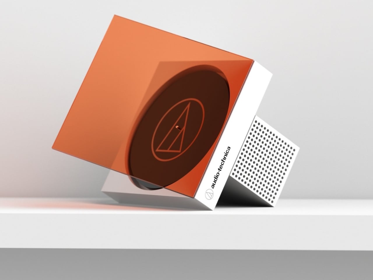
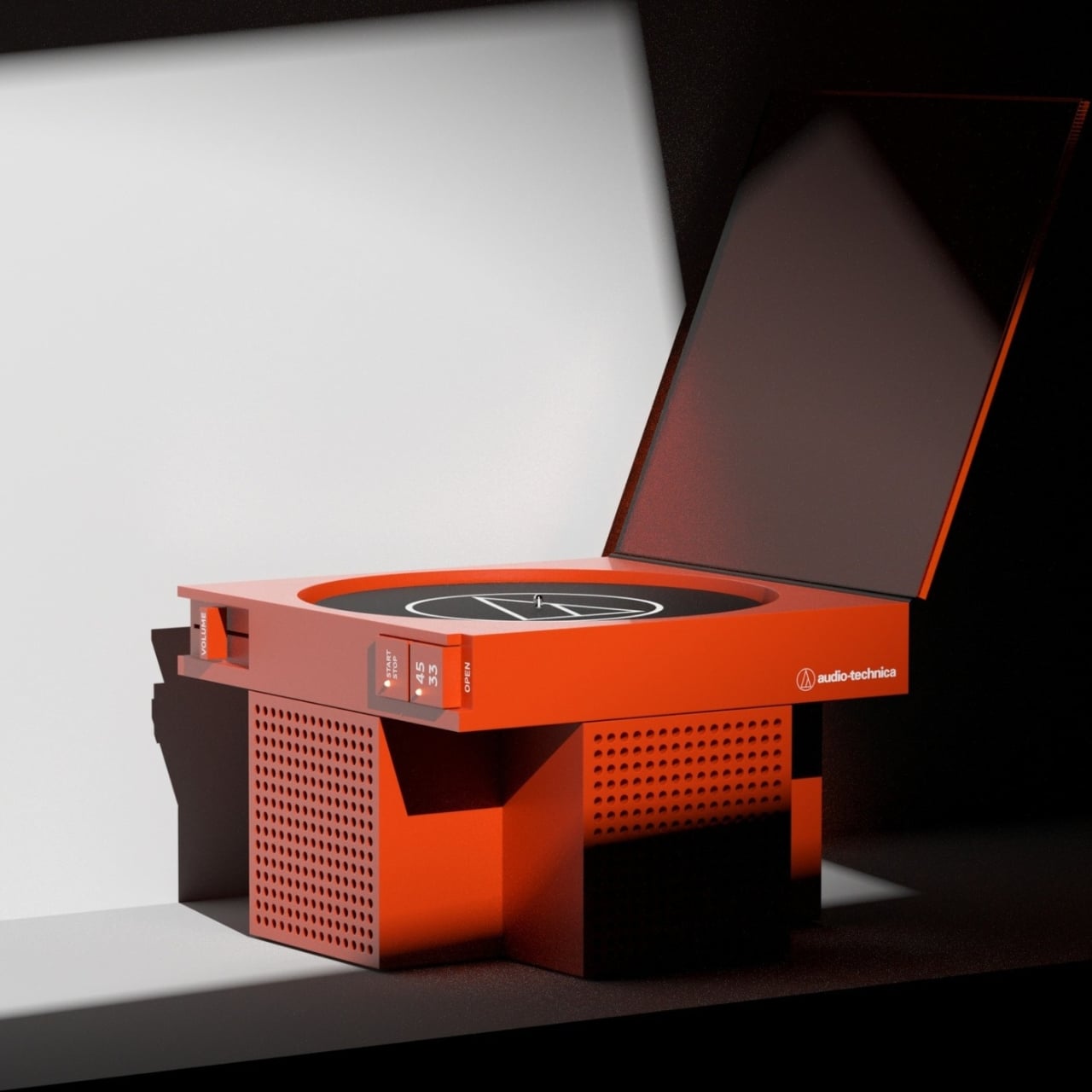
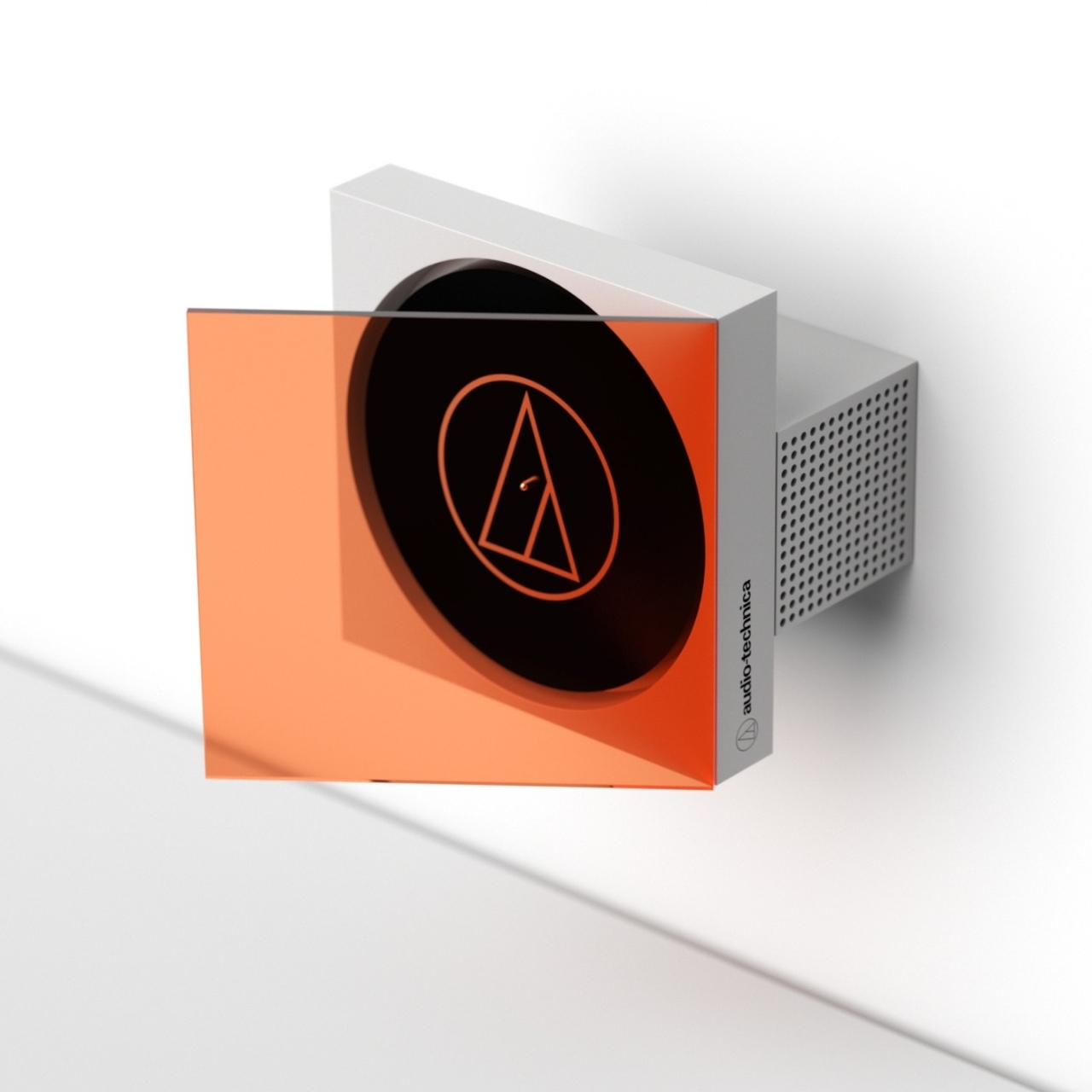
The ID Concept for Audio-Technica isn’t one turntable. It’s a family of forms, all sharing the same design DNA, all pushing the question of what a vinyl player can be when you stop treating it purely as audio equipment and start treating it like a sculptural object. The concept explores three distinct configurations: a flat tabletop version that opens like a precision box, a wall-mounted version where the record faces outward behind a tinted panel, and a vertical format where the disc and player stand together like a piece of framed art.
Designer: Hive Industrial
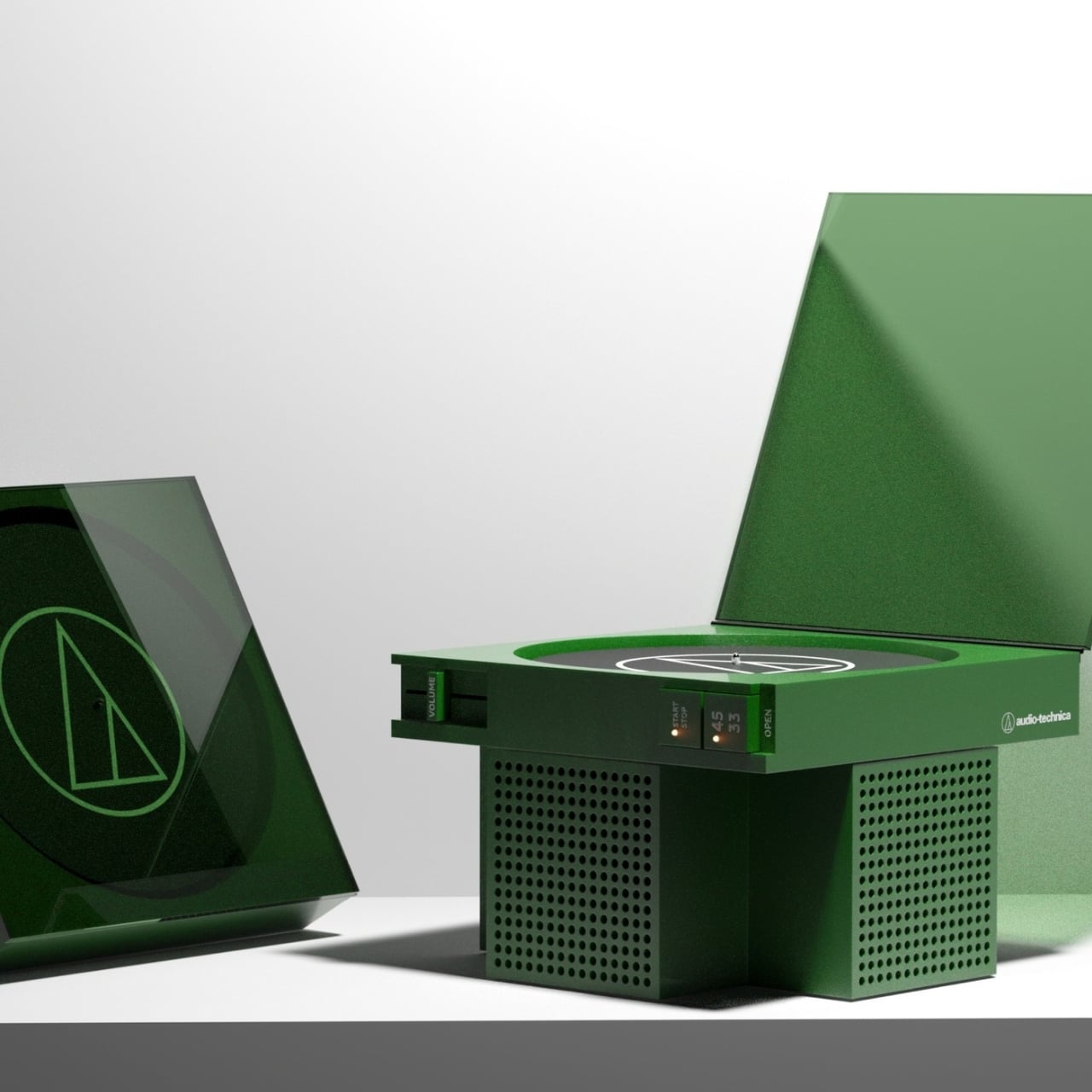
What makes it immediately striking is the geometry. Hive Industrial built the whole concept around a T-shaped extrusion, a form language that is clean and architectural without trying too hard. There are no soft curves begging for your attention, no retro-inspired wood paneling chasing nostalgia points. The shapes are confident and geometric, almost brutalist in their directness, which is exactly what makes them feel both modern and collectible.
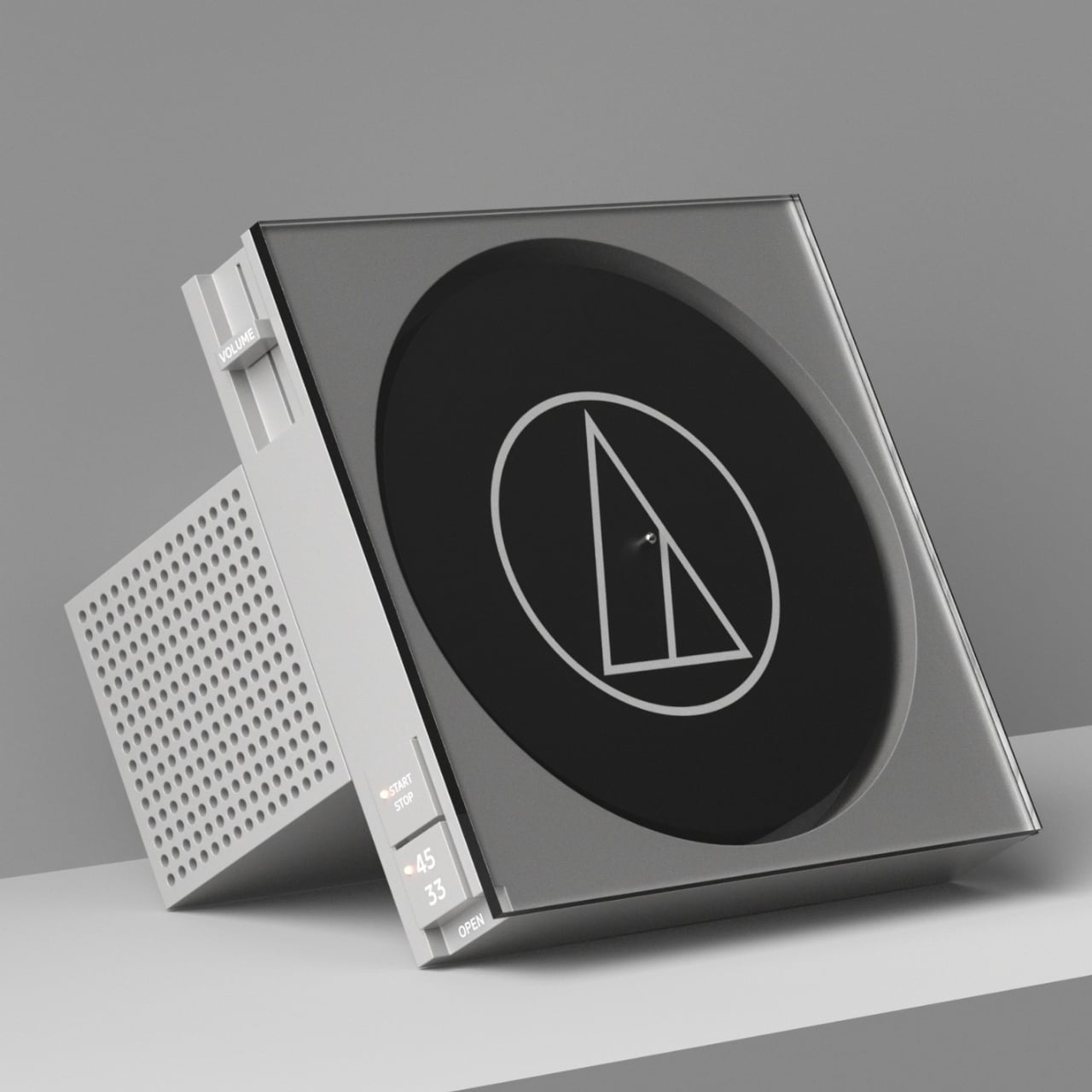
The colorways are doing a lot of heavy lifting, too. The terracotta red version reads bold and warm, the kind of piece that anchors a room the moment you place it down. The forest green edition has a more muted, considered quality that would sit comfortably alongside design-forward furniture. The gray and silver variant is crisp and precise. Then there is the wall-mounted orange-tinted version, which looks less like audio gear and more like something you would find at a gallery opening with a four-digit price tag on the label. Each colorway feels like a deliberate creative decision rather than a marketing checkbox.
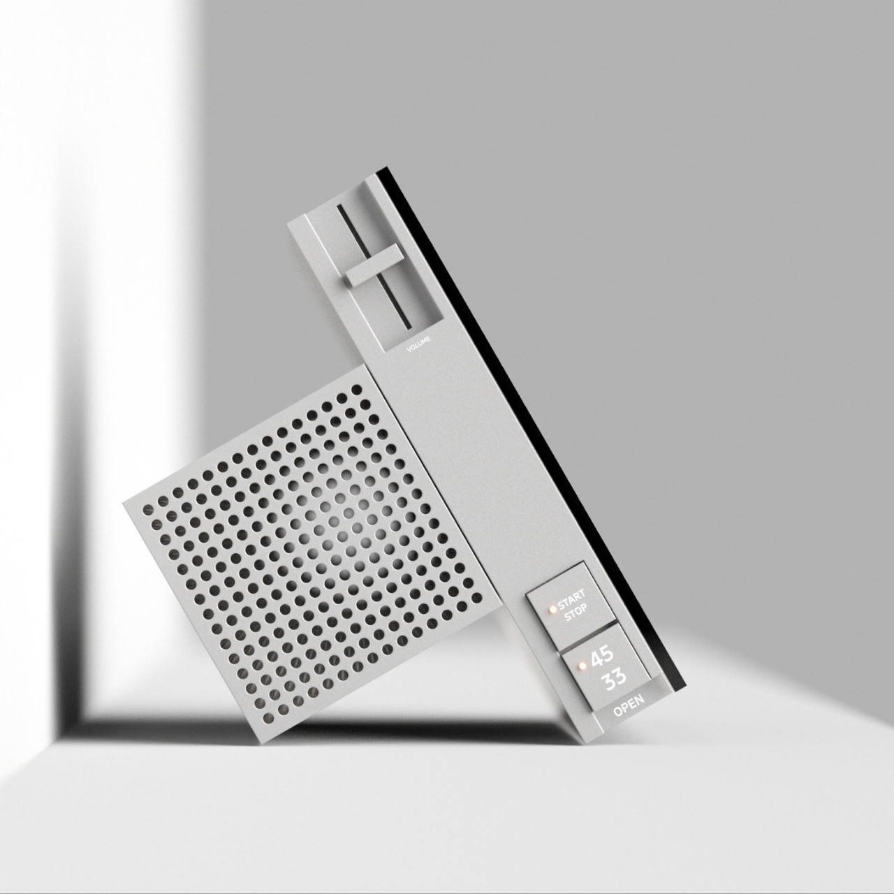
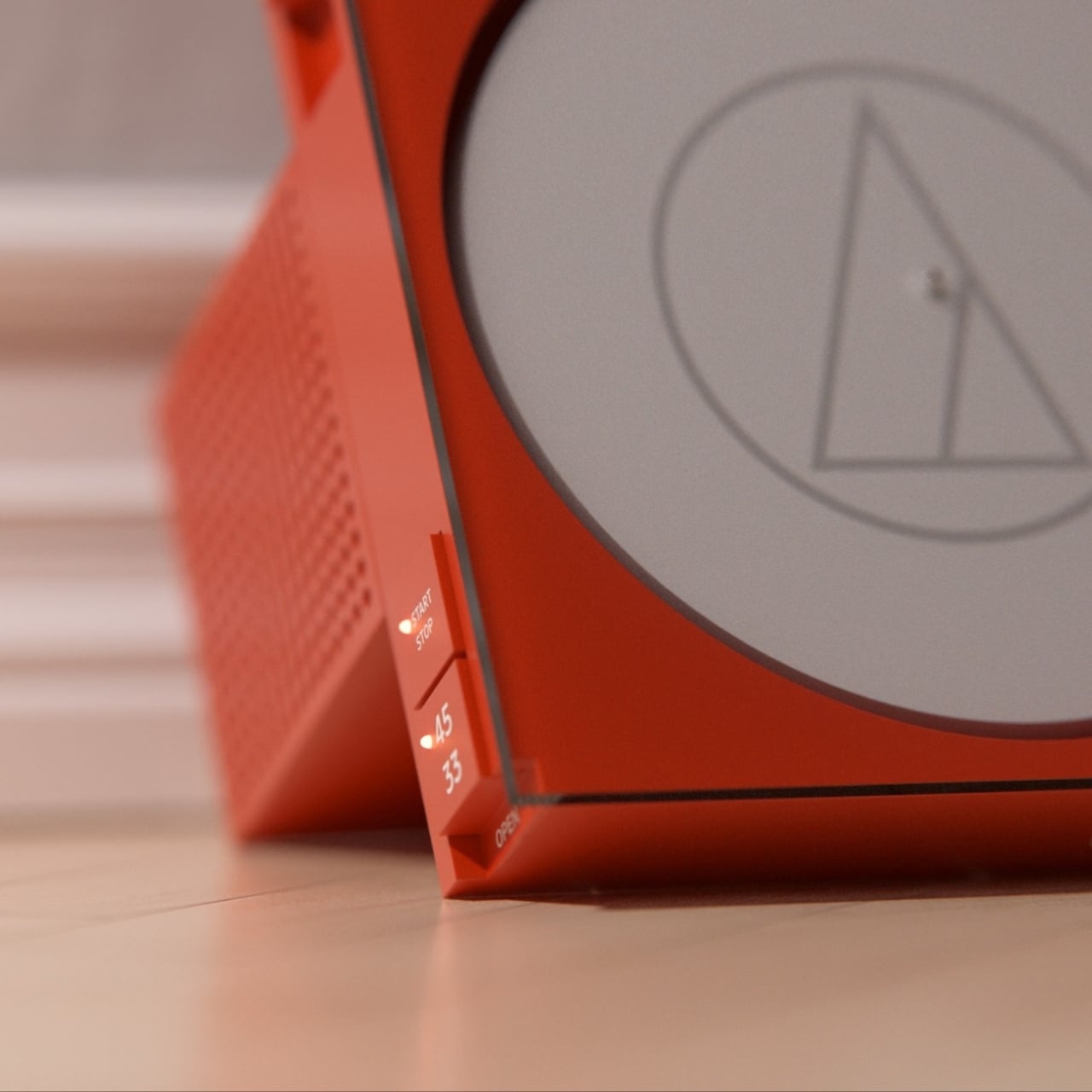
The controls are minimal by design. Along the side spine of each unit, you get a volume slider, a start/stop toggle, a 33 and 45 RPM selector, and an open mechanism. That is it. Nothing clutters the surface. The speaker grille, punched with a tight grid of circular perforations, sits flush into the body and reads almost as texture rather than hardware. The Audio-Technica triangle logo appears on each version, etched or applied with restraint, which is exactly how branding should be handled on a piece this considered.
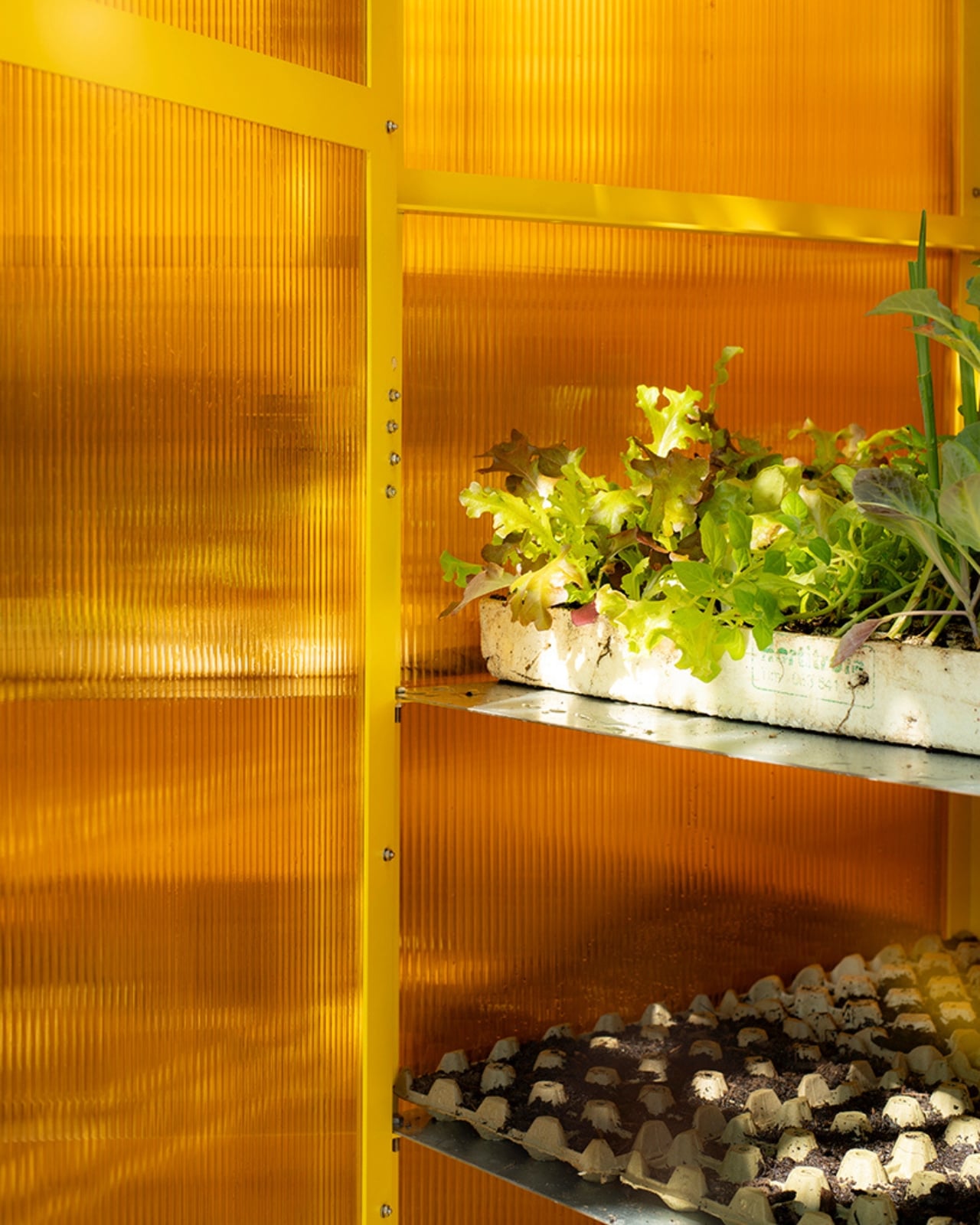
The wall-mounted interpretation is the one that really challenges your expectations. Getting a turntable off the desk and onto the wall is not a new idea, but presenting the record itself as a visual element, visible through a color-tinted panel that doubles as the lid, is genuinely fresh territory. The record becomes part of the display. When the player is in use, you would be watching it spin behind that translucent orange surface, which is the kind of detail that takes something from useful to memorable.
Hive Industrial has a real history with Audio-Technica. The studio’s portfolio includes several actual products for the brand, including headphones that have shipped to real consumers. So this concept is not just a fantasy render from someone who has never held a stylus. It comes from a team that understands Audio-Technica’s design vocabulary and is asking, quite deliberately, what the next chapter of that vocabulary could look like.
Vinyl’s so-called revival has been going strong for well over a decade now. Sales have climbed consistently, and the audience has expanded well beyond classic rock collectors and dedicated audiophiles into a much broader group of people who simply want something more intentional than a streaming playlist. That audience, which has grown up caring about how things look as much as how they sound, is exactly who a concept like this speaks to.
Whether this ever makes it to production is an open question. But that is almost beside the point. Concepts like this matter because they move the conversation forward and remind you that even an object as established and beloved as a turntable still has room to surprise you.
The post Gorgeous Audio-Technica Turntable Concept is worthy of being in an Art Gallery first appeared on Yanko Design.