If you’ve lived long enough on this earth, you probably sometimes still long for those days when music was tangible. Whether you experienced putting in a cassette tape or placing a vinyl record on your turntable or even plopping in a CD, you probably miss the sound and feel of “physical music”. That’s why we have several devices that are banking on this nostalgia factor and it seems like Samsung is not immune to this trend.
Samsung Display has unveiled two intriguing concept devices at the ongoing CES 2026: the AI OLED Cassette and the AI OLED Turntable. While they’re not yet products that you can actually buy tomorrow, this “creative flex” for their circular OLED technology may inspire other manufacturers or even get Samsung to actually produce it or something similar in the future.
Designer: Samsung Display
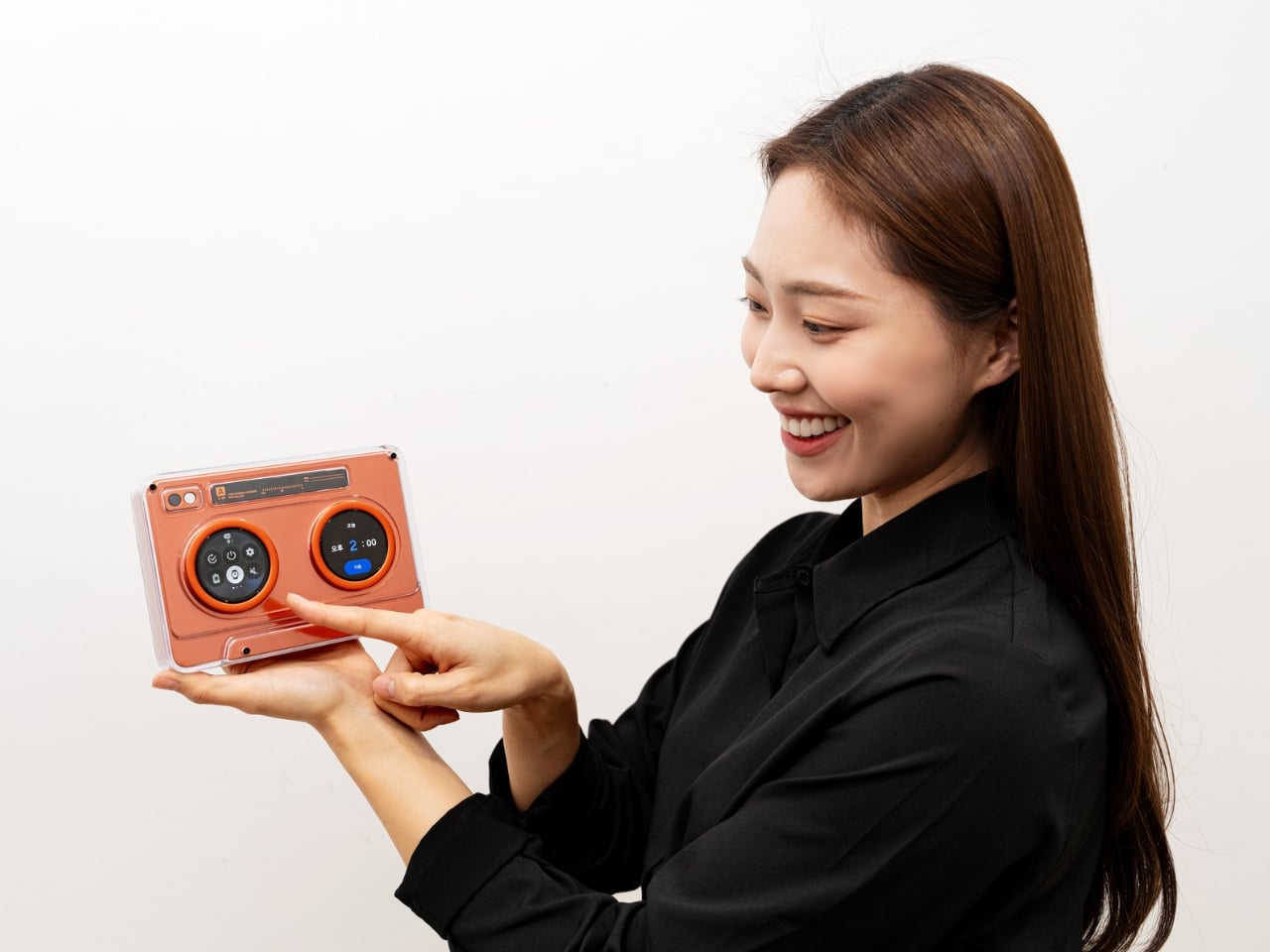
The AI OLED Cassette is a throwback for those who experienced this kind of music back in the day. It takes the classic tape deck design and turns it into a smart speaker with two tiny 1.5-inch circular OLED displays. They’re in that place where the spinning reels used to be, since this isn’t exactly a cassette player. On the left, you get the playback controls and on the right side, you get a digital waveform or equalizer. Both screens are touch-sensitive, letting you interact directly with the device without constantly reaching for your phone.
It’s not just a usual Bluetooth speaker, though, as you get AI-powered music recommendations built into the device. That means you can discover new music, select what you want to hear, and control everything directly on the cassette itself. You get a touchscreen display as well so you don’t need an external device to control it. This standalone functionality sets it apart from traditional Bluetooth speakers that rely heavily on phone connectivity. There’s also a lozenge-shaped display that doubles as a virtual tuning dial, adding another layer of interaction that feels surprisingly intuitive for something so retro-inspired.
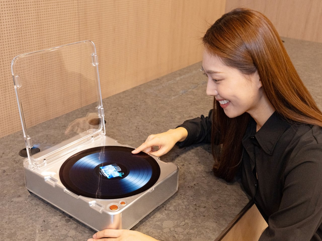
Going further back in the nostalgia trip, the AI OLED Turntable is a 13.4-inch circular OLED touchscreen that looks like an actual vinyl turntable. The turntable display can actually display images and videos to add to the ambience in your space while playing the tunes. Imagine hosting friends and having your turntable show ambient visuals that match the vibe of your playlist. It’s part music player, part art installation, part conversation starter. The large circular display becomes the centerpiece of whatever room you place it in, commanding attention in a way that most modern tech tries to avoid.
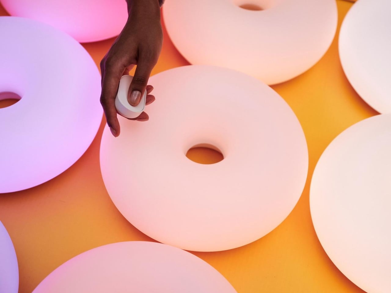
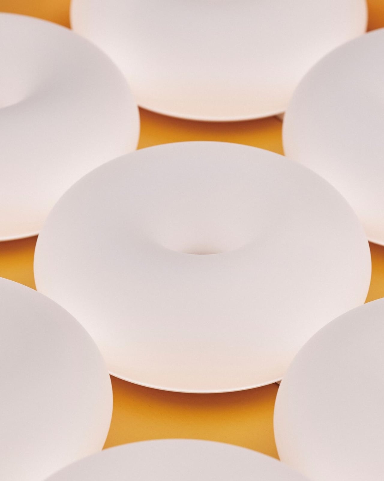
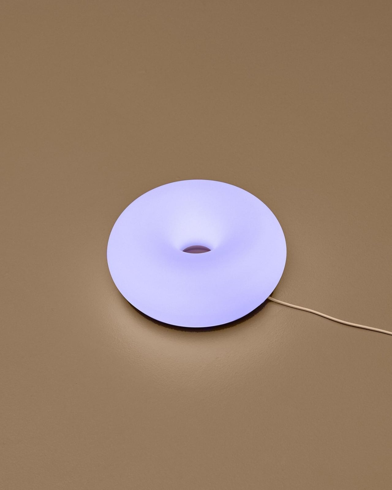
AI OLED Bot
These two device concepts actually blur the line between technology and home decor, standing out from the usual, minimalist smart speakers that are on the market. By embracing retro aesthetics and then adding cutting-edge OLED technology, they turn these functional devices into design statements as well, letting them blend into your living space while giving you the music that you want at a particular time.
The timing couldn’t be better either. We’re living through a massive vinyl resurgence, with record sales hitting levels not seen since the 1990s. Cassette tapes are even making a comeback among collectors and indie musicians. There’s clearly an appetite for music experiences that feel more intentional, more physical, more there. Samsung seems to understand that people don’t just want convenience anymore. They want connection to their music and their spaces.
However, before you start dreaming about these devices adorning your living room, remember that they’re still concept devices and may never be manufactured by Samsung Display. These showcases are essentially Samsung demonstrating what’s possible with their circular OLED technology and showing other manufacturers what could be built. They might never produce these exact products themselves.
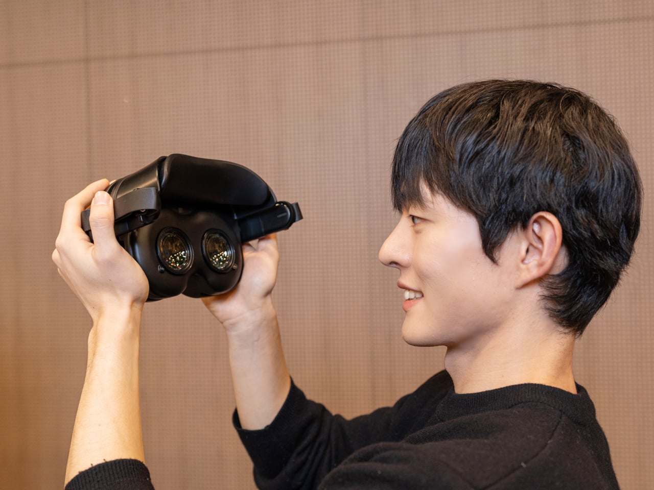
RGB OLEDoS Headset
Still, as concepts, they’re a vision for how technology can exist while still celebrating personality and nostalgia, rather than generic, robotic looks. Whether you’re a design enthusiast who appreciates the aesthetic, a tech geek fascinated by flexible OLED displays, or a pop culture lover drawn to the retro vibes, there’s something genuinely appealing about these devices. Sometimes the best concepts aren’t about predicting the future. They’re about reimagining how the past and present can play together.
The post Samsung’s Retro OLED Cassette and Turntable Concepts Are Pure Nostalgia first appeared on Yanko Design.


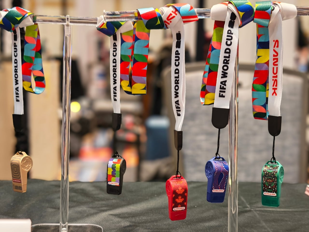
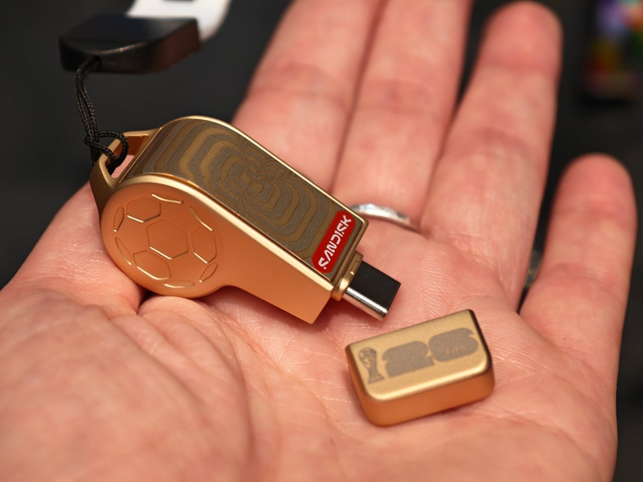
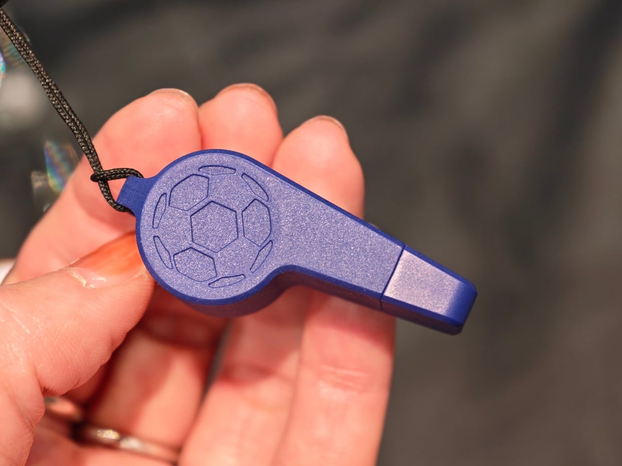
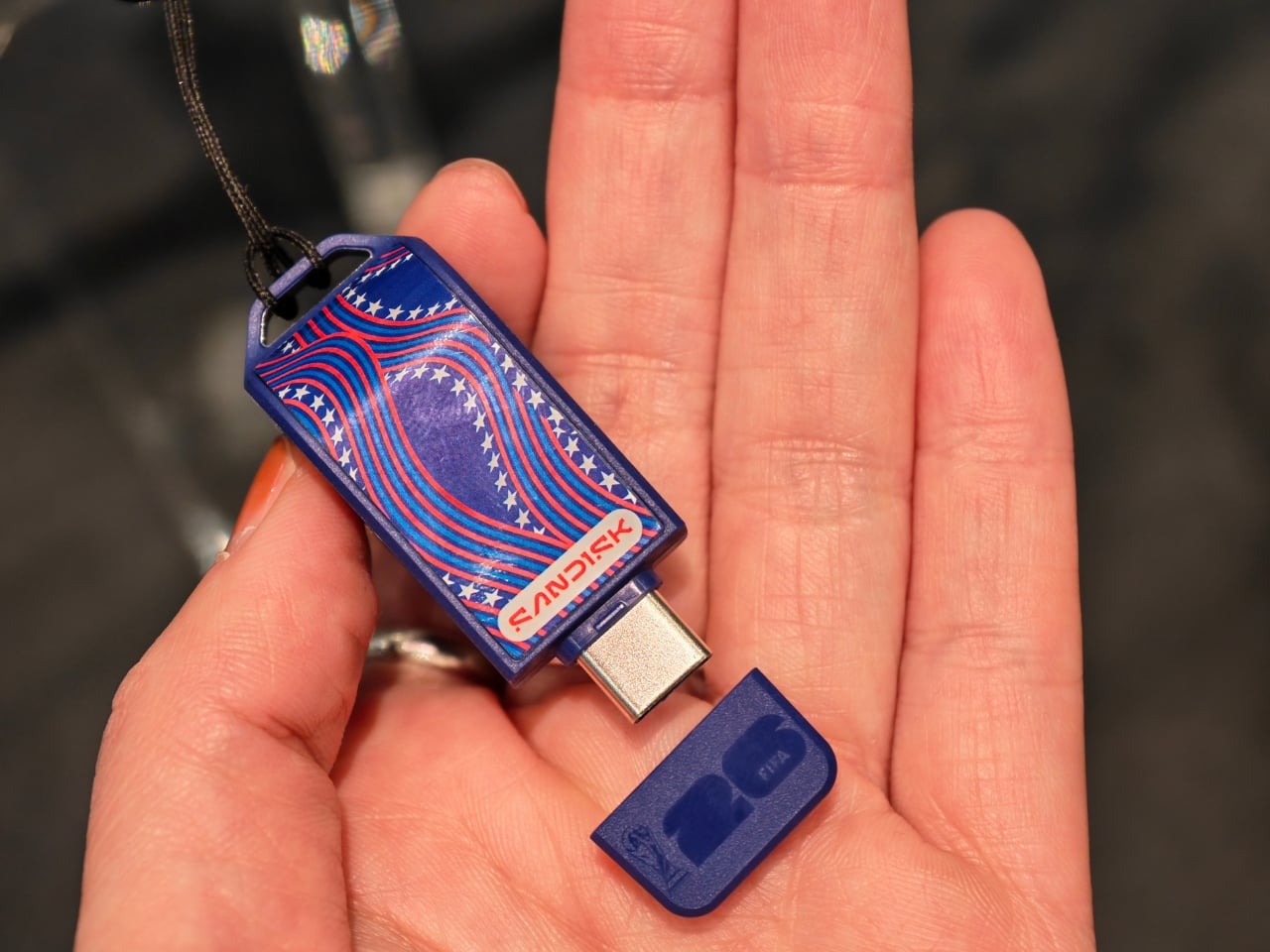
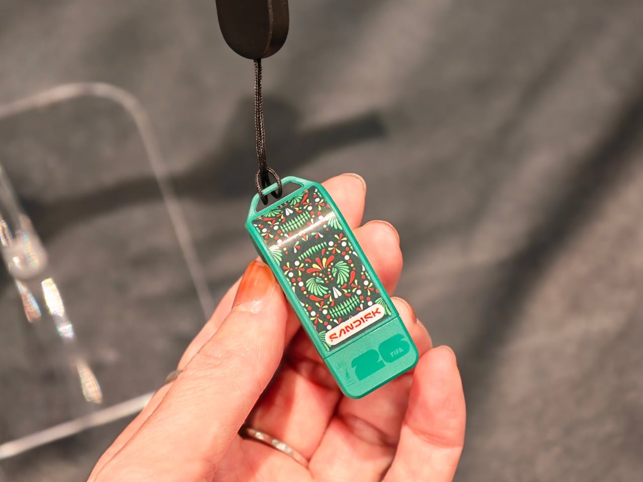
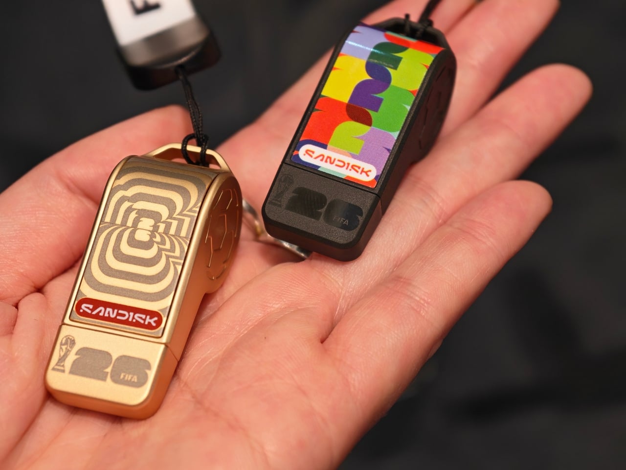
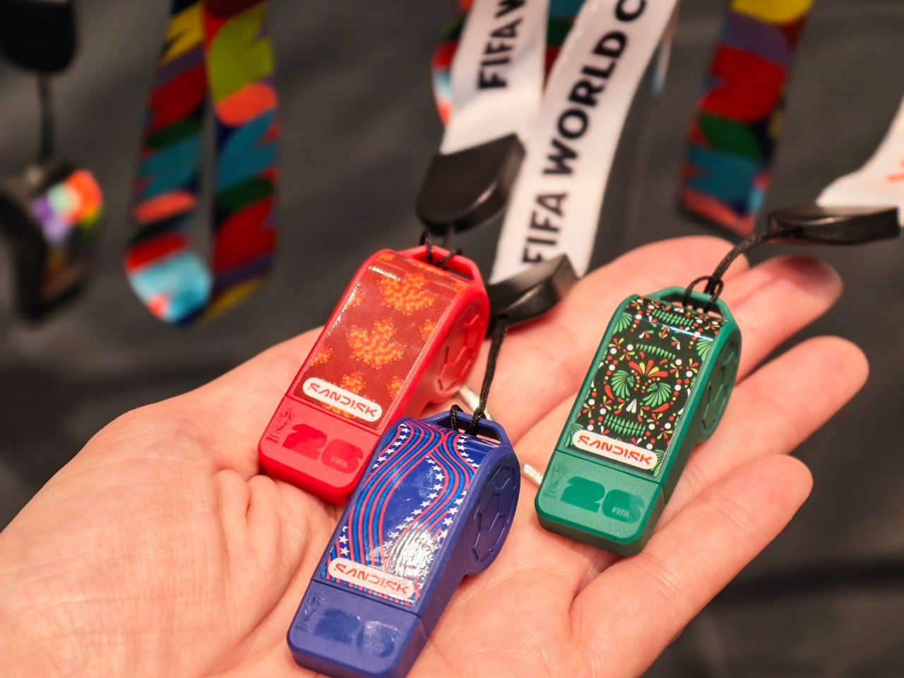

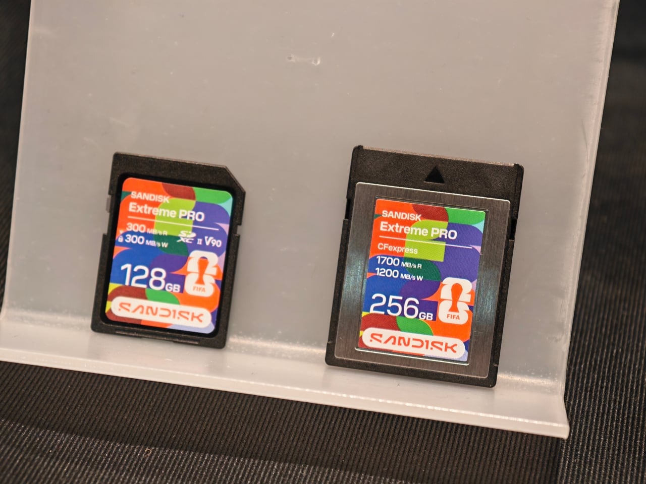
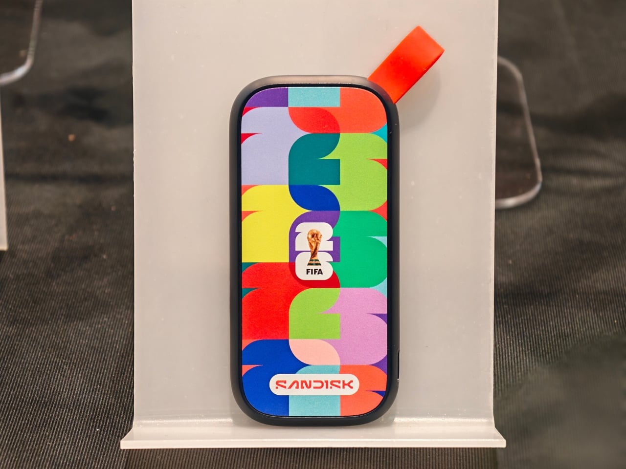
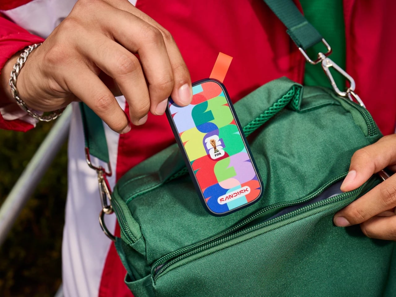


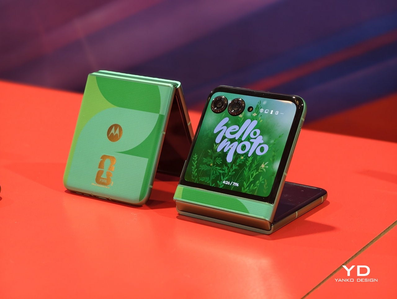
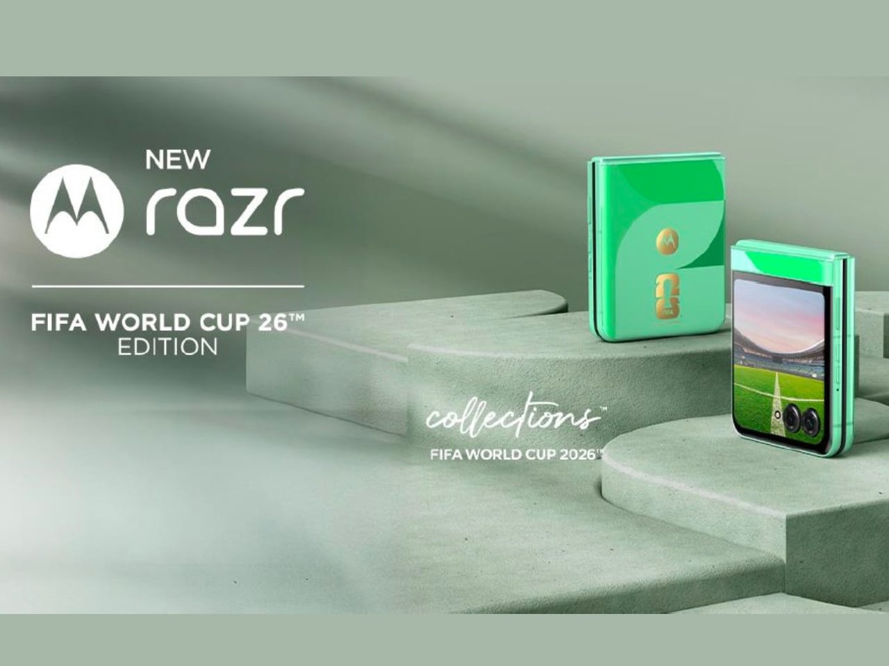
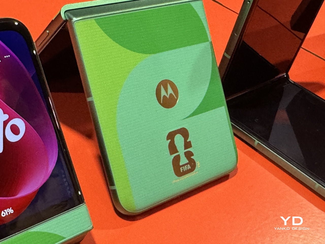
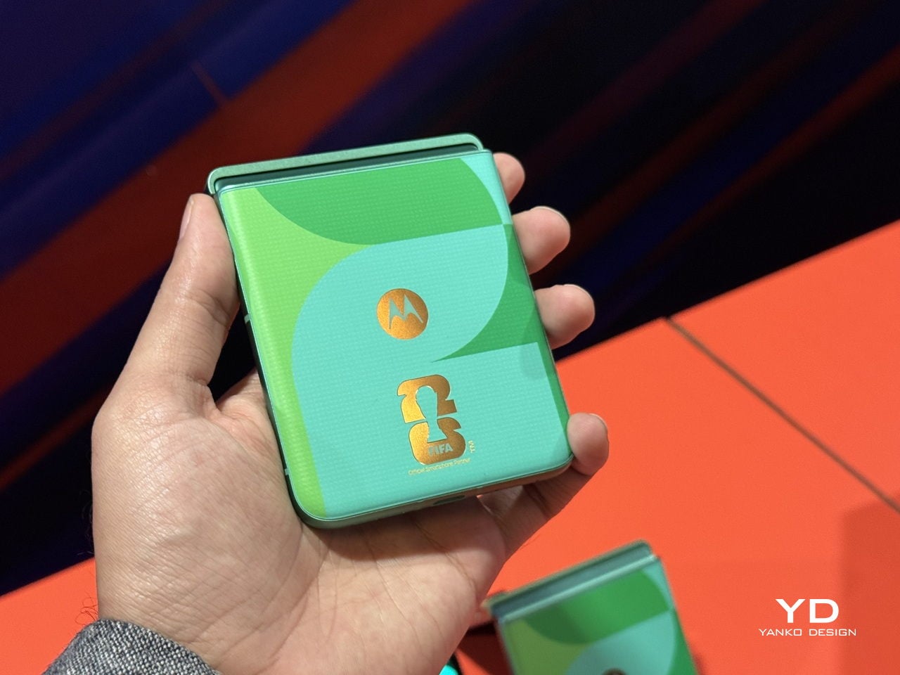
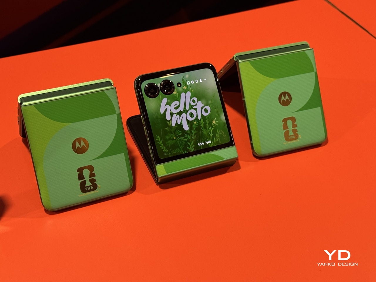
 Edition is a limited-edition collectible device that celebrates the first-ever 48-team FIFA World Cup. It is a mobile phone that’s designed for soccer fans who are excited about the upcoming tournament and for anyone who loves things where technology meets sports culture.