Gerber Just Solved Camp Cooking’s Messiest Problem With 6 Pieces

You know what’s annoying about camping? You’re out there trying to enjoy nature, breathe in the fresh air, and cook a decent meal, but then you realize your cutting board is wedged under the cooler, your knife is somewhere in the depths of your trunk, and everything you need for meal prep is scattered across three different bags. It’s chaos, and not the fun kind.

Enter the Gerber ComplEAT Cutting Board Set, which is basically what happens when someone finally asks the right question: what if your entire camp kitchen could pack itself into something the size of a shoebox? This six-piece set is like the Russian nesting doll of outdoor cooking gear, and honestly, it’s kind of brilliant.

Designer: Gerber Gear

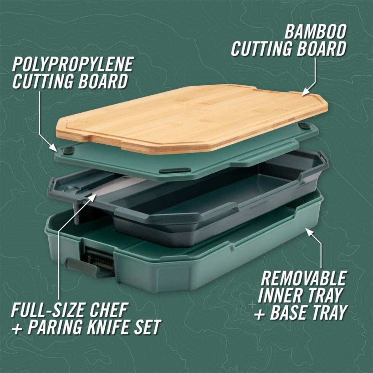
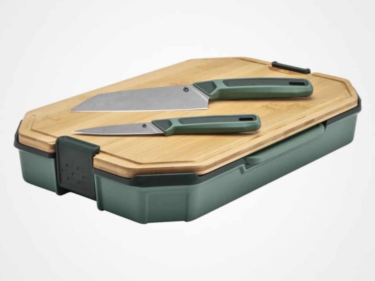
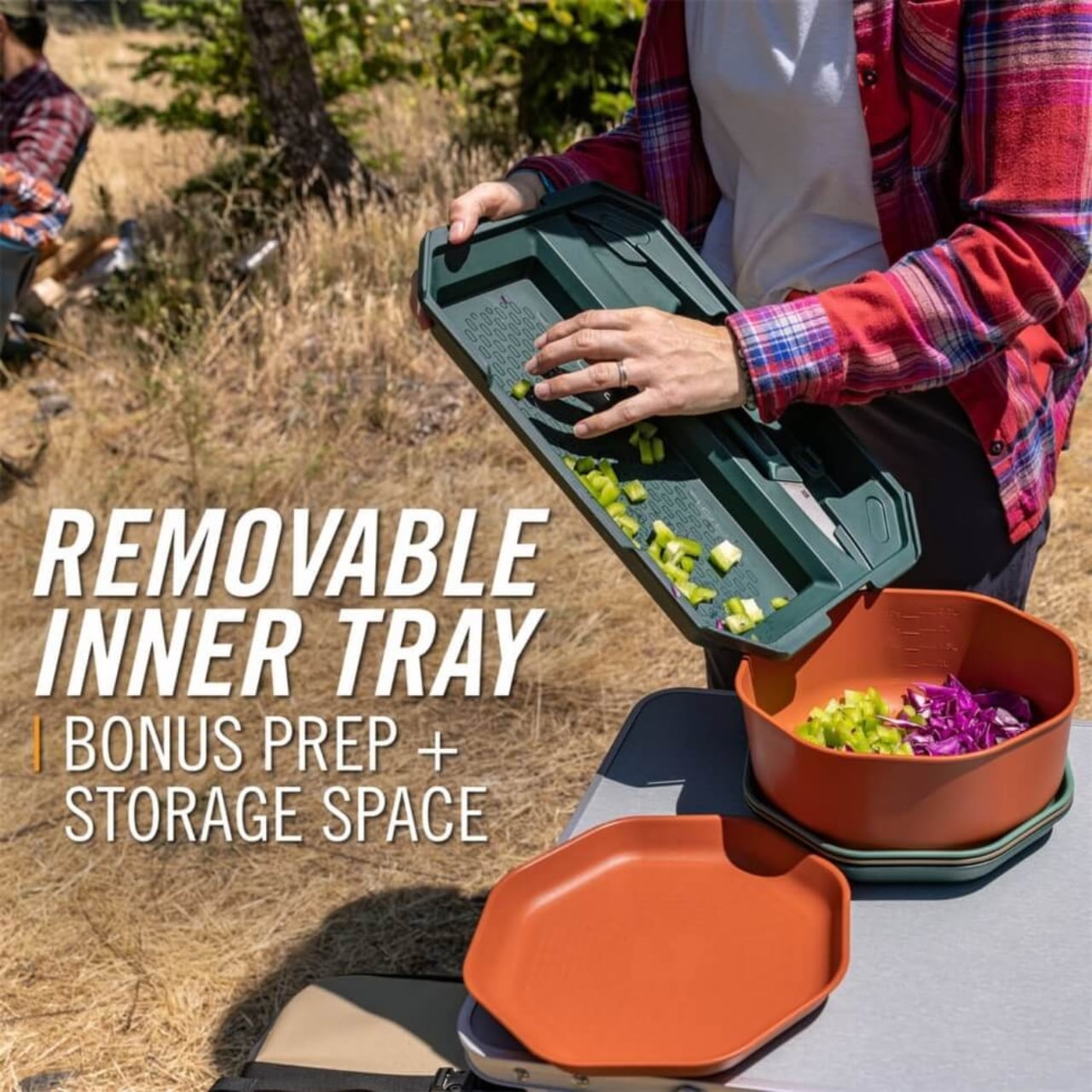
The whole thing starts with two cutting boards. One is bamboo, measuring about 9.6 by 15.6 inches, and the other is polypropylene, slightly smaller at 8.9 by 14.3 inches. Both are dual-sided with juice grooves, which means you can flip them depending on what you’re prepping. The bamboo board gives you that nice, knife-friendly surface for vegetables and bread, while the polypropylene one handles the messier stuff like raw meat without absorbing odors or staining. It’s the kind of thoughtful detail that shows someone actually tested this thing in the real world.

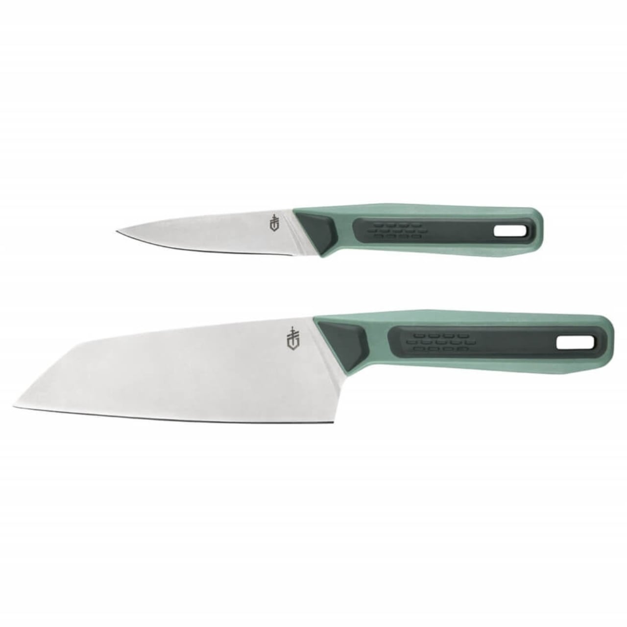
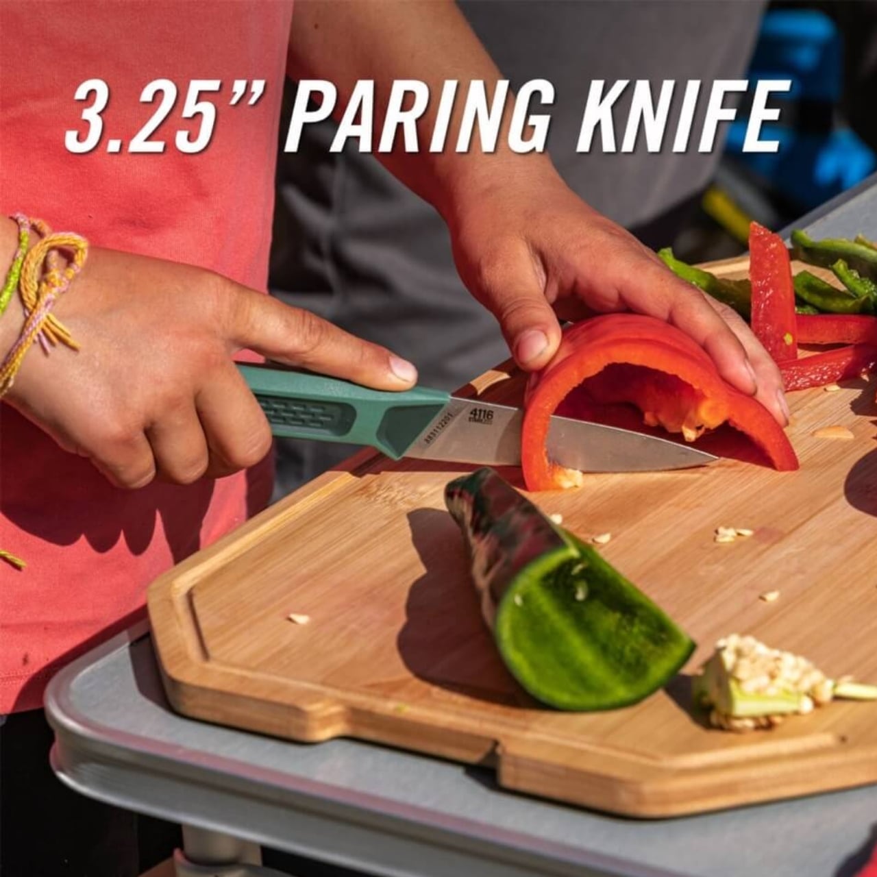
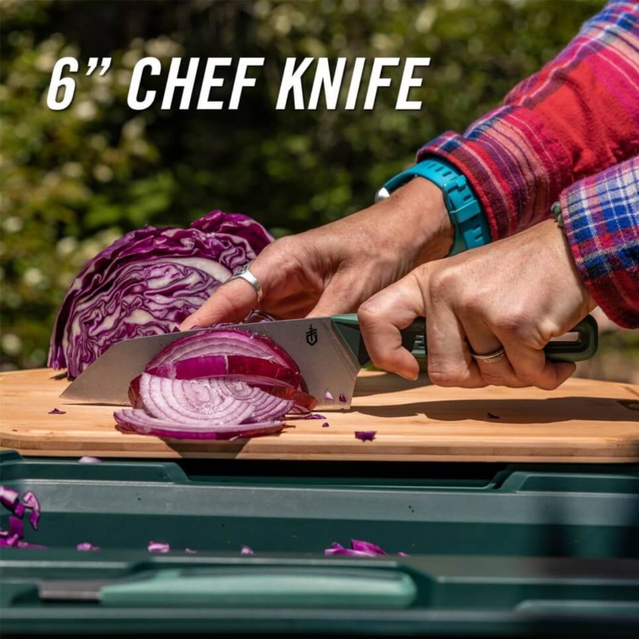
Tucked inside are two fixed-blade knives: a 3.25-inch paring knife and a 6-inch chef knife. These aren’t flimsy camping afterthoughts, either. They’re made with 4116 German stainless steel, which is corrosion-resistant and holds an edge really well. The handles are glass-filled polypropylene with a rubber overmold for grip, and there’s even a lanyard hole if you want to tether them. According to reviews, these knives are legitimately sharp, the kind you’d be happy to use in your home kitchen.

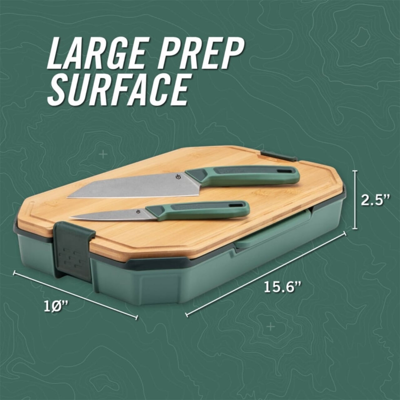
What makes this set stand out is how everything nests together. The knives fit into an inner tray, and that tray sits inside the base tray between the two cutting boards. Heavy-duty locks keep everything secure, so you’re not worried about sharp blades sliding around in your gear. When closed, the whole setup measures approximately 15.6 by 10 by 2.5 inches and weighs just over four pounds. That’s compact enough to slide into a car trunk, RV cabinet, or even a large backpack without monopolizing space.

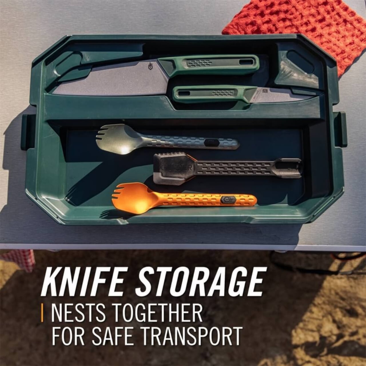
The design is smart in those small, annoying-problem-solving ways. The cutting boards have rubber feet to keep them stable while you’re chopping on uneven surfaces, which is pretty much every surface when you’re camping. Everything is dishwasher safe, so cleanup isn’t a nightmare after a long day outdoors. And the inner tray doubles as storage for utensils or other small kitchen items, giving you a little extra organizational real estate.

Is it perfect? Well, at around $117, it’s definitely an investment. This isn’t something you casually toss in your cart unless you’re serious about outdoor cooking or you’ve had one too many experiences with bad camp knives. But if you’re the kind of person who actually enjoys making real meals while camping (or tailgating, van life-ing, or boat dwelling), the quality justifies the price. Reviews consistently mention that the knives alone make it worth it, and the fact that everything stores so neatly is a game changer.

Gerber designed the ComplEAT as part of a larger collection aimed at people who don’t want to sacrifice quality when they’re away from home. It’s for the folks who would rather grill fresh vegetables and sear a good steak over the fire than eat sad sandwiches out of a cooler. There’s something satisfying about gear that works hard and looks good doing it, and this set checks both boxes.

At its core, the ComplEAT Cutting Board Set is about solving a very specific problem: how do you bring a functional kitchen into the woods without it becoming a logistical nightmare? Gerber’s answer is elegantly simple. Pack smart, nest everything, and don’t compromise on the tools. It’s design meeting utility in the best possible way, wrapped up in a package that actually makes outdoor cooking feel less like roughing it and more like, well, eating well.

The post Gerber Just Solved Camp Cooking’s Messiest Problem With 6 Pieces first appeared on Yanko Design.

Rimowa Just Built a $450 Bag That’s Actually 3 Bags in One

You know that frantic airport moment when you need your laptop but it’s buried deep in your suitcase? Or when you’re rolling through the terminal juggling a carry-on, a tote bag that keeps slipping off your shoulder, and a coffee that’s about to meet its untimely end? Rimowa just made all of that dramatically less chaotic.

The luxury luggage brand has reimagined its Cabin Luggage Harness with a clever upgrade that transforms it from a simple add-on into something genuinely versatile. This isn’t just another travel accessory trying to justify its existence. It’s a three-in-one design that actually makes sense for how we move through airports and cities today.

Designer: Rimowa

At first glance, it looks like a sleek organizer that wraps around your suitcase like a well-tailored vest. Made from high-quality recycled nylon with nylon webbing for durability, it attaches via adjustable straps that fit neatly over Rimowa’s Original, Classic, Essential, Essential Lite, and Hybrid cabin collections. The straps secure to the telescoping handle, keeping everything stable as you roll through crowded terminals. Three non-slip silicone strips ensure the bag stays balanced even when you’ve loaded it unevenly (because let’s be honest, we all do that).

What makes this version special are the hidden shoulder straps tucked into the design. When you need to break away from your rolling luggage for a coffee run or quick meeting, simply detach the harness and those concealed straps convert it into a surprisingly functional backpack. It’s the kind of thoughtful detail that makes you wonder why no one thought of it sooner.

The organizational setup is where Rimowa really nailed it. Two large pockets accommodate laptops up to 16 inches, plus tablets, documents, and magazines. Several smaller pockets handle the usual suspects: chargers, phones, passports, that random USB cable you always need. Everything stays accessible without forcing you to dig through your main suitcase or squat awkwardly in the middle of a busy airport corridor.

But wait, there’s more functionality packed into this thing. Zipped side panels connect the two sections of the harness, and when paired with the two top handles, the whole setup transforms into a hand-carry briefcase. It’s polished enough for a business meeting, yet practical enough for everyday travel. That’s three distinct carrying modes in one compact package. Despite all these features, the harness stays remarkably compact and lightweight. It weighs just 0.59 kilograms and measures 15.4 inches high by 12.2 inches wide by 3.5 inches deep. When attached to your suitcase, it sits flush against the surface rather than bulging awkwardly or throwing off your balance as you navigate tight airplane aisles.

The timing of this release feels particularly smart. As travel rebounds and more people return to airports, there’s growing frustration with the juggling act required to manage multiple bags while maintaining easy access to essentials. Airlines have gotten stricter about what counts as a personal item, and gate-checking fees continue to climb. A solution that consolidates your carry items while keeping them organized and accessible? That’s solving real problems.

Rimowa can’t claim total originality here. Similar suitcase harness designs have existed for years, though typically at lower price points and with less refined execution. What sets Rimowa’s version apart is the build quality, the versatility of those hidden shoulder straps, and the thoughtful integration with their suitcase lineup. It’s the difference between a hack that technically works and a solution that feels intentionally designed.

The recycled materials deserve a mention too. Using recycled nylon for both the exterior and lining aligns with growing expectations that luxury brands need to consider sustainability. It’s not revolutionary, but it’s the baseline we should expect from premium products in 2025. For frequent travelers who already own Rimowa luggage, this harness feels like an obvious upgrade. For everyone else, it’s an interesting glimpse into how thoughtful design can solve everyday frustrations without overcomplicating things. Sometimes the best innovations aren’t flashy new technology. They’re just smart solutions that make you say, “Why didn’t this exist before?”

The post Rimowa Just Built a $450 Bag That’s Actually 3 Bags in One first appeared on Yanko Design.

This $10 Metallic Piggy Bank Is Actually Made of Paper

There’s something oddly satisfying about dropping coins into a piggy bank. That little clink sound, the weight gradually building up, the anticipation of finally cracking it open. But let’s be honest, traditional ceramic piggy banks are kind of predictable. So when PLANBUREAU studio decided to reimagine this childhood classic, they went in a direction nobody saw coming: metallic paper.

Here’s the twist. The designers, Dániel Lakos and Míra Majoros, didn’t just wake up one day and think “hey, let’s make a paper pig.” They were working on a project for Red Noses International, an organization that supports clown doctors who work with children in hospitals. The brief was pretty specific: create something that encourages young people to save money and donate, all while keeping the price under 10 EUR with minimal production costs. Not exactly an easy ask.

Designer: PLANBUREAU studio

Most designers would’ve gone the obvious route with plastic or cheap ceramics. But PLANBUREAU had a better idea. Paper. Not flimsy craft paper, mind you, but printed metallic paper that looks like it costs way more than it actually does. It’s one of those “why didn’t anyone think of this before?” moments.

The design process itself is fascinating and honestly pretty modern. They started with ChatGPT, using AI to generate initial concepts. Their first prompt produced a pig that was fine but not quite right. So they asked the AI to make it “more boxy-looking and silver,” then added tweaks like a “cute nose” until they landed on something that felt both contemporary and charming. It’s the kind of iterative design process that shows how technology can actually enhance creativity rather than replace it.

What makes this piggy bank work is its simplicity. It arrives as a flat sheet that you cut and fold yourself. There’s something almost meditative about the assembly process, like adult origami but with a purpose. The metallic finish gives it a modern, almost futuristic vibe that doesn’t scream “kid’s toy.” You could honestly put this on a minimalist desk or shelf and it wouldn’t look out of place. The genius is in the material choice. Paper means easy printing and cutting, which keeps manufacturing costs low. It’s lightweight for shipping. It’s recyclable. And if you’re designing something meant to be eventually destroyed (because let’s face it, that’s how you get the money out), paper actually makes more sense than ceramic shards scattered across your kitchen floor.

There’s also something symbolic about using paper to save money. We’re living in an increasingly cashless society where financial transactions happen with a tap or a click. Physical money feels almost nostalgic. Creating a paper vessel to hold coins becomes this interesting commentary on the materiality of money itself. It’s meta in the best way. For kids especially, this design hits differently. Assembly becomes part of the experience, not just a barrier to use. The act of putting it together creates ownership and investment (pun intended). And when it’s time to donate, breaking open a paper bank feels less destructive than smashing ceramic. There’s no guilt, just satisfaction.

PLANBUREAU studio has carved out a niche making playful, geometric designs, and this piggy bank fits perfectly into their aesthetic. It’s functional but also kind of art. The kind of object that makes you reconsider what everyday items can be. It proves that good design doesn’t require expensive materials or complex manufacturing. Sometimes the best solutions are literally paper-thin. Since we’re constantly looking for ways to make sustainable choices without sacrificing style, this metallic paper piggy bank feels like a small but meaningful answer. It’s affordable, it’s clever, and it makes saving money feel fresh again. Plus, it teaches kids about generosity without being preachy about it. Not bad for something you can fold from a single sheet of paper.

The post This $10 Metallic Piggy Bank Is Actually Made of Paper first appeared on Yanko Design.

A Button, A Loop, And The Problem Of Where To Put Your Glasses

Look, I’ve lost my glasses in some pretty creative places. Between the couch cushions. On top of my head while frantically searching for them. In the fridge once (don’t ask). And I know I’m not alone in this very specific modern anxiety: that moment when you take your glasses off and suddenly have nowhere to put them that won’t end in disaster.

Cubitts, the London-based eyewear brand that’s been quietly revolutionizing how we think about spectacles, has come up with a solution so elegantly simple you’ll wonder why no one thought of it sooner. It’s called On The Wing, and it’s basically a small leather loop that attaches to any button on your shirt. That’s it. That’s the whole thing. And somehow, it’s brilliant.

Designer: Cubitts

Made from supple vegetable-tanned leather, On The Wing transforms whatever you’re wearing into a temporary perch for your frames. It’s designed for those in-between moments when you’re not wearing your glasses but don’t want to commit them to a case or risk the inevitable “left them at the restaurant” panic. You slip the loop onto a button, hang your glasses from it, and go about your business. No stretched-out necklines from hanging them on your collar. No bulging pockets. No setting them down on a table and walking away without them.

The design came out of a collaboration between Cubitts and industrial designer Daniel Weil, part of a broader collection of accessories that share the brand’s philosophy: functional, beautiful, and made to last. Weil has spent decades thinking about how objects interact with daily life, and you can feel that consideration in On The Wing’s simplicity. It’s barely visible when you’re wearing it, but always there when you need it.

What I love about this is how it acknowledges a real problem that glasses wearers deal with constantly. If you wear glasses full-time, you know the dance. You take them off to look at your phone up close, or to rub your eyes, or because you’re transitioning from reading to eating. And then what? Do you set them on the table where they’ll get scratched? Balance them precariously on your head? Shove them in a pocket where they’ll get smudged or bent?

The thing is, glasses have become such an integral part of personal style. People spend serious time choosing frames that reflect their aesthetic, whether that’s vintage-inspired, minimalist, or boldly contemporary. Cubitts understands this better than most brands. Their frames are designed to be enduring companions, repaired and serviced over many years rather than treated as disposable fashion. So it makes sense that they’d think about what happens to your glasses when they’re not on your face.

On The Wing costs about $14 and comes in a few colors to match different wardrobe aesthetics. It’s the kind of accessory that feels almost too simple to be worth it until you start using it and realize how much mental energy you were spending on the where-do-I-put-my-glasses question. There’s something charmingly analog about the solution too. In a world where every problem seems to require an app or a gadget with a battery, here’s a piece of leather and a button doing exactly what they need to do. No charging required. No setup. No learning curve.

Will a leather loop on your shirt button change your life? Probably not. But will it solve a small, persistent annoyance in a way that feels considered and well-designed? Absolutely. And sometimes that’s exactly what good design should do: notice the little frustrations we’ve all accepted as normal and offer something better. For anyone who’s ever patted down their pockets in a panic or retraced their steps through a entire building looking for their glasses, On The Wing makes a lot of sense. It’s the kind of simple solution that feels obvious in retrospect, which is usually the mark of genuinely smart design.

The post A Button, A Loop, And The Problem Of Where To Put Your Glasses first appeared on Yanko Design.

IKEA’s $10 Donut Charger is the Quirkiest Tech Accessory You Need

IKEA has always understood that good design is about more than just aesthetics; it’s about making everyday life just a little bit smarter and a whole lot more delightful. From the iconic, ubiquitous flat-pack furniture phenomenon that has furnished college dorms and first apartments worldwide, to their surprisingly savvy and rapidly expanding smart home gear, the Swedish powerhouse consistently sneaks into our lives with functional, well-priced objects. They have a unique talent for translating high-level function into accessible, everyday items, democratizing design in a way few other companies can match.

But their latest accessory, the VÄSTMÄRKE wireless charger, feels like they stopped designing furniture for a minute and started making tech that belongs on a designer’s desk or maybe even a breakfast tray. And truth be told, I’m all for this kind of quirky but also highly functional kind of device, especially for someone who always needs to charge one gadget or another and appreciates a bit of personality in their tech landscape.

Designer: IKEA

Forget the sleek metal pucks and boring black slabs that define the typical wireless charger landscape. The VÄSTMÄRKE arrives in a striking, happy red color which is a shade that manages to be both playful and aggressive. It is wrapped in soft, tactile silicone, and is shaped unmistakably like a bright, circular donut. Yes, a donut. This accessory is a masterclass in playful industrial design, immediately standing out in a crowded market where everything is trying desperately to be minimal and invisible, striving for that elusive “zero design” aesthetic. The VÄSTMÄRKE loudly rebels against that. At around ten dollars, it’s an absolute steal and an impulsive buy designed to bring a little pop culture fun and necessary color into your daily tech routine. It’s an instant dopamine hit for your desk.

But don’t let the adorable, pastry-like exterior fool you into thinking this is merely a cute paperweight that’s all style and no substance. Underneath that cheerful, friendly silicone exterior is a genuinely modern piece of charging tech that proves IKEA is serious about functionality. The VÄSTMÄRKE supports the new Qi2 standard, which is the current industry gold standard for magnetic wireless charging. This means it offers fast 15-watt charging speeds which is on par with high-end, premium alternatives, and, crucially for modern phone users, it includes precise magnetic alignment. This makes it instantly compatible with systems like Apple’s MagSafe or Google’s emerging PixelSnap standard, ensuring your phone snaps perfectly into place every single time. That magnetic click maximizes charging efficiency and eliminates the frustrating hunt for the sweet spot, a common annoyance with older, non-magnetic wireless pads.

Where the VÄSTMÄRKE truly shines, however, is in its secret identity, offering two hidden functions that transform it from a simple charger into a genuine utility tool, a Swiss Army knife of power. The whole device is built around a clever fold-out core. You can flip the top half up and invert the ring, effectively turning the charger into an impromptu, stable, PopSocket-style grip for your phone. Imagine charging on the go, then seamlessly using the attached charger, which is still magnetically clamped to your device, to secure your grip while scrolling through social media, watching a video, or taking a complicated selfie. It’s a brilliant crossover of charging and ergonomic convenience that no one specifically asked for, but everyone who uses it will immediately wonder how they lived without it.

The second genius trick tackles the bane of all tech lovers: the cable tangle. That circular cutout, which doubles as the grip, is also a clever storage solution. The VÄSTMÄRKE includes an integrated USB-C cord, which is another nod to modernity and universal compatibility. When you’re done charging or ready to travel, you can simply wrap the cable neatly and snugly around the center gap and snap the silicone top back down. The cord disappears completely into the design, keeping your bag or pocket blissfully knot-free and preventing the charger itself from becoming a tangle magnet. It’s a supremely thoughtful nod to portability, making this the ideal budget travel companion for anyone constantly on the move.

The VÄSTMÄRKE is the perfect embodiment of IKEA’s approach to the smart home and personal tech. It’s cheap, utterly practical, uses high-level Qi2 technology typically reserved for more expensive gear, and comes wrapped in a delightful design that is guaranteed to spark conversation and smiles. It’s a testament to the idea that functional tech doesn’t have to be visually dull or take itself too seriously. Sometimes, the best design is the one that looks like it belongs on the menu rather than on the motherboard. If you’re looking for a dash of color, a clever set of features, and next-gen magnetic charging without emptying your wallet, this little red donut is an unexpected, delightful, and highly functional winner.

The post IKEA’s $10 Donut Charger is the Quirkiest Tech Accessory You Need first appeared on Yanko Design.

Rotating Kitchen Cubes Make Wasting Food Actually Impossible

We’ve all been there. You buy fresh produce with the best intentions, tuck it away in the fridge or pantry, and then discover a wilted mess two weeks later. It’s frustrating, wasteful, and honestly, it happens way more often than we’d like to admit. But what if your storage system actually worked with you instead of against you?

Enter Saveit, a modular food storage concept by designer Yerin Kim that’s making me rethink everything about how we organize our kitchens. At first glance, it looks like something straight out of a design museum with its sleek metal boxes, perforated panels, and pops of color. But the real magic happens when you actually use it.

Designer: Yerin Kim

The system is built around a brilliantly simple idea: rotating storage that follows the FIFO principle (first in, first out). You know how grocery stores stock their shelves so older items move to the front? That’s exactly what Saveit does for your home. The modules feature these clever two-way rotating structures, so when you add new food from one side, the older items naturally move toward the exit point. No more mystery tomatoes rotting in the back of your produce drawer.

What makes this system feel genuinely different is how modular and adaptable it is. The stackable metal units can be configured in countless ways, kind of like edible Tetris. Need more space for root vegetables this week? Rearrange. Stocking up on citrus? Adjust accordingly. The colored sliding trays and hanging hooks accommodate everything from loose potatoes to bunches of bananas, and each component is designed to maximize airflow through those perforated backs, keeping produce fresher longer.

The aesthetic is industrial meets playful, with that brushed metal finish that feels both serious and approachable. Those bright red, green, blue, and yellow accents aren’t just for looks either. They help you quickly identify different food categories or rotation systems at a glance. It’s functional design that doesn’t sacrifice personality.

But here’s what really sold me on this concept: every single part slides out and pops into the dishwasher. Anyone who’s ever tried to clean a traditional produce basket or drawer knows that trapped dirt and sticky residue situation. Saveit eliminates that headache entirely. The removable design means you can actually keep your storage clean without contortionist-level flexibility or a dedicated scrub brush.

The environmental angle here is significant too. Food waste is a massive problem. We’re talking about roughly a third of all food produced globally ending up in the trash, which contributes to greenhouse gas emissions and represents billions of dollars thrown away annually. While Saveit won’t solve food waste entirely, it tackles one of the root causes: poor visibility and organization at home. When you can actually see what you have and the system naturally prioritizes older items, you’re far more likely to use everything before it goes bad. There’s something refreshing about design that solves real problems without overcomplicating things. Saveit doesn’t require an app, doesn’t need to be plugged in, and doesn’t come with a subscription service. It’s just smart, thoughtful design applied to an everyday challenge. The kind of thing that makes you wonder why storage hasn’t worked this way all along.

Yerin Kim’s creation sits at this interesting intersection of sustainability, functionality, and visual appeal that feels very now. It’s the type of design that tech enthusiasts appreciate for its systematic approach, that eco-conscious consumers love for its waste-reduction potential, and that design lovers simply want to display on their countertops. It transforms a mundane task (food storage) into something that actually feels considered and intentional. Whether Saveit moves from concept to production remains to be seen, but it represents a shift in how we think about kitchen organization. Storage shouldn’t be something you work around. It should work for you, making sustainable choices easier and more intuitive. And if it looks this good while doing it? Even better.

The post Rotating Kitchen Cubes Make Wasting Food Actually Impossible first appeared on Yanko Design.

When Your Desk Lamp Becomes Your Study Partner: Check Mate

We’ve all been there. You’re three hours into a study session, hunched over your desk with tabs multiplying like rabbits, your phone buzzing with notifications, and that nagging feeling that you’re not actually retaining anything. Digital learning promised us flexibility and endless resources, but sometimes it feels more like drowning in information while learning nothing at all.

A new concept design called Check Mate is tackling this exact problem, and it’s making waves in the design community for all the right reasons. Created by a team of seven designers (Dongkyun Kim, Jaeryeon Lee, Eojin Jeon, Noey, Jaeyeon Lee, Jagyeong Baek, and Jimin Yeo), this concept reimagines what a study companion could look like if we actually designed for how people learn in the digital age. While you can’t buy it yet, the ideas behind it are definitely worth paying attention to.

Designers: Dongkyun Kim, Jaeryeon Lee, Eojin Jeon, Noey, Jaeyeon Lee, Jagyeong Baek, Jimin Yeo

Create your own Aesthetic Render: Download KeyShot Studio Right Now!

The name itself is clever. “Check Mate” borrows from chess, evoking that decisive moment of victory, but it’s also wonderfully literal. This concept envisions a device that genuinely acts as your learning mate, checking in on your progress and helping you actually achieve those goals instead of just feeling busy. The design language speaks to this dual nature with a clean, minimalist aesthetic in soft gray tones, punctuated by shots of energizing yellow that feel like highlighting the important bits in a textbook.

What makes this concept compelling is that the designers didn’t just jump to solutions. They actually did their homework (pun intended) by researching what digital learners need and where current methods fall short. Their field research identified some uncomfortable truths: digital learning can create passive attitudes, make us susceptible to misinformation, and ironically, despite all our access to information, contribute to declining literacy levels. We’re getting really good at searching and depending on AI, but are we actually learning?

The proposed device looks deceptively simple. At first glance, it’s an elegant desk lamp with an adjustable arm and a cylindrical head wrapped in fabric, giving it a softer, more approachable vibe than your typical tech gadget. But the concept goes deeper, packing some serious multitasking capabilities into that minimal form. The lamp head would rotate and adjust, there appears to be a projection or camera system integrated into the design, and the base doubles as a wireless charging pad. Those yellow accents aren’t just for looks either, they’re envisioned as tactile interaction points that make the technology feel more human and less intimidating.

Where Check Mate really shines as a concept is in how it reimagines the learning experience. The visualization shows it functioning as a projection device that could display educational content, video calls with instructors, or interactive annotations directly onto your workspace or wall. Imagine highlighting text on actual paper and having that integrate with your digital notes, or being able to project your screen large enough to actually see what you’re working on without squinting at a laptop.

The concept addresses one of digital learning’s biggest weaknesses: that narrow, passive relationship we have with our screens. By proposing a way to bring information into your physical space and allowing for more natural interaction, it suggests learning could feel less like staring into the void and more like an active, engaging process. You wouldn’t just be consuming content, you’d be working with it in a space that feels comfortable and personal.

The packaging design in the concept presentation deserves a mention too. Everything is shown organized in a beautifully designed kit with that signature yellow and gray color scheme. It’s the kind of unboxing experience that would make you feel like you’re opening something important, not just another gadget. There’s a psychological element to that. When something looks and feels intentional, we treat it more seriously. As a concept, Check Mate represents the kind of forward thinking we need more of in the education technology space. It pushes conversations forward about how we should be designing for learning, how technology could support rather than distract, and what the future of education might actually look like when we stop thinking about it as just “Zoom, but make it fancier.”

The reality is that digital learning isn’t going anywhere. Remote work, online courses, and hybrid education models are here to stay. So maybe concepts like Check Mate can inspire the tools we actually need, devices designed for this reality instead of just adapting what we already have. The best part? It suggests that the answer isn’t more screens or more apps, it’s smarter integration of digital and physical spaces, and technology that adapts to how we naturally learn rather than forcing us to adapt to it.

The post When Your Desk Lamp Becomes Your Study Partner: Check Mate first appeared on Yanko Design.

Bang & Olufsen’s $150K Speakers Shift Color As You Walk By

There’s something almost surreal about watching Bang & Olufsen celebrate its 100th birthday. While most brands would throw a retrospective exhibition or release a commemorative coffee table book, the Danish audio company has decided to do something far more ambitious. They’re taking their most advanced loudspeaker and reimagining it as high art.

Enter the Beolab 90 Phantom and Mirage Editions, two wildly different expressions of the same technological marvel. These aren’t just new color options thrown onto an existing product. They’re part of a five-edition Atelier series, each limited to just ten pairs worldwide, where Bang & Olufsen’s designers and craftspeople have pushed materials and finishes to places they’ve never been before.

Designer: Bang & Olufsen

Let’s start with the Phantom Edition, which feels like something out of a science fiction film. The classic fabric covers that typically wrap the Beolab 90 have been stripped away and replaced with custom-designed black metal mesh. It’s a bold move. The coated stainless steel creates this hologram-like effect, letting you peek through at the powerful drivers underneath. There’s something mesmerizing about seeing the technology usually hidden behind elegant fabric, now revealed like the inner workings of a watch through a sapphire caseback.

The aluminum skeleton features pearl-blasted surfaces and unified structural beams, with precision-machined trim details that speak to the hundreds of hours invested in each pair. It’s technical, it’s architectural, and honestly, it looks like it could double as a prop in a high-budget space station scene. But that’s precisely the point. The Phantom Edition isn’t trying to blend into your living room. It’s demanding attention.

Then there’s the Mirage Edition, which takes an entirely different approach. Imagine a speaker that appears to shift and transform as you move around it. The surface flows from vivid blue to rich magenta through a bespoke gradient anodization applied entirely by hand at Bang & Olufsen’s Factory 5. It’s the kind of finish that makes you want to circle the speaker just to watch the colors dance and morph.

This isn’t airbrushing or a printed vinyl wrap. The gradient effect is achieved through meticulous anodization of the aluminum components, a process that requires incredible precision and skill. The result positions the Mirage Edition as what Bang & Olufsen calls “a visualisation of sound itself”. It’s poetic, sure, but also surprisingly accurate. Sound is movement, frequency, vibration. Why shouldn’t a speaker designed to reproduce it perfectly also capture that sense of constant transformation?

Both editions maintain the same acoustic platform as the original Beolab 90, which launched back in 2015 and remains the brand’s most advanced loudspeaker. We’re talking about 18 drivers and beam-forming technology that can literally shape sound to suit your room’s acoustics. These Anniversary Editions keep all of that sonic prowess intact. The innovation here is purely about design and craft refinement.

That’s what makes these releases so fascinating. Bang & Olufsen isn’t trying to improve the performance or add new features. They’re exploring what happens when you treat a speaker as a canvas for material experimentation and artistic expression. It’s a luxury approach, certainly, but it also raises interesting questions about how we value design objects in our homes.

These speakers join the previously released Titan Edition, another ultra-limited variant featuring raw cast aluminum. Together, they represent a century of design philosophy distilled into physical form. Whether you lean toward the architectural drama of the Phantom, the fluid artistry of the Mirage, or the industrial purity of the Titan probably says something about your design sensibilities.

At a time when so much consumer tech prioritizes invisibility (think hidden speakers, frameless TVs, voice assistants tucked into fabric cylinders), Bang & Olufsen is moving in the opposite direction. These Atelier Editions celebrate presence, craftsmanship, and the idea that exceptional objects deserve to be seen, not just heard.

The post Bang & Olufsen’s $150K Speakers Shift Color As You Walk By first appeared on Yanko Design.

This Smart Griddle Just Combined 4 Breakfast Gadgets Into One Device

Look, we need to talk about kitchen appliances. If you’re anything like me, you’ve got a toaster shoved in one corner, a waffle maker collecting dust in a cabinet, and maybe a sandwich press you haven’t seen since 2019. The countertop real estate struggle is real, and it’s a problem that designer Nikhil Thomas Zachariah just solved with BrioChef.

Picture this: one sleek appliance that houses a griddle, sandwich maker, toaster, and waffle iron all in one sculptural package. Yeah, you read that right. Four appliances, one footprint, and honestly, it looks like something that wandered off the set of a sci-fi movie and decided to make you breakfast instead.

Designer: Nikhil Thomas Zachariah

The design itself is striking. That bold coral-orange body with black cooking surfaces isn’t trying to blend into your kitchen. It wants to be seen, and frankly, it’s earned the right. The form flows in this organic, almost architectural way, with a raised section on the left housing the griddle and sandwich maker, while the right side keeps the toaster and waffle maker ready for action. It’s like someone finally asked, “What if kitchen appliances were actually cool?”

But here’s where BrioChef goes from “pretty cool” to “okay, I’m interested.” Everything is modular. Those cooking surfaces? They pop out with spring-release mechanisms, making cleanup actually manageable instead of that weird scrubbing dance we all do with traditional appliances. The griddle has removable bars that flip between flat griddle mode and sandwich press grooves. The toaster and waffle modules lift right out. All of it is food-grade material that you can clean with whatever you already have under your sink.

The touch display embedded in the surface is another smart move. It’s not just a timer and temperature control (though it does that). It actually walks you through recipes step by step. So if you’ve never made a proper Belgian waffle or you’re not sure how long to press a panini, the appliance literally guides you. It’s like having a patient friend who actually knows how to cook standing in your kitchen at 7 AM, except this friend doesn’t judge you for making a grilled cheese for dinner.

Let’s talk about real-world usage because that’s what matters. Morning rush? Throw eggs on the griddle while your bread toasts. Lazy Sunday? Waffles on one side, bacon on the griddle. Late-night munchies? Grilled cheese in minutes. The versatility here isn’t just a nice feature but the entire point. You’re not just consolidating appliances; you’re opening up possibilities because everything is actually accessible and ready to go.

The thoughtful details pile up when you look closer. There’s an oil and liquid drain built into the griddle section because of course there is. Warning lights tell you when surfaces are hot so you don’t learn that lesson the hard way. The lid design on the griddle and sandwich maker allows waste to be removed while cleaning, which sounds small until you’ve tried to clean out a traditional sandwich press and wanted to throw the whole thing away.

From a design perspective, BrioChef does something that kitchen appliances rarely achieve: it makes you reconsider what’s possible in the space. We’ve been trained to accept that kitchen gadgets are clunky, single-purpose items that we hide away. This challenges that assumption entirely. Why shouldn’t an appliance be modular, beautiful, and smart all at once? The compact footprint means this could work in a tiny studio apartment, a college dorm, or a sprawling kitchen where you just want less clutter. It’s democratizing in that way, meeting people where they actually live and cook rather than assuming everyone has unlimited cabinet space.

Is BrioChef going to revolutionize your entire life? Probably not. But it might revolutionize your morning routine, your countertop organization, and your willingness to actually make breakfast instead of grabbing whatever on your way out the door. And honestly, in a world where most kitchen gadgets are forgettable at best, creating something that’s genuinely useful, thoughtfully designed, and kind of gorgeous? That’s worth paying attention to. Sometimes good design is about solving problems we didn’t even realize we’d been tolerating. BrioChef makes a compelling case that the four-appliance breakfast setup was one of those problems all along.

The post This Smart Griddle Just Combined 4 Breakfast Gadgets Into One Device first appeared on Yanko Design.