Every MoonSwatch Cold Moon Has a One-of-a-Kind Laser-Engraved Snowflake

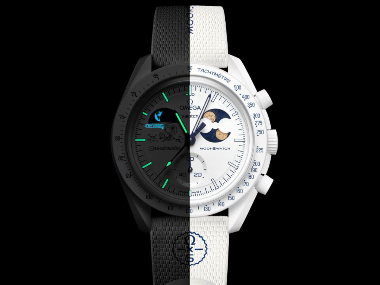
Swatch looked at December and thought: what if a watch could feel like the quiet before snowfall? The MoonSwatch Mission to Earthphase Moonshine Gold “Cold Moon” drops the navy-and-white palette of its predecessor for something bolder in its restraint. Pure white Bioceramic. White crown. White pushers. White strap. The effect is startling, almost clinical, until you notice the blue hands catching light like ice crystals at dawn.

Designer: Swatch

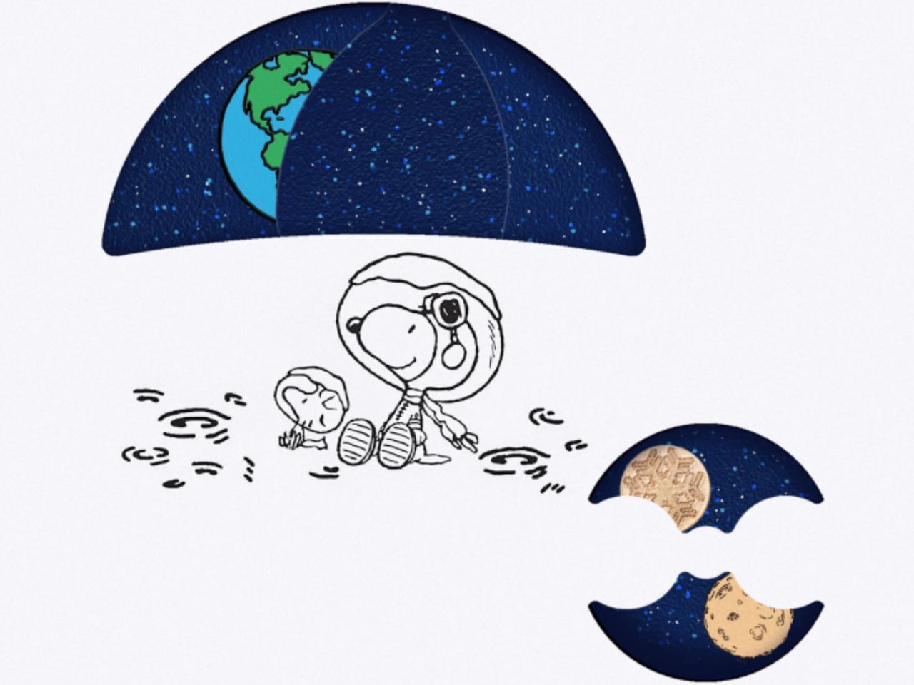
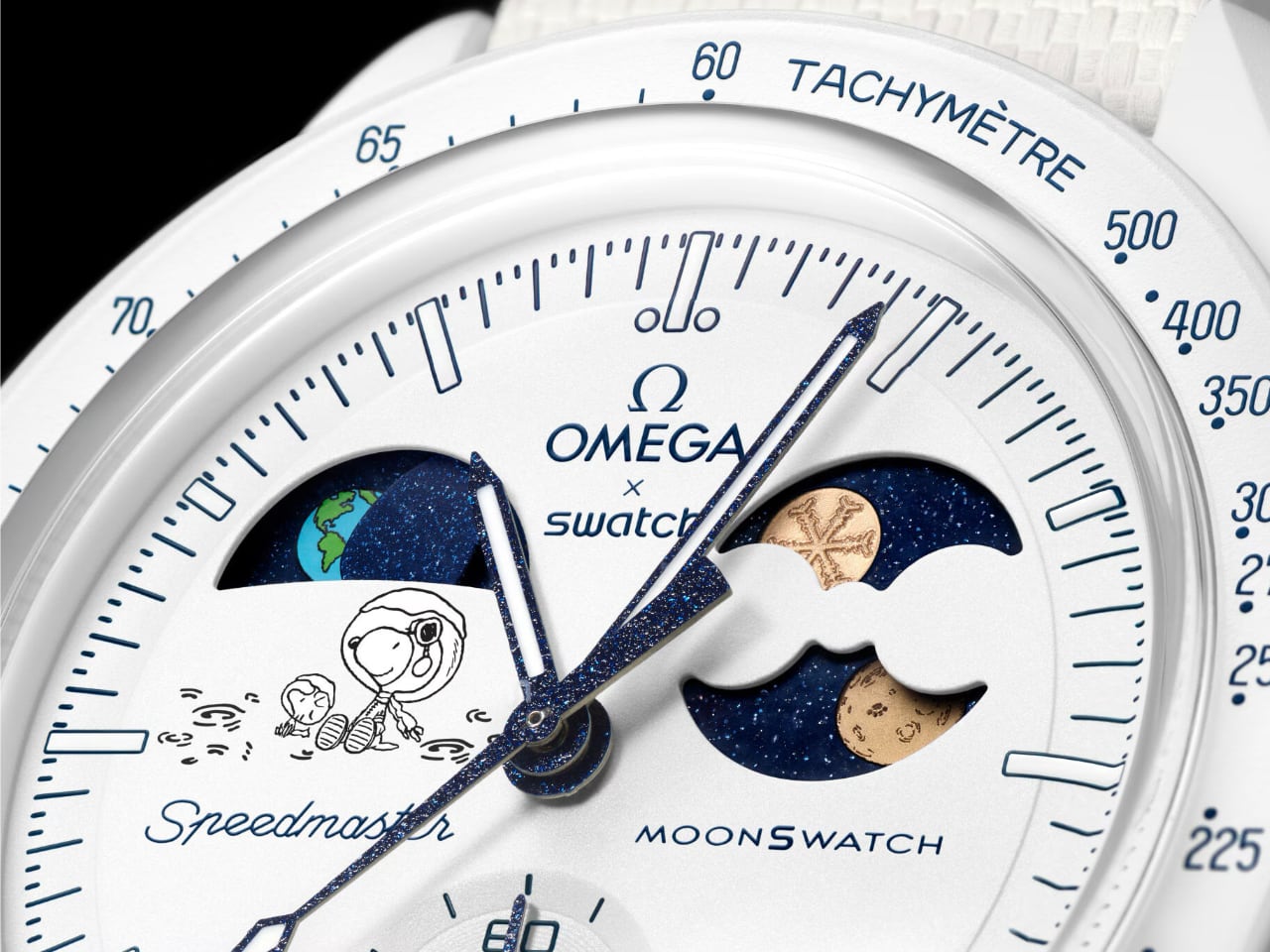
The moonphase disc carries two Moonshine Gold moons, and this is where the Cold Moon earns its place in the MoonSwatch lineup. One wears Snoopy’s face (the beagle’s NASA credentials run deep). The other? A laser-engraved snowflake. And here is the trick: every single snowflake pattern is unique. Swatch somehow turned quartz mass-production into something resembling one-of-a-kind craft. Your Cold Moon is literally not like anyone else’s.

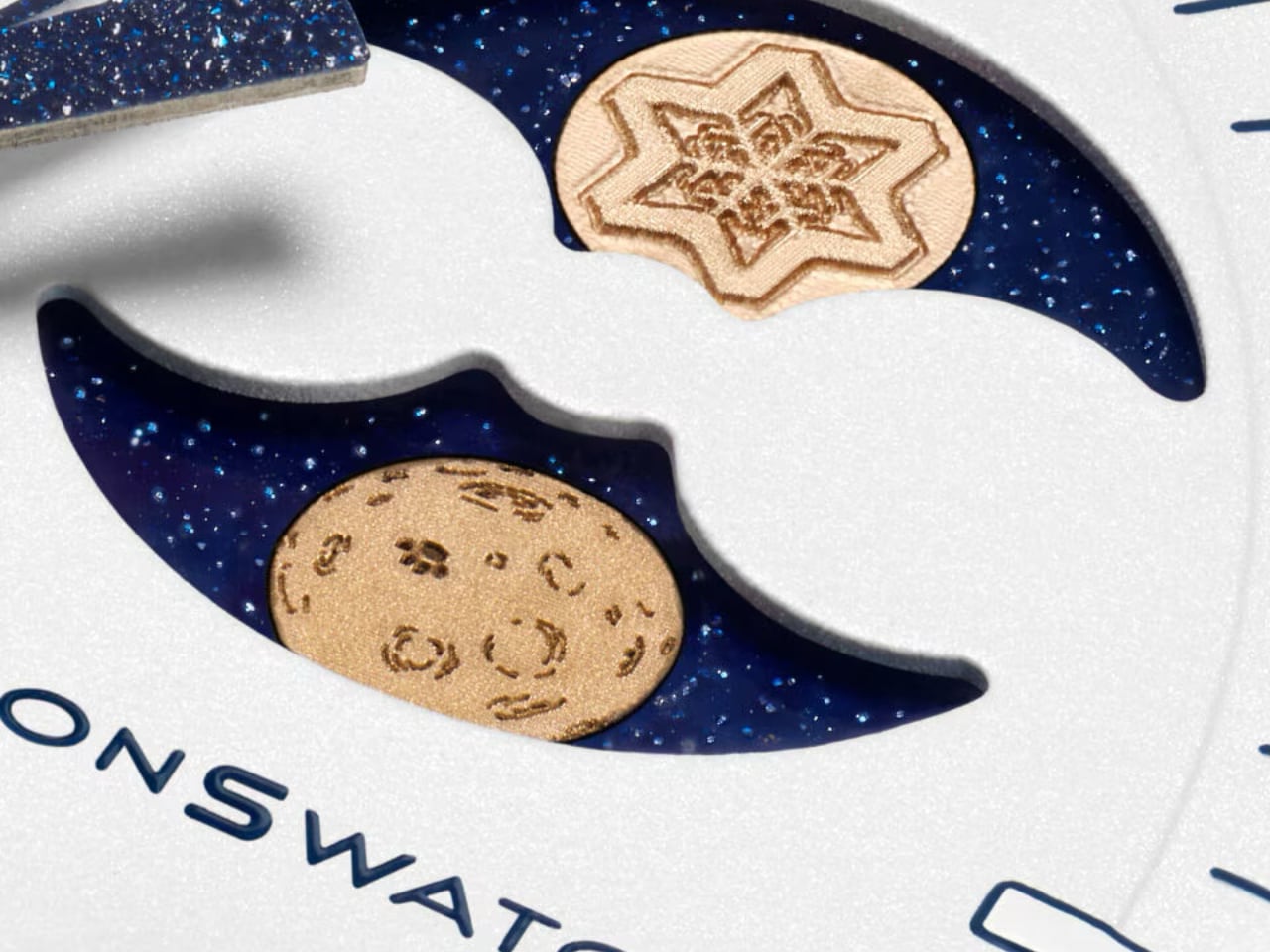
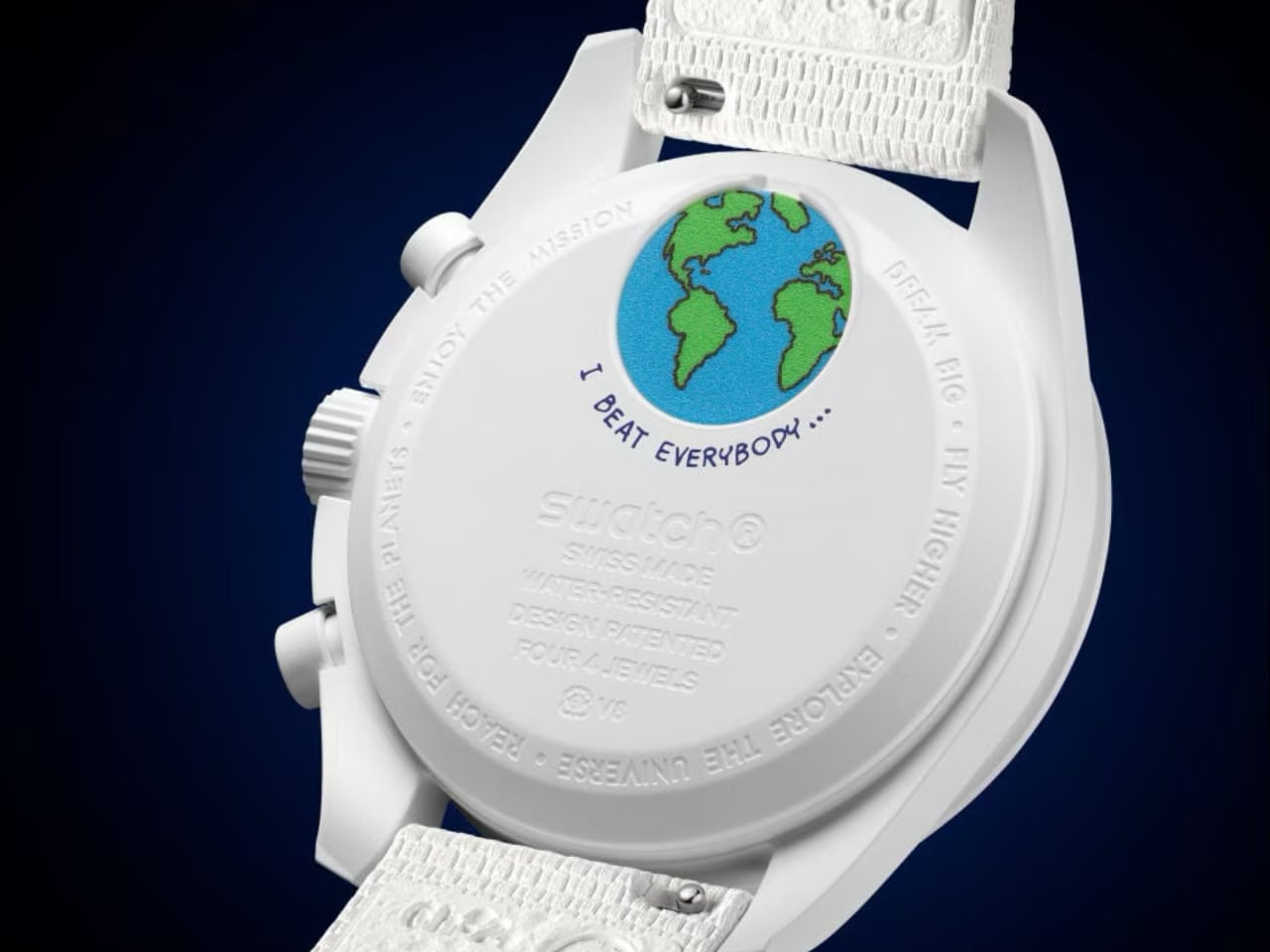
The earth phase complication at 9 o’clock shows our planet as seen from the lunar surface. It cycles backward compared to a traditional moonphase, which is the kind of detail that rewards the people who actually think about what they’re wearing. Below it, Snoopy and Woodstock in winter gear watch Earth spin. Playful? Yes. But also weirdly poetic for a $450 watch.

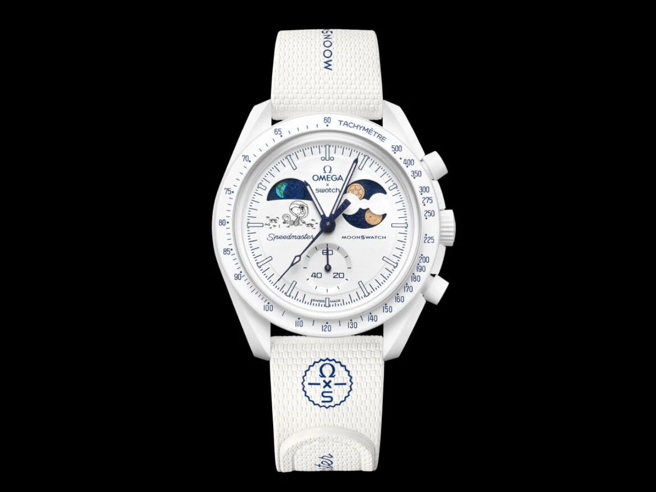
Blue printing appears throughout the design: tachymeter text, dial markings, the “dot over ninety” detail Speedmaster collectors obsess over. Against all that white, the blue reads like ink on fresh paper. Grade A Super-LumiNova on the hour markers glows green in darkness, adding functional contrast to the monochromatic scheme.

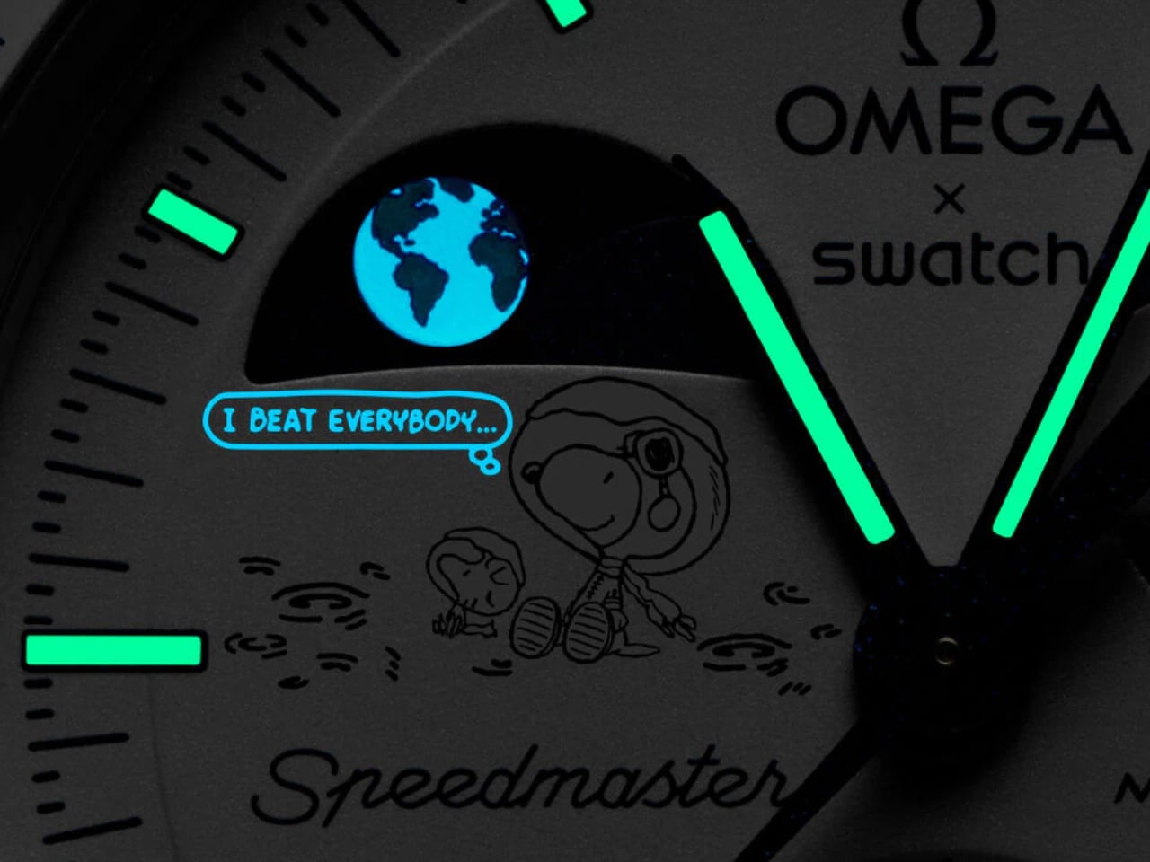
There is also a UV-reactive hidden detail somewhere on the dial. Swatch is not saying what or where, which is exactly the kind of Easter egg that turns casual owners into obsessive hunters. You will need a black light and some curiosity.

The theatrics extend to availability. It launches December 4, 2025 (the actual Cold Full Moon) and stays in stores until the last day of winter. But after launch day, it only goes on sale when snow is falling in Switzerland. Social media will absolutely lose its mind tracking Swiss weather forecasts. Swatch knows exactly what it is doing.

The Design Read

Seasonal watch releases usually fail because they treat “theme” as decoration. Slap some snowflakes on the dial, call it winter, move on. The Cold Moon succeeds because the design team inverted an entire color system. The white Bioceramic case (a plant-derived ceramic-plastic composite with a matte, almost powdery texture) becomes the dominant material story. Everything else, the blue accents, the gold moons, the starry moonphase backdrop, exists in service to that white.

The 42mm case at 13.75mm thick carries the familiar Speedmaster asymmetry. The biosourced crystal has a box shape with an etched “S” at center. None of this is new to MoonSwatch. What is new is how different these familiar elements feel when the entire palette shifts to winter.

It is still a quartz chronograph. It still costs a fraction of the Omega original. But this one might actually be the most considered design the collaboration has produced.

Spec Detail
Case 42mm x 13.75mm, white Bioceramic
Lug-to-lug 47.30mm
Movement Quartz chronograph, earth phase, moon phase
Crystal Biosourced plastic, box-shaped
Water resistance 3 bar
Strap White rubber, Velcro closure

The post Every MoonSwatch Cold Moon Has a One-of-a-Kind Laser-Engraved Snowflake first appeared on Yanko Design.

This Whale Bed Goes From Bedroom to Poolside in Seconds

There’s something absolutely magical about furniture that makes you do a double take, and the Whale Bed by designers Zeng Haojie and Chen Zhe is exactly that kind of piece. At first glance, you might wonder if you’re looking at a luxurious lounger or an art installation, but this Red Dot Award-winning design is actually both and so much more.

Picture this: a bed that looks like a gentle whale gliding through calm waters, complete with fin-like panels extending from both sides. It’s the kind of piece that makes you want to immediately redesign your entire space around it. But beyond its striking ocean-inspired silhouette, the Whale Bed represents something we desperately need more of in the design world: thoughtful innovation that doesn’t sacrifice style for sustainability.

Designers: Zeng Haojie, Chen Zhe

What makes this design so clever is how it manages to pack multiple functions into one sleek package without going overboard on materials. The adjustable backrest is a game changer, letting you shift between different positions whether you’re reading, scrolling through your phone, or settling in for a Netflix marathon. It’s like having a bed, a lounge chair, and a reading nook all wrapped into one streamlined piece.

Those fin-like panels aren’t just there to complete the whale aesthetic (though they absolutely nail that vibe). They serve as practical side extensions that give you extra surface area for whatever you need. Morning coffee? Check. Favorite book? Done. Laptop for those work-from-anywhere days? You got it. It’s the kind of multipurpose thinking that makes small spaces feel more livable and large spaces feel more intentional.

But here’s where things get really interesting. The Whale Bed is crafted from environmentally friendly plant fiber material, which means you can take this beauty from your bedroom to your backyard without worrying about weather damage or environmental impact. Imagine lounging poolside on this stunning piece, or creating an outdoor sanctuary in your courtyard where the lines between indoor comfort and outdoor freedom completely blur. We’re now increasingly conscious about our carbon footprint and the lifecycle of the products we bring into our homes so the Whale Bed’s approach to reducing material consumption is refreshing. The designers didn’t just slap an eco-friendly label on it and call it a day. They actually reimagined the structure itself to minimize waste during production. That’s the kind of innovation that moves the industry forward.

The color shown in the images, a sophisticated ocean blue, feels like an obvious choice that somehow still surprises. It’s calming without being boring, bold without being overwhelming. You can easily imagine it working in a minimalist Scandinavian-inspired bedroom, a boho outdoor oasis, or even a contemporary loft space. That versatility is part of what makes this design so compelling. What really strikes me about the Whale Bed is how it challenges our assumptions about what furniture should be. We’re so used to pieces being designated for one specific room or purpose. A bed stays in the bedroom. Patio furniture stays outside. But why? The Whale Bed asks us to think differently about how we use our spaces and how our furniture can adapt to our lives rather than the other way around.

There’s also something wonderfully playful about the whole concept. In a design landscape that can sometimes take itself too seriously, a bed inspired by the largest creatures in our oceans brings a sense of wonder and whimsy. It reminds us that sustainable design doesn’t have to be austere or preachy. It can be joyful, imaginative, and utterly desirable. For anyone who’s been watching the intersection of sustainability and design, pieces like the Whale Bed represent where we’re headed. It’s not about choosing between beautiful design and environmental responsibility anymore. The best designers are proving we can have both, and they’re doing it with creativity and innovation that makes us excited about the future of our living spaces.

The post This Whale Bed Goes From Bedroom to Poolside in Seconds first appeared on Yanko Design.

Fire-Proof & Forest-Focused: A Holiday Home That Embraces The Australian Bush

High in the canopy of a eucalyptus forest in New South Wales, a holiday home sits perched like an eagle’s nest, looking out over the landscape with quiet confidence. Amongst the Eucalypts, designed by Jason Gibney Design Workshop, reimagines what it means to live within fire-prone Australian bushland, creating a space that embraces nature while respecting its volatile temperament. The clients came to JGDW with a vision that might seem contradictory: they wanted both refuge and connection, a home that could evoke the immersive experience of camping in nature’s vastness while offering protection from its extremes. They sought a place where family and friends could gather communally yet still find moments of solitude within nature’s embrace.

The architectural response is a study in balance. Set high behind the tree line on a steeply sloped site, the house grounds itself along the hill’s natural contour. Its split form creates intimate, private moments while maintaining what the NSW Architecture Awards jury described as “a quiet dialogue between space and landscape beyond.” This isn’t a home that dominates its setting or shrinks from it. Instead, it unfolds to meet the upper realm of the forest, positioning itself as both observer and participant in the landscape.

Designer: Jason Gibney Design Workshop

Material choices reflect the reality of building in bushfire country. The palette is deliberately raw and robust: plywood, lightweight cladding, and metal sit comfortably within the remote setting, offering low maintenance and crucial protection from fire. These aren’t just practical selections. They’re materials that age gracefully in the elements, developing character rather than requiring constant intervention.

What sets this project apart is its embrace of impermanence. The operable facade allows the home to open and close to the elements, transforming its relationship with the outdoors. Outdoor washrooms and a loose-fit interior reinforce this camping-inspired approach, where the boundaries between inside and outside become negotiable rather than fixed. The architecture suggests a way of living that’s more adaptable, more responsive to seasonal changes and the rhythms of nature.

Built by Midcoast Construction on Worimi land, the home earned a Commendation for Residential Architecture at the 2025 NSW Architecture Awards and recognition in the Sustainable Architecture category at the National Architecture Awards Program. The jury commended the design team for creating a home that addresses the pressing question of how to build responsibly in fire-prone landscapes. Photography by Justin Alexander captures the home’s unique position, revealing how it sits suspended among the eucalypts, neither floating above nor buried within the forest but existing in comfortable coexistence with it.

As climate change intensifies fire seasons across Australia, projects like Amongst the Eucalypts offer more than aesthetic pleasure. They demonstrate that building in bushland doesn’t require choosing between connection to nature and protection from it. The home stands as evidence that thoughtful design can create spaces of genuine sanctuary and contemplation, places where engaging with the landscape occurs with the solace of protection from the extremes.

The post Fire-Proof & Forest-Focused: A Holiday Home That Embraces The Australian Bush first appeared on Yanko Design.

Instagram mandates total return to office for employees in 2026

Instagram employees will be back at their desks full time next year. Beginning February 2, workers with the social media network will be expected to spend five days a week working in person in offices. Instagram leader Adam Mosseri announced the change in an internal memo first reported by Alex Heath's Sources newsletter. "It's clear we have to evolve," he told the staff, also closing with the note that "2026 is going to be tough." 

The full return to office mandate applies to Instagram's US employees in offices with assigned desks. The memo allowed that people will still be able to work remotely "when you need to," but gave an open-ended call to "use your best judgment" about when to take advantage of that flexibility. 

Many tech companies have adopted a hybrid approach to office work in the years following the COVID-19 pandemic. For instance, Meta instituted a policy of three days a week spent in the office in 2023. Although the messaging from executives insists that in-person work has important benefits, employees have often resisted the shift back to old ways. 

Mosseri outlined other planned changes intended to make the social media company "more nimble and creative." One shift that's probably more welcome than the return to office is to scale back recurring meetings. Any recurring meetings will be canceled every six months unless they're deemed "absolutely necessary." He also plans the team to have more prototypes of product overviews rather than decks, and a faster process for unblocking and decision-making.

This article originally appeared on Engadget at https://www.engadget.com/social-media/instagram-mandates-total-return-to-office-for-employees-in-2026-212738225.html?src=rss

These Lightweight Foam Chairs Could Finally Fix Public Seating

You know that feeling when you’re at an outdoor concert and your back is screaming after 30 minutes on those unforgiving metal benches? Or when you’re at a community event, desperately wishing you could just shift that heavy concrete seating a few feet over? Yeah, BKID Co clearly knows that feeling too, and they’ve designed a concept that could potentially solve it.

Meet Form&Foam, a conceptual modular seating system that’s basically the opposite of everything we’ve come to expect from public furniture. Instead of being rigid, heavy, and impossible to move without a forklift, these proposed chairs would be soft, lightweight, and surprisingly adaptable. The secret ingredient? EPP material, which stands for expanded polypropylene if you want to get technical about it.

Designer: BKID Co

What makes EPP so special is its trifecta of practical benefits. It’s shock-resistant (meaning it can take a beating and bounce right back), it’s genuinely soft to sit on, and it weighs next to nothing. That last part is crucial because it would transform these chairs from static objects into something more like building blocks for public spaces. Anyone could pick one up and rearrange the seating configuration on the fly.

The design comes in multiple variations, but the star of the show is the “Lean” model, which has this wonderfully relaxed recline to it. Looking at the concept images, you can immediately tell this isn’t your grandma’s folding chair. The textured surface has this almost fuzzy, pixelated appearance in vibrant colors (that speckled red is particularly eye-catching), and the form itself curves in ways that actually seem to understand how human bodies work.

Here’s where the concept gets really interesting. BKID Co isn’t just proposing another chair design. They’re imagining an entire philosophy about how public seating should work. The idea is that different events call for different postures and different social dynamics. Their “Sit” chair would encourage upright, formal posture, perfect for city council meetings or lecture-style events. Meanwhile, the “Lean” version invites you to kick back a bit, ideal for casual concerts or relaxed community gatherings.

This isn’t just aesthetic flexibility; it’s behavioral design in action. The furniture would literally shape how people interact with spaces and with each other. Want to create a more formal atmosphere? Bring out the upright chairs. Hosting a laid-back music festival? Break out the lean-back models. It’s public space planning that actually thinks about the humans using the space.

The practical benefits extend beyond just comfort and flexibility. Traditional public furniture has some serious maintenance issues. Wooden benches rot, metal rusts, and concrete cracks. All of that means constant repairs and replacements, which drain municipal budgets. EPP foam, on the other hand, is incredibly durable and weather-resistant. It won’t rust, rot, or splinter. And because it’s shock-absorbent, it’s actually pretty difficult to damage in the first place.

There’s also something refreshingly playful about the design concept. Public furniture tends to be brutalist and unwelcoming, partly by design (hello, hostile architecture). But Form&Foam takes the opposite approach. The soft, tactile quality and bright colors make these pieces feel approachable and friendly. They look like something you’d actually want to sit on, not something designed to make you uncomfortable after 15 minutes.

The modularity factor shouldn’t be underestimated either. These chairs could be arranged and rearranged to create different seating configurations. Line them up in rows for a presentation, cluster them in circles for discussions, scatter them casually for an open-space vibe. The lightness of the material means event organizers (or even attendees) could reshape the space as needs change throughout the day.

What BKID Co has envisioned here feels like a small but significant rethinking of how we do public spaces. It asks why public furniture needs to be permanent, heavy, and uncomfortable when it could be adaptable, accessible, and actually pleasant to use. In a world where urban designers are increasingly thinking about how to make cities more livable and human-centered, concept proposals like Form&Foam feel like a step in exactly the right direction.

Whether this concept makes the leap from design portfolio to actual parks and plazas remains to be seen. But sometimes the most innovative design isn’t about reinventing everything from scratch. It’s about taking something we all use and asking, “But what if it didn’t suck?” Form&Foam asked that question about public seating, and the answer turns out to be pretty compelling.

The post These Lightweight Foam Chairs Could Finally Fix Public Seating first appeared on Yanko Design.

India will require a state-owned cybersecurity app to be installed on all smartphones

Telecom regulators in India have reportedly asked smartphone manufacturers to preload a state-owned cybersecurity app that cannot be deleted onto all new devices, and push the app to existing devices via a software update. Reuters reports that, according to a non-public government order sent to manufacturers, Apple, Samsung, Xiaomi and others were given 90 days to comply.

The app in question is called Sanchar Saathi (meaning Communication Companion), and is primarily aimed at fraud prevention with tools that allow users to report and lock lost or stolen devices. According to Reuters, the app has a reported 5 million downloads since its release and has helped block 3.7 million stolen or lost phones in India. An additional 30 million reportedly fraudulent connections have been terminated using the app.

"If I lose my phone, immediately the app is on my phone which I can then register and make sure my phone is not used by any fraudulent individual. It's a step to protect the consumer," Telecom Minister Shri Jyotiraditya M. Scindia said in an interview with CNBC. The Minister said the installation order should be issued in the "next couple of days."

How smartphone manufacturers will respond remains to be seen. Apple, for its part, doesn't have the strongest history of standing up to governments that oversee large markets for the company. Just a few weeks ago Apple removed two of the largest LGBTQ+ dating apps from the Chinese App Store at the government's request. In 2019 the iPhone maker removed a Hong Kong protest app following pressure from Chinese authorities. The company has also become increasingly entangled with India as it looks to move US-bound iPhone production to the country.

This article originally appeared on Engadget at https://www.engadget.com/cybersecurity/india-will-require-a-state-owned-cybersecurity-app-to-be-installed-on-all-smartphones-192305599.html?src=rss

Marques Brownlee’s controversial Panels app is shutting down

Marques Brownlee's Panels app is shutting down on December 31. The creators blame this on a shifting development team, as they weren't able to "bring in collaborators who shared our passion and vision, and we weren't able to find the right fit."

Annual subscribers will get a refund when the app shutters and any downloaded wallpapers will still be available to use. Additionally, the developers will be making the app's code available to "allow anyone to build on what we started."

Brownlee, a popular tech YouTuber who goes by MKBHD, introduced the Panels app back in 2024. It sailed to the top of the various app charts, for a time, but was mired by controversy. It's basically just a marketplace for smartphone wallpaper images, but one that requires a steep subscription price for real access. Angry consumers also complained that the app was plagued by intrusive ads and mandated intrusive data-tracking permissions.

MKBHD tried to assuage concerns by introducing a cheaper subscription tier and improving the free experience. However, it looks like the damage was done. Panels was a tough sell even without the frustrations, as not that many people want to spend real money on smartphone wallpapers. Maybe that idea would've flown when smartphones were still new and exciting, but that ship sailed over a decade ago.

This article originally appeared on Engadget at https://www.engadget.com/apps/marques-brownlees-controversial-panels-app-is-shutting-down-192224468.html?src=rss

New electrostatic car speakers create a massive soundstage

Car audio has operated under a fundamental constraint for decades: speakers need cones, cones need depth, and depth requires space that automotive interiors simply cannot spare. Warwick Acoustics, a UK-based hi-fi company known for headphones that cost as much as a used car, believes it has solved this problem by abandoning cone speakers entirely. The company’s electrostatic speaker system for automobiles measures just 1mm thick and weighs 90% less than conventional units, yet Warwick claims it produces a soundstage that feels ten times larger than the physical cabin.

Designer: Warwick Acoustics

The technology relies on electrostatic principles rather than the traditional cone-and-voice-coil arrangement found in virtually every car speaker today. An ultra-thin, electrically charged diaphragm sits sandwiched between two perforated metal plates that function as electrodes. When audio signals pass through these plates, they generate a varying electrostatic field that pushes and pulls the diaphragm, producing sound waves. This approach eliminates the heavy magnets and moving coils that make conventional speakers bulky and placement-dependent.

The Physics of Perceived Space

The perceived soundstage expansion stems from how electrostatic speakers generate planar, or near-flat, sound waves. According to Warwick Acoustics CCO Ian Hubbard, these planar waves initially sound flat, lacking the soaring highs and booming bass of traditional speaker output. However, human hearing interprets this flatness as distance. “We then perceive this as a sound that has begun further away, in some cases up to 30 meters from our ears, and thus representative of a venue much bigger than the physical size of the car cabin,” Hubbard explains. The brain essentially interprets the acoustic characteristics as originating from a concert hall rather than a cramped interior.

This perceptual trick addresses a persistent limitation of automotive audio. Sound waves naturally flatten and spread as they travel through air, and human ears detect both directionality and apparent distance. Inside a car, speakers positioned in door panels and dashboards create a compressed listening experience because the sound has nowhere to go. Warwick’s approach tricks the auditory system into perceiving space that physically does not exist.

The speaker’s minimal profile enables placement options that conventional units cannot achieve. Warwick suggests mounting points in A-pillars and roof linings, positioning audio sources at or above ear level rather than below it. This elevated placement further enhances the perception of listening to music in a large space, since concert halls and performance venues typically feature speakers or acoustic sources above the audience rather than at floor level.

Material and Manufacturing Advantages

Beyond the acoustic benefits, Warwick’s electrostatic speakers contain no rare earth elements, a notable departure from conventional speaker construction that relies on powerful permanent magnets. The company manufactures its automotive speakers entirely from upcycled and recycled materials, addressing sustainability concerns that increasingly influence automotive purchasing decisions. While the environmental impact of a car’s audio system ranks low on most buyers’ priority lists, the material choices eliminate supply chain vulnerabilities associated with rare earth sourcing.

The thin profile and light weight also translate to potential reductions in digital signal processing requirements. Warwick claims the speed and accuracy of electrostatic speaker response reduces the need for electronic manipulation of audio signals, potentially allowing automakers to use smaller, less power-hungry DSP components. Whether this translates to meaningful cost or efficiency gains at the vehicle level remains to be seen, but the company presents it as an additional benefit beyond pure audio quality.

Market Timing and Production Reality

Warwick Acoustics has been developing this automotive application for years, and the technology appears close to production readiness. The company confirms that a “global luxury car maker” will debut the electrostatic speaker system in a vehicle sometime in 2026, though it declines to identify the manufacturer. Given Warwick’s existing reputation in high-end audio (the company’s headphone and amplifier combinations sell for approximately $50,000), the partnership with a luxury automotive brand aligns with the company’s market positioning.

The luxury segment makes strategic sense for initial deployment. Premium car buyers expect audio systems that justify six-figure vehicle prices, and the ability to market a ten-times soundstage expansion provides compelling differentiation. Whether the technology eventually scales to mainstream vehicles depends on manufacturing costs and whether the perceived audio benefits translate across different listening preferences and cabin configurations.

The post New electrostatic car speakers create a massive soundstage first appeared on Yanko Design.

Shopify was down for much of Cyber Monday

Here’s hoping the retailers offering tasty Cyber Monday deals that caught your eye aren’t having trouble with Shopify. The ecommerce platform is experiencing some issues. According to a support page, some merchants were having trouble logging into the Shopify platform, which was experiencing outages with the checkout and admin systems. Shopify’s point-of-sale (POS), API and mobile and support systems also saw “degraded performance.”

Editor's note (on December 2 10:35AM ET): The outage appears to have been resolved, with Shopify posting on X at 6:11PM yesterday that it “had a system degradation that has now been mitigated.” The statement further clarified that checkout and storefronts remained online during the outage, while admin interfaces were “temporarily unavailable for some merchants.” Also, the outage “briefly extended to POS but was quickly resolved.”

In an update at 12:39PM ET, Shopify wrote “We are continuing to investigate and apply mitigations for the issues with accessing Admins and POS systems.” It added “Some merchants may also see an issue with POS checkouts, due to not being able to access POS systems.”

At 2:31PM ET, the company posted an update to its status page, saying “We have found and fixed an issue with our login authentication flow, and are seeing signs of recovery for admin and POS login issues now. We are continuing to monitor recovery.” You might start to see some services go back to normal, and it should hopefully not impact your holiday shopping too much.

Shopify said in a blog post just last week that it powers 12 percent of ecommerce in the US. Brands including Netflix, Mattel, Supreme, Glossier and Converse are among those that use the platform.

When asked for more details about the outage, Shopify directed Engadget to its status page as well as a tweet posted at 10AM that read, “We're aware of an issue with Admins impacting selected stores, and are working to resolve it.”

Somewhat ironically, that very account posted on November 27 that 56 seconds was the average amount of wait time the prior week and that its team was ready to “keep that pace” for the Black Friday/Cyber Monday shopping rush. It has been hours since the outage was first reported this morning.

Update, December 1 2025, 2:48PM ET: This story has been updated to include Shopify’s latest post about resolving a login authentication issue, as well as its tweet from November 27.

Update, December 2 2025, 10:35AM ET: This story has been updated to include an Editor’s note with the latest on the outage, which seems to mostly have been resolved.

This article originally appeared on Engadget at https://www.engadget.com/big-tech/shopify-was-down-for-much-of-cyber-monday-180958407.html?src=rss

A Cordless Kitchen Processor Soft Enough to Leave Out All Day

If you cook in a small kitchen, you already know the choreography. The toaster gets shoved into a cabinet so the kettle can come out. The air fryer lives on the floor of a pantry. Power cords drape across the counter like tripwires. It is domestic Tetris, and it rarely looks good.

That is the quiet problem the Food Sitter Cooking Processor, designed by Qi Liu, is trying to solve. On paper it is a cordless, multifunctional food processor that chops, blends, and whisks. In reality it feels more like a friendly little gadget that wants to restore some visual calm to your kitchen.

Designer: Qi Liu

The first thing that stands out is the form. Instead of the usual squat base with a forest of buttons, this processor reads almost like a compact handheld vacuum crossed with a milk frother. A clean cylinder holds the motor and battery, with a straight handle projecting from the side and a clear jar below. The lines are smooth and rounded, and the whole object looks soft without being cute for the sake of it.

Color does a lot of the emotional work here. The palette of cream white, gentle gray, and lemon yellow is closer to lifestyle accessories than industrial appliances. These are the kinds of colors you expect from a Scandinavian lamp or a wireless speaker, not a device that pulverizes garlic. That choice is intentional. Food Sitter positions itself as a Korean kitchen lifestyle brand with the motto “Less Effort, More Joy,” and the processor fits that promise. It is designed to sit out in the open without visually shouting.

Cordless power is the other big shift. The processor has a built in battery and charges via USB, which instantly changes how and where you use it. No cord means you can move from counter to dining table to balcony without hunting for an outlet. It is easy to imagine it on a picnic table, pureeing salsa next to a portable speaker, or on a camping trip where it turns into a tiny off grid prep station. The portability feels closer to a tech gadget than a traditional kitchen tool, and that is part of the appeal.

Functionally, the product leans into modularity. Interchangeable blades and accessories cover three core jobs chopping, blending, and whisking. In design terms it is a single platform with multiple behaviors. Instead of owning a separate chopper, mini blender, and hand whisk, you swap attachments on one compact base. That reduces clutter and, importantly, visual noise. One small cylinder on your shelf looks a lot better than three unrelated appliances with three different design languages.

The interaction details are refreshingly straightforward. There is a clear top hole for feeding ingredients, paired with a small stick that nudges food down toward the blades. It is almost analog in spirit. You are still present in the process, but the tool does the heavy lifting. The controls are minimal, with a small display for on off and speed, and a single main button. It feels closer to using a simple audio player than programming a blender.

Cleaning, the step that often kills our enthusiasm for kitchen gadgets, is handled with the same clarity. Every food contact part is designed to come apart quickly. Blade, jar, and lid separate for a rinse under the tap, no awkward crevices or trapped onion pieces. That kind of invisible design work is what makes a product move from novelty to daily habit.

What makes this project interesting beyond the kitchen is how it merges three worlds. From a design perspective, it borrows the soft minimalism of contemporary home objects. From tech, it adopts battery power, portability, and a restrained interface. From pop culture, it taps into our current love of “tiny living” and curated domestic aesthetics. It is the kind of object you can imagine on Instagram next to a latte and a stack of cookbooks, but it also has the chops to justify its presence.

For modern homeowners especially those living in apartments or shared spaces that blend work, life, and cooking into one room this balance matters. We want tools that earn their footprint. The Food Sitter Cooking Processor feels like a response to that desire. It is compact, visually calm, and flexible enough to support both weekday meal prep and weekend kitchen experiments. In the end, this is not just another food processor. It is a small argument for a different kind of kitchen where technology is cordless and quiet, aesthetics are part of function, and the tools that help you cook are pleasant enough to leave out in plain sight.

The post A Cordless Kitchen Processor Soft Enough to Leave Out All Day first appeared on Yanko Design.