A Coat Rack With 16 Hooks That Disappear When Not in Use

Every entryway tells a story, and most of the time, it’s one you’d rather not have visitors read. A coat draped over another coat. A bag looped onto an already-occupied hook. A scarf hanging off the edge of something that was never meant to hold it. We’ve all been there, and for some reason, we keep buying the same row-of-hooks solution as if more hooks were ever really the answer.

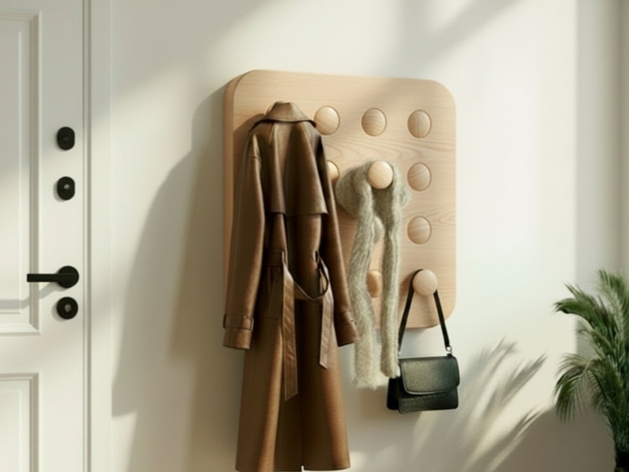
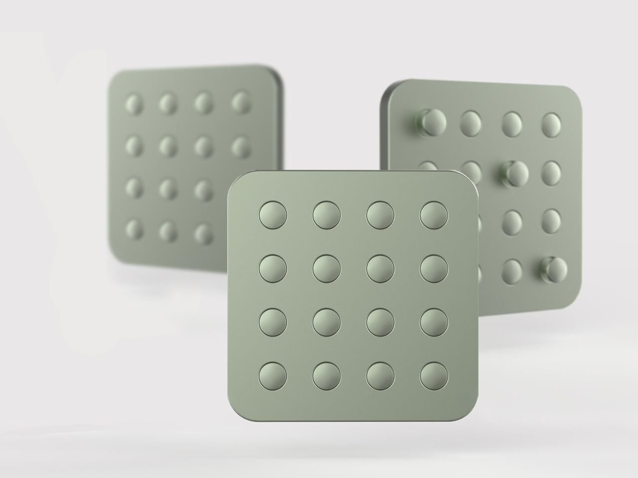
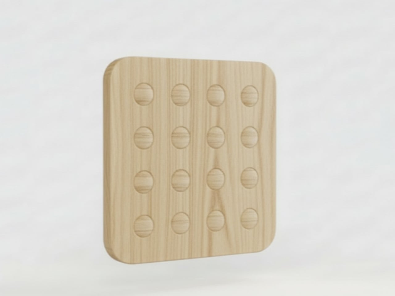
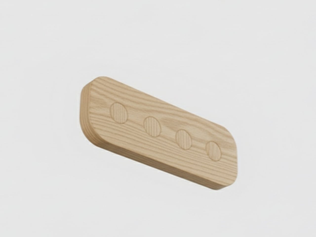
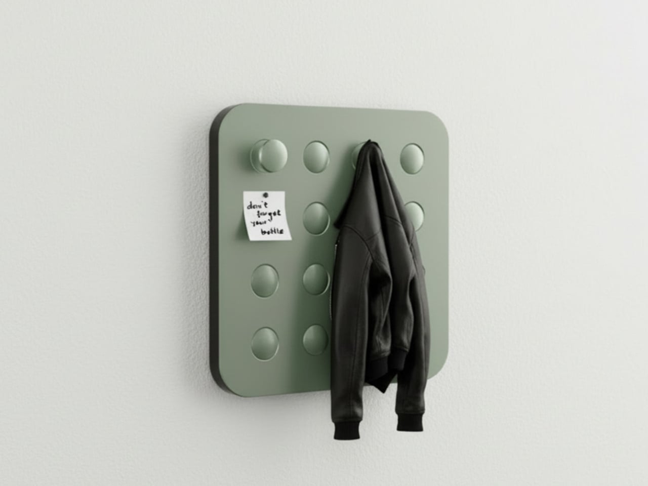
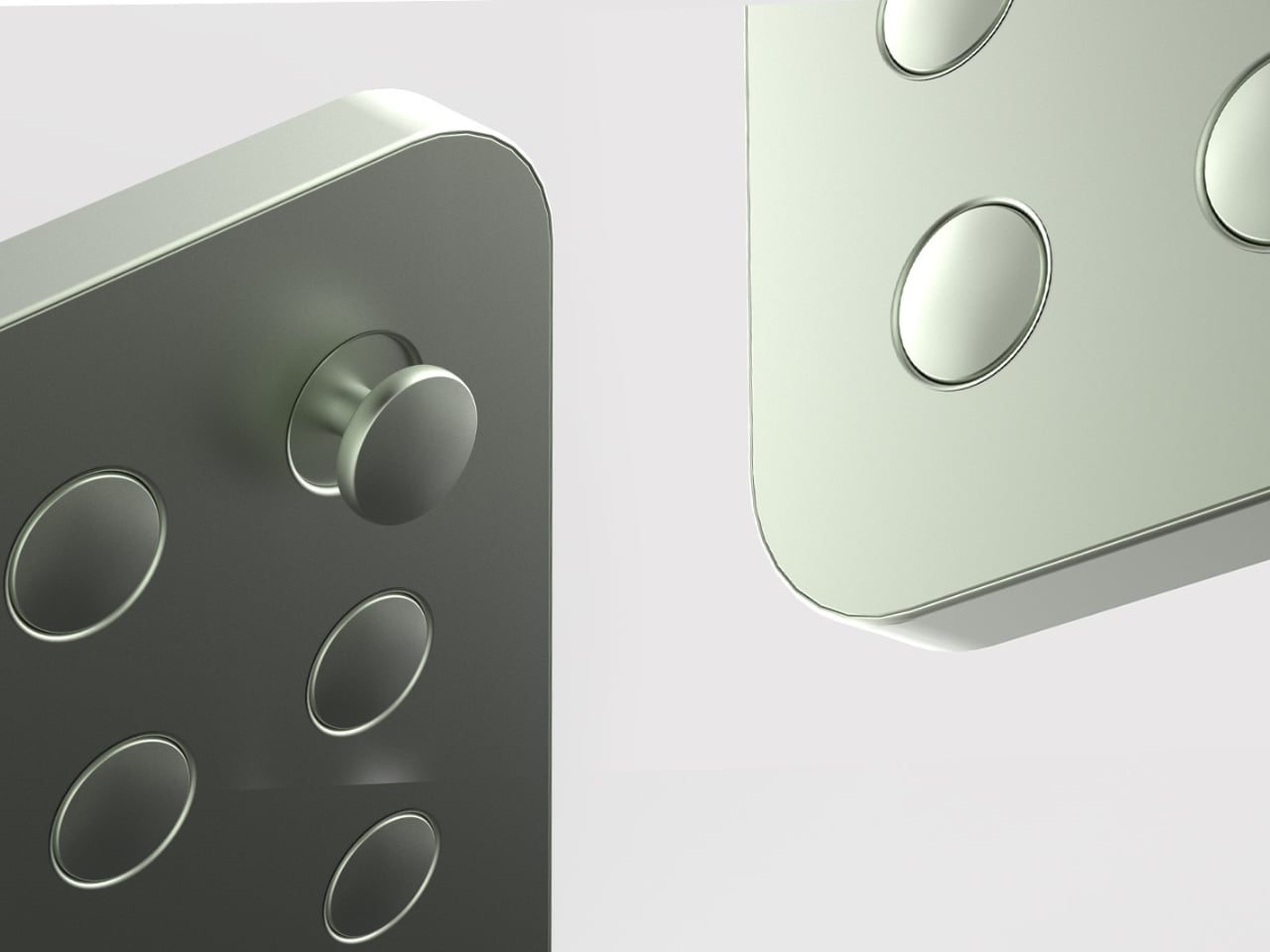
That’s what makes Elif Bulut’s coat rack concept so quietly radical. At first glance, it looks more like a piece of wall art than storage hardware. It’s a square panel with 16 circular elements arranged in a neat 4×4 grid, mounted completely flush against the wall. No hooks jutting out. No protruding arms. Just a flat, calm surface sitting there, completely unassuming, until you actually need it.

Designer: Elif Bulut

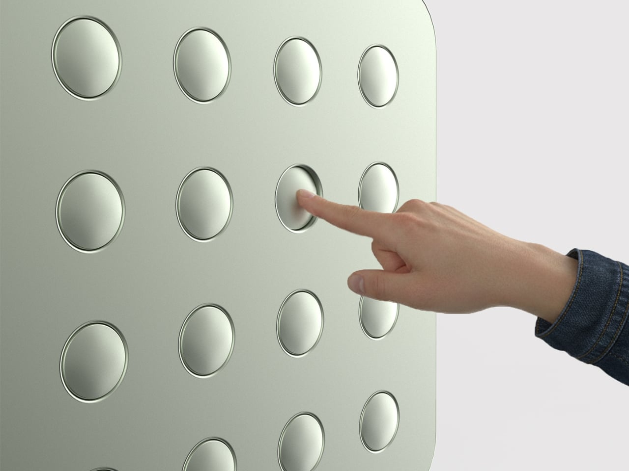
The concept is push-to-use. Press one of those circles and it extends outward into a hanging point. Press it again and it retreats back into the panel. Each circle is independently controlled, which means you decide how many hooks you want, where they go, and how many stay dormant on any given day. It’s the kind of interaction that feels satisfying in the same way clicky keyboards or popping bubble wrap does. Tactile, deliberate, and oddly fun.

1

I’ll admit that when I first saw this, my brain went straight to “pop it” fidget toys. And I don’t think that’s an accident. Bulut is working with a visual and tactile language that’s immediately familiar, maybe even nostalgic, and redirecting it toward something genuinely useful. That’s a smart design move. When a product taps into something people already instinctively want to touch, you’ve already won half the usability battle before anyone reads a word of product copy.

The design is grounded in a real observation: people pile coats on top of each other even when there are open hooks nearby. The problem was never really about the number of hooks. It was about how fixed, static structures force you to adapt to them instead of the other way around. A coat rack that responds to you, that only extends what’s needed and retreats the rest, changes that relationship entirely. The wall stays clean. The space stays calm. The hooks are there when you call for them, and invisible when you don’t.

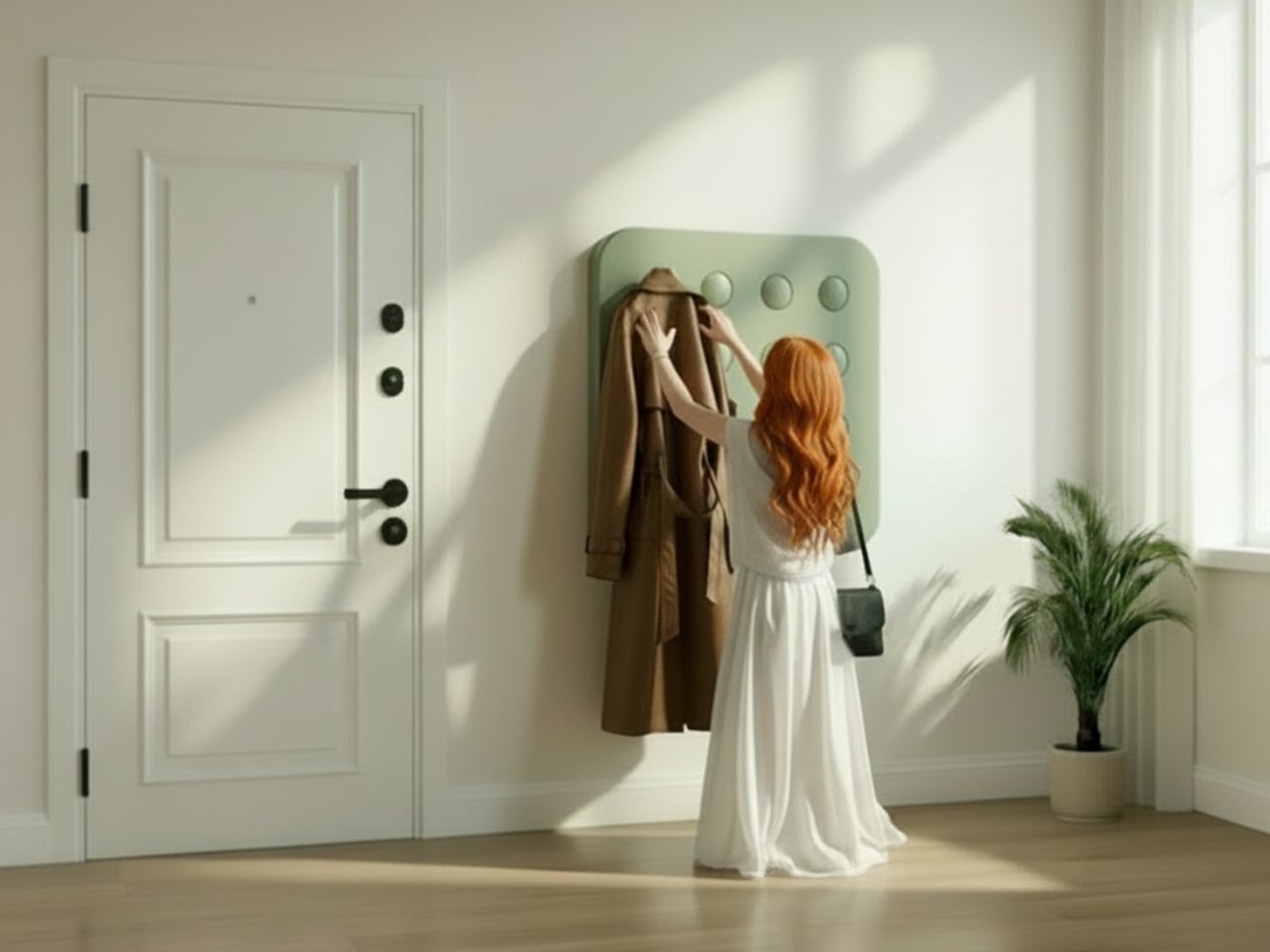
The entryway has been chronically undervalued in home design for a long time. It’s the first thing you see when you come home and the last thing you interact with before you leave. Bulut is clearly thinking about that rhythm. One of the concept renderings even shows a small sticky note pinned to the panel, reading “don’t forget your bottle.” That single detail hits differently than any technical specification could. It grounds the whole concept in the messy, forgetful, real way people actually move through their mornings, and it signals that the designer is paying attention to life, not just surfaces.

What also works is the restraint. Bulut hasn’t tried to make this product do too much. It doesn’t track your habits, connect to an app, or announce itself as a smart home device. It’s just a better, quieter version of something we’ve had for decades. The intelligence is in the form, not the firmware. In a design landscape where everything is trying to become a gadget or justify itself with an AI feature, that choice is worth noticing.

Whether this moves from concept to production is a different conversation, but as a piece of industrial design thinking, it lands. It asks a question that sounds simple but clearly wasn’t: what if your coat rack only took up as much space, visually and physically, as you actually needed it to? The answer turns out to be a flat panel that waits patiently on your wall, ready to show up the moment you press it. That’s not a small idea dressed up in minimal aesthetics. That’s just good design.

The post A Coat Rack With 16 Hooks That Disappear When Not in Use first appeared on Yanko Design.

Meet the World’s First Door Grown From Fungi, Not Cut From Wood

What if the door you walk through every day was grown from fungi? Danish mycelium company Rebound and architecture studio Det Levende Hus have partnered to create what they claim is the world’s first mass-produced interior door with a core cultivated from fungal mycelium. Currently in the prototype phase, the door is part of a broader collection of bio-based interior and sliding doors designed for modern living spaces, and it may quietly redefine what architectural materials can be.

The concept is straightforward but radical. Rebound cultivates the fast-growing root structure of fungi inside a mould, producing a rigid, lightweight panel with natural sound-absorbing qualities. That mycelium core is then enclosed within a timber frame built from reclaimed and surplus wood, including offcuts sourced from Danish flooring manufacturer Dinesen, meaning the door carries minimal material waste from start to finish.

Designer: Rebound & Det Levende Hus

Rebound co-founder Jon Strunge sees this as a direct challenge to the construction industry’s dependence on slow-growing hardwoods. “We wanted to demonstrate how regenerative, high-performance mycelium-based materials open opportunities for new, innovative, and scalable building components,” he said. The growing process takes roughly two weeks and is designed to scale industrially, making these doors a production-ready proposition rather than a one-off experiment.

What makes the design particularly noteworthy is its adaptability. Colour and surface texture can be altered during the growing process itself, removing the need for post-production finishing. The current prototype presents a smooth, silky surface, but the material can shift in tone and can also be finished with a layer of clay for a warmer, earthier aesthetic.

Structural performance was equally prioritised. A bio-based layer incorporated during the growing process stiffens the door and improves fire resistance, a bio-welding method that adds reinforcement without glue or additional manufacturing stages. The door was also designed to comply with current building standards for private homes, particularly around fire and moisture resistance, making it a credible candidate for real construction.

The first real-world application will be at Kaerhytten, a low-impact housing project in Ramloese, Denmark, designed by architect Jens Martin Suzuki-Højrup, scheduled for completion in 2026. The prototype also features a door handle by architect Bjarne Hammer for Danish brand Randi, the Moom handle cast from recycled seashells, adding a tactile detail that mirrors the door’s material ethos. Looking ahead, Rebound and Det Levende Hus are expanding into mycelium-based acoustic wall panels and ceilings. As Suzuki-Højrup put it, “It’s about how natural materials can transform our experience of space, visually, acoustically, even emotionally.”

The post Meet the World’s First Door Grown From Fungi, Not Cut From Wood first appeared on Yanko Design.

PSA: T-Mobile customers have a week to sign up for a free year of MLB.TV

Today marks the start of the 2026 baseball season and in what has sort of become an annual tradition, T-Mobile is once again offering a free subscription to MLB.TV.

In order to take advantage of the deal, T-Mobile customers simply need to log into the T Life app, navigate to the Benefits tab and then hit Redeem after clicking the banner for a free season of MLB.TV. From there, you just need to download the latest version of the MLB app to your mobile device and sign in or create an account. That said, this is a time-limited offer, so if you want the ability to stream regular season baseball for free, you’ll need claim the deal prior to March 31 at 4:59 AM ET. For anyone on a different carrier, this may be enough time to switch providers and still get in on the savings.

Unfortunately, MLB.TV is subject to blackouts and market restrictions, so depending on where you live and where your favorite team is playing that day, you may not be able to catch every game. Sadly, this includes tonight’s 8:05 PM ET matchup between the New York Yankees and the San Francisco Giants, which is streaming exclusively on Netflix. Even so, with a one-year subscription to MLB.TV currently going for $150, this is one of the best perks available from any of the big cellular carriers.

In addition to full season of games, an MLB.TV subscription also includes access to a collection of baseball documentaries, game streams from previous years, World Series films, highlights, news and more. And with over 1.25 million customers having redeemed last year’s offer, this is potentially one of T-Mobile’s biggest offers of the year, with the company claiming to have delivered more than $1 billion in savings since it first started running the promotion 10 years ago in 2016.

This article originally appeared on Engadget at https://www.engadget.com/entertainment/streaming/psa-t-mobile-customers-have-a-week-to-sign-up-for-a-free-year-of-mlbtv-211306444.html?src=rss

Leaked Honor 600 Pro looks a lot like the iPhone 17 Pro, but with a much bigger battery

I have to hand it to Honor, they are consistent. When I wrote about the Magic8 Pro Air and its striking similarity to the iPhone Air, I thought we had seen the peak of their “inspiration.” It turns out that was just the warm-up act. The main event has arrived in the form of the Honor 600 and 600 Pro, and this time they have perfectly mimicked the iPhone 17 Pro. The new renders, courtesy of WinFuture, show a design that lifts every key element from Apple’s latest flagship. The full-width camera bar, the arrangement of the lenses, the flat metal frame, and even the color options are all present and accounted for. It’s a remarkable feat of reverse-engineering that feels both impressive and completely shameless.

What makes this strategy so fascinating is that Honor isn’t just making a cheaper clone. They are using the familiar, market-tested design as a vessel for a totally different philosophy. The Honor 600 is expected to ship with a 200MP camera and a 9,000mAh battery, specs that are practically alien to Apple’s ecosystem. It’s a phone designed to look like an iPhone from a distance but to function like an endurance-focused Android powerhouse up close. Honor is essentially telling the world that you can have Apple’s style without having to accept Apple’s compromises, and that’s a powerful message.

Designer: HONOR

The horizontal camera bar is not just vaguely similar, it’s dimensionally faithful. Both models feature the same raised rectangular module spanning nearly the full width of the device, with lenses, flash, and sensor cutouts arranged in a configuration that directly mirrors Apple’s layout. The standard Honor 600 goes with a dual rear camera setup, with its LED flash and laser autofocus tucked into a separate pill-shaped island below. The Pro model steps it up with a triple-lens arrangement, going all-in on the vertical stack. Even the colorways follow Apple’s playbook closely, with glossy black, metallic gold, and a bright orange finish that lands somewhere between homage and photocopy. Honor’s team clearly studied the iPhone 17 Pro with the intensity of an art student sketching a masterpiece in a museum.

The hardware rumors add even more intrigue to the picture. A 9,000mAh silicon battery in a flagship-tier device is almost unheard of in 2026, delivering the kind of multi-day endurance that the iPhone 17 Pro can only dream about. Both phones also get a 6.57-inch 120Hz OLED display at 1.5K resolution, wireless charging, a 3D ultrasonic in-display fingerprint sensor, and a Snapdragon 8 series chipset. There’s even a dedicated camera button on the side, which is, yes, another very Apple-like touch. Honor is effectively saying: if you love how the iPhone looks but wish it prioritized endurance and camera specs over thinness, we built that phone for you. Whether that resonates with buyers remains to be seen, but the logic behind it is hard to argue with.

The post Leaked Honor 600 Pro looks a lot like the iPhone 17 Pro, but with a much bigger battery first appeared on Yanko Design.

HBO Max’s Harry Potter series premieres this Christmas

HBO released a teaser trailer and premiere date for its take on Harry Potter and the Philosopher's Stone. The show will premiere on the HBO Max streaming network this December 25. It's a rare case where a big-ticket project is coming out earlier than anticipated instead of later; the series wasn't expected to arrive until 2027. 

HBO has already proved its bona fides with lush adaptations of fantastical stories several times over, and this trailer looks like more of the same. The team behind the camera includes notable names who have worked on series such as Succession, Game of Thrones, The Last of Us and Killing Eve. Harry Potter creator J.K. Rowling, who alienated many fans after outing herself as transphobic, is also one of the show's executive producers.

Engadget's Jess Conditt has already written eloquently on the struggle of when and how to engage with the Harry Potter franchise while rejecting Rowling's worldview, although the author’s involvement at the top level may make this adaptation a harder sell to the disillusioned community than, say, the Hogwarts Legacy video game where Rowling was barely involved and the studios took a more proactive approach toward presenting many types of diversity, including gender expression. If you’re hyped for this particular show, seems you'll have a shorter time to wait for it.

This article originally appeared on Engadget at https://www.engadget.com/entertainment/tv-movies/hbo-maxs-harry-potter-series-premieres-this-christmas-202818238.html?src=rss

Webb and Hubble telescopes combine forces for a new view of Saturn

The ESA, NASA and CSA have released new images of Saturn captured by the James Webb and Hubble space telescopes that offer an unprecedented view of the gas giant's atmosphere. Particularly, comparing shots captured with Hubble against an infrared view from Webb highlights details in the composition and movement of Saturn's outer layers.

The Hubble images were captured as part of the Outer Planet Atmosphere Legacy program in August 2024, while the Webb images were shot a few months later. "Both sense sunlight reflected from Saturn’s banded clouds and hazes," NASA says, "but where Hubble reveals subtle color variations across the planet, Webb’s infrared view senses clouds and chemicals at many different depths in the atmosphere, from the deep clouds to the tenuous upper atmosphere."

Hubble has historically been used to track storms on Saturn, and you can see bands of atmospheric clouds in the telescope's new photo. The infrared sensors on the Webb telescope are able to highlight even more detail, like the highly-reflective ice of Saturn's ring, which is practically white in the photo, and grey-green shading on the planet's poles. The different coloring in the Webb photo could be caused by a "a layer of high-altitude aerosols" scattering light across latitudes, or "charged molecules interacting with the planet’s magnetic field" and causing "auroral activity."

The visual information from both telescopes is valuable to scientists and should prove to be more valuable over time. "These 2024 observations, taken 14 weeks apart, show the planet moving from northern summer toward the 2025 equinox," NASA says. "As Saturn transitions into southern spring, and later southern summer in the 2030’s, Hubble and Webb will have progressively better views of that hemisphere."

This article originally appeared on Engadget at https://www.engadget.com/science/space/webb-and-hubble-telescopes-combine-forces-for-a-new-view-of-saturn-202526270.html?src=rss

Formula Pro simulator with ultra-realistic controls emulates F1 racing fun in your living room

In the world of Formula-1 world championships are won by the slender margin of milliseconds that turn into big margins after every passing lap. The level of engineering in the pinnacle of Motorsports is unparalleled, and the drivers competing for the top podium step do every little thing that gives them a strategic advantage over their rivals.

Personal training is a part of the drill to stay in top shape, but the real deal is to polish the skills and gain telemetry data in the racing sims that very closely mimic the nuances of each track on the season calendar. With the hybrid era, the need for simulating the real track conditions has become even more important, given the metamorphosis this sport is undergoing.  A good simulator plays a vital role in giving the F1 and F2 drivers a fair idea of areas to improve, or develop strategic maneuvers that can be finally implemented on the track.

Designer: Cool Performance

With over two decades of motorsport experience and trusted by over 250 professional racers, Cool Performance now brings its most advanced F1 sim racer for professionals and motorsports fans. Current F1 drivers who train their driving skills on the Formula Pro Simulator include Lando Norris, Carlos Sainz, Sebastian Vettel and Alex Albon. Founder Oliver Norris has designed the simulator from the ground up with tons of experience in his own Motorsports journey and his brother Lando’s last couple of successful F1 seasons.

The professional-grade simulator has a precision-designed cockpit and race seat to recreate the realism of FPV in the single-seater racer. To simulate the nuances of a Formula -1 car riding the tarmac, the simulator has a high-torque force feedback steering and a Leo Bodnar SimSteering 2 base. This lets the sim racer feel every little bump of the chicane or the minute grip changes when the car is steered off the racing line. Braking in Formula 1 is way more challenging than your average SUV. That is mimicked by the CP-S hydraulic pedals with an AP Racing master cylinder support, which can simulate 200 kgs of braking force. For that, you’ll require immense strength in your core and lower body.

Every little detail of this F1 simulator is narrowed down to the last millimeter, much like the Formula 1 cars. Right from the highly technical CP-S Formula steering wheel that has virtually everything right at arms distance for the driver, to the CP-S custom hydraulic pedals, nothing gets better than the Cool Performance’s option. Clearly, if you want to feel the realism and the tiny details of Formula 1, this is it. Each one of the Formula Pro F1 simulators is custom-manufactured and tested by Oliver and Adrian Quaife-Hobbs in Kent, United Kingdom.

Eager buyers can opt for a single curved screen setup or a multiscreen array for better realism. If you are a purist, then the UK-based manufacturer can create a bespoke version of the sim to fit your specific needs. The Formula Pro simulator price starts from $40,950 and can go higher depending on the add-ons demanded or the bespoke modifications required.

The post Formula Pro simulator with ultra-realistic controls emulates F1 racing fun in your living room first appeared on Yanko Design.

Razer’s new Blade 16 has Intel’s latest chips and ultra-fast RAM

After leaning into some questionable AI antics at CES 2026, Razer is making some altogether more practical updates to its 16-inch laptop by giving it newer chips and faster RAM. The new Razer Blade 16 features Intel's new Core Ultra chips and speedy LPDDR5X-9600 MHz RAM, and is available to order today for $3,500.

The Razer Blade 16 is designed to split the difference between the portable Razer Blade 14 and the monstrous Razer Blade 18, mostly by being thin but offering improved performance. Razer says the 2026 Blade 16 is 0.59 inches (14.9mm) at its thinnest point, which matches the thinness of the 2025 Blade 16. The laptop also has a similar 16-inch QHD+, 240Hz OLED screen to last year's model, though the company says it's 100 nits brighter than before. Port selection also remains respectable: the laptop includes three USB 3.2 Gen 2 Type-A ports, a Thunderbolt 4 port, a Thunderbolt 5 port, a full-sized HDMI 2.1 port and a UHS-II SD card reader.

A Razer Blade 16 laptop viewed from the front next to a monitor.
Razer

The real notable upgrade is Razer's switch from AMD Ryzen chips to new Intel Core Ultra 9 386H chips on the 2026 Razer Blade 16. The new Core Ultra chips are some of Intel's first processors made with its new 18A process and pitched as the company's comeback. Razer says the new chip es 16 cores and an integrated NPU that "provides up to 50 TOPS" for things like image generation and live translation, which the Razer Blade 16 supports natively as a Copilot+PC. The efficiency of the new chip also contributes to the laptop’s up to 15 hours of battery life. Of course, if you want power, the Razer Blade 16 has it: the laptop includes NVIDIA's GeForce RTX 50 Series Laptop GPUs and up to 64Gb of LPDDR5X-9600MHz RAM, which should give the Razer Blade 16 plenty of pep for games.

Hardware upgrades don't come cheap, and the higher $3,500 starting price of the Razer Blade 16 — which includes 32GB of RAM, 1TB of storage and a GeForce RTX 5080 GPU at a minimum — is likely reflective of the growing cost of memory and storage that's already negatively impacting the PC industry.

The Razer Blade 16 is available to purchase now through Razer’s website.

This article originally appeared on Engadget at https://www.engadget.com/computing/laptops/razers-new-blade-16-has-intels-latest-chips-and-ultra-fast-ram-185858799.html?src=rss

Nintendo to start charging different prices for first-party digital and physical games

Nintendo just announced it will soon start charging different prices for first-party Switch 2 games based on whether the content is digital or physical. This could actually be a good thing for those who like to download their games instead of heading to a brick-and-mortar store to pick up a copy, as digital titles are getting a nice discount.

It starts with the release of Yoshi and the Mysterious Book on May 21, which will be $60 on the eShop but $70 at retail locations. Prior to this, most first-party games were $70 no matter how you bought them. I prefer downloading games, for convenience, and paid that much for both Donkey Kong Bananza and Pokémon Pokopia.

The price of Yoshi.
Nintendo

It's yet another blow, however, for consumers who prefer physical media. They aren't getting any kind of a discount, and many Switch 2 cartridges don't even contain the game nowadays. The boxes include game key cards, which allow the user to download the title to the console but are basically paperweights after that.

This isn't the first time Nintendo has participated in this kind of dual pricing structure. The digital version of Donkey Kong Bananza was cheaper than the physical version in some parts of the world, including the UK.

Is this another sign that making and shipping actual things is getting to be prohibitively expensive? There are storage and memory shortages due to AI and oil shortages due to war, not to mention an ever-shifting tariff policy here in the US. It's tough out there. 

This article originally appeared on Engadget at https://www.engadget.com/gaming/nintendo/nintendo-to-start-charging-different-prices-for-first-party-digital-and-physical-games-184249374.html?src=rss