Your iPhone comes equipped with a range of security features designed to protect you from online threats. These tools, while valuable, are not infallible. Understanding their strengths and limitations is crucial, especially during peak shopping seasons when scams and fraudulent activities are more prevalent. The video below from Proper Honest Tech explores the capabilities of […]
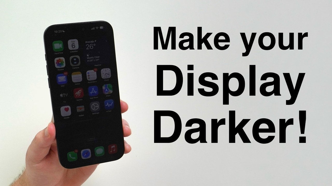
Have you ever found your iPhone’s screen uncomfortably bright, even when set to its lowest brightness level? This is a common issue, especially in low-light environments. Fortunately, your iPhone includes built-in features that allow you to dim the screen beyond the standard minimum brightness. By adjusting a few settings, you can create a more comfortable […]
A little over a year ago, HOZO basically wrote a eulogy for the hobby knife. Their NeoBlade came in swinging with ultrasonic vibrations, promising an end to blades that snag, skip, or crack a delicate print, and our headline covering it literally started with “RIP Hobby Knives.” Well, plot twist. HOZO just built a hobby knife, and it turns out the eulogy was less “rest in peace” and more “watch this.” It wasn’t supposed to be their next project at all. They were trying to expand NeoBlade’s blade lineup, saw a hobby knife online that looked ridiculously good, bought one, and the real thing was a serious letdown.
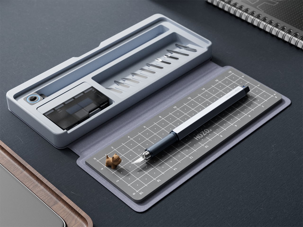
HOZO’s tenth product arrives after nine years of the Hong Kong brand making measuring devices, ultrasonic cutters, and detail sanders for the maker community. The Hobby Knife is a compact precision craft knife with a spring-loaded one-press blade change, paired with a case that unfolds into a portable cutting mat. Six flat profiles carry over from NeoBlade, joined by four new specialized tools, of which the U-Gouge and V-Gouge also fit the NeoBlade, giving eight blades shared across both handles. HOZO aimed it at leatherworkers, cosplayers, paper crafters, Gunpla builders, and jewelers. They started making it because they bought someone else’s version and felt let down, a starting point with a certain internal logic to it.
A round hobby knife handle rolls off any slanted surface, and nobody seemed to care enough to fix it until HOZO came along. The Hobby Knife body is full aluminum, hexagonal in cross-section, and that geometry sits flat by physics alone without needing a clip or a desk stand. The textured grip zone and raised rings at the balance point add tactile registration for long sessions without making it feel overengineered. At 6.3 inches (160mm) with the blade cap on and 26 grams total weight, it sits in the hand more like a technical pen than a knife. The material breakdown covers stainless steel at the collet, aluminum alloy through the body, and a nylon and glass fiber blend for the button, so it’s light without being fragile.
Pressing the spring-loaded button on the body releases the blade in one motion, replacing what used to require two hands, a twisting routine, and at least one moment of lost grip. The stainless steel collet has a magnet built into it that holds the blade in place, so pressing the button loosens the grip rather than firing anything out or letting it drop free. HOZO describes the inspiration as the familiar ease of a ballpoint pen, and the comparison is more accurate than it sounds. That magnetic hold keeps fine cuts free of play, and the internal spring locks everything tight again the moment a new blade seats. The whole swap takes under a second, and the mechanism feels more deliberate than the twist collet on any comparable knife in this category.
Ten interchangeable blade types come with the knife, a range the standard No. 11 scalpel system never really offered. Six flat blades inherited from the NeoBlade lineup cover Standard, Long, Chisel, Mini Chisel, Curved, and Double Edge profiles for paper, leather, film, and soft wood. HOZO expands the system with U-Gouge and V-Gouge attachments, the first for rounded grooves and the second for sharp defined lines. A fine saw handles tougher material and a metal file refines edges once the cutting is done, pushing the tool past slicing into actual finishing work. Eight of the ten fit the NeoBlade ultrasonic cutter as well, so the blade drawer serves both handles instead of splitting into two incompatible piles.
All blades are quenched 420 stainless steel, rust-resistant without oil, and finished with rounded non-cutting ends that make handling safer when fishing them out of the auto-feeding dispenser. That dispenser is translucent, so the remaining blade count reads at a glance instead of requiring a shake test. The case carries a disposal slot that keeps spent blades contained rather than loose in a bag, aimed at anyone who has ever reached into a tool roll and found a used No. 11 point first. Blade handling is where most hobby knife systems stay stuck in 1960, loose cardboard sleeves and a bin you hope nobody reaches into. HOZO treating storage, feeding, and disposal as design problems rather than packaging afterthoughts is the part of this product I find most convincing.
HOZO embedded a PVC cutting mat directly into the knife case, solving the most annoying problem in portable craft work: arriving somewhere ready to cut and realizing the mat is at home. The case folds through four modes, from slim closed carry to flat open mat to a propped desktop angle to a fully extended layout that doubles the 5.2 by 7.6 inch (133 by 192mm) working area. Mat and leather case are a single piece, and the tool body holding the knife and blades is what attaches magnetically to that case. Pouch and mat replace together when the surface wears out, and they come in different colors. NeoSander’s 13,000-SPM action slots into the next stage of the same workflow for anyone doing finishing after the cutting.
The base Hobby Knife Set is $59 (MSRP $79), including the knife, the Knife Case with Pouch and Cutting Mat, 01 Knife Blades, and the 10-in-1 Blade Refill Set. The Premium Set steps up to $129 (MSRP $219), including the Regular Blade Set for blade types 1 through 8. Replacement HOZO Knife Pouch and Cutting Mat units are available at $15.90 each, and blade refill sets run $9.90. The All-In Combo, bundling the Hobby Knife with both the NeoSander and NeoBlade, runs $489 (MSRP $739). The blade system is HOZO-proprietary rather than compatible with standard No. 11 blades, so ongoing supply runs through their store, and the cutting mat tops out at 7.6 inches, compact by design and worth knowing before you commit.
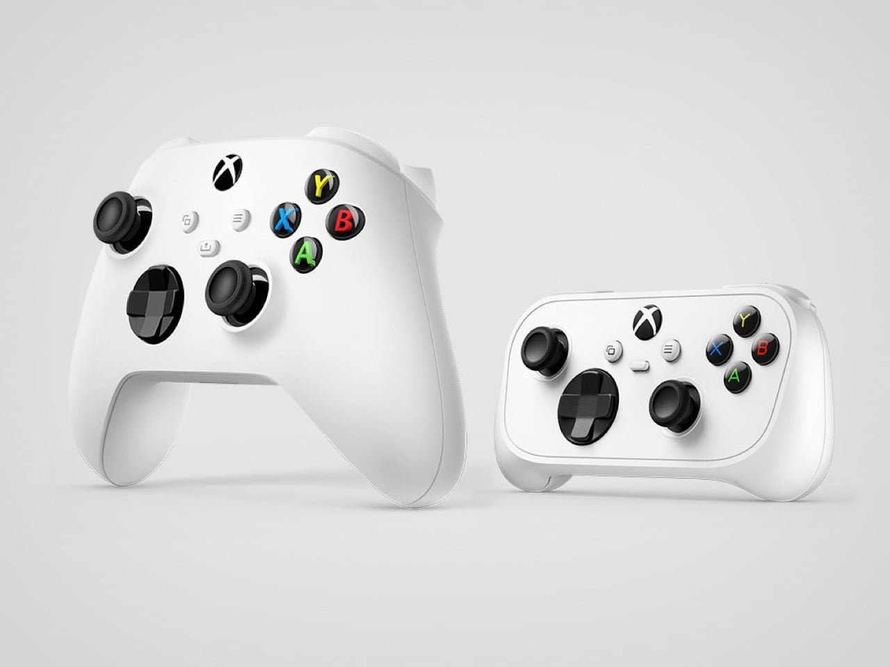
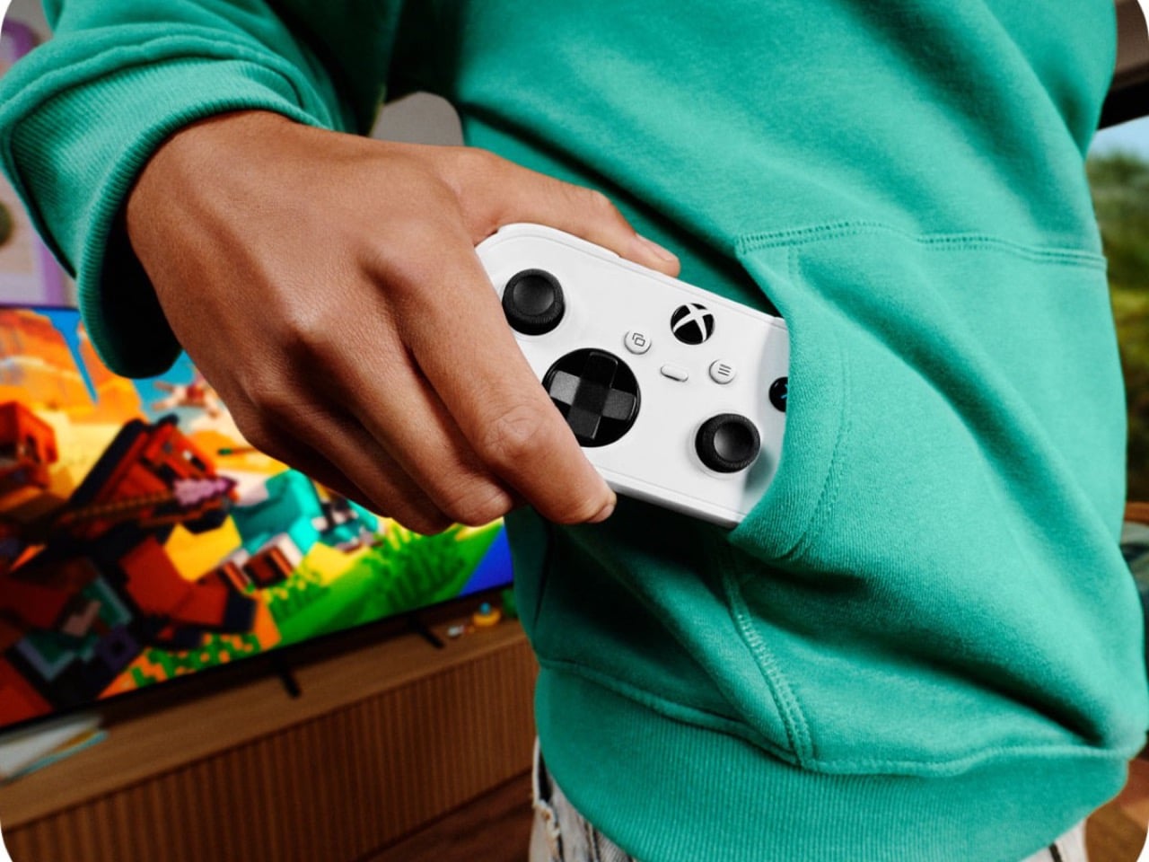
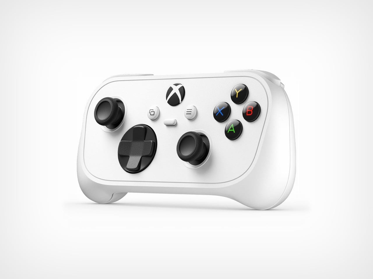
The Xbox controller is one of the best things ever put in a human hand and one of the worst things ever put in a backpack. Those big grips and that two-AA battery bay feel great on the couch and ridiculous on a train. 8BitDo worked out the pocket problem a while ago, and its wired Ultimate Mini squeezed the Xbox layout into a $35 body weighing about 6.7 ounces (189.6 grams). Microsoft’s answer is the Xbox Nano Controller, a little over 5 inches long and just 3.5 ounces (99 grams). It keeps all 18 standard inputs and swaps the AA bay for a built-in rechargeable battery.
At $49.99, the Nano undercuts the $64.99 standard controller by $15 but still costs more than the $30 to $35 pads from CRKD and 8BitDo. Native Xbox Wireless and a programmable Action Button for screenshots and clips are the premium on offer. I am happy to pay it, mostly because Xbox under CEO Asha Sharma has been on a listening streak. She took over Microsoft Gaming in February, lowered Game Pass pricing, and reportedly spends a few hours a month answering player support tickets herself. A pocketable pad for kids, commuters, and small hands looks a lot like that listening turned into plastic. It ships November 4 in the US and 35 other markets.
Designer: Xbox
A landscape slab with stub grips and a familiar face
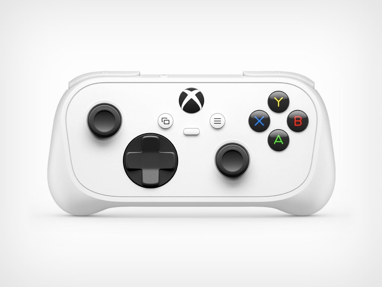
The Nano looks like the Xbox Wireless Controller after a dictionary fell on it. The face is a single inset plate with a visible seam, the grips are short stubs, and the shell in Microsoft’s images is the same Robot White as the standard pad. Everything else stays familiar, from the staggered stick layout and faceted hybrid D-pad to the textured stick caps and glossy black ABXY buttons with colored letters. Shrinking a controller usually means redrawing it, and Xbox mostly shrank the drawing it already had. Colors beyond white have not been announced, though the May leak showed a black model too.
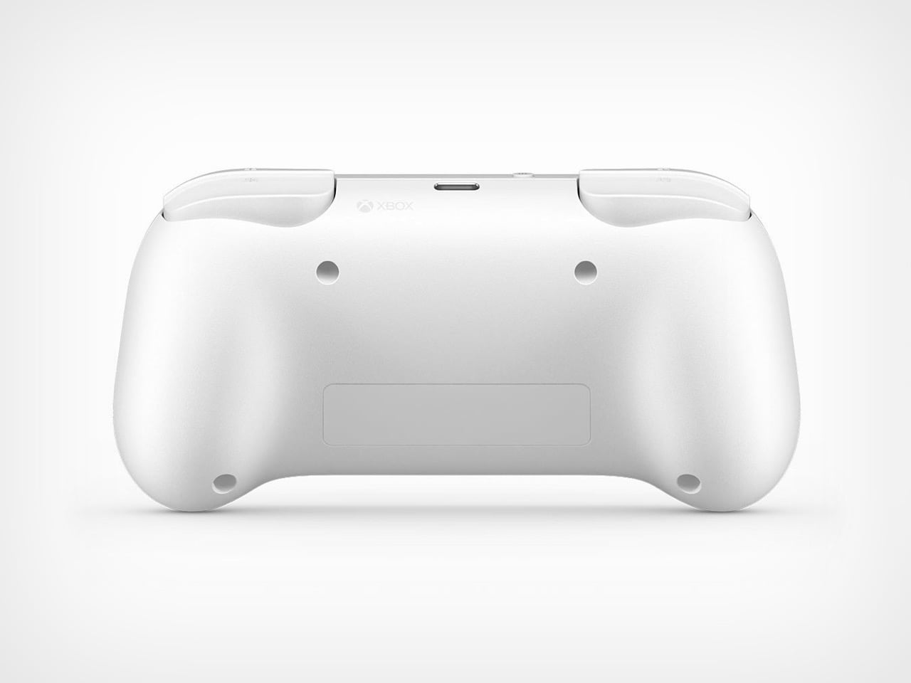
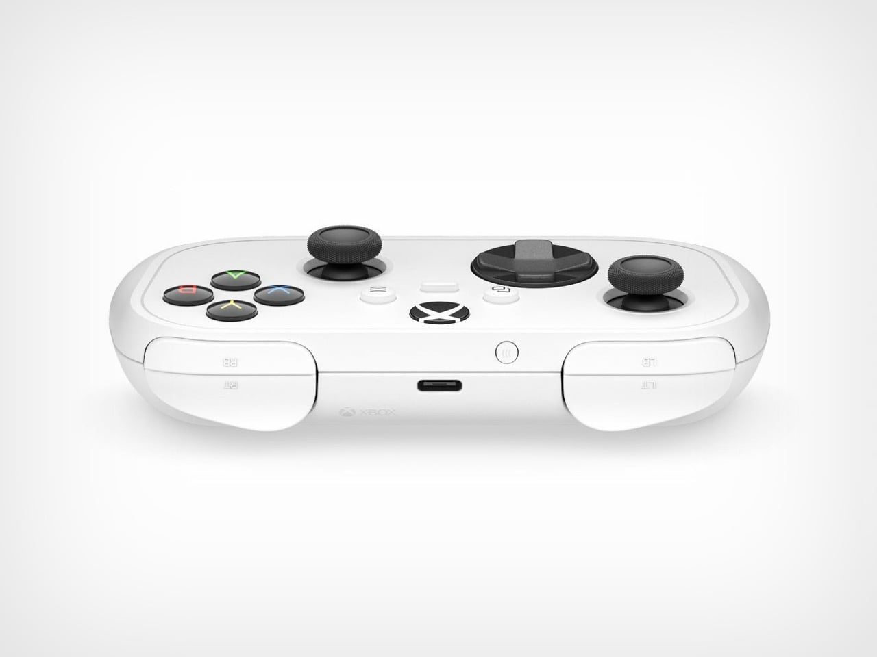
Each side of the top edge carries a single pad labeled LB over LT or RB over RT, which puts bumper and trigger in one compact housing, with the USB-C port and pairing button sitting between them. The back is smooth and matte, with a recessed label panel and four round recesses whose purpose Microsoft has not explained. How independently the bumper and trigger move is something only hands-on time can settle. The overall rectangle will look familiar to anyone who has browsed 8BitDo’s catalog, and Engadget said the leaked version looked like something that company would make. 8BitDo spent years proving the shape works, and Microsoft is borrowing the proof.
Eighteen inputs, one new button, and a few blanks
All 18 standard gameplay inputs made the trip, and the one addition is a programmable Action Button that appears to sit below the Xbox logo. Through the Xbox Accessories app it can fire off screenshots, gameplay capture, or other shortcuts, and the same app handles button remapping. It also seems to take over the job of the standard pad’s Share button, which has no obvious twin on the Nano’s face. Microsoft has not shared battery life, rumble or Impulse Trigger support, or whether a headphone jack exists. Those answers will decide how the Nano stacks up against the cheaper pads in its aisle.
Connectivity runs on Xbox Wireless for consoles and Bluetooth for Windows PCs, iOS, Android, and select smart TVs. A USB-C cable handles charging and is sold separately. Tecnoblog’s May report on Brazilian Anatel filings described a compact cloud-focused pad that looks a lot like the Nano, with Wi-Fi 6 and a 500 mAh battery, but Microsoft’s launch post mentions only Xbox Wireless and Bluetooth, so the Wi-Fi part stays unconfirmed. The cloud angle still shows up in the bundles, since Samsung’s Gaming Hub streams Game Pass titles and select Samsung TVs and Meta Quest headsets carry holiday Nano offers with two months of Game Pass Ultimate for new US members. That is a lot of screens for 3.5 ounces.
Where $49.99 lands among the pocket pads
The $49.99 price parks the Nano between the $30 to $35 pocket pads and the $64.99 standard controller. 8BitDo’s wired Ultimate Mini offers Hall effect sticks and triggers, a 3.5 mm audio jack, and an RGB Fire Ring for $35, which is a lot of spec per dollar. The Nano answers with first-party Xbox Wireless, a built-in battery, and zero cable tether, though Microsoft has not said what sits under its sticks. So the choice comes down to whether you value a plug-in spec sheet or a cord-free pad that speaks Xbox Wireless natively. Microsoft is also leaning on Minecraft Dungeons II, which supports four players, as the obvious reason to own a few.
Designing for hands the standard pad does not fit is familiar territory for Xbox, which built the Xbox Adaptive Controller, first glimpsed as the Project Z leak in 2018. The Nano takes that instinct and points it at small hands and small pockets. It also fits the Sharma era’s pattern of making Xbox cheaper to join and easier to carry. Grips this short will get their real verdict in a three-hour session, and I am curious to run one. 8BitDo drew the map. Xbox just showed up with the logo.
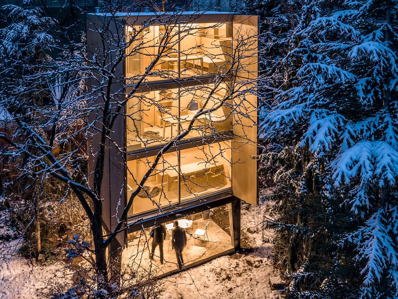
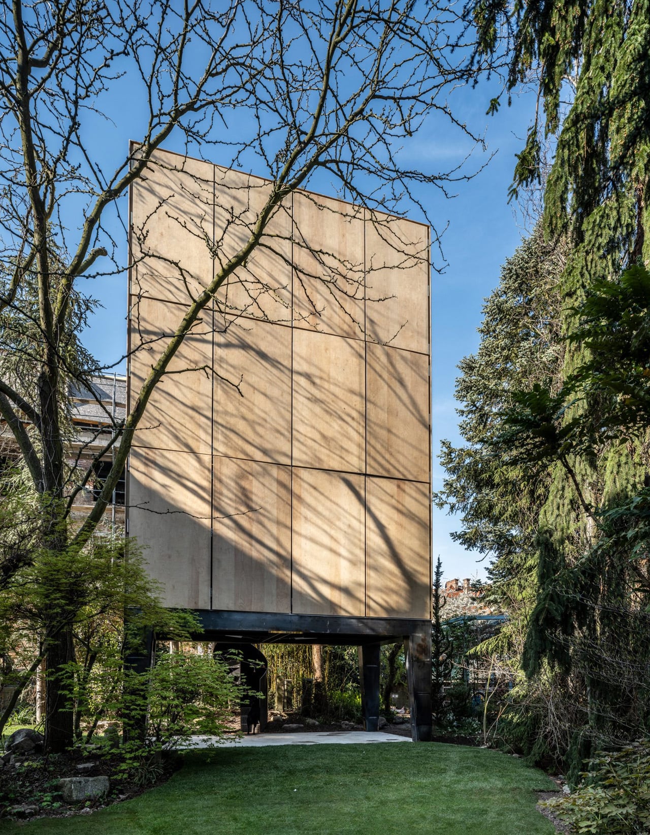
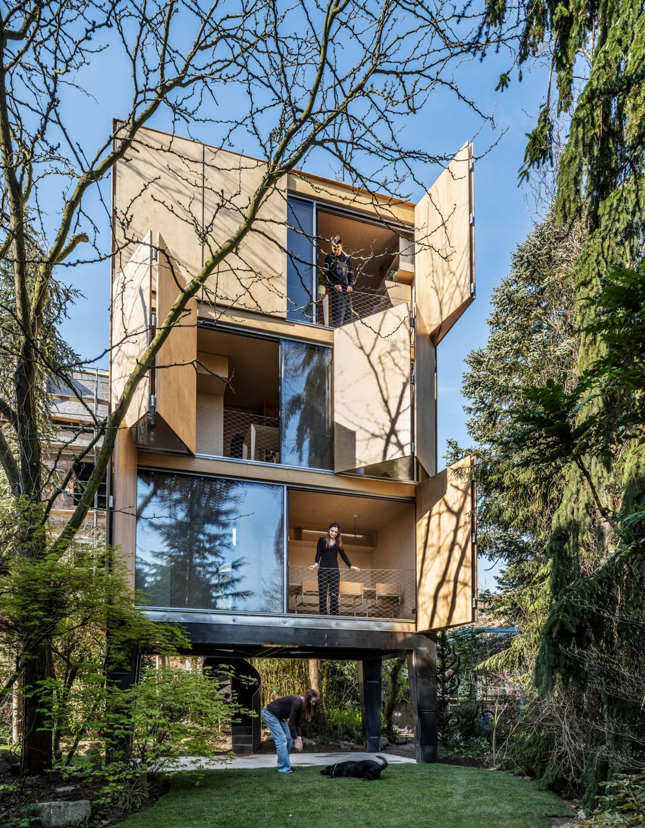
Giant shutters open the side of Wardrobe House like the doors of an oversized cabinet. Behind them, glazing connects three stacked living levels to the surrounding trees. Designed by Šépka Architekti in Prague’s Ořechovka district, the narrow wooden building takes its furniture reference seriously: it stands on legs, opens on one side, and carries that same timber vocabulary into its interiors.
The project began with a family whose existing villa could no longer comfortably accommodate six children. Expanding the original house would have disrupted its preserved architecture, so architect Jan Šépka proposed a separate building in the garden. With a footprint measuring just 5 by 2.5 meters, Wardrobe House addresses the shortage of space by stacking rooms rather than enlarging the villa. Two children now live there.
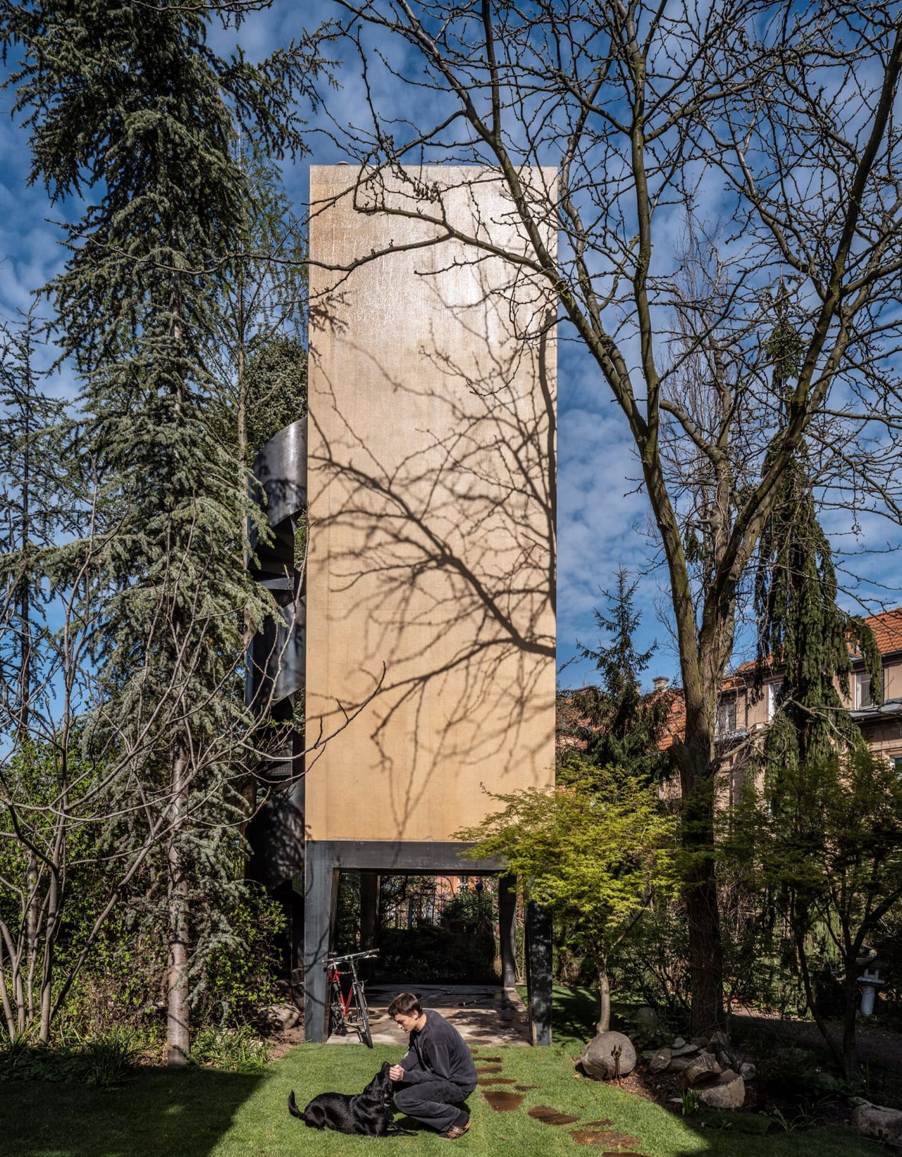
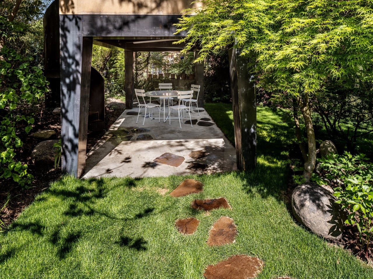
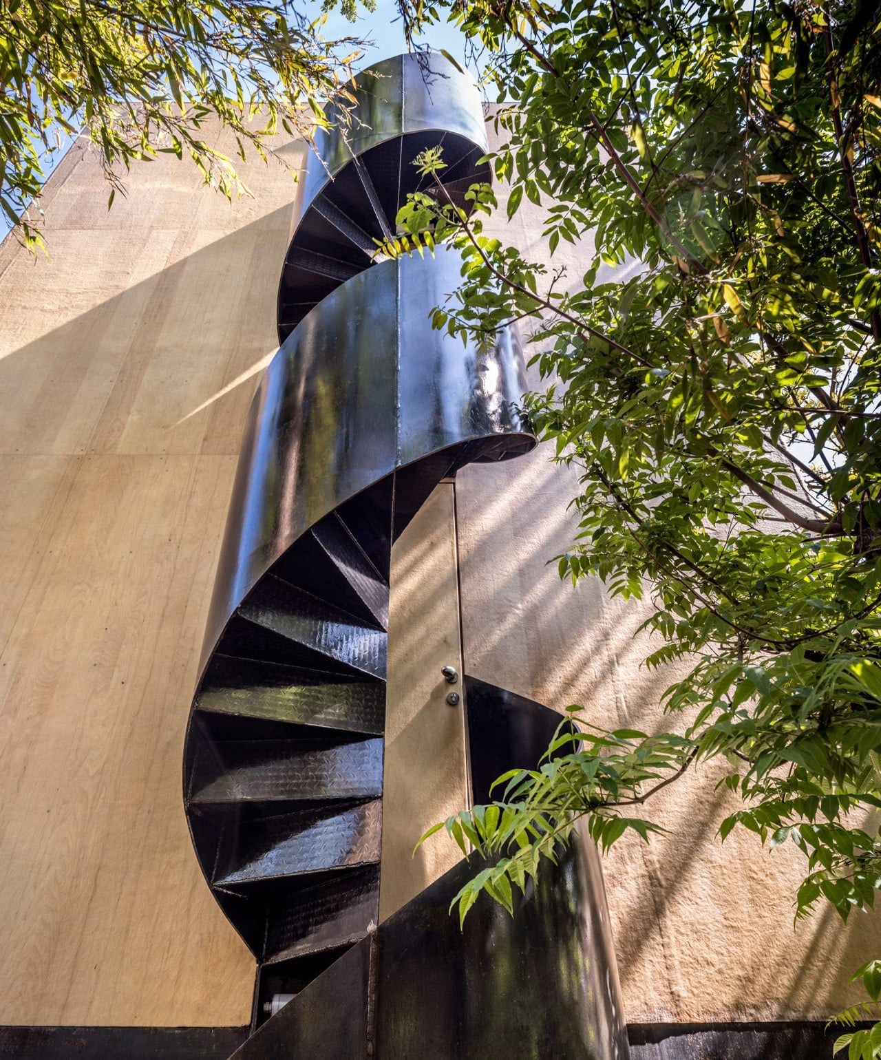
That decision also shaped its relationship with the garden. Micropile foundations were chosen to avoid damaging the roots of existing trees, while steel legs support the timber accommodation above. The ground level remains open, providing covered seating and an entrance beside a spiral staircase. Rather than filling its entire footprint with enclosed rooms, the house preserves an outdoor space beneath the living spaces.
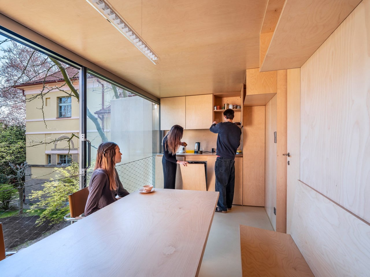
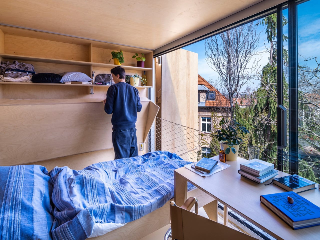
Above this sheltered base sits a shared kitchen and dining area. The next two floors each contain a bedroom with a bathroom and toilet, occupied by Ema and Jan respectively. Each bedroom also includes an additional fold-down bed, allowing another person to stay. Across four levels, including the open ground floor, the building provides 34 square meters of usable space: a compact arrangement organized around clearly separated daily activities.
Construction follows the logic of assembled furniture. The steel supports were manufactured in a workshop and positioned by crane. The timber floors were also prefabricated, then lifted into place during a single day. That installation milestone should not be confused with the entire construction schedule, but it explains how the building’s stacked form translates into a practical assembly method.
Inside, plywood continues across walls, kitchen cabinetry, and built-in furniture, making the rooms read as parts of one carefully fitted object. Open shelves and cabinets leave possessions visible rather than concealing everything behind doors. It’s an especially apt detail for a house named after storage furniture: the architecture supplies a consistent backdrop, while the things its occupants keep give each room its own character.
The tradeoff is vertical circulation. Separating cooking and sleeping across floors means stairs are part of everyday life, a consequence of gaining accommodation on such a small patch of ground. The shutters offer another kind of choice, letting occupants adjust privacy and shading at the glazed facade. Wardrobe House earns its unusual silhouette through these specific decisions, giving two family members their own rooms while leaving the original villa’s architecture undisturbed.
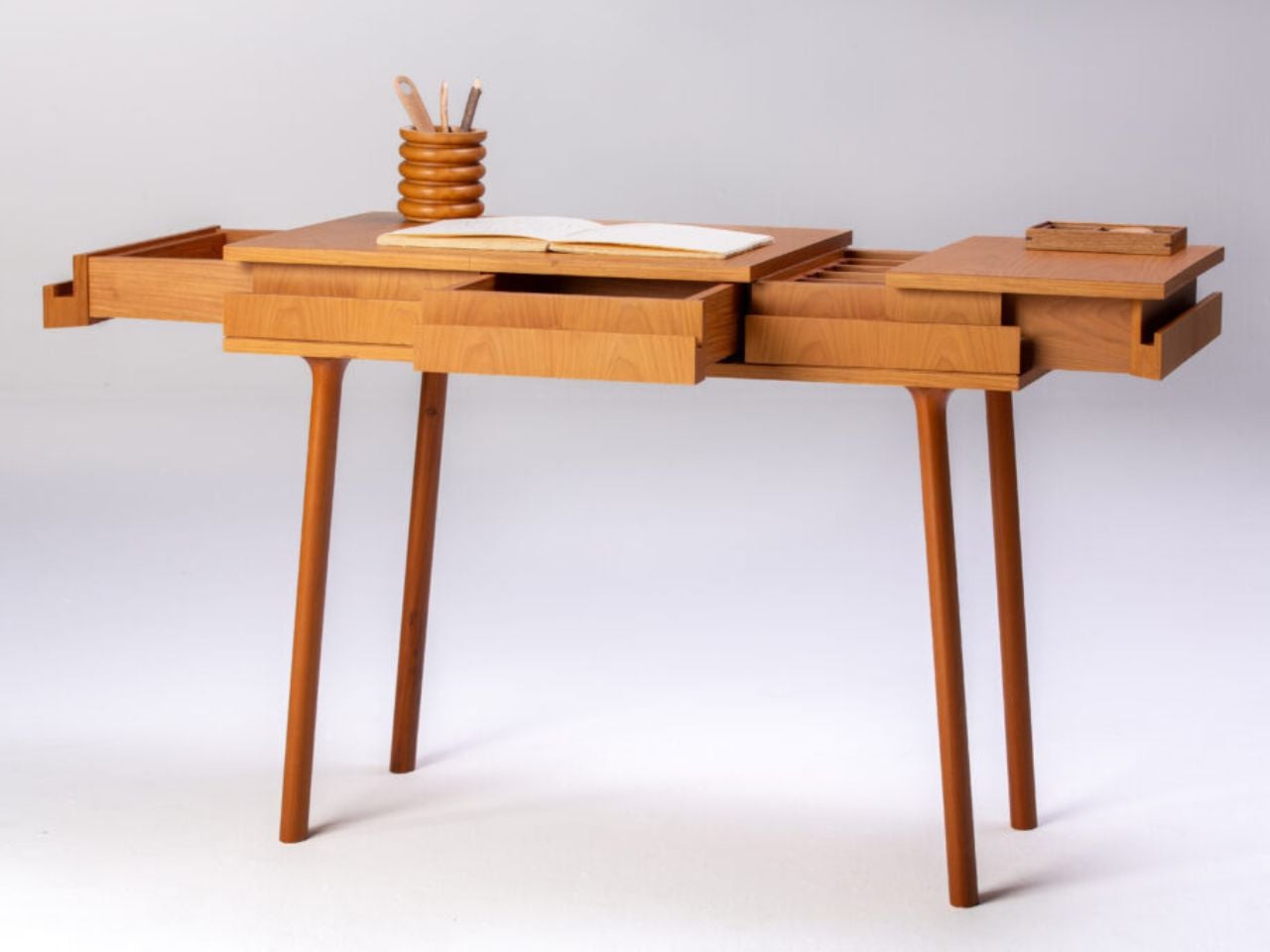
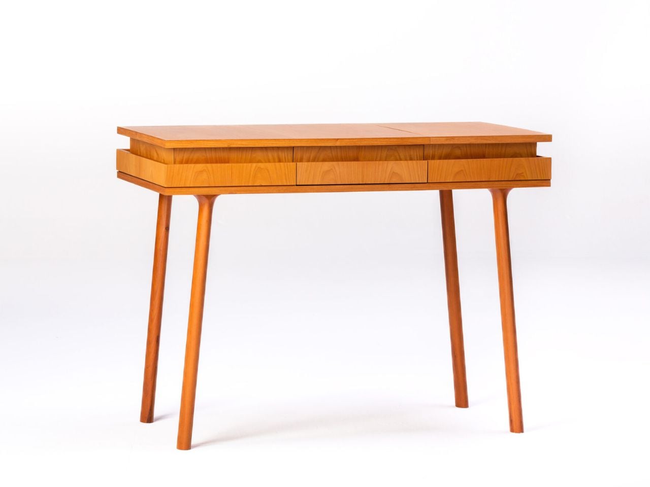
A desk is usually understood as a fixed surface, a place where work happens, and objects accumulate. Brazilian architect and designer Lia Siqueira approaches this familiar piece of furniture with a different proposition. Her Open Sesame Desk is conceived as an object that changes with its user, expanding through a series of openings to reveal surfaces, drawers, and concealed compartments. What initially appears to be a compact wooden desk gradually unfolds into a more elaborate workspace, where the simple gesture of opening becomes an experience of its own.
Designed in 2025 for Brazilian furniture brand ETEL, the desk takes its name from the famous expression in the tale of Ali Baba and the Forty Thieves. In the story, the words “Open Sesame” unlock a cave filled with hidden treasures. Siqueira translates this familiar moment of discovery into furniture design, replacing the mysterious cave with a carefully organized wooden structure. Its contents remain protected and concealed until the user chooses to reveal them. The reference lends the piece a playful character, while the design itself remains grounded in the practical needs of a working environment.
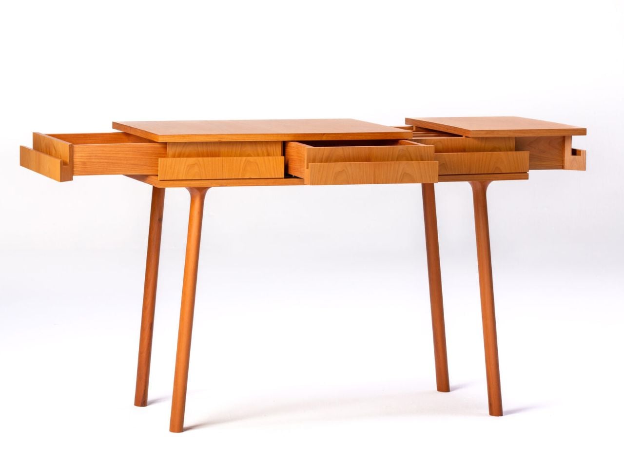
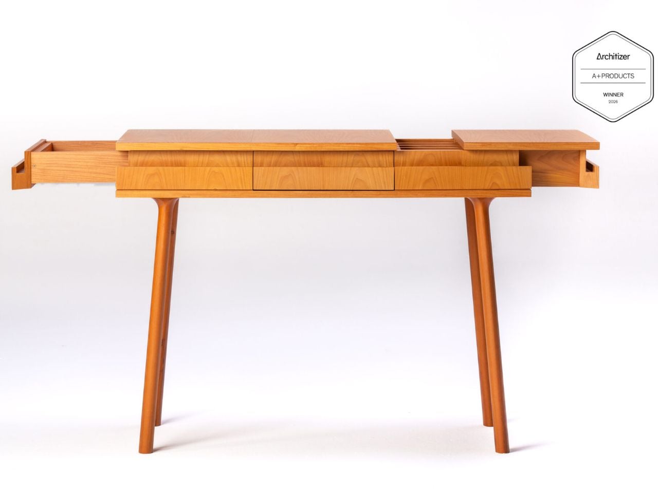
The desk’s most distinctive quality lies in the contrast between its two configurations. When closed, it maintains a restrained profile, containing its various functions within a discreet volume. Opening the piece introduces an entirely different spatial arrangement. Previously hidden drawers and compartments become accessible, while additional surfaces extend the available working area. Each opening reveals another layer of utility, allowing a single piece of furniture to accommodate activities that might otherwise require several separate storage solutions.
This transformation is particularly relevant to the way contemporary workspaces are occupied. A desk rarely serves one purpose throughout the day. It may hold a laptop in the morning, become a writing surface in the afternoon, or accommodate drawings, documents, and personal belongings as different tasks unfold. Open Sesame responds to these changing requirements through its physical adaptability. Rather than permanently exposing every storage space and working surface, the furniture allows them to be accessed when needed and concealed afterward.
Measuring 100 by 50 by 76 centimeters, approximately 39.4 inches wide, 19.7 inches deep, and 29.9 inches high, the wooden desk maintains a relatively compact footprint. Its dimensions make the internal arrangement especially significant, as the design creates additional usable space through movement rather than a permanently larger structure. The expansion is integrated into the furniture itself, preserving the relationship between its proportions and functional capacity.
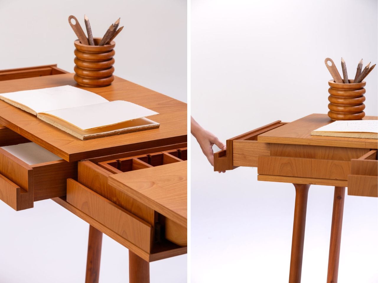
There is also an interesting consideration of visibility within the design. Conventional desks often leave their contents exposed, with organization dependent on external accessories or separate furniture. Siqueira builds that organization into the object, giving each stored item the possibility of remaining out of sight until required. Papers, tools, and everyday essentials can occupy the internal compartments without constantly sharing the main working surface. The user decides when the desk should reveal its contents and when it should return to its quieter, closed state.
Perhaps the most engaging aspect of Open Sesame is the importance it places on physical interaction. The furniture encourages a sequence of gestures that makes accessing its contents feel deliberate. Opening a section changes the arrangement of the desk, introduces new possibilities, and invites the user to explore its construction. This relationship between movement and discovery gives the piece a character that extends beyond its functional specifications. Its transformation becomes part of the daily routine rather than an occasional feature.
The desk also reflects an approach to furniture in which storage is treated as an architectural element. Its compartments are concealed within the overall composition, and their gradual revelation changes how the object is perceived. The distinction between the exterior and interior becomes essential to its identity. From the outside, the desk communicates restraint; from within, it offers a more intricate arrangement of surfaces and spaces. These contrasting qualities allow it to balance visual simplicity with an unexpectedly generous range of uses. Its appeal comes from the experience of using it as much as from its appearance. Siqueira gives the act of opening a meaningful role, turning an ordinary interaction with furniture into a small moment of anticipation. Like the story that inspired its name, the desk suggests that what is hidden can be just as intriguing as what is immediately visible.
An open floor plan can make cooking, reading, and catching up with friends feel pleasantly connected. It can also leave you with nowhere to withdraw short of closing a bedroom door. Georgy Kostrov’s Villa in the Forest by the River addresses that familiar tension with changing floor levels, looping routes, and places to pause. He’s designing it as his own home in Russia’s Moscow Region.
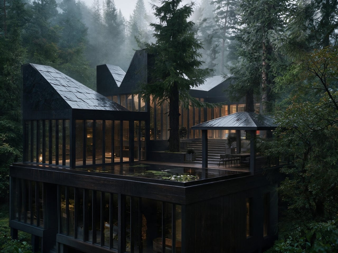
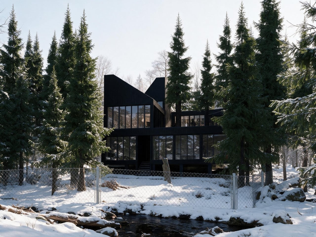
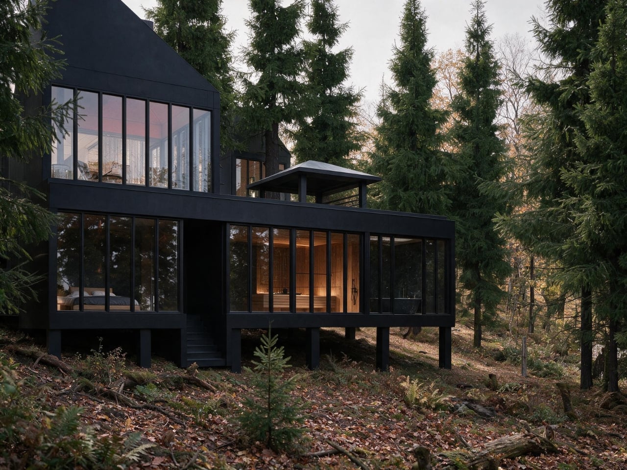
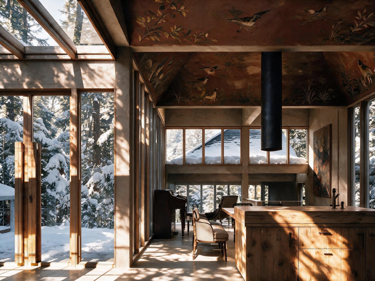
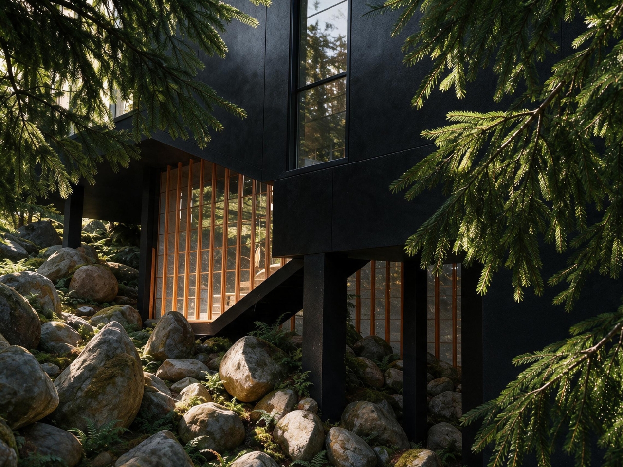
The 2026 project is still in progress, and the perspective images are AI-assisted visualizations, not photographs of a finished house. That distinction matters with a proposal this atmospheric. Dark, angular roofs rise among the trees, while glass walls face the wooded slope beside a river. The ambition is to accommodate solitude, everyday life together, and entertaining without making every change of mood require a separate room.
Designer: Georgy Kostrov
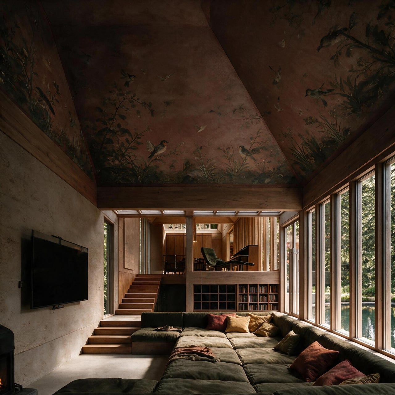
I like that the layout treats those needs as different settings rather than competing lifestyles. Floor and ceiling heights distinguish areas within the connected interior, while a circulation loop allows movement indoors, onto a terrace, and back by another route. In principle, that gives someone more choices than sitting in the middle of everything or leaving entirely. The steps also raise a practical question: how easily will everyone navigate these routes?
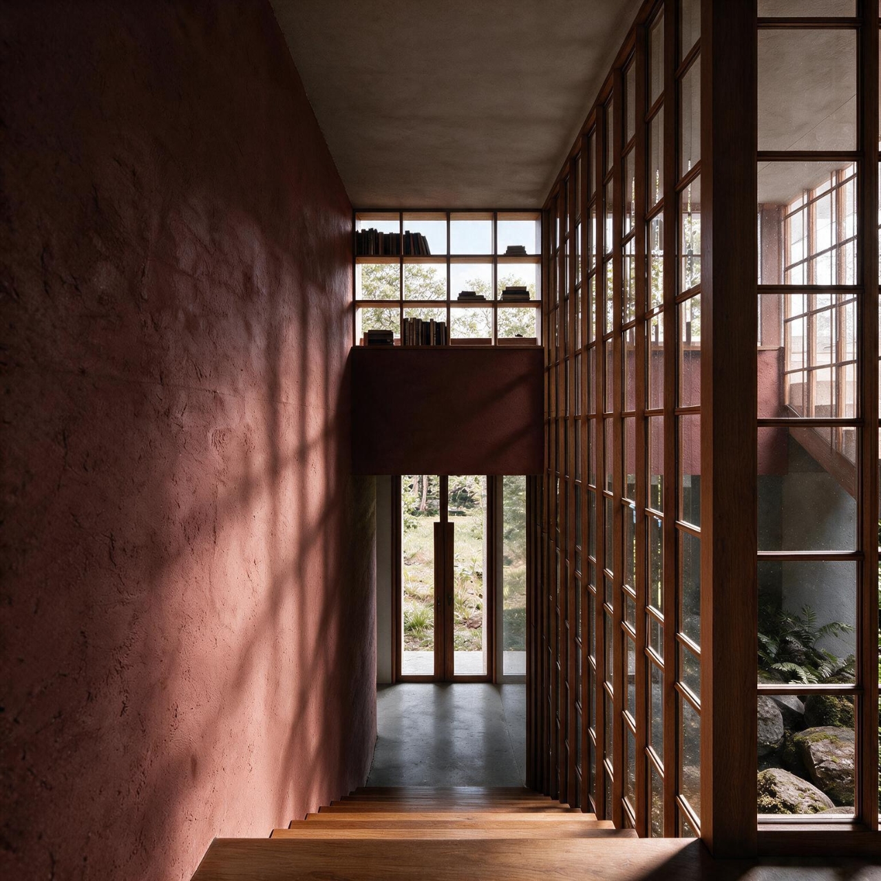
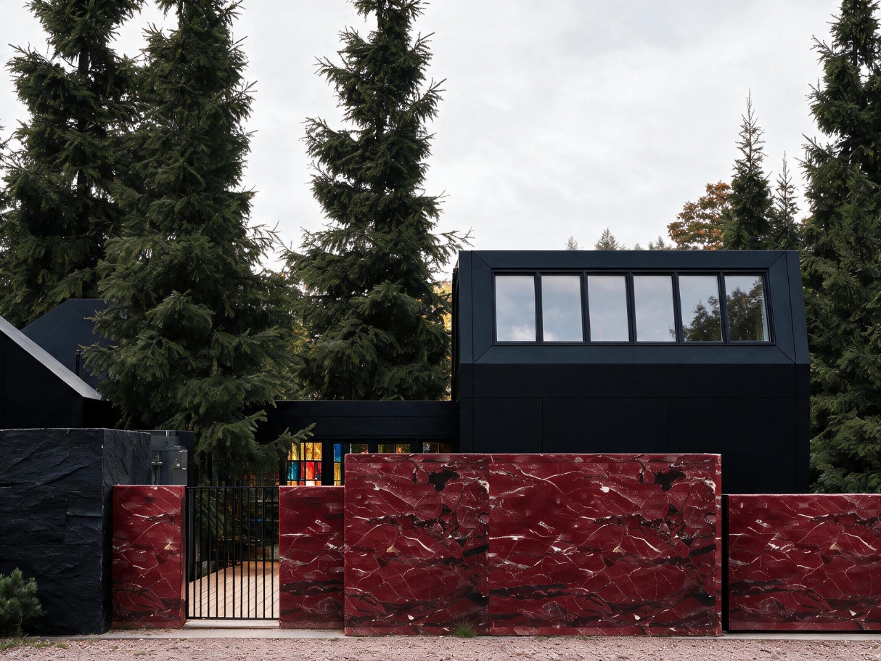
The exterior makes a similarly deliberate choice. Kostrov keeps the road-facing side more enclosed and opens the shared spaces toward the forest with glazing, terraces, and steps. That seems a sensible hierarchy: passing traffic gets less access to domestic life, while the trees become the view. In the renderings, slim window frames give the broad glass surfaces a rhythm.
The roofline is the most assertive part of the design. Its uneven peaks could easily read as architectural theater, but Kostrov connects the shape to rooflights, ventilation, and proposed modular assembly. I’m more persuaded by that explanation than by an abstract claim about mimicking trees. The silhouette has a job to do, even if the construction process still needs to prove itself.
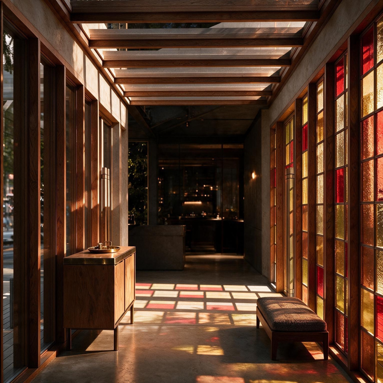
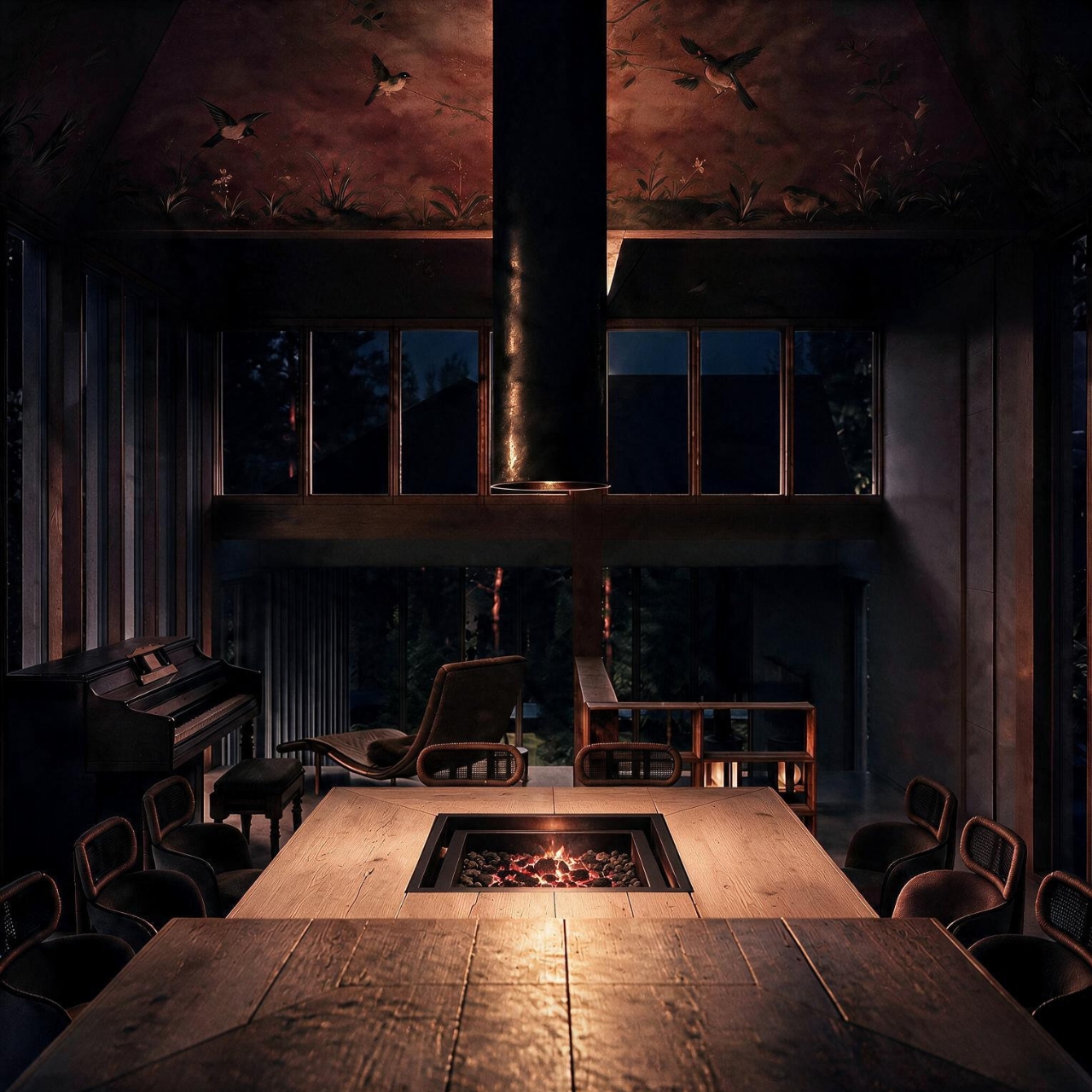
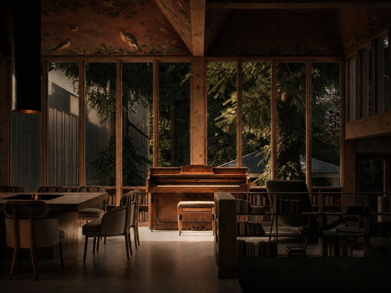
Light also helps distinguish places without putting up another partition. The project description positions rooflights above separate activity areas and uses colored glazing at the entrance to limit direct views inside. In the kitchen visualization, sunlight falls across timber cabinetry beneath a ceiling decorated with birds and foliage. I like the generosity of that ceiling. The room’s most expressive surface is overhead, leaving the kitchen itself visually grounded.
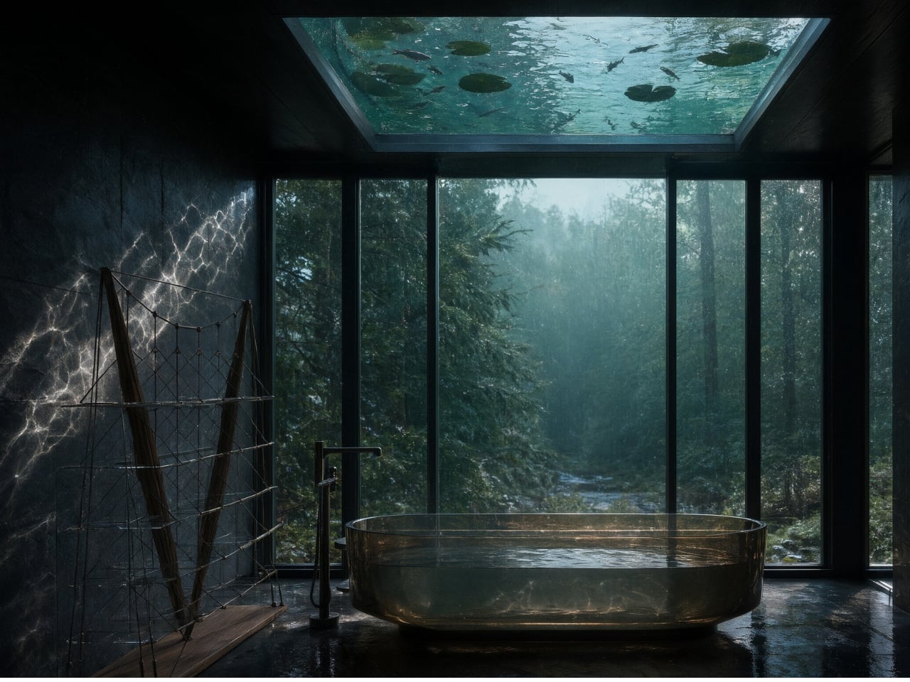
The proposed rooftop pond is the design’s biggest indulgence. Above the bathroom, water would refract daylight onto dark stone surfaces. The visualization shows a bathtub beneath a glazed opening, with lily pads visible overhead. It’s a lovely reversal of the usual skylight: looking up means looking through another little landscape. I’d want the engineering story alongside the image, particularly the provisions for waterproofing, cleaning, and winter conditions.
Elsewhere, the material palette gives each area its own character. Timber, terracotta, concrete, dark stone, slate, and water are proposed throughout. The warm kitchen rendering and shadowy bathroom suggest markedly different moods within the same house. Neither image proves how the materials will feel in use, but their contrast makes the spatial intention easy to read.
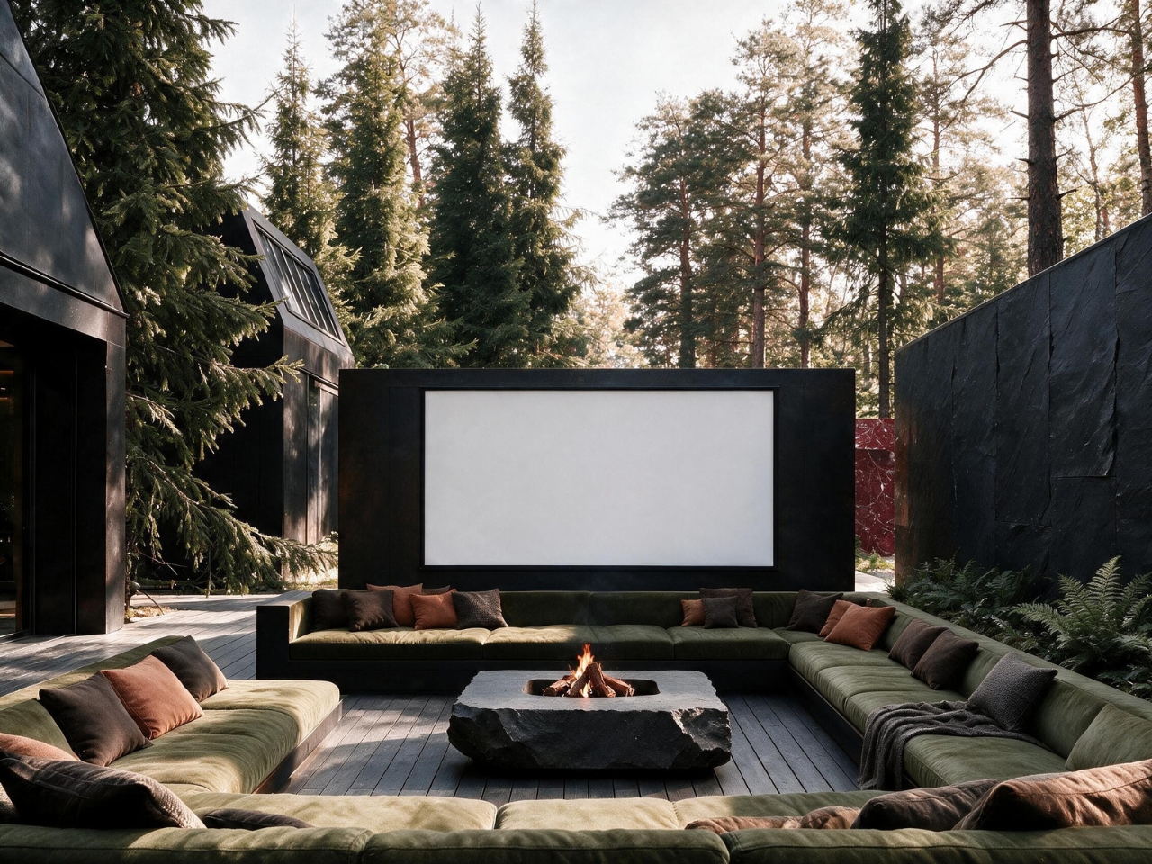
The outdoor lounge is the most sociable scene in the set: low, wraparound seating surrounds a stone fire feature, with a large projection screen facing it. I’d happily trade a conventional media room for that arrangement on a mild evening. Its appeal is straightforward. Everyone has a place to settle, and the forest remains visible around the screen instead of disappearing behind blackout curtains.
For all the drama of the roofs and the pond, the circulation interests me most. A home that lets people drift between company and quiet has a useful ambition beyond looking good in a rendering. Kostrov still has to turn these images into a workable building. The design’s real test will be whether those everyday choices remain as compelling as its bathtub ceiling.