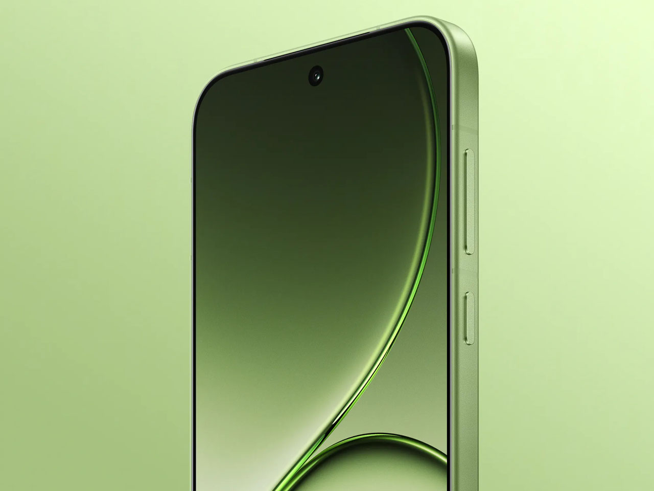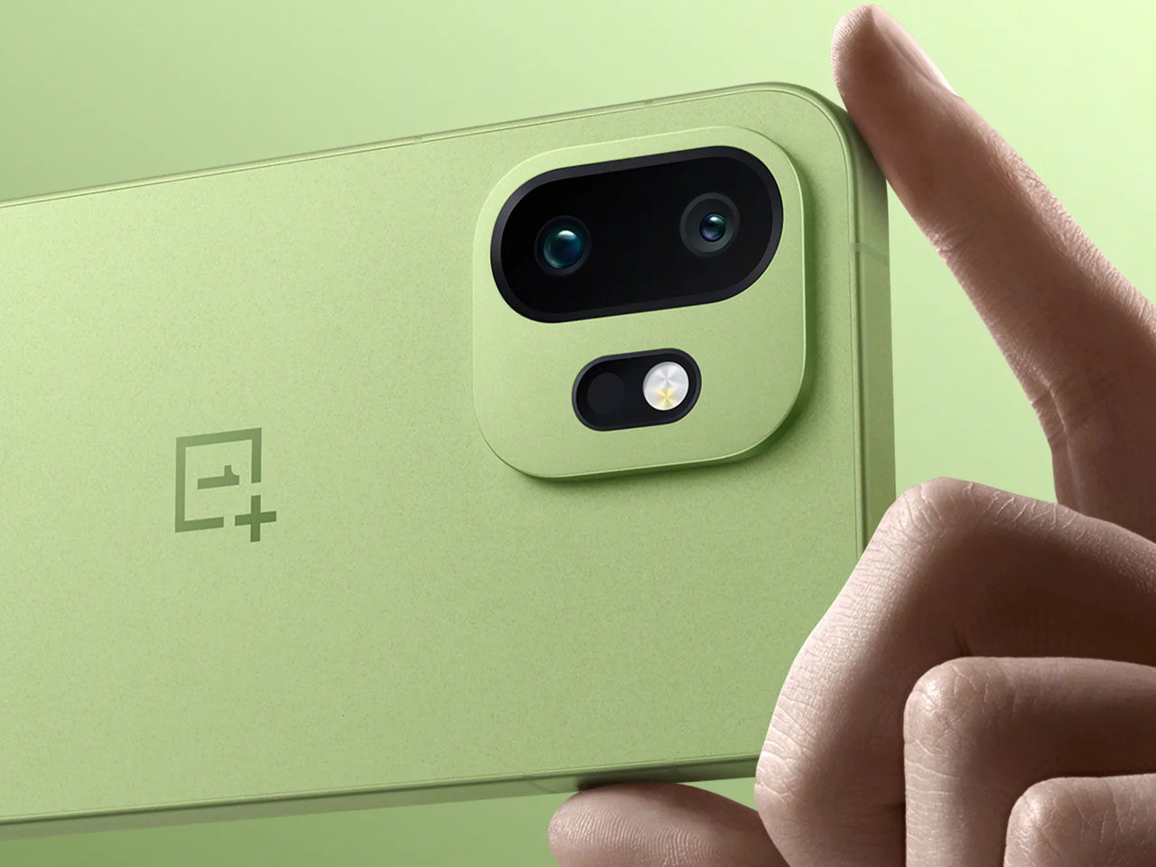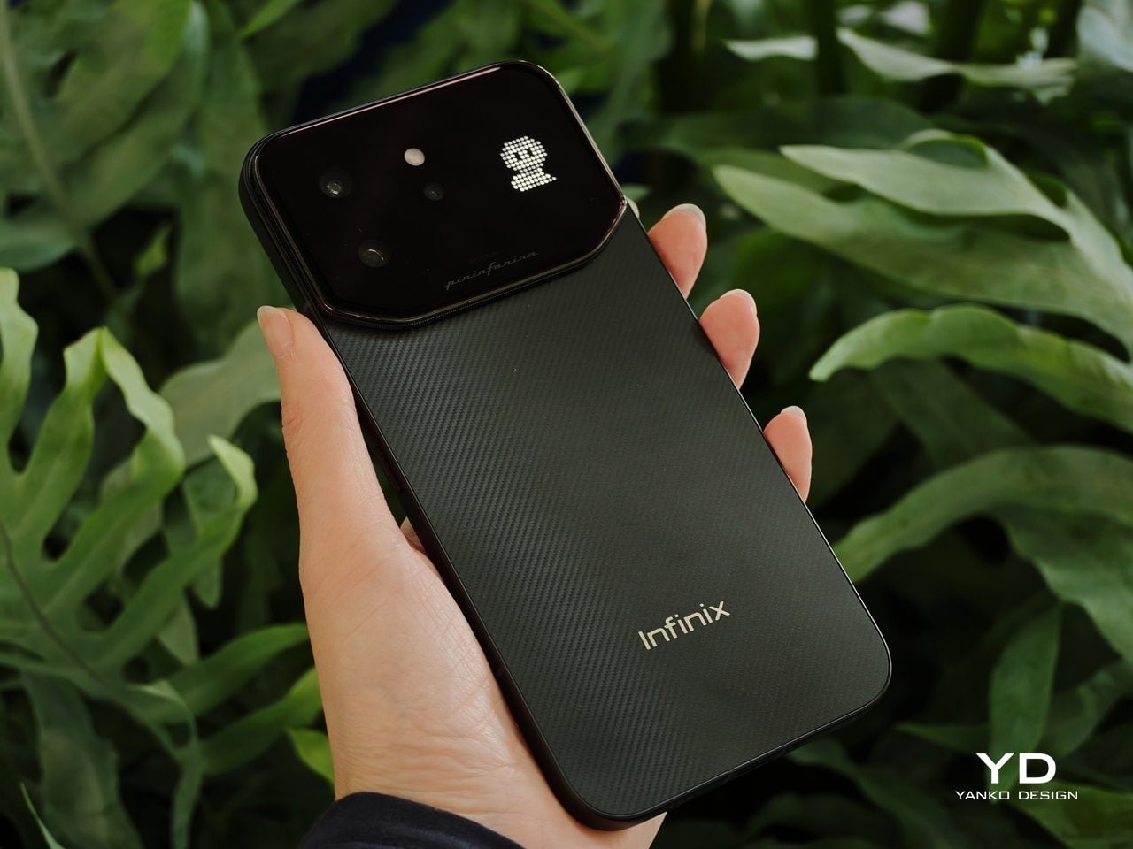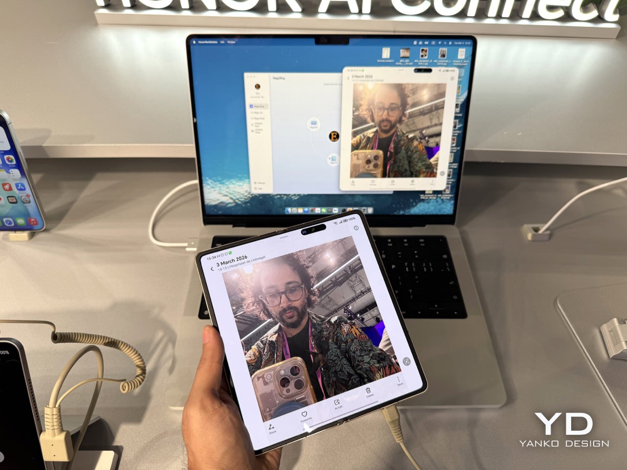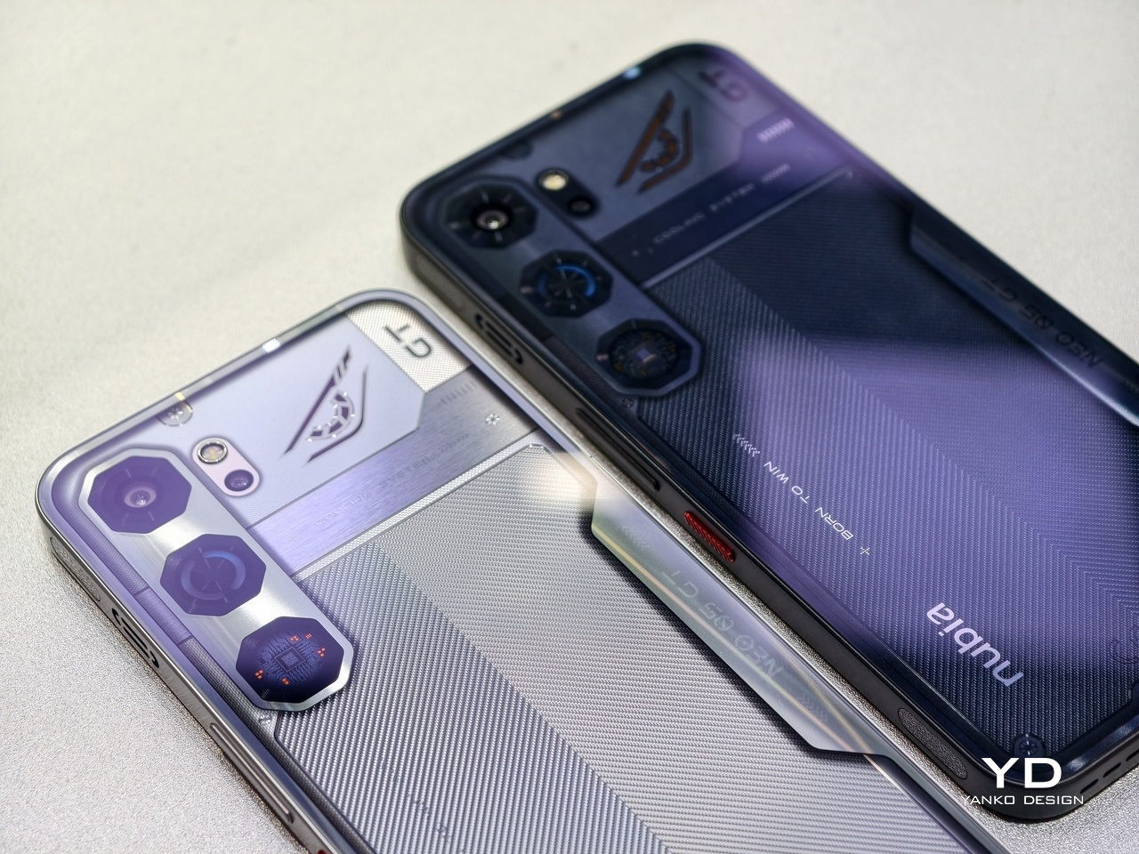
Look at the phones announced this year, like those revealed at MWC 2026 last week, and you will notice something. They are all faster, thinner, and shinier than last year’s models, and yet none of them feel particularly surprising. Cameras gained another sensor. Bezels shrank another millimeter. Battery life improved by an amount that is technically measurable but practically indistinguishable from the model before. The industry has gotten so good at making phones incrementally better that it has almost forgotten to ask whether they could be genuinely different.
That is where concept phones come in. Not all of them are practical, and not all of them will ship. But the five designs here do something that the latest Galaxy or iPhone cannot: they make you pause and reconsider what a phone actually is, and what it could be if the people designing it were not also worrying about carrier approvals, supply chains, and quarterly earnings. Some are functional prototypes shown on actual show floors. Others exist purely as design arguments. All of them are worth thinking about.
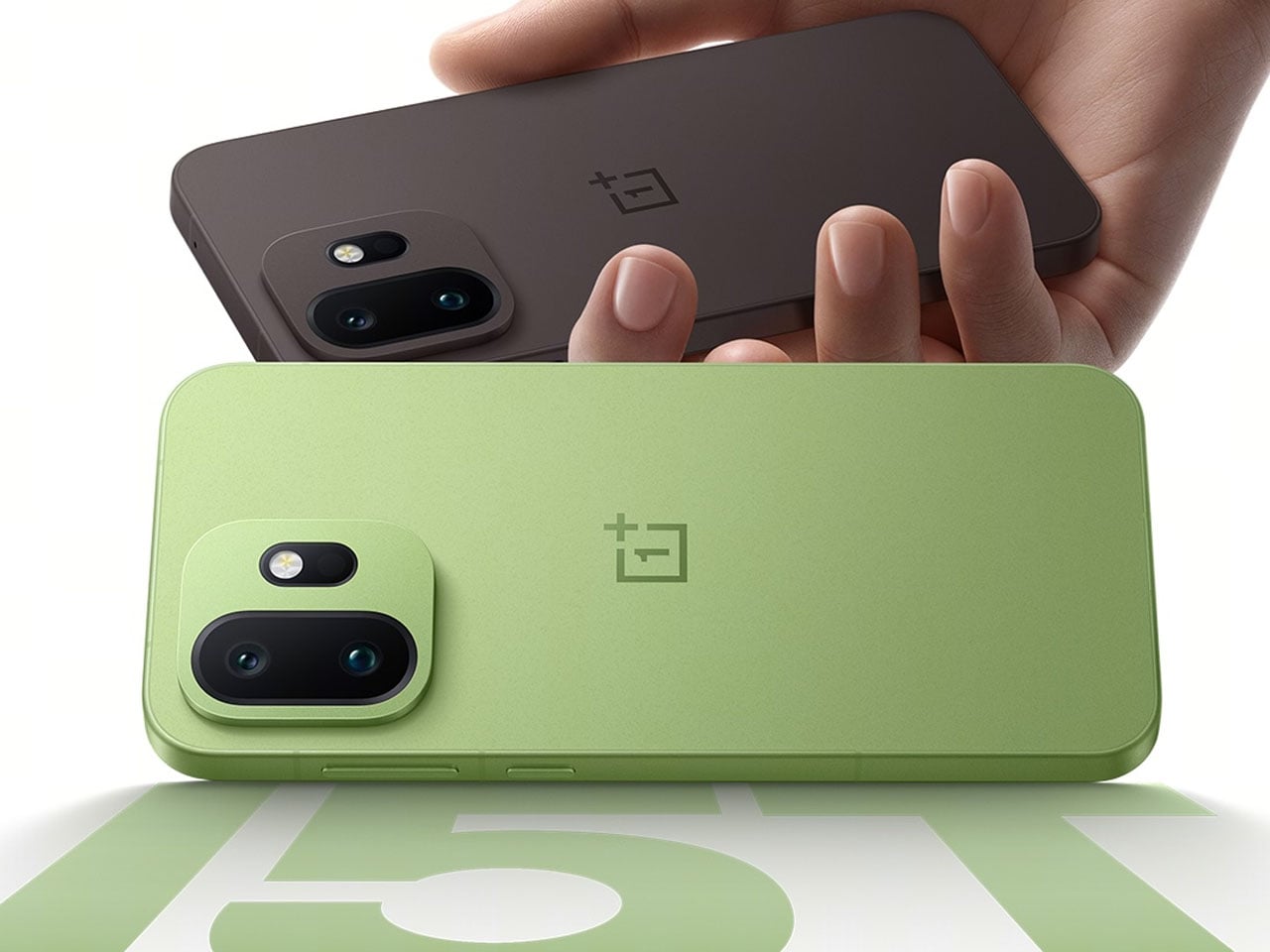
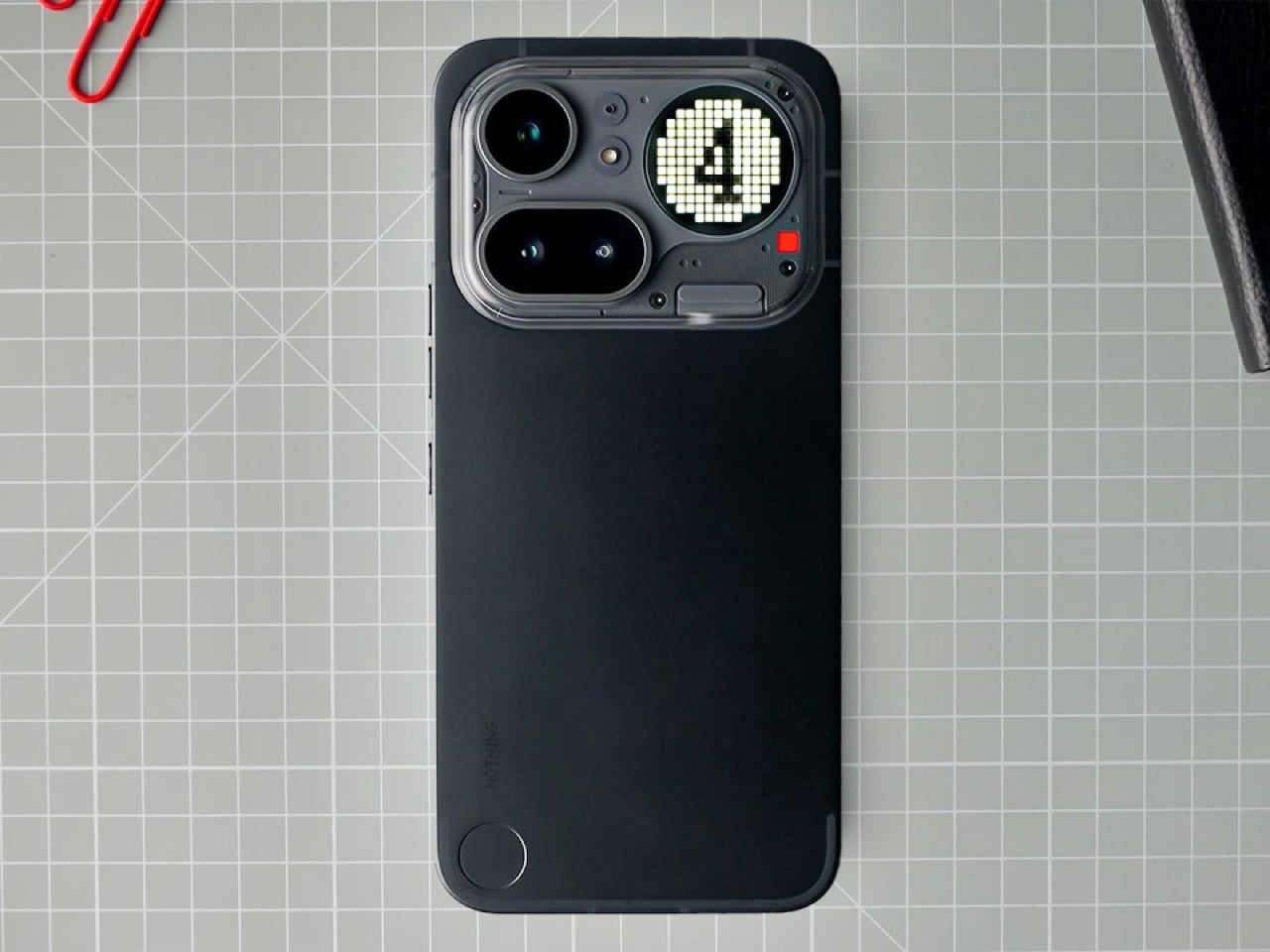
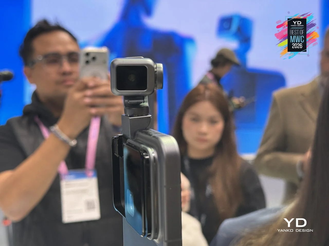
TECNO Magnetic Modular System
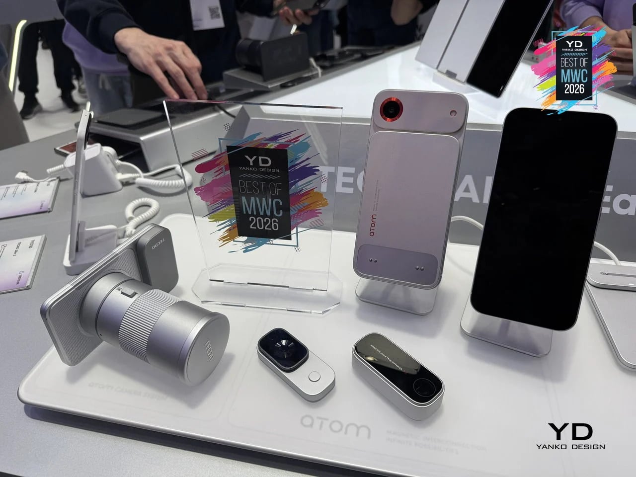
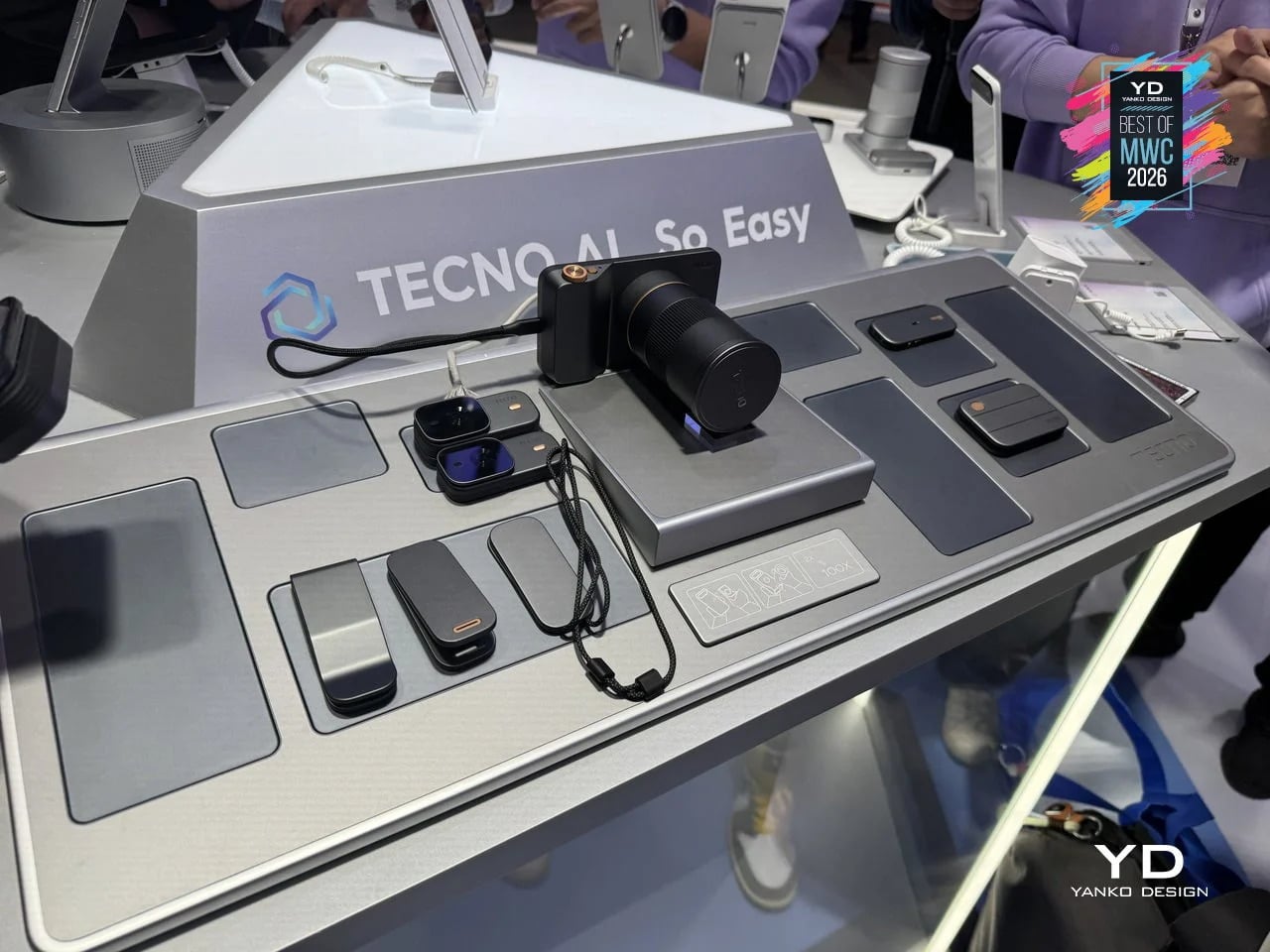
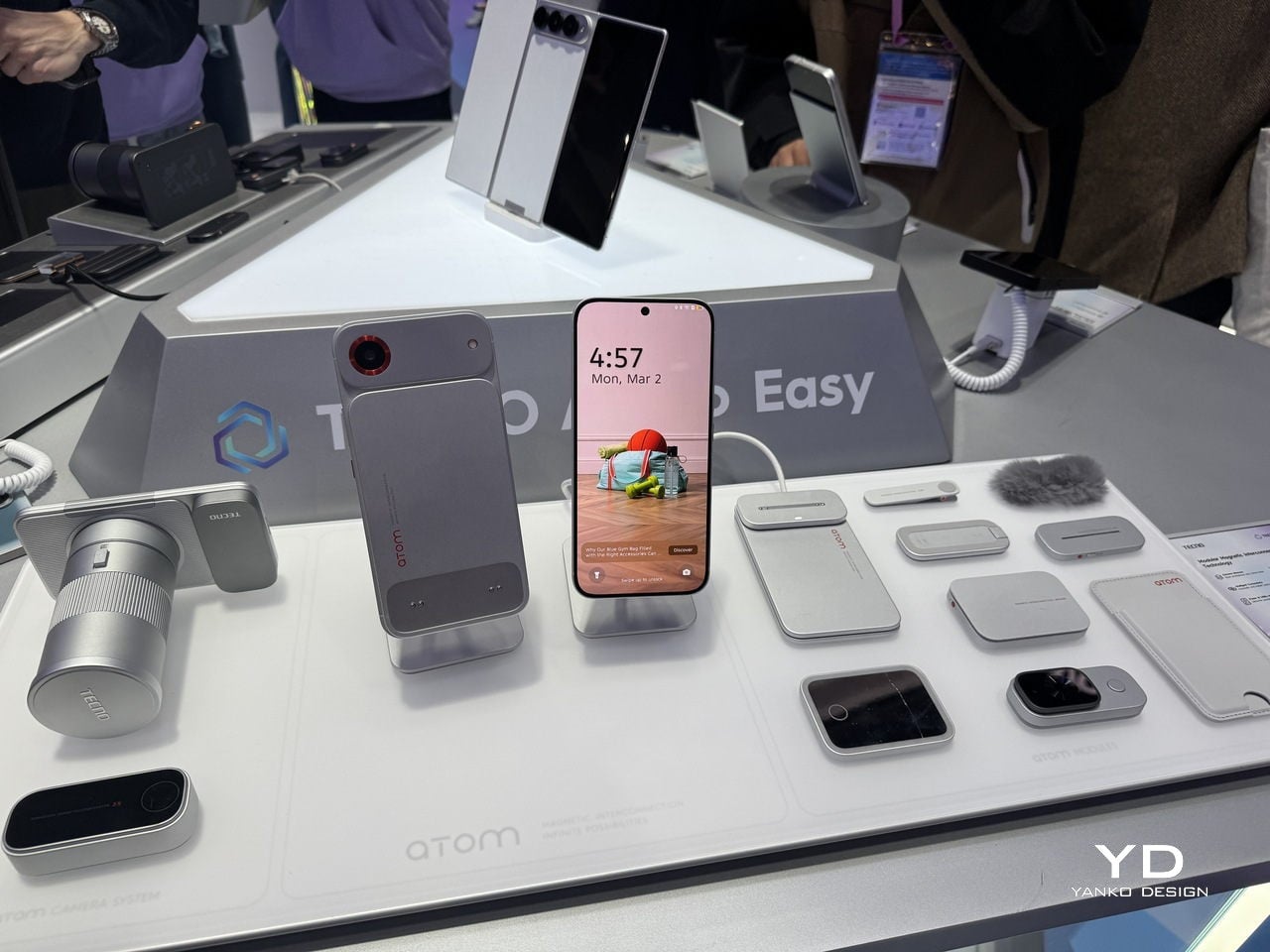
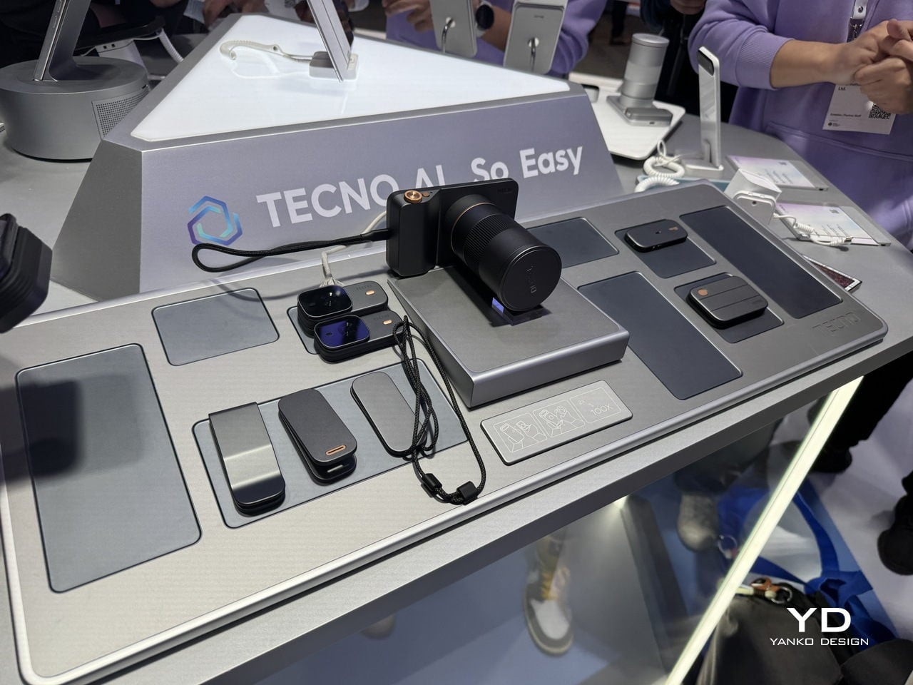
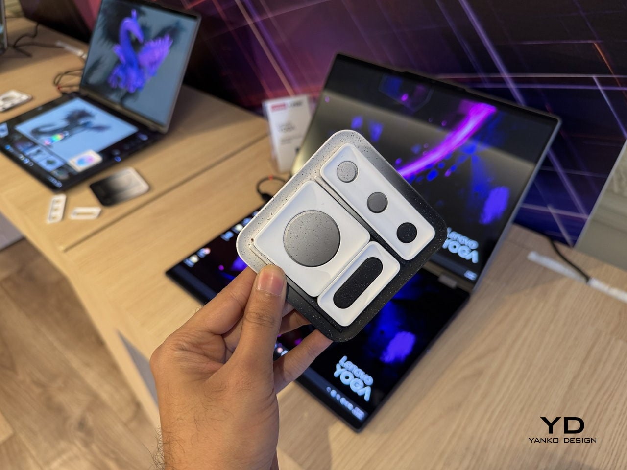
Phones have been getting thinner for years, which sounds like progress until you think about what got traded away in the process. Removable batteries went first, then expandable storage, then headphone jacks. Every feature that required physical complexity was quietly dropped in the name of a slimmer profile. TECNO’s Magnetic Modular System, shown at MWC 2026, challenges that logic directly. Rather than cramming every possible capability into a single fixed body, it keeps the phone lean by design and lets you snap on what you need, when you actually need it.
Designer: TECNO
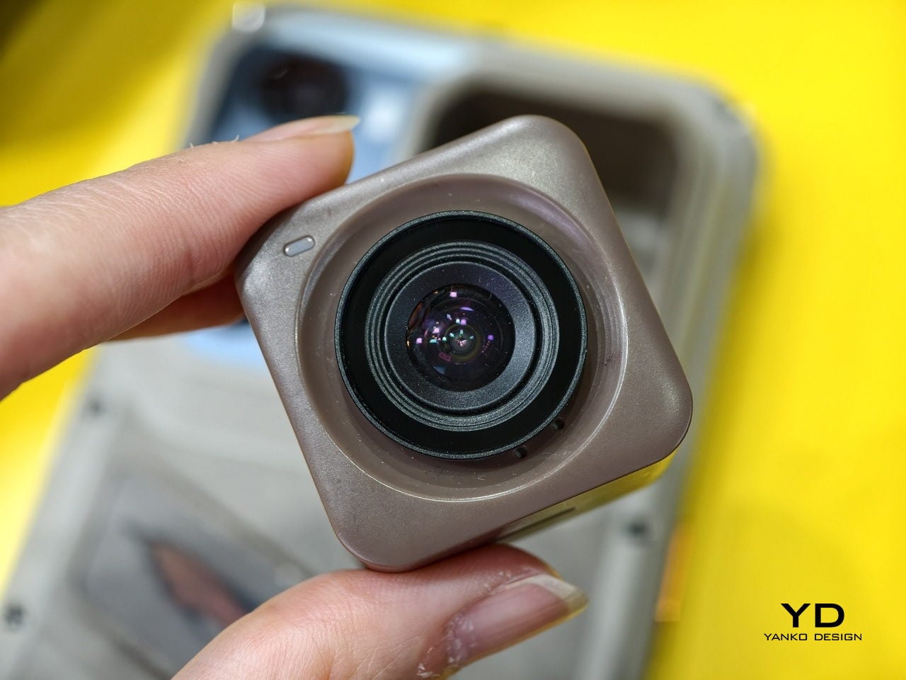
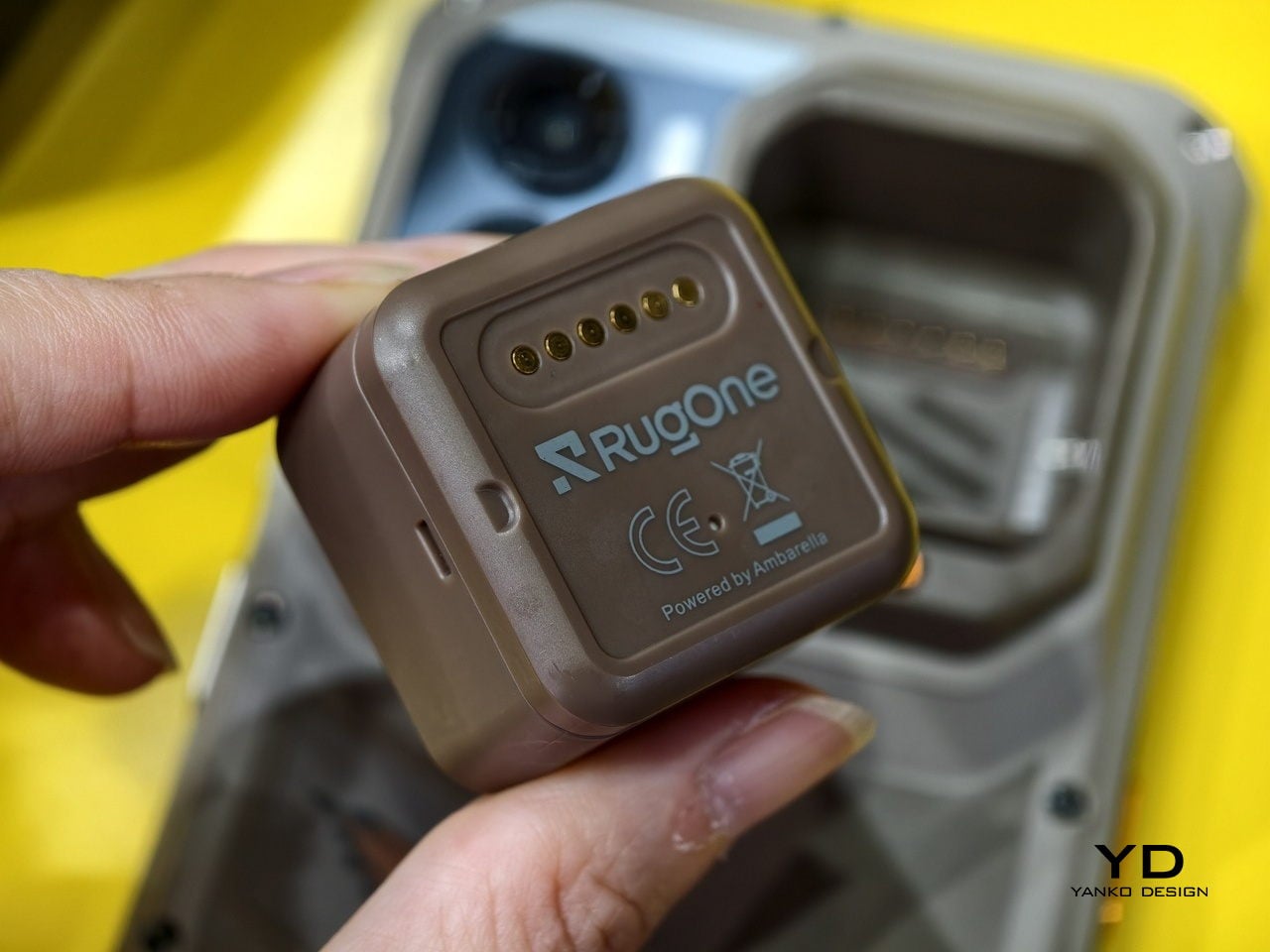
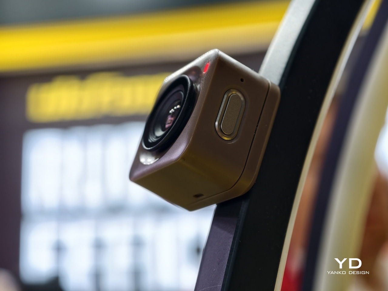
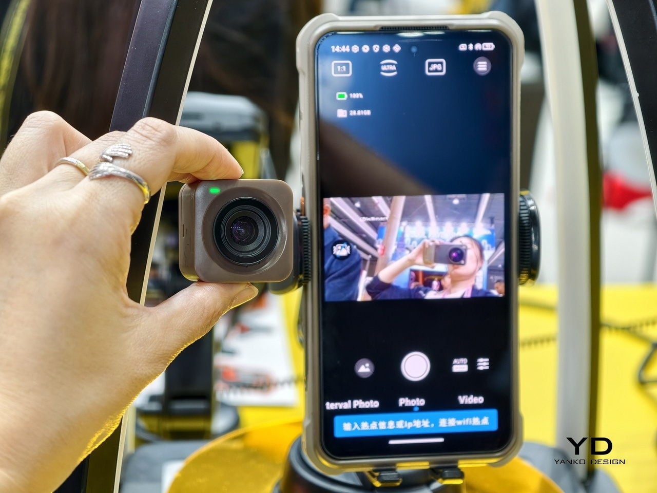
The system works through a magnetic interconnection technology that attaches hardware modules directly to the phone. Telephoto lenses, action cameras, additional battery packs, and over a dozen other components can be added or removed in seconds. The core argument is straightforward: a phone that tries to do everything is permanently weighed down by everything it carries. A phone that adapts to the moment is only as heavy as today demands. Whether TECNO can pull off what Google’s Project Ara could not is another matter, but the design thinking here is at least pointed at the right problem.
What we liked
- The base phone stays slim and fully usable on its own, so you’re not carrying the bulk of a photography rig on days when all you really need is a phone.
- The modular suite covers a wide enough range of options to be genuinely practical, from camera upgrades to battery expansion, rather than limiting you to a couple of cosmetic add-ons.
What we disliked
- Using the system to its full potential requires thinking ahead. If you leave the telephoto module at home, the hiking trail is not going to wait for you to go back and get it.
- The smaller modules seem like prime candidates for disappearing to the bottom of a bag, while the larger ones can add considerable bulk when stacked, which rather defeats the point of keeping the base phone slim.
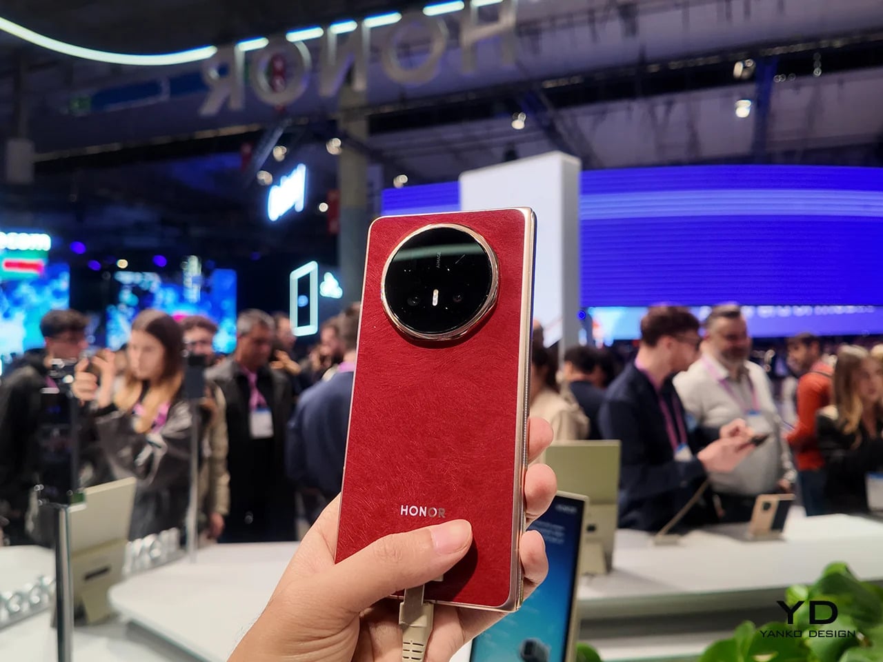
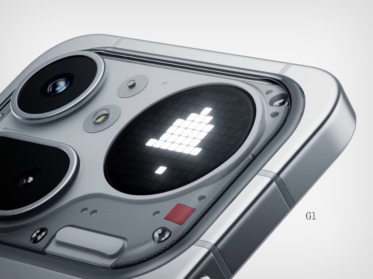
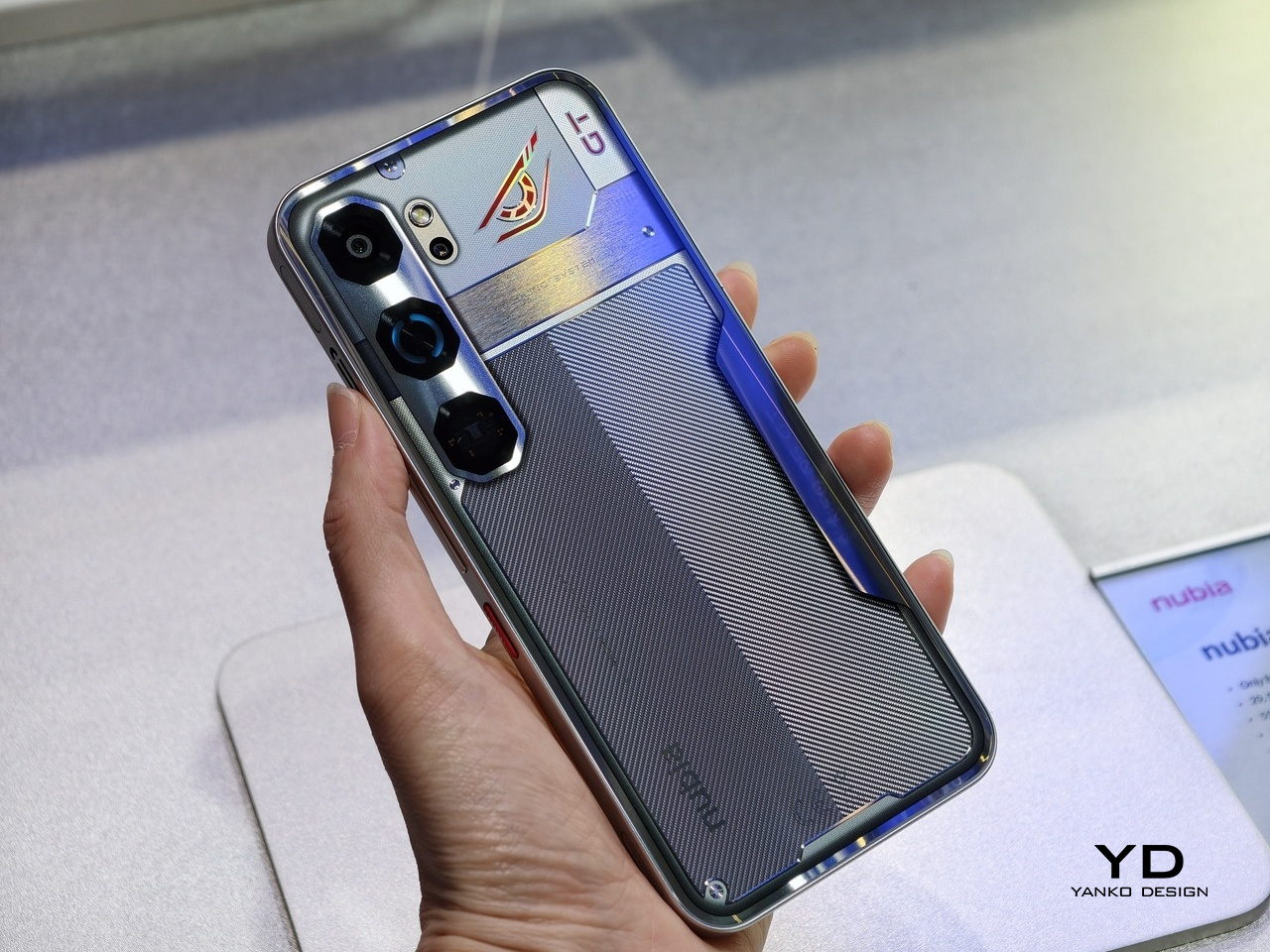
HONOR Alpha Robot Phone
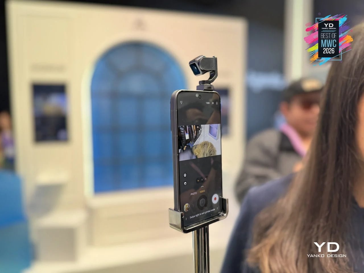
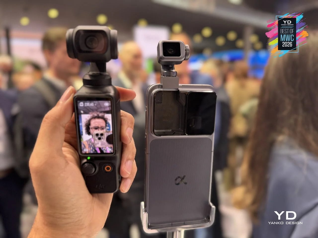
Most phones sit on a desk and wait. The HONOR Alpha does not. Demonstrated as a functional prototype at MWC 2026, this is a phone with a 4DoF gimbal system inside the camera bump, built around what HONOR describes as the industry’s smallest micro motor. Three-axis mechanical stabilization runs alongside an AI tracking engine, and a double-tap locks onto any subject, following it through movement, obstructions, and sudden changes in direction. The person who used to carry a separate DJI Osmo just to get steady footage now has a reasonable question to ask.
Designer: HONOR
The gimbal also does something harder to categorize. HONOR designed it to express what they call embodied AI interaction, meaning the phone physically responds to its environment. It nods during video calls. It reframes itself to keep you centered without being asked. It moves when music plays through its speakers. Phones have had personalities before, mostly through notification lights and ringtones. The Alpha just happens to have something closer to a neck.
What we liked
- Giving AI a physical presence, rather than just a voice or a chat window, makes the technology feel more tangible and less like a background service you forgot was running.
- The built-in gimbal meaningfully expands what the main camera can do without requiring any extra gear, turning a stationary device into something closer to an autonomous one-person film crew.
What we disliked
- Motorized components inside a device that gets dropped, sat on, and shoved into pockets will eventually wear down. A gimbal mechanism that fails out of warranty is a discouraging prospect.
- The behavioral features, nodding, swaying, tracking your face, are the kind of thing that feels charming in a demo and potentially exhausting at 7 AM when all you want to do is check your messages.
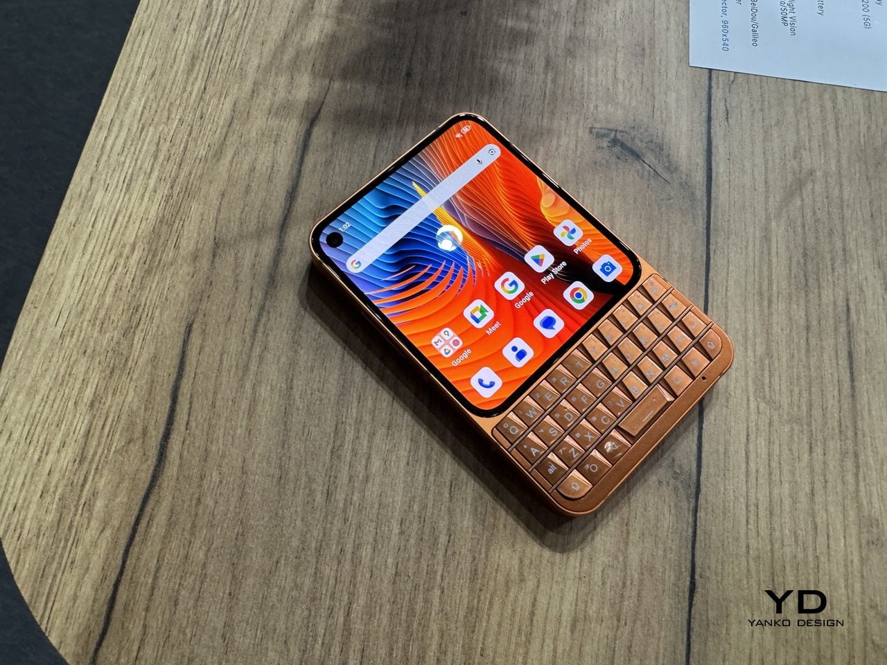
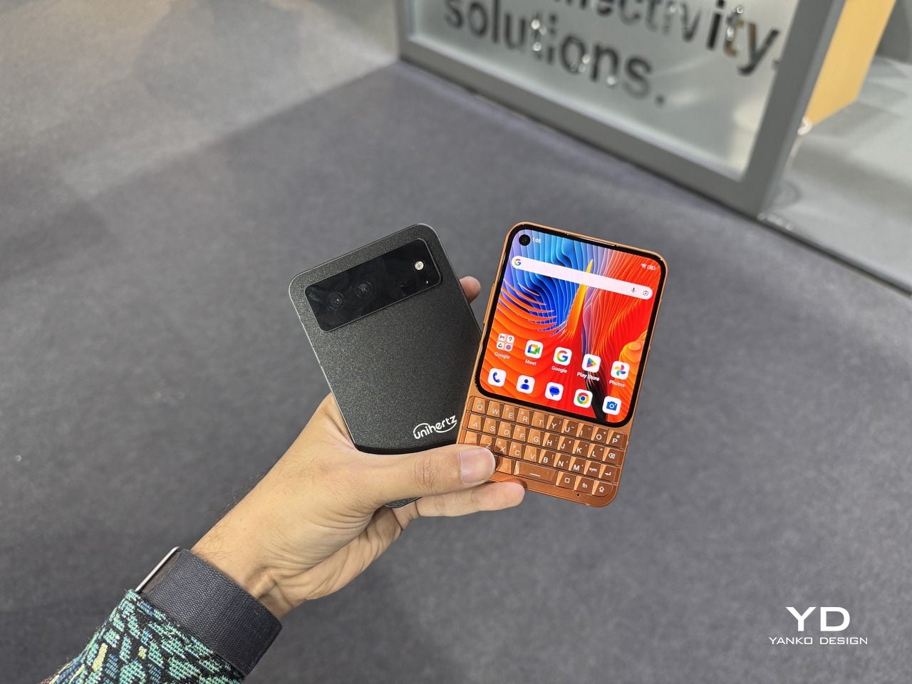
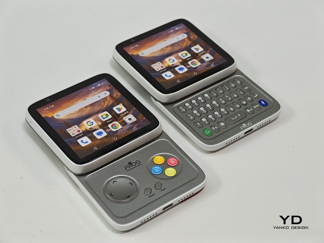
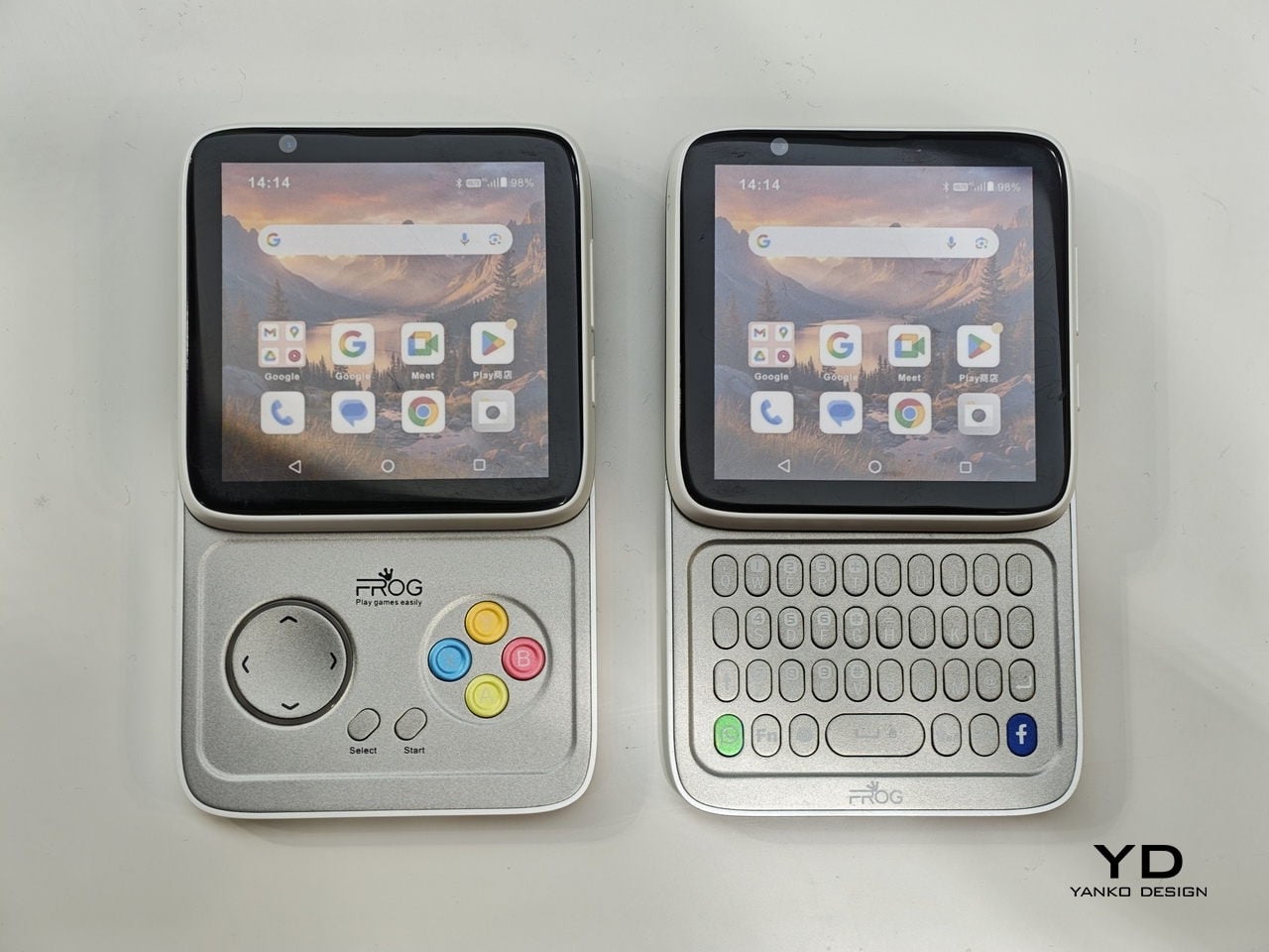
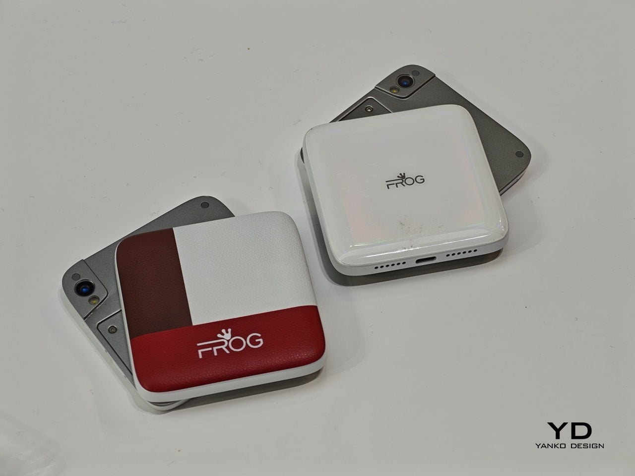
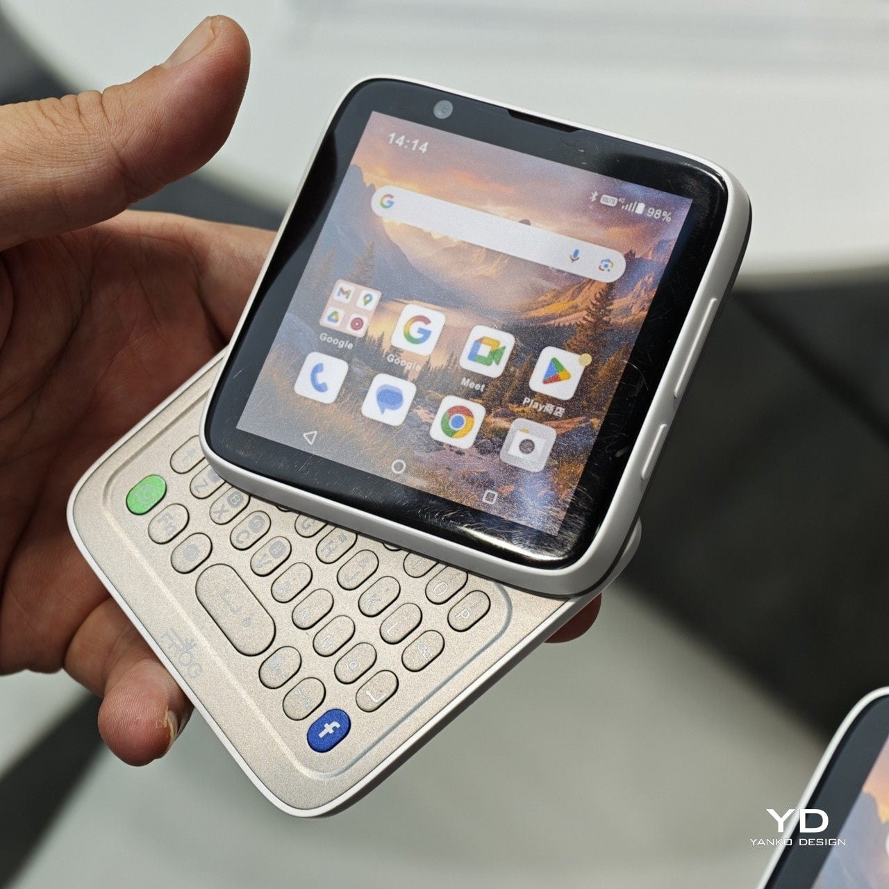
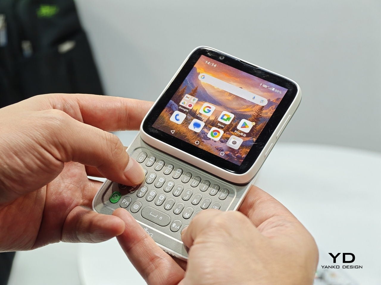
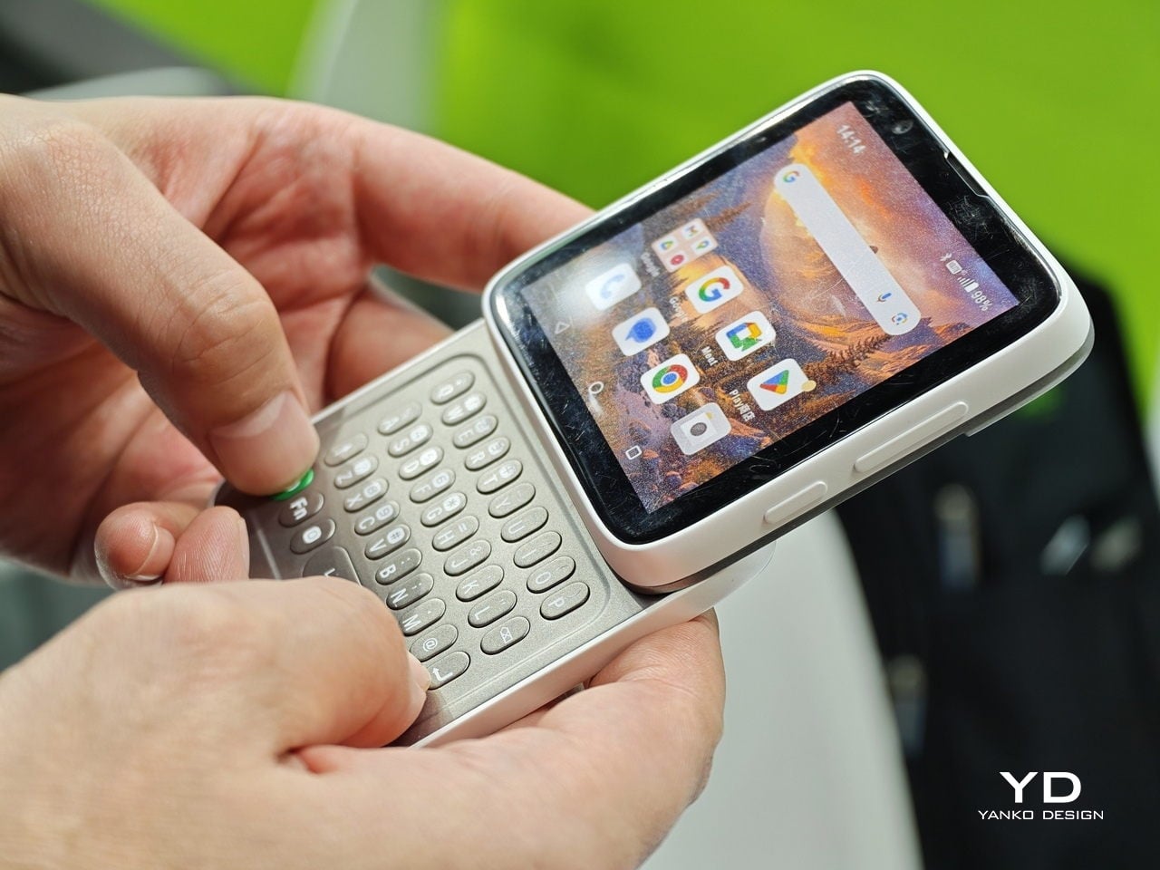
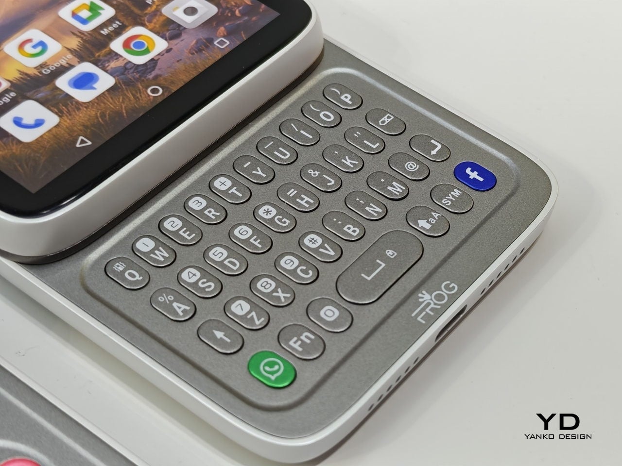
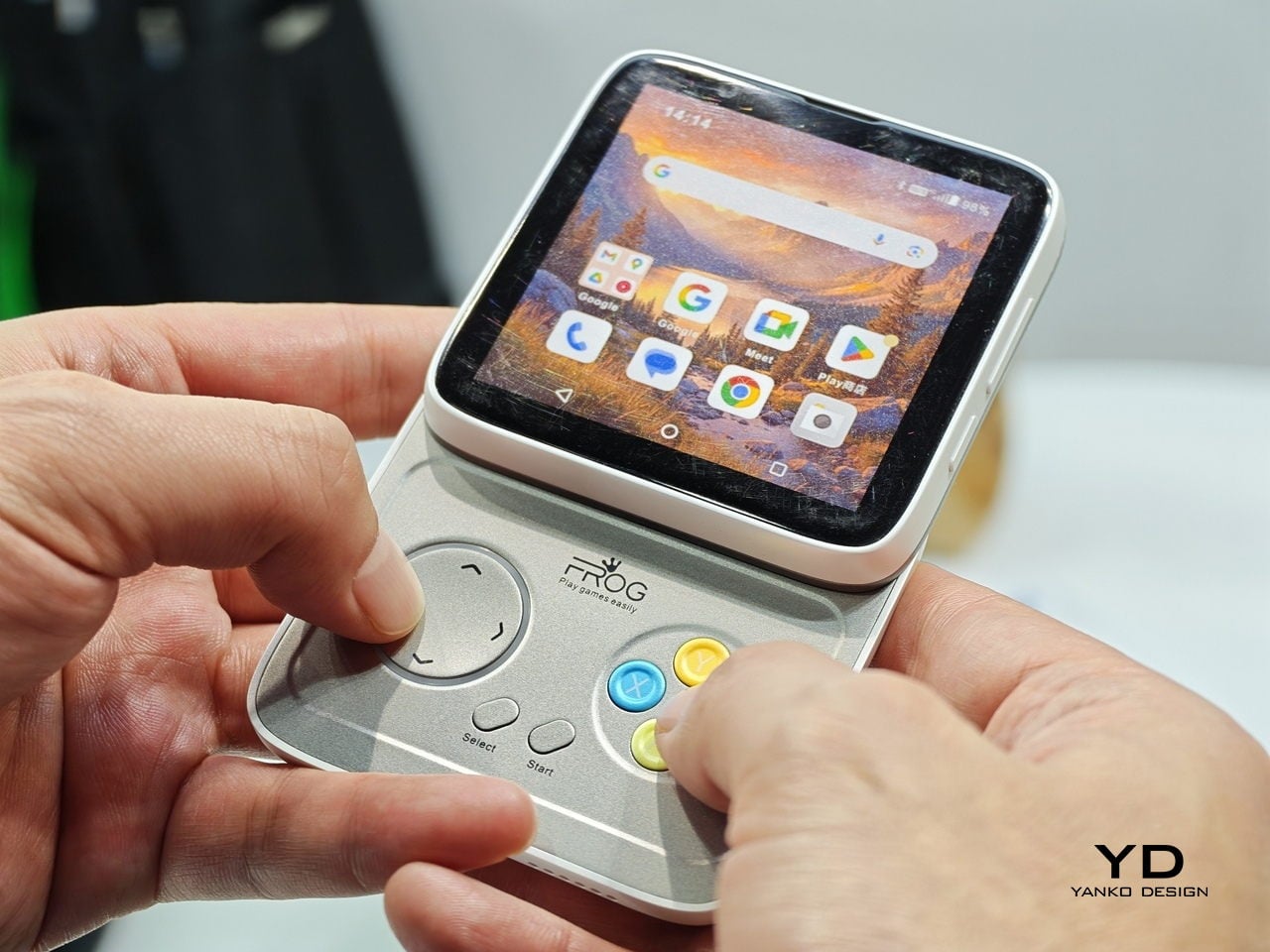
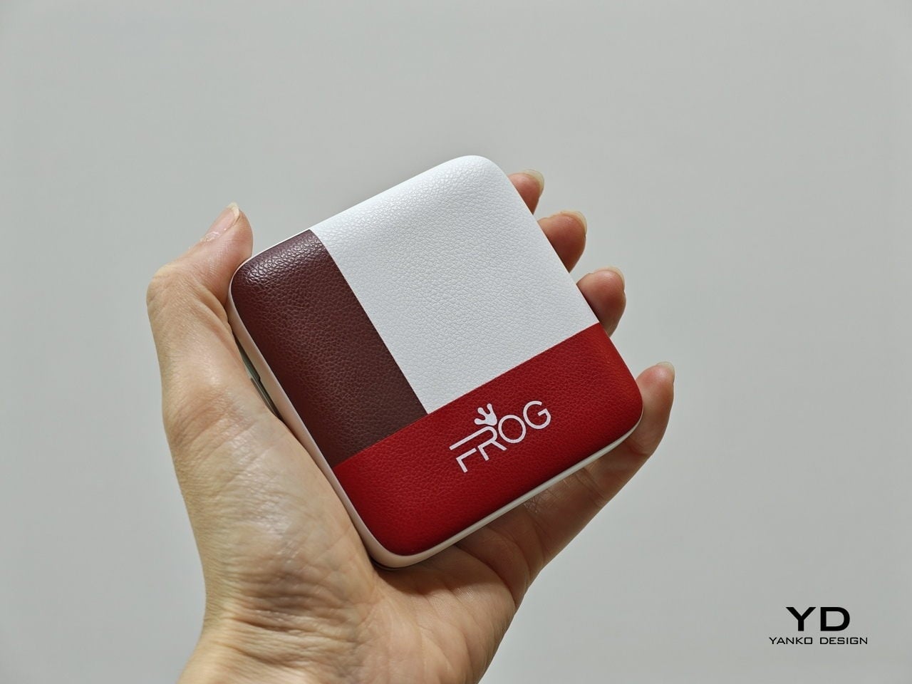
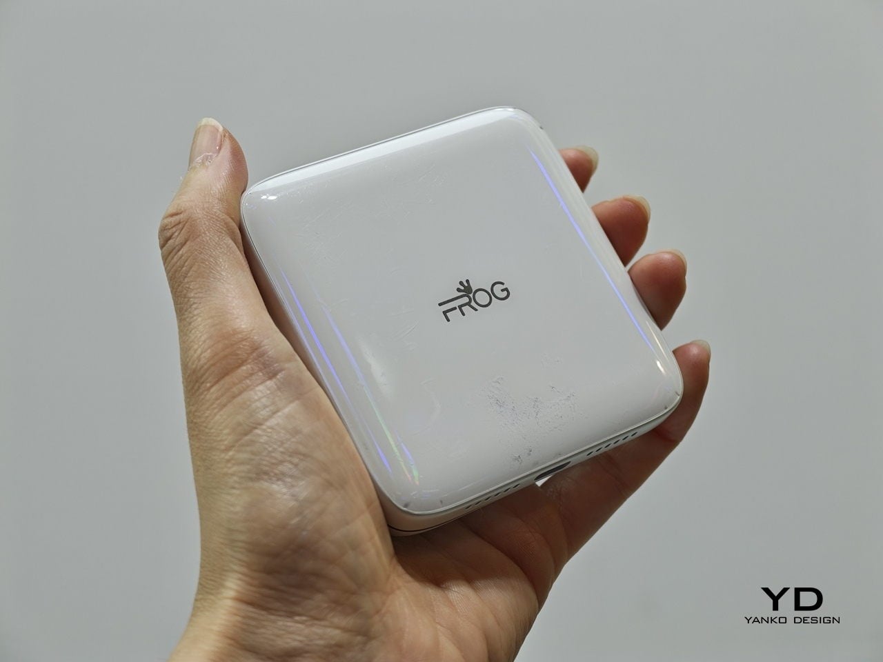
iFROG RS1


Every phone released this year is a tall rectangle, some taller than others. The iFROG RS1, shown at MWC 2026, is a square, which already makes it unusual before you get to the part where it twists open. Built around a 3.4-inch square display, the RS1 has a rotating lower section that reveals one of two things depending on the variant you’re looking at: a full QWERTY keyboard with raised, tactile keycaps, or a gamepad with a D-pad, a four-button cluster, and Select and Start. No price and no release date were announced at MWC, because the hardware itself is the pitch.
Designer: iFROG
The keyboard variant has a clear and underserved audience. The people who have quietly resented touchscreen typing for fifteen years are not a small group, and the Unihertz Titan has been proving that niche quietly for a while. The gamepad version is a stranger and arguably more interesting proposition. Running Android with physical controls in a square body draws instant comparisons to the Motorola Flipout, a 2010 Android phone that did something structurally similar and was adored by a small crowd before being largely ignored by everyone else.
What we liked
- The rotating mechanism keeps the phone genuinely compact in normal use, so the keyboard or game controls are there when you want them and completely invisible when you don’t.
- Adding physical input without making the phone permanently thicker or wider is a trade-off very few devices have come close to solving, and the RS1 at least makes a credible attempt.
What we disliked
- Modern software is built almost entirely around tall, vertical screens, so the square format creates real friction with apps, video, and content that all assume a rectangular display.
- Choosing between the keyboard and gamepad variants at the point of purchase is a long-term commitment. If your priorities shift, or you simply want both, you are looking at two separate phones.
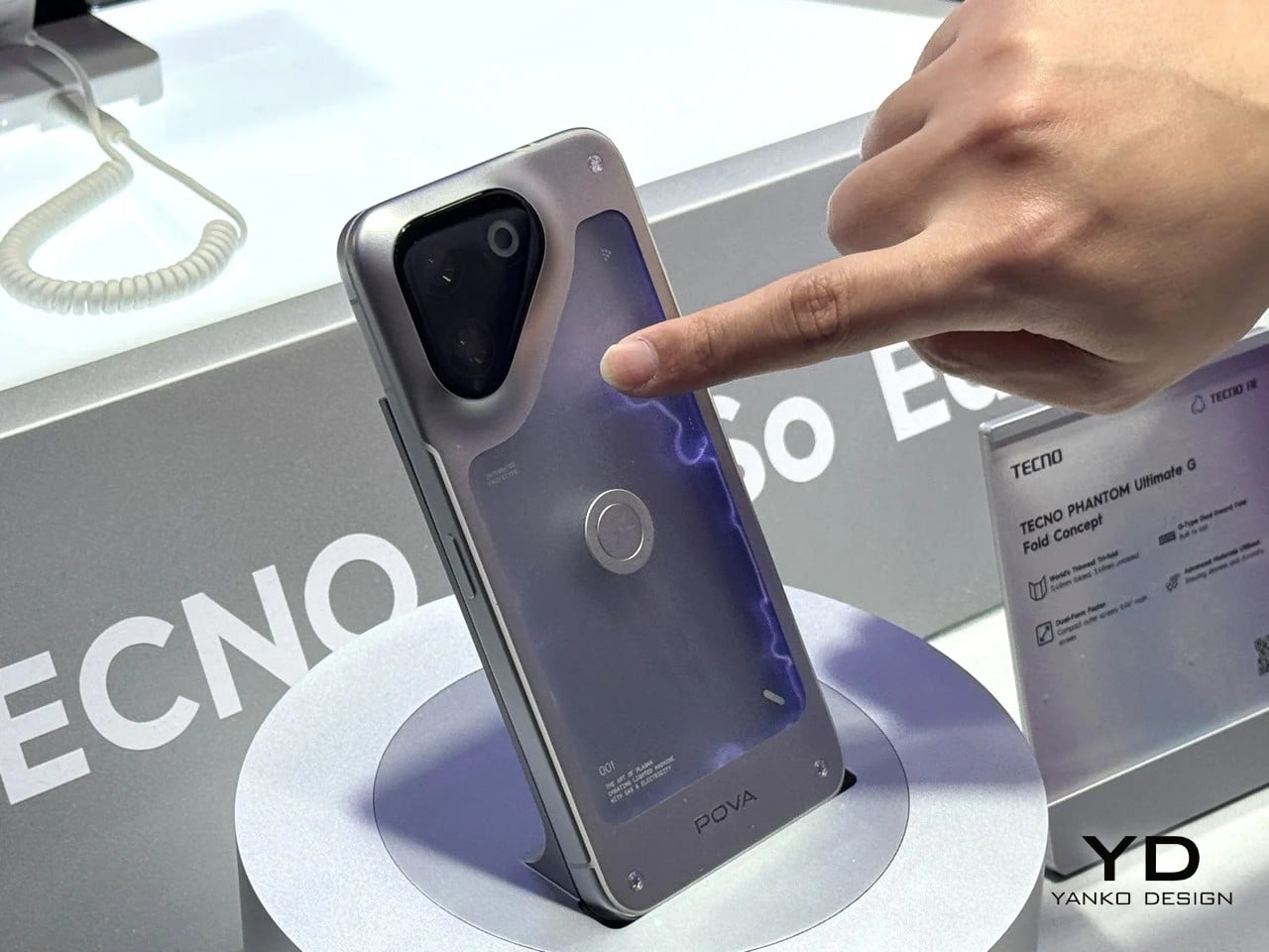
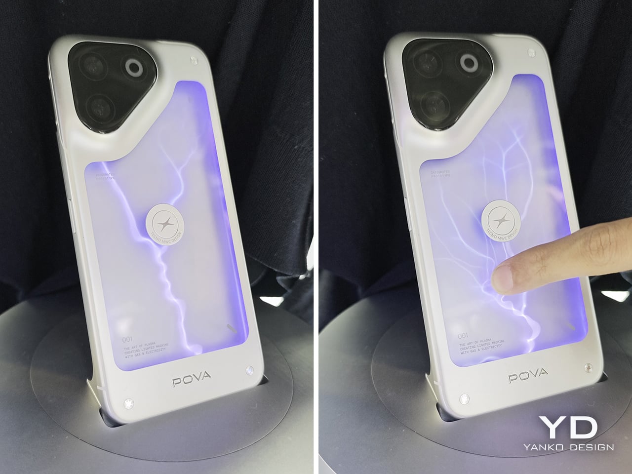
TECNO POVA Neon

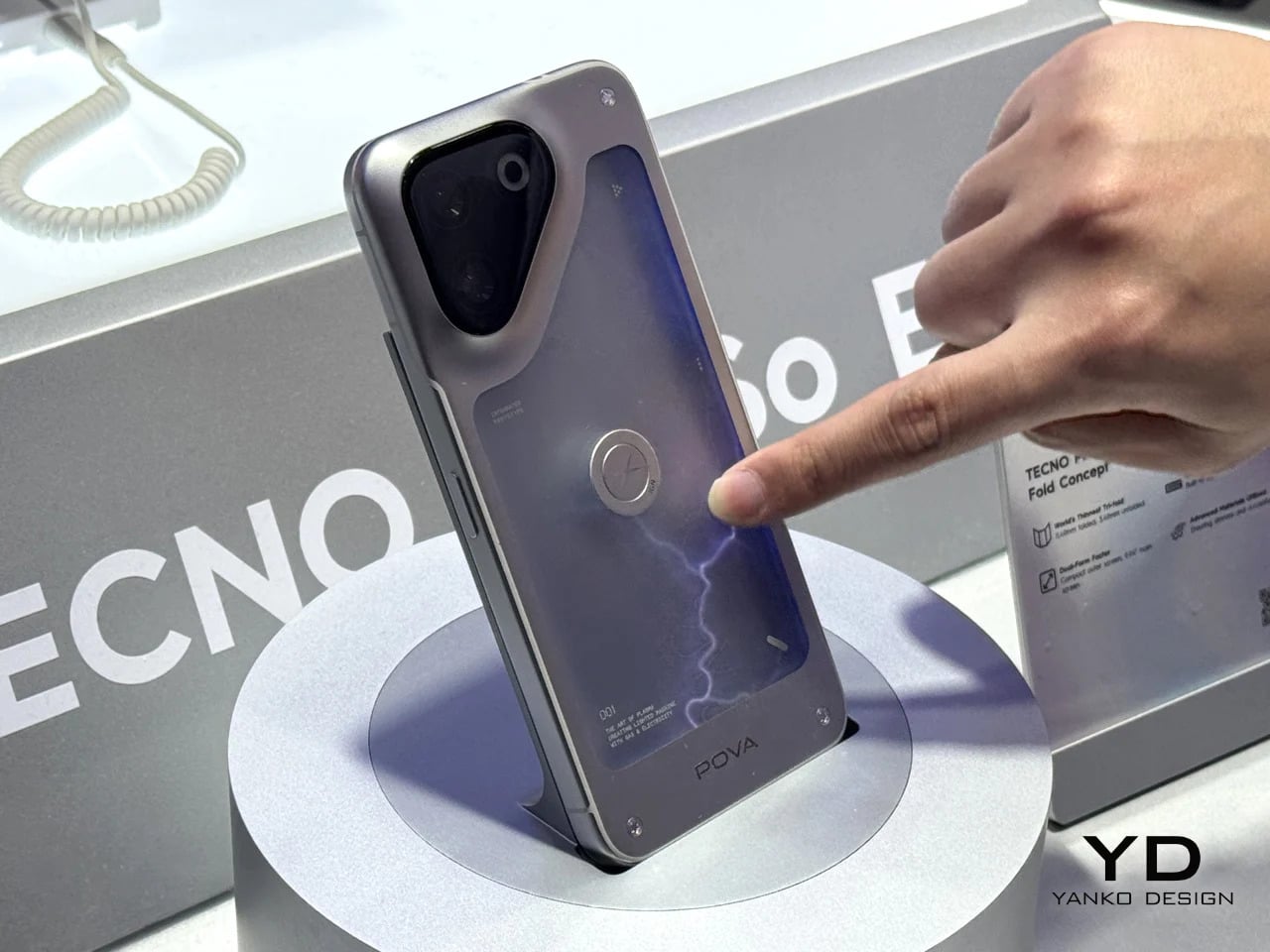
Some phones try to solve a problem, but the POVA Neon honestly isn’t that kind of phone. TECNO’s other MWC 2026 concept uses ionized inert gas lighting, the same technology that gives neon signs their glow, to create a branching luminescent effect on the back panel that sits somewhere between a lightning bolt and a circuit trace. TECNO is not claiming this makes the phone faster or the camera better. The claim is simpler and more honest: a phone’s back doesn’t have to be an inert sheet of glass waiting to collect fingerprints.
Designer: TECNO
As design statements go, that one is actually worth taking seriously. Most phone backs are the most visible surface on a device that billions of people carry every day, and they’re almost universally empty. The POVA Neon asks what happens when that surface does something. The answer here is that it glows, which is not practical and doesn’t need to be. Concept work isn’t obligated to be practical. It’s obligated to make you look at a familiar object differently, and a phone that pulses with light like a neon sign in a diner window at least does that.
What we liked
- Treating the back panel as a dynamic surface rather than a passive sheet of glass is a genuinely fresh direction, and using ionized gas to do it is unlike anything else currently on the market.
- As a concept, it opens up real questions about how materials and lighting could make phone design more expressive without requiring any changes to the screen whatsoever.
What we disliked
- Ionized gas channels in a device that flexes under grip pressure, absorbs impacts, and hits the floor on a semi-regular basis seem like they would not survive the lifespan of the phone itself.
- A protective case, which most people use, would cover the entire back panel and make the concept completely invisible. It is a design that fundamentally cannot coexist with the most basic act of protecting your phone.
Pixel Dynamics iPhone Fold Concept
Foldable phones keep running into the same set of problems. The phone has to fold, which means the screen has to fold, which means the screen eventually creases at the hinge line, the hinge develops resistance over time, and the finished device ends up thicker than either of the two things it’s trying to be. Pixel Dynamic’s iPhone Fold concept approaches the whole premise from a different direction. Keep the iPhone exactly as it is. Add a separate foldable screen to the back.
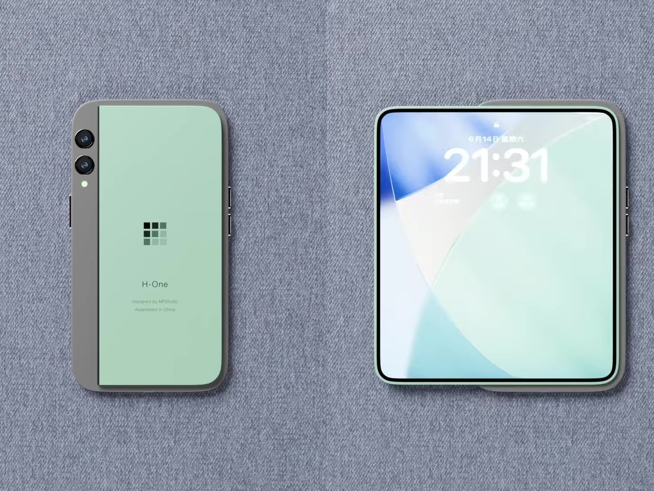
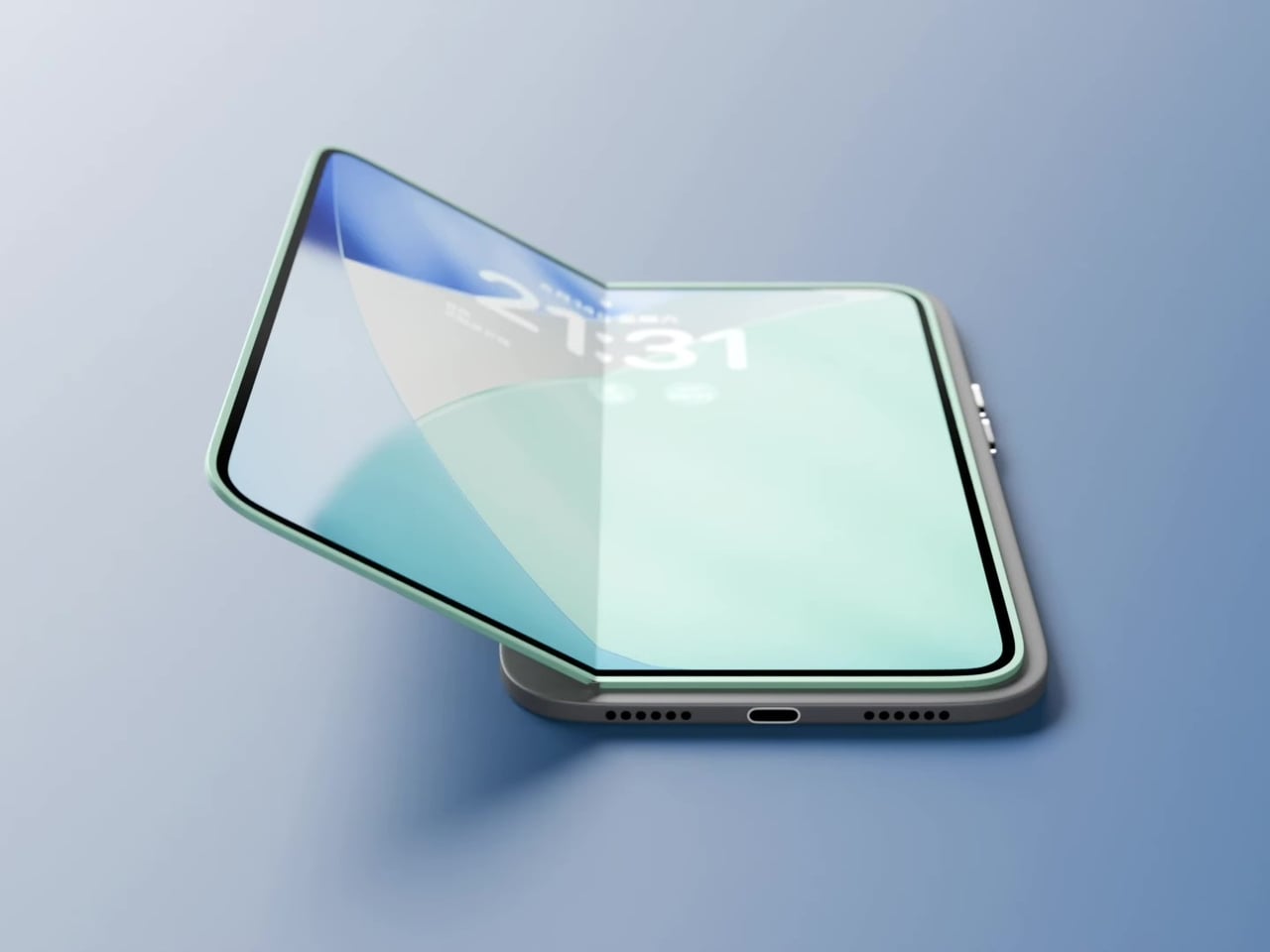
The main iPhone body stays rigid and conventional. A thin, flexible secondary display sits raised on a platform above the rear panel, and when needed, it unfolds outward to create a larger, roughly square tablet surface. The phone itself does not flex, leaving the primary display completely untouched. In daily use, it feels and functions like a normal iPhone, because it essentially is one. That said, the raised platform adds thickness, wireless charging is probably absent, and using the camera while the secondary screen is unfolded becomes nearly impossible since it sits directly over the lenses. Apple almost certainly will never endorse the design, but as a thought experiment about whether a foldable screen and a foldable phone actually need to be the same thing, it’s one of the more original answers anyone has put forward.
What we liked
- Treating the foldable display as a separate, discrete component rather than the phone’s primary structural element is unconventional thinking, and it raises genuinely interesting questions about repairability and modular design.
- The concept challenges the assumption that a foldable phone has to mean a folding device, which is exactly the kind of first-principles questioning that occasionally turns into something the industry actually builds five years later.
What we disliked
- Getting a raised foldable display to sit flush, function reliably through daily use, and survive the realities of a pocket likely puts this well outside what current manufacturing can deliver.
- Apple’s tendency to design through subtraction rather than addition makes this particular execution, with its visible raised platform and external folding mechanism, almost impossible to imagine coming from Cupertino in any recognizable form.
The post Your $1,200 Phone Looks Boring Next to These 5 Concepts first appeared on Yanko Design.