BreakX1 Just Made Karaoke Machines Actually Worth Displaying

Remember when karaoke machines were those clunky black boxes that looked like rejected stereo equipment from the 90s? Yeah, those days are officially over. The BreakX1 Smart Karaoke by designer Liu Wei just snagged a Silver A’ Design Award for 2025, and it’s proof that home entertainment tech can be both functional and seriously good-looking.

What really sets this thing apart is how it moves. The BreakX1 features an innovative hinge design that connects the screen to the speakers, letting you rotate the screen 180 degrees front to back and 120 degrees left to right. It’s the kind of flexibility you didn’t know you needed until you think about it. Whether you’re belting out power ballads from the couch or standing up for your best Beyoncé impression, you can adjust the angle to actually see the lyrics without doing neck gymnastics.

Designer: Liu Wei

The design inspiration comes from an unexpected place: minimalist automotive design, specifically the clean lines of Tesla and Porsche. That aesthetic shows up in the machine’s sleek, soft curves and compact form. It doesn’t scream “karaoke machine” the way older models do. Instead, it looks like something you’d actually want sitting in your living room, not hidden away in a closet between uses.

Liu Wei, who works with Dongguan Aika Electronic Technology Co., developed the BreakX1 between October 2023 and January 2024 in Shenzhen, China. The device is built for the wireless entertainment era, designed to work seamlessly whether you’re hosting an indoor party or taking the show outside for backyard gatherings. That portability is key because modern life doesn’t always happen in one room anymore.

The tech specs back up the design ambitions. The BreakX1 comes equipped with a 2K HD screen that delivers crystal-clear visuals for lyrics, music videos, or whatever else you want to throw at it. The Red Dot Design Award jury noted that the machine “impresses with its exceptional ease of use and attractive appearance,” which is basically the holy grail for consumer electronics. Too often, devices choose one or the other, but this manages both.

What makes the BreakX1 feel current is its versatility beyond just karaoke. Sure, you can use it for singing your heart out, but it’s also designed for listening to music or engaging in what the specs call “audio visual creativity.” That vague-but-intriguing phrase suggests this is really a multi-purpose entertainment hub that adapts to how you want to use it, not the other way around. The design also addresses a real problem with portable entertainment systems: they usually look temporary or makeshift. The BreakX1’s integrated approach, where the screen and speakers form one cohesive unit connected by that flexible hinge, creates a device that feels intentional. It’s the difference between furniture and something you assembled from random parts.

This isn’t just about making karaoke look better (though it definitely does that). It’s about recognizing that home entertainment equipment has become part of our living spaces in ways it wasn’t before. We’re not hiding our tech in cabinets anymore. It’s out, it’s visible, and we want it to look like it belongs. The BreakX1 gets that shift. Liu Wei’s work represents a broader trend in tech design where aesthetics and function aren’t competing priorities but complementary ones. The rotatable screen isn’t just pretty engineering; it solves the real challenge of making one device work for different body positions and room configurations. The minimalist styling isn’t just trendy; it helps the device fit into more home decor situations.

The Silver A’ Design Award recognition confirms what’s already becoming clear: smart entertainment devices need to be smart about more than just their features. They need to understand that users want equipment that enhances their space, not clutters it. The BreakX1 delivers on that promise while still packing in the technology that makes modern karaoke actually fun. Whether this sparks a wave of better-looking karaoke machines remains to be seen, but it’s a solid start. At the very least, it proves that party tech doesn’t have to look like party tech. Sometimes it can just look good.

The post BreakX1 Just Made Karaoke Machines Actually Worth Displaying first appeared on Yanko Design.

Someone Finally Made Video Meetings Look Like a Game Console

There’s something deeply satisfying about watching designers take a swing at corporate boredom. Fevertime, a recent collaboration by Dugyeong Lee, Gyeong Wook Kim, MyeongHoon Cheon, and Dayong Yoon, does exactly that by transforming the typical video conference setup into something that looks like it belongs in a mid-80s arcade.

The concept is deceptively simple: what if meetings felt less like mandatory Zoom rectangles and more like gathering around a shared screen? The team created a physical meeting system inspired by retro game consoles, complete with a bright red spherical camera perched on a stand like some cheerful robot companion, and a base unit that wouldn’t look out of place next to your old Nintendo. There are even cartridge-style slots and that unmistakable game controller aesthetic, all rendered in a palette of scorched red, neon accents, and soft grays.

Designers: Dugyeong Lee, Gyeong Wook Kim, MyeongHoon Cheon, dayong Yoon

But this isn’t just nostalgia bait. The designers identified a real problem with modern collaboration tools: everyone staring at their own screens creates this weird isolation, even when you’re supposedly “together” in a virtual room. Fevertime flips that script by projecting content onto a shared surface, encouraging actual eye contact and spatial awareness. The physical device becomes a focal point, something to gather around rather than disappear behind.

The system lets users set up meetings in advance, defining time, participants, and structure before anyone logs on. When the session starts, participants can instantly share content from their personal devices onto the collective display. Everything stays synced and visible to everyone simultaneously. No more “Can you see my screen?” or fumbling through share settings while everyone waits. The interface shows meeting cards, schedules, and project data in a clean, modular layout that feels more like organizing a playlist than managing corporate logistics.

What makes Fevertime visually compelling is how committed it is to the gaming metaphor. The red sphere isn’t trying to look sleek or invisible like most tech hardware. It wants to be noticed. It practically begs to be the conversation starter in the room. The cartridge system for what appears to be different meeting modes or templates plays into that collectible, tactable quality that made physical media so satisfying. You’re not just clicking through digital menus; you’re handling objects, sliding things into slots, physically engaging with the technology.

The UI design carries that same energy. Bright pink highlight screens pop against neutral backgrounds. Typography is bold and condensed, channeling the space constraints of old arcade cabinets where every pixel counted. Cards and modules feel like game level selects or achievement screens. There’s a playful confidence in the branding, with the Fevertime logo rendered in that wavy, almost melting typography that suggests heat and intensity without being aggressive.

The designers describe the project as capturing “a single moment of high-intensity creative output,” that fever state when an idea finally clicks and everything flows. That philosophy shows up in the pulsing, breathing quality of the custom lettering, where font weights fluctuate to create visual rhythm. It’s design that refuses to sit still, much like the creative process it’s trying to facilitate.

From a product design perspective, Fevertime sits in that interesting space between speculative concept and plausible near-future tech. The physical components look production-ready, with thoughtful details like ventilation ridges on the base unit and a weighted stand for the camera sphere. But there’s also a conceptual boldness here, a willingness to say “what if meeting technology looked completely different from what we’re used to?”

The team used Adobe’s creative suite to develop the project, combining Photoshop and Illustrator for the identity work with After Effects for motion elements. That mix of static and animated content gives Fevertime a kinetic presence even in still images. You can imagine the interface cards sliding, the logo pulsing, the whole system humming with that arcade-ready energy.

Whether Fevertime ever makes it to market is almost beside the point. As a design exercise, it asks useful questions about how we physically and emotionally experience collaboration technology. It challenges the assumption that workplace tools need to look serious and minimal. And it demonstrates how pulling from gaming culture can make even something as mundane as meeting software feel fresh and approachable. Sometimes the best design projects are the ones that make you think, “Wait, why doesn’t everything look like this?”

The post Someone Finally Made Video Meetings Look Like a Game Console first appeared on Yanko Design.

A Digital Music Player with FLAC Files and a Built-In Speaker

There’s something oddly comforting about watching the vinyl resurgence happen in real time. We’ve collectively decided that convenience isn’t everything, that sometimes the ritual matters as much as the result. But while turntables have been getting their moment in the spotlight, another piece of audio history has been quietly staging its own comeback: the dedicated digital audio player.

Enter the DAP-1, a concept device from Frankfurt-based 3D artist and art director Florent Porta that asks a simple but compelling question: what if we took the best parts of portable audio’s past and reimagined them for today?

Designer: Florent Porta

Porta, who’s built a reputation creating everything from viral 3D animations to commercial work for brands like McDonald’s and Tuborg, recently unveiled this personal project after letting it sit unfinished for over a year. Sometimes the best ideas need time to breathe, and the DAP-1 feels like it benefited from that patience.

At first glance, the device looks like it could have been pulled from an alternate timeline where iPods evolved differently. There’s a clean, minimalist aesthetic that feels both retro and contemporary. The most striking feature is the OLED touchscreen, which gives the device a modern interface while maintaining the dedicated hardware approach that made original DAPs so appealing to audiophiles.

But here’s where it gets interesting: Porta included a built-in speaker. His parenthetical aside of “because why not” undersells what’s actually a clever design choice. Most high-end portable audio players skip integrated speakers entirely, assuming users will always have headphones or want to connect to external systems. The DAP-1 challenges that assumption. Sometimes you just want to share what you’re listening to without fumbling for a Bluetooth speaker or passing around earbuds.

The real substance of the DAP-1 lies in its commitment to high-resolution FLAC file playback. While streaming services have made music more accessible than ever, they’ve also created a generation of listeners who’ve never heard what their favorite songs actually sound like without compression artifacts. FLAC files, which preserve audio quality without the data loss of MP3s or streaming codecs, require dedicated hardware and storage. The DAP-1 embraces this limitation rather than trying to work around it.

This positions the device squarely in the current audio zeitgeist. Audiophiles have long argued that we lost something important in the transition from physical media to streaming, and they’re not entirely wrong. There’s a noticeable difference between a 320kbps Spotify stream and a lossless file, especially if you’re using decent headphones. The question is whether that difference matters enough to justify carrying a separate device.

For some listeners, the answer is becoming yes. The same impulse that drives people to buy vinyl despite its inconvenience applies here. There’s value in intentionality, in choosing to engage with music as an activity rather than ambient background noise. A dedicated audio player forces you to curate your library, to think about what you’re bringing with you rather than having infinite options at every moment.

What makes the DAP-1 particularly noteworthy as a concept is its timing. We’re seeing a broader cultural pushback against the smartphone-as-everything approach to technology. People are buying digital cameras again, rediscovering e-readers, and reconsidering whether having every tool in one device actually serves them well. The DAP-1 fits perfectly into this moment of technological reevaluation.

Of course, as a concept design, the DAP-1 exists primarily as a beautifully rendered 3D vision rather than a physical product you can actually purchase. Porta’s background in 3D animation and motion graphics means the device looks stunning in its presentation, with the kind of glossy perfection that concept renders do so well. Whether it will ever make the jump from screen to hand remains to be seen.

But that might not be the point. The best concept designs don’t just imagine new products; they spark conversations about what we actually want from our technology. The DAP-1 succeeds in asking whether we’ve given up something valuable in our rush toward convergence and convenience. It suggests that maybe, just maybe, there’s still room in our pockets and our lives for devices that do one thing exceptionally well rather than everything adequately. The DAP-1 proposes something quietly radical: focused, high-quality audio experiences on your own terms. That’s a concept worth tuning into.

The post A Digital Music Player with FLAC Files and a Built-In Speaker first appeared on Yanko Design.

Fauna Robotics Just Built the First Humanoid You’d Want Home

Picture a humanoid robot, and you probably imagine something sleek, vaguely threatening, or at least a little cold. Maybe it’s built for a factory floor, towering and intimidating, or designed to look eerily human in a way that triggers that uncanny valley feeling. Either way, it’s not exactly something you’d want hanging around your living room.

That’s what makes Sprout so different. This portable humanoid from Fauna Robotics just launched out of stealth mode, and it’s taking a completely opposite approach to robot design. Instead of trying to look impressively human or industrial, Sprout leans into something that feels refreshingly approachable and, dare I say it, genuinely charming.

Designer: Fauna Robotics

Standing just 3.5 feet tall and weighing about 50 pounds, Sprout is compact and lightweight in ways that most humanoid robots simply aren’t. But what really sets it apart are those antenna-like eyebrows perched on its wide, rectangular head. They move up and down like little windshield wipers, giving this robot an expressive quality that feels more Pixar character than sterile machine.

The eyebrows work alongside a 360-degree LED facial display that animates with different light patterns and colors, plus body language that includes walking, kneeling, crawling, and sitting. Together, these features create a communication style that doesn’t rely on mimicking human faces or voices alone. Instead, Sprout uses a whole vocabulary of movement and light to express what it’s doing or feeling, which somehow makes it feel less like a failed attempt at humanity and more like its own friendly creature.

The design philosophy here clearly draws inspiration from beloved fictional robots like Baymax from Big Hero 6 or Rosie from The Jetsons, characters designed to feel helpful rather than threatening. Fauna Robotics wrapped the whole thing in a soft, padded exterior that’s safe to touch, and the company emphasizes that Sprout is built to operate in shared human spaces, around adults, children, and even pets.

This isn’t just a cute toy, though. The Creator Edition that’s shipping now is aimed at developers, researchers, and institutions that want to experiment with embodied AI in real-world settings. Sprout comes with some serious tech under that friendly exterior, including an NVIDIA Jetson AGX Orin processor with 64GB, stereoscopic vision, four time-of-flight sensors, a directional microphone array, and dual speakers.

Early customers are already putting Sprout to work. Disney, Boston Dynamics, UC San Diego, and NYU are all testing applications across retail, entertainment, home services, and research. The robot can navigate both indoor and outdoor environments without needing restricted zones, and its battery runs for about 3 to 3.5 hours before needing a swap. The price tag sits at $50,000 for the Creator Edition, which positions it as a serious development platform rather than a consumer product ready for mass adoption. But that’s kind of the point. Fauna Robotics is building the foundation for what humanoid robots could become once they leave the factory and start mingling with regular people in everyday spaces.

What strikes me most about Sprout is how it sidesteps the whole debate about whether robots should look human. By embracing a more abstract, expressive design, it avoids that creepy almost-human trap while still feeling relatable and engaging. Those eyebrows, as simple as they are, do more emotional heavy lifting than a thousand attempts at realistic facial expressions.

The broader question, of course, is whether we’re ready for robots like this in our lives. But maybe that’s the wrong question. Maybe the better question is whether robots are ready for us, designed in ways that make interaction feel natural rather than forced or unsettling. Sprout suggests that the path forward might not be about making robots that look like people, but rather creating robots that feel like they belong in the spaces where people actually live, work, and play.

With its soft exterior, expressive features, and human-scale design, Sprout represents a different vision of what personal robotics could look like. Whether it succeeds in changing minds about humanoid robots remains to be seen, but those articulated eyebrows are certainly making a compelling argument.

The post Fauna Robotics Just Built the First Humanoid You’d Want Home first appeared on Yanko Design.

DIYer creates a retro-modern typewriter computer with moving screen on the slide

What’s the precursor of the computer? The typewriter, of course. Taking things the other way around, a DIYer has built a gaming PC inside an old typewriter for the sake of technology. First of its kind, this DIY is all about building everything from scratch to have a typewriter that works better than your average computer.

Fitting a computer inside a typewriter requires a lot of brainstorming about which components are useful and which can give way to the PC components. Sounds easy, doesn’t it? The art here is to be very careful when removing unwanted parts like the keyboard, motor, and side brackets, while still retaining the slide’s functionality via the hammers and the main movement.

Designer: Prototype

After removing the components, there is just enough space to fit in a motherboard, power supply, and a graphics card. Before sorting this bit of the DIY, the first step is to sort out the keyboard assembly by preplacing it with a modern keyboard that is made from scratch, using the keys of the keyboard to keep the theme alive. This is where 3D printing comes in by taking a 360-degree scan of the typewriter’s keyboard and modelling the desired keyboard case that has more height for fitting in all the PCB components of a modern keyboard. The hard part here is to make the PCB assembly that corresponds to the key input and send it over to a PCB manufacturer to make.

Next comes the easy bit, where the keycaps are 3D modelled and printed to test fit the adapters. Attaching them to the corresponding key strokes does the job. The backplate is a cakewalk, and the parts are done. Finally, all the parts are put together, and the keyboard for the typewriter is ready. Then it’s time to connect the keyboard to the complex working of the computer using a servo motor. To test the thing, the DIYer attaches it to his laptop, and it works all fine with the slide and the bell working perfectly.

The final part is to fit the PC mechanism and screen onto the typewriter assembly for the magic as the typing action moves the whole thing on the slide. Incredible, I must say. The final part of the build is yet to be released, but we know what to expect!

The post DIYer creates a retro-modern typewriter computer with moving screen on the slide first appeared on Yanko Design.

This 6-Fingered Robot Hand Crawls Away From Its Own Arm

Imagine a robotic hand that not only mimics human dexterity but completely reimagines what a hand can do. Researchers at École Polytechnique Fédérale de Lausanne (EPFL) have developed something that looks like it crawled straight out of a sci-fi fever dream: a modular robotic hand that can detach from its arm, scuttle across surfaces spider-style, and grab multiple objects at once.

The human hand has long been considered the gold standard for dexterity. But here’s the thing about trying to replicate perfection: you often inherit its limitations, too. Our hands are fundamentally asymmetrical. We have one opposable thumb per hand, which means we’re constantly repositioning our wrists and contorting our bodies to reach awkwardly placed objects or grasp items from different angles. Try reaching behind your hand while keeping a firm grip on something, and you’ll quickly understand the problem.

Designer: École Polytechnique Fédérale de Lausanne’s (EPFL) school of engineering

The team at EPFL, led by Aude Billard from the Learning Algorithms and Systems Laboratory, decided to throw the rulebook out the window. Instead of copying human anatomy, they created something better: a symmetrical hand that features up to six identical fingers, each tipped with silicone for grip. The genius lies in the design, where any combination of fingers can form opposing pairs for pinching and grasping. No single designated thumb here.

But wait, it gets wilder. The hand is completely reversible, meaning the palm and back are interchangeable. Flip it over, and it works just as effectively from either side. This eliminates the need for awkward repositioning and opens up grasping possibilities that humans simply can’t achieve. The device can perform 33 different types of human grasping motions, and thanks to its modular design, it can hold multiple objects simultaneously with fewer fingers than we’d need.

The most mind-bending feature? This hand can literally walk away from its job. Using a magnetic attachment and motor-driven bolt system, it detaches from its robotic arm and crawls independently to retrieve objects beyond the arm’s reach. Picture a warehouse robot that needs to grab something just out of range. Instead of the entire system repositioning, the hand simply walks over, grabs what it needs, and returns like a loyal (if slightly creepy) pet.

The practical applications are staggering. In industrial settings, this kind of “loco-manipulation” (locomotion plus manipulation) could revolutionize how robots interact with their environments. Service robots could navigate complex spaces and handle multiple tasks without constant human intervention. In exploratory robotics, think Mars rovers or deep-sea vehicles, a detachable hand could investigate tight spaces or retrieve samples from areas the main body can’t access.

The research team’s work, published in Nature, demonstrates that symmetrical design provides measurably better performance, with 5 to 10 percent improvements in crawling distance compared to traditional asymmetric configurations. The hand’s 160mm diameter palm houses motors that mimic the natural forward movement of human finger joints, but without being constrained by human limitations.

What makes this project so compelling isn’t just the technical achievement. It’s the philosophical shift it represents. For years, robotics has been obsessed with replicating human form and function. But by questioning whether human design is actually optimal for all tasks, the EPFL team has created something that surpasses our biological blueprint. It’s a reminder that innovation often requires abandoning our assumptions about how things should work.

This robotic hand represents more than just another engineering marvel. It’s a glimpse into a future where machines aren’t limited by human constraints, where form follows function in unexpected ways, and where a hand doesn’t need to stay attached to be incredibly handy. Whether it’s retrieving your dropped phone from under the couch or assembling complex machinery in factories, this crawling, grasping, reversible wonder proves that sometimes the best way forward is to let go of convention entirely.

The post This 6-Fingered Robot Hand Crawls Away From Its Own Arm first appeared on Yanko Design.

5 Best Tech Gadgets of February 2026

February finds us in that strange liminal space where the hype of CES has barely settled and the actual products are just starting to trickle into reality. This year brought us plenty of vaporware wrapped in ambitious promises, but these five gadgets represent something different. They solve real problems with clever engineering and genuinely fresh thinking.

Walking the show floor in Vegas last month revealed a clear shift away from novelty toward utility. The best announcements were the ones that respected your workflow, your attention, and the physical space you live in. These five designs emerge from that ethos. They are tools that bend technology to fit your life rather than demanding you rearrange yourself around yet another screen or charging cable.

1. Keychron Nape Pro

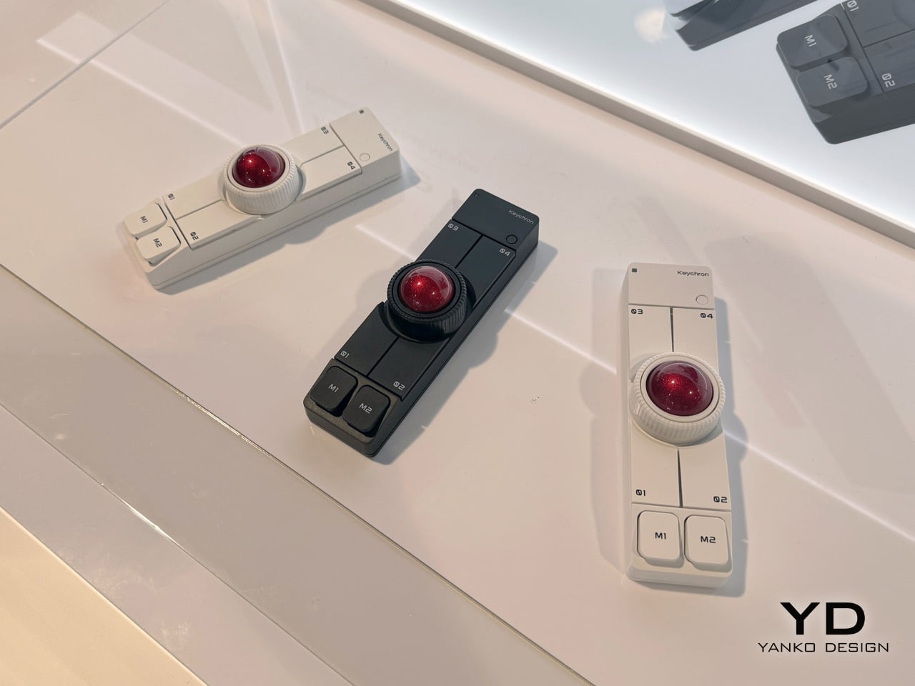
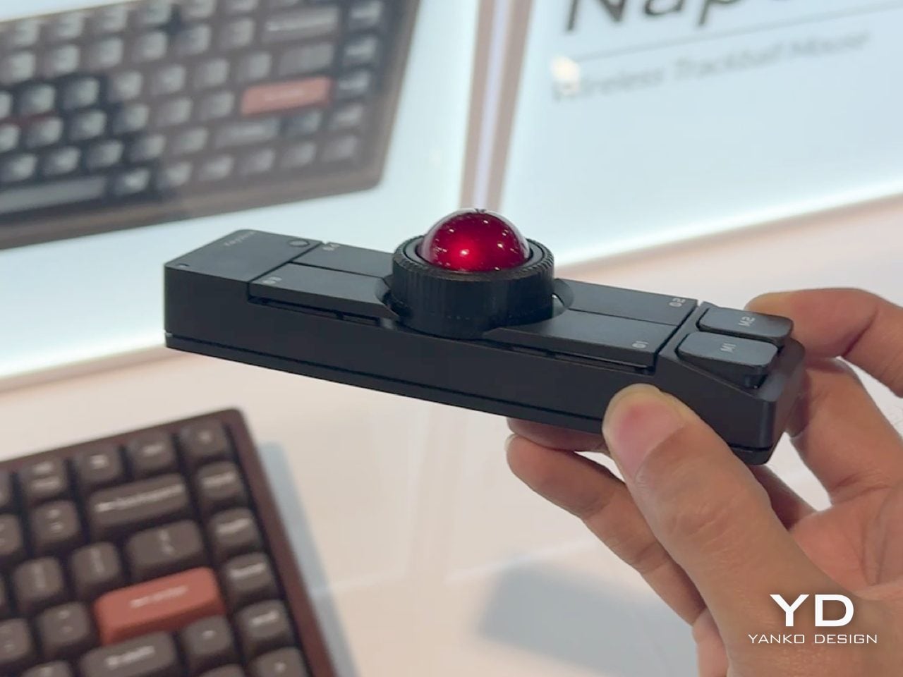
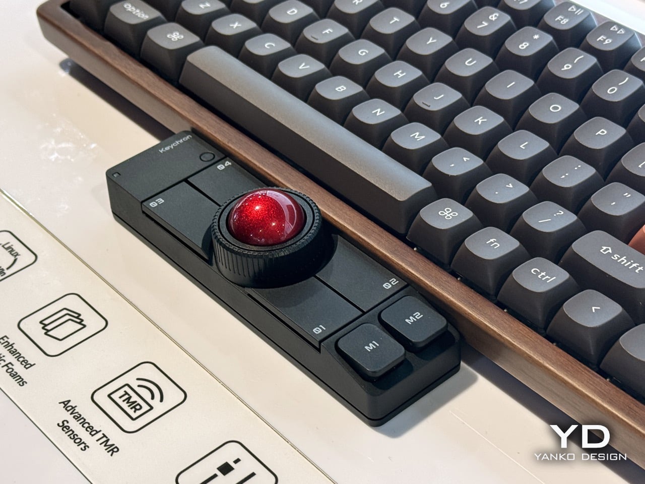
Keychron carved out a reputation for building mechanical keyboards that do not compromise on quality while remaining accessible. The Nape Pro takes that same philosophy and applies it to the awkward gap between your hands and your cursor. What results is a modular trackball that sits under your keyboard and turns typing sessions into something smoother and less physically punishing.

The design prioritizes economy of motion. Thumb operation means your hands stay planted on the home row. No more stretching for a distant mouse or breaking your typing flow for minor navigation tasks. The 25 mm trackball is noticeably smaller than desktop monsters like the Kensington Expert, but that size feels intentional. It is responsive without demanding the kind of hand repositioning that defeats the whole purpose. The unit occupies just 135.2 mm in length and 34.7 mm in width, so it tucks neatly within a tenkeyless footprint. Quiet Huano micro switches across six buttons ensure you are not broadcasting every click to anyone within earshot. ZMK customization means layers, shortcuts, and macros live right where your thumb rests. It is a genuinely modular control surface disguised as a pointing device, and the wireless connectivity means you can slide it around without cable anxiety.

What We Like

• The compact footprint means it works on cramped desks without territorial disputes with your keyboard.

• Thumb operation keeps your fingers on home row and drastically reduces reaching.

• ZMK-powered layers bring macro pad functionality without needing a separate device.

• Quiet switches make sense for something living directly under your palms during work calls.

What We Dislike

• The 25 mm ball is smaller than dedicated trackball users might prefer for precision tasks.

• Wireless means yet another thing competing for battery attention in your peripherals drawer.

2. TWS Earbuds with Built-in Cameras

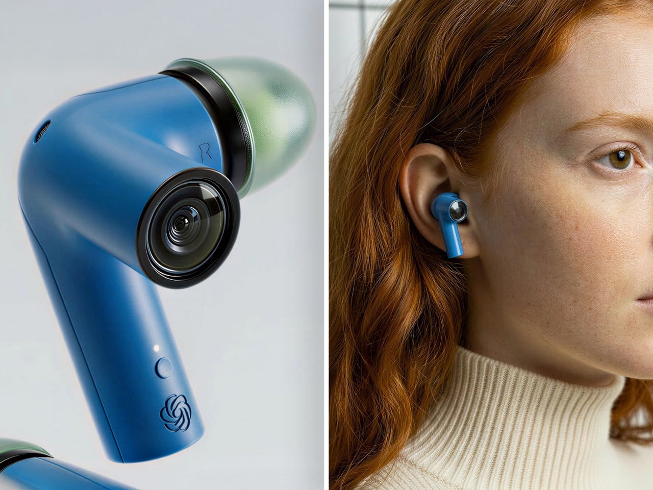
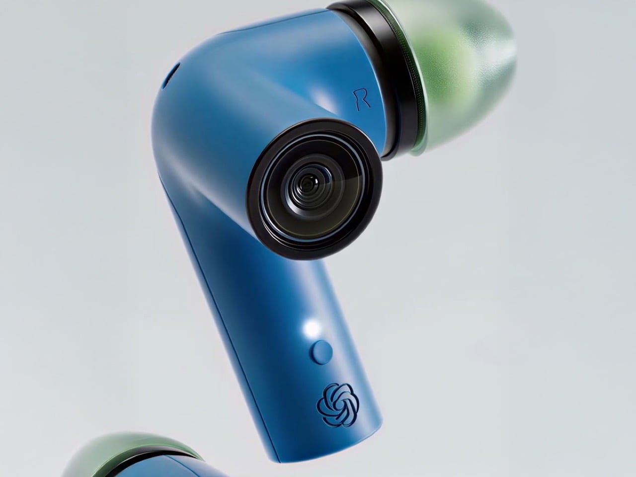
The race to build wearable AI took a weird turn with pins, pendants, and smart glasses that scream, “I am wearing a camera.” This concept flips the script by hiding the whole thing in earbuds. Each stem carries a camera positioned near your natural line of sight. Paired with ChatGPT, those lenses feed a constant visual stream to an assistant that lives in your ears without broadcasting your tech evangelist status to everyone you meet.

The brilliance is in the form factor. TWS earbuds are already socially normalized. People wear them everywhere without raising eyebrows. Adding cameras to the stems turns a familiar object into something functionally new without the social friction of face-mounted glass. The setup can read menus, interpret signs, describe scenes, and guide navigation through unfamiliar cities without demanding you pull out your phone. Voice interaction keeps your hands free. The AI processes visual information in real time and responds through audio, creating a genuinely assistive loop that does not require staring at a screen. It is the kind of product that could make AI feel less like a gimmick and more like a utility you actually use daily. OpenAI has been hunting for a hardware play that sticks. This might be the one that finally makes sense beyond early adopters and conference demos.

What We Like

• Form factor avoids the social awkwardness of wearing cameras on your face in public spaces.

• Voice and audio interaction keep your hands free and your phone in your pocket.

• Real-time visual processing paired with ChatGPT turns navigation and scene interpretation into something genuinely useful.

• Familiar earbud design means minimal learning curve for adoption.

What We Dislike

• Battery life will be a concern with cameras and AI processing running on tiny earbud cells.

• Privacy questions around always-on cameras in social settings will be unavoidable.

3. Focus Desktop Board

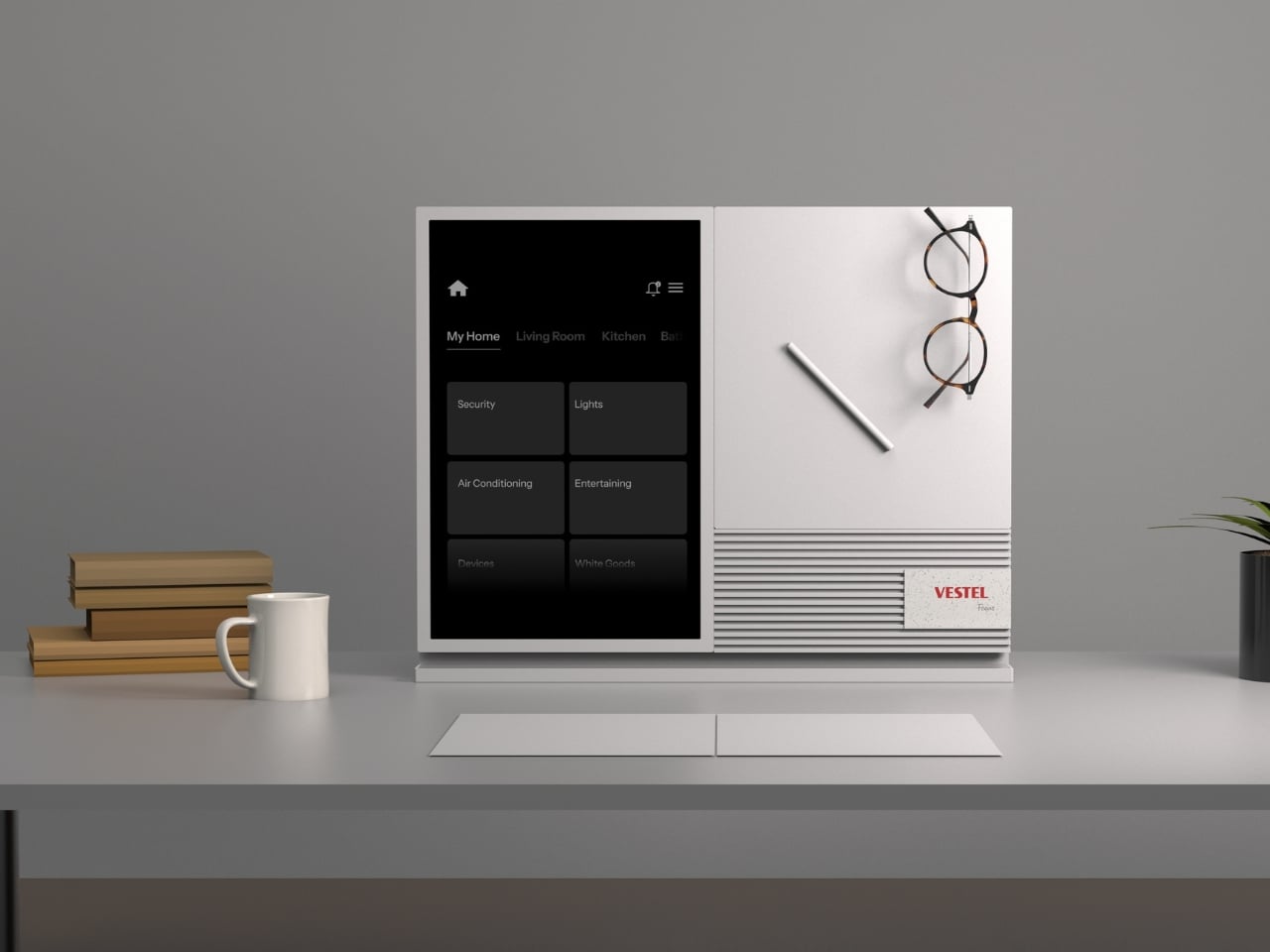
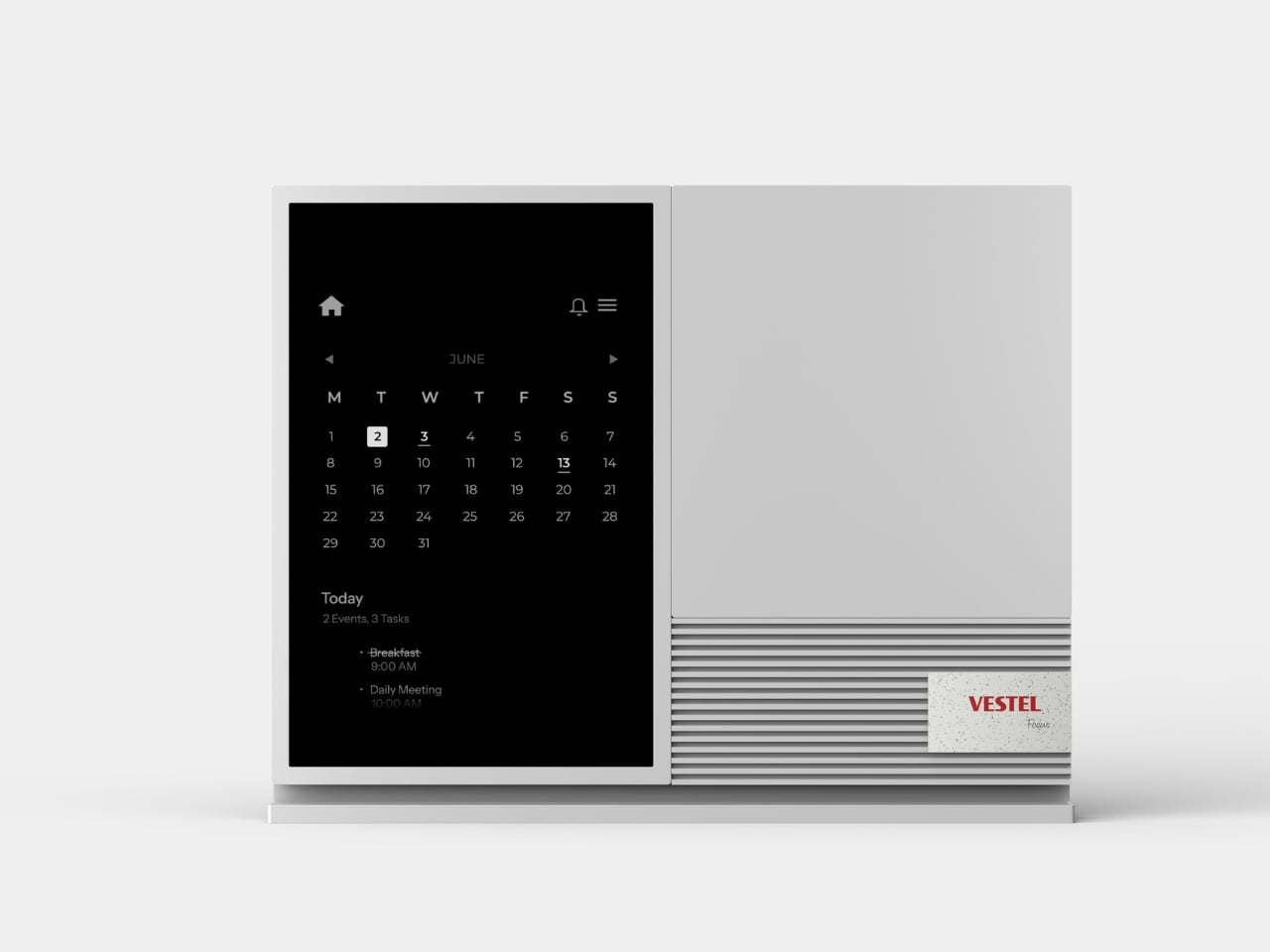
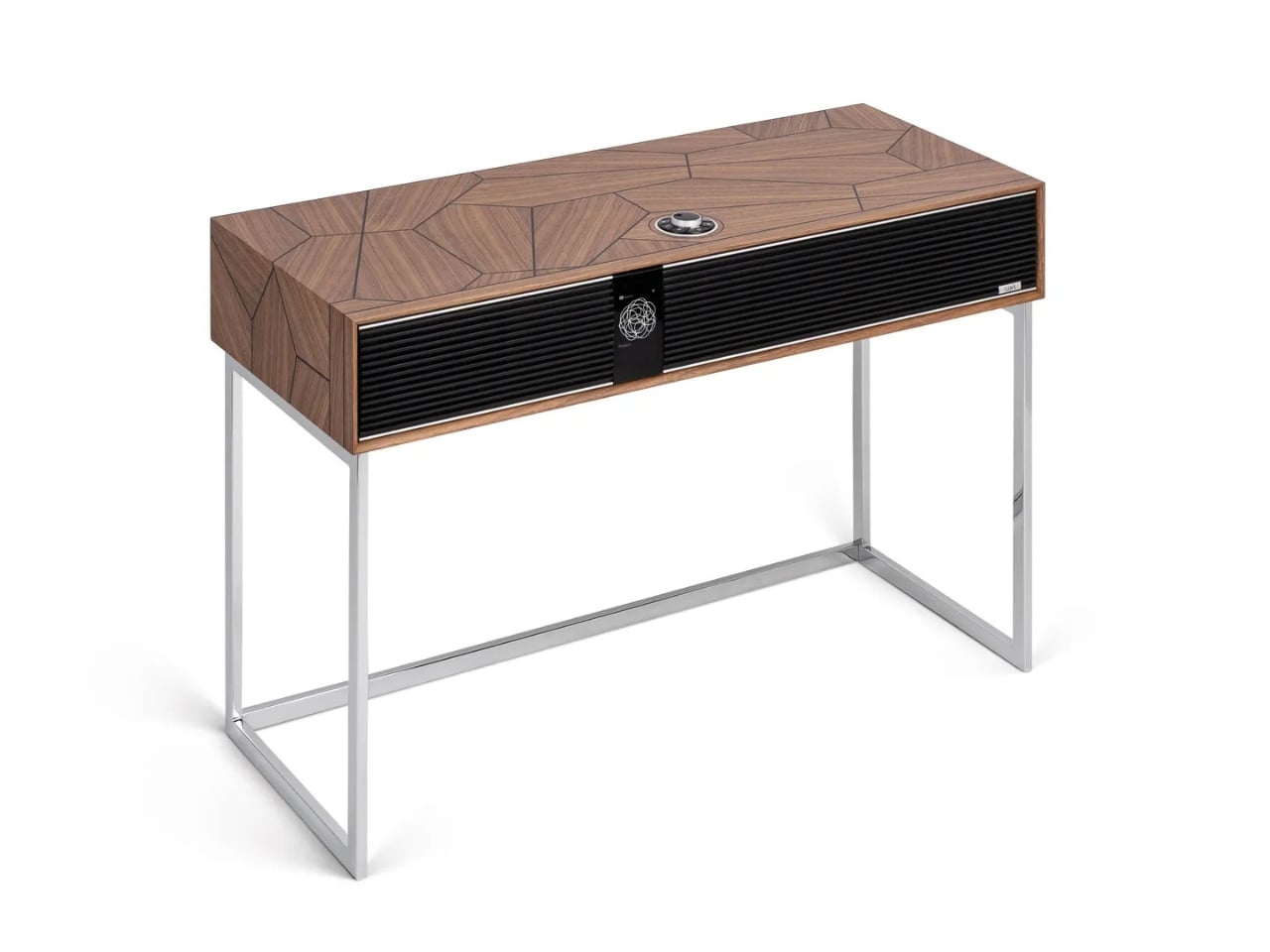
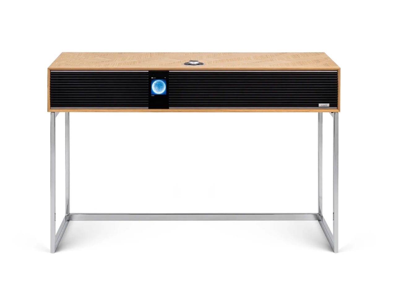
Phones created a problem that app makers spent years optimizing to exploit. Notifications turned into weapons-grade attention traps designed to pull you back into the feed. Focus tackles this with an E Ink panel that syncs with your phone but forces you to choose what actually deserves your eyes. It is a multifunctional hub that doubles as a magnetic tool board with a built-in speaker, but the real value is in the filtering.

E Ink delivers that paper-like quality familiar to anyone who has used a Kindle. It is easy on the eyes and legible in any lighting condition, which makes it a natural fit for something meant to sit on your desk all day. Focus displays tasks, calendar events, and selected notifications, but the keyword is selected. You decide what makes it through. Your cousin’s takes and algorithm-fed suggestions stay trapped on your phone where they belong. The magnetic surface lets you attach tools, notes, or whatever analog objects you need within arm’s reach. The built-in speaker handles calls or audio reminders without needing yet another Bluetooth device cluttering your setup. The whole thing is designed to look like minimalist desk art, which is probably the smartest move they could have made. It sits in your peripheral vision without screaming for attention, offering information when you glance over rather than demanding you stop what you are doing.

What We Like

• E Ink panel is easy on the eyes during long work sessions and readable in any light.

• Selective notification filtering gives you control over what interrupts your focus.

• Magnetic tool board integrates analog and digital workflows without forcing you to choose one.

• Minimalist design looks intentional on a desk rather than like forgotten tech clutter.

What We Dislike

• E Ink refresh rates mean it is not suited for real-time updates or dynamic content.

• Another device to sync and charge adds friction to an already crowded digital ecosystem.

4. CMF Phone Mini Concept

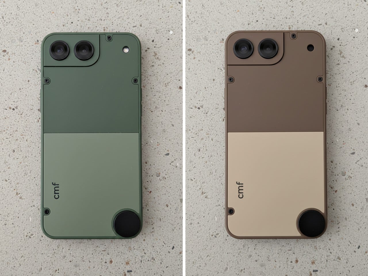
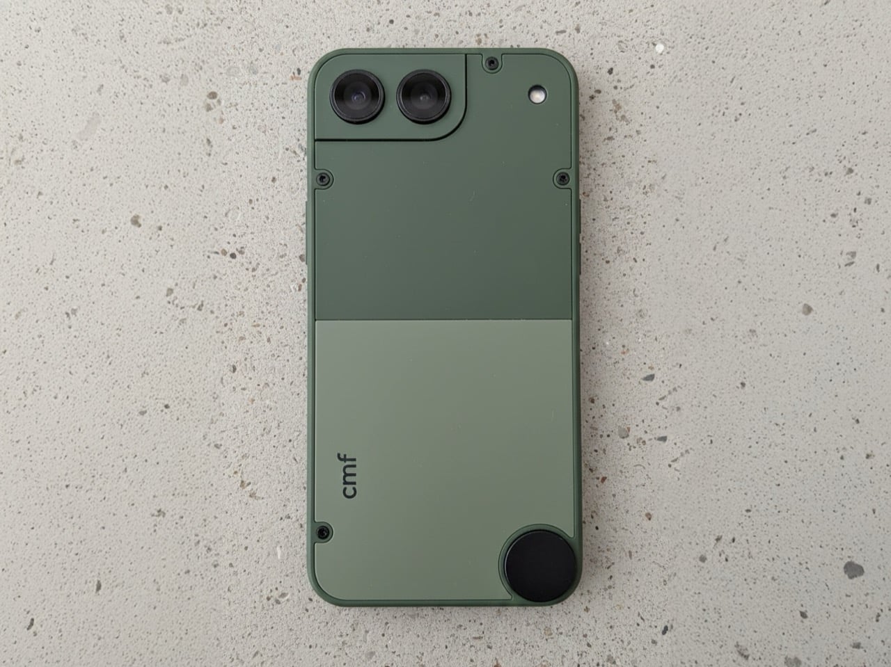
The compact smartphone market died not because people stopped wanting small phones, but because manufacturers decided the margins were not worth the engineering. The iPhone 13 mini was the last credible option, and its discontinuation left a genuine void. Designer Preet Ajmeri’s CMF Phone Mini concept, posted on the Nothing Community forum, suggests a smarter path forward built around accessibility and modularity rather than flagship specs.

What makes this concept compelling is its complete lack of flagship pretension. The design feels like a tool, with an aesthetic closer to a Braun appliance than a fragile glass sandwich. Two-tone back panels secured by exposed screws nod directly to the modularity of the CMF Phone 1 and 2 Pro. The circular element in the lower corner practically begs for a lanyard or magnetic accessory, turning portability into something tangible rather than a spec-sheet claim. The camera housing integrates into a stepped corner plate, making it feel like a distinct functional component rather than a generic bump. It is an honest object designed to be held and used without demanding reverence. The concept suggests that small phones do not need flagship processors or camera arrays to justify their existence. They need a thoughtful design that respects the reality of one-handed use and pockets that are not cargo pants. If Nothing or CMF actually builds this, it would fill a market gap that has been ignored for years.

What We Like

• Modularity through exposed screws and swappable back panels extends device lifespan and personalization.

• Tool-like aesthetic prioritizes function and durability over fragile premium materials.

• Compact size addresses the genuine demand for one-handed usability that flagship lines abandoned.

• Circular lanyard element turns portability into a practical feature rather than marketing speak.

What We Dislike

• Concept status means there is no guarantee this will ever reach production.

• Smaller size likely means compromises on battery capacity that could limit all-day use.

5. SanDisk FIFA World Cup 2026 USB-C Flash Drive

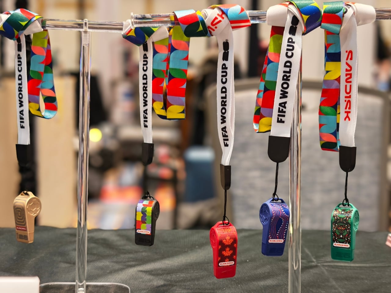
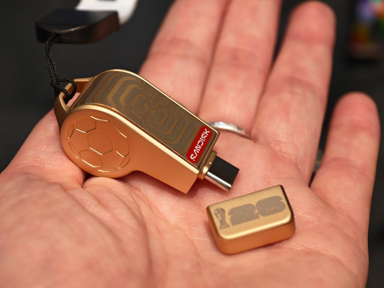
SanDisk made a USB-C flash drive shaped like a referee’s whistle, and it somehow manages to be both completely ridiculous and genuinely clever. The FIFA World Cup 2026 collection turns storage into collectible objects that celebrate the tournament across the three host countries. The whistle drive packs up to 128GB of storage with speeds hitting 300MB/s, so it is not just a novelty item you shove in a drawer after the unboxing photo.

The collection includes editions for the USA, Canada, Mexico, plus a Global Edition and a premium Gold Edition. Each design draws from the culture of its respective host country, turning these drives into objects that feel like memorabilia rather than disposable tech. The whistle shape is practical in a weird way. It is distinctive enough that you would not lose it in a cable drawer, and the loop means you can attach it to a keychain or lanyard. Storage is increasingly cloud-based, but physical drives still matter for quick transfers, backups, and situations where you do not want to trust your files to someone else’s servers. Turning that utility into something fun is rare in a category dominated by boring rectangles. The design asks a question more tech companies should be asking: Why are we making everything so serious? The World Cup collection proves that functional objects can carry personality without sacrificing performance. It is the kind of thing that makes you wonder why more companies are not having this much fun with products people actually use.

What We Like

• Up to 128GB storage with 300MB/s speeds means it is genuinely useful beyond novelty status.

• Distinctive whistle shape makes it hard to lose in a drawer full of generic cables and drives.

• Collectible editions tied to World Cup host countries turn storage into cultural memorabilia.

• USB-C compatibility ensures it works with modern devices without adapter hassles.

What We Dislike

• Novelty design might feel dated once the World Cup hype cycle ends.

• Physical drives are increasingly niche as cloud storage dominates mainstream workflows.

Where February Leaves Us

These five gadgets represent a shift in how companies are thinking about technology’s role in daily life. The focus has moved away from adding more screens and notifications toward tools that integrate without demanding constant attention. They solve specific problems with thoughtful design rather than throwing features at spec sheets.

February is always that strange month where CES announcements start transitioning from vaporware to actual products you can touch and buy. These five stand out because they respect your time, your space, and your sanity. They bend technology to fit your workflow rather than demanding you rearrange your life around yet another device. That feels like progress worth celebrating.

The post 5 Best Tech Gadgets of February 2026 first appeared on Yanko Design.

Samsung Just Made Those Viral 3D Billboards Fit on Any Wall

Walking through a mall means passing bright rectangles looping 2D video, occasionally interrupted by a viral 3D billboard that makes people stop and film it. Those 3D moments usually feel like one-off stunts with custom hardware and bespoke content, not something you can bolt to a wall like normal signage and manage alongside the rest of your screens without rebuilding your entire workflow from scratch.

Samsung’s Spatial Signage tries to make that volumetric effect practical. The first global product is an 85-inch 4K portrait display that uses a patented 3D Plate behind the LCD to create depth you perceive behind the glass, without glasses or headsets. It is still wall-mounted, but it behaves more like a window where products and scenes sit in real space instead of just flickering on a surface.

Designer: Samsung

Picture a flagship store or museum lobby where a life-size figure or product appears to stand just behind the glass, rotating to show front, back, and side views. The 9:16 portrait format and 4K resolution let brands run 360-degree spins or full-height characters that feel more like installations than ads. Samsung’s Quantum Processor handles upscaling, color mapping, and HDR tweaks so older assets stay sharp, and an anti-glare panel keeps the illusion working under bright retail lighting.

The 85-inch unit is only 52mm thick and weighs 49kg, so it mounts with a Slim Fit Wall Mount like regular signage instead of needing a deep box enclosure. That means it can integrate into compact or design-sensitive locations without construction overhauls. Samsung is launching smaller 32-inch and 55-inch versions later, making it easier to repeat the same 3D language in window displays or feature walls across a retail chain.

Of course, the content side matters as much as the hardware. AI Studio, the new app inside Samsung’s VXT cloud platform, can take static images and automatically turn them into signage-ready video, adjusting shadows, margins, and backgrounds specifically for Spatial Signage. That means brands without dedicated 3D pipelines can still get depth-friendly motion from existing imagery instead of hiring specialized studios for every campaign.

Spatial Signage launches alongside other supersized displays, like a 130-inch Micro RGB signage and a 108-inch The Wall All-in-One that simplifies LED installs, plus Cisco and Logitech partnerships for meeting rooms. The point is that this 3D panel is not a toy but one piece of a lineup meant to cover storefronts, lobbies, and boardrooms with different flavors of immersive screens that plug into the same management stack.

Samsung’s Spatial Signage hints at a future where digital signage is less about flat loops and more about volumetric storytelling that fits into normal walls and workflows. It does not ask passersby to put on glasses or download an app; it just quietly makes content feel like it occupies space. Brands and venues that live or die by how long people stop and stare will see this, pun intended, as the logical next step after everyone got bored with rectangles running the same video on repeat.

The post Samsung Just Made Those Viral 3D Billboards Fit on Any Wall first appeared on Yanko Design.

When Furniture Meets High Fidelity: The Ruark R810 MiE

There’s something beautifully nostalgic about the radiogram. You know, those elegant wooden cabinets from the mid-century that housed radio, turntable, and speakers all in one piece of furniture that looked good enough to anchor your living room. Ruark Audio clearly remembers, and they’re marking their 40th anniversary by bringing that concept into 2026 with the R810 MiE (Made in England edition), a stunning collaboration with Storm Furniture that proves technology can be just as much art as function.

This isn’t just a speaker in a nice box. The R810 MiE is part of Ruark’s Made in England project, which focuses on limited production, hand-built products using traditional craftsmanship. Only 100 units will ever exist, split evenly between two exquisite finishes: Penta-Chord Walnut with ebony detailing and Leaf-Line Oak with sycamore accents. Each piece is truly unique, bearing patterns that resemble fingerprints, no two exactly alike.

Designers: Ruark Audio and Storm Furniture

What makes these so special is the centuries-old art of marquetry that decorates the cabinet tops. If you’re not familiar, marquetry involves meticulously cutting selected veneers and arranging them into intricate patterns before bonding them to the cabinet. It demands precision and patience, the kind that only artisan makers possess. Storm Furniture, based in Norfolk and a proud member of the Guild of Master Craftsmen, hand-builds each cabinet and grille component before carefully transporting them to Ruark’s headquarters in Southend, where each R810 MiE is individually assembled, tested, and signed off.

The patterns themselves are designed to reflect modern life while honoring traditional techniques. Multiple layers of lacquer are then applied to create that lustrous finish that makes you want to run your hand across the surface (though you’ll probably resist once you see the price tag). Combined with precision-formed trims and a polished chrome stand, the result radiates the kind of sophistication you’d expect from fine furniture.

But let’s talk about what this thing actually does, because looks alone don’t justify nearly $9,000. The R810 MiE packs the same technological prowess as its standard R810 sibling, which retails for around $5,000. You get a 4.1 speaker system powered by 180 watts of Class A/B amplification, with a frequency response that dips down to 30Hz. It supports hi-res music files up to 32-bit/192kHz, has built-in Spotify Connect, TIDAL Connect, and Qobuz Connect, works with Apple Music and BBC Sounds, and includes AirPlay and Google Cast.

There’s also HDMI ARC/eARC connection for your TV, plus Internet, DAB, DAB+, and FM tuners because sometimes you just want to flip through actual radio stations. It’s essentially a complete home audio hub disguised as an heirloom-quality piece of furniture. Like the iconic radiograms it takes inspiration from, the R810 is designed to be seen, to be a focal point rather than something you hide in a cabinet or tuck into a corner.

What strikes me most about this release is the timing. We’re living through an era where so much technology feels disposable, designed to be replaced in a few years when the next model drops. The R810 MiE pushes back against that entire philosophy. This is a piece you’re meant to keep, to pass down, to let age gracefully in your home. That marquetry top isn’t going out of style, and that hand-built cabinet isn’t falling apart after a couple of years.

Each unit comes with an engraved plaque as proof of authenticity, which feels appropriate for something this exclusive. At £6,495 (roughly $8,955), it’s absolutely a luxury item. But when you consider that only 50 of each finish will ever be produced, and that each one is genuinely handcrafted using techniques that have been around for centuries, that price starts to make sense for collectors and audiophiles who want something genuinely special.

The R810 MiE represents what happens when a 40-year-old British audio company decides to celebrate not by churning out another limited colorway, but by going all-in on craftsmanship and exclusivity. It’s a statement piece that happens to deliver exceptional sound, or maybe it’s an exceptional sound system that happens to be a statement piece. Either way, it’s proof that furniture really can sound this good.

The post When Furniture Meets High Fidelity: The Ruark R810 MiE first appeared on Yanko Design.

When Your Speaker Is Also a Statement: The Tresound Mini

Sometimes the best tech isn’t the loudest. It’s the one that makes you pause and actually look at it before you press play. That’s what designers Yong Cao and Jianfeng Lv have managed to pull off with the Tresound Mini, a desktop Bluetooth speaker that refuses to be just another black box on your desk.

At first glance, this compact speaker looks like it wandered in from a modern art gallery. Its cone-shaped design is clean, almost architectural, with a minimalist aesthetic that feels intentional without being precious about it. The form isn’t just for show, either. TRETTITRE, the emerging HiFi brand behind the speaker, describes itself as bridging traditional audio quality with something more forward-thinking, and you can see that philosophy at work here.

Designers: Yong Cao and Jianfeng Lv

The Tresound Mini recently won the Golden A’ Design Award in the Audio and Sound Equipment Design category, which is one of those achievements that signals serious design cred. But awards aside, what makes this speaker interesting is how it thinks about the desktop experience differently. Instead of trying to dominate your workspace with aggressive angles or flashy lights, it takes a more refined approach. The design integrates seamlessly into your environment, whether that’s a home office setup, a creative studio, or just a corner of your apartment where you actually get things done.

Art Director Yong Cao and Designer Jianfeng Lv, both from China, approached this project with a focus on what they call the “deep integration of brand design and product design”. That sounds like design speak, but what it really means is that every element serves a purpose. The cone shape isn’t arbitrary. It contributes to the audio performance while also giving the speaker a distinctive profile that stands out without screaming for attention. It’s the kind of design that works equally well in a carefully curated Instagram photo or just sitting there doing its job.

Let’s talk about the packaging, because this is where things get genuinely clever. Instead of going with the typical cardboard box and foam inserts, the Tresound Mini comes with a carrying bag that’s wet-pressed from bamboo fiber pulp. This isn’t just packaging in the traditional sense. It’s designed to double as a carrying case, making the speaker genuinely portable. The bamboo fiber approach is both environmentally friendly and cost-effective, reducing packaging waste while providing actual protection for the product. It’s the kind of thoughtful detail that shows someone was actually thinking about the full lifecycle of the product, not just the unboxing moment.

The portability factor is key here. Desktop speakers traditionally live in one spot, tethered to your workspace. But the Tresound Mini was designed with the understanding that people move around now. You might want it on your desk in the morning, out on a balcony in the afternoon, or in your kitchen while you’re cooking dinner. The compact size and that bamboo fiber carrying bag make that kind of flexibility possible.

TRETTITRE positions itself as catering to “the new generation of HiFi enthusiasts”, which is a smart read of where audio culture is heading. There’s a growing audience that cares about sound quality but doesn’t want to sacrifice design or deal with the bulk and complexity of traditional HiFi setups. They want something that sounds good, looks intentional, and fits into spaces that might not have room for a full speaker system. The Tresound Mini seems built specifically for that demographic.

What’s interesting about this design is how it challenges the assumption that good audio equipment needs to look technical or industrial. There’s no display screen, no visible screws, no aggressive branding. Just a clean geometric form that happens to deliver quality sound. It’s the audio equivalent of those minimal tech accessories that proved you don’t need to sacrifice aesthetics for function.

The success of the Tresound Mini might signal a broader shift in how we think about desktop audio. As more people work from home or create hybrid living and working spaces, there’s an appetite for products that perform well without dominating the visual landscape. We want our tech to be good at what it does, but we also want it to feel like it belongs in our actual lives, not in a showroom.

Yong Cao and Jianfeng Lv have created something that manages to be both functional and thoughtful. The Tresound Mini proves that when you approach product design with real consideration for how people actually use things, you can create something that transcends its basic function and becomes worth talking about.

The post When Your Speaker Is Also a Statement: The Tresound Mini first appeared on Yanko Design.