
Alibaba sues the US government for adding it to list of firms linked to Chinese military
Alibaba is suing the US government to be removed from a blacklist with companies linked to China's People's Liberation Army.
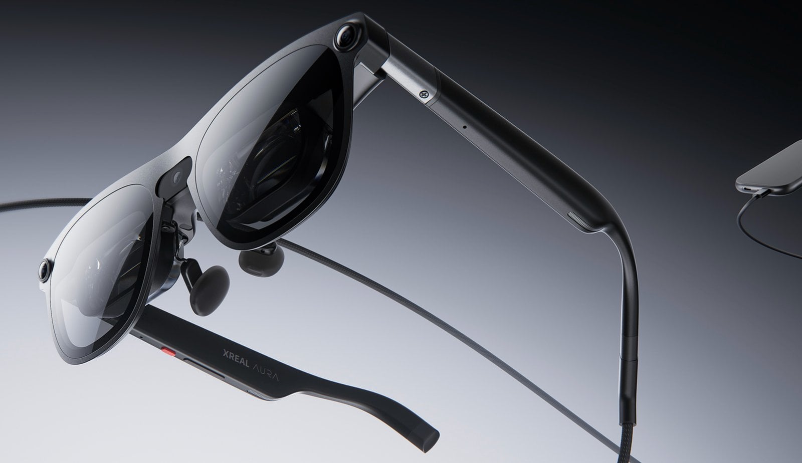
The Xreal Aura is a lightweight mixed reality headset designed to combine portability with advanced functionality. First introduced at AWE 2026, it features a three-camera system that enables hand tracking and six degrees of freedom (6DOF) for accurate motion detection. According to Kola, the device also offers an expanded field of view, enhancing the overall […]
The post Xreal Aura vs Galaxy XR : 6 Degrees of Freedom and a Wider FOV Define the Xreal Aura appeared first on Geeky Gadgets.

Samsung is poised to make a significant impact with its highly anticipated Galaxy S27 series, a lineup designed to push the boundaries of smartphone technology. With innovations spanning privacy display technology, advanced camera systems, and improved battery efficiency, the Galaxy S27 series aims to cater to a broad spectrum of users. This detailed exploration highlights […]
The post Samsung’s Galaxy S27 Ultra Leak Reveals a Radical Rear Redesign appeared first on Geeky Gadgets.

Smart glasses have been trying to go mainstream for years, but pricing has been a stubborn barrier. The Ray-Ban Meta glasses popularized the category by making them feel like normal eyewear, but their entry-level price has hovered well above what many casual buyers are willing to spend on something they might not be sure they need. The market has been compelling, just not quite accessible enough for everyone.
Meta is trying to change that with Meta Glasses, its first line of smart glasses sold under its own name rather than Ray-Ban or Oakley. Developed in partnership with EssilorLuxottica, the new lineup starts at $299, which is at least $80 less than the Ray-Ban Meta Gen 2 entry price, and it arrives in three distinct frame styles designed to cover a broader range of tastes and budgets.
Designer: Meta, EssilorLuxottica
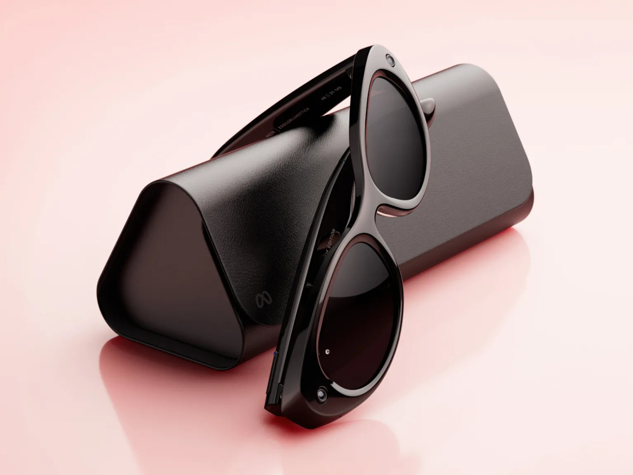

The two base models are the Adventurer and the Fury, each starting at $299. The Adventurer leans toward a slimmer, everyday silhouette, while the Fury goes bigger with a thicker, more rectangular profile, including a striking translucent racing green colorway that reveals the circuitry underneath. Both come in standard and large sizing, and together they span 26 color and lens combinations.


Meta Adventurer
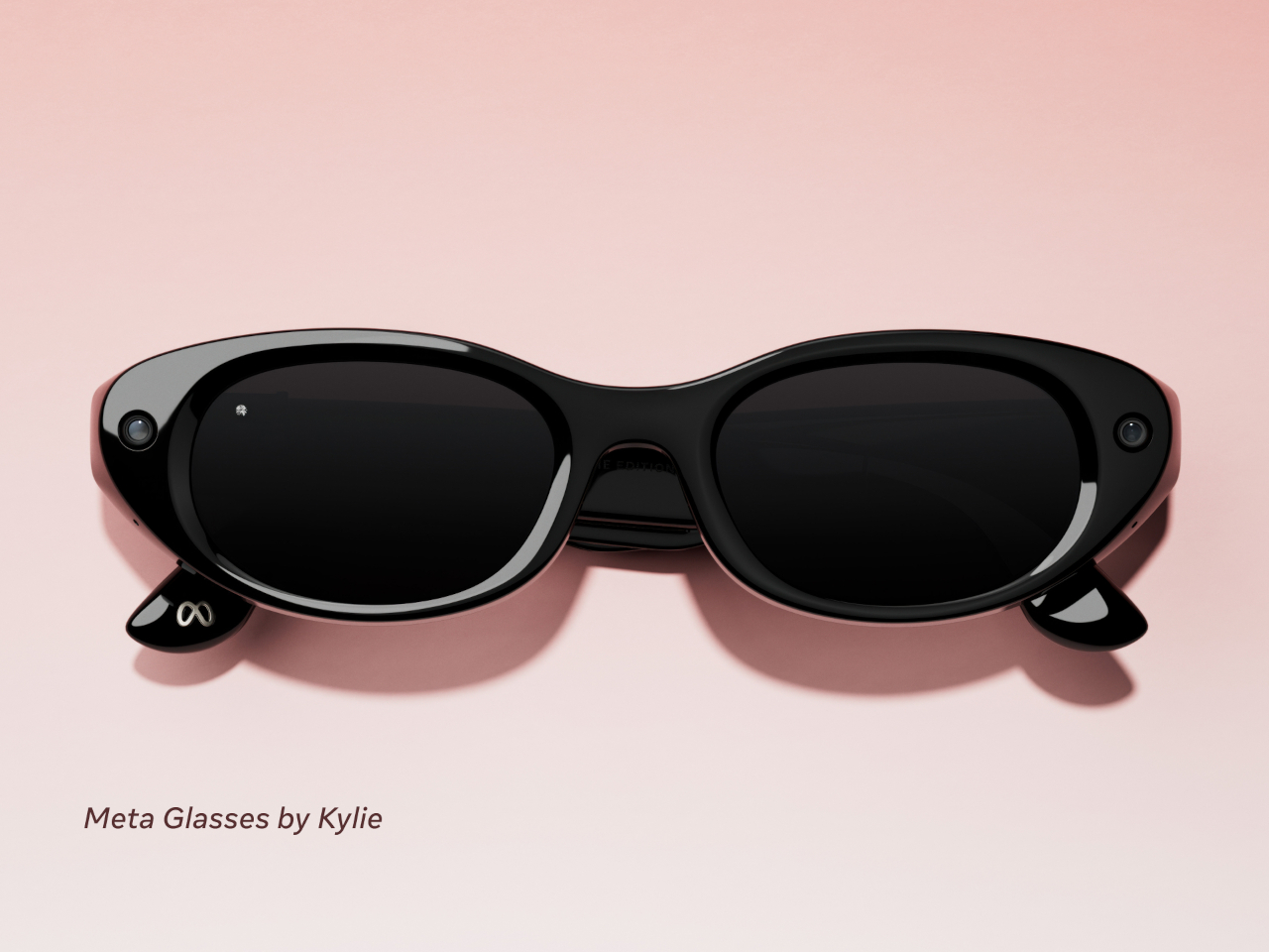
A third model called the Starfire, designed in collaboration with Kylie Jenner, rounds out the lineup at $399. Its slim, oval shape sits closer to the territory of Prada or Gentle Monster than anything Meta has put out before. The most notable exclusive is the option to use Jenner’s own voice as the on-device AI assistant for everything from navigation cues to battery alerts. It’s a fashion-forward direction for smart glasses that doesn’t really have a precedent.


All three models carry the same core hardware: a 12 MP camera, open-ear audio, and a dedicated action button for invoking Meta AI or launching a preferred feature. The addition of three-way adjustable nose pads and temple tips is a practical improvement that makes them easier to wear across different face shapes. They’re also compatible with prescription lenses, which meaningfully broadens who can actually wear them all day.


On the software side, all Meta Glasses launch with Muse Spark, Meta’s newest AI model from its Meta Superintelligence Labs. Live translation now covers 20 languages, adding Mandarin, Korean, Japanese, Arabic, and Hindi to the existing roster. Pedestrian navigation, which debuted on Meta’s more expensive display glasses, now works on the camera-equipped models too, making the $299 pair genuinely capable of directing you through an unfamiliar city while you walk.


A Dynamic Photo feature also debuts with the launch, capturing a quick burst of frames and automatically selecting the sharpest one. It’s a small addition but a practical one, given how awkward it can be to time a single-frame capture when the glasses are on your face and you’re not looking at a screen.
The glasses are available today at Meta.com and through retailers including LensCrafters, Best Buy, Amazon, and Sunglasses Hut. Dropping Ray-Ban from the name is a quiet but meaningful move, and the lower price suggests Meta is confident enough in its own brand to see if that’s what people were actually waiting for.
The post Meta Just Launched $299 AI Glasses Without the Ray-Ban Name first appeared on Yanko Design.
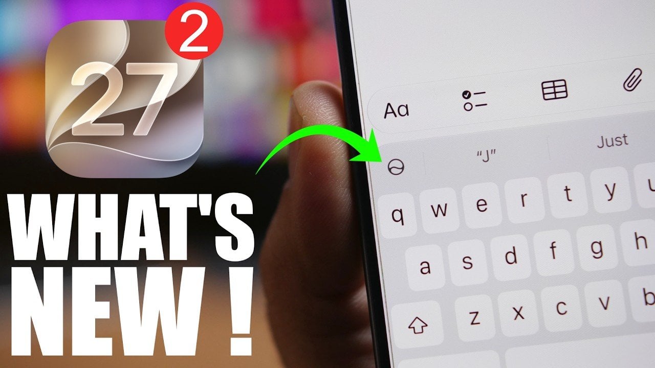
Apple has officially released iOS 27 Beta 2, offering a range of updates, new features, and bug fixes aimed at refining the overall user experience. This latest beta focuses on enhancing Siri’s functionality, improving the user interface, and addressing long-standing issues reported by users. With a clear emphasis on usability and performance, this update provides […]
The post Everything New in iOS 27 Beta 2: Every Feature, Tweak, and Bug Fix appeared first on Geeky Gadgets.

The 2026 Surface Pro 13 (12th Edition) represents Microsoft’s latest innovation in its high-end 2-in-1 tablet lineup. This device introduces a host of upgrades, including a new OLED display option, enhanced performance, and a refined design. With prices ranging from $1,499.99 to $3,549.99, the Surface Pro 13 is aimed squarely at professionals and power users […]
The post What the 2026 Surface Pro 13 Actually Looks Like Out of the Box appeared first on Geeky Gadgets.
Hosting a watch party usually means thinking through every sensory detail in the house. The menu has to hit the right balance of easy and memorable, the drinks need to stay cold, the room temperature has to feel right once the crowd settles in, and even the air gets attention, whether that means opening windows early or giving the couch and curtains a quick pass with Febreze before people arrive. A lot of effort goes into creating a space that feels clean, welcoming, and put together without looking like it took effort at all.
Water can undo that illusion fast. Guests might forgive a late pizza delivery or a bowl of chips running empty, but a glass of bad-tasting water has a different effect. It lingers. It cuts through the mood and makes people notice the one part of the hosting experience that feels neglected. That is why home water filtration belongs in the same conversation as food, comfort, and atmosphere, especially around Prime Day when Waterdrop’s offering a practical upgrade that slides neatly into the rest of your summer hosting plans.
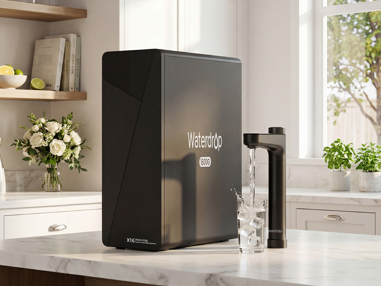
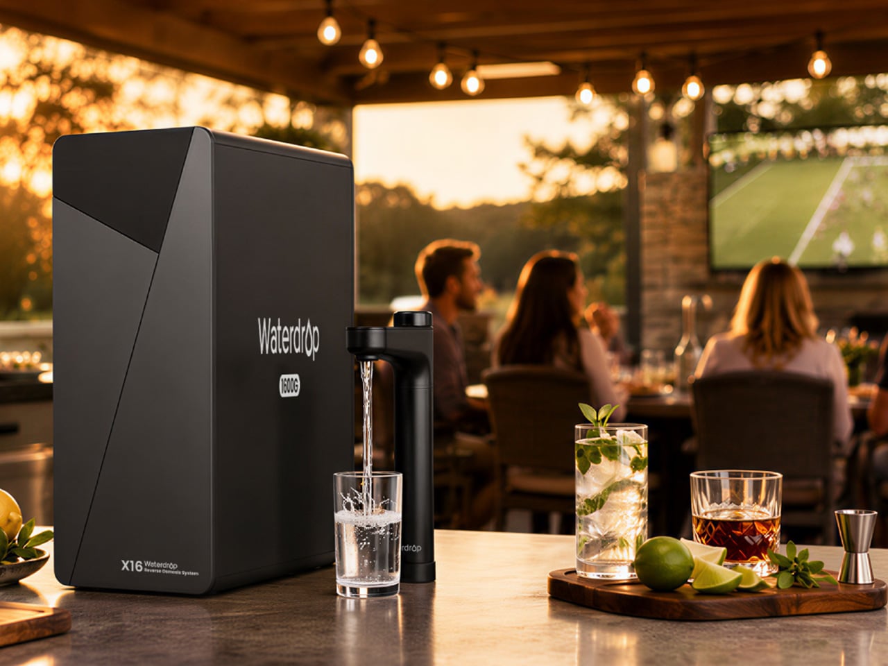
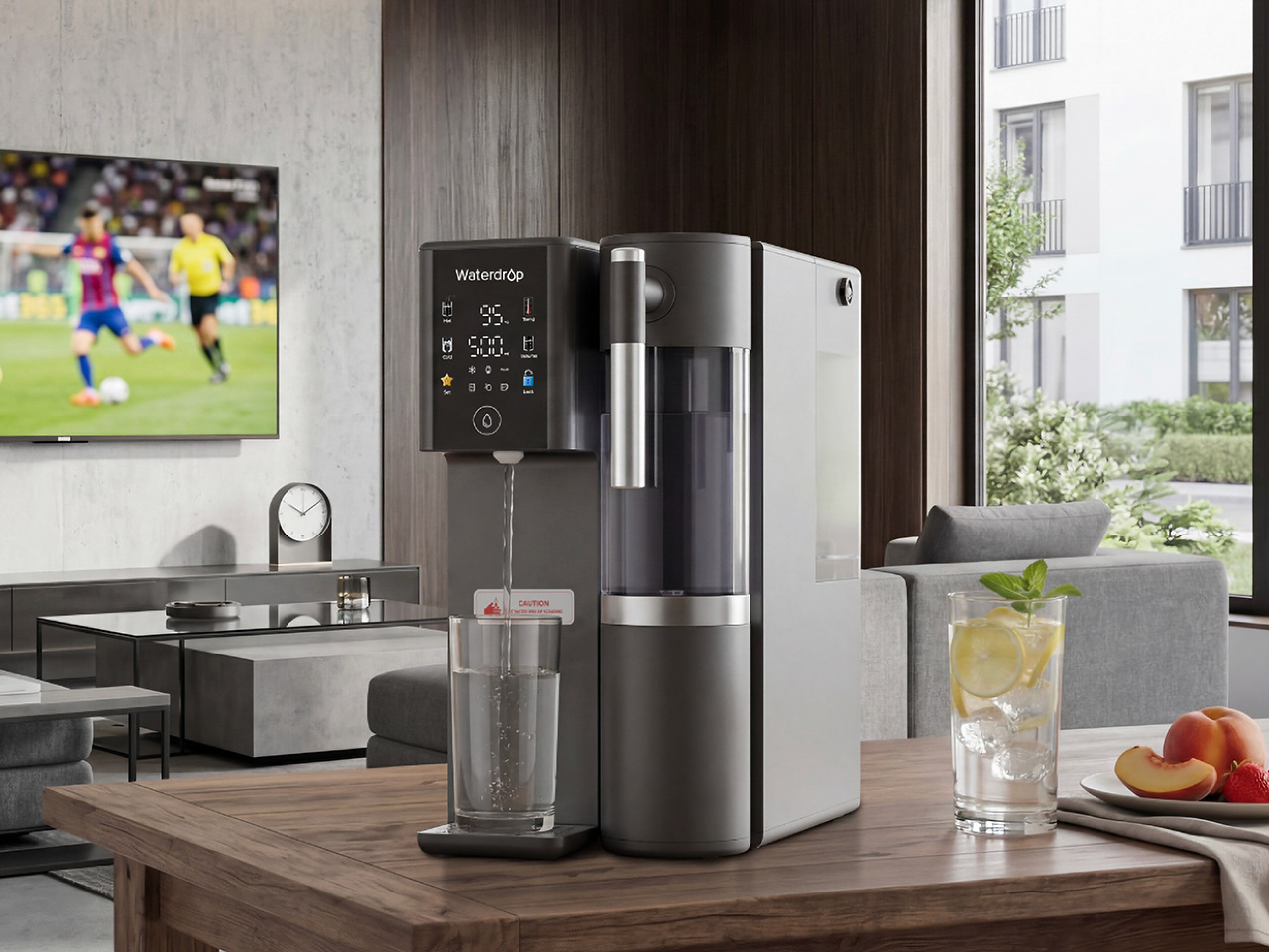
For the household that treats hosting as a serious craft, the Waterdrop X16 is the flagship upgrade that anchors the entire kitchen. This is a system designed for large families and frequent entertainers, people who need a high-volume, high-performance solution that never becomes a bottleneck, even when the house is full. Its tankless design is the first thing that stands out, saving a significant amount of under-sink cabinet space compared to older RO systems. Aesthetically, it is clean and minimal, with a smart faucet that feels like a proper piece of modern kitchen hardware, displaying water quality and filter life at a glance.
The performance backs up the premium design. The X16 pushes out water at a rate of 1600 gallons per day, a spec that translates to filling a cup in about three seconds, so there is no waiting around when multiple people need a drink. Its 11-stage filtration system removes the usual contaminants while adding back alkaline minerals like Ca and Mg, balancing pH to 7.5± , which improves the taste for everyday drinking, coffee, and cooking. The 3:1 pure-to-drain ratio is also remarkably efficient, making it a responsible long-term investment for a home that wants the best water possible without the waste. It is a true kitchen centerpiece for game-day essentials.
Click Here to Buy Now: $1234.05 $1999 ($764.95% off, use coupon code “YANKOPD26”). Hurry, Prime Day deal ends soon!
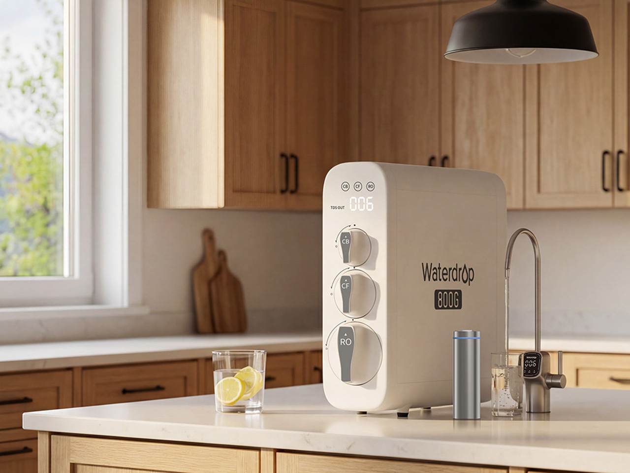
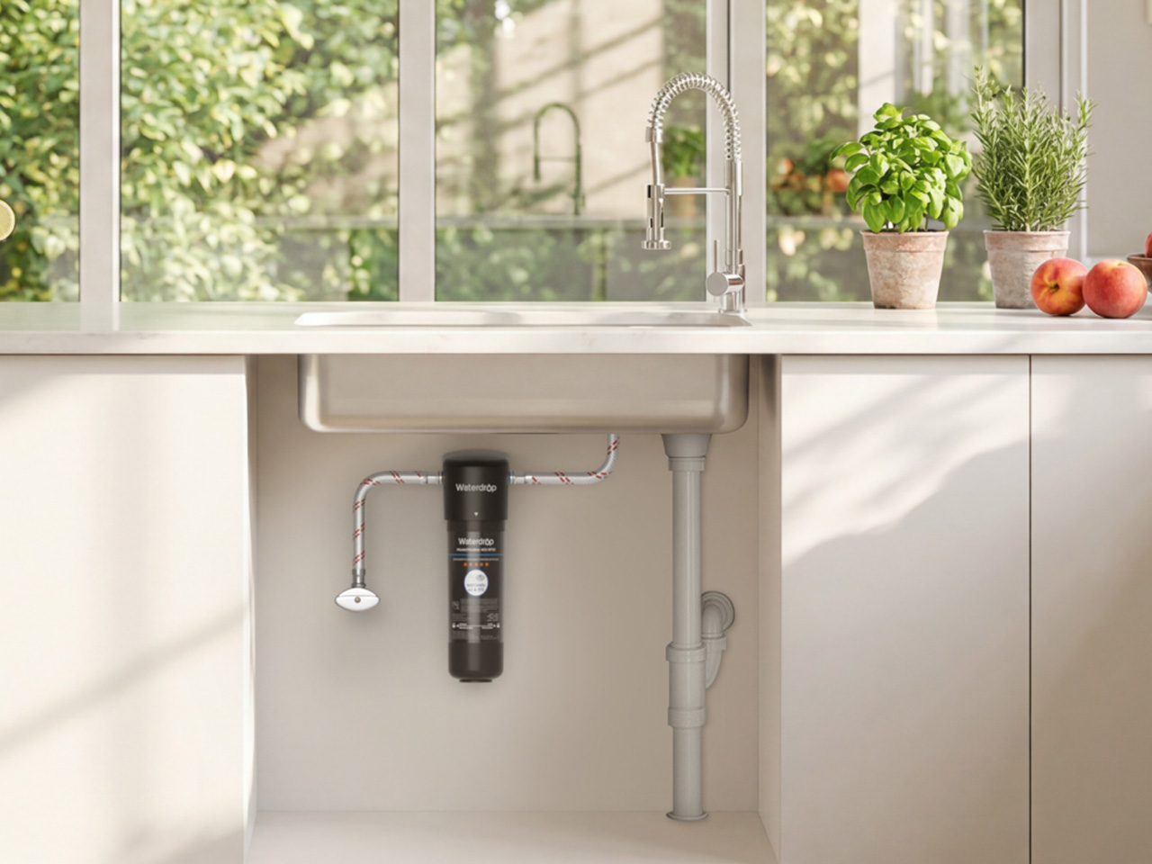
If the X16 represents the top tier of home filtration, the Waterdrop G3P800 is the trusted, family-ready workhorse that brings many of the same benefits to a broader audience. It has become a best-seller on Amazon for a reason, it hits the sweet spot between powerful reverse osmosis filtration and practical everyday convenience for a family of four or five. Like its bigger sibling, the G3P800 uses a tankless design that keeps the under-sink area tidy and accessible, a thoughtful touch for anyone who has dealt with bulky, tank-based systems in the past.
With an 800 GPD flow rate, the system is more than capable of handling daily routines and smaller gatherings without any frustrating lag at the faucet. It provides a steady stream of clean water for cooking, filling water bottles before school, or serving guests during a weekend get-together. For safety-conscious households, the G3P800 is certified against NSF/ANSI standards 42, 53, 58, and 372, offering documented proof of its ability to reduce a wide range of contaminants including chlorine, lead, and TDS. The smart faucet adds a layer of confidence, displaying real-time water quality so you always know the system is working as it should.
Click Here to Buy Now: $664.05 $999 ($334.95 off, use coupon code “YANKOPD26”). Hurry, Prime Day deal ends soon!
For a huge number of people, including renters, apartment residents, and office workers, a permanent under-sink installation is simply not an option. The Waterdrop M6H is engineered for exactly this scenario. This countertop RO water filter delivers high-quality purified water without requiring any plumbing or drilling, you just plug it in and fill the tank. It is a self-contained unit that brings the power of reverse osmosis to kitchens, dorm rooms, home offices, and even RVs, making it one of the most versatile home hydration essentials available.
The M6H distinguishes itself further with its instant hot water capabilities. It offers multiple temperature settings, perfect for making baby formula, brewing tea at the right temperature, or getting a quick start on oatmeal or coffee during busy mornings. This feature also makes it a fantastic beverage station for gatherings, allowing guests to make their own drinks without hovering around the stove. The system includes a detachable glass pitcher that can move from the countertop to the dining table or into the fridge, blending the convenience of a portable server with the power of a stationary RO system.
Click Here to Buy Now: $284.05 $429 ($144.95 off, use coupon code “YANKOPD26”). Hurry, Prime Day deal ends soon!
Sometimes the goal is a simple, effective upgrade, a straightforward improvement over tap water without the complexity or cost of a full reverse osmosis system. The Waterdrop 10UA is that practical first step. It is an under-sink filter designed for budget-conscious households and first-time filter users who want an affordable, low-effort way to get cleaner, better-tasting water for drinking and cooking. The installation is quick and easy, making it a great weekend project that delivers immediate benefits.
While it is a simpler system than the RO models, the 10UA still provides robust filtration that significantly reduces chlorine, taste, odor, sediment, and other common impurities. Its long filter life makes it a low-maintenance choice for busy families who want to set it and forget it. For daily use, it provides a reliable supply of filtered water directly from the existing kitchen faucet, making it useful for everything from filling a pot for pasta to washing vegetables. It is an accessible entry point to better summer hydration for anyone who wants to improve their tap water quality without a major investment.
Click Here to Buy Now: $36.09 $45.99 ($9.90 off, use coupon code “YANKOPD26”). Hurry, Prime Day deal ends soon!
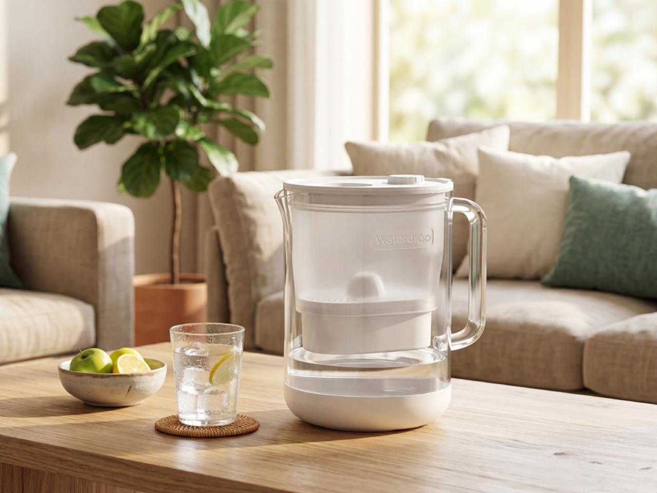
Finally, there is the solution that fits every space and any occasion, the Waterdrop Glass Water Filter Pitcher. This is the most flexible option in the lineup, designed for families, apartment users, and anyone who wants a simple, portable way to get filtered water. It is perfect for shared moments, easily moving from the kitchen counter to the dining table for a family meal or out to the patio for a backyard gathering. The pitcher’s high-quality glass construction offers a more elevated look for hosting compared to typical plastic pitchers.
The design is both stylish and sustainable, helping to reduce reliance on single-use bottled water. Its 5-stage filtration system works quickly to serve cleaner, better-tasting water with less waiting, which is a noticeable improvement during busy moments. The exceptionally fast flow-rate fills an 8oz cup in under 60 seconds, 10x faster than standard pitchers. That means healthier water in seconds instead of minutes.
Click Here to Buy Now: $42.74 $49.99 ($7.25 off, use coupon code “YANKOPD26”). Hurry, Prime Day deal ends soon!
The post Don’t Let Bad-Tasting Tap Water Ruin Your Dinner Party – Save Up to $700 This Prime Day With Waterdrop Filter first appeared on Yanko Design.
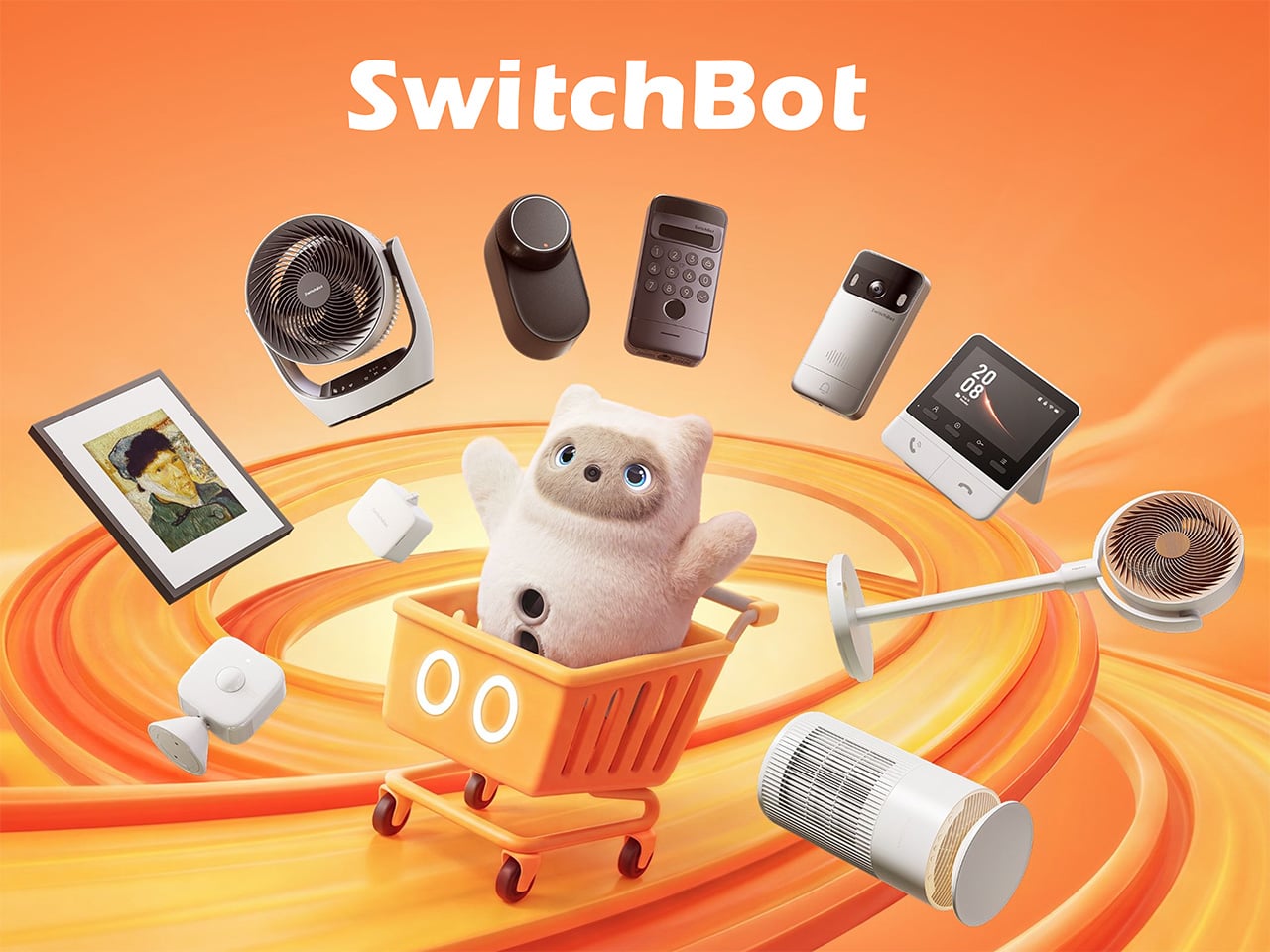
Smart home products have come a long way from the days when “home automation” meant complicated setups only tech enthusiasts could manage. The best ones now work with what people already have rather than asking them to start over from scratch. That shift has made the category far more approachable, and Prime Day sales like this one are worth paying closer attention to.
SwitchBot’s Prime Day 2026 sale runs from June 23 to June 26, offering discounts as high as 50% on a range of devices that handle security, window control, home decor, and daily comfort. None of them requires tearing down walls or rewiring anything, which is part of the appeal. The lineup this year has something for practically every room in the house.
Designer: SwitchBot
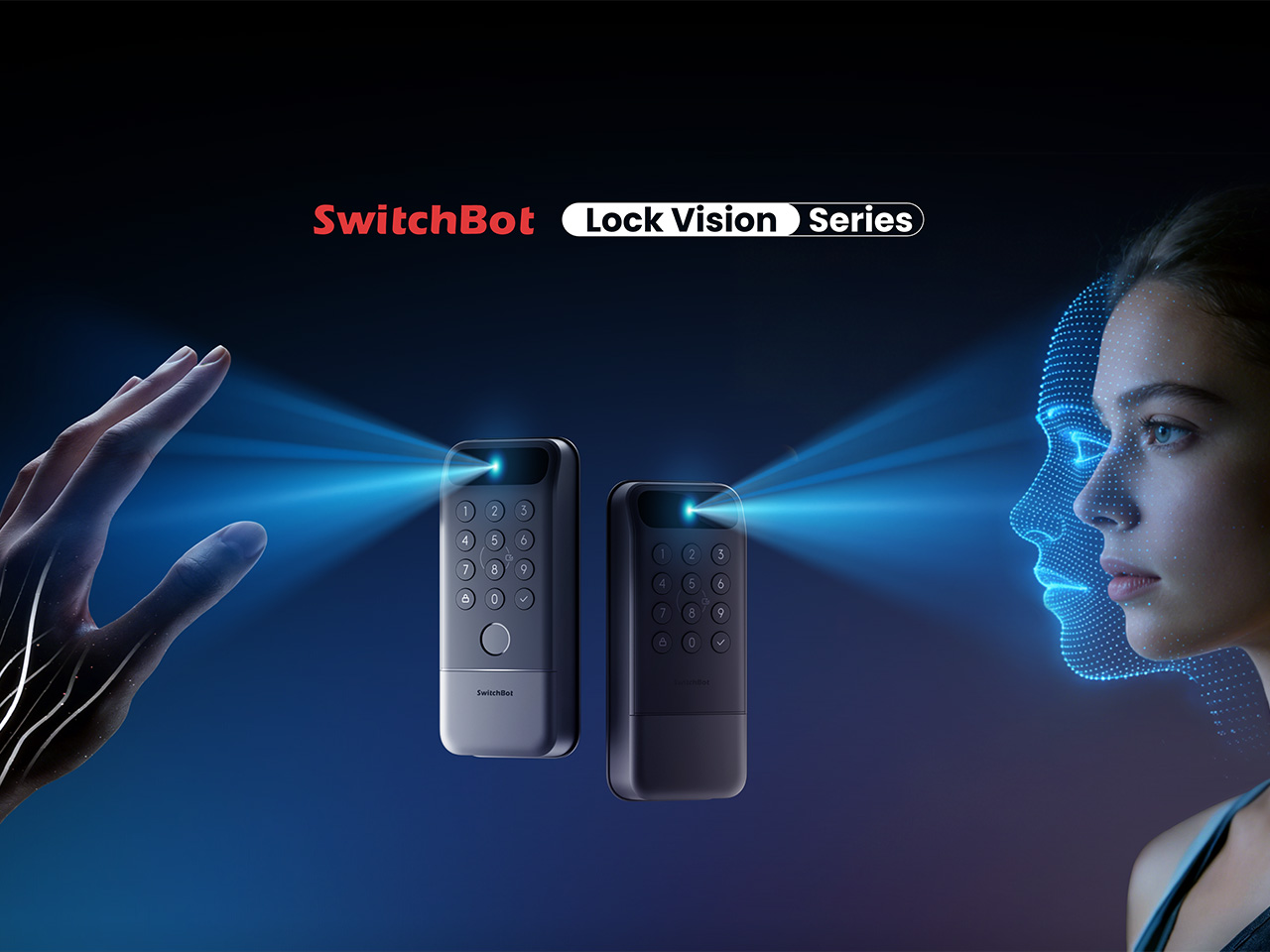
Getting home with your hands full and somehow managing to unlock the door without dropping anything is one of those small daily struggles nobody really talks about. The SwitchBot Lock Vision takes care of that with 3D structured-light facial recognition, letting you walk right in without touching anything. It’s also built to tell the difference between a real face and a photo or video.
If your household has multiple people who need different ways to get in, the Lock Vision Pro adds fingerprint and palm vein recognition on top of the facial option, which makes it a bit more flexible for families. During Prime Day, the Lock Vision is down to $109.99, which is 35% off, while the Pro model drops to $169.99 at 26% off.
Click Here to Buy Now: $109.99 $169.99 (35% off). Hurry, Prime Day Deal ends soon! Website Link Here.

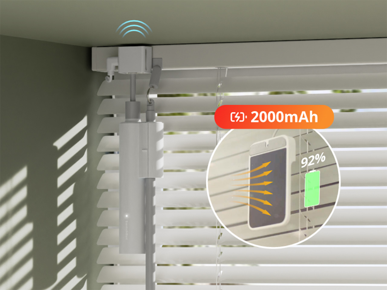
There’s something genuinely nice about curtains that open on their own in the morning, letting light in without you having to get out of bed. The SwitchBot Curtain 3 makes that possible by attaching directly to compatible curtain rods, so nothing needs to be replaced. You can control it through the SwitchBot app, a voice assistant, a set schedule, or the remote it comes with.
This bundle comes with two units, enough to cover a full window or even two separate ones, depending on your setup. The motor also runs as low as 25dB in QuietDrift mode, so it won’t wake anyone up if you’ve set it to open at sunrise. At 28% off during Prime Day, it’s priced at $129.99, which makes the automation a lot easier to justify.
Click Here to Buy Now: $129.99 $179.99 (28% off). Hurry, Prime Day Deal ends soon! Website Link Here.

Digital frames have been around for a while, but most of them glow a bit too brightly for a living room. The SwitchBot AI Art Frame takes a different approach with an E Ink display that gives artwork a paper-like quality rather than a screen-like one. It comes in 7.3-inch and 13.3-inch sizes, and can show photos, personal artwork, or AI-generated visuals.
What makes it genuinely usable is that it isn’t tethered to a wall outlet, thanks to a built-in battery. It can sit on a desk, lean against a shelf, or hang on a wall, wherever it fits into your space best. The 7.3-inch model is $109.99 at 27% off during Prime Day, and the 13.3-inch goes for $265.99 at 24% off.
Click Here to Buy Now: $109.99 $149.99 (27% off). Hurry, Prime Day Deal ends soon! Website Link Here.
If you work from home, you’ve probably gotten up too many times just to adjust your blinds whenever the sun shifts. The SwitchBot Blind Tilt attaches to your existing blinds and lets you adjust the slat angle precisely without replacing anything. Three units are included in this bundle, so you can cover an entire room instead of just one window.
The included Hub Mini connects everything to the wider SwitchBot ecosystem, so you can control the blinds from anywhere, set them up with voice commands, or let a schedule take over. Instead of manually adjusting slats every morning or evening, you can just let it happen on its own. The bundle is $139.99 during Prime Day, which is 26% off its regular price.
Click Here to Buy Now: $139.99 $189.99 (26% off). Hurry, Prime Day Deal ends soon! Website Link Here.

A fan that just runs until someone turns it off isn’t exactly the pinnacle of smart living. The SwitchBot Standing Circulator Fan can be scheduled, adjusted remotely, and paired with other SwitchBot devices so it responds to what’s actually happening in your home. Given that Prime Day falls right in the middle of summer, it’s also one of the more timely picks.
Its adjustable height makes it easy to move between rooms without any hassle, and the quiet operation means it won’t be a distraction during calls or when you’re trying to sleep. At $89.99, it’s the most affordable item in this Prime Day lineup, and at 31% off, it’s a reasonable deal for a fan that fits neatly into a connected home setup.
Click Here to Buy Now: $89.99 $129.99 (31% off). Hurry, Prime Day Deal ends soon! Website Link Here.
The post SwitchBot Prime Day 2026: Smart Upgrades, No Installation, Up to 50% Off first appeared on Yanko Design.