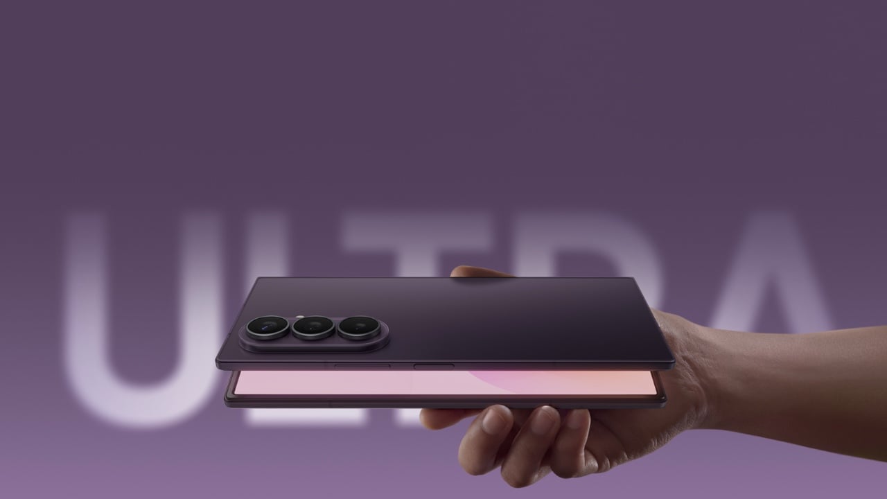
MacBook Ultra 2026: Samsung ships OLED panels for Apple’s first touchscreen MacBook

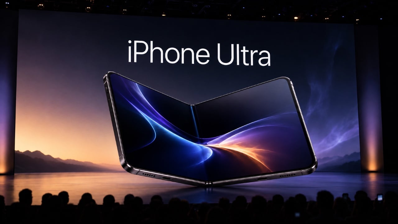
Every major Apple hardware shift leaves a paper trail in someone else’s factory first. Samsung Display’s decision to begin shipping hybrid tandem OLED panels to Apple this month is that kind of trail, and it points toward something Apple fans have speculated about for years: a MacBook with a screen built for touch.

What Samsung is shipping isn’t just any old OLED, either. This is a dual-layer architecture that stacks two emissive panels, a trick that lets them crank up the brightness and improve longevity. It’s the kind of high-end, durable tech you’d want for a machine reportedly being called the MacBook Ultra. The most reliable analyst in the game, Ming-Chi Kuo, is pegging mass production for late 2026. In the world of hardware, when the screens start moving, the rest of the machine usually isn’t far behind.

I get it, we’ve all grown a little tired of the yearly touchscreen MacBook rumors. But this feels different. What separates this moment from all the others is the sheer physicality of the evidence. We’re moving past analysts reading tea leaves and into the realm of logistics. A company like Samsung doesn’t build out a custom, high-spec panel production line for a product that might not happen. This is hardware, in motion. It’s the kind of supply-chain event that turns a long-running prediction into a production schedule.

But here’s the part of the story that most rumor pieces tend to gloss over. Adding a touchscreen isn’t like adding a new port; it forces a complete rethink of the laptop’s physical design. A MacBook is engineered with the assumption that you’ll never push on the screen. Introduce touch, and suddenly you have to solve for hinge wobble, for chassis stiffness, for the simple ergonomics of reaching up to poke at a vertical display. It’s a design problem Apple has deliberately avoided for over a decade.

Remember Steve Jobs’ whole “gorilla arm” argument? The term itself came from the iPad launch in 2010, and the underlying logic is pretty intuitive. When you use a touchscreen on a phone or tablet, your arm is resting. Touch a vertical laptop display repeatedly, and your arm is out in front of you, elevated, working against gravity the whole time. The fatigue that builds up is what Jobs called the gorilla arm, that tired, heavy feeling that sets in faster than you’d expect. He argued it made touchscreen laptops fundamentally uncomfortable, and for anyone who has used a Windows touch laptop for more than a few minutes, the assessment is spot-on.

There’s also a telling piece of Mac history that doesn’t get brought up enough here. Apple introduced the Touch Bar in 2016, a slim OLED strip that replaced the physical function keys with a context-sensitive touch surface. The idea was interesting on paper, but in practice, most users found it awkward, and app support never really materialized. By 2021, Apple quietly killed it on the new MacBook Pros, bringing physical function keys back. That retreat matters because it shows Apple will walk back a touch-related Mac experiment when it fails. The difference this time is that a full touchscreen is a much more compelling proposition than a strip of shortcuts nobody knew what to do with.

You have to imagine that a big part of what changed their minds has been staring them in the face for years: the iPad Pro. Apple successfully built and sold a pro-grade computing device where direct manipulation is the entire point. They proved people will pay a premium for a brilliant screen they can interact with. After a while, the argument that this experience has no place on their other pro-grade device starts to wear a little thin.

And if that “MacBook Ultra” name sticks, you can bet it’ll have an Ultra price tag. Apple seems to be positioning this not as the next MacBook Pro, but as a new tier above it. That strategy would frame the touchscreen as an exclusive, high-end feature, at least for the first generation. It gives them a way to introduce the concept to the Mac lineup without having to immediately solve it for every price point.

Of course, there’s still a ton we don’t know. Will macOS get a subtle facelift to better accommodate fingers? Will the hinge be radically different? Is Apple Pencil support on the table? With some sources pointing toward a fall event, we might not have to wait too long for the first real answers. Until then, those OLED panels are the most solid clue we have. That’s what makes this whole cycle feel so much more concrete. When components from one of the world’s biggest display makers are in transit, you’re not really talking about a rumor anymore. You’re talking about a timeline.

The post MacBook Ultra 2026: Samsung ships OLED panels for Apple’s first touchscreen MacBook first appeared on Yanko Design.
LEGO’s Boba Fett Is Finally the 16-Inch Monument Fans Deserve

Boba Fett has always been one of those characters who punches far above his screen time. He barely speaks. He barely moves. He’s in Return of the Jedi for what feels like fifteen minutes before unceremoniously falling into a giant sand pit. And yet, for decades, he has occupied some kind of untouchable throne in the Star Wars universe. People love him. Collectors obsess over him. T-shirts, statues, Funko Pops, limited-edition helmets, you name it. And now, LEGO has given him the monument he probably always deserved.

Set 75455, simply titled Boba Fett, is a 1,544-piece buildable display figure that stands over 16 inches tall and releases on August 1, 2026, for $169.99. It’s part of LEGO’s growing line of adult-oriented collectible builds, rated 18+, and designed to sit on your shelf and make people stop and stare. Which, knowing Boba Fett’s track record, feels entirely appropriate.

Designer: LEGO

I’ll be upfront: I am a sucker for LEGO’s collector sets when they get it right, and this one looks like they really got it right. The model is based on Boba Fett’s appearance in Return of the Jedi, which means the classic Mandalorian armor in all its battle-worn, weathered green glory. The attention to detail is immediately obvious. There’s the helmet with its swiveling rangefinder, the jetpack on his back, the blaster in hand, and then the detail that genuinely surprised me: a real fabric cape. Not a printed piece, not a molded brick approximation. An actual woven fabric cape. That single design choice signals that LEGO was serious about this one, and it lifts the whole build from a clever display piece into something that feels almost premium.

The figure stands on a display base styled after the sands of Tatooine, which grounds the whole thing visually and gives it that diorama quality that collectors genuinely appreciate. The head and arms are poseable, so you can adjust him into different stances, which adds a nice layer of personality to what is otherwise a static display piece. It’s a small feature on paper, but it makes a real difference when you’re placing it on a shelf and trying to decide whether Boba should look like he’s about to shoot someone or simply surveying the room with quiet menace. Both are valid.

The set also includes a new Boba Fett minifigure, this time in his Episode 6 look complete with a cape. It doesn’t change the core experience, but it’s the kind of detail that longtime fans will absolutely notice and appreciate. LEGO didn’t have to include it, which makes its presence feel intentional rather than filler.

At $169.99, this sits comfortably in what I’d call the “considered purchase” category. It’s not an impulse buy, but it’s also not asking you to take out a loan. For 1,544 pieces and the level of finishing involved, including that fabric cape, the poseable figure, and the Tatooine display base, it feels like fair pricing. LEGO’s adult collector line has trained us to expect a certain standard, and 75455 appears to meet it without overshooting the budget into luxury territory.

What makes this particularly interesting from a design standpoint is how LEGO continues to push the language of what a “LEGO set” can look like. This isn’t a spaceship or a modular building. It’s essentially a sculptural figure built from interlocking bricks, meant to be admired the same way you’d admire a well-crafted statue or a limited art piece. LEGO has been quietly building (no pun intended) a vocabulary for this format over the past few years, with character figures like C-3PO and K-2SO paving the way. Boba Fett feels like the line reaching a new level of confidence.

If you’re a Star Wars fan, a collector, or just someone who appreciates when a brand commits to doing something with genuine craft, this set is hard to ignore. It releases August 1, 2026, and given how Boba Fett tends to sell out, I wouldn’t wait too long to decide.

The post LEGO’s Boba Fett Is Finally the 16-Inch Monument Fans Deserve first appeared on Yanko Design.
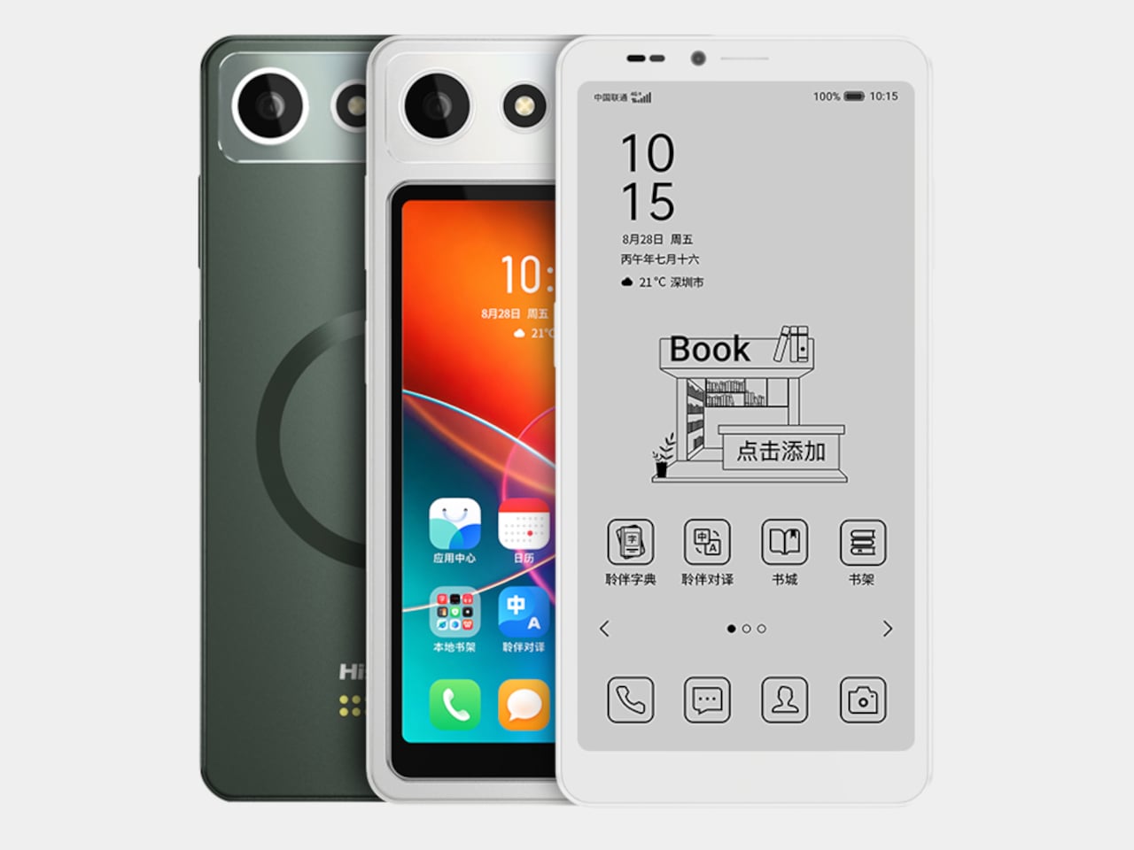
These $69 ANC Headphones for kids are so good, I might use them myself: iClever Q950 Hands-on

Designing for children is a unique challenge. Kids are clumsy, impatient, and have a remarkable talent for forgetting to charge their devices. This reality often seems lost on product designers, who shrink adult technology and call it a day. The result is usually a frustrating experience for both parent and child, filled with confusing touch controls and the inevitable silence of a dead battery. It’s a cycle of minor tech annoyances that feels all too familiar in the modern family home.

The iClever QuietShield Q950 feels like it was designed by someone who has actually spent time with kids. The controls are large, satisfying physical buttons, a smart choice for small hands that lack fine motor precision. Bluetooth pairing notifications are delivered in a friendly child’s voice, a small detail that makes the headphones feel truly personal. Best of all, the auxiliary input works even when the power is off, providing a practical backup for those very conceivable moments when charging is forgotten. These are the kinds of thoughtful, practical choices that make a product genuinely useful.

Designer: iClever

At $69.99, the Q950 makes a strong first impression. You get the headphones, a matching soft-shell carrying case, a USB-C charging cable, and an AUX cable, which already makes the package feel more complete than many headphones in this range. The case is especially nice, with a clean zippered form factor and enough room for the cables and paperwork in a mesh pocket. It is the sort of inclusion that makes the Q950 feel less like a basic kids’ accessory and more like a proper travel-friendly headphone package.

The design itself strikes a nice balance between playful and polished. In the blue finish, the two-tone color treatment gives the Q950 a softer, more approachable look, while the metallic-looking frame pieces that connect the earcups to the headband add a slightly more premium touch. Even though the construction is plastic, nothing about it feels cheap. The headband and earcups are cushioned well, the structure feels solid in hand, and nothing creaks or feels flimsy. I still hope replacement earcups are available, because that would make the product easier to recommend for long-term use, but the initial build quality is genuinely impressive.

That premium feel carries over into the controls. iClever made the right call by skipping touch panels entirely and using dedicated buttons for power, volume, and listening modes. Touch controls can be annoying even on adult headphones, so physical buttons make far more sense for kids. They are easier to find by feel, harder to trigger accidentally, and generally more forgiving. Just as importantly, there is no smart assistant toggle here, no Hey Siri shortcut, and no dedicated button that could accidentally send a child wandering into a voice assistant rabbit hole. They also look cute in a way that suits the Q950’s overall design language.

Bluetooth connectivity worked flawlessly in my time with the headphones. Pairing was quick, the connection stayed stable, and I did not run into any hiccups. Sound quality was also better than expected. To be honest, it held up surprisingly well against my Soundcore Space One in casual listening. I am not going to nitpick too much here because these are headphones for kids, not audiophiles, but there were no complaints on audio quality. They sounded clean, balanced, and perfectly good for movies, educational content, and everyday listening.

The volume does max out a little lower than the average pair of headphones, but that is clearly by design. iClever is positioning the Q950 around an 80dBA safe listening limit, and in practice that lower ceiling feels intentional rather than frustrating. The active noise cancellation helps here, because kids do not need to crank the volume as much in noisy environments just to hear what they are watching. That is the real advantage of pairing hearing protection with ANC instead of relying on a volume cap alone.

ANC is easy to access through the center button on the earcup, and transparency mode is available too, which is useful for keeping kids aware of their surroundings when needed. That setup feels much more practical than burying everything inside an app. The Q950 also supports wear detection, which worked well overall. There is one small quirk, though. If you place the headphones on a table with the earcups facing downward, the sensor can mistake the surface for your head and assume the headphones are still being worn. It is a minor issue and did not feel like a dealbreaker, but it is the kind of behavior you notice quickly in real use.

One of my favorite details is the AUX support. The headphones work passively over a wired connection even when they are powered off, which is genuinely useful if the battery dies because a kid forgot to charge them. That means the Q950 still works in a pinch instead of becoming dead weight during a flight or car ride. Of course, features like ANC and wear detection do not work when the headphones are off, because they still need power, but wired playback alone is a great fallback to have. If the headphones still have charge and are powered on, iClever says ANC can also work in wired mode.

The company claims up to 60 hours of playback with ANC off and 35 hours with ANC on, which is within the ballpark of what I got with my week’s worth of testing. The presence of AUX backup already removes a lot of battery anxiety.

For $70, the iClever QuietShield Q950 feels like a steal. You get a thoughtful set of features, reliable Bluetooth, effective ANC, a kid-safe volume cap, and a design that feels more premium than expected at this price. More importantly, it feels like a product built around how kids actually use headphones, and how parents actually worry about them.

The physical ANC button lets you toggle transparency

iClever delivers the Q950 in a gorgeous soft-shell case that kids can carry around with them.

The post These $69 ANC Headphones for kids are so good, I might use them myself: iClever Q950 Hands-on first appeared on Yanko Design.
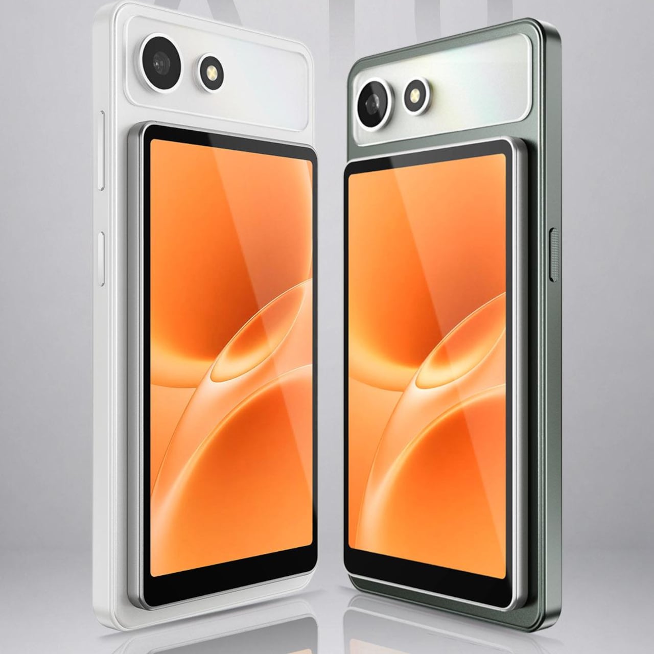
Birkenstock Just Went to Ballet Class With Repetto

If you had told me a year ago that two of the most culturally distinct footwear brands in the world would join forces for a collection, I would have been skeptical. A German orthopedic sandal brand and a Parisian ballet institution? On paper, it reads like the setup to a joke. In practice, it might just be one of the most thoughtfully designed collaborations of 2026.

Birkenstock’s 1774 line, the brand’s Paris-based special projects and collaborations unit, has been steadily building a portfolio that makes you reconsider what a sandal can be. Past partnerships with Rick Owens, Valentino, and Dior cemented the label on fashion’s most coveted list. The Repetto chapter, though, feels different. It feels like two brands that genuinely needed to meet, and the design bears that out at every level.

Designers: Birkenstock x Repetto

The collection spans three pieces, and each one tells a slightly different version of the same story. The Arizona sandal comes first, and it’s the most familiar entry point. Birkenstock kept the silhouette exactly as it is, which was the right call, but swapped the standard hardware for exclusive oversized round buckles. The scale shift is subtle but meaningful. The buckles read more sculptural than functional, borrowing the rounded, almost jewelry-like geometry that runs through Repetto’s aesthetic. It’s still unmistakably an Arizona. It just carries itself differently.

The Scala is where the ballet influence becomes most direct. Built on a round-toe base with two top straps and a laced bow at the front, it sits somewhere between a sandal and a ballet flat without fully committing to either. The bow is the kind of detail that could have easily felt costume-y or overdone, but the proportions keep it grounded. It’s small enough to feel considered rather than decorative, which is a harder balance to strike than it looks.

The Opéra sabot is the most adventurous piece of the three. It takes Birkenstock’s clog silhouette, one of the brand’s most architectural forms, and finishes it with long laces that wrap around the ankle the way a dancer’s ribbon would. The contrast between the solid, structured base of the clog and the softness of the wrapping lace is genuinely interesting from a design standpoint. It’s the piece that most clearly shows what happens when you treat a Birkenstock as a canvas rather than a finished object.

That framing came directly from Repetto CEO Charlotte Gaucher-Holmann, who described approaching Birkenstock’s silhouettes as a “blank canvas.” The result is a collection where neither brand disappears into the other. Birkenstock’s construction logic stays intact, the cork footbed, the contoured sole, the characteristic weight and proportion of each silhouette. Repetto layers its visual language on top without disrupting the architecture underneath.

That visual language is specific and consistent across all three pieces. The color palette draws from Repetto’s signature shades: Iconic Pink, Flame Red, and Profound Black. These are not trend colors. They’re house colors, the kind that have been associated with the brand long enough to carry their own meaning. The pink in particular has that very specific quality of being both soft and confident, which is harder to achieve in pigment than it sounds.

The Vichy-check gingham footbed lining is another detail worth pausing on. Hidden inside the shoe, it only reveals itself when worn. It’s a Repetto signature motif, and placing it at the footbed rather than on any visible exterior surface feels like a deliberate act of restraint. You know it’s there. It just doesn’t announce itself.

Grosgrain ribbon trim finishes the edges on key pieces, and again, the choice of material matters. Grosgrain has weight and structure. It doesn’t drape or flutter. For a collaboration rooted in dance, that tension between movement and structure runs all the way through the design decisions, from the buckle scale on the Arizona to the lace wrap on the Opéra.

The collection launches July 16 through 1774.com, Repetto’s own channels, and select retailers worldwide. Given how quickly 1774 collaborations have sold out historically, hesitating is probably not the strategy here. Iconic Pink alone is going to move fast.

The post Birkenstock Just Went to Ballet Class With Repetto first appeared on Yanko Design.