Meta is rolling out Conversation Focus and AI-powered Spotify features to its smart glasses

Back in September during Meta Connect, the company previewed a new ability for its smart glasses lineup called Conversation Focus. The feature, which is able to amplify the voices of people around you, is now starting to roll out in the company's latest batch of software updates.

When enabled, the feature is meant to make it easier to hear the people you're speaking with in a crowded or otherwise noisy environment. "You’ll hear the amplified voice sound slightly brighter, which will help you distinguish the conversation from ambient background noise,” Meta explains. It can be enabled either via voice commands ("hey Meta, start Conversation Focus") or by adding it as a dedicated "tap-and-hold" shortcut. 

Meta is also adding a new multimodal AI feature for Spotify. With the update, users can ask their glasses to play music on Spotify that corresponds with what they're looking at by saying “hey Meta, play a song to match this view.” Spotify will then start a playlist "based on your unique taste, customized for that specific moment." For example, looking at holiday decor might trigger a similarly-themed playlist, though it's not clear how Meta and Spotify may translate more abstract concepts into themed playlists. 

Both updates are starting to roll out now to Meta Ray-Ban glasses (both Gen 1 and Gen 2 models), as well as the Oakley Meta HSTN frames. The update will arrive first to those enrolled in Meta's early access program, and will be available "gradually" to everyone else.

Meta's newest mode of smart glasses, the Oakley Meta Vanguard shades, are also getting some new features in the latest software update. Meta is adding the option to trigger specific commands with a single word, rather than having to say "hey Meta." For example, saying "photo" will be enough to snap a picture and saying "video" will start a new recording. The company says the optional feature is meant to help athletes "save some breath" while on a run or bike ride. 


This article originally appeared on Engadget at https://www.engadget.com/wearables/meta-is-rolling-out-conversation-focus-and-ai-powered-spotify-features-to-its-smart-glasses-192133928.html?src=rss

The GT50 Asks What Happens When Combustion Heritage Becomes a Design Argument


Audi’s electrification messaging has been relentless. Press releases foreground battery density. Concept reveals emphasize range anxiety solutions. The brand’s future, by every official metric, runs on electrons. Then the GT50 surfaces, quietly, through social channels and enthusiast blogs rather than a formal unveiling, and poses a question the corporate roadmap doesn’t answer: what cultural work can a five-cylinder engine still perform when the company building it has publicly committed to moving beyond internal combustion?

Designer: Audi

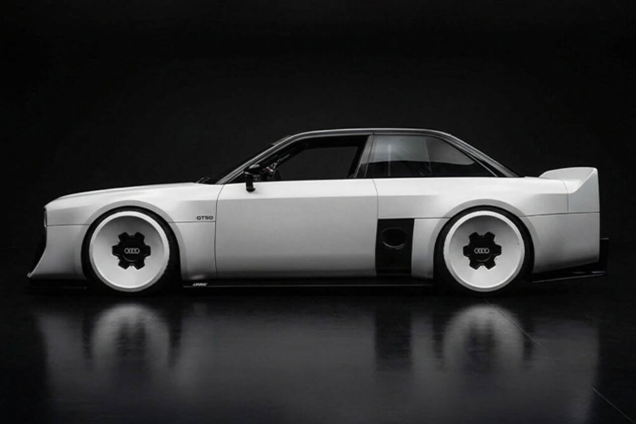
The concept car itself offers one response. Built by apprentices at Audi’s Neckarsulm training center, the GT50 wraps an unmodified RS3 powertrain in new fiberglass panels that visually lower the car (even if Audi has not detailed any suspension changes) while refusing every styling convention the parent company currently practices. The result reads less as tribute and more as provocation.

Visual Defiance: Reading the Surfaces

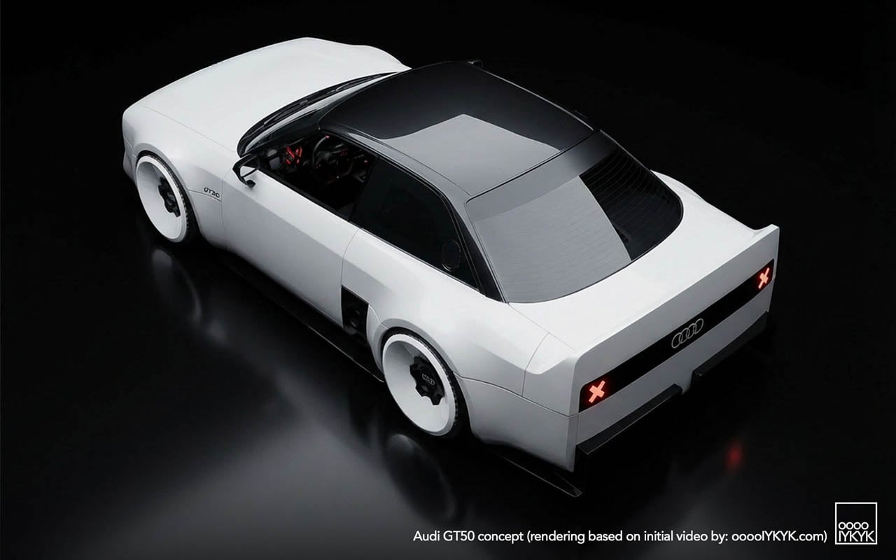
Start with what the photographs show that no press release describes. The C-pillar treatment carves a sharp notch where contemporary Audis would flow into a smooth shoulder line. Light catches the edge and dies. Below the rear glass, the decklid drops away at an angle that creates a shadow pocket, a visual trick borrowed from Group B rally cars, where abrupt surface breaks disrupted airflow less than they announced aggression.

The diffuser tells another story. Where modern RS models tuck their aerodynamic elements into integrated bumper designs, the GT50 exposes a finned undertray that reads like industrial equipment. No attempt to blend. No body-color covers. The functional hardware becomes ornament by being left visible.
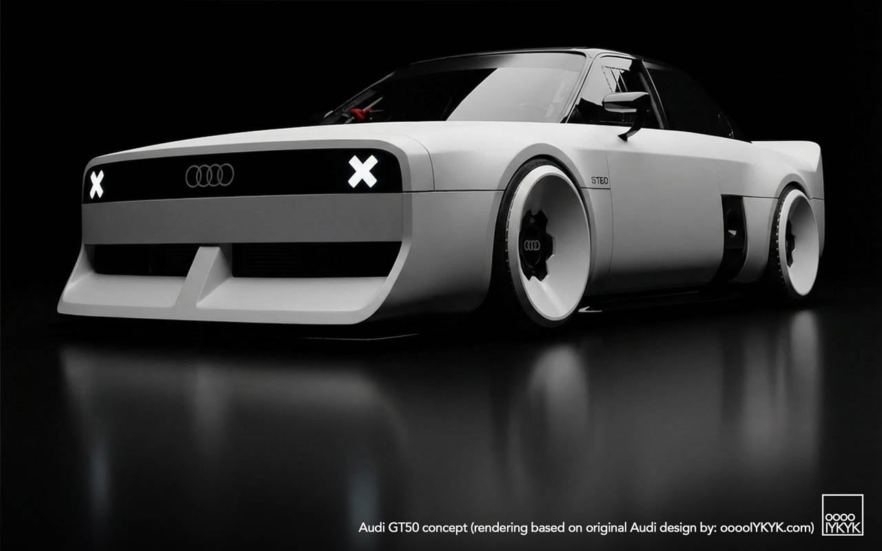
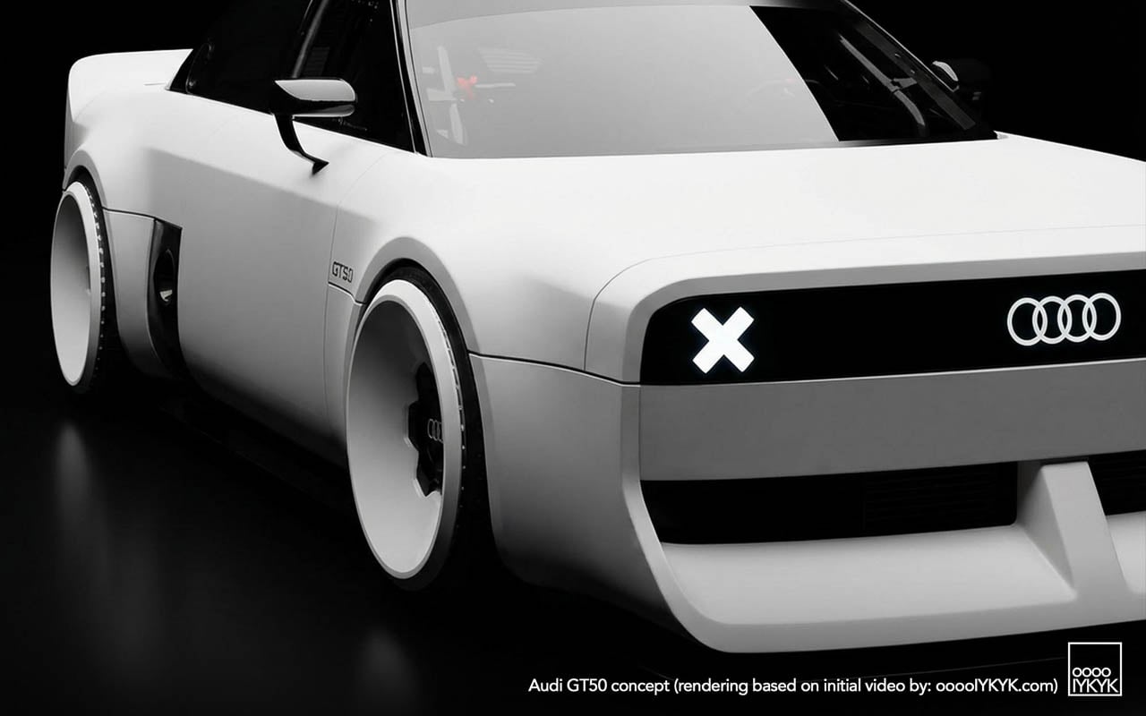
Wheel graphics interact with the body in ways that suggest deliberate coordination. The turbofan blades repeat the horizontal slat motif from the grille, creating a visual echo across the car’s length. Whether this was intentional design language or happy accident, the effect unifies the silhouette: front face and wheel face speak the same vocabulary.

Three-box geometry defines the overall proportion. Flat hood. Upright greenhouse. Hard rear edge. Each volume asserts itself rather than dissolving into the next. This is geometry as argument, a rejection of the flowing sculpture that defines the e-tron GT and its siblings.
The Engine as Artifact

The 2.5-liter turbocharged five-cylinder produces 394 horsepower. The apprentice team changed nothing about it. No additional boost. No revised mapping. No intake modifications. This restraint is the point.

Enthusiasts know the platform. Basic modifications unlock nearly 500 horsepower. The aftermarket has mapped this engine extensively. Choosing to leave it stock reframes the powertrain as something worth preserving rather than improving: a museum piece still capable of performance, displayed in running condition rather than under glass.

The configuration itself has become rare. Volvo abandoned inline-fives years ago. Ford’s brief experiment ended. Fiat moved on. Among major manufacturers, Audi alone continues production, and only in the RS3. Fifty years after the layout debuted in the 1976 Audi 100 as a packaging compromise (five cylinders fit engine bays designed for fours while delivering displacement advantages) the configuration survives as brand signature rather than engineering necessity.

Racing Ghosts: Two Distinct Legacies

The GT50’s visual references split into separate histories that share an engine family but little else.
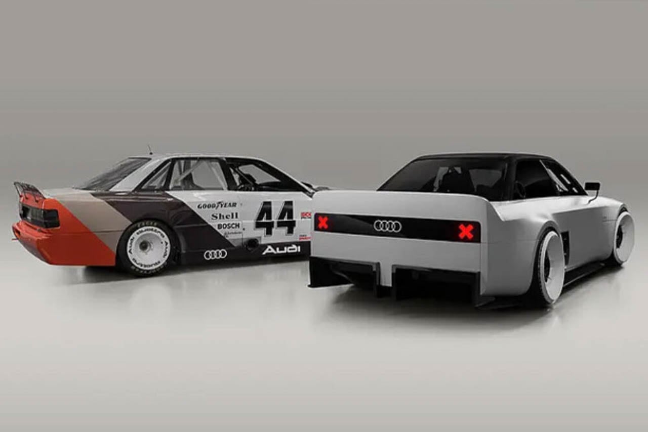
Rally heritage came first. The original Quattro road car and its competition derivatives established the five-cylinder as Audi’s performance identifier through the early 1980s. Gravel. Snow. Tarmac stages. The configuration proved itself in conditions that punished mechanical weakness.

North American racing followed a different path. The 90 Quattro IMSA GTO and 200 Quattro Trans-Am cars ran on circuits rather than stages, competing against purpose-built machinery from manufacturers with deeper racing budgets. The blocky bodywork, the aggressive aero addenda, the turbofan wheels: these elements came from that asphalt racing context, not from rally.
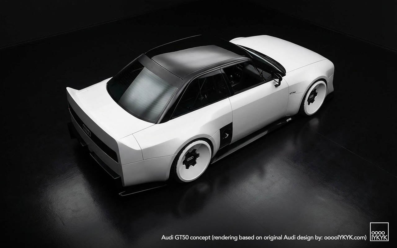
The GT50 draws primarily from the second lineage. Its proportions quote the IMSA cars directly: the way the fenders box out rather than curve, the stance created by wheels pushed to the body’s corners, the rear wing that spans the full decklid width. Rally Quattros looked different. The concept acknowledges this distinction through specific formal choices rather than generic “heritage” styling.

Apprentice Programs as Design Laboratory

Neckarsulm’s training program has produced boundary-testing work before. The RS6 GTO concept eventually influenced production decisions. That project proved the pipeline exists: ideas developed under apprentice freedom can migrate into showroom reality.

Other builds have pushed further from commercial viability. An electrified A2. A 236-horsepower NSU Prinz running modern EV hardware. These projects test technical integration as much as design direction.

The GT50 fits a different category. It uses a production powertrain unchanged. The bodywork is additive rather than structural. What the project tests is audience response, whether visual commitment to mechanical heritage generates the kind of enthusiasm that justifies development investment in combustion performance when corporate strategy points elsewhere.

Manufacturing Quality as Statement

Execution matters in this context. The released photography shows panel gaps that read as production-grade. Surface alignments hold. The fiberglass work displays none of the waviness or inconsistency that marks student-built specials at other institutions.

This finish level functions as argument. The GT50 is not a sketch in three dimensions. It is a proposal that could, with different business decisions, reach production. The apprentices built something that asks to be taken seriously as a potential product direction rather than dismissed as training exercise.

The Quiet Reveal and Its Implications

No stage. No livestream. No embargo coordination. The GT50 initially surfaced through social and niche outlets rather than the press machinery Audi deploys for products it expects to sell. This distribution choice communicates uncertainty, or perhaps strategic patience.

If reception proves enthusiastic, the soft launch becomes origin story. If response flatters less, the project remains an apprentice exercise, easily distanced from official product planning. The approach hedges corporate exposure while allowing genuine audience testing.

What the GT50 asserts, regardless of its production future, is that the five-cylinder’s cultural position within Audi’s identity has not been resolved by electrification commitments. The engine configuration still generates response. The racing heritage still communicates. Whether that cultural capital translates into business justification for extended combustion development remains the open question the concept was built to help answer.

The post The GT50 Asks What Happens When Combustion Heritage Becomes a Design Argument first appeared on Yanko Design.
This Footbridge Has 3 Paths That Rise and Fall Through Steel Waves

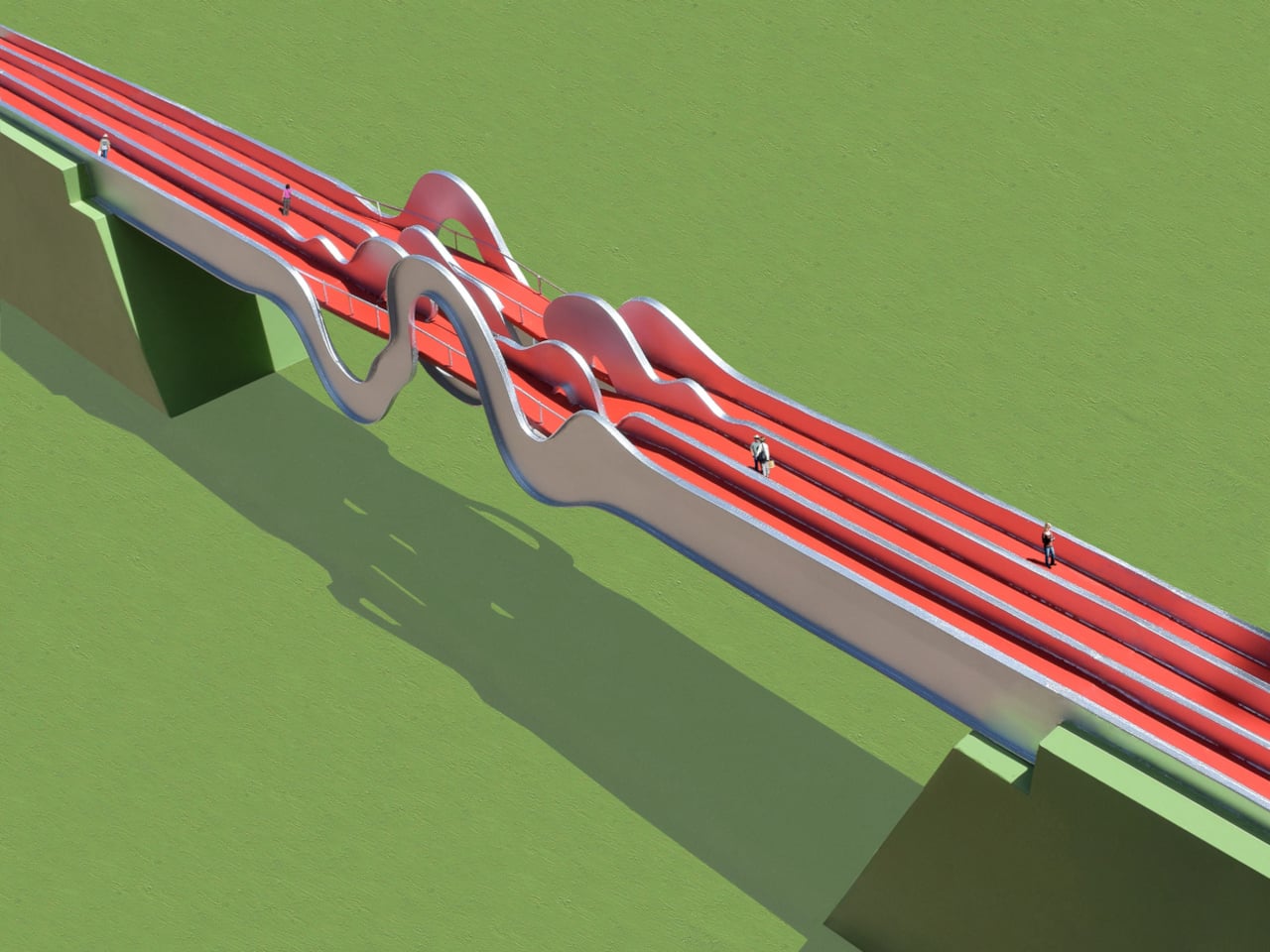
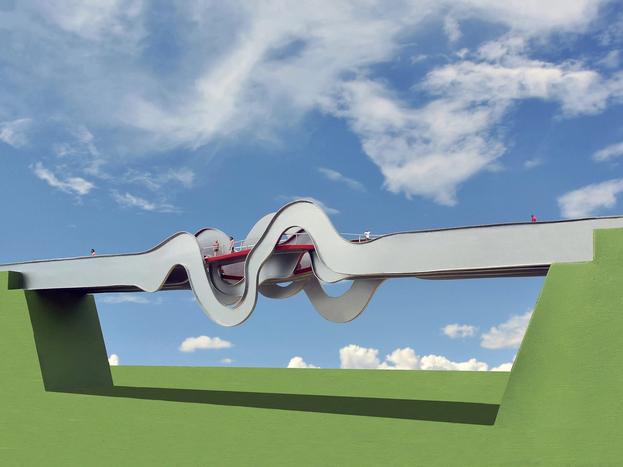
Most pedestrian bridges are neutral pieces of infrastructure, straight spans with railings that get you from one side of a road to the other. A few projects treat bridges as public art, but often as surface decoration rather than structural idea. The Wave Formed Footbridge is a proposal that starts from movement itself, imagining people as waves that literally reshape the bridge as they cross it.

The concept visualizes people walking across the bridge and, in doing so, forming waves of energy that could conceptually deform the structure in space and time. In this case, three people walking on three different paths are imagined as three overlapping waveforms, and those waves are frozen at the center of the span to become the model for the final steel geometry. The bridge becomes a physical record of motion before anyone has even stepped on it.

Designer: Michael Jantzen

The basic layout uses four primary steel channels running the length of the bridge, each deformed into a different wave shape at mid-span, and three separate red paths weaving through them. The two outer paths curve up where the channels distort into waveforms, while the center path curves down. The result is a multi-level crossing where pedestrians can choose to crest over the waves or dip into them, experiencing the same structure in different ways.

As you reach the middle, the outer paths rise into gentle hills that give you a higher vantage point over the highway, while the center path drops into a kind of canyon formed by the looping steel ribbons. Openings in the waves frame views of sky and landscape, and the red deck threads through peaks and troughs, making the act of crossing feel more like moving through a sculptural field than walking a straight line across a gap.

From the driver’s perspective, the underside of the bridge becomes the main event. The four channels loop up and down, casting complex shadows and creating a silhouette that looks like a waveform drawn in steel. As you pass underneath, the bridge acts as a gateway or landmark, not just a slab overhead. It is meant to function as a tourist attraction for the city as much as a safe way to cross a two-lane highway.

The Wave Formed Footbridge proposes that a pedestrian bridge can be a physical record of movement, a wave of steel shaped by the imagined footsteps of those who cross it. Instead of treating people as loads on a diagram, it treats them as the authors of the form. The highway crossing stops being a simple gap to span and starts being a chance to turn everyday movement into something sculptural, visible from both above and below.

The post This Footbridge Has 3 Paths That Rise and Fall Through Steel Waves first appeared on Yanko Design.

ChatGPT image generation is now faster and better at following tweaks

Following the release of GPT-5.2 last week, OpenAI has begun rolling out a new image generation model. The company says the updated ChatGPT Images is four times faster than its predecessor. If you're a frequent ChatGPT user, you'll know it can sometimes take a while for OpenAI's servers to create images, particularly during peak times and if you're not paying for ChatGPT Plus. In that respect, any improvement in speed is welcome.

The new version is also better at following instructions, including when you want to edit something the new model just generated. You can ask the system to add, subtract, combine, blend and even transpose elements. At the same time, OpenAI says the update offers better text rendering. That's something many image models have traditionally struggled with, but according to the company, the new ChatGPT Images is capable of handling denser and smaller text. As part of the today's model update, OpenAI is additionally adding a dedicated Images section to the ChatGPT sidebar. Here you'll find preset filters and prompts you can look to for inspiration. 

A portrait of Sam Altman, in the style of Johannes Vermeer's Girl with a Pearl Earring.
OpenAI

The new ChatGPT Images arrives just as Nano Banana Pro is responsible for a surge in Gemini usage. In October, Google said its chatbot had 650 million users, up from 450 million just a few months earlier in July. Nano Banana Pro has proven so popular, the company recently limited free users to just two image generations per day. For OpenAI, a strong response to Nano Banana Pro probably wasn't as important as ensuring it came out swinging against Gemini 3 Pro, but ChatGPT Images is a big part of why there are 800 million ChatGPT users.    

"We believe we’re still at the beginning of what image generation can enable," OpenAI said. "Today’s update is a meaningful step forward with more to come, from finer-grained edits to richer, more detailed outputs across languages."

OpenAI is rolling out the new ChatGPT Images to all users starting today. If you're one of those people who miss GPT-4o, you'll be happy to learn you can continue to use the older version of the tool through a custom GPT.  

This article originally appeared on Engadget at https://www.engadget.com/ai/chatgpt-image-generation-is-now-faster-and-better-at-following-tweaks-180000750.html?src=rss

Rainbow Six Mobile will finally be available in February after years of testing

The long-awaited Rainbow Six Mobile comes out on February 23 for iOS and Android devices. This is a global release and follows years of testing and some significant delays.

This is basically a smartphone version of the popular tactical shooter Rainbow Six Siege. It was "developed exclusively" for mobile devices and features a trio of 5v5 multiplayer modes. There's a team deathmatch, of course, and a pair of bomb-defusing games that are riffs on a pre-existing mode from Siege.

Rainbow Six Mobile offers access to a bunch of maps, including some that will be familiar to fans of the franchise. There are more than 20 operators to choose from and Ubisoft promises it'll be adding more content with each new season.

The company is rolling the game out early in some parts of the world. It's already playable in Poland, France, Canada and parts of Latin America. Everyone else has to wait until February.

This article originally appeared on Engadget at https://www.engadget.com/gaming/rainbow-six-mobile-will-finally-be-available-in-february-after-years-of-testing-174001081.html?src=rss

This Wicker Collection Looks Like the Forest Came Indoors

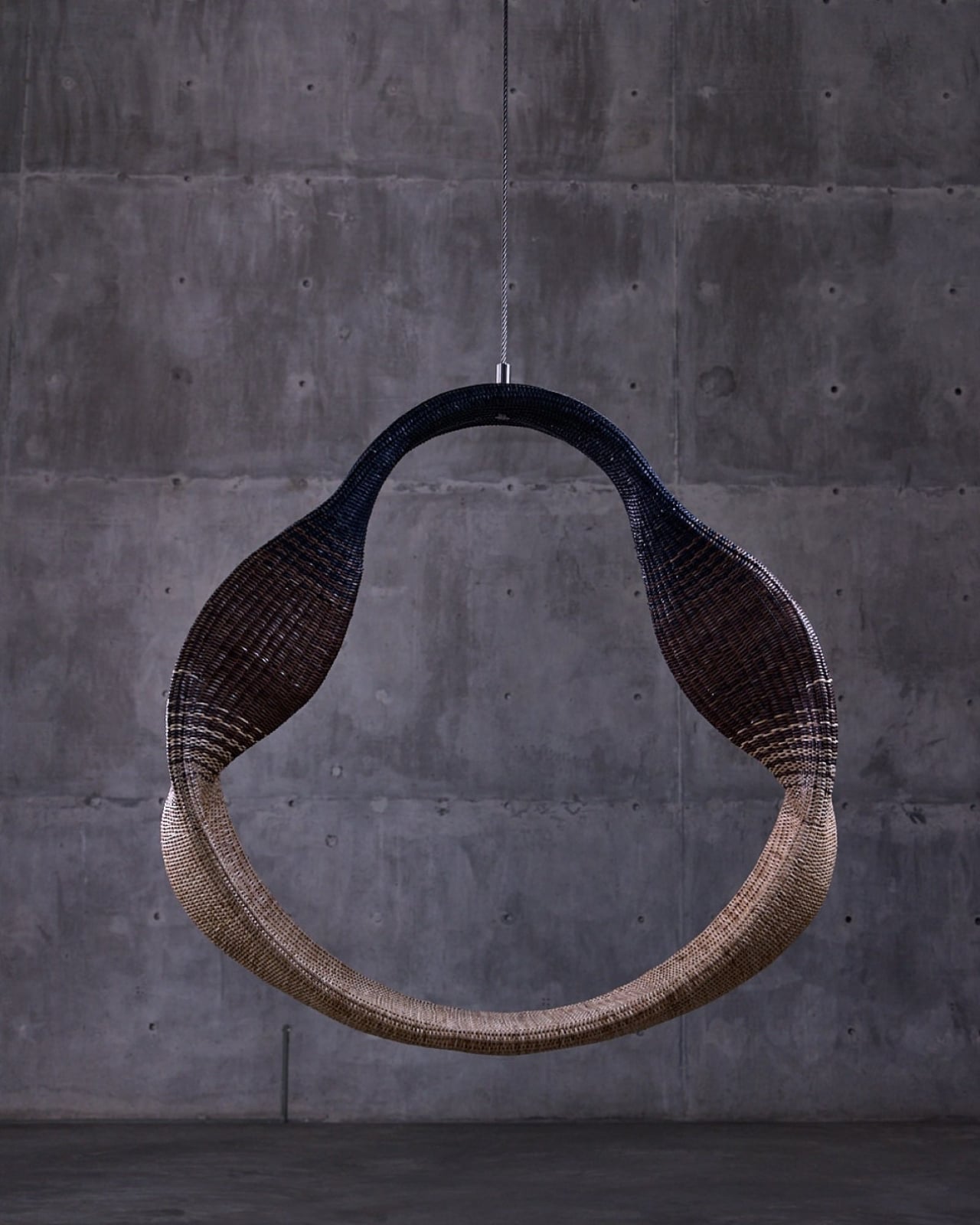
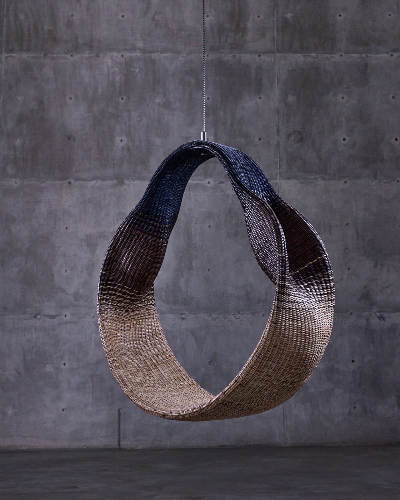
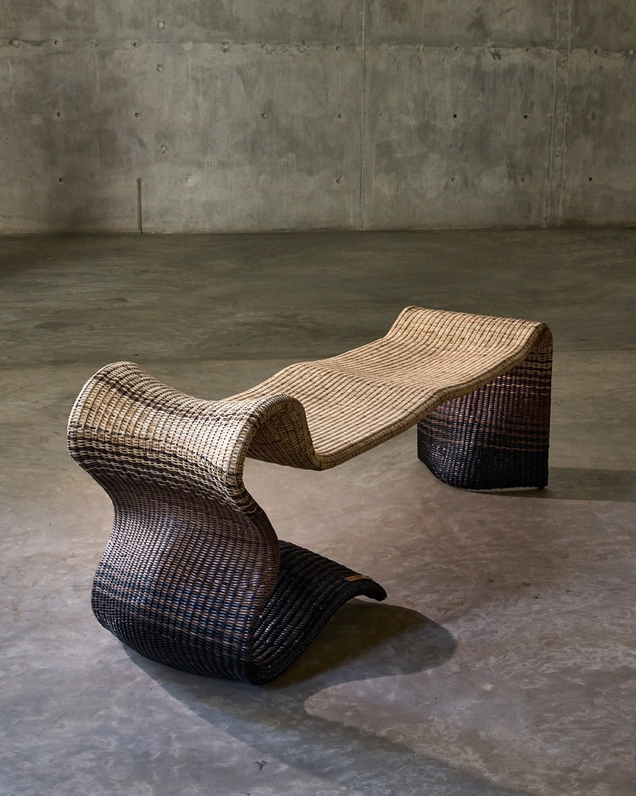
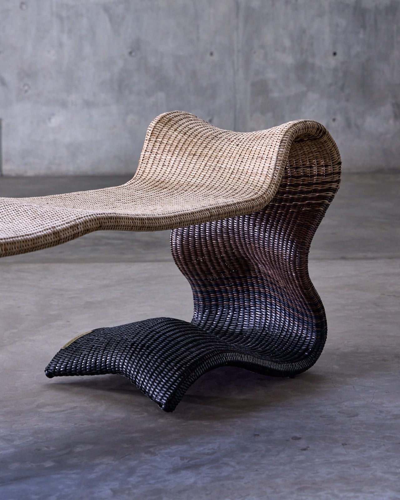
There’s something magical about watching an ancient craft transform into something that feels utterly contemporary. That’s exactly what happens when you encounter Whispers of the Wildwood, a new collection from Hyderabad-based design studio The Wicker Story. Designer Priyanka Narula has taken the humble art of wicker weaving and turned it into something that feels like poetry you can touch.

Wicker has been having a moment lately. You’ve probably noticed it creeping back into the design world, showing up in Instagram-worthy cafes and carefully curated living rooms. But here’s the thing: most wicker pieces still carry that nostalgic grandma’s-porch vibe, charming but predictable. Narula decided to throw that playbook out the window.

Designer: Priyanka Narula for The Wicker Story

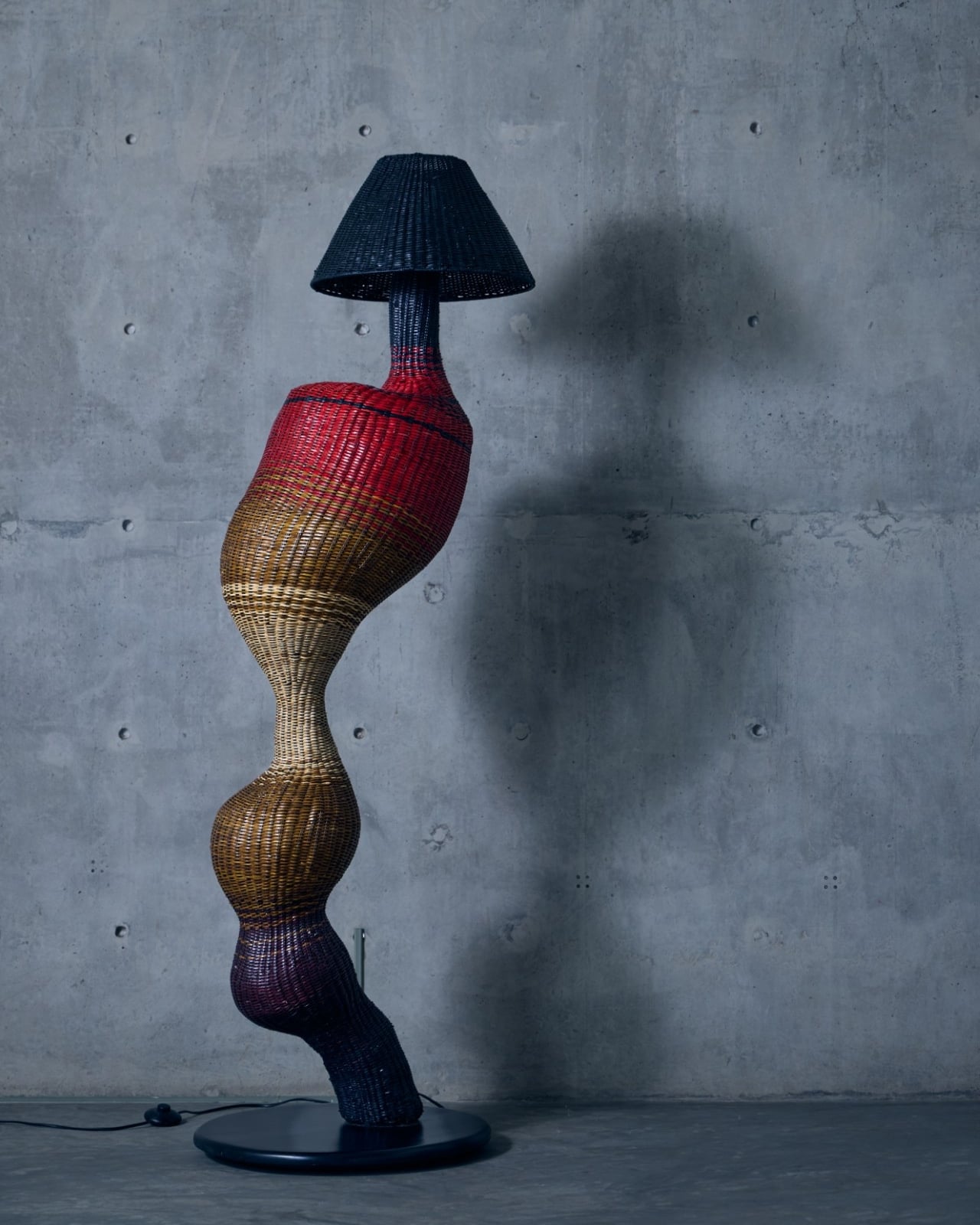
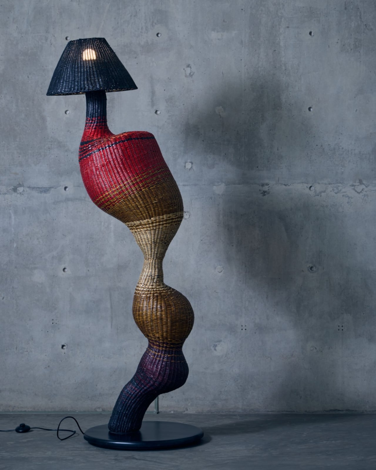
Instead of sticking to traditional furniture forms, she looked to the forest itself for inspiration. The collection draws from the organic chaos of nature, from meandering rivers that never quite go straight to forest canopies that filter light in a thousand different ways. There’s the gentle sway of wild grasses caught in the breeze, the textured warmth of tree bark, the unpredictable curves of branches reaching toward the sun. Each piece in the collection becomes a memory of these natural moments, frozen in woven form.

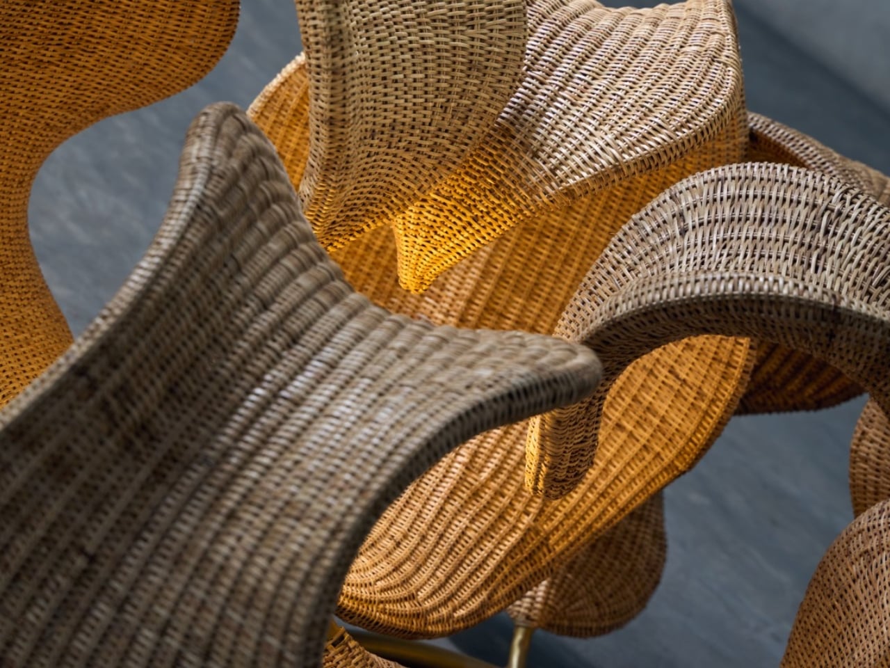
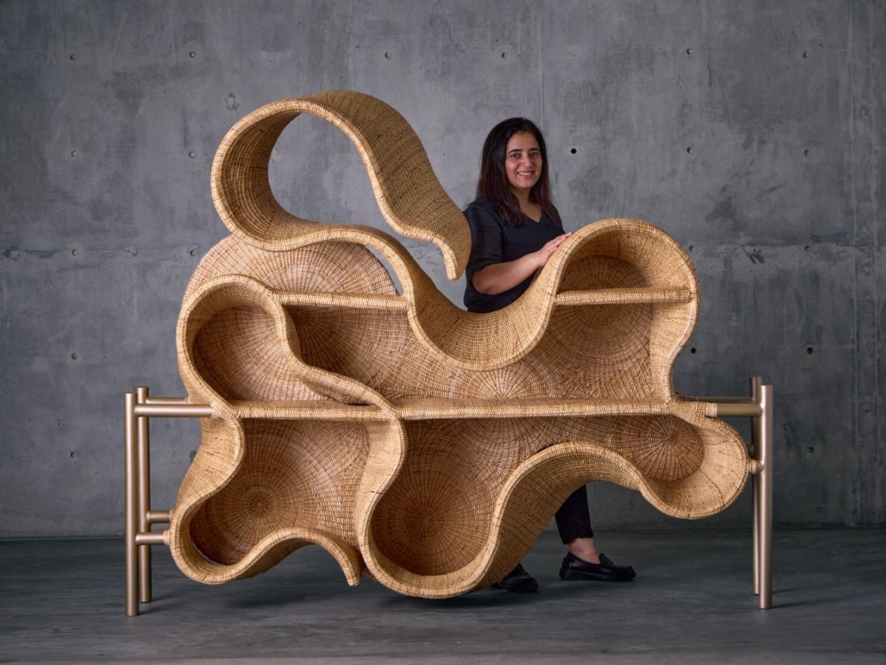
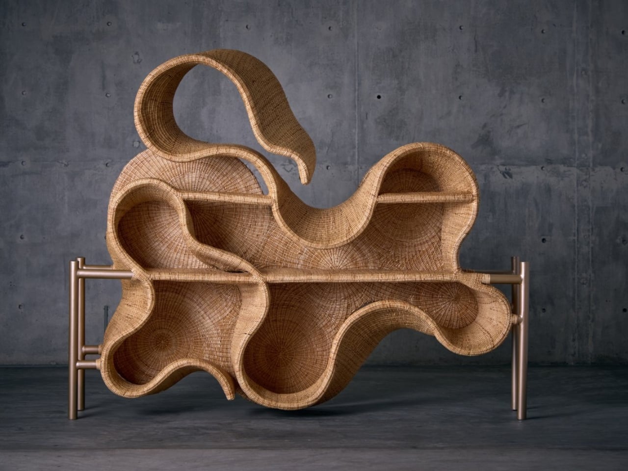
What makes this collection so compelling is how it pushes wicker beyond what we think it can do. These aren’t just chairs and tables with a nature-inspired twist. They’re sculptural pieces that happen to be functional, blurring that increasingly fuzzy line between art and design. The textures are incredibly fine, elevated through contemporary silhouettes and details so subtle you might miss them at first glance.

Take the Pagdandi wall unit, for example. The name itself evokes narrow forest paths, those meandering trails worn by countless footsteps over time. The piece captures that same sense of organic movement, of following where nature leads rather than imposing rigid geometry. It’s the kind of design that makes you stop and look twice, wondering how something woven could feel so fluid.

The earthy tones throughout the collection feel deliberate but never forced. Instead of reaching for trendy neutrals, Narula stays true to the materials themselves, letting the natural warmth of wicker shine through. It’s a celebration of what the material can do when you really understand it, when you’ve spent years researching and experimenting with traditional weaving techniques and then finding ways to push them forward.

This approach makes sense when you learn more about The Wicker Story itself. Founded by Narula in 2018, the studio has built its reputation on research-driven design that respects Indian weaving craft while refusing to let it remain static. It’s not about preservation for preservation’s sake. It’s about honoring the skill and knowledge of traditional artisans while asking what else is possible, what new forms and expressions might emerge when you give craft room to evolve.

The timing feels right for a collection like this. We’re living in an era where people are craving authenticity and connection to natural materials, but nobody wants their space to feel like a museum or a rustic cabin. We want pieces that acknowledge our contemporary lives while bringing in warmth and texture and that ineffable quality of something made by human hands. Whispers of the Wildwood hits that sweet spot perfectly.

What Narula has created isn’t just furniture. It’s a reminder that the best design often comes from deep observation of the world around us. The forest doesn’t use straight lines or perfect symmetry, yet it creates compositions that feel balanced and beautiful. By channeling those organic rhythms into woven forms, this collection brings a piece of that wildwood serenity into our built environments.

For anyone who loves design that tells a story, that carries meaning beyond pure aesthetics, this collection deserves your attention. It proves that traditional craft can speak to contemporary sensibilities, that wicker can be sculptural and sophisticated, and that sometimes the most innovative design comes from looking not to the future but to the timeless patterns of nature itself.

The post This Wicker Collection Looks Like the Forest Came Indoors first appeared on Yanko Design.
This Wicker Collection Looks Like the Forest Came Indoors

There’s something magical about watching an ancient craft transform into something that feels utterly contemporary. That’s exactly what happens when you encounter Whispers of the Wildwood, a new collection from Hyderabad-based design studio The Wicker Story. Designer Priyanka Narula has taken the humble art of wicker weaving and turned it into something that feels like poetry you can touch.

Wicker has been having a moment lately. You’ve probably noticed it creeping back into the design world, showing up in Instagram-worthy cafes and carefully curated living rooms. But here’s the thing: most wicker pieces still carry that nostalgic grandma’s-porch vibe, charming but predictable. Narula decided to throw that playbook out the window.

Designer: Priyanka Narula for The Wicker Story

Instead of sticking to traditional furniture forms, she looked to the forest itself for inspiration. The collection draws from the organic chaos of nature, from meandering rivers that never quite go straight to forest canopies that filter light in a thousand different ways. There’s the gentle sway of wild grasses caught in the breeze, the textured warmth of tree bark, the unpredictable curves of branches reaching toward the sun. Each piece in the collection becomes a memory of these natural moments, frozen in woven form.

What makes this collection so compelling is how it pushes wicker beyond what we think it can do. These aren’t just chairs and tables with a nature-inspired twist. They’re sculptural pieces that happen to be functional, blurring that increasingly fuzzy line between art and design. The textures are incredibly fine, elevated through contemporary silhouettes and details so subtle you might miss them at first glance.

Take the Pagdandi wall unit, for example. The name itself evokes narrow forest paths, those meandering trails worn by countless footsteps over time. The piece captures that same sense of organic movement, of following where nature leads rather than imposing rigid geometry. It’s the kind of design that makes you stop and look twice, wondering how something woven could feel so fluid.

The earthy tones throughout the collection feel deliberate but never forced. Instead of reaching for trendy neutrals, Narula stays true to the materials themselves, letting the natural warmth of wicker shine through. It’s a celebration of what the material can do when you really understand it, when you’ve spent years researching and experimenting with traditional weaving techniques and then finding ways to push them forward.

This approach makes sense when you learn more about The Wicker Story itself. Founded by Narula in 2018, the studio has built its reputation on research-driven design that respects Indian weaving craft while refusing to let it remain static. It’s not about preservation for preservation’s sake. It’s about honoring the skill and knowledge of traditional artisans while asking what else is possible, what new forms and expressions might emerge when you give craft room to evolve.

The timing feels right for a collection like this. We’re living in an era where people are craving authenticity and connection to natural materials, but nobody wants their space to feel like a museum or a rustic cabin. We want pieces that acknowledge our contemporary lives while bringing in warmth and texture and that ineffable quality of something made by human hands. Whispers of the Wildwood hits that sweet spot perfectly.

What Narula has created isn’t just furniture. It’s a reminder that the best design often comes from deep observation of the world around us. The forest doesn’t use straight lines or perfect symmetry, yet it creates compositions that feel balanced and beautiful. By channeling those organic rhythms into woven forms, this collection brings a piece of that wildwood serenity into our built environments.

For anyone who loves design that tells a story, that carries meaning beyond pure aesthetics, this collection deserves your attention. It proves that traditional craft can speak to contemporary sensibilities, that wicker can be sculptural and sophisticated, and that sometimes the most innovative design comes from looking not to the future but to the timeless patterns of nature itself.

The post This Wicker Collection Looks Like the Forest Came Indoors first appeared on Yanko Design.

What happened to iRobot can happen to anyone

The company which popularized robot vacuum cleaners around the world has filed for Chapter 11 bankruptcy. iRobot, makers of the Roomba, has been synonymous with the category since its inception, but its star had dulled in recent years. The company plans to sell its assets to its primary supplier, China’s Picea Robotics, in the hope of maintaining its business.

Everyone’s got a strident opinion as to why iRobot fell from grace. The rugged individualists blame limp regulators on both sides of the pond (and their hatred for big tech) for blocking Amazon’s attempted purchase in 2023. Those on the hardware side of the fence say iRobot’s refusal to embrace LiDAR for navigation until this year left it behind rivals.

Then there’s the geopolitical experts, who can point at China’s industrial policy, subsidies and favorable regulatory environment compared to the US approach. After all, iRobot’s US gear is made in Vietnam, which is now subject to a 46 percent import levy. As BBC News reported, that added around $23 million to iRobot’s costs and increased the price of its hardware.

The real answer is that iRobot’s demise was caused by a perfect storm of all these factors piling on to the company. More importantly, iRobot’s situation isn’t any way unique, and should serve as a warning to every major American technology brand. It’s also a lesson in why companies need to deal with existential threats when they have the time and cash to do so. 

For instance, once iRobot perfected the concept for the Roomba, it wasn’t long before the first copies burst onto the scene. iRobot had the brand and the know-how, but that only goes so far against well-motivated copycats. Think about the first Samsung Android handsets, and how quickly they went from iPhone imitations to class-defining devices of their own — and how hard Apple fought in court to prevent it.

Even before this year’s tariffs, iRobot struggled to compete on price in a manner we’ve seen in other fields. Remember Fitbit before Google purchased it, happily selling $80 fitness trackers for years until Xiaomi swiped the low-end part of its business for itself. Even if the early MiBands weren’t very good, you could buy three for the price of a single Fitbit Charge. Yes, the argument around quality and reliability is important, but it’s often not as loud or compelling as a competing product sold for a fraction of the price.

iRobot should have either made more of an effort to offer a dirt-cheap model to undercut its rivals, or more likely pull out of the low end altogether. Earlier today, I checked out local retail listings for Roombas and its nearest competitors. Next to one another were the Roomba 405 Combo with Dock and the Roborock Q7 L5+ — both capable of vacuuming and mopping your floor. The former is currently on sale for $400 direct from iRobot, while the latter is currently selling for $220. I’m sure plenty of buyers would have seen the price difference and opted for the cheaper model.

I’m not going to throw too many Told You So’s over iRobot’s fence for not embracing LiDAR sooner. Its omission was a mistake, but you could see why it was shy about abandoning its existing setup. But the company had forgotten one key mantra about the tech world, Andy Grove’s maxim that “only the paranoid survive.” Even the fanciest, highest-end Roombas of the last five years felt a generation behind rival products.

And, at the risk of sounding like a marketing guru, it was never clear what iRobot, or Roomba, stood for. When companies flooded the market with cheaper models, iRobot needed to make it clear what it meant when you bought a Roomba over a generic model. What did, and could, it offer beyond the name and history that made it stand out against cheaper competitors? Companies like Apple and Dyson command a premium, but you almost always know what you’re getting for your money.

All I can say is that it’s good that there isn’t another American company presently in a similar position. I certainly can’t think of a controversial US company that builds things with wheels that has historically rejected LiDAR for its autonomous services. One that has a brand that doesn’t stand for much, or has its identity tied too closely to the identity of its CEO. One that is staring down the barrel at a raft of better equipped and often cheaper Chinese alternatives. Because that company could surely be looking at a similar fate a decade or so down the road.


This article originally appeared on Engadget at https://www.engadget.com/home/what-happened-to-irobot-can-happen-to-anyone-164500625.html?src=rss

Dead Island 3 is in development and will reportedly come out in 2028

The zombie-decapitating sim Dead Island 3 is still being developed, according to financial documents from Dambuster Studios that were published on X and reported on by Video Games Chronicle. These documents suggest a 2028 release date, so that's something to look forward to.

The paperwork says the development is "moving at pace" and that "parts of the game are now in early production." These parts reportedly include feature design, world design, narrative and character design.

We already knew this game was in development, as Dambuster posted on Steam earlier this year that "the outbreak is far from over." The idea of Dead Island 3 makes a whole lot of sense, given the success of the second one. The company has sold over 4 million copies of the game since 2023.

It's also worth noting that a 2028 release date would put five years between the two sequels. That's a long time for something like Assassin's Creed, but nothing for the Dead Island franchise. Dead Island 2 was first announced in 2014, so development took nearly a decade.

This article originally appeared on Engadget at https://www.engadget.com/gaming/dead-island-3-is-in-development-and-will-reportedly-come-out-in-2028-162522680.html?src=rss

Hexagon Board Game Trays Make Perfect Magnetic Desk Organizers

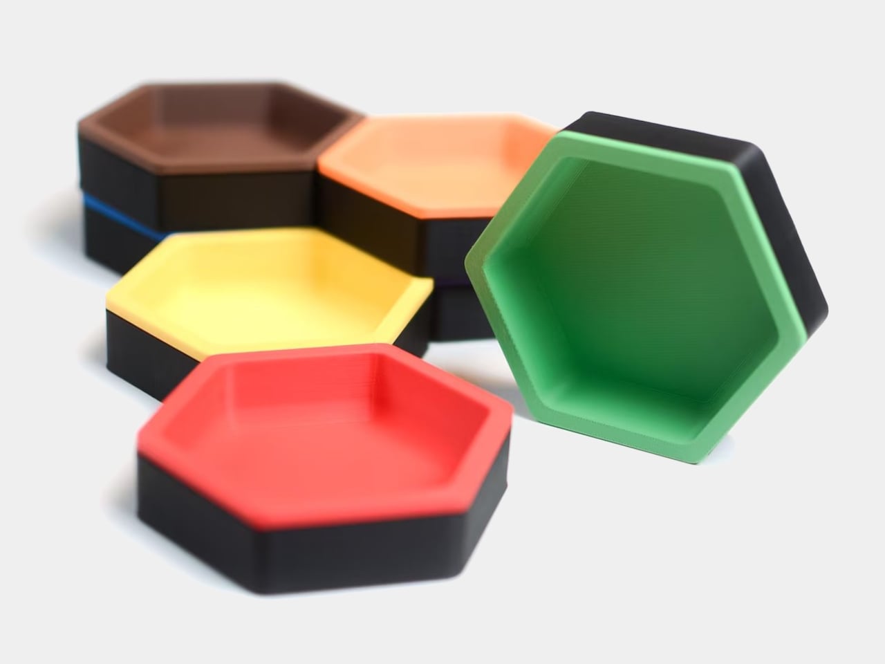
Most of us end up using whatever is at hand as a catch-all: coffee cups, candle lids, random bowls, and that works until you actually need to find a specific SD card or binder clip. A lot of the best small organizers are hiding in other categories, and these magnetic hexagon token trays, sold as board game accessories, are really just well-designed hexagonal dishes with magnets and dividers.

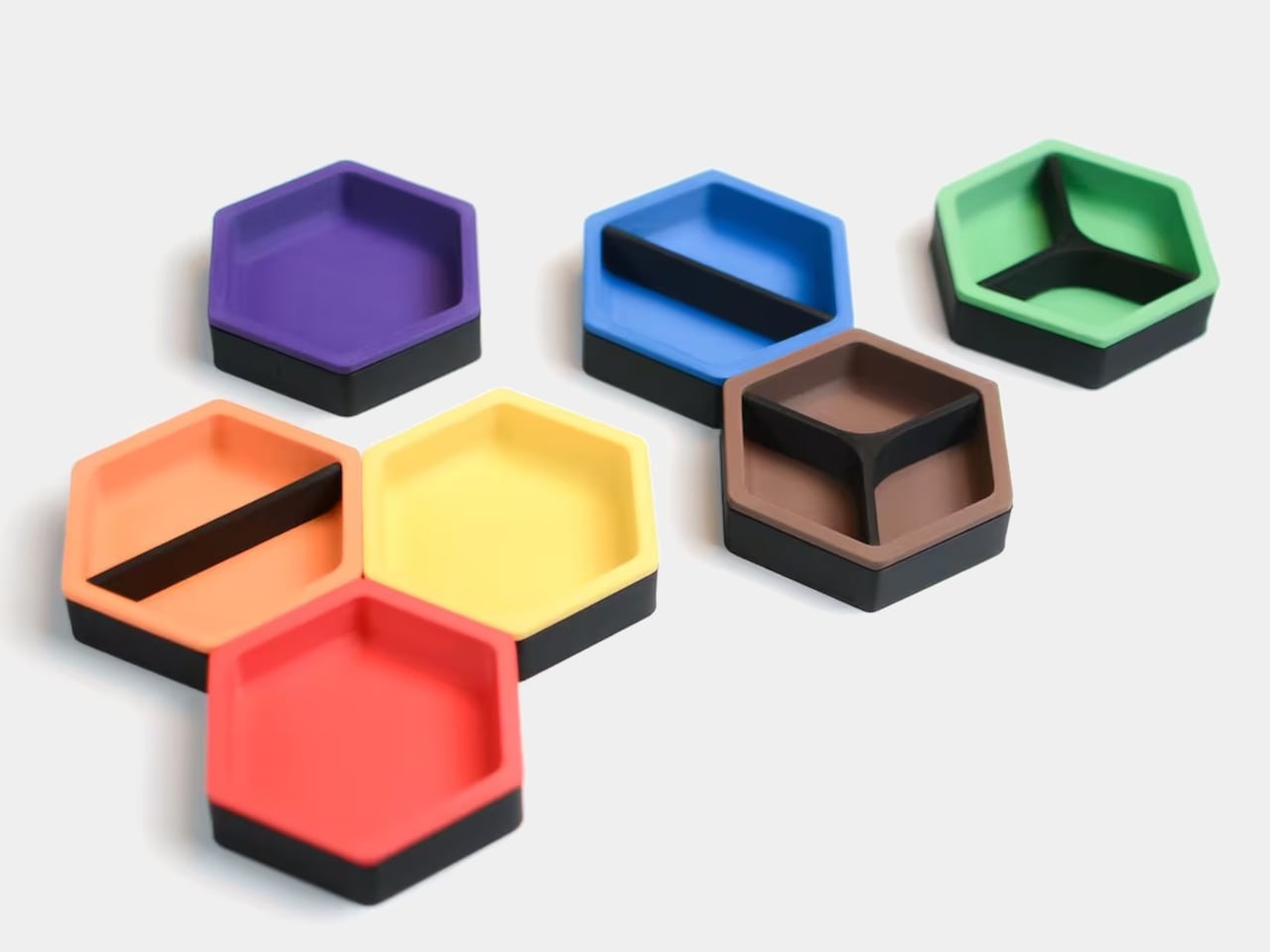
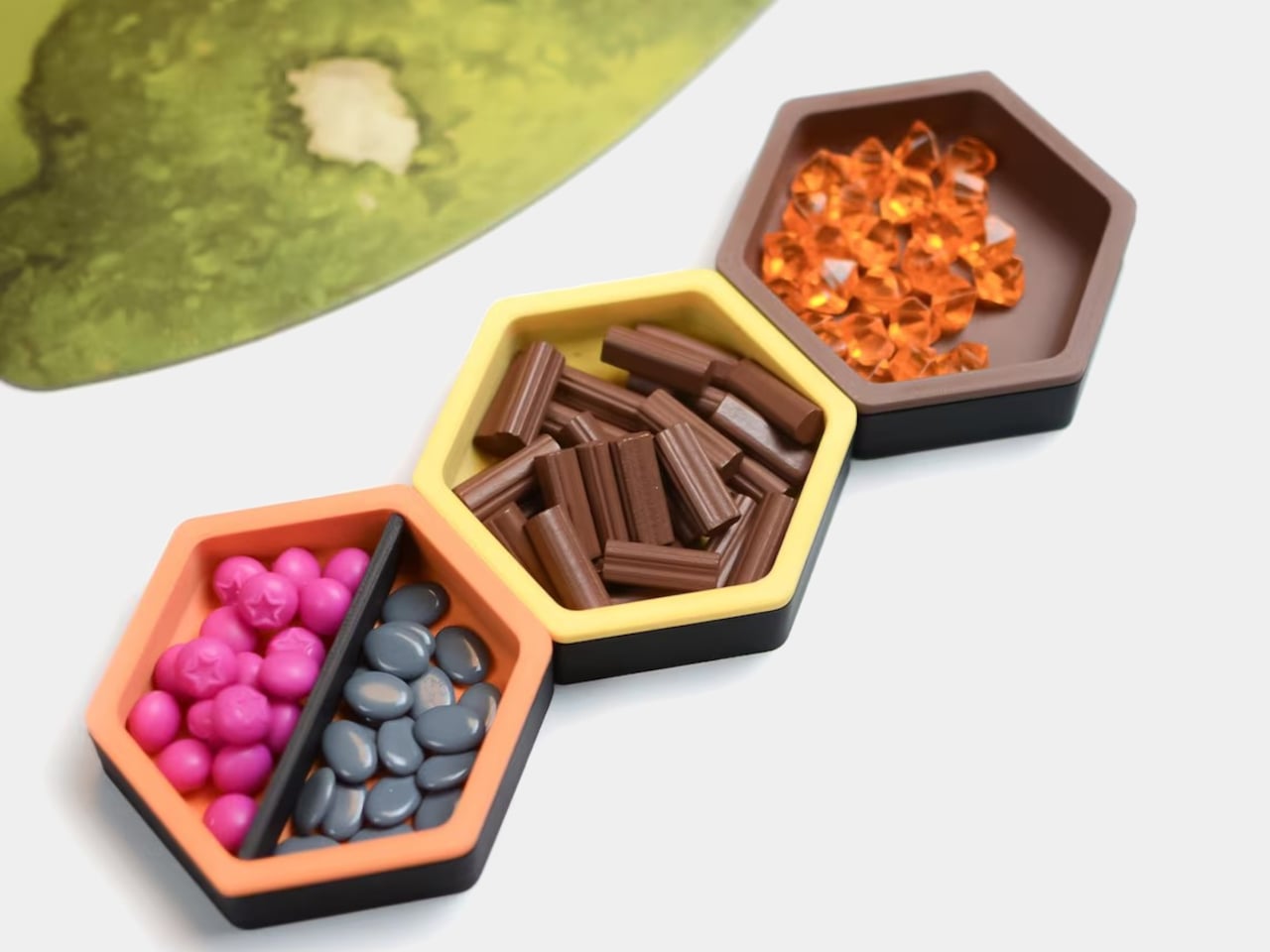
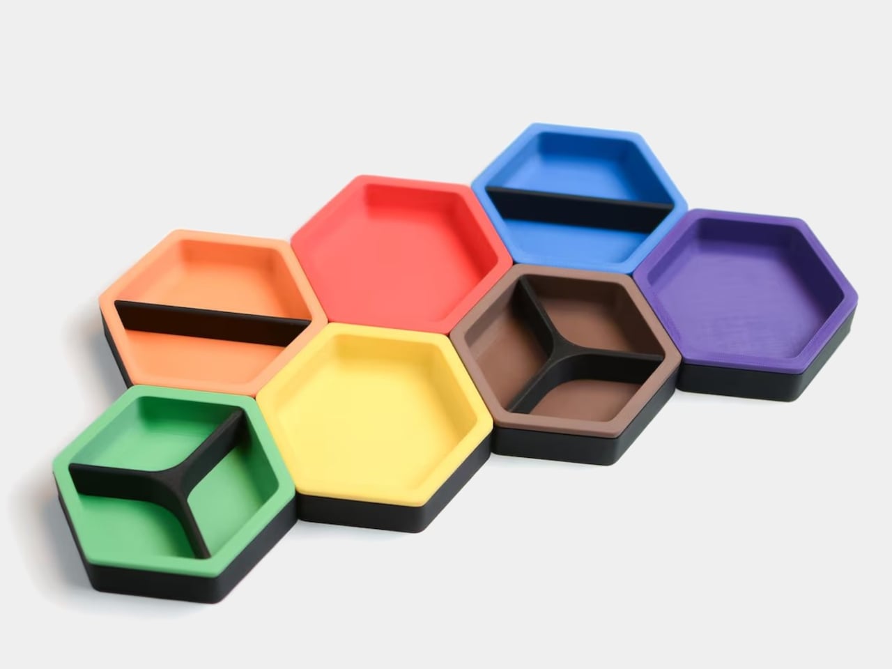
Each tray is a hexagon with magnets hidden in its edges so it snaps to its neighbors in a honeycomb. You can build a cluster that fits the corner of a monitor stand or the space in front of a keyboard, then peel one off and move it closer when you need it. The magnets keep the layout coherent instead of letting dishes drift apart over time, which is a small but meaningful improvement over loose containers.

Designer: BoardGeekFox

Each unit is a two-part organizer, a black magnetic base, and a colored insert that drops in. The insert ships with two dividers, a straight one that splits the tray into two sections and a Y-shaped one that splits it into three. You can run it as one big bin, two equal compartments, or three wedges, depending on whether you are holding paper clips, sticky-note flags, or three different pen nibs.

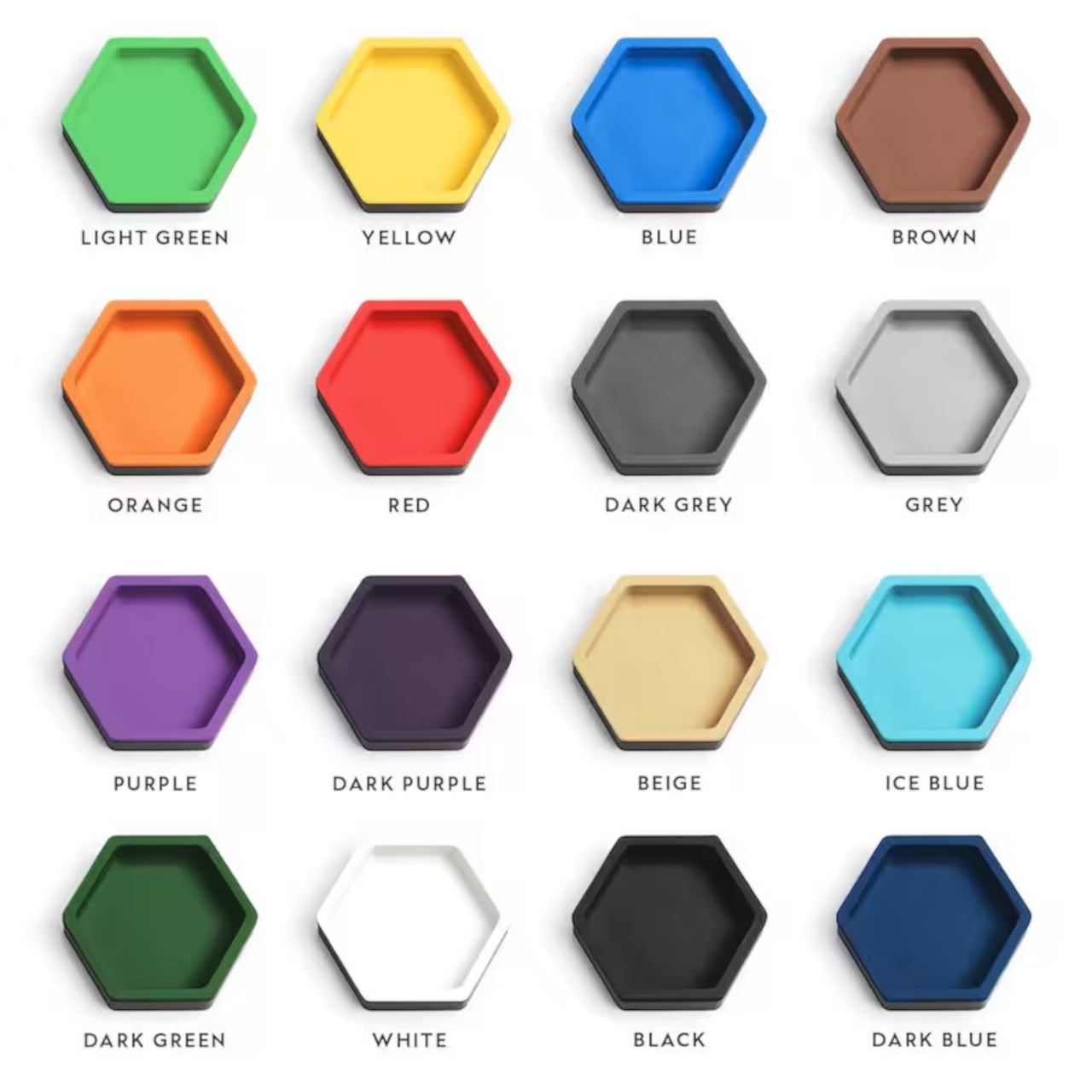
The color options for the inserts let you treat the trays as a visual system. You can assign colors to categories, blue for tech bits, yellow for writing tools, red for things that need attention, or just build a small rainbow that makes the corner of your desk feel more like a layout than a pile. The black bases keep everything grounded, so the color reads as an accent, not chaos.

The trays are 3D-printed in PLA with embedded magnets, which keep them light but give them a satisfying snap when they connect. On a smooth desk, that matters, a cluster of loose bowls tends to slide and separate, while a magnetic cluster holds its shape when you nudge things around. The slight texture of printed PLA also keeps small items from skittering around inside each compartment, especially paper clips and staples.

The modularity plays nicely with shifting work modes. On a heavy project day, you can build a larger honeycomb and park it next to your main work area, each tray handling a different set of parts. On quieter days, you can break the set into smaller clusters and spread them across a shelf, a secondary desk, or a nightstand. The hexagon footprint is compact enough that a single tray works as a bedside catch-all for rings and earbuds.

These trays sit in a sweet spot between rigid drawer inserts and random containers, structured enough to keep things sorted but flexible enough to reconfigure when your habits change. For anyone who likes their desk to feel a little more like a considered layout and a little less like a junk drawer, a handful of magnetic hexagons with dividers is a surprisingly simple way to give every small object a place to land, while keeping the option to rebuild the whole composition whenever the mood or the project shifts.

The post Hexagon Board Game Trays Make Perfect Magnetic Desk Organizers first appeared on Yanko Design.