Most gift guides for him are boring. A leather wallet, a whiskey set, a watch he already owns in a different color. But if the person you’re buying for genuinely cares about the objects around him, about what something communicates before he even uses it, a pen is an underrated move. Not just any pen. The five below are the kind of pieces that make everything else on the gift table look like an afterthought.
These aren’t novelty pens with logos. Each one makes a deliberate argument about what a writing instrument can be, rethinking the material, the mechanism, or the relationship between the pen and the desk it lives on. Together, they represent how designers are now treating an object that most people have stopped thinking about. Whether you’re shopping for a birthday, an anniversary, or a reason to stop buying the same gift twice, this list delivers.
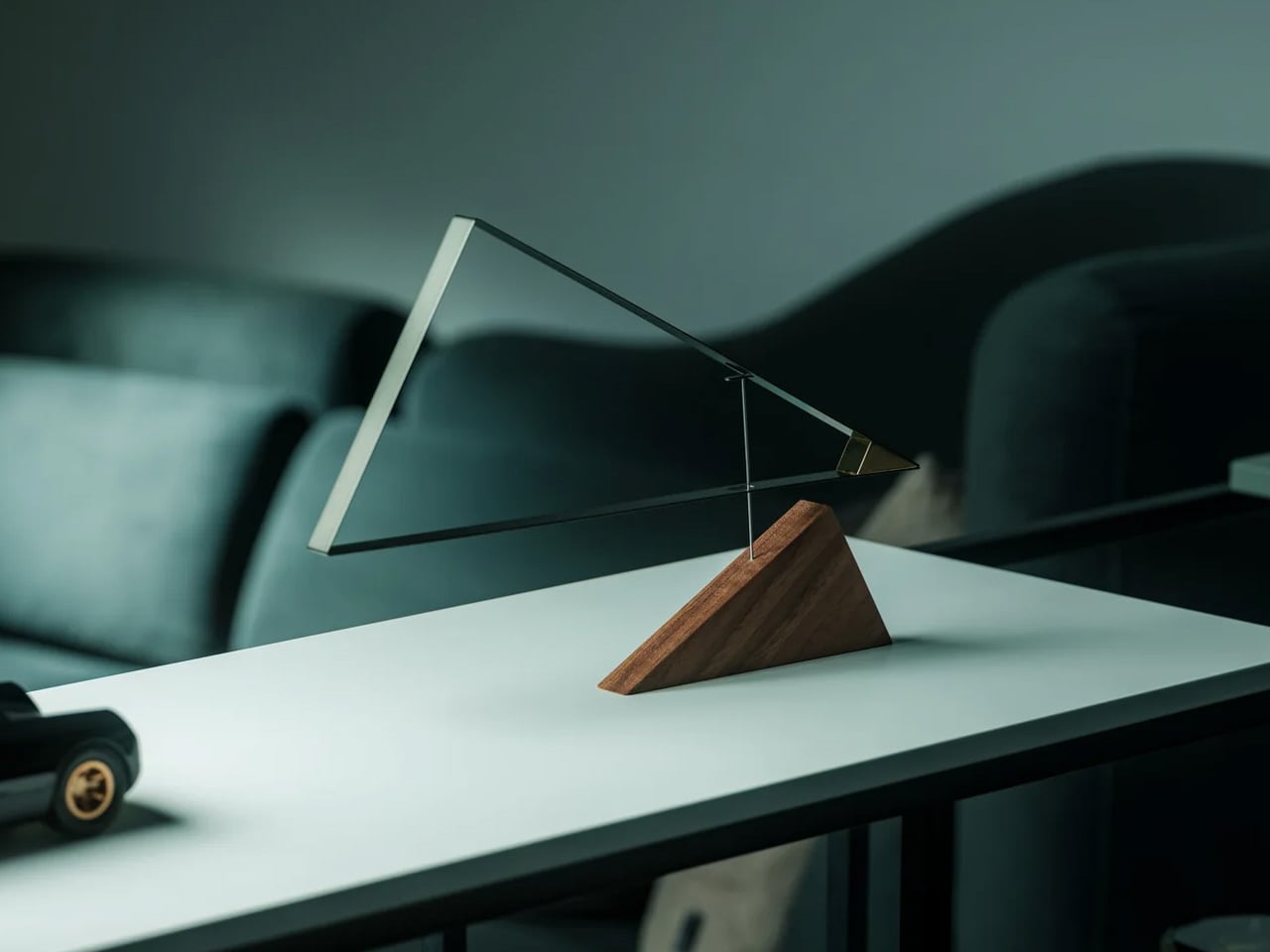
1. Pininfarina Aero Ethergraf
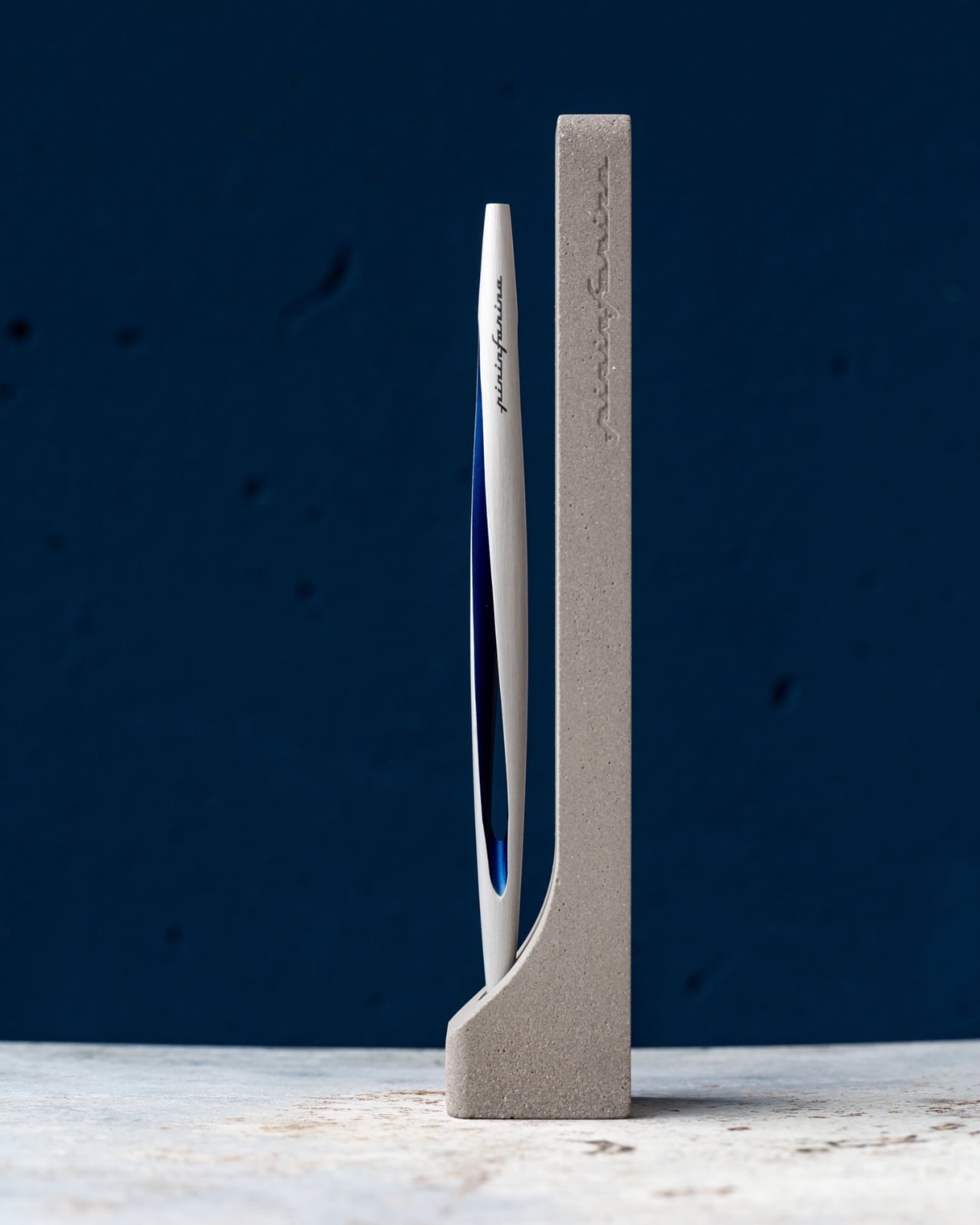
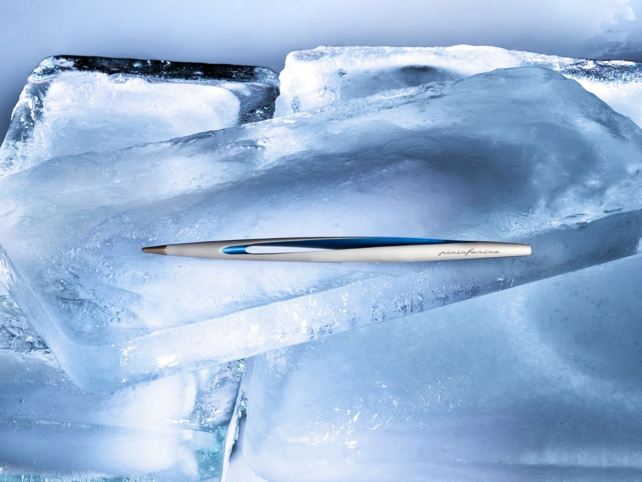
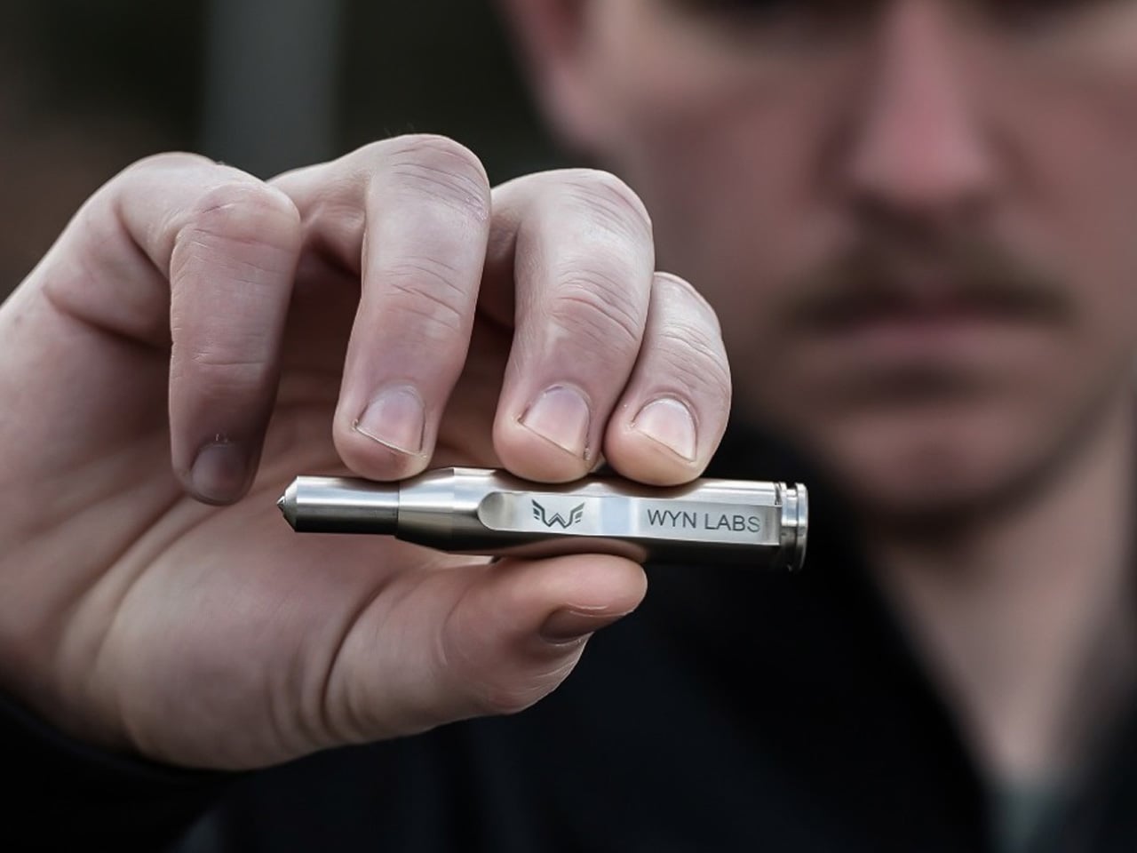
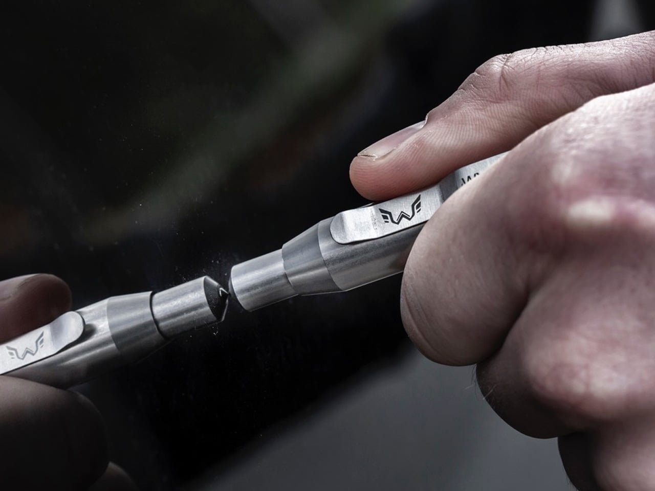
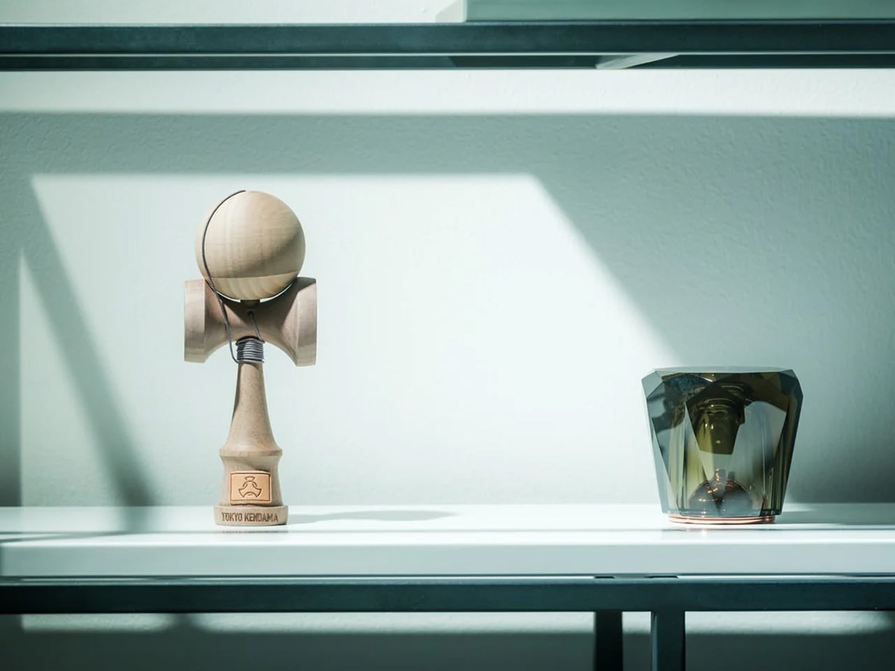
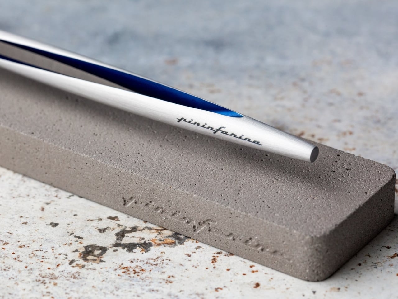
Pininfarina’s design language has always been about the single confident line that communicates speed and restraint at once. The Aero Ethergraf carries that directly to the desktop. It writes through an Ethergraf metal alloy tip that works via oxidation, leaving a graphite-like mark on paper without any ink. No cartridges, no cap to lose, no refills, ever. For him, this means a writing tool that genuinely never runs out, made in Italy and handcrafted to outlast anything else on his desk.
The aluminum body carries a blue accent that catches light the way a car door does at the right angle, which makes complete sense coming from the studio responsible for decades of Ferrari and Maserati bodies. Sitting in its raw concrete cradle, the Aero Ethergraf reads less like office stationery and more like a considered piece of sculpture. The line it leaves is precise, smudge-proof, and won’t bleed through paper. It’s the kind of object that earns its place on whatever desk it lands on.
What we like:
- Writes indefinitely with no ink, cartridges, or maintenance required — the Ethergraf alloy tip is genuinely a forever writing surface
- Handcrafted in Italy, the aerospace-grade aluminum body and raw concrete cradle together make a gift that reads as a design object, not an office supply
What we dislike:
- The mark left by the Ethergraf tip is lighter than a standard pen line, which may not suit those who prefer a bold, ink-heavy stroke
- Very smooth or coated paper surfaces can diminish the writing quality, so it performs best on standard uncoated notebooks or writing pads
2. Inseparable Notebook Pen
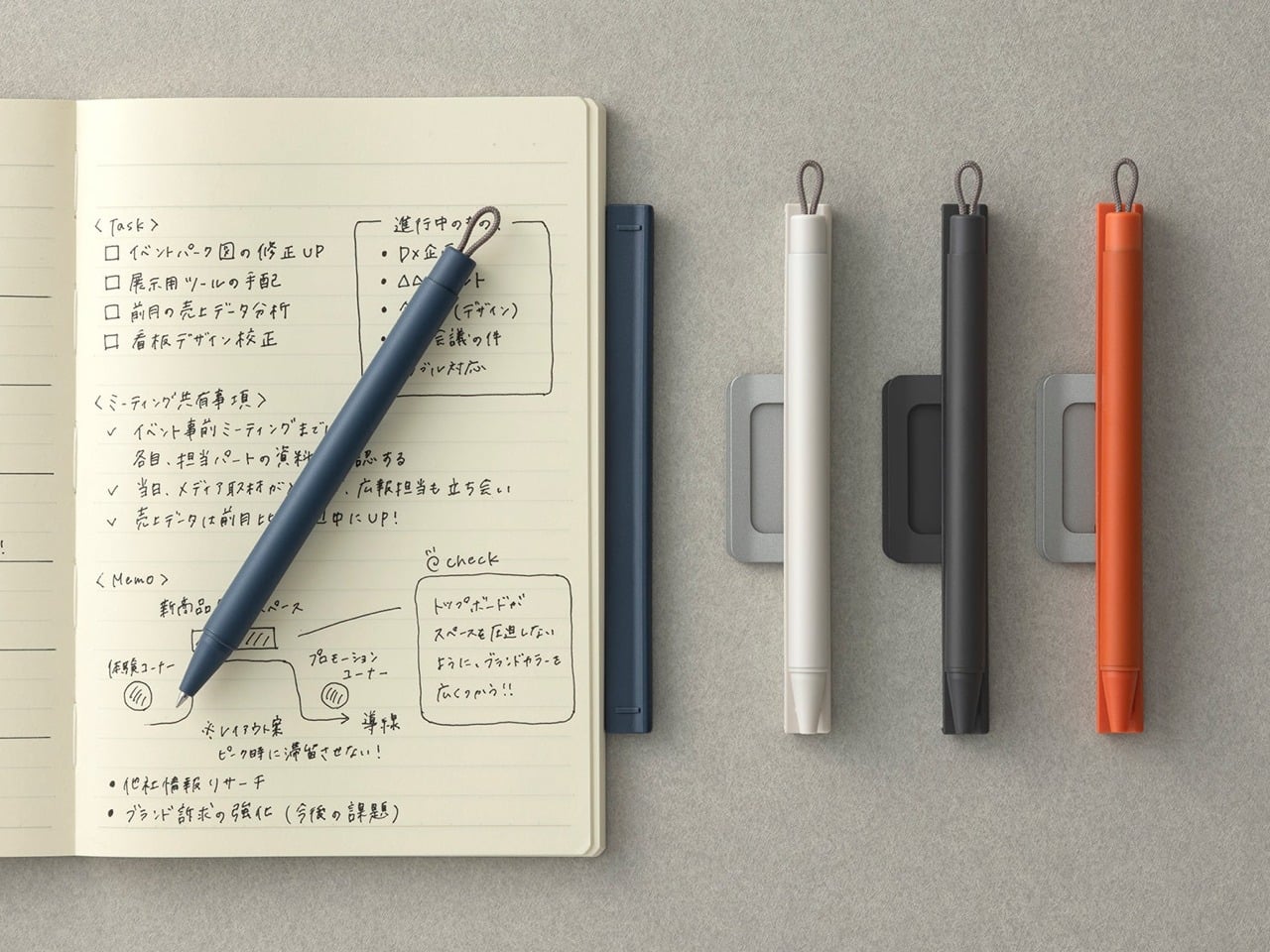
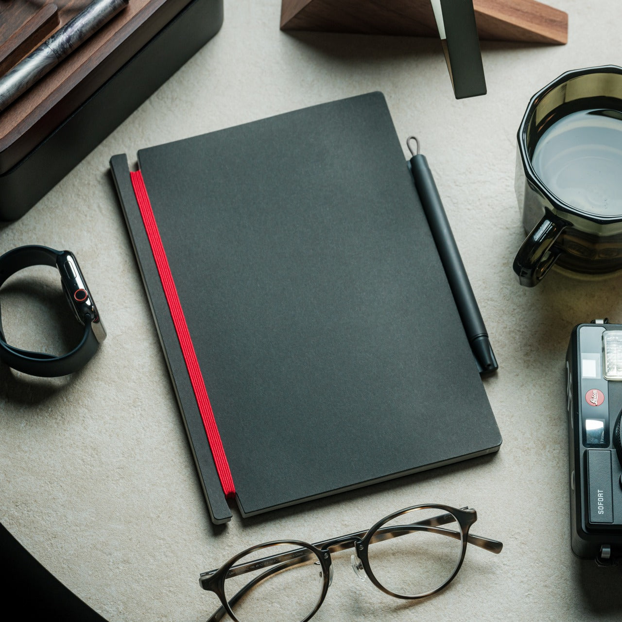
The premise is almost frustratingly simple. A pen that attaches magnetically to the side of a notebook — the way an Apple Pencil does on an iPad — so the two are always together and always ready. Designer Yusuke Nagao built it with a three-part construction featuring a plastic protector, a metal clip, and the pen itself. For him, it solves one of the most persistent small frustrations in daily life: a notebook sitting on the table with nothing to write with.
There’s a quiet confidence to the Inseparable’s design that reveals itself the longer it’s used. Nothing feels overworked. The silhouette is clean, the clip is integrated rather than decorative, and the magnetic attachment snaps silently into place in a way most products would never bother to refine. The ink flows smoothly for clear and precise writing on the go.
What we like:
- Magnetic attachment to any notebook eliminates one of the most persistent small frustrations in daily writing habits in the cleanest possible way
- The minimal three-part design prioritizes function without visual noise — it looks exactly as useful as it actually is
What we dislike:
- The magnetic clip system is built around a single notebook format, so those who move between multiple journals will find the integration more limiting
- The compact form and single-ink style serve portability well, but leave little room for those who prefer a heavier body weight or a finer writing point
3. Yamaha Swing Scribe
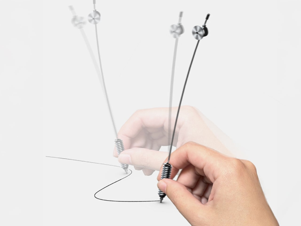
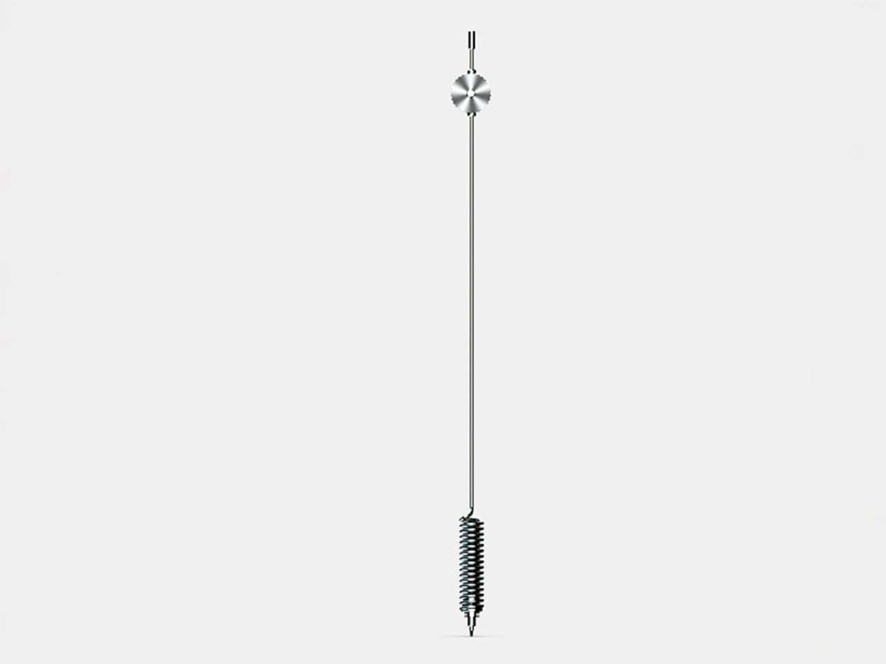
If someone asked you to name a Yamaha product, you’d say piano or motorcycle before you said pen. That gap is exactly what makes the Swing Scribe interesting. Part of Yamaha’s Scribe Tool Design 2024 project, it’s a collaboration between Yamaha Corporation and Yamaha Motor designers in the US. The premise draws from the quill: as a feather naturally wobbles under air resistance while writing, it creates a rhythm. Yamaha made that incidental quality deliberate and physical for him to feel.
A weighted tip is attached to a metal bar, and as he writes, it swings. The small pendulum force feeds a steady beat back into the hand with every stroke. No batteries, no app, just physics. For someone who gets his best thinking done with a pen in hand, the Swing Scribe adds a dimension to the writing experience that no other pen on any other list has thought to offer.
What we like:
- The pendulum mechanism delivers a genuinely new physical sensation in writing, drawing directly on the natural rhythm that once made quill writing feel so distinct from any modern tool
- The creative pedigree is unlike anything else here — a joint effort between two legendary Yamaha divisions, treating writing as a sensory design challenge worth solving
What we dislike:
- The Swing Scribe is a concept from Yamaha’s design research project, meaning it isn’t currently available as a retail product ready to purchase and wrap
- The swinging weighted mechanism, while compelling in execution, may require an adjustment period for those accustomed to the predictable feel of a standard pen
4. Levitating Pen 3.0
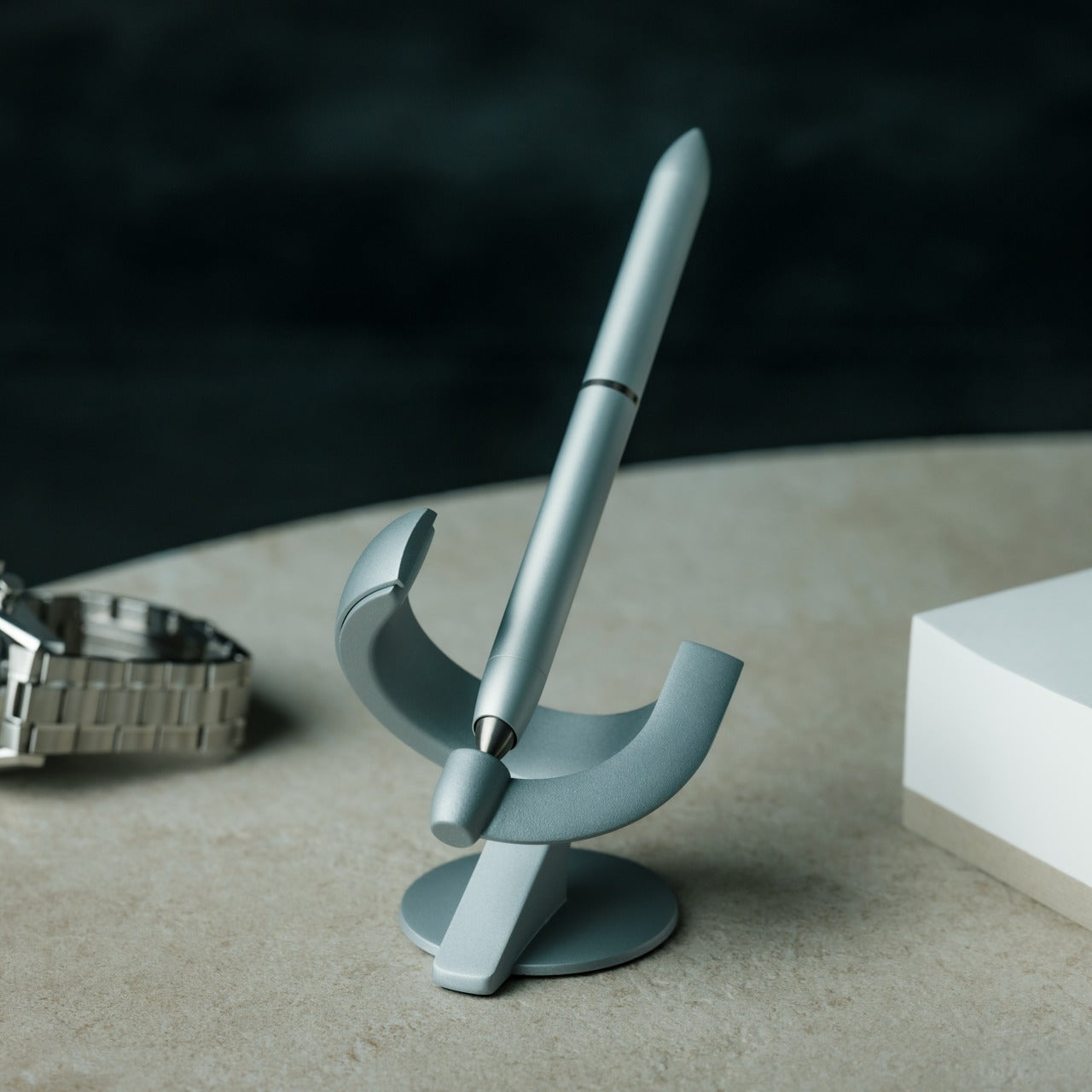
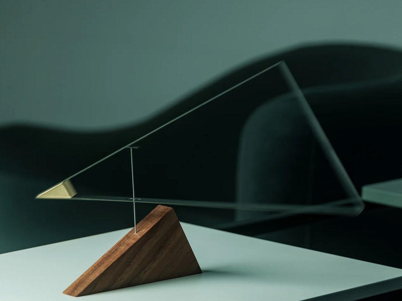
The third iteration of a design that has always pushed toward the improbable, the Levitating Pen 3.0 is built from aerospace-grade aluminum and titanium with a zinc alloy base and balances at a 60-degree angle in a charged magnetic field, bobbing gently when it settles into position. For him, this is the desk object that does something no leather-bound pen set ever managed: it makes people stop mid-conversation and ask what that thing is.
Available in silver or anodized black with a satin finish, it ships with a German-engineered Schmidt rollerball cartridge that delivers a silky writing experience to match its appearance. Undocking the pen to write is its own small ritual. Docking it back lets it find its magnetic sweet spot on its own. Spin it against the stand, and it rotates for up to 30 seconds.
Click Here to Buy Now: $139.00
What we like:
- The magnetic levitation is genuinely hypnotic, and the Schmidt rollerball cartridge means it writes as well as it performs — form and function earn equal attention
- Ships complete in silver or anodized black with a satin finish, making this an immediate desk statement that needs nothing added to impress
What we dislike:
- The levitation only functions on a flat, stable surface — this is strictly a stationary desk piece and cannot be stored on its side or carried in its floating position
5. Pulse
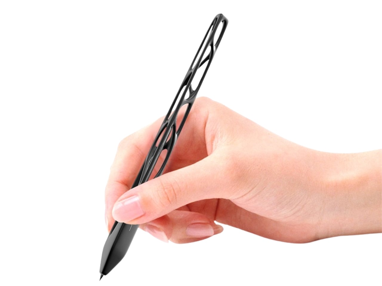
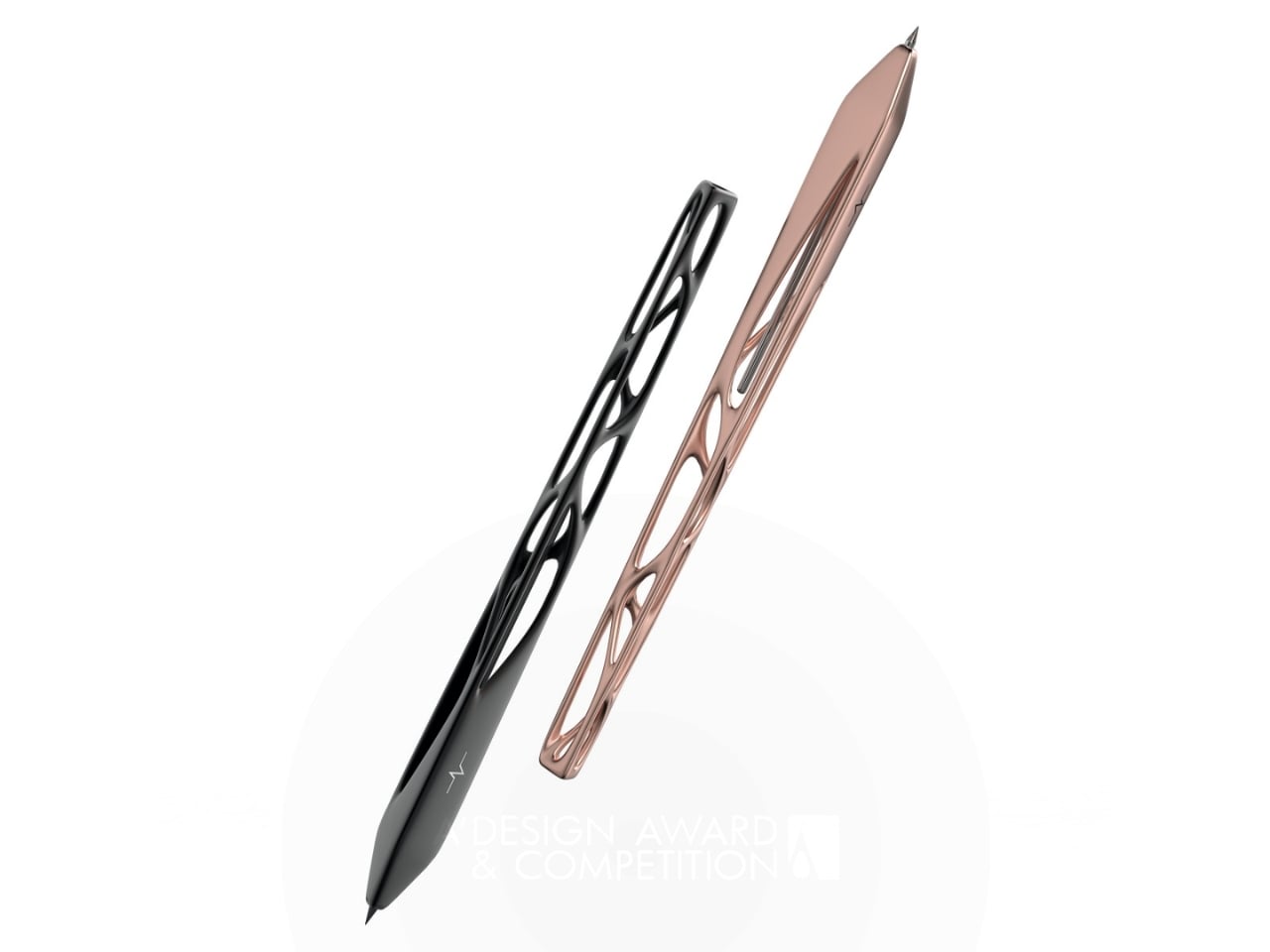
Leila Ensaniat, an industrial designer with a background at Cisco in consumer electronics, spent over a year developing Pulse, earning the 2025 Golden A’ Design Award for 3D Printed Forms and Products. The pen draws its inspiration from clouds — the quiet drift rather than the dramatic storm — translating that into a skeletal biomorphic form with flowing cutouts that resemble veins in a leaf. For him, it’s the kind of object that changes what he expects from a writing instrument entirely.
The biomorphic patterns are created using lost wax casting in aluminum, silver, bronze, and gold — a centuries-old metalworking technique typically reserved for jewelry and fine art. Ensaniat’s approach centers on how we actually interact with objects rather than how they look in isolation. The negative space is considered the material itself. On the desk, it reads as a sculpture. As a gift, it lands as a statement about what good design actually is.
What we like:
- The Golden A’ Design Award and lost wax casting in precious metals make Pulse as legitimate a design object as anything found in a gallery, not a gift shop
- The biomorphic skeletal form earns visual attention without demanding it — arresting and considered in equal measure, it rewards a closer look every time
What we dislike:
- The open skeletal frame, while visually exceptional, may feel more delicate in hand than the solid-body construction many people expect from a daily writing tool
A Pen Says More Than the Note Written With It
What makes a designer pen worth giving isn’t prestige or price. It’s the decision behind every detail — where the material comes from, how it feels before the first word is written, what it says about the person who chose it. The five pens above span different philosophies and price points, but each makes the same quiet argument: the objects we pick up every day are worth getting exactly right.
If there’s a theme running through this list, it’s that the best writing tools aren’t the ones with the most features. They’re the ones where a specific design problem was solved in a way that hadn’t been tried before. Whether that’s a pen without ink, a pen with a heartbeat, or a pen that floats, each one earns its place on a desk. And that’s exactly what a good gift should do.
The post 5 Designer Pens That Make Every Other Gift for Him Look Lazy first appeared on Yanko Design.