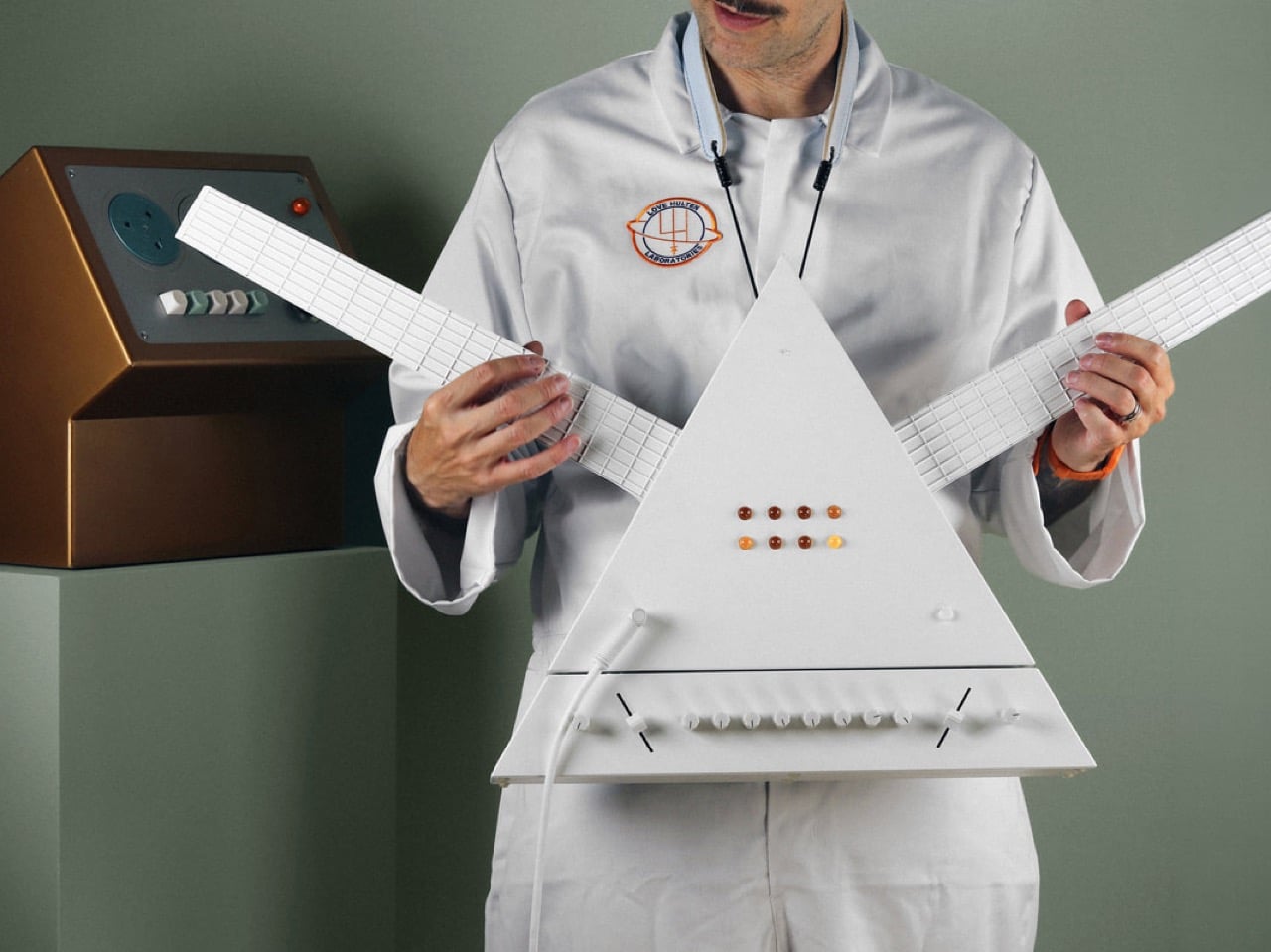
The equilateral triangle is one of the most psychologically loaded forms in Western visual culture. It appears on currency, on occult diagrams, on the cover of the best-selling rock album of all time, and now, with precise white planes and amber jewel controls, on the body of a custom synthesizer guitar made by Swedish instrument designer Love Hultén. The Magicos-2, unveiled in late 2025, carries that shape with full awareness of its freight. Hultén has built Darth Vader synths, bonsai MIDI sculptures, NES-inspired keyboards, and a circular Game Boy for clients over the years, and we have covered the lot of them here at YD. Each one takes a form that feels conceptually wrong for an instrument and makes it feel inevitable. This one takes the prism from The Dark Side of the Moon and turns it into something you can actually play.
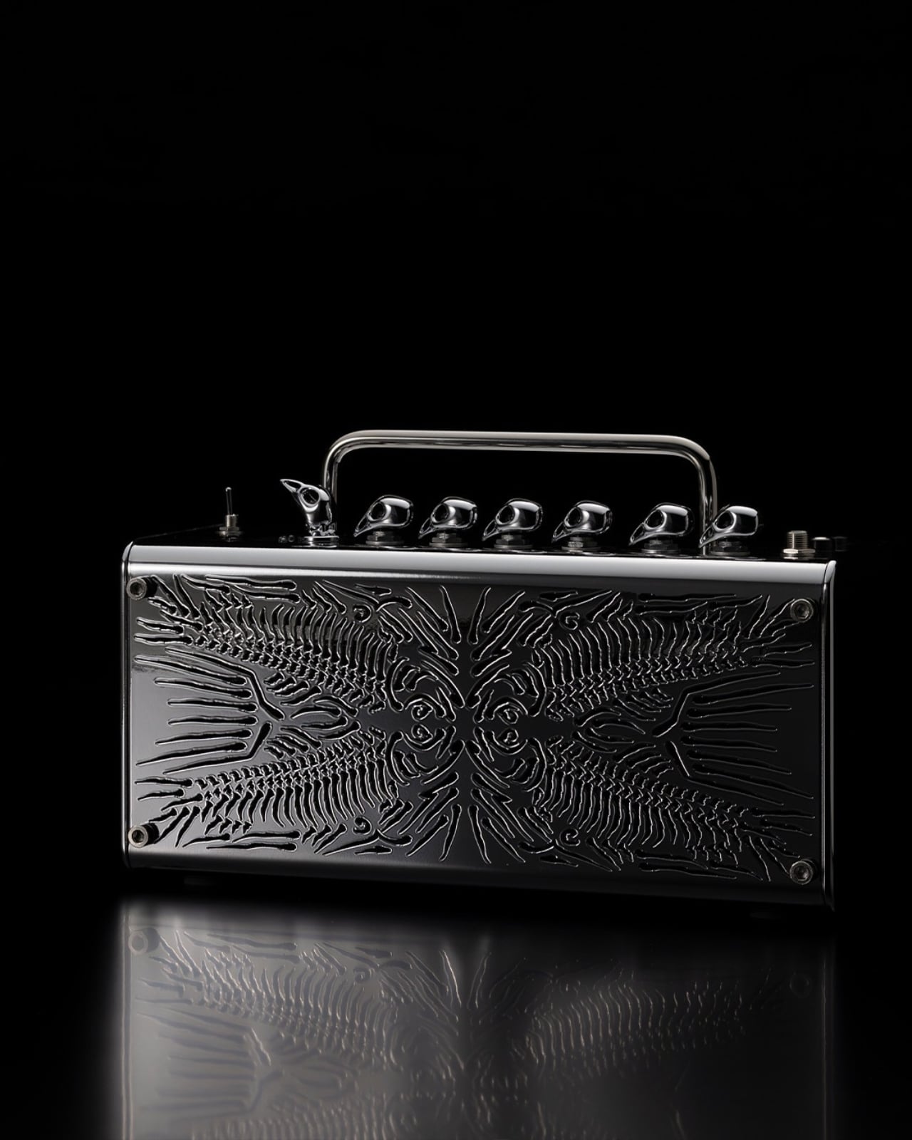
Commissioned by a private client and described by Hultén himself as a “triangular oddity born from deranged imagination and psychedelic fandom,” the Magicos-2 is a double-necked instrument housing a 1010music Tangerine module on one arm and a Lemondrop on the other. The detachable base unit, a trapezoidal slab that sits below the main body and separates cleanly for transport, contains the effects chain: Walrus Audio Lore for reverse reverb and ethereal drones, Collision Devices TARs for fuzz and distortion. A rose quartz crystal pyramid sits at the center of that base, lit from within. Hultén calls it the crystalline emitter, and at this point, questioning the nomenclature feels beside the point.
Designer: Love Hultén
Alexis Mardas, better known as Magic Alex, was the Beatles’ in-house electronics wizard during the Apple Corps years, a man who promised John Lennon wallpaper that played music, a force field for the house, and an amplifier that would go to a million. Almost none of it worked. What he left behind was the irresistible idea of a device that operates somewhere between real technology and pure mythology, an object whose presence in a room changes the room’s frequency before it ever produces a sound. Hultén name-drops Mardas directly in the Magicos-2’s description, and the invocation lands. This instrument carries that same energy: technically rigorous, visually hallucinatory, and spiritually somewhere between a laboratory prototype and a sacred relic.
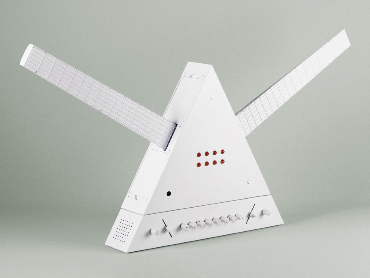
The Tangerine and Lemondrop, both 1010music modules, sit one per neck, each a dense and malleable synthesis engine with its own voice and parameter set. Having two discrete sound sources mounted symmetrically on the triangular body means the player can run parallel sonic worlds simultaneously, layering Mellotron-style string leads against drones, or pushing both into the Lore’s reverse reverb to create the kind of sustained wash that makes people stop and stare at the ceiling. The fretboard grids running along each white arm read visually as pure geometry, equal parts instrument neck and architectural elevation drawing. Two necks, two engines, one triangular chassis: the form follows the function with a directness that most instrument designers would kill for.
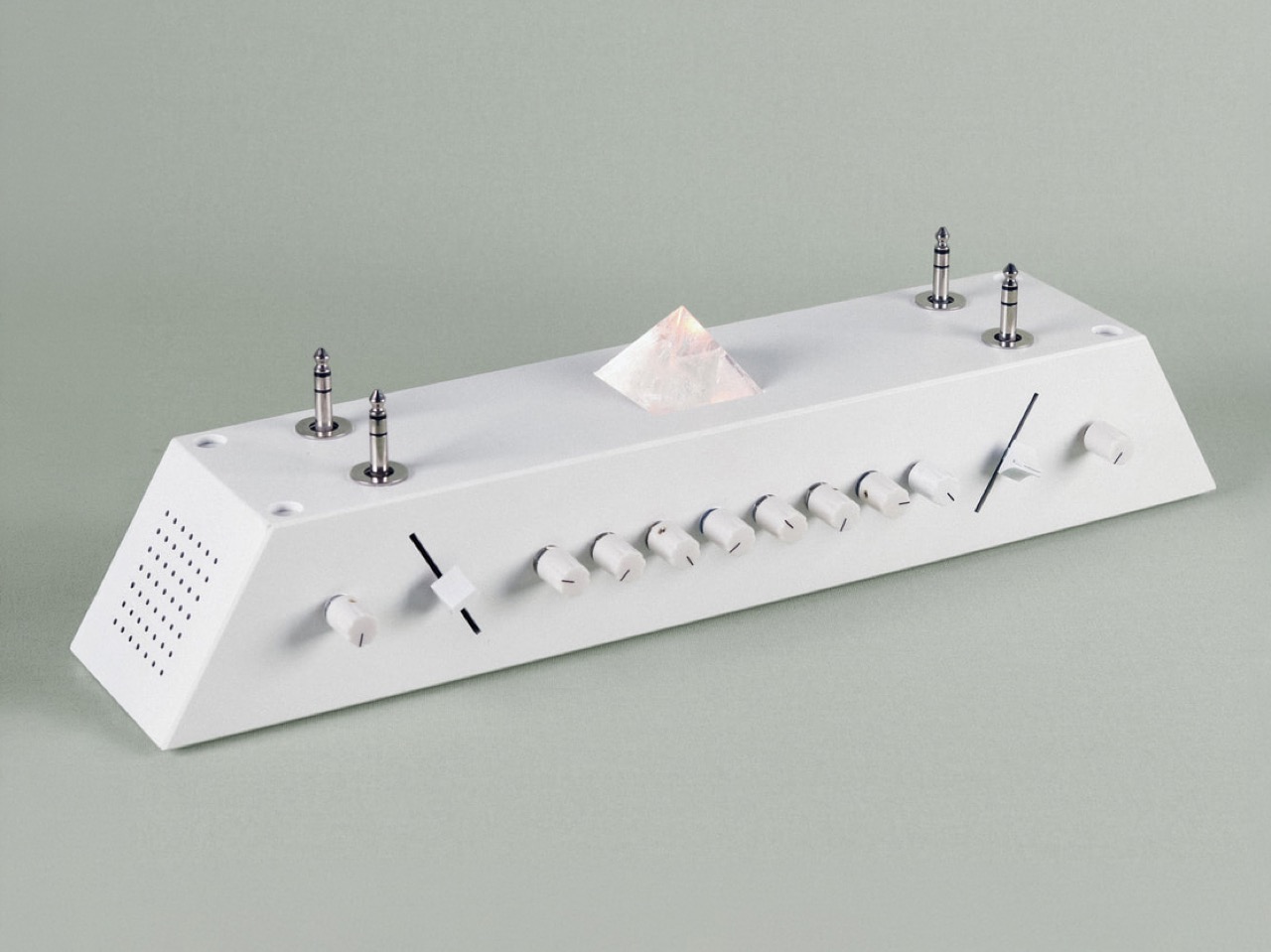
Walrus Audio’s Lore pedal handles the reverse delay and ethereal glow, celebrated among ambient and drone players for its ability to turn almost any input into a sustained, backward-breathing atmosphere. Collision Devices’ TARs sits alongside it, adding the fuzz and harmonic density that filters the whole signal into what Hultén memorably describes as a carpet of sonic moss. The base connects to the triangular body via a clean physical joint visible as a horizontal seam in the silhouette, detaching entirely for transport or for reconfiguring the signal chain. That modularity reinforces the instrument’s identity as a system rather than a single object, which matters practically when you are carrying something shaped like a pyramid to a gig.
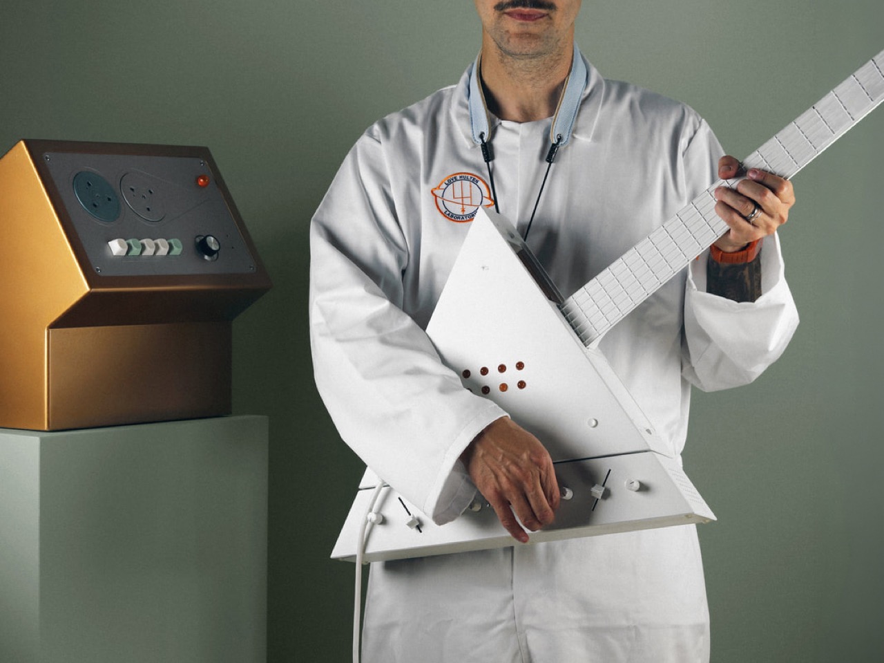
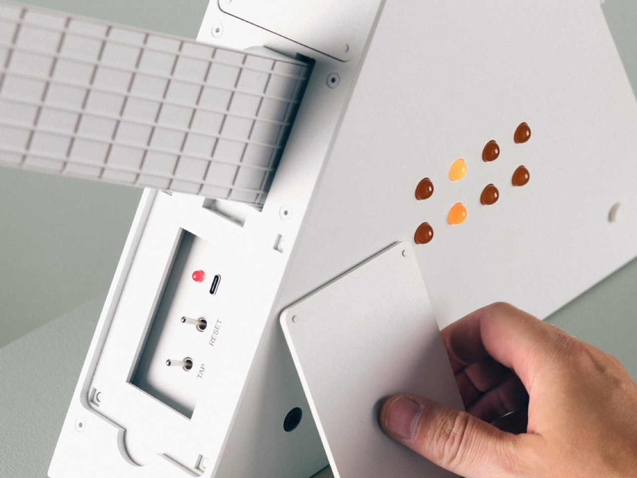
The nine amber teardrop controls embedded in the triangular face, warm brown and orange against the flat white surface, are the one moment of color in the whole instrument, and they carry the weight of that responsibility well. They read like something between a control panel and a constellation. The crystal pyramid in the base glows softly beneath them. The chakras, per Hultén, are aligned. I believe him.


The post Love Hultén Built a Pink Floyd Prism Guitar You Can Actually Play first appeared on Yanko Design.