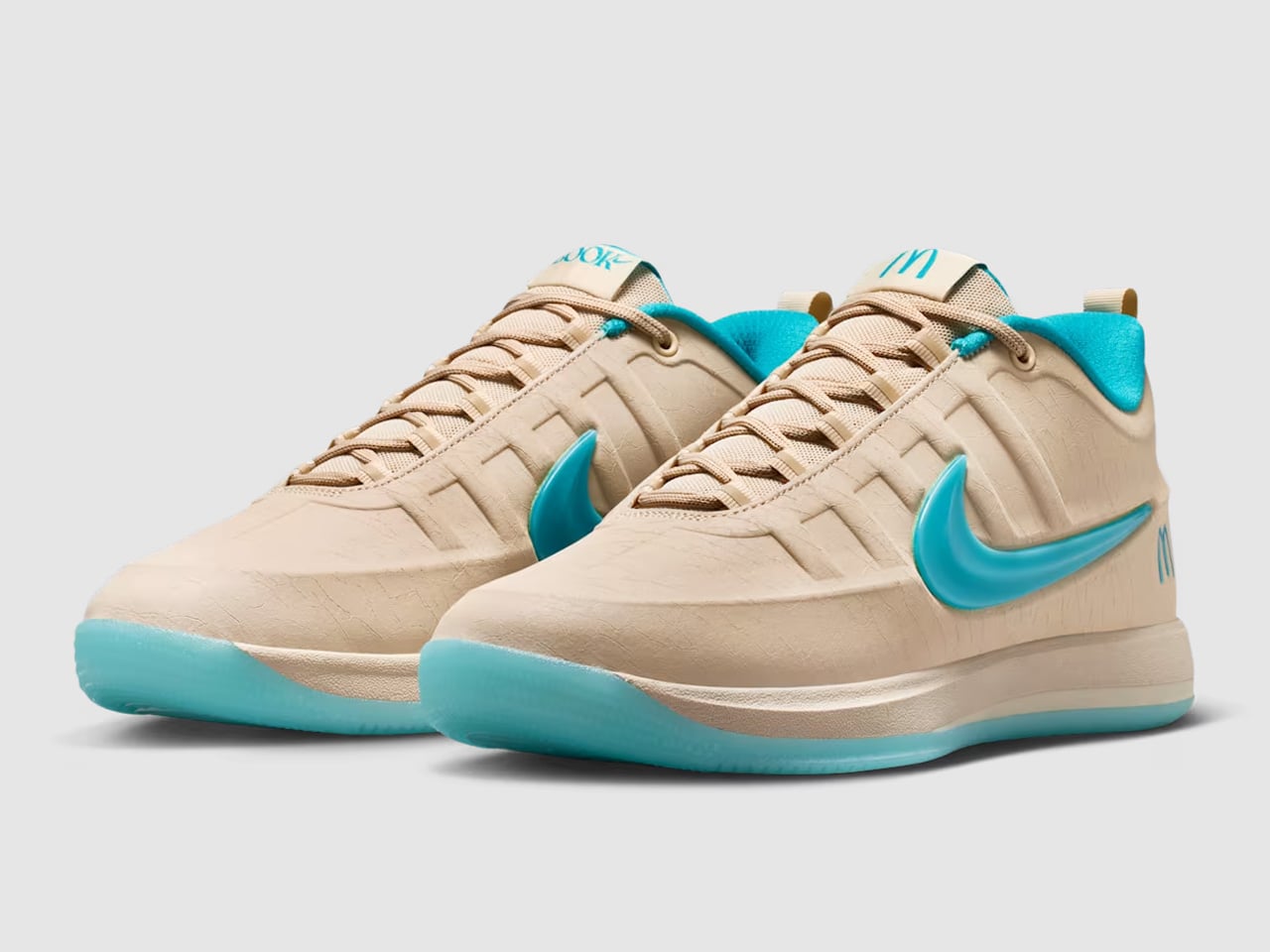
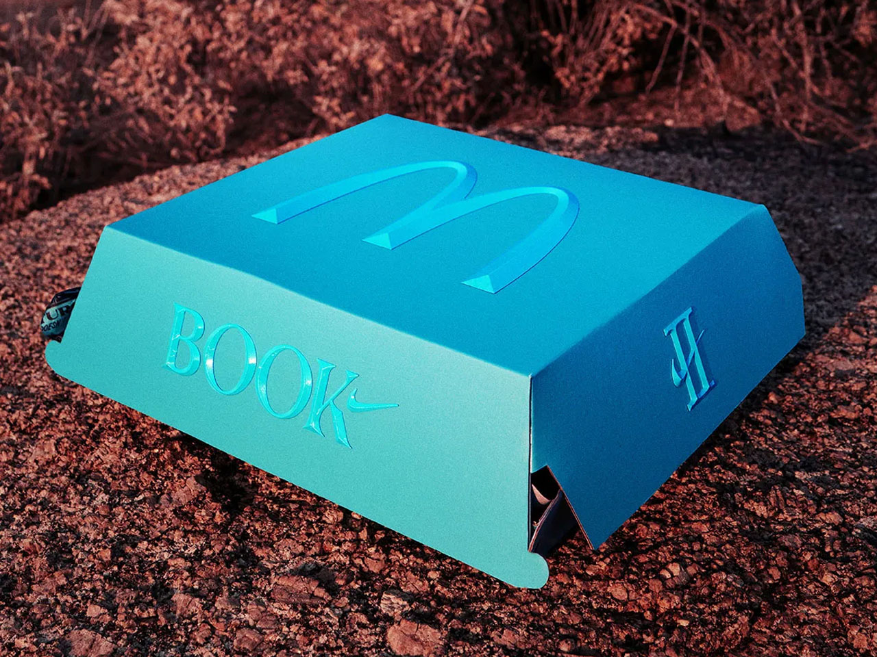
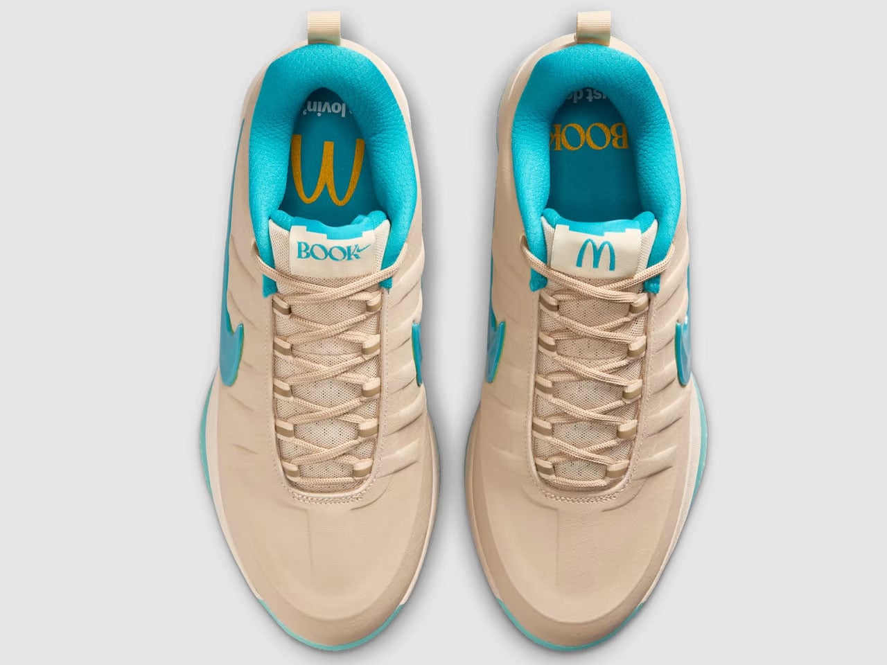
Signature sneakers rarely manage to feel personal anymore. Most arrive overloaded with athlete branding and colorways engineered more for resale culture than everyday wear. Devin Booker’s Nike Book 2 collaboration with McDonald’s takes a surprisingly different route. Instead of leaning into fries-and-burgers nostalgia, the sneaker pulls inspiration from one of Arizona’s oddest landmarks — the turquoise-arched McDonald’s in Sedona — and turns it into a basketball shoe that feels more rooted in place than corporate crossover hype.
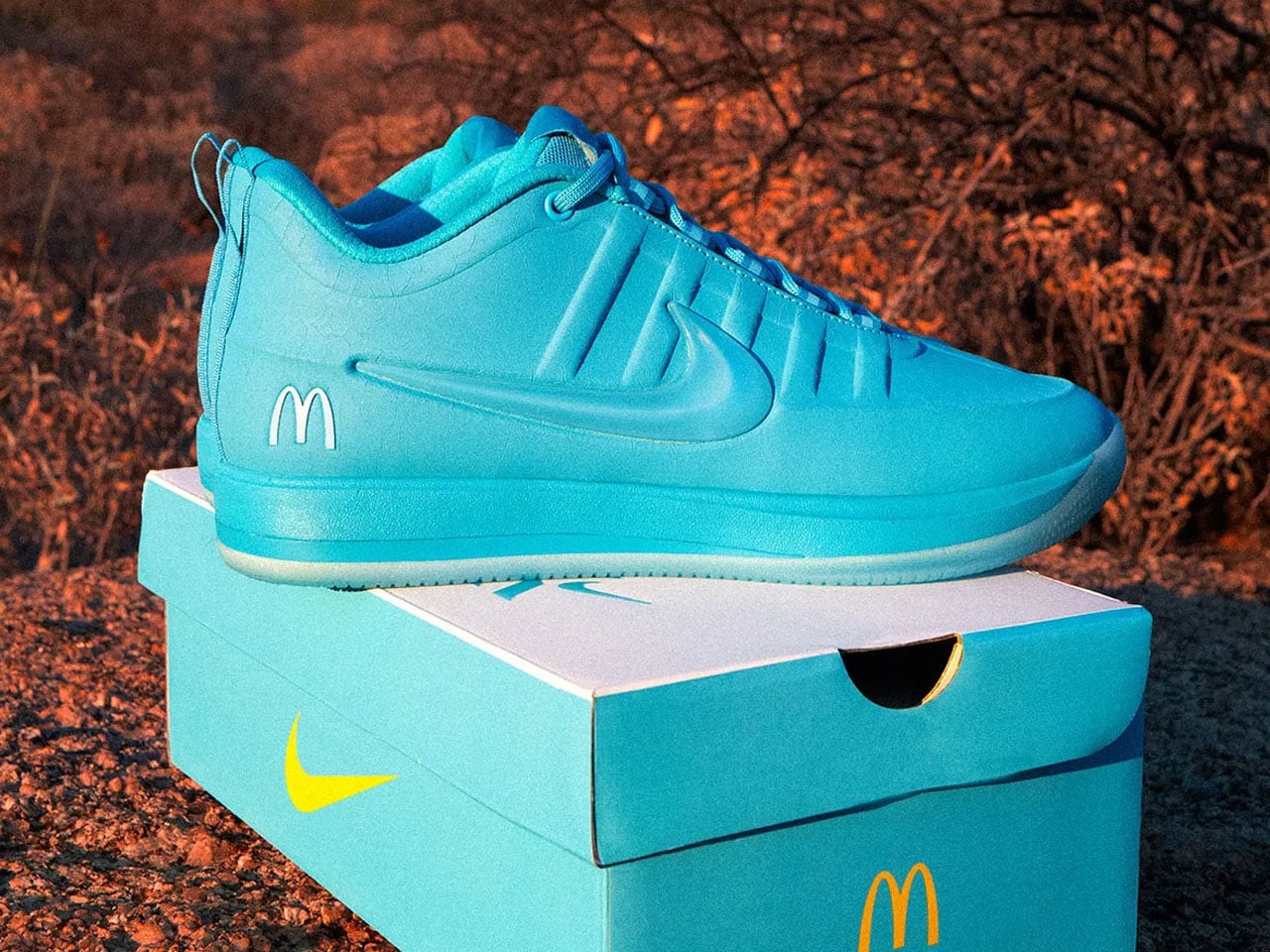
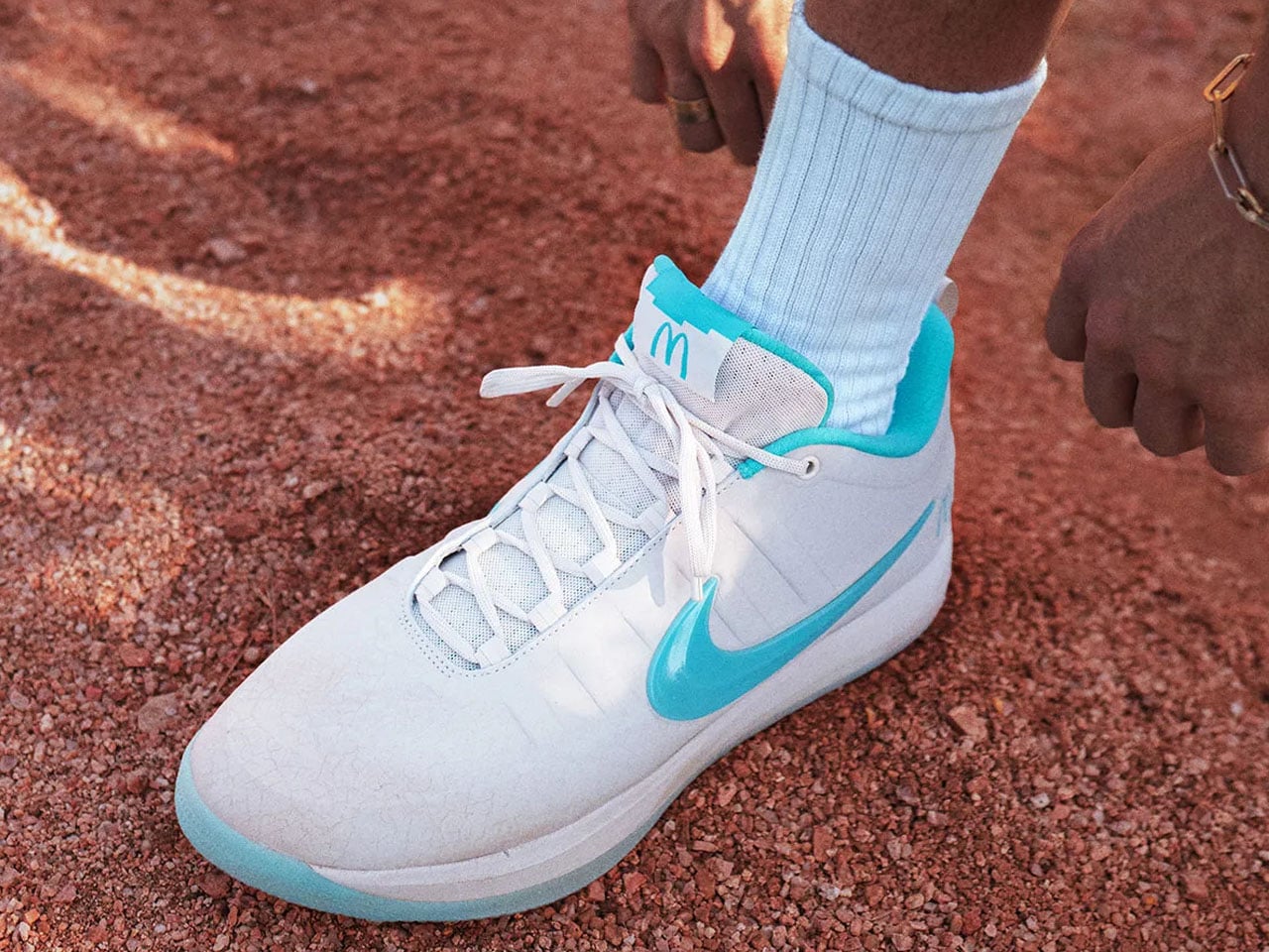
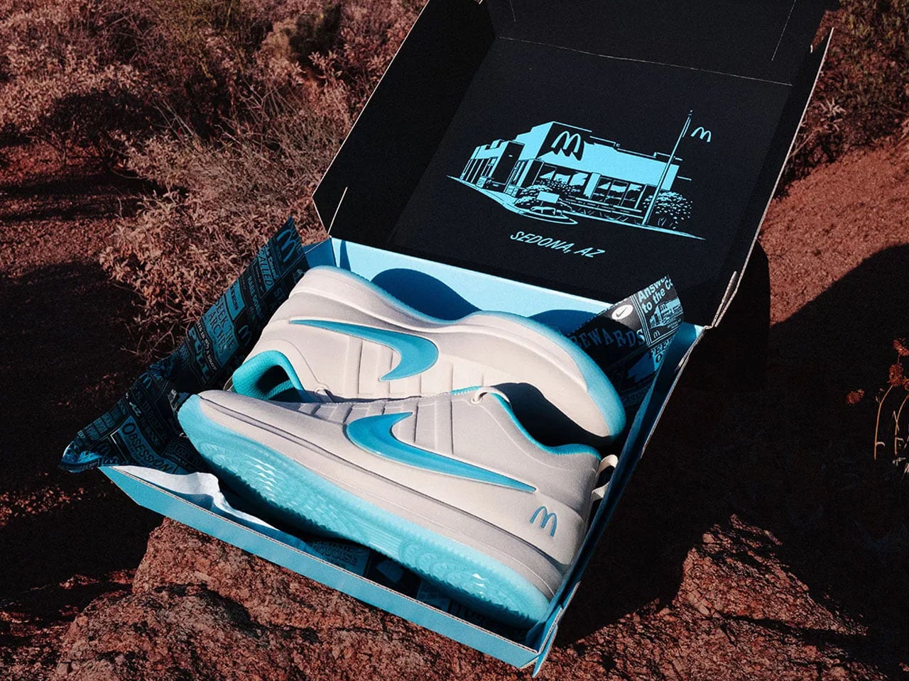
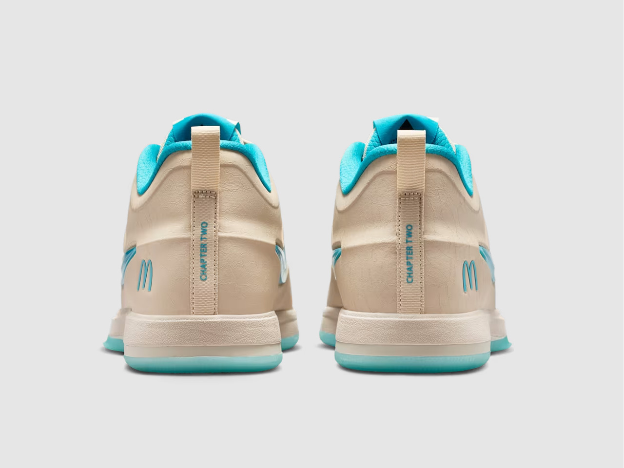
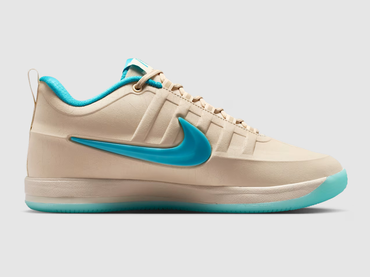
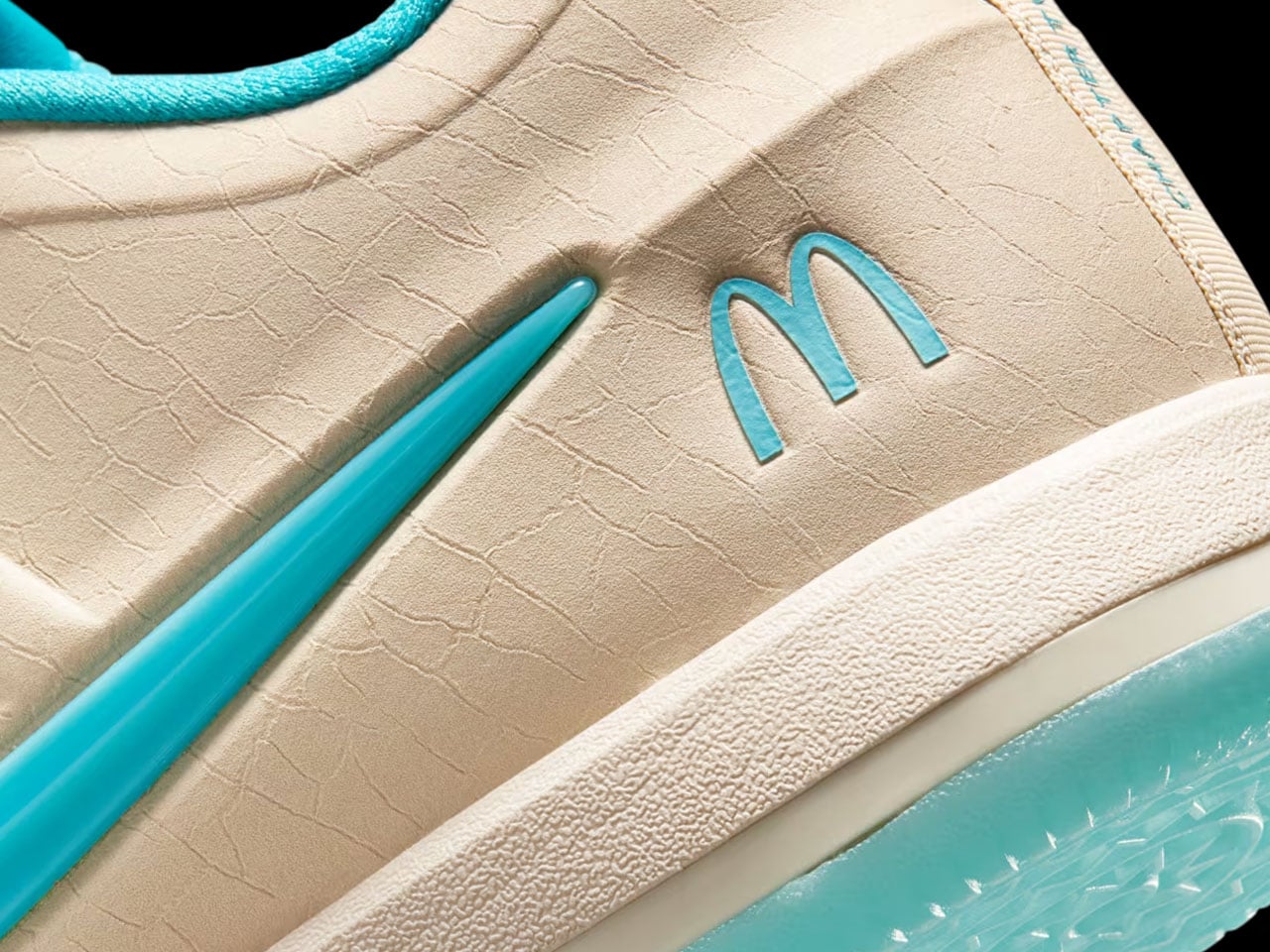
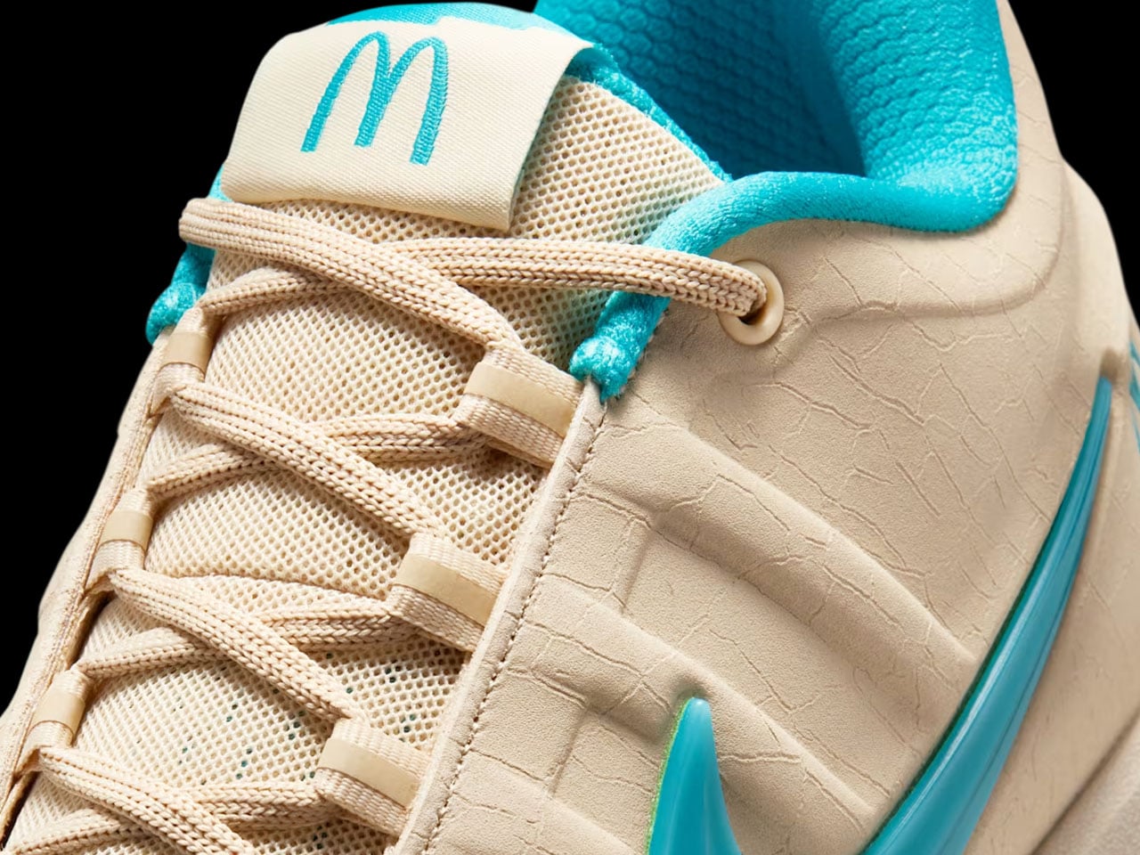
At first glance, the Nike Book 2 “Sedona” barely resembles a McDonald’s collaboration at all. The sneaker trades loud fast-food colors for sandy beige uppers, dusty earth tones, and soft turquoise accents inspired by the famous Sedona McDonald’s location, which swapped its golden arches for turquoise ones to better blend with the city’s iconic red rock surroundings. It’s the kind of hyper-specific regional detail that could have easily become gimmicky, but Booker’s growing signature line has consistently worked best when it stays connected to Arizona culture rather than chasing trends.
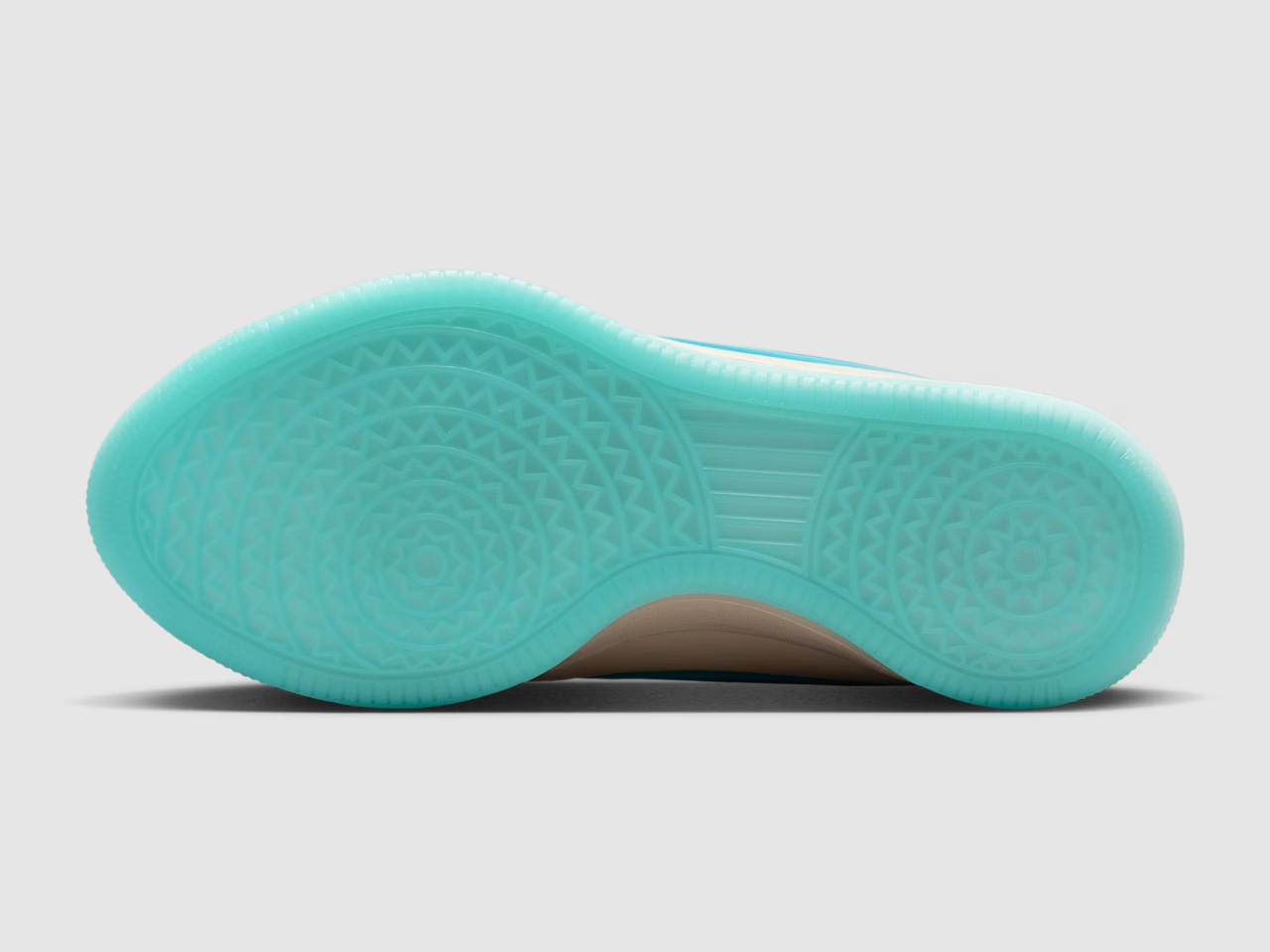
The design itself continues the Book series’ understated approach to basketball footwear. Where many modern performance sneakers rely on exaggerated shapes and futuristic layering, the Book 2 keeps things clean and wearable. The low-cut silhouette looks closer to a lifestyle sneaker than a traditional on-court model, borrowing cues from retro Nike runners and skate shoes while still packing modern basketball tech underneath. Nike equips the sneaker with a forefoot Air Zoom unit, Cushlon 3.0 cushioning, and a lightweight molded upper designed around Booker’s preference for responsive movement and minimal bulk.
That balance between performance and casual wearability is what gives the Book line its identity. Booker has never approached his signature shoes like loud statement pieces; they feel more like sneakers designed by someone who genuinely cares how they look off the court. The “Sedona” colorway pushes that idea even further. The cracked leather details, aged textures, and muted desert palette make the sneaker feel intentionally lived-in, almost like something discovered on a road trip through Arizona rather than a highly manufactured sports collaboration.
McDonald’s also seems aware that the appeal here extends beyond basketball fans. Instead of limiting the partnership to standard product placement, the company built a broader campaign around Booker’s connection to the Southwest. Promotional visuals lean heavily into desert imagery, road-trip aesthetics, and surreal humor, including a campaign video featuring Booker wandering through Sedona alongside a silent Ronald McDonald appearance that somehow feels strange and perfectly on-brand at the same time.
The collaboration also arrives with a Friends & Family sweepstakes through the McDonald’s app, giving select customers access to an exclusive variation of the sneaker with the purchase of specialty beverages. A dedicated pop-up event tied to the release is also expected ahead of launch, reinforcing how brands increasingly treat sneaker drops more like cultural events than product launches. The McDonald’s x Nike Book 2 “Sedona” sneaker is scheduled to release on June 2 through Nike SNKRS and select retailers for $155.
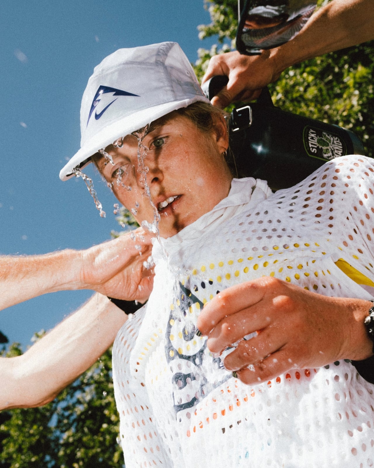
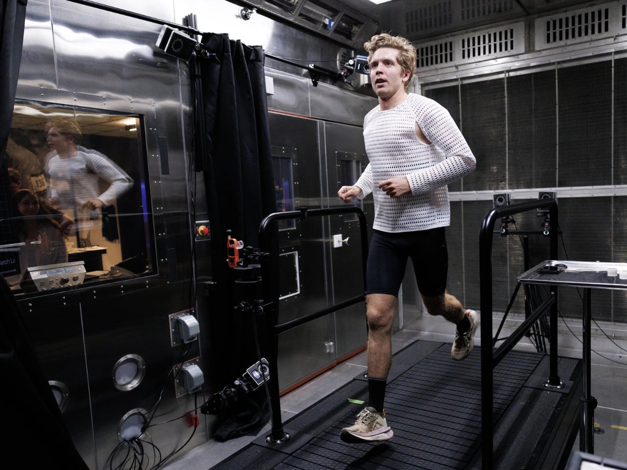
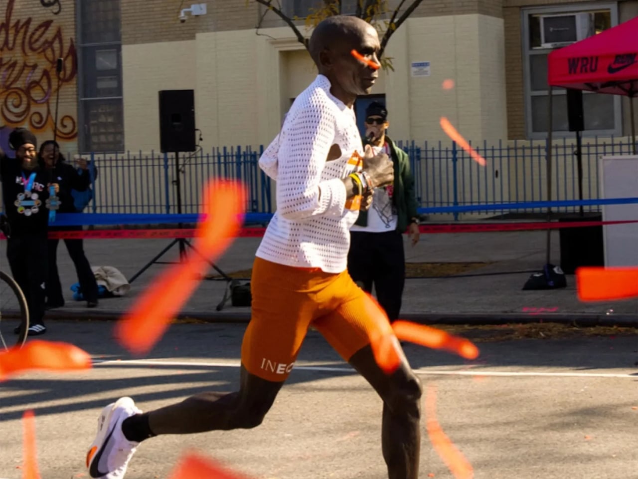
There are moments in design when a product looks so strange that you can’t stop staring at it, and then you find out how it works and it suddenly makes perfect sense. That’s exactly what happened when trail runner Caleb Olson crossed the finish line at the 2025 Western States Endurance Run in the second fastest time in the race’s history. People clapped. Then they immediately started asking: what is he wearing?
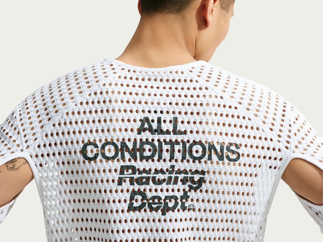
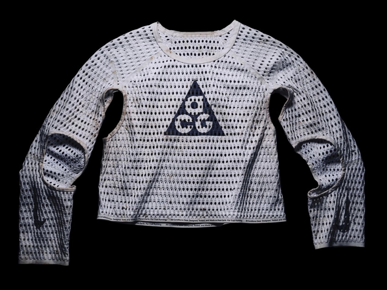
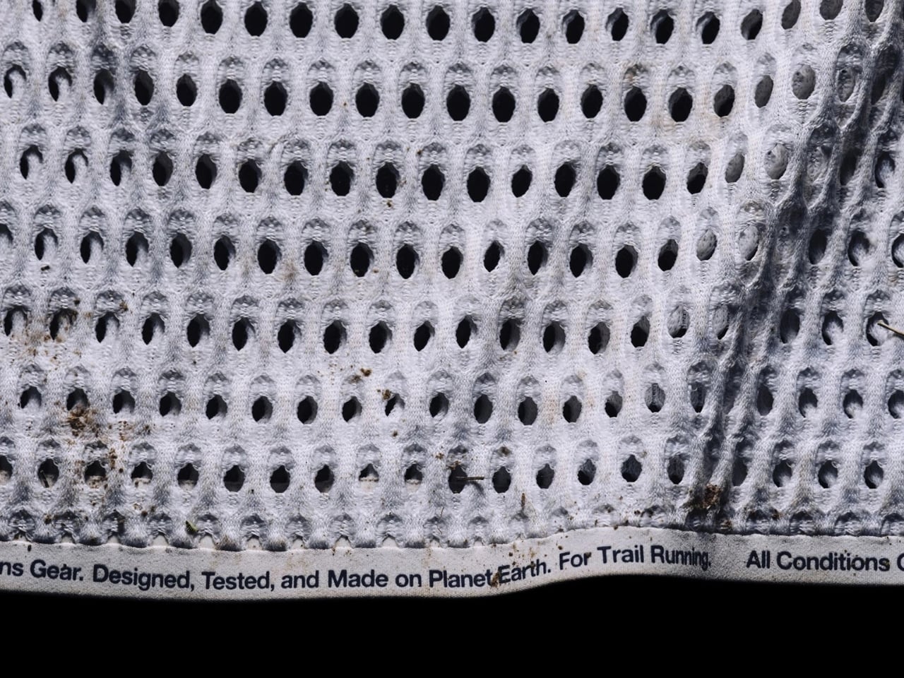
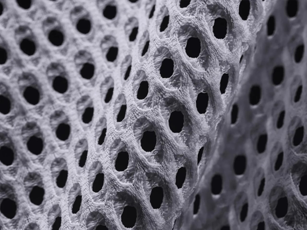
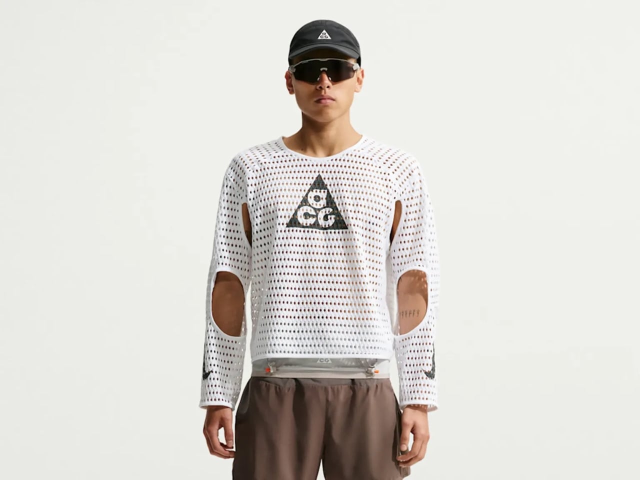
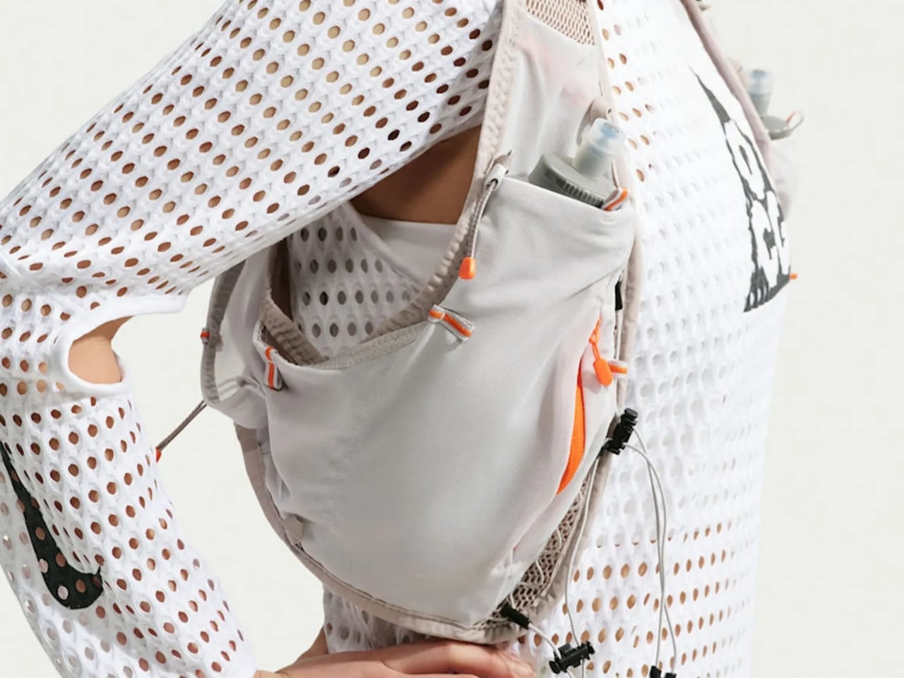
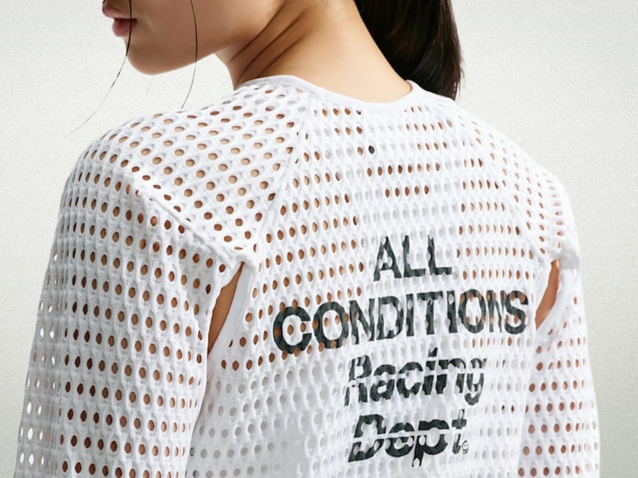
The shirt is the Nike ACG Radical AirFlow, and calling it a “shirt” feels generous. It looks more like a sweater that had an encounter with a drill press. Cone-shaped holes punctuate the fabric in deliberate patterns, creating what Nike calls airducts. They’re not just decorative (though they definitely are that, too). They’re functional in a very specific, physics-driven way. The design harnesses the Bernoulli principle and the Venturi effect, two concepts most of us haven’t thought about since a physics class we may or may not have paid attention to. The short version: as air moves through a narrowed opening, it speeds up and pressure drops. Nike essentially engineered that phenomenon into a fabric layer sitting on your body while you run.
Designer: Nike
The result, according to Nike’s own testing, is a top that absorbs and retains 50% less sweat than DriFit, the brand’s long-trusted performance fabric. It’s also 25% less resistant to the evaporation of sweat. For those of us not running ultramarathons in the California mountains, those numbers might sound abstract, but the principle holds whether you’re hiking a trail in August or doing anything remotely active in heat. The body cools itself through sweat, and anything that helps that process happen faster is worth paying attention to.
What makes this interesting beyond the performance specs is how it got here. The Radical AirFlow came out of Nike’s All Conditions Gear line, a sub-brand with a very specific purpose: designing for the outdoors, not the gym. ACG lives by the motto “Designed, Tested, and Made on Planet Earth,” which sounds like a marketing line until you realize the top was debuted mid-race at one of trail running’s most grueling events. The testing wasn’t a controlled brand activation. It was a competitive ultra-marathon.
The design itself doesn’t pretend to be subtle. It’s a cropped silhouette, worn long-sleeved, with large cutouts under the arms and at the elbows for mobility. The airducts are visible and intentional. It reads more like a prototype from a materials science lab than a rack piece at your local athletic retailer. And I think that’s the point. Nike ACG has always occupied that niche space between gear and fashion, performance and provocation. The Radical AirFlow leans all the way into that tension.
It also went viral in a way that athletic apparel rarely does, because the response was split. Some people immediately understood it. Others were convinced it was a joke. Trail runner Drew Holmen, an ACG athlete who tested the garment, said it plainly: “When I first saw the product, it was like nothing I had ever seen before.” That reaction, repeated by thousands of people online, is actually a good sign in design. If no one’s confused, nothing is new.
The broader conversation Radical AirFlow opens up is one about where performance apparel is headed. For a long time, innovation in this space meant better synthetic blends, tighter weaves, smarter seam placement. The Radical AirFlow goes in the opposite direction. It removes material entirely, then structures the absence of it. The holes aren’t a compromise or a cost-cutting measure. They’re the technology.
Whether you’d actually wear it outside of a race context is a fair question, and a cap version built on the same technology is already on the way, which might make the concept more accessible. But the full racing top is a genuine design statement, one that prioritizes function in a way that can’t be hidden. You can see it working. That kind of transparency, in design, is rarer than it should be.
The RIMOWA Design Prize doesn’t always produce furniture, and that’s precisely why I pay attention to it every year. The luggage brand’s annual student design competition has a way of surfacing ideas that sit at the uncomfortable, exciting edge of what design can actually do for people, and the 2026 winner is probably the best example of that yet.
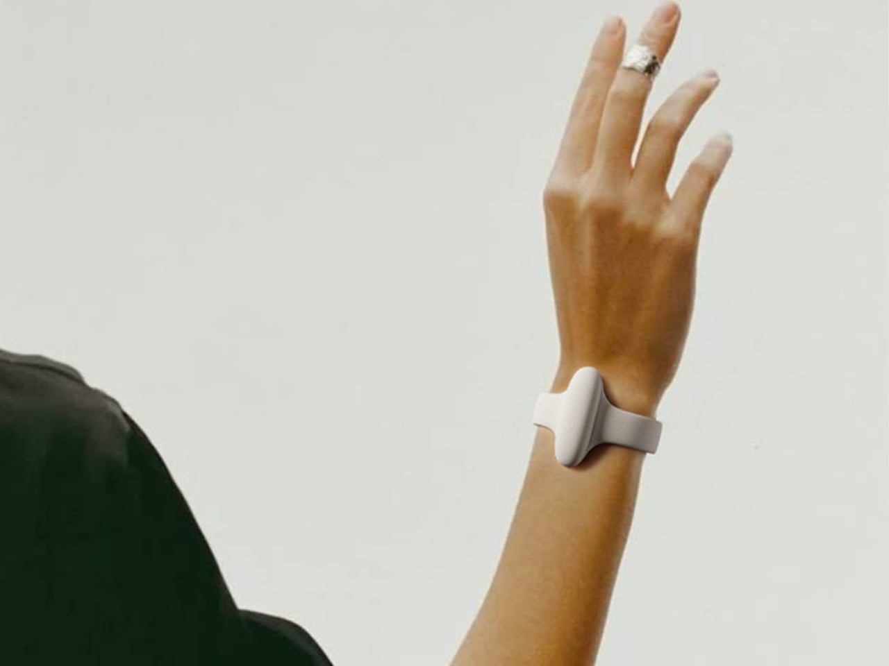
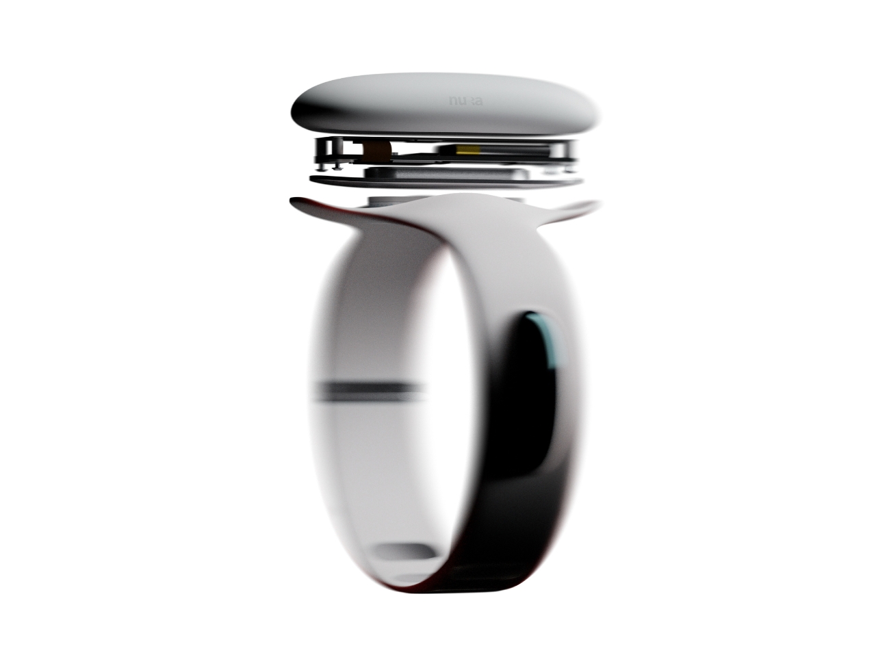
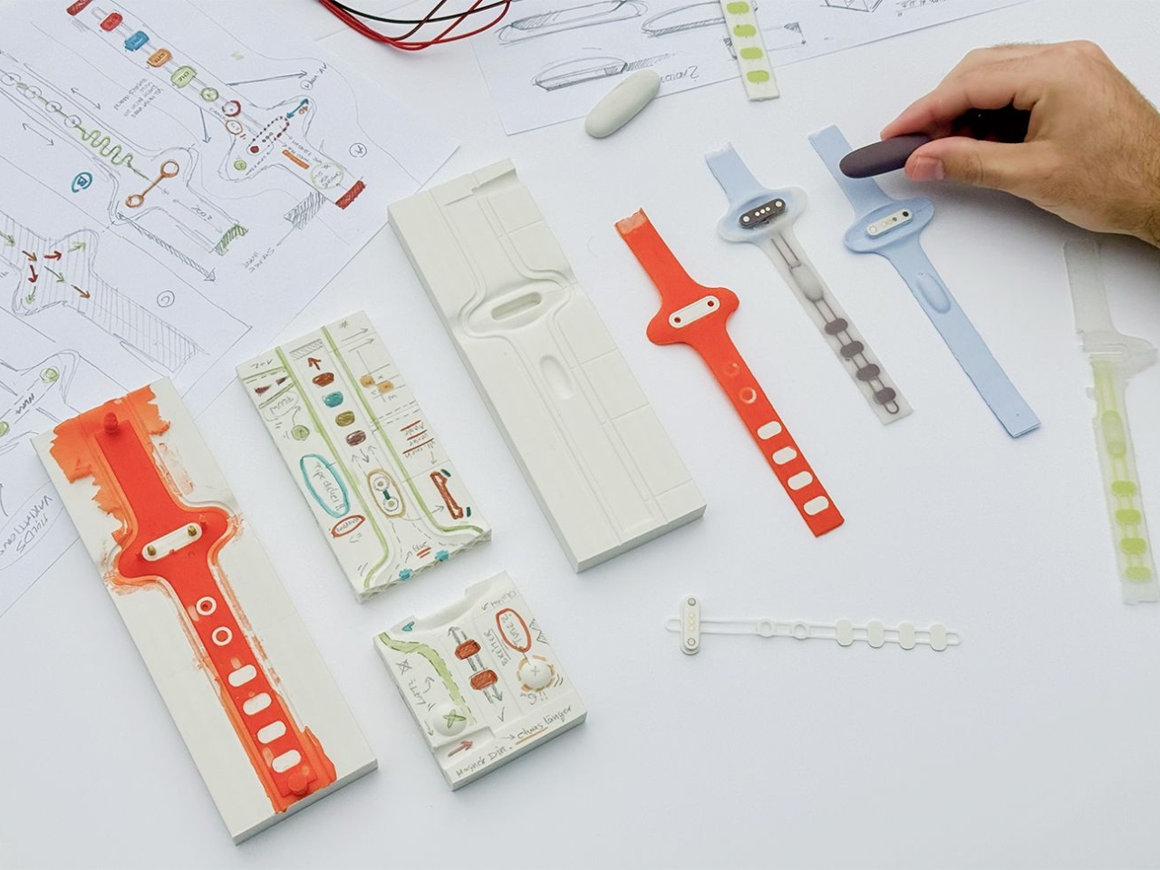
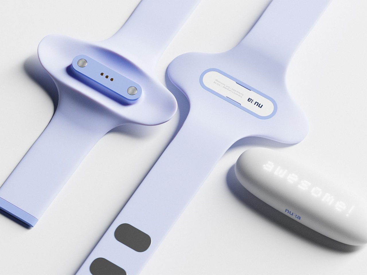
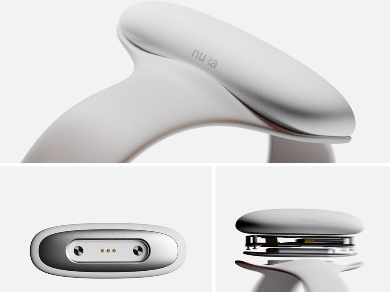
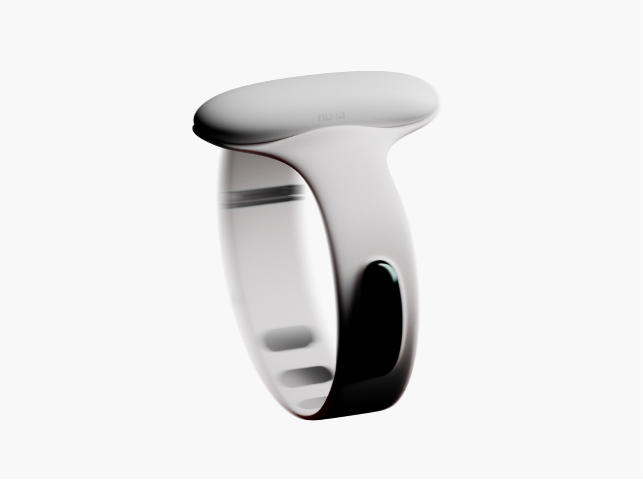
Samuel Nagel and Paul Feiler, two students from Hochschule für Gestaltung Schwäbisch Gmünd, took home the fourth edition of the prize with NURA: a bracelet that uses EMG (electromyography) sensors to capture muscle signals in the forearm and translate sign language into audible speech in real time. It works the other way around too, converting spoken language into visible text for deaf users. The whole thing sits on your wrist, shaped by the silhouette of a manta ray, and it looks less like a medical device and more like the kind of accessory you’d spot on someone at a gallery opening.
That last detail is actually the point, and I think it’s worth dwelling on. Assistive technology has a long and unfortunate history of making the people who need it feel conspicuous. Hearing aids, for decades, were designed to be invisible precisely because visibility carried stigma. The unspoken message was that needing help was something to hide. NURA takes a completely different position. It’s designed to be seen, worn with pride, styled rather than concealed. The gesture feels radical even though, rationally, it shouldn’t have to be.
The technology behind it is genuinely clever. EMG sensors are nothing new as a concept, but applying them to sign language translation in a form this compact and wearable is a meaningful design leap. The bracelet reads the electrical signals produced by muscle contractions in the forearm as the wearer signs, processes them, and produces speech output. The reverse channel picks up spoken language and renders it as text. Two-way, seamless, real-time. For anyone who has ever watched a deaf person navigate a conversation without an interpreter present, or felt the awkward pause that comes from communication breaking down mid-exchange, the implications of that are enormous.
I keep thinking about how many interactions become effortless with something like this on your wrist. Ordering at a counter. Talking to a doctor. A spontaneous conversation with a stranger on the street. These are moments that require logistics for deaf users in a way most hearing people never have to consider, and NURA collapses that distance without asking anyone to compromise.
The manta ray inspiration is a quiet masterstroke, too. It gives the object a reference point that feels alive and organic rather than mechanical or clinical. The form has been rendered in clean, sculptural white, with the kind of restraint you’d expect from a German design school sensibility. It doesn’t scream technology. It just sits there looking elegant, doing something extraordinary underneath.
Will NURA make it into production? That’s the question that always hovers over student prize winners, and it’s an honest one. The gap between a beautifully executed concept and a market-ready product is wide, and the challenges of real-world EMG accuracy across different body types and signing styles are not trivial. But I don’t think that’s entirely the point. The RIMOWA Prize exists, among other things, to expand the imagination of what design is for, to signal to the industry what problems are worth solving and what solving them beautifully might look like.
On that count, Nagel and Feiler have done something genuinely important. They’ve argued, through the language of form, that accessibility and desirability don’t have to be in opposition. That a wearable designed for a deaf person can be something a hearing person might be jealous of. That the most human design isn’t the kind that fixes a flaw and hides it, but the kind that celebrates capability and brings people closer together. The bracelet is beautiful. The idea behind it is even more so.
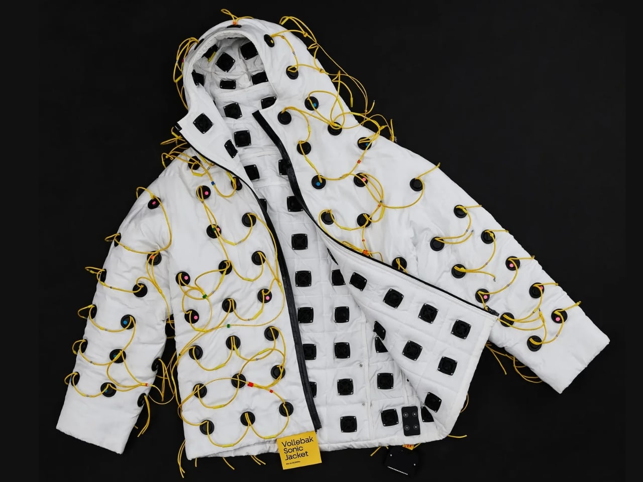
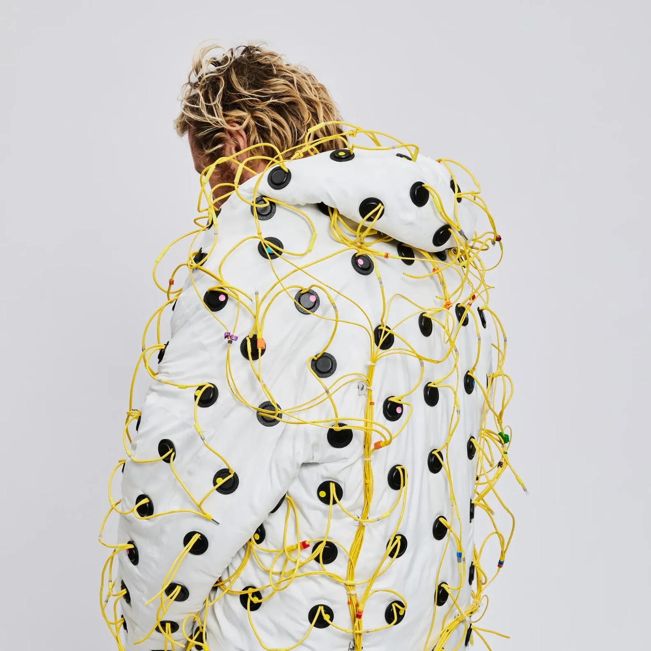
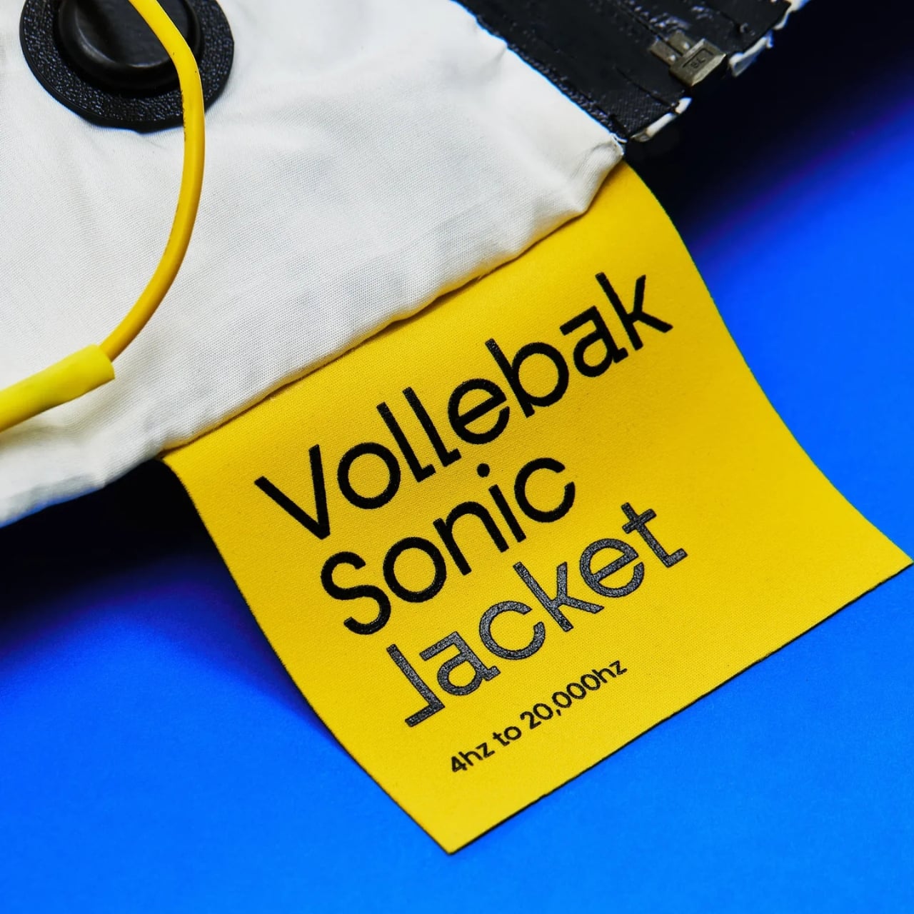
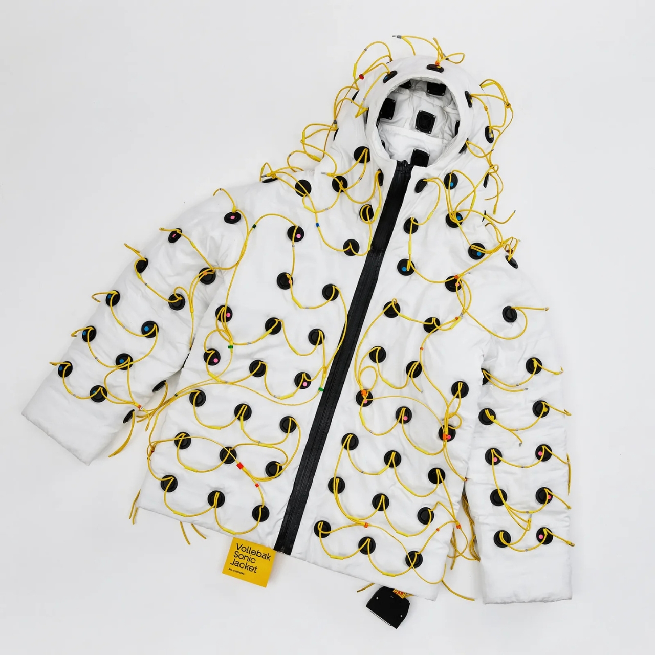
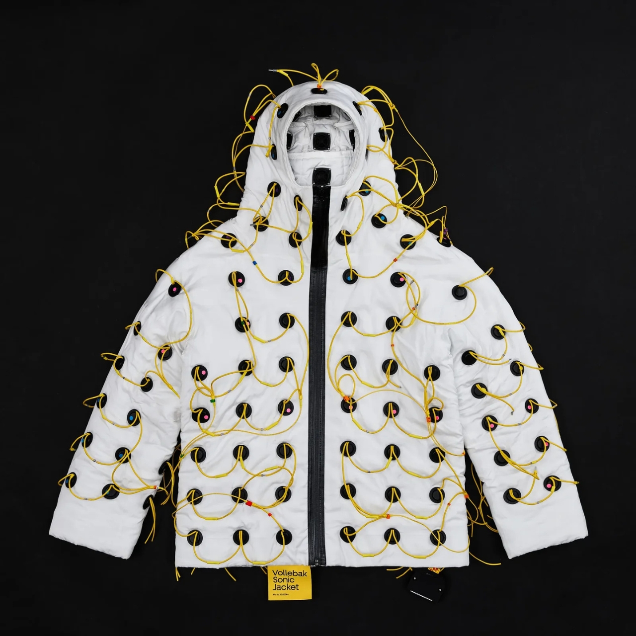
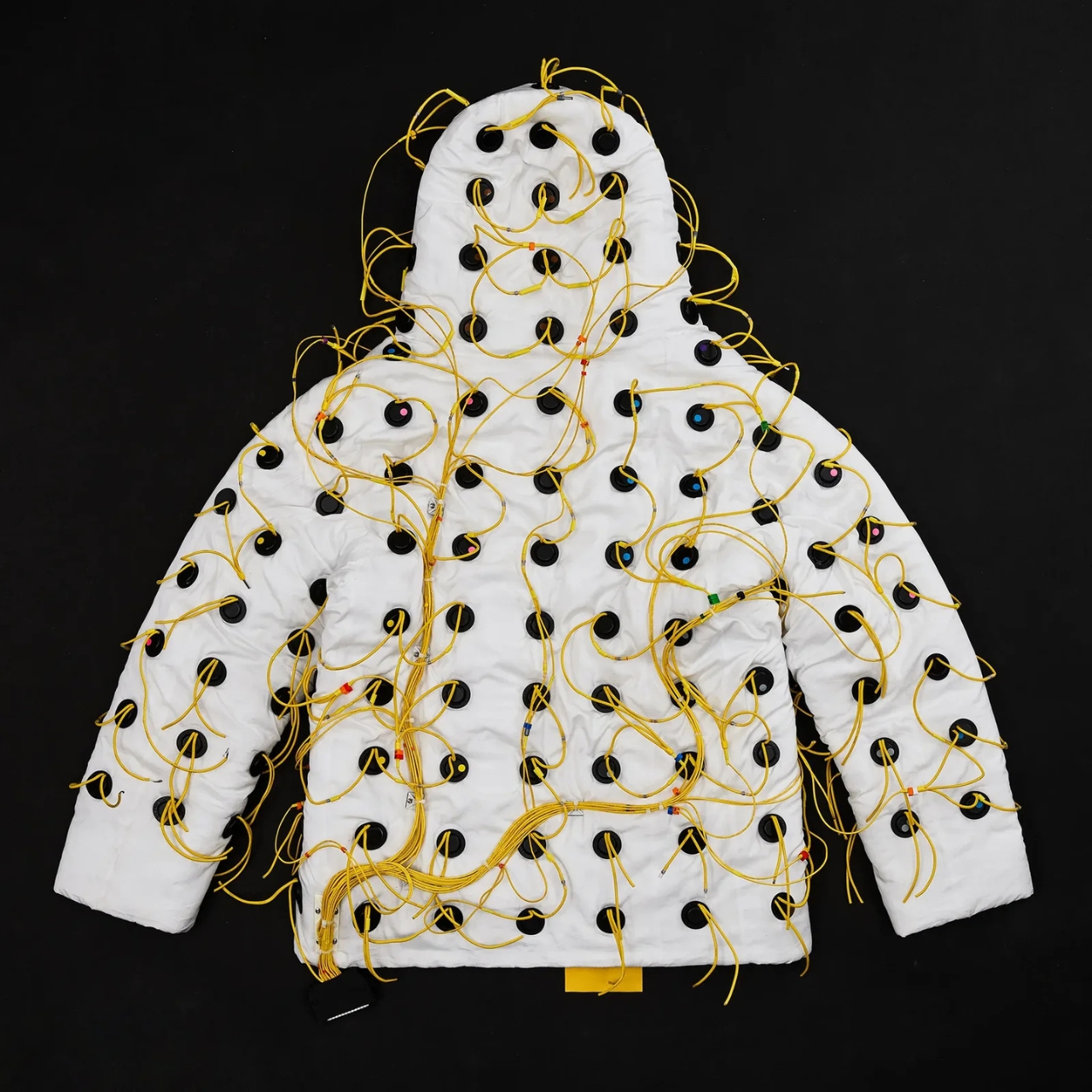
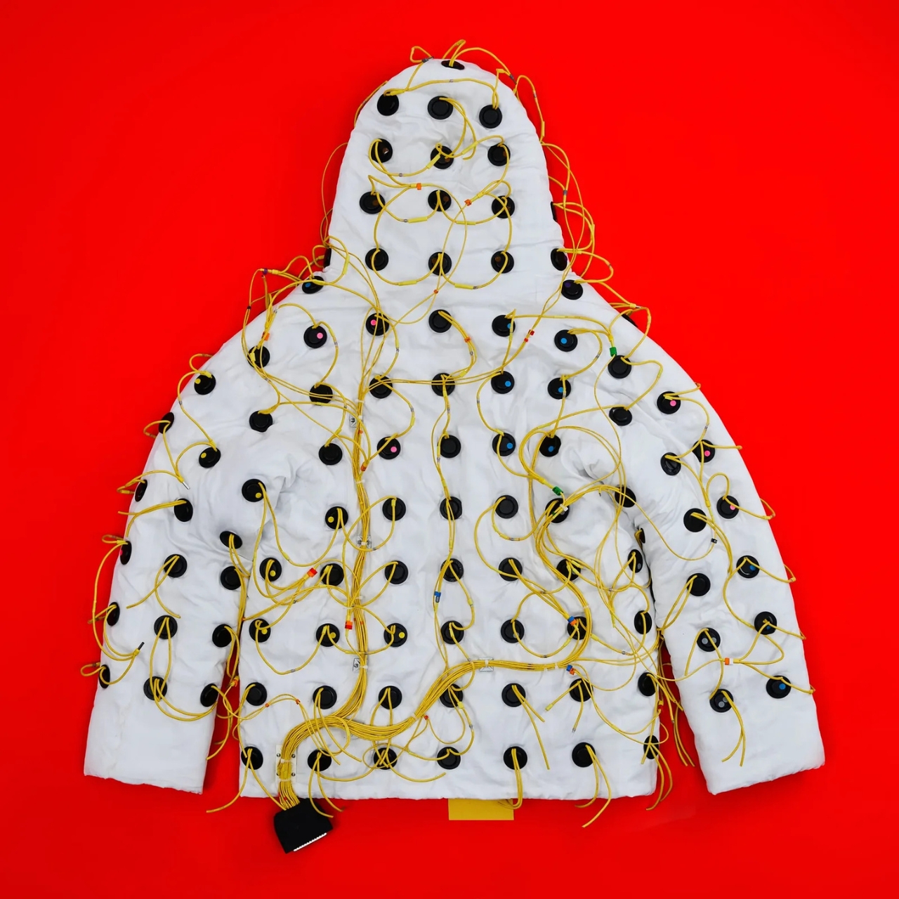
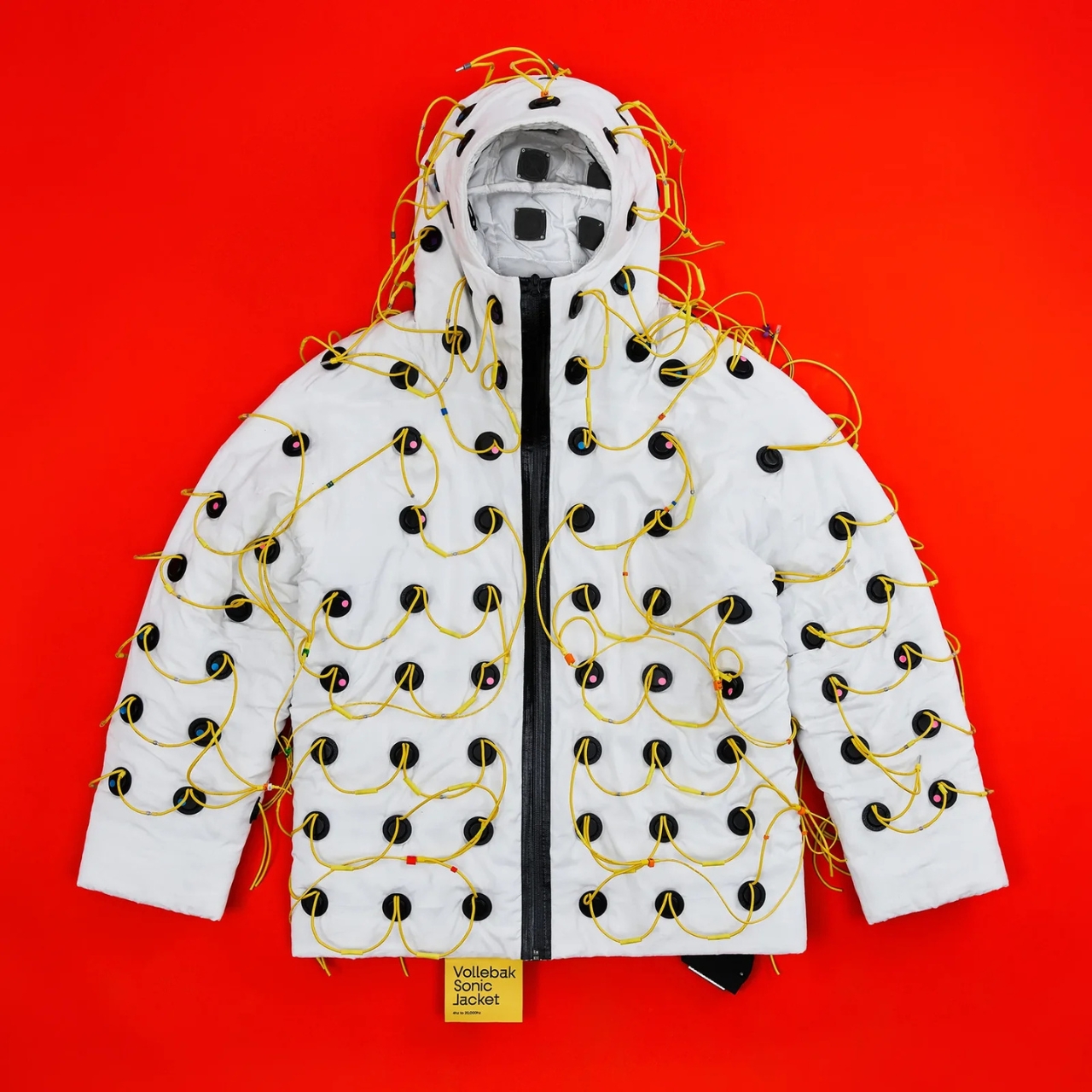
If you’ve ever stood too close to a speaker at a concert and felt the bass move through your chest, you already understand the basic premise of Vollebak’s latest creation, even if just barely. The Sonic Jacket doesn’t pump sound into a room. It pumps it directly into you.
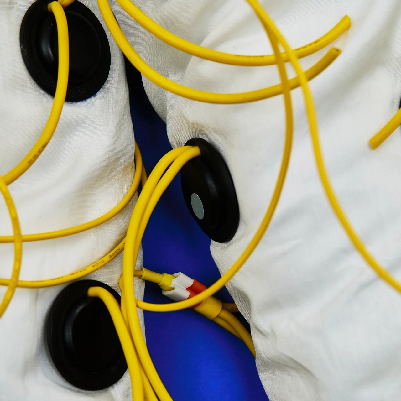
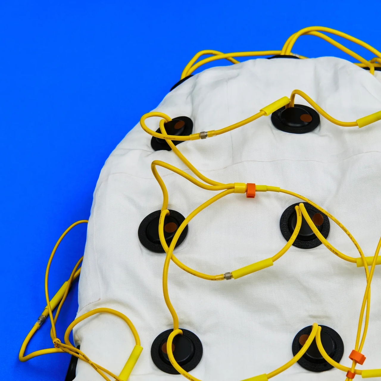
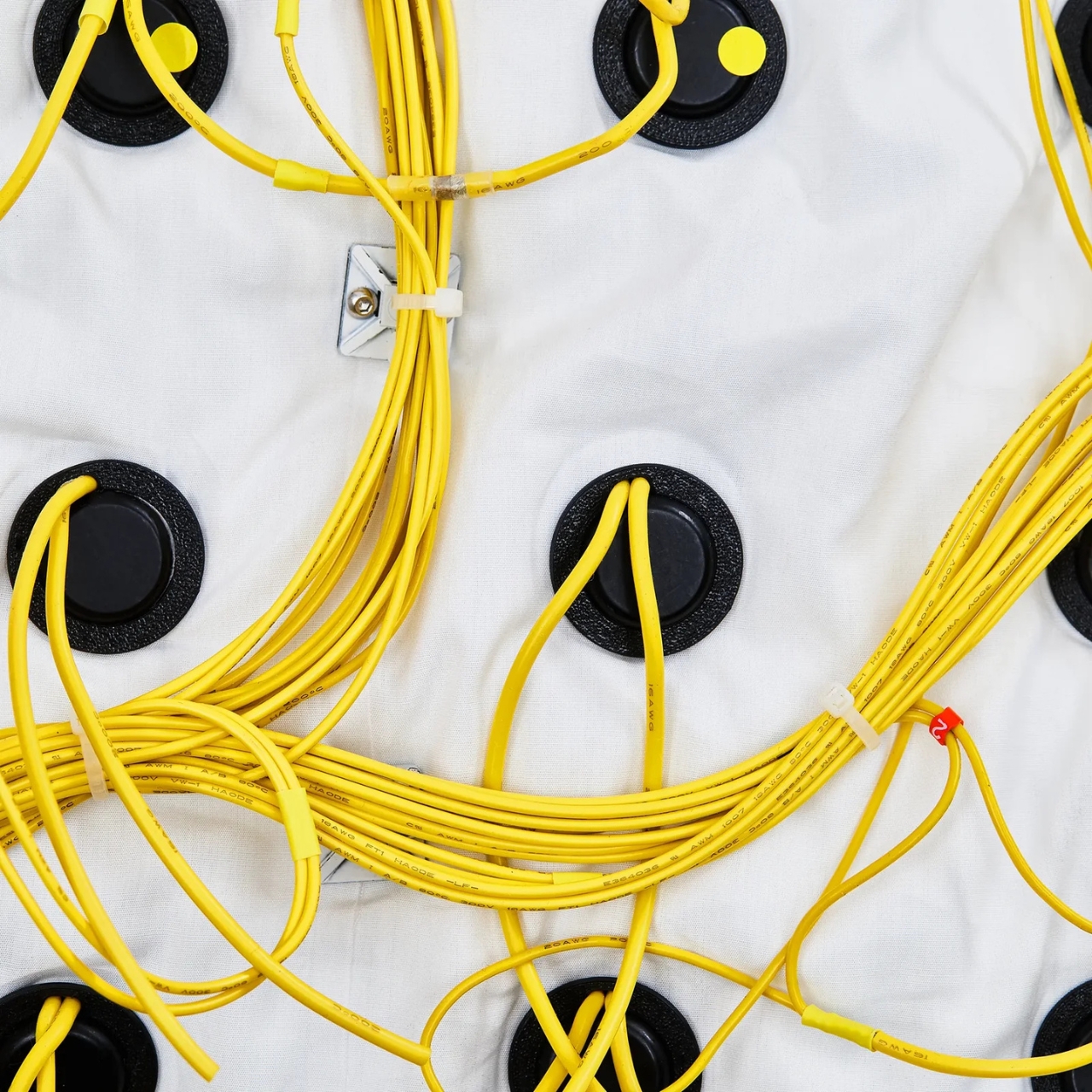
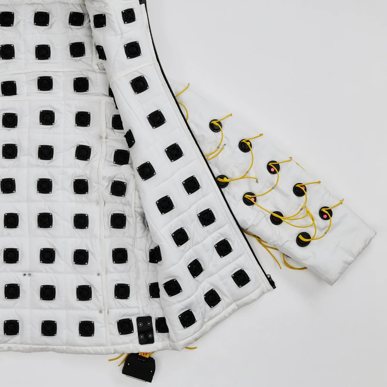
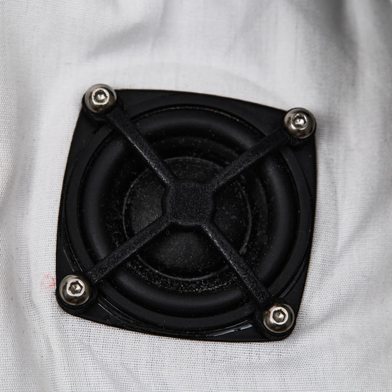
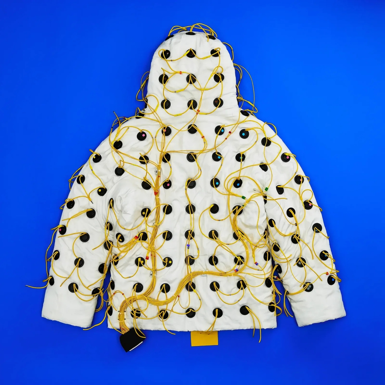
Vollebak, the experimental clothing brand founded in 2015 by twin brothers Nick and Steve Tidball, has built a jacket lined with 180 inward-facing speakers. Each one is 32mm in diameter and 10mm deep, laser-cut into the fabric across the body, arms, and hood. The speakers fire frequencies ranging from 4 Hz to 20,000 Hz straight into the wearer’s body. Not at your ears. Through your skin, your bones, your tissue. The brand’s own description puts it plainly: “You don’t listen to this jacket. You feel it.”
I’ll be honest. My first instinct was skepticism. Frequency therapy and sound healing have a way of sitting at the awkward intersection of legitimate science and wellness marketing, and it can be hard to tell which side of that line you’re on at any given moment. But the more I dug into what Vollebak actually built here, the harder it became to dismiss.
The jacket was engineered by FBFX, a London-based special effects studio with 30 years behind them and credits that include Gladiator, Dune, The Martian, and Project Hail Mary. These are people who build functional spacesuits worn by real actors in demanding production environments. They brought that same precision to the problem of turning a jacket into a distributed speaker system. The wiring is intentionally left visible, all yellow and exposed, because FBFX co-founder Grant Pearmain’s position is straightforward: it looks like a science experiment because that’s exactly what it is.
Control is handled through a unit fitted with an MP3 player preloaded with 10 frequencies, a physical dial for fine-tuning, and a Micro SD card slot that can hold up to 1,000 personalized frequencies. A Bluetooth app is in development. For lower frequencies, where speakers risk overheating, the jacket works around the problem by playing two slightly different tones simultaneously. The body registers the gap between them rather than the tones themselves, and that gap is where the lowest frequencies live.
Nick Tidball’s language around the whole project is part visionary, part slightly unhinged, which is exactly what makes Vollebak so compelling as a brand to follow. He talks about the earth resonating at a frequency, about his cat’s purr, about the fact that we are not solid beings but collections of particles with space between them where sound can travel. “Maybe you’ll orgasm. Maybe you’ll shit yourself. Maybe you’ll find God,” the brand writes on its site. Bold copy, sure. But it’s genuinely hard to argue that sound and frequency don’t do something to us. Every religious tradition figured that out thousands of years ago, from drumming around fires to chanting in stone chambers.
The Sonic Jacket is currently a prototype, tested on only a handful of people. Tidball himself did a 30-minute session and described the initial effects as “kind of astonishing.” That’s a small sample size and a subjective account, so I’d take the results with appropriate caution. But the ambition here isn’t really in question.
What Vollebak is doing, jacket by jacket, is expanding the definition of what clothing is for. They’ve done it with graphene that behaves like a radiator, with near-indestructible Dyneema, and with a jacket made from 250,000 pieces of laser-cut American walnut. The Sonic Jacket feels like the most speculative thing they’ve attempted so far, and that’s saying something. It’s not a wellness gadget in a tech form factor. It’s a wearable environment designed to shift your nervous system.
Whether the science catches up to the ambition remains to be seen. But that’s always been part of Vollebak’s proposition. They make things that probably shouldn’t exist yet, and then figure out if they should. The Sonic Jacket is the most interesting thing I’ve seen come out of the wearable tech space in a long time, and I’m not even sure it counts as wearable tech. It might just be the future of how we think about clothing altogether.
Yanko Design’s Design Mindset podcast continues to carve out a thoughtful space for conversations around creativity, innovation, and the ideas shaping the future of design. Now at Episode 22, the weekly podcast is steadily building a strong voice of its own by focusing not just on finished products, but on the processes, philosophies, and experiments behind them. Powered by Zawa, this latest episode turns its attention to a fascinating tension in contemporary design: as AI becomes more embedded in creative workflows, where does human originality begin, and what happens when the most forward-looking idea starts with something as ancient as clay?
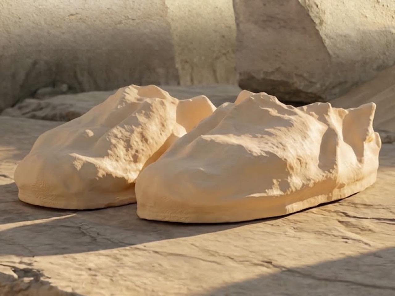
That question drives host Radhika Seth’s conversation with Ben Weiss, CEO of Syntilay, a company already known for pushing footwear into unfamiliar territory through AI, 3D printing, and custom-fit production. In this episode, Weiss unpacks the making of the Skin shoe, a project that began with artist Sebastian ErraZuriz sculpting directly around his foot before the form was scanned, translated, and turned into wearable footwear. The result is not just a new shoe, but a new argument for how design can begin, who gets to author it, and why technology may be most powerful when it supports human expression rather than replacing it.
The most striking part of the Skin shoe story is that it did not begin with a digital tool, a design brief, or a manufacturing constraint. It began with clay in the hands of an artist, and for Ben Weiss, that starting point changed everything about the outcome. As he explains, “People kept asking us, why start with clay? Why not just open a design software and begin, you know, kind of like the typical path for making shoes. And the answer is because a computer has an idea and some predetermined steps. But when you start with an art form, it’s entirely original.” That distinction becomes the foundation of the entire episode.
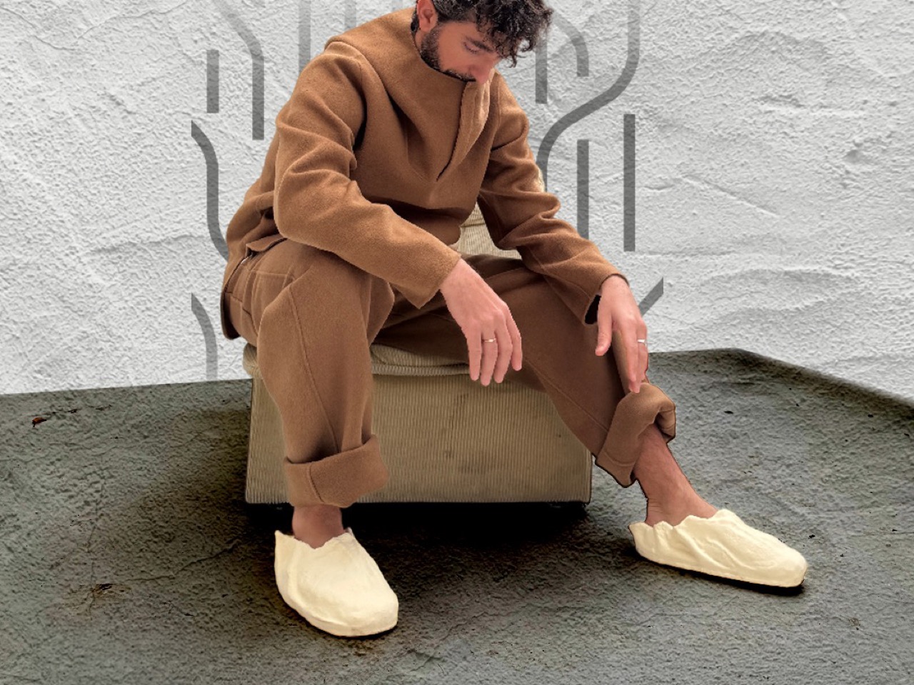
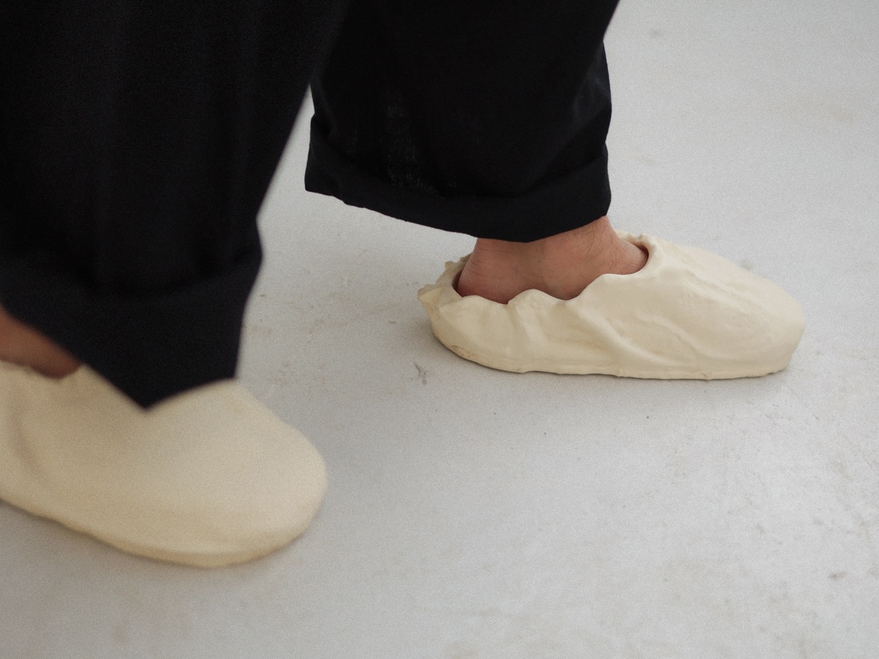
Weiss makes it clear that the goal was not simply to make a shoe in an unusual way. It was to let an artist enter footwear authentically, using his own medium and instincts instead of adapting to the usual industrial process. Sebastian ErraZuriz sculpted around his own foot in a w†ay that was, as Weiss describes it, “very free flowing,” with no predetermined expectations about what a shoe should look like. That is also why the final product feels less like a sneaker and more like something anatomical, intimate, and expressive, a piece of wearable sculpture rather than a conventional consumer product.
Turning Sculpture into a Wearable, Custom Fit Shoe
Once the clay sculpture was complete, Syntilay had to solve the difficult problem of turning a tactile, hand-made object into something that could actually be worn. Weiss acknowledges that some detail is always at risk in the translation from physical object to digital file, but preserving the original character of the sculpture was a key priority throughout. “Cause you lose some detailing, but you know you try to capture it as best as you can,” he says, before noting that the final printed shoe still retains much of the fine surface texture and hand-made quality of the original piece.
What makes the process especially interesting is that the artistic form is largely preserved on the outside, while most of the personalization happens on the inside. Using more than 5,000 data points captured from a phone scan or in-person fitting, Syntilay adjusts the internal geometry of the shoe to fit each customer’s foot without distorting the sculpture itself. Weiss explains, “The key is is not changing the outside structure that much so it distorts what the shoe looks like. In this case, what this piece of art looks like on your feet, um, and while also providing a good fit experience. So most of the changes are happening on the inside.” That balance between fidelity and function is what allows the shoe to remain art-led while still being wearable.
Ben Weiss on AI, Human Craft, and What Innovation Actually Means
Although the episode title sets up a contrast between clay and AI, Weiss is not arguing against technology. His view is more layered, and more useful, because he sees AI as a tool that can support creativity without becoming the sole source of it. “AI is going to be a great augmenter, um, maybe that’s not the best word, but a great kind of helper for humans,” he says. He goes on to describe a future in which designers sometimes use tools, sometimes choose not to, and build workflows based on what makes the most sense for the idea rather than on ideology alone.
That mindset also shapes how Syntilay positions itself as a brand. Weiss points out that the company has already explored highly automated footwear, but the Skin shoe takes the opposite route by placing the human hand at the very beginning of the process. For him, the bigger point is experimentation. Footwear, he argues, has become too comfortable with minor updates, surface-level collaborations, and familiar formulas. His response is blunt and memorable: “A lot of collaborations today are new embroidery on the shoe, different colors. It’s nice, But like when you can take an actual clay sculpture that somebody made around their foot and make it something you can wear. I mean that’s next level.” Innovation, in this framing, is not about choosing between AI and craft, but about creating conditions for truly new ideas to emerge.
Storytelling, Authorship, and Why the Human Element Still Matters
One of the strongest ideas in the conversation is that the Skin shoe is not just a design object, but a story that could only exist because of its human origin. Weiss sees that as increasingly important in a design landscape crowded with AI-generated outputs and endless visual sameness. “The story of the skin shoe is is a great story,” he says, pointing to the way Syntilay documents the journey from clay sculpture to 3D file to finished shoe. For him, storytelling is not decoration added after the fact, but a core part of how a product communicates meaning and builds resonance with people.
That same human-first logic also shapes how Weiss thinks about authorship. When asked who designed the shoe, he resists reducing it to one name, instead crediting both Sebastian, who created the sculpture, and Pablo, who translated the scan into a printable product. “So I would say it’s designed by two people,” he says, acknowledging that the future of artist-led footwear may depend on this kind of collaboration between conceptual creator and technical designer. He also notes that stories like these matter because they cannot simply be fabricated by a machine, adding that “storytelling is is a really significant moat because there are some stories that AI can just doesn’t have.” In other words, the human element is not just visible in the object, but embedded in the narrative around it.
Joe Foster’s Influence and Ben Weiss’s Bigger Design Philosophy
Another compelling layer in the episode is Weiss’s reflection on working with Joe Foster, Reebok’s cofounder, whose decades of experience have shaped the way Syntilay thinks about product. Weiss describes Foster as someone who still approaches design with energy, curiosity, and a strong belief that the work should remain enjoyable. But the deeper lesson comes from Foster’s idea of “vis tech,” or visible technology, the principle that innovation should not be hidden beneath the surface. Customers should be able to look at a product and immediately understand that it is doing something different. That philosophy clearly runs through Syntilay’s work, from the pod-based structure of other models to the unmistakably sculptural silhouette of Skin.
Weiss also shares a broader set of lessons that go beyond this one project. He admits that early on, he had not fully figured out how to optimize footwear for printing cost while balancing comfort, and that learning came through iteration rather than certainty. He is equally clear about what AI companies often get wrong when entering established creative fields, saying the most common mistake is “losing the authenticity and respecting the people that come before you.” Still, his most revealing line comes near the end of the episode, when he is asked to define the future of design. His answer is simple and sharp: “It’s about giving people more opportunities to design.” That may be the clearest summary of both the Skin shoe and Syntilay’s larger ambition, opening the category to artists, creators, and new forms of authorship that conventional design systems have historically left out.
Design Mindset drops every week on Yanko Design. Catch Episode 22 in full wherever you listen to podcasts.
Your desk says something about you before you ever open your mouth. The monitor, the mug, the little objects arranged around your keyboard, they all add up to a portrait. And the keyboard sits dead center in that portrait, the most touched, most visible, most personal object in the whole setup. So why do most of them look like they were designed by someone who has never once cared about how a workspace feels?
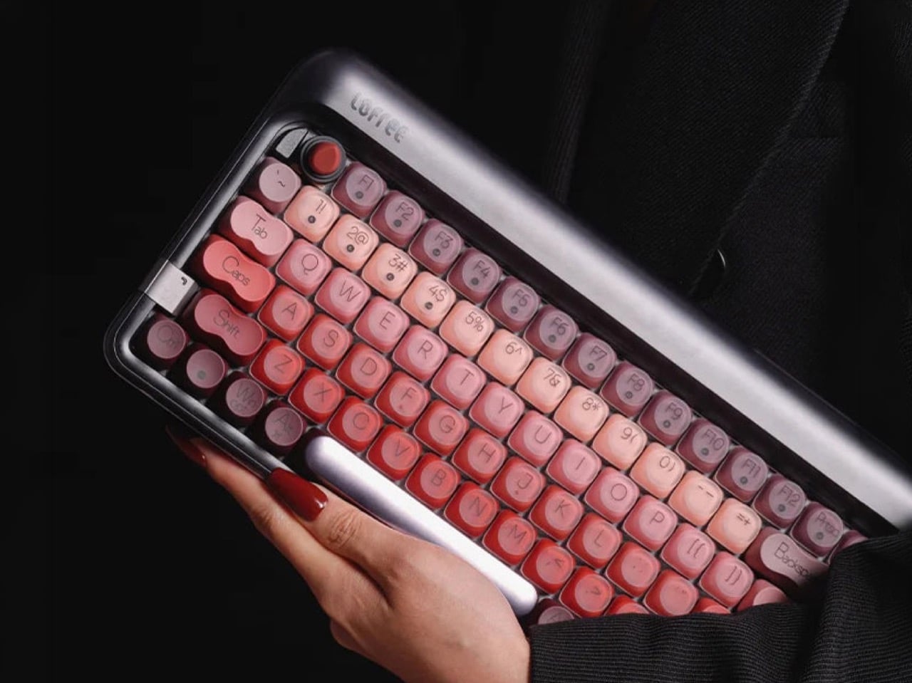
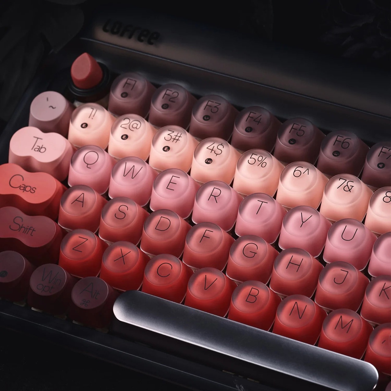
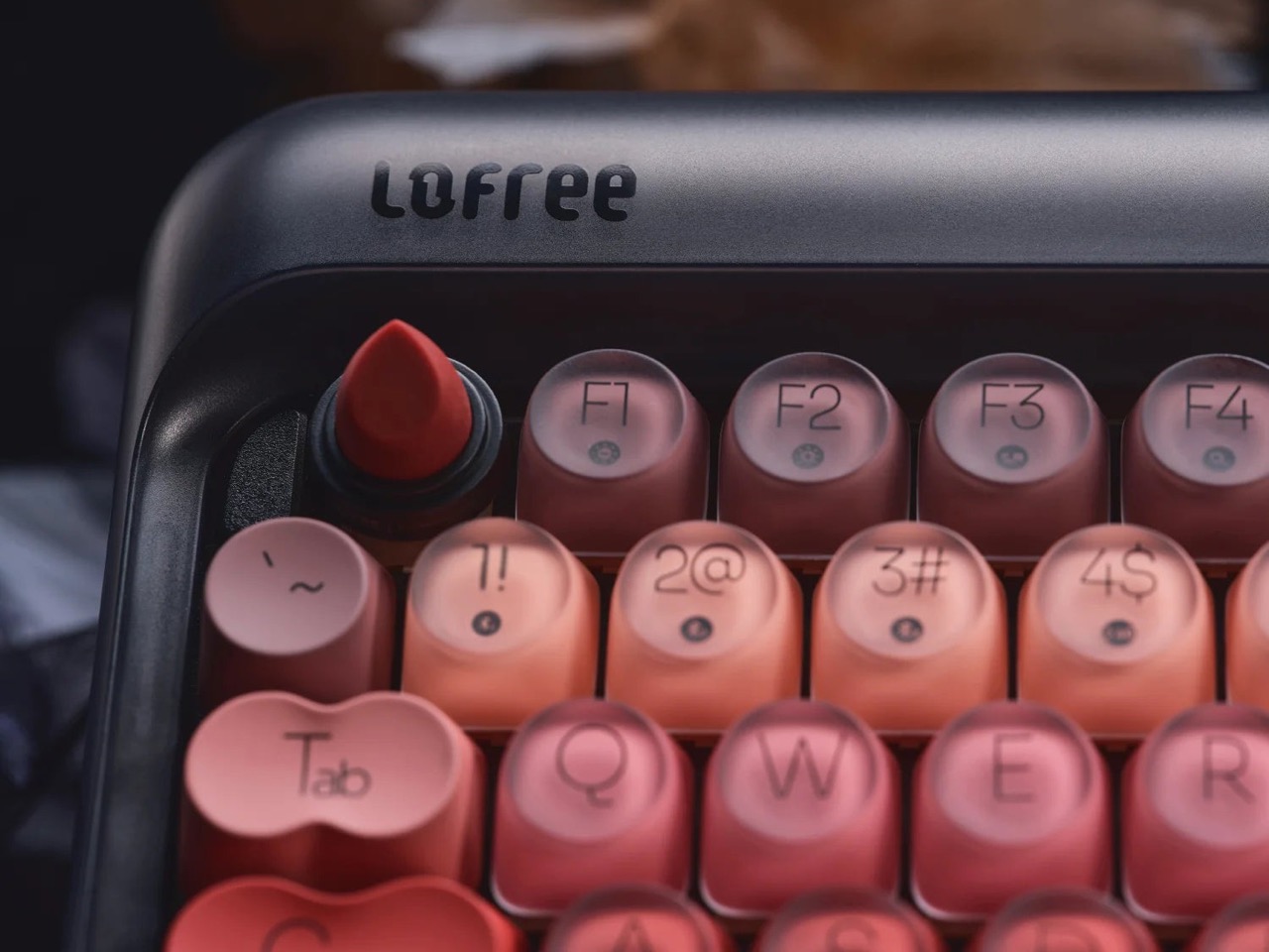
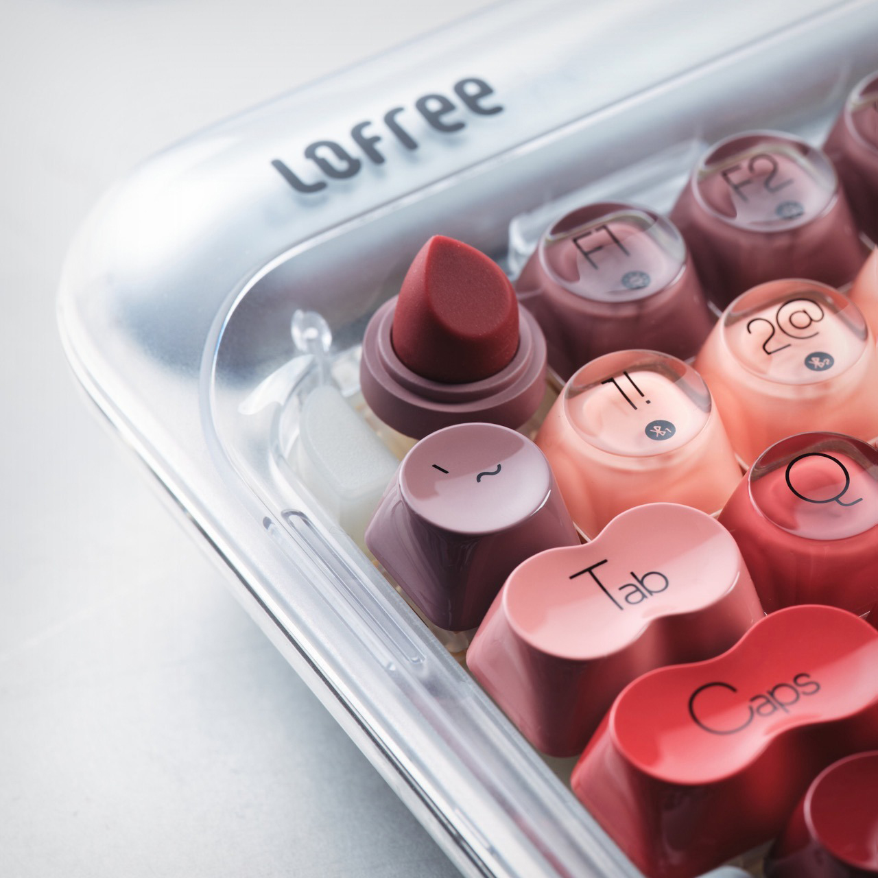
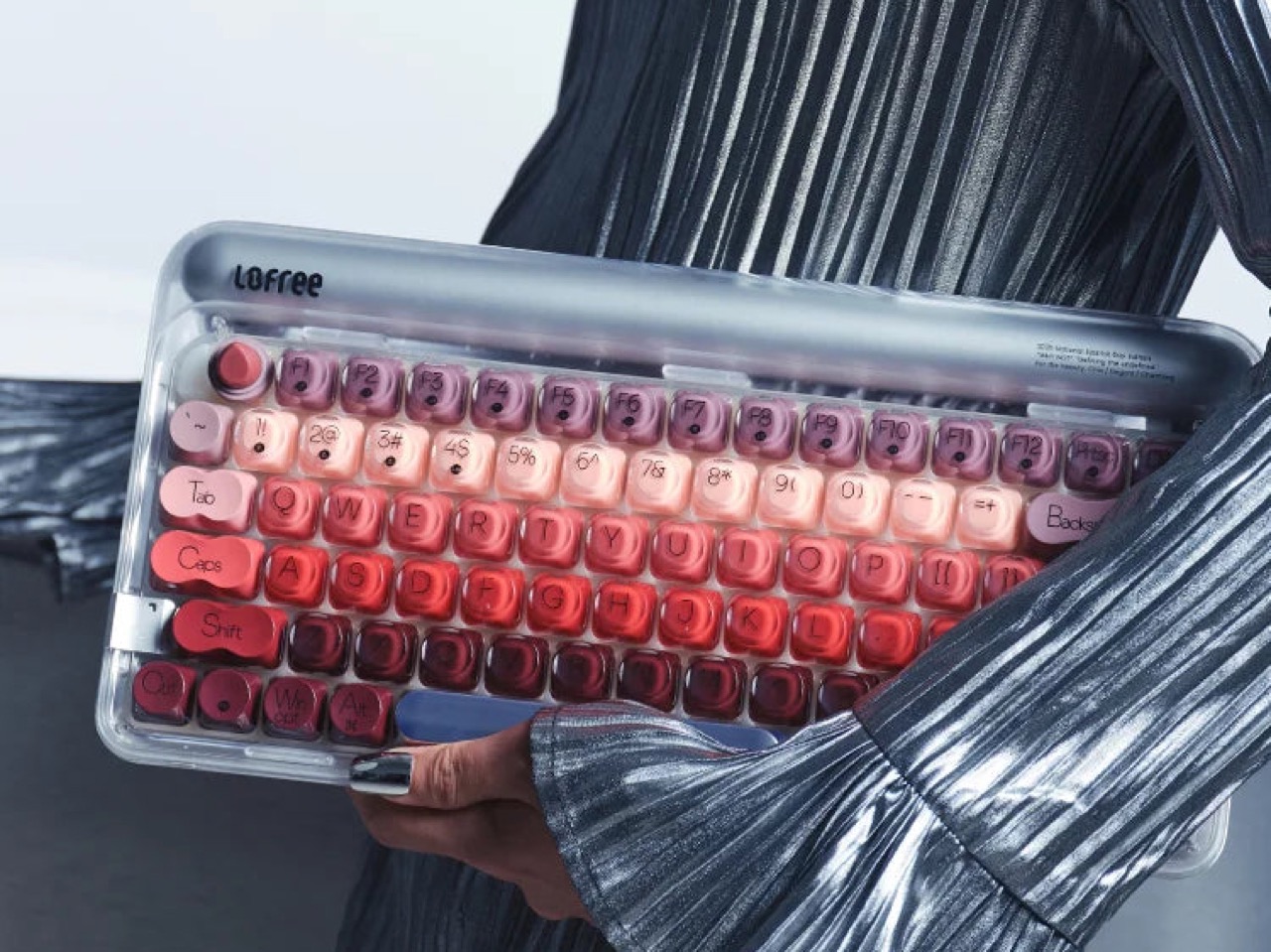
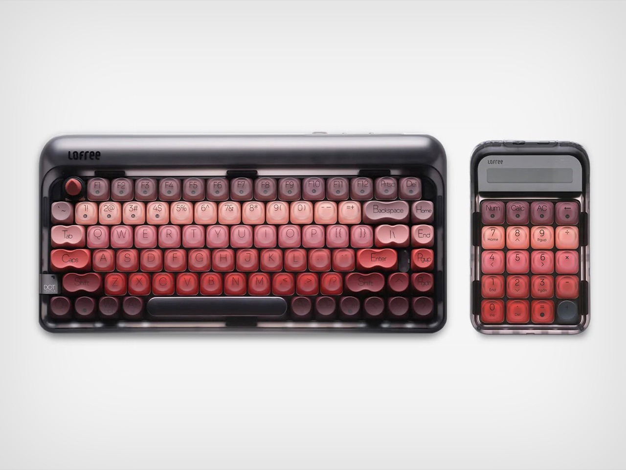
Lofree has been answering that question for years, building a catalog around the idea that a keyboard can carry genuine personality. The Lipstick is where that philosophy gets its boldest, most unapologetic expression yet. Five lipstick shades flowing across the keycaps in a deliberate ombre gradient, a sculptural lipstick-bullet ESC key rising from its cradle, and a gorgeous frosted transparent shell that puts the whole color story on display like jewelry in a glass case. It retails for $199 and is available now in Silver and Black directly from Lofree.
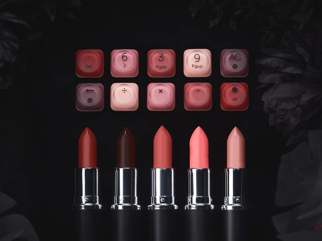
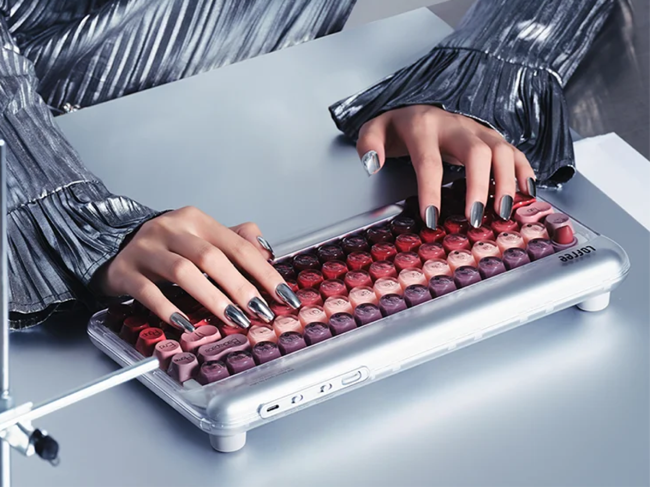
Never did I think the overlap between beauty and keyboards would exist so seamlessly. Lofree used dual-tone PBT keycaps to create that mystique that is each and every key, with a frosted outer shell revealing the hint of a hue underneath. Lofree didn’t scatter five themed shades arbitrarily across 84 keys. They sequenced them, running deep burgundy and wine tones from the left and right of the board through warm coral and brick red across the QWERTY row, then lightening into blush pink and dusty mauve as you move into the function row. The result reads like a makeup palette laid flat across your desk, a color story with a beginning, a middle, and an end. The keys on the extreme left and right (Tab, Caps Lock, Shift, Enter) are single-tone, giving you a direct look at the color while the rest of the row looks like actual samples of lipstick or nail paint that you’d feel like popping out to test. Pair this with the nail-job on your actual hands and you’ve got absolute art at work.
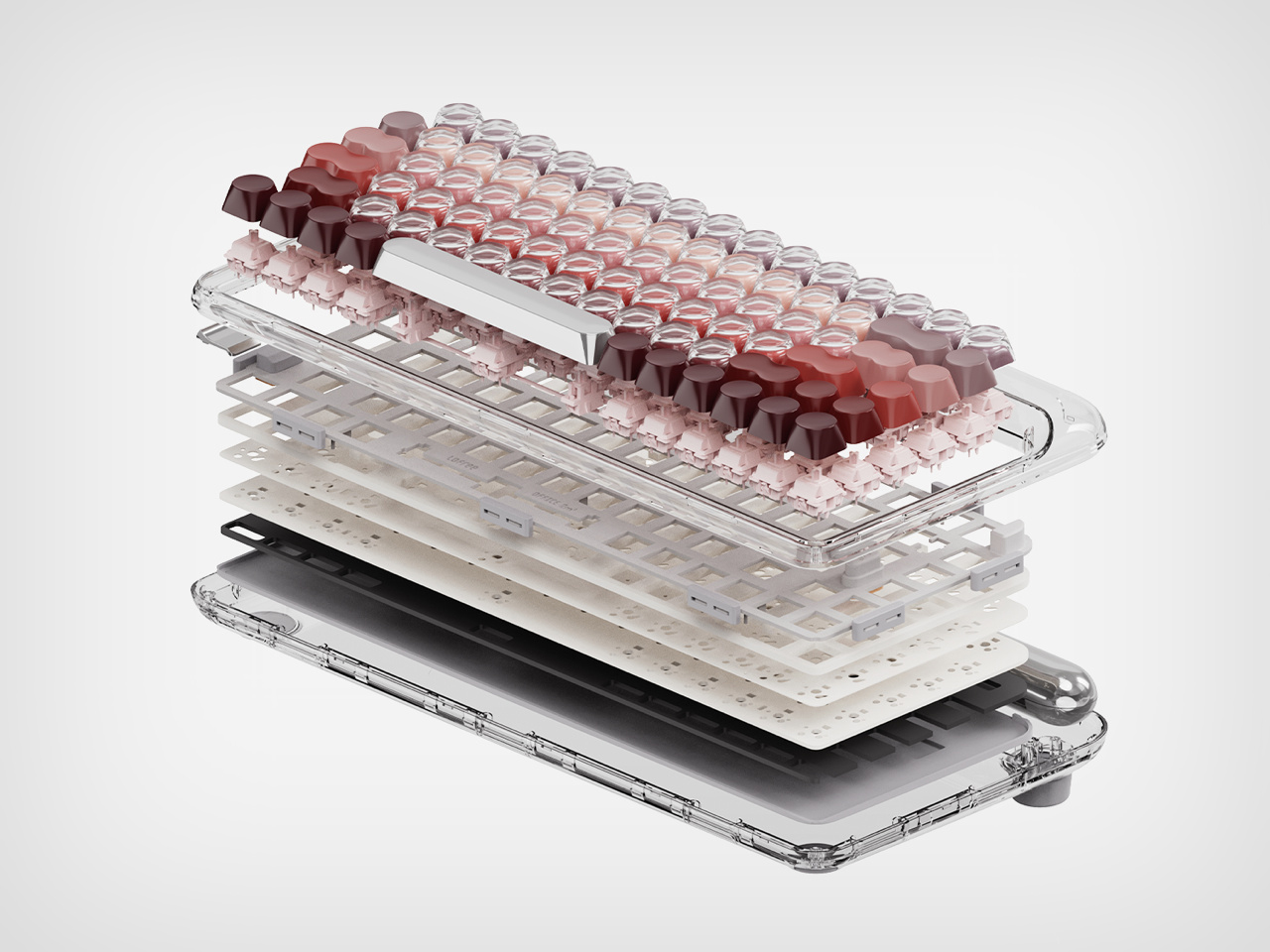
Lofree’s rounded, typewriter-inspired keycap profile has been a house signature since the original Block, and the Lipstick leans into it fully. That retro shape is clever because it mimics the cylindrical form of a lipstick tube at a miniature scale, which means the thematic reference lands in three dimensions rather than just through color. The ESC key pushes that logic to its natural conclusion, a fully sculpted lipstick bullet in matte red, sitting upright in a black cradle in the top left corner of the board. It physically protrudes above the surrounding keys, and when you see it in person, it has the quality of a very good joke told with a completely straight face. Clever without being loud about it.
Under all of that, Lofree built a proper enthusiast keyboard. The Lipstick runs Lofree x Gateron linear switches with a 40g actuation force, hot-swappable and compatible with both 3-pin and 5-pin configurations, so you can retune the typing feel whenever you want without touching a soldering iron. A gasket mount structure absorbs the hard edges out of each keystroke, softening the acoustics and adding a slight cushioned rebound that makes extended typing sessions noticeably more comfortable than a standard tray mount board. The 1000Hz polling rate over both 2.4GHz wireless and USB-C wired connections keeps response times sharp, and a 4000mAh battery delivers up to 14 days of use with the backlight off, or 30 hours with all seven lighting effects running. The keys aren’t individually backlit, which is what you’d expect with dual-tone PBT caps, but rather the space between the keys lights up, giving you a look at the keyboard’s outline. Bluetooth 5.3 handles up to three paired devices simultaneously, with seamless switching across macOS, Windows, iOS, and Android.
Lofree also makes a matching Lipstick Wireless Numpad that carries the same gradient keycaps and frosted shell, available separately for anyone who wants the full spread across their desk. It connects via the same tri-mode system, so the two sit together without any friction. At $199 for the keyboard, the Lipstick sits at a price point where the spec sheet fully justifies the ask, and the design justifies everything else.
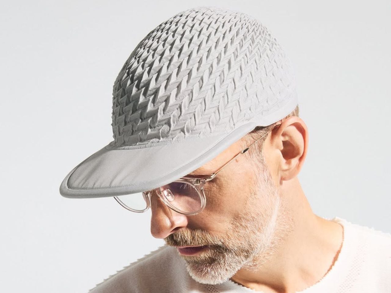
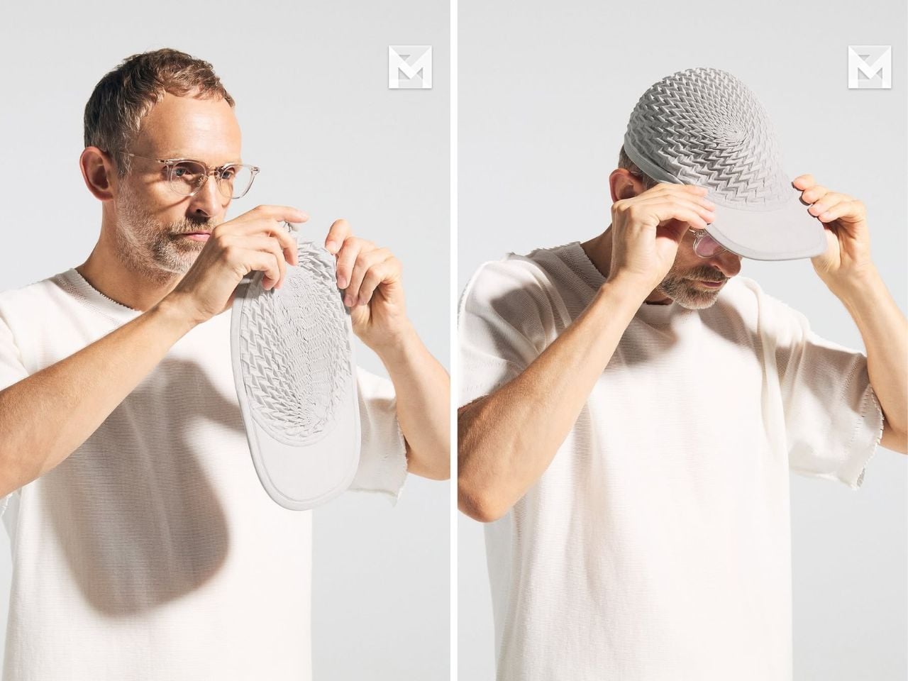
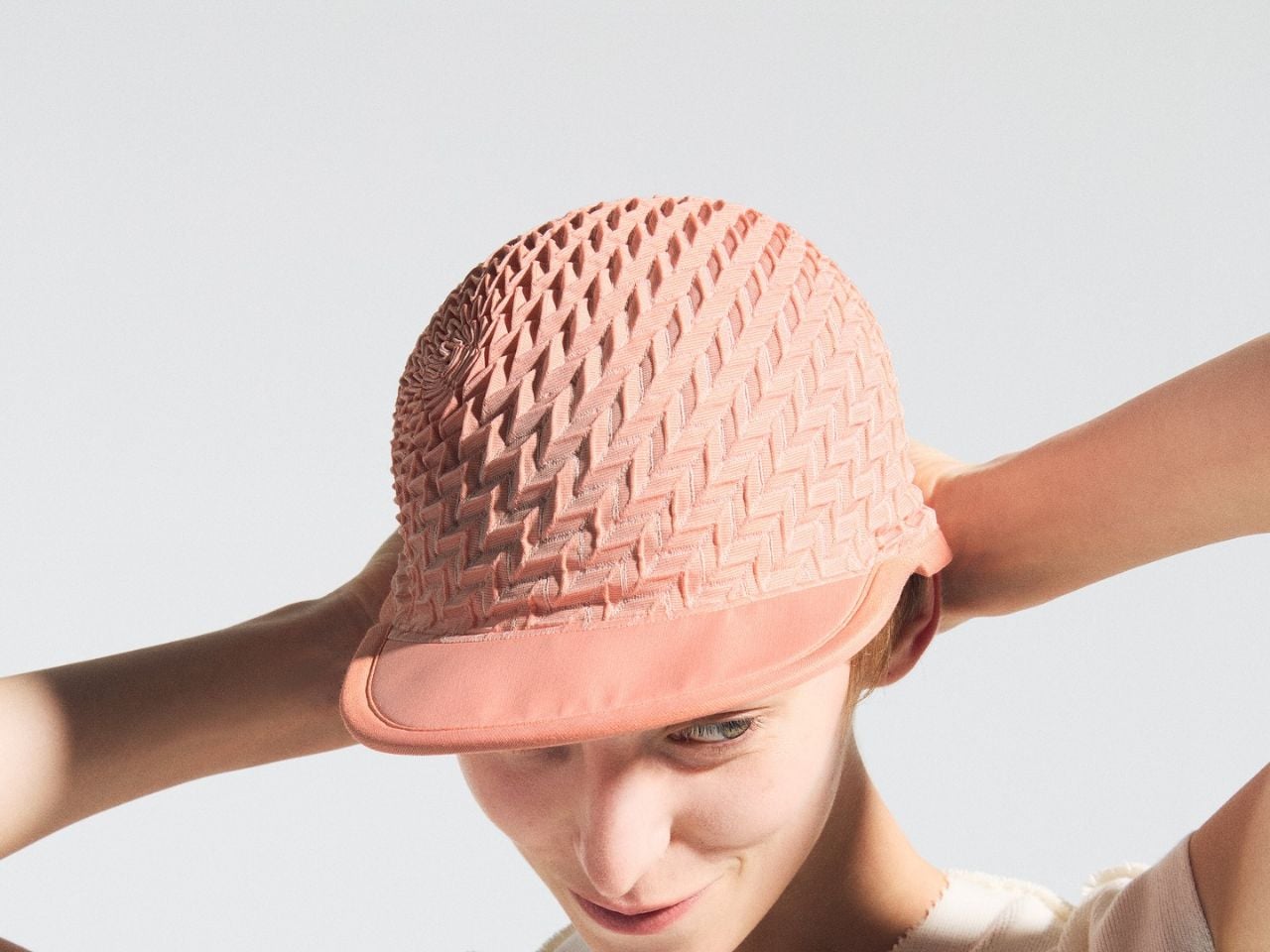
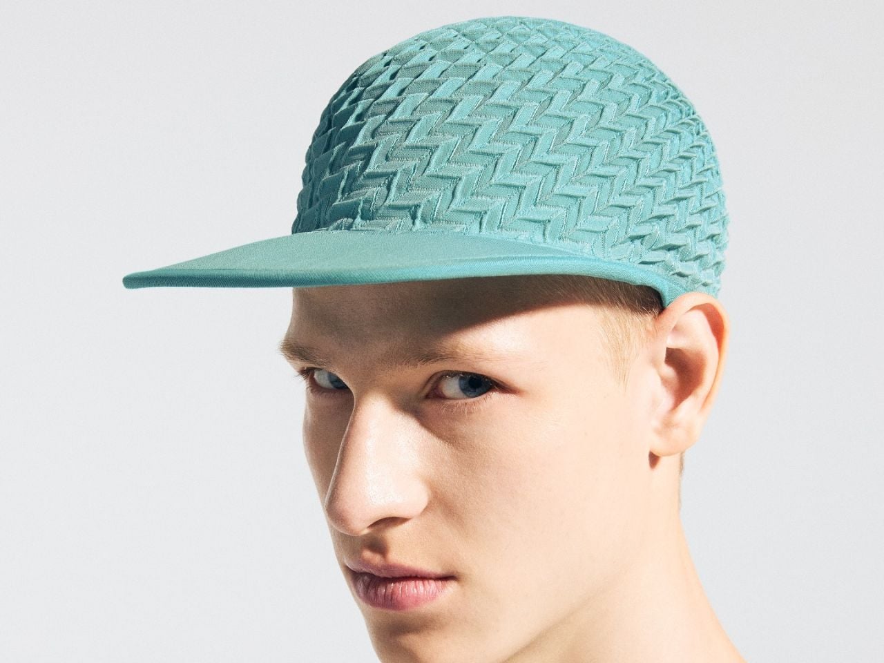
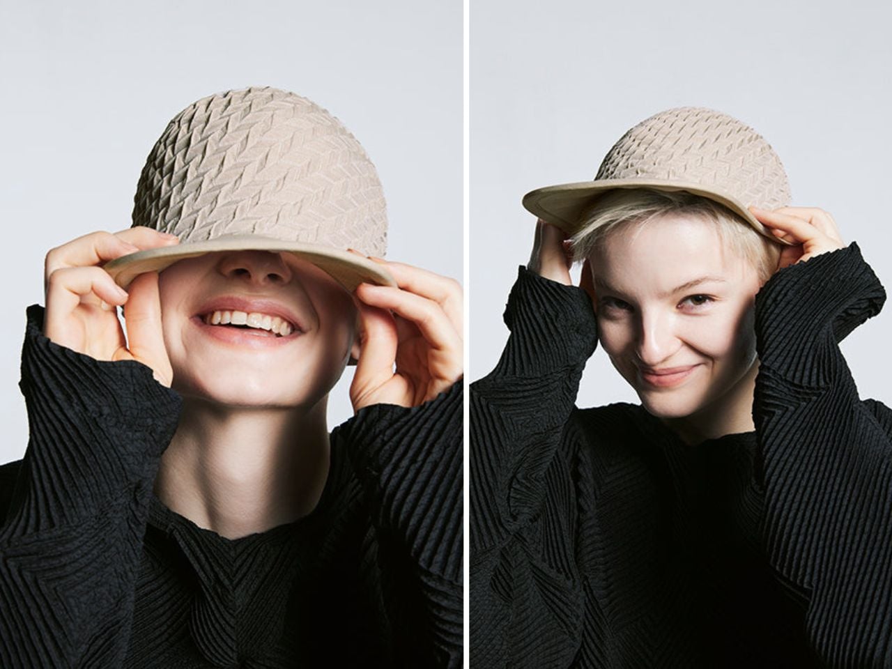
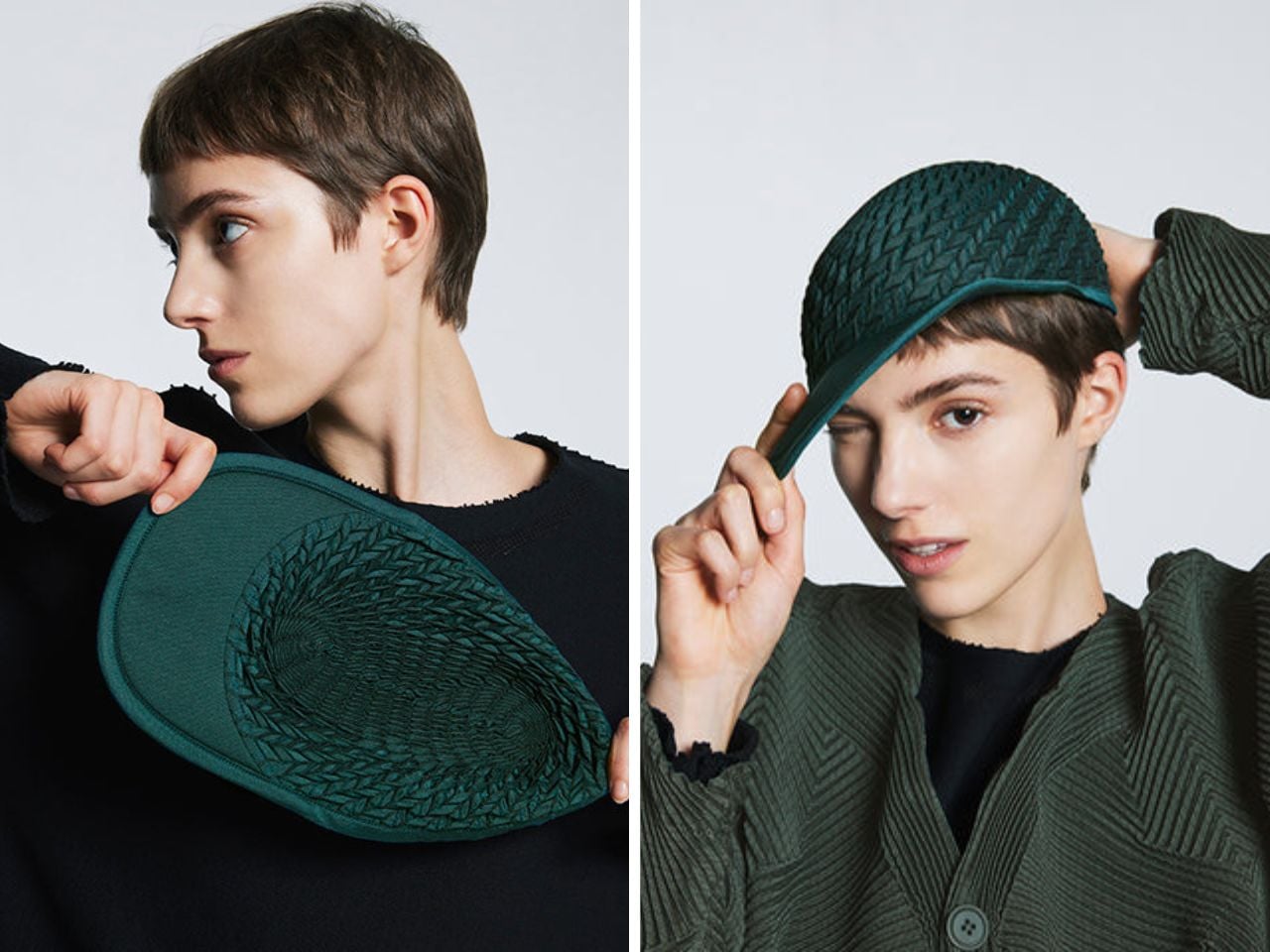
The TYPE-O CAP by A-POC ABLE ISSEY MIYAKE is not just a cap; it is a small, wearable study in transformation. At first, it begins as something surprisingly simple: a flat woven textile. But through the application of heat and steam, the fabric contracts, expands, and reshapes itself into a sculptural three-dimensional form. What was once flat becomes structured. What looked quiet becomes expressive. The result is a cap that feels both technical and poetic, sitting somewhere between fashion, material research, and soft architecture.
At the center of the cap is Steam Stretch, an innovative textile technique developed by A-POC ABLE ISSEY MIYAKE. The fabric is woven using heat-reactive yarns that respond to steam by shrinking in specific areas. This contraction is not random. It is carefully planned through data-driven jacquard weaving, where thousands of threads are arranged to create a structure before the object even visibly takes shape. Once steam is applied, the hidden logic of the weave is activated, allowing the cap to rise from a flat surface into a dimensional form.
This is what makes the TYPE-O CAP so compelling. Its shape is not created by cutting multiple panels and stitching them together in a conventional way. Instead, the structure is embedded into the textile itself. The pleats, curves, and volume emerge from the behavior of the material. The fabric almost seems to remember what it is supposed to become.
Created in collaboration with Nature Architects, the cap is part of a larger exploration into how textiles can transform through programmed material behavior. Nature Architects studied the contraction properties of the Steam Stretch yarn and developed algorithmic methods to generate weave patterns that control how the fabric changes shape. In the case of the cap, this results in a geometric pleated structure that expands around the head, adapting to the wearer while maintaining its sculptural character.
Despite its experimental process, the cap remains thoughtfully functional. It is unisex, washable, adjustable, and flat-packable, making it as practical as it is innovative. A drawcord at the back allows the wearer to fine-tune the fit, while the pleated structure gives the cap a flexible, adaptive quality. It can also be dyed in various colors, giving the same material system different expressions depending on finish, tone, and styling.
What is especially interesting about the TYPE-O CAP is how it makes advanced material technology feel approachable. It is not a dramatic runway object that only exists as a concept. It is an everyday accessory, but one that quietly challenges how we think about clothing construction. The cap suggests a future where garments may not need to be assembled from many separate cut pieces. Instead, they could be woven flat, transported efficiently, and transformed into complex forms through heat, steam, or other triggers.
While the cap is the focus here, the possibilities of this material system extend far beyond headwear. The same Steam Stretch and data-driven weaving approach can be used to create other garments with complex pleats, adaptive silhouettes, and reduced sewing requirements. It also opens up possibilities beyond fashion, including furniture, lighting, interiors, and even architectural applications. A textile that can shift from flat to dimensional has enormous potential in a world increasingly interested in compact production, responsive materials, and more efficient design systems.
The TYPE-O CAP captures that potential in a beautifully contained form. It is small enough to be worn casually, but conceptually large enough to suggest a different way of making. It turns fabric into structure, steam into a design tool, and a cap into an object that feels almost alive.
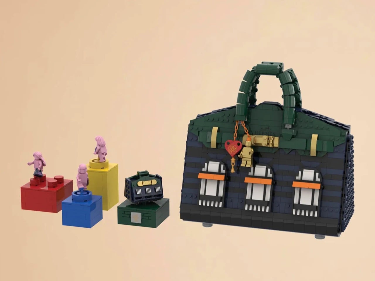
The Hermès Birkin has one of the most theatrical purchasing rituals in luxury retail. You cannot simply walk into a boutique on Rue du Faubourg Saint-Honoré and buy one. Hermès makes you earn it, building a relationship with a sales associate over months, sometimes years, demonstrating cultural fluency with the house before they’ll even have the conversation. The result is an object that carries as much mythology as it does resale value, a handbag that has become shorthand for a particular kind of aspirational excess that the internet finds endlessly fascinating.
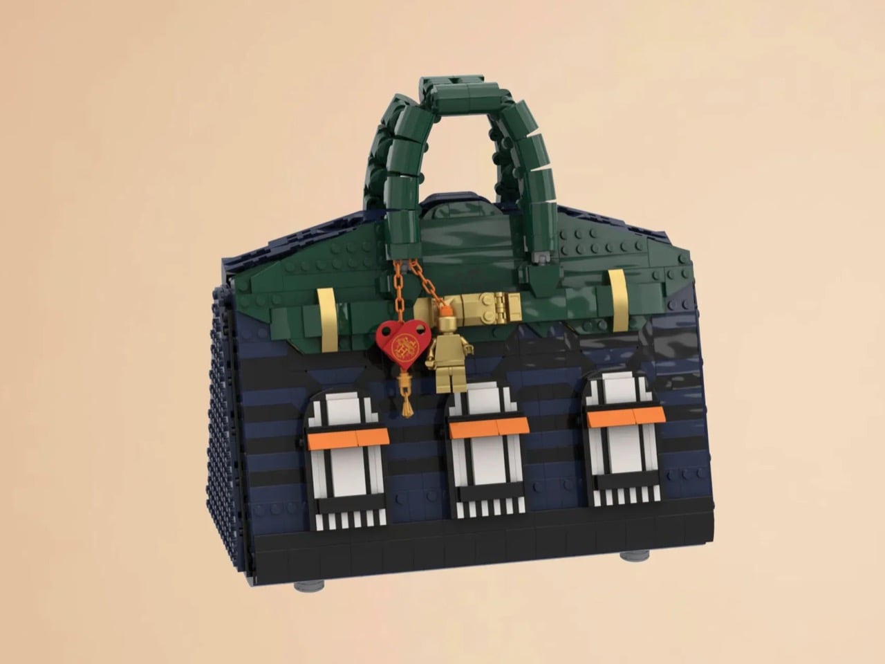
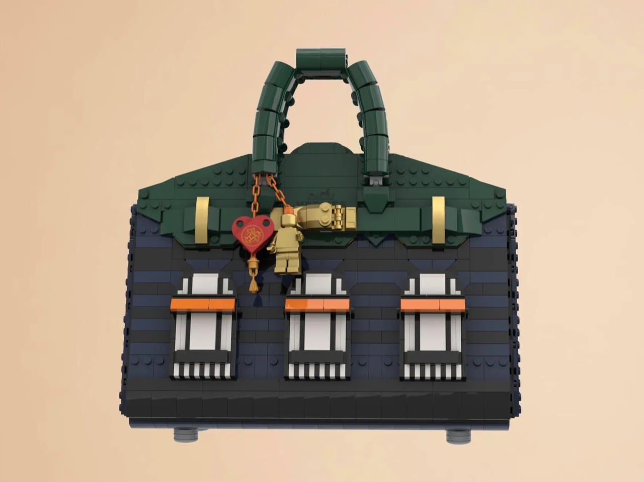
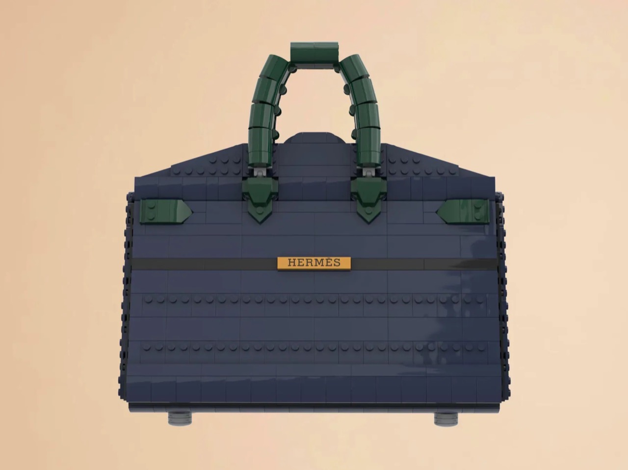
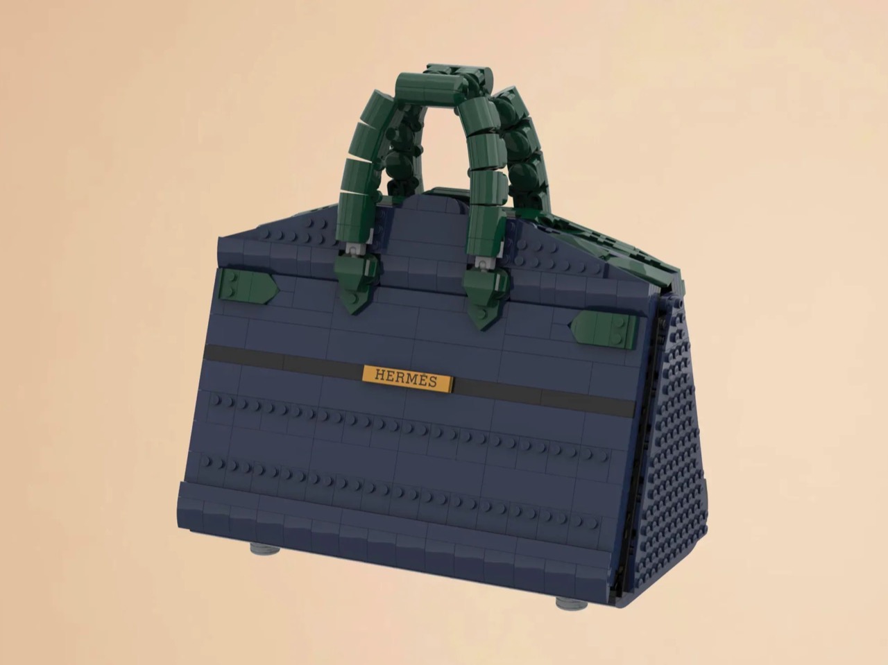
LEGO Ideas builders BOI_Design and KittyJW found a rather elegant workaround. Their MOC (My Own Creation) reimagines the Birkin 20 Faubourg, the special edition inspired by Hermès’s flagship Paris store, as approximately 1,400 bricks of deep navy, dark green, and gold. The exterior facade doubles as a miniature rendering of 24 Rue du Faubourg Saint-Honoré itself, complete with arched boutique windows and orange awnings. And it opens.
Designers: BOI_Design and KittyJW
The silhouette is immediately recognizable to anyone who has spent time in the vicinity of luxury retail, or, more realistically, scrolled past one on Instagram. The trapezoidal body is rendered in deep navy blue tiles, layered with a subtle horizontal banding that gives the surface genuine texture and depth. The handles arc overhead in dark green, assembled from linked Technic-adjacent elements that convincingly mimic the soft curve of the real bag’s leather grip. Gold hardware details sit at the clasp, at the side buckles, and along the turnlock assembly, and a tiny linked orange chain drops a red heart charm and a gold minifigure pendant in a detail that reads as both playful and surprisingly precise. Flip the bag around and the back panel is clean and quiet, just navy tiles and a gold Hermès tile sitting on a dark strap, which is exactly how the real thing looks.
The front face depicts three arched windows dressed with crisp white frames and orange awnings are spaced across the lower body, referencing the Haussmannian rhythm of the actual boutique facade at Faubourg Saint-Honoré. It takes a second to fully resolve in your eye, this thing that is simultaneously a handbag and a building, and that slight double-take is very much the point. The builders describe it as merging fashion and architecture into a single object, and looking at it straight on, that framing holds up completely.
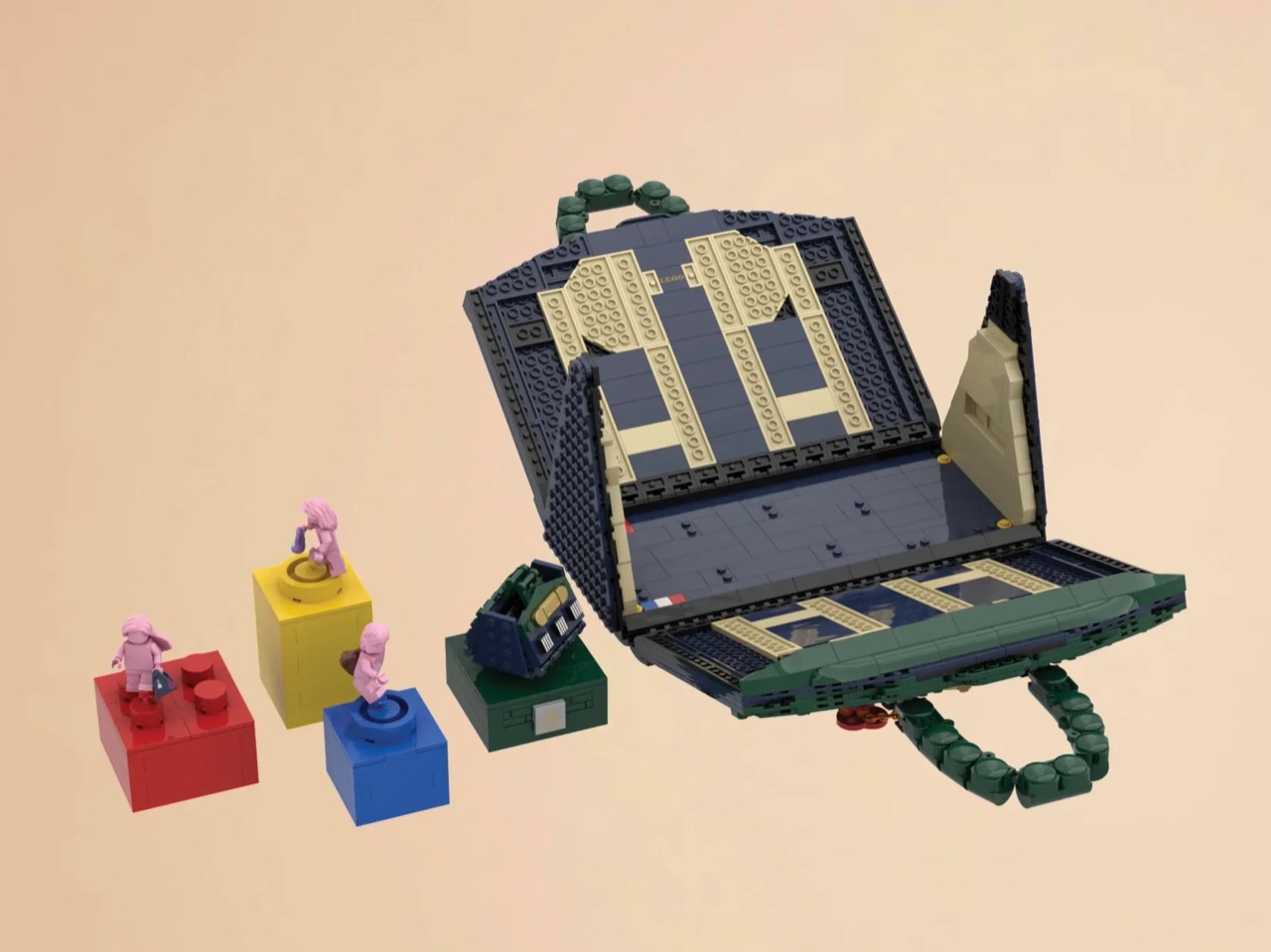
My favorite detail, however, is what happens when you open it. The lid swings up to reveal a hidden interior scene that commits fully to the bit. Three pink minifigures, each carrying a tiny handbag, are posed on oversized primary-color bricks in red, yellow, and blue, the kind of bold, joyful color blocking that feels distinctly LEGO while also evoking a fashion week runway setup. Nestled alongside them is a miniature Birkin 20 Faubourg bag rendered at a smaller scale, a self-referential easter egg that will land immediately with anyone paying attention. The interior lining is lined in cream and tan tiles, a genuinely considered touch that mirrors how a real Birkin’s suede interior contrasts against its exterior leather. At 28.5 centimeters wide and 29 centimeters tall, the whole thing has real physical presence on a shelf.
The build is currently gathering votes on LEGO Ideas, the community platform where fan submissions need to reach 10,000 supporters before LEGO’s internal team will formally review them for potential production. It’s early days for this one, but the concept has the kind of crossover appeal, fashion collectors, LEGO enthusiasts, Paris romantics, people who just want the Birkin experience without the two-year waitlist, that could carry it a long way. You can head to the LEGO Ideas page here to cast your vote.
The Met Gala is probably the most popular and glamorous fashion event in the Western world. Whichever way you feel about the organizers and having such a lavish event in these times, you can’t deny that it is very much talked about, especially on social media, due to the personalities who attend and, of course, what they’re wearing.
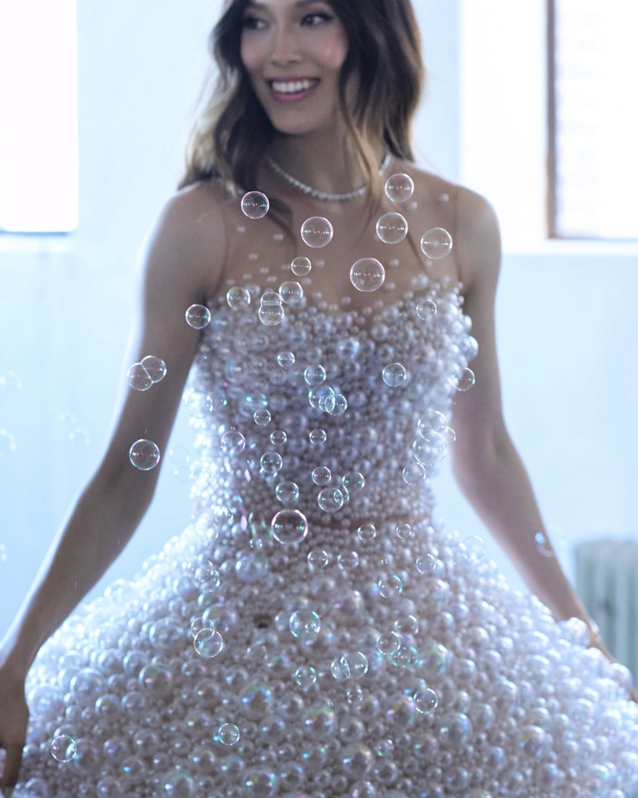
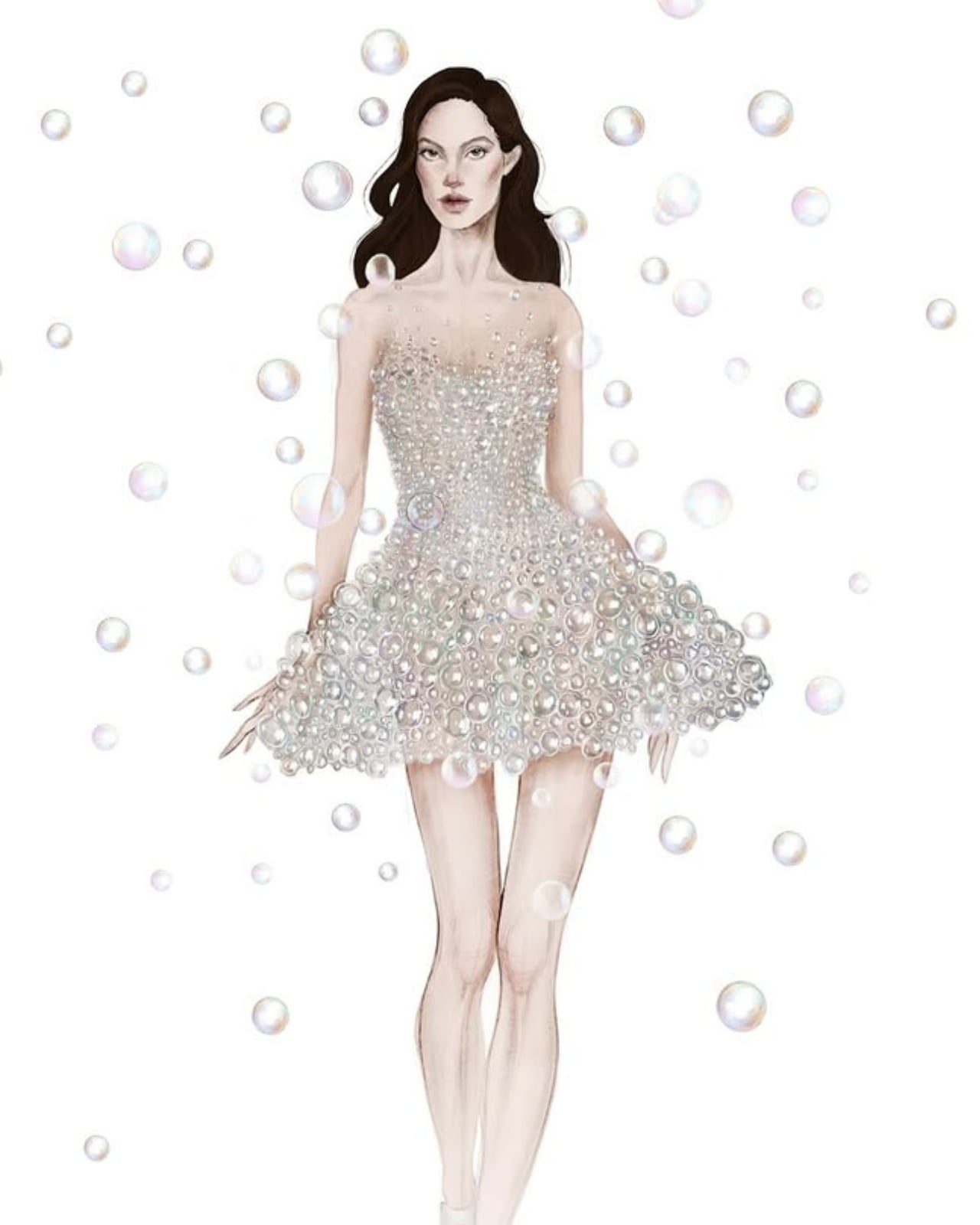
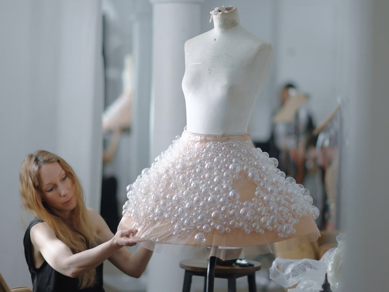
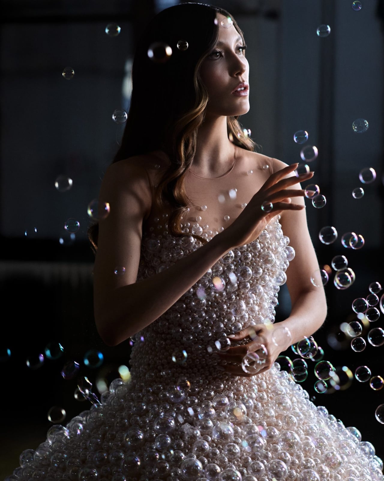
This event is also a chance for designers to showcase their more experimental works. One of the most eye-catching and interesting dresses we saw this year is the Airo dress, worn by Olympic freestyle skier and model Eileen Gu and designed by Iris van Herpen in collaboration with artist duo A.A. Murakami. The dress features 15,000 iridescent glass bubbles and, believe it or not, it actually released real floating bubbles live on the red carpet.
The dress’s silhouette is sculptural and mini in length, giving off a cloud-like, ethereal effect that instantly captured eyes on the red carpet. Van Herpen described the bubbles as a reflection of human anatomy, “which is composed of 99.9% empty space,” and the piece is also a nod to her ongoing fascination with biotech couture. Olympic triple medalist Eileen Gu is a wonderfully fitting muse, as the concept philosophically mirrors the kind of weightless, almost gravity-defying precision her sport demands on the snow slopes.
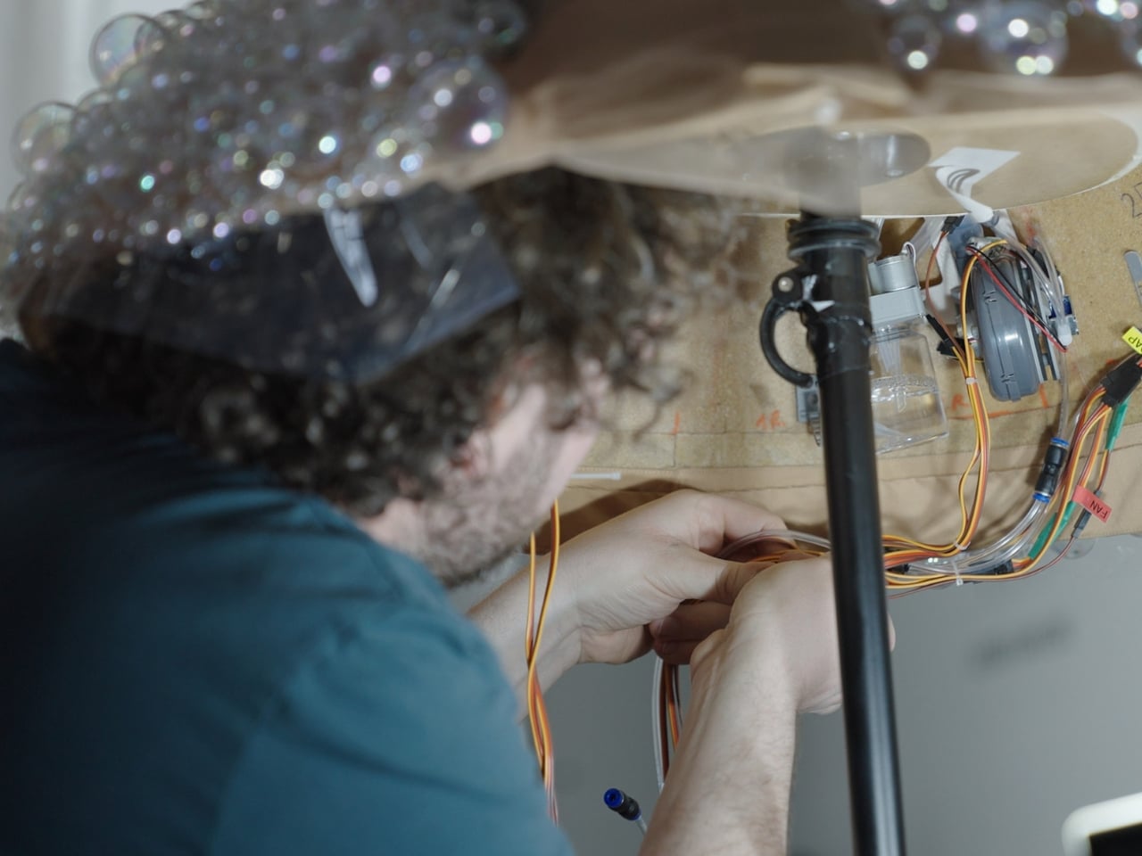
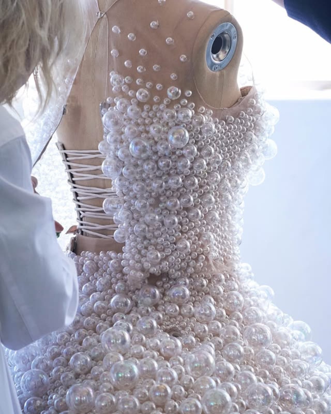
This is not just a simple dress adorned with bubbles. Each of the 15,000 iridescent glass bubbles was hand-moulded and then attached to the bodice using UV light, a meticulous process that required 2,550 hours of work across 15 weeks, carried out by a dedicated team of specialists in couture, science, and computational design. Underneath the skirt, hidden microprocessors pressurized gas and released real, floating bubbles in timed sequences. Everything you saw on that red carpet was completely real, with no filters and no CGI. It was a pure, breathtaking collaboration between fashion, art, and science.
What truly elevates the Airo dress from couture to living art is the partnership with A.A. Murakami. Alexander Groves and Azusa Murakami, who work between London and Japan, are celebrated for transforming ephemeral materials like steam, light, and air into immersive living installations. Their renowned “Floating World” exhibition is a perfect example of how they blur the line between the tangible and the invisible. Remarkably, the Airo dress marks the very first time they have applied their artistic philosophy to a wearable garment, and the result is nothing short of extraordinary.
What makes this piece particularly compelling is the question it poses while you’re simply looking at it: where does the body end and the space around it begin? The cloud of iridescent glass and the soft stream of real bubbles dissolving into the air around Eileen Gu created something genuinely hypnotic. It wasn’t just a dress being worn; it was a statement unfolding in real time. The silhouette seemed to blur the lines of her athletic frame, giving her an almost otherworldly quality that no CGI could ever replicate.
Van Herpen is no stranger to this kind of boundary-pushing. Her previous viral creation was a luminous dress made of living algae, crafted in collaboration with a bio-engineer and biophysicists from the University of Amsterdam. With every headline-making piece, she continues to challenge what fashion can be, not just as clothing, but as a vehicle for scientific exploration, philosophy, and wonder.
And perhaps that’s the most exciting thing about the Airo dress. In a sea of beautiful gowns at the Met Gala, this one made people stop and ask questions about science, about art, about the human body, and about what fashion is even for. At a time when so much of what we see has been filtered, edited, or AI-generated, there’s something incredibly refreshing about a dress that creates its own quiet spectacle from the inside out. Real bubbles. Real craft. Real wonder. That’s the kind of fashion that stays with you long after the cameras have gone.
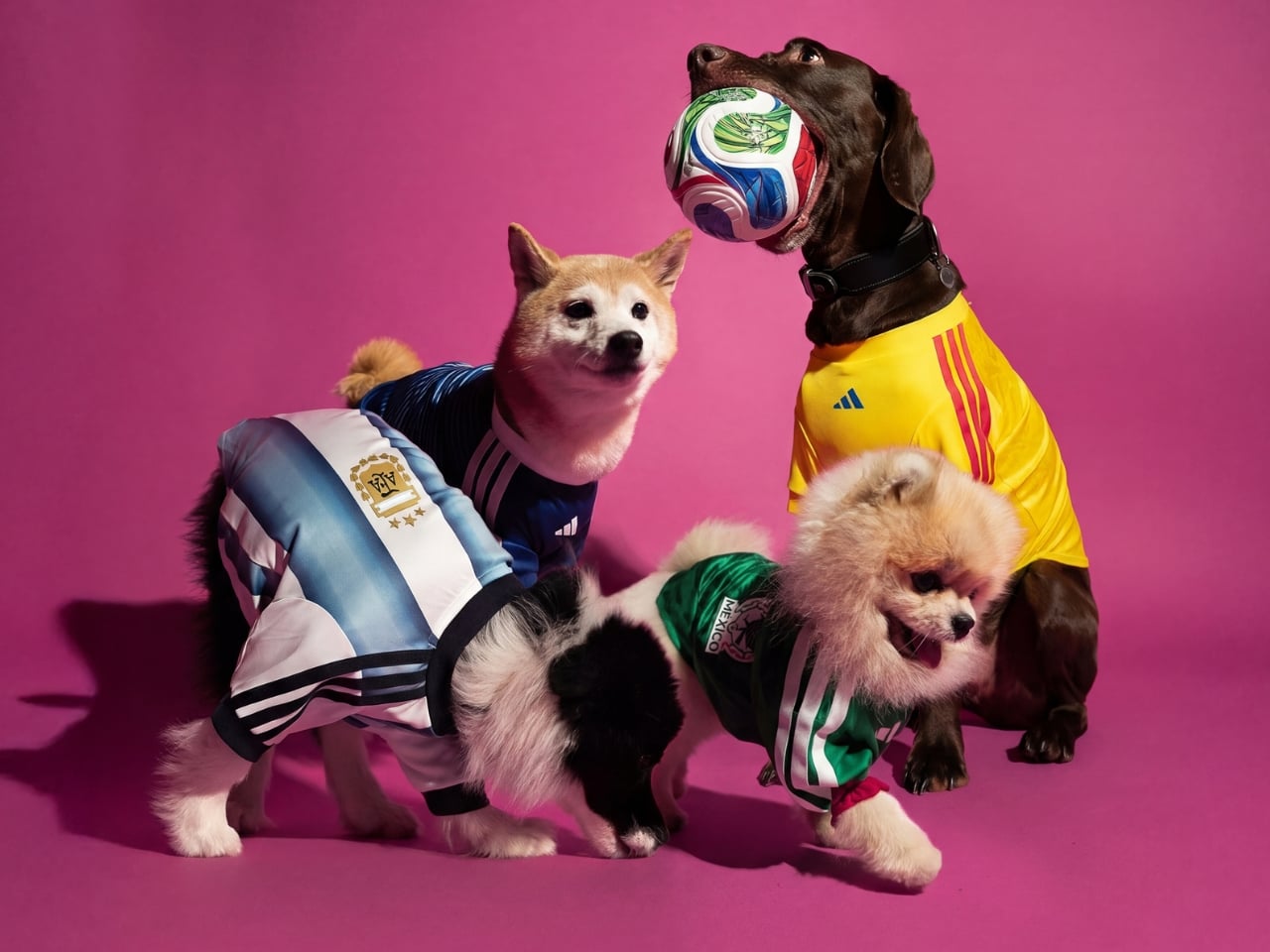
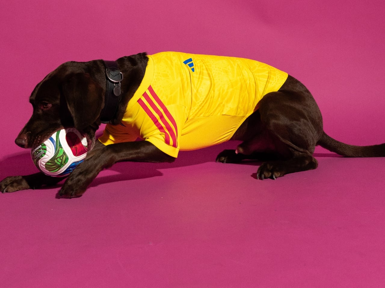
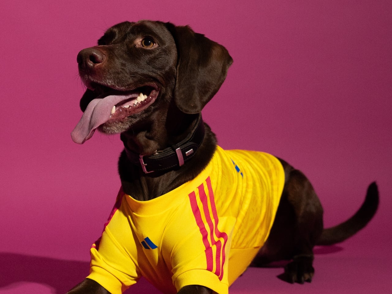
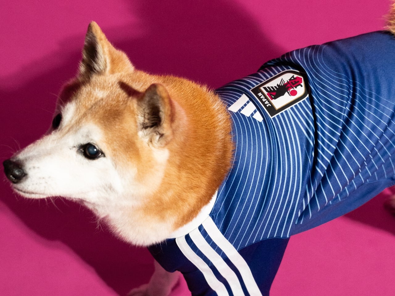
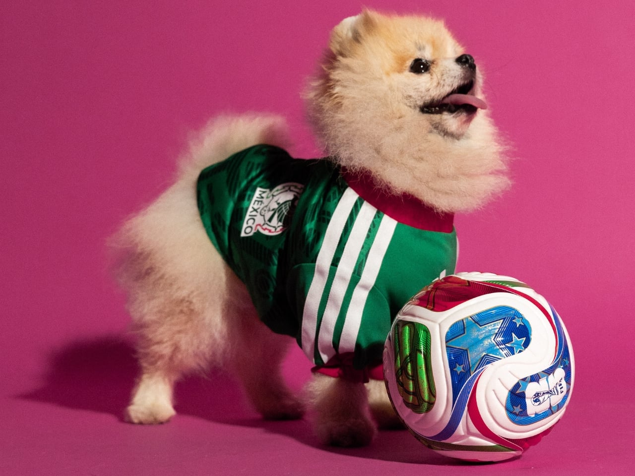
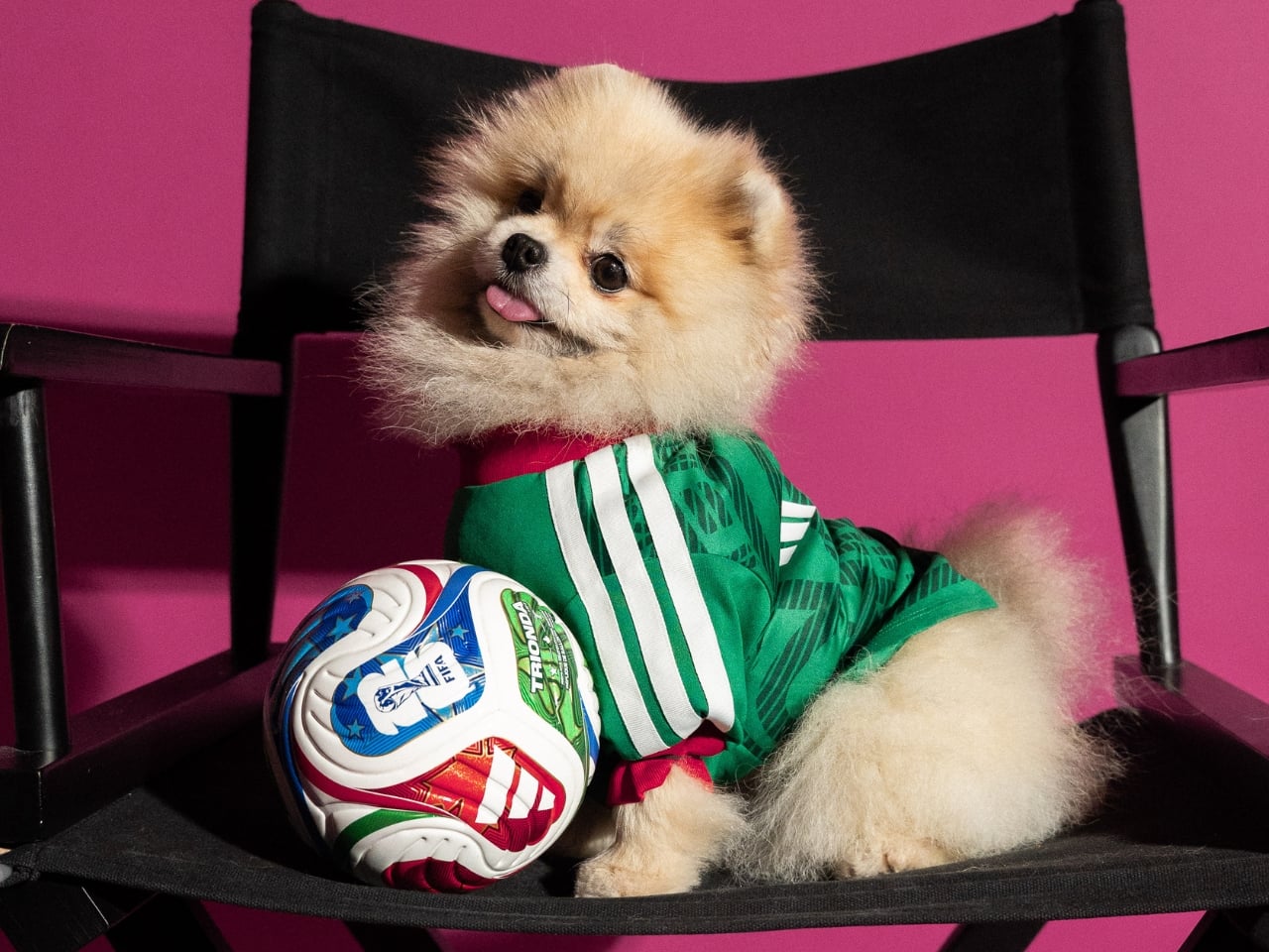
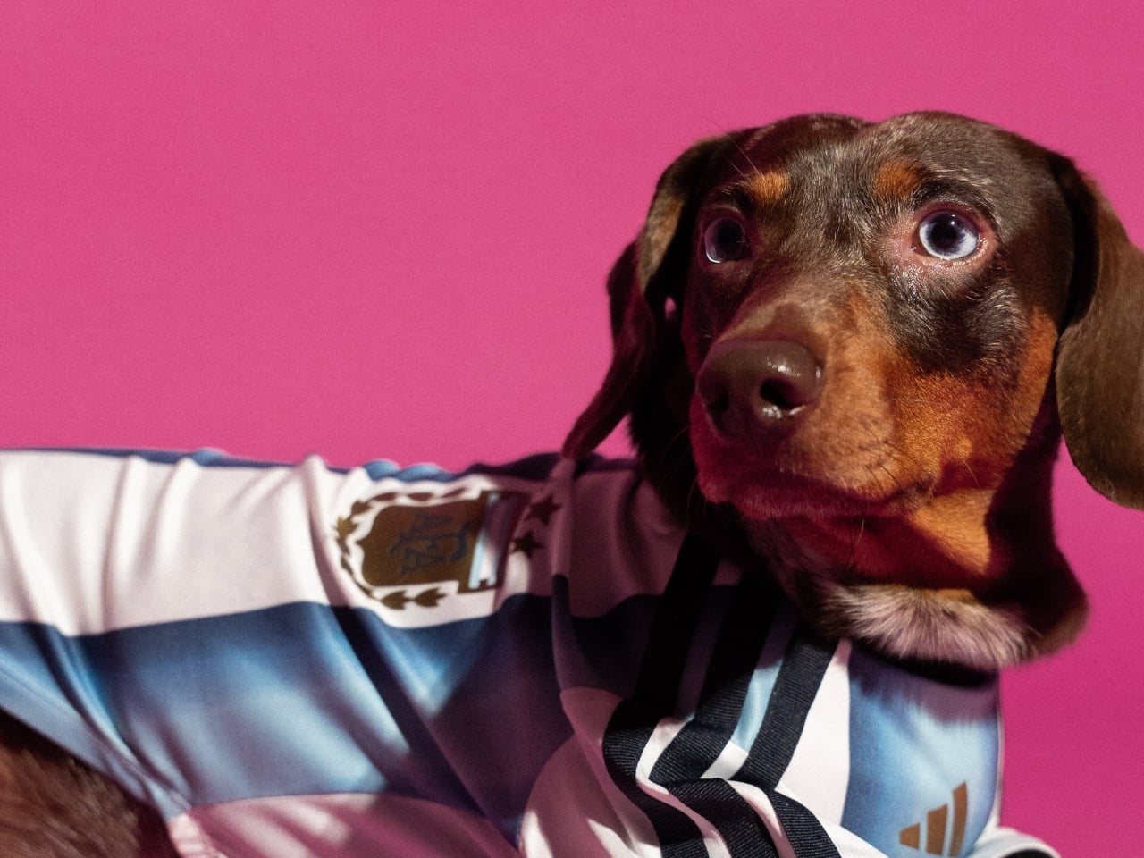
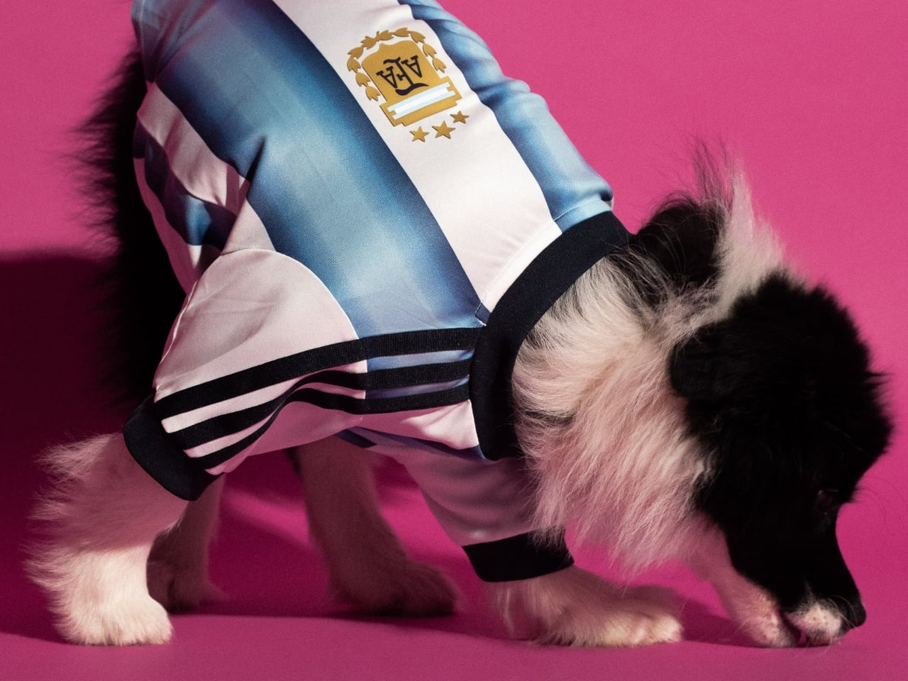
adidas dropped a pet jersey collection for the FIFA World Cup 2026 and I genuinely cannot decide if it’s brilliant or completely unhinged. Maybe both. That tension is precisely what makes it worth paying attention to.
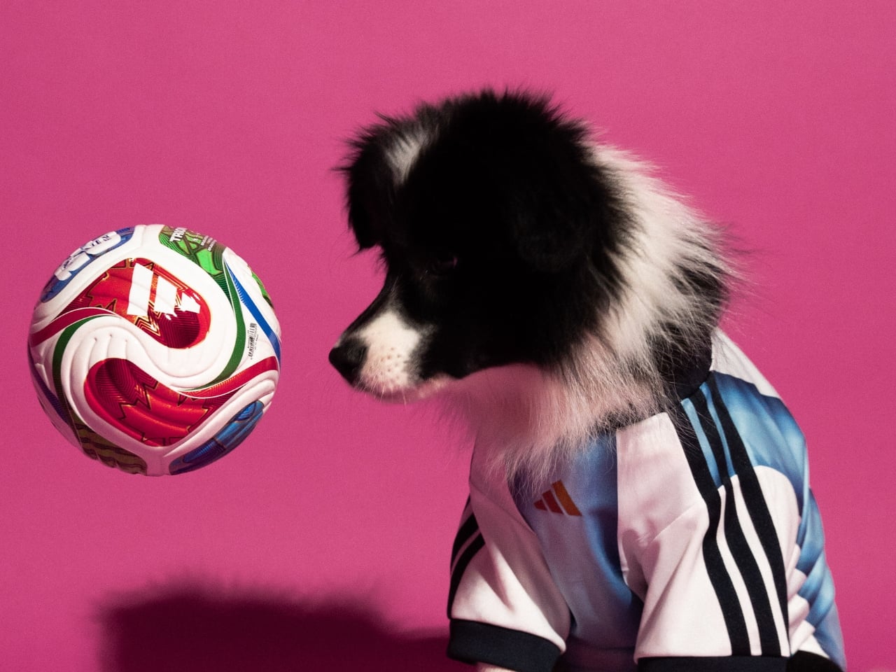
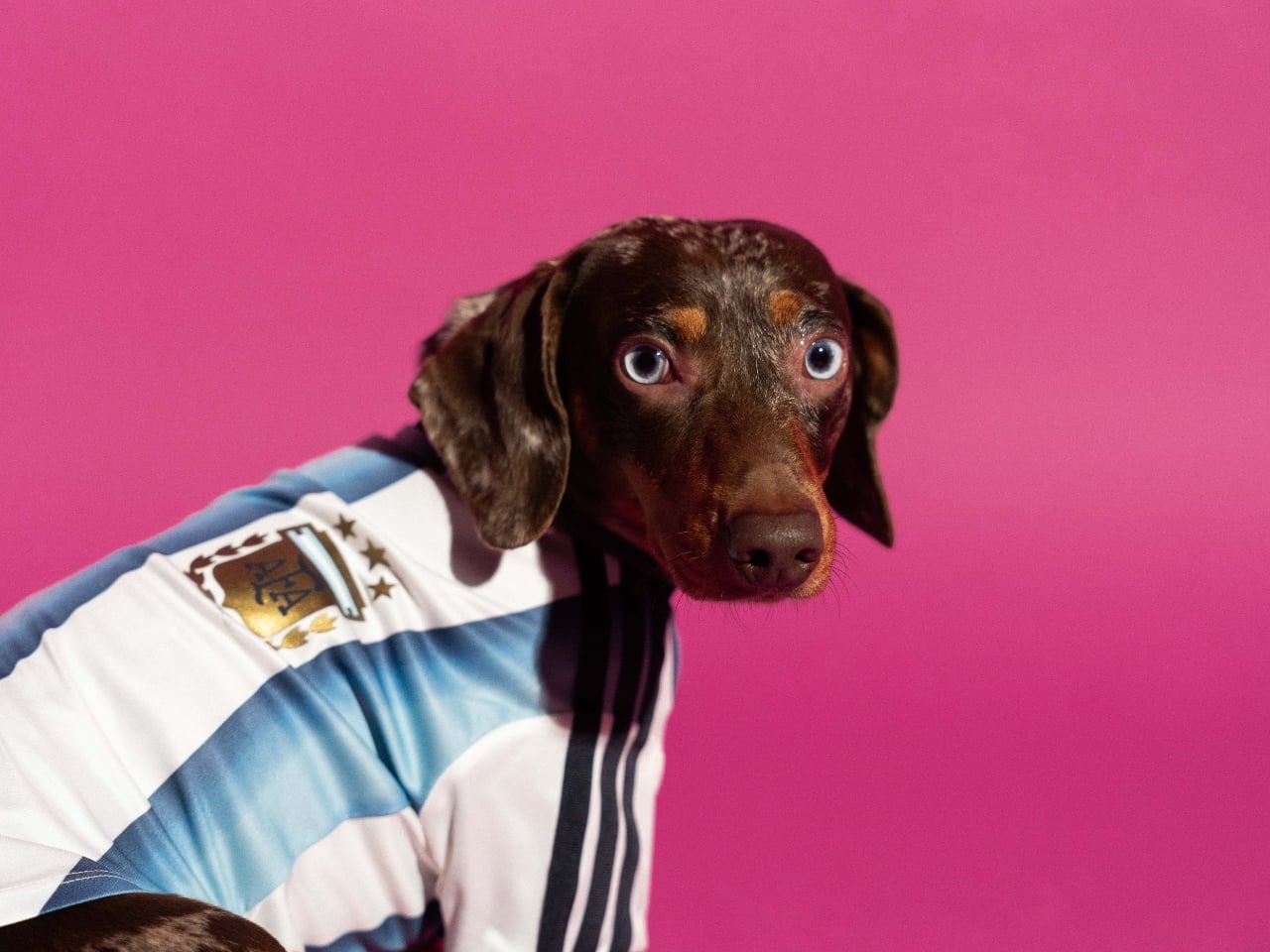
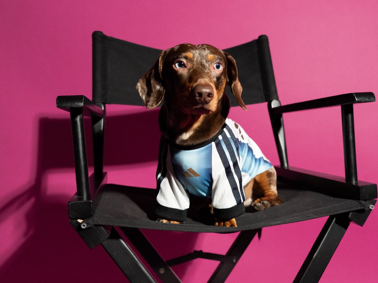
The collection features scaled-down versions of the official home kits for four national federations: Argentina, Mexico, Colombia, and Japan. Each jersey is made with interlock fabric, finished with heat-transferred federation crests and the adidas logo, and sized to fit pets of varying builds. On paper, it reads like a novelty item, the kind of thing that gets a cute Instagram moment and then disappears. But the more I think about it, the more I suspect adidas is operating on a level most people aren’t fully registering yet.
This isn’t the brand’s first move into pet fashion. They released a pet tracksuit collection in late 2025 and followed it up with Lunar New Year designs in early 2026. The World Cup drop is the third chapter, and it’s by far the most culturally loaded. Attaching pet merchandise to the biggest sporting event on the planet isn’t a gimmick. It’s a calculated bet on where consumer culture is right now. People don’t just watch the World Cup. They host parties, coordinate outfits, wear matching kits with their kids, and increasingly treat their pets as full participants in the whole ritual. adidas saw that behavioral shift and decided to meet the moment rather than wait for someone else to.
The design fidelity is where I think they actually earned some genuine respect here. These aren’t generic jerseys with a crest slapped on. The Argentina kit carries the iconic Albiceleste stripes. The Mexico jersey features the Piedra del Sol, the same Aztec sun stone print embedded in the human version. The Colombia and Japan kits follow the same logic: faithfully reproduce the visual DNA of the official tournament kits, just at a smaller scale. That level of attention to detail signals that adidas isn’t treating the pet market as an afterthought. They’re treating it as a legitimate extension of the product line, and that’s a meaningful distinction.
Whether that’s the right move commercially is a separate conversation. The pet economy has been growing steadily for years, and premium pet accessories have become a real, serious category. But there’s also a risk of diluting what a World Cup kit means. A national team jersey carries history, identity, and a specific kind of weight. Putting it on your Corgi is either a celebration of that connection or a softening of it, depending on how you feel about football culture to begin with. I lean toward the former, mostly because fandom has always been about emotional inclusion rather than gatekeeping.
What adidas is really selling here is a shared experience. The visual of a fan and their dog in matching kits is immediately legible as a moment of joy, and that’s not nothing. The FIFA World Cup 2026 runs from June 11 to July 19 across the United States, Canada, and Mexico, which means there’s an entire summer of viewing parties and matchday gatherings where this collection becomes exactly the kind of organic conversation starter that no marketing budget can easily manufacture. You don’t need a big campaign when your product photographs that naturally.
The collection became available on May 1st across North America, Latin America, and selected markets in Asia including Japan, China, Vietnam, the Philippines, and Indonesia, through adidas stores, retail partners, and online. The timing gives fans about six weeks to get their pets game-ready before the opening match. That’s enough runway to make it feel intentional rather than rushed. Is it the most important design release of 2026? Obviously not. But it’s a genuinely smart piece of brand work that understands its cultural moment, respects its source material, and executes with more craft than the premise suggests it deserves. Sometimes that’s enough. Sometimes that’s actually the point.