Tablets Sound Bad, So Motorola Just Put 9 JBL Speakers in One

Entertainment tablets have come a long way in terms of screen quality, but audio often tells a different story. Most of them ship with a pair of speakers that merely get the job done, leaving users reaching for headphones or a separate Bluetooth speaker the moment things need to get louder. The gap between how tablets look and how they actually sound has never been more apparent.

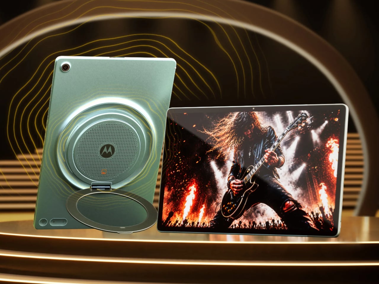
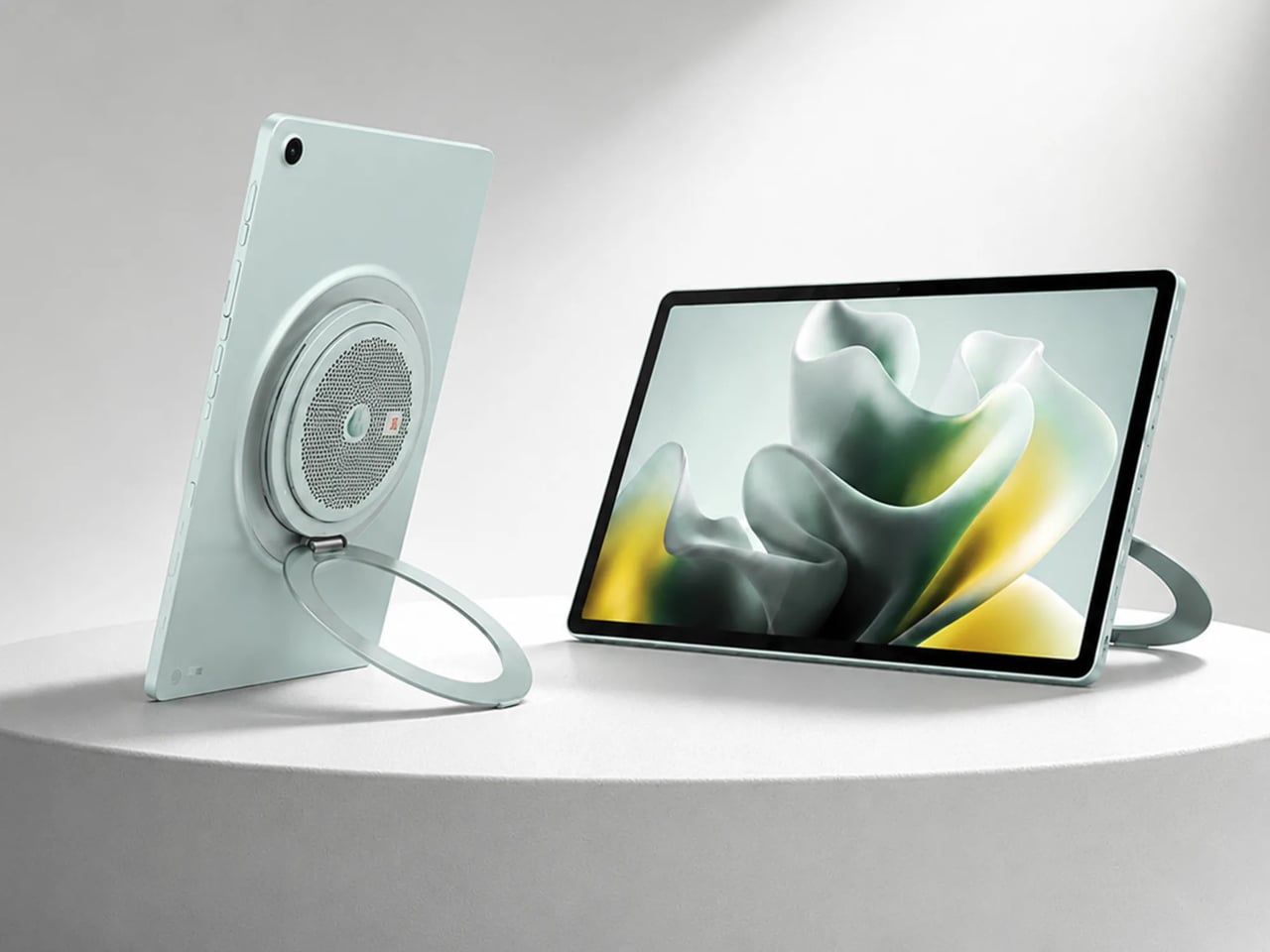
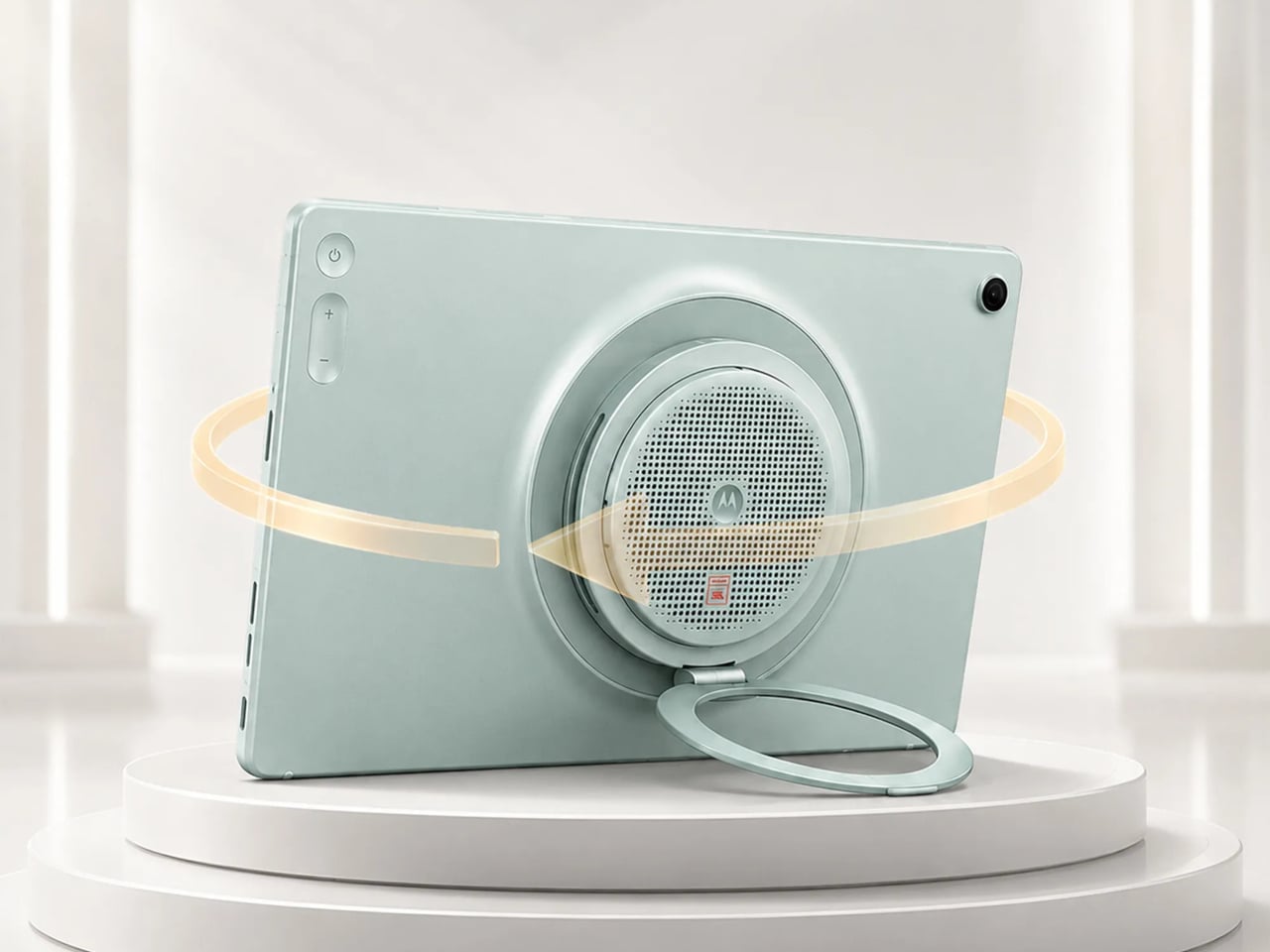
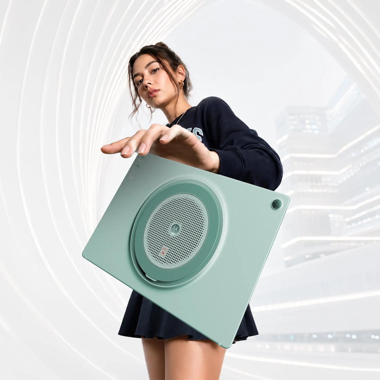
The Motorola Moto Pad 70 Groove is built around a premise that most tablets don’t dare fully commit to: making audio the centerpiece, not an afterthought. It arrives loaded with a nine-unit JBL Pro speaker system, a 12.1-inch 2.5K display, and a 360-degree built-in kickstand, addressing the kind of everyday entertainment scenarios where a standard tablet simply wouldn’t be enough.

Designer: Motorola

The display is well suited for this audio-first identity. The 12.1-inch IPS LCD panel runs at 120 Hz with a 2560×1600 resolution, HDR10 and Dolby Vision certification, and a peak brightness of 800 nits. It’s a smooth, vivid canvas for streaming content, though the real draw is what’s happening on the edges of that screen, where all those speakers live.

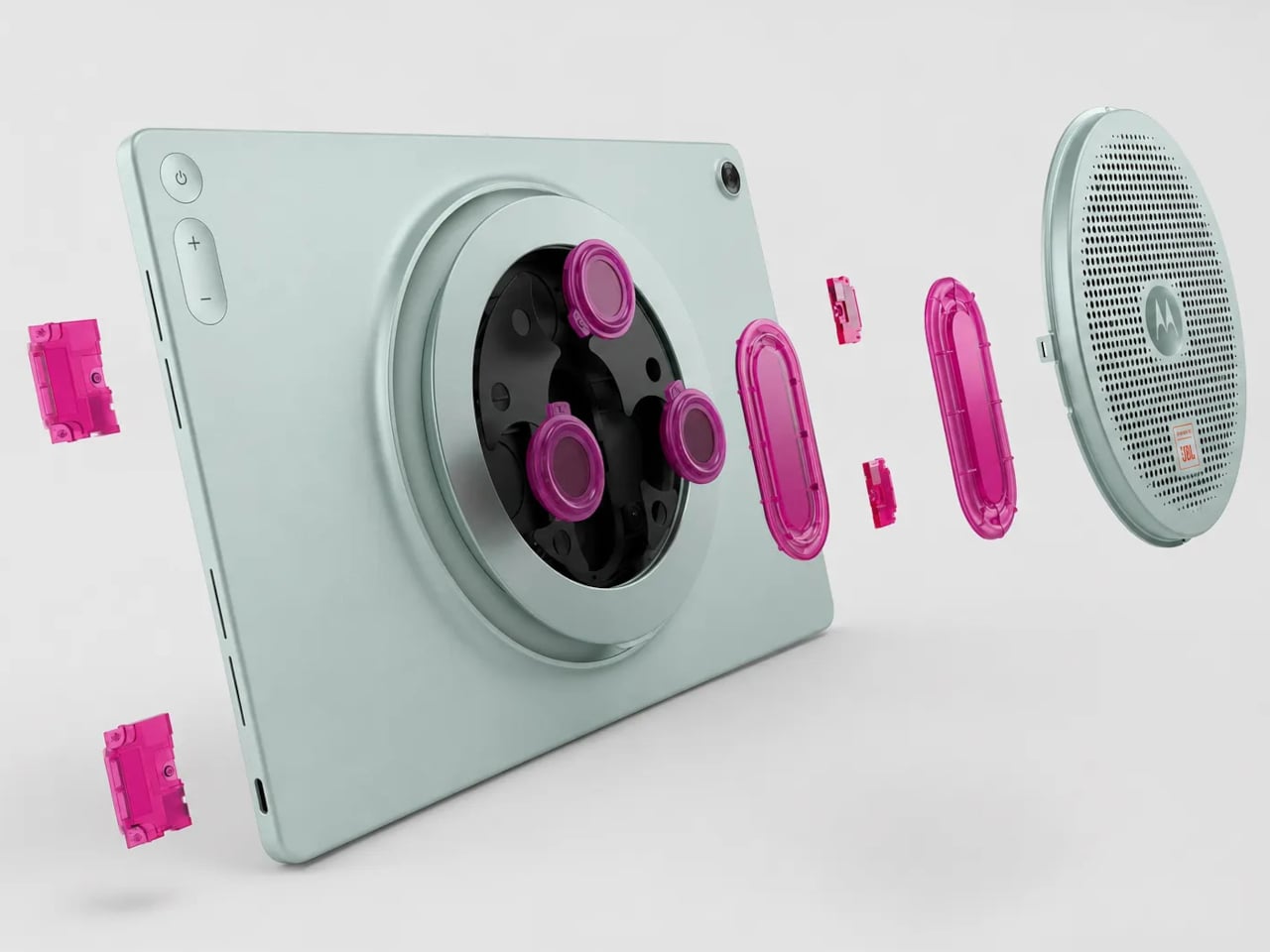
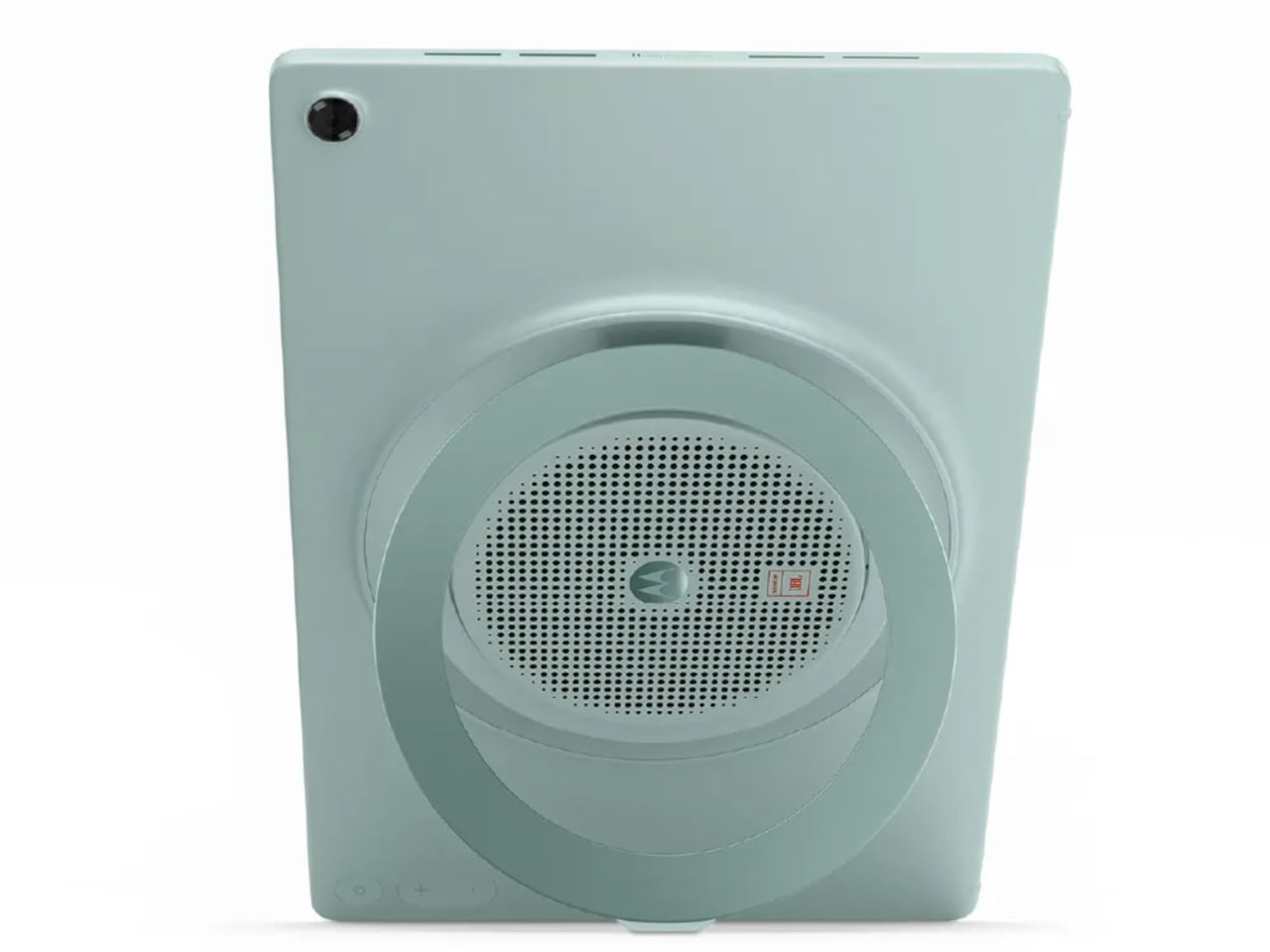
Nine speakers sound like a gimmick until you see what they’re actually made of: four tweeters, three woofers, and two passive radiators, all tuned by JBL and backed by Dolby Atmos. Together, they’re rated to push up to 48W of audio output, which is a lot to ask from a tablet-sized device. It’s the kind of setup that makes you rethink whether you actually need a separate soundbar.

What makes the audio system more interesting is the built-in Bluetooth speaker mode, which turns the Groove into a standalone speaker your phone can control wirelessly. It’s a clever trick for situations where you want music filling a kitchen or a living room during a gathering, without having to keep the tablet actively streaming the content. Dolby Audio further adds Dynamic, Movie, and Music modes for more tailored listening.

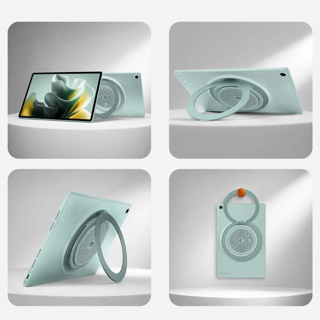
The 360° Kickstand 2.0 adds another layer of flexibility. It supports four positions named Lean, Stand, Theatre, and Hanging, each suited for a different viewing situation. Prop it up on a desk for a video call, tilt it back for a movie in bed, or hang it from a hook when counter space runs out. It’s a practical piece of engineering that doesn’t feel like an afterthought.

Under the hood, a MediaTek Dimensity 7400 chip handles daily tasks alongside 8GB of RAM and 256GB of storage. The 10,200mAh battery keeps extended streaming sessions going, and the 45W TurboPower charging keeps downtime short. The all-metal body in Pantone Blue Surf measures 6.8 mm at its thinnest, though the speaker array at the back raises that to 22.7 mm, creating a distinctive ridge. The Groove ships with Android 16 and Google Gemini out of the box, with Motorola committing to updates through Android 18 and security patches through 2030.

The post Tablets Sound Bad, So Motorola Just Put 9 JBL Speakers in One first appeared on Yanko Design.

Forget Tracking Kids After School, This Cute Device Lets Them Check In

Working parents of school-age children face a particular kind of worry during the hours between the end of the school day and the end of the workday. Phone calls get missed, text messages go unread, and the ones that do get through usually carry just enough information to confirm a child made it home. What they rarely carry is any sense of how the child is actually doing, and that gap tends to get filled with parental anxiety rather than reassurance.

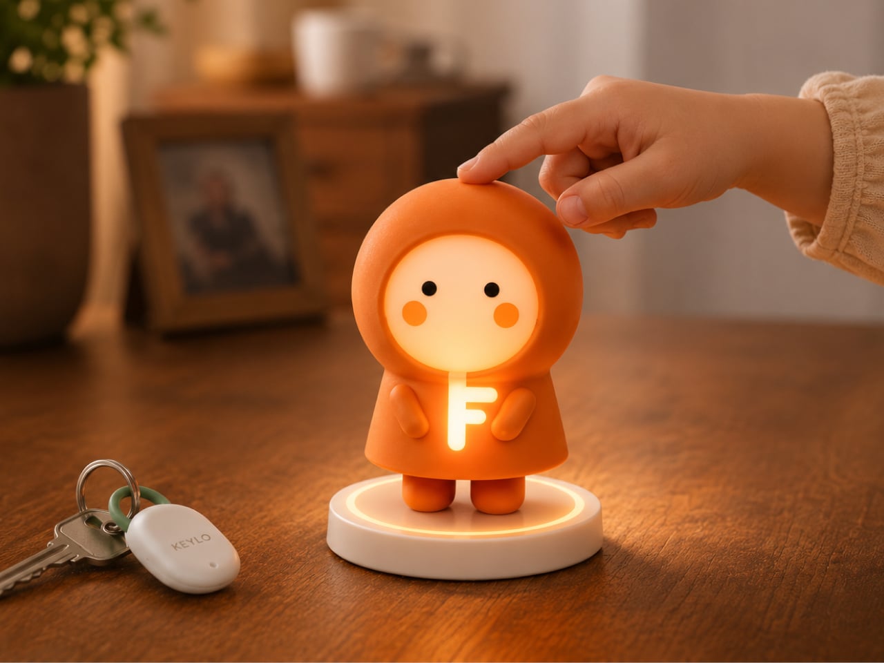
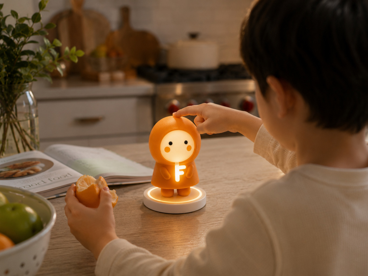
Keylo is a conceptual companion device designed around that specific gap. Rather than giving children another screen to manage or another app to navigate, it offers a single, tactile interaction: a tap that lets them express how they’re feeling. No typing, no calling, no notification chain. The child touches the device, cycles through a color to represent their emotional state, and the parent’s app receives it.

Designer: Miaonan Li

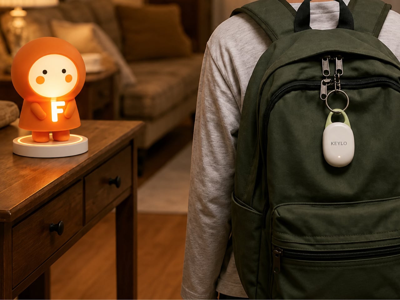
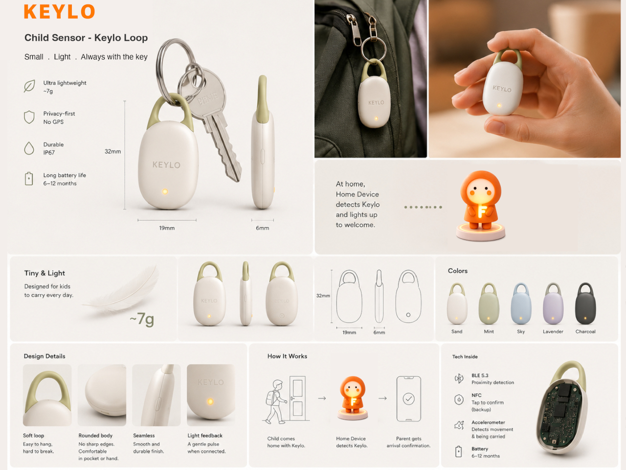
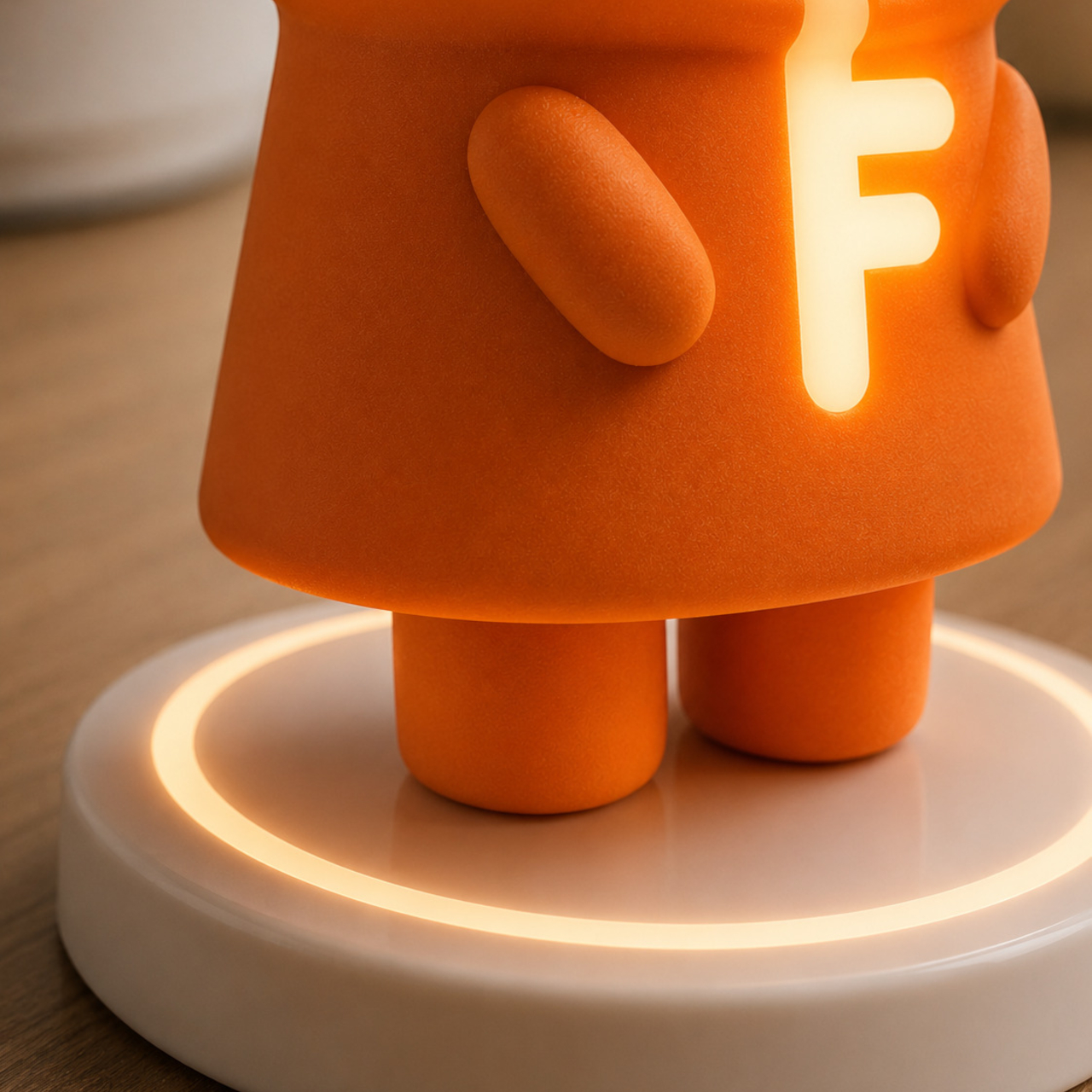
The system consists of three physical parts. The main companion unit sits on a home dock, usually somewhere a child passes when they get home. A smaller key fob clips to a backpack and travels with the child throughout the day. Both are made from soft matte silicone and deliberately avoid any screen or complex interface, giving the object a quality that’s closer to a familiar household item than a piece of consumer electronics.

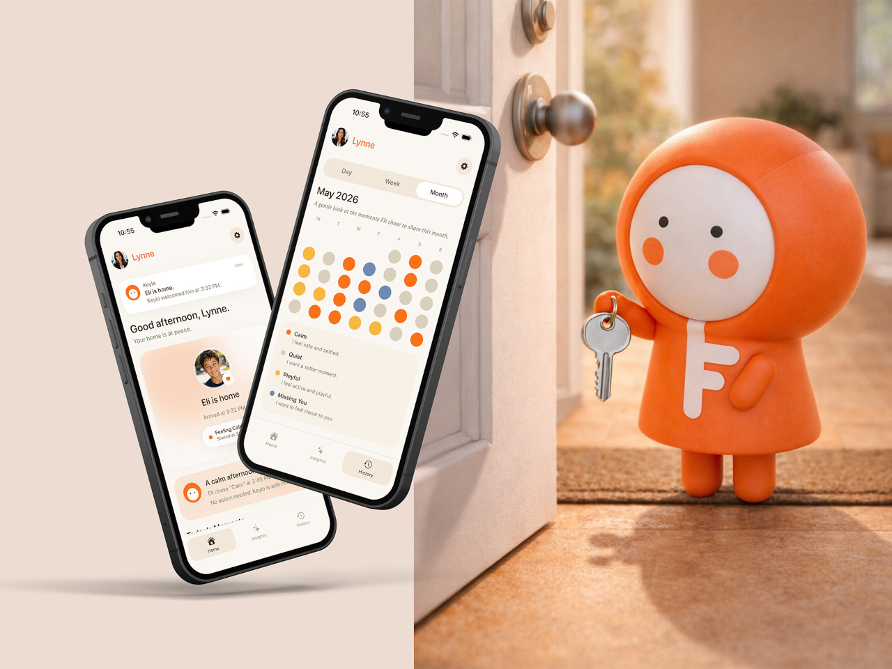
The four emotional states Keylo recognizes are kept intentionally broad. A soft orange glow indicates the child feels relaxed; bright yellow signals something more playful or energetic; a neutral white tone signals a preference for quiet or personal space; and a calm blue light carries a specific message from child to parent: I’m thinking of you. Each one is simple enough for a young child to understand and expressive enough to actually mean something when it arrives on a parent’s phone.

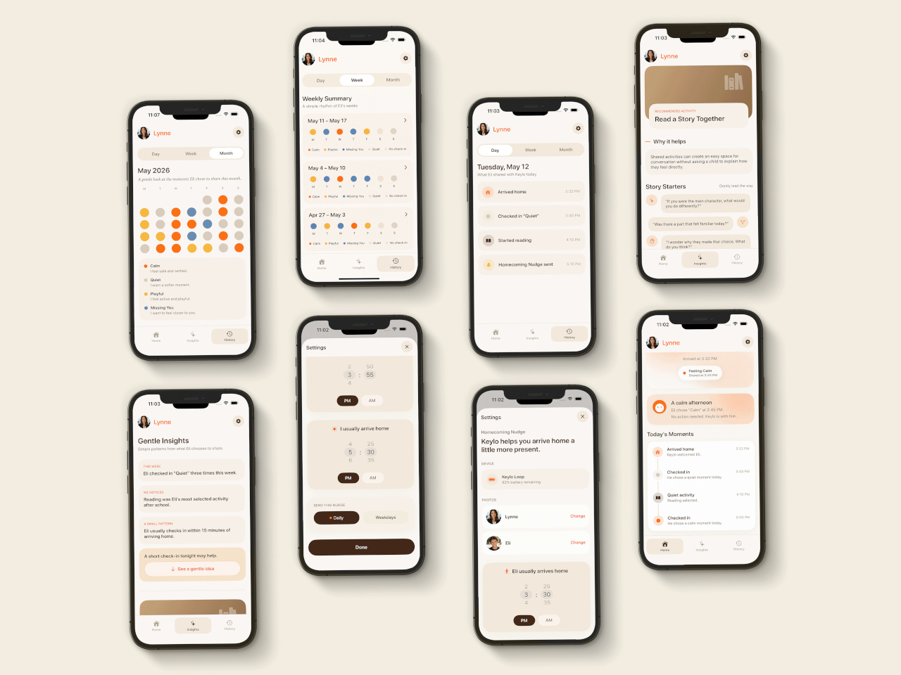
That arrival is handled by the companion app, which mirrors the same color language as the physical device. The distinction the project draws between this and conventional parental monitoring is deliberate. Rather than showing parents a location, a screen time report, or a camera feed, the app delivers a single emotional moment. A notification that says a child is feeling calm and playful carries a different quality of information than a location ping, and it asks for a different kind of response.

The device is designed to work without any input from the child beyond that single tap. There are no prompts to answer, no questions to read, and no follow-up required. For a child who has just walked in the door after school, the low threshold is significant; the gesture stays small enough that it doesn’t feel like a chore, which is probably the main reason most family communication apps get abandoned within a few weeks of being set up.

What Keylo explores through its design is how much emotional information can be conveyed through the simplest possible interaction. A color chosen by a child carries less data than a voice call but far more than no contact at all, and it arrives without interrupting anyone’s afternoon in the way a ringing phone does. The project makes a case for the idea that the volume of communication matters less than whether it happens at all, and on terms that feel natural to the person sending it.

The post Forget Tracking Kids After School, This Cute Device Lets Them Check In first appeared on Yanko Design.

Bang & Olufsen’s New Speaker Concept Is a Ritual, Not a Device

Most speakers are designed to disappear. They sit on a shelf, blend into a bookcase, or hide in a cabinet, quietly doing their job until you need them and then fading back into the background. Mårten Malmnäs, a graduate from the Umeå Institute of Design, designed something that pushes back against all of that.

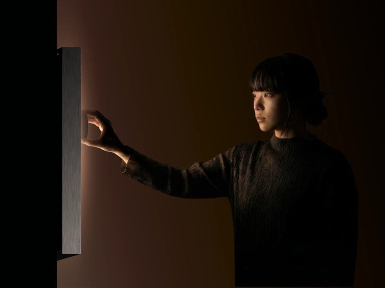
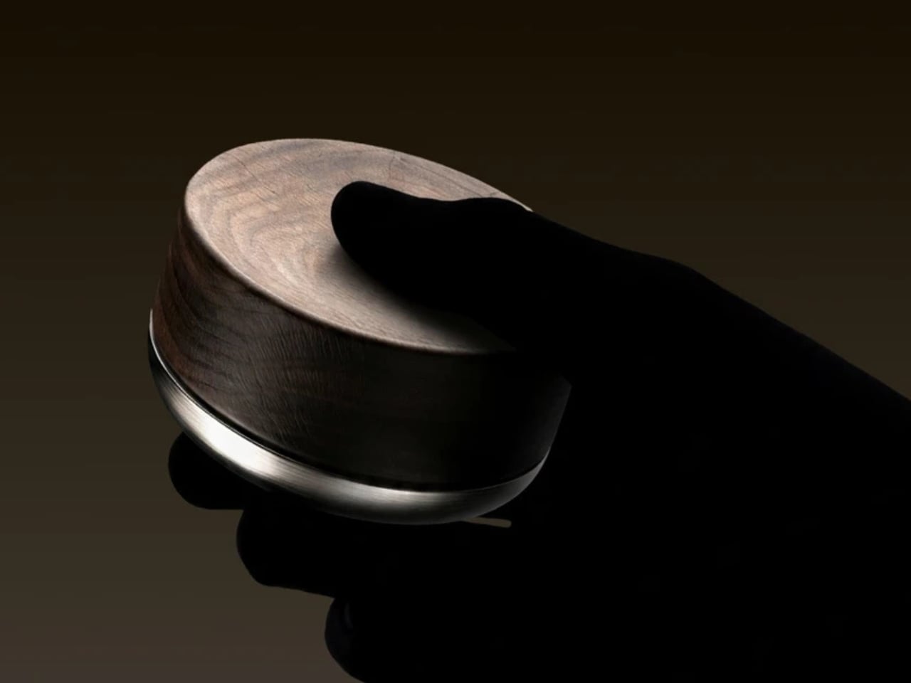
The Beosound Tableau is a wall-mounted audio object developed in collaboration with Bang & Olufsen. Malmnäs calls it “a fireplace for music,” an instrument not just for listening, but for living. The moment I read that, I had to stop. Because I’ve never heard a speaker described that way before, and suddenly, I couldn’t think of a more fitting comparison.

Designer: Mårten Malmnäs

Think about what a fireplace actually does. Yes, it produces heat, but that’s almost beside the point. A fireplace creates presence. It becomes the thing a room organizes itself around. People pull their chairs toward it, conversations happen because of it, and its absence is genuinely felt. That’s a completely different design brief than “fits on your desk” or “connects to your phone.”

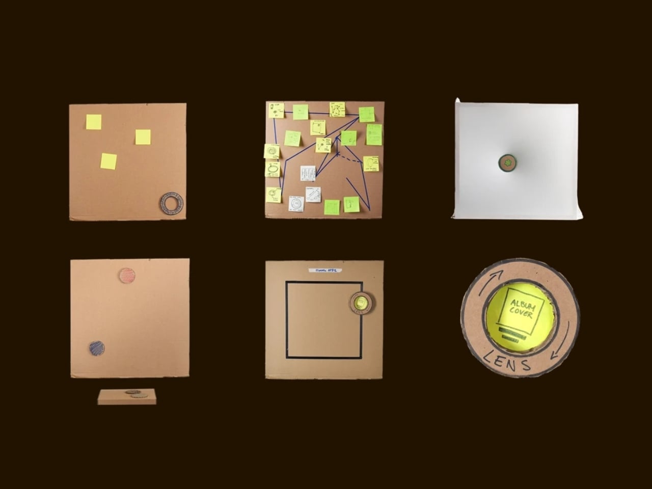
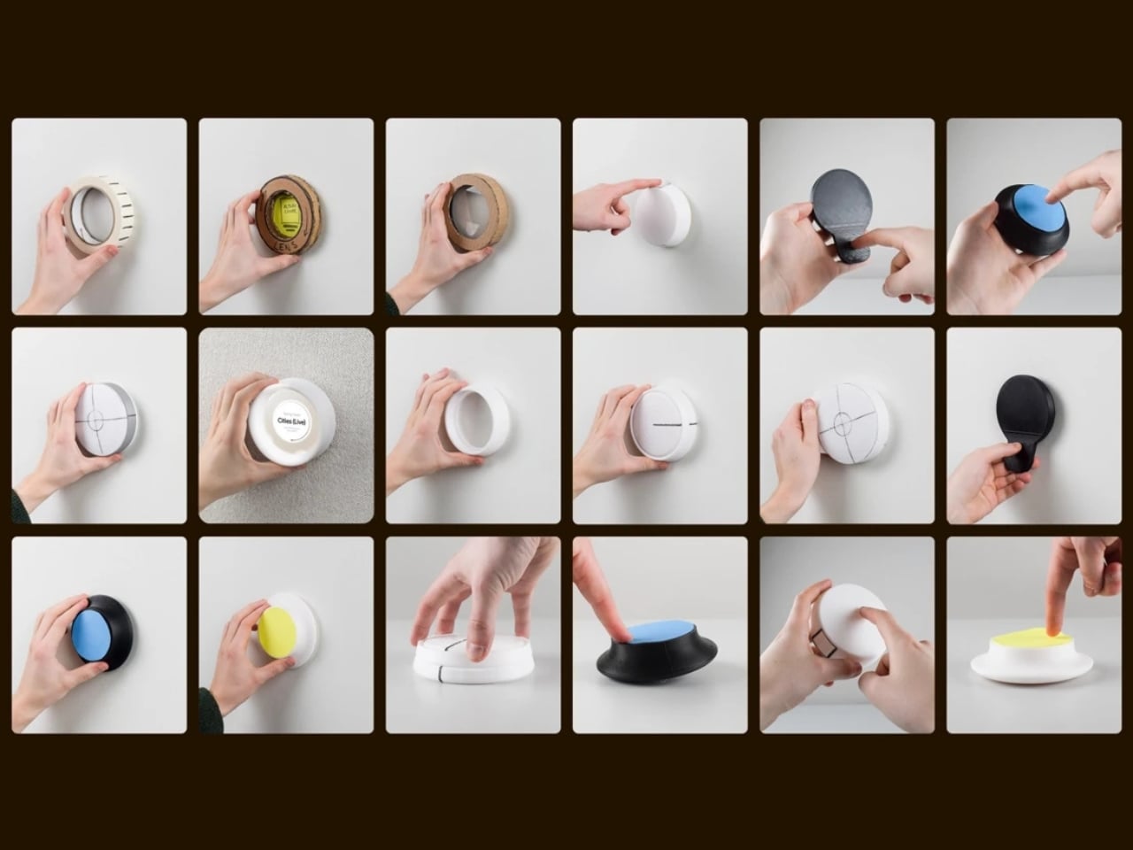
Malmnäs started the project with a design probe, a research method that explores the relationships people have with their homes, and from that came a set of experiments around values and behaviors. Eight experimental directions emerged from the ideation phase, spanning different input and output formats. Three of those directions clearly answered the design responsibilities he’d set for the project, and their shared qualities pointed toward one resolved object.

Here’s where it gets interesting. The original concept for the Tableau was screen-based, but a method called Wizard of Oz testing, where a human simulates the system to observe how people actually interact with it, pushed the design somewhere more honest. The interaction model shifted from screens to navigation by sound. And the principle that came out of it became the foundation of the whole concept: the most honest interface for a music object is music itself.

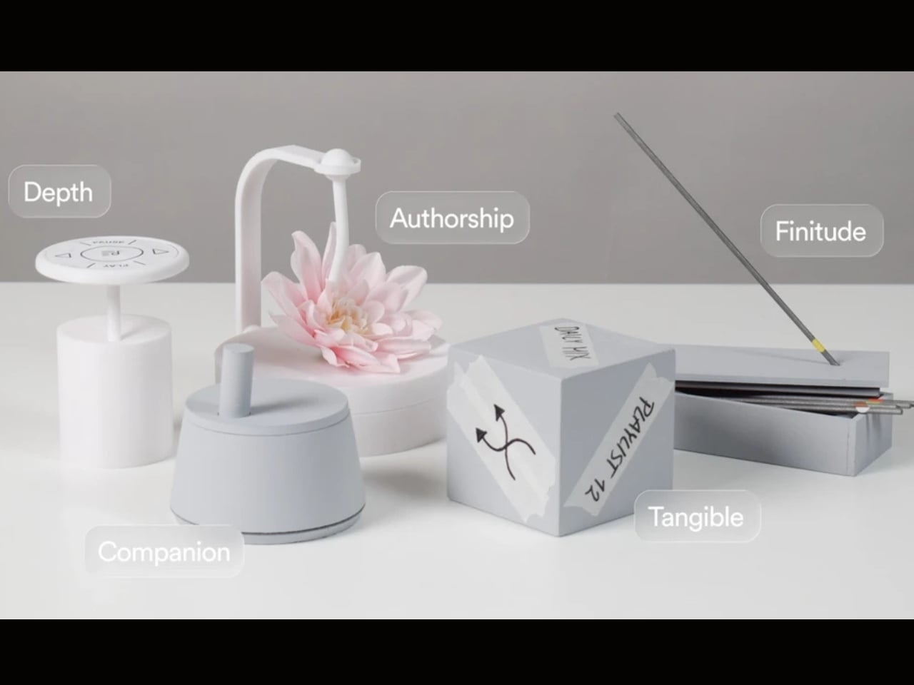
That’s a provocative idea. We’ve spent years layering more and more visual UI on top of audio experiences. Every streaming service competes on the complexity of its recommendation algorithm, the visual polish of its playlist covers, the grid of album art. Malmnäs argued the opposite, that sound should speak for sound. The result is the Sonic Token, a physical object that mediates between the listener and the Tableau. Tactile, intentional, and completely different from scrolling a touchscreen.

The Tableau is positioned as a focal thing for the home. An object to gather around and tend to. That language is deliberate, and it’s also a little radical. “Tending” to an audio object implies care and attention, a relationship rather than a transaction. You don’t tend to a Bluetooth speaker. You don’t gather around an app.

Bang & Olufsen has always occupied a rare space in the audio world, where design and sound hold equal weight, and where a product can belong in a design museum and still deliver extraordinary sound. But even by B&O’s standards, the Tableau concept asks a genuinely new question: what if the speaker were the focal point of the room, rather than just a feature of it?

There are fair questions about how a concept like this survives beyond a graduate show. The hands-on, material-driven process Malmnäs used, with 1:1 mock-ups and rigorous testing of the Sonic Token’s form and function, suggests this isn’t a vague idea dressed up in renders. It was built and tested as a real object. Whether it eventually reaches production or stays as a collaborative concept between a student designer and one of the world’s most revered audio brands is another matter.

But the value of the Beosound Tableau isn’t only in whether it ships. It’s in the question it refuses to let go of: why have we settled for speakers that ask nothing of us? The alternative, a speaker that earns its place on the wall, makes music feel like a gathering, and treats sound like something worth being present for, sounds like exactly what the living room has been missing.

The post Bang & Olufsen’s New Speaker Concept Is a Ritual, Not a Device first appeared on Yanko Design.

Forget Lithium. Algae Might Be Powering Your Devices Next.

Every time I replace a battery, I think about where it ends up. A AA battery in a remote control, a watch battery in a smoke alarm, the little round one rattling around in a drawer because nobody knows what to do with it. We go through billions of them every year, toss them out without much thought, and then mine more lithium from the earth to make the next round. It’s a loop that’s hard to break, and harder still to look at clearly. But what if the alternative was something alive?

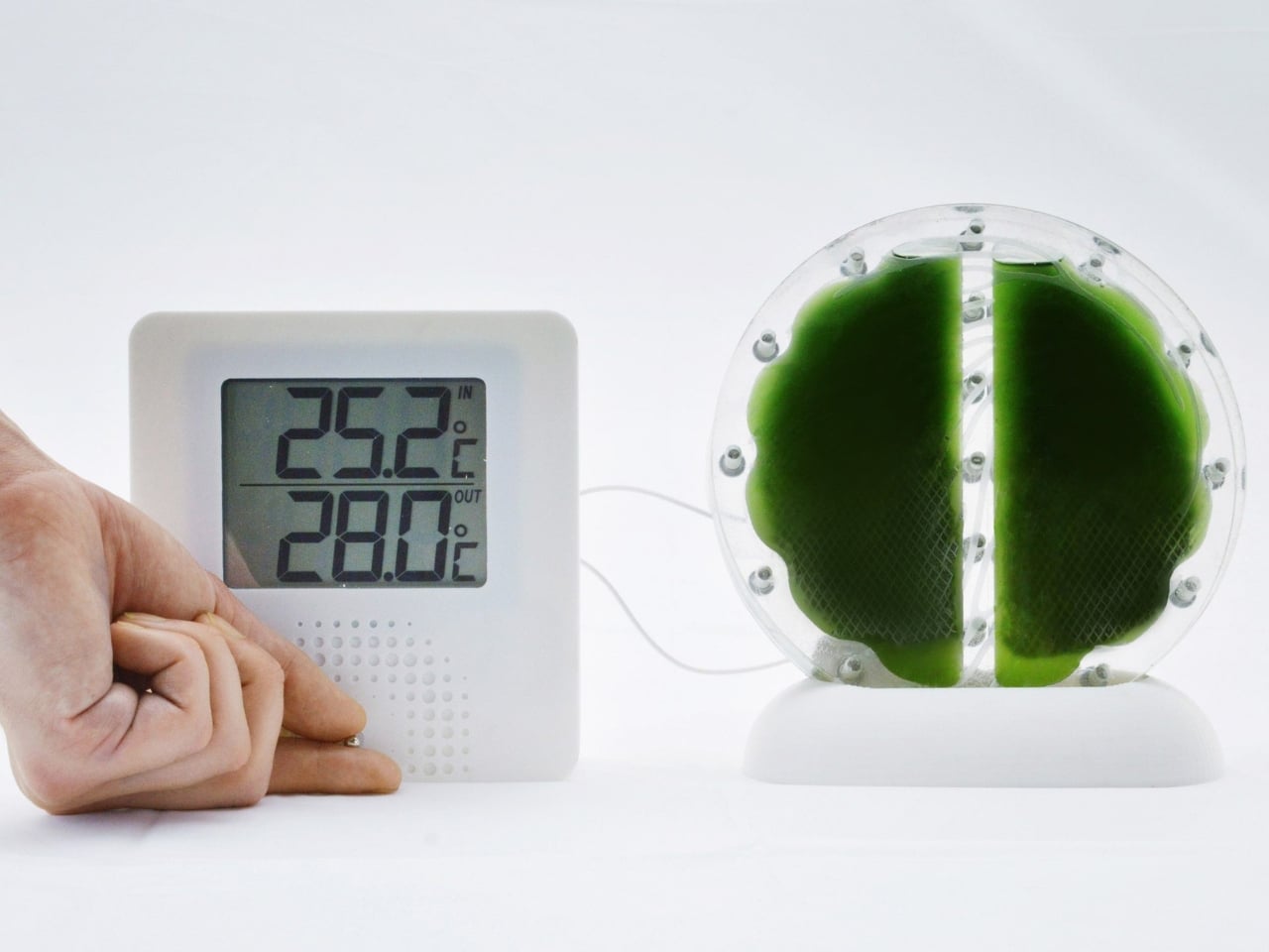
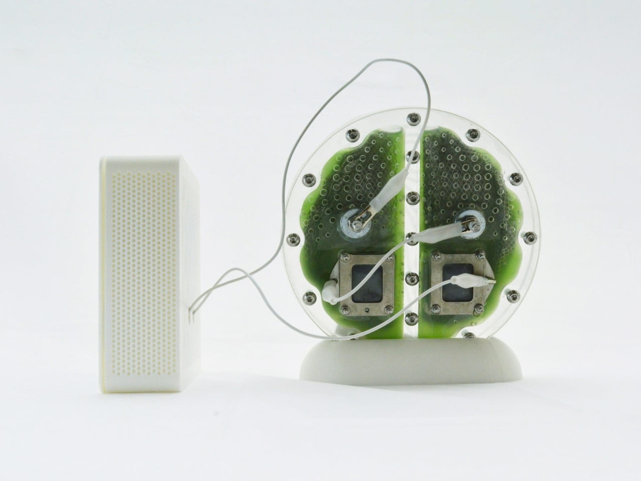
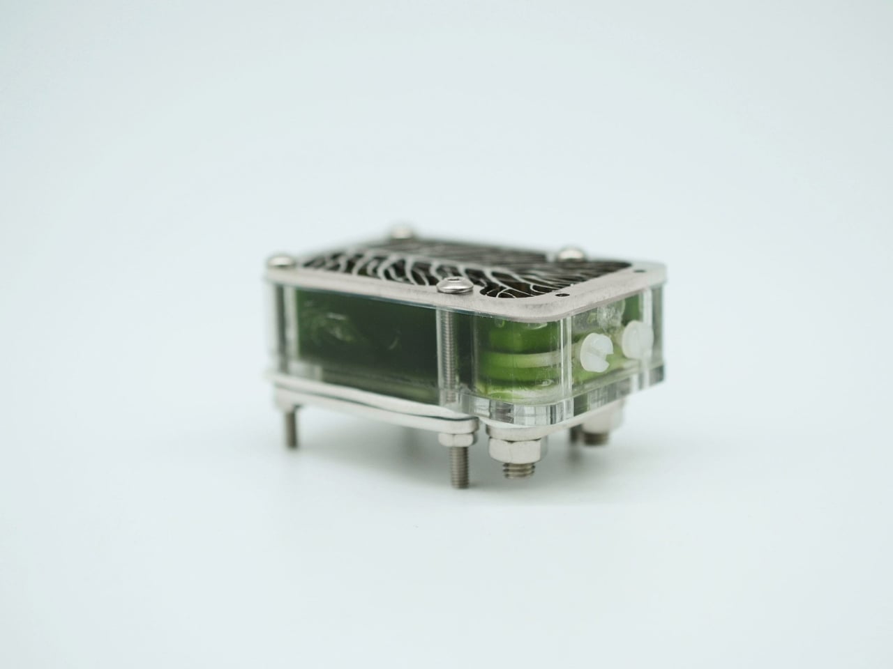
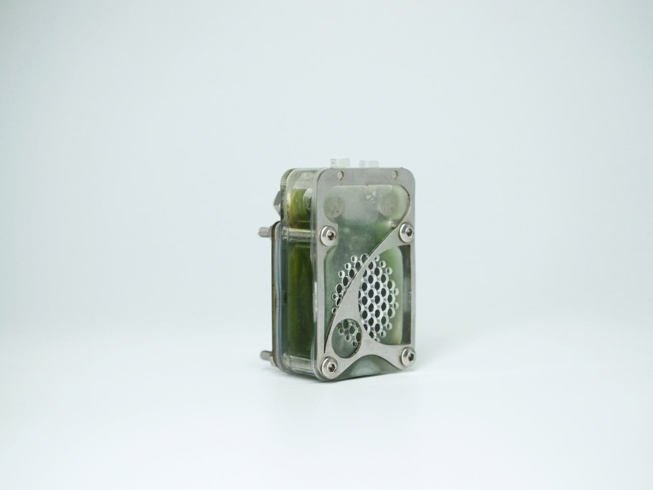
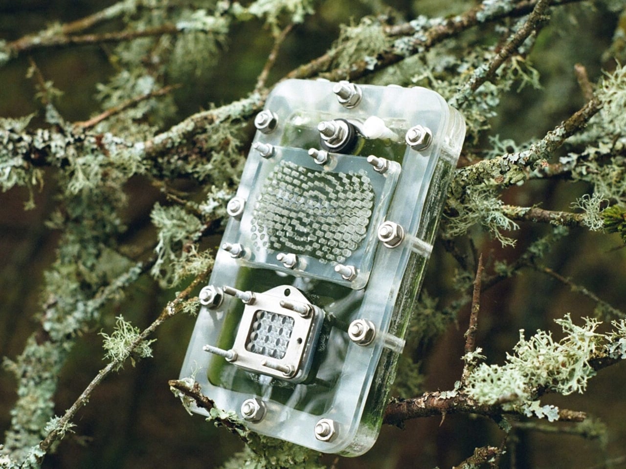
Bio-designer Lucia Giron, working alongside the University of Cambridge’s Department of Biochemistry and electrical engineer Lifu Tan, has developed prototypes of an algae-based battery alternative called a biocell. The science behind it is called biophotovoltaics, which works like a biological solar panel. Living microorganisms, specifically cyanobacteria (which most of us know as blue-green algae), carry out photosynthesis and generate an electrical current in the process. They take energy from sunlight and feed on carbon dioxide to grow. And crucially, the electricity keeps flowing even when it’s dark.

Designers: Lucia Giron and University of Cambridge’s Department of Biochemistry

Cyanobacteria have been generating electricity in the Cambridge labs for over six years now. Not in theory. Actually generating. That number stopped me when I first read it. The potential scale of this is worth paying attention to. Professor Chris Howe, the project’s principal investigator, puts it plainly: disposable batteries are very bad for the planet. Conventional batteries are built with mined materials like lithium, which carry a range of environmental costs from extraction to disposal. The researchers believe biocells could one day eliminate the need for the small chemical batteries powering everyday devices like remote controls, smoke alarms, and sensors. Paolo Bombelli, one of the Cambridge researchers behind the project, has said their aim is to get rid of the need for batteries altogether.

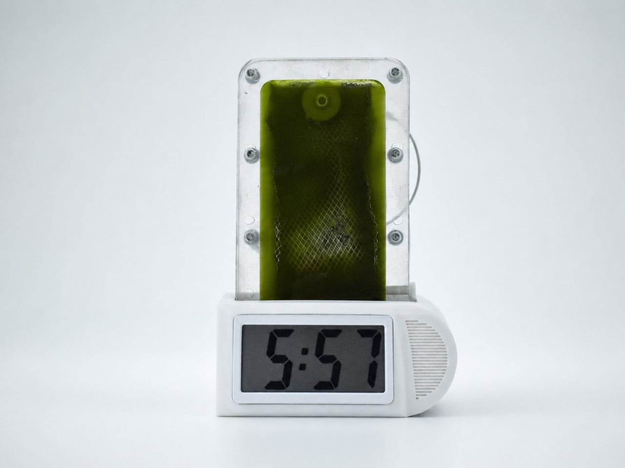
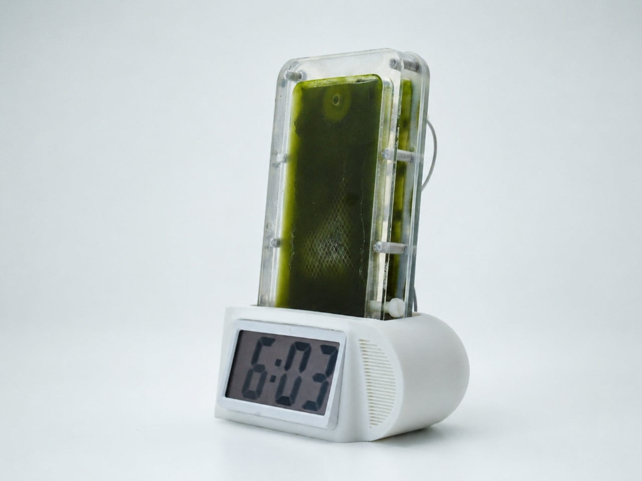
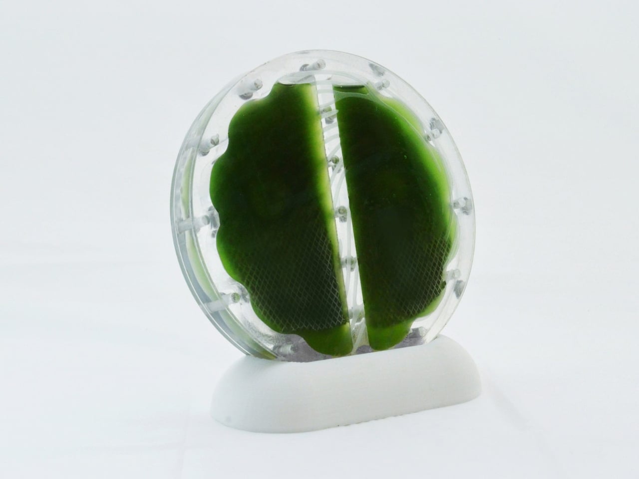
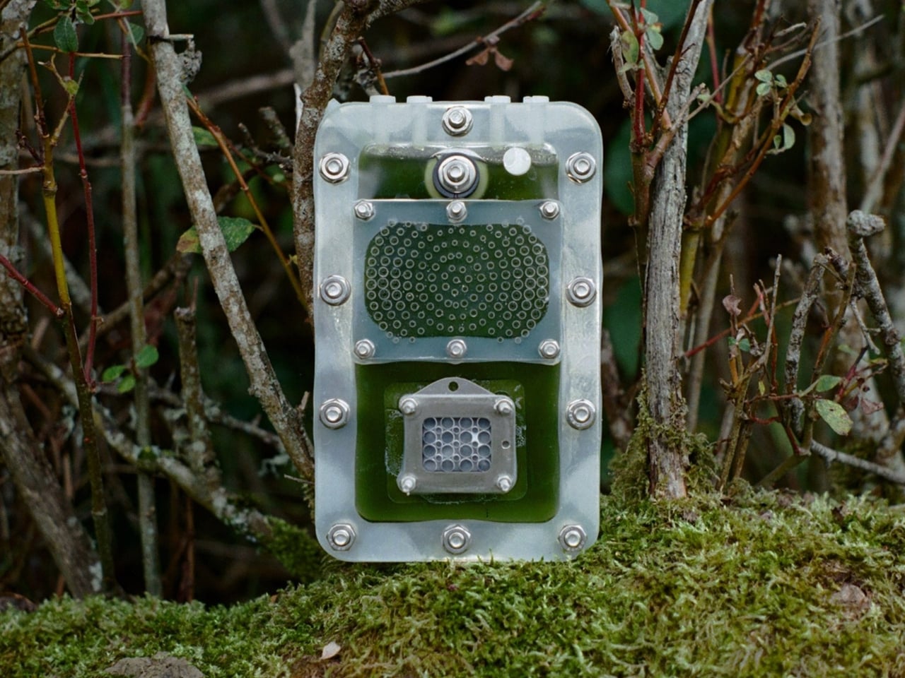
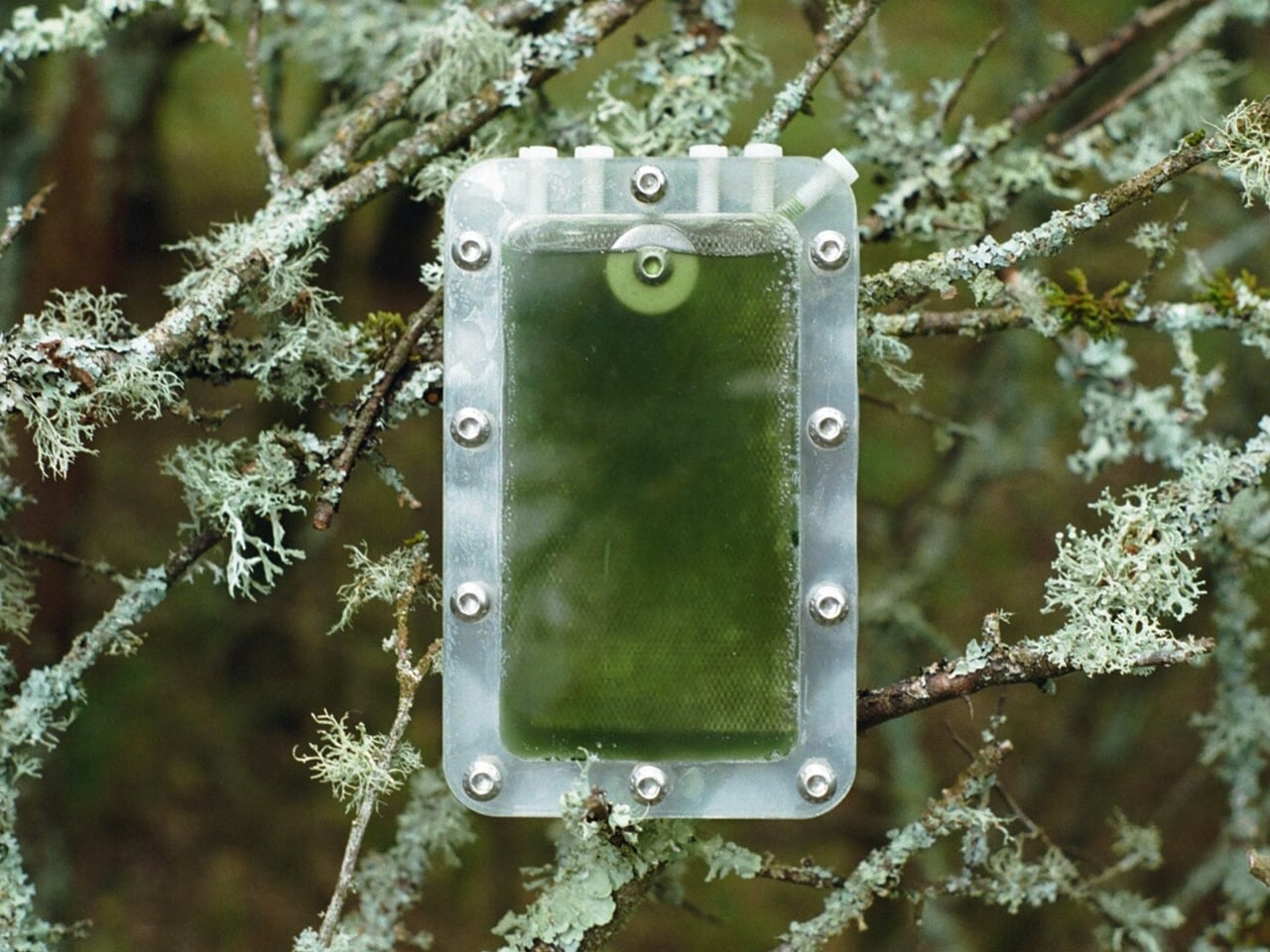
That sounds bold, but the team has already proven the concept beyond the lab. Giron designed a demonstrator cell (essentially a compact, transparent case filled with green-tinged cyanobacteria) as well as a clock radio and a temperature sensor, both powered by biophotovoltaic panels. There’s also a system that monitors a potted plant, reading light levels, air temperature, and soil moisture, all powered by the algae cells. The data feeds directly into a mobile app. It’s the kind of object that makes you look twice, because nothing about it reads as conventional technology.

Giron’s role here is genuinely interesting. Coming from an art and design background rather than a science one, she was brought in specifically to translate the research into something legible to the rest of us. Her goal, as she’s described it, is to find ways of making these prototype living systems into real-world sustainable energy solutions. The demonstrator cell wasn’t designed to be hidden away in a lab. It was designed to communicate, to make biophotovoltaics feel tangible and approachable to a new audience.

The team has since launched a startup, e-Pho, and is exploring commercial applications with prospective clients. They’ve also developed a classroom toolkit where students can grow algae, assemble biocells, and test how different materials affect performance. That last part feels significant to me. Getting a technology into classrooms before it reaches shelves is a way of building familiarity and, more importantly, building the next generation of people who don’t think twice about energy coming from something alive.

We’re at a stage where the biocell can power small, low-energy devices reliably. The researchers are clear that it’s not yet a replacement for your phone charger. But the trajectory is what matters, and it’s pointing somewhere genuinely different from where the battery industry has been going for the past century.

Algae is not the flashiest material to build a future around. It doesn’t have the gleam of a new chip or the cultural momentum of a wearable. But it eats light, feeds on carbon dioxide, and keeps going. For a technology, that’s a remarkably good résumé.

The post Forget Lithium. Algae Might Be Powering Your Devices Next. first appeared on Yanko Design.

Replace 100 Tutorial Videos With This One Smart Keyboard

If you’ve ever tried to learn Photoshop, Illustrator, or pretty much any serious creative software on your own, you know the ritual. Open the app, watch a tutorial, pause the tutorial, switch back to the app, forget what you just watched, rewind, watch it again, lose your place in the project, repeat. It is a loop that is less about learning and more about surviving, and it is the reason so many people quietly give up on tools they actually want to use.

Designer Ming Sheng Shih clearly knows this frustration, because KeyFlowAI is built around that exact problem. The constant back-and-forth between tutorial and practice does not just slow you down; it breaks the thread of whatever you were trying to create. And once that thread snaps, getting back into it takes more energy than most beginners have left after the third rewind.

Designer: Ming Sheng Shih

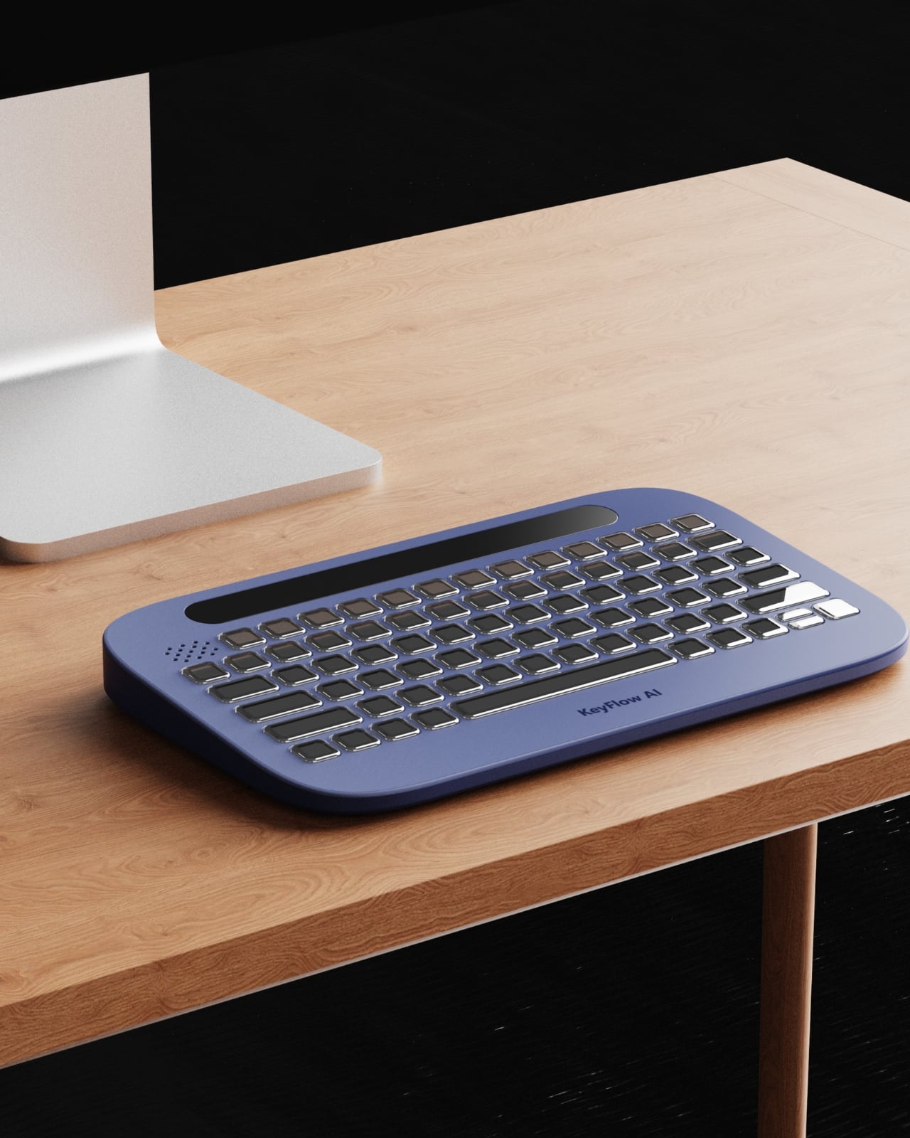
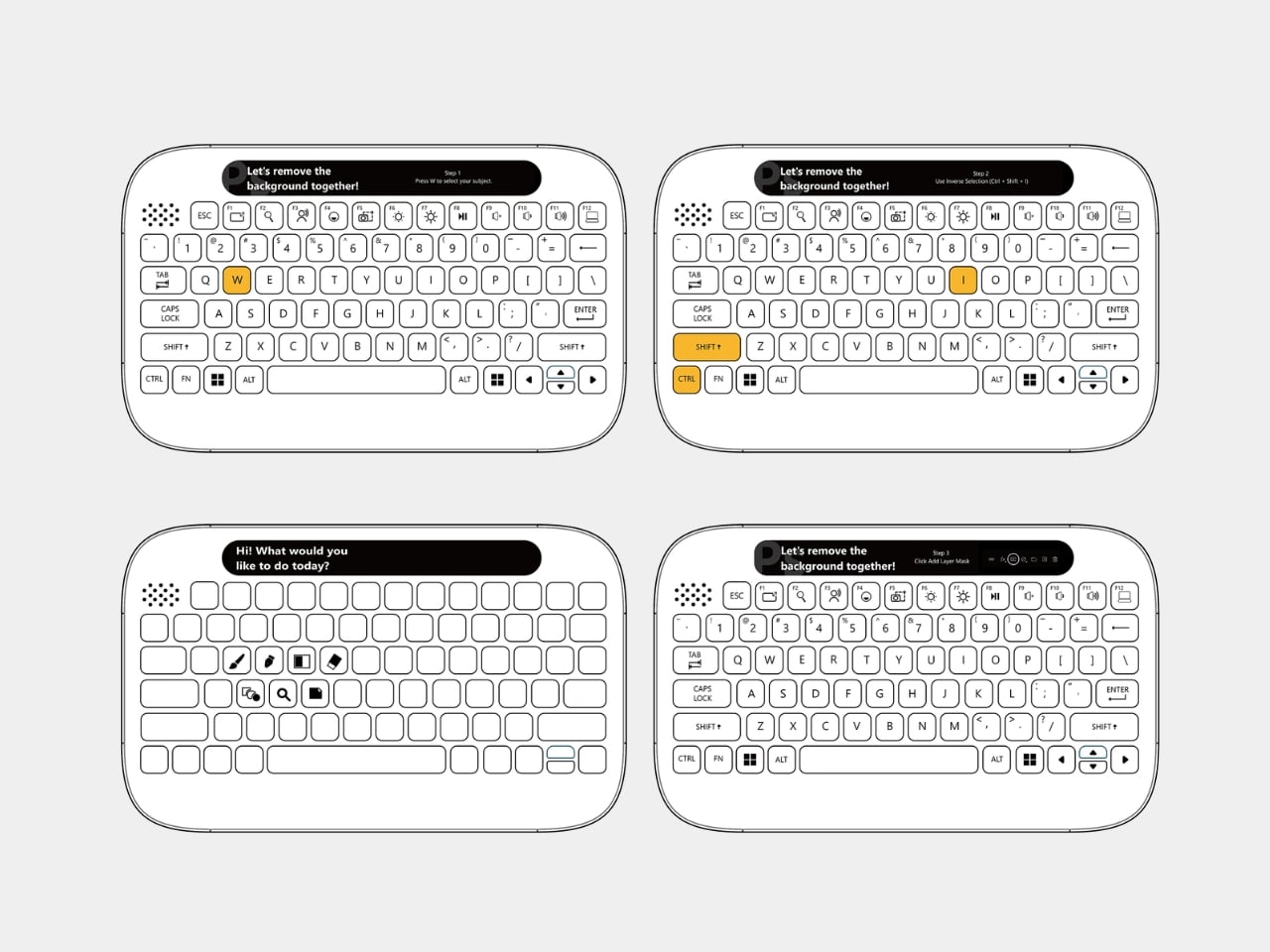
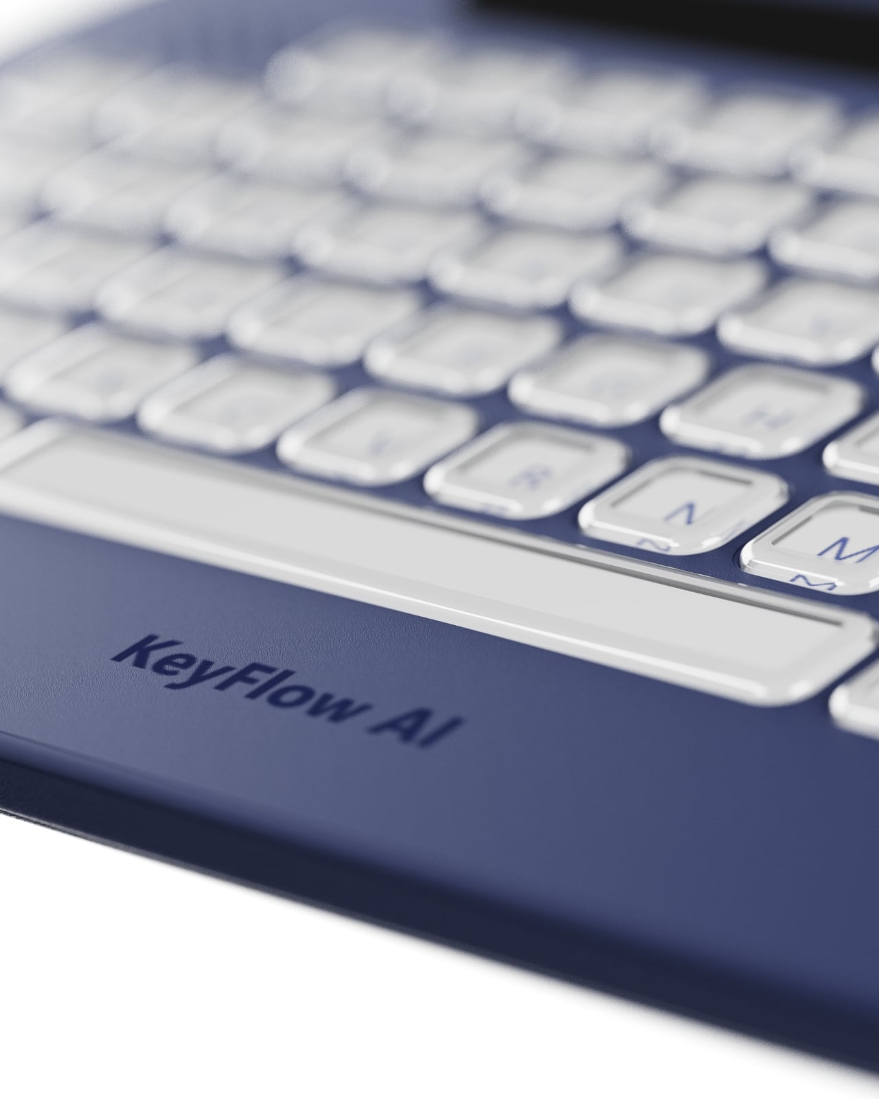
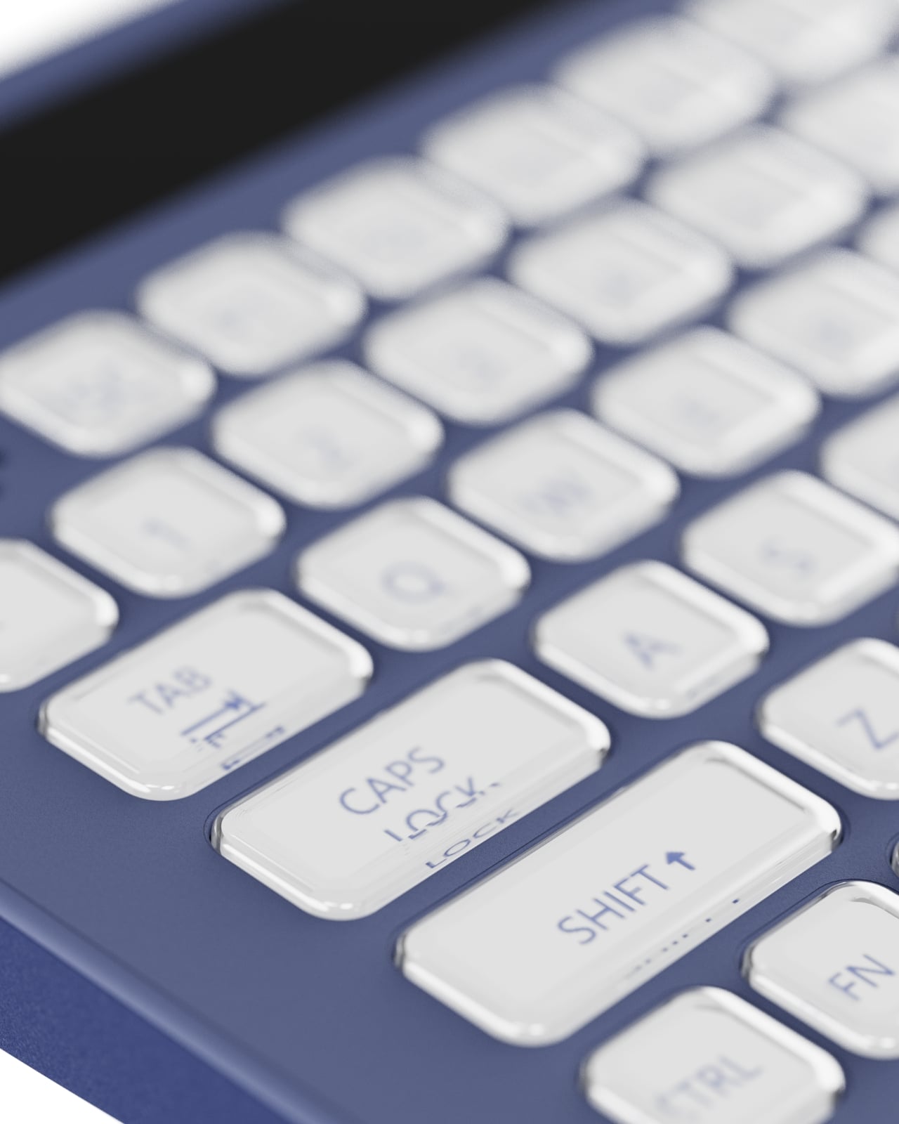
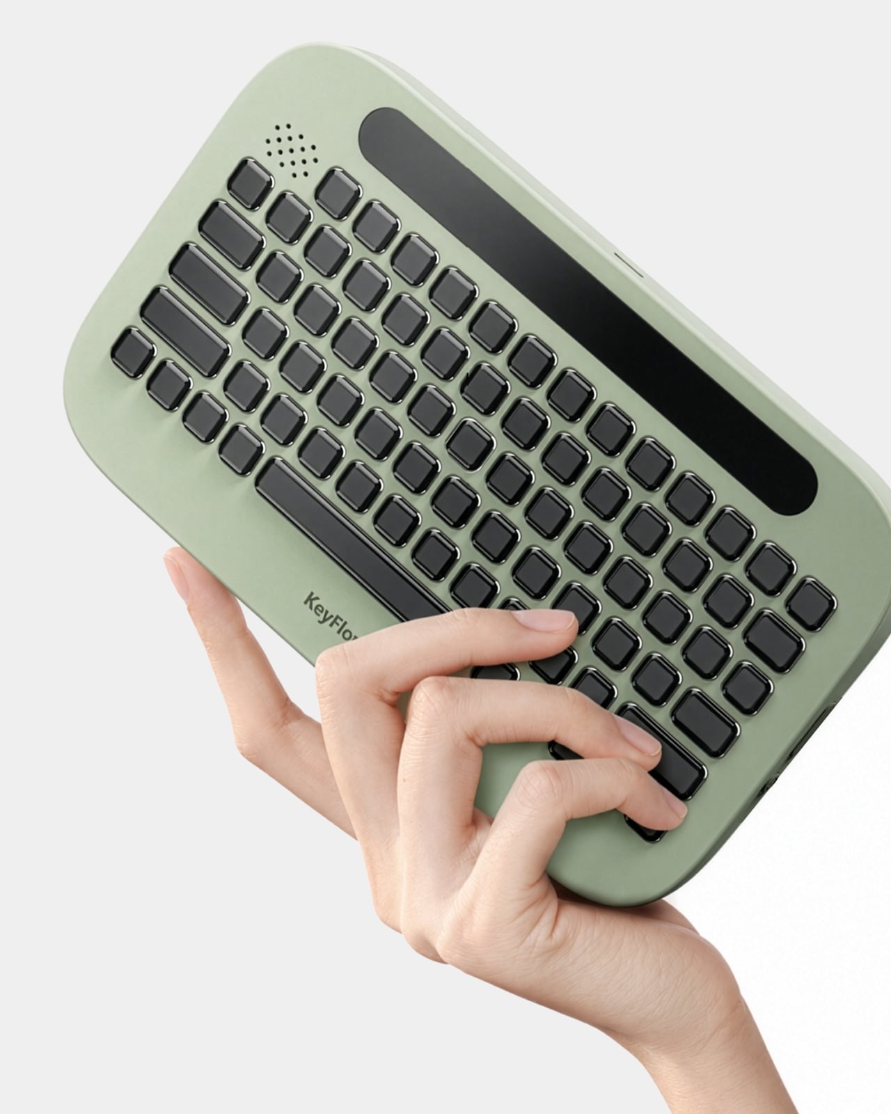
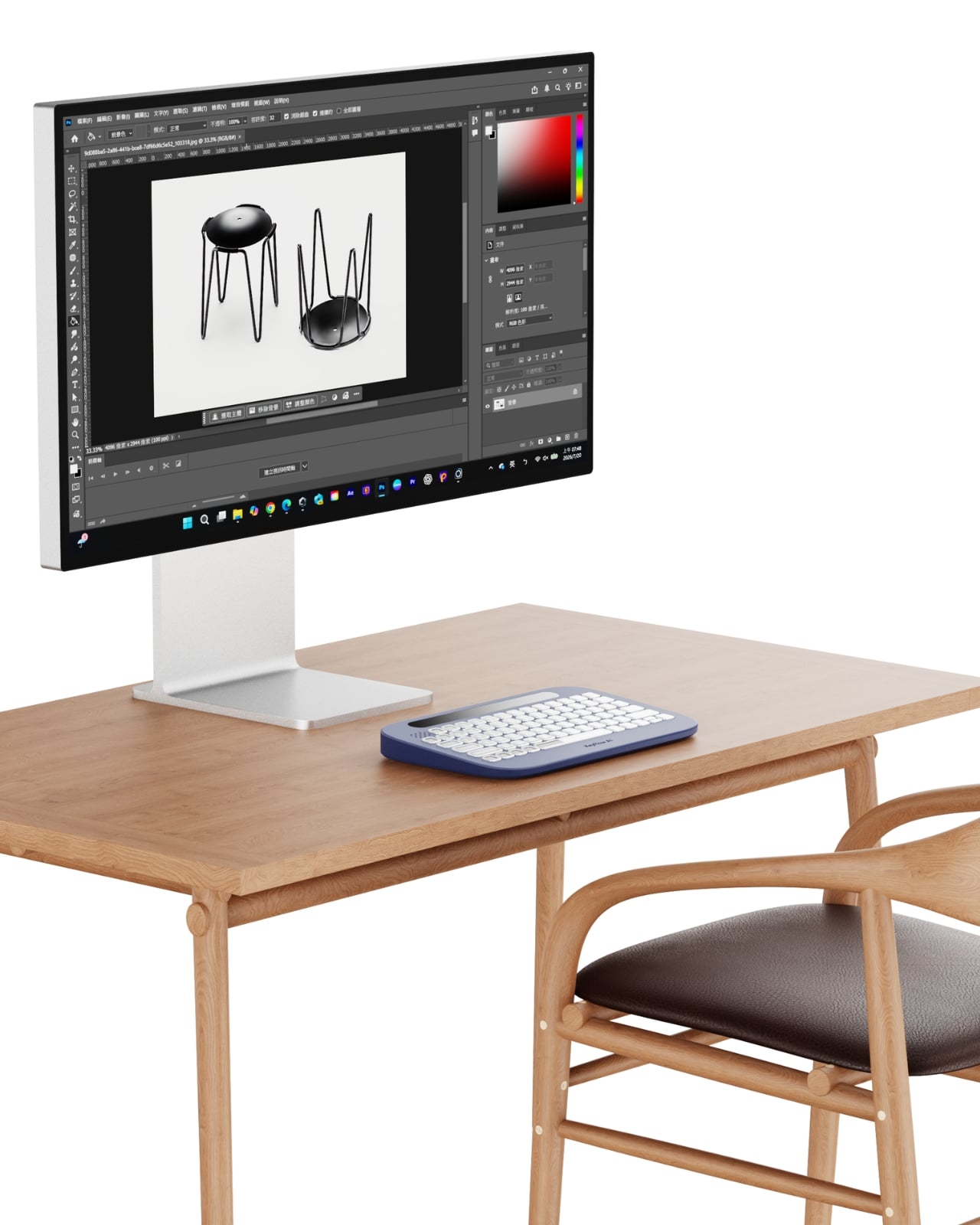
The concept is straightforward but genuinely clever. KeyFlowAI combines an AI-powered guidance system with an adaptive keyboard to bring step-by-step assistance directly into your workflow. Instead of alt-tabbing your way through browser tabs or scrubbing back through YouTube, the keyboard itself becomes the guide. The keys adapt contextually, surfacing relevant shortcuts and workflow cues for whatever task you are working on, right where your hands already are. It is a fundamentally different approach to the onboarding problem that creative software has had for decades.

What strikes me about this design is how it reframes the learning challenge at the hardware level rather than the software level. Most ed-tech solutions pile another app on top of the chaos, another overlay, another subscription layer you have to manage alongside the thing you are actually trying to learn. KeyFlowAI goes the other direction. It meets you at the physical interface, which is where attention already lives during any hands-on creative session. The keyboard stops being just an input device and starts acting as a co-pilot.

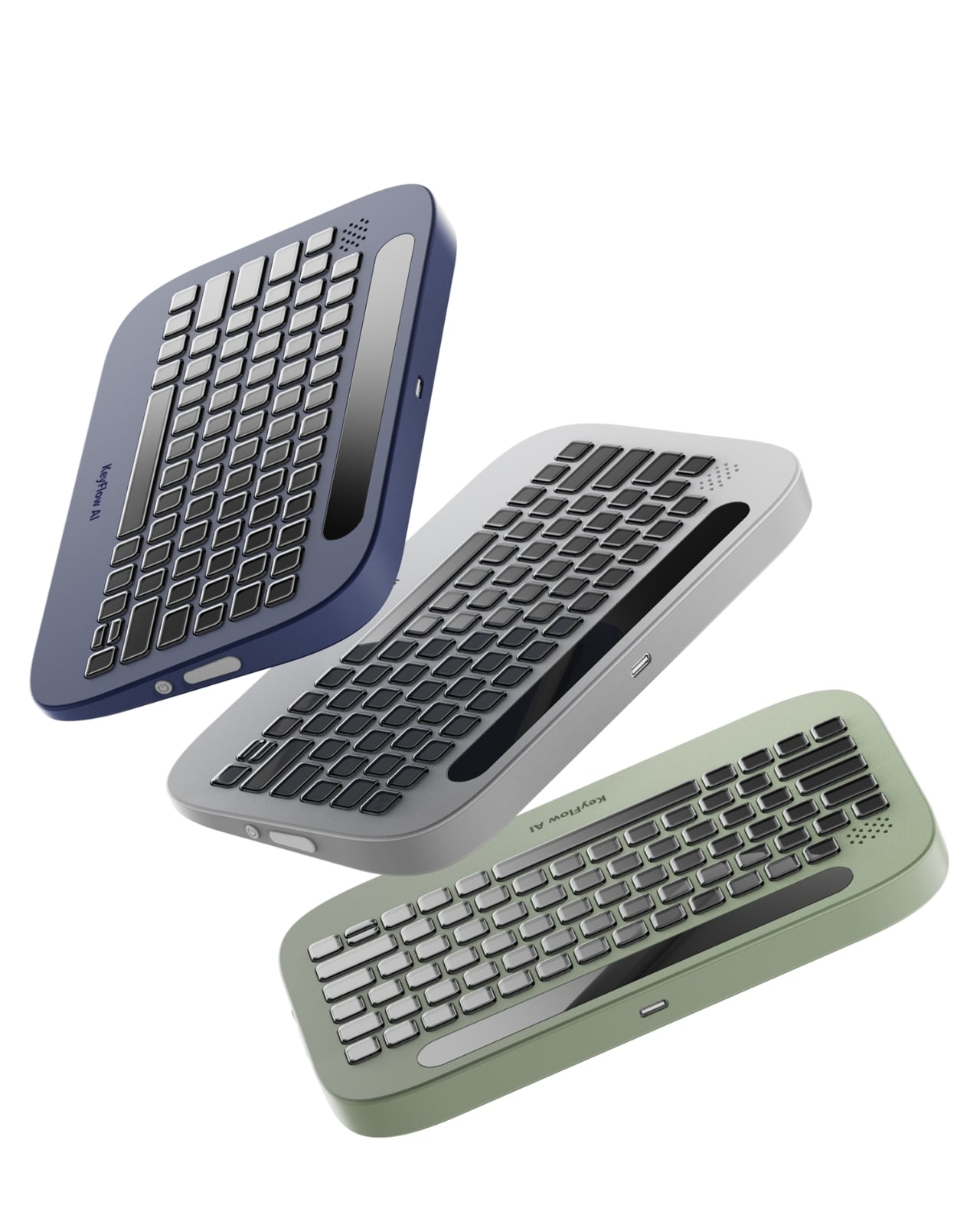
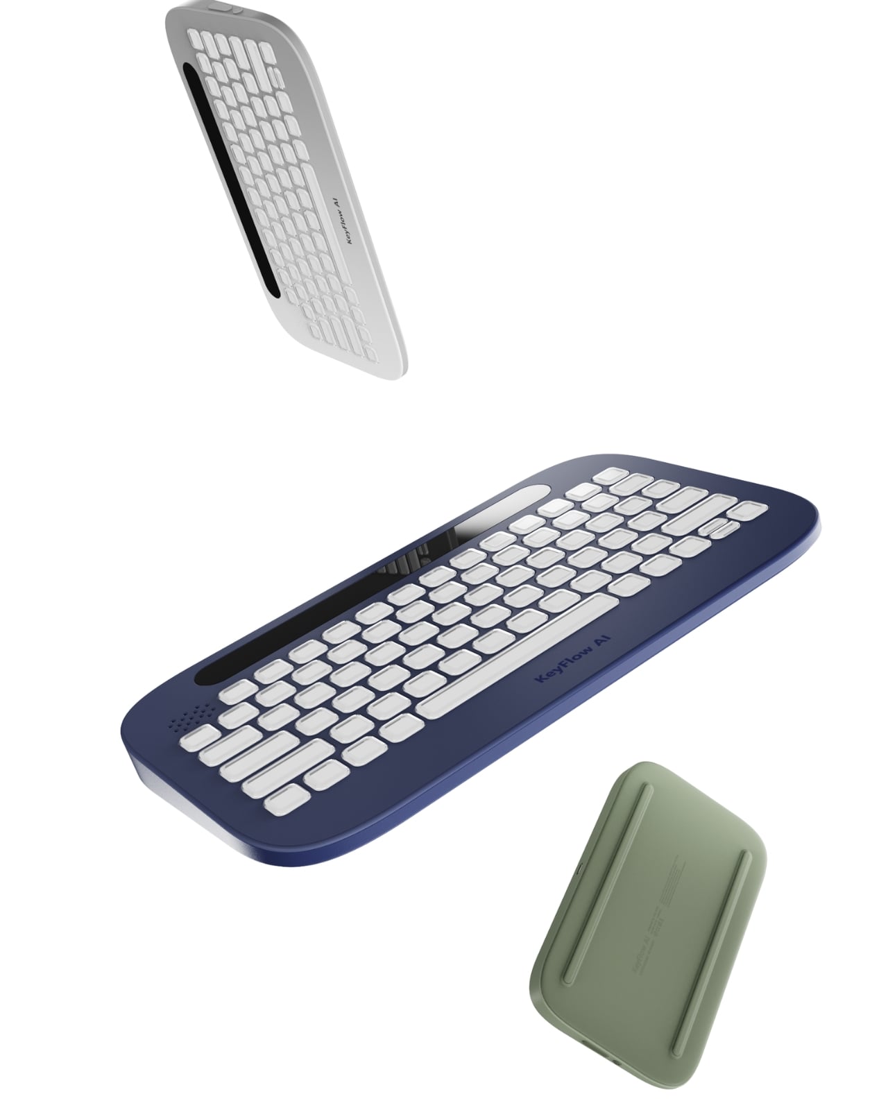
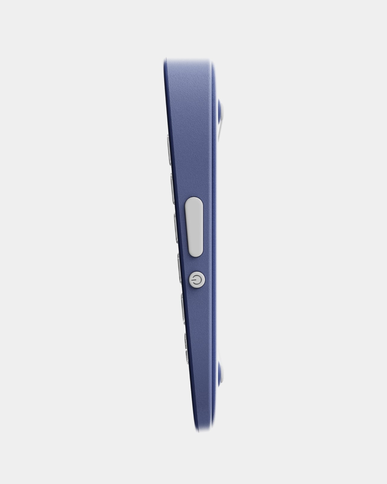
Visually, the design is clean and restrained in the best way. The rounded, slightly pill-shaped body comes in navy blue, light gray, and a soft sage green. None of the colors are aggressive or trendy in an obvious way. The keys have that satisfying, slightly domed profile that looks genuinely tactile even in product renders. Running along the top edge is a narrow display strip that presumably serves as the main guidance interface, showing instructions or prompts without pulling your eyes fully away from the screen. It is a small detail that shows real consideration for how people actually look at their desks when they are working.

The back of the device features two raised rails that function as a stand, letting you tilt the keyboard to a more comfortable working angle. A coiled cable option is also part of the design language, and while coiled cables are very much having a moment in the mechanical keyboard world right now, it does not feel forced here. It fits the overall aesthetic without trying too hard.

To be fair, KeyFlowAI is still a concept from Shih, which means there are open questions that a working prototype would need to answer. How accurately does the AI read your current task within the software? How quickly do the adaptive key labels update? Does the system scale to more advanced workflows, or is its sweet spot firmly in the beginner range? These are the kinds of details that make or break a tool like this, and they cannot be answered on paper.

But the underlying premise is sound, and more than that, it is overdue. The gap between watching a tutorial and actually building something has always been wider than the creative software industry acknowledges. Beginners do not need more content; they need less friction in the moment of doing. KeyFlowAI is betting that the solution lives right there on the desk, sitting under your hands. Whether or not it makes it to production, it is making the right argument.

The post Replace 100 Tutorial Videos With This One Smart Keyboard first appeared on Yanko Design.

Smart Glasses Run Hot. A 1mm Fan Might Finally Fix That.

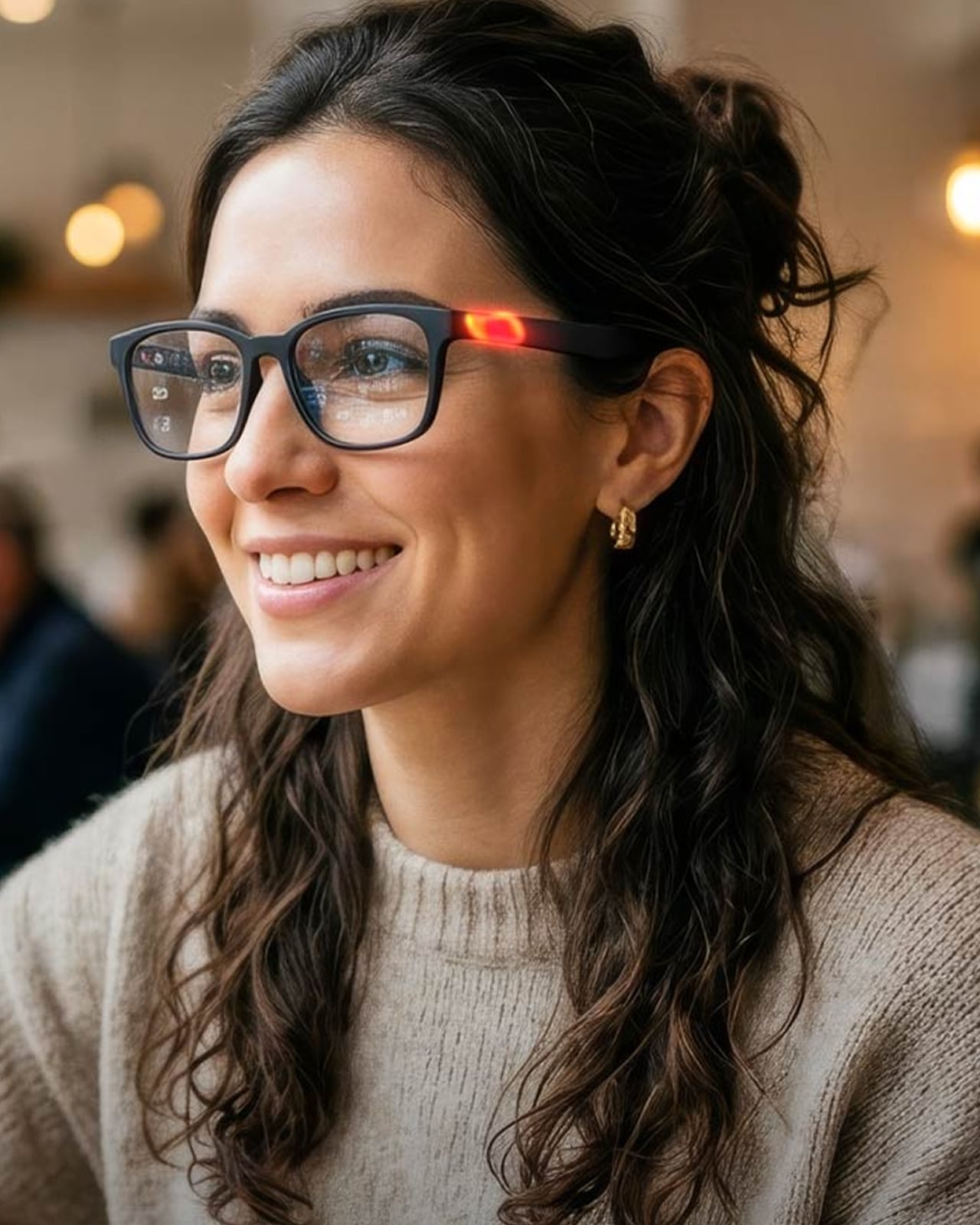
Smart glasses have a problem they don’t talk about enough, and it has nothing to do with design or battery life or social awkwardness. It’s heat. Plain, boring, uncomfortable heat. When you pack AI processing, computer vision, translation capabilities, and high-resolution displays into a frame that sits directly on your face, things get warm fast. Not warm in a “this laptop is on my lap” kind of way, but warm in a “I need to take these off because my temple is burning” kind of way. It’s a limitation that has quietly held the entire category back, and it’s one of the reasons smart glasses have struggled to make good on years of very loud promises.

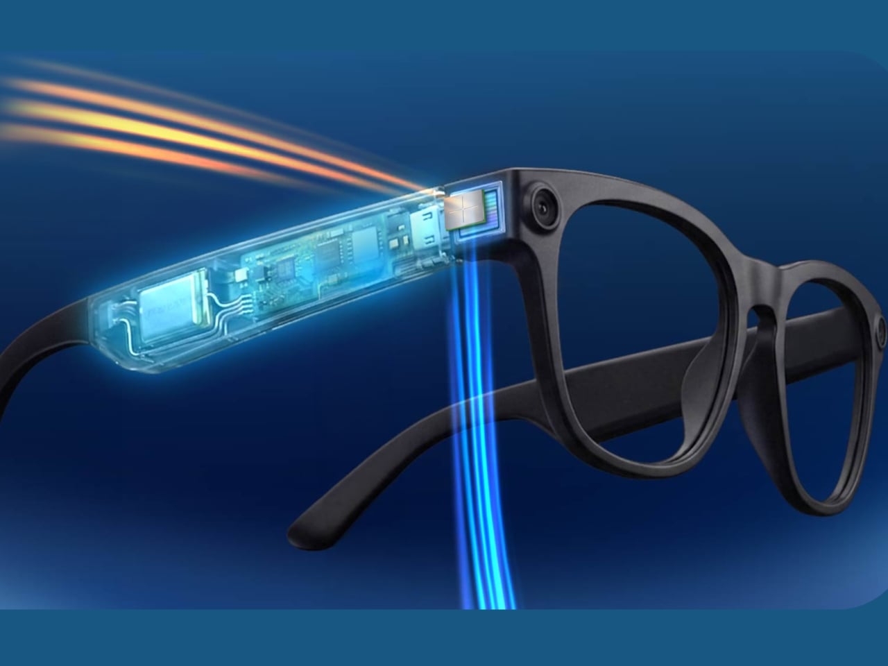
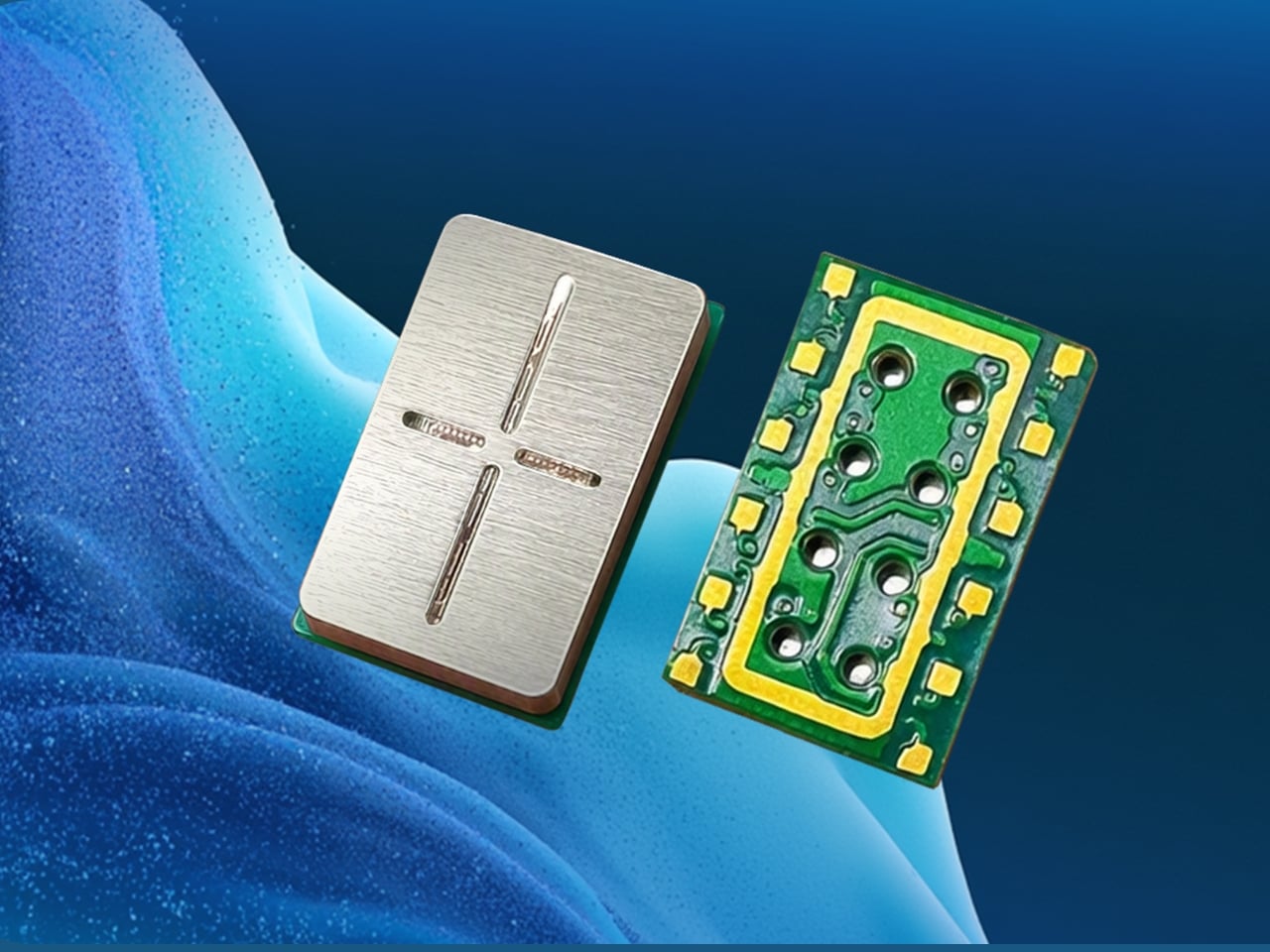
xMEMS Labs is trying to fix that with the XMC-1200, and the approach is genuinely clever. The XMC-1200 is a solid-state micro fan, billed as the world’s smallest active micro fan purpose-built for AR, XR, and AI-powered smart glasses. It measures just 46mm², it’s 1mm thin, and it draws only 70mW of power. For context, that is less energy than most Bluetooth earbuds consume. Yet it still manages to deliver up to a 10°C temperature reduction at a 1W thermal load, which is not a small number when you’re dealing with wearable tech that people expect to use comfortably for hours at a time.

Designer: xMEMS

What makes the XMC-1200 different from conventional cooling solutions is that it’s built for the exact spaces those solutions can’t reach. Traditional fans simply don’t fit inside a glasses temple arm. The XMC-1200 does. Paired with xMEMS’ Astra2 drive ASIC, the chip targets heat directly at the source rather than trying to dissipate it passively. It also carries an IP68 rating, meaning it holds up against water and dust, which matters a great deal for something you’re wearing on a humid afternoon or during a light rain.

The timing here is significant. We’re at a point where the smart glasses category is starting to feel real in a way it hasn’t before. Meta’s Ray-Ban smart glasses have sold surprisingly well. Apple continues iterating on Vision Pro. Startups and established brands alike are betting big on the idea that the next dominant computing interface lives on your face. But all of that progress runs into the same wall: you can miniaturize a processor, you can shrink a display, but you can’t compress the laws of thermodynamics. Heat is still heat.

That’s what makes xMEMS’ announcement feel more foundational than it might appear at first glance. This isn’t a headline feature. Nobody is going to choose smart glasses because of the cooling chip inside them. But they will absolutely notice when their glasses throttle performance after 20 minutes of use, or when the frame gets too hot to wear during a long session, or when the display dims because the hardware is desperately trying to regulate its own temperature. These are the friction points that kill user adoption quietly, before anyone stops to ask why.

The XMC-1200 won’t be the last word in wearable thermal management, but it represents a genuinely meaningful step toward smart glasses that actually behave like the always-on, AI-powered tools they’re marketed as. Engineers working on next-generation devices now have an option that doesn’t force them to choose between ambitious performance and a form factor people will actually want to wear.

Engineering samples are currently available under NDA for qualified OEMs and technology partners, which means this is still early. Consumers won’t be picking XMC-1200-equipped glasses off a shelf anytime soon. But the fact that a purpose-built cooling solution at this scale exists at all is a signal that the industry is finally treating thermal management as a design priority, not just a footnote in a spec sheet. Good design has always been about solving the problems nobody sees. The XMC-1200 is exactly that. Invisible, necessary, and quietly important to everything the smart glasses category is trying to become.

The post Smart Glasses Run Hot. A 1mm Fan Might Finally Fix That. first appeared on Yanko Design.

The Fridge Screen Your Family Can Update From Anywhere Without Texting

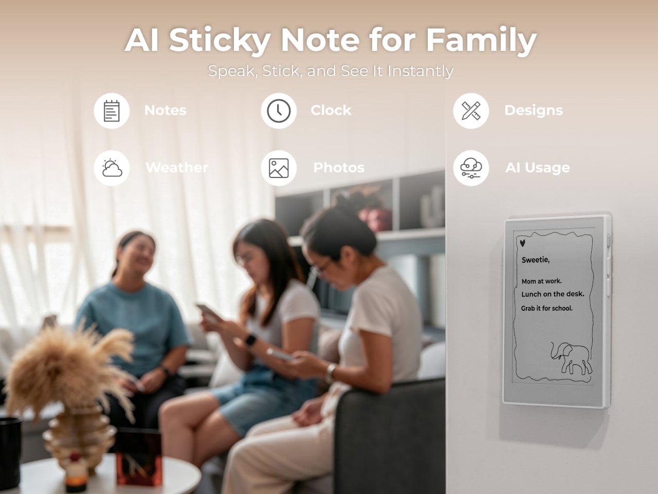
The shared household notice board is one of those ideas that never quite works the way it’s supposed to. Paper notes fall off, whiteboards get ignored once the novelty fades, and the natural alternative, a group chat, keeps everything buried where nobody looks unless they’re already on their phone. The problem isn’t that families don’t communicate; it’s that the display for that communication isn’t in the right place or form.

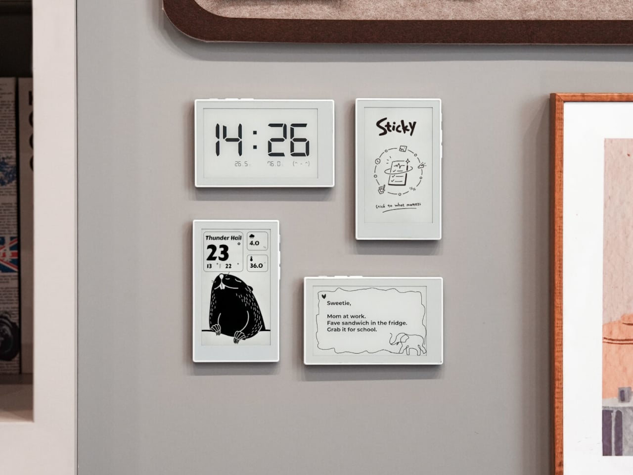
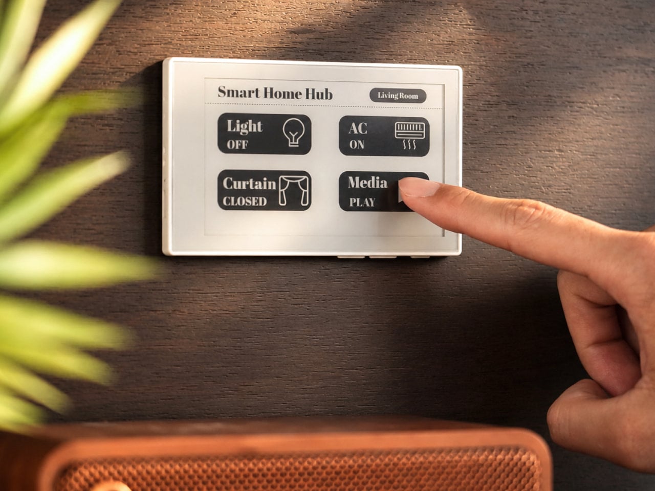
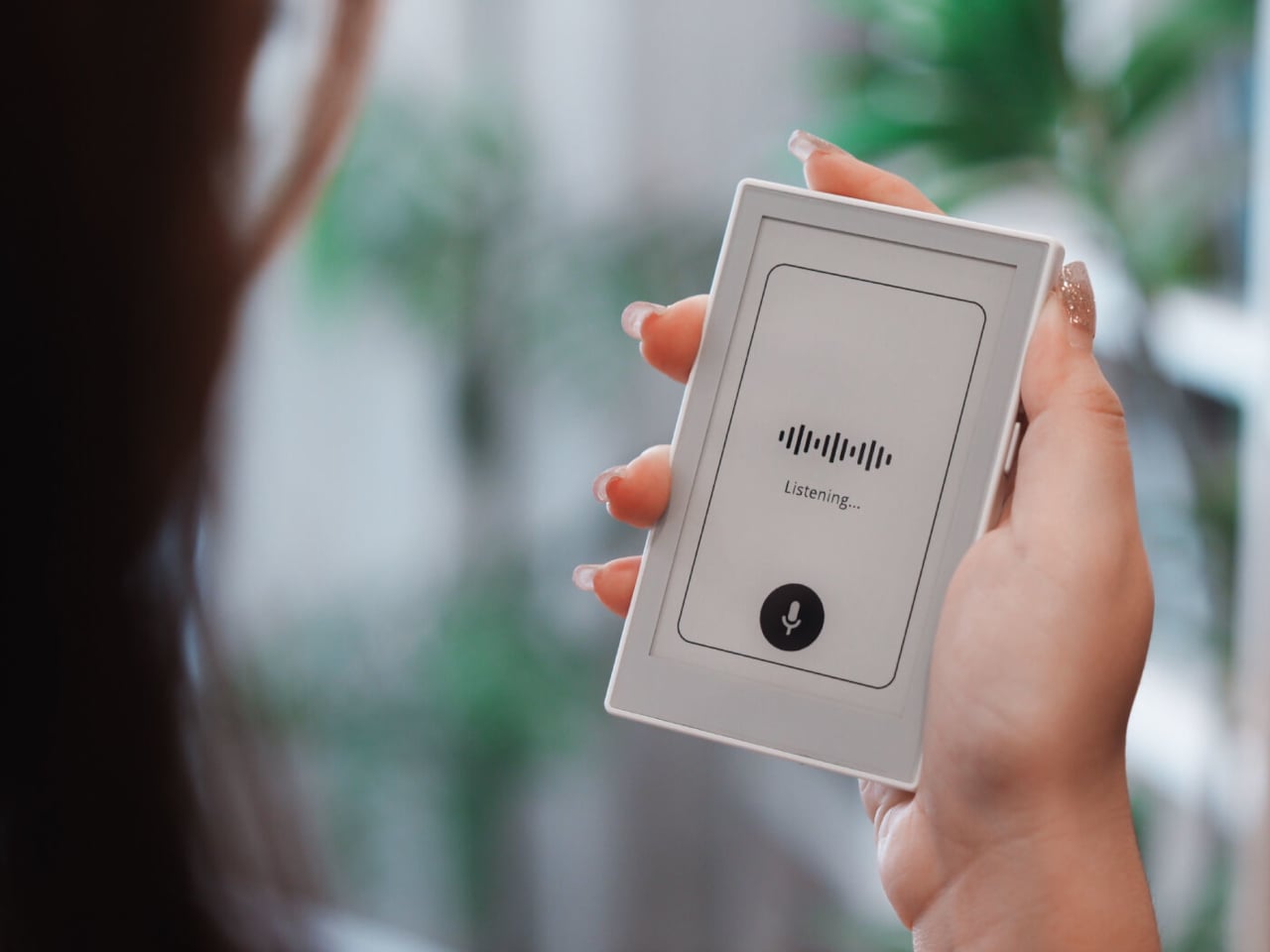
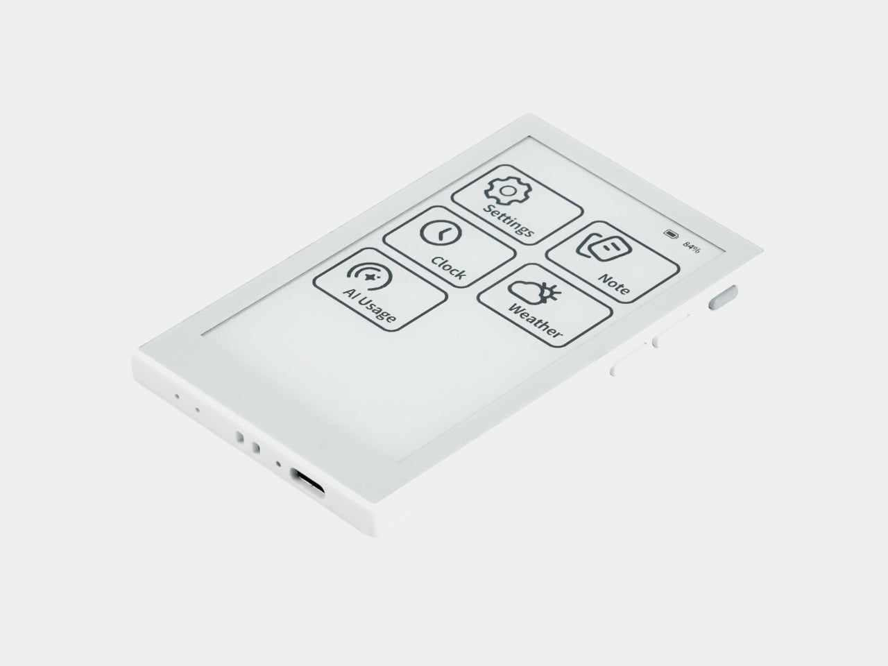
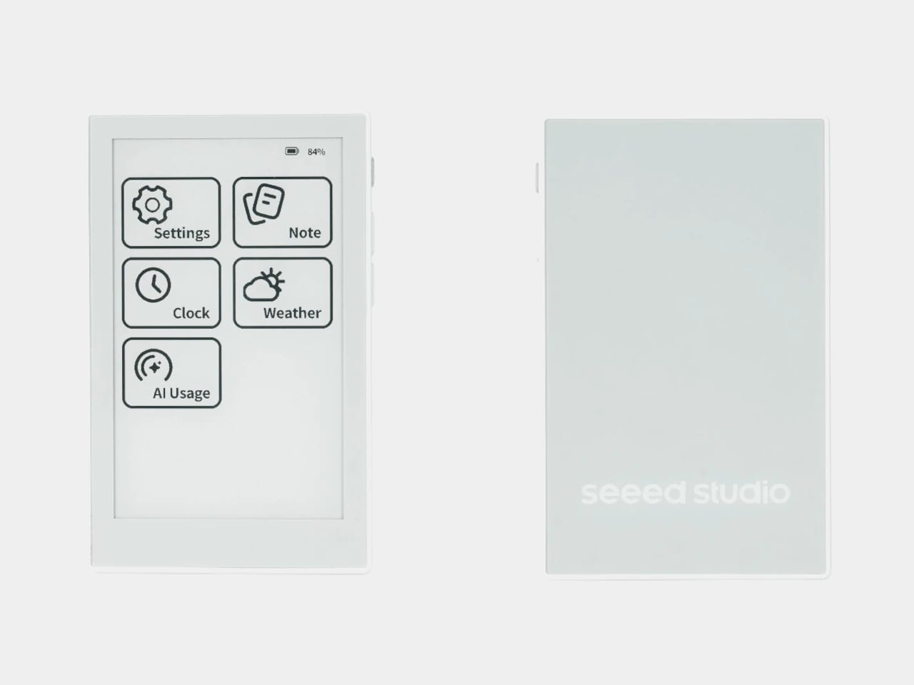
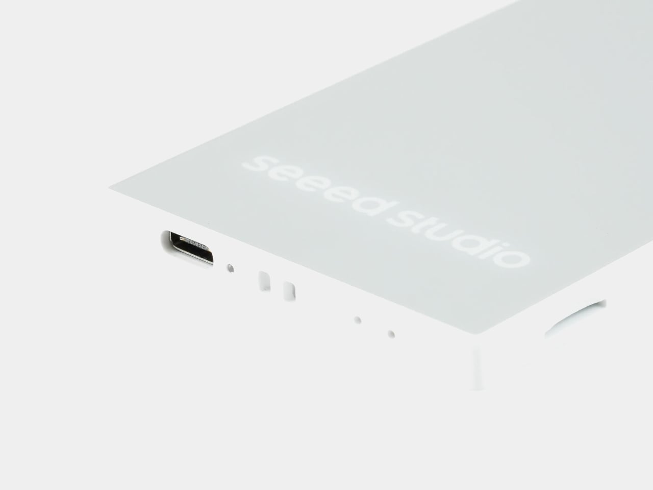
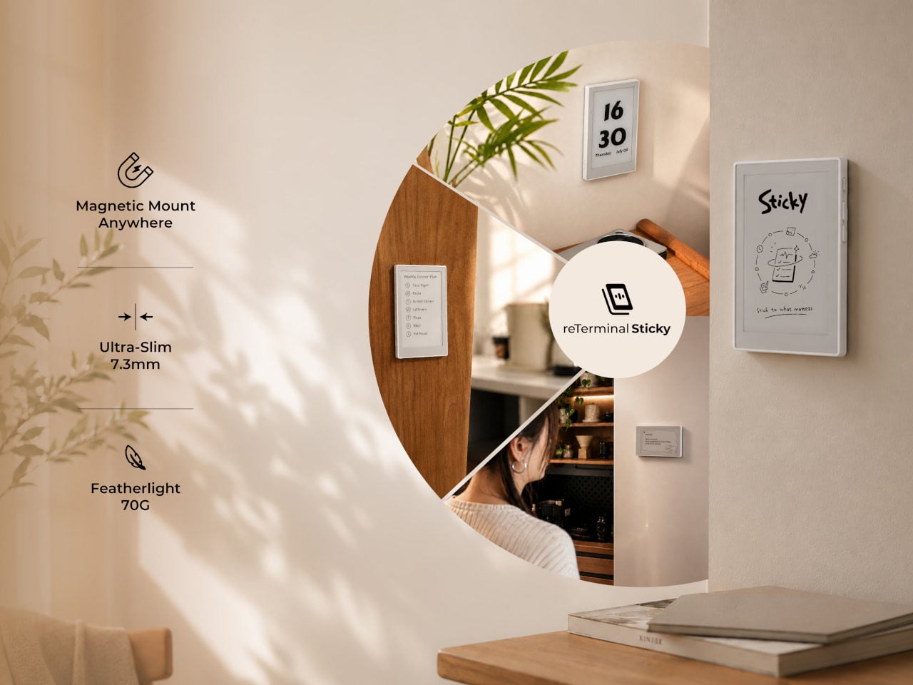
The reTerminal Sticky is a compact e-paper display built specifically for that gap. It magnets directly to a refrigerator or any metal surface, runs for days on a single charge, and shows notes, reminders, weather, and messages sent from a phone. The idea is simple: a screen that stays in plain sight and updates without demanding attention in return.

Designer: Seeed Studio

The display is a 3.97-inch monochrome E-Ink touchscreen at 800×480 resolution, set into a 106mm x 65.5mm x 7.3mm body that sits flush against a surface without protruding noticeably. E-Ink suits the application well because it holds whatever’s on screen without drawing power to maintain the image, which is why the 750mAh battery lasts up to a week under normal use and potentially months in Battery Saver Mode.

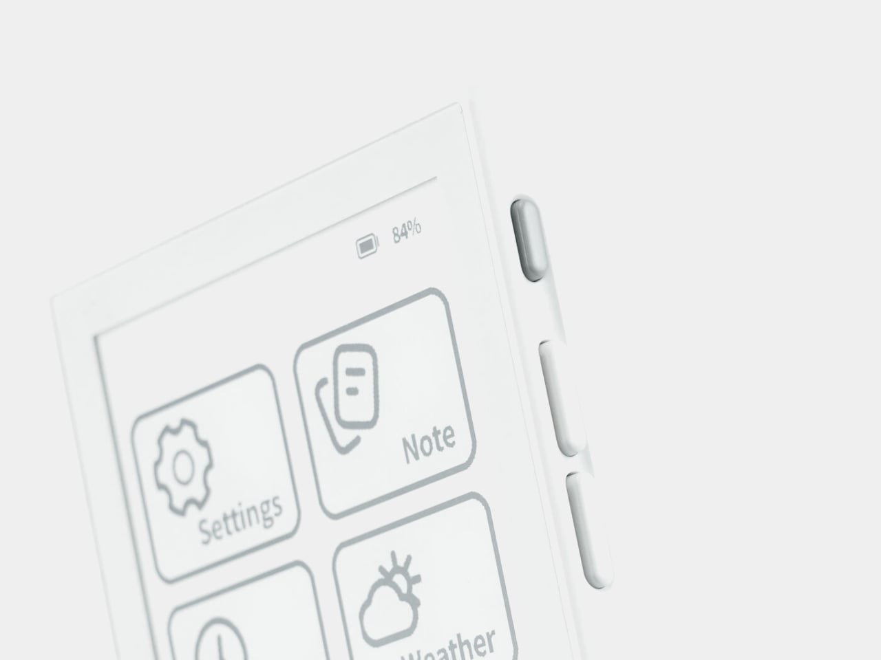
Creating a note doesn’t require opening an app first. An onboard physical button lets you press and speak; the device transcribes the voice directly into a note or to-do list on screen. Voice input works in English and Chinese. For sending notes remotely, the companion Seeedash app handles it over Wi-Fi or cellular, so someone at work can post a dinner reminder to the home screen without a text chain.

The Seeedash app is also where most of the management happens. It pairs initially over Bluetooth, sets the Wi-Fi network, and after that the device runs independently without the phone needing to stay nearby. Content can include typed notes, weather pulled from a set location, a clock, a calendar, or custom designs and photos uploaded from the app or the Seeedash web platform.

Mounting is toolless in either direction. The built-in magnetic backing attaches to any metal surface directly. For non-metal walls, the box includes an adhesive magnetic ring that goes up once and lets you reposition the Sticky freely afterward. For users who want to go further with the hardware, the device also supports custom firmware flashing, making it compatible with the broader SenseCraft ecosystem and developer-friendly by design.

The monochrome E-Ink display trades color for legibility and battery life, two properties that matter more than vibrancy when the screen is sitting on a kitchen appliance across the room. The low-power nature of the display also means it can show a full week’s worth of reminders without needing to be charged mid-week, which removes the main reason most desk gadgets get quietly retired after a month.

The post The Fridge Screen Your Family Can Update From Anywhere Without Texting first appeared on Yanko Design.

A 40-Gram Drone Is Now Hunting the World’s Deadliest Animal

The mosquito has never been bested by elegance. We’ve thrown everything at it: citronella candles that smell like a health food store, zappers that feel more like novelty items than actual deterrents, sprays that coat everything in a layer of chemical suspicion. None of it has really worked. Not comprehensively. Not quietly. Not without trade-offs.

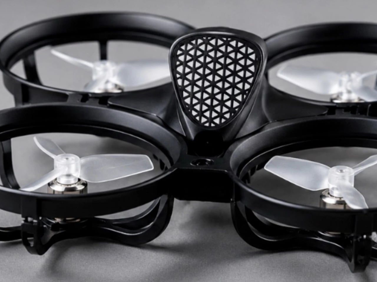
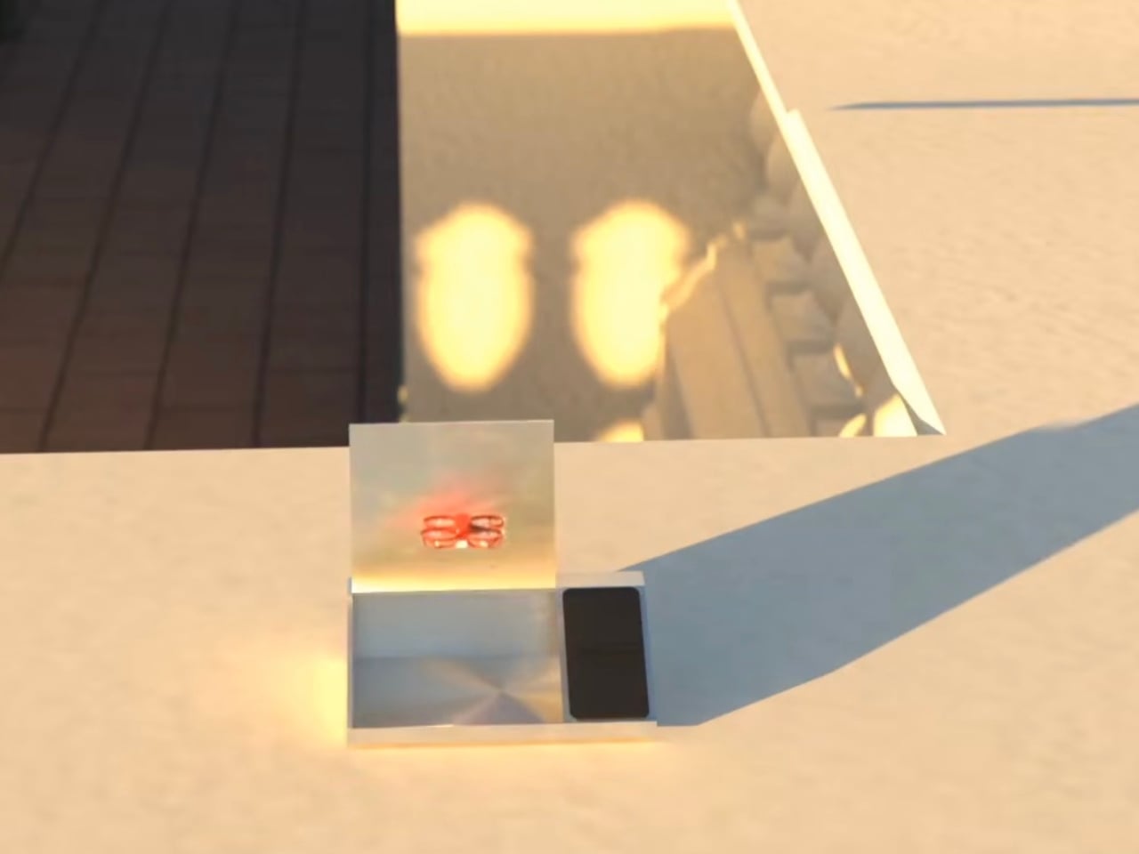
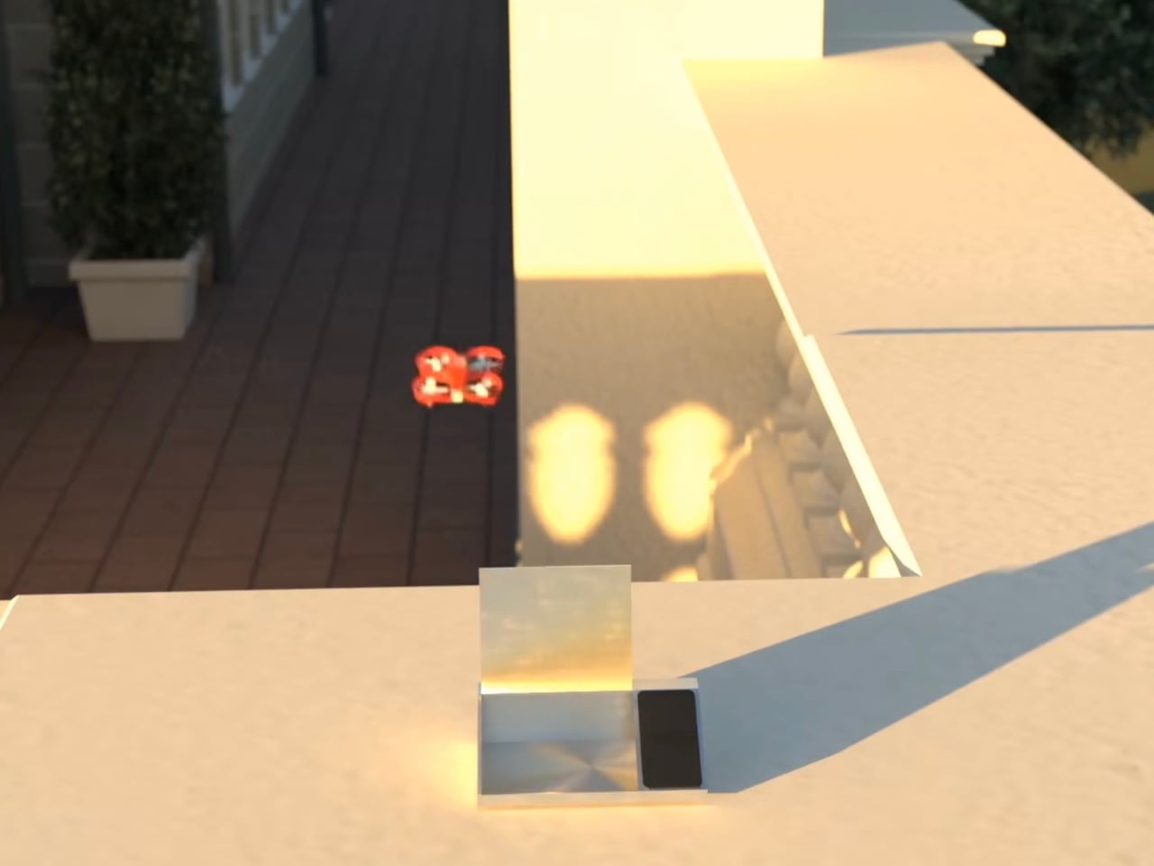
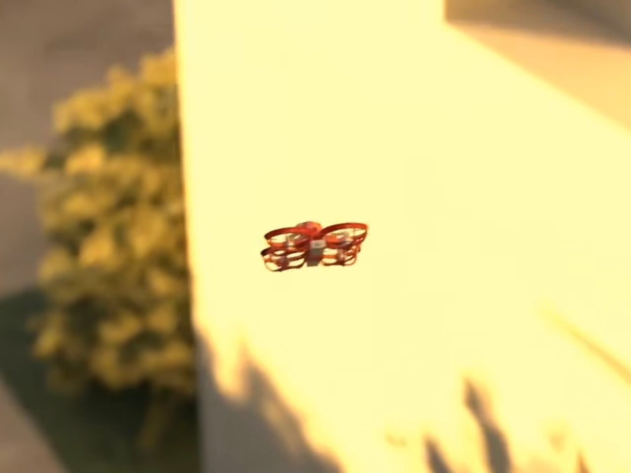
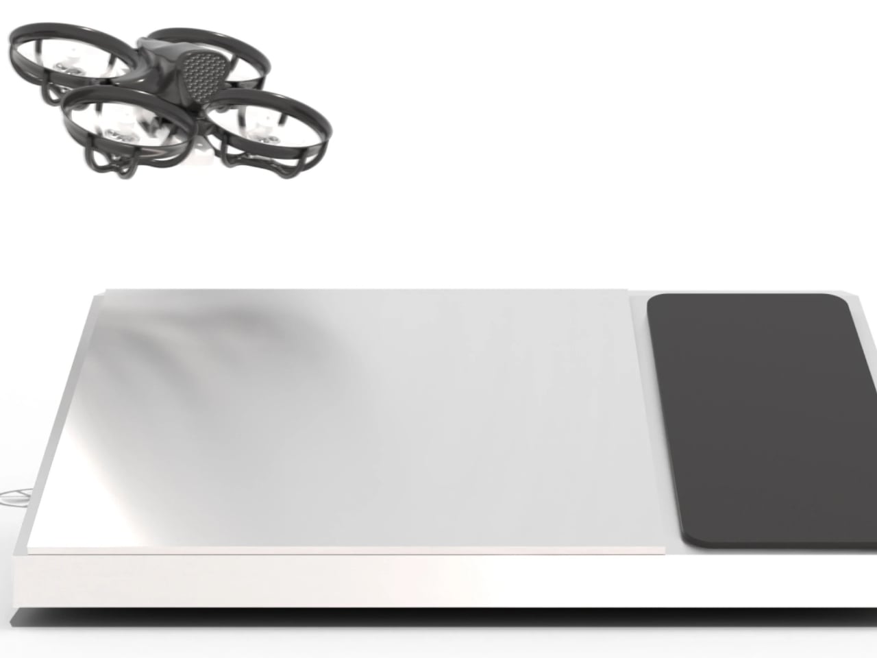
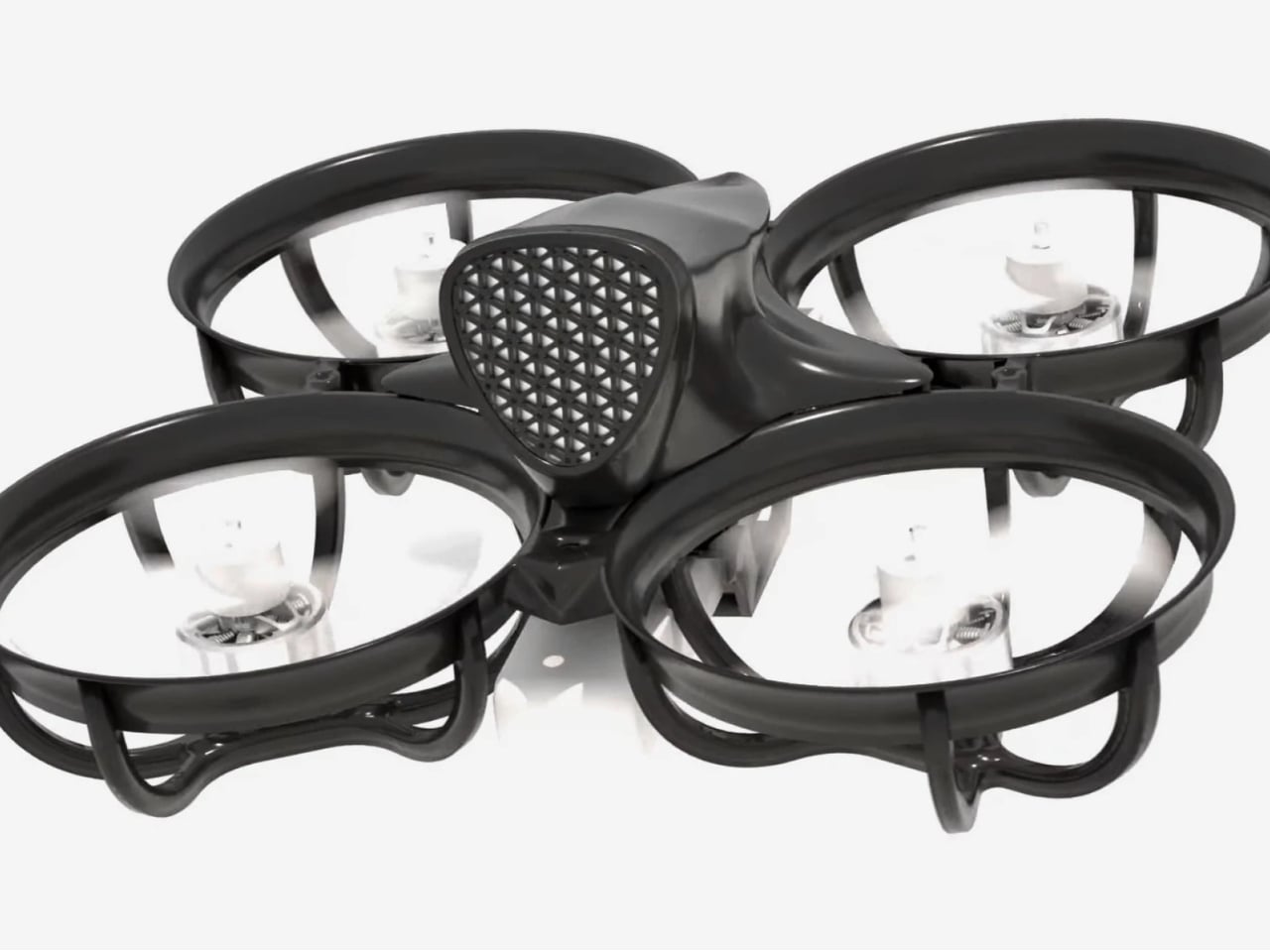
Enter Tornyol’s LeSonar2, a 40-gram autonomous drone that doesn’t just repel mosquitoes. It hunts them. The concept alone is enough to stop you mid-scroll. A micro-drone, roughly the weight of a few sheets of paper, patrols your living space like a silent sentinel, listening for the specific wingbeat frequency of a mosquito and then intercepting it mid-air. No chemicals. No noise you can hear. No action required on your part. It just handles it.

Designer: Tornyol

The engineering behind the LeSonar2 is where things get genuinely impressive. The drone uses 32 ultrasonic emitters to send out pulses that bounce off nearby objects and insects, and 380 smartphone microphones to capture the returning data. An Artix-7 FPGA processor handles the real-time beamforming, mapping the environment in 3D and measuring movements down to 0.1 millimeters. To put that in context, that’s the same underlying principle bats use to navigate and hunt in total darkness. Tornyol has essentially built a bat, shrunk it to the size of a large cookie, and given it a mission.

Once the LeSonar2 confirms a target by reading its wingbeat signature, it intercepts and dispatches the mosquito mid-flight using its own propellers. First air-to-air kill by an autonomous micro-drone. That milestone recently landed and it reads like a sentence from a near-future thriller, except it happened in a lab and it’s now available for pre-order.

The setup is more straightforward than you’d expect. You draw your protection zone on a base-station map. The drone launches, patrols, returns to charge on its own between passes, and relaunches. The whole system runs 24/7 without you touching it. Tornyol calls it “silent, safe, chemical-free,” and those three words carry more weight than they initially seem, especially for households with children, pets, or anyone wary of pesticide exposure.

The design thinking here is just as sound as the engineering, and I think that deserves attention. The choice to avoid cameras is notable. Instead of building something that watches your room, Tornyol built something that listens to it. That’s a meaningful distinction in an era where surveillance fatigue is real. A sensor that identifies a mosquito by its wingbeat signature rather than by filming your living room feels like a more considered approach to consumer technology. Privacy, quietly protected alongside you.

The bigger picture is hard to ignore, too. Mosquitoes kill more people every year than any other animal on the planet. Malaria alone accounts for over 400,000 deaths annually, with dengue adding tens of thousands more. Tornyol was founded by two CentraleSupélec graduates with the stated goal of consigning mosquitoes to history, and while a home drone isn’t going to solve a global public health crisis on its own, it’s a serious first step from a company that clearly understands the scale of what it’s attempting.

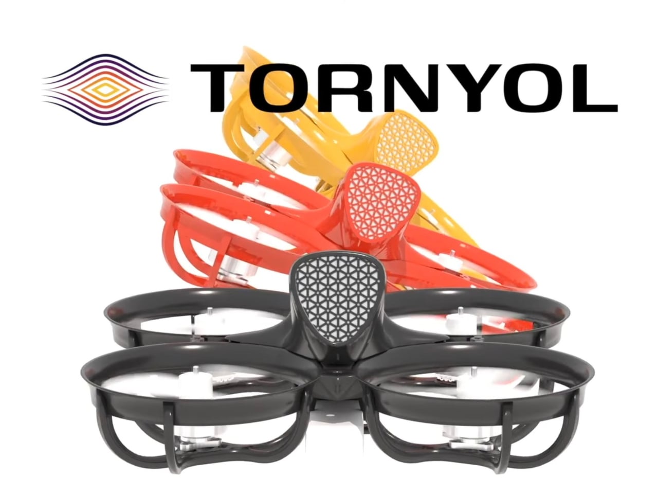
Backed by Y Combinator and currently open for pre-orders with a $100 refundable deposit, the LeSonar2 is targeting US shipping in 2027. The drone comes in black, red, and orange for people who care about that kind of thing, and I think more people do than would admit it. Tornyol’s LeSonar2 is one of those designs that makes you realize how much creative inertia exists in categories we assume are already solved. Bug control felt finished. Candles, sprays, zappers, and screens. We stopped asking for better because we didn’t know better was possible. Now it is, and it weighs less than a slice of bread.

The post A 40-Gram Drone Is Now Hunting the World’s Deadliest Animal first appeared on Yanko Design.

This $125 Glowing Pay Phone Charges the Smartphone That Killed It

The pay phone had a specific place in the urban landscape, usually on a corner, usually a little battered, and always surrounded by some combination of stickers and street art that turned it into an unintentional canvas. Cities spent decades pulling them out, convinced that no one needed them anymore now that everyone had a phone in their pocket. That logic was correct, of course, but it didn’t make the pay phone any less iconic.

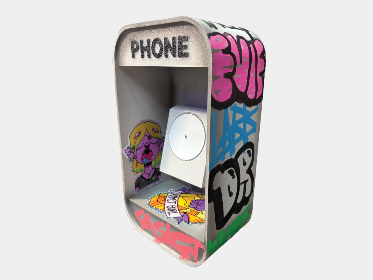
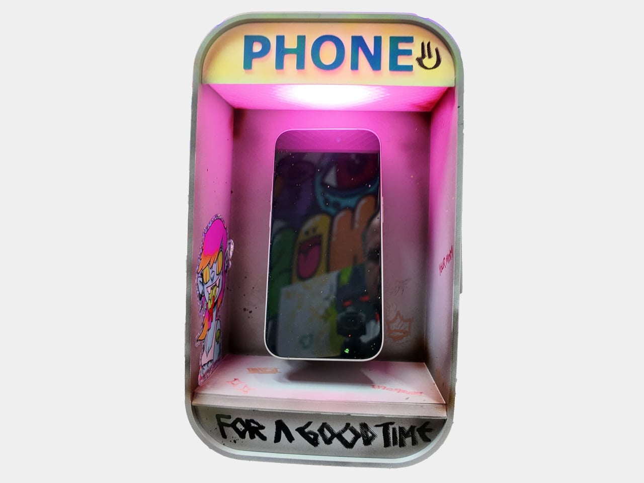
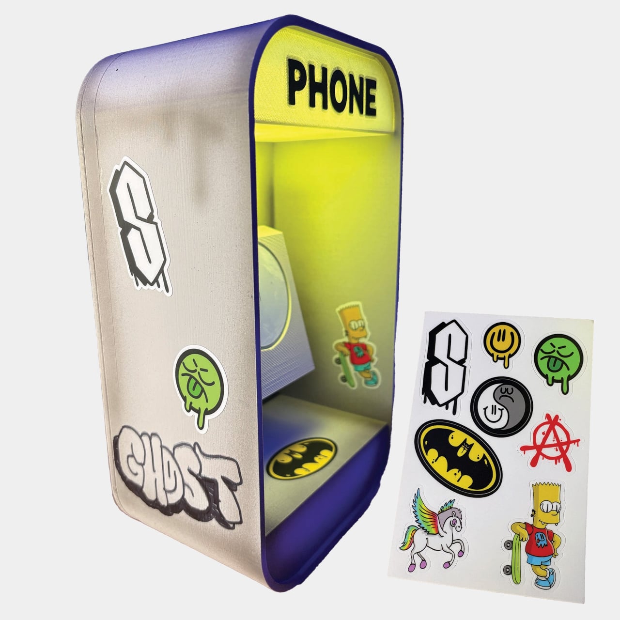
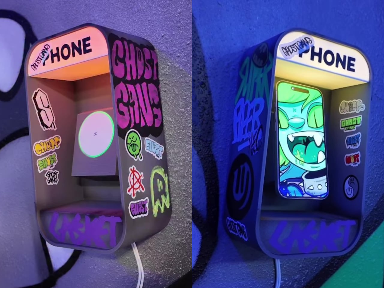
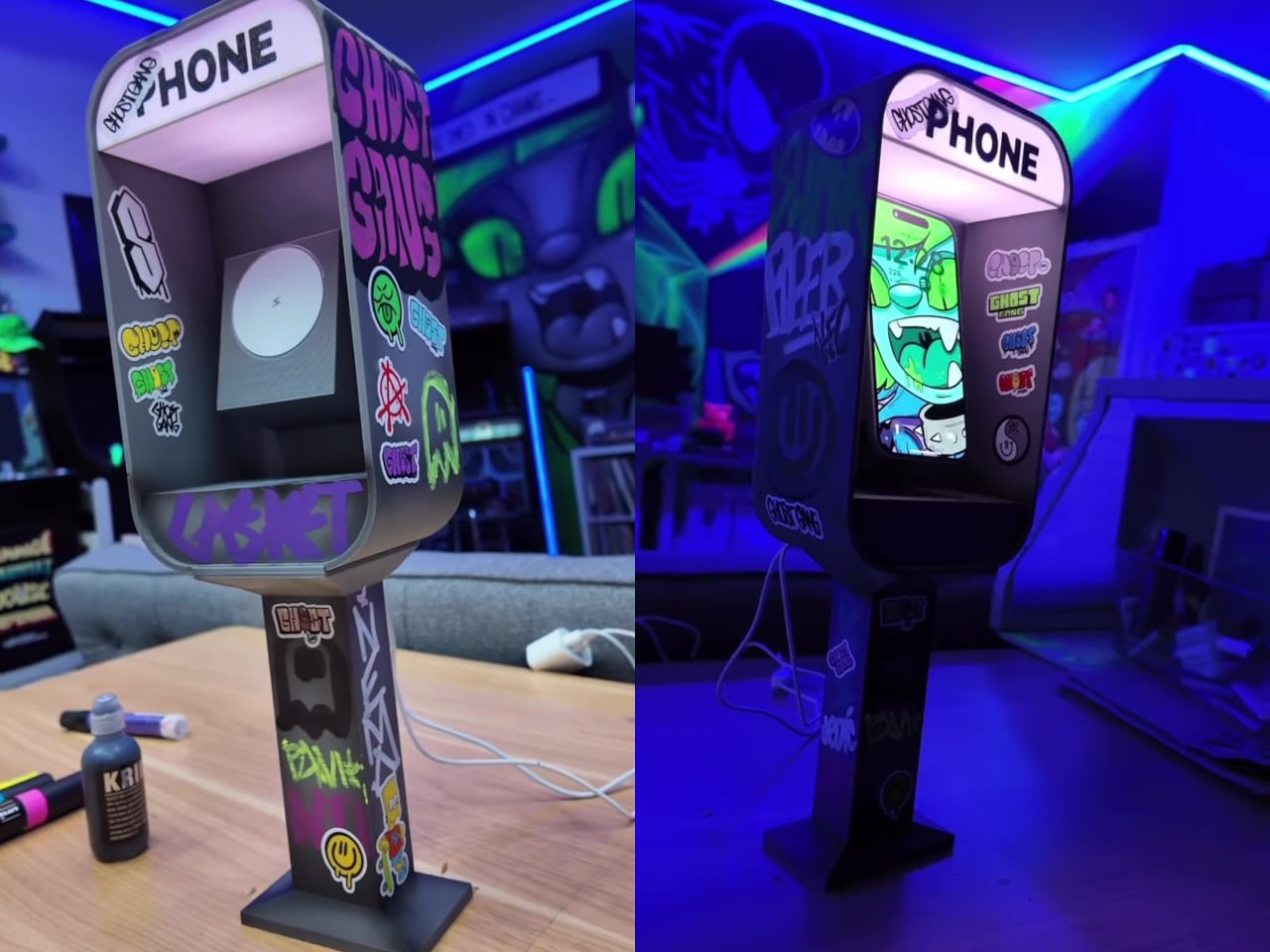
The Pay Phone Charger takes that object out of storage and puts it back on the desk, this time doing the one job the original never could: charging the very devices that replaced it. It’s a 3D-printed miniature pay phone booth with a built-in MagSafe-compatible wireless charger and RGB LED lights that illuminate the “PHONE” sign. Set your phone inside it, and it charges, while the lit-up booth sits on your nightstand or desk looking thoroughly unapologetic about the whole thing.

Designer: Nicky Davis

The version you receive depends on which style you choose at purchase. The DIY option arrives as a blank, undecorated body, with the MagSafe charger and LED lights included alongside a retro sticker sheet that lets you decorate it yourself. For anyone who’d rather skip that step, the Hand Painted and Graff version comes fully decorated with original artwork applied by hand before it ships.

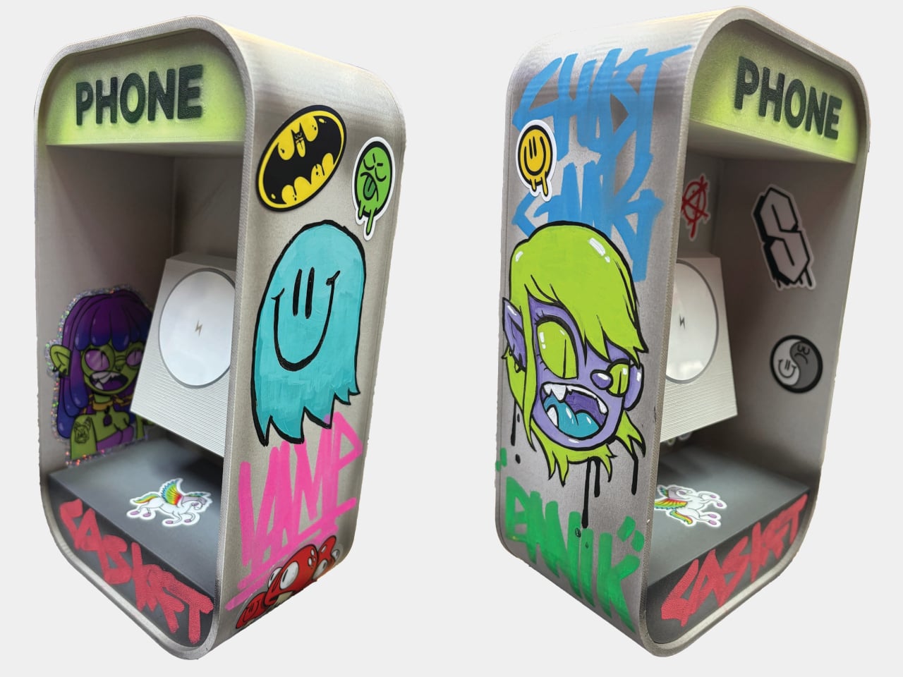
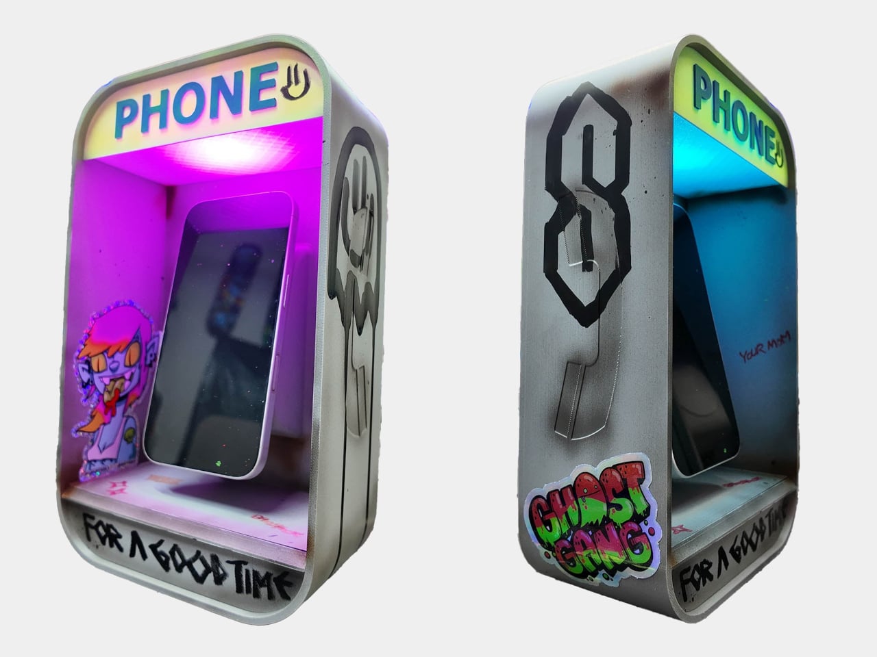
Two more options lean into the aesthetic of pay phones in their natural habitat. The Graffiti Covered version is fully tagged across the body, the kind of treatment any phone booth in a city block would accumulate over a few years. The 90’s Worn Looking version takes a different approach, styled to look genuinely aged and battered, as if it survived decades of street corners before ending up on your desk. Custom designs are also available on request for anyone with a specific vision.

Graffiti Covered

Each piece is made individually, not manufactured in batches, which is a detail that matters when you’re looking at something styled after hand-tagged street furniture. The LED-lit “PHONE” sign is a small but exactly right touch, nodding to the illuminated panels that real pay phones used to make themselves visible at night. Placed on a nightstand, it gives the charger a presence that a flat wireless pad simply doesn’t.

90s Worn Looking

The irony at the center of the design doesn’t need to be overstated. A miniature pay phone charging a smartphone is a visual joke that explains itself the moment anyone sees it, and that’s part of why the product went viral before most people had even had a chance to order one. The waitlist that followed was long enough that the creator switched to a preorder system just to manage demand, making units one at a time as an independent artist.

The charging function works on any MagSafe-compatible device, which covers a broad range of current iPhones without needing an adapter. The 3D-printed body is compact enough for a bedside table or desk corner without demanding too much space, and the sticker-ready surface of the DIY version makes it something of a collaboration between the maker and whoever ends up with it.

Pay phones disappeared because they were replaced by something more convenient. The Pay Phone Charger acknowledges that fully, charges it anyway, and glows while it does it. Starting at $125, it’s the kind of object that usually needs a lot more explaining than this one does.

The post This $125 Glowing Pay Phone Charges the Smartphone That Killed It first appeared on Yanko Design.

DJI Osmo Pocket 4P Review: Finally a Pocket Camera That Flatters Faces

PROS:


  • Dual cameras can handle any kind of occasion or scene

  • 10-bit D-Log 2 color profile better supports professional needs

  • Easy-to-use ergonomic controls

  • Coherent design language across Vlog Combo accessories

CONS:


  • Slightly heftier and top-heavy than previous Osmo Pocket models

  • 10-bit D-Log 2 isn't available on the 60mm med-tele camera

RATINGS:

AESTHETICS
ERGONOMICS
PERFORMANCE
SUSTAINABILITY / REPAIRABILITY
VALUE FOR MONEY

EDITOR'S QUOTE:

The DJI Osmo Pocket 4 is a camera worth carrying, and more importantly, worth reaching for.

Compact cameras have gotten remarkably capable over the past few years. Smartphones shoot impressive footage, action cameras have become tiny powerhouses, and entry-level mirrorless setups deliver results that would have seemed professional a decade ago. But most of these smaller options share a common visual limitation: they default to wide-angle perspectives that capture environments and movement well, without always doing the most flattering things to faces and portraits.

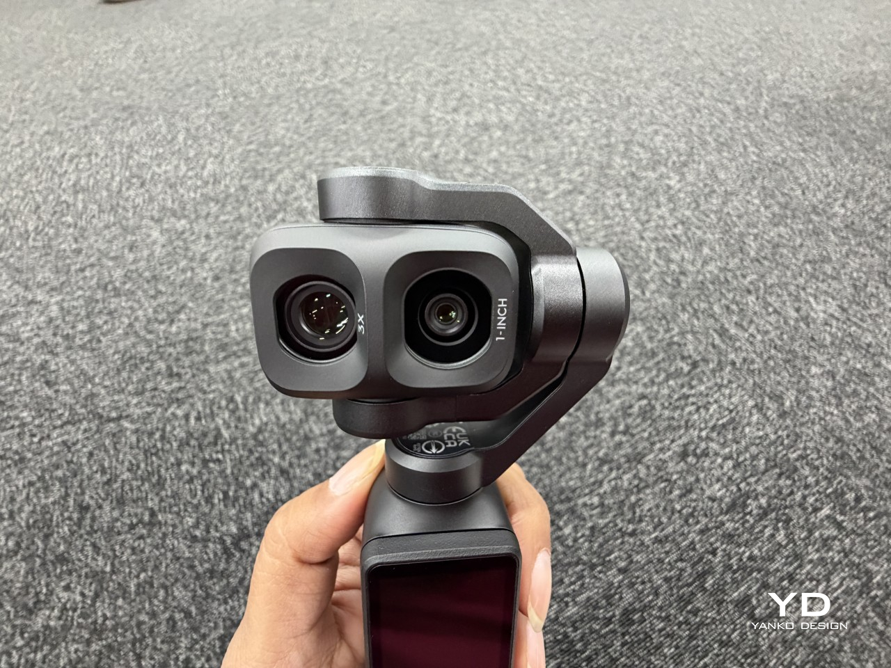
That’s the gap the DJI Osmo Pocket 4P is designed to close. Building on the stabilized pocket-gimbal formula that made earlier Pocket cameras popular, this fourth-generation model adds a dedicated 60mm medium-telephoto lens alongside the wide camera, with an f/1.8 aperture purpose-built for more flattering, more cinematic portrait shots. It’s a design decision that shapes not only how the camera performs, but also how it makes you think about framing. But is that enough to make a significant difference, or does the Osmo Pocket 4P have other surprises in store? Read on to find out.

Designer: DJI

Aesthetics
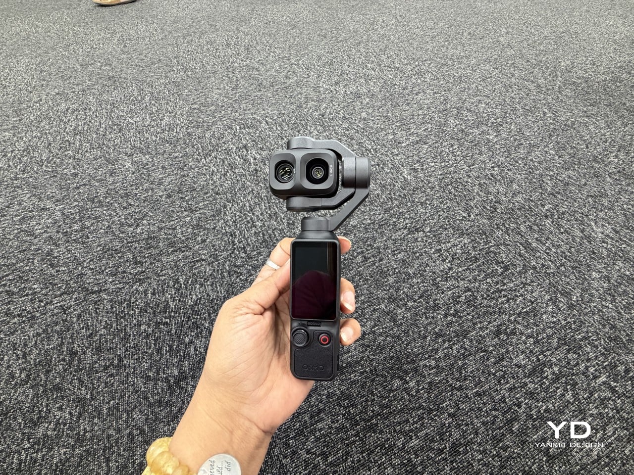
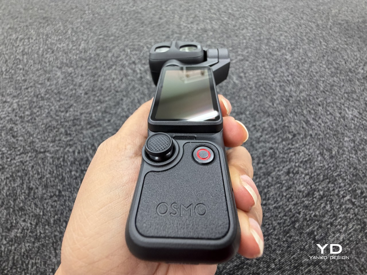
At a glance, the Osmo Pocket 4P still belongs to the same family as its predecessors, with a compact upright body, a small rotating touchscreen, and a stabilized gimbal head on top. Look a little closer, though, and the dual-lens arrangement immediately sets it apart. There’s something more camera-like about it now, in the best possible sense, rather than a gadget that happens to record video.
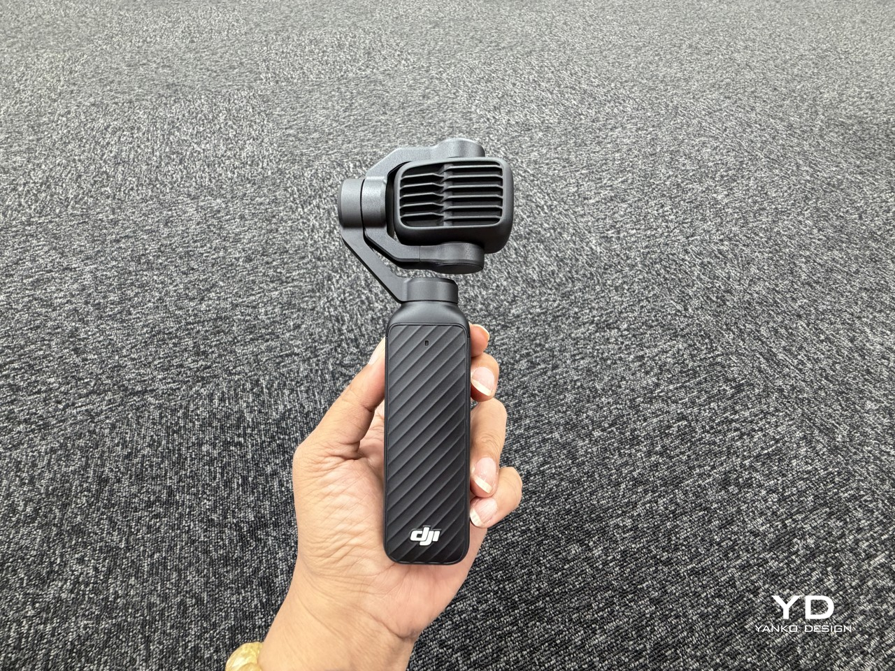
DJI offers the Pocket 4P in two finishes, classic black, which was our review unit, and pearl white, both of which carry a premium, polished feel without going into flashy territory. The materials have that familiar blend of structured plastic and matte-finish surfaces that DJI tends to do well, feeling solid without being unnecessarily heavy. Neither colorway draws attention to itself in an obvious way, which actually works in the camera’s favor as a daily-carry tool.
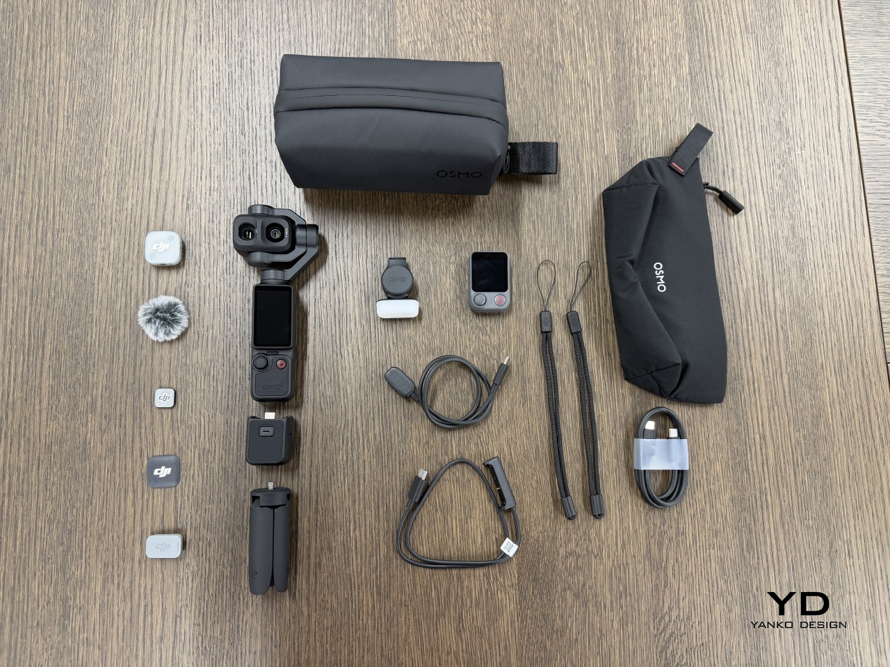
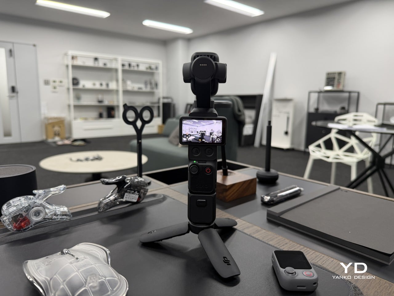
What makes the design feel complete is how the accessories extend the camera’s visual language rather than disrupting it. The fill light clips on cleanly, the handle and tripod give it a more grounded foundation, and the FrameTap remote adds a secondary screen without making the whole setup look like a patchwork rig. Fully assembled for a shoot, the Pocket 4P has the coherent look of a purpose-built creator system, not a Frankenstein of parts.
The presence of two lenses changes what the camera communicates even before it’s switched on. Earlier Pocket models read as action-friendly video tools. The Osmo Pocket 4P reads as something closer to an intentional image-making device, and that shift comes almost entirely from the addition of the portrait lens. Rather than simply adding more specs, DJI gave this camera a more considered point of view, and that reads clearly in the design.
Ergonomics

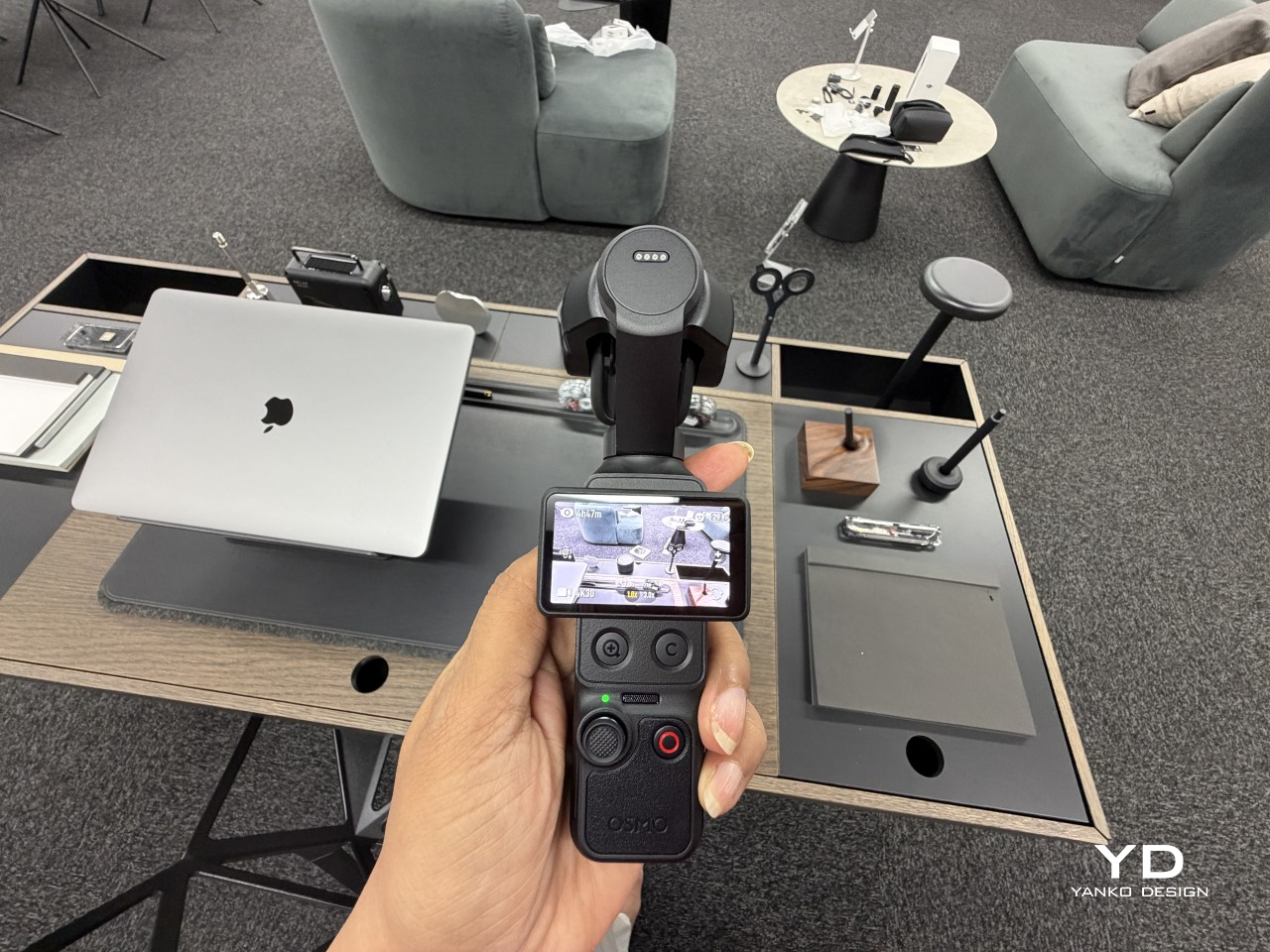
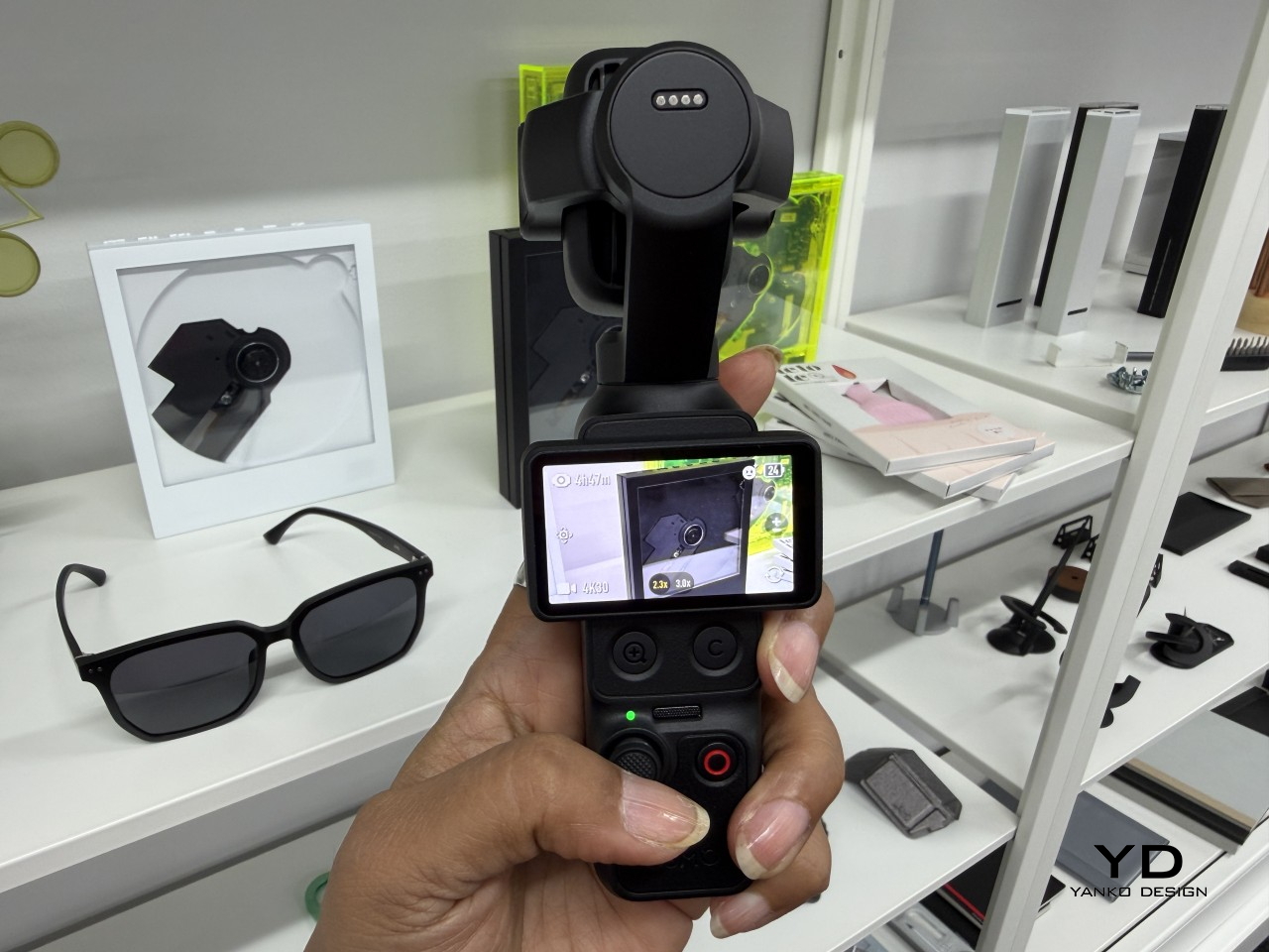
One of the best things about the Osmo Pocket line has always been how easy it is to grab and go, and the Osmo Pocket 4P keeps that up. It slips into a jacket pocket or small bag without fuss, and it’s ready to record almost immediately. Twisting the touchscreen to power it on takes barely a second, which matters more than it sounds when something worth filming is happening right now.
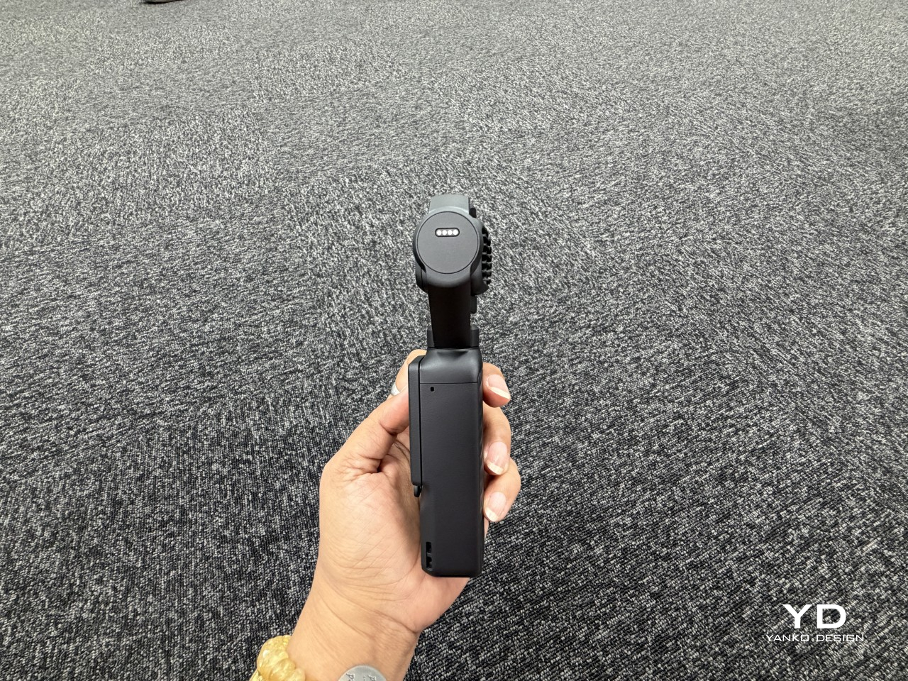
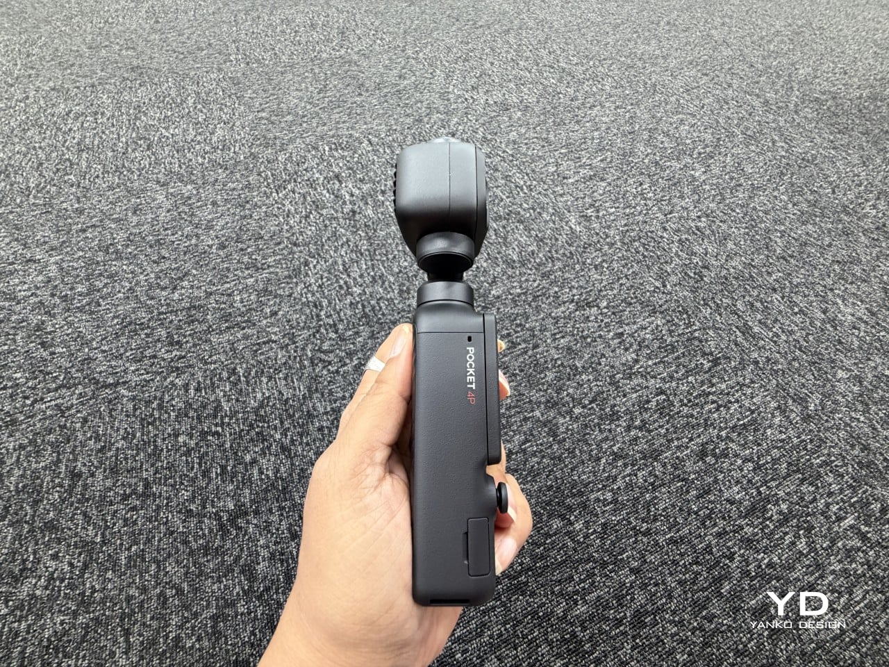
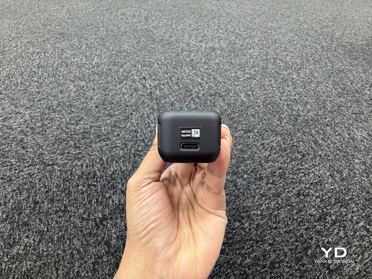
Handling the Pocket 4P day to day is comfortable, especially once the threaded handle is attached. It gives the camera a stable grip and a flexible mounting solution for tripods and other accessories. The touchscreen is compact and works well for quick adjustments, though it favors speed and simplicity over deep menu navigation. That’s a natural consequence of the body’s slim profile and carry-first design philosophy.
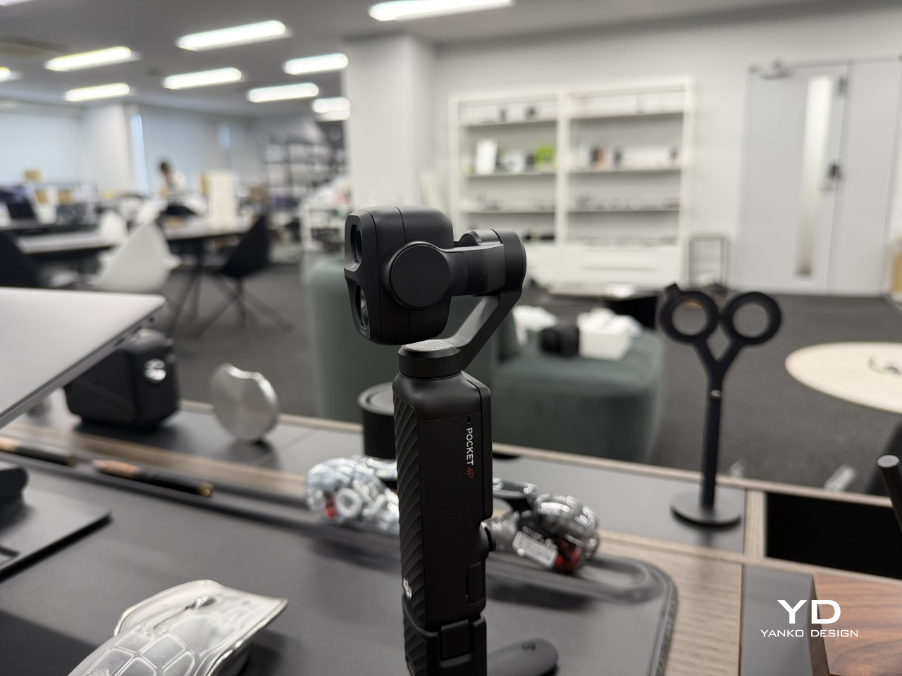
The dual-lens head makes the camera noticeably heavier and more top-heavy than earlier Pocket models, and you’ll feel that difference during longer sessions. But that added mass is a physical consequence of housing a second optical system in such a compact body, which makes it a worthwhile trade. The included handle and mini tripod become genuinely useful for that reason, giving the whole setup a more balanced, natural feel.
Performance

At the heart of the 4P’s imaging system is a 1-inch CMOS sensor paired with a 20mm wide lens, and alongside it, a 1/1.28-inch sensor powering a 60mm medium-telephoto lens with an f/1.8 aperture. Together, they give the camera two genuinely different visual identities: the wide camera for movement, environments, and establishing shots, and the telephoto for faces, details, and compositions where subject isolation matters most.

20mm, f/2.0

60mm, f/1.8, 3x zoom

The 1-inch sensor on the wide camera carries 17 stops of dynamic range, which means tricky lighting situations, such as backlit faces, strong sunsets, or mixed indoor light, tend to resolve more naturally than you’d expect from something this small. Colors look accurate and grounded rather than oversaturated, and skin tones in particular come through with a warmth and believability that most compact cameras don’t typically manage.

20mm, f/2.0

60mm, f/1.8

The 60mm telephoto lens is where the Pocket 4P starts telling a more complete story. At f/1.8, it creates a natural compression and background separation that a wide lens simply can’t replicate, which makes portrait shots, talking-head videos, and product close-ups look considerably more flattering and cinematic. Wide-angle lenses can make subjects look slightly distorted, particularly around the edges of the frame. The telephoto doesn’t, and that difference is immediately noticeable.

20mm, f/2.0 (Top) | 60mm, f/1.8 (Bottom)

Video recording shows how seriously the Osmo Pocket 4P takes its professional aspirations. It supports 10-bit D-Log 2, a color profile with enough tonal latitude to recover highlights and lift shadows in post-production without the footage falling apart, making grading feel genuinely flexible. The standard color profile also deserves credit for looking natural and grounded straight out of camera, giving creators who don’t want to grade a polished result with minimal effort.

20mm, f/2.0 (Top) | 60mm, f/1.8 (Bottom)

Stabilization comes from a 3-axis mechanical gimbal rather than electronic cropping, keeping footage smooth in a way that feels physically grounded. ActiveTrack 8.0 handles subject tracking reliably enough that solo creators can set the camera up, step in front of it, and let it do the work. Slow-motion recording is equally impressive, with the wide lens supporting exceptionally high frame rates that transform ordinary moments into something far more dramatic.

20mm, f/2.0 (Top) | 60mm, f/1.8 (Bottom)

The telephoto camera is best treated as a specialized portrait and close-up lens rather than a full duplicate of the main sensor. It doesn’t support D-Log 2, only 10-bit D-Log, so that color workflow difference is worth planning around before a shoot. The 103GB of built-in storage, fast transfer speeds, and a quick-charging battery that holds up through hours of shooting on a single charge make the overall experience feel refreshingly low-friction.

20mm, f/2.0 (Top) | 60mm, f/1.8, 3x zoom (Bottom)

Sustainability

There’s a practical case for the 4P being a more sustainable choice than it might first appear. A compact camera that handles wide landscapes, tight portraits, slow-motion action, and stabilized everyday shots is genuinely harder to outgrow. That kind of versatility tends to extend a product’s useful life, making it less likely that a single creative limitation will push someone toward a hardware upgrade they don’t actually need.
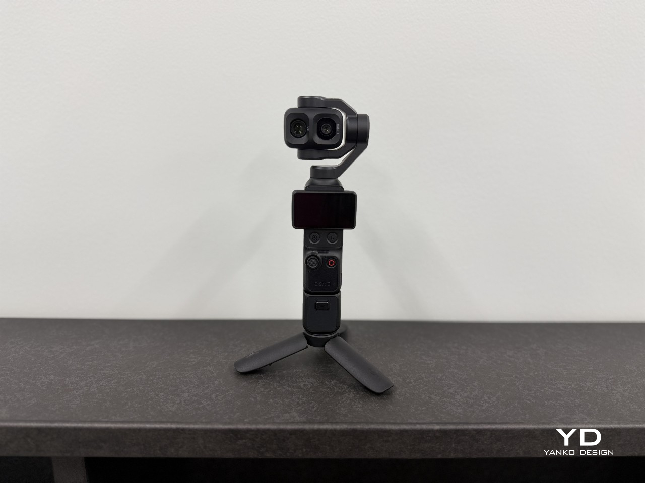
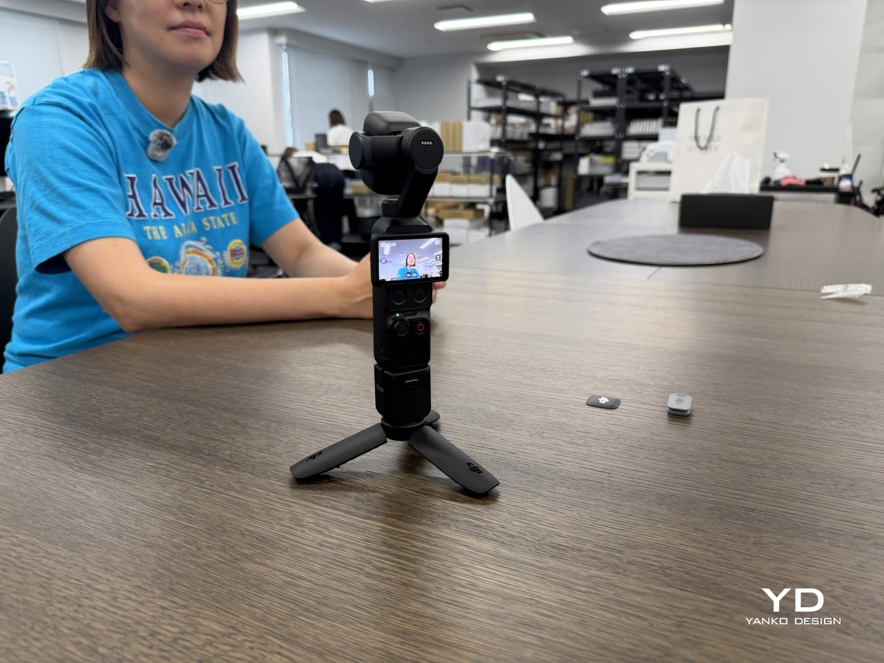
DJI’s ongoing firmware support has already added meaningful features since launch, including 10-bit HDR recording and auto media transfer to compatible iOS devices. The 103GB of built-in storage also means one less memory card to buy, lose, or eventually replace, and the broad accessory ecosystem lets the camera adapt to new shooting scenarios without requiring a full hardware upgrade. That’s a quieter form of sustainability, but a genuine one.

Value

Although available solo, the Osmo Pocket 4P also comes in a Vlog Combo that packs significantly more than just the camera itself. The box includes a threaded handle, FrameTap remote with its own screen, fill light, DJI Mic Mini 2 wireless microphone, mini tripod, and carrying accessories. Pricing it as an assembled creator kit rather than a standalone camera body makes the overall cost feel far more proportionate to what’s actually being offered.
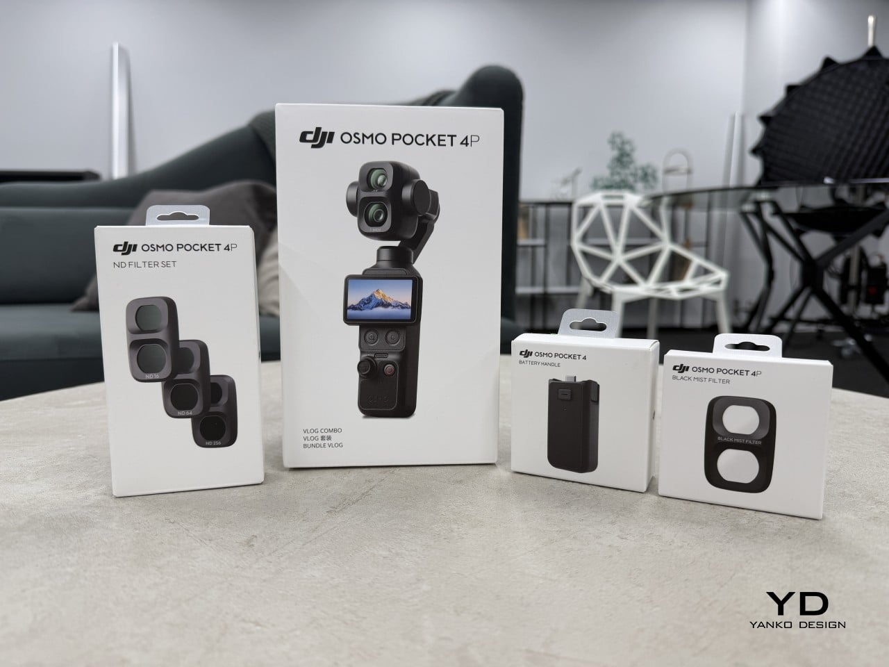
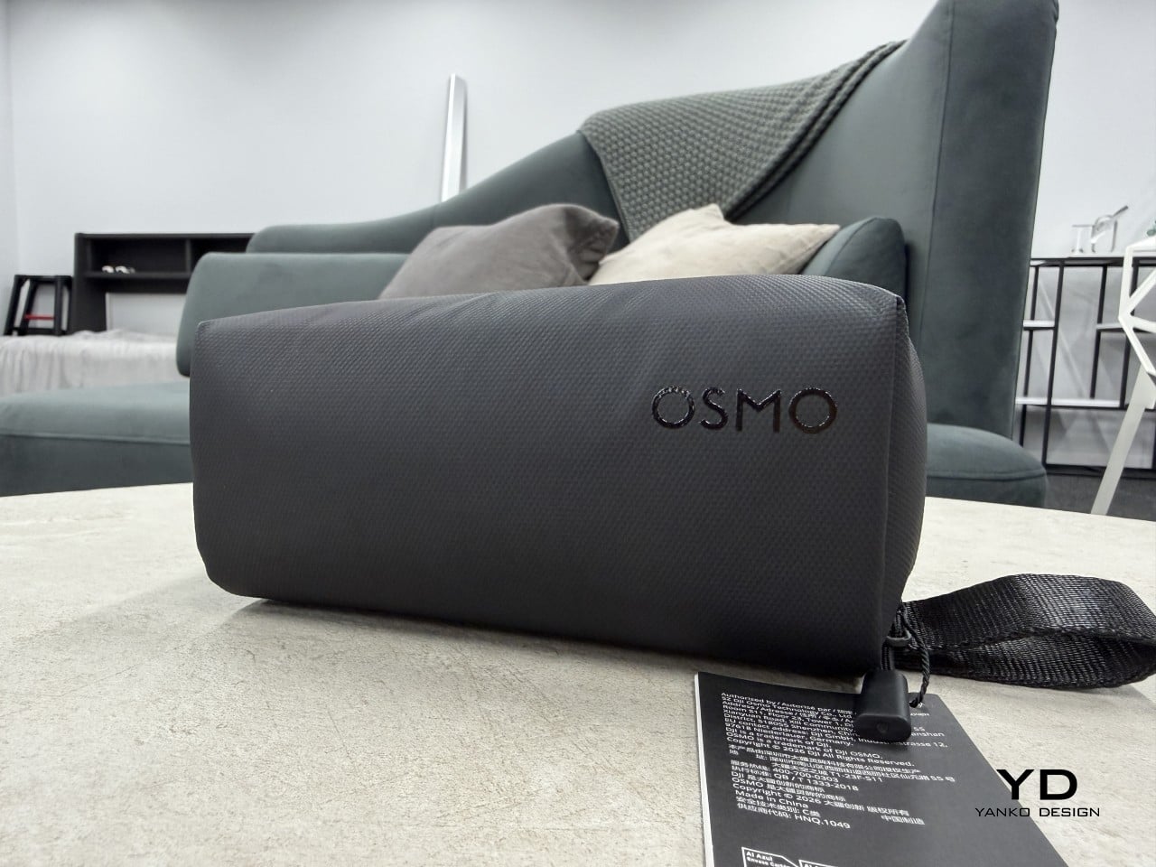
Compared to a smartphone, the Pocket 4P offers better stabilization and a more cinematic image. Compared to an action camera, it brings a portrait lens and a significantly more refined look. And compared to a mirrorless kit with a separate gimbal and microphone, it’s dramatically smaller and faster to deploy. It won’t replace a dedicated mirrorless setup in every scenario, but for most creators, it comes close enough to matter.

Verdict

What makes the DJI Osmo Pocket 4P worth noticing goes beyond better hardware or higher specs. DJI made a considered design decision to add a second lens that genuinely changes how the camera approaches perspective. That 60mm portrait focal length lets it tell more complete visual stories, handling the wide context shots and the tighter, more flattering moments that a single wide lens simply can’t manage as naturally.

For travel creators, vloggers, portrait-focused photographers, and anyone who’s wanted something that shoots more like a serious camera without the bulk, the Osmo Pocket 4P makes a genuinely strong case for itself. There are trade-offs, but they’re manageable, and the overall package in the Vlog Combo configuration is one of the more thoughtfully considered compact creator kits available right now. It’s a camera worth carrying, and more importantly, worth reaching for.
The post DJI Osmo Pocket 4P Review: Finally a Pocket Camera That Flatters Faces first appeared on Yanko Design.