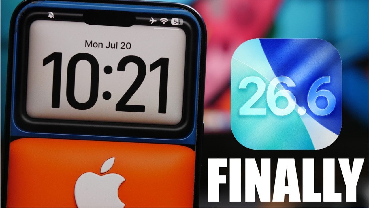
Apple’s iOS 26.6 serves as the final major update in the iOS 26 series, offering a range of enhancements aimed at improving performance, battery efficiency, and security. Scheduled for public release on July 27th, 2026, this update addresses lingering issues while introducing features designed to enhance usability and safety. Below is a detailed look at […]
The Hermes Agent is an AI system designed to streamline workflows and automate tasks across different environments. Tina Huang provides a thorough breakdown of its fundamentals, highlighting the importance of matching hardware to specific workloads. For instance, she discusses how high-performance devices like Mac Studio are well-suited for demanding operations, while older systems can be […]
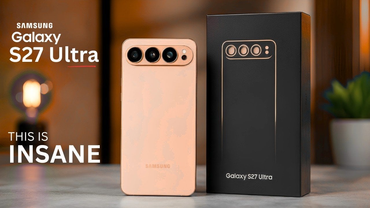
The Samsung Galaxy S27 series is poised to make a significant impact as one of the most eagerly awaited flagship smartphone launches in recent years. With reports hinting at major advancements in camera systems, display technology and a refined lineup strategy, Samsung appears ready to elevate the premium smartphone experience. Among the most notable developments […]
Flip phones never really disappeared. They just got sidelined once smartphones made everything available in a single touchscreen slab. Now they’re back in two very different forms: the foldable flagship, where a large touchscreen folds in half and costs over a thousand dollars, and a growing category of deliberately simpler devices that use the clamshell form to keep things from spiraling into the same habits smartphones enabled.
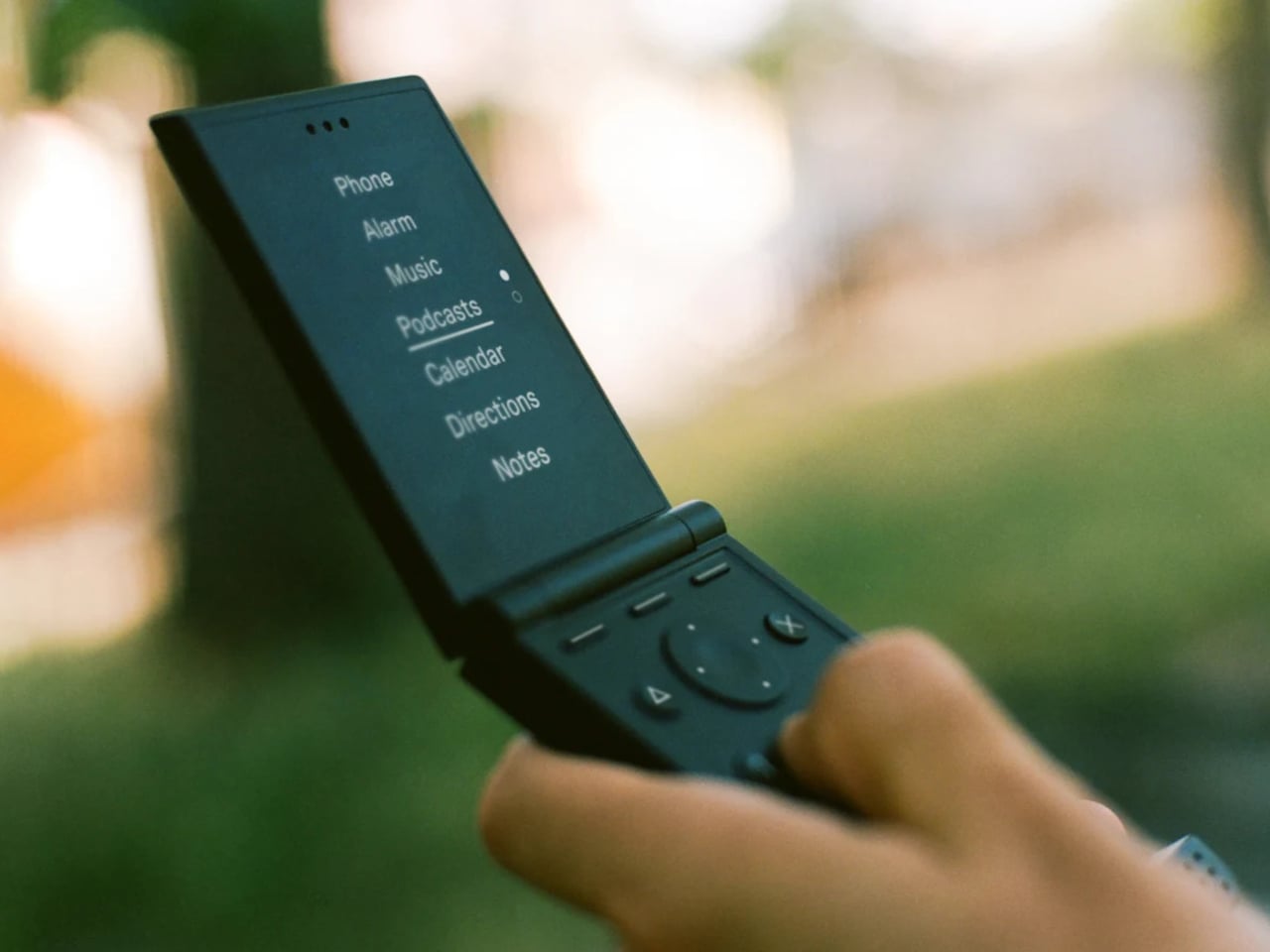
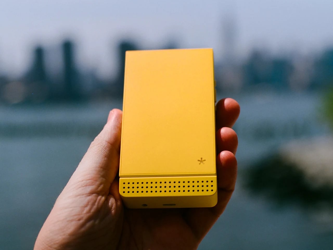
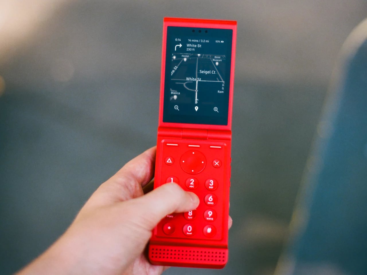
The Light Flip lands firmly in that second camp. It’s a 5G clamshell built around the same philosophy that has driven Light’s earlier devices, giving people the connectivity they need without the features that compete for attention. Fold it open, and you get a 2.8-inch matte OLED display and a physical keypad. Close it, and there’s no outer screen to glance at, no notification count, nothing pulling you back.
That absence of an outer display is a deliberate one. Most modern flip phones make the external screen a selling point, showing you messages and notifications without opening the phone. The Light Flip skips that entirely, which means the act of opening it is the only way in. It’s a small friction that turns out to make a meaningful difference in how often you reach for the phone by instinct rather than by intention.
Calls, texts, T9 predictive input, voice-to-text, and audio messaging cover the communication basics. Beyond that, LightOS includes a focused set of tools: directions, a music and podcast player, hotspot, calendar, weather, notes, a timer, and an authenticator for two-factor logins. The tools are genuinely useful and show up only when you need them. There’s no app store, no browser, and no social feeds anywhere in the operating system.
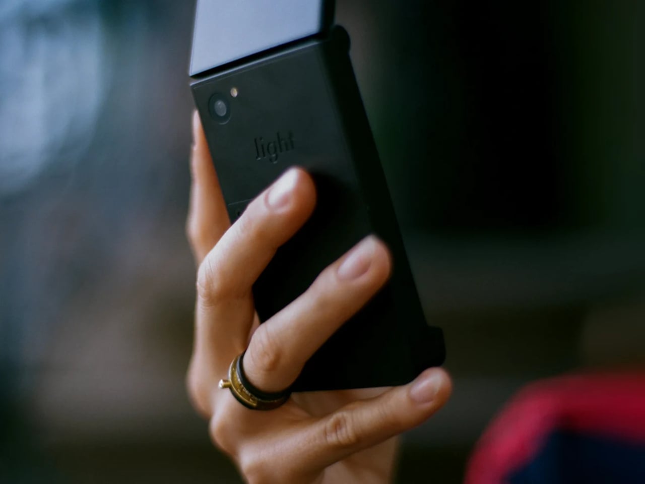
The hardware is honest about where the money went. The body is plastic, 160g, and uses a MediaTek MT8873 processor with 128 GB of storage and a 1,800 mAh battery that lands around 1.5 days. The camera uses a 50-megapixel rear sensor to produce 12-megapixel images. There’s no selfie camera, no NFC reader, and no touchscreen, which is how Light kept the price to $299. A 3.5mm headphone jack and a swappable battery are both present, which makes the trade-off feel more deliberate than arbitrary.
Connectivity covers Wi-Fi, Bluetooth 5.0, GPS, and 5G across a wide band range. The phone ships with a nano SIM slot and an eSIM option, and Light offers its own service plan at $39 a month for unlimited calls and texts with 1 GB of data, available in the US on a two-year contract. The unlocked version works on compatible carriers worldwide.
There’s a growing audience for devices that sit somewhere between a dumbphone and a smartphone. The Light Flip fills a specific niche with modern hardware and a considered software layer that adds without overwhelming. For anyone who’s tried screen time apps and focus modes on a smartphone and found them too easy to undo, a phone that simply doesn’t have those functions built in offers a different kind of answer to the same problem.
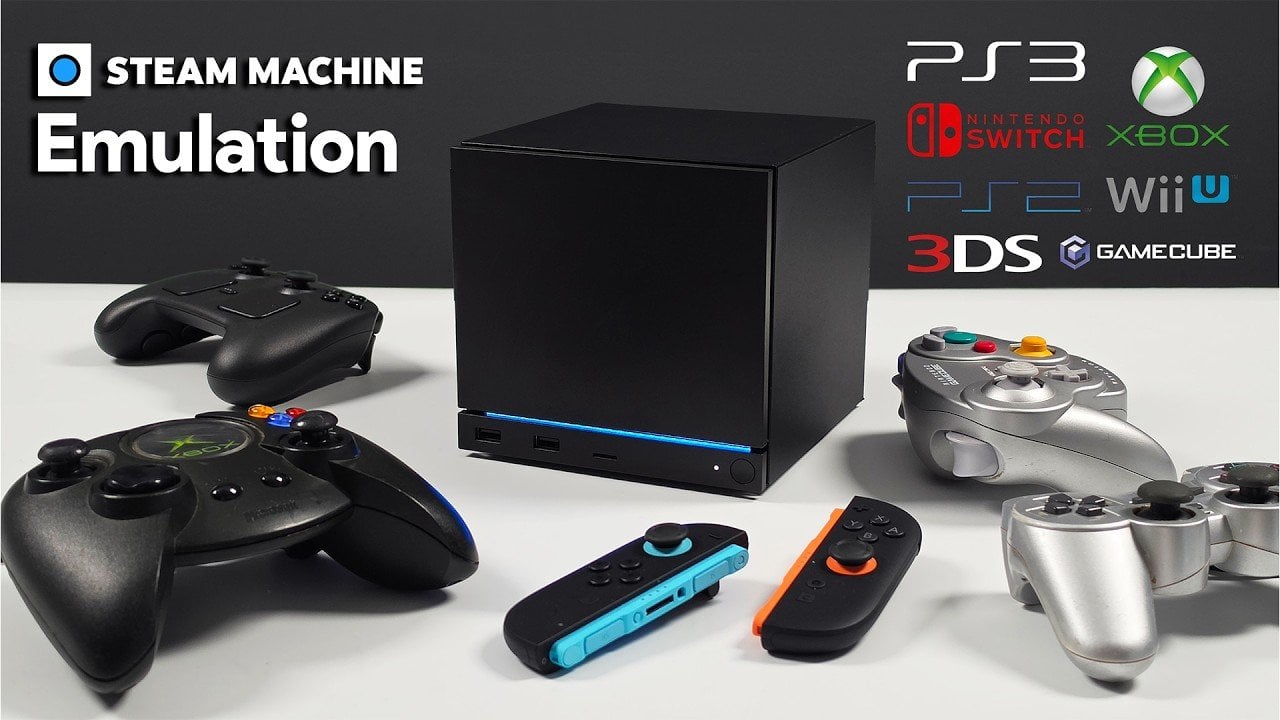
High-end emulation on the Steam Machine showcases the potential of compact gaming PCs to handle a wide range of systems. Equipped with a six-core, 12-thread CPU and an AMD GPU, this setup supports smooth gameplay for platforms like the GameCube, PS2, Wii U and 3DS. According to ETA Prime, frameworks such as EMU Deck simplify […]
Samsung Galaxy Unpacked 2026 is poised to be a significant moment in the tech world, taking place this Wednesday, July 22, at 9:00 a.m. Eastern Time (6:00 a.m. Pacific Time). Hosted in New York City, this highly anticipated event will spotlight Samsung’s latest advancements and innovations. Whether you’re attending in person or joining the live […]
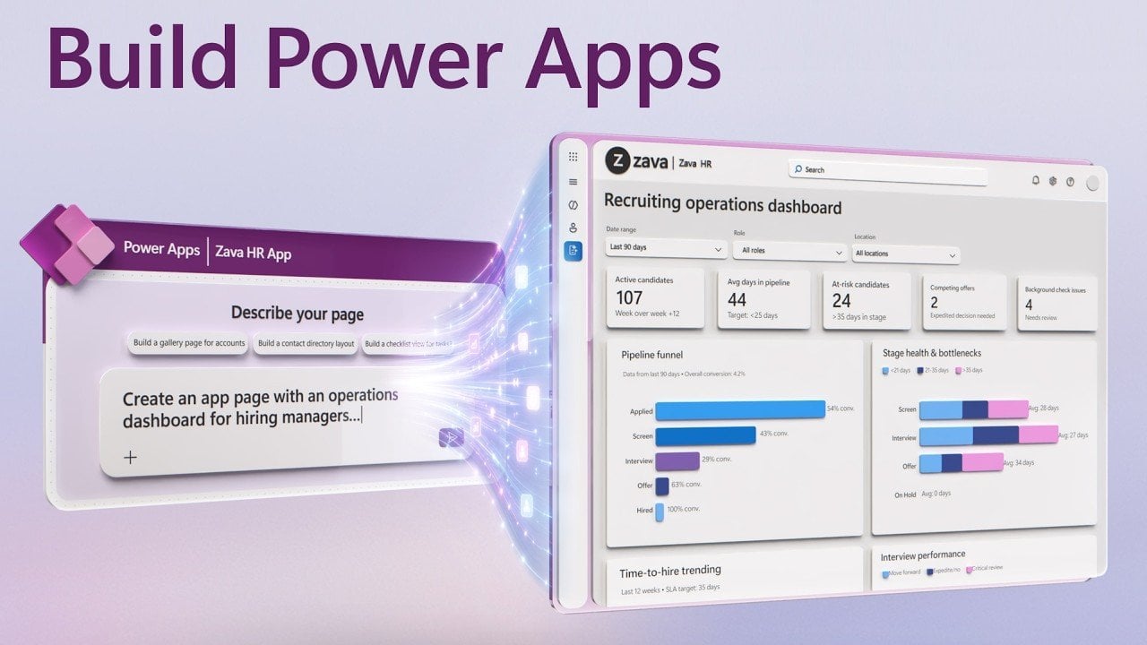
Creating your first app doesn’t have to be a daunting process, especially with the low-code capabilities of Power Apps. In a recent breakdown by Microsoft Mechanics, you’ll see how to build an app directly from your existing data in just a few steps. For instance, if you’re working with customer data stored in an Excel […]
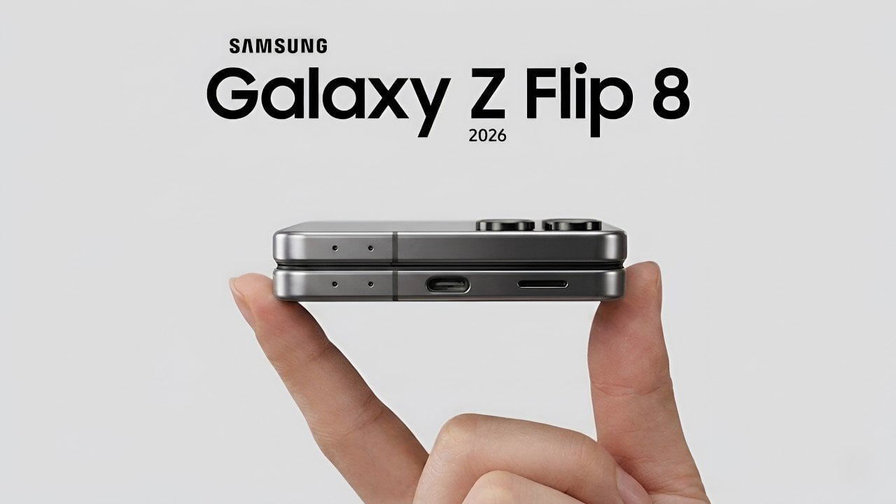
The Samsung Galaxy Z Flip 8 is set to make its debut in the foldable smartphone market, offering a blend of familiar features and modest upgrades. While it retains much of the design and functionality of its predecessor, the Galaxy Z Flip 7, the device comes with a higher price point. This increase, largely attributed […]