Meta AI should soon be better at surfacing international news content thanks to a set of new deals with publishers. The company announced new agreements with international outlets and offered additional details on its recent deal with News Corp.
The latest deals bring French newspaper Le Figaro, Spanish media company Prisa and German newspaper Süddeutsche Zeitung into the fold. Together, along with News Corp, which runs a number of outlets in the UK, these sources should give Meta AI better access to timely info about world events. Meta didn't disclose terms of the deals — The Wall Street Journal previously reported the News Corp arrangement was worth up to $50 million a year — but it said that it intends to link out to the relevant news sources.
"These integrations will also facilitate easier access to information by linking out to articles, allowing you to visit these partners’ websites for more details while providing value to partners, enabling them to reach new audiences," Meta wrote in an update. The company has a long and sometimes fraught history with publishers as its priorities have shifted over the years. In the past, Meta has struck deals to pay publishers to produce live video and "instant articles" only to change course as news content has become less of a priority for Facebook.
Now, with Meta struggling to compete with its AI rivals, it seems the social media company is once again interested in news content. As the company notes in its blog post, Meta AI isn't always great at surfacing accurate and timely info. I noted this in 2024 when the company's assistant was repeatedly unable to accurately answer seemingly simple questions like " who is the Speaker of the House of Representatives."
By striking a bunch of deals with publishers, the company should be better equipped to handle these kinds of queries (and hopefully more complex ones). How much benefit publishers will see from these arrangements, however, is an open question. While Meta says it will link out to the relevant news sources, there are lots of outside data points that raise serious questions about the effect AI search tools are having on web traffic.
This article originally appeared on Engadget at https://www.engadget.com/social-media/meta-is-bringing-more-international-news-to-its-ai-213323713.html?src=rss
Adobe has agreed to pay the US government $75 million to settle its lawsuit over the company's allegedly harmful approach to subscriptions. The suit started in 2024, when the US Department of Justice and the Federal Trade Commission filed a joint complaint alleging the company deliberately made it difficult to cancel subscriptions and obscured the frequently expensive "early termination fee" customers have to pay to get out of annual subscriptions that are paid monthly.
"While we disagree with the government’s claims and deny any wrongdoing, we are pleased to resolve this matter," Adobe writes. "We have agreed to provide $75 million worth of free services to customers that qualify. We will proactively reach out to the affected customers once the appropriate filings with the Court are made and accepted. Additionally, we have agreed to a $75 million payment to the Department of Justice."
Adobe's statement also notes that it's made the process of both signing up for and canceling subscriptions "more streamlined and transparent." A major sticking point of the original complaint is that canceling an "annual plan, paid monthly" subscription before completing the first year of service required customers to pay an early termination fee to make up for the value Adobe lost initially offering its software at a discount. Adobe currently allows plans to be refunded if they're canceled within 14 days after signing up, but canceling an "annual plan, paid monthly" subscription after those first 14 days requires paying a hefty fee (as outlined in the company's detailed support page).
A court will have to approve Adobe's proposed settlement before the lawsuit can be totally resolved, but the timing is at least a little ironic. Shantanu Narayen, Adobe's CEO for the last 18 years and the executive who oversaw the company's transition from traditional software business to software-as-a-service business, recently announced plans to retire.
This article originally appeared on Engadget at https://www.engadget.com/big-tech/adobe-agrees-to-pay-settlement-for-making-its-subscriptions-hard-to-cancel-210336635.html?src=rss
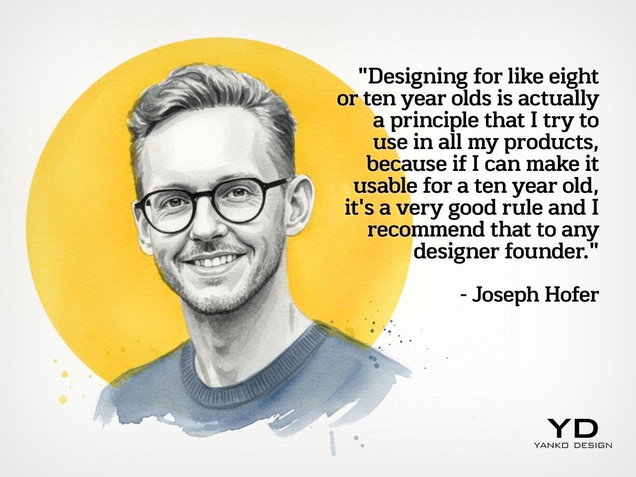
Design Mindset is Yanko Design’s weekly podcast, powered by KeyShot, the 3D rendering and visualization software that helps designers test how products feel, not just how they look. Hosted by Radhika Seth, the show goes deep into the philosophy and process behind world-class products, sitting down with the designers and founders who actually built them. Episode 19, premiering this week, is one of the most thought-provoking conversations the series has produced yet.
Joseph Hofer is the founder of Hofer Studio, where he consults with hardware entrepreneurs on building profitable, world-class product portfolios. Before that, he spent over a decade at BlackBerry as senior industrial designer, establishing the look and feel of the iconic Bold family and shaping devices like the Q10, Z10, and the BlackBerry Passport. His work spans over sixty design and utility patents, touching products that have sold over twenty-one million units and generated upward of $3.1 billion in revenue. More recently, he’s been the design force behind the Clicks Communicator, a physical-keyboard phone that launched at CES and challenges the smartphone status quo from the ground up.
Joseph opens the conversation with something that sounds almost poetic but lands with the weight of a core design principle, saying that “most of the objects we use every day quietly train us. They teach us how to hold them, how long to focus, how patient we need to be. When design ignores human limits, it drains us. When design respects them, it almost feels like care.” He critiques what he calls “sticky” experiences, the kind that benefit companies at users’ expense, arguing that the real question designers should be asking is whether a product helps people become a better version of themselves, or whether the company simply wins after ten years of draining them.
His case against the modern smartphone is pointed. Everything phones have become reactionary devices, he says, describing the experience of opening one to send an email and somehow finding yourself fifteen minutes deep in a reel, asking yourself how you got there. Big tech, in his view, has deliberately shaped products to increase screen time and sell more through ads. His philosophy runs in the opposite direction: good design should prompt intention before action, not exploit the absence of it.
Integration as Core Design Principle
One of the more revealing details Joseph shares early on is that at BlackBerry, the design team’s official title wasn’t “Industrial Design.” It was Design Integration. That framing stayed with him. “Integration is probably the word, the action that I look to do well in every project I work on,” he says, adding that a product can be really strong in one area but fall flat in others if you’re only focused on a single dimension. Great design, strong UX, and poor profit economics don’t add up to a sustainable company. Economics, manufacturing, cost, and complexity all have to be part of the thinking from the start.
His advice to technical founders reflects the same logic. Many of them start with a breakthrough innovation and then go looking for a market to push it into, which he sees as working in the wrong direction. The better path is to step back, clearly analyze the problem bubbling up from the market, shape an experience that solves it, and then let the technology marry with that. Letting one run too far ahead of the other is how good innovations end up as products nobody uses.
The Clicks Communicator: Intentional Mobile Interaction
The Clicks Communicator is the most direct physical expression of Hofer’s philosophy. It was the first phone he designed in ten years after BlackBerry, and the central idea is a complete inversion of how smartphones currently work. Rather than an app grid that presents notifications and pulls users in reactively, the Communicator prompts users to decide what they want to do first, then acts on it. Physical keys map to intentional shortcuts: pressing K calls a specific contact, pressing I opens Instagram only when the user has consciously chosen to. “It flips it from being reactionary to intentional,” Joseph says simply.
He’s also clear that the product’s appeal isn’t nostalgia. A lot of the customers aren’t even BlackBerry users, he notes; they’re younger people who simply want a different relationship with their mobile device. The Communicator sits within what he sees as a broader 2025 trend of “intentional tech,” products designed to decouple from the everything-phone model and serve one specific purpose well. Adding a 3.5mm headphone jack and a removable SD card wasn’t feature-stacking for its own sake either; those choices are signals to a specific audience that the team is listening and cares about them.
Recognizing Quiet Ideas and Process Discipline
When Radhika points out that the BlackBerry keyboard now feels like it was always inevitable, Hofer pushes back immediately. “Sometimes these quiet ideas that feel obvious or become obvious actually took a lot of effort and iteration to get there,” he says, describing the motto his team lived by: think, build, test. The keyboard’s evolution wasn’t a single stroke of insight; it was a response to real constraints. As iPhones pushed screens larger, BlackBerry faced intense pressure to shrink keypads, which meant switching from oval keys to square ones, losing the tactile separation users relied on. The innovation was subtle: raising a curved edge on each square key to preserve the feeling of the oval, essentially hiding a reference to the old shape inside the new form. Speed tests, accuracy tests, user sentiment on different options, all of that grinding iteration is what produced something that feels natural.
He applies the same thinking to simplicity broadly. Designing for a ten-year-old, he argues, is one of the most useful principles any designer or founder can adopt. If you can’t explain the product to a ten-year-old, it’s too complicated. He tested this literally the night before the recording, sitting down with his eight-year-old daughter to ask about her CD player. Her answer was that it had way too many buttons. Her ideal? Three: power, volume up, volume down. Six identical-feeling buttons with in-mold graphics that disappear in the dark told a clear story about what the designers had gotten wrong.
Restraint as Confidence and Commercial Strategy
The tension between restraint and visibility is something Hofer takes seriously. He doesn’t frame minimalism as a virtue in itself. “Clarity is actually an even stronger word,” he says, arguing that a vanilla product solving a vanilla problem will simply go unnoticed. The goal isn’t to be quiet; it’s to solve a real, specific problem so well that the product becomes the only answer for a particular group of people. A phrase he came up with captures where he’s trying to take the companies he works with: from viral products to vital ones, products that customers genuinely need in their lives because of the difference they’ve made.
That philosophy maps directly onto commercial outcomes. A product that meets the emotional and functional needs of a user, reduces cognitive load, lasts longer, and has lower return rates naturally builds a brand that draws people in without needing to be aggressively sold. “When products are just better,” he notes, “they need to be marketed and sold maybe less. That’s an effect on your bottom line.” His work at Hofer Studio is less about crafting beautiful objects and more about asking founders what commercial success actually means to them and building backwards from that.
When the rapid-fire round asks him to describe restraint in design in a single word, his answer arrives without hesitation: confidence. “What does obviousness create? It creates confidence. I know how to enter this experience. I know how to start this product. I feel more confident with it in my life.” It’s a fitting close to a conversation that consistently returned to the same idea: that the design decisions nobody notices are usually the ones that took the most care to make.
Design Mindset drops every week on Yanko Design. Catch Episode 19 in full wherever you listen to podcasts. For a free trial of KeyShot, visit keyshot.com/mindset.
In the mad dash many companies have made to incorporate AI features into their phones, Nothing arrived at one of the better ideas with Essential Space on the Nothing Phone 3a in 2025. The AI-powered app turns screenshots and voice recordings into actionable to-do lists and transcriptions, and now Nothing is rolling out an update to make the app easier to search and capable of recognizing new kinds of content.
As part of the update, Essential Space now recognizes "Events," displaying them in their own card with fields for the date, time and location. That means, for example, if you add a photo of a flyer for pottery class to the app, Essential Space will be able to pull the details of when and where it's happening, and track it in much the same way it does tasks or to-dos. Nothing foresees events being such a big part of how people will use Essential Space that it's also changing the layout of the app's interface and listing things like Events and Tasks in a new For You page you see when you open the app.
To make everything you've stored in Essential Space easier to find, the app now also supports semantic search, surfacing results that don't just match the text you've entered, but try to match the meaning of what you're looking for. Semantic search should be particularly useful when you're looking for an image, because you can enter a description of what you're looking for and Essential Space should still be able to surface it.
Sorting and indexing digital ephemera like voice notes and screenshots with AI is a popular use for the technology. Google offers Pixel Screenshots, and even Apple gave iOS and iPadOS the ability to automatically recognize events in images and add them to your calendar. Essential Space might be less unique now, but the fact that Nothing continues to update it bodes well for its future.
Nothing's new Essential Space update is available starting today on "all 2025–2026 Nothing and CMF phones that support Essential Key," the company says. Essential Space should automatically update, but you also manually update the app in the Google Play Store.
This article originally appeared on Engadget at https://www.engadget.com/apps/nothing-updates-its-ai-app-with-semantic-search-and-a-new-way-to-track-events-202500495.html?src=rss
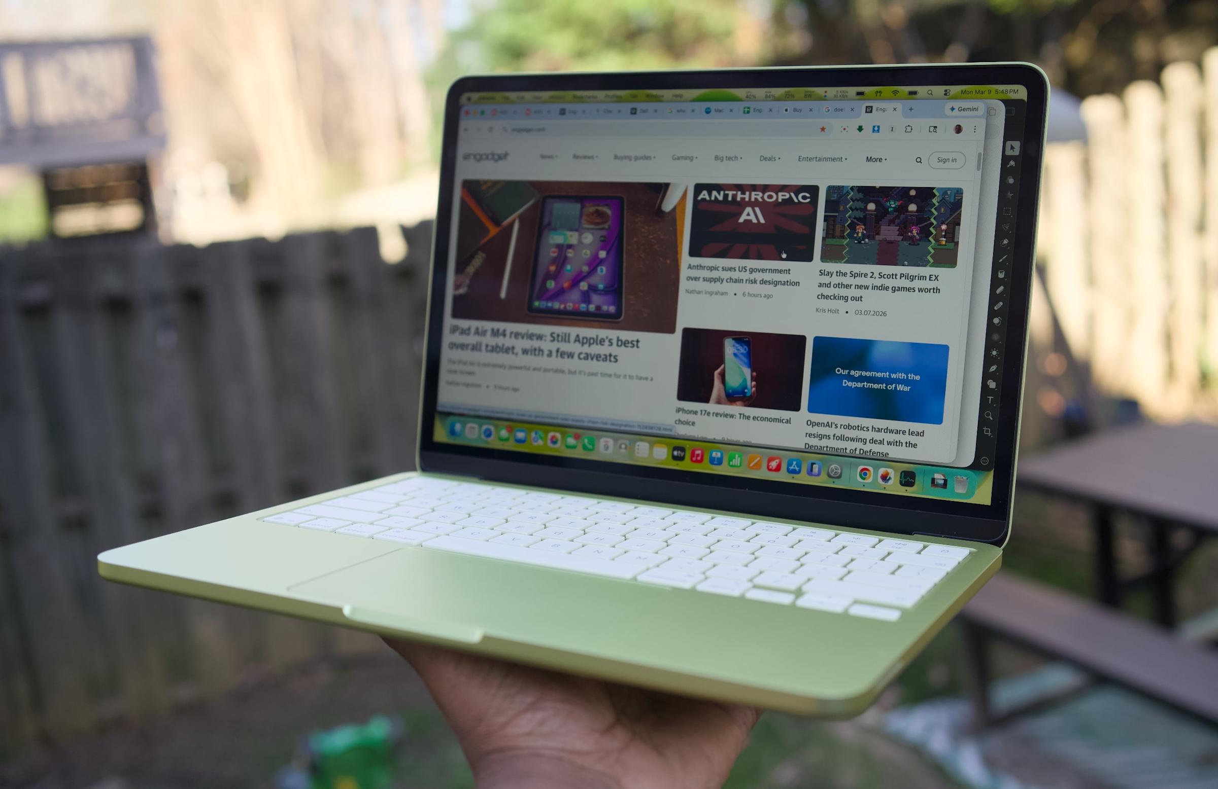
Apple's cheapest laptop is also its most repairable. iFixit gave the new MacBook Neo a 6/10 repairability score. Although that number would only be mediocre for, say, a game review or final exam grade, it's the MacBook line's highest iFixit score in about 14 years.
As always, iFixit goes into great detail about the product's repairability, but a few points stand out. First, the MacBook Neo's battery is screwed down rather than glued — moving it from "this might burn the house down" to "routine repair" territory. The laptop also has a flat disassembly tree. That means its battery, speakers, ports and trackpad are all immediately accessible after opening the back case.
In other areas, a simplified antenna assembly helps the screen come away cleanly. Keyboard repair is still a bit tedious (41 screws and tape), but at least it isn't riveted to the top case like on other models. (The screwed-not-glued battery helps here, too.) Apple's decision to forego a Force Touch trackpad and return to a mechanical style improves repairability as well. And in a nice touch, all the machine's Torx Plus screw sizes are clearly labeled inside the case.
Apple
Several other encouraging signs carry over from recent MacBooks. iFixit found that Apple's Repair Assistant accepted all replacement parts it tried without a fuss. And its USB-C ports and headphone jack are modular, so replacing either doesn't "turn into logic board work."
Not everything is peachy. As expected, the Neo still has soldered RAM and storage, so there's no upgrade path there. iFixit describes Apple's pentalobe screws on the bottom case as an "annoying" choice. And while the device's speakers are easy to remove, they, well, just aren't very good. (Had to cut that cost somewhere.)
While iFixit describes the Neo's repairability as "a real comeback," it's premature to assume higher-end MacBooks will follow suit. After all, with this $599 device ($499 for schools), Apple is targeting the educational sector, where repairability could mean more bulk orders. Until Apple is convinced that the MacBook Air or Pro would sell better with similar serviceability, this kind of score may be limited to the budget model.
This article originally appeared on Engadget at https://www.engadget.com/computing/laptops/the-macbook-neo-is-apples-most-repairable-laptop-200923202.html?src=rss
Meta is killing end-to-end encryption in Instagram DMs. The feature will "no longer be supported after May 8, 2026," the company wrote in an update on its support page. Unlike WhatsApp, Meta never made encryption available to all Instagram users and it was never a default setting. Instead, users in "some areas" had the ability to opt-in to encryption on a per-chat basis.
In a statement, a Meta spokesperson said the feature was being retired due to low adoption. "Very few people were opting in to end-to-end encrypted messaging in DMs, so we're removing this option from Instagram in the coming months," the spokesperson said. "Anyone who wants to keep messaging with end-to-end encryption can easily do that on WhatsApp.”
Interestingly, Meta's statement doesn't mention the status of encryption on Messenger. The company began turning on end-to-end encryption as a default setting in 2023 after years of work on the feature. A support page for Messenger currently states that the company "is in the process of securing personal messages with end-to-end encryption by default."
Meta's approach to encrypted messaging has changed several times over the years. It started encrypting WhatsApp chats in 2016. In 2019, Mark Zuckerberg outlined a "privacy-focused" revamp of the company's apps, saying at the time that "implementing end-to-end encryption for all private communications is the right thing to do." In 2021, the company's head of safety said that Meta was delaying its encryption work until 2023 in order to create stronger safety features.
Meta’s use of encryption has been repeatedly criticized by law enforcement and some child safety organizations that say the feature makes it harder to catch predators who target children on social media. Recently, the topic has been raised numerous times during a trial in New Mexico over child safety. Internal documents that have surfaced as part of the trial show Meta executives and researchers debating the trade-offs between safety and privacy as it relates to encryption.
In testimony that was broadcast during the trial, Zuckerberg said that safety issues were "a large part of the reason why it took so long" to bring encryption to Messenger. "There's been debate about this, but I think the majority of folks, from people who use our products to people who are involved in security overall, believe that strong encryption is positive," he said.
This article originally appeared on Engadget at https://www.engadget.com/social-media/meta-is-killing-end-to-end-encryption-in-instagram-dms-195207421.html?src=rss
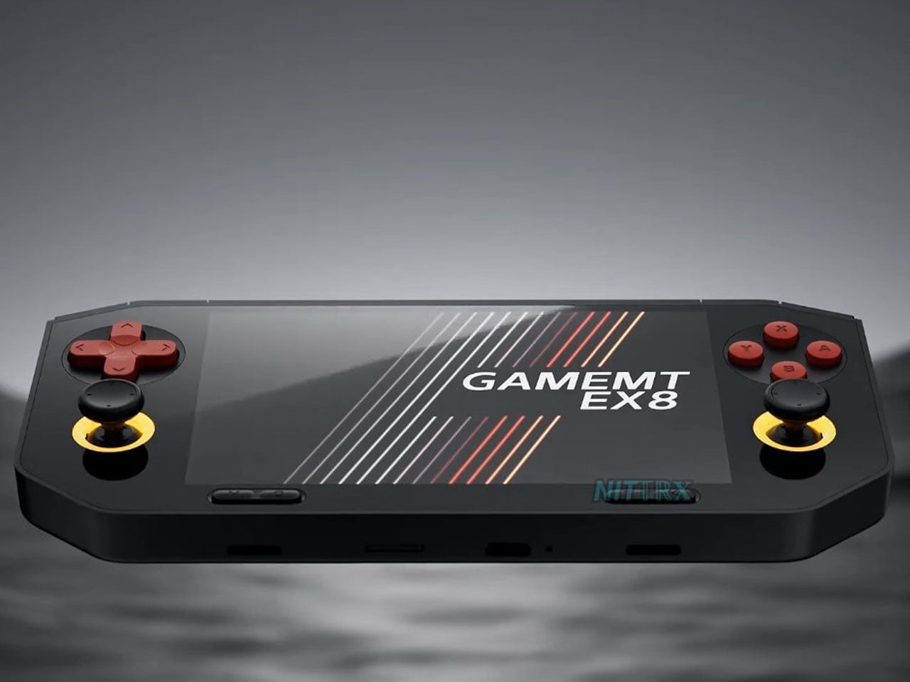
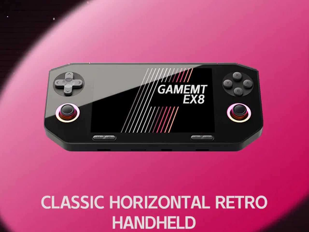
The gaming handheld continues to expand with new devices aimed at retro enthusiasts and mobile gamers. One of the latest additions is the GameMT EX8, a portable gaming console designed to deliver a capable Android-based gaming experience while maintaining a relatively affordable price point. With a high-resolution display, a familiar handheld layout, and hardware suited for emulation and mobile gaming, the EX8 represents GameMT’s attempt to compete with other budget-friendly handhelds in the growing retro gaming segment.
The handheld features a 4.88-inch display with a resolution of 1080 × 1620 pixels and a 3:2 aspect ratio. This format is particularly appealing for retro gaming because it better accommodates older console titles that do not match modern widescreen displays. The panel is also noticeably sharper than the screen used in some competing handhelds, such as the Ayaneo Pocket Micro, which uses a smaller 3.5-inch display with a lower resolution. The larger and sharper screen is expected to improve the visual experience when playing classic games from platforms like the PlayStation and PSP. With its combination of a high-resolution 3:2 display, capable mobile processor, and expandable storage, the GameMT EX8 aims to deliver a balanced handheld gaming experience.
Designer: GameMT
Powering the device is MediaTek’s Helio G99 processor, a chipset commonly found in mid-range smartphones. The chip is paired with 6GB of RAM and 128GB of internal storage, providing enough performance for Android gaming and a wide range of emulated titles. The Helio G99 has already proven capable of handling many retro systems and even some more demanding platforms through emulation, making it a practical choice for a handheld of this category. For users with larger game libraries, the EX8 also includes a microSD card slot that allows the storage to be expanded beyond the built-in capacity.
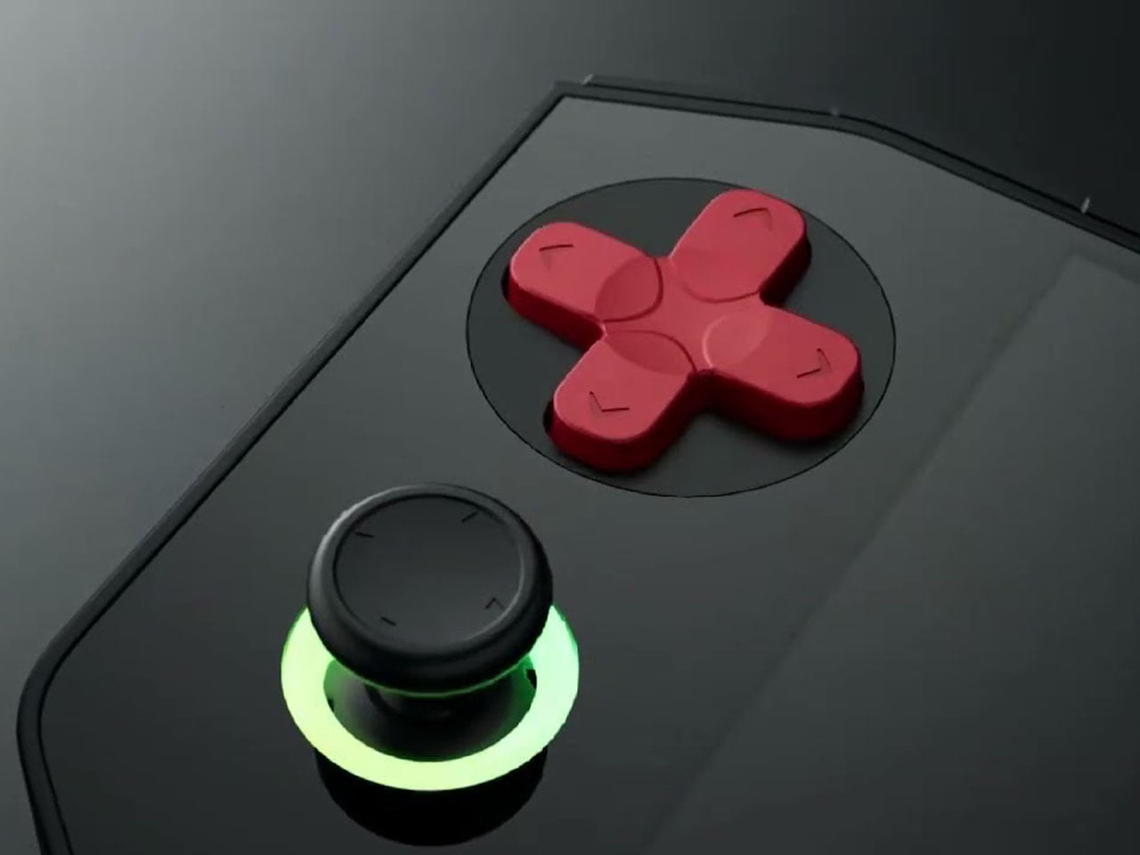
In terms of design, the EX8 adopts a horizontal handheld layout with symmetrical analog sticks positioned on both sides of the display. Each thumbstick is surrounded by an RGB ring light, giving the device a more modern aesthetic. A traditional D-pad and ABXY button arrangement sits alongside the sticks, while shoulder buttons are integrated along the top edge. The device also appears relatively thick compared to some competitors, likely to accommodate its internal hardware and cooling system. Thermal management is supported by an internal cooling fan, which helps maintain stable performance during extended gaming sessions. Audio is delivered through bottom-firing speakers, and the handheld is powered by a 5,000 mAh battery that charges through a USB-C port. These features are designed to ensure the device can sustain longer play sessions without overheating or running out of power too quickly.
The GameMT EX8 will be available in two color options. A black version pairs dark hardware with red D-pad and face buttons, while a white variant features purple buttons and matching accents. This contrast gives the handheld a distinctive visual identity within the crowded retro gaming market.
Amazon is raising the price of its ad-free Prime Video subscription and locking 4K UHD streaming behind this new tier. Starting April 10 for US customers, a rebranded Prime Video Ultra subscription will cost $5 per month, up from $3 per month.
For that extra $2, you get a download capacity increase from 25 to 100, and you can now run five streams concurrently instead of three. Whether those "Ultra" upgrades are worth the $24 annual hike will probably depend on how many boxsets you like to plough through on a long flight, or how many devices are using your Prime Video account.
The changes are most galling for Prime members who automatically qualify for Prime Video with ads through their membership, as Amazon has decided to remove 4K streaming from the standard tier. That means that, despite already paying $15 per month or $139 per year for Amazon Prime, you’ll be stuck with 1080p shows and movies unless you sign up to Prime Video Ultra.
Amazon has thrown in Dolby Vision support for the first time, as well as upping the concurrent stream and download count on its free tier as well, but you’re losing the privilege of UHD content that has been available to all Prime Video members for years. Dolby Atmos remains exclusive to the $5 tier too.
Amazon is the latest streamer to put its prices up, following similar recent hikes to Apple TV, Disney+ and HBO Max. If you don’t want to give the company any more of your hard-earned, you have just under a month to binge your way through the second season of Falloutin all of its irradiated UHD glory.
This article originally appeared on Engadget at https://www.engadget.com/entertainment/streaming/youll-now-have-to-fork-out-for-an-additional-subscription-if-you-want-to-watch-4k-content-on-prime-video-174028064.html?src=rss
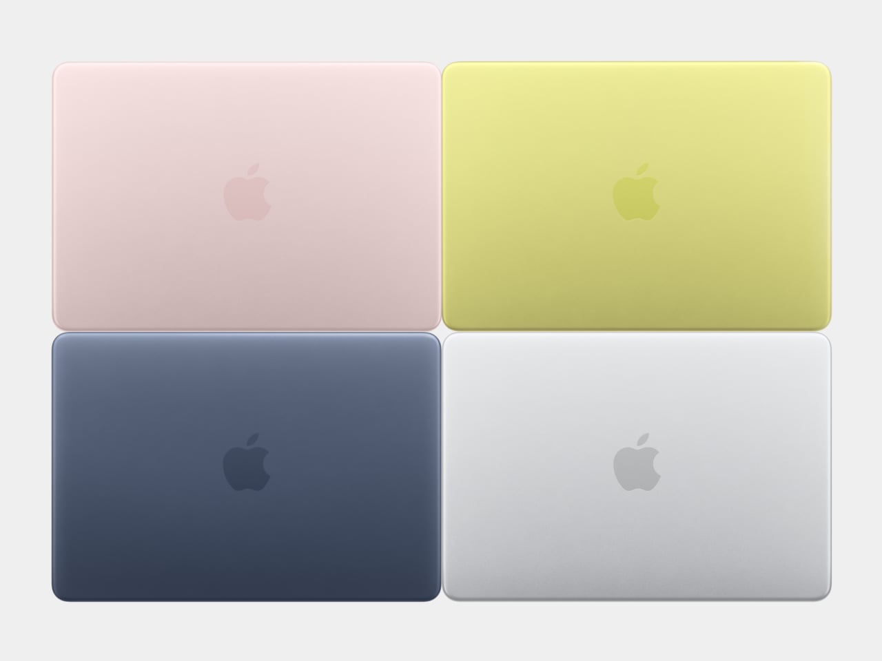
For about 18 years, every aluminum MacBook has looked more or less the same. Silver. Angular. Quietly serious. There’s nothing wrong with that. Apple’s unibody aluminum design, introduced in October 2008 and carved from a single block of metal, was genuinely elegant and set the template for an entire industry. But it also retired something along the way: the idea that a Mac laptop could feel chosen rather than just defaulted to.
The MacBook Neo, announced March 4 and starting at just $599, is the first real crack in that template. It comes in four colors (blush, indigo, silver, and a yellow-green called citrus) with enclosure corners that are noticeably softer than any aluminum Mac in recent memory. Whether that adds up to a proper design statement or just smart positioning is worth thinking through.
Designer: Apple
What happened to Apple’s color confidence
iBook G3 Clamshell (courtesy of Wikipedia)
Apple’s fondness for color didn’t always live inside an iPhone. The iBook G3, launched in 1999, came in tangerine and blueberry, and later in indigo and key lime. It was rounded, slightly toy-like, and completely unapologetic about being a consumer product. When the aluminum unibody arrived in 2008, Apple traded that warmth for precision machining and sharp rectilinear edges. Right call for the MacBook Pro. Default for everything else, apparently, for nearly two decades.
The result was a color drought in aluminum Mac laptops that has lasted until now. Silver, space gray, midnight, starlight: all variations on the same mood of professional restraint. The Neo’s citrus and blush aren’t just options on a spec page. They’re a quiet admission that not every laptop buyer wants a device that looks like it belongs in a boardroom. For Apple, that’s actually not a small thing to say at the product level.
Two different stories about corners
M1 MacBook Pro (2021)
There’s a distinction worth making here, because “rounded corners” gets used loosely when describing the Neo. MacBook displays have had rounded screen corners since 2021, which is a display-level detail and nothing new. What’s different on the Neo is the chassis itself. The physical aluminum enclosure is softer at the edges and corners than any aluminum Mac before it, and Apple’s own press materials describe “soft, rounded corners” specifically in terms of how the device feels to hold and carry.
That’s a real shift in the design language. The 2008 unibody was celebrated for machined sharpness, corners you could feel were engineered. The Neo softens that deliberately. It’s not a revival of the iBook, and it’s not trying to be, but the instinct is similar: a consumer Mac that feels a little more like it belongs to you. The notch is also gone, making this the first notchless MacBook since 2020, which quietly tidies up the one thing that made recent Airs feel slightly unfinished.
The repairability angle is actually a design story too
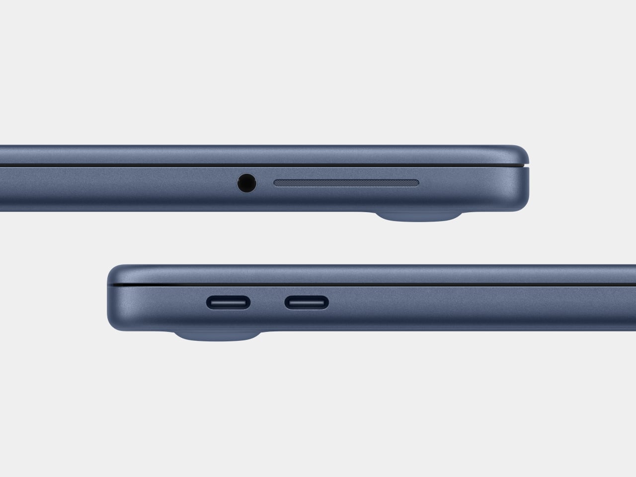
One thing that got a little buried under the color conversation: the Neo is the most repairable Mac laptop in years, and that’s partly a design decision worth noting. Teardowns showed how the whole machine was disassembled in just a few minutes using standard Torx screws throughout. No tape, no adhesive, anywhere inside. That’s a first for a modern Mac. The USB-C ports, speakers, and headphone jack are all modular. The keyboard can be replaced on its own, without swapping the entire top case, which on the MacBook Air currently costs over $370 in parts.
The internal simplicity isn’t accidental. The A18 Pro chip runs so efficiently that the Neo needs no fan at all, which removes a whole layer of thermal engineering that usually clutters a laptop’s interior. The result is a cleaner, more logical internal layout. Whether Apple arrived here from genuine design philosophy or from regulatory pressure (the EU’s right-to-repair push has been building for years) is an open question, but the outcome is real either way.
What it doesn’t fix, and what might come next
It’s not all sunshine and rainbows, of course. The base model has 8GB of non-upgradable RAM, one USB-C port runs at USB 2.0 speeds, and there’s no backlit keyboard. These are calculated trade-offs for the price point, not mistakes, but they matter depending on what you actually need the machine for. And repairability, for all the justified enthusiasm, is still partial: the RAM and storage are fixed at purchase, just like every other current Mac.
Still, the Neo feels like Apple designing for a specific person it had previously ignored: someone who was never going to spend $1,000 on a MacBook Air and wasn’t particularly well served by anything else Apple made. The color, the softer form, the price, the clean internals, all of it points at the same person. What’s genuinely interesting is whether any of this travels upmarket. If a future MacBook Air gets a color story this confident, the Neo might end up looking less like an entry-level product and more like Apple quietly figuring out what comes next.
Parallels, the company best known for making the virtualization software that enables you to run Windows and other operating systems on a Mac, has confirmed that Parallels Desktop is compatible with the MacBook Neo.
At launch it was unclear if Apple's new $600 laptop possessed the under-the-hood heft to run Windows apps, but in a recently updated post on its website, Parallels said that initial tests show its software running "stably," although performance is still being assessed.
The MacBook Neo uses an A18 Pro chip, which debuted in the iPhone 16 Pro. However, as this chip is based on the same ARM architecture as M-series chips for Mac, it’s still capable of running Parallels’ Windows virtual machine.
But there is a caveat to all this. Just because you can do something, it doesn’t necessarily mean you should. While Parallels Desktop could theoretically be a viable option for Neo owners who are only interested in light Windows use, anything that puts a significant strain on the CPU or GPU is going to present a problem.
This is because the MacBook Neo only ships with 8GB of RAM, and as Parallels highlights, Windows 11 requires a minimum of 4GB of RAM to run. That leaves a very small amount of remaining headroom for macOS and your Mac apps to run alongside Windows, which is going to noticeably hurt the laptop’s performance. Add to that the lack of a cooling fan, meaning the chip will reduce clock speeds when it detects a heavy CPU or GPU load, and this definitely isn’t a device for power users.
If you really want to dabble with Windows on a Mac, Parallels recommends picking up an Apple laptop with 16GB of unified memory or more, like the new MacBook Air M5 or a MacBook Pro. And for those content with macOS and looking to save some money, we dubbed the MacBook Neo the best $600 laptop we’ve ever used in our recently published review.
This article originally appeared on Engadget at https://www.engadget.com/computing/laptops/parallels-desktop-creators-say-macbook-neo-does-indeed-have-enough-muscle-to-run-windows-apps-164525546.html?src=rss