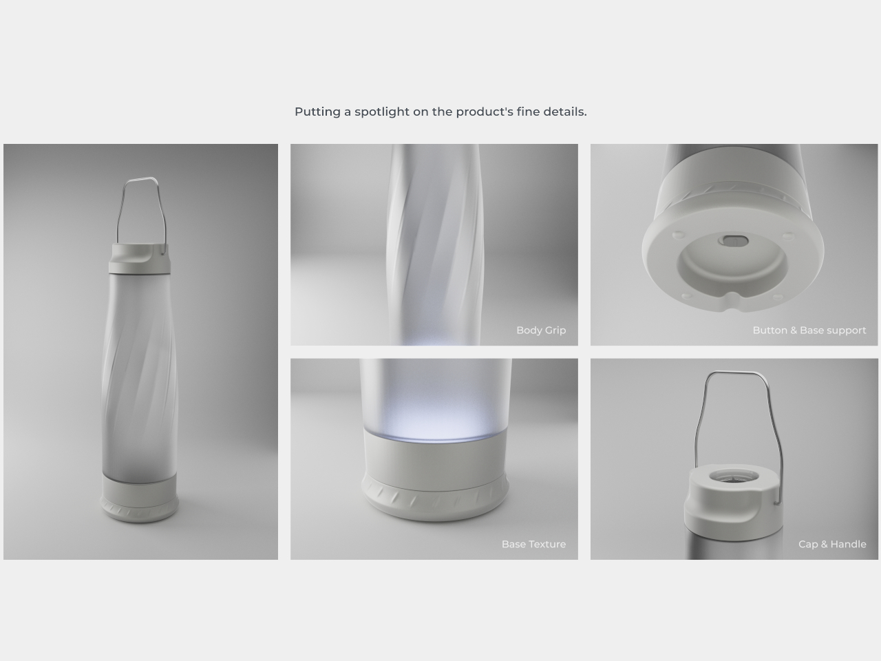
AI is gradually creeping up in our daily lives, giving us all better ways to be productive without exercising our neural network. If we weren’t already slaves to our phones and PCs, AI will ensure we stay hooked on to our gadgets more than ever. Many applications of AI are more than useful if used smartly.
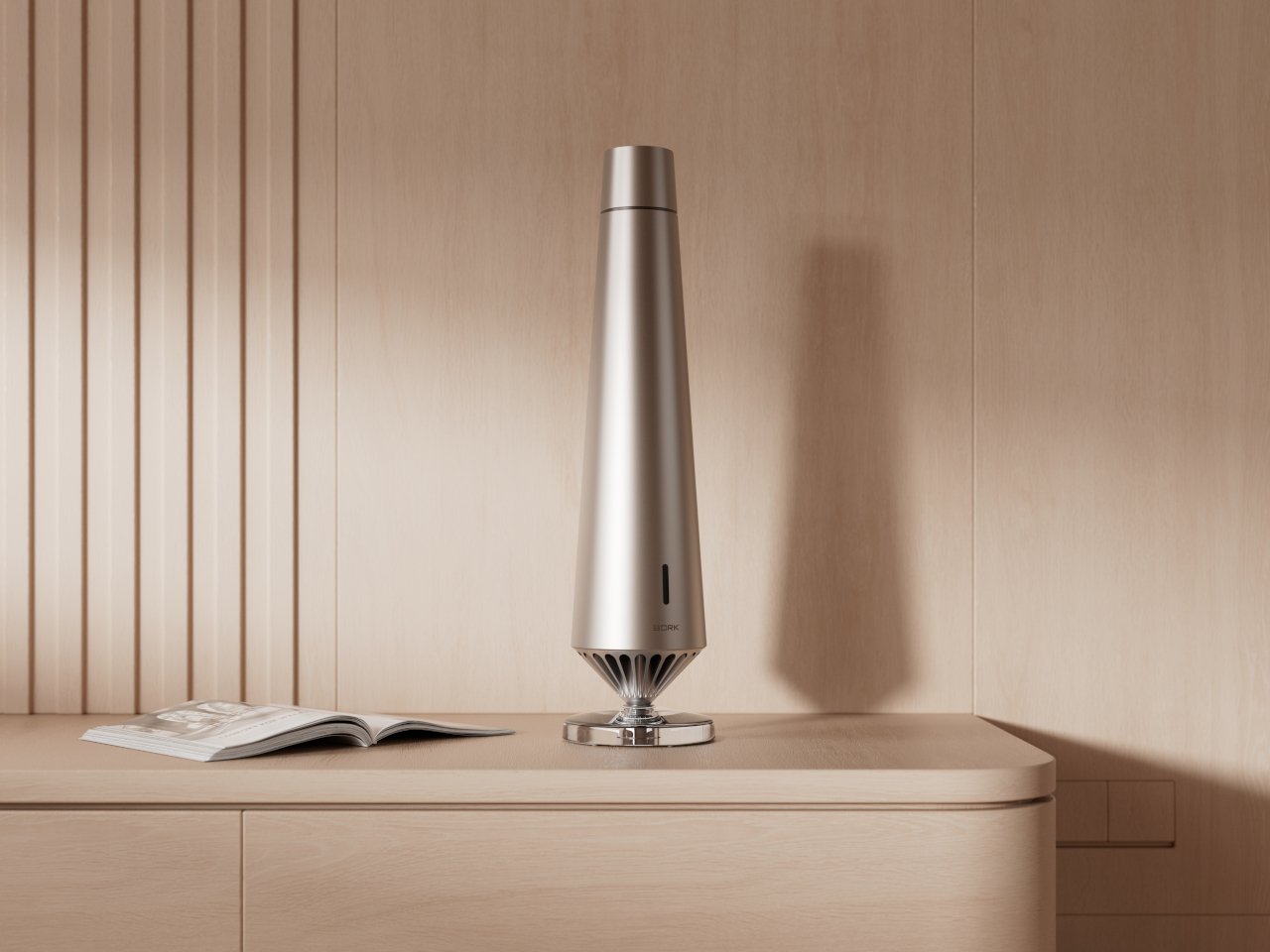
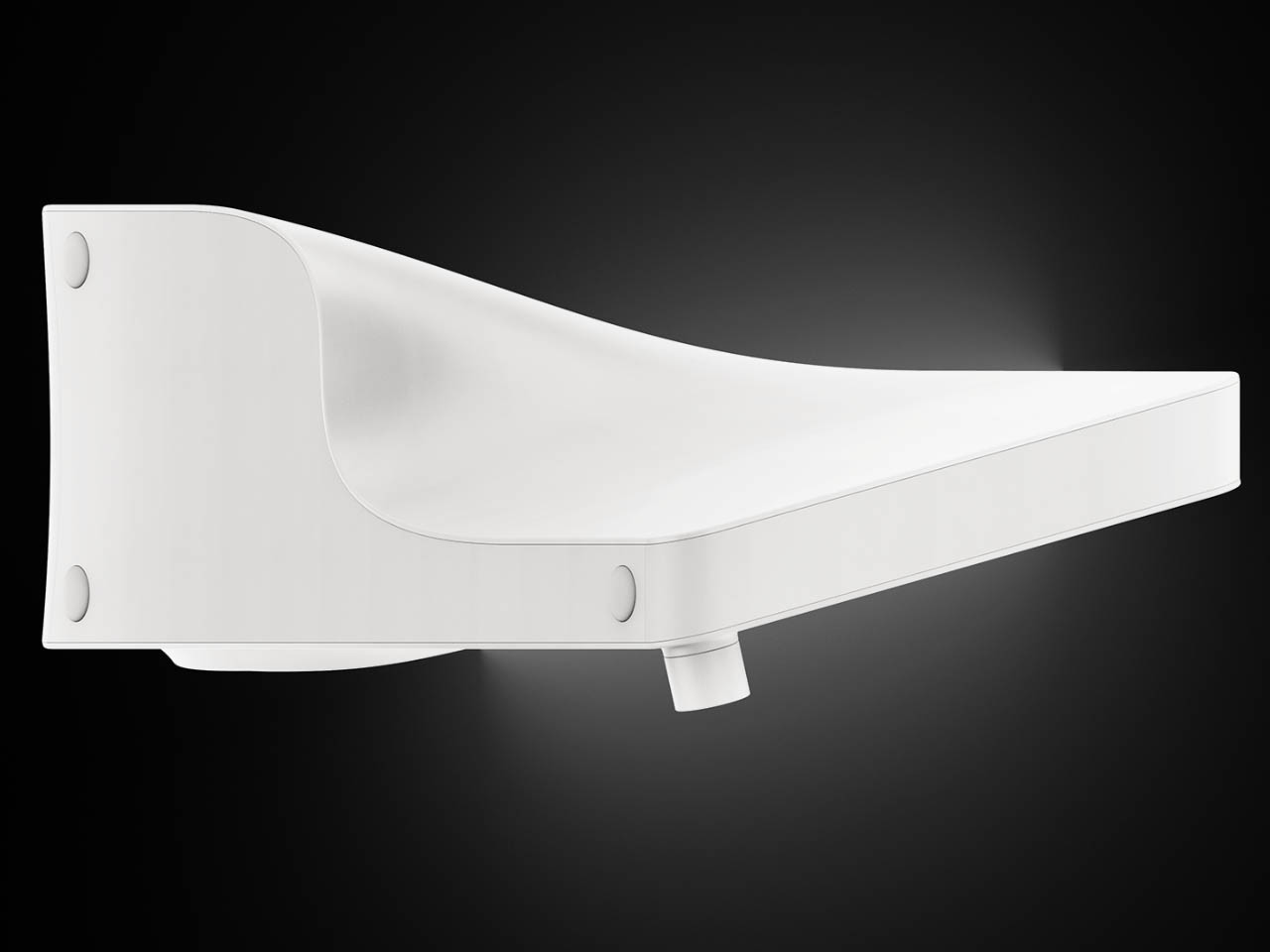
Most AI models are slowly inching towards a machine learning level that’s useful for more complex day-to-day applications. A direct byproduct of that metamorphosis is this concept radio that is entertaining for good. Meet Symphony AI language module radio that won’t leave you bored sitting on your couch scrolling endlessly in your Instagram feed.
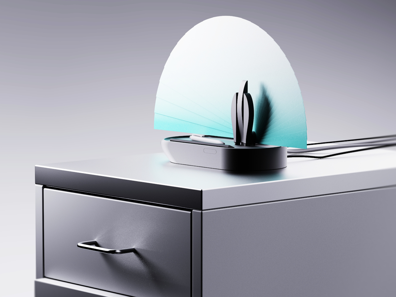
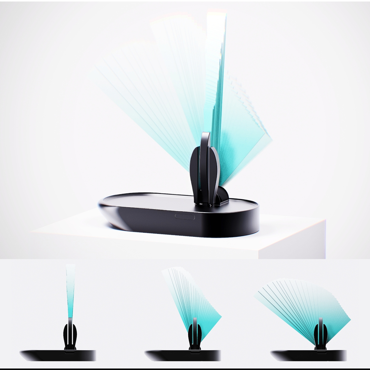
Designer: Junha Kahm
The device comes with an in-built AI language module that creates engaging debates and conversations on a variety of topics. They can range from online news, podcasts, or trends that can be on any platform via YouTube, audio files or PDFs. The gadget is more than just summarizing information that doesn’t require debate. It captures the gist of the reasoning process and discusses information to further provide an opportunity for objective thinking that’s free from any biases. This is done based on all the latest world’s information.

These two functions of the Symphony radio are kept separate via two modes. One of them is the Summary Mode which is more of a knowledge-condensing function for extracting the summary of elaborate topics that can get boring at times. The other is the Debate Mode which is more engaging and dynamic since it gathers and presents contentious information available online in a narrative format. In the second mode, the AI-driven approach presents individual perspectives and understands the issues more openly. This expands the user’s thoughts in a very entertaining way.
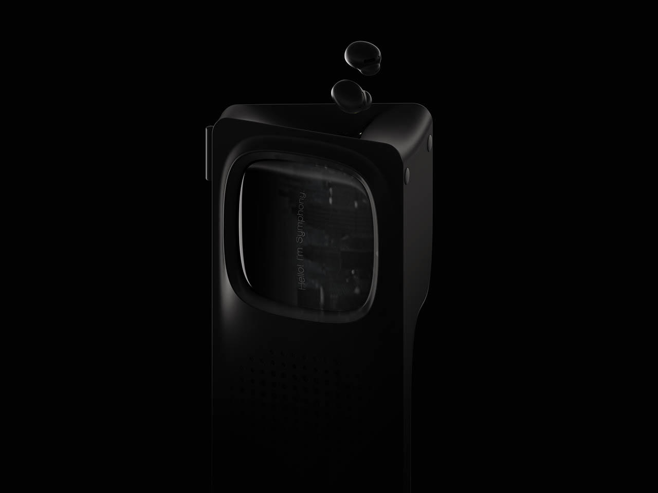


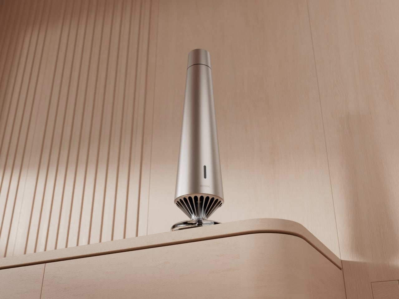
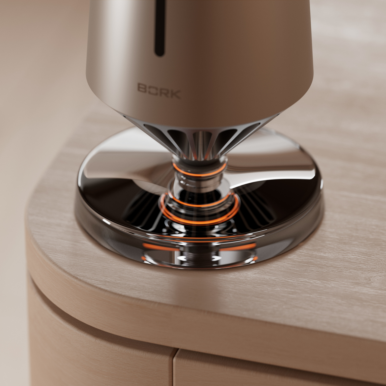
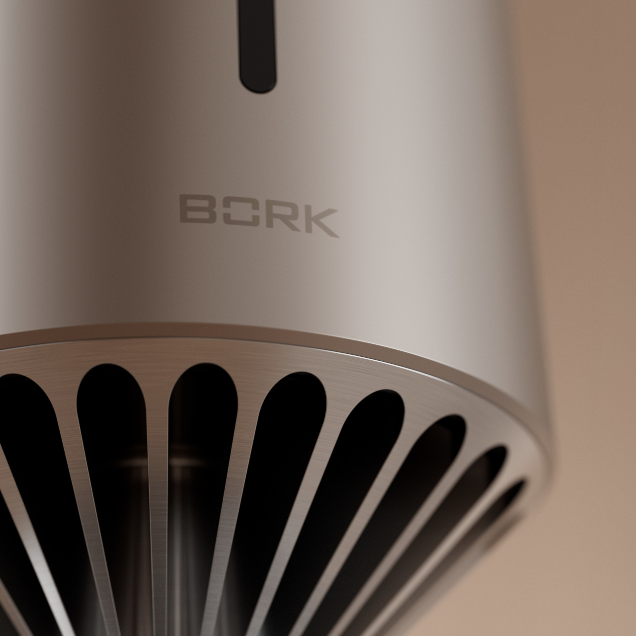
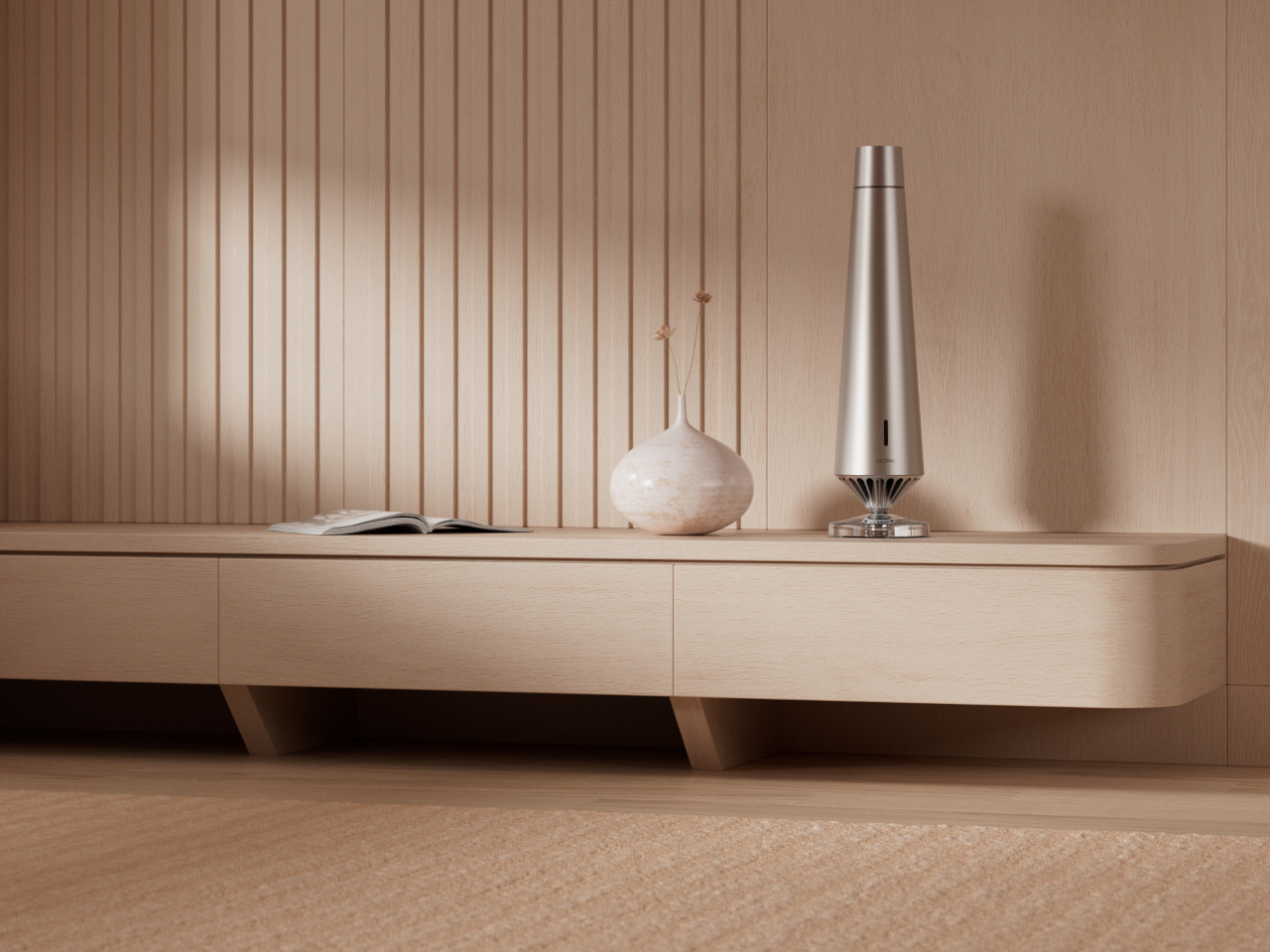
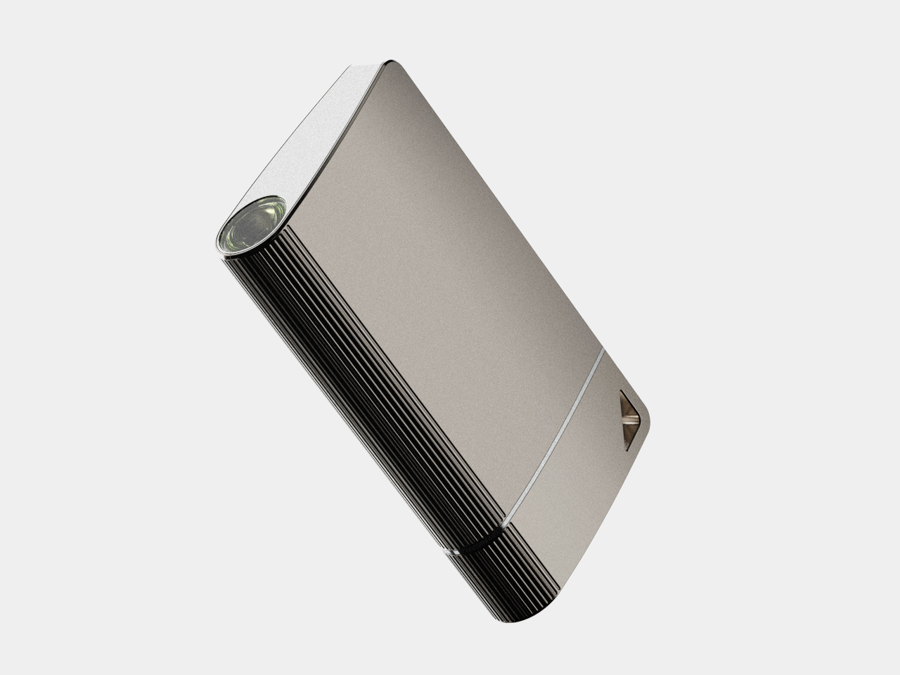
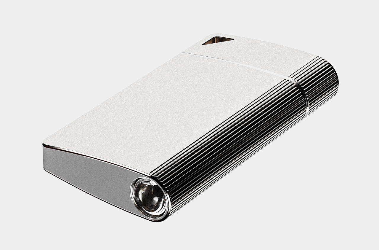
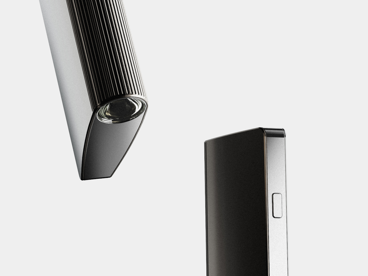
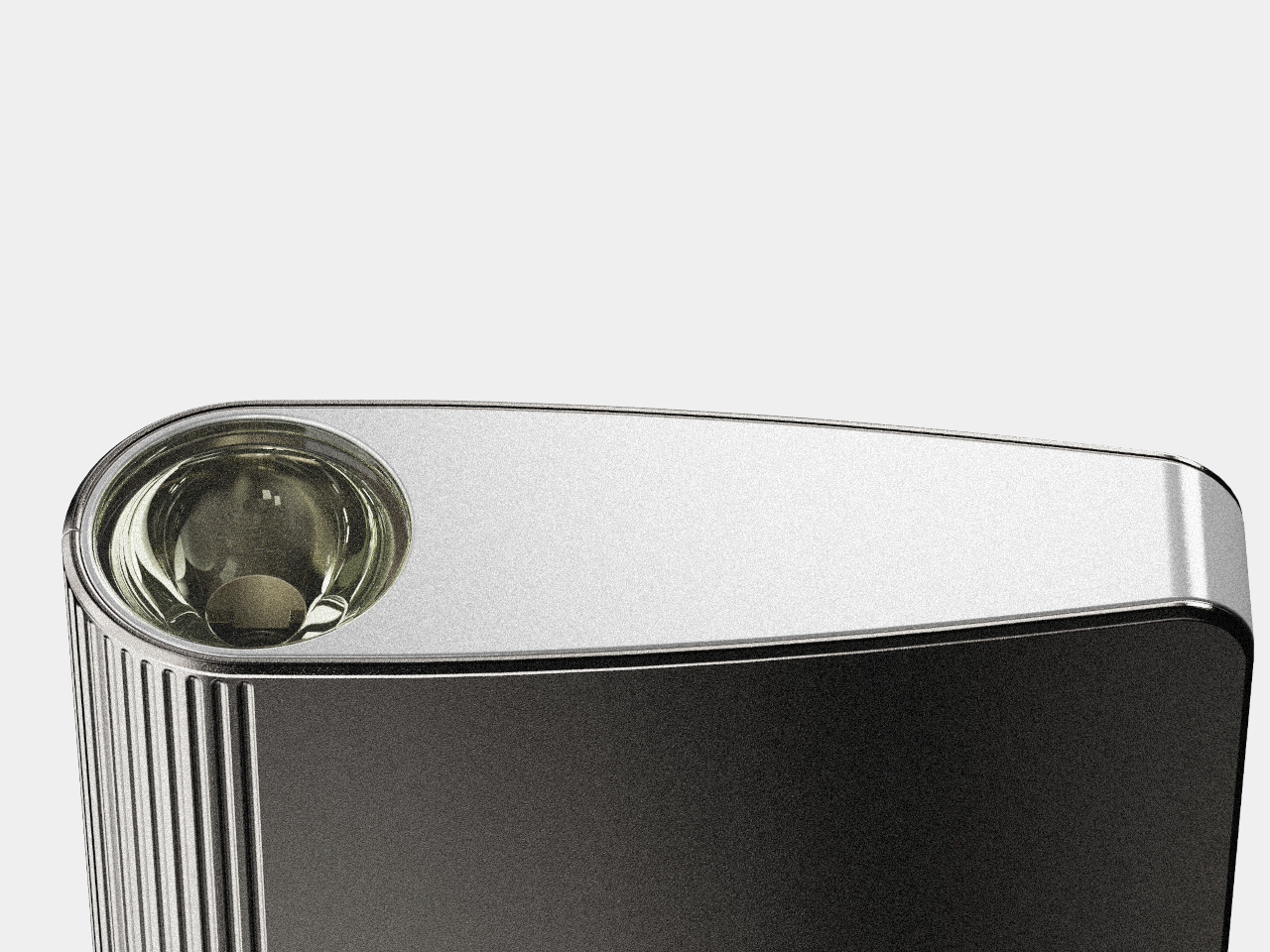
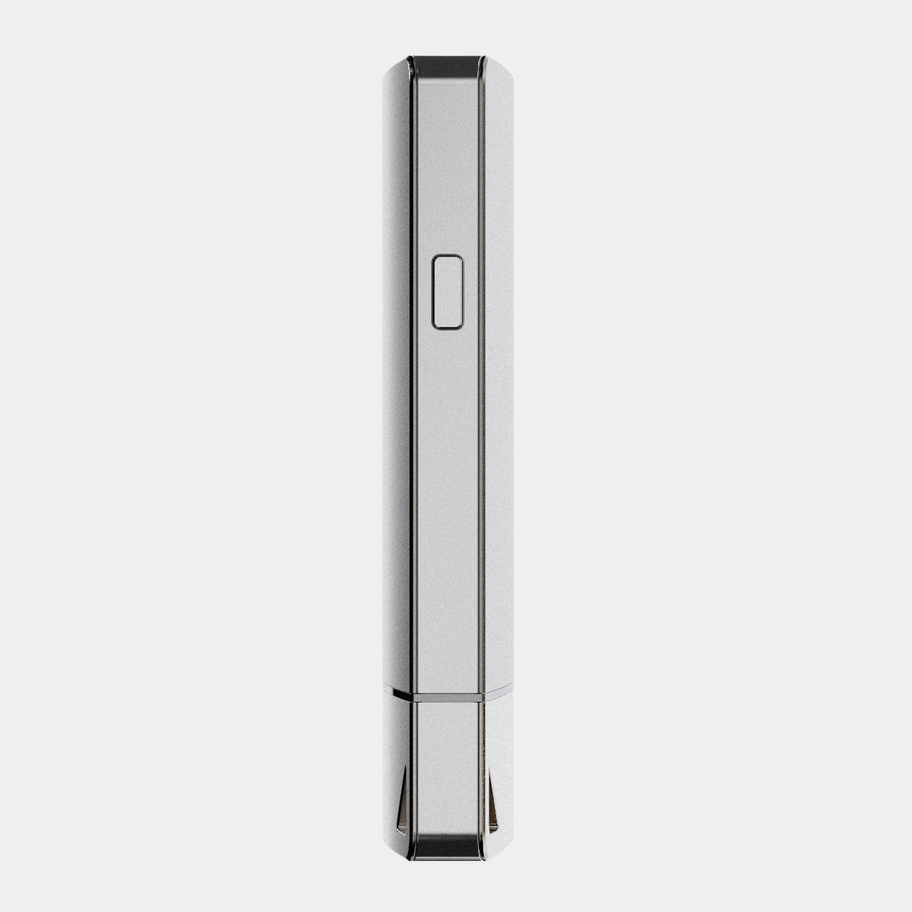
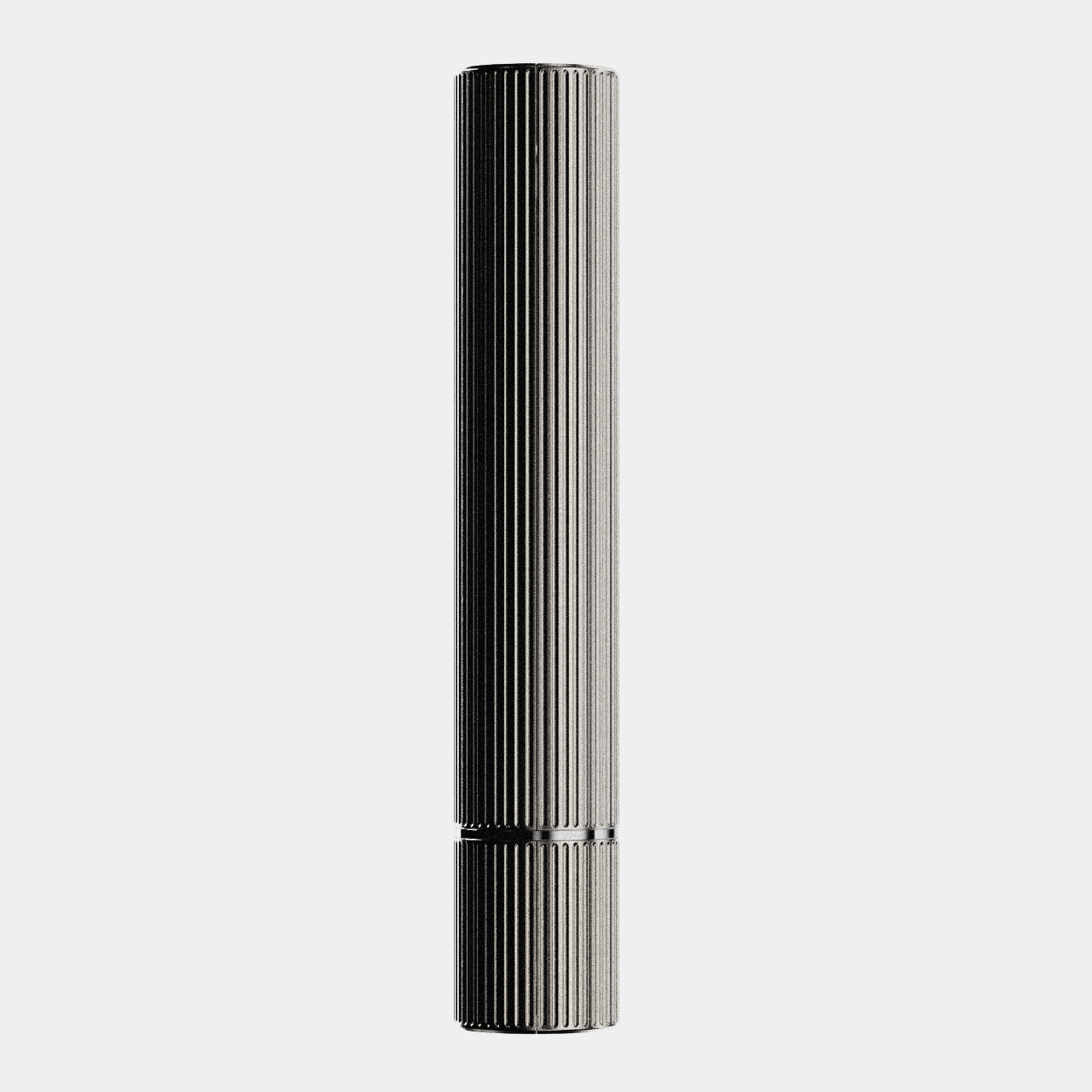
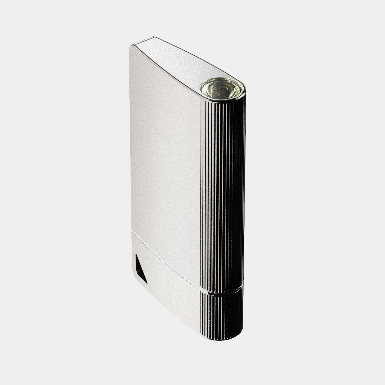
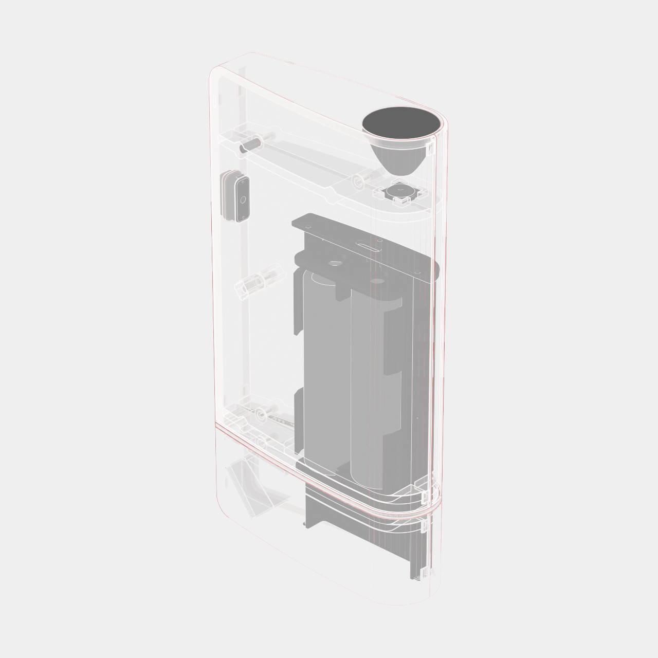
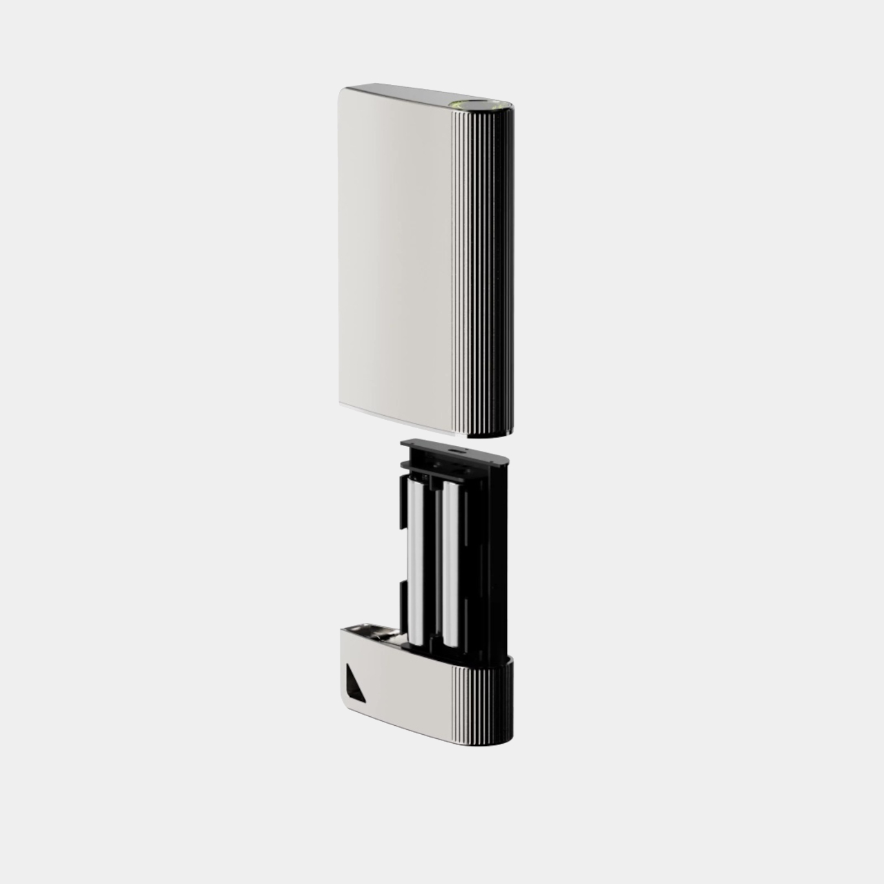
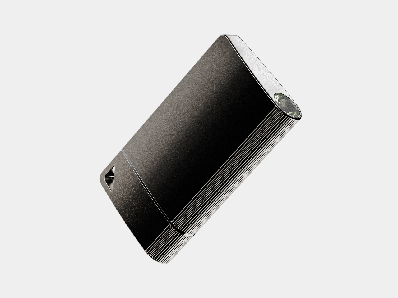
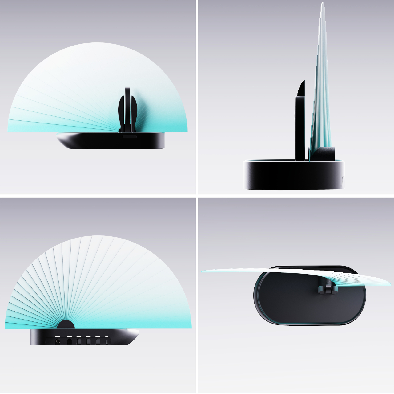
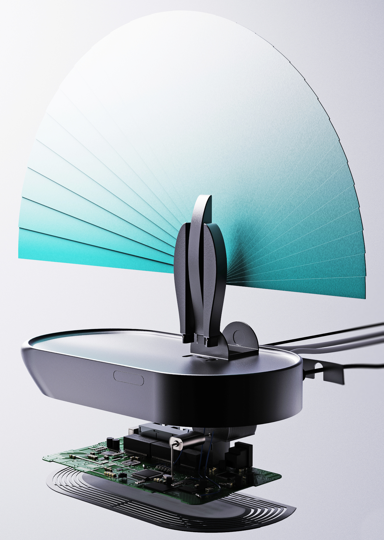
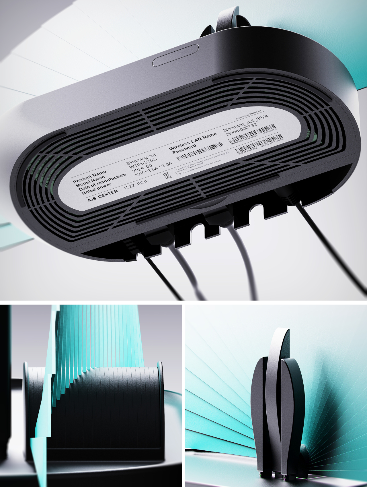
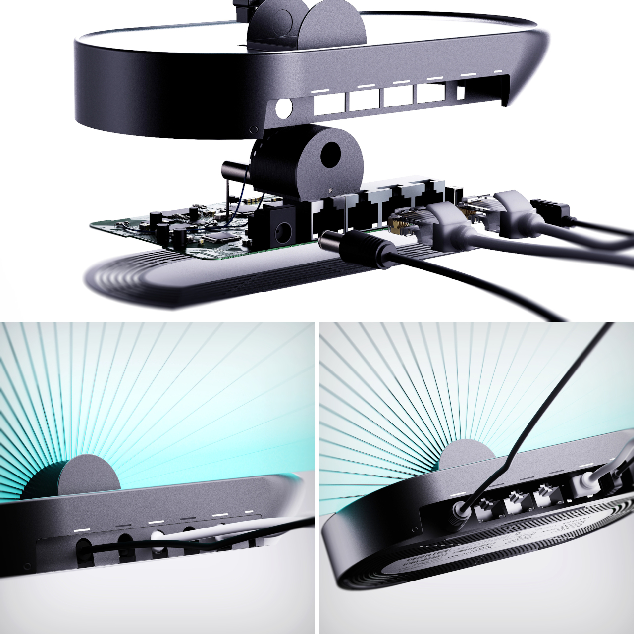
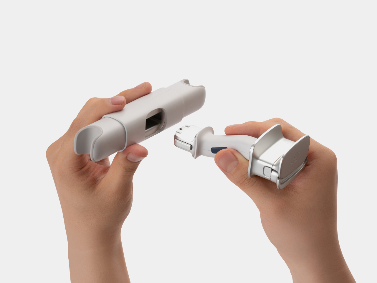
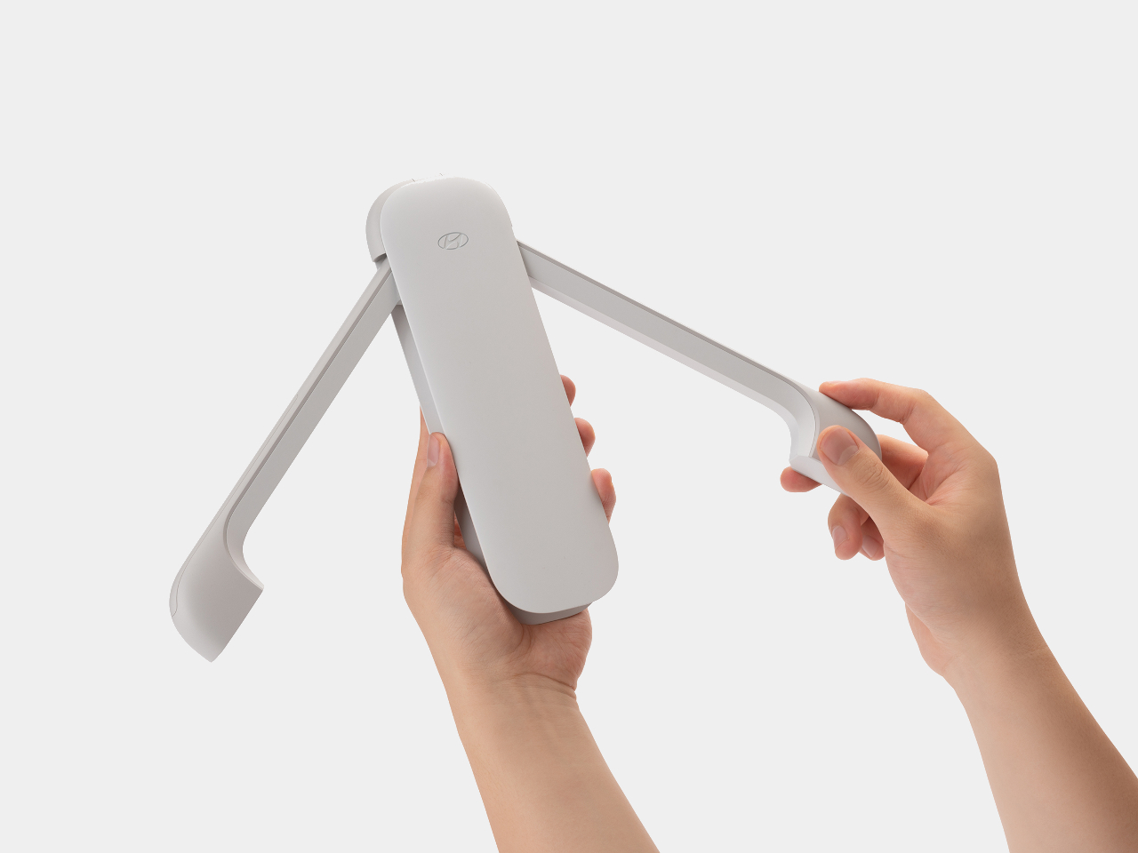
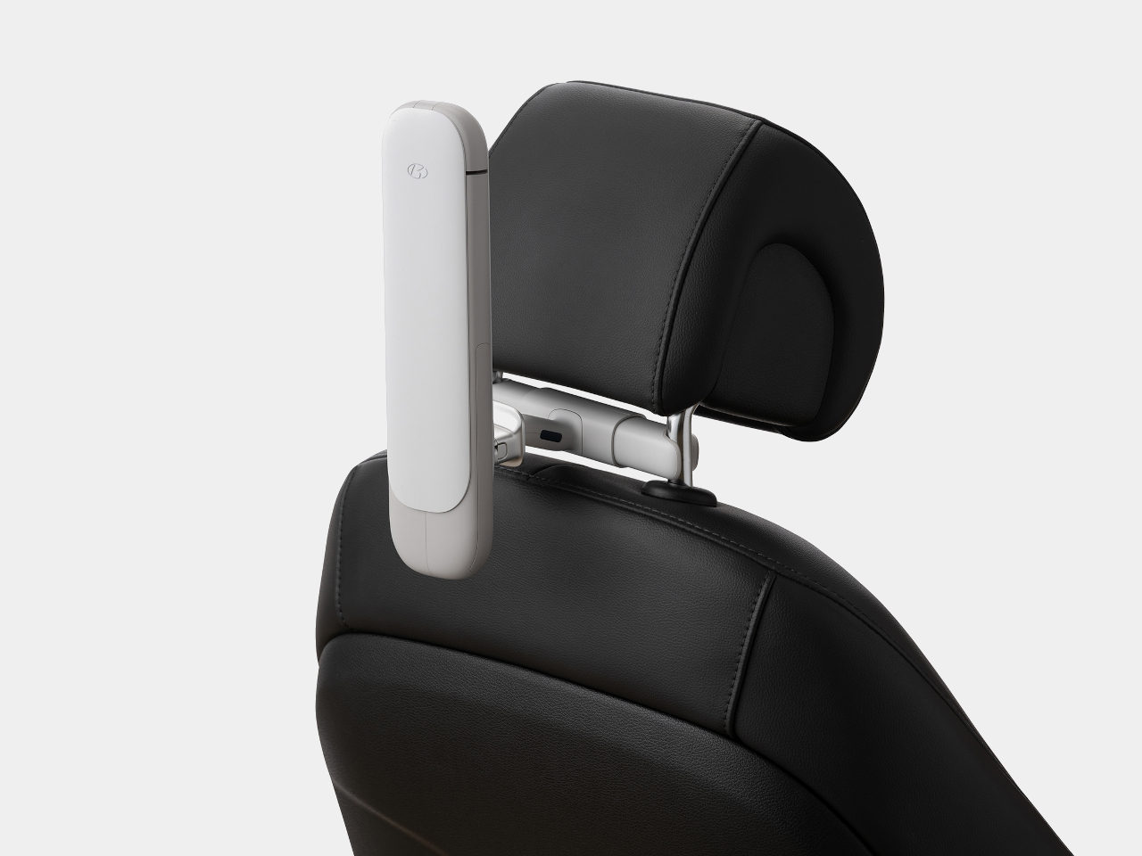
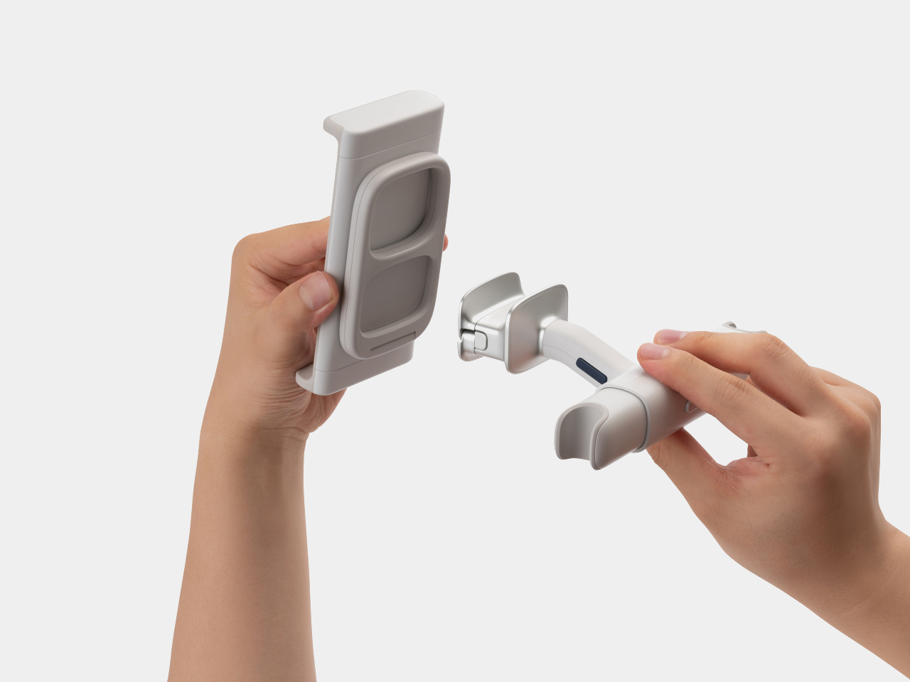
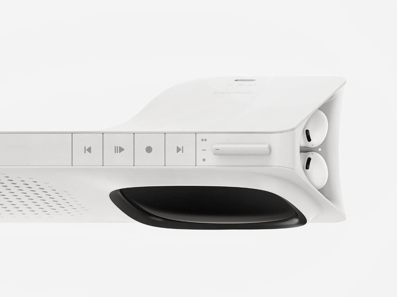
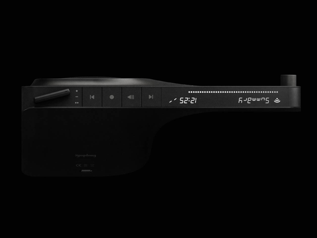
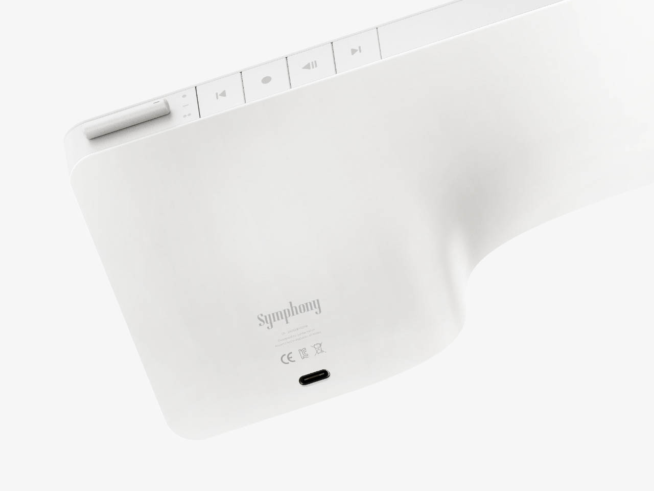
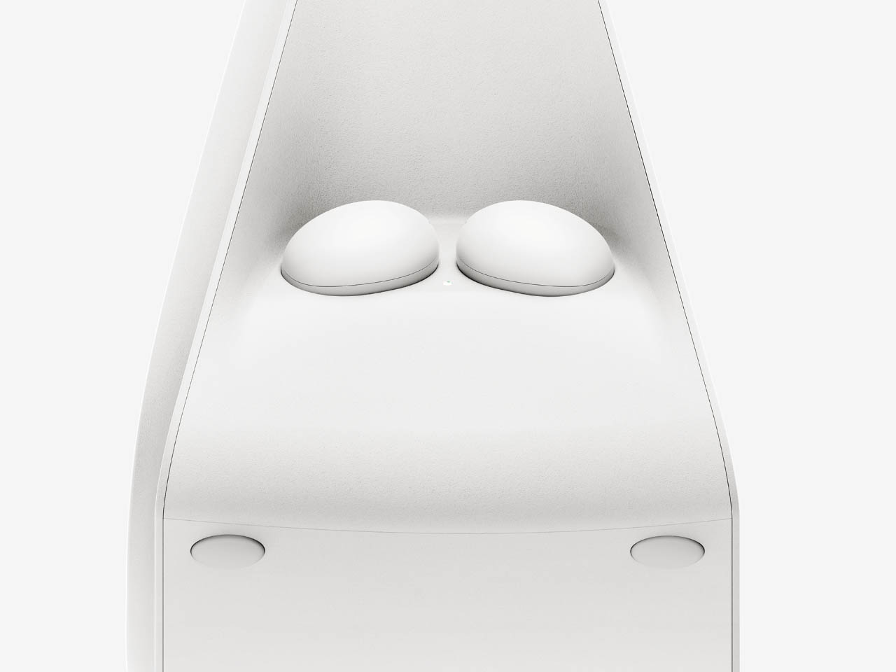
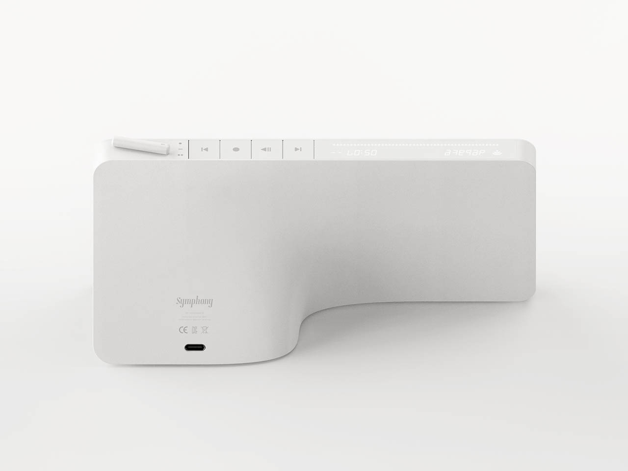
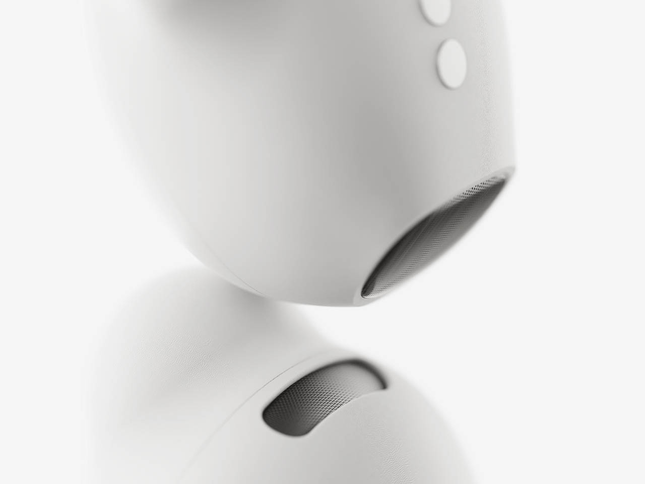
Symphony is like a small radio playing local channels in the afternoon, letting you engage with the latest news and information while sipping coffee. The gadget also comes with a monochrome screen to prompt all the spoken content in a textual format. Carrying a very future-forward design language, the Symphony radio has two wireless earbuds attached magnetically to the sides, hidden from plain sight. They let you enjoy all the AI-generated conversations without disturbing others in the room. Other than that, the radio has all those normal buttons to change channels, toggle volume levels and play/pause the broadcast.


The post This AI-equipped smart radio cooks up engaging conversations on trending topics, comes with TWS earbuds for listening freedom first appeared on Yanko Design.