Most public sculptures ask you to stand in front of them and feel something, usually reverence, awe, or a vague sense of civic pride. They represent people, events, or abstract ideals, but they rarely suggest function. A figure cast in bronze doesn’t appear to be doing anything, and that’s largely the point. The statue commemorates; it doesn’t operate. The relationship between viewer and object is, by design, entirely passive.
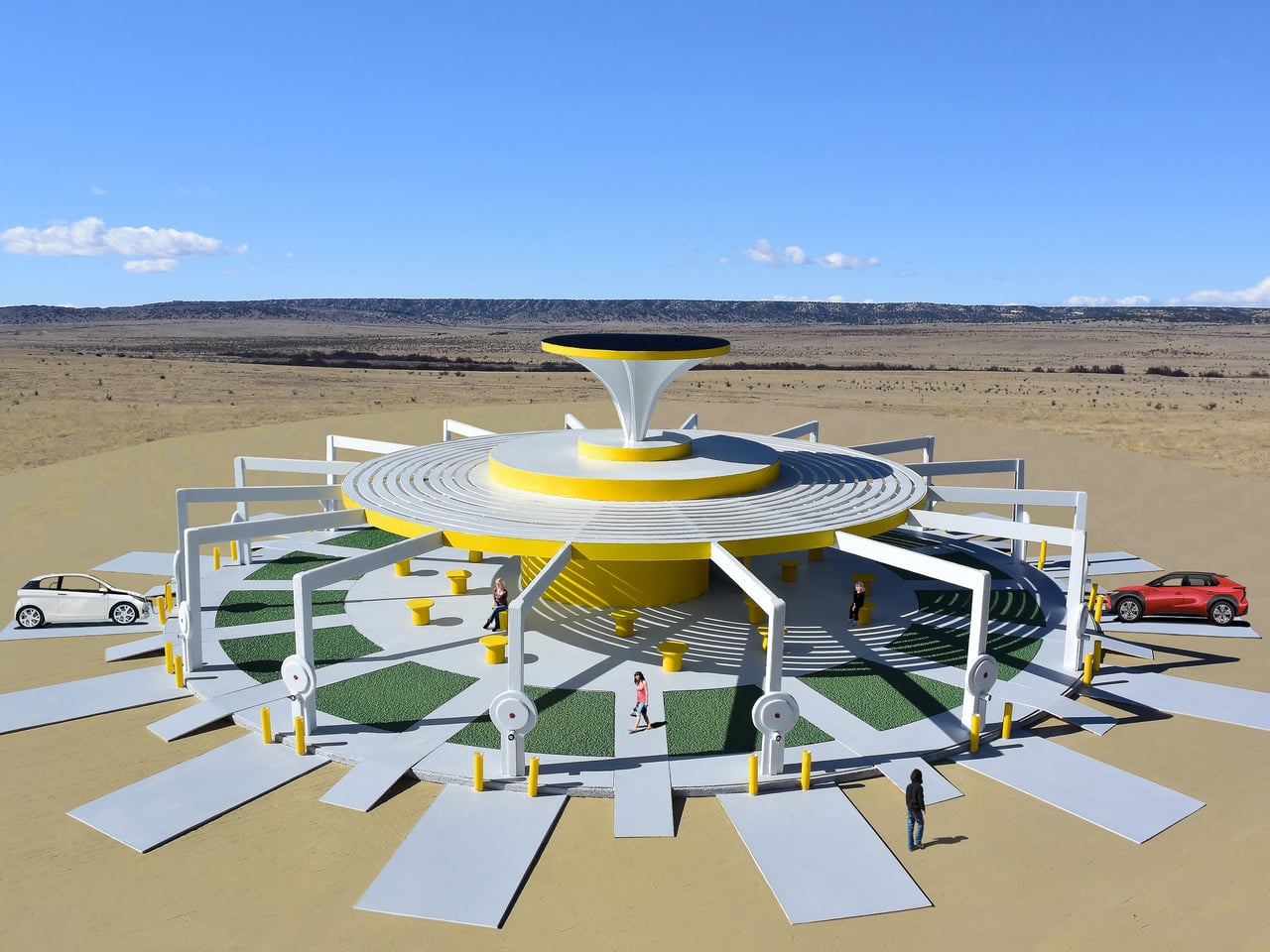
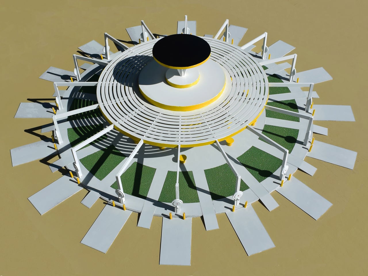
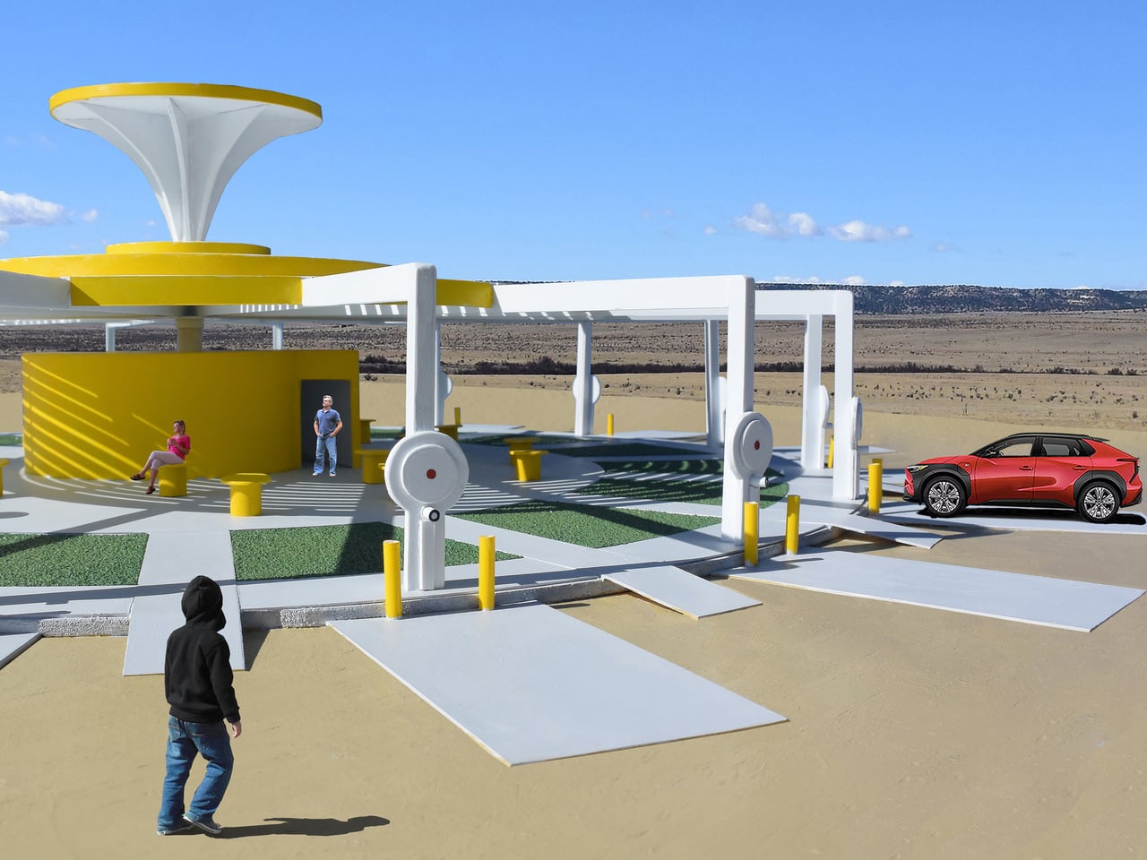
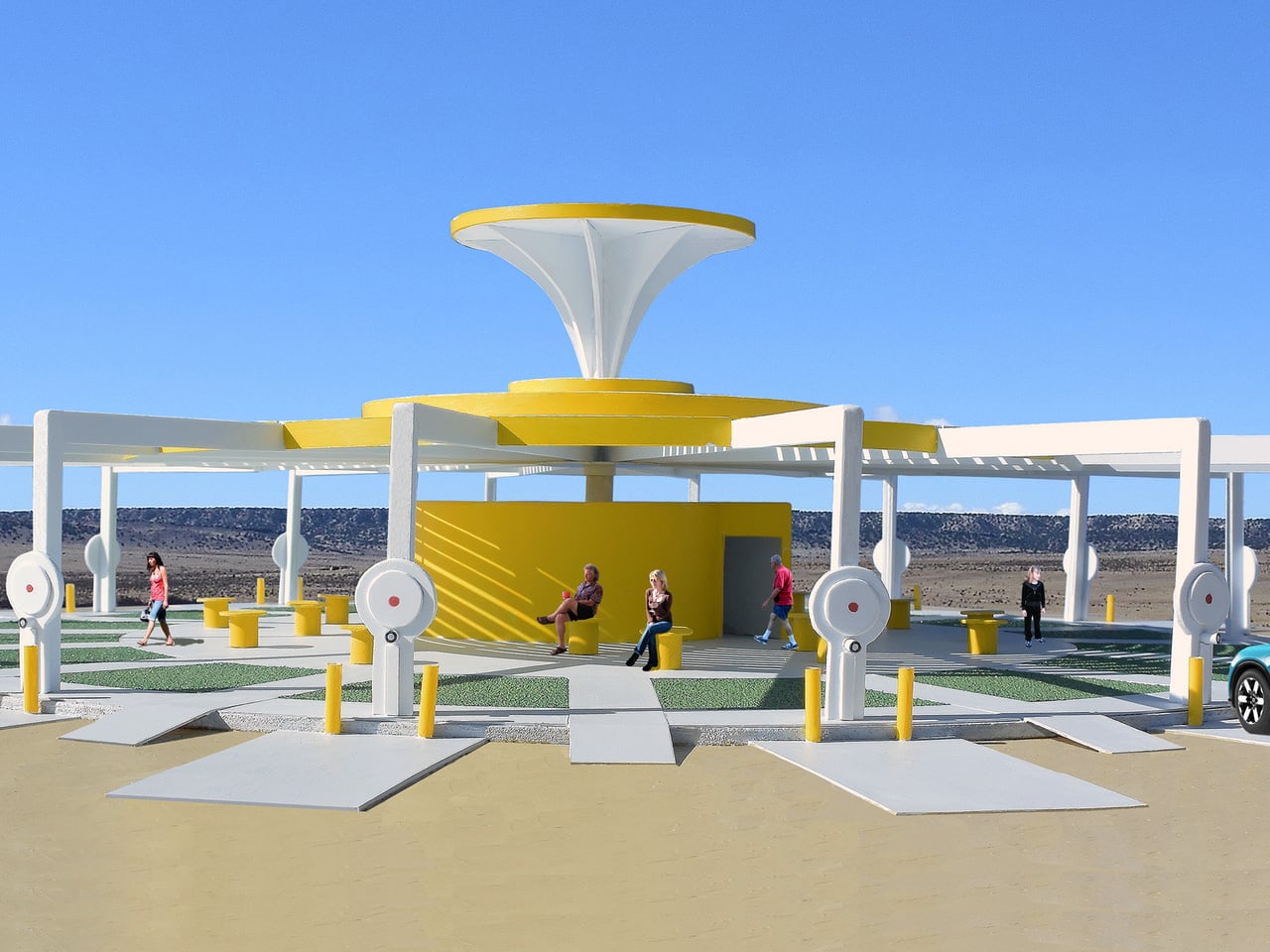
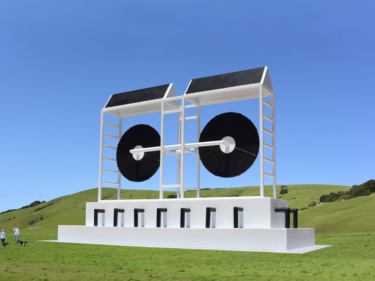
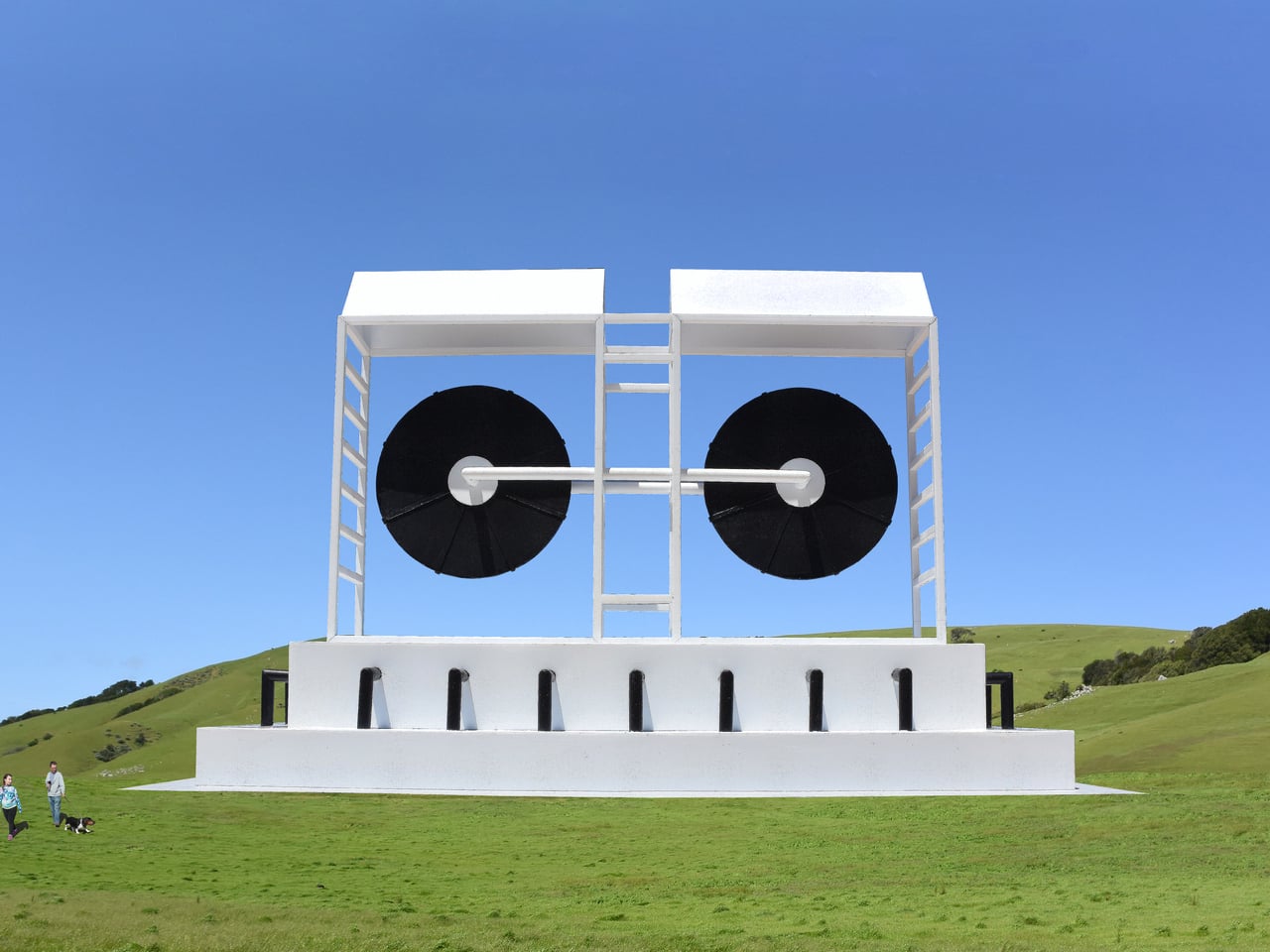
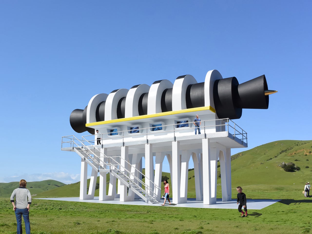
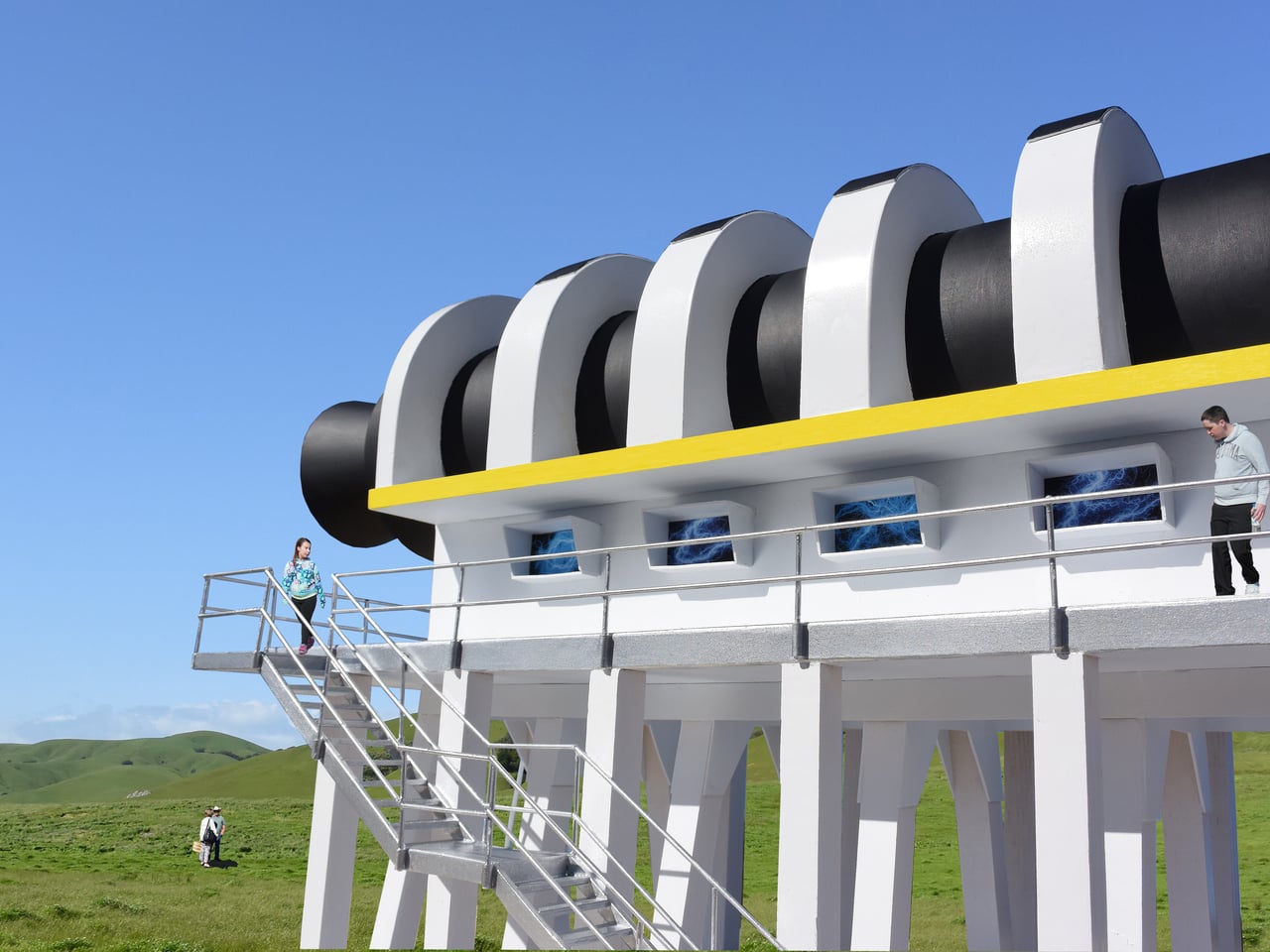
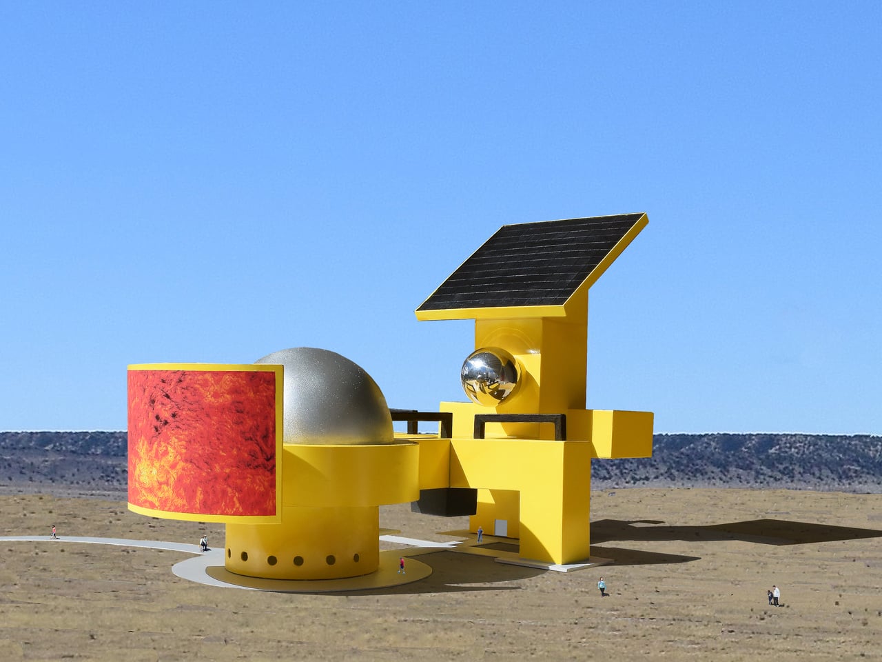
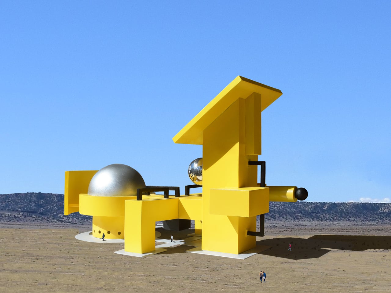
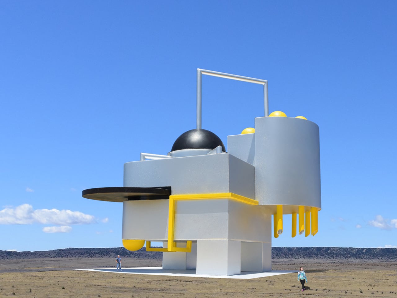
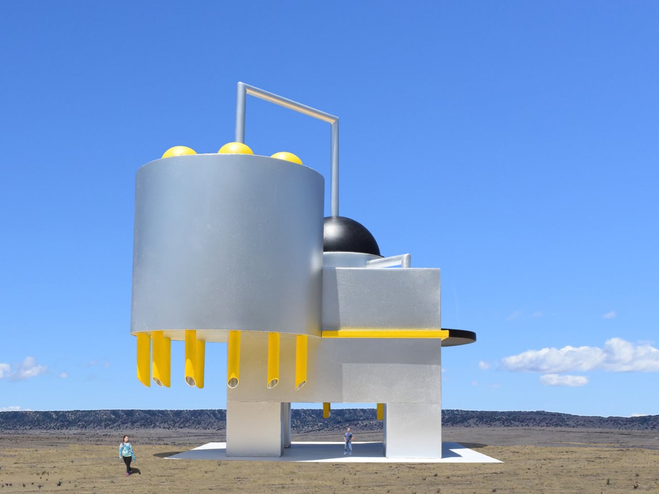
Michael Jantzen had a different idea. The Santa Fe-based designer set out to create public sculptures that look like they’re built to do something, even if no one, including Jantzen himself, can say what that something is. The result is the Monumental Engines of Creation, a concept series drawing from the visual language of high-technology hardware, assembled into objects that feel purposeful, alien, and oddly believable all at once.
Designer: Michael Jantzen
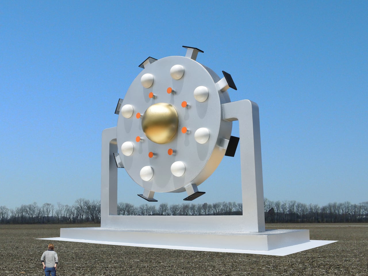
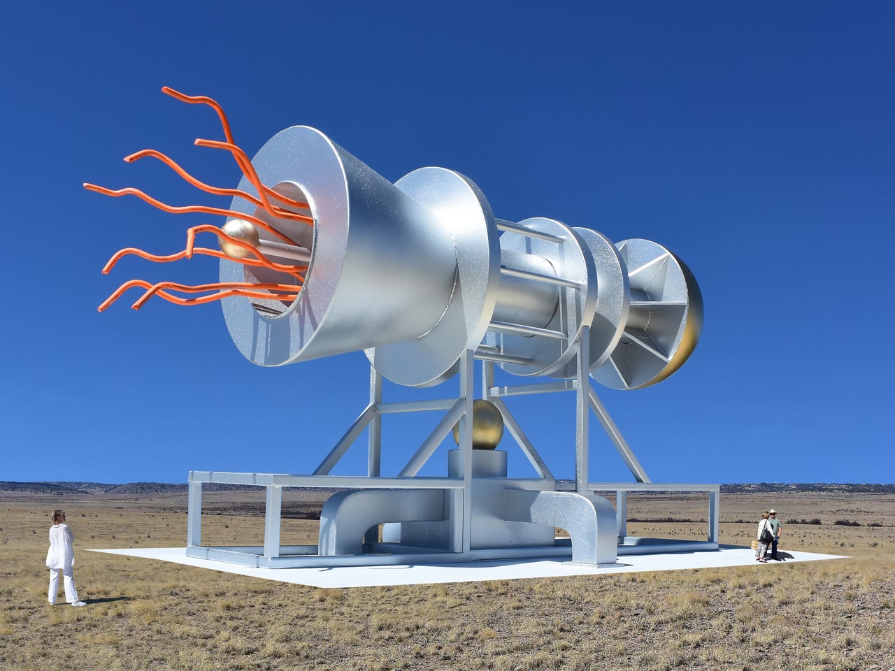
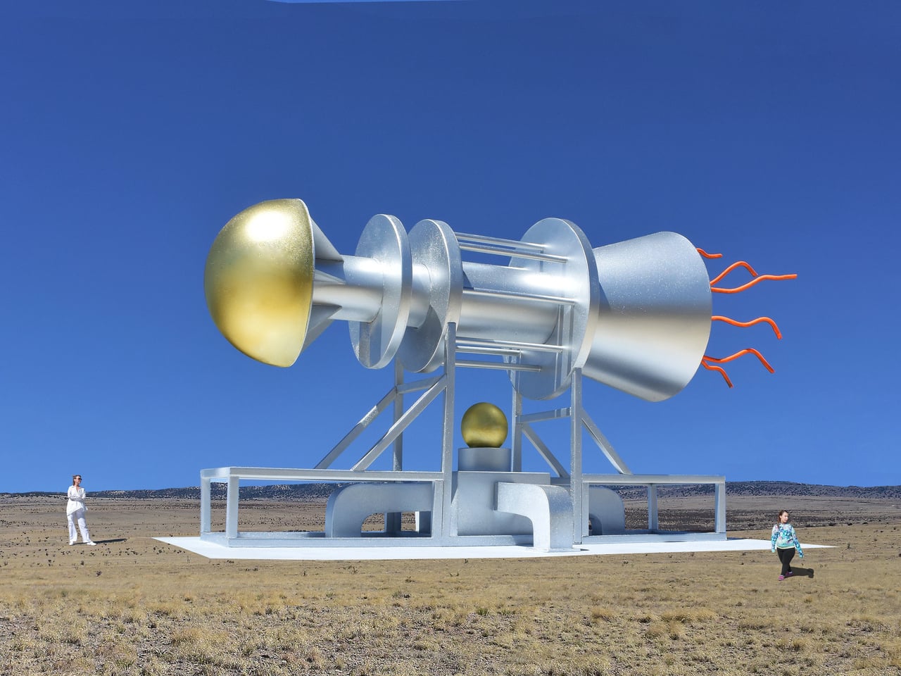
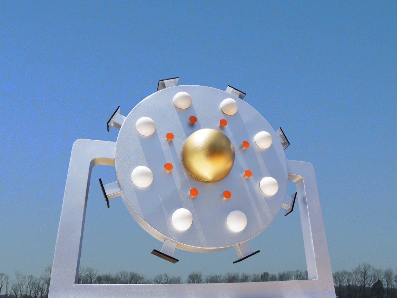
The design process is telling. Jantzen didn’t start with a function and work backward to a form, as industrial designers typically do. He built the pieces intuitively, combining various components into composites that simply suggest some kind of high-level intelligence at work. The question of what they might actually be for was deliberately left unanswered, and that open-endedness is precisely what gives the series its strange pull.
Standing near one of these sculptures, you’d spend a while trying to decode it. Jantzen’s hope is that viewers engage with the objects and find themselves genuinely wondering about their origin, their creators, and their purpose. That kind of sustained curiosity is harder to provoke than it sounds. Most public sculptures deliver their meaning almost immediately; these deliberately withhold it, rewarding prolonged attention with more questions rather than answers.
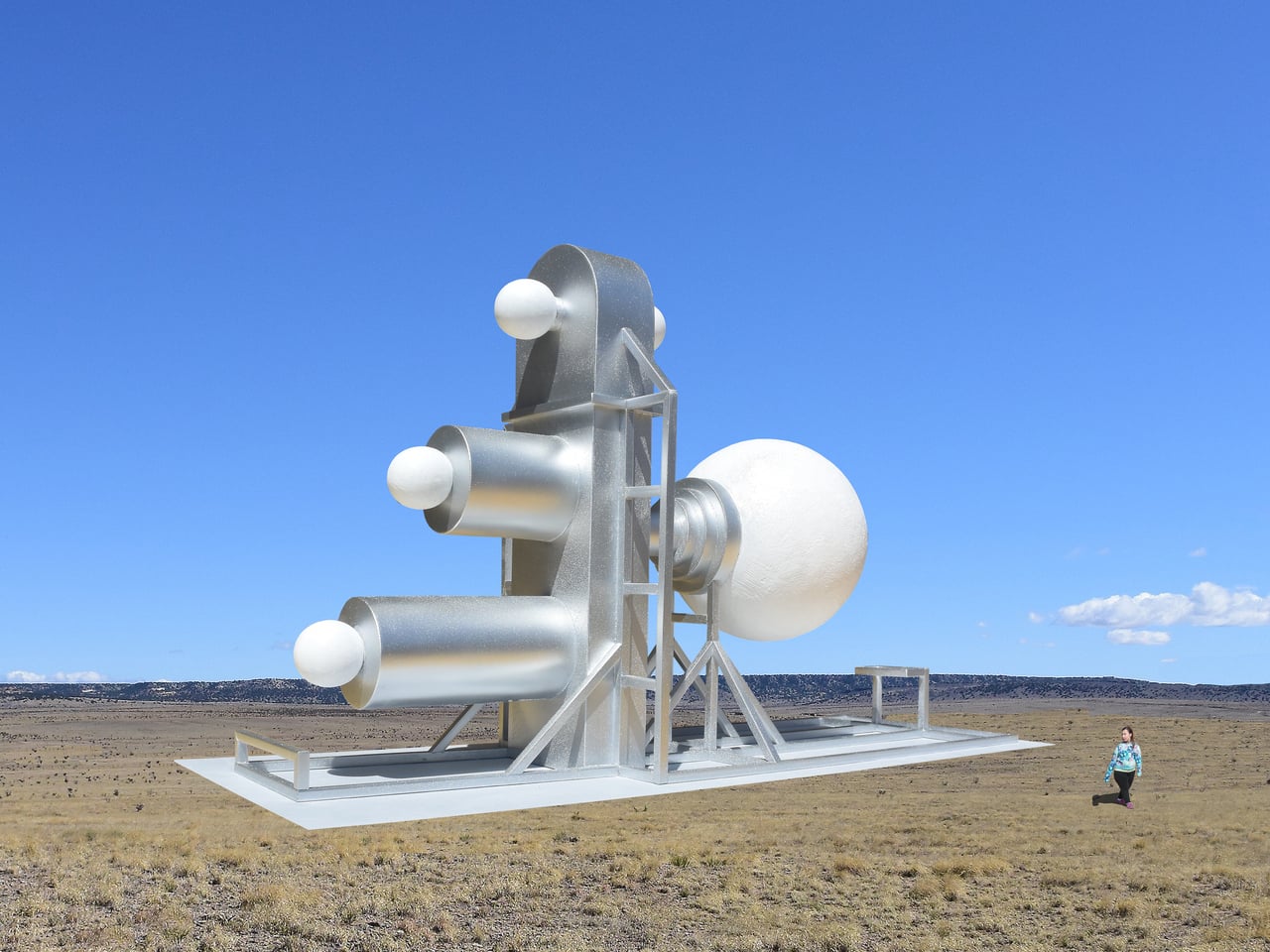
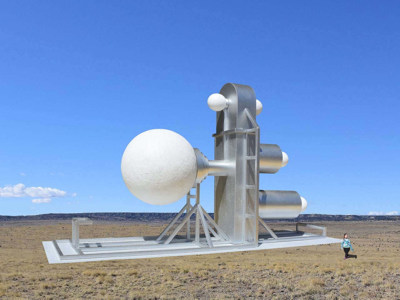
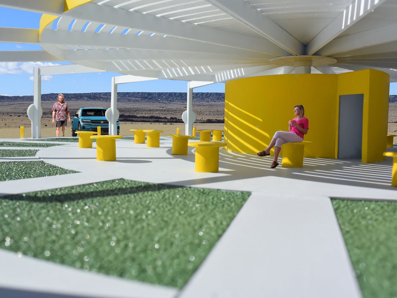
Part of why that works is scale. Each piece in the series is intentionally gigantic, dwarfing any person nearby to the point of near insignificance. That proportion isn’t accidental; Jantzen designed the scale to convey the symbolic weight of each object relative to its imagined function. A machine built to scatter the seeds of creativity throughout the universe, the thinking goes, should probably look the part.
There’s something worth sitting with in the idea that creativity itself deserves monuments. Most of what we commemorate in public space is history, politics, or governance. Jantzen’s machines point somewhere else, toward imagination, invention, and the strange optimism embedded in building. They don’t ask to be understood. They ask to be wondered at, which turns out to be a different, and arguably more honest, kind of public art.
The post Giant Sculptures Look Like Machines but, Nobody Knows What They Do first appeared on Yanko Design.