Most university research facilities share a certain visual language. You know the one: utilitarian, slightly apologetic in appearance, the kind of building that exists to check boxes and contain equipment rather than inspire the people who work inside it. The University of Toronto’s Koffler Scientific Reserve is not that building.
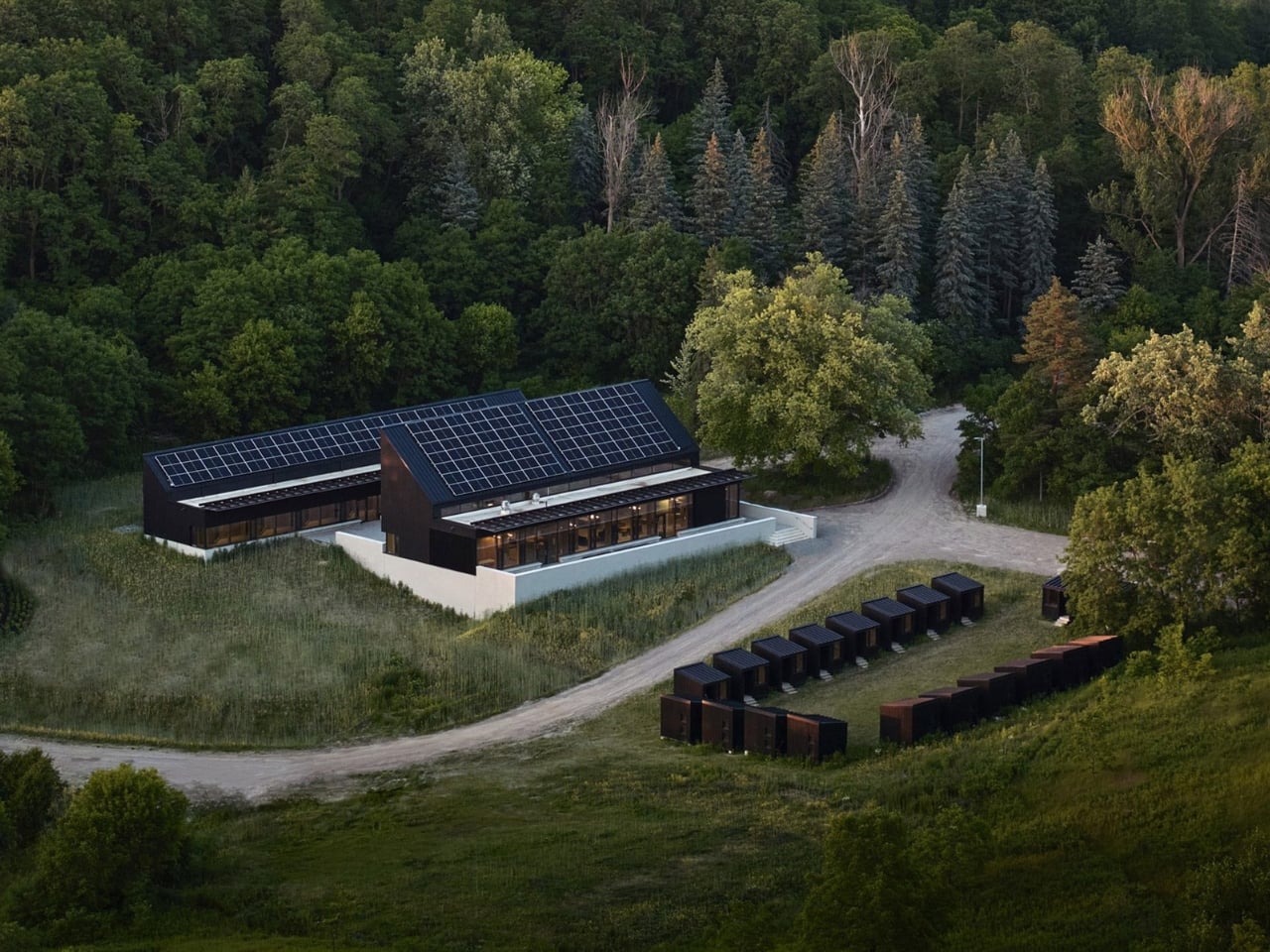
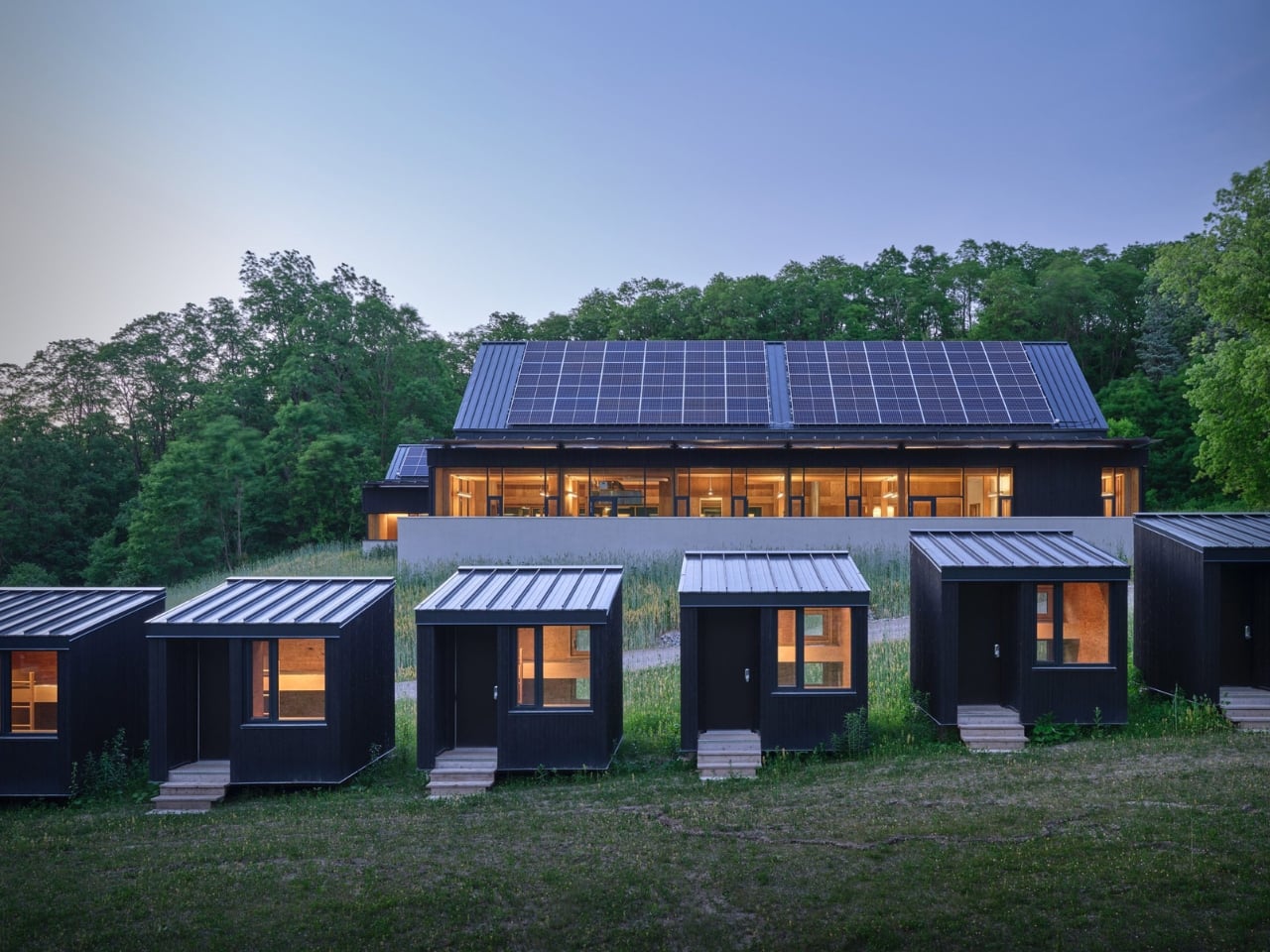
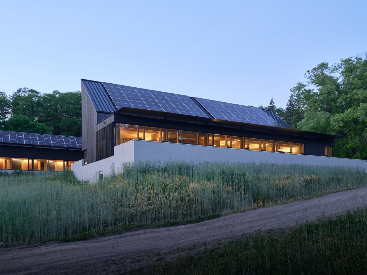
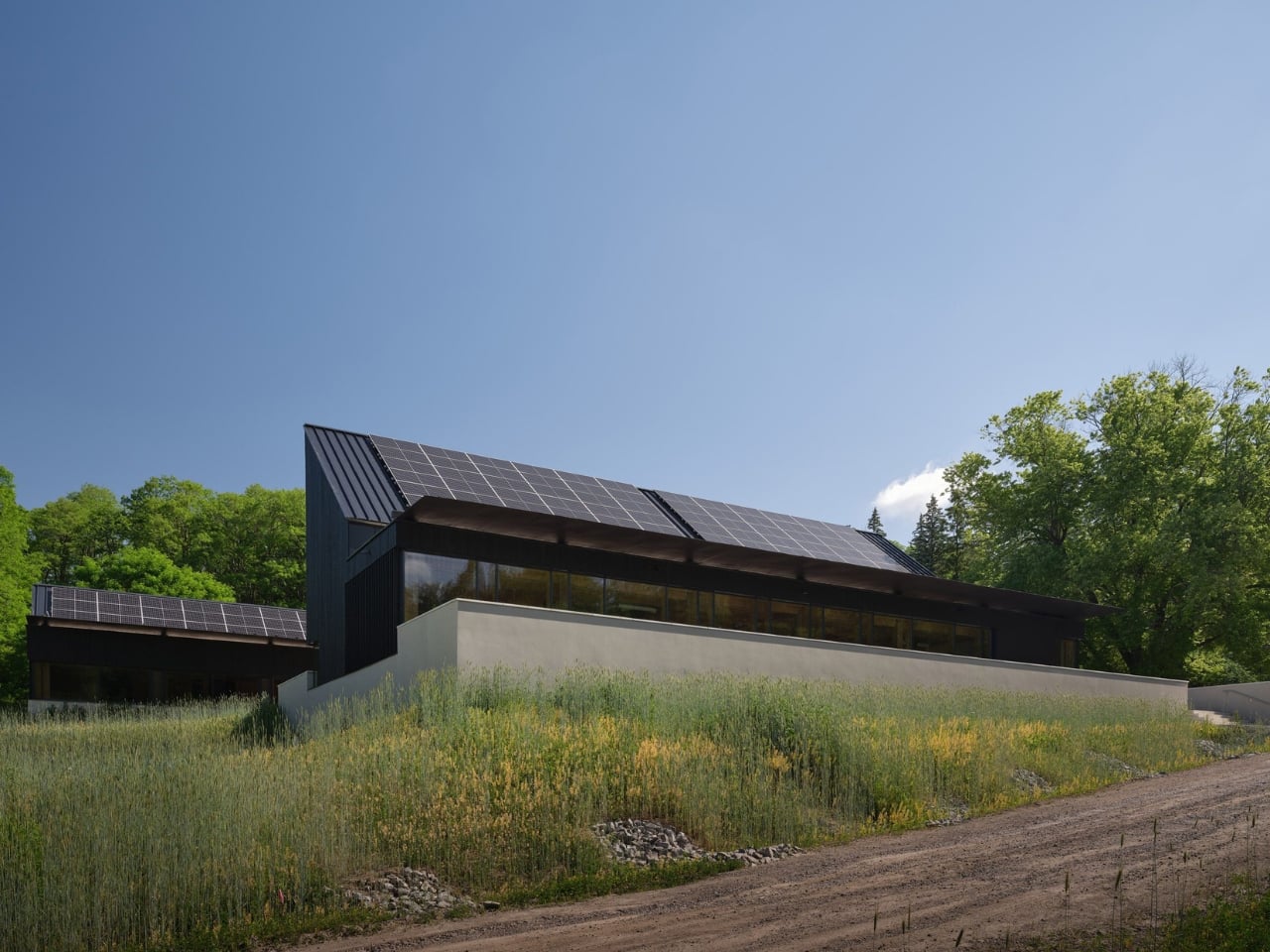
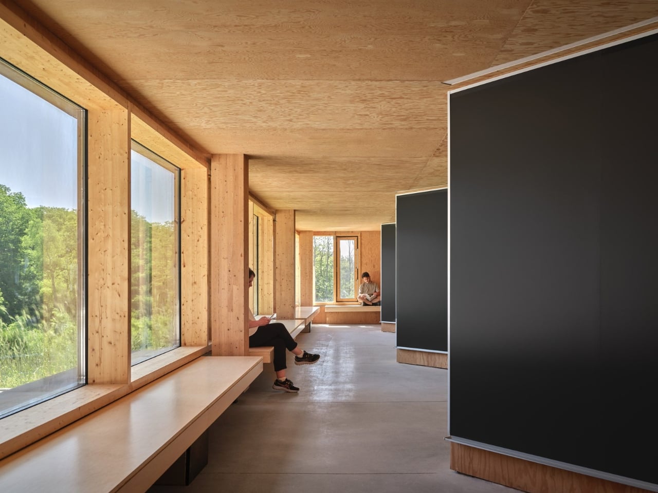
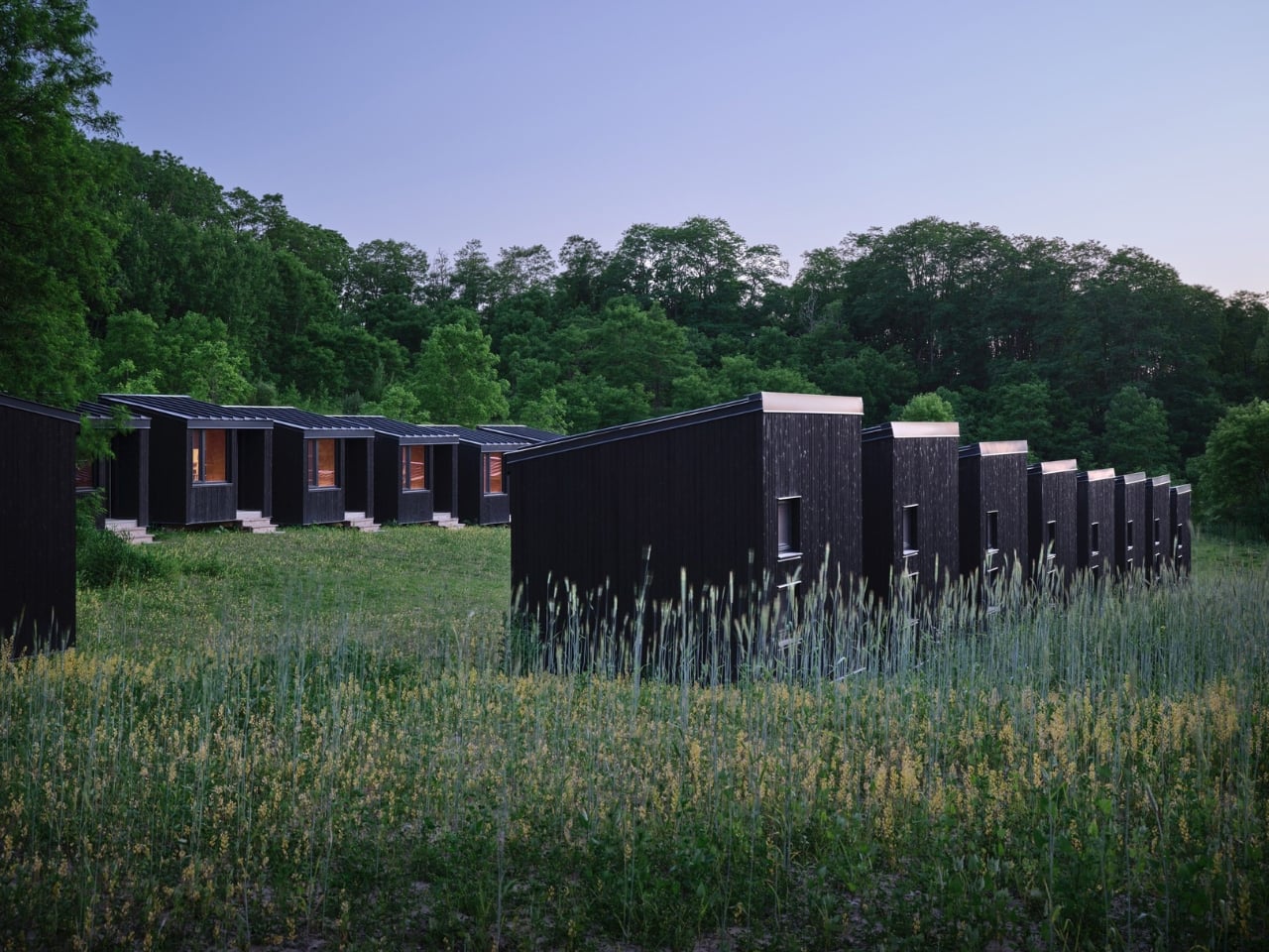
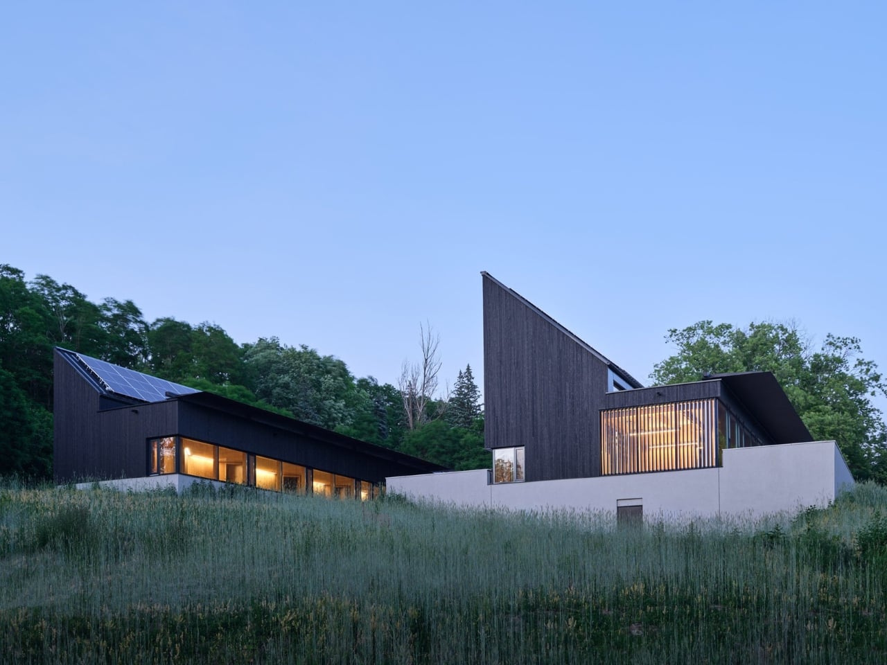
Completed in May 2025 and designed by Toronto-based Montgomery Sisam Architects, the 2,680-square-metre facility sits on 350 hectares in the Oak Ridges Moraine in King Township, Ontario, about an hour north of the city. It serves as a research and teaching base for ecology and environmental biology students and faculty, combining dormitory space, a dining hall, a classroom, and a common room into a single, beautifully considered structure. On paper, that sounds modest. In execution, it’s one of the more thoughtful buildings to come out of Canada recently.
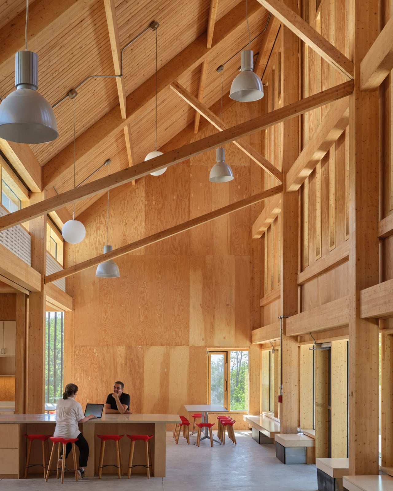
What makes the Koffler Reserve stand out is how deliberate its design philosophy is. Principal Robert Davies put it plainly: “Researchers there study the smallest changes in organisms to understand systems at a global scale, and that relationship between the micro and the macro became the lens through which we evaluated every design decision.” That’s not just a nice quote for a press release. You can actually feel that thinking in the architecture.
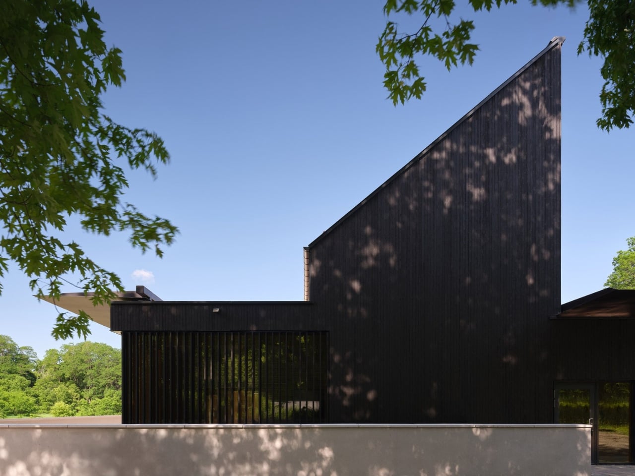
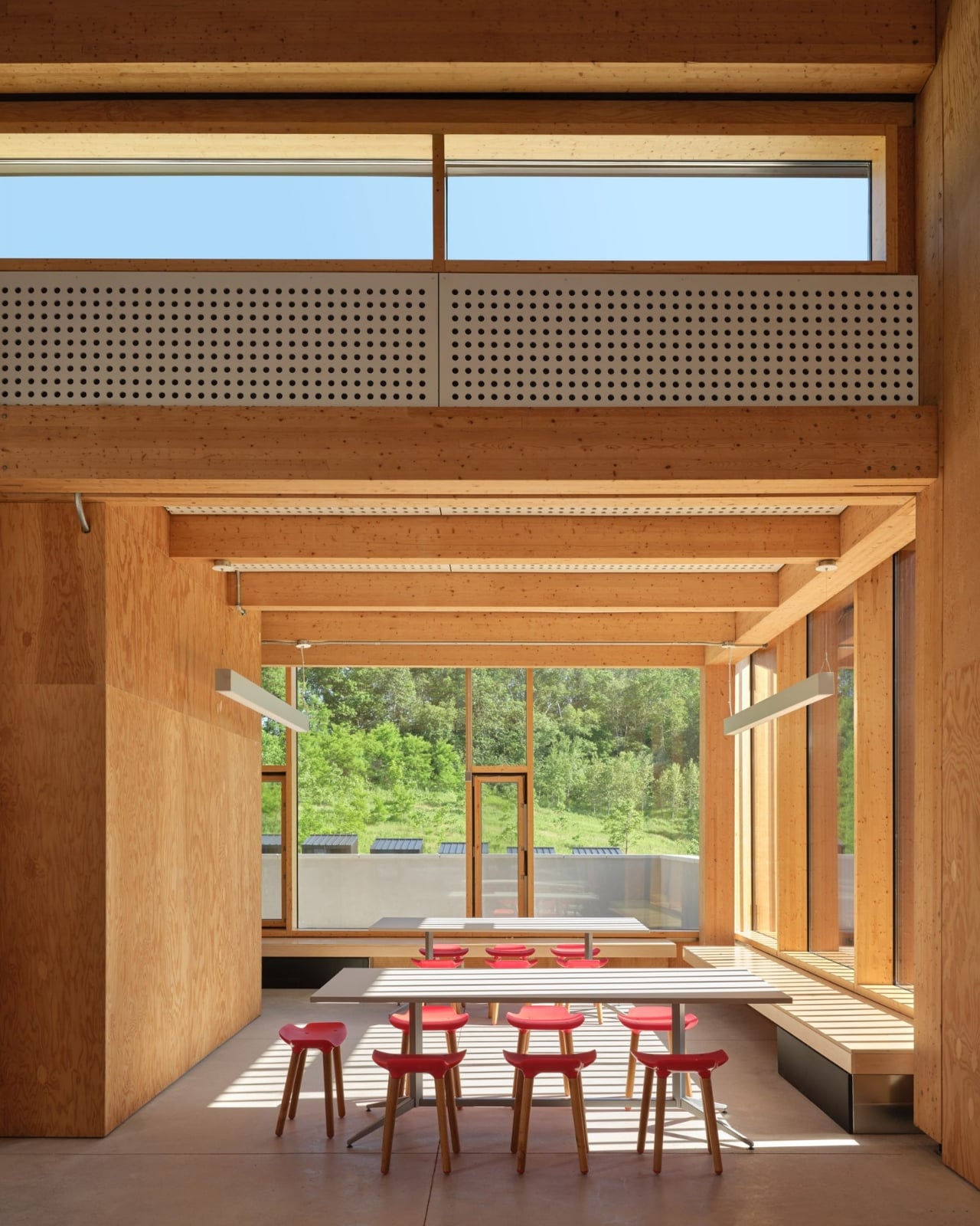
The building’s two prominent shed roofs, for instance, aren’t purely aesthetic choices. They’re angled precisely to optimize solar panel placement based on the site’s latitude, which in turn informed the entire formal expression of the structure. The flat roof and sunshade over the common room’s pitched elevation are carefully positioned to welcome the warming winter sun while blocking the uncomfortable heat of summer rays. Every element earns its place, and that’s exactly the kind of intentional design thinking that makes a building worth talking about.
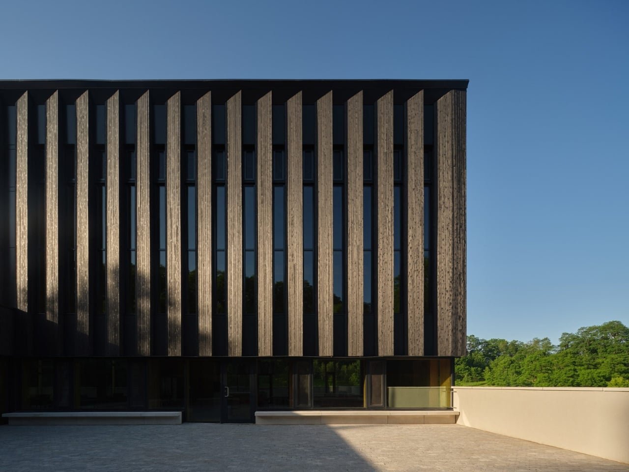
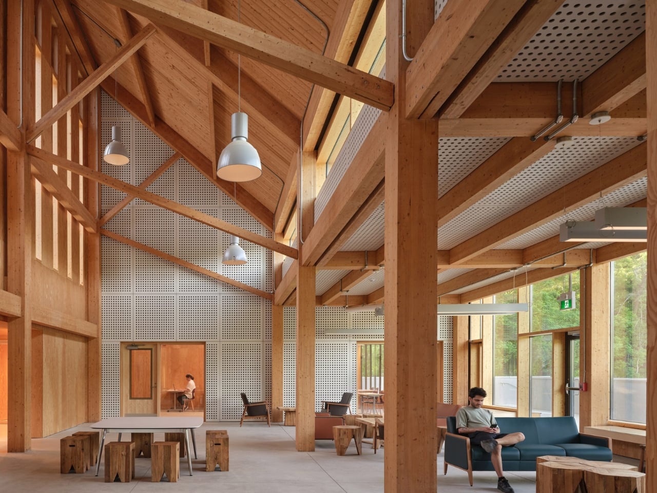
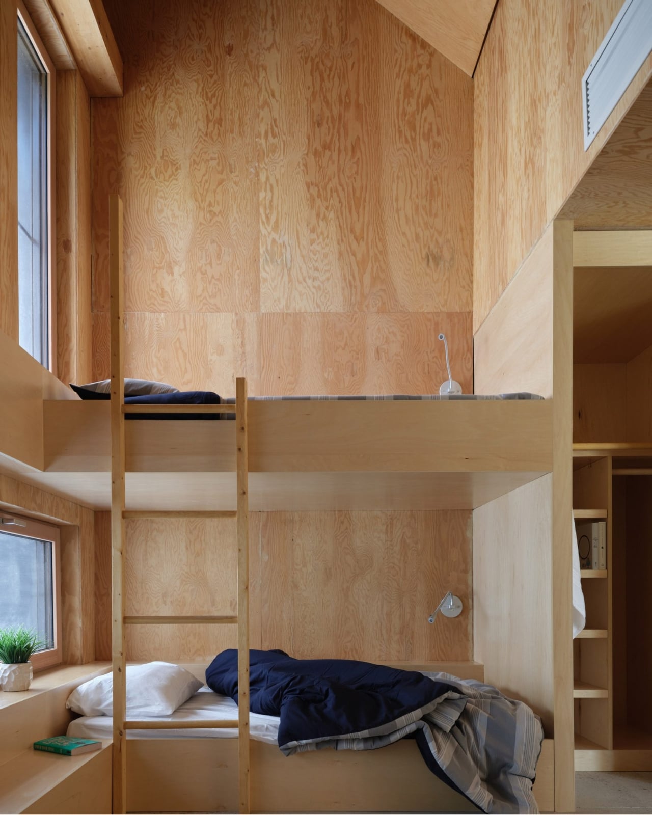
The material choices reinforce this sensibility. The structure is a hybrid of mass timber and conventional light-frame wood construction, using glulam columns and beams with a tongue-and-groove roof. The exterior is clad in shou sugi ban wood, the Japanese technique of partially charring wood to increase its water-resistance and durability. It’s a material that ages honestly and fits the agrarian character of the site, which started life as a series of agricultural plots, became an equestrian centre in the 1950s, and was donated to the university by philanthropists Murray and Marvelle Koffler in 1995. The building knows where it is, and that’s a quality that is rarer than it should be.
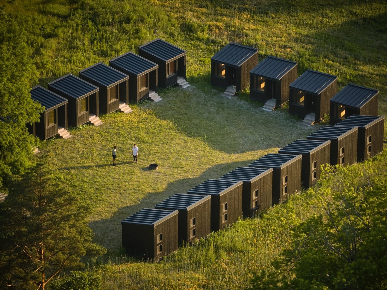
The Reserve’s C-shaped main building houses 20 students, while a cluster of 20 separate bunkies accommodates up to 40 more. The shared amenities, including the kitchen, bathrooms, and living spaces, are deliberately oversized to support larger summer populations and to encourage the kind of informal gathering that actually makes collaborative research work. The design is thinking about people, not just program. That distinction matters more than most architects will admit.
Below grade, a ground source heat pump circulates fluid through deep underground pipes to warm the building in winter and cool it in summer. Paired with the solar panels and passive design strategies, the project is working toward net-zero carbon and energy goals. I’ll be honest: sustainability claims in architecture have become so reflexive and routine that they’ve started to lose meaning. But at Koffler, the sustainable systems are so deeply woven into the structure’s formal logic that they feel like genuine convictions rather than marketing additions.
The Reserve sits within a landscape of wetlands, forests, and grasslands that scientists there study every single day. The building respects that by not trying to compete with it. It settles into the site rather than announcing itself, which takes real confidence for an architect to pull off. Confidence, and a genuine understanding of why the building exists in the first place. It would be easy to overlook this project because it doesn’t carry the dramatic scale or cultural visibility of a museum or a concert hall. But the Koffler Scientific Reserve is the kind of work that quietly raises the bar for what institutional architecture can be, and it deserves attention for exactly that reason.
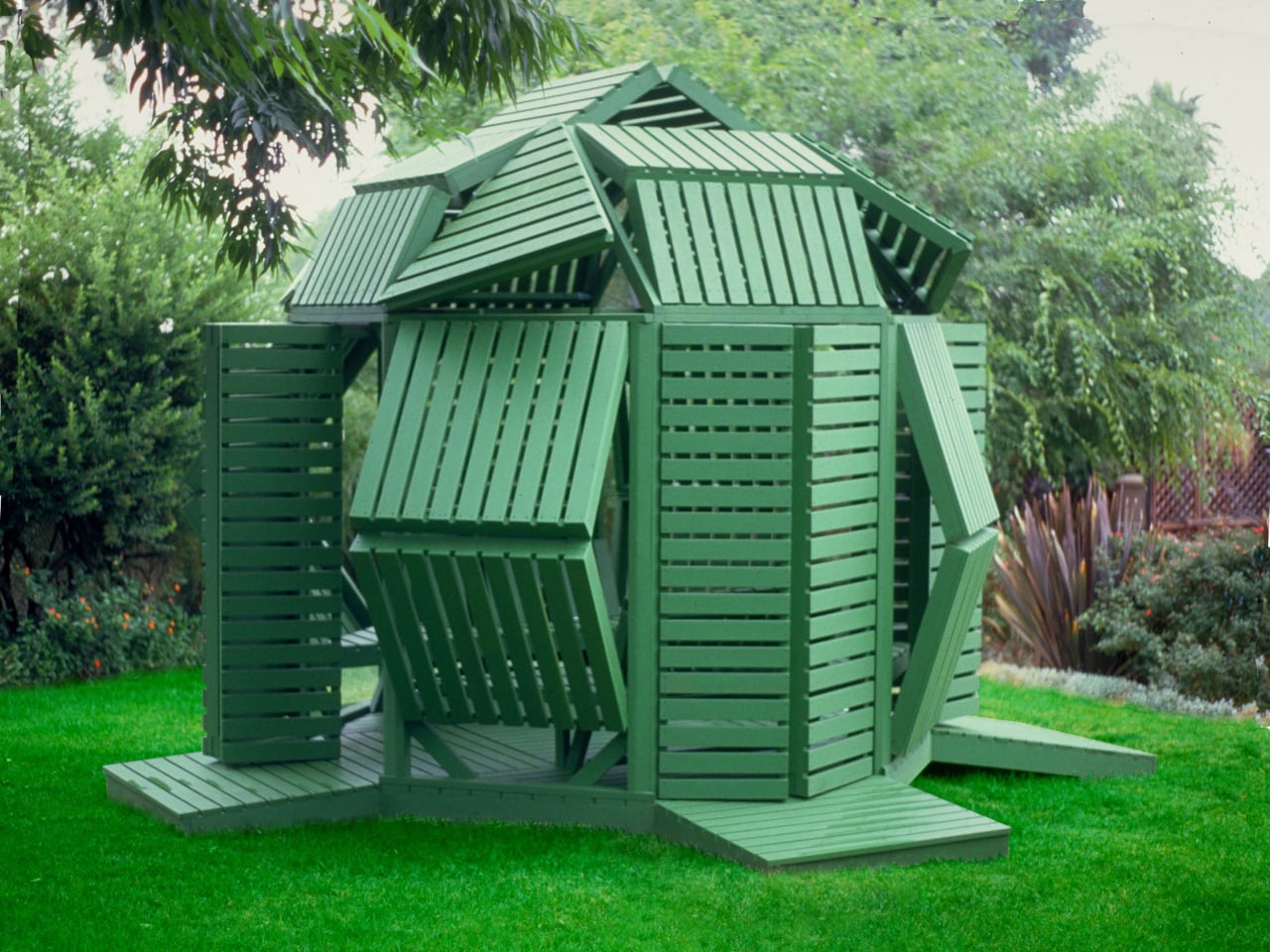
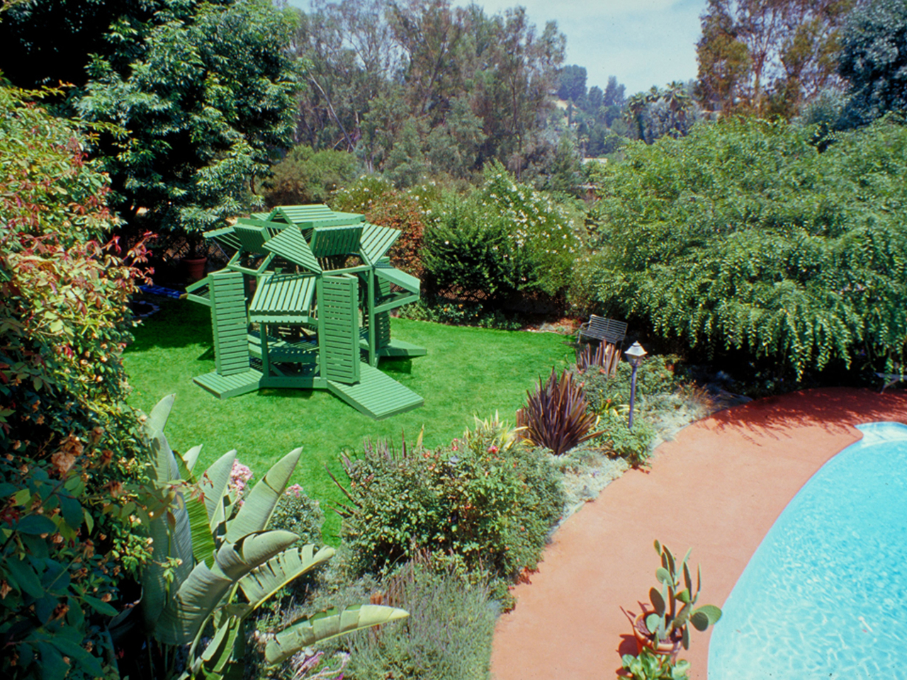
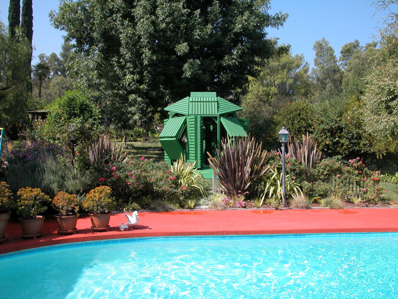
Most garden structures ask one thing of you: sit still and enjoy the shade. A pergola is a pergola, a gazebo is a gazebo, and neither one particularly cares what the afternoon light is doing. Michael Jantzen’s Interactive Garden Pavilion operates on a different premise entirely, one where the occupant has as much say over the structure as the designer did.
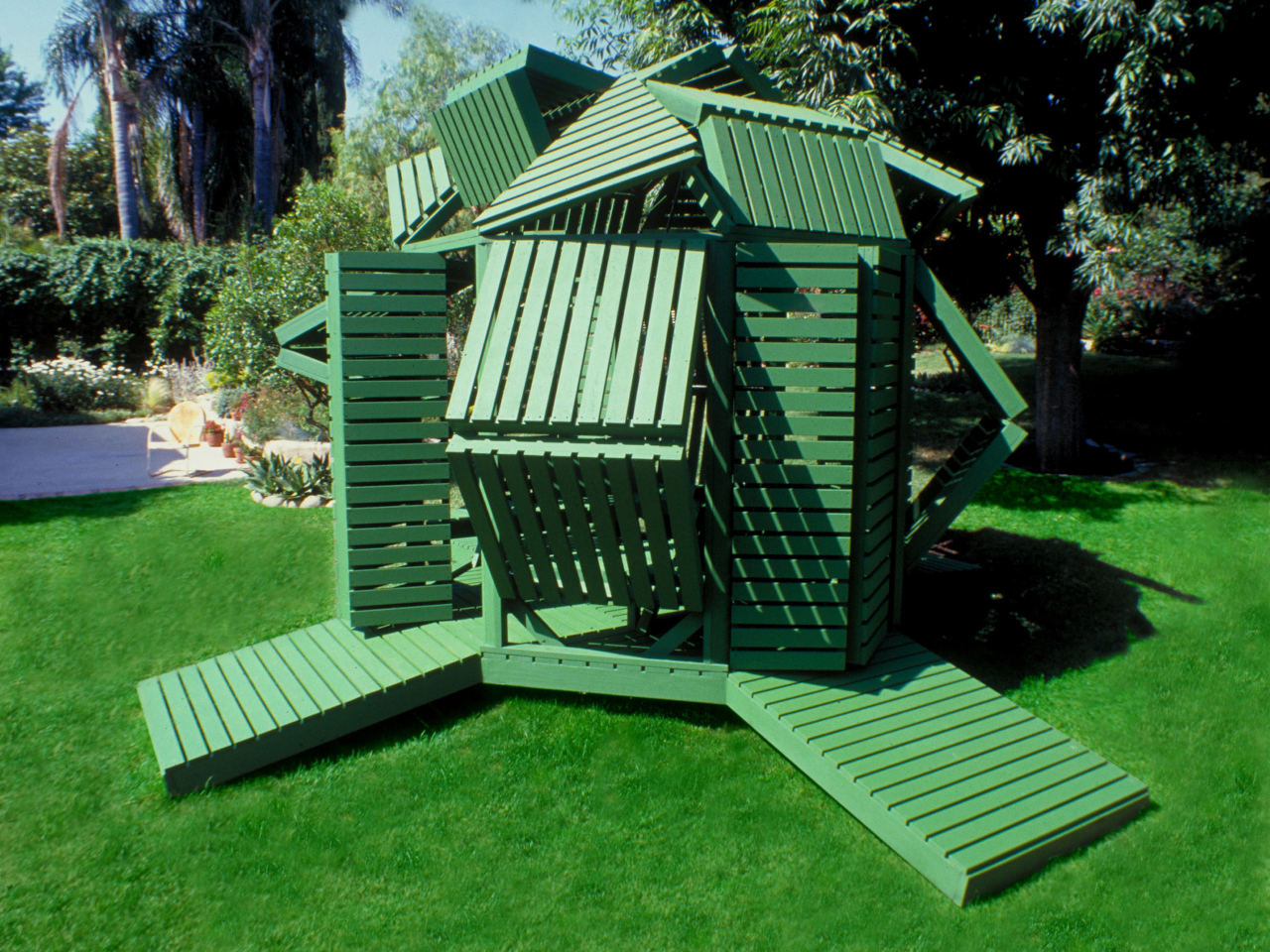
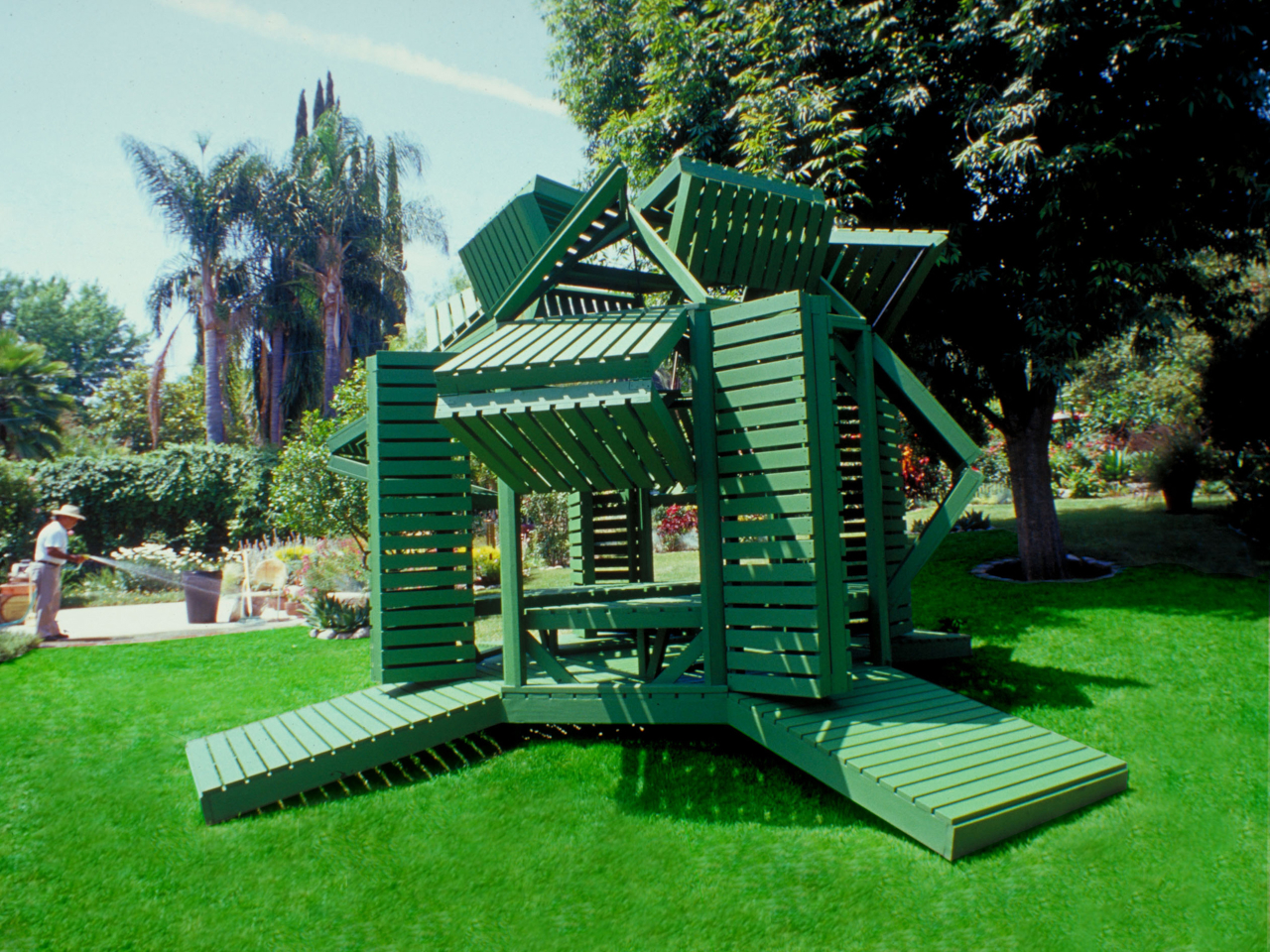
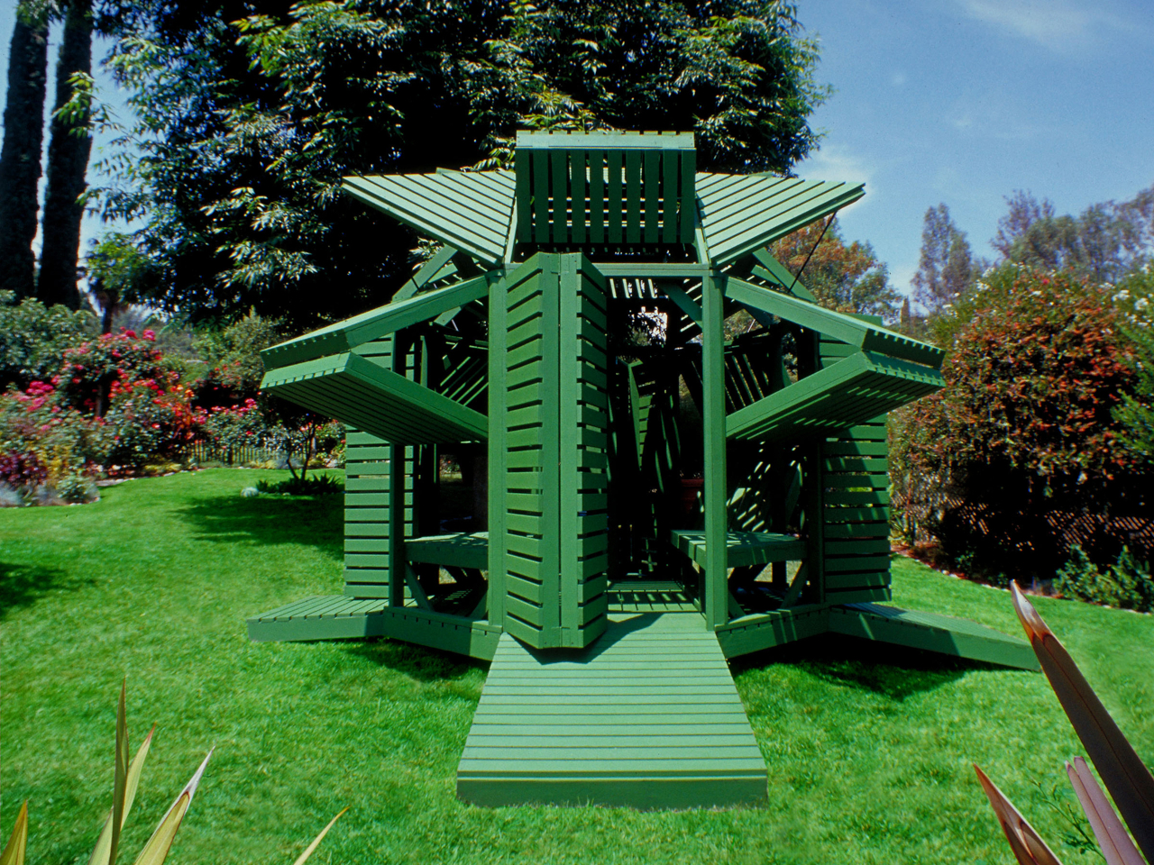
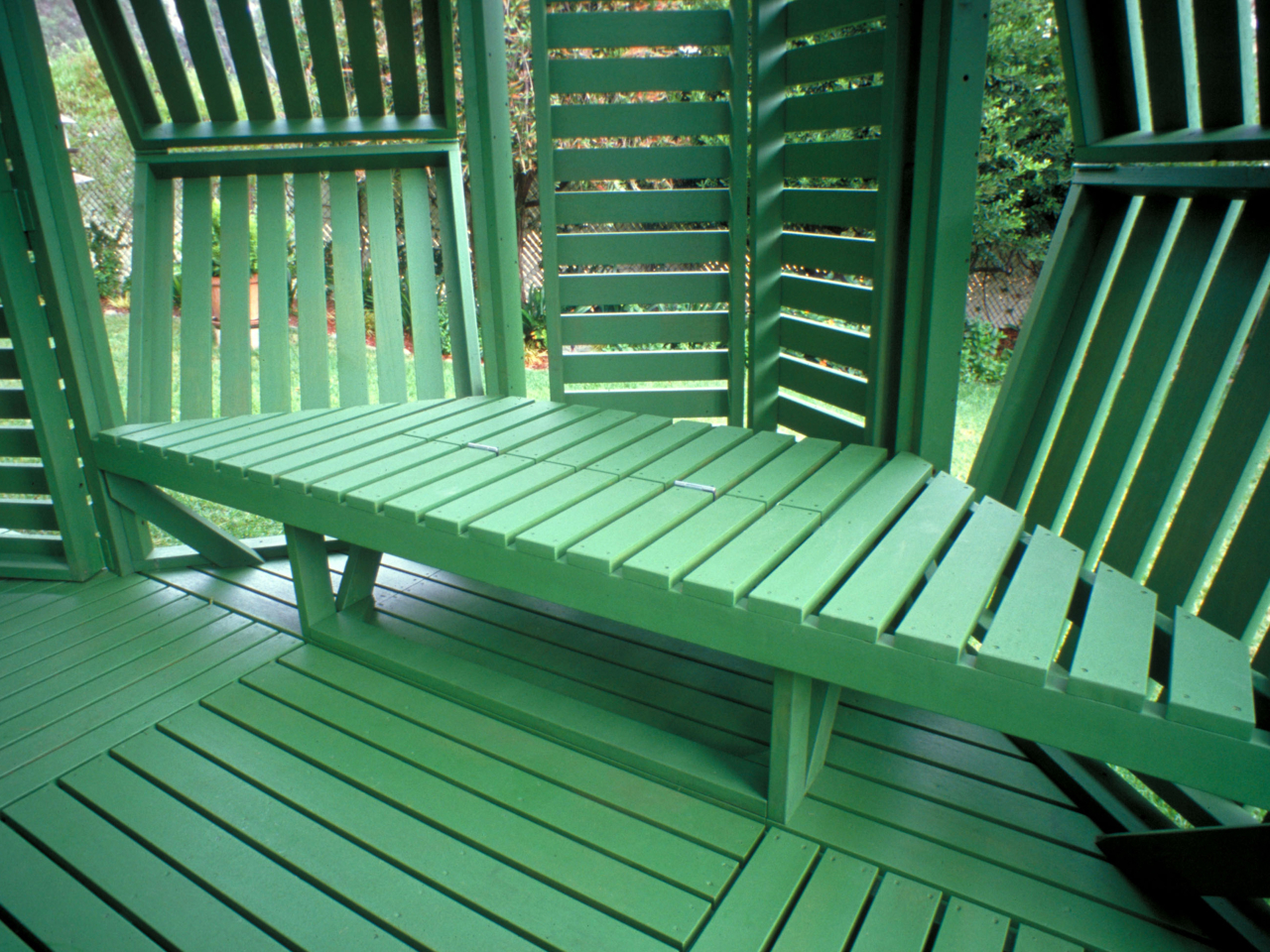
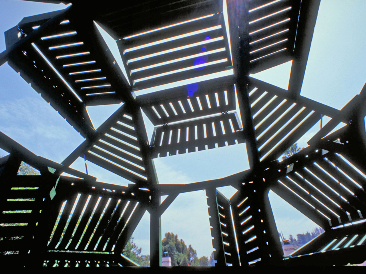
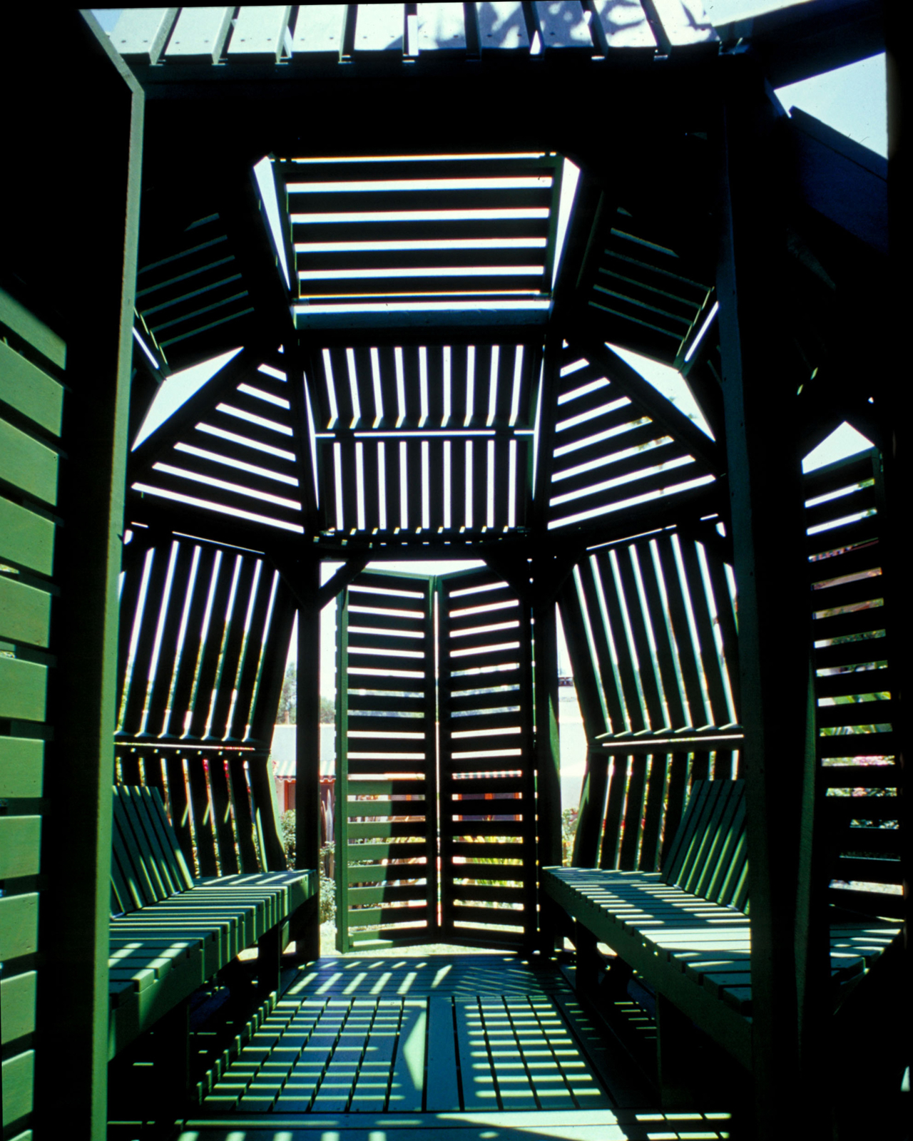
Built from sustainably grown stained wood and painted a uniform forest green, the pavilion sits on an octagonal support frame fitted with 30 slatted hinged panels across its walls and roof. Each panel pivots independently, sliding and rotating along the frame before locking into position. Open them wide on a hot afternoon, and the interior breathes. Angle them down against the glare, and the space dims considerably.
That last point is where the design earns its name. Most adjustable outdoor structures offer a single variable, usually an awning or a retractable canopy, within an otherwise fixed form. Here, the entire skin of the building is the variable. The wall panels, roof panels, and ground-level platform extensions can all be repositioned, which means the pavilion can look substantially different from one afternoon to the next.
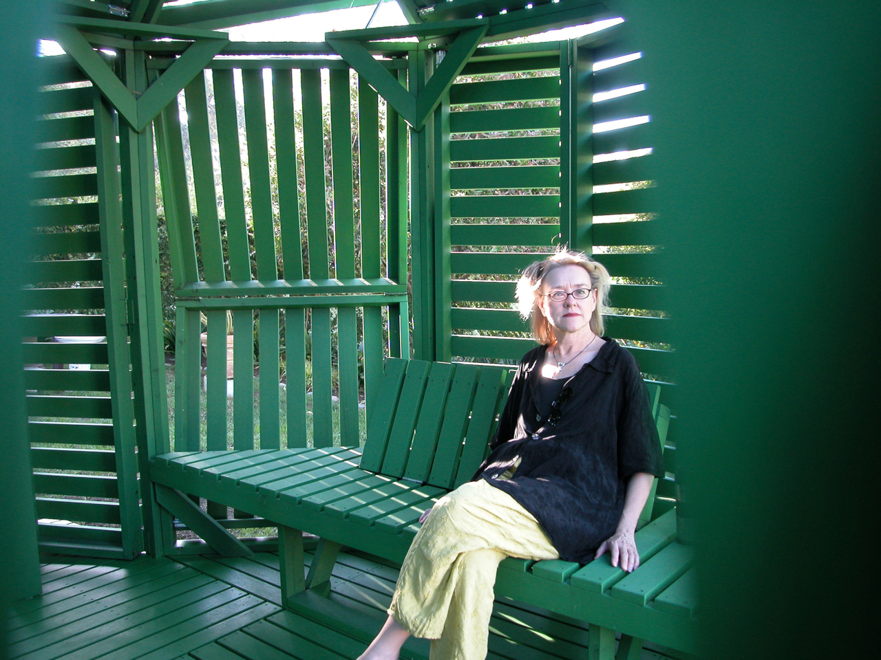
Pull the panels shut on three sides, and the structure becomes a genuinely private enclosure. Splay them open, and the interior connects fully to the garden around it. In one arrangement, it reads as a dense closed form. In another, the structure opens up entirely, and the slatted framework becomes almost sculptural against the lawn.
Inside, two benches with adjustable backrests run the length of the interior, facing each other. The seating is built into the frame, which keeps the floor plan clean and leaves room to recline fully. When the overhead panels are partially open, sunlight enters in sharp parallel bands that shift across the benches as the day moves, a quality that is either meditative or distracting depending on what you came in for.
The construction logic is also notably practical. The pavilion is a prefabricated modular system, so the components can be scaled before assembly or joined with additional units to form a larger cluster. No foundation is required in most configurations. Given its size and type, a building permit is unlikely to be needed in many jurisdictions, which removes one of the more tedious barriers between an interesting design and an actual garden.
Jantzen has spent decades proposing architecture that responds dynamically to its occupants, much of it remaining on paper. This pavilion is one of the cases where the idea got built, and the result holds up at close range. The slatted wood is honest about what it is, the green paint ties the structure to the garden without trying to disappear into it, and the hinge mechanism does exactly what it promises.
The meeting of home design and food production is no longer a trend as it marks a fundamental shift toward self-sustaining living. The Transparent Farm reimagines the greenhouse as more than a growing chamber; it becomes an integral architectural feature. It merges carbon efficiency with the desire for a biophilic home, creating a new relationship between structure and landscape where true luxury equals independence.
For modern homeowners and designers, this represents the next evolution. Integrated greenhouse systems, expressed through double-height glass and thoughtful spatial planning, enhance energy performance and bring natural materials into daily life. This design approach boosts productivity, reduces external reliance, and positions the greenhouse as a fully self-supporting component of the home.
1. Designs with Sustainable Water Cycles
For any glasshouse-based farm, the real metric of success is resource conservation. Traditional agriculture consumes large amounts of water, but hydroponic and aquaponic systems cut usage by up to 90%. These methods create a far more efficient growing environment.
Architecture makes this possible. Internal reservoirs and advanced filtration systems clean, recycle, and repurpose greywater from the residence. The result is reduced utility demand and a long-term financial benefit grounded in minimal waste and maximum autonomy.
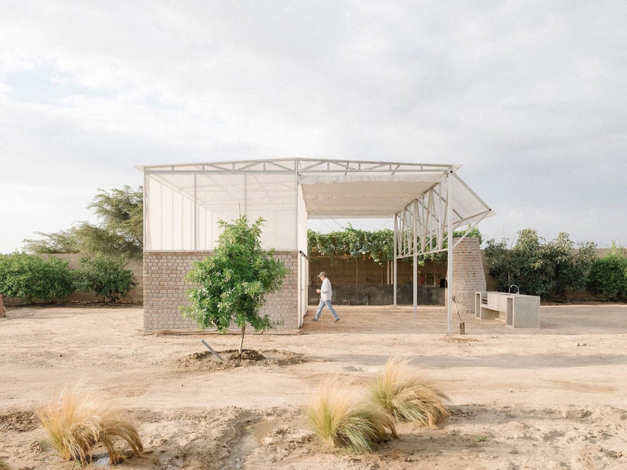
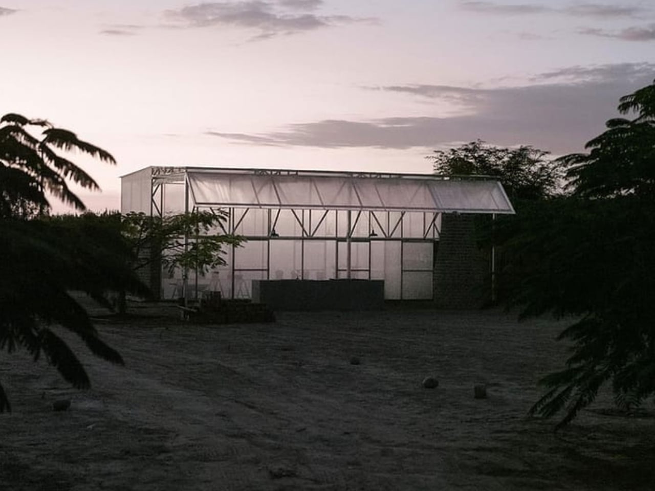
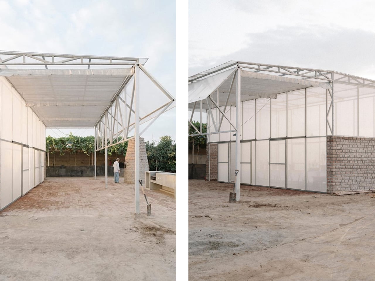
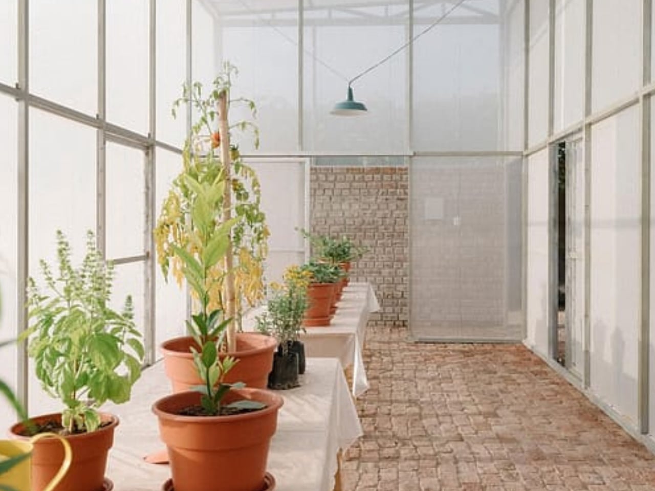
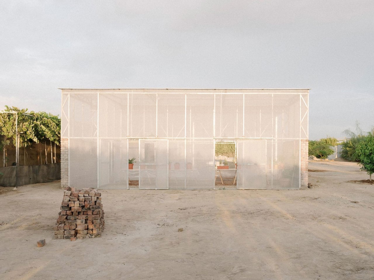
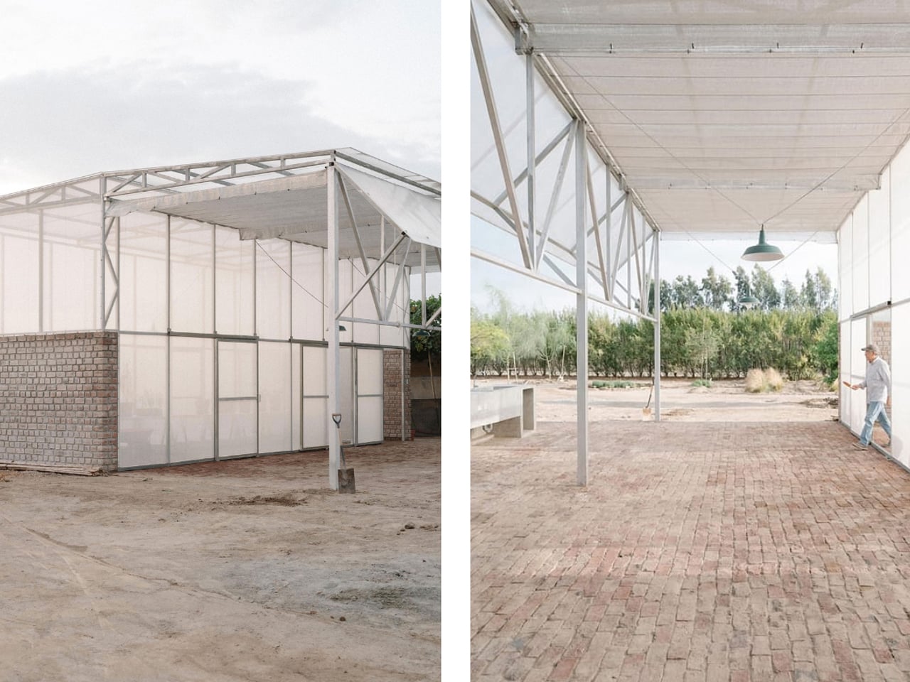
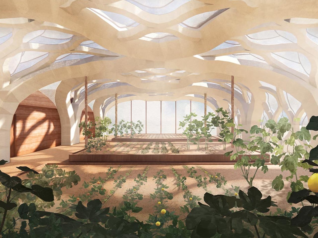
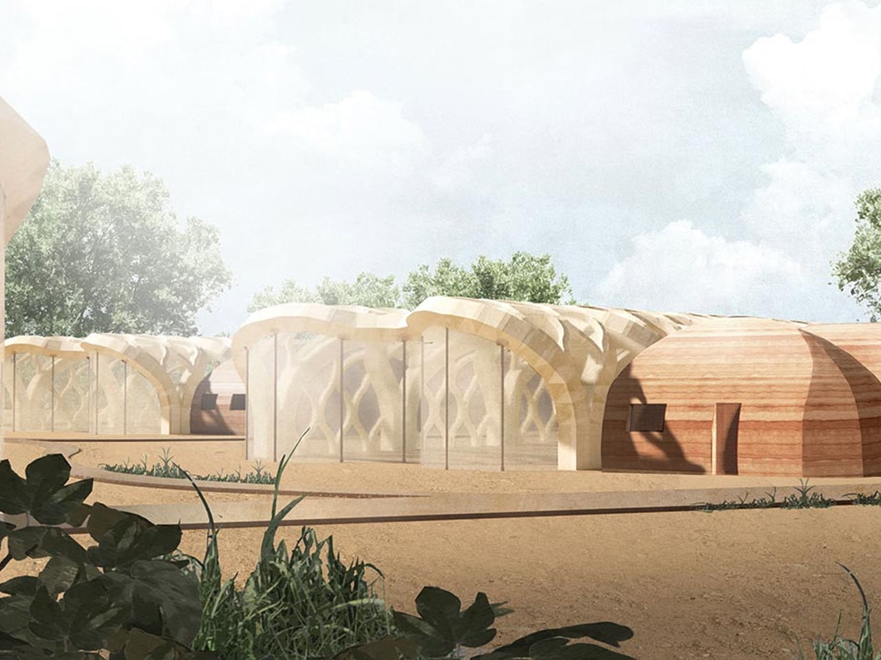
The Livable Greenhouse Home in El Carmen, Peru, redefines sustainable living by merging modern architecture with ecological principles. Drawing inspiration from Peru’s rich cultural heritage and traditional structures, this innovative dwelling blends indoors with outdoors, creating a seamless harmony with nature. Designed as a habitable greenhouse, it supports plant growth within the living space, improving air quality and enhancing well-being while minimizing energy use through passive design strategies such as natural ventilation and abundant daylight.
Constructed with a robust brick base using salvaged “ladrillo recocho” overfired bricks and topped with a lightweight metal structure made from recycled agricultural components, the home embraces both permanence and adaptability. The result is a tranquil living environment that reconnects residents with nature while championing sustainability and responsible material use. The Livable Greenhouse Home is not just a structure, but a vision of a regenerative, eco-conscious future where architecture and nature coexist effortlessly.
2. Indoor Greenhouse With Adaptive Thermal Control
Thermal performance defines the functionality of a transparent greenhouse. The building envelope must act as a climatic instrument, not a simple shell of glass. This is why photovoltaic-integrated glazing and low-emissivity systems are becoming standard, allowing the façade to generate energy while moderating solar gain.
Automated shading, passive ventilation stacks, and phase-change flooring materials stabilize the interior climate. Together, they maintain optimal conditions for plants while reducing the energy load on the main home.
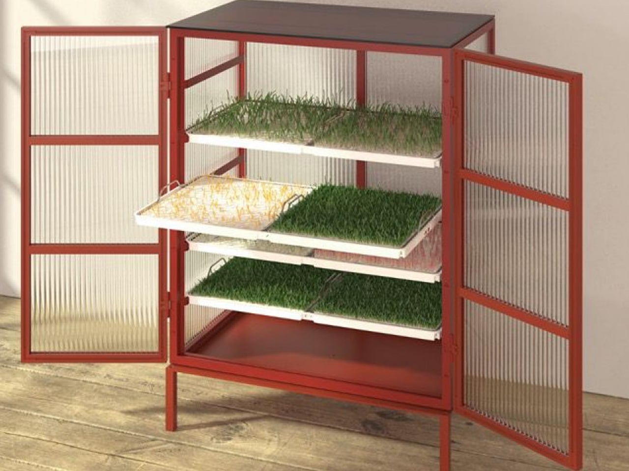
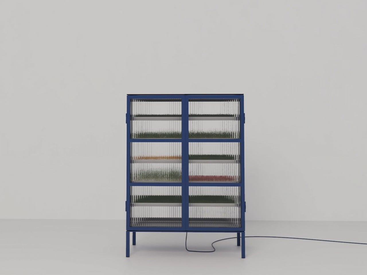
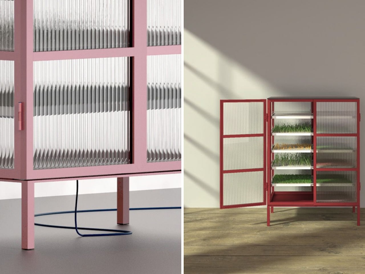
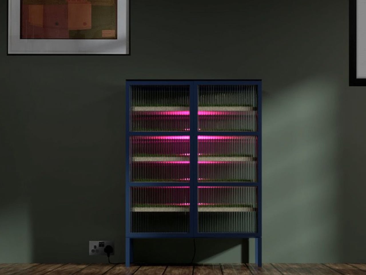
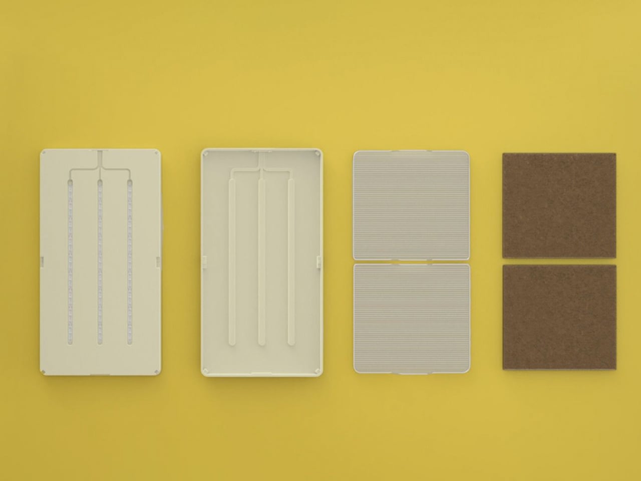
Farmhouse features a five-tiered structure that replaces soil with nutrient-rich water and root-supporting materials such as Rockwool. Each tray provides oxygen, filtered water, and the right support for plant growth, while adjustable LED or HID lights supply each plant with ideal light based on its Daily Light Integral (DLI).
As a sustainable farming method, hydroponics enables year-round cultivation anywhere. Farmhouse aims to reduce food miles, plastic waste, and pollution by offering an indoor farming solution that allows families to grow fresh, healthy produce at home.
3. Seamless Spatial Flow Delivers Circulation
A greenhouse becomes truly intentional when it’s embedded within the home’s natural circulation. Many contemporary designers place it beside, or above, the kitchen or dining area, creating a continuous dialogue between everyday domestic routines and the living landscape.
This connection enhances the experience. Descending into a winter garden that doubles as a larder replaces the sterility of a typical pantry with the scent of herbs and earth, elevating daily harvests into memorable spatial experiences.
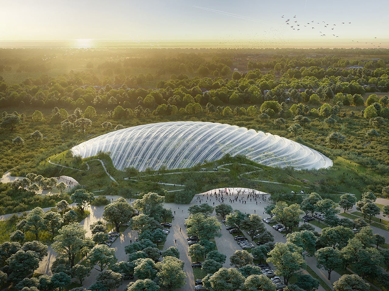
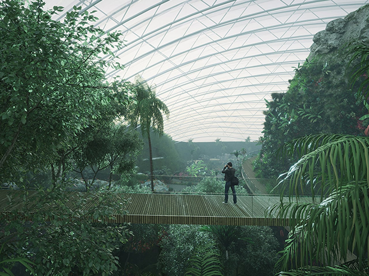
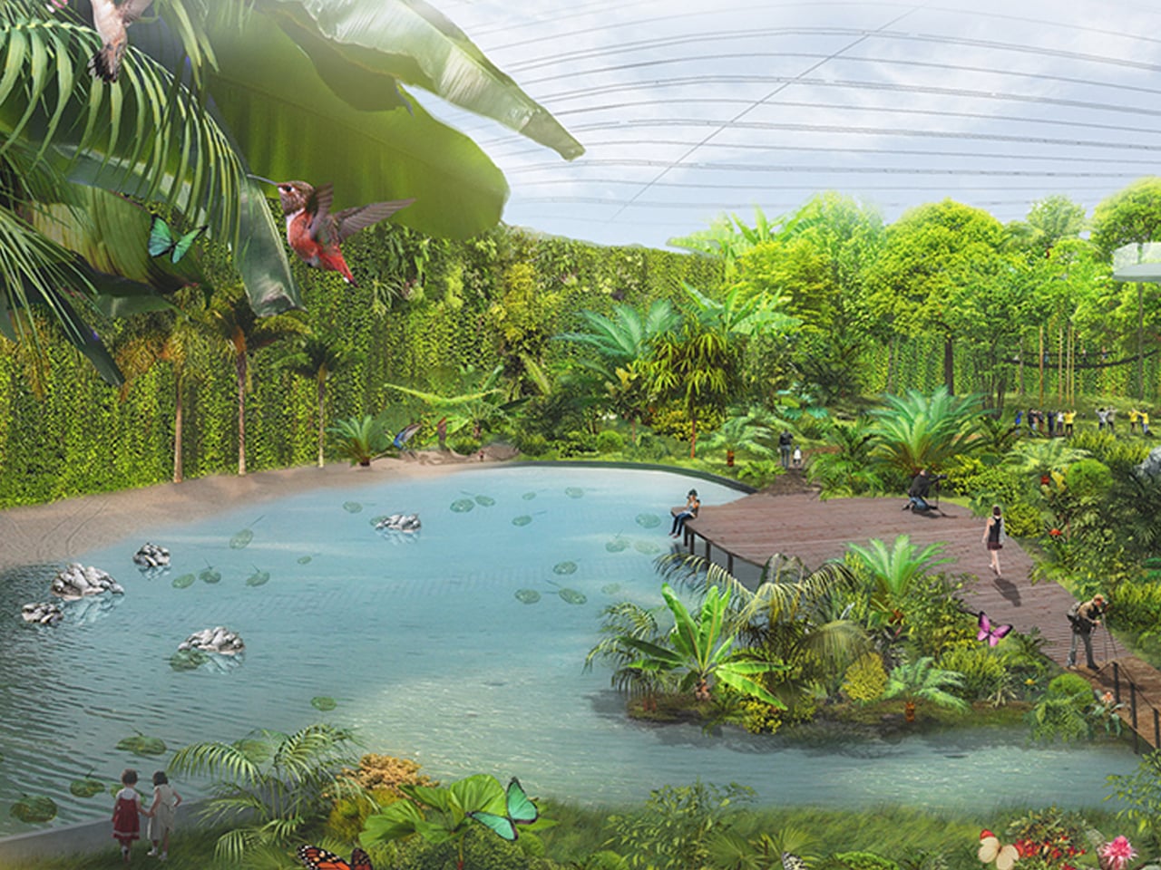
Hydroponic systems in greenhouses enable water recycling and support sustainable agriculture, while also aiding natural pollination. These controlled environments are emerging as a key solution to global food challenges by reducing resource waste. Leading this evolution is Tropicalia, a groundbreaking greenhouse that immerses visitors in a lush tropical world.
Designed by Coldefy & Associates in collaboration with an energy partner, Tropicalia is set to open in Northern France. This vast greenhouse maintains a stable tropical climate and functions without internal support columns, allowing biodiversity to thrive freely. Its innovative design captures and reuses the heat it generates, powering nearby buildings and addressing inefficiencies typical of traditional greenhouses. Inside, visitors can explore winding paths, waterfalls, and vibrant aquatic life.
4. Modular Greenhouse Design
A sustainable greenhouse must be designed for longevity. Durable, non-corrosive materials such as marine-grade aluminum and treated glulam ensure structural integrity while enabling easy reconfiguration.
Modularity protects function and beauty over time. Homeowners can shift from vertical farming to traditional planting without disrupting the architectural language, preserving long-term relevance and aesthetic harmony.
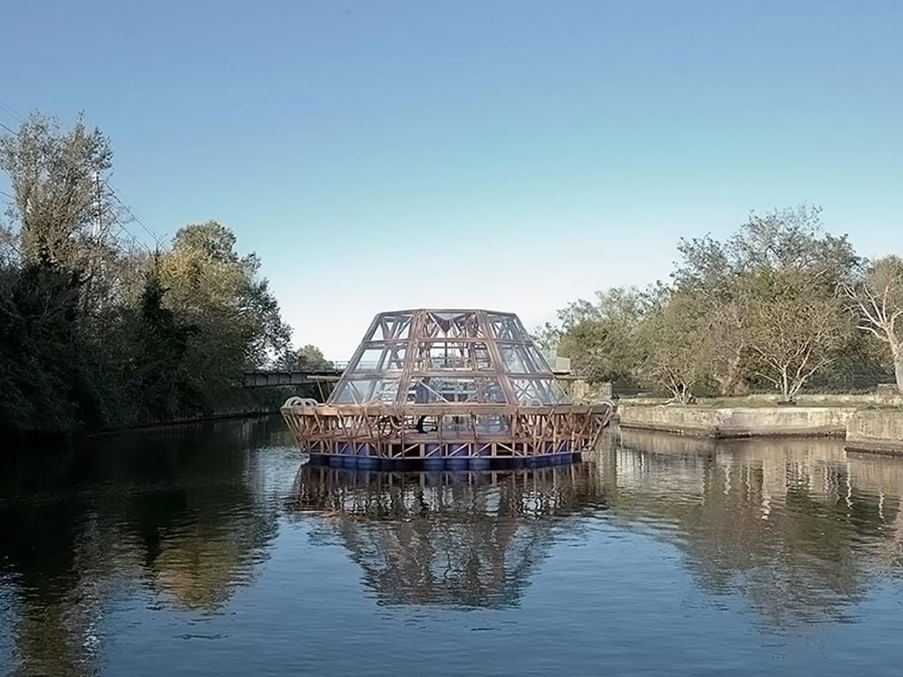
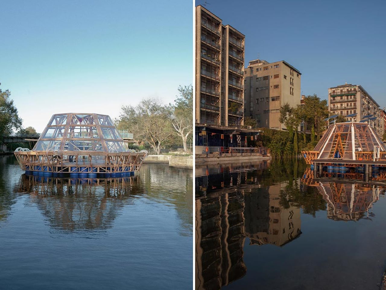
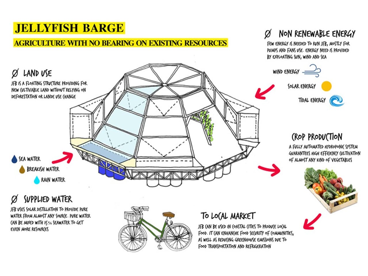
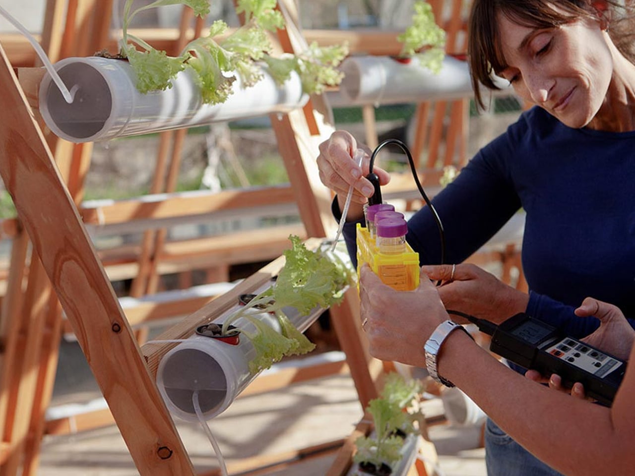
Studies indicate that by 2050, global food demand is expected to rise by up to 70%, yet cultivable land and fresh water are rapidly diminishing due to climate change. Flooding, extreme weather, and soil degradation are already impacting agricultural productivity, pushing the need for resilient and sustainable food systems. One innovative solution is the Jellyfish Barge, a modular floating greenhouse designed to support food production in coastal communities without relying on soil, fresh water, or fossil fuels.
Created by Studiomobile and Pnat, the Jellyfish Barge harnesses solar energy to desalinate water, producing enough clean water to sustain its crops. Built on a wooden platform supported by recycled plastic drums, it uses efficient hydroponic methods to reduce water usage by 70% compared to traditional systems. Its modular structure allows the design to be scaled, replicated, or adapted, even serving as floating markets or community farms. This sustainable, affordable greenhouse offers a promising model for future urban food resilience.
5. Renewable Power Systems For Growth
A transparent greenhouse reaches full sustainability when it demands little to no external power. Beyond energy-generating façades, integrating renewables like compact wind turbines or ground-source heat pumps ensures consistent energy for grow lights and environmental controls.
This autonomy transforms the greenhouse from a home feature into a self-reliant sanctuary, an off-grid, future-ready asset that resonates with the values of high-net-worth homeowners.
In many Southeast Asian countries, plastic-covered greenhouses remain common, especially in India, where over 60% of the population relies on agriculture. Polythene sheets are inexpensive and convenient, but their environmental impact is often overlooked due to limited awareness and a lack of alternatives.
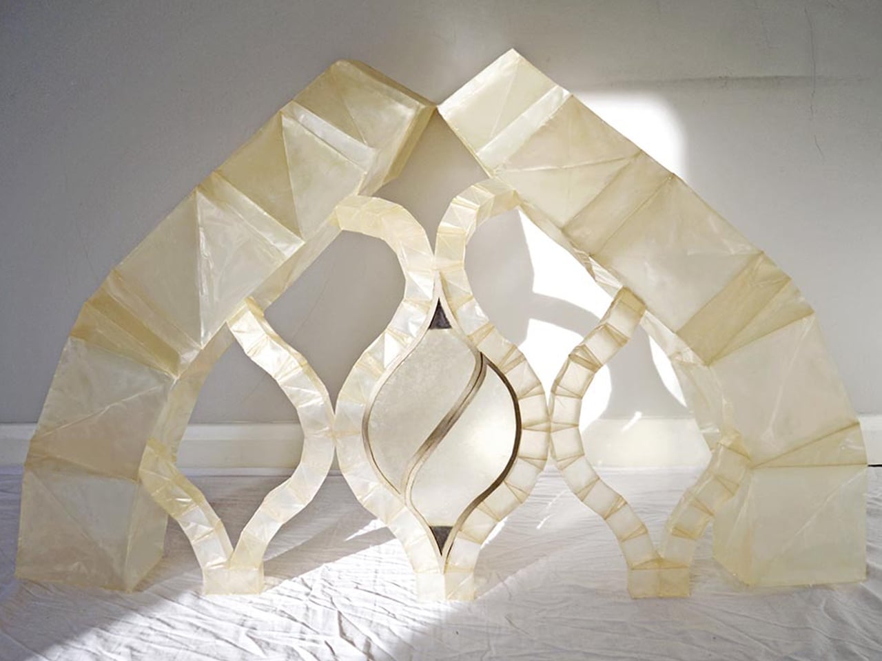
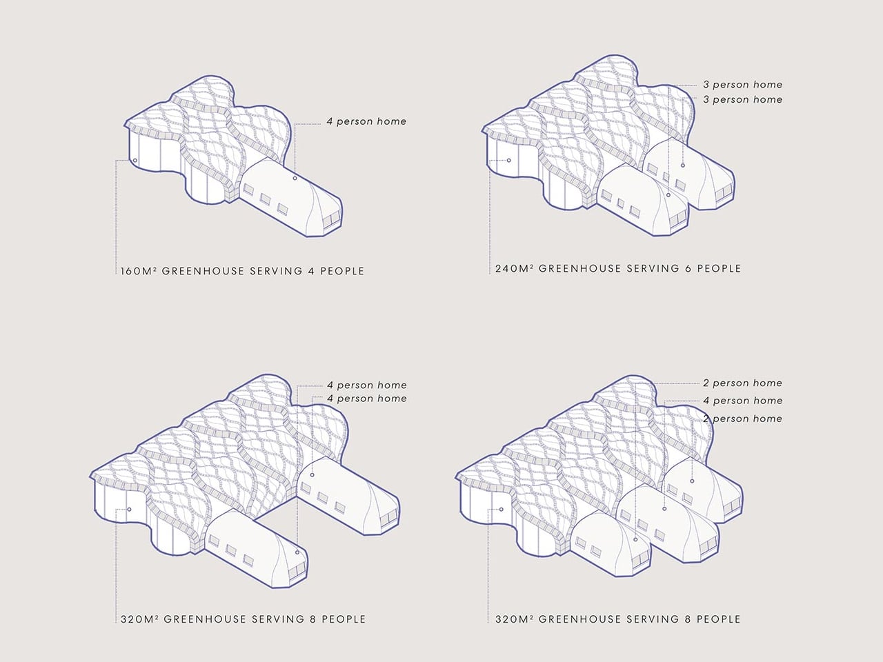
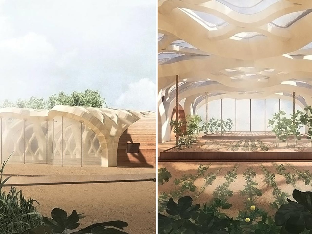
Architect Eliza Hague offers a sustainable solution with her inflatable bamboo greenhouses. Designed during her Master’s at the University of Westminster, Hague’s concept uses shellac-coated bamboo inspired by biomimicry. The structure mimics the Mimosa Pudica plant, incorporating collapsible beams and inflatable hinges to create a unique, origami-like form that can be flat-packed for easy transport.
These bamboo-paper greenhouses can connect to soil-based dwellings that regulate temperature naturally. Hague envisions them as shared spaces for families in rural communities, providing food self-sufficiency and reducing plastic use.
The Transparent Farm becomes an architectural imperative, more than an amenity, signaling a genuine commitment to ecological responsibility. It unites nourishment and shelter within a single experiential volume. For the discerning homeowner, the integrated sustainable greenhouse represents the ultimate expression of biophilic, intelligent, and forward-thinking luxury.
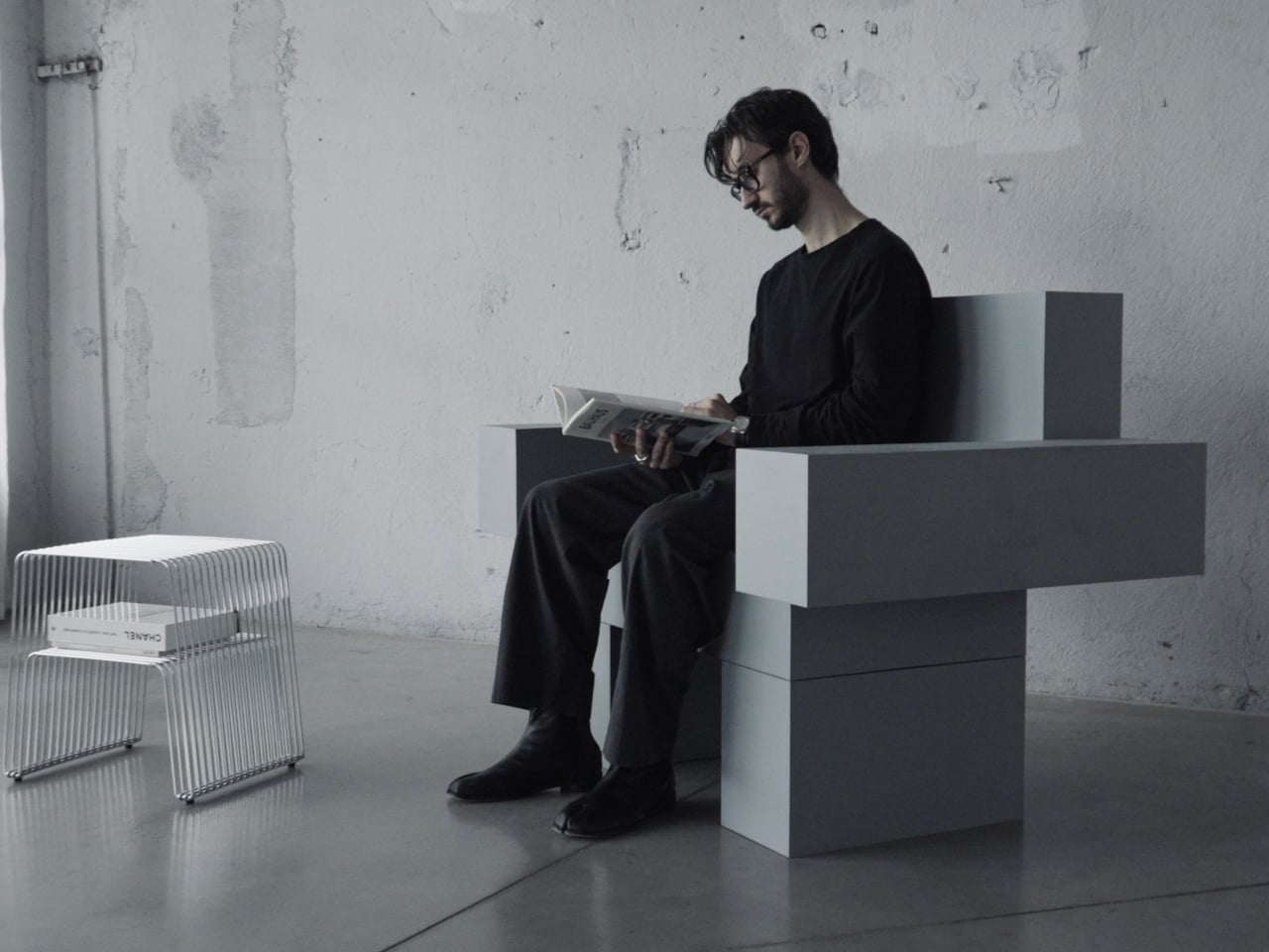
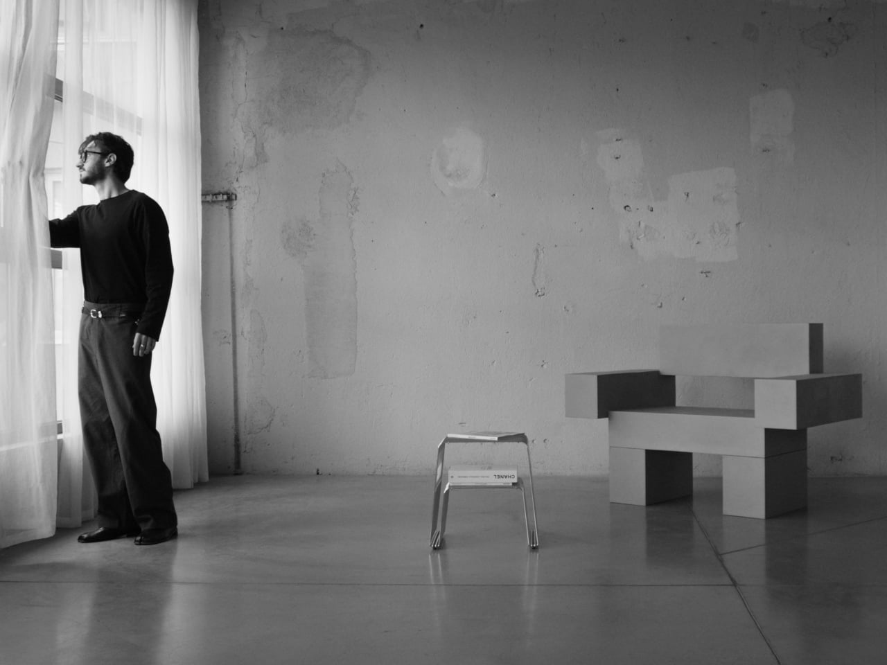
Most furniture sits in a room without saying much. It fills a corner, does its job, and disappears into the background. Nako Baev’s THE OBJECT 01 is not that kind of furniture. The Amsterdam-based designer set out to build a chair that carries the weight of a spatial statement, something that holds its ground without decoration or apology, and in that specific ambition, the object largely delivers.
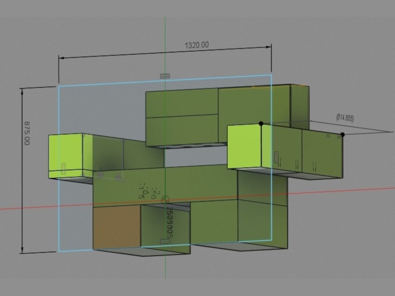
THE OBJECT 01 is a 3D-printed lounge chair built from recycled PETG, a plastic more commonly found in water bottles than in furniture workshops. At 20kg, it is lighter than its blocky, slab-heavy proportions suggest, though not exactly something you would reposition on a whim. Its dimensions push it closer in scale to a small architectural fragment than to a typical chair, which is likely the whole point.
The construction follows a modular panel system, where each 3D-printed block fits into a sequence designed to cut material waste and keep the overall mass structurally lean. Finished in a cold grey Baev calls “Kyoto Fog,” the chair reads somewhere between concrete and matte stone. In a sparse studio or raw loft, it anchors the space with quiet authority. In a more conventional living room, it would likely dominate in ways not every household would welcome.
What makes THE OBJECT 01 genuinely worth attention is how honestly it exposes its own making. The layer-by-layer texture from the printing process is not hidden or smoothed away; it stays visible across the surface, turning the manufacturing method into part of the visual language. That kind of material honesty is far more common in ceramics or cast concrete than in plastic furniture, and it gives the piece a tactile quality that polished renders simply do not convey.
Baev describes the design as sitting between furniture and sculpture, drawing on minimalist brutalism and a quieter Japanese restraint in equal measure. The emotional reference points are more unusual: the designer cites the atmosphere of Silent Hill and Half-Life, those game environments built from silence and abandoned space, as part of what shaped the object’s mood.
The workflow involved AI assistance across early form studies, structural testing, and design refinement, reducing development time considerably. That footnote is becoming standard across the industry, and it doesn’t add or subtract much here. This process might even become the key to sustainable furniture design, as it can help optimize 3D printing, increase efficiency, and reduce waste in the long run.
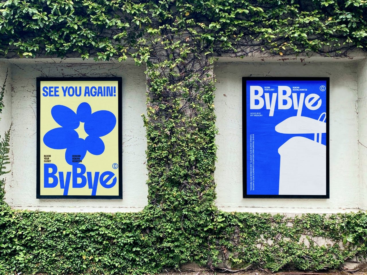
Most of us have a box. Or a bag, or a corner of the closet where clothes go to wait for a fate we haven’t quite settled on yet. Not trash, not donation, just quietly pushed aside. The jeans that stopped fitting but once made you feel unstoppable. The sweater that pilled after three washes but somehow survived four more years. Parting with clothes is harder than it sounds, and the fashion industry has largely treated that emotional gap as a non-problem.
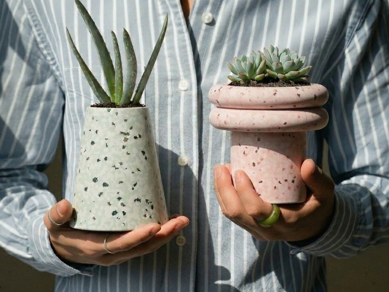
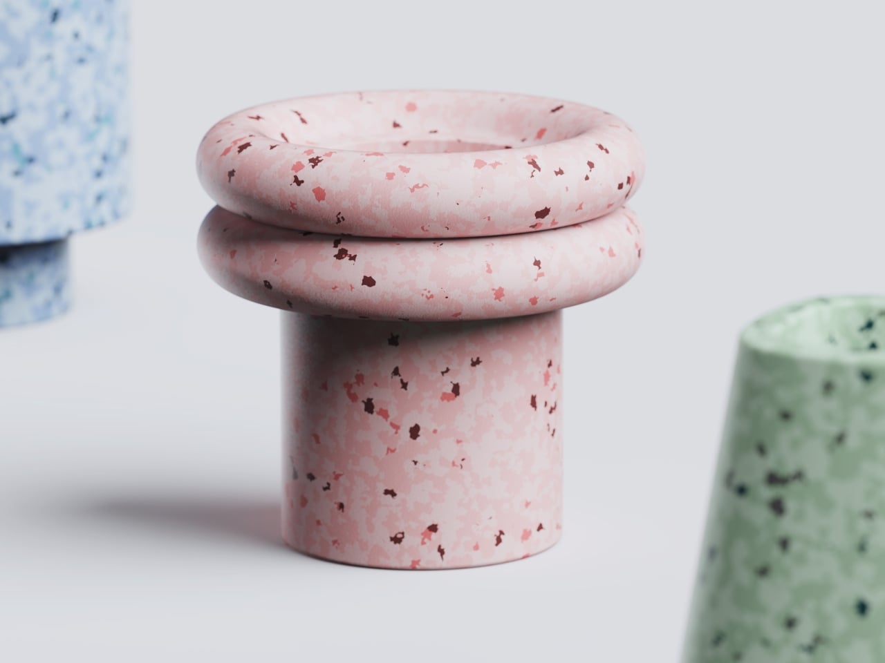
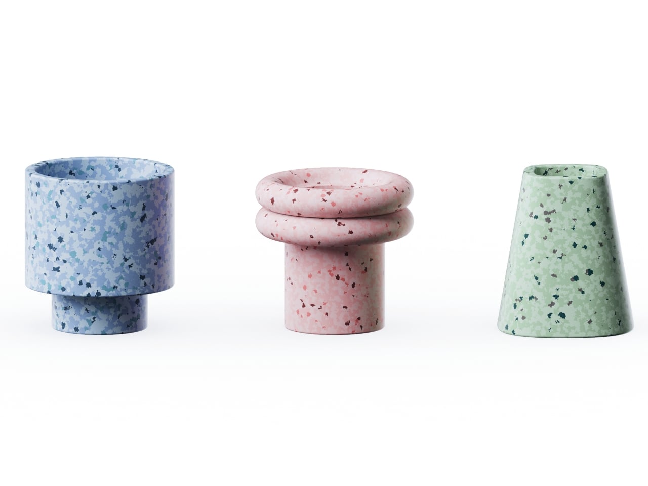
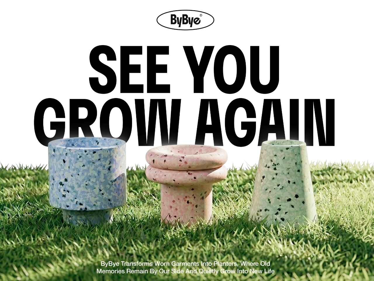
ByBye, a concept designed by Gyeong Wook Kim, Sooa Kim, Gayeon Kim, and Mingyeong Shin, disagrees with that approach in the most literal way possible. It’s a countertop-sized machine that takes your worn and discarded garments and transforms them, through a process of grinding, compression, and heat, into flower pots. Real, usable, actually beautiful flower pots.
Designers: Gyeong Wook Kim, Sooa Kim, Gayeon Kim, Mingyeong Shin
I want to sit with that idea for a second, because it’s a genuinely clever reframe of the problem. The designers describe ByBye not as a disposal system but as a “system of reform.” That language matters. When we throw clothes away, the garments disappear. When we donate, we hand off the moral weight to someone else. But ByBye asks you to stay present for the transformation and gives you something physical to show for it.
The mechanics are straightforward but impressively considered. You feed garments into the top opening, which uses a sliding rail mechanism to regulate input and automatically closes once the designated weight is reached. Inside, a shredder breaks the fabric down into fine particles. Those particles are then fed into a flower pot mold, compressed by a pressing plate, and hardened through high-temperature treatment. The finished pots rise up from the molding mechanism. The whole process takes about ten minutes per piece, and a companion app tracks fabric weight, the number of pots produced, and total production time.
What comes out of the machine is genuinely surprising. The pots carry a terrazzo-like texture from the mixed fibers, soft and speckled in muted blues, pinks, and greens depending on the fabric input. They look like something you’d find at a design fair, not something born from a pile of worn-out t-shirts. That aesthetic outcome feels important to the whole concept. If the result were dull or utilitarian, the emotional payoff wouldn’t land. Instead, you end up with an object that holds some trace of the original garment, and then holds a plant on top of that.
The project raises questions I keep turning over. Can the machine handle all fabric types, including synthetic blends that behave very differently under heat and compression? What’s the upper limit on pot durability when working with processed textiles? These feel like the natural next steps for a concept this promising, and I genuinely hope the team is pushing toward them.
What ByBye gets absolutely right is the emotional architecture of the experience. The name alone, a gentle play on “bye bye” and “by” as in made by, signals that this isn’t designed to make you feel guilty about your wardrobe. The copy throughout the project, “Hello? Nice to Wear You,” “Let Your Clothes Begin Again,” reads more like an invitation than an environmental lecture. That tone is rare in sustainable design, which has a tendency to lead with shame rather than possibility.
The designers put it plainly in their project statement: “Not a system of disposal, but a system of reform where clothing is seen again, and made anew.” That’s a design philosophy worth paying attention to. Fashion produces staggering amounts of textile waste every year, and while no home appliance is going to fix that alone, concepts like ByBye shift the conversation in a useful direction. They make the ending feel less like a loss and more like a beginning. Parting with clothes is still going to feel like something. But now it might feel like planting something too.
A sneaker-sized robot developed at RMIT University in Australia is making a compelling case for rethinking how humanity responds to one of the ocean’s most persistent threats. The “Electronic Dolphin” is a Wi-Fi-controlled minibot built to skim oil slicks from contaminated marine surfaces without deploying any chemical dispersants, and without putting human responders anywhere near the hazard. Detailed in the journal Small, the device is compact, remote-operated, and draws on one of nature’s more underrated structural templates to do its job. It is not the first machine built to address marine oil contamination, but it may be the first to approach the problem with this particular combination of biomimicry, material science, and autonomous ambition.
The secret is in the filter. Rather than relying on PFAS-based absorbents, which are toxic, persistent in the environment, and increasingly regulated worldwide, the RMIT team engineered a composite coating from specialized carbon layers and modified barium carbonate. The resulting material mimics the microscopic spine geometry found on sea urchins, forming tiny protrusions that trap air pockets in a precise architectural arrangement. That structure makes the surface simultaneously superhydrophobic and oleophilic, a combination that causes water to roll straight off while oil latches on and gets drawn in. The chemistry here is elegant in the way good materials science often is: solving a messy physical problem through surface geometry rather than reactive chemistry.
Designers: RMIT University
The filter sits at the robot’s nose, paired with a small onboard pump that actively draws the oil slick inward. In controlled laboratory tests, the prototype processed oil at roughly two milliliters per minute, achieving over 95% purity in the recovered material. The coating also demonstrated strong corrosion resistance when exposed to saltwater, and held up across multiple reuse cycles without meaningful degradation. Those numbers matter because reusability is one of the practical bottlenecks that has historically limited oil spill response hardware. A filter that survives repeated deployment in a corrosive marine environment is a filter worth scaling.
The current battery life runs to about 15 minutes, which is honest enough for a research prototype operating at this scale. The RMIT team is candid about the limitations, and equally clear about the trajectory. Future iterations are envisioned at dolphin scale, fully autonomous, and capable of operating in a continuous loop: skim the surface, return to a base station, drain the collected oil, recharge, and head back out. That remediation model borrows from how robotic vacuum cleaners normalized autonomous domestic cleaning, and it translates surprisingly well to open-water spill response, where the geography is hostile, the timeline is open-ended, and human supervision is expensive.
Marine oil spills remain one of the more intractable environmental disasters, not because the problem is poorly understood but because the cleanup tools available have lagged behind the scale of the damage. Dispersants break oil into smaller particles that sink rather than surface, which looks like cleanup but often relocates the harm. Booms and skimmers are manual, slow, and weather-dependent. The Electronic Dolphin does not solve all of that at once, but it represents a shift in the design logic: autonomous, chemical-free, biomimetically informed, and built from the start with continuous deployment in mind. That is the kind of thinking the problem has always deserved.
A quiet revolution is reshaping the future of sustainable architecture. Instead of treating buildings merely as energy-saving shells, designers are now turning them into active power generators. With innovations such as Building-Integrated Photovoltaic (BIPV) panels and ultra-thin solar films, the building’s exterior becomes an energy-harvesting surface, enabling power generation directly where people live and interact. This shift creates a new, dynamic dialogue between architecture and the landscape it occupies.
This transformation moves the industry beyond passive efficiency toward a more expressive, technology-driven design philosophy. Structural components now serve dual roles as sculptural elements and renewable energy assets. For high-net-worth homeowners, this translates into increased long-term property value, reduced operational costs, and a significantly lower carbon footprint, and a new visual language defined by sleek, intelligent, nearly invisible power.
Core Drivers of the Micro Power Revolution include:
1. Aesthetic Solar Integration
The challenge with older photovoltaic systems was their tendency to disrupt a building’s visual harmony. Today, architects tend to favor thin-film solar cells and BIPV solutions that blend seamlessly into the building’s envelope. These systems maintain material authenticity while introducing clean, unobtrusive energy generation.
Resembling glass, ceramic tiles, or flexible metal sheets, these technologies transform roofs and façades into active energy skins, rather than passive surfaces. High-net-worth clients want sustainability without aesthetic sacrifice, and this approach delivers both. The architecture retains its visual clarity while every sun-facing surface works quietly as an elegant, invisible power source.
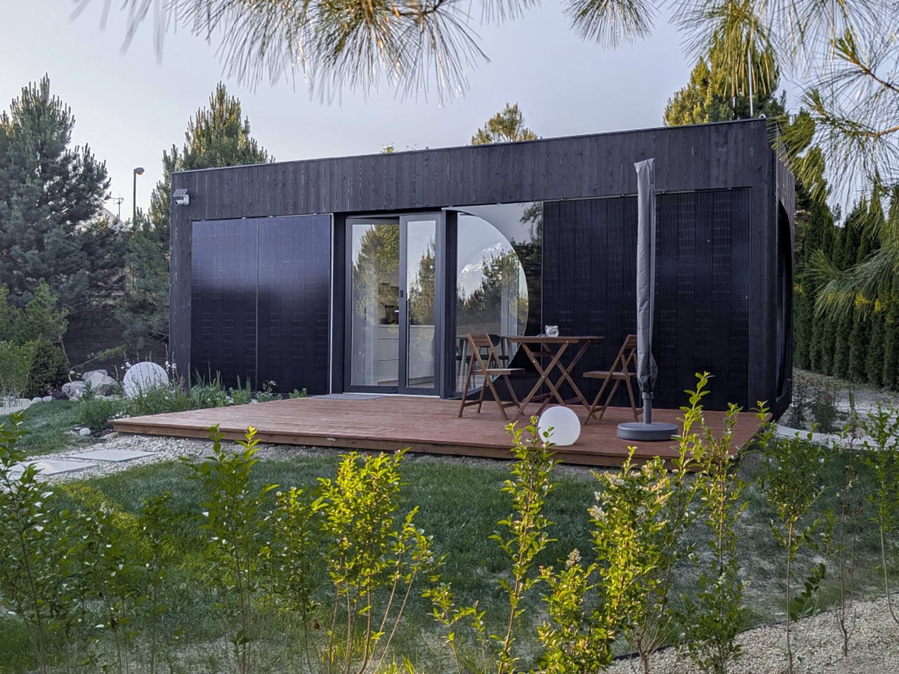
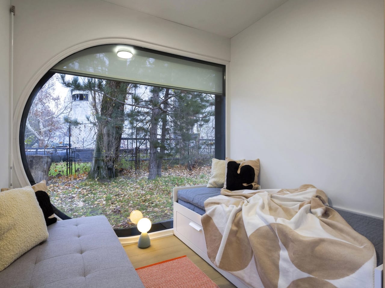
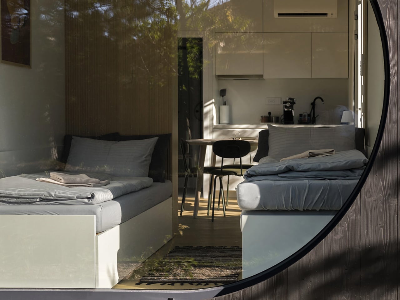
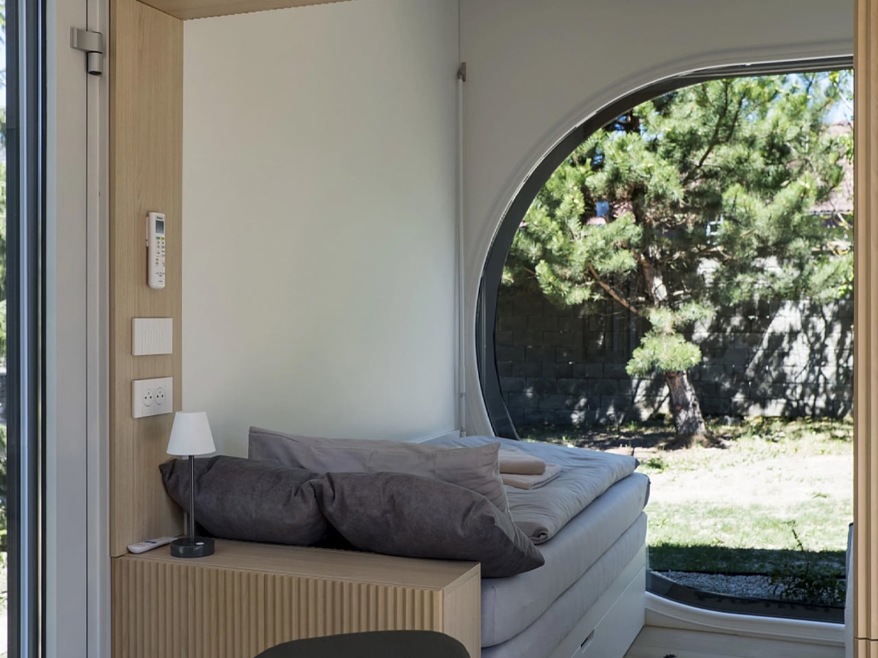
The Ecocapsule Box embraces a clean, rectangular design that prioritizes comfort and practicality over novelty. Its elongated form, expansive glass walls, and neatly organized interior create a bright, contemporary living space that feels far more like a modern micro-home than an off-grid experiment. The layout flows effortlessly, with convertible seating, integrated storage and clear zoning that make the compact footprint feel genuinely functional. This present design shifts the focus from making a visual statement to offering a calm, well-crafted environment that blends quietly into different landscapes.
Solar panels are central to the Box’s current architecture, powering essential systems with reliable renewable energy. These roof-mounted panels support lighting, appliances and climate control, allowing residents to live fully off-grid without sacrificing comfort. The technology is seamlessly built into the structure, maintaining the clean aesthetic while delivering true energy independence.
2. Versatile Solar Surfaces
The micro power revolution thrives on turning previously passive surfaces, especially vertical ones, into productive energy assets. New flexible, lightweight solar harvesters, such as perovskite and CIGS thin films, can adapt to curved forms and unconventional façades, allowing architects to integrate power generation into complex geometries.
This adaptability expands harvesting potential far beyond the flat roof, proving that expressive design no longer limits energy performance. In dense urban settings, this capability is essential for achieving net-zero targets. By transforming vertical cladding into a power-producing layer, buildings improve ROI through higher energy yield per square meter of their envelope.
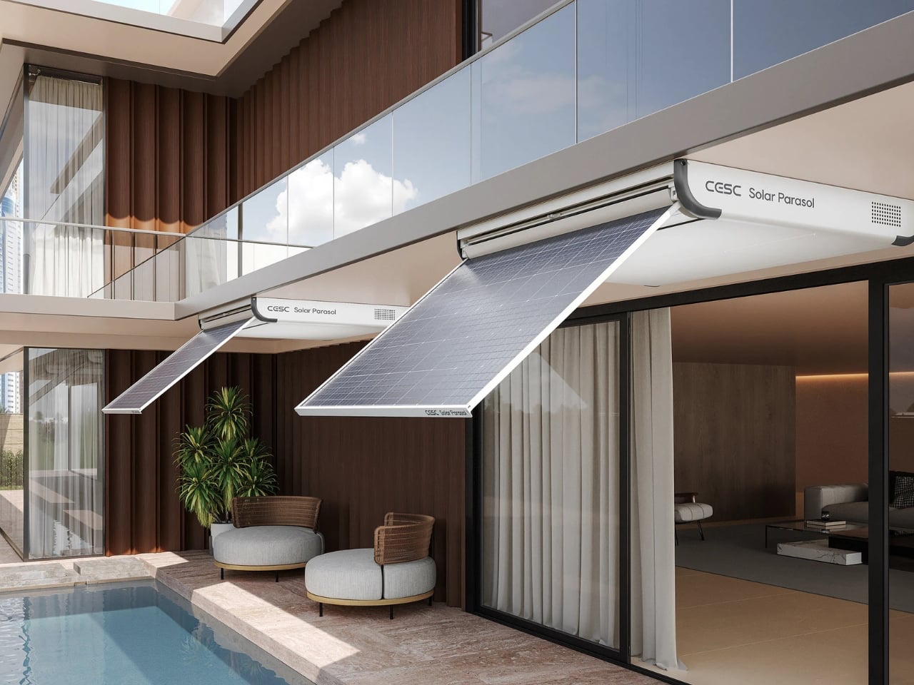
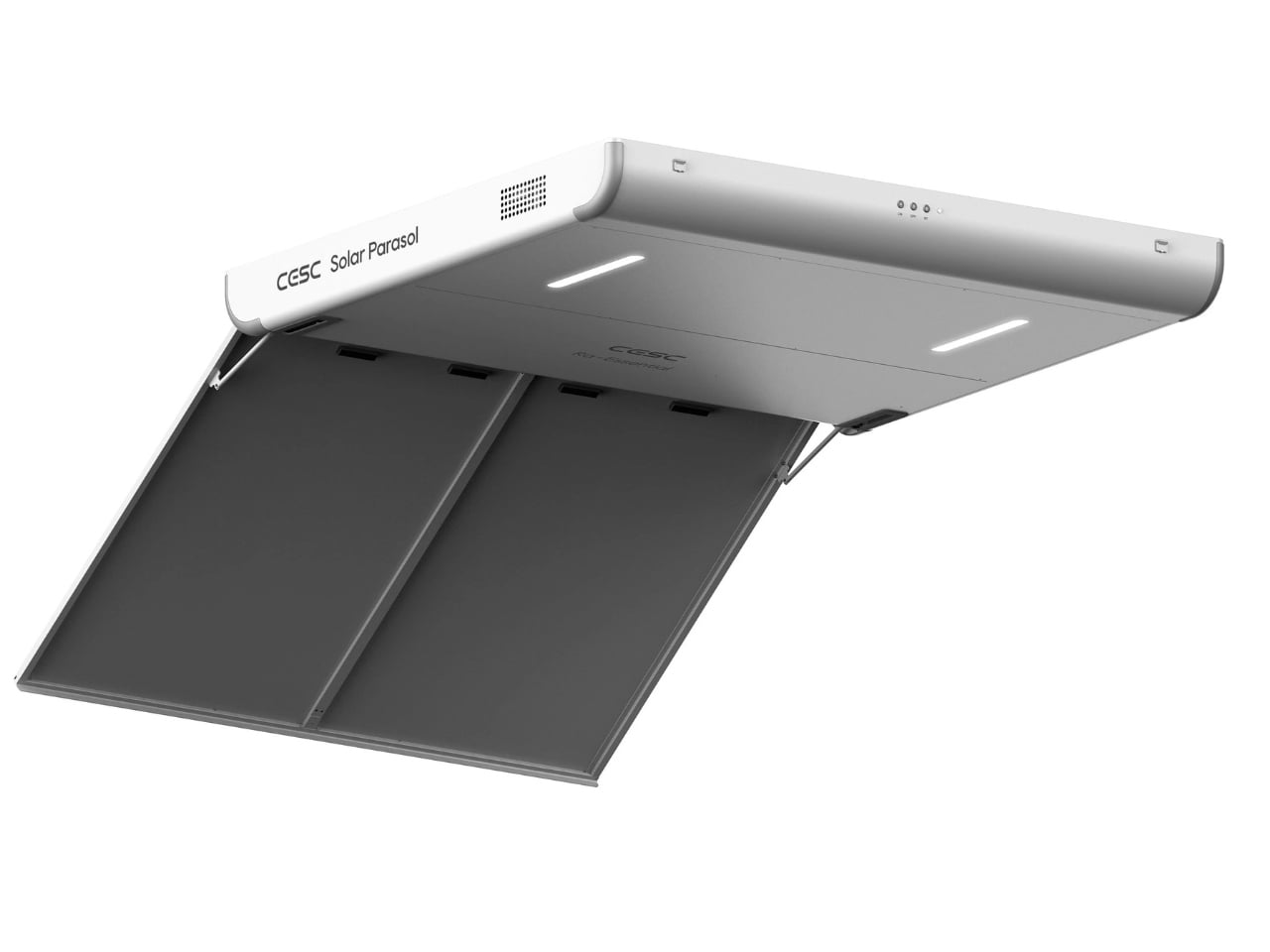
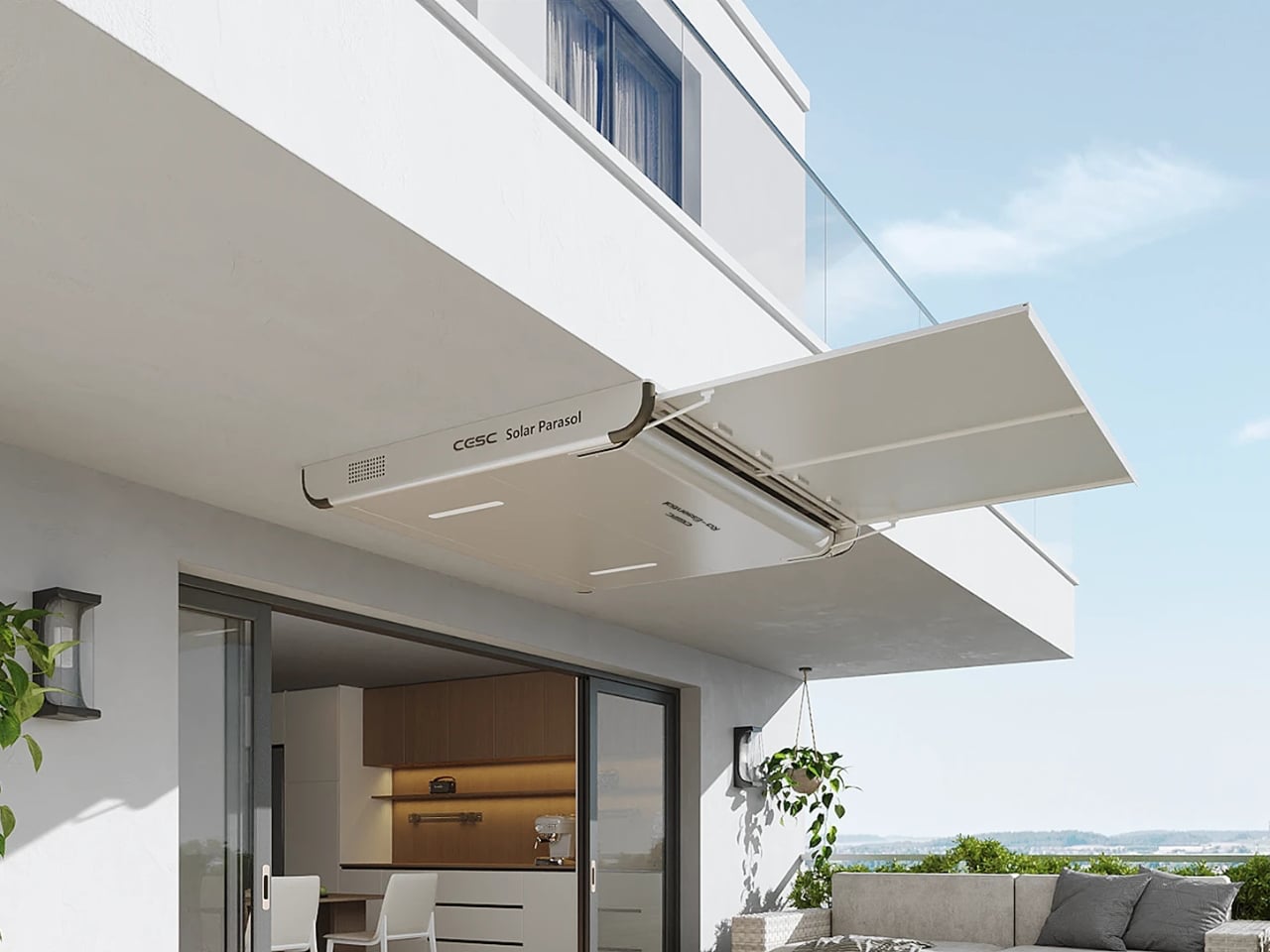
As more people seek sustainable energy options, urban homes often struggle with limited space for traditional solar installations. The CESC Solar Parasol by gang.lab design addresses this challenge with an elegant, space-efficient solution tailored for high-rise living. This smart parasol turns small balconies and overlooked corners into clean-energy hubs. Its minimalist aluminum frame, sleek white finish, and integrated LED lighting create a refined, modern aesthetic while enhancing the usability of compact outdoor areas.
At the heart of the design are high-efficiency solar panels capable of generating 315W of renewable power. These flexible panels fuel a 12W LED system and support intelligent energy management through an adaptive control mechanism. Users can adjust the parasol’s angle between 0°, 35°, and 90° via remote or mobile app, optimizing both shading and solar intake. By merging elegant design with practical photovoltaic technology, the CESC Solar Parasol offers a realistic, future-ready approach to sustainable urban living.
3. Thermal Smart Envelope
Optimized thermal performance is a central advantage of today’s BIPV systems. Beyond producing electricity, these panels function as an outer skin that absorbs solar radiation before it reaches the primary insulation. This reduces heat gain and lowers the cooling demand inside the building, making the envelope work harder and smarter.
This dual-purpose design turns the energy-generating layer into a dynamic shading surface. It doesn’t just add solar capacity; it actively shapes the thermal behavior of the interiors. The result is cooler spaces, reduced reliance on mechanical systems, lower long-term operating costs, and a more comfortable environment for occupants.
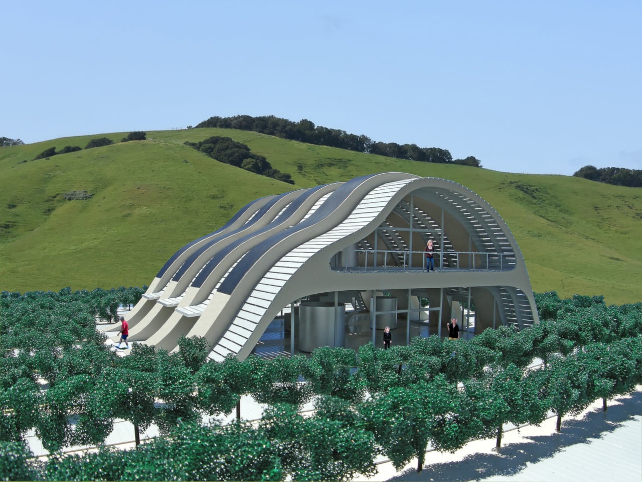
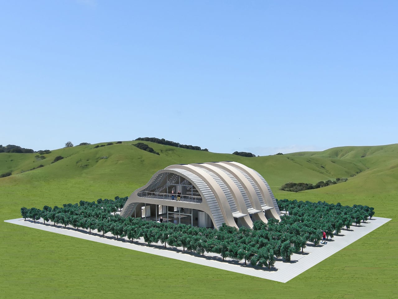
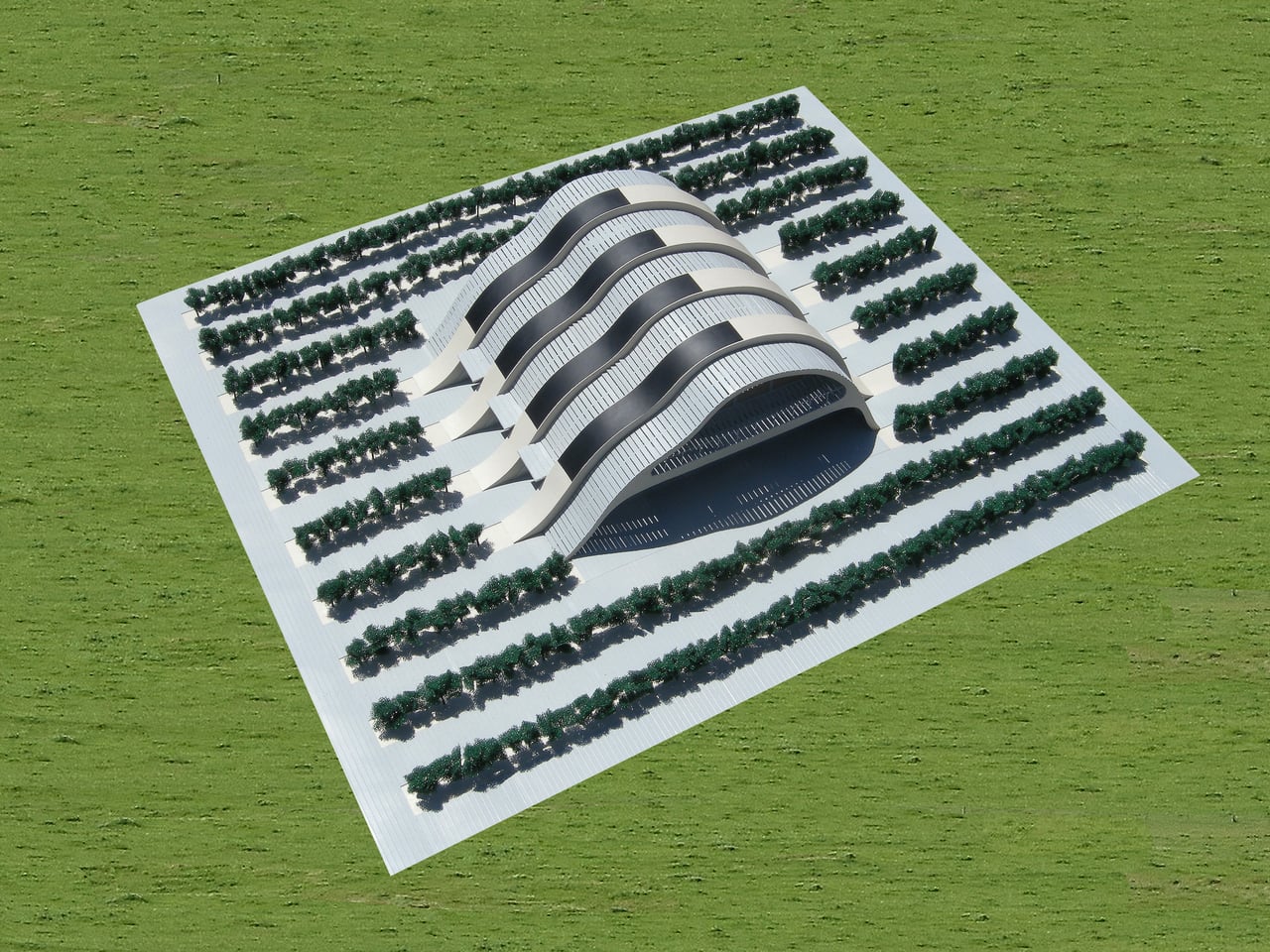
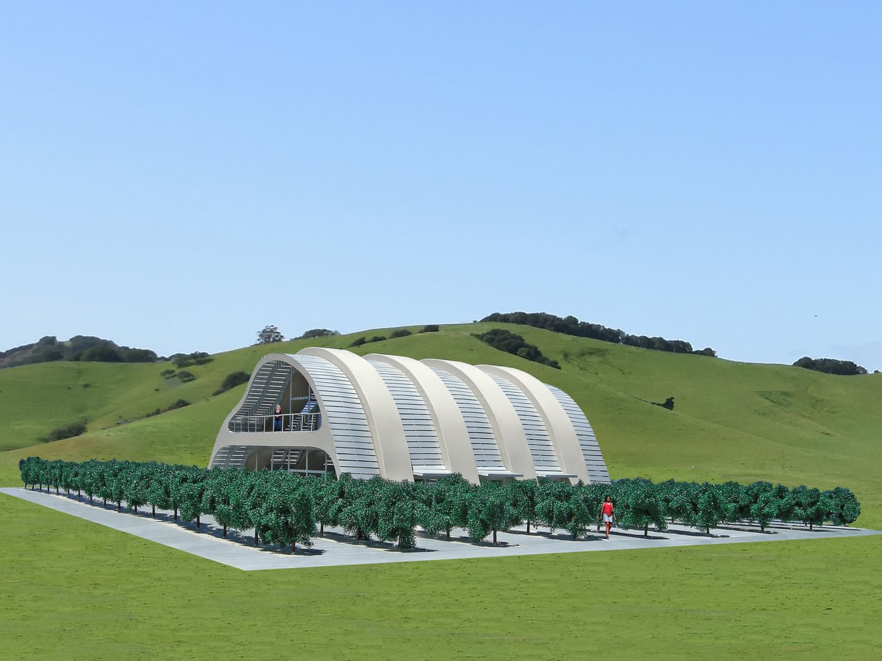
Michael Jantzen’s Solar Vineyard House combines sustainability and aesthetics in a 5,000-square-foot concept that merges living space, small-scale wine production, and environmental responsibility. Four sweeping concrete composite arches, linked by expansive glass sections, anchor the design and echo the rolling Californian landscape. Sustainably sourced wood pathways weave through the vineyard and over the structure, offering natural shading and circulation.
Sustainability is integrated seamlessly, not added as an afterthought. Curved solar panels along the south side generate renewable power while maintaining the home’s sculptural fluidity. Natural ventilation, deep overhangs, and rainwater harvesting reduce energy use and support vineyard irrigation. Inside, modular cylindrical units on wheels create flexible living and working zones, with filtered sunlight animating the interior and strengthening the home’s constant dialogue with its surrounding landscape.
4. Microgrid Advantage
Integrating surface harvesters opens the door to creating a decentralized building microgrid, a major advantage for homeowners seeking true energy resilience. With micro-inverters installed at the module level, each unit can operate independently, improving performance and adding built-in protection against system failure.
Pairing BIPV with advanced battery storage transforms the building into a self-reliant power ecosystem. This setup provides autonomy during outages or peak-demand periods, offering long-term security for high-net-worth homes. The property becomes a self-sustaining micro-economy of energy, ensuring consistent, uninterrupted power and elevating resilience and overall value.
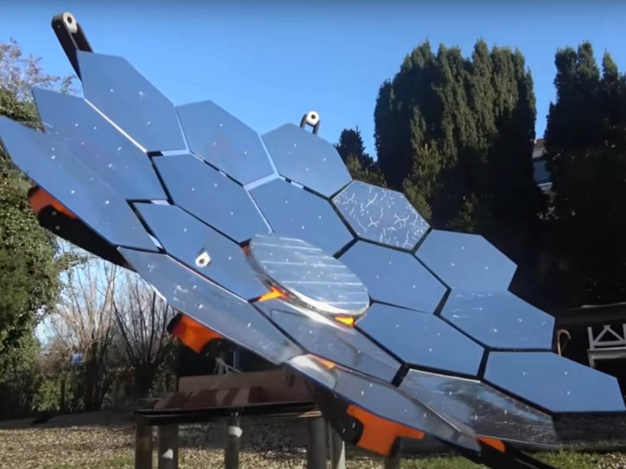
Solar energy was once considered a luxury, but today it has become accessible enough for anyone to experiment with. A DIY solar generator offers an affordable way to generate clean, renewable power using just a few essential components. Whether you want emergency backup power, a portable source for camping, or simply a way to lower electricity costs, building your own generator is both practical and rewarding. The project took inspiration from NASA’s solar technology, adapting high-efficiency panels and smart battery systems similar to those used on space missions into a setup suitable for everyday use at home.
The build requires solar panels, lithium iron phosphate batteries, a charge controller, power outlets, and a portable case, all assembled by following the video guide. Once completed, the generator can charge phones, laptops, lights, and small appliances, offering both convenience and energy savings. Beyond cost efficiency, it provides peace of mind during outages, supports sustainable living, and allows anyone to harness solar power in a hands-on, meaningful way.
5. Material Innovation
Advances in materials science are rewriting what solar technology can look like. Semi-transparent PV glazing now allows windows to generate power while still delivering daylight, turning a basic architectural element into an active energy source without sacrificing interior quality.
Colored and textured BIPV options, enabled by specialized coatings and nanotechnology, give architects a much broader palette of finishes. This means solar technology becomes an intentional design feature rather than a visual concession. By merging color, texture, and energy production, these next-generation materials elevate each surface from a functional module to a refined architectural expression that blends performance with beauty.
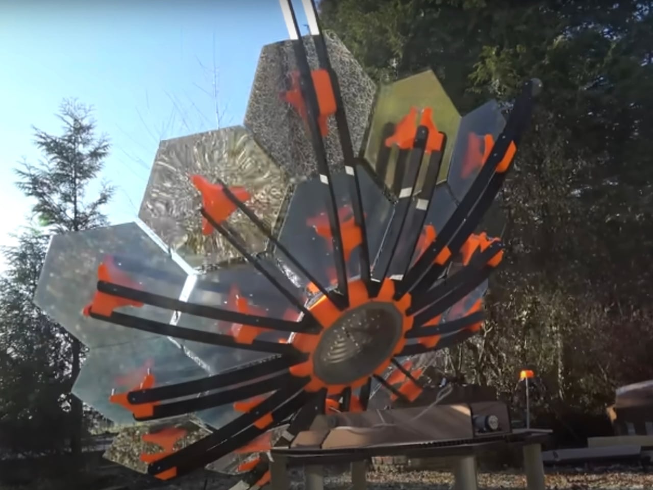
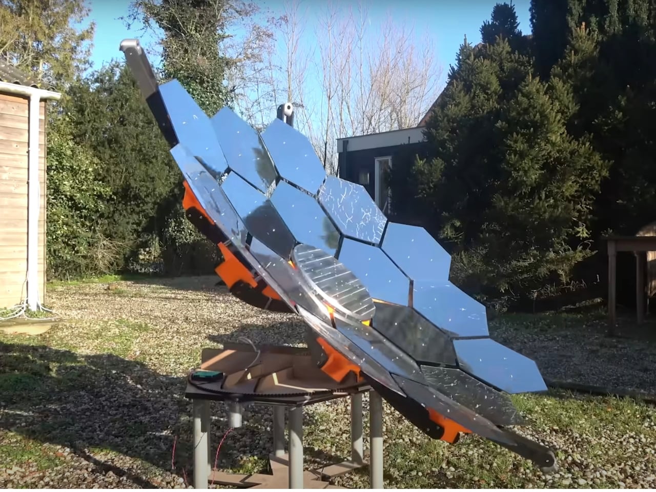
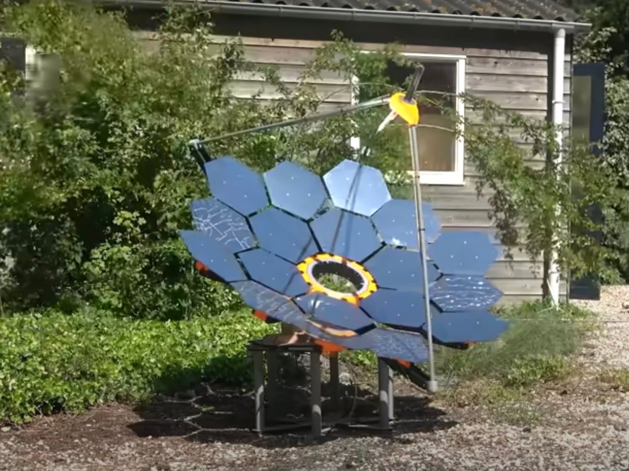
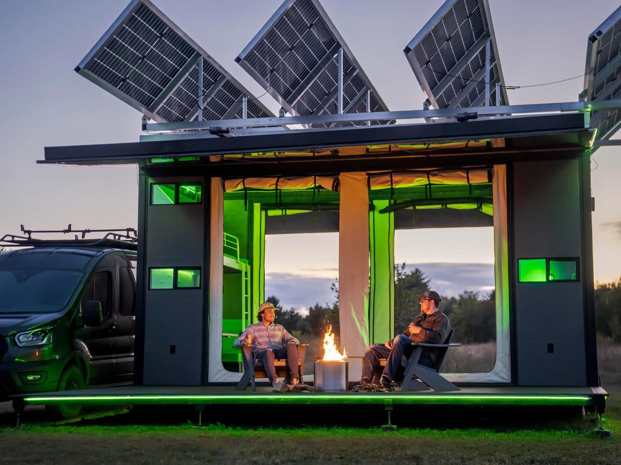
The EO Canopy by Electric Outdoors represents a significant advancement in off-grid camping, delivering urban-level comfort through a fully solar-powered system. Classified as a “canopy,” it requires neither permits nor additional infrastructure, offering exceptional flexibility in a variety of locations. The unit is notable for its ability to generate its own water and for its substantial energy system, which includes a 154-kWh sodium-ion battery pack that can be expanded up to four times. Its 6,600-watt solar-tracking roof produces between 45 and 64 kWh of power per day, ensuring a highly reliable and continuous energy supply.
This solar configuration is capable of generating enough electricity to power approximately two American homes each day. It also supports the charging of electric vehicles, including Tesla and Rivian models, providing an estimated driving range of up to 150 miles (241 km) via the integrated Level 2 charging station. Additionally, the 154-kWh battery bank enables uninterrupted air-conditioning use, positioning the EO Canopy as a sophisticated and self-sufficient solution for modern off-grid living.
The Micro Power Revolution redefines how architecture and energy interact. By embedding solar harvesters directly into building materials, every structure becomes an active generator rather than a passive consumer. This self-sustaining model represents modern luxury: high design, strong performance, and true ecological responsibility.
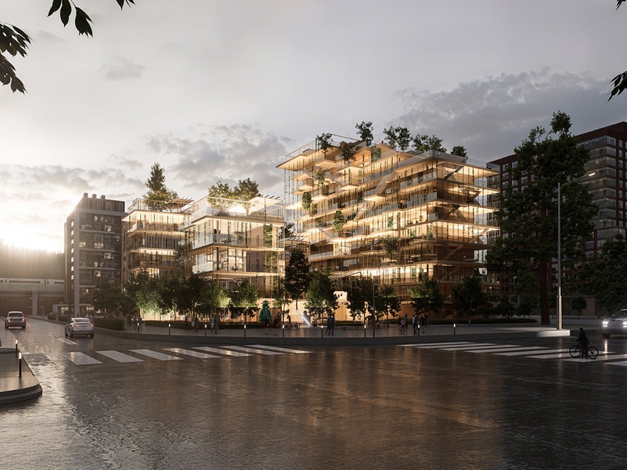
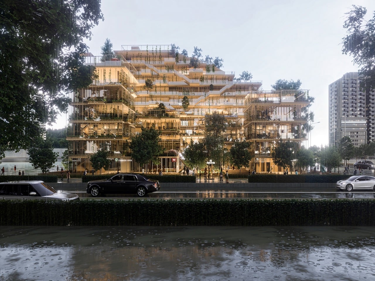
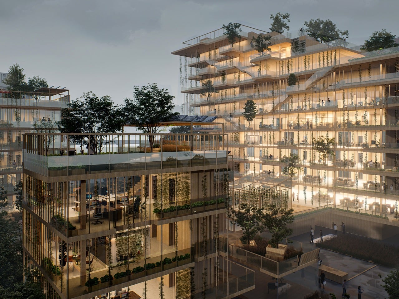
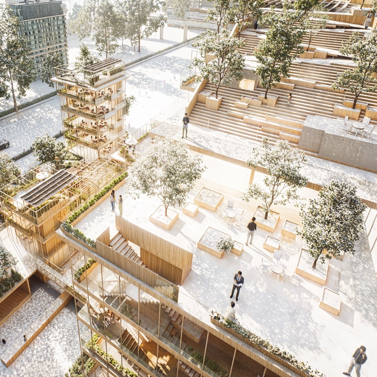
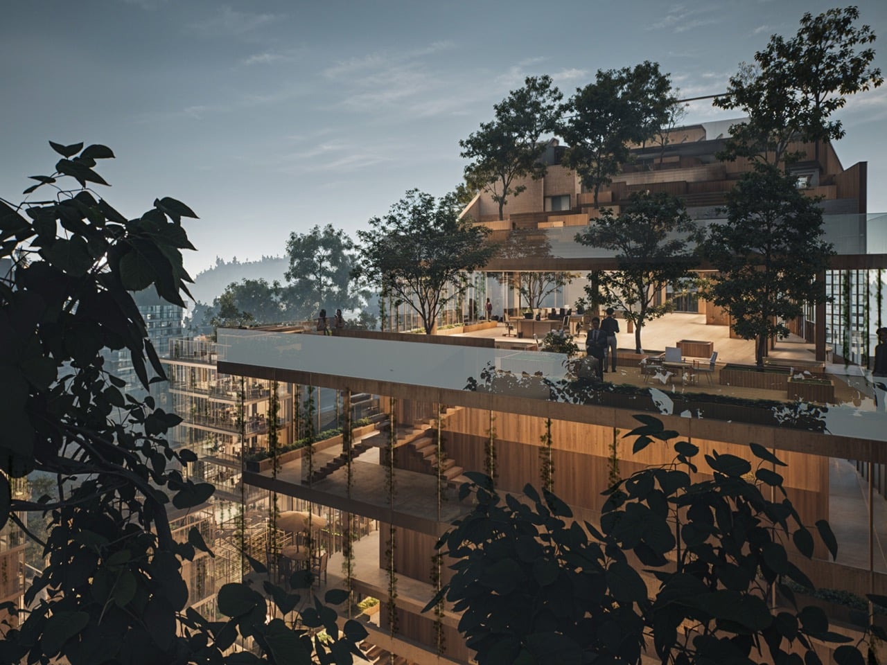
China loses farmland to urbanization at a pace that makes most planners nervous, and the usual architectural response is to pour a slab and move on. Wei Dou took a different position with the Verdant Syndicate, a mixed-use complex in Henan designed around the premise that the agricultural identity of a site deserves to survive its redevelopment. The project occupies 4,269 square meters of former farmland and organizes itself as two offset stepped volumes flanking a shared courtyard, wrapped in warm timber cladding and draped in cascading vertical vegetation from ground level to roofline.
What makes the building function as a living system is a tenant-operated planting board system, where modular growing panels connect directly to embedded water and nutrition lines. People who work and gather inside the building are also tending it, turning every terrace and balcony into a productive growing surface. A gravity-powered rainwater collection system handles irrigation without mechanical pumping, closing the resource loop on a plot that once fed the surrounding community through entirely different means.
Designer: Wei Dou
Splitting the program across two volumes instead of one monolithic block gives the courtyard between them genuine solar access, which matters enormously when your facade is a vertical farm. The stepped terrace profile on the taller volume echoes terraced agricultural landscapes without being literal about it, and the offset placement of the two blocks creates a ground-level commons that functions as the social spine of the whole complex. At 60 by 71 meters, the site is compact enough that every planning decision carries weight, and Dou clearly understood that.
Tenants can install, reconfigure, or remove individual planting panels, each one tapping into water and nutrient lines built directly into the structure. The building’s productive surface is never fixed, it adapts to whoever is using it and what they want to grow, season by season. Most biophilic buildings treat greenery as a fixed aesthetic layer applied during construction and maintained by a facilities team. Here the maintenance is distributed, social, and intentional, which is a fundamentally different model and one that actually has a chance of working long term.
The facade runs slim vertical members in a warm timber tone, with terraces wide enough to support real planting depth rather than cosmetic window boxes. Solar panels sit integrated into a mid-level roof deck canopy under a mature tree, handling shade and energy harvesting simultaneously without dedicating separate real estate to either function. The ground floor activates with retail, and the renders show it occupied and commercially legible, not the ghostly pedestrian utopia that kills most concept presentations.
Henan is a province with deep agricultural history and rapid urbanization pressure, which makes it exactly the right place to ask whether a building can carry both realities at once. The Verdant Syndicate backs that argument with a gravity-fed water loop, a modular tenant farming system, GIS and CAD-optimized solar orientation, and a courtyard massing strategy that keeps the whole thing from tipping into greenwash territory. Whether the planting board system performs in practice the way it does in simulation is the real open question. The framework is sound, and the building looks extraordinary doing it.
University campuses function like small cities. Students move between buildings, find outdoor spots to read or work, and constantly need power for phones and laptops. Sustainability tends to get communicated through plaques, rooftop panels, and annual reports, things you don’t interact with. There’s a gap between “this campus is reducing its carbon footprint” and “here’s a place where you can sit, charge your phone, and actually experience that in some tangible way.”
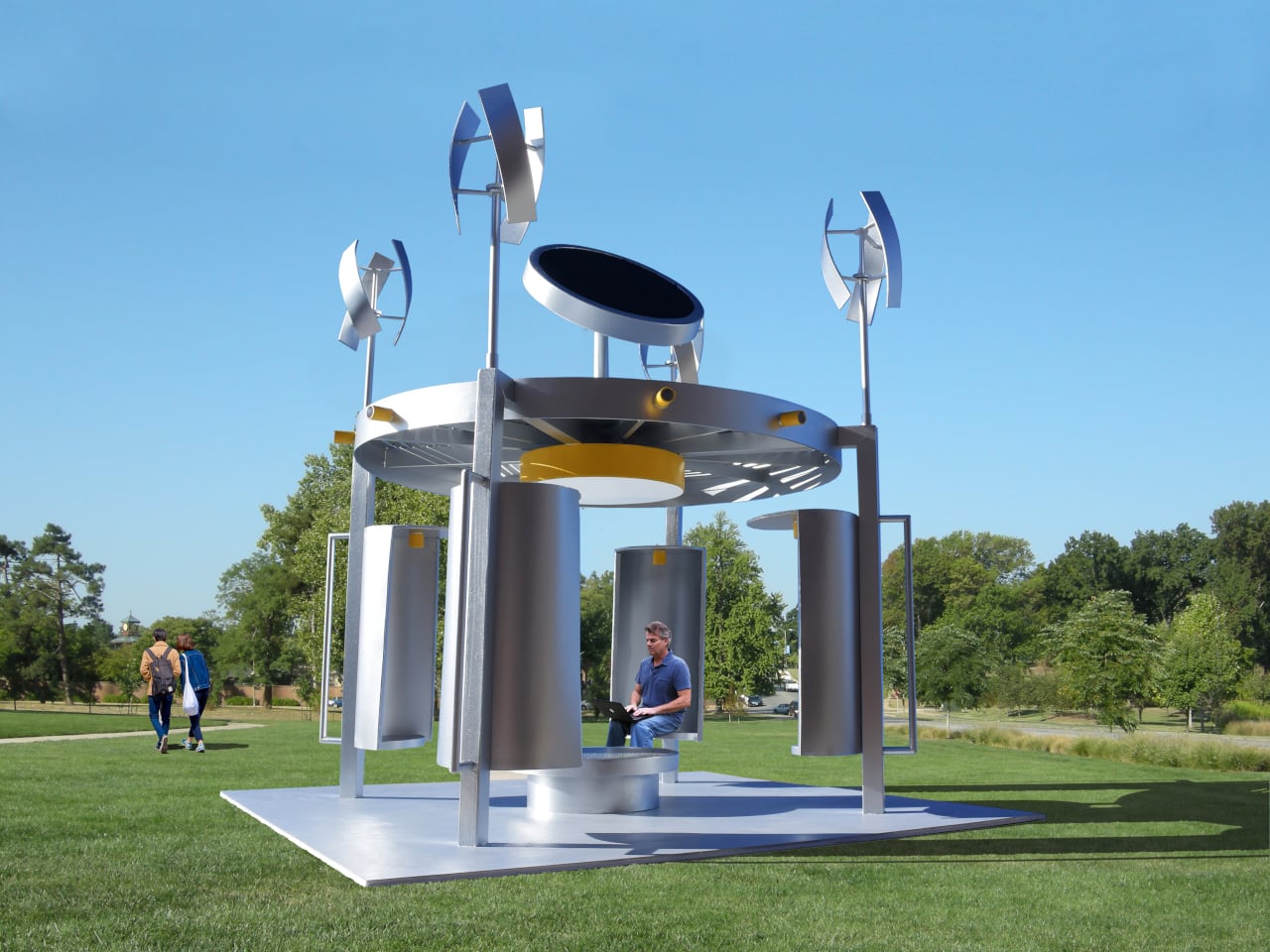
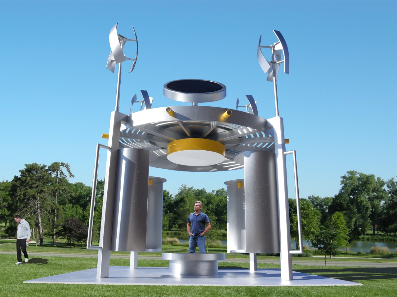
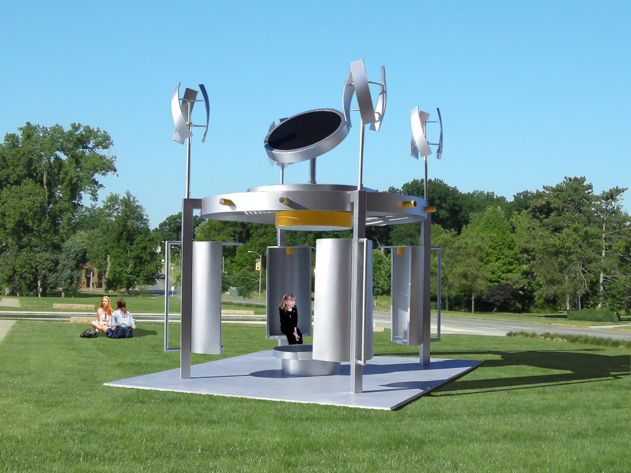
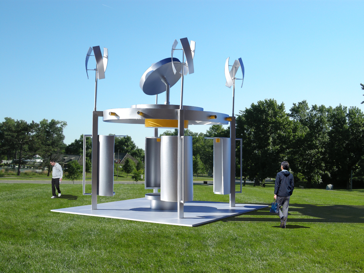
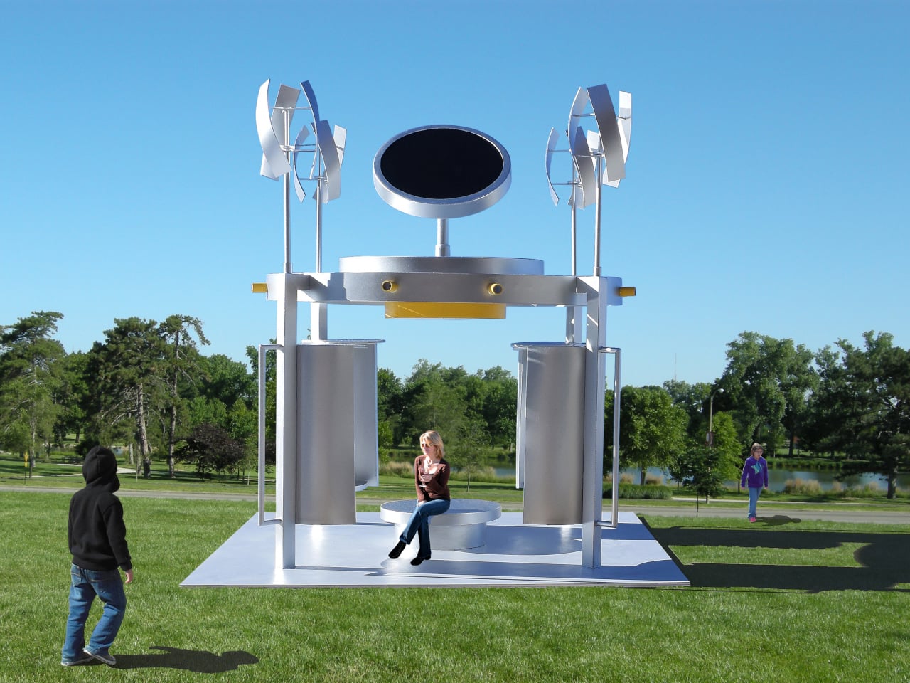
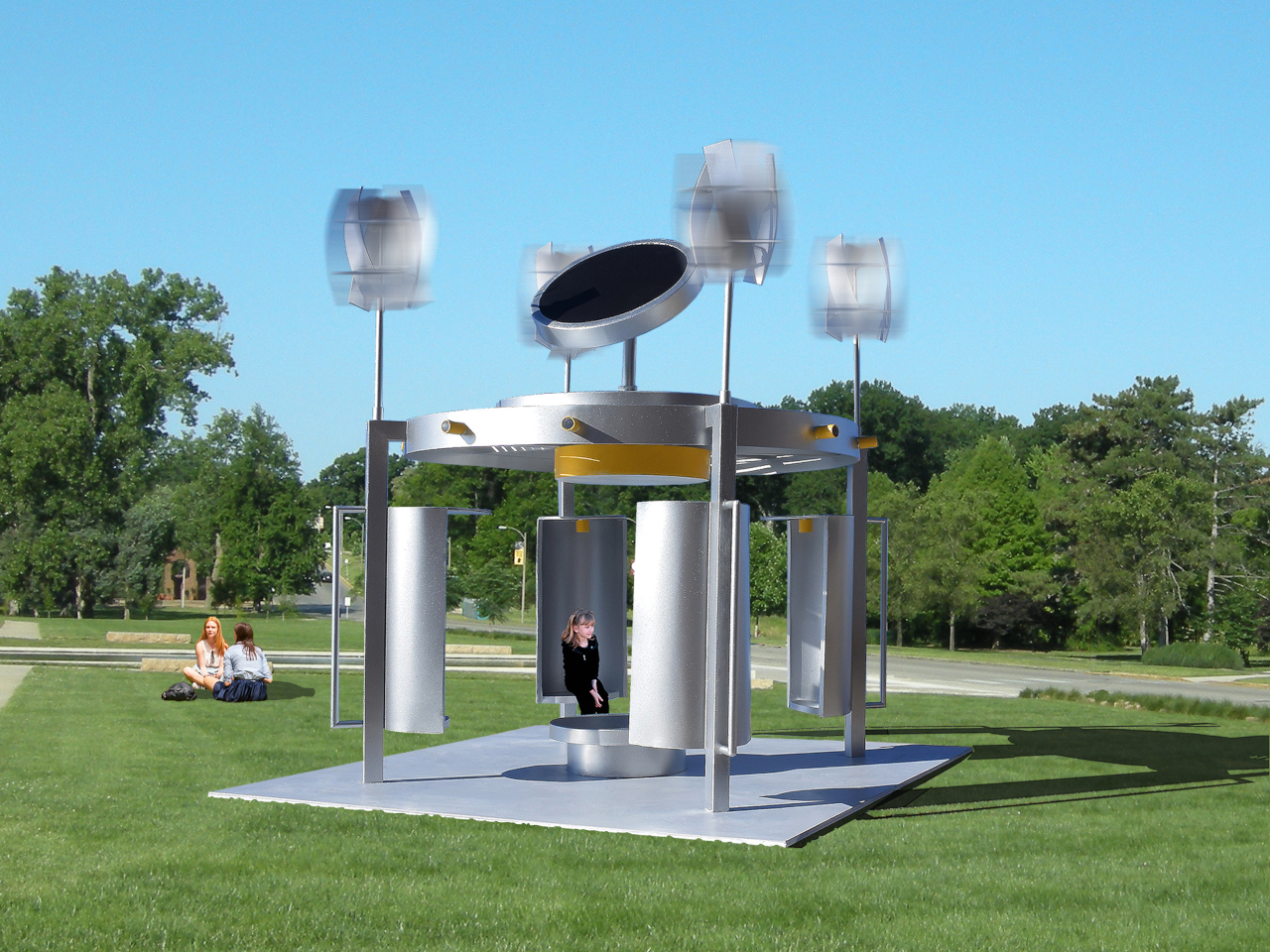
Michael Jantzen’s Solar Wind Gazebos are public pavilions designed to close that gap. Intended for university campuses, they function as gathering spaces while generating electricity from sun and wind, with the power feeding into the university’s grid. The proposal treats renewable infrastructure as a place to inhabit rather than a system to install, and it makes that infrastructure legible to anyone who walks up to one.
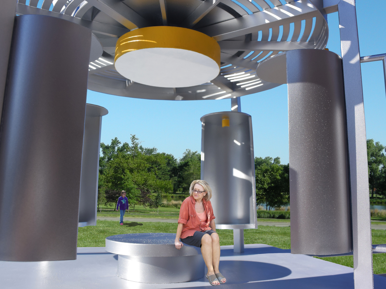
The roof does most of the communicating. Four commercially available vertical-axis wind turbines sit at the corners, while a large circular solar panel occupies the center. That layout is easy to read at a glance: wind at the perimeter, sun at the core. You don’t need a label to understand what’s happening because the structure’s own geometry explains its energy logic, which is something most utility infrastructure completely fails to do.
The frame is predominantly stainless steel on concrete bases, which is a deliberate choice for outdoor public installations. Campuses need structures that handle weather, seasonal temperature swings, and constant use without requiring frequent maintenance windows. Stainless steel and concrete aren’t glamorous materials, but they’re honest ones for a building type that needs to outlast a decade of students without becoming an eyesore or a liability.
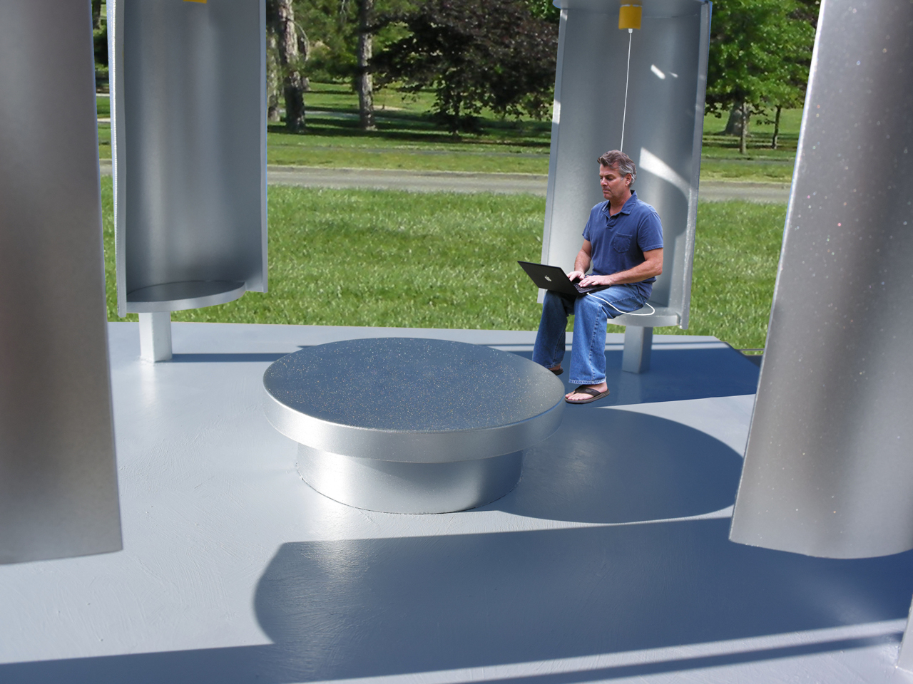
Inside, four cylindrical seating spaces are attached to the support columns, each with a receptacle at the top for plugging in devices. That detail is quiet but important, turning charging into a normal part of sitting down outdoors rather than a task that sends students hunting for an outlet inside a building. A large round central platform offers a shared surface for sitting or lying down, creating a mix of semi-private individual zones and an open communal gathering area.
A circular electric light mounted above the central platform runs off the same solar and wind generation, extending the pavilion’s usefulness into evening hours. The structure essentially powers its own ambience, which gives the whole thing a satisfying sense of completion, generation, use, and light running off the same rooftop.
The gazebos are designed to be reproduced as prefabricated structures in various sizes and installed across different landscapes. The same concept fits public parks, corporate campuses, and any open space where people gather and need shade, seating, and somewhere to plug in. The broader implication is that renewable energy infrastructure doesn’t always have to hide behind fences or sit on rooftops. Sometimes it can be the very thing you sit inside of on a Tuesday afternoon between classes.
Most of us think of corn as food. Maybe fuel, if you’re feeling generous. But a building material? That’s the kind of idea that sounds like it belongs in a sci-fi pitch until you look at what Mexico-based design practice MANUFACTURA has been quietly pulling off.
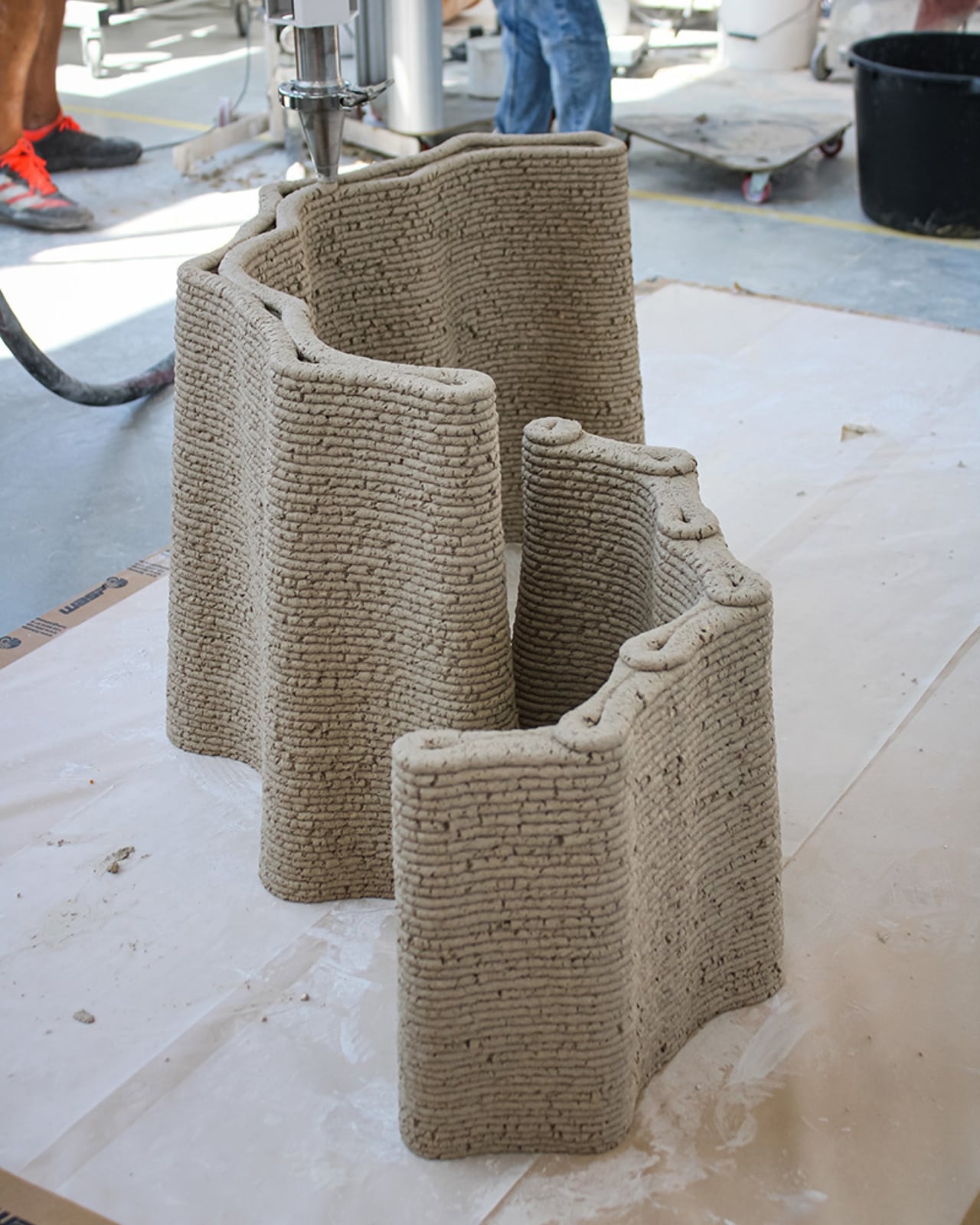
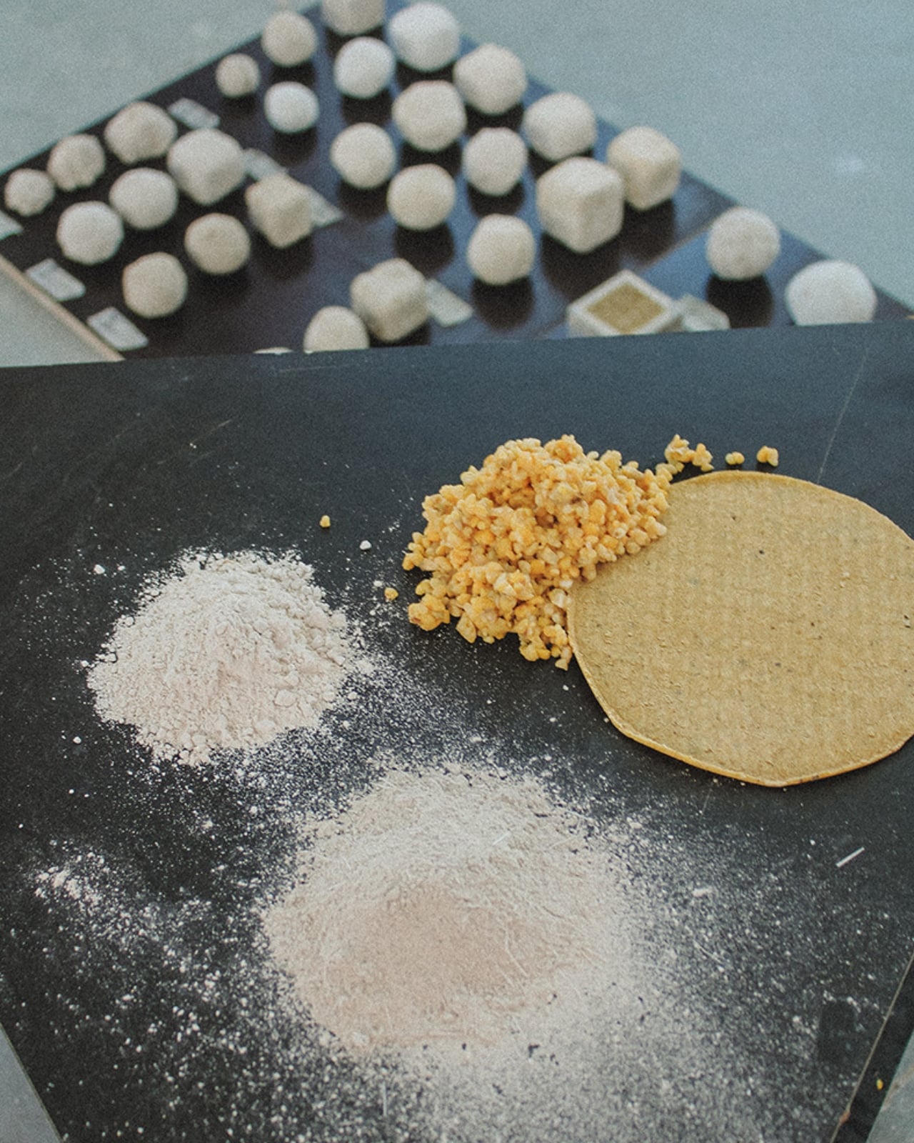
Their project is called CORNCRETL, and it is exactly what it sounds like: a bio-based construction material made largely from corn waste. Specifically, it combines limestone aggregates, dried corn residues, and recycled nejayote, which is the calcium-rich wastewater left over from nixtamalization, the ancient process of soaking corn in an alkaline solution that’s been used across Mesoamerica for thousands of years. That liquid, normally discarded after making tortillas and tamales, turns out to be a surprisingly useful ingredient in a next-generation building composite.
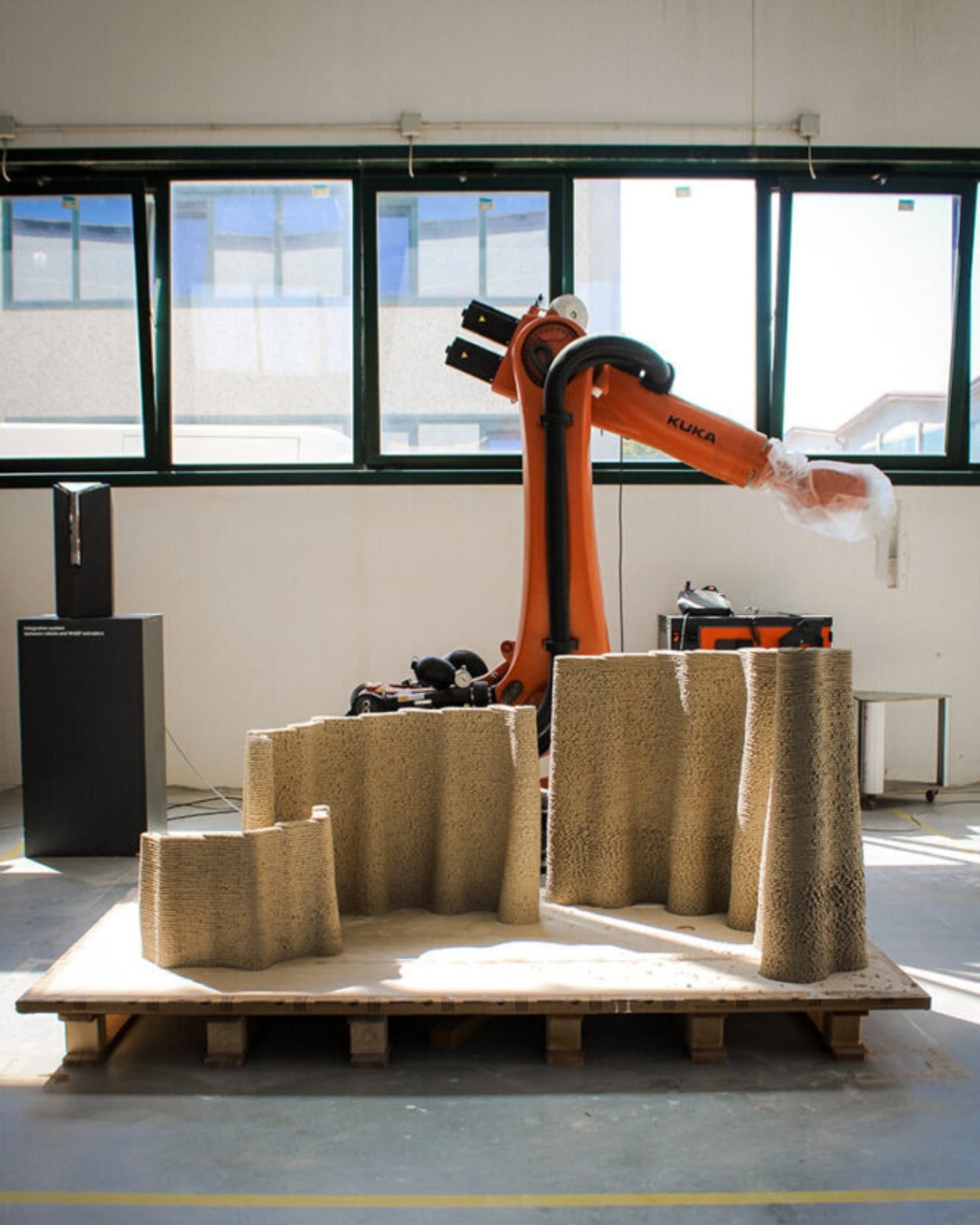
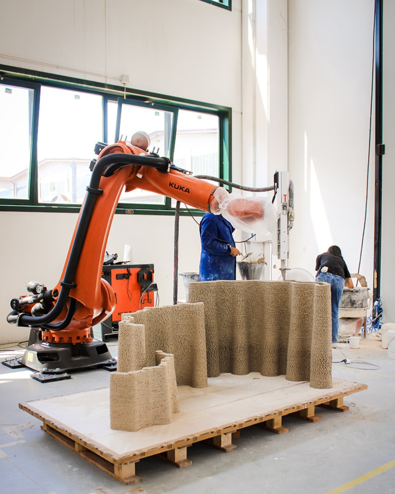
The name CORNCRETL is a clever mashup of corn and concrete, and the concept sits at the crossroads of ancestral knowledge and cutting-edge fabrication. MANUFACTURA drew direct references from pre-Hispanic Mayan construction techniques, which relied heavily on lime-based materials long before Portland cement ever existed. What they’ve done is take that legacy and run it through a robotic arm.
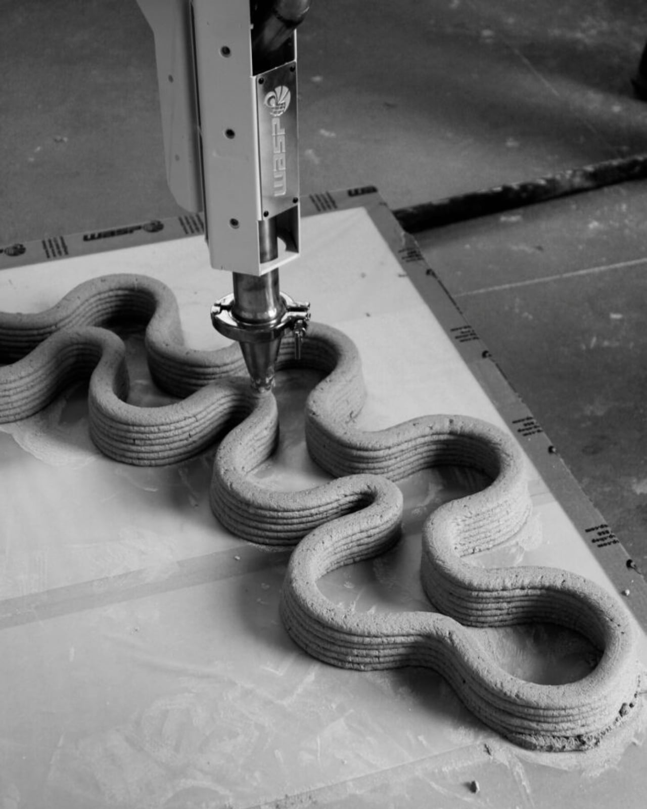
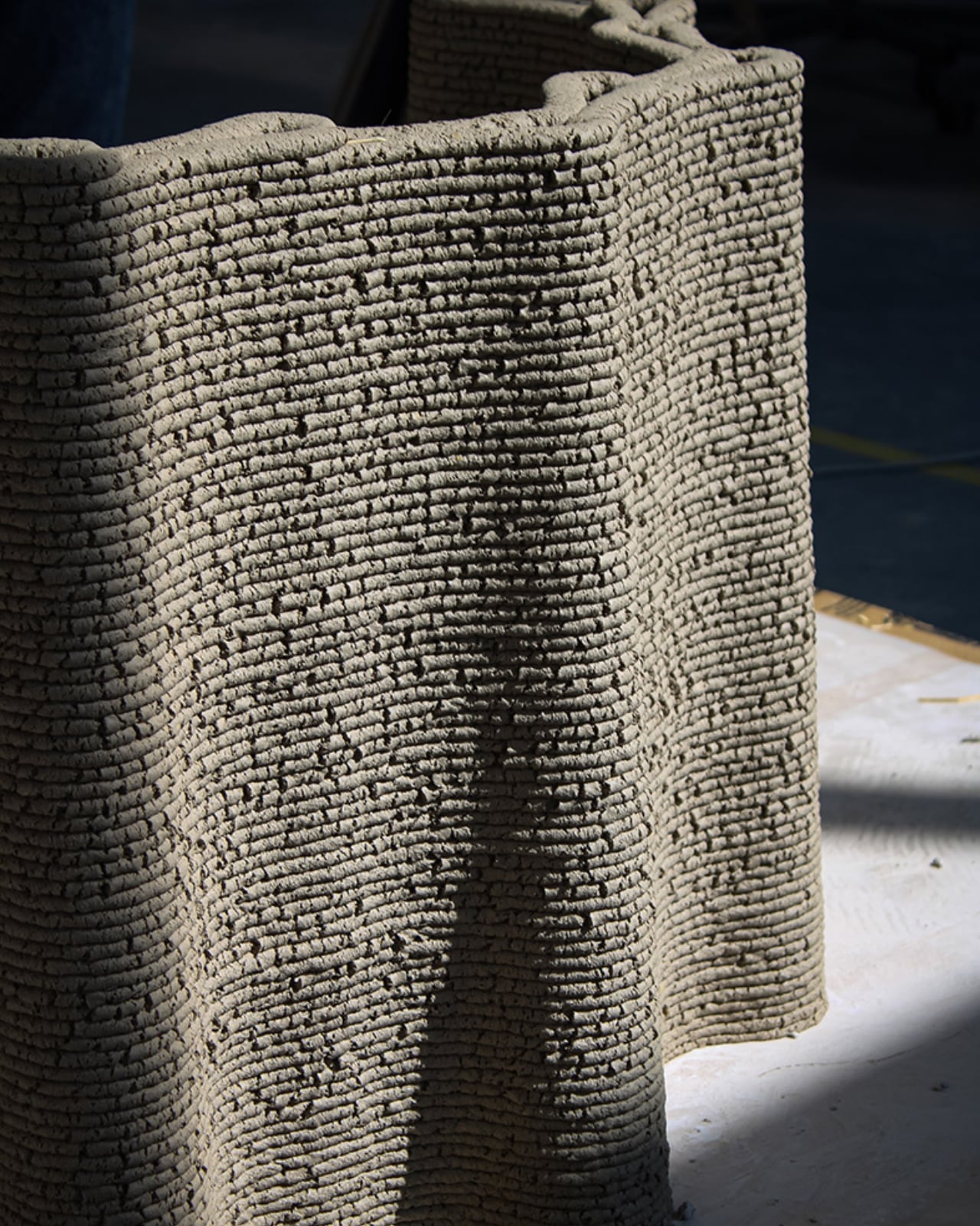
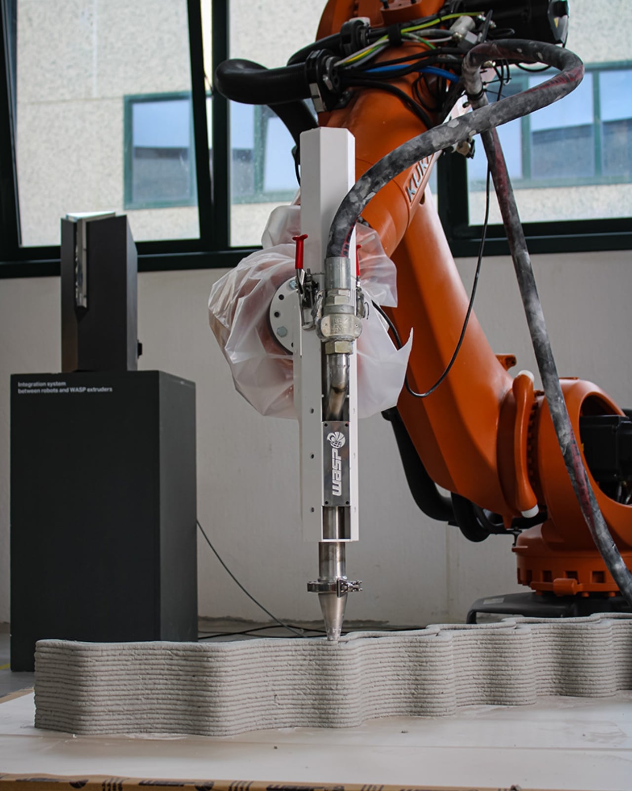
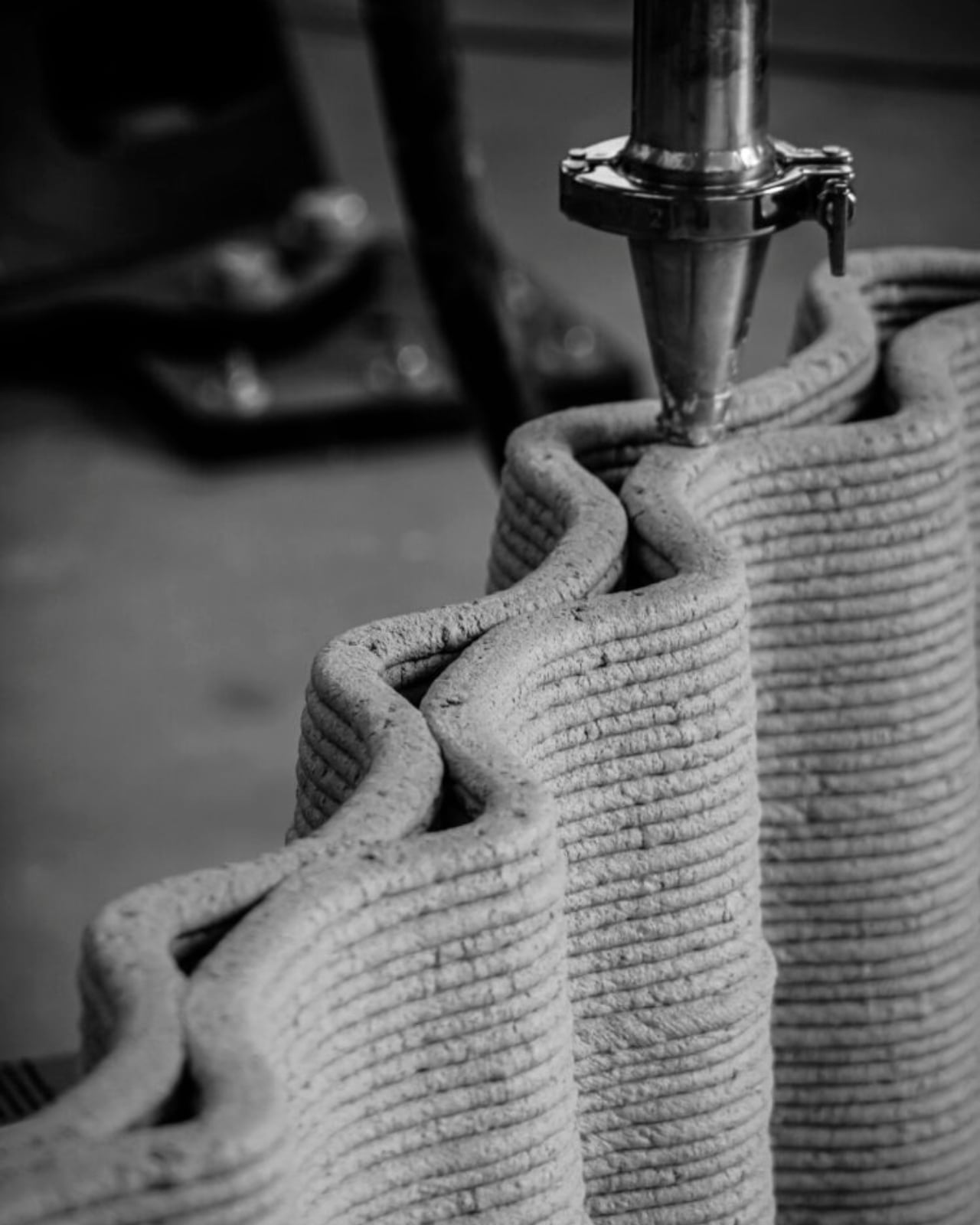
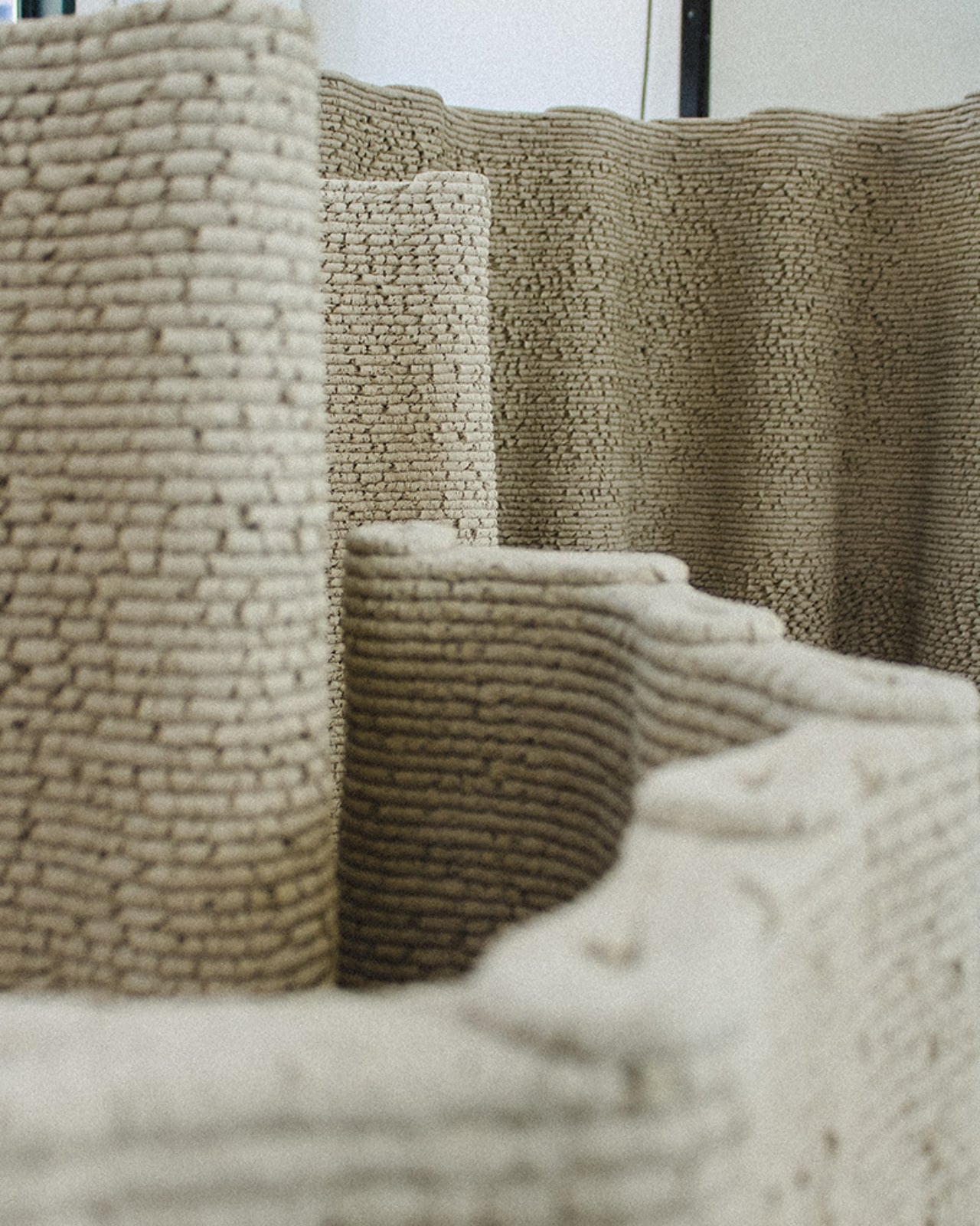
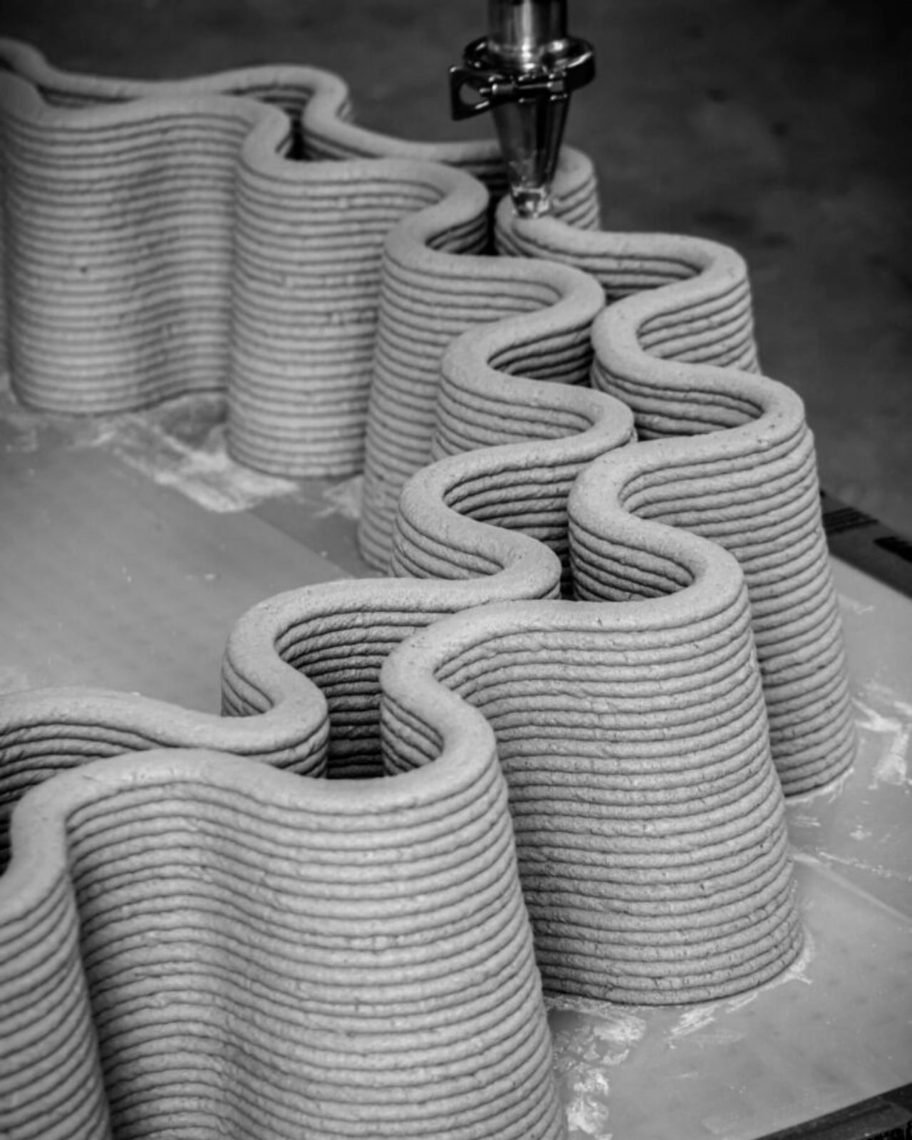
To produce the material, nixtamal waste is collected, dried, shredded, and pulverized down to a consistent particle size that works for extrusion. It’s then blended with mineral aggregates and organic binders to create a printable mixture. Printability tests were conducted using a WASP Concrete HD Continuous Feeding System integrated with a KUKA robotic arm, meaning the building process is precise, automated, and repeatable. The result doesn’t just look like a structural material. It performs like one.
One of the biggest knocks against conventional concrete is its carbon footprint. Cement production alone is responsible for a significant chunk of global CO2 emissions. CORNCRETL addresses this head-on. Compared to standard concrete, the material achieves up to a 70 percent reduction in carbon emissions. Part of that comes from how lime-based systems work: unlike Portland cement, they harden at room temperature and require lower calcination temperatures during production, which means less energy and fewer greenhouse gases released into the atmosphere.
Lime also brings a few bonus features to the table. It naturally regulates humidity and has self-healing properties for minor surface cracks, meaning the material can repair small imperfections on its own over time. For a building material, that’s a pretty remarkable quality.
The motivation behind CORNCRETL goes beyond just making something cool out of kitchen scraps. Mexico’s construction sector carries real environmental and social weight. Across the country, 64 percent of all waste is organic, and corn is a major contributor to that figure. At the same time, construction labor conditions remain difficult, with limited access to technical training and high occupational risk. MANUFACTURA’s approach proposes a circular material strategy that tries to address both sides of that problem, reducing waste while introducing more automated, accessible fabrication methods into the building industry.
The project has already moved beyond the lab. A full-scale prototype was built at the Shamballa open-air laboratory in Northern Italy, which is a long way from Mexico City but signals exactly the kind of cross-continental interest that a material like this can generate. It’s the kind of proof-of-concept that transforms a research idea into something you can actually stand next to.
CORNCRETL is led by designer Dinorah Schulte and project director Edurne Morales, with contributions from structural engineers and 3D printing specialists who helped optimize the material for real-world application.
What makes this project stick is that it doesn’t ask you to choose between tradition and technology. It holds both at once. Ancient techniques meet robotic fabrication. Food system waste becomes architectural possibility. And corn, of all things, might just have a future in the walls around us.