iOS 27 brings a robust suite of updates designed to refine how you interact with your iPhone. With smarter AI, dynamic widgets, and enhanced app functionalities, this update emphasizes productivity, customization, and accessibility. These changes aim to make your device more intuitive and adaptable to your daily needs. Below is an in-depth look at the […]
Apple’s upcoming N50 smart glasses are poised to bring a fresh approach to wearable technology, emphasizing privacy and AI-driven functionality over traditional recording features. As highlighted by TechAvid, these glasses will forgo conventional cameras for capturing photos or videos, instead focusing on tasks like object recognition, text reading, and navigation assistance. This privacy-first design reflects […]
The iPad Mini 2026 is poised to make a strong impression in the compact tablet market, offering a blend of advanced features and thoughtful design enhancements. With upgrades such as an OLED display, water resistance, and a powerful new processor, Apple aims to deliver a premium experience in a portable form factor. However, a rumored […]
RISION Magic Series transforms USB-C smartphones, tablets, and PCs into portable thermal imaging tools with AI fusion, super resolution, and smart reporting.
Most coffee nerds can tell you the difference between a bean from Colombia and one from Ghana, or even one from Brazil, without hesitation. Some are arabica, some robusta, some carry caramel notes while others lean fruity, some taste gentler thanks to high-altitude growing conditions, while others pick up the character of the soil they’re grown in. Most coffee nerds can taste the difference between two cups brewed with two different beans. What they usually can’t do at a glance is look at two pour-over drippers and instantly tell how each design shapes the brewing process and, ultimately, the flavor in the cup. They obsess over coffee, and sometimes maybe even the device they brew the coffee in, but not everyone can identify the hidden engineering details that make your coffee maker do its job consistently.
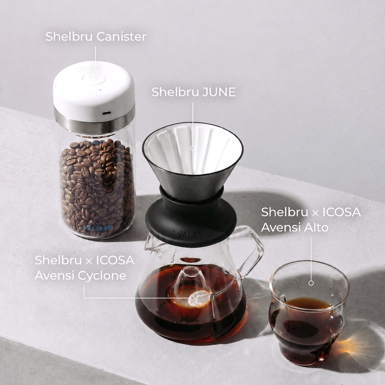
The fun part is that JUNE wears all that engineering incredibly well. It has the clean, almost gallery-like silhouette of a countertop design object you’d actually want to leave out, but every part of that shape is secretly working double duty. The dual-wall vacuum body is there to stop heat from escaping mid-brew, the ceramic-coated interior keeps your coffee tasting like coffee instead of metal, and the 12 internal ribs are designed to manage filter contact and airflow with a surprising amount of precision. It’s the kind of thoughtful design that makes you realize some drippers are basically just bowls with ambition, hoping for the best. JUNE, on the other hand, tries to account for every unknown variable, make it known, and then control it obsessively to ensure that your brew is consistent to the point where it feels like science meets art meets coffee.
Temperature is the variable most pour-over gear quietly ignores. Glass, ceramic, and single-wall steel drippers all absorb heat from brewing water rapidly, sometimes dropping the temperature by as much as 15-20°C in the first thirty seconds of a brew, which changes how compounds extract from the grounds and ultimately changes what ends up in the cup. Most people never realize it’s happening because the result is just a slightly flatter, slightly less interesting version of what the coffee could have been. JUNE’s double-wall vacuum structure builds a thermal barrier directly into the dripper itself, maintaining a more stable brewing environment from bloom to drawdown. Shelbru’s own testing showed JUNE holding within roughly 1-2°C of its starting brew temperature over four minutes, while glass and metal competitors dropped far more aggressively. The practical payoff is straightforward: you can dial in a recipe and actually repeat it, which sounds obvious but is genuinely harder than it should be with conventional gear.
The 12 concave ribs inside JUNE are doing more brewing work than they look like. Their primary job is holding the paper filter flush against the dripper wall, which reduces the gap through which water can slip around the coffee bed instead of through it, a problem that quietly leads to under-extracted, uneven cups. Between each rib, recessed air channels let pressure escape smoothly as water flows down, helping maintain a steadier, more controlled drawdown from start to finish. Then there’s the Aroma Flow outlet at the base, which centers and stabilizes the coffee stream as it exits the dripper, pointing it precisely where it needs to land. For people using a standard server, that’s a nice quality-of-life detail. For people pairing JUNE with ICOSA’s Avensi Cyclone, it becomes the entire point.
JUNE’s Aroma Flow outlet was designed with a specific destination in mind, and the Shelbru x ICOSA Avensi Cyclone is it. The Cyclone is a borosilicate glass sensory carafe featuring a raised Aroma Peak at its center, a form inspired by high-end wine decanters, which coffee cascades over as it drips from JUNE’s outlet, diffusing and magnifying aromatics into the air as it does. The Avensi Alto tasting cup extends that philosophy further, with an hourglass form and Aeration Waves geometry that amplify the aromatic complexity of each sip. Both pieces are handcrafted from borosilicate glass and designed to stack cleanly for storage. Together they push the serving and tasting half of the pour-over ritual well past what a standard mug typically offers.
The Shelbru Smart Canister handles everything that happens before the kettle even comes out. It’s a vacuum-sealed bean storage container with an automated pressure sensor that monitors internal conditions and reactivates vacuuming whenever pressure drops below -20 kPa, keeping beans in a stable, low-oxygen environment without any manual effort on your part. Press once to seal, press again to open, and the canister takes care of the rest. It holds 250 to 300 grams of roasted coffee, runs on a 1,500 mAh battery rated for around 4,000 hours of standby, and charges fully in three hours. For anyone who has bought genuinely excellent beans and then watched them go stale in a poorly sealed bag, this is the container that fixes that specific, recurring regret.
Swapping JUNE’s silicone base for a Hario Switch converts the entire setup to immersion brewing in seconds, giving you a different extraction profile from the same dripper body without buying a second piece of equipment. Pairing JUNE with Nucleus Paragon opens up rapid cooling and temperature-controlled experiments for brewers who want to get more technical about what’s in the cup. The detachable base makes JUNE feel like a platform rather than a fixed tool, one that grows with how seriously you decide to take this whole thing. For casual daily brewers, this is context they may never need. For the kind of person who already owns a precision kettle and a gram scale, this is where JUNE gets very interesting very fast.
JUNE starts at $63 for the single dripper, with the Fresh Brew Bundle pairing JUNE with the Smart Canister at $103. The Complete Aroma System, which brings together JUNE, the Avensi Cyclone, the Avensi Alto, and the Smart Canister, covers the full pour-over journey from bean storage to brewing to serving to tasting, and is priced at $137. Yanko Design readers get an exclusive deal on that Complete Aroma System at $135, against an MSRP of $235. The Cold Brew Bundle, which includes the Shelbru Brewer, Carafe, and Smart Canister, comes in at $83. Mass production is already underway with delivery expected in September 2026, and full details are available on the Kickstarter page below
London has always demanded creative solutions from its architects. Space is scarce, plots are irregular, and the city’s historic fabric rarely makes room for anything new without a fight. Smart’s Place, designed by David Kohn Architects for developer Baylight Properties, found its answer not on the ground, but above it — perched atop a 19th-century Covent Garden warehouse where a rooftop became the foundation for a proper two-story home.
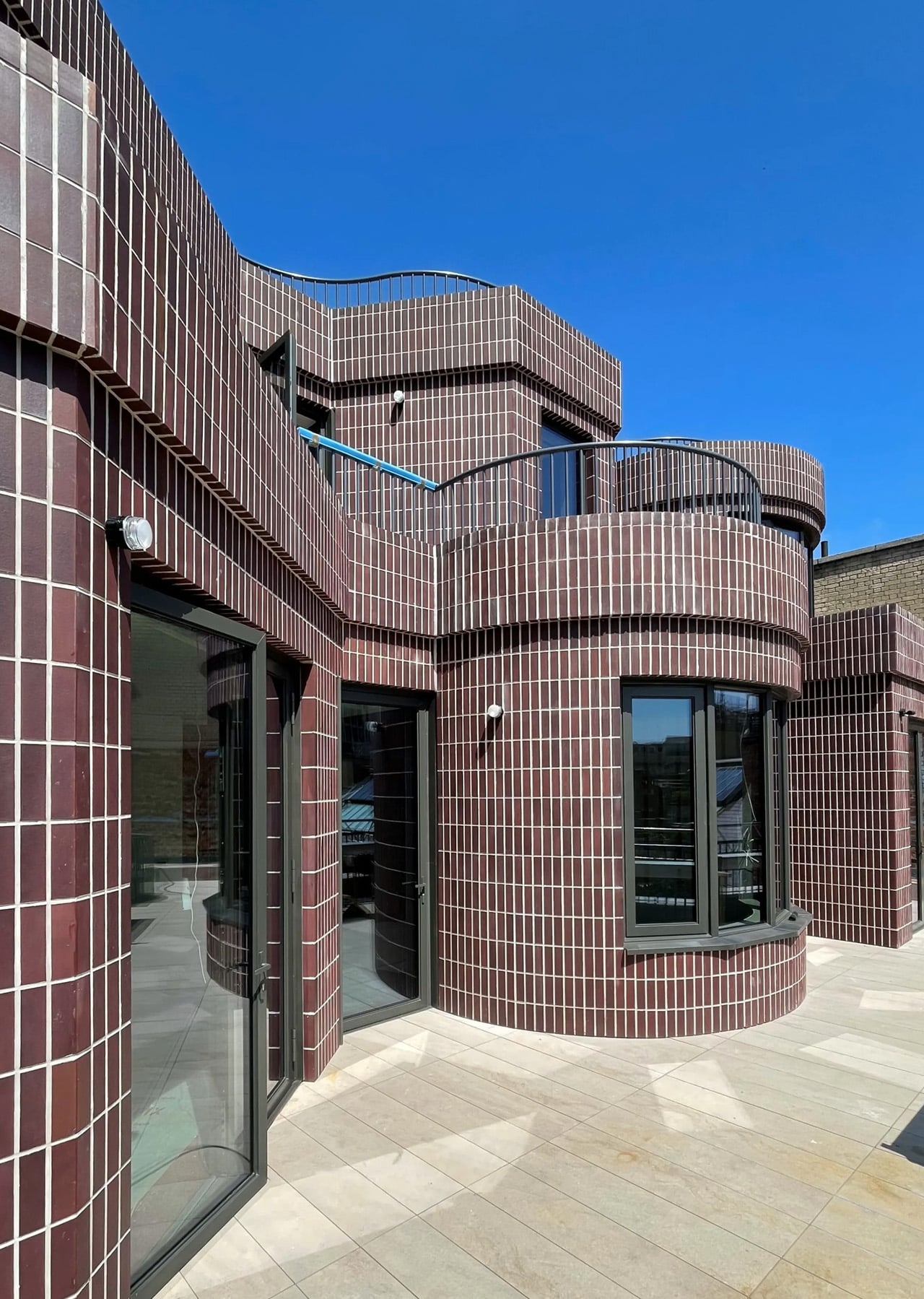
At 3,046 square feet, the residence doesn’t read like a rooftop addition. It reads like a house. The exterior is clad almost entirely in brick, but not laid in the conventional staggered pattern found across London’s surrounding streetscape. Here, each brick is turned on its narrow side and stacked vertically, producing a tighter, more textured surface. The dark plum tone and pale mortar still acknowledge the neighborhood’s palette — it fits without blending in.
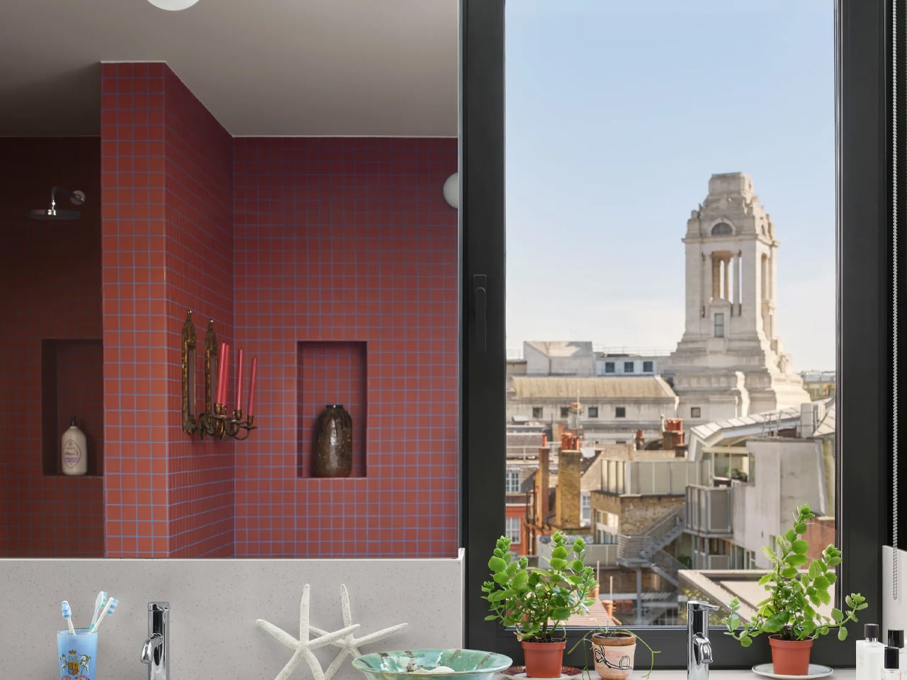
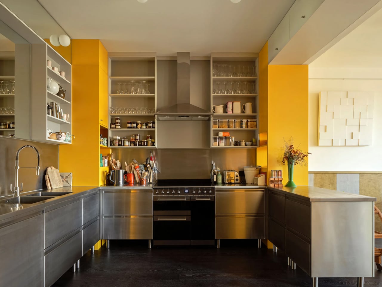
The ground floor is organized as an enfilade — dining room, library, and lounge arranged in an open sequence with no doors between them, flowing as one continuous space. It’s a layout that suits the owner well; the brief called for a home built around hosting. Each room faces south, framed by bay windows that pull London’s skyline into view, with a terrace extending the living space outward. Behind this sequence sits the kitchen, bathrooms, and a lift connecting the home to the warehouse below, which the owner uses as an office.
Upstairs, the character shifts slightly. Two bedrooms, each with its own bathroom, are lined with shelving and wood paneling — a deliberate backdrop for the owner’s collection of art and ceramics. Picture rails run throughout, and a study completes the floor. The staircase connecting both levels is lit from above by circular skylights, a quiet architectural gesture that makes the climb feel considered. Each bedroom has bay windows set back from the facade, carving out private terraces landscaped by Todd Longstaffe-Gowan.
David Kohn himself acknowledged the layered references embedded in Smart’s Place. He cited Sir John Soane’s Museum and the Villa Necchi in Milan alongside the studio’s own Red House — the Dorset project that won RIBA’s House of the Year in 2022, praised specifically for its enfilade that “magically flows.” That same spatial logic reappears here, refined and transported to a London rooftop.
What Smart’s Place demonstrates, much like the studio’s previous work, is an ability to find genuine domesticity inside unlikely shells. Two years in the making, it doesn’t try to look temporary or apologetic about its position above the city. It simply looks like a home — which, given where it sits, is the hardest thing to pull off.
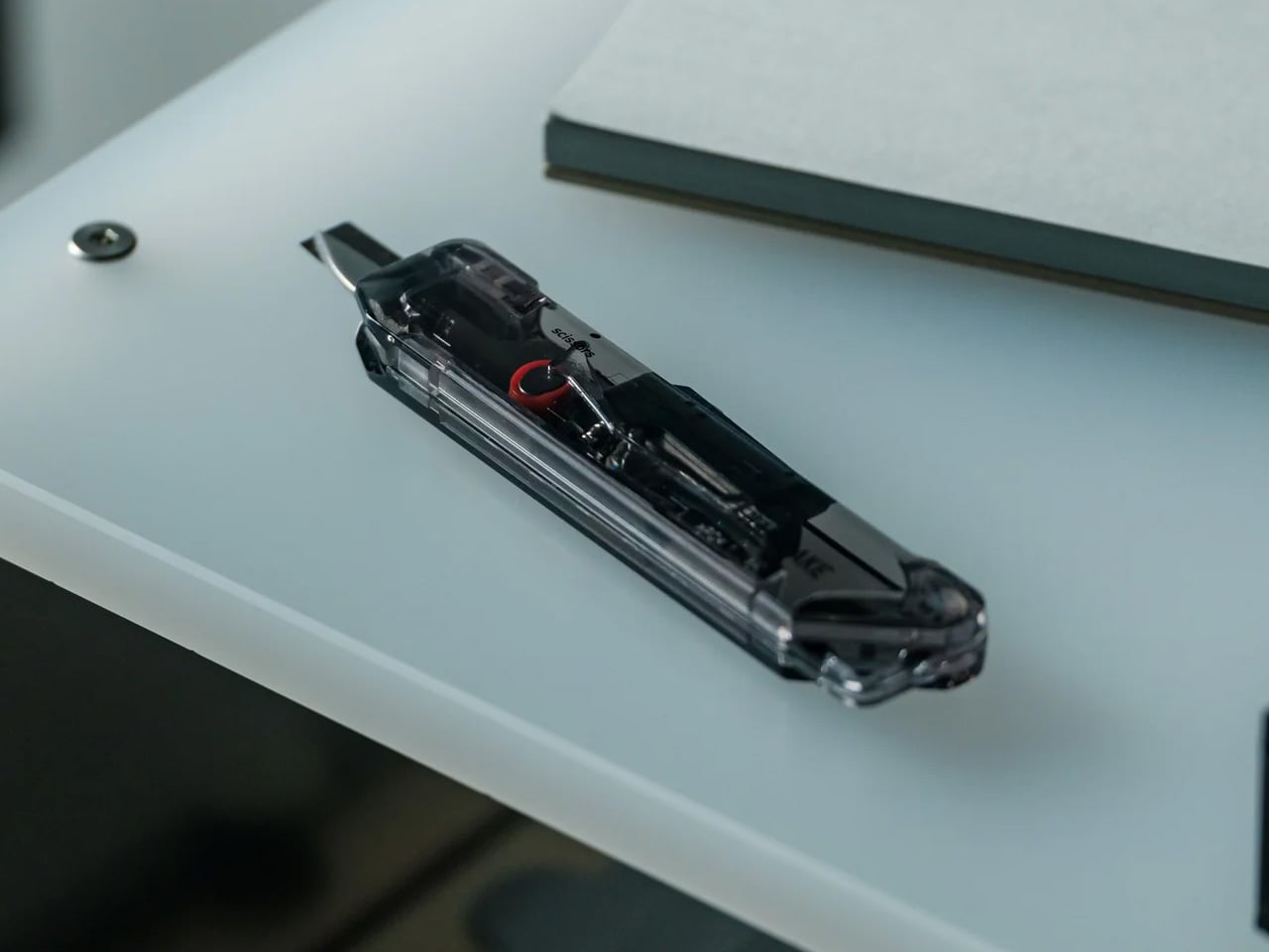
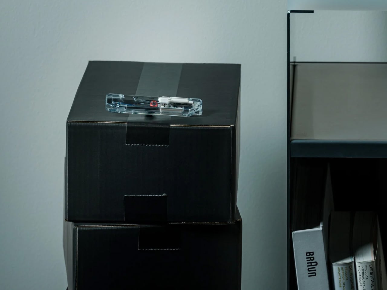
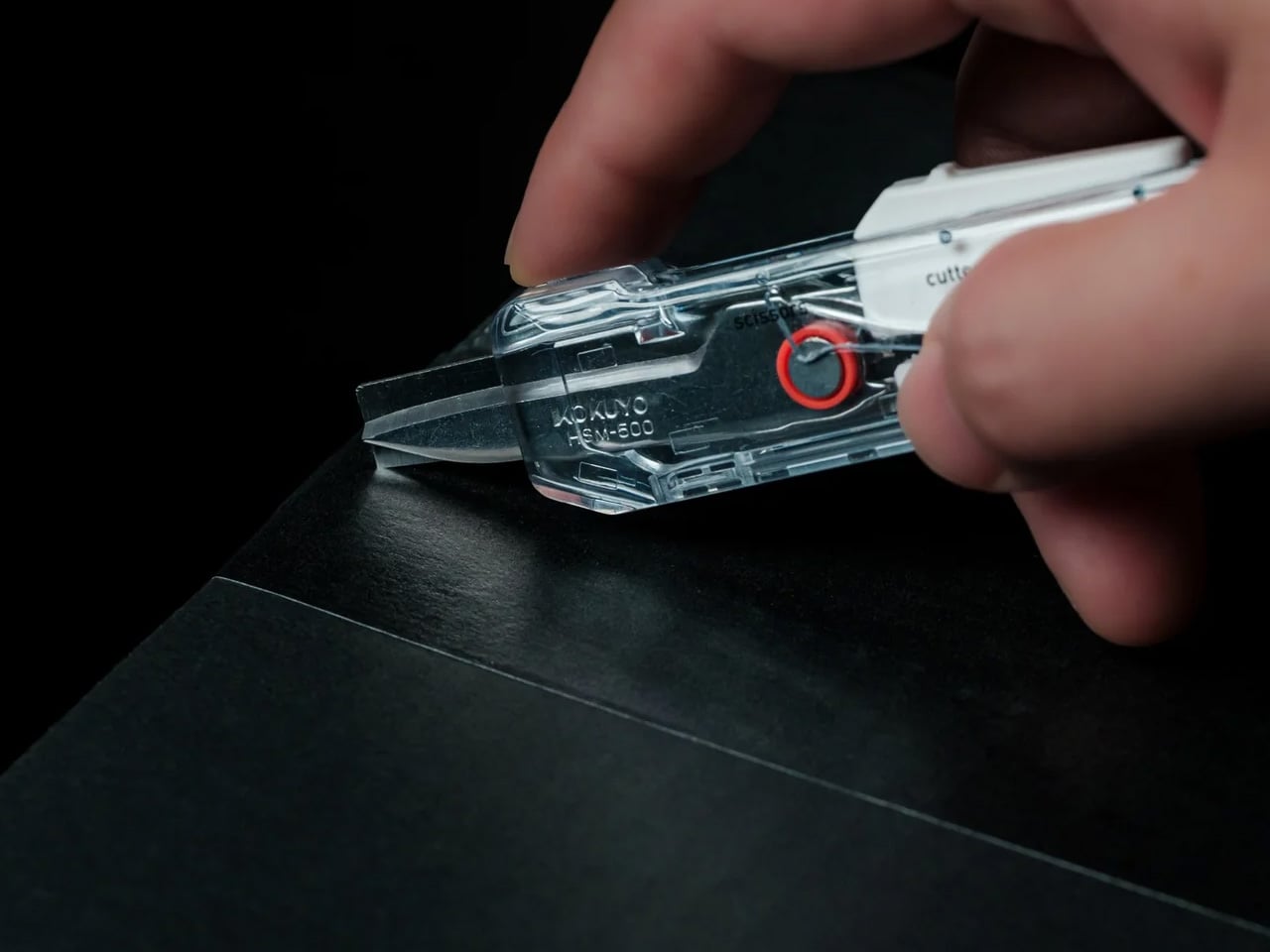
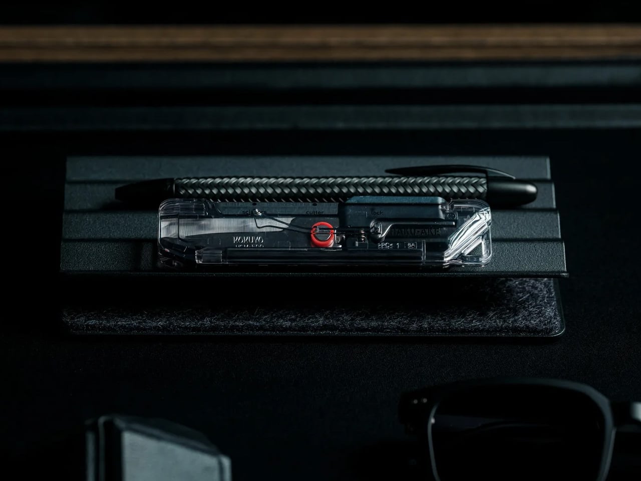
Most box cutters do one thing and leave the scissors somewhere else. The ritual of tearing into a delivery becomes a hunt for a second tool, or a decision to use the first one for everything and hope it does not cut too deep. The ClearSlide Box Opener removes that problem. A blade and scissors in a single compact body, it handles packaging tape and tags in one uninterrupted motion, without putting the package down.
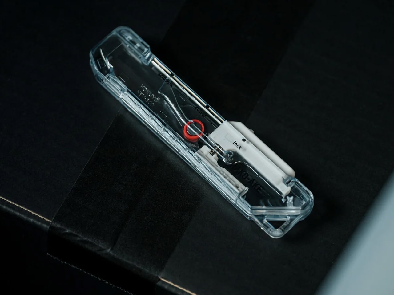
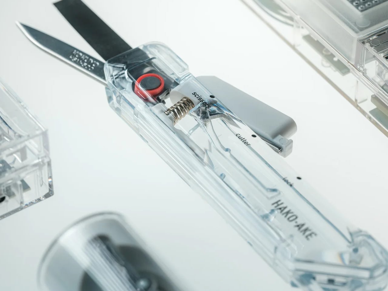
What makes it worth keeping on the desk is the mechanism. A sliding thumb control moves between lock, cutter, and scissors without requiring both hands; each position locks in before releasing cleanly. The blade extends just 0.12 inches, enough to slice through tape without reaching the contents inside. The transparent body shows the internal mechanism’s shift with every adjustment, turning a utility object into something that actually earns its spot next to the keyboard.
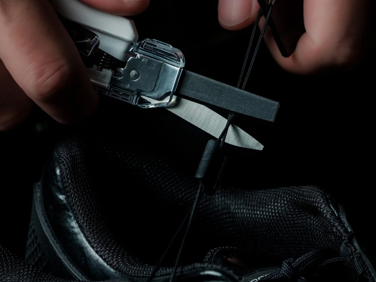
Box cutters and scissors solve the same last step in two different ways. The ClearSlide puts both into a single form factor small enough for a pocket. The sliding mechanism moves through three positions: lock, cutter, and scissors, each one clicking into place before releasing with a clean spring action. That kind of tactile confirmation in something this compact is not common. It changes how deliberate the tool feels in use and removes the uncertainty from every position change.
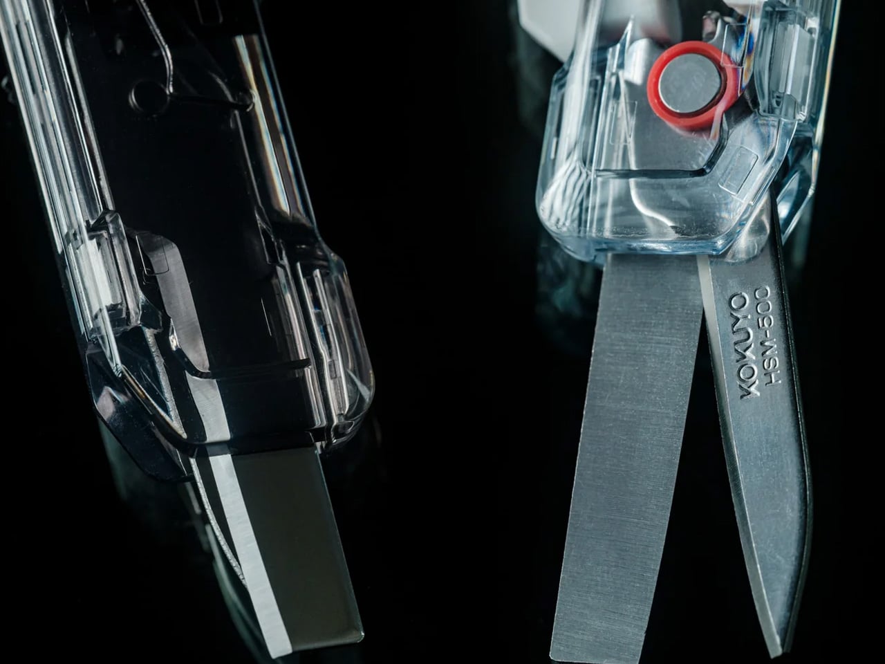
The blade extension is limited to 0.12 inches, which sounds like a constraint until you consider what it actually prevents. Most damaged deliveries come from a blade that cuts too deep on the first pass. At this depth, the cutter handles tape without reaching the contents underneath, which is the only job it needs to do. The scissors handle the rest: tags, inner packaging, anything that a blade would otherwise make worse rather than better.
Transparent by Design
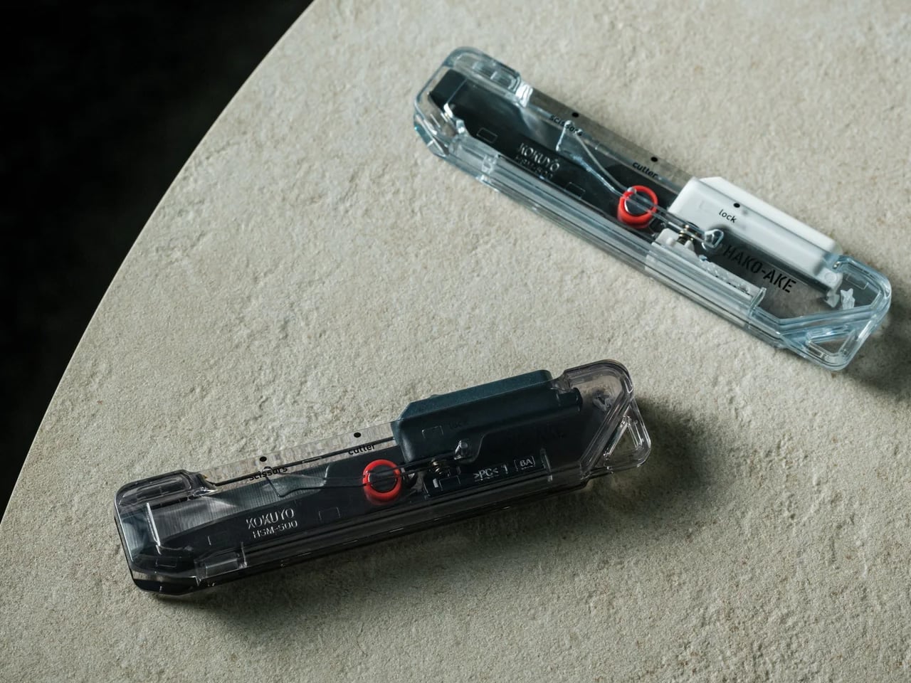
Most tools hide their engineering inside an opaque body. The ClearSlide does the opposite. The transparent shell makes the internal sliding mechanism visible with every position change, so you can see the active mode before making the cut. It is a functional decision dressed as an aesthetic one, or an aesthetic one that happens to be functional. The result is a tool that communicates clearly and carries a retro-tech character most utility objects never bother developing.
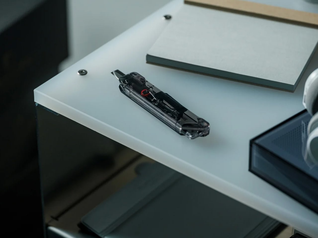
Compact enough for a pocket, fitted with a built-in strap hole for clipping onto a bag, and retractable for safe carry, the ClearSlide is designed to stay within reach. The frustration of opening packages is rarely about the cutting itself. It is about the pause before it: the drawer search, the tool switch, the moment where the delivery wins. This closes that gap. One tool, one pocket, one motion from the moment it arrives at the door.
What We Like
Blade-and-scissors combination: replaces two tools with one slim body that handles packaging tape and tags in a single session, without switching grip or setting the package down
Single-hand operation: the thumb-controlled slider moves between lock, cutter, and scissors with one hand, leaving the other free to hold whatever is being opened
Controlled 0.12-inch blade depth: cuts through tape cleanly while staying clear of the contents underneath, solving the most common frustration of opening deliveries with a standard blade
Visible internal mechanism: the transparent body lets you confirm the active mode before every cut, and gives the tool a distinct retro-tech character that sets it apart from every other cutter in a drawer
What We Dislike
Blade replaceability: the product does not specify whether the cutter blade is replaceable, which matters for anyone opening packages regularly and expecting long-term performance from a $30 tool
Limited color range: Clear, White, and Smoke Black are clean choices, but the transparent body has the visual potential to carry a wider palette than three colorways currently allow
The Tool That Ends the Two-Step
The ClearSlide Box Openerwas built around a problem most people have learned to live with rather than solve. Two functions in one tool, controlled by a single thumb, with a blade depth engineered to protect what matters. For something that lives on a desk or clips onto a bag, that level of considered detail at $30 makes it difficult to justify keeping a box cutter and scissors as two separate jobs.
If the current setup involves reaching for one tool and then switching to another halfway through, that is the exact friction this replaces. Pick it up in Clear, White, or Smoke Black. Let the next delivery be the last time the packaging feels harder to deal with than whatever is inside it, and let the scissors that used to live in the desk drawer finally earn a proper rest.
Most public spaces don’t trust you. They’re designed to move you through them efficiently, seat you for a limited time, or keep you from lingering too long. Benches with armrests in the middle to prevent sleeping. Spikes on flat ledges. Gaps between seats so no one gets too comfortable. Somewhere along the way, cities stopped being places you inhabit and started being places you pass through.
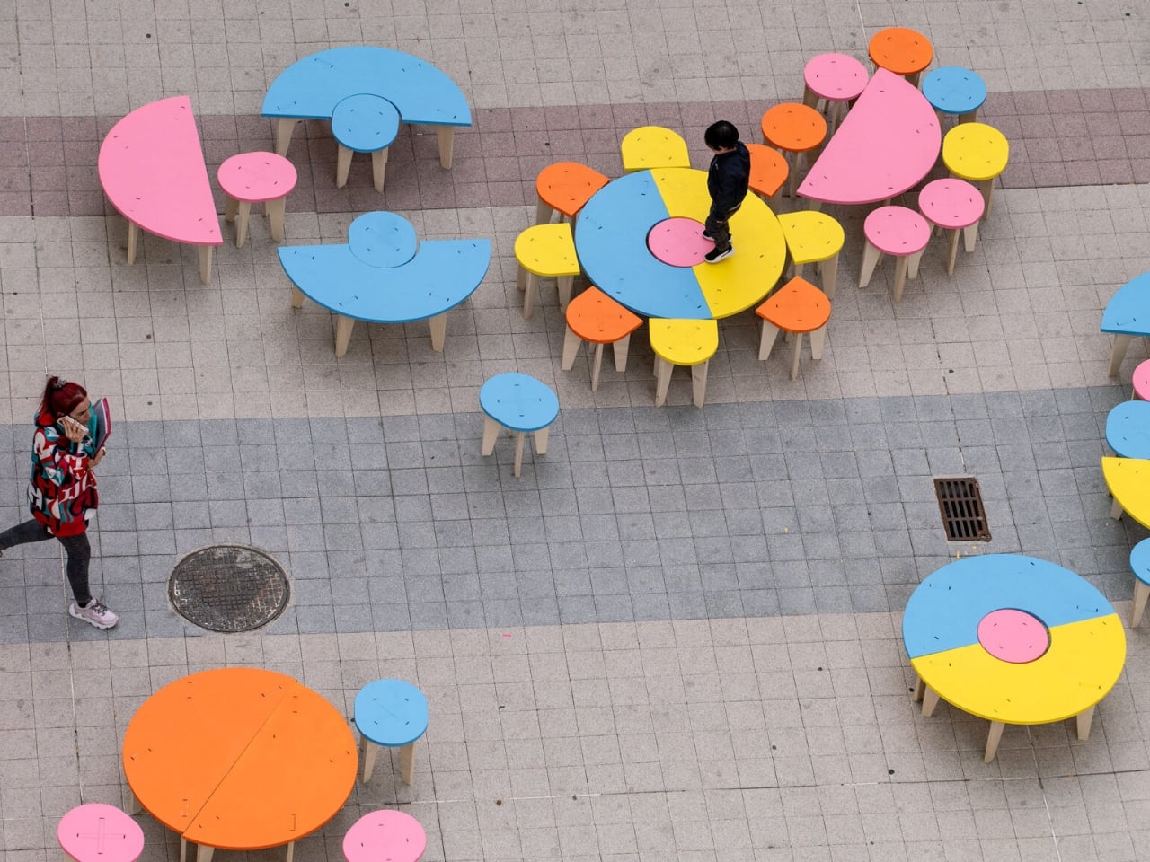
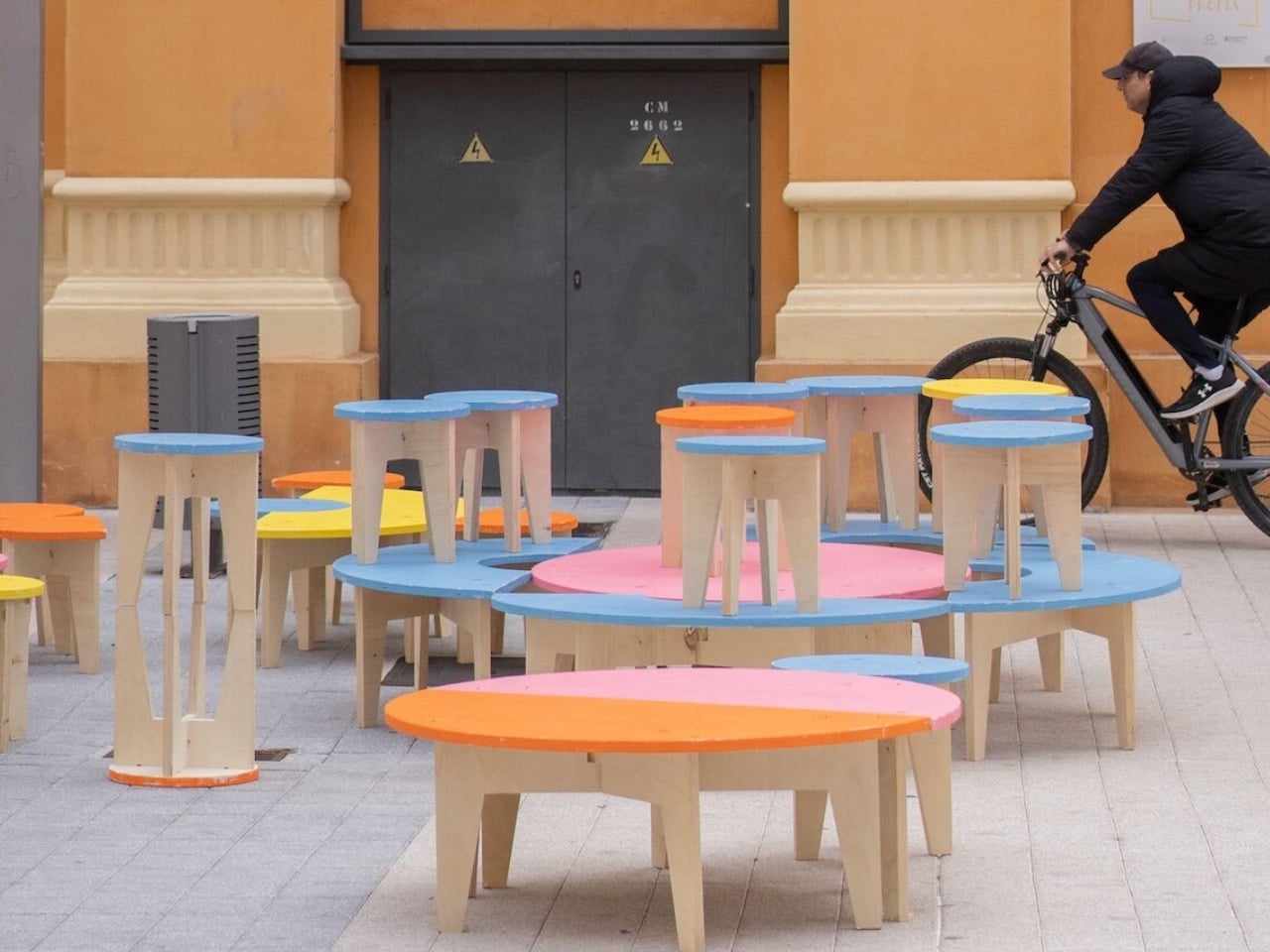
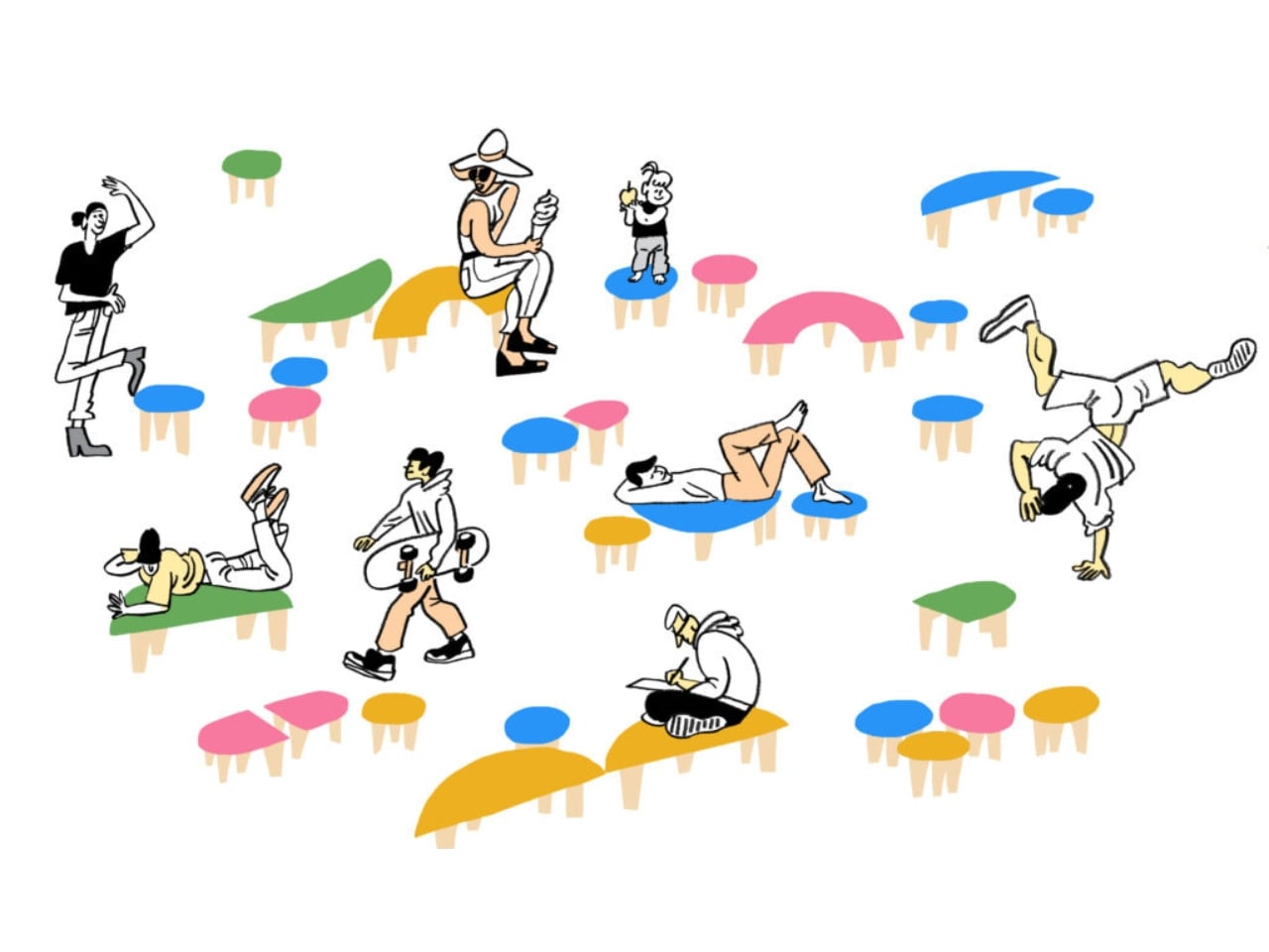
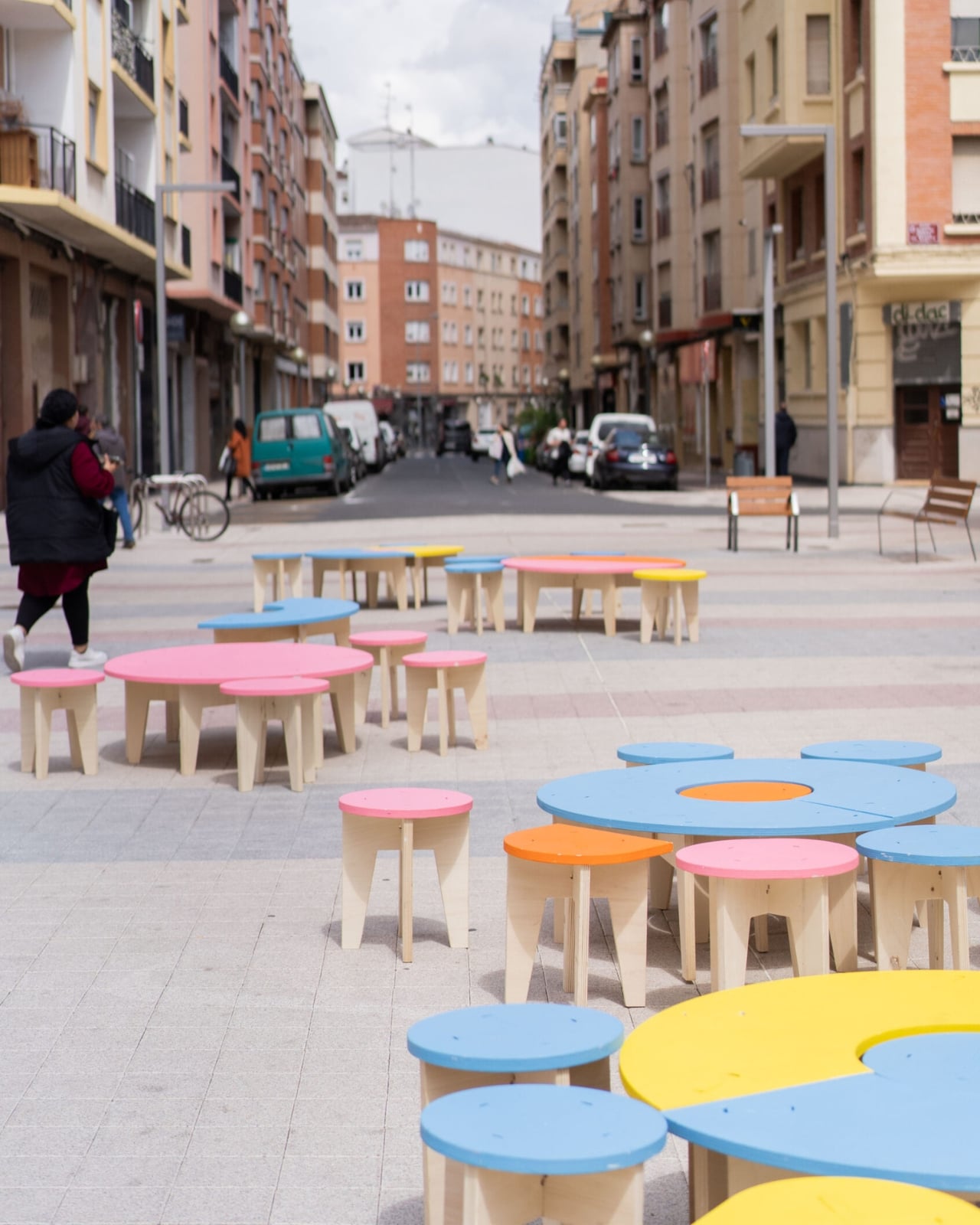
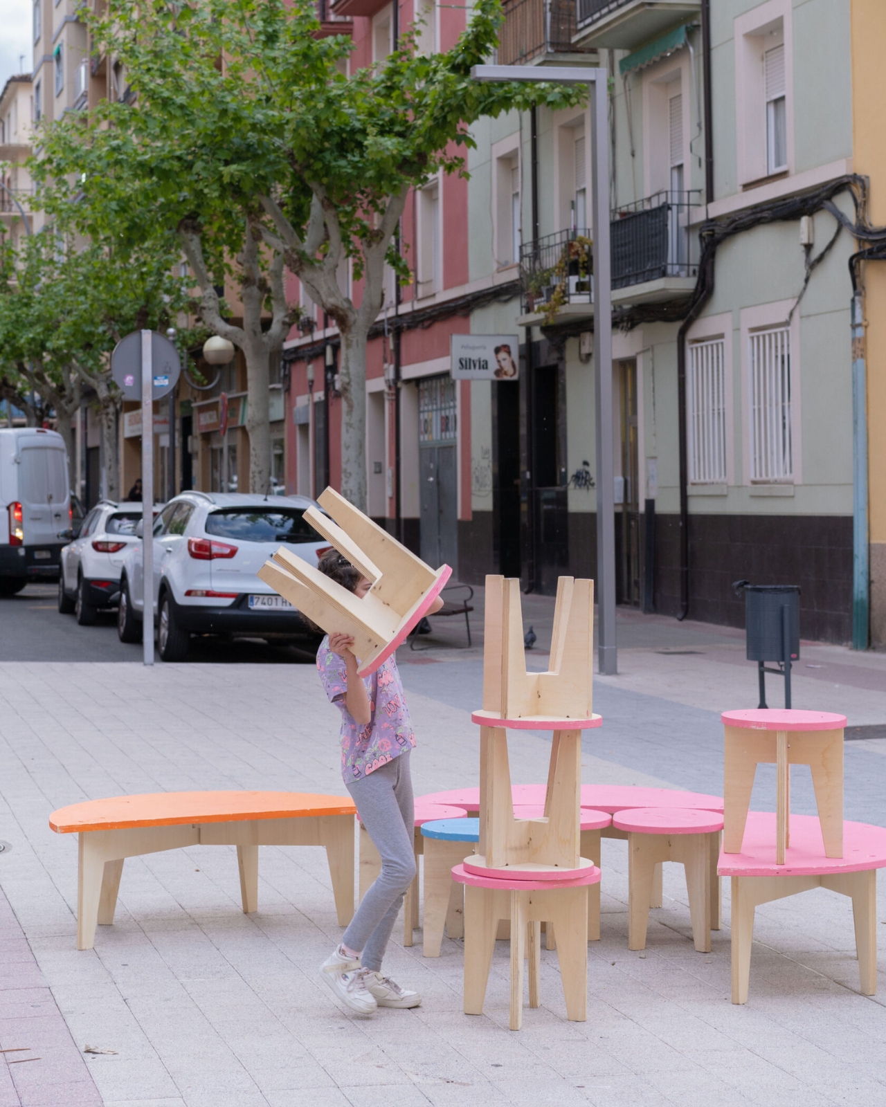
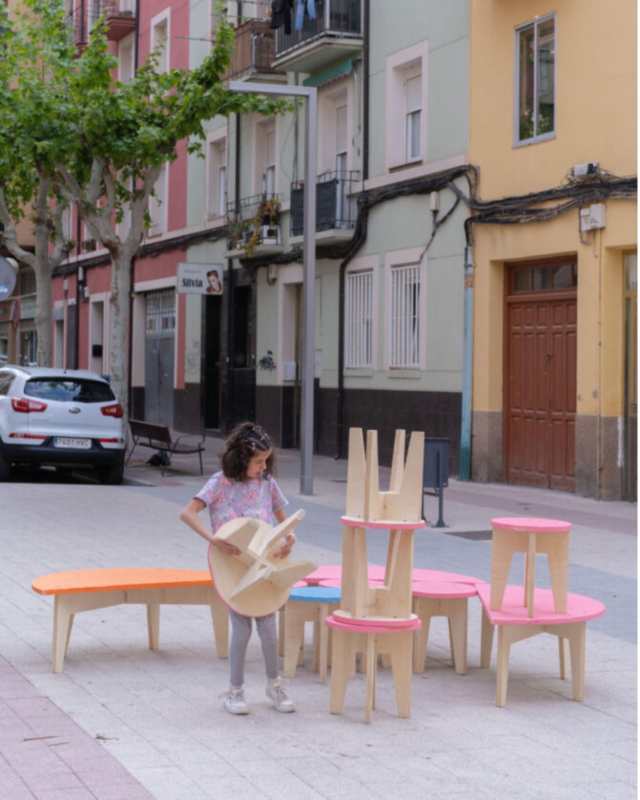
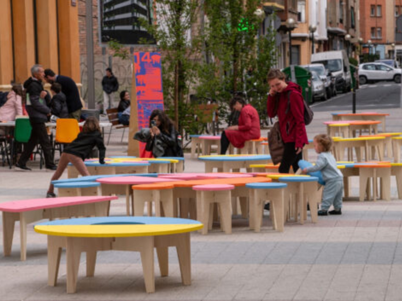
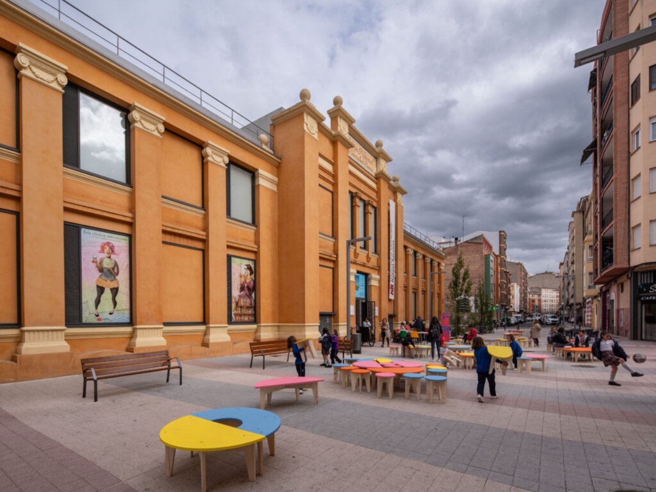
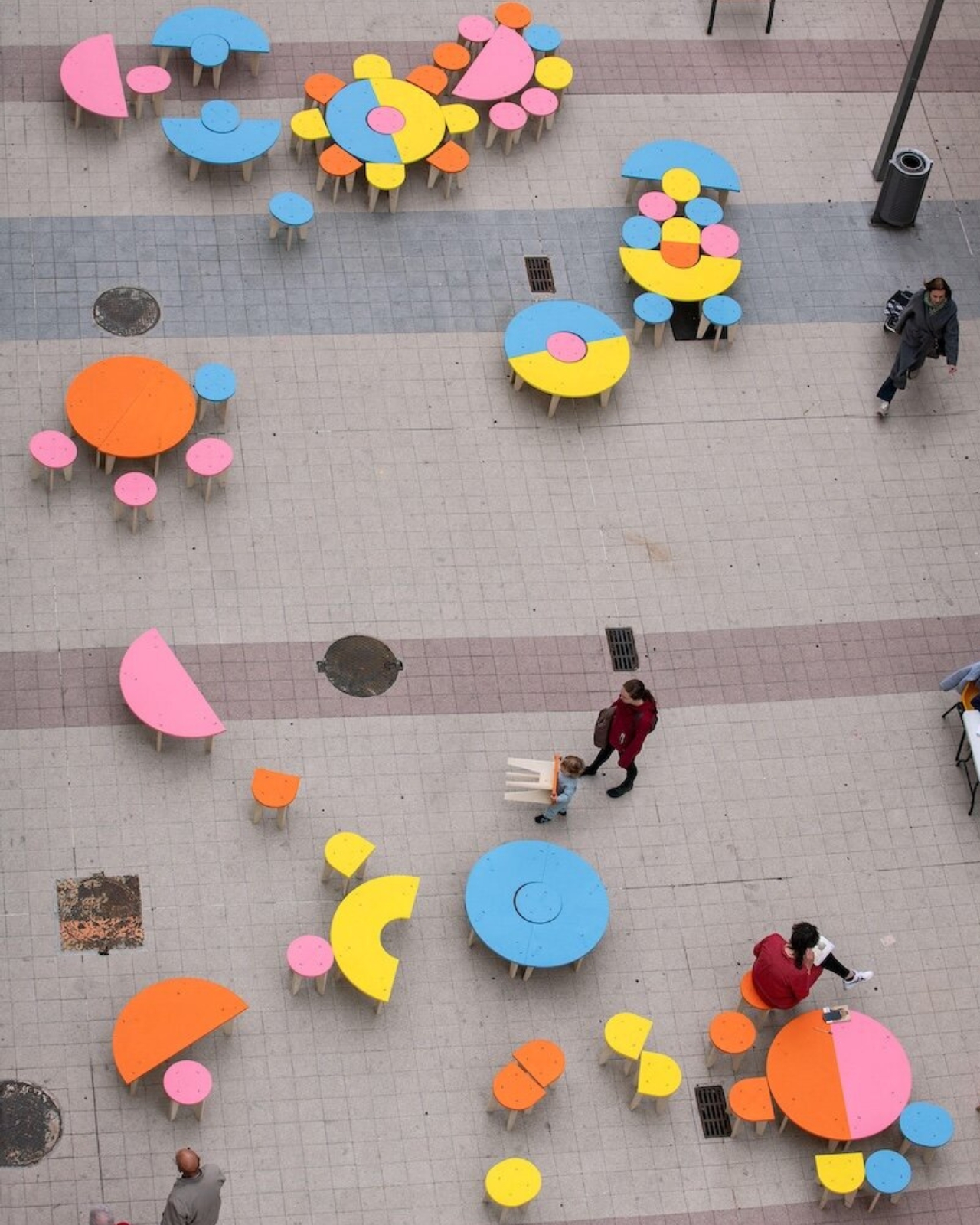
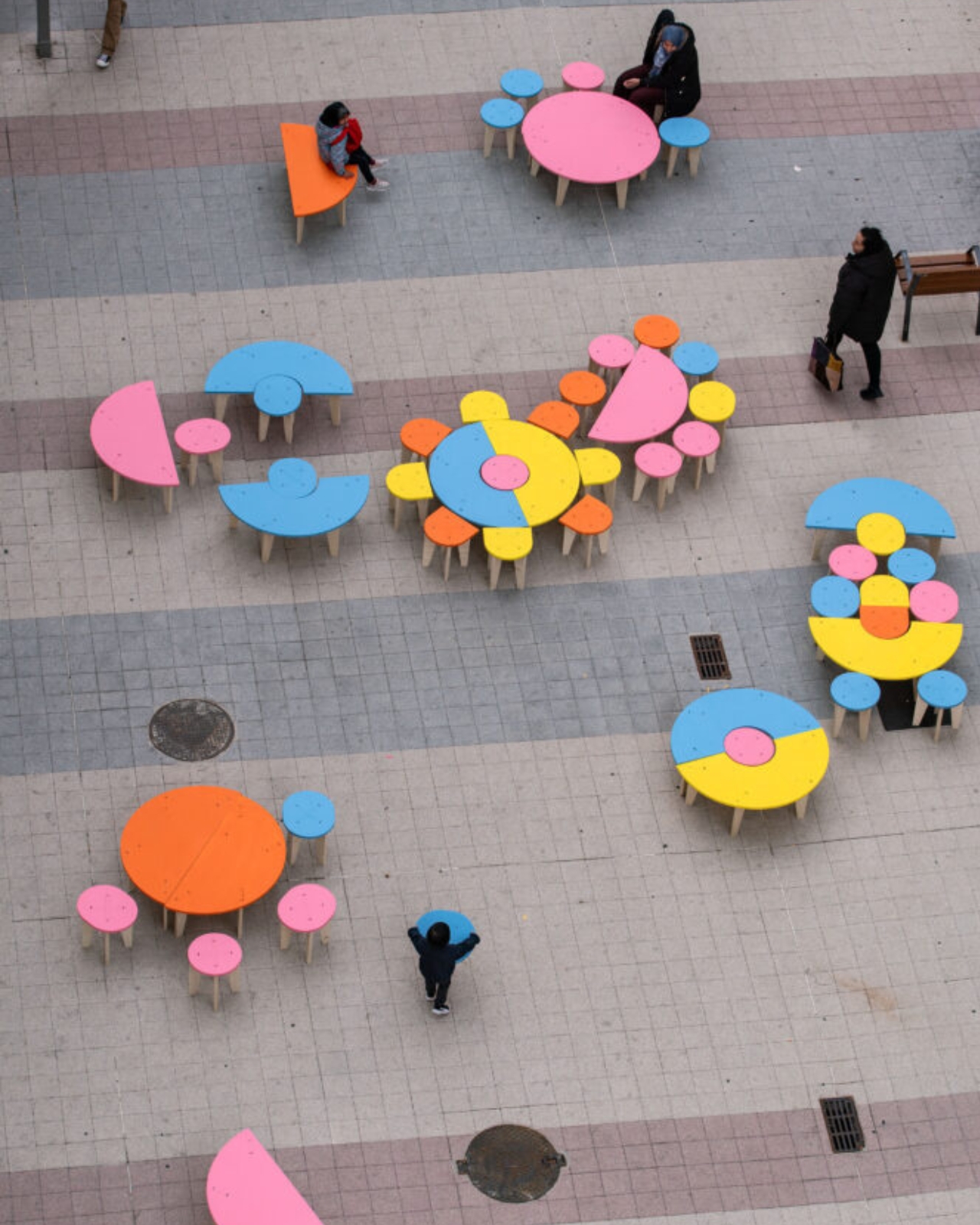
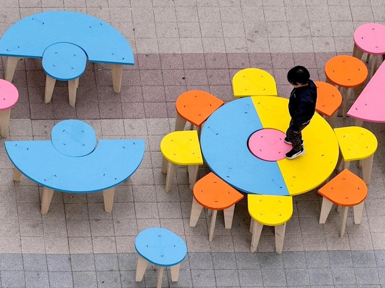
Päivi Raivio’s Basic Forms (of Urban Life) is a direct and cheerful argument against all of that. The Finnish artist and urban designer has taken a set of geometric plywood pieces, painted in colors borrowed from the Barbican’s own brutalist architecture, and placed them in the middle of one of London’s most famous cultural complexes. No instructions. No fixed configuration. No single correct answer. Visitors are invited to pick them up, move them around, stack them, sit on them, or arrange them into something entirely new. What looks like furniture is actually a question: what do you want this space to be?
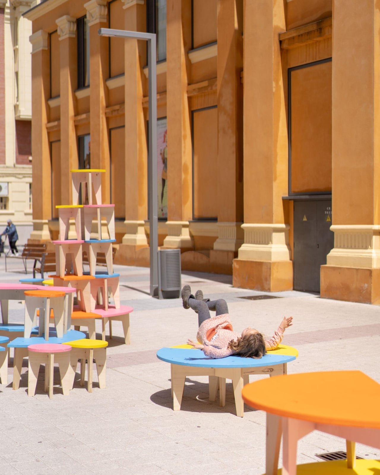
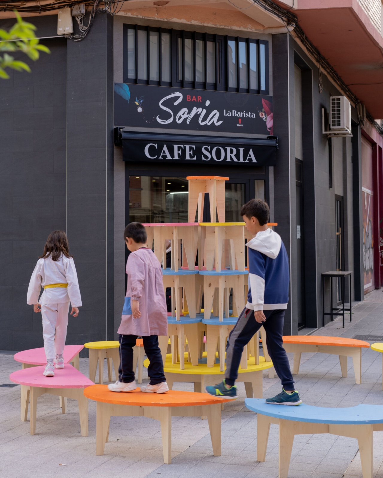
I’ve seen a lot of participatory design installations over the years, and most of them fail for the same reason: they participate for you. They have a predetermined “correct” arrangement that visitors slowly discover through guided cues. There’s no real agency. Raivio’s work is different because it genuinely means it. A seat can become a table. A table can become a platform. A platform can become a wall, a stage, or a privacy screen between two strangers who both needed a quiet corner at the same moment. The work shifts with whoever is using it, and that feels radical compared to what most public design offers.
The Barbican is a fitting backdrop for all of this. Designed through the 1950s and completed in 1982, it’s one of the most monumental pieces of brutalist architecture in the UK, all exposed concrete and sharp geometry. Raivio’s lightweight, colorful pieces don’t fight the setting. They echo it quietly, picking up the shapes and tones of the architecture without trying to compete with several acres of concrete. The contrast between the fixed permanence of the building and the cheerful rearrangeability of the installation is part of what makes the whole thing click.
For Raivio, play isn’t a decorative layer applied over the surface of serious design. It’s a foundational principle. Her studio, RaivioBumann, focuses on transforming public spaces into places that are genuinely livable, not just functional. The idea that disorder and disruption can be design tools, rather than problems to be solved, runs through everything about Basic Forms. Public space, in her view, is most alive when it hasn’t been entirely decided for you.
The installation is part of the Barbican’s Play Make Do festival, running 14 to 16 August 2026, and it’s free, unticketed, and open to anyone who walks through. It previously showed at Concéntrico in Logroño, Spain, where it was met with the kind of spontaneous collective enthusiasm that designers spend careers hoping for. People of all ages rearranged, combined, balanced, and rebuilt the pieces for hours. The images from that presentation are worth looking up. They show something you don’t see often enough in public space: strangers making decisions together.
That’s the detail that sticks with me. Not the form, not the color palette, not even the clever way the installation adapts to its environment. It’s the fact that two people who don’t know each other will naturally start negotiating, collaborating, and eventually laughing over how to arrange a pile of plywood. Raivio has essentially built a permission slip for connection, disguised as furniture.
Cities don’t lack benches or tables. They lack reasons to linger. They lack spaces that say, figure it out, make it yours, stay as long as you want. Basic Forms gives London exactly that, even if only for a weekend. The real question it raises is why we aren’t building this kind of thinking into cities permanently, instead of treating it as a festival-season novelty.
Gold is a bully. Put it anywhere near black and it wins every argument, which is why most manufacturers use it sparingly, on a badge, maybe a border, probably just a little accent here or there, that’s it. Triumph used it five times on the new Speed Twin 1200 TFC and somehow the bike does not look like a trophy. There’s gold in the tank pinstripe, gold outlining the Triumph badge, gold on the fork lowers, gold on the Öhlins adjusters, and a full gold chain spinning away back there like it’s showing off.
The trick is what’s holding it all down. Every other surface on this thing is either gloss black, matte carbon, or blacked out titanium, so the gold has nowhere to bounce. It reads as punctuation instead of paint. Look at the tank in daylight and the metallic flake in Obsidian Gold does something sneakier still, glinting only when the light hits at an angle.
Designer: Triumph
Carbon fiber handles the unglamorous half of the equation. Gloss-lacquered panels wrap the mudguards, side panels, and heel guards, keeping the bike visually quiet enough for the gold to register. It also drops wet weight to 214 kg, 3 kg under the Café Racer Edition and 2 kg under the standard Speed Twin 1200 and RS, roughly a six-pack of beer permanently removed from a bike you’re about to fling around corners. None of it shouts about lap times. It’s there because a factory custom still has to look hand-built even when a robot laid up half the panels.
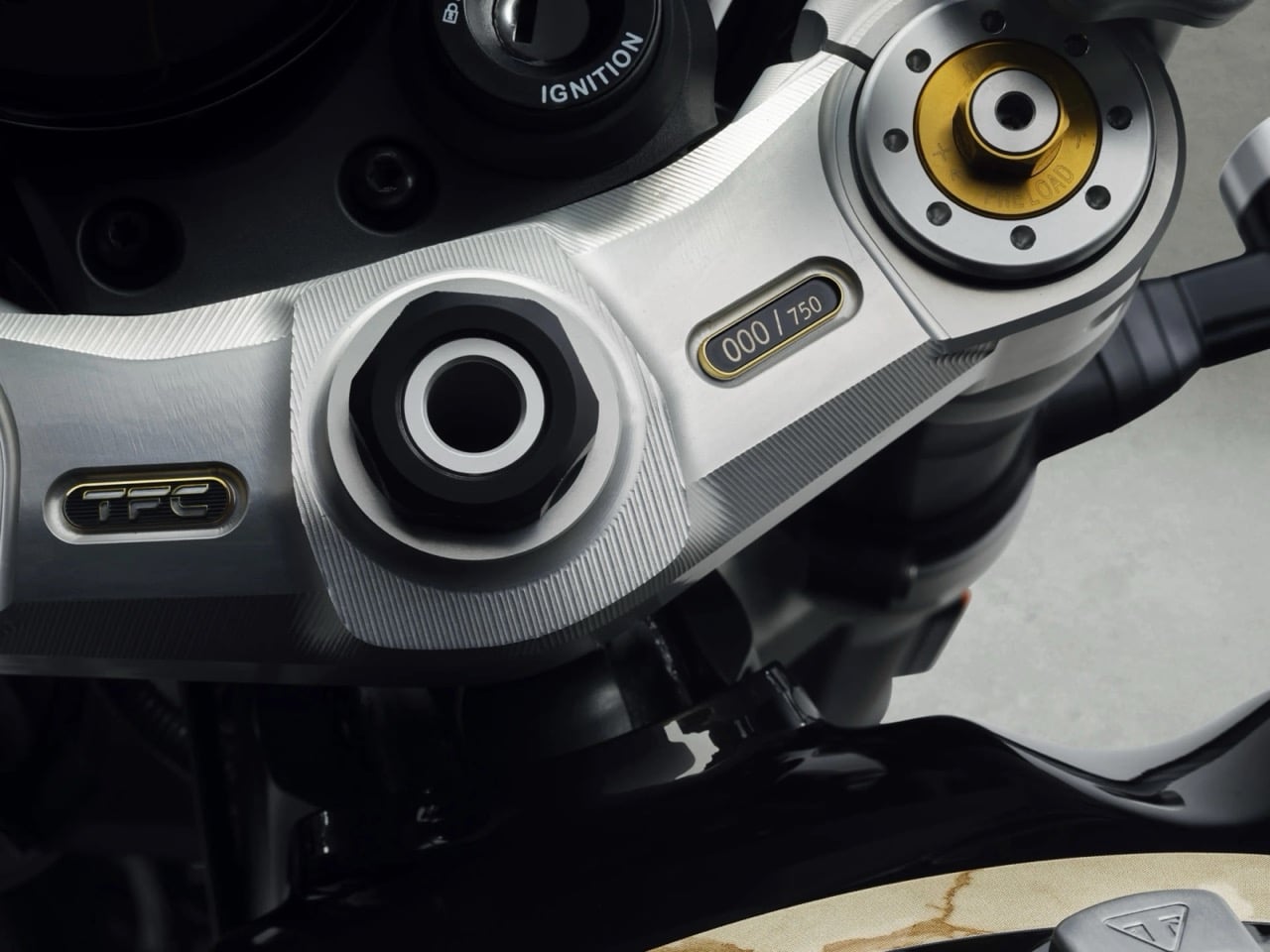
Fully adjustable Öhlins units replace the Marzocchi suspension at both ends, and Brembo Stylema calipers grab the front discs through a radial master cylinder, hardware you’d expect on a race bike, not a numbered plaque. Low clip-on bars and end-mounted mirrors push the rider into a sportier crouch, backed by a billet aluminum top yoke laser-etched with each bike’s number out of the 750-unit run. It’s parked right where your eyes land every time you glance at the bars, a reminder that you did, in fact, pay for something rare.
The engine is the one thing Triumph left alone, correctly. It’s the same 103.5 hp, 112 Nm parallel twin found in the standard Speed Twin 1200, the RS, and the Café Racer Edition, so nobody’s buying this for a bigger number. What’s different is how it exits, through black titanium Akrapovič silencers with carbon end caps that trade a bit of restriction for a better soundtrack. Shift Assist, cornering ABS, traction control, and three riding modes round out the electronics on a color TFT and LCD combo, with a USB-C port instead of some ancient proprietary plug.
Bullet-style LED indicators double as brake and tail lights, freeing up the space where a central lamp usually sits for a clean, logoed blanking plate instead. It’s a small deletion custom shops would charge extra for, and here it comes standard. The seat is a one-piece bench in hand-stitched leather with a suede pad, the kind of detail you only clock once you’re sitting on it.
At $21,995, with 180 units earmarked for the US and 30 for Canada, the Speed Twin 1200 TFC is priced and rationed like the collector’s item Triumph wants it to be. Deliveries start in October, and every bike ships with its own numbered yoke, turning “limited edition” into something you can actually point to. Neither the horsepower nor the price tag really sells this bike. It’s that Triumph resisted throwing everything at it, building a bike where five points of gold do more design work than most manufacturers manage with an entire livery.