For decades, “form follows function” shaped how you designed and lived. Minimalism stripped objects down to pure utility, where functional products like a chair were only a chair, or a lamp was only a source of light. That clarity once felt essential, but now it feels incomplete. We are moving into an era of playful functional design, where everyday objects reclaim character, becoming whimsical, unexpected, and slightly strange.
This shift is not about excess but about emotional precision. Function no longer ends at performance, but it extends into experience. Objects are designed to engage, surprise, and evoke emotion. A well-designed piece does not simply serve a purpose; it leaves a lasting impression.
1. Interactive Furniture Design
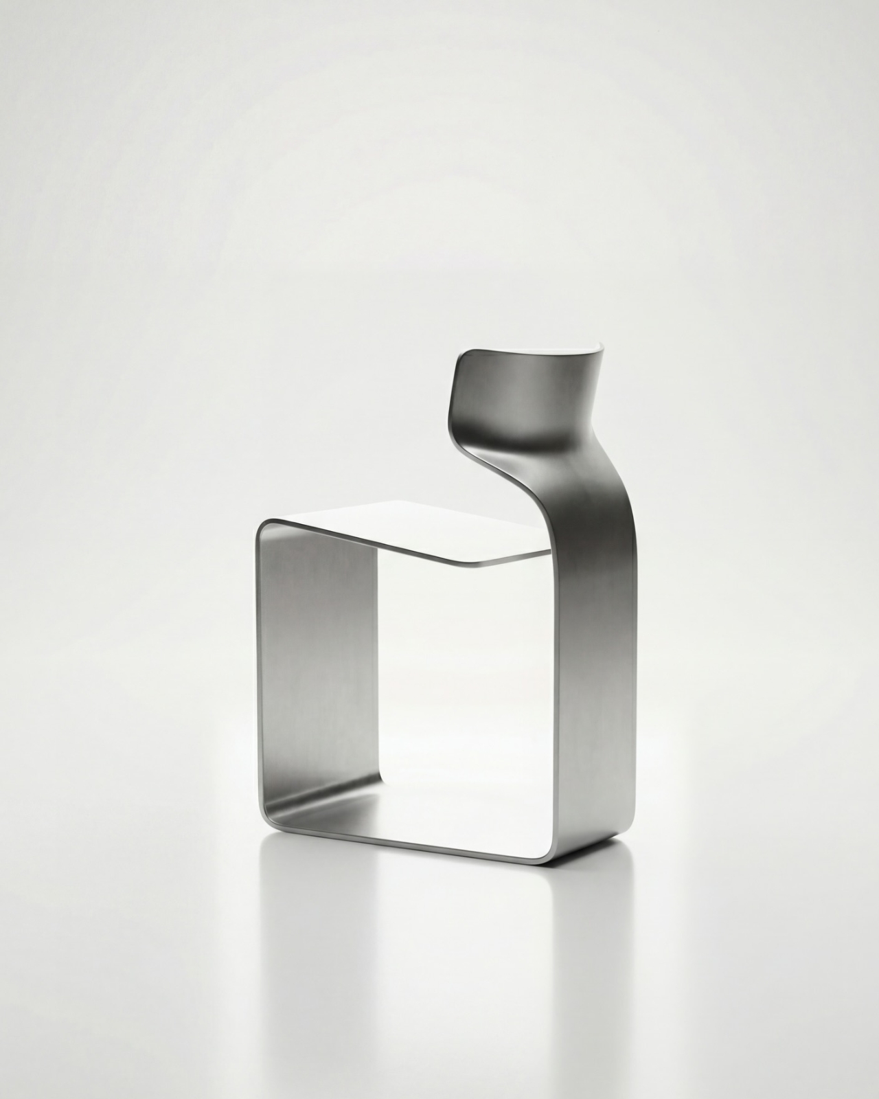
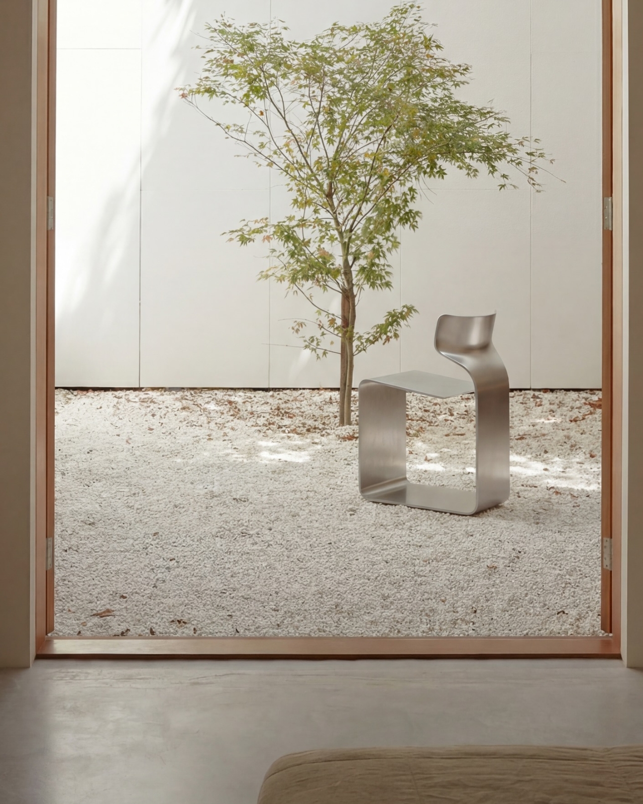
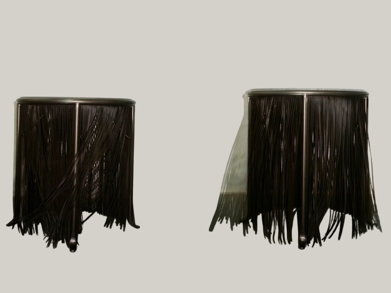
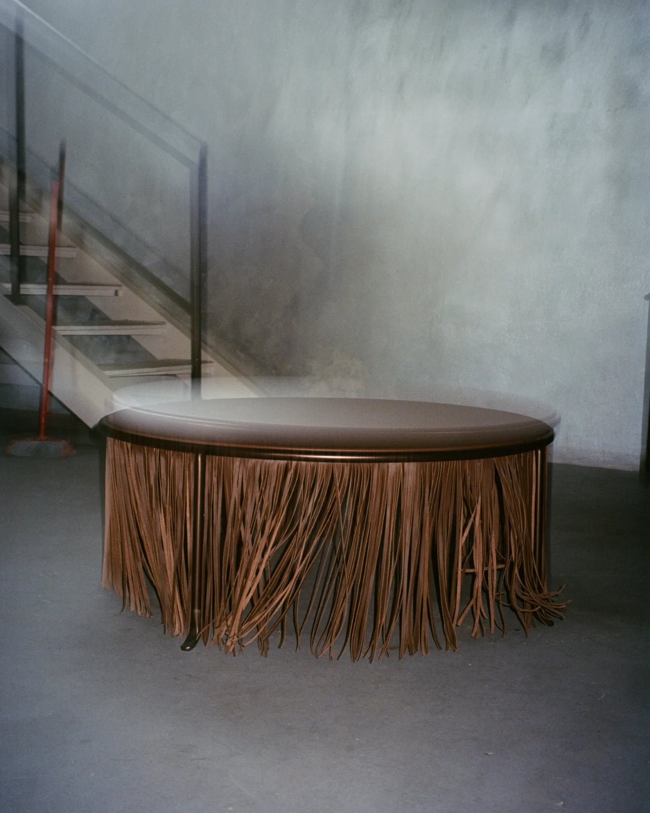
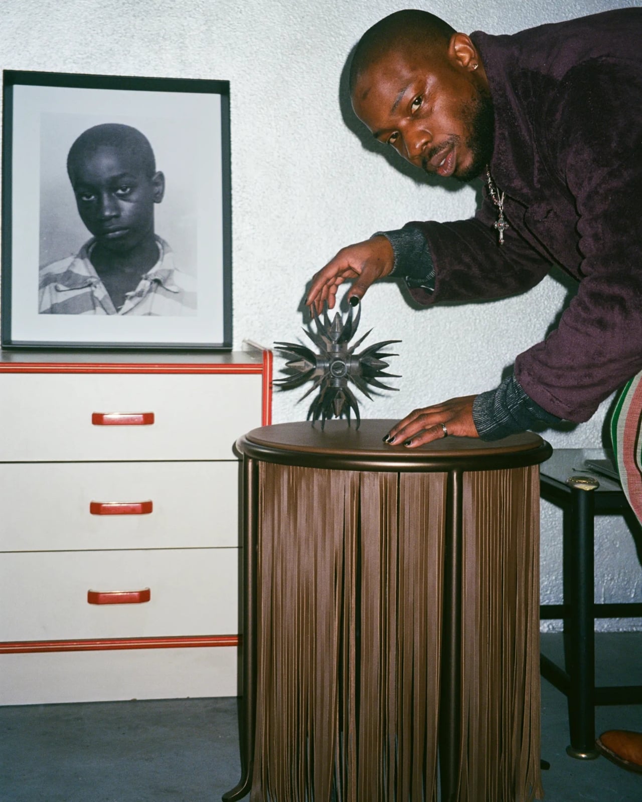
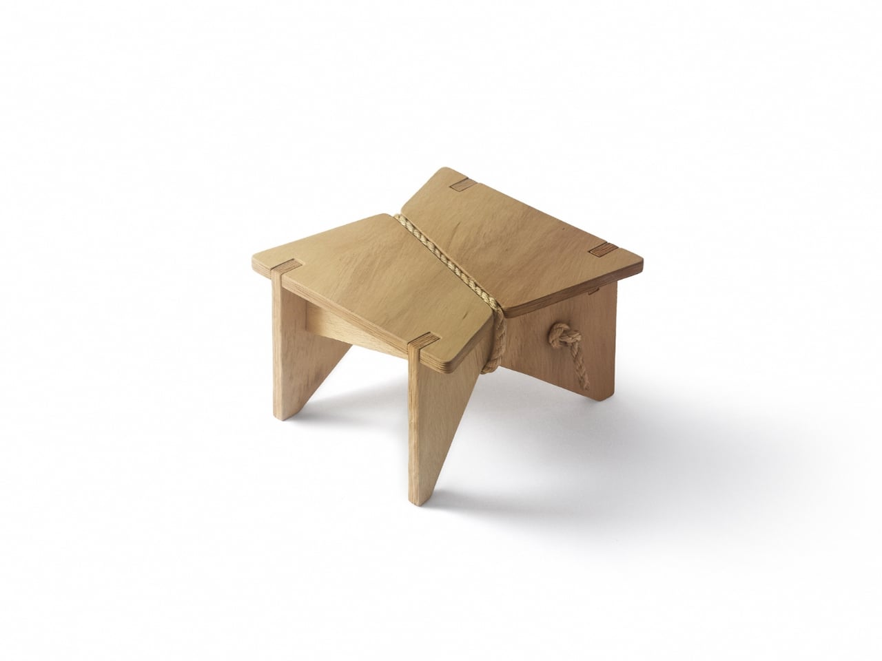
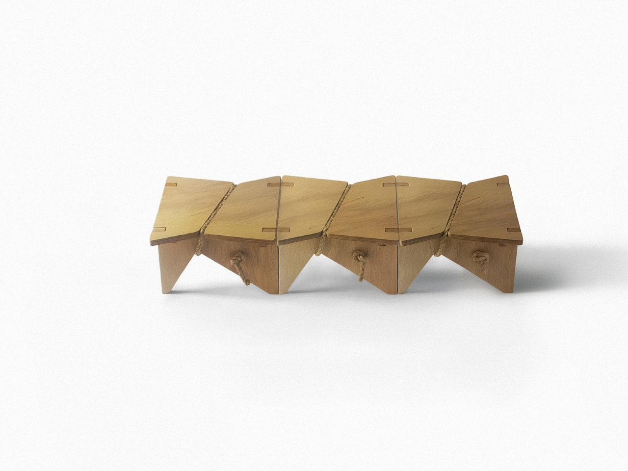
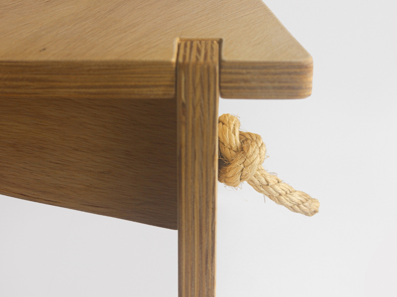
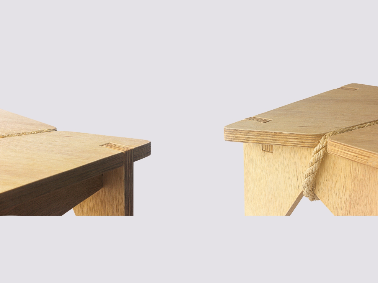
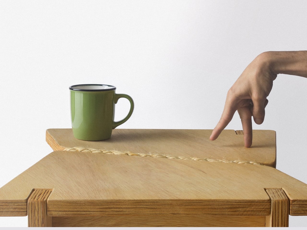
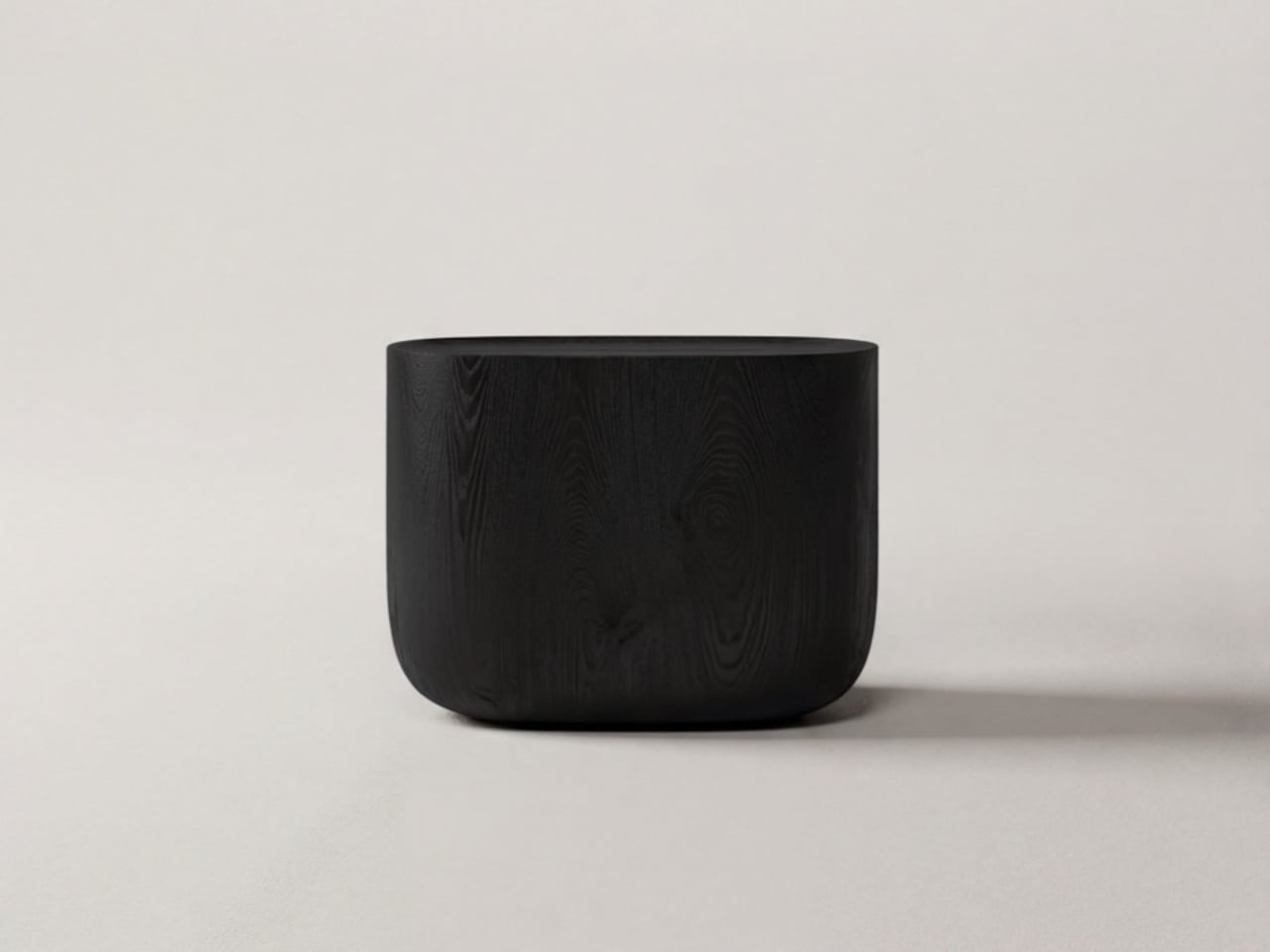
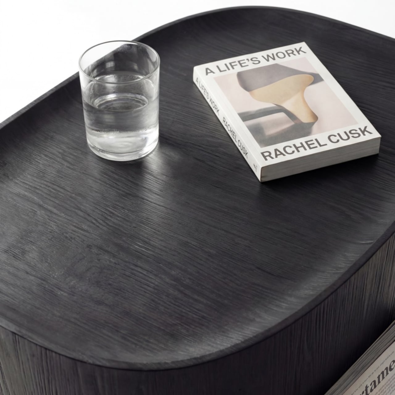
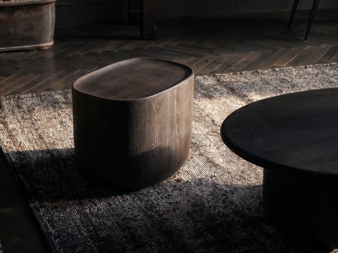
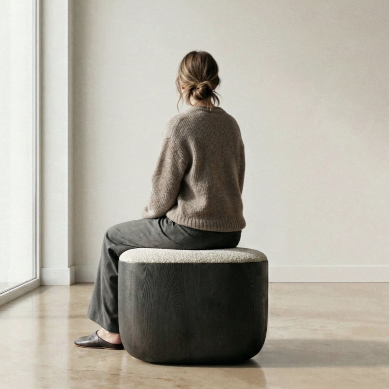
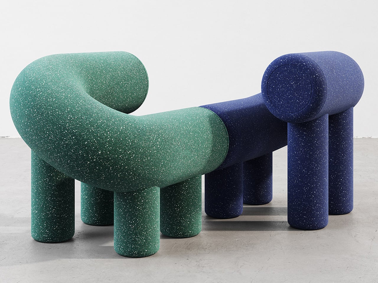
The era of the static, rigid sofa is fading as furniture begins to take on a more expressive role. Pieces are no longer designed to sit quietly in the background, but they carry presence through bold forms and modular compositions. Soft, blobby silhouettes and subtle anthropomorphic details transform chairs and stools into objects that feel almost alive, inviting interaction.
The real transformation lies in how people engage with these designs. Materials like memory foam and recycled plastics allow furniture to adapt to the body, shifting from passive to responsive. As a result, furniture moves beyond function and begins to feel more like a companion within a space. This shift creates interiors that are more intimate, expressive, and dynamic, where everyday objects actively shape the playful atmosphere.
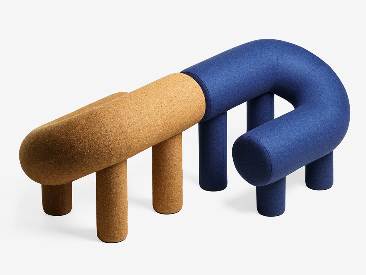
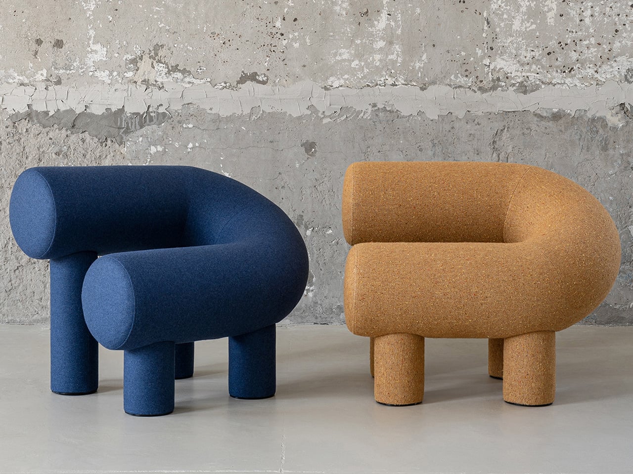
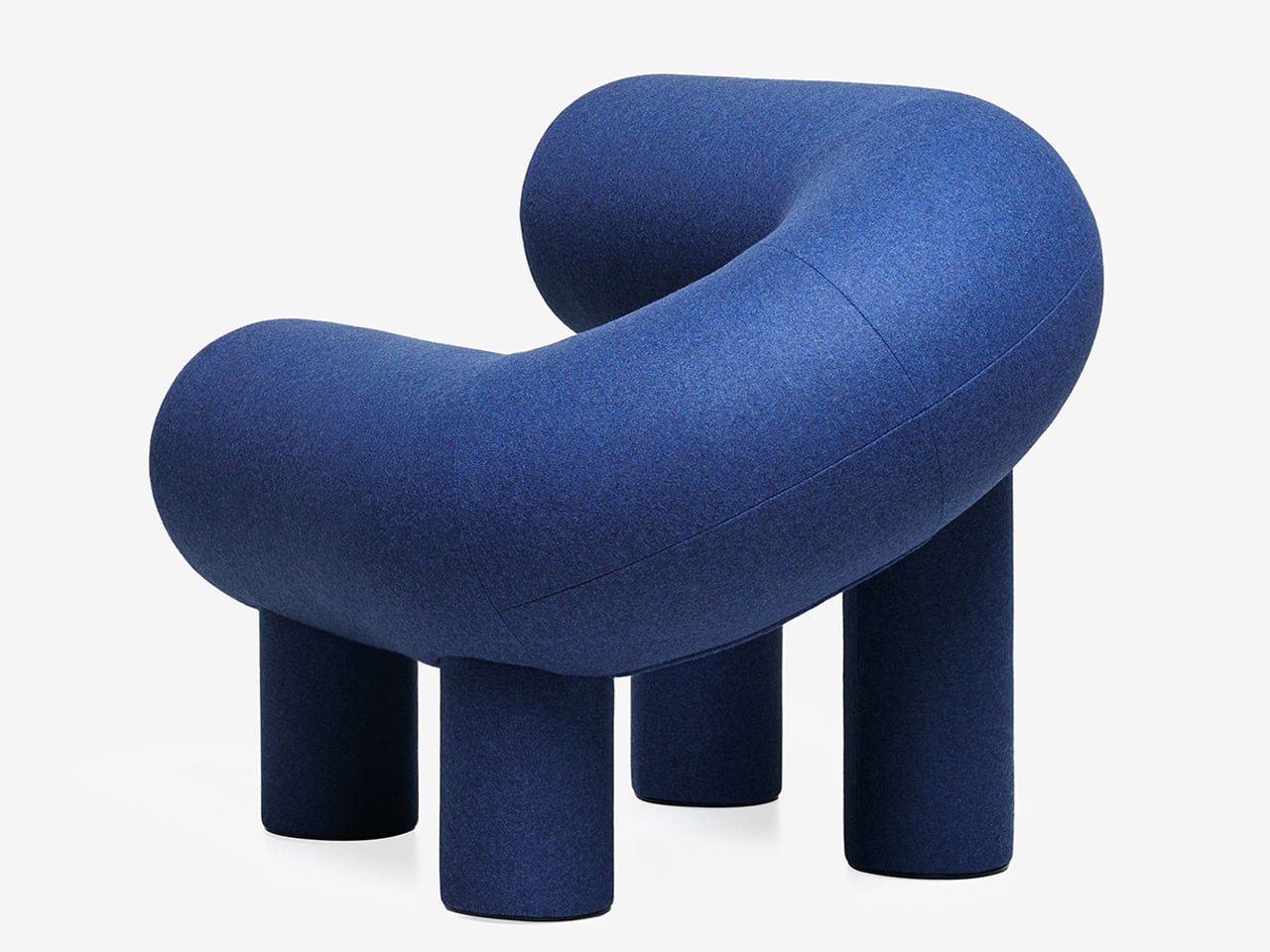
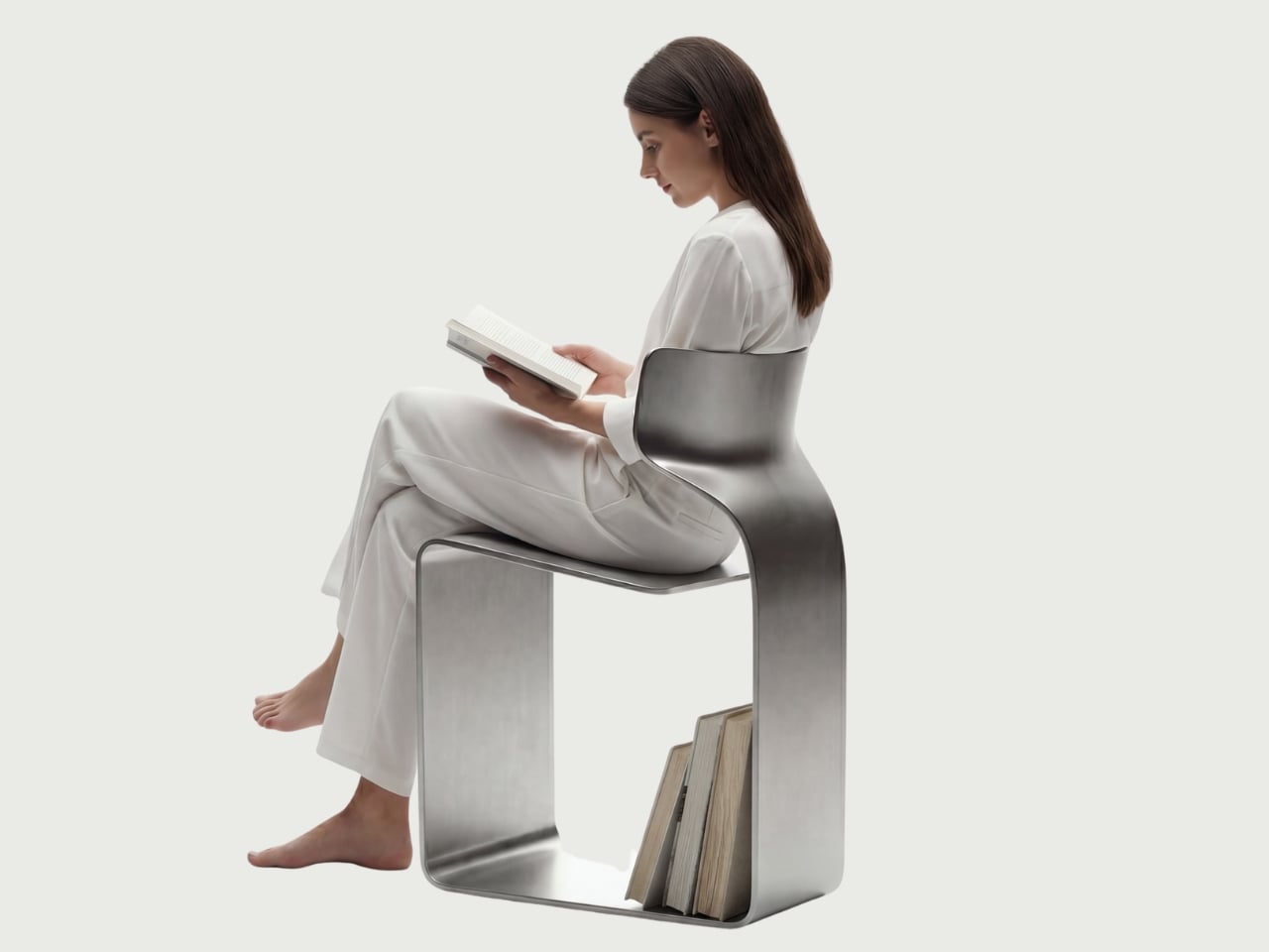
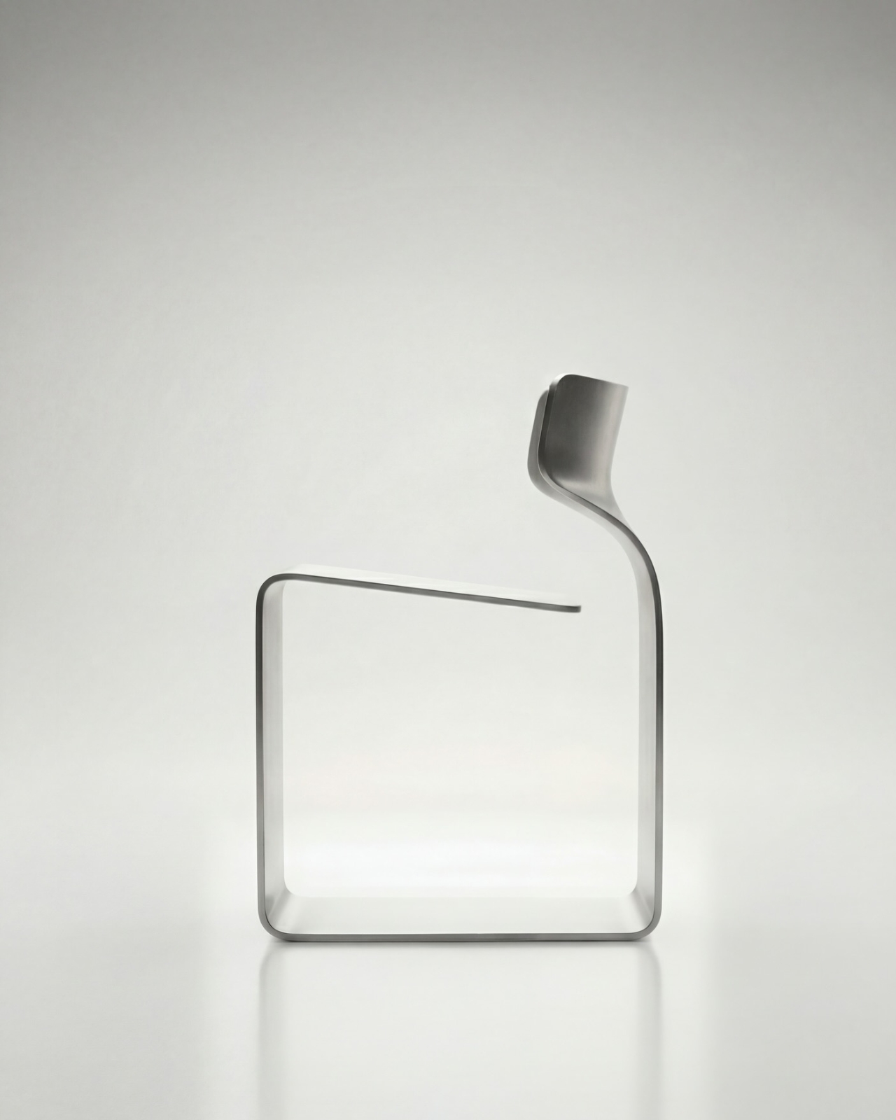
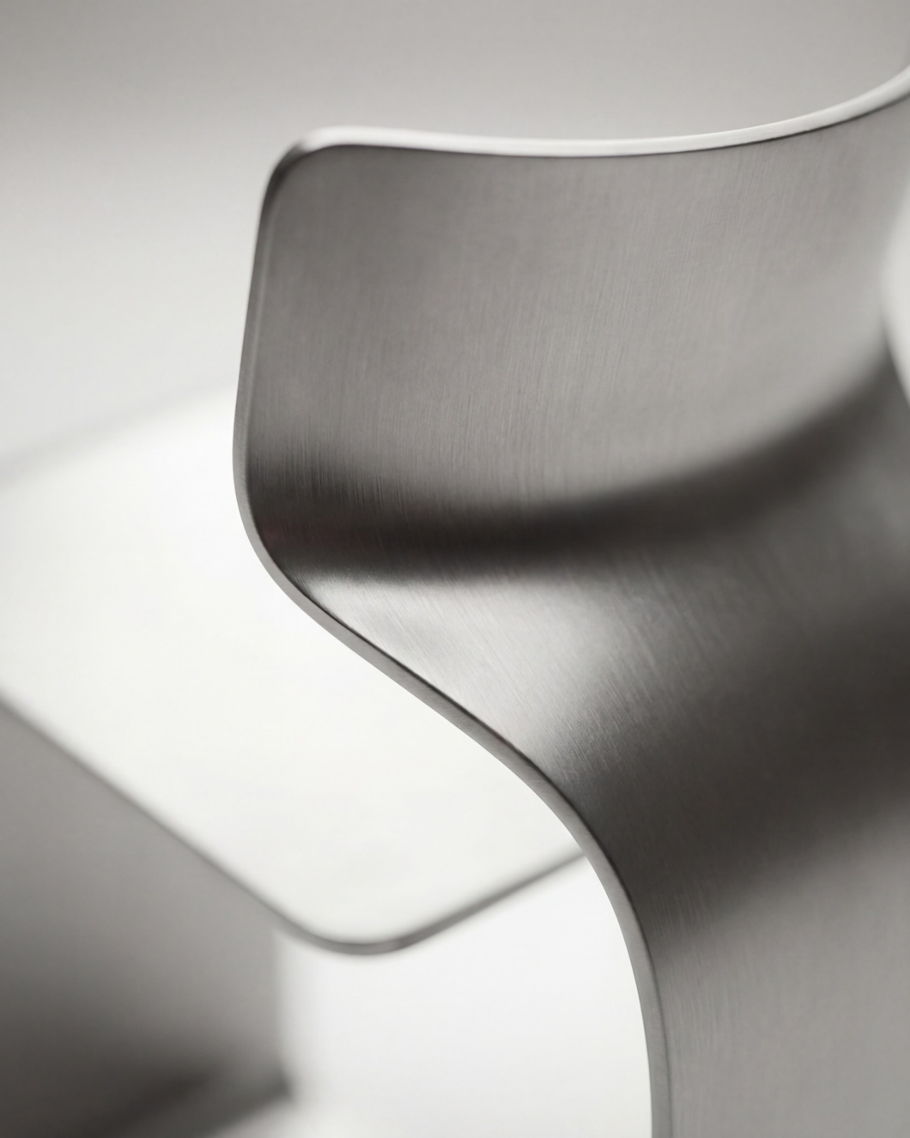
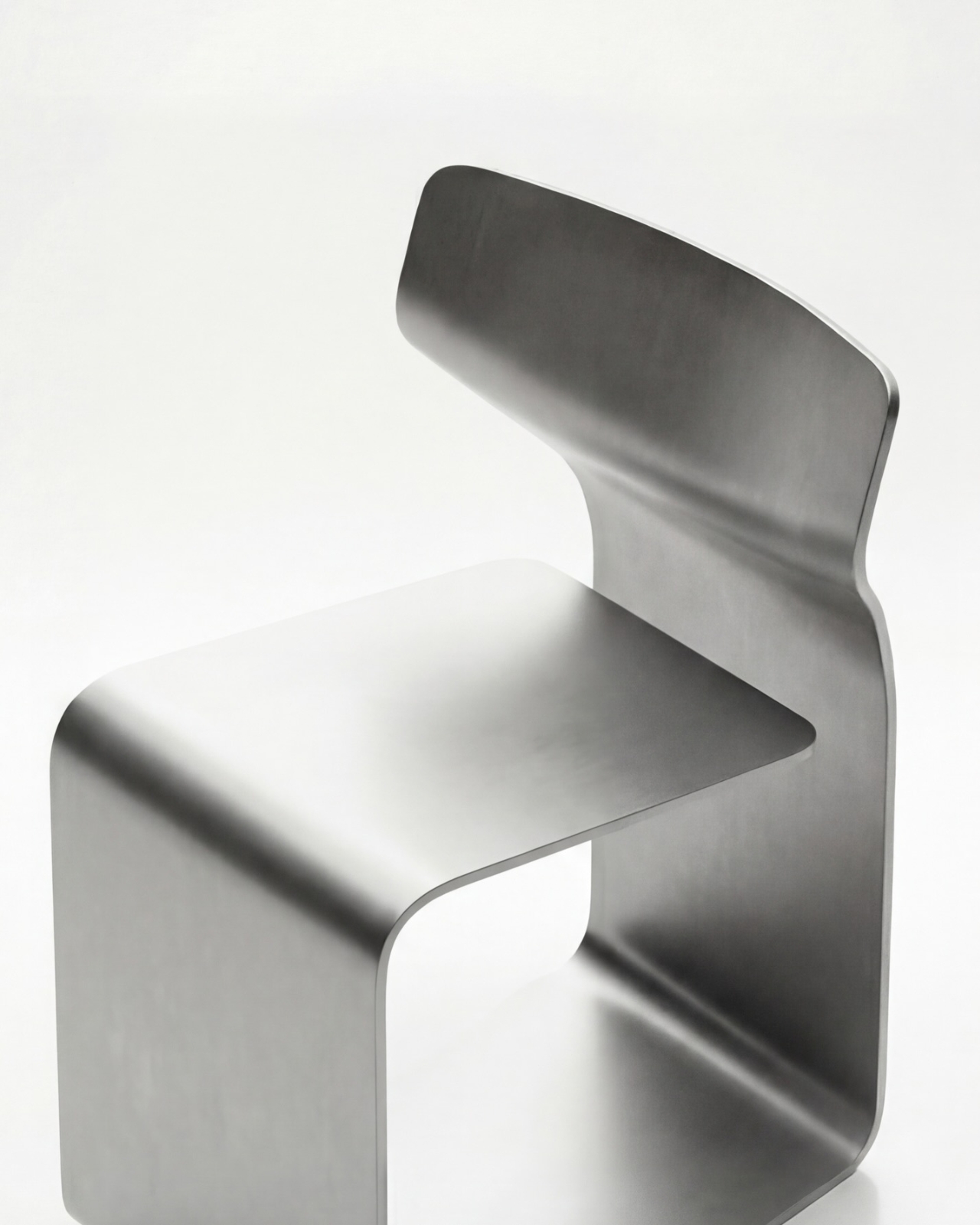
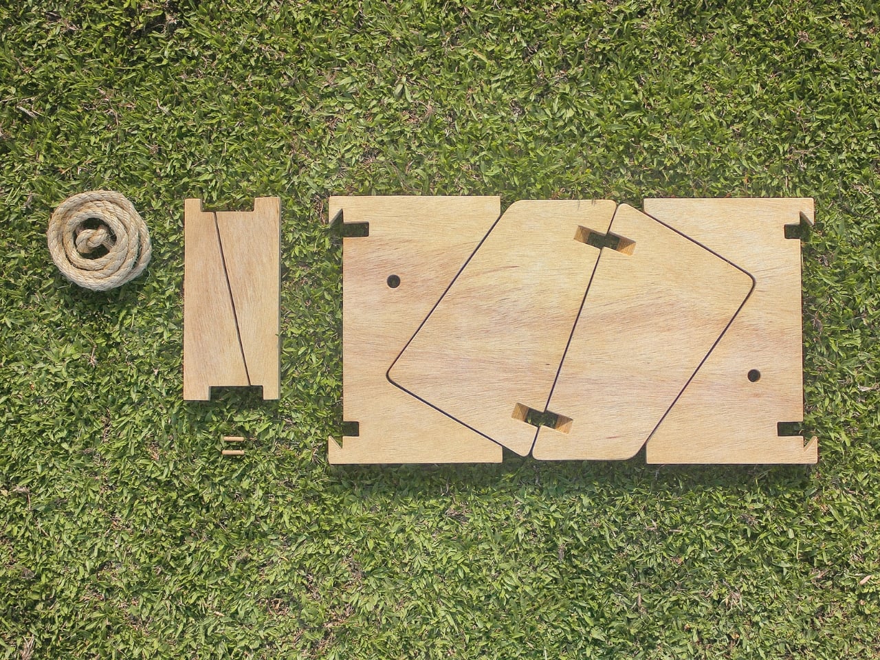
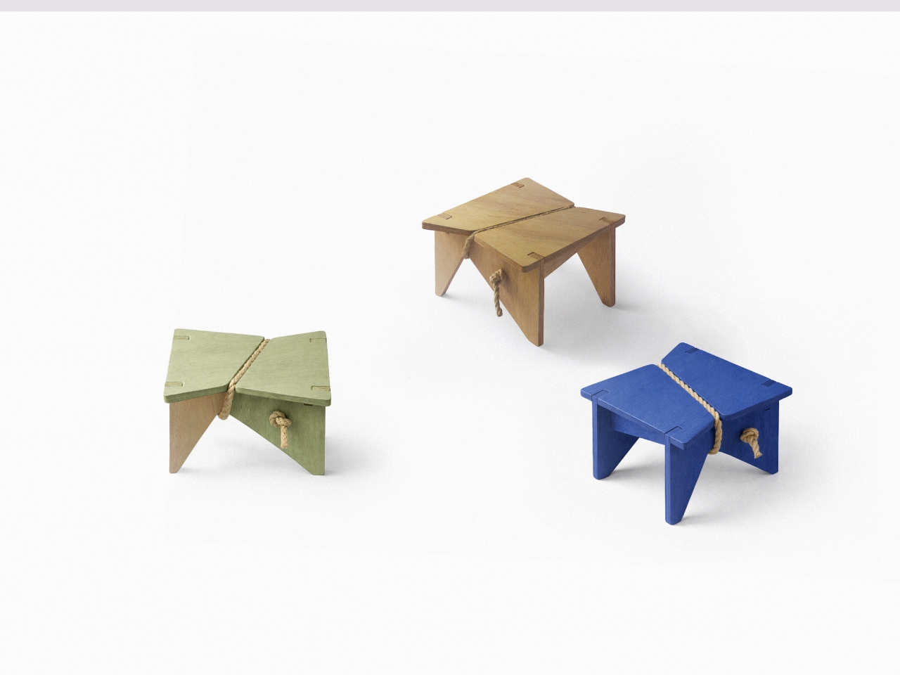
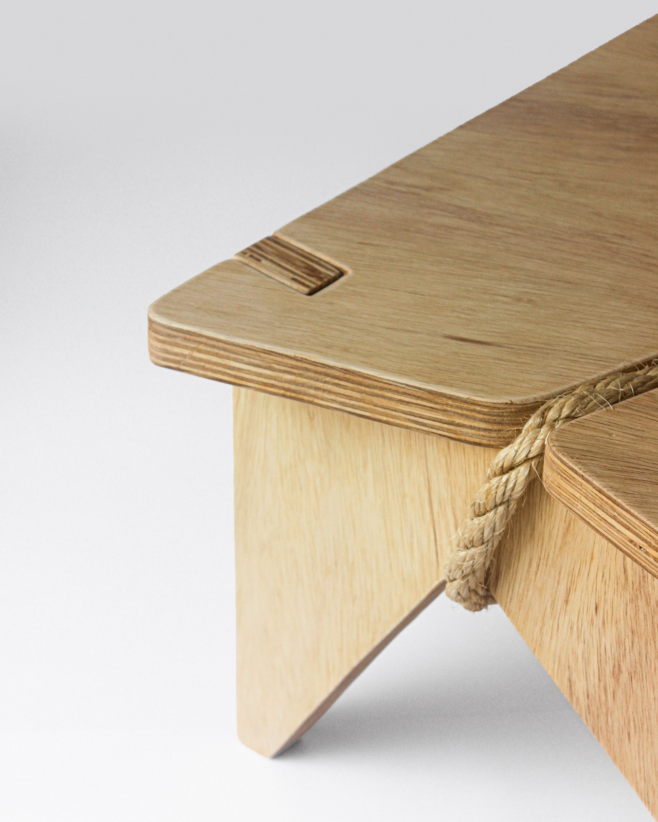
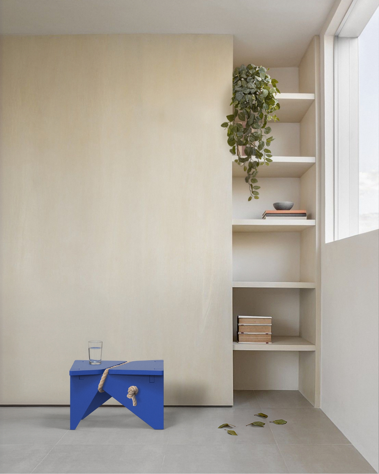
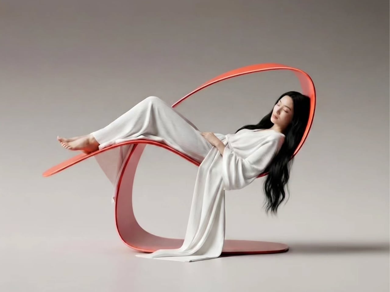
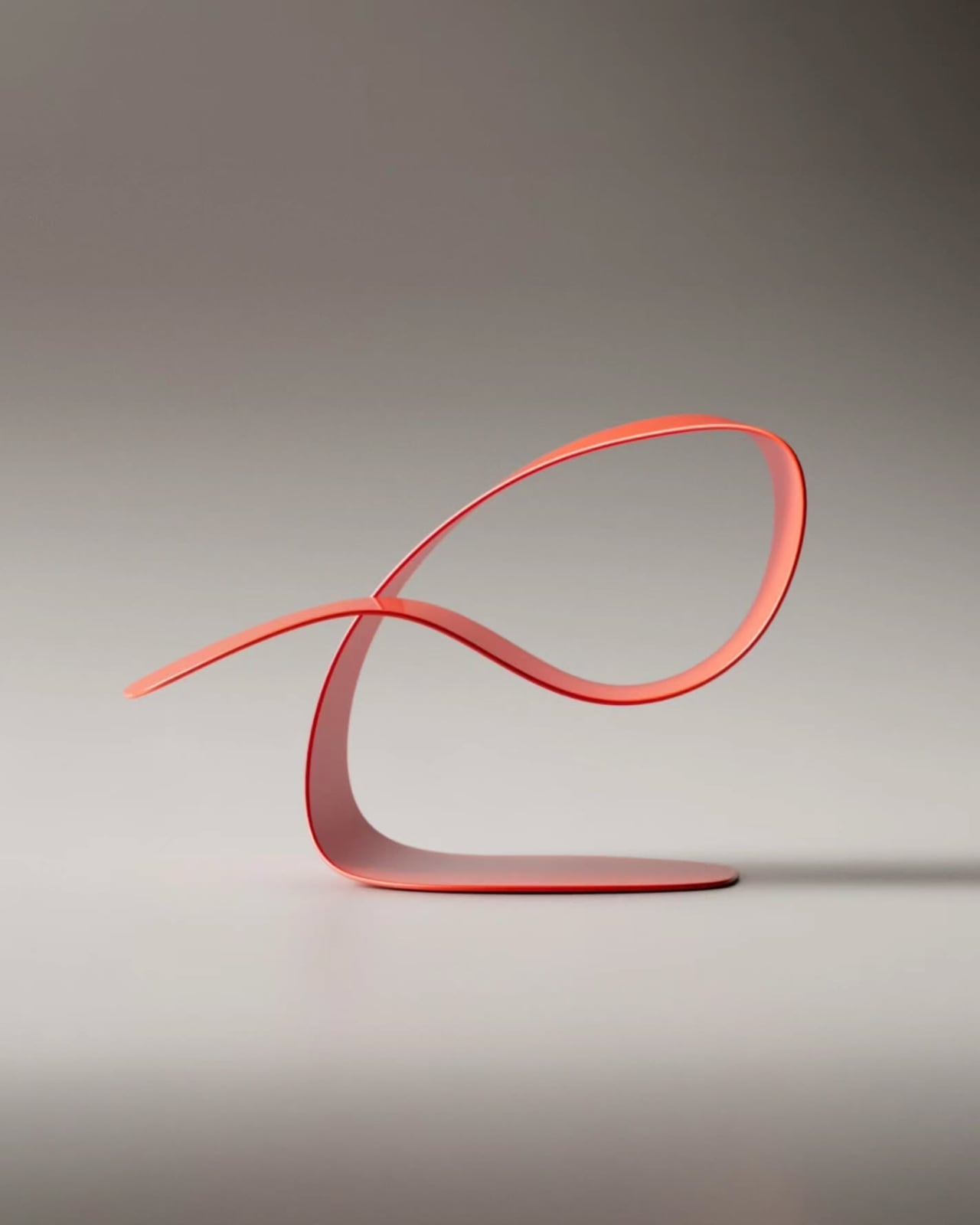
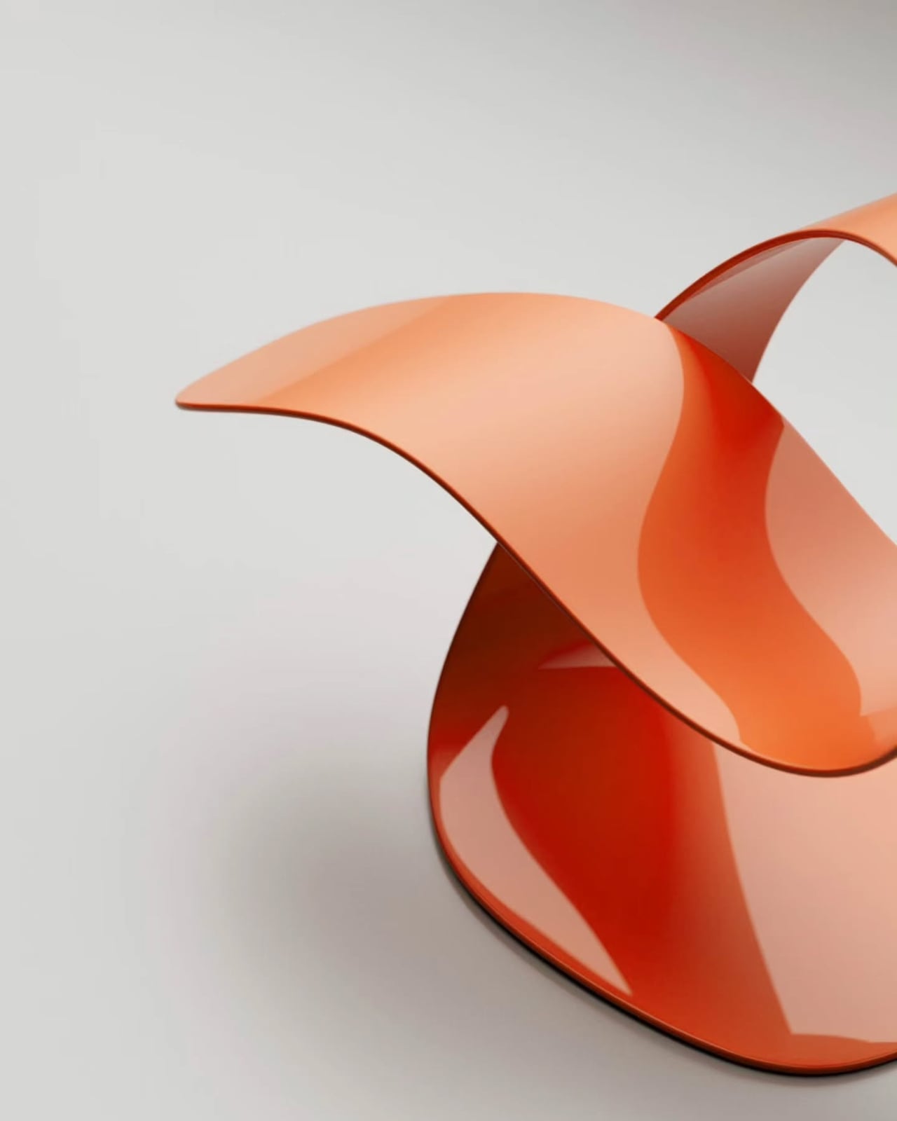
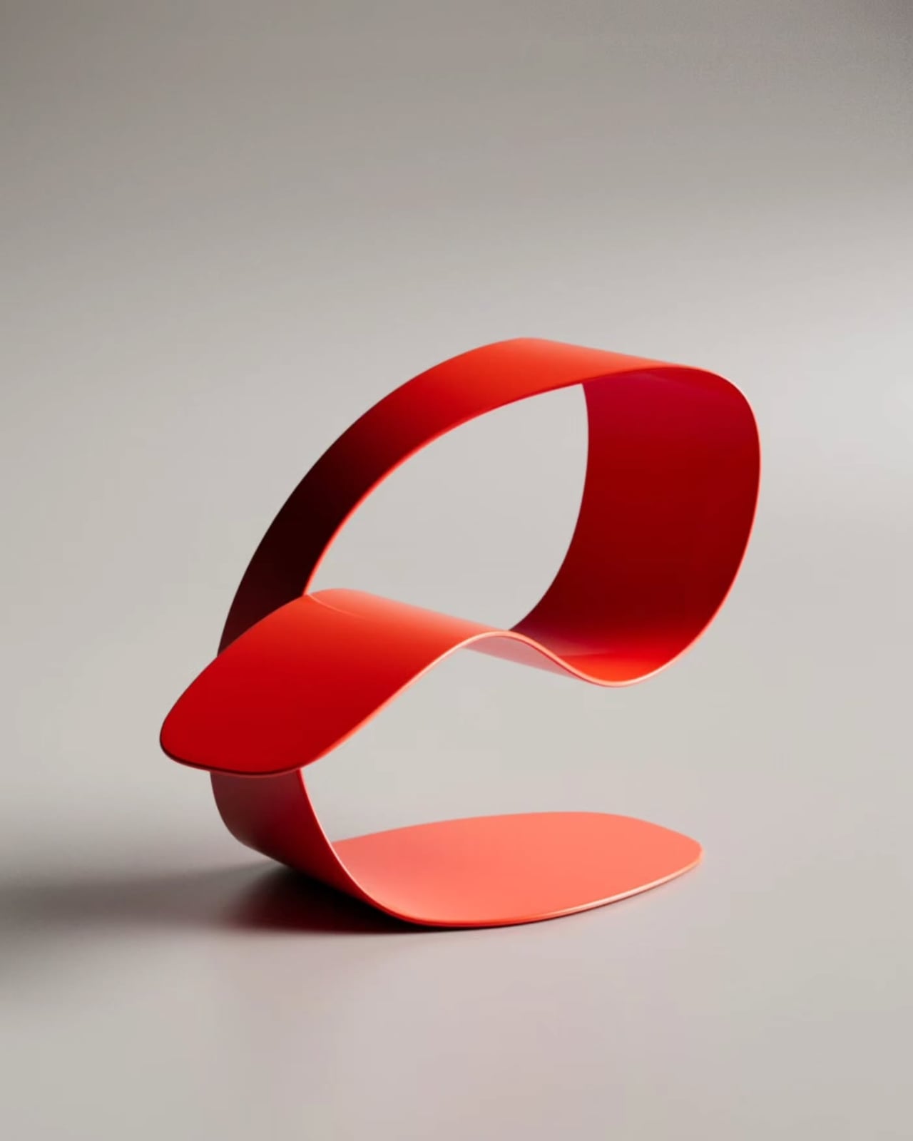
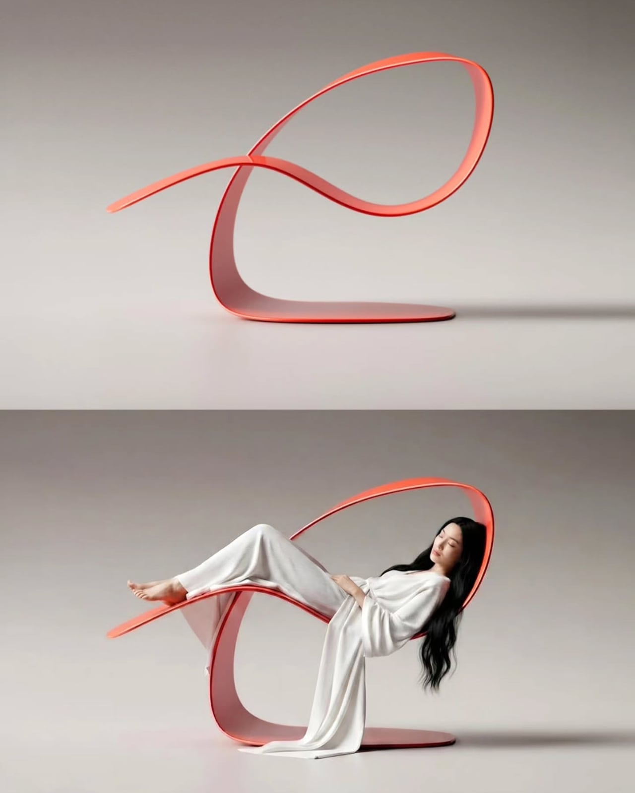
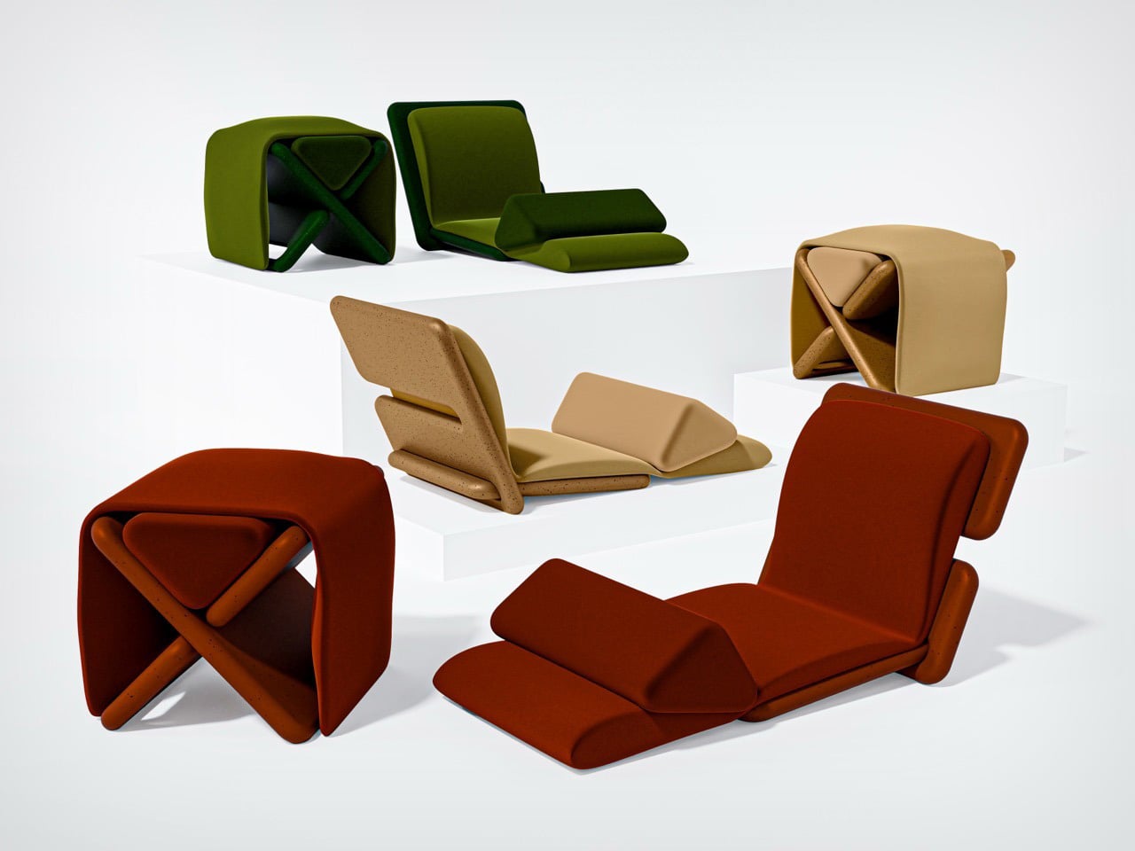
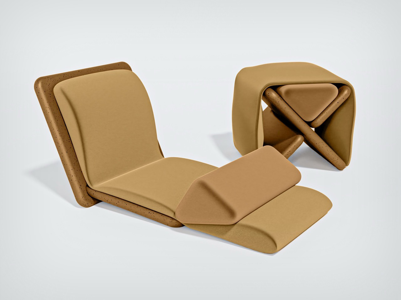
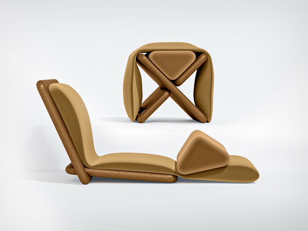
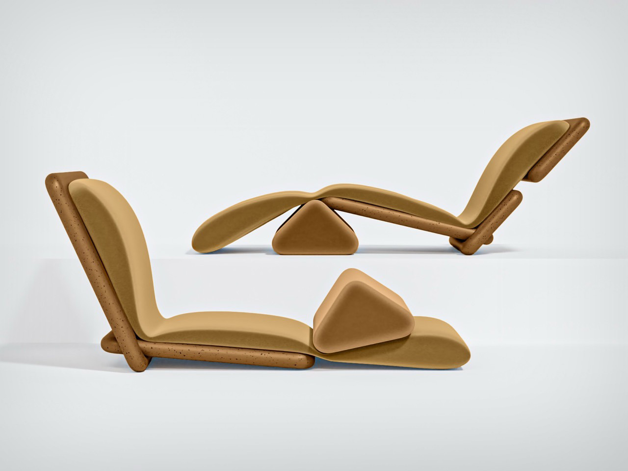
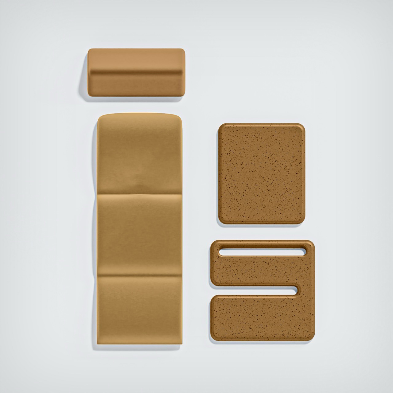
Playful furniture is reshaping everyday living, and the UMI Armchair by Rostislav Sorokovoy for Woo reflects this shift with ease. It moves beyond conventional seating, becoming an interactive object that sparks curiosity. Its bold, chunky form carries a soft, sculptural presence, giving it the character of a modern art piece. Designed to invite engagement, the chair encourages relaxed lounging and a more instinctive, almost childlike interaction.
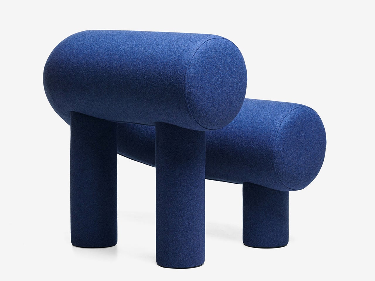
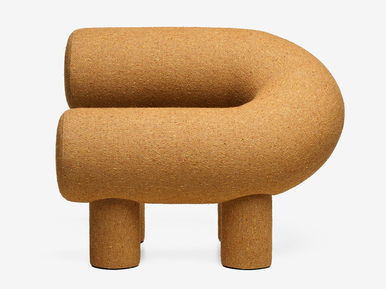
Its distinctive horseshoe shape is created using two cylindrical volumes, supported by four plush legs that provide both stability and visual charm. Constructed with a plywood frame, polyurethane foam, and textile upholstery, it delivers comfort alongside strong design appeal. While its scale may not suit compact interiors, it works effortlessly in larger spaces where its expressive form can stand out. Whether used alone or in pairs, it creates a seating arrangement that feels tactile, inviting, and visually dynamic.
2. Sculptural Light Design
Lighting has moved beyond pure function, evolving into something sculptural, immersive, and subtly performative. A fixture is no longer just a source of illumination as it becomes an object that encourages interaction. With hidden LEDs and responsive sensors, even the simple act of turning on a light feels more intentional, almost ritual-like.
The experience is defined by engagement. Some lamps require a physical gesture, like placing a glowing orb to activate them, while others shift form as they dim, echoing organic movement. When light is treated as a material to shape and experience, rather than just a utility, it transforms the mood of a space. Shadows gain depth, and dim corners turn into moments of intrigue, adding a layer of quiet wonder to everyday environments.
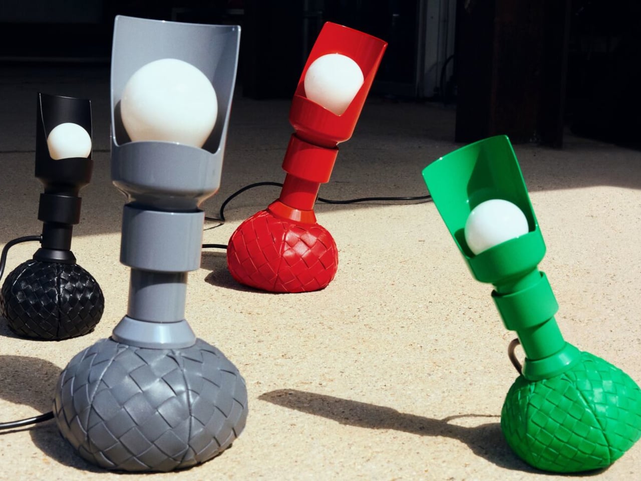
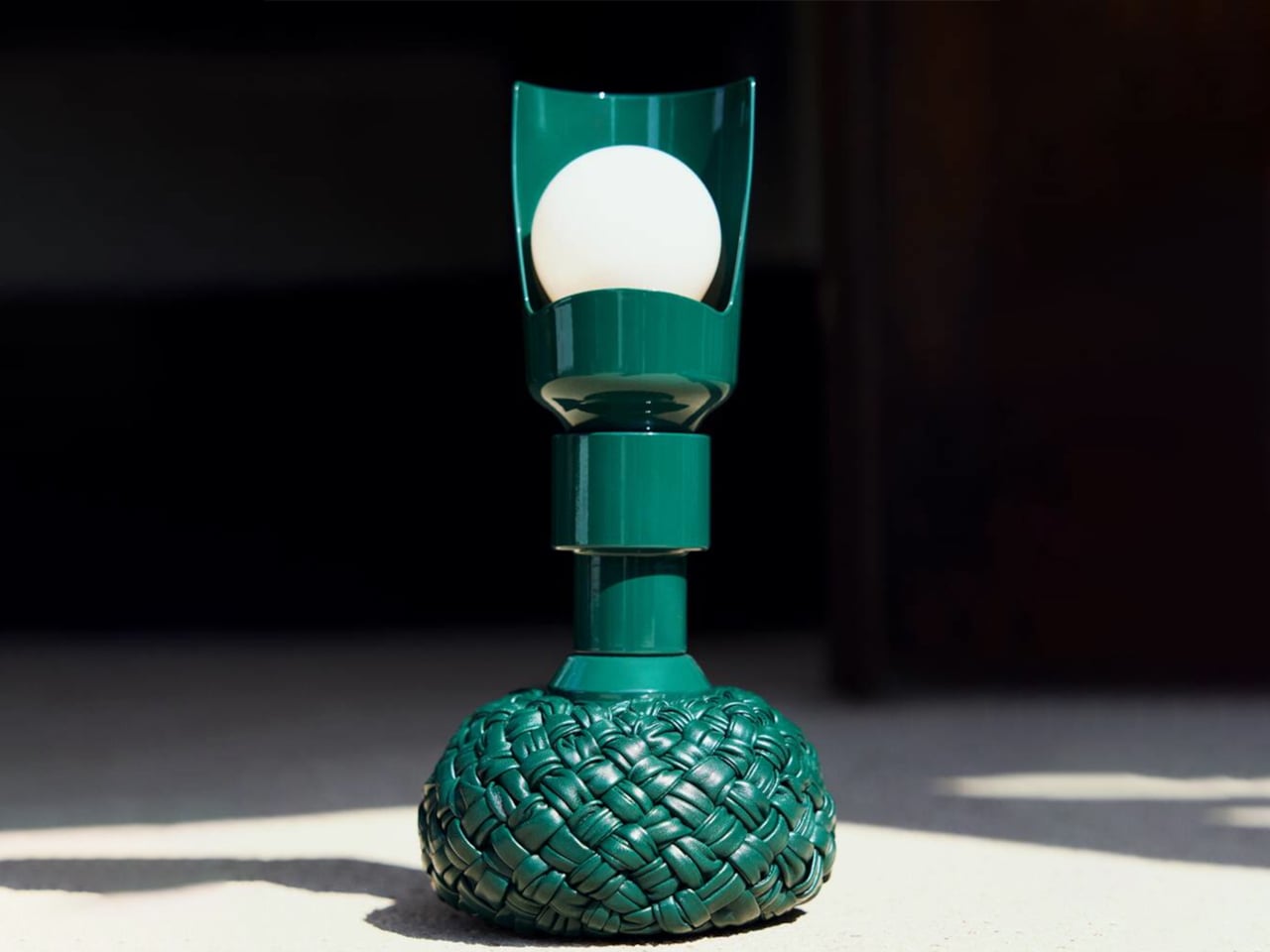
Lighting is often viewed as purely functional, designed to illuminate and enhance a space. Yet some designs move beyond utility, introducing interaction and character without feeling overly whimsical. The reimagined Model 600 by Bottega Veneta x Flos, created by Gino Sarfatti, captures this balance with ease. Its rounded base offers a soft, inviting presence, while the slender metal stem adds a refined contrast, resulting in a form that feels both approachable and sophisticated.
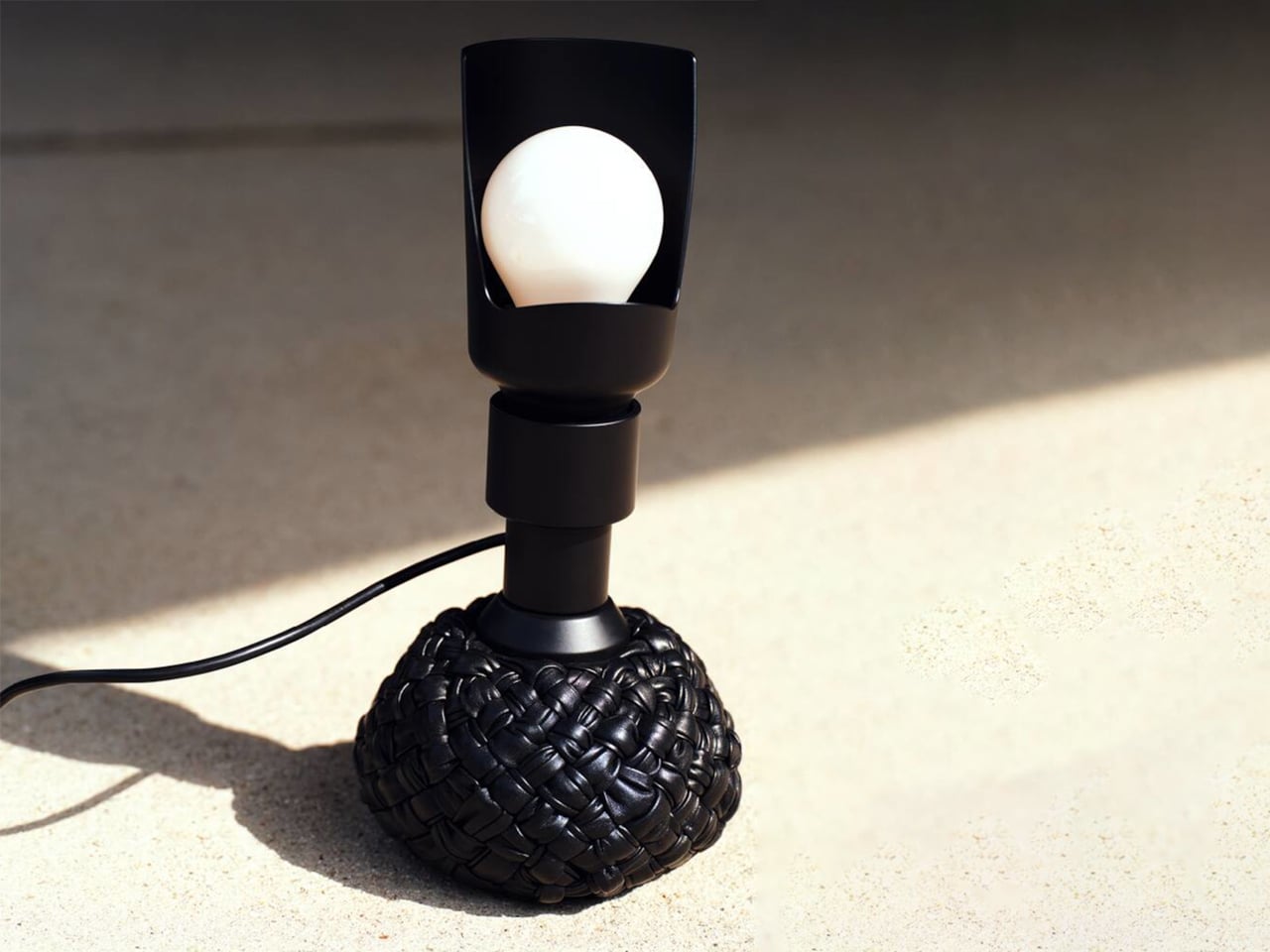
The original 1960s design embraced experimentation with a weighted leather base that could tilt without falling. The updated version retains this dynamic feature while introducing an interwoven leather texture that enhances its visual depth. Functionally versatile, it serves as a desk and floor lamp, with adjustable light direction through a curved reflector. Available in multiple sizes and colors, it merges structure with softness, creating a lighting piece that feels engaging, elegant, and enduring.
3. Playful Gadgets
Technology has long been defined by precision and restraint, often creating a sense of distance through its polished perfection. That gap is now narrowing, as a new generation of gadgets introduces softness, charm, and tactility. Drawing from “kawaii” influences and responsive design, these objects invite touch and emotional connection, from companion-like power banks to speakers that move and respond with sound.
The real shift is in how these devices are perceived and experienced. Tools once valued solely for efficiency are now designed as sensory interactions. A hard drive wrapped in soft silicone, yielding like a stress ball, blurs the line between utility and play. In this transition, technology becomes more personal and approachable, transforming everyday use into something warmer, lighter, and more human-centered.
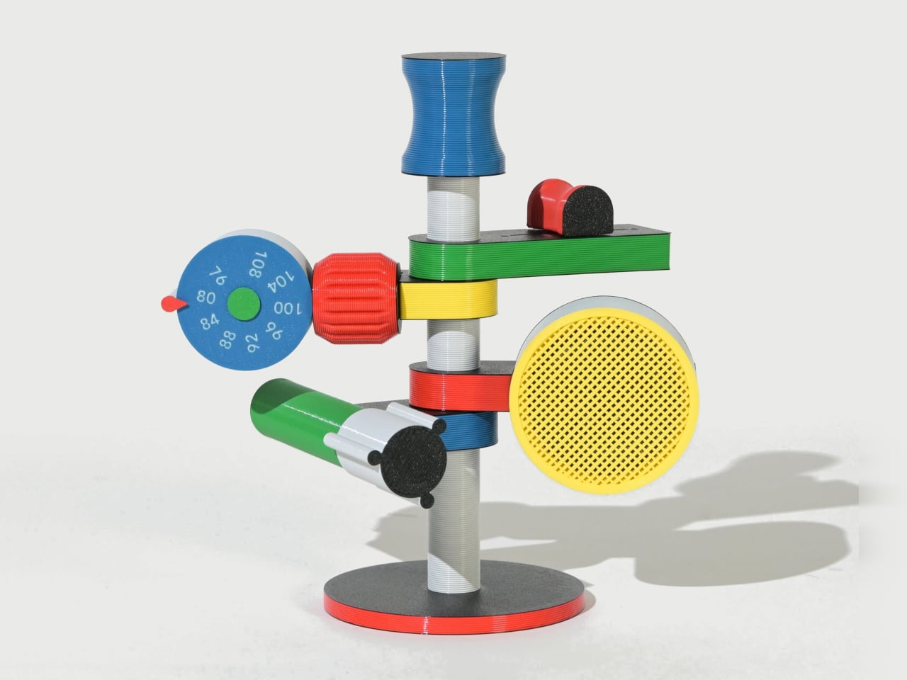
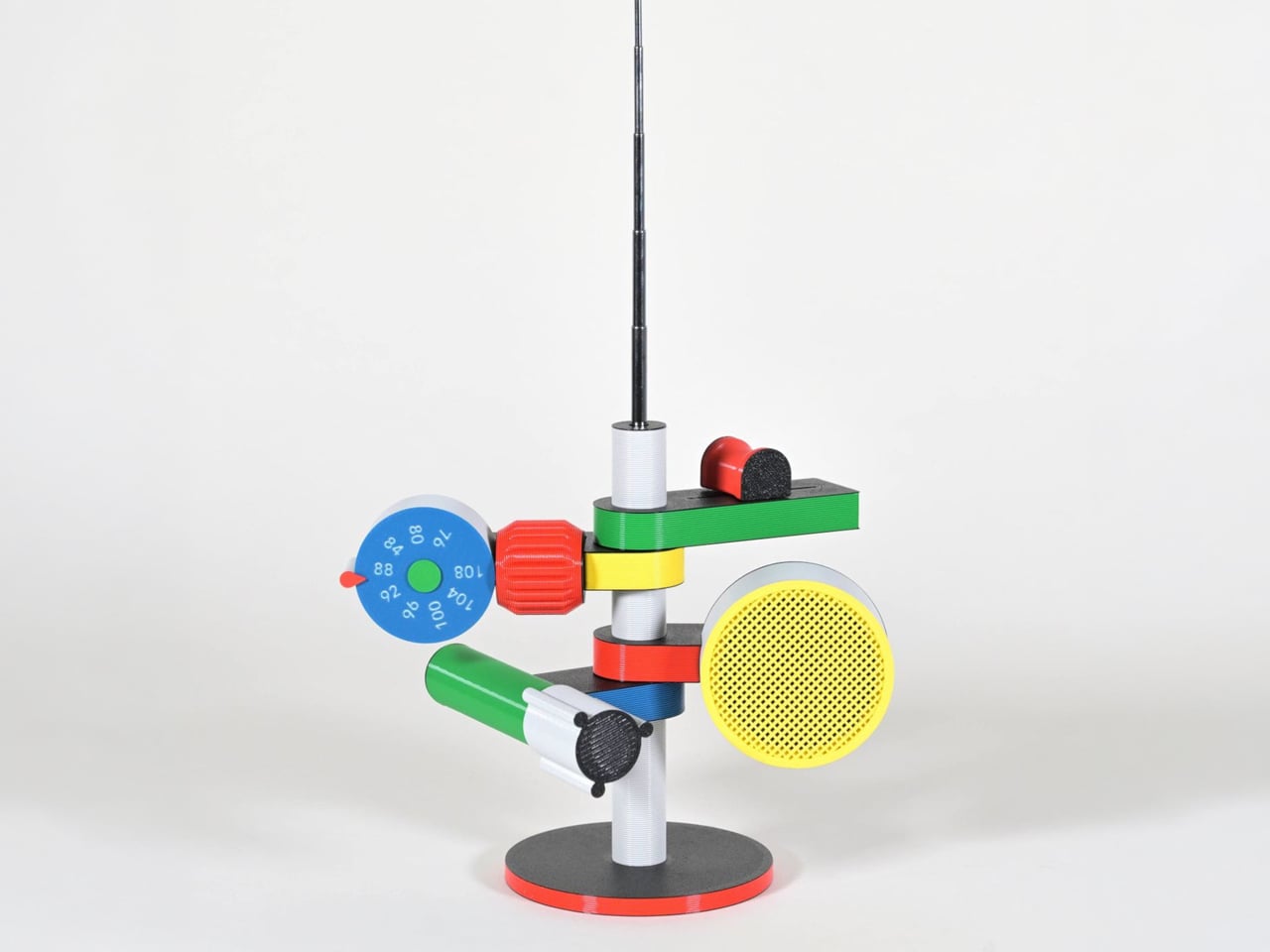
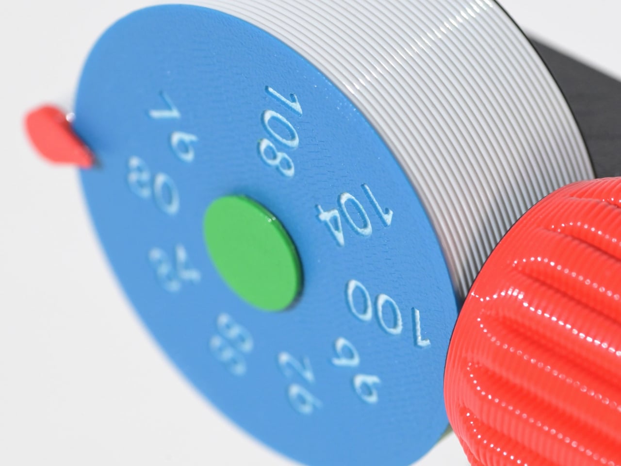
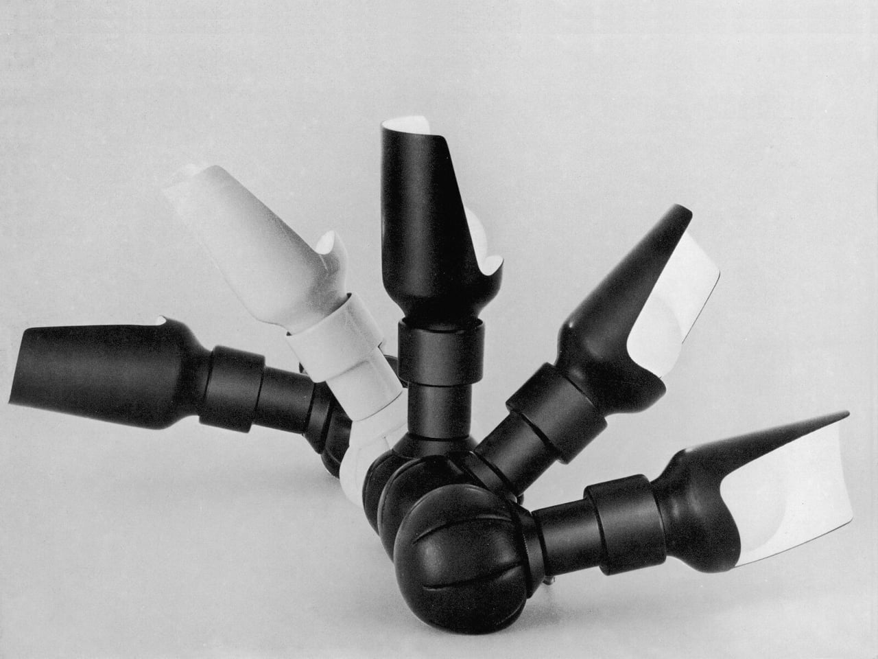
Some gadgets stand out not for precision or minimalism, but for their sense of character. The Anomalo FM radio by SHINKOGEISHA leans into this idea, presenting itself as an object that feels closer to a playful sculpture than a conventional device. With its bold colors and exaggerated form, it instantly grabs attention, sparking curiosity even before it’s switched on. The tall antenna anchors the design, while branching, limb-like extensions give it an almost animated presence.
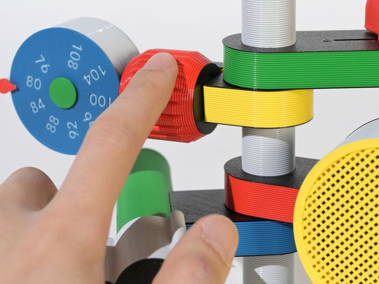
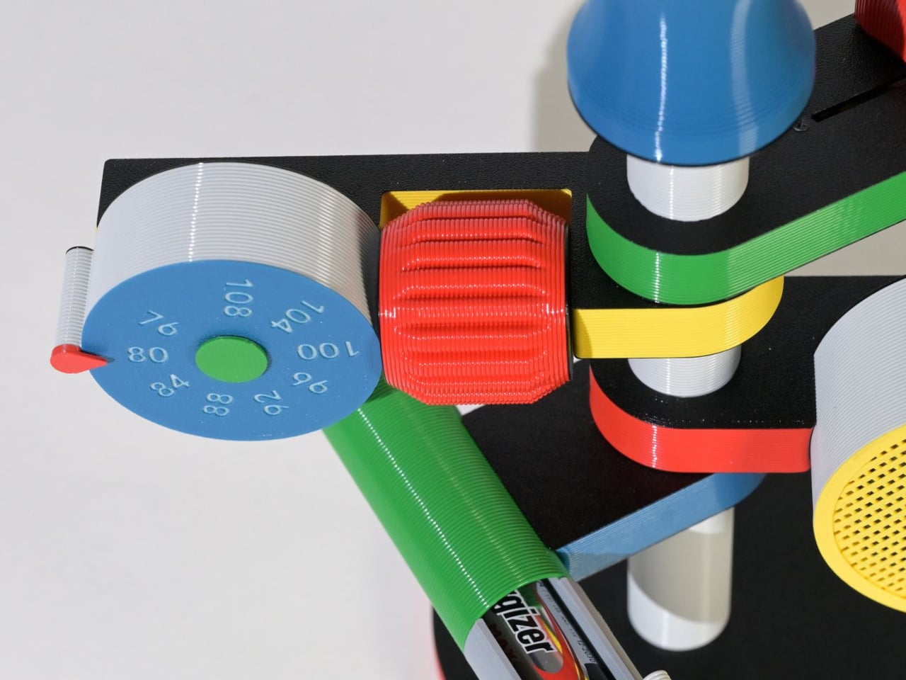
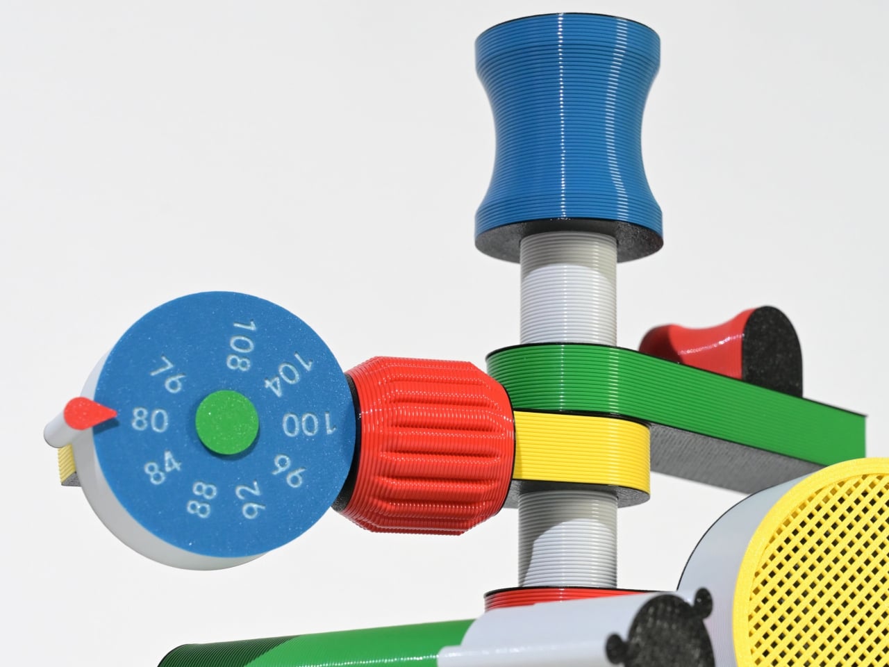
Each extension serves a clear function, creating a tactile, engaging experience. A roulette dial scans stations, a barrel controls volume, and a bold speaker projects sound, while exposed wiring enhances its expressive look. Made with PLA through digital fabrication, it favors creativity over polish, reflecting a shift toward more personal, experimental electronics.
4. The Joy of Stationery
Even in a digital world, the desk is becoming a space for quiet play. Stationery is no longer purely functional as it engages the senses. The focus has moved beyond simple aesthetics to how tools feel, respond, and enhance the act of making.
Erasable inks react to friction, washi tapes create layered compositions, and modular notebooks connect with magnetic precision. Writing no longer feels routine as it transforms into a small ritual, where thinking on paper feels intentional, creative, and deeply satisfying.
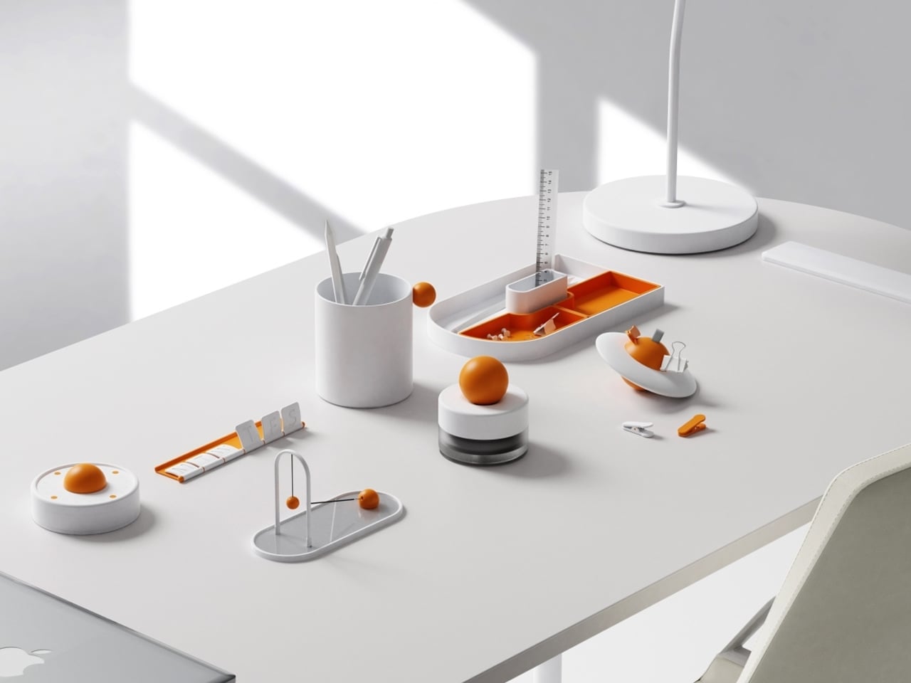
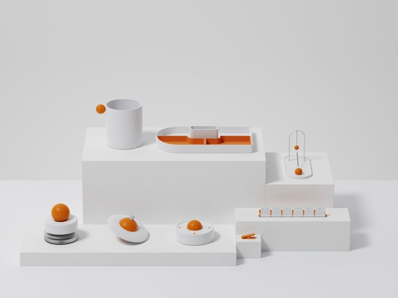
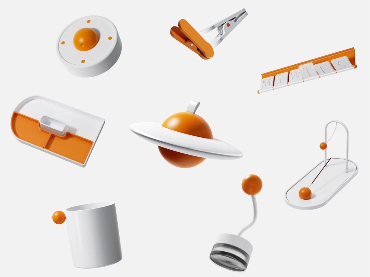
Objects on a desk quietly influence mood and thought throughout the day. While some environments lean toward minimal setups for clarity, others incorporate subtle moments of joy. The Madang collection by Jiung Yun, Siwook Lee, Jihyun Hong, and Junsu Lee brings these ideas together, balancing simplicity with a gentle sense of play inspired by traditional Korean childhood games.


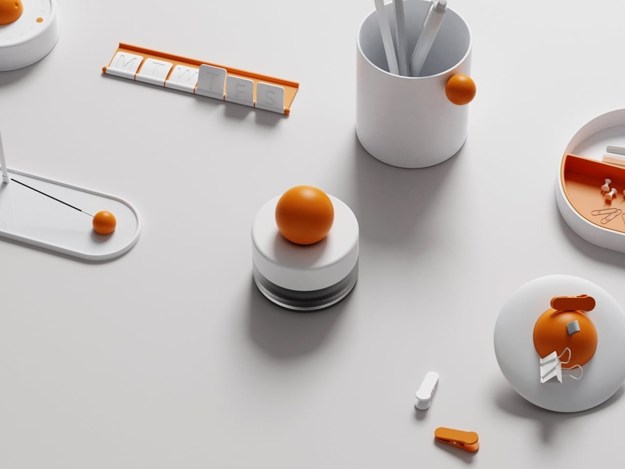
Each piece translates a familiar activity into a functional object. A wrist tool references tug-of-war, trays mirror playful ground layouts, and clips echo movement-based games, turning routine actions into engaging interactions. Even more abstract elements, like a circular timer or sculptural pen holder, carry narrative undertones. Finished in a soft white and orange palette, the collection remains visually calm yet expressive, adding character without clutter while making everyday work feel lighter and more thoughtful.
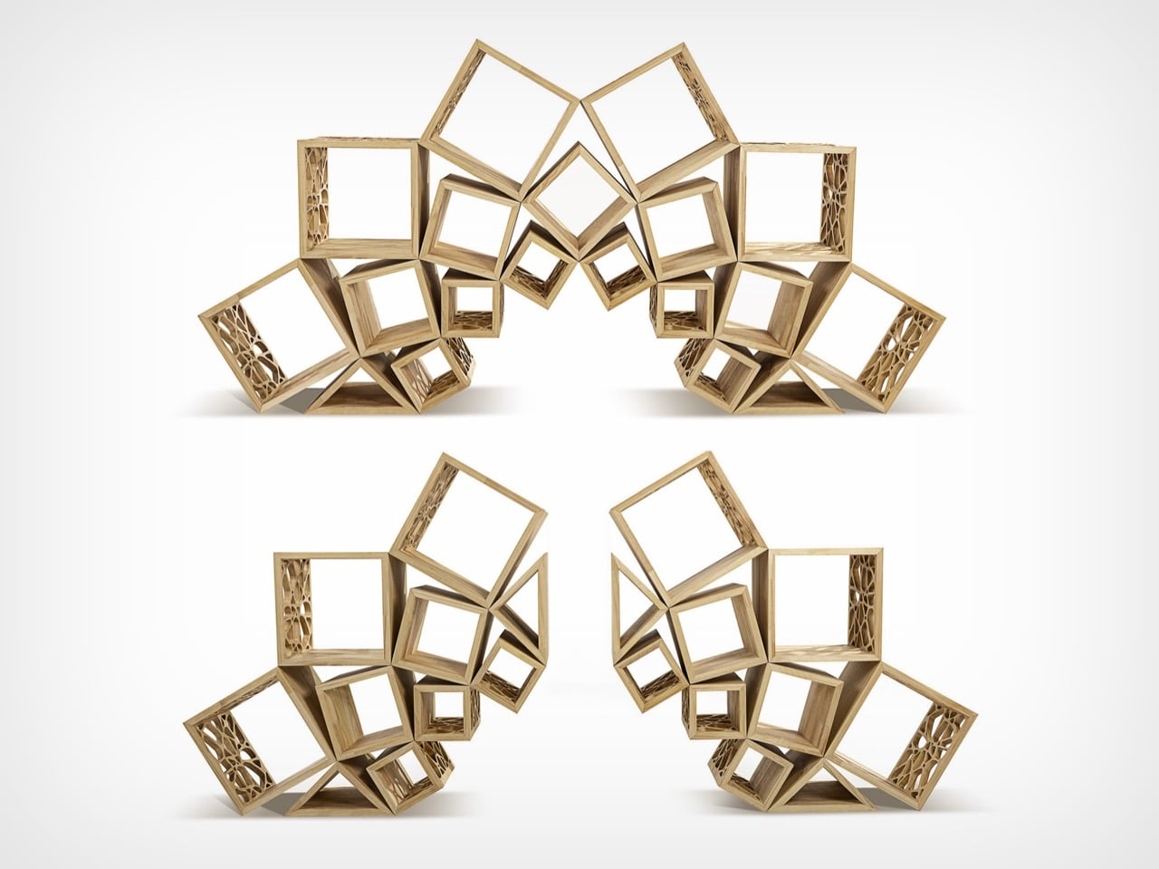
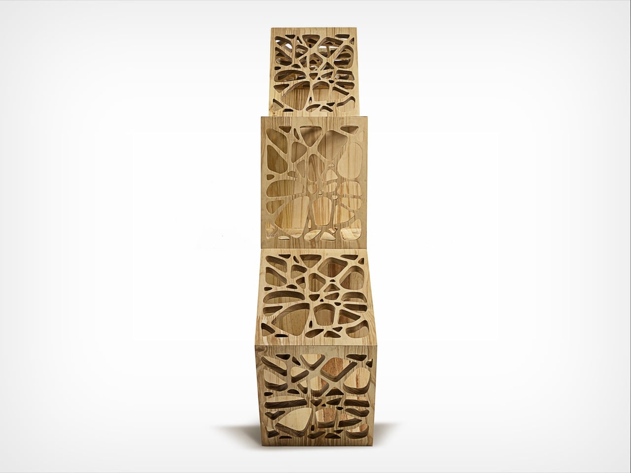
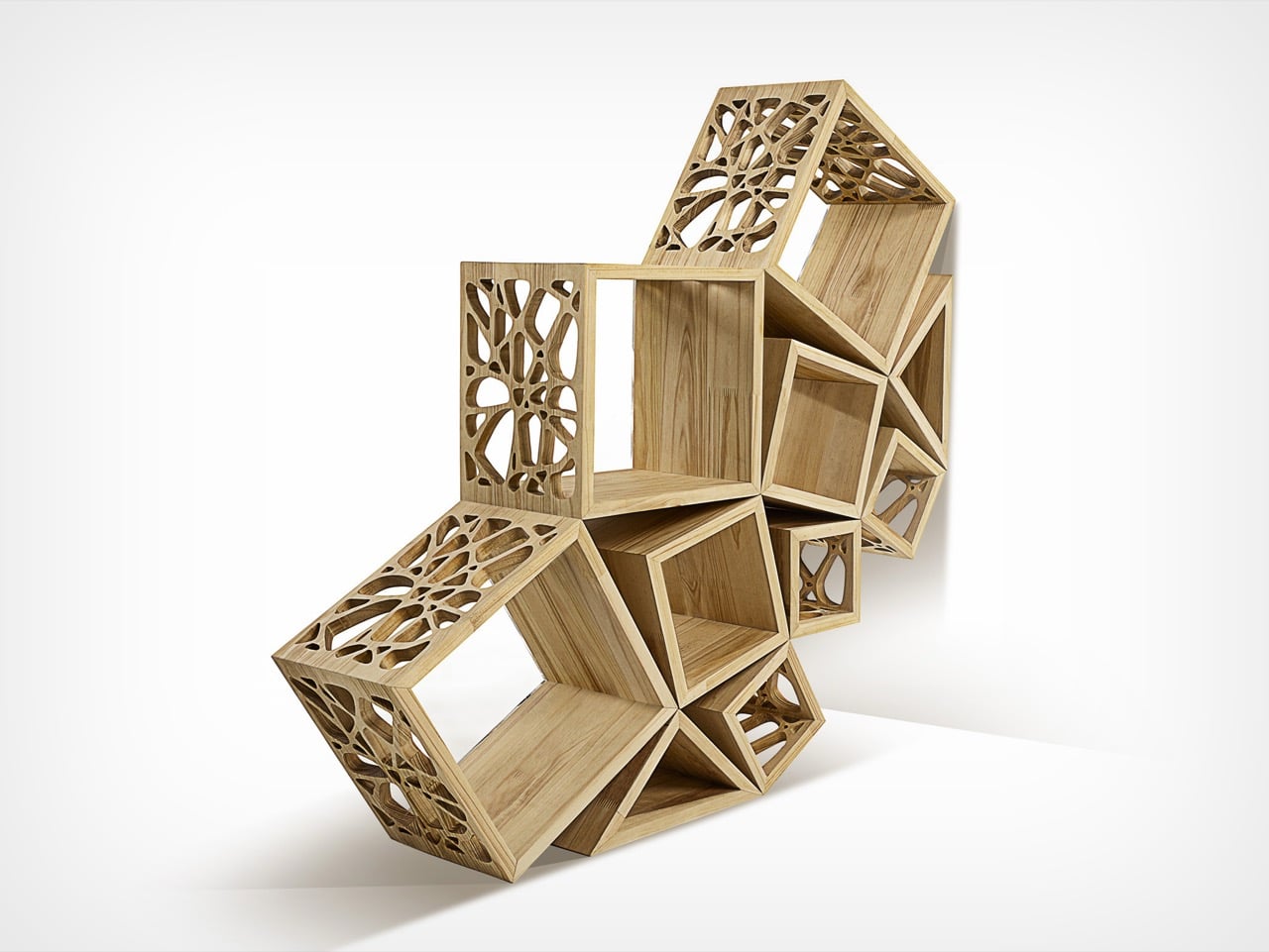
5. Joyful Building Design
Playful thinking is extending into architecture, reshaping how buildings and cities are experienced. The rigid “gray box” is gradually giving way to environments that encourage curiosity and movement. Designers are introducing spatial surprises into everyday settings, from slides integrated into workspaces to hidden gardens within facades and windows that break rigid grids to filter light in unexpected ways.
These interventions go beyond visual appeal. They disrupt routine and draw attention to the surroundings. A burst of color or an unconventional pathway shifts perception, encouraging awareness and engagement. As a result, architecture moves beyond shelter, becoming more interactive and expressive while transforming the built environment into something dynamic, human-centered, and quietly uplifting.
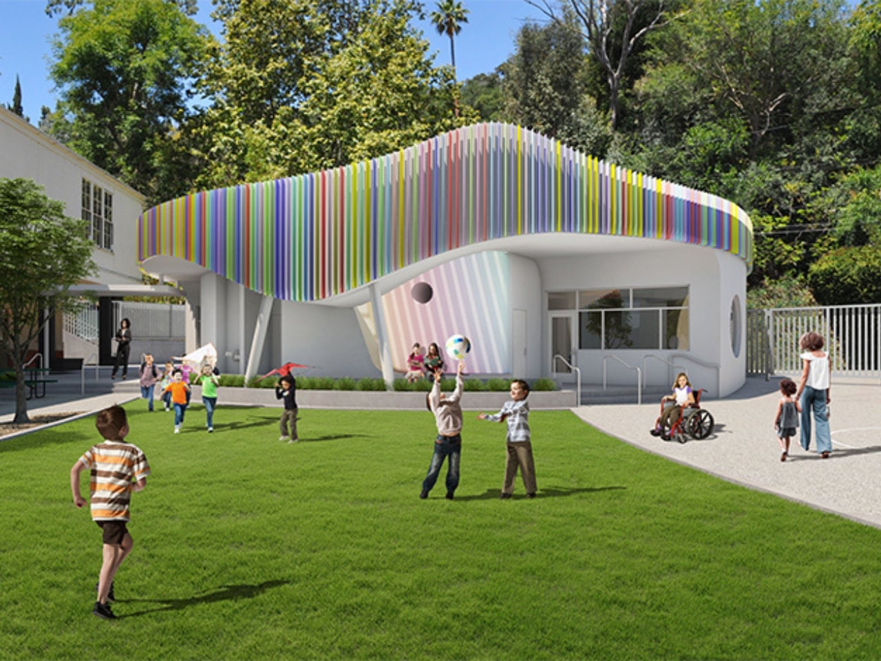
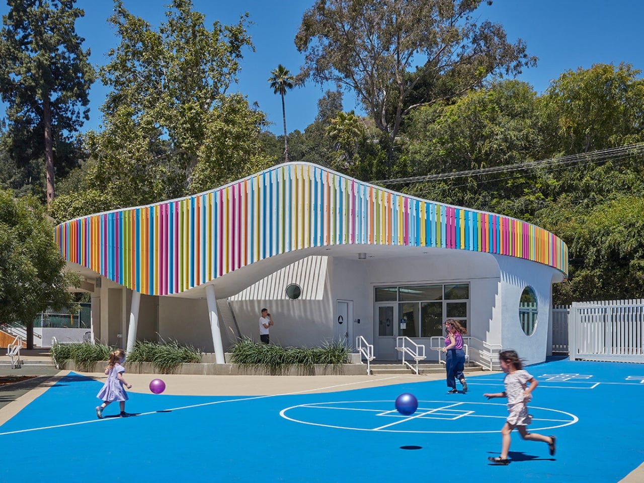
Most early school memories are tied to plain, boxy classrooms that felt more functional than inspiring. Spaces like these rarely encourage curiosity or creativity, making learning feel routine rather than exciting. In contrast, thoughtfully designed environments can shape how children engage with education. In Laurel Canyon, Los Angeles, Wonderland Elementary School’s new kindergarten building by John Friedman Alice Kimm Architects (JFAK) reimagines this experience through a design that feels open, engaging, and visually dynamic.
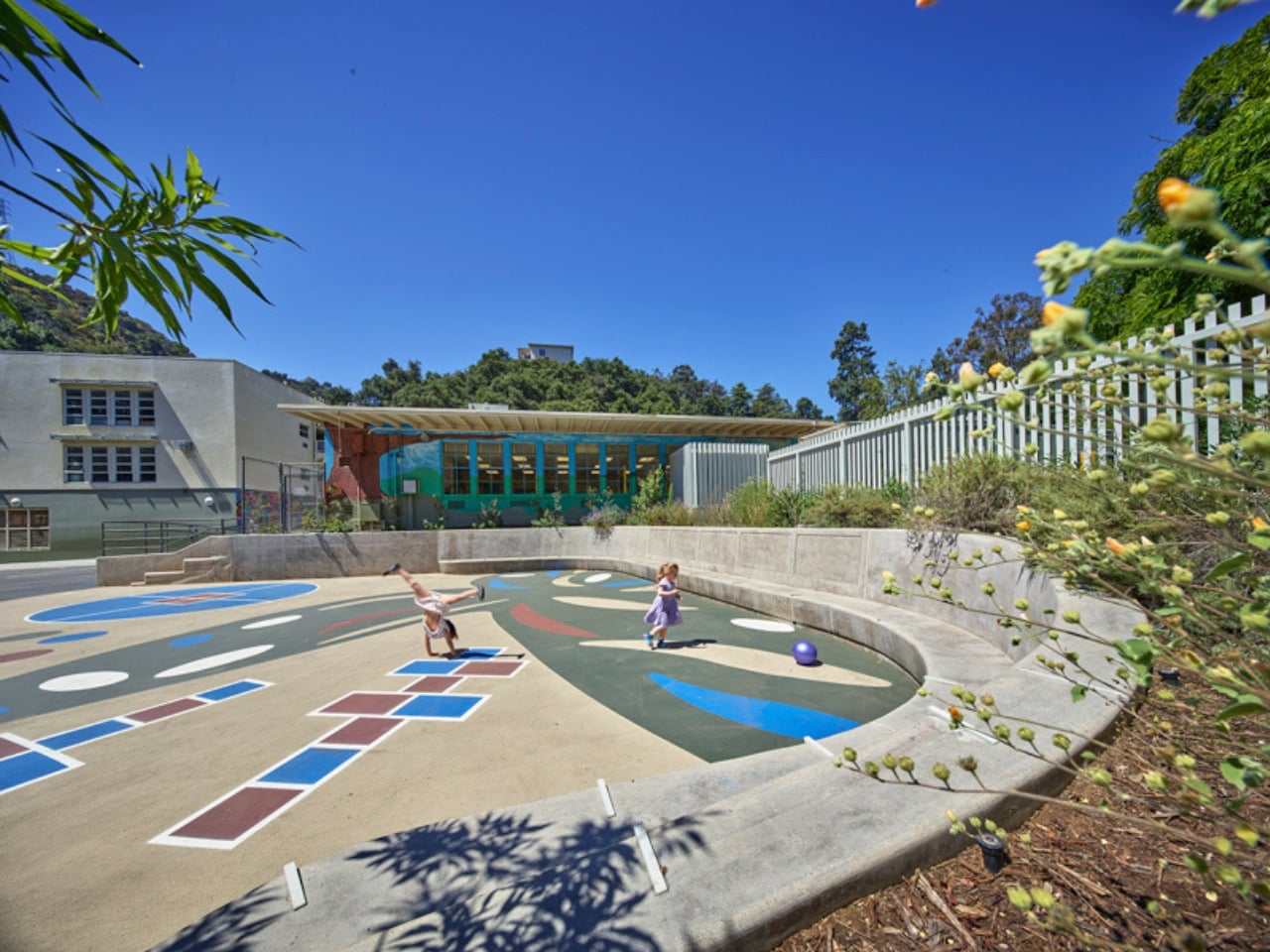
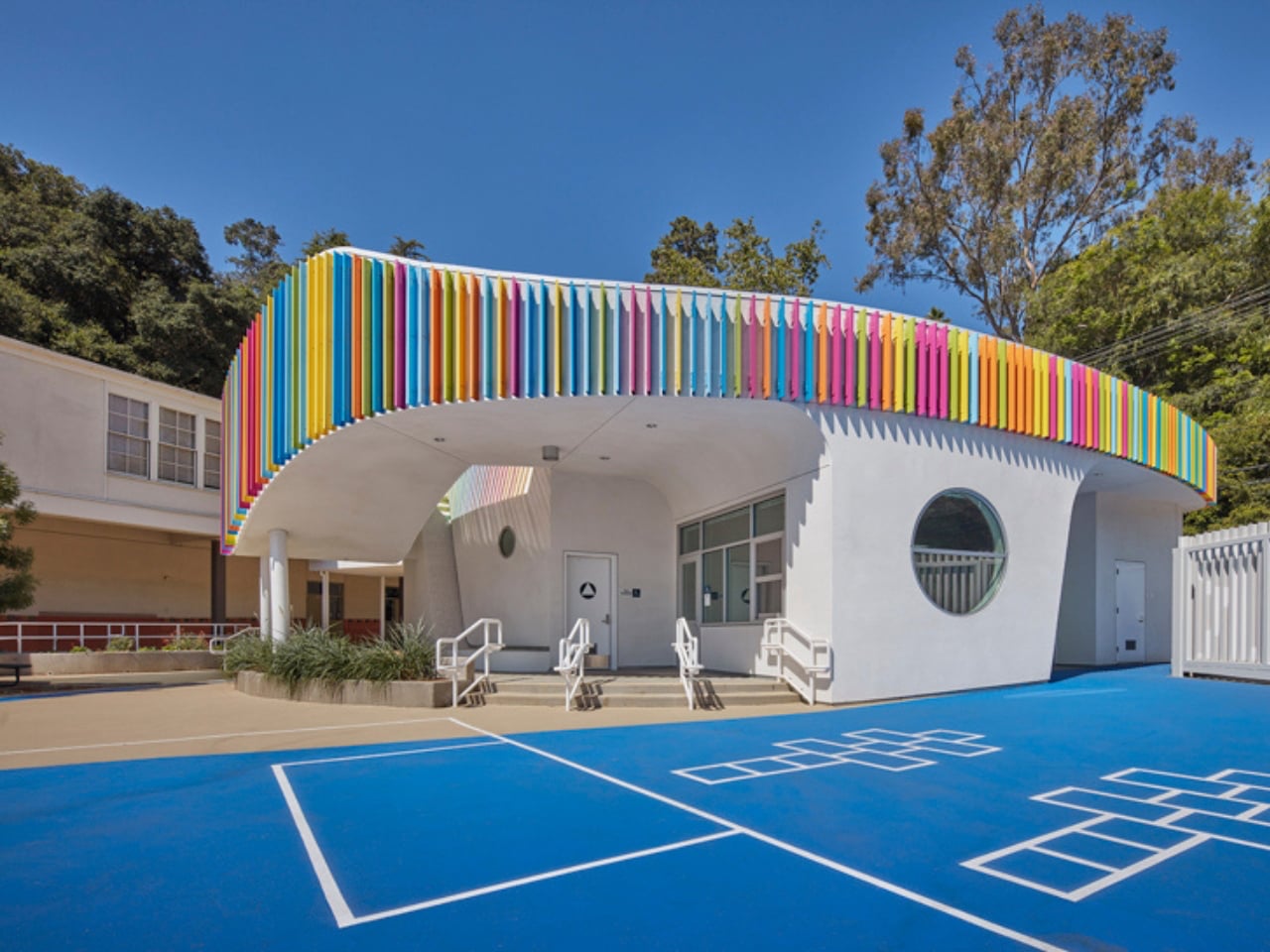
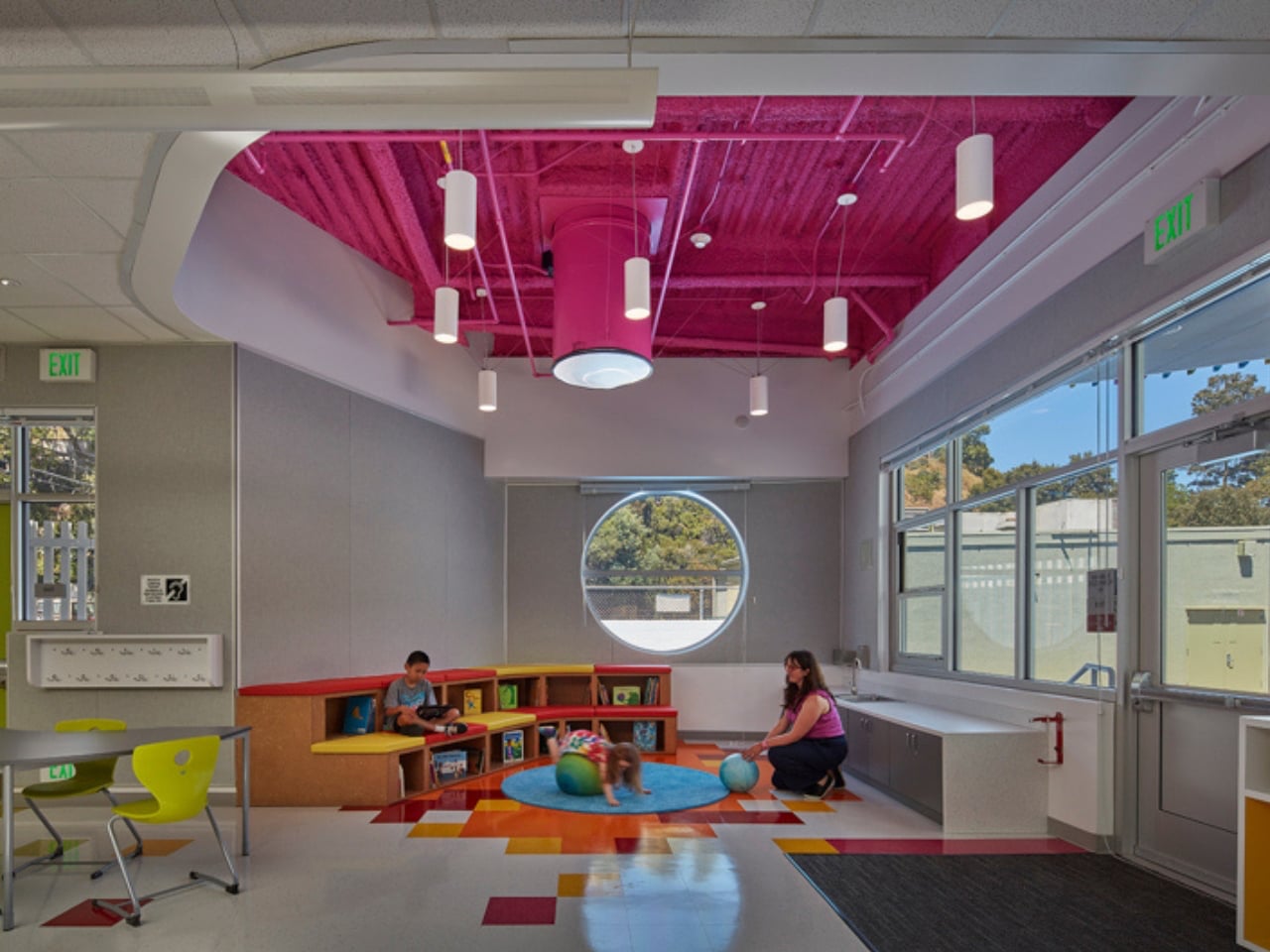
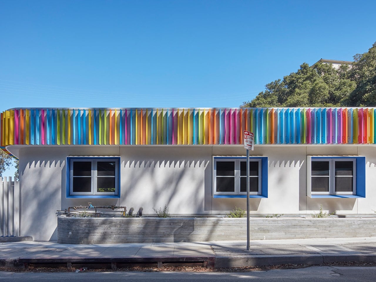
The structure stands out with its soft, curved form and colorful exterior louvers that filter sunlight into shifting patterns across the interiors. Inside, natural light pours in through skylights and solar tubes, creating a warm and welcoming atmosphere. Classrooms feature circular reading nooks, low seating, and accessible storage tailored for young learners. A semi-covered outdoor space encourages interaction and play, while exposed ceilings reveal structural elements, sparking curiosity. Designed with sustainability in mind, the building blends function with imagination, turning everyday learning into a more engaging and enriching experience.
Everyday objects still hold the power to surprise. When play enters function, design softens decision fatigue and digital burnout. Objects with wit and warmth transform spaces, turning routine into experience and making daily life feel more engaging, expressive, and alive.
The post These 5 Playful Everyday Objects Were Designed to Make You Feel Like a Kid Again first appeared on Yanko Design.