Italy is probing Apple over iCloud services like iPhone backups
Apple is being investigated by the EU again, this time over its iCloud service.
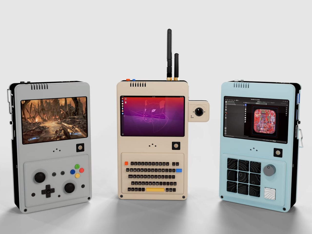
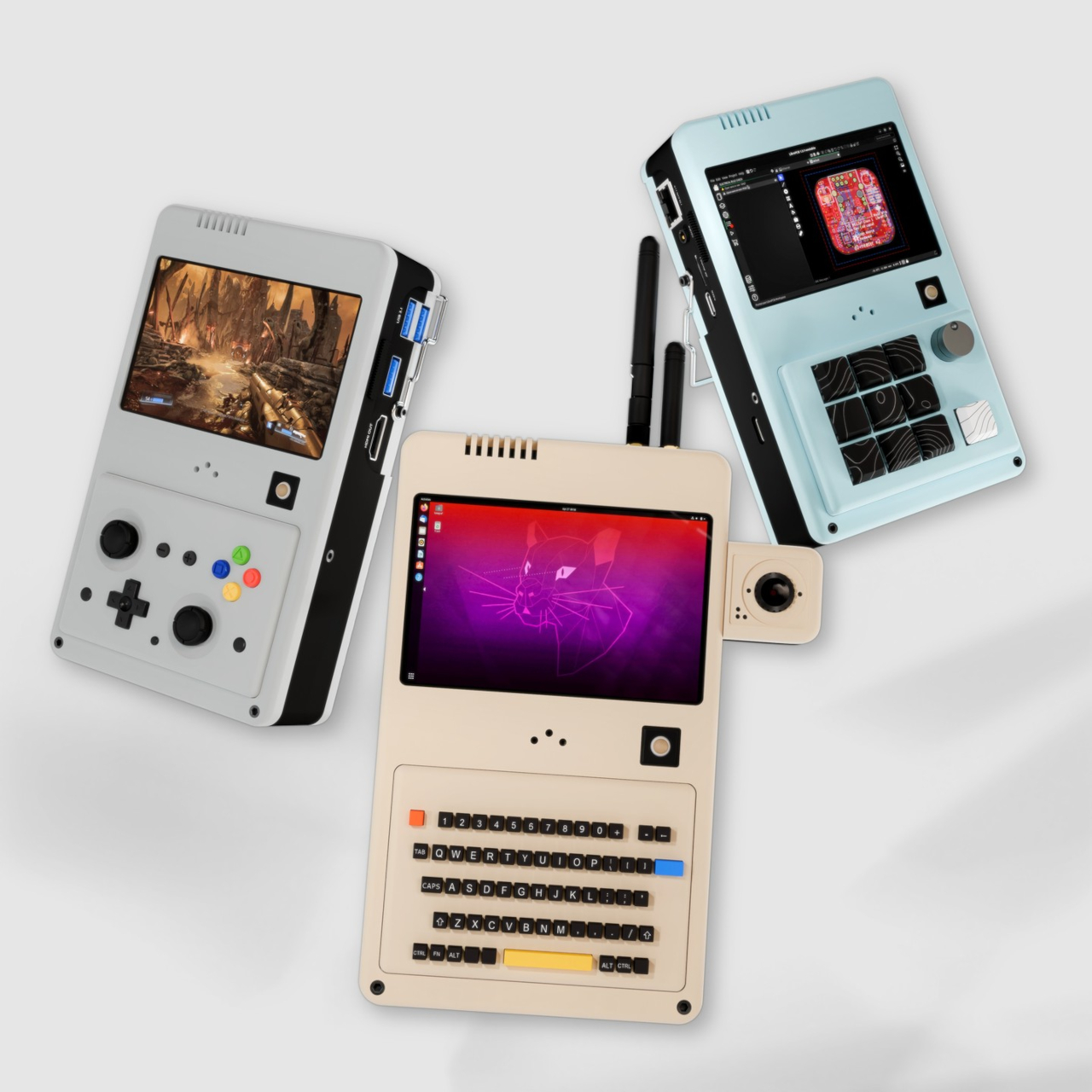
The handheld PC market has gotten surprisingly competitive in recent years. Devices like the Steam Deck and ROG Ally have proven that people genuinely want powerful computers in their pockets, but they’ve all settled into roughly the same formula: a fixed gamepad layout and a fixed identity as gaming devices. Getting any serious work done on them usually means plugging in a keyboard and calling it a compromise.
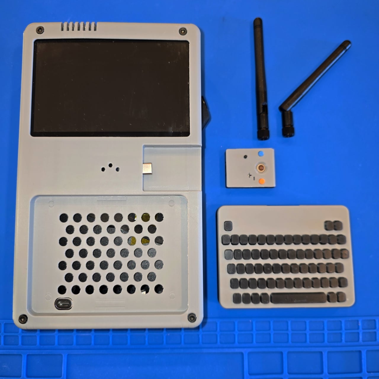
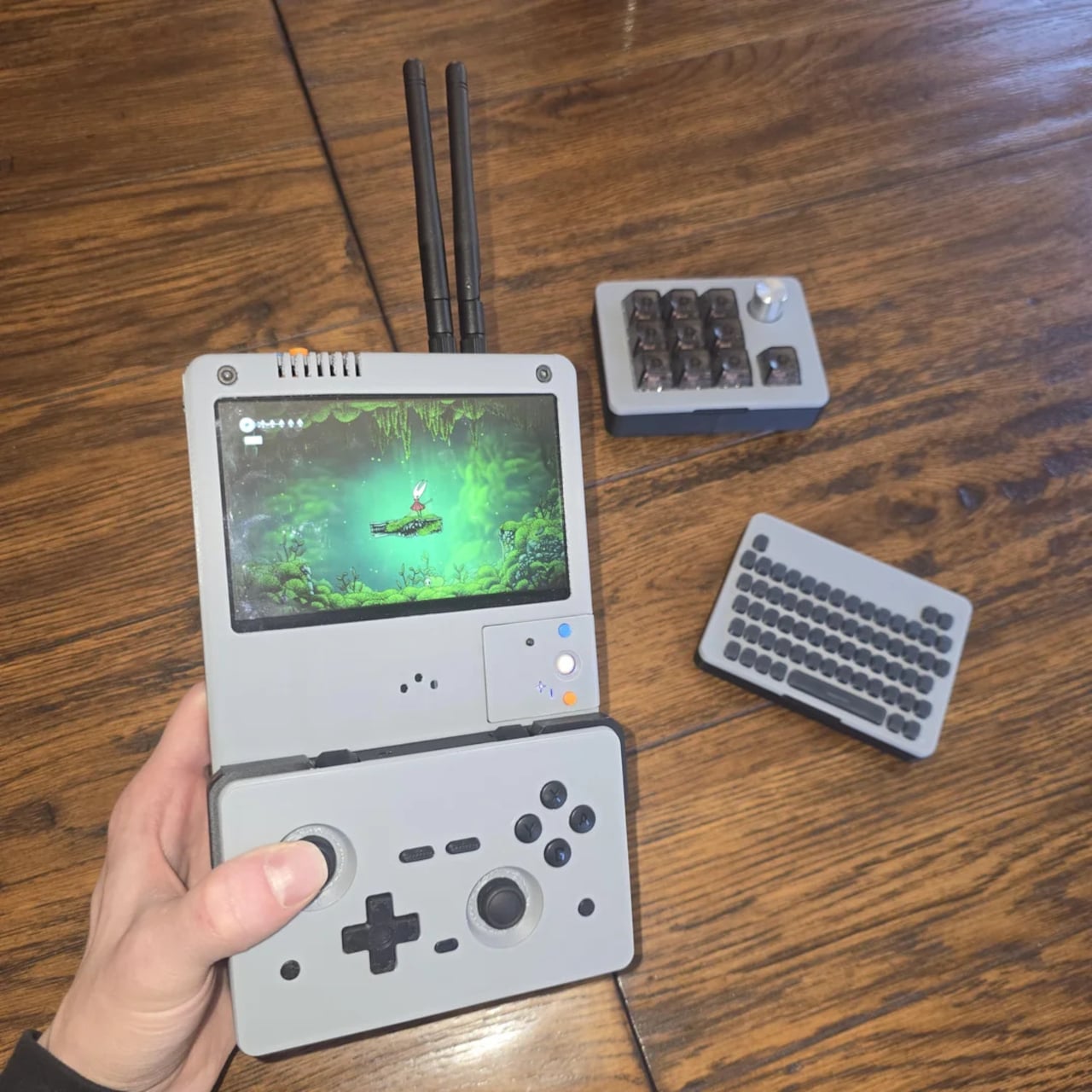
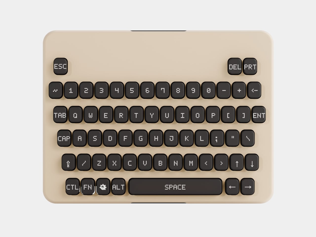
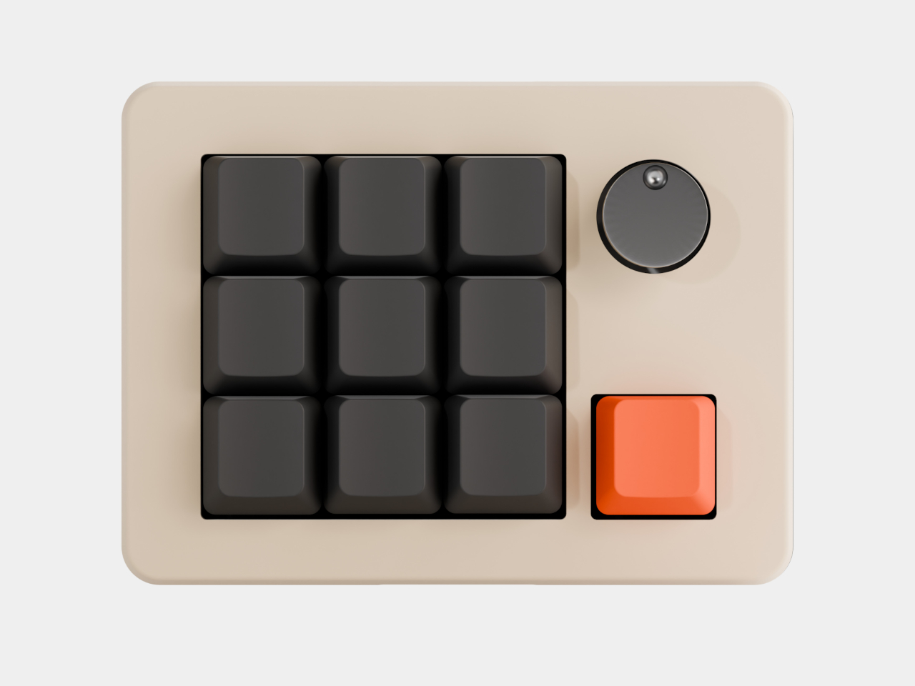
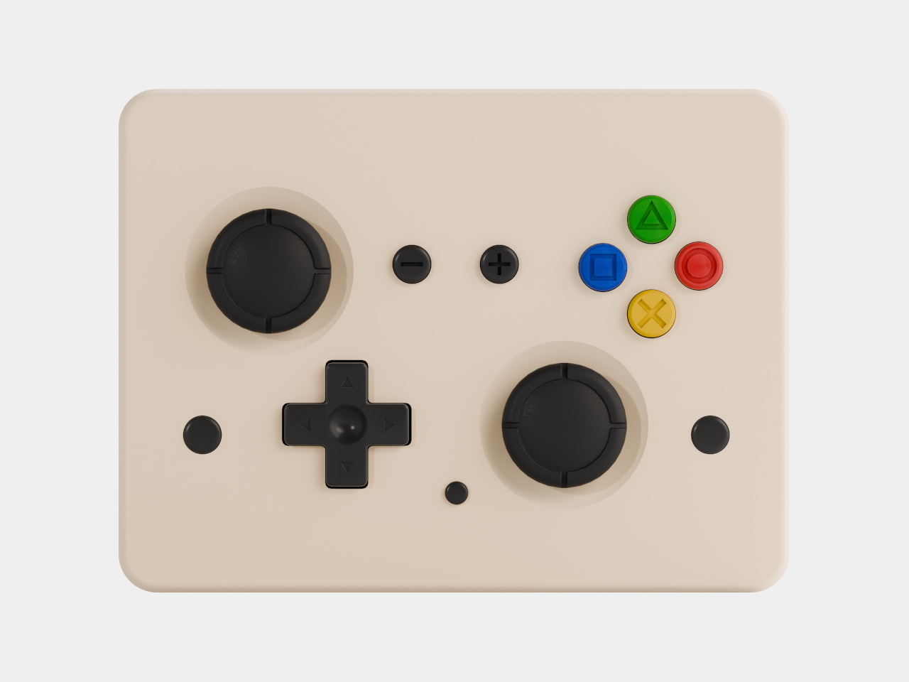
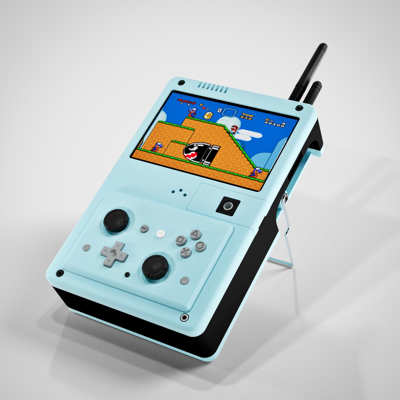
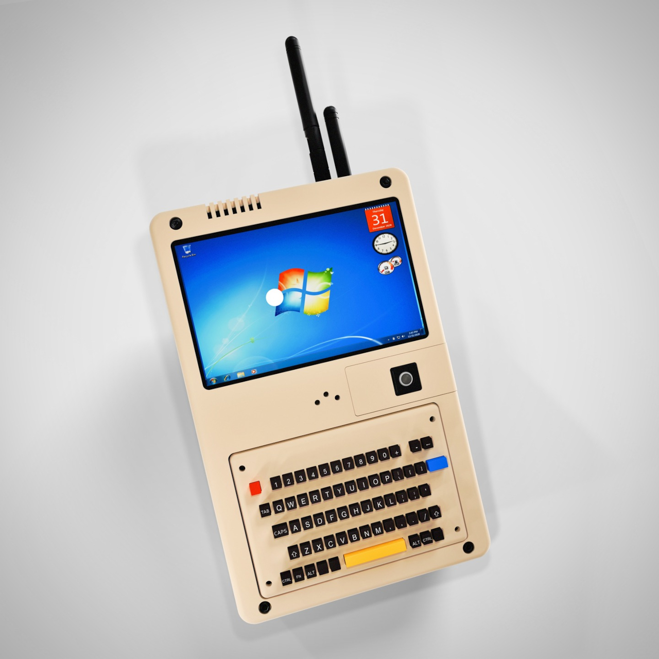
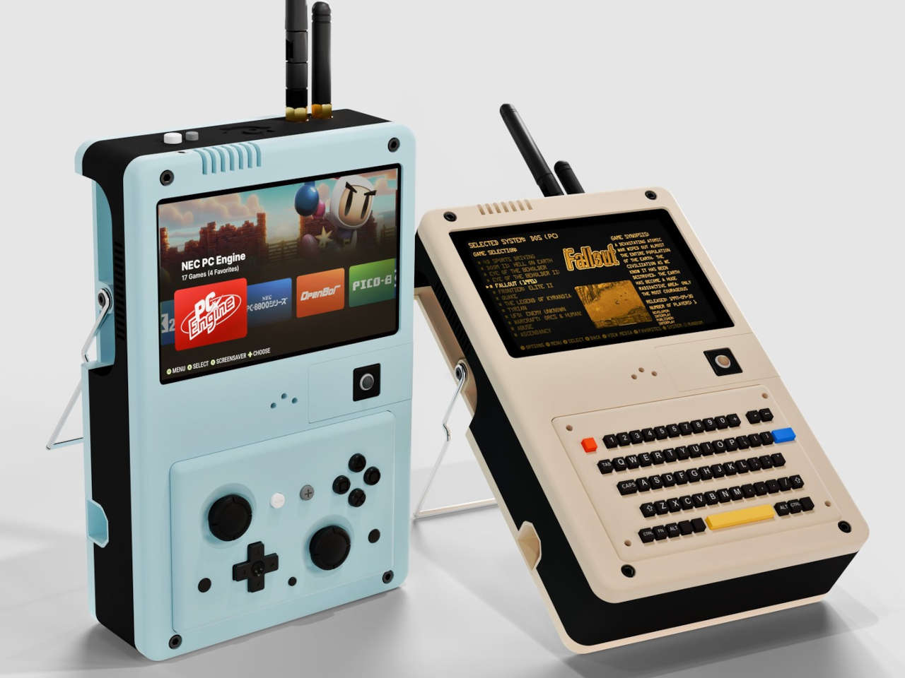
The CG Deck takes a different approach. Rather than locking itself into one form factor, it’s built around swappable input modules that let you physically change what kind of device it is, depending on what you need it to do. Snap on the gamepad for gaming, switch to the 64-key keyboard for writing, or reach for the 11-key rotary knob module when precision matters most.
Designer: Mogozen

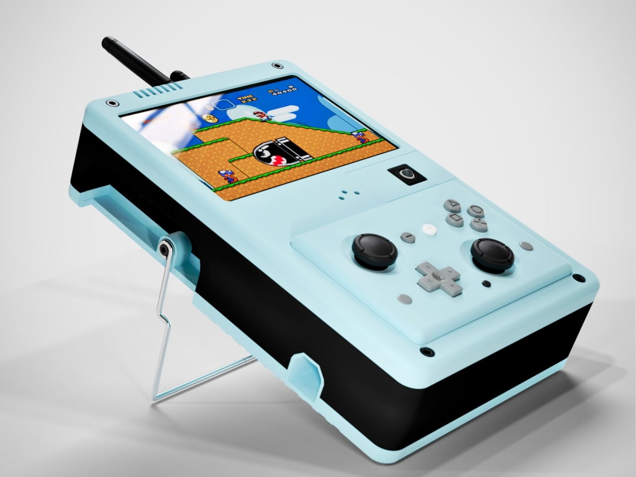
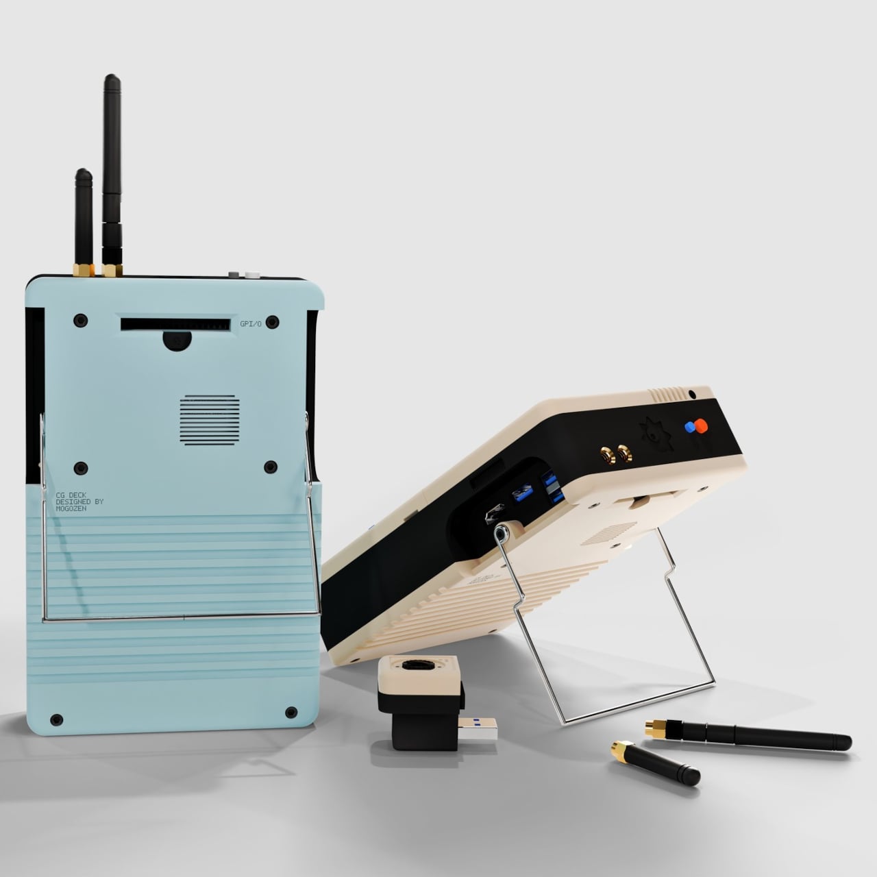
The module system is split into two types of slots, primary and secondary, which accept different kinds of attachments. The primary slot handles the bigger input options, like the gamepad controller, keyboard, or knob module. The secondary slot is where something like a trackball mouse module goes. Over 30 additional modules are already in development, opening the door to configurations nobody has really tried before.
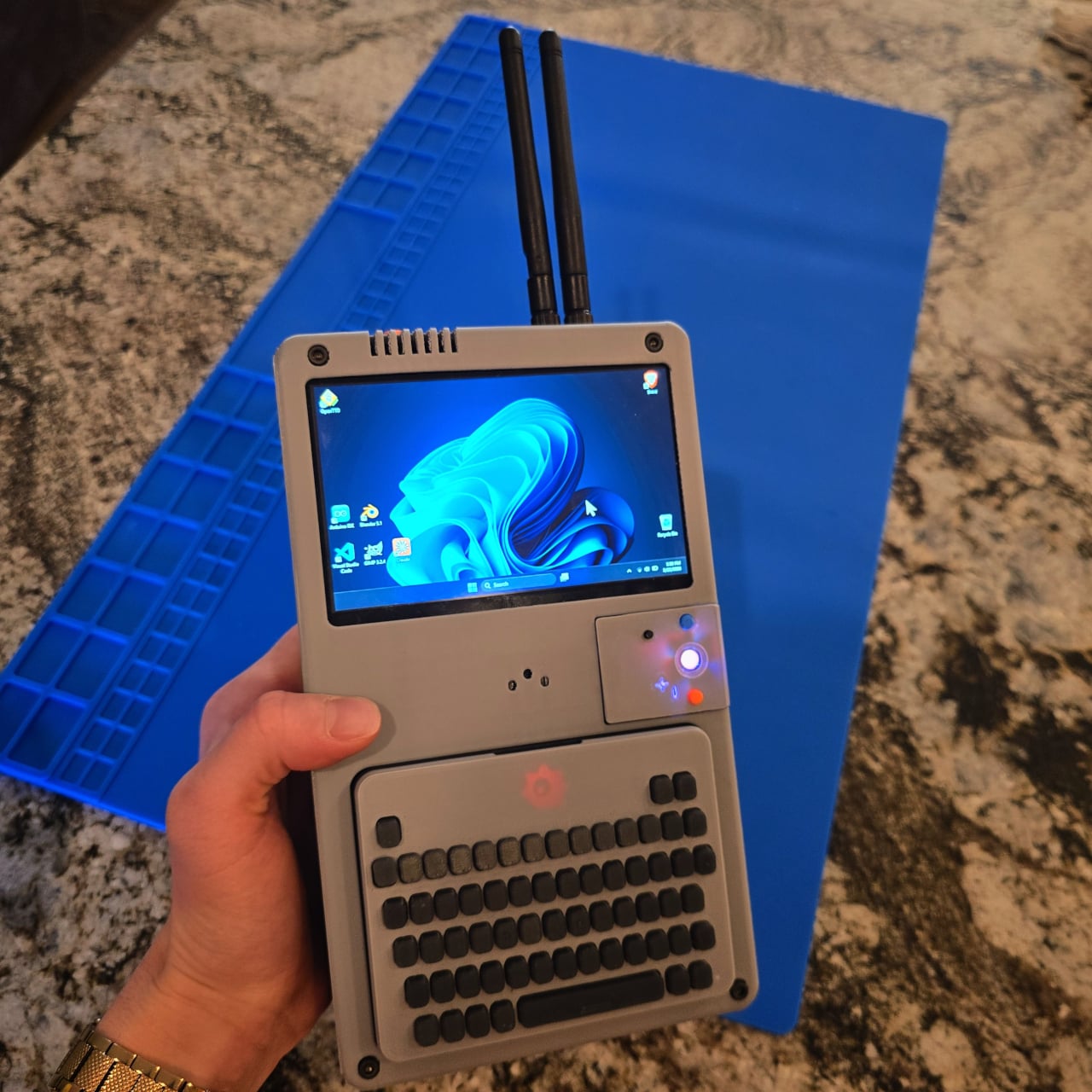
Running the whole thing is an Intel N150 processor paired with up to 16GB of LPDDR5 RAM, which is enough to handle productivity workloads, light creative tasks, and indie gaming without breaking a sweat. The 5-inch IPS touchscreen runs at 1024×600 and peaks at 1,000 nits, which keeps it readable in brighter conditions. It also outputs up to 4K at 60Hz via HDMI 2.1 when a bigger screen is nearby.
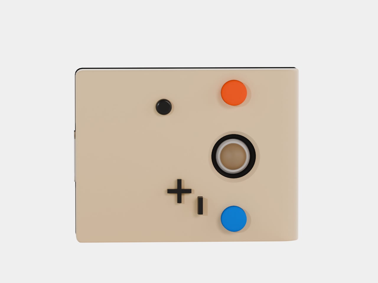
The battery is made up of three 18650 lithium cells totaling 10,500 mAh, good for roughly eight hours of use and charged via USB-C. Connectivity is unusually generous for a handheld of this size, with built-in Wi-Fi 6e, Bluetooth, and a full 1GbE Ethernet port, plus two USB-A 3.0 ports, a USB-C port, and a MicroSD card slot built directly into the chassis.
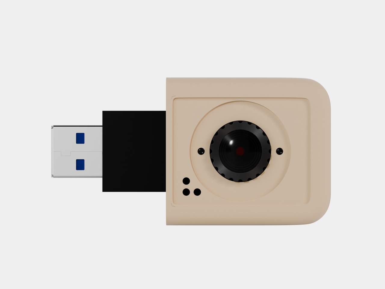
Beyond swapping the controllers, the internals are expandable, too. An M.2 slot accepts NVMe SSDs in 2230 or 2280 form factors via PCIe 3.0, there’s a module slot for 4G LTE cellular connectivity with a NanoSIM, and a PCIe expansion port opens the door to external GPU attachments for more demanding workloads. x86 architecture means it runs anything, from Windows 10 and 11 to any Linux distribution you prefer.
What makes this even more interesting is that everything about the CG Deck is open source. Schematics, firmware, and design files will all be available on GitHub, so tinkerers can build their own version without waiting for the commercial release. A Kickstarter is currently in the works for those who’d rather not solder their way through it, and a waitlist is already open on the Mogozen website.
The engineering prototype is working, though it’s still being refined before it’s ready for a wider audience. Future shell designs include options with picatinny rails and LEGO-compatible brick plates, suggesting that physical customization goes well beyond the input modules alone. The overall concept is unusual enough to feel genuinely novel in a category that’s started to feel a bit predictable.
The post The Handheld PC That Becomes a Gamepad, Keyboard, or Knob Panel first appeared on Yanko Design.
Lenovo’s Legion Tab Gen 3 has carved out a unique space in the Android gaming tablet market by blending high-performance hardware with thoughtful design features. Retro Game Corps highlights the device’s standout elements, such as its Snapdragon 8 Gen 3 processor and 8.8-inch display with a 165Hz refresh rate, which together ensure smooth gameplay and […]
The post Why Lenovo’s New 8.8-Inch Tablet is Secretly a Portable Gaming Console appeared first on Geeky Gadgets.

The Samsung Galaxy S27 Ultra is poised to make a significant impact on the smartphone industry with a range of advanced upgrades. Expected to launch in early 2027, this flagship device promises to deliver state-of-the-art improvements in design, performance, and functionality. As the highlight of the Galaxy S27 series, which is likely to include multiple […]
The post Samsung Galaxy S27 Ultra: The Flagship Overhaul We’ve Been Waiting For appeared first on Geeky Gadgets.


The colon character in Excel is often associated with defining static cell ranges, such as `A1:A10`, but its capabilities extend far beyond this basic use. Excel Off The Grid explores how combining the colon with the spill operator (#) can unlock advanced techniques for creating dynamic ranges. For example, a range like `A1#:B1#` automatically adjusts […]
The post Stop Updating Excel Charts Manually: the Secret of the Colon and Spill Operator appeared first on Geeky Gadgets.

Apple’s macOS 27 Golden Gate represents a significant step forward in the evolution of its desktop operating system. With over 50 new features and refinements, this release focuses on enhancing the user experience through advanced AI integration, a cohesive design overhaul, and functional improvements across core applications. Whether you’re a professional seeking efficiency or a […]
The post What Apple Hid Inside the macOS 27 Golden Gate Update appeared first on Geeky Gadgets.
Keychron has built a reputation on lineups that quietly iterate, but the K2 HE Concrete Edition is something different. A 75% wireless magnetic-switch board housed in architectural-grade concrete, packing TMR sensors, Rapid Trigger, and a price tag that undercuts its closest gaming rivals. Priced at $199.99, this is a 75% layout wireless mechanical keyboard housed in a […]
The post Keychron K2 HE Concrete Edition 75% Wireless Mechanical Keyboard appeared first on Geeky Gadgets.