![]()
Insta360’s Mic Pro has three built-in mics and looks like a chunky pin badge
Insta360's latest mic hides in plain sight.
![]()
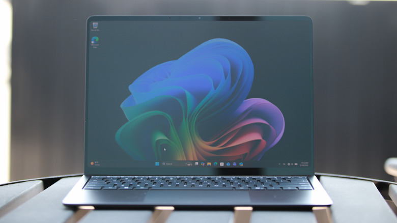


Microsoft has introduced nine updates to its M365 Copilot suite, designed to streamline workflows and enhance productivity. One key update is the redesigned app launcher, often referred to as the “waffle,” which now allows users to pin frequently used apps and access the “Create” module for generating images and videos. This change minimizes time spent […]
The post 9 New Microsoft Copilot Updates That Make Work Effortless appeared first on Geeky Gadgets.

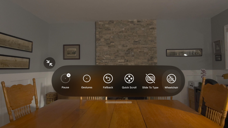
Meta’s Ray-Ban display glasses are making waves in the wearable technology space, not just for their sleek design but for their open development platform. As TechAvid explains, this approach allows developers to create applications using familiar web technologies like HTML, CSS and JavaScript, significantly lowering the barriers to entry. For example, developers can design lightweight […]
The post Meta Opens Ray-Ban Smart Glasses to Developers Using HTML and JavaScript appeared first on Geeky Gadgets.

Apple’s iOS 27 introduces a suite of updates designed to enhance personalization, functionality, and system reliability. With advancements in artificial intelligence (AI), augmented reality (AR), and user interface design, this release aims to redefine the mobile experience. Below is a detailed exploration of the ten most impactful upgrades that will shape how you interact […]
The post Why Everyone is Talking About the Leaked iOS 27 Features appeared first on Geeky Gadgets.
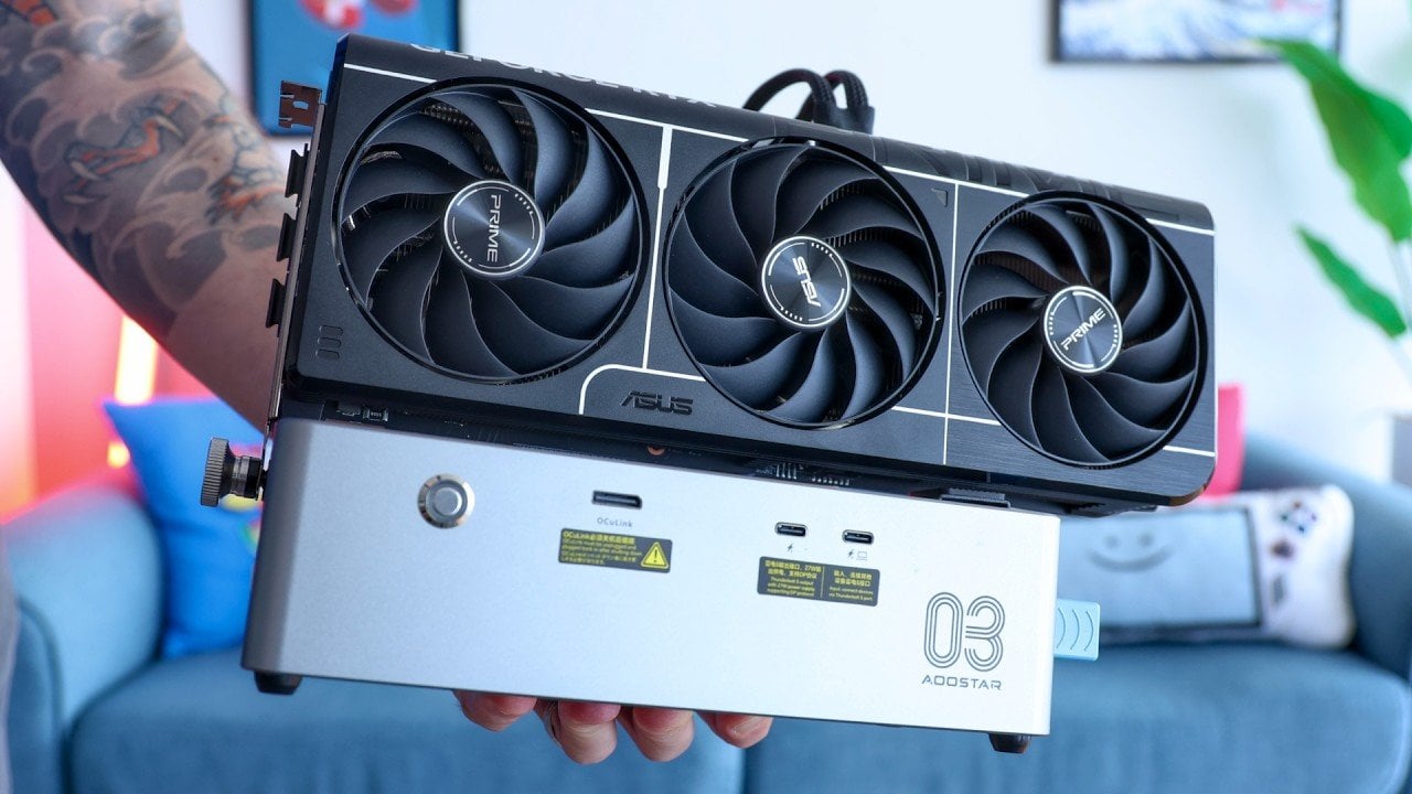
External GPUs (eGPUs) have become an increasingly viable solution for users looking to boost the performance of compact devices like laptops and mini PCs. Retro Game Corps explores this trend by examining the AOOSTAR AG03, a Thunderbolt 5 eGPU enclosure that pairs advanced features with a budget-friendly price point. With its 800W power supply, dual […]
The post Why Desktop eGPUs Are Finally Worth Buying In 2026 appeared first on Geeky Gadgets.
Most grilling gear is built for one season. The spatulas bend, the tongs lose tension, the finish chips by August, and you’re back at the store before the next summer. There’s a different category of BBQ tool, though: one designed by people who think about material science and ergonomics before they think about price. These eight picks share a common thread. They’re made to outlive the grill they came with.
Nothing here was sourced for novelty alone. Each piece earns its place through material quality, design thinking, or a real rethink of what a grilling tool should do. Whether you’re upgrading a backyard setup or building one from scratch, these are the tools worth spending real money on.
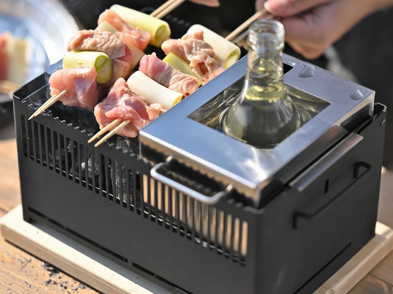
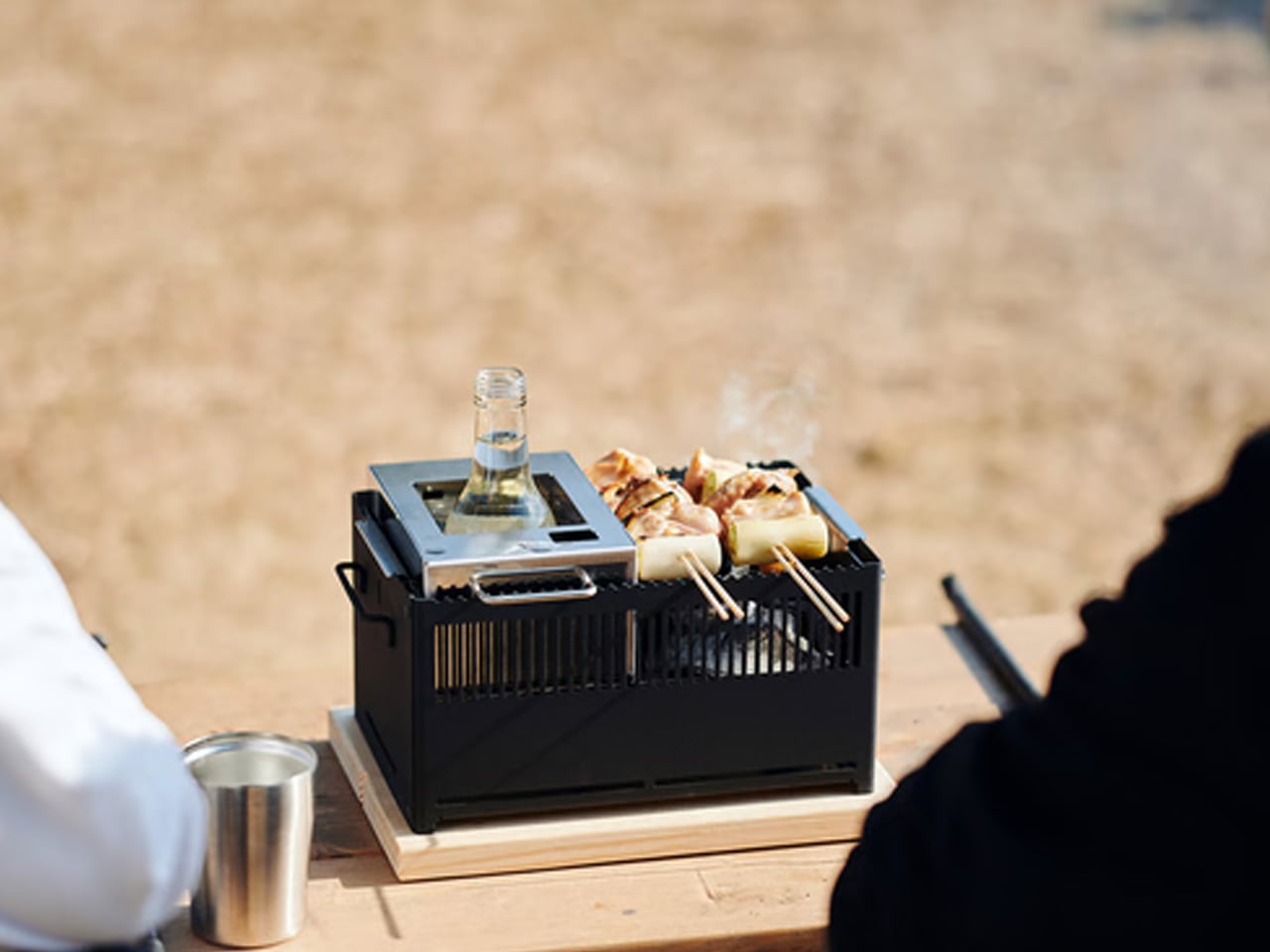
The All-in-One Grill was made in Japan, and it shows. Modular parts allow for six different cooking methods from a single compact unit, the kind of flexibility that makes sense whether you’re cooking on a balcony, a campsite table, or a backyard deck. The design is clean enough to sit on a countertop without looking out of place, and the compact footprint means it doesn’t demand the real estate that a full outdoor grill requires during and between sessions.
Where most outdoor grills ask you to commit to one cooking style, this one adapts. The modular system disassembles for cleaning, which matters more than most people expect. Tools that are hard to clean don’t stay clean, and tools that don’t stay clean don’t last. There’s also a dedicated module for warming bottles, a small detail that signals the kind of thorough product thinking that separates considered design from commodity manufacturing.
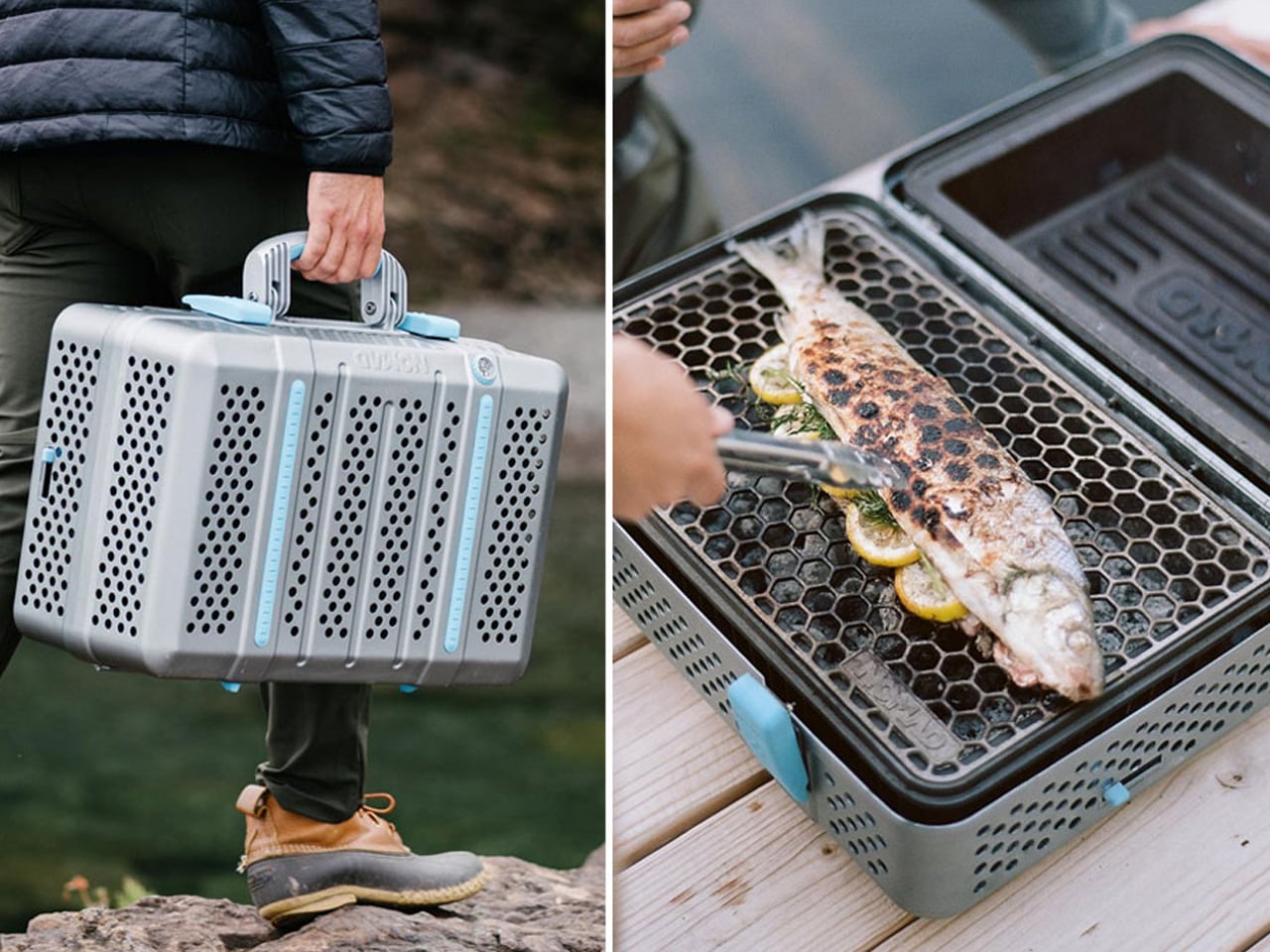
The Nomad Grill and Smoker earns its place through sheer design intelligence. Built from anodized aluminum with a honeycomb interior pattern, it folds down to a 2×2-foot briefcase form and opens into 212 square inches of cooking space, doubling that in open-grill mode. Magnetic clutches lock the whole unit shut for transport. There are no smart buttons, no app. Just physics doing the work of keeping heat in and the exterior cool to the touch while it cooks.
What makes the Nomad particularly useful is how it handles both smoking and grilling without asking you to choose between portability and performance. The closed position circulates smoke and heat consistently for low-and-slow cooking. Open it up, and it performs like a conventional charcoal grill. At $599, it sits at the premium end of portable setups, but the anodized aluminum construction and industrial design mean you are not replacing this in five years. You are passing it on.
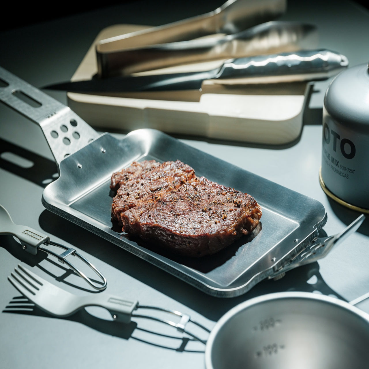
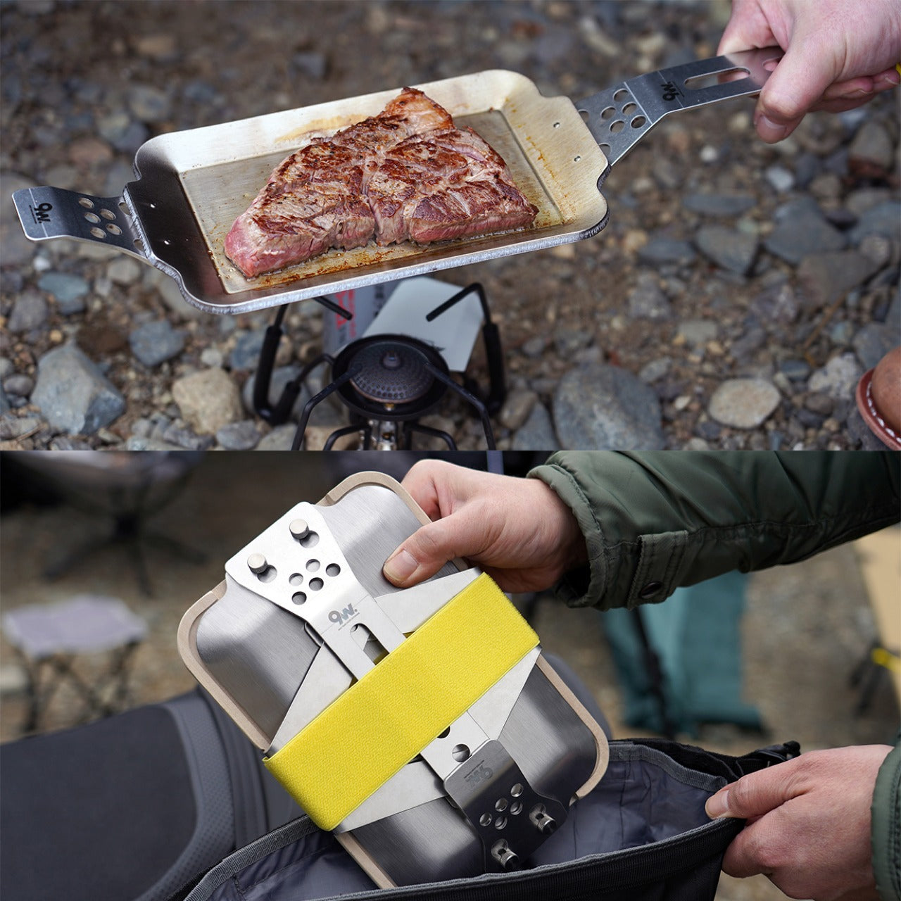
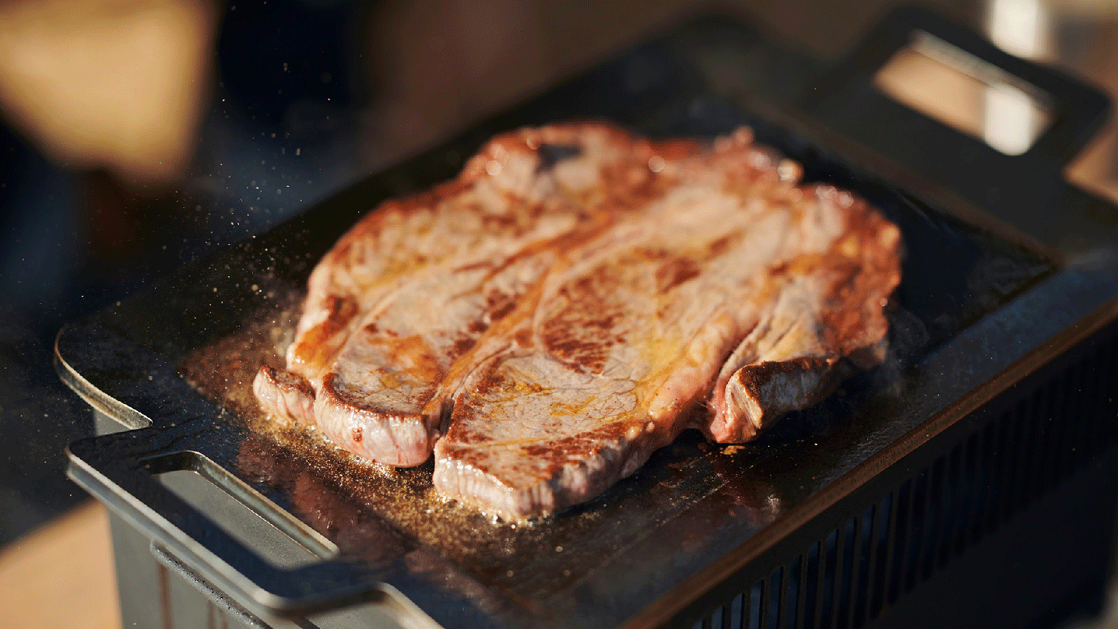
The Compact Modular Grill Plate is the kind of tool that belongs in the same kit as the All-in-One Grill but works just as well on its own. The adaptable metal plate cooks food evenly while locking in juiciness, making it the right surface for steaks and fish that need consistent heat contact across the entire cut. It works across different heat sources, which means it moves between cooking setups without requiring its own dedicated station or stand.
Priced between $100 and $139, depending on configuration, this is the category of tool that looks deceptively simple until you use a lesser version. The difference between a well-engineered grill plate and a cheap one is the difference between a proper seared crust and a steamed, stuck mess. The modular nature also means it doesn’t take up a fixed position in a drawer or cabinet. It slots into a kit, disappears when not in use, and performs exactly when it counts most.
Click Here to Buy Now: $100.00
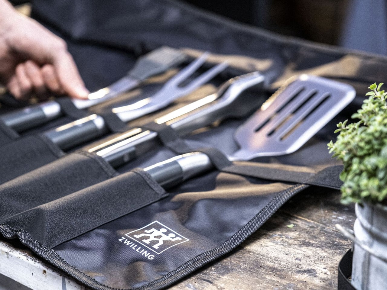
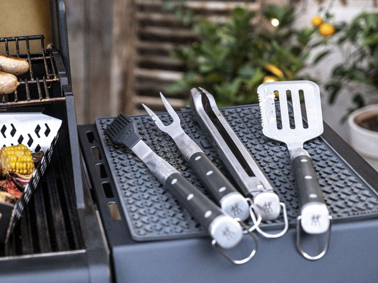
Zwilling has been making blades since 1731, which gives the BBQ+ set a particular kind of credibility. The five-piece set is built from 18/10 stainless steel, the same grade used in surgical instruments, with triple-riveted handles and heat-resistant grips. It carries a 4.9-star rating across major retailers, including Crate and Barrel and Wayfair, and reviewers consistently note the build quality as something that feels immediately different from standard grill sets the moment you pick a piece up.
The spatula comes with a serrated edge for checking doneness without reaching for a separate tool. The tongs carry the satisfying mechanical resistance of something properly engineered rather than assembled for a price point. At $149.99, this set sits where you’re paying for materials and manufacturing heritage rather than branding. These tools don’t rust, don’t bend, and don’t require seasonal replacement. For anyone who has cycled through two or three cheaper sets in as many years, this is where that pattern stops.

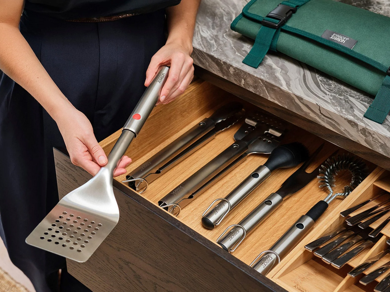
Joseph Joseph built its reputation on solving storage problems as cleverly as it solves cooking ones, and the GrillOut set is that philosophy applied to outdoor equipment. The four-piece set includes tongs, a spatula, a fork, and a basting brush, all integrated into a foldable carry case that functions as both a storage unit and a transport caddy. Utensil heads retract for compact packing, every tool is fully stainless with slip-resistant silicone grips, and the whole set dismantles for easy cleaning after each session.
Priced between $78 and $98, depending on the retailer, the GrillOut set is the most accessible on this list without feeling like a step down. The retractable utensil heads are the kind of detail that rewards you every time you pack up: no loose pieces, no separate bag, no searching for the brush before you can leave. For anyone who grills away from home as often as in it, this is the set that travels with real intention rather than just tolerance of inconvenience.
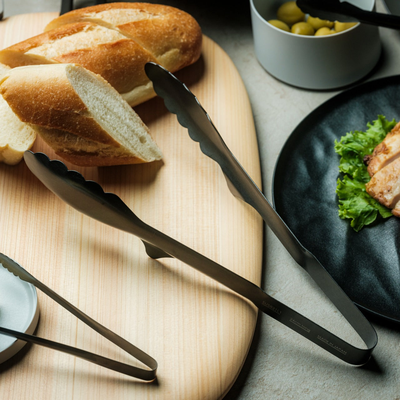
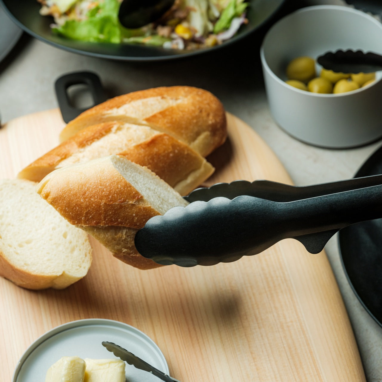
The Obsidian Black All-Around Tongs are made from SUS821L1 stainless steel, a grade selected for its exceptional strength and corrosion resistance rather than cost efficiency. The 9.45-inch length handles most cooking and plating tasks without putting your hand close to the heat. The all-black finish signals a material choice rather than a style decision: this is a kitchen tool that takes the visual language of professional equipment and applies it to backyard cooking without compromise or apology.
What makes these tongs worth including in a list about longevity is the material specification. SUS821L1 is not the steel found in budget tong sets. It holds its finish, resists the corrosive effects of marinades and high-heat cleaning, and maintains its mechanical tension over time. The Obsidian Black range also includes chopstick tongs, mini grip tongs, and salad tongs, making the collection genuinely expandable. These are tools you build a kitchen setup around rather than ones you phase out at the end of a season.
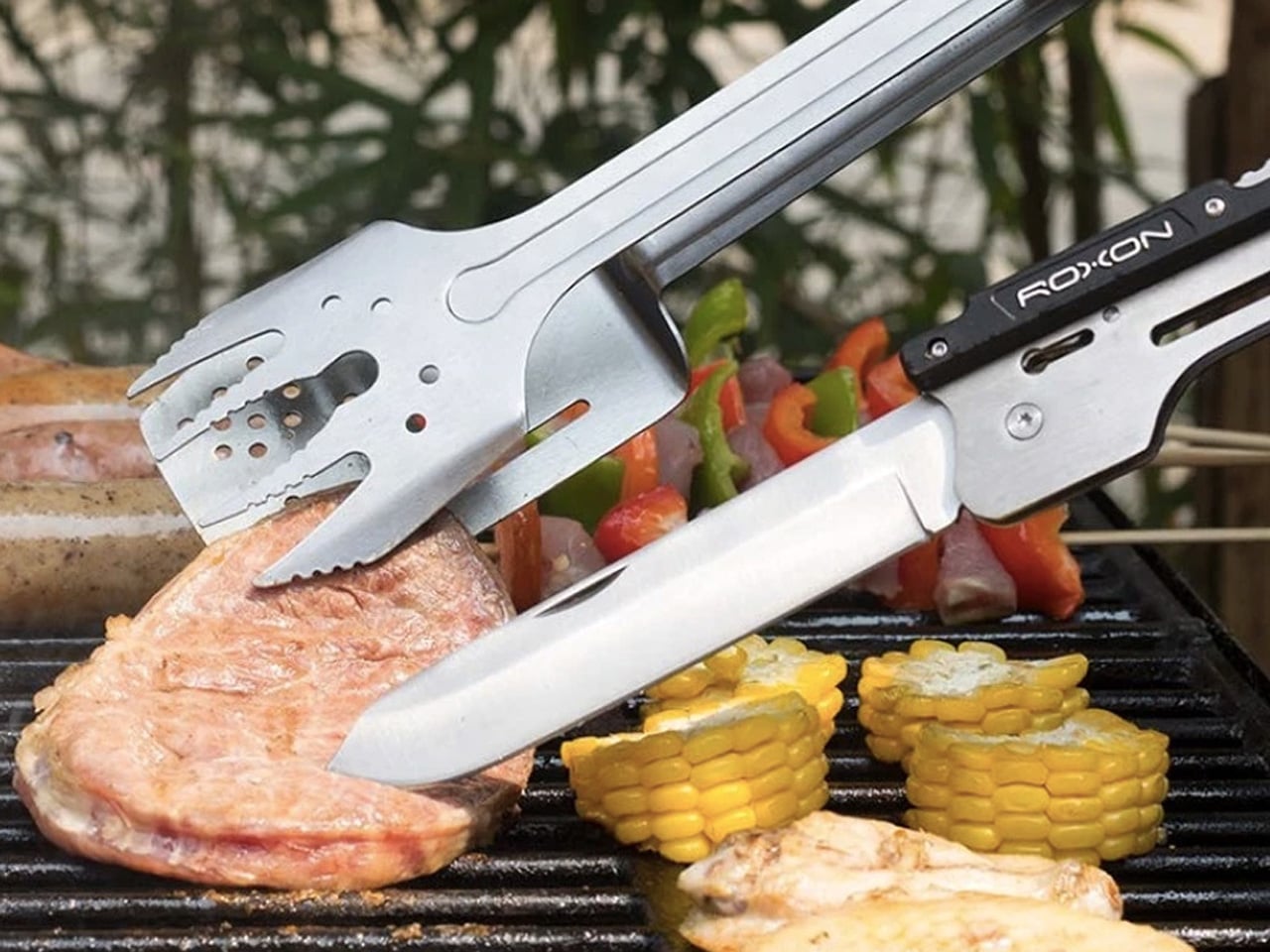
The Roxon MBT3 is a six-in-one BBQ multi-tool built from food-grade 430 stainless steel. Three base elements, a fork, spatula, and knife, connect via a 1.2mm liner lock and reconfigure depending on what you need at the moment. The fork and spatula join to form tongs. The knife folds to become a bottle opener and corkscrew. It packs into a nylon pouch small enough to slip into a jacket pocket, making it the only tool on this list that genuinely disappears when it isn’t needed.
What the Roxon MBT3 gets right is that it doesn’t ask you to carry more to do more. The EDC thinking behind it translates to the grill better than most multi-tools manage. The liner lock mechanism is secure enough that reconfiguring parts doesn’t feel like a compromise in the field. For a camper, a tailgater, or anyone who grills away from a fixed setup regularly, this is the one piece of kit that handles everything without filling a bag or requiring a dedicated case to transport.
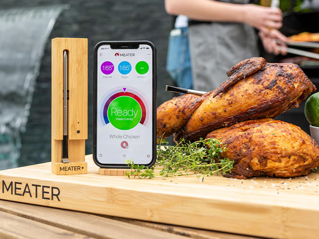
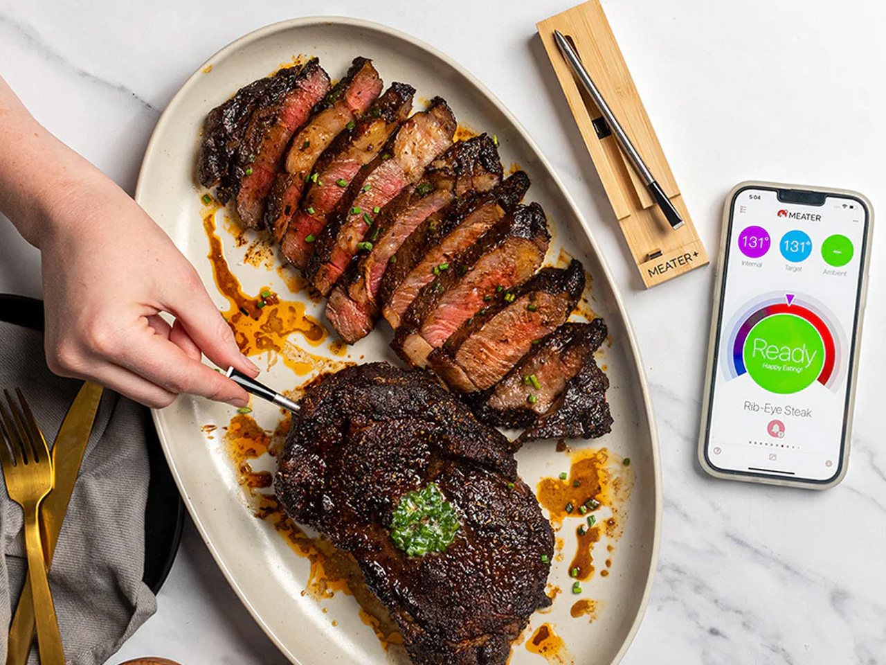
The MEATER Plus is the first truly 100% wire-free meat thermometer on the market. A single probe monitors both internal meat temperature and ambient grill temperature simultaneously, then relays that data to your phone via Bluetooth at a range of up to 165 feet. The bamboo charging dock doubles as a Bluetooth repeater, extending that range without additional hardware. The companion app guides you through the cooking process in real time and estimates exactly when to pull the meat off the grill.
The design case for the MEATER Plus is as strong as the technical one. The probe is minimal enough to sit in a bamboo dock on a kitchen counter without looking like a gadget. No wires, no clunky receivers, no analog dials. At $99.95, it’s the kind of tool that changes how you interact with a grill rather than just what you can do with it. Once you’ve cooked with one, the idea of cutting into meat to check doneness feels genuinely outdated rather than just inconvenient.
The common thread across all eight of these picks is intention. Each one was designed with a specific problem in mind, whether that’s portability, material longevity, storage efficiency, or the kind of precision that removes guesswork from the cooking process entirely. None of them is an impulse purchase, and none of them is meant to be. Good tools earn their place over time, and every one of these has the construction quality to do exactly that.
If there’s a place to start, the Obsidian Black Tongs and the MEATER Plus represent two ends of the spectrum: one purely mechanical, one quietly smart, both worth having before anything else on the list. The Nomad and the All-in-One Grill offer different answers to what a portable grill can be. Any combination of these eight will outlast the average grilling season by years. That’s the entire point of buying well once.
The post Forget Cheap Grilling Tools — These 8 BBQ Gadgets Are Actually Designed to Last a Decade first appeared on Yanko Design.