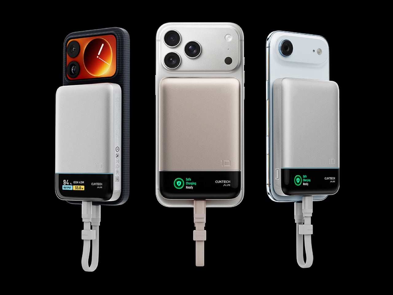
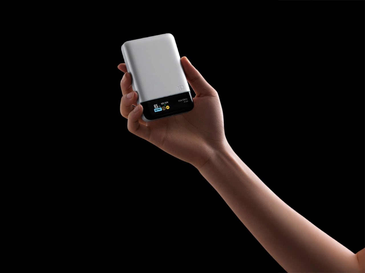
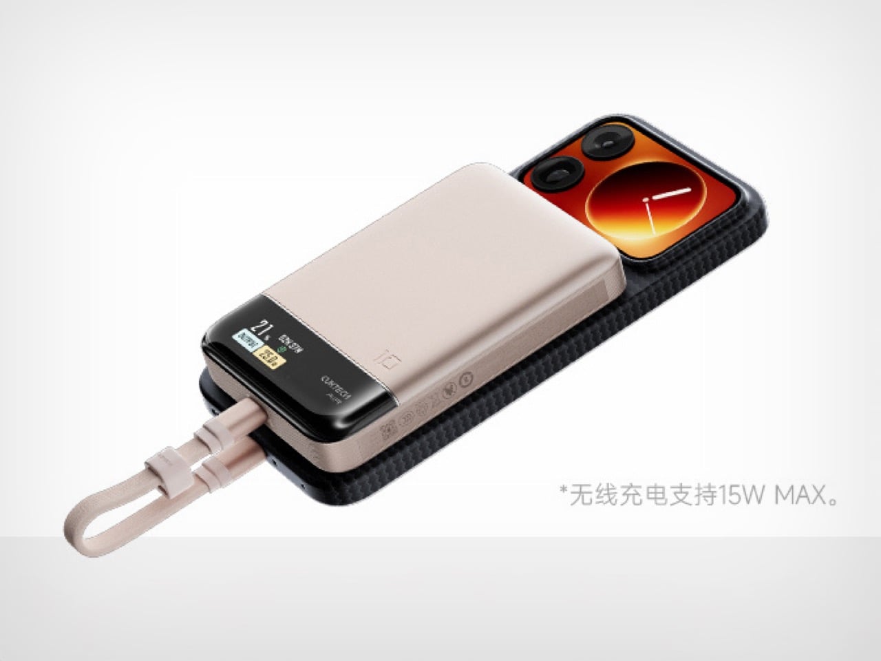
Cuktech just dropped their 10 Air magnetic power bank in China, and honestly, the most interesting thing about it has nothing to do with the specs. Sure, it’s got a 10,000mAh battery with 55W wired fast charging and 15W wireless, and yeah, the CNY 199 price tag (roughly $28) is aggressively reasonable. But look at the damn thing. That silver body with the black magnetic strip running across the bottom? Slap this on the back of your iPhone and you’ve accidentally recreated the iPhone 3G’s iconic two-tone design.
I can’t tell if this is deliberate nostalgia bait or a happy accident, but either way, it’s working. The iPhone 3G had that silver aluminum back with the black plastic bottom for the antennas, and this power bank’s layout mirrors it almost perfectly. It’s like wearing your phone’s ancestral portrait as a backpack. The magnetic strip sits right where that glossy black section used to be, and suddenly your sleek 2025 smartphone is cosplaying as a 2008 legend.
Designer: Cuktech
Beyond the accidental throwback aesthetic, Cuktech packed in a built-in display that shows actual charging data instead of making you interpret cryptic LED blinks like you’re reading Morse code. The brand claims it can take an iPhone 17 from zero to full about 1.8 times, the Galaxy S25 Ultra gets 1.3 cycles, and the Xiaomi 17 Pro manages 1.1. These numbers track for a 10,000mAh capacity when you account for conversion losses, so at least they’re not inflating claims. Most flagships hit 50 percent in around 30 minutes with this thing, which is solid performance for something this affordable. The 55W wired output does the heavy lifting here since the 15W wireless is more about convenience than speed.
The bundled USB-C cable has a self-storing design, which sounds gimmicky until you’ve untangled your charging cable from your keys for the thousandth time. Cuktech also mentions their “OPC worry-free charging” technology for battery health, though I’m skeptical of proprietary acronyms until I see independent testing. What matters is that the fundamentals are sound: decent capacity, legitimate fast charging, and a price that doesn’t require a mortgage. The fact that it accidentally turns your modern phone into a design artifact from the Steve Jobs era is just a bonus. No word on global availability yet, but Cuktech usually brings their products international eventually, and this one deserves the trip.
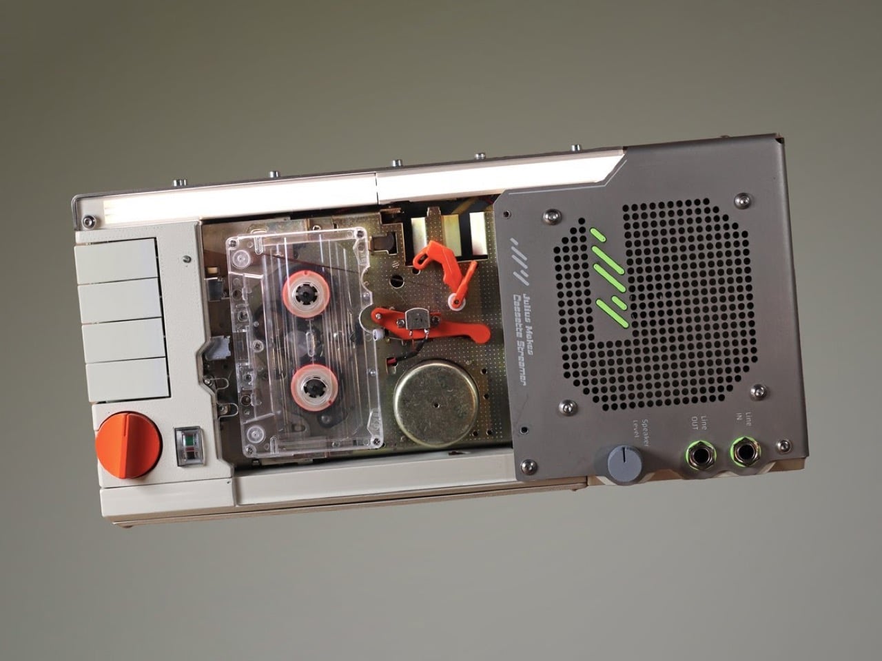
Most audio enthusiasts fall into one of two camps: the ones chasing perfect fidelity with lossless files and the ones who swear their vinyl sounds warmer. Julius decided to build a bridge between these worlds, and it looks like something Q would hand to James Bond if the mission involved a particularly groovy villain.
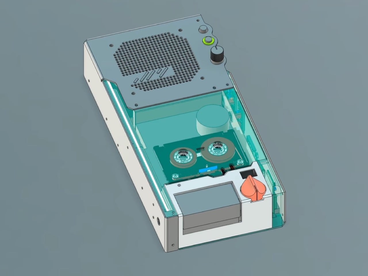
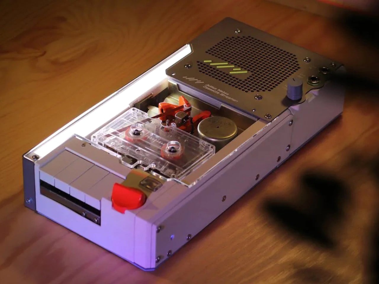
His cassette streaming device takes Bluetooth audio and runs it through an actual tape loop before playback, physically imprinting that analog character onto digital streams. The engineering journey was brutal. Turns out cassette decks from decades past have some deeply weird ideas about electrical grounding, and getting modern Bluetooth hardware to play nice with positive-rail-referenced vintage electronics required DC isolating voltage regulators and more than a few creative workarounds. The payoff is a device that looks incredible and introduces real tape saturation without any digital fakery.
Designer: Julius Makes
The concept is straightforward. Bluetooth audio arrives digitally, converts to analog, mixes from stereo to mono, records onto cassette tape, travels around the loop, hits a playback head, then reaches the speaker. That physical trip through magnetic tape creates the warmth people obsess over. The compression happens because ferric oxide particles on polyester film genuinely can’t capture digital audio’s full range. These are real physical limitations making the sound different, and somehow our ears prefer it that way. Julius made the tape loop visible on purpose, sitting outside the cassette with orange guide brackets so you watch it move while listening.
Getting everything to work required solving problems that shouldn’t exist anymore. Cassette decks connect their chassis to the positive power rail instead of ground. Julius only learned this after bolting his grounded metal case directly to the deck with screws, nearly shorting everything. The audio input shielding also runs to positive, which makes zero sense if you’re used to modern electronics. His Bluetooth module expected normal ground references, creating a fundamental incompatibility. An isolation transformer from AliExpress failed completely. He tried powering the Bluetooth at 12.5 volts while referencing it to 7.5 volts, but that rail wouldn’t sink current. Three months of debugging until DC isolating voltage regulators finally solved it.
The VU meter uses a fluorescent tube that works backward from what you’d expect. Silence keeps it fully lit, loud beats make it dim. Julius inverts the signal on purpose so the tube glows when the device sits idle, which looks better and extends the tube’s life. The circuit gains the audio signal 500 times, clips it hard to isolate peaks, then runs through a diode detector with a capacitor for smoothing. The power amp inverts everything again and boosts another five times to drive the tube. The lag you see in the meter’s response comes from that smoothing capacitor, which is a feature since nobody wants a seizure-inducing flicker.
He built five separate circuit modules. One auto-starts the Bluetooth by faking a long button press with an RC pulse generator. Another converts stereo to mono for the recorder. The playback preamp amplifies the tape signal and applies EQ compensation, splitting output between the speaker and the meter circuits. Everything lives on custom PCBs he designed in KiCad after a month of learning the software. The stainless steel case handles shielding and heat dissipation from the power amp. A laser-cut acrylic panel makes the front transparent. The big orange knob pushes record volume into distortion territory. The small knob controls speaker output. Input and output jacks mean you can use this as a tape delay or saturation processor for other gear, which honestly might be more useful than Bluetooth streaming through cassette tape. But useful was never really the point.
You know those ‘Shot On iPhone’ images and videos you see? What they don’t tell you is that they didn’t just use an iPhone to shoot the content, they used an entire ecosystem of rigs, lights, lenses, dongles, microphones, stabilizers, and a bunch of other tech alongside the iPhone. ‘Shot On iPhone’ implies that all someone did was use their phone and nothing else, but the reality is more ‘Shot On iPhone using thousands of dollars worth of other gear’. While most content creators can’t afford that entire setup, one humble power bank hopes to make things easier.
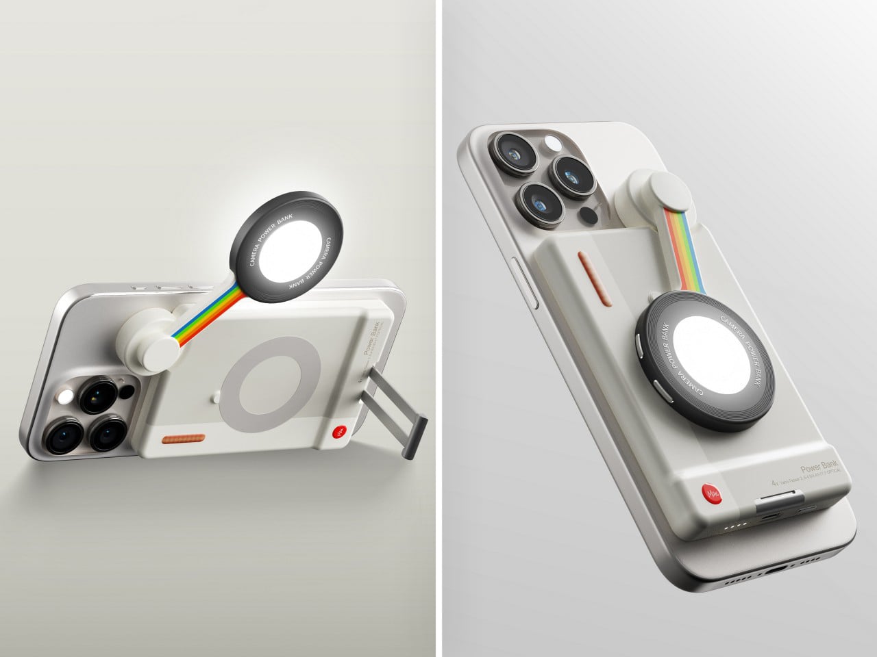
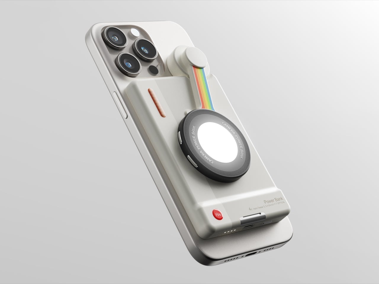
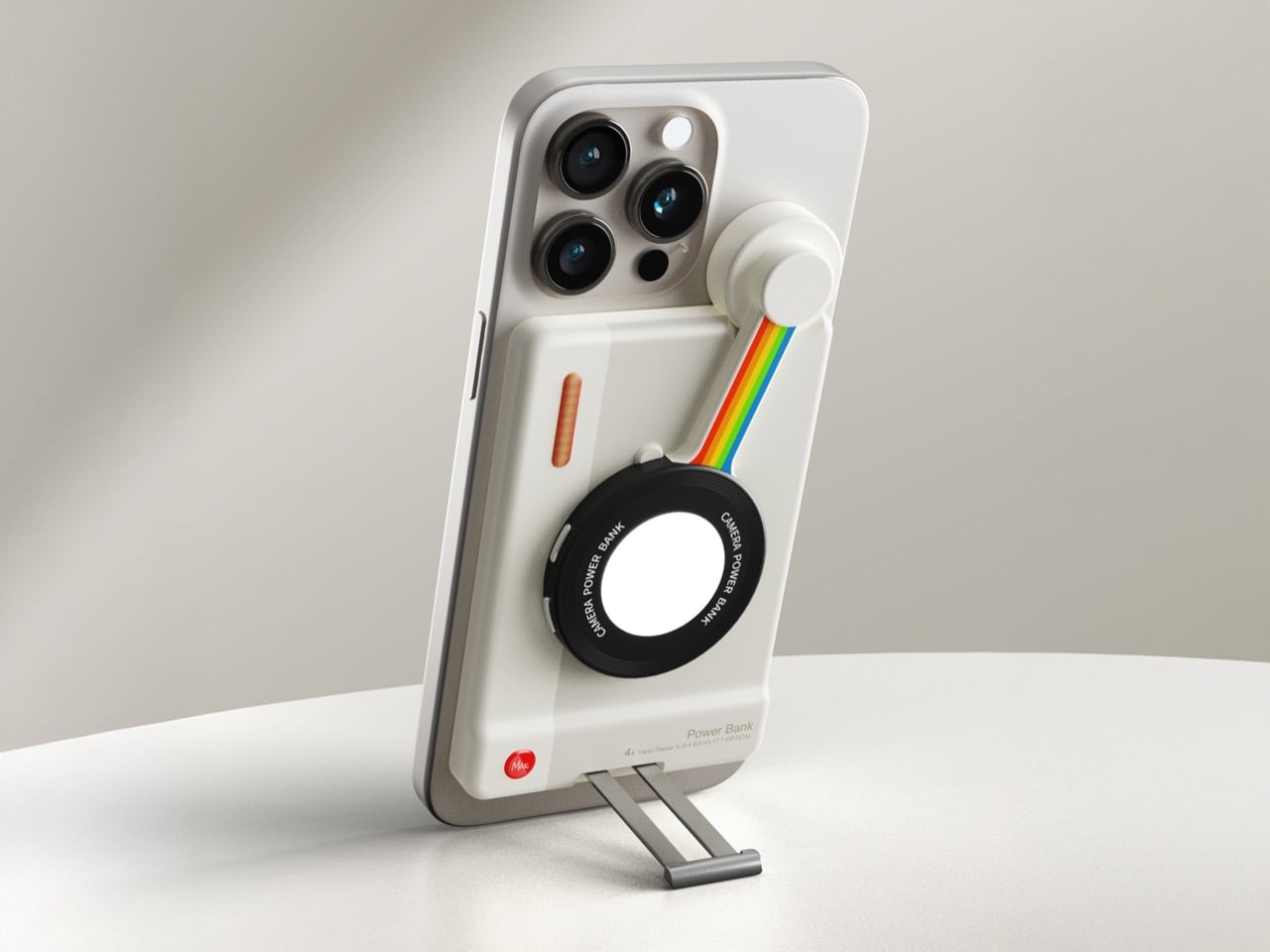
The ‘Creator Beauty’ power bank may sound like a Chinese product name translated rather poorly, but this little device promises to uplift your iPhone’s video and photo capabilities significantly. Most MagSafe power banks snap on and begin charging – this one snaps on and turns your iPhone into a vlogging machine. Aside from giving your iPhone juice while it films, the Creator Beauty power bank packs a swivel-able light-source, and a kickstand that lets you prop your phone either vertically or horizontally, depending on what content you’re creating.
Designer: Max
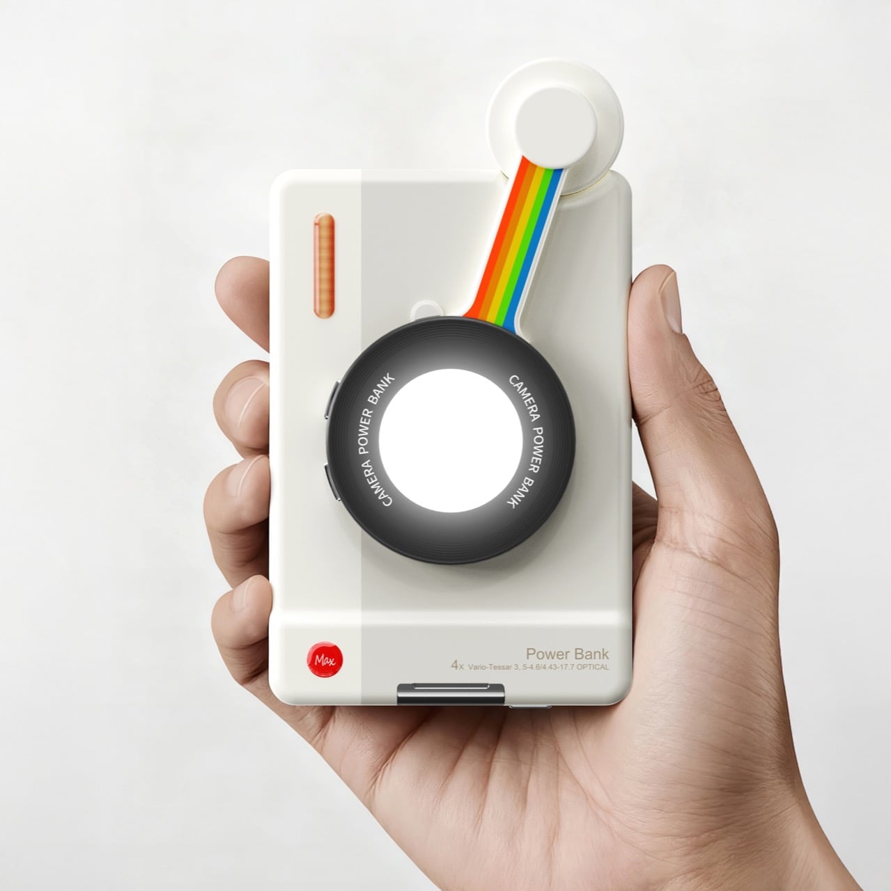
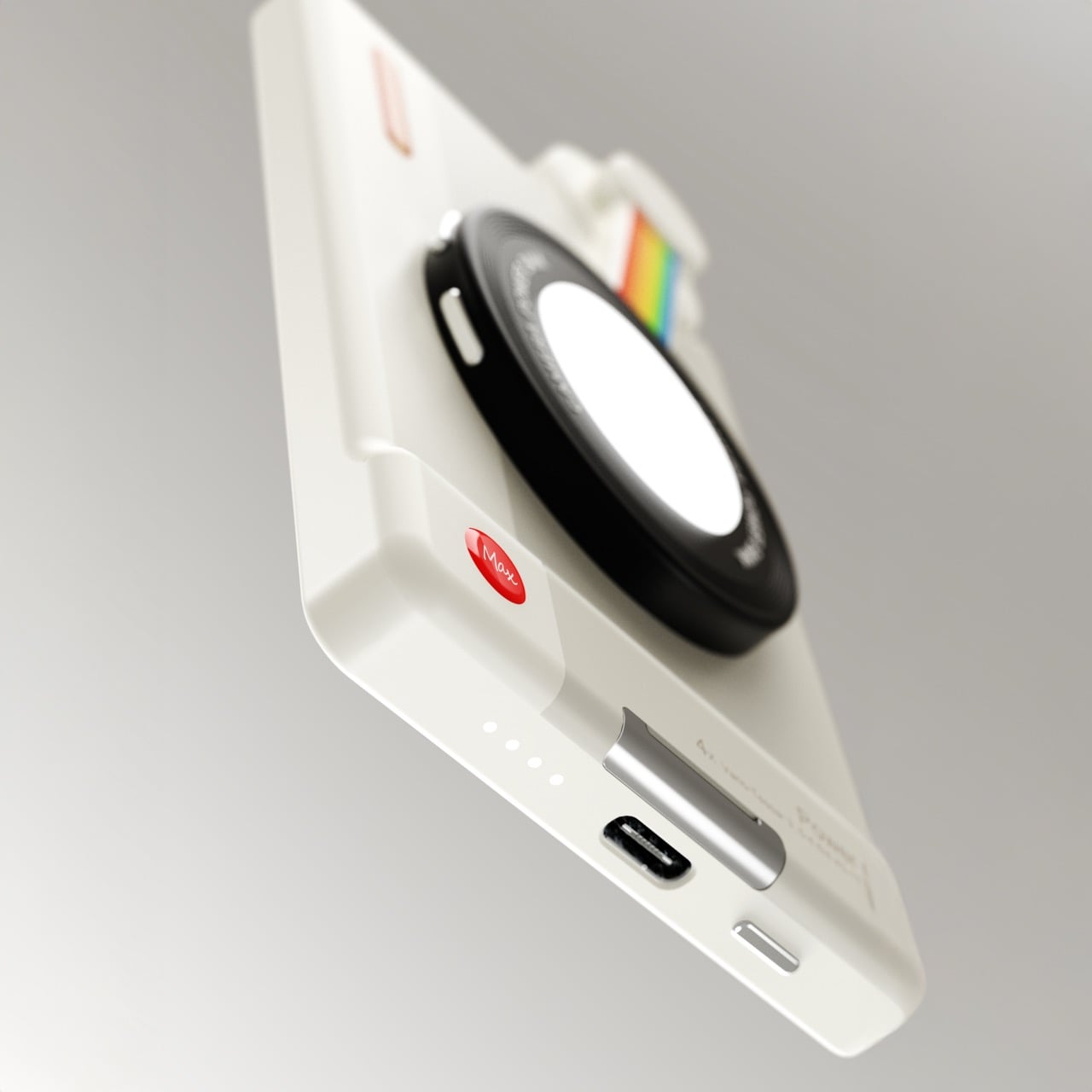
The entire power bank has a Leica meets retro Polaroid aesthetic. You’ve got a two-tone beige/grey body with a red dot on the corner that you’d think was a Leica logo (but it just has Max written on it, i.e., the designer’s name). Meanwhile, the light itself sits on a swiveling joint, connected by an arm that has Polaroid’s original candy-colored rainbow printed on it. The visual beauty of the light is that, when closed, it sits at the center of the power bank, looking quite literally like a camera. Swivel it out, however, and it becomes an adjustable light source that’s softer-yet-stronger, perfect for filming content without relying on your phone’s flash.
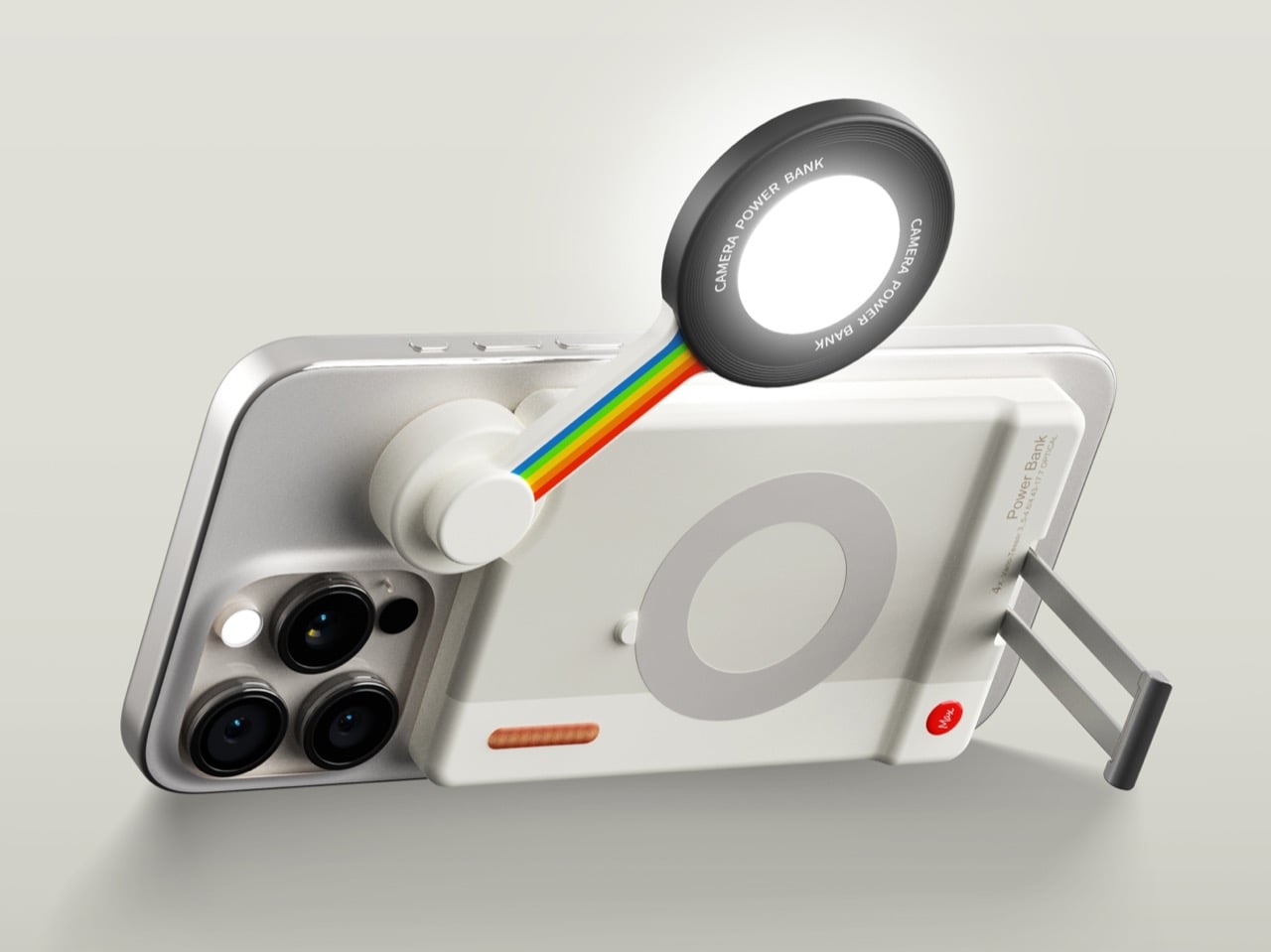
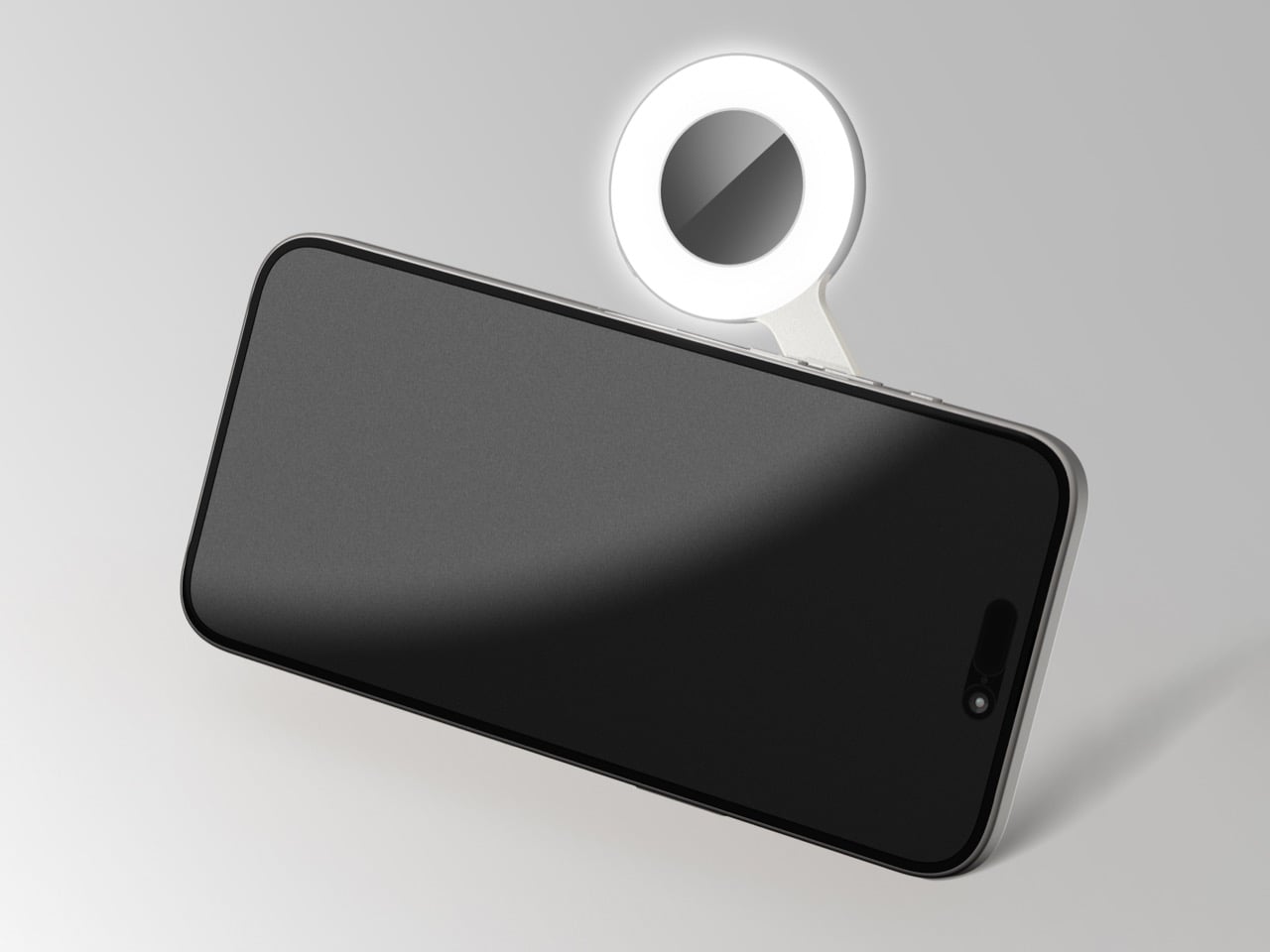
What you see as a fairly novelty-ish light source is, in fact, a true content creator’s dream – because it’s dual-sided. On the outer side, it’s a disc-shaped light, capable of providing a broader wash of light while filming… but look on the other side and you’ve got a ring light, designed to make content creation a breeze without needing to invest in a separate ring light accessory. Buttons on the rim of the light let you toggle between front and rear lights, as well as brightness. The lights draw power from the power bank itself, making the entire arrangement super convenient – and the swiveling design gives you the ability to uniquely position the light source anywhere around the camera to get the right lighting angle or to avoid glare.
The kickstand is icing on the cake. Instead of being one of those flip-out kickstands, this one stays tucked inside the power bank itself, so it isn’t really visible until you need it. Pull it out like you would a drawer in a cabinet and position it at a 90° angle and the kickstand can be used either for docking your phone vertically or horizontally. Together, the three features give the Creator Beauty power bank quite the edge over other power banks. You practically don’t need an extra light or a tripod while recording – just snap the power bank on, swivel the light out, knock out the kickstand, and hit record!
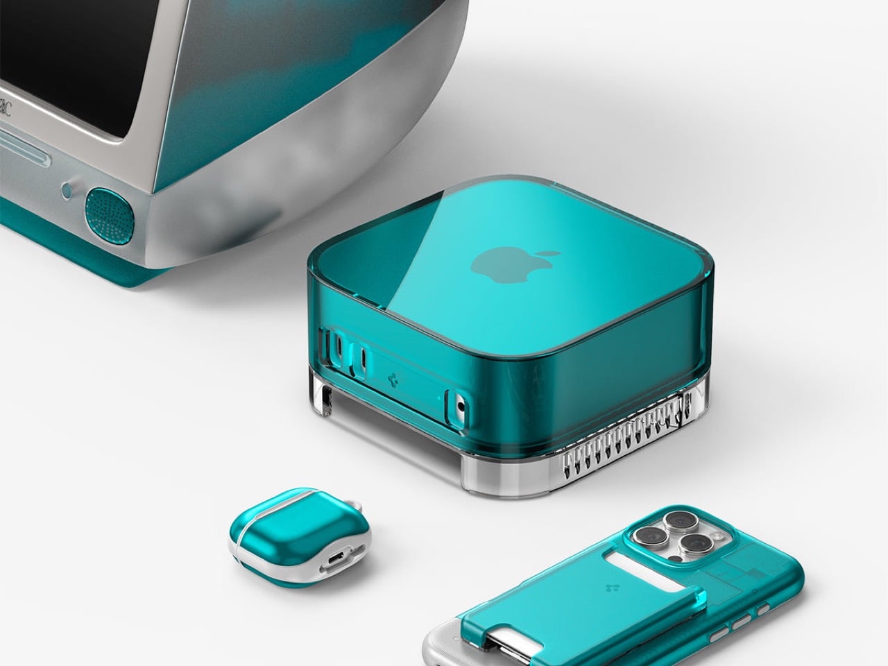
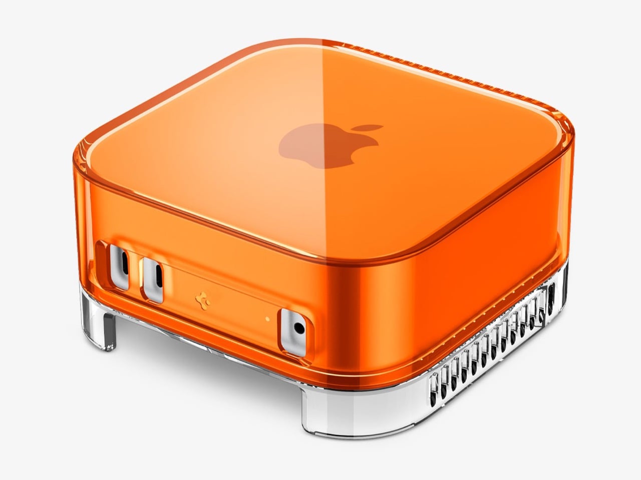
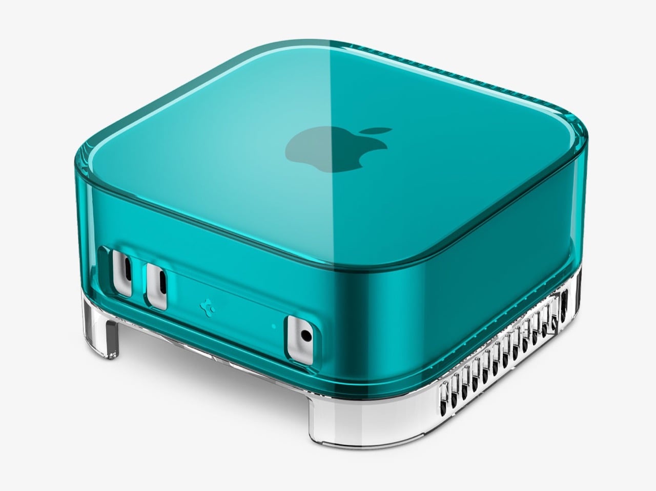
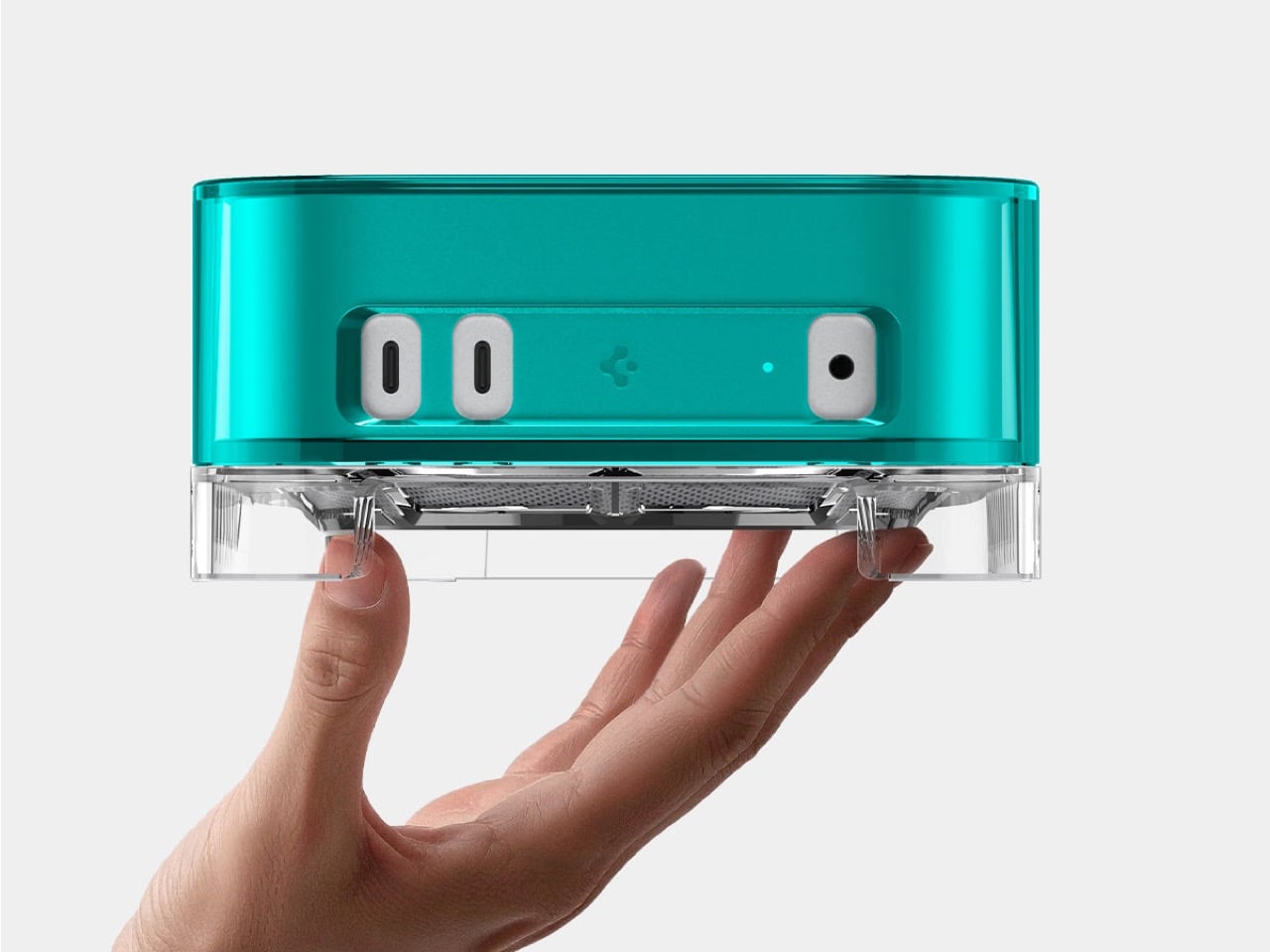
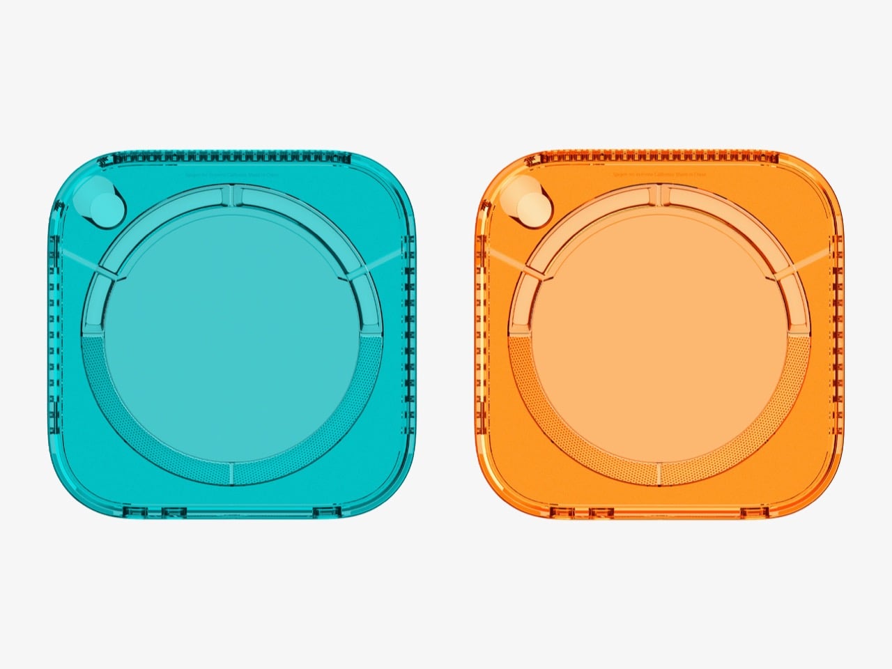
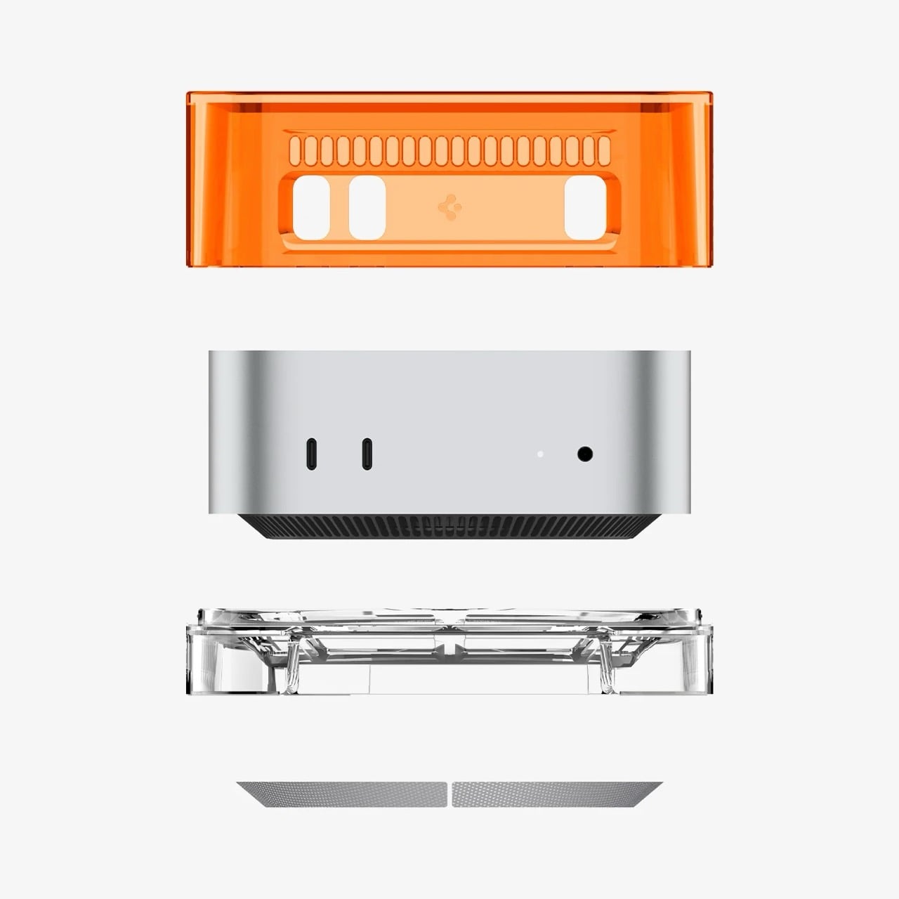
Spigen just launched a plastic shell that turns your Mac mini into a time machine. The Classic C1 wraps Apple’s minimalist aluminum cube in translucent plastic inspired by the iMac G3, complete with Bondi Blue and Tangerine colorways that defined Apple’s most playful era. For $32.99, your desk gets an instant injection of late ’90s nostalgia without sacrificing any of the Mac mini’s modern functionality.
The case feels like Spigen asking “what if Apple never stopped being fun?” The iMac G3 saved the company in 1998 by proving computers could be joyful instead of boring beige boxes. Now that same translucent aesthetic wraps around Apple’s most compact desktop, creating a bridge between two completely different design philosophies. The Mac mini stays minimalist underneath while the C1 shell broadcasts personality loud enough to make your entire workspace smile.
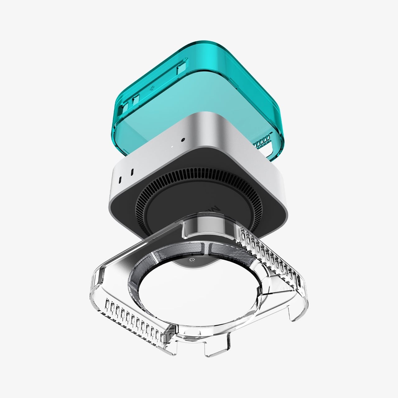
You’d almost expect a $45 plastic accessory to feel like a cheap gimmick, but peeling back the layers reveals some genuinely clever engineering. The exploded view shows this is a multi-part assembly, not some flimsy snap-on lid. Its base is a precisely molded cradle with ventilation slots that align perfectly with the Mac mini’s own air intake. The whole thing is built from a sturdy blend of PMMA, acrylic, and PVC that gives it the authentic heft and feel of turn-of-the-millennium hardware. This isn’t just a costume; it’s a well-made suit of armor.
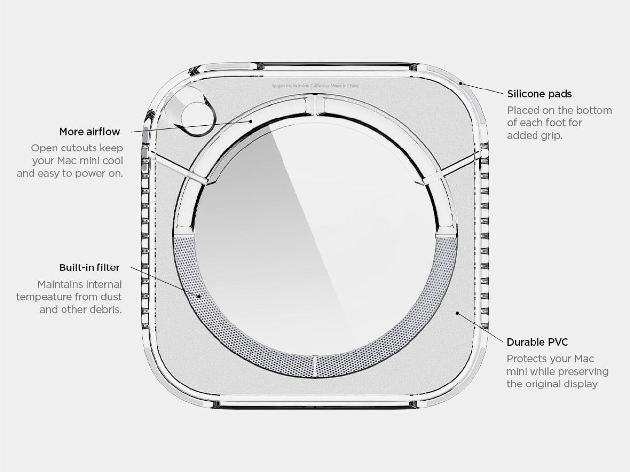
It’s the smaller, nerdier details that really sell the execution. The vertical grilles on the sides are a direct homage to the Power Mac G4 Cube, yet they also provide functional ventilation for a machine that can get surprisingly warm. That clear base also elevates the entire unit just enough to improve airflow from below, and the inclusion of a simple dust filter is a practical touch most companies would skip. This is what separates a thoughtful tribute from a lazy cash-grab, proving someone at Spigen actually did their homework on Apple’s golden age.
Let’s face it, the Mac mini is an incredibly boring-looking box. It’s a marvel of miniaturization, sure, but it has all the personality of a corporate paperweight. The C1 completely upends that sterile aesthetic, swapping the cold, professional feel of aluminum for the warm, inviting glow of colored plastic. It reminds you that technology can be approachable and even a little bit weird. It turns an appliance back into a companion, something with a presence that does more than just sit there and compute.
Ultimately, this little plastic shell is a rebellion against the sea of monotonous silver and gray (we even wrote about an iMac G3-inspired Apple Watch just yesterday!) Given CES is in another week or so, we’re prepared for an onslaught of sleek silver or black boxes that do a lot without having much character. But for thirty-three bucks, you get to reclaim a bit of that lost optimism as an existing (or prospective) Apple Mac mini owner. It’s a small, delightful declaration that our desktops don’t have to be so damn serious (aka boring) all the time.
The iMac G3 was discontinued in 2003, around the same time Apple began pivoting to its clean, color-free aesthetic. Cut to a few years later and Apple transitioned entirely to aluminum for its devices, ushering in an era of sleek, and a few more years later, Apple built a computer small enough for your wrist. That means there was a little over a decade between Apple’s era of color, and the Apple Watch. Sadly, the two didn’t coexist in the same timeline, but that doesn’t mean a guy can’t imagine, right?
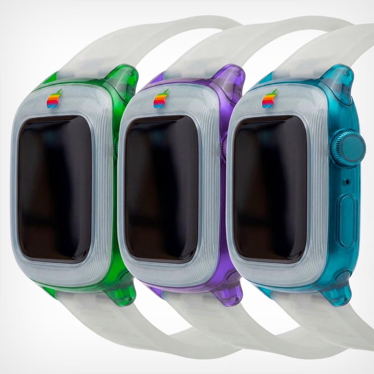
Saffy Creatives’ Apple Watch G3 concept brings the two together in what I can only describe as sheer nostalgic dream-come-true. The two design worlds collide perfectly – the body of a Watch with the soul of Apple’s G3 devices (tbh even the MacBook was absolute eye-candy). The results don’t just look fantastic, they honestly look wearable – like I would absolutely like to be caught with this piece of hand-candy across my wrist, even if its vibrant colors feel less serious than the cool metallic finish of your standard Watch.
Designer: Saffy Creatives
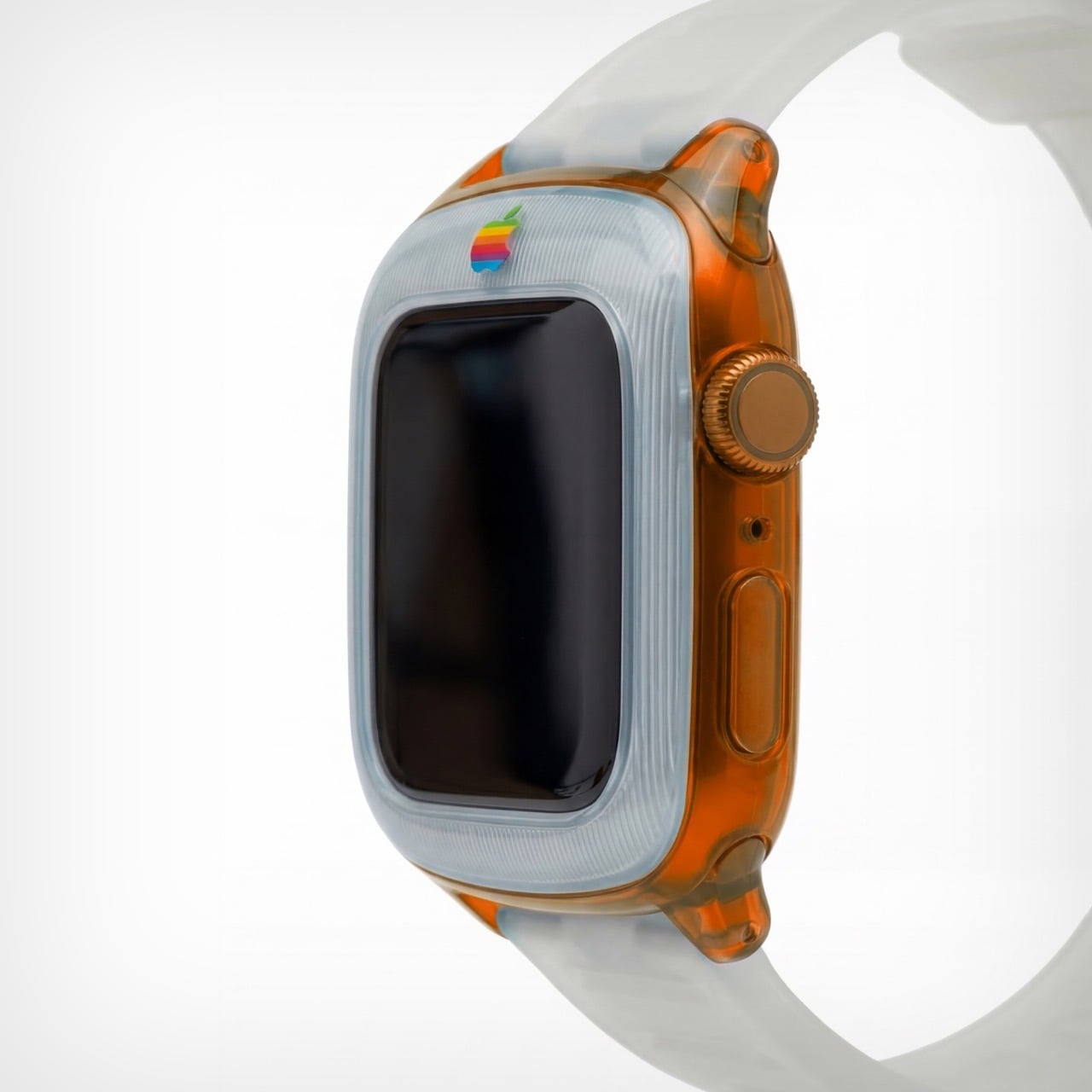
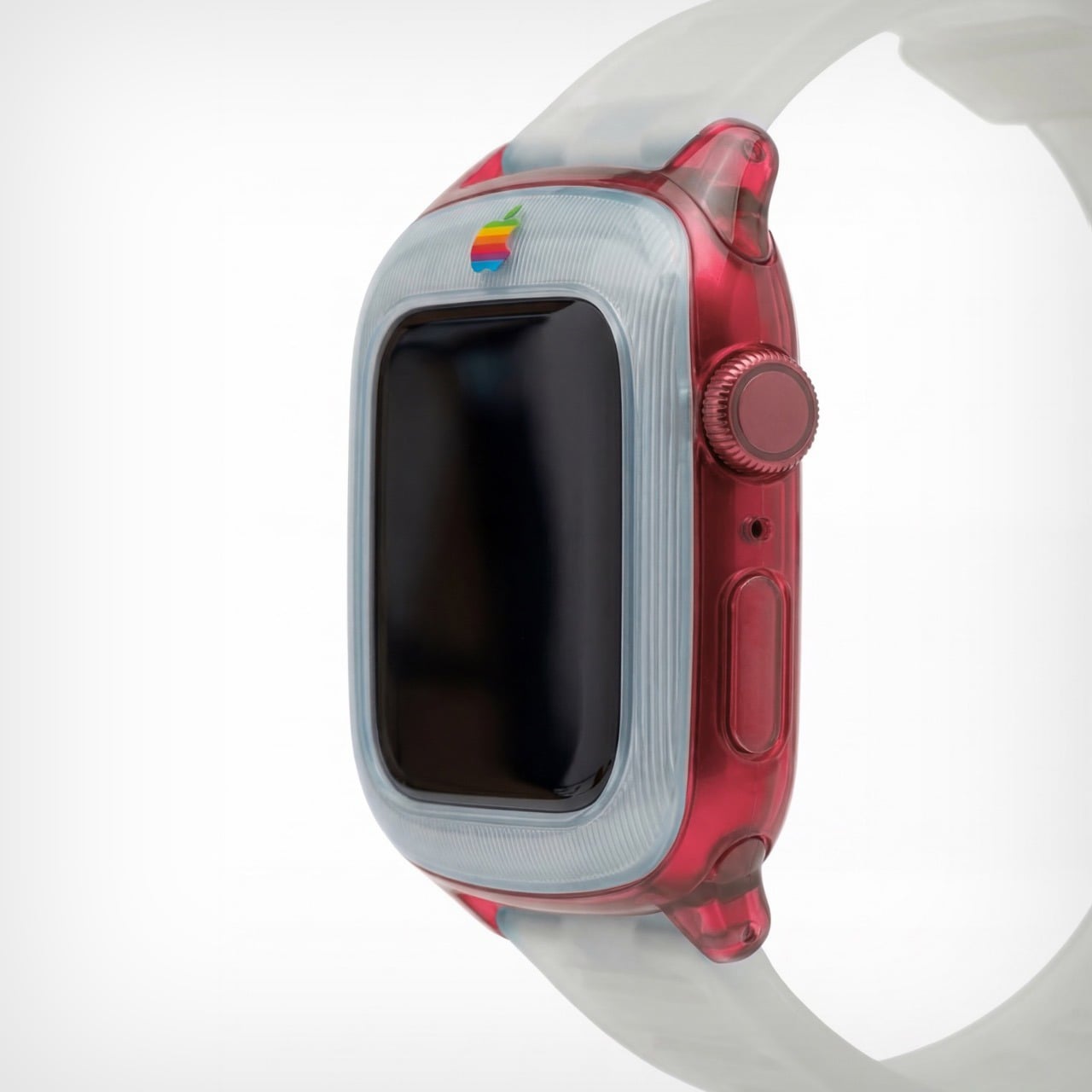
It’s worth noting that this isn’t just an existing watch with a plastic body. There are a few changes to the design itself to make it stand true to its inspiration. For starters, the watch has a chonky bezel, quite like the G3 iMac did. The bezel separates itself from the body by being made of an entirely separate plastic component. This is further reinforced by the watch’s two-tone colorway. The bezel adopts a clear white plastic design, while the body itself goes for the transparent tinted plastic that G3 fans know too well. The watch ditches all perceivable metal components, barring probably the crown, which looks like metal anodized to match the body’s color. The power button on the side is clear plastic, as are the lugs, and even the strap!
The G3 trend even carries to the Apple’s colored logo, which features on the bezel of the watch. It’s rare for the watch to have a logo on the front, but then again, it’s entirely inconceivable for Apple to make a plastic watch. But, like I said, a guy can dream! The colorful logo sits on the front, right above the standard touchscreen display with its curved glass almost perfectly mirroring the iMac G3’s CRT display.
The watch comes in a variety of colors, all celebrating that short but iconic era. You’ve got the truly legendary Bondi Blue, along with the Strawberry, Lime, Tangerine, and Grape variants. Like I said, this is, for most parts, an entire redesign of the watch itself. It isn’t really possible to make a watch case that captures the retro beauty of this watch – unless you expand the design outwards to give the watch a true bezel, or cut into the watch’s screen to keep the exact proportions as shown here. That being said, I’d like to see Spigen or any other company try giving the Apple Watch a retro flavor. That being said, this iMac G3-inspired Watch Charger from Spigen is perhaps the closest we’ll ever come to seeing anything!
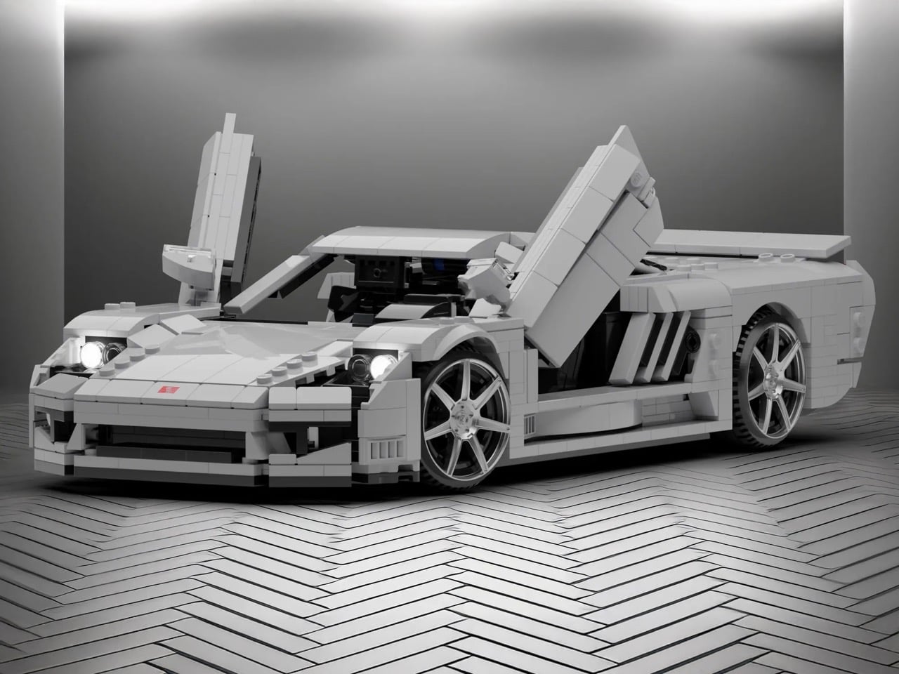
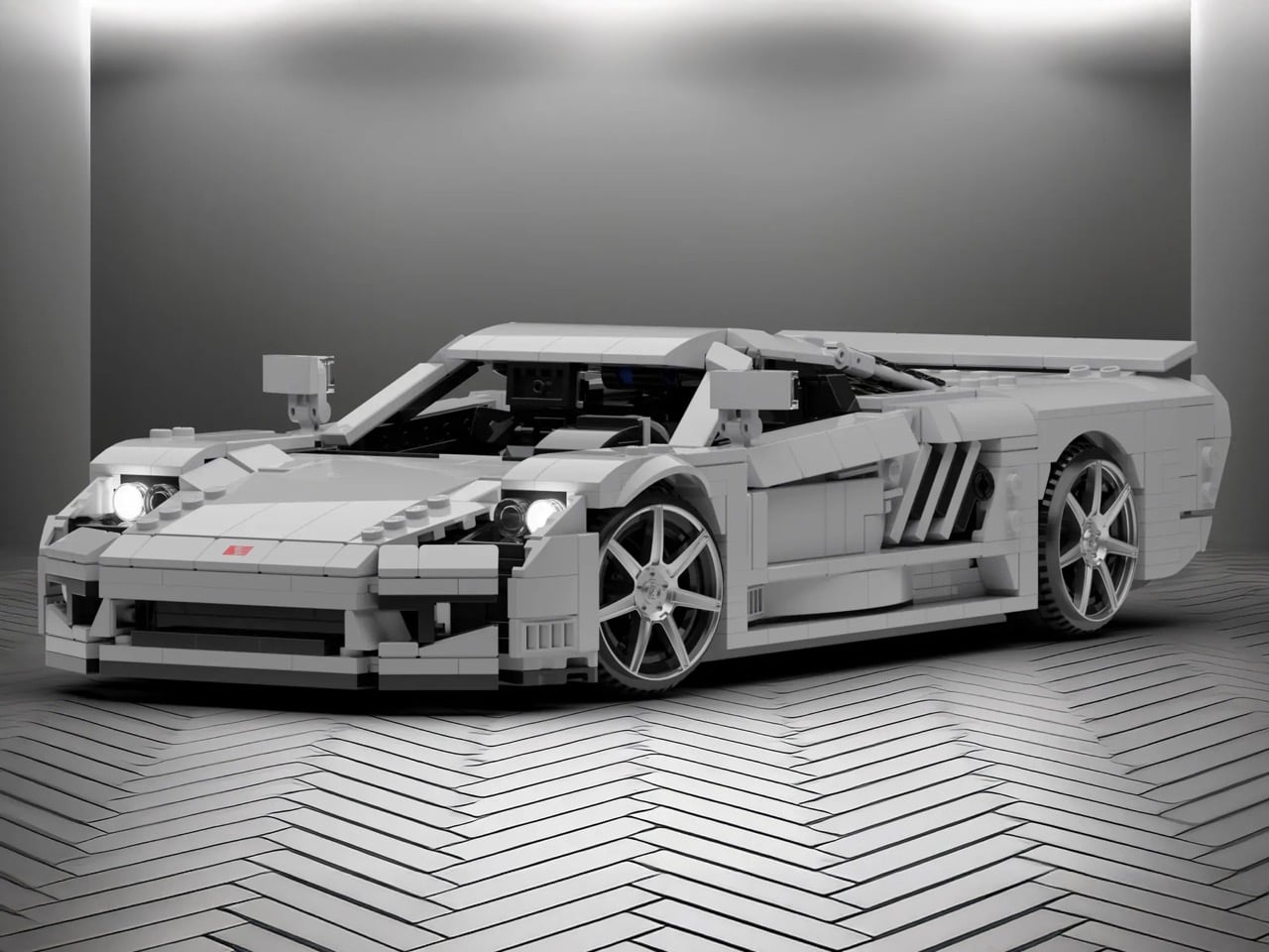
LEGO’s Speed Champions line has given us countless Ferraris, Porsches, and McLarens. Meanwhile, one of America’s most ambitious supercar projects sits conspicuously absent from the brick-built garage. The Saleen S7 deserves better than obscurity, and builder Nytedance has created a 1,200-piece proposal that makes the case beautifully. This isn’t a quick parts-bin creation but a thoughtfully detailed tribute to a car that once proved American manufacturers could play in the supercar sandbox.
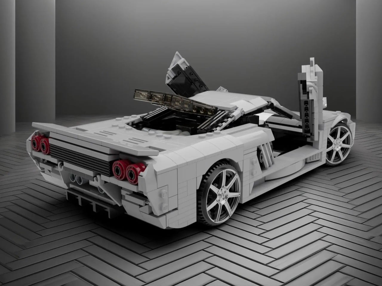
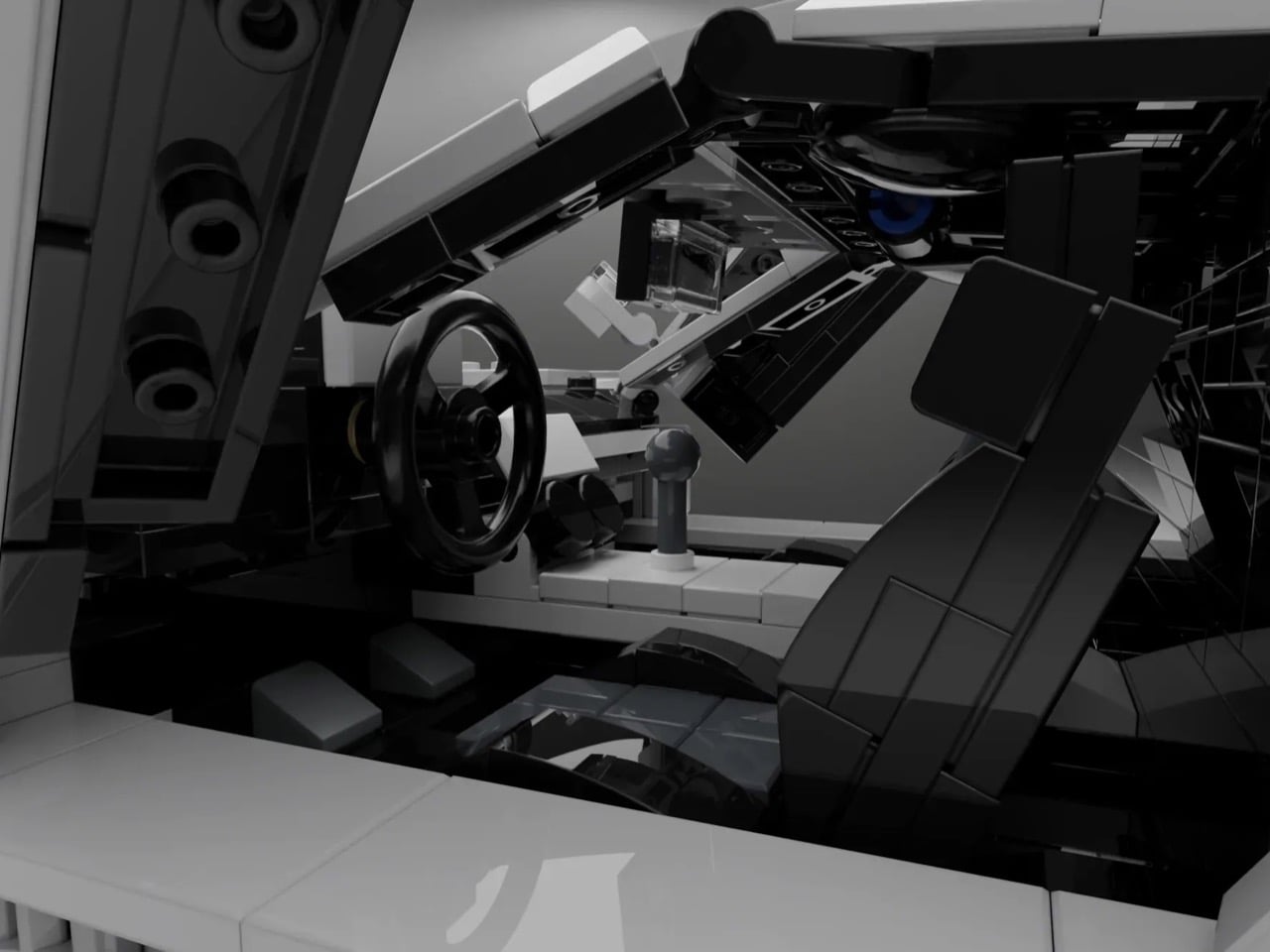
The build captures everything that made the S7 special: those dramatic scissor doors, the trio of diagonal side vents that channeled air to the mid-mounted engine, and the low-slung stance that telegraphed serious performance intentions. Nytedance included opening hood and engine bay access alongside a detailed interior, giving the model the same display-worthy presence the real S7 commanded on showroom floors. At a time when automotive design often feels derivative, this MOC celebrates a machine that carved its own identity through pure American audacity and engineering ambition.
Designer: Nytedance
Here’s the thing about the S7 that most people forget: it was legitimately fast. Like, 2000-era supercar fast when that still meant something. The naturally aspirated version put out 550 horsepower from a 7.0-liter V8, which sounds almost quaint now until you remember the whole car weighed 2,865 pounds. Then in 2005 they strapped turbos to it because why not. Steve Saleen had spent years building hot rod Mustangs, so when he decided to build a proper supercar, he didn’t half-ass it. Carbon fiber monocoque, mid-engine layout, the whole European playbook executed by a company in Irvine, California. And somehow this car gets forgotten while we endlessly rehash which Ferrari from that era was best.
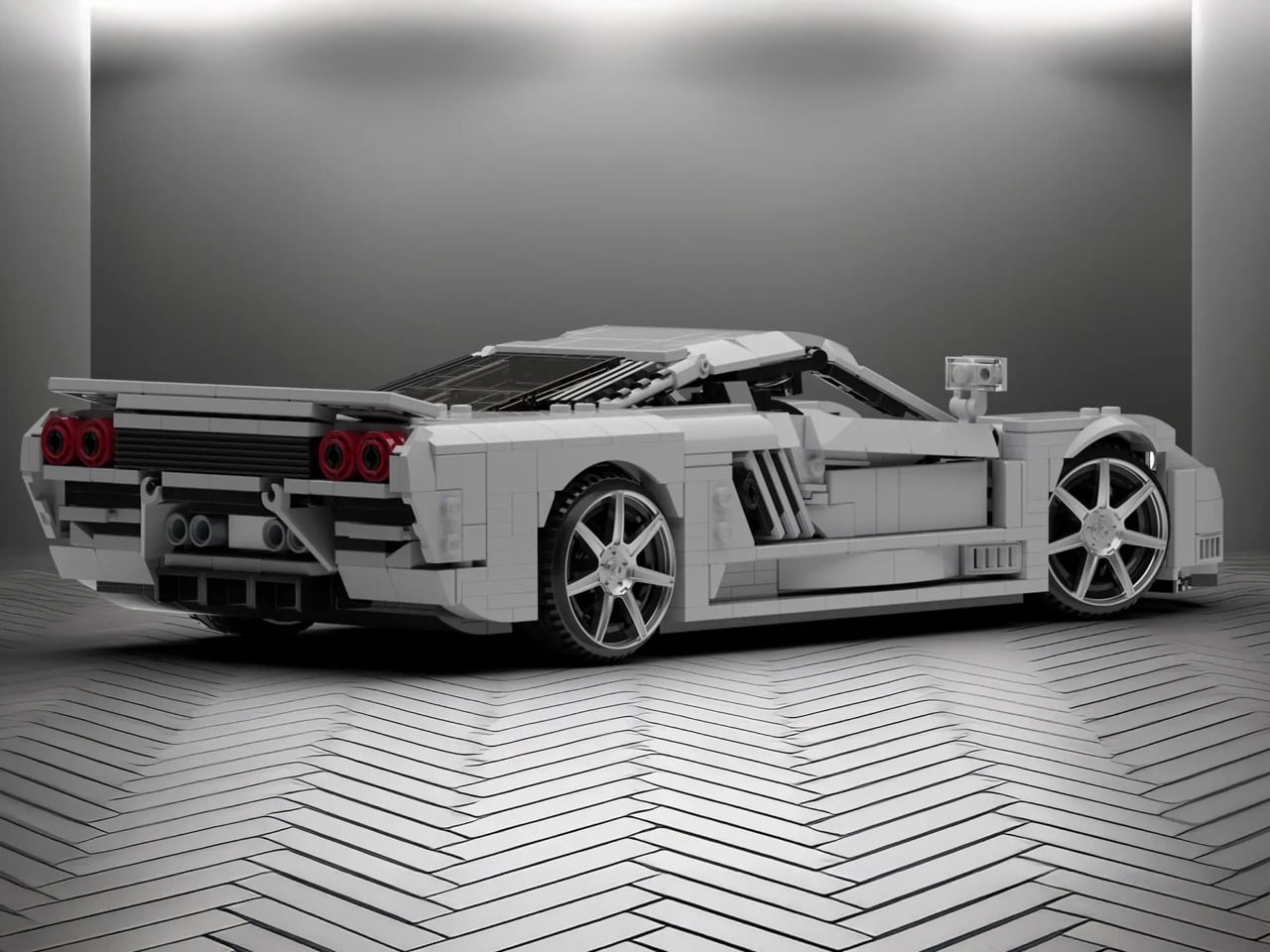
Those proportions are tricky because the car sits so low and wide, but the MOC nails that aggressive wedge shape without looking like a doorstop. The side intakes are the hero detail here, three diagonal slashes that became the car’s signature move. They’re rendered in white against black internals, creating the contrast you need for them to read properly at this scale. The scissor doors actually function, which feels mandatory given that half the reason anyone remembers the S7 involves those doors opening at car shows. Look at the rear haunches and how they flare out over the wheels. That’s not easy to pull off with LEGO’s predominantly rectangular vocabulary, but it works. The builder used curved slopes intelligently instead of trying to force angles that would look chunky.
The white color is clean enough to let you study the form without distraction, plus it matches one of the more common S7 liveries. Those red taillights pop against the white body, four circles arranged in a quad pattern that anyone who spent time with Need for Speed games will recognize instantly. The wheels use those multi-spoke pieces that suggest performance without going full boy racer. At 1,200 pieces, this sits in an interesting spot between impulse purchase and serious investment. You’re committed enough to display it properly but you’re not dropping Technic Bugatti money.
LEGO Ideas is basically democracy for brick nerds. You submit a design, people vote, and if you hit 10,000 supporters, LEGO actually reviews it for potential production. Get approved and your MOC becomes a real set with your name on the box and royalties in your pocket. Nytedance’s Saleen S7 is live on the platform now, so if you think American supercar history deserves shelf space next to all those Prancing Horse sets, go vote for it. The S7 spent too long in obscurity already.
Jet skis rip through water with ridiculous speed and agility. They’re also terrible at everything else. Try bringing friends along for the ride, or packing anything beyond a phone in a waterproof case. Yachts fix the space issue completely, but they cost a small fortune and require actual skills to operate. Spanish designer Amor Jimenez Chito created the One 16 to split the difference: it’s a six-meter boat powered by a jet ski that detaches when you want to go full throttle solo. The design won the Golden A’ Design Award for 2025, which apparently goes to projects that solve problems nobody else bothered to address.
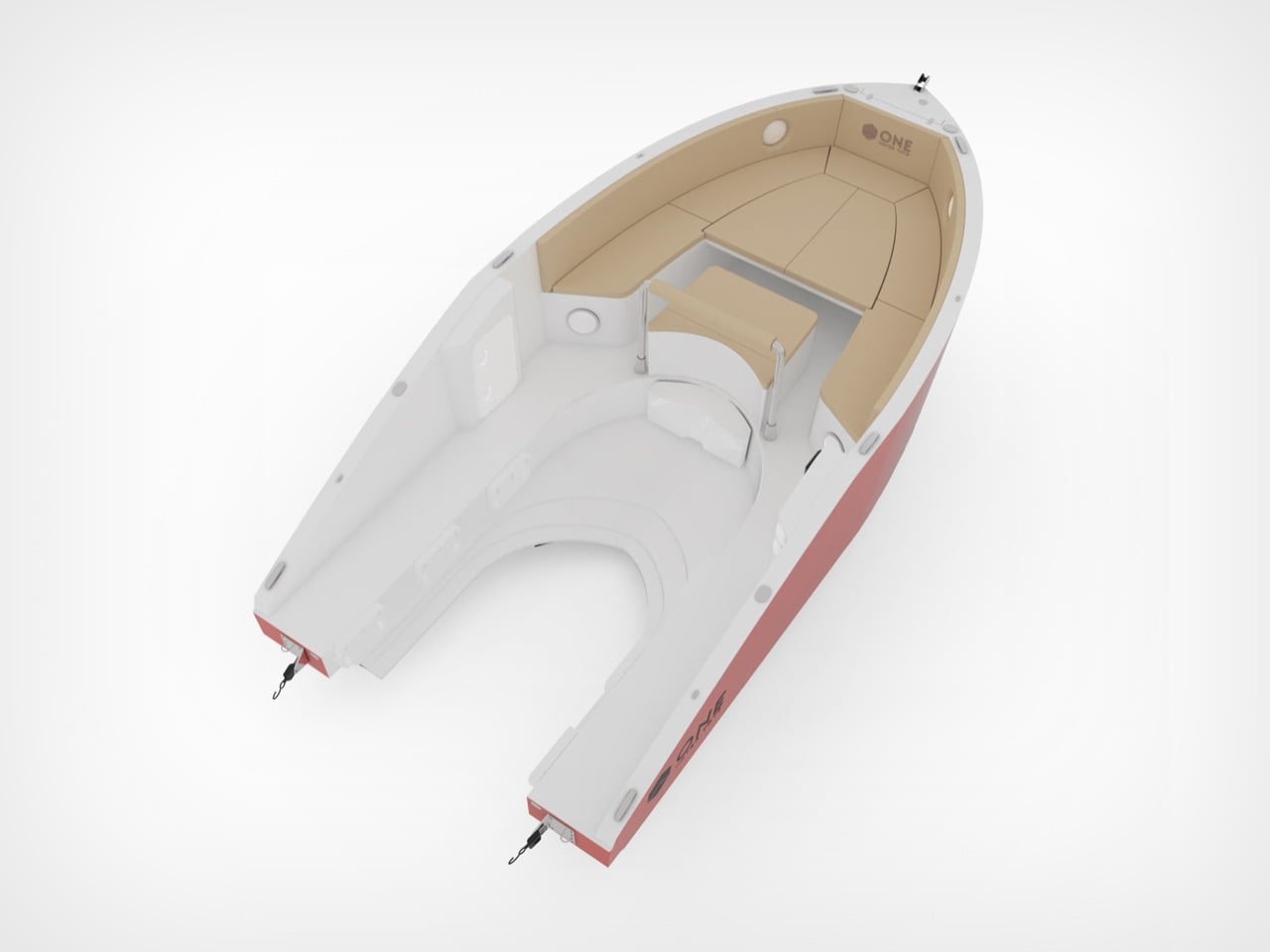
The engineering is surprisingly straightforward. Your jet ski slots into the hull and becomes the propulsion system for the entire boat. The plug-and-play setup works with major jet ski brands, so you can use whatever you already own or prefer. Six people fit comfortably on deck, where a convertible bow switches between table mode and sunbathing platform depending on the vibe. The hull keeps weight distributed properly so the whole thing stays stable instead of feeling like you strapped a picnic table to a rocket. You get two vehicles in one without paying marina fees for two vehicles. That’s the entire pitch, and it actually makes sense.
Designer: Amor Jimenez Chito
This kind of modularity has been tried before, usually with clunky results that looked like a science fair project gone wrong. The reason the One 16 works, at least conceptually, is that it doesn’t try to hide what it is. The jet ski integration is a core feature, not an afterthought. Chito’s background in industrial design engineering clearly shows in the execution, where the docking mechanism appears both robust and user-friendly. Making it compatible with Sea-Doo, Yamaha, and Kawasaki from the get-go is the smartest decision they could have made. It bypasses the proprietary ecosystem trap and opens the concept up to the entire existing PWC market, which is a massive advantage.
Of course, the real test is how it handles chop with a 300-horsepower jet ski bolted into its spine. The weight distribution is supposedly optimized, but there’s a big difference between a CAD rendering and a windy afternoon on the water. Aesthetically, it’s clean and inoffensive, which is probably the right call for a product aiming for broad appeal. It won’t turn heads like a Wally tender, but it’s not supposed to. The One 16 is a clever piece of problem-solving that prioritizes function over form. It’s a utility player, a waterborne multitool for people who want more options without owning an entire fleet.
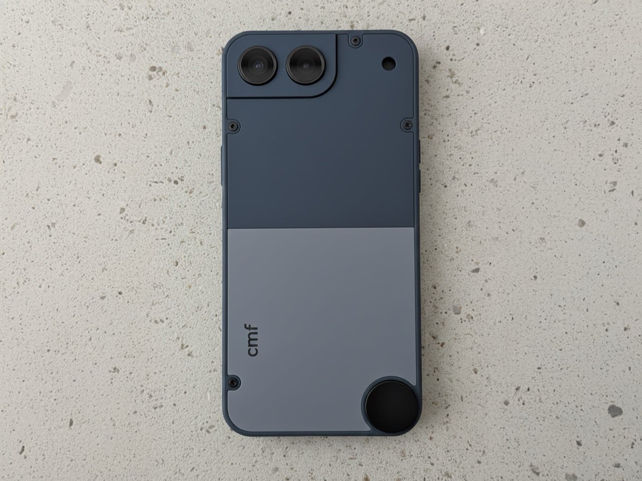
The market for compact smartphones didn’t disappear because people stopped wanting them; manufacturers simply decided the economics didn’t justify the engineering. The iPhone 13 mini was the last great holdout, and its discontinuation left a void that has been filled with nothing but silence. That makes this CMF Phone Mini concept, posted by designer Preet Ajmeri on the Nothing Community forum, feel less like a flight of fancy and more like a genuine market opportunity. It suggests a smarter middle path for small phones, one built around accessibility and modularity rather than specs-sheet maximalism. This isn’t just another shrunken flagship render; it’s a thoughtful take on what a small phone in 2025 ought to be.
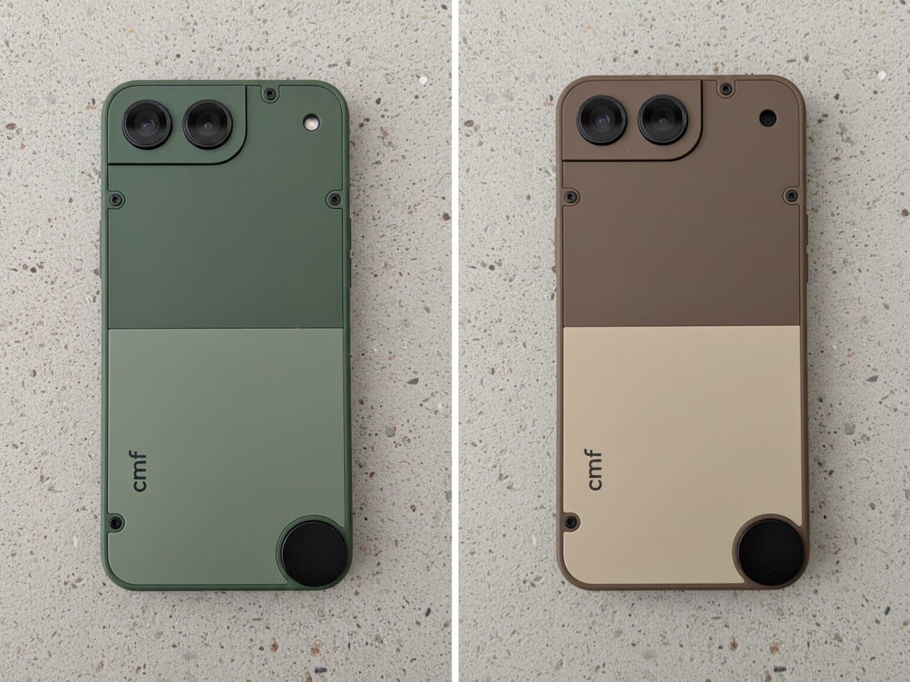
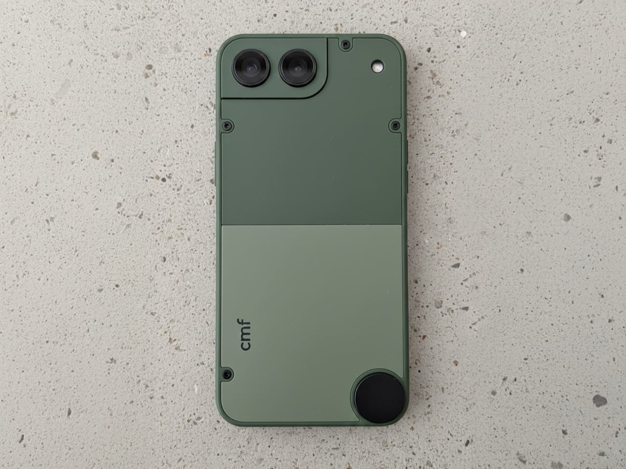
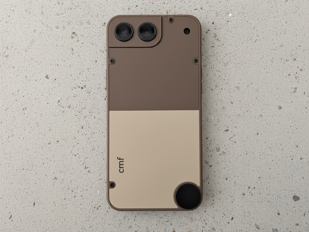
What makes Ajmeri’s concept work is its complete lack of flagship pretension. The design has a satisfying, tool-like quality, with an aesthetic that leans closer to a Braun appliance than a miniaturized glass sandwich. The two-tone back panels, secured by exposed screws, are a direct nod to the modularity of the CMF Phone 1 and 2 Pro. That little circular element in the lower corner is a brilliant touch, practically begging for a lanyard or a clever magnetic accessory. The camera housing is integrated into a stepped corner plate, making it feel like a distinct, functional component rather than a generic camera island. It’s an honest object, designed to be held and used without demanding reverence.
Designer: Preet Ajmeri
The colorways Ajmeri mocked up are subtle, and a deviation from the flagship phones’ vibrant color schemes. The sage green has a distinct, almost military-grade feel, while the slate blue is more of a classic tech color. But that brown and cream version is the real standout; it feels like something Braun would have designed in 1975, a perfect piece of retro-futurism. The hard split between the two tones gives it a clear visual hierarchy, and the presumed matte texture looks like it would feel fantastic in the hand. That aside, the modularity is still retained, with the screw-in design, and the knob on the bottom for fixing accessories.
This thing would live or die in the sub-$300 space, and that’s exactly where it belongs. You wouldn’t expect a top-tier Snapdragon processor here; a power-efficient MediaTek Dimensity 7000-series chip would be more than enough to drive a 5.4-inch OLED display without destroying the battery. And battery life would be the biggest engineering challenge, as it always is with small devices. But the appeal isn’t raw performance. The appeal is ergonomics, a one-handed user experience, and a design that has more personality than anything five times its price. CMF has already proven it can deliver a thoughtful software experience on a budget, and that’s all a device like this would need.
So, will Nothing ever actually build it? Almost certainly not, and that’s the real shame. The big players are too risk-averse to cater to a niche they’ve already declared dead. But this concept proves the desire for a well-designed, affordable, and genuinely compact phone is very much alive. It’s a perfect fit for a brand like CMF, which has built its identity on challenging the assumption that budget-friendly has to mean boring. The first company to take a chance on a design with this much character and common sense won’t just sell a phone; they’ll create a cult classic.
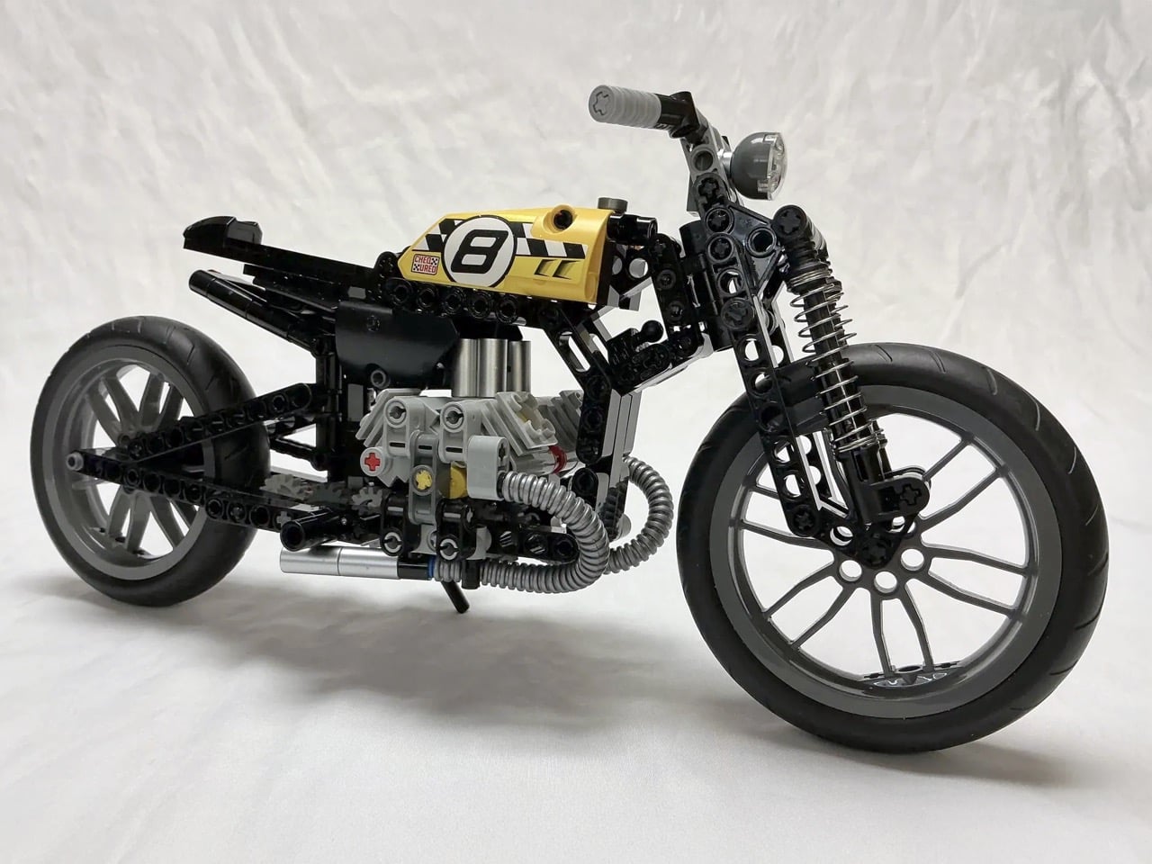
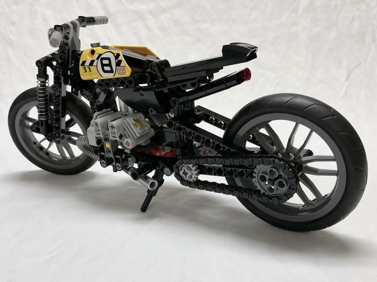
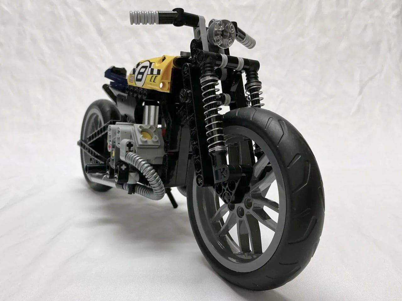
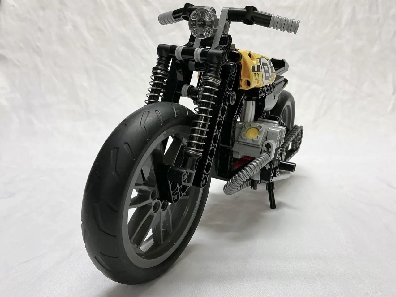
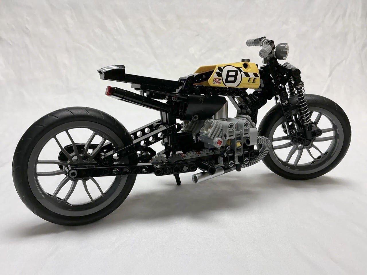
Ballpoint pen springs probably weren’t on your list of unofficial-yet-essential LEGO Technic parts, but this bobber MOC (My Own Creation) makes a compelling case for raiding your desk drawer. The twin coiled springs flanking the front forks and tucked behind the rear wheel handle suspension duties with surprising visual authenticity. They compress and extend just like real motorcycle shocks, adding functional movement to a build that already nails the stripped-down bobber aesthetic.
Bobbers emerged from post-war American garages when riders started cutting away everything unnecessary from their motorcycles. The philosophy was simple: lose the extra weight, keep what makes it run. This LEGO version channels that same spirit with its exposed twin-cylinder engine, bare-bones frame, and that yellow racing tank sporting a bold number 8. The builder modified LEGO Technic set 42036 into something far leaner and more specialized, swapping the original suspension components for those ingenious pen springs and repositioning elements to achieve proper bobber proportions.
Designer: MadamMelodicRaisin104
The pen spring hack solves a real problem in LEGO motorcycle builds. Technic sets come with their own suspension systems, sure, but they’re often bulky or visually clunky at this scale. Real bobber shocks are these long, exposed coil-over units that sit right out in the open, part of the bike’s visual language. Standard LEGO shock absorbers don’t quite capture that look. They function fine mechanically but lack the visual density and tight coil pattern you see on actual motorcycles. Pen springs nail the aesthetics, which works perfectly for this MOC because visuals are everything. The Bobber isn’t entirely functional, but the suspension (even if static) looks the part.
Set 42036, the donor bike here, originally builds into either a chopper or a street bike configuration. Both versions skew whimsical, which works for LEGO’s typical audience but doesn’t scratch the itch if you’re after something with genuine mechanical credibility. The builder kept the core engine assembly and frame geometry but ditched the fanciful proportions. Bobbers sit low, with the seat almost directly over the rear axle and minimal distance between components. This build compresses everything into that tight package, pulling the handlebars back into a more neutral position and mounting the foot pegs mid-frame rather than forward where cruisers typically place them. Mid-controls make sense for bobbers because the whole point was maneuverability and quick handling, not long highway cruises with your feet stretched out front.
The kickstand correction might seem minor but it speaks to the builder’s attention to detail. The original Technic chopper configuration puts the stand on the right side, which is wrong for actual motorcycles. Real bikes park on the left because that’s where the shifter lives and you need clear access when you’re mounting from the curb side. Swapping it over takes maybe five minutes but it shows someone who actually rides or at least understands how these machines work in the real world. Same logic applies to adding the foot pegs, which the kit omits entirely. You can’t have a rideable motorcycle without somewhere to put your feet, even in miniature form.
The yellow racing livery with that big number 8 pulls the aesthetic away from typical black-on-black bobber builds and into flat track racing territory. Flat trackers are bobbers’ dirt-slinging cousins, stripped down for speed on oval dirt tracks. The color choice keeps the build from looking too generic while the racing plate gives it a story beyond “stripped motorcycle.” The tail section stays minimal, just a small seat cowl and rear fender. Nothing to disturb the clean line running from tank to tail. The fat rear tire balances against that narrow front wheel, classic bobber proportions that suggest power and grip where it matters most. Those pen springs keep catching your eye though, because they’re so perfectly scaled and so absurdly obvious that you wonder why more builders haven’t figured it out.
The catch, however, is that this Bobber only exists in the metaverse… or rather LEGO’s own virtual verse, called the LEGO Ideas forum. Designed as an online platform for LEGO enthusiasts to share their own creations and vote for their favorites. MOCs that cross the 10,000 vote threshold get sent to LEGO’s internal team for review, and if successful, get turned into a box set that all of us can buy! I don’t see LEGO launching kits that require dismembering ballpoint pens for their springs (because that’s technically an ‘illegal’ form of building a brickset), but I’m sure there’s a pneumatic Technic part somewhere in LEGO’s arsenal that will work. If you want to see that happen, however, step 1 is to cast your vote for this gorgeous build on the LEGO Ideas website.
If Part 1 of this list proved that nostalgia is having a moment, Part 2 is here to show you that 2025 wasn’t only about looking backward. Sure, we are obsessed with what came before, but the best designs this year didn’t just resurrect the past, they remixed it with enough modern intelligence to feel genuinely new. This is where things get interesting: when designers stop treating retro as a costume and start using it as raw material. The result is products that feel familiar enough to trust but fresh enough to justify their existence in a world already drowning in stuff.
So here are the next 10 designs that made 2025 unforgettable. Some lean hard into nostalgia. Others push so far forward they feel like prototypes from 2030. A few manage to do both at once, which might be the most 2025 thing possible. Whether you spent this year glued to design blogs or just trying to keep your head above water, these picks represent the moments when form, function, and cultural timing aligned perfectly. Let’s dig into the second half of what made this year worth paying attention to.
1. Poke-Nade Monster Ball by Takara Tomy & The Pokémon Company
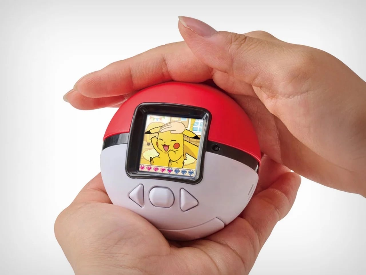
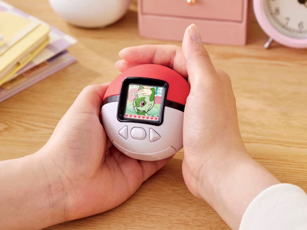
Nostalgia is a fickle mistress! She shows up when you least expect her, whispers about the good old days, and convinces you to spend money on things that have no business existing in 2025. Case in point: Pokemon just dropped the Poke-Nade Monster Ball, which is essentially a Tamagotchi disguised as a Pokéball, and millennials are losing their collective minds over it. This is not groundbreaking technology. This is not solving any real problems. This is pure, weaponized nostalgia, and it is working exactly as intended.
The device takes everything we loved about late-90s virtual pets and wraps it in Pokemon branding so potent you can practically hear the theme song playing. A color LCD screen sits inside a touch-sensitive shell shaped like an actual Pokéball, letting you stroke, tap, and physically interact with your digital companion. Pet it gently and it reacts with happiness. Tap persistently and it falls asleep. The gestures unlock deeper animations as your friendship level grows, which is a clever evolution of the old Tamagotchi button-mashing routine. But let’s be honest, the innovation here is minimal. What they are really selling is the emotional real estate Pokemon and Tamagotchi occupied in our childhoods, repackaged with a slightly better screen and some capacitive touch sensors. And you know what? That is enough. Because nostalgia does not need to innovate. It just needs to remind you of a time when feeding a pixelated creature between math classes felt like the most important responsibility in your life. Pokemon knows this. They counted on it. And judging by how fast these things are selling out, they were absolutely right.
2. Wi-Fi HaLow (with 9.9 mile connectivity) by Morse Micro
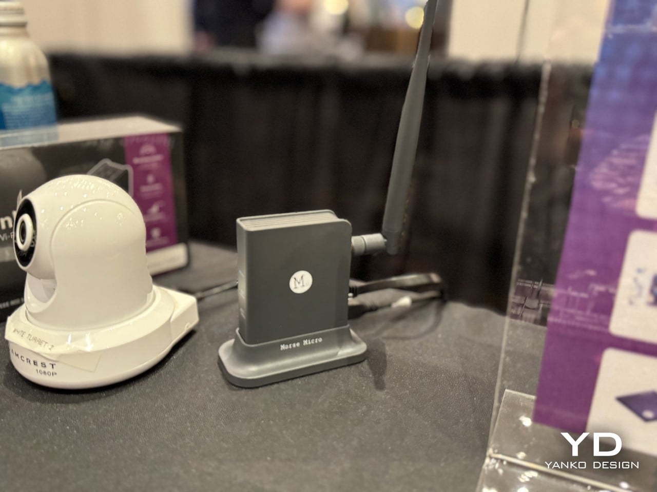
And to counteract that, here’s some serious tech innovation from the beginning of the year that grabbed eyeballs. While most brands relied hard on nostalgia, Morse Micro decided to solve a problem that has plagued connectivity since WiFi was invented: range. The Wi-Fi HaLow system delivers connectivity across a 9.9-mile radius using sub-GHz radio waves, which means it can punch through walls, penetrate obstacles, and maintain signal strength over distances that would make standard Wi-Fi routers give up and go home. Traditional Wi-Fi operates on crowded high-frequency bands that struggle beyond a few dozen meters and get blocked by anything denser than drywall. HaLow operates at lower frequencies with significantly better propagation characteristics, turning your home network into something closer to a neighborhood utility than a room-specific convenience.
The implications go way beyond streaming Netflix from your driveway. You could theoretically connect to your home network from the grocery store, maintain smart home control from miles away, or create IoT networks that span entire campuses without repeaters or mesh nodes cluttering every hallway. Industrial applications become viable where they were previously impossible, rural connectivity suddenly looks feasible without expensive cellular infrastructure, and the whole concept of what a local network means gets redefined. This is not retro. This is not nostalgic. This is pure forward momentum, the kind of innovation that makes you wonder why we spent decades optimizing the wrong frequencies when the solution was sitting in a less congested part of the spectrum the whole time. If 2025 taught us anything, it is that sometimes the best way forward has nothing to do with where we have been.
3. Nintendo Wii U Revival by Brenden Sullivan
The Wii U was Nintendo’s most spectacular failure in recent memory, a console so confusing in its messaging and underwhelming in its execution that even hardcore fans pretend it never happened. Yet here comes a concept that asks: what if we took the one genuinely clever idea from the Wii U, the gamepad with the built-in screen, and rebuilt it for the Switch 2 era? This Wii U revival concept imagines a companion device that pairs with Nintendo’s next console, offering dual-screen gameplay, touch controls, and the asymmetric multiplayer experiences that made the Wii U interesting for about five minutes before everyone forgot it existed. It is nostalgia for hardware that barely had time to build nostalgia in the first place, which makes it either brilliantly contrarian or deeply misguided depending on how charitable you are feeling.
What makes this concept work as a 2025 artifact is that it refuses to let a good idea die just because the original execution flopped. The Wii U’s tablet controller was ahead of its time in some ways and catastrophically behind in others, but the core premise, that asymmetric information and split-screen interactions could create new gameplay dynamics, never got a fair shot. This concept takes that kernel and strips away everything that made the original clunky: the limited range, the single-controller restriction, the confusion about whether it was a handheld or a console accessory. By positioning it as an optional sidekick to the Switch 2 rather than the main event, it fixes the branding disaster while keeping the innovation. It is nostalgia weaponized correctly, not as pure recreation but as salvage operation, pulling the worthwhile parts from the wreckage and giving them a second chance in a context that might actually appreciate them.
4. No.1/1000 Titanium Fractal Vise by Titaner
Most tools are designed to disappear into workshops, utilitarian objects that do their job without demanding attention. Titaner’s titanium fractal vise does the opposite. It announces itself as both precision instrument and sculptural object, with a body machined from solid titanium and a fractal pattern that serves actual structural purposes rather than just looking cool. The geometry distributes clamping force efficiently while reducing material weight, which means the mathematical beauty is not decorative, it is load-bearing. Limited to a small production run, each vise is CNC-machined to tolerances that make it as much a collector’s item as a working tool, the kind of thing that sits on a workbench and makes visitors ask questions before they realize it actually functions.
What makes this a 2025 design rather than just expensive engineering porn is the way it represents a larger shift in how we think about tools and objects. We are moving past the idea that functional items need to be aesthetically neutral, that beauty and utility occupy separate categories. This vise proves you can have museum-grade craftsmanship in something designed to grip metal and take abuse. It is the intersection of maker culture, precision manufacturing, and the growing appreciation for objects that justify their cost through both performance and presence. There is no nostalgia here, no retro callback, just an argument that everyday tools can be extraordinary if we stop accepting mediocrity as the baseline. It is innovation in the form of asking why more things are not built this well, and then actually building one to prove the point.
5. WP200 Pro Modular Smartphone by OUKITEL
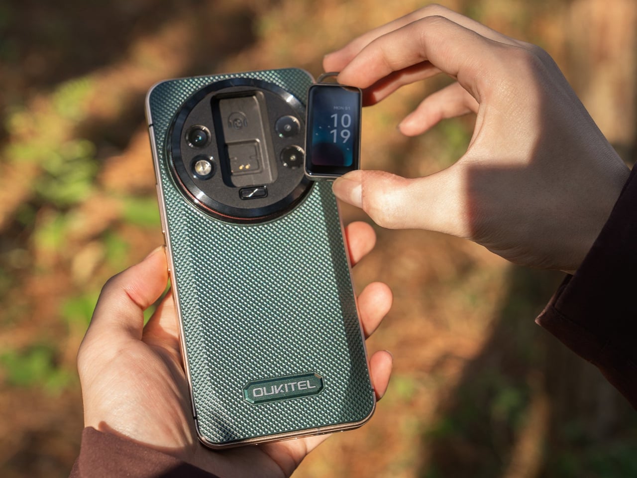
Modular smartphones have been promised, prototyped, and abandoned so many times that most people stopped believing they would ever work. Then the rugged WP200 Pro from OUKITEL shows up with a detachable display that does not just disconnect, it transforms into entirely different devices. The screen pulls away from the phone body and can be reconfigured as either a smartwatch strapped to your wrist or an earbud clipped to your ear. The phone itself continues functioning with a secondary display underneath, so you are not sacrificing core functionality when you repurpose the main screen. It is the kind of absurdly ambitious design that sounds like vaporware until you see the mechanical hinges and magnetic connections that make it plausible.
This is innovation trying to solve a problem nobody asked for but might actually appreciate once it exists: the fact that we carry multiple screens doing similar jobs when one good screen could rotate between contexts. Why own a phone, smartwatch, and wireless earbuds when one modular system could cover all three? The rugged construction suggests this is built for field work, outdoor use, or situations where carrying multiple fragile devices makes no sense. It is the opposite of nostalgia, there is no retro aesthetic here, no callback to simpler times, just aggressive forward-thinking that asks whether our current device ecosystem is as optimized as we assume. Whether it ever ships is anyone’s guess, but as a statement of intent, it proves that some designers are still more interested in what comes next than what came before.
6. Kangourou Tiny Home by Quadrapol
Tiny homes have been sold as this romantic solution to housing affordability and minimalist living, but they come with one universal design flaw that nobody wants to admit: climbing a ladder to your bed every night gets old fast. Especially if you have kids, aging parents, mobility issues, or just a baseline desire to not break your neck at 3am during a bathroom trip. This family-friendly tiny home named Kangourou redesigns the entire layout to put every sleeping space on the ground floor, which sounds simple until you realize how much spatial gymnastics that requires in a structure measuring under 400 square feet. The designers pulled it off using sliding partitions, convertible furniture, and clever vertical storage that keeps the ceiling height usable without forcing anyone to sleep in what amounts to an attic crawlspace.
What makes this relevant to 2025 is that it represents tiny home design finally maturing past the Instagram aesthetic phase. For years, tiny homes prioritized looking good in photos over actually functioning as long-term residences, which is why so many ended up as glorified vacation rentals rather than permanent housing solutions. This design prioritizes livability, accessibility, and the reality that families need private sleeping spaces that do not require ladder proficiency. It is not flashy. It is not trying to reinvent architecture. It is just solving a known problem with enough intelligence that it stops being a problem, which might be the most underrated form of innovation. If the tiny home movement wants to be taken seriously as housing rather than lifestyle content, this is the direction it needs to go: less emphasis on clever lofts, more focus on whether you would actually want to live there past the honeymoon phase.
7. Pexar Starlight 15.6″ Picture Frame by Lexar
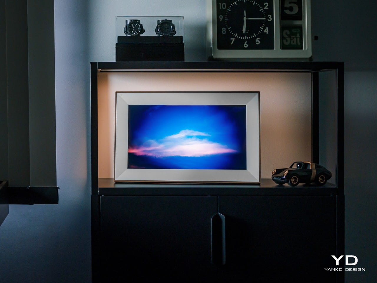
Wizarding photographs in Harry Potter had one feature that always felt unfair: they moved, waved back, captured the full motion of a moment instead of freezing it into stillness. Muggles have been trying to close that gap ever since, and digital picture frames are basically our best attempt at making photos feel alive without actual magic. The Pexar Starlight takes that idea and adds ambient backlighting, turning a 15.6-inch display into something that sits between traditional frame and mood lighting. Photos cycle through with adjustable brightness that shifts based on time of day, so your memories glow softly in the evening and stay crisp during daylight hours. It is designed to blend into home decor rather than scream “tech gadget,” which is harder than it sounds when you are essentially mounting a screen on the wall.
What separates this from the dozens of other digital frames cluttering the market is the execution of details most brands ignore. The matte finish reduces glare without killing color vibrancy. The frame itself comes in multiple finishes so it does not look like every other black-bezeled rectangle. Setup happens through a companion app that actually works instead of requiring a computer science degree to navigate, and photo uploads can be automated from cloud storage so you are not manually curating every week. The backlight feature is the real differentiator, creating depth and warmth that makes photos feel more like displayed art than screensaver content. It is not trying to replace your phone’s photo library. It is trying to give your best shots the kind of presence they deserve, somewhere between nostalgia object and functional decor, which is exactly where digital frames should have been aiming all along.
8. CAMIO Wearable by BQEYZ
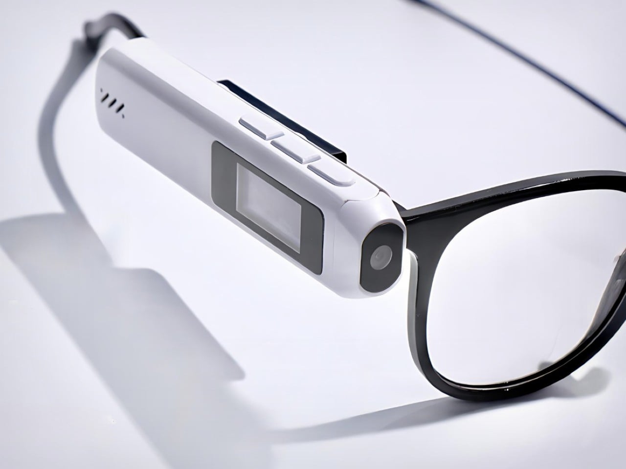
Meta’s smart glasses cost several hundred dollars and lock you into their ecosystem, their frames, their design language, and their gradual feature rollout that always feels like paying for a beta test. Meet CAMIO, a $79 snap-on module from an upstart competitor that takes a different approach: it clips onto any pair of glasses you already own and turns them into recording devices with a tiny camera, built-in storage, and wireless connectivity. You keep your prescription lenses, your favorite frame style, your existing investment in eyewear. The module just adds the capture functionality without forcing you to replace everything. It records video, snaps photos, and syncs to your phone over Bluetooth, handling the basics without trying to be a full augmented reality platform or AI assistant.
The genius here is recognizing that most people do not want to replace their glasses, they just want their glasses to do more. Meta’s approach requires buying into their hardware completely, which is a tough sell when you have frames you like or prescriptions that need specific lenses. This module treats smart features as an add-on rather than a replacement, which dramatically lowers the barrier to entry both financially and practically. It is not going to match Meta’s polish or integration depth, but it does not need to. It just needs to capture moments hands-free and stay out of the way when you are not using it. For seventy-nine dollars, that is a value proposition that makes sense in a way premium smart glasses still struggle to justify. Sometimes the best innovation is not building something entirely new, it is building something that works with what people already have.
9. Small House On A Corner Lot by KOMINORU Design
Tokyo real estate operates on a completely different logic than most cities. Space is so expensive and scarce that architects have spent decades perfecting the art of making tiny footprints feel livable, even generous. This Japanese tiny home takes those spatial compression techniques and pushes them further, creating a dwelling that maximizes every cubic inch without feeling claustrophobic or compromised. The design uses vertical layering, multifunctional furniture, and strategic transparency to make a structure barely wider than a parking space feel like a complete home rather than an elaborate closet with plumbing.
What sets this apart from typical tiny home design is the cultural context. Japanese architecture has been optimizing small spaces for centuries, long before minimalism became a lifestyle trend or tiny homes became YouTube content. This design pulls from that tradition: sliding shoji-inspired partitions that reconfigure rooms on demand, sunken floors that create separation without walls, storage integrated into every surface so nothing feels like dead space. Natural light floods in through carefully positioned windows that also provide ventilation and visual connection to the exterior. The result is a home that feels intentional rather than constrained, where every design choice serves multiple purposes and nothing exists just for show. It is a masterclass in efficiency that does not sacrifice comfort, proving that small spaces stop being a limitation once you design specifically for them instead of trying to cram traditional layouts into compressed square footage. If urban density is the future, this is the blueprint for making it actually desirable.
10. Saros Z70 by Roborock
Robot vacuums have gotten really good at one thing: vacuuming. They map your floors, avoid obstacles, empty themselves, and generally handle the task they were designed for with increasing competence. But they have always had one glaring limitation: if there is a sock on the floor, a charging cable, a kid’s toy, anything that is not flat dirt or debris, the vacuum just routes around it or gets tangled and calls for help. The Roborock Saros Z70 fixes this with the most obvious solution nobody thought to mass-produce until now: it adds a robotic arm. A literal articulated arm that extends from the vacuum’s body, grabs objects off the floor, and moves them out of the way so it can continue cleaning underneath. Socks, shoes, small towels, cables, anything under a certain weight gets picked up and relocated to a designated drop zone.
This is innovation that feels overdue the moment you see it. We have had the mechanical capability to build grabber arms into consumer robots for years, but nobody committed to the engineering challenge until Roborock decided the robot vacuum category had gotten boring enough to need disruption. The arm uses vision recognition to identify objects, assess their weight and shape, and determine whether they are safe to grab, which prevents it from trying to lift furniture or drag your laptop across the room. It is not perfect, weight limits and object recognition will have edge cases, but it represents a fundamental expansion of what a cleaning robot can do. Instead of just reacting to obstacles, it actively manipulates its environment to complete its job. That is a step change in capability that makes every previous robot vacuum feel like it was solving only half the problem. If this actually ships at a reasonable price point and the arm proves reliable, it will instantly make the entire existing market feel outdated, which is exactly what genuine innovation is supposed to do.