I don’t sing enough praise of titanium as a material. It’s the strongest metal known to humankind, but at the same time, it’s also anti-corrosive, rust-resistant, and biocompatible (the body doesn’t reject it when used internally for implants/supports in surgery). It’s found in abundance on the moon, it self-heals (forms an oxidized layer if scratched), and is the only element that burns in nitrogen (every other element burns in oxygen). Titanium, aside from being such a weirdly wonderful element, is also a preferred alloy in EDC… and while most makers use titanium for a handle and call it a day, the folks at KeyUnity machined it in a way to give Titanium properties of a carabiner.
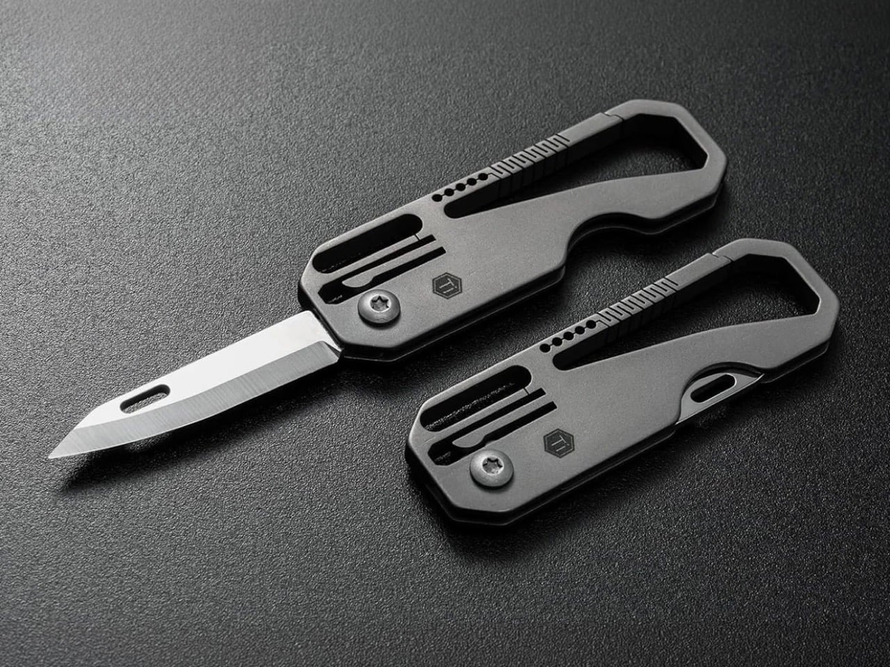
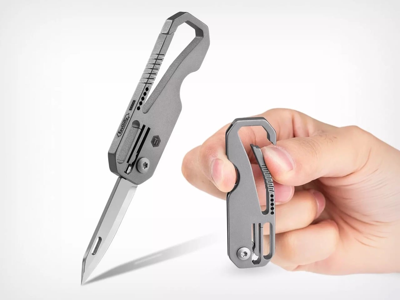
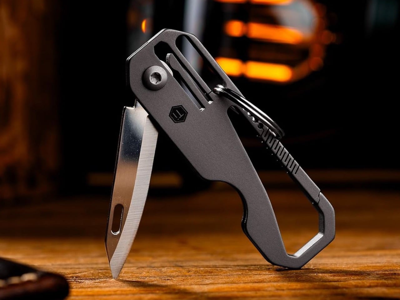
The KK08 carabiner from KeyUnity uses a single-piece titanium handle, which houses a 7Cr17Mov steel blade inside it. The handle is carabiner-shaped for a reason – it has this brilliantly machined detail that allows the carabiner arm to spring and bend without using a spring. Relying entirely on Titanium’s own properties, the zigzag machined pattern lets the carabiner work immaculately, providing spring as well as being durable enough to never break. The rest of the handle? Well, it’s cleverly designed to house the knife when not in use, sheathing the blade within its slim but incredibly cool design.
Designer: KeyUnity
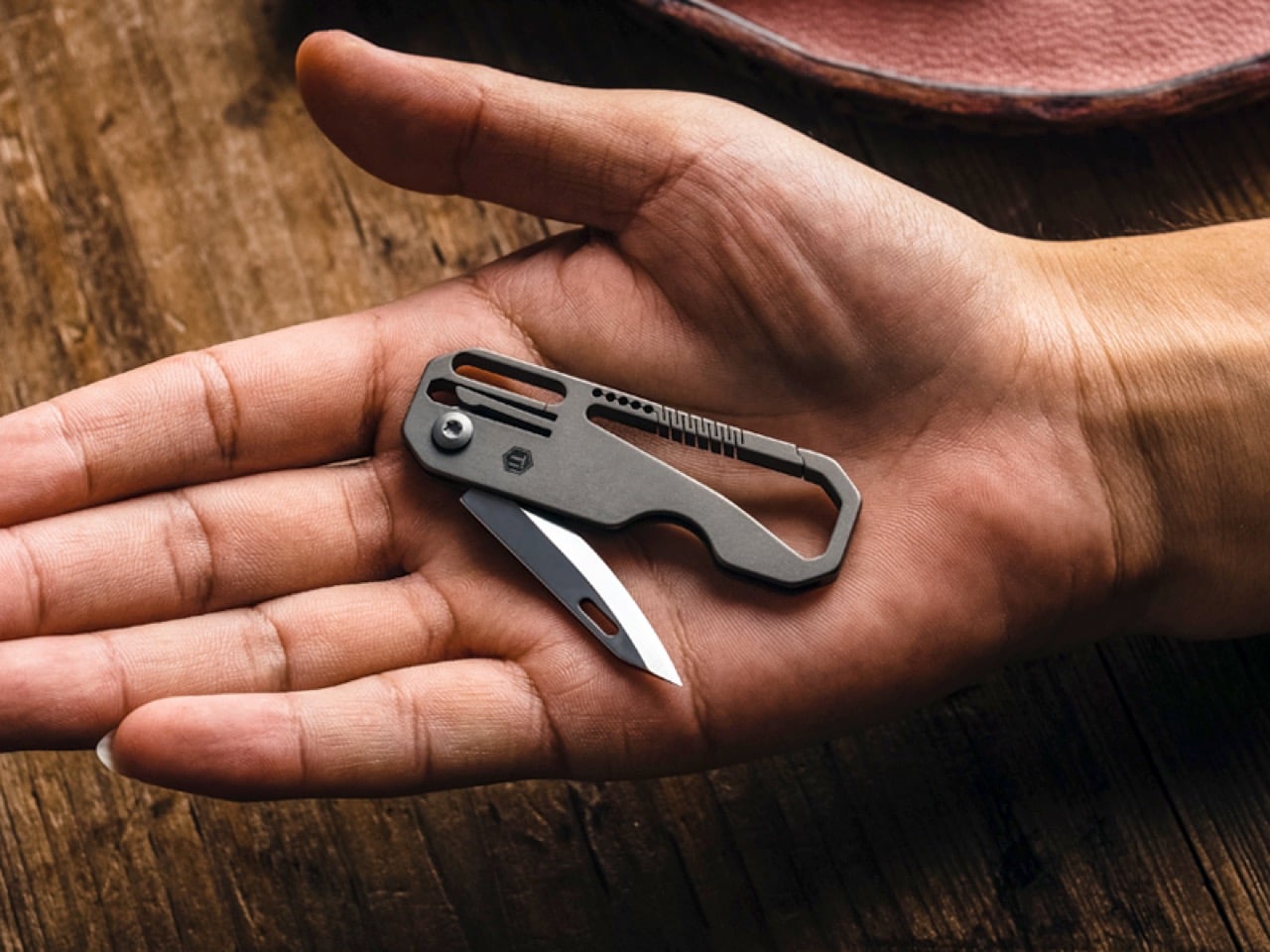
At 2.56″ when closed, this is your average-sized carabiner. It’s compact, weighs a paltry 16 grams, and can punch well above its weight. Titanium’s incredible strength-to-weight ratio means this carabiner can lift keys but even be used to do things like secure your water bottle to your backpack or even your backpack to a railing/fence. The cleverly machined detail on the carabiner arm allows the titanium to flex just like the spring-loaded arm on a regular carabiner. Meanwhile, the KK08 also hides a nifty blade inside it, for when you need a pocket knife.
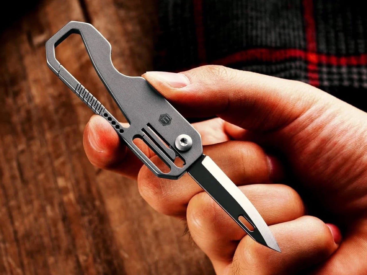
The hidden blade folds out, revealing a 1.6″ cutting edge which might be on the smaller side, but it certainly gets the job done. The 7Cr17Mov steel build is brilliant on a budget, with high chromium for shine, and vanadium for strength and resilience. The drop-point profile makes it a great knife for all sorts of activities, from benign stuff like opening envelopes and packages, to more rugged activities like sharpening pencils, cutting branches, slicing through fruit/vegetables, or even self defense if push comes to shove.
Given its small size (and its fairly budget $23 price tag), the KK08 integrates everything into a minimal footprint, using a simple pivot for the knife to fold in and out. A frame lock is built into the titanium handle, allowing the blade to click into place while open, holding its position even while you’re working with tough materials like wood. KeyUnity mentions that the KK08 is the perfect hiking companion, although we see it as a brilliant EDC tool that you can carry anywhere – just not an airport or places where knives are considered taboo!
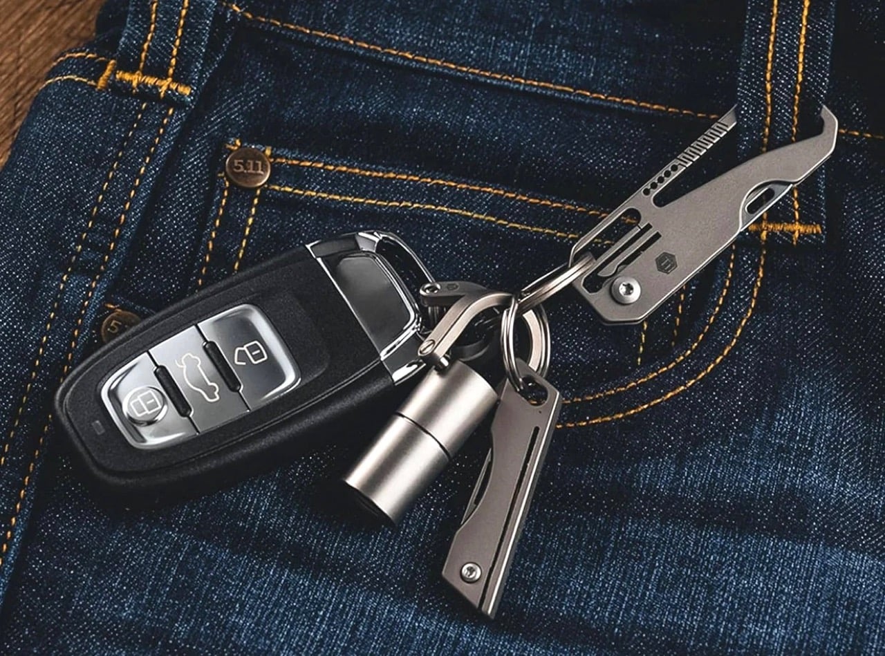
The KK08 comes in two colors – the plain titanium, as well as an anodized space grey finish. It honestly doesn’t need any color or pattern – the simple design language works wonderfully for this form factor, allowing it to also integrate seamlessly into your other EDC (especially your keychain). Both variants cost $23, and KeyUnity provides a 15 day exchange window upon damage or defect, along with a 1-year free maintenance period if your carabiner experiences regular wear and tear. There’s a lifetime warranty available too, although KeyUnity offers it at an added cost. Knowing their track record as well as how robust and durable titanium is, you’ll probably never need it.
The post This $23 Titanium Carabiner Hides a Secret EDC Knife Inside It And Weighs Next To Nothing first appeared on Yanko Design.