8 Best Pens and Writing Instruments That Make You Actually Want to Pick Up a Pen Again

There is an argument happening on desks everywhere, and it is not about productivity systems or the right notebook grid. It is about whether the thing you write with deserves the same design attention as everything else you choose to own. For most people, a pen is a pen. For a small and growing number, it is the one object that connects thought to surface, and that connection is worth getting right. The instruments on this list take that idea seriously.

What unites them is not price or prestige. It is that each one treats the act of writing as a design problem worth solving from the beginning — the weight, the mechanism, the material, the way it sits in the hand before the nib or tip ever touches paper. Some are concepts. Some are products you can order today. All of them make the case that the writing instrument is still one of the most interesting objects in design.

1. Yamaha Swing Scribe

Yamaha’s answer to the question nobody thought to ask — what if a pen had a heartbeat? Part of the brand’s Scribe Tool Design 2024 project, the Swing Scribe draws its logic from the quill: as a feather naturally wobbles under air resistance while writing, it gives the act a physical rhythm. Yamaha made that incidental quality intentional. A weighted tip attached to a metal bar swings as the pen moves, feeding a small, steady pulse back into the hand with every stroke. No batteries. No app. Just physics.

The weight slides along the bar, letting you dial in the arc of the swing to match how you’re writing at any given moment. Pull it close to the pivot for a tighter, faster beat. Let it run wide for slow, deliberate work. This is the kind of design thinking that earns the word Kando — the Japanese concept of emotional resonance that sits at the core of everything Yamaha builds, from concert grands to this pen. It doesn’t make writing faster. It makes it more felt.

What we like:

  • The pendulum mechanism works without any power source, making it completely self-contained
  • Adjustable weight position means it adapts to the writer rather than demanding the writer adapt to it

What we dislike:

  • The swinging arm adds visual complexity that won’t suit every context or desk aesthetic
  • The concept hasn’t been tested across extended, high-volume writing sessions yet

2. Inseparable Notebook Pen

The premise is embedded in the name. Most pens and notebooks exist in a state of constant near-separation — the pen migrates to a bag, a pocket, another room, and the notebook sits waiting and useless. The Inseparable concept addresses this directly, building pen and notebook as a single resolved object rather than two products that happen to be sold together. The pen lives within the notebook’s architecture rather than being clipped to it as an afterthought, and removing it feels deliberate rather than accidental.

What makes this design interesting isn’t just the integration — it’s that the integration is the premise, and everything else follows from it. The proportions of the pen are dictated by the notebook. The notebook’s form is shaped around the pen’s presence. Neither object is compromised to serve the other, which is harder to achieve than it sounds. When a design solves a problem this specific and this common, it has a right to exist.

Click Here to Buy Now: $19.95

What we like:

  • Eliminates one of the most common and most irritating failures of the writing ritual entirely
  • The formal resolution between pen and notebook is tight — neither object feels like a concession

What we dislike:

  • Integration at this level commits you to one notebook format, limiting flexibility for writers who move between sizes
  • Writers who prefer their own paper choices will find the pairing restrictive

3. Da Vinci Pencil

Gabrilevich Design’s Da Vinci pencil concept earns its name not through ornamentation but through the kind of cross-disciplinary thinking that made Leonardo’s notebooks worth studying in the first place. The design draws from da Vinci’s own mechanical sketches — the geometry, the visible logic of moving parts, the sense that an object should reveal how it works rather than hide it. The result is a pencil that functions as a small piece of mechanical sculpture, beautiful precisely because nothing about its construction is concealed.

The concept challenges the pencil’s conventional muteness. Most pencils look like nothing in particular. The Da Vinci concept looks like something that was thought about — that has a position, a point of view about what a mark-making tool should communicate about the hand that uses it. Whether it writes better than a standard pencil is beside the point. It writes differently, and it makes you think about the act differently, which is often the more interesting design outcome.

What we like:

  • Treats a pencil as a vehicle for design philosophy rather than a commodity object
  • The exposed mechanical logic gives it a conceptual depth that most stationery completely lacks

What we dislike:

  • Concept-driven designs at this level of visual complexity often struggle in extended daily use
  • Visible mechanisms can introduce maintenance friction that disrupts the writing ritual

4. Levitating Pen 2.0 Cosmic Meteorite Edition

The levitating pen is a category that could easily slide into novelty, and the original versions of magnetic levitation pens leaned into that direction unapologetically. The 2.0 Cosmic Meteorite Edition changes the conversation by adding material seriousness to the spectacle. The pen itself incorporates genuine meteorite fragment material — iron-nickel alloy from outside the atmosphere — which gives the levitation a context it previously lacked. The object that hovers above its base is, in a measurable sense, from space.

That combination of astronomical material and magnetic suspension creates an object that earns its place on a desk in a way that pure spectacle cannot. It is a writing instrument that happens to be made partly from the oldest solid material you will ever hold, suspended above a surface by the same electromagnetic principles that govern planetary orbits. The writing experience is secondary to what the pen communicates as a resting object, and for a desk piece that doubles as a conversation anchor, that hierarchy is entirely appropriate.

Click Here to Buy Now: $399.00

What we like:

  • The meteorite material elevates the concept from a gadget to a genuine collectible
  • The levitation serves the narrative of the material rather than competing with it

What we dislike:

  • The magnetic base required for levitation eliminates any possibility of portability
  • Its function as a writing instrument is always secondary to its function as a display object

5. Qui Magnetic Pencil System

Qui operates on the premise that the friction between a pencil and the surface it lives on — a desk, a notebook, a wall — should be designed rather than incidental. The magnetic system allows the pencil to attach and detach from its designated surface with a satisfying, calibrated resistance, making the act of picking it up and setting it down feel considered rather than casual. This is a small interaction, but it happens dozens of times a day, and designing it well changes the quality of the entire writing practice.

The system thinking extends beyond the magnetic connection. The pencil’s geometry is resolved with the mounting surface as part of the design problem, not as a separate accessory. The result is that Qui occupies space well even when not in use, which is most of the time. A pencil that looks intentional when it is sitting still is a harder design challenge than one that merely writes well, and Qui understands that the resting state is part of the design.

What we like:

  • The system approach treats the pencil and its environment as a single design problem
  • The resting interaction — picking up and setting down — is as considered as the writing experience itself

What we dislike:

  • The magnetic system creates a dependency: without its base, the pencil loses its defining characteristic
  • Committing to a fixed mounting point works against the natural portability of a pencil

6. PENTAPA

Konstantin Diehl’s PENTAPA takes its name and its logic from the pentagon — five sides, each one a resolved surface rather than a generic round barrel. The five-sided form is unusual enough to read as a design decision the moment you pick it up, and practical enough to hold well once you begin writing. Pentagons don’t roll off desks. They register against the fingers in a way that circular barrels don’t, giving you tactile information about the nib’s orientation before the tip reaches paper.

PENTAPA belongs to a tradition of geometric pen design that runs from the hexagonal tradition of rOtring and Kaweco through to contemporary CNC-machined objects, but it finds its own position in that tradition rather than merely referencing it. Five sides is not the expected answer. It is the interesting one — the number that offers enough symmetry to feel resolved and enough irregularity to feel considered. That balance between the expected and the surprising is where most good pen design lives.

What we like:

  • The pentagonal form solves the rolling problem with more formal interest than a standard hexagon
  • The five-sided barrel gives the pen a distinct tactile identity that rewards extended daily use

What we dislike:

  • The unconventional geometry won’t suit every grip style or hand size
  • Finding a compatible pen case or sleeve requires more effort than standard round or hexagonal barrels

7. Everlasting All-Metal Pencil

The all-metal pencil solves a problem that the pencil has had since its invention: it runs out. A graphite core depletes. A pencil shortens. Eventually, it disappears entirely and takes with it whatever patina or character it had developed through use. The everlasting all-metal pencil replaces graphite with a metal alloy tip — typically an aluminum or similar soft-metal formulation — that deposits a mark through controlled abrasion rather than core consumption. The pencil does not shorten. It does not run out.

The mark is different from graphite — lighter, slightly metallic in tone, with a distinctive quality that serious writers and sketchers tend to either embrace or reject immediately. The design interest is in what remains when the core is removed: a pure metal object whose entire form is determined by how it feels to hold, since there is no pencil-to-grip ratio to manage, no sharpener to carry, no length to account for. The result is one of the most resolved objects in everyday carry design.

Click Here to Buy Now: $19.95

What we like:

  • Removes the pencil’s built-in obsolescence entirely, changing the object from consumable to permanent
  • With no core to deplete, the entire form is determined purely by how it feels to hold

What we dislike:

  • The mark quality is distinct enough from graphite to require genuine adjustment and won’t suit every application
  • Some writing and sketching tasks — particularly those requiring dense, dark marks — simply don’t translate well to a metal alloy deposit

8. The Bolen

The James Brand has built its reputation on EDC objects with no unnecessary elements — knives, tools, and pens that look like they were designed by someone who uses them. The Bolen is the brand’s pen, and it carries the same design logic as everything else in their catalogue: machined from quality materials, resolved in form, designed to be carried without thought and used with satisfaction. The clip works. The mechanism engages cleanly. The proportions sit right in the hand without adjustment.

What distinguishes the Bolen from most EDC pens is that the James Brand comes from a tool-making tradition rather than a stationery one, which means the pen is designed for carry first and desk presence second. That priority ordering produces a different object than you get from pen-first design — one that is slightly more aggressive in material and slightly more considered in how it lives in a pocket. It is the writing instrument for someone who doesn’t think of themselves as a pen person, and that is exactly who needs it most.

What we like:

  • The tool-making heritage produces genuine material integrity, with nothing present without a reason for being there
  • Carry-first design logic makes it the most naturally portable instrument on this list

What we dislike:

  • The EDC-first approach means it lacks the expressive personality of instruments designed for desk use
  • Writers who want the pen to feel special on the page rather than merely functional in the pocket may find it underwhelming

The Object in Your Hand Shapes the Thought on the Page

Eight instruments that represent eight different positions on what a writing tool should be. The Yamaha asks what happens when you give a pen a pulse. The Levitating Pen asks what happens when the material itself carries a story. The Bolen asks what happens when you design for the pocket before the page. None of these answers is the same, which is the point. The best design in any category is the kind that expands your sense of what the category can contain.

What they share is the conviction that the instrument matters — that the weight, the mechanism, the material, and the form of the thing in your hand have a real effect on what ends up on the page. That conviction used to belong only to serious writers and professional draughtsmen. The fact that you can now find it in a magnetic pencil system, a levitating desk object, and a pen designed by a motorcycle company suggests the rest of the world is catching up.

The post 8 Best Pens and Writing Instruments That Make You Actually Want to Pick Up a Pen Again first appeared on Yanko Design.

Mass Timber, Passive House, & a Curving Roof: This Canadian Community Centre Is the Civic Building Other Cities Should Be Copying

There’s a version of a public building that checks all the sustainability boxes and still feels cold, institutional, and somehow indifferent to the people it’s meant to serve. The new Marpole Community Centre is not that building. Designed by Diamond Schmitt for the City of Vancouver and the Vancouver Board of Parks and Recreation, it’s nearing completion in Oak Park. It quietly resets expectations for what a civic facility can be.

The project replaces a well-loved but outgrown facility with a two-storey structure nearly double its size, measuring 5,000 square metres. The program is generous: a gymnasium, fitness centre, field house, multi-purpose rooms for seniors and youth, and a 74-space childcare facility. Underground parking is tucked beneath the building to protect the surrounding natural vegetation, letting Oak Park remain exactly that — a park.

Design: Diamond Schmitt

What makes the architecture worth paying attention to is the mass timber. Rather than limiting wood to the roof structure, as institutional buildings often do, the Marpole Community Centre uses a comprehensive mass timber frame — glulam columns and beams, a CLT floor system, and a long-span upper roof built from steel wide flange beams and a CLT deck. The result is a structure that reads as warm and considered, not engineered into submission. Exposed throughout the interior, the timber gives the building a human scale that concrete rarely allows.

The signature move is the gently curving roof. The doubly curved cantilever form, supported by long-span steel beams, required close coordination between the design team and contractors — but the payoff is an exterior that feels unified without being monotonous, and an interior where the ceiling becomes the experience. Strategic glazing pulls the landscape in, connecting occupants to Oak Park’s natural setting without sacrificing energy performance.

On the sustainability front, the numbers are serious. The building targets Passive House and LEED Gold certifications and has achieved a 41% reduction in embodied carbon. It’s also a pilot project for the City of Vancouver’s Embodied Carbon Guidelines, meaning lessons learned here will directly shape future civic buildings across the city. The project is also pursuing the CAGBC’s Zero Carbon Building Design Standard.

Beyond the technical performance, the centre was designed with inclusion, equity, and Indigenous cultural representation as core principles — not afterthoughts bolted on at the end. For a neighbourhood as diverse as Marpole, that intentionality matters. A community centre tends to be the most democratic building a city can build. This one makes a strong case that it can also be among its most thoughtful.

The post Mass Timber, Passive House, & a Curving Roof: This Canadian Community Centre Is the Civic Building Other Cities Should Be Copying first appeared on Yanko Design.

10 Best Kitchen Tools and Appliances Designed to Live on Your Counter, Not in Your Cupboard

The kitchen counter is prime real estate. Most appliances waste it, sitting there looking generic and visually forgettable until they get pushed to the back and eventually into a box. A smaller category of kitchen objects earns that space differently. They are worth looking at, whether in use or not. The ten products here belong to that category, and each one makes a quiet but convincing case for staying exactly where it is.

The question has never really been about function alone. It is about form meeting function so completely that putting the object away would feel like a loss. A Dutch oven with architectural presence. A kettle that handles like nothing you have owned before. A grater shaped like a curled sheet of paper. These are not kitchen tools that happen to look good. They are objects that happened to end up in the kitchen and have no intention of leaving.

1. Smeg Air Fryer + Steam

Smeg’s origins are in enamel technology, not the candy-colored kitchen appliances the brand became famous for. At Milan Design Week 2026, the Italian company debuted a concept air fryer that brings genuine cooking innovation to a form that could hold its own in any design-forward kitchen. The fryer opens from the top rather than the front, its lid ejecting at the press of a button to reveal a 7-liter basket, an exposed heating coil, and a tinted black visor that lets you see inside while it works.

What separates it from the broader category is a built-in steam function. A removable water cartridge feeds moisture into the basket via a top-mounted nozzle, creating an environment where food crisps on the outside while retaining moisture within. Chicken wings come out with a fried texture and no oil. Bread develops the kind of crust usually reserved for a professional oven. Currently a concept with no confirmed launch before 2027, it already sets the benchmark for where the category is heading.

What we like

  • The steam function produces results that no standard air fryer can replicate
  • The top-opening form and enameled body make it worthy of permanent counter placement

What we dislike

  • Not available to purchase, with no confirmed launch before 2027
  • Bold color options lean maximalist, which won’t suit every kitchen aesthetic

2. Playful Palm Grater

Most kitchen tools that try to be playful end up decorative and useless. The Playful Palm Grater avoids that completely. Designed to look like a sheet of paper curled at one corner, its form solves the ergonomic problem that plagues standard graters: it sits inside the palm of your hand, keeps knuckles clear of the surface, and contains what you are grating rather than scattering it across the counter. The object makes a strong aesthetic case while being entirely serious about its purpose.

At $25, it is the price anchor of this list and arguably its sharpest surprise. Guests who pick it up typically ask what it is before they realise it is a grater, which is the clearest signal that the design is working at the level it intends to. Hard cheese, citrus zest, ginger, chocolate: it handles all of it without protest. It also stores flat, so the playfulness does not come at the cost of practicality.

Click Here to Buy Now: $25

What we like

  • Palm-hold grip makes grating more controlled than any flat or box grater alternative
  • A genuine design achievement delivered at a $25 price point

What we dislike

  • Compact surface area limits it to small-quantity grating tasks
  • Not suited for bulk preparation, where a larger, fixed grater would serve better

3. Mitsubishi Bread Oven

The Mitsubishi Bread Oven exists at the opposite end of the appliance spectrum from multi-function, multi-mode, multi-button. It does one thing: toast a single slice of bread to a standard that no conventional toaster approaches. It’s a sealed, thermally insulated chamber that locks moisture in during the process, producing a slice that is crisp at the edges and genuinely fluffy at the center. The boxy silhouette and matte finish make it look less like a toaster and more like an object recovered from a mid-century Japanese archive.

For anyone serious about morning rituals, it rewires the relationship between bread and appliance entirely. One slice goes in, and a considered, unhurried result comes out. Its compact footprint occupies less counter space than most four-slice toasters while commanding considerably more visual presence. The Bread Oven is the kind of appliance that prompts questions from anyone who enters your kitchen, not because it looks complicated, but because it looks so deliberately, confidently simple.

What we like

  • A sealed thermal chamber produces toast that no pop-up toaster can replicate
  • Minimal Japanese form earns counter presence through restraint rather than spectacle

What we dislike

  • Limited to a single slice at a time, which doesn’t suit households cooking for multiple people

4. BØYD Espresso Machine

The BØYD Espresso Machine is a coffee machine that reads as modern sculpture before it reads as equipment. Its smooth curves and pure lines result from stripping the object back to what the design actually requires. No panel clutter, no unnecessary controls. Just form shaped around the daily ritual of pulling a shot, and a counter presence that justifies every centimeter it occupies.

It belongs to a growing movement of coffee equipment that treats the counter as an extension of living space rather than a working surface. BØYD understands that an espresso machine is often the first thing reached for in the morning and the last object you look at before leaving the kitchen. Making that object worth looking at is not superficial. It is the point. For a home barista who cares as much about the counter as the cup, BØYD answers both without compromise.

What we like

  • Sculptural form elevates the morning coffee ritual beyond the purely functional
  • Minimal interface keeps the countertop visually clean and uncluttered

What we dislike

  • The stripped-back aesthetic works best in kitchens that can match its visual confidence
  • Design restraint offers little warmth for kitchens that lean more traditional in character

5. FineLine Aluminum Chopsticks

Chopsticks are rarely considered as design objects in Western kitchens, which is precisely the space the FineLine Aluminum Chopsticks occupy. Machined from aluminum with a finish that sits somewhere between tool and instrument, they bring the same material confidence to the table that a well-made knife brings to the counter. For everyday use, the grip is secure and the balance calibrated enough that switching from wooden chopsticks feels immediately like a step worth taking.

Left beside the matching chopstick rest, they form a composition rather than a cutlery arrangement. That distinction makes them worth the counter space: they are objects you would display even without daily use. Aluminum resists staining and absorbs minimal heat, so hot dishes do not require the caution that some metal utensils demand. The design is one of those cases where the material logic and the aesthetic argument arrive at the same answer.

Click Here to Buy Now: $30.00

What we like

  • Machined aluminum delivers a material precision and weight that wooden chopsticks cannot match
  • The finish reads as a considered object rather than a utensil, earning a counter display

What we dislike

  • Aluminum conducts heat, which can be uncomfortable with very hot food over an extended period of contact
  • The refined finish requires careful washing to maintain its quality over time

6. Kenwood Go Compact Stand Mixer

The stand mixer has always been a counter occupant by necessity rather than by design. They are large, heavy, and most look like they belong in a professional bakery. Kenwood’s Go Compact reframes the category. It packages the performance of a full stand mixer into a footprint small enough to coexist with everything else on a compact counter without requiring the kitchen to reorganize itself around one machine.

Its value is in the everyday bake rather than the occasional showpiece production. It handles the mechanical work of mixing dough, whipping cream, or folding batter without demanding that the kitchen dedicate itself to the task. That restraint in form, paired with Kenwood’s track record for motor reliability, makes it a counter object rather than a stored appliance. Compact proportions mean it stays where it sits, ready for the next session, without becoming a visual intrusion between uses.

What we like

  • Compact footprint genuinely rethinks the stand mixer for smaller kitchens without sacrificing performance
  • Kenwood’s motor reliability means the scaled-down size doesn’t compromise on results

What we dislike

  • Smaller bowl capacity limits batch sizes for high-volume or professional-scale baking sessions
  • Can feel less stable than full-size alternatives when working with particularly stiff doughs

7. JIA Inc. Rolling Mortar

The mortar and pestle have been functionally unchanged for roughly 35,000 years, which is either a testament to the design or an invitation to rethink it. JIA Inc., a Taiwan-based design brand, chose the second view. Their Rolling Mortar replaces the vertical pounding motion with a rolling action: a stone sphere moves across a curved ceramic base, grinding herbs and spices through rotation rather than force. The gesture is more intuitive, considerably less tiring, and far more interesting to watch.

On a counter, it reads as a sculptural object long before it reads as a kitchen tool. The sphere and base form a self-contained composition that earns its space whether in use or not. Fresh pesto, ground spices, crushed garlic: the results are consistent, and the process is more enjoyable than the traditional method. It also cleans easily, which is the practical detail that tends to close the case for anyone still on the fence.

What we like

  • The rolling mechanism reduces the physical effort of traditional pounding significantly
  • The sphere-and-base composition is sculptural enough to justify permanent counter display

What we dislike

  • Slower than traditional methods for particularly coarse or hard spices, requiring significant force
  • The sphere needs adequate clearance to move freely, demanding more counter space during active use

8. Toru Kettle

Nendo’s design work is consistent in one quality: it takes a familiar object, finds the assumption buried inside it, and quietly dissolves it. With the Toru kettle for Alessi, that assumption is how a kettle is held. Rather than a handle attached to the side, a black tube runs through the body of the stainless-steel vessel, becoming the grip itself. Toru means “through” in Japanese, and the name describes the design principle with complete accuracy.

Alessi’s metalworking precision is evident in the finish, and the contrast between the brushed steel body and the matte black tube creates a tonal balance that reads as sculpture before it reads as kitchen equipment. On the counter, it occupies the same visual register as a considered ceramic object or a well-made vase. Boiling water in it feels slightly ceremonial, which is not incidental to the design. Nendo and Alessi intended the daily ritual to feel like one.

What we like

  • The through-handle design transforms a routine gesture into something worth noticing every morning
  • Alessi’s metalworking gives it a material quality that mass-market kettles cannot replicate

What we dislike

  • The unconventional grip takes some adjustment, particularly when pouring with precision
  • The stainless and matte-black palette, while refined, can feel cool in warmer-toned kitchens

9. Hesslebach Dutch Oven

The Dutch oven is the kitchen’s most honest piece of cookware. It travels from stovetop to oven to table without changing character, and the finest examples improve with use rather than degrade with it. HK Kim’s Hesslebach takes that functional lineage and applies a design sensibility that treats the vessel as an object worth placing rather than simply setting down. Its counter presence communicates something deliberate about the kitchen it occupies, a quality very few pieces of cookware achieve.

A well-made Dutch oven retains and distributes heat in a way that makes slow-cooked dishes genuinely superior in result. Braises develop deeper flavor, bread develops a crust that rivals a professional deck oven, and soups reach a depth of reduction that stovetop-only pots rarely match. The Hesslebach is built to that standard, and its form carries the confidence of its material. Left on the counter between sessions, it functions as an aesthetic anchor for the kitchen space around it.

What we like

  • Heat retention and distribution deliver cooking results that lighter cookware simply cannot match
  • A form confident enough to remain on the counter between uses without apology

What we dislike

  • Weight and material density demand more deliberate handling than lighter everyday cookware
  • The investment required places it well above casual kitchen upgrade territory

10. FineLine Chopstick Rest

The chopstick rest is the punctuation mark of a table setting: small enough to be overlooked, significant enough to shift the character of everything around it. The FineLine Chopstick Rest is machined from the same aluminum as the chopsticks it accompanies, creating a material consistency across the table that reads as intentional rather than assembled. Its form is architecturally proportioned, a precisely angled piece that holds the chopsticks cleanly off any surface.

What it does for the FineLine chopsticks is what any well-designed accessory does for its counterpart: it completes the object. Chopsticks left flat on a table look forgotten. Placed on a form machined to hold them, they look arranged. That distinction carries through to the counter, where rest and chopsticks together become the kind of small arrangement that makes a kitchen feel curated rather than accumulated. Very few objects at this price point deliver that quality of visual return.

Click Here to Buy Now: $20.00

What we like

  • Machined aluminum matches the FineLine chopsticks precisely, creating a coherent tabletop object
  • The angled form elevates the chopsticks from a utensil to a display piece between uses

What we dislike

  • Designed specifically around the FineLine chopsticks, which limits pairing with other styles
  • The minimal form is unforgiving if placed on a visually cluttered or busy surface

The Objects That Stay

A kitchen that looks considered doesn’t happen through a single purchase. It accumulates through a sequence of decisions, each one small enough to seem insignificant until the room starts to reflect them. The ten objects here span different categories, different price points, and different materials. What they share is a refusal to be hidden away. Each one earns its counter space not through function alone but through the integrity of its form.

The Smeg fryer shows where cooking technology is heading. The Mitsubishi Bread Oven shows what happens when a brand stops trying to do everything. The Toru Kettle shows that the most familiar object in a kitchen can still be entirely rethought. The rest follow the same logic: that good design and daily use are not competing priorities. They are, at their very best, the same thing.

The post 10 Best Kitchen Tools and Appliances Designed to Live on Your Counter, Not in Your Cupboard first appeared on Yanko Design.

This 1.5mm Japanese Chopstick Might Ruin Ordinary Ones for You

Most chopsticks are never designed. They’re just made. Wide enough to produce cheaply. Consistent enough to ship by the millions. Familiar enough that nobody questions them.

Until someone finally did.

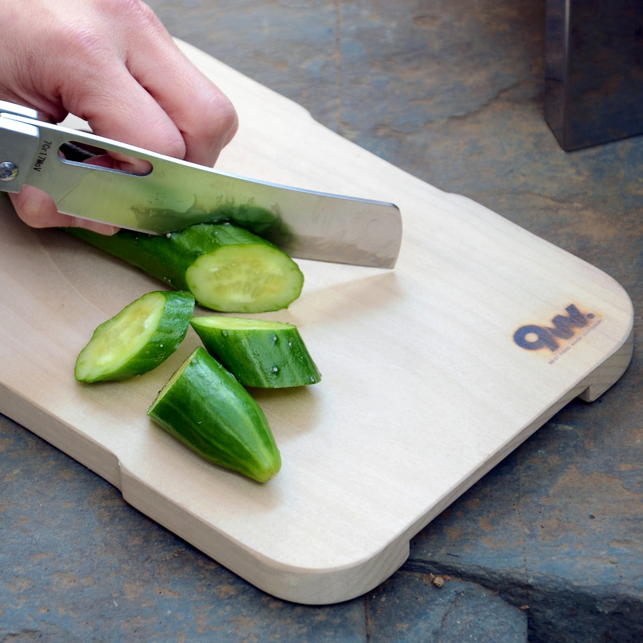
The FineLine Aluminum Chopsticks are the result of more than 40 rounds of refinements in Tsubame-Sanjo, Japan—adjusting the tip diameter, taper angle, grip texture, and balance in increments as small as 0.1mm.

Not to reinvent chopsticks. Just to remove the small frustrations people stopped noticing years ago. And surprisingly, most of those frustrations start with rotation.

Neatly arranged colored pencils in a rainbow gradient across a gray desk, with color swatches in the background on the right.

Plate of assorted nigiri and maki sushi on a gray platter, with soy sauce, a wine glass, and blue chopsticks on a woven placemat.

The Chopsticks That Changed How Dinner Felt

At first, the difference felt almost too small to explain. Then I noticed I wasn’t squeezing sashimi as hard. I wasn’t correcting the tips halfway through a bite. I wasn’t adjusting my grip every few minutes without realizing it.

The chopsticks stayed aligned. The tips held cleanly. Long meals felt calmer somehow. And once I noticed that, ordinary chopsticks started feeling strangely unfinished.

Salmon nigiri being picked up by chopsticks over a plate of assorted sushi and soy sauce nearby.

Designed for the Details

  • 1.5mm precision tip: Roughly half the diameter of most standard chopsticks, creating cleaner contact and more precise control.
  • Faceted anti-rotation body: Prevents the constant drifting and micro-corrections caused by round chopsticks.
  • Machined anti-slip texture: Built directly into the tip instead of added as a coating that eventually wears away.
  • 40 rounds of refinements: Tip diameter, taper angle, grip texture, and balance were adjusted repeatedly in increments as small as 0.1mm.
  • 14.5g balanced weight: Controlled enough for precision without becoming tiring across a full meal.
  • Anodized aluminum construction: Resists moisture, warping, stains, and dimensional drift over time.

Available in ten satin anodized tones, the finish adds grip without roughness while maintaining the same feel years later as it did on day one.

Flat lay of black minimalist dinnerware: two large round plates, two cups, and a pair of chopsticks on a dark textured surface at top and bottom center.

The Friction You Stop Noticing

Standard chopsticks taper to around 3–4mm at the tip. That’s not really a design decision—it’s a manufacturing default. It works, but it quietly asks something of you every time you eat. A little extra pressure to hold slippery food. A slight grip adjustment. A constant realignment of the tips.

Round profiles make it worse. They rotate in your fingers constantly. Subtly, continuously—your hand is always correcting them, always bringing the tips back into alignment. It’s the kind of friction that never rises to the level of complaint but accumulates quietly across every meal.

White chopsticks laid across a curved ceramic rest on a dark textured surface with black chopsticks nearby.

Most people never notice it because they’ve adapted to it for years.

The FineLine was designed to remove that friction entirely. Not through dramatic reinvention, but through refinement precise enough that the tool eventually disappears from your awareness altogether.

Colorful plastic twist ties arranged in a circle around a central point on a dark textured surface, creating a starburst pattern.

Design That Disappears

The workshop behind the FineLine was founded in Tsubame-Sanjo in 1907, a region known for precision metalworking where tolerances measured in fractions of a millimeter completely change how a tool feels in use.

That same philosophy shaped these chopsticks.

Metal chopsticks done poorly feel clinical and slippery because aluminum hides nothing. Wood and bamboo naturally absorb small inconsistencies in manufacturing. Aluminum doesn’t. Every imbalance in taper, texture, and weight becomes immediately obvious in the hand.

That’s precisely why this level of precision mattered here. The same discipline required to hold 0.1mm tolerances across professional tools is what allows a 1.5mm aluminum tip to feel stable instead of precarious.

The matching FineLine Chopstick Rest completes the system, carrying the same anodized finish, color language, and quiet restraint. Together they create a table setting that feels considered without asking for attention.

Colorful chopsticks laid diagonally across a dark textured surface, forming a rainbow arrangement.

Who It’s For

  • Daily Chopstick Users
    Once you’ve used a 1.5mm tip on a properly balanced stick, ordinary chopsticks start feeling strangely unfinished.
  • Japanese Craft Enthusiasts
    This isn’t craft as decoration. It’s a century of metalworking precision applied to one of the most ordinary tools on a Japanese table.
  • Gift Givers with Taste
    Not displayed. Not saved for guests. Just quietly reached for without thinking—which is exactly the point.

Minimal black tableware setting: two plates with a small black bowl and a pair of chopsticks resting on the plates on a dark textured surface.

Where The Meal Takes Over

You don’t think about chopsticks when they work. You think about the food, the conversation, the rhythm of the meal. That’s the quiet achievement of the FineLine Aluminum Chopsticks. The grip stays aligned. The tip holds cleanly. The weight never asks for attention.

Not just chopsticks. A better way to feel every meal. The FineLine Chopsticks are available now for $30.

The post This 1.5mm Japanese Chopstick Might Ruin Ordinary Ones for You first appeared on Yanko Design.

The 5 Best Tech Gadgets of May 2026

May 2026 is a good time to be paying attention. Gadgets aren’t just getting faster or thinner; the best ones this month are getting more intentional. There’s a shared thread running through every standout: each was built around a real constraint, a real behavior, or a real cultural moment, rather than a spec sheet searching for an audience. Five products rose above the rest, and each earns its spot for a distinctly different reason.

From a foldable phone that demolishes the category’s $800 price floor to a Nintendo Switch add-on that turns a gaming console into a live production rig, the range here is unusually wide. What connects them is the quality of thinking underneath. These aren’t renders looking for investment. They’re real objects designed to change how you work, listen, create, and move through a day. That’s the only brief that actually matters.

1. NASA Artemis Watch 2.0

NASA’s Artemis II lifted off from Kennedy Space Center on April 1, 2026, carrying four astronauts on humanity’s first crewed lunar journey in over 50 years. CircuitMess timed the NASA Artemis Watch 2.0 directly into that cultural gravity. At $129, it’s a fully assembled, ready-to-use programmable smartwatch built around a dual-core ESP32 microcontroller, with a full-color LCD screen, accelerometer, gyroscope, compass, and temperature sensor packed into a wristband designed for anyone aged nine and up who wants more than a fitness tracker strapped to their wrist.

What makes it worth your attention is the depth it offers without demanding anything upfront. Out of the box, it pairs with iOS and Android over Bluetooth for activity tracking and notifications. When curiosity takes over, the firmware is fully open-source and reprogrammable in Python, CircuitBlocks, or the Arduino IDE. Build custom watch faces, write your own apps, and modify sensor behavior as far down as you want to go. The Artemis Watch 2.0 is one of the rarer gadgets at this price: it genuinely grows with the person wearing it.

What we like

  • Fully open-source firmware supports Python, CircuitBlocks, and Arduino, giving both beginners and experienced coders meaningful room to explore and build
  • Ships fully assembled and ready to use straight out of the box, lowering the barrier to entry without removing any of the technical depth underneath

What we dislike

  • At $129, it asks for more commitment than most impulse purchases in the kids’ tech category allow for
  • Screen performance in direct sunlight hasn’t been addressed in any available documentation

2. OrigamiSwift Mouse

Every frequent traveler has made the same quiet compromise: leave the proper mouse at home or carry something too small to work with comfortably for more than an hour. OrigamiSwift was built precisely around that problem. It’s a Bluetooth mouse that folds flat when not in use, weighs just 40 grams, and opens into full working position in under half a second. The origami-inspired form isn’t a styling exercise. It’s a structural answer to the oldest tension in portable peripherals: comfort has always cost you size.

The ergonomic shaping holds up across extended work sessions, which matters more than most product pages acknowledge. Whether you’re finalizing a presentation at an airport gate or editing documents in a co-working space, OrigamiSwift stays comfortable in your hand and disappears into a bag when you’re done. The ultra-thin profile and minimal build weight mean it never adds anything meaningful to your load. For anyone who genuinely works from wherever they happen to be, this is the mouse that finally makes sense to own.

Click Here to Buy Now: $85.00

What we like

  • 40-gram weight and flat-fold profile make it practically invisible in any bag, disappearing entirely until you actually need it
  • Sub-0.5-second activation means there’s no friction at all between being packed and being productive

What we dislike

  • Available listings don’t confirm DPI range or scroll wheel responsiveness for anyone doing precision work
  • Bluetooth-only connectivity may create compatibility friction with older desktop setups that lack wireless support

3. Ai+ Nova Flip

The foldable phone category has spent five years convincing itself that the flip experience carries a natural premium of $800 or more. Ai+ is testing that assumption head-on with the Nova Flip, launched in India at Rs 29,999, roughly $320, making it the most accessible foldable phone on the market. The inner display is a 6.9-inch AMOLED panel resolving at 2790 x 1188 pixels, complemented by a 3.1-inch AMOLED cover screen. MediaTek’s Dimensity 7300 handles processing, paired with 8GB of LPDDR4X RAM and 256GB of internal storage.

The spec list doesn’t read like a budget compromise. A 50-megapixel primary camera, a 32-megapixel front shooter, and a 4325mAh battery with 33W wired charging all hold credibly against devices at double the price. 5G, NFC, and an IP64 dust and splash rating close out a package that would feel serious in any category. The Nova Flip doesn’t just undercut the competition on price. It quietly forces a harder conversation about what the flip form factor has genuinely been worth at $1,000 all along.

What we like

  • $320 pricing opens the foldable phone experience to an entirely new audience that the category has ignored since its beginning
  • The 4325mAh battery is a genuinely surprising capacity for the flip form factor at any price point, let alone this one

What we dislike

  • The 2-megapixel depth lens reads as the weakest component in an otherwise strong and well-considered camera array
  • Long-term hinge durability at this price tier is unproven and worth tracking carefully over time

4. Akai MPC Switch

Alquemy’s Akai MPC Switch concept asks a question that feels obvious the moment someone finally puts it to you: if laptop-grade software can run on portable hardware, why can’t a capable gaming console handle serious music production? The MPC Switch is a pair of controller units designed to snap directly onto the sides of a Nintendo Switch, replacing the Joy-Cons with MIDI inputs, outputs, and a full DAW running on the console’s own screen. The control layout reflects real production workflows rather than a stylized render built for social media.

The appeal runs deeper than the novelty of the form. The concept treats the Switch as a legitimate interface surface: something you game on when you need to and produce or perform on when the moment calls for it. Swap the Joy-Cons for the MIDI setup, and you’re there. Whether Nintendo or Akai ever moves this into production is a separate question entirely, but Alquemy has made a persuasive case that the idea deserves a real answer. The best concepts don’t just look good. They make you wonder why nobody shipped it first.

What we like

  • MIDI integration and a credible DAW interface position the Switch as a serious production platform rather than a novelty peripheral
  • The Joy-Con snap mechanism makes the transition between gaming and music production genuinely seamless in concept

What we dislike

  • No confirmed production timeline means this remains aspirational, with no clear path in your hands
  • The Switch’s processing ceiling may be a real constraint for complex, multi-layer production sessions

5. StillFrame Headphones

Most headphone designs land at one of two poles: the over-ear build that announces itself before you even put it on, and the in-ear solution that disappears but gives nothing back in soundstage. StillFrame lands somewhere more considered than either. At 103 grams, it sits closer to weightless than wearable. The 40mm drivers are tuned for a wide, open soundstage that pulls spatial detail and melodic texture out of tracks that most headphones flatten into undifferentiated background noise.

Active noise cancellation closes you off when focus demands it. Transparency mode reconnects you to the room when the world around you matters more. Battery holds at 24 hours, covering a full workday, an overnight flight, and the morning after with no cable required. Switching between modes takes a single tap. StillFrame was designed around the premise that how you listen should adapt to where you are, not the other way around. That’s a harder brief to execute cleanly than it sounds, and the weight alone suggests it’s been taken seriously.

Click Here to Buy Now: $245.00

What we like

  • 103 grams is a genuinely rare achievement for an over-ear headphone carrying both ANC and full-size 40mm drivers
  • 24-hour battery life covers the kind of all-day, real-world use that most headphones in this category only claim to handle

What we dislike

  • No published information on codec support, like LDAC or aptX, for listeners who prioritize wireless audio fidelity
  • Colorway and finish options appear limited in current listings, which may be a sticking point for buyers who care about visual identity

The Only Standard That Matters Is the One You Can Feel

May 2026’s strongest gadgets share something harder to write into a spec sheet than battery life or pixel count. Each was designed around a specific friction point and resolved it with a precision that feels purposeful rather than accidental. The Artemis Watch converts a cultural moment into a learning platform. The Nova Flip resets the floor of an entire category. The OrigamiSwift solves a portability problem that dozens of mice before it never genuinely addressed.

StillFrame and the Akai MPC Switch represent opposite ends of the development spectrum, one shipping and one conceptual, but both make the same underlying argument: that considered design changes the terms of what a product is allowed to be. Whether you’re optimizing a travel bag or rethinking a music studio from a gaming console, the standard these five set is worth taking seriously. The best gadgets this month aren’t the loudest ones in the room. They’re the most resolved.

The post The 5 Best Tech Gadgets of May 2026 first appeared on Yanko Design.

This Stationary Tiny Home Has More Room Than Most City Apartments

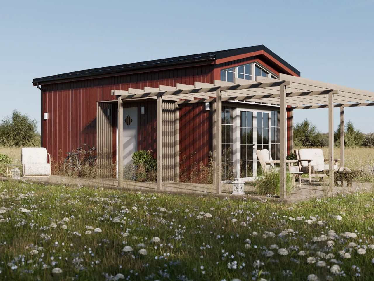
Most tiny houses ask you to make a trade-off. You get the romance of compact living, but sacrifice the one thing that makes a home feel like a home — space. Craft House, a modular builder operating across Poland, Austria, and Ireland, decided to flip that script entirely with the Samuel, a non-towable module house that prioritizes spacious full-time living over the freedom to hitch and go.

The Samuel sits at 10 meters (32 ft) long and an unusually generous 3.2 meters (10.6 ft) wide, measurements that push well beyond the European tiny home average. That extra width is deliberate. It’s what allows the interior to breathe in a way that most towable models simply can’t, opening up a layout that reads less like a cleverly compressed box and more like a well-considered apartment. The structure wears a single-pitched roof, topping out at 4.1 meters at the ridge, and is finished in engineered wood and metal, a clean pairing that reads industrial without feeling cold.

Designer: Craft House

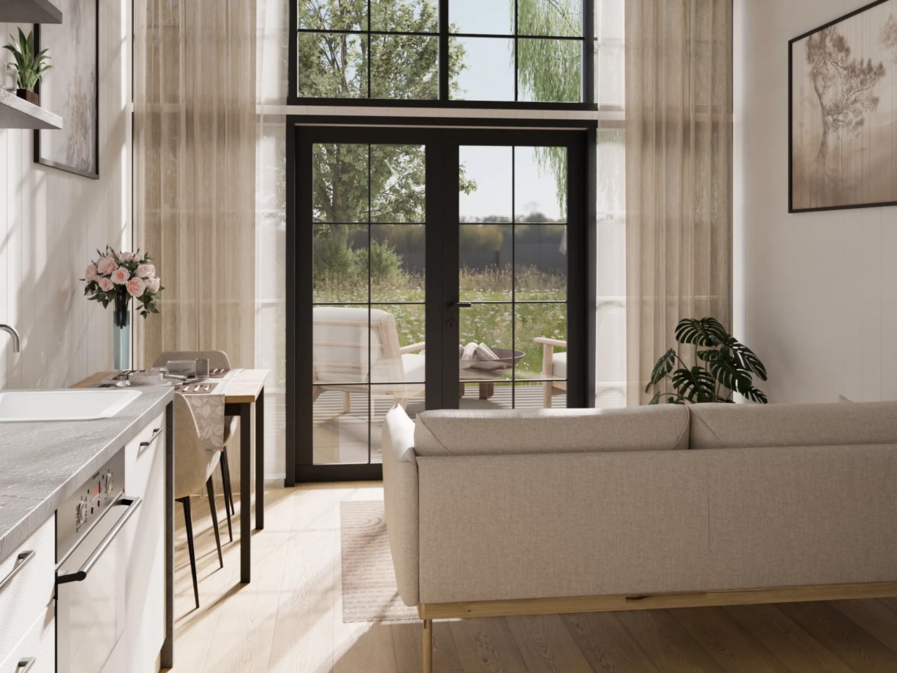
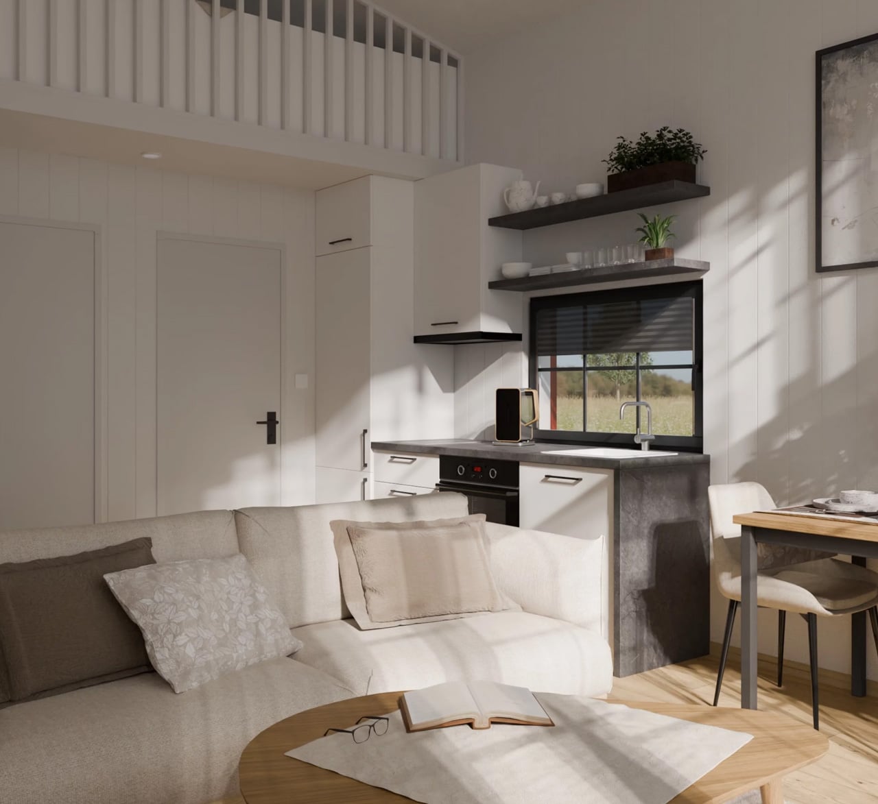
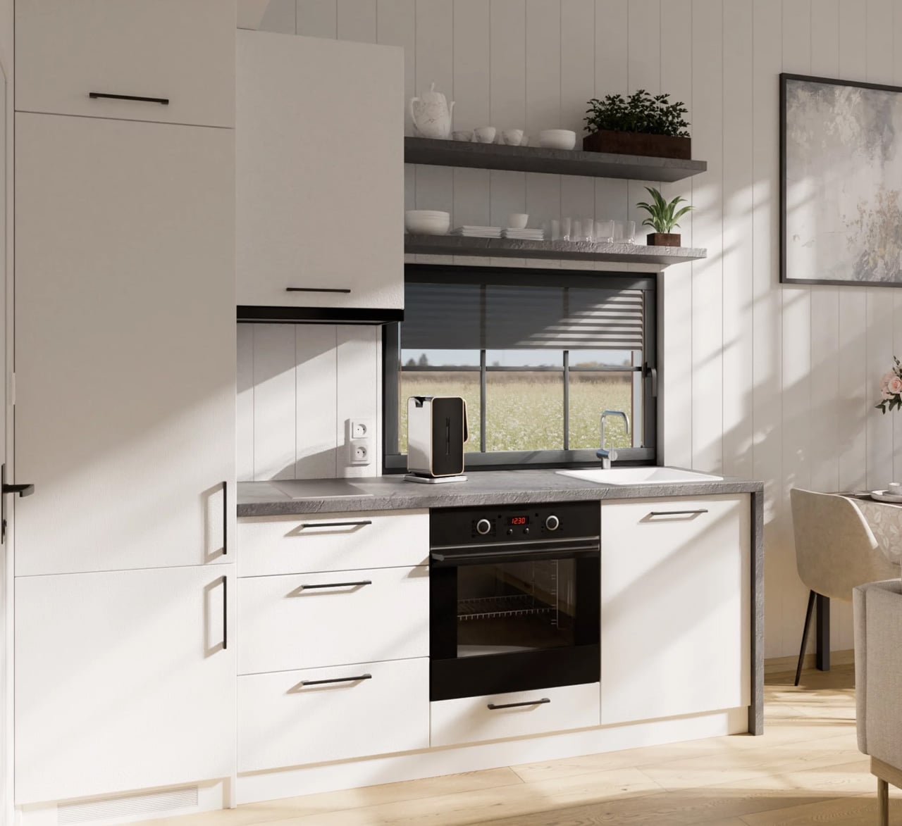
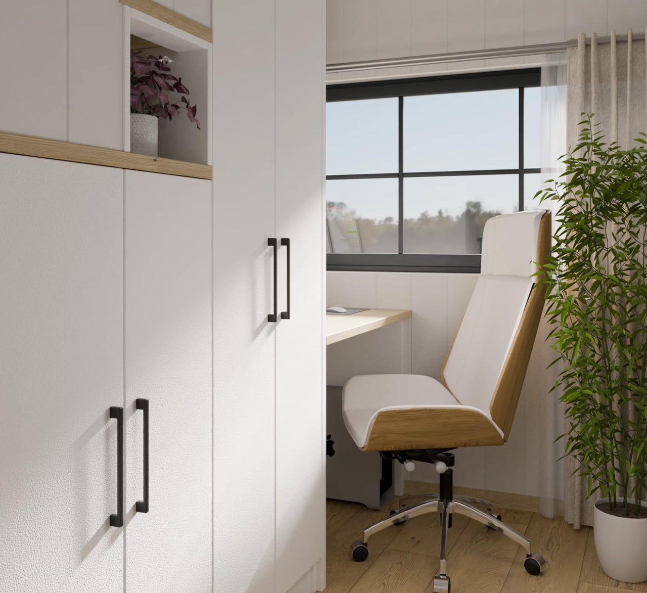
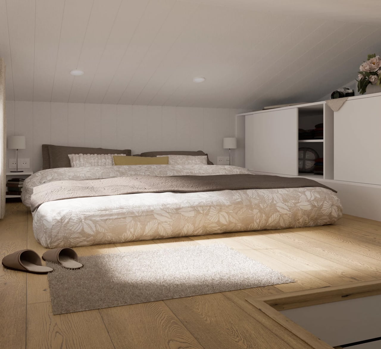
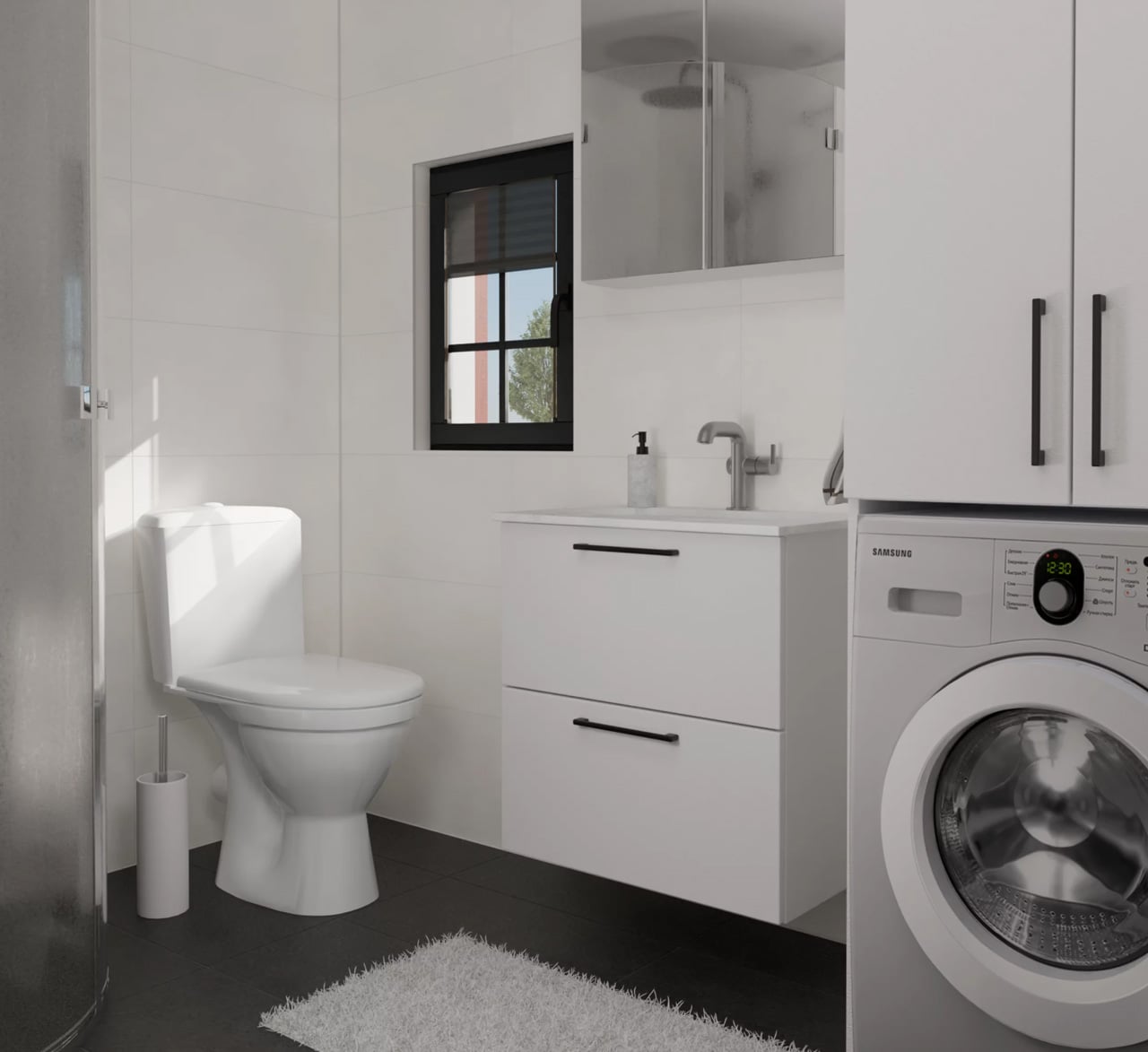
Inside, the ground floor spans 26 square meters, with a 13-square-meter mezzanine sitting above and a 4.3-square-meter bathroom rounding out the floor plan. The layout makes room for two distinct sleeping areas, and the volume created by the sloped ceiling gives the mezzanine level a loft-like quality that larger homes often fail to capture. Optional off-grid upgrades are also on the table, making the Samuel a realistic candidate for plots far beyond urban infrastructure.

What Craft House understood when designing the Samuel is that the tiny home market has two very different buyers. There’s the nomad, always ready to hitch the trailer and head somewhere new. Then there’s the person who simply wants a well-designed, right-sized home that doesn’t carry the financial weight of a conventional build. Samuel is clearly built for the latter. By dropping the wheels and leaning into a fixed footprint, Craft House was able to allocate width and volume in ways that towable structures prohibit by law and logistics.

Priced at around US$72,000, the Samuel lands in a range that makes it a genuinely viable alternative to traditional housing in several European markets. It isn’t trying to be everything. You won’t be parking it in a new location every season. What it offers instead is something arguably more valuable: a permanent, considered space that proves small doesn’t have to mean cramped, and that the best tiny homes aren’t always the ones with the biggest adventures, but the ones that make staying put feel worth it.

The post This Stationary Tiny Home Has More Room Than Most City Apartments first appeared on Yanko Design.
5 Best Tiny Homes of May 2026 Prove Tiny House Design Stopped Being Cute — It Became a Category

Tiny homes had a moment. Then they had another. Then, somewhere between the Instagram hashtags and the weekend specials, they quietly became something more serious. The designs releasing in 2026 aren’t pitching a lifestyle fantasy — they’re solving real problems: family space, year-round comfort, material quality, and genuine mobility. The builders showing up this year aren’t compensating for square footage. They’re rethinking what square footage is even supposed to accomplish.

What’s changed is the thinking behind the build. Reverse floor plans. Apartment-scale dimensions on trailer frames. Japanese material sensibility packed into a 130-square-foot shell. Choices that match what you’d find in a well-funded apartment remodel, not a budget cabin kit. These five tiny homes, all surfacing this spring, represent what the category looks like when builders stop apologizing for the format and start designing with full conviction.

1. Onda

The Tiny Home That Put Bedrooms on the Bottom and Changed the Entire Conversation

The Onda doesn’t tweak the tiny home formula — it inverts it entirely. Australian builder Removed Tiny Homes placed all three bedrooms on the ground floor and pushed the kitchen, living room, and bathroom to the elevated upper level, a reverse loft plan that nobody had executed quite like this before. Built on a double-axle trailer and finished in steel with warm wooden accents, it measures 10 meters long, 3.4 meters wide, and 4.5 meters tall, pushing it firmly into apartment territory.

What the upside-down layout gives you is privacy on your own terms. Bedrooms stay quiet, dark, and grounded — actual breathing room away from the communal noise above. A full-height hallway with 200cm of standing clearance connects each room below, so moving through the home never feels cramped. An optional deck spills the upper-level living space into the open air. For a family that wants to downsize without shrinking their sense of home, this is the most coherent answer currently on the market.

What We Like

  • The reverse loft layout is genuinely original — private spaces below, communal life above — and the spatial logic holds up completely once you see it in practice
  • At 70 square meters across a double-axle trailer, the scale rivals a proper apartment without surrendering mobility or road-legal status

What We Dislike

  • The 4.5-meter height may face clearance restrictions in some regions, limiting where the Onda can realistically be parked or towed permanently

2. Audrey

The Single-Level Build That Makes Efficient Living Look Effortless

There’s a certain confidence in keeping things flat. CozyCo’s Audrey is a single-level build, 7.2 meters long and mounted on a triple-axle trailer, and its restraint is exactly what makes it work. The exterior pairs corrugated aluminium with timber-look panels — a combination that slots into a bush property, a coastal block, or a suburban backyard without missing a beat — while a neatly tucked propane storage box keeps the silhouette clean. It looks like a home that knows precisely what it wants to be.

Inside, the open studio layout does what smart single-level design does best: it makes the space feel larger by refusing to fight itself. Sliding glass doors bring in light and dissolve the boundary between inside and out. R2.5 insulation, double-glazed windows, gas, hot water, and air conditioning mean you can live in the Audrey year-round without a second thought. A storage bed removes the need for bulky furniture. Whether you’re running it as a guest suite, a short-stay rental, or a granny flat, it earns its position effortlessly.

What We Like

  • The combined thermal package — R2.5 insulation, double-glazed windows, and full air conditioning — makes it genuinely livable across every season without requiring expensive upgrades after purchase
  • Single-level circulation eliminates the ladder-and-loft compromise that makes most tiny homes feel like clever camping rather than actual living

What We Dislike

  • Sleeping comfortably up to two people limits the Audrey’s appeal — it isn’t a family home and doesn’t pretend to be, but that’s a real ceiling on its long-term versatility
  • At 7.2 meters, the footprint sits on the smaller end, even for a tiny house, meaning storage and layout flexibility have a defined and non-negotiable limit

3. Harmony

The Family Tiny Home That Proves Four People Don’t Need Four Thousand Square Feet

The Harmony was originally commissioned by a family of four in Southern Alberta who were done with the time and financial weight of conventional living. What emerged from that brief is one of the most thoughtfully designed family tiny homes on the market right now. Built by Alberta-based Teacup Tiny Homes on a triple-axle trailer and clad in metal and wood, it measures 34 feet long and 8.5 feet wide — road-legal across North America, towable without a special permit — with 423 square feet of considered interior space.

That floor plan matters because it holds the things families actually use. A sofa, a fireplace, and a dedicated TV wall mean family evenings don’t have to be compressed into a bench seat. What the Harmony gives you specifically is the freedom to move — across provinces, across states — without putting your life into storage. Mobility and stability, sharing the same triple-axle frame. For a family that wants flexibility without surrendering the feeling of a real home, this is one of the most convincing arguments the tiny home world has produced.

What We Like

  • Standard 8.5-foot road-legal width means the Harmony can be towed anywhere across North America without a special permit — genuine mobility, not just the promise of it
  • 423 square feet with a sofa, fireplace, and dedicated TV wall means family life doesn’t get flattened into efficiency mode the moment you walk through the front door

What We Dislike

  • The metal-and-wood cladding combination, while durable and practical, is familiar territory — the Harmony doesn’t push any aesthetic boundaries and looks exactly like you’d expect it to
  • At 34 feet long, site placement requires real planning, and not every property has the physical footprint to accommodate it without trade-offs

4. Shoji

The 130-Square-Foot Home That Makes the Case for Japanese Minimalism on Wheels

At 130 square feet and just 5.5 meters long, the Shoji is a study in not flinching. Completed in November 2022 and sited in Brittany, France, it was designed by Koleliba alongside architect Hristina Hristova as the brand’s S Tiny model. The name points directly to its influence: clean lines, natural materials, and a deep respect for negative space. Vertical timber siding, a metal roof, and expansive sliding glass doors give it an exterior that reads equally well in a forest clearing or an open countryside field.

Inside, the birch plywood interior does what Koleliba does best — furniture becomes a seamless continuation of the architecture. A U-shaped couch converts into a queen-size bed. There’s a dedicated home office desk, essential kitchen appliances, a washing machine, and a roomy shower, all packed into a footprint that defies logic. Electric floor heating and solid winter insulation make it genuinely year-round livable. What the Shoji gives you is proof that living with intention — rather than abundance — isn’t a lesser version of home. It’s a stronger argument for what home can be.

What We Like

  • The furniture-as-architecture approach means nothing feels crammed in or improvised — every element is a deliberate continuation of the interior, not an afterthought placed inside it
  • Electric floor heating and serious winter insulation make this a genuine four-season home, not a warm-weather retreat built for photography

What We Dislike

  • 130 square feet is a real constraint — there’s no graceful way to accommodate guests, and solitude becomes a structural feature of the design, whether you planned for it or not
  • As a completed, commissioned project, the Shoji isn’t a ready-to-buy model — interested buyers would need to engage Koleliba directly, with no standard production line to order from

5. Urban Gable Park

The Park Model That Stopped Making Compromises and Started Making a Statement

The Urban Gable Park is what happens when a builder decides to stop apologizing for comfort. At 30 feet long and 11 feet wide — significantly beyond the standard 8.5-foot width that most trailer-based homes are constrained to — it’s a single-level park model that gives rooms actual space to breathe. The bedroom has real headroom. The living area fits a proper sofa. That extra width isn’t just a number on a spec sheet; it fundamentally restructures how the interior feels and how you move through it on an ordinary Tuesday.

The material choices confirm the intent. The kitchen comes fitted with maple slab cabinets, an induction cooktop, a full-size fridge, and a dishwasher, all set within a striking limewash alcove. In the bathroom: a concrete vessel sink, terrazzo tile floors, matte black fixtures, a walk-in shower, and a stacked washer/dryer. These aren’t budget finishes dressed up to photograph well — they’re material decisions made by people who know exactly what they’re doing. The Urban Gable Park gives you apartment-grade quality in a format that doesn’t ask you to keep justifying the choice to everyone you meet.

What We Like

  • The 11-foot width fundamentally changes how the interior reads — rooms have breathing room, and daily living stops being an exercise in constant spatial problem-solving
  • Kitchen and bathroom material quality — limewash alcoves, terrazzo tile, maple slab cabinets — matches what you’d find in a thoughtful urban apartment remodel, not a prefab compromise

What We Dislike

  • The 11-foot width requires a road permit for towing on public roads, which meaningfully limits relocation flexibility compared to any standard road-legal tiny home
  • Built as a park model designed to stay in place, the Urban Gable Park won’t suit buyers expecting the full mobility and spontaneity of a traditional tiny home on wheels

The Cute Phase Is Over — What Replaced It Is Far Harder to Dismiss

What these five homes share isn’t a size or a price point — it’s a standard. None of them asks you to romanticize the limitations of small living. They ask whether those limitations are even real. The Onda inverts the entire floor plan. The Shoji strips everything down to what actually matters. The Urban Gable Park adds width and lets the rooms speak for themselves. Each one represents a distinct position on the same argument: that less space is not, by definition, a lesser life.

The category has grown up. The builders who matter right now aren’t chasing aesthetics for a mood board feature — they’re engineering real precision into formats that serve families, couples, remote workers, and anyone tired of paying for rooms they never enter. If May 2026 is a signal of where tiny home design is heading, the message reads clearly: the cute phase is over. What’s replaced it is something far more interesting, and far harder to dismiss.

The post 5 Best Tiny Homes of May 2026 Prove Tiny House Design Stopped Being Cute — It Became a Category first appeared on Yanko Design.

This Quebec Home Doesn’t Fight the Forest – It Disappears Into It

Certain kinds of architecture don’t announce themselves. La Maraude, the latest project by Nathalie Thibodeau Architecte, is exactly that — a compact residential dwelling tucked into the dense woodlands of Boileau, in Quebec’s Outaouais region, that earns its presence through restraint rather than spectacle. Completed in 2024, it’s one of the more quietly compelling houses to come out of Canada in recent memory.

The name itself carries meaning. ‘Maraude’ — to roam, to forage — hints at the relationship the house cultivates with its surroundings. Rather than claiming a dominant position along the river’s edge, the architects deliberately set the home deeper within the treeline, orienting the house’s interior life entirely toward the forest. It’s a gesture that shapes everything else about the project.

Designer: Nathalie Thibodeau Architects

The design draws directly from Quebec’s vernacular architectural tradition — steeply pitched rooflines, grounded proportions, and a material palette that feels native to the region. The exterior is clad in natural cedar shingles and topped with a metal roof, two materials with deep roots in the local building culture. These aren’t nostalgic choices. They’re translated through a contemporary lens, stripped of ornament, reduced to their essential geometry. “Designed with particular attention to simplicity, functionality, and respect for traditional codes, La Maraude embodies a successful dialogue between contemporary architecture and local traditions,” says Nathalie Thibodeau Architecte.

What makes the spatial sequence genuinely interesting is the use of two courtyards as organizing devices. The plan doesn’t simply open to the outdoors — it pulls the forest in, fragmenting the landscape into a series of framed views that shift with the seasons. One courtyard faces north, more sheltered and partly enclosed by the building itself, oriented toward higher ground. The other faces south, brighter and more expansive, drawing the eye down toward the lower terrain. The result is a house that reads differently in every light condition, every month of the year.

The second volume, arranged over two levels in response to the site’s slope, plays a more introverted role. Openings here are smaller and precisely placed to frame specific moments within the tree canopy — quiet apertures rather than panoramic statements.

Photographed by Maxime Brouillet, La Maraude has the look of a project that will age well, both materially and culturally. It’s already being discussed as a potential anchor for a broader ensemble of small retreats on the site — a first building in what could become a considered, evolving conversation between architecture and landscape.

The post This Quebec Home Doesn’t Fight the Forest – It Disappears Into It first appeared on Yanko Design.

Inside the Log-and-Glass Home Olson Kundig Built for a Builder on Salt Spring Island

Salt Spring Island doesn’t need much convincing — it already has the cliffs, the meadows, and the trees. The name sounds more like a childhood storybook setting than an architectural statement — and that tension is exactly the point. Nestled amidst the trees and rugged cliffs of Salt Spring Island, BC, the Daisy Ranch is Olson Kundig’s most recent residential project, led by design principal Tom Kundig. It’s casual. It’s rugged. And it’s entirely, unapologetically itself.

The house sits at the edge of a sweeping meadow, anchored by a log structure that feels like it could have always been there. The primary move is a rugged glass box paired with a long, cantilevered roof that stretches over a generous deck — a roof that earns its keep through BC’s shifting seasons, offering shelter without closing anything off. What makes it work visually is the layering: large square-cut logs and glass soften the rust-colored patina of weathered steel cladding, giving the exterior a palette that feels earned rather than designed.

Designer: Olsun Kundig

The plan is organized along a clean linear axis, with two distinct volumes bisected by an eastern entry stairway. The front door is tucked under a generous overhang — a small but considered gesture that grounds the arrival sequence without dramatizing it. The northern volume, clad in wood and steel, handles the private program: a primary suite and additional bedrooms, with framed view corridors that offer deliberate glimpses of the landscape rather than full exposure. Privacy and connection, calibrated carefully.

Inside, the bathroom is where the project gets most personal. Widespread use of wood infuses the space with warmth, while a clawfoot tub set before corner windows underscores the home’s persistent connection to the landscape outside. It’s the kind of detail that feels borrowed from an older, more tactile way of building — which is precisely the intention.

The project was designed in close collaboration with the client, Patrick Powers, a builder and fabricator who also served as general contractor. That relationship left its mark. The house doesn’t feel like it was delivered to a site; it feels like it was made with the site, material decision by material decision.

As Kundig put it: “There’s a lineage at play in this project, a quiet innovation that comes from the shared DNA of materials and relationships.” The Daisy Ranch is the kind of project that doesn’t need to announce itself. It sits lightly on its land, opens wide to its meadow, and gets on with the business of being lived in.

The post Inside the Log-and-Glass Home Olson Kundig Built for a Builder on Salt Spring Island first appeared on Yanko Design.
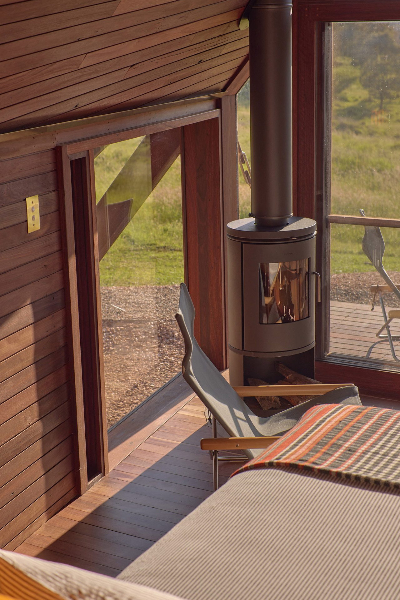
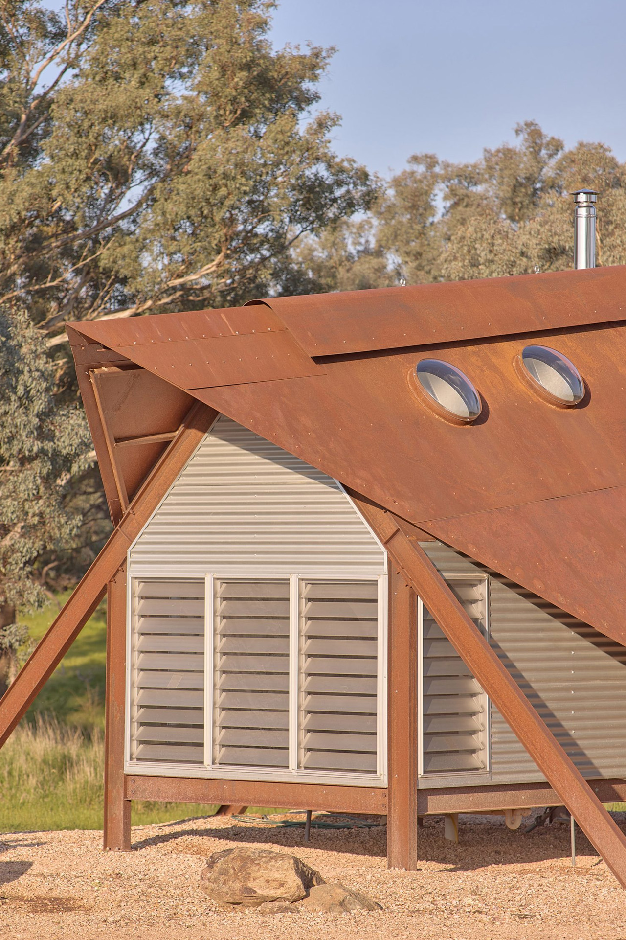
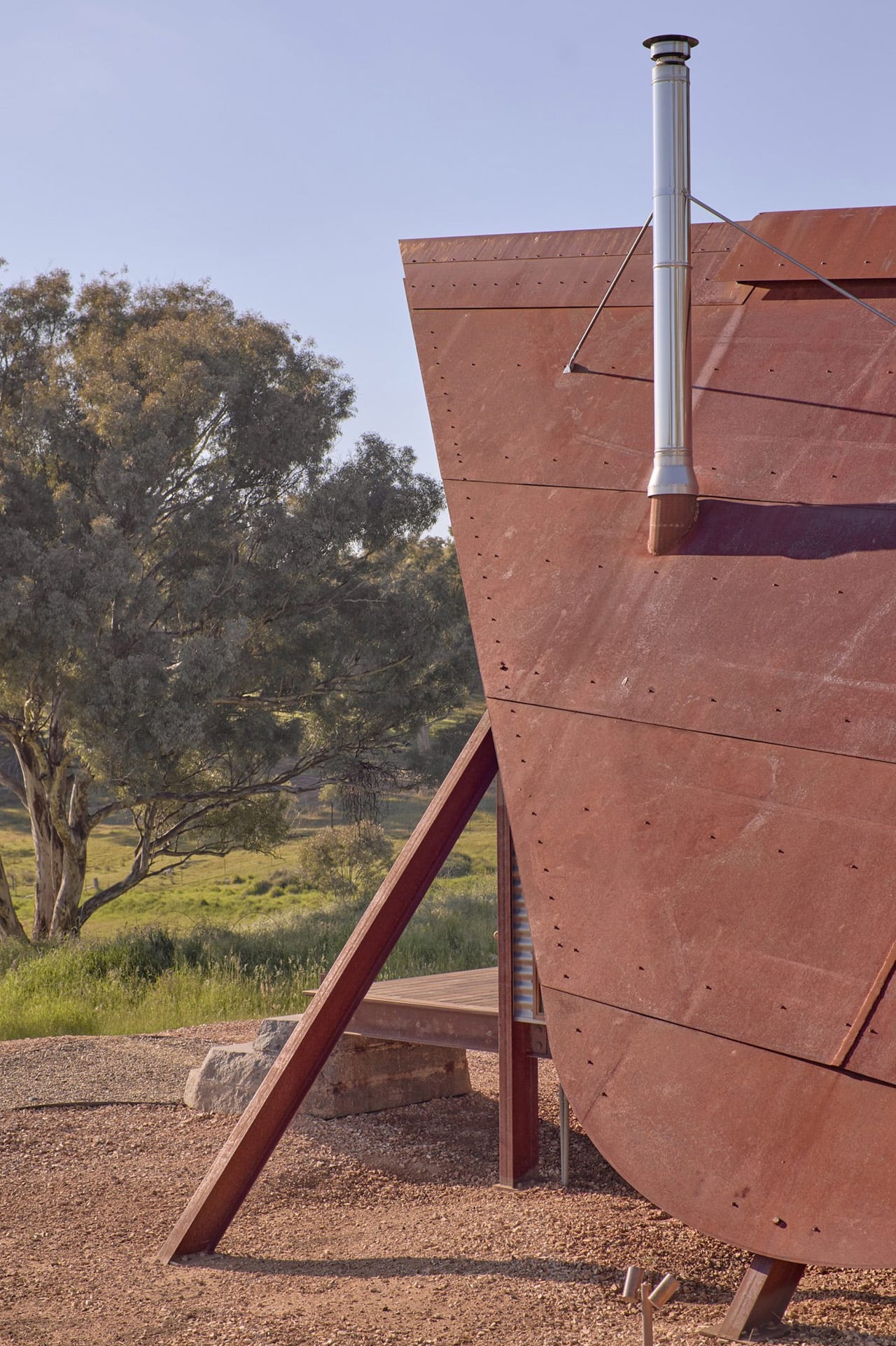
This 25-Square-Metre Tiny House on Wheels Makes Most Apartments Look Like a Waste of Space

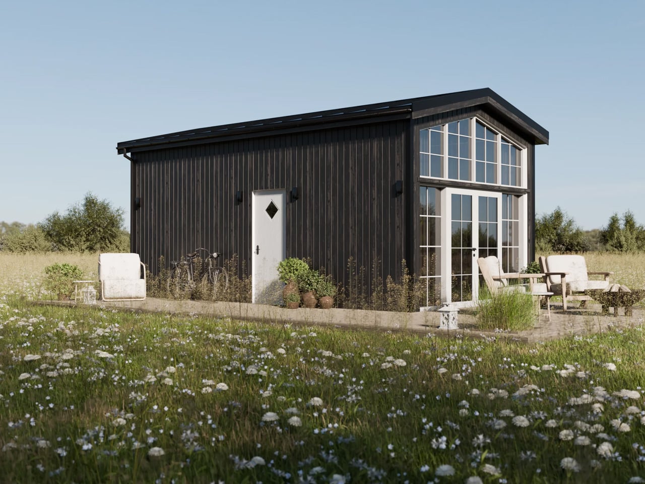
Sweden has long understood that good design isn’t about size. The Smile by Vagabond Haven makes that case better than most — a compact, Scandinavian-built tiny house that lives far larger than its footprint suggests.

At 25 square metres, the Smile sits at the top of Vagabond Haven’s lineup, classified under their Extra Large category. It measures 7.2 metres in length and 3 metres in width, riding on a steel frame with wheels that allow it to be transported by truck and placed wherever life takes you. That semi-mobile quality is part of the appeal. It’s not a home you’re locked into — it’s one you can genuinely take with you.

Designer: Vagabond Haven

The interior is where the Smile earns its name. High ceilings give the space an airiness that most tiny homes can’t pull off, and large windows flood the living area with natural light throughout the day. The layout is considered and unhurried: a full living room with a sofa and coffee table, a fully equipped kitchen, a spacious bathroom with a shower, and a sleeping loft overhead. Everything has a place, and nothing feels crammed. It reads less like a tiny house and more like a well-edited apartment.

Vagabond Haven’s Scandinavian roots show up in the material choices and the restraint of the overall aesthetic. The interiors lean warm and clean, with a palette that feels calm rather than clinical. There’s a deliberate softness to the design that makes the space feel settled, even when it’s technically on wheels.

Functionality runs deep. The Smile comes equipped with a solar system, a rainwater harvesting setup, a fresh water tank and pump, and an energy-saving electric or gas water heater. Ventilation covers the living room, kitchen, and bathroom, with a recuperator to maintain air quality year-round. Off-grid living isn’t an afterthought here; it’s built into the DNA of the house.

For buyers, Vagabond Haven offers the Smile as a ready-built model available for delivery across Europe within two to four weeks if in stock, or fully customisable in terms of materials, colours, and finishes. A 3D virtual tour is also available for those who want to walk through the space before committing — a small touch that speaks to how seriously the brand takes the buying experience.

The Smile won’t suit everyone. Those expecting the scale of a conventional home will need to recalibrate. But for the person willing to trade square footage for freedom, thoughtful design, and a lighter way of living, it makes a genuinely compelling case.

The post This 25-Square-Metre Tiny House on Wheels Makes Most Apartments Look Like a Waste of Space first appeared on Yanko Design.