The car industry rarely slows down, but every so often a stretch of weeks produces designs so distinct from each other that you wonder if the brief was simply “surprise us.” That’s exactly what’s been happening this season. From a retro-coded open-air speedster to an arcade-themed Rolls-Royce, the range on display right now is genuinely startling. Five designs in particular have made the strongest case for why automotive design still matters.
These aren’t trade show fillers or routine refreshes. They represent five different philosophies about what a car can be, and each one challenges something the industry has taken for granted. One reimagines the pit stop entirely. Another builds an off-roader with 37-inch tires and zero touchscreens. One is a rolling fortress with 850 horsepower. Together, they map a season of car design that swings between pure spectacle and serious intent.
1. TESTaZERO
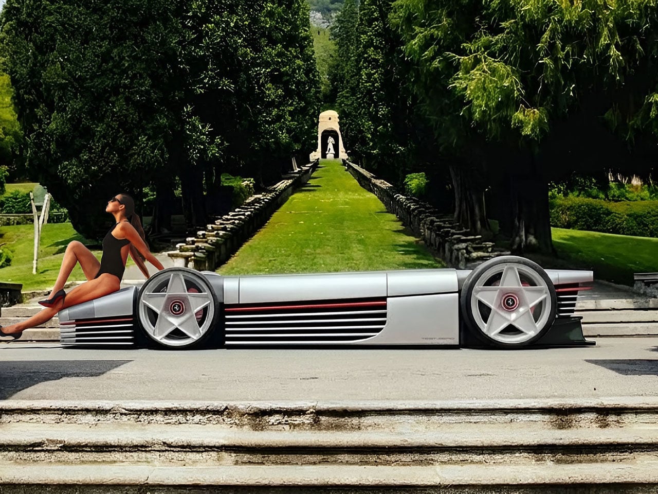
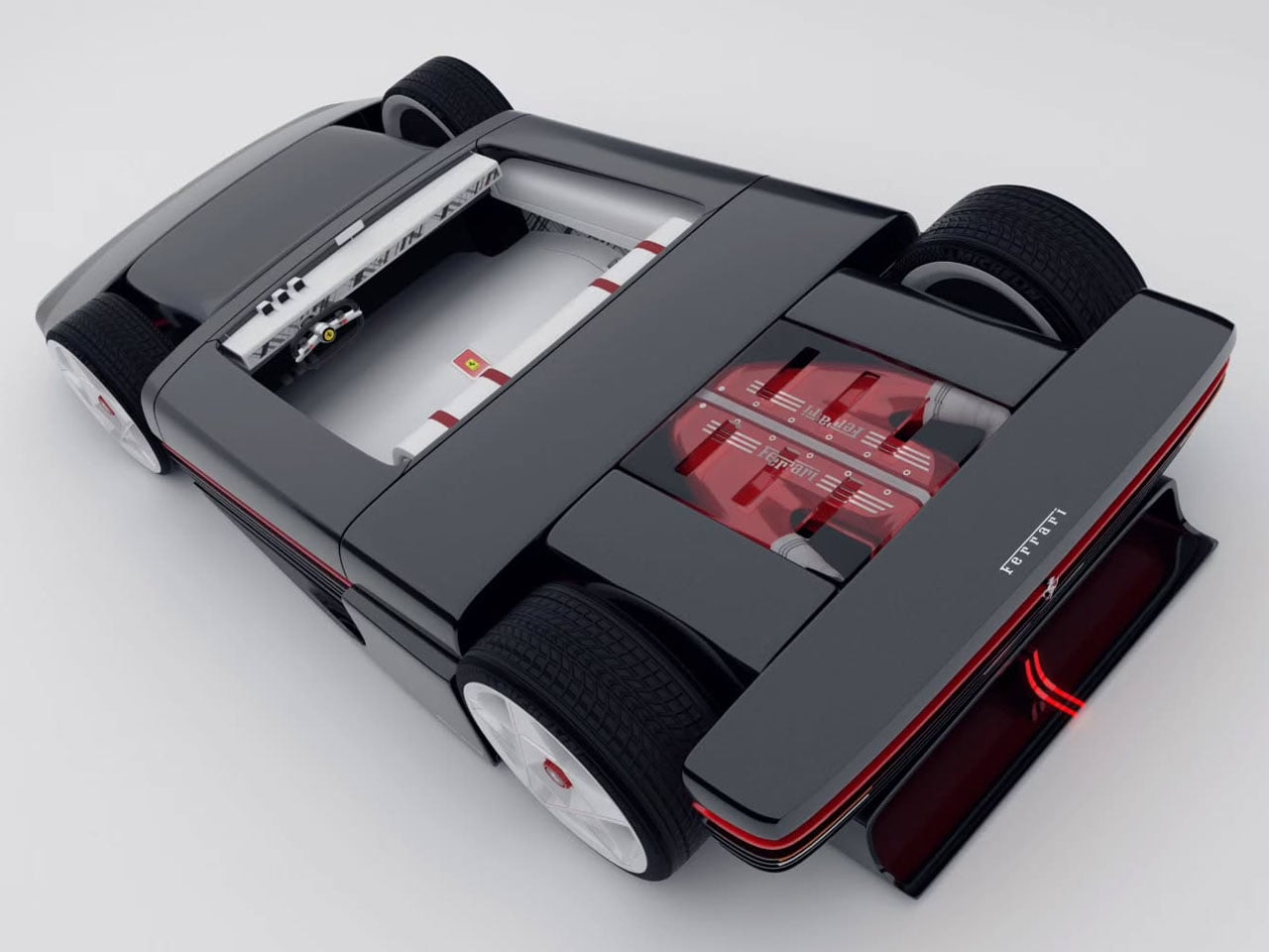
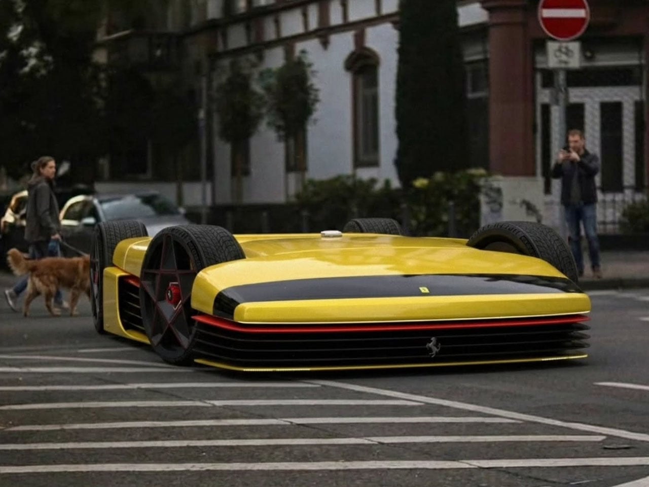
The TESTaZERO is a Ferrari-inspired concept that strips the formula down to something dangerously pure. Designed as an open-air speedster with retro Maranello cues baked into every panel, it draws a direct line back to the raw, unbothered spirit of Ferrari’s classic roadsters. Wide haunches, a minimal cabin, and a deliberate absence of the usual visual clutter give it a presence that feels earned rather than engineered. Ferrari’s own all-electric Luce — the brand’s first fully electric production car — now has something worth worrying about in the concept conversation.
What makes the TESTaZERO so compelling is precisely what it removes. Bulky body panels are gone, leaving a taut, exposed silhouette that reads closer to a concept sketch than a production vehicle. The driving position sits low, the windscreen barely there, and the entire philosophy points toward wind, noise, and sensation rather than comfort or insulation. It’s a design that asks a pointed question about the EV era: does a Ferrari-coded electric speedster need to be grand and imposing, or can it be small, immediate, and entirely its own thing?
What we like
- The stripped-back silhouette offers a genuinely different vision for what an electric Ferrari-inspired roadster could look like, presenting a credible alternative to the four-door Luce’s grand touring approach
- The retro-coded design language feels specific and referential rather than simply nostalgic for its own sake, with every panel decision pointing toward a coherent identity
What we dislike
- Without confirmed production specs or a manufacturer commitment behind it, the TESTaZERO remains a compelling mood board rather than a real directional statement with weight
- The fully open-air format, as dramatic as it looks, limits its practical appeal to fair-weather conditions and a narrow window of real-world use
2. Renault Double Barrel Le Mans Hypercar
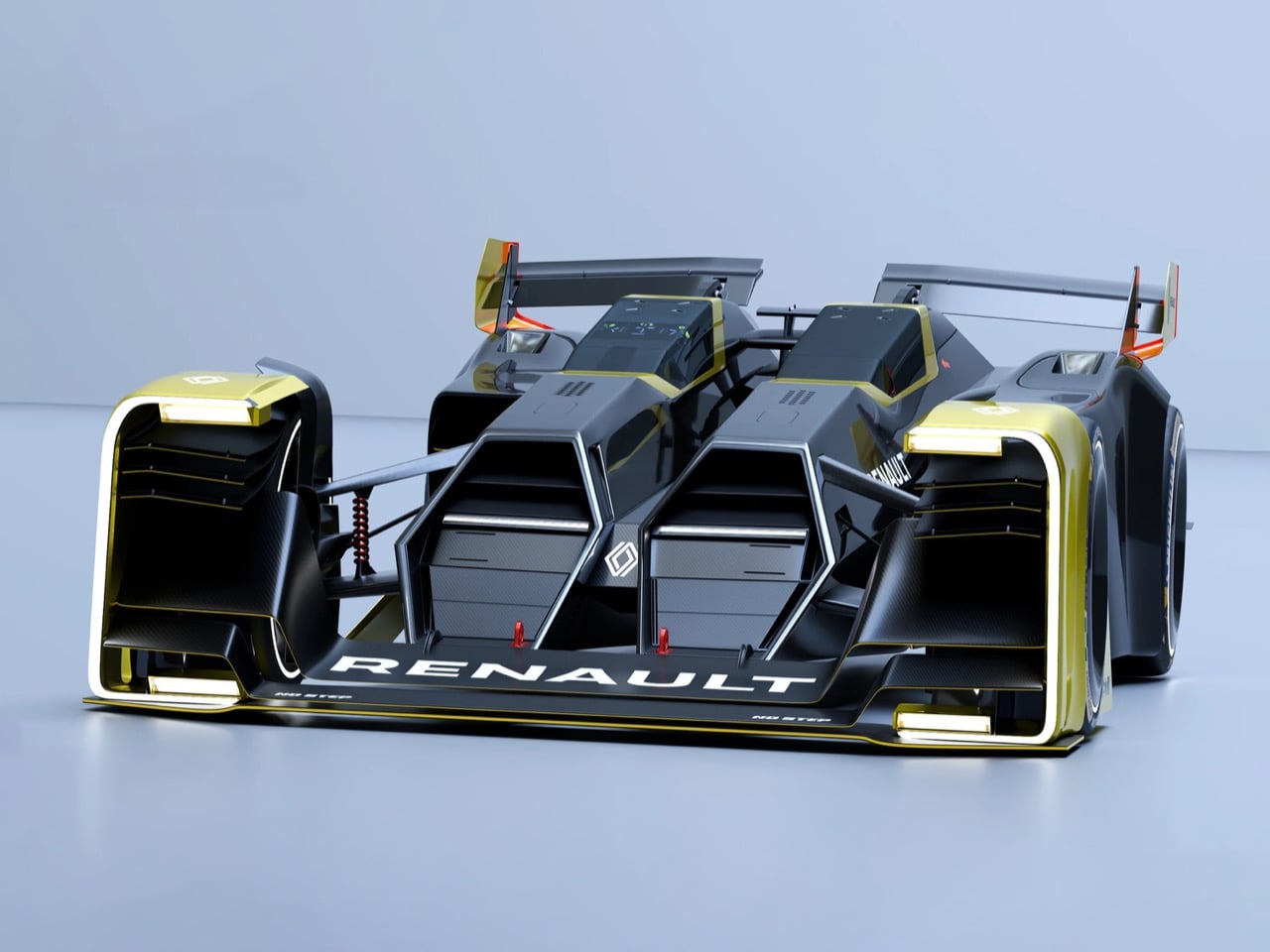
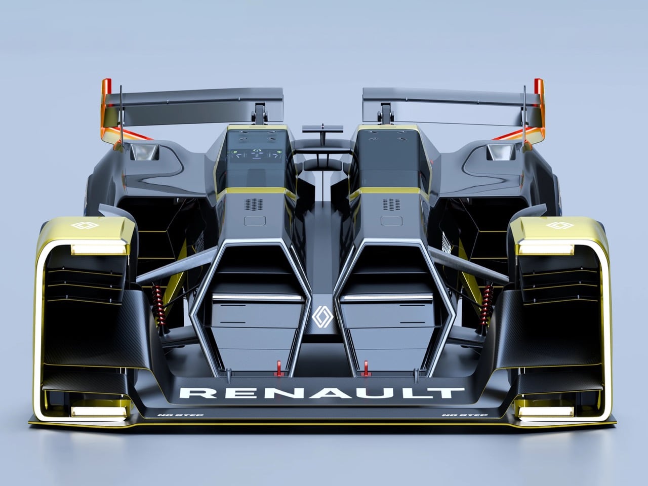
The Double Barrel is the work of designer Taejung Kim, and it treats the 2040 Le Mans pit stop as a design problem rather than a race strategy issue. The core idea is genuinely radical: instead of refueling or swapping tires, the car hot-swaps its entire driver cockpit and hydrogen powertrain as two completely self-contained pods. A central carbon monocoque spine connects them, handling structural loads and aerodynamic surfaces simultaneously. The result is a twin-fuselage racer that looks like nothing else currently operating in the hypercar conversation.
Inspired by the mechanics of a double-barrel shotgun and the 1955 Nardi Giannini, Kim’s rendering projects endurance racing firmly into a zero-emission future. Every surface, vent, and wing exists purely to serve track performance, entirely free from road regulation compromise. What makes it memorable beyond the swap-pod logic is that the twin-fuselage form justifies itself visually without needing any explanation. It doesn’t read as a thought experiment dressed up in render form. It reads like something that could genuinely appear on a Le Mans starting grid in fourteen years and win.
What we like
- Hot-swapping entire driver and powertrain pods simultaneously is a fresh rethink of endurance pit stop strategy that emerges naturally and logically from the design architecture rather than being bolted on as an afterthought
- The twin-fuselage form is confident enough to hold its own on pure visual merit, entirely independent of the concept’s mechanical rationale
What we dislike
- As a personal project without any manufacturer backing, there is no clear pathway from this compelling render to a real Le Mans grid entry with a racing program behind it
- The 2040 timeframe frames the concept more as speculative design fiction than a near-term directional statement with any racing authority behind it
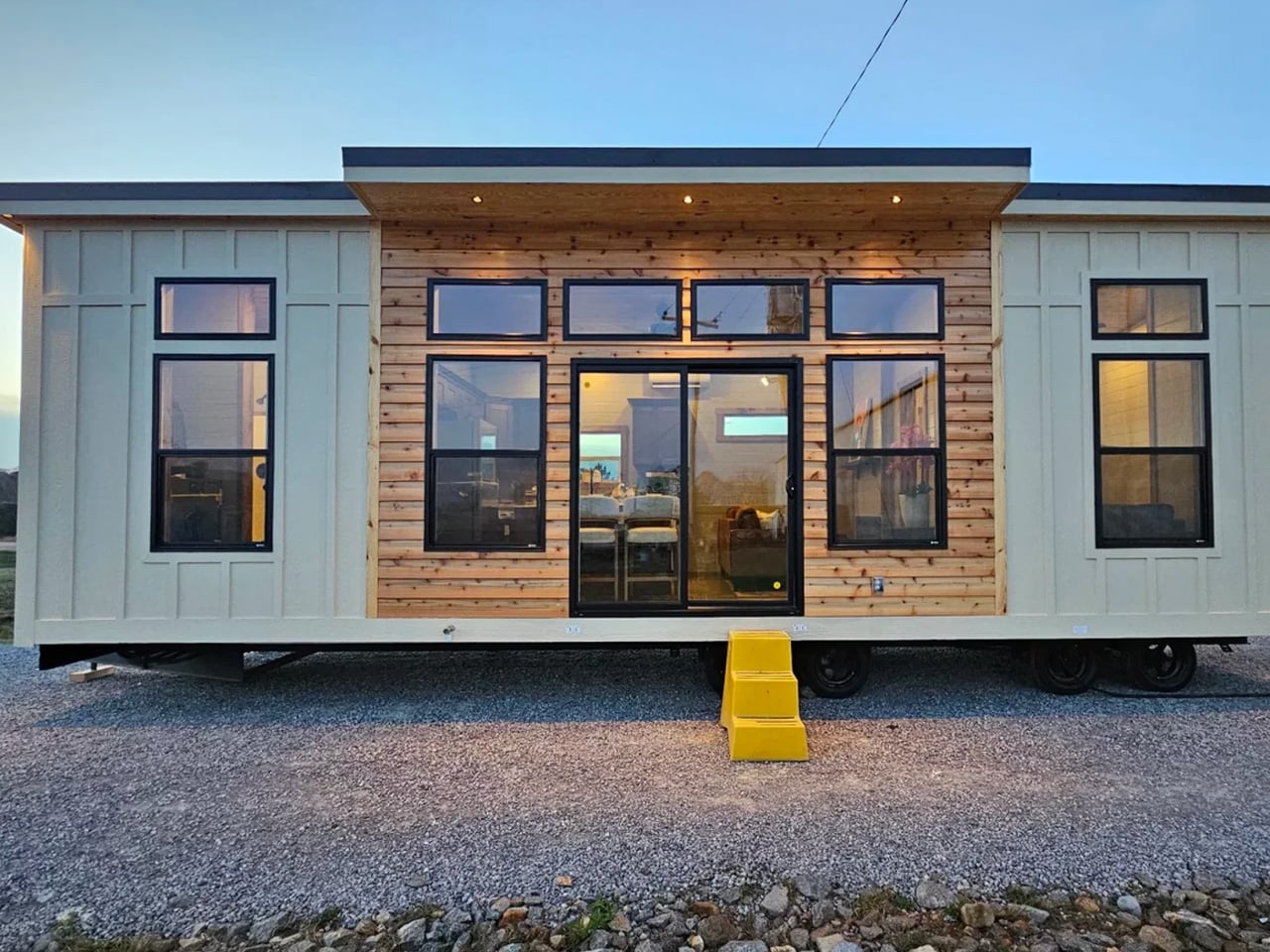
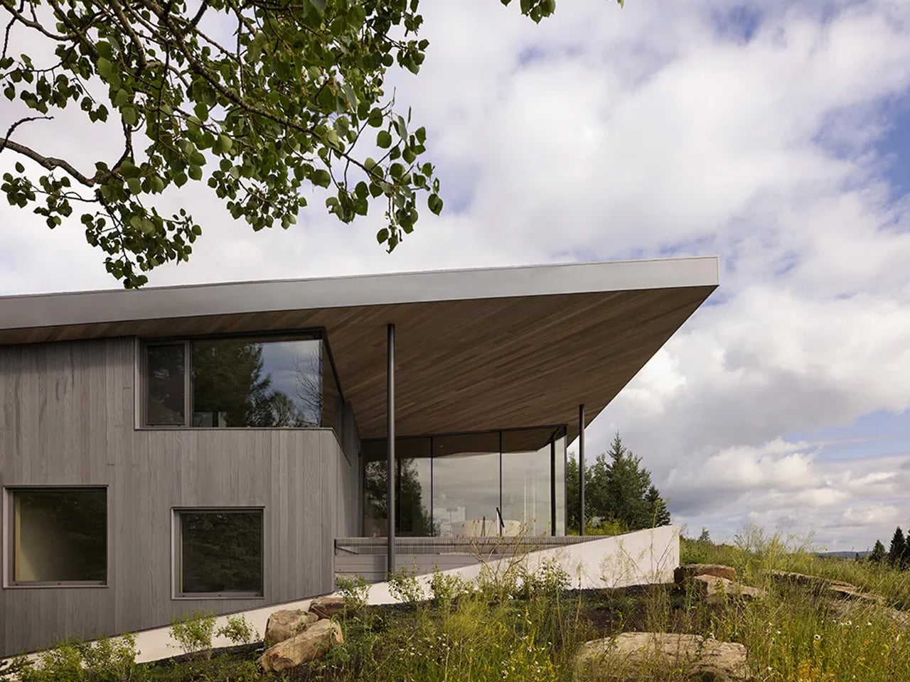
3. Hyundai Boulder
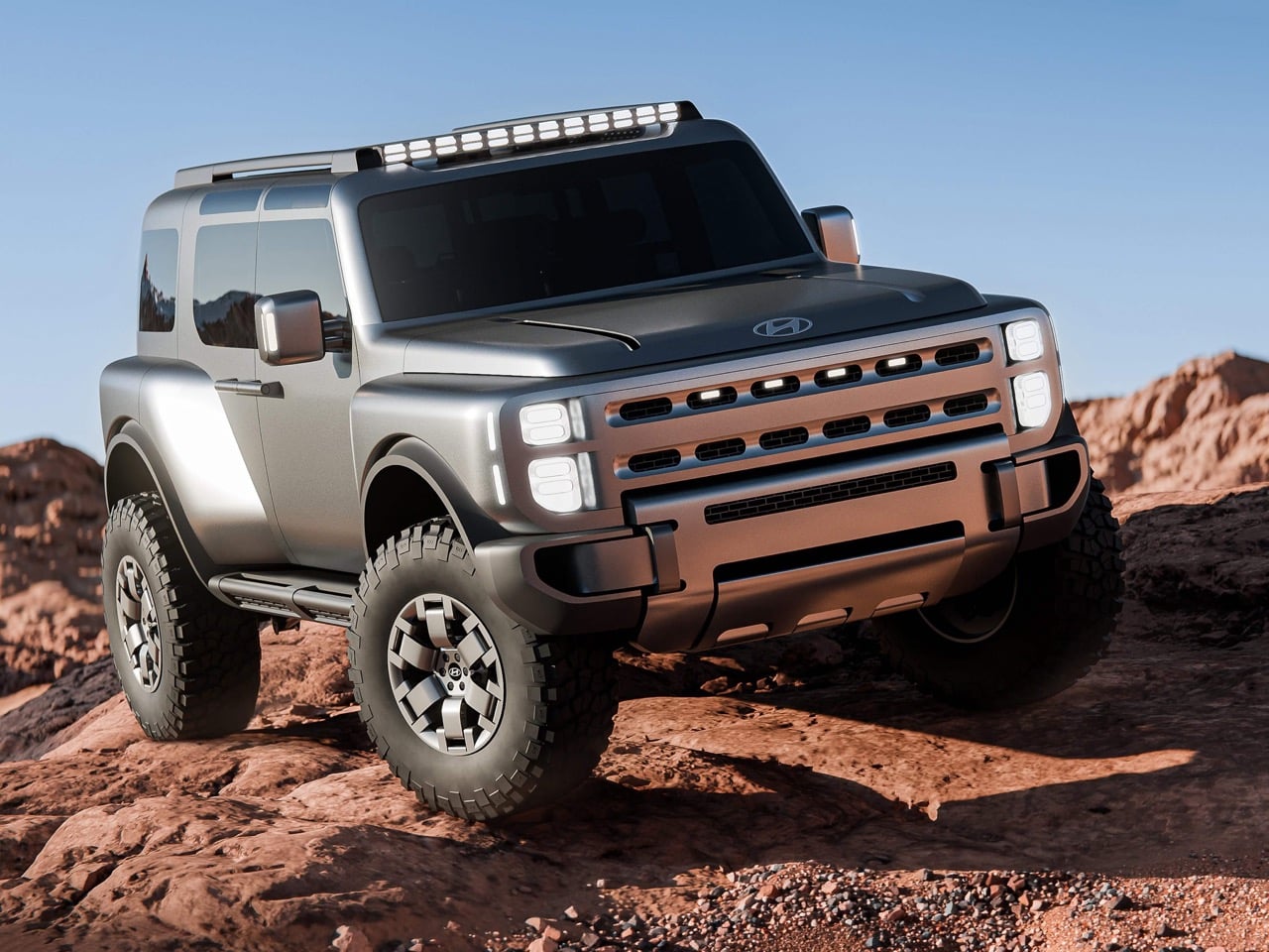
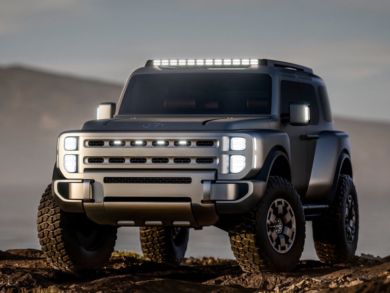
The Boulder is the concept Hyundai needed to make. Body-on-frame construction, 37-inch mud-terrain tires, coach-style rear doors, dual safari windows, a double-hinged tailgate that opens from either side, and a Liquid Titanium finish: every decision signals a genuine off-roader built on Hyundai’s “Art of Steel” design philosophy rather than a crossover with lifted suspension. The machined, sculptural quality of the exterior communicates real capability without resorting to theatrical add-ons. This isn’t Hyundai imitating Jeep or Land Cruiser. It’s Hyundai arriving in the off-road segment with its own considered language.
Debuted at the New York International Auto Show and designed, developed, and set to be assembled in America, the Boulder is more than a design study. It previews Hyundai’s first body-on-frame pickup truck, due by 2029, and confirms the brand’s intent to compete directly with Jeep and Toyota for buyers who take their vehicles well beyond the pavement. Stripping back digital touch interfaces in favor of mechanical clarity is a deliberate and confident design statement, and one that should resonate with the off-road community’s increasingly analog-minded values.
What we like
- The “Art of Steel” exterior language brings genuine sculptural toughness to a segment Hyundai has never seriously entered before, and the level of design commitment makes this feel like a real arrival rather than a trial balloon
- Choosing to leave out a touchscreen as a design decision rather than a cost measure signals real philosophical intent, which is increasingly rare in a segment dominated by screen-forward interiors
What we dislike
- Core production details including powertrain specification, interior layout, and weight remain entirely unconfirmed ahead of the expected 2029 production window
- The three-year development gap raises the real question of how much of this design language actually survives intact between concept form and a production showroom floor
4. Rezvani Fortress
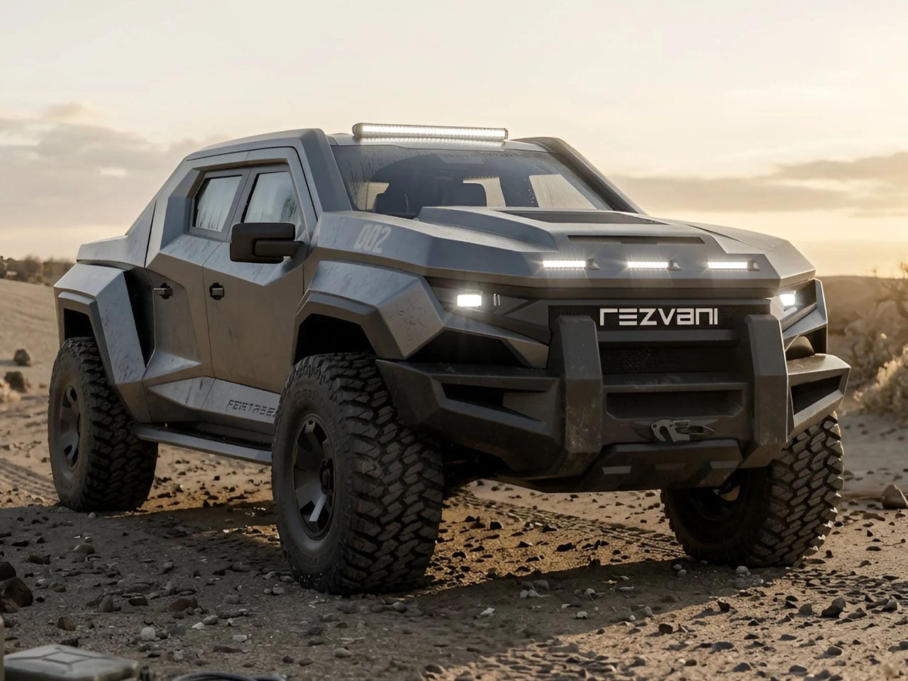
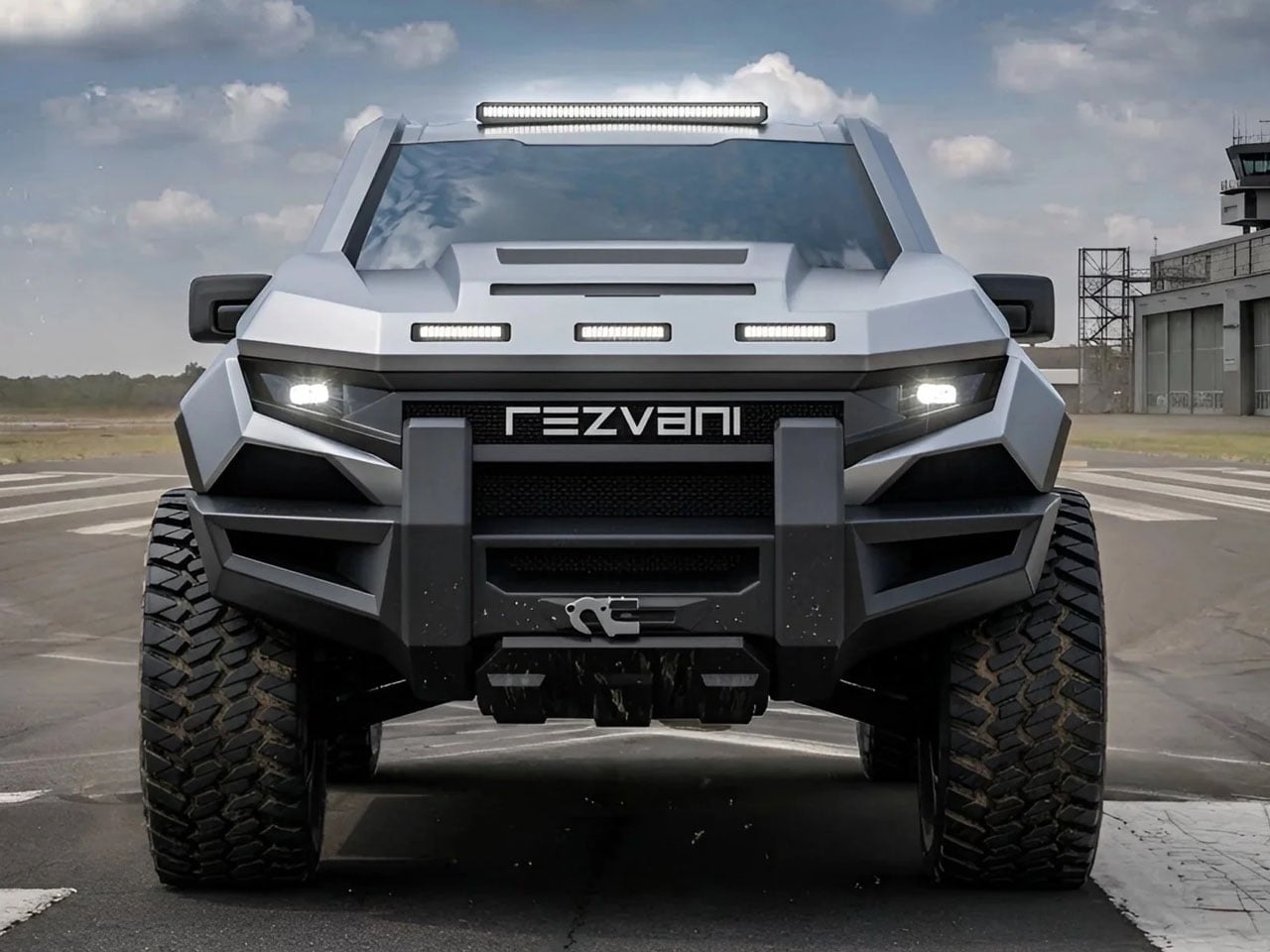
The Rezvani Fortress starts where the Ford F-150 Raptor finishes and proceeds in an entirely different direction. Reinforced steel bumpers, wide-body fender extensions, hood heat extractors, roof-mounted auxiliary lighting, and bulletproof glass come standard. The optional Security Survival Pack goes further still: military-grade gas masks, a hypothermia kit, a pepper spray dispenser mounted on the exterior, and an EMP protector. Power goes up to a 5.2-liter V8 producing 850 horsepower, with Fox suspension and four-wheel drive standard across the entire range.
Limited to 100 units and priced from $285,000 with a $500 refundable deposit to secure a build slot, the Fortress is Rezvani at its most committed. The exterior transformation is total: none of the original F-150 Raptor’s styling survives, replaced by a tank-like body that sits closer to a military convoy than any civilian road truck. Ten seat styles and color options give the interior some unexpected latitude. The result, as Rezvani puts it, is a tactical off-road truck that can handle city streets and terrain no other truck would even attempt.
What we like
- The complete exterior overhaul is not a body kit but a total redesign that removes every trace of the donor vehicle and replaces it with something entirely singular and uncompromising in its identity
- The Security Survival Pack creates an automotive product category that barely existed before Rezvani named it, and the Fortress owns that space without any meaningful competition at this price point
What we dislike
- At $285,000, retaining the largely unchanged F-150 Raptor interior dashboard and screen setup feels like a genuine missed opportunity to fully commit to the Fortress’s extreme exterior ambition and asking price
- A production run of just 100 units positions this firmly as a collector statement rather than a serious challenge to the broader tactical and overlanding truck market
5. Rolls-Royce Black Badge Ghost Gamer
![]()
The Black Badge Ghost Gamer is a one-off Bespoke commission built for a tech entrepreneur with a deep passion for early arcade culture. Rolls-Royce finished the car in a two-tone of Salamanca Blue and Crystal over Diamond Black, a pairing that deliberately echoes the neon-lit, super-metallic hardware of classic arcade cabinets. The exterior carries a hand-painted ‘Cheeky Alien’ 8-bit coachline motif designed exclusively for this commission. The overall effect is restrained provocation: a luxury car that has decided, with complete sincerity, that it no longer needs to take itself seriously.
Inside, every surface rewards closer inspection. The ‘Pixel Blaster’ Starlight Headliner is custom-programmed to simulate laser fire, each seat carries embroidery from ‘Player One’ through ‘Player Four,’ and illuminated tread plates display Press Start, Insert Coin, and Level Up in 8-bit lettering. Hidden Easter eggs are scattered throughout the entire cabin, and discovering each one functions, as intended, as a game in itself. The Ghost Gamer is the first Bespoke Rolls-Royce commission ever inspired by gaming culture, signaling just how seriously ultra-luxury clientele now collect the history of play.
What we like
- The interior detailing system is exhaustive and genuinely cohesive: every surface connects to a single thematic logic that rewards real exploration and reveals something new on a second or third look
- The Ghost’s 6.75-liter twin-turbo V12 foundation means the Gamer carries serious mechanical credibility beneath all the theatrical Bespoke craftsmanship, keeping it firmly grounded as a driver’s car
What we dislike
- As a one-off commission, it exists entirely outside reach for anyone not already operating deep within the Rolls-Royce Bespoke client program
- The 8-bit arcade references, however well-executed right now, carry a real risk of aging poorly as gaming culture continues to move further from its pixel-era origins
Design Has Nothing Left to Prove — And Everything to Say
What ties these five designs together is that none of them are playing it safe. Whether it’s a stripped-back speedster challenging Ferrari’s own electric flagship, a hydrogen hypercar that rethinks the Le Mans pit stop, or an arcade-coded Rolls-Royce that treats its cabin as an immersive game, each one commits fully to its own logic. That kind of conviction, uncompromised and unhurried, is what makes automotive design worth paying attention to.
Not all of them will reach a showroom. The TESTaZERO and the Double Barrel exist as arguments rather than products, and the Ghost Gamer will live in one garage for the rest of its life. The Boulder and the Fortress are real, in different ways, but the conversation each one starts is the same: what should a car actually stand for? In 2026, the most interesting designers are asking that question louder than ever.
The post The 5 Best Automotive Designs of June 2026 first appeared on Yanko Design.