This Architect Built a 20m² Red Cabin on Her Family’s Greek Vineyard — and It’s the Antidote to Every Concrete Villa on the Island

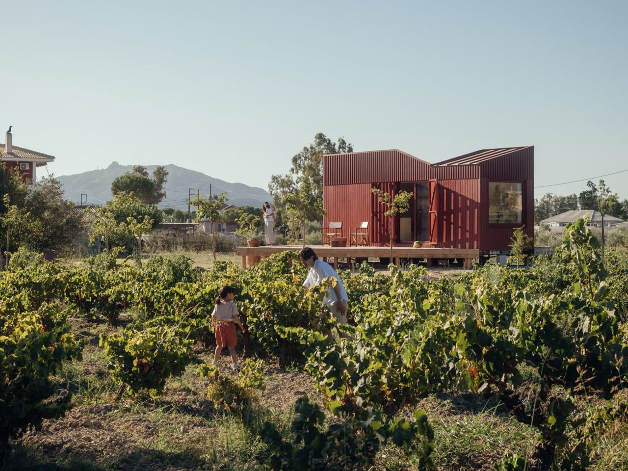
Somewhere between the olive groves and vine rows of Zakynthos, a deep-red timber cabin sits quietly in the Greek countryside, and it’s one of the most considered small structures to come out of Europe this year. The Root Cabin, designed by London-based studio Kasawoo, is a 20-square-metre prefabricated retreat that challenges the very idea of what a holiday home in Greece should look like.

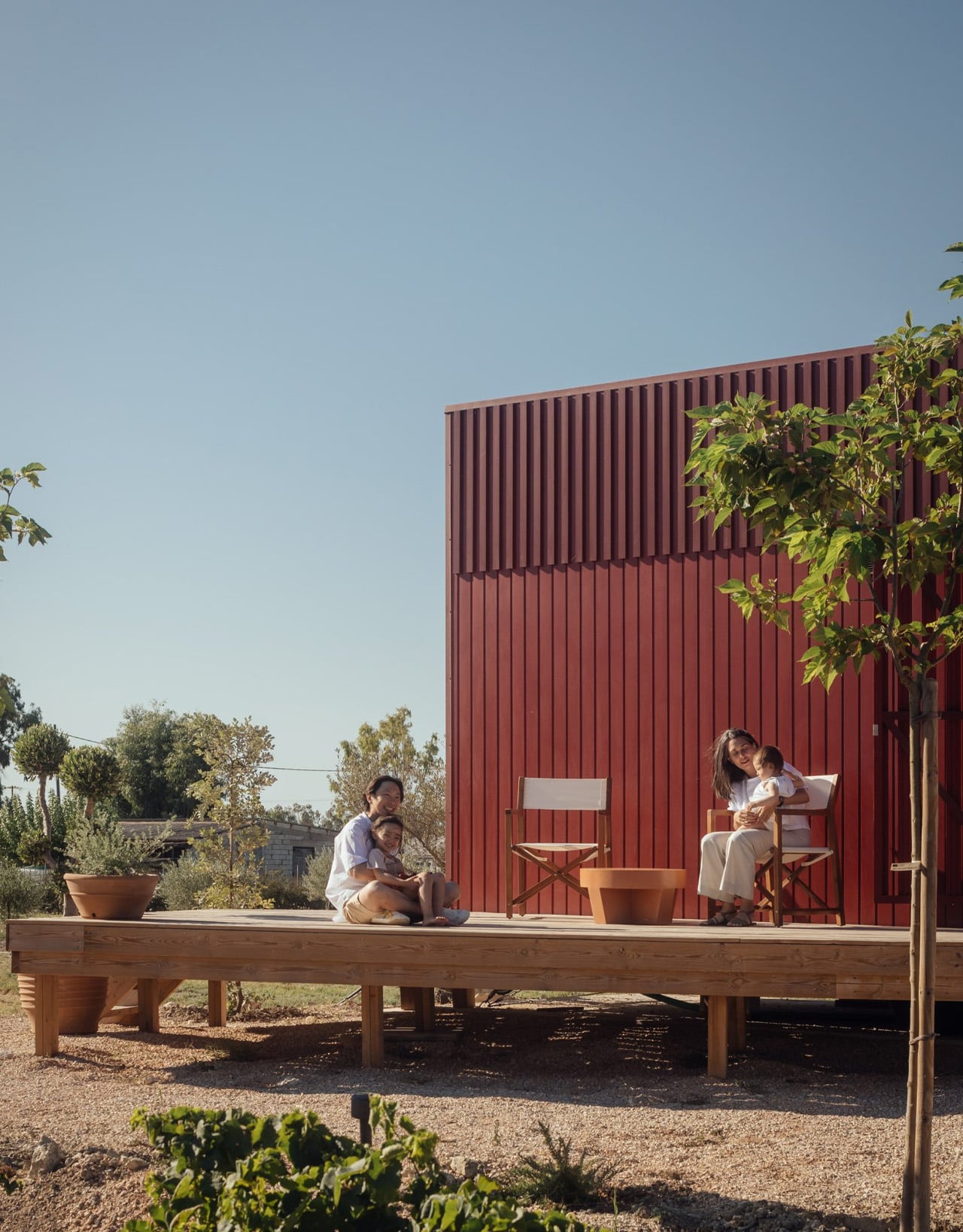
The project is personal. Co-founder Katie Kasabalis owns the land in the village of Vanato, a site that has been in her family for decades and still holds the ruins of her grandmother’s old stone house. Together with co-founder Darius Woo, she set out to build something that felt of the place rather than imposed on it. The result sits at just 2.5 by 8 metres, slipping gently between rows of vines without disrupting the agricultural and historical fabric of the land.

Designer: Kasawoo

Built off-site in Romania and transported to Zakynthos fully prefabricated, the cabin is road-legal and designed to be relocatable, a detail that speaks directly to its low-intervention philosophy. “Nothing is superfluous,” the architects told Dezeen. “The project’s generosity lies in what it refuses to add.” In a part of Greece where sprawling concrete villas are accelerating across the countryside, that kind of restraint is quietly radical.

The exterior is wrapped in deep-red timber planks, a shade drawn from the historic villas of Zakynthos, and topped with a gently angled roofline that echoes the island’s mountainous horizon. It’s a structure that has absorbed its context rather than competed with it. Inside, the atmosphere shifts to something warmer and more immediate. Plywood lines the walls, ceilings, and all built-in furniture, creating a near-seamless, cocoon-like interior in which a bed, compact kitchen, sofa, and bookshelves are integrated into the structure.

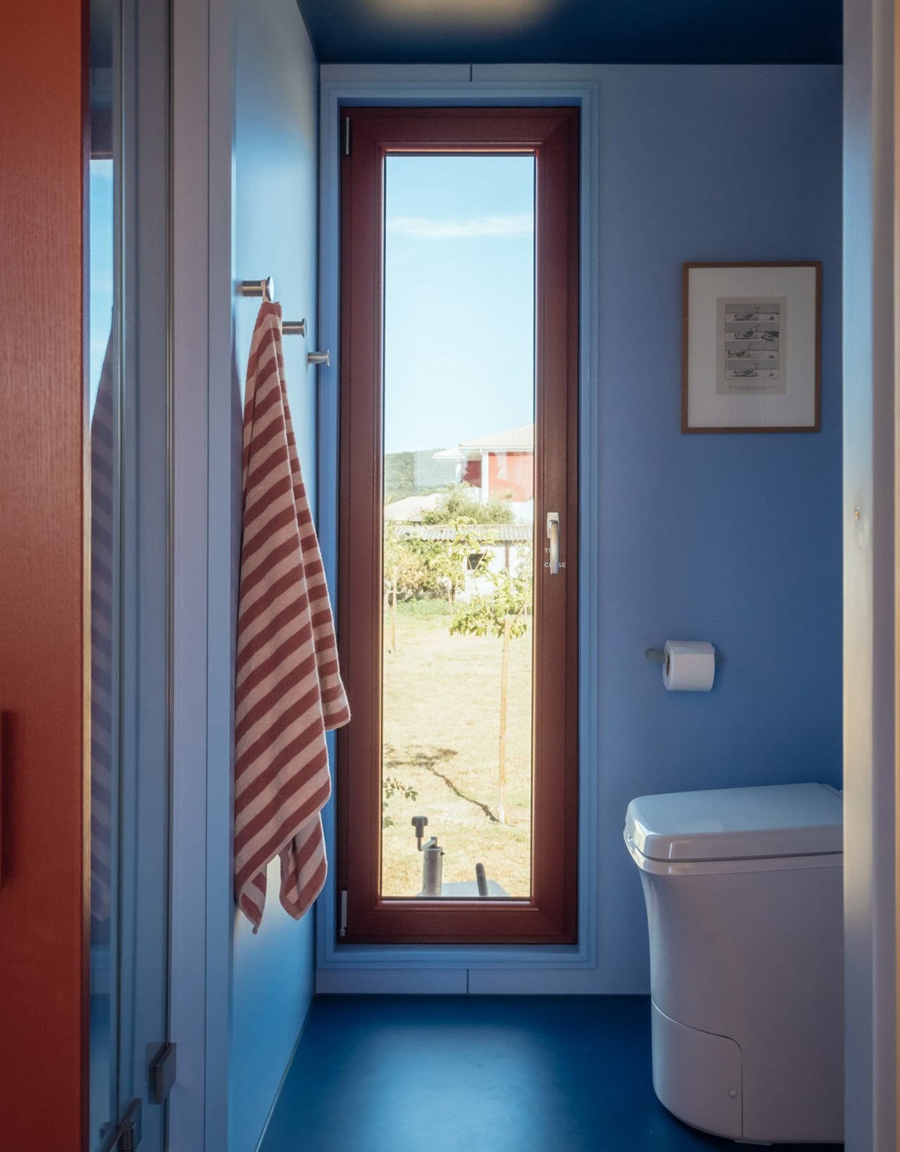
The layout places the bedroom and bathroom at opposite ends, with a central living space defined by large sliding glass doors that open directly onto the landscape. Red details carry through from the exterior, while the bathroom shifts to soft blue tones, a quiet nod to the Ionian Sea nearby. Objects sourced from Greek makers, including ceramics and textiles, add another layer of local grounding to a space that already feels deeply rooted.

Passive ventilation and operable openings allow the cabin to function off-grid, reinforcing what Kasawoo describes as a “different kind of luxury,” one that measures itself not by square footage or spectacle, but by the quality of what’s been left out.

The post This Architect Built a 20m² Red Cabin on Her Family’s Greek Vineyard — and It’s the Antidote to Every Concrete Villa on the Island first appeared on Yanko Design.

Forget Your Old Loadout — 5 EDC Essentials Built for Summer 2026

Summer 2026 is a different kind of season for EDC. The carry conversation has matured past keychain gimmicks and bulk-heavy multitools into something sharper; gear that’s actually thought through, built from aerospace-grade materials, and designed with the same care as the objects that live on your desk. These five pieces represent the best of where that shift has landed: practical without being boring, minimal without being precious.

Whether you’re navigating festival crowds, weekend camping trips, or the daily urban grind, the right loadout isn’t about carrying more — it’s about carrying smarter. Each of the picks below earned its spot not through spec sheets alone, but through intentional design choices that make the experience of using them genuinely different. These are the five pieces worth making room for this summer.

1. Cubik Knife

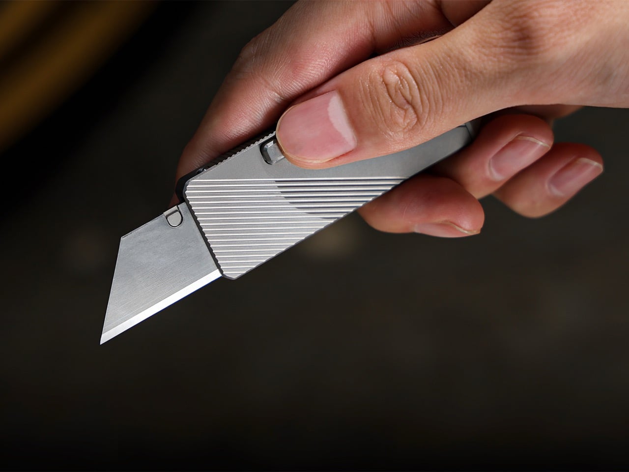
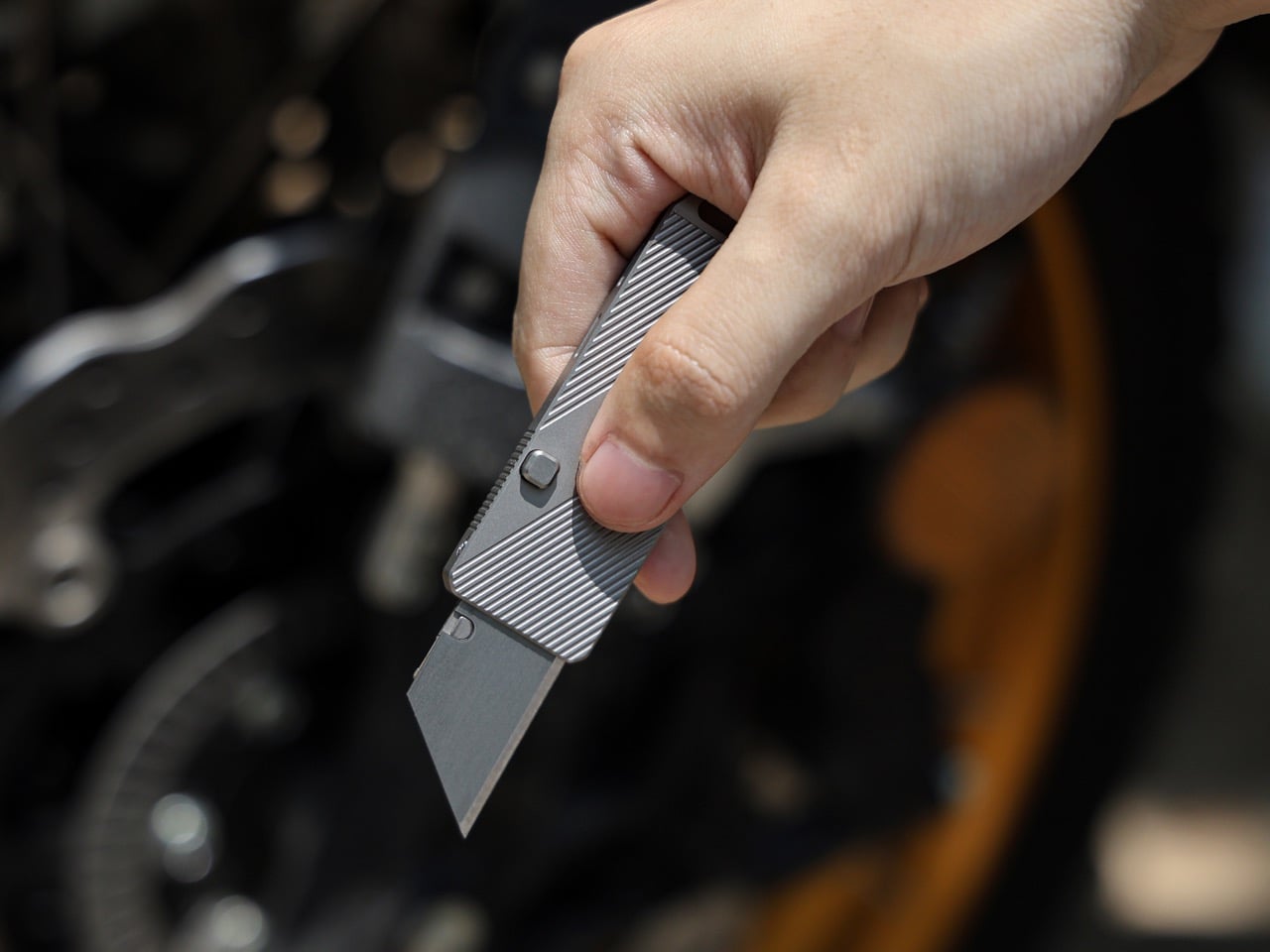
Gravity-powered deployment sounds more cinematic than practical — until you hold the Cubik. Designed by IF and machined from aerospace-grade titanium, this pocket knife opens with a button-flick and the natural pull of gravity: no springs, no mechanisms to fail, no audible snap. At 2.6 inches long, 0.98 inches wide, and just 0.2 inches thick, it slips into a pocket and disappears. The Cubik looks more like a designer flash drive than a knife, which is exactly the point — and what makes it so easy to live with every single day.

The blade runs a standard trapezoid utility format — the same geometry used to slice linoleum, roofing materials, acrylic, and thin sheet metals. When one edge dulls, flip it; when both are spent, swap it. That interchangeable format turns a consumable item into something genuinely sustainable over time. A deep-carry titanium clip keeps it flush to the pocket edge, and a tungsten carbide glass-breaker on the rear makes it a legitimate lifesaver when it counts. At $59 with five replacement blades included, it’s one of the most sensibly priced titanium tools in the category.

What we like

  • Gravity-flick deployment is spring-free, meaning zero moving parts to fail over time
  • Swappable trapezoid blades make the Cubik cost-effective and sustainable for long-term carry

What we dislike

  • The utility blade format won’t appeal to collectors who prefer a dedicated knife steel
  • Gravity deployment requires a deliberate wrist flick that takes a brief learning curve

2. 8-in-1 EDC Scissors

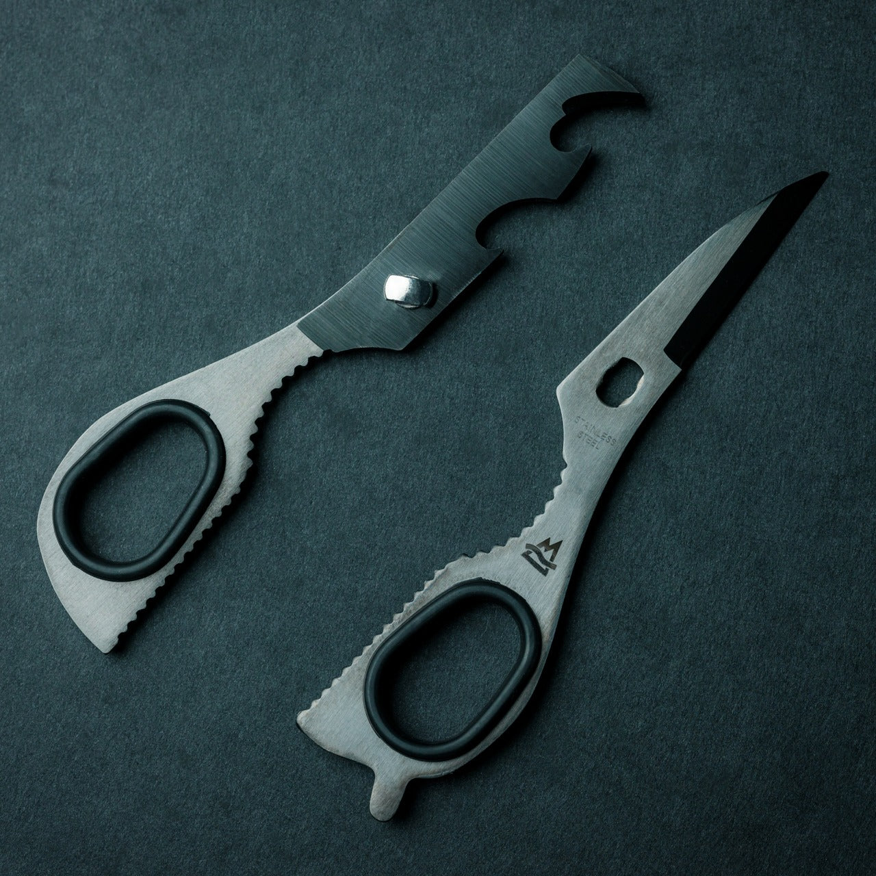
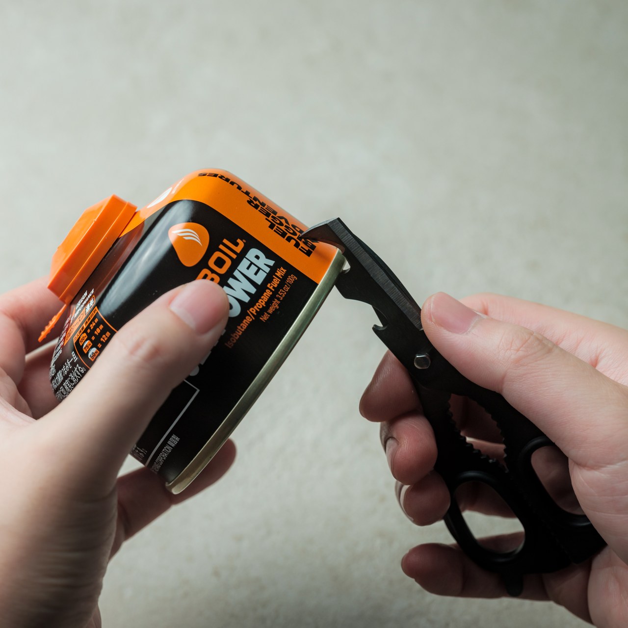
Most EDC scissors ask you to accept a compromise — either you get a folding design that sacrifices cutting power, or you get a rigid tool that’s too bulky to pocket. The 8-in-1 EDC Scissors from Eiger Design, available through the Yanko Design Shop, sidesteps both problems. Made in Japan and compact enough to sit in a palm at just 13 centimeters (5.1 inches) closed, it packs scissors, a knife, a lid opener, a can opener, a cap opener, a bottle opener, a shell splitter, and a degasser into a single carry-ready object.

The scissors themselves are the real story — full-strength blades that don’t rely on a collapsible pivot to achieve their compact profile, which means they cut with conviction through materials that foldable scissors would snag or mangle. The remaining seven functions are genuine, not ornamental. For summer specifically — camping weekends, beach cookouts, farmers market errands, festival packing — this is the kind of tool that earns its weight early and keeps earning it. At $53 through the YD Shop, it’s the most versatile item on this list per dollar spent.

Click Here to Buy Now: $59.00

What we like

  • Eight independent tools in a 5.1-inch, palm-sized package that’s genuinely comfortable to carry daily
  • Made-in-Japan manufacturing brings real precision to both the scissors and every secondary tool

What we dislike

  • The scissors-first form factor means the secondary tools can feel secondary in actual day-to-day use
  • Not the right call if you’re shopping for a dedicated cutting tool rather than a multitool

3. NoxTi

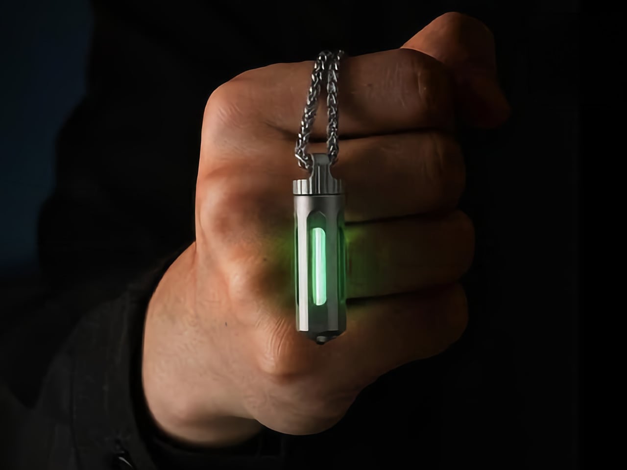
NoxTi is the kind of object that makes you reassess what belongs on your keychain. Designed by Xedge and built from Grade 5 titanium, it measures just 45mm and weighs 10.7 grams. The core of the piece is a tritium vial — a sealed, self-luminous insert that glows continuously for 25 years without batteries, charging, or any external power source. Quartz glass protects the vial from impact, and the titanium housing supports interchangeable vial options alongside a glass-breaker tip at the rear, making it far more than a novelty.

In practical terms, NoxTi solves a problem most EDC setups don’t realize they have: passive orientation in the dark. When your keychain is at the bottom of a bag, buried in a jacket pocket, or left on a nightstand, the glow orients you without reaching for your phone. That always-on, zero-input utility is a design philosophy most gear claims but rarely delivers.

What we like

  • Tritium vial delivers 25 years of passive, battery-free illumination with no maintenance required
  • Grade 5 titanium housing and quartz vial protection make it exceptionally durable for keychain life

What we dislike

  • At 45mm, it’s compact but will add noticeable length to an already-loaded keychain setup
  • Tritium vials are radioactive (safely contained, but a consideration for buyers who prefer chemical-free carry)

4. HYZER

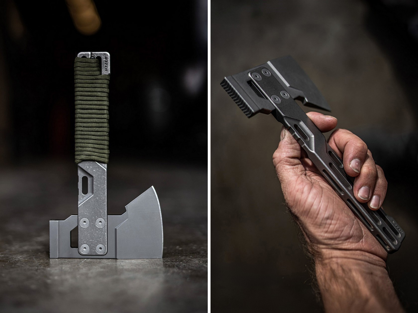
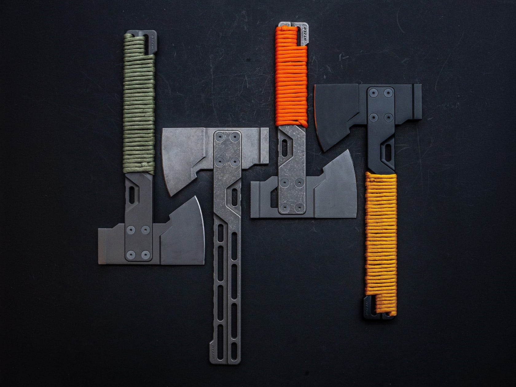
Exceed Designs doesn’t do anything conventionally, and the HYZER is the clearest proof of that. At its core, it’s a hatchet — but calling it that undersells the engineering. The handle is fully skeletonized and CNC-machined from a solid block of 6AL-4V Grade 5 titanium, available in two lengths: a full-size 9.75 inches or a compact 8.15 inches. The head runs on an infinitely modular nested system that lets you swap cutting formats without replacing the handle — a level of adaptability that no conventional hatchet even attempts.

For summer carry — backcountry hiking, basecamp setups, or serious van-life configurations — the HYZER changes the math on what a hatchet needs to be. The D2 steel axe head delivers serious chopping performance, while the titanium handle keeps the tool lighter than any steel-handled competitor in its class. The stonewashed finish gives it a visual identity that’s unmistakably premium without being precious about it.

What we like

  • The modular nested head system allows the HYZER to adapt to different cutting and splitting configurations
  • Full skeletonized Grade 5 titanium achieves meaningful weight savings without compromising structural integrity

What we dislike

  • The premium titanium and D2 material combination places this at a significantly higher price point than most seasonal carries
  • Two-handed hatchet operation demands dedicated pack space that the other four items on this list don’t require

5. BlackoutBeam Tactical Flashlight

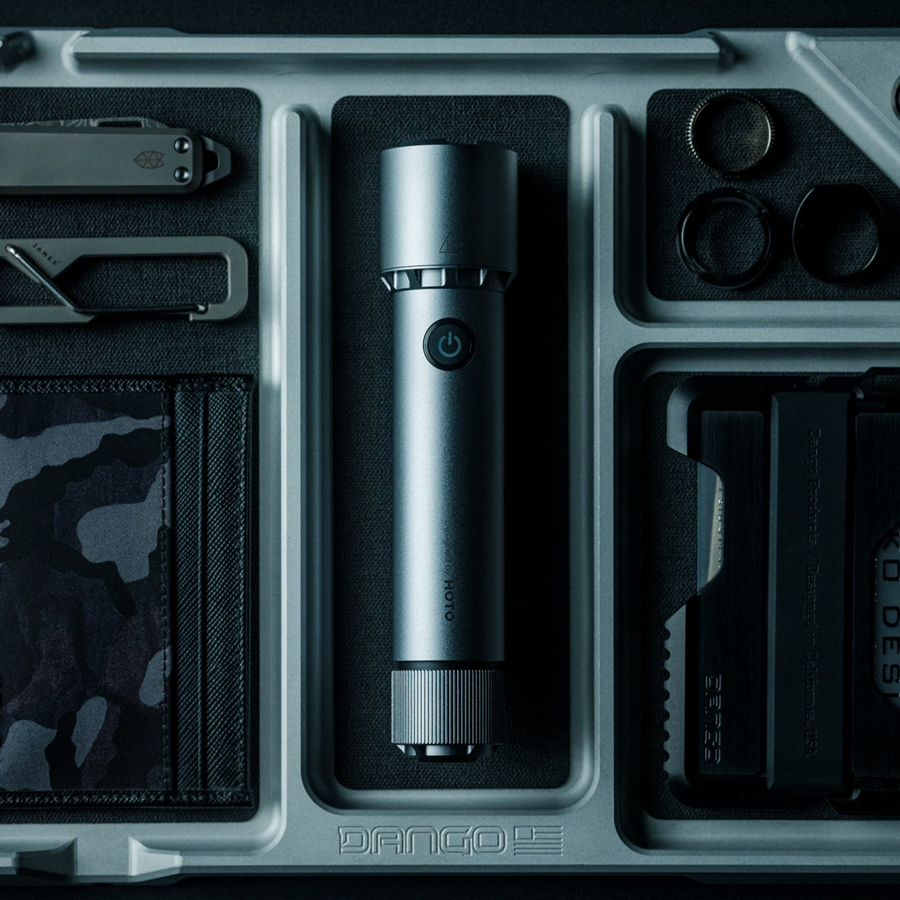
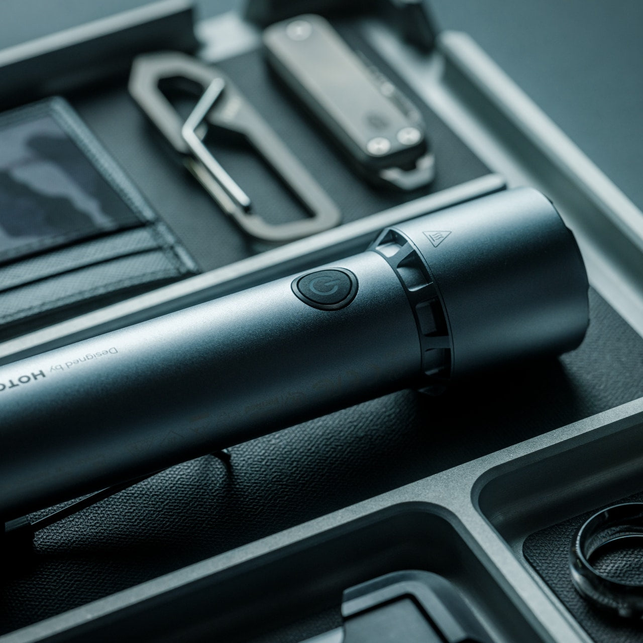
A 2,300-lumen output in a tactical flashlight isn’t rare in 2026 — but a 2,300-lumen flashlight that looks like it belongs at a design exhibition rather than a military surplus store is still genuinely hard to find. The BlackoutBeam, available through the Yanko Design Shop at $90, pairs that blinding output with an industrial aesthetic that wears well whether it’s clipped to a backpack or sitting on a shelf. The 300-meter throw distance cuts through darkness with clinical precision, and the IP68 waterproof rating ensures it performs regardless of what summer throws at it.

Five operational modes — including strobe and pinpoint — give the BlackoutBeam tactical flexibility that goes well beyond on-off cycling. The 0.2-second instant-on response is the detail that separates tools built for designers from tools built for actual use: in a power outage, a trail emergency, or any situation where you need light immediately, that activation speed matters in a way that a spec sheet can’t fully communicate. With longer days turning into late evenings outdoors and camping season running hot, the case for a serious flashlight in your summer kit has never been more straightforward.

Click Here to Buy Now: $89.00

What we like

  • 2,300-lumen output with a 300-meter throw distance puts it firmly in professional-grade territory
  • A 0.2-second instant-on response time makes it genuinely dependable when the situation demands it

What we dislike

  • The tactical aesthetic reads as aggressive for carry setups that lean toward minimalist or everyday styling

The Best Loadout Is the One You Actually Think About

What these five pieces share isn’t material or price point…it’s intention. Every one of them was designed by someone who cared enough to solve the actual problem rather than approximate a solution. That’s the standard worth holding EDC to in 2026, and it’s becoming a higher bar to clear as the category matures and the market fills with near-misses. The best loadout is never the one with the most gear. It’s the one with the right gear.

Summer tends to be the season when carry gets edited down; lighter layers mean fewer pockets, and heat means less patience for bulk. These five designs all pass that test. They’re compact enough to disappear when you want them to and capable enough to matter when you don’t. Whether you pick up one or all five, the upgrade from whatever you’re carrying now is real.

The post Forget Your Old Loadout — 5 EDC Essentials Built for Summer 2026 first appeared on Yanko Design.

This $35,000 Tiny Home Proves You Don’t Need More Than 161 Square Feet to Live Well

At 20 feet long and 8 feet wide, the Tulsi by Simplify Further Tiny Homes doesn’t try to be anything it isn’t. It has everything you need, and nothing you don’t. That restraint is exactly what makes it work. While the tiny home market is crowded with builds that either sacrifice livability for aesthetics or pile on features that inflate the price tag, the Tulsi threads the needle — landing at a starting price of $35,000 for a fully functional, NOAH-certified home on wheels.

The Florida-based builder behind it, Simplify Further, has built a reputation around the idea that quality and simplicity aren’t mutually exclusive. Their motto — “Simple Living, High Thinking” — runs through every design decision in the Tulsi. The build carries a BBB Accredited A+ rating, and its certification as an RV through NOAH means it meets a recognized standard for workmanship and safety.

Designer: Simplify Further Tiny Homes

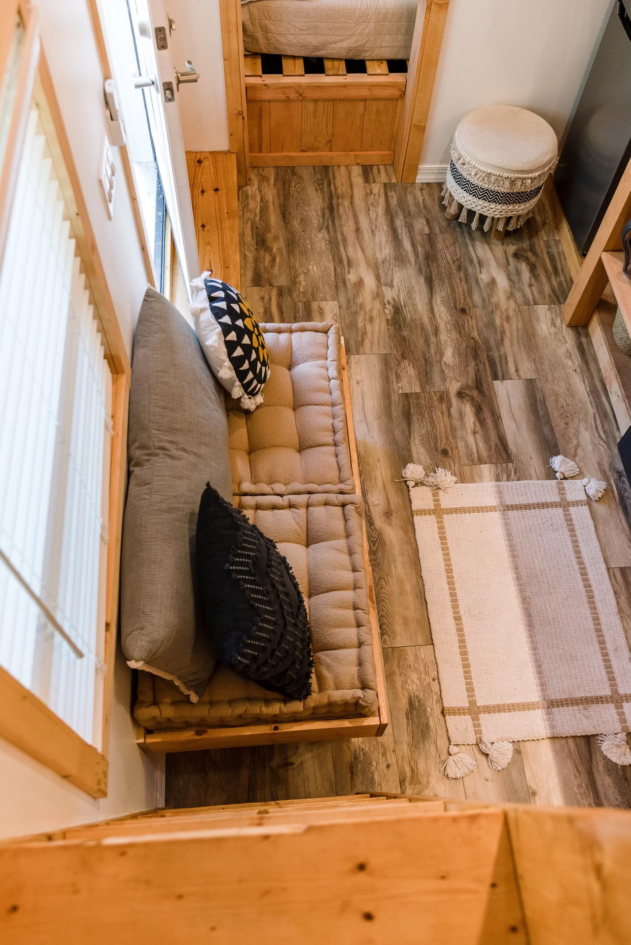
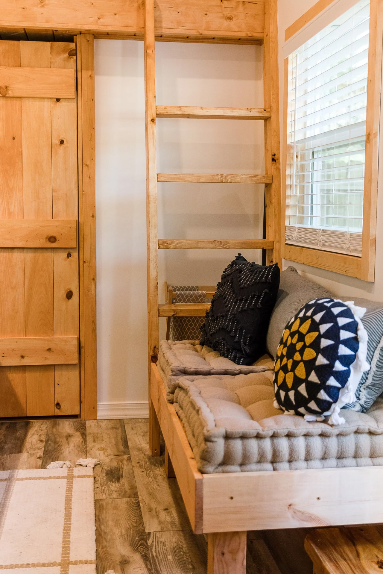
At 161 square feet, the Tulsi packs in a kitchenette, a full bathroom with a shower stall, a flush toilet, a mini sink, a built-in seating area, a main-level queen-sized bedroom, and a loft. The loft measures 7 by 4 feet with a 36-inch height at the low side, accessible by ladder with black metal railings — tight, but functional. The height under the loft sits at 6 feet 4 inches, which means the main living area never feels like you’re ducking through a crawl space.

What sets the Tulsi apart from its contemporaries is its genuine flexibility. The main level bedroom isn’t a compromise — it’s a feature. For guests who don’t mind the loft, you could designate the loft as the main sleeping area and convert the downstairs bedroom to a living room. That kind of adaptability is rare at this price point. In the kitchen, buyers can opt for open shelving or swap seating for additional cabinet storage — a small but meaningful decision that shapes how the space actually lives day to day.

Simplify Further positions the Tulsi primarily as a guest house or mother-in-law suite — a secondary structure that gives visitors full independence without removing them from the property entirely. But the build has proven versatile enough to serve as a short-term rental, a starter home, or a full-time residence for someone drawn to the economy of small living. The Tulsi by Simplify Further seamlessly blends convenience and comfort, making it a charming addition to any property.

For a 161 square foot box on wheels, the Tulsi has quietly earned its place as one of the more thoughtfully designed entry points into tiny living — and the numbers back it up.

The post This $35,000 Tiny Home Proves You Don’t Need More Than 161 Square Feet to Live Well first appeared on Yanko Design.

5 Memorial Day Outdoor Gadgets That Make Every Camping Trip Feel Engineered in Japan

Memorial Day weekend is when the campsite gets its first real test of the year. The gear you pack either earns its place or takes up space. This year, a handful of outdoor gadgets are shifting the conversation, designs so considered, so precise in their logic, they feel lifted straight from a Tokyo design studio. Each one solves a familiar outdoor problem in a way you didn’t see coming.

What unites these five objects is a shared commitment to intentionality, the Japanese idea that a well-made thing should do its job beautifully, without fanfare or waste. Whether it’s a lantern that turns like a toy or a fire pit engineered around combustion science, these gadgets carry a point of view. Not here to impress on a spec sheet. Just here to make the long weekend feel properly planned.

1. RetroWave 7-in-1 Radio

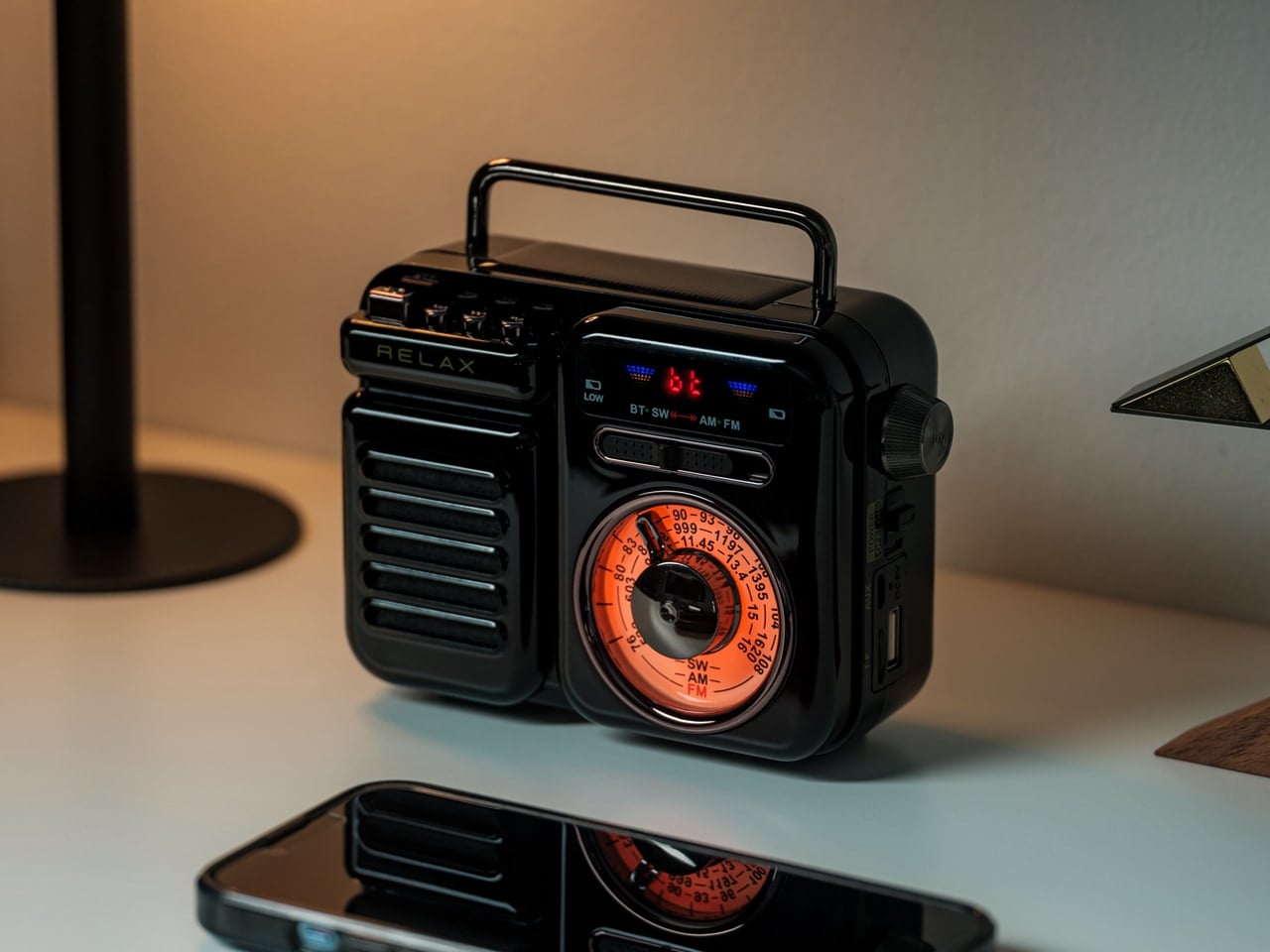
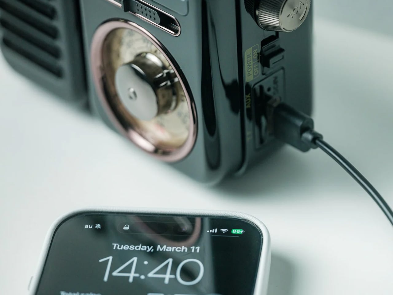
There’s a radio sitting somewhere in Japanese design history that directly inspired this one. The RetroWave 7-in-1 Radio arrives with a tactile tuning dial, a warm housing drawn from mid-20th century aesthetics, and the kind of visual restraint that makes a thing look inevitable. Behind the retro face is a 7-in-1 device handling AM, FM, and shortwave reception, Bluetooth streaming, a built-in flashlight, SOS alarm, power bank charging, and a 2000mAh battery that tops up via hand-crank or solar panel.

The 8W speaker punches with enough warmth to soundtrack a campfire properly, and the 20-hour radio battery life means it runs through a full weekend without reaching for a cable. Two colorways — black and warm gray — make it look as good on a picnic blanket as it sounds in the open air. It’s the rare object that solves the problems you forgot to plan for: music, emergency signaling, phone power, and light, all from one compact, beautiful thing.

Click Here to Buy Now: $89.00

What We Like

  • The 7-in-1 function set means it replaces multiple items in your pack — flashlight, emergency radio, portable charger, and speaker all collapse into a single carry-anywhere device with one well-resolved retro form that earns its weight every time.
  • The retro Japanese design with a tactile tuning dial doesn’t look like survival gear. It looks like a piece you’d buy for the living room, which means it earns a permanent spot in the gear bag rather than getting quietly left behind on the shelf.

What We Dislike

  • Bluetooth battery life tops out at approximately 5 hours at 75% volume, meaning a full camp day of wireless streaming will require a recharge — the solar panel helps, but cloud cover changes that math quickly.
  • The compact body keeps it packable, but the speaker volume has a ceiling that wide-open outdoor settings can expose, especially once the campfire gets going and conversation picks up.

2. Twist Camping Lantern

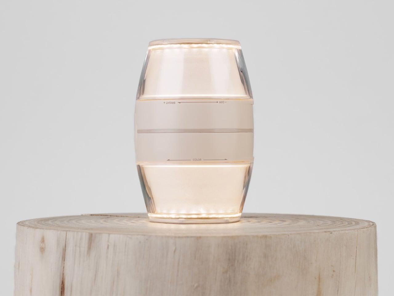
Small beige LED lamp lit with a warm glow, sitting on a round wooden stump.

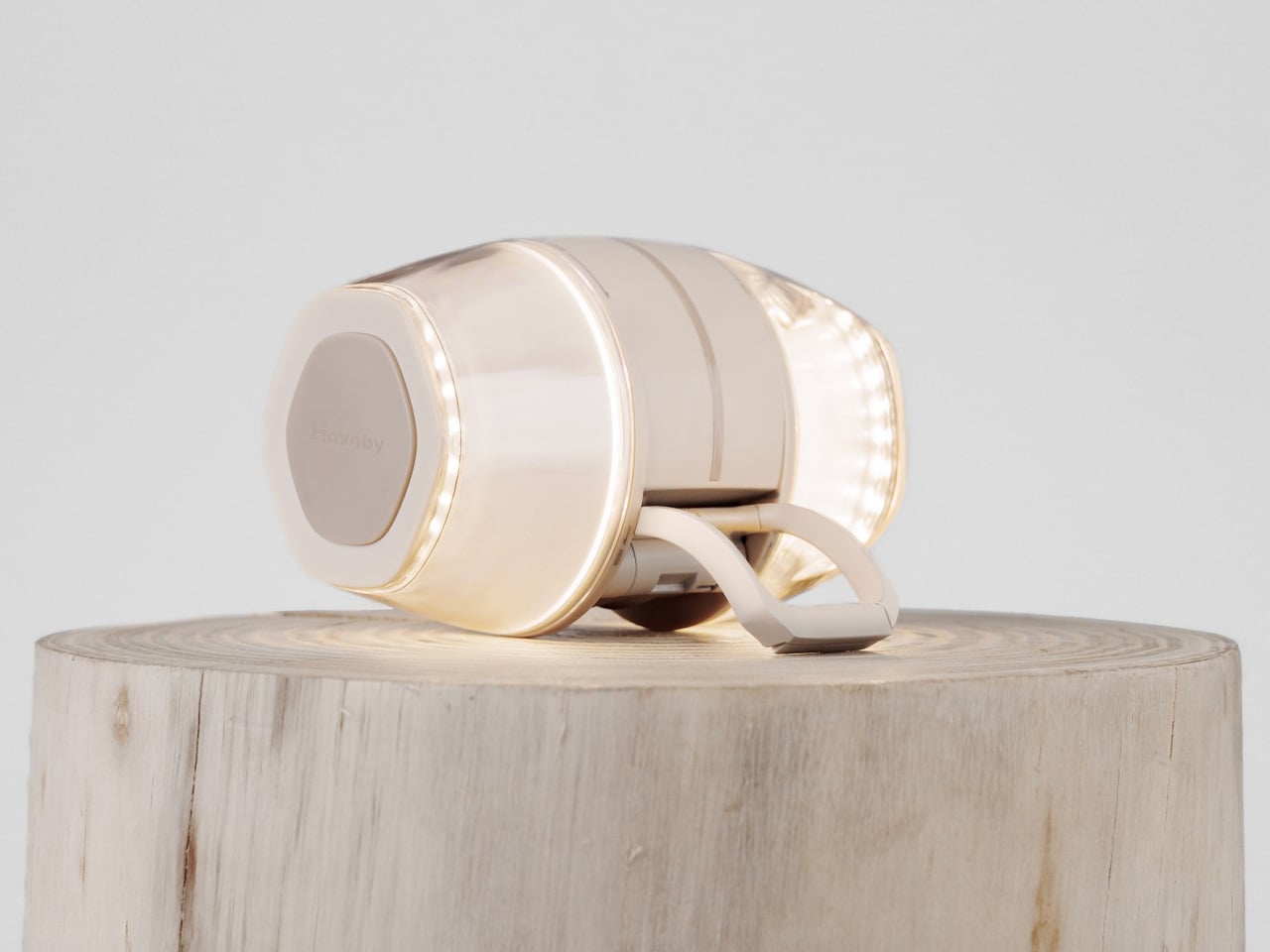
Cream wireless over-ear headphones resting on a wooden stump against a pale background.

When designer iu Llong looked to Japanese gashapon vending machines for inspiration — those capsule toy dispensers that make cracking open a prize feel like a small ceremony — the result was a camping lantern that turns on exactly the way a gashapon opens: with a satisfying twist. Built for Havnby as two cones joined at the base, the single twist mechanism adjusts both brightness and color temperature, dialing from cool white all the way down to a warm red.

The Twist Lantern packs a 10,000mAh rechargeable lithium battery into a compact form that weighs around 410 grams and charges fully in under three hours via USB-C. Its runtime stretches from 3.8 hours at full brightness to an impressive 70 hours on its lowest setting — enough for an extended weekend. The waterproofing and built-in magnetic mount mean it handles rain and hangs wherever you need it. For a lantern, it’s remarkably thoughtful. For a design object, it’s immediately recognizable.

What We Like

  • The gashapon-inspired twist interaction makes operating this lantern something you’ll actually look forward to — the kind of satisfying physical gesture that cheap pushbutton camp lights have never managed to replicate across years of trying.
  • A 70-hour runtime on its lowest setting is exceptional for any rechargeable camping lantern, meaning you can leave home without calculating whether the battery will outlast the trip or quietly die at hour three.

What We Dislike

  • At 520 lumens, the Twist Lantern is optimized for ambiance and intimate spaces — it sets a tent mood beautifully but won’t flood a large group campsite the way a high-output utility lantern would.
  • The twin-cone form factor, while visually striking, is less stackable in a tightly packed gear bag than a more conventional cylindrical lantern design, which may require some creative packing on longer trips.

3. Iam Sauna

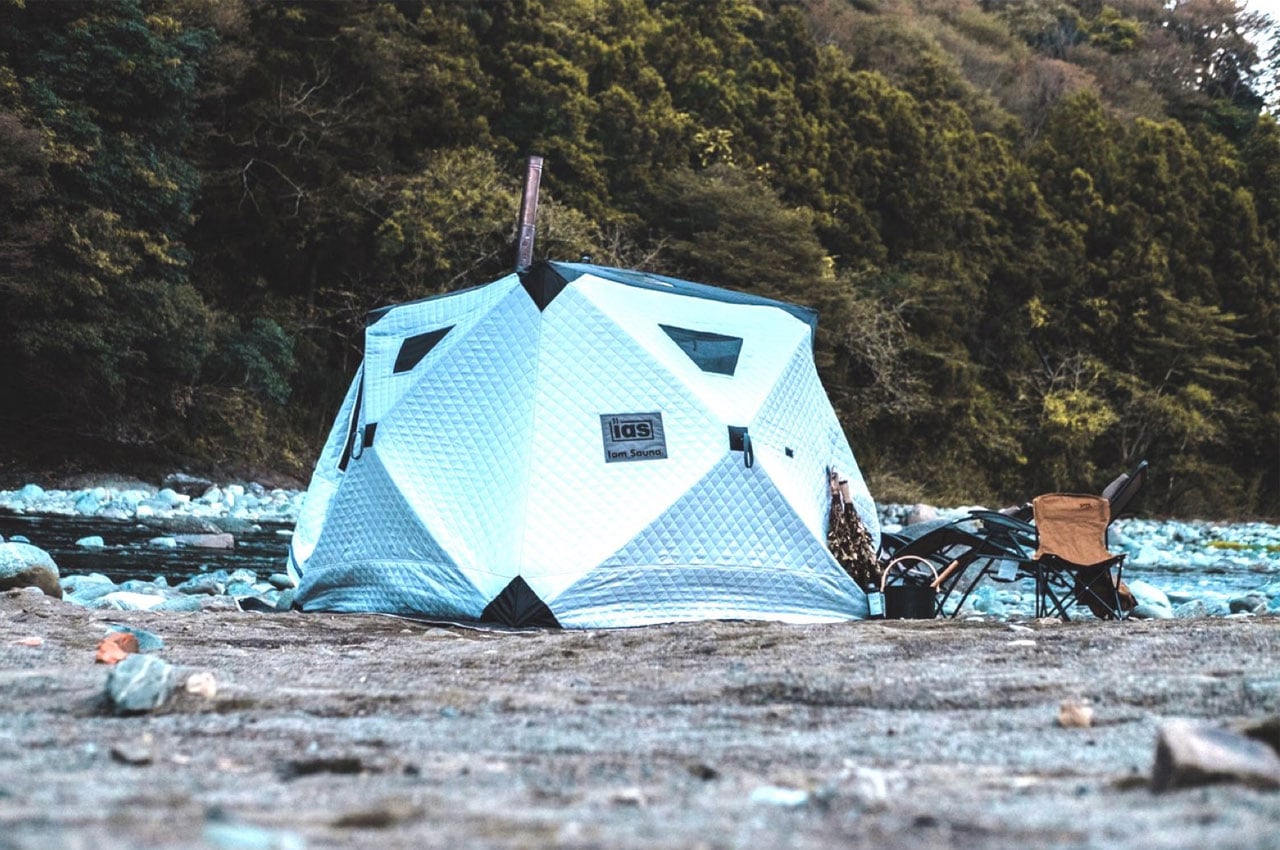
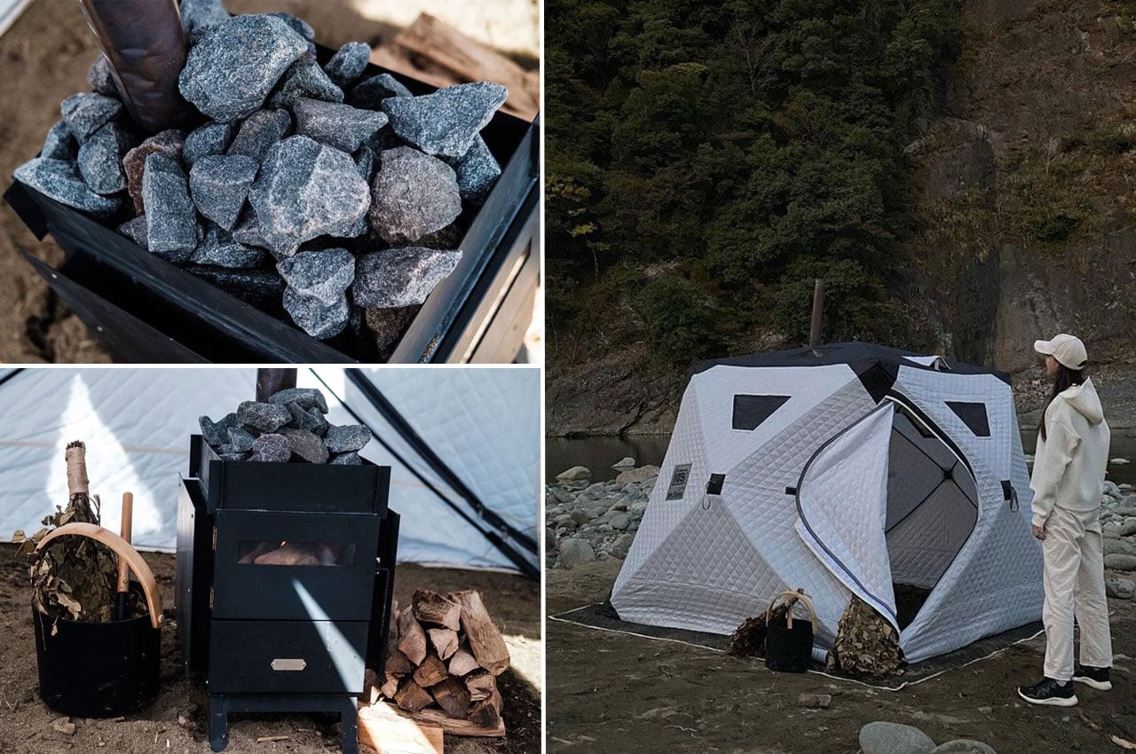
Iam Sauna is a portable sauna, genuinely made portable. The tent-style unit measures 220cm x 220cm x 185cm, accommodates up to six people, and is built from heat-insulating cotton material designed to trap steam and hold warmth in cold outdoor conditions. The included Tanzawa wood-burning stove is iron-built with folding legs, a heat-resistant glass window, and a removable guard plate where sauna stones stack neatly on top. Setup takes under a minute — one person, four pull tabs.

The panoramic windows along the upper section of the tent are a quiet design decision that separates this from any other portable sauna concept. Heat the stove, settle in, and you can watch stars or the tree canopy while your body does exactly what it came outdoors to do. Whether recovering after a full day of hiking or committing to a Saturday evening ritual by the lake, Iam Sauna delivers the restorative experience that used to require a fixed structure.

What We Like

  • A single person can collapse and set up the full tent structure in under 60 seconds, which means the sauna arrives at the campsite as a realistic option rather than a logistical project that gets quietly abandoned at the trailhead.
  • Panoramic windows at the top of the structure keep you visually connected to the outdoor environment while you’re inside — a design detail that makes the experience feel like it genuinely belongs in the wilderness, not in a hotel spa.

What We Dislike

  • The Tanzawa iron stove weighs approximately 18kg on its own, which adds meaningful carry weight to an otherwise packable system, effectively making Iam Sauna more of a car-camping or van-camping solution than a true backpacking option.
  • The wood-burning heat source requires sourcing fuel on-site or carrying it in, which introduces a variable that a gas or electric alternative would eliminate for weekend campers who prefer to pack light and plan less.

4. Airflow 8-Panel Fire Pit

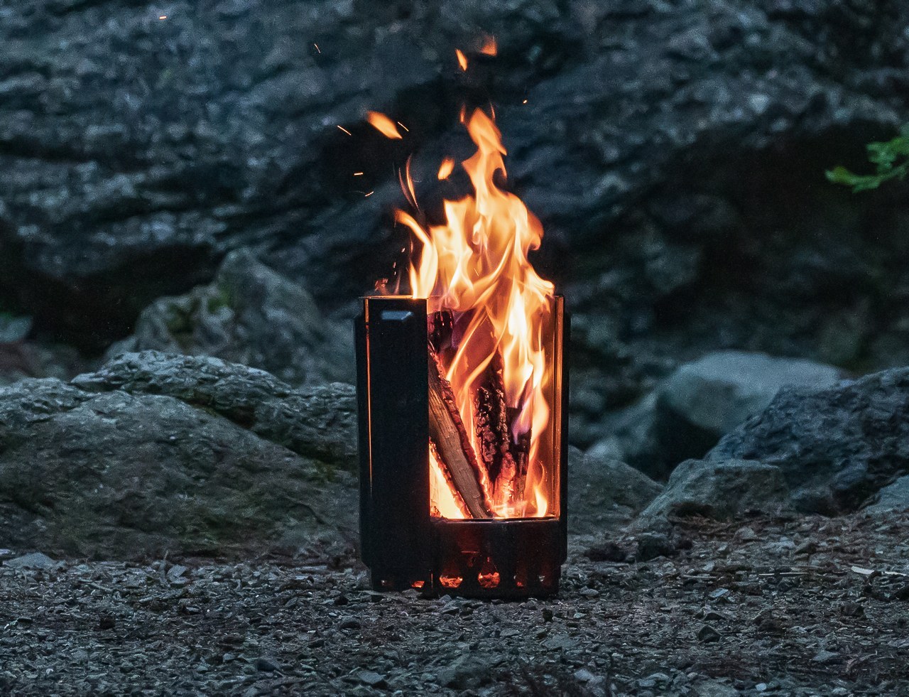
Japanese company UM spent decades in metal processing before arriving at the Airflow 8-Panel Fire Pit, and that deep material knowledge shows clearly. Eight removable panels form an octagonal cylinder optimized for secondary combustion. Holes at the base of each panel channel fresh air directly to the wood for primary combustion. As that air heats up, it rises through the double-walled cavity and exits at the top, creating secondary combustion that burns wood more completely and produces significantly less smoke.

The exterior panels are removable, meaning fire intensity is adjustable — pull one or two off and the fire breathes differently. The interior uses corrosion-resistant stainless steel designed to age into a natural patina, while exterior panels take the punishment a campsite delivers. A grill grate attachment turns it into a cooking platform without altering the fire pit’s core logic. Ash falls and collects at the base. Cleanup is minimal. It’s a piece of engineering that makes fire feel considered.

Click Here to Buy Now: $325

What We Like

  • The secondary combustion system is a genuine engineering achievement at this size — the smoke reduction is physics, not a marketing claim, and it makes extended campfire evenings significantly more comfortable for everyone sitting around it without constantly shifting to dodge the drift.
  • The modular panel system means the fire pit packs down smaller than its assembled footprint suggests, making it more portable than traditional bowl-style designs that share its output and heat radius.

What We Dislike

  • Assembling eight individual panels before the fire can be lit adds more steps to the startup process than a campfire usually demands — a minor friction, but one that registers in the dark or in rain when fumbling with separate components feels less intuitive.
  • The cooking grill grate is sold as an optional add-on rather than included in the base package, which feels like a missed opportunity given that cooking over fire is the most obvious secondary use case for every campsite fire pit.

5. Haori Cup

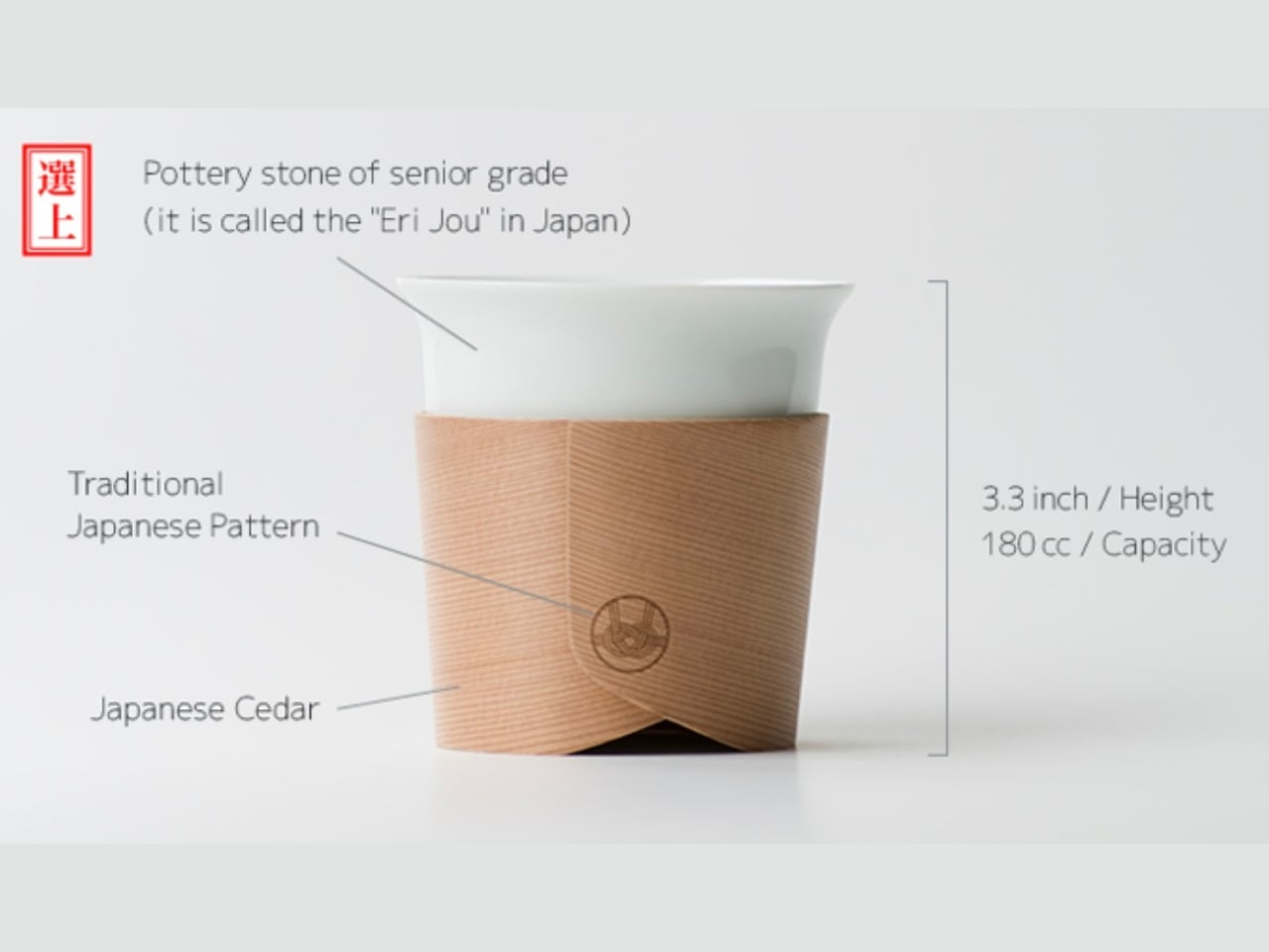
When designer Tomoya Nasuda set out to revive Hakata Magemono — the 400-year-old Japanese craft of hand-bending thin cedar into curved forms — he built the Haori Cup from a single piece of Japanese cedar. The result is a vessel that holds warmth from the inside and transfers almost none to your hands, because cedar insulates naturally. Available in several colorways, including the “Sakura” edition, every cup is handmade and shaped by grain patterns unique to that piece of wood.

The cedar lends a whisper of fragrance to each sip — a clean, forest quality that doesn’t compete with the coffee, just frames it. Bring the Haori Cup camping, and something specific happens. Holding warm coffee in a vessel bent from a single piece of Japanese cedar, sitting among trees not unlike the ones that made it, that’s the kind of moment you came outside for. It’s lightweight, it carries centuries of craft, and it makes the morning feel intentional.

What We Like

  • Reviving the 400-year-old Hakata Magemono craft means every Haori Cup is genuinely one of a kind — no two grain patterns are the same, and that individuality gives it a value that mass-produced camping vessels with identical stamped forms simply cannot offer.
  • Cedar’s natural thermal insulation keeps drinks warm without heating the exterior surface of the cup, meaning you can hold a freshly poured coffee comfortably without burning your hands — a straightforward material advantage with quietly elegant results in practice.

What We Dislike

  • Cedar is not dishwasher-safe and requires careful hand cleaning followed by thorough drying, which is a manageable routine at home but adds genuine friction when you’re washing up at a campsite with limited water and fading daylight.
  • As a handcrafted artisan object rooted in centuries-old technique, the Haori Cup carries a premium price that may be difficult to justify for a purpose as unpredictable as outdoor camping, where the risk of a dropped cup on river rock is never zero.

The Best Camping Gear Doesn’t Add More — It Gets Everything Right

Five products, five different problems, each solved with a rigor that feels less like product design and more like pure philosophy. That’s what Japanese design does at its best: it doesn’t add features to justify a price. It removes everything unnecessary, then makes whatever’s left feel like the only possible answer. That’s the standard these objects hold, and it makes everything else at the campsite feel slightly underdressed by comparison.

The best gear for Memorial Day isn’t the most technical. It’s the most considered. A radio that earns its campfire seat. A lantern that makes switching on a light feel like an occasion. A fire pit engineered so you don’t think about combustion. A sauna you carry in and a cup that turns coffee into a ceremony. Pack these five, and the weekend will be more than just a long one.

The post 5 Memorial Day Outdoor Gadgets That Make Every Camping Trip Feel Engineered in Japan first appeared on Yanko Design.

UNStudio’s Wasl Tower Is Dubai’s Most Sculptural Skyscraper Yet

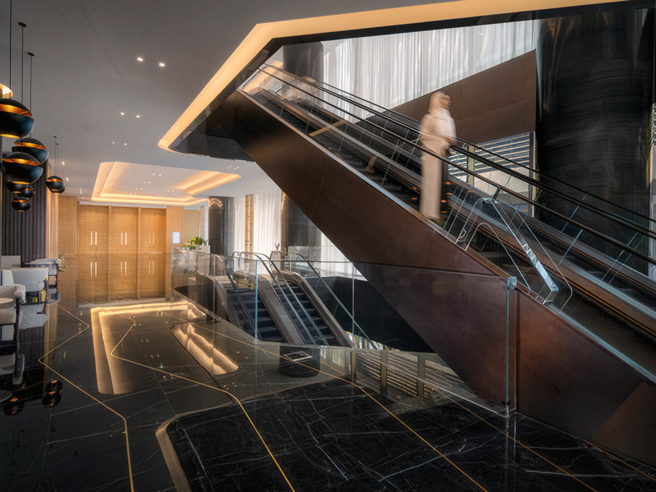
There’s a building rising on Sheikh Zayed Road that isn’t trying to be the tallest thing in the room — it’s trying to be the most alive. The Wasl Tower, designed by UNStudio in collaboration with structural engineers Werner Sobek, stands 302 metres above Dubai and carries with it one of the most thoughtful design narratives in the city’s recent skyline story. Conceived as early as 2014 and nearing completion, the 64-storey supertall is a landmark in the truest sense, not just because of its height, but because of what it means to stand there.

The tower draws its form from classical sculpture. UNStudio looked to the ‘contrapposto’, a Renaissance-era pose in which a figure shifts weight and twists slightly at the torso, suggesting movement mid-stride, and scaled it to 302 metres. The result is a building that appears to rotate as you move around it, its geometry shifting with every vantage point. Structurally, this feat is achieved through three massive 300-metre shear walls linked by four strategic outriggers, a system that allows the building to twist gracefully while still supporting a fully flexible, mixed-use floorplate.

Designer: UN Studio

Positioned directly opposite the Burj Khalifa along Dubai’s main north-south artery, the Wasl Tower occupies a site that was previously untouched by high-rise development. A new pedestrian bridge now connects it to the Burj Khalifa metro station, threading the tower into the city’s movement infrastructure and making it a genuine civic node rather than an isolated object. Its programming reflects that ambition — the building houses residential apartments, offices, a hotel, restaurants, and entertainment spaces, with public programming deliberately elevated high above street level.

What gives the tower its visual texture is its facade, one of the tallest ceramic facades in the world. UNStudio and Werner Sobek clad the building in a lace-like grid of glazed clay fins, a material choice that is as low-tech as it is clever. The ceramic tiles diffuse and reflect the desert sun, reducing heat gain and eliminating the need for more energy-intensive shading systems. At night, the facade takes on an entirely different quality, illuminated in a way that makes the building appear to breathe.

For a city that has never been shy about spectacle, the Wasl Tower earns its place on the skyline by being something rarer: a building with a rigorous idea behind it. It references art history, responds to climate, and reshapes a stretch of one of the world’s most iconic roads, all at once.

The post UNStudio’s Wasl Tower Is Dubai’s Most Sculptural Skyscraper Yet first appeared on Yanko Design.

8 Best Pens and Writing Instruments That Make You Actually Want to Pick Up a Pen Again

There is an argument happening on desks everywhere, and it is not about productivity systems or the right notebook grid. It is about whether the thing you write with deserves the same design attention as everything else you choose to own. For most people, a pen is a pen. For a small and growing number, it is the one object that connects thought to surface, and that connection is worth getting right. The instruments on this list take that idea seriously.

What unites them is not price or prestige. It is that each one treats the act of writing as a design problem worth solving from the beginning — the weight, the mechanism, the material, the way it sits in the hand before the nib or tip ever touches paper. Some are concepts. Some are products you can order today. All of them make the case that the writing instrument is still one of the most interesting objects in design.

1. Yamaha Swing Scribe

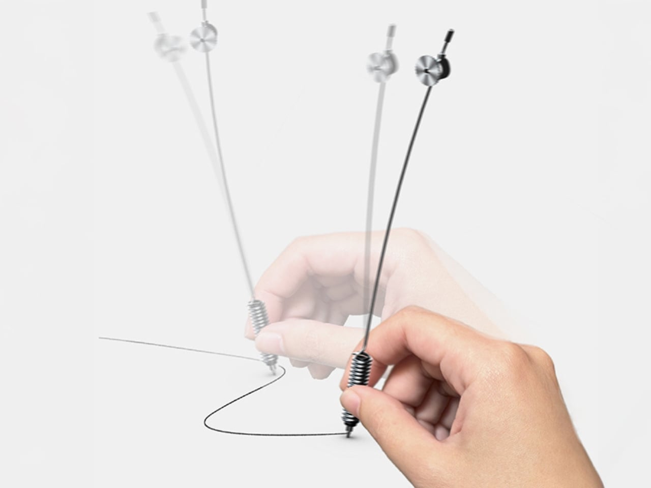
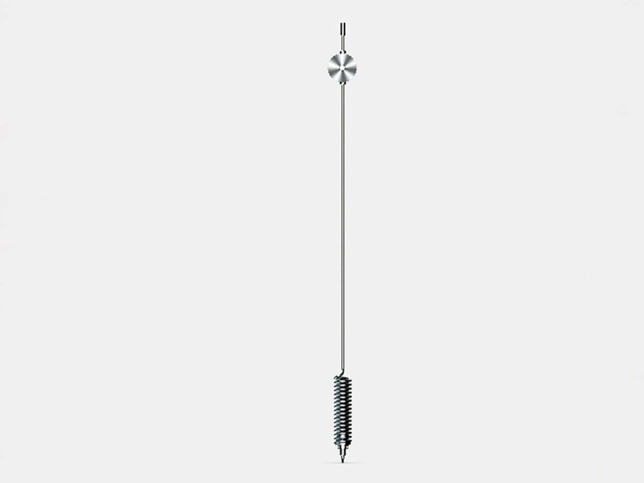
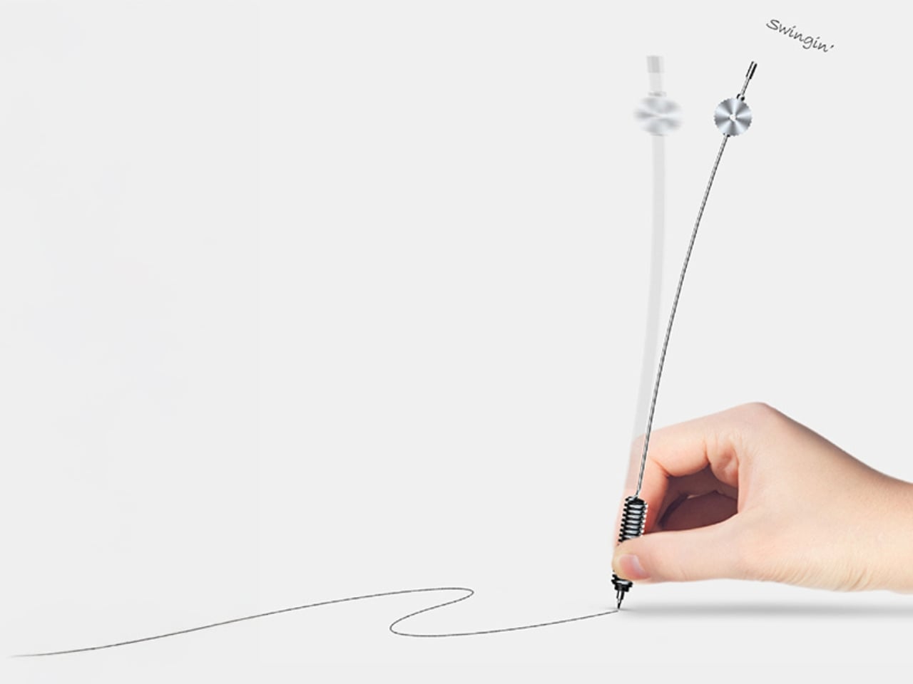
Yamaha’s answer to the question nobody thought to ask — what if a pen had a heartbeat? Part of the brand’s Scribe Tool Design 2024 project, the Swing Scribe draws its logic from the quill: as a feather naturally wobbles under air resistance while writing, it gives the act a physical rhythm. Yamaha made that incidental quality intentional. A weighted tip attached to a metal bar swings as the pen moves, feeding a small, steady pulse back into the hand with every stroke. No batteries. No app. Just physics.

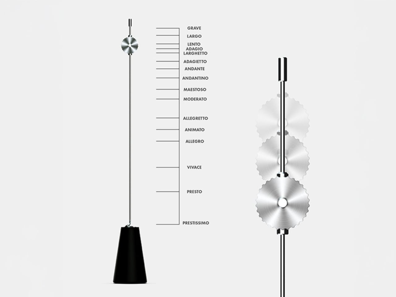
The weight slides along the bar, letting you dial in the arc of the swing to match how you’re writing at any given moment. Pull it close to the pivot for a tighter, faster beat. Let it run wide for slow, deliberate work. This is the kind of design thinking that earns the word Kando — the Japanese concept of emotional resonance that sits at the core of everything Yamaha builds, from concert grands to this pen. It doesn’t make writing faster. It makes it more felt.

What we like:

  • The pendulum mechanism works without any power source, making it completely self-contained
  • Adjustable weight position means it adapts to the writer rather than demanding the writer adapt to it

What we dislike:

  • The swinging arm adds visual complexity that won’t suit every context or desk aesthetic
  • The concept hasn’t been tested across extended, high-volume writing sessions yet

2. Inseparable Notebook Pen

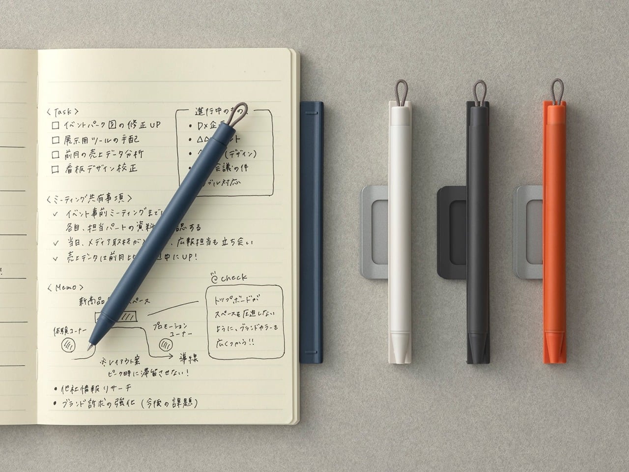
The premise is embedded in the name. Most pens and notebooks exist in a state of constant near-separation — the pen migrates to a bag, a pocket, another room, and the notebook sits waiting and useless. The Inseparable concept addresses this directly, building pen and notebook as a single resolved object rather than two products that happen to be sold together. The pen lives within the notebook’s architecture rather than being clipped to it as an afterthought, and removing it feels deliberate rather than accidental.

What makes this design interesting isn’t just the integration — it’s that the integration is the premise, and everything else follows from it. The proportions of the pen are dictated by the notebook. The notebook’s form is shaped around the pen’s presence. Neither object is compromised to serve the other, which is harder to achieve than it sounds. When a design solves a problem this specific and this common, it has a right to exist.

Click Here to Buy Now: $19.95

What we like:

  • Eliminates one of the most common and most irritating failures of the writing ritual entirely
  • The formal resolution between pen and notebook is tight — neither object feels like a concession

What we dislike:

  • Integration at this level commits you to one notebook format, limiting flexibility for writers who move between sizes
  • Writers who prefer their own paper choices will find the pairing restrictive

3. Da Vinci Pencil

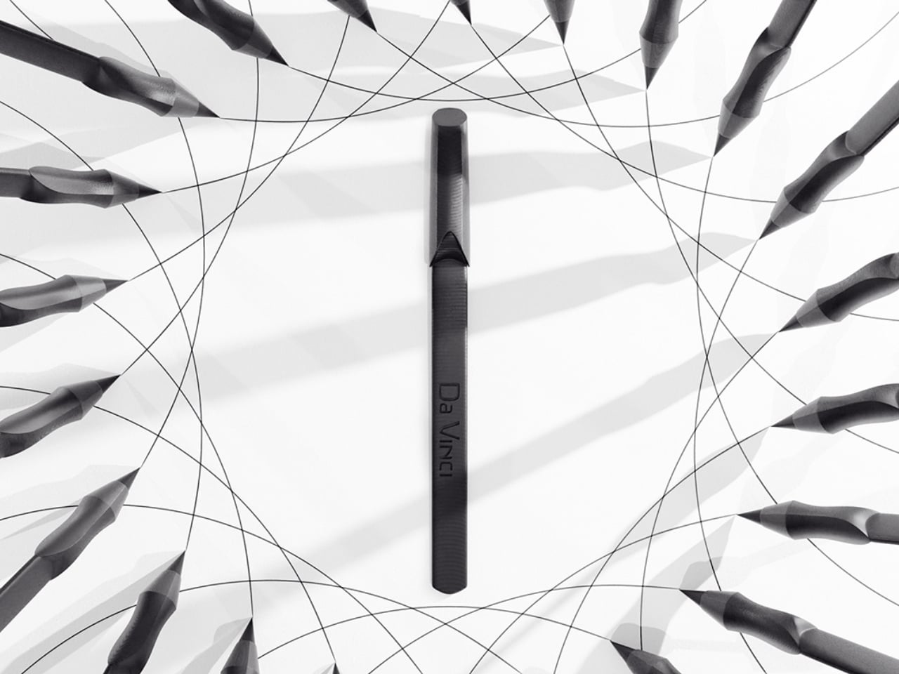
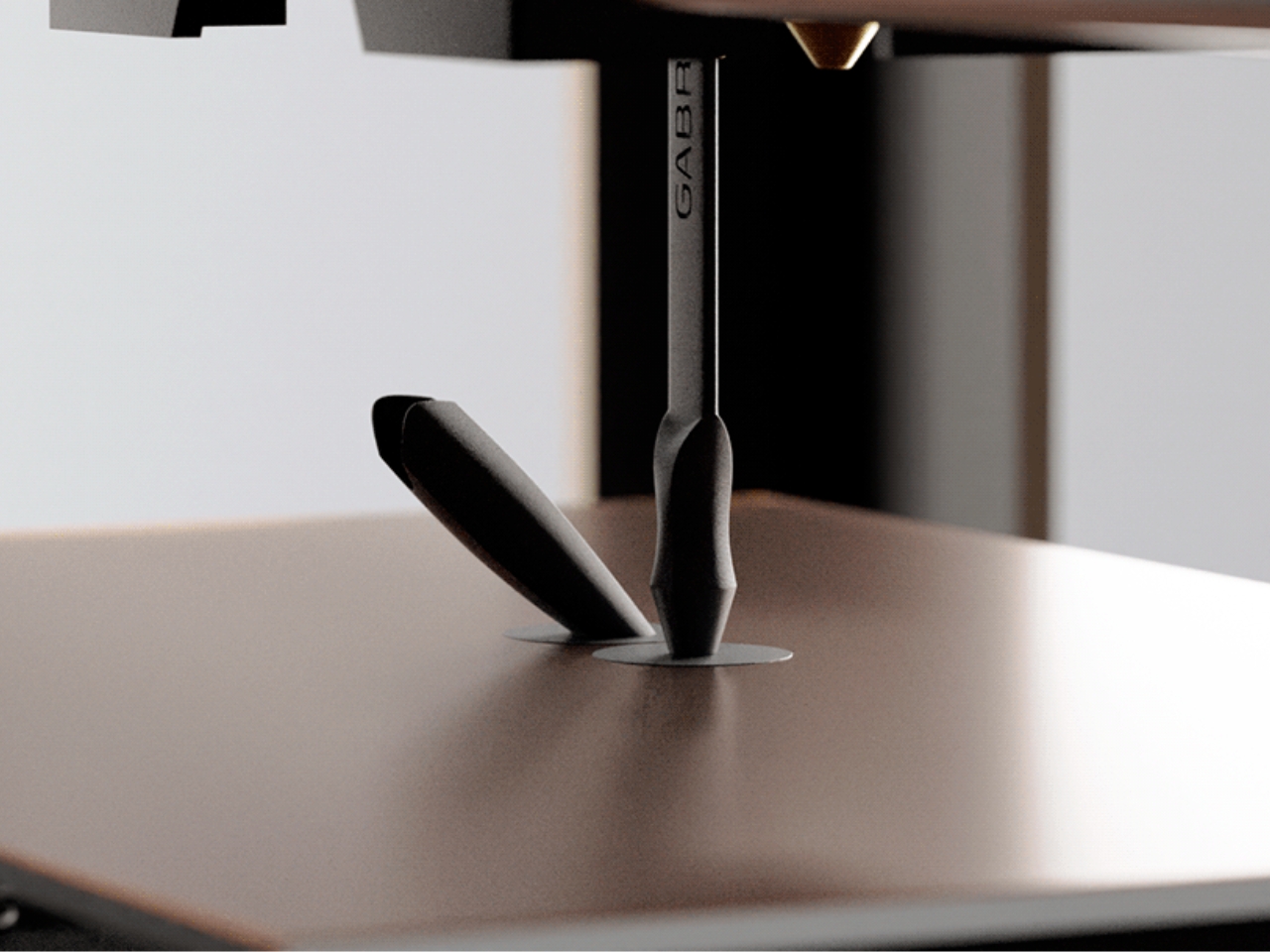
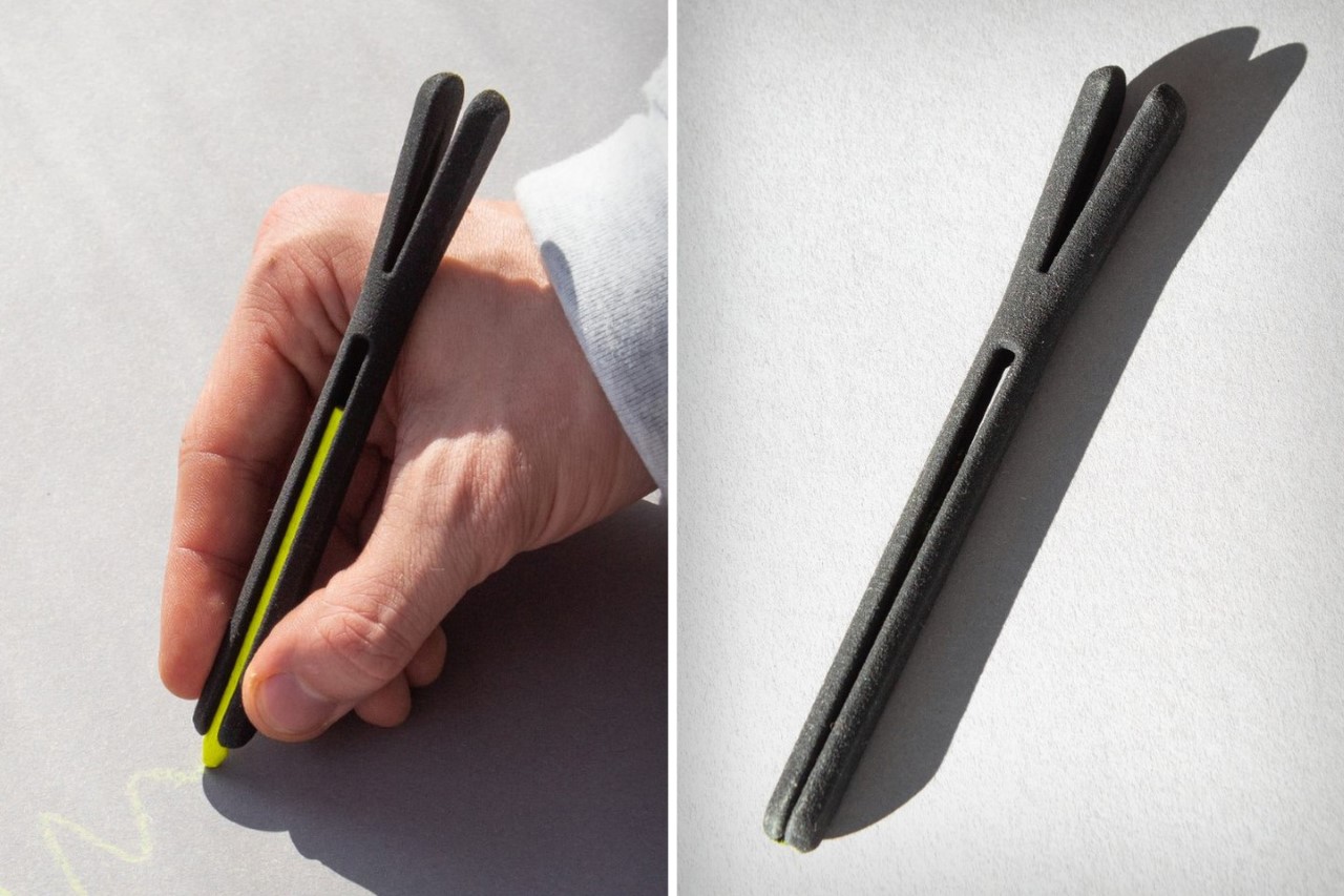
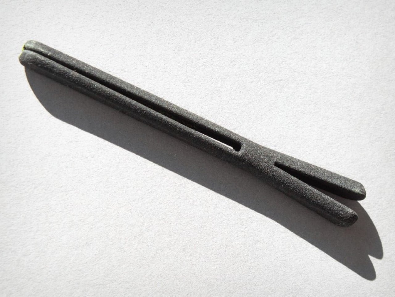
Gabrilevich Design’s Da Vinci pencil concept earns its name not through ornamentation but through the kind of cross-disciplinary thinking that made Leonardo’s notebooks worth studying in the first place. The design draws from da Vinci’s own mechanical sketches — the geometry, the visible logic of moving parts, the sense that an object should reveal how it works rather than hide it. The result is a pencil that functions as a small piece of mechanical sculpture, beautiful precisely because nothing about its construction is concealed.

The concept challenges the pencil’s conventional muteness. Most pencils look like nothing in particular. The Da Vinci concept looks like something that was thought about — that has a position, a point of view about what a mark-making tool should communicate about the hand that uses it. Whether it writes better than a standard pencil is beside the point. It writes differently, and it makes you think about the act differently, which is often the more interesting design outcome.

What we like:

  • Treats a pencil as a vehicle for design philosophy rather than a commodity object
  • The exposed mechanical logic gives it a conceptual depth that most stationery completely lacks

What we dislike:

  • Concept-driven designs at this level of visual complexity often struggle in extended daily use
  • Visible mechanisms can introduce maintenance friction that disrupts the writing ritual

4. Levitating Pen 2.0 Cosmic Meteorite Edition

The levitating pen is a category that could easily slide into novelty, and the original versions of magnetic levitation pens leaned into that direction unapologetically. The 2.0 Cosmic Meteorite Edition changes the conversation by adding material seriousness to the spectacle. The pen itself incorporates genuine meteorite fragment material — iron-nickel alloy from outside the atmosphere — which gives the levitation a context it previously lacked. The object that hovers above its base is, in a measurable sense, from space.

That combination of astronomical material and magnetic suspension creates an object that earns its place on a desk in a way that pure spectacle cannot. It is a writing instrument that happens to be made partly from the oldest solid material you will ever hold, suspended above a surface by the same electromagnetic principles that govern planetary orbits. The writing experience is secondary to what the pen communicates as a resting object, and for a desk piece that doubles as a conversation anchor, that hierarchy is entirely appropriate.

Click Here to Buy Now: $399.00

What we like:

  • The meteorite material elevates the concept from a gadget to a genuine collectible
  • The levitation serves the narrative of the material rather than competing with it

What we dislike:

  • The magnetic base required for levitation eliminates any possibility of portability
  • Its function as a writing instrument is always secondary to its function as a display object

5. Qui Magnetic Pencil System

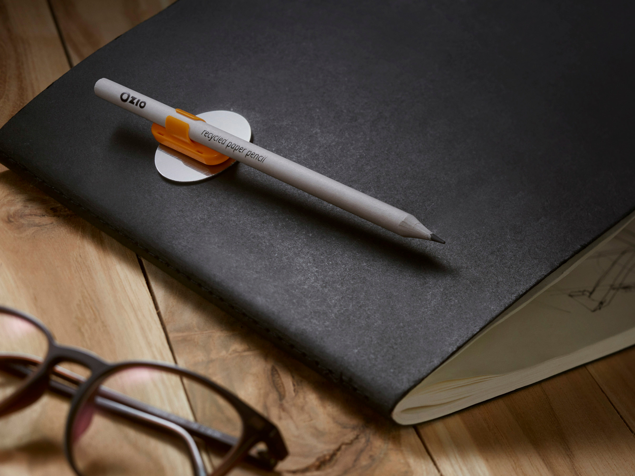
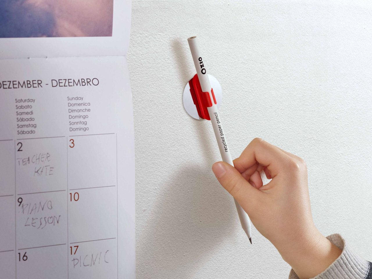
Qui operates on the premise that the friction between a pencil and the surface it lives on — a desk, a notebook, a wall — should be designed rather than incidental. The magnetic system allows the pencil to attach and detach from its designated surface with a satisfying, calibrated resistance, making the act of picking it up and setting it down feel considered rather than casual. This is a small interaction, but it happens dozens of times a day, and designing it well changes the quality of the entire writing practice.

The system thinking extends beyond the magnetic connection. The pencil’s geometry is resolved with the mounting surface as part of the design problem, not as a separate accessory. The result is that Qui occupies space well even when not in use, which is most of the time. A pencil that looks intentional when it is sitting still is a harder design challenge than one that merely writes well, and Qui understands that the resting state is part of the design.

What we like:

  • The system approach treats the pencil and its environment as a single design problem
  • The resting interaction — picking up and setting down — is as considered as the writing experience itself

What we dislike:

  • The magnetic system creates a dependency: without its base, the pencil loses its defining characteristic
  • Committing to a fixed mounting point works against the natural portability of a pencil

6. PENTAPA

Konstantin Diehl’s PENTAPA takes its name and its logic from the pentagon — five sides, each one a resolved surface rather than a generic round barrel. The five-sided form is unusual enough to read as a design decision the moment you pick it up, and practical enough to hold well once you begin writing. Pentagons don’t roll off desks. They register against the fingers in a way that circular barrels don’t, giving you tactile information about the nib’s orientation before the tip reaches paper.

PENTAPA belongs to a tradition of geometric pen design that runs from the hexagonal tradition of rOtring and Kaweco through to contemporary CNC-machined objects, but it finds its own position in that tradition rather than merely referencing it. Five sides is not the expected answer. It is the interesting one — the number that offers enough symmetry to feel resolved and enough irregularity to feel considered. That balance between the expected and the surprising is where most good pen design lives.

What we like:

  • The pentagonal form solves the rolling problem with more formal interest than a standard hexagon
  • The five-sided barrel gives the pen a distinct tactile identity that rewards extended daily use

What we dislike:

  • The unconventional geometry won’t suit every grip style or hand size
  • Finding a compatible pen case or sleeve requires more effort than standard round or hexagonal barrels

7. Everlasting All-Metal Pencil

The all-metal pencil solves a problem that the pencil has had since its invention: it runs out. A graphite core depletes. A pencil shortens. Eventually, it disappears entirely and takes with it whatever patina or character it had developed through use. The everlasting all-metal pencil replaces graphite with a metal alloy tip — typically an aluminum or similar soft-metal formulation — that deposits a mark through controlled abrasion rather than core consumption. The pencil does not shorten. It does not run out.

The mark is different from graphite — lighter, slightly metallic in tone, with a distinctive quality that serious writers and sketchers tend to either embrace or reject immediately. The design interest is in what remains when the core is removed: a pure metal object whose entire form is determined by how it feels to hold, since there is no pencil-to-grip ratio to manage, no sharpener to carry, no length to account for. The result is one of the most resolved objects in everyday carry design.

Click Here to Buy Now: $19.95

What we like:

  • Removes the pencil’s built-in obsolescence entirely, changing the object from consumable to permanent
  • With no core to deplete, the entire form is determined purely by how it feels to hold

What we dislike:

  • The mark quality is distinct enough from graphite to require genuine adjustment and won’t suit every application
  • Some writing and sketching tasks — particularly those requiring dense, dark marks — simply don’t translate well to a metal alloy deposit

8. The Bolen

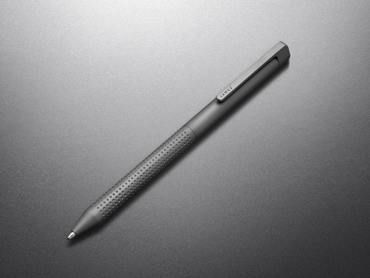
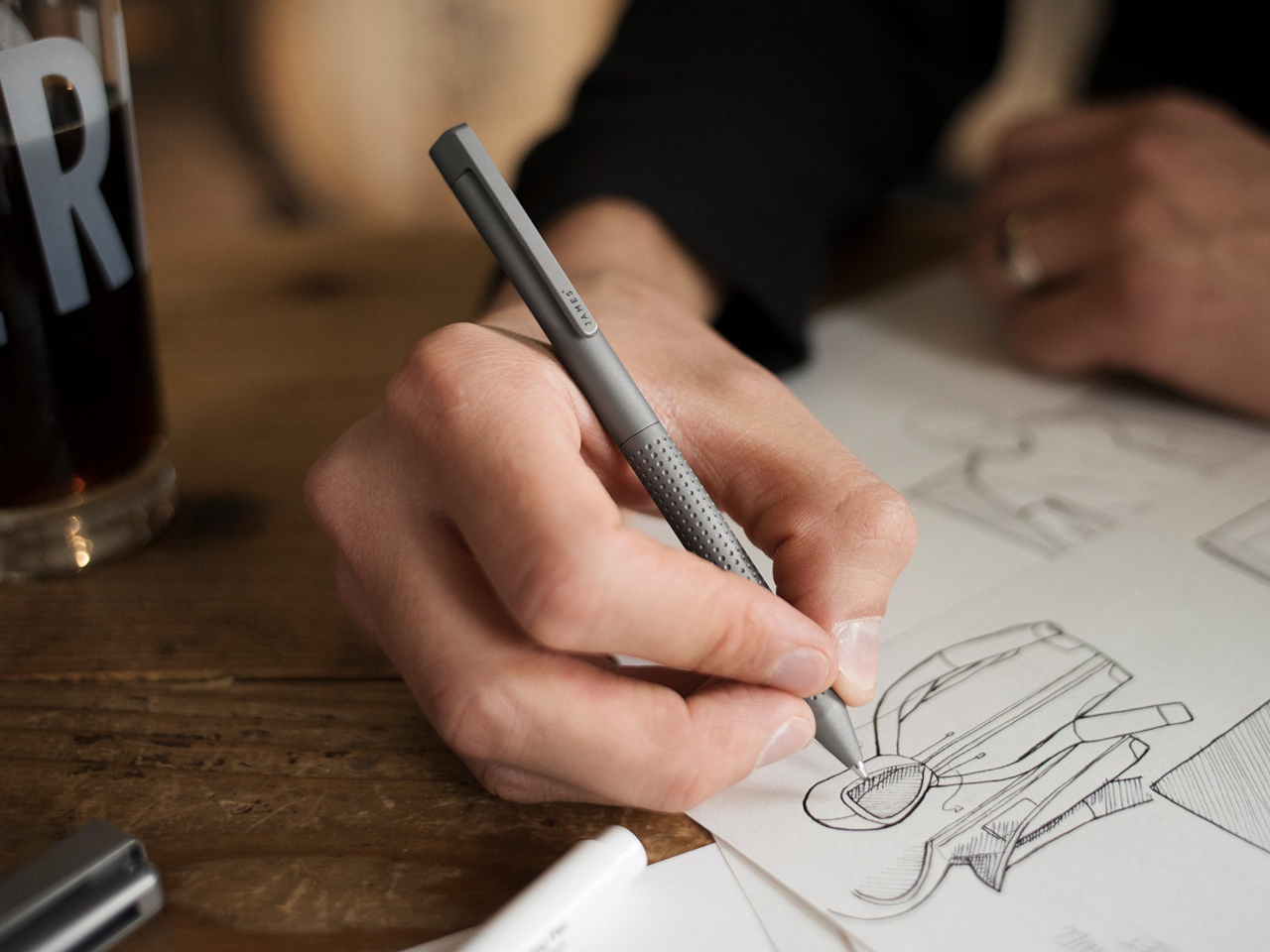
The James Brand has built its reputation on EDC objects with no unnecessary elements — knives, tools, and pens that look like they were designed by someone who uses them. The Bolen is the brand’s pen, and it carries the same design logic as everything else in their catalogue: machined from quality materials, resolved in form, designed to be carried without thought and used with satisfaction. The clip works. The mechanism engages cleanly. The proportions sit right in the hand without adjustment.

What distinguishes the Bolen from most EDC pens is that the James Brand comes from a tool-making tradition rather than a stationery one, which means the pen is designed for carry first and desk presence second. That priority ordering produces a different object than you get from pen-first design — one that is slightly more aggressive in material and slightly more considered in how it lives in a pocket. It is the writing instrument for someone who doesn’t think of themselves as a pen person, and that is exactly who needs it most.

What we like:

  • The tool-making heritage produces genuine material integrity, with nothing present without a reason for being there
  • Carry-first design logic makes it the most naturally portable instrument on this list

What we dislike:

  • The EDC-first approach means it lacks the expressive personality of instruments designed for desk use
  • Writers who want the pen to feel special on the page rather than merely functional in the pocket may find it underwhelming

The Object in Your Hand Shapes the Thought on the Page

Eight instruments that represent eight different positions on what a writing tool should be. The Yamaha asks what happens when you give a pen a pulse. The Levitating Pen asks what happens when the material itself carries a story. The Bolen asks what happens when you design for the pocket before the page. None of these answers is the same, which is the point. The best design in any category is the kind that expands your sense of what the category can contain.

What they share is the conviction that the instrument matters — that the weight, the mechanism, the material, and the form of the thing in your hand have a real effect on what ends up on the page. That conviction used to belong only to serious writers and professional draughtsmen. The fact that you can now find it in a magnetic pencil system, a levitating desk object, and a pen designed by a motorcycle company suggests the rest of the world is catching up.

The post 8 Best Pens and Writing Instruments That Make You Actually Want to Pick Up a Pen Again first appeared on Yanko Design.

Mass Timber, Passive House, & a Curving Roof: This Canadian Community Centre Is the Civic Building Other Cities Should Be Copying

There’s a version of a public building that checks all the sustainability boxes and still feels cold, institutional, and somehow indifferent to the people it’s meant to serve. The new Marpole Community Centre is not that building. Designed by Diamond Schmitt for the City of Vancouver and the Vancouver Board of Parks and Recreation, it’s nearing completion in Oak Park. It quietly resets expectations for what a civic facility can be.

The project replaces a well-loved but outgrown facility with a two-storey structure nearly double its size, measuring 5,000 square metres. The program is generous: a gymnasium, fitness centre, field house, multi-purpose rooms for seniors and youth, and a 74-space childcare facility. Underground parking is tucked beneath the building to protect the surrounding natural vegetation, letting Oak Park remain exactly that — a park.

Design: Diamond Schmitt

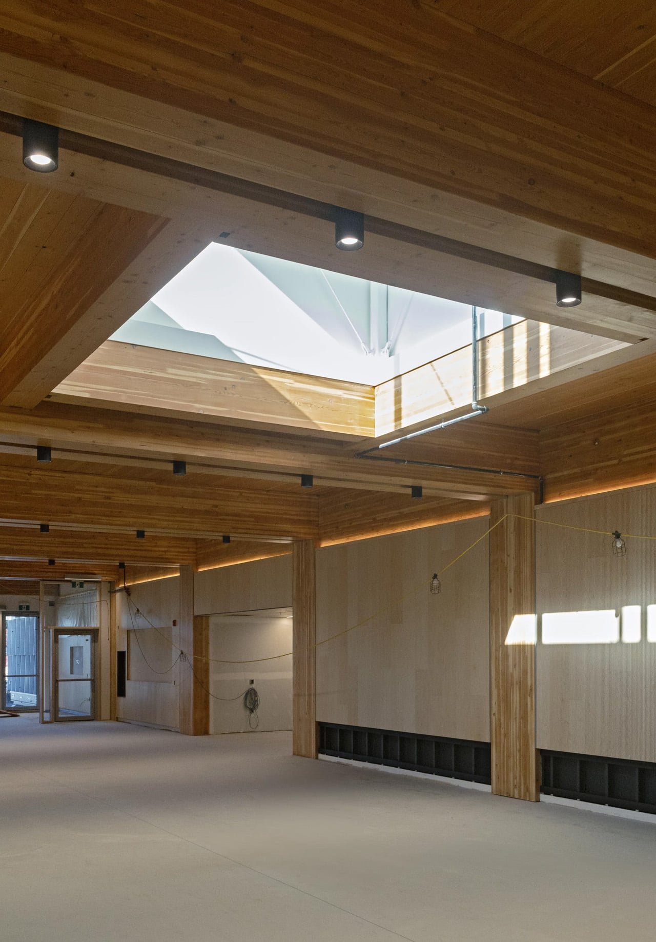
What makes the architecture worth paying attention to is the mass timber. Rather than limiting wood to the roof structure, as institutional buildings often do, the Marpole Community Centre uses a comprehensive mass timber frame — glulam columns and beams, a CLT floor system, and a long-span upper roof built from steel wide flange beams and a CLT deck. The result is a structure that reads as warm and considered, not engineered into submission. Exposed throughout the interior, the timber gives the building a human scale that concrete rarely allows.

The signature move is the gently curving roof. The doubly curved cantilever form, supported by long-span steel beams, required close coordination between the design team and contractors — but the payoff is an exterior that feels unified without being monotonous, and an interior where the ceiling becomes the experience. Strategic glazing pulls the landscape in, connecting occupants to Oak Park’s natural setting without sacrificing energy performance.

On the sustainability front, the numbers are serious. The building targets Passive House and LEED Gold certifications and has achieved a 41% reduction in embodied carbon. It’s also a pilot project for the City of Vancouver’s Embodied Carbon Guidelines, meaning lessons learned here will directly shape future civic buildings across the city. The project is also pursuing the CAGBC’s Zero Carbon Building Design Standard.

Beyond the technical performance, the centre was designed with inclusion, equity, and Indigenous cultural representation as core principles — not afterthoughts bolted on at the end. For a neighbourhood as diverse as Marpole, that intentionality matters. A community centre tends to be the most democratic building a city can build. This one makes a strong case that it can also be among its most thoughtful.

The post Mass Timber, Passive House, & a Curving Roof: This Canadian Community Centre Is the Civic Building Other Cities Should Be Copying first appeared on Yanko Design.

10 Best Kitchen Tools and Appliances Designed to Live on Your Counter, Not in Your Cupboard

The kitchen counter is prime real estate. Most appliances waste it, sitting there looking generic and visually forgettable until they get pushed to the back and eventually into a box. A smaller category of kitchen objects earns that space differently. They are worth looking at, whether in use or not. The ten products here belong to that category, and each one makes a quiet but convincing case for staying exactly where it is.

The question has never really been about function alone. It is about form meeting function so completely that putting the object away would feel like a loss. A Dutch oven with architectural presence. A kettle that handles like nothing you have owned before. A grater shaped like a curled sheet of paper. These are not kitchen tools that happen to look good. They are objects that happened to end up in the kitchen and have no intention of leaving.

1. Smeg Air Fryer + Steam
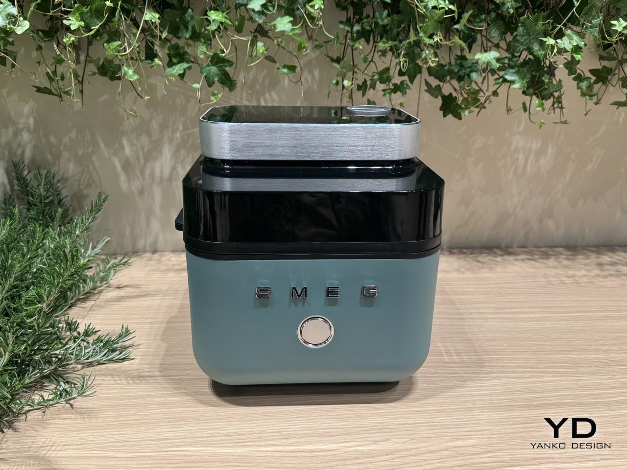
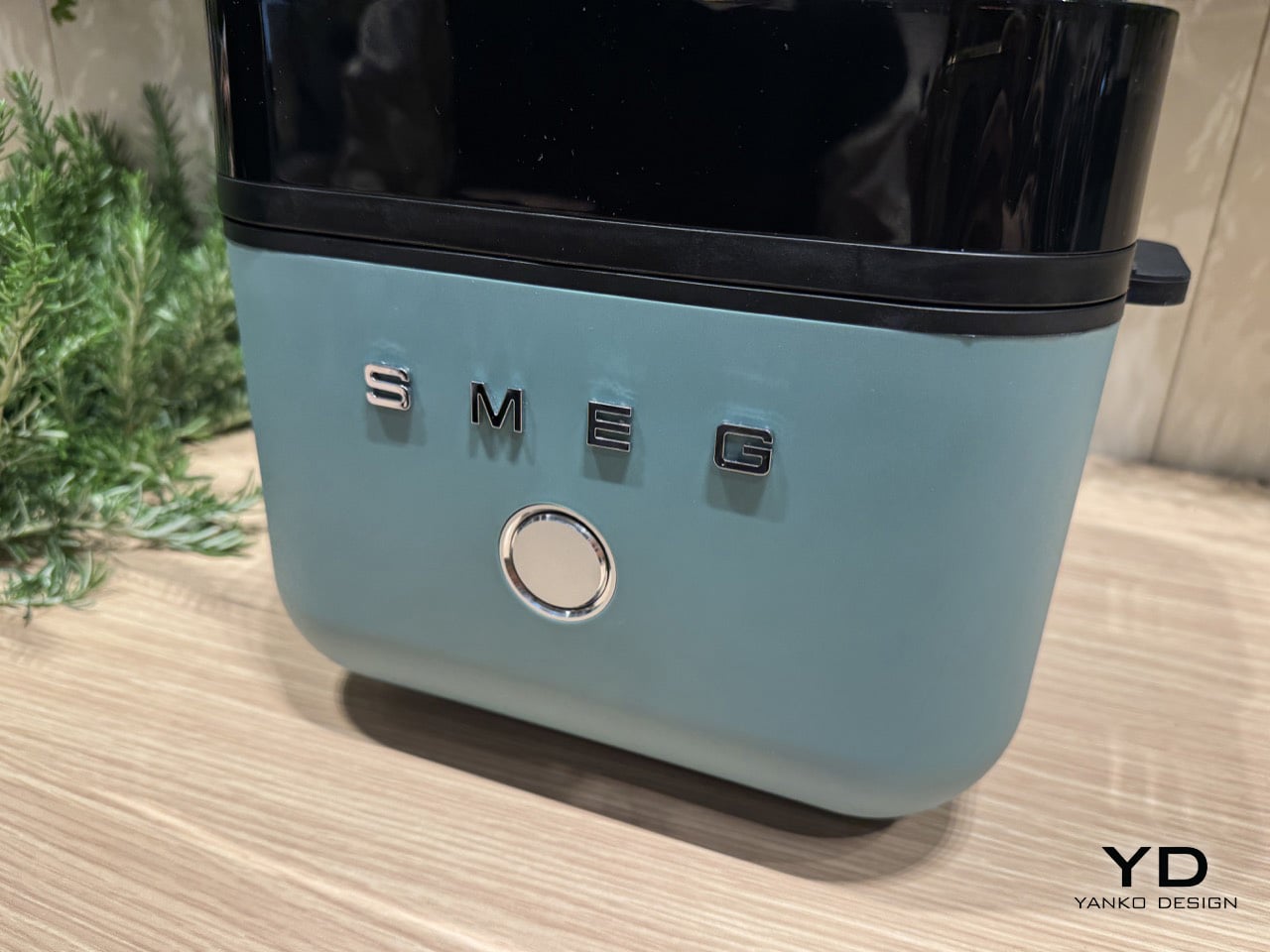
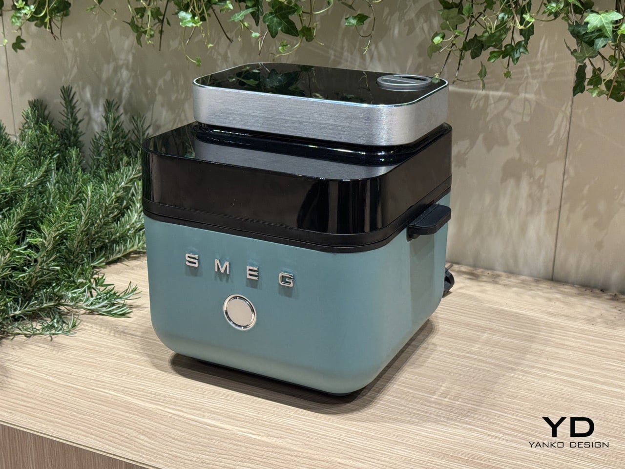
Smeg’s origins are in enamel technology, not the candy-colored kitchen appliances the brand became famous for. At Milan Design Week 2026, the Italian company debuted a concept air fryer that brings genuine cooking innovation to a form that could hold its own in any design-forward kitchen. The fryer opens from the top rather than the front, its lid ejecting at the press of a button to reveal a 7-liter basket, an exposed heating coil, and a tinted black visor that lets you see inside while it works.

What separates it from the broader category is a built-in steam function. A removable water cartridge feeds moisture into the basket via a top-mounted nozzle, creating an environment where food crisps on the outside while retaining moisture within. Chicken wings come out with a fried texture and no oil. Bread develops the kind of crust usually reserved for a professional oven. Currently a concept with no confirmed launch before 2027, it already sets the benchmark for where the category is heading.

What we like

  • The steam function produces results that no standard air fryer can replicate
  • The top-opening form and enameled body make it worthy of permanent counter placement

What we dislike

  • Not available to purchase, with no confirmed launch before 2027
  • Bold color options lean maximalist, which won’t suit every kitchen aesthetic

2. Playful Palm Grater
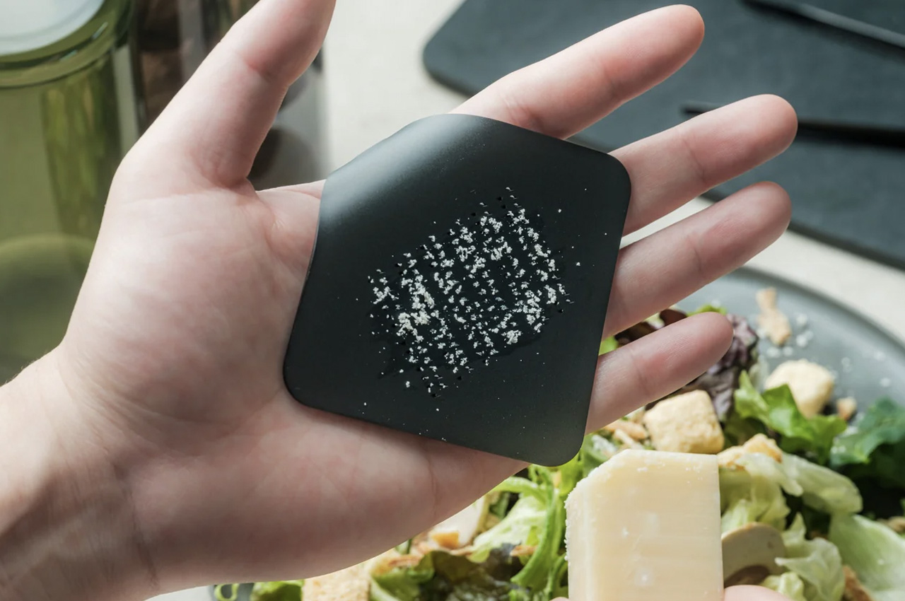
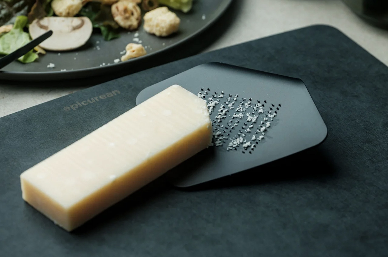
Most kitchen tools that try to be playful end up decorative and useless. The Playful Palm Grater avoids that completely. Designed to look like a sheet of paper curled at one corner, its form solves the ergonomic problem that plagues standard graters: it sits inside the palm of your hand, keeps knuckles clear of the surface, and contains what you are grating rather than scattering it across the counter. The object makes a strong aesthetic case while being entirely serious about its purpose.

At $25, it is the price anchor of this list and arguably its sharpest surprise. Guests who pick it up typically ask what it is before they realise it is a grater, which is the clearest signal that the design is working at the level it intends to. Hard cheese, citrus zest, ginger, chocolate: it handles all of it without protest. It also stores flat, so the playfulness does not come at the cost of practicality.

Click Here to Buy Now: $25

What we like

  • Palm-hold grip makes grating more controlled than any flat or box grater alternative
  • A genuine design achievement delivered at a $25 price point

What we dislike

  • Compact surface area limits it to small-quantity grating tasks
  • Not suited for bulk preparation, where a larger, fixed grater would serve better

3. Mitsubishi Bread Oven

The Mitsubishi Bread Oven exists at the opposite end of the appliance spectrum from multi-function, multi-mode, multi-button. It does one thing: toast a single slice of bread to a standard that no conventional toaster approaches. It’s a sealed, thermally insulated chamber that locks moisture in during the process, producing a slice that is crisp at the edges and genuinely fluffy at the center. The boxy silhouette and matte finish make it look less like a toaster and more like an object recovered from a mid-century Japanese archive.

For anyone serious about morning rituals, it rewires the relationship between bread and appliance entirely. One slice goes in, and a considered, unhurried result comes out. Its compact footprint occupies less counter space than most four-slice toasters while commanding considerably more visual presence. The Bread Oven is the kind of appliance that prompts questions from anyone who enters your kitchen, not because it looks complicated, but because it looks so deliberately, confidently simple.

What we like

  • A sealed thermal chamber produces toast that no pop-up toaster can replicate
  • Minimal Japanese form earns counter presence through restraint rather than spectacle

What we dislike

  • Limited to a single slice at a time, which doesn’t suit households cooking for multiple people

4. BØYD Espresso Machine
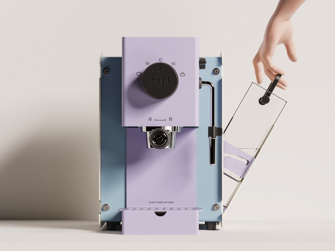
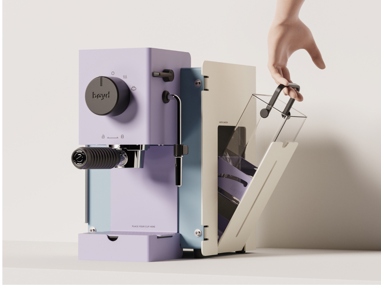
The BØYD Espresso Machine is a coffee machine that reads as modern sculpture before it reads as equipment. Its smooth curves and pure lines result from stripping the object back to what the design actually requires. No panel clutter, no unnecessary controls. Just form shaped around the daily ritual of pulling a shot, and a counter presence that justifies every centimeter it occupies.

It belongs to a growing movement of coffee equipment that treats the counter as an extension of living space rather than a working surface. BØYD understands that an espresso machine is often the first thing reached for in the morning and the last object you look at before leaving the kitchen. Making that object worth looking at is not superficial. It is the point. For a home barista who cares as much about the counter as the cup, BØYD answers both without compromise.

What we like

  • Sculptural form elevates the morning coffee ritual beyond the purely functional
  • Minimal interface keeps the countertop visually clean and uncluttered

What we dislike

  • The stripped-back aesthetic works best in kitchens that can match its visual confidence
  • Design restraint offers little warmth for kitchens that lean more traditional in character

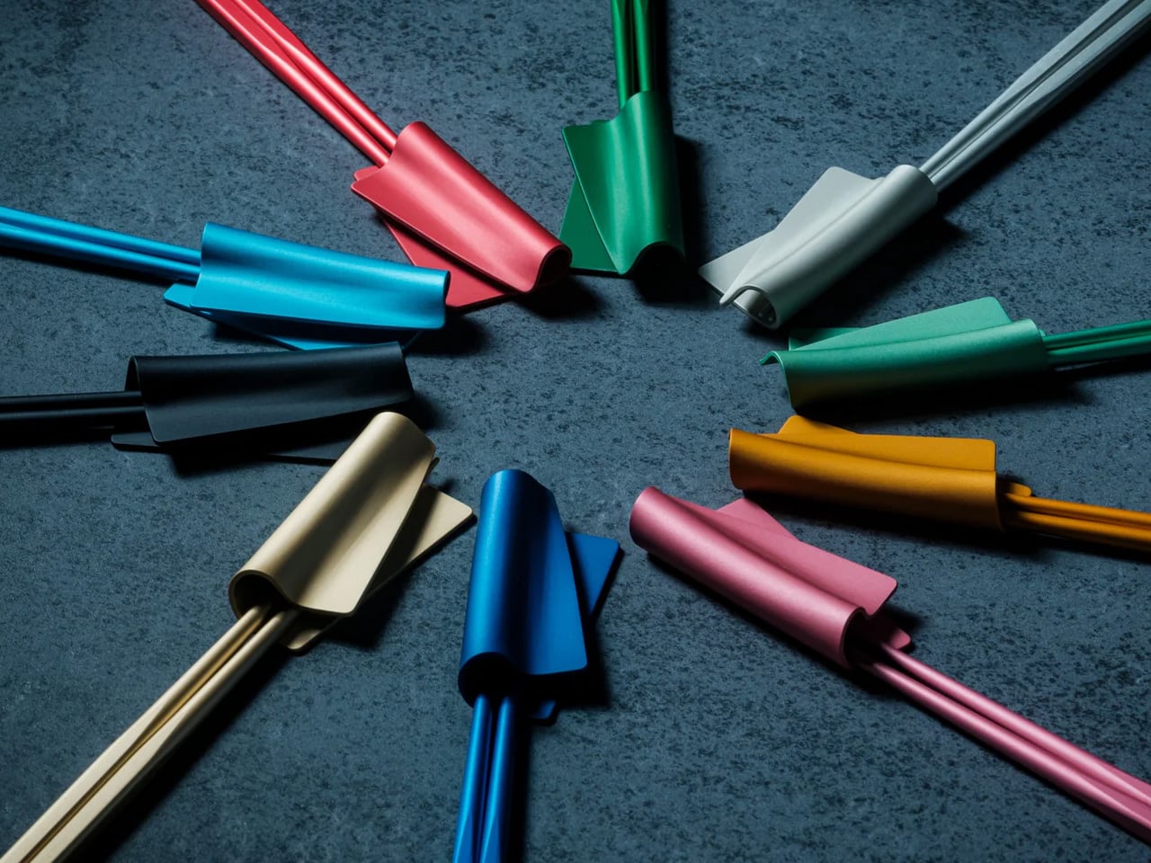
5. FineLine Aluminum Chopsticks

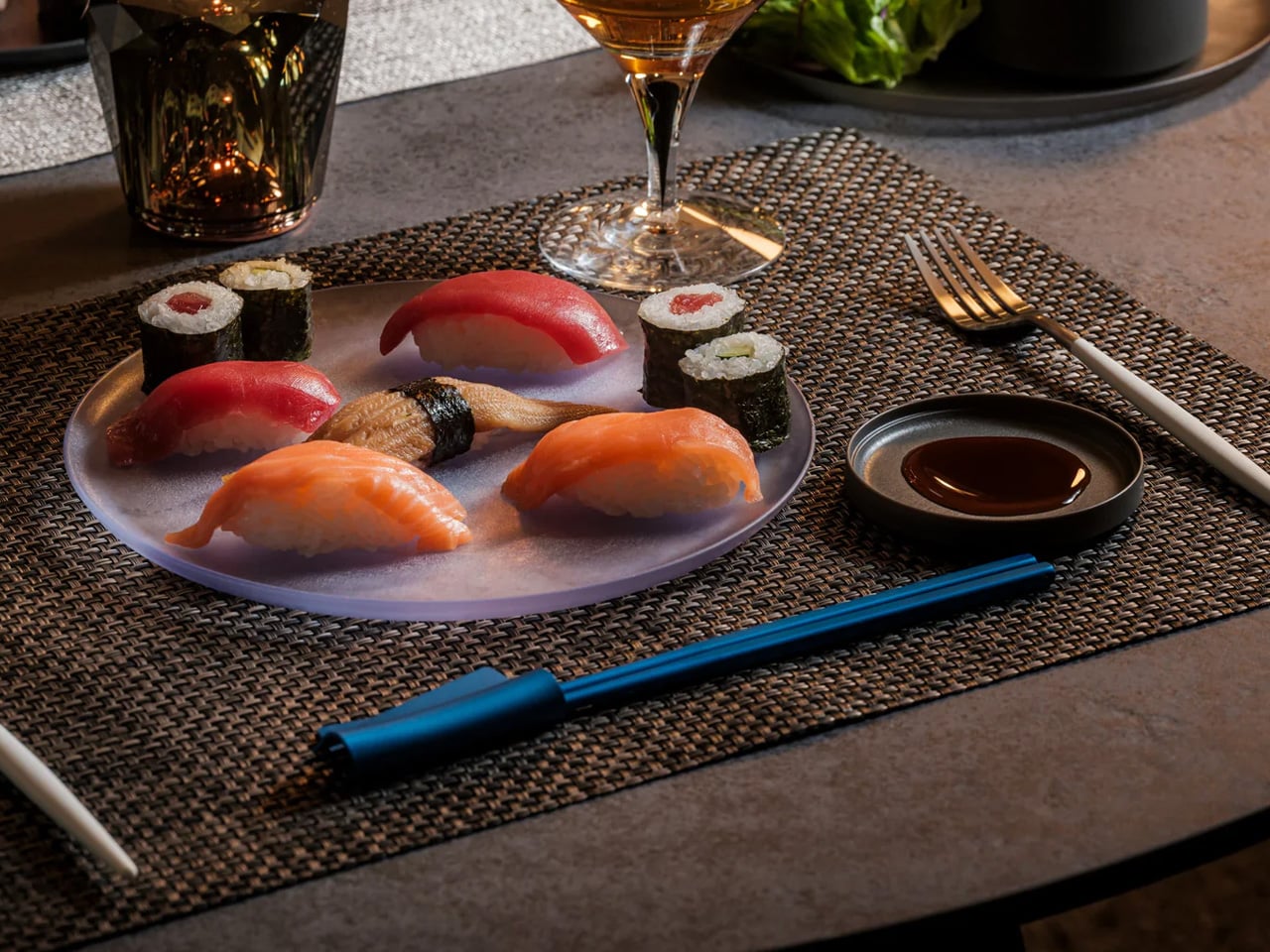
Chopsticks are rarely considered as design objects in Western kitchens, which is precisely the space the FineLine Aluminum Chopsticks occupy. Machined from aluminum with a finish that sits somewhere between tool and instrument, they bring the same material confidence to the table that a well-made knife brings to the counter. For everyday use, the grip is secure and the balance calibrated enough that switching from wooden chopsticks feels immediately like a step worth taking.

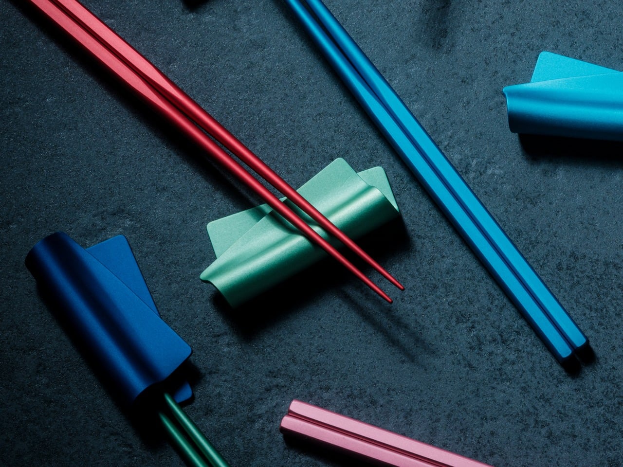
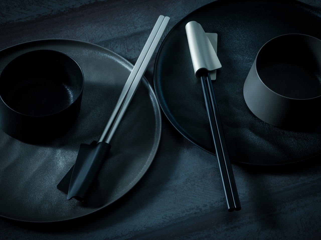
Left beside the matching chopstick rest, they form a composition rather than a cutlery arrangement. That distinction makes them worth the counter space: they are objects you would display even without daily use. Aluminum resists staining and absorbs minimal heat, so hot dishes do not require the caution that some metal utensils demand. The design is one of those cases where the material logic and the aesthetic argument arrive at the same answer.

Click Here to Buy Now: $30.00

What we like

  • Machined aluminum delivers a material precision and weight that wooden chopsticks cannot match
  • The finish reads as a considered object rather than a utensil, earning a counter display

What we dislike

  • Aluminum conducts heat, which can be uncomfortable with very hot food over an extended period of contact
  • The refined finish requires careful washing to maintain its quality over time

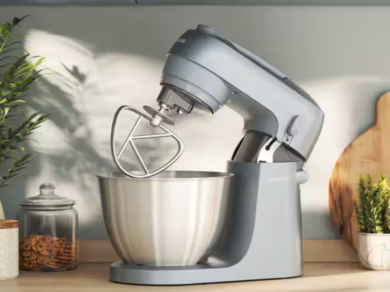
6. Kenwood Go Compact Stand Mixer
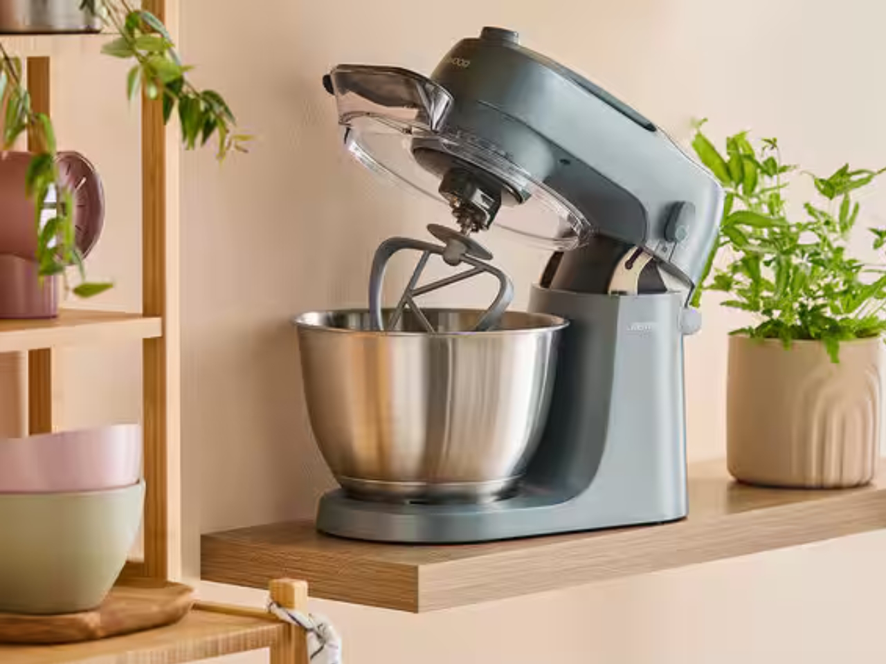
The stand mixer has always been a counter occupant by necessity rather than by design. They are large, heavy, and most look like they belong in a professional bakery. Kenwood’s Go Compact reframes the category. It packages the performance of a full stand mixer into a footprint small enough to coexist with everything else on a compact counter without requiring the kitchen to reorganize itself around one machine.

Its value is in the everyday bake rather than the occasional showpiece production. It handles the mechanical work of mixing dough, whipping cream, or folding batter without demanding that the kitchen dedicate itself to the task. That restraint in form, paired with Kenwood’s track record for motor reliability, makes it a counter object rather than a stored appliance. Compact proportions mean it stays where it sits, ready for the next session, without becoming a visual intrusion between uses.

What we like

  • Compact footprint genuinely rethinks the stand mixer for smaller kitchens without sacrificing performance
  • Kenwood’s motor reliability means the scaled-down size doesn’t compromise on results

What we dislike

  • Smaller bowl capacity limits batch sizes for high-volume or professional-scale baking sessions
  • Can feel less stable than full-size alternatives when working with particularly stiff doughs

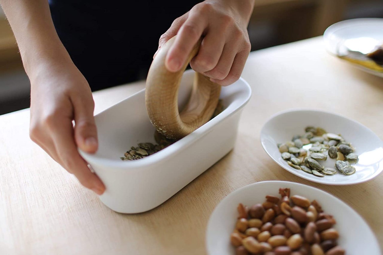
7. JIA Inc. Rolling Mortar
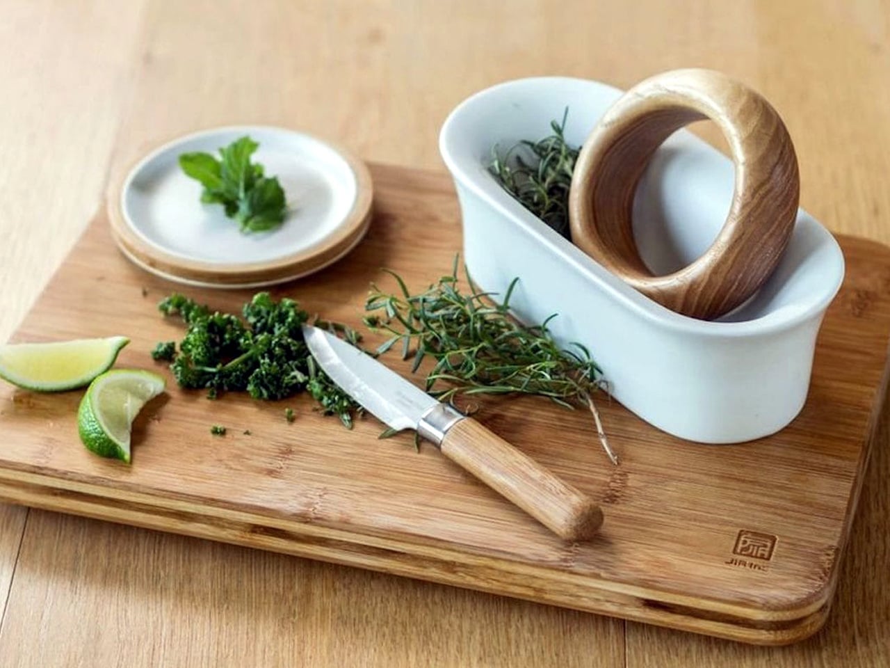
The mortar and pestle have been functionally unchanged for roughly 35,000 years, which is either a testament to the design or an invitation to rethink it. JIA Inc., a Taiwan-based design brand, chose the second view. Their Rolling Mortar replaces the vertical pounding motion with a rolling action: a stone sphere moves across a curved ceramic base, grinding herbs and spices through rotation rather than force. The gesture is more intuitive, considerably less tiring, and far more interesting to watch.

On a counter, it reads as a sculptural object long before it reads as a kitchen tool. The sphere and base form a self-contained composition that earns its space whether in use or not. Fresh pesto, ground spices, crushed garlic: the results are consistent, and the process is more enjoyable than the traditional method. It also cleans easily, which is the practical detail that tends to close the case for anyone still on the fence.

What we like

  • The rolling mechanism reduces the physical effort of traditional pounding significantly
  • The sphere-and-base composition is sculptural enough to justify permanent counter display

What we dislike

  • Slower than traditional methods for particularly coarse or hard spices, requiring significant force
  • The sphere needs adequate clearance to move freely, demanding more counter space during active use

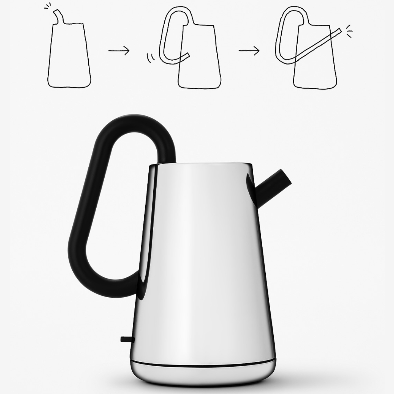
8. Toru Kettle
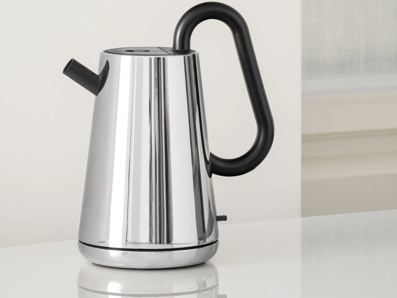
Nendo’s design work is consistent in one quality: it takes a familiar object, finds the assumption buried inside it, and quietly dissolves it. With the Toru kettle for Alessi, that assumption is how a kettle is held. Rather than a handle attached to the side, a black tube runs through the body of the stainless-steel vessel, becoming the grip itself. Toru means “through” in Japanese, and the name describes the design principle with complete accuracy.

Alessi’s metalworking precision is evident in the finish, and the contrast between the brushed steel body and the matte black tube creates a tonal balance that reads as sculpture before it reads as kitchen equipment. On the counter, it occupies the same visual register as a considered ceramic object or a well-made vase. Boiling water in it feels slightly ceremonial, which is not incidental to the design. Nendo and Alessi intended the daily ritual to feel like one.

What we like

  • The through-handle design transforms a routine gesture into something worth noticing every morning
  • Alessi’s metalworking gives it a material quality that mass-market kettles cannot replicate

What we dislike

  • The unconventional grip takes some adjustment, particularly when pouring with precision
  • The stainless and matte-black palette, while refined, can feel cool in warmer-toned kitchens

9. Hesslebach Dutch Oven
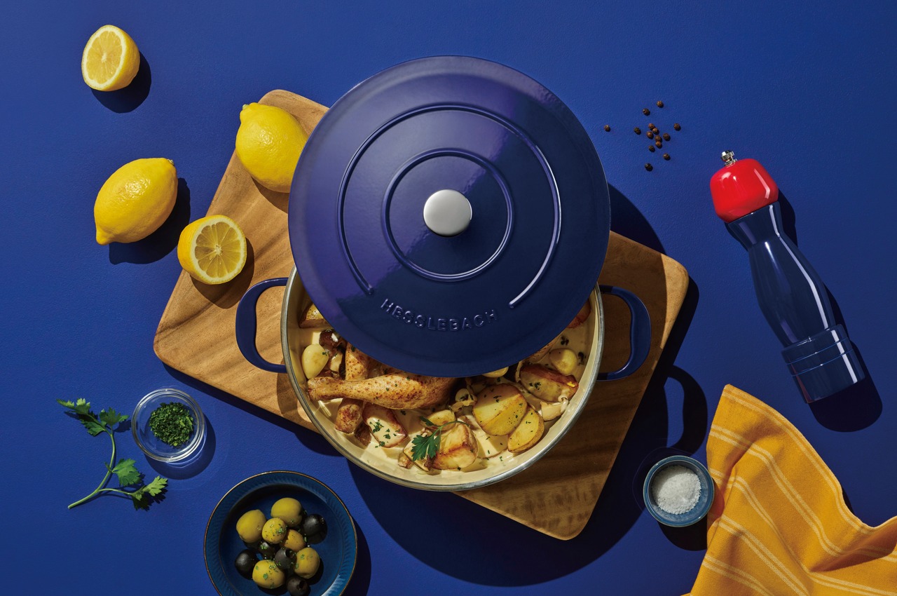
The Dutch oven is the kitchen’s most honest piece of cookware. It travels from stovetop to oven to table without changing character, and the finest examples improve with use rather than degrade with it. HK Kim’s Hesslebach takes that functional lineage and applies a design sensibility that treats the vessel as an object worth placing rather than simply setting down. Its counter presence communicates something deliberate about the kitchen it occupies, a quality very few pieces of cookware achieve.

A well-made Dutch oven retains and distributes heat in a way that makes slow-cooked dishes genuinely superior in result. Braises develop deeper flavor, bread develops a crust that rivals a professional deck oven, and soups reach a depth of reduction that stovetop-only pots rarely match. The Hesslebach is built to that standard, and its form carries the confidence of its material. Left on the counter between sessions, it functions as an aesthetic anchor for the kitchen space around it.

What we like

  • Heat retention and distribution deliver cooking results that lighter cookware simply cannot match
  • A form confident enough to remain on the counter between uses without apology

What we dislike

  • Weight and material density demand more deliberate handling than lighter everyday cookware
  • The investment required places it well above casual kitchen upgrade territory

10. FineLine Chopstick Rest
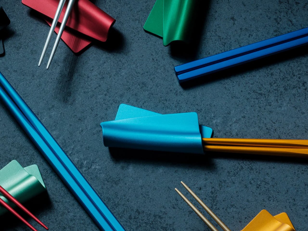
The chopstick rest is the punctuation mark of a table setting: small enough to be overlooked, significant enough to shift the character of everything around it. The FineLine Chopstick Rest is machined from the same aluminum as the chopsticks it accompanies, creating a material consistency across the table that reads as intentional rather than assembled. Its form is architecturally proportioned, a precisely angled piece that holds the chopsticks cleanly off any surface.

What it does for the FineLine chopsticks is what any well-designed accessory does for its counterpart: it completes the object. Chopsticks left flat on a table look forgotten. Placed on a form machined to hold them, they look arranged. That distinction carries through to the counter, where rest and chopsticks together become the kind of small arrangement that makes a kitchen feel curated rather than accumulated. Very few objects at this price point deliver that quality of visual return.

Click Here to Buy Now: $20.00

What we like

  • Machined aluminum matches the FineLine chopsticks precisely, creating a coherent tabletop object
  • The angled form elevates the chopsticks from a utensil to a display piece between uses

What we dislike

  • Designed specifically around the FineLine chopsticks, which limits pairing with other styles
  • The minimal form is unforgiving if placed on a visually cluttered or busy surface

The Objects That Stay

A kitchen that looks considered doesn’t happen through a single purchase. It accumulates through a sequence of decisions, each one small enough to seem insignificant until the room starts to reflect them. The ten objects here span different categories, different price points, and different materials. What they share is a refusal to be hidden away. Each one earns its counter space not through function alone but through the integrity of its form.

The Smeg fryer shows where cooking technology is heading. The Mitsubishi Bread Oven shows what happens when a brand stops trying to do everything. The Toru Kettle shows that the most familiar object in a kitchen can still be entirely rethought. The rest follow the same logic: that good design and daily use are not competing priorities. They are, at their very best, the same thing.

The post 10 Best Kitchen Tools and Appliances Designed to Live on Your Counter, Not in Your Cupboard first appeared on Yanko Design.
This 1.5mm Japanese Chopstick Might Ruin Ordinary Ones for You

Most chopsticks are never designed. They’re just made. Wide enough to produce cheaply. Consistent enough to ship by the millions. Familiar enough that nobody questions them.

Until someone finally did.

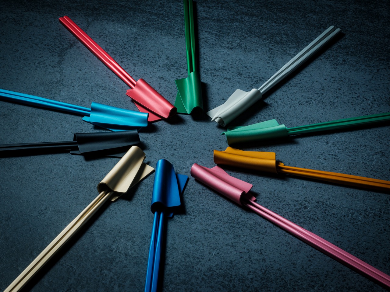
The FineLine Aluminum Chopsticks are the result of more than 40 rounds of refinements in Tsubame-Sanjo, Japan—adjusting the tip diameter, taper angle, grip texture, and balance in increments as small as 0.1mm.

Not to reinvent chopsticks. Just to remove the small frustrations people stopped noticing years ago. And surprisingly, most of those frustrations start with rotation.

Neatly arranged colored pencils in a rainbow gradient across a gray desk, with color swatches in the background on the right.

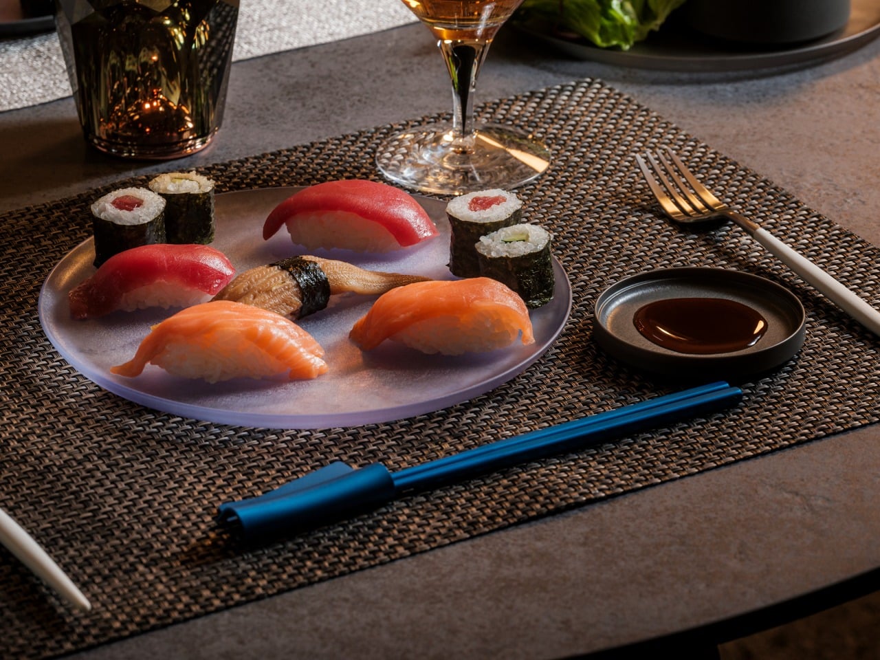
Plate of assorted nigiri and maki sushi on a gray platter, with soy sauce, a wine glass, and blue chopsticks on a woven placemat.

The Chopsticks That Changed How Dinner Felt

At first, the difference felt almost too small to explain. Then I noticed I wasn’t squeezing sashimi as hard. I wasn’t correcting the tips halfway through a bite. I wasn’t adjusting my grip every few minutes without realizing it.

The chopsticks stayed aligned. The tips held cleanly. Long meals felt calmer somehow. And once I noticed that, ordinary chopsticks started feeling strangely unfinished.

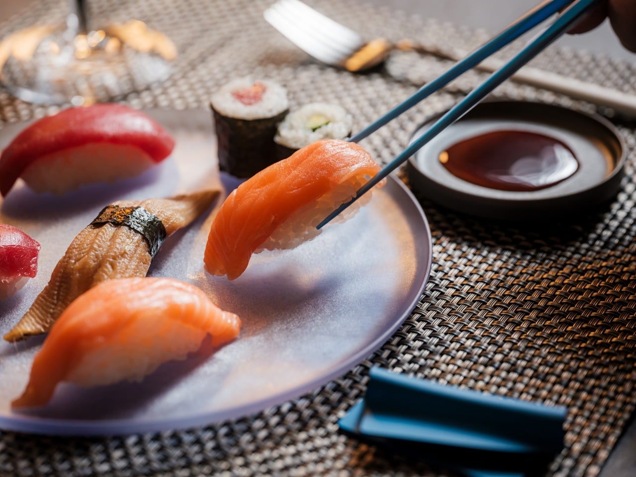
Salmon nigiri being picked up by chopsticks over a plate of assorted sushi and soy sauce nearby.

Designed for the Details

  • 1.5mm precision tip: Roughly half the diameter of most standard chopsticks, creating cleaner contact and more precise control.
  • Faceted anti-rotation body: Prevents the constant drifting and micro-corrections caused by round chopsticks.
  • Machined anti-slip texture: Built directly into the tip instead of added as a coating that eventually wears away.
  • 40 rounds of refinements: Tip diameter, taper angle, grip texture, and balance were adjusted repeatedly in increments as small as 0.1mm.
  • 14.5g balanced weight: Controlled enough for precision without becoming tiring across a full meal.
  • Anodized aluminum construction: Resists moisture, warping, stains, and dimensional drift over time.

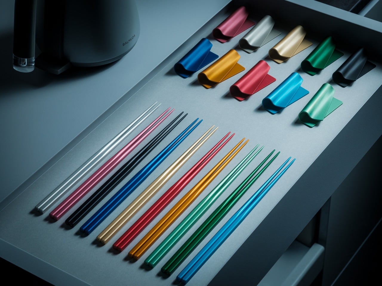
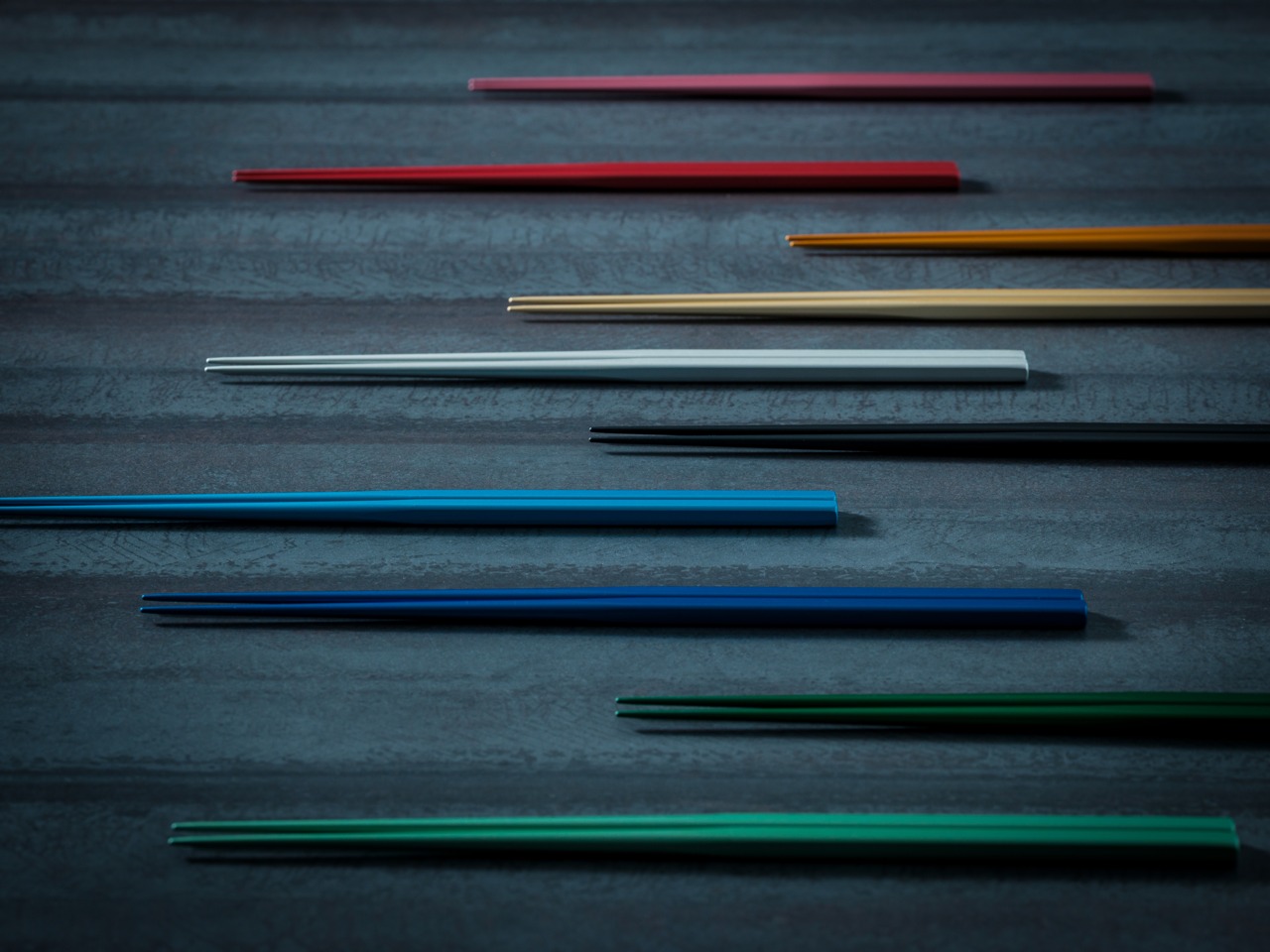
Available in ten satin anodized tones, the finish adds grip without roughness while maintaining the same feel years later as it did on day one.

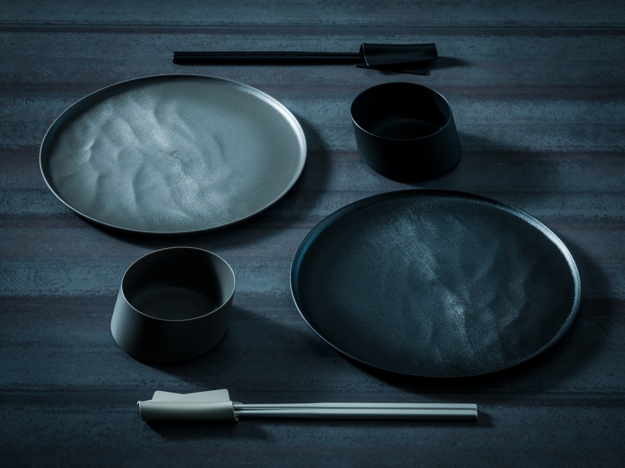
Flat lay of black minimalist dinnerware: two large round plates, two cups, and a pair of chopsticks on a dark textured surface at top and bottom center.

The Friction You Stop Noticing

Standard chopsticks taper to around 3–4mm at the tip. That’s not really a design decision—it’s a manufacturing default. It works, but it quietly asks something of you every time you eat. A little extra pressure to hold slippery food. A slight grip adjustment. A constant realignment of the tips.

Round profiles make it worse. They rotate in your fingers constantly. Subtly, continuously—your hand is always correcting them, always bringing the tips back into alignment. It’s the kind of friction that never rises to the level of complaint but accumulates quietly across every meal.

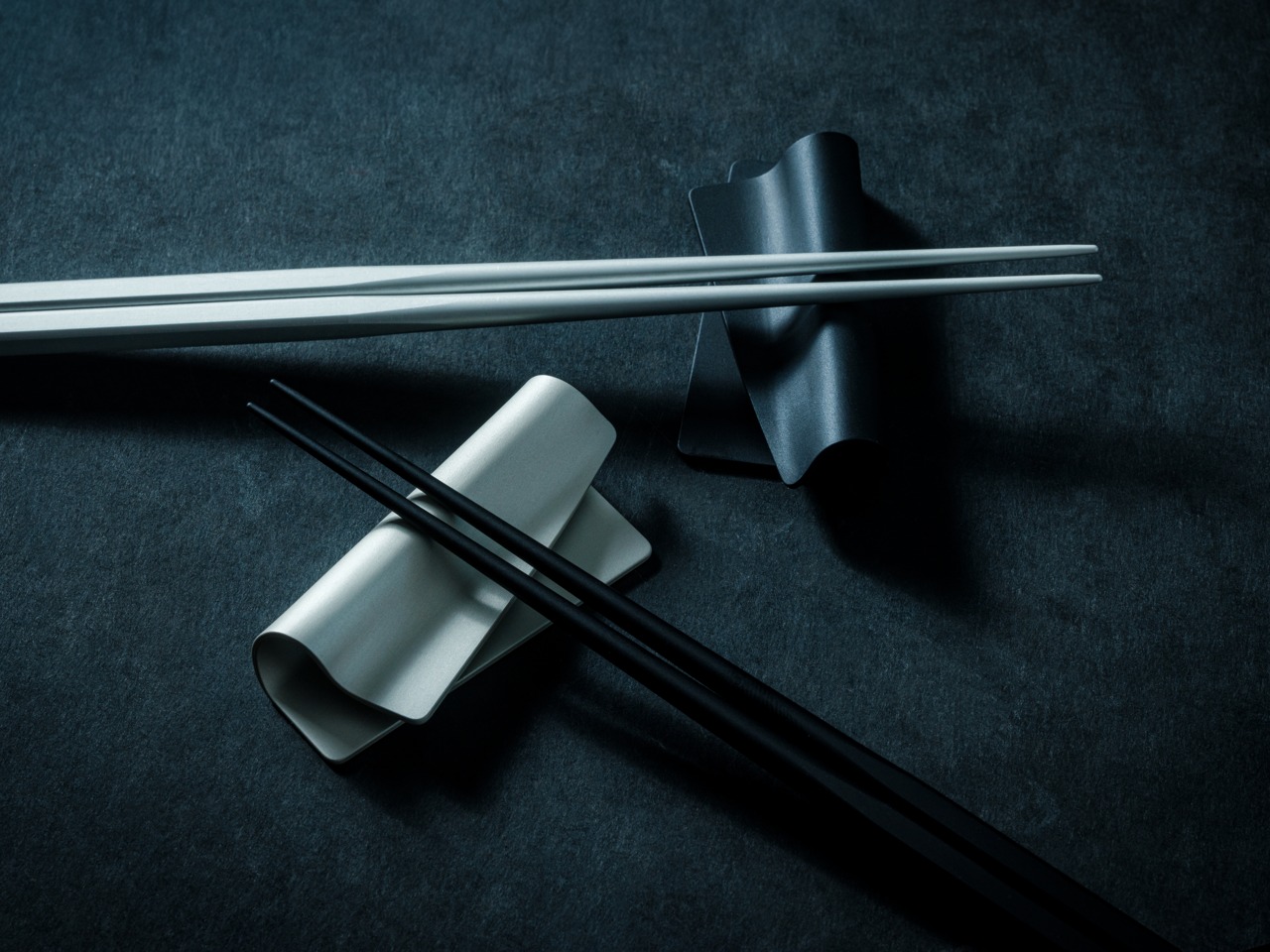
White chopsticks laid across a curved ceramic rest on a dark textured surface with black chopsticks nearby.

Most people never notice it because they’ve adapted to it for years.

The FineLine was designed to remove that friction entirely. Not through dramatic reinvention, but through refinement precise enough that the tool eventually disappears from your awareness altogether.

Colorful plastic twist ties arranged in a circle around a central point on a dark textured surface, creating a starburst pattern.

Design That Disappears

The workshop behind the FineLine was founded in Tsubame-Sanjo in 1907, a region known for precision metalworking where tolerances measured in fractions of a millimeter completely change how a tool feels in use.

That same philosophy shaped these chopsticks.

Metal chopsticks done poorly feel clinical and slippery because aluminum hides nothing. Wood and bamboo naturally absorb small inconsistencies in manufacturing. Aluminum doesn’t. Every imbalance in taper, texture, and weight becomes immediately obvious in the hand.

That’s precisely why this level of precision mattered here. The same discipline required to hold 0.1mm tolerances across professional tools is what allows a 1.5mm aluminum tip to feel stable instead of precarious.

The matching FineLine Chopstick Rest completes the system, carrying the same anodized finish, color language, and quiet restraint. Together they create a table setting that feels considered without asking for attention.

Colorful chopsticks laid diagonally across a dark textured surface, forming a rainbow arrangement.

Who It’s For

  • Daily Chopstick Users
    Once you’ve used a 1.5mm tip on a properly balanced stick, ordinary chopsticks start feeling strangely unfinished.
  • Japanese Craft Enthusiasts
    This isn’t craft as decoration. It’s a century of metalworking precision applied to one of the most ordinary tools on a Japanese table.
  • Gift Givers with Taste
    Not displayed. Not saved for guests. Just quietly reached for without thinking—which is exactly the point.

Minimal black tableware setting: two plates with a small black bowl and a pair of chopsticks resting on the plates on a dark textured surface.

Where The Meal Takes Over

You don’t think about chopsticks when they work. You think about the food, the conversation, the rhythm of the meal. That’s the quiet achievement of the FineLine Aluminum Chopsticks. The grip stays aligned. The tip holds cleanly. The weight never asks for attention.

Not just chopsticks. A better way to feel every meal. The FineLine Chopsticks are available now for $30.

The post This 1.5mm Japanese Chopstick Might Ruin Ordinary Ones for You first appeared on Yanko Design.

The 5 Best Tech Gadgets of May 2026

May 2026 is a good time to be paying attention. Gadgets aren’t just getting faster or thinner; the best ones this month are getting more intentional. There’s a shared thread running through every standout: each was built around a real constraint, a real behavior, or a real cultural moment, rather than a spec sheet searching for an audience. Five products rose above the rest, and each earns its spot for a distinctly different reason.


From a foldable phone that demolishes the category’s $800 price floor to a Nintendo Switch add-on that turns a gaming console into a live production rig, the range here is unusually wide. What connects them is the quality of thinking underneath. These aren’t renders looking for investment. They’re real objects designed to change how you work, listen, create, and move through a day. That’s the only brief that actually matters.

1. NASA Artemis Watch 2.0

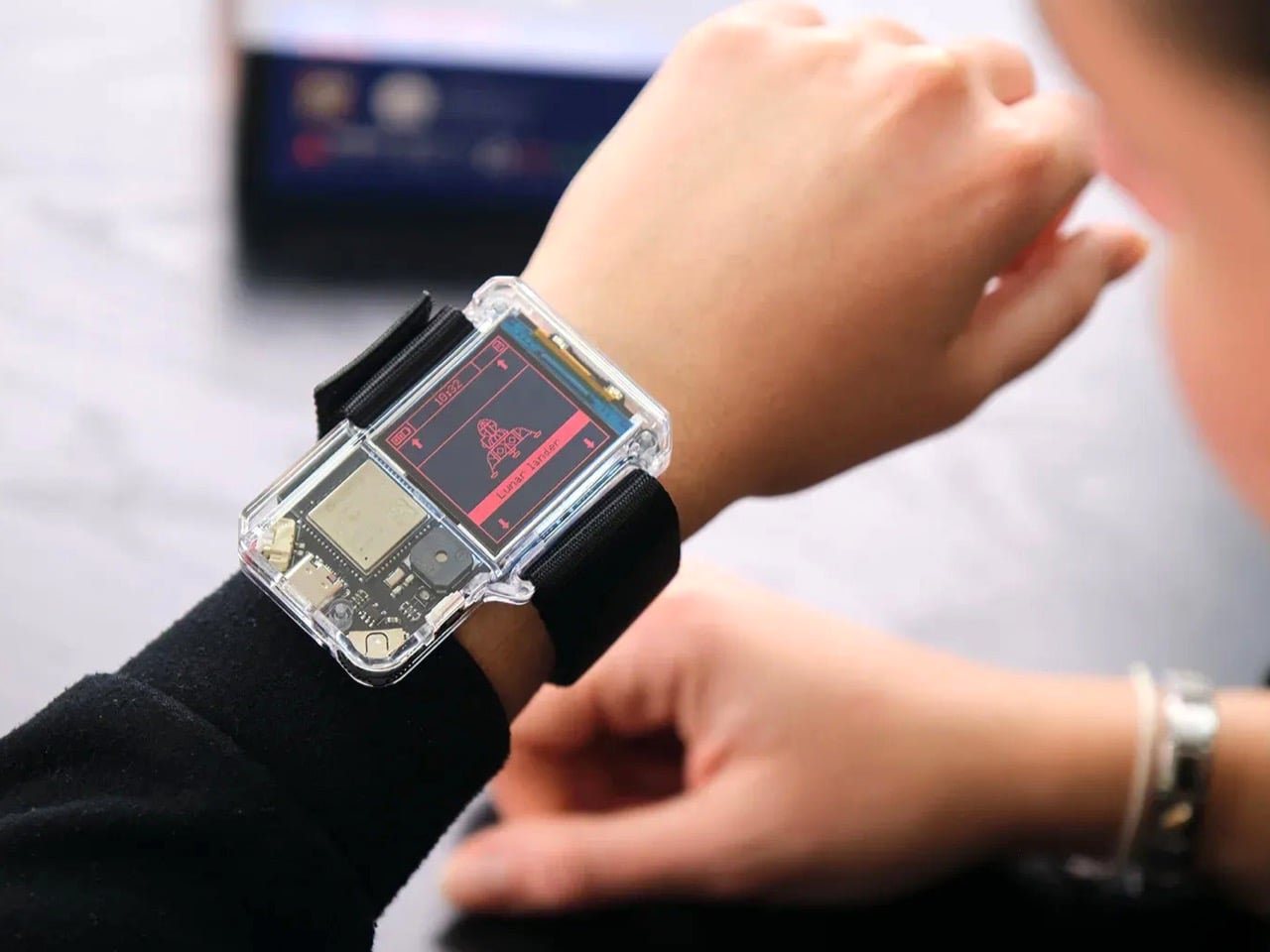
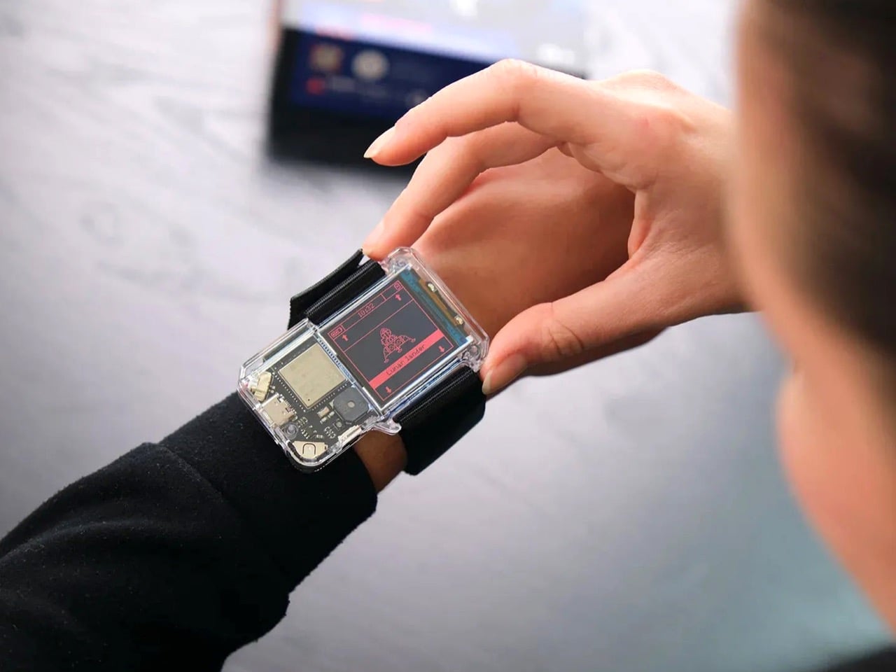
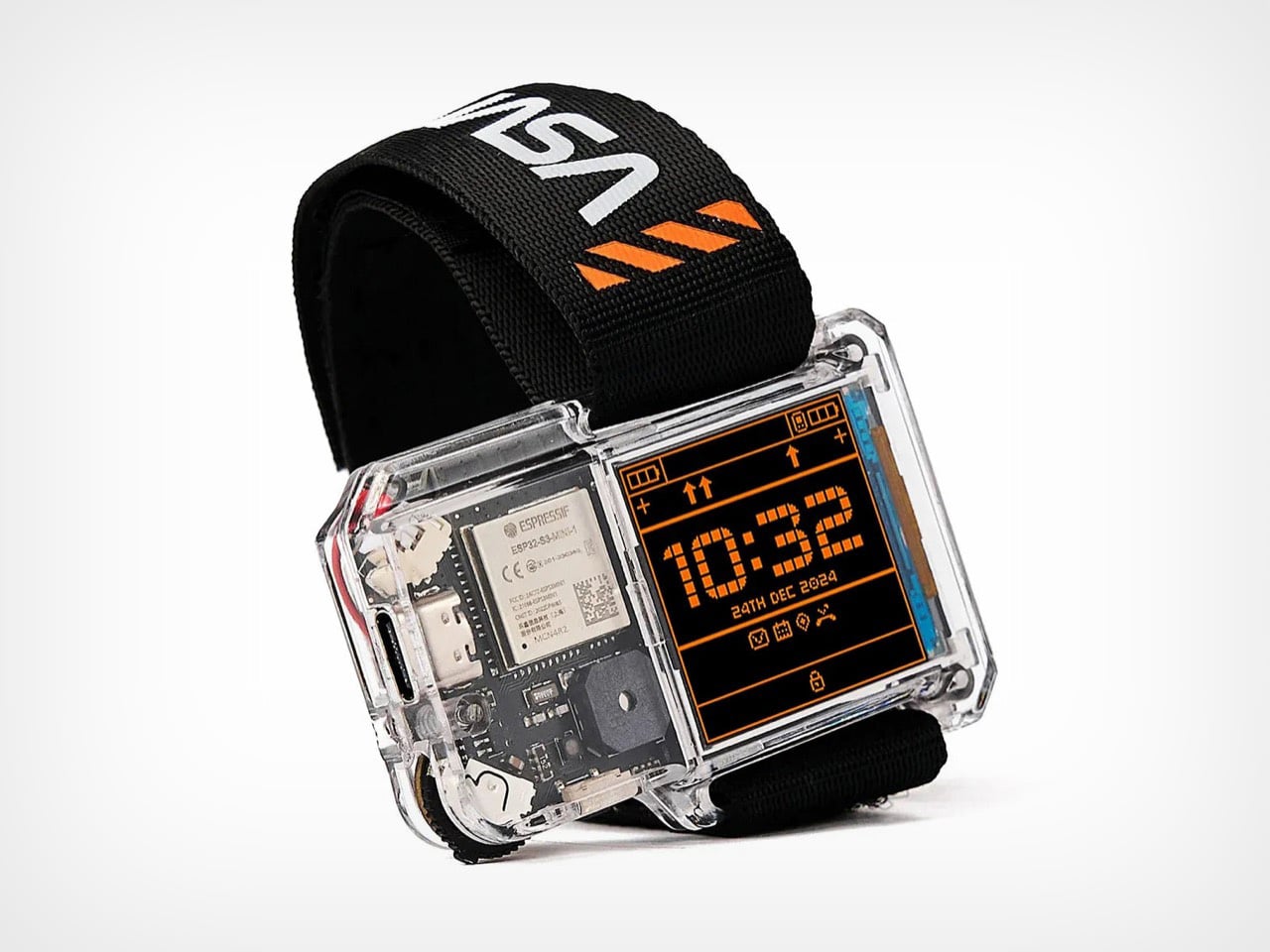
NASA’s Artemis II lifted off from Kennedy Space Center on April 1, 2026, carrying four astronauts on humanity’s first crewed lunar journey in over 50 years. CircuitMess timed the NASA Artemis Watch 2.0 directly into that cultural gravity. At $129, it’s a fully assembled, ready-to-use programmable smartwatch built around a dual-core ESP32 microcontroller, with a full-color LCD screen, accelerometer, gyroscope, compass, and temperature sensor packed into a wristband designed for anyone aged nine and up who wants more than a fitness tracker strapped to their wrist.

What makes it worth your attention is the depth it offers without demanding anything upfront. Out of the box, it pairs with iOS and Android over Bluetooth for activity tracking and notifications. When curiosity takes over, the firmware is fully open-source and reprogrammable in Python, CircuitBlocks, or the Arduino IDE. Build custom watch faces, write your own apps, and modify sensor behavior as far down as you want to go. The Artemis Watch 2.0 is one of the rarer gadgets at this price: it genuinely grows with the person wearing it.

What we like

  • Fully open-source firmware supports Python, CircuitBlocks, and Arduino, giving both beginners and experienced coders meaningful room to explore and build
  • Ships fully assembled and ready to use straight out of the box, lowering the barrier to entry without removing any of the technical depth underneath

What we dislike

  • At $129, it asks for more commitment than most impulse purchases in the kids’ tech category allow for
  • Screen performance in direct sunlight hasn’t been addressed in any available documentation

2. OrigamiSwift Mouse

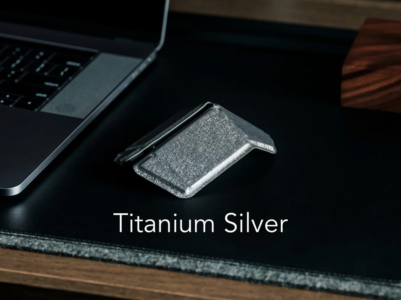
Every frequent traveler has made the same quiet compromise: leave the proper mouse at home or carry something too small to work with comfortably for more than an hour. OrigamiSwift was built precisely around that problem. It’s a Bluetooth mouse that folds flat when not in use, weighs just 40 grams, and opens into full working position in under half a second. The origami-inspired form isn’t a styling exercise. It’s a structural answer to the oldest tension in portable peripherals: comfort has always cost you size.

The ergonomic shaping holds up across extended work sessions, which matters more than most product pages acknowledge. Whether you’re finalizing a presentation at an airport gate or editing documents in a co-working space, OrigamiSwift stays comfortable in your hand and disappears into a bag when you’re done. The ultra-thin profile and minimal build weight mean it never adds anything meaningful to your load. For anyone who genuinely works from wherever they happen to be, this is the mouse that finally makes sense to own.

Click Here to Buy Now: $85.00

What we like

  • 40-gram weight and flat-fold profile make it practically invisible in any bag, disappearing entirely until you actually need it
  • Sub-0.5-second activation means there’s no friction at all between being packed and being productive

What we dislike

  • Available listings don’t confirm DPI range or scroll wheel responsiveness for anyone doing precision work
  • Bluetooth-only connectivity may create compatibility friction with older desktop setups that lack wireless support

3. Ai+ Nova Flip

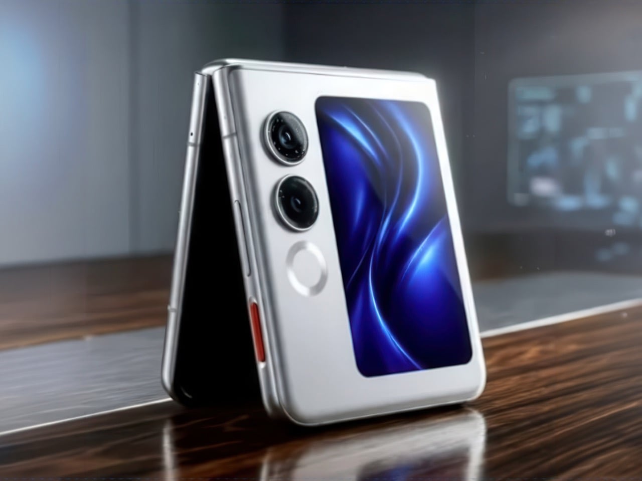
The foldable phone category has spent five years convincing itself that the flip experience carries a natural premium of $800 or more. Ai+ is testing that assumption head-on with the Nova Flip, launched in India at Rs 29,999, roughly $320, making it the most accessible foldable phone on the market. The inner display is a 6.9-inch AMOLED panel resolving at 2790 x 1188 pixels, complemented by a 3.1-inch AMOLED cover screen. MediaTek’s Dimensity 7300 handles processing, paired with 8GB of LPDDR4X RAM and 256GB of internal storage.

The spec list doesn’t read like a budget compromise. A 50-megapixel primary camera, a 32-megapixel front shooter, and a 4325mAh battery with 33W wired charging all hold credibly against devices at double the price. 5G, NFC, and an IP64 dust and splash rating close out a package that would feel serious in any category. The Nova Flip doesn’t just undercut the competition on price. It quietly forces a harder conversation about what the flip form factor has genuinely been worth at $1,000 all along.

What we like

  • $320 pricing opens the foldable phone experience to an entirely new audience that the category has ignored since its beginning
  • The 4325mAh battery is a genuinely surprising capacity for the flip form factor at any price point, let alone this one

What we dislike

  • The 2-megapixel depth lens reads as the weakest component in an otherwise strong and well-considered camera array
  • Long-term hinge durability at this price tier is unproven and worth tracking carefully over time

4. Akai MPC Switch

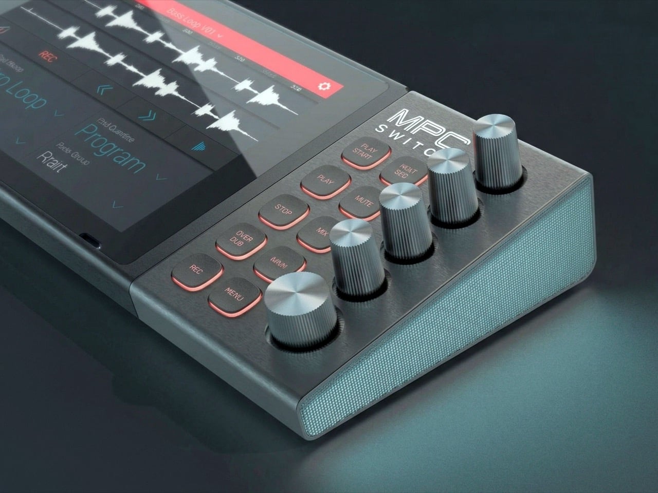
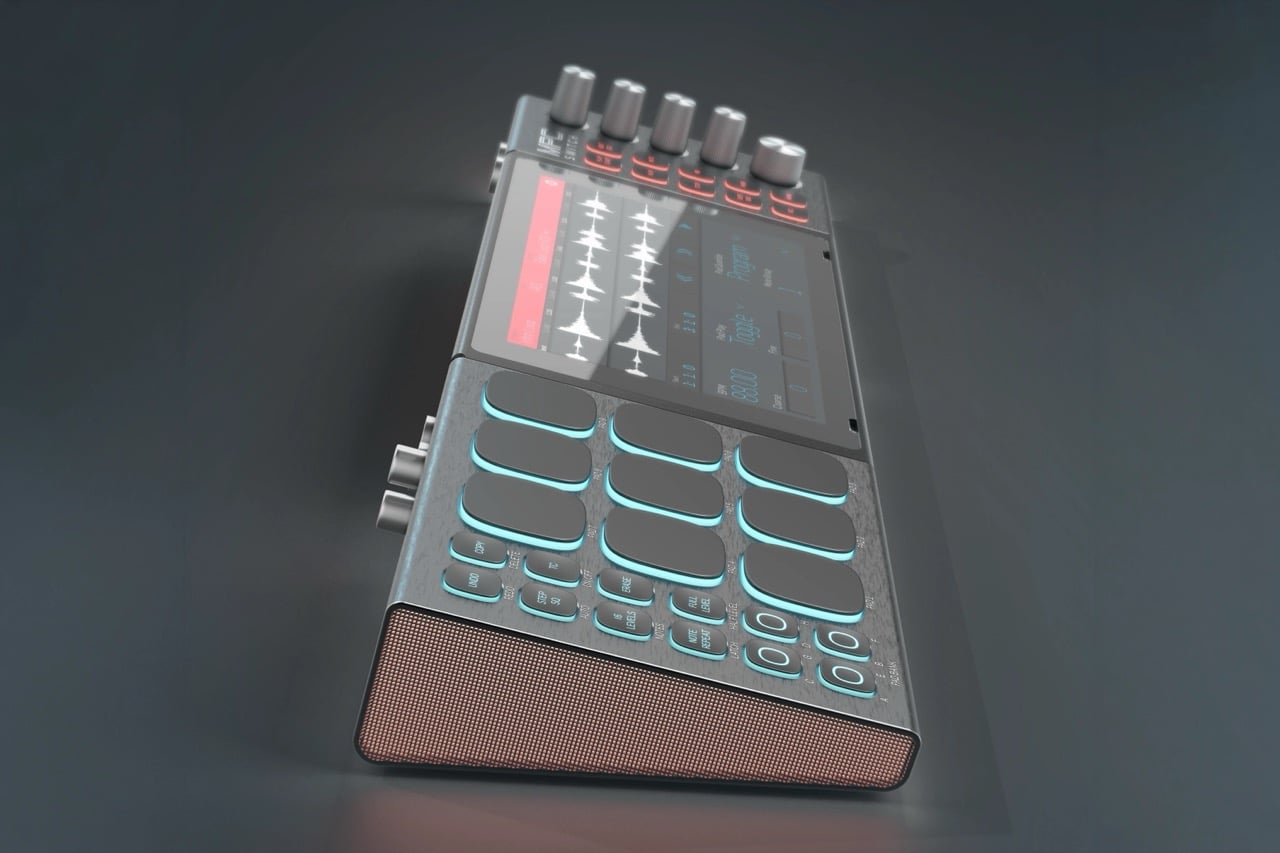
Alquemy’s Akai MPC Switch concept asks a question that feels obvious the moment someone finally puts it to you: if laptop-grade software can run on portable hardware, why can’t a capable gaming console handle serious music production? The MPC Switch is a pair of controller units designed to snap directly onto the sides of a Nintendo Switch, replacing the Joy-Cons with MIDI inputs, outputs, and a full DAW running on the console’s own screen. The control layout reflects real production workflows rather than a stylized render built for social media.

The appeal runs deeper than the novelty of the form. The concept treats the Switch as a legitimate interface surface: something you game on when you need to and produce or perform on when the moment calls for it. Swap the Joy-Cons for the MIDI setup, and you’re there. Whether Nintendo or Akai ever moves this into production is a separate question entirely, but Alquemy has made a persuasive case that the idea deserves a real answer. The best concepts don’t just look good. They make you wonder why nobody shipped it first.

What we like

  • MIDI integration and a credible DAW interface position the Switch as a serious production platform rather than a novelty peripheral
  • The Joy-Con snap mechanism makes the transition between gaming and music production genuinely seamless in concept

What we dislike

  • No confirmed production timeline means this remains aspirational, with no clear path in your hands
  • The Switch’s processing ceiling may be a real constraint for complex, multi-layer production sessions

5. StillFrame Headphones

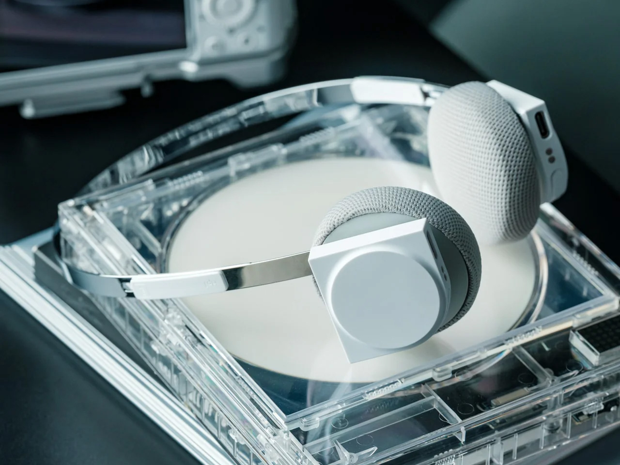
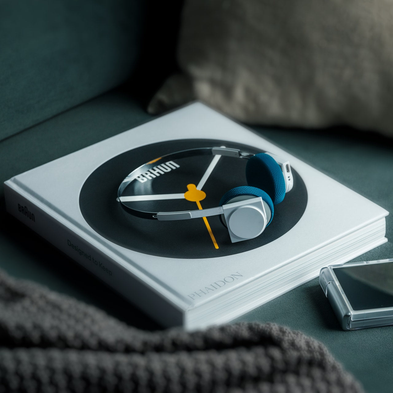
Most headphone designs land at one of two poles: the over-ear build that announces itself before you even put it on, and the in-ear solution that disappears but gives nothing back in soundstage. StillFrame lands somewhere more considered than either. At 103 grams, it sits closer to weightless than wearable. The 40mm drivers are tuned for a wide, open soundstage that pulls spatial detail and melodic texture out of tracks that most headphones flatten into undifferentiated background noise.

Active noise cancellation closes you off when focus demands it. Transparency mode reconnects you to the room when the world around you matters more. Battery holds at 24 hours, covering a full workday, an overnight flight, and the morning after with no cable required. Switching between modes takes a single tap. StillFrame was designed around the premise that how you listen should adapt to where you are, not the other way around. That’s a harder brief to execute cleanly than it sounds, and the weight alone suggests it’s been taken seriously.

Click Here to Buy Now: $245.00

What we like

  • 103 grams is a genuinely rare achievement for an over-ear headphone carrying both ANC and full-size 40mm drivers
  • 24-hour battery life covers the kind of all-day, real-world use that most headphones in this category only claim to handle

What we dislike

  • No published information on codec support, like LDAC or aptX, for listeners who prioritize wireless audio fidelity
  • Colorway and finish options appear limited in current listings, which may be a sticking point for buyers who care about visual identity

The Only Standard That Matters Is the One You Can Feel

May 2026’s strongest gadgets share something harder to write into a spec sheet than battery life or pixel count. Each was designed around a specific friction point and resolved it with a precision that feels purposeful rather than accidental. The Artemis Watch converts a cultural moment into a learning platform. The Nova Flip resets the floor of an entire category. The OrigamiSwift solves a portability problem that dozens of mice before it never genuinely addressed.

StillFrame and the Akai MPC Switch represent opposite ends of the development spectrum, one shipping and one conceptual, but both make the same underlying argument: that considered design changes the terms of what a product is allowed to be. Whether you’re optimizing a travel bag or rethinking a music studio from a gaming console, the standard these five set is worth taking seriously. The best gadgets this month aren’t the loudest ones in the room. They’re the most resolved.

The post The 5 Best Tech Gadgets of May 2026 first appeared on Yanko Design.