Uplight game console concept with an interactive 3D screen changes the way you play

Handheld gaming consoles are rocking the market again, in no small part thanks to the success of the Nintendo Switch nearly eight years ago. But for all the technological marvels these powerful computers bring today, they’re really just rehashing time-tested formulas, at least when it comes to the way we see and interact with games. Just like with much of computing, we’re simply seeing images rendered on a flat screen rather than the way we naturally see and interact with the world in three dimensions. Mixed reality and spatial computing are trying to challenge the status quote when it comes to typical computing scenarios, while this concept for a unique kind of console proposes a literally different perspective when it comes to the video games we play.

Designers: Tatsuya Kato, Shion Ito, Toshikatsu Nakamura, Toshiki Sato

Uplight definitely looks like no other gaming console, not just because of the different controller configuration but primarily for the lack of a screen. The design concept flips the convention of game design, with the experience being designed to conform to the unique traits of the console rather than the other way around. In this case, the unique characteristic is a projector hidden in the base of the console that displays the game on three-dimensional acrylic screens that can take on different object shapes specific to the nature of the game.

Think about those 3D puzzle games that require you to rotate a cube around to see it from different sides to solve the puzzle, except that cube is a literal and physical cube existing in the real world. This cube, made from translucent acrylic, is mounted on top of the Uplight console and displays the game projected into it. Players can use the console’s unusual controls to move the displayed image around or, better yet, use their own hands to actually turn the cube.

1

The 3D acrylic screen can be any shape, in theory, depending on the game experience being designed. It could, for example, be a giant translucent jellyfish for an aquatic adventure game, or even a tree branch for a game related to planting or vegetation. The possibilities are nearly endless, limited only by the angle that the integrated projector can reach and, of course, the size of the console.

That said, such a unique system will require games specifically designed for it, which also means designing new experiences that involve three-dimensional thinking as well as direct tactile interaction. Very few of today’s games have that, which will definitely challenge the creativity and ingenuity of game designers should Uplight ever become an actual commercial product.

The post Uplight game console concept with an interactive 3D screen changes the way you play first appeared on Yanko Design.

ASUS ProArt PX13 Laptop Review: An Agile Content Creator’s Best Friend

PROS:


  • Handsome, minimalist, and lightweight design

  • Impressive performance packed in a compact size

  • Gorgeous 3K OLED screen for both viewing and color-accurate work

  • Incredible value for creative professionals on the go

CONS:


  • No full-sized SD card reader, only one USB-A port

  • Display refresh rate is only up to 60Hz

RATINGS:

AESTHETICS
ERGONOMICS
PERFORMANCE
SUSTAINABILITY / REPAIRABILITY
VALUE FOR MONEY

EDITOR'S QUOTE:

The ASUS ProArt PX13 makes the impossible possible, delivering unbeatable performance and uncompromising mobility in an elegant and accessible package.
award-icon

The nature and execution of work have changed significantly in the past years, especially for those who use computers all the time. Mobility and flexibility have become an important part of the business, sometimes requiring people to be able to take their work anywhere life leads them. At the same time, it also allows people to do their work in the best possible location for them, which isn’t always the office. To support these new work arrangements, computer vendors have been trying to shove more power into laptops without turning them into gargantuan machines that would force people to leave them in the office anyway. It’s a delicate balancing act, one that very few brands have successfully pulled off, but the ASUS ProArt PX13 makes that very promise to one of the more discerning and particular markets. Is the ProArt PX13 able to deliver that promise of unbounded creativity anywhere or does it make too many compromises along the way? We give it a flip and a spin to bring you that answer.

Designer: ASUS

Aesthetics

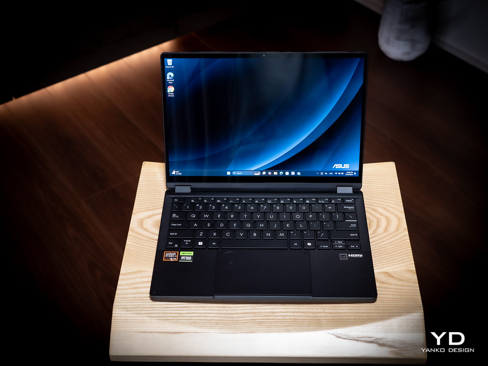
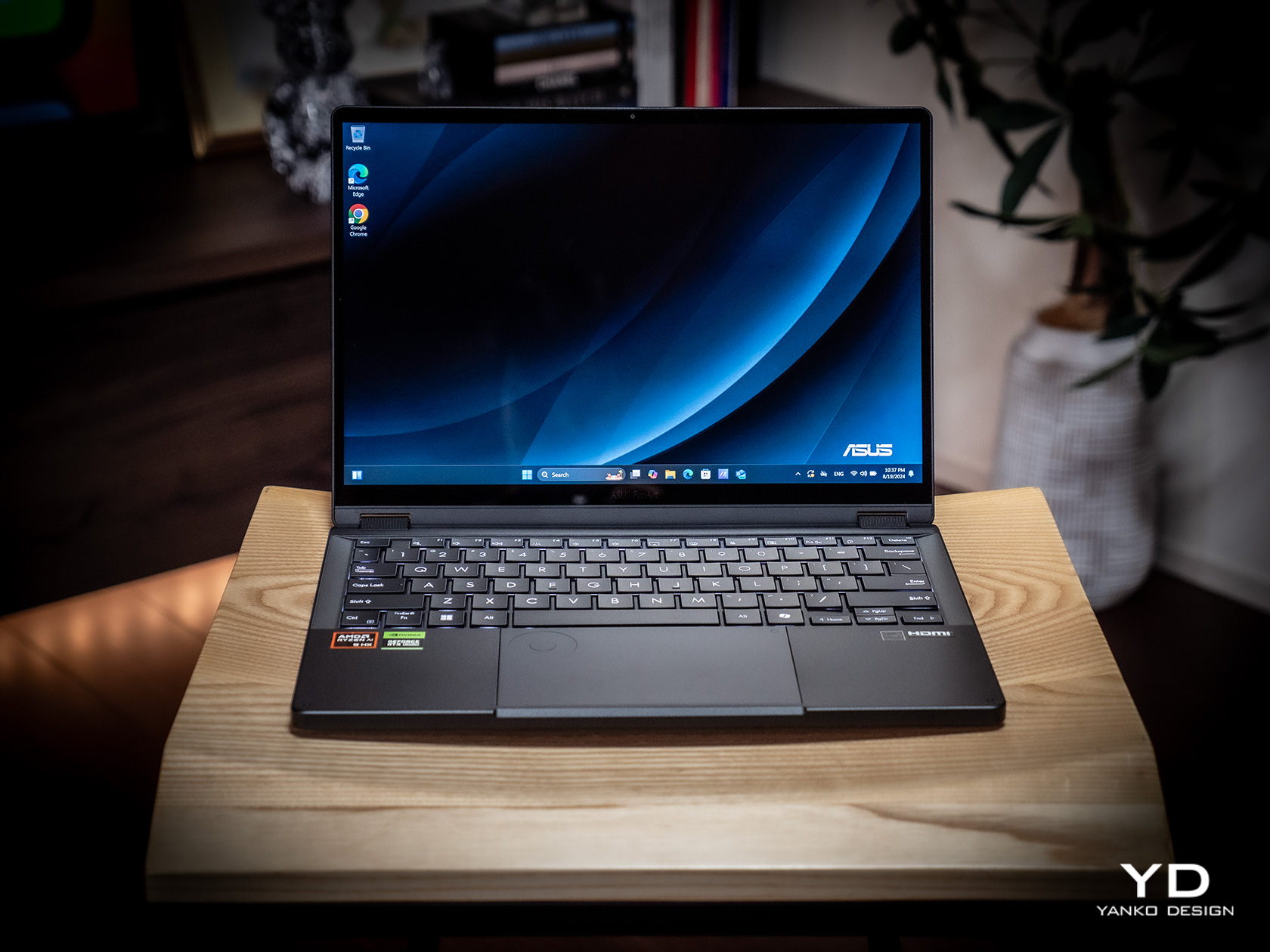
The first impression you’ll have when seeing the ASUS ProArt PX13 is how compact and thin it is, at least for a supposedly powerful laptop aimed at creative professionals. Your second impression will be how sleek and elegant it looks with its deep, all-black design. It’s an aesthetic that doesn’t scream at you but instead talks mellowly, fitting a professional product. There are barely any markings on the laptop’s cover; no fancy RGB lighting at its sides, protruding edges, or sharp angles. Just one truly black slab.

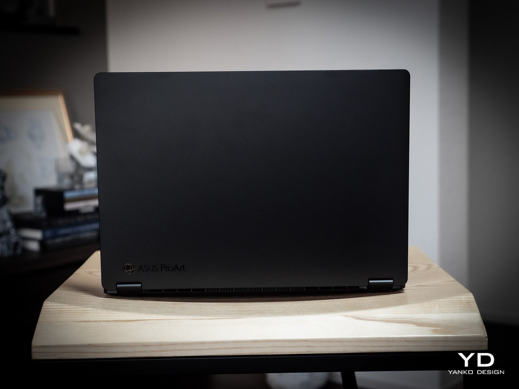
Unlike other laptops that advertise a black colorway, the ASUS ProArt PX13 really walks the walk thanks to the company’s Nano Black coating that almost poetically matches the deep blacks of the OLED screen on the opposite side. It’s admittedly a matter of taste, as some will prefer the luster of silver metal like those on MacBooks or Dell, but its more subdued aesthetic makes it less distracting as well. Thankfully, that same Nano Coating also prevents fingerprint smudges so there’s very little that will stain that darkness.

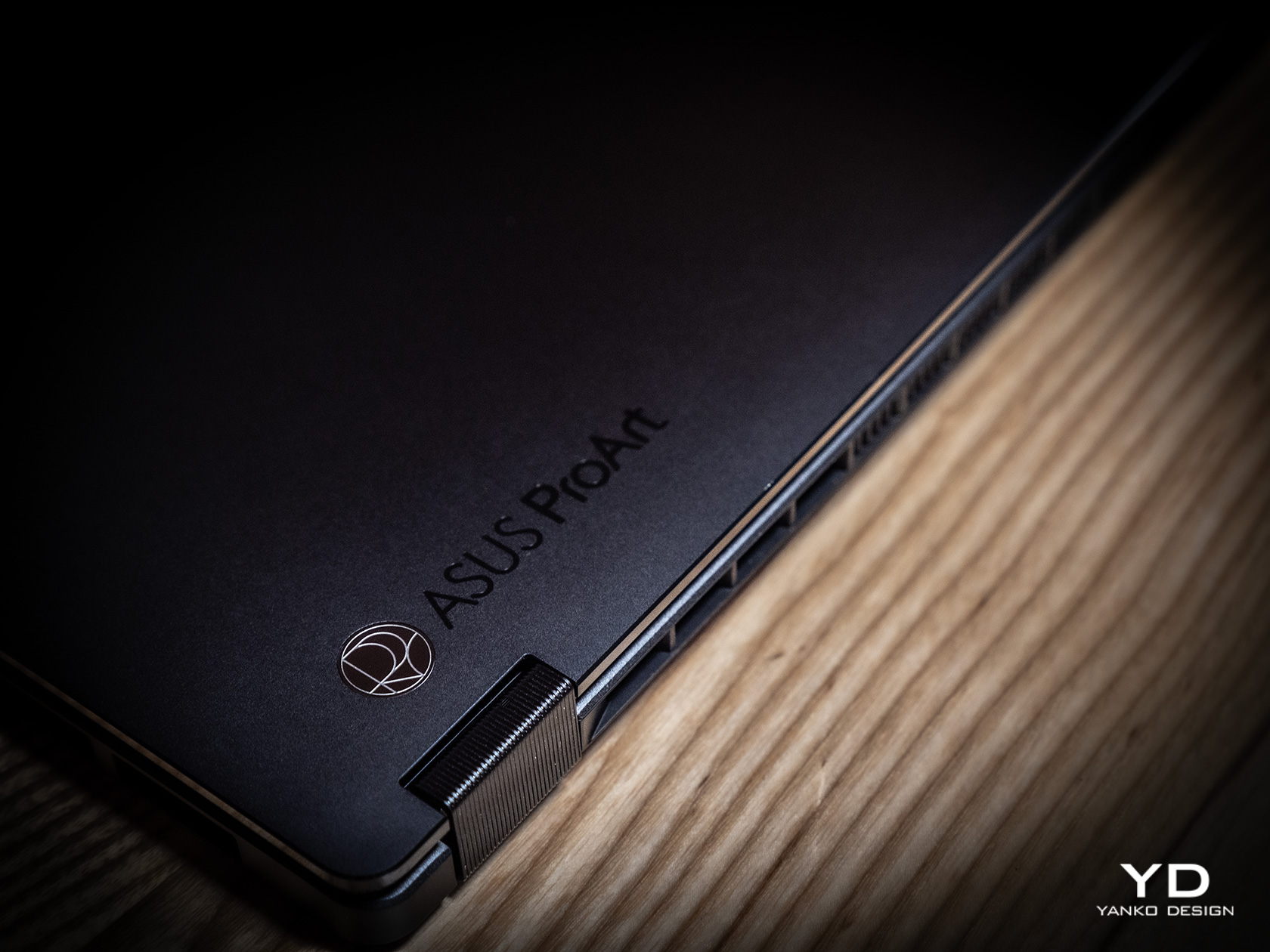
Minimalist doesn’t mean plain, however, and there are a few accents that bring out the ProArt PX13’s designer-centric character. The ProArt branding, for example, is smooth and a little bit reflective, tastefully set against the blackness of the cover. The vertical stripes on the hinge are supposed to be a nod to pro camera designs, but even if you don’t make that connection, they’re still an interesting touch. All in all, the ASUS ProArt PX13’s minimalism puts the focus not on the laptop but on the creator and the content, while also providing a dark, blank canvas for owners to use to let their own creativity shine through if needed.

Ergonomics

The ProArt PX13 is hardly the thinnest laptop, whether traditional or convertible, but it’s not terrible either for a 13-inch. When you consider that it packs enough hardware to cater to creative professionals and even some gamers, you’ll even be amazed at how ASUS managed to keep the numbers down to an accessible level. At 17.78mm (0.7 inches) thick and 1.38kg (3.04 lbs) heavy, this is something you can easily stow in your bag and be on the move in a flash.

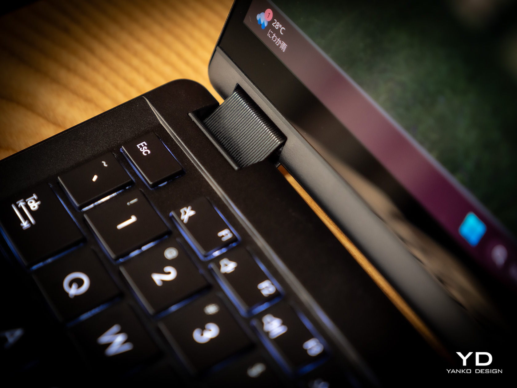
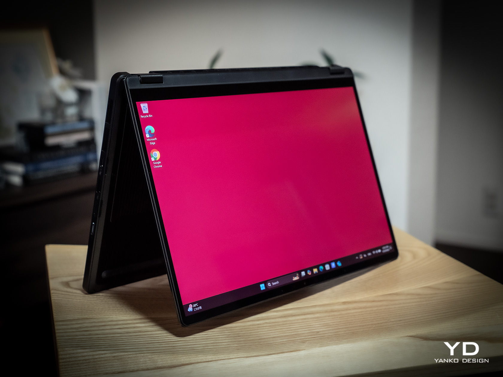
This is very important when you consider that ProArt PX13 is more than just a laptop. It can also be a tablet you can draw on, whether on your table or on your lap, as well as a “tent mode” presentation and entertainment display. Changing forms is as easy as folding the screen back and forth, and the sturdy 360-degree hinge makes sure that it stays open at whatever angle you leave it. At the same time, however, the laptop’s weight is distributed properly so that you can open it up with just a single finger, lifting the lid while the body anchors it down.

The typing experience is pretty good as well, with well-spaced keys and a good 1.7mm travel. The cursor keys are squashed, of course, but that’s nothing new nor is it extremely uncomfortable. The touchpad is a decent size, but its mechanical design might disappoint fans of more haptic touchpads.

Performance

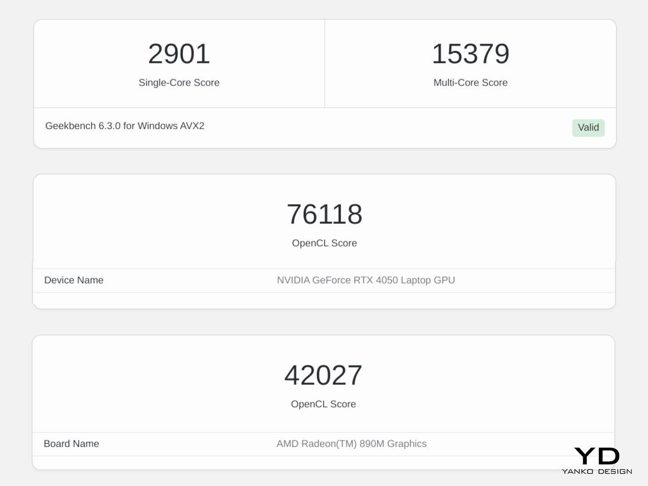
Right off the bat, the ASUS ProArt PX13 has some of the best hardware you’ll find in a 13-inch laptop. It’s one of the first to utilize AMD’s new AI-powered Ryzen AI 9 HX 370, giving it a wide lead in AI operations. This is paired with an NVIDIA GeForce RTX 4050, like in our review unit, or an RTX 4060. Either way, you’re getting a powerful graphics processor that, to no one’s surprise, handles AI skillfully as well. Benchmark numbers don’t always tell the whole story, but they’re impressive nonetheless. Whether the laptop is plugged in or running on battery, it will meet almost anything you can throw at it, whether it’s Photoshop, Da Vinci Resolve, or Blender.

Gaming is a bit of a different issue, though the ProArt PX13 is definitely capable. You will definitely feel the heat when pushing the system to its limits, but the cooling system does a stellar job of regulating its impact. The fans are definitely audible under heavy loads, but they quiet down just as quickly when no longer needed. And they’re barely noticeable at all if you’re just doing basic computing tasks like browsing the Web or typing up documents. The biggest setback when using this machine for gaming is actually one of its biggest strengths as well: its screen.

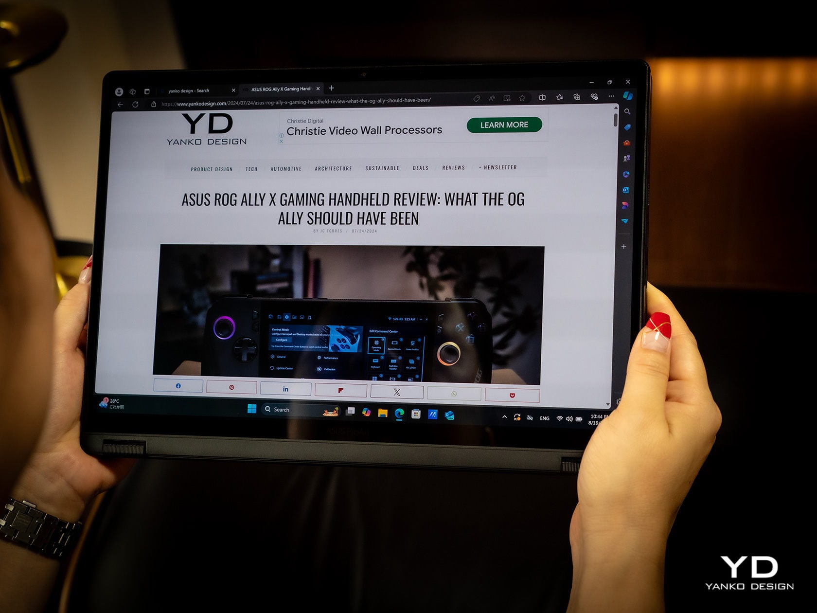
The 13.3-inch OLED touch screen is simply stunning, with rich colors, deep blacks, and a sufficient amount of brightness so that you can even work outdoors under overcast skies. The display is Pantone-validated and supports a wide gamut of colors, an important detail for graphics artists and content creators who need color accuracy more than anything else. The screen has a 3K resolution of 2880×1800 in a familiar 16:10 aspect ratio and a refresh rate of 60Hz. The latter is what makes the ProArt PX13 less suitable for gaming, at least for those who live and breathe 120Hz or higher. It’s not totally unusable for fast-paced games, and it completely marks the laptop as a machine primarily for work, with just a bit of gaming on the side.

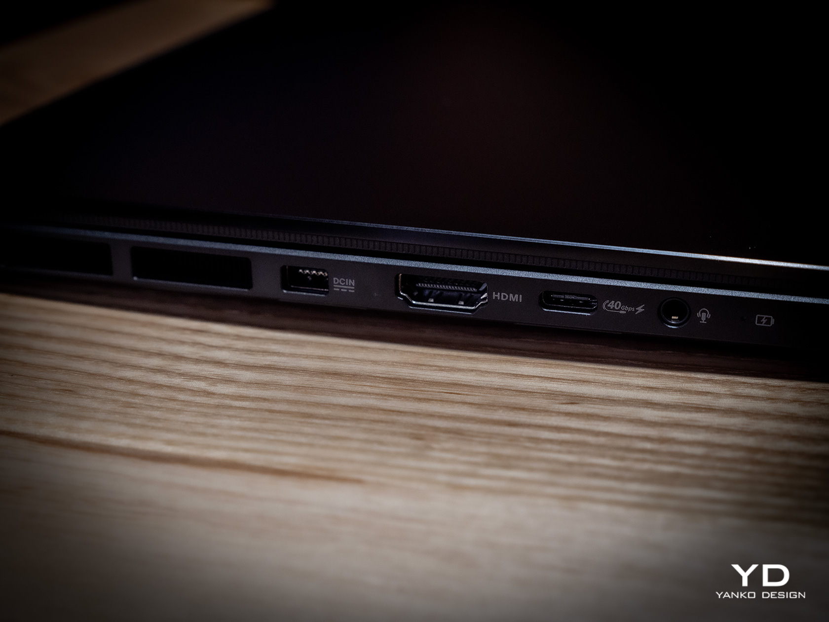
Battery life for the ASUS ProArt PX13 is so-so. Given its size, the 75WHr battery it packs is actually generous, but it’s offset by the more powerful hardware. On Eco/Power Saving mode and average computing tasks, it can last an average of 8 hours, definitely shorter once you push the hardware to the limit. It ships with a 200W power brick that’s large but not gigantic. It can charge over USB-C using a 100W charger, but you’ll probably bring the official charger with you anyway unless you’re traveling extra light.

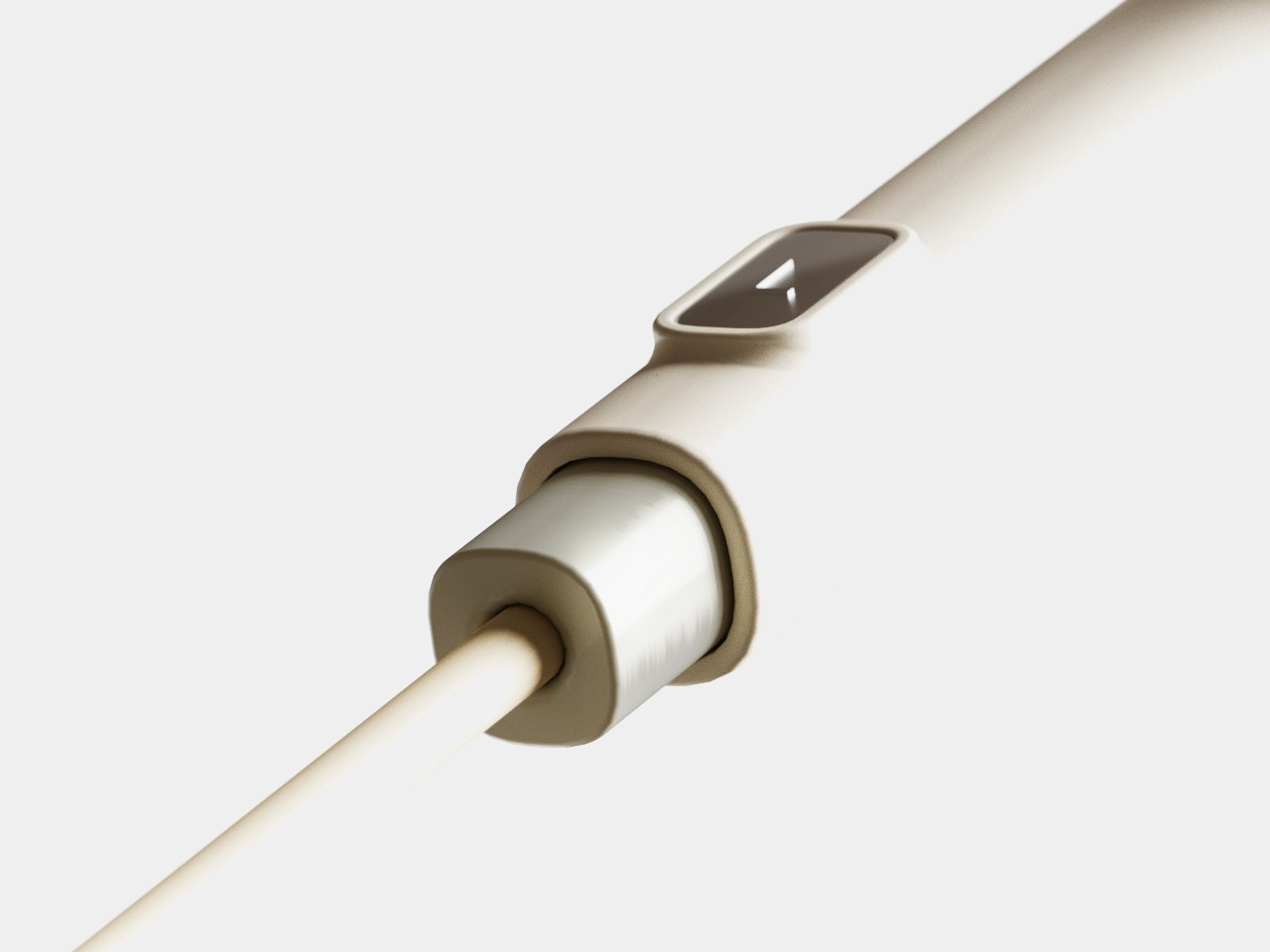
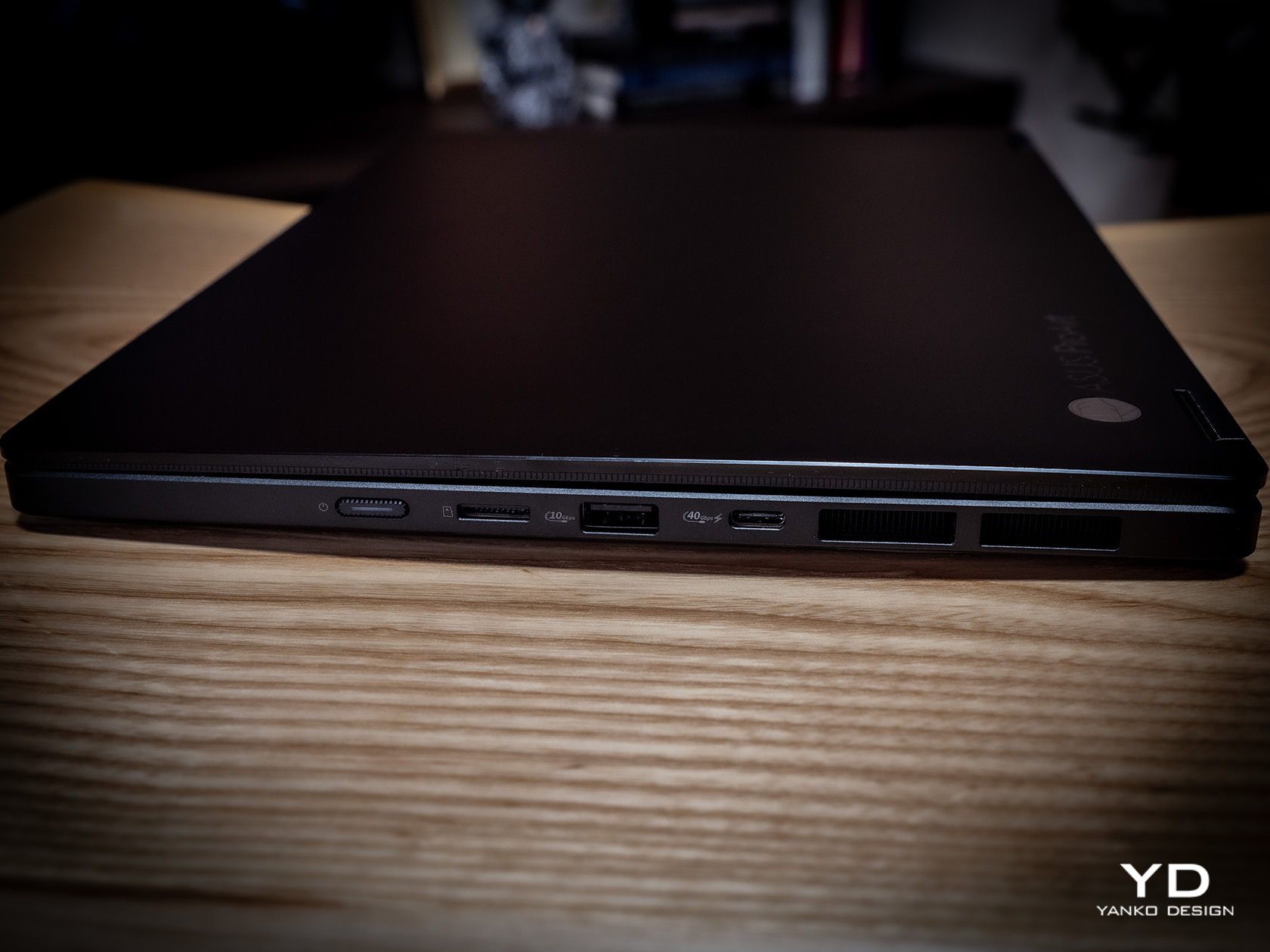
Port selection is on the light side as well. It has most of the important basics but is also oddly missing a few ones. There are two USB 4.0 Gen 3 Type-C ports and a single USB 3.2 Gen 2 Type-A port, one HDMI port, a 3.5mm headphone jack, and the proprietary DC-in charging port. There’s a microSD card reader but not a full-sized one, which is strange considering how digital cameras still mostly use SD cards, not their tiny cousins. We could always do with an extra USB-A port, especially if the only available one is already in use with an Ethernet adapter because the laptop doesn’t have its own RJ45 port.

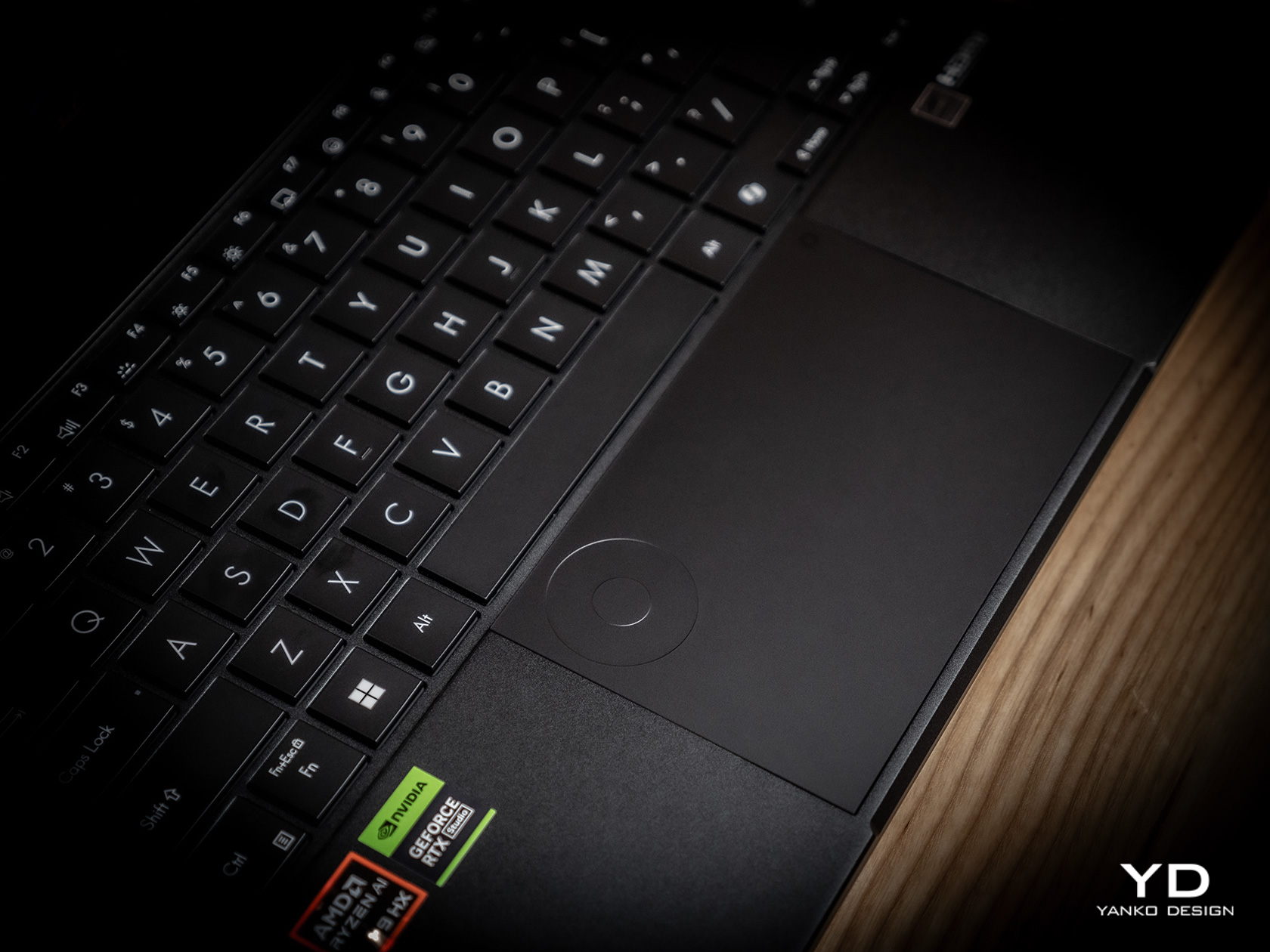
The ASUS ProArt PX13 is overflowing with features designed for creative professionals, from hardware to software. There’s the somewhat odd DialPad in the order of the touchpad, giving quick access to actions like changing brush sizes in Photoshop, scrubbing through timelines in Premiere, and more. Not everyone will love this convenience, and it is fortunately easy to disable it completely. From the ProArt Creator Hub which has all the settings you can tweak for performance or monitor calibration, to the AI-powered software that takes advantage of the combined strength of AMD processors and NVIDIA graphics, the ProArt PX13 offers a multitude of tools to assist content creators in whatever kind of work or problem they’re facing.

Sustainability

ASUS has been making big waves when it comes to its commitment to helping protect the future of the planet, from the use of recycled materials in its products to the decrease of plastic in its packaging. It might not be visible or advertised for the ProArt PX13, but we’re banking on the company giving it the same treatment even in small amounts.

In terms of prolonging the life of the laptop, ASUS definitely took steps to make it a bit easier. The bottom plate can be removed easily using a screwdriver, except for the middle screw that’s also covered by a sticky rubber material. The NVMe SSD storage, battery, and Wi-Fi 7 module are easily replaceable, which are some of the most common components that need to be repaired or upgraded. Sadly, the LPDDR5X RAM is soldered to the motherboard, but having 32GB of memory isn’t that bad anyway.

Value

The ASUS ProArt PX13 is available in two configurations, with the RTX 4050 and 4060 being the only real difference between the two, as well as the Windows 11 Home and Pro licenses. Given the performance difference between these two very capable NVIDIA graphics processors, you couldn’t go wrong if you picked the base configuration that goes for only $1,699.99. At that price point, it already surpasses larger laptops and can hold its own against a MacBook that’s nearly double its price.

It’s pretty mind-blowing how much ASUS was able to cram inside the compact 13.3-inch body of the ProArt PX13 without hitting any significant compromises. It’s hardly the best gaming laptop or the most powerful movie maker, but what it offers is the flexibility to take your work or game anywhere without missing a bit. In that regard, it is pretty unrivaled, making it a truly tempting device for creative professionals, even those who mostly stay at their desks.

Verdict

The way we make content these days has changed greatly over the past years. Videos and graphic designs no longer have to be made on hulking towers tethered to desktops. Sometimes, the ability to quickly churn out content at a moment’s notice has become more important than production-level quality that will take hours on a regular laptop. Then again, why do you have to choose when the ASUS ProArt PX13 can give you the best of both worlds? Powerful, portable, and flexible, this convertible laptop delivers the tools that creative professionals need to bring their work to the next level, whenever inspiration strikes, wherever they are.

The post ASUS ProArt PX13 Laptop Review: An Agile Content Creator’s Best Friend first appeared on Yanko Design.

INSTAX WIDE 400 instant camera leaves more space for your friends

Even with the growing power of smartphone cameras, the discrete camera market hasn’t yet folded as many once prophesied. Professional cameras like DSLRs are still unmatched in power and flexibility, while the retro and nostalgia craze has actually carved a niche for Polaroid-style instant cameras. The most popular format for the latter is small vertical cards that fans love sharing or sticking on walls and fridge doors, but those square-shaped photos (not including the wide white borders) don’t exactly have enough room for everyone or everything you might want to capture. For that, you’ll need a wider picture format, almost like the stereotypical 4×6, which is something that Fujifilm’s latest INSTAX design is offering, allowing you to snap and share those once-in-a-lifetime moments with more friends.

Designer: Fujifilm

There’s just something about these instant cameras that tickle people’s fancies, regardless of whether they lived through the age of Polaroids or not. Rather than being seen as a weakness, the lack of digital features and the limits of printed photos actually add to the charm of the experience. It makes each moment even more ephemeral and precious, which is why you’d want to include as many people or as much of the scene as you can.

The INSTAX WIDE 400 provides that breathing room with its wide photo format, almost twice the size of regular INSTAX photos. That also makes the camera twice as large, as it needs to fit the cartridge holding the ink-free sheets of photo frames. That said, the camera is also designed for comfort despite its size and heft, and its traditional design makes it easy to grasp and hold even with a single hand.

One of the biggest strengths of the INSTAX cameras is their extreme ease of use. Simply turn them on, which involves turning the central dial to the left, and you’re good to go. But since it was specifically designed for group photos, the INSTAX WIDE 400 has a unique feature that lets you turn a lever to set a timer for up to 10 seconds, giving you enough time to position yourself or prepare wacky poses. It doesn’t get simpler than that.

Admittedly, the INSTAX WIDE 400 is aimed at a very niche audience, but one that really digs this kind of experience enough to fork out around $150 for just the camera alone. That said, Fujifilm also knows it’s not everyone’s cup of tea, which is why it has a wide range of INSTAX products ranging from smaller instant cameras to portable photo printers that try to offer the best of both analog and digital worlds.

The post INSTAX WIDE 400 instant camera leaves more space for your friends first appeared on Yanko Design.

Spherical webcam concept adds a playful personality to a utilitarian product

The new era of video meetings has put webcams in the spotlight. At the same time, it has also become more quickly apparent that webcam technologies and designs didn’t really grow alongside the rest of the computing industry, seemingly stuck in the requirements and conventions of the early 2000s. But while their capabilities have indeed caught up to modern needs, their designs remain eyesores sitting on top of many monitors and laptop screens. This design concept tries to buck the trend by presenting a webcam that isn’t just useful or privacy-respecting but also carries a character of its own.

Designer: André Terchanian

There’s a principle in psychology that says that something that’s always in our vision can affect our minds in sometimes subconscious ways. That’s why sticky notes surrounding your computer monitor can be good at nagging us long after we’ve clocked out of the office, which can be a good or bad thing for your productivity. We also put things that delight and inspire us always within our field of vision, but things that irk or discomfort us can bring our mood down if we have them in our faces long enough.

Webcams are meant to be discreet and almost invisible, but except for built-in cameras in laptop monitors, the vast majority of them are perched on top of our screens, often at eye level, so there’s absolutely no way to ignore their presence. It’s not that these devices are unappealing, though some might indeed fall under that category, but many of them are plain, uninspiring, and sometimes at odds with our carefully designed desk or computer motif.

MILO is a design concept that tries to make the webcam look a little more alive and distinctive, and it does so by simply putting a ball on a stick. A spherical webcam isn’t new, but most of the existing designs often use tripods, wide mounts, or clips to stay upright. In contrast, MILO has a stem with a spherical base that can stick to the back of any monitor using an adhesive surface and suction force to stay in place. This makes MILO look almost like a robot ball or a robotic eye that’s peeking from the top of your screen.

1

This small design change also brings some important benefits to its functionality. For one, you only need a single USB-C cable coming out of its base, away from sight and tangles. Another is that the magnetic base can rotate in a 360-degree direction, letting the webcam swivel downward if you want to block its view and prevent accidental recording. MILO’s design is also compact and convenient to carry around, allowing you to set up your mobile office anywhere and take up video calls with a quirky-looking webcam sticking out of your laptop lid.

The post Spherical webcam concept adds a playful personality to a utilitarian product first appeared on Yanko Design.

Self-coiling charging cable solves the smartphone industry’s biggest headache

Apple’s embrace of wireless charging technologies eased one of the most common annoyances for mobile devices: tangled charging cables. With MagSafe and magnetic wireless charging, charger designs have become more varied and interesting, but the technology still pales in comparison to wired charging in terms of speed. Unfortunately, USB cables are still a critical part of modern computing, whether it’s for charging or data transfer, which means that tangled cables, plural, are also a necessary evil. This seemingly futuristic solution may have taken inspiration from the infamous “self-lacing shoes” from the Back to the Future film, but the innovation and convenience that this self-coiling cable offers is far from being just science fiction.

Designer: Design 1st for lūp

It is the cursed nature of any loose, long, and flexible material to get tangled with itself as well as other similar objects. There is no shortage of cable organizing accessories and designs to alleviate that headache, but these solutions exist outside of the cables themselves, which means they could either get lost or have to be left on your desk. It would definitely be great if these cables could organize themselves or, at the very least, stop getting mixed up with other cables or other things in your bag or pocket.

lūp delivers that kind of feature by using the same technology found in wireless chargers today: magnets. With a flat design, the cable can easily wind itself, creating a compact coil that won’t become loose by jiggling in your bag or pocket. It might sound like a simple solution, but the actual implementation was anything but. Just like with wireless charging, magnetic fields can actually interfere with those electrical charges, especially ones that are carrying data across the wire. lūp, thus, needed to make extra sure that those magnets wouldn’t make the cable pretty useless.

The magnetic cable is already great on its own, but it also behaves well when used with others of its kind. Rather than having cables jumbled and tangled when charging multiple devices, the flat cables can neatly stack on top of each other, making it look like a single thick cable splitting off into two or more plugs. lūp also conveniently stays coiled in your pocket, making it the perfect partner to take with you anywhere. It’s not exactly cheap, though, but the peace of mind that lūp offers might very well be worth that price tag.

The post Self-coiling charging cable solves the smartphone industry’s biggest headache first appeared on Yanko Design.

DIY tiny Windows XP PC is an extreme nostalgia trip

Although the craze for old “retro” designs has gripped many industries, it has taken a rather odd direction in the computing and gaming worlds. More than just recreating the designs and experiences of the past, many retro computers or consoles also strangely decided to shrink those products down to sometimes unusable sizes. Though manufacturers like Nintendo have jumped on that bandwagon, the biggest push comes from makers and modders who now have a wide arsenal of tools available at their disposal, giving them the freedom to create or recreate almost any design imaginable. This painstaking DIY project, for example, tries to bring back the iconic beige computer boxes of the 90s in a way that’s almost usable, at least if you can manage squinting at a 4-inch screen.

Designer: Salim Benbouziyane

The PCs of the 90s and early 2000s aren’t really the epitome of inspired industrial design, which is why their rival Macs became the choice of designers, creators, and design-conscious users. Nonetheless, these geometric boxes were also the pinnacle of computing technology of that period, earning them their place not only in offices and homes but also in iconography. There are also quite a number of fond memories attached to these machines, which some more skilled craftsmen are now using to turn some of that nostalgia into a working PC, albeit a miniature one.

Patterned after one of the more common designs of Dell PCs, this tiny retro computer revives the spirit if not the function of those 90s computers. It’s pretty much a box-like CRT monitor sitting on top of another horizontal box which was the convention for desktop computers at that time. The attention to detail is pretty impressive, from the carved DELL branding to tiny “Intel Inside” and Windows decals.

It’s a completely functional computer, though not all represented features actually work. The floppy disk drives, for example, are naturally too small for any disk, but they happen to be the right side to let a micro SD card through. There are LED lights to indicate power and mimic the flickering “hard drive spinning” activity. On the software side, it convincingly mimics the Windows XP look and feel, but it’s actually a flavor of Linux designed for the Raspberry Pi that’s running inside. And, of course, it can run DOOM, just like any self-respecting computer.

As impressive as this intricate recreation might be, it is also one that is a true labor of love. It requires a lot of 3D printing, custom soldering, and fiddling with electronics, so it’s not something that just about anyone can do on their own. Fortunately, the instructions and materials for this project are all listed and available for anyone to see, reliving the spirit of openness and exploration that was also alive during that period.

The post DIY tiny Windows XP PC is an extreme nostalgia trip first appeared on Yanko Design.

Cute earbuds concept look like tiny perched birds ready to sing a tune

With Apple leading the way, the design of wireless earbuds has almost become monotonous as many manufacturers try to flatter the brand through imitation. There are, of course, a few outliers and there is definitely plenty of room for creativity, especially now that earbuds and earphones have almost become a necessity for anyone who uses a smartphone. Of course, ergonomics and acoustics still play the most important role in designing such audio accessories, but if there was more leeway in those areas, you might be able to come up with something a bit more imaginative, like these buds that resemble a pair of birds tweeting a sweet melody into your years.

Designers: Jinho Choi, Seunghun Jeong

The standard design for earbuds these days, whether they’re wired or wireless, consists of a bulging mass on the end of a short stick. The larger shape is designed to go into the ear canals, tapering at the tip while almost rotund at its base. With some imagination, it almost looks like a pudgy bird, which is what this design concept has made out of the silhouette of the buds. And not just any bird, mind you, but a bird with an astronaut helmet on!

That’s the almost comical picture that AI drew for this design, which works perfectly in this scenario. The tips of the buds can’t be sharp and small like bird heads, so imagining these two birds wearing translucent space helmets gives the design a playful character. These birds sit on top of the branch, represented by the stalk of the earphones, at least when you place them down in a certain way.

What makes this design concept extra fun is that everything revolves around this avian idea, including both the packaging and associated accessories. Rather than just have the buds lying on a desk or dangling from some hook, a special stand mimics a small tree trunk where you can insert the earbuds’s stem, creating the semblance of birds perched on a tree. It would probably be nice if you could also hear audio coming out of the buds while in this arrangement to complete the image, but that would require a more complex audio solution.

The TweetTunes buds concept also includes a specially designed box that’s more circular than boxy. Opening up the packaging reveals two birds sitting inside a nest, or at least the representation of a nest. It’s definitely a subtle but nice touch, with the attention to detail you’d expect from larger companies. There’s still the question of whether such a bird-like shape actually provides both comfort and sufficient sealing, but having adorable earbuds like that on your desk is probably worth just the decorative value, even if you barely use it.

The post Cute earbuds concept look like tiny perched birds ready to sing a tune first appeared on Yanko Design.

Modular stool concept is designed for people who love sitting cross-legged

Stools are often classified as tall, backless chairs, and like most seats, they’re designed to be used in a specific way. You simply sit on top of the stool and have your legs hanging from the edge, with your feet planted firmly on the ground. This style of sitting might be common, but it’s definitely not how everyone sits around the world. In some cultures, particularly in Asia, people tend to sit cross-legged on the floor, at least when they’re at home or in establishments designed to cater to that culture. Stools, of course, aren’t meant to support that way of sitting, but this concept design tries to expand the traditional stool design to be more inclusive while also offering an additional feature completely unrelated to sitting.

Designer: Gisung Han

It’s probably too much of a generalization but sitting cross-legged has become associated with Asian cultures. Especially in countries like Korea and Japan, some families tend to sit on the floor during meals in that position, something that might not sit well with those who don’t consider it proper during meals. Eating outdoors, of course, is a completely different matter, especially in public places like outdoor restaurants that only provide simple stools for customers. One simply can’t sit cross-legged comfortably, but still try to do it.

Named after a famous avenue in South Korea, the Euljiro stool concept tries to solve this conundrum with a design that caters to both normal sitting and cross-legged sitting. This seemingly magical capability is made possible by the stool’s two-part modular design. When joined together, it looks like a simple, two-color stool that you can use normally. But remove the top part and you actually get two stools, with the top shorter than the bottom.

1

When you insert one of the legs of the taller stool into the middle of the shorter one, you get a two-tier seat seemingly joined at the hip. This setup would allow the person to sit with their legs crossed without worries they’ll tumble backward or to the side. It doesn’t take up too much space either, and it can even be used as two separate stools if there aren’t enough seats to go around.

Euljiro’s flexibility also extends to its use as a place to put bags while eating. This is especially useful in restaurants that don’t have designated storage for bags, where putting bags down on the ground might be unhygienic. It’s definitely a creative way to solve multiple problems with a single design while ironically still sticking to the most common stool shape of all.

The post Modular stool concept is designed for people who love sitting cross-legged first appeared on Yanko Design.

Ergonomic controller suggests a more comfortable way to use XR glasses

The launch of the Apple Vision Pro sparked renewed interest in extended reality experiences, both those offered by full-blown and heavy headsets as well as those pushed by more straightforward glasses. The latter often rely on your smartphone or a dedicated remote control to navigate through apps projected in front of you, an indirect interaction method made more awkward by the standard design of these devices. Remote controls might be fine for TVs and appliances, but not when you can barely see your own hand. This concept design tries to challenge convention by redesigning the face of a remote, offering a more ergonomic and simpler way to move around mixed reality while wearing those XR glasses.

Designer: Yiqiao Liu

XR or eXtended Reality glasses like the Xreal Air and TCL RayNeo can probably be called the poor man’s Vision Pro. They practically display a virtual monitor in front of you, which may or may not be pinned in an arbitrary location or follow your head around. This allows the glasses to be lighter, cheaper, and less conspicuous, though they do look like overgrown sunglasses. This also makes using the XR platform feel a bit more familiar because they more or less correspond to familiar operating systems like Windows or Android.

Moving around and interacting with objects in this XR space is then a simpler matter as well, and some even use the phone itself as a pointer and remote control, which is difficult to use when your vision is partially obscured by the glasses and all your fingers can feel is a flat and featureless surface. On the other hand, conventional remotes with their numerous buttons and straightforward layout can also be cumbersome to use as well.

The XR Glasses Controller concept takes the minimalist design of something like an Apple TV remote and tilts it at an angle. Visually, this soap-shaped device looks like an unbalanced remote, with the top buttons leaning to the right and the bottom touch dial sliding to the left. It’s not a design that was made just to look different, though it definitely gives it a distinctive appearance.

The theory behind this design is the mobility and limited range of our thumbs when holding a remote. As many smartphone designers already know by now, the thumb holding the remote moves naturally in an arc, and that up-and-down movement can cause more strain. The controls are thus aligned with this arc, making it easy for the user to switch between buttons and touchpad without having to overextend or bend their thumb. Along with the significantly reduced number of buttons, the remote is easier to use as well, though it does limit itself to Android-based XR platforms since those buttons perfectly match Android’s navigation scheme.

The post Ergonomic controller suggests a more comfortable way to use XR glasses first appeared on Yanko Design.