5 Photorealistic Designs Rendered in KeyShot Every Minimalist Homebody Wants

In the world of product design, there’s a special kind of magic that happens when a concept moves from sketch to stunning photorealistic image, and KeyShot rendering software has become the go-to tool for designers who want to bring their visions to life with breathtaking clarity. This powerful rendering engine transforms 3D models into images so realistic you’d swear you could reach out and touch them, capturing every subtle detail from the grain in natural wood to the way light refracts through fluted glass. For designers, it’s not just about making pretty pictures; it’s about communicating ideas, testing color palettes, and visualizing how a piece will actually feel in your space before a single prototype is ever made.

We’ve rounded up five exceptional designs that showcase just how transformative KeyShot rendering can be, from a Japanese-inspired bird feeder that looks like garden sculpture to a modular glass lighting system that captures the neon glow of Taiwan’s street culture. Each piece tells its own story through these beautifully rendered images, whether it’s a playful desk organizer that helps you find misplaced items or a minimalist bedside table that celebrates honest craftsmanship. These aren’t just concept drawings or rough sketches; they’re fully realized visions that let you fall in love with a design before it ever leaves the digital realm. Let’s dive into these stunning creations and discover what makes KeyShot rendering such a game-changer for contemporary design.

Create your own Aesthetic Render: Download KeyShot Studio Right Now!

1. Kasa by Ed.I.d
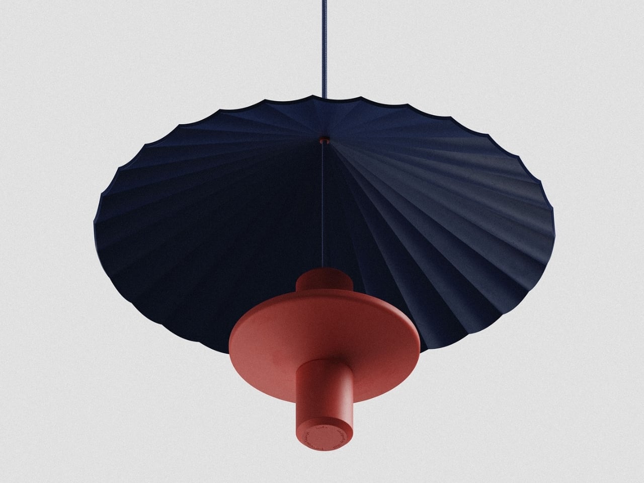
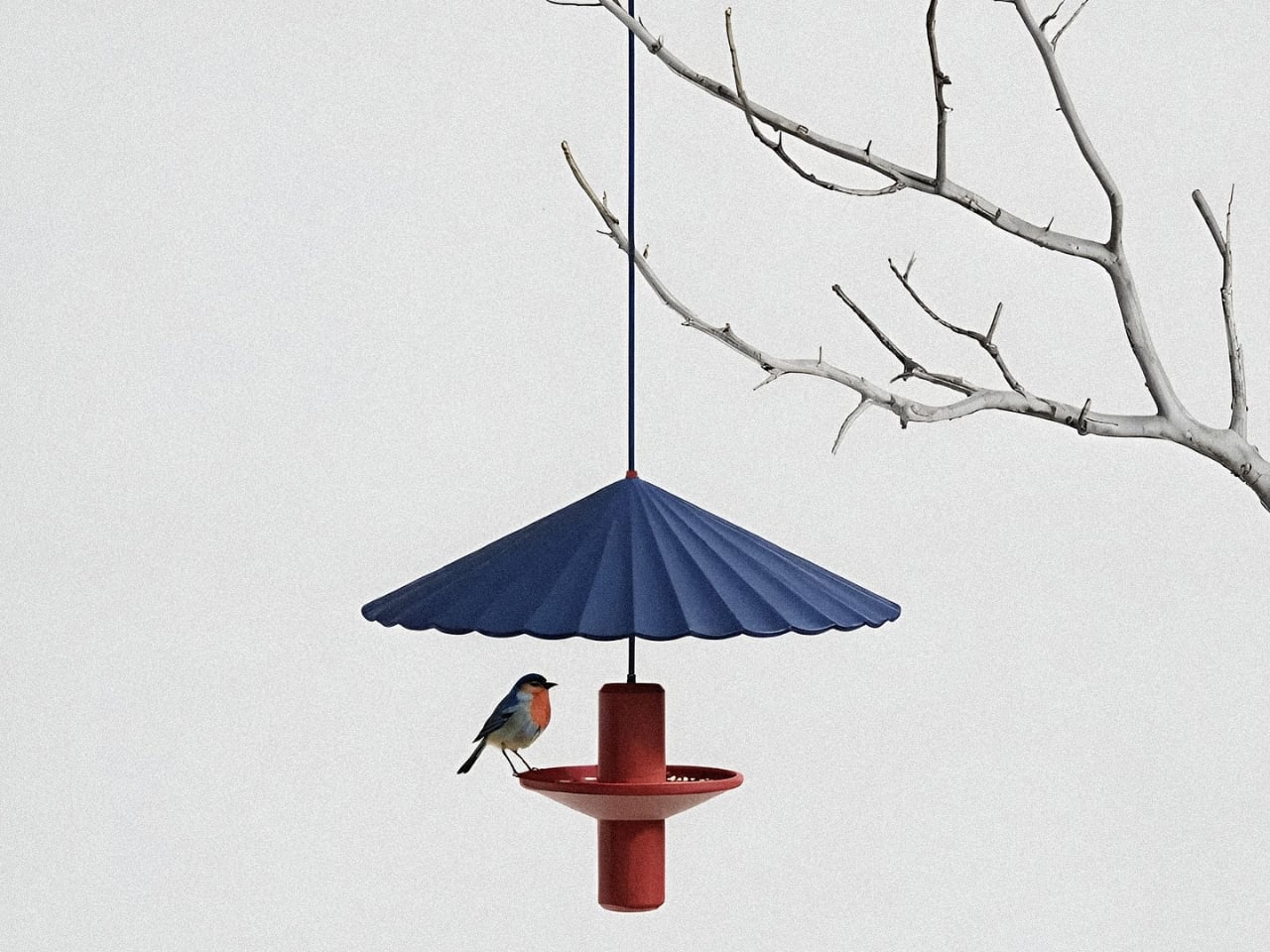
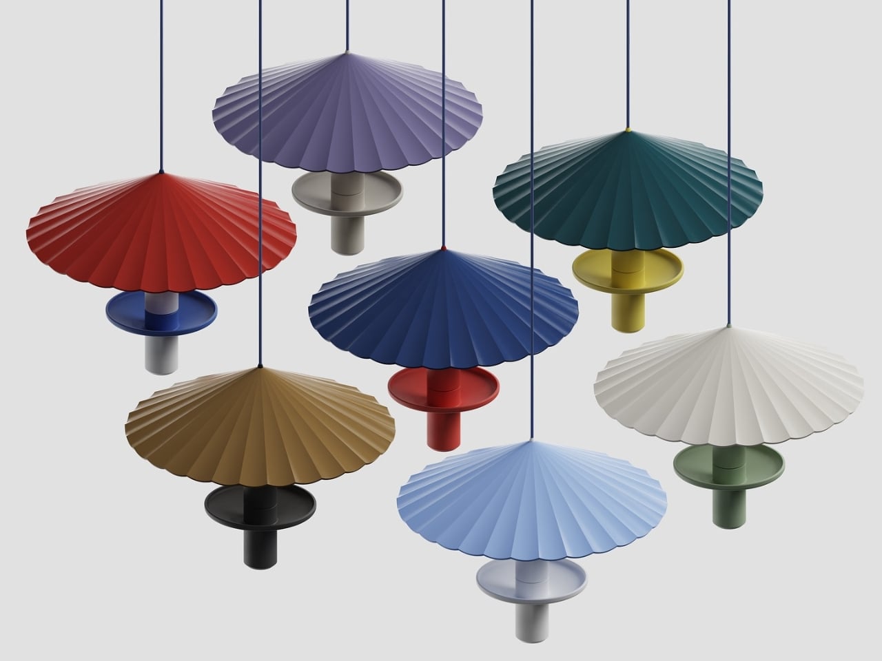
This elegant bird feeder reimagines a garden staple through the lens of Japanese design, drawing inspiration from the graceful, pleated form of a traditional wagasa umbrella. The umbrella canopy features delicate radial folds that fan outward in a sunburst pattern, creating both visual drama and functional shelter for visiting birds. Available in a stunning array of rich, matte colors, from deep navy and terracotta to sage green and mustard yellow, each feeder becomes a sculptural accent piece in your outdoor space, blending seamlessly with modern aesthetics while honoring centuries-old craftsmanship.

The design process by Ed.i.d reflects a beautiful marriage of tradition and technology, beginning with conceptual sketches and AI-assisted explorations in Vizcom.ai, then refined through detailed 3D modeling and photorealistic KeyShot rendering. The result is a piece that’s as thoughtful as it is beautiful: the umbrella canopy protects seed from rain while providing a safe dining spot for small songbirds, and the central cylindrical body adds architectural interest even when birds aren’t visiting. Whether hung from a tree branch or displayed as a cluster in varying colors, this bird feeder transforms functional outdoor decor into a gallery-worthy statement piece that celebrates both nature and design.

2. Ice Cube by Harry Chang
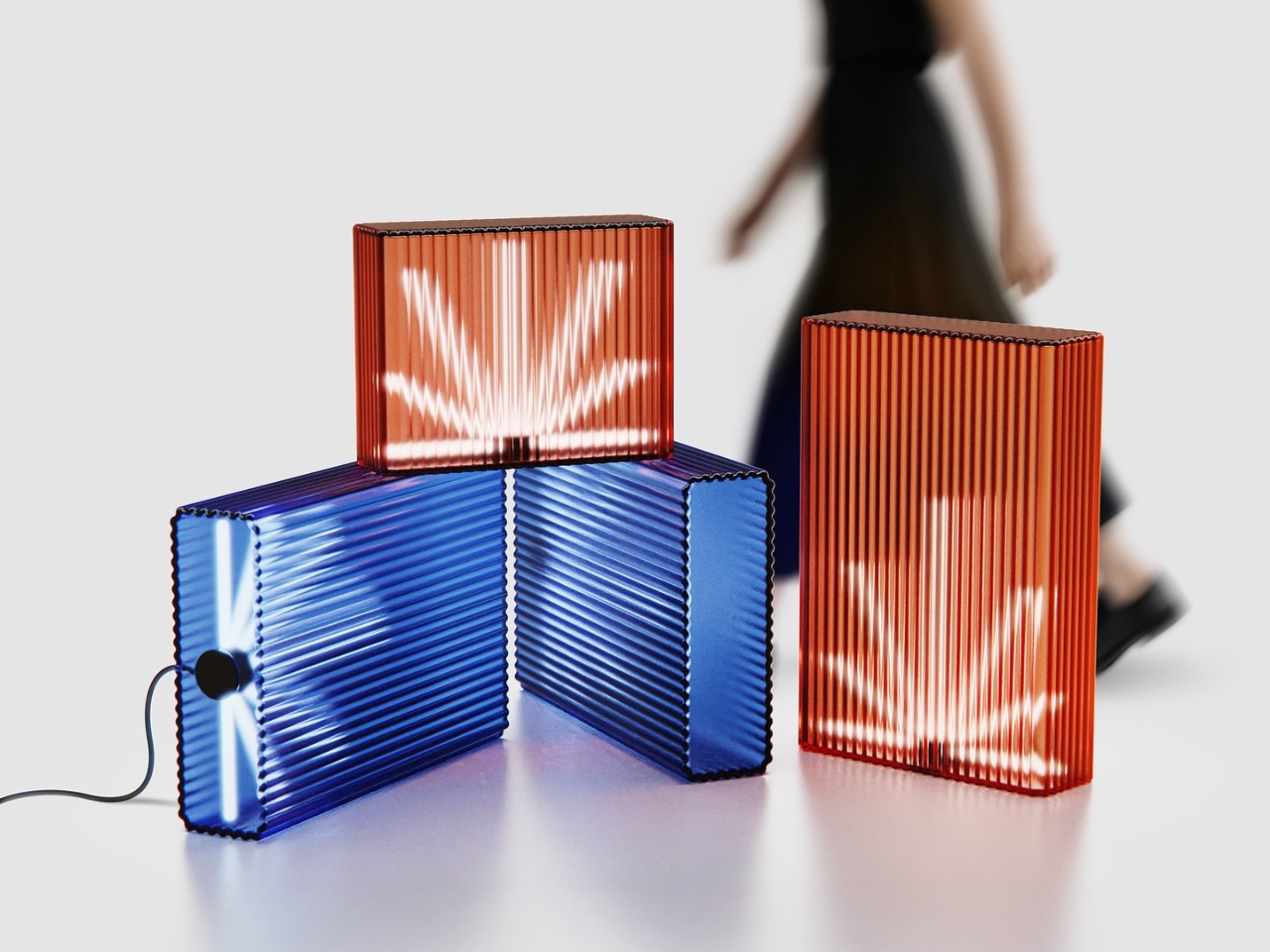
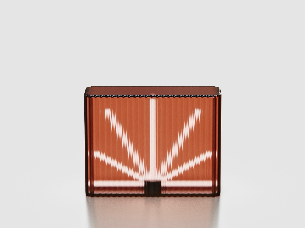
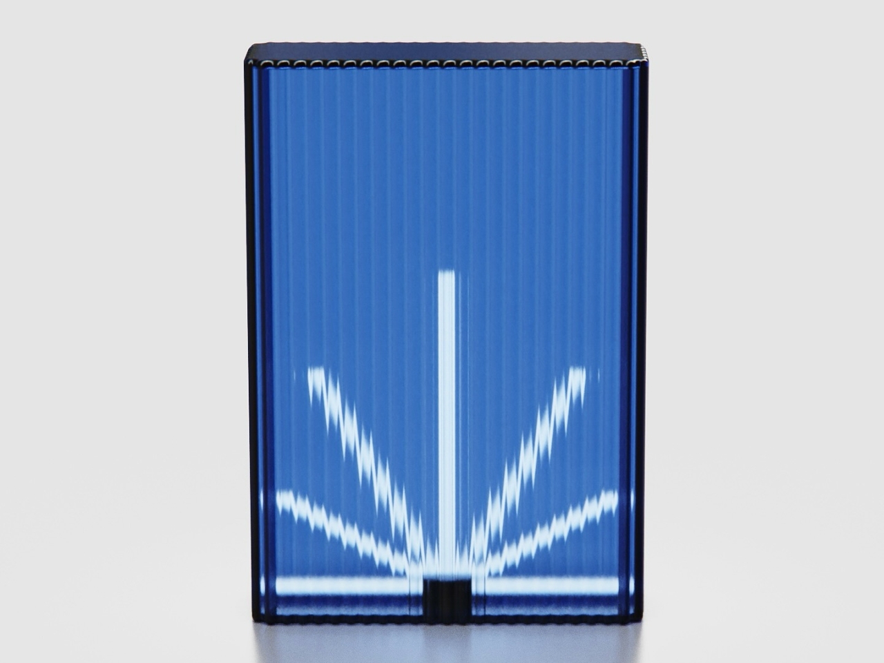
Ice Cube by Harry Chang draws from an unexpected blend of influences: the utilitarian geometry of office ceiling lights meets the electric, neon-soaked ambiance of Taiwan’s iconic betel nut shops. The result is a lighting concept that feels both nostalgic and utterly contemporary, capturing the raw energy of urban nightlife in a refined, sculptural form. Each piece is crafted from 1cm thick fluted glass that transforms ordinary light into something almost magical: the vertical ridges diffuse and refract illumination into starburst patterns that seem to pulse and shift as you move around them. Available in jewel-toned hues like sapphire blue and warm coral, these glowing glass blocks bring an unexpected dose of drama to any space.

What makes Ice Cube truly special is its modular flexibility. It is offered in two heights (70cm and 40cm), the lights can be stacked, clustered, or lined up to create custom lighting installations that double as spatial dividers. Imagine grouping several in varying heights to define a dining area, or placing a single glowing cube on a console table as a sculptural accent piece. The fluted surface doesn’t just look gorgeous; it creates an ever-changing play of light and shadow that turns walls and ceilings into canvases for radiant, geometric reflections.

3. Bold Text by Silvester Kössler
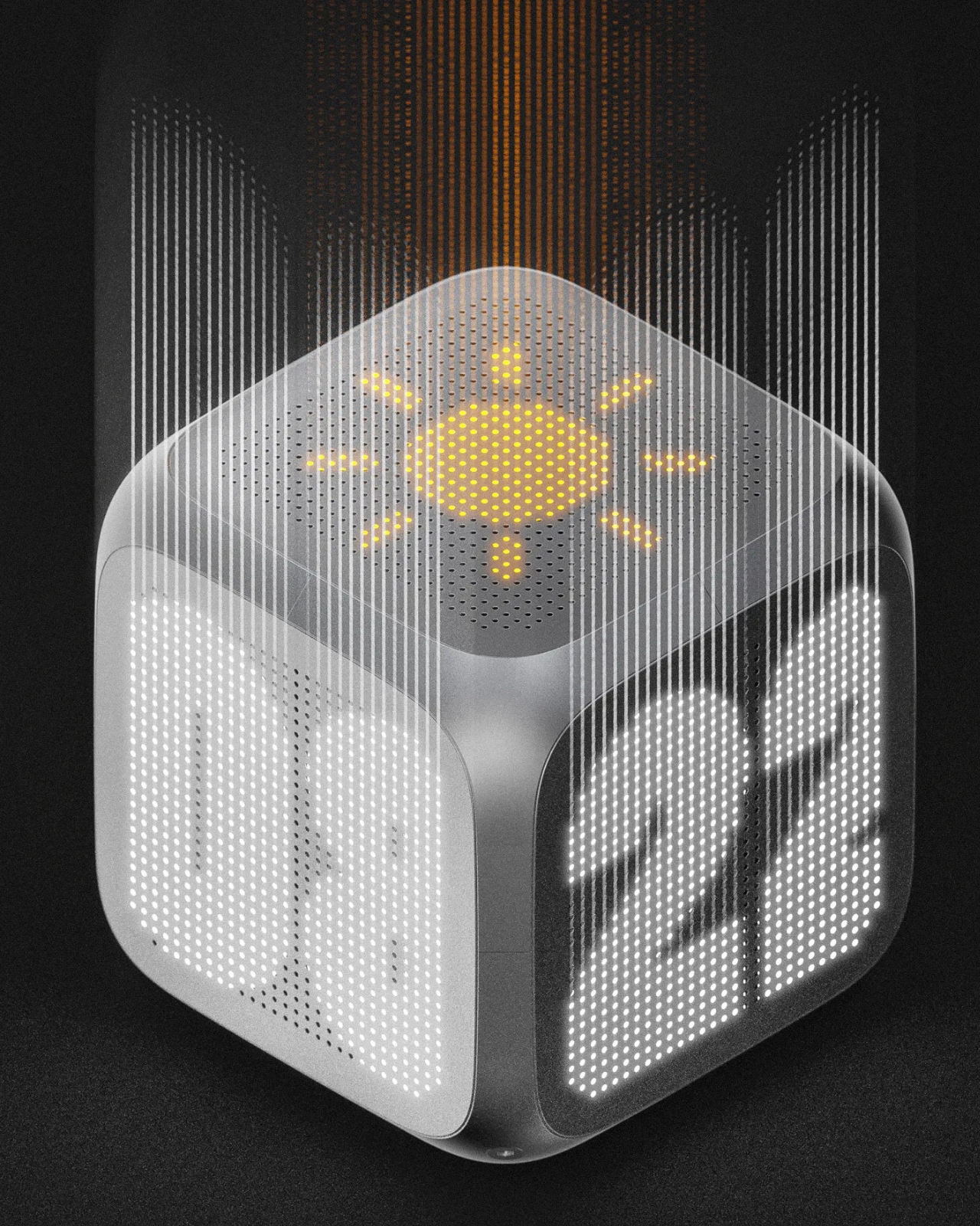
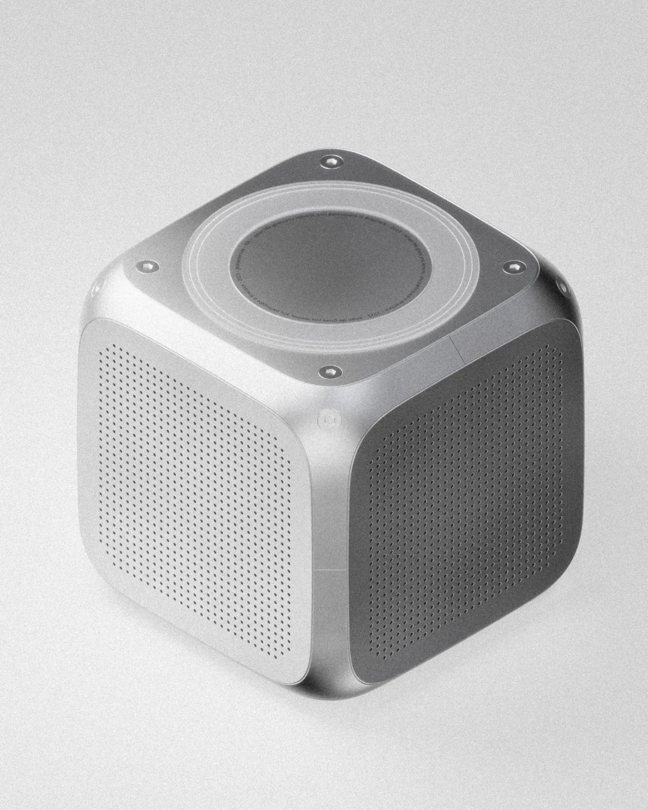
Bold Text reimagines the humble desk clock as a three-dimensional conversation piece that refuses to be ignored. Breaking away from the flat, one-sided displays we’re all used to, this cube-shaped design by Silvester Kössler wraps time around you, literally. Each face features perforated metal screens that conceal bold LED typography displaying hours, minutes, weather icons, and ambient information that glows through the industrial mesh like a secret waiting to be discovered. The genius here is in the positioning: this isn’t a clock you face head-on from your desk; it’s meant to exist in space, casting its dot-matrix glow from a console table, shelf, or corner where multiple sides can be appreciated at once. The aluminum frame and geometric form give it an architectural presence that feels equal parts tech-forward and brutalist sculpture.

Created as part of a design challenge to push beyond comfortable territory, this concept leans hard into graphical, almost cinematic rendering. Think of it as a clock that wants to be photographed from every angle. The perforated screens create mesmerizing moiré patterns when the LEDs illuminate beneath, and the bold, chunky typography ensures legibility without sacrificing style. There’s something beautifully paradoxical about a timepiece that demands you move around it, that rewards curiosity and changes its personality depending on your vantage point. Bold Text transforms timekeeping from a passive glance into an active, spatial experience. It’s proof that even the most utilitarian objects deserve a little drama.

4. Xylo by Kim Min Hyeok
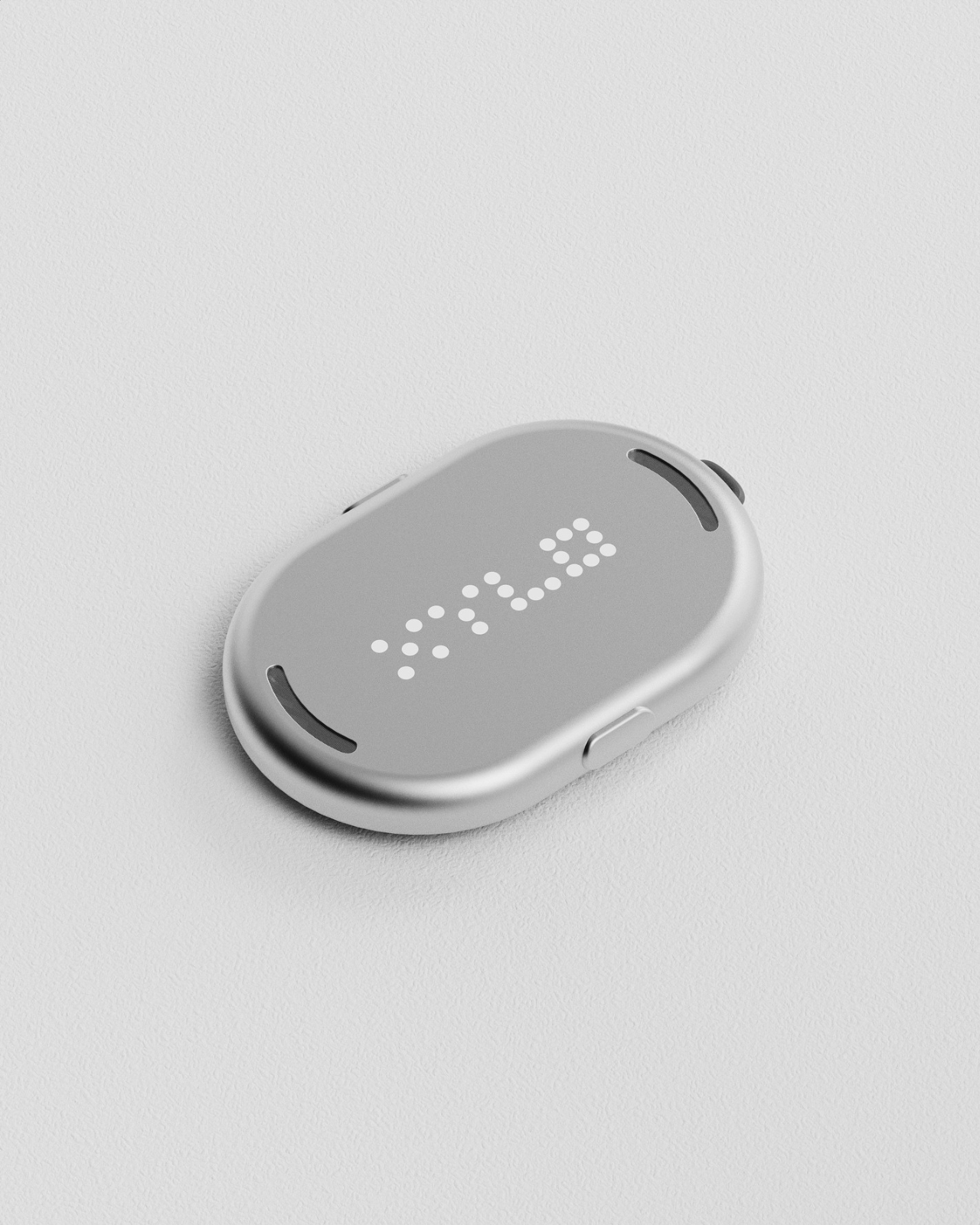
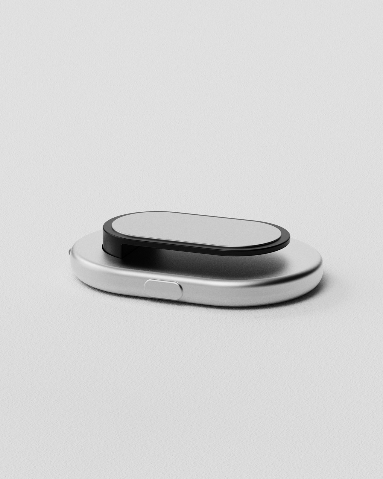
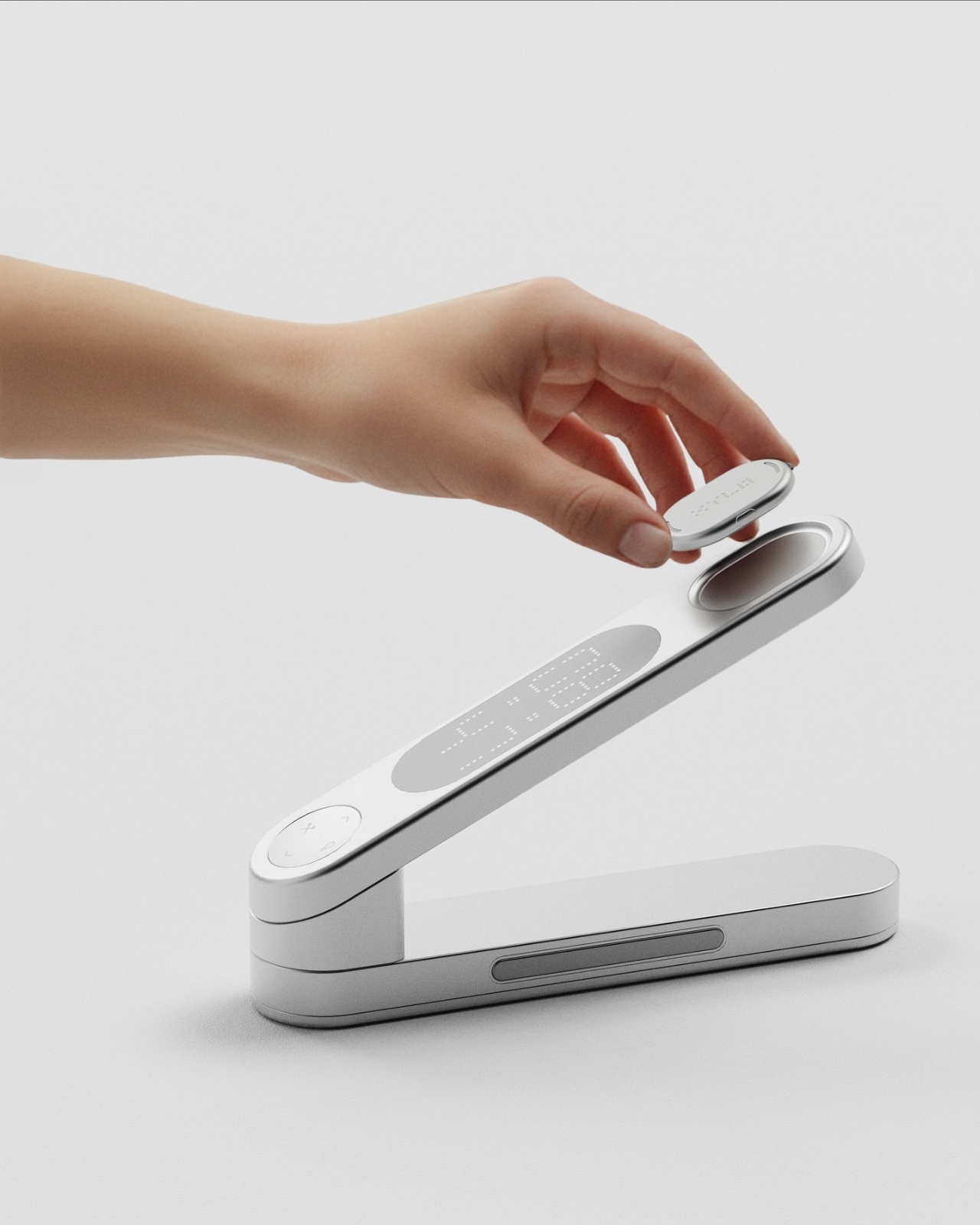
XYLO solves one of those frustrating everyday problems we all know too well: that frantic search for your favorite notebook, important documents, or that USB drive you swear you just had five minutes ago. Unlike our smartphones that chirp back when we call for them, most of our workspace essentials stay frustratingly silent. This sleek desk object designed by Kim Min Hyeok changes that game entirely. Inspired by the classic xylophone, XYLO features detachable tags that respond instantly with sound when you press the corresponding key on the minimalist base unit. Just attach a slim tag to anything you tend to misplace, and suddenly your most elusive items become findable with a single tap.

What makes XYLO so clever is how intuitive and elegant the whole system feels. The design borrows from the xylophone’s most satisfying quality: that immediate, tactile response when you strike a note. Each smooth, pebble-shaped tag magnetically nests into the base when not in use, creating a sculptural desk accessory that’s as beautiful as it is functional. The tags are lightweight enough to clip onto notebooks, slip into laptop sleeves, or attach to pouches and folders without adding bulk. For anyone who collects beautiful desk objects or just wants to bring a little more order (and a lot less stress) to their workspace, XYLO transforms the mundane task of keeping track of things into something almost playful.

5. Bedside Table by Mads Hindhede Svanegaard
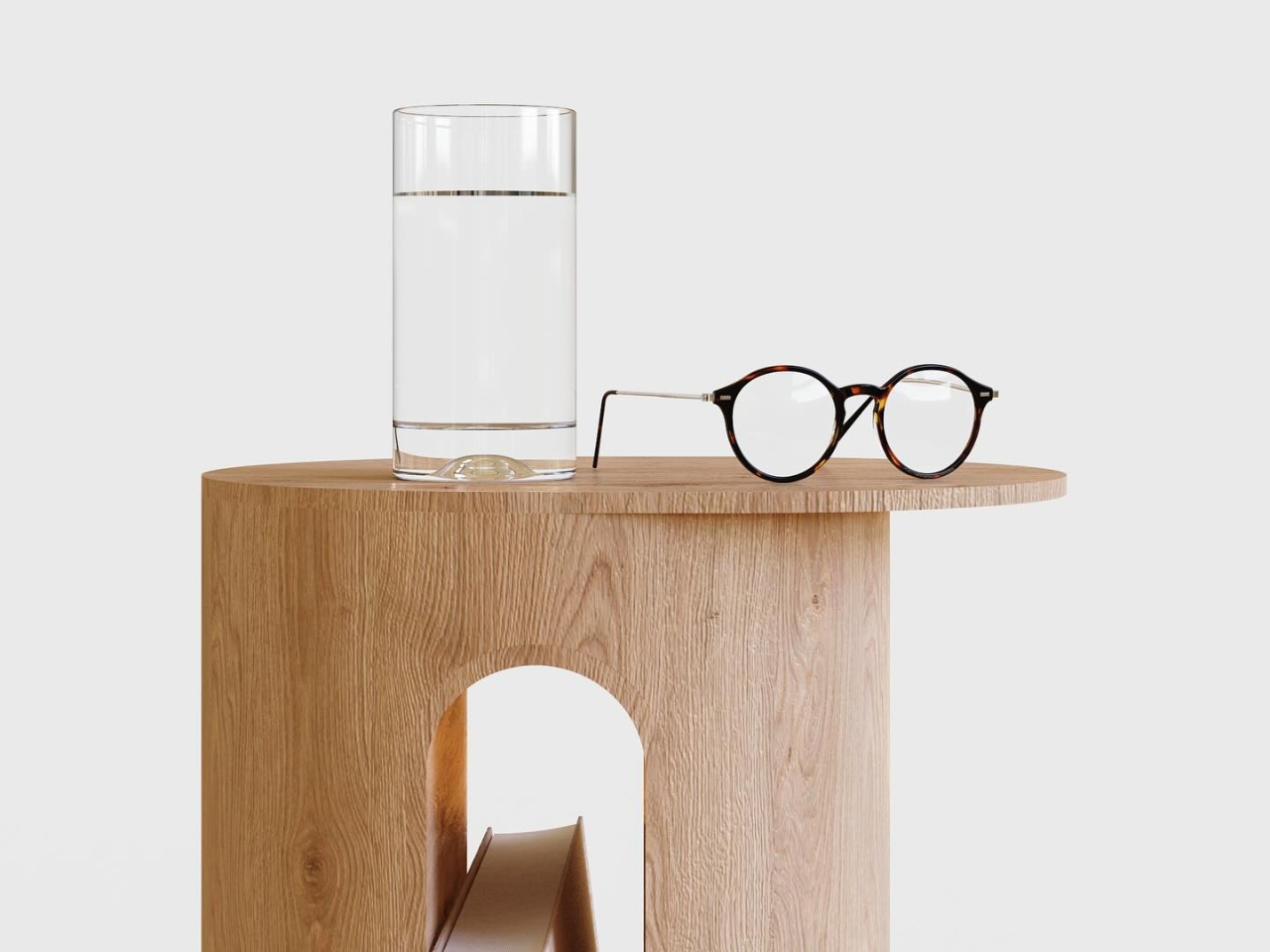
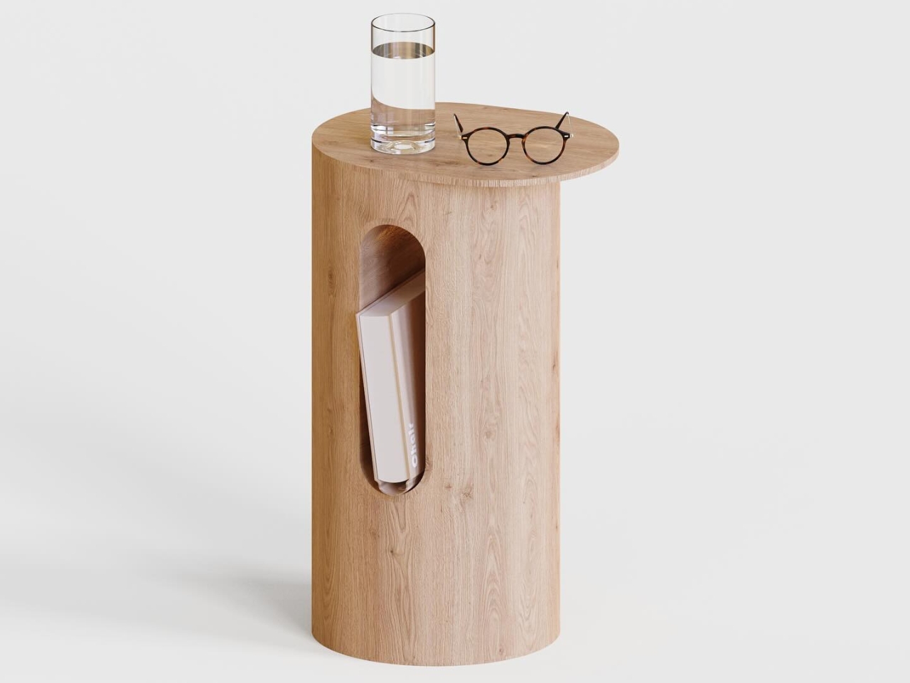
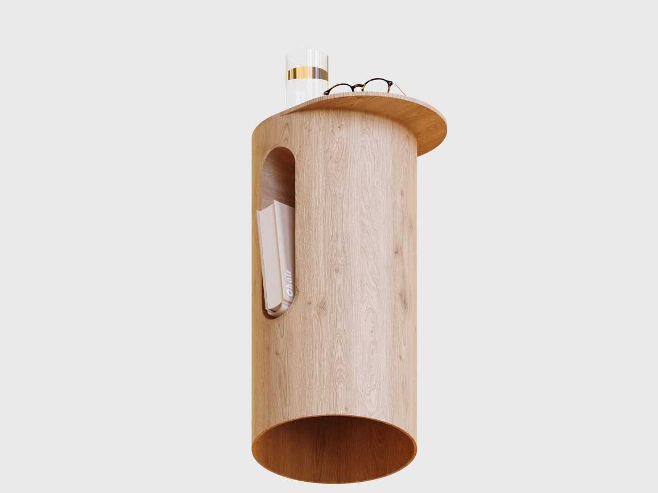
Sometimes the most beautiful designs are the ones that don’t try too hard, and this cylindrical bedside table is a perfect example of that philosophy. Crafted from warm, natural oak, the simple pedestal form by Mads Hindhede Svanegaard feels both modern and timeless, like a sculptural accent piece that just happens to hold your water glass and reading glasses. What makes it special is that clever arched cutout on the front, a built-in magazine or book holder that keeps your current read within arm’s reach without cluttering the top surface. The rounded tabletop offers just enough space for nighttime essentials, while the hollow cylinder design keeps the visual weight light and airy, perfect for smaller bedrooms or minimalist spaces.

Created as an exercise in efficient design workflow, this piece was modeled in Fusion 360 and rendered in KeyShot using traditional, old-school techniques with no AI assistance. The result is refreshingly straightforward: a side table that celebrates the beauty of natural wood grain and honest construction. The cutout detail casts gorgeous shadows that shift throughout the day, adding subtle visual interest without any fuss. It’s the kind of design that would feel at home next to a mid-century platform bed or a contemporary upholstered frame, proving that sometimes simplicity and thoughtful functionality are all you really need. For collectors who appreciate understated Scandinavian-inspired design and furniture that feels both functional and sculptural, this little table delivers quietly confident style.

Create your own Aesthetic Render: Download KeyShot Studio Right Now!

The post 5 Photorealistic Designs Rendered in KeyShot Every Minimalist Homebody Wants first appeared on Yanko Design.


This 15-Minute Human Washing Machine Finally Solved Shower Time

Remember when the future promised us flying cars and automated everything? Well, Japan just delivered on part of that promise with something wonderfully bizarre: a human washing machine. And honestly, after hearing about it, I kind of want one.

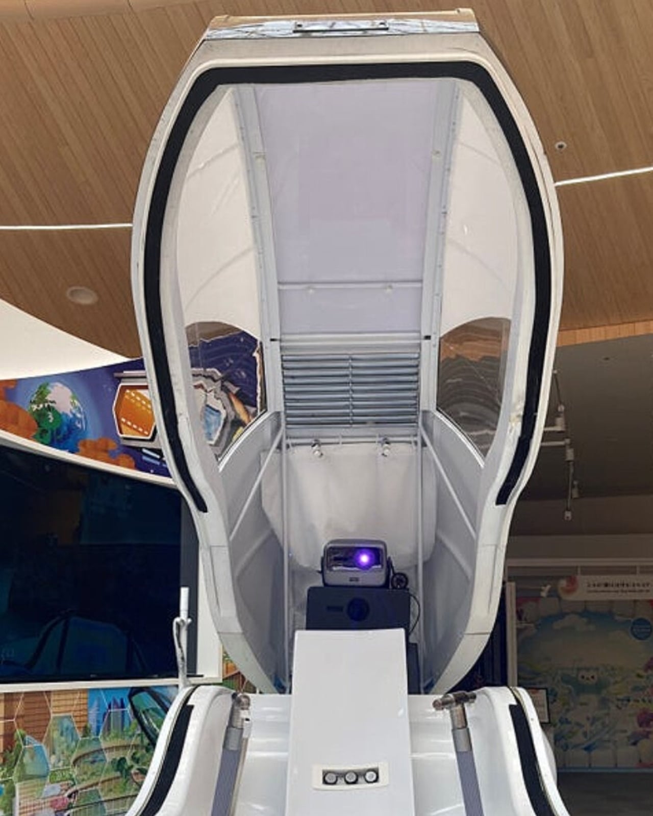
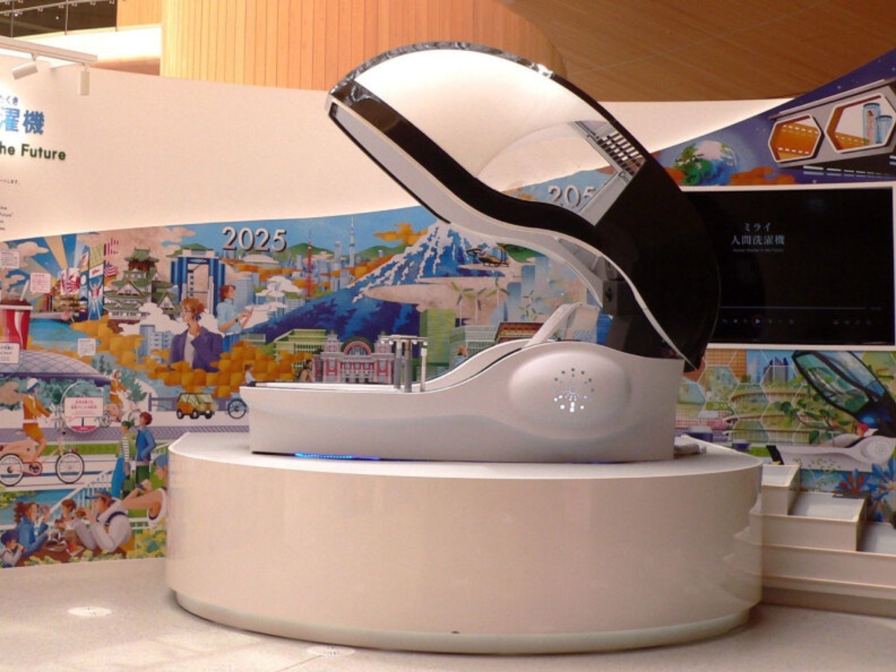
At Expo 2025 Osaka, Science Corporation unveiled the Future Human Washing Machine, and it’s exactly what it sounds like. You climb into a sleek capsule, sit down, and let the machine do its thing. Water splashes around you, micro- and ultrafine bubbles get to work cleaning your body, and then air blasts you dry. The whole experience takes about 15 minutes, which might actually be faster than your current shower routine if you’re anything like me.

Designer: Science Corporation

But this isn’t just some random quirky invention that popped out of nowhere. The concept actually has roots dating back to 1970, when Sanyo exhibited an Ultrasonic Bath at the original Osaka Expo. That version used pulsing jets, ultrasonic mist, and rubber massage balls to create what was essentially a human car wash. It was spectacular, photogenic, and totally impractical. The costs were so prohibitive that it never moved beyond being a futuristic showpiece.

Fast forward 55 years, and Science Corporation’s chairman Yasuaki Aoyama decided to resurrect the concept, but with a 2025 upgrade. The new version ditches the gimmicky bruteness of its predecessor for something more refined and genuinely useful. We’re talking about biometric sensors that monitor your vital signs and stress levels, AI that adjusts water temperature and pressure based on what your body needs, and even a display that shows calming or positive images if the sensors detect you’re tired or stressed.

The technology behind it is genuinely impressive. Those ultrafine bubbles aren’t just for show. They’re designed to cleanse more effectively than regular water alone, blending traditional Japanese bathing culture with cutting-edge innovation. And unlike the 1970 version that was pure spectacle, this one has a clear practical application in mind.

Science Corporation isn’t just building this for tech enthusiasts to marvel at during expo season. They’re actually targeting nursing care facilities, where something like this could be genuinely transformative. Think about it: for elderly individuals or people with mobility issues, the simple act of bathing can be challenging, uncomfortable, or even unsafe. An automated system that can clean and dry someone comfortably while monitoring their health status? That’s not just clever engineering. That’s solving a real problem.

During the expo, which ran from April through October, visitors got to experience the machine firsthand. The process is surprisingly straightforward. You step in, sit down in the transparent capsule, and the system takes over. Water fills the chamber with those special bubbles doing their cleaning magic. Meanwhile, sensors are constantly checking in on you, and if you’re looking tense, the screen adjusts to show you something more soothing. Once the wash cycle finishes, the water drains automatically and the drying process begins with air circulating around your body.

What strikes me most about this project is how it represents a shift in how we think about automation. We’ve gotten used to robots handling manufacturing and algorithms managing data, but automating something as personal and intimate as bathing feels different. It requires a level of trust and sophistication that goes beyond just mechanical efficiency. The machine needs to understand human comfort, adapt to individual needs, and create an experience that feels safe and relaxing rather than clinical and weird.

There’s no word yet on commercial availability for regular consumers, and honestly, I’m not sure how many people would rush out to buy one even if it hit the market tomorrow. The concept might still feel too futuristic, too impersonal, or just plain too strange for mainstream adoption. But for specific use cases, particularly in healthcare settings, the potential is undeniable.

Whether the Future Human Washing Machine becomes a common sight in homes or remains a specialized tool for care facilities, it’s a fascinating glimpse into how technology continues to reimagine even our most basic daily routines. And who knows? Maybe in another 55 years, we’ll look back at our manual showers the same way we now view hand-washing clothes in a river. Sometimes the future arrives in the strangest packages.

The post This 15-Minute Human Washing Machine Finally Solved Shower Time first appeared on Yanko Design.

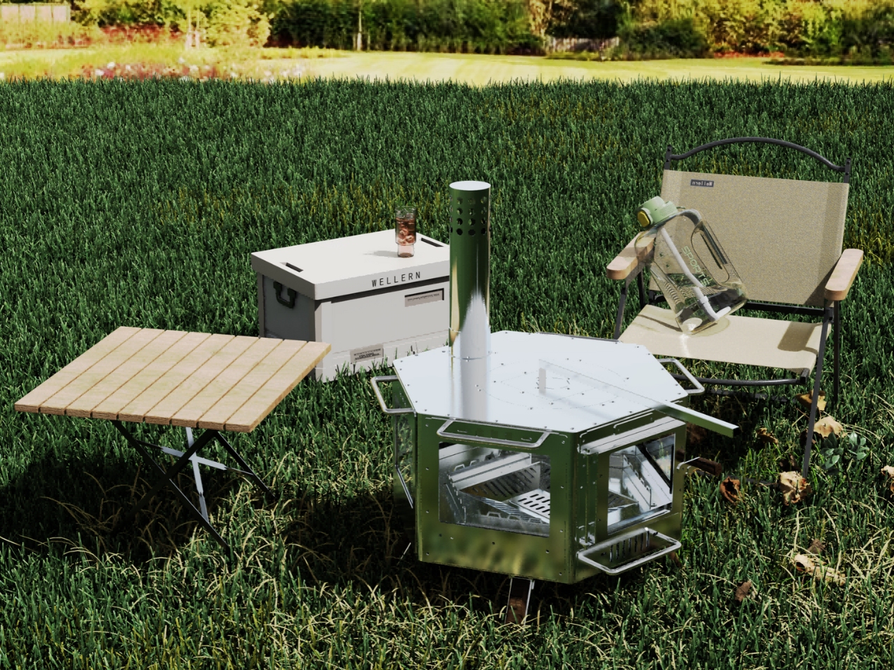
This Stove Just Reinvented Firewood With Stainless Steel

There’s something primal about gathering around a fire. That crackling warmth, the dancing flames, the way it becomes the centerpiece of any gathering. But traditional firewood stoves? They’re often heavy, inefficient, and leave a pretty hefty carbon footprint. Designer Chen Jun looked at this ancient cooking method and asked a simple question: what if we could make it better for the 21st century?

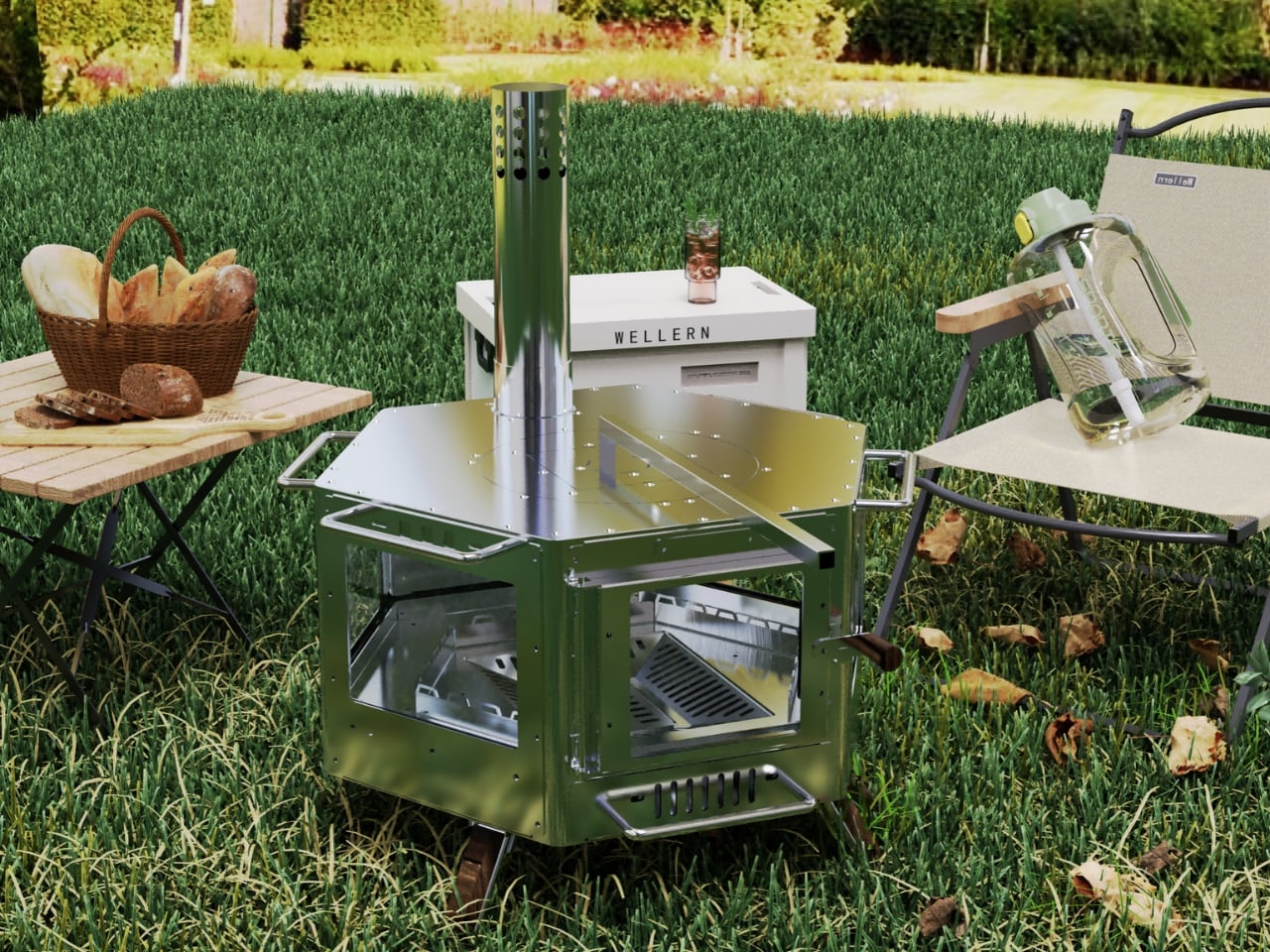
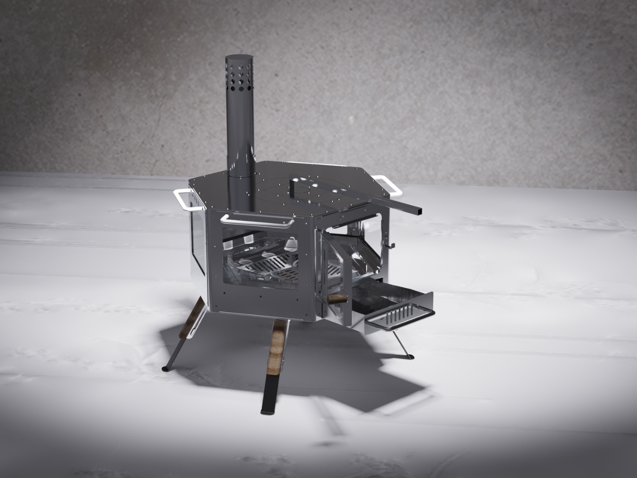
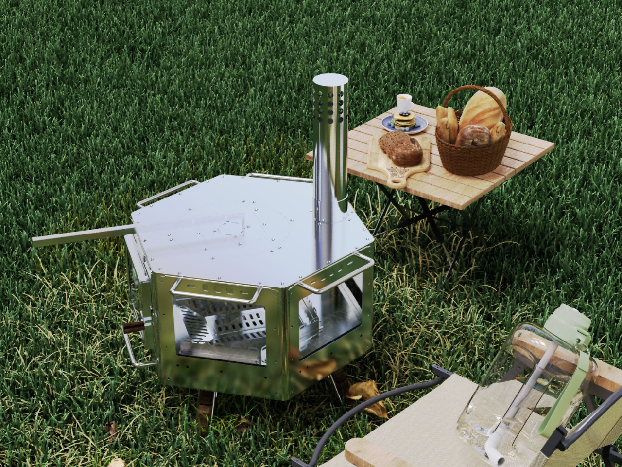
Chen Jun’s stainless steel firewood stove isn’t just another pretty appliance trying to look good in your Instagram feed. This is serious engineering wrapped in sleek design, tackling real problems that have plagued wood-burning stoves for generations. The secret? A sophisticated modular system that completely rethinks how we approach portable heating and cooking.

Designer: Chen Jun

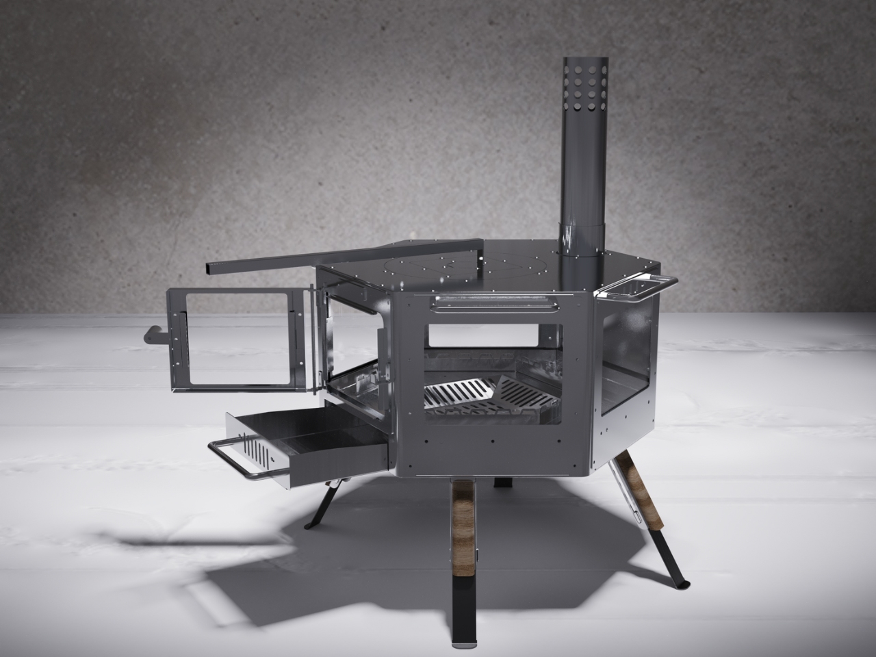
Here’s what makes it clever: the entire stove can be disassembled and reassembled without needing a PhD in engineering. If you’ve ever wrestled with flat-pack furniture and won, you can handle this. That modularity isn’t just about convenience (though being able to pack up your stove is pretty convenient). It’s about creating something that can adapt to different situations, different users, and different needs.

The combustion system is where things get really interesting. We’ve all stood next to a smoky campfire or dealt with a stove that seems to eat through wood like there’s no tomorrow. Chen Jun’s design tackles both issues head-on with an internal structure that’s been optimized for maximum efficiency. The combustion is so clean that emissions come in significantly lower than national standards. That’s not just meeting the bar, that’s clearing it with room to spare.

But efficiency means nothing if the thing only works in perfect conditions with perfect fuel. That’s why the stove is designed to handle multiple fuel types. Got hardwood? Great. Only softwood available? Also fine. This flexibility makes it genuinely useful across different environments, from backcountry camping to rural homesteads where fuel options might be limited.

Now here’s where it gets really smart: Chen Jun created two distinct versions for two very different use cases. The rural version comes equipped with a waste heat recovery system. Think about how much heat typically just disappears into thin air with traditional stoves. This system captures that energy and puts it to work, maximizing every bit of fuel you burn. For households relying on wood heat regularly, that efficiency translates to real savings over time.

The outdoor version takes a different approach, focusing on portability. It features a foldable design that shrinks the stove down to a fraction of its operating size. Anyone who’s ever tried to pack for a camping trip knows the tetris game of fitting everything into limited space. A stove that folds down? That’s the kind of practical innovation that outdoor enthusiasts will actually use.

Maintenance has always been the Achilles heel of durable goods. Something breaks, and suddenly you’re looking at expensive repairs or just replacing the whole unit. Chen Jun addressed this with quick-release core components. The parts that typically wear out or need cleaning can be accessed and replaced without dismantling the entire stove. It’s the difference between a product that lasts five years and one that lasts fifteen.

The choice of stainless steel isn’t just aesthetic (though it does look fantastic). Stainless steel is recyclable, durable, and doesn’t require protective coatings that might off-gas when heated. It’s a material choice that aligns with the stove’s broader environmental goals while delivering the structural integrity needed for something that will face repeated heating and cooling cycles. What really stands out is how this design bridges two worlds. It’s sophisticated enough for the design-conscious crowd who want their gear to look good, but practical enough for people who genuinely need reliable heating and cooking solutions. That’s a tough balance to strike, and most products lean heavily toward one side or the other.

For anyone interested in sustainable living, outdoor adventures, or simply well-designed products that solve real problems, this stove represents something important. It’s proof that traditional doesn’t have to mean outdated, and that innovation isn’t always about adding more complexity. Sometimes it’s about taking something fundamental, something humans have relied on for millennia, and making it work better for how we live today.

The post This Stove Just Reinvented Firewood With Stainless Steel first appeared on Yanko Design.

This Lucky Four-Leaf Stool Transforms Into Whatever You Need

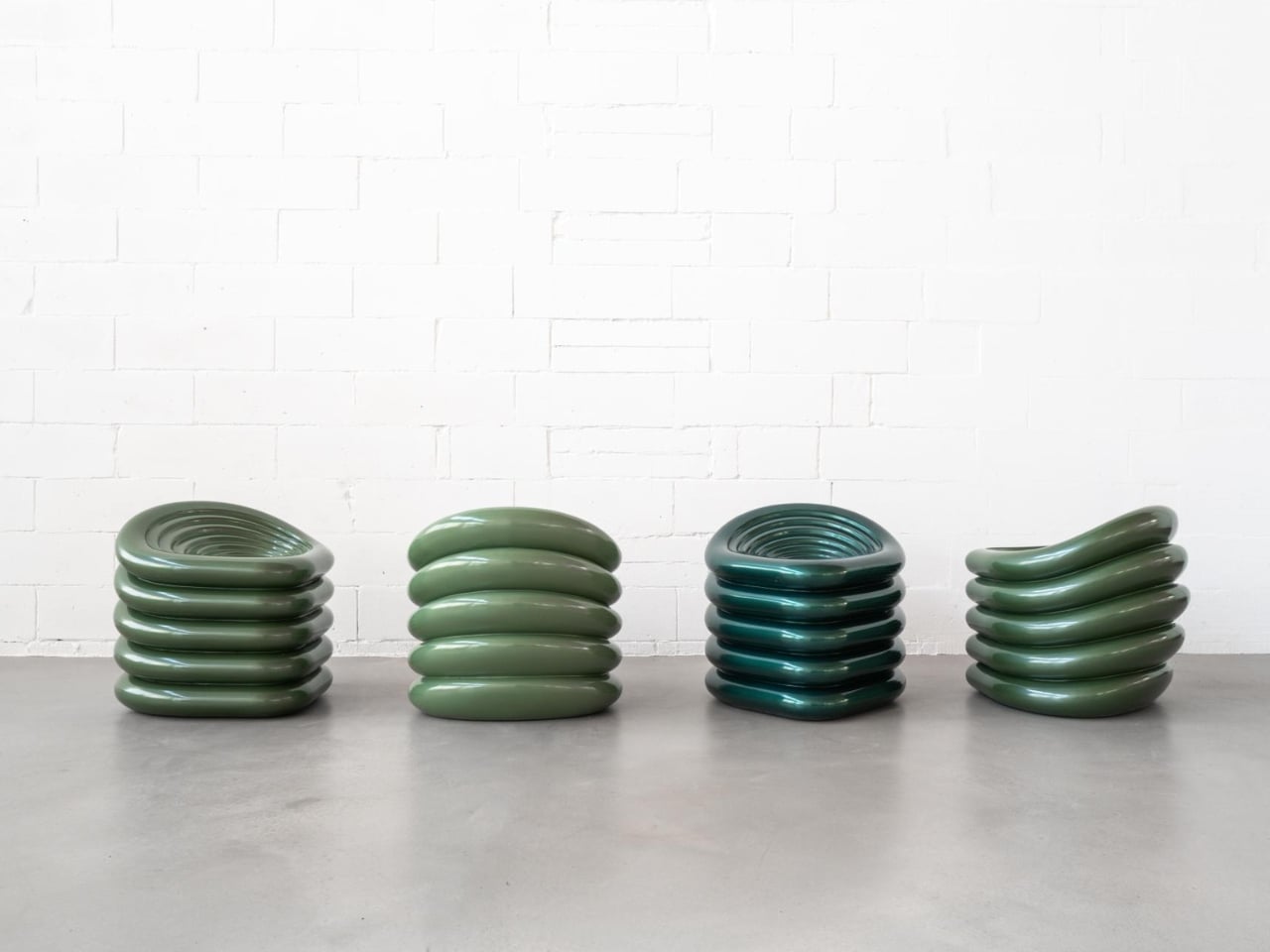
You know that feeling when you rearrange your furniture and suddenly your whole space feels different? ARTA Architects just bottled that magic into something you can hold in your hands. Meet Clover Collective, a modular stool that’s basically the Swiss Army knife of seating, and it’s turning heads from Milan to Hong Kong.

Here’s the thing about good design: it shouldn’t just look pretty sitting in a museum. It needs to work for real life, adapt to your moods, and ideally, not destroy the planet in the process. The folks at ARTA clearly got that memo because Clover Collective checks all those boxes and then some.

Designer: ARTA Architects

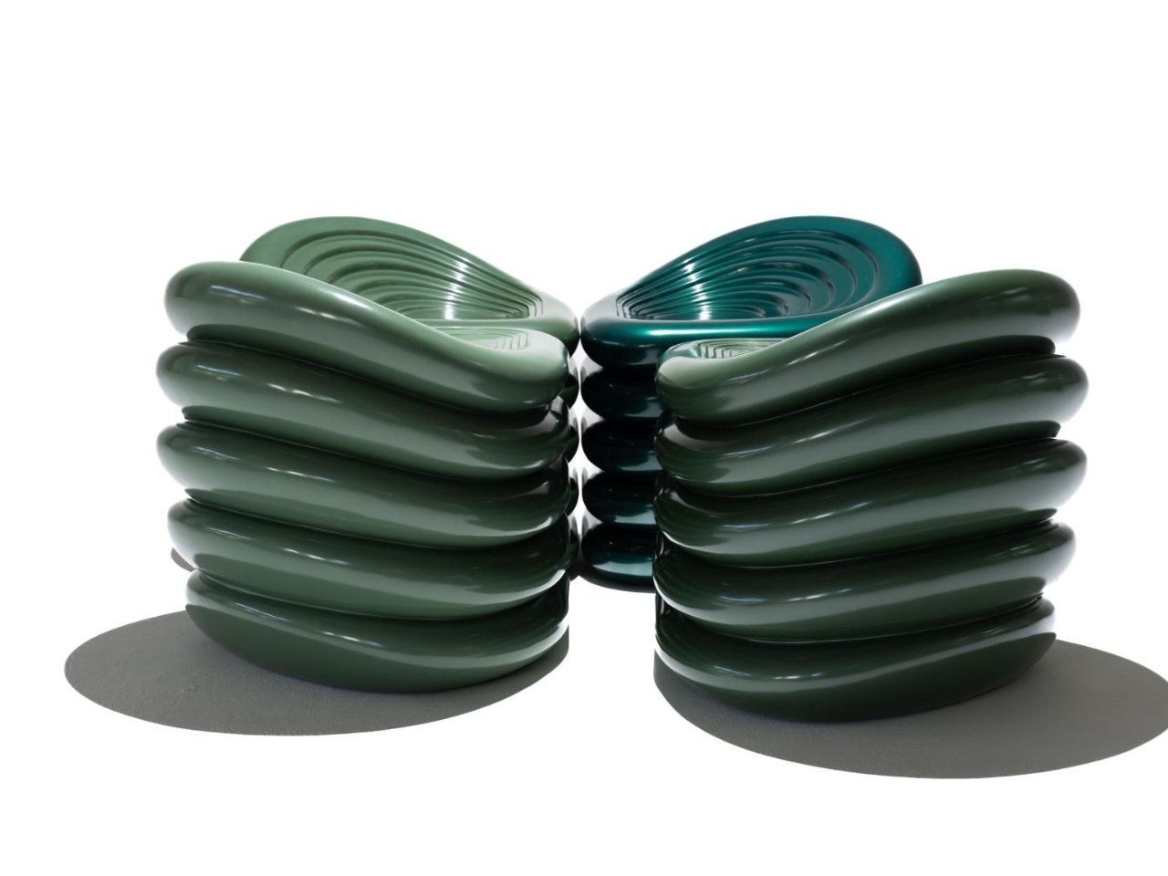
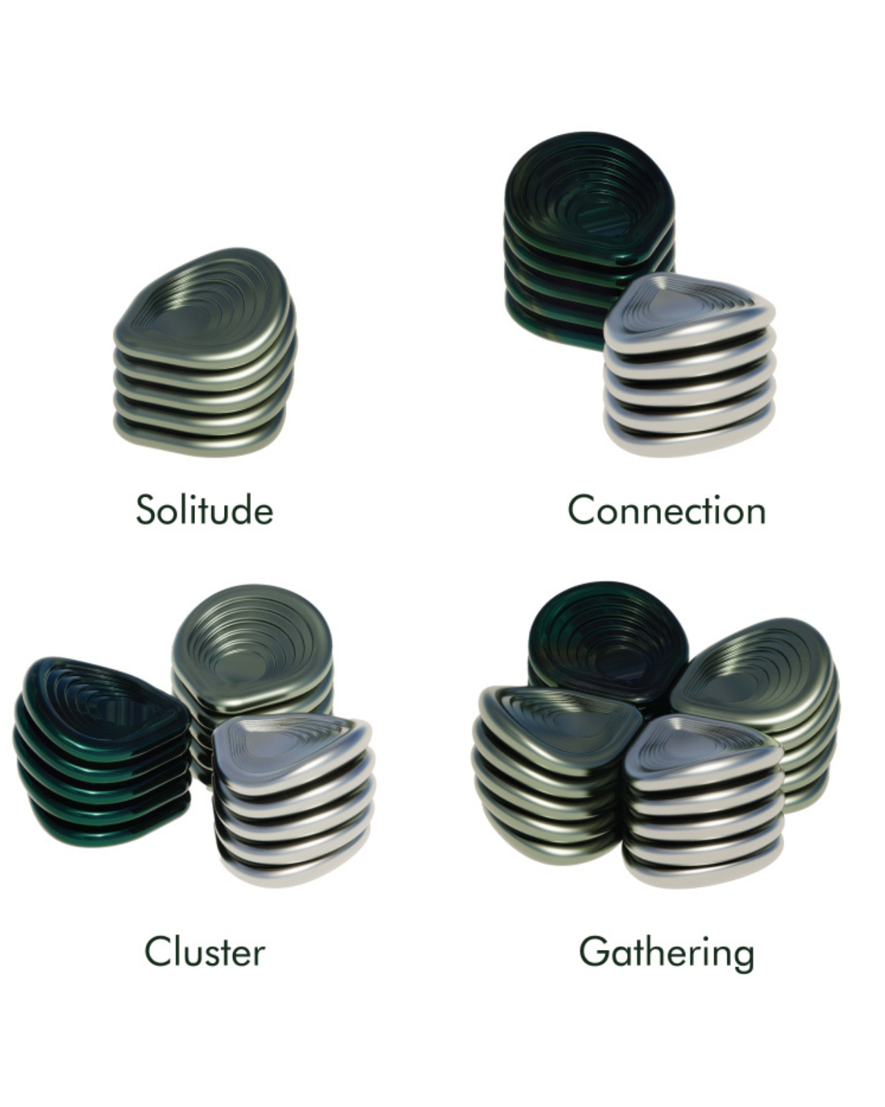
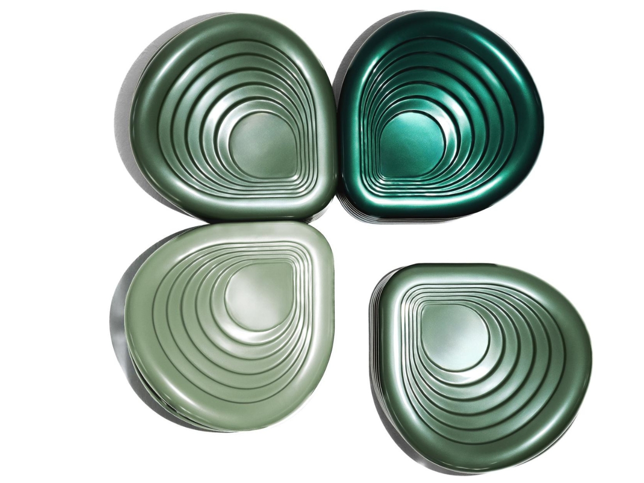
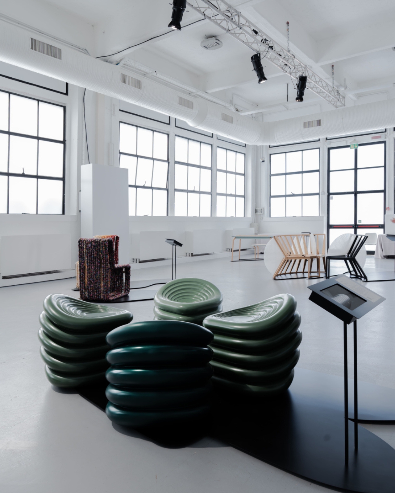
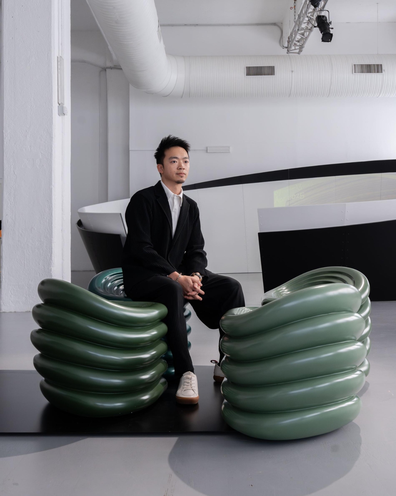
The concept is brilliantly simple. Inspired by the four-leaf clover (you know, that lucky little plant you spent hours searching for as a kid), each piece features five ergonomic layers that stack and connect in multiple ways. Think of it like grown-up LEGO blocks, but way more sophisticated and actually comfortable to sit on. You can use one stool solo for those introspective coffee moments, push several together for an impromptu dinner party, or arrange them into completely different configurations depending on whether you’re hosting book club or just need a spot to tie your shoes.

What really sets this design apart is its versatility. The modular nature means you’re not stuck with one static piece of furniture that only works in one spot doing one thing. Your living room setup today doesn’t have to be your living room setup tomorrow. Hosting friends? Reconfigure. Need more floor space for yoga? Stack them up. Moving to a smaller apartment? These pieces travel and adapt with you. It’s furniture that actually respects the fact that life isn’t static.

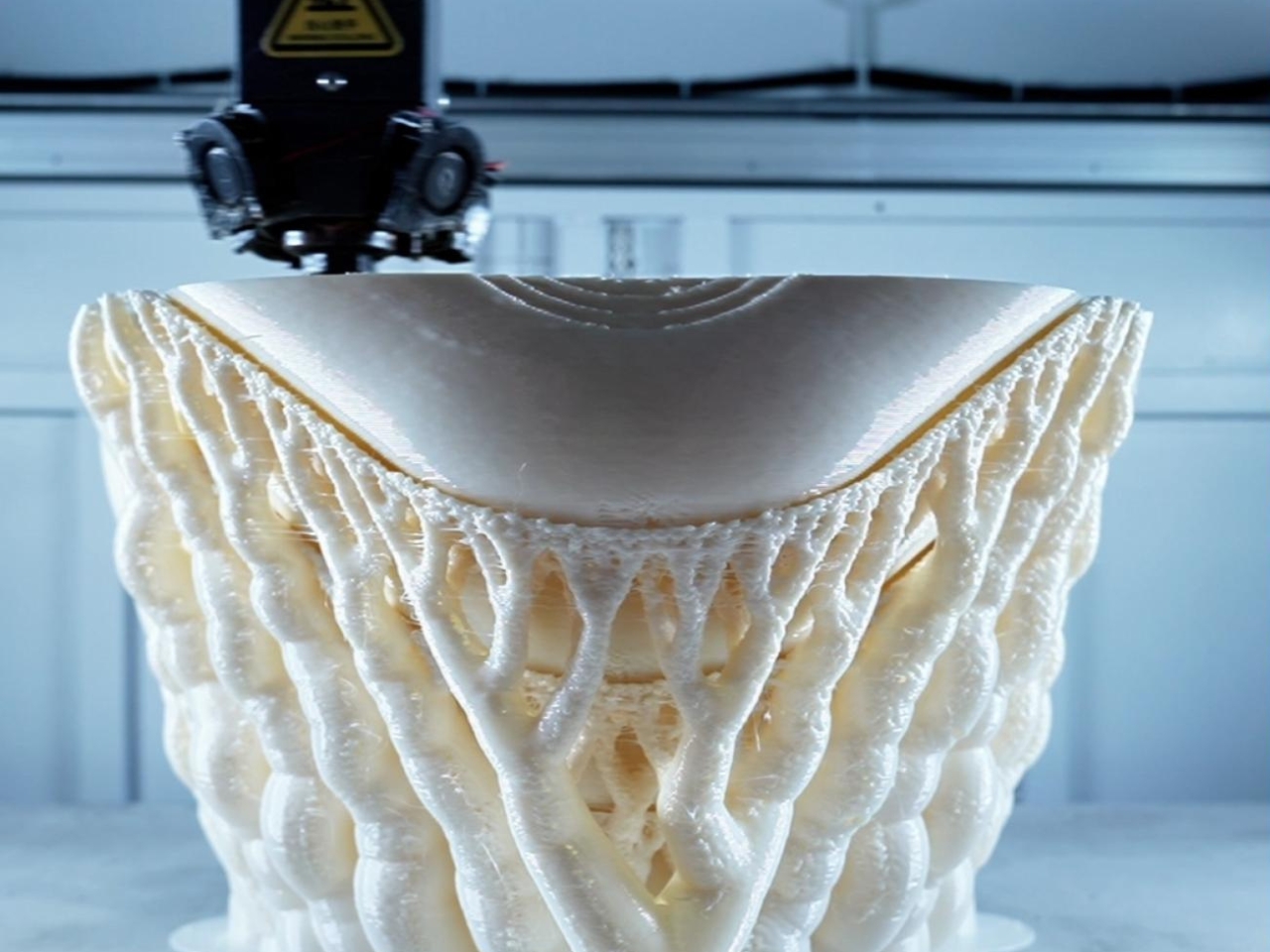
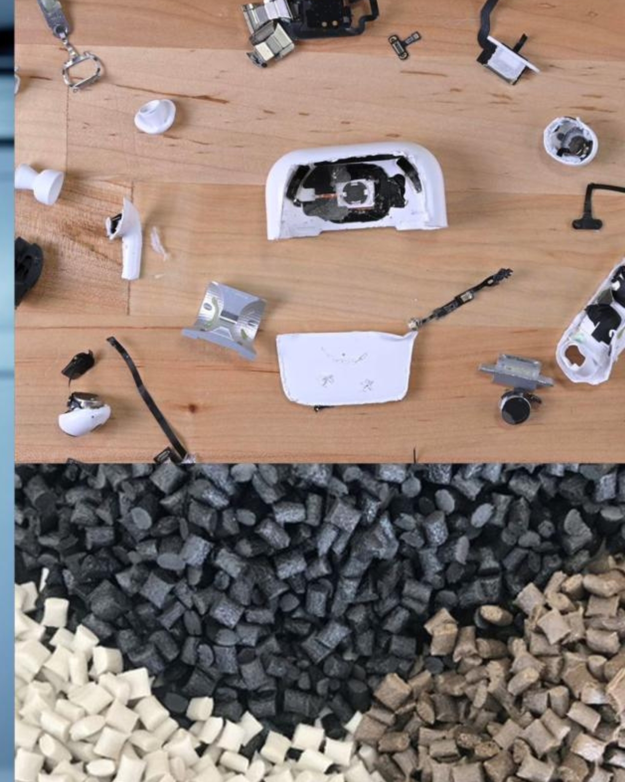
But here’s where it gets even better. ARTA didn’t just focus on form and function. They made these stools from 3D-printed recycled ABS plastic, the same stuff that’s in old consumer products that would otherwise end up in landfills. Every curve and contour of the Clover Collective represents hope, quite literally upcycling trash into treasure. In an era where we’re all trying to make better choices about consumption, having furniture that’s both beautiful and sustainable feels like a small victory. Beyond the accolades, what’s compelling is how this piece represents a shift in thinking about what furniture can be. We’re moving away from the idea that you buy a couch or a chair and you’re stuck with it for life. Instead, we’re embracing pieces that evolve with us.

The five-layered construction isn’t just aesthetic either. It creates stability while maintaining an elegant, almost organic silhouette that doesn’t scream “I’m recycled plastic!” The balance between structural integrity and visual lightness is tricky to pull off, but ARTA nailed it. These stools look like they could be at home in a minimalist Scandinavian loft or a colorful maximalist studio. What strikes me most is how Clover Collective embodies this broader cultural moment we’re in. We want flexibility. We want sustainability. We want things that can keep up with how we actually live, not how design magazines think we should live. Whether you’re in a tiny apartment where every square foot counts or you love rearranging your space on a whim, this kind of adaptive design just makes sense.

There’s something hopeful about furniture that refuses to be just one thing. In a world that often demands we fit into rigid categories, Clover Collective is over here saying “why not be everything?” It’s a stool. It’s a side table. It’s a conversation starter. It’s proof that sustainable design doesn’t have to be boring or preachy. ARTA Architects has created something that feels both timely and timeless, which is the sweet spot every designer dreams of hitting. It’s the kind of piece that makes you rethink what’s possible when creativity meets conscience, and honestly, we could use more of that energy in our homes and our world.

The post This Lucky Four-Leaf Stool Transforms Into Whatever You Need first appeared on Yanko Design.

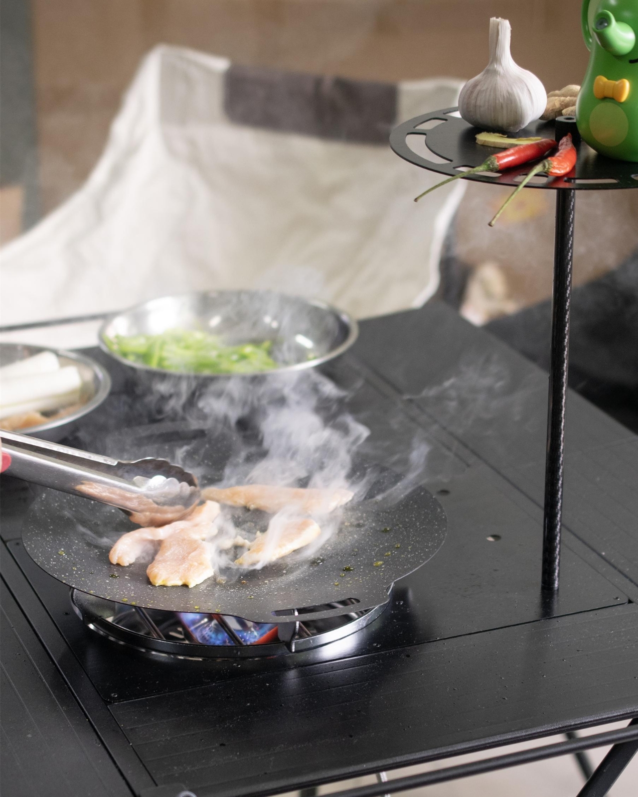
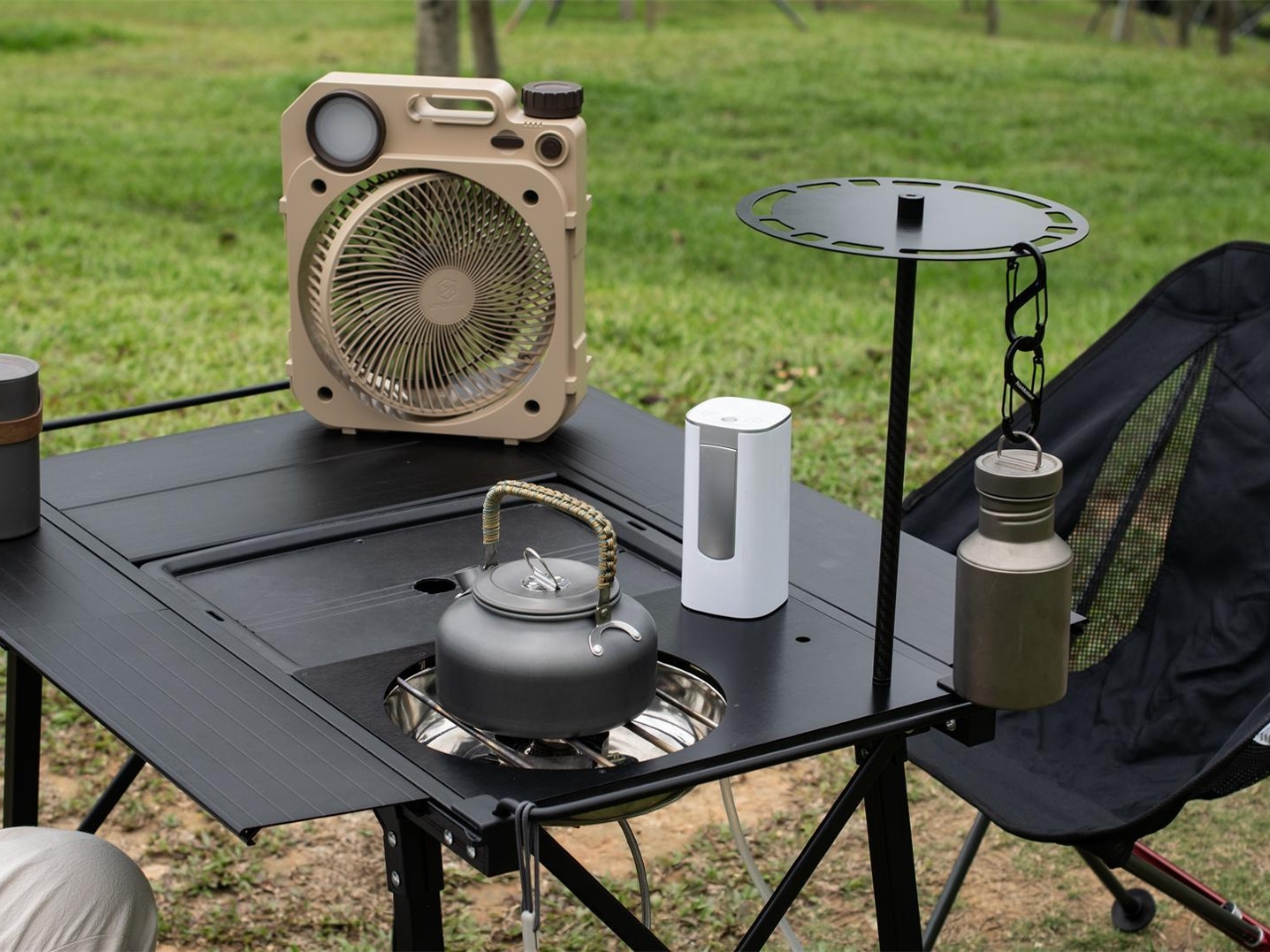
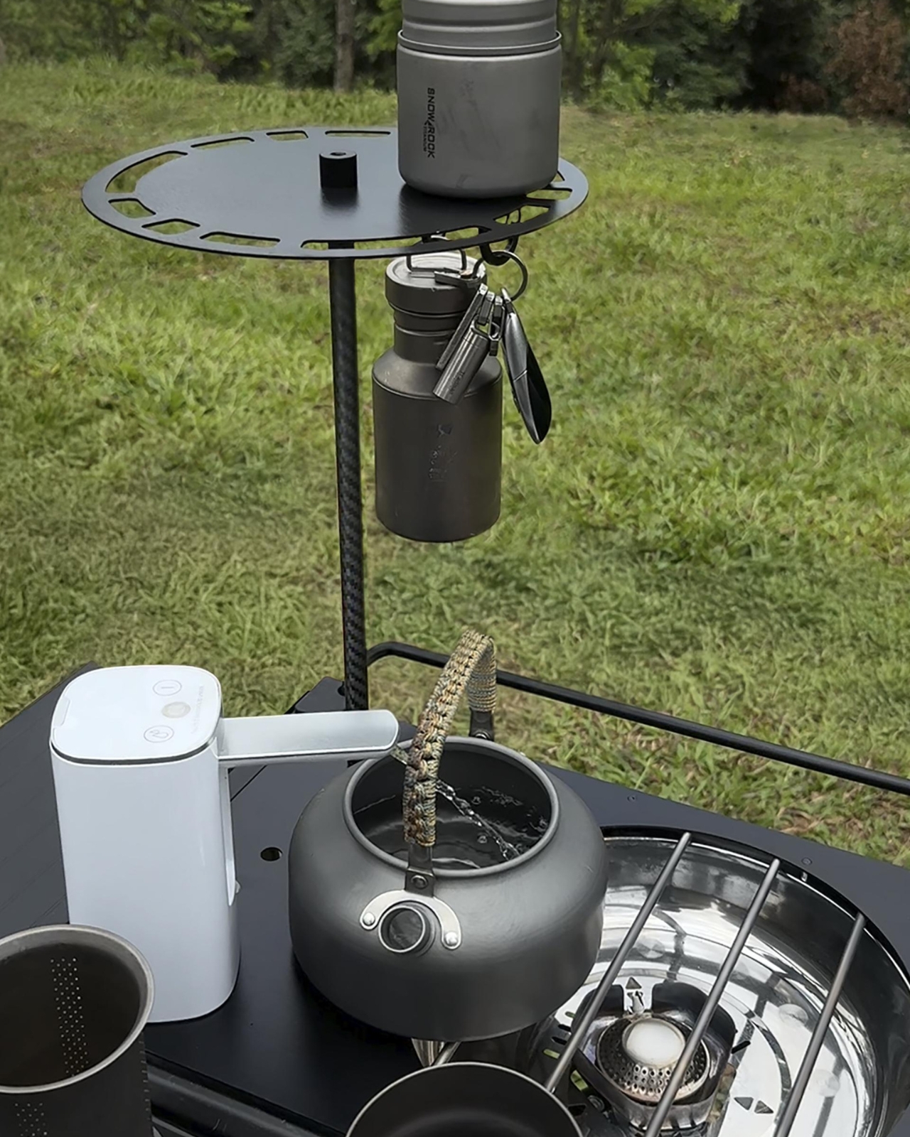
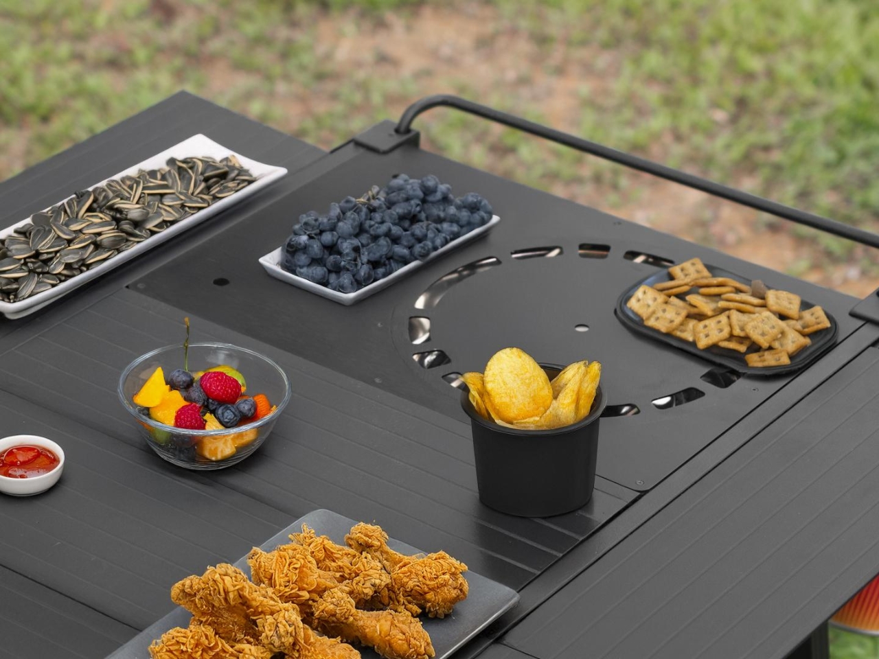
The Invisible Kitchen Revolution: IGT Phantom Stove

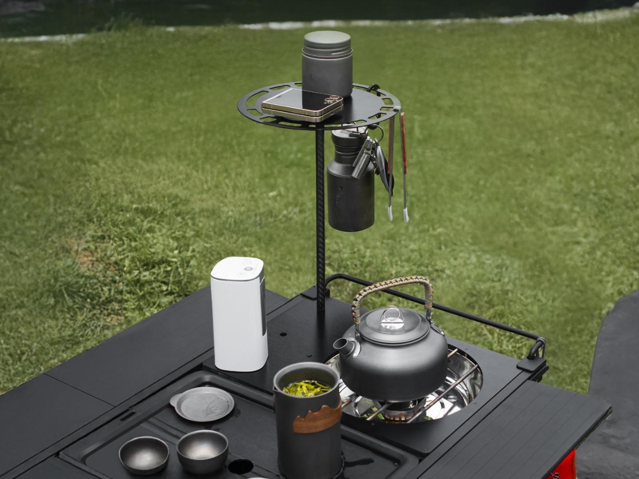
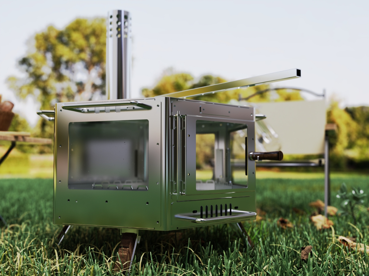
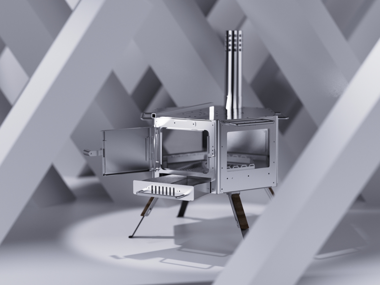
You know that moment when technology becomes so intuitive it practically disappears? That’s exactly what Shenzhen Juyouhang Technology Co. just pulled off with their IGT Phantom Stove, a MUSE Design Award winner that’s making waves in the outdoor cooking scene for all the right reasons.

At first glance, the name “Phantom” might sound a bit dramatic for a camping stove. But spend a minute looking at this design, and you’ll get it. This isn’t your clunky, utilitarian camping gear that screams “I’m roughing it in the wilderness.” Instead, it’s a sleek piece of equipment that bridges the gap between serious outdoor functionality and the kind of minimalist aesthetic we’ve come to expect from our favorite tech gadgets.

Designer: Shenzhen Juyouhang Technology

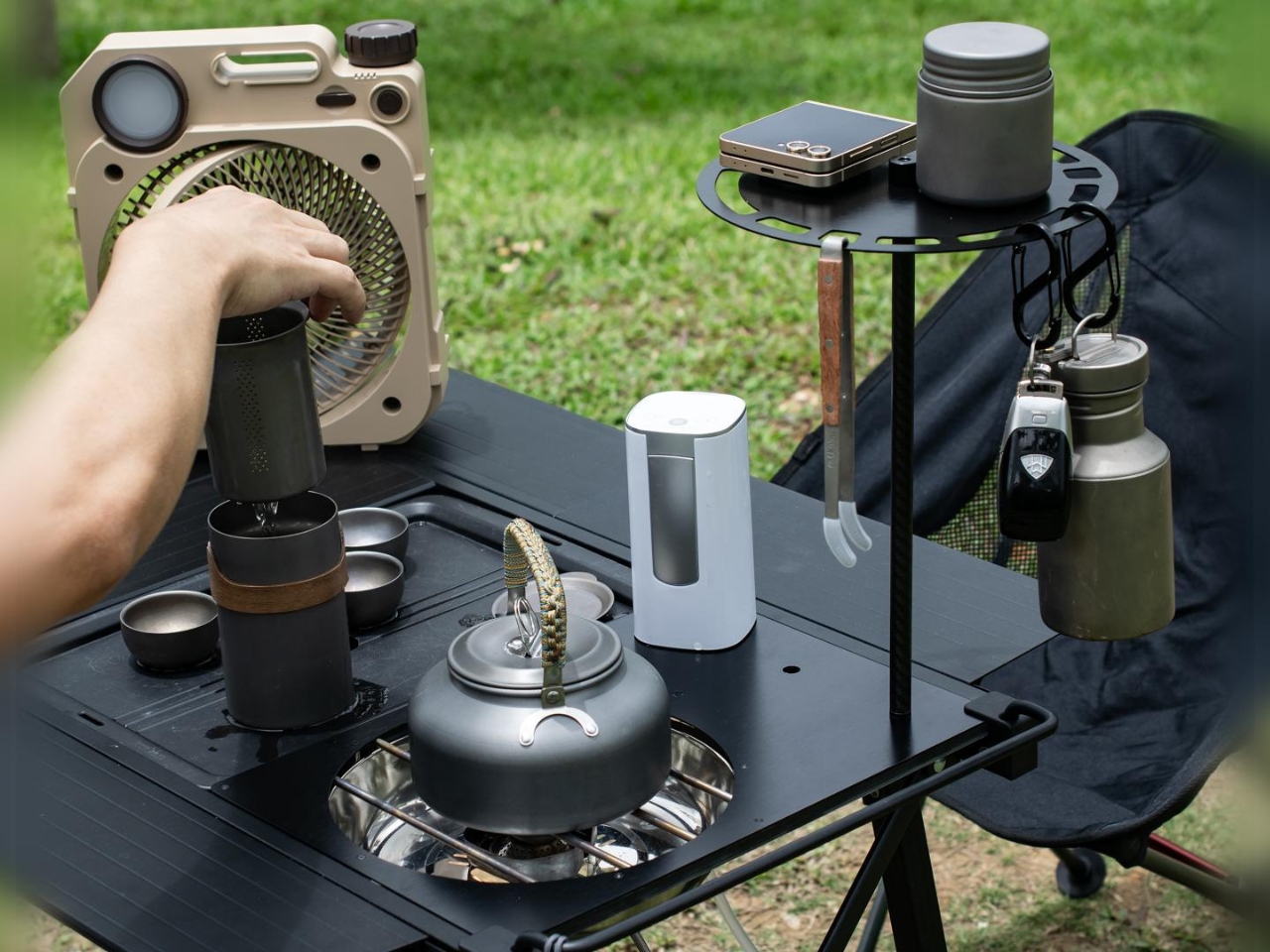
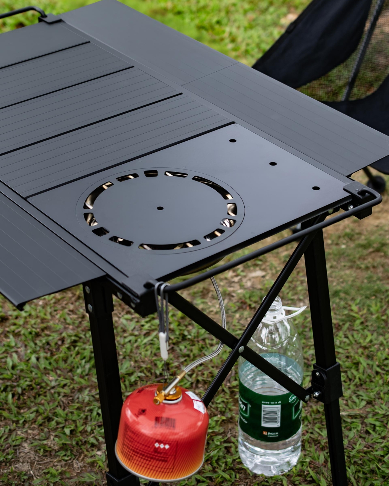
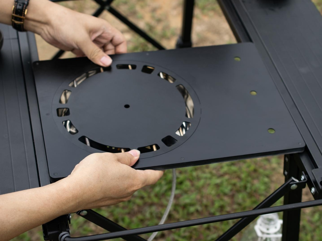
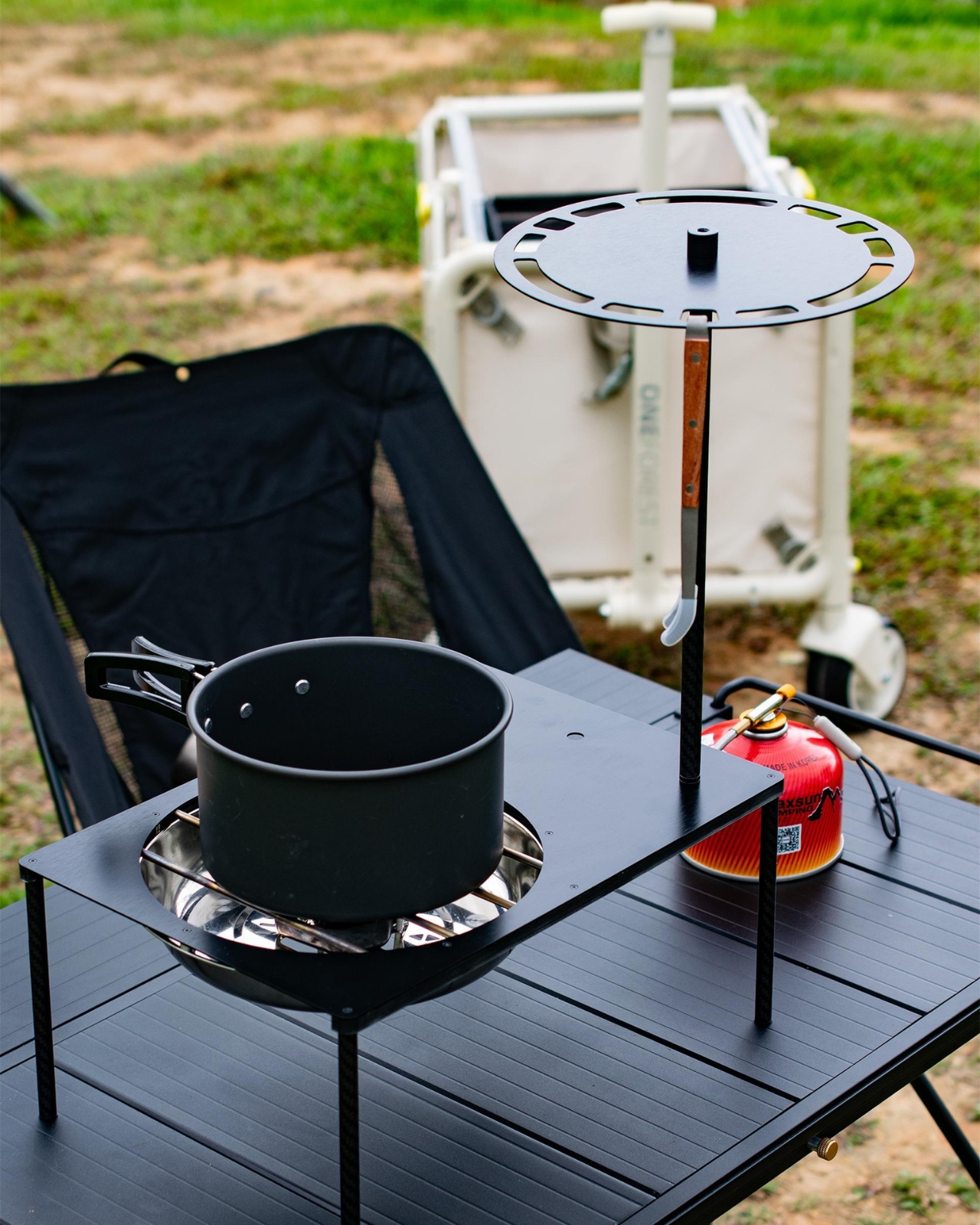
The IGT system, for those not already deep into the camping world, stands for Iron Grill Table, a modular camping kitchen concept that originated in Japan. Think of it like LEGO blocks for your outdoor cooking setup. Different components slot into a unified system, letting you customize your camp kitchen however you want. The Phantom Stove takes this concept and refines it with a sophistication that feels more Apple Store than sporting goods aisle.

What makes this stove particularly clever is how it manages to be simultaneously present and absent. When you need it, it’s there, ready to boil water or cook a gourmet camp meal. When you don’t, its foldable design and clean lines mean it practically melts into your setup. There’s no visual clutter, no awkward bulk taking up precious space in your gear collection or on your camp table.

The design philosophy here speaks to a broader shift happening in outdoor equipment. We’re moving past the era when camping gear had to look rugged and intimidating to be taken seriously. Today’s outdoor enthusiasts want products that perform brilliantly but also respect their aesthetic sensibilities. They’re taking Instagram-worthy photos of their campsites, hosting friends for glamping weekends, and expecting their gear to look as good as it functions.

Shenzhen Juyouhang Technology clearly understands this market evolution. The Phantom Stove’s stainless steel construction suggests durability without sacrificing elegance. Its compatibility with the IGT system means it plays well with others, fitting seamlessly into existing setups rather than demanding you rebuild your entire camp kitchen around it. This kind of thoughtful integration is what separates good design from great design.

The portability factor can’t be overstated either. Modern campers are increasingly mobile, whether they’re van-lifers constantly on the move, backpackers counting every ounce, or weekend warriors who want setup and breakdown to be as painless as possible. A stove that folds down without complicated mechanisms or fragile parts is worth its weight in gold. Or in this case, stainless steel.

There’s also something refreshing about seeing Chinese design firms like Shenzhen Juyouhang Technology getting recognition on the international stage. The MUSE Design Awards spotlight excellence from around the globe, and this win reflects how innovation in outdoor equipment is truly becoming a worldwide conversation. Great ideas can come from anywhere, and the camping community benefits when designers from different cultures and perspectives bring their unique approaches to solving common challenges.

What’s particularly exciting about products like the Phantom Stove is how they lower the barrier to entry for people curious about outdoor cooking. When gear looks approachable and fits naturally into your life rather than requiring a complete lifestyle overhaul, more people are willing to give it a try. You don’t need to be a hardcore backpacker to appreciate clean design and smart functionality.

The recognition from MUSE Design Awards validates what many outdoor enthusiasts already know: the gear we use matters, not just for performance but for the entire experience. When your equipment is well-designed, intuitive, and beautiful, it enhances every moment of your adventure. You’re not fighting with finicky mechanisms or tolerating eyesores. You’re just cooking, enjoying nature, and living well.

The IGT Phantom Stove represents where outdoor design is heading: smarter, sleeker, and more integrated into our lives. It’s proof that we don’t have to choose between function and form, between serious performance and sophisticated aesthetics. We can have both, and honestly, we should demand both.

The post The Invisible Kitchen Revolution: IGT Phantom Stove first appeared on Yanko Design.

Kartell Revives a 1967 Icon: The KD28 Lamp Gets a Modern Makeover

There’s something magical about design pieces that refuse to fade into history. They sit there in archives, quietly waiting for their moment to shine again, proving that good design really is timeless. That’s exactly what’s happening with Joe Colombo’s KD28 lamp, which Kartell is bringing back to life after its original debut in 1967.

If you’re not familiar with Joe Colombo, let me paint you a picture. This Italian designer was basically the poster child for optimistic, forward-thinking mid-century design. He created bold, colorful furniture and objects that perfectly captured the era’s “the future is bright” energy. Colombo sadly passed away in 1971 at just 41, but his work continues to influence designers today. The KD28 lamp is a perfect example of why his pieces remain relevant decades later.

Designer: Kartell

What makes this relaunch particularly interesting is how Kartell has managed to honor the original design while addressing contemporary concerns. The lamp’s silhouette stays true to Colombo’s 1967 vision, but the materials tell a different story. This new iteration is manufactured using recycled materials, which feels like exactly the kind of innovation Colombo himself would have championed. He was always about pushing boundaries and embracing new technologies, so it’s fitting that the lamp’s comeback includes a sustainability angle.

The technical updates go beyond just eco-friendly materials. The shade now features a satin finish treatment that creates a warmer, more enveloping glow compared to the original. Anyone who’s ever dealt with harsh lighting in their home knows how much of a difference this makes. It’s the kind of thoughtful detail that transforms a lamp from merely functional to genuinely cozy. Even the power cable gets the deluxe treatment, covered in fabric that matches the base color. It’s a small touch, but it shows that Kartell understands that design is about the complete package, not just the flashy parts.

Now let’s talk about the color options, because this is where maximalists are going to lose their minds. The KD28 comes in eight shades: Bordeaux, Woodland Green, Dove Grey, Orange, Petroleum, Mustard, Black, and White. That’s quite a spectrum, ranging from neutrals that’ll blend seamlessly into minimalist spaces to bold statement hues that demand attention. The Mustard and Orange options feel particularly vintage in the best way, channeling those groovy 60s and 70s vibes without feeling like a costume. Meanwhile, the Petroleum and Woodland Green speak to today’s preference for moody, sophisticated tones.

What’s really compelling about this reissue is what it represents for Kartell as a brand. They’re not just randomly dipping into their archives to capitalize on nostalgia. The KD28’s return demonstrates a clear through-line in their design philosophy, connecting past innovation with present-day values. It’s proof that their commitment to pushing materials and manufacturing forward isn’t new, it’s been part of their DNA all along.

This approach to heritage design feels refreshingly honest compared to some of the trend-chasing we see in the furniture world. Rather than trying to make the lamp “relevant” by completely reimagining it, Kartell recognized that the original design already had everything it needed. The updates are practical improvements that make it work better for contemporary life, not desperate attempts to chase Instagram aesthetics.

For anyone building a collection of iconic design pieces or just looking to add something special to their space, the KD28 offers an interesting proposition. You’re getting a legitimate piece of design history, crafted by one of the 20th century’s most influential designers, but with the practical benefits of modern manufacturing. It’s the best of both worlds: vintage credibility with contemporary functionality.

The KD28 lamp proves that sometimes looking backward is the best way to move forward. In a market flooded with disposable products, there’s something deeply satisfying about investing in a design that’s already proven its staying power over five decades.

The post Kartell Revives a 1967 Icon: The KD28 Lamp Gets a Modern Makeover first appeared on Yanko Design.

This Power Station Has Mood Lighting (And 8 Charging Ports)

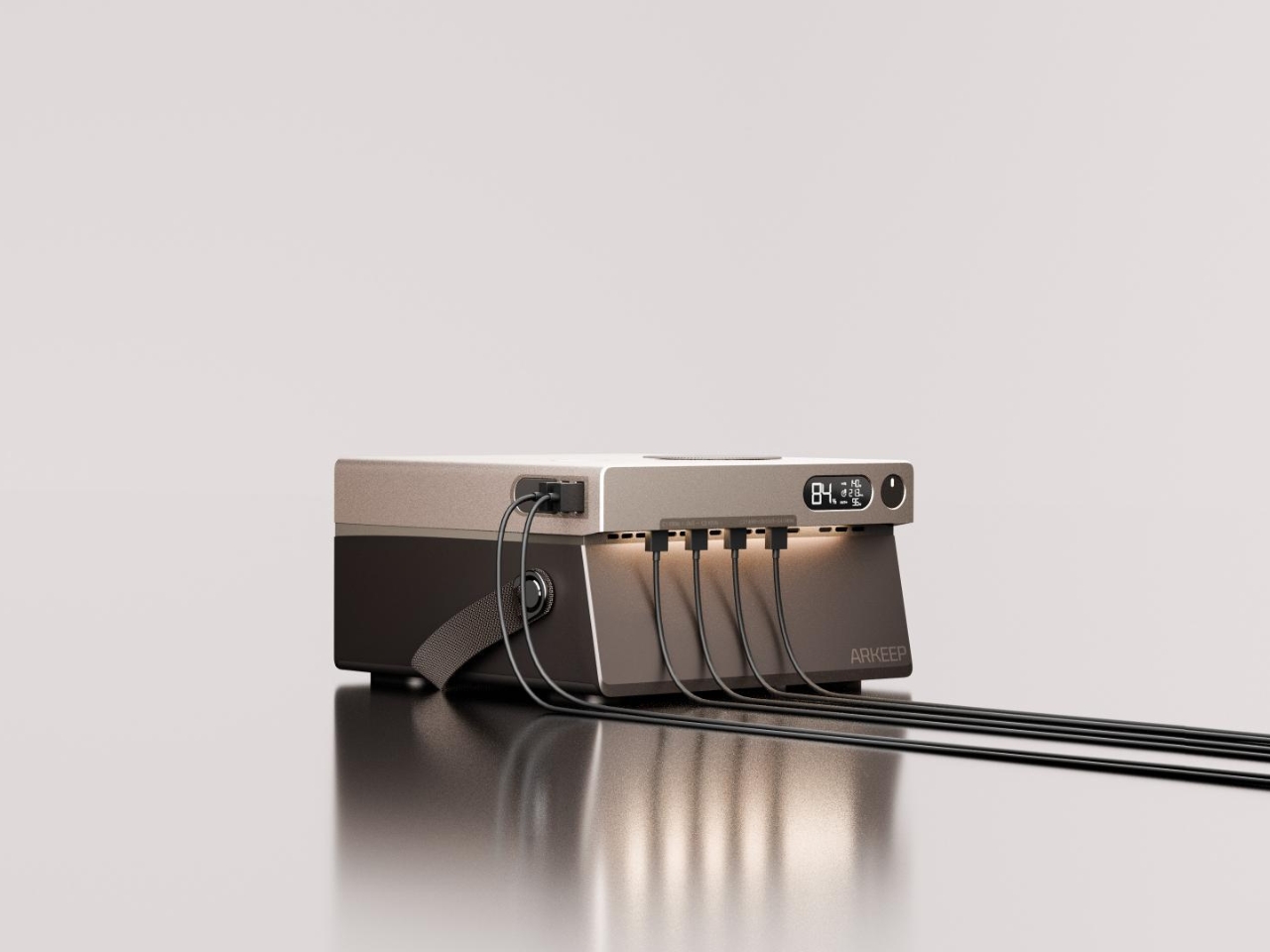
Let’s be honest. Most portable power stations look like someone’s idea of what a camping generator should be: utilitarian, bulky, and about as stylish as a cinderblock. They’re the kind of gadgets you’d happily hide in a closet when company comes over. But what if your power station could actually enhance your space instead of cluttering it? Enter the ARKEEP Halo Portable Power Station, and trust me when I say this isn’t your typical backup battery.

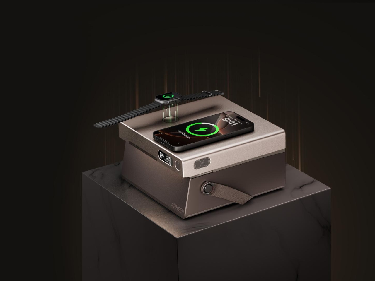
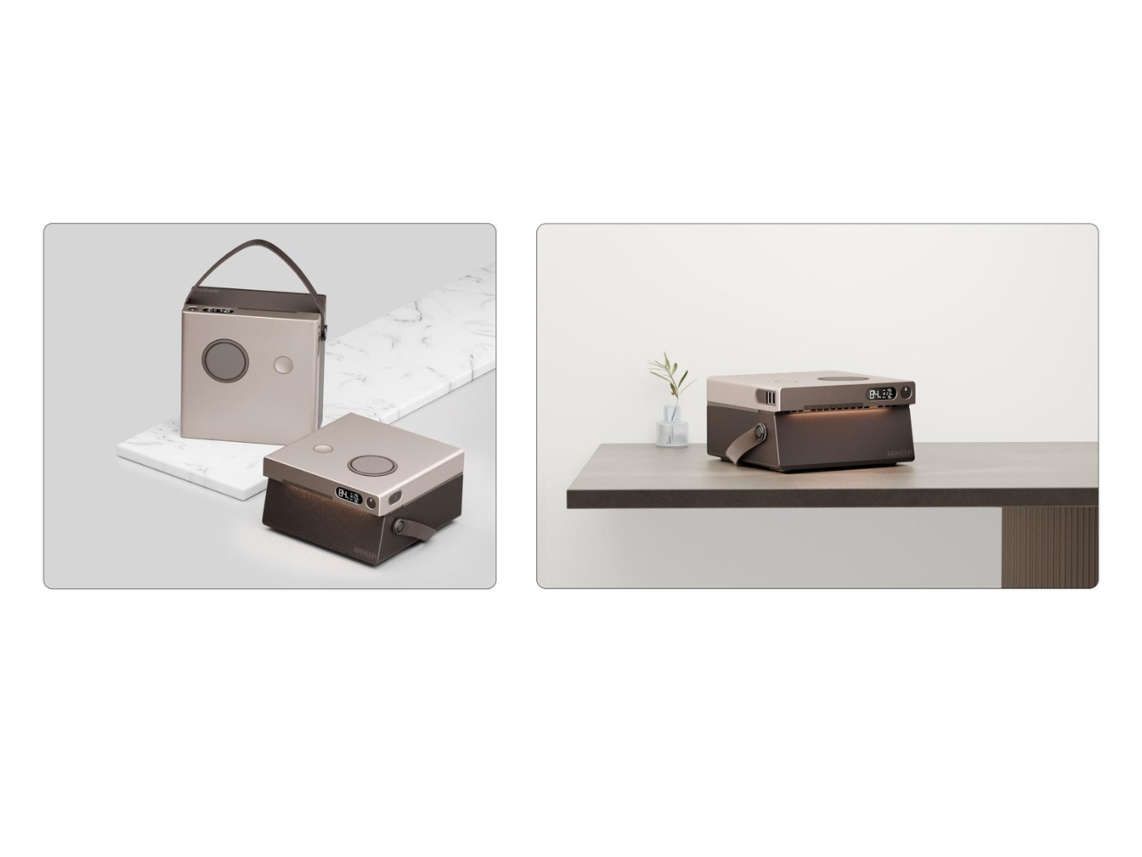
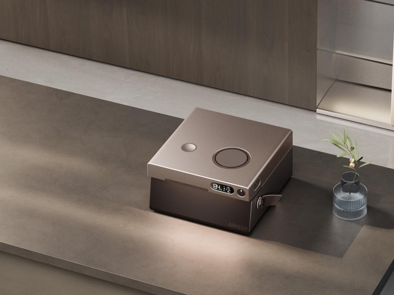
Designed by Union Suppo Battery, the ARKEEP Halo is what happens when someone finally asks the question: why can’t emergency power be beautiful? The result is a device that takes its design cues from high-end electronics rather than construction equipment, creating something that looks equally at home on your desk, in your living room, or tucked into your camping gear.

Designer: Union Suppo Battery

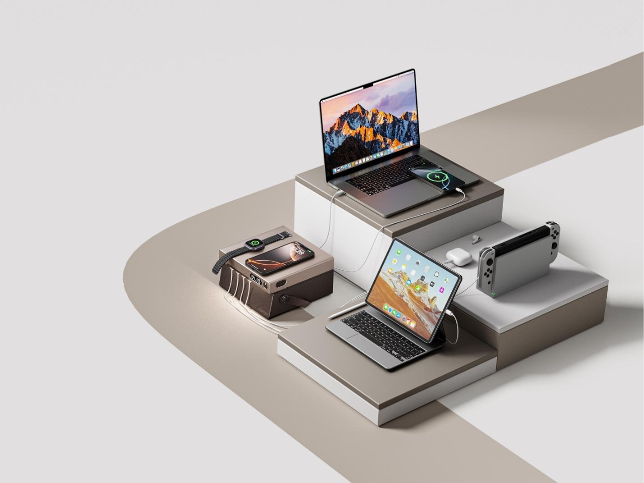
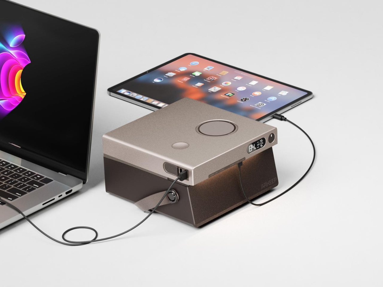
What makes this little powerhouse so compelling is how it refuses to be just one thing. It’s an 8-port charging hub that includes dual 140W PD3.1 ports and dual 100W USB-C ports, two 22.5W USB-A ports, and here’s where it gets interesting: dual wireless charging pads at 15W and 5W. This means you can charge your laptop, your phone, your tablet, and your partner’s phone all at the same time without needing to carry around a tangled mess of charging bricks. It’s the kind of thoughtful design that makes you wonder why every power station doesn’t work this way.

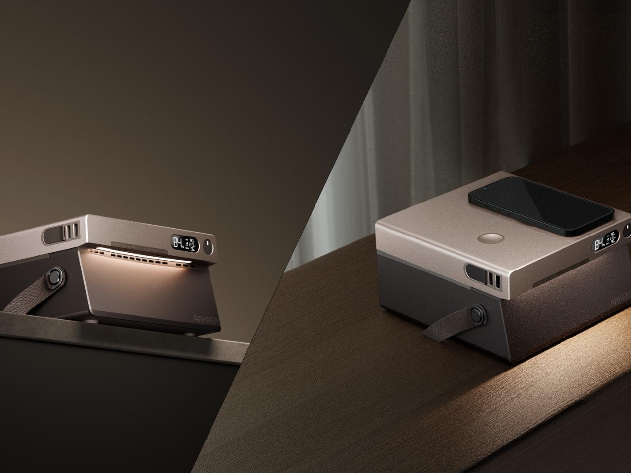
But the real genius of the ARKEEP Halo lies in a feature you wouldn’t necessarily expect from a battery pack: integrated lighting. This isn’t just a simple flashlight stuck on the side. The designers created a 270-degree ambient glow system with adjustable color temperature and brightness that can simulate natural light rhythms. During the day, it provides functional illumination. At night, it shifts to warmer tones with lower blue light output, creating an atmosphere that actually helps reduce anxiety and promotes relaxation. It’s like having a mood lamp, a charging station, and an emergency power supply all rolled into one sleek package.

The design philosophy here is refreshingly different. Instead of treating portable power as purely functional, ARKEEP has reimagined it as an everyday essential that seamlessly integrates into modern life. The aesthetic strikes that tricky balance between looking sophisticated enough for your home office while being rugged enough to handle outdoor adventures. It’s the Swiss Army knife approach to power stations, where versatility doesn’t come at the cost of elegance.

This matters more than you might think. We live in an age where our devices are extensions of ourselves. Our phones, laptops, and tablets aren’t just tools anymore but lifelines to work, relationships, and entertainment. The anxiety of running out of battery has become a legitimate modern stressor. Having a power solution that’s not only reliable but actually pleasant to look at and use changes the entire relationship we have with backup power.

What’s particularly smart about the ARKEEP Halo is how it acknowledges that portable power stations have evolved beyond their original purpose. Sure, they’re still great for camping trips and power outages, but increasingly, they’re becoming part of our everyday tech ecosystem. Remote workers need them for flexibility. Content creators use them for on-location shoots. Digital nomads rely on them for constant connectivity. The ARKEEP Halo was designed with all these use cases in mind, not as an afterthought but as core considerations.

The ambient lighting feature deserves special attention because it reveals a deeper understanding of how people actually use these devices. During power outages, harsh white light can feel jarring and cold. The ability to create a softer, warmer glow transforms a stressful situation into something more manageable. It’s a small detail that makes a significant emotional difference, the kind of thoughtful touch that separates good design from great design.

In a market flooded with black boxes covered in neon highlights and aggressive industrial styling, the ARKEEP Halo stands out by simply being more human. It recognizes that technology should adapt to our lives, not the other way around. Whether you’re powering through a blackout, working from a coffee shop, or setting up camp under the stars, this is a device that actually understands what you need. And that’s worth celebrating.

The post This Power Station Has Mood Lighting (And 8 Charging Ports) first appeared on Yanko Design.

A Rectangular Bladeless Fan? This Design Breaks All the Rules

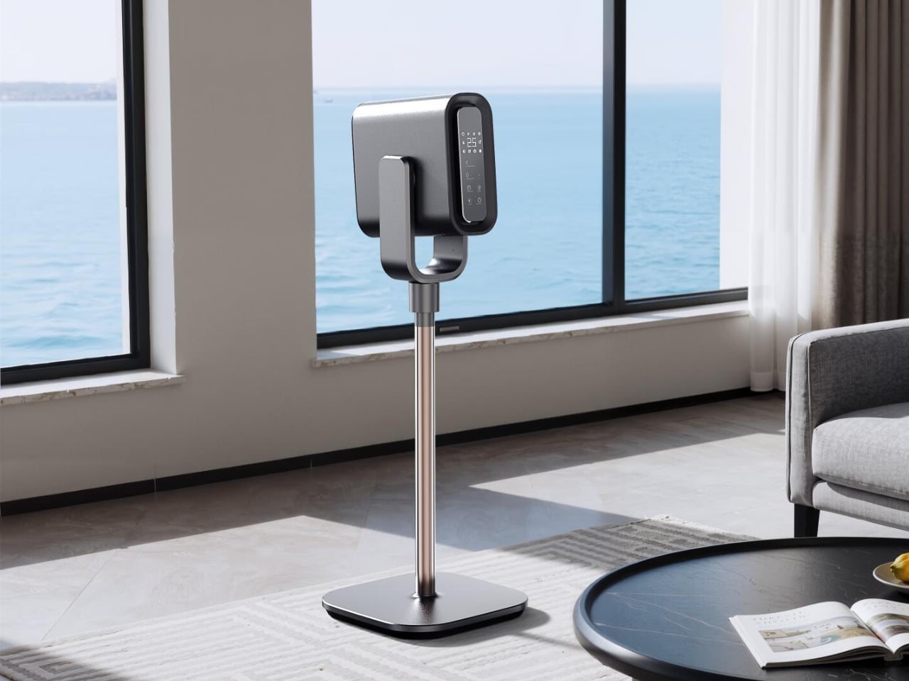
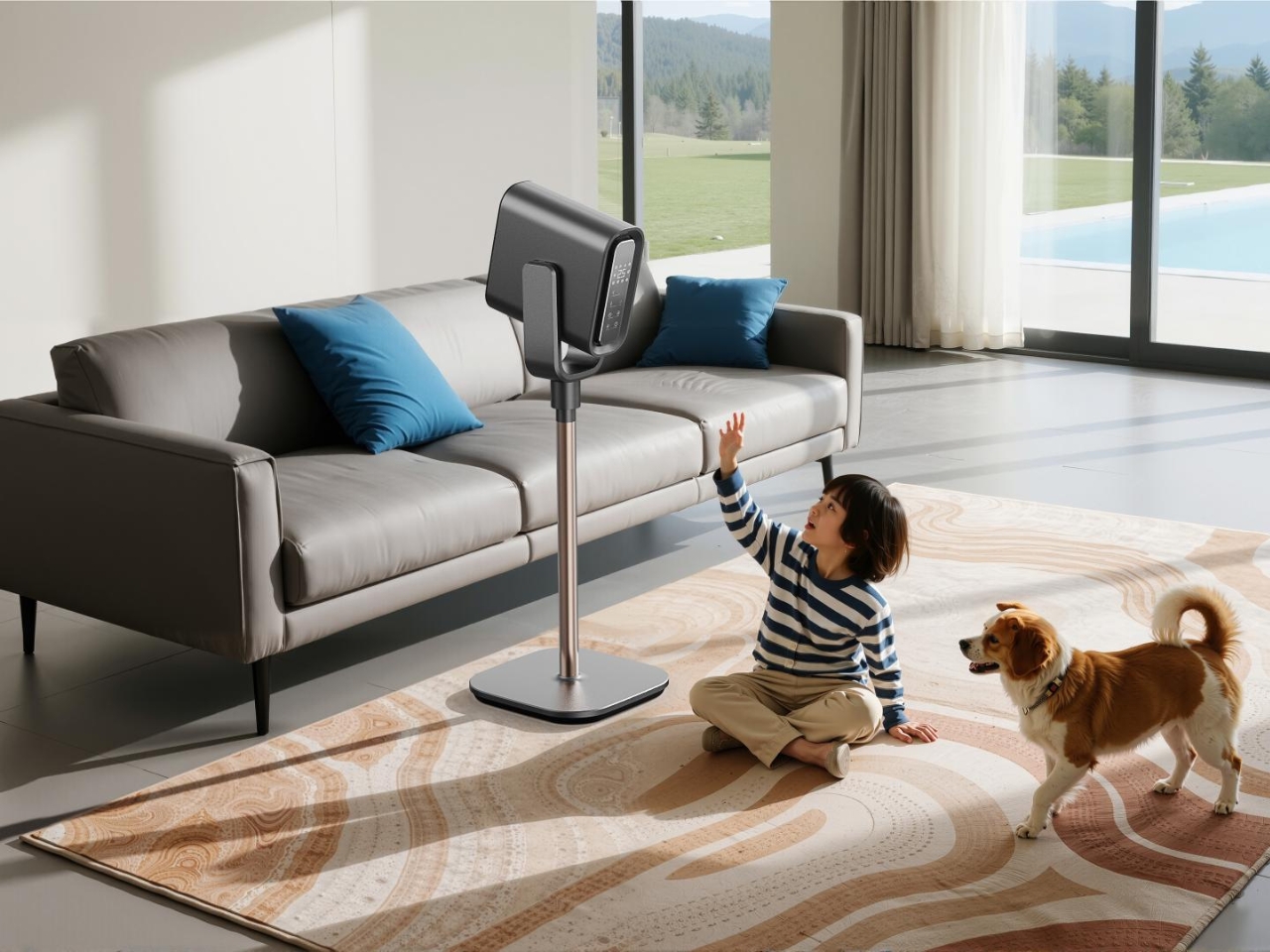
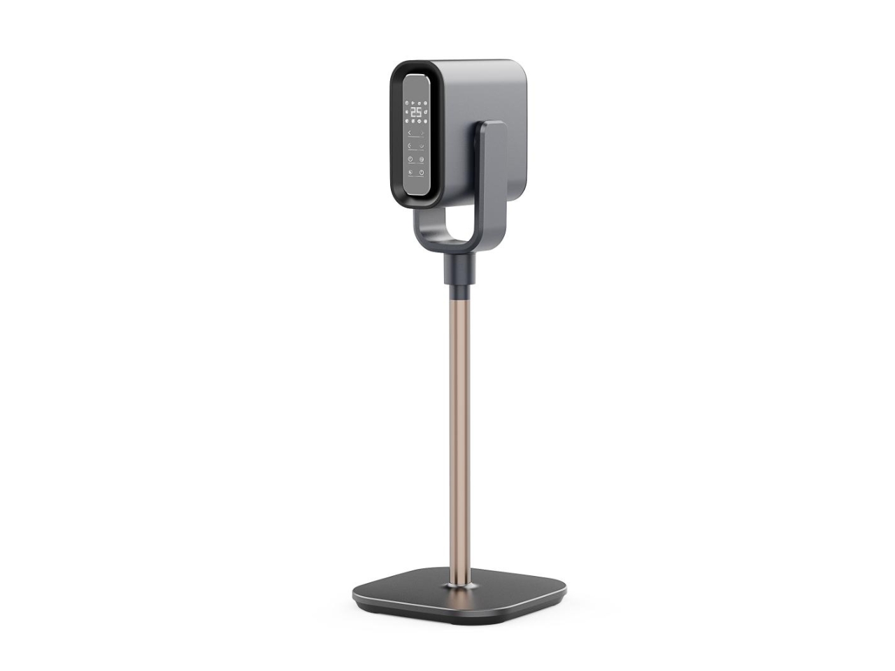
You know how some designs just make you stop scrolling? That’s exactly what happened when I came across this bladeless fan by Foshan Perfect Industrial Design. It’s not your typical circular fan that we’ve all gotten used to seeing since Dyson popularized the concept. This one’s rocking a square base, and honestly, it’s kind of genius.

Let me explain why this caught my attention. We’ve been conditioned to think that fans, bladeless or not, should be round. It makes sense, right? Air flows in circular patterns, so circular fans seem like the natural choice. But here’s where this design gets interesting. The team behind this fan decided to challenge that assumption and built their concept around a square-based design language. And it’s not just about being different for the sake of standing out.

Designer: Foshan Perfect Industrial Design

The real innovation here is what they’re calling 5D air circulation. Now, I’ll admit that sounds like marketing speak at first, but stick with me. Traditional bladeless fans work by hiding a propeller in the base that sucks air in and pushes it through a ring-shaped opening. The expelled air creates what’s called negative pressure, which pulls even more surrounding air through the ring, multiplying the airflow by up to 15 times.

This square design takes that concept and apparently amplifies it with a focused air duct system. Instead of just sending air in one general direction like circular fans tend to do, this focused duct system accelerates and directs the airflow more precisely. Think of it like the difference between a garden hose with a regular nozzle versus one with a spray gun attachment. Same water source, but way more control and power.

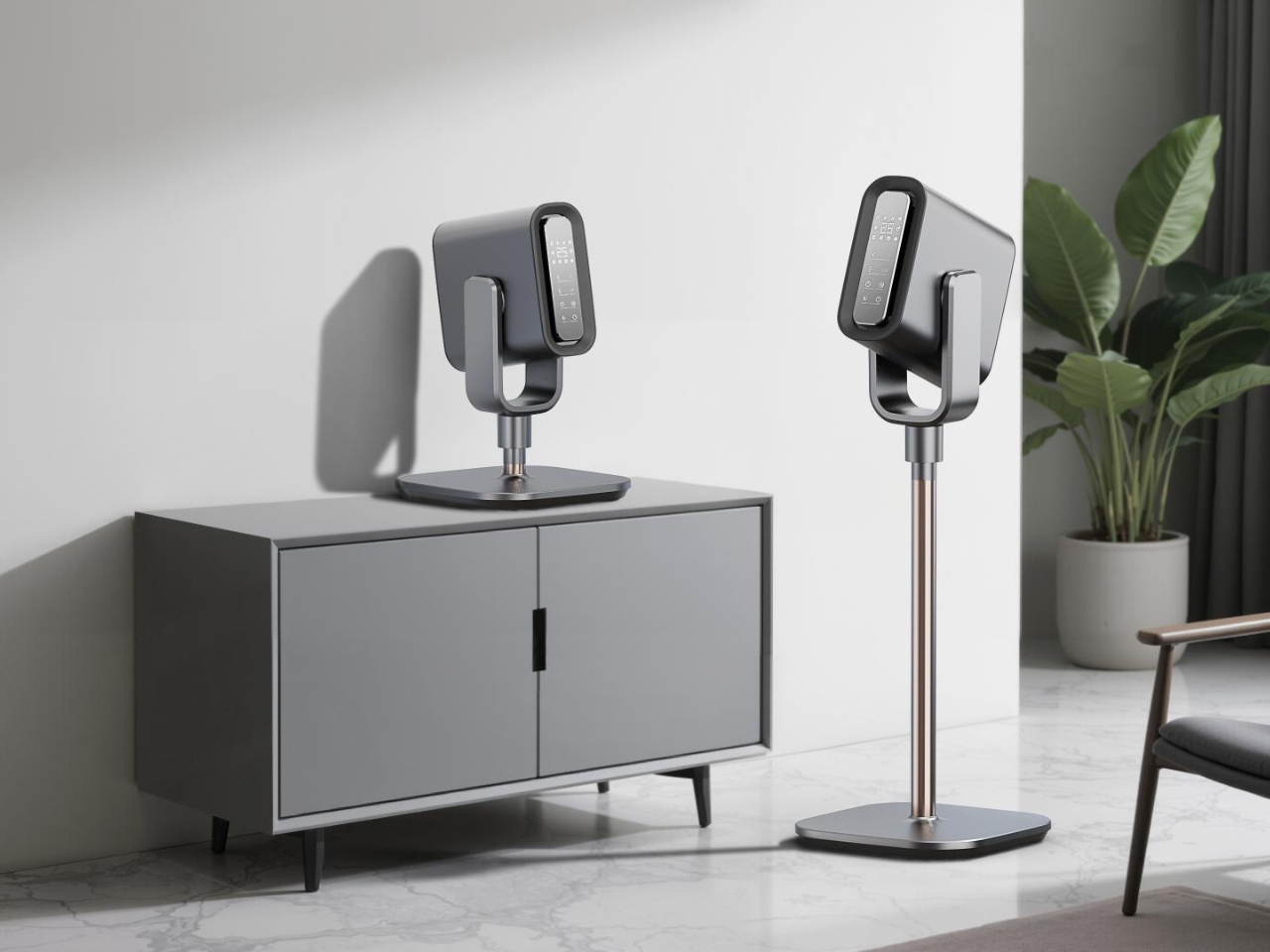
What I find particularly clever about the square form factor is how it fits into modern living spaces. Most of our furniture, shelves, and room layouts are based on right angles and straight lines. A square-based fan just sits more naturally on a desk, side table, or shelf without that awkward “where do I put this round thing” moment we’ve all experienced. It’s one of those design decisions that seems obvious once you see it, but took real creative thinking to actually execute.

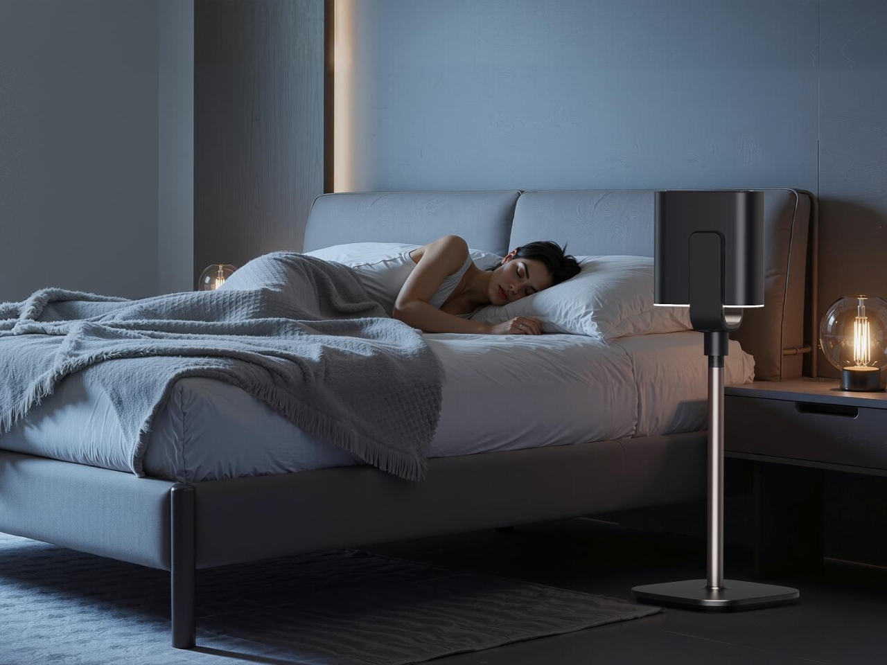
The bladeless fan category itself has come a long way since it first hit the market. These devices are safer than traditional fans because there are no exposed blades that curious kids or pets can stick their fingers into. They’re also typically quieter and more energy-efficient. But they’ve mostly followed the same aesthetic playbook, which is why seeing a square interpretation feels refreshing.

This design won recognition from the MUSE Design Awards, which celebrates innovative product design across categories. And it’s not hard to see why. It takes an established product category and reimagines it in a way that’s both functional and aesthetically interesting. The square form doesn’t just look different, it potentially offers better spatial efficiency and air direction control. I think what makes this design work is that it doesn’t sacrifice function for form. The square base isn’t just a stylistic choice; it’s integrated with the technical improvements like that focused air duct system. That’s the sweet spot in product design, where aesthetics and engineering work together rather than competing for attention.

For anyone who’s into tech, design, or just appreciating when everyday objects get thoughtfully reimagined, this fan is worth a second look. It’s a reminder that even in mature product categories, there’s still room for innovation when designers are willing to question the assumptions we’ve all been making. Sometimes the best ideas come from asking the simplest questions, like “does a fan really need to be round?” Whether this square bladeless fan becomes the new standard or remains a cool design experiment, it’s already succeeded in making us think differently about an appliance we barely notice. And that’s kind of the whole point of good design, isn’t it?

The post A Rectangular Bladeless Fan? This Design Breaks All the Rules first appeared on Yanko Design.
The Sleekest Vinyl Player of 2025 Hides Its Turntable Mechanism

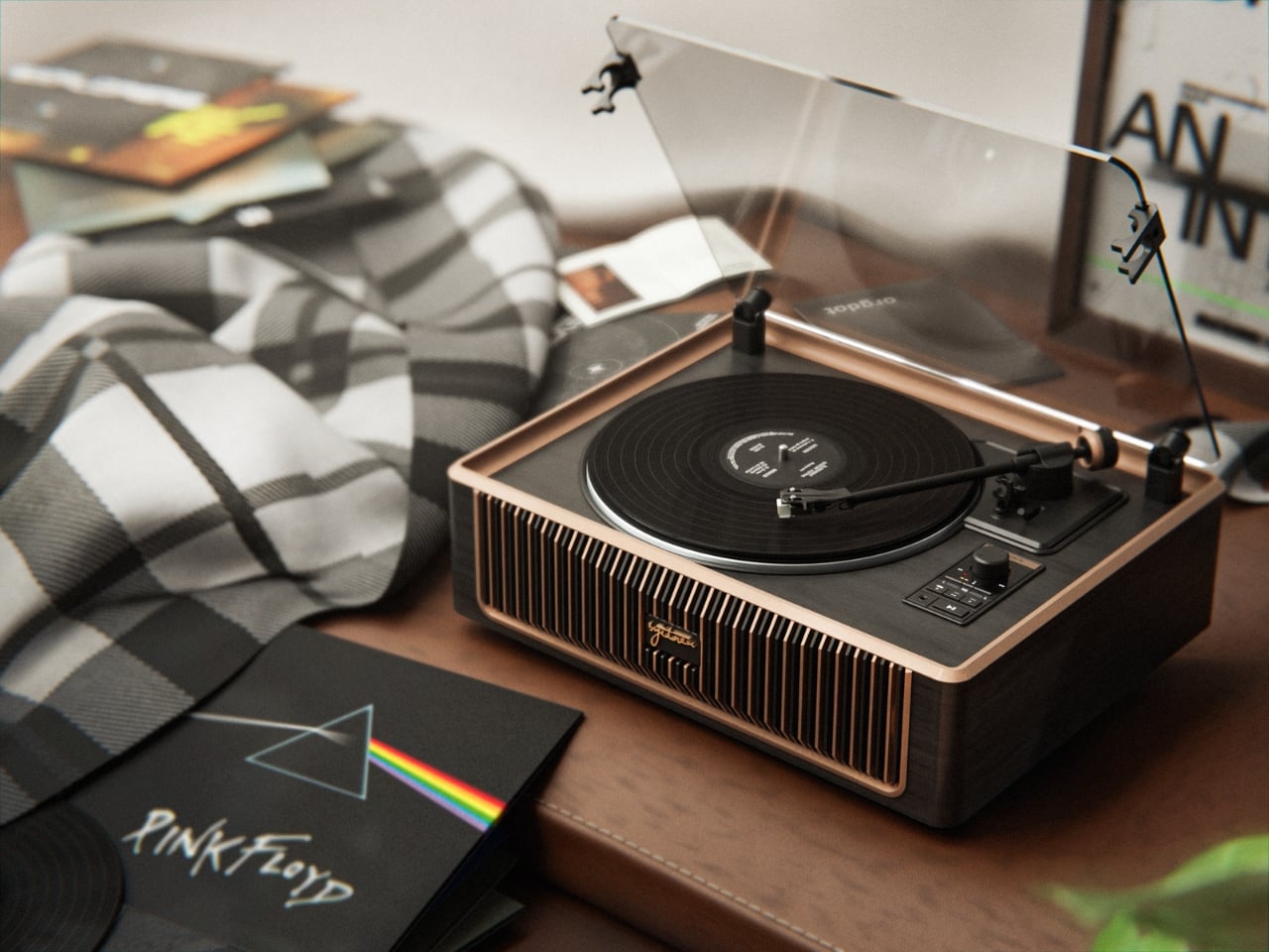
Here’s the thing about most vinyl record players: they’re either trying way too hard to look vintage, complete with faux leather suitcase vibes and knobs that belong in your grandparents’ attic, or they’re sleek modern machines that feel more like lab equipment than music players. The PARON III from Shenyang Orgot Design? It’s neither, and that’s exactly why it works.

This award-winning turntable is what happens when designers actually think about how modern life happens. You know how we’re all supposed to be downsizing, living with intention, and making every object in our homes earn its spot? The PARON III gets it.

Designer: Shenyang Orgot Design

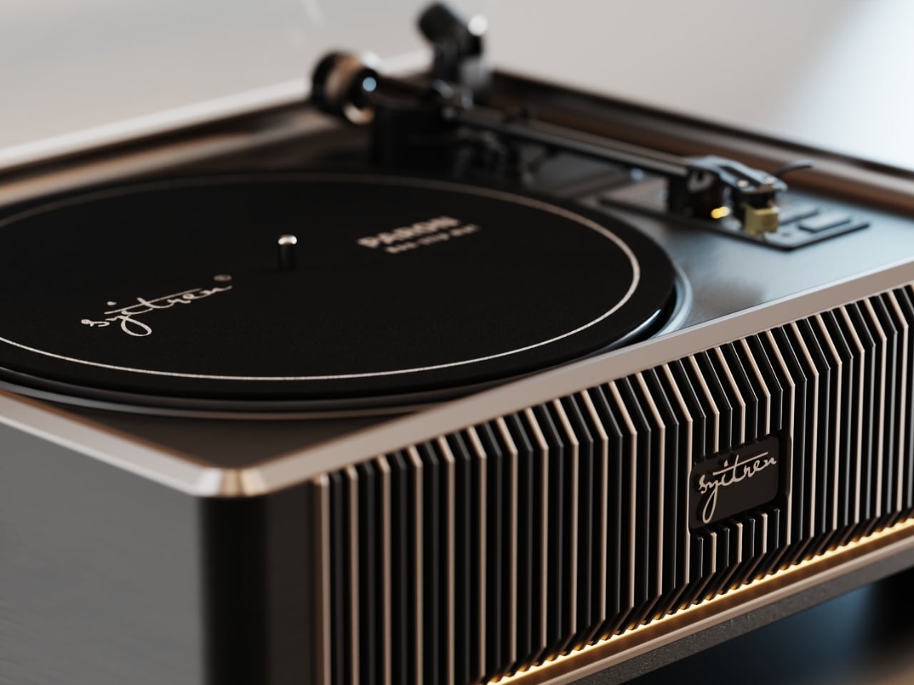
What makes this player different starts with that lowered platter design. Instead of sitting on top of the unit like a hat that doesn’t quite fit, the turntable mechanism is recessed into the body. It’s a subtle move, but it completely changes the visual profile. The whole thing becomes more compact and unified, with this gorgeous layered depth that makes it actually interesting to look at, not just functional.

The materials tell their own story here. Black wood grain paired with metallic paint finishes creates this interesting tension between warmth and precision. It’s the kind of combination that reads as both reliable and refined without screaming for attention. And that slim transparent dust cover? It does its job protecting your vinyl without adding unnecessary visual weight. The whole aesthetic feels considered rather than calculated.

Let’s talk about what this means for your actual space. Traditional turntables demand real estate. They sprawl. They dominate. They require you to build your room around them. The PARON III’s minimalist square form takes up less footprint while somehow feeling more substantial. It’s the design equivalent of that friend who’s quietly confident rather than loudly insecure. The team behind this clearly understood that people who buy vinyl in 2025 aren’t doing it purely for nostalgia. Sure, there’s romance in the ritual of dropping a needle, but we also want that ritual to fit into homes that don’t look like vintage record shops. We want our tech to integrate, not dominate.

This is part of a larger shift happening in audio design. As vinyl has made its comeback, the market has been flooded with all-in-one players that prioritize convenience over quality or retro reproductions that prioritize aesthetic over integration. The PARON III splits that difference beautifully. It delivers high-quality audio performance (which, let’s be honest, is the actual point) while looking like something that belongs in a contemporary space.

What’s particularly smart is how the design enhances mechanical precision. That lowered platter isn’t just about looks. It actually improves performance by centralizing weight and reducing vibration. Form following function, function enhancing form. It’s the kind of circular design thinking that separates good products from great ones. There’s also something quietly rebellious about this approach. In a market that keeps telling us retro is cool, vintage is authentic, and older is better, the PARON III says: what if we just made something that worked really well and looked clean doing it? What if we stopped pretending we live in 1972 and designed for the homes and lives we actually have?

The PARON III doesn’t need to cosplay as vintage to justify its existence. It’s confident enough in what vinyl actually offers (that tangible connection to music, the intentionality of listening, the superior sound quality when done right) to present itself honestly. No fake wood grain, no retro fonts, no winking nostalgia. For anyone who’s been wanting to get into vinyl but couldn’t stomach another clunky conversation piece, this feels like permission. The PARON III proves that loving analog music doesn’t mean sacrificing modern design sensibilities. Sometimes the best way to honor tradition is to stop trying to recreate it and instead figure out what it means for right now.

The post The Sleekest Vinyl Player of 2025 Hides Its Turntable Mechanism first appeared on Yanko Design.
This Tilting Marble Maze Turns Into 5 Different Games

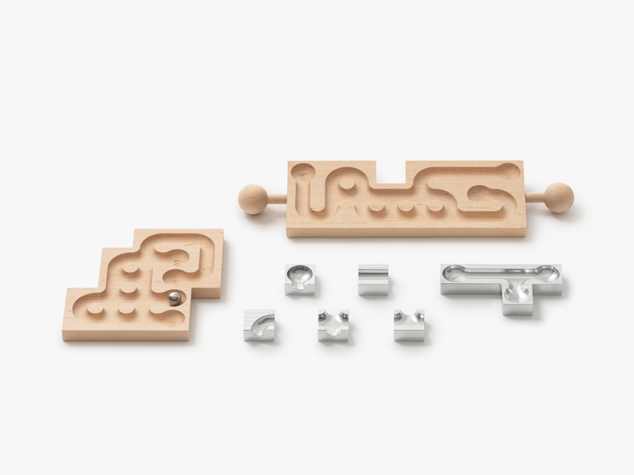
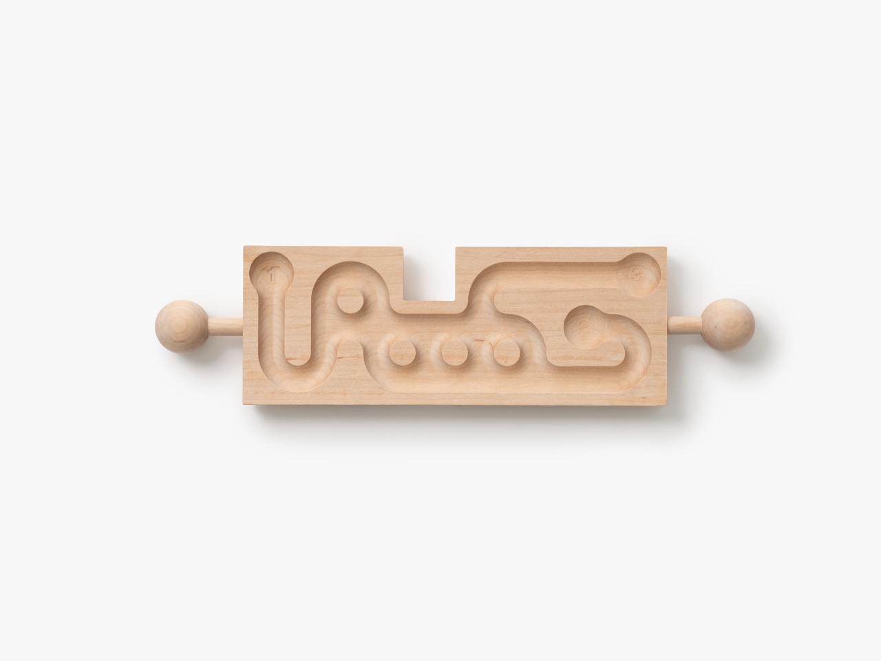
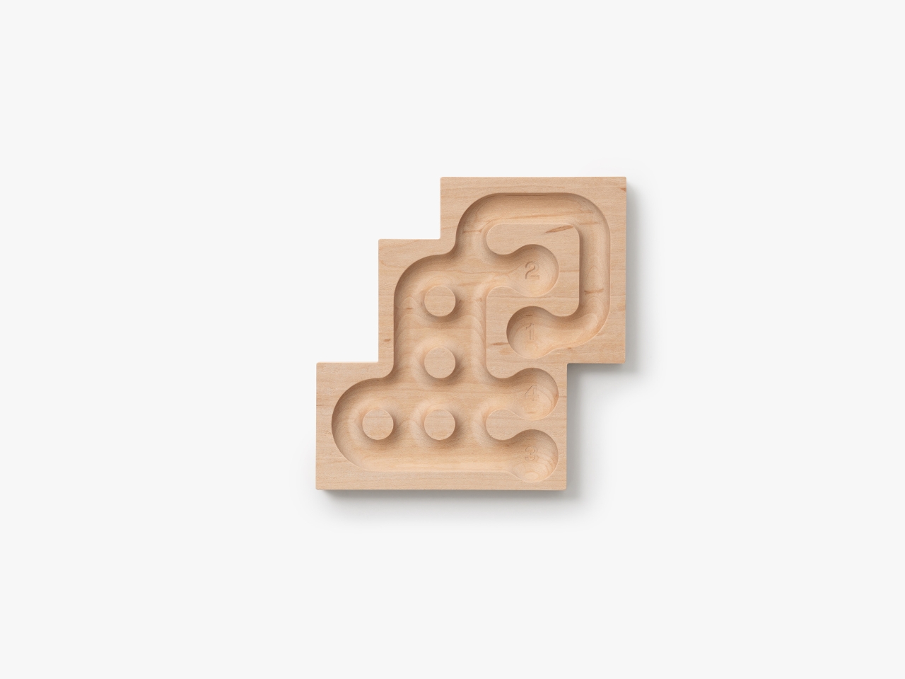
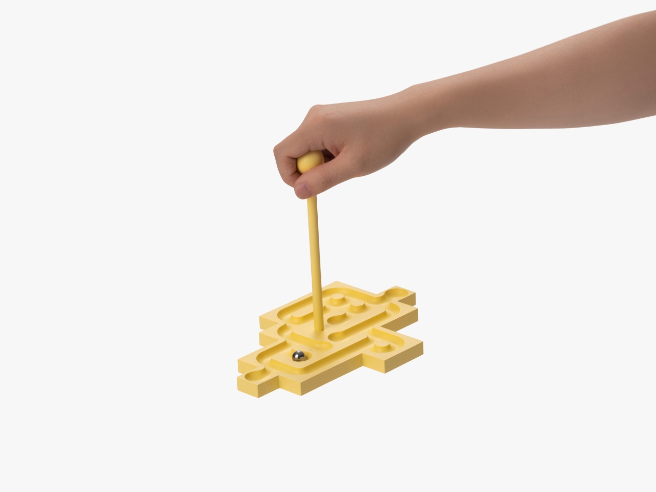
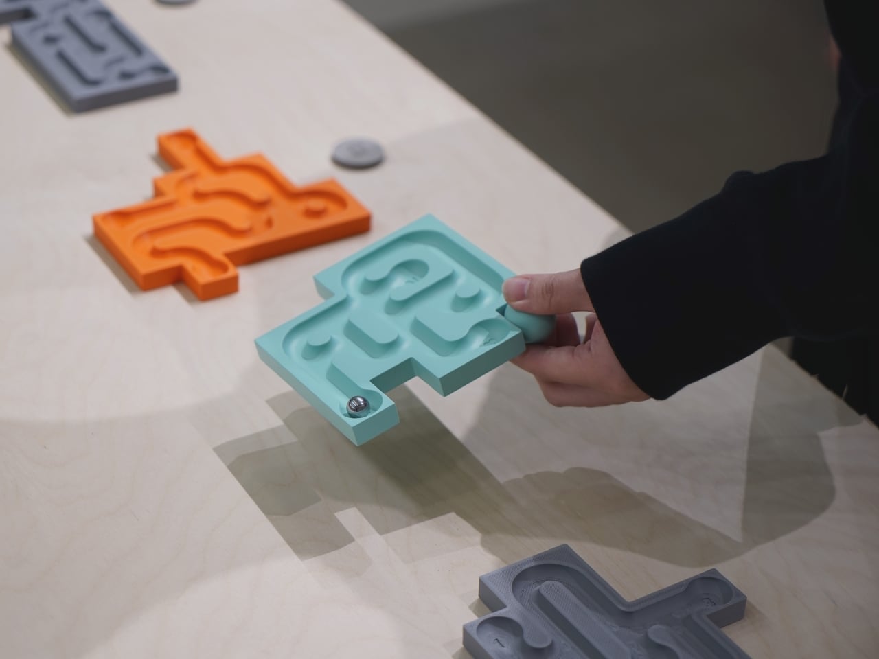
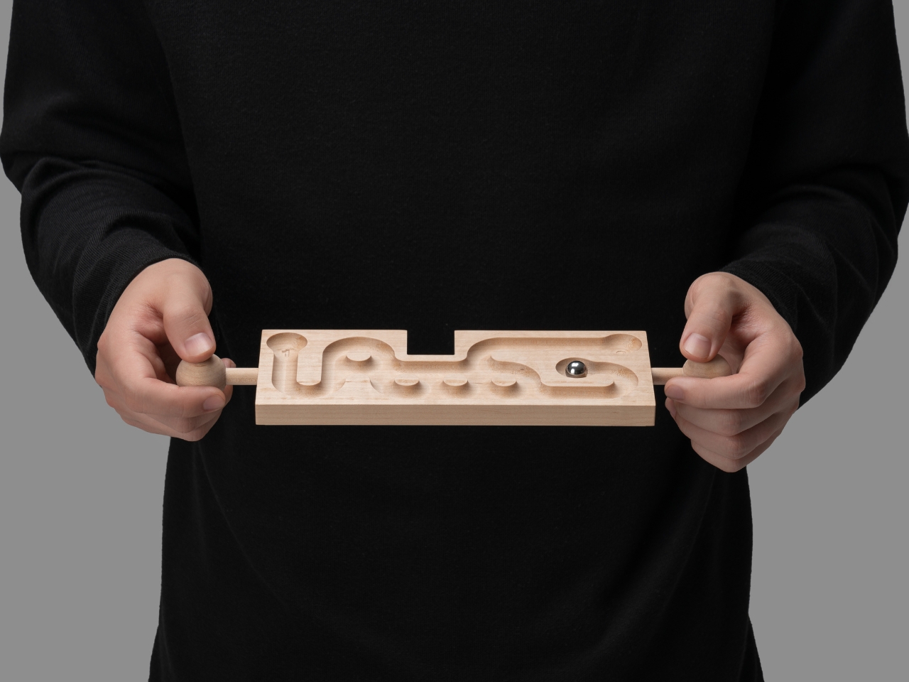
Remember those wooden labyrinth games where you’d tilt a board to guide a tiny marble through a maze? You know, the ones that turned even the calmest person into a bundle of nerves? Well, BKID Co just gave that childhood classic a major upgrade, and honestly, it’s kind of brilliant. Balance Maze is exactly what happens when industrial design meets nostalgic play. This concept isn’t your average tabletop game. It’s a modular marble maze that’s part puzzle, part physics challenge, and entirely more interesting than scrolling through your phone for the hundredth time today.

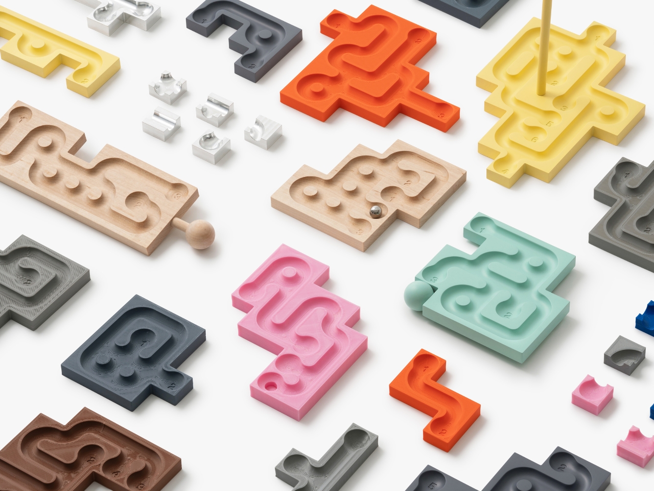
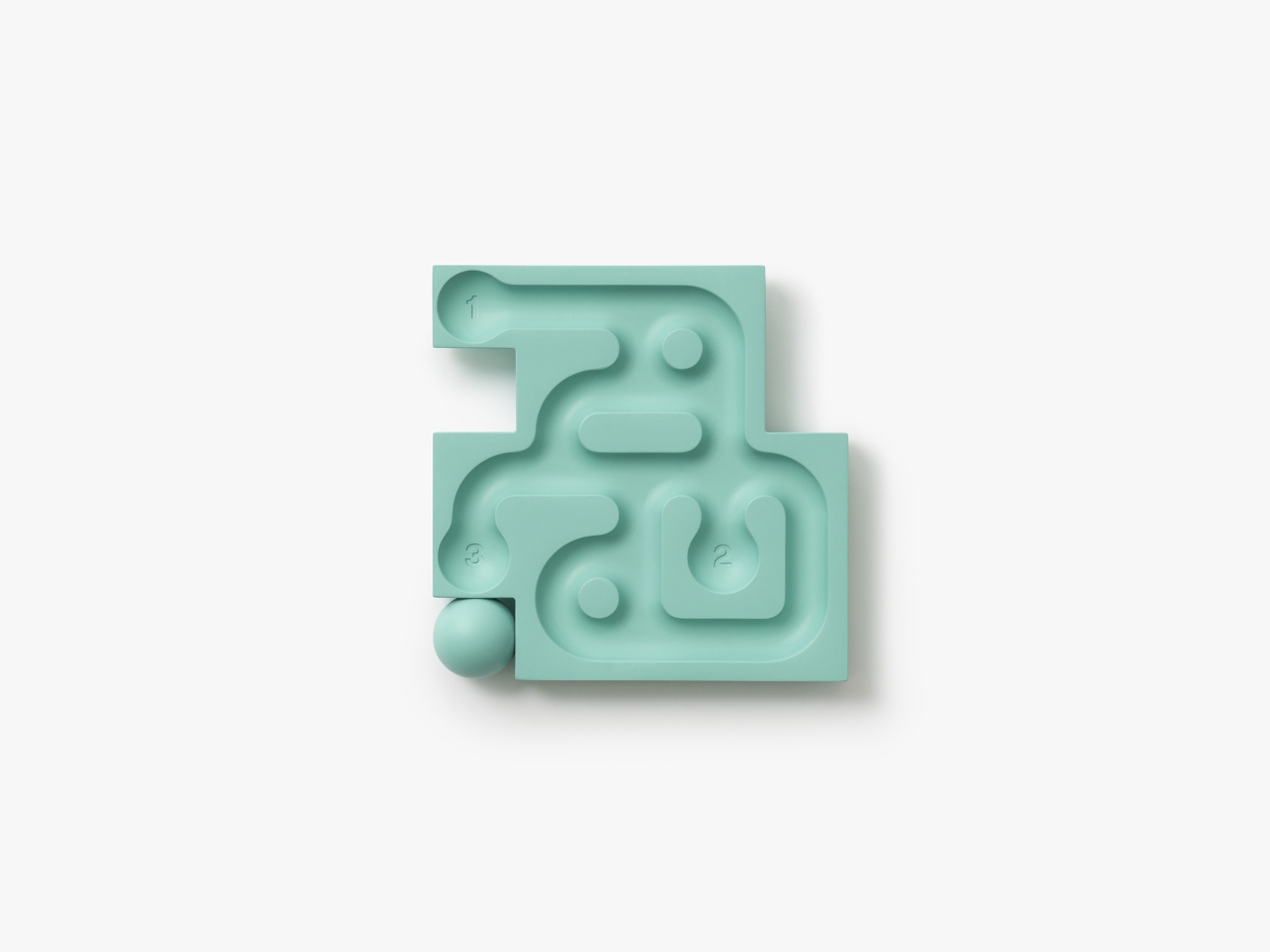
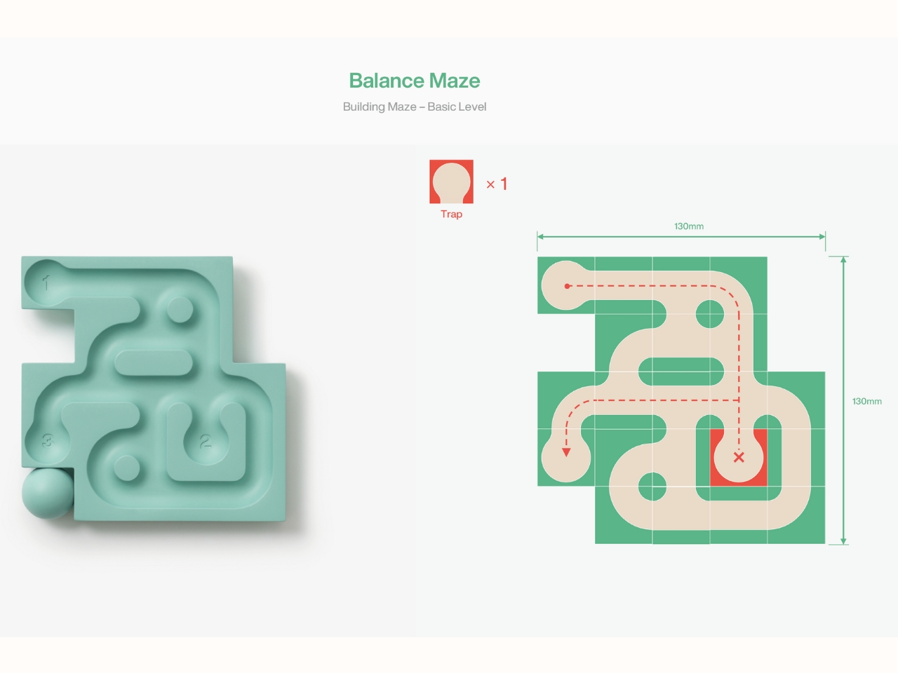
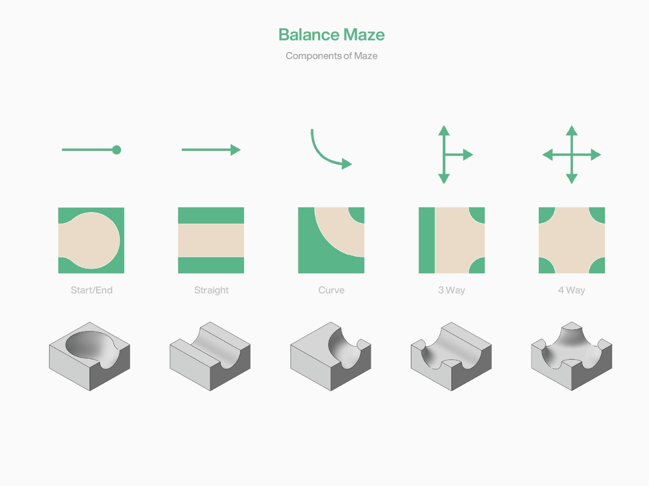
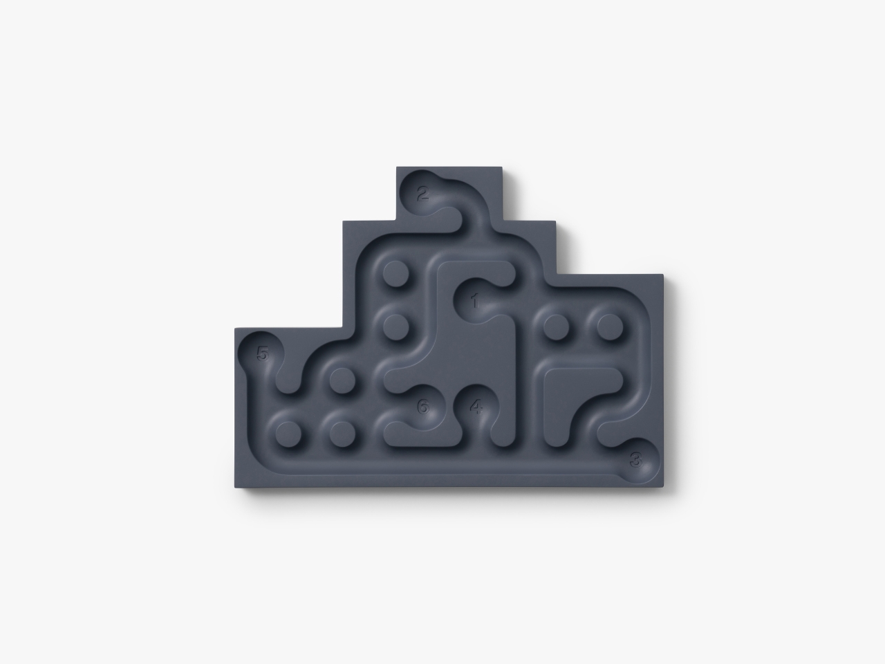
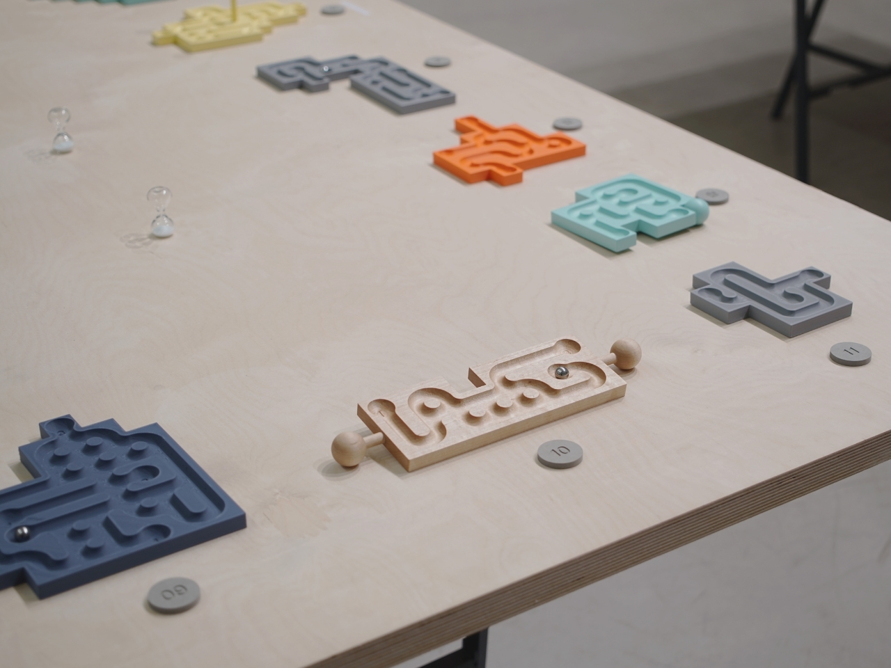
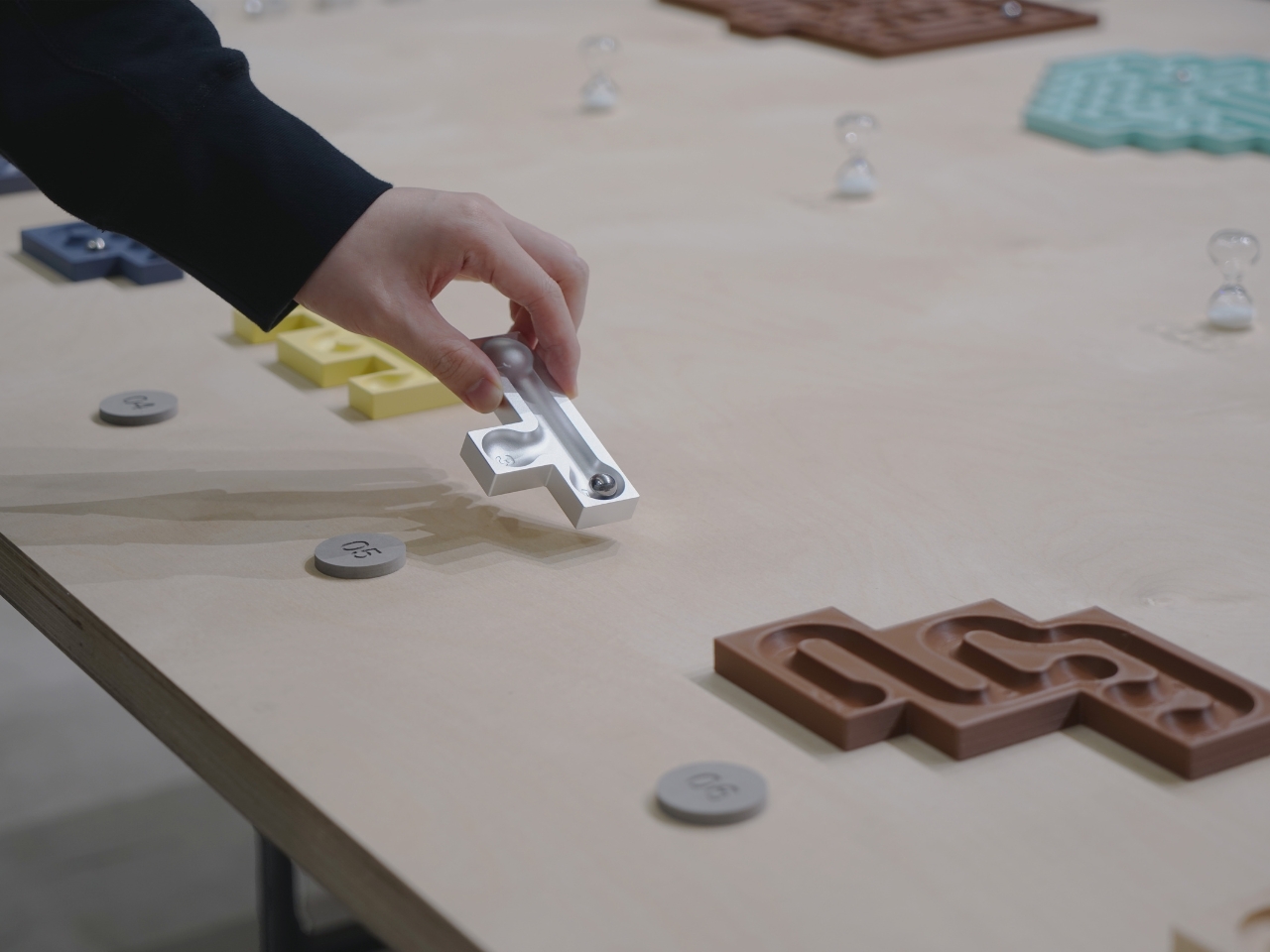
Here’s where things get clever. Balance Maze consists of five separate modules that connect together like puzzle pieces. Each module contains its own maze section with pathways, twists, and turns. The goal sounds simple enough: guide a marble through the entire maze by tilting and adjusting the slope of each individual module. But here’s the catch: because each section can move independently, you’re constantly problem-solving how to get that marble from one module to the next without sending it careening off course.

Designer: BKID Co

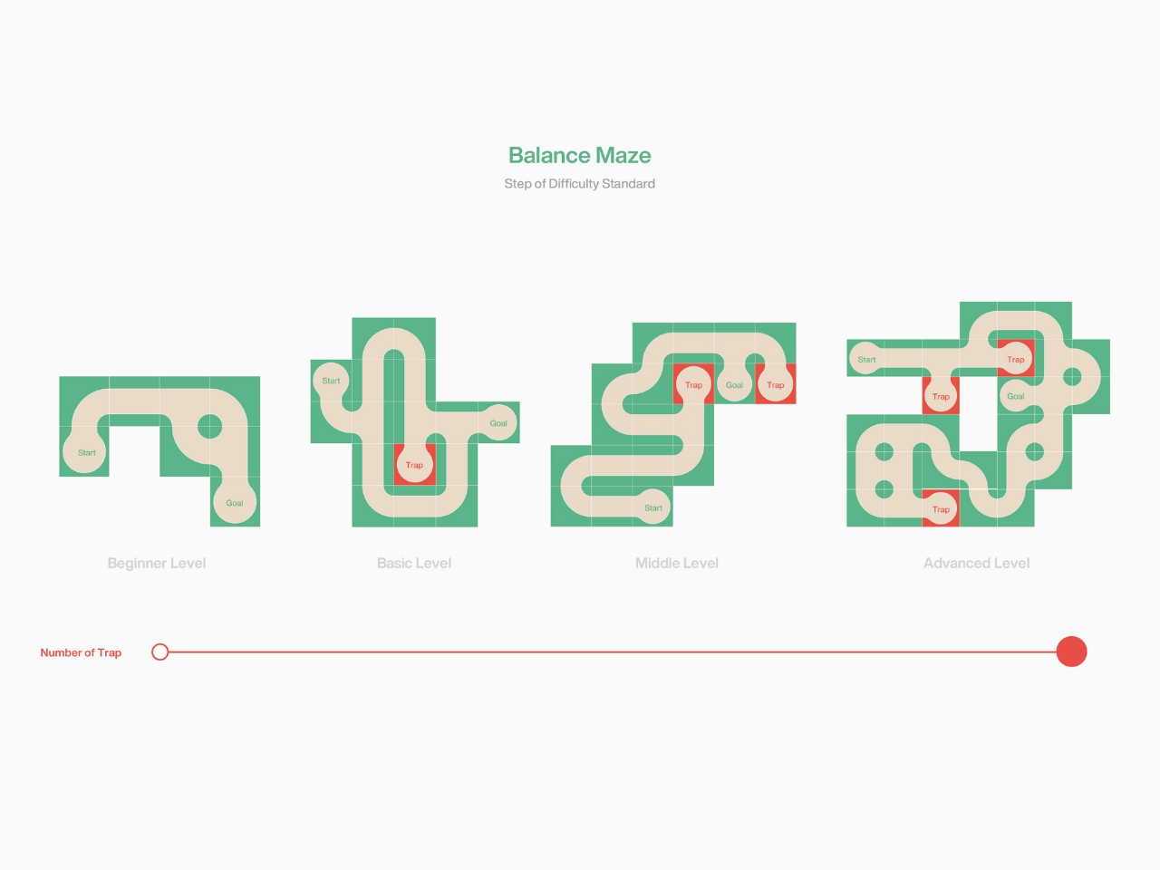
What makes this design so smart is its adaptability. You can combine the modules in different configurations, which means you can control the difficulty level. Want a quick five-minute challenge? Use two modules. Feeling ambitious? Connect all five and prepare for some serious concentration. It’s like having multiple games in one, which is pretty perfect for anyone who gets bored easily or wants something that grows with them. The visual design is refreshingly clean and modern. BKID Co went with a minimalist aesthetic that feels contemporary without being cold. The modules feature smooth surfaces and clean lines, letting the actual gameplay be the star. There’s something satisfying about well-designed objects that don’t need excessive decoration to look good, and this definitely fits that category.

But beyond just looking good on a coffee table, Balance Maze taps into something we’re all craving more of these days: tactile, screen-free play. There’s no app to download, no batteries to replace, no notifications interrupting your focus. Just you, a marble, and the laws of physics. In a world where everything seems to require WiFi, there’s something genuinely refreshing about a game concept that relies entirely on your spatial reasoning and hand-eye coordination.

The modular concept also means this could be a game that evolves. While the current design includes five modules, there’s potential for expansion packs, new maze configurations, or even user-created challenges. The design community has already shown plenty of love for the project, which suggests there’s real appetite for thoughtfully designed analog games. What’s particularly interesting is how Balance Maze fits into a broader trend of adults rediscovering play. We’re seeing a resurgence in puzzles, board games, and hands-on activities that offer a break from digital overload. This isn’t just nostalgia (though that plays a part). It’s about reclaiming focus and finding satisfaction in completing something tangible.

The engineering behind it shouldn’t be overlooked either. Creating a modular system where pieces connect securely while still allowing for individual movement requires careful consideration of materials, weight distribution, and connection mechanisms. BKID Co had to ensure each module could tilt freely without disconnecting from its neighbors, which is trickier than it sounds.

Whether you’re a design enthusiast who appreciates smart industrial design, someone looking for a genuinely engaging game for your home, or just tired of the same old entertainment options, Balance Maze offers something different. It’s proof that sometimes the best innovations aren’t about adding more technology but about reimagining something familiar in a smarter, more thoughtful way. And let’s be real: there’s something deeply satisfying about finally getting that marble to the end after multiple attempts. It’s the kind of small victory that actually feels earned, which is increasingly rare. So if you’re looking for your next conversation-starter object or just want to give your brain a different kind of workout, this concept is definitely worth paying attention to.

The post This Tilting Marble Maze Turns Into 5 Different Games first appeared on Yanko Design.