Honor Just Made Malaysia Its Global Launch Pad for the Honor 600

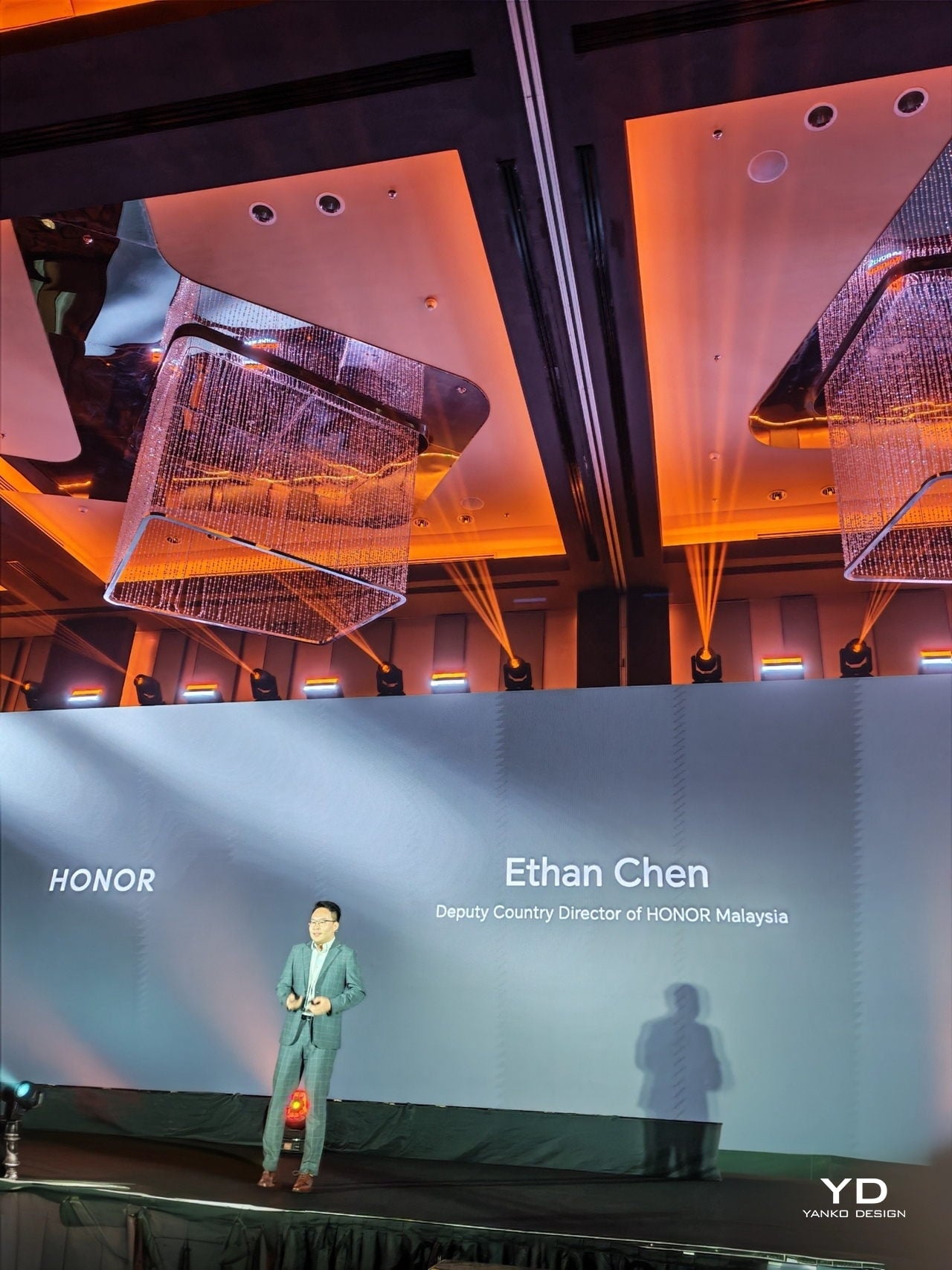
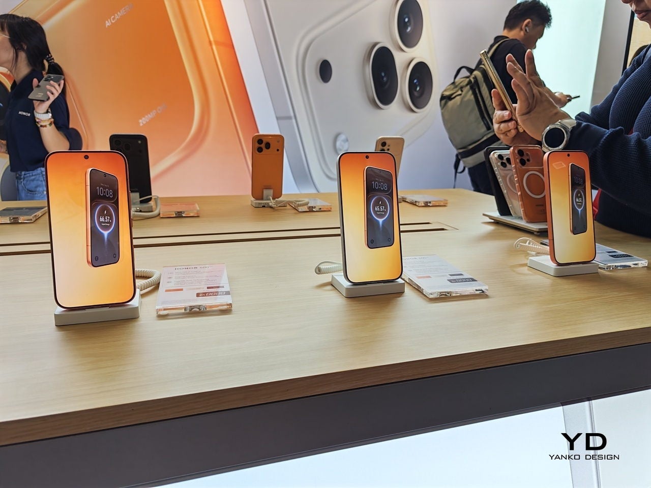
Malaysia doesn’t always get to be first. So when HONOR chose Kuala Lumpur as the global stage for the HONOR 600 Series launch, it felt less like a marketing decision and more like a statement. The kind brands make when they actually believe a market is ready, not just willing to buy, but ready to appreciate what’s being offered. I walked into the event expecting a standard product unveiling. What I got was something closer to a creative manifesto.

Ethan Chen, Deputy Country Director of HONOR Malaysia, set the tone early. The brand currently holds the number one spot in Android sales volume in Malaysia, and rather than simply leaning on that achievement, Chen framed it as a responsibility. “Pushing boundaries of what technology can do” wasn’t a tagline on a slide. It was the running thread of everything that followed, including why the device is focusing on its AI-powered features.
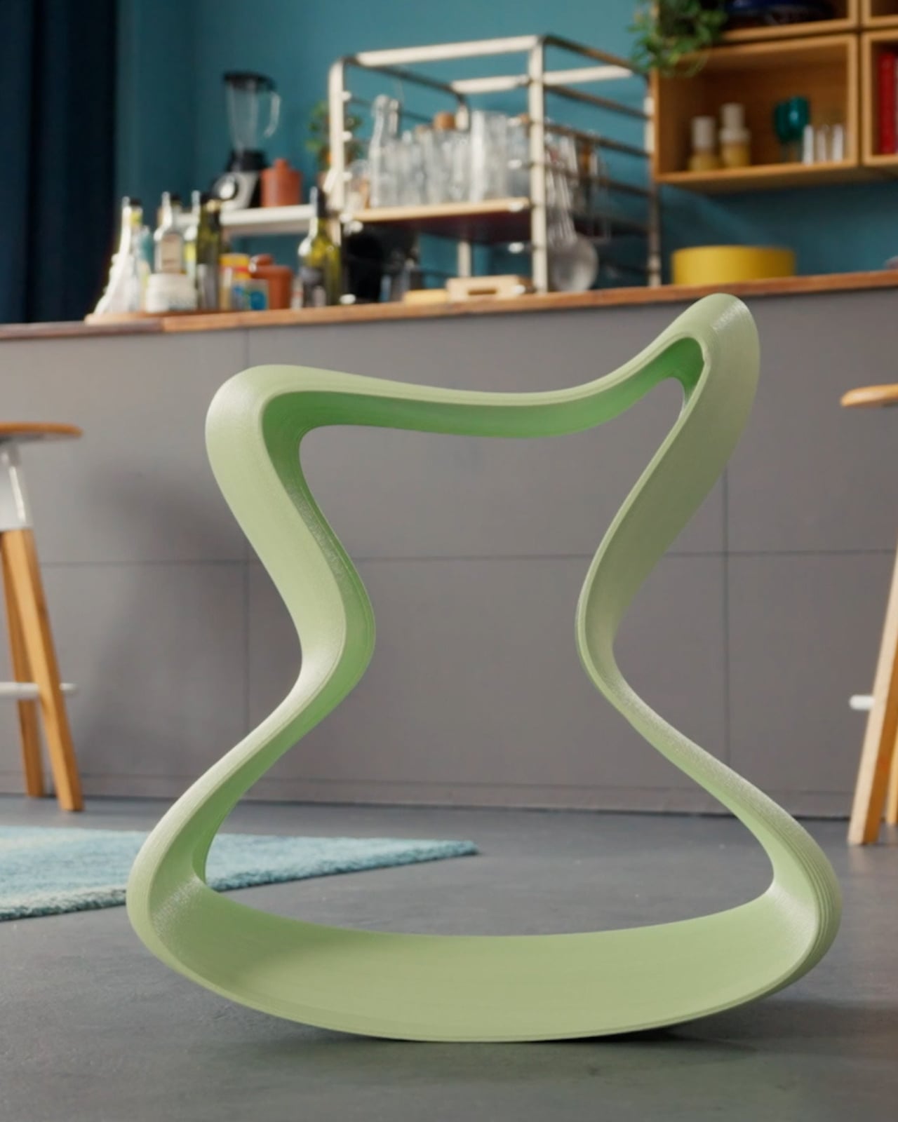
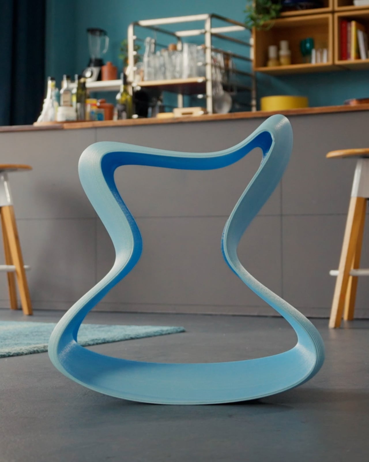
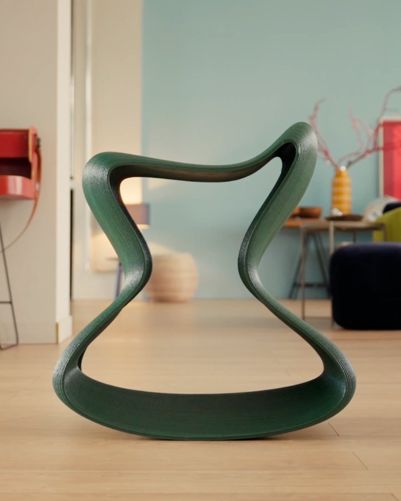
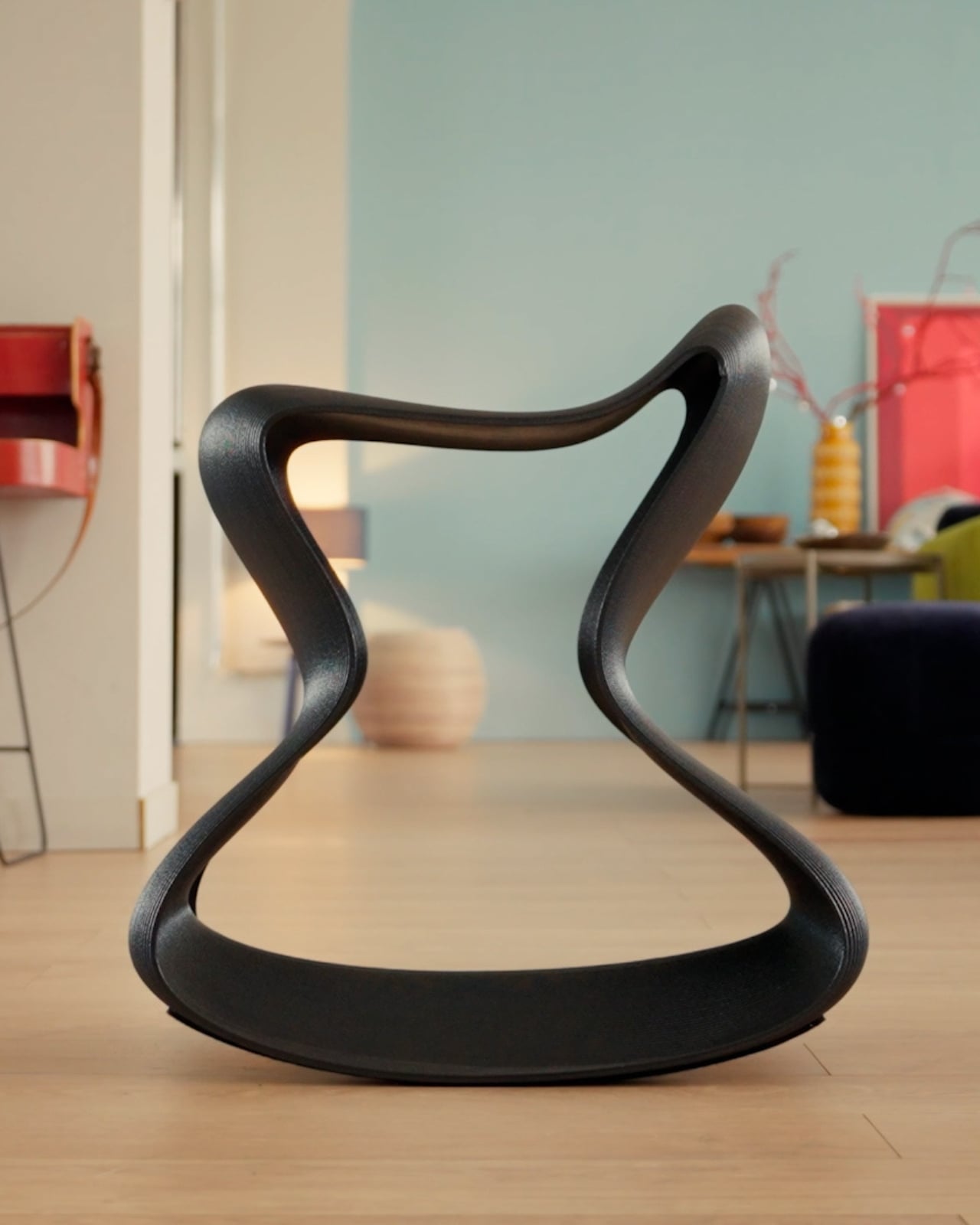
Designer: Honor

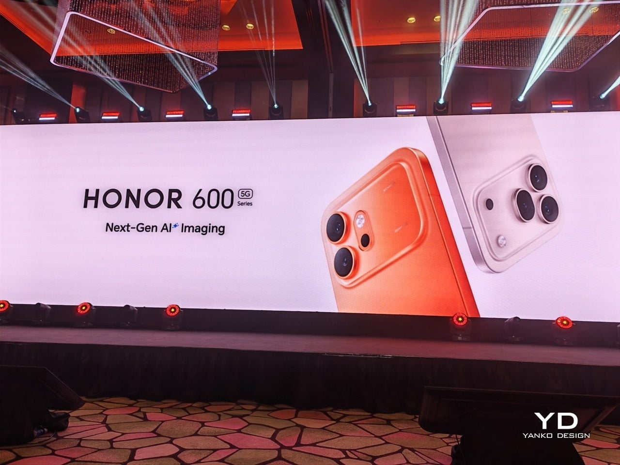
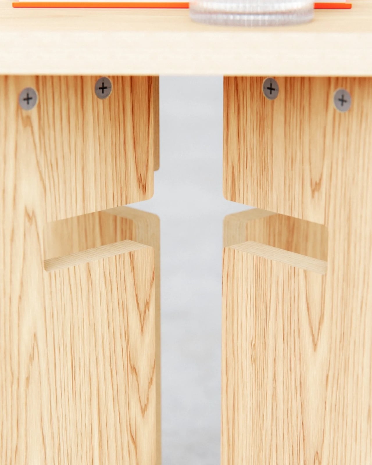
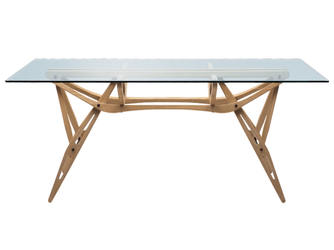
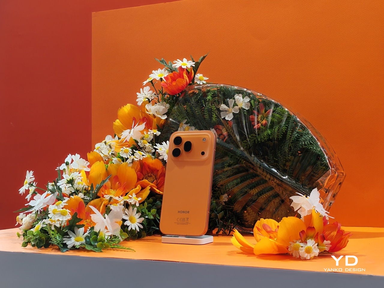
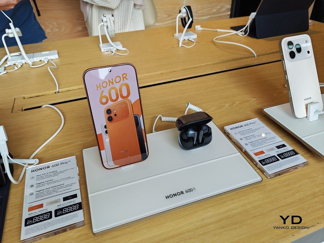
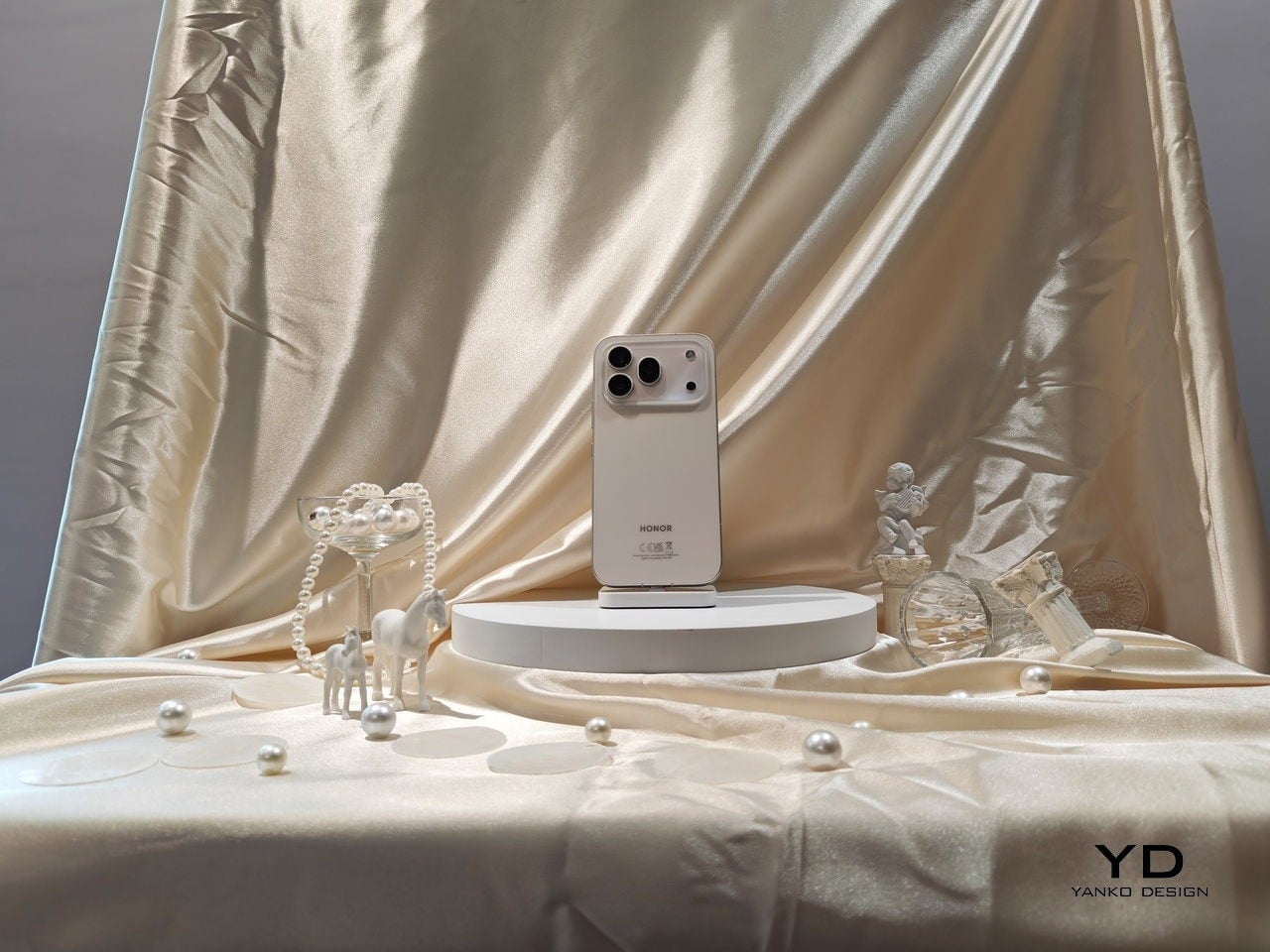
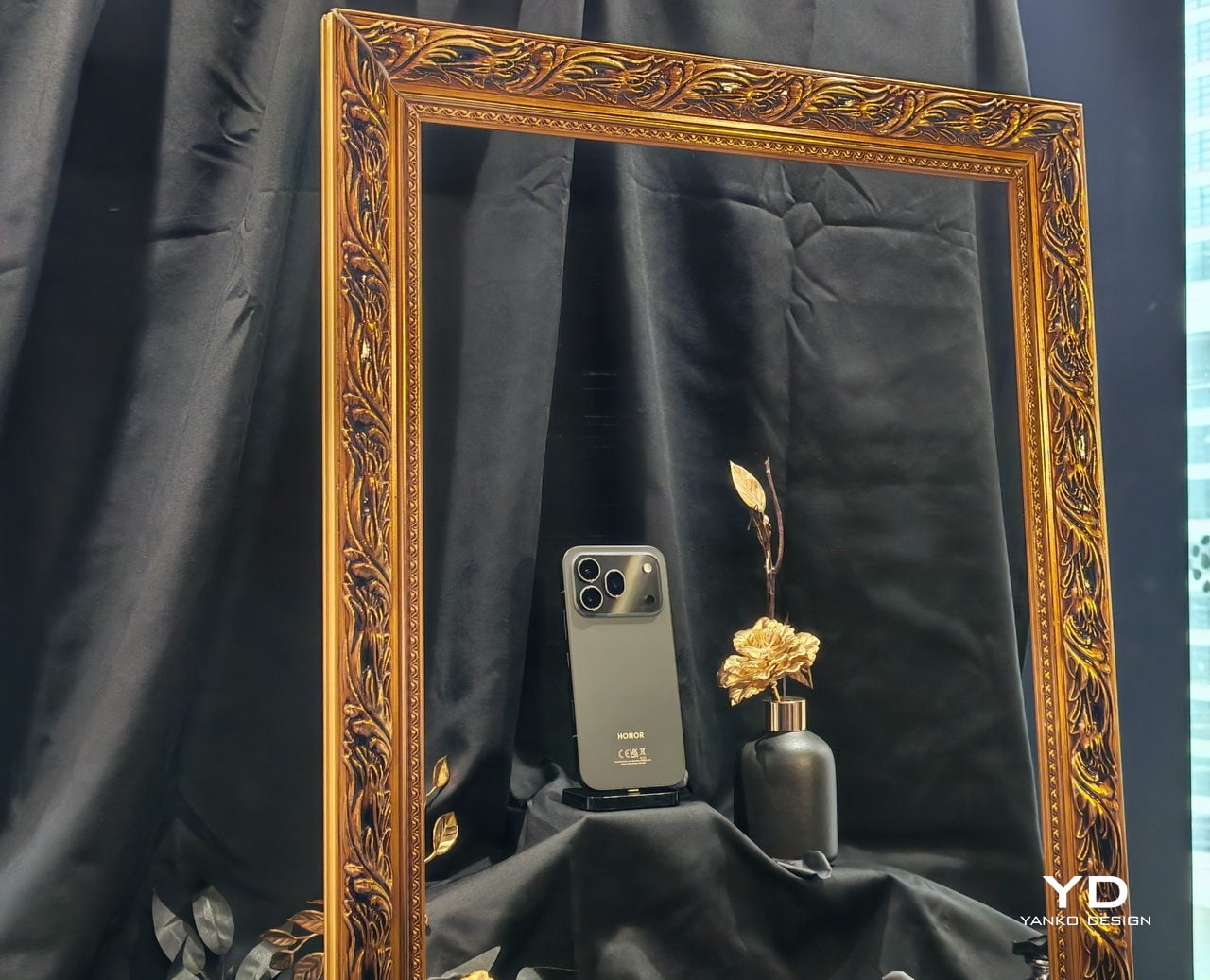
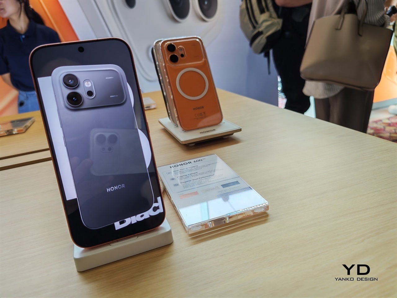
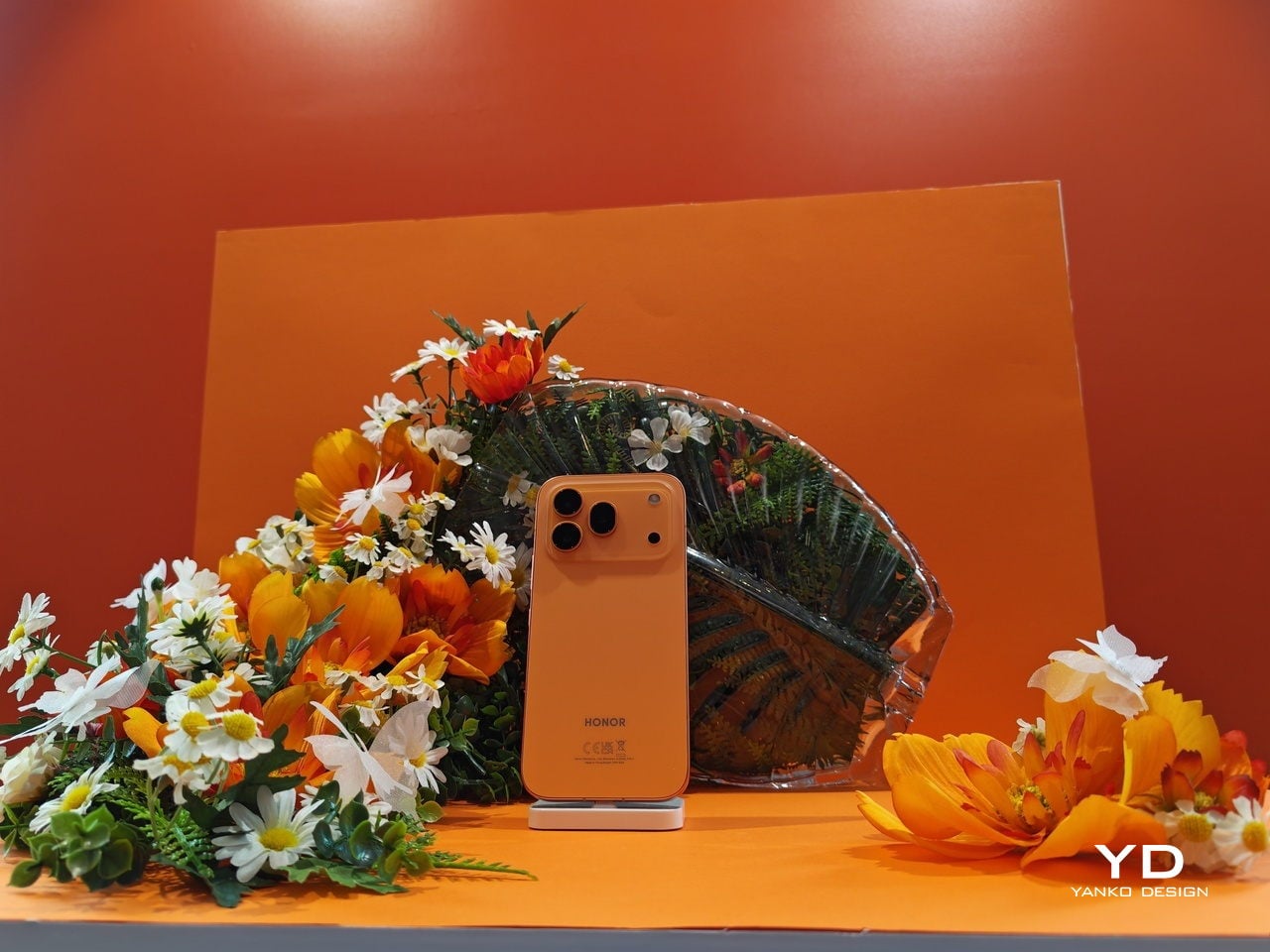
The design conversation alone was worth showing up for. HONOR used what they’re calling an integrated cold carving process to achieve a flagship-grade matte metal finish on a phone that looks premium but without the expected premium price tag. The bezels measure 0.98mm, an industry first, and they literally compared it to the string of a badminton racket, which is a very Malaysian way to explain precision and I respect it entirely. Holding the device, you feel the difference immediately. It doesn’t feel like a phone built to a budget. It feels like a phone that’s been decided upon.

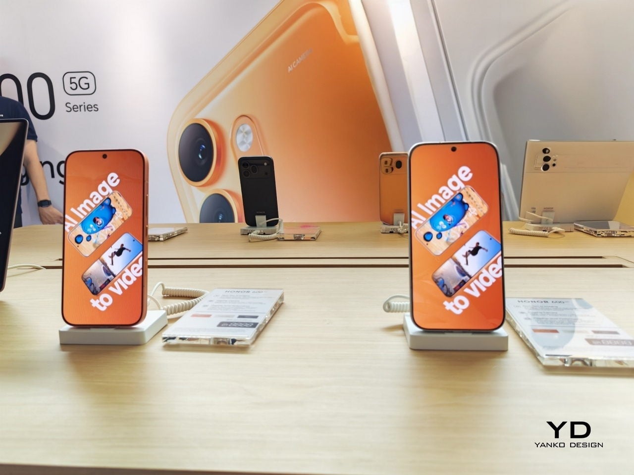
On the camera front, HONOR Imaging System Expert Dr. Weilong Hou walked through what the 200MP sensor and the 120x telephoto zoom with industry-highest CIPA 6.5 image stabilization actually means in practice. The Pro model can lock onto distant subjects with a steadiness that used to require dedicated camera equipment. For anyone who shoots street photography or travel content without a full kit, that’s a genuinely useful upgrade. The AI Image to Video 2.0 feature lets you combine up to three photos with a text prompt to generate short video sequences, no third-party apps needed. It’s the kind of feature that sounds gimmicky until you see the demo, and the on-stage result looked surprisingly natural.

The moment that stayed with me most, though, wasn’t about megapixels. It was when the conversation turned to one of the reasons why they’re bringing AI into the conversation of transforming creativity. Mr. Harald Neerland, the president of Autism Europe, shared how AI tools like what can be found on the Honor 600 series can help autistic children tell and share their stories through imagery and videos. The line that landed: “True innovation should serve humanity, especially those who communicate differently.” It’s easy to be cynical about corporate purpose statements, but this one felt grounded and specific rather than vague. Whether it fully delivers on that promise over time is the real question, and worth watching.

Back to the specs, because they matter. The 7,000mAh silicon carbon battery was demonstrated through an F1-style simulation that put the HONOR 600 up against an iPhone and a Samsung in an endurance test that was also quite funny, with the Honor car pushing Samsung towards the finish line when it ran out of “gas”. Another standout feature that was highlighted was that the 8,000-nit display with HONOR’s Eye Comfort technology means you can actually use the phone in full Malaysian sun without squinting, while also protecting your eyes during late-night scroll sessions. The IP69K rating, the highest water and dust protection available, means a heavy downpour is genuinely not a concern. Neither is dropping it, thanks to the SGS 5-star Drop and Crush Certification.

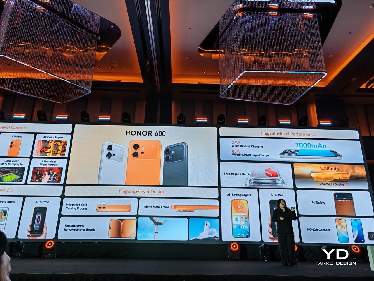
With a price range between $650-850, the HONOR 600 Series is pitching itself squarely in the accessible flagship bracket, the space where most people actually shop. It’s not trying to out-premium the ultra-luxury tier. It’s trying to make flagship-level hardware feel normal, attainable, and beautifully designed. Malaysia being the first market for this global launch isn’t just a footnote. It’s a signal. And if the 600 Series performs the way it looks, HONOR may have just made their most compelling argument yet for staying at the top of that Android chart.

Full review of the Honor 600 coming soon!

The post Honor Just Made Malaysia Its Global Launch Pad for the Honor 600 first appeared on Yanko Design.

Yamaha Just Made a Pen That Writes With a Beat

If you asked most people to name a Yamaha product, you’d probably get piano, guitar, or motorcycle long before anyone said pen. And yet here we are, talking about a writing instrument from one of the most iconic music and motor companies in the world. The Swing Scribe is not a gimmick. It’s a genuinely fascinating piece of design thinking, and it deserves far more attention than it’s been getting.

Part of Yamaha’s Scribe Tool Design 2024 project, the Swing Scribe is a collaboration between Yamaha Corporation and Yamaha Motor designers based in the US. The project’s premise is simple but surprisingly profound: in an age saturated with digital tools, what happens when you return to something as primitive as writing? And more importantly, what can you add to it, not to make it smarter or faster, but to make it more felt?

Designer: Yamaha

The Swing Scribe answers that question with a pen that behaves like a metronome. The design draws its inspiration from the quill, one of the oldest writing instruments in history. As you write, the natural wobble of the feather gives the pen rhythm through a small amount of air resistance. Yamaha took that phenomenon and made it intentional. A weighted tip is attached to a metal bar, and as you write, it swings. The small pendulum force produced by the weight and the movement gives a rhythm to the pen and the way it flows, feeding that beat back into your hand.

What’s particularly clever is the degree of control built into it. You can slide the weight along the bar to change the arc of the swing, adjusting resistance and tempo to match how you’re feeling at any given moment. Slow and contemplative? Let it swing wide. Fast and focused? Pull the weight closer. It sounds like a small, quiet thing, but it genuinely reframes the act of writing as something that has a beat, a pace, its own kind of mood.

This is deeply Yamaha. The company has a long-standing design philosophy rooted in the Japanese concept of Kando, which translates roughly to emotional excitement or deep resonance. The goal isn’t just functionality. It’s feeling. It’s the reason a Yamaha piano doesn’t only produce notes but creates a whole physical experience for the player, something that connects the body to the sound. The Swing Scribe takes that same philosophy and applies it to a writing tool.

I’ll admit my first reaction was skepticism. A pen that swings on a metal arm sounds like something you’d appreciate in a design exhibit and then immediately set down. But the more I thought about it, the more it made sense. We’ve spent years optimizing handwriting out of our lives. Keyboards are faster. Voice memos are easier. Dictation tools have gotten good enough to be genuinely useful. And yet journaling, sketching, hand-lettering, and analog note-taking are having a real cultural moment right now. People aren’t returning to pen and paper purely out of nostalgia. They’re returning because it feels different from every other thing they do. Because it slows them down in a way that makes room for actual thinking.

The Swing Scribe leans into that completely. It doesn’t try to make handwriting more efficient. It makes it more deliberate, more sensory, more present. And it does all of this with a mechanism that is elegant in its simplicity. No batteries, no Bluetooth, no companion app. Just physics. Not everything needs to be optimized. Some things are better when they resist you slightly, when they swing a little off-center, when they remind you that creating something by hand is its own reward. Yamaha, of all companies, probably understood that long before the rest of us caught up.

The post Yamaha Just Made a Pen That Writes With a Beat first appeared on Yanko Design.

The Side Table That Holds One Book Right in Its Legs

Most furniture design is an exercise in addition. More drawers. More shelves. More compartments to fill with things we forget we own. It is refreshing, then, to come across a piece that does the exact opposite and still lands somewhere quietly brilliant.

Meet the Notch Side Table, designed by Liam de la Bedoyere of Bored Eye Design. It is a flat-pack side table made of wood, clean-lined and minimal in the way that good, thoughtful furniture tends to be. From certain angles, it looks almost unremarkable. Two sets of paired legs, a flat top, honest grain. Then you look between the legs and notice the cutout, a precisely carved notch sized to hold a single book suspended between the panels, spine facing out, held steady by the tension of the slot. That is it. That is the entire idea. And somehow, it is one of the more satisfying design moves I have seen in a while.

Designer Name: Liam de la Bedoyere (Bored Eye Design)

The designer’s own framing says it best: material is removed to add use. Rather than building up, de la Bedoyere carved away. By taking wood out, he created a dedicated slot that functions as a book holder without adding any extra hardware, brackets, or fussy mechanisms. The notch is load-bearing in the most elegant sense of the word. It is structural and functional all at once, and it costs the table almost nothing to include. That kind of efficiency is harder to achieve than it looks.

Bored Eye Design is a one-person independent studio, and the Notch feels like the kind of piece that could only come from someone working without a committee. There is a specificity to it, an opinion embedded in the design, that bigger furniture brands tend to sand down in favour of mass appeal. De la Bedoyere has been quietly putting out thoughtful concepts through his Instagram, and the Notch is the one that feels most resolved. It has a clear point of view.

That point of view, as far as I can read it, is about intentionality. The notch holds exactly one book. Not a stack, not an assortment of odds and ends, just one. That constraint is a feature, not a limitation. It asks you to choose. It reminds you, every time you walk past it, that you had a book you were reading, that you actually meant to pick it back up. The book is not tucked away out of sight. It is displayed between the legs of the table like a small personal exhibit.

That is a subtle but genuinely interesting cultural statement about how we relate to the things we claim to care about. Books are increasingly used as decor, stacked artfully on coffee tables in colours that match throw pillows. The Notch does not stack them. It slots one in at midpoint, visible and accessible, in a way that feels more honest than a colour-coordinated pile ever could.

Practically speaking, the flat-pack construction means the table ships flat and assembles without tools that would make your Sunday miserable. The joinery is clean, and the interlocking parts are visible in the design in a way that feels deliberate rather than accidentally exposed. Looking at the disassembled photos, there is a puzzle-like quality to the whole thing that makes it more interesting, not less.

The material is ash wood with a warm, pale grain, and the photos styled with what appears to be a Dieter Rams monograph slotted in the notch feel entirely on brand. That orange spine against the pale timber is doing real editorial work, and it is hard not to appreciate the faintly meta quality of a design book being cradled by a well-designed table.

Whether the Notch moves into full production beyond its current personal project status, I genuinely hope it does. Furniture that nudges you toward more thoughtful habits without being preachy about it is rare. The Notch does not lecture you about slowing down. It just makes it a little easier to do exactly that, by doing less with considerably more conviction.

The post The Side Table That Holds One Book Right in Its Legs first appeared on Yanko Design.

A Seoul Design Student Built an AI Speaker Around Namsan Tower

Namsan Tower stands at the center of Seoul like a declaration. It doesn’t just sit on a hilltop watching over the city; it has always been a transmitter, physically sending signals outward to every corner of a metropolis that never slows down. For most people, it’s a tourist destination, a date-night landmark, the place you go to lock a padlock and feel poetic about love. But for Juhyun Lee, a design student at Hongik University, it was a brief. A very interesting brief.

AION is Lee’s concept for an AI assistant device, and the connection to Namsan Tower isn’t decorative or coincidental. The tower’s original function as a broadcast tower, a structure purpose-built for transmitting information across an entire city, is the actual design philosophy behind it. Lee took that idea and scaled it down: what if a single object on your kitchen counter, or your desk, or your bedside table, could do something similarly intentional? Not just respond to commands, but transmit meaning through light and sound in a way that actually fits how you live? That question is what makes AION more interesting than the average concept speaker.

Designer Name: Juhyun Lee

The device combines speaker and lighting functions, but the point isn’t really the hardware. The point is how it communicates. AION is designed to provide context-aware information, meaning it adapts to what you actually need in the moment rather than just playing music until you ask it something. In a design landscape crowded with smart speakers that are essentially cylinders with microphones, a concept that thinks about situational awareness and ambient communication feels genuinely worth the attention.

Light as a communication tool is an underused idea in home technology, and it puzzles me that more designers haven’t pushed harder here. We’re surrounded by screens that demand our eyes, and speakers that demand our ears. The quiet alternative, light that shifts and signals without interrupting you, is something AION seems to understand. There’s a reason we find a lamp calming and a notification alarming. The difference is mostly about how information reaches us, not what the information actually is.

The name AION is borrowed from Greek, where it carries meanings of “age” and “eternity,” a word associated with cyclical time and continuity rather than a single moment. That choice doesn’t feel arbitrary. A tower that has broadcast through decades of a city’s history, and a home device designed to integrate into the ongoing rhythm of daily life, share a certain kind of permanence in their logic. They aren’t built for a single interaction. They’re built to always be there, doing their job quietly in the background.

What’s refreshing about Lee’s approach is the restraint. Concept design can easily become an exercise in maximalism, stacking features and rendering a product that looks cinematic but has no real relationship to how humans actually use things. AION doesn’t appear to fall into that trap. The Namsan Tower reference isn’t about aesthetics alone; it’s a framework that disciplines the design. You start with a clear function, a clear reason for existing, and you build outward from there.

Hongik University has produced a lot of notable designers over the years, and Lee’s project earns its place in that tradition not because it’s technically revolutionary, but because it’s conceptually coherent. The thinking is visible. You can follow the logic from inspiration to outcome, and that kind of transparency in a design brief is rarer than it should be.

Whether AION ever moves past concept stage is probably the wrong thing to focus on. The more useful takeaway is what it suggests about the future of AI devices in general: that the most compelling ones won’t necessarily be the smartest or the loudest, but the ones that know when to speak in light instead of sound, when to blend into the room, and when to make themselves known. Seoul’s tower has been doing exactly that for decades. Someone just finally took notes.

The post A Seoul Design Student Built an AI Speaker Around Namsan Tower first appeared on Yanko Design.

The 3D-Printed Chair That Moves With You, Not Against You

The first time I looked at the Flow Chair, I thought it was a sculpture. The sinuous, looping form bending into itself like a standing wave frozen mid-motion. No visible joints, no screws, no padding, no legs in the traditional sense. Just one continuous ribbon of material that somehow, impossibly, holds a person’s weight while gently rocking beneath them.

That last part surprised me. The Flow Chair, designed by Daniel Streilein and Henry Boy of the German studio Boldobjects, is not actually a chair in the way we typically think about chairs. It’s a rocking stool, and it functions through the intelligence of its shape rather than through any kind of mechanism. You shift your weight, and it responds. You lean forward to concentrate, and it follows. You settle back, and it adjusts. No moving parts. No knobs to turn. No assembly required. The geometry does all the work.

Designers: Daniel Streilein and Henry Boy (Boldobjects)

I’ve been thinking about this a lot lately, specifically the idea that so much of modern ergonomic furniture design has overcomplicated the act of sitting. We’ve added lumbar supports and pneumatic height adjustors and tilt-tension knobs, and yet most office workers still end the day with a stiff back and a neck that sounds like a bowl of cereal. The Flow Chair is a direct argument against all of that. Its proposition is simple: give the body room to move, and it will figure out the rest.

The manufacturing process is just as interesting as the design itself. The Flow Chair is produced using large-scale pellet 3D printing, a more industrial cousin of the desktop 3D printing most people are familiar with. This process allows for the kind of fluid, organic geometry that would be nearly impossible, and almost certainly cost-prohibitive, to achieve through traditional molding or casting. You can actually see the layer lines running across the surface of the chair, horizontal bands that trace the path of the print head as it built the form up from nothing. Most designers would treat those lines as a flaw. Streilein and Boy treat them as texture, a visual record of how the object came to be. I find that genuinely compelling. The chair doesn’t hide what it is.

What makes the sustainability story here worth paying attention to is that it isn’t just a marketing footnote. The Flow Chair is made from a single material: recycled PETG. No adhesives, no hardware, no secondary components of any kind. When the stool eventually reaches the end of its life, it can go back into the production cycle without complex processing. The branding is embossed directly into the base material rather than applied as a separate label. Even the decision to manufacture locally in Germany shortens the supply chain in a meaningful way. Every design choice reinforces the same intention, and that kind of coherence is rarer than it should be.

It also comes in a range of colors including deep forest green, powder blue, sage, and near-black, which tells you something about how Boldobjects is thinking about this object. It’s not purely a functional tool. It’s a considered, designerly thing meant to live in real spaces with real aesthetics. Looking at the photographs, it holds its own in a warm, book-lined study just as well as it does in an eclectic living room. That versatility is harder to engineer than it looks.

The Flow Chair sits, if you’ll allow the pun, at an interesting intersection. It belongs in a conversation about sustainable materials and digital fabrication, yes, but it also belongs in a conversation about what good design actually feels like to live with. Not just to look at. Not just to Instagram. To actually use, day after day, in the small and ordinary act of sitting down. That turns out to be a higher bar than most furniture ever clears.

The post The 3D-Printed Chair That Moves With You, Not Against You first appeared on Yanko Design.

Backcountry’s Scandi Inn Makes 270 Sq Ft Feel Generous

The tiny house movement has had its share of aesthetic whiplash over the years. One week it’s shiplap and barn doors, the next it’s industrial pipe fixtures and Edison bulbs. So when something comes along that actually commits to a visual language and carries it through consistently, it’s worth paying attention. The Scandi Inn by Backcountry Tiny Homes is one of those rare builds that knows exactly what it is.

At 270 square feet and 24 feet long, the Scandi Inn sits on a triple-axle trailer and borrows its design sensibility from Scandinavian interiors. Cedar tongue-and-groove siding on the exterior, paired with metal cladding, gives it that understated cabin quality that reads more European alpine than American backwoods. It doesn’t shout for attention, which is a deliberate choice, and the right one.

Designer: Backcountry Tiny Homes

Step inside, and the interior is finished entirely in tongue-and-groove pine. The effect is warm without being heavy, which is genuinely hard to pull off in a small space. Nordic design has always understood the relationship between wood and light, using natural materials to compensate for limited square footage and often-limited daylight. In the Scandi Inn, that same logic applies, and it translates surprisingly well to a 270-square-foot box on wheels. The overall atmosphere lands somewhere between a mountain cabin and a well-curated hotel room, which is a balance most interior designers wouldn’t attempt at full scale, let alone this one.

The layout makes serious use of every inch. The kitchen includes a breakfast bar that seats two, alongside a dining area, a living room, and a tiled shower bathroom. A loft bedroom sits above the main floor, and a reading nook tucks into the plan somewhere in between, which is the kind of detail that separates a thoughtful design from a merely functional one. A reading nook isn’t about space efficiency. It’s about acknowledging that people need places to exist quietly, even in small homes. Especially in small homes.

The Scandi Inn sleeps up to three people, which is ambitious for 270 square feet but not unrealistic. The loft configuration handles sleeping without eating into the main living space, a solution that tiny house designers have relied on for years. What makes it work here is that the loft doesn’t feel like an afterthought squeezed in at the last minute. It feels planned, proportional, and consistent with the rest of the interior.

Backcountry Tiny Homes has built a reputation for custom builds that take their design cues seriously, and the Scandi Inn reflects a clear maturity in that thinking. Earlier tiny house builds, from this maker and others, often suffered from the same problem: too many styles competing for attention in a space that couldn’t support the noise. The Scandi Inn has none of that. The palette is restrained, the material choices are cohesive, and the proportions feel considered rather than accidental.

The turnkey price lands at $77,800, which in the current housing market feels almost quaint. That’s not a dismissal of the cost. It’s a significant sum. But context matters. The average home price in the US continues to climb past the reach of a growing number of people, and builds like the Scandi Inn represent a legitimate alternative for those rethinking what homeownership can look like. It’s not a compromise so much as a reorientation of priorities.

The tiny house conversation used to center on sacrifice, on what you give up, what you do without, how you make peace with less. The Scandi Inn frames it differently. The quality of the materials, the cohesion of the design, and the genuine livability of the layout suggest that the goal was never to shrink a house. It was to build something intentional from the start. That distinction matters more than it might seem. Most spaces, regardless of size, feel the way they do because of decisions made about materials, light, layout, and proportion. The Scandi Inn makes good decisions throughout. At 270 square feet, that’s all it needs to do.

The post Backcountry’s Scandi Inn Makes 270 Sq Ft Feel Generous first appeared on Yanko Design.

A Designer Just Fixed Foundation’s Biggest Waste Problem

Most sustainable beauty products come with a visual apology. You know the look: matte recycled paper, utilitarian shapes, a general aesthetic that signals good intentions while quietly penalizing you for having taste. Designer Sanya Jain’s unsolicited concept for a Tata Harper foundation system refuses that trade-off entirely, and the result is one of those rare design exercises that feels more polished than half the things sitting on Sephora shelves right now.

Tata Harper, for anyone who hasn’t fallen into that particular rabbit hole, is the brand that built its entire identity on the idea that luxury and purity don’t have to be in conflict. Founded in 2010 and formulated on an organic farm in Vermont, the brand made its name in skincare with 100% natural, high-performance formulas free of synthetic chemicals, toxins, and fillers. It’s a rigorous philosophy, and one that its existing packaging already respects to a degree. But the color cosmetics side of things has always felt like an unfilled gap. Jain spotted that gap independently, and used it as the brief for something worth paying attention to.

Designer: Sanya Jain

The concept, which she calls PureDose Foundation, centers on a refillable, modular system. The product lives inside a Viomer pod, a material valued for being lightweight, durable, and designed for circular reuse. That pod slots cleanly into a polished, gold-toned dispenser that looks less like something from a drugstore and more like a small piece of modernist sculpture you’d display on purpose. Press the top button once, and the foundation dispenses in a controlled drop directly onto a detachable metal slate positioned at the base. You load your brush from there and go. No squeezing, no guesswork, no wasted product sitting in the cap.

That last part matters more than it sounds. Foundation is one of the more quietly wasteful categories in makeup. Products get dispensed in excess, oxidize before you can blend them, or sit in bottles that are technically not empty but practically impossible to finish. The PureDose concept sidesteps most of that friction by making the application point clean, controlled, and hygienic. The metal slate rinses under the tap. The pod refills. The dispenser stays on your vanity indefinitely. It’s a smarter loop, and the fact that it manages to look this refined while doing it is not accidental.

Jain pulled from biomimicry and clean geometry throughout the design. The rounded, organic silhouettes of both the pod and the dispenser echo the natural world that Tata Harper draws from as a brand, and that kind of visual consistency is harder to achieve than it appears. The colorway options, gold, rose gold, silver, and matte black, give the system range without diluting the identity. And the unboxing experience is worth noting: a velvet-lined jewelry box for the dispenser and a kraft-paper octagonal carton for refill pods. It’s one of the more layered packaging stories I’ve come across in concept work. It understands that luxury is at least partly emotional, and that the ritual of opening something should feel like it belongs to the rest of the experience.

What makes this project compelling beyond the aesthetics is how faithfully it mirrors the brand’s existing values without any official mandate to do so. Tata Harper already commits to FSC-certified paper, transparent ingredient sourcing, and eco-conscious material choices. Jain’s concept simply asks the next question: what would a color cosmetics line look like if it operated with the same level of rigor? The answer is something that sits on your vanity like a design object, performs with precision, and leaves significantly less behind when it’s done.

Concept work in industrial design usually lands in one of two places. It either solves a real problem with no aesthetic investment, or it produces something visually stunning that would fall apart after a week of actual use. This one manages to hold both ends of that tension together, which is the harder achievement. Jain didn’t find a way to make sustainability bearable. She found a way to make it worth wanting. Whether or not Tata Harper ever sees this, the question it raises is one the beauty industry should be sitting with.

The post A Designer Just Fixed Foundation’s Biggest Waste Problem first appeared on Yanko Design.

The 40-Year-Old Lamp That Still Looks Like the Future

Some design ideas are so quietly right that they take decades to find their full audience. Oliver Michl’s Architect’s Lamp from the 1980s is exactly that kind of piece. It is a ceiling-mounted light that borrows its entire visual logic from equal space dividers, the spring-loaded drafting tools that architects and engineers use to plot perfectly even intervals across a surface. The concept sounds almost too clever when you say it out loud. And yet, the moment you see it, it just makes sense.

Michl designed the lamp during a very specific cultural pivot. The 1970s had been all about flowing, organic plastic forms. Soft curves, warm earth tones, a kind of material optimism that felt almost comforting. Then the 1980s arrived and jolted design in the opposite direction. Hard lines, industrial materials, a theatrical confidence in structure that felt almost confrontational compared to what came before. Michl, a German lighting designer who would later found Lucelab in Berlin, built the Architect’s Lamp squarely in that spirit. Steel and aluminum, full articulation, no softness anywhere.

Designer: Oliver Michl (Lucelab)

What makes the lamp genuinely interesting, beyond its visual bravado, is how it actually functions. The scissor-like expanding structure allows the piece to adjust both in height, ranging from about 41 to 79 inches, and in width, from 41 to 60 inches. Because it hangs from the ceiling rather than sitting on a desk or floor, the light it casts is ambient rather than task-focused. This was never a reading lamp. It was always a statement, and a rather bold one. Michl made the deliberate choice to take a mechanism that belongs at a drafting table and scale it up for overhead use. That kind of lateral thinking, the willingness to transplant a tool from one context and drop it into a completely different one, is harder than it looks. Most attempts at it feel gimmicky. This one feels inevitable.

There is a particular intelligence in designing a lamp that operates like this. Most lighting from that era leaned one way or the other, either purely functional or purely decorative, rarely both at the same time. The Architect’s Lamp refuses that binary entirely. It performs, and it reads as kinetic sculpture. The expanding grid of its structure, when viewed from below, creates a repeating geometric pattern that visibly shifts with every adjustment. You are not moving a lamp. You are editing a composition, and that distinction matters more than it might sound.

Michl has always worked at that intersection of function and spectacle. His FleXXXibile luminaire, also produced under Lucelab, became a cult object among designers for similar reasons. It features a concertina lattice that can be precision-aimed at a specific point, and it has never really left the design conversation. The Architect’s Lamp arrives at the same sensibility from a different angle. Both pieces suggest a designer who finds moving parts not just practical but genuinely compelling. The mechanism, in Michl’s work, is always part of the message.

The lamp currently lives at Blackman Cruz, the Los Angeles gallery that specializes in exactly this kind of historically significant object. It is listed at $5,500, which is real money, but it is also an original piece from Germany, circa 1980, in steel and aluminum. It has survived four decades intact, which tells you something. The pieces that do not hold up tend to disappear. The ones that keep getting rediscovered tend to deserve it.

The reason this lamp keeps resurfacing in design conversations right now is not nostalgia. It is recognition. The industrial-meets-sculptural vocabulary that dominates so many contemporary interiors, the hard edges, the mechanical articulation, the idea that a light fixture can function as architecture, all of it circles back to what Michl was already doing forty years ago. He was early, and the design world was not paying close enough attention. The Architect’s Lamp is a reminder that some of the most interesting ideas do not announce themselves loudly. They just wait.

The post The 40-Year-Old Lamp That Still Looks Like the Future first appeared on Yanko Design.

The Ghost of Carlo Mollino’s Best Table Has Finally Arrived

Some designs don’t age. They just wait. The Vertebra table by Carlo Mollino has spent the last 75 years doing exactly that, existing in the margins of design history as a tantalizing “what if.” Created in 1950, the piece was only ever realized in two physical examples, both of which eventually found their way to auction houses where collectors paid serious money to own a slice of Mollino’s particular brand of genius. The rest of us could only stare at photographs.

That changes this week. Italian design house Zanotta has acquired the Carlo Mollino archive from the Italian State through a public tender, securing exclusive rights to produce 30 of his designs. The first piece to come out of that deal is the Vertebra table, which is making its industrial production debut at Milan Design Week 2026. For anyone who follows design even loosely, this is a genuinely exciting moment.

Designer: Zanotta (Carlo Mollino)

If the name Carlo Mollino isn’t immediately familiar, here’s the short version: he was a Turin-born architect, designer, photographer, racing driver, skier, and aviation enthusiast who lived from 1905 to 1973 and made everyone around him look like they weren’t trying hard enough. He synthesized Expressionism, Futurism, Organicism, and Surrealism into a design language that felt simultaneously ancient and far ahead of its time. His furniture didn’t follow trends. It followed the human body.

That’s precisely what makes the Vertebra table so arresting. The name isn’t decorative. Mollino perceived furniture not as mere decoration, but as an extension of the body in motion, and the Vertebra’s sinuous, almost skeletal structure makes that philosophy literal. Its base is formed from a single continuous sheet of plywood that curves and flexes in ways that feel less like woodworking and more like anatomy. Look at it long enough and you start to see ribs, joints, a spine caught in mid-motion. It’s the kind of design that makes you forget you’re looking at a table.

The production history adds a certain poetry to the moment. Mollino spent much of his career working with a carpentry workshop in Turin to create pieces in limited runs, often for specific clients. The Vertebra was originally designed for the Lattes publishing house in Turin. That it never made it to industrial production during his lifetime is one of those quiet design world tragedies that don’t get talked about enough. His furniture was always collector territory, commanding extraordinary prices at auction and sitting in the collections of major design museums. Beautiful, but locked away.

What Zanotta is doing here feels like more than just a business move. By going through the Italian State, winning a public tender, and committing to serial production, they’re essentially arguing that Mollino’s work belongs to a wider audience. That’s a stance worth appreciating. Good design shouldn’t only exist in the hands of people who can afford auction house prices, and bringing a piece like the Vertebra into serial production opens up a real conversation about access, legacy, and what it means to steward a designer’s archive responsibly.

The unveiling at Milan Design Week is set within an immersive installation inside the Zanotta flagship store, where curtains fluidly define space and the organic forms of the human body serve as a visual reference. It sounds like exactly the kind of environment that would make Mollino feel at home. He was always staging things, always thinking about how space, form, and the presence of the body existed in relation to each other.

The broader archive Zanotta now holds includes tens of thousands of drawings, sketches, photographs, handwritten notes, and typed documents alongside those 30 production-ready projects. That’s a significant responsibility, and how they steward it over the coming years will say a lot about their real commitment to doing Mollino’s legacy justice. For now, though, the Vertebra is the headline. A table that waited 75 years to be made at scale, by a designer who saw furniture as something alive. It’s the kind of debut that reminds you why design history is worth paying attention to.

The post The Ghost of Carlo Mollino’s Best Table Has Finally Arrived first appeared on Yanko Design.

Raw-Edges Just Designed a Chair That Needs Zero Fasteners

Upholstery has been done the same way for centuries. Foam gets glued, tacked, or stapled onto a frame, and that’s more or less the end of the story. It’s functional, it’s reliable, and it’s almost never questioned. London-based Raw-Edges Design Studio decided it was worth questioning.

Yael Mer and Shay Alkalay, the duo behind Raw-Edges, have built their entire creative identity around exactly this kind of thinking. Founded in 2007 after the two met at the Royal College of Art, the studio has spent nearly two decades treating everyday objects as unsolved puzzles worth reopening. Their latest experimental chair design is a perfect example of how they operate: take a convention that everyone has accepted without debate, strip it down to first principles, and see if a smarter answer has been sitting there all along. The answer, in this case, is a notch.

Designer: Raw-Edges Design Studio

The chair, still unnamed and currently in the design phase, uses no adhesives, no tacks, no staples, none of the usual fasteners that hold most upholstered furniture together. The wooden frame is carved with a deliberate groove, and the upholstered foam cushion is simply wedged into it. Friction does the rest. The whole thing holds together through the logic of fit rather than the intervention of hardware. It sounds almost too simple, and that’s kind of the point.

I keep thinking about why this feels so satisfying to look at, and I think it comes down to the fact that we’ve been conditioned to accept over-engineering as a sign of quality. More parts, more steps, more materials, more adhesives: these feel like indicators of a serious product. Raw-Edges pushes back on that quietly. The notch solution is elegant precisely because it asks less of the chair, not more. It treats the materials as intelligent components that can work together without being forced.

This thinking is very on-brand for Raw-Edges. Their work sits comfortably in the permanent collections of MoMA, the Vitra Design Museum, and The Art Institute of Chicago, and the studio has collaborated with names like Louis Vuitton, Vitra, Stella McCartney, and Moroso. They’ve won the A&W Designers of the Year award, a Wallpaper Design Award, and were named Designers of the Future at Design Miami/Basel. None of that happened by accident. It’s the result of a studio that consistently asks questions other designers tend to skip over.

Their philosophy, as they describe it, begins with humble experimentation and a search for unconventional principles. That’s a gracious way of saying they don’t assume the current answer is the best one. The project is being developed in collaboration with Italian furniture company Bolzan, which strongly suggests this isn’t destined to stay a prototype forever. A saleable product feels like the logical next step, and that’s worth getting excited about.

The implications here also stretch beyond aesthetics. A chair held together by friction rather than glue or staples is, by nature, easier to take apart. The foam can be removed, replaced, or recycled separately from the frame. In a design culture increasingly preoccupied with repairability, longevity, and what happens to products at the end of their lives, this approach carries real practical weight. And it doesn’t feel like a sustainability talking point bolted onto a product after the fact. It feels like an idea that was right from the start.

Furniture design doesn’t often make headlines outside trade publications and design weeks, but this concept deserves a wider audience. Not because it’s flashy, and not because it’s about to show up in every furniture showroom next season, but because it demonstrates that design thinking is still genuinely capable of surprise. Sometimes the most powerful idea is a groove in a piece of wood and the confidence to trust it.

The post Raw-Edges Just Designed a Chair That Needs Zero Fasteners first appeared on Yanko Design.