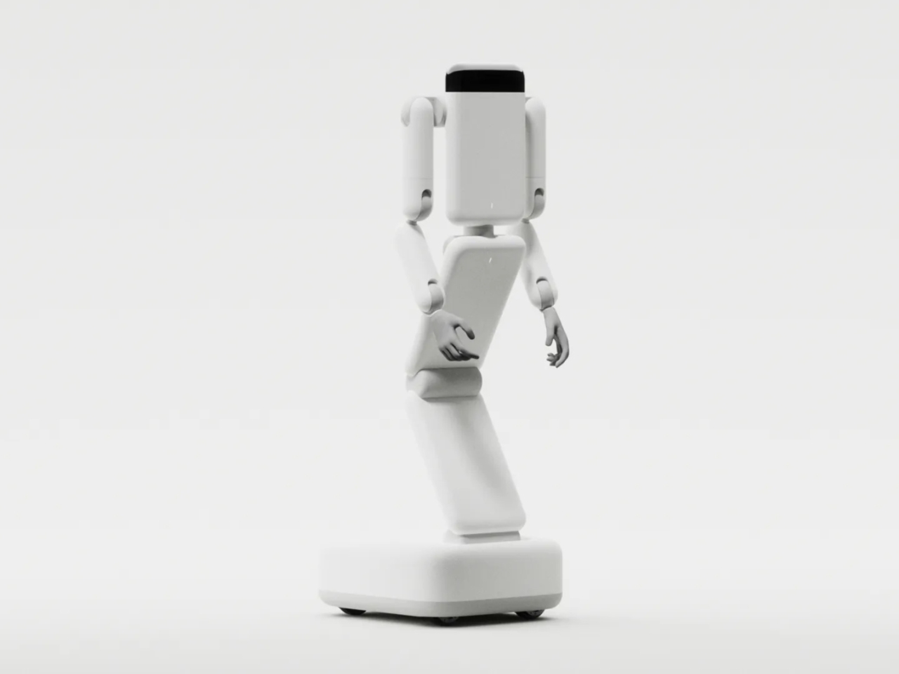
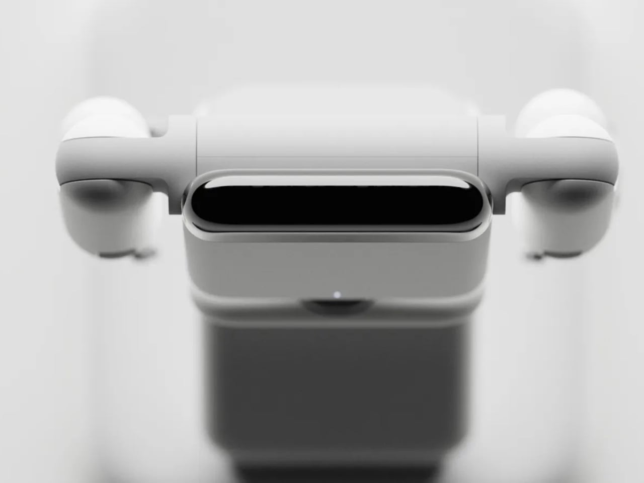
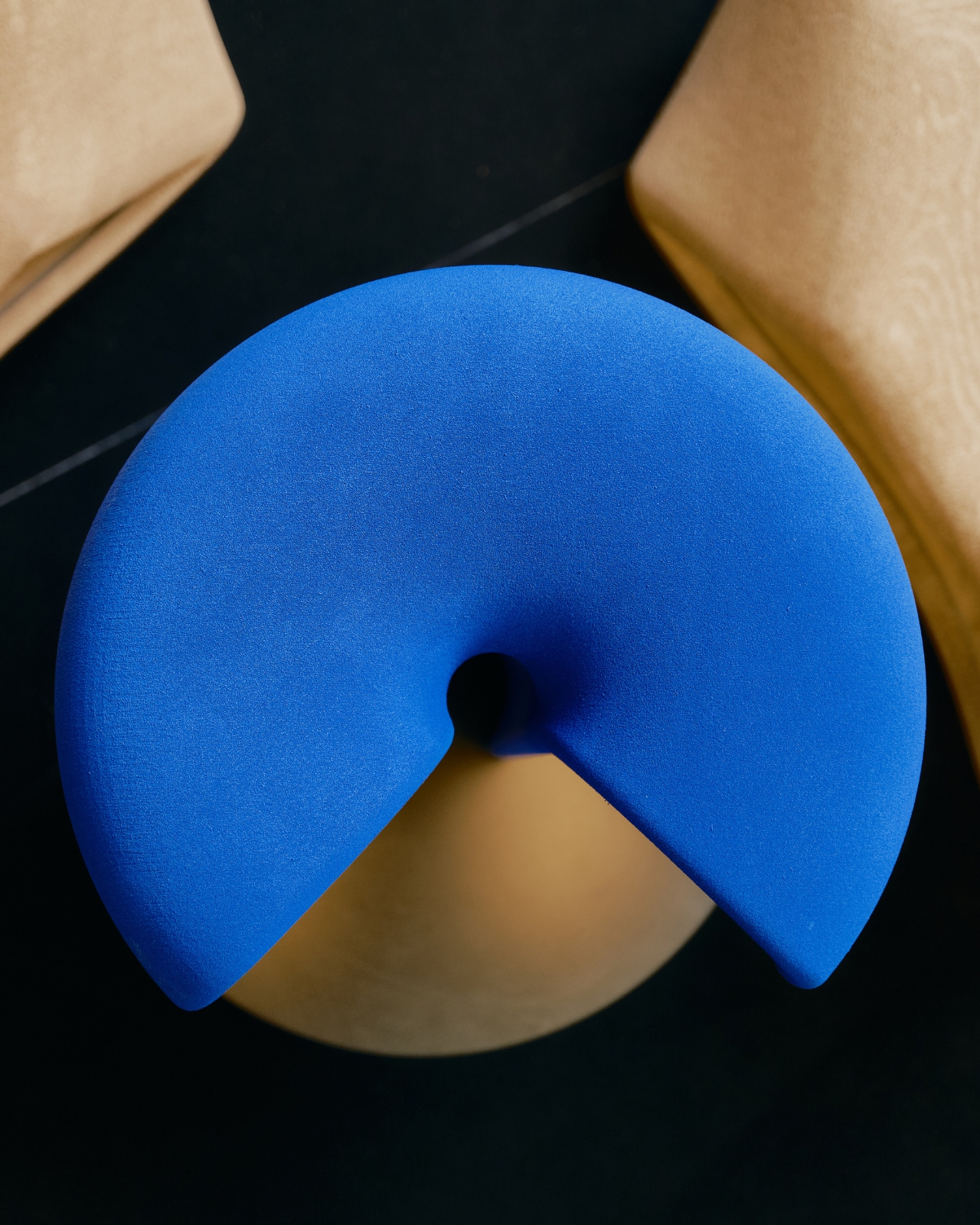
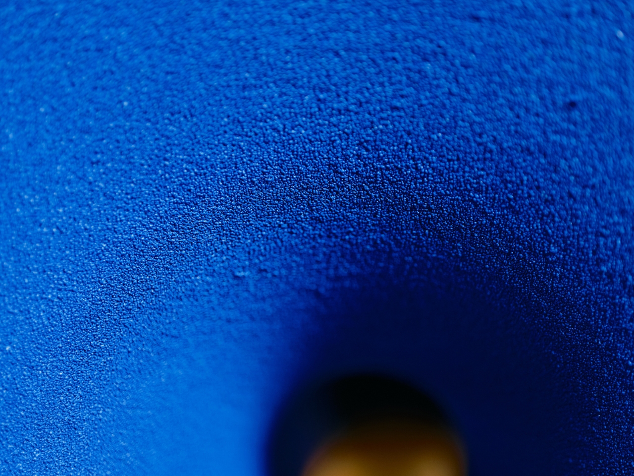
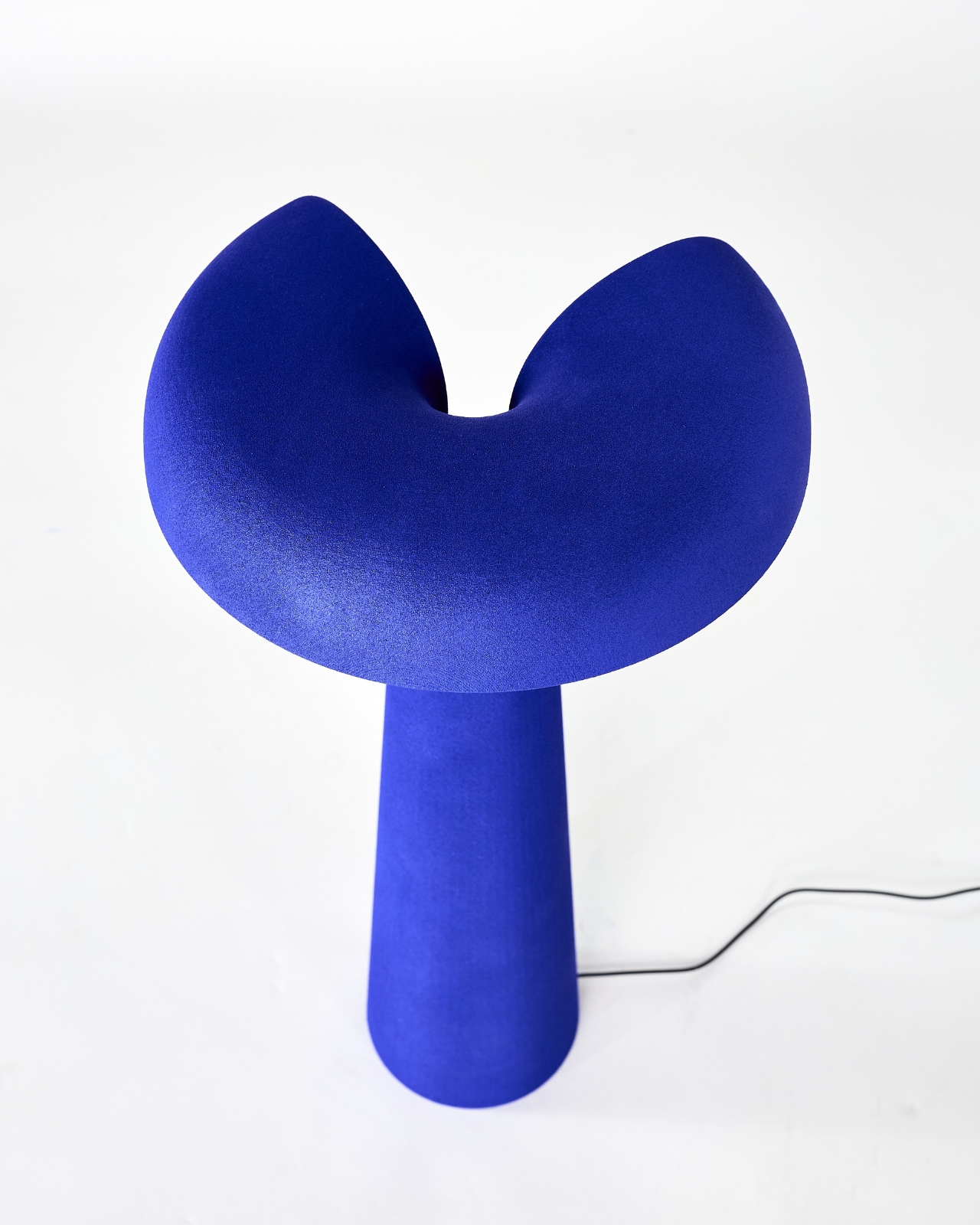
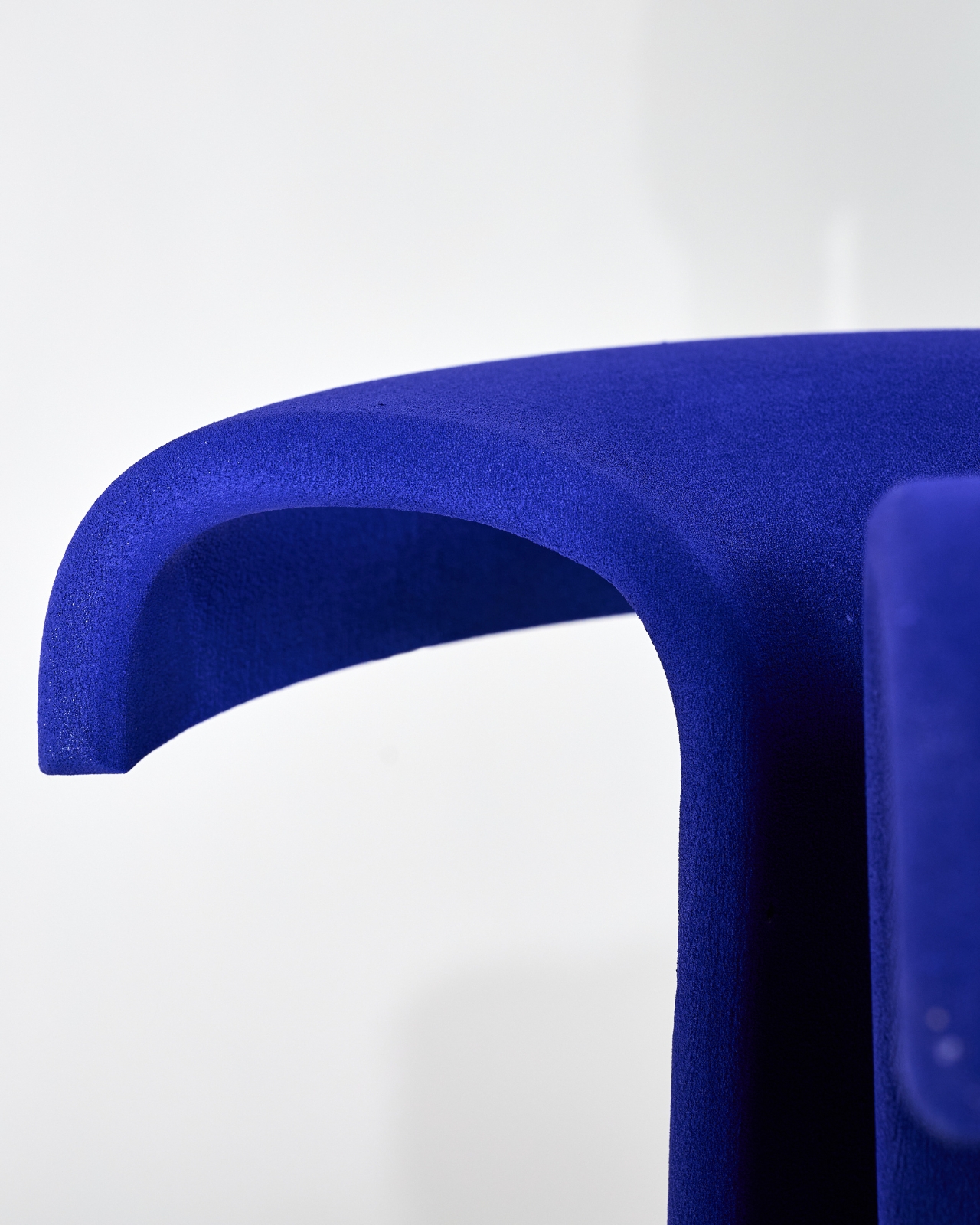
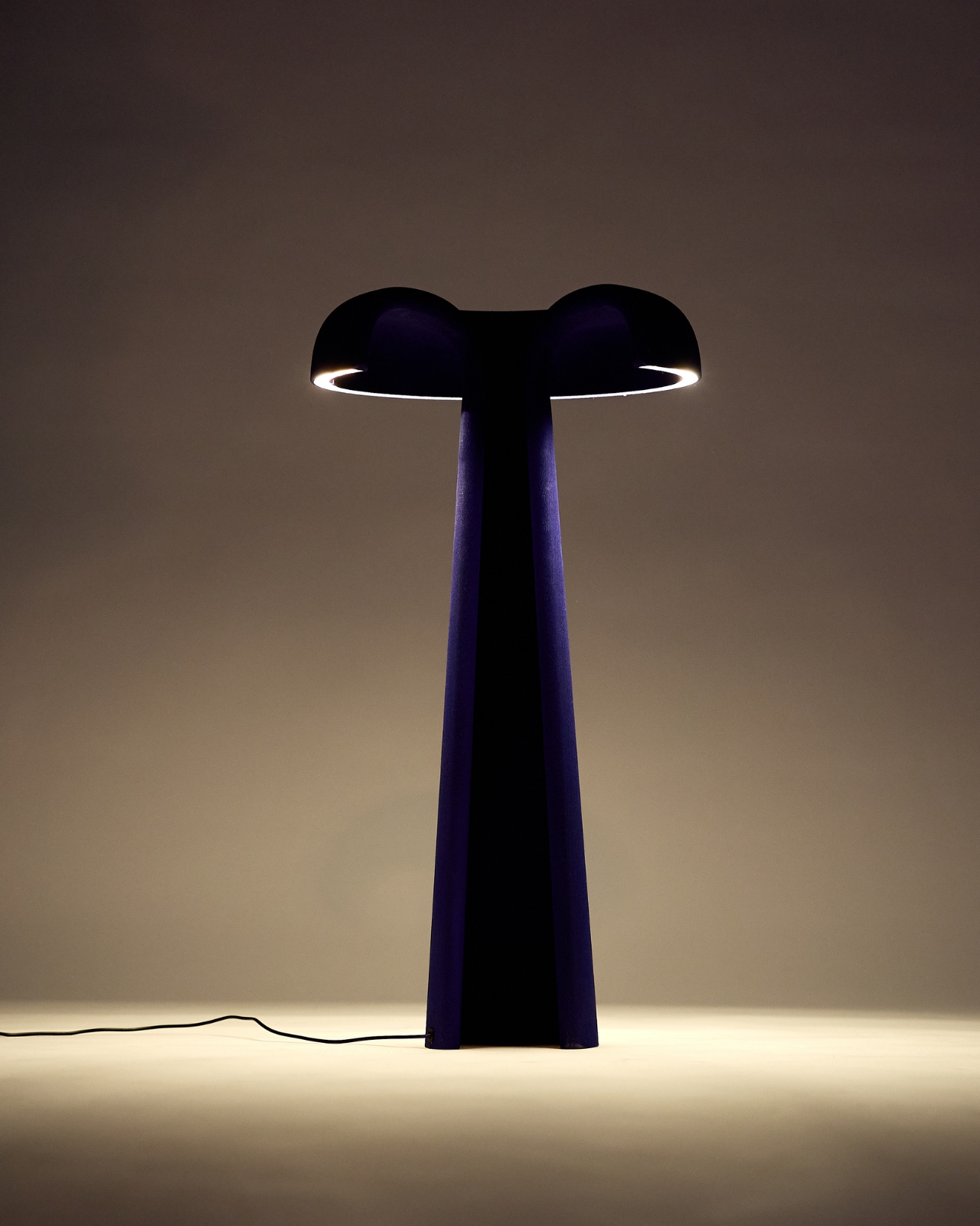
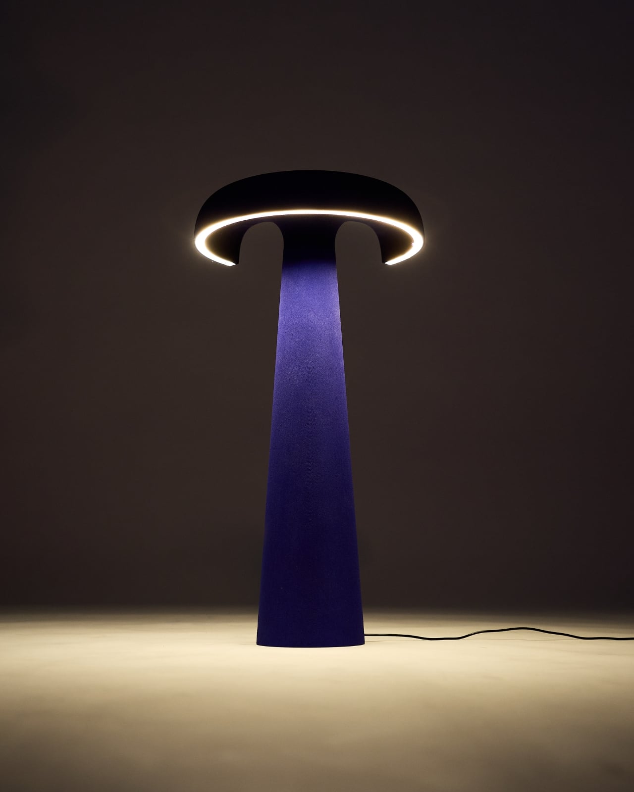
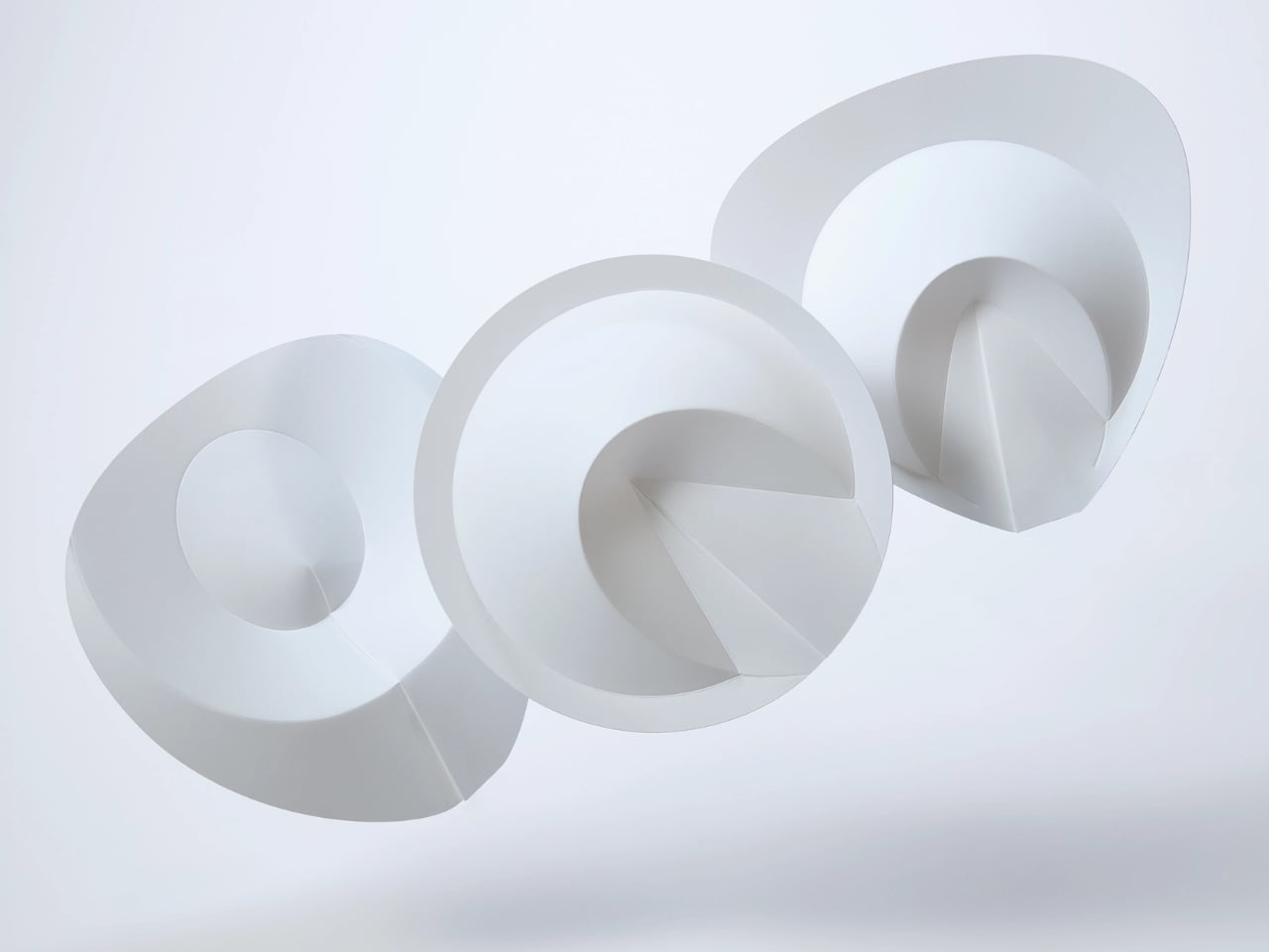
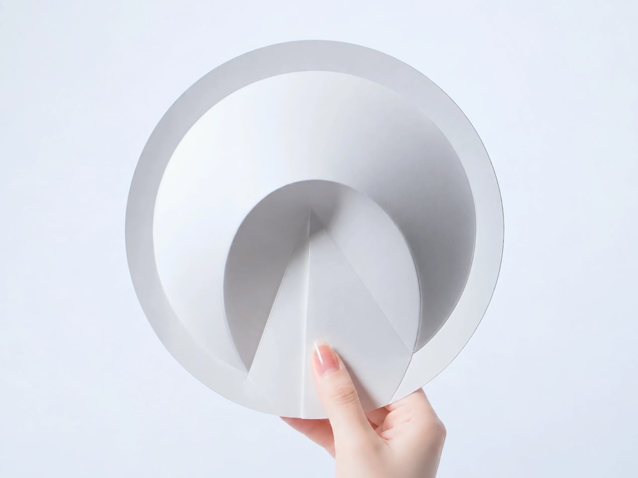
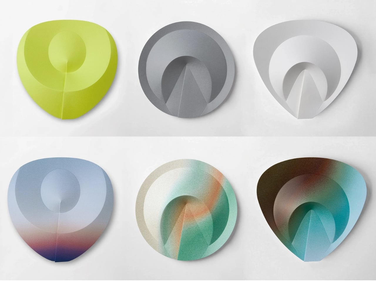
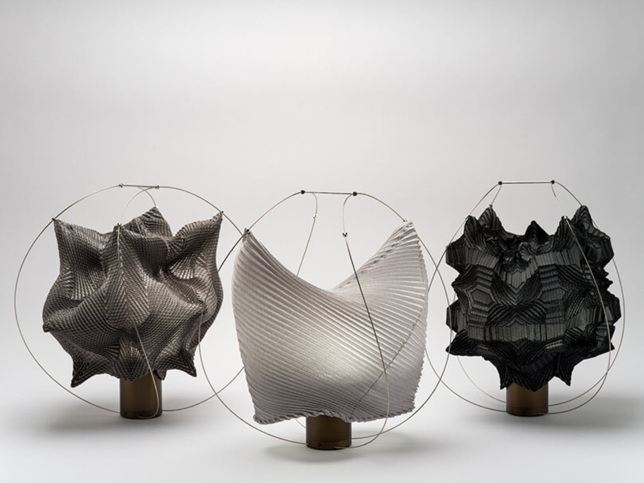
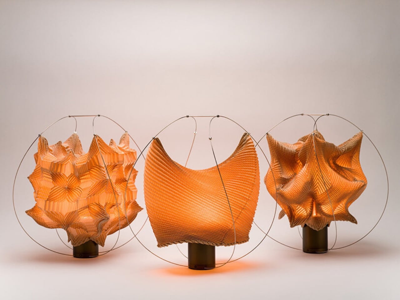
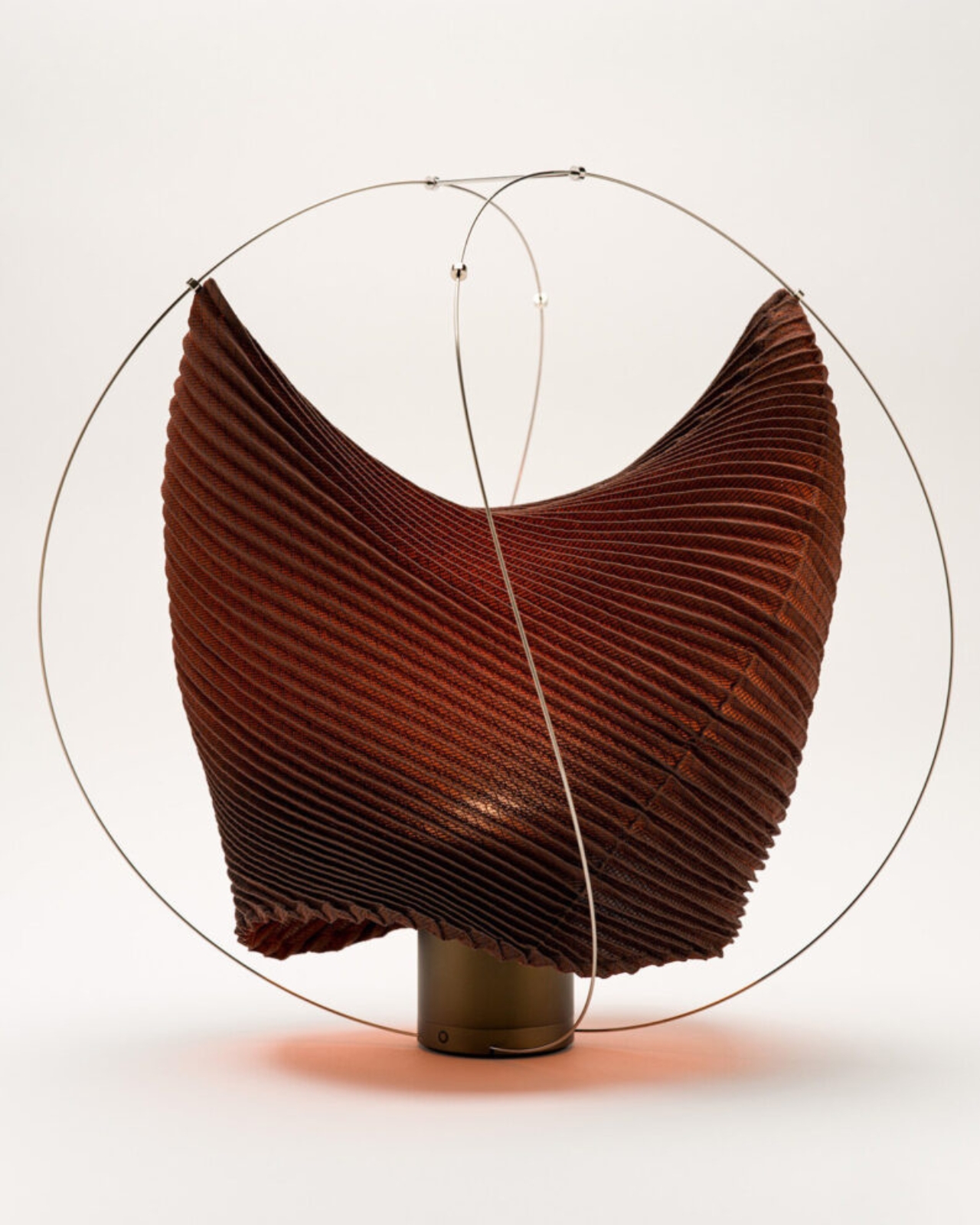
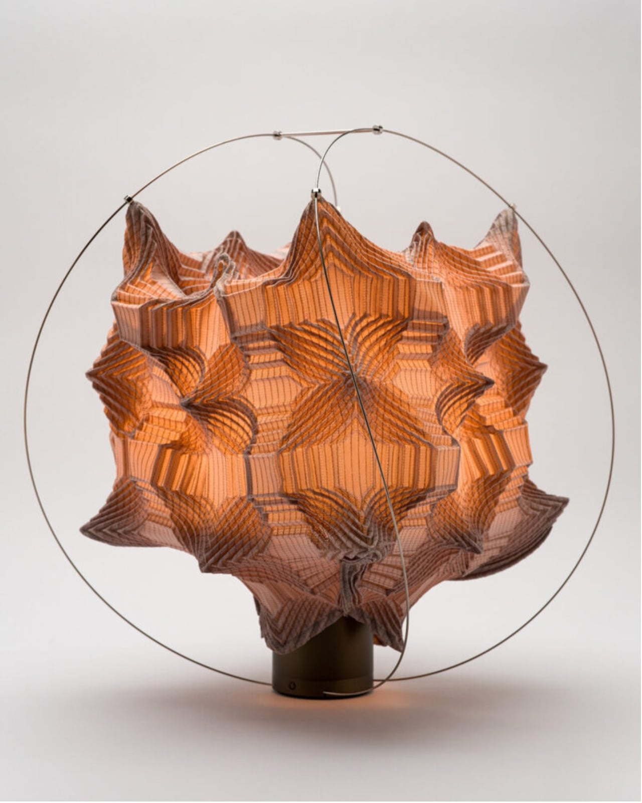
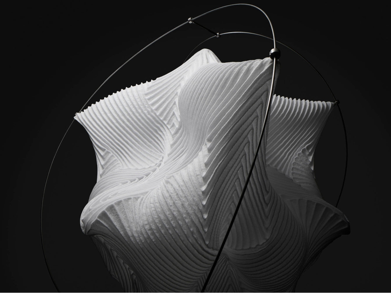
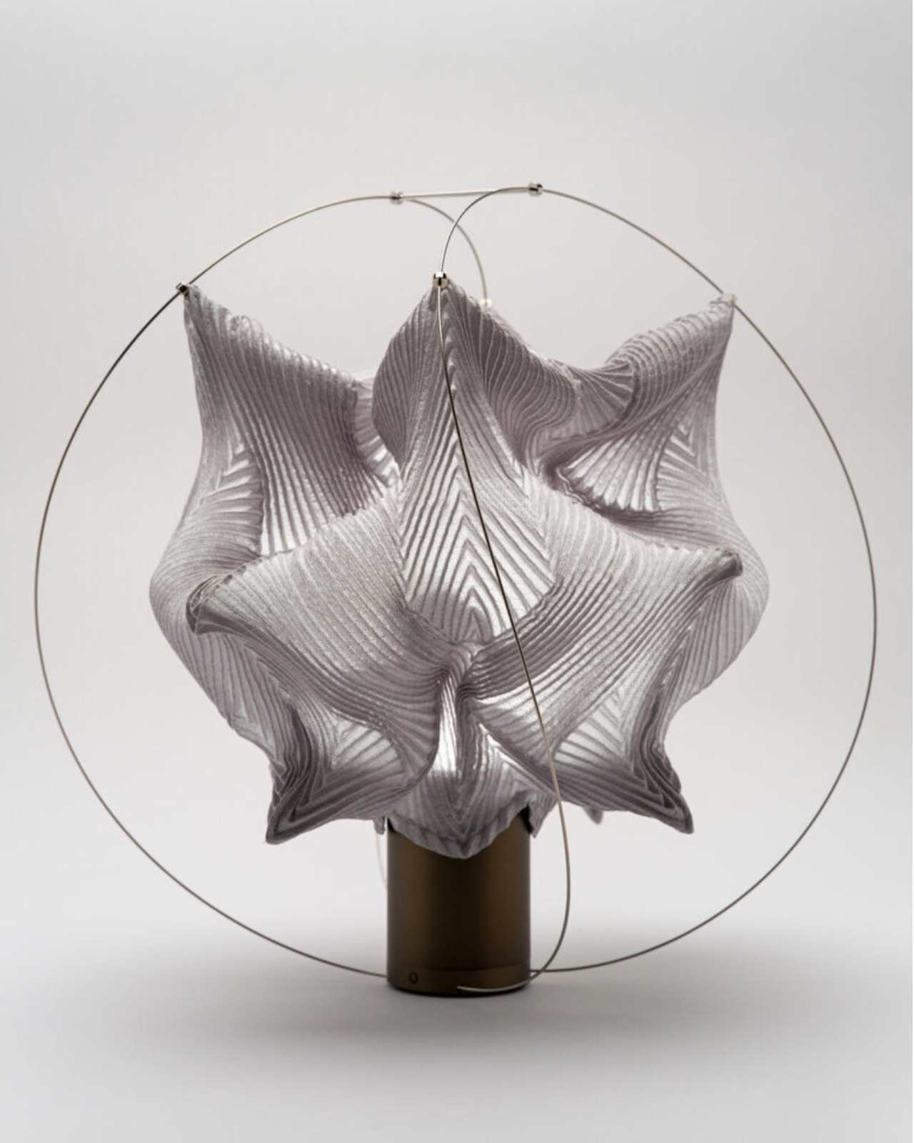
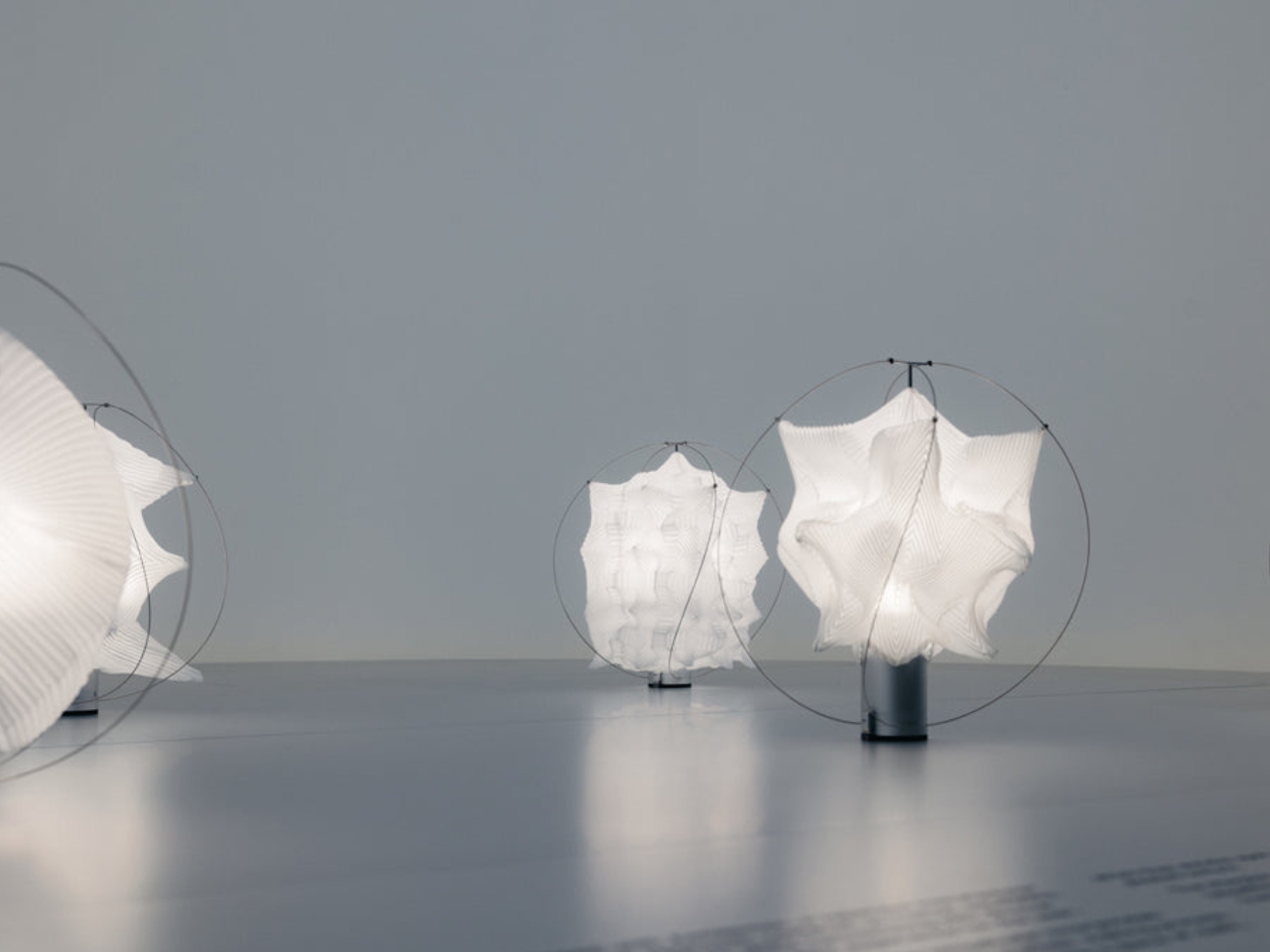
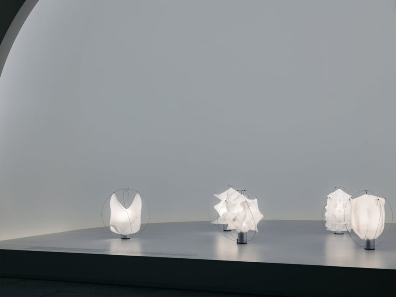
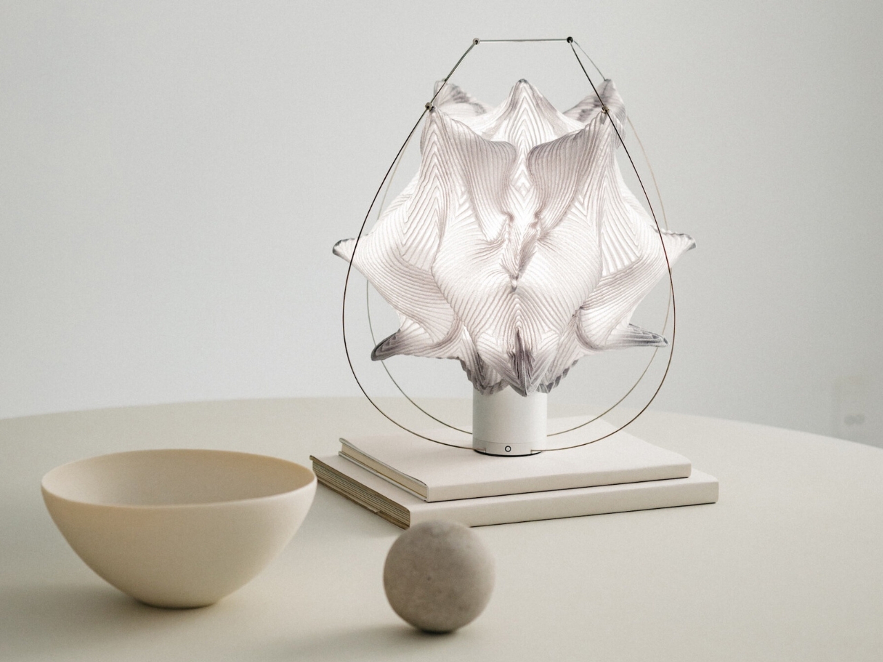
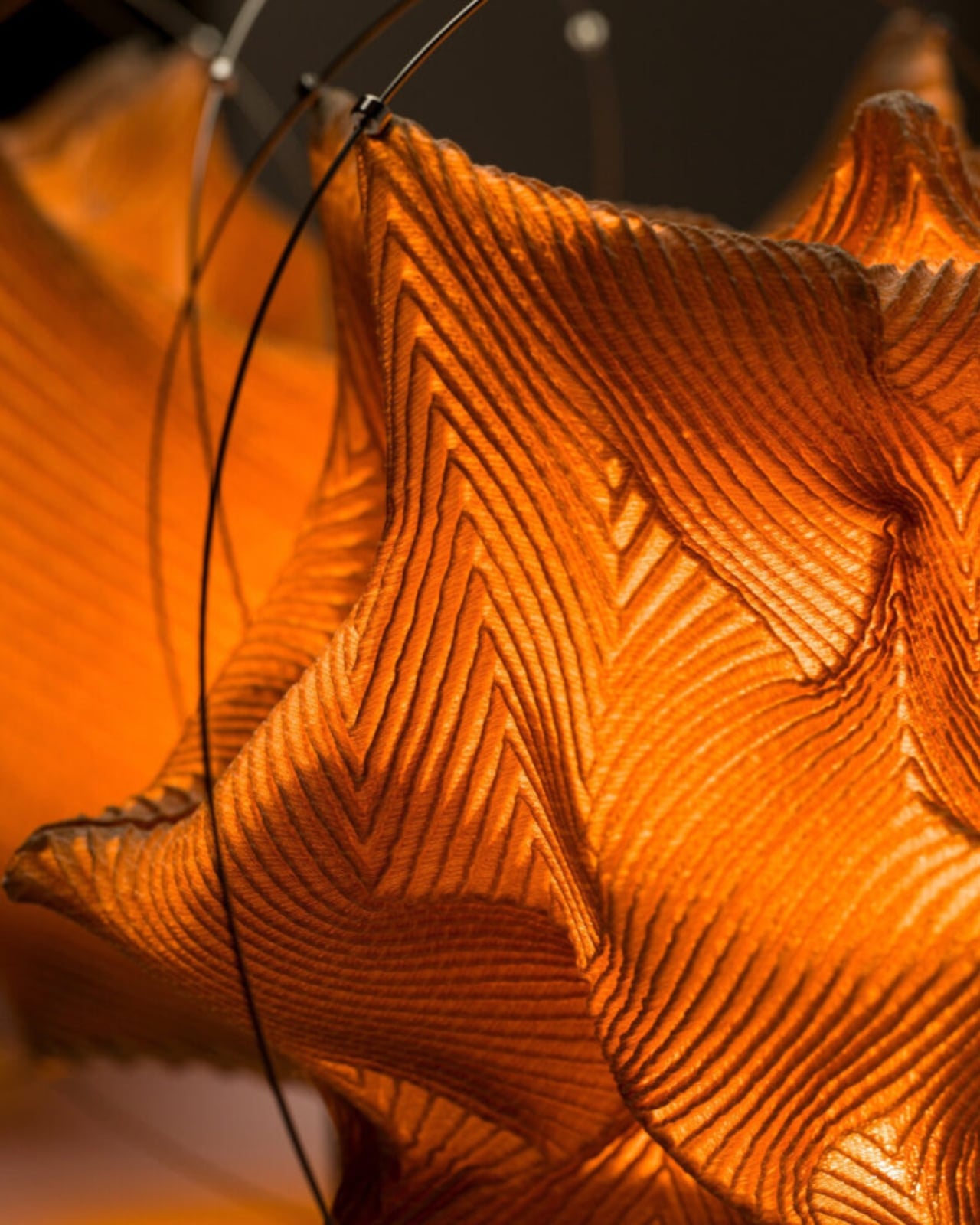
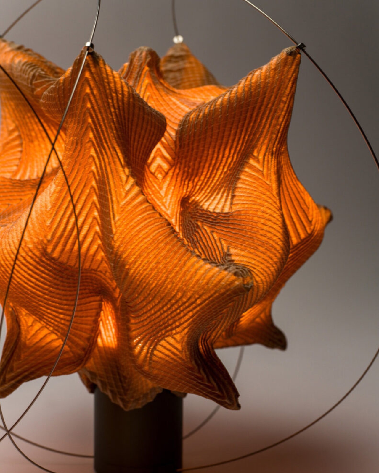
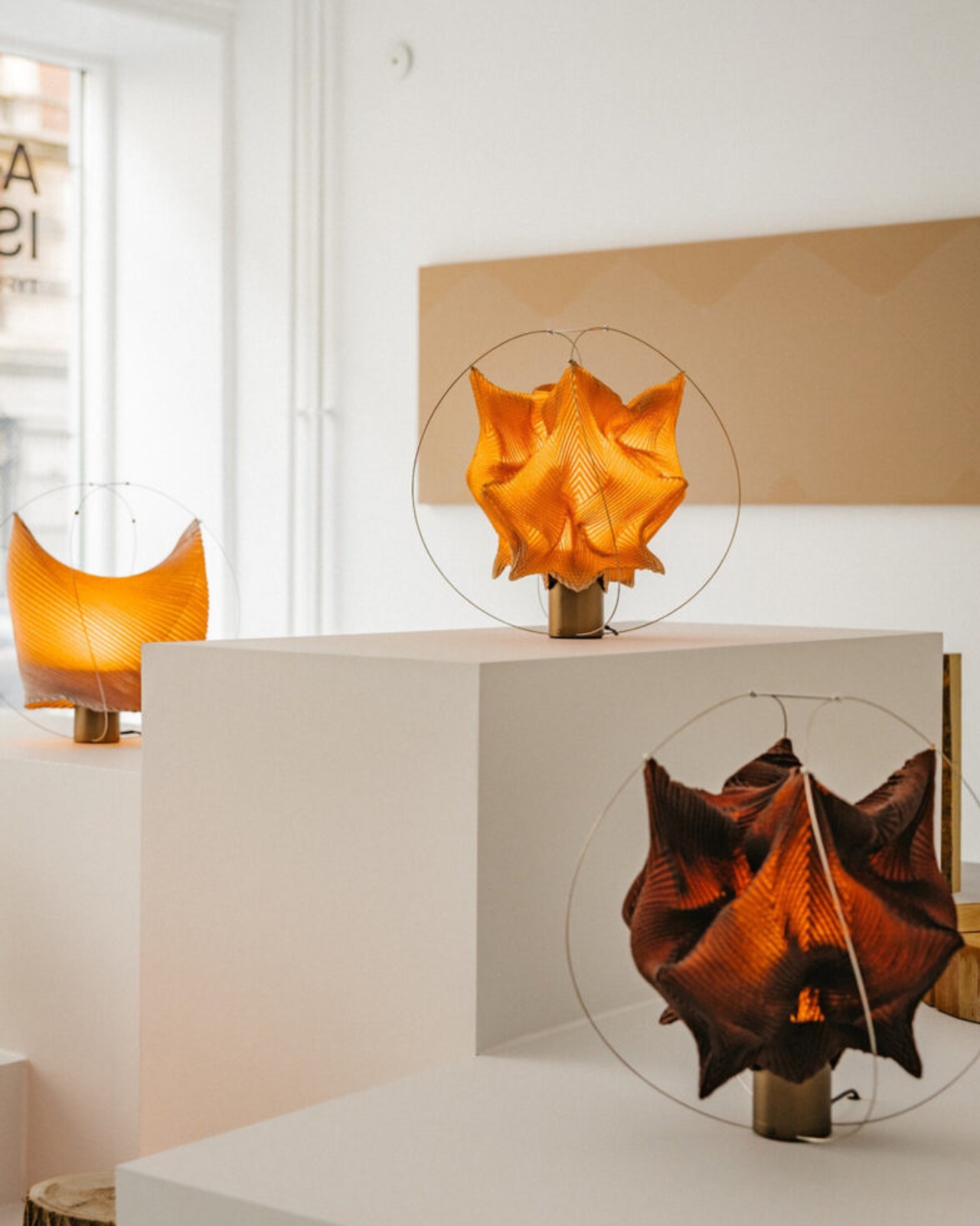
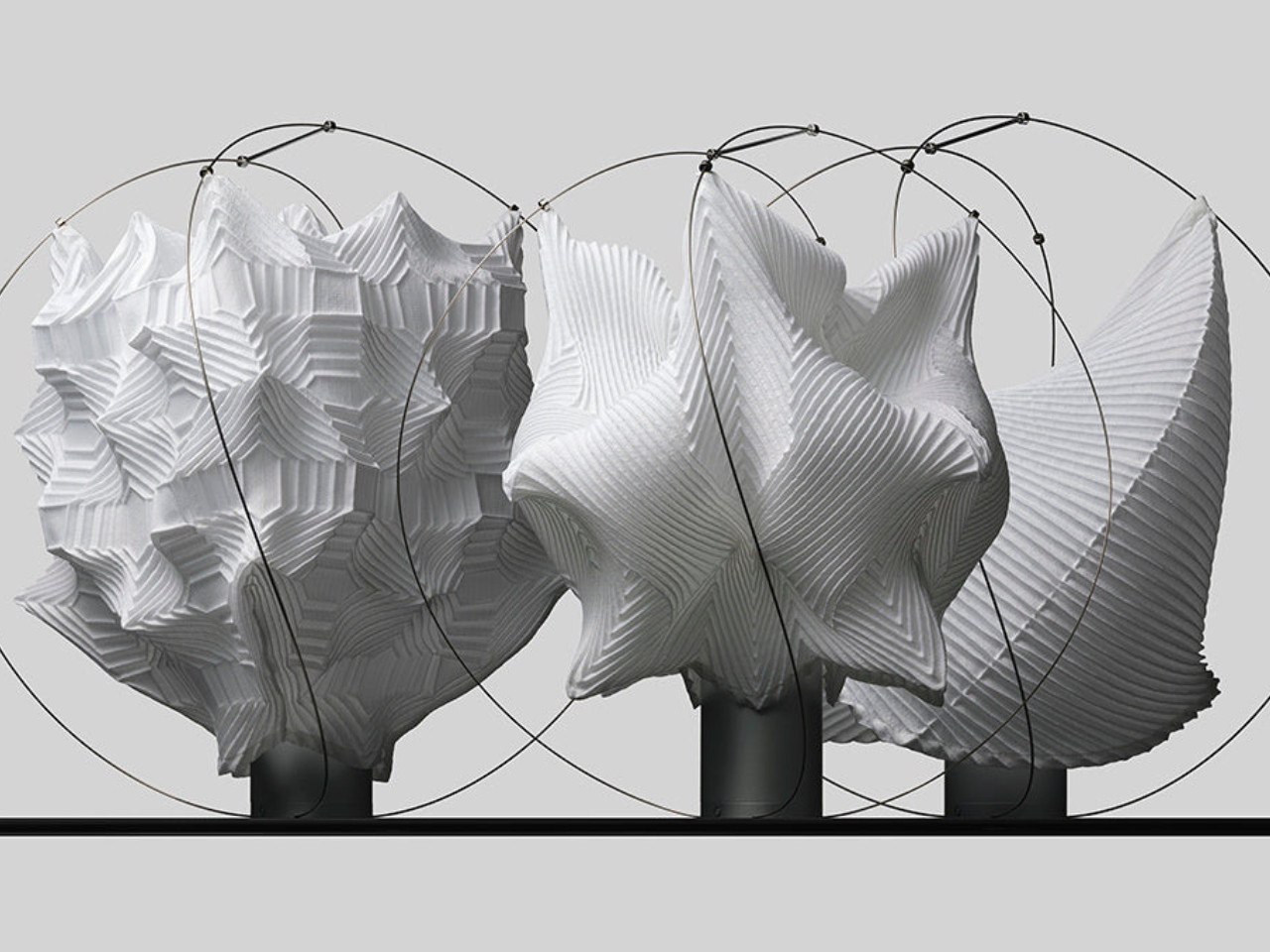
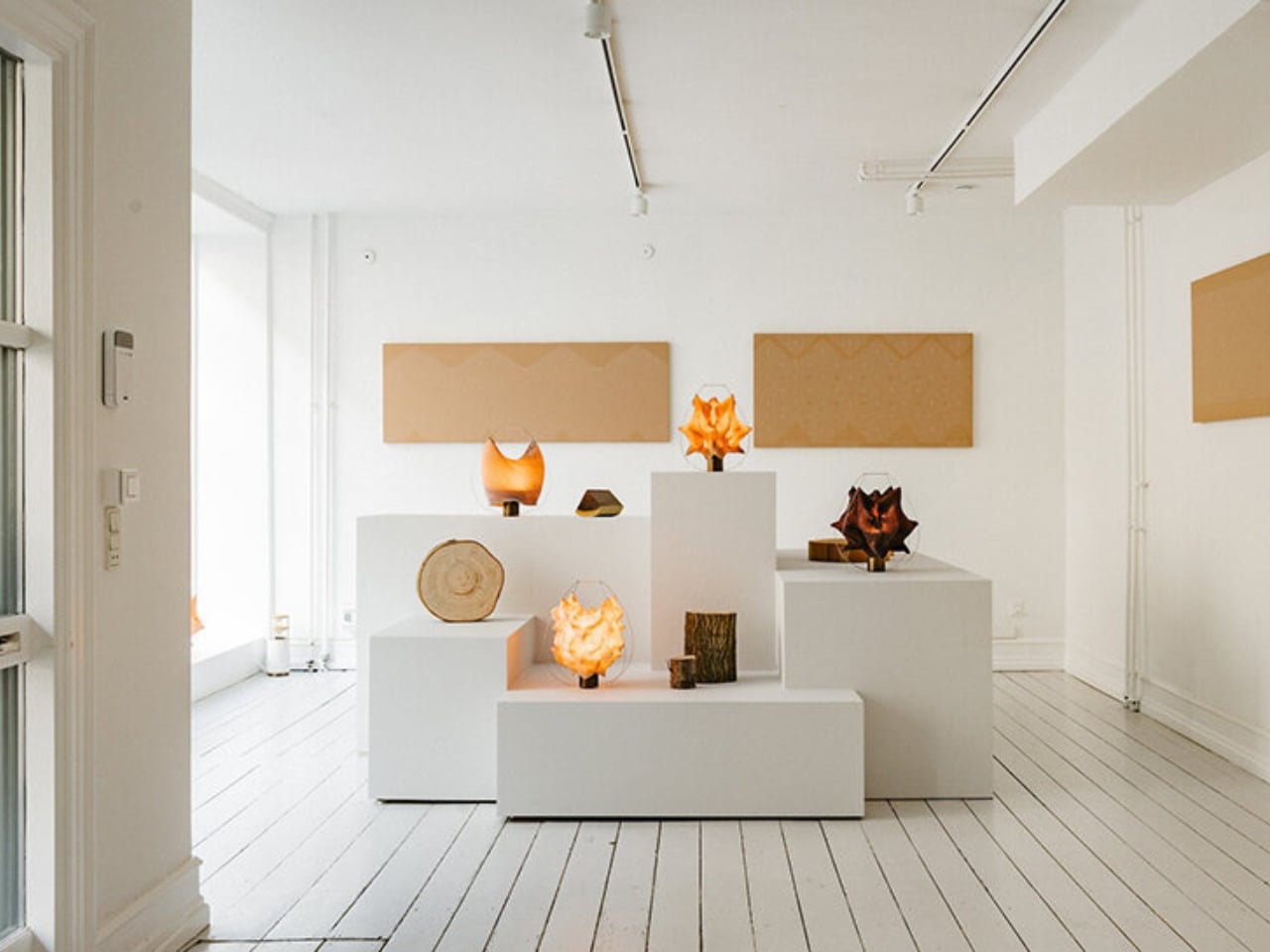
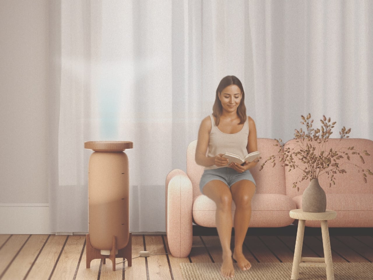
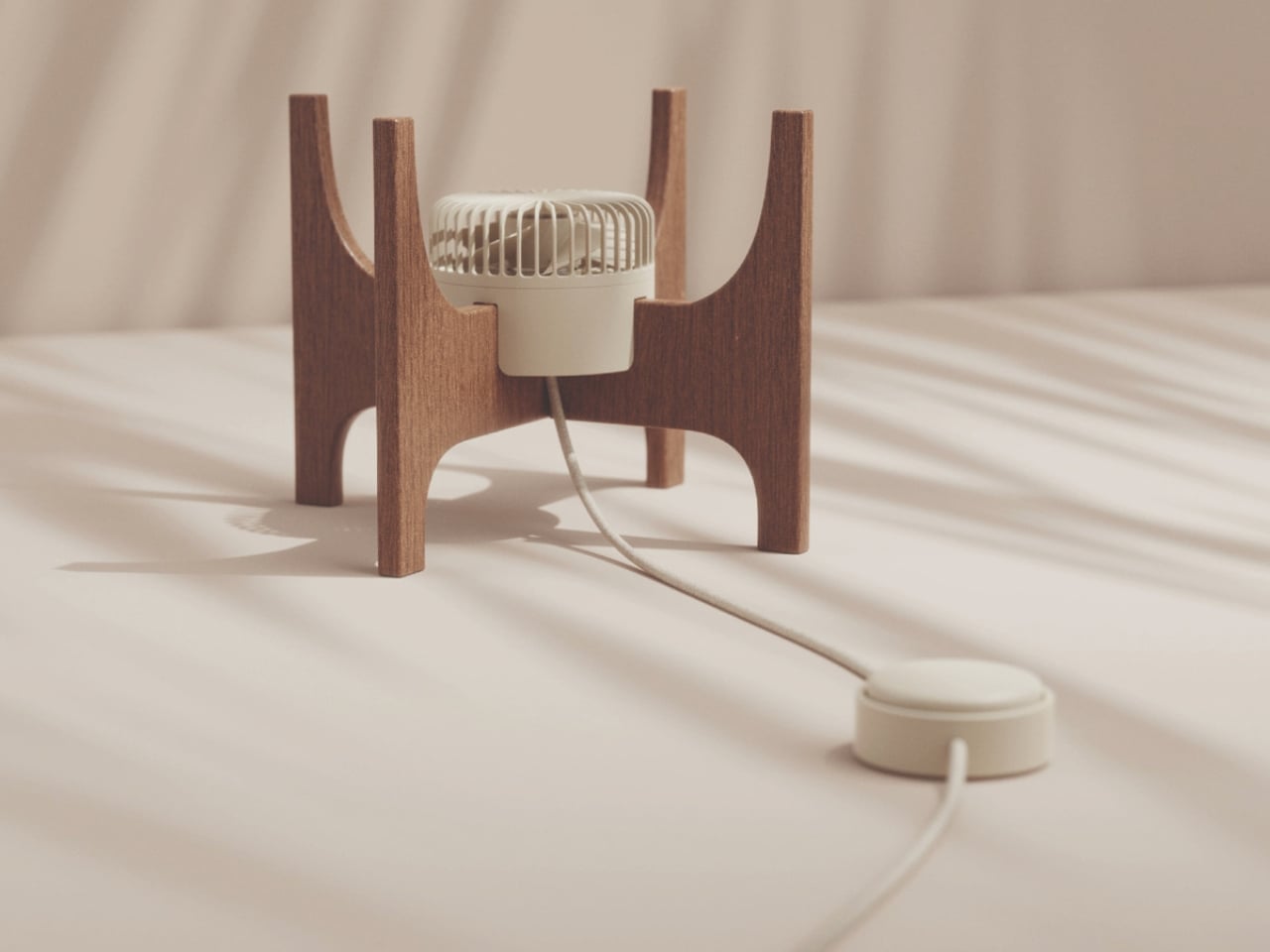
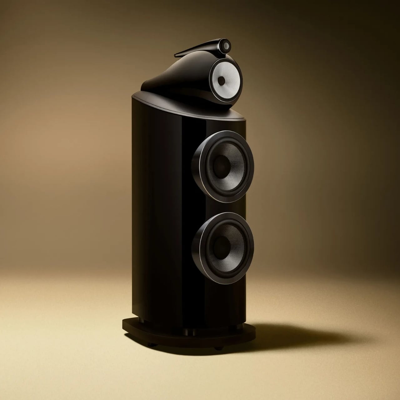
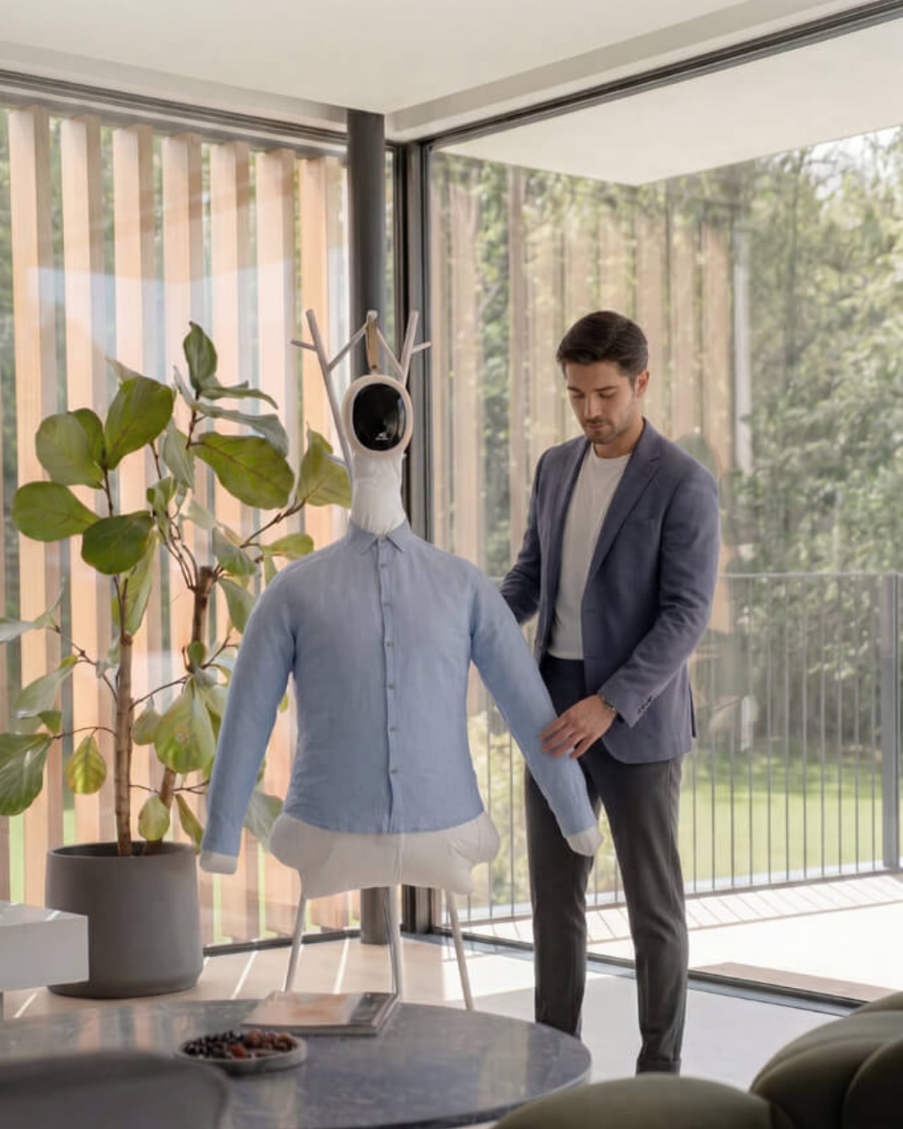
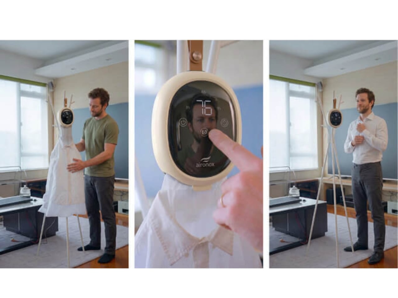
Most of us are passive music listeners now. We scroll, press shuffle, half-hear a song while doing something else entirely, and let algorithms decide what comes next. That’s not really listening, is it? IMAGO, a deep listening device created by designers Domenico Di Paolo and Kieran Feechan at Central Saint Martins, is taking direct issue with that kind of relationship with music and with the AI systems that have quietly normalized it.
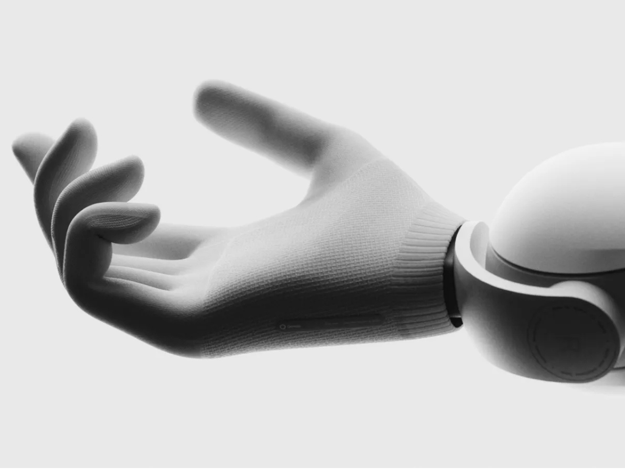
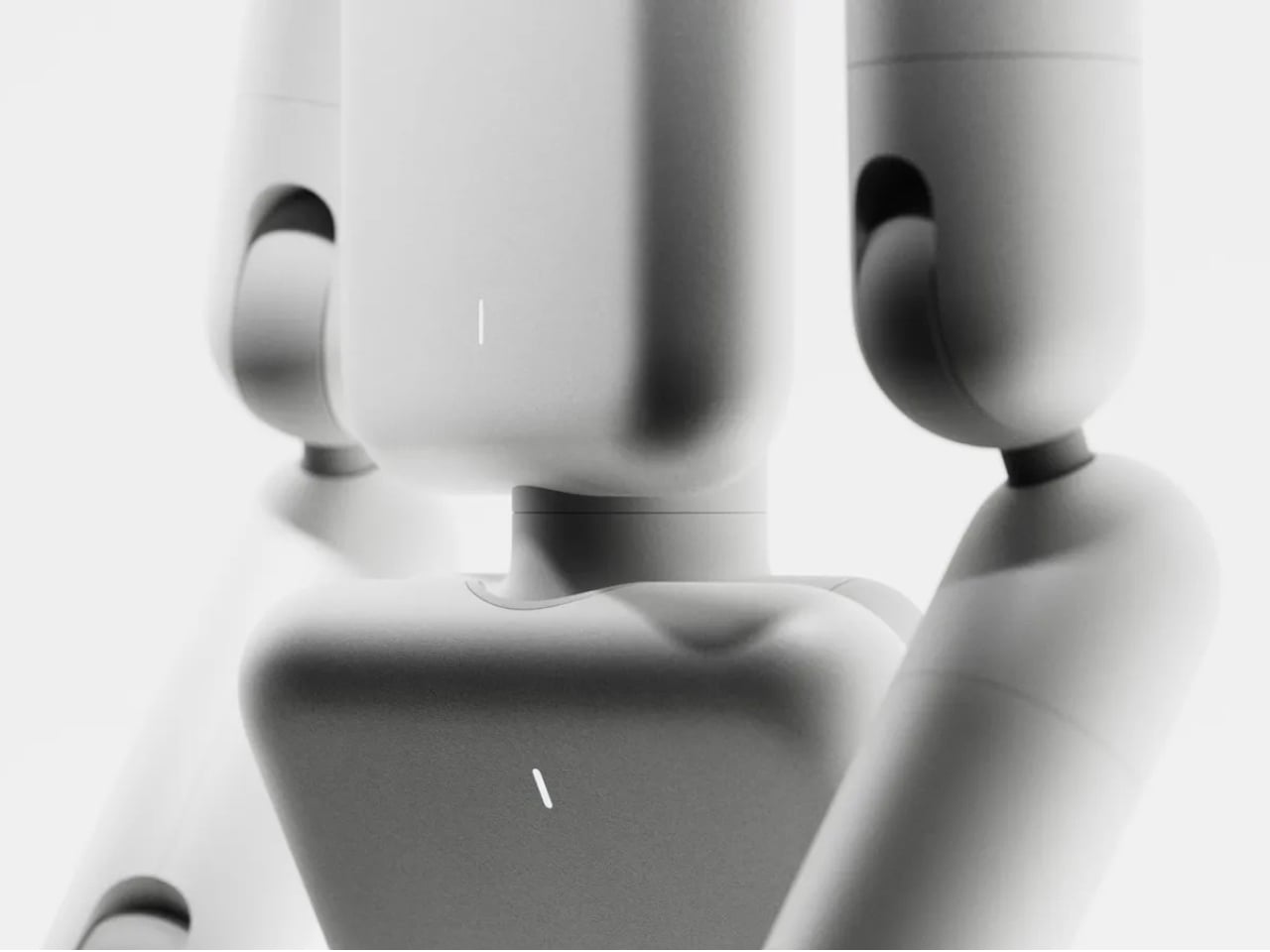
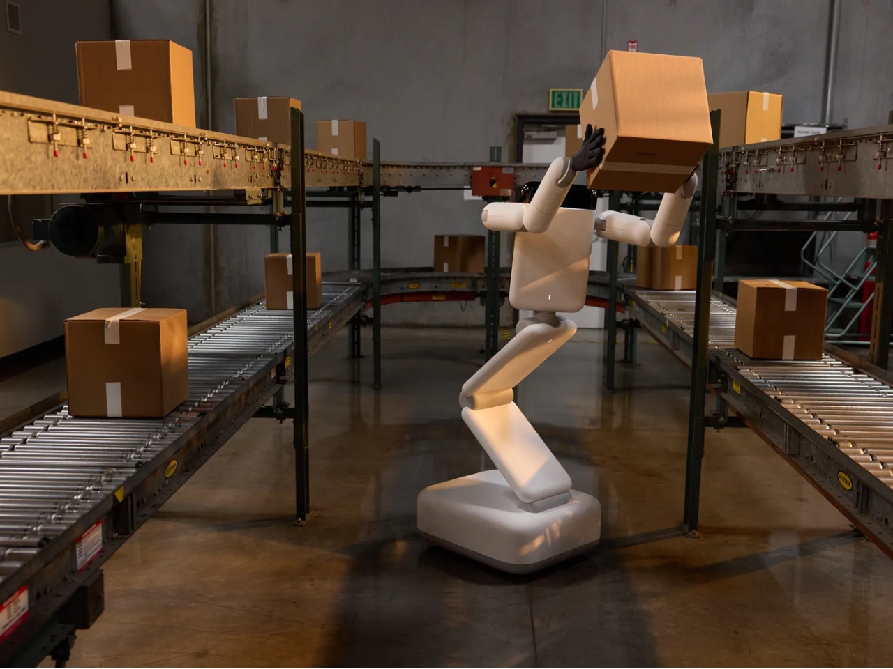
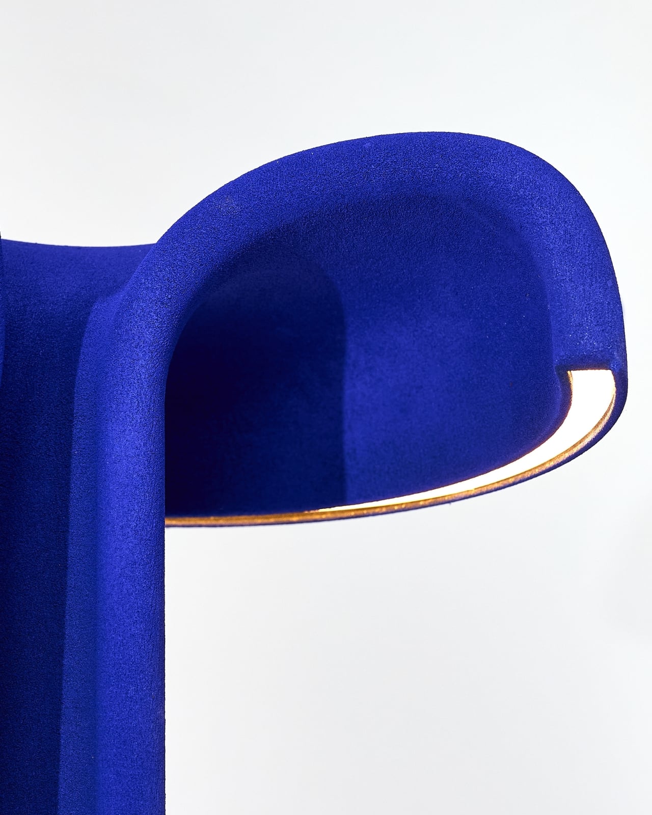
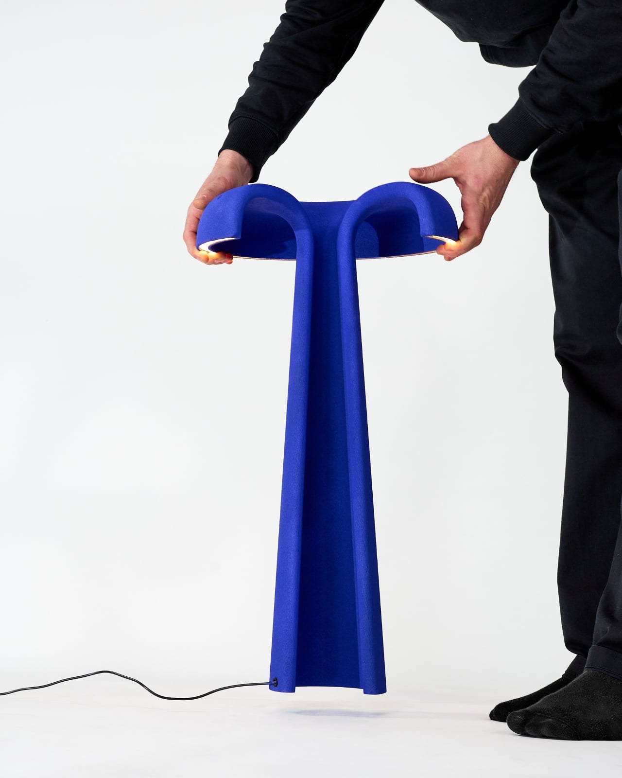
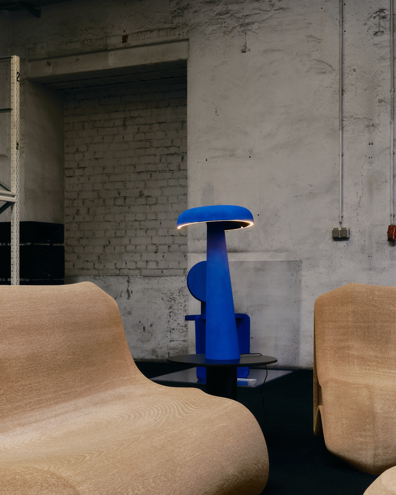
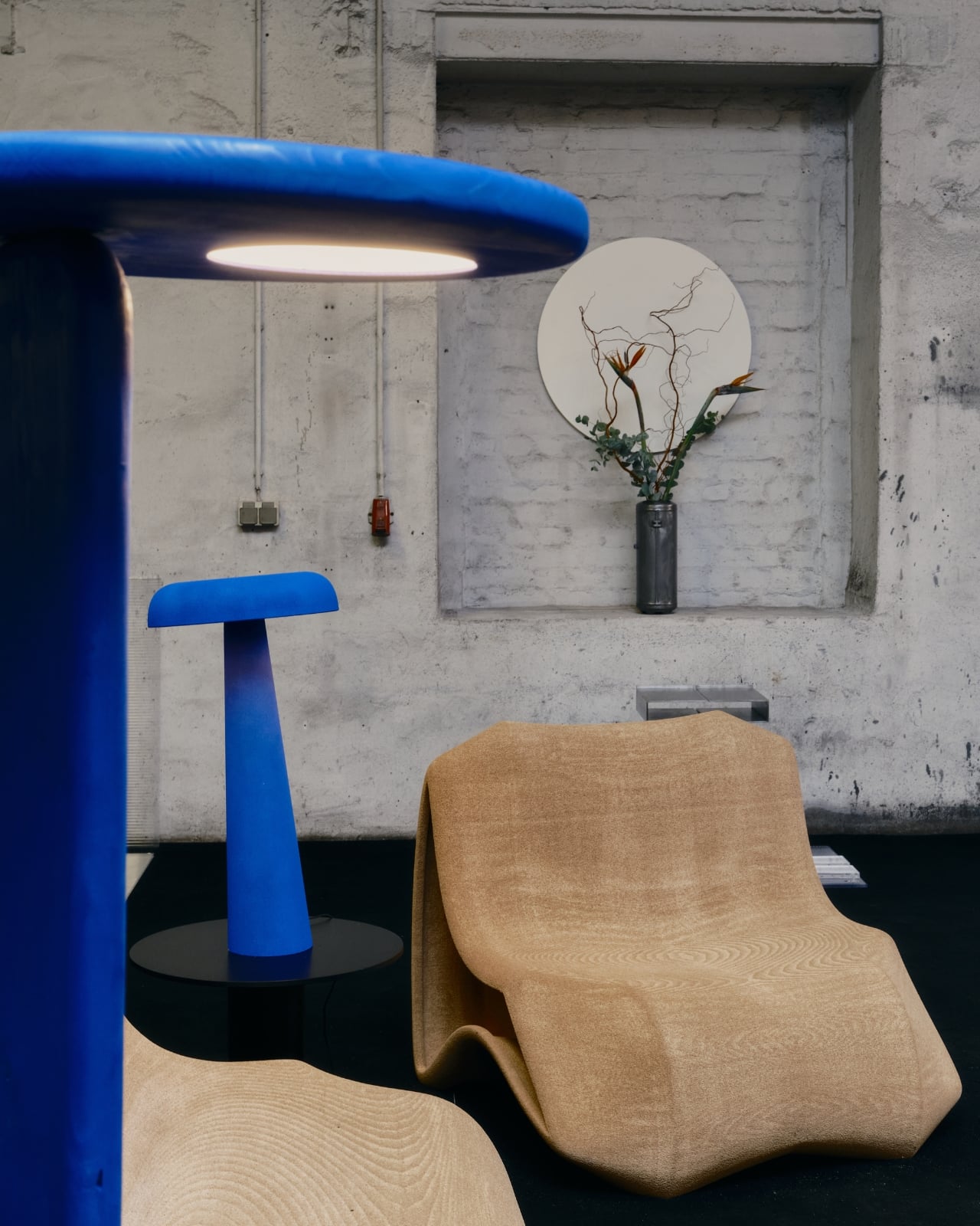
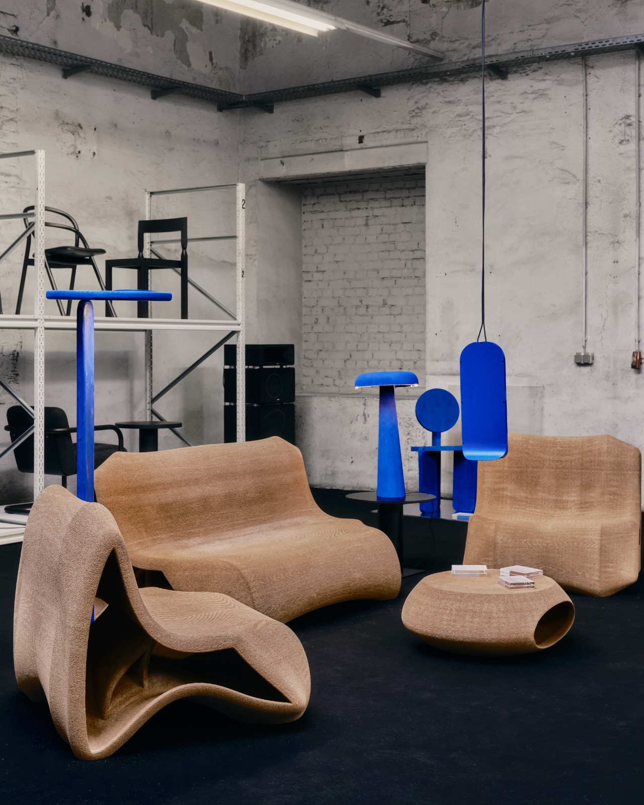
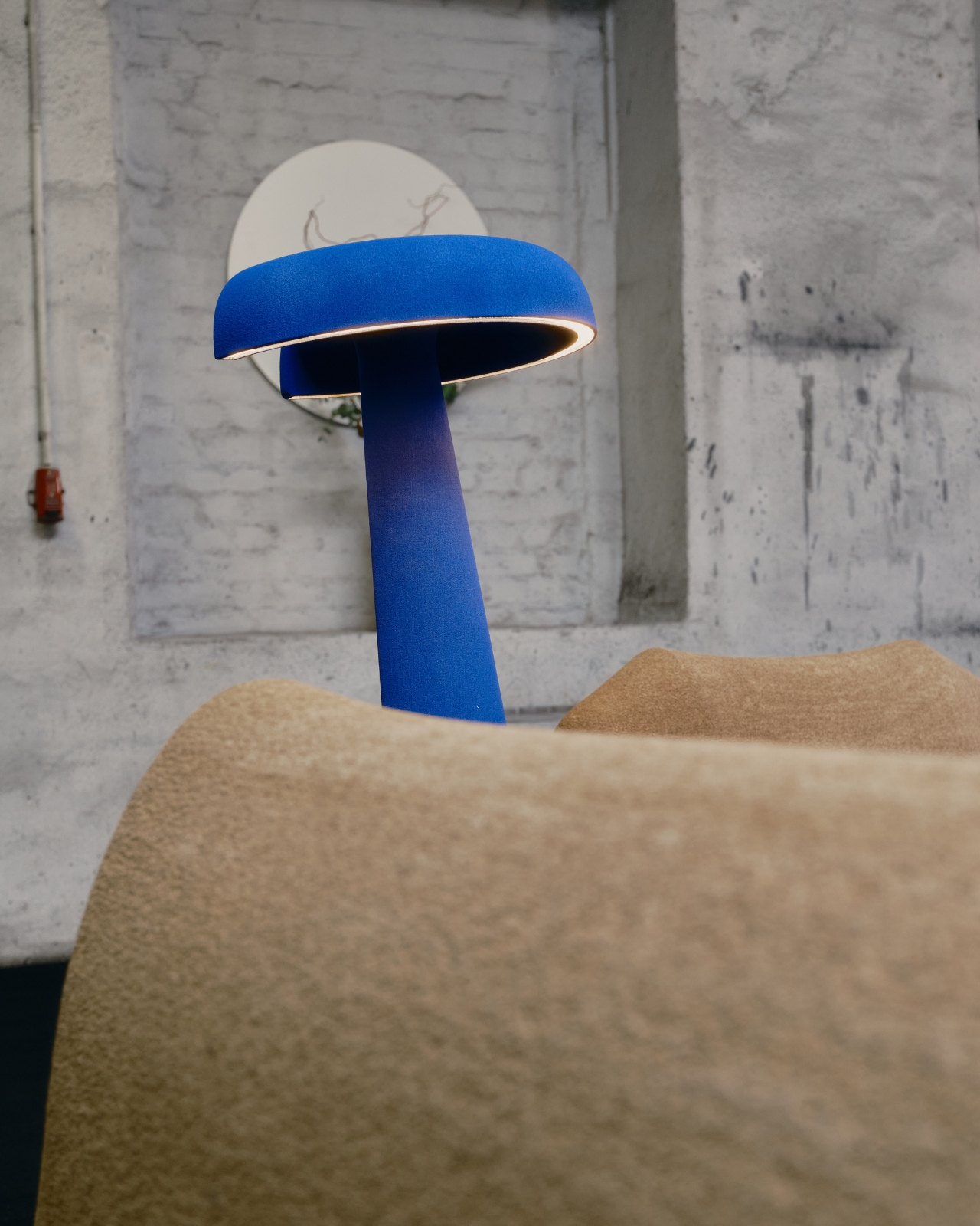
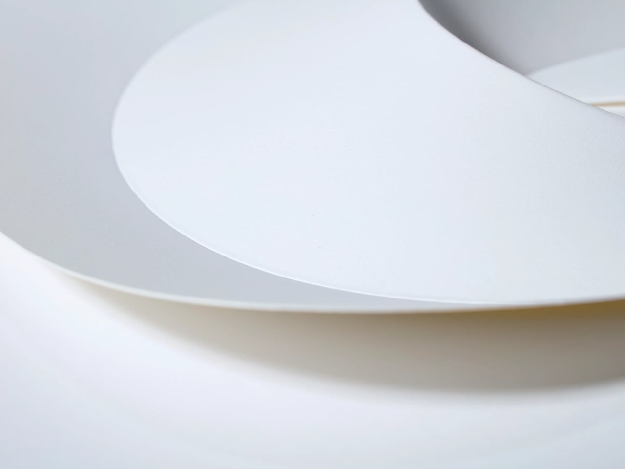
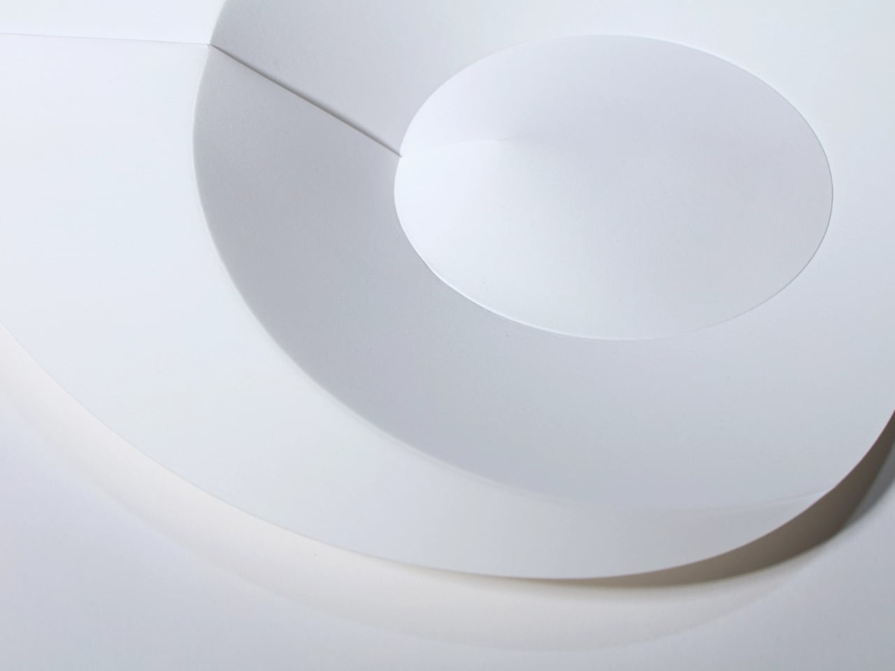
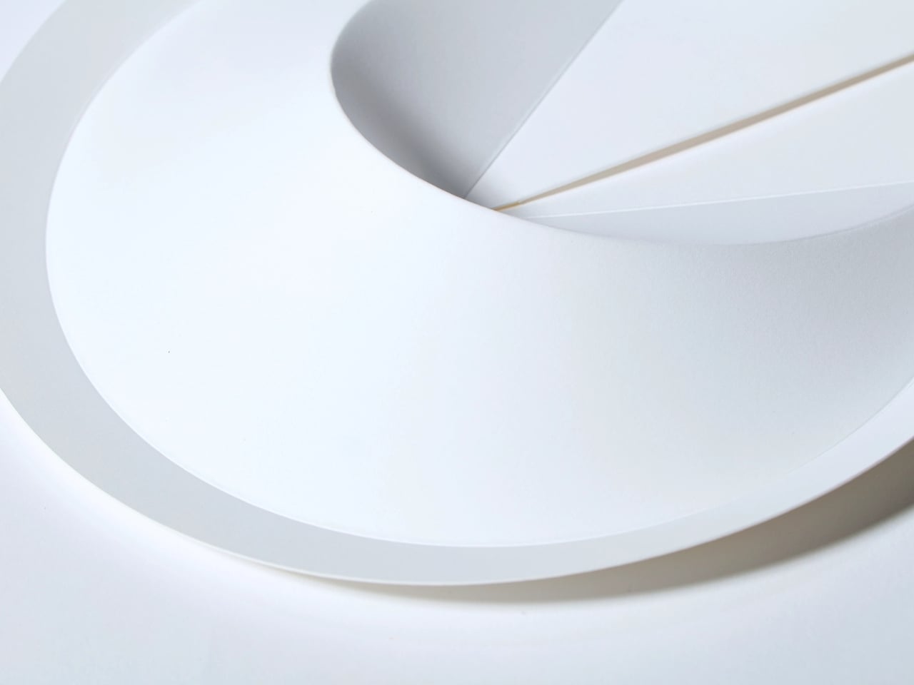
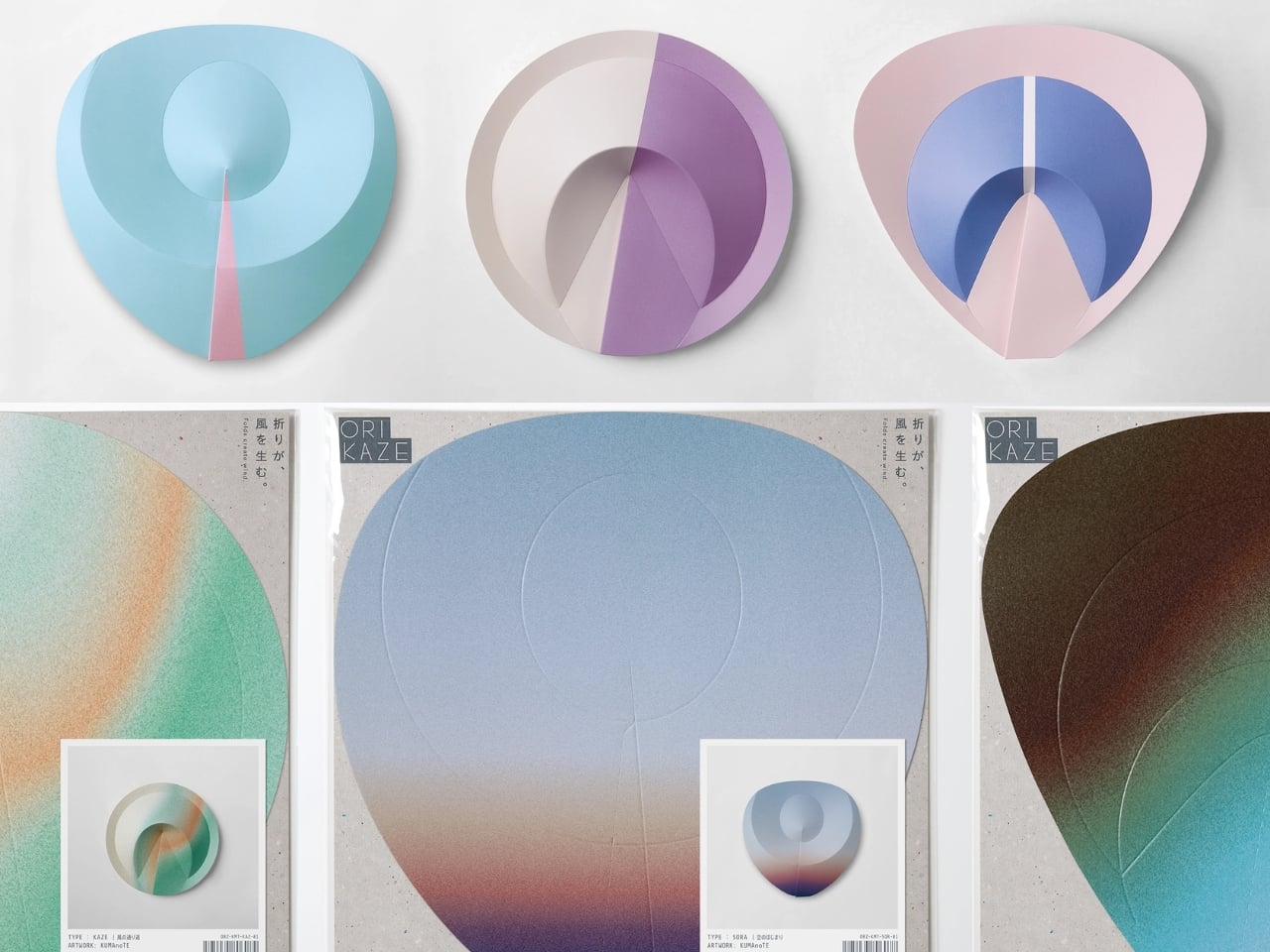
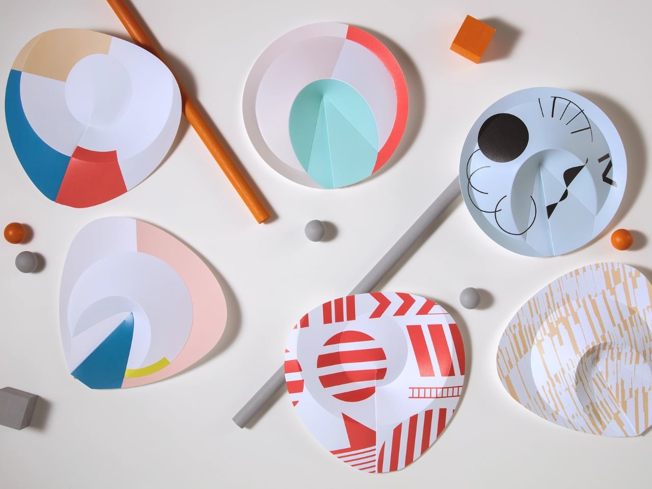
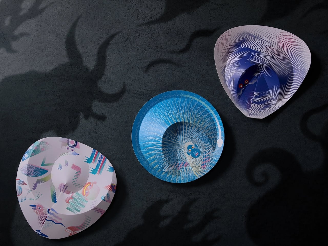
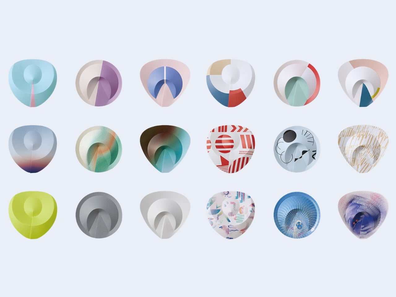
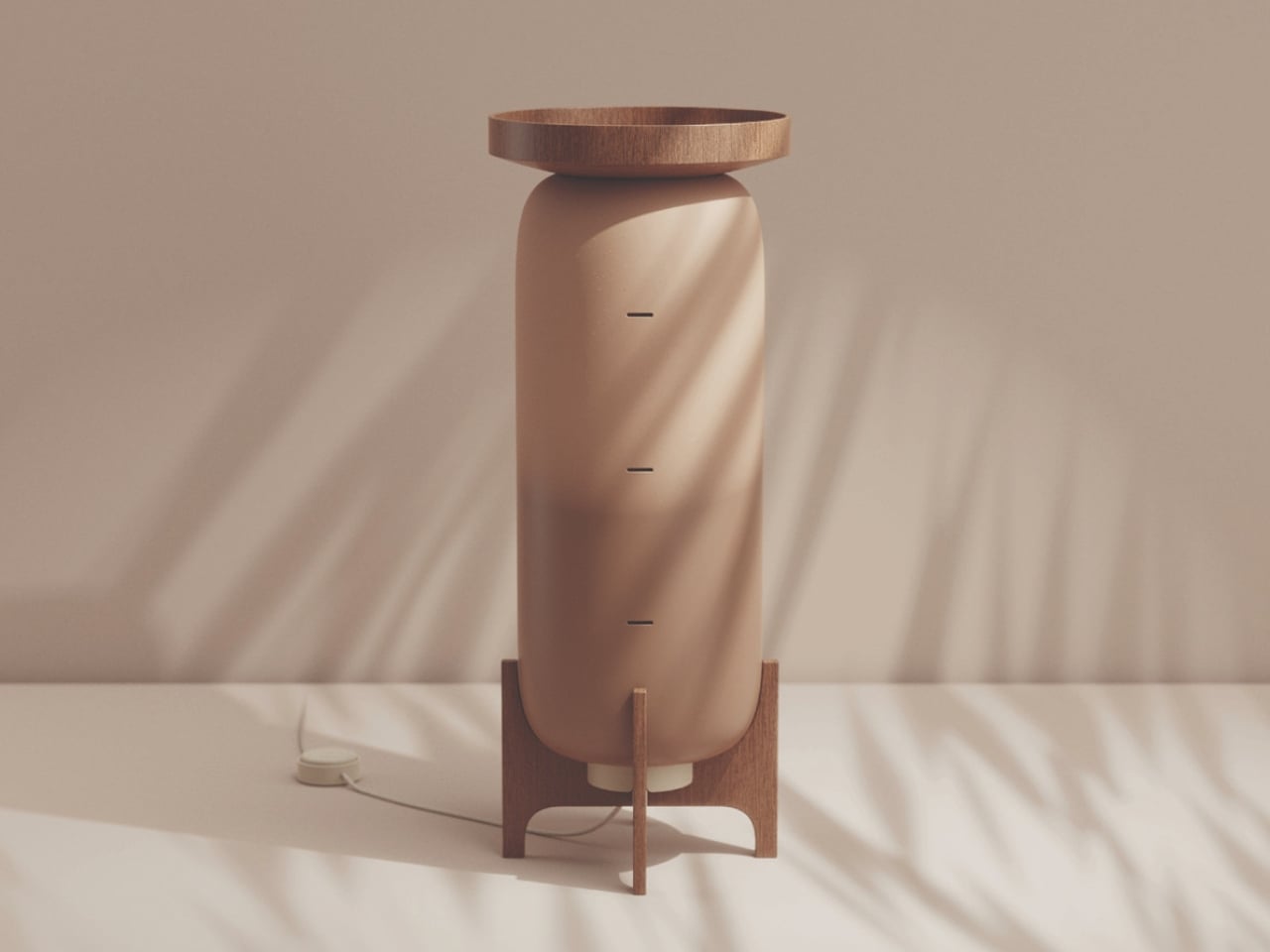
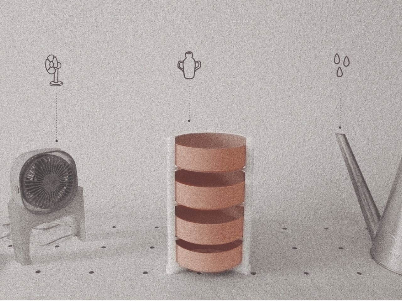
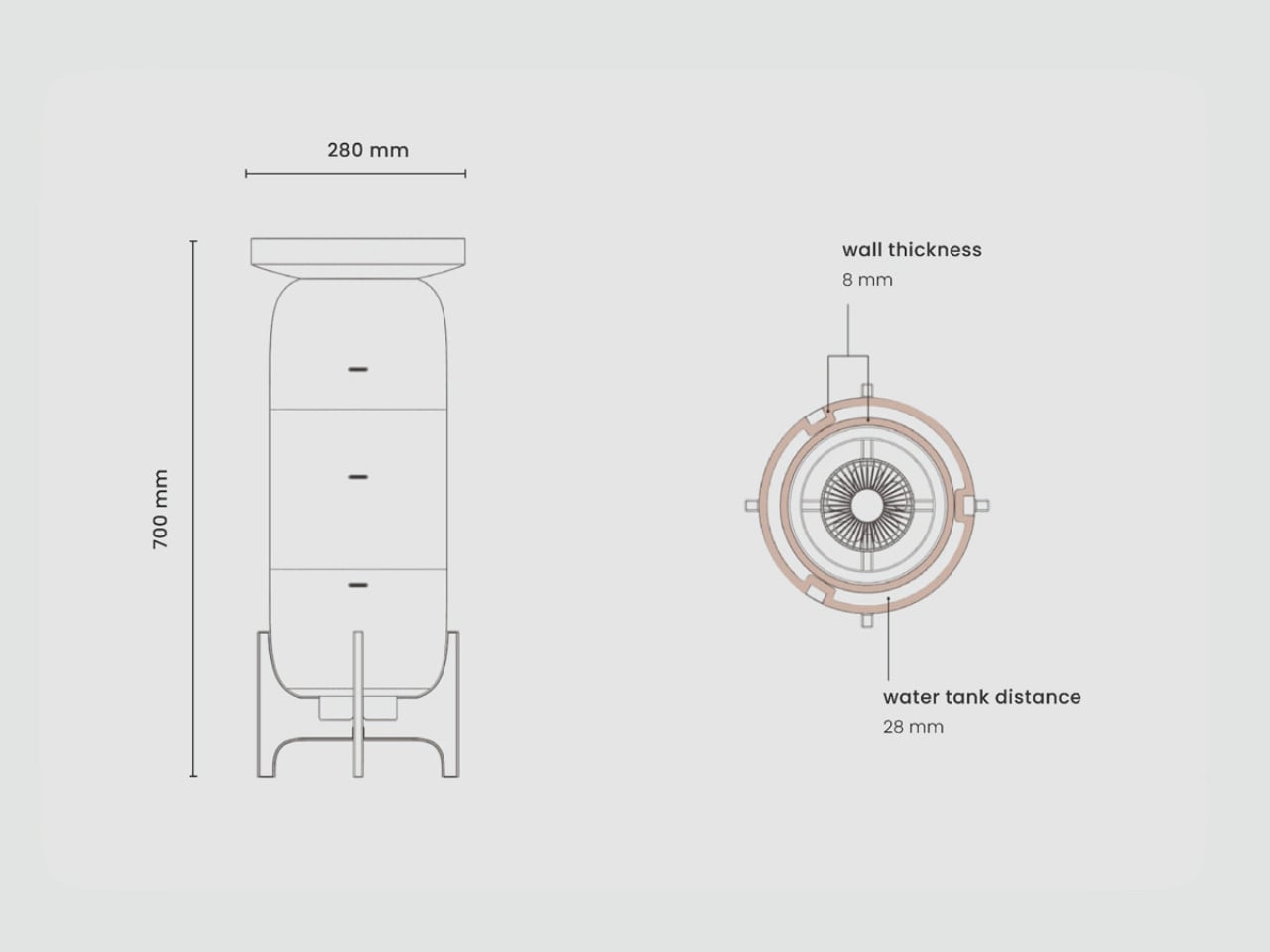
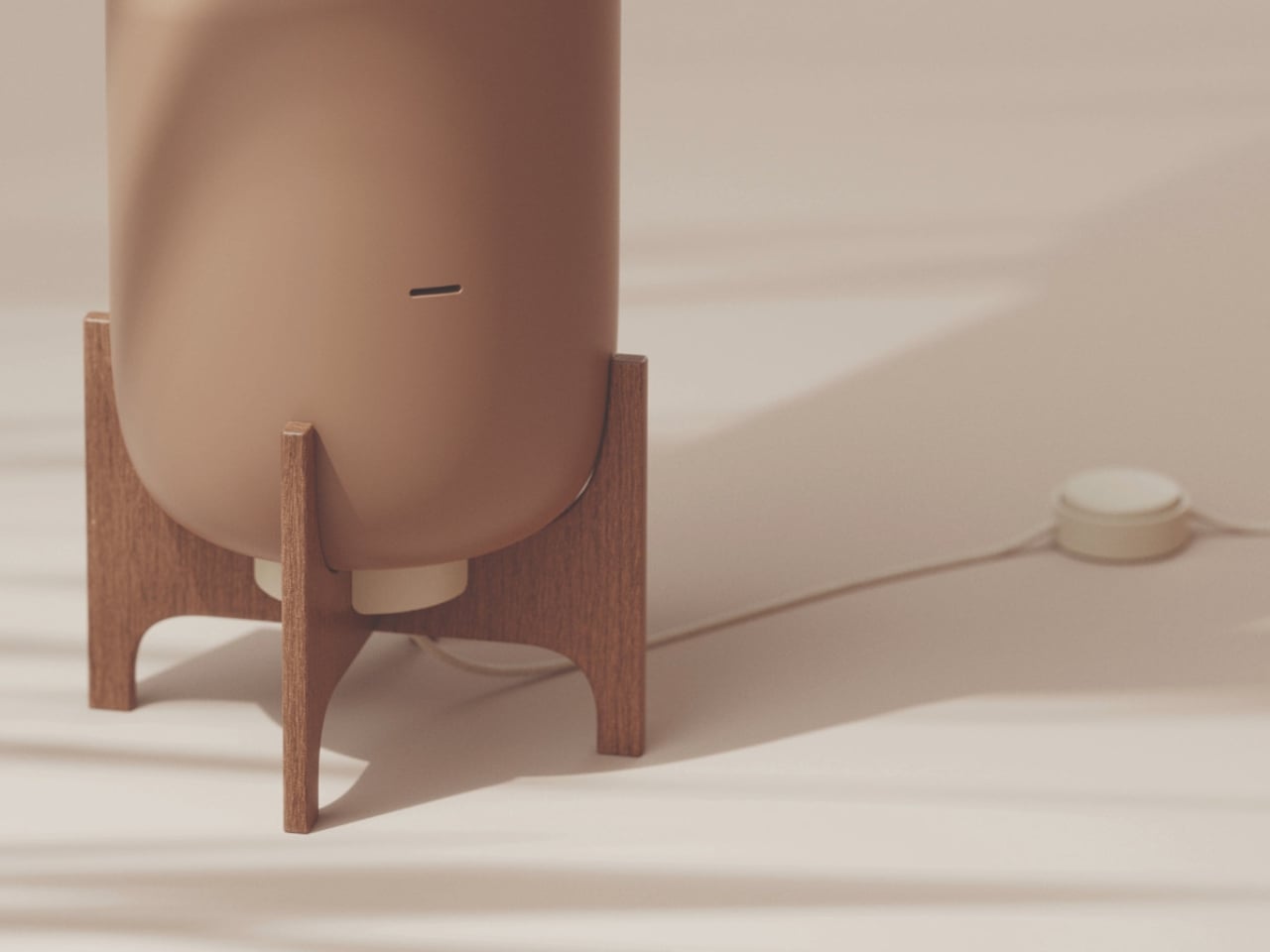
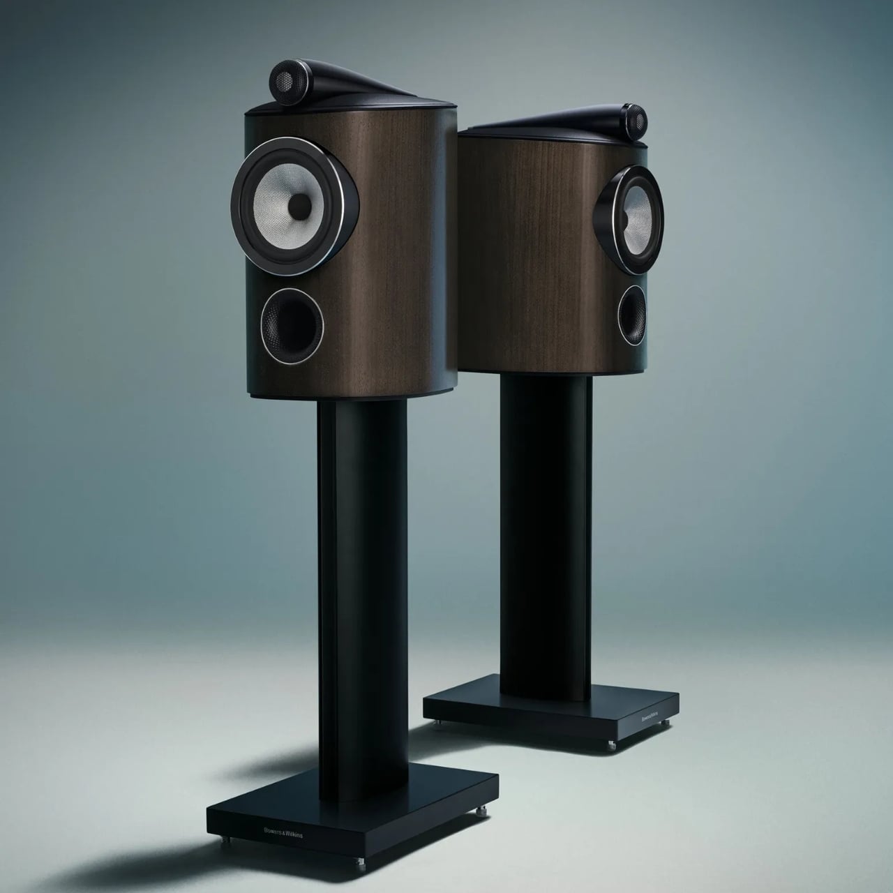
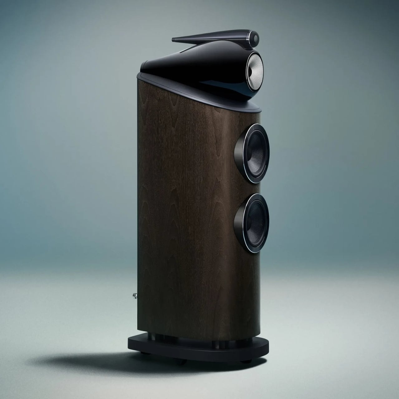
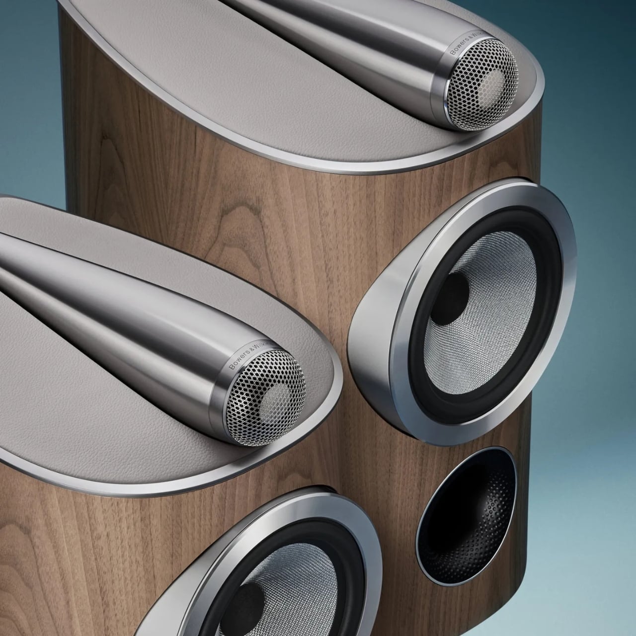
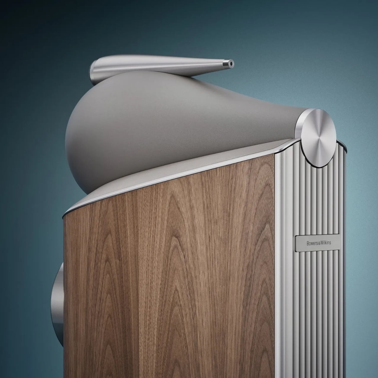
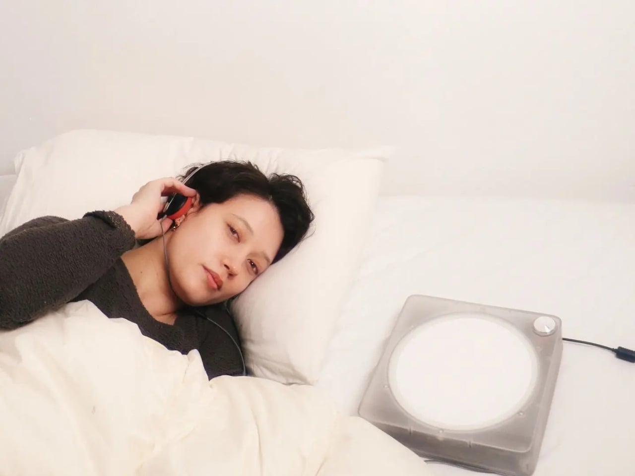
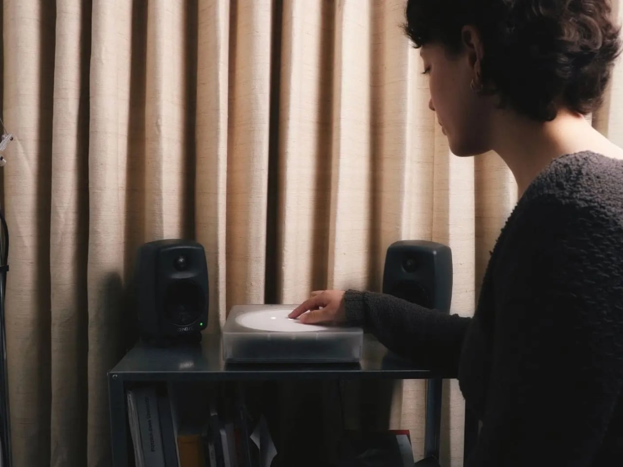
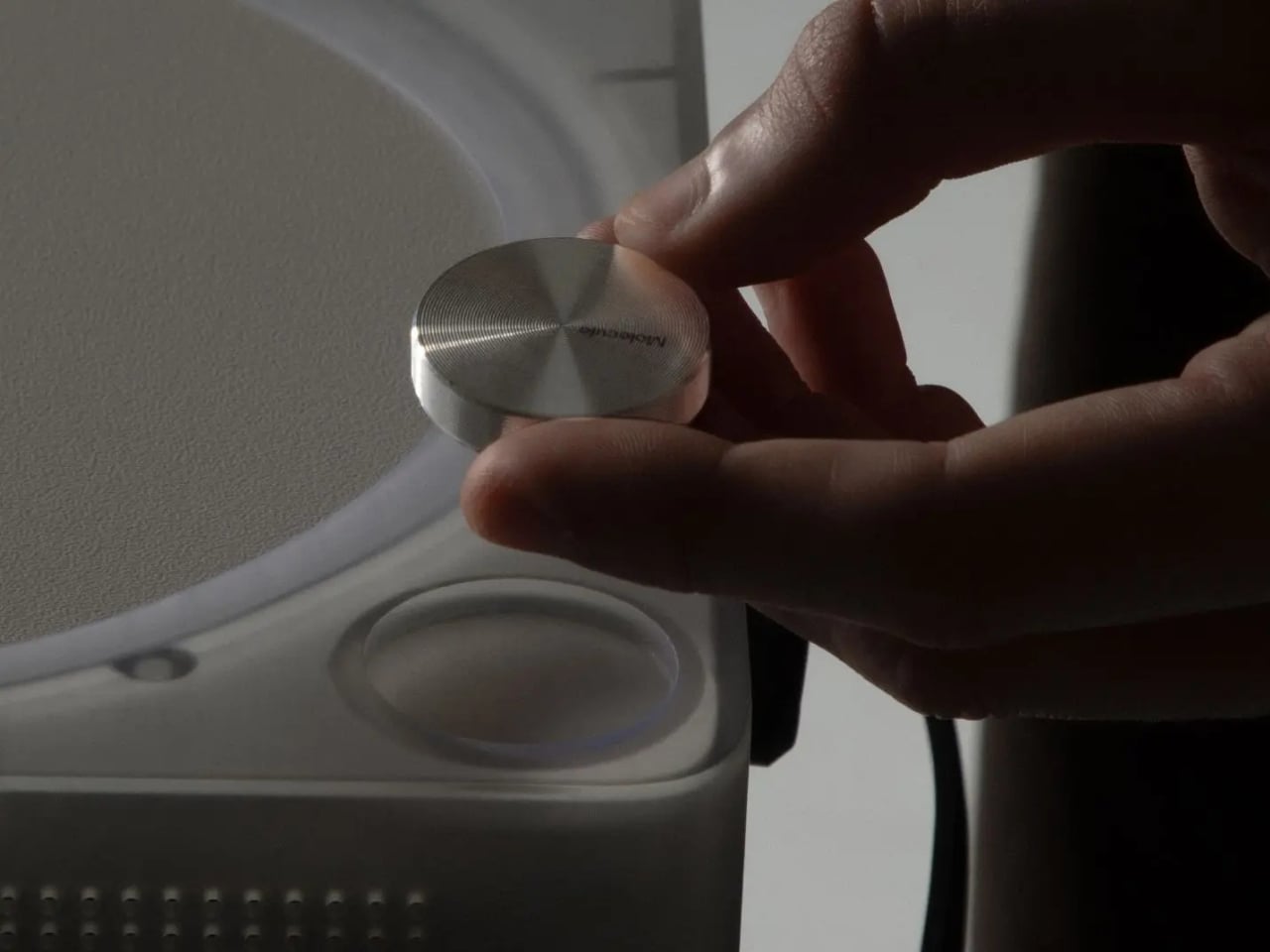
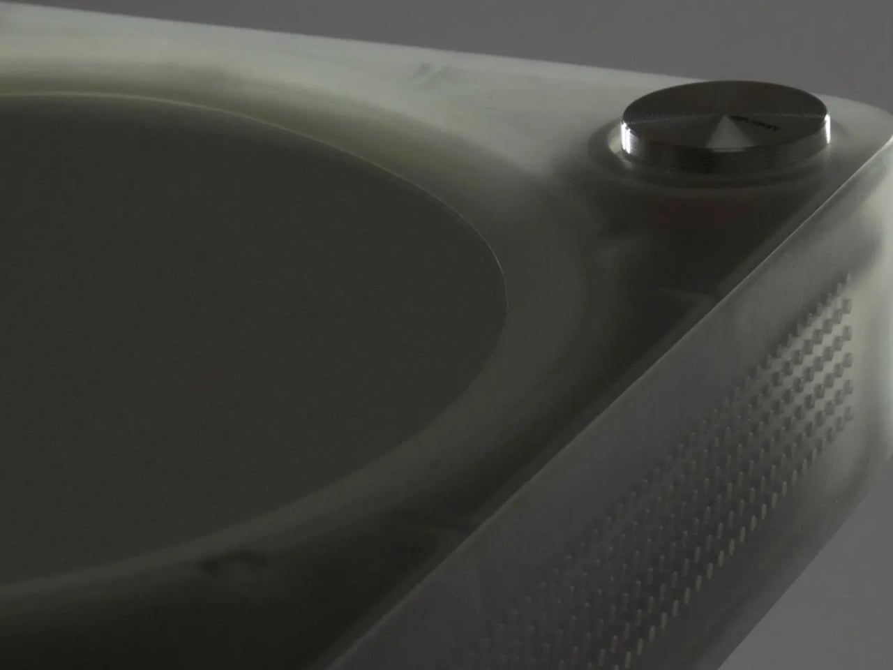
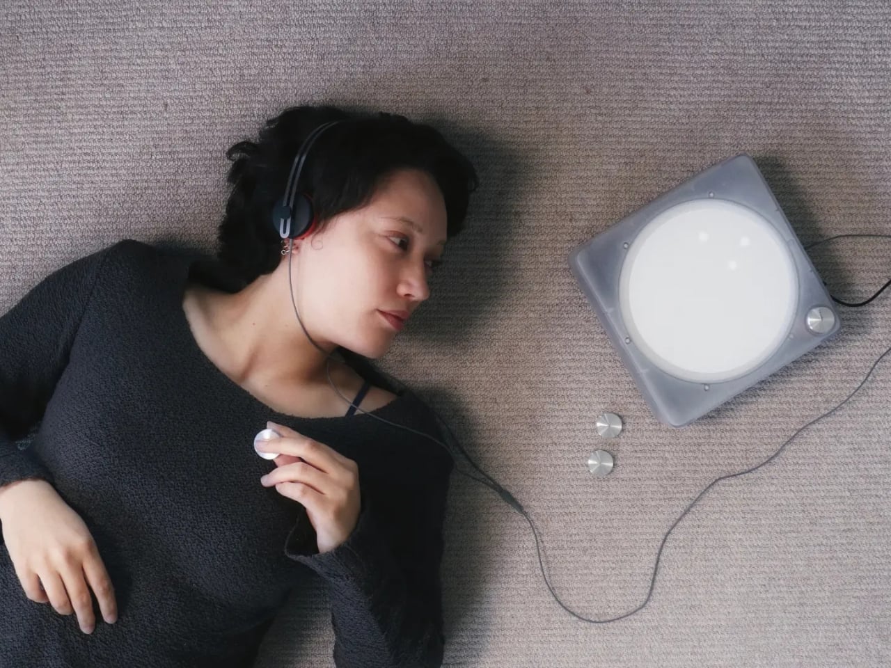
The device is designed for a domestic setting, which is already an interesting choice. Home is intimate. Home is where you actually sit with things. By placing IMAGO in that kind of environment, Di Paolo and Feechan are deliberately steering users away from passive consumption and toward something more deliberate, more physical, more present. The design encourages bodily engagement with sound, not just background ambience you forget about before the track even ends.
Designers: Domenico Di Paolo and Kieran Feechan
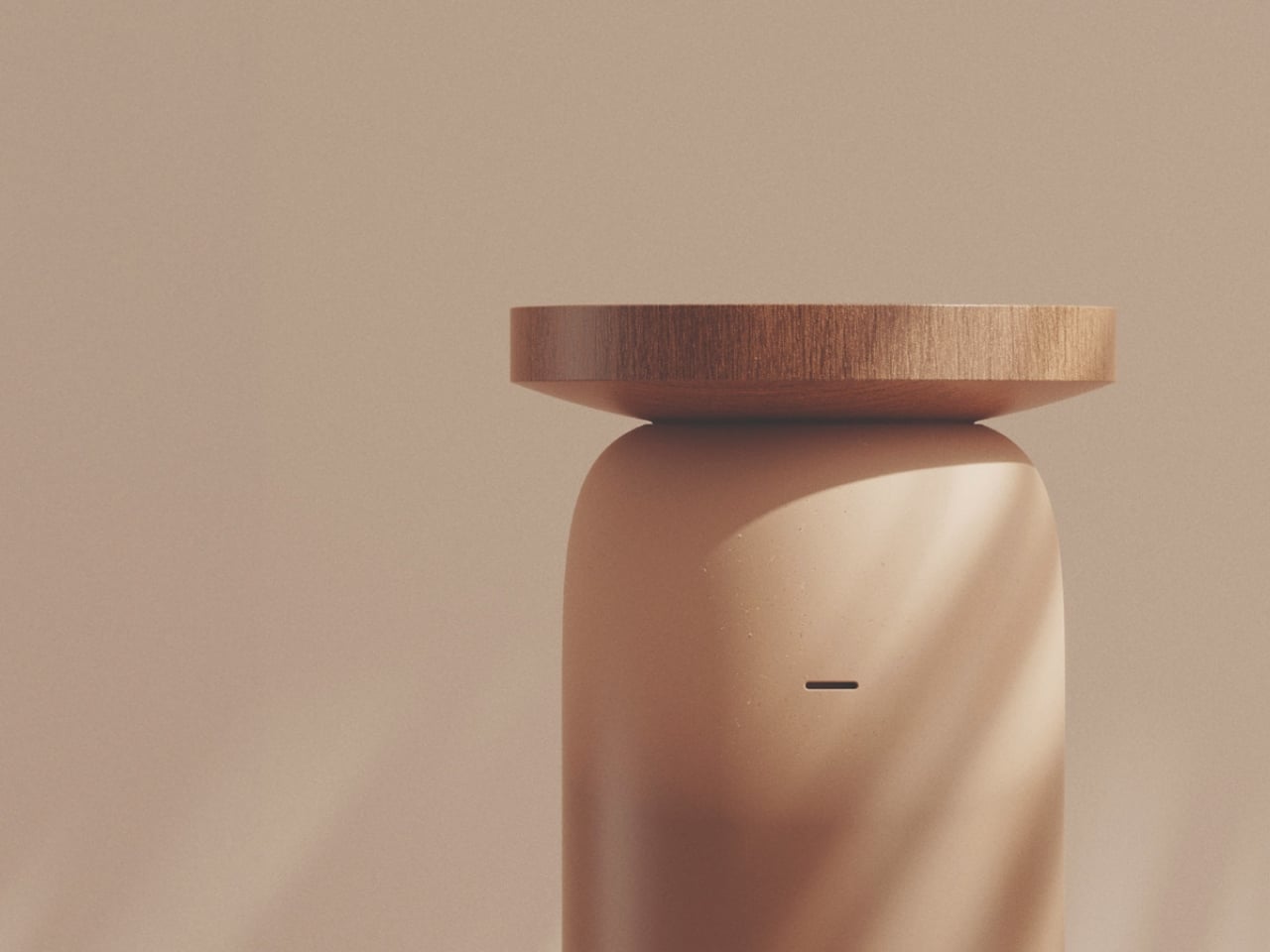
But the more pressing issue IMAGO raises isn’t about listening habits. It’s about data. Most AI music systems today are trained on enormous datasets of songs scraped from the internet, with little or no compensation to the artists whose work feeds those models. It’s a system that benefits everyone except the people who actually made the music. IMAGO runs differently. It operates locally and uses artist-trained models, meaning the AI at its core was built with consent, not convenience.
That distinction matters more than it might initially seem. The conversation around AI and creative theft has been growing louder for years now, and for good reason. Artists, musicians, writers, and illustrators have spent considerable energy sounding alarms about models trained on their work without permission, without pay, and often without acknowledgment. What Di Paolo and Feechan have done is embed that ethical position directly into the design of an object. Not as a tagline. Not as an ethical framework document buried on a website. As the thing itself.
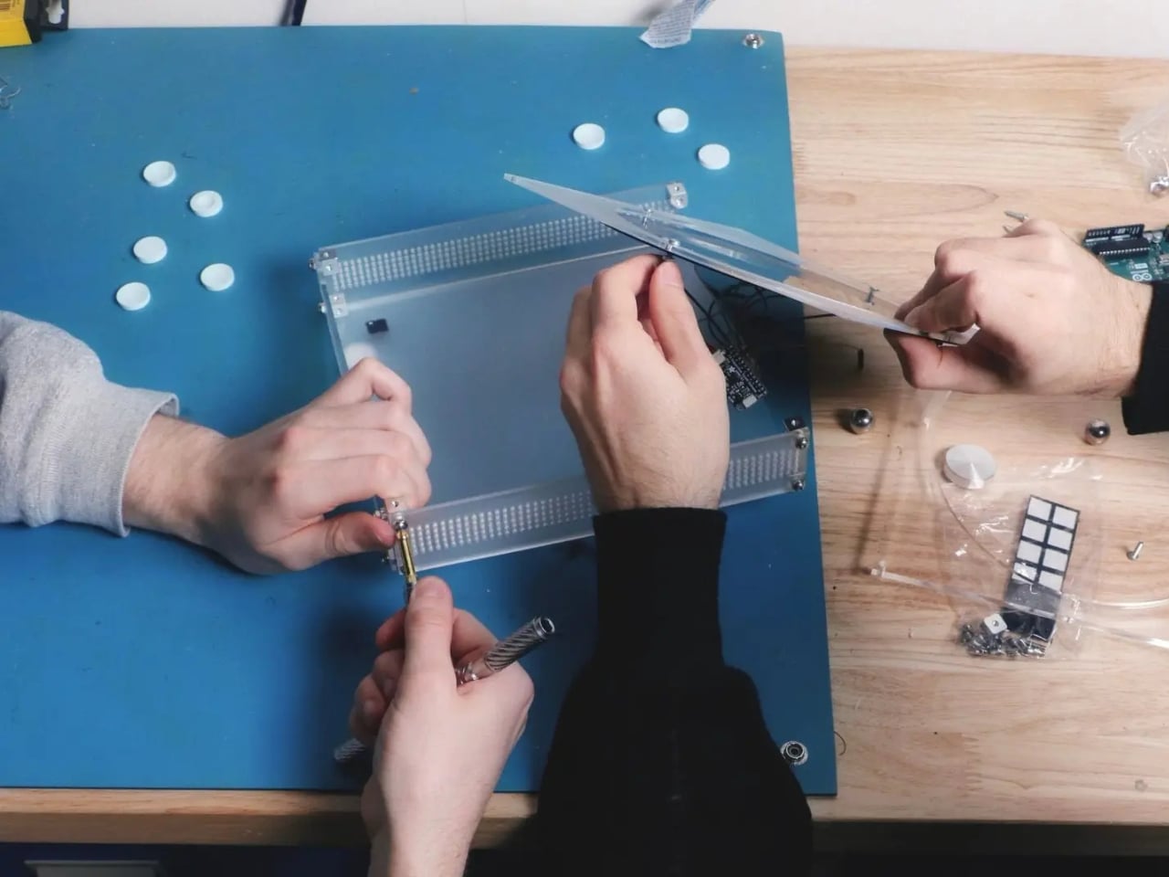
It’s a quietly bold position to take. Industrial design has always had the ability to make abstract ideas tangible, and IMAGO does exactly that. It takes the ongoing debate about AI ethics and turns it into something you can hold, operate, and sit with in your living room. The choice to run locally rather than in the cloud also carries weight. Local operation means no data is being siphoned off somewhere, no behavior tracked, no listening habits packaged and sold. Just you, the device, and music that an artist knowingly contributed to the model.
Central Saint Martins has consistently produced designers who treat objects as arguments, and this is clearly one of them. IMAGO feels less like a product pitch and more like a provocation, a physical question mark placed in front of an industry that has been moving too fast and asking too little. What if the default model for AI creativity wasn’t extraction? What if consent was the starting point instead of the afterthought?
I won’t pretend these questions are new. But packaging them this clearly, this beautifully, in something that functions as both a design object and a listening experience? That’s genuinely hard to do. Di Paolo and Feechan have managed it.
Whether IMAGO ever reaches mass production is almost beside the point. Its real value lies in what it models: a blueprint for how AI-powered design could look if we collectively decided that the people whose work trains these systems deserve a seat at the table. The device won’t fix the music industry’s complicated relationship with artificial intelligence on its own, but it makes the alternative feel possible and, more importantly, desirable.
The best design objects tend to do that. They don’t solve problems so much as they reframe them, make them feel answerable rather than overwhelming. IMAGO does that well. It asks whether deep listening and ethical AI can occupy the same space, and then it shows you what that space might actually look and feel like. That’s a harder question than most devices bother to ask.
The post The AI Music Device That Finally Asked Artists First first appeared on Yanko Design.