The 190sqm Melbourne Renovation That Didn’t Touch the Street

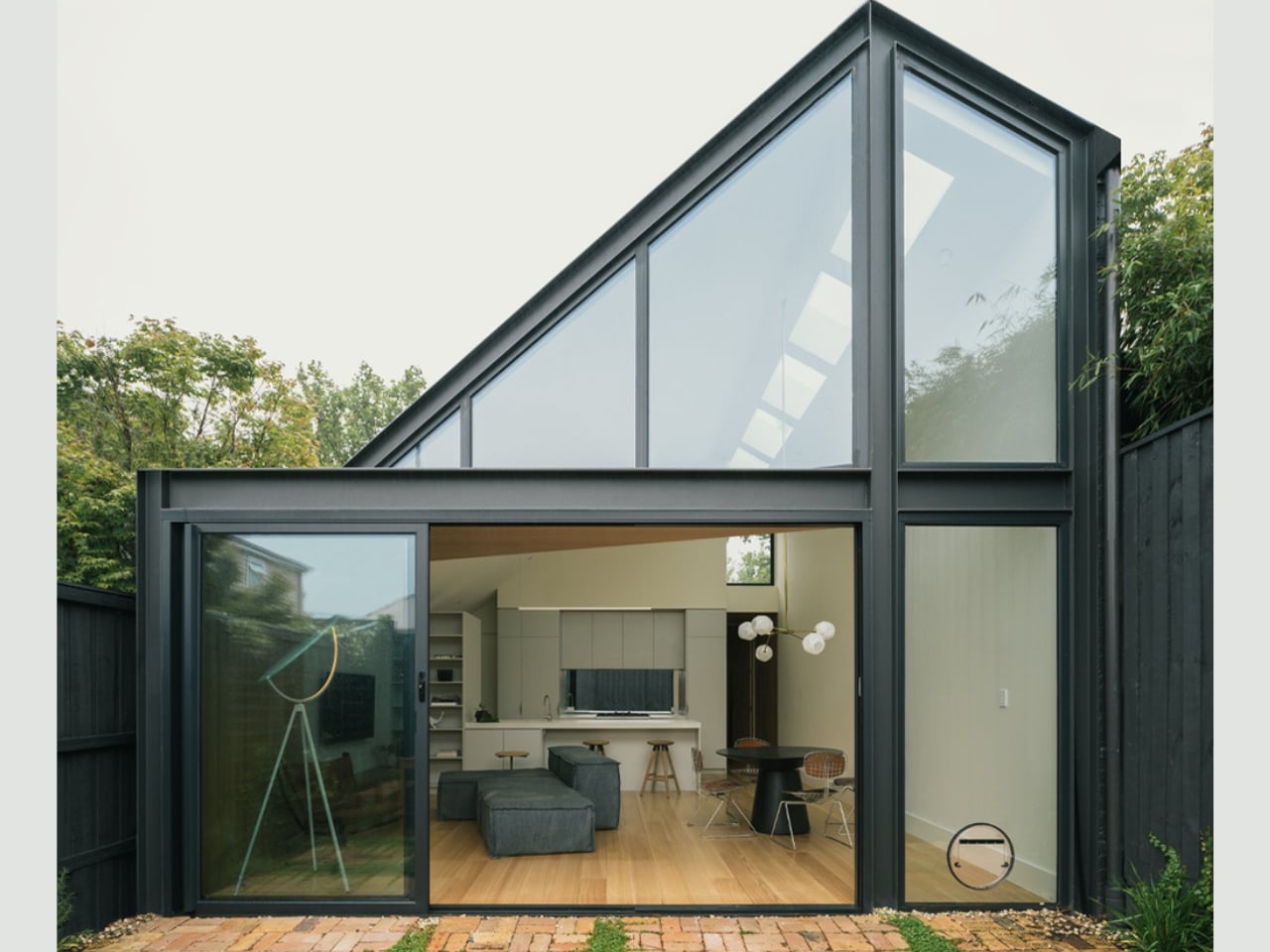
Melbourne’s inner-city suburb of Abbotsford is the kind of place that makes you feel the weight of time. Its streets are lined with single-fronted worker’s cottages, row after row of modest Victorian weatherboards that have been standing since the 19th century, when industrial workers first settled around the nearby factories of Fitzroy and Collingwood. The vernacular is intact, the character deeply established. To build something new here isn’t just a design challenge. It’s a negotiation with history.

That’s what makes the Abbie Abbotsford Terrace by Eckersley Architects so worth paying attention to. Not because it breaks the rules, but precisely because it knows which ones to follow. Completed in 2021, the project began with a single-fronted worker’s cottage situated directly opposite a leafy park and asked a straightforward but deceptively difficult question: how do you expand a home that’s defined by its modesty without losing the thing that makes it meaningful? The answer Eckersley Architects arrived at is one of restraint, context, and a quiet kind of confidence that isn’t always easy to pull off.

Designer: Eckersley Architects

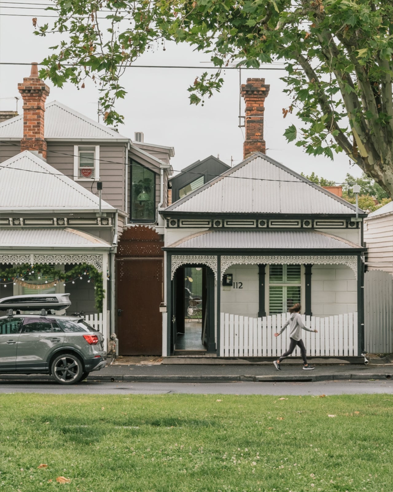
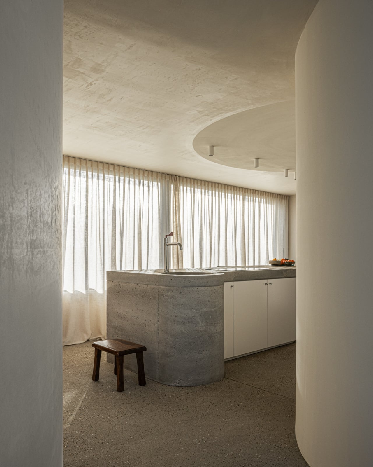
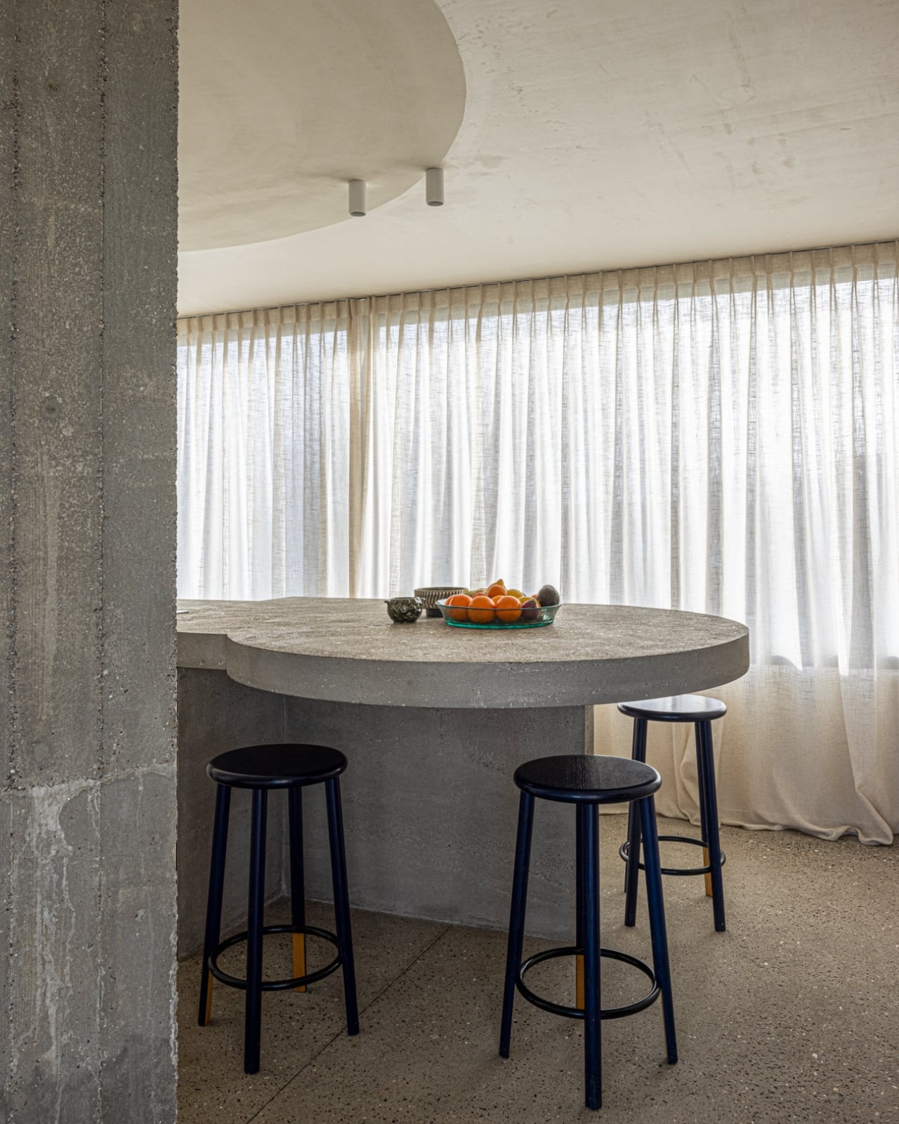
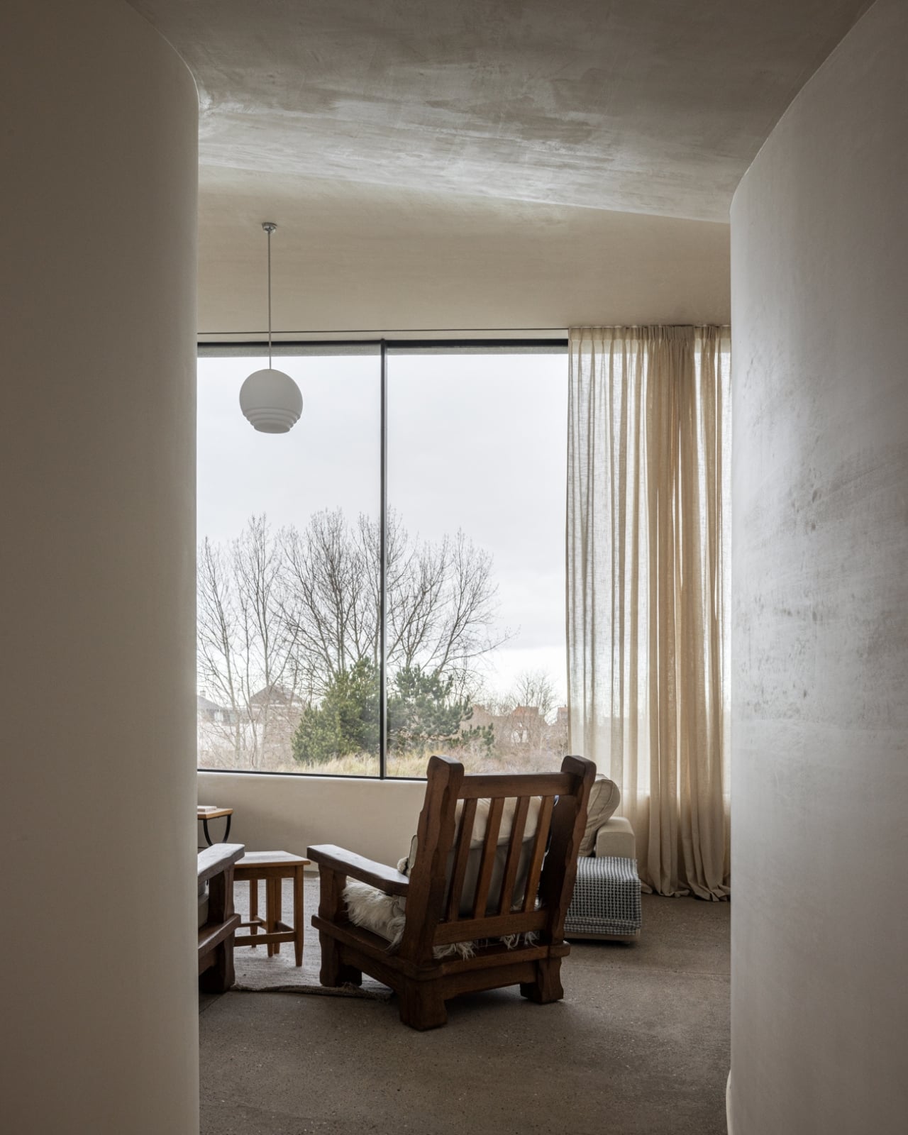
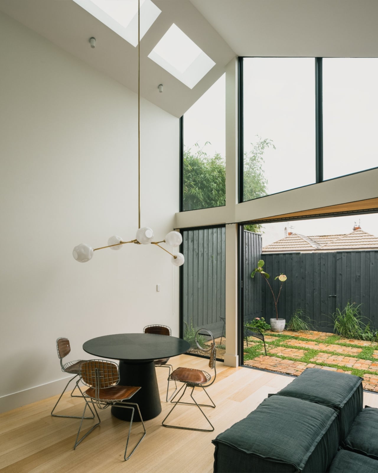
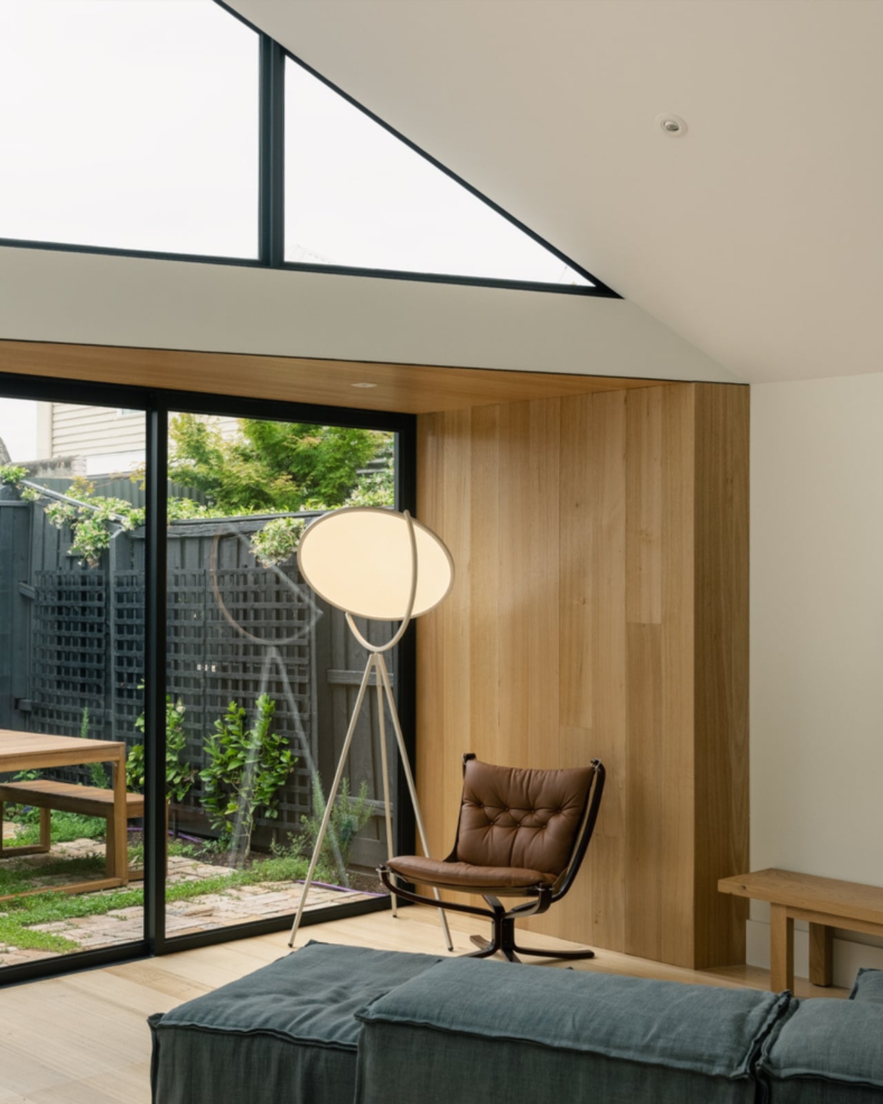
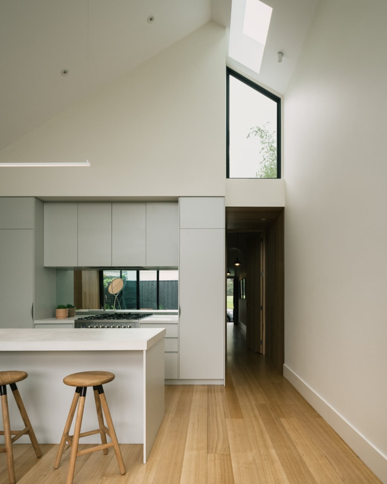
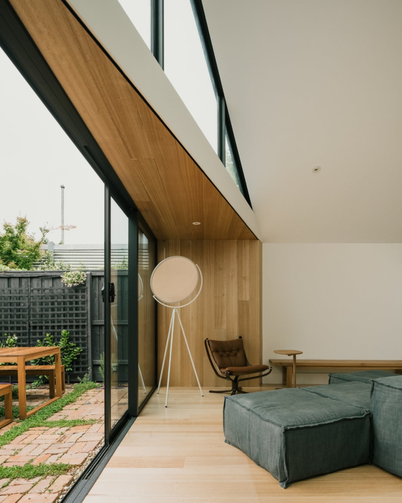
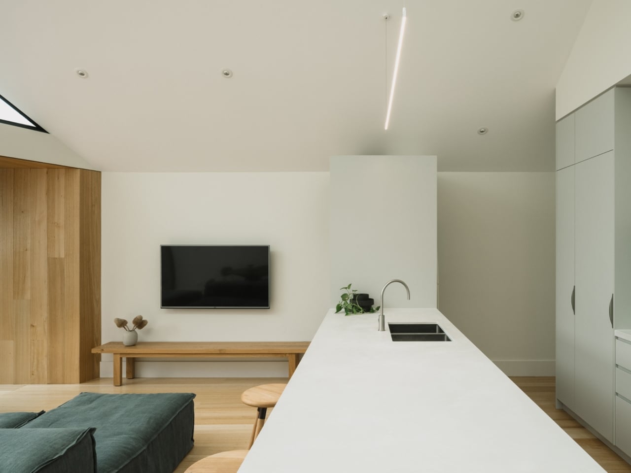
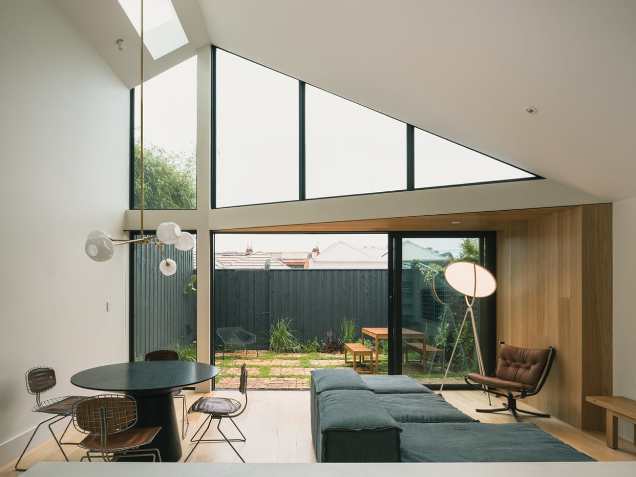
The approach was to preserve and restore the original cottage entirely, keeping it as the street-facing face of the home. The new addition lives at the rear, a modern single-level extension that opens generously onto a private, enclosed courtyard. It doesn’t announce itself. It doesn’t try to compete. The original and the new sit in dialogue rather than in tension, and that matters more than it might first appear.

One of the more understated decisions in the design is how the building form was shaped by its immediate neighbours. To the north, a two-storey dwelling. To the south, a single-level home with very little outdoor space. Rather than ignoring this context, Eckersley Architects used it as a structural premise, positioning Abbie as the bridge between two opposing scales, sitting equally adjacent to both boundary walls and carefully calculated to cause minimal shadowing to the southern neighbour. It’s the kind of considered empathy that rarely gets talked about in residential architecture, but it’s exactly the sort of thinking that separates good design from great design.

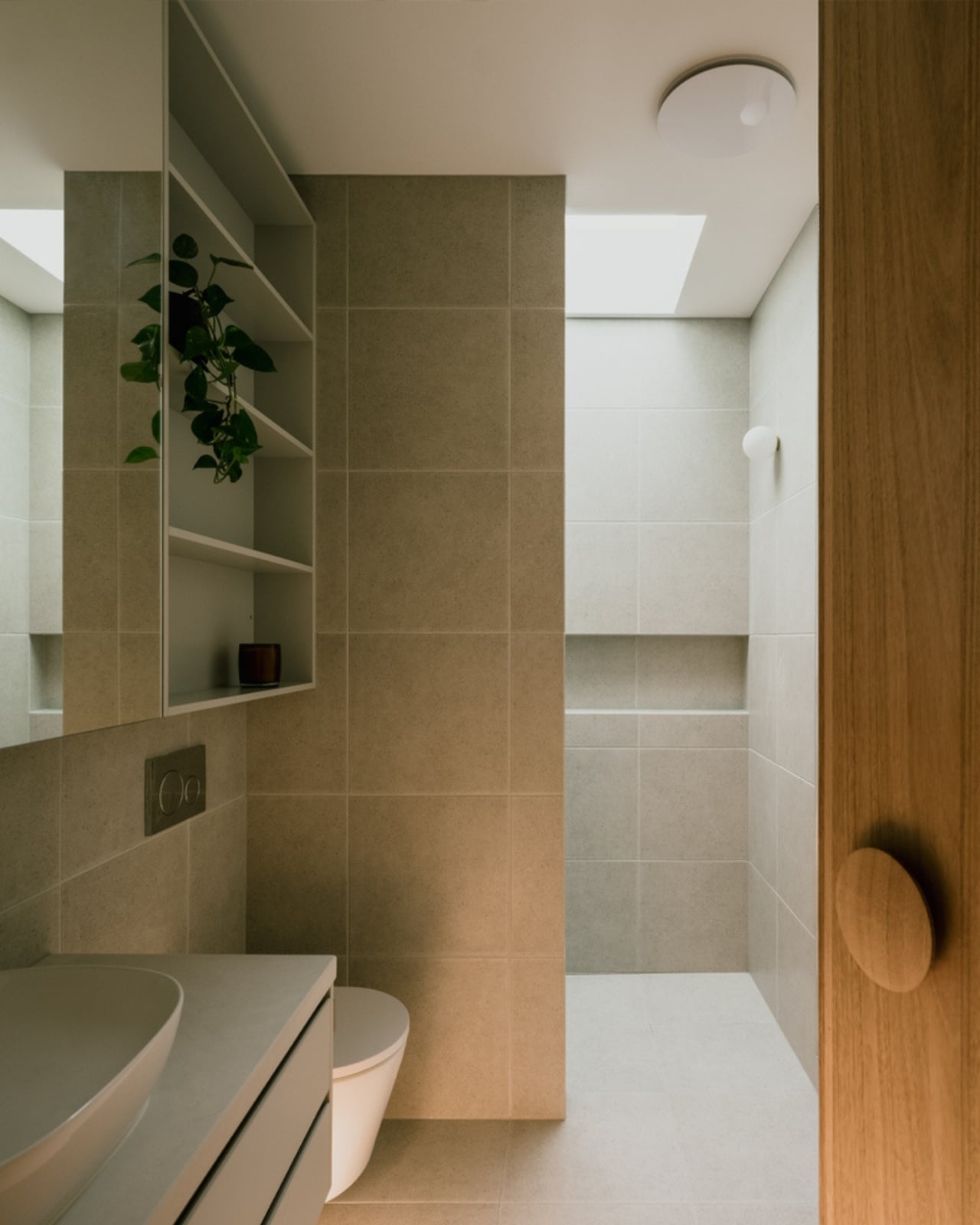
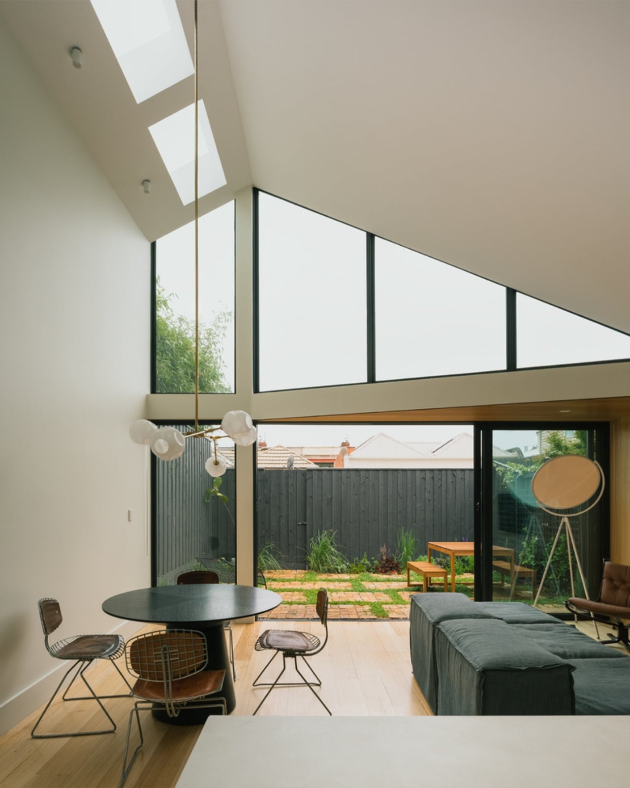
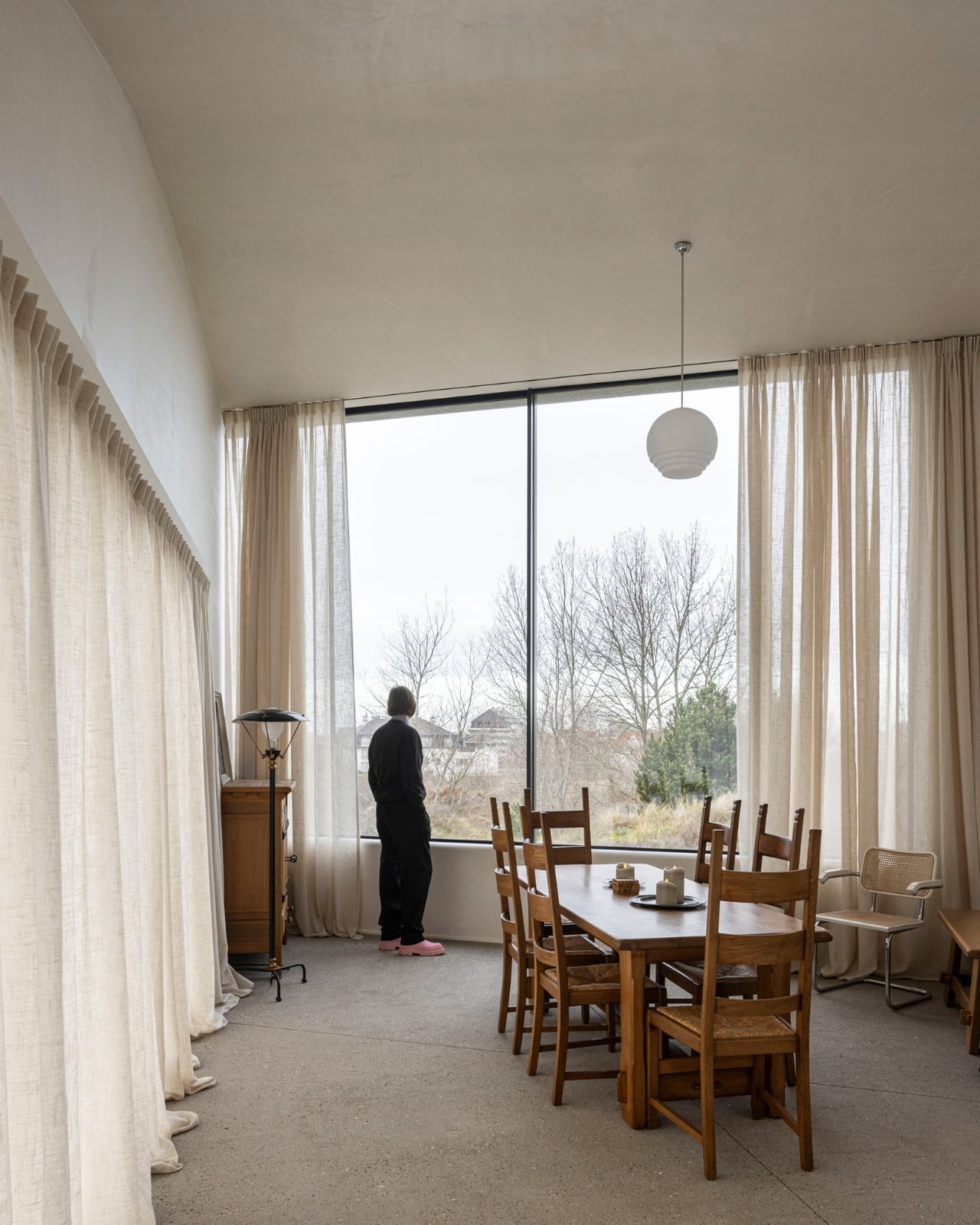
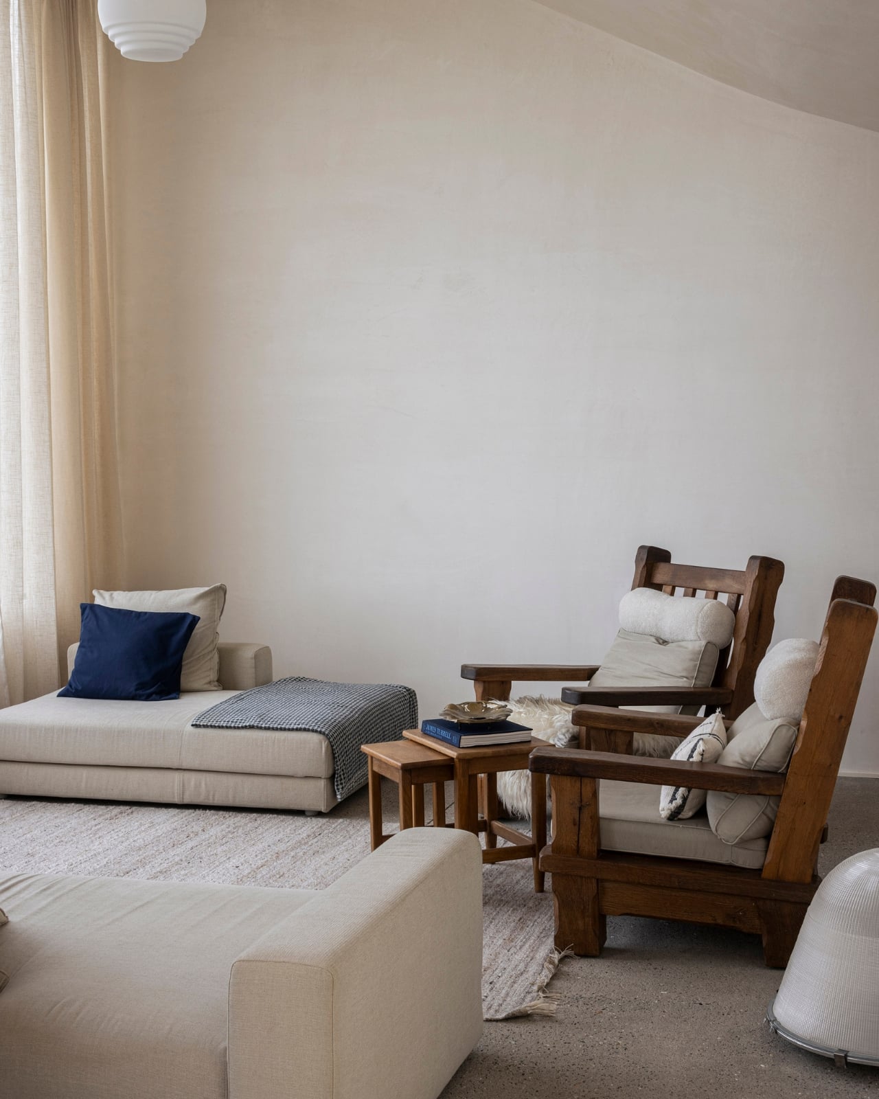
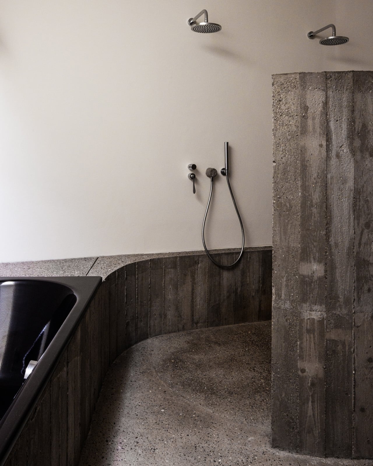
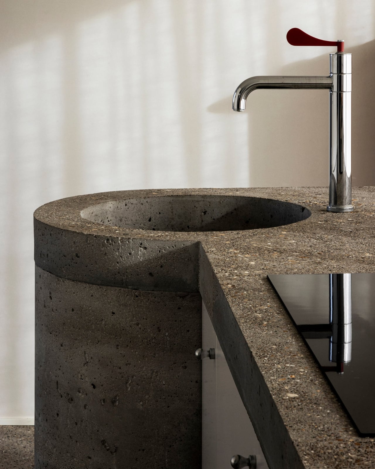
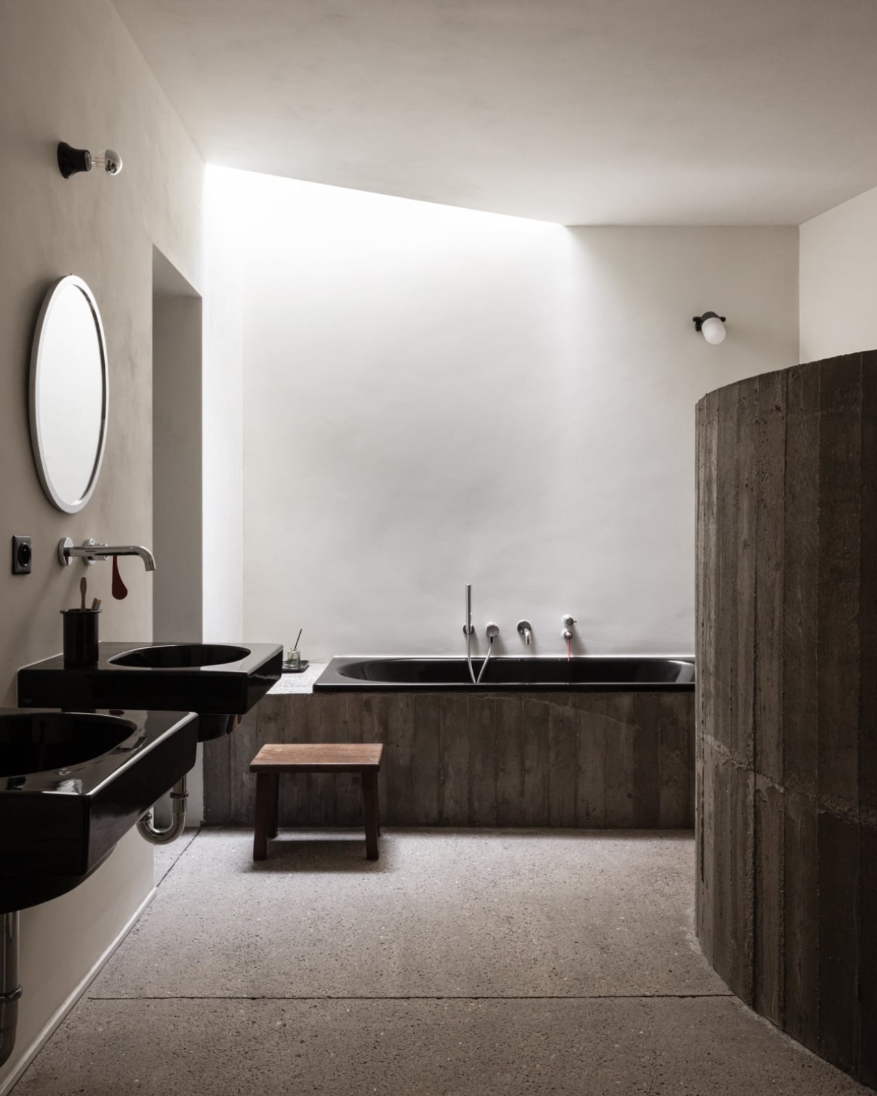
The result, at 190 square metres, is a home that punches well above its footprint. The new addition features lofty ceilings and expansive windows that frame the rear courtyard. The living space feels generous without being excessive, and the courtyard itself functions as an outdoor room, extending the home’s liveable area into something that feels genuinely alive. Photography by Dan Preston captures it all with a warmth that makes you want to be there, which is the ultimate compliment to any home.

I keep thinking about why projects like this matter so much right now. We spend a lot of time talking about bold new architecture, the statement builds, the hero houses dropped onto open sites with unlimited vision and budgets to match. And those are exciting, too. But the harder, more quietly radical act is doing exactly what Eckersley Architects did here: entering an existing neighbourhood, respecting its inherited logic, and finding a way to add to it rather than override it. Abbotsford’s rows of Victorian cottages are a form of collective memory. The preservation of that streetscape, maintained by dozens of homes that all quietly hold the line, is what gives the neighbourhood its character. When a renovation like Abbie comes along and chooses to work with that, rather than against it, it earns its place.

The project was completed in 2021 and has only now landed on ArchDaily, which feels right. It was never going to make a loud entrance. It’s a house doing exactly what it needs to do without reaching for attention. The best residential architecture often works that way. It reveals itself gradually, detail by detail. Abbie Abbotsford doesn’t reimagine what a house can be. It simply becomes a very good version of what this one always had the potential to be. And sometimes, that is enough.

The post The 190sqm Melbourne Renovation That Didn’t Touch the Street first appeared on Yanko Design.

Belgium’s Most Striking Concrete Villa Was Designed by the Dunes

If you’ve ever stood on a beach and watched the tide pull back, you know that moment right before the water retreats completely, when it leaves those delicate horizontal lines etched across wet sand. That’s what the facade of Villa Nouvelle Vague looks like. Not metaphorically. Literally. Belgian architect Magalie Munters designed the concrete surface of this seaside villa in Oostduinkerke with a horizontal grain that mirrors the striations the North Sea leaves behind at low tide. The reference isn’t decorative, it’s structural. And that distinction matters.

The villa sits on a corner plot at the edge of a protected dune reserve in Oostduinkerke, a small coastal town already known for a few wonderfully eccentric things: a ship-shaped restaurant and fishermen who harvest shrimp on horseback. Into this landscape, Munters has introduced something that manages to be arresting without being loud. The form is sculptural and unmistakably modern, but it doesn’t shout. It settles.

Designer: Magalie Munters

The name “Nouvelle Vague” borrows from the French New Wave film movement, and the reference is apt in ways that go beyond the obvious nod to style. The French New Wave was defined by breaking conventional rules while remaining deeply committed to craft. Munters is working in a similar register. For years, her Ghent-based boutique studio has been developing residential architecture with organic geometries, pushing against the idea that construction methods should set the ceiling on what architecture can achieve. “Through that ongoing research, I developed a way of building in which construction and technology no longer act as a limitation to the architecture,” she explains. Villa Nouvelle Vague is where that research cashes out.

The concrete form is completely curved across the entire volume, not just as a surface treatment but as a governing logic, carried through every detail: the absent roof edges, the curved garage opening, even the way the house integrates into the ground. The bedrooms are half-buried in the dunes, which is both a functional and a conceptual move. The house doesn’t sit on the landscape. It’s anchored into it. Above those buried rooms, the living spaces rise toward the horizon, pulling in light and opening out to views of the dunes in a way that feels earned rather than forced.

The way you move through the house is where Munters’ admiration for Le Corbusier becomes most legible. She’s spoken about his influence, specifically in “the rooftop solarium, in the way spaces expand and contract, and in the vertical shafts that structure movement through the house.” You enter through a vertical shaft that climbs toward the roof before expanding into the main living space. The compression-then-release is theatrical in the best sense. The house is working on your nervous system before you’ve even sat down.

I keep coming back to that word: deliberate. Munters uses it herself: “What might appear as a free form is in fact the result of a very deliberate construction logic.” That’s the tension the villa lives in, and frankly, it’s what makes it interesting. Nothing here is freehand improvisation. The curves look fluid because the logic behind them is airtight. The concrete looks like it grew from the dunes because the architect studied the dunes before she touched a drawing. That’s different from a building that mimics nature for aesthetic points. It’s rarer, and harder.

Belgian architecture doesn’t always get the international visibility it deserves, and Magalie Munters is one of those names worth paying attention to even if residential architecture isn’t usually your thing. Villa Nouvelle Vague is the kind of project that earns its name. It has the confidence of something that knows exactly what it is, and the intelligence not to over-explain itself. Just like the best films of the movement it references.

The post Belgium’s Most Striking Concrete Villa Was Designed by the Dunes first appeared on Yanko Design.

A Bookrack That Started as a Rectangle and Refused to Stay One

Most furniture design starts with a question about function and ends there. Deniz Aktay, the designer behind the studio @dezinobjects, apparently decided to start with geometry instead, and the result is one of the most quietly clever storage pieces I’ve come across in a while: the Barrow Bookrack.

The concept is almost laughably simple to explain, which is exactly why it works. Take a rectangle. Extend each of its lines on one side only. That’s it. That’s the whole idea. And yet, what comes out the other end of that single decision is a bookrack that feels caught mid-motion, leaning into itself, its proportions oddly satisfying in a way that’s difficult to immediately place. On paper, it barely sounds like a design at all. In person, it’s all you notice.

Designer: Deniz Aktay

Looking at it from a distance, the Barrow tilts at an angle that initially reads as precarious. It looks like it could tip at any moment, like a shelf that forgot to stand up straight. But it doesn’t. The asymmetry is intentional and controlled, and that’s exactly the kind of design choice that separates a well-considered piece from something that only looks interesting in renders. The structure holds, both physically and visually. The angular feet, the jutting top ledge, the open body sitting between them: everything is doing something.

The name is worth pausing on. A barrow, the traditional kind, is a simple carrying frame stripped back to its essential parts. Nothing extra, nothing decorative, just the minimum structure required to move something from one place to another. Aktay’s Barrow carries that same philosophy. Every extended edge and protruding surface earns its place. The result is a range of storage spots, each with its own character. Books stand upright in the central cavity. Larger volumes or stacked titles settle onto the flat extended surfaces. A magazine slipped sideways into one of the outer ledges feels like it was always meant to sit there.

This is the kind of piece that rewards being actually used. A lot of beautiful storage objects suffer from what I’d call the trophy problem: they look better empty than full. Barrow is the opposite. Load it with design books, art monographs, a worn paperback or two, and it genuinely improves. The varying heights, the mix of orientations, the textures of spines pressed against pale wood, it all adds up into something that feels lived in rather than staged. The structure becomes a frame for your reading life rather than something competing with it.

Aktay has explored this kind of thinking before. His earlier Bookgroove piece was a sculptural bookrack-table hybrid that played with the idea of furniture as form. Barrow feels like a sharper, more edited version of that same instinct: fewer moves, more precision. There’s less drama in the silhouette, but the restraint makes it more liveable. A piece like this can sit in a living room, a studio, or a bedroom and feel contextually right without demanding too much visual real estate from the room around it. It has presence without insistence, which is a harder balance to strike than it sounds.

The part that keeps pulling me back to this design is how naturally it moves from a flat idea to a physical one. The Barrow is essentially a graphic concept made tangible, a line drawing that decided to become furniture. The form evolved directly from extending lines on a flat surface before anything was actually built, and seeing that logic translated so cleanly into wood makes the whole thing click. The render and the physical piece are telling the same story, which is rarer in furniture design than it ought to be.

Furniture, at its best, makes you reconsider something you assumed was already settled. You’ve seen hundreds of bookshelves. You’ve probably owned a few. The Barrow doesn’t try to be revolutionary. It just extends a line a little further than expected, and somehow that’s enough to change the whole conversation.

The post A Bookrack That Started as a Rectangle and Refused to Stay One first appeared on Yanko Design.

The F1 Engineer Who Turned Time Into a Kinetic Sculpture

Most clocks are honest about what they are. They count. They tick. They remind you, with mild urgency, that you are late or almost late or about to be. Robert Spillner’s Luna is not a clock that measures time. It stages it. That’s a subtle but loaded distinction, and it’s exactly why this object is worth paying attention to.

Luna is a fluid wall object that translates the principle of the single-hand watch into a kinetic sculpture, making the moment between past and future perceptible. Behind the hand, a trace of turbulent patterns marks the touched past. Ahead of it stretches calm liquid: the untouched future. The present is the thin, moving line between them. It sounds poetic because it is, but it’s also technically precise, which is kind of the whole point.

Designer: Robert Spillner

Spillner trained as an engineer and initially developed components for Formula 1 cars, used by numerous teams, in a culture where speed, optimization, and victory are everything. With Luna, that paradigm is reversed. Instead of lap times, the focus is on mindful observation; instead of chasing the fastest, it is about pausing, about stillness. The pivot reads like a philosophical reversal, not just a career change, and that tension is embedded in the object itself.

At the heart of Luna is a specially developed fluid Spillner calls Zero Flow Technology. Its core consists of distilled water, additives, micro-particles, and a minimal quantity of genuine lunar dust. The exact composition remains deliberately undisclosed, part of the mystery that invites the observer to immerse themselves in the visual experience rather than merely explain it technically. I think that’s the right call. Part of what makes Luna compelling is that it resists easy explanation. You’re not supposed to look at it and think “clever fluid dynamics.” You’re supposed to feel like time has texture.

The lunar dust takes the cosmic concept to its logical conclusion. These are particles billions of years old that once fell from space to Earth, and they are now carriers of time. Each piece comes with a certificate of authenticity documenting the origin of this cosmic additive. That detail is not just a marketing flourish. It changes the nature of the object.

Aesthetically, Luna presents itself as a square wall or stand object, approximately 400 by 400 millimeters, with a black front and a cast acrylic glass pane at its centre that becomes the stage for the fluid time, framed by a solid, matte-black wooden frame. A small LCD touchscreen, 35 millimeters in diameter, merges the cosmic and digital realms. Time and display brightness can be adjusted easily. The screen is discreet enough that it doesn’t compete with the fluid for visual dominance. It supports the piece without stealing from it, and that balance isn’t easy to pull off.

Luna is handcrafted in Germany as a limited edition. The fluid mixture, developed over years in collaboration with a laboratory, requires weeks of fine-tuning for each unique piece. Every Luna carries an engraved serial number and year of manufacture, signed by the artist, and comes with a certificate for the meteorite dust. Only 99 pieces per year are planned, all made on demand. Luna defines itself clearly as an art object with a time function, not as an industrial small series. That self-awareness matters.

The question people tend to ask about objects like this is whether they’re worth it. I’d reframe the question. Luna isn’t competing with your iPhone or your smartwatch. It’s not trying to optimize anything in your day. It’s making an argument about how we relate to time, which is a thing most of us don’t think about until we’re running out of it. The fact that it’s beautiful while doing this isn’t a bonus. It’s the method. Design, when it’s working at its best, changes how you see the thing it’s describing. Luna does that with time. And for an object that started life inside Formula 1 engineering labs, that’s a remarkable distance to travel.

The post The F1 Engineer Who Turned Time Into a Kinetic Sculpture first appeared on Yanko Design.

Konstantin Grcic Finally Designed the Office Desk We Needed

We’ve been designing office desks essentially the same way for decades. Four legs, a flat surface, maybe a drawer if you’re lucky, and an ergonomic chair that costs more than your first car. So when Vitra and German industrial designer Konstantin Grcic quietly dropped the Scout Work Mobile just last month, I paid close attention.

The Scout Work Mobile is part of a larger family of workstation and meeting tables simply called Scout, launched on March 19 of this year. The collection comprises five pieces ranging from stationary desks to mobile variants, and it’s Grcic’s response to how offices actually function today versus how they were designed to function twenty years ago. The Scout Work Mobile is the one that caught my eye: a compact, trapezoidal desk on wheels with a tubular steel frame that rises up and encircles the work surface.

Designer: Konstantin Grcic

That frame is the whole story, really. It’s not decorative. It’s not there to look good in a mood board (though it absolutely does). The frame acts as a grab handle when you’re rolling the thing across a room, a mounting point for privacy screens, and a place to hang accessories. Without any attachments, it still creates what Vitra describes as a “room-within-a-room” effect, a bit of visual and psychological separation from whatever chaos is happening around you. For those of us who’ve had to MacGyver focus time in open-plan offices using noise-cancelling headphones and pure denial, that feels like a genuine design insight rather than a marketing afterthought.

Grcic is known for what Vitra calls a “severely simple” aesthetic. He doesn’t add things for the sake of adding them, and the Scout Work Mobile reflects that clearly: the height adjustment and tilting function work entirely without electricity. No motors, no app, no firmware updates required. It adjusts by hand. That might sound unremarkable, but compared to the increasingly tech-dependent office furniture being released right now, it reads almost like a radical statement.

The mobile aspect of Scout is where the design really earns its name. Return-to-office mandates are reshaping how companies think about their physical spaces, and the rigid assigned-desk model is quietly becoming a liability. Hot-desking, collaborative hubs, project clusters, training rooms that double as focus spaces. Modern offices are being asked to do a lot more with the same square footage. Scout was built for exactly that kind of environment. You grab it, roll it where you need it, work, and move on. No teardown required. No reconfiguration meeting on the calendar.

Grcic put it plainly in an interview with Vitra Magazine: “The aim is not to replace what already exists. Rather, the system is an extension or complementary offering that responds to different levels and styles of work.” That kind of restraint is rare in product design, where the temptation is always to pitch your thing as the only thing. Scout doesn’t ask to own your whole office. It just wants to be useful wherever you put it.

Aesthetically, it sits in that satisfying middle ground between industrial and refined. The tubular steel frame reads as utilitarian at first glance, but the trapezoidal silhouette and deliberate proportions make it feel considered rather than clinical. It’s the kind of furniture that would look at home in a forward-thinking tech company, a design school studio, or a well-curated co-working space. It isn’t trying to disappear into the background, and it certainly doesn’t need to.

What makes Scout genuinely interesting is that it treats mobility as a first principle rather than a feature tacked on after the fact. Desks on wheels have existed forever, but most of them feel like an afterthought, as if someone just bolted casters onto a standard table and called it agile. Grcic designed the Scout Work Mobile from the ground up with movement in mind, and the difference is visible in every element. Office furniture rarely makes me stop and think twice. The Scout Work Mobile managed to.

The post Konstantin Grcic Finally Designed the Office Desk We Needed first appeared on Yanko Design.

Preciosa To Make Light Feel Like a Living Thing at Milan 2026

Light has always been design’s most underrated material. We talk endlessly about furniture, textiles, and surfaces, but light? It usually plays the supporting role, the thing that makes everything else look good. Preciosa Lighting is quietly changing that conversation, and their latest collection, Drifting Lights, might be the most convincing argument they’ve made yet.

The Czech brand has been doing this long enough to know the difference between novelty and genuine craft. Their heritage is rooted in traditional glassmaking, but what they’ve built with Drifting Lights feels like a very deliberate step forward. Each piece is made up of oblong and square glass panels slotted into a stainless-steel frame that discreetly conceals an LED strip. Inside each panel, the glass has been infused with countless tiny air bubbles. When light passes through, it doesn’t just illuminate the glass. It gets lost in it, scattering through those bubbles in a way that looks less like electricity and more like light deciding where it wants to go.

Designer: Preciousa Lighting

For Milan Design Week 2026, Preciosa is bringing the full Drifting Lights experience to the Tempesta Art Gallery in Brera, and the scale alone is worth paying attention to. The installation spans approximately 30 square metres and features 60 glass panels suspended vertically and horizontally, forming a structure measuring 8.7 by 3.2 by 3 metres. Set against a dark interior, the panels will be animated using 3D spatial mapping and RGBW technology, cycling through colour sequences from red to pink to green. Co-Creative Directors Michael Vasku and Andreas Klug put it plainly: the installation aims at “creating space to slow down, pause and wonder.”

I appreciate that framing, because Milan Design Week is genuinely relentless. Every brand is competing for the loudest moment, the most shareable installation, the boldest statement. There is a real temptation to optimise for the 15-second video clip rather than the actual experience of standing in a room. Preciosa is betting on the opposite, and I think that’s the smarter play. The colour sequence from red to pink to green reads like an emotional arc rather than a tech demo, referencing love, passion, and inner peace. Whether or not you buy the symbolism, you can’t argue with the atmosphere it creates.

A design object earns its place when it works just as well outside a gallery as inside one, and Drifting Lights has clearly been thought through on that level. The panels come in ten sizes, with different metal frame finishes and the option to orient them vertically or horizontally. The same collection can fill a grand hotel lobby or anchor a living room without losing its character. For bespoke projects, Preciosa can apply a painting technique that introduces pigment bubbles into the glass, giving each panel a layer of quiet individuality. The bubbled glass can also be enhanced with their Fused Veil pattern, which shifts the direction of light and adds even more visual complexity.

Under static illumination, Drifting Lights is calm and composed. Switch to dynamic mode and the panels come alive, with light moving from one to the next like ink dispersing through water. The gradients bloom, soften, and recombine. It’s the kind of effect that makes you stay in a room longer than you planned, which is, ultimately, what great lighting is supposed to do.

Preciosa has had a strong run at Fuorisalone in recent years, with recognised installations at Zona Tortona and Euroluce. The move to Tempesta on Foro Buonaparte suits the work well: a contemporary art gallery setting that lets the installation breathe without competing with showroom furniture. It’s a confident choice for a collection that clearly doesn’t need much help making a room feel different. If you’re heading to Milan, the installation runs April 20 to 26 at the Tempesta Art Gallery on Foro Buonaparte, and this one is worth the detour.

The post Preciosa To Make Light Feel Like a Living Thing at Milan 2026 first appeared on Yanko Design.

A Tiny Pinwheel Is Doing What AI Giants Won’t

Every time you type a prompt into ChatGPT, something happens somewhere far away. Servers spin up. Electricity moves. Carbon gets generated. The whole transaction is so clean and invisible on your end that it might as well not be happening. That’s by design, and it’s worth thinking about. Although with the way we use technology these days, we seldom think about the consequences on our environment.

London-based creative studio Oio wants to change that, starting with a small 3D-printed box and a bright yellow pinwheel. Their project, the Hot Air Factory, is a domestic AI device that processes your questions and requests locally, without connecting to the cloud, and every time it thinks, it physically exhales. Hot air pushes out of the top of the device and spins that cheerful little pinwheel. The harder it thinks, the faster it spins. You’re watching computation happen in real time, which turns out to be a surprisingly powerful thing.

Designer: Oio

The concept is simple: make the invisible visible. We know AI uses energy. We’ve read the headlines. But knowing abstractly that data centers are energy-hungry is different from watching a pinwheel turn every time you ask your AI assistant to summarize something. One is a statistic. The other is a moment of honest accountability.

What makes the Hot Air Factory smart, beyond its obvious design appeal, is how it translates cost into human-readable terms. It doesn’t give you kilowatt-hours because most people have no idea what that means. Instead, it tells you something like “that prompt cost the equivalent of brewing a cup of tea” or “watching Netflix for five minutes.” Suddenly the math becomes personal. Suddenly you start wondering whether you really needed a 500-word AI response to a question you could have Googled.

Oio co-founder Matteo Loglio describes it as “a small, domestic AI that reveals the hidden energy cost behind every prompt.” The factory also lets you dial up or down the level of intelligence it uses. Want a quick answer? Use a lighter model, spend less energy. Need something more complex? Crank it up, and watch that pinwheel work for it. You can even schedule your heavier prompts for the night shift, when energy is cleaner and the grid is quieter. These are design decisions that carry real ethical weight, and they’re baked in with zero condescension.

The playfulness and the seriousness aren’t in conflict here. They’re exactly the point. The Hot Air Factory is built in a Frutiger Aero visual language, all soft curves and clean optimism, the kind of aesthetic that makes you want to put it on a shelf next to your plants. But underneath that approachable exterior is a genuinely complicated machine running open-source large language models on a local GPU. It looks like something a friendly robot would carry. It functions like a small act of protest.

AI companies have very little incentive to make their energy costs legible to users. Invisibility is convenient. It keeps things frictionless. It keeps you prompting without thinking about the bill. A report from the US Department of Energy projected that by 2028, data centers could account for 12% of total electricity consumed in the US. That’s not a small number, and it keeps growing every time we treat AI like it runs on good intentions and cloud magic.

The Hot Air Factory isn’t saying AI is bad. It isn’t demanding you stop using it. What it’s doing is quieter and more persuasive than that. It’s asking you to look. To see. To feel, just a little, what your digital habits cost in the physical world. That’s the argument made not through a lecture or a campaign, but through a yellow pinwheel spinning in your living room.

Design can do that. Sometimes a small, well-made object says more than a policy paper ever could. The Hot Air Factory is currently looking for collaborators to help bring it to a wider audience, still working its way from experiment to something anyone can own. If the goal is conscious computing, the first step might just be this: a tiny box, a spinning fan, and the quiet discomfort of watching a machine breathe.

The post A Tiny Pinwheel Is Doing What AI Giants Won’t first appeared on Yanko Design.

McDonald’s Just Built a Gadget That Every Gamer Has Needed Forever

Every gamer knows the panic. You’re mid-session, your team is deep into a raid, and your stomach is absolutely staging a coup. You ordered food 20 minutes ago, and now it’s sitting on the counter getting cold. The second you put down the controller to eat, you risk going AFK long enough to get kicked from the game, lose progress, or let down your whole squad. It’s one of those universal gaming frustrations that nobody has really addressed in a meaningful way. Until now, at least in Türkiye.

McDonald’s Türkiye just introduced “Archie,” a small controller peripheral that solves this exact problem. The device clips onto your gamepad and brings the analog sticks together, keeping your character in motion even when your hands are occupied with a burger instead of the buttons. The result? Your character keeps walking, you keep your spot in the session, and your food doesn’t go cold. It’s a stupidly simple fix to something that has plagued gamers for years.

Designer: McDonald’s Turkiye

The name “Archie” is a nod to the brand’s iconic Golden Arches, and the device’s shape reflects that. It’s a small arch-shaped piece that essentially bridges the two sticks on your controller. It’s not a Bluetooth gadget loaded with firmware updates or a subscription service. It’s just a clever piece of physical design that does exactly what it needs to do and nothing more. I genuinely appreciate that. Not every solution needs to be a tech startup. Sometimes the answer is a well-placed piece of plastic.

Archie comes bundled with what McDonald’s Türkiye is calling the “Pro Gamer Menu,” which includes a Big Mac, medium fries, a medium Coke, and 8-piece onion rings, available for a limited time through delivery orders. The branding is playful, the packaging presumably leans into the gamer aesthetic, and the whole campaign was developed by TBWA\Istanbul. It’s a smart marketing move, but calling it only marketing feels like underselling it. The gadget is actually useful, which is what separates this from your typical branded promotional gimmick.

Fast food and gaming have always had an unofficial relationship. Late nights, delivery orders, gaming fuel, you know the drill. Brands have tried to tap into that culture with discounts, streaming sponsorships, and limited-edition packaging, but most of it feels performative. This is the first time I’ve seen a fast food brand actually design something that speaks directly to the gameplay experience rather than just putting a controller graphic on a cup. That distinction matters.

The AFK problem is particularly brutal in competitive or online multiplayer games. Most games have inactivity timers that will boot a player for not doing anything for a certain period. Some games penalize you for leaving mid-match. Your teammates suffer. Your stats take a hit. Your character might just stand there in the open, practically begging to get eliminated. Gamers have been taping rubber bands around their controllers and propping up joysticks with coins for years. The fact that it took a fast food chain to come up with a legitimate, branded fix is equal parts amusing and oddly satisfying.

Does Archie work for every game? Probably not. Games that require active combat input, precise aiming, or frequent menu navigation will still need two hands. But for open-world games, exploration-heavy titles, or any session where moving in a general direction is enough to stay active, this is genuinely clever. It threads a needle that a lot of gaming accessories miss, which is solving a real problem without overcomplicating the solution.

I hope this doesn’t stay exclusive to Türkiye. The problem Archie addresses isn’t regional. Every gamer, everywhere, has eaten at their desk or on their couch while trying to keep an eye on the screen. McDonald’s stumbled onto something that is simple, charming, and genuinely useful, and that combination is rarer than it looks. Give us the Archie globally, please.

Image courtesy of: @technology

The post McDonald’s Just Built a Gadget That Every Gamer Has Needed Forever first appeared on Yanko Design.