The Red Cabin Sitting Alone on a 1,000-Year-Old Island in China

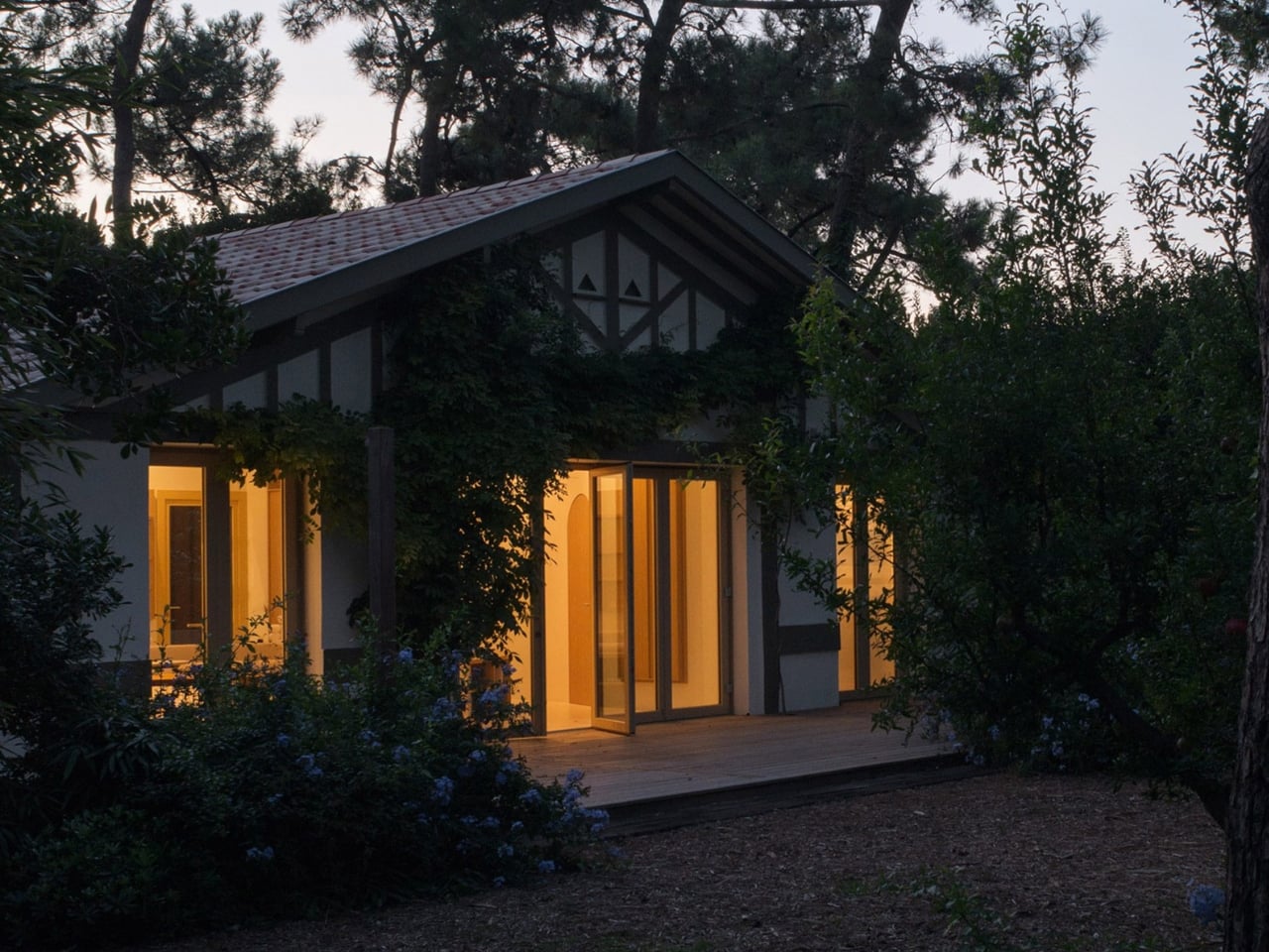
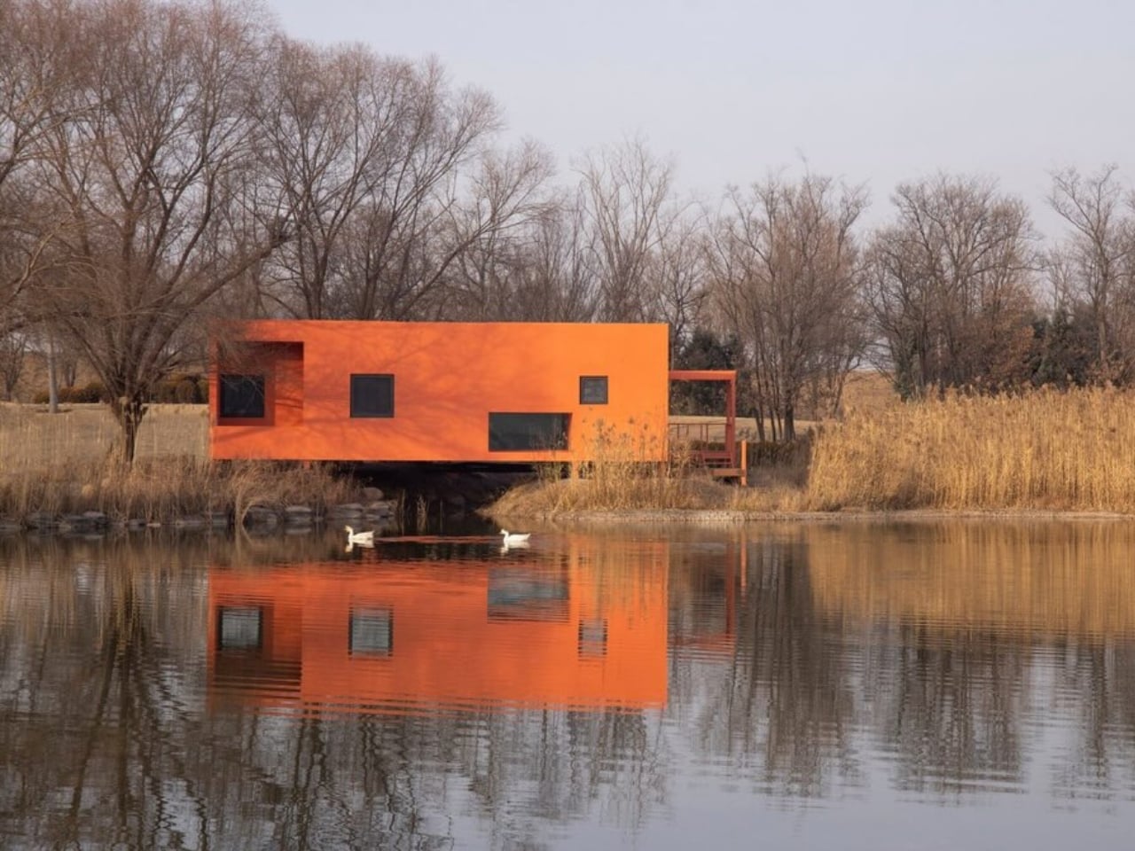
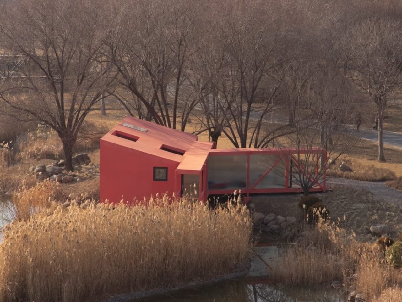
The first time I saw images of the Red Bridge Cabin, I spent a good five minutes just staring at them. Not scrolling. Not clicking through. Just staring. A small red structure sitting on a quiet island, reflected in the water around it, surrounded by the stillness of a thousand-year-old heritage park in Zhengzhou, China. It looked like something out of a dream someone had while reading ancient poetry. It makes me want to spend a few hours in it. That’s the kind of thing good architecture can do to you.

Designed by Wiki World and the Advanced Architecture Lab, the Red Bridge Cabin is the 138th entry in Wiki World’s ongoing “Wild Home” series, a collection of experimental small-scale dwellings that push back against conventional ideas about what a home needs to be. At just 79 square meters, the cabin sits within Yuancheng Cultural Park, a free-admission heritage park built around the Yuanling Ancient City Site in the Zhengzhou Airport Economy Zone. The site is a nationally protected cultural landmark that integrates historical preservation, ecological landscapes, and family-friendly leisure all in one place. Parking a bold red wooden cabin in the middle of that requires either tremendous confidence or a very specific kind of audacity. I’d argue it requires both.

Designers: Advanced Architecture Lab, Wiki World (photos by Arch Exist)

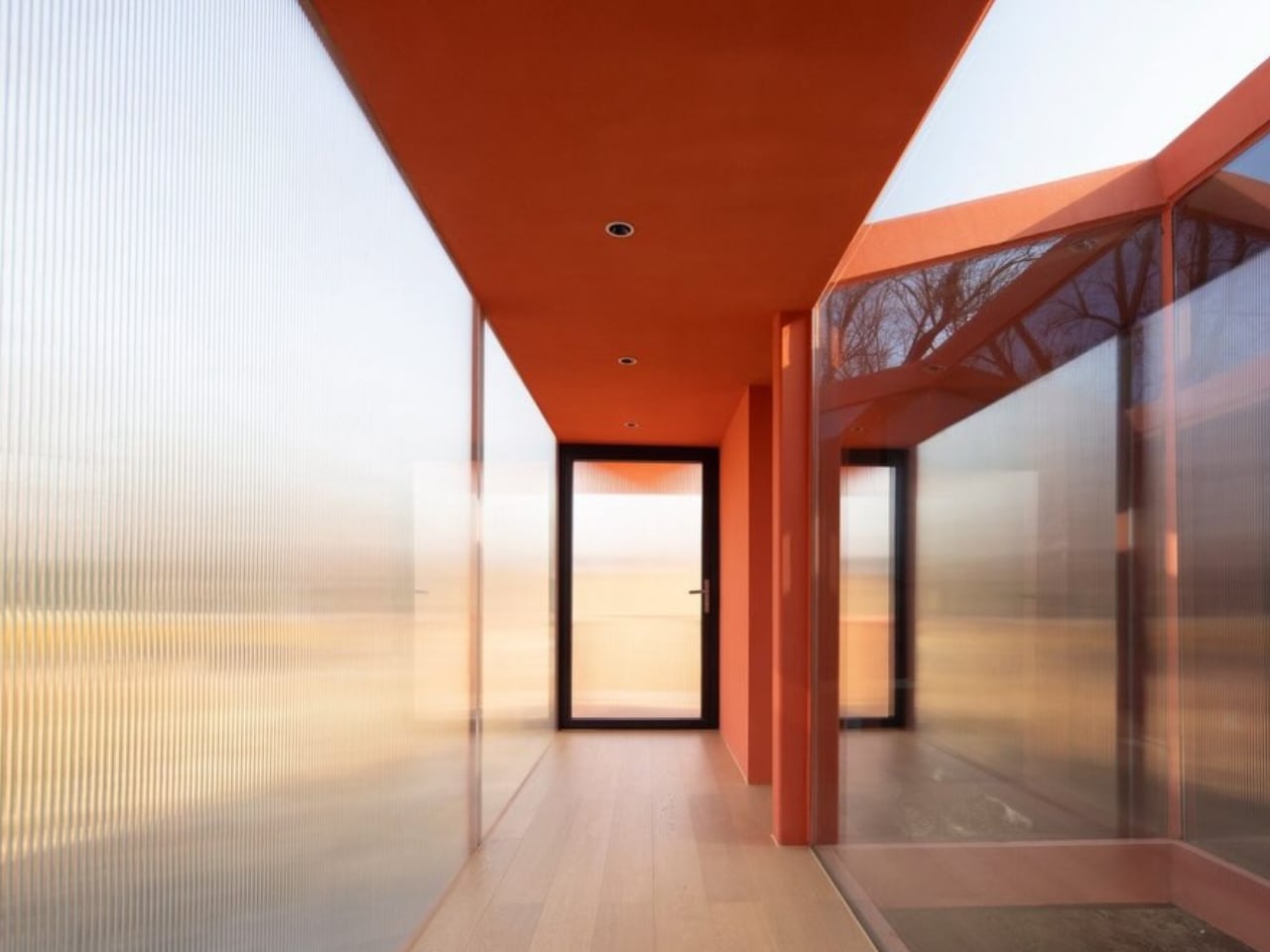
The name comes from the bridge. You reach the cabin by crossing a narrow, translucent bridge over the water, which immediately sets the tone. This isn’t a building you stumble into. You approach it, and that approach is already part of the experience. The designers describe it as a place where “comfort and wilderness, engagement and detachment, become indistinct, like longing itself, beautifully blurred.” I know that reads a little poetic for a press release, but I think they actually meant it, and looking at the photographs, it’s hard to argue against it.

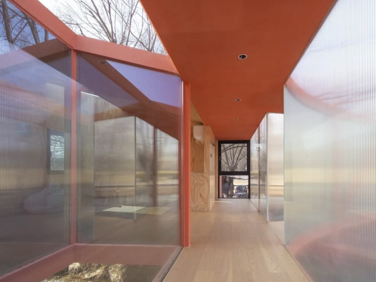
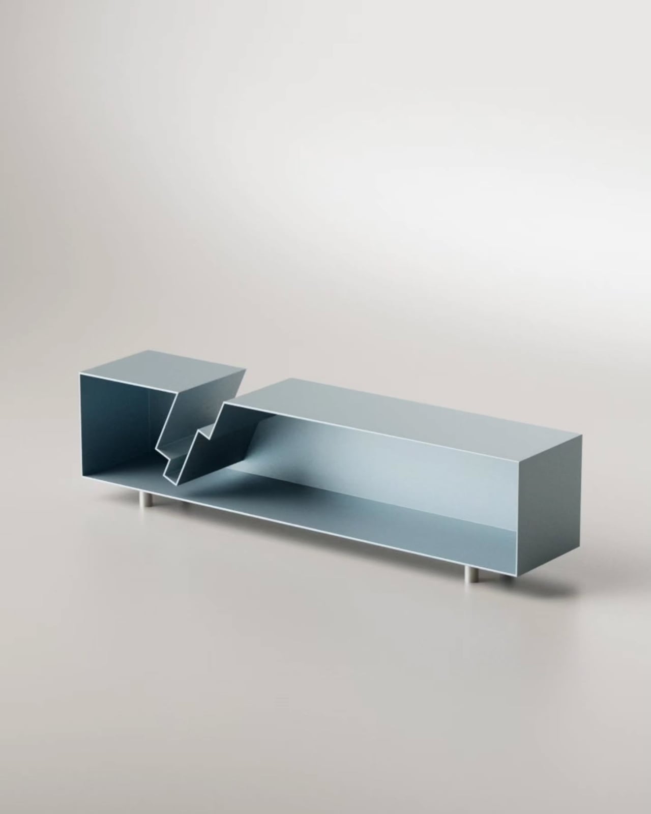
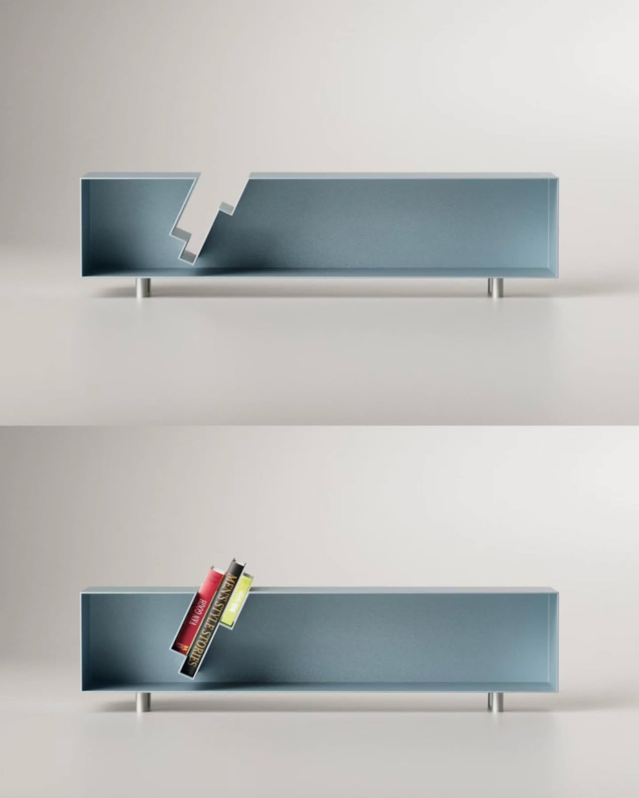
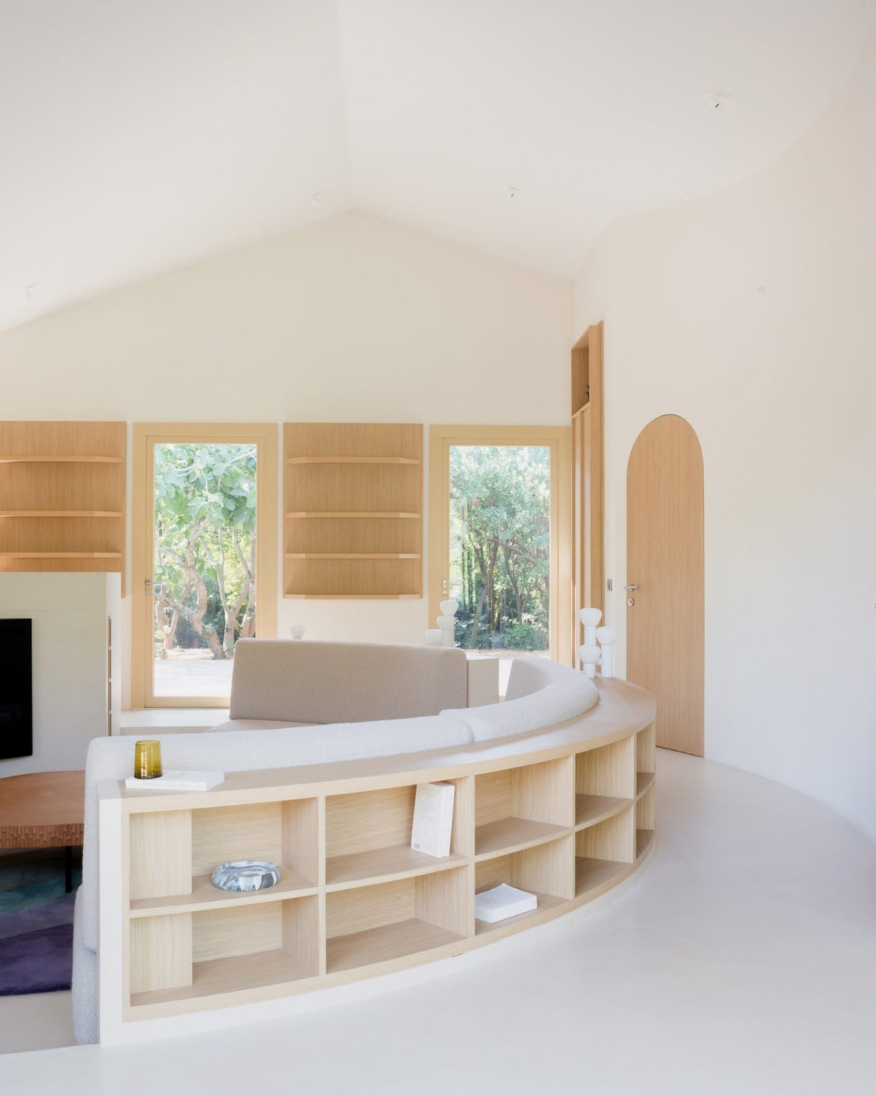
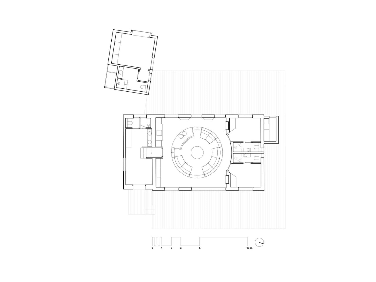
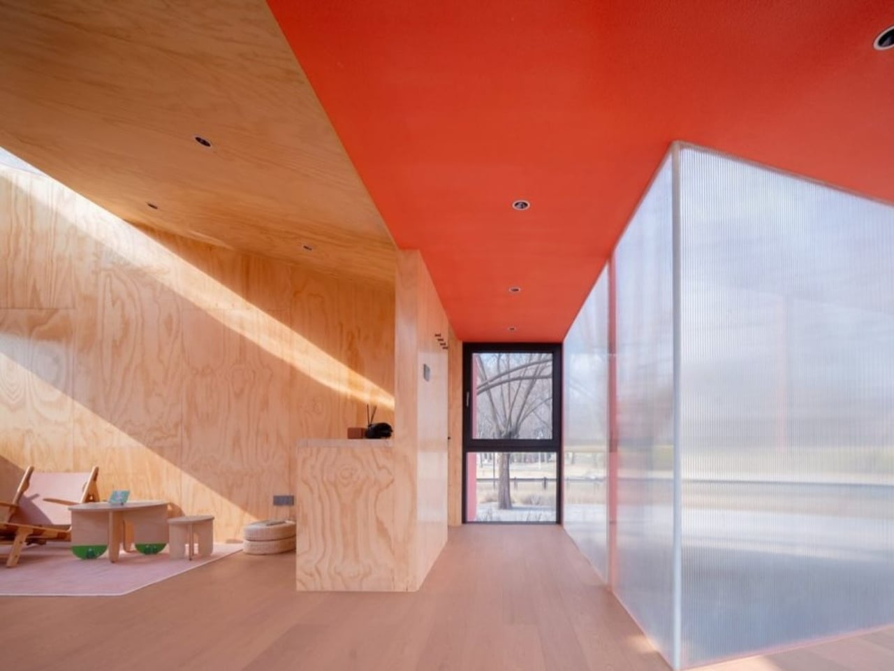
Inside, the cabin incorporates two courtyards and a large skylight, which together create what the designers call “a landscape within the living space itself.” That phrase sounds abstract until you see it in practice. Natural light moves through the interior differently at different times of day. Translucent screens blur the surrounding views into soft silhouettes while carefully placed windows frame specific sightlines outward. It’s a small space that feels intentionally porous, as if the boundary between inside and outside was always meant to be negotiable.

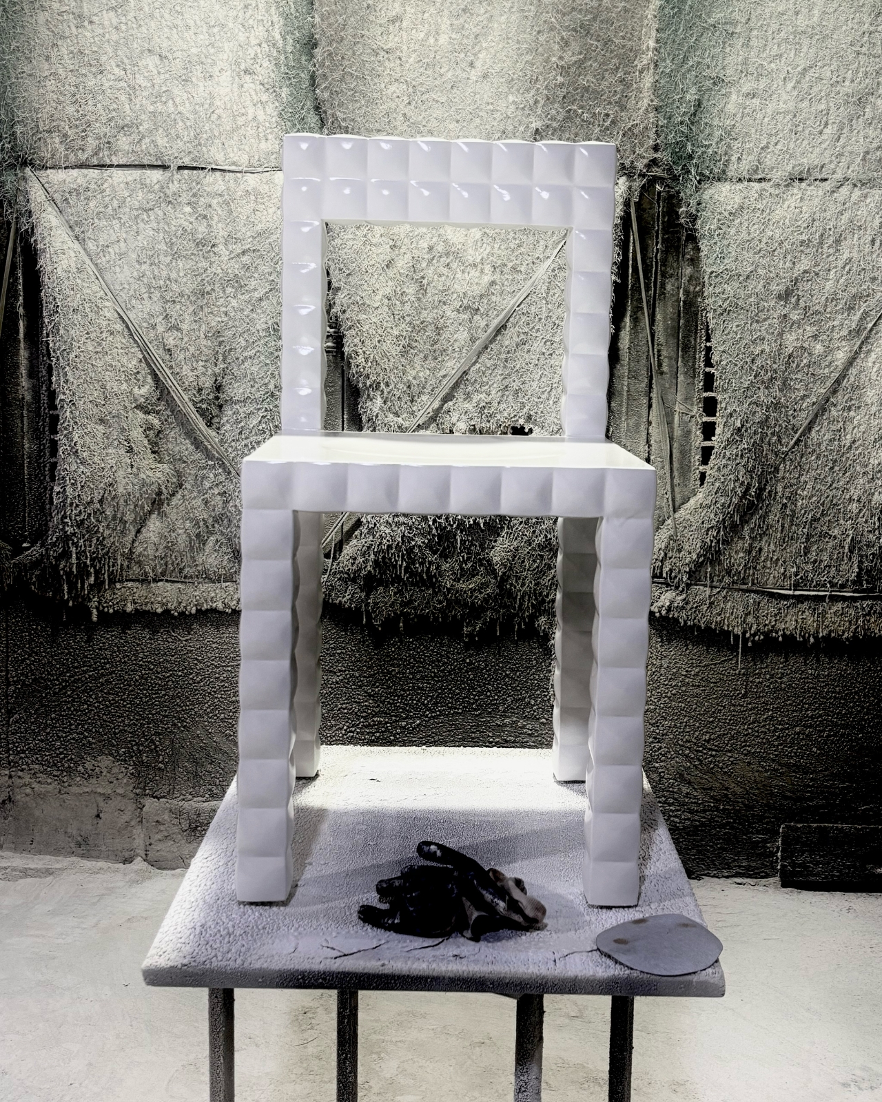
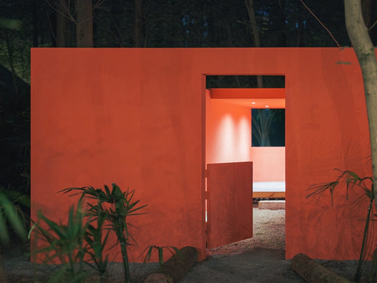
The construction method deserves its own moment. The entire structure is built from glued laminated timber, with every irregular component and joint digitally designed and custom-fabricated for full prefabricated assembly. Small metal connectors link the timber elements, and the whole thing can be disassembled and reassembled without permanently altering the site. The designers frame this as a feature, not a workaround, and for a cabin sitting on protected heritage ground, it’s the only approach that makes any sense. The cabin belongs to the landscape without claiming it.

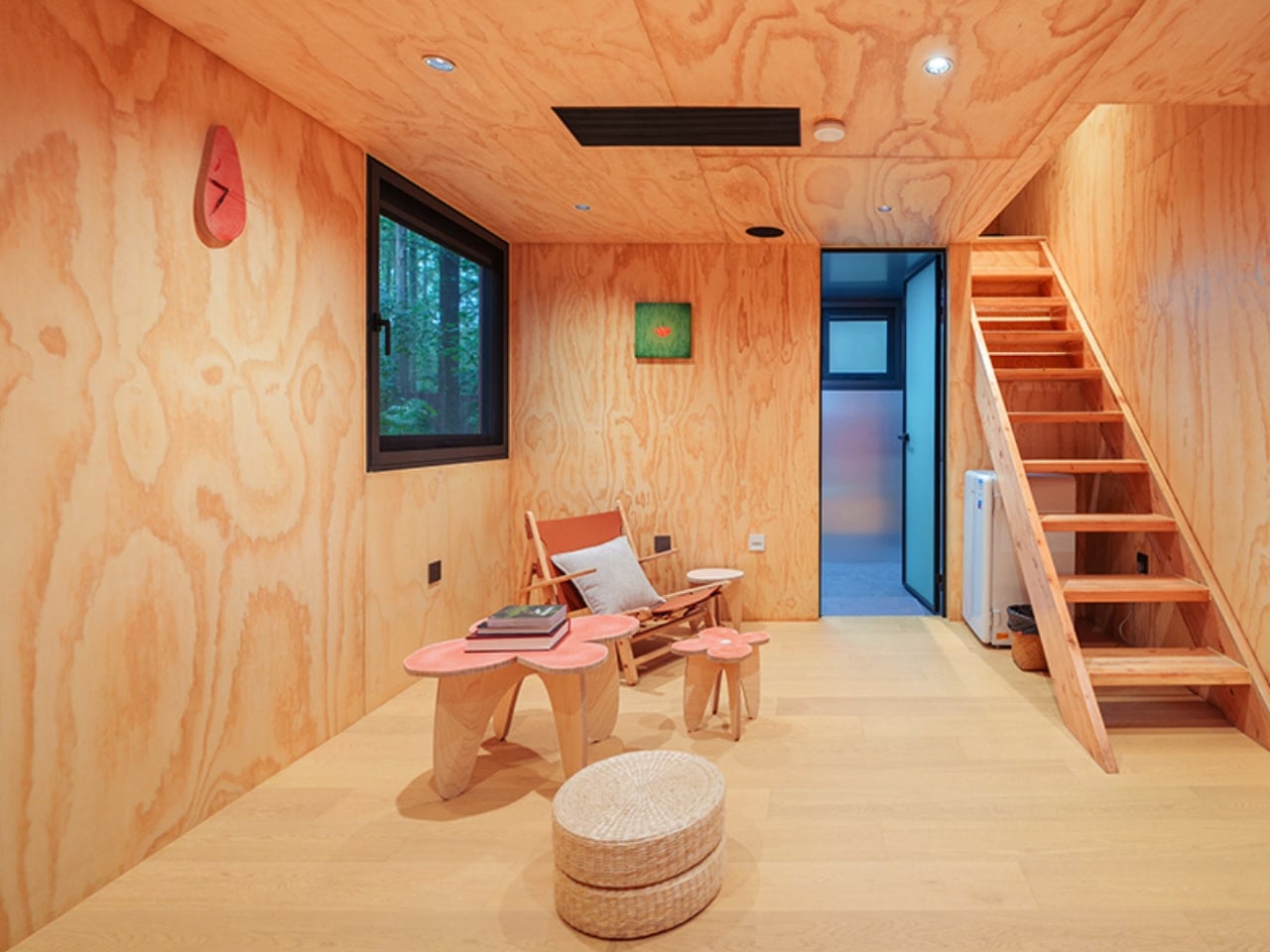
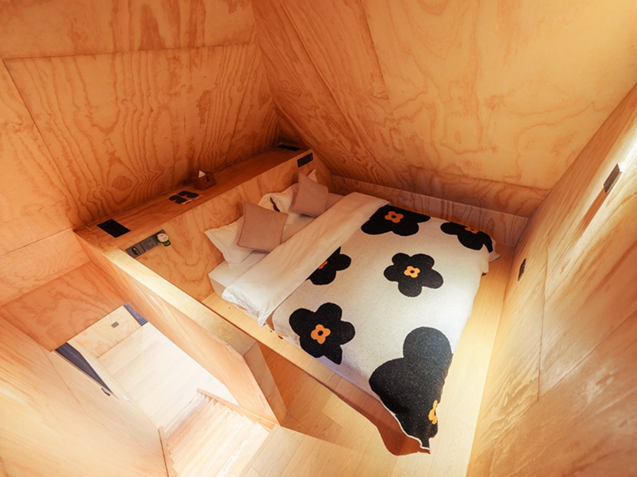
Wiki World has been building this kind of experimental wilderness dwelling for years, and their consistency is a big part of what makes the Red Bridge Cabin feel interesting rather than just pretty. They’re genuinely working through a set of ideas about small-scale living, about what it means to be physically close to materials, about how reducing space can make a person more sensitive to their surroundings. Their phrase, “small brings us closer to the material,” sounds like design philosophy, but it also sounds like something that could apply to how most of us live, if we let it.

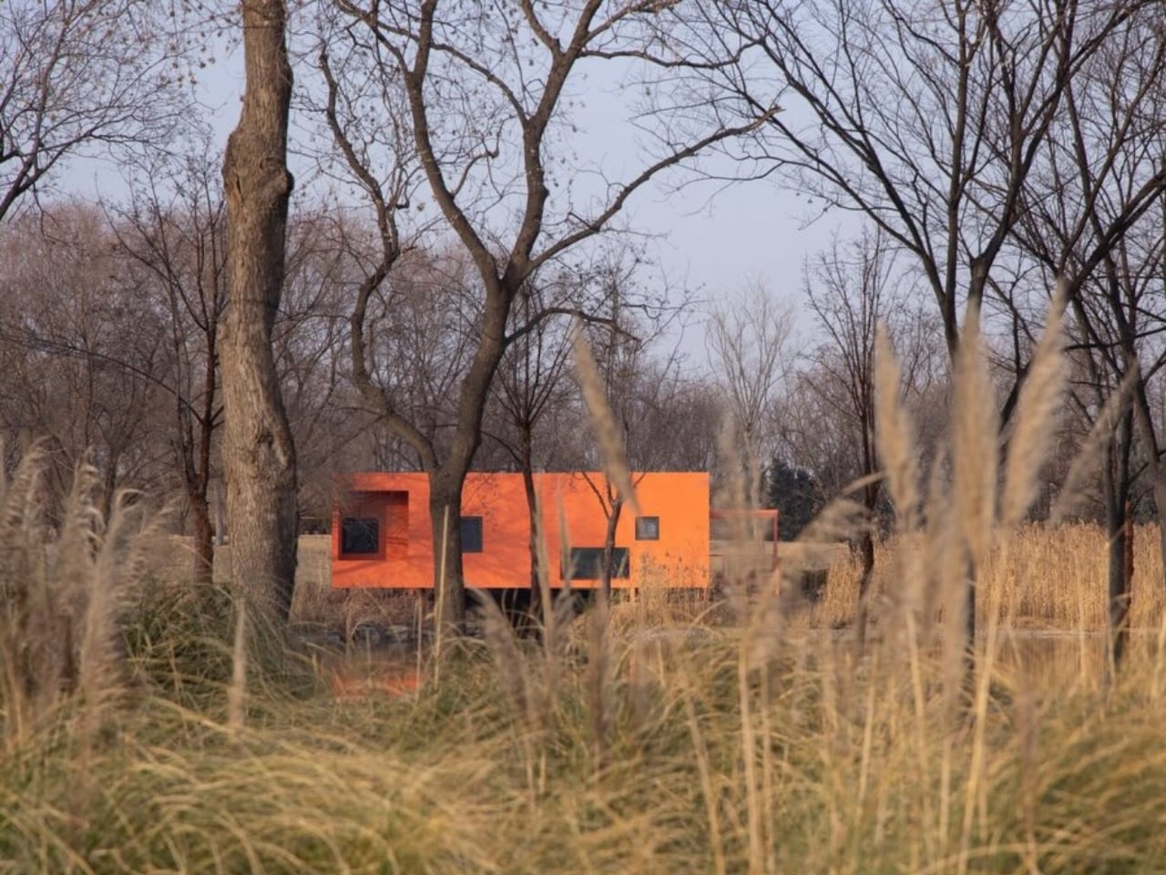
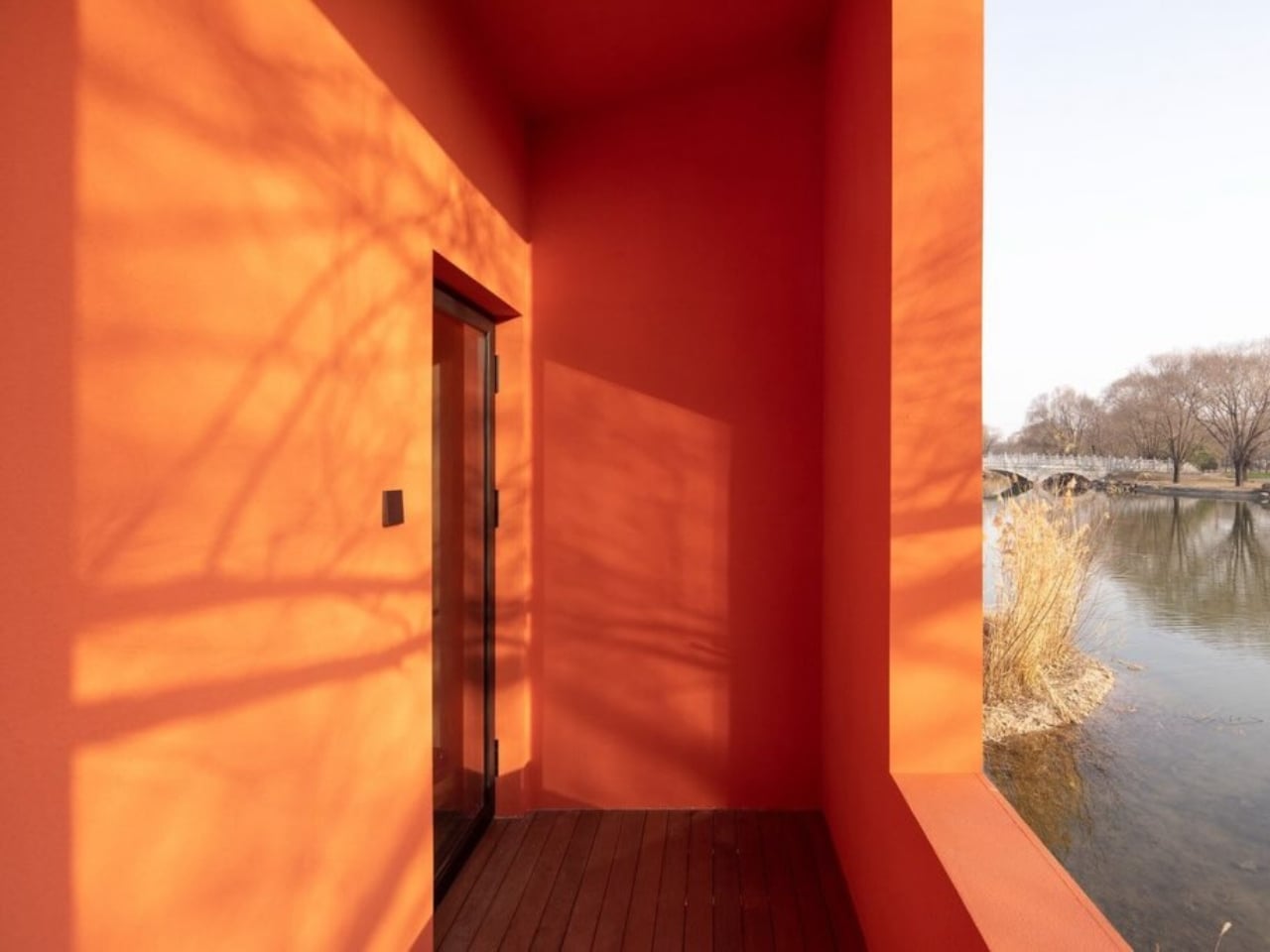
The cabin is painted a deep, saturated red, which at first feels like a deliberate provocation against its natural setting. But the more you look at it in those photographs, reflected in still water against muted greens and ancient earth, the more it starts to feel inevitable. Like it was always supposed to be there. Like the landscape had been waiting for something to mark it. I’m not entirely sure if that’s great design or great photography. Probably both. Either way, I keep returning to those images, and that feels like its own kind of answer.

The post The Red Cabin Sitting Alone on a 1,000-Year-Old Island in China first appeared on Yanko Design.

What Happens When You Stop Fighting the Rain and Design With It

Most architects treat rain as an obstacle. Drain it. Redirect it. Keep it away from the interior at all costs. Australian architect Steven Chu had a different idea entirely, and it just earned him the Grand Prize at the NOT A HOTEL DESIGN COMPETITION 2026.

His winning entry is called Sound of Rain, a proposed villa on Yakushima, a densely forested island off the southern coast of Kyushu, Japan. It’s a UNESCO World Heritage site known for its ancient cedar forests and, predictably, a lot of rain. Rather than treating that rain as a logistical problem to solve, Chu built his entire design around it.

Designer: Steven Chu (Artefact Architects)

The concept is beautifully straightforward. A broad, bowl-shaped rooftop sits above the structure, collecting rainfall and releasing it slowly along the roof’s perimeter. Water traces a continuous line around the building’s edge, creating a living curtain that shifts and moves depending on the weather. That boundary between inside and outside isn’t a wall or a window. It’s water.

Circulation paths, sheltered zones, and open terraces are all arranged around the movement of that water. It’s the kind of design thinking that sounds almost obvious in hindsight but rarely gets executed with this much commitment. Chu didn’t just reference the climate in a mood board. He made it load-bearing.

Inside, the approach stays consistent. Materials are restrained and surfaces curve gently, guiding movement without feeling prescriptive. Glass openings frame the surrounding forest and coastline. A bedroom sits along the perimeter, positioned specifically to receive filtered light and the ambient sound of rain falling outside. The atmosphere in every room is meant to shift throughout the day as weather changes, because in this house, weather isn’t background noise. It’s the whole point.

A circular outdoor space anchors the main living area, with a sunken fire element at its center. It’s a pairing that works precisely because neither element announces itself. The contrast between the water perimeter and the fire core feels like it’s pulled directly from the island’s own logic: rain on the outside, warmth on the inside. As a design gesture, it’s earned rather than decorative.

The competition itself adds weight to the win. NOT A HOTEL, the Japanese luxury hospitality brand, opened the 2026 edition to architects under 40, asking them to design a hybrid between a private residence and a boutique hotel on Yakushima. Sound of Rain was selected from 1,058 entries submitted across 112 countries and regions. That’s a significant shortlist to come out on top of, and the scale of the competition makes Chu’s win feel genuinely meaningful, not just for him, but for a generation of architects rethinking what place-responsive luxury design can be.

The restraint of this project is remarkable. It would have been very easy to over-design a property on an island as visually rich as Yakushima. The temptation to layer in dramatic architectural gestures must be significant when your backdrop is ancient cedar forest, rugged coastline, and a UNESCO-protected landscape. Instead, Chu did the quieter, harder thing. He listened to what the site was already doing and made that the architecture.

Sound of Rain fits into a broader conversation about how design can respond to climate without trying to conquer it. So much of contemporary architecture is still fundamentally about control, about managing and minimizing natural elements rather than working alongside them. This project offers a different model, one that treats the environment as a collaborator instead of a variable to be resolved. It’s a building that knows where it is and what that means, and it doesn’t pretend otherwise.

Whether the villa ever gets built is another question, but as a competition entry, it’s already doing something valuable. It’s expanding the conversation about what a high-end retreat can look like, and what the relationship between a building and its environment should be. Sometimes the most sophisticated thing a designer can do is step back and let the rain do some of the talking.

The post What Happens When You Stop Fighting the Rain and Design With It first appeared on Yanko Design.

The 2-Person Rocking Bench Made From 55kg of Plastic Waste

Most furniture tells you exactly what to do with it. A chair says sit. A table says set things down. A bench says sit, maybe share the space. The X Bench Swing, the latest from Rotterdam-based studio The New Raw, has a slightly more interesting ask: sit, rock, and do it facing the opposite direction from whoever’s sitting next to you.

That setup sounds strange until you see it. The bench seats two people, but the clever part is that both sitters face opposite ways while sharing a single rocking motion. Think of it less like a traditional bench and more like a kinetic sculpture that happens to be incredibly functional. The form is defined by two intersecting volumes that create a sculptural, sturdy X-shaped structure. It’s the kind of piece that makes you want to walk around it before you sit down.

Designer: The New Raw

The New Raw describes the design’s intent with quiet confidence: “X Bench explores movement as a design principle.” That could easily read as throwaway design-speak, but when you look at the object itself, it actually lands. The rocking motion isn’t just a feature. It’s the whole point of the bench. The movement is built into the geometry, encoded in the alternating orientation of the seats, and made possible by a curved base that lets both sitters sway in rhythm even while facing away from each other.

And yes, it’s 3D printed, but not the kind of 3D printing you might be picturing. The New Raw works with industrial robotic arms to fabricate their pieces layer by layer from recycled polypropylene (rPP), plastic waste that would otherwise not have much of a future. Each X Bench uses 55 kilograms of recycled plastic and saves an estimated 143 kilograms of CO2 compared to conventional manufacturing. The studio sources materials from local recyclers in Rotterdam, prints on demand, and uses no adhesives or mixed materials, which means every piece can be fully recycled at the end of its life. The sustainability story here isn’t bolted on as an afterthought. It is the manufacturing philosophy.

The result is a bench that looks nothing like recycled plastic is supposed to look. The surface texture has a tactile, almost geological quality. The layered printing process turns what could be a visual liability into a genuine aesthetic. It reads as warm and handcrafted even though a robot arm built it. That tension between industrial process and sensory finish is, arguably, The New Raw’s most consistent signature across their body of work.

At 70 x 140 x 76 cm, the X Bench isn’t small, but it’s sized for real use. It works indoors or out, which makes it an easy fit for public spaces, gardens, lobbies, or any room that can absorb a statement piece without turning into a gallery. The studio describes it as suited for spaces “with an open-hearted character,” which I’d translate as: don’t put this in a minimalist white box and expect it to whisper quietly in the corner.

The social dimension baked into the design is where the piece gets genuinely interesting. Sitting across from someone on a bench is one kind of dynamic. Sitting back to back while you both rock is another kind of conversation entirely. It invites a sideways glance, a shared rhythm, an awareness of another person without the weight of direct eye contact. For a piece of furniture, that’s a lot to offer.

A lot of sustainable design right now carries a slightly apologetic quality, as if the environmental credentials are meant to compensate for aesthetic compromise. The X Bench doesn’t do that. It’s confident, a little playful, and the fact that it’s made from waste plastic feels like a bonus rather than a burden. The New Raw has been quietly making that argument with their work for years. With the X Bench Swing, they’re making it more clearly than ever.

The post The 2-Person Rocking Bench Made From 55kg of Plastic Waste first appeared on Yanko Design.

The Desk Organizer That Looks Like a Rice Field

Most desk organizers are an afterthought. You buy one because your pens are rolling off the edge or your sticky notes have formed some kind of autonomous colony, and you just need something, anything, to contain the chaos. The result is usually a sad plastic tray that technically does the job but adds nothing to the room. That’s what makes Mirko Romanelli’s KOMBO concept genuinely worth paying attention to. It’s a desk organizer that actually looks like it was designed.

KOMBO is a concept by Florence-based product and industrial designer Mirko Romanelli, and the first thing that strikes you when you see it is the shape language. Every single piece in the system uses the same deeply rounded rectangle form. Not slightly rounded corners, but corners so soft and generous that the pieces read almost like smooth stones. The silhouette has that superellipse quality that makes you want to pick it up just to feel the edge in your hand. Sharp angles are entirely absent, and the effect is immediately calming in a way that most workspace products never manage.

Designer: Mirko Romanelli

The system is made up of modular trays that stack into a tiered structure, labeled K1 through K4. Each layer is a different depth, creating a step-like formation when assembled that unmistakably echoes the terraced rice fields of China’s Yuanyang and Yunhe regions that inspired the concept. Romanelli wasn’t being abstract with that reference. You can see it plainly: the way the pieces descend in size from a wide, flat base mat up to the smallest top compartment mimics exactly how those agricultural terraces look when viewed from above. The poetry of that connection is that it works even if you’ve never heard the backstory.

The base layer is notably generous, a large flat mat with that same softly rounded edge running all the way around. It grounds the whole composition and gives the stacked pieces above it a stage to sit on. The trays above vary in height, allowing different categories of items to nest within different depths. A slim tray for paper and documents. A deeper one for pens and clips. The hierarchy makes sense without needing instructions.

The standout detail in the system is the K1 module: a small compartment topped with a clear, transparent lid. It’s a subtle material contrast that breaks the otherwise monochromatic look in the most restrained way possible. The transparency lets you see what’s inside without opening it, and it also catches light differently from the matte surfaces below it. Small decisions like that are where considered design separates itself from generic product design.

And those matte surfaces deserve their own mention. The finish across all pieces is smooth and consistent, almost velvety in the renders, with no visual noise or texture competing for attention. The whole thing operates in a single color per colorway, which is a bold choice that pays off. Romanelli presents KOMBO in a set of tonal palettes: a dusty slate blue, a warm terracotta, a deep mauve, and a soft sage green. Each one feels considered rather than arbitrary. The blue reads as cool and focused. The terracotta feels warm and lived-in. The sage is the obvious crowd-pleaser, and you can see why. Every version reads as the kind of object that belongs on a desk you’re proud of, not just a desk you tolerate.

The material is recycled plastic throughout, and it’s worth saying that you wouldn’t know from looking at it. The construction doesn’t announce its sustainability credentials in any visual way. It’s just a well-made thing that happens to be made responsibly.

KOMBO is still a concept, which is one of the more frustrating things about covering design at this level. You see something that clearly has a market, clearly has the craft, and clearly has the visual coherence to succeed on shelves, and it simply isn’t there yet. Romanelli has built something that understands a simple truth: the objects you put on your desk shape how you feel about the hours you spend there. That’s not a small thing to get right.

The post The Desk Organizer That Looks Like a Rice Field first appeared on Yanko Design.

One Week Design’s Squares Furniture Is Built on a Bricklayer’s Memory

I’ve been thinking a lot lately about what separates furniture that you simply own from furniture that you actually feel something about. Most pieces fall squarely in the first category. They hold your things, fill your space, and eventually end up in someone else’s apartment. But every once in a while, a collection comes along that makes you want to know the story behind it. The Squares, designed by Xiaoya Wang and Jian Ni of One Week Design, is that kind of collection.

The origin story alone is worth sitting with. The design is rooted in a personal memory: Wang’s father worked for a construction company that built small houses, and she occasionally joined him on the job, learning to lay bricks. Ensuring each wall was perfectly plumb, each brick snug against its neighbor, each layer bound by mortar. That ritual, repeated countless times, forged a core belief: objects are vessels of memory. That’s not a new idea, but Wang and Ni have translated it into something tangible and deeply specific.

Designers: Xiaoya Wang & Jian Ni (One Week Design)

That specificity is where the collection gets interesting. The design exercised extreme restraint, strictly planning every dimension as a multiple of a 5x5cm square. It sounds almost obsessive, and maybe it is, but the result is furniture that feels completely resolved. The chair is reduced to its essence: four legs, a seat, and a back. Nothing more. That kind of restraint is genuinely hard to pull off. Minimalism often reads as cold or indifferent, but The Squares has warmth baked into it precisely because the discipline behind it comes from somewhere real.

The design process mirrored childhood block-building: starting from chaos and moving toward order through a relentless search for harmony. You can see that in the finished pieces. The forms are architectural without being austere, geometric without feeling mechanical. The surface detail is what pushes it over the edge. The wooden construction features subtly convex surfaces on every block, which catch the light to create shimmering highlights, enhancing the vibrant colors or finishes. It’s a quiet trick that rewards a second look, and a third.

What keeps The Squares from tipping into a pure exercise in restraint is the color. The collection is available in a range of bold, saturated finishes: yellows that practically vibrate, deep crimsons, inky blacks, soft naturals. Beneath its austere exterior, the collection surprises with luminous finishes and bold colors, introducing a note of playful whimsy. I think that’s an accurate read, and I’d add that it gives the collection an unusual flexibility for something so formally rigid. A white Squares chair in a quiet corner reads as sculptural and calm. The same chair in acid yellow is a full statement.

Constructed from solid ash wood with a water-based paint finish, the pieces have a physical presence that photos almost undersell. The wood grain shows through certain finishes in a way that reminds you these are handcrafted objects, not manufactured units. The series currently comprises chairs, benches, stools, and mirrors, available in a variety of colors. The stool, the bench, the mirror — they all carry that same weight and intention. You get the sense that every piece in this family was considered with the same level of care as the chair.

One Week Design plans to expand this family in the future, exploring the endless possibilities of the square. I’m curious to see where that goes, because the vocabulary Wang and Ni have built feels like it has real range. The square is, after all, one of the most elemental forms there is, and they’ve already shown how much meaning you can pack into it when you take it seriously.

Good design often tells you what something is. Great design tells you where it came from. The Squares does both, which is why it’s one of the more memorable collections I’ve come across recently. It looks like order. It feels like memory. And it sits like a chair that knows exactly what it is.

The post One Week Design’s Squares Furniture Is Built on a Bricklayer’s Memory first appeared on Yanko Design.

The Eames House Was Always Meant to Be Yours

If you’ve ever stood in front of a photograph of the Eames House and felt a quiet longing, you’re not alone. That black steel frame, the jewel-toned panels, the floor-to-ceiling glass looking out onto a California meadow. It’s one of those images that lodges itself somewhere deep in your design-brain and refuses to leave. Most of us just assumed it would stay a photograph. Turns out, Charles and Ray Eames had other plans all along.

The Eames House, or Case Study House #8, was completed in 1949 in Pacific Palisades, California. It was built as part of Arts & Architecture magazine’s Case Study House program, which challenged architects to design homes using post-war industrial materials and techniques. Charles and Ray made something so effortlessly beautiful that it became one of the most photographed residences of the 20th century. But here’s the part most people miss: they always saw it as a starting point, not a masterpiece. Their real goal was a universal architectural system, one accessible to almost anyone and deployable almost anywhere. They never got there. That dream stayed tucked in archives, in sketches, in proposals that never left the studio. There was even a flat-pack modular concept the couple researched independently, informally called the “Supermarket House.” That name alone tells you exactly what they were going for.

Designer: Kettal

Nearly 80 years later, the Eames Office and Spanish manufacturer Kettal are finally making it happen. The Eames Pavilion System is a modular building kit that draws directly from those decades of unpublished drawings and ideas. Eckart Maise, former chief design officer at Vitra, spent three years digging through the Eames archives to surface material that had largely never been seen, including an unrealized California dome home and those flat-pack housing studies. What emerged is not a replica of Case Study #8, but something more faithful to its spirit: a system built on the same principles of efficiency, flexibility, and honest materiality.

The structure is made from aluminum throughout, a significant upgrade from the original steel and considerably more weather-resistant. You get interchangeable roof types, triple-glazed windows, and wall panels that echo the bold primary colors Ray loved. The visual DNA is unmistakable. Zig-zag trusses, black-painted frame, chicken wire-reinforced glass. It is recognizably Eames without pretending to be a museum piece.

Pricing starts at around $325 per square foot. A 4-by-4-meter indoor pavilion begins at roughly €45,000 (about $52,000), and an outdoor version of the same size starts at €60,000. The double-height configuration that most closely resembles Case Study #8 comes in at €145,000. For a lot of people, that’s still a stretch. But compare it to what custom architecture typically costs, and it starts to read more like a genuine offer than a luxury souvenir.

The use cases are broad by design. A home recording studio, a backyard office, a guest pavilion, a poolside retreat. With enough modules assembled and stacked, a full two-story house is achievable. Kettal also factors in the support of a trained advisor, someone who makes sure the configuration you choose actually works for your specific site and climate conditions. The indoor version hits the market at the end of 2026, with the outdoor version following in 2027.

The Eames Pavilion System is making its debut at Milan Design Week 2026, as part of a Triennale di Milano exhibition called “The Eames Houses,” opening in April. Seeing it presented there feels appropriate. The Triennale has always been a place where design gets to ask bigger questions than just whether something looks good. The question this project raises is genuinely worth sitting with: what does it mean to actually democratize an icon, and not just sell the idea of one?

I think Charles and Ray would have approved of the answer Kettal and the Eames Office arrived at. Not a knockoff. Not a nostalgia play. A real building system, rooted in the same rigorous thinking that produced the original house, finally getting the chance to do what it was always supposed to do: show up wherever someone needs it.

The post The Eames House Was Always Meant to Be Yours first appeared on Yanko Design.

IKEA Just Gave the Allen Key a Glow-Up Nobody Saw Coming

You know exactly where this is going the moment IKEA hands you that little L-shaped hex key. You use it once, maybe twice, cross your fingers the furniture doesn’t wobble, and then it disappears into the junk drawer, a kitchen counter corner, or the bottom of a tote bag you haven’t opened since 2021. The allen key has never been a thing anyone kept on purpose. Until now.

IKEA Singapore, working with creative agency The Secret Little Agency, has reimagined the brand’s iconic flat-pack tool as a piece of wearable jewelry. The ALLËNKI, as it’s been named (and yes, the umlaut is doing a lot of heavy lifting there), is the humble allen key redesigned to hang from a chain as a pendant. It leans hard into an industrial aesthetic, the kind that lives somewhere between a Depop vintage find and something a contemporary menswear designer would slip into a lookbook without explanation. Raw, utilitarian, and surprisingly chic. I did not expect to want a hex wrench around my neck. And yet, here we are.

Designers: The Secret Little Agency for IKEA Singapore

What makes the ALLËNKI genuinely interesting as a design concept isn’t just the novelty of it. It’s the fact that it remains fully functional. The piece isn’t a replica or a decorative prop styled to look like the real thing. It’s the actual tool, shaped into something you’d wear. That framing, which the designers describe as “hardware meets heirloom,” is doing a lot of the creative work here, and it does it well. There’s a real conversation happening in contemporary design right now about the objects we use every day and why we’ve decided some deserve beauty and others don’t. The ALLËNKI is a pretty sharp response to that question, even if the response comes with a chain and a studio-lit campaign.

The branding also knows exactly what it is. The campaign leans into humor and self-awareness, which is the right call. A jewelry line built around a furniture tool that most people lose within 48 hours of unboxing a bookcase doesn’t need to take itself too seriously. The Secret Little Agency managed that balance well, keeping the design itself genuinely considered while letting the concept breathe with a bit of absurdity. That’s harder to pull off than it sounds. Most brand stunts either try too hard to be funny or take themselves so seriously that the joke lands flat. This one sits in the right place.

Now, the catch. The ALLËNKI dropped on April 1st, which puts a fairly significant asterisk on the whole thing. Whether it was an April Fools’ stunt, a concept piece, or an actual product in development isn’t entirely clear. Store availability, if any, has not been confirmed. And while part of me wants to be cynical about that, the other part of me thinks the ambiguity might be intentional. It functions as a piece of cultural commentary either way. If it becomes real, great. If it doesn’t, it still made people stop and look at a two-inch hex key like it had something worth saying.

And maybe that’s the bigger point. The ALLËNKI asks you to reconsider what makes something worth keeping. We’ve watched fashion absorb work boots, industrial hardware, and construction aesthetics for years. Luxury brands have put carabiners on bags and charged several hundred dollars for the privilege. In that context, turning the allen key into a pendant feels less like a joke and more like a logical next step in a long line of utilitarian objects getting a second life. IKEA has always understood that good design shouldn’t be reserved for expensive things. Extending that thinking into wearables, even as a concept, feels genuinely on-brand.

Whether or not the ALLËNKI ever lands on store shelves, it’s already doing what good design work does. It’s got people talking, reconsidering a mundane object, and maybe feeling just a little possessive over something they used to throw in a drawer without a second thought. That’s a win, April Fools or not.

The post IKEA Just Gave the Allen Key a Glow-Up Nobody Saw Coming first appeared on Yanko Design.

When Your Sideboard Swallows Your Books (On Purpose)

Most furniture does exactly what it promises. A shelf holds things. A table provides surface. A sideboard stores what you don’t want to look at. Deniz Aktay, a Stuttgart-based designer, seems to find that level of literalism a little boring.

His latest piece, the “Slot” Sideboard, is a sleek metal sideboard that does something I haven’t seen before: it swallows your books whole. Or nearly whole. The top surface features book-shaped cutouts, slots sized just right to accept a few volumes that then slide partway through, hovering suspended between the top of the sideboard and the interior shelf below. Spines tilted at an angle, partially disappearing into the furniture itself, the books aren’t hidden. They’re put on stage.

Designer: Deniz Aktay

The visual effect is genuinely arresting. From straight on, it looks like the books are simply leaning through the sideboard, defying the expected logic of furniture. The steel body, finished in a dusty blue-grey, stays completely clean and minimal, which only makes the books pop harder. They become the focal point. The design knows this and leans into it.

Aktay trained as an architect at the University of Stuttgart before founding his own design studio, DEZIN, in 2020. You can feel the architectural thinking in the Slot Sideboard. The slots aren’t decoration. They are a structural decision that reorganizes how the object functions. By cutting through the plane of the top surface, Aktay collapses the boundary between storage and display. The books don’t live behind a door or on top of the piece as an afterthought. They are literally built into its architecture.

This matters more than it might seem. One of the persistent design problems with books is exactly this tension: do you store them, or do you show them? Traditional bookshelves say store, with display as a side effect. Coffee table styling says display, with access sacrificed. The Slot Sideboard says both, simultaneously, and solves the problem by making books a structural element rather than an accessory.

I appreciate that the piece doesn’t shout about this. It’s not a novelty object with an obvious gimmick printed on the side. At rest, without books, the sideboard is clean and almost brutally minimal, the stepped slot openings looking like an architectural section drawing. Add a few books, and the whole thing shifts register. It becomes warmer, more personal, more lived-in. That kind of dual identity in a single object is hard to pull off.

Aktay’s philosophy centers on finding the right balance between proportion, material, and functionality. The Slot Sideboard is a good example of that balance working. The proportions are long and low, giving the piece the kind of horizontal calm that makes a room feel settled. The metal construction is precise without feeling cold. And the function is genuinely expanded by the design, not just dressed up.

The one thing I keep thinking about is the practical question of how many books actually fit, and at what angle. The promotional images show a small cluster, maybe three or four volumes, tilted together in the slot. It reads beautifully. Whether it reads the same with a thicker, heavier hardback, or with books of wildly different heights, is a detail that a real-world test would answer. That’s not a criticism so much as natural curiosity. Good design always makes you want to live with it.

The broader trend here is worth noting. Furniture design has been slowly, quietly moving away from pure storage and toward what you might call narrative objects, pieces that make a room tell a story. The Slot Sideboard fits into that movement while having its own specific logic. It isn’t just pretty. It has a point of view about what books are for and where they belong. They belong where people can see them. Where they’re part of the room. Not filed away. Whether or not Aktay set out to make a statement about books and visibility, the piece makes one. And it makes it beautifully.

The post When Your Sideboard Swallows Your Books (On Purpose) first appeared on Yanko Design.

LEGO and Crocs Finally Made the $89 Collab Nobody Knew They Needed

No matter how you feel about Crocs, you cannot deny the brand has a remarkable talent for finding partners that make you stop and say, “wait, actually… that works.” We’ve seen Krispy Kreme clogs dripping in donut-glazed energy, Windows XP nostalgia packed into a wearable throwback, and Ghostbusters uniforms distilled down to clog form. Every time I think Crocs has peaked its collab game, another partnership resets the bar. This time, they’ve linked up with LEGO for the Creativity Clogs collection, and this one lands a little differently.

The appeal is almost embarrassingly obvious in hindsight. Both LEGO and Crocs are built around the same core philosophy: take something simple, make it endlessly customizable, and let people go wild with it. LEGO gave us the stud system; Crocs gave us Jibbitz holes. Jibbitz charms are basically a wearable LEGO build. The two brands have been spiritually aligned for decades without anyone thinking to actually put them together, and the fact that it took this long feels like a design oversight that’s now been corrected.

Designers: LEGO x Crocs

The collection spans several configurations. The base Creativity Clog starts at $79.99, keeping things relatively clean with colorful LEGO bricks along the sole and a Jibbitz-ready upper waiting to be personalized. There is also a Kids’ Creativity Clog at $59.99, because LEGO is a multigenerational brand whether anyone admits it or not.

The Masterbrand Creativity Clog at $89.99 is the one that goes all in. It arrives with 12 LEGO brick Jibbitz charms already loaded onto the upper and around the sole, plus a LEGO Minifigure tucked into the box. That detail genuinely made me smile. It is the kind of considered touch that separates a real collaboration from a brand simply slapping a logo on an existing product.

The Midnight Garden Creativity Clog takes the same design language in a different direction. Where the other colorways lean into LEGO’s signature primary palette, this version opts for a darker, more subdued aesthetic that feels almost grown-up by comparison. It is the right pick for someone who wants to quietly signal their appreciation for the collab without committing to the full crayon-box energy of the others.

Visually, these clogs strike a balance I did not expect. The brick texture runs along the sole without overtaking the whole shoe, so you are not walking around in something that looks like a toy store exploded on your feet. It is restrained enough to wear in public while still being obviously, joyfully LEGO. The Jibbitz-ready holes mean you can keep building on top of the base, swapping in dedicated LEGO charm packs depending on your mood. That is exactly the kind of open-ended customization that makes both brands tick.

The LEGO Group and Crocs announced their multi-year global partnership in January 2026, and the Creativity Clogs dropped on March 19, with LEGO Insiders getting a three-day head start. Certain sizes sold out quickly, which tells you all you need to know about the appetite for this one.

My honest read is that this collaboration is smarter than its predecessor. The original LEGO Brick Clogs were built for viral moments and display shelves. Giant foam bricks make a statement, but they do not go anywhere useful. The Creativity Clogs are the real follow-through, translating LEGO as a design language into something you would actually wear to a theme park, a farmers market, or around the house on a slow Tuesday. The playfulness is baked in without demanding you commit to a costume to participate.

That said, $89.99 for a pair of Crocs is a price point worth sitting with, even if the included Minifigure does technically sweeten the deal. Crocs collabs have always commanded a premium over the core classics, and by now the brand’s audience is accustomed to paying for the concept as much as the shoe itself. Whether the LEGO x Crocs Creativity Clog earns its place in your rotation will probably depend on how much real estate your inner kid still occupies. For a lot of people, that answer is quite a bit of space.

The post LEGO and Crocs Finally Made the $89 Collab Nobody Knew They Needed first appeared on Yanko Design.

A 1930s French Cabin Brought Back the Pit, and It’s the Best Part

If you grew up watching old movies or flipping through your parents’ architecture magazines from the 70s, you probably remember the conversation pit. That sunken, circular seating area built into the floor, ringed with cushions, usually occupied by someone in a turtleneck holding a glass of wine. It felt like the most optimistic design idea of its era: a room within a room, purpose-built for the act of simply talking to each other. Then open-plan living came along and flattened everything, and the pit more or less disappeared.

Studio Razavi just brought it back, and they did it in about the best possible setting you could imagine. The Paris, London, and New York-based firm recently completed Seaside House, a renovation of a 1930s coastal cabin at the tip of Cap Ferret, a narrow peninsula near Bordeaux, France. The structure sits nestled among towering pine trees, which is already a lot for any building to live up to. But the interior is where things get quietly radical.

Designer: Studio Razavi

All of the cabin’s original partition walls were stripped out entirely, leaving just the building’s envelope standing. In the center of what became one long, open living space, the architects placed a circle. A sunken circular living room, specifically, with a low perimeter wall that integrates the kitchen sink and storage on one side, and steps leading down into the seating area on the other. Two decked terraces bookend the space, one on each facade of the house.

Project architects Guillen Berniolles and Michele Sacchi described it as a direct response to the local lifestyle around Cap Ferret, where people are constantly moving between indoors and outdoors. “The local lifestyle revolves around constantly moving in and out of houses, which led us to opt for a centrally sunken living room that creates a circulation flow all around,” they told Dezeen. The pit, in other words, isn’t just decorative. It gives the house its entire traffic pattern.

That reasoning matters because it pushes back against the way we usually justify bold design choices. We tend to dress them up in language about “flow” and “intention,” which often means nothing. Here, the logic is actually grounded in how real people use a real place. You come in from the terrace, the circle pulls you in, and then you drift out the other side. It’s a house that choreographs you without you noticing, and that kind of invisible architecture is genuinely hard to pull off.

The material choices are just as considered. Solid wood furniture and veneer are used throughout as a nod to the surrounding Landes forest, which is not only France’s largest but also Europe’s most extensive man-made forest. That context matters. A coastal house in Cap Ferret sits at the intersection of sea and forest, and the design doesn’t pretend otherwise. It leans into both, which gives the whole renovation a rootedness you don’t always see in coastal homes.

A separate guest annexe, clad in dark timber, sits to the west of the main cabin, blending quietly into the tree trunks around it. It’s the kind of restrained detail that separates a thoughtful renovation from a merely stylish one.

The conversation pit feels timely for a reason that goes beyond nostalgia. We spend so much time designing spaces for productivity, for content, for function, that a space designed specifically for conversation feels almost radical now. A sunken circle in a beach house that says, essentially, sit here and talk to each other, is a quiet but pointed statement. I don’t think it’s a coincidence that it lands now.

Studio Razavi has always been good at finding the architectural move that feels both inevitable and completely unexpected once you see it. Seaside House is that in full. The shell stayed. Everything else became about the circle at the center of it, and somehow, that’s more than enough.

The post A 1930s French Cabin Brought Back the Pit, and It’s the Best Part first appeared on Yanko Design.