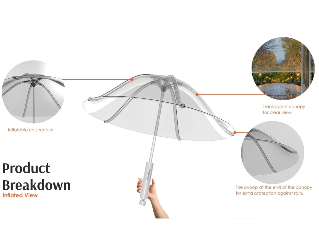
The chair is probably the most taken-for-granted object in any room. You pull one out, you sit, you get up and push it back in. That’s the full extent of the relationship most of us have with it, a transaction so unremarkable it barely registers. So when a designer decides to treat the chair as a kind of autobiography, carved out of wood and layered with personal memory, it forces you to rethink that entire casual dynamic in a way that feels both unexpected and long overdue.
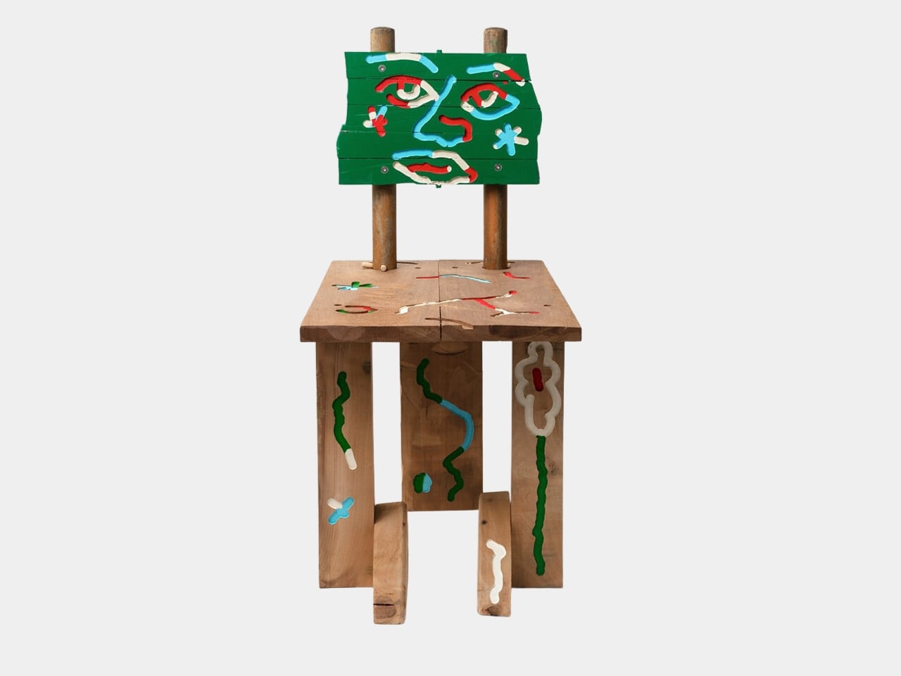
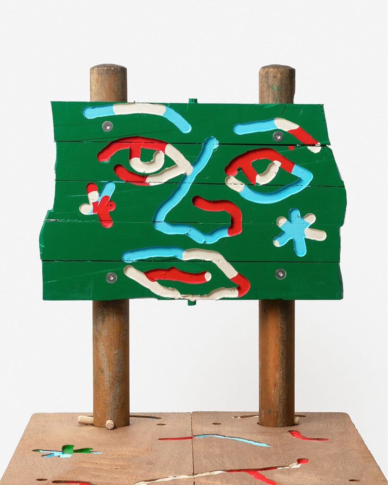
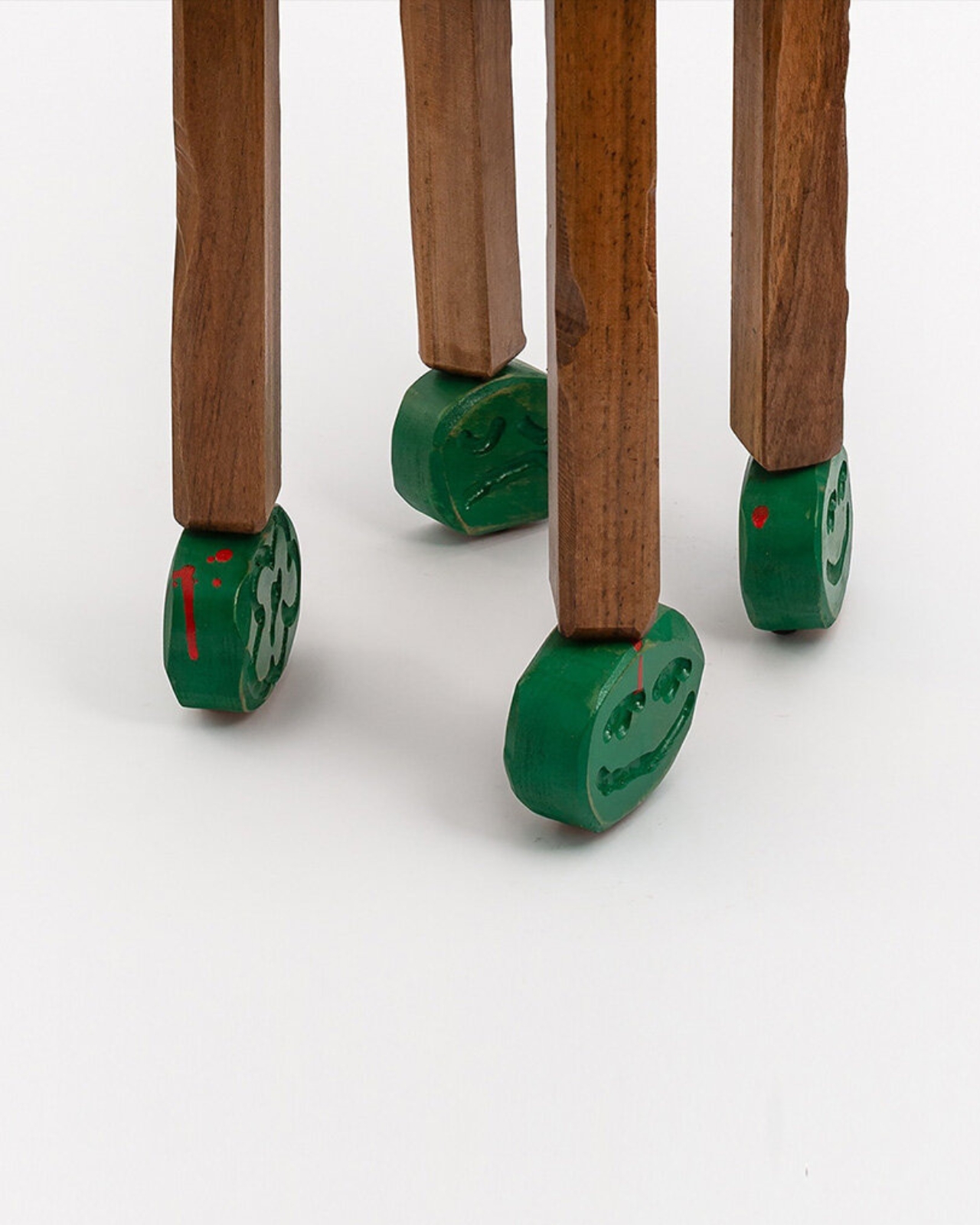
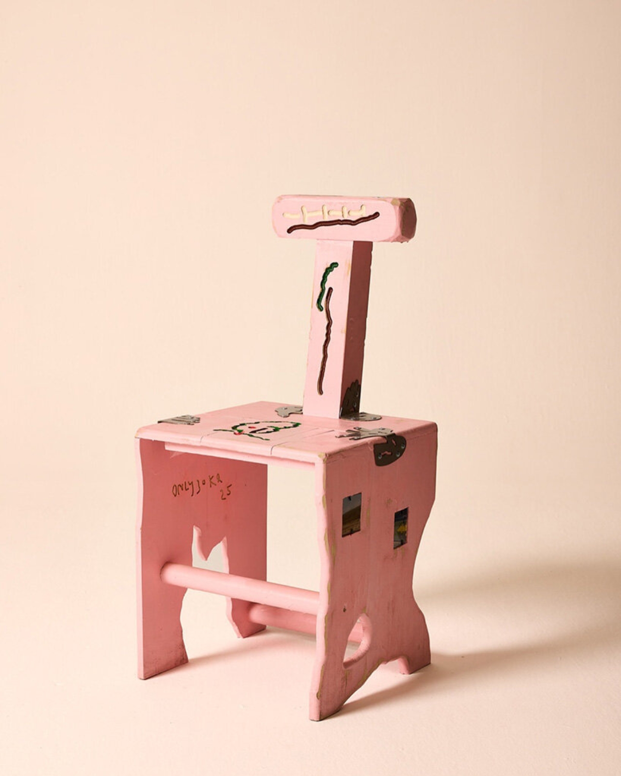
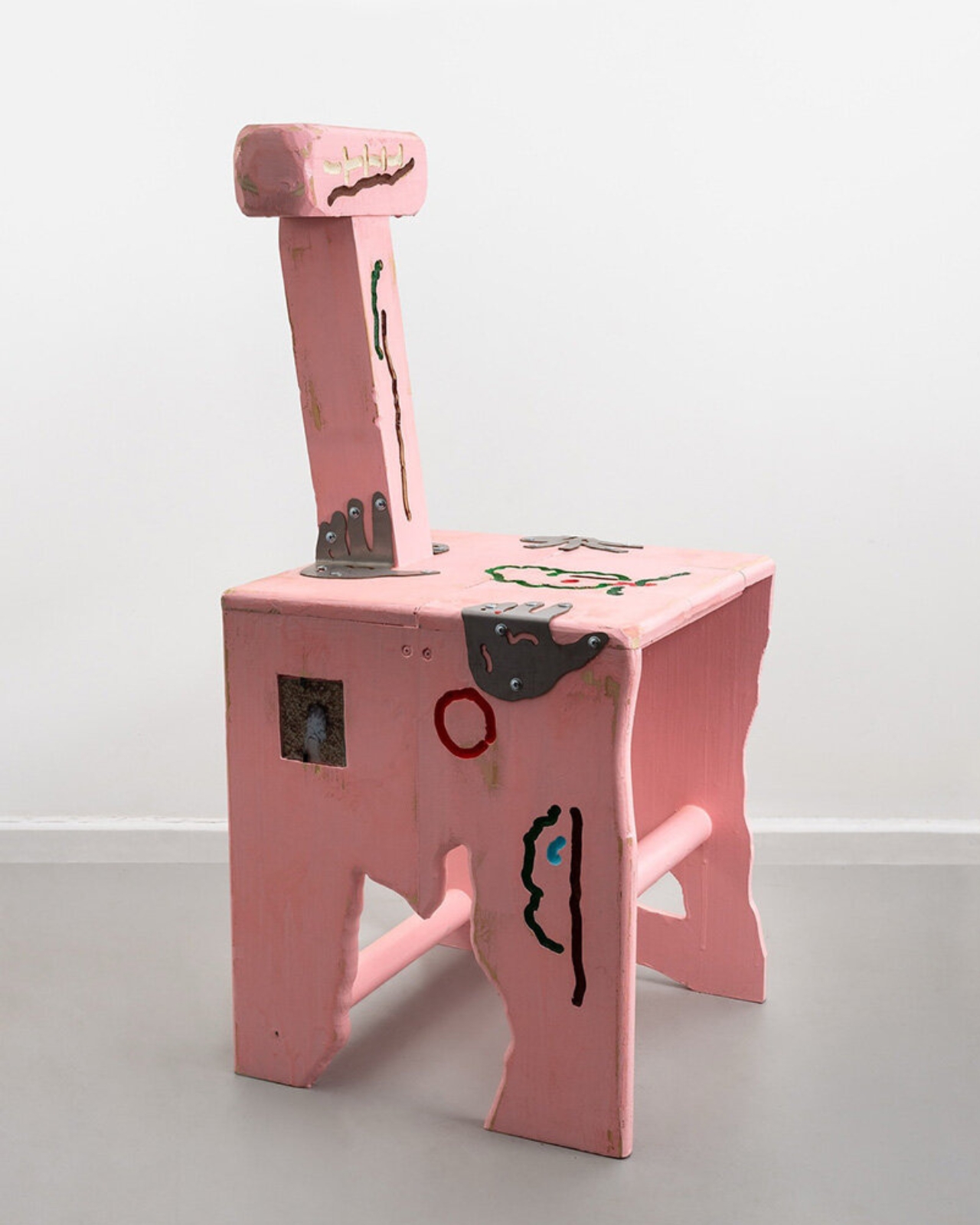
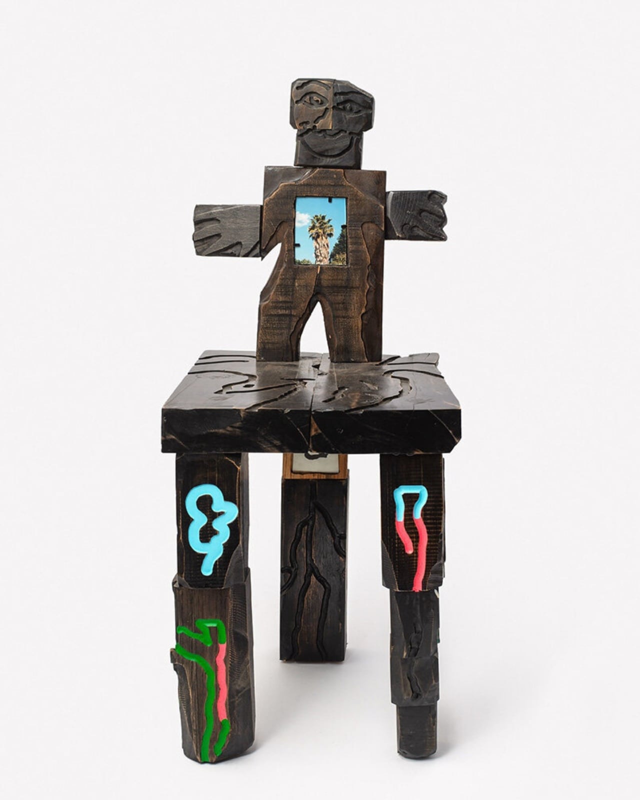
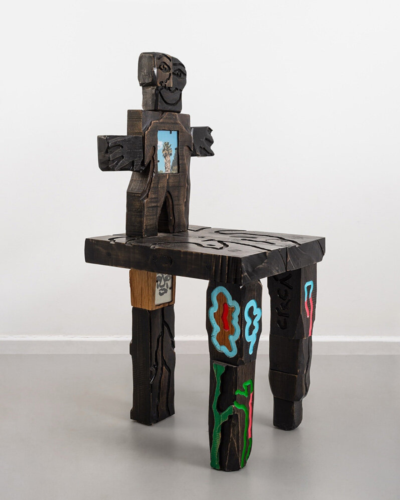
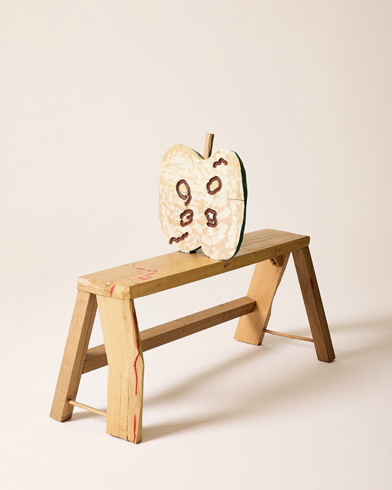
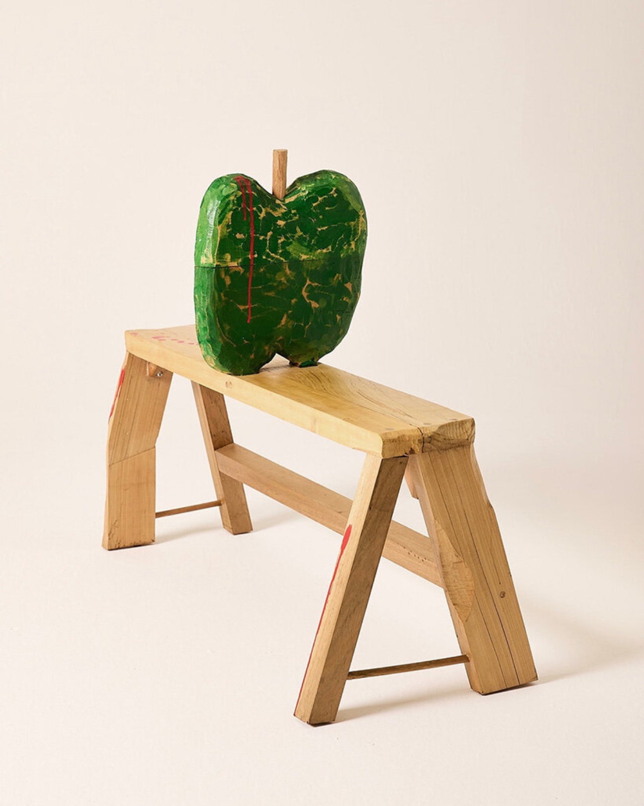
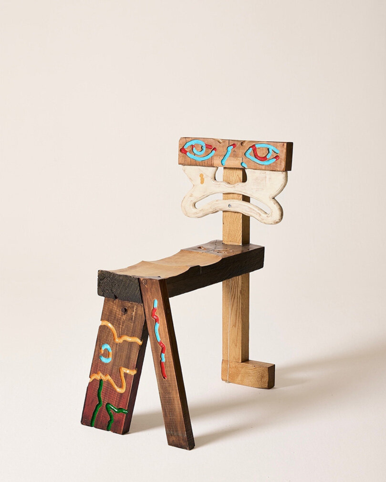
Chilean designer Camilo Huinca, who works under the studio name ONLYJOKE, has built a collection of sculptural wooden chairs that are less about sitting and more about telling. Titled Personal Histories, the work transforms familiar furniture forms into autobiographical portraits. Faces emerge from backrests. Figures are carved directly into seats and tabletops. Painted motifs trace emotional landscapes into the grain of the wood itself. These aren’t decorative touches you might overlook at first glance and appreciate later. They’re the whole point, present and insistent from the moment the piece comes into view.
Designer: Camilo Huinca
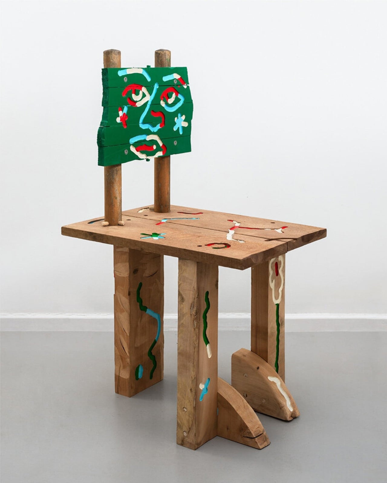
What Huinca is doing feels significant because furniture has long occupied this uncomfortable middle ground between design and art, never quite allowed to be taken seriously as either. Functional objects are expected to serve a purpose without demanding interpretation. Huinca rejects that, quietly but firmly. Each chair in Personal Histories carries a title with real weight: Rider on a Broken Horse, Partes Rotas (Broken Parts), Confluencia. These aren’t whimsical names assigned after the fact. They’re structural to the work itself, the same way a painting’s title can shift how you experience everything inside the frame. You come to each piece already oriented.
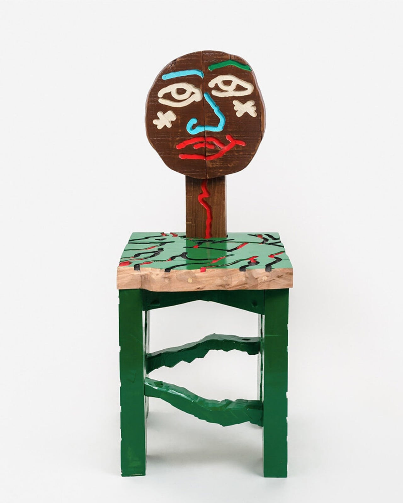
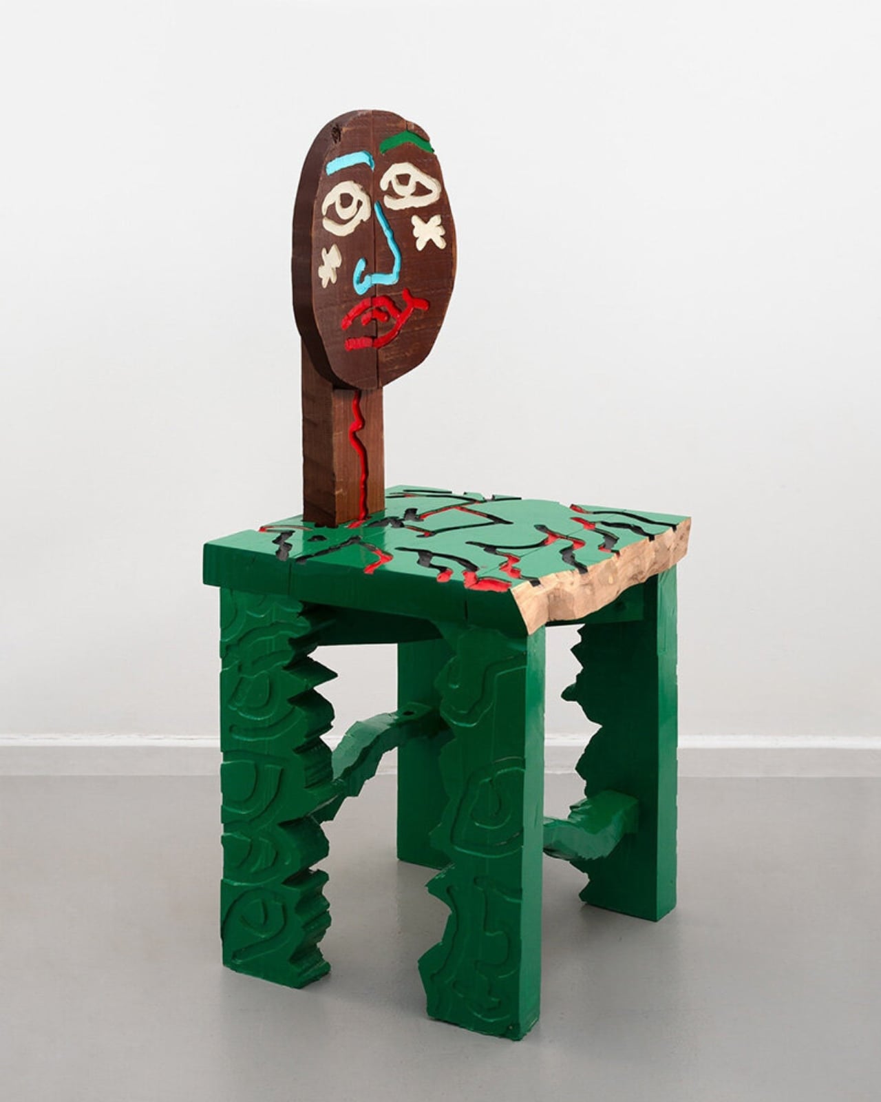
The material choice matters here, too. Wood carries time in a way that metal or plastic simply doesn’t. You can feel the decisions made in it, the places where the carver lingered and the places where they moved fast. Huinca draws on memories of summers spent in rural Chillán, Chile, and that rootedness in a specific place and biography gives the pieces an authenticity that’s hard to manufacture. The apple-shaped sculpture sitting atop one of his benches, the carved motifs, the exposed hardware, the layered paint: none of it reads as arbitrary. It reads as accumulated, like a life condensed into joints and grain and surface.
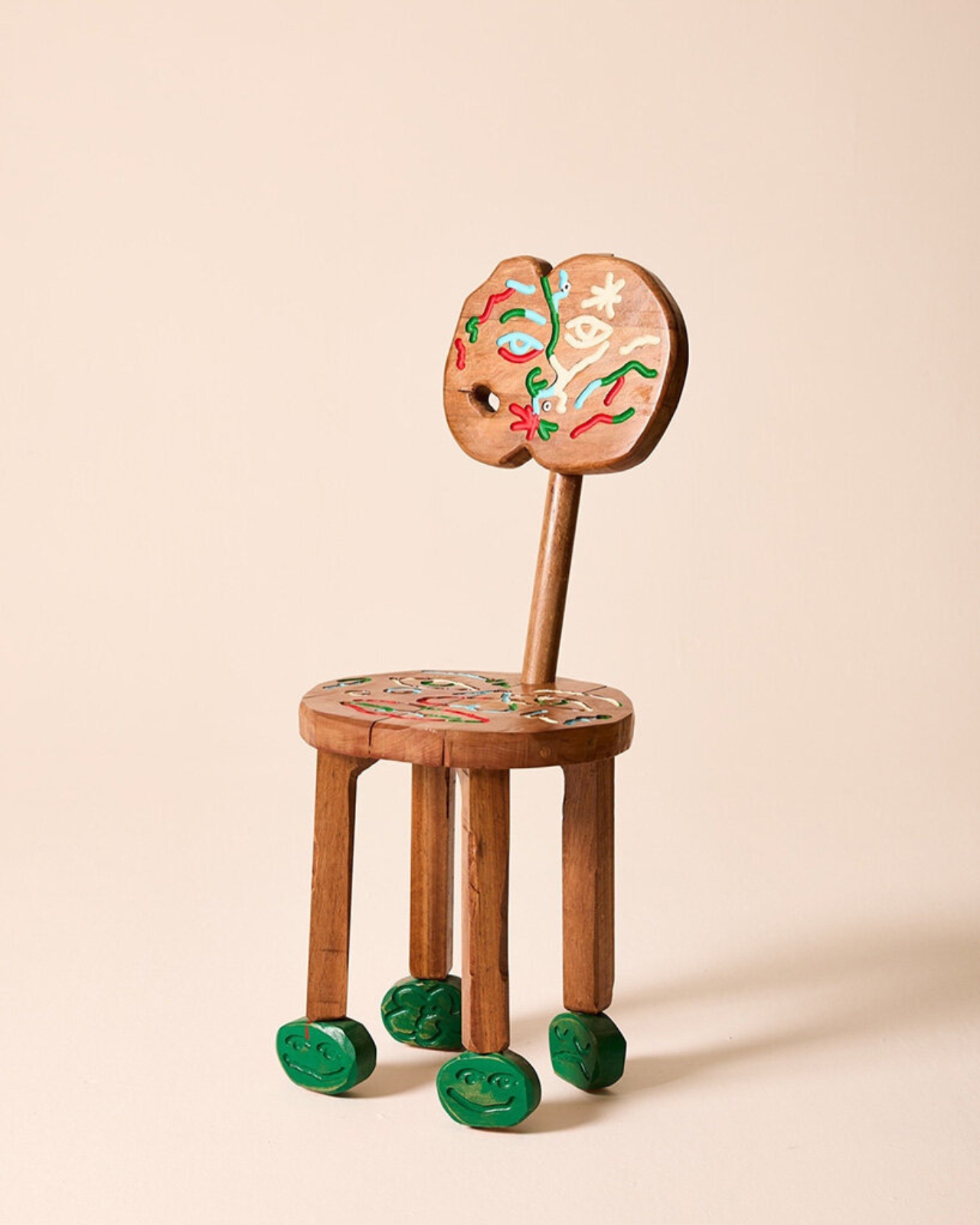
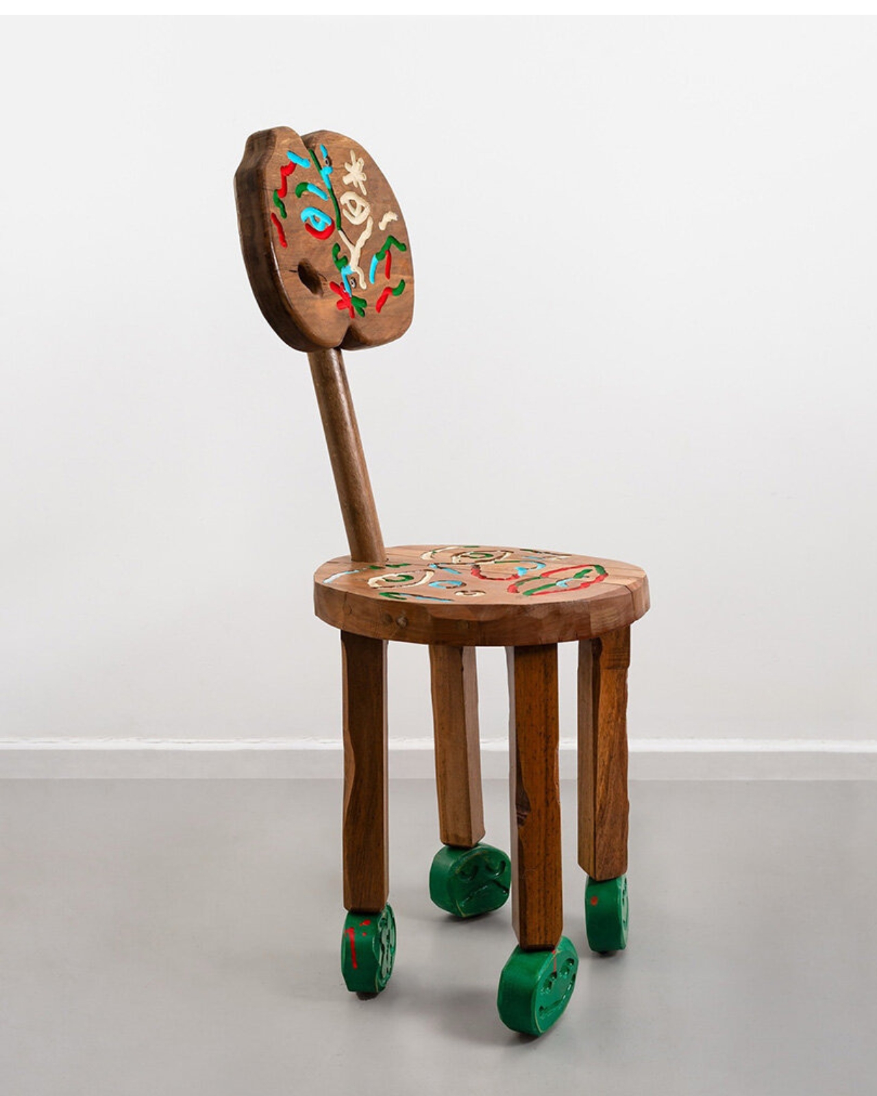
The chairs are also built through a modular system that allows them to be assembled and disassembled, which becomes more interesting when you consider how memory itself works. Nothing is permanently fixed. What you carry from your past doesn’t stay the same shape forever, and the fact that this furniture can be taken apart and reassembled feels less like a practical design consideration and more like a philosophical statement embedded quietly into the construction.
The inevitable question is about function. Can you actually sit in them? I’d like to think so, because the idea of using a piece of furniture that was carved from someone else’s grief or joy or the heat of a rural Chilean summer introduces an intimacy that most objects never manage to create. You wouldn’t just be in a room with the work. You’d be in direct contact with it, which is a different thing entirely.
The debate over whether furniture belongs in the gallery or in the home has been going on for decades. Designers like Ron Arad, Studio Job, and Nacho Carbonell have all pushed at that boundary in their own ways. But Huinca’s contribution feels distinct because the storytelling is so specific and so grounded in personal biography rather than formal experimentation. This isn’t furniture that gestures broadly toward concept. It’s furniture that insists on autobiography, that makes the personal structural and the structural unmistakably personal.
You walk away from Personal Histories with the nagging sense that every chair you’ve ever owned has been holding out on you. That the objects we press our bodies against daily could have been carrying so much more all along, and we simply never thought to ask.
The post A Designer Just Turned His Memories Into Chairs You Can Sit In first appeared on Yanko Design.