This Sculptural Bench Captures Sardinia’s Sea in Recycled Resin

You know that moment when you’re standing at the edge of the ocean, watching waves roll in with that hypnotic rhythm that makes everything else fade away? Designer Andrea Ponti wanted to bottle that feeling, and honestly, I think he nailed it with Cresta, a sculptural bench that looks like it was pulled straight from the Mediterranean and frozen in time.

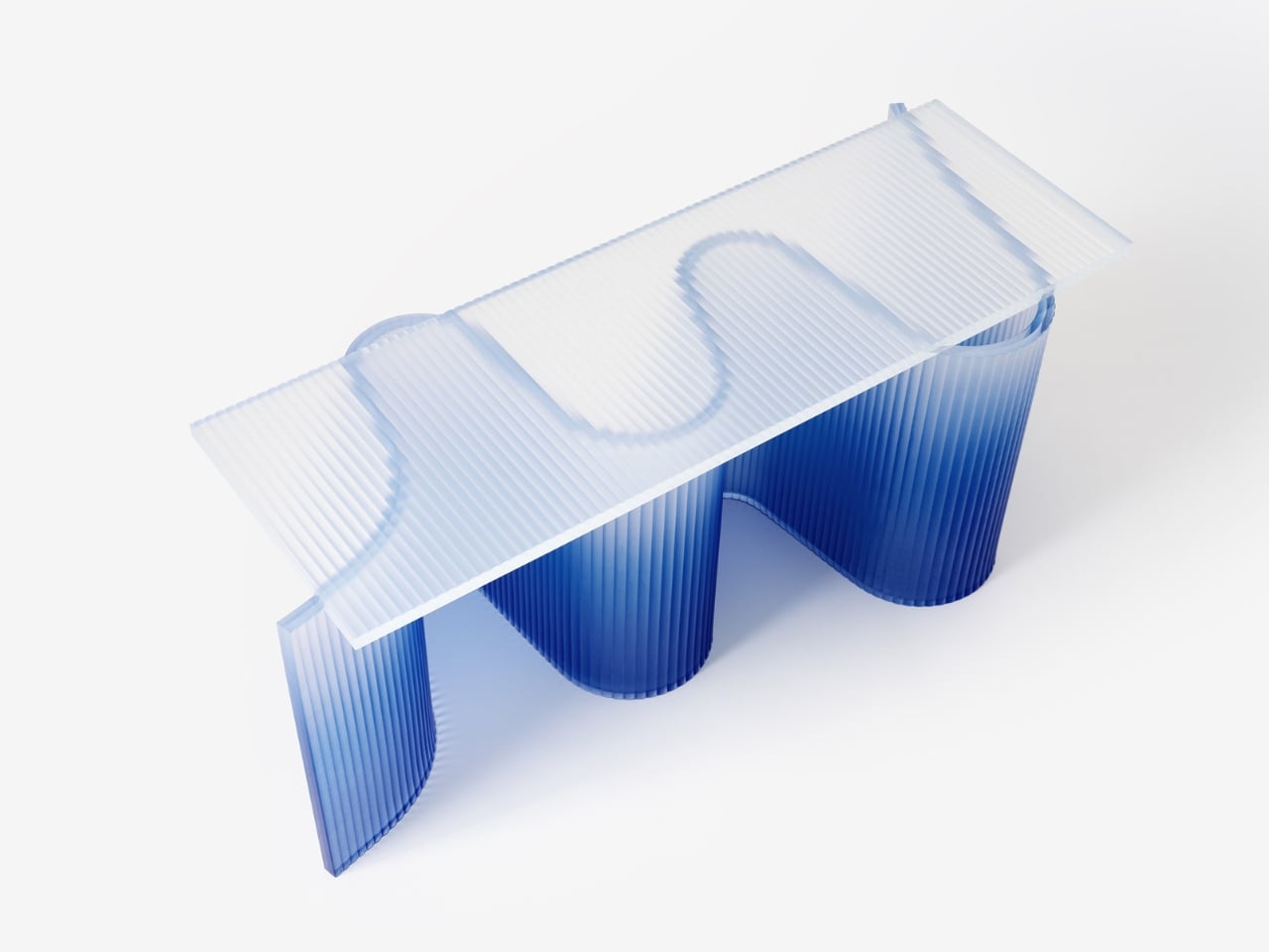
Cresta, which means “crest” in Italian, is more than just a place to sit. It’s a love letter to Sardinia’s coastline, where Ponti grew up surrounded by the kind of natural beauty that gets under your skin and never really leaves. The bench captures that raw, untamed energy of water in motion, translating it into something you can actually touch and experience in your own space. And the best part? It’s made entirely from recycled plastics, proving once again that sustainability and stunning design don’t have to be mutually exclusive.

Designer: Ponti Design Studio

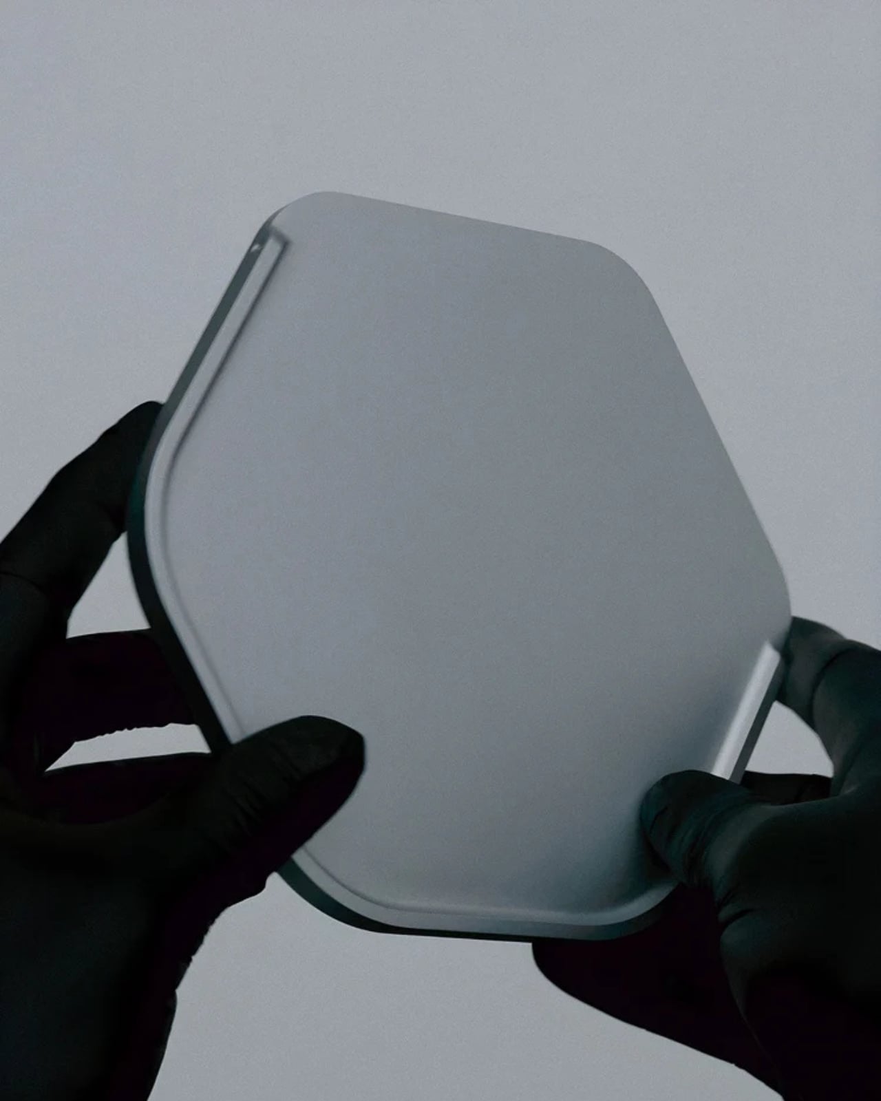
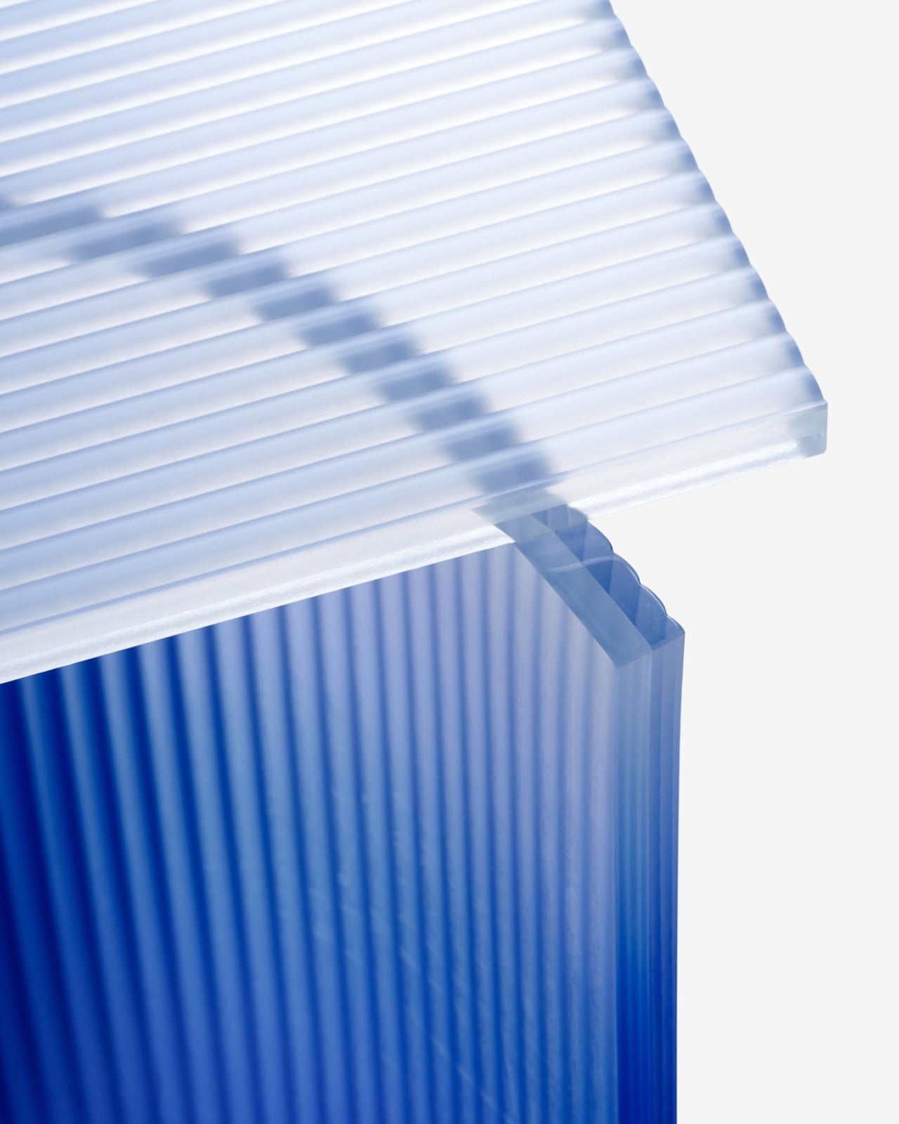
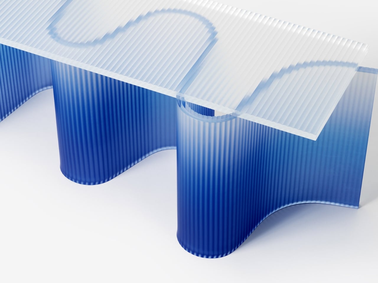
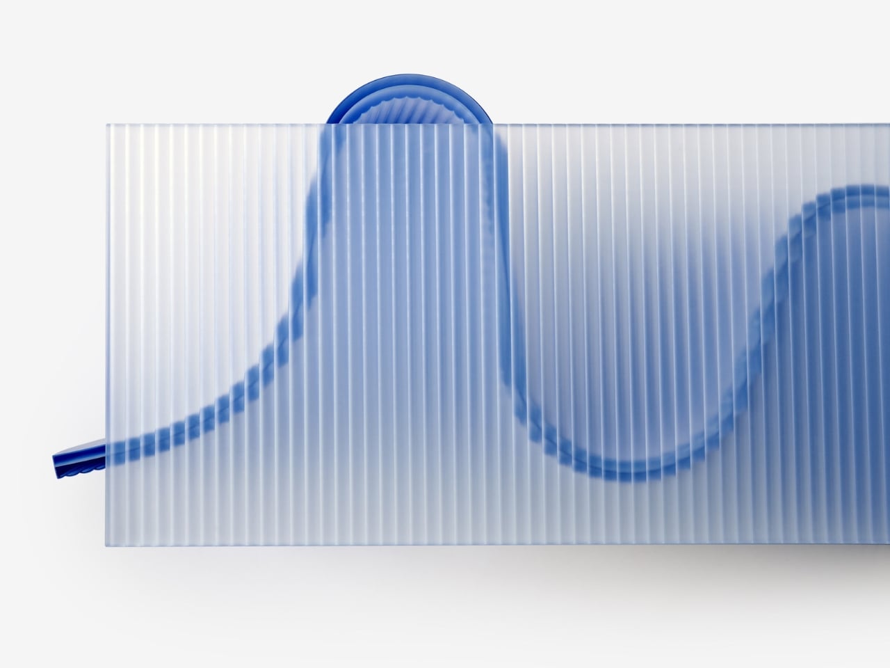
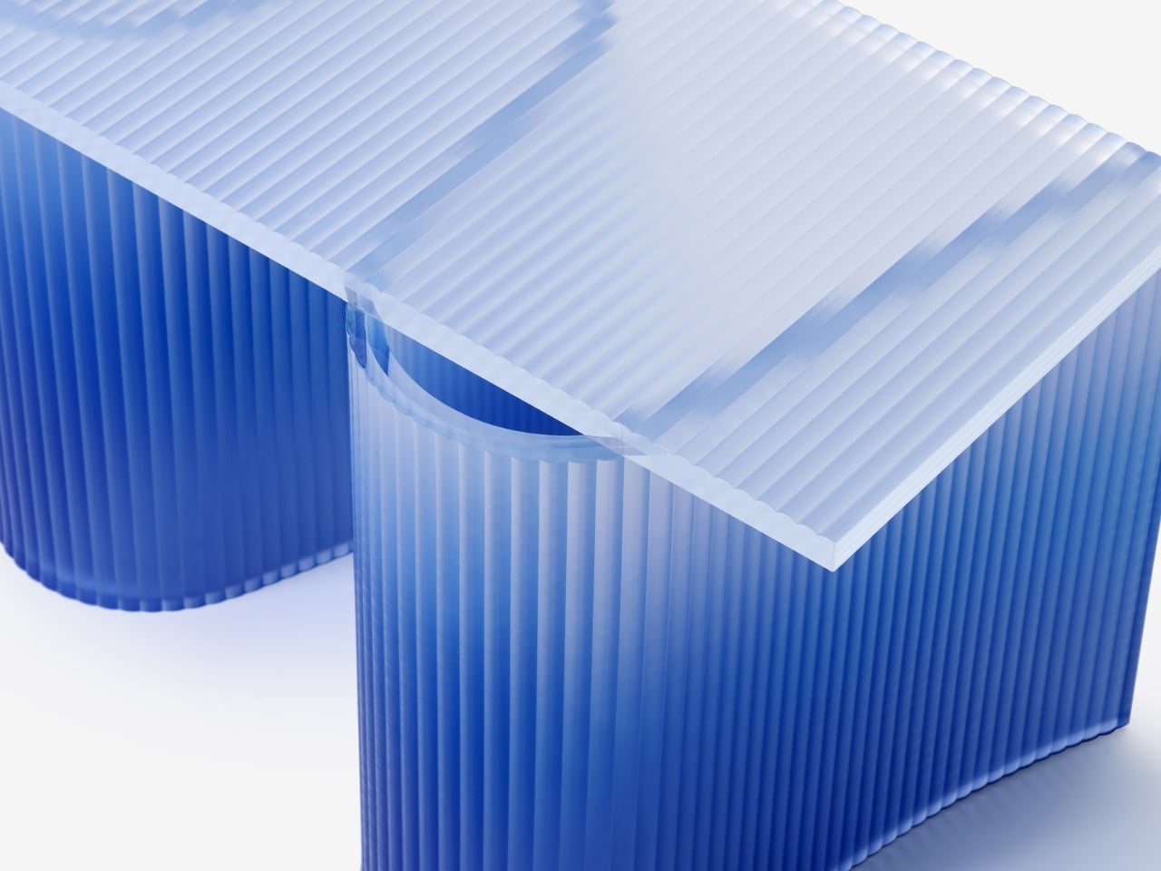
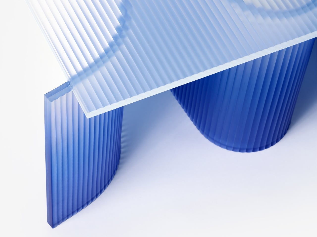
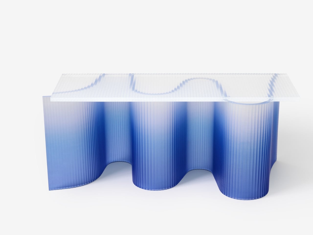
Let’s talk about what makes this piece so visually striking. The color alone is enough to stop you in your tracks. Cresta features a gradient that flows from deep ocean blue at the base to crystal-clear transparency at the top, mimicking the way sunlight filters through water. It’s the kind of detail that makes you want to walk around the piece from every angle, watching how the light plays through the material and creates new patterns depending on where you’re standing.

The texture adds another layer of intrigue. Those fine vertical lines running through the resin give it a tactile quality that invites you to reach out and touch it. From certain angles, it almost looks like the surface is rippling, as if the bench is caught in a perpetual state of movement. It’s a clever trick that keeps the piece feeling alive rather than static.

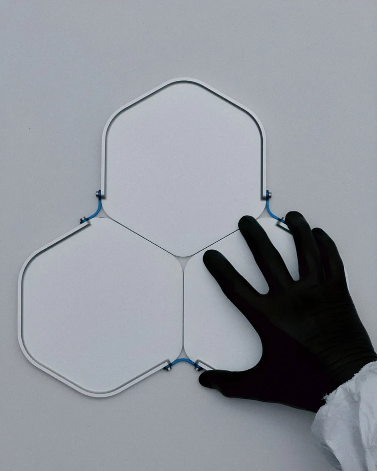
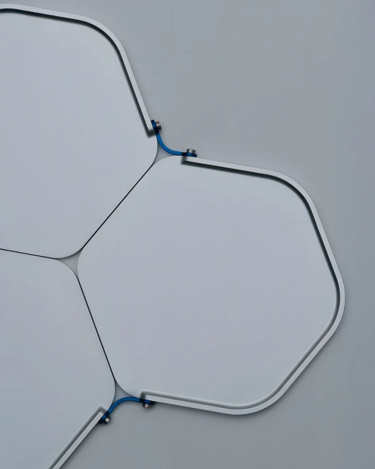
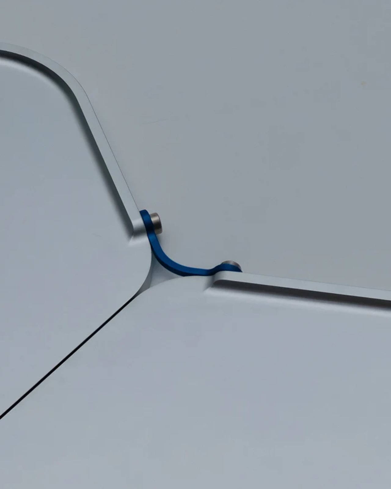
What really sets Cresta apart is its structure. The bench is composed of two distinct elements that work together to create its distinctive character. The top section is designed for comfort, providing seating for two people. But it’s the bottom that steals the show. That wave-like base isn’t just visually dramatic, it’s the heart of the design, giving Cresta its sculptural identity and making it feel less like furniture and more like a piece of contemporary art that happens to be functional.

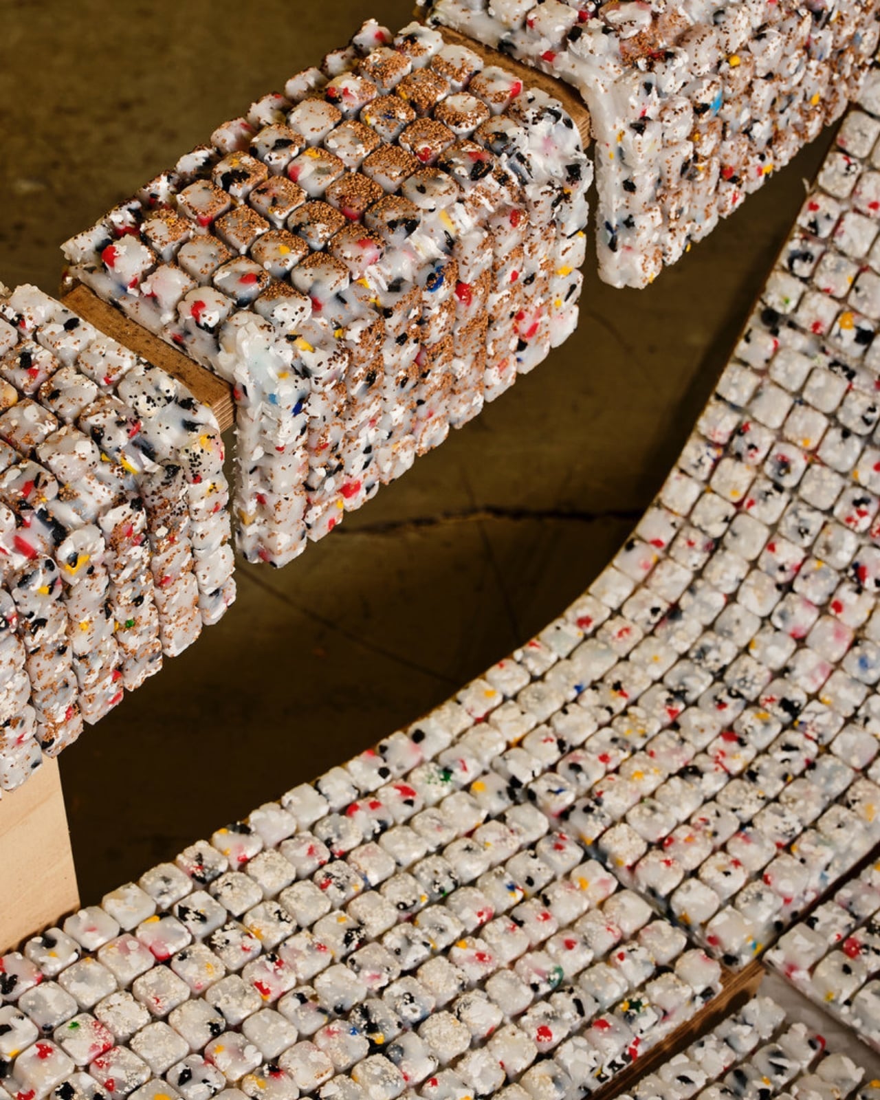
Now, about that sustainability angle. Ponti and his team at Ponti Design Studio didn’t just slap some eco-friendly marketing on this project and call it a day. They carefully curated a blend of recycled plastics, including PMMA (acrylic), PET (the stuff in water bottles), PC (polycarbonate), and PS (polystyrene). These materials would otherwise end up in landfills or, ironically, polluting the very oceans that inspired this piece. By transforming waste into something beautiful and functional, Cresta makes a quiet but powerful statement about what’s possible when we rethink our relationship with discarded materials.

This approach feels particularly relevant right now. We’re all drowning in conversations about plastic waste and environmental responsibility, and sometimes it can feel overwhelming and abstract. But when you see something like Cresta, it suddenly clicks. Recycled materials don’t have to look recycled. They don’t have to sacrifice beauty or craftsmanship. In fact, they can become something that people actively want in their homes and public spaces.

The bench would be right at home in a contemporary gallery, a modern office lobby, or even a stylish outdoor space where it could echo the natural environment it celebrates. Its clean aesthetic and sculptural form give it versatility, while that unmistakable wave-inspired silhouette ensures it never fades into the background. What I find most compelling about Cresta is how it manages to be both minimal and dramatic at the same time. There’s nothing extraneous about the design. Every curve, every gradient shift, every textured line serves the larger vision. Yet the overall effect is bold and memorable, the kind of piece that makes people stop and ask questions.

In a world where so much furniture blends together into beige sameness, Cresta stands out as something genuinely different. It’s a reminder that good design can tell a story, honor a place, and push us toward better environmental choices, all while looking absolutely stunning. Andrea Ponti took his memories of Sardinian seas and transformed them into something tangible, something that lets the rest of us experience a little bit of that coastal magic, no plane ticket required.

The post This Sculptural Bench Captures Sardinia’s Sea in Recycled Resin first appeared on Yanko Design.

This Engineer Built a 9-Instrument Orchestra From Vintage Computers

You know that moment when someone takes something impossibly complicated and makes it look like the most natural thing in the world? That’s exactly what happens when you watch Linus Akesson perform Maurice Ravel’s Boléro on nine homemade 8-bit instruments. And honestly, it’s the kind of thing that makes you stop scrolling and just stare.

Akesson isn’t your average musician or engineer. He’s both, which is probably the only way a project like this could exist. The Swedish creator has spent years building custom electronic instruments from vintage computer parts and retro gaming hardware, and this 15-minute performance might just be his magnum opus. We’re talking about a piece that required nearly 10 hours of footage and 52 mixer channels to capture. This isn’t just a fun weekend project. It’s a full-blown technical and artistic achievement.

Designer: Linus Akesson

Ravel’s Boléro is one of those classical pieces that you recognize even if you don’t think you know classical music. It’s hypnotic and repetitive, building slowly over 15 minutes with the same melody cycling through different instruments until it reaches this massive crescendo. It’s also notoriously difficult to perform because of how exposed every musician is. There’s nowhere to hide when you’re playing the same pattern over and over. Now imagine tackling that with a collection of beeping, blooping 8-bit computers that you built yourself.

The instruments in Akesson’s arsenal include things like the Chipophone, an organ-like device that uses old computer sound chips, and the Commodordion, which is essentially a Commodore 64 turned into an accordion. Yes, you read that right. These aren’t instruments you can just buy off the shelf or even find in some obscure music shop. Akesson designed and built them from scratch, combining his deep knowledge of electronics with a genuine love for the aesthetic and sound of vintage computing.

What makes this performance so compelling isn’t just the technical wizardry, though there’s plenty of that. It’s the way Akesson treats these humble, squeaky sounds with the same reverence you’d give to a string section in a concert hall. Chiptune music, the genre that emerged from early video game soundtracks, often gets dismissed as novelty. But in Akesson’s hands, it becomes something genuinely moving. The piece still builds, still swells, still commands your attention the way Ravel intended.

There’s something deeply satisfying about watching someone honor both the past and the present in the same breath. Akesson isn’t trying to prove that 8-bit sounds are better than traditional orchestras, and he’s not making a joke out of classical music. He’s finding a middle ground where nostalgia, craftsmanship, and artistry all meet. It’s retro without being kitsch. It’s technically impressive without being cold or showy.

The video itself is a treat for anyone who loves behind-the-scenes peeks at creative processes. You see Akesson switching between instruments, his workspace cluttered with wires and vintage gear, every sound painstakingly triggered and mixed. It’s a one-man orchestra in the truest sense, except the orchestra is made of machines that were obsolete before many of us were born. In a world where we’re constantly told to upgrade, to move forward, to embrace the newest and shiniest technology, there’s something quietly rebellious about what Akesson does. He takes the discarded, the outdated, the supposedly useless and turns it into art. And not just functional art or conceptual art. Beautiful art. The kind that makes you feel something.

If you’re someone who gets excited about the intersection of design, technology, and culture, this project is basically catnip. It’s proof that limitations can breed creativity, that old technology still has stories to tell, and that sometimes the best way to appreciate a classic is to reimagine it completely. Akesson’s 8-Bit Boléro doesn’t replace the original. It sits alongside it, offering a new way to hear something we thought we already knew.

So do yourself a favor and watch it. Turn up the volume, let those retro beeps wash over you, and marvel at what one person with vision and skill can create. It might just change how you think about what’s possible when art and engineering collide.

The post This Engineer Built a 9-Instrument Orchestra From Vintage Computers first appeared on Yanko Design.

Atlanta Airport Has Chairs Made From Campus Trash. They’re Gorgeous

There’s something quietly radical about sitting in a recycled Adirondack chair while you’re waiting for your flight at the world’s busiest airport. Plastic Reimagined transforms locally sourced plastic waste into full-scale seating prototypes, bridging design education, material research, and civic infrastructure at Hartsfield-Jackson Atlanta International Airport, and honestly, I can’t stop thinking about how clever this is.

Here’s what happened. Assistant Professor Hyojin Kwon, founder of the research-oriented practice Pre– and Post–, developed this through a graduate design research studio at Georgia Tech’s School of Architecture, where students took a very practical question and turned it into something beautiful. What if all that plastic waste from campus could actually become something useful again?

Designer: Hyojin Kwon (curator and instructor)

Graduate students collected post-consumer HDPE and PLA from campus makerspaces, waste collection streams, and local recycling facilities. Think about that for a second. The plastic cups from the student union, 3D printing scraps from late-night projects, all that everyday campus detritus that usually ends up in a landfill. Instead of being tossed, the materials were shredded, pressed into sheets, milled with CNC routers, or cast into volumetric forms.

What I love most is that they didn’t try to hide the recycled nature of these pieces. Surface variations, including marbled color patterns and irregular textures, were retained as integral elements of the final designs, so each chair has this gorgeous, swirly aesthetic that screams “I used to be something else.” The imperfections became the personality.

The project started modestly enough. It was first exhibited at Atlanta Contemporary from June to September 2025, where a series of Adirondack chairs and collective seating elements were presented as both design artifacts and material propositions. But then it went public in a bigger way. During SITE 2025 at the Goat Farm Arts Center, the chairs were installed across the 12-acre property during a one-night arts festival and encountered by over 4,000 visitors who could actually sit on them, touch them, use them in the wild.

Now comes the really exciting part. Plastic Reimagined transitioned into a long-term civic setting as part of TRANSPORT | Transform | TRANSCEND, a year-long exhibition partnership between Georgia Tech Arts and Hartsfield-Jackson Atlanta International Airport, installed in Terminal T and on view through November 2026. That means millions of travelers from around the world will see these chairs, and maybe pause long enough to wonder about their own relationship with plastic waste.

As Kwon noted, “These post-consumer materials were coming from our campus, our students’ everyday life. By repurposing them, we created meaningful research outcomes.” There’s something deeply satisfying about that circularity. The students created the waste, then figured out how to give it a second life as functional furniture that other people can actually use.

The individual pieces have names and personalities. There’s Vincent, with its hand-shaped forms and marbled surfaces. There’s Modu-Chair, built from cubic modules that echo quilting patterns. And Framework, a translucent lattice structure that reimagines what an Adirondack chair can even be. Each one asks the same question in a different way: what if we stopped seeing plastic as garbage and started seeing it as potential?

Across its transitions from gallery to festival to global transit hub, Plastic Reimagined argues for sustainability as infrastructural literacy rather than aesthetic signaling. This isn’t performative environmentalism. It’s practical, tangible, and sitting right there in the airport terminal where anyone can plop down and rest their feet.

This project proves something I’ve always believed: the best design solutions come from constraints, not abundance. When you have to work with what’s already there, you get creative in ways you never would with unlimited resources. These Georgia Tech students turned their campus waste stream into a civic contribution, and now their work is literally supporting weary travelers at one of the planet’s busiest crossroads.

The post Atlanta Airport Has Chairs Made From Campus Trash. They’re Gorgeous first appeared on Yanko Design.

Aerospace Engineers Just Solved Your Messy Nightstand Problem

You know that thing where you walk into your bedroom at the end of the day and just start emptying your pockets onto whatever flat surface is closest? Keys land on the dresser, wallet gets tossed on the nightstand, watch goes who knows where. It’s a universal ritual of coming home, and it’s exactly the kind of everyday moment that aerospace engineers Javier De Andrés García and Anaïs Wallet decided to redesign.

Their brand, Unavela, takes the precision and intentionality of aerospace engineering and applies it to the mundane objects we interact with daily. The Unavela Valet Tray is a perfect example of this philosophy: it’s a catchall that doesn’t just catch, it elevates the entire experience of organization into something that feels considered and purposeful.

Designers: Javier De Andrés García, Anaïs Wallet (Unavela)

What makes this particularly interesting is the design pedigree behind it. De Andrés García and Wallet aren’t your typical product designers who sketch pretty shapes and call it a day. They come from a world where every gram matters, where form follows function with almost religious devotion, and where materials are chosen based on performance characteristics rather than trends. When aerospace engineers decide to make a tray for your keys, you can bet they’ve thought about it differently than everyone else.

The valet tray sits in that sweet spot between utilitarian and beautiful. It’s not trying to disappear into your decor, nor is it screaming for attention. Instead, it occupies space with quiet confidence, the way really good design tends to do. Think of it as the functional equivalent of that friend who just makes everything run more smoothly without making a big deal about it.

Valet trays themselves have an interesting history. Originally, they were the domain of well-appointed gentleman’s dressers, a place to organize pocket watches, cufflinks, and collar stays. But in our modern world of smartphones, AirPods, car key fobs, and whatever else we’re carrying, the valet tray has become even more relevant. We might not wear pocket watches anymore, but we’ve got more stuff to keep track of than ever before.

What Unavela brings to this category is a fresh perspective. When you look at their work across different products, you see a consistent thread: they’re interested in what they call “functional objects.” Not decorative objects that happen to be functional, but pieces where the function itself becomes the aesthetic statement. It’s a subtle but important distinction. The beauty comes from how well something works, not from applied decoration or styling tricks.

This approach feels particularly resonant right now. We’re living in an era where people are increasingly interested in buying fewer, better things. The whole concept of everyday carry (EDC) has evolved from a niche hobby into a broader cultural conversation about intentionality and quality. People are thinking more carefully about the objects they interact with daily, and they want those objects to reflect thoughtfulness and care. The Unavela Valet Tray fits perfectly into this mindset. It’s not fast furniture or disposable decor. It’s a considered piece that’s designed to be used daily and to improve with that use. There’s something deeply satisfying about having a designated spot for your everyday items, about the ritual of emptying your pockets into a tray that was designed specifically for that purpose.

From a design perspective, what’s compelling is how Unavela bridges the gap between industrial design and consumer products. Aerospace engineering isn’t typically associated with home goods, but maybe it should be. After all, if you can design components for aircraft where failure isn’t an option and weight is critical, you probably have some interesting insights about how to make a really excellent tray. The beauty of good design is that it often looks simple, even inevitable, but that simplicity is the result of countless decisions and refinements. Every angle, every dimension, every material choice has been considered. It’s the difference between something that works and something that works exceptionally well.

For anyone interested in design, tech, or the intersection of engineering and everyday life, the Unavela Valet Tray represents something larger than just a place to put your keys. It’s a statement about bringing rigor and intentionality to the objects we live with. It’s about applying aerospace-level thinking to earthbound problems. And honestly, in a world full of stuff that’s designed to be replaced rather than cherished, that’s a pretty refreshing approach.

The post Aerospace Engineers Just Solved Your Messy Nightstand Problem first appeared on Yanko Design.

This $7,000 Robot Shapeshifts Into 3 Different Machines

Imagine a robot that can transform like a high-tech LEGO set, swapping out legs for arms or wheels depending on what the day throws at it. That’s exactly what LimX Dynamics has cooked up with their latest creation, the Tron 2, and honestly, it’s making me rethink everything I thought I knew about what robots can do.

The Tron 2 isn’t your typical one-trick-pony robot. This thing is basically the Swiss Army knife of the robotics world. Chinese startup LimX Dynamics just unveiled this modular marvel that can morph between three completely different configurations: a dual-armed humanoid torso, a wheeled-leg explorer, or a bipedal walker that can actually climb stairs without making you nervous. And get this, you can switch between these forms with just a screwdriver. No fancy tools, no complicated procedures. Just some strategic unscrewing and you’ve got a whole new robot.

Designer: LimX Dynamics

The company’s demo video starts with something delightfully surreal: just a pair of robotic legs casually strolling along, completely headless and armless. Then, like watching a transformer come to life in real time, those same leg components get repurposed into arms, complete with a head and torso. Suddenly, you’ve got a full humanoid lifting heavy water bottles and showing off its surprisingly impressive strength.

What makes the Tron 2 particularly fascinating is its intelligence layer. This isn’t just a mechanical chameleon. It’s powered by advanced AI and built on what’s called a vision-language-action platform, which essentially means it can see, understand commands, and actually do something useful with that information. The robot comes with a fully open software development kit that plays nice with both ROS1 and ROS2, making it a dream for researchers and developers who want to experiment without fighting proprietary systems.

Performance-wise, the specs are genuinely impressive. Each of its dual arms features seven degrees of freedom with a reach of 70 centimeters and can handle up to 10 kilograms of payload together. The wheeled configuration offers about four hours of runtime and can haul around 30 kilograms of cargo, while the bipedal mode excels at navigating tricky terrain like staircases that would leave most wheeled robots stuck at the bottom. The demo footage shows Tron 2 doing things that feel almost show-offy: playing table tennis, performing cartwheels, rolling around smoothly on wheels, and conquering staircases with the confidence of someone who’s done it a thousand times. It’s the kind of versatility that makes you wonder why we’ve been so committed to single-purpose robots for so long.

And here’s where things get really interesting. LimX is positioning the Tron 2 as ideal for future Mars missions. Think about it: on Mars, you can’t exactly call a repair truck when something breaks or send a specialized robot for every different task. You need something adaptable, something that can switch roles as mission needs evolve. The modular design means you could potentially swap out damaged components or reconfigure for different tasks without needing an entirely new robot shipped from Earth.

For research labs, the Tron 2 offers something that’s been surprisingly rare: a flexible test bed that can support multiple types of projects without requiring a whole fleet of different robots. Whether you’re studying manipulation, locomotion, or AI integration, you can configure the same platform to suit your specific needs. Perhaps most surprisingly, this technological marvel starts at just 49,800 Chinese yuan, which translates to around $7,000 USD. For context, that’s dramatically cheaper than many specialized robots that can only do a fraction of what the Tron 2 offers. Pre-orders are already open, though LimX hasn’t fully disclosed all the pricing details or specified exactly who their target customers are.

The Tron 2 represents something bigger than just another cool robot demo. It’s pointing toward a future where adaptability matters more than specialization, where one well-designed platform can handle whatever challenges come its way. Whether it ends up exploring Mars or revolutionizing warehouse operations here on Earth, this shape-shifting bot is definitely one to watch.

The post This $7,000 Robot Shapeshifts Into 3 Different Machines first appeared on Yanko Design.

This Designer Turned Road Material Into Stunning Furniture

When you think of asphalt, furniture probably isn’t the first thing that comes to mind. More likely, you’re picturing roads, parking lots, or maybe the smell of fresh pavement on a hot summer day. But designer So Koizumi is flipping that association on its head with a new collection that’s making us completely rethink this humble material.

The series, simply called “As,” takes asphalt back to its roots. Long before it became synonymous with infrastructure, asphalt was actually used as a binding agent, bringing different materials together. Koizumi taps into this ancient purpose and transforms it into something unexpectedly beautiful: stools, side tables, lighting fixtures, and wall-mounted objects where asphalt serves as the glue holding together metal, stone, and resin.

Designer: So Koizumi

What makes this collection really interesting is how Koizumi approaches the material itself. This isn’t some off-the-shelf, industrial-grade asphalt. Instead, each piece involves hand-shaping and finishing, with the texture and density changing based on what each object needs structurally and aesthetically. It’s a hands-on process that involves experimenting, testing, and refining until the materials play nicely together.

Think about it for a second. Asphalt is typically something we walk or drive on without a second thought. It’s functional, forgettable, purely utilitarian. But here, it becomes the star of the show, or at least a co-star alongside the metals and stones it connects. The collection treats asphalt not as a surface layer you slap on top, but as a structural intermediary, forming cores that support and anchor everything else.

The result is furniture that feels almost sculptural. These aren’t your typical mass-produced pieces that roll off an assembly line. Each object has its own character, its own story of how different materials came together through this unexpected mediator. There’s something deeply satisfying about seeing such disparate elements (industrial metal, natural stone, synthetic resin) united by something as overlooked as asphalt.

From a design perspective, what Koizumi is doing speaks to a bigger movement we’re seeing right now. Designers are increasingly interested in material honesty, in celebrating what things are actually made of rather than hiding it behind veneers and polish. They’re also looking at waste materials, industrial byproducts, and overlooked substances with fresh eyes, asking what else they could become.

The “As” series fits perfectly into this ethos. It challenges our preconceptions about what materials belong where. Why shouldn’t asphalt have a place in your living room? Why can’t something designed for roads also work as a elegant side table or atmospheric lighting? These questions might sound cheeky, but they’re actually at the heart of innovative design. There’s also something poetic about the concept. Asphalt connects places in our cities, quite literally paving the way from point A to point B. In Koizumi’s hands, it connects materials instead, creating little ecosystems where metal meets stone meets resin, all held together by this dark, textured binding agent. The furniture becomes a metaphor for connection itself.

What’s particularly cool is how this collection sits at the intersection of art and function. Yes, these are usable pieces. You can sit on the stools, set your coffee on the tables, light your space with the fixtures. But they’re also conversation starters, objects that make you pause and reconsider your assumptions. They blur the line between furniture and sculpture in the best possible way.

For anyone who loves design that takes risks and challenges norms, the “As” collection is definitely worth checking out. It’s not trying to be trendy or follow what everyone else is doing. Instead, it carves out its own weird, wonderful niche by asking a simple question: what if we used asphalt differently? The answer, as it turns out, is pretty compelling. Sometimes the most innovative ideas come from looking at the most ordinary materials with extraordinary imagination.

The post This Designer Turned Road Material Into Stunning Furniture first appeared on Yanko Design.

MVRDV’s Timber Pavilion Revives a City’s Forgotten Identity

There’s something magical about architecture that doubles as a love letter to a place. MVRDV just pulled this off in Chiayi, Taiwan, with a temporary pavilion that’s less about showing off and more about remembering what made this city special in the first place.

Picture this: Chiayi is celebrating its 321st birthday, and instead of a generic party tent, the city gets a timber structure that tells the story of its forgotten identity as Taiwan’s wood capital. Over 6,000 historic timber buildings still dot this city, remnants of an era when Chiayi thrived on forestry and woodcraft, yet most residents have lost touch with that heritage.

Designer: MVRDV (Photos by Shephotoerd)

Enter Wooden Wonders, a pavilion that sits right across from city hall and functions as what the architects call an “urban living room.” It’s an apt description. The structure wraps around a central courtyard, creating an intimate gathering space that feels both public and personal. Think of it as the architectural equivalent of pulling up a chair and asking someone to tell you their life story.

What makes this project fascinating is how MVRDV approached the design. Instead of imposing their signature style, they went full detective mode, studying the city’s existing timber buildings to understand the local architectural DNA. What they found was beautifully eclectic: diagonal cuts that emphasize street corners, ornamental rooflines with decorative flourishes, a mix of time periods and influences all woven together. These elements became the blueprint for the pavilion’s perimeter structure, making the new building feel like it grew organically from Chiayi’s architectural family tree.

Inside, the exhibition takes visitors on a journey through wood’s past, present, and future. Pastel-colored gateways (a softer touch than you’d expect from an architecture exhibition) guide people through different zones. There’s a forest-themed area exploring how timber is grown and harvested, and “the workshop,” which celebrates the historic craftsmanship that once defined the region. The exhibition doesn’t just look backward, though. It also positions Chiayi alongside global timber leaders like Norway and New Zealand, showing how engineered timber can bridge traditional culture and contemporary construction.

The timing of this project couldn’t be more relevant. MVRDV founding partner Jacob van Rijs nails it when he says Chiayi’s timber story mirrors a global shift in how we think about building materials. Wood went from practical and abundant to “old-fashioned” when concrete and steel took over. But the climate crisis has flipped the script again. Wood stores carbon; concrete and steel release massive amounts of it into the atmosphere. Add decades of innovation in engineered timber techniques, and suddenly wood isn’t just nostalgic, it’s the future.

In Taiwan specifically, this conversation takes on extra weight. Many people there view timber as less reliable or reputable compared to modern materials, and seismic regulations make working with existing buildings challenging. So this pavilion isn’t just celebrating heritage, it’s making a bold argument about sustainability and what’s possible when you look at old materials with new eyes. The two-story main hall on the north side is where this vision gets practical. Visitors can contribute ideas for Chiayi’s urban development and its potential future as Taiwan’s “Wood Capital.” It’s participatory architecture at its best, a space that doesn’t just talk at people but invites them into the conversation about what their city could become.

What I love about Wooden Wonders is how it manages to be both specific and universal. Yes, it’s deeply rooted in Chiayi’s particular history and architecture. But it also speaks to something bigger: how cities can honor their past while building a more sustainable future. How materials that were once dismissed can become solutions to our most pressing problems. How good design can create space for community and conversation.

The pavilion is only up through December 28, making it a fleeting moment in the city’s long history. But maybe that’s fitting. Sometimes the most powerful statements are temporary ones, just present long enough to remind us what we’ve forgotten and inspire us to imagine what comes next.

The post MVRDV’s Timber Pavilion Revives a City’s Forgotten Identity first appeared on Yanko Design.

This $1,299 Heater Costs 75% Less to Run Than Propane

Since I live in a tropical country, I’ve never truly experienced a winter season. So I really can’t relate when I see people huddled in front of a fire, trying to get a modicum of warmth. But I can just imagine how terribly cold it can get during these times and while most of the time you’d just want to stay indoors, you do need to spend some time out on your porch or background every once in a while.

Look, most patio heaters are basically expensive lawn ornaments that happen to produce a tiny bubble of warmth if you stand directly underneath them while wearing a parka. The Timber Stoves Revere Patio Heater is not that. This American-made beast is more like a seven-foot tall sculpture that moonlights as a radiant heating powerhouse, and honestly, it’s about time someone figured out how to make outdoor heating both beautiful and brutally effective.

Designer: Timber Stoves

Let’s start with what makes this thing fascinating from a design perspective. At 84 inches tall and wrapped entirely in stainless steel, the Revere looks like something that belongs in a modern art museum or a very chic industrial loft. But here’s where it gets interesting: this heater requires absolutely zero electricity. The entire operation runs on gravity and thermodynamics, using wood pellets that feed down into a firepot where the draft from the stovepipe creates an almost hypnotic flame behind those generous 7.5 by 14.5 inch viewing windows. It’s basically engineering theater, and you get to watch it through the glass while staying warm.

The pellet system is where Timber Stoves really shows its cards. While everyone else is fussing with propane tanks and dealing with that distinctive smell, the Revere chomps through wood pellets at roughly a quarter of the operating cost of propane while producing double the BTUs. We’re talking 90,000 BTUs of heat radiating out in a 12-foot circle, which means you’re actually warm from head to toe rather than just getting that weird sensation where your face is hot but your back is freezing. The hopper holds 25 pounds of pellets, so you’re not constantly babysitting the thing. Fill it up, let gravity do its job, and go back to being the host who actually enjoys their own party.

Now let’s talk about what happens when you use this thing regularly. The stainless steel body doesn’t just sit there looking pretty. As the Revere heats up over multiple uses, the metal begins developing these incredible patina colors: gold, purple, blue, and green. It’s like the heater is keeping a visual diary of every fire you’ve lit, every conversation you’ve had around it. Some design objects try desperately to stay pristine forever. The Revere embraces the passage of time and looks better for it.

The engineering nerd stuff matters too. That firepot at the heart of the operation? It’s crafted from a high-temperature stainless steel alloy designed to handle up to 2,100 degrees Fahrenheit, and it’s rated for approximately 1,000 hours of use before you need to think about replacement. Most outdoor equipment starts showing its age after a season or two, but Timber Stoves built this thing to last through years of entertaining, late-night conversations, and those random Wednesday evenings when you just want to sit outside with a book.

The virtually smokeless operation deserves its own paragraph because it’s a game changer. Wood pellets burn clean, which means you’re not standing in a cloud of smoke trying to remember which way the wind was blowing when you started the fire. You don’t smell like a campfire afterward unless you want to. And because everything is contained within that stainless steel body with an enclosed flame, you get all the ambiance of a traditional fire without the constant worry about sparks.

There’s something refreshingly analog about the controls too. No app to download, no Bluetooth connection that drops out randomly. You’ve got a key for easy shut-off and a damper dial that lets you adjust the temperature by up to 250 degrees. Turn it up, turn it down, walk away if you need to. The heater just keeps doing its job. The Revere weighs 75 pounds, which sounds heavy until you realize it means this thing isn’t going anywhere in a windstorm. It’s substantial, grounded, the kind of outdoor equipment that feels permanent even though it’s technically portable. At $1,299, it’s not an impulse purchase, but here’s the thing about investing in good outdoor gear: it fundamentally changes how you use your space.

Suddenly those fall evenings extend later into the season. Winter gatherings move outside. You’re not held hostage by the weather forecast anymore. The Revere turns patios, decks, and backyards into year-round destinations rather than seasonal amenities. And unlike trendy outdoor furniture that’ll be dated in three years, this is a piece of functional design that’ll still look modern a decade from now, just with better patina colors.

The post This $1,299 Heater Costs 75% Less to Run Than Propane first appeared on Yanko Design.

Floating Cities Might Actually Save Us (And They’re Gorgeous)

You know that feeling when you see a design concept that makes you go “wait, is this for real?” That’s exactly what happened when I came across Novasis, a floating platform project by designer Mohsen Laei that just won the Grand Prix Architecture and Innovation Award for the Sea 2025. And honestly? It’s not just another futuristic pipe dream. This thing might actually change how we think about living with our oceans.

Here’s what makes Novasis so compelling. It’s a scalable floating structure that tackles three massive problems at once: climate change, resource scarcity, and marine ecosystem collapse. Unlike those dystopian visions of humans abandoning land because we’ve wrecked it, this platform is designed for genuine coexistence with the ocean. It cultivates algae on a massive scale, produces renewable energy, creates freshwater, and helps restore marine life, all while being modular, recyclable, and energy independent.

Designer: Mohsen Laei

Let’s talk about the algae part, because it’s actually the star of the show. The platform uses floating and submerged nets made from recycled PET to grow both macro and microalgae. Why does this matter? Algae is ridiculously versatile. It can be turned into biofuel, food supplements, pharmaceuticals, and even carbon-neutral materials. Plus, algae cultivation naturally absorbs carbon dioxide from the atmosphere, making this a genuinely climate-positive system. We’re talking about a design that doesn’t just minimize harm but actually reverses it.

The structure itself is stunning in a practical way. Picture a circular floating platform with a central dome and perimeter walkway that organizes movement across the space. It’s designed to support research facilities, recreational areas, and even habitation. Freshwater gets produced through rainwater harvesting combined with solar and wave-powered desalination, meaning the whole thing functions as a self-sufficient ecosystem. No need to pipe in resources from mainland infrastructure.

What I find most exciting about Novasis is how it reimagines what “development” can look like in coastal and open-ocean contexts. Traditional marine construction tends to be either extractive (oil rigs, commercial fishing) or leisure-focused (luxury resorts, cruise ships). This platform flips that script entirely. It’s designed to be revenue-generating through biomass production and renewable energy, making it economically viable without requiring grants or subsidies.

Laei isn’t new to ambitious ocean-based concepts either. Back in 2021, he proposed Wind Island, another floating structure that combined wind, water, and solar power with residential and research spaces. That project used flag-like blades around a central tower to capture wind energy while creating shade and cooling for the platform below. You can see the evolution of his thinking from that earlier concept to Novasis, where the focus has sharpened on ecosystem restoration and practical resource production.

The timing couldn’t be more relevant. Floating solar farms have been gaining traction as a renewable energy solution, particularly because they preserve land for other uses and can actually help clean nutrient-polluted water. But most floating renewable projects focus on just one function. Novasis integrates multiple systems into one cohesive platform, which makes it far more resilient and useful.

Critics might call this concept too ambitious or unrealistic, but I’d argue we’re past the point where playing it safe makes sense. Our oceans are warming, acidifying, and losing biodiversity at terrifying rates. Coastal cities face rising seas and freshwater shortages. We need solutions that are as complex and interconnected as the problems we’ve created. Novasis offers exactly that: a model for how humans might actually contribute to ocean health rather than just taking from it.

The best part? Because the system is modular, it can scale up or down depending on location and need. Small coastal communities could deploy a single unit. Larger installations could connect multiple platforms into floating networks. The design adapts rather than demanding a one-size-fits-all approach.

I’m genuinely curious to see where this goes. Will we see a working prototype in the next few years? Will governments and private investors recognize the potential here? For now, Novasis stands as proof that design can be both beautiful and functionally revolutionary, that we can build infrastructure that heals rather than harms. And in a world that desperately needs both hope and practical solutions, that feels like something worth getting excited about.

The post Floating Cities Might Actually Save Us (And They’re Gorgeous) first appeared on Yanko Design.

This Cutlery Set Celebrates the Machine That Made It

There’s something inherently rebellious about celebrating the process instead of hiding it. But most products are still designed to look effortlessly smooth, polished to perfection, and stripped of any trace of how they came to be. Atelier Andy Carson’s G-Code flatware takes the opposite approach. This cutlery set doesn’t just acknowledge its manufacturing origins, it flaunts them.

The name itself is a clever nod to the digital backbone of modern production. G-code is the programming language that tells CNC machines exactly where to cut, mill, and carve. It’s the invisible blueprint that translates design into reality, one precise coordinate at a time. By naming this flatware collection after that very code, Australian-based designer Andy Carson and his collaborator Sam Collett are making a bold statement: the machine is not just a tool, it’s part of the story.

Designer: Atelier Andy Carson

You can see that story in every angle of these pieces. Each implement in the set, a knife, fork, and spoon, is milled from solid stainless steel bar stock. There’s no stamping, no casting, no traditional manufacturing shortcuts that would smooth away the evidence of creation. Instead, what you get are geometric forms with crisp edges, flat planes, and subtle facets that catch the light in unexpected ways.

The aesthetic is unapologetically industrial, yet somehow it doesn’t feel cold or impersonal. The handles are rectangular and minimalist, tapering slightly as they extend toward the functional end. The fork features an intriguing angular bend that adds sculptural interest while maintaining perfect balance. The spoon’s oval head sits atop its geometric handle like a carefully considered punctuation mark. Even the knife, with its serrated edge, feels more like a piece of architecture than a simple eating utensil.

What makes this design particularly smart is how form and function work together so seamlessly. The weighted handles aren’t just about aesthetics or that satisfying heft you feel when you pick one up. They serve a practical purpose, ensuring that the head of each utensil hovers above the table surface when you set it down. It’s a thoughtful touch that addresses hygiene without requiring a separate knife rest or worrying about sauce staining your tablecloth. This approach challenges the conventions of how cutlery is typically made and what it’s supposed to look like. Most flatware relies on stamping or casting to achieve smooth, anonymous forms that disappear into the background of a meal. G-Code does the opposite. It asks to be noticed, to be appreciated not just as a functional object but as a celebration of precision manufacturing.

There’s a broader conversation happening here about honesty in design. In an era when so much of what we consume is mass-produced but styled to look artisanal, G-Code takes the reverse path. It’s a product that embraces its machined origins and turns them into a virtue. The flat surfaces, the geometric precision, the visible traces of the milling process, these aren’t flaws to be hidden. They’re features to be celebrated.

The monochromatic photography that accompanies the project only reinforces this philosophy. Shot against dark gray backgrounds, the flatware pieces stand like monoliths, their shadows as carefully composed as the objects themselves. The lighting emphasizes every edge, every transition from one plane to another, revealing the complexity within apparent simplicity. It’s worth noting that this isn’t just an exercise in theoretical design. These pieces are meant to be used, held, experienced. The matte finish on the stainless steel provides just enough grip without feeling rough. The proportions are calibrated for comfort. The balance point of each piece feels natural in your hand.

In a design landscape often dominated by either hyper-ornamentation or bland minimalism, G-Code carves out its own territory. It proves that celebrating manufacturing processes doesn’t mean sacrificing elegance, and that industrial aesthetics can coexist with everyday functionality. It’s flatware that makes you think about how things are made, why certain choices matter, and what it means when a designer decides to show their work rather than hide it. For anyone who appreciates when form, function, and manufacturing philosophy align perfectly, G-Code is a masterclass in intentional design. It’s proof that sometimes the most interesting stories are told not by what we conceal, but by what we choose to reveal.

The post This Cutlery Set Celebrates the Machine That Made It first appeared on Yanko Design.