Studio Carraldo Built a Maze Out of a Gen Z Joke

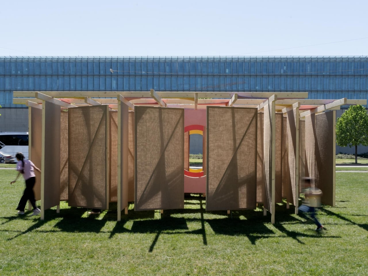
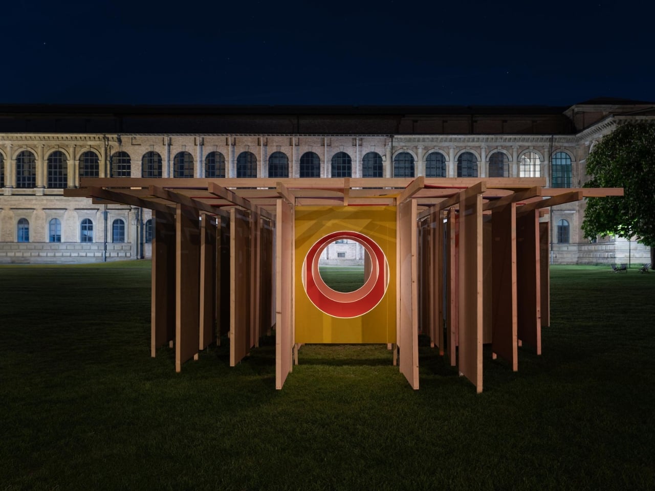
When a design installation borrows its name from a Gen Z slang term, you might expect something shallow. Something Instagram-first, substance-optional. DELULU, the jute fabric labyrinth created by Studio Carraldo for Munich Creative Business Week 2026, is not that. It takes a word that’s been used mostly for self-deprecating humor and stretches it into something genuinely thoughtful. Something worth walking through, both literally and figuratively.

The word “delulu,” for the uninitiated, is short for “delusional.” It’s the kind of slang that appears in captions and comment sections, usually to describe someone (often the speaker themselves) who’s holding out hope that doesn’t quite line up with reality. It’s got humor to it, but underneath the joke is something real: the experience of being a young person navigating a world that feels increasingly difficult to make sense of, shaped by climate anxiety, economic uncertainty, and the relentless noise of digital life.

Designer: Studio Carraldo
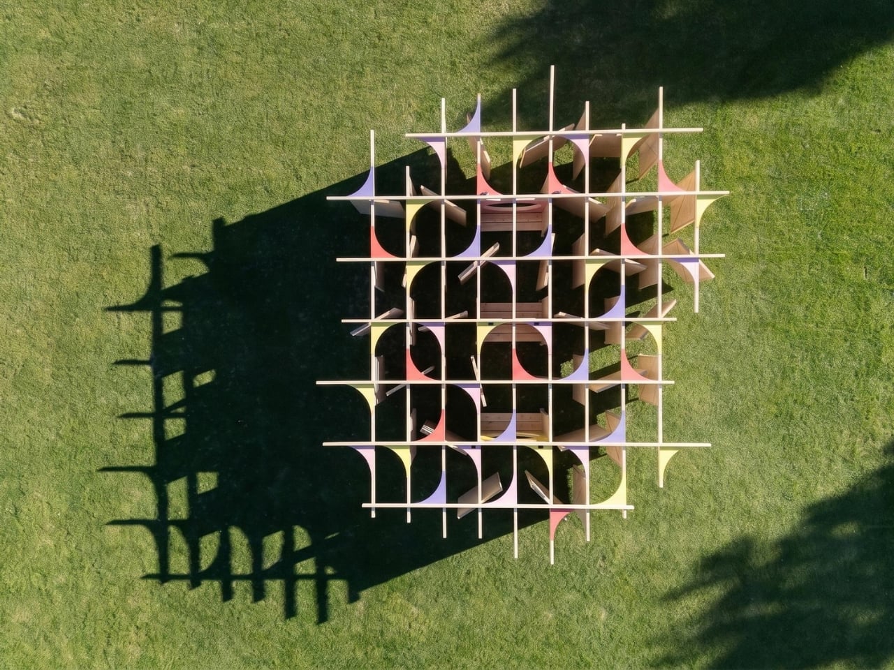
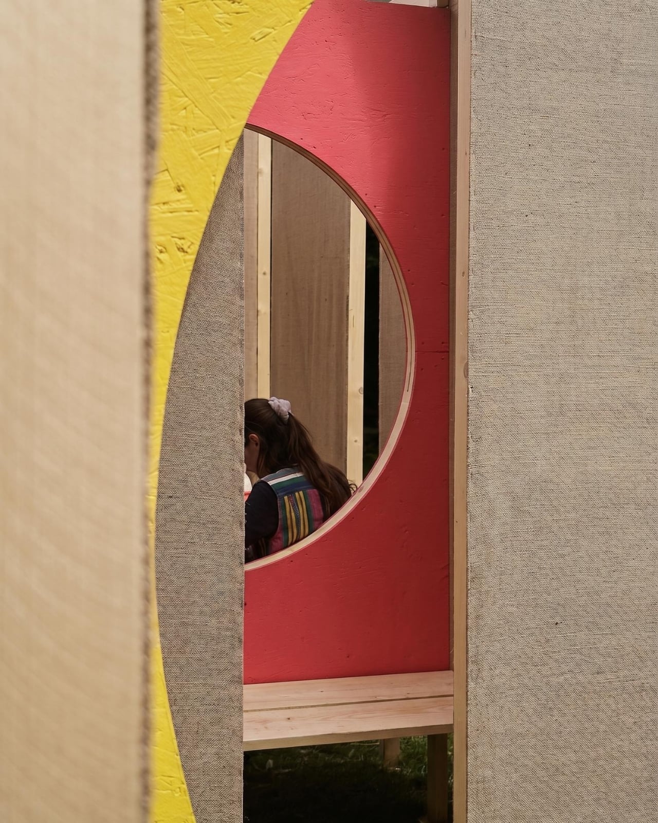
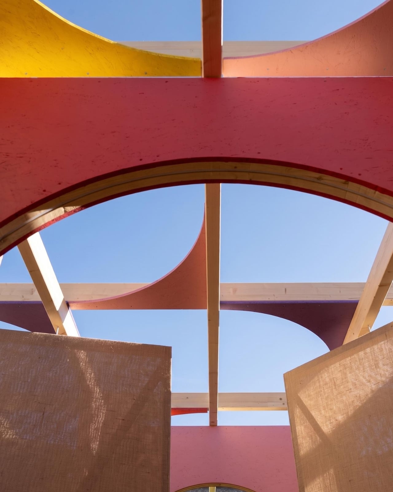
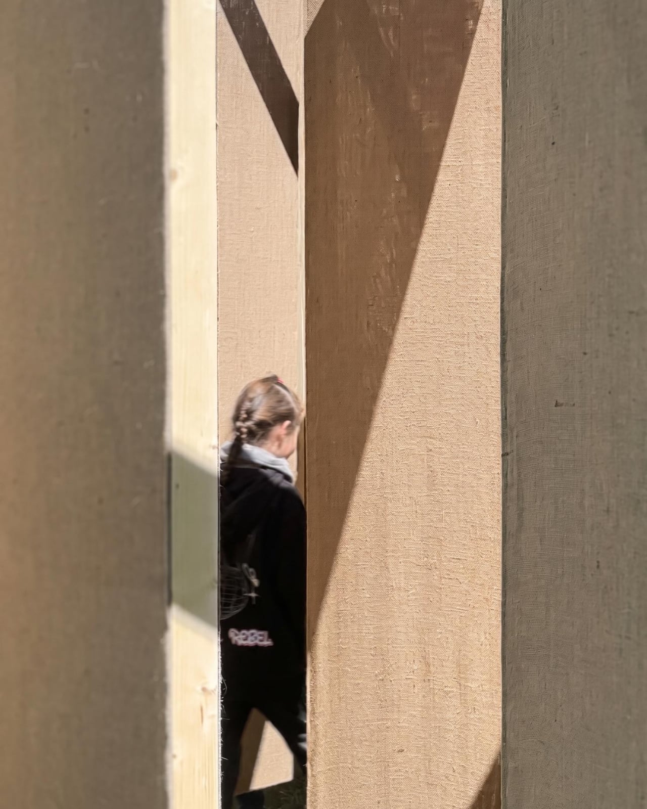
Studio Carraldo took that emotional texture and built a room out of it. Literally. DELULU is a walkable labyrinth constructed with jute fabric walls that shift, creating pathways that are never fully fixed. Visitors move through the space not knowing where the next turn leads, alternating between moments of solitude and unexpected encounters with other people. The whole experience sits somewhere between play and unease, which, when you think about it, is a pretty accurate description of where a lot of us are right now.
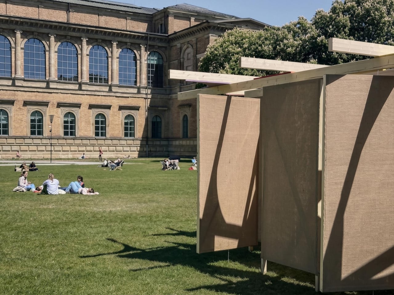
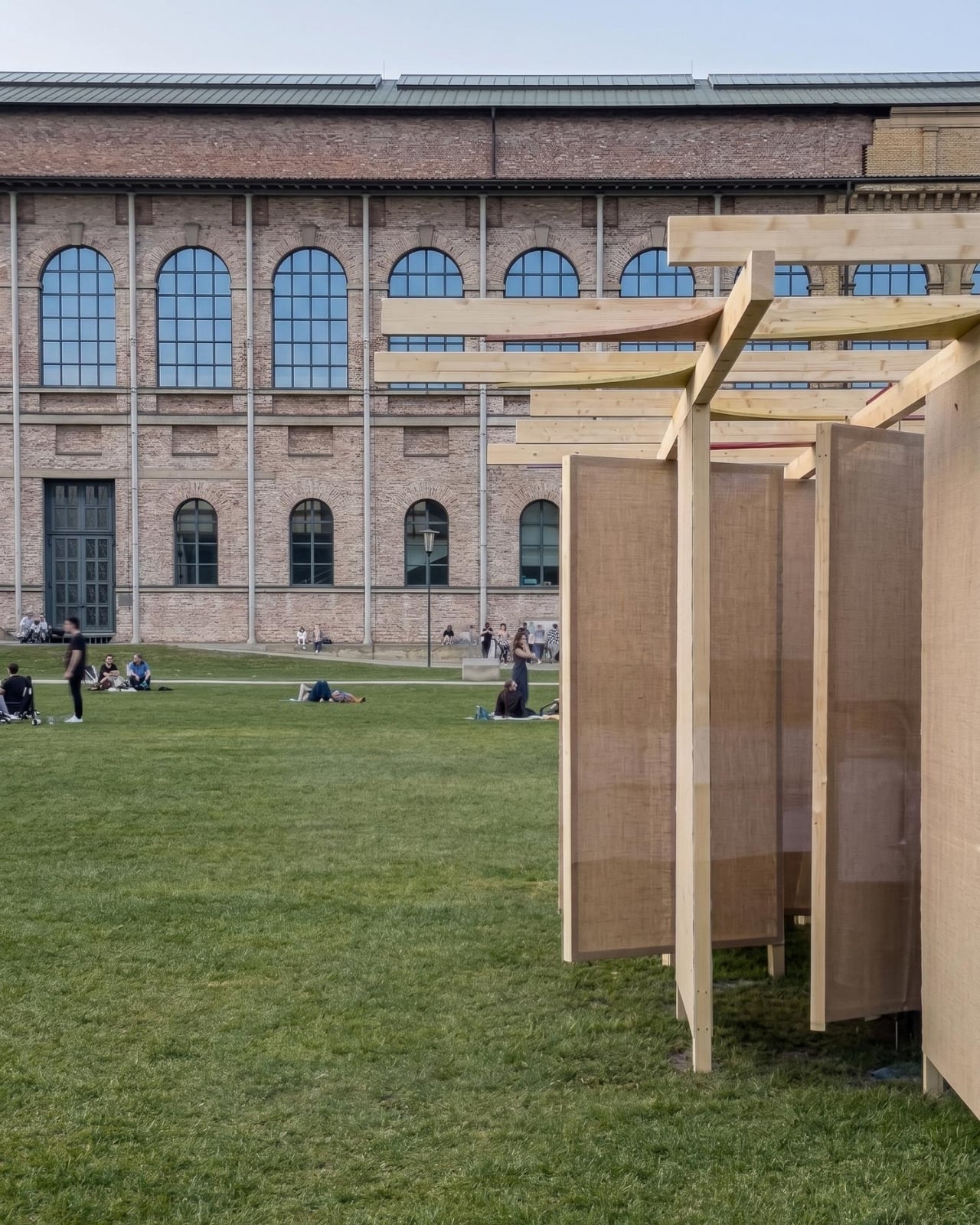
The installation was presented on the south lawn of the Alte Pinakothek during mcbw 2026, which ran under the theme “Playground of Possibilities.” That theme and DELULU make a good pair. The labyrinth isn’t a puzzle to be solved. It’s an experience to be had, and getting disoriented is built into the design on purpose. Studio Carraldo frames that disorientation not as a failure but as a creative opening, a moment where visitors stop navigating on autopilot and start paying attention.
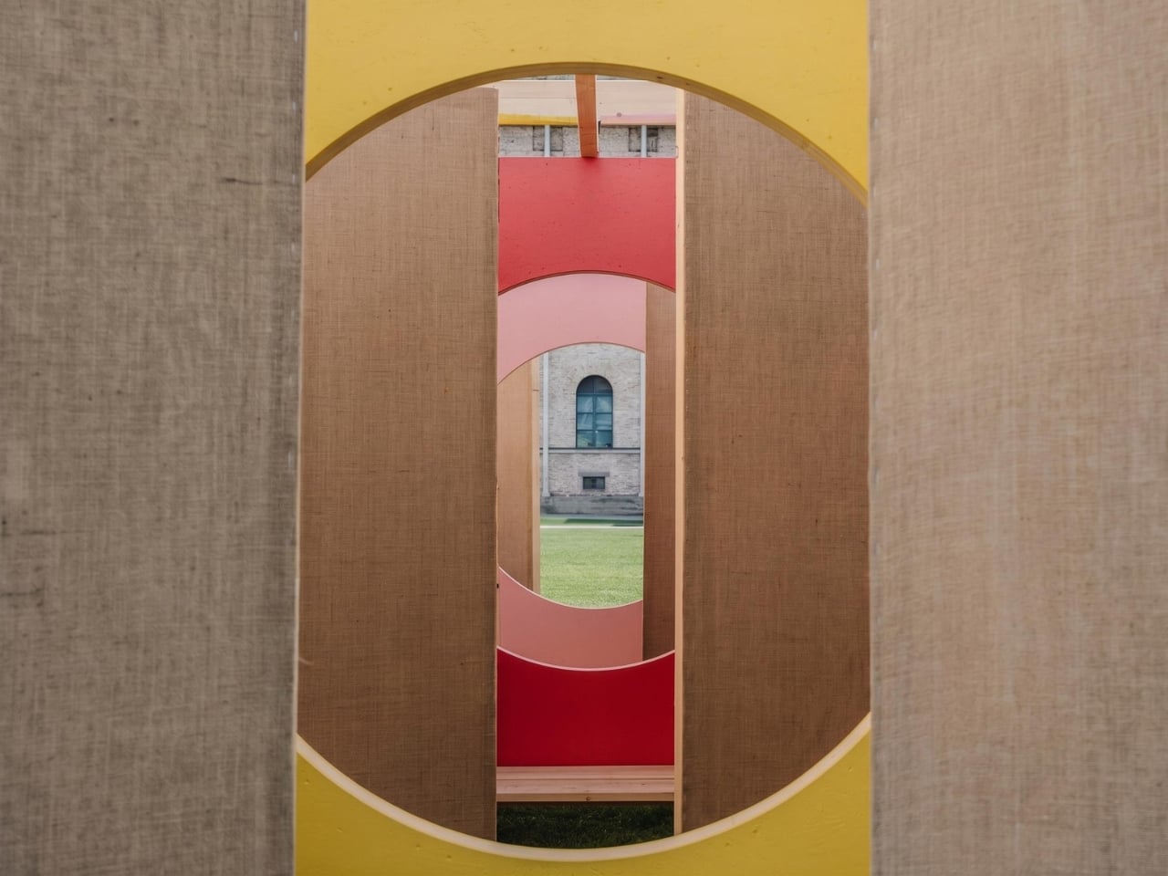
The conceptual backbone here draws on philosopher Timothy Morton’s idea of “hyperobjects,” phenomena so enormous and distributed that they’re essentially impossible to fully comprehend. Climate change is the canonical example. So is the internet. So is the feeling of collective dread that settles over many of us when we try to think clearly about the future. DELULU acknowledges that these things are too big to hold and asks what we do with ourselves inside that impossibility. The answer the installation seems to lean toward is: play. Not as avoidance, but as a way through.
That reframing matters. The word “delulu” works as slang partly because it acknowledges the absurdity of hoping hard in difficult circumstances while also refusing to give that hope up entirely. It’s coping, yes, but it’s coping with a kind of style and self-awareness. Studio Carraldo seems to find genuine value in that instinct, and the installation treats it with more respect than most commentary on Gen Z’s coping mechanisms bothers to.
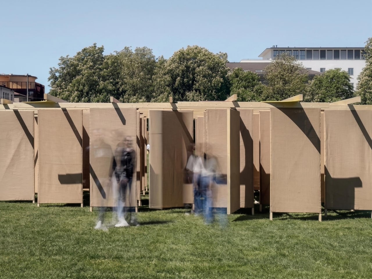
From a design perspective, the material choice of jute feels deliberate. It’s tactile, warm, and unpretentious. It doesn’t try to be sleek or futuristic. The walls don’t feel like technology. They feel like something you could touch and lean against, which makes the disorientation easier to sit with. A maze built from cold steel or glass would feel like a trap. One built from jute feels more like a shifting conversation.

The question the installation keeps circling, per Studio Carraldo’s own framing, is what it means to design responsibly when the context around you is uncertain and constantly changing. It’s a question the field is wrestling with broadly right now. DELULU doesn’t answer it. It does something more useful: it makes the question feel like a space you can actually inhabit for a while, wander around in, and maybe even enjoy. For a piece of work named after a word that started as an internet joke, that’s no small thing.
The post Studio Carraldo Built a Maze Out of a Gen Z Joke first appeared on Yanko Design.
The Lamp That Nine Artisans Built by Hand

Most lamps disappear into a room. They’re functional, fine, forgettable. The new collection from Taiwan-Lantern, shown this week at ICFF during NYCxDESIGN in New York, does the opposite. These are lamps you stop in front of. Lamps you study. Objects that reward attention the longer you give them.

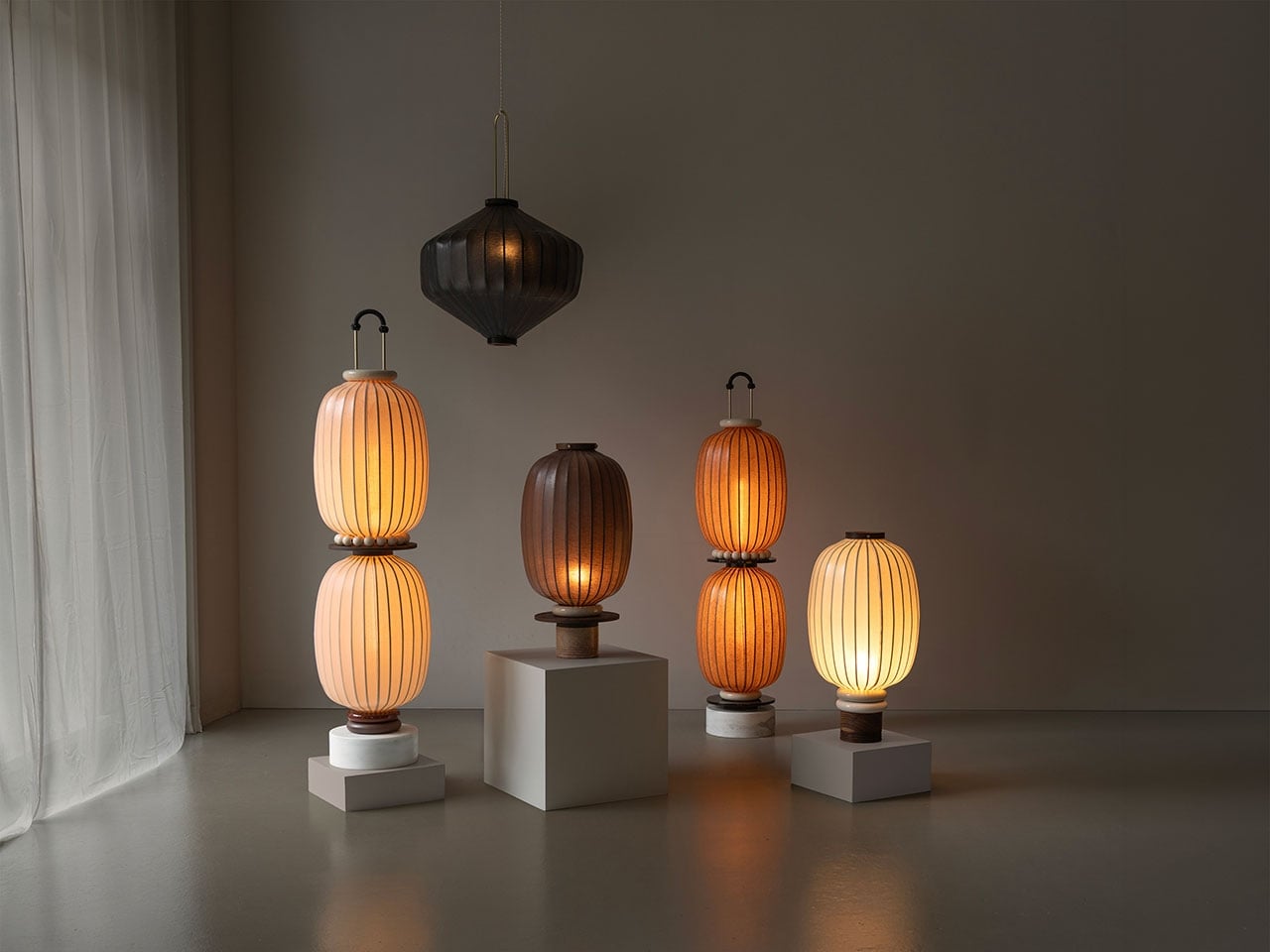
The Amsterdam-based studio, founded by Pei-Ching Hsiao and Jean-Marc Daniëls, brought a floor and table lantern collection to Booth 843 at the Javits Center, and the visual logic of each piece is genuinely worth unpacking. The forms pull directly from the traditional East Asian paper lantern, that familiar oval body stretched over a bamboo frame, but what the studio has done with that starting point is where it gets interesting.

Designer: Taiwan-Lantern

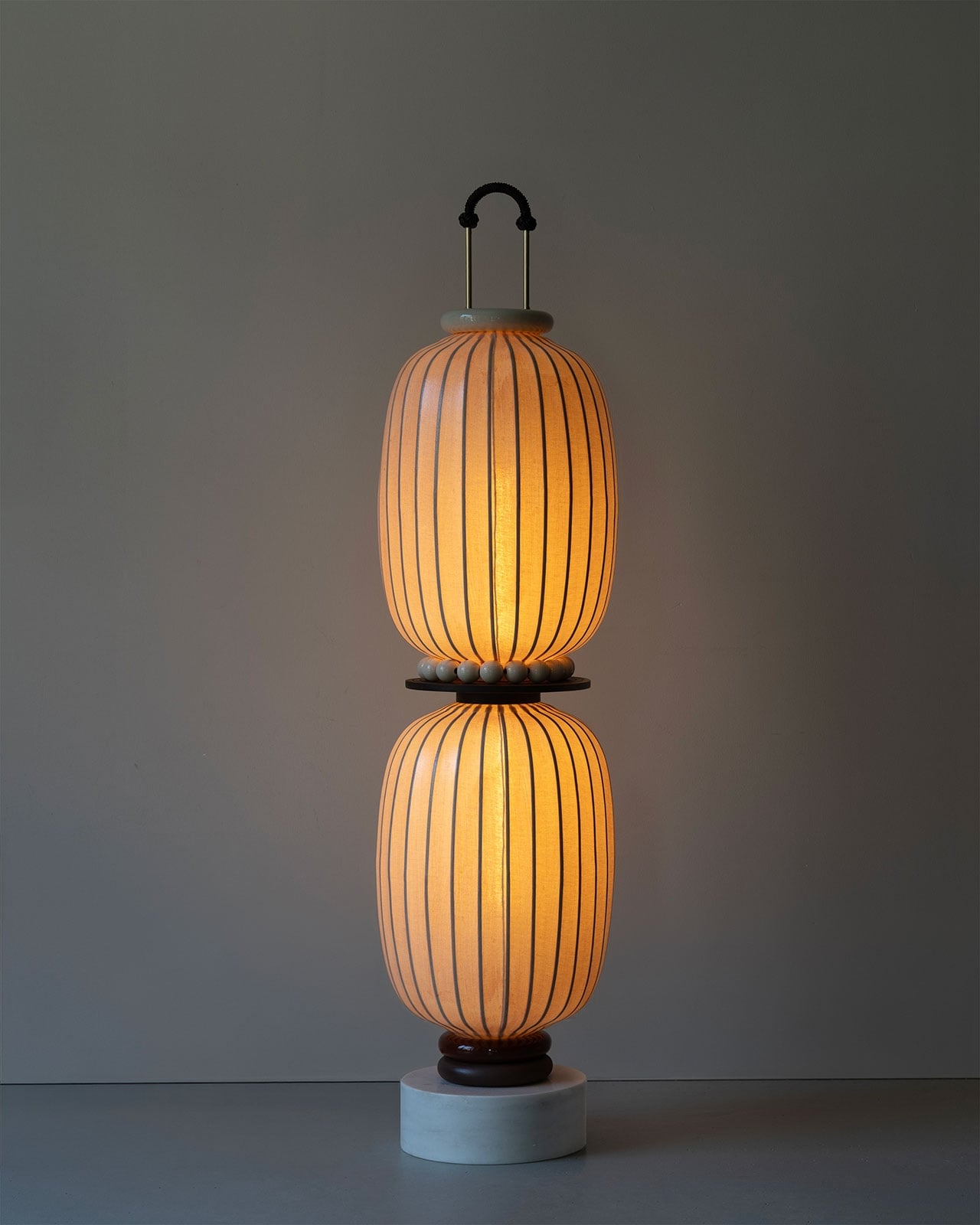
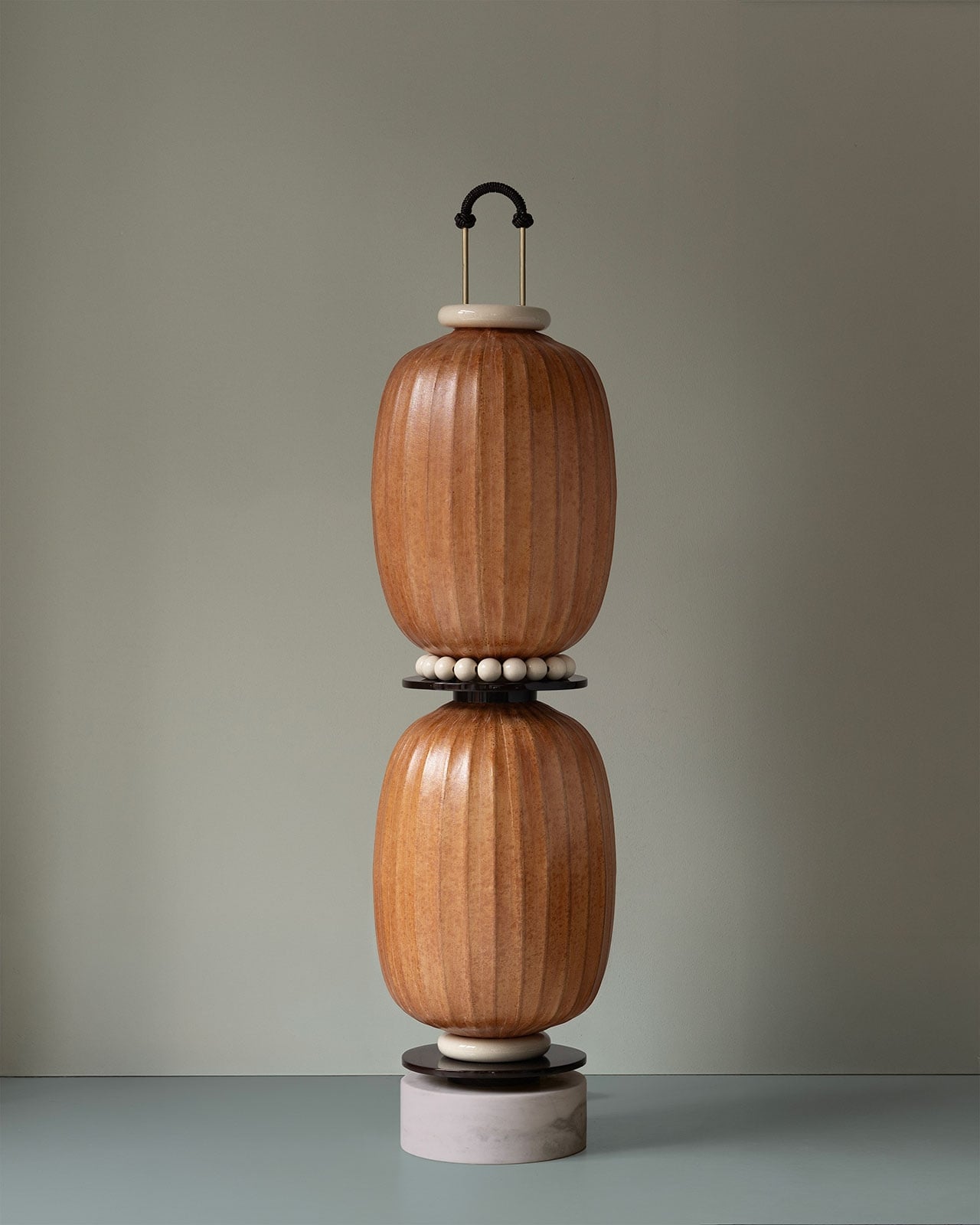
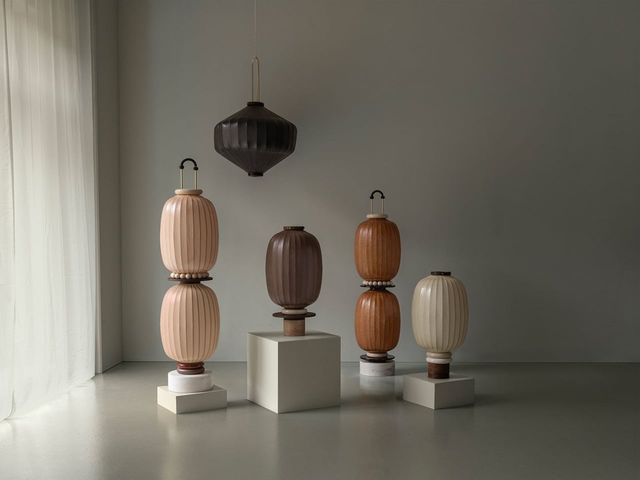
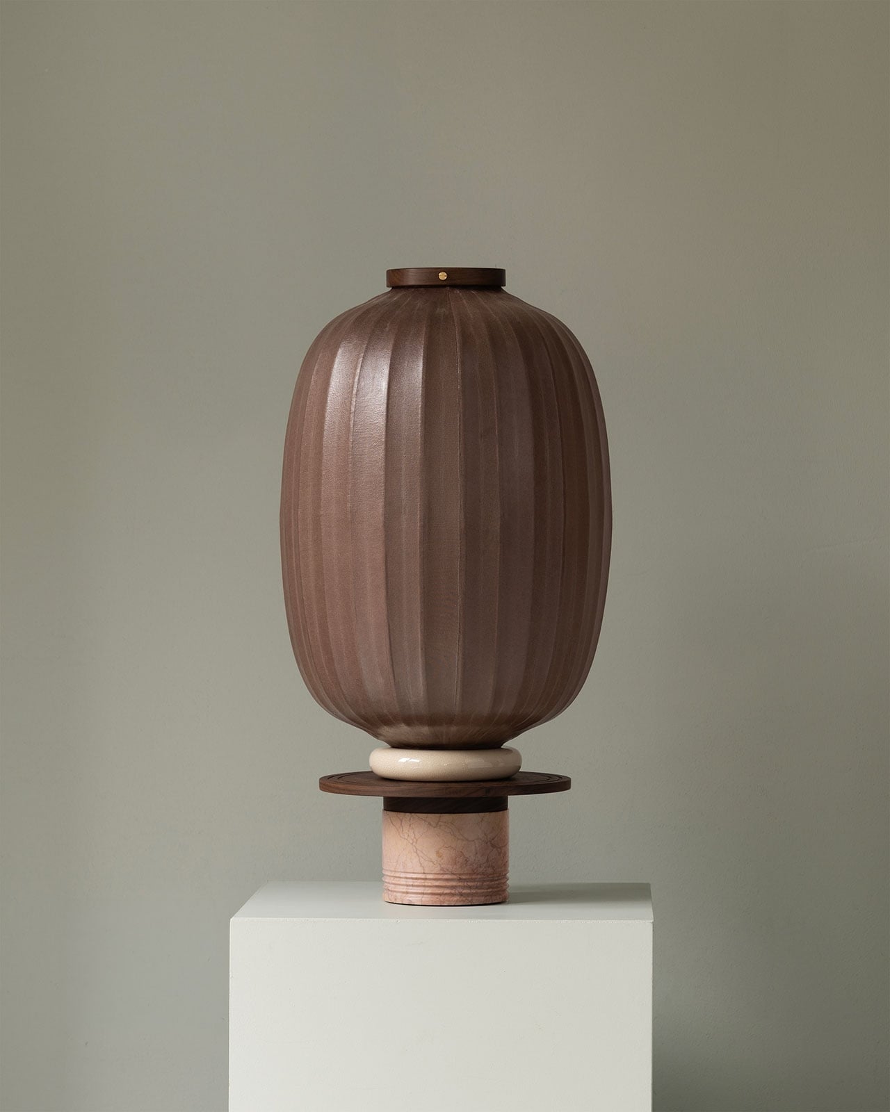
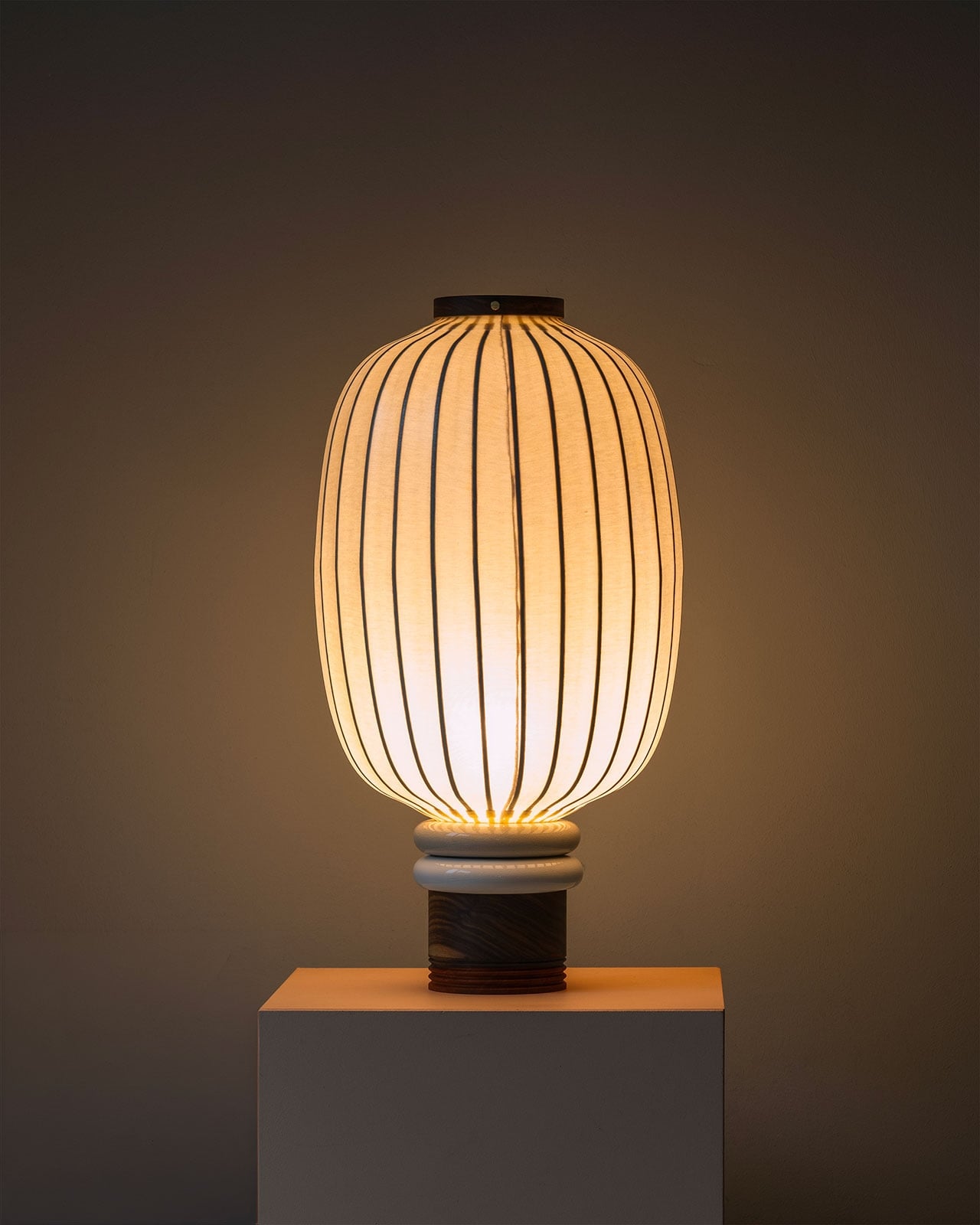
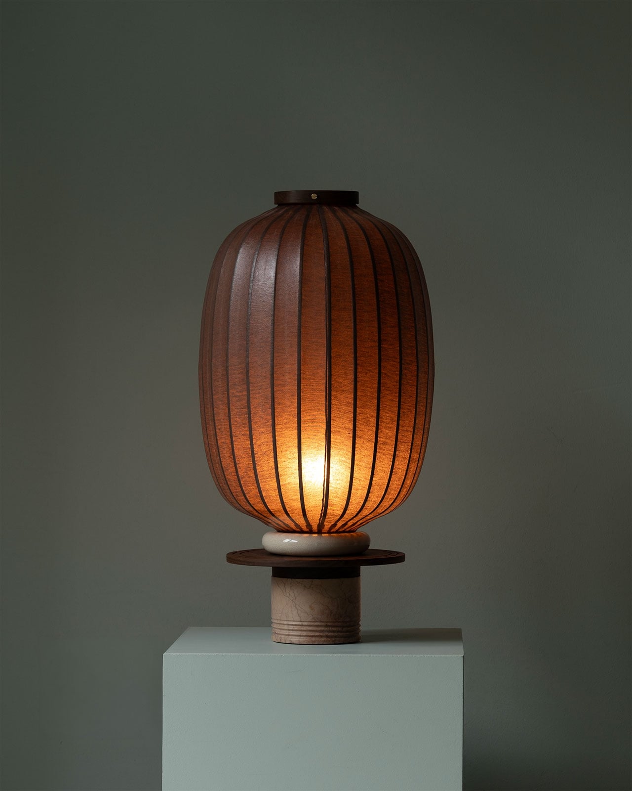
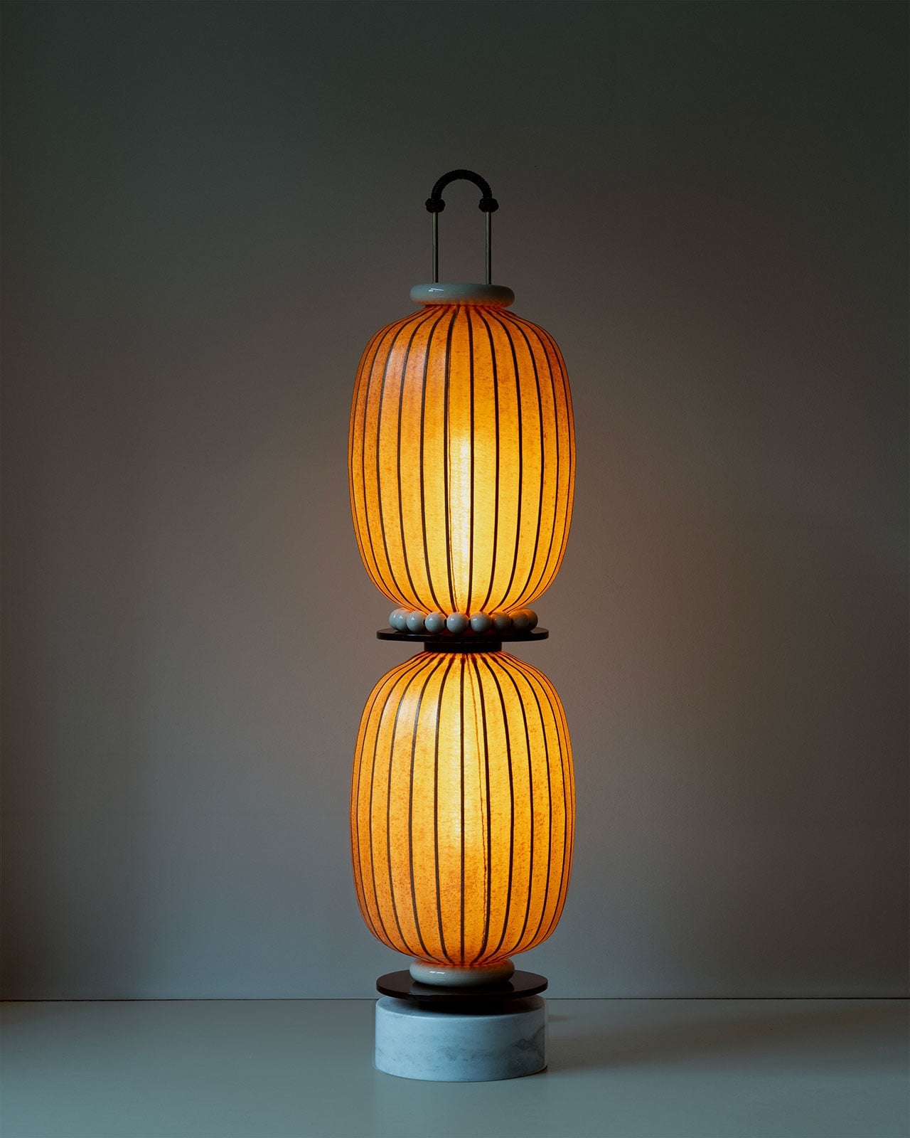
The lantern bodies themselves are pleated fabric pulled taut over a ribbed structure, with vertical seams running from crown to base like meridian lines on a globe. Unlit, the forms are sculptural and matte, almost ceramic in feeling, which is part of what makes them so surprising when the light comes on. The fabric glows from within, casting a warm amber that bleeds between each rib and throws thin lines of shadow onto the floor below. It’s the kind of light that changes a room’s entire temperature without a dimmer switch.

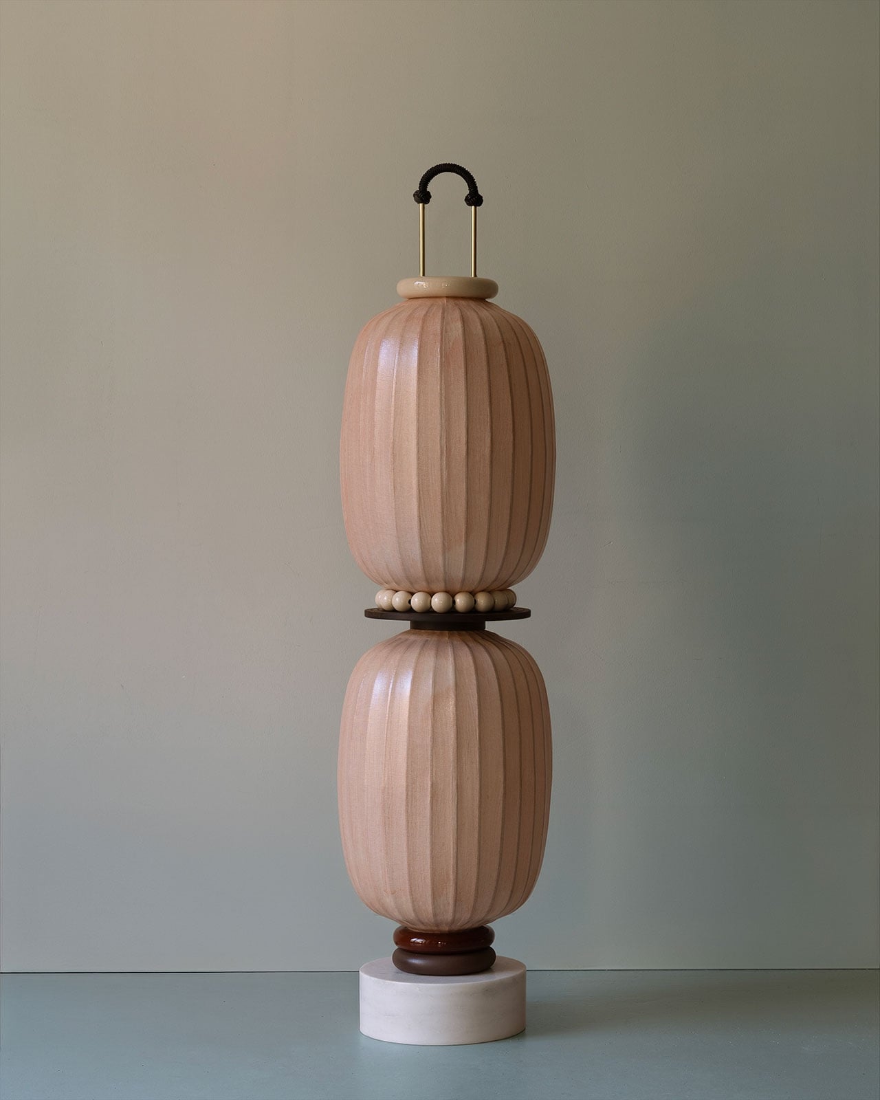
The floor lamps take this further by stacking two of these oval forms vertically, separated by a collar of small hand-strung beads, pale or dark depending on the colorway. The overall silhouette is monumental and a little totemic, tall enough to feel architectural, grounded enough to feel domestic. A round marble disc sits at the very base, and a dark wooden platform separates the stone from the lantern body above it. At the top, a small ceramic collar and a brass arch handle, finished with a hand-knotted rope loop, completes the form. Each of those transitions between materials is considered. Nothing gaps. Nothing looks like an afterthought.

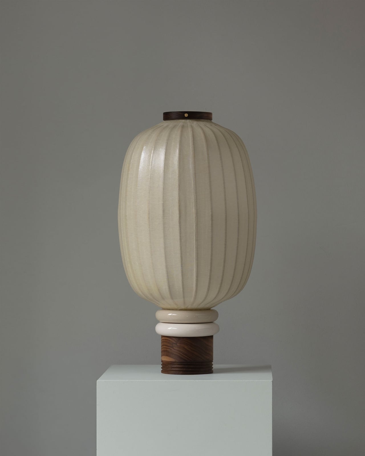
The table lamps are a single lantern body on the same layered base construction: marble cylinder, wooden disc, ceramic ring, all stacked in sequence before the lantern begins. Seen in the cooler, dark photography with light on, the table lamp version becomes something else entirely. The fabric blazes orange-amber, the ribs define themselves sharply, and the base grounds it with the coolness of stone and lacquered wood. The contrast between the glowing body and the inert base is the design’s central tension, and it holds.

The color palette is restrained and precise. Pale pink Huo and terra cotta Tu are the named hues for the Lotus Charm floor lantern, but the full collection also includes a deep chocolate brown and an off-white cream that reads almost bone in natural light. These aren’t trendy colors. They’re earth tones in the truest sense, rooted in the Wu Xing framework of the five elements that informs the studio’s design philosophy. The naming isn’t decorative. It’s structural.

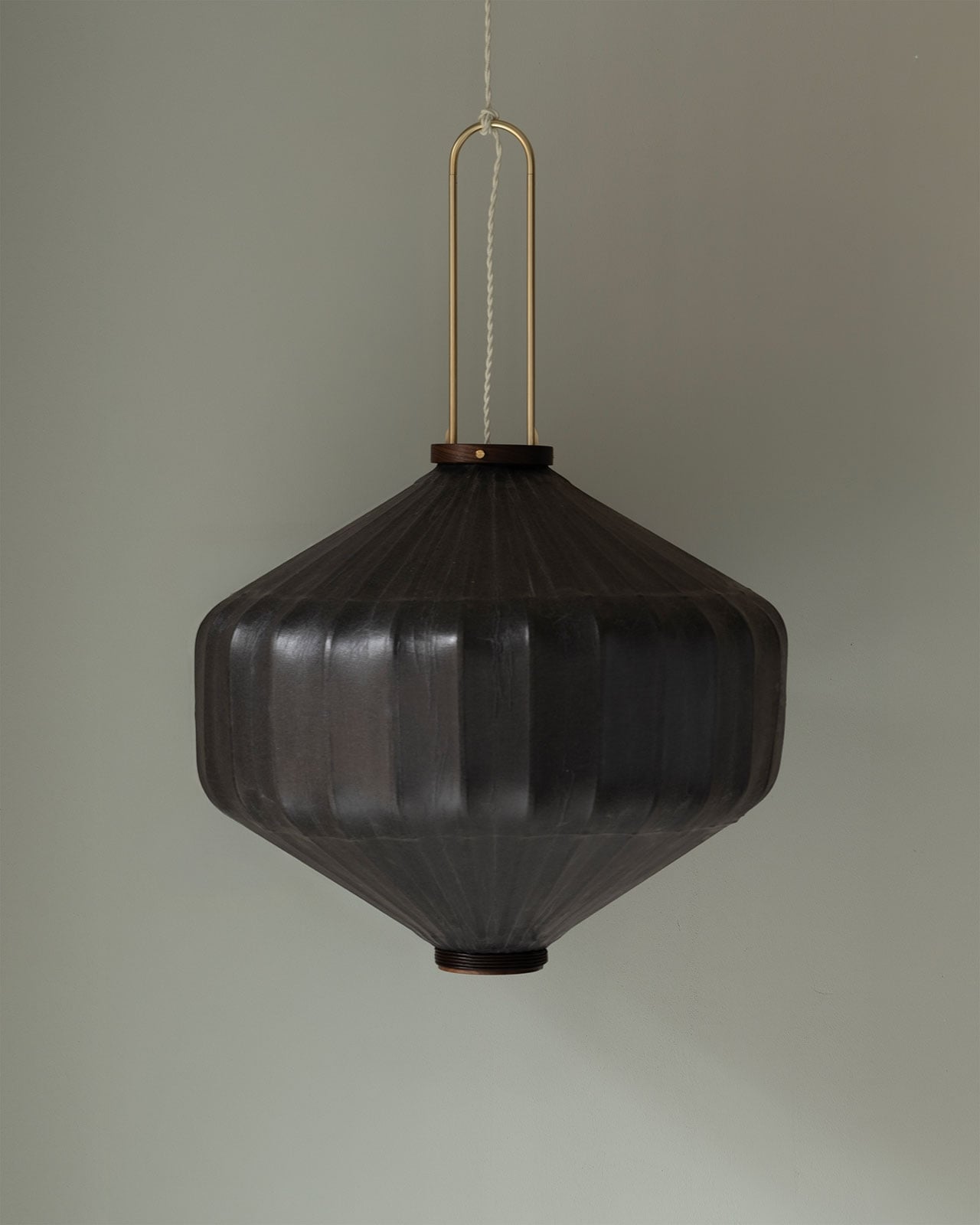
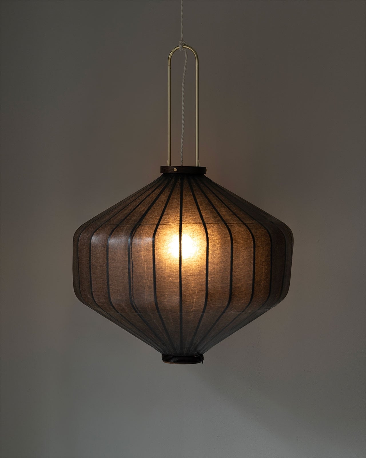
The pendant lamp is worth separate attention because it behaves differently from everything else in the collection. Rather than the soft oval, it takes a compressed diamond shape, wider at the middle and tapering to neat points at top and bottom. The fabric is a much darker, denser weave, almost charcoal, so the light it produces is intimate and filtered rather than openly warm. A brass U-shaped arch suspends it with a clean, modern hardware logic that sits at an interesting remove from the more ornate treatment of the floor lamps. It’s the cooler, quieter cousin in the room, and it earns its place.

Nine artisans contribute to each piece, working across bamboo, lacquer, natural dyeing, stone, porcelain, and Chinese knotting. That number shows. Not in any busy or demonstrative way, but in the specific quality of objects where every transition between materials is resolved and every surface has been touched with purpose. In a design market that rewards speed and volume, that level of attention to a single object is increasingly rare, and immediately perceptible. Taiwan-Lantern’s collection isn’t trying to reinvent the lamp. It’s trying to make one that’s worth keeping.

The post The Lamp That Nine Artisans Built by Hand first appeared on Yanko Design.

An Iranian Villa Built Around Architecture’s Oldest Shape

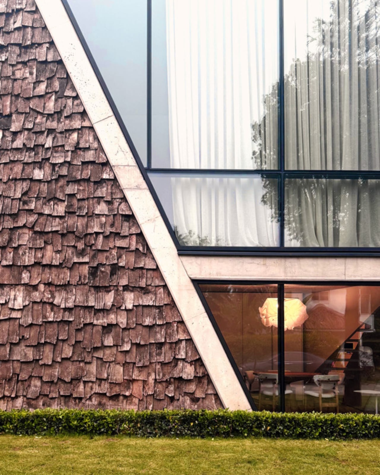
The gabled roof is one of the oldest tricks in architecture’s playbook. Pitched, familiar, and about as dramatic as a grammar school diagram, it’s the shape children draw when they first sketch a house. But Alireza Taghaboni of Tehran-based Next Office has done something rare with it: he made it interesting again.

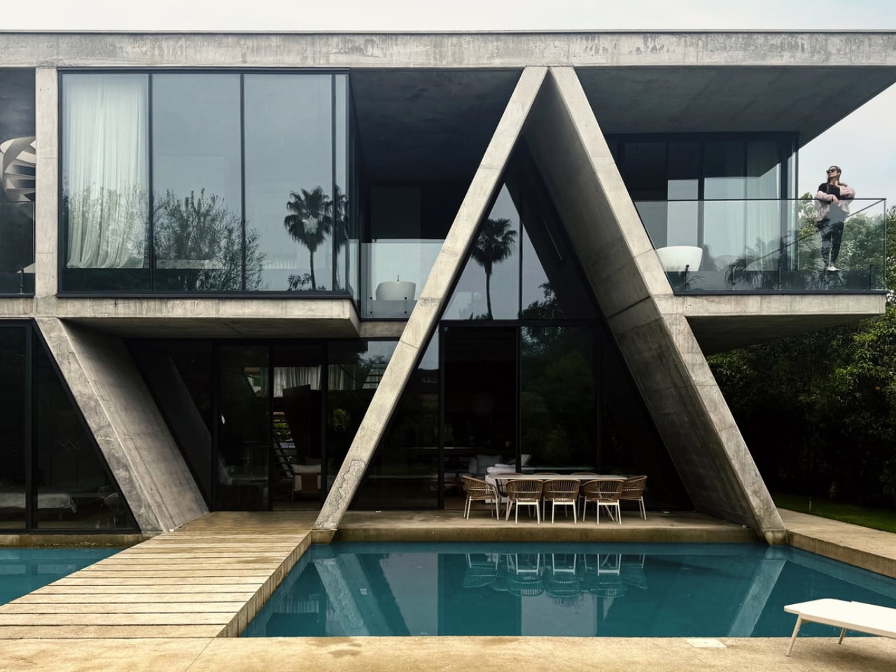
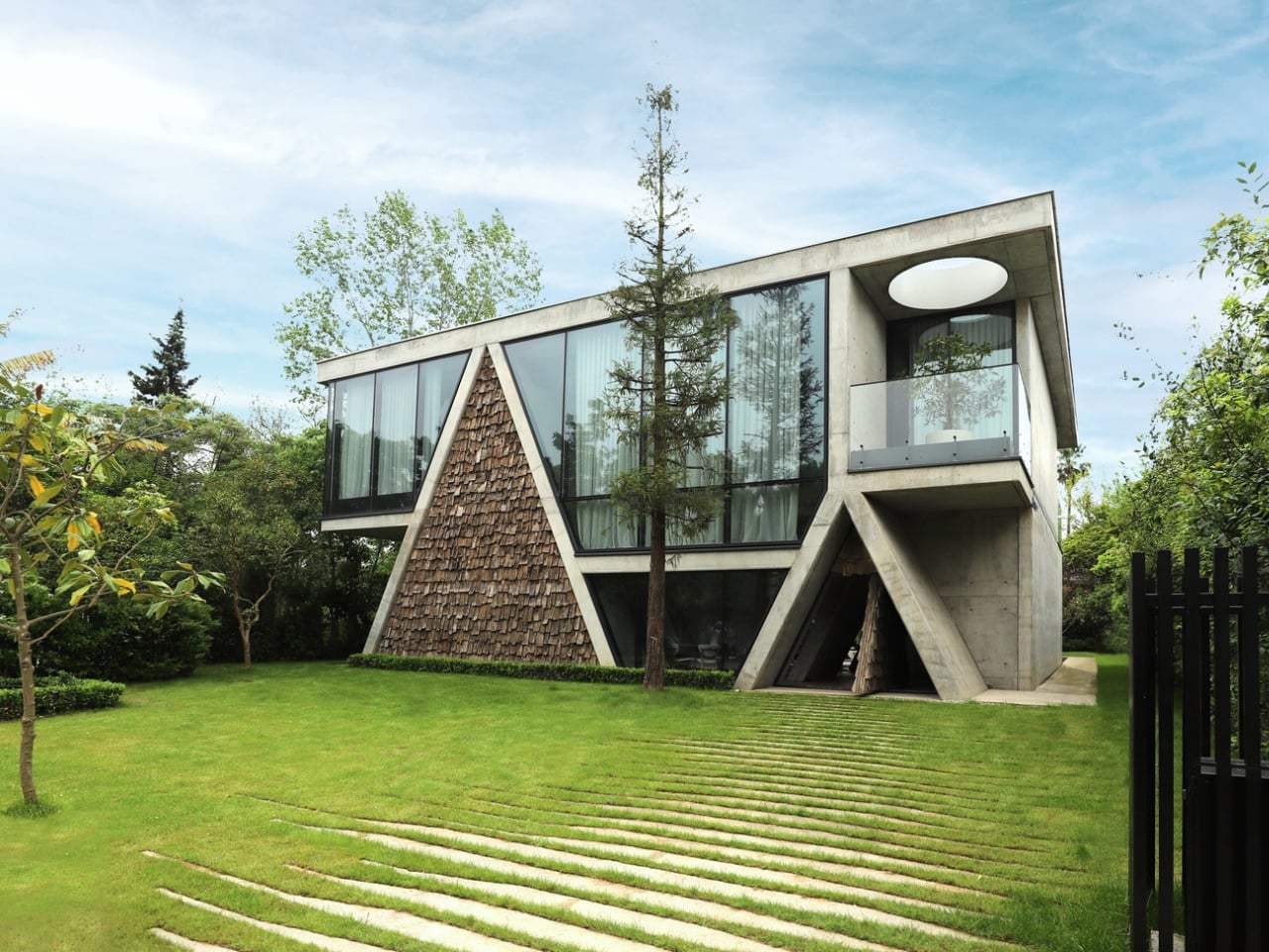
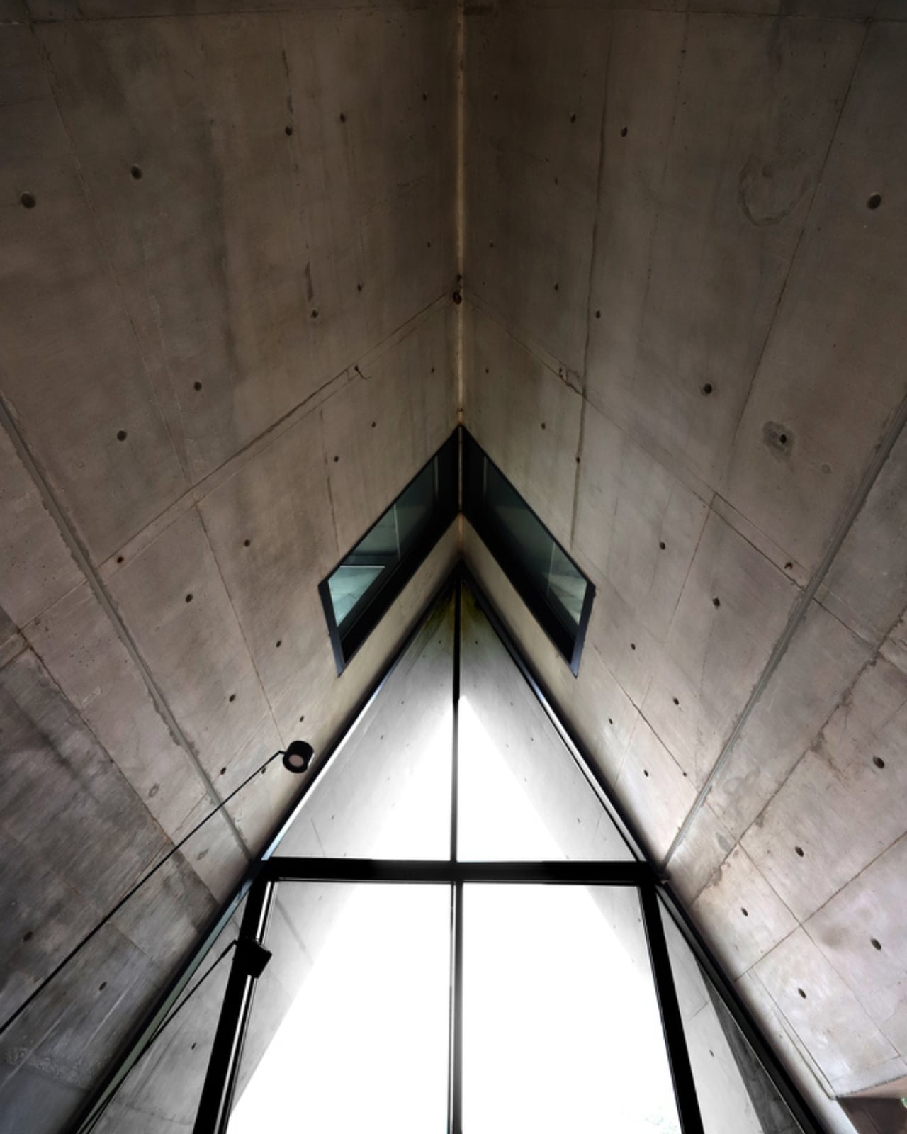
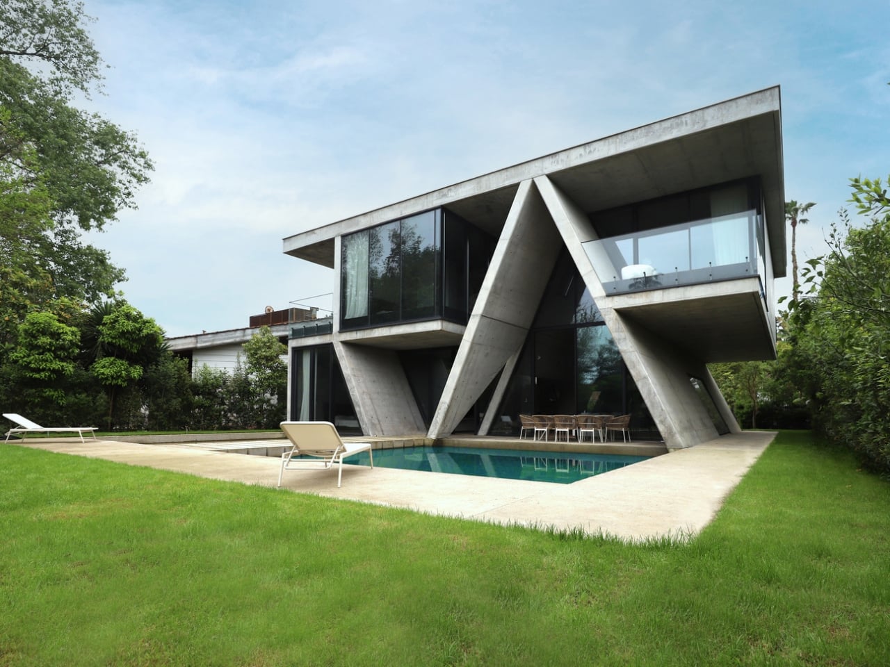
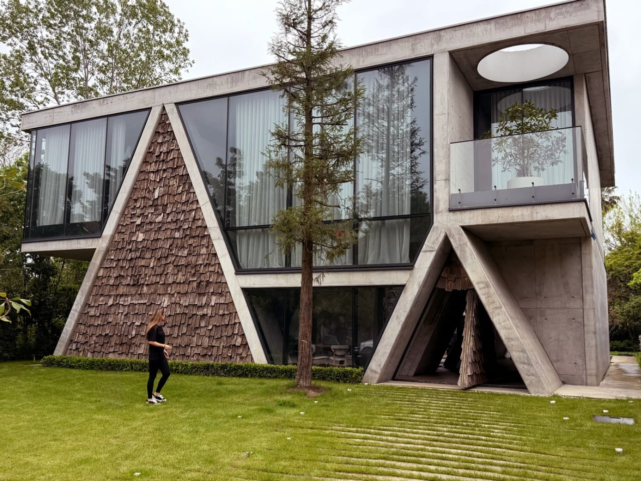
The Gable Villa, completed in 2025 in Royan, a coastal city in northern Iran, is the kind of project that looks obvious at first glance and quietly revelatory the longer you sit with it. Royan sits near the Caspian Sea, and like much of Iran’s northern region, its traditional architecture has always leaned into the pitched roof as a direct response to heavy seasonal rainfall. This isn’t a decorative choice or a nostalgic one. It’s climate-driven, practical, and centuries old. What Taghaboni does is take that deeply familiar slope and push it into conversation with the hard orthogonal language of contemporary architecture, and the result is genuinely compelling.

Designer: Next Office–Alireza Taghaboni (photos by Ehsan Ahani)

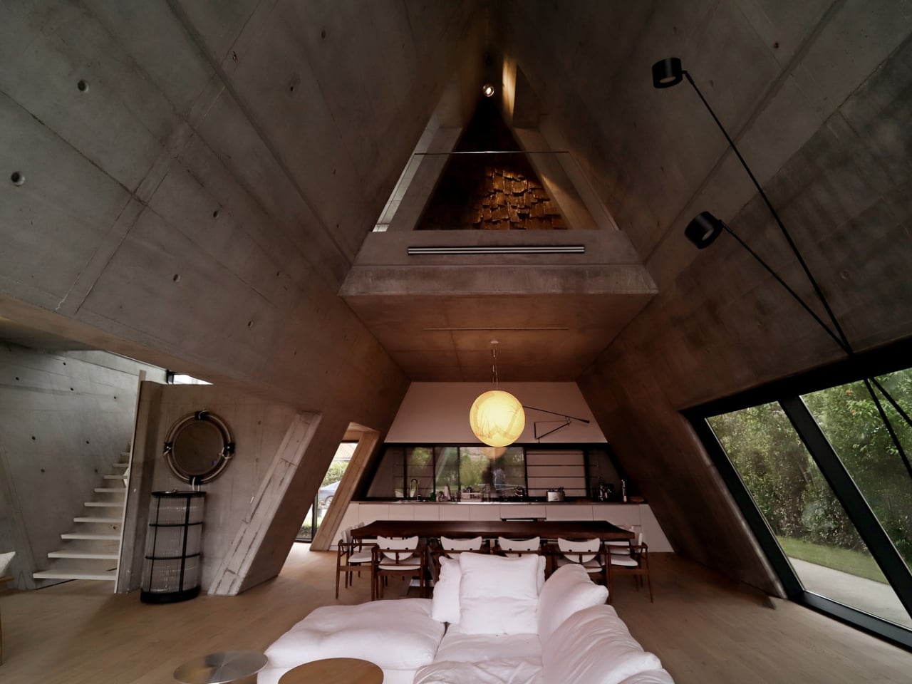
The design concept is built around hybridization: an inclined structure, reminiscent of the region’s vernacular buildings, fused with a right-angled framework. On paper, that might sound like an architectural compromise, the kind of thing that slides into awkward pastiche. It doesn’t. The collision of the two forms creates interior spaces that feel both grounded and unexpected. The inclined volume doesn’t just define the exterior silhouette; it reshapes the interior experience entirely. Rooms feel taller where the ridge runs and more intimate where the slope pulls low, creating a natural hierarchy of space without needing extra walls to do the organizing. The geometry does the emotional heavy lifting.

Next Office, which Taghaboni founded in 2009, has built its reputation on exactly this kind of thinking. The studio’s work consistently returns to one core tension: how do you build something deeply contemporary in a country with one of the most layered architectural traditions on the planet? The Sharifi-ha House, perhaps the firm’s most internationally recognized project, explored flexibility and movement through rotating rooms that could open or close depending on the season. The Gable Villa is quieter than that, less theatrical, but no less considered. It’s a more mature move, one that doesn’t need to show its mechanism to make its point.

What strikes me about the Gable Villa is how unapologetically local it is. At a time when globalized architecture tends to iron out regional character in favor of a universally recognizable aesthetic, this project leans hard into where it is. Royan’s vernacular DNA isn’t applied as surface decoration; it’s baked into the structural logic of the building itself. That’s a meaningful distinction. Taghaboni isn’t borrowing visual language from tradition, he’s inheriting the reasoning behind it and rewriting it in a contemporary register.

The photography by Ehsan Ahani captures the project with a stillness that suits it. The villa simply isn’t competing for attention. It sits in its landscape with a kind of confidence that comes from knowing exactly what it is and what it’s trying to do. The light plays differently across the gabled form than it would over a flat roof, and you feel that in the images even before you fully process why.

For anyone who follows contemporary architecture, the Gable Villa is a reminder of why regional architecture, done with intelligence and rigor, still carries a weight that purely international work sometimes loses. Architecture has spent decades flattening itself into a single global style, and you can feel the cost of that. It’s also a reminder that the most familiar forms, the gable, the pitched roof, the shape of the house your four-year-old self drew with a crayon, still hold enormous untapped potential in the right hands.

Taghaboni and Next Office are clearly worth watching. Not because they’re doing the loudest work, but because they’re doing work that rewards attention. The Gable Villa is exactly that kind of building: patient, purposeful, and quietly smarter than it looks.

The post An Iranian Villa Built Around Architecture’s Oldest Shape first appeared on Yanko Design.
A 3D-Printed Lamp That Finally Makes Sustainability Look Great

Most lamps do one thing. They sit on your desk, light your space, and get buried under the slow-moving chaos of charger cables and forgotten receipts. The Drop Light by Teixeira Design Studio doesn’t just resist that fate; it anticipates it.

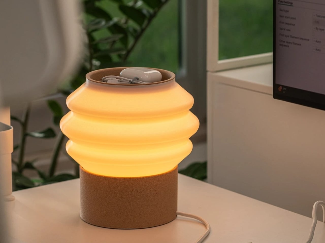
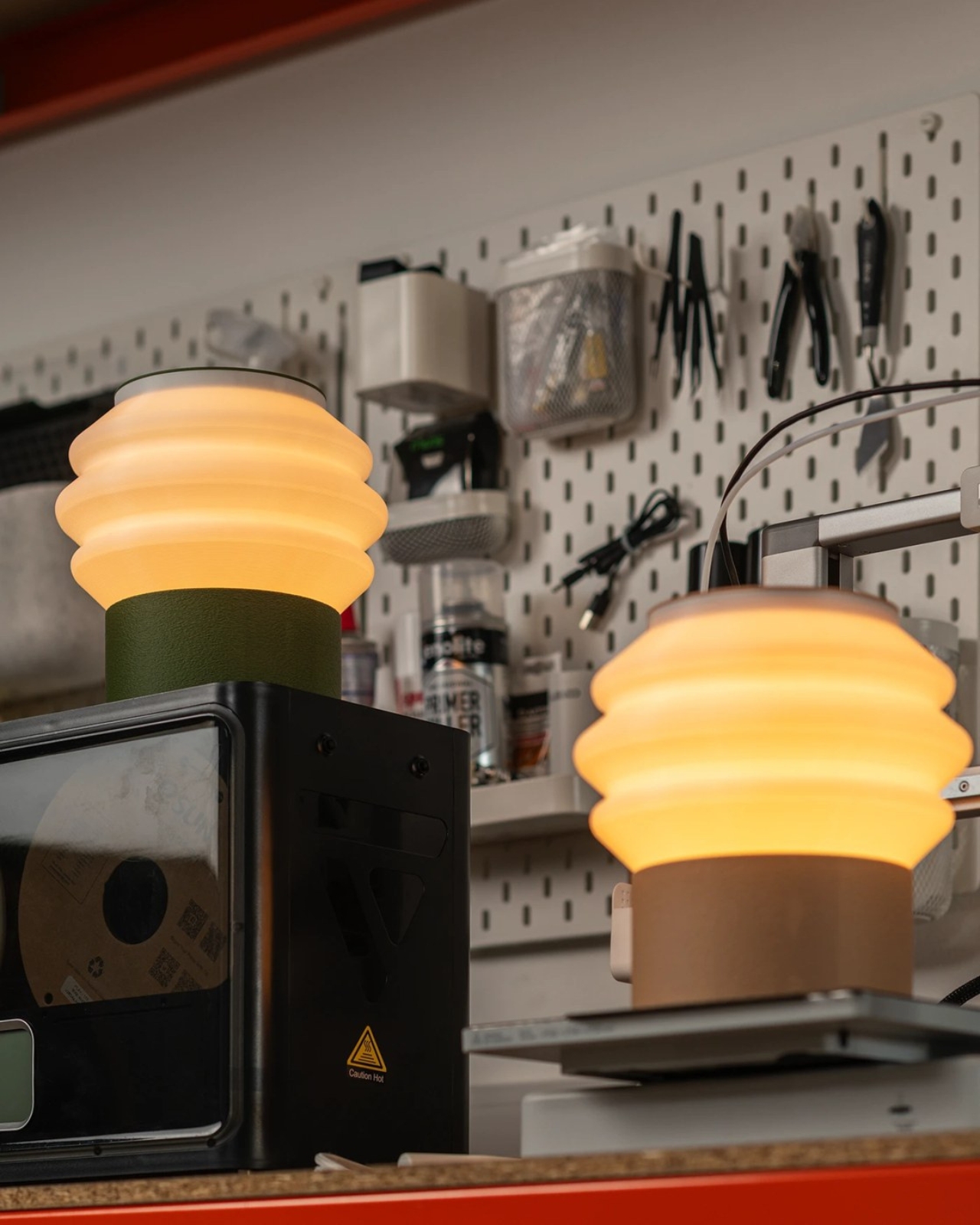
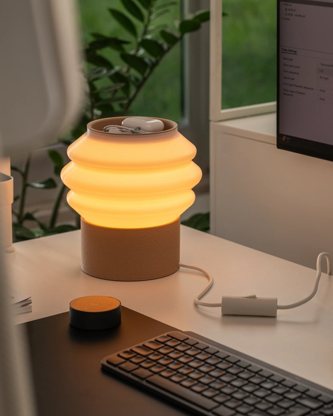
The lamp is 3D printed entirely from recycled, plant-based PLA, designed in collaboration with Oftwise Studio. It’s a desk lamp with a built-in tray at the base that holds the usual suspects: pen drives, earphones, that one charging cable you’re always looking for. The storage isn’t an afterthought bolted onto a design that already existed. It’s baked into the silhouette from the start, which is a distinction I wish more designers paid attention to.

Designer: Teixeira Design Studio

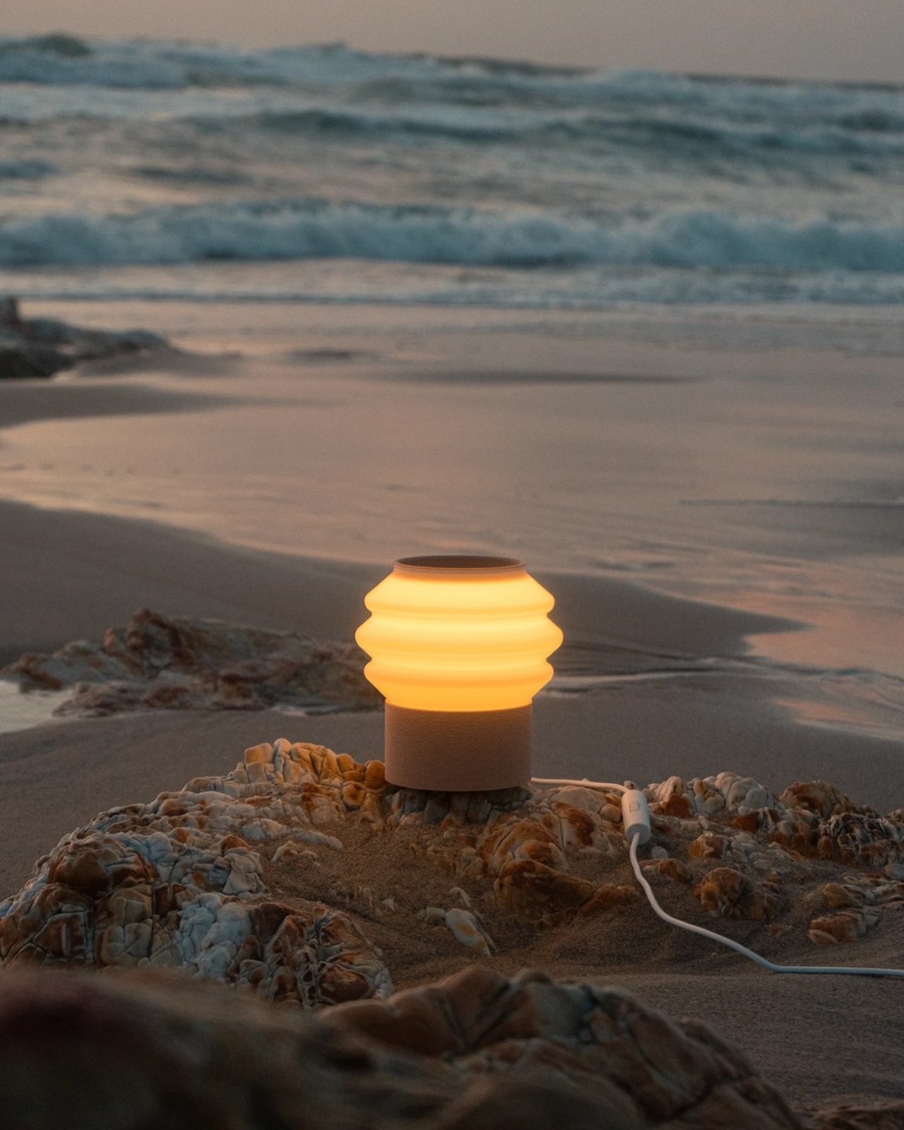
What makes the Drop Light genuinely interesting isn’t just the function-forward thinking, although that’s a big part of it. It’s the way the material actually drives the design. The base and top tray carry a fuzzy, matte PLA texture that’s scratch-resistant and tactile, almost soft to look at. The shade is printed smooth and semi-translucent, scattering light evenly without showing you the bulb. Two completely different surface behaviors, one material, one object.

That contrast between matte and diffuse isn’t just visual. It communicates function before you even plug anything in. You know instinctively where to rest your things and where the light comes from, and nothing about that has to be labeled or explained. Good design, in my opinion, should always work like that. The object tells you what it needs from you before you ask.

I’ve seen a lot of “sustainable” product design that feels more like an excuse than a commitment. Recycled materials get used in ways that look recycled. Rough edges, uneven finishes, a vague suggestion that the environmental good will outweigh the aesthetic compromise. Drop Light doesn’t do that. The layered build lines from the printing process are barely visible under the fuzzy texture, reading as intentional surface detail rather than manufacturing artifact. It looks fabricated, deliberate, finished. The plant-based PLA carries a warmth that petroleum-based plastics simply don’t, and the design leans into that warmth rather than trying to disguise it.

This is also where 3D printing, as a production method, starts to become genuinely exciting for everyday objects. For a long time, additive manufacturing lived almost entirely in the prototyping world. You used it to test a form before committing to injection molding. Drop Light is part of a growing wave of products that treat 3D printing as the final destination, not a stepping stone to something else. The result is a lamp that looks like it was designed to be made this way, not like it was designed for a factory and then adapted.

Teixeira Design Studio has done this kind of work before. Their Fold luminaire, also 3D printed, tackled the challenge of combining task and mood lighting into a single form. The studio seems genuinely interested in what the process makes possible, rather than just using it for the sustainability talking points. That consistency matters. It’s the difference between a design practice and a design trend.

Is Drop Light for everyone? Probably not. Minimalist in its silhouette, muted in its palette, it rewards people who appreciate restraint. If you’re someone who wants your lamp to announce itself, this isn’t it. But if you’re drawn to objects that feel considered, that do more than one thing without trying to look like they do, the Drop Light hits a note that a lot of current lighting design misses completely.

We talk a lot about what sustainable design could be, and not nearly enough about what it actually looks like when it works. This lamp is a solid answer to that question. Not a perfect one, but a convincing one, and sometimes that’s exactly what the conversation needs.

The post A 3D-Printed Lamp That Finally Makes Sustainability Look Great first appeared on Yanko Design.
Herman Miller Finally Built a Gaming Desk That Matches Its Chairs

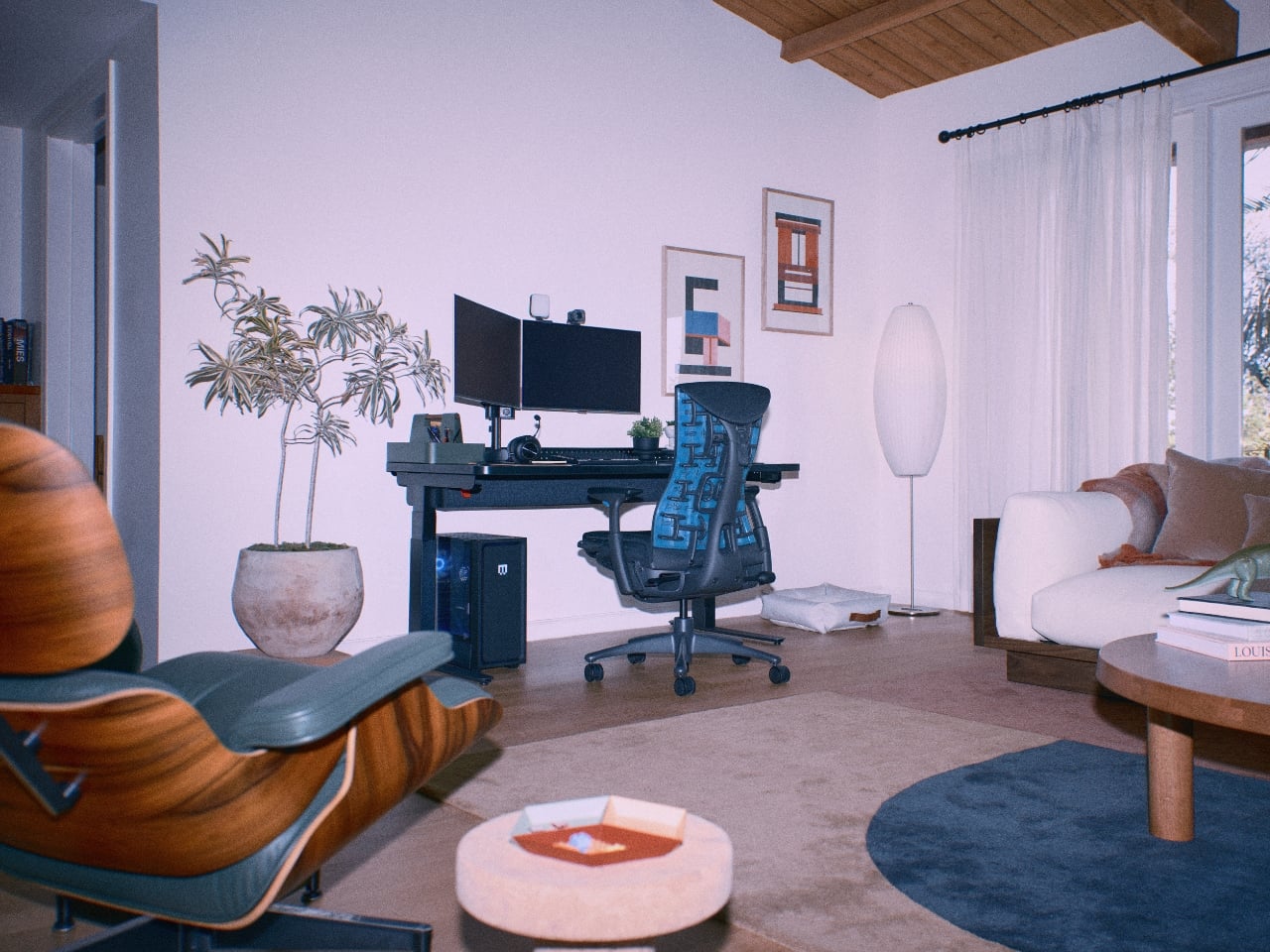
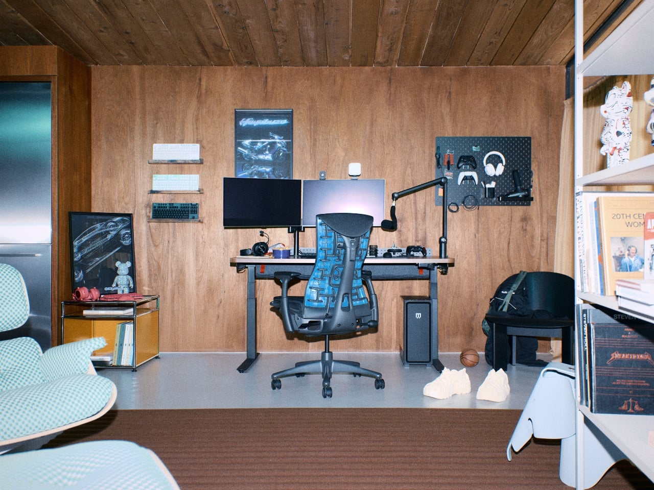
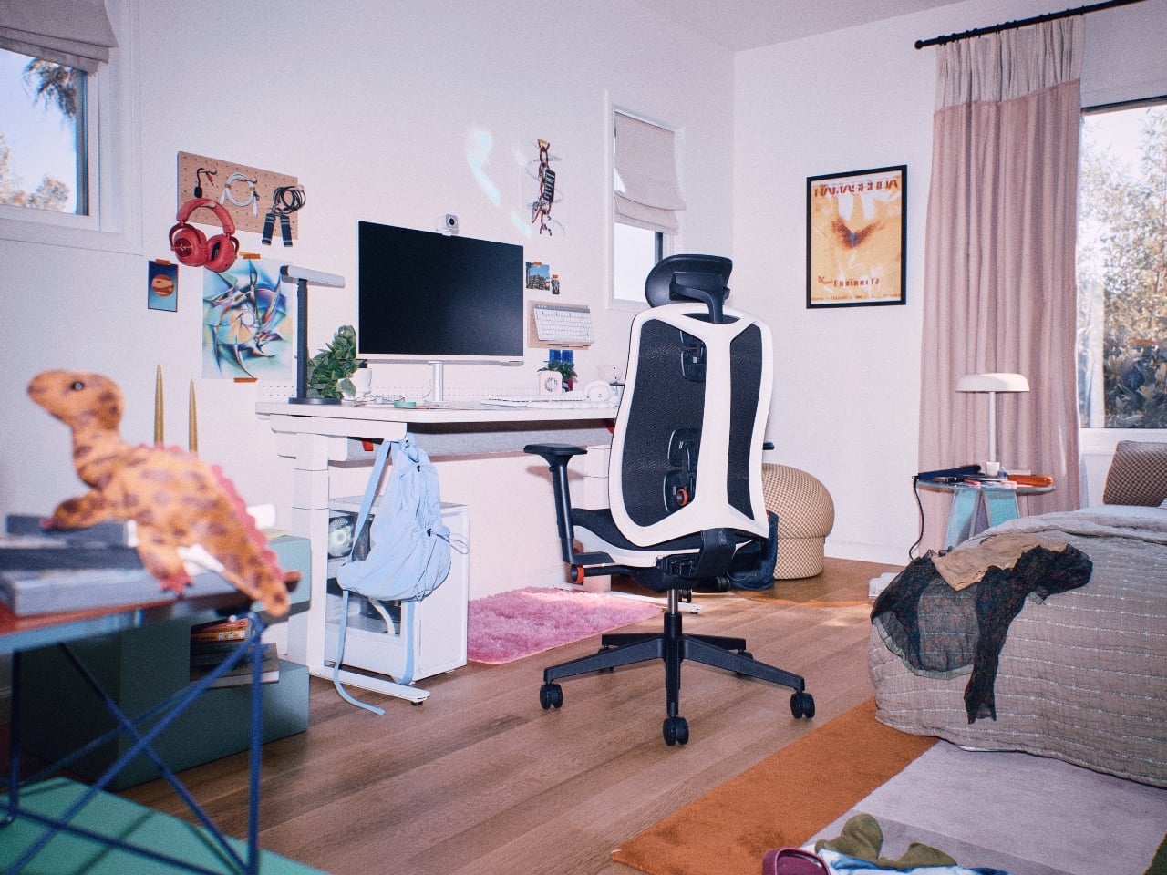
If you’ve ever spent real money on a Herman Miller chair, you know the particular satisfaction that comes with it. It’s not just the lumbar support or the breathable mesh. It’s the feeling that someone actually thought hard about how you sit, and then engineered accordingly. That philosophy is exactly what’s been missing from the gaming desk category for years, and now Herman Miller has stepped in to fill the gap with the Coyl Gaming Desk.

The Coyl is the brand’s first desk built specifically for gamers, which is a little surprising considering Herman Miller Gaming has been around since 2020. Better late than polished, I suppose. But after seeing what they’ve put together, it’s clear they spent that time observing how people actually use their spaces, rather than just rushing to market with something forgettable.

Designer: Herman Miller

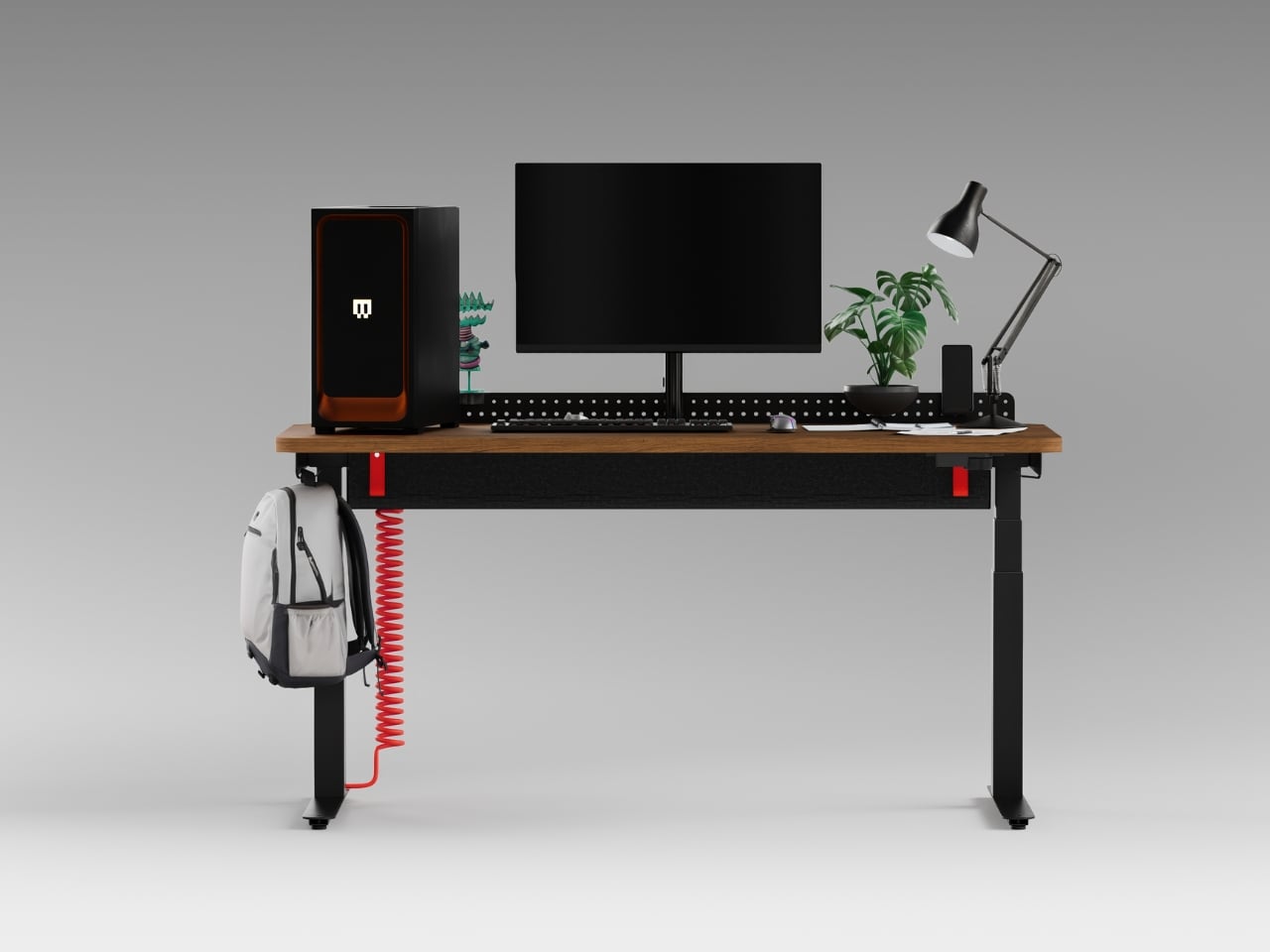
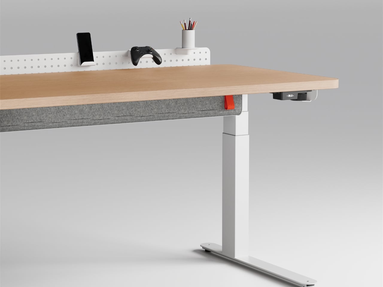
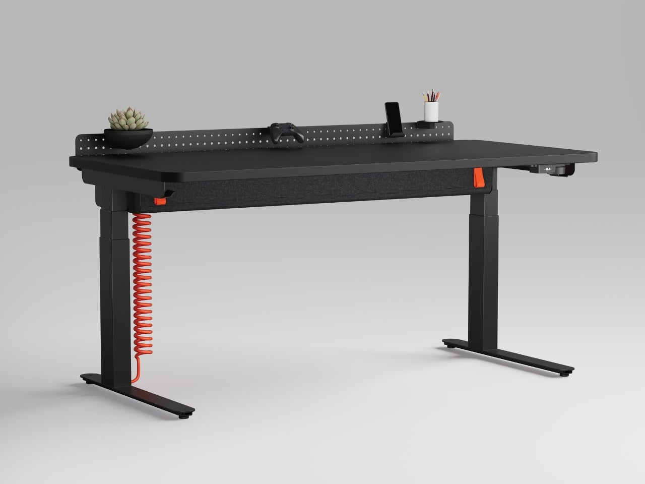
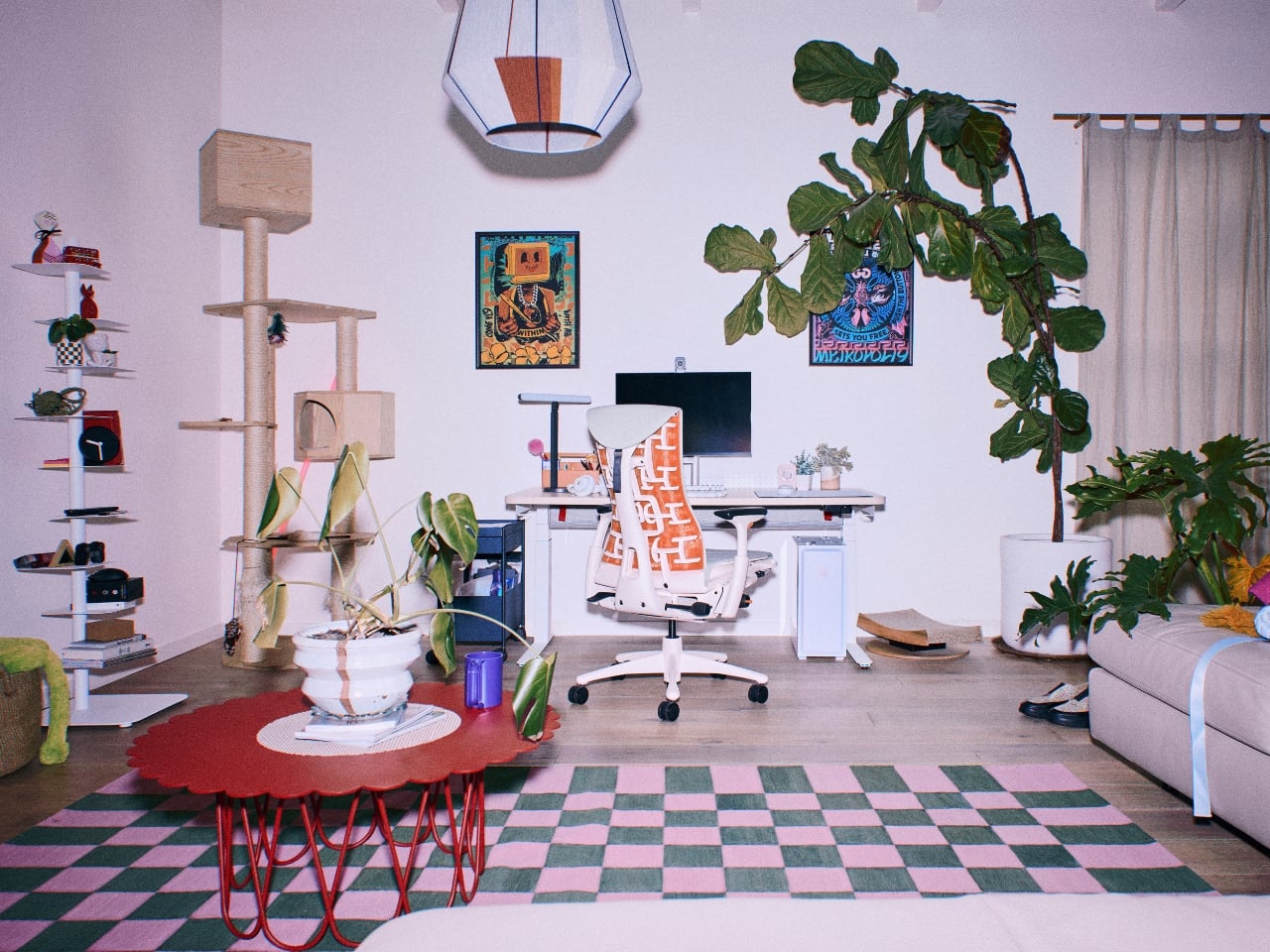
The most talked-about detail is the rotary dial. While traditional sit-to-stand desks feature up-down toggle switches, the Coyl Gaming Desk features a rotary dial, a round knob you turn to raise or lower the height, allowing for greater control and seamless adjustment. That feels like a meaningful upgrade over the toggle switch that costs pennies and has somehow survived on products that cost over a thousand dollars. Inspired by premier audio equipment, the dial features detent notches to allow players to easily identify the exact setting for their preferred position. It’s a small change that makes a surprisingly big difference. When your hands are already on autopilot during a long session, not having to hunt for a button matters more than you’d think.

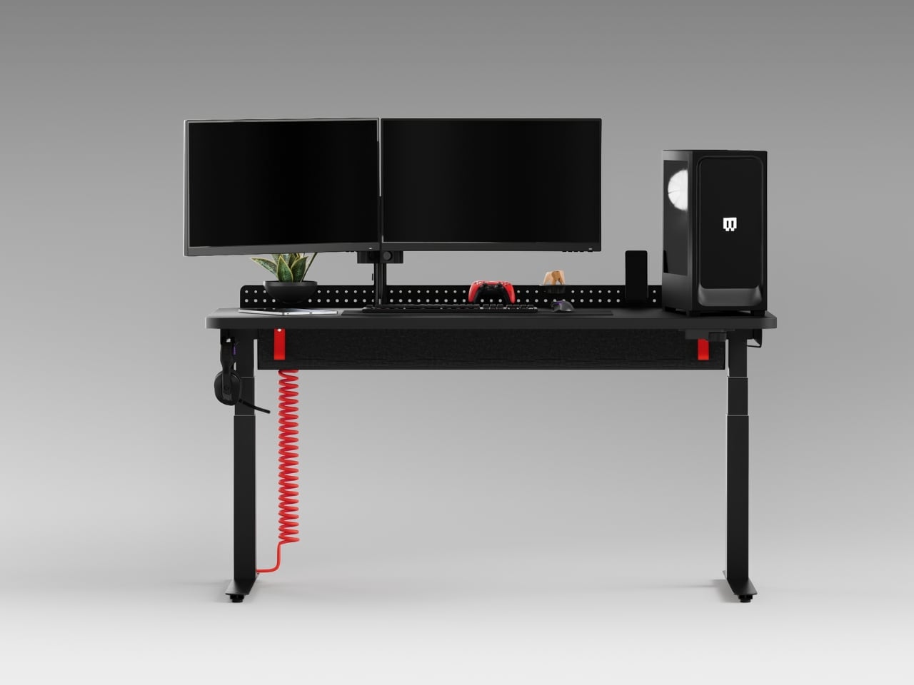
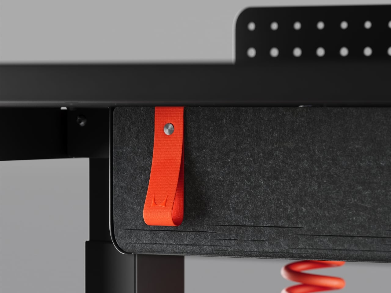
The desk also has a built-in cable management trough tucked underneath toward the back, which handles the chaotic tangle of wires that plagues most gaming setups. It’s one of those features that seems obvious in hindsight but is inexplicably absent from most desks in this category. Whoever decided to finally make this standard deserves a quiet round of applause. There are also built-in hooks for frequently used items, allowing players to stay locked into the play experience, and adjustable glides on the top of the desk feet allowing users to level the desk.

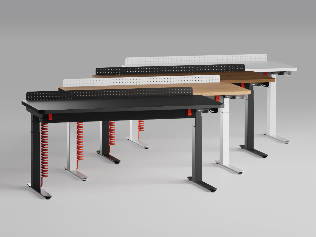
Where things get genuinely interesting is the optional perforated back panel. For those who want to further personalize their set-up, Coyl includes an optional perforated back panel with a smart collection of accessories, including controller holders, phone docks, small shelves, and planters. Think of it as a pegboard-style system you can actually curate. These add-ons can be rearranged as setups evolve, which is the kind of modularity that tends to make a product feel useful long-term rather than dated in two years. It’s also the design detail that signals what Herman Miller is really going after here: the desk isn’t meant just for gaming, it’s meant for the modern person who games, works, creates, and streams, often from the same surface.

The Coyl comes in four desktop finishes: black, white, walnut, and ash, with the rounded laminate top giving the whole thing a cleaner look than the sharp-cornered, RGB-saturated aesthetic that dominates most gaming furniture. You can program up to four height presets, which is useful if your desk doubles as a standing workstation during the day. The base version starts at $1,095, rising to $1,495 with the cable trough and $1,635 if you want the back panel included.

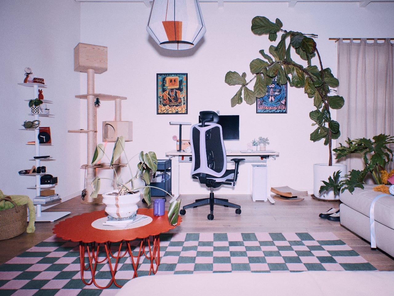
That price point will be a sticking point for some people. Gaming desks at a fraction of the cost do exist and do the job adequately. But the Coyl isn’t really competing on value, it’s competing on intention. The same way a Herman Miller chair isn’t for someone who just needs somewhere to sit, the Coyl is for someone who wants their desk to be an actual design decision and not just a surface with legs.

Is it groundbreaking? Not technically. The features themselves aren’t revolutionary. But the execution and the restraint are notable, especially from a brand entering a product category already crowded with competitors trying too hard to look cool. Herman Miller didn’t try to out-RGB anyone. They just made something that looks like it belongs in the same room as their chairs, which is, frankly, exactly what the gaming space has been waiting for.

The post Herman Miller Finally Built a Gaming Desk That Matches Its Chairs first appeared on Yanko Design.
The Robots That Built Seoul’s Robot Museum

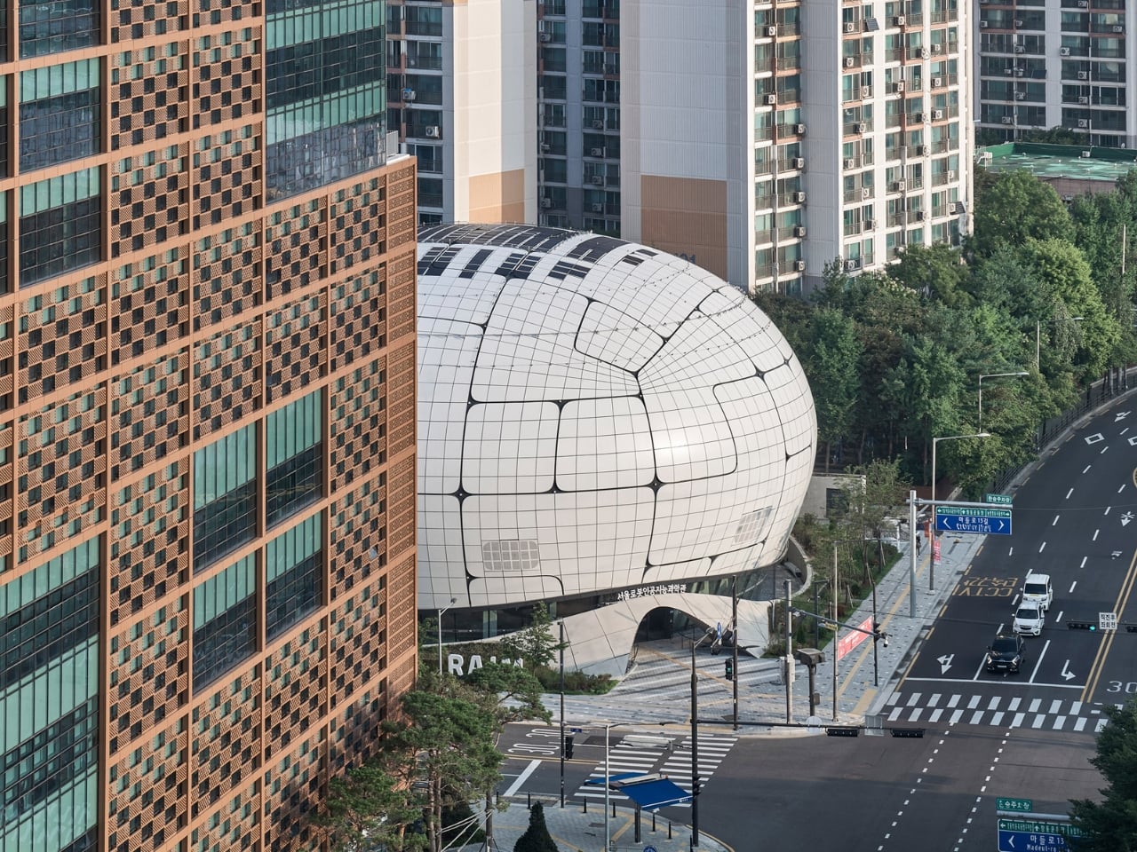
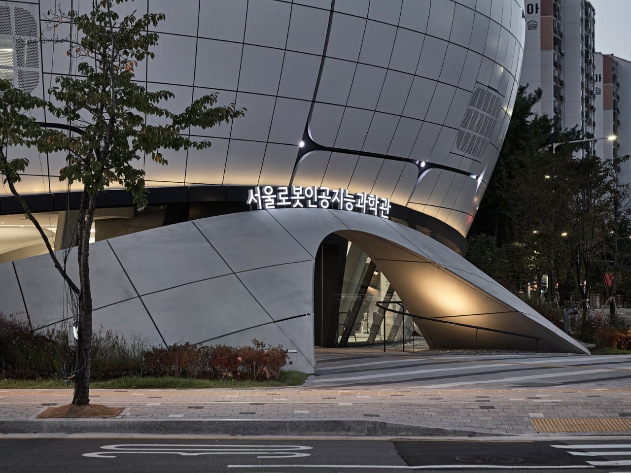
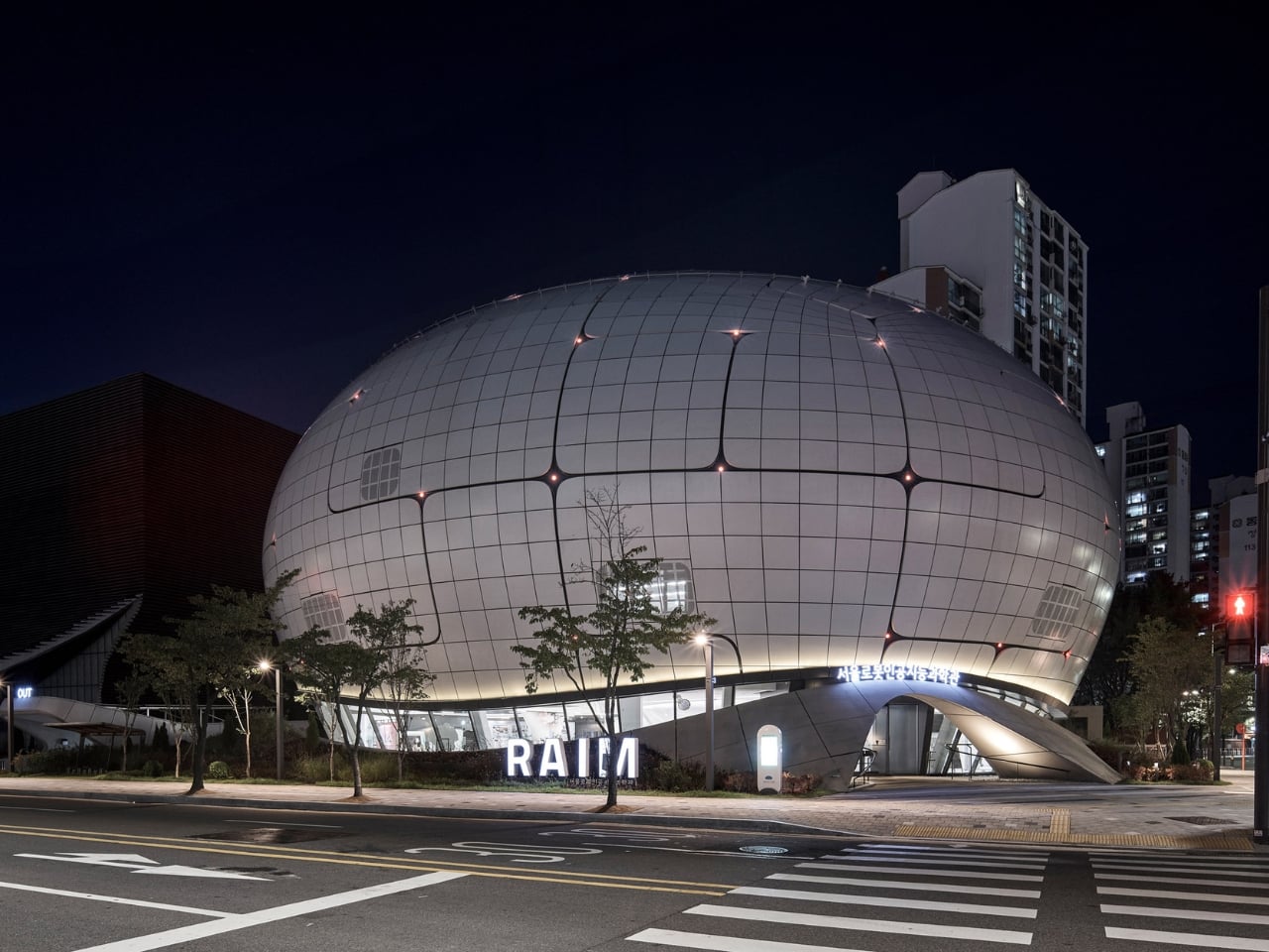
The Seoul Robot & AI Museum is the definitive parametric architecture reference of 2026, and it’s easy to understand why the design world keeps returning to it. Every few years, a building comes along that doesn’t just represent a movement; it is the argument. RAIM is that building right now, and the reason has less to do with how it looks and more to do with how it got made.

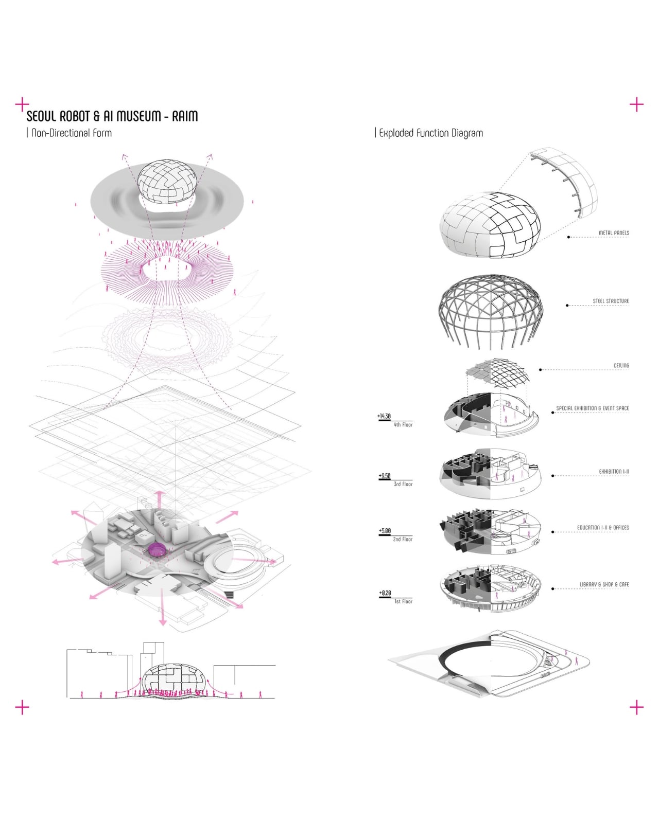
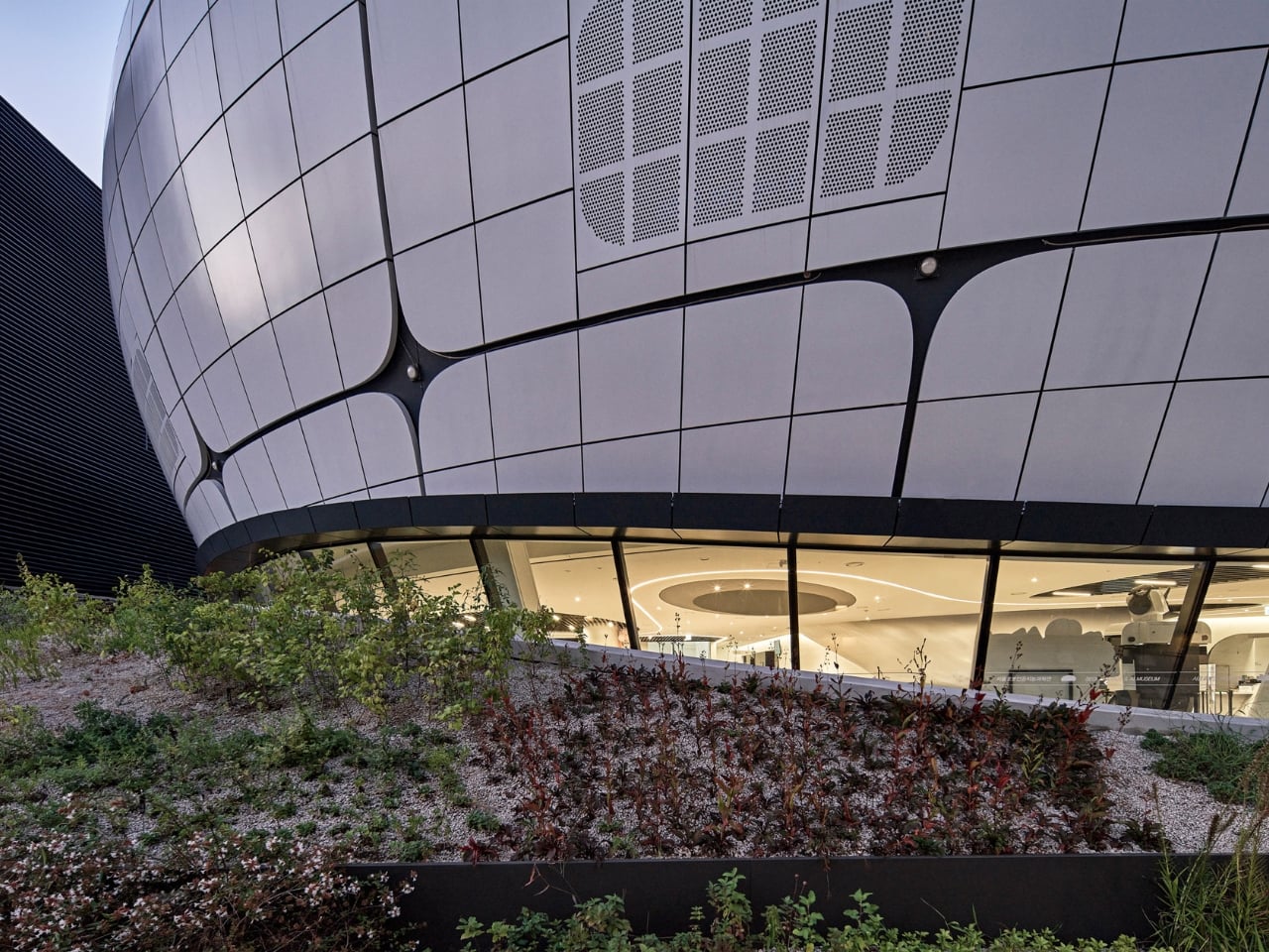
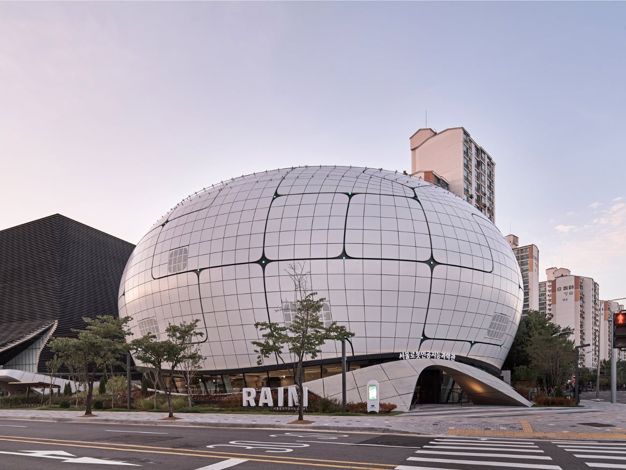
Opened in 2024 in the Chang-dong district of northeast Seoul, the museum was designed by Turkish studio Melike Altınışık Architects. From the street, it reads like something that landed rather than was built: a spherical, mirror-finish shell that catches the sky and refuses to look like any cultural institution you’ve encountered before. The facade is wrapped in 3,422 double-curved metal panels, each one a unique geometry, each one positioned according to a structural logic you can actually read from the outside. The gridded surface pattern isn’t decorative. It follows the structural steel grid concealed behind it, making the building’s skeleton visible through its skin. That level of architectural honesty is rarer than it should be.

Designer: Melike Altınışık Architects

The geometry didn’t come from sketching. Melike Altınışık and her team scripted the form parametrically, then reverse-engineered the entire envelope to make it buildable. That second part is where most parametric ambitions historically die. Double-curved panelization at this scale is the kind of thing that gets value-engineered into something flatter and sadder during construction documentation. But Melike Altınışık Architects designed specifically for fabrication from the start, using a methodology called DFMA (Design for Manufacture and Assembly), which meant the form and the production method evolved together rather than fighting each other.

The fabrication pipeline is where the story gets genuinely interesting. The panels were cut using laser CNC machines and welded using industrial robots. On-site, 3D scanning ensured alignment that human measurement couldn’t consistently achieve at that tolerance. What this unlocks, practically, is that double-curved metal panelization stops being a budget line reserved for landmark commissions and becomes something mid-scale cultural buildings can actually afford. Robot welding doesn’t get tired. It doesn’t accumulate small errors across 3,422 repetitions. The precision holds, and holding precision across a spherical envelope is a very different proposition from getting it right once.

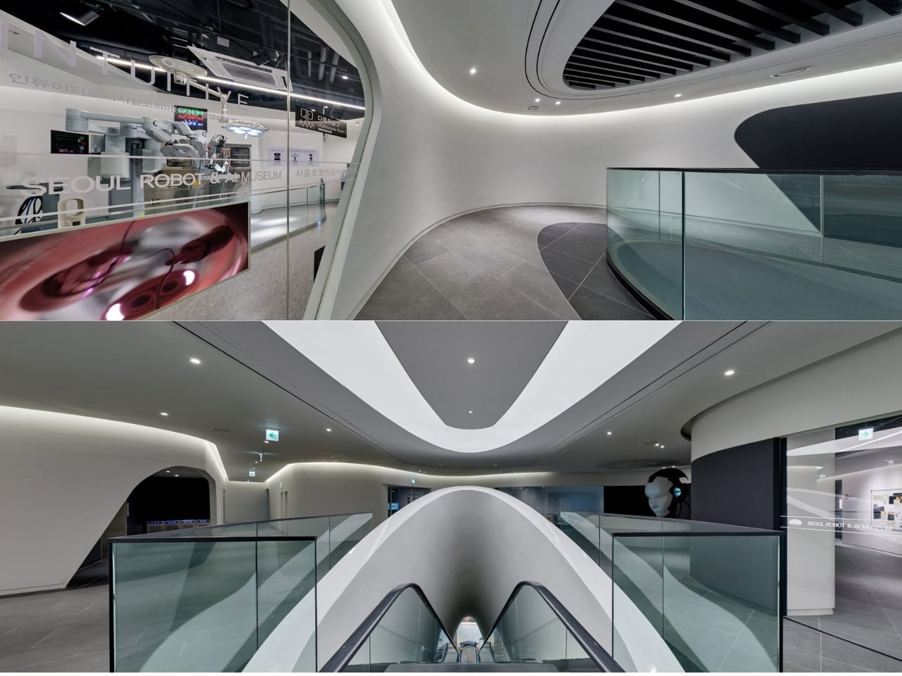
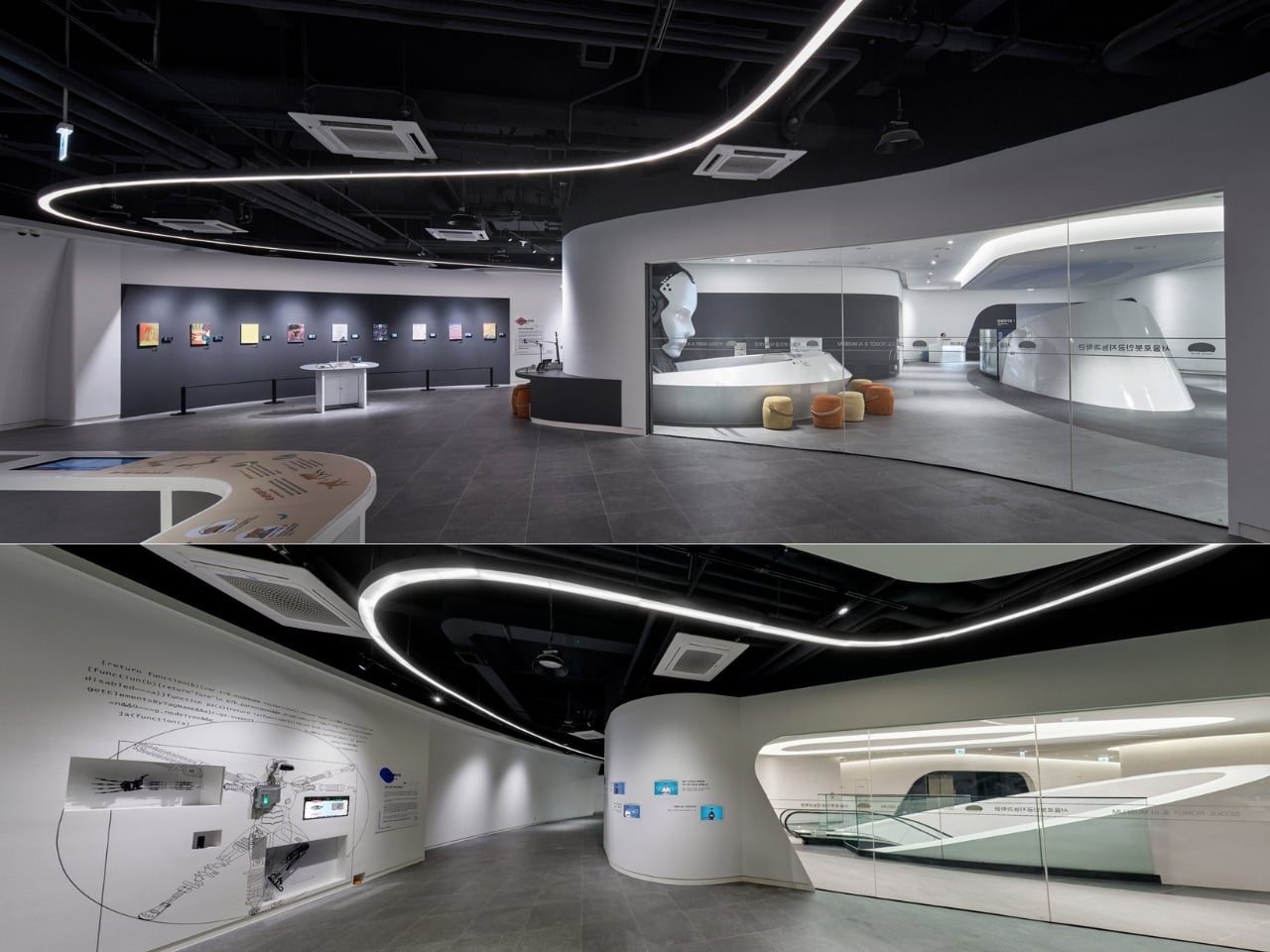
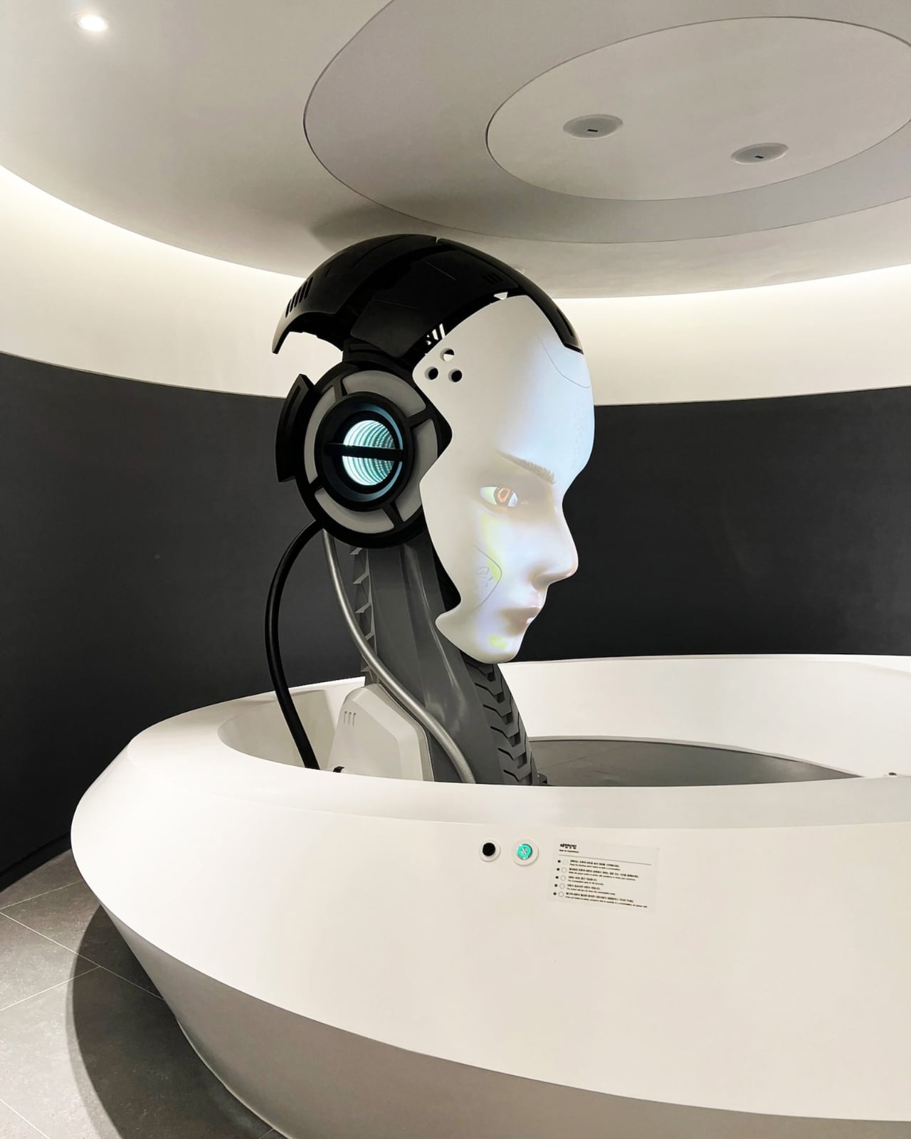
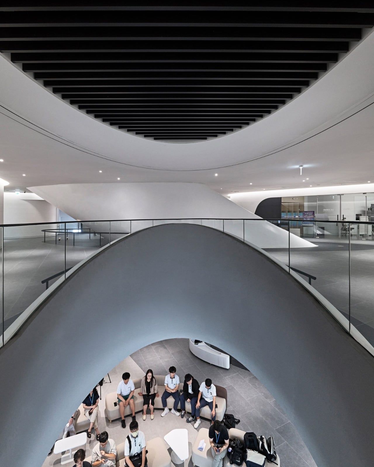
Now layer in the subject matter of the museum itself. RAIM is dedicated to robotics and artificial intelligence. Its permanent exhibitions trace the evolution of AI from predictive fraud detection systems to generative models. Robots greet visitors at the entrance. The interior reads like a spaceship, with a vertical exhibition tunnel at the building’s center blurring the boundary between the physical and the technological. So when you consider that robots also assembled the facade above your head, the recursion is almost too neat. Architect Altınışık framed it clearly: the architecture is “both shelter and pedagogy.” The building doesn’t just house the argument. It makes it.

Parametric facades are having a genuine cultural moment in 2026, and it’s not limited to the usual European flagships. Studios in South Korea and India are pushing computational design into more projects, and the international awards circuit is beginning to reflect that geographic shift. The conversation has moved from “can parametric architecture actually be built?” to “what does it cost, and who controls the pipeline?” RAIM answers both questions at once, which is probably why it’s the reference point of record for this particular moment.

That shift is worth paying attention to. For decades, the most ambitious architectural geometries required either enormous budgets or a willingness to absorb serious construction risk. Robotic fabrication and CNC manufacturing are quietly changing that calculus. In Altınışık’s own words, “the division between design and construction is becoming obsolete. The parametric model becomes not just a design tool but a construction platform.” The next wave of museums and civic buildings won’t choose simpler geometry because they have to. They’ll choose the complex version because their fabricators can deliver it, and because, as RAIM proves, the building becomes a more interesting object for it. Seoul’s robot museum was built by robots. The next one might be anywhere.

The post The Robots That Built Seoul’s Robot Museum first appeared on Yanko Design.
Milan 2026’s Most Interesting Chandelier Is Named After a Computer

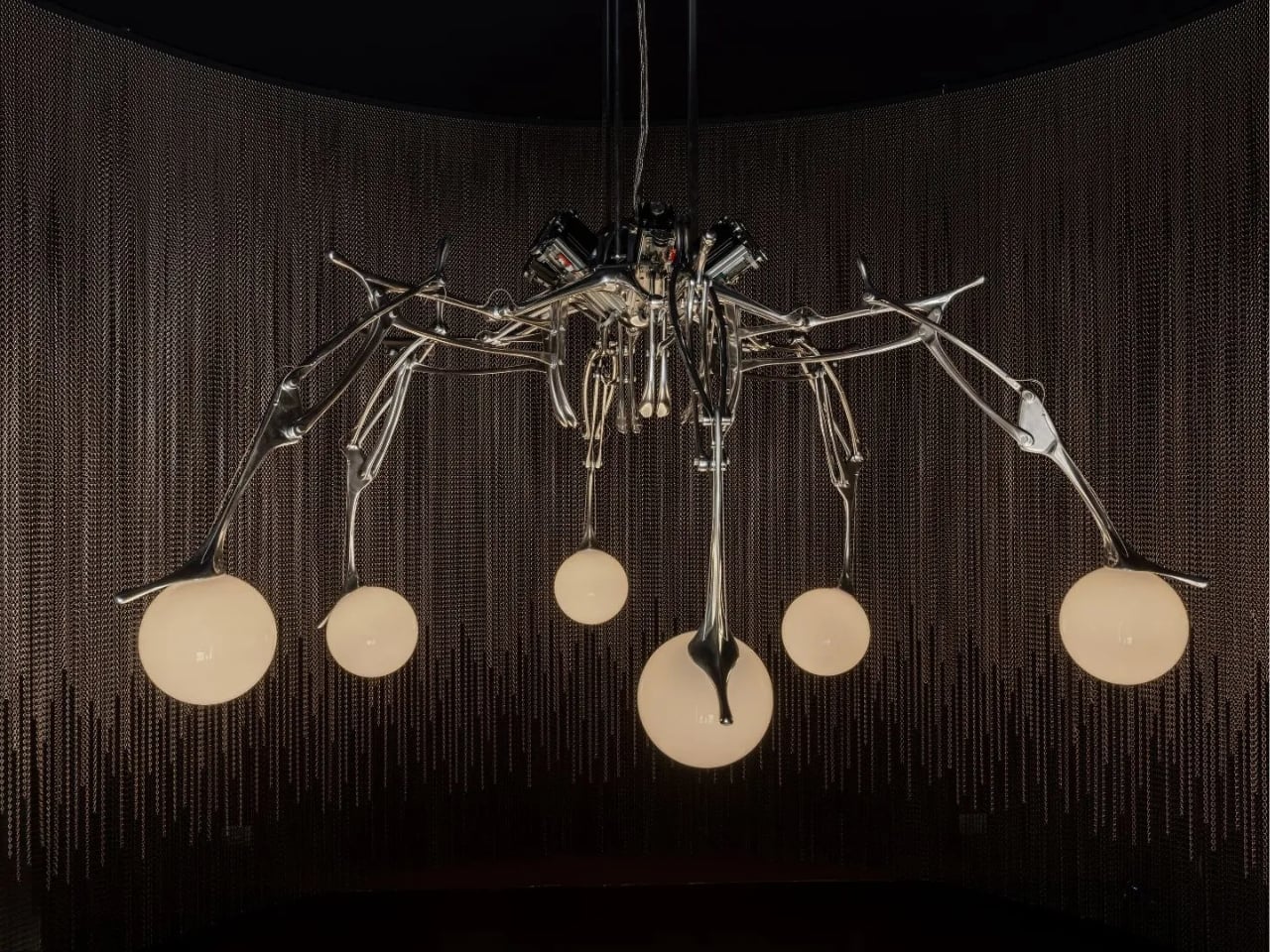
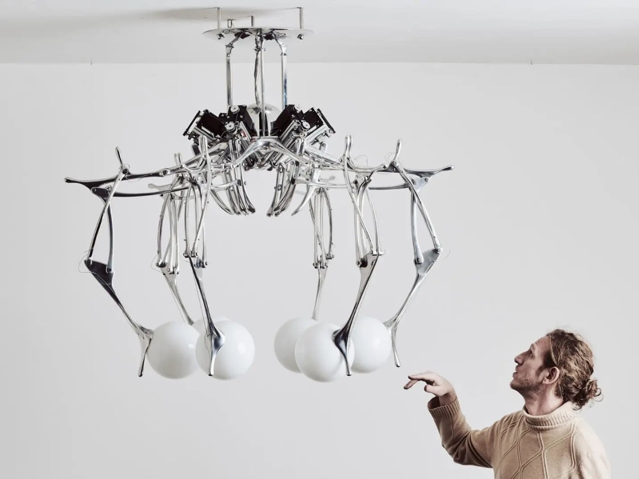
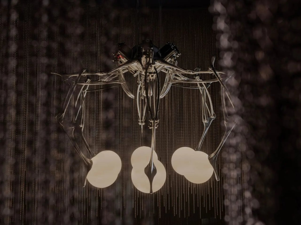
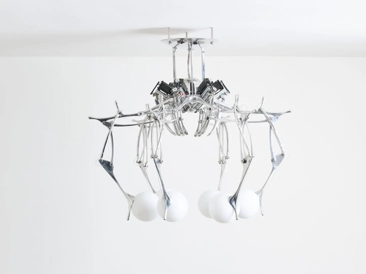
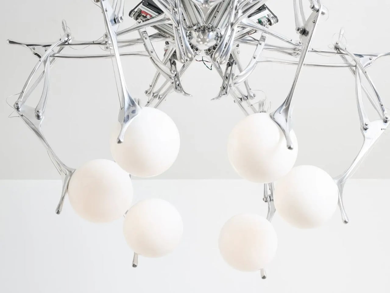
Milan Design Week 2026 was, by most accounts, a fair deeply in love with the handmade. Craft, texture, labour, and the visible trace of human effort were the recurring themes that season. So it felt like a deliberate and well-timed provocation when, inside Nilufar’s historic gallery on Via della Spiga, Andrea Mancuso unveiled LUMIAC: a chandelier that moves on its own, generates its own choreography of light, and takes its name from a 1950s computer.

The name is no accident. LUMIAC stands for Light Unit Mechanized Intelligence Apparatus Computer, a direct nod to MANIAC, one of the earliest autonomous computers built in the 1950s and one of the machines that essentially launched the age of computation. Mancuso chose this reference deliberately, grounding the piece in the origins of electronic thinking rather than in the shinier, more marketable language of today’s AI conversation.

Designer: Andrea Mancuso

That distinction matters more than it might seem at first. Anyone can slap the word “intelligent” on a product in 2026 and call it a day. Mancuso went further back, to a time when the boundary between human logic and machine logic was first being tested, and asked what it would look like to translate that early electronic reasoning into light and movement.

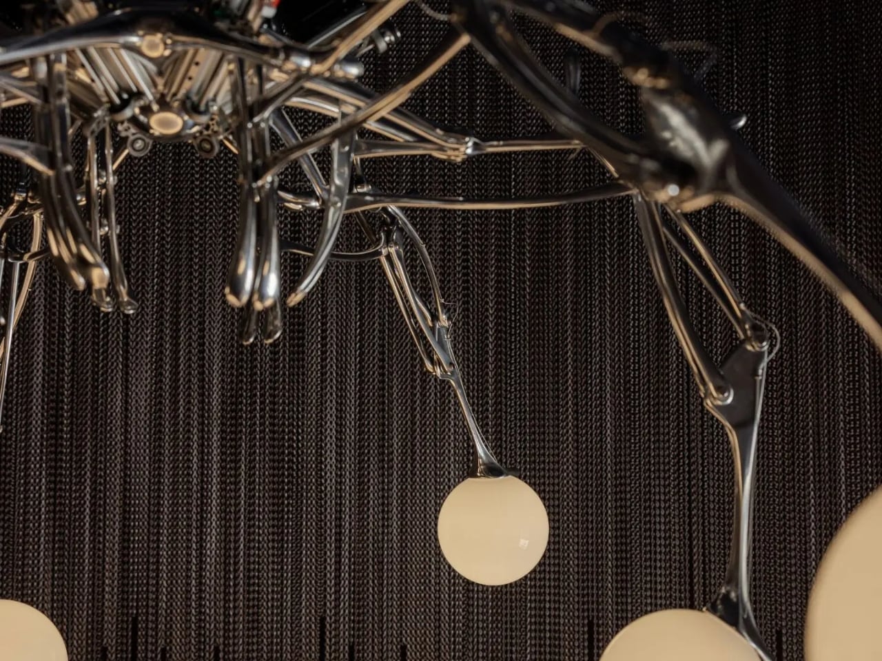
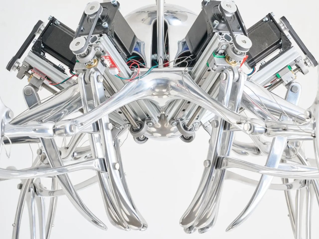
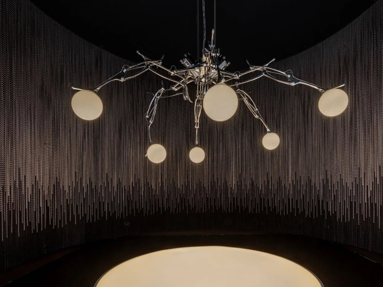
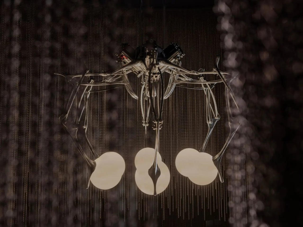
What you actually see at Nilufar is a cast aluminium and glass ceiling lamp that generates what the designer calls a choreography of light and movement. It does not sit still, and it does not simply illuminate. It behaves. That single word does a lot of work here. Not “performs,” not “functions,” but behaves. The shift in language reframes the entire object, placing it in a category of things that act rather than simply exist, and once you see it that way, it is very hard to unsee.

Surrounding the chandelier is a spatial installation developed in collaboration with Kriskadecor, a Spanish company that has spent a century, since 1926, transforming aluminium chains into architectural and expressive surfaces. At the gallery, two superimposed curtains of chains enclose LUMIAC in a kind of ceremonial cocoon. The outer layer is coffee-toned, anchoring the perimeter of the space. The inner curtain is amethyst, softer and more translucent. At the base, the two blend into one another in a gradient that feels less like a decorative choice and more like a gradual change in atmosphere.

The collaboration works because neither element competes for dominance. The chains frame LUMIAC without trying to match its presence, which is harder to pull off than it sounds. Too often, spatial installations feel like a product surrounded by visual noise. Here, the room has a mood. The closest word for it is quietly unsettling, though that sounds like a criticism and it is not. It is unsettling in the way that a genuinely good question is.

Mancuso’s earlier work pulled from deep time: geology, cave paintings, the slow logic of the natural world. LUMIAC is a turn in direction but not in spirit. The same designer who once looked at rock formations and asked how they got there is now looking at a moving machine and asking where this all ends up. That kind of long-view thinking is genuinely rare when the pressure to be current and commercially relevant is so relentless in the design world.

The piece also lands with particular weight given the broader cultural moment. Conversations about AI in 2026 tend to swing between uncritical enthusiasm and existential alarm, and design is not immune to either extreme. LUMIAC does something more interesting by stepping back to the very beginning of the machine-human conversation and holding that origin point up to the light, literally. It is a reminder that these questions are not new, even if the technology is.

The post Milan 2026’s Most Interesting Chandelier Is Named After a Computer first appeared on Yanko Design.
RIMOWA’s 2026 Prize Went to a Bracelet That Speaks Sign Language

The RIMOWA Design Prize doesn’t always produce furniture, and that’s precisely why I pay attention to it every year. The luggage brand’s annual student design competition has a way of surfacing ideas that sit at the uncomfortable, exciting edge of what design can actually do for people, and the 2026 winner is probably the best example of that yet.

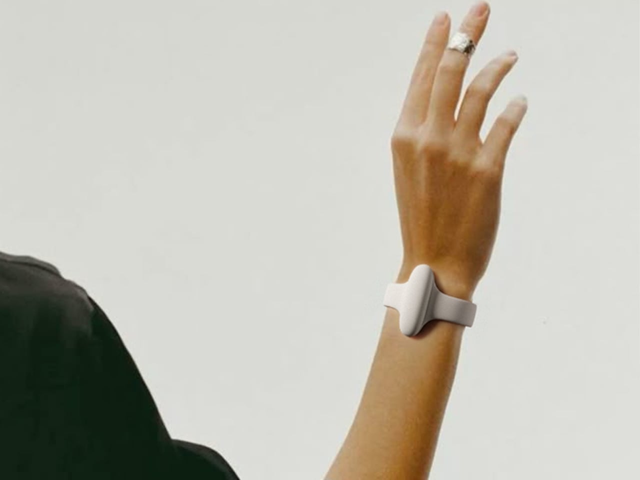
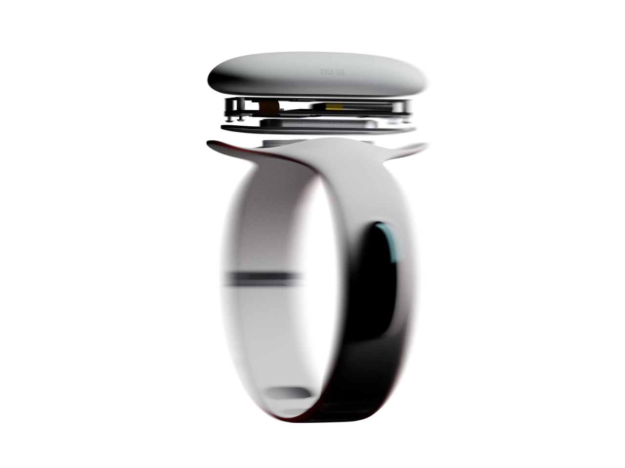
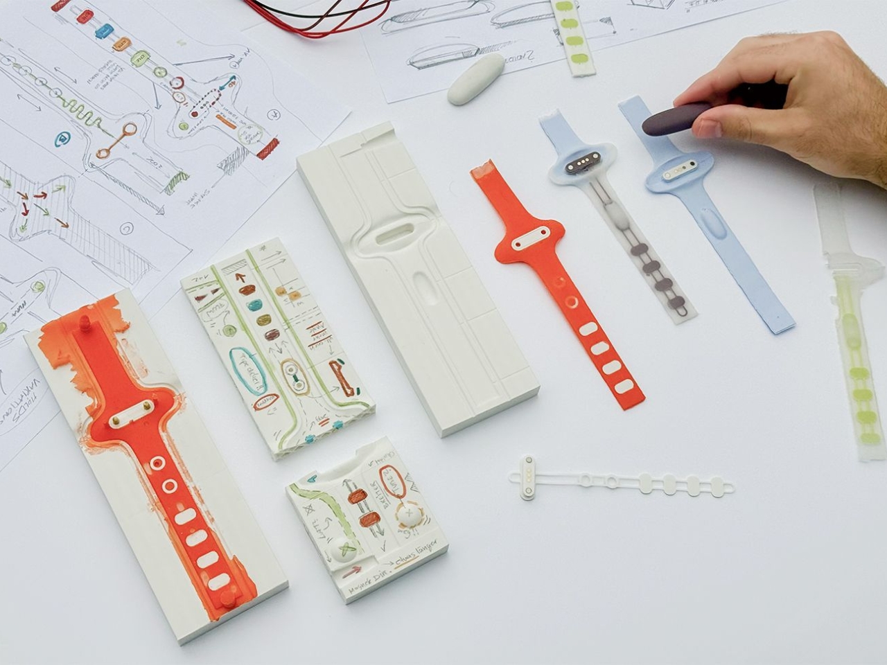
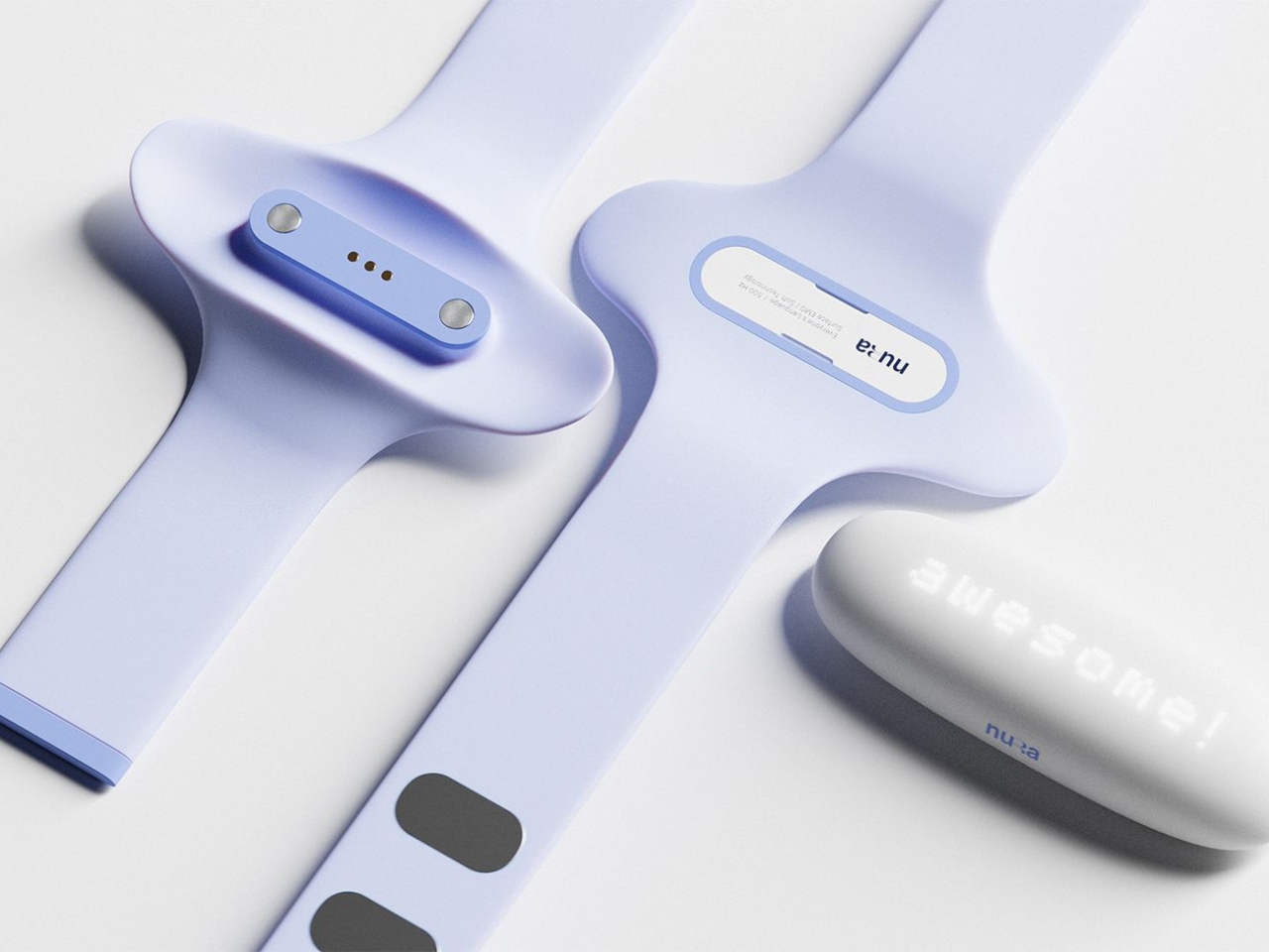
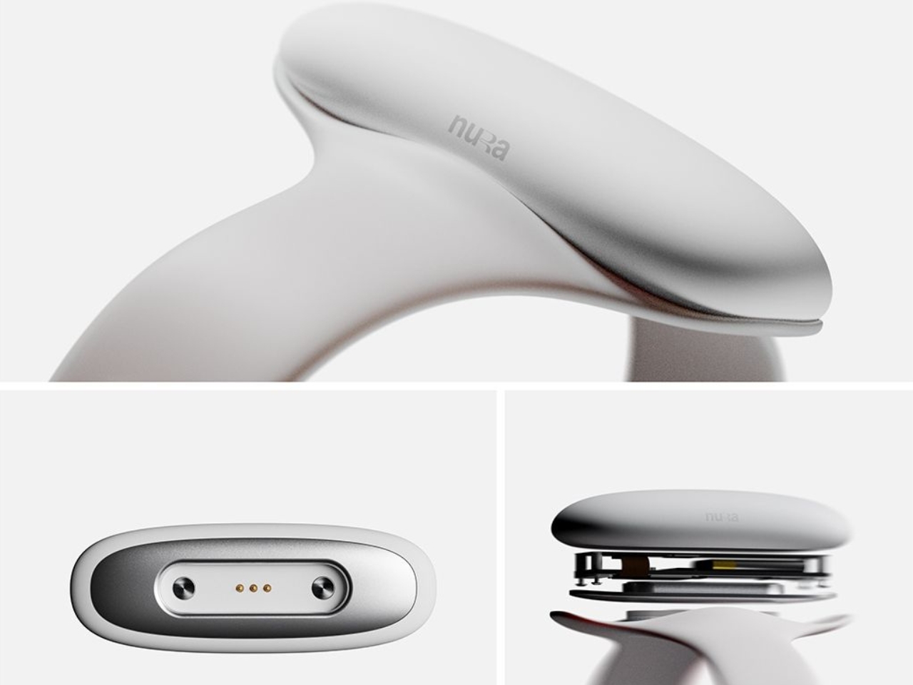
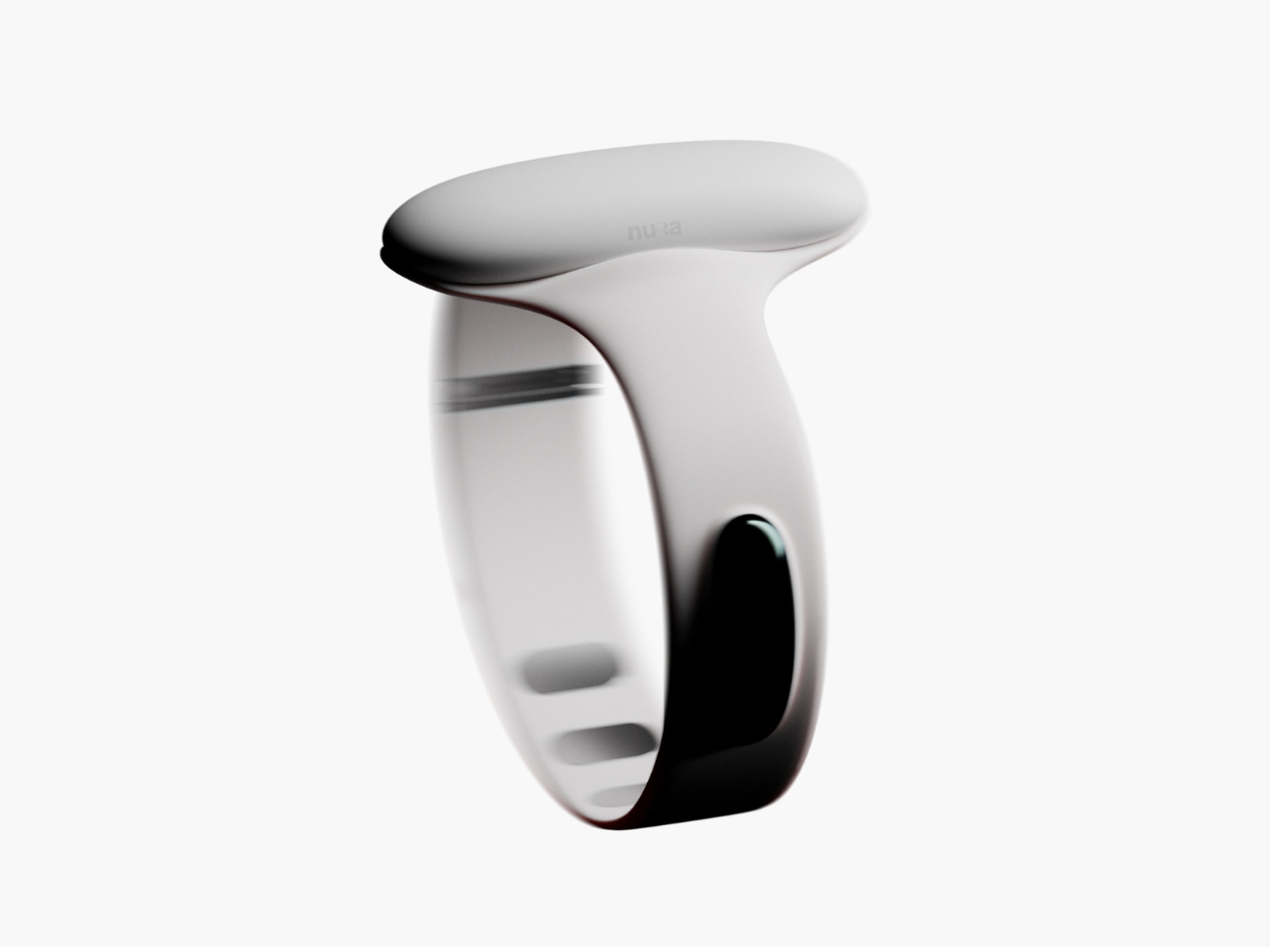
Samuel Nagel and Paul Feiler, two students from Hochschule für Gestaltung Schwäbisch Gmünd, took home the fourth edition of the prize with NURA: a bracelet that uses EMG (electromyography) sensors to capture muscle signals in the forearm and translate sign language into audible speech in real time. It works the other way around too, converting spoken language into visible text for deaf users. The whole thing sits on your wrist, shaped by the silhouette of a manta ray, and it looks less like a medical device and more like the kind of accessory you’d spot on someone at a gallery opening.

Designers: Samuel Nagel and Paul Feiler

That last detail is actually the point, and I think it’s worth dwelling on. Assistive technology has a long and unfortunate history of making the people who need it feel conspicuous. Hearing aids, for decades, were designed to be invisible precisely because visibility carried stigma. The unspoken message was that needing help was something to hide. NURA takes a completely different position. It’s designed to be seen, worn with pride, styled rather than concealed. The gesture feels radical even though, rationally, it shouldn’t have to be.

The technology behind it is genuinely clever. EMG sensors are nothing new as a concept, but applying them to sign language translation in a form this compact and wearable is a meaningful design leap. The bracelet reads the electrical signals produced by muscle contractions in the forearm as the wearer signs, processes them, and produces speech output. The reverse channel picks up spoken language and renders it as text. Two-way, seamless, real-time. For anyone who has ever watched a deaf person navigate a conversation without an interpreter present, or felt the awkward pause that comes from communication breaking down mid-exchange, the implications of that are enormous.

I keep thinking about how many interactions become effortless with something like this on your wrist. Ordering at a counter. Talking to a doctor. A spontaneous conversation with a stranger on the street. These are moments that require logistics for deaf users in a way most hearing people never have to consider, and NURA collapses that distance without asking anyone to compromise.

The manta ray inspiration is a quiet masterstroke, too. It gives the object a reference point that feels alive and organic rather than mechanical or clinical. The form has been rendered in clean, sculptural white, with the kind of restraint you’d expect from a German design school sensibility. It doesn’t scream technology. It just sits there looking elegant, doing something extraordinary underneath.

Will NURA make it into production? That’s the question that always hovers over student prize winners, and it’s an honest one. The gap between a beautifully executed concept and a market-ready product is wide, and the challenges of real-world EMG accuracy across different body types and signing styles are not trivial. But I don’t think that’s entirely the point. The RIMOWA Prize exists, among other things, to expand the imagination of what design is for, to signal to the industry what problems are worth solving and what solving them beautifully might look like.

On that count, Nagel and Feiler have done something genuinely important. They’ve argued, through the language of form, that accessibility and desirability don’t have to be in opposition. That a wearable designed for a deaf person can be something a hearing person might be jealous of. That the most human design isn’t the kind that fixes a flaw and hides it, but the kind that celebrates capability and brings people closer together. The bracelet is beautiful. The idea behind it is even more so.

The post RIMOWA’s 2026 Prize Went to a Bracelet That Speaks Sign Language first appeared on Yanko Design.
Vollebak’s New Sonic Jacket Fires 180 Speakers Into Your Body

If you’ve ever stood too close to a speaker at a concert and felt the bass move through your chest, you already understand the basic premise of Vollebak’s latest creation, even if just barely. The Sonic Jacket doesn’t pump sound into a room. It pumps it directly into you.

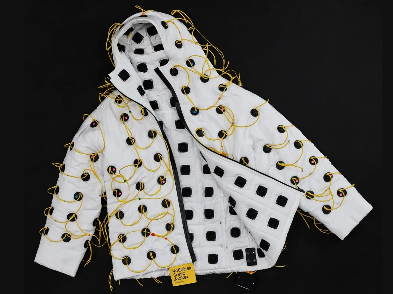
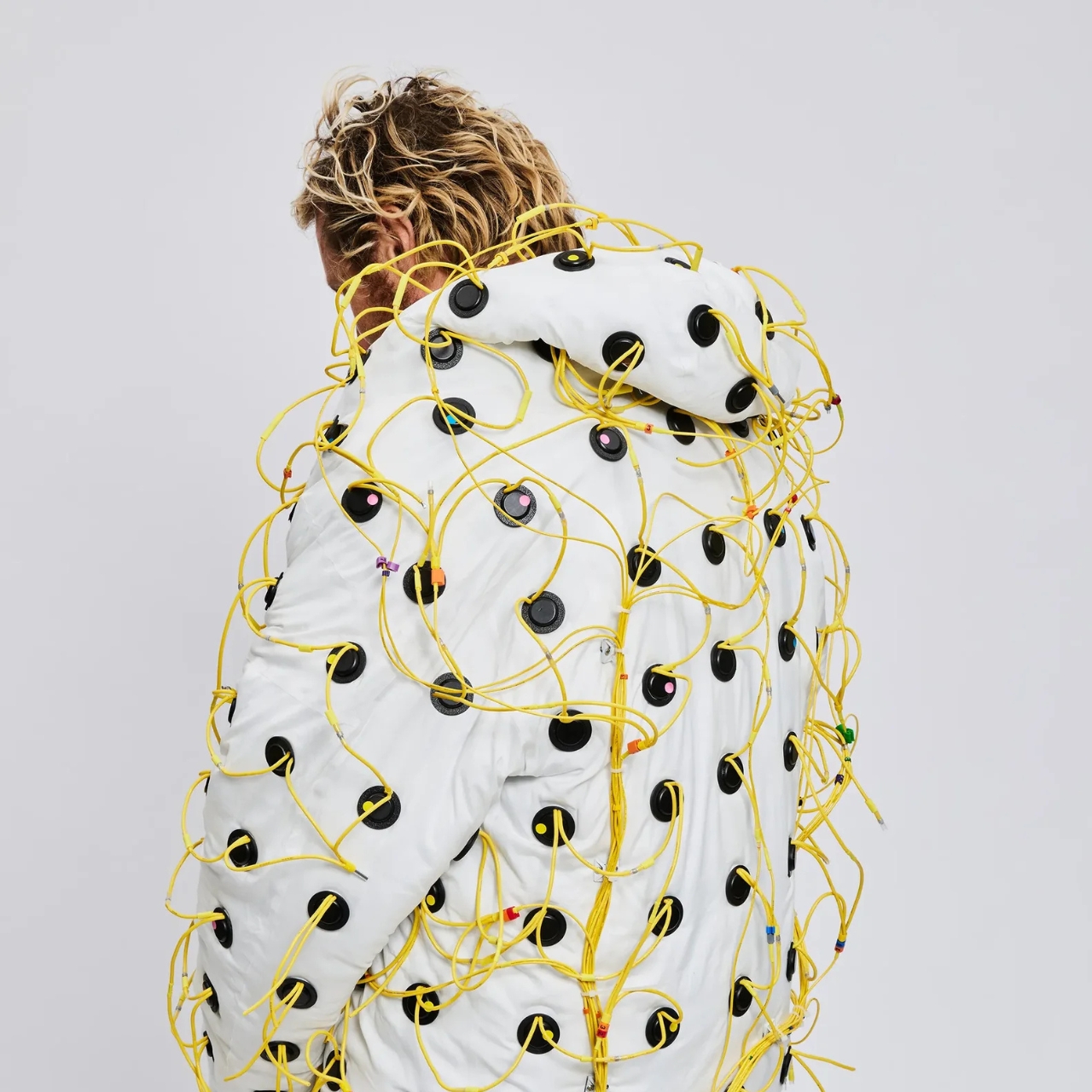
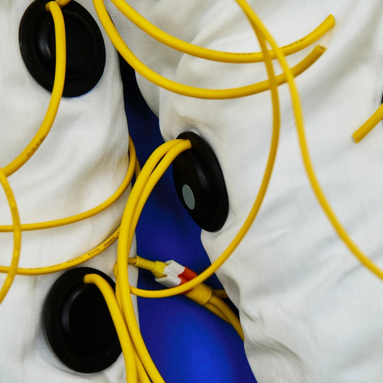
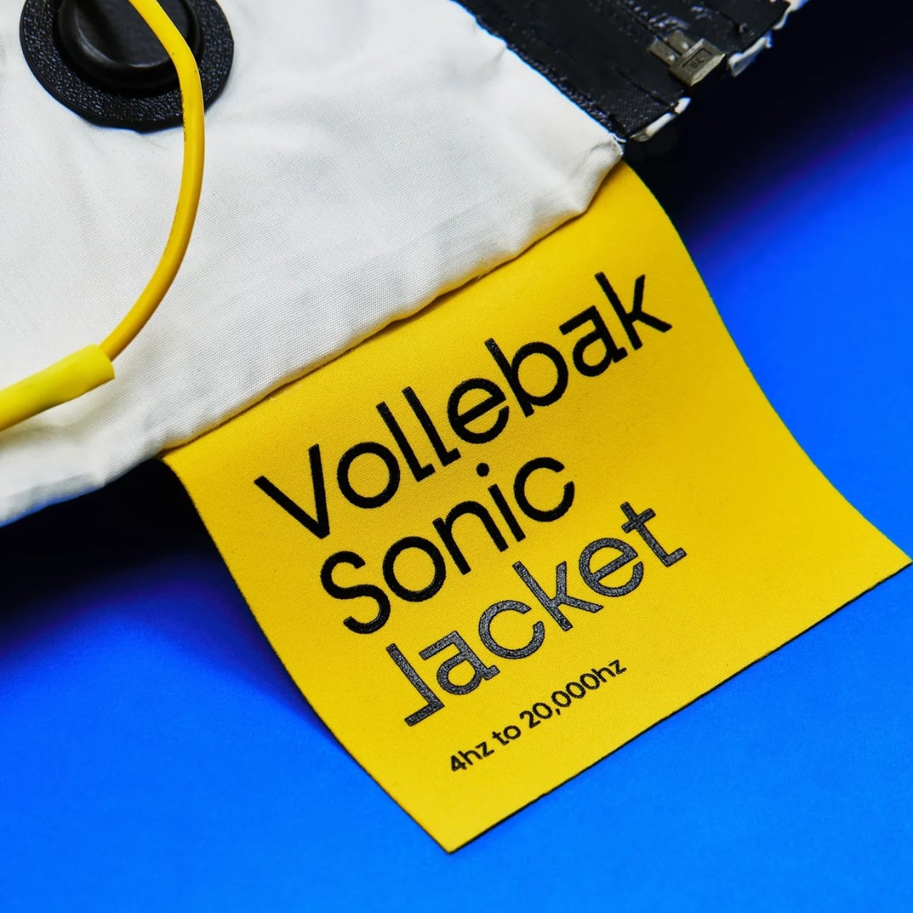
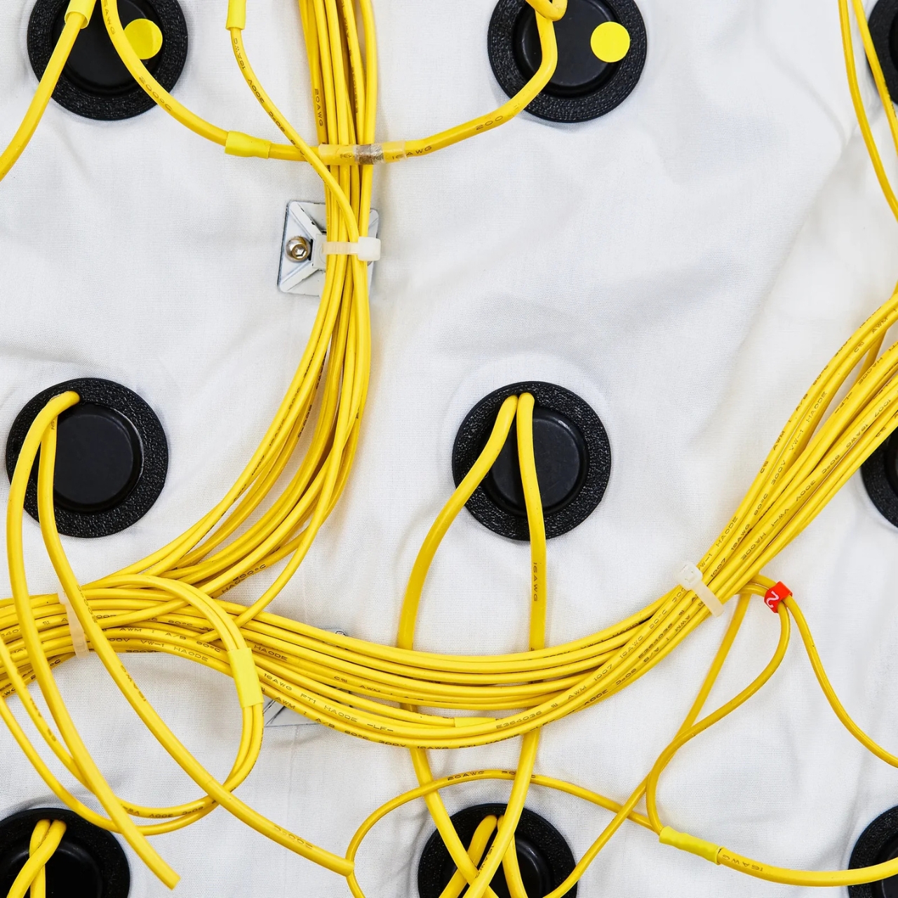
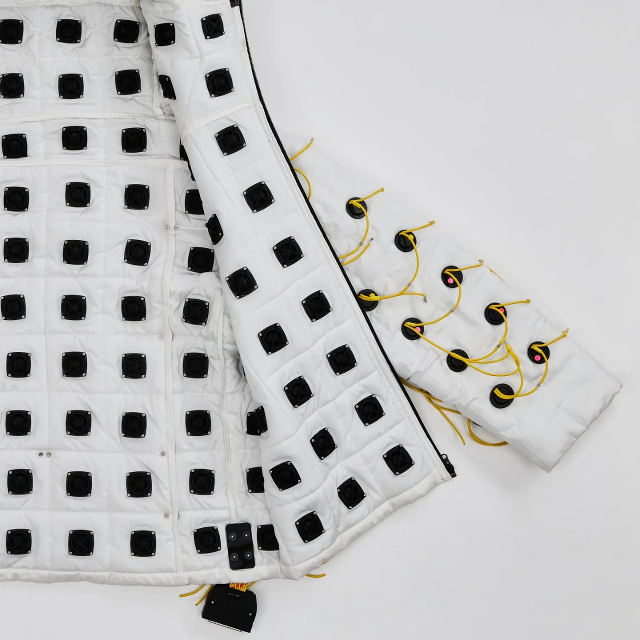
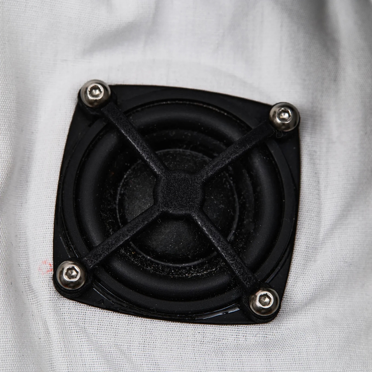
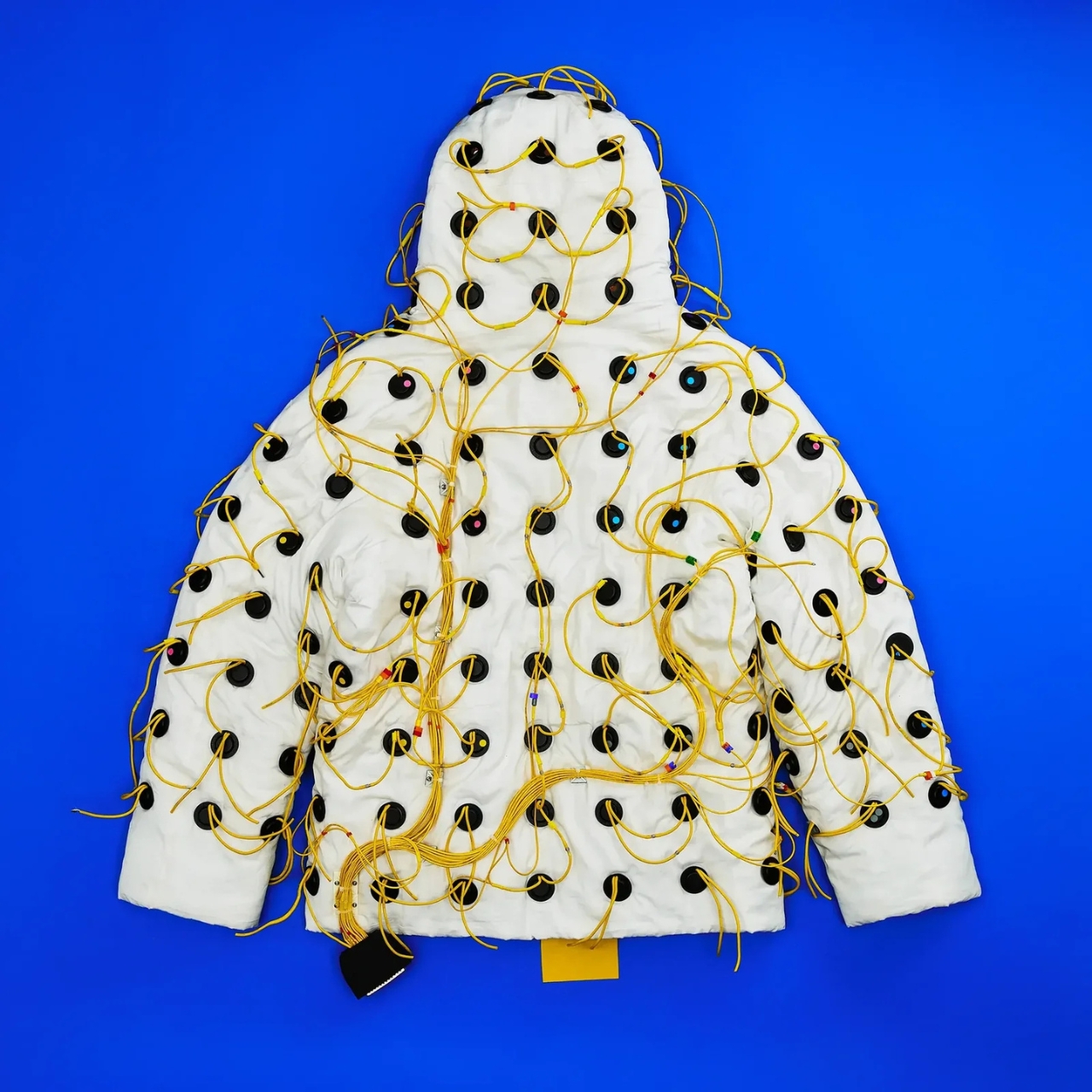
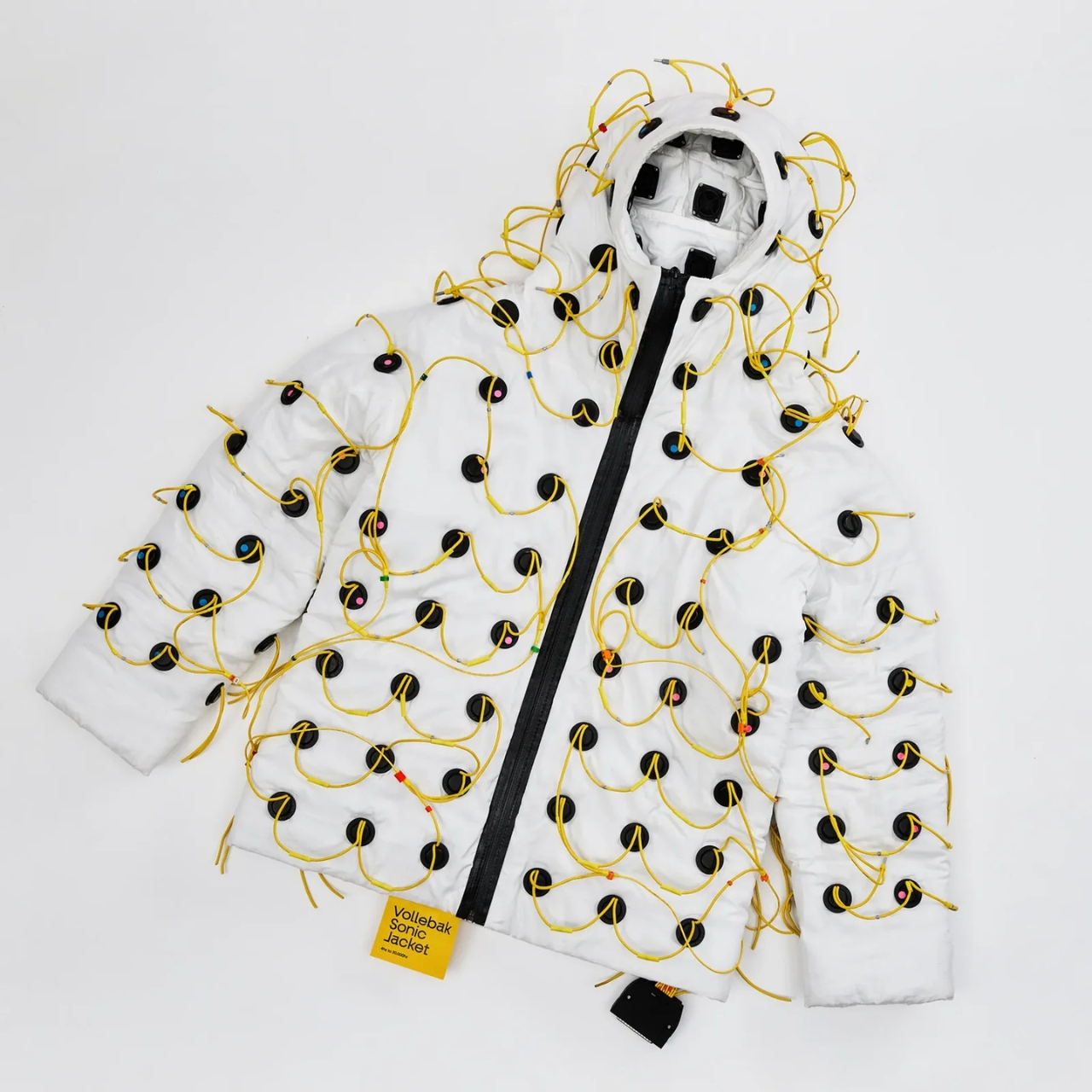
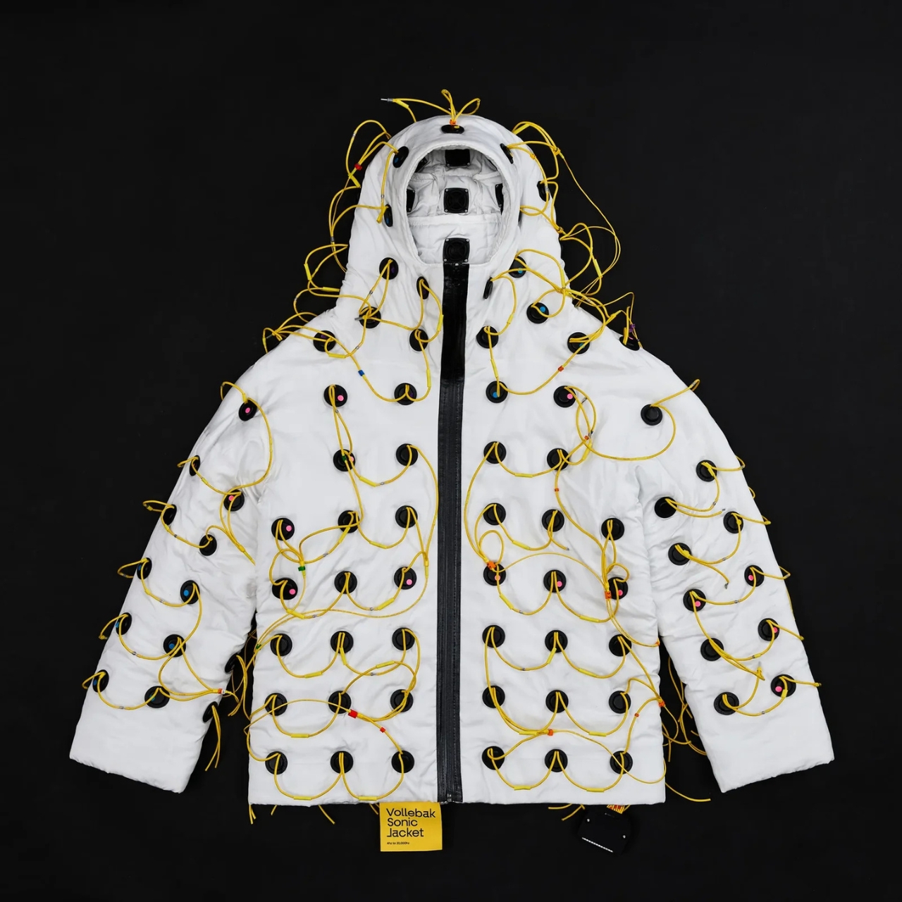
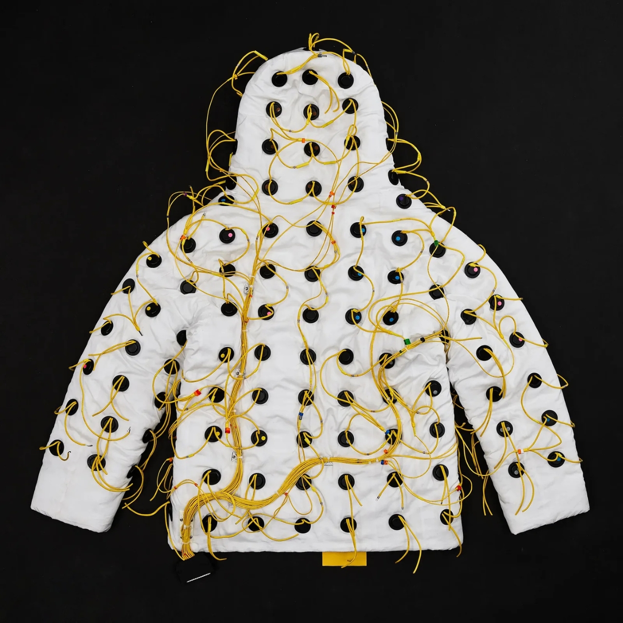
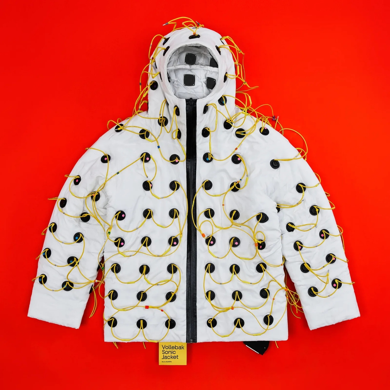
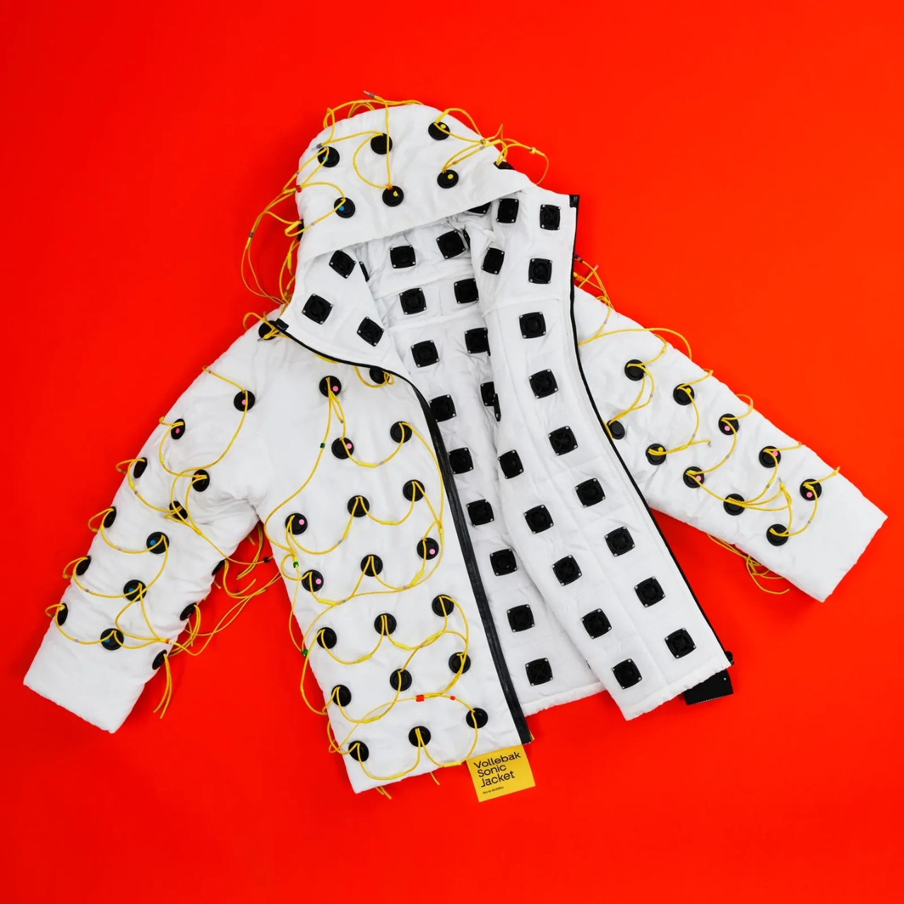
Vollebak, the experimental clothing brand founded in 2015 by twin brothers Nick and Steve Tidball, has built a jacket lined with 180 inward-facing speakers. Each one is 32mm in diameter and 10mm deep, laser-cut into the fabric across the body, arms, and hood. The speakers fire frequencies ranging from 4 Hz to 20,000 Hz straight into the wearer’s body. Not at your ears. Through your skin, your bones, your tissue. The brand’s own description puts it plainly: “You don’t listen to this jacket. You feel it.”

Designer: Vollebak

I’ll be honest. My first instinct was skepticism. Frequency therapy and sound healing have a way of sitting at the awkward intersection of legitimate science and wellness marketing, and it can be hard to tell which side of that line you’re on at any given moment. But the more I dug into what Vollebak actually built here, the harder it became to dismiss.

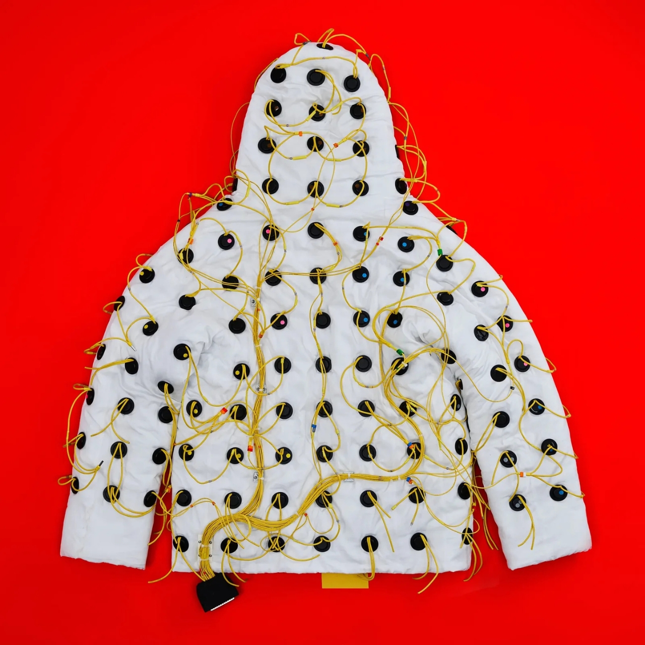
The jacket was engineered by FBFX, a London-based special effects studio with 30 years behind them and credits that include Gladiator, Dune, The Martian, and Project Hail Mary. These are people who build functional spacesuits worn by real actors in demanding production environments. They brought that same precision to the problem of turning a jacket into a distributed speaker system. The wiring is intentionally left visible, all yellow and exposed, because FBFX co-founder Grant Pearmain’s position is straightforward: it looks like a science experiment because that’s exactly what it is.

Control is handled through a unit fitted with an MP3 player preloaded with 10 frequencies, a physical dial for fine-tuning, and a Micro SD card slot that can hold up to 1,000 personalized frequencies. A Bluetooth app is in development. For lower frequencies, where speakers risk overheating, the jacket works around the problem by playing two slightly different tones simultaneously. The body registers the gap between them rather than the tones themselves, and that gap is where the lowest frequencies live.

Nick Tidball’s language around the whole project is part visionary, part slightly unhinged, which is exactly what makes Vollebak so compelling as a brand to follow. He talks about the earth resonating at a frequency, about his cat’s purr, about the fact that we are not solid beings but collections of particles with space between them where sound can travel. “Maybe you’ll orgasm. Maybe you’ll shit yourself. Maybe you’ll find God,” the brand writes on its site. Bold copy, sure. But it’s genuinely hard to argue that sound and frequency don’t do something to us. Every religious tradition figured that out thousands of years ago, from drumming around fires to chanting in stone chambers.

The Sonic Jacket is currently a prototype, tested on only a handful of people. Tidball himself did a 30-minute session and described the initial effects as “kind of astonishing.” That’s a small sample size and a subjective account, so I’d take the results with appropriate caution. But the ambition here isn’t really in question.

What Vollebak is doing, jacket by jacket, is expanding the definition of what clothing is for. They’ve done it with graphene that behaves like a radiator, with near-indestructible Dyneema, and with a jacket made from 250,000 pieces of laser-cut American walnut. The Sonic Jacket feels like the most speculative thing they’ve attempted so far, and that’s saying something. It’s not a wellness gadget in a tech form factor. It’s a wearable environment designed to shift your nervous system.

Whether the science catches up to the ambition remains to be seen. But that’s always been part of Vollebak’s proposition. They make things that probably shouldn’t exist yet, and then figure out if they should. The Sonic Jacket is the most interesting thing I’ve seen come out of the wearable tech space in a long time, and I’m not even sure it counts as wearable tech. It might just be the future of how we think about clothing altogether.

The post Vollebak’s New Sonic Jacket Fires 180 Speakers Into Your Body first appeared on Yanko Design.
A Pour-Over Dripper Inspired One of Beijing’s Best Pop-Ups

Pop-ups have become one of the more interesting testing grounds for design ambition. They exist long enough to make a statement but not so long that they have to compromise on boldness. And Atelier L seems to understand that assignment completely.
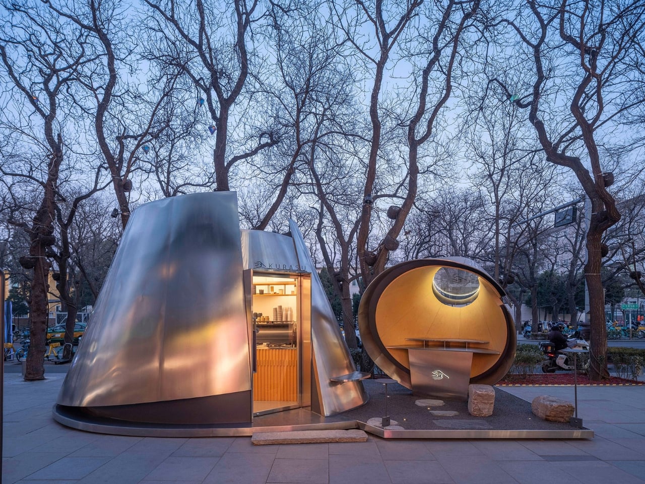
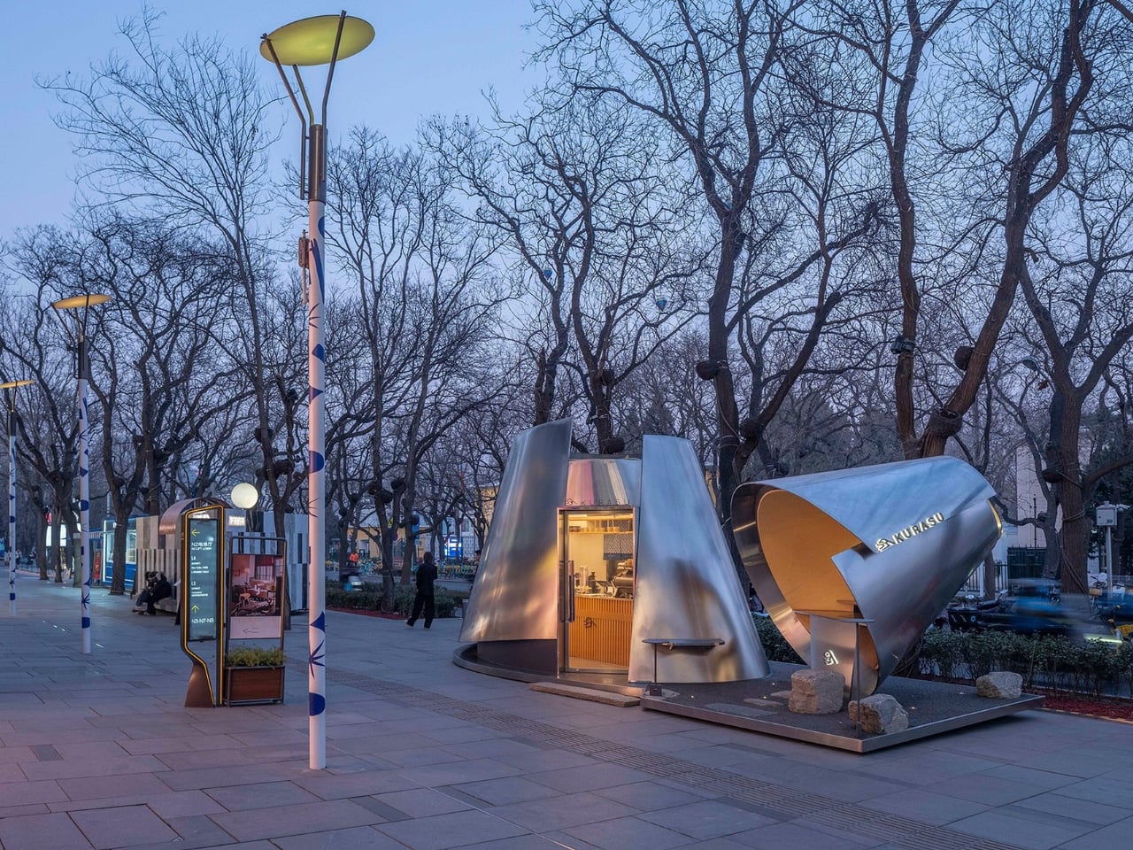
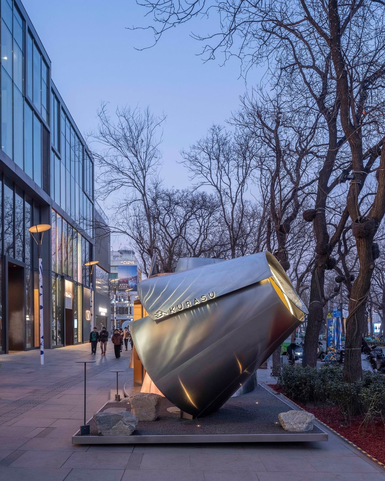
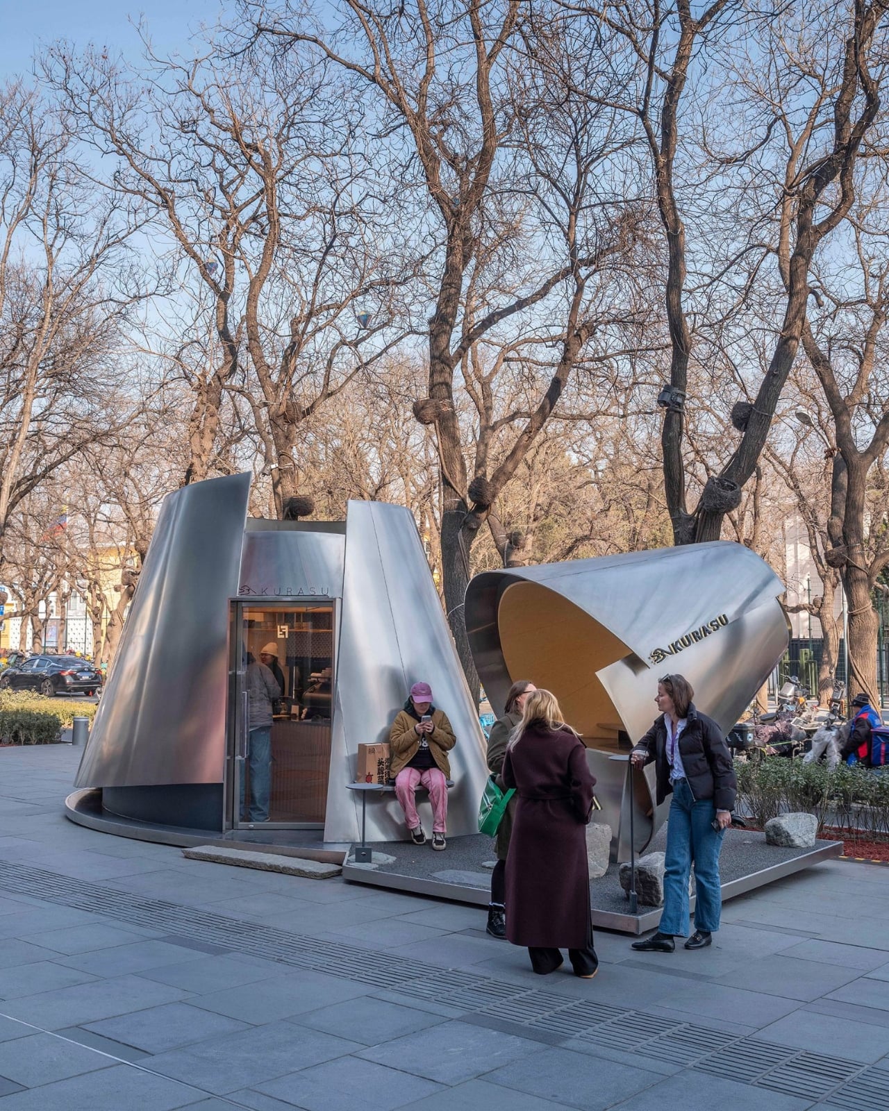
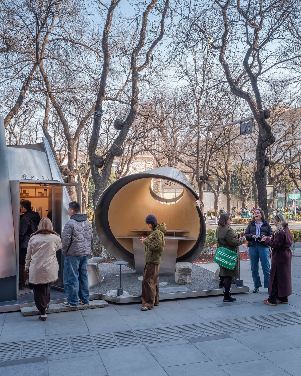
The studio’s latest project is a temporary coffee pavilion for Kurasu, the Kyoto-based specialty coffee brand, installed at Taikoo Li Sanlitun, one of Beijing’s most high-traffic outdoor retail districts. On the surface, it’s a pop-up kiosk. But spend a few seconds looking at it, and you realize it’s a fully considered piece of architecture that draws its entire form from a pour-over coffee dripper.

Designer: Atelier L

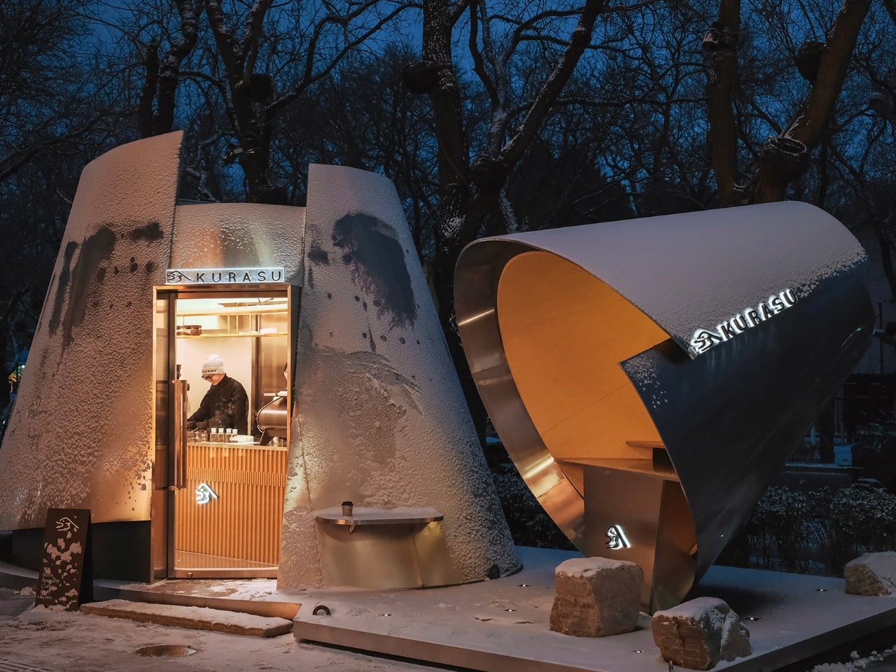
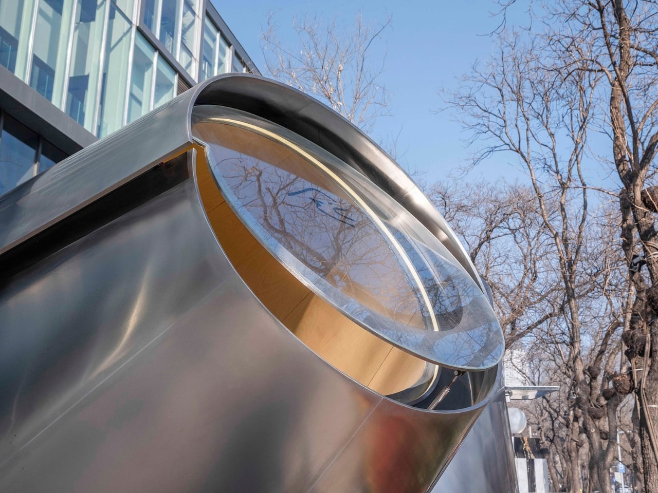
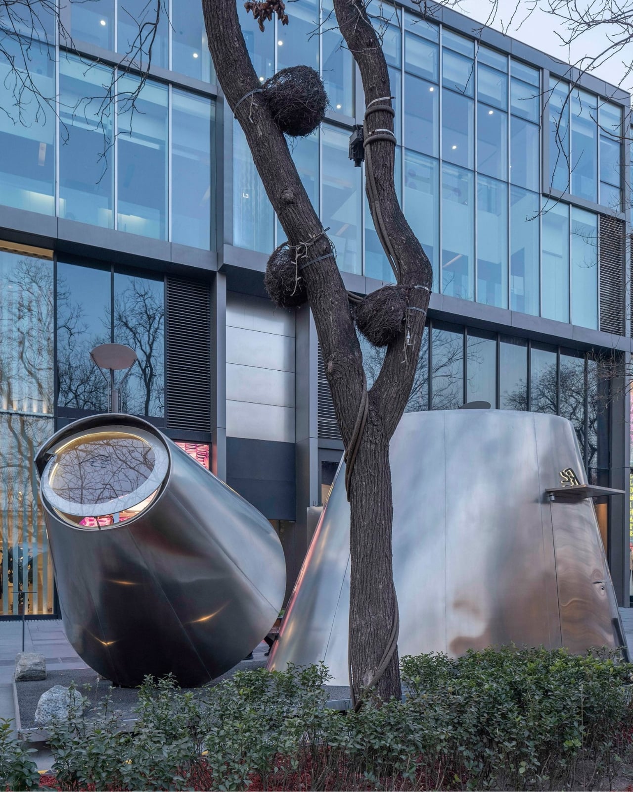
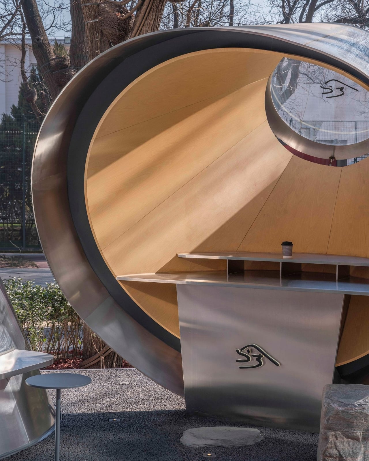
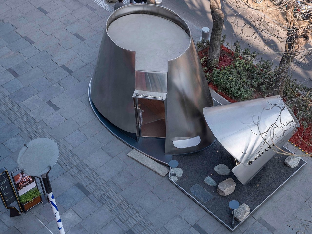
That’s the concept at the core of it: the geometry of a pour-over dripper, translated directly into architectural form. Atelier L scaled up the familiar conical vessel into two interconnected volumes, each clad in reflective stainless steel that mirrors the movement and light of the city around it. The inspiration nods to origami, which tracks visually. The structure reads as almost folded into place, light and precise rather than heavy or monolithic.

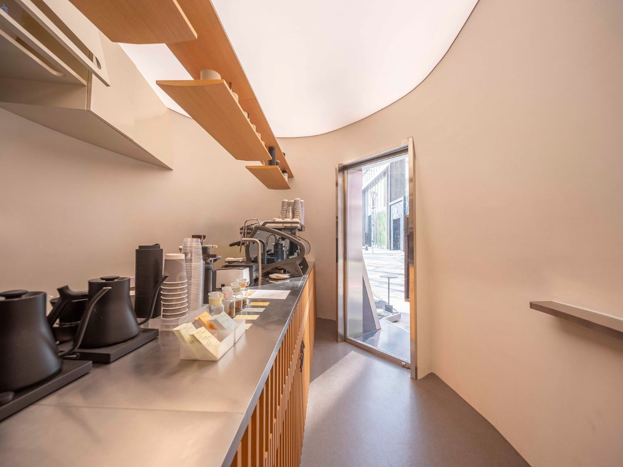
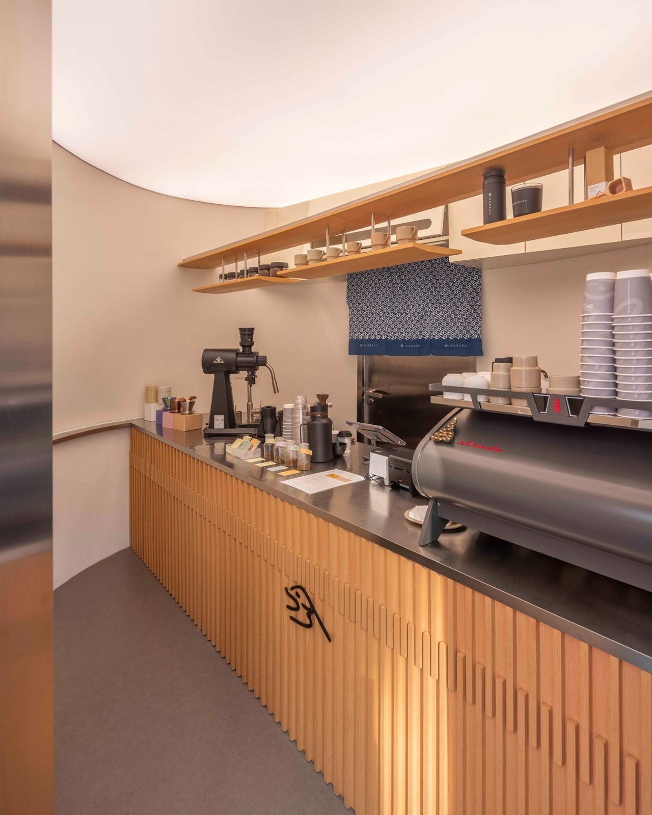
What makes the design smart rather than just clever is how the two volumes work separately but together. The larger one faces inward, creating a contained environment for the coffee ritual itself. A central linear bar clearly divides the space between barista and customer, and the wall inclinations, subtle as they are, actually serve a functional purpose: they create more movement space behind the counter while making the customer-facing side feel more expansive than its actual square footage. That kind of spatial sleight of hand is hard to achieve in a compact footprint, and Atelier L manages it without making you feel like you’ve noticed it.

The smaller volume does something entirely different. It cantilevers outward toward the street and functions as a display structure and micro gallery, which is an elegant answer to the challenge every pop-up faces: how do you engage passers-by without resorting to signage? Here, the architecture itself becomes the invitation.

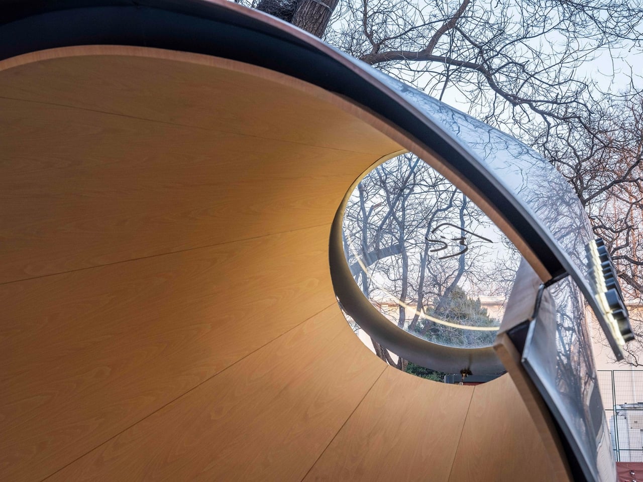
Materials are where my personal preferences become part of the read. The stainless steel exterior is striking without trying too hard. It catches the light, reflects the surrounding winter trees, and at dusk, the entire pavilion takes on the quality of a glowing lantern. But the interior feels more considered to me. Wood-grain aluminum brings warmth into what could easily have been a cold, overly minimal space, and the curved surfaces soften light across the small interior rather than bouncing it. The contrast between the pavilion’s cool, almost industrial exterior and its warmer interior is a deliberate design choice, and it works. The outside sets an expectation; the inside quietly revises it.

A steel base anchors both volumes, with its corners slightly lifted to maintain the illusion of paper-thin lightness. Dark gravel and natural stone slabs compose the ground plane. An operable glass roof keeps the interior connected to the sky, allowing the space to shift with the light and the movement of trees above. Those details matter. They’re what separate a thoughtful installation from a kiosk.

For a brand like Kurasu, whose identity has always been rooted in the quiet rituals of specialty coffee, a pavilion that architecturally embodies the act of brewing makes complete sense. The pour-over method is slow, precise, and intentional. The pavilion mirrors all of that. Whether the alignment between concept and experience was always the plan or sharpened through the process, it reads as completely resolved.

Pop-ups tend to get treated as design’s sketchpad, too temporary to be taken seriously. The Kurasu pavilion in Beijing is a case against that assumption. When the brief is specific and the constraints are real, a temporary structure can be as fully realized as anything permanent. Sometimes more so, because there’s no room to defer decisions or soften edges. You build it, it lands, and people either feel it or they don’t. This one lands.

The post A Pour-Over Dripper Inspired One of Beijing’s Best Pop-Ups first appeared on Yanko Design.