The beauty industry has been promising us “personalized skincare” for years. What usually comes out the other end is a quiz, a starter kit, and a monthly subscription box full of products you may or may not actually need. So when I came across Elio, a concept skincare device by Korean industrial designer Taehyeong Kim, I sat up a little straighter. Not because it makes bold promises, but because it looks exactly like something that already belongs on your counter, and that’s entirely the point.
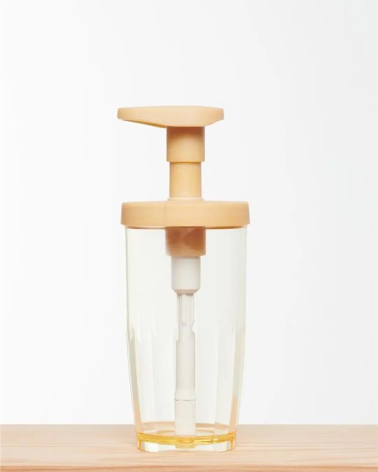
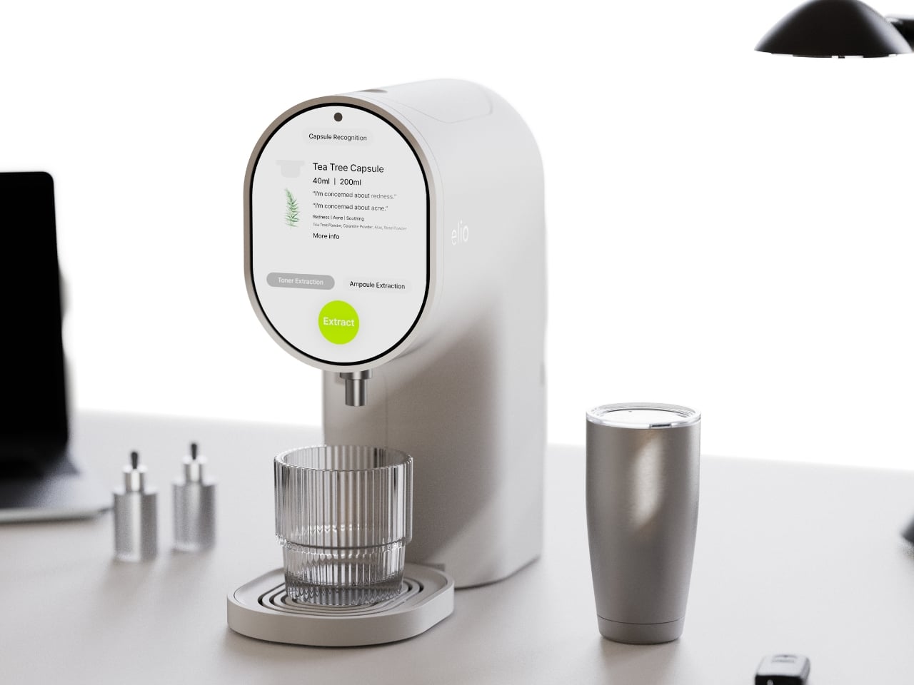
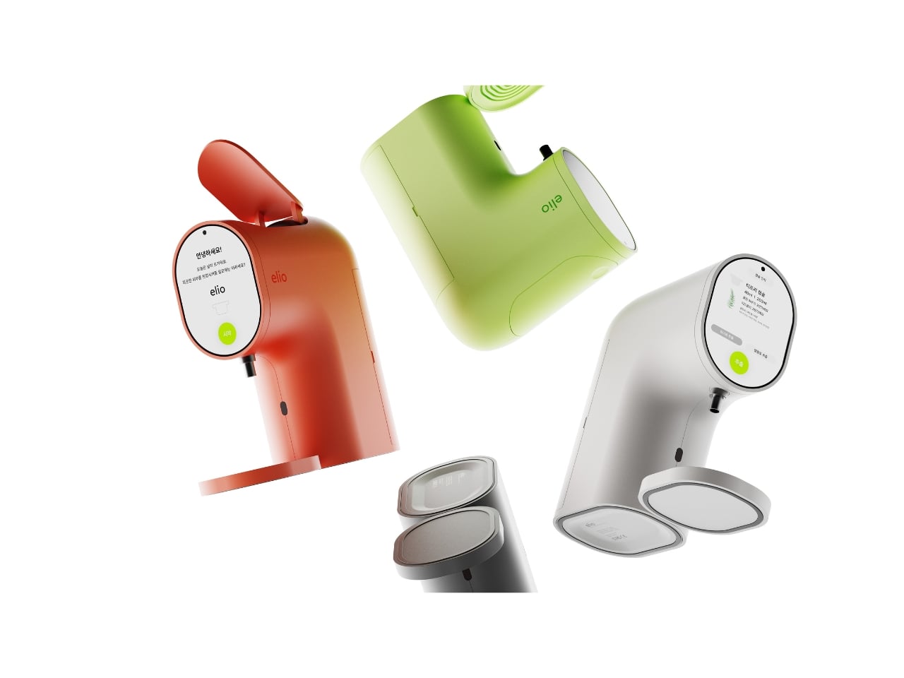
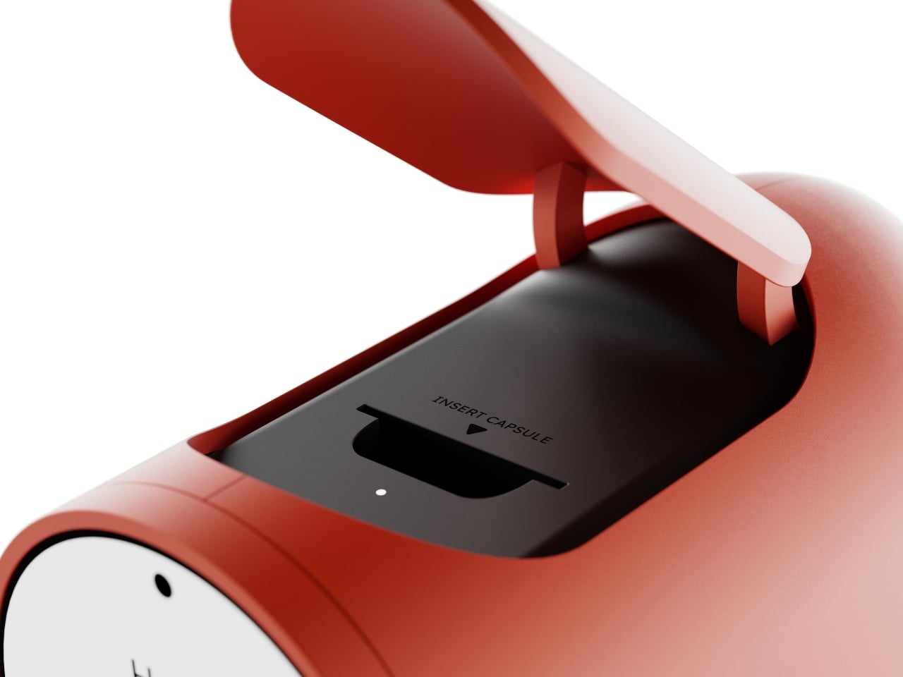
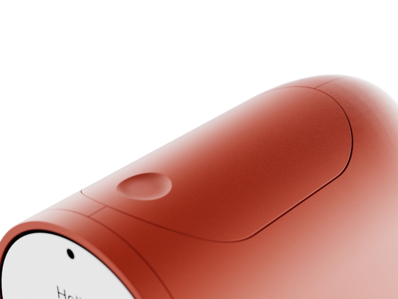
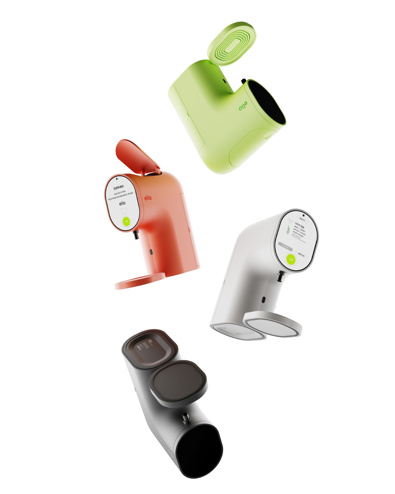
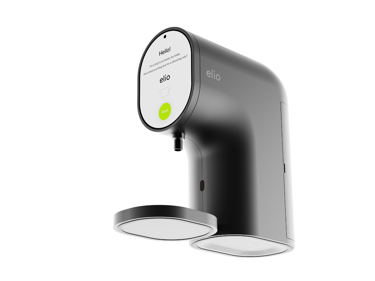
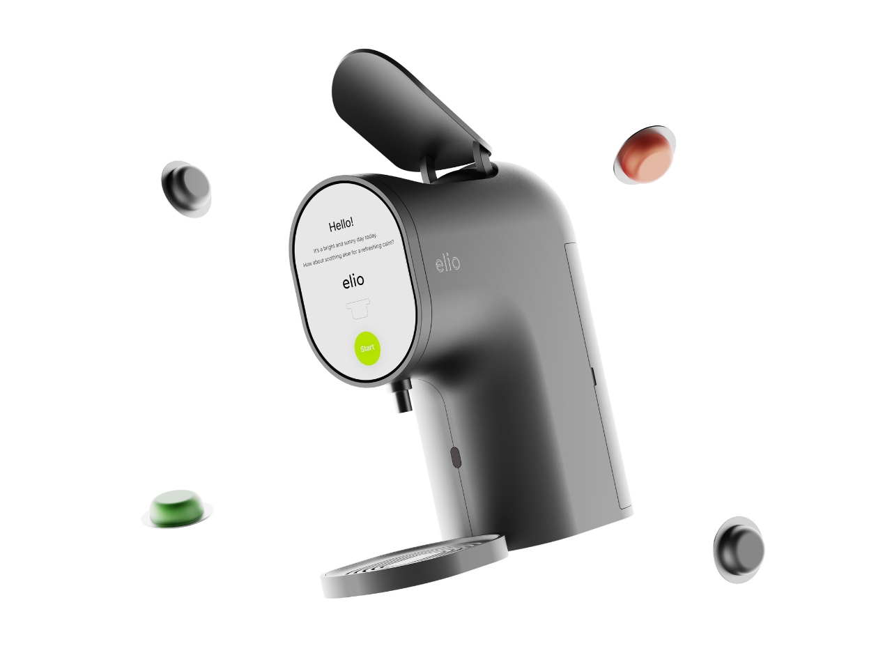
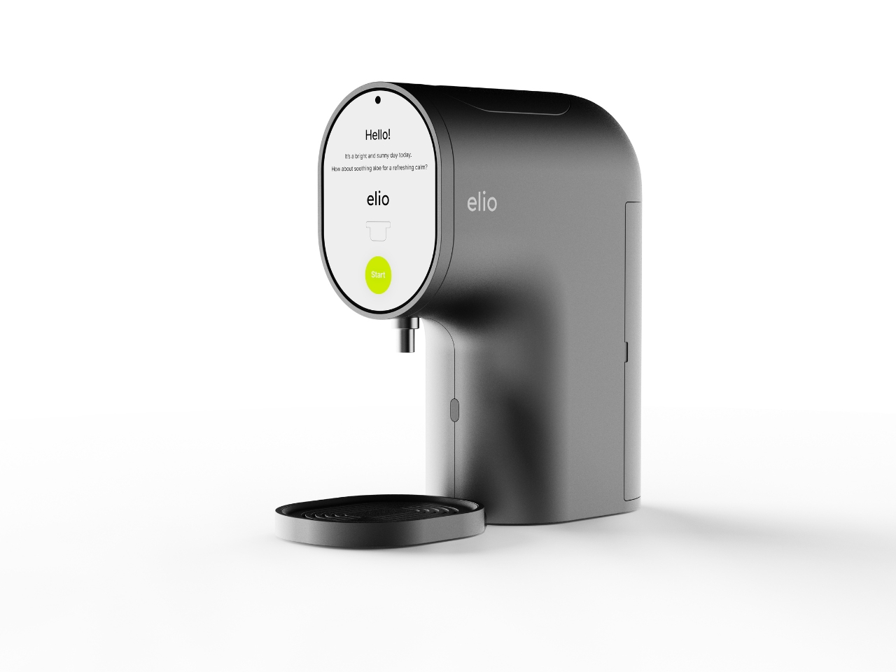
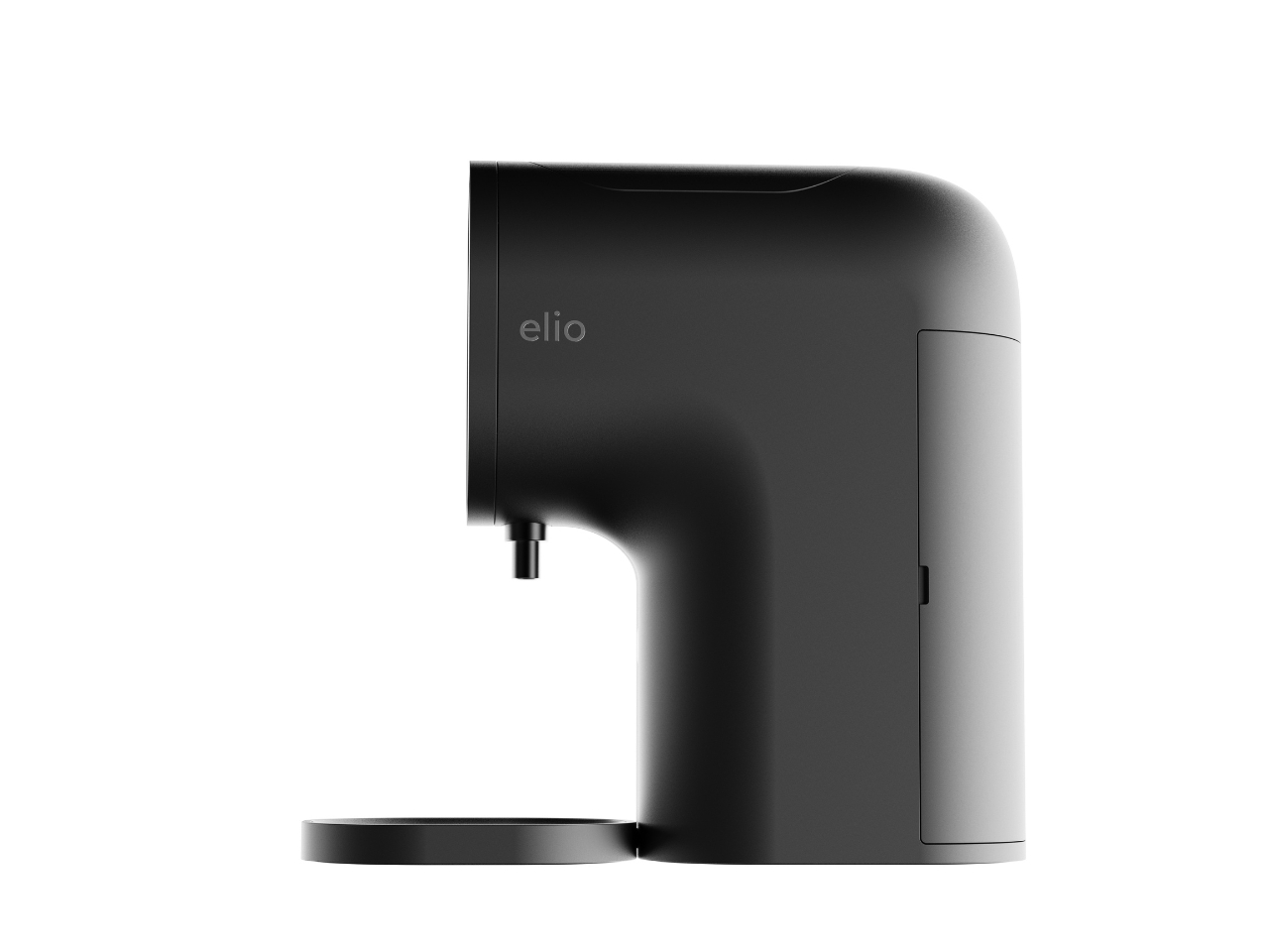
Elio looks like a coffee machine. Specifically, it looks like the kind of sleek pod coffee machine you’d find in a well-designed apartment kitchen. The body is compact and rounded, with a smooth curved neck that sweeps forward and a circular display face mounted front and center. A small nozzle sits just below the screen, and a flat tray rests at the base. Flip open the top lid and you’ll find a slot that literally reads “INSERT CAPSULE.” If you told someone this was a new Nespresso colorway, they’d believe you without question. That’s not a criticism at all. It’s one of the smartest design decisions in the whole concept.
Designer: Taehyeong Kim
The familiarity is doing real work here. One of the biggest friction points in getting people to actually use a skincare device consistently is that most of them look clinical, complicated, or just strange sitting on a bathroom shelf. Elio sidesteps all of that by borrowing the visual language of something people already love and trust. The rounded silhouette, the satisfying top-load mechanism, the single glowing green button on the display. It reads as approachable before you even know what it does.
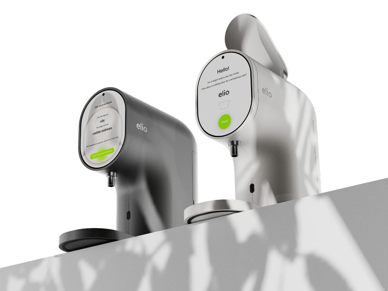
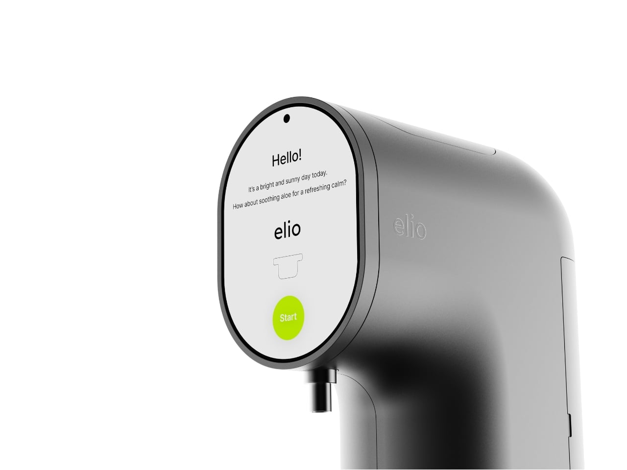
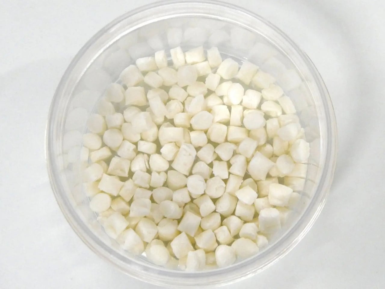
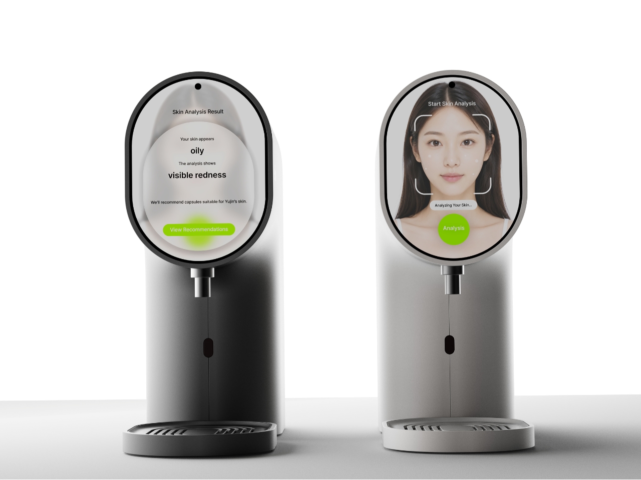
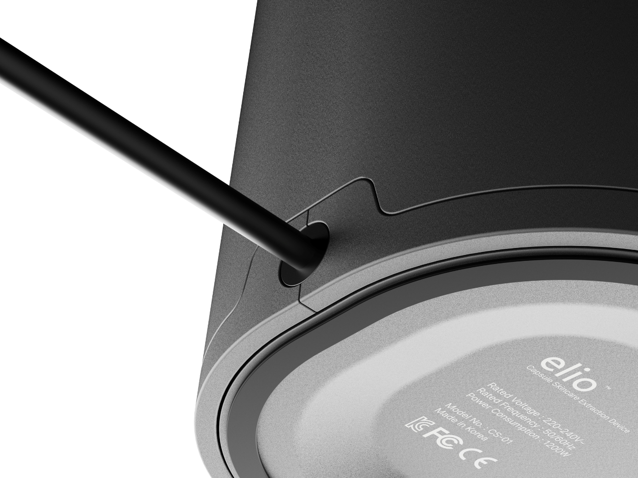
What it does is genuinely clever. Elio is an AI-powered skincare system that scans your skin in real time, reads your condition, and then dispenses a custom-formulated serum through a capsule-based delivery system. The circular display shows your skin analysis results directly, flagging things like oiliness or redness, then recommends the right capsule formula for that specific day. You load the capsule into the top slot, press the green button, and the device does the rest. The capsules themselves are small, pill-shaped, and almost jewel-like in the renders, orbiting the machine like they have somewhere important to be.
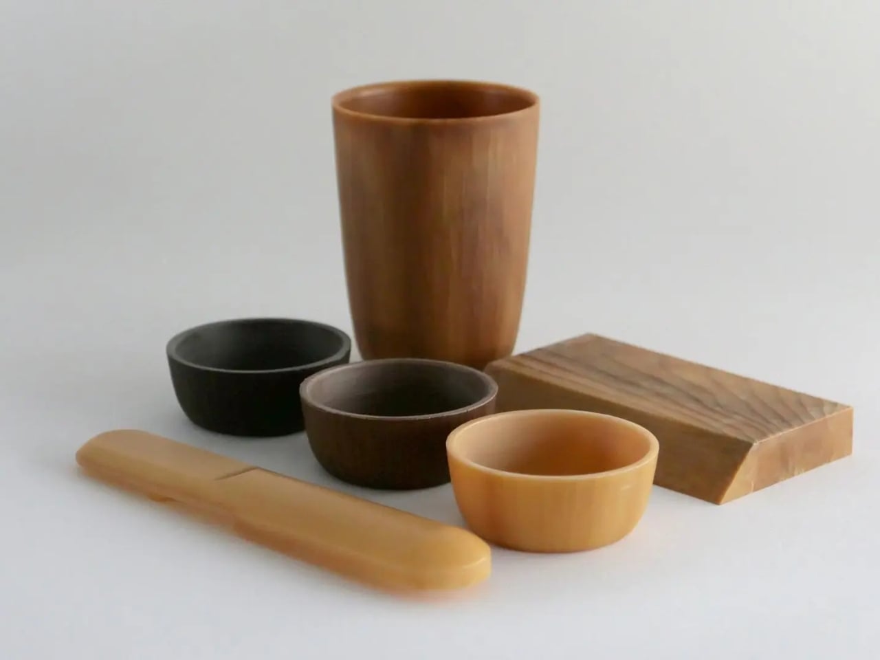
The color range is also worth talking about. Most skincare devices default to clinical white or muted grey and call it a day. Elio comes in a deep charcoal, a warm terracotta, a bold lime green, and a soft white. They all work, but the terracotta and lime green versions in particular feel like a deliberate statement. They want to be seen. They want to sit on your counter the way a designer object sits in a living room, as something you chose because you liked how it looked, not just what it did.
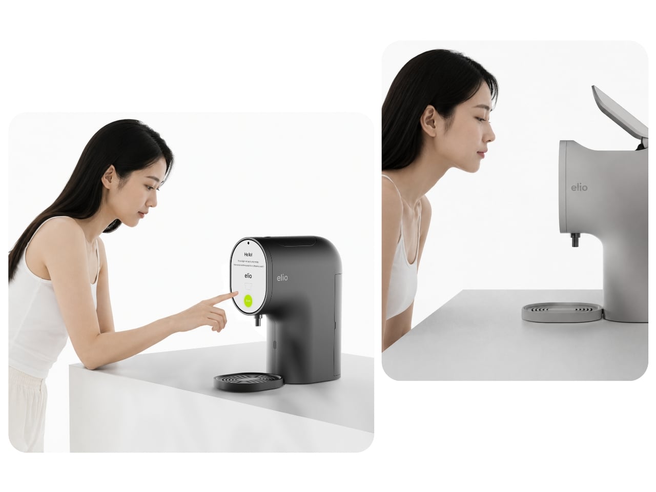
The detail I keep returning to is the skin scanning interaction. In the lifestyle renders, the user leans in close to the circular display, which doubles as the analysis interface. It’s an intimate, quiet moment, more ritual than routine, and it reframes what getting ready in the morning can feel like. Not a chore, not a checklist, but a small daily check-in with yourself. Whether or not that reads as overly poetic, the design actively encourages that interaction, and that’s intentional.
Kim is still a student designer based in Daegu, South Korea, and Elio has already picked up a Red Dot Design Award in 2025 alongside Gold and Silver wins at the Spark Design Awards. That’s a significant return for any portfolio piece. It also says something about where Korean industrial design is right now, producing work that doesn’t just look good in renders but thinks clearly about behavior, habit, and the emotional relationship between a person and the objects they live with.
Elio is a concept, not a product you can buy today. But it’s the kind of concept that makes you look at your current skincare shelf and feel a little impatient for the future.
The post The Skincare Device Concept That Makes Every Other One Look Lazy first appeared on Yanko Design.