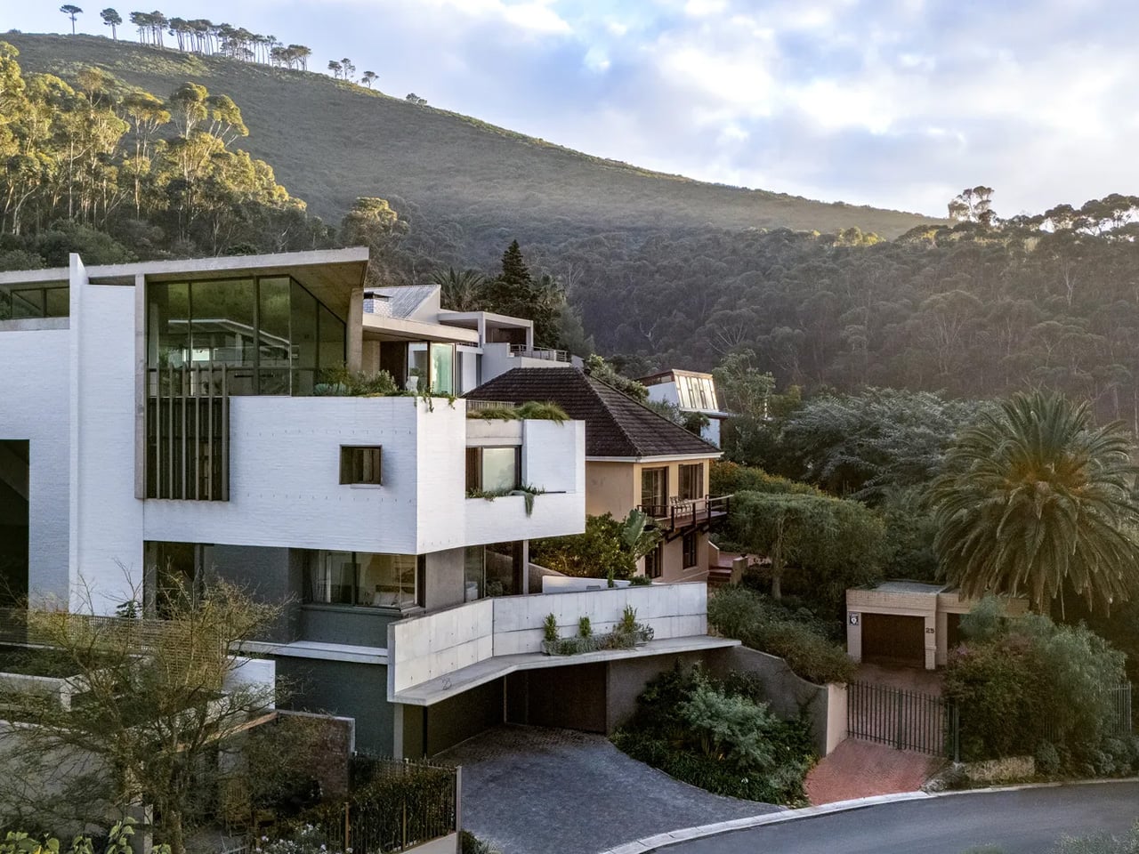
When Mark Bullivant, principal at South African architecture studio SAOTA, came across a steep, impossibly narrow plot in Cape Town’s Tamboerskloof neighborhood, most architects would have walked away. He bought it. The result is Kenmore — a personal home that quietly dismantles every assumption about what a tight site can hold.
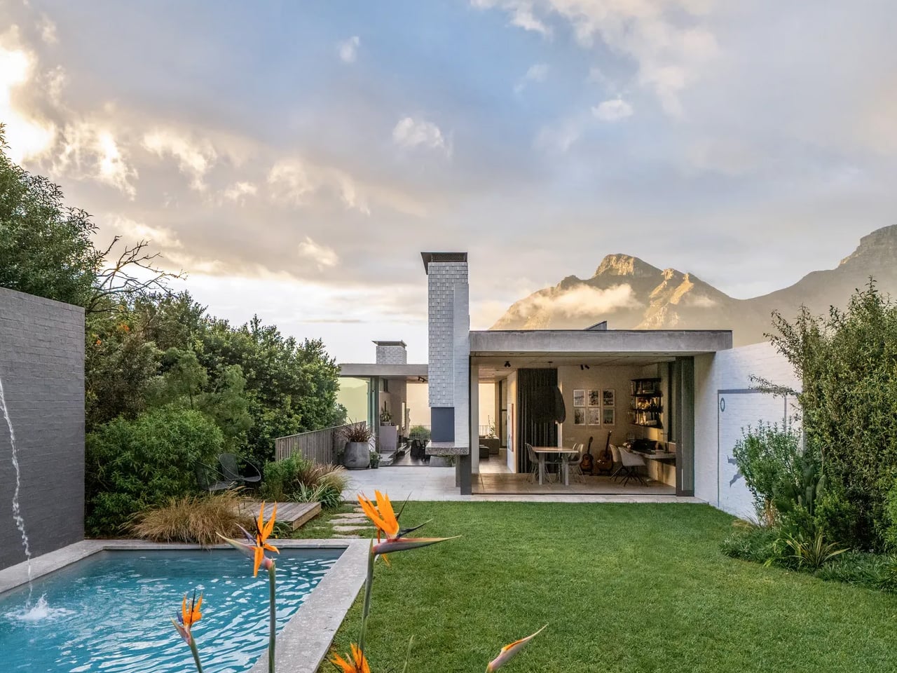
The numbers tell their own story. The plot stretches 58 meters long but only 14 meters wide, with the interior reaching a maximum width of just 7.44 meters. An existing structure occupied the land when Bullivant acquired it, but it was dark, fragmented, and unwieldy — torn down to make room for something entirely more considered. What replaced it sits on the hillside like a long, quiet exhale: terraces extending outward, oversized windows framing the landscape, a home that reads less like a building and more like a vantage point.
Designer: SAOTA Architecture Studio
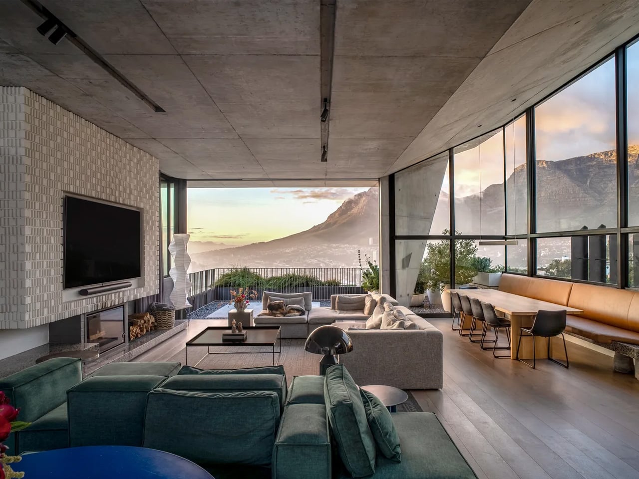
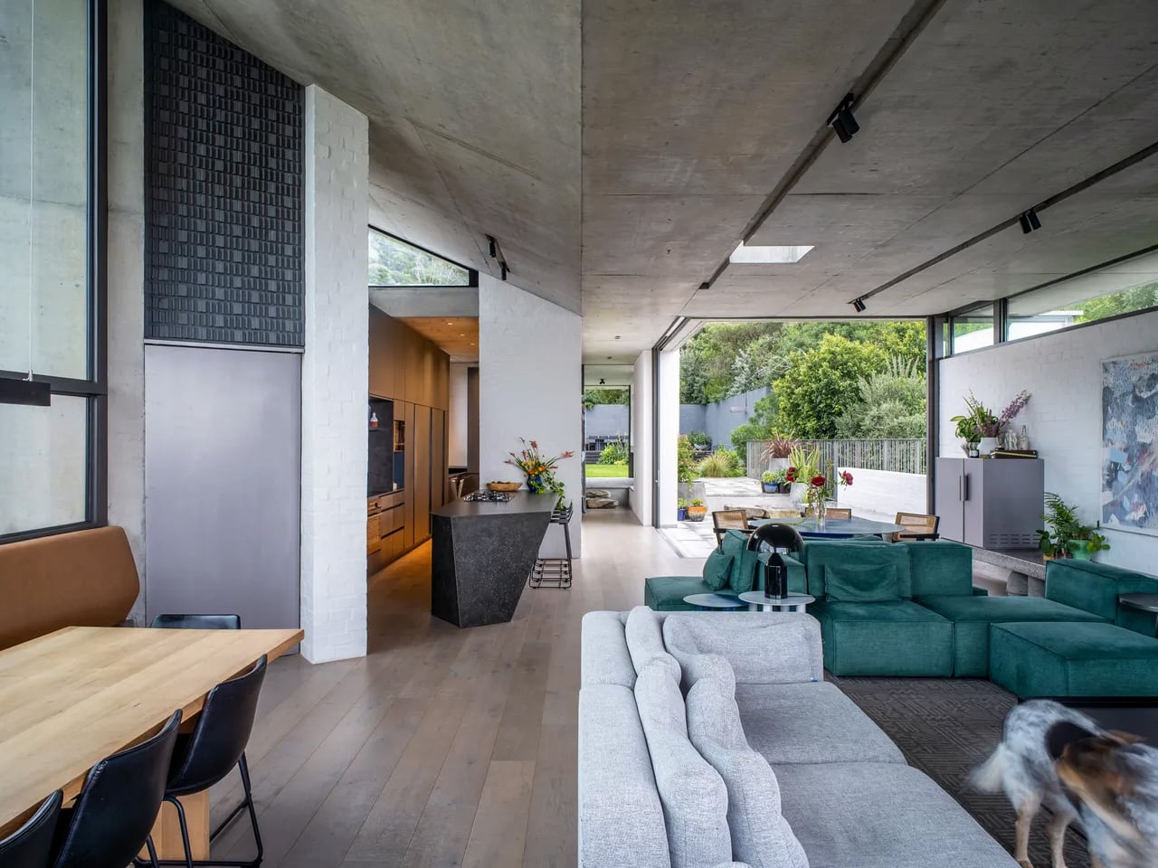
That framing was intentional. The most compelling views fall on the short sides of the property — east toward Table Mountain and west toward Signal Hill and the national park behind it. The architecture is organized entirely around those two axes, turning the site’s constraints into its greatest asset. Rather than fighting the narrow footprint, the design leans into it — producing a continuous, open living space that flows visually from front to back, resisting the fragmentation that plagued the original structure.
The decision to elevate the primary living level to the top of the house was driven by more than views. Placing it there allowed the home to connect directly to the landscape of Signal Hill and maximize sunlight — a critical move given the site’s limited northern exposure. It also made room for a meaningful garden, something Bullivant had set as a core ambition from the very beginning. What could have been a rooftop afterthought becomes, instead, a living threshold between architecture and the mountain that cradles it.
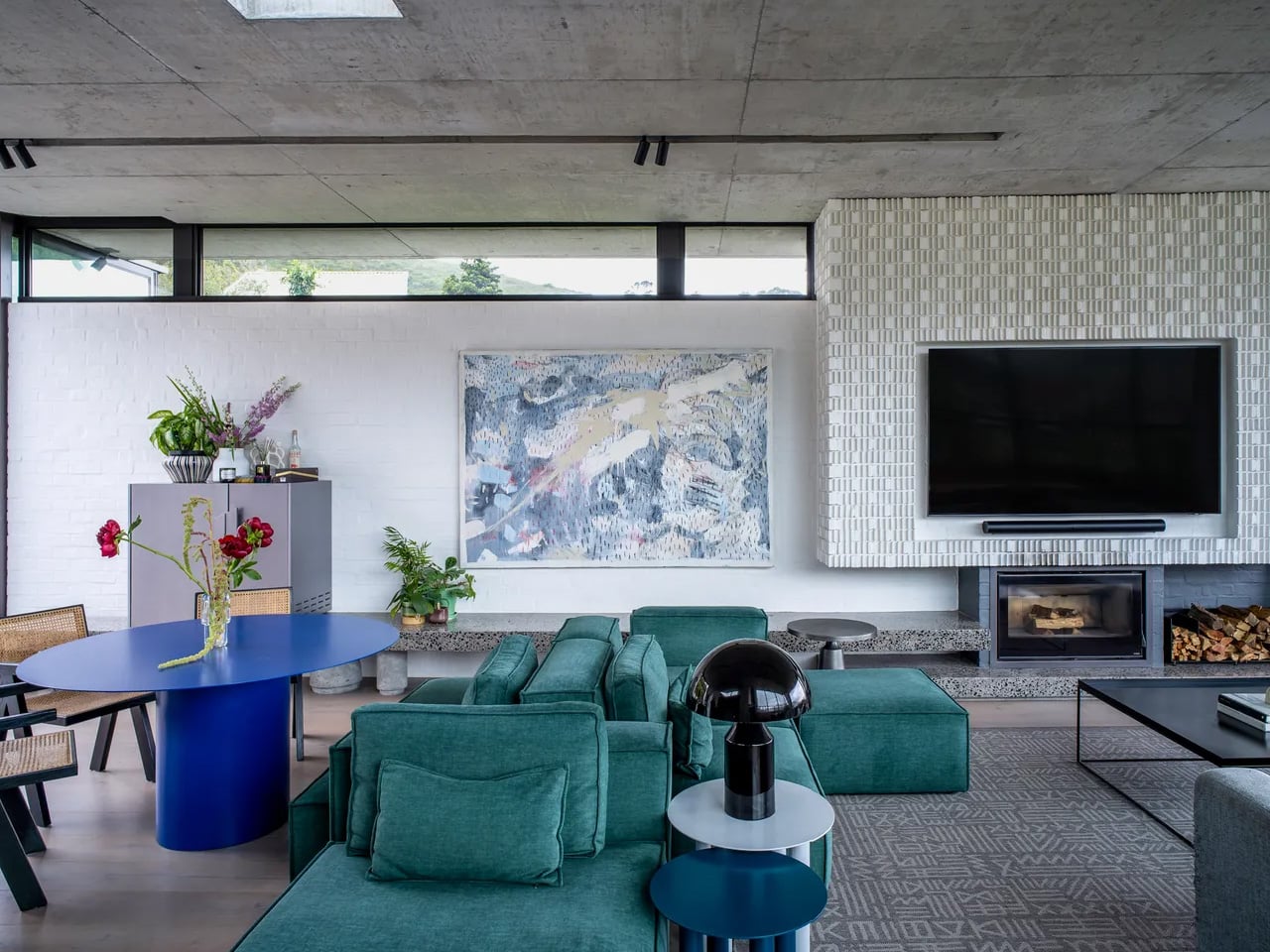
Spanning three levels with five bedrooms, the home never feels like a corridor with rooms attached. Bullivant was deliberate about that. He has never been drawn to living environments defined by a sequence of small, closed-off rooms — and the constraints of the site only pushed that instinct further. The communal spaces are fluid and generous, a pointed rebuttal to the idea that a narrow house must feel narrow.
Kenmore is, in many ways, SAOTA’s philosophy made domestic. The firm has built its reputation on reading a site’s limitations as a design mandate rather than a compromise. Bullivant just happened to live that philosophy out this time — quite literally. The house doesn’t just sit within its difficult terrain. It belongs to it.
The post SAOTA’s Kenmore Proves You Don’t Have to Sacrifice Space for an Impossibly Narrow Cape Town Hillside first appeared on Yanko Design.