This Stationary Tiny Home Has More Room Than Most City Apartments

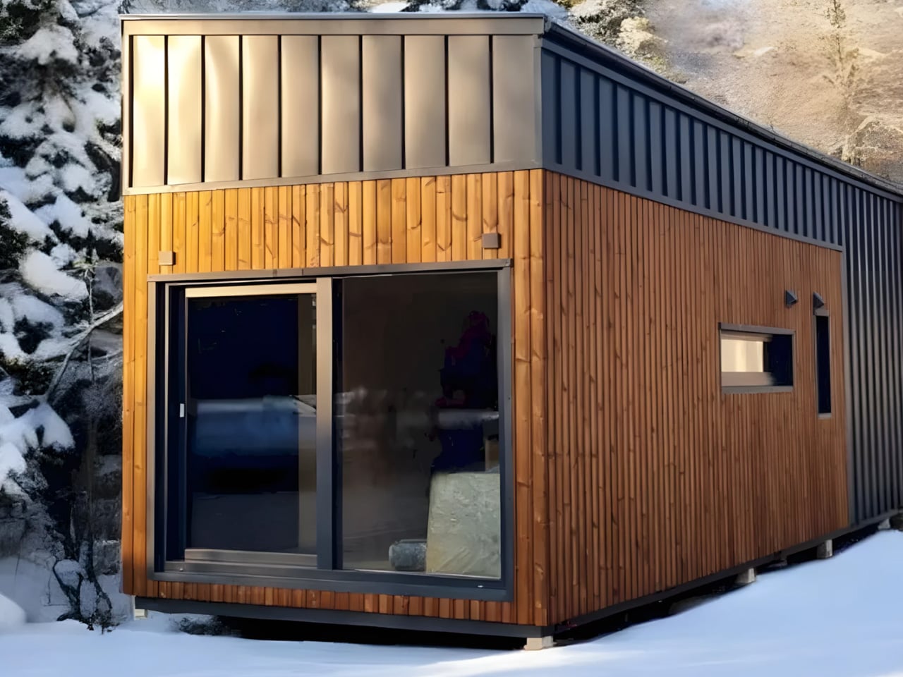
Most tiny houses ask you to make a trade-off. You get the romance of compact living, but sacrifice the one thing that makes a home feel like a home — space. Craft House, a modular builder operating across Poland, Austria, and Ireland, decided to flip that script entirely with the Samuel, a non-towable module house that prioritizes spacious full-time living over the freedom to hitch and go.

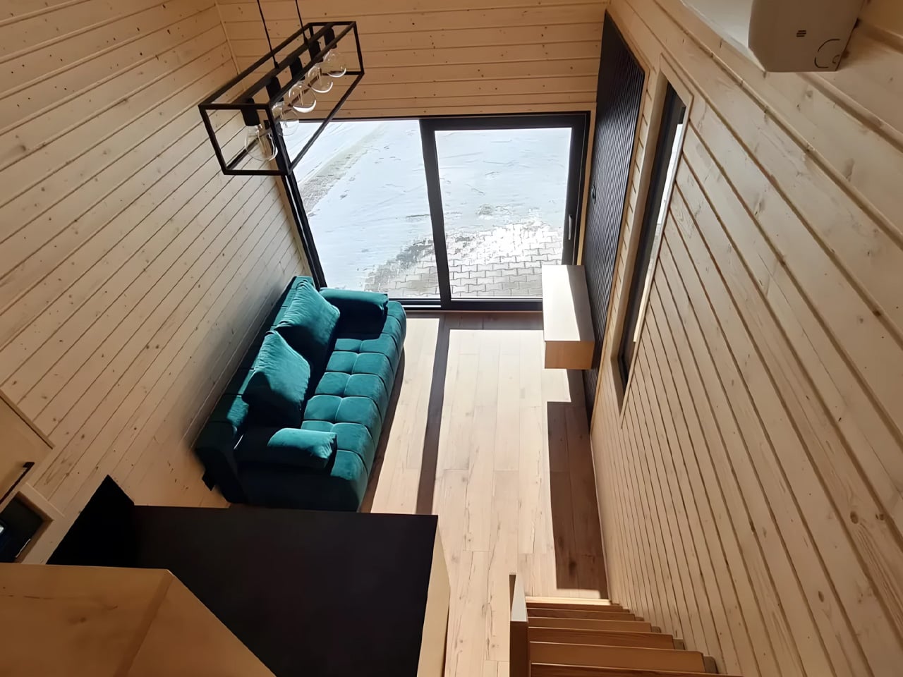
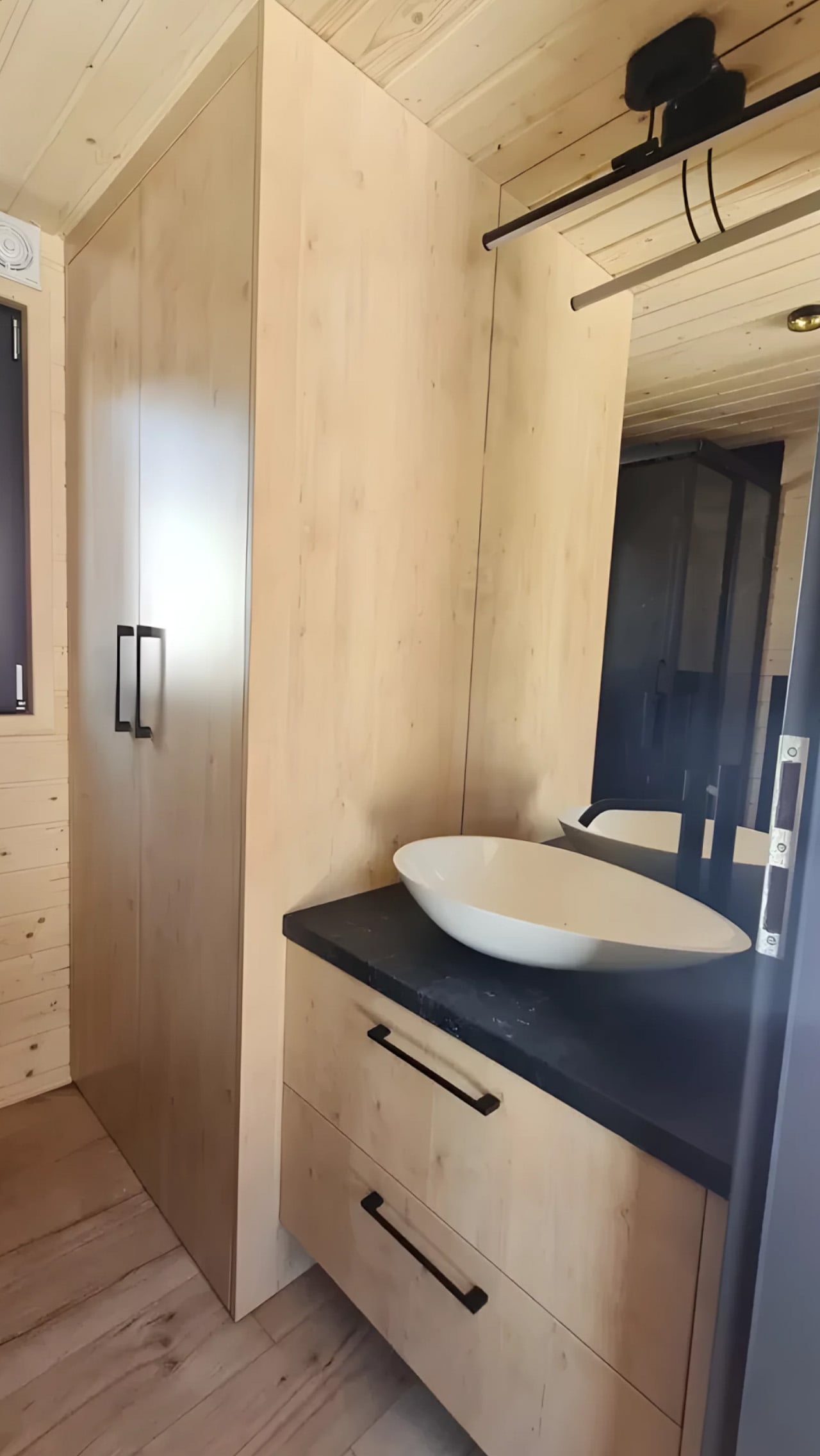
The Samuel sits at 10 meters (32 ft) long and an unusually generous 3.2 meters (10.6 ft) wide, measurements that push well beyond the European tiny home average. That extra width is deliberate. It’s what allows the interior to breathe in a way that most towable models simply can’t, opening up a layout that reads less like a cleverly compressed box and more like a well-considered apartment. The structure wears a single-pitched roof, topping out at 4.1 meters at the ridge, and is finished in engineered wood and metal, a clean pairing that reads industrial without feeling cold.

Designer: Craft House
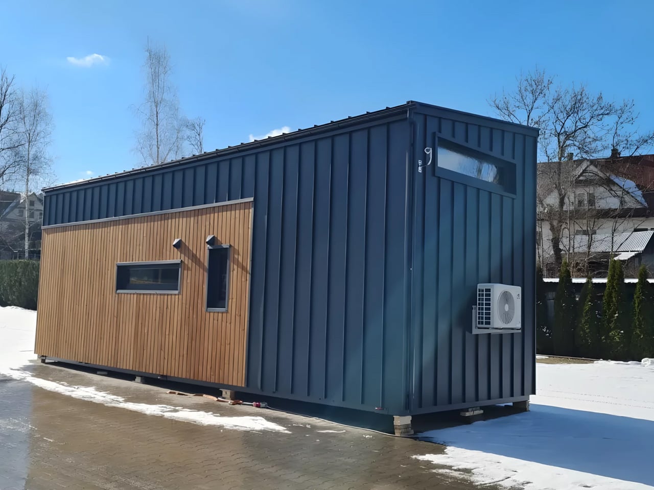
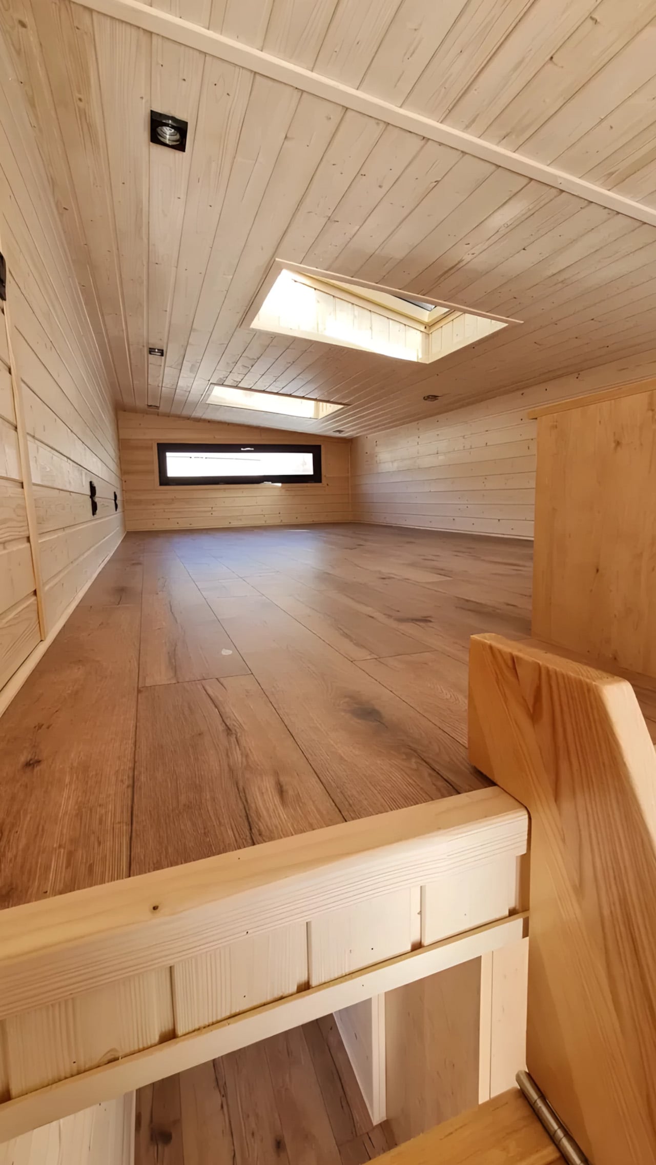
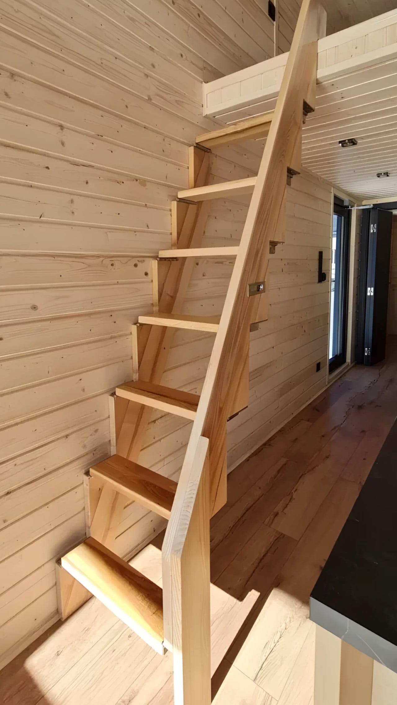
Inside, the ground floor spans 26 square meters, with a 13-square-meter mezzanine sitting above and a 4.3-square-meter bathroom rounding out the floor plan. The layout makes room for two distinct sleeping areas, and the volume created by the sloped ceiling gives the mezzanine level a loft-like quality that larger homes often fail to capture. Optional off-grid upgrades are also on the table, making the Samuel a realistic candidate for plots far beyond urban infrastructure.

What Craft House understood when designing the Samuel is that the tiny home market has two very different buyers. There’s the nomad, always ready to hitch the trailer and head somewhere new. Then there’s the person who simply wants a well-designed, right-sized home that doesn’t carry the financial weight of a conventional build. Samuel is clearly built for the latter. By dropping the wheels and leaning into a fixed footprint, Craft House was able to allocate width and volume in ways that towable structures prohibit by law and logistics.
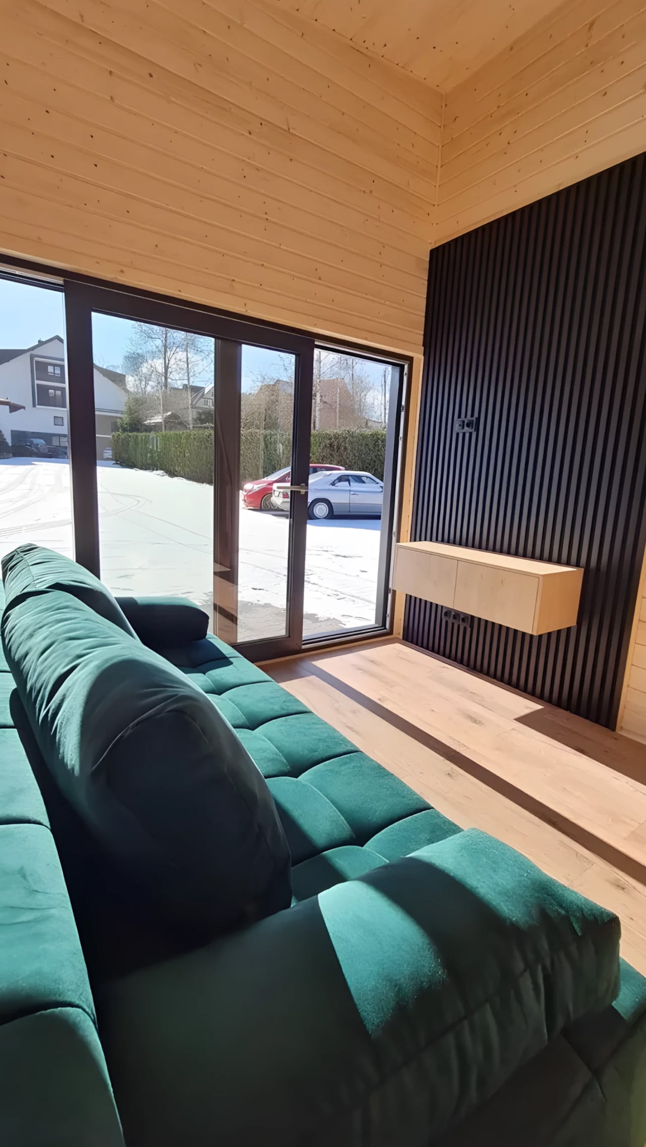
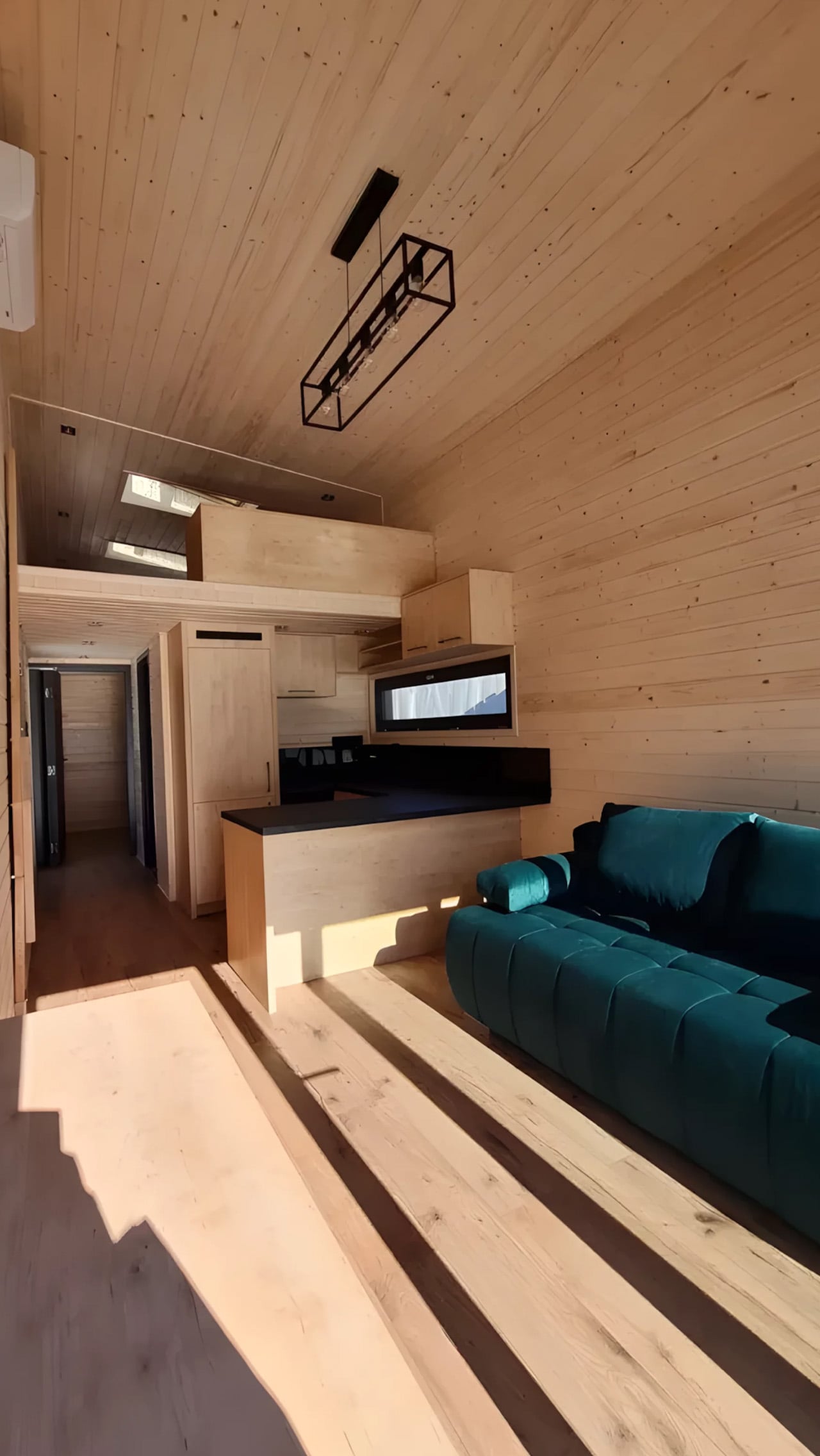
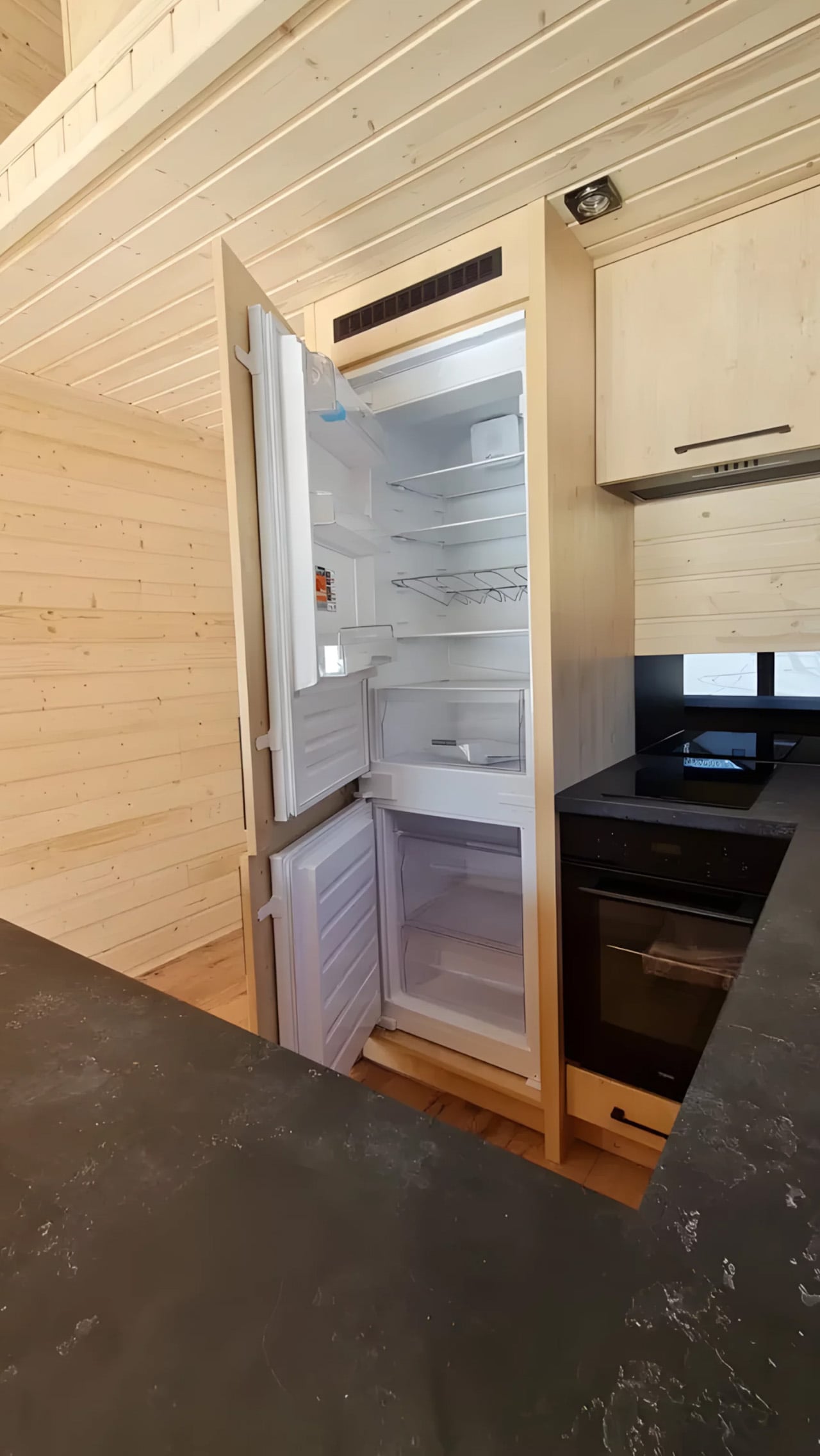
Priced at around US$72,000, the Samuel lands in a range that makes it a genuinely viable alternative to traditional housing in several European markets. It isn’t trying to be everything. You won’t be parking it in a new location every season. What it offers instead is something arguably more valuable: a permanent, considered space that proves small doesn’t have to mean cramped, and that the best tiny homes aren’t always the ones with the biggest adventures, but the ones that make staying put feel worth it.
The post This Stationary Tiny Home Has More Room Than Most City Apartments first appeared on Yanko Design.


This Sculptural Glass Object Makes Flowers Feel Like a Van Gogh Painting

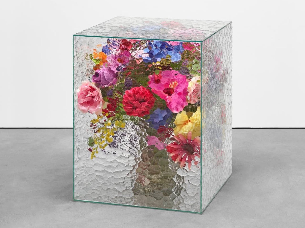
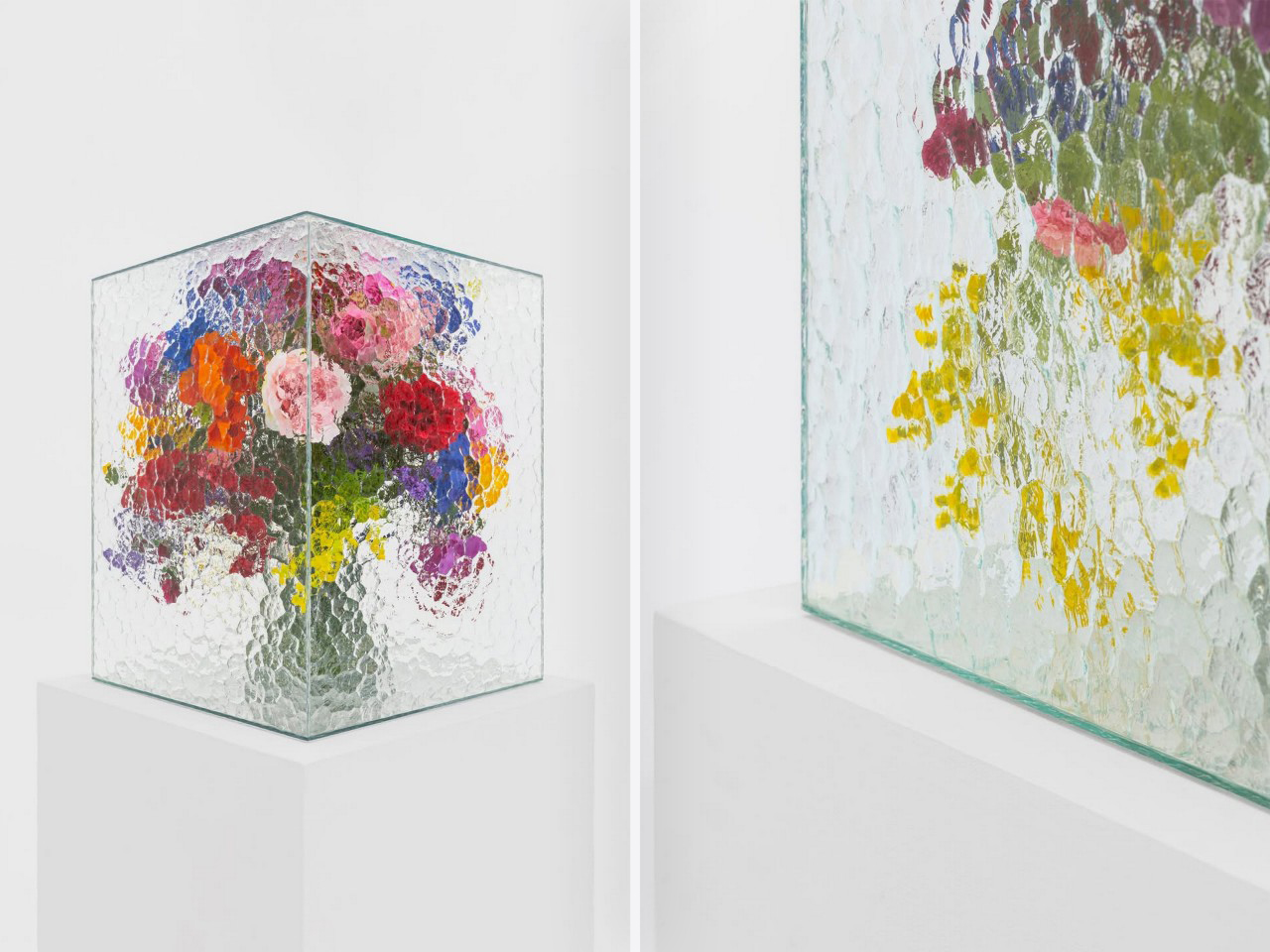
There is something instantly familiar about patterned glass. We have seen it in old windows, cabinet doors, bathroom partitions, and quiet corners of homes where privacy and light needed to exist together. It is a material that usually stays in the background, doing its job quietly. With Violet Frosted, designer Marius Boekhorst brings that overlooked material forward and turns it into something sculptural, expressive, and quietly poetic.

At its heart, Violet Frosted is a geometric glass object that plays with flowers, light, color, and texture. What makes it interesting is the way it changes how we see what is placed behind it. The frosted, patterned glass softens the flowers, turning bright petals and stems into blurred fields of color. A flower becomes a shadow, a brushstroke, a violet glow, or a faded green line depending on where you stand.

Designer: Marius Boekhorst

That is where the charm of the piece begins. Instead of presenting flowers directly, Violet Frosted filters them. It creates a gentle distance between the viewer and the arrangement. That distance makes you look closer. It asks you to slow down and notice how color shifts through glass, how a shape becomes unclear, and how something ordinary can feel painterly when it is partly hidden.

In many ways, Violet Frosted feels like a still life painting brought into the real world. Traditional still lifes capture flowers in one fixed composition, frozen in paint and time. This piece lets the still life move. The flowers change as they bloom and fade. The light changes throughout the day. The view changes as you move around it. From one angle, the arrangement may feel bold and graphic. From another, it becomes soft, quiet, and almost dreamlike.

The design feels especially beautiful because it does not try too hard. It avoids excess decoration. The form is clean and almost architectural, while the patterned glass gives it warmth and character. It feels contemporary without losing the memory of where the material comes from. That balance between old and new gives the piece its quiet confidence.

Violet Frosted also carries a museum-like feeling, though it never feels precious or untouchable. It brings the mood of a gallery into everyday space. A table, shelf, or windowsill suddenly feels more considered. A simple floral arrangement becomes an experience. You are looking at flowers through atmosphere, texture, and light.

Violet Frosted reminds us that design does not need to shout to stay with us. Sometimes, the most memorable objects are the ones that shift how we see familiar things. By turning patterned glass into a living frame, Marius Boekhorst creates a piece that sits between a vase, a sculpture, and a painting. It is functional, emotional, and deeply visual. It holds flowers, and it holds a moment.

The post This Sculptural Glass Object Makes Flowers Feel Like a Van Gogh Painting first appeared on Yanko Design.

Kohler’s Smart Shower Purifies and Recirculates up to 80% of Water per Shower

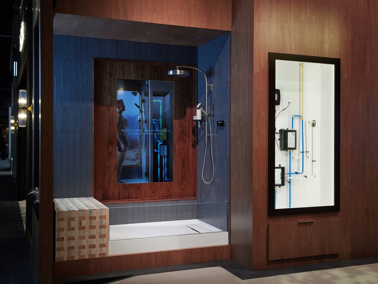
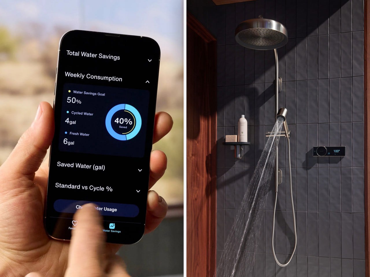
For a decade, the smart shower category was essentially a thermostatic valve with an app stapled to it. Not particularly useful unless you consider “Hey Alexa, switch on my shower” to be the pinnacle of smart home automation. Essentially, the water itself still ran the same path it always had: supply line, showerhead, drain, gone. Kohler’s Anthem EvoCycle, announced February 2026 and shown live at KBIS, is the first product from a major fixture brand that questions what a smart bathroom should be. The answer? Something more than a voice-activated or app-controlled shower. Something more like a shower that recycles 80% of its water every time you bathe.

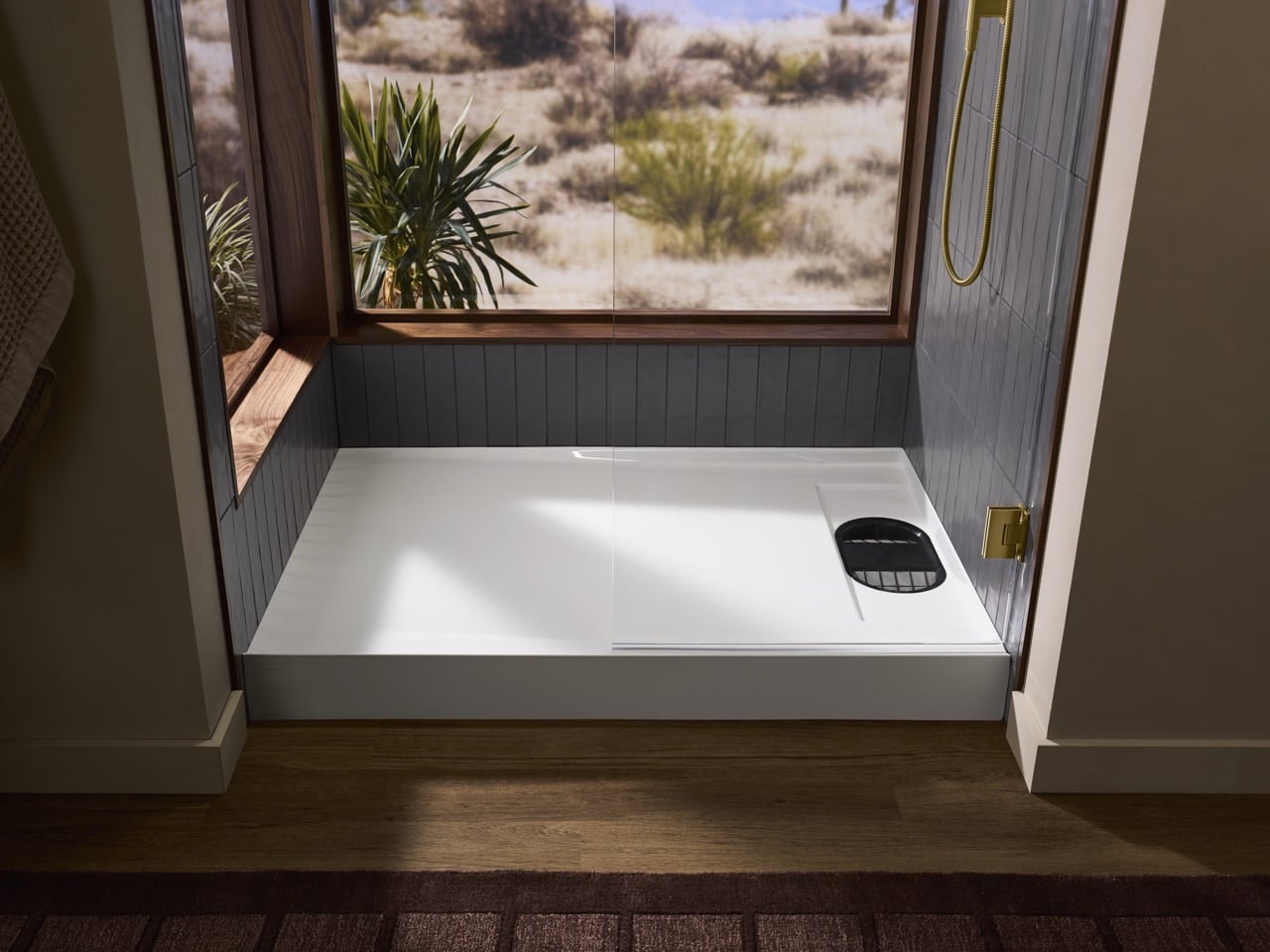
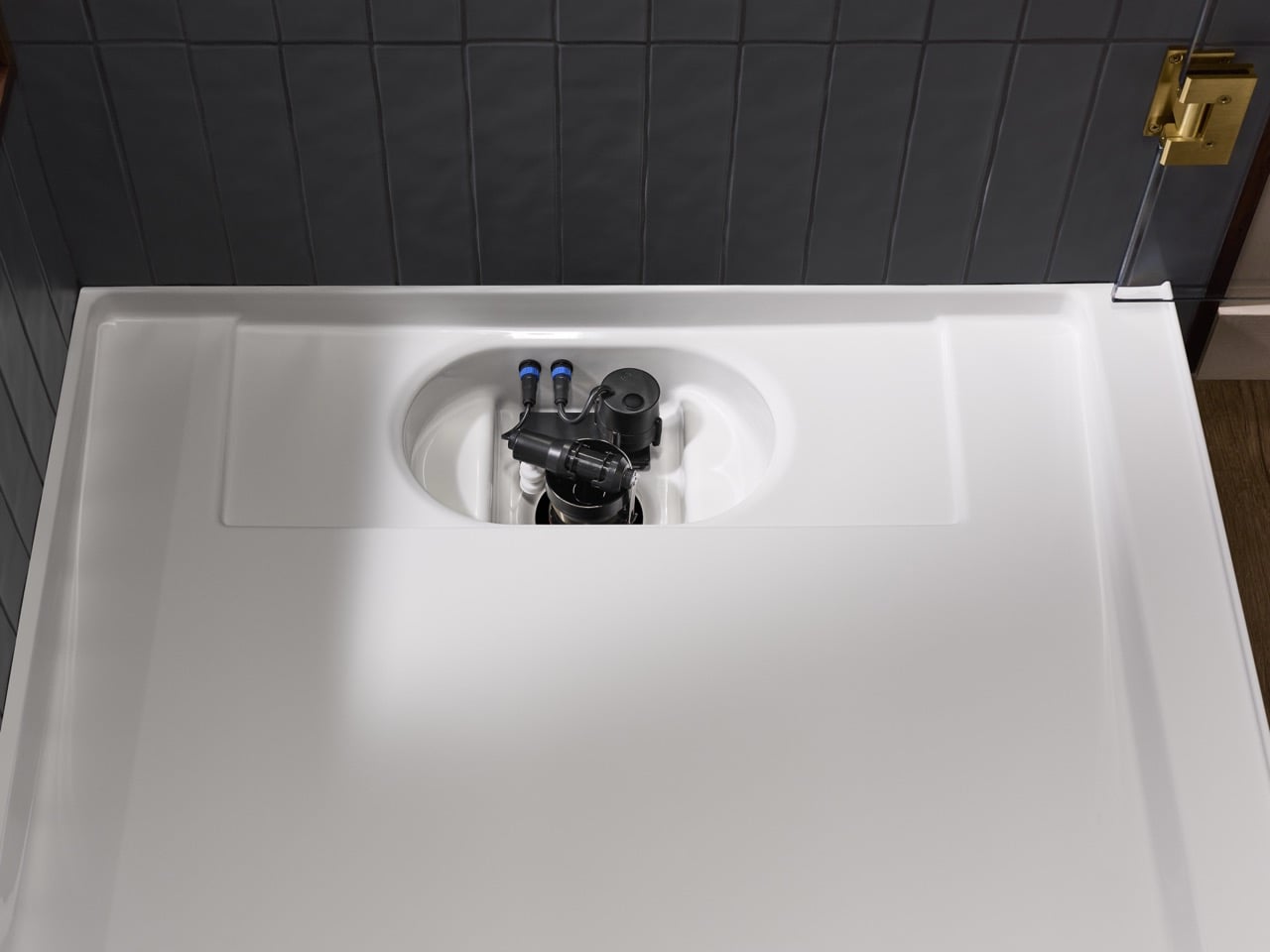
The magic lies in your bathroom’s subfloor. The EvoCycle’s recirculation loop lives 4.5 inches below your shower base in a purpose-built receptor sump, paired with a pump, an ozone sanitation system, and a closed filtration loop that processes your shower water and sends it back through the showerhead mixed with 0.5 gallons of fresh water per cycle. Kohler’s claim is 80% water savings at full flow pressure, and the design work required to make that claim feel like a regular shower experience instead of a sustainability-driven compromise is perhaps the most interesting part about this entire product’s UX.

Designer: Kohler

The system runs in two modes. Standard Mode is exactly what it sounds like: fresh water, normal shower, nothing unusual happening. Cycle Mode is where the engineering earns its keep. Once activated, the system fills the subfloor reservoir, then begins running that water through a closed filtration loop while continuously mixing in fresh input. The result hits the showerhead at full pressure, which matters enormously because the biggest psychological hurdle any recirculating system faces is the moment the flow drops and you suddenly become very aware that something unconventional is happening beneath your feet. Kohler clearly stress-tested that experience, because maintaining full pressure wasn’t a given. Orbital Systems, the Swedish company that pioneered residential recirculation technology from aerospace-derived origins, solved the same problem at roughly $3,995. Kohler’s full system comes in at $5,625 for the smart shower hardware alone, with the receptor base and installation on top of that. The price delta is smaller than you’d expect, but Kohler brings something Orbital never had: contractor relationships, showroom presence, and a brand name that appears on spec sheets without requiring an explanation.

The sanitation story is where the hidden complexity really accumulates. Recirculated shower water is only as good as what’s been done to it between uses, and Kohler’s answer is ozone. The system runs an automated Rapid Clean ozone cycle after every single shower, no pods, no chemicals, no user action required. A monthly Deep Clean cycle goes deeper, and the receptor filter pulls out for a dishwasher run. That maintenance architecture was clearly designed for the person who will never read a manual, which is essentially everyone. The Kohler Konnect app handles remote start, temperature control, water usage tracking, and cleaning cycle management, so the whole system is accessible without ever touching the wall-mounted digital control panel.

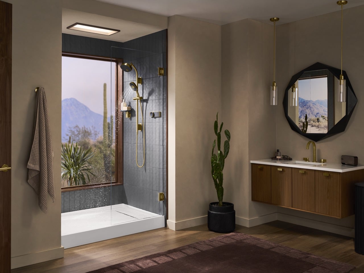
There are five receptor size options ranging from 48 by 32 inches up to 60 by 42 inches, left and right drain configurations, and four finish choices: Vibrant Brushed Moderne Brass, Polished Chrome, Matte Black, and Vibrant Brushed Nickel. The system is also compatible with any Kohler showerhead or rainhead, so you’re not locked into a specific spray experience. What you are locked into is the construction timeline. The subfloor cutout has to happen during the building or renovation phase, which means this is a conversation you have with your contractor before the concrete goes down, not after. For luxury new builds and serious bathroom renovations, that’s a manageable constraint. For anyone hoping to retrofit an existing shower over a weekend, it isn’t.

That construction dependency is also, in a strange way, the product’s strongest design statement. Kohler built something that requires genuine commitment, a system that can’t be undone with a screwdriver and an afternoon. The smart shower category spent a decade adding features you could turn off. The EvoCycle is a feature you build your bathroom around.

The post Kohler’s Smart Shower Purifies and Recirculates up to 80% of Water per Shower first appeared on Yanko Design.

This NYC Restaurant Was Built From Materials Other Designers Threw Away – And It Looks Stunning

Interior design has a quiet problem that rarely makes it into glossy magazine spreads. Behind the polished renders and immaculate finishes lies an uncomfortable truth. Enormous amounts of material are discarded in the pursuit of perfection. Samples are ordered and then rejected. Finishes are replaced for being slightly off. Entire surfaces are redone for the sake of visual consistency. Waste is not a byproduct. It is often built into the process.

Gourmega in Manhattan offers a different way of thinking.  The restaurant does not attempt to hide imperfections. It leans into it. It reframes it. And in doing so, it turns restraint into a form of luxury.

Designer: Mariam Issoufou Architects

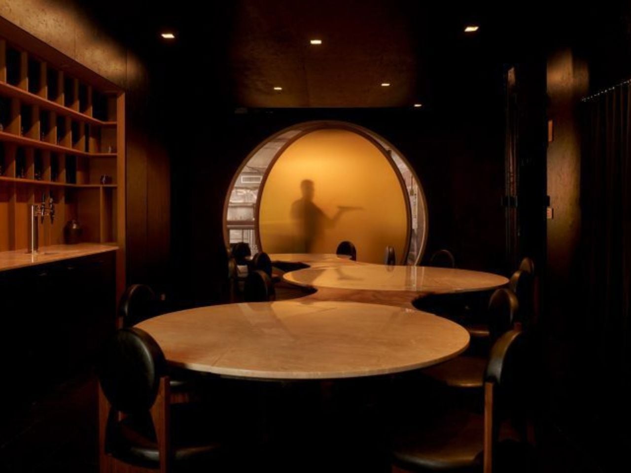
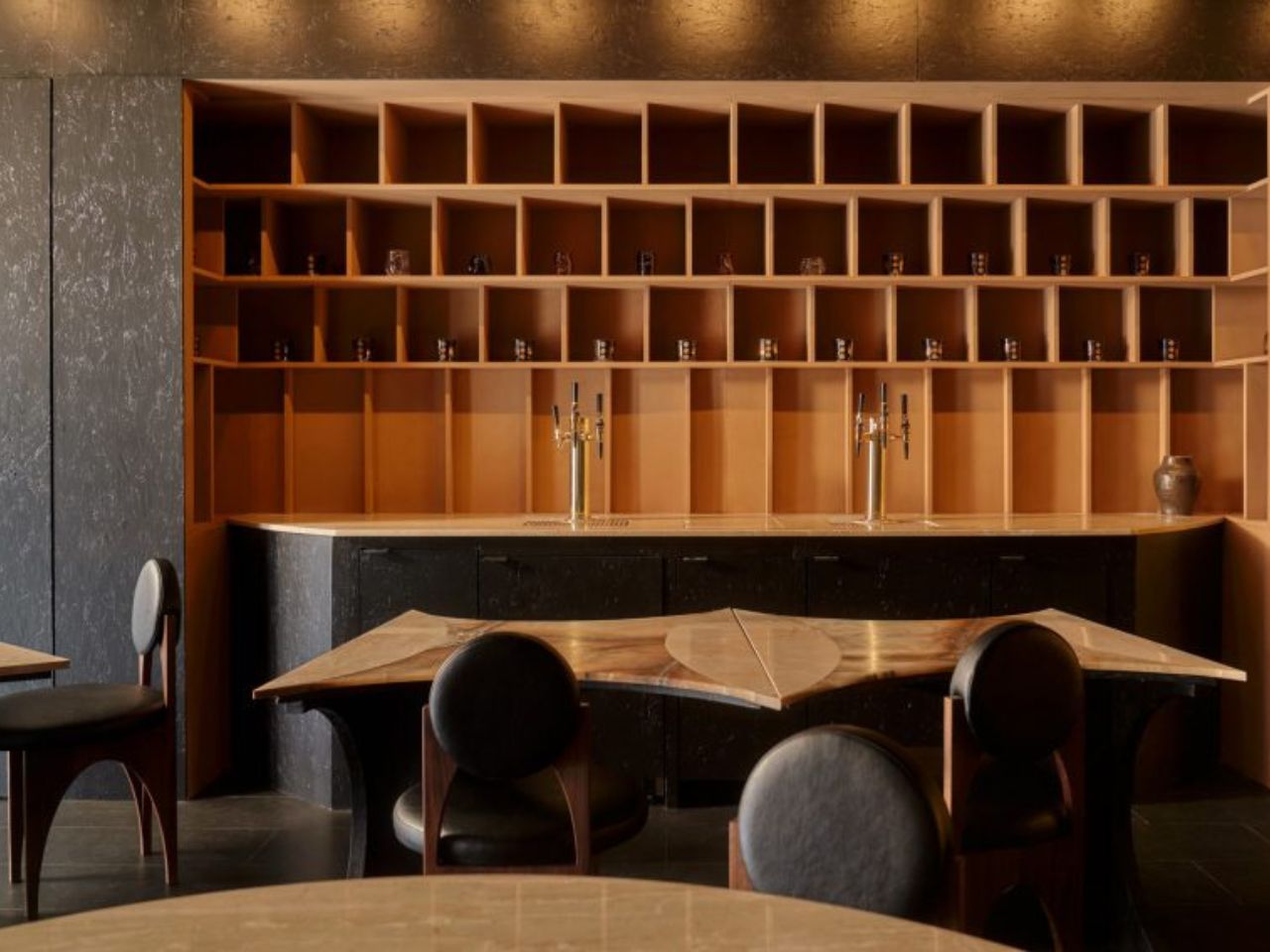
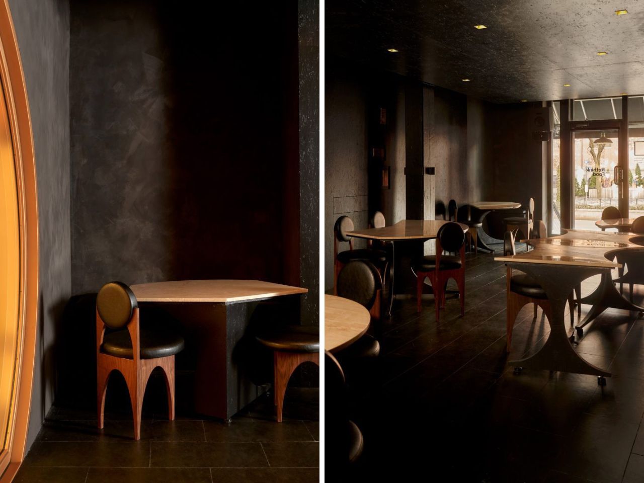
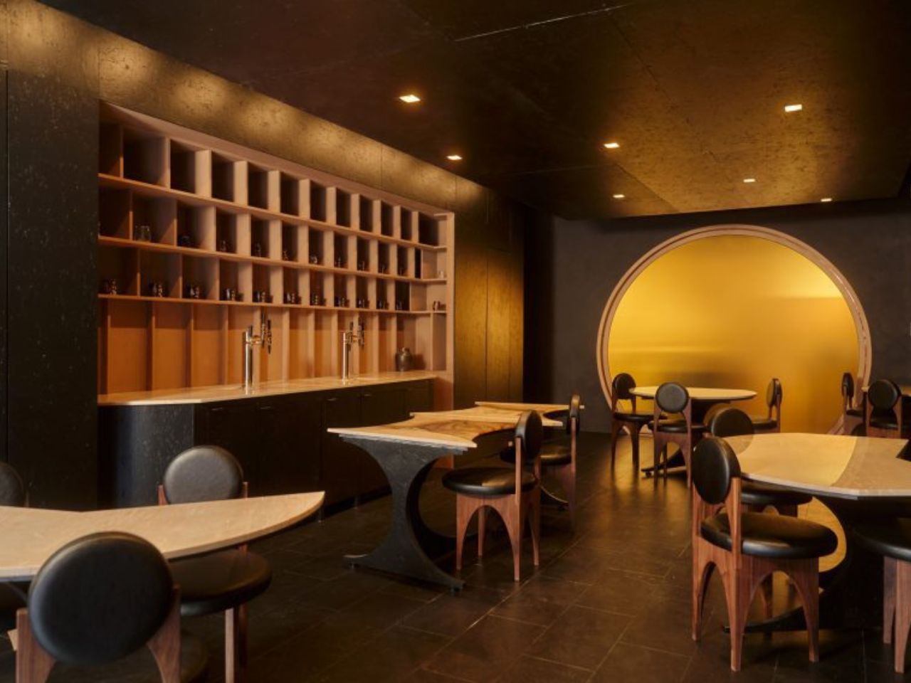
The space is described as a zero-waste restaurant, but that label only scratches the surface. The design is not just about reducing waste. It is about redefining what is considered valuable in the first place. The black lime-washed walls hold uneven textures that catch light differently across the room. The black-stained cork floor carries a softness and irregularity that feels lived in rather than manufactured. Walnut chairs with black vegan leather sit quietly within this palette, never demanding attention but always belonging.

Founder Mariam Issoufou grounds this material honesty in history. The site was once known as the Land of the Blacks, a place where African-owned farms and early Black social spaces existed in New York. Rather than translating this into literal symbols, the design holds it in the atmosphere. The darkness is not emptiness. It is density. It is memory. It is a way of anchoring the present within a layered past.

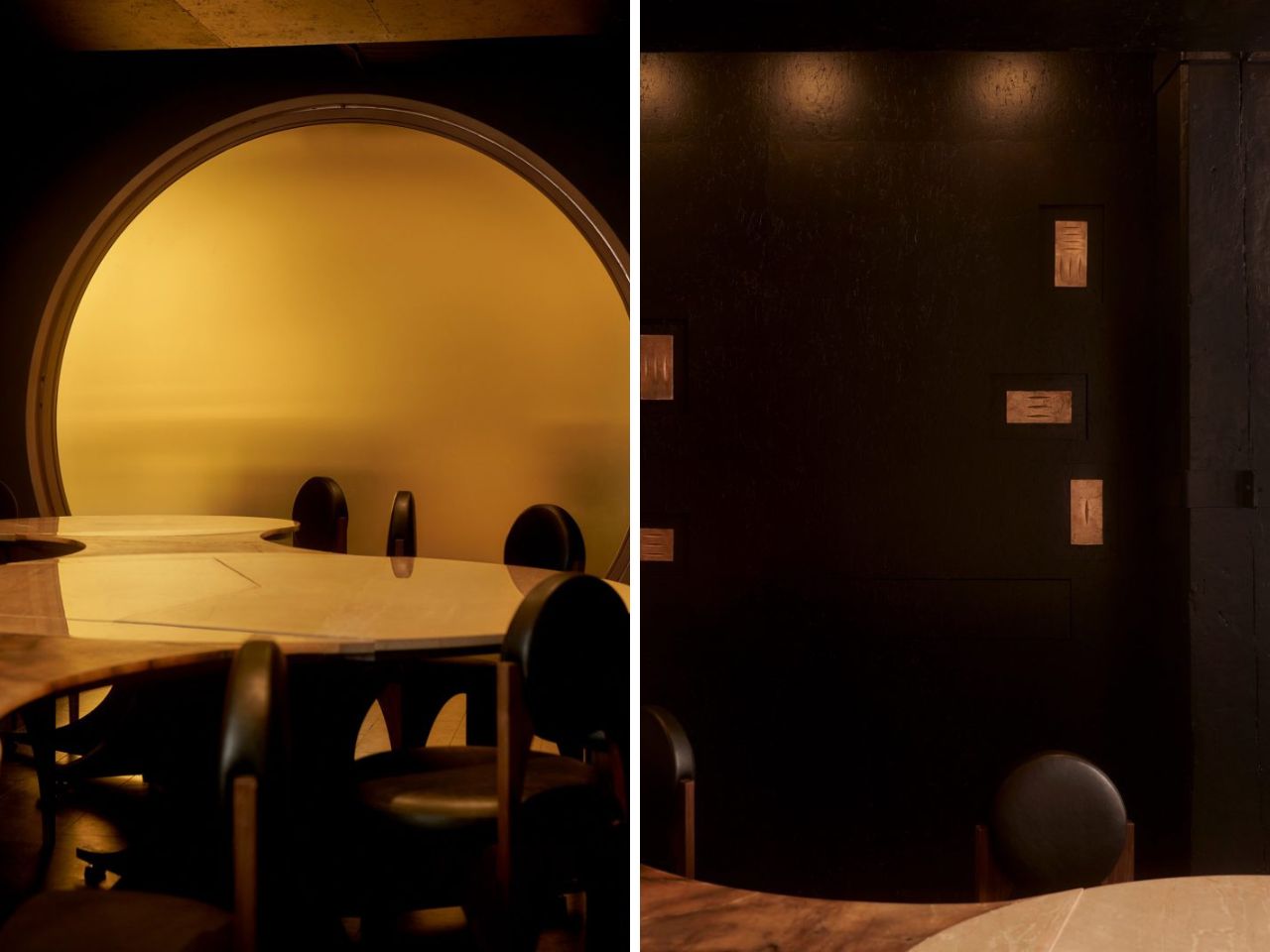
Then, just when the room settles into its depth, a moment of contrast appears. A translucent yellow circular pivot door marks the transition to the kitchen. It glows. It moves. It reveals silhouettes of chefs at work. What could have been a simple divider becomes a performance. The act of cooking is no longer hidden. It becomes part of the dining experience, flickering in and out of view like a living backdrop.

At the center of the space sits the most radical decision. A circular communal table made of alabaster and travertine. It can be split into seven smaller tables, allowing the restaurant to shift from a daytime cafe to a nighttime supper club. But its real impact is social. Circular seating removes hierarchy. There is no head of the table. No privileged position. Every diner shares the same spatial status. In a city defined by speed and stratification, this simple gesture feels quietly revolutionary.

The project extends beyond its walls through its collaboration with Rethink Food. Gourmega contributes to a system that provides free meals across New York, linking fine dining to food access in a way that feels integrated rather than performative. Sustainability here is not just about materials. It is about relationships and responsibility.

Even the walls resist finality. They are treated as exhibition surfaces for local African American artists, including bronze panels by Nifemi Marcus-Bello. The space is designed to change, to hold new stories over time, rather than remain frozen as a finished object.

Gourmega does something that many interiors avoid. It accepts that making something meaningful does not require making it perfect. It suggests that beauty can come from constraint, that history can be carried through material choices, and that design can hold both dignity and imperfection at once. In a discipline obsessed with control, this restaurant offers something far more compelling. It lets go.

The post This NYC Restaurant Was Built From Materials Other Designers Threw Away – And It Looks Stunning first appeared on Yanko Design.
Fully working computer the size of a credit card is just 1mm thick

In the past few decades, we’ve moved from computers the size of a room to ones that sit pretty on your desk. Apple Mac mini takes all the praise for being a powerful machine without the bulk. The low-cost single-board Raspberry Pi can be categorized as a mini PC, but all the DIYers pretty well know it can do basic tasks for DIY projects.

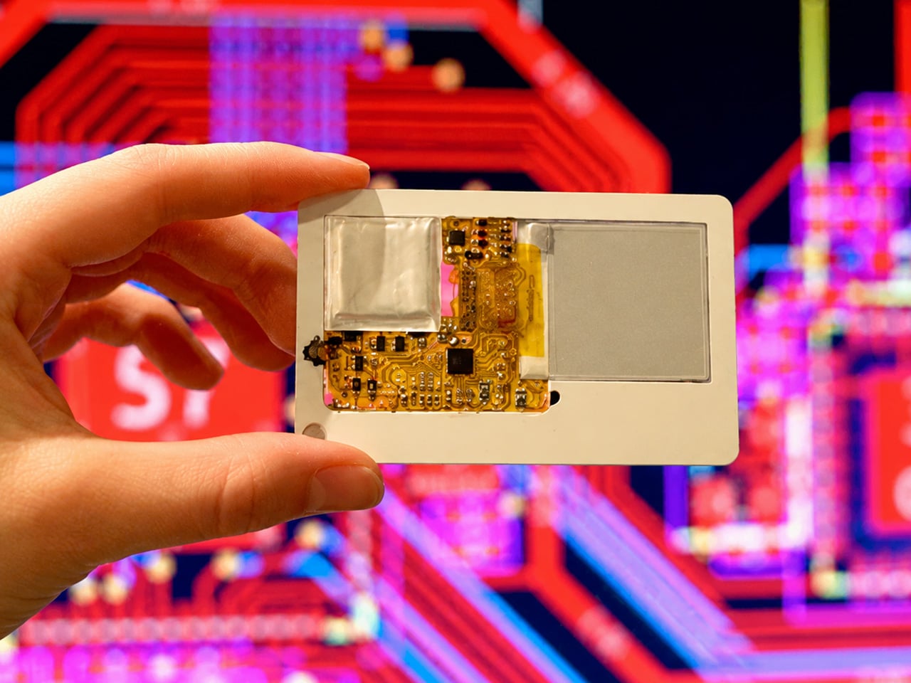
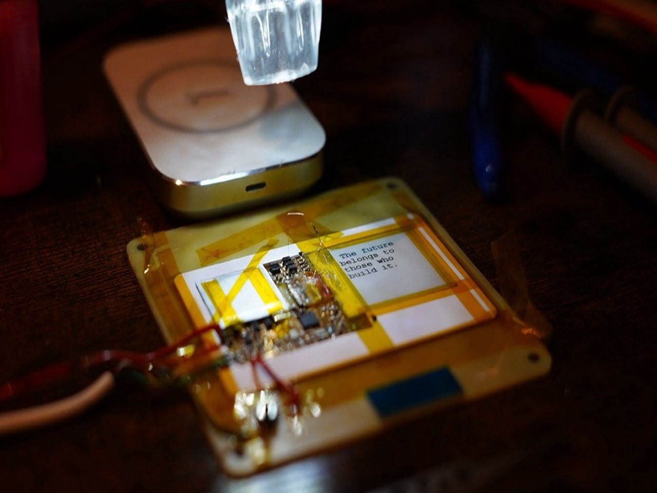
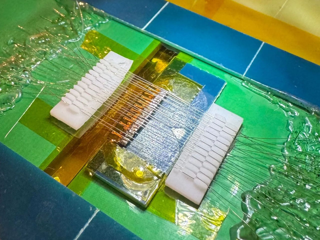
A developer wants to hit the sweet spot in the middle, having developed a mini PC the size of a credit card. Developed by GitHub user krauseler, the fully working computer dubbed Muxcard. Unlike other single-board computers, this one factors in the thickness as well, being just 1mm thick at any point on the whole make. For the chassis of this amazingly tiny CPU, the maker uses an old plastic NFC card. Understandably, the micro-computer (as I like to denote the build) is in the prototype stage, and the ultimate goal is to make it more durable and powerful.

Designer: krauseler

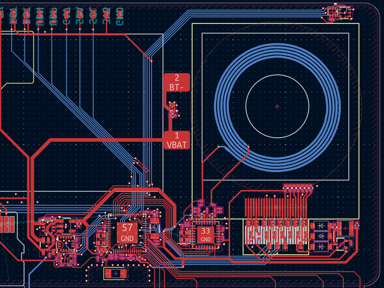
At the time of making, the credit card-sized computer packs a RISC-V CPU architecture, and a Wi-Fi-capable microcontroller with 320KB of usable SRAM and 384KB ROM. The next version of the mini PC could feature the ESP32‑S3 or nRF52/53, which are more powerful than the currently installed ESP32‑C3 CPU. The display on this thing is a 1.54-inch 200×200-pixel flex ePaper screen that consumes minimal power, which is vital. There’s an LIS2DW12 accelerometer for motion-sensing applications. The thing is powered by a 1mm thick 30mAh rechargeable LiPo battery, but krauseler plans to swap this one with an even slimmer battery cell in the future.

In the plans is the scope for touch button control configuration, a USB Type-C, and a microSD card slot. Since everything is so exposed right now, it’ll take quite an effort to reinforce Muxcard’s design to make it more practical, even if the DIY community has to consider using this for their projects. According to the maker, the prototype “still feels slightly absurd every time the display updates while holding what basically feels like a normal card.” Pondering over the possible applications that I can think of with the card-sized computer could be smart home controls, security systems, or a potent upgrade to the Raspberry Pi for more flexibility in use case scenarios.

The DIY is already an open source project as the hardware files and firmware are already online for non-commercial use. That means, if you are interested, the option to make further improvements is also there, keeping in mind the project cannot be commercially used without the maker’s consent.


The post Fully working computer the size of a credit card is just 1mm thick first appeared on Yanko Design.
Galaxy S26 Ultra Buried the Note’s Boxy Soul, and Fans Are Split

The race to make flagship phones thinner, smoother, and more visually unified has become one of the defining stories in premium smartphone design. Hard angles and bold silhouettes that once gave each model its own character have been quietly traded for softer frames and tighter lineup coherence. It’s a direction that makes these phones easier to hold and sell, but not always easier to tell apart.
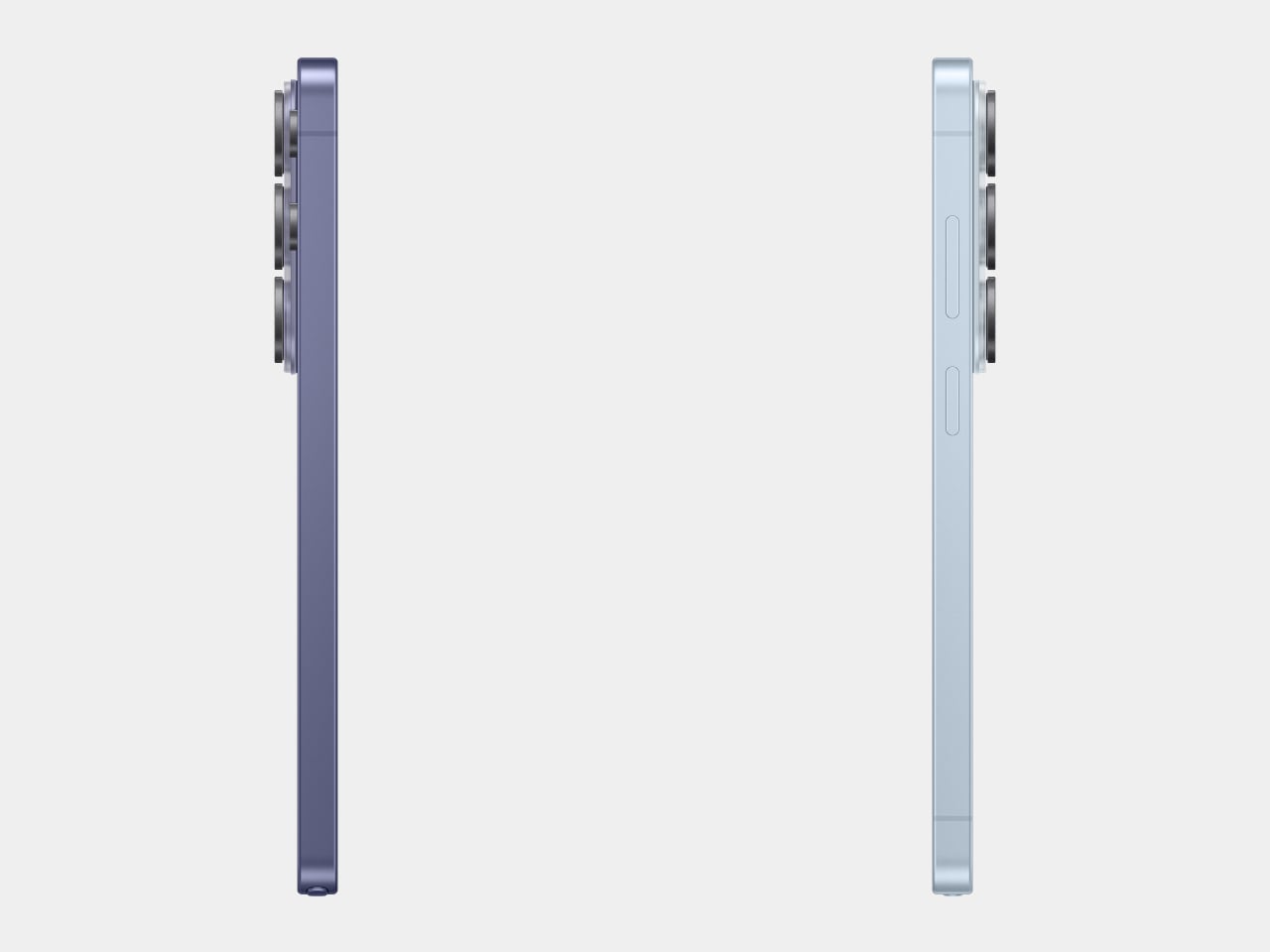
The Samsung Galaxy S26 Ultra, which hit shelves on March 11, 2026, fits squarely into that movement. Samsung pushed the chassis below 8mm for the first time on any Ultra, trimming it down to 7.9mm. Add to that a softer corner radius, an Armor Aluminum frame, and an anti-reflective Privacy Display, and it starts to feel like something more deliberate than a routine generational update.

Designer: Samsung

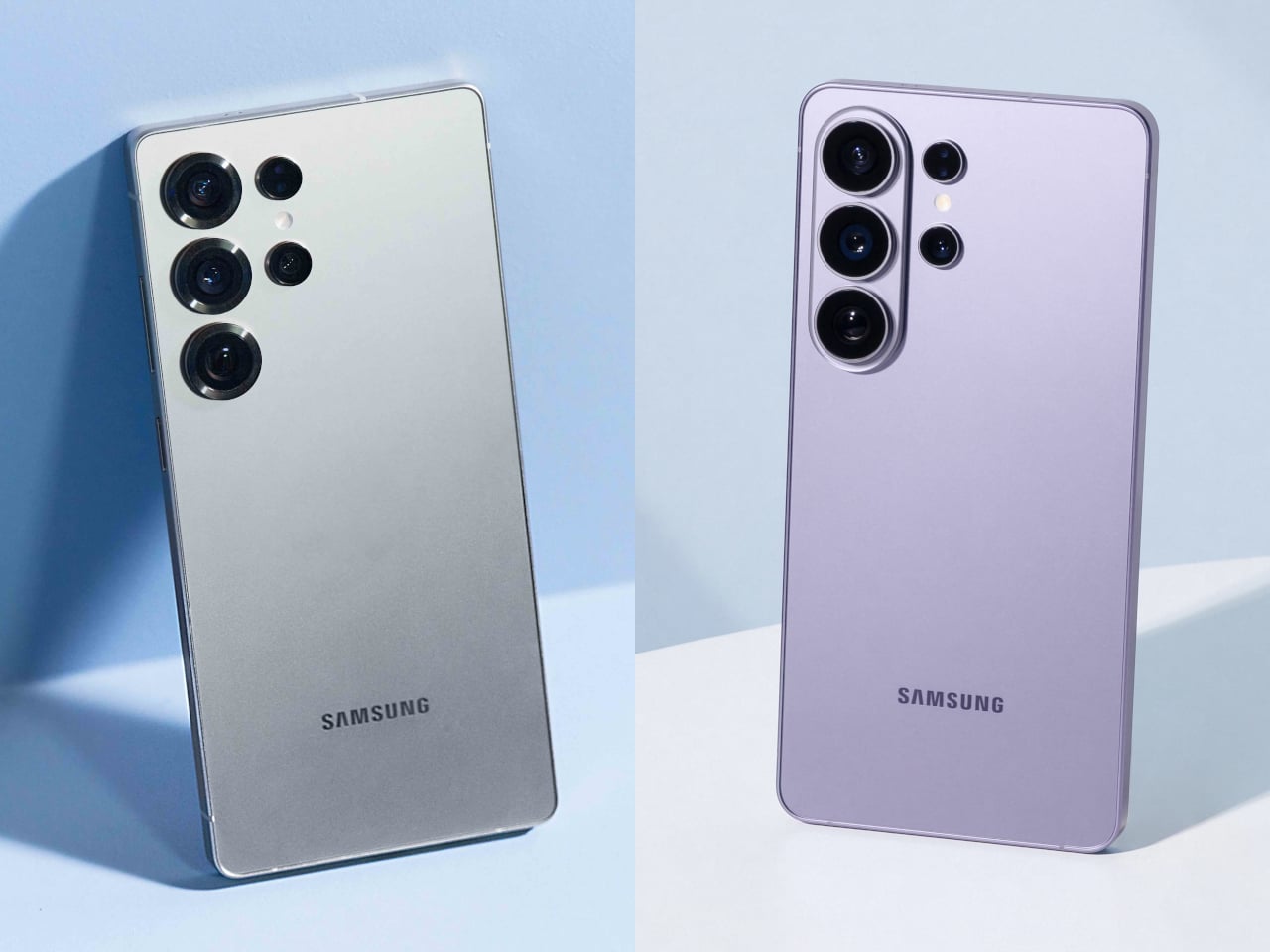
To understand why that matters, it helps to remember where the Ultra came from. When Samsung discontinued the Galaxy Note in 2021, it didn’t retire the design language that defined it. The Note’s boxy corners, flat sides, and upright proportions migrated into the Ultra line, giving those phones a distinctly tool-like character. The Ultra felt like a device built for serious use, and its shape made that clear.

Galaxy S25 Ultra

Galaxy S26 Ultra

The Galaxy S26 Ultra leaves most of that behind. Samsung rounded the corners, softened the edges, and made the phone look far more like the standard Galaxy S26 and S26+ than any Ultra model before it. That visual coherence is good design management, but it’s also the moment the Ultra stops looking distinctly like its own thing. It’s harder to spot in a lineup now.

Galaxy S25 Ultra

Those softer edges do make a real difference in how the phone sits in the hand over a long day. When you’re scrolling through a document or holding the device on a commute, the rounded frame distributes pressure more evenly across the palm. The 7.9mm chassis also disappears into a pocket more gracefully than its predecessor, which sounds minor until you realize how often you actually notice it.

Galaxy S26 Ultra

With the silhouette doing less visual heavy lifting, Samsung shifted the premium story into the surface itself. The Armor Aluminum frame carries the finish more evenly from back to edge, giving the phone a cleaner look that doesn’t need dramatic geometry to feel expensive. The anti-reflective Privacy Display adds a different kind of thoughtfulness, letting you check sensitive messages or browse in public without worrying about prying eyes.

What really puts the 7.9mm figure in perspective is the competition. The iPhone 17 Pro Max measures 8.75mm thick, and while a 0.85mm difference might not sound dramatic on its own, the context here matters quite a bit. Samsung is fitting a built-in S Pen into a phone that still comes in thinner than Apple’s stylus-free flagship, which is an engineering tradeoff worth acknowledging.


iPhone 17 Pro Max

What makes this shift more significant is what it says about Samsung’s intentions for the lineup as a whole. The Galaxy S26, S26+, and S26 Ultra now share the same curvature and visual language for the first time. That’s Samsung quietly admitting that the Ultra doesn’t need to look like a separate category; it’s a flagship, not a relic from a discontinued line.

Two months after launch, the Galaxy S26 Ultra’s design verdict has had time to settle, and the conversation is genuinely split. There’s something complete about how it all comes together now, smoother, thinner, and more coherent. The S Pen remains, but the body no longer insists on its Galaxy Note roots. Whether that reads as maturity or loss probably depends on how long you’ve been following the Ultra.

The post Galaxy S26 Ultra Buried the Note’s Boxy Soul, and Fans Are Split first appeared on Yanko Design.