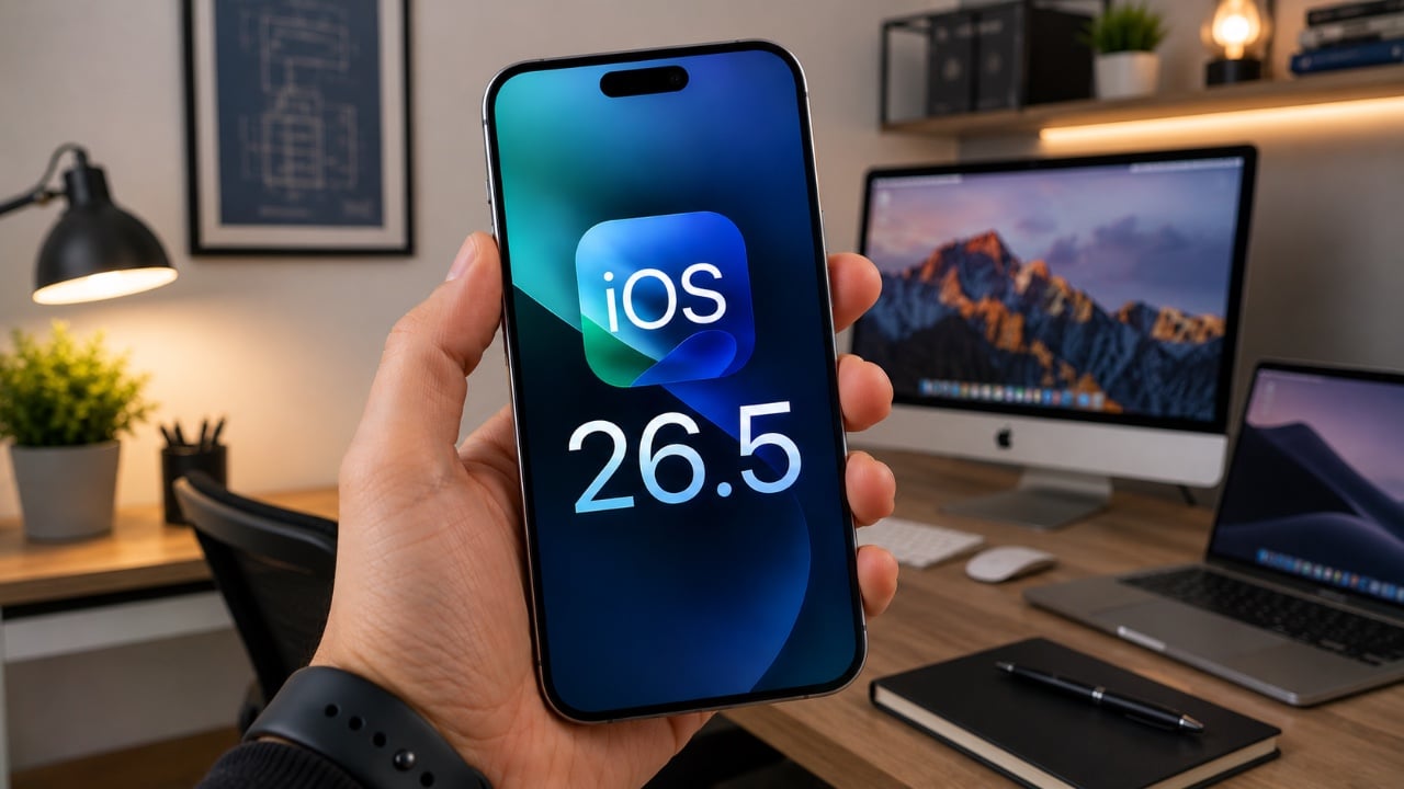
Apple’s iOS 16.5 update introduces a variety of features and improvements aimed at enhancing your iPhone experience. With a focus on personalization, privacy, and usability, this update ensures your device remains both functional and secure. From expanded customization options to improved messaging security and streamlined accessory pairing, iOS 16.5 offers practical enhancements designed to meet […]
AirDrop is a highly efficient method for sharing files, photos, and videos between Apple devices. By using both Wi-Fi and Bluetooth, it allows for seamless transfers without requiring internet access or third-party applications. Whether you’re sharing with someone in your contacts or a new acquaintance, understanding how to set up and use AirDrop ensures a […]
Closed, the VitaLink looks like a very flat book, silver, about the footprint of a large paperback, with nothing to suggest it carries a 4K display inside. At 20mm thick with a CNC-machined aluminum shell, it weighs 1200 grams and travels the way a slim notebook does; it fits in a laptop sleeve, takes up a predictable corner of a bag, and requires no dedicated case beyond what you already carry. Then it unfolds at 180 degrees. The screen lifts above the keyboard, the whole unit settles into a 34 by 15 centimeter footprint, and what you have is a self-contained dual-screen workspace that happened to be a thin slab a moment ago.
The keyboard is the part that usually betrays products like this. Portable keyboards compress key spacing to save millimeters, shorten travel to save thickness, and leave you typing on something that feels like a shallow membrane rather than actual keys. VitaLink went in the opposite direction, widening key spacing to 3.27mm and setting travel at 0.8mm, with scissor switches tuned for speed and quiet actuation. The display above it runs at 3840×1600 with a 2.4:1 aspect ratio, a cinematic proportion that gives the screen an unusually wide horizontal span, well-suited to keeping a reference panel open alongside a working document without feeling like you’re squinting at either side.
The resolution translates to 298 pixels per inch, which puts it in the same territory as Apple’s Retina displays and well above the pixel density of most portable monitors in this category. Text holds sharp at native scaling, fine details in images stay crisp, and the 60Hz refresh rate keeps touch input feeling immediate. Ten-point multitouch means gestures respond the way they do on a tablet, with swipes, pinches, and drags registering without lag. The screen covers 100 percent of the sRGB color gamut, which makes it viable for color-sensitive work where you need confidence that what you see on the display matches what the final output will deliver. That 2.4:1 ratio keeps showing up as the design’s defining decision; it gives you enough horizontal real estate to run a code editor with a console window beside it, or a timeline with a preview panel, without either side feeling like it’s been compressed into a narrow strip.
Typing on the VitaLink is designed to feel deliberate in a way that most travel keyboards do not. The 0.8mm of key travel sits in a range where the keys actuate fast but still give tactile confirmation that you pressed them, a balance that makes a difference during long writing sessions where you need speed without sacrificing accuracy. The 3.27mm key spacing is wider than what most compact keyboards offer, eliminating that cramped sensation where your fingers feel like they’re hunting for keys in tight quarters. RGB backlighting runs through three modes, activated with function key shortcuts: a breathing gradient, a solid single-color backlight, and a rainbow wave that ripples across the keys as you type. The backlighting does actual work in low-light environments, but the rainbow mode leans more toward visual flair than strict utility.
CNC machining means the aluminum body starts as a solid block and gets precision-carved, producing the kind of structural rigidity that protects the screen during transit and prevents flex when you’re typing hard. The 180-degree hinge lets the unit lay completely flat, which matters both for stability on uneven surfaces and for low-angle use when you’re working on a cramped airplane tray table or a café counter. Dual USB-C ports handle video, data, and power delivery up to 65W, so a single cable from your laptop, tablet, or phone brings the display to life with no drivers to install. Compatibility spans Windows, macOS, Linux, and Android, with plug-and-play recognition across all of them. Connect a Steam Deck or a Nintendo Switch via USB-C, and the VitaLink becomes a 13-inch 4K external display for handheld gaming, turning a small console screen into something considerably more immersive.
VitaLink offers eight keyboard layout options, covering US Windows (the default), US Mac, German QWERTZ, Japanese JIS, UK, French AZERTY, Nordic, Italian, and Spanish. The standard US Windows layout ships at no extra cost; upgrading to US Mac adds ten dollars, German or Japanese layouts add twenty, and UK, French, Nordic, Italian, or Spanish layouts add thirty. The layouts require specific laser engraving and dedicated production runs, so they’re available as optional add-ons rather than default configurations. You select your preferred layout during checkout or in a post-campaign survey if you miss it the first time.
VitaLink is currently available on Kickstarter starting at $299, down from a retail price of $658. The package includes the VitaLink keyboard and display unit plus two USB-C cables. Eight keyboard layout options are available as add-ons, including US Mac, German QWERTZ, Japanese JIS, UK, French AZERTY, Nordic, Italian, and Spanish, with upgrade fees ranging from $10 to $30 depending on the layout. Shipping is scheduled for September 2026, with delivery fees ranging from approximately $18 to $33 depending on region. VitaLink covers all taxes and customs duties, so the listed shipping fee is the only additional cost beyond the pledge amount.
Rose Gold did not just sell iPhones. It rewired the consumer electronics industry’s entire relationship with color, spawning a decade of blush-tinted Samsung flagships, Beats headphones, Dell XPS laptops, Dyson hairdryers, and KitchenAid stand mixers that are still arriving on shelves today. Apple introduced it in 2015 with the iPhone 6s, and within eighteen months every major manufacturer had a rose-gold SKU, not because the color was revolutionary but because the sales data was undeniable. Cosmic Orange pulled off a smaller version of that trick with the iPhone 17 Pro, becoming the de facto personality colorway of the lineup and reportedly outperforming expectations at retail. Apple noticed, and for the iPhone 18 Pro, they are reaching for lightning in a bottle again with a finish called Dark Cherry.
Dark Cherry is a deep, wine-red hue that leaked camera cover prototypes have now confirmed as the hero color of the 18 Pro and 18 Pro Max lineup, sitting alongside the more conservative Light Blue, Dark Gray, and Silver. The timing carries its own irony given that a segment of Cosmic Orange iPhone 17 Pro owners have been reporting their units gradually shifting toward a reddish cherry tone over time, which makes Apple’s new colorway feel less like a creative pivot and more like an accidental preview. Whether Dark Cherry becomes the next Rose Gold, something every Android manufacturer from Samsung to OnePlus rushes to clone by mid-2027, will depend entirely on how the color reads in the real world rather than in leaked silicone covers.
Designer: Apple
The same leaks that confirmed Dark Cherry also tell us that the rear camera layout holds steady from the 17 Pro generation, with a slightly thicker camera plateau accommodating the new primary sensor. That sensor is a 48MP variable aperture unit, a meaningful upgrade that gives the 18 Pro genuine optical flexibility rather than the fixed-aperture approach every iPhone before it has used. The thicker module is a reasonable trade-off for what variable aperture actually delivers in low light and in bright outdoor conditions, and the accompanying iOS 27 camera app, reportedly rebuilt from the ground up as a pro-grade tool, suggests Apple is treating the entire capture pipeline as a system rather than isolated hardware specs.
We’ve addressed the speculation around the changes on the front too. The Dynamic Island is allegedly shrinking by approximately 25 percent, a reduction that sounds modest until you factor in how much screen real estate that cutout currently consumes on the 17 Pro. Tighter bezels are also in the mix, pushing the display closer to the edges and giving the front face a density that the current generation does not quite achieve. These are the kinds of incremental refinements that read as minor in a spec comparison but register immediately when you pick the phone up.
Underneath all of it sits the 2nm A20 Pro chip, Apple’s first processor built on TSMC’s second-generation 2nm process node. The performance and efficiency gains from moving to 2nm are expected to be substantial, particularly for the on-device Apple Intelligence workloads that Siri’s expanded capabilities will demand. Apple has been positioning its silicon advantage as the reason to stay in the ecosystem, and the A20 Pro is the clearest expression of that argument yet.
The one narrative the iPhone 18 Pro cannot fully control is the company sharing a stage with the foldable iPhone Ultra at the same September event. A first-generation foldable from Apple will absorb the room’s attention regardless of what the Pro brings, which means Dark Cherry has real work to do as a visual hook. If the color lands the way Cosmic Orange did, and if the Rose Gold instinct proves correct, the 18 Pro will find its audience on color alone while the spec sheet closes the deal.
There’s a version of a public building that checks all the sustainability boxes and still feels cold, institutional, and somehow indifferent to the people it’s meant to serve. The new Marpole Community Centre is not that building. Designed by Diamond Schmitt for the City of Vancouver and the Vancouver Board of Parks and Recreation, it’s nearing completion in Oak Park. It quietly resets expectations for what a civic facility can be.
The project replaces a well-loved but outgrown facility with a two-storey structure nearly double its size, measuring 5,000 square metres. The program is generous: a gymnasium, fitness centre, field house, multi-purpose rooms for seniors and youth, and a 74-space childcare facility. Underground parking is tucked beneath the building to protect the surrounding natural vegetation, letting Oak Park remain exactly that — a park.
What makes the architecture worth paying attention to is the mass timber. Rather than limiting wood to the roof structure, as institutional buildings often do, the Marpole Community Centre uses a comprehensive mass timber frame — glulam columns and beams, a CLT floor system, and a long-span upper roof built from steel wide flange beams and a CLT deck. The result is a structure that reads as warm and considered, not engineered into submission. Exposed throughout the interior, the timber gives the building a human scale that concrete rarely allows.
The signature move is the gently curving roof. The doubly curved cantilever form, supported by long-span steel beams, required close coordination between the design team and contractors — but the payoff is an exterior that feels unified without being monotonous, and an interior where the ceiling becomes the experience. Strategic glazing pulls the landscape in, connecting occupants to Oak Park’s natural setting without sacrificing energy performance.
On the sustainability front, the numbers are serious. The building targets Passive House and LEED Gold certifications and has achieved a 41% reduction in embodied carbon. It’s also a pilot project for the City of Vancouver’s Embodied Carbon Guidelines, meaning lessons learned here will directly shape future civic buildings across the city. The project is also pursuing the CAGBC’s Zero Carbon Building Design Standard.
Beyond the technical performance, the centre was designed with inclusion, equity, and Indigenous cultural representation as core principles — not afterthoughts bolted on at the end. For a neighbourhood as diverse as Marpole, that intentionality matters. A community centre tends to be the most democratic building a city can build. This one makes a strong case that it can also be among its most thoughtful.
The Color Gradient Table is a piece that understands something very simple, but often overlooked: wood already has color. It does not need to be overly treated, disguised, or forced into becoming something else. Instead, this design begins by paying attention to the natural tones already present in different wood species, arranging them into a subtle but intentional color scale. The result is a table that feels both designed and discovered, as if the material itself guided the form.
The idea is built around a gradual transition of woods, moving from beech to chestnut, European oak, and finally black-stained chestnut. The shift is quiet, but it gives the piece a strong visual rhythm. It moves from pale warmth to deeper, richer tones without feeling decorative or forced. The color is coming from the wood itself, which makes the gradient feel honest and grounded.
There is something incredibly satisfying about the way the different sections sit together. Each part has its own character, yet the full piece feels completely resolved. The joins and transitions create a sense of order that feels calm, precise, and almost meditative. It has that rare quality where the more you look, the more you notice: the change in tone, the grain, the weight of the form, the way one wood leads into the next.
Because of its size and weight, this is not a table meant to be moved around casually. It is designed to occupy a special place in the house. Once placed, it becomes part of the room’s identity. It feels grounded, almost architectural, like an object that was meant to live in one exact spot and quietly hold the space around it.
The soft edges make a big difference. They prevent the table from feeling too heavy or severe, even though it clearly has mass. That rounded form gives it the feeling of a modern, polished trunk in the room. It still carries a memory of the tree, but in a refined and contemporary way. It feels natural without leaning rustic, sculptural, without feeling dramatic.
What makes the Color Gradient Table so compelling is its restraint. It does not rely on ornament or visual noise. Its strength comes from material, proportion, and the careful relationship between each wooden element. It adds to a subtle natural aesthetic in a way that feels warm, permanent, and deeply considered. It is the kind of piece that does not need to announce itself loudly; it simply belongs.
Only 36 Ferrari 250 GTOs were ever built between 1962 and 1964, and one of them sold privately for $70 million in 2018. The body was shaped by Sergio Scaglietti working metal directly over the frame, piece by piece, without drawings, which means the most valuable car in the world was essentially hand-sculpted from instinct and aerodynamic necessity. Giotto Bizzarrini refined the GTO’s form through wind tunnel testing at the University of Pisa and extensive track sessions at Monza, chasing tenths through aluminum curvature at a time when the science of aerodynamics was barely a decade old. The result was a long, low nose, muscular flanks, and a Kamm-tail rear that looked inevitable rather than designed. That visual logic, equal parts science and poetry, is what makes the 250 GTO the single hardest car in automotive history to reimagine credibly.
India-based designer Krishnakanta Saikhom, a mechanical engineering graduate and National Institute of Design alumnus whose Lamborghini Massacre concept we covered on these pages, decided to try anyway. His Ferrari SC250 concept plants a provocative question at Maranello’s feet: what if the 250 GTO’s aerodynamic DNA had been allowed to keep evolving for sixty years, unconstrained by road regulations, homologation rules, or production economics? The SC250 answers by stretching the GTO’s proportional logic into Le Mans Hypercar territory, wrapping a dramatically low, wide body in Rosso Corsa and staging it directly alongside the original in the renders. The juxtaposition is deliberate and devastating. The ancestor looks delicate. The descendant looks like it wants to consume the atmosphere.
Designer: Krishnakanta Saikhom
From the side profile, the most direct visual conversation with the 250 GTO happens through proportion rather than surface decoration. Saikhom has preserved the long-nose, short-tail logic of the original, but stretched everything laterally and pushed the greenhouse rearward until it sits almost over the rear axle, compressing the visual mass of the cabin into something that reads more like a fighter jet canopy than a traditional coupe roof. The fastback line drops sharply into a truncated tail equipped with a pronounced multi-element rear wing, a detail that the original GTO gestured toward with its modest spoiler and that the SC250 takes to its aerodynamic conclusion. The flanks are clean and tumblehome is aggressive, with the body visibly wider at the rear haunches than at the shoulder line, generating the kind of planted visual stance that makes a car look fast even in a still image.
The front end is where Saikhom makes his boldest departure from GTO orthodoxy. Where the original wore a relatively narrow, rounded nose with small paired air intakes, the SC250 arrives with a full-width splitter assembly that consumes most of the front fascia, flanked by deep aerodynamic channels that feed air under and around the bodywork. A small prancing horse badge sits centered on the nose panel above the splitter, almost understated against the aggression of the aero package surrounding it. The twin vertical gill vents on the front quarter panels directly echo the 250 GTO’s signature side intakes, which is the most explicit heritage callout in the entire design and the one that ties the sixty-year conversation together most convincingly.
The rear is the SC250’s most purposeful face. Four circular exhaust outlets are stacked vertically in pairs on the rear panel, flanked by a carbon-fiber diffuser that rises aggressively from the undertray, and the “SC250” designation is stamped into the bodywork just above the lower valance. The multi-element rear wing sits on twin end plates and reads as a structural aero component rather than a styling accessory, consistent with the car’s overall refusal to treat aerodynamics as decoration. Michelin-shod five-spoke wheels in deep graphite fill the arches at all four corners, and their star-spoke geometry echoes, probably intentionally, the classic cross-spoke alloys that the period 250 GTO wore on its wire-spoked rims.
Saikhom stages the SC250 directly alongside a period 250 GTO in several of the key compositions, and it is a brave editorial choice that pays off completely. The original reads as something assembled from courage and aluminum by people making up the rules in real time. The SC250 reads as the logical destination of the journey those people started. Whether Ferrari would ever sanction something this uncompromising as an official concept is a separate question, and honestly an irrelevant one. What Saikhom has demonstrated is that the 250 GTO’s design language is durable enough to survive extrapolation into a completely different performance era without losing its identity, which is precisely what separates a genuinely great design language from one that only looks good frozen in its original context.