This Carbon-Negative Neighborhood in the Netherlands Is Rethinking Affordable Housing

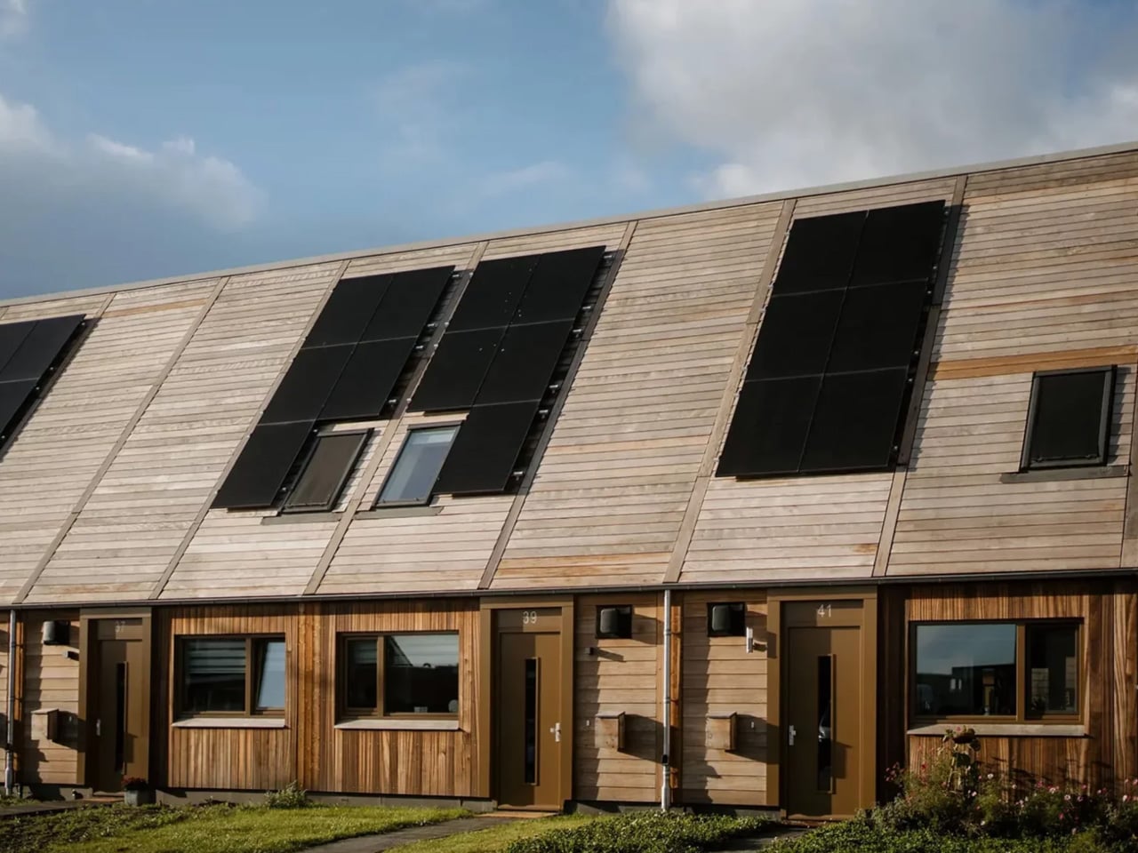
Architecture has long been one of the planet’s most significant contributors to carbon emissions. ORGA, a Dutch studio, is challenging that reality head-on with a carbon-negative neighborhood prototype built in the village of Marknesse, Netherlands — and the results are worth paying attention to.

Commissioned by housing association Mercatus, the project consists of 12 affordable rental homes designed specifically for first-time buyers and low-income households. From the outset, the goal was to minimize environmental impact at every stage — not as an afterthought, but as the foundation of every design decision made.

Designer: ORGA
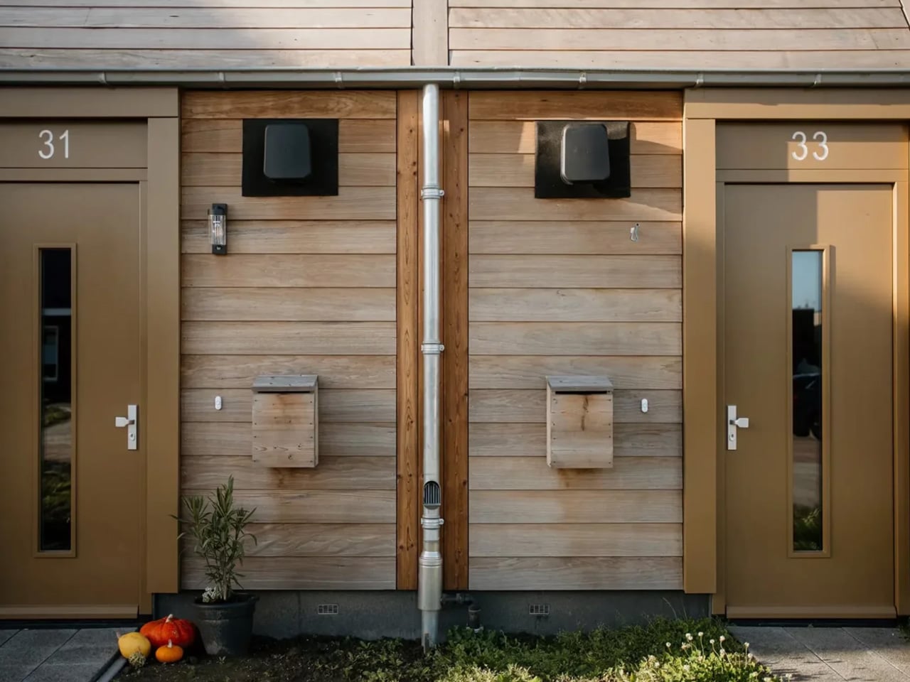
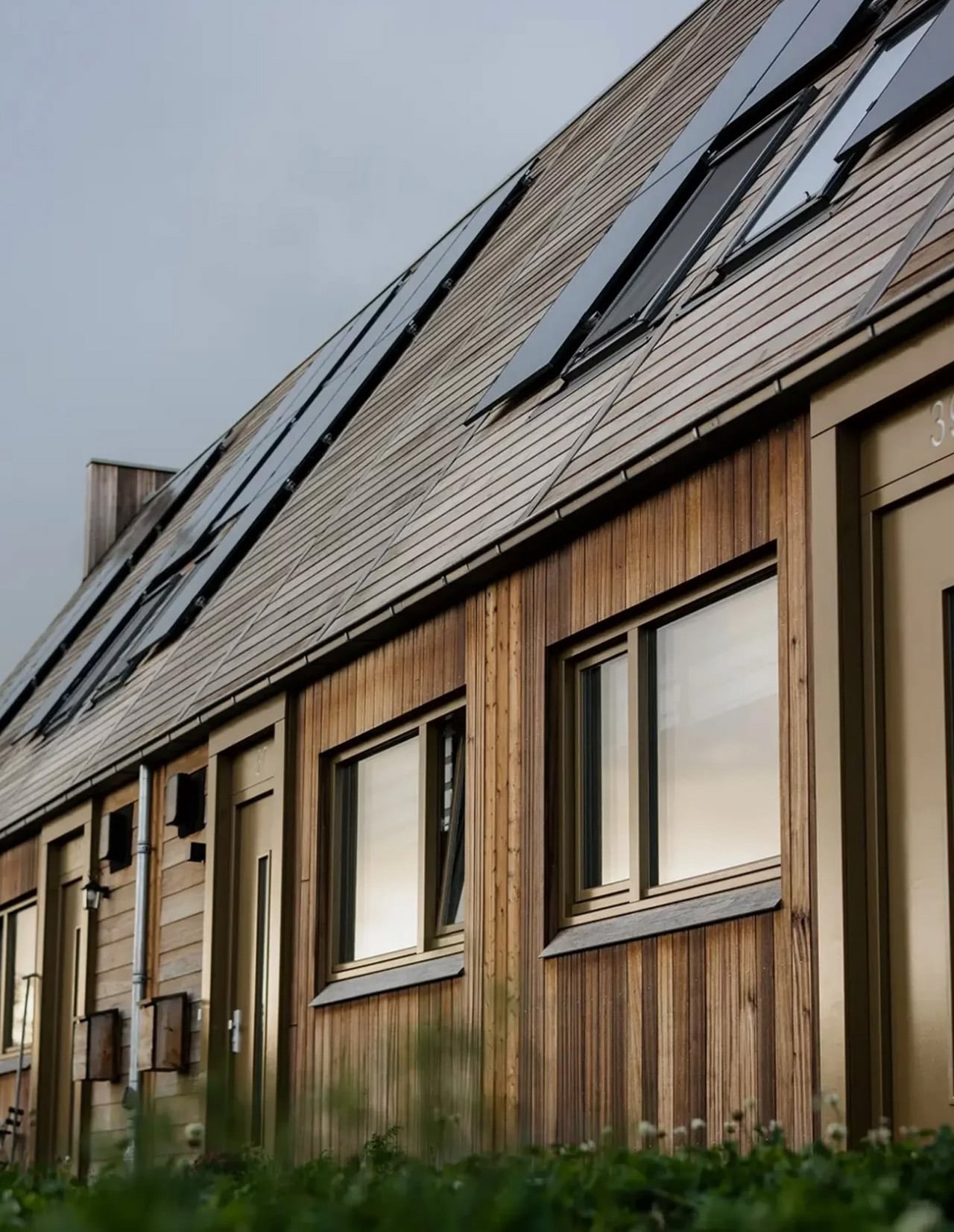
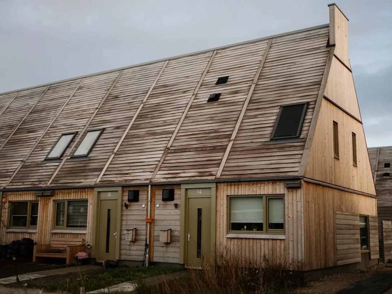
Marknesse sits in a region historically defined by its ‘Delft Red’ aesthetic: red clay bricks and orange-red roof tiles. Rather than abandon that visual identity, ORGA reinterpreted it through a modern lens, swapping out high-carbon materials for natural, renewable alternatives. The result is something rare in contemporary construction — a structure that stores more carbon than it produces. The architects also wove local ecology into the design, incorporating wooden chimneys that double as nesting sites for bats.

The numbers behind the project are striking. The prototype achieves a 76% share of bio-based and circular raw materials. Nearly everything is sourced from renewable materials, with the exception of the concrete foundation and essential components like windows and fasteners. It’s an approach that echoes projects like the 3D-printed Lib Earth House Model B in Japan, which similarly replaces cement with soil-based mixtures to reduce material impact.
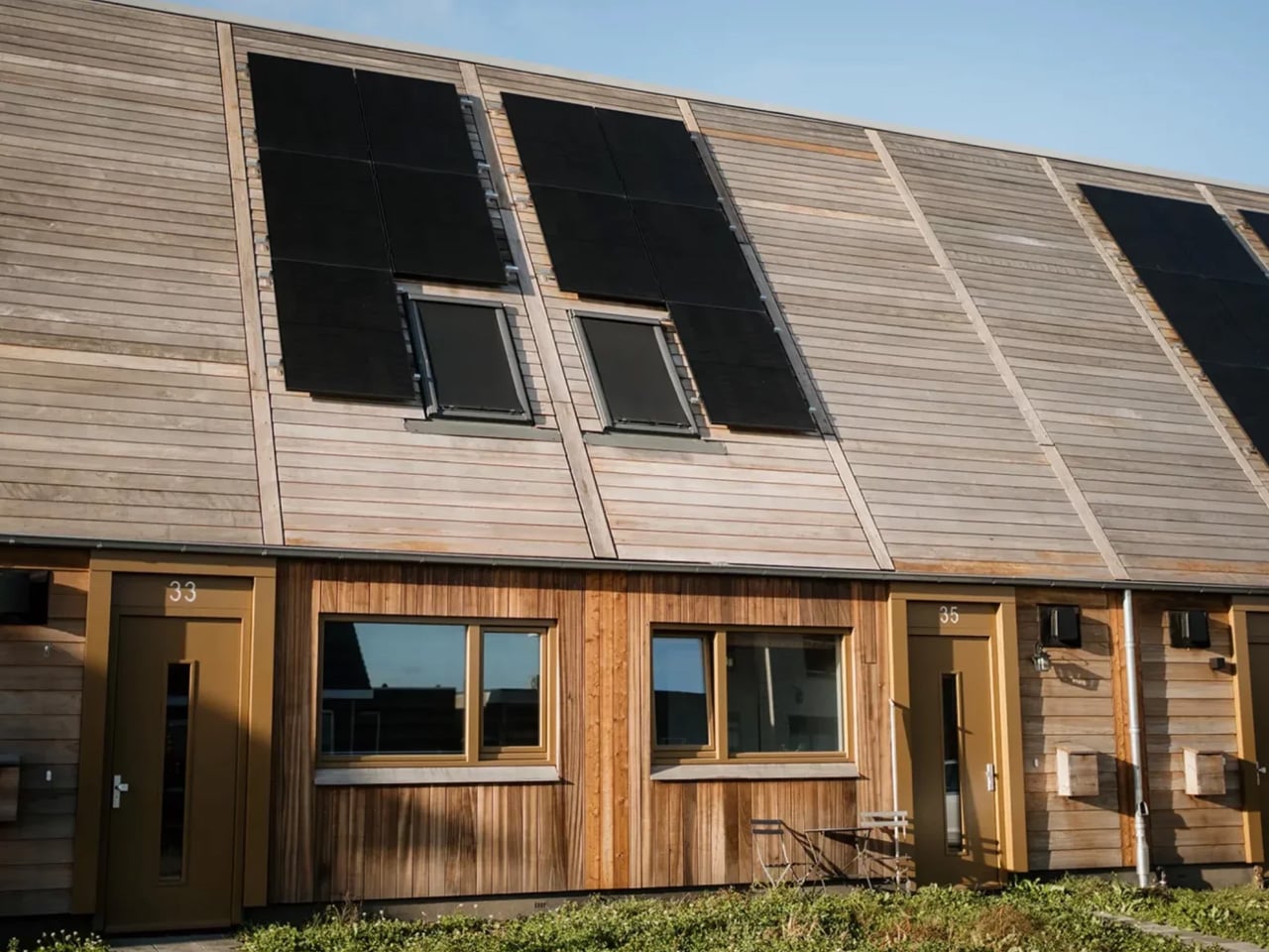
Construction efficiency was also a priority. The homes are built using prefabricated timber elements manufactured off-site and assembled on-site, a method that dramatically cuts construction time while reducing local disruption. This mirrors what’s been seen in mass timber projects like the 230 Royal York tower in Toronto, where prefabrication trimmed months off the build schedule.

Inside, the timber framing is insulated with wood fiber and other natural materials, enabling a completely foil-free, vapor-permeable construction. There are no synthetic plastic wrapping layers. Instead, the wall system is breathable — designed to passively regulate moisture and temperature without air conditioning or mechanical intervention. The building essentially manages its own climate.
To close the loop on long-term sustainability, each home was cataloged using the Madaster Material Passport, an online dossier that tracks all materials and their applications. Residents also received user manuals to help them maintain and eventually repurpose components of the home. What ORGA has built in Marknesse is more than a prototype. It’s a proof of concept that bio-based, affordable, and carbon-negative architecture can coexist — and that meaningful ecological design doesn’t have to come at the cost of accessibility.
The post This Carbon-Negative Neighborhood in the Netherlands Is Rethinking Affordable Housing first appeared on Yanko Design.

Stoa Turns Chess Into Quiet Architecture for the Modern Home

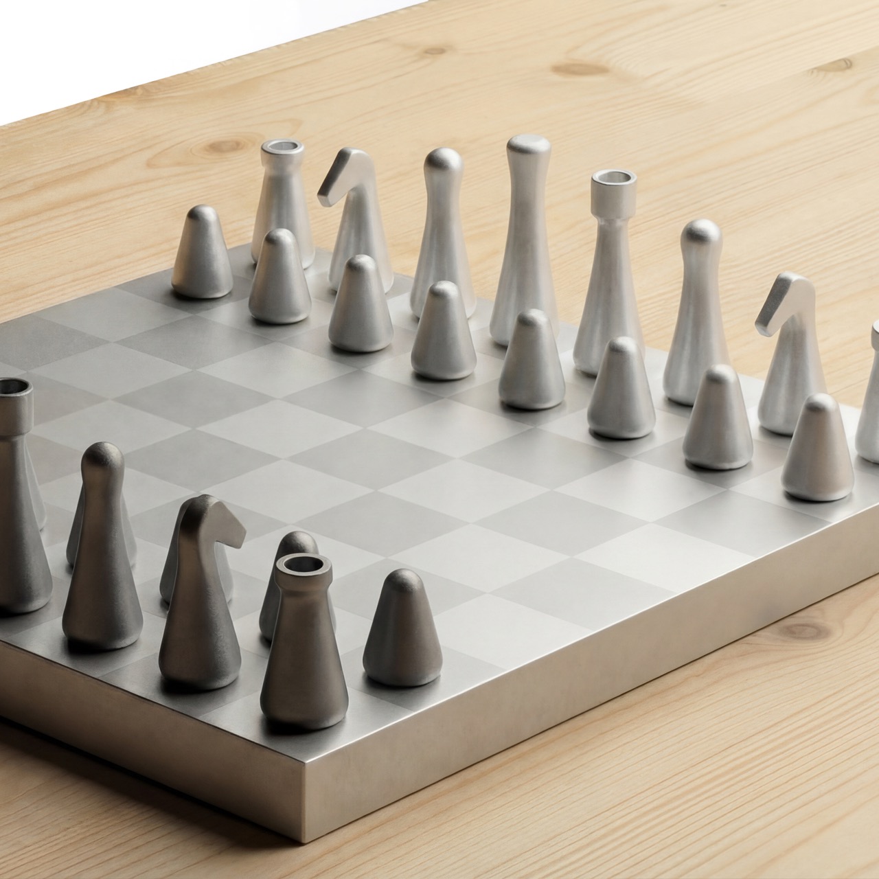
Chess has always been a game of structure, strategy, and symbolism. The pieces carry centuries of visual language: the authority of the King, the movement of the Knight, the strength of the Rook, the quiet repetition of the Pawns. Many chess sets lean into that history through ornament, carving, and decorative detail. Stoa takes a different path. It looks at the same familiar game and asks what can be simplified without losing meaning.

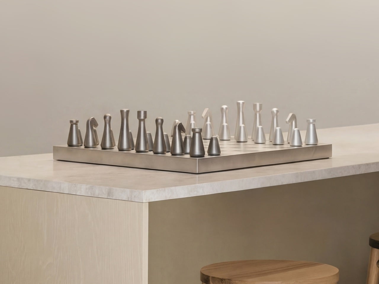
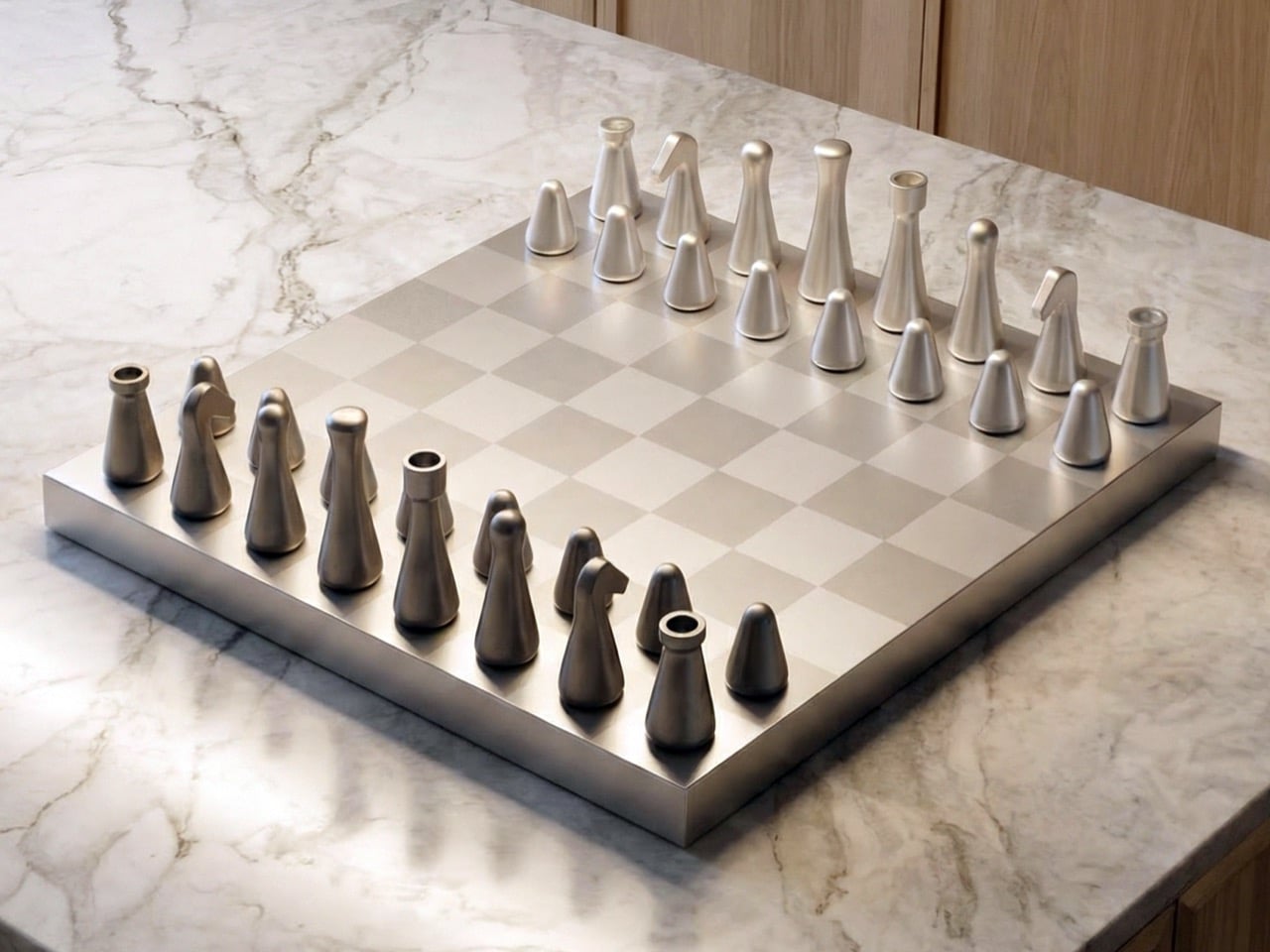
Inspired by Scandinavian design principles, Stoa is shaped by clarity, balance, and calm visual expression. Its forms are clean, architectural, and restrained, giving the set a quiet presence that feels natural in modern interiors. The pieces do not feel overly decorative or nostalgic. They feel composed, almost like small spatial objects arranged across a board. This gives Stoa a visual language that is contemporary, but still deeply connected to the traditions of chess.

Designer: Fabian Haydt

The strength of the design lies in its balance between reduction and recognition. Each piece is simplified to its essential geometry, yet remains easy to identify during play. This is an important distinction. Minimal chess sets can sometimes become so abstract that they ask too much from the player. Stoa avoids that by treating simplicity as a careful design decision rather than a visual shortcut. The King, Queen, Bishop, Knight, Rook, and Pawn each have their own identity, but none of them rely on unnecessary detail to communicate their role.

That clarity matters because chess is a game of focus. A player should be able to read the board quickly, understand the position of each piece, and make decisions without visual distraction. Stoa supports that experience through uncluttered forms and restrained proportions. The pieces are easy to recognize, comfortable to hold, and stable on the board. Their visual calmness allows attention to stay on the game itself.

The Knight becomes one of the most interesting moments in the set. In traditional chess design, the Knight is often the most expressive piece, usually represented by a horse’s head. Reducing that form into a minimal object while keeping its character intact is a difficult challenge. Stoa handles it through proportion, silhouette, and a subtle sense of personality. It does not imitate the traditional Knight literally, but it preserves enough of its identity to make the piece immediately understandable.

Materiality adds another layer of refinement. Each piece is CNC-machined from solid recycled aluminum, giving the set a precise and durable foundation. After machining, the surfaces are polished and treated with fine glass bead-blasting to achieve a uniform matte texture. The pieces are then anodized for durability. This process gives Stoa a soft, premium finish that feels controlled rather than flashy.

The tactile experience is equally considered. Internal brass weights give the pieces a grounded feel, while leather pads on the bases provide stability and protect the board surface. These details make each move feel deliberate and satisfying. The weight, touch, and surface finish all contribute to a more immersive playing experience. Nothing feels accidental. Every material choice supports both function and atmosphere.

The proportions are compact and precise. The King stands at 68 mm, followed by the Queen at 62 mm, Bishop at 58 mm, Knight at 52 mm, Rook at 47 mm, and Pawn at 32 mm. The board measures 280 mm by 280 mm. This scale gives the set a refined presence without overwhelming the space around it. It can sit comfortably in a living room, study, or studio, carrying the elegance of a design object while remaining fully playable.

The development process focused on refining visual clarity, balance, and ergonomics. Multiple prototype stages helped test how the pieces felt in the hand and how quickly players could recognize them during faster gameplay. The challenge was not simply to make chess look minimal. It was to preserve the logic of the game while reducing each piece to a cleaner, more contemporary form. That required careful iteration, especially in maintaining distinction between pieces with similar proportions.

What remains is a chess set that feels calm, tactile, and quietly luxurious. Stoa brings a centuries-old game into a modern design language without disconnecting it from its roots. It respects tradition by understanding it, then translates that tradition through geometry, material precision, and visual discipline. The result is a set that feels made for contemporary life: thoughtful enough to admire, clear enough to play, and restrained enough to last.

The post Stoa Turns Chess Into Quiet Architecture for the Modern Home first appeared on Yanko Design.
A Biodegradable Rapid Test for Microplastics in the Human Body Just Got a Real Design

The images from the pandemic were hard to forget. Surgical masks tangled in mangroves, disposable gloves floating past fishing boats, lateral flow tests piling into landfills at a scale nobody had anticipated or planned for. At its peak, an estimated 129 billion face masks and 65 billion gloves were being consumed every single month worldwide, and more than 140 million COVID-19 test kits generated around 731,000 litres of chemical waste alone. The pandemic did not create the disposable medical plastic problem; it simply made it large enough, and visible enough, that ignoring it became harder to justify. Healthcare products had always been designed around urgency, accuracy, and immediate disposal. What the pandemic exposed was the full weight of that logic applied at planetary scale.

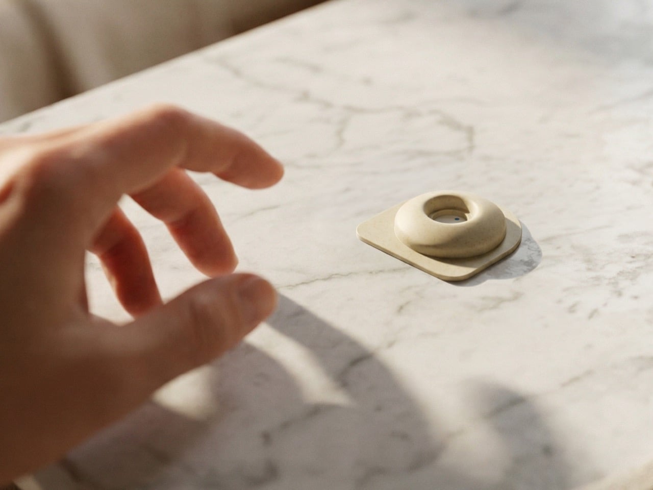
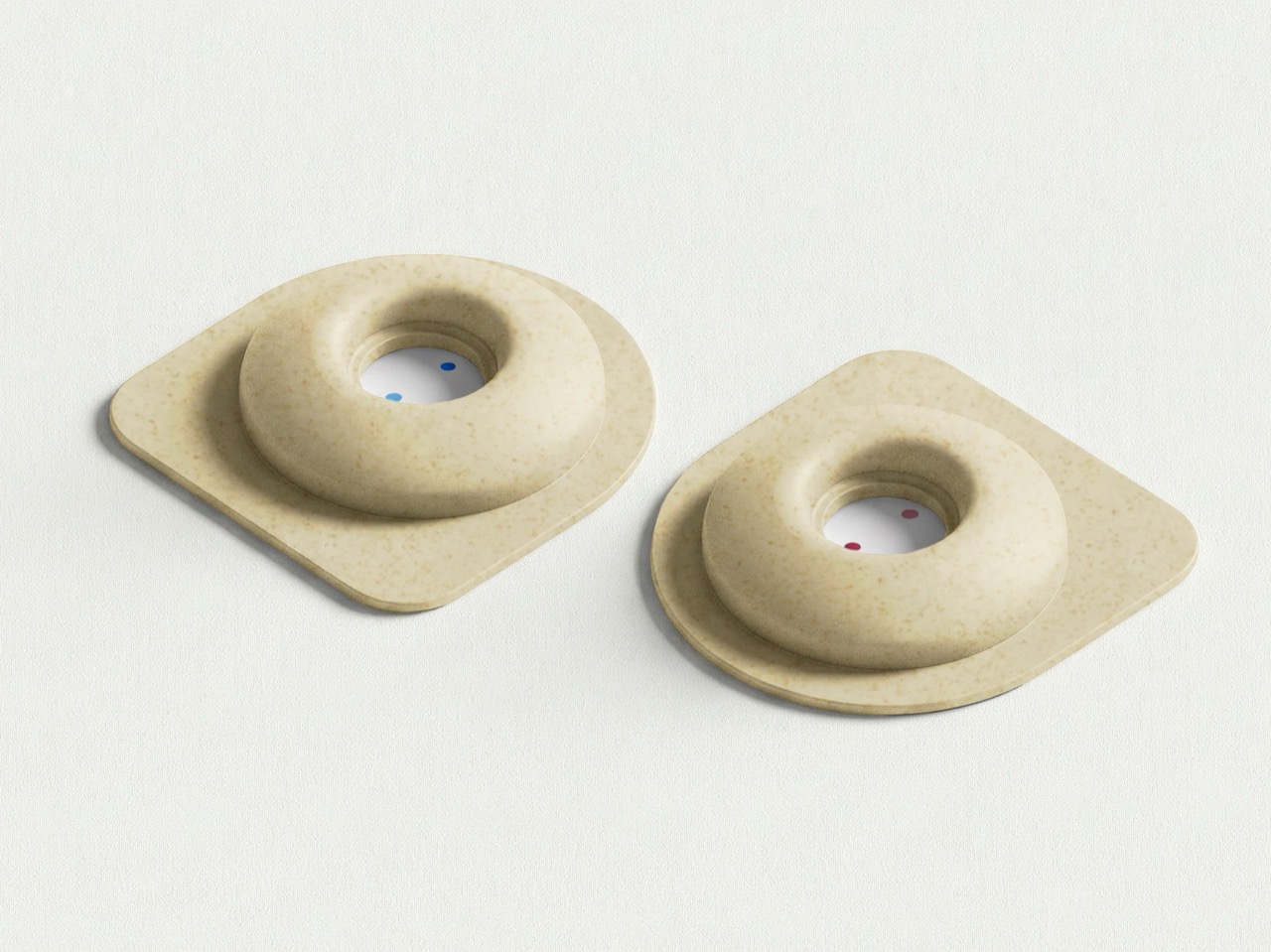
Created by Okos Diagnostics with industrial design by Luis Fernando Barrios, ‘Measuring the Invisible’ arrives at that problem from a direction with an unusual internal coherence. The project proposes a biodegradable rapid test concept for detecting microplastics in the human body – a zero-waste testing kit designed to detect the plastic waste in your body. Rather than treating sustainability as a coating applied after the product logic was already fixed, the material strategy and the diagnostic function are developed as a single integrated argument. Because everyone has microplastics in their body – but the Earth can’t take the load of everyone testing for microplastics only to dispose of used kits in the millions or billions.

Designers: Luis Fernando Barrios / Okos Diagnostics

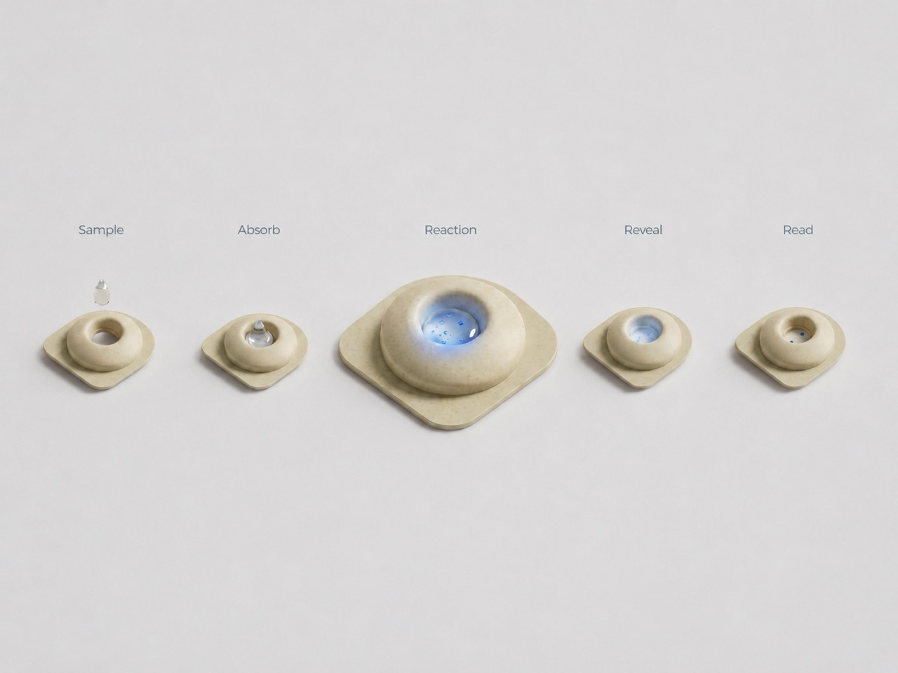
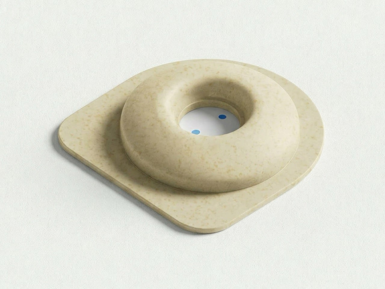
Measuring the Invisible uses a vertical-flow system where a biological sample interacts with a reactive surface, generating a chromatic response tied to the presence and concentration of specific microplastic particles. Rather than reading two lines, the user interprets a dot-based visual field where tone, saturation, and density do the interpretive work. Color intensity communicates contamination levels as gradients rather than binary outcomes, a visual language closer to environmental data than a clinical checklist. The 2020 James Dyson Award international winner, The Blue Box, enabled breast cancer home-testing through a urine sample; the 2025 shortlist featured Urify, a toilet-cleaning tablet that also screens for kidney disease. Measuring the Invisible occupies that same design space, applying the point-of-care impulse to a contamination problem nobody has yet brought home.

The housing uses Okos’ own biodegradable material formulations, with compatibility with existing molding infrastructure treated as a core constraint. That practicality separates the project from speculative material concepts that collapse at the production stage, unable to be processed without complete retooling. Visually, the design resists the earthy textures and performative naturalism common to sustainability-led objects, maintaining the clinical restraint of standard medical hardware. The biodegradable material sits beneath the surface, invisible in the same way microplastics are invisible, doing its work without announcing it. Whether Okos Diagnostics takes this from concept to validated clinical product depends on scientific and regulatory groundwork that renders cannot shortcut, but the design argument it makes is already worth the attention.

The post A Biodegradable Rapid Test for Microplastics in the Human Body Just Got a Real Design first appeared on Yanko Design.
Frankfurt’s Solar Lights That Look Better Than Your Living Room Lamp

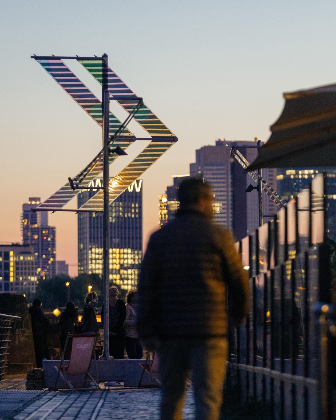
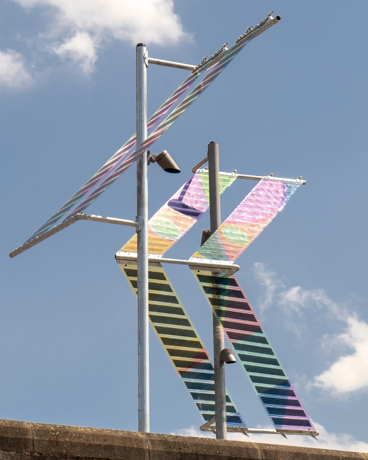
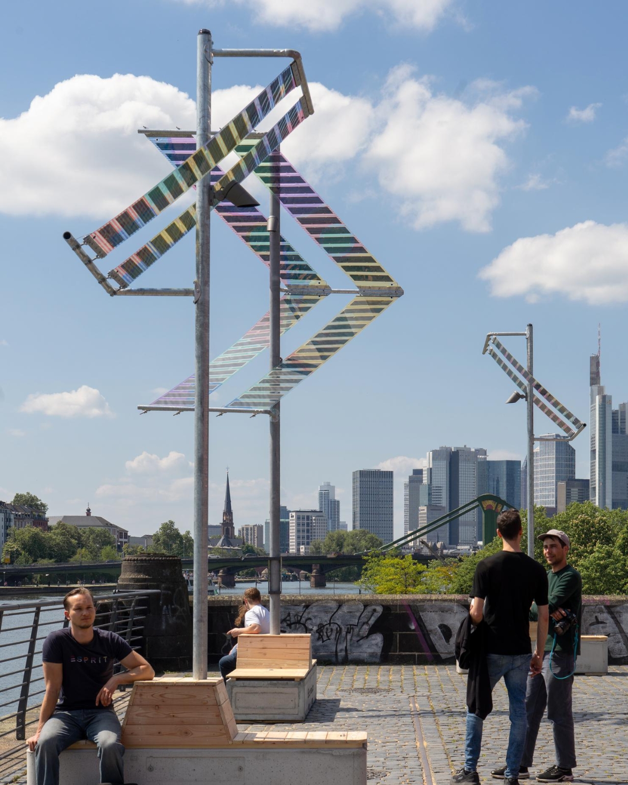
If you’ve ever walked along a riverbank at night and squinted up at a buzzing fluorescent streetlamp wondering who designed that thing and why, Munich-based duo ttal just made that question feel very urgent. Their installation Main Light, currently glowing along Frankfurt’s Weseler Werft as part of the World Design Capital Frankfurt RheinMain 2026 programme, is one of those rare projects that makes you rethink infrastructure entirely.

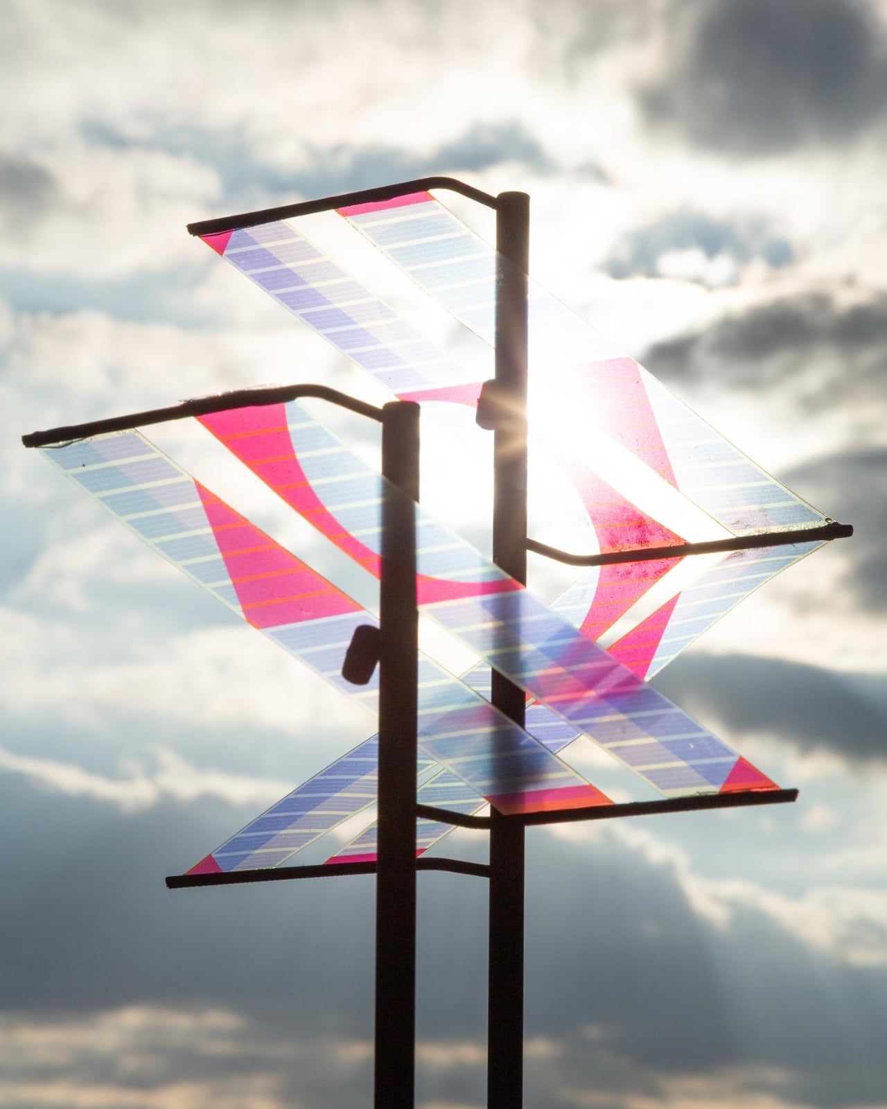
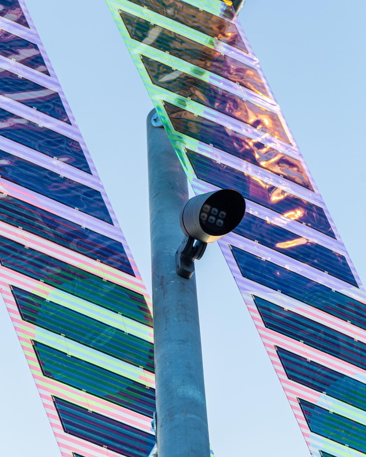
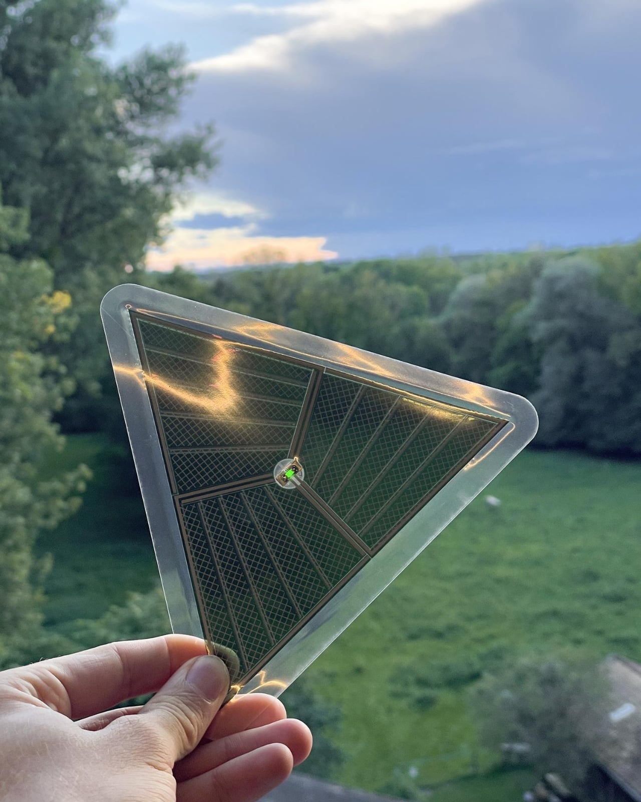
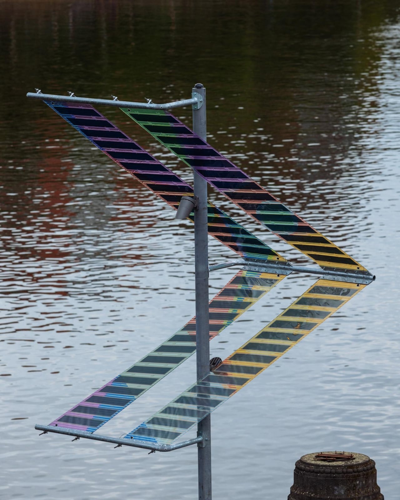
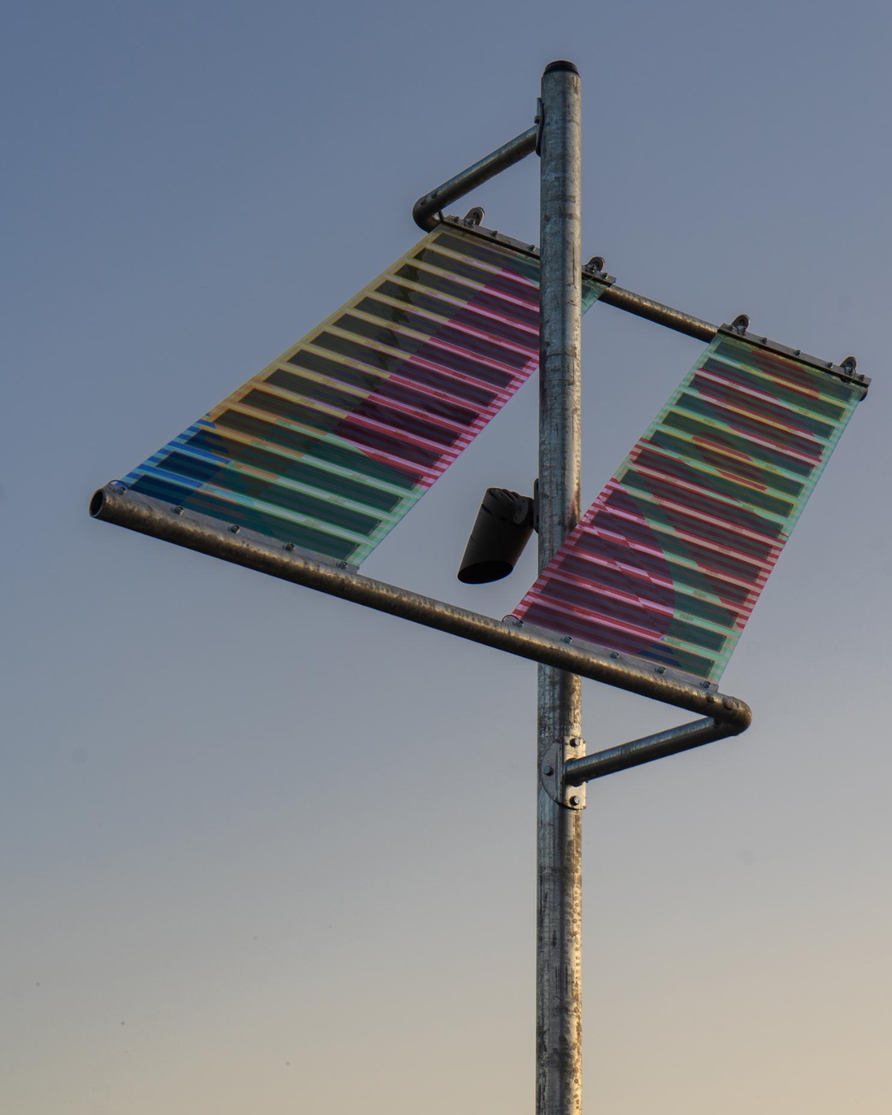
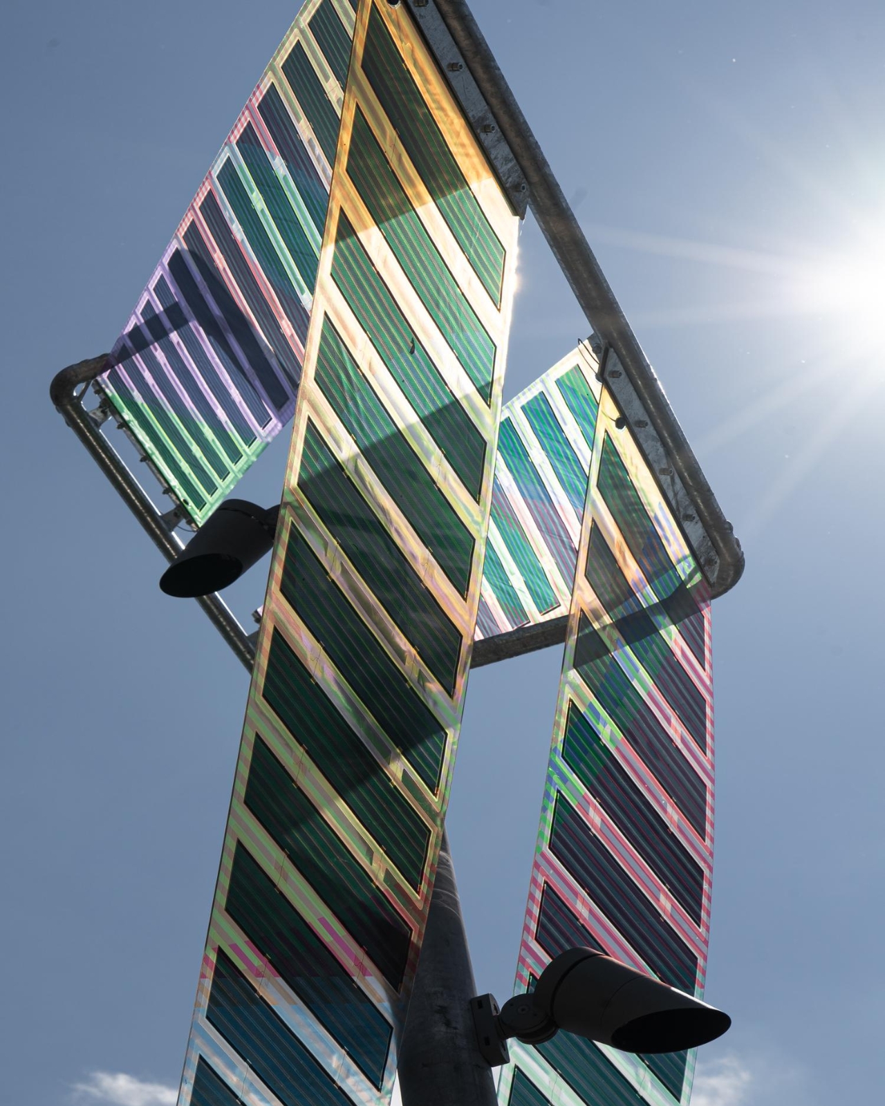
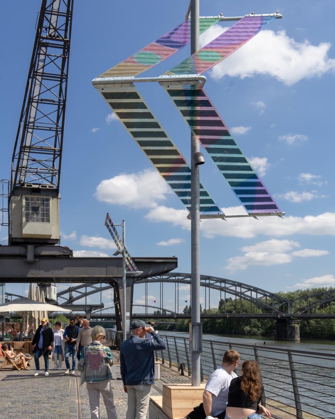
ttal, the design studio formed by Tobias Trübenbacher and Andreas Lang, built Main Light around a deceptively simple premise: public lighting doesn’t have to be ugly, energy-hungry, or ecologically reckless. The result is a self-sufficient solar installation that runs completely off-grid, no power lines buried underground, no permanent excavation, and no connection to the city grid whatsoever. It generates its own electricity through organic photovoltaic (OPV) solar films, those wonderfully colorful translucent panels that make the whole structure look like it belongs in a design museum rather than on a bike path. And that’s exactly the point.

Designer: Tobias Trübenbacher (ttal)

During the day, the solar surfaces catch the light and cast shifting, multicolored patterns across the riverbank. The horizontal stripes of the laminated solar cells aren’t hidden away or treated as a necessary evil. They’re the main visual event. The design essentially says: clean energy can be beautiful, and we should stop pretending otherwise. Trübenbacher, who was named Newcomer of the Year by the German Design Council at the German Design Award in 2023, has described design as a tool for social change, and Main Light reads exactly like that philosophy made physical.

The ecological thinking goes deeper than solar panels, too. Main Light only switches on when a motion sensor detects a person nearby, meaning it doesn’t flood the riverbank with unnecessary light through the night. More quietly significant is its light spectrum. The installation deliberately avoids the blue-heavy frequencies common in most modern LED street lighting, opting instead for an insect-friendly spectrum that’s gentler on nocturnal ecosystems. Light pollution is one of those invisible crises we rarely talk about loudly enough, and seeing it addressed this thoughtfully in a public installation feels quietly radical.

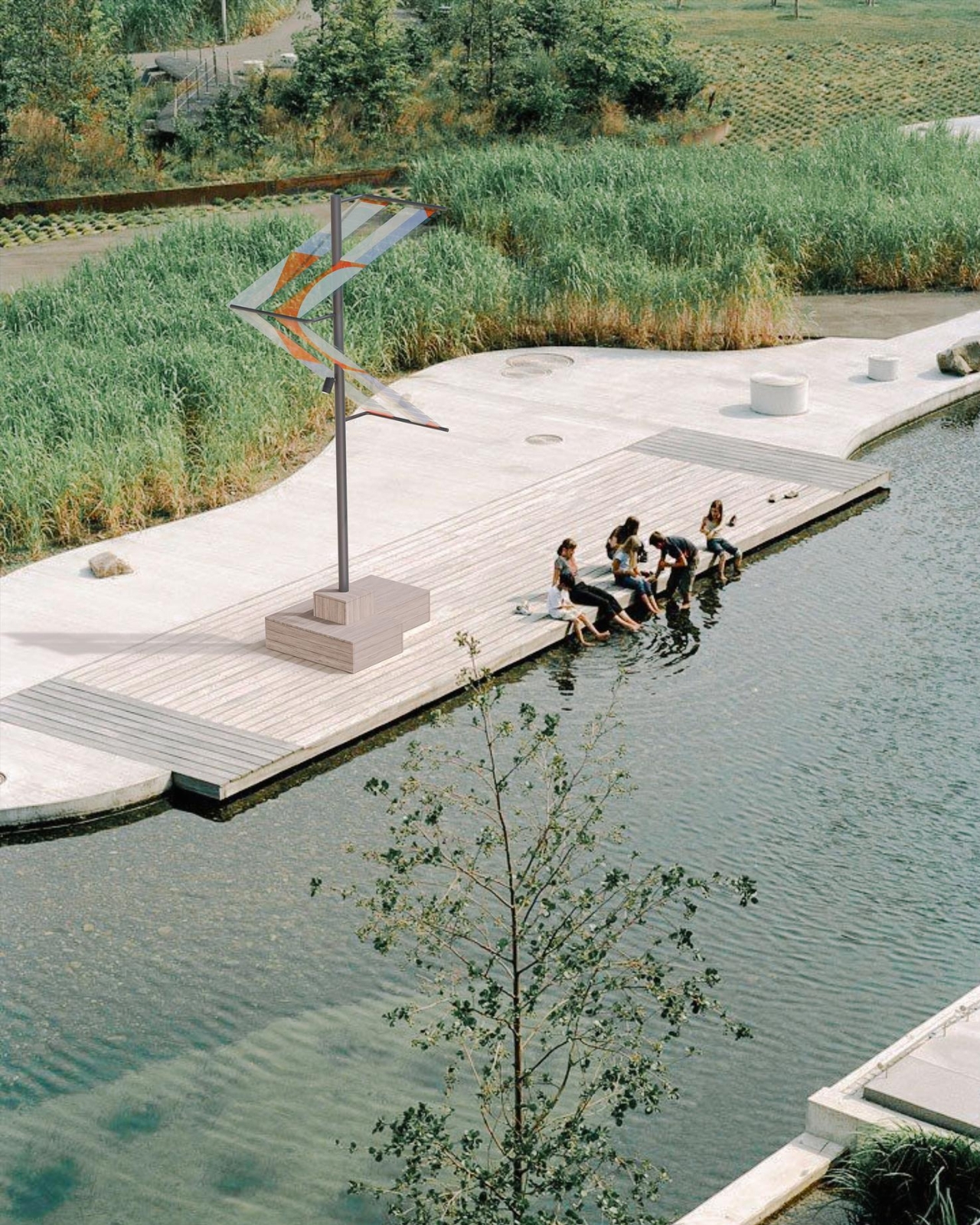
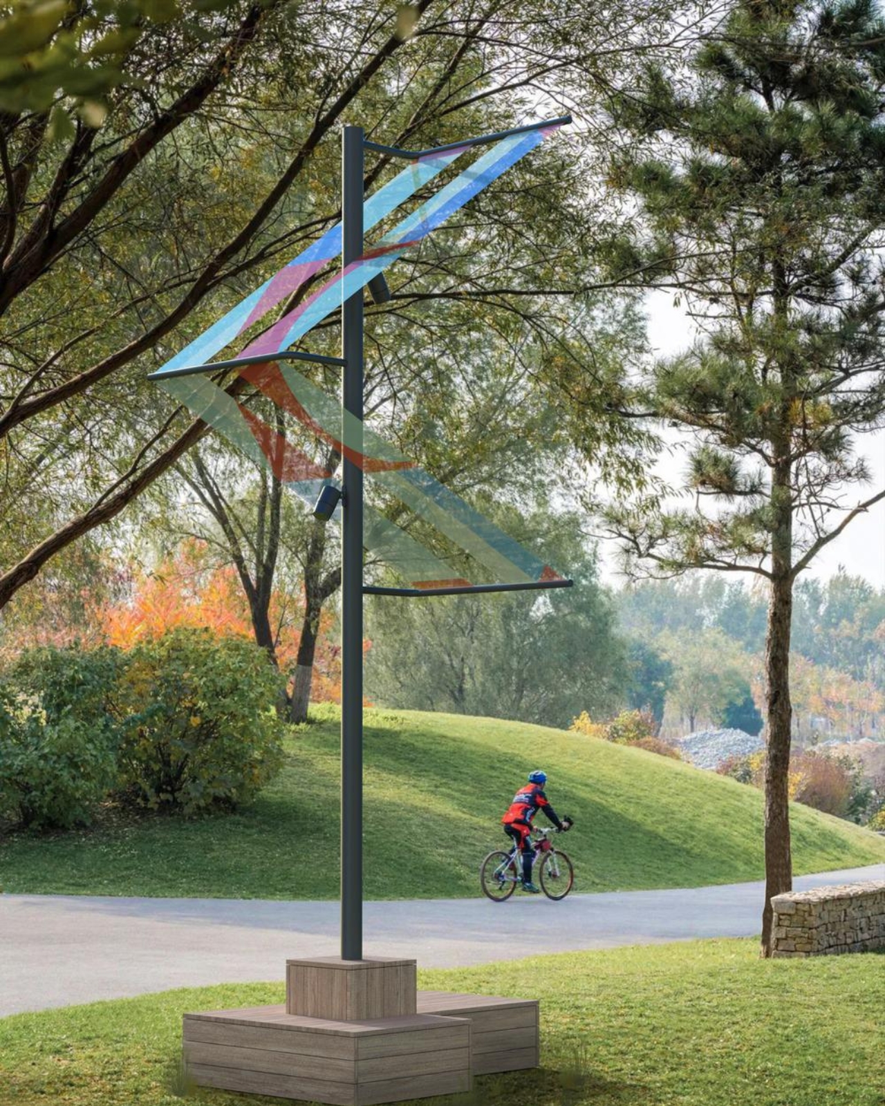
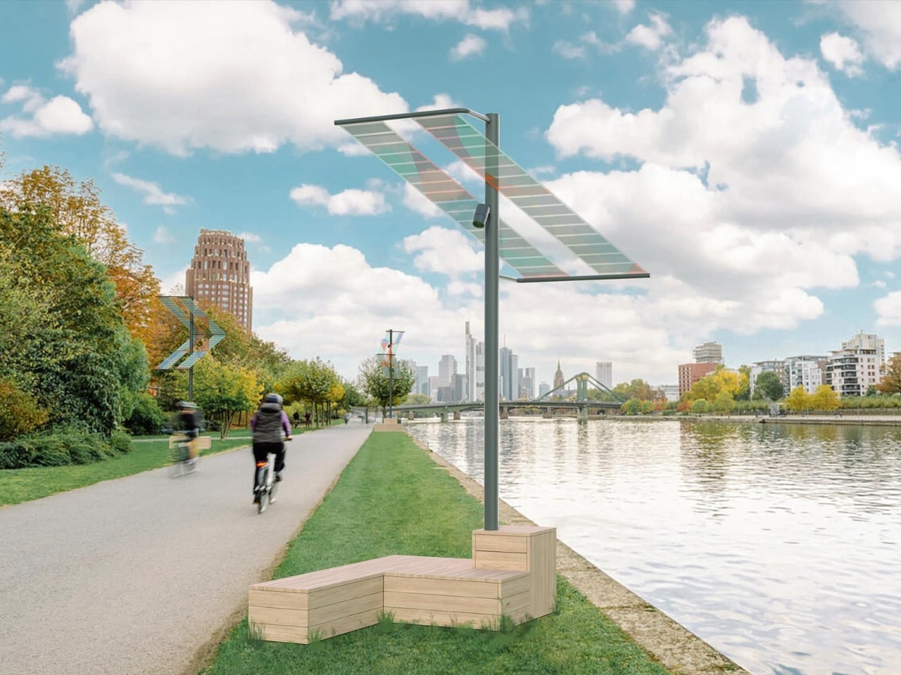
The structural decisions are just as considered. The foundations are reversible concrete bases that also function as urban furniture, places to sit, to pause, to look at the river. Trübenbacher and Lang worked with ewo GmbH on lighting and control technology, ASCA GmbH on the organic photovoltaic systems, and Schake GmbH on the steel construction. Four structures in total were installed near the Oosten restaurant, one large and three smaller units, running from May to November 2026.

The installation sits within a broader conversation about what public infrastructure is allowed to look like. For too long, sustainability has been sold with a kind of visual apologetics, the clunky panel, the utilitarian form, the implicit suggestion that doing the right thing means sacrificing aesthetics. Main Light refuses that trade-off. The colored OPV panels turn the energy-generation process into something visible, even celebratory, a reminder that the transition away from fossil fuels doesn’t need to be grey and joyless.

The duo is also running workshops and public events alongside the installation through the summer months, which matters. A beautiful object without discourse risks becoming wallpaper. The conversations ttal wants to start are about energy, public space, and who gets to decide what our streets look like. These aren’t niche design industry questions. They affect how livable, how safe, and how ecologically responsible our cities actually become.

Cities across Europe and beyond are already reaching out about scaling the project, and it’s easy to see why. Main Light doesn’t require the ground to be torn up. It doesn’t need a power grid. It works, it glows, and it looks genuinely gorgeous against the Frankfurt skyline. The bike paths and riverbanks of the world deserve better than what they usually get. Trübenbacher and Lang have proven, at least along one stretch of the River Main, that we’re already capable of delivering it.

The post Frankfurt’s Solar Lights That Look Better Than Your Living Room Lamp first appeared on Yanko Design.
This Grungy Metal Case turns your iPhone 17 Pro into an iPod Classic

The original iPod (even the iPhone) was designed to scratch. Contrary to the idea of Steve Jobs and Jony Ive chasing perfection, the idea behind having an iPod that wears and tears with use was that A. it would be less of a hurdle to get you to upgrade, but also B. it would make each iPod uniquely different.

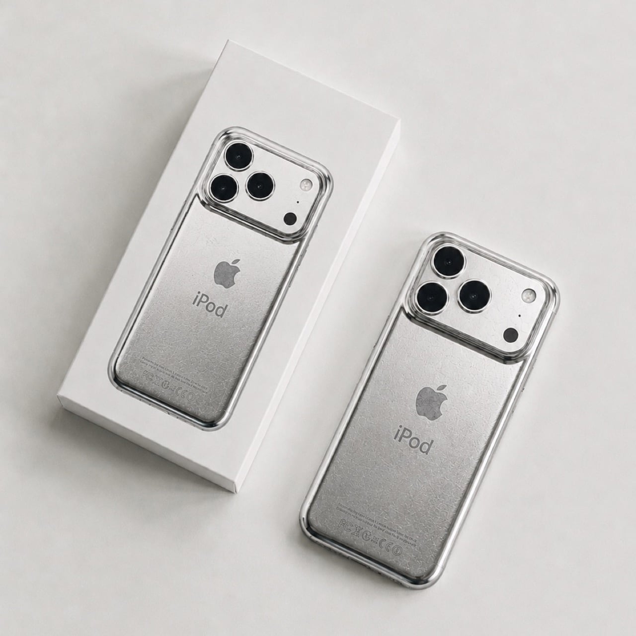
The term designers and craftspeople use to describe this phenomenon is ‘Patina’, it’s when iron rusts a certain way, when bronze oxidizes in a unique style, or when leather wears down in a distinct manner that’s unique to each individual product and how it’s used. The back of the iPod would scratch based on whether you’d keep it on tables or in pockets, whether your pocket had keys, whether you accidentally scuffed it against your belt buckle or the railing of a flight of stairs. That patina was ‘by design’, and even though the new iPhones don’t have that feature, David Delahunty designed a case that lets you relive exactly that.

Designer: David Delahunty

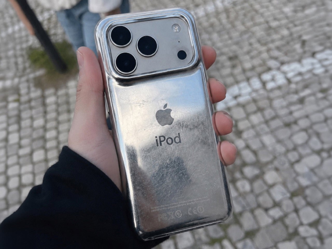
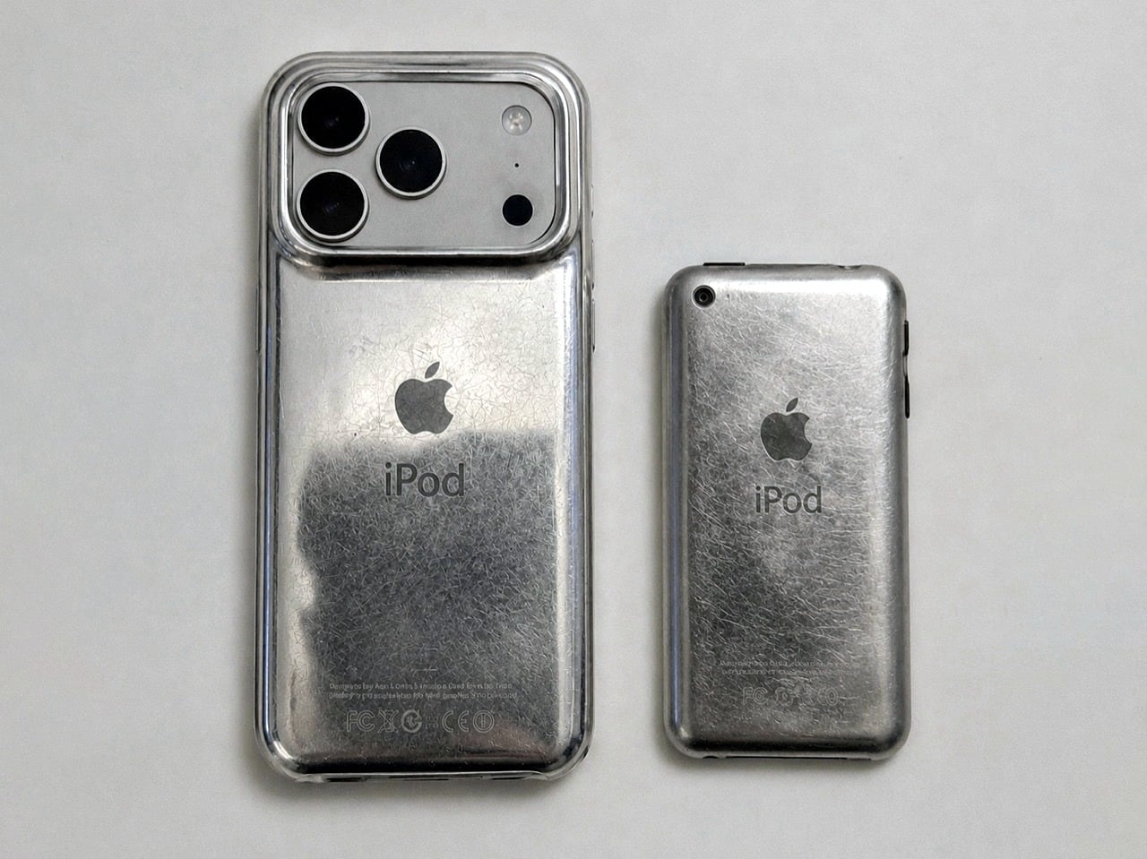
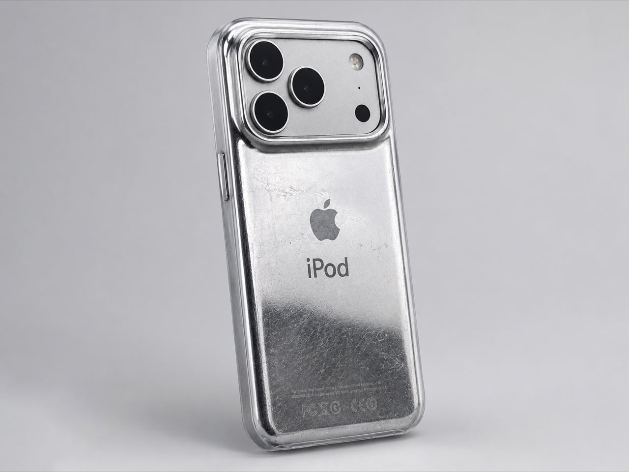
Rather simply put the iPod Classic iPhone 17 Case, this distressed metal case was designed to fit around any iPhone 17 Pro or Pro Max, giving your phone the same grunge-ish vibe. It has the exact same curved body that the iPod Classic had, making the product feel almost identical to the original when held in your hand (bye bye sharp edges on the iPhone, you won’t be missed). The case sports the same artwork on the back too, with an iPod symbol and the Apple logo, along with even the certification text at the bottom… but what steals the show are the scratches.

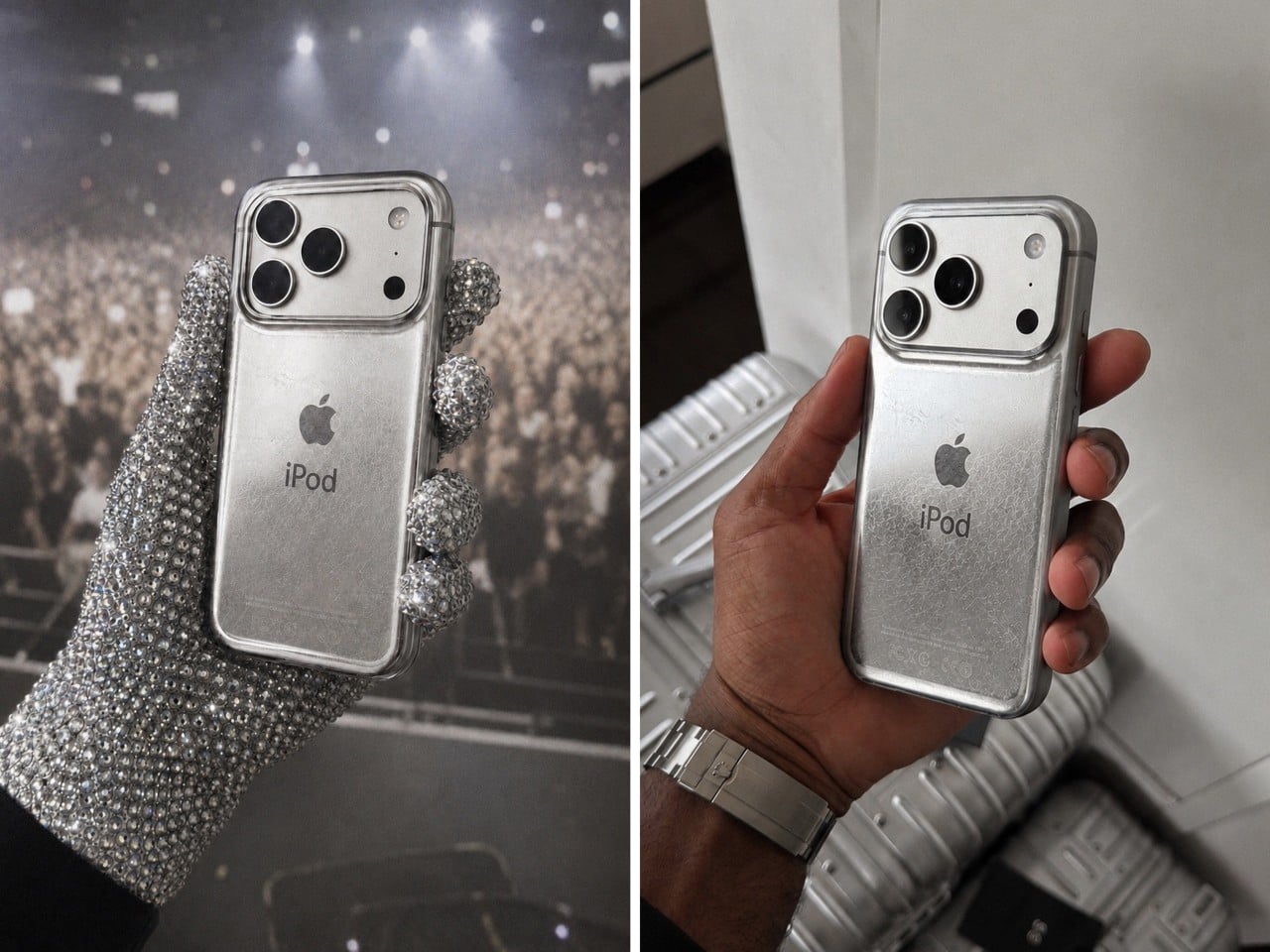
Now it’s difficult to say if Delahunty designed each case to be unique, but that’s because these are just conceptual… for now. The designer, who goes by ‘delahuntagram’ on social media, churns out unique ideas of quirky products (like this MS paint makeup kit or this Apple Spinning Wheel Tennis Ball). Some products end up making it to reality, like the MacOS Folder SSD that is now available for sale. With enough interest, I don’t see how such a product couldn’t hit the mainstream. Delahunty even rendered an image of Drake (although I choose to see MJ) holding the phone in his hand while wearing those bejewelled gloves.

It isn’t the first time the iPhone’s been used as a canvas for Apple-of-the-past. Spigen routinely releases cases that transform the iPhone into Apple icons like the Lisa/Macintosh, or the iMac G3, or even the original iPhone 3G. The ‘scratched’ iPod is a fairly new design take, and something you could totally expect from the mind of Delahunty. I wonder if the case has a faux 3.5mm jack just for kicks…

The post This Grungy Metal Case turns your iPhone 17 Pro into an iPod Classic first appeared on Yanko Design.