This Traditional Japanese Home Was Brought Back to Life by Opening It Up to Everything Around It

Returning home is a deeply intentional process. Not just to a place, but to a life — one shaped by memory, family, and the particular quality of light that falls through a familiar window. That is precisely the spirit YNAS brought to House in Miyakonojo, a renovation and extension of a traditional timber home in southern Japan that quietly redefines what it means to belong somewhere.

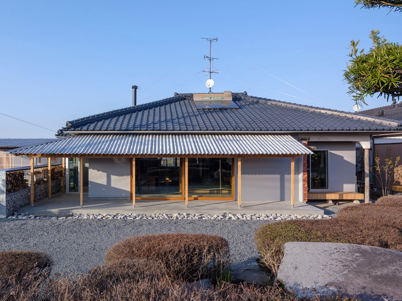
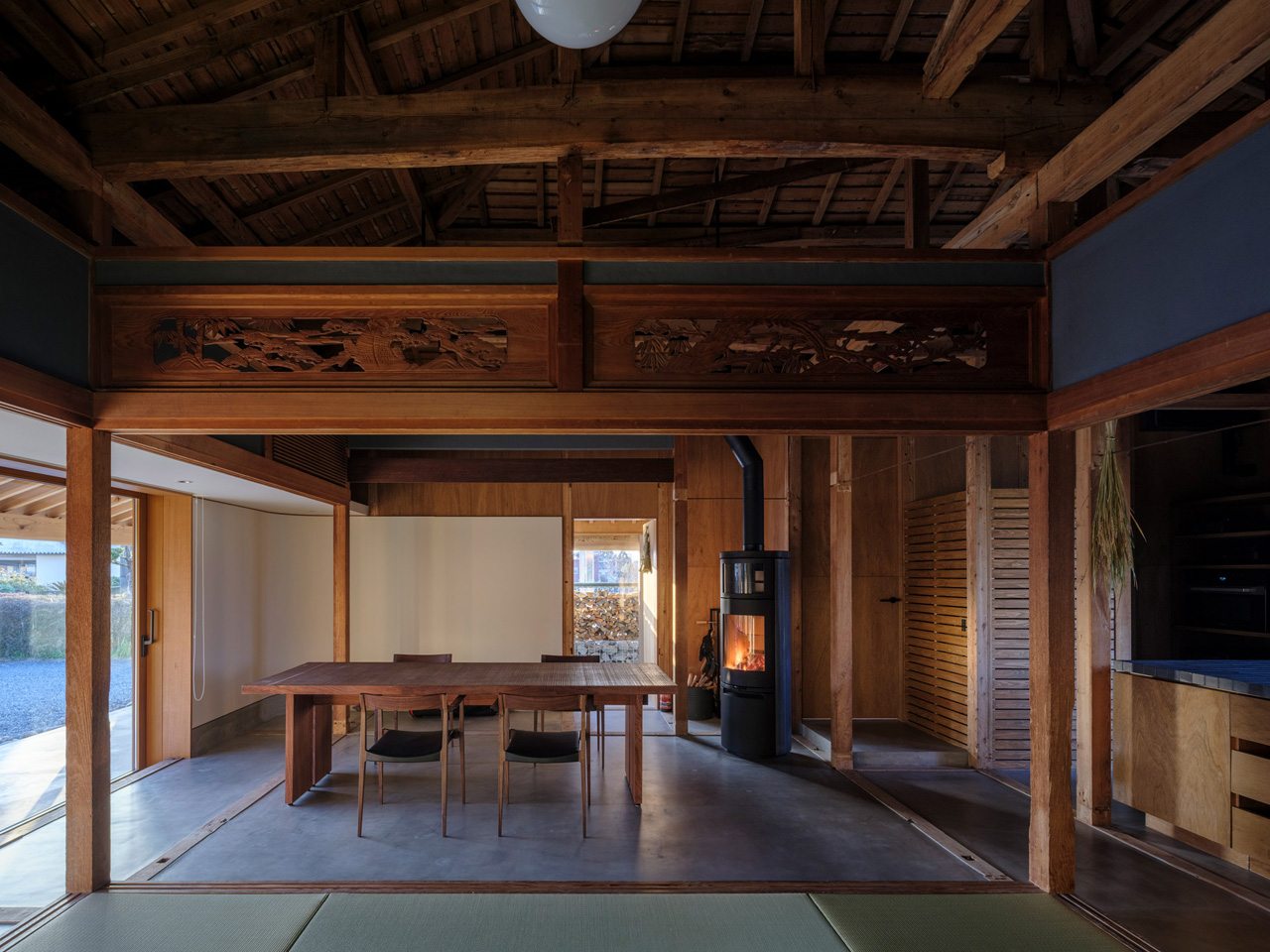
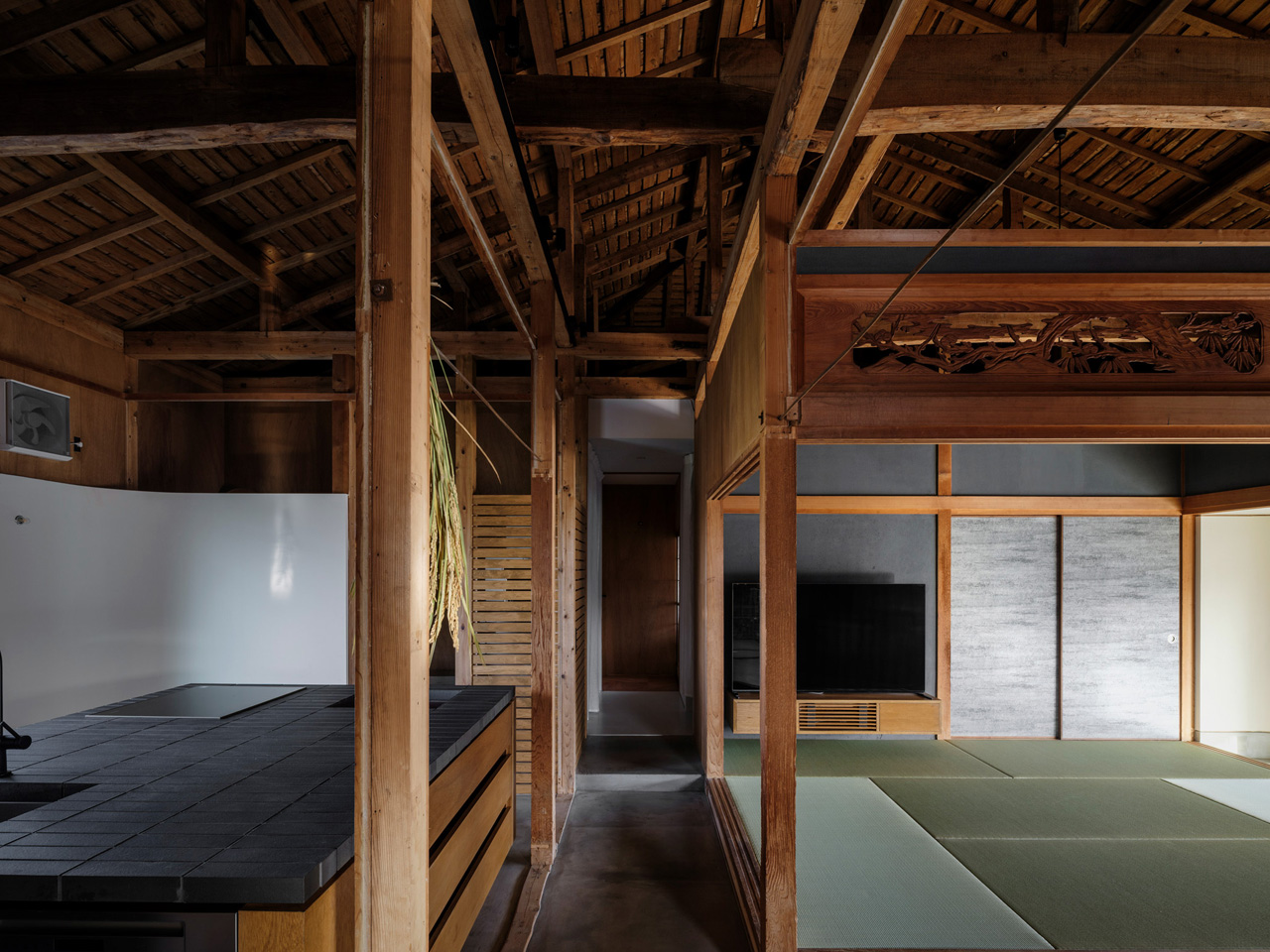
The project began with a couple who, after raising their children and shifting careers, chose to return to the wife’s ancestral home in Miyakonojo to live alongside her father. The house carried history in its bones — a traditional layout of rooms partitioned by sliding screens, arranged off a dark, L-shaped corridor that kept the living area, kitchen, dining room, and bedroom firmly separated from one another. It was a home that had turned inward, closing itself off from both the people inside and the landscape beyond its walls.

Designer: YNAS
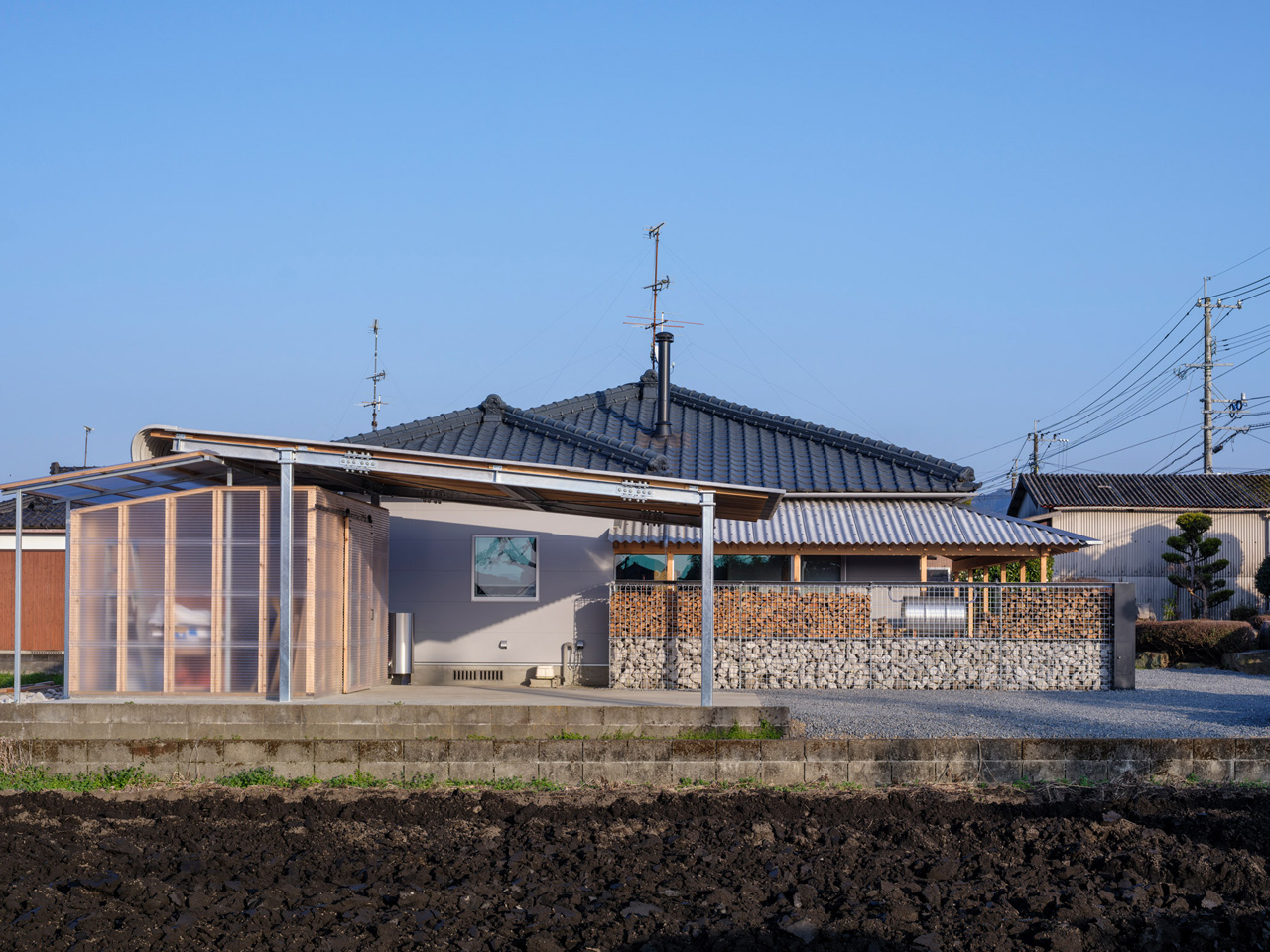
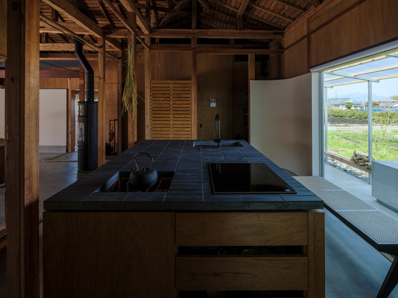
YNAS dismantled that introversion entirely. The studio opened up the cramped internal layout, dissolving the rigid partitions to let space breathe and flow the way a home shared between generations should. The transformation is not just structural — it’s philosophical. The design rejects the idea that privacy requires enclosure, leaning instead into a more generous, paradoxical logic: that openness itself can become a form of protection.

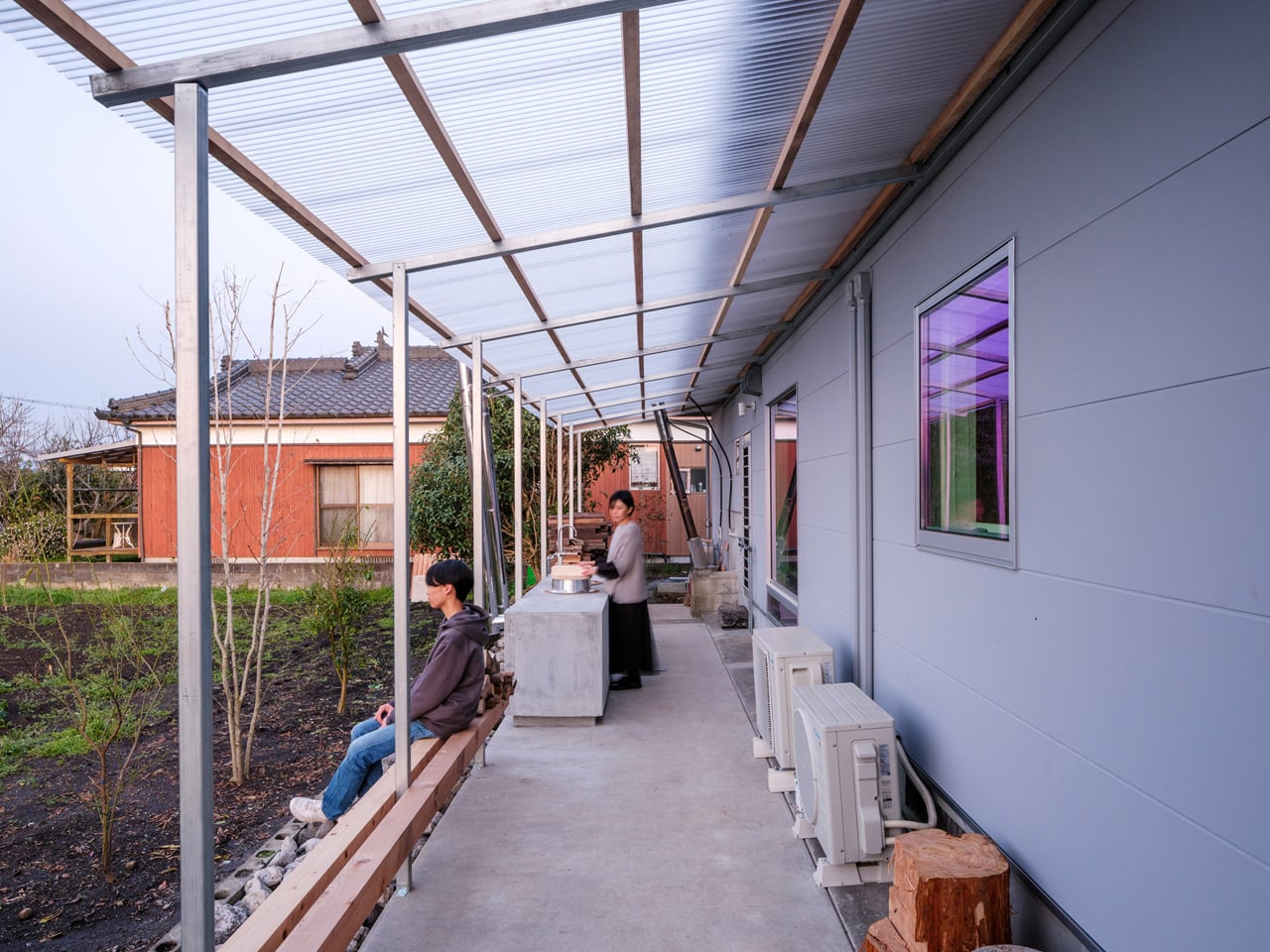
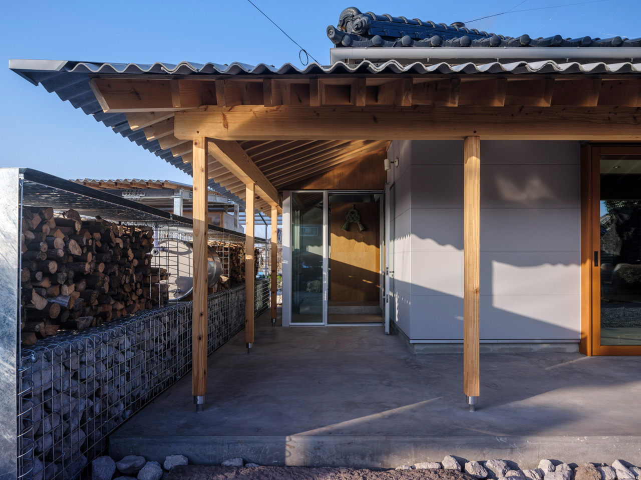
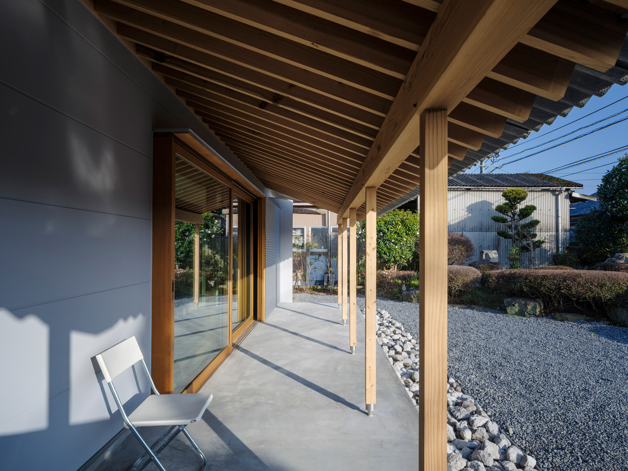
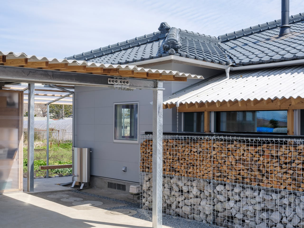
That thinking is most visible in the corrugated metal canopies YNAS added to the exterior. Timber-framed and industrial in material, they extend the home outward, creating covered outdoor spaces that blur the threshold between inside and out. An outdoor kitchen and a wood-fired bath become part of daily life, not luxuries tucked away from it. Neighbors might catch a distant glimpse of the family gathered outside, or notice smoke rising from the stove — and that, the studio argues, is the point.
“The house once again becomes a part of the landscape through the ‘signs of life’ it emits,” YNAS noted of the project. It’s a rare architectural position — one that treats visibility not as exposure but as community, as a soft signal that a home is lived in and loved.

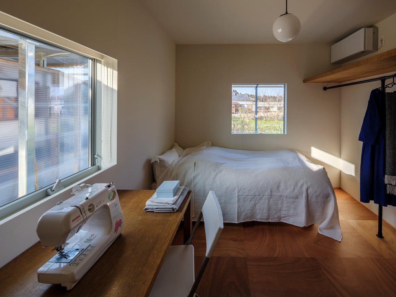
The result is a house that honors its past without being imprisoned by it. The ancestral bones remain, but the rooms now open to each other, to the garden, to the sky. Corrugated metal and old timber sit side by side without apology. Three generations share space under a roof that has finally learned how to exhale. In Miyakonojo, YNAS has done something quietly radical: they’ve made a home feel, again, as it belongs to the world around it.
The post This Traditional Japanese Home Was Brought Back to Life by Opening It Up to Everything Around It first appeared on Yanko Design.


This Royal Enfield Continental GT Concept Looks Like a Café Racer Cast From a Revolver

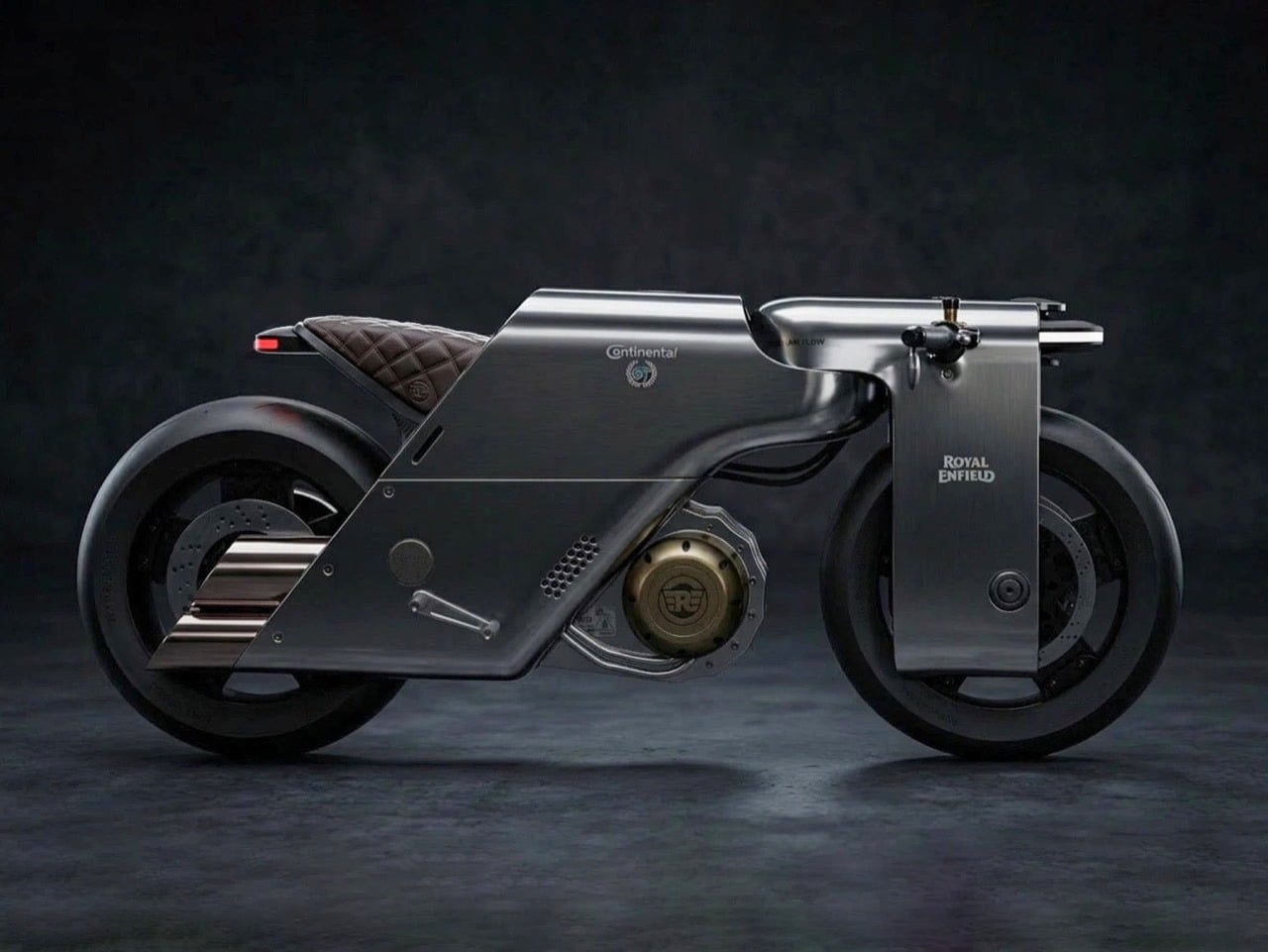
The original Royal Enfield Continental GT was designed, in 1964, to look like a young enthusiast built it in a garage on a Saturday afternoon, with bolt-on parts, clip-on handlebars, a fiberglass tank painted red, and a riding posture borrowed from the race paddock. That was the point. Café racer culture in 1960s Britain grew up around young people doing exactly that, modifying whatever they had to race between cafes along the A1, chasing ton-up speeds on public roads. Royal Enfield turned that grassroots spirit into a production motorcycle, and the GT 250 became Britain’s fastest 250cc bike, 74mph from a factory-built machine wearing the costume of a homemade racer. The GT 535 and GT 650 that followed stayed faithful to that same visible-skeleton philosophy, and then Krishnakanta Saikhom’s Homage concept arrived to ask what happens if you take a blowtorch to all of that.

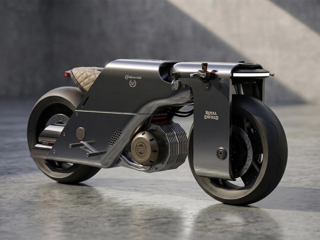
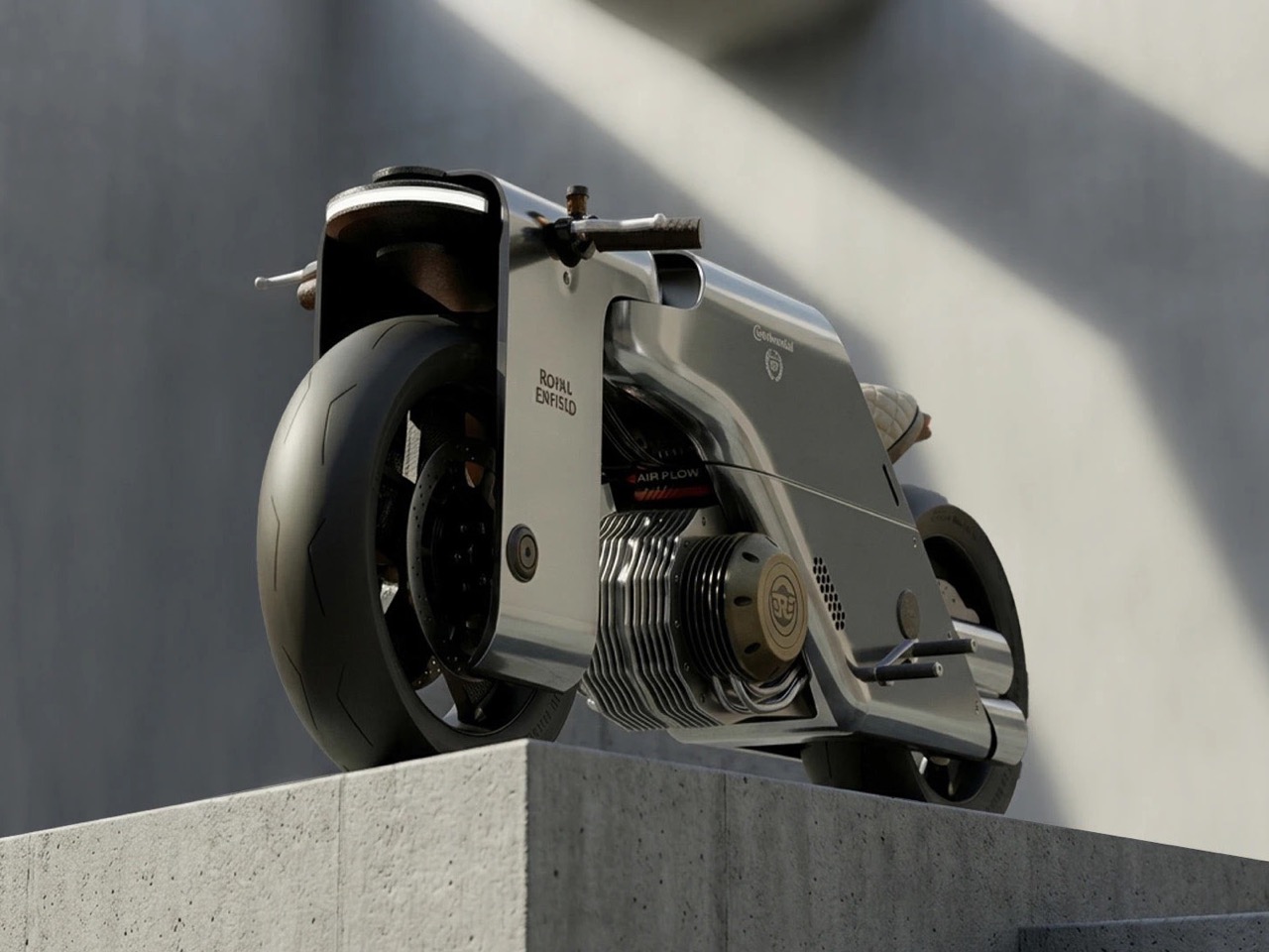
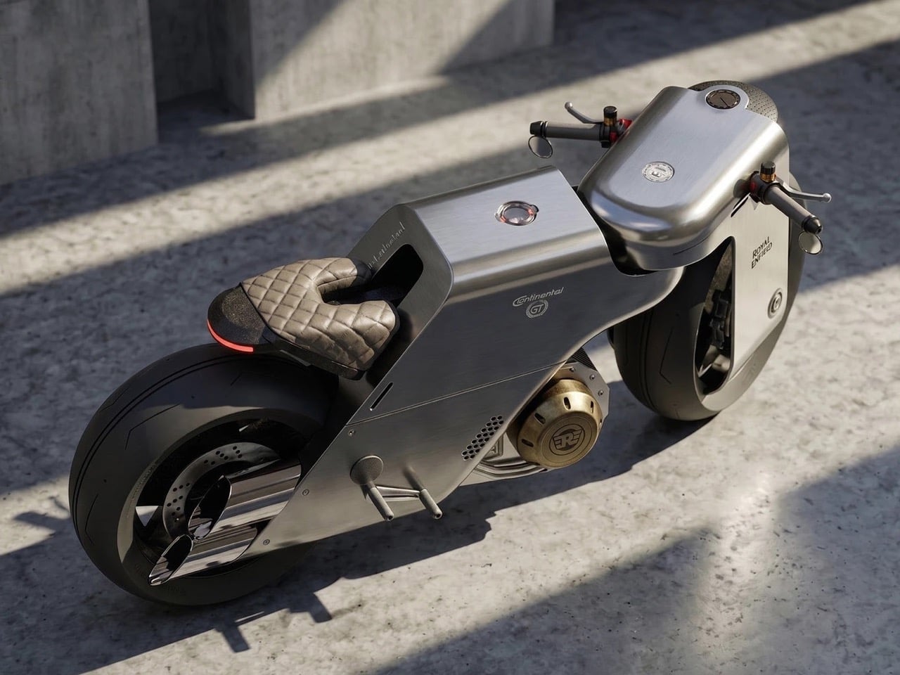
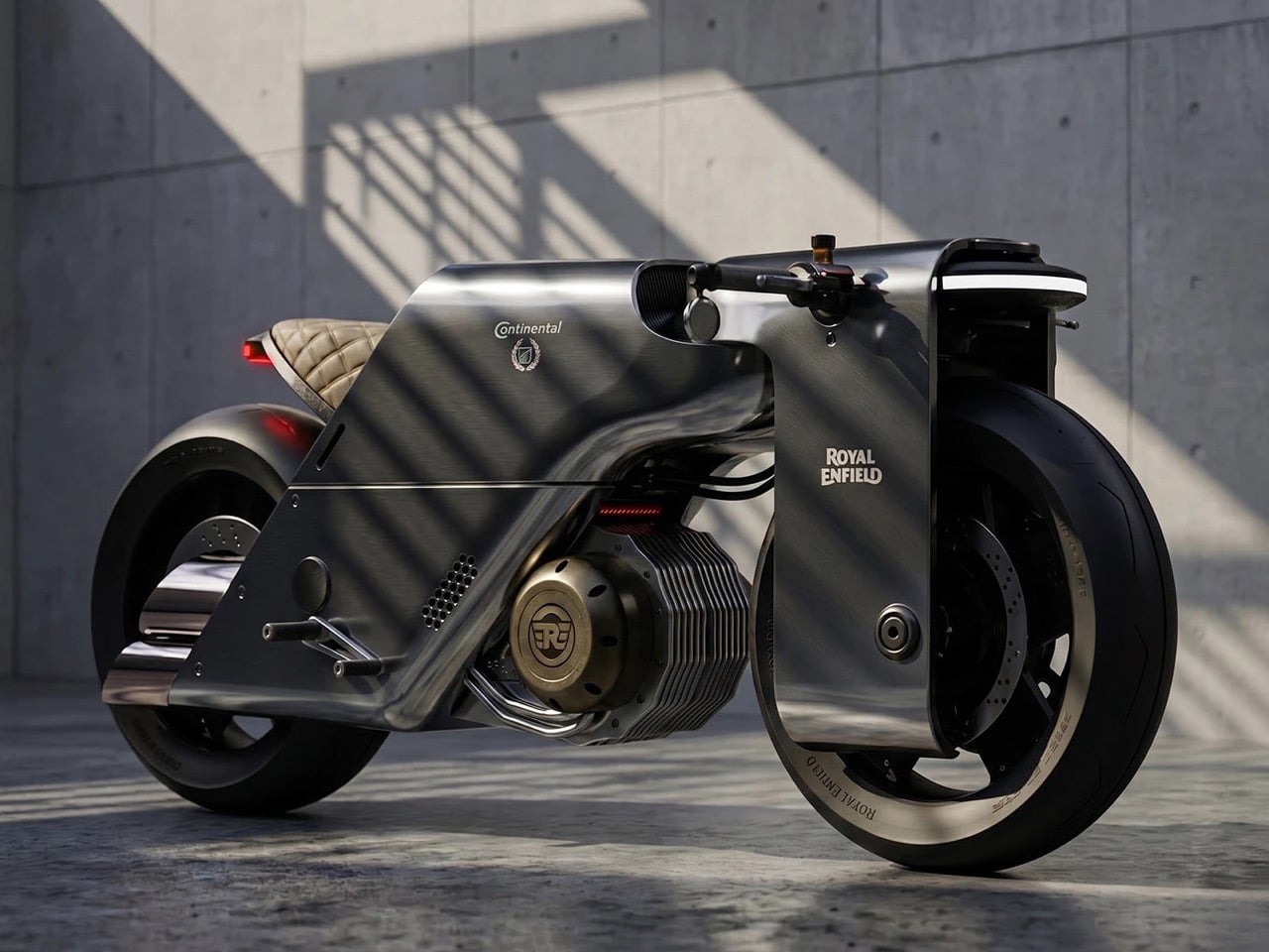
Saikhom’s answer is a monolithic, gunmetal-gray motorcycle where the body encases everything, the frame, the mechanicals, the conventional café racer’s skeletal honesty, within a single sculptural shell. The concept draws its entire visual vocabulary from firearms, quite literally: the designer’s moodboard places revolver silhouettes and handgun cross-sections directly alongside development sketches, treating the gun barrel as a formal reference for the motorcycle’s enclosures. The proportions are aggressive and low, with wide arc fenders sweeping over both wheels like the housing of a precision instrument. A quilted leather saddle floats above the body line where a conventional seat hump would sit, and a brass medallion badge marks the engine compartment like a gunsmith’s maker’s mark. What Saikhom has done is take Royal Enfield’s founding motto, the one engraved on the cannon in the brand’s own logo since 1890, and treat it as an actual design specification.

Designer: Krishnakanta Saikhom

The body shell presents as two materials in dialogue: a matte gunmetal primary surface covering the tank volume, side panels, and fender arcs, offset by polished cutouts that expose the engine’s air-cooled cylinder fins. Those fins are the only surviving element of conventional Royal Enfield mechanical vocabulary, framed by Saikhom the way a gunsmith would display an action mechanism inside its housing. Clip-on handlebars sit nearly swallowed by the body mass on either side, communicating a riding posture more committed than anything in the current GT lineup. A thin red LED strip traces the tail as the sole concession to contemporary lighting language in an otherwise entirely analog package. The brass RE medallion anchors the bike’s visual center of gravity like a heraldic crest pressed into armor.

The “Made Like a Gun, goes like a bullet” slogan traces directly to Royal Enfield’s origins supplying components to the Royal Small Arms Factory in Enfield, and the cannon in the brand logo has carried that history since 1890. Every production Continental GT has worn that heritage as brand poetry rather than surface grammar. The GT 650, launched in 2018 alongside the Interceptor with a 647.95cc parallel twin and neo-retro exposed mechanicals, is a genuinely charming motorcycle on its own terms. But the armaments lineage has never once informed the actual design language, only the tagline. Saikhom’s Homage is the first time anyone has treated it as a real visual brief.

A mechanical engineering graduate and National Institute of Design alumnus, Saikhom has a clear pattern in his work: find the most extreme honest interpretation of a brand’s DNA and follow it without flinching. His Lamborghini Massacre concept, which we gushed over in 2021, pulled the entire body language from the Russian Sukhoi Su-57 stealth fighter to channel Marcello Gandini’s aggressive geometry back into the modern brand. The McLaren Meliora, from the same year, reduced the brand’s design language to its most essential ellipse geometry and held it there. His Ferrari SC250, covered here just last week, stretched the 250 GTO’s racing silhouette into something closer to a Le Mans prototype program than a road car studio. The Continental GT Homage follows that same logic, and it lands in a design space Royal Enfield’s own studio, currently split between the Flying Flea EV sub-brand and the forthcoming GT 450, has not yet had the nerve to occupy.

The post This Royal Enfield Continental GT Concept Looks Like a Café Racer Cast From a Revolver first appeared on Yanko Design.
Flipper One Launches With 5G, Satellite, and the Ability to Turn Any Hotel TV Into a Linux Desktop

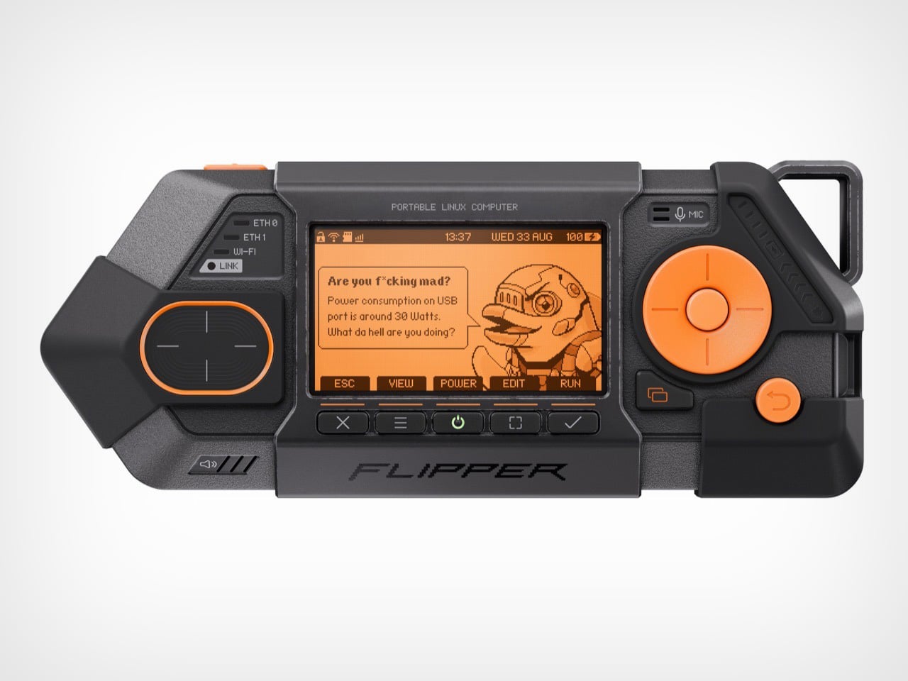
The Flipper Zero always looked like it was designed by someone who grew up on Game Boys and cyberpunk anime simultaneously, and that instinct paid off spectacularly. A toy-shaped hacker tool with a pixelated dolphin mascot somehow became one of the most culturally significant pieces of open hardware of the past decade, racking up a million units shipped and a string of government ban attempts that only made it more desirable. We’ve covered the Zero’s behind-the-scenes, and the throughline was always the same: great design lowers the barrier to entry, and a device that looks fun gets picked up, explored, and loved in ways that a purely utilitarian box never would.

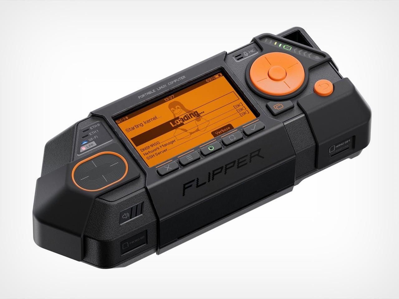
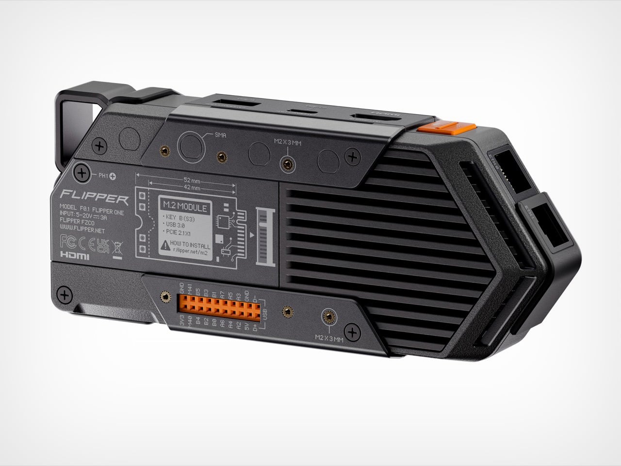
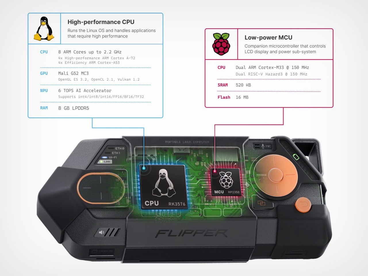
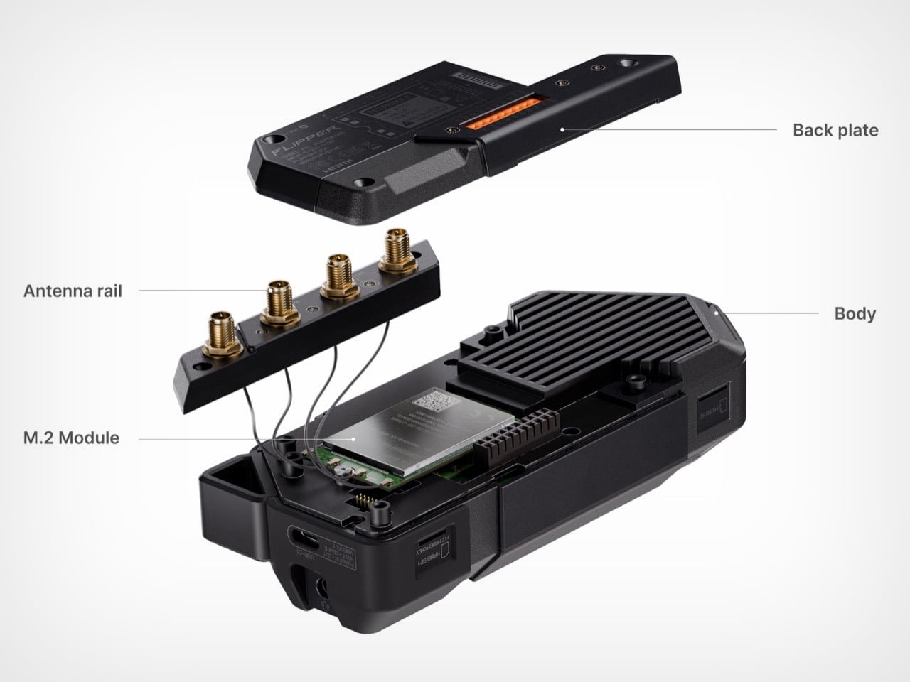
Flipper One lands with that same energy, except the mascot is now visibly unhinged. The screen on the press images shows the dolphin yelling “Are you f*cking mad?” at the user for drawing too much power from the USB port, which tells you everything about the tonal direction here. This thing stamps “PORTABLE LINUX COMPUTER” across its forehead, wears its network indicator LEDs like a badge of honor, and ships with a carabiner loop because Flipper knows exactly who is buying this. The hardware underneath that attitude is a full Linux machine capable of operating as a router, a network analyzer, a travel desktop, and a satellite-connected field tool, all depending on what you slot into its M.2 expansion bay.

Designers: Pavel Zhovner & Flipper Devices

I’ll be honest, when the Flipper One CAD files leaked in March, my first reaction was that it looked like someone scaled up a Game Boy Advance and bolted Ethernet ports onto it. My second reaction, about thirty seconds later, was that I wanted one immediately. The form language was unmistakably Flipper, angular and purposeful and slightly aggressive, but the proportions told a completely different story than the Zero. This was not a radio tool. The Zero’s pixel dolphin was charming and approachable, a deliberate design choice that got a hacking tool onto TikTok and into mainstream conversation. The One’s mascot has apparently developed strong opinions and a short temper, which fits a device aimed at people who want their pocket computer to reflect how seriously they take their craft.

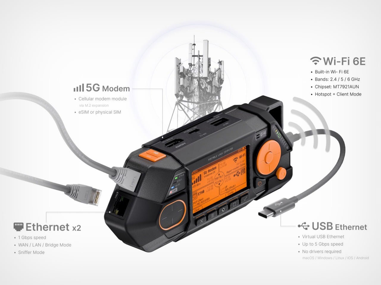
That craft, in practice, looks like this. You’re at a conference, hotel Wi-Fi is the usual disaster, and you want a clean network environment for your laptop. Flipper One bridges its dual Gigabit Ethernet ports, runs a VPN tunnel through the cellular modem you’ve slotted into the M.2 bay, and your laptop connects through USB-C Ethernet at 5 Gbps without touching the hotel network once. Or you’re a field engineer doing network diagnostics in a location with no cellular, and the NTN satellite modem module gives you an IP connection via the same low-orbit infrastructure newer phones use for emergency SOS messaging. Or you’re traveling light and plug the One into the hotel TV via full-size HDMI 2.1, grab a Bluetooth keyboard, and have a working Linux desktop controlled by the room remote through HDMI CEC. These aren’t edge cases dreamed up for a spec sheet. They’re the actual use cases Flipper is designing toward.

The software architecture is as interesting as the hardware. Flipper OS introduces a profile system where each configuration is a complete, isolated OS snapshot. Boot a network analysis profile, install whatever you need, break things freely, then switch to a clean travel desktop profile without any experimental residue carrying over. Anyone who has re-flashed a Raspberry Pi SD card for the fourth time in a week because a router experiment ate the system will understand exactly why this matters. FlipCTL completes the picture, a UI framework that wraps existing Linux command-line tools like nmap, ping, and traceroute in a clean, D-pad-navigable interface purpose-built for the One’s small screen, rather than squeezing a full desktop environment into a space it was never designed for.

Flipper Devices shipped a million Zeros by making a serious tool feel approachable and fun. The One is a bet that the same philosophy scales up to a full Linux platform, and that an unhinged pixel dolphin yelling at you about USB power draw is exactly the right mascot for a machine with this much capability packed into a chassis you can clip to a bag and carry anywhere.

The post Flipper One Launches With 5G, Satellite, and the Ability to Turn Any Hotel TV Into a Linux Desktop first appeared on Yanko Design.

Ducati Barista M3 1926 gives new meaning to caffeinated motorhead passion

What’s common between thunderous sports bikes and espresso machines? Both deliver a high-adrenaline rush, right? Yes, but there’s more to it: both are precision-engineered, and both rely on immense (bar) pressure and thermal control for peak performance. This shared DNA traces back to the 1960s when British riders modified their stripped-down motorcycles to race from one roadside café to another, giving birth to the term “Café Racer.”

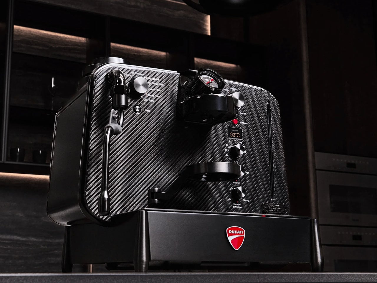
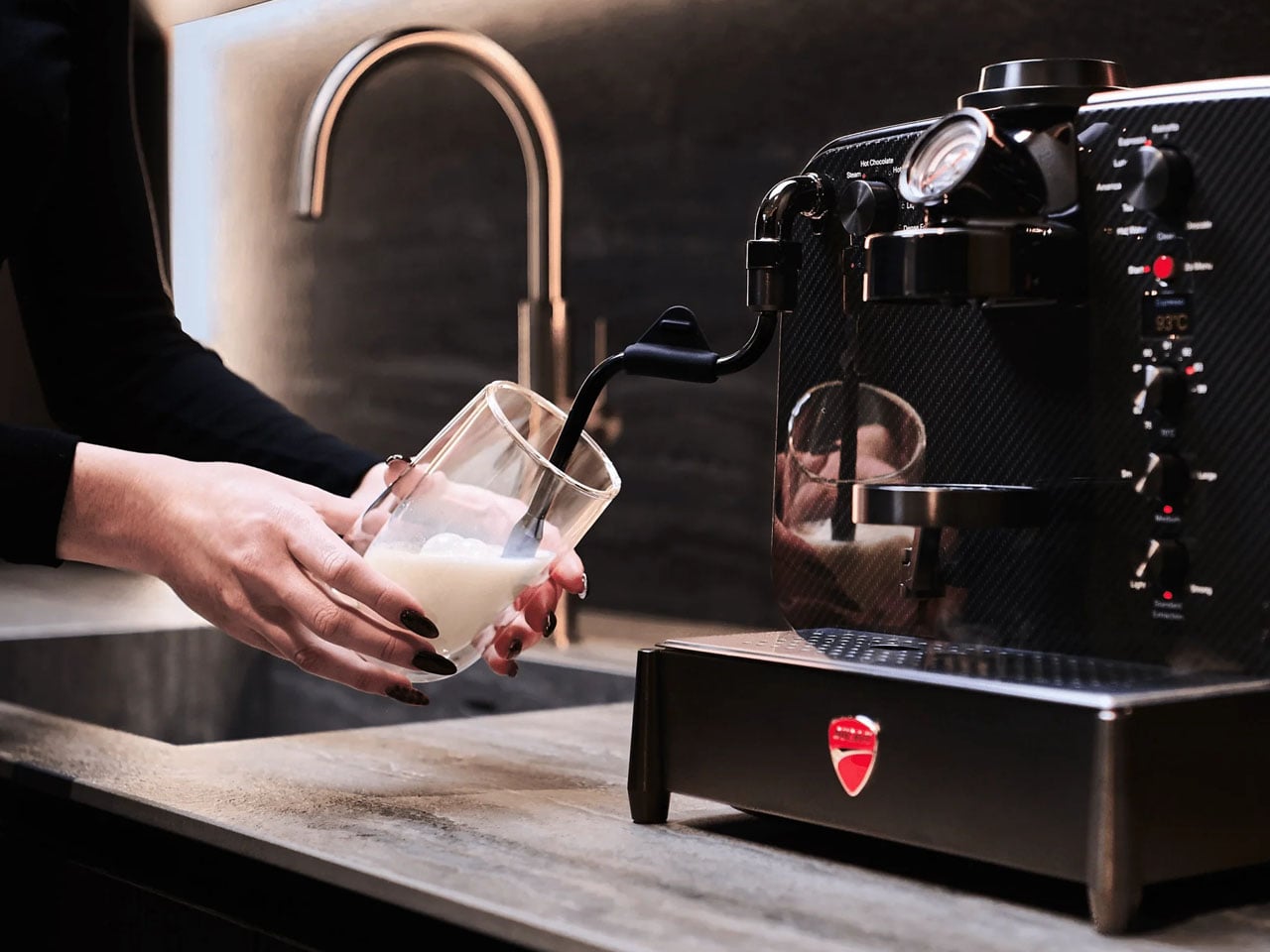
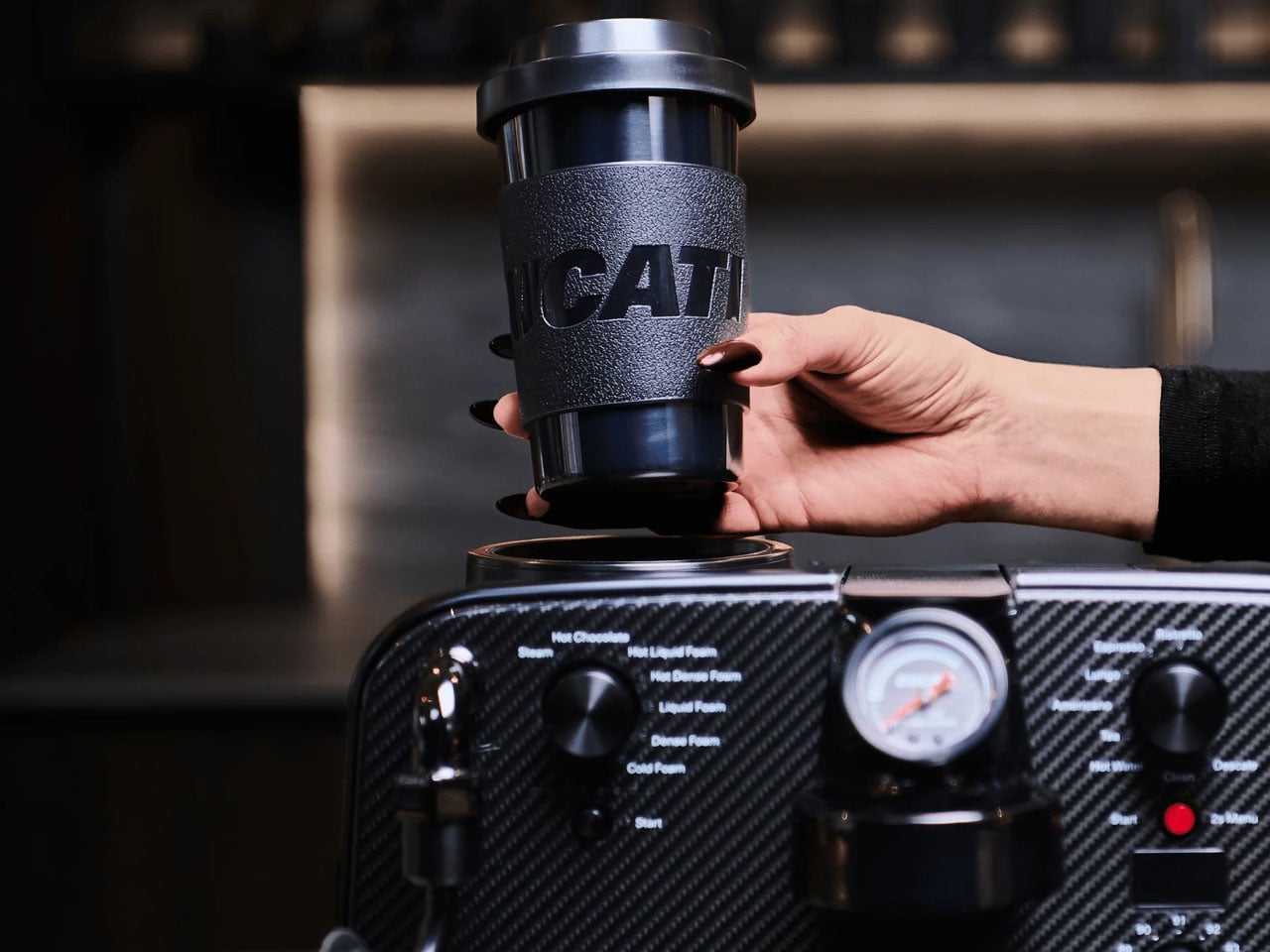
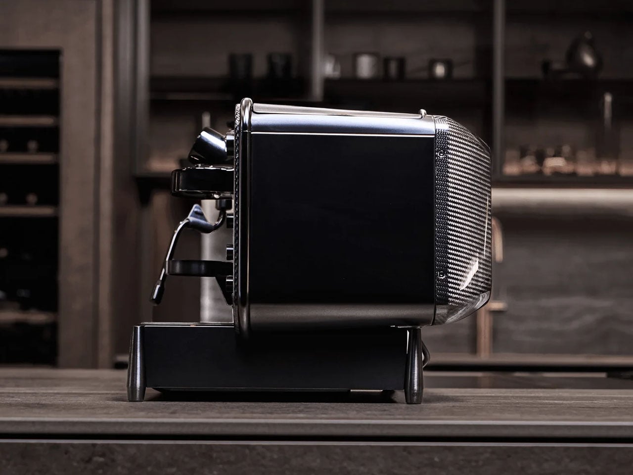
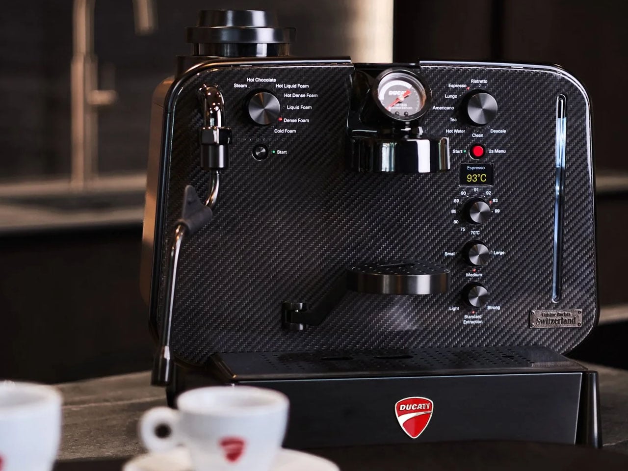
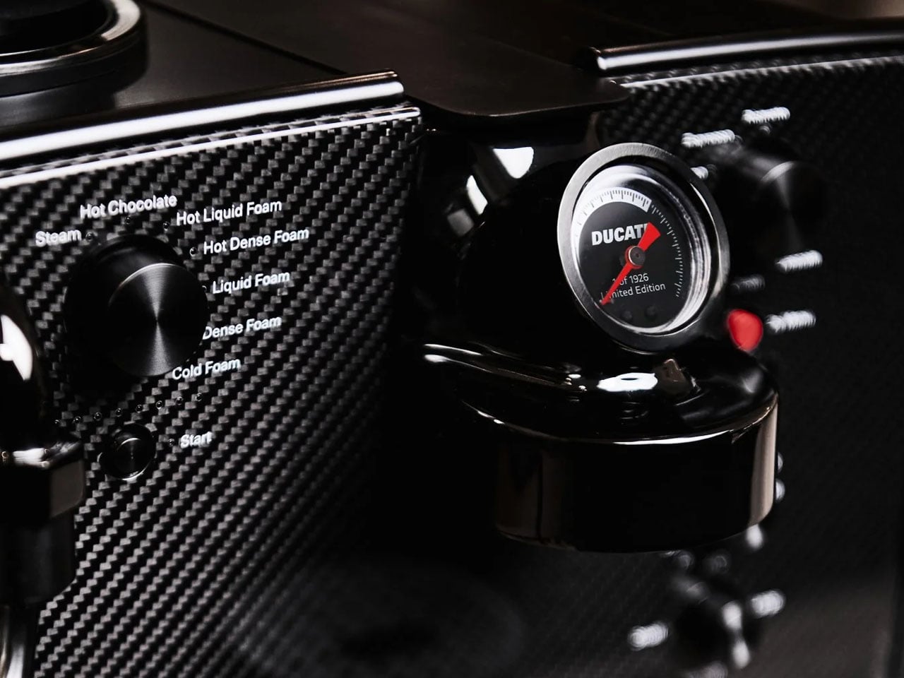
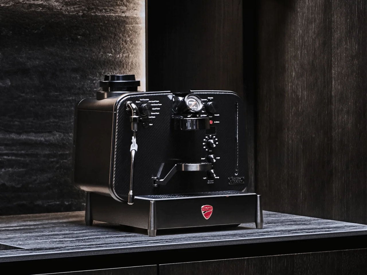
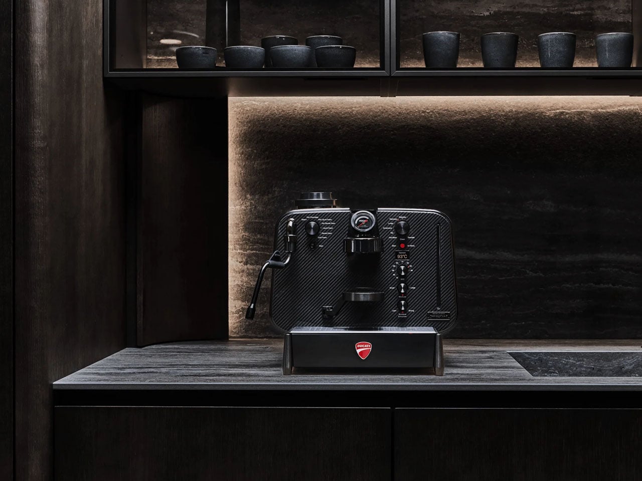
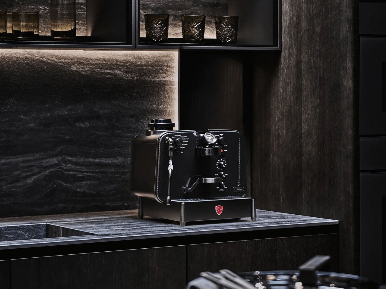
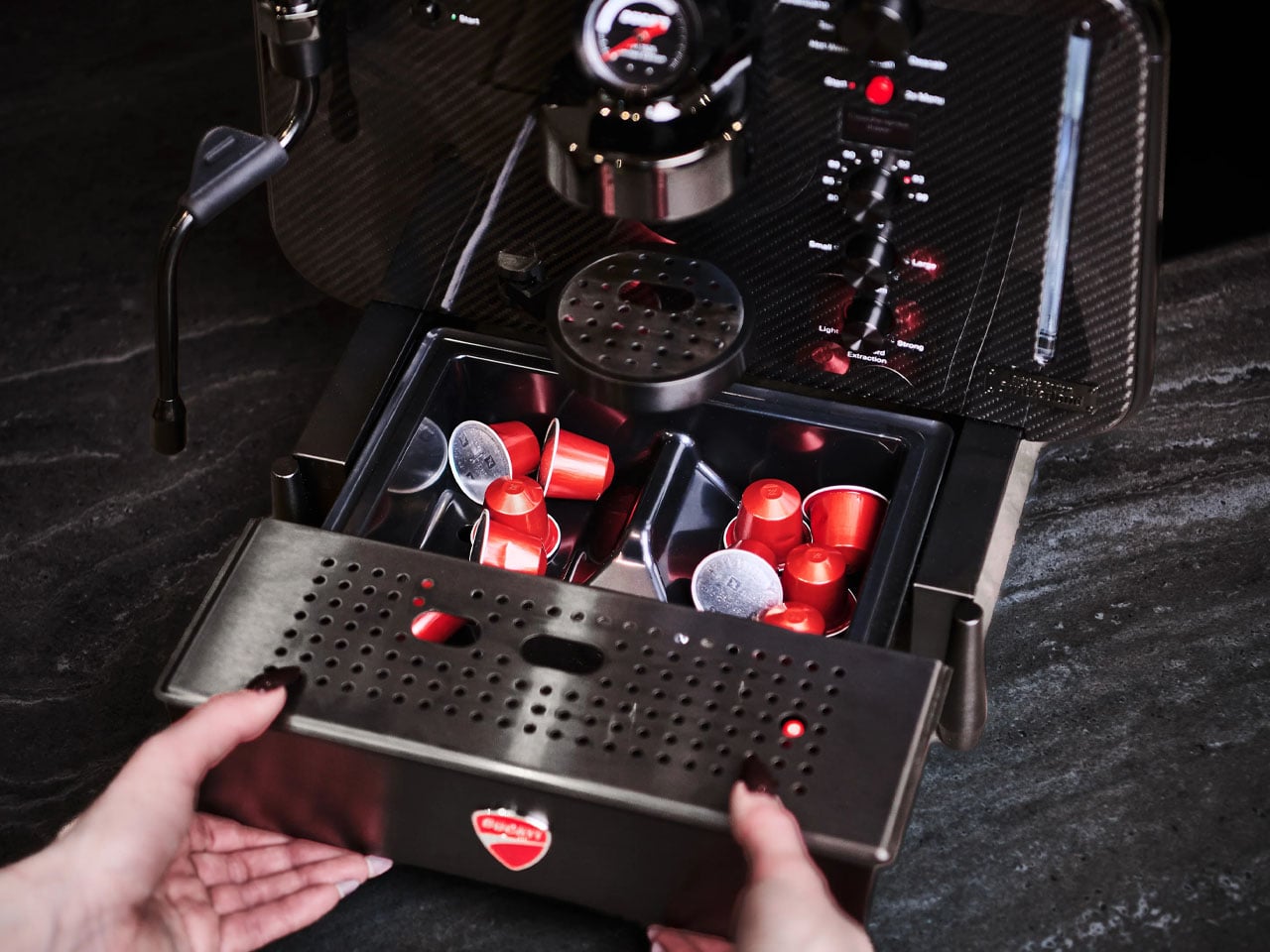
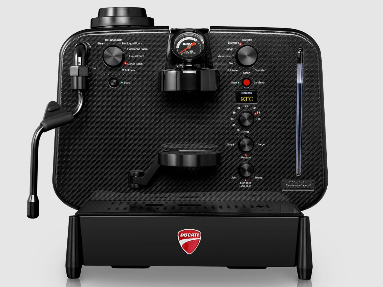
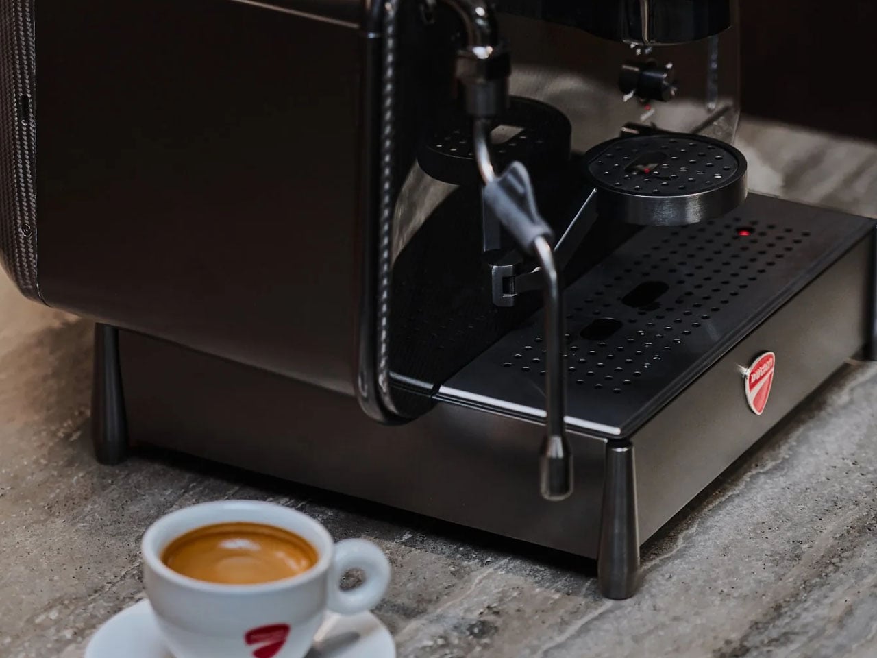
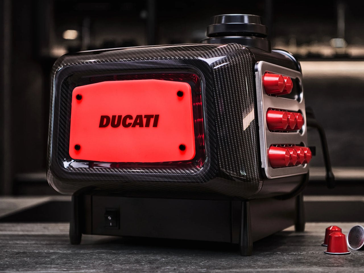
This historical buildup is important for the latest creation by Ducati, which stamps its track image, craftsmanship, and aesthetics onto a flagship espresso machine, which will be released in 1,926 units only. It is touted as the world’s first and only carbon fiber capsule machine with a composite carbon fiber build, and is called the Ducati Barista M3 1926 Limited Edition Carbon Fiber.

Designer: Ducati and Cuisine Barista

The motorbike-inspired coffee machine hits different in its aesthetic appeal and hopefully the espresso it brews. Even if it doesn’t, it is a collector’s item – ground up – for everyone with a passion for superbikes and love for coffee brewing.

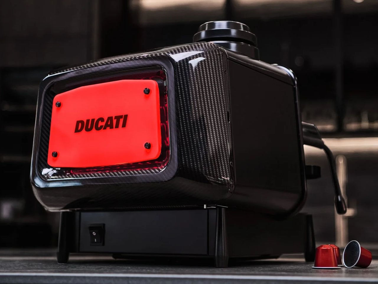
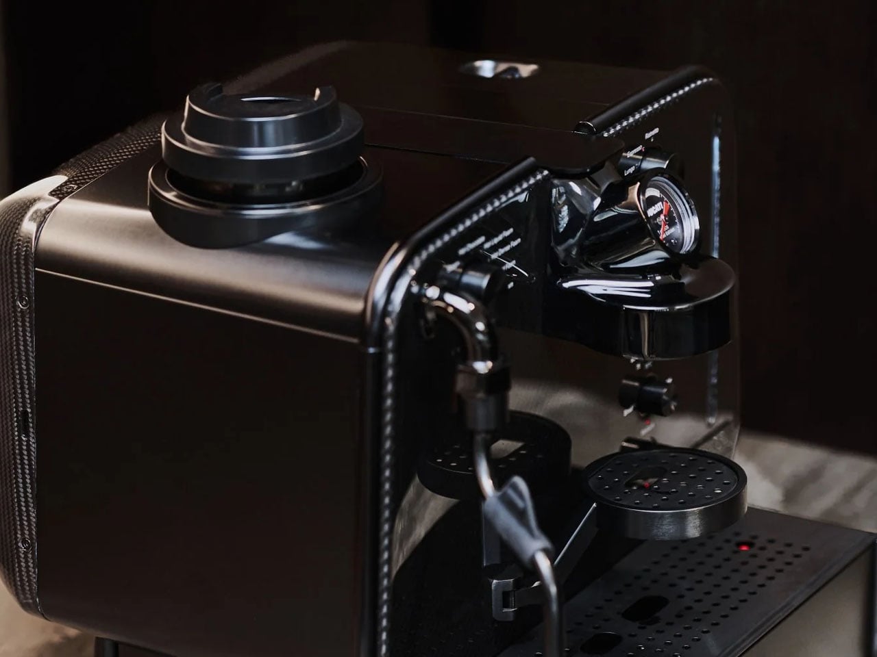
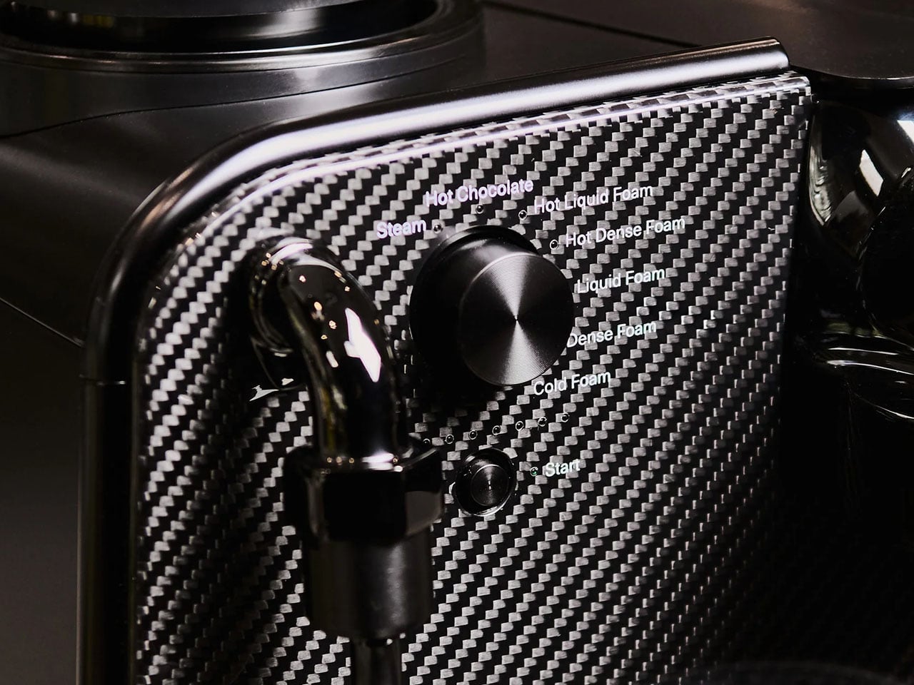
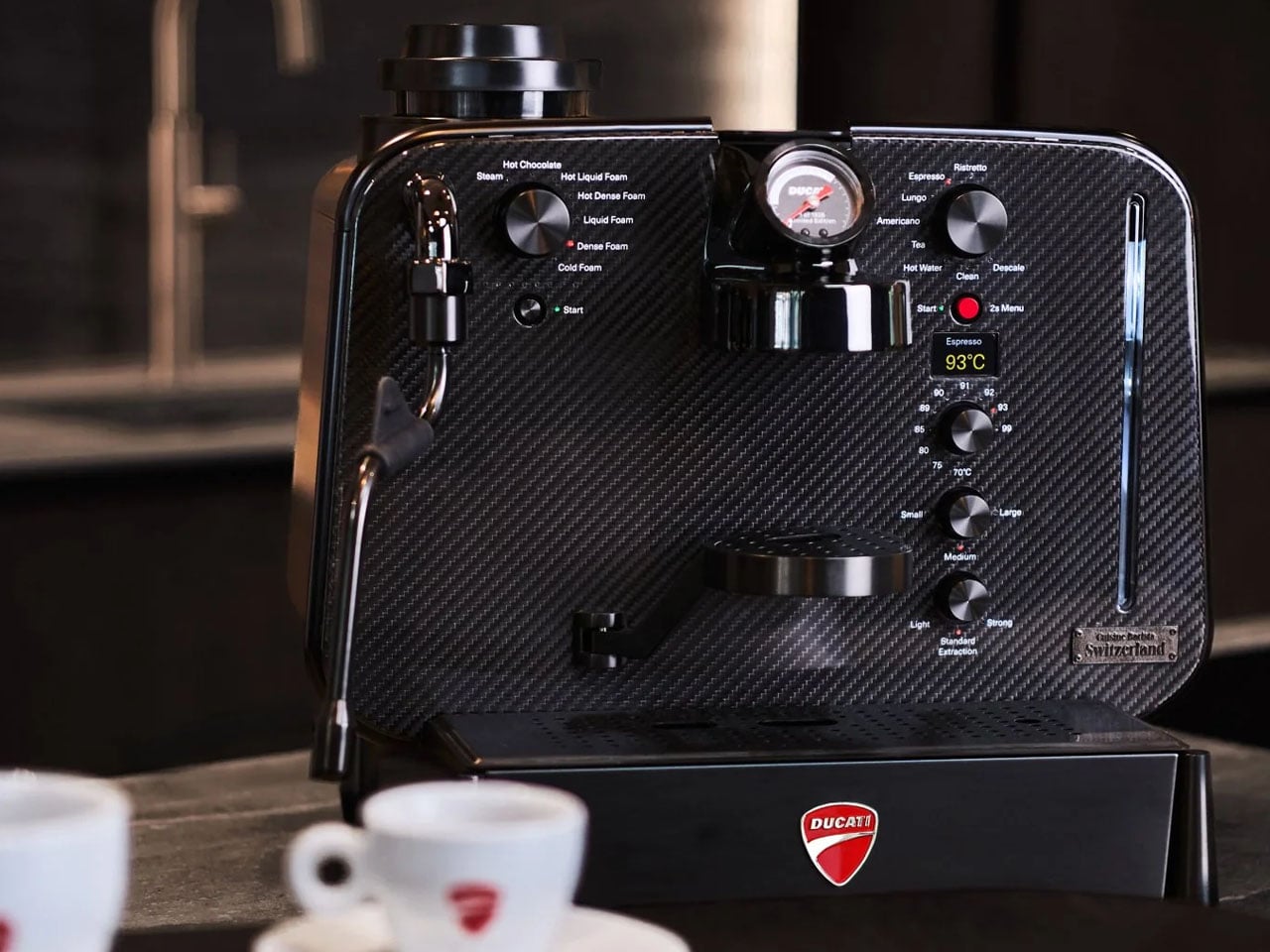
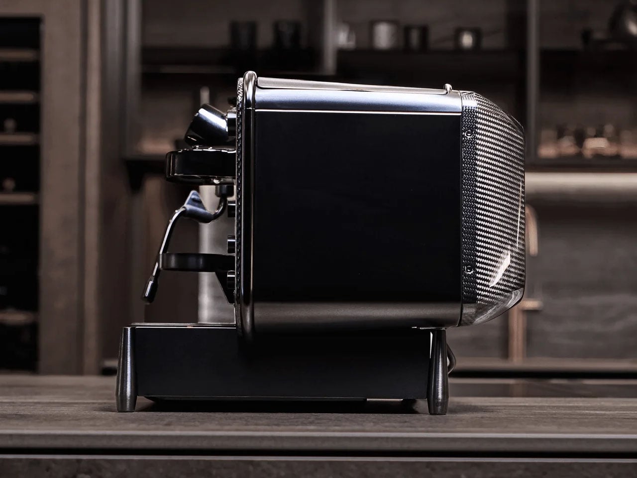
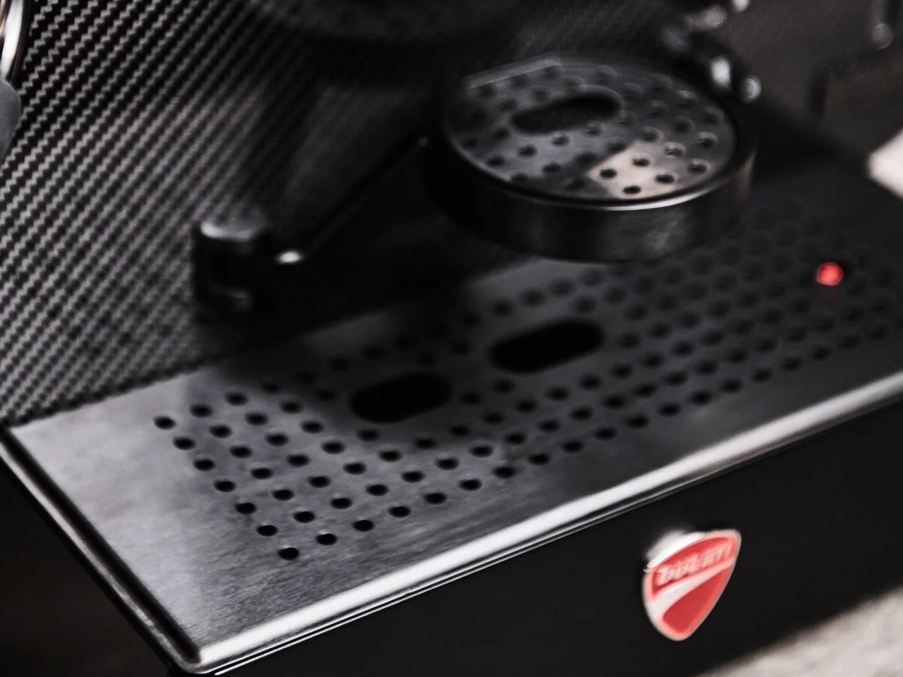
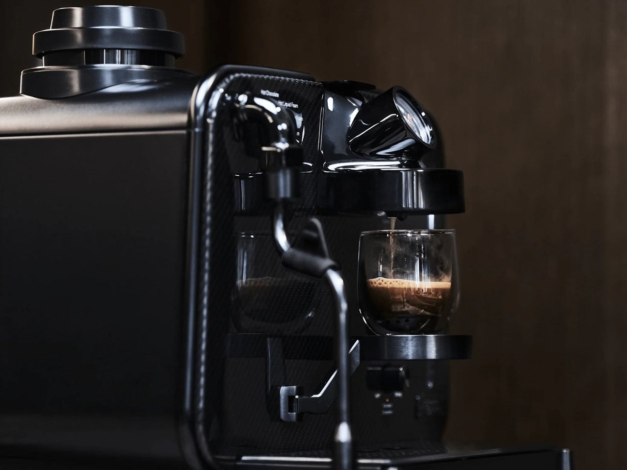
The front and rear panels of the Ducati Barista are crafted from twill-weave carbon fiber material, the same as that seen on the performance track bikes from the brand. The rest of the body is made from stainless steel, overlayed with a PVC coating to bring forth the perfect chrome look that would entice anyone who appreciates craftsmanship at the highest level, irrespective of their allegiance to Ducati.

Barista M3 1926 by Ducati is “only capsule machine in the world” to feature three precision-laid layers of carbon fiber, just 1.5 mm thick, on its front and back. Advanced brewing technology is, of course, a given but for me, having such a beautiful machine take pods, is such a waste of time and effort. The fans wouldn’t align with my thoughts, so here is some information you’d like anyway.

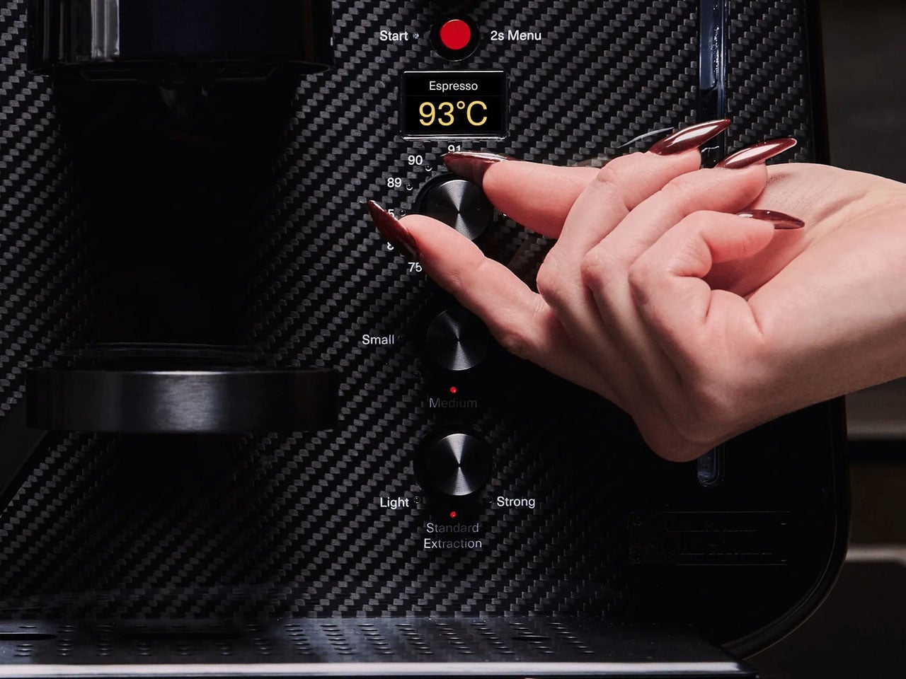
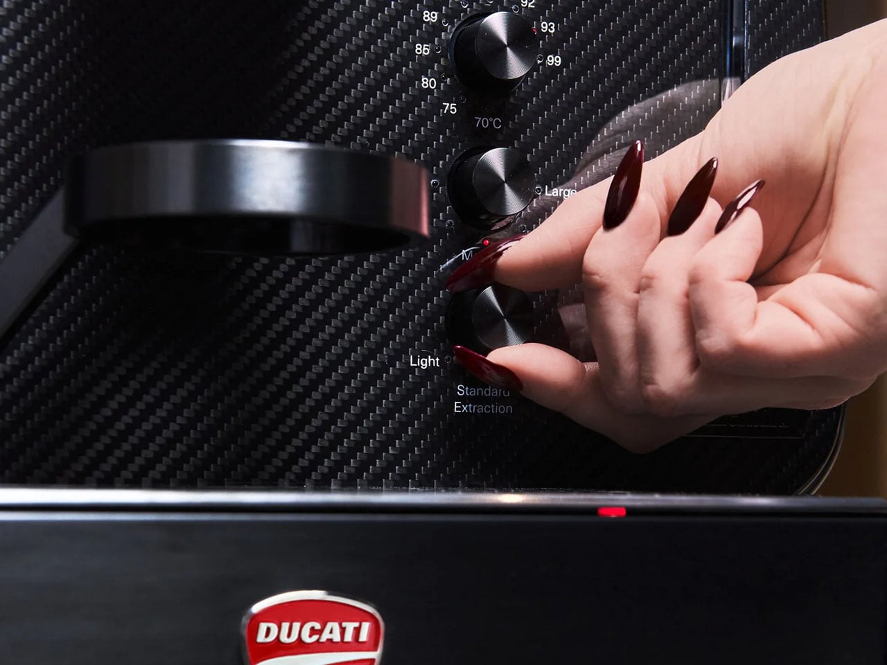
The machine employs a proprietary heating element to deliver an adjustable temperature that’s ready for a good brew in seven seconds flat. If this achieved temperature is not to your preference, you can use onboard controls to set it to your brewing temperature between 70°C to 99°C. Besides the temperature, you can toggle between light, standard, and strong extraction modes, so that what you get from the capsule is brewed perfectly as you prefer.

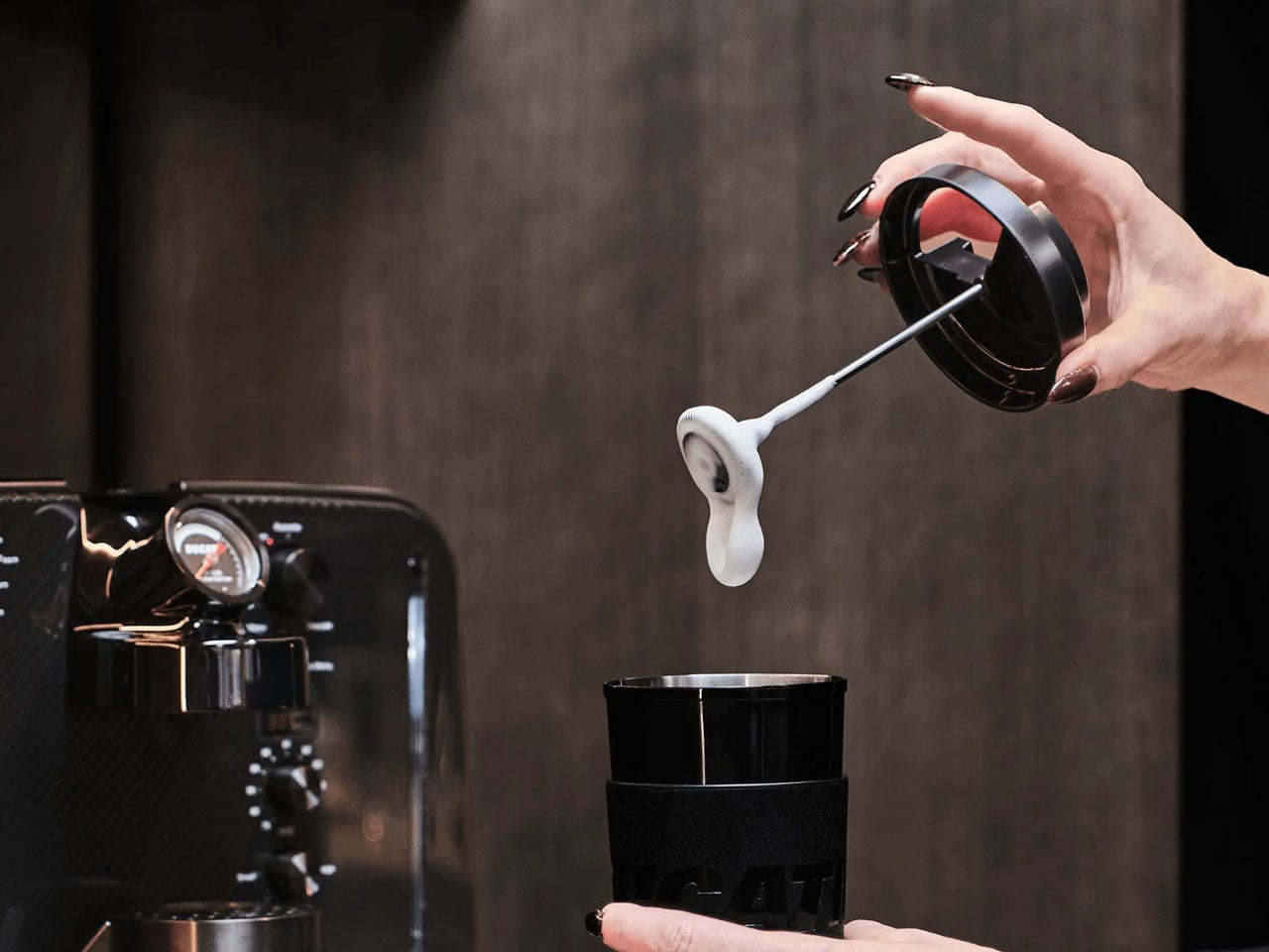
The Barista M3 1926 machine can pump high-pressure up to 19 bar. It comes with the world’s first in-cup frother to elevate your in-home lattes and cappuccinos in café-esque perfection. It’s possible with frothed milk right in the cup provided with your Barista M3 1926. The machine can deliver up to 12 preset drinks at the touch of its integrated control panel.

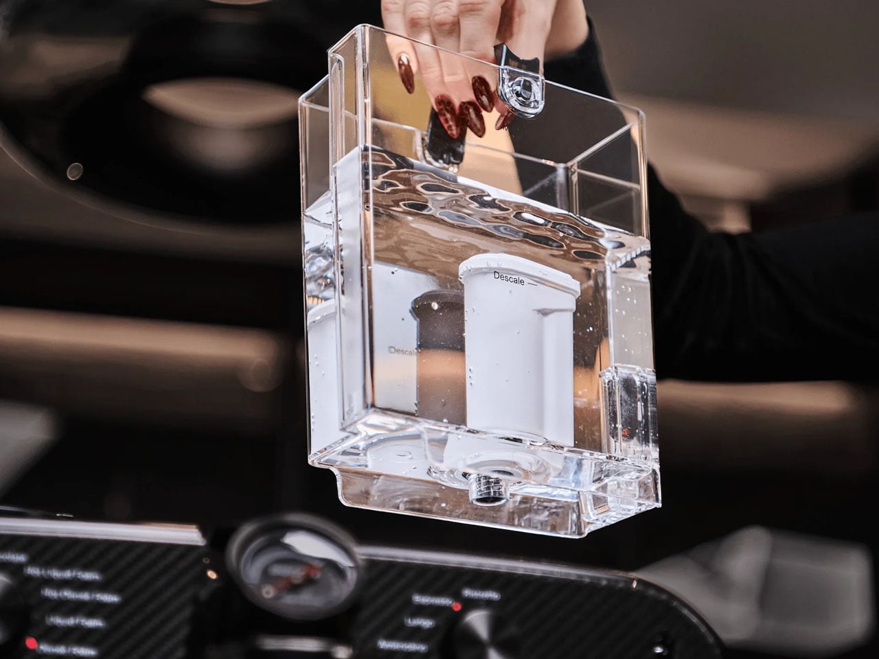
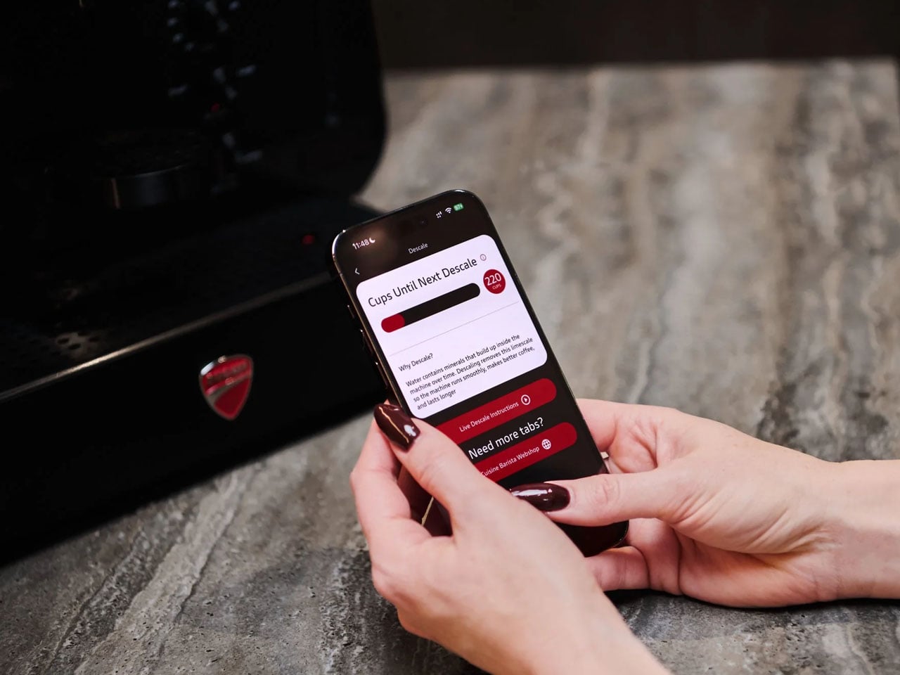
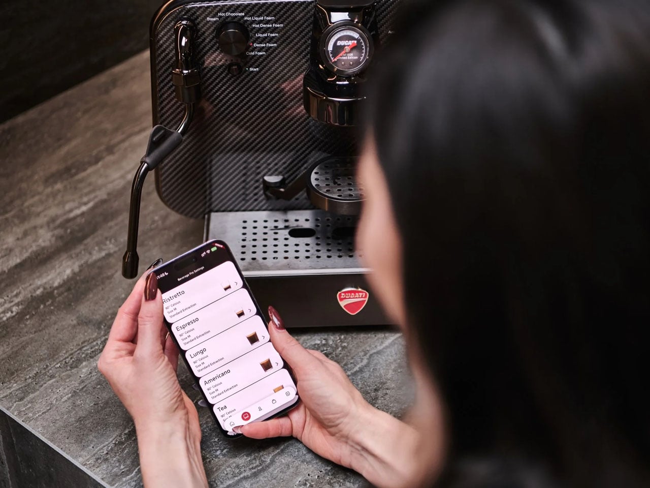
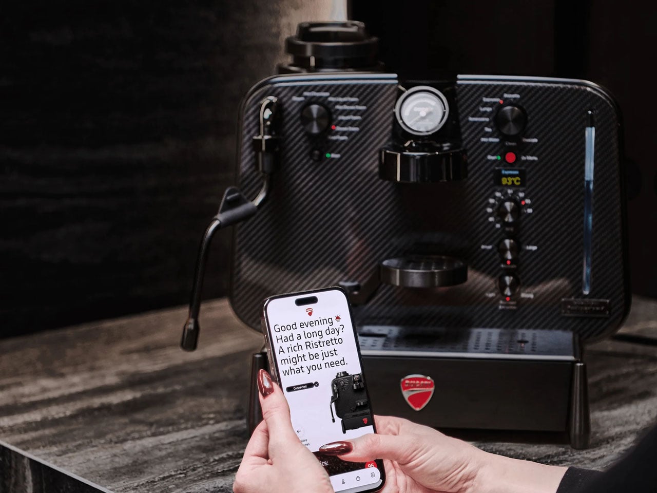
Maintaining this sculptural coffee machine on your countertop is simplified by an accompanying mobile app. The app receives various stats and alerts for descaling and your caffeine consumption, so that you know when to slow down because you’ve already had a few espresso shots in the build-up to the MotoGP!

The post Ducati Barista M3 1926 gives new meaning to caffeinated motorhead passion first appeared on Yanko Design.
Google’s Android XR Glasses Pick Gentle Monster and Warby Parker

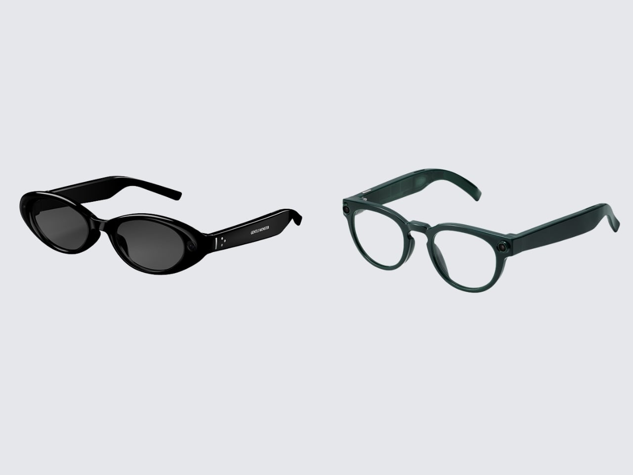
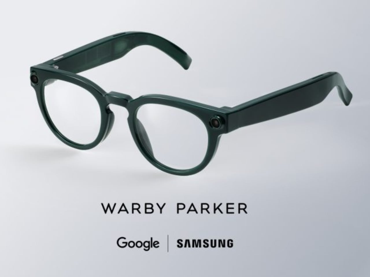
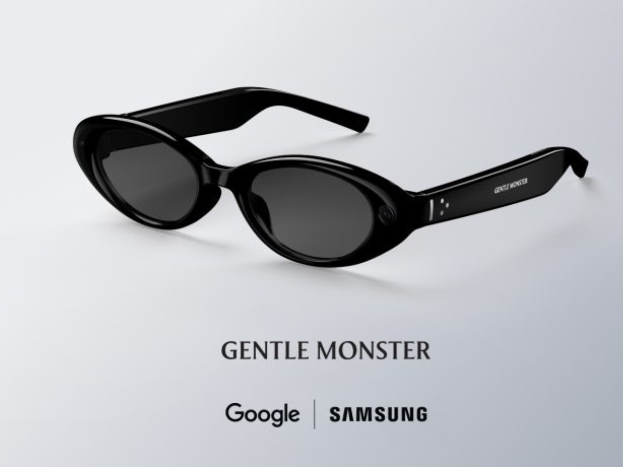
The biggest design announcement to come out of Google I/O 2026 did not involve a language model. It involved a pair of frames. On May 19, Google and Samsung unveiled their Android XR intelligent eyewear, a product that still has no official name, no confirmed price, and no exact ship date beyond “this fall.” What it does have is two very deliberate aesthetic camps: Gentle Monster on the disruptive end, Warby Parker anchoring the refined and timeless side. And leading with eyewear partners instead of chipset specs felt like the most coherent product launch decision Google has made in years.

Two form factors are on the way. Audio glasses ship first, landing later this fall. Display glasses follow at some point after that. The audio version is exactly what it sounds like: Gemini in your ear, accessed by saying “Hey Google” or tapping the frame. From there, you can pull up turn-by-turn navigation, real-time translation, hands-free calls, photo capture, and multi-step task execution through third-party apps like DoorDash and Uber. The glasses work with both Android and iOS, which is smarter than it sounds. Picking a platform fight at launch would have cut the potential audience in half before a single pair hit a face.

Designer: Google x Samsung

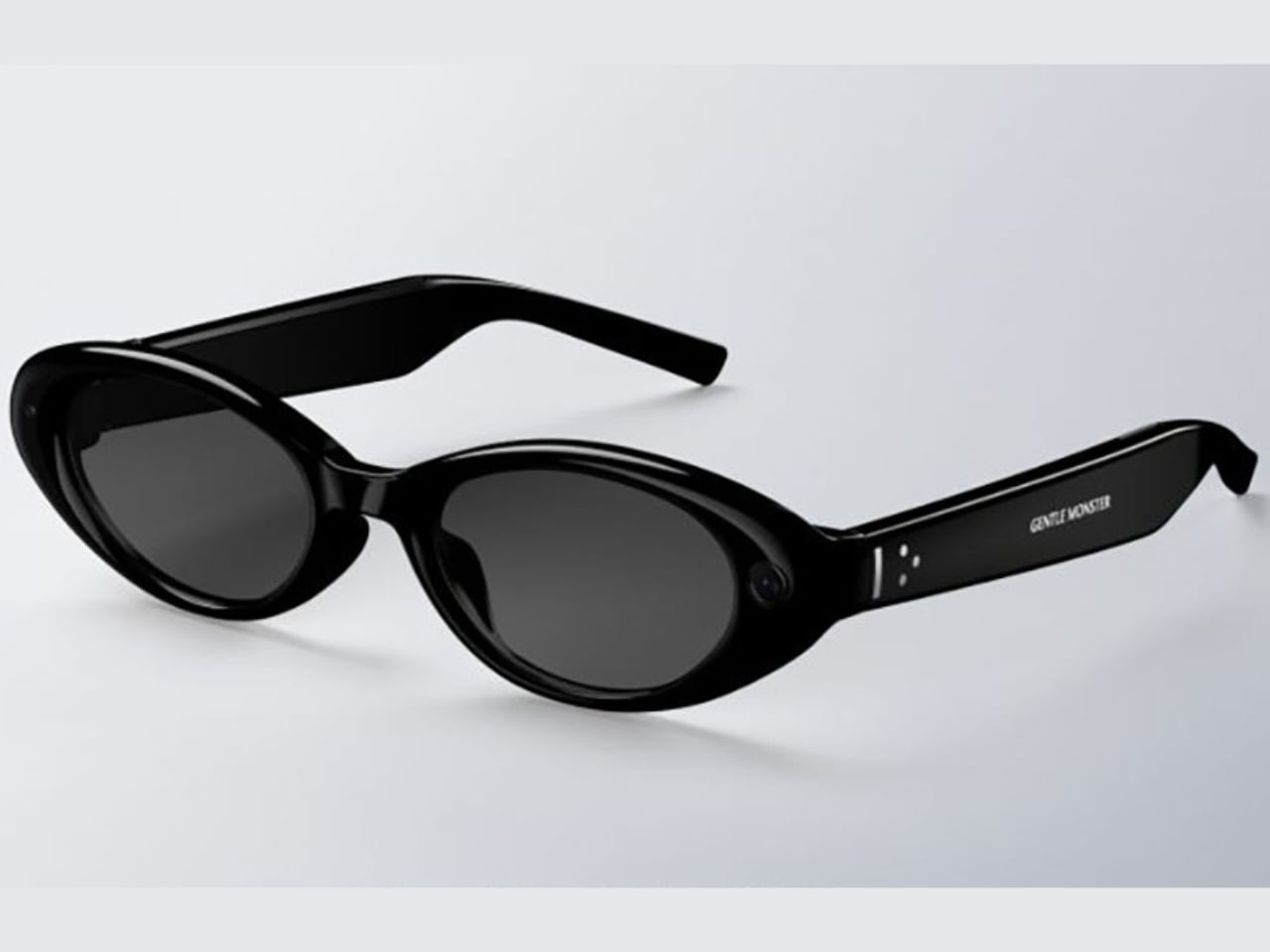
The more interesting story, though, is what the Gentle Monster and Warby Parker pairing actually signals. These are not interchangeable options with different colorways. Gentle Monster built its entire identity on turning eyewear into conceptual art, the kind of brand that stages gallery-scale retail installations and has never been embarrassed to make a statement. Warby Parker, on the other hand, is the brand that convinced a whole generation that glasses could be accessible, thoughtful, and quietly cool without trying too hard. Putting both on the same platform is Google saying, very clearly, that Android XR is not a single-consumer product. It is a platform designed to flex across aesthetic identities the same way Android flexes across phone manufacturers.

That framing matters a lot when you look at the competitive landscape. When Meta launched its Ray-Ban Display glasses with EssilorLuxottica, it made a calculated bet on one legacy brand and one aesthetic: cool-casual, lifestyle-adjacent, slightly sporty. The strategy has worked reasonably well. Google is trying something architecturally different. Two visual identities, baked in from day one, each with its own mood and customer. Whether that becomes a genuine advantage or a positioning headache will depend entirely on execution, but the intent is worth paying attention to.

The missing information in this announcement is not accidental. No price. No product name. No exact release date. All of that has been deliberately saved for fall, which means we are still in the phase where the visual story matters more than the spec sheet. That is the right call. If Google had led with processor benchmarks and battery life numbers right now, the conversation would have immediately turned into a hardware comparison against Meta. By leading with Gentle Monster and Warby Parker, they shifted the frame entirely. We are not talking about a spec race. We are talking about what you actually want to wear.

Industrially, the frames read as genuinely wearable. Temple thickness, hinge detailing, and touchpad placement all suggest that someone with a real brief about daily wear and aesthetic integrity was in the room during development. The original Google Glass was technically ambitious and aesthetically alienating, and that gap between capability and wearability became the most expensive lesson in smart glasses history. The Android XR eyewear, at least from what has been shown, appears to have absorbed it.

The fall window is real. Prescriptions, pricing, and the question of what this product is actually called will all arrive before year’s end. But right now, two days out from the reveal, the conversation that Google and Samsung have started feels like the right one. Not what can these glasses do, but who are these glasses for. When the design partners are Gentle Monster and Warby Parker, the answer is already pretty interesting.

The post Google’s Android XR Glasses Pick Gentle Monster and Warby Parker first appeared on Yanko Design.