The Smartest Upgrade for Better Sleep Isn’t a New Mattress

We spend about a third of our lives asleep, and most of us are still doing it on the same basic setup we’ve had since forever: a mattress, some pillows, and a blanket we’re either kicking off or pulling back over our shoulders at 3 a.m. For something so essential to how we function every single day, every workout, every decision, sleep technology has been surprisingly slow to catch up with everything else in our homes. That changes with the Orion Sleep System.

Designed by Santa Cruz-based studio Herbst Produkt, Orion is a Smart Cover that turns your existing bed into a fully intelligent, AI-powered sleep system. No mattress replacement required. The concept alone is worth pausing on. Most high-tech sleep products ask you to invest in an entirely new bed setup. Orion fits over what you already have, which says a lot about how this team thinks about design: it’s not about selling you more, it’s about making what you already own work smarter.

Designer: Herbst Produkt
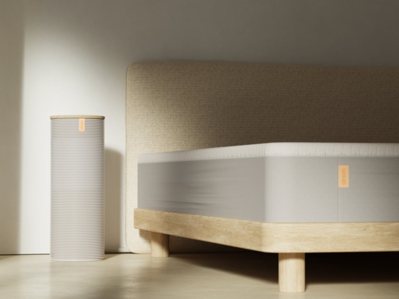
The core technology centers on dual-zone thermoregulation that senses, learns, and adapts in real time. If you tend to overheat at night and your partner is perpetually cold, Orion handles both sides of the bed separately, without negotiation, without a thermostat war, and without anyone losing sleep over it (pun fully intended). Biometric sensing feeds data into an AI that builds personalized temperature profiles over time. The more you sleep with it, the better it gets at keeping you in that ideal zone where deep, restorative sleep actually happens.
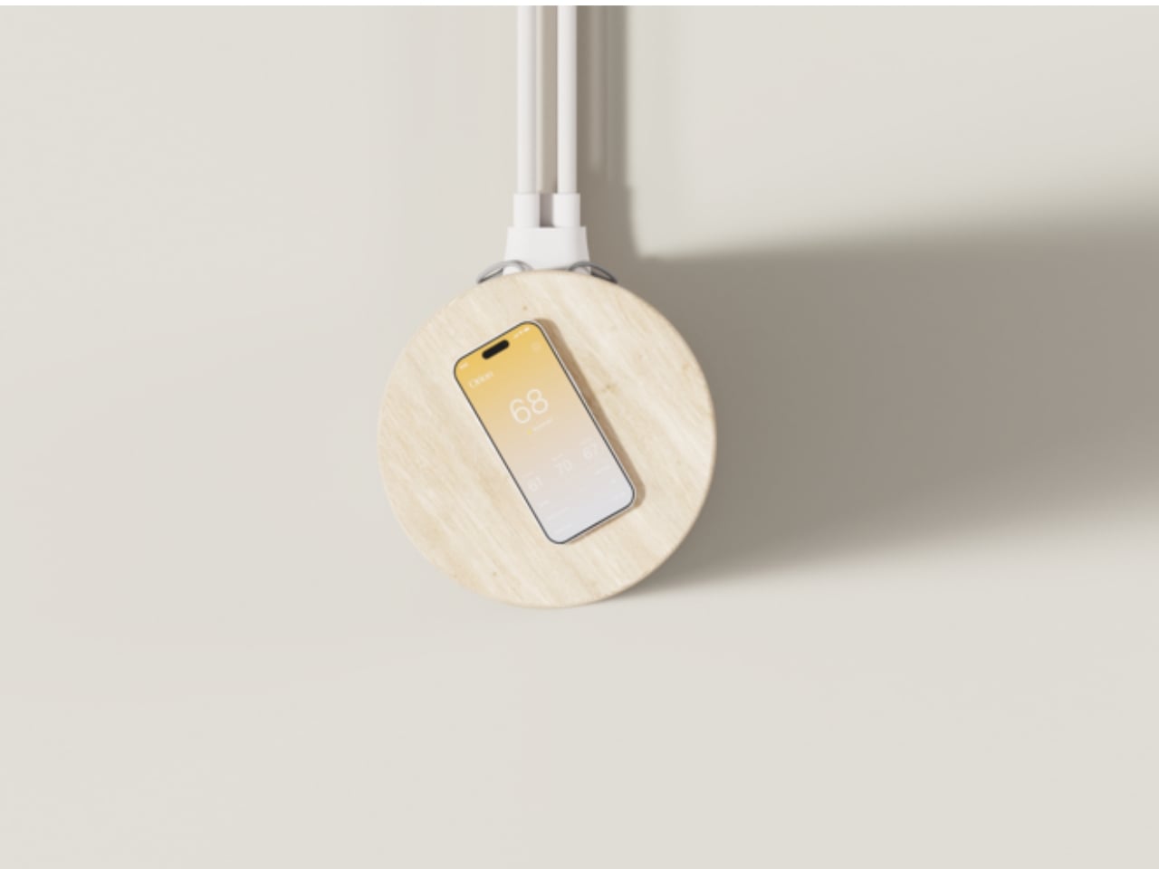
Temperature, by the way, is one of the most underrated factors in sleep quality. Research consistently shows that our bodies need to cool down to fall asleep and stay that way through the night. For anyone who’s ever been yanked out of a deep sleep by a sudden hot flash, a restless partner, or just a bedroom that refuses to cooperate with the season, that’s not a small thing. Orion treats it like the serious physiological variable it actually is.
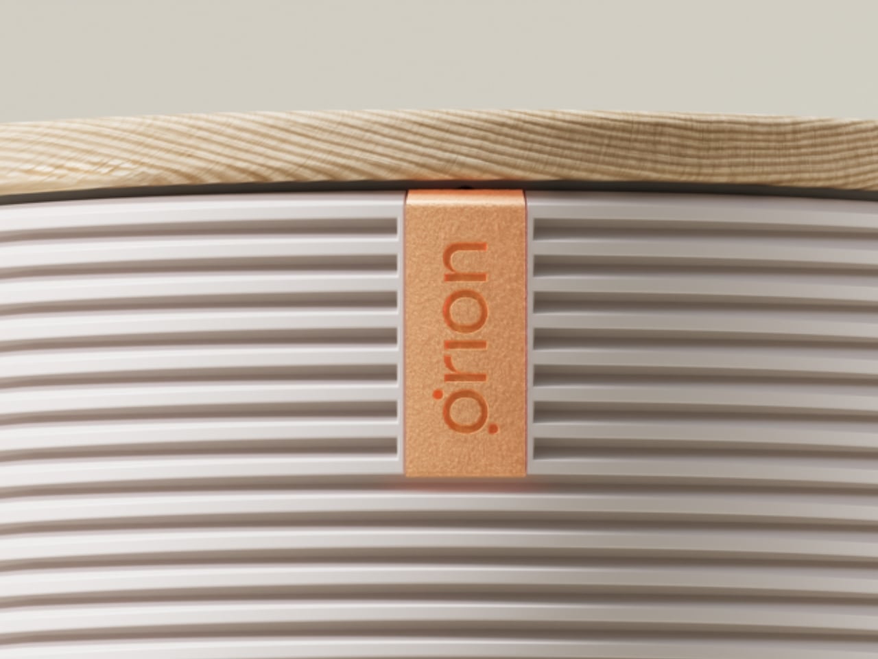
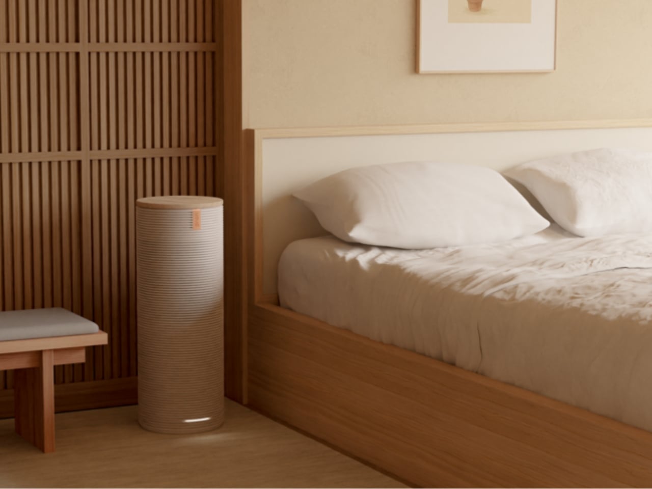
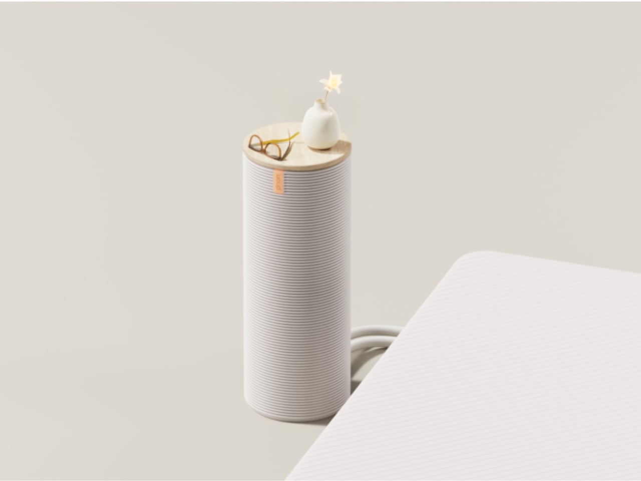
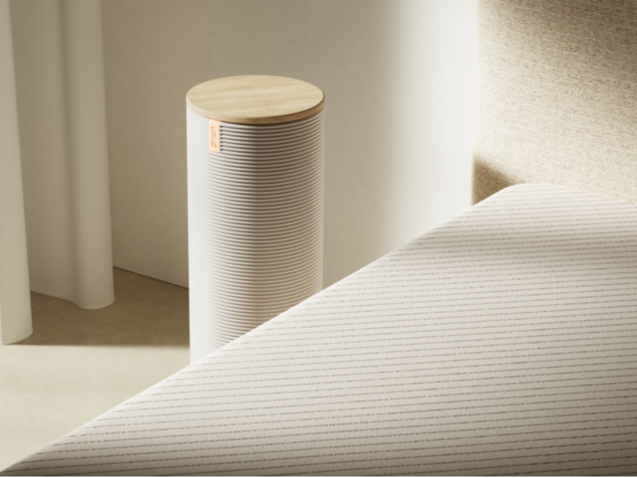
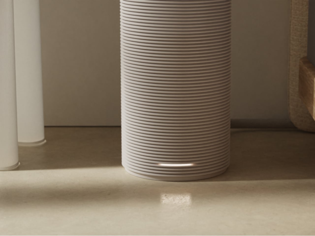
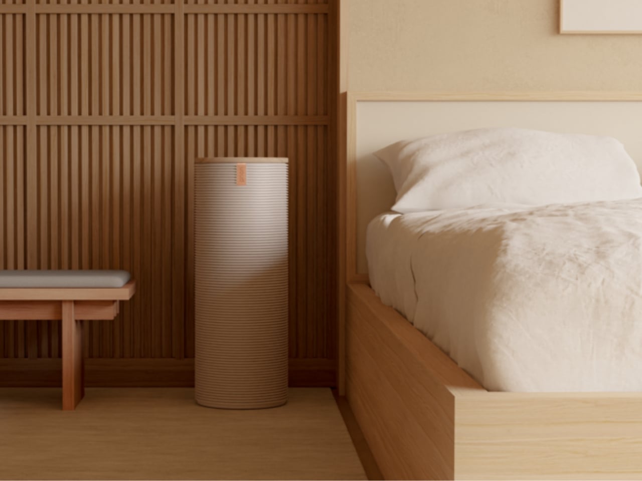
What makes this stand out beyond the specs, though, is the physical design approach. Sleep tech has a history of looking like medical equipment, things you’d rather keep hidden than have sitting prominently on your nightstand. Orion went the opposite direction. The hub is built with warm wood tones and a clean cylindrical form that reads more like a considered home object than a gadget. It sits on your nightstand like something you consciously chose to put there. It was designed to live in your space, not just function in it, and the difference between those two things is exactly what separates good design from great design.
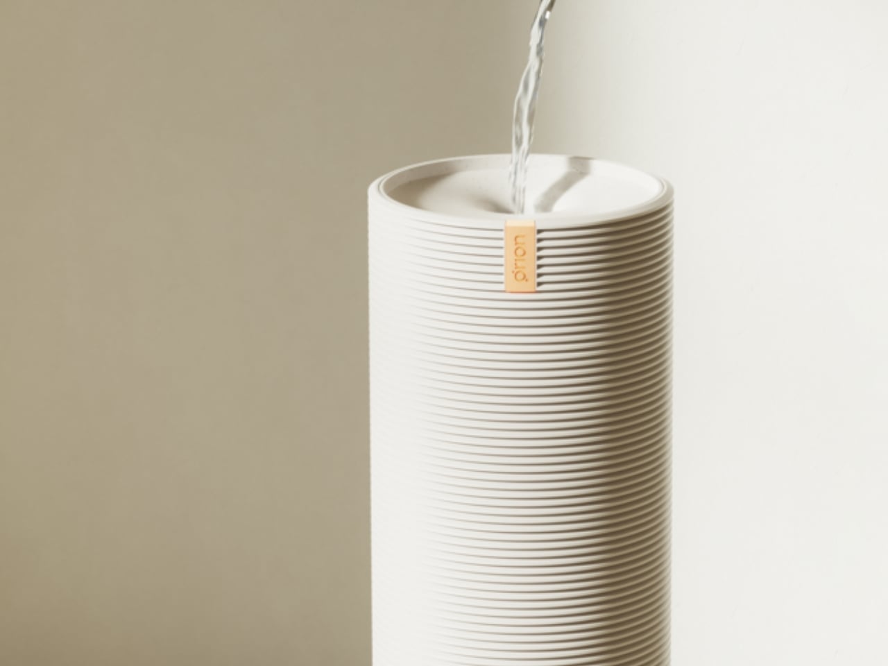
That choice matters more than it might seem. The best technology is the kind you forget is there, the kind that doesn’t make your bedroom feel like a biohacking lab. Orion lands somewhere between sophisticated and approachable, and the design team specifically built it to be accessible to people who aren’t particularly tech-savvy. There’s no steep learning curve here, no intimidating interface to decode at midnight. That kind of inclusive thinking in product design still doesn’t happen enough.
At around $2,295 for a Queen size, the Orion Sleep System is a real investment. It’s not for everyone’s budget, and glossing over that would be doing you a disservice. But the framing matters here. This is being positioned alongside wellness tools, not bedding. When you start thinking about it the way people think about a Peloton or a standing desk, the math starts to feel different.
Sleep is the foundation everything else is built on. Energy, focus, mood, recovery, even creativity all trace back to how well you rested the night before. The fact that a product this considered, this well-designed, and this genuinely functional now exists to address it feels like a meaningful signal of where the wellness and design worlds are finally, properly meeting. It took long enough.
The post The Smartest Upgrade for Better Sleep Isn’t a New Mattress first appeared on Yanko Design.
The 21.5-Inch Transparent Speaker That Animates Lyrics to Match Your Music

Most home speakers today have settled into a comfortable invisibility. Whether they’re slim soundbars pushed against a wall or cylindrical mesh towers parked on a bookshelf, the design goal is essentially the same: stay out of the way. They’re meant to be heard and rarely looked at, and even the ones that look interesting rarely offer much to see once the music starts.

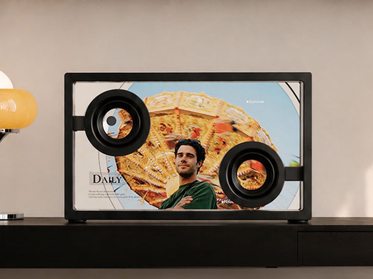
MorningBlues has a clear thesis about music, and it has a lot to do with how the things we listen to can also be things worth looking at. Its SonicGlass A1 is a hi-fi speaker built around a transparent glass driver that lets you watch sound in motion as music plays. It’s the kind of object that sits on a shelf the way art does, with intention, and with something to say even before you press play.

Designer: MorningBlues

Click Here to Buy Now: $646 $999 (35% off). Hurry, only 16/205 left! Raised over $360,000.

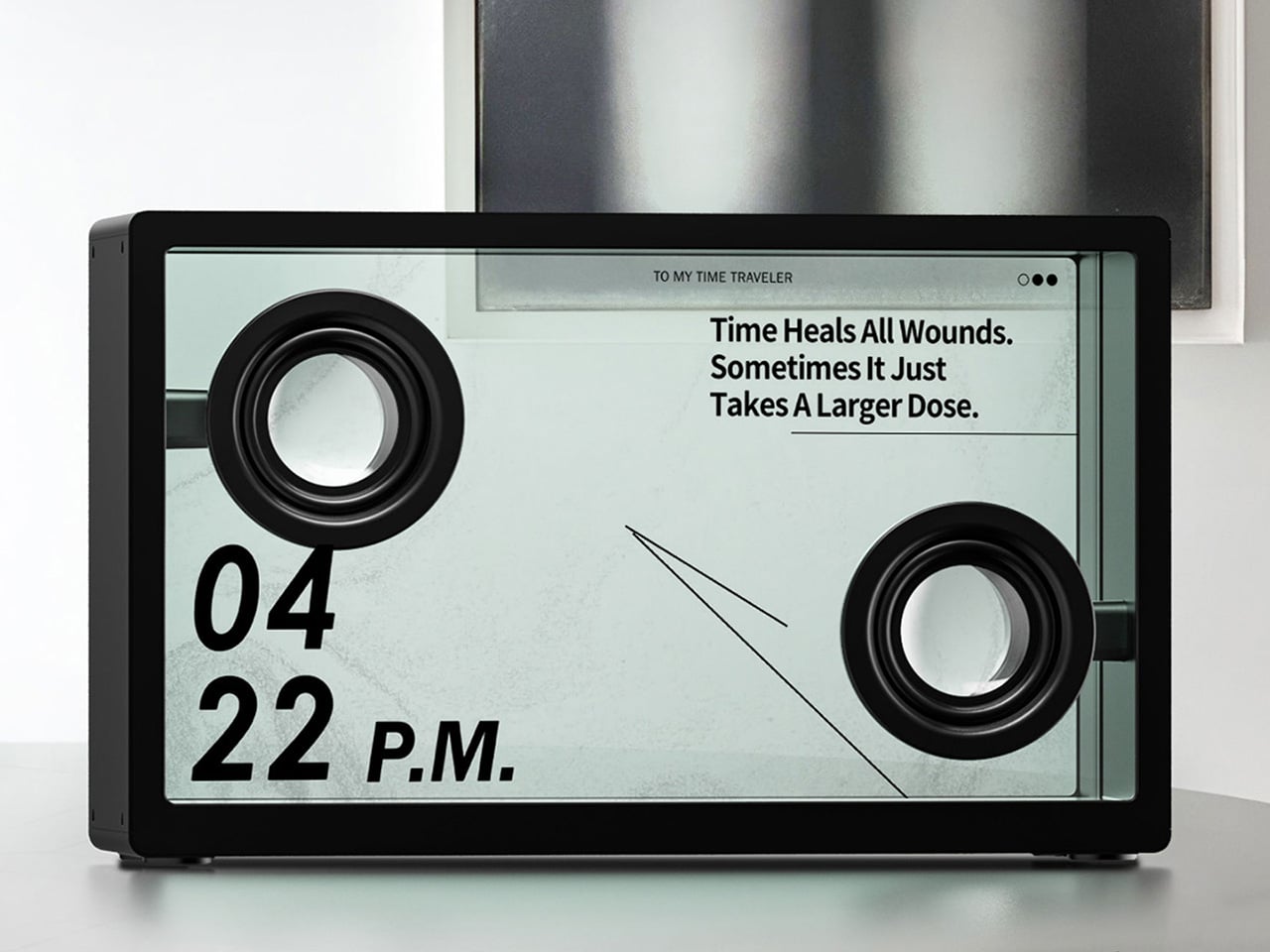
The SonicGlass A1’s front face is a 21.5-inch TFT panel with high-transparency tempered glass, framed in black with over 90% light transmission. The transparent driver sits behind it, fully visible, which is both an acoustic feature and a design statement. There’s no grille hiding anything, no fabric obscuring the view. What you see is the working interior of the speaker, presented like an exhibit rather than concealed like a component.

When a song plays, lyrics appear across the glass surface in motion styles drawn from the track’s rhythm, pace, and emotional character. MorningBlues calls this MoodLyric, built on data from hundreds of millions of playbacks to animate text in ways that feel tied to what the song is actually doing. All lyrics are licensed through LyricFind, meaning the display does right by the artists whose words it borrows.

Beyond the lyrics, a feature called SceneSync adds a visual layer that responds to music genres. Pop, hip-hop, R&B, and rock each trigger different visual aesthetics on screen, generated in real time by AI. The idea is that the speaker shouldn’t just play a song; it should match the world the song is coming from. It’s a more cinematic take on the standard music visualizer.

The MorningBlues app lets you upload a personal photo that AI uses to place your face inside a genre-matched music video, displayed on the speaker’s screen. It’s the kind of feature that’s genuinely fun at a gathering, or just for yourself on a slow afternoon. You can also load the speaker with your own photos and videos to use as background content, turning it into a personal display.

When the music stops, the SonicGlass A1 doesn’t go blank. It has ambient display settings that keep it working as a room fixture, with options like ambient backgrounds, dynamic clock faces, and an ASMR sleep mode for winding down at night. That always-on character makes the speaker feel less like a device you switch off and more like something that already belongs in the room.

Pair the A1 with a microphone, and it becomes a home karaoke setup with licensed lyrics scrolling on screen in sync as you sing. The MorningBlues Music Hub 1, a dedicated controller for phone-free playback, rounds out the experience by letting you manage everything from a single tactile device, so your phone doesn’t need to be part of the evening at all. The large glass screen handles the rest.

The SonicGlass A1 isn’t angling to be the most powerful speaker in the room or the one with the most impressive spec sheet. It’s made for people who think about music the way they think about other things they choose to live with, considering both what those things do and how they look doing it. MorningBlues is asking a direct question: what if your speaker was worth watching?

Click Here to Buy Now: $646 $999 (35% off). Hurry, only 16/205 left! Raised over $360,000.

The post The 21.5-Inch Transparent Speaker That Animates Lyrics to Match Your Music first appeared on Yanko Design.

PEEL Turns Discarded Fruit Skins Into Living Textile

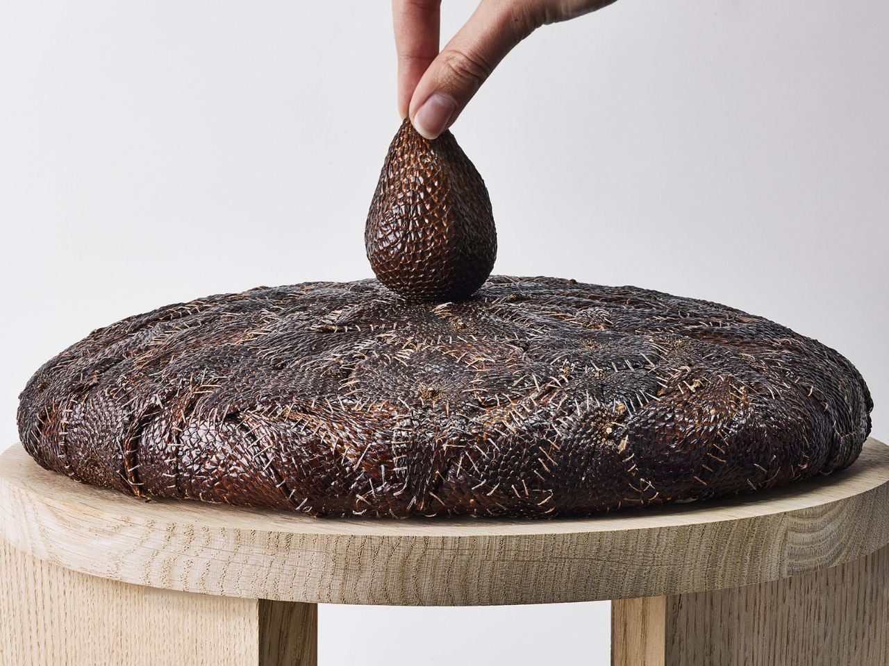
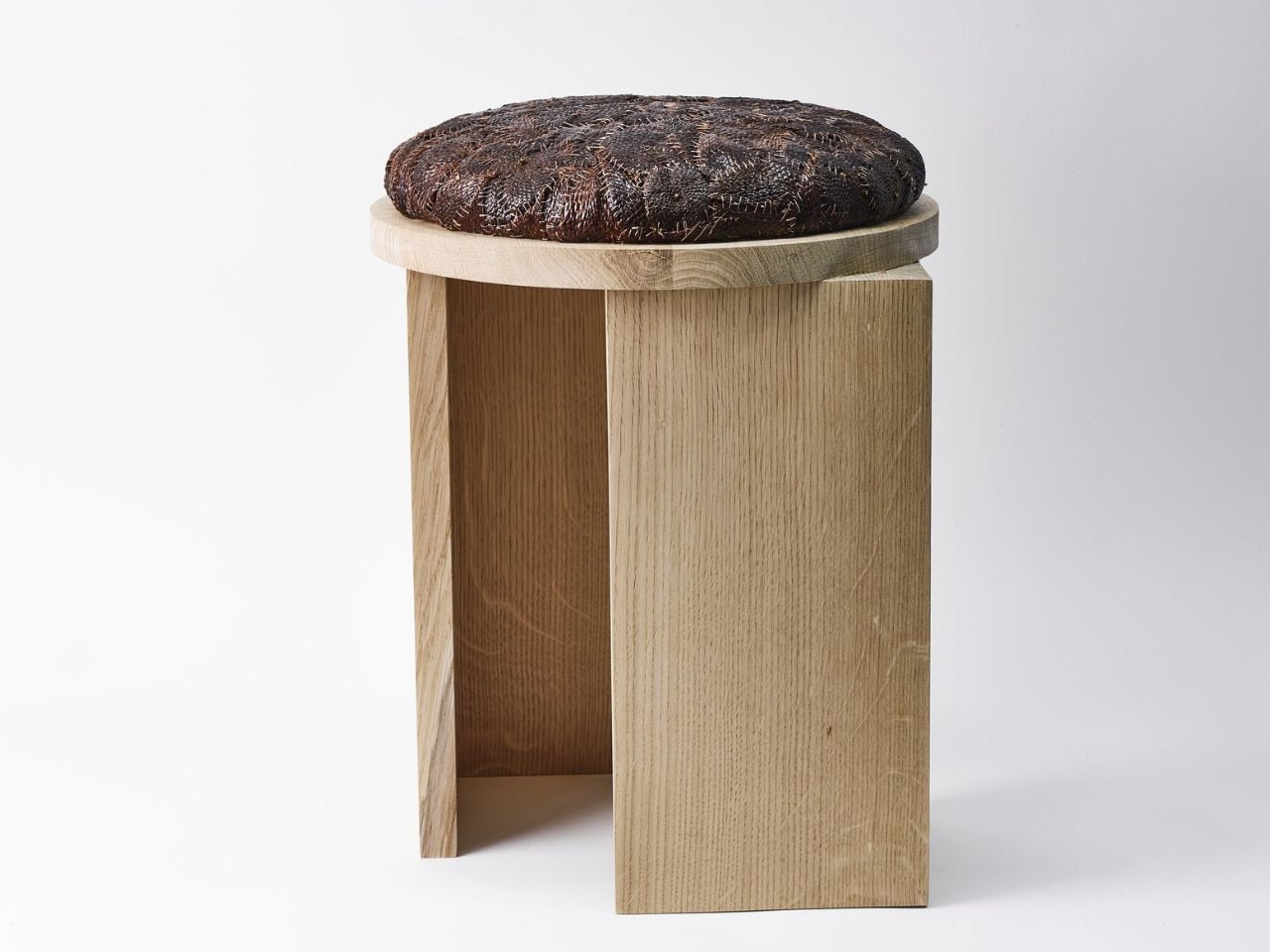
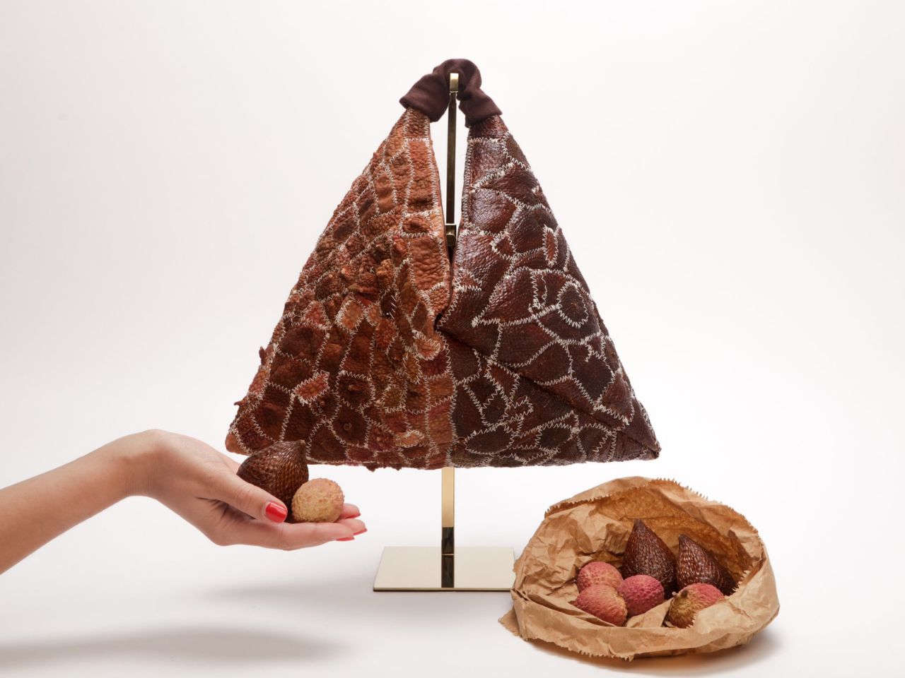
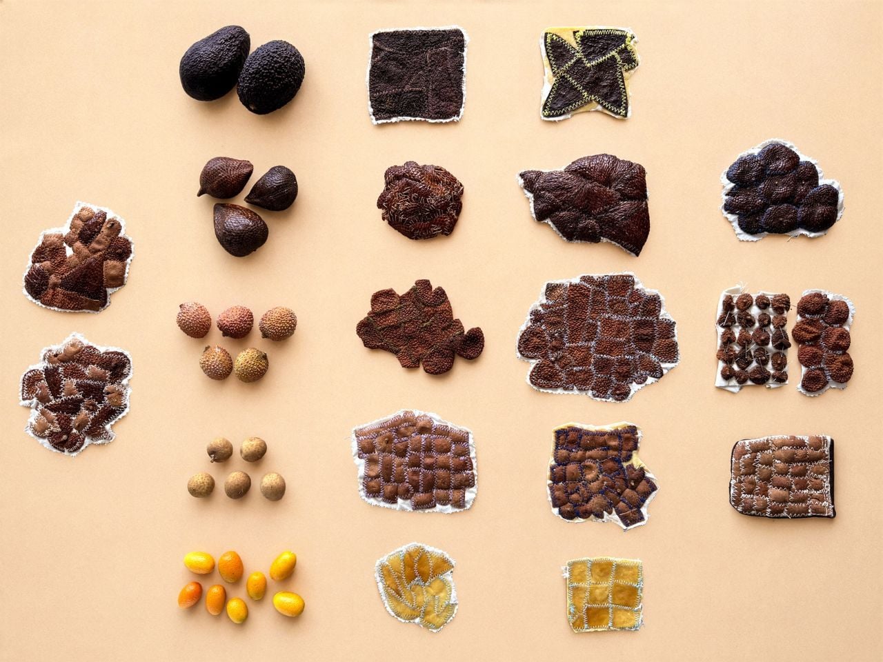
There is something quietly radical about looking at a fruit peel and refusing to see waste. Salak and lychee skins are usually treated as the most disposable part of the fruit, peeled off, discarded, and forgotten almost instantly. PEEL begins at that exact moment of dismissal. Instead of blending the skins down, disguising them, or forcing them to behave like leather, the project lets them remain visibly themselves.

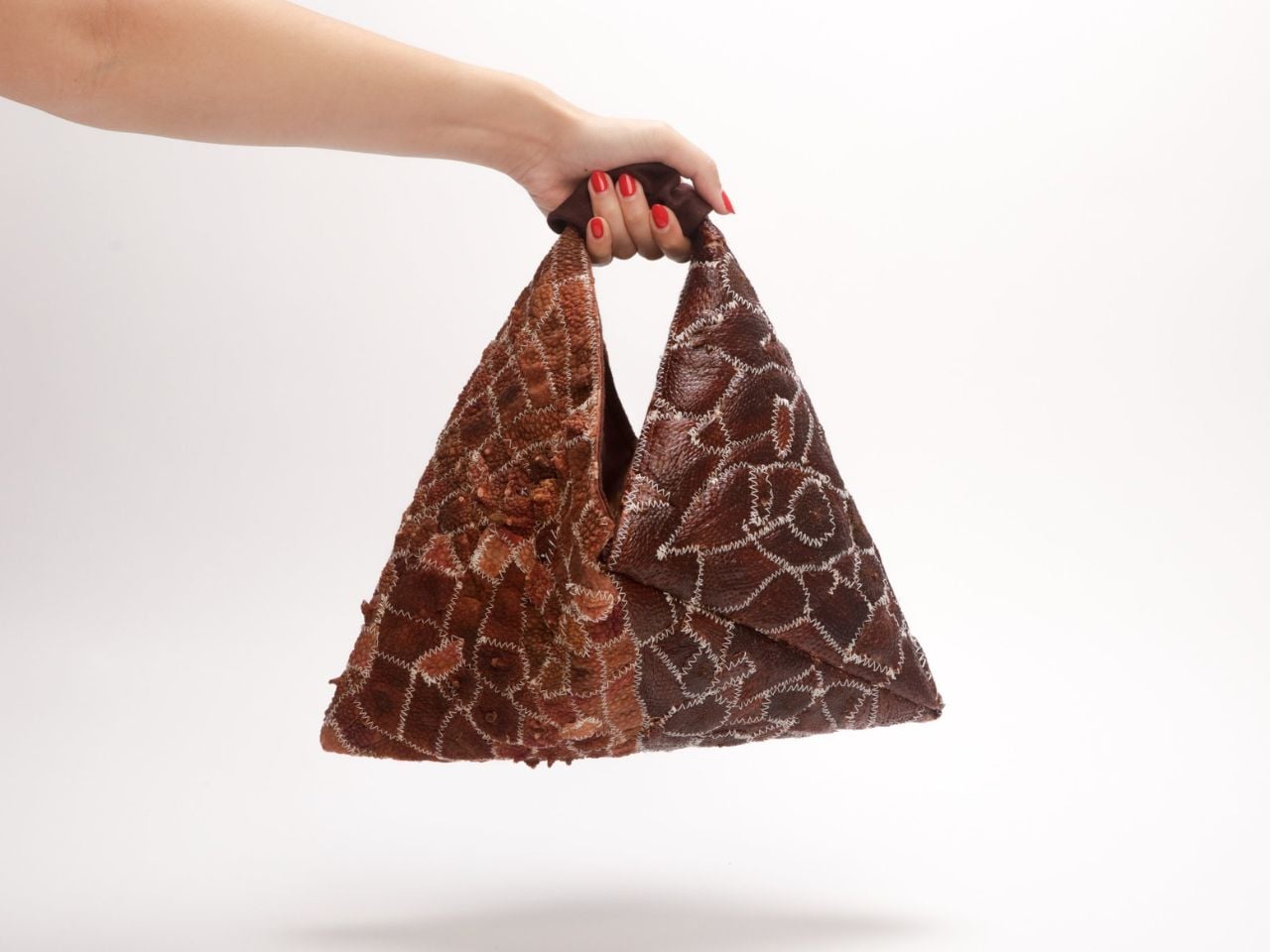
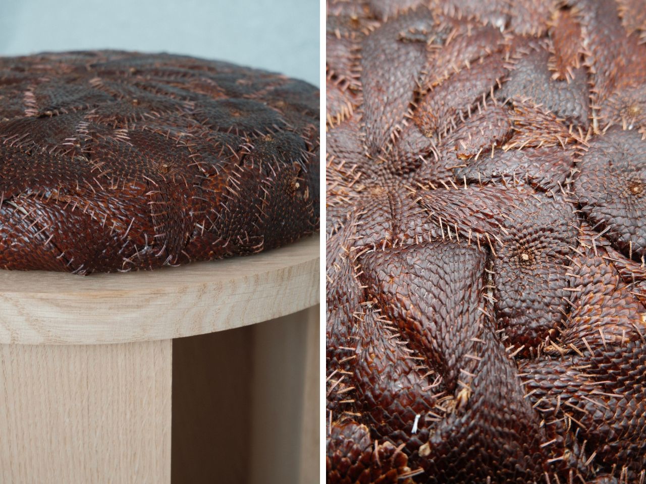
Developed by designer Anthony Guevara, PEEL transforms discarded salak and lychee skins into a durable, biodegradable textile made without adhesives, synthetic polymers, or toxic chemical treatments. The material offers a regenerative alternative to leather and petroleum-based vegan substitutes, with estimated CO₂ emissions up to 95% lower. What makes the work compelling is that it does not rely on the usual visual language of “sustainable design.” It is not trying to look clean, neutral, or overly polished. It carries the roughness, colour shifts, scale-like patterns, and irregular surfaces of the skins it comes from.

Designer: Nefeli Vitoraki

The project is deeply rooted in Indonesia, where salak and lychee are widely consumed, and their skins are discarded in large quantities every day. These fruits also have a short shelf life, which means their peels are consistently available through existing food systems. This matters because PEEL does not depend on growing a new crop or creating an additional supply chain for material production. It begins with what already exists, what is already abundant, and what is already being thrown away.

The process is careful rather than overly industrial. After the fruits are consumed, the skins are collected and dried through a controlled low-heat process. This step preserves the natural structure and pliability of each peel, which is essential for turning it into a textile. The skins are then treated with naturally derived materials to improve durability and water resistance. Once stable, they are stitched onto biodegradable backing structures such as cotton muslin or linen.

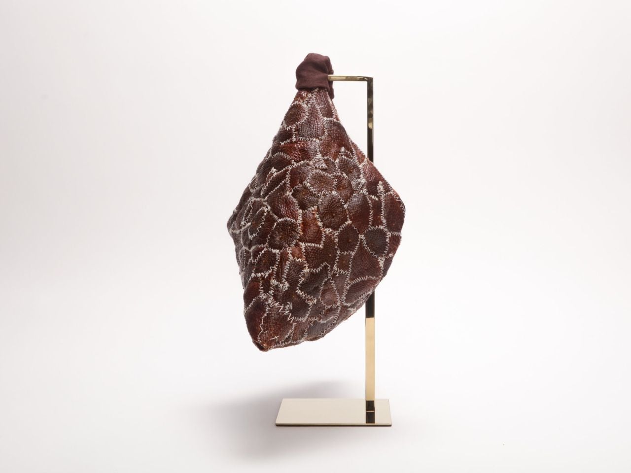
That stitching is important. Many plant-based leather alternatives are processed into uniform sheets, often requiring synthetic binders or coatings to hold everything together. In doing so, they erase the character of the original material. PEEL takes the opposite route. Each skin is treated and applied individually, so the final textile carries visible traces of the fruit’s form, colour, and texture. The result feels less like imitation leather and more like a material with its own identity.

From a design perspective, honesty is one of the strongest parts of the project. Sustainable materials often get pushed into proving themselves by looking like something familiar. Mushroom leather has to look like leather. Cactus leather has to look like leather. Grape waste, apple waste, pineapple fibre, all of them are frequently judged by how convincingly they can replace an existing material. PEEL resists that pressure. It does not apologize for the fact that it used to be fruit skin. It builds its visual and tactile language from that origin.

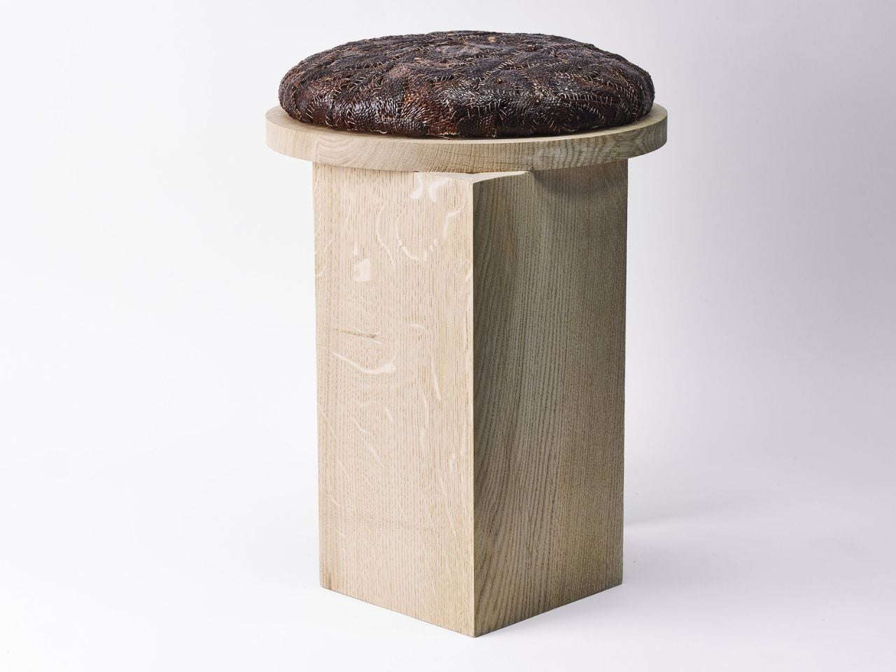
The development process also reveals the material’s stubbornness. PEEL began with salak alone, with no guarantee that the skins could become usable. Early experiments focused on drying methods because the peels were too brittle to stitch by machine. The first prototype, a stool, had to be hand-stitched throughout. More than fifty tests followed, adjusting combinations of naturally derived treatments until the material became flexible, durable, and workable. The second prototype, a bag, expanded the system to lychee and four other tropical fruit peels.

Home testing across abrasion, water, heat, humidity, and bend fatigue showed promising results across all six materials. Every peel demonstrated high heat and humidity resistance, and samples have remained stable for over a year. These early results suggest that the project is more than a beautiful material experiment. It has the potential to become a practical textile system, especially for applications where biodegradability, local sourcing, and distinctive surface quality are valuable.

The local production model makes the idea stronger. Since the skins can be sourced where the fruits are processed or consumed, PEEL imagines a closed regional loop: fruit is eaten, skins are collected, material is made, and products are produced within the same community. This keeps the material connected to the place. It also creates an opportunity for small local workshops in Indonesian fruit-growing regions, turning a low-value waste stream into a new economic resource.

The next step is bringing more rigour to the testing and supply chain. Guevara is working toward partnerships with Indonesian fruit processing factories where skins are currently discarded, creating a zero-cost raw material source. In parallel, collaboration with Imperial College London aims to formalise lab testing for tensile strength, abrasion resistance, and long-term durability.

PEEL is interesting because it does not frame sustainability as a finish, a label, or a moral claim attached to the end of a product. It begins with material behaviour. It asks what a peel can do before deciding what it should become. That shift feels important. The project is not just about replacing leather. It is about expanding the designer’s imagination around overlooked matter and treating waste as something with form, memory, and potential still left in it.

The post PEEL Turns Discarded Fruit Skins Into Living Textile first appeared on Yanko Design.

This Concept Car’s AI Slows Down When It Finds a Scenic Road

Modern life has made genuine rest surprisingly hard to come by. Homes are saturated with obligations, travel gets consumed by itineraries, and the spaces that are supposed to support recovery often fall short. Young people in particular are navigating a kind of exhaustion that doesn’t come from a lack of free time, but from a lack of environments that actually know how to be still.

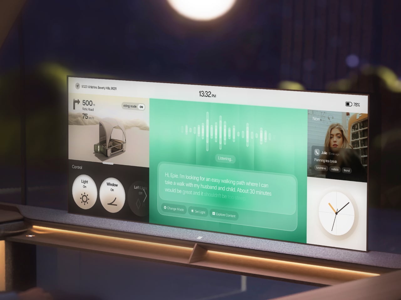
Epik is a mobility concept that addresses this at its root. Rather than packing more comfort into transit or filling trips with more activities, it takes a different route entirely: nature and light, the things that already surround you but go unnoticed, become the primary tools for rest. The vehicle reimagines the journey as a second home that moves with you and adapts entirely to your intentions.

Deisgners: Ellie Ahn, Shirley Cheon, Changdong Min, Geonhoo Son

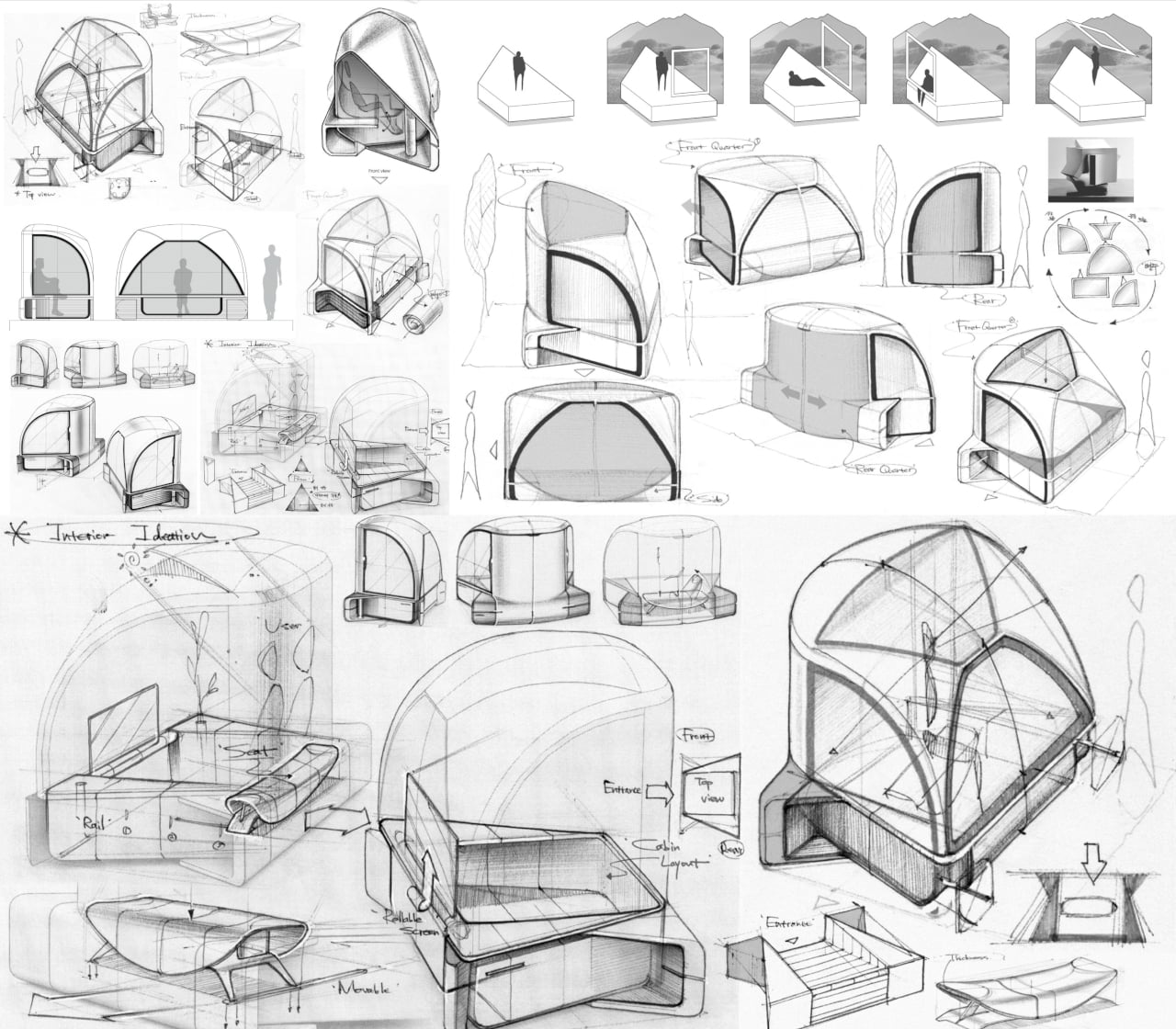
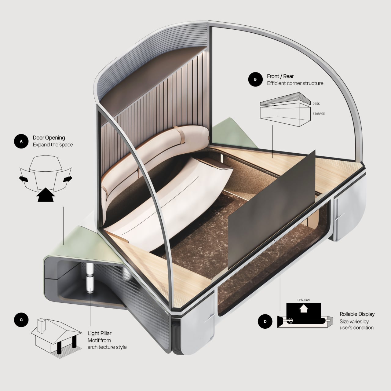
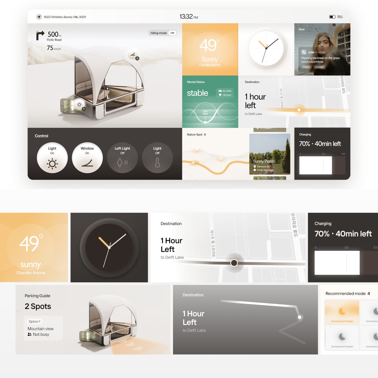
The exterior form draws from the architecture of an auditorium, with a broad, arched glass canopy that gives the interior an immersive, wide-angle view of whatever lies outside. This isn’t incidental; it’s the entire premise. Epik calls this the “Live Frame,” treating the vehicle less like a transport pod and more like a moving window that actively captures and amplifies the surrounding scenery.

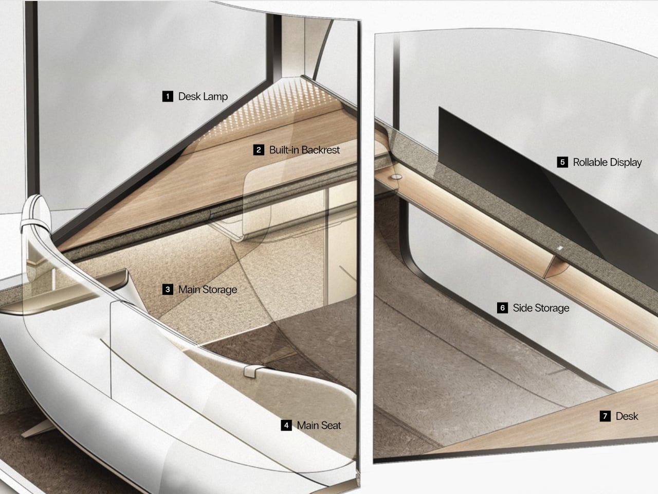
Inside, the compact cabin is built around flexibility rather than fixed arrangements. Doors and windows can open to varying degrees, inviting nature in or closing it out. A rollable display changes size depending on what the occupant wants to do, while corners that would otherwise go to waste are repurposed as storage and a small work surface. The same space can hold one person alone or two people together.

On a trip through mountain country, Epik’s Scenic Mode detects beautiful stretches of road and quietly slows the vehicle, adjusting window angles to frame the best view, almost as if the pod itself is composing a photograph. The detours it suggests aren’t inconveniences; they’re the whole point. Every landscape encountered gets logged in the “Rest Timeline,” a running record of every journey worth remembering.

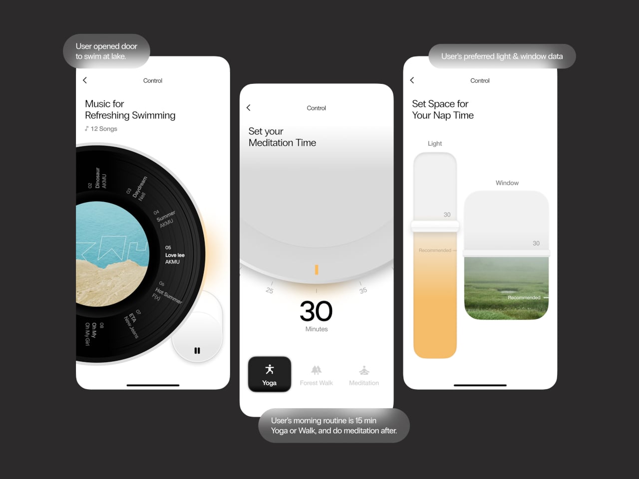
The onboard AI, called EPIE, learns the occupant’s routines, preferences, and how they typically spend time with the people around them. It reads mood signals through music and content choices, then gently nudges toward what comes next, whether that’s a nearby walking path, a quiet stop, or simply reconfiguring the cabin layout. For couples, it can even split the space into two personalized zones when schedules diverge.

When there’s nothing more to do than absorb the moment, the interface knows to retreat. The screen takes on a skin drawn from the surrounding landscape, blending into the view, and only the most essential details, like weather and music, stay visible. Controls are modeled after analog buttons, using transparent textures so the display feels less like a gadget and more like a natural extension of the cabin walls.

The idea that a vehicle could be primarily about rest rather than destination is still a rare one. Epik doesn’t claim you can find peace anywhere with the right pod, but it argues that the ingredients, specifically light, nature, and a space that listens, are far closer than most people realize. Getting somewhere just becomes the occasion for that rest, rather than the thing standing in its way.

The post This Concept Car’s AI Slows Down When It Finds a Scenic Road first appeared on Yanko Design.

A Design Student Just Fixed the Way Runners Hydrate

Most runners know the feeling. You’re a few miles in, the sun is beating down, and somewhere between the last water stop and the next one, you’re already behind. You’ve read the articles. You know hydration matters. And yet, you still have no real idea if you’re actually drinking enough, or too much, or the right thing at all. You’re just guessing, like almost everyone else out there pounding the pavement.

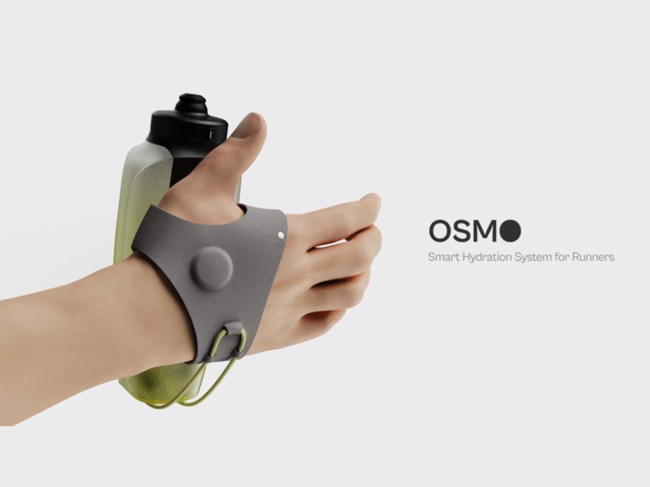
That gap between knowing and doing is exactly what Yash Ghule, a student at ArtCenter College of Design, set out to close with Osmo, an adaptive hydration system built specifically for runners. It’s a student design project, but the thinking behind it is sophisticated enough to deserve a proper look well beyond the design community.

Designer: Yash Ghule

The problem Ghule identified isn’t lack of information. It’s that current hydration tools don’t fit how running actually feels. When you’re in the middle of a run, your cognitive bandwidth is largely committed to the act of running itself. Checking an app, reading a label, or doing mental math about electrolytes isn’t something most people can or will do mid-stride. Hydration fails not because runners don’t care, but because the tools available demand too much attention at exactly the wrong moment. That insight alone is sharp.

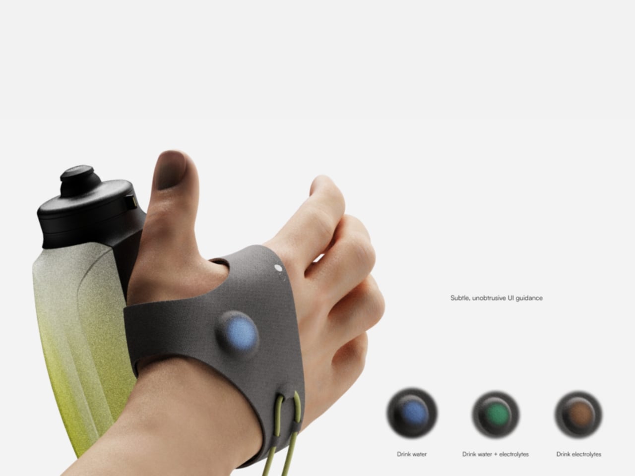
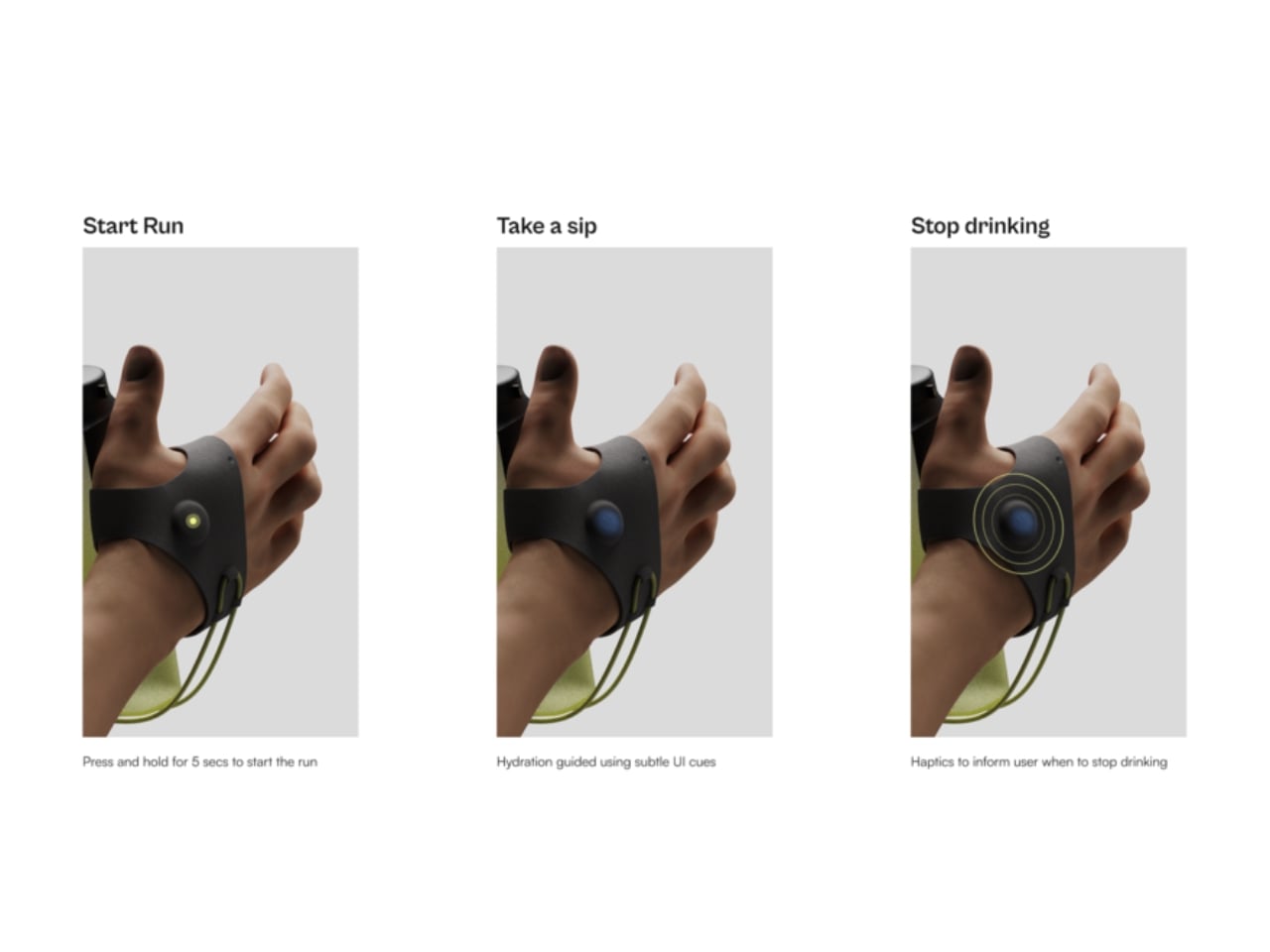
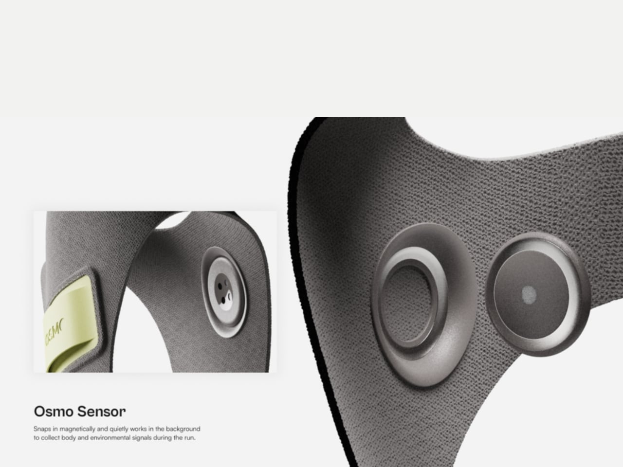
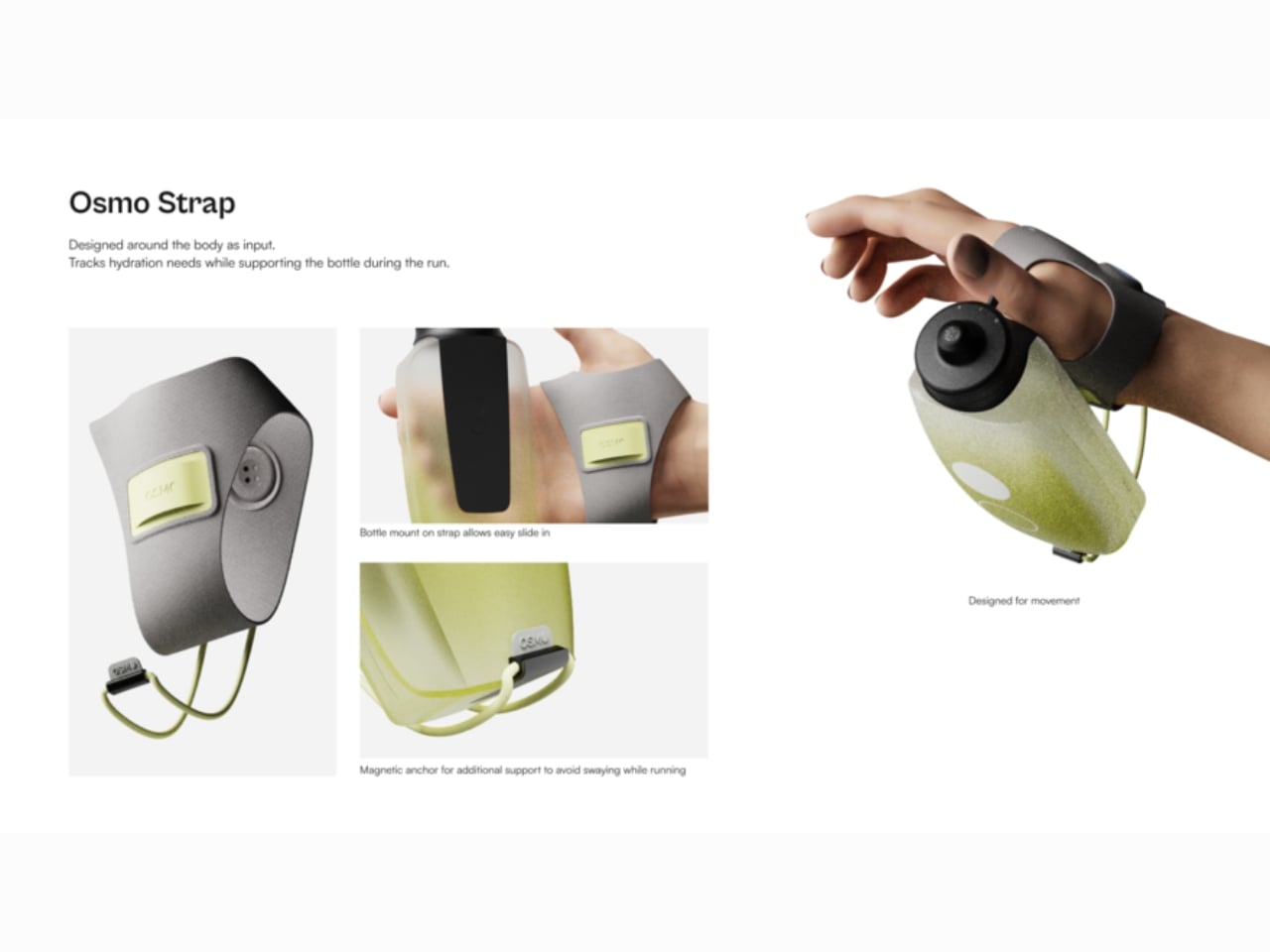
Osmo solves this with three connected components working as a single system. The wearable, worn on the wrist, continuously tracks sweat rate, temperature, humidity, and intake behavior. It then translates that data into cues delivered through haptic vibration and light feedback, nudging the runner without pulling them out of their flow. No screen to look at. No notification to parse. Just a quiet signal saying, drink something now.

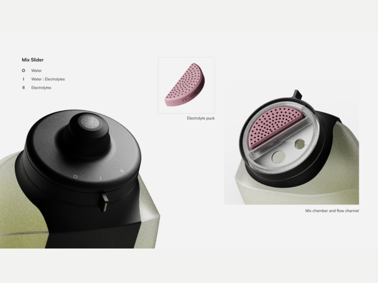
The bottle is where it gets particularly elegant. Rather than requiring you to pre-plan your hydration strategy before lacing up, Osmo’s bottle includes a built-in mixing mechanism that lets you shift between water and electrolytes on the fly. A simple slider adjusts the ratio as your needs change. This is the kind of thinking that solves a real problem rather than adding a layer of complexity dressed up as innovation. No extra pouches, no separate drink mixes to remember, no mid-run compromise where you reach for the wrong option because you didn’t prepare for the conditions.

The companion app rounds out the system, handling setup before a run and offering digestible insights afterwards. That structure matters. It keeps the app out of the experience when you need to focus, and puts it to work when you finally have the headspace to reflect. I find this concept genuinely compelling, partly because so many “smart” fitness products get this backwards. They front-load the technology in ways that interrupt the activity itself, demanding interaction at moments when you just want to move. Osmo flips that. The intelligence runs quietly in the background, and the interface shows up only when it’s actually useful.

It’s also worth acknowledging the quality of thinking behind the design approach. Ghule didn’t just design a cool bottle or a slick wearable. He mapped out a friction problem, traced it back to its actual root, and then built a system around it. The research behind Osmo surfaced a key insight: runners know they should be hydrating better, but the physical and cognitive demands of running make it genuinely difficult to act on that knowledge in real time. That’s a design challenge with real nuance, and the response reflects it.

Osmo won’t be on store shelves tomorrow. It’s a student concept, and concept-to-market is always a long road. But the fact that it exists as a fully realized, integrated system rather than a single clever gadget suggests Ghule has a clear understanding of what it actually takes to change behavior. That’s not a minor thing. Running keeps growing as a sport, and the industry has largely kept pace. The gear has evolved, the shoes have evolved, the tracking technology has evolved. It’s about time hydration caught up.

The post A Design Student Just Fixed the Way Runners Hydrate first appeared on Yanko Design.

Noble’s $199 Osprey Earbuds Aim Straight at Sony’s XM6

The $200 true wireless earbud market is crowded, but the brands filling it are mostly consumer electronics companies that tune for mass appeal rather than accuracy. Getting earbuds with any real audiophile pedigree under that threshold has historically meant compromising somewhere meaningful, whether on driver quality, build, or sound character. Most listeners have made their peace with that trade-off and gone with whatever Sony or Sennheiser had on the shelf.

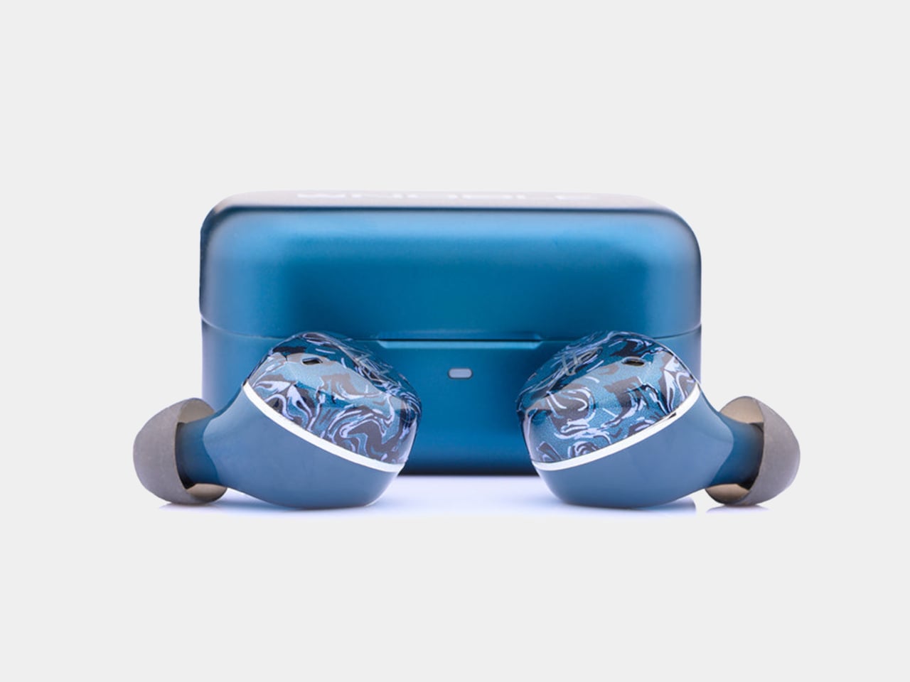
The Noble Audio Osprey debuted at High End Vienna 2026 and starts shipping at the end of June at $199. Noble has spent years building custom in-ear monitors that sell for four figures to listeners who argue about driver counts and cable geometry. Compressing that into a sub-$200 true wireless product is a considerable stretch, and the Osprey’s choices reflect what had to be preserved and what didn’t.

Designer: Noble Audio

The Osprey uses a hybrid dual-driver configuration, pairing a 10mm dynamic driver with a custom balanced armature. The dynamic driver handles low-end weight and warmth, delivering bass that’s smooth and thick rather than just punchy, while the balanced armature supports midrange detail and treble precision. The frequency response spans 20Hz to 40kHz, wider than most consumer earbuds at this price point.

That driver combination pays off most noticeably in the soundstage, which reviewers describe as genuinely expansive, with strong depth and layering that becomes especially clear in music with complex percussion. The signature leans slightly V-shaped, with the low end its most impressive range. Mids are full and anchoring rather than recessed, and highs are crisp and extended without tipping into harshness, a balance that works across most genres.

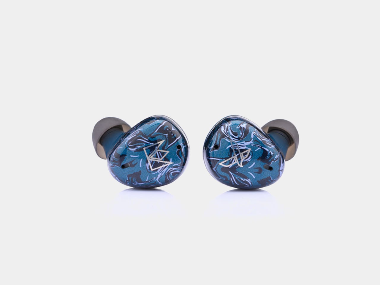
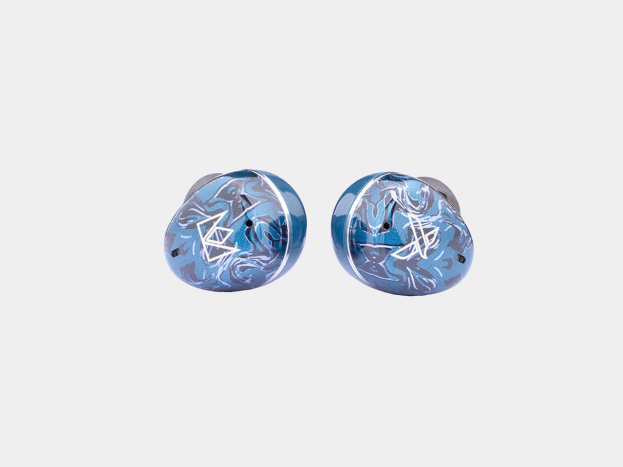
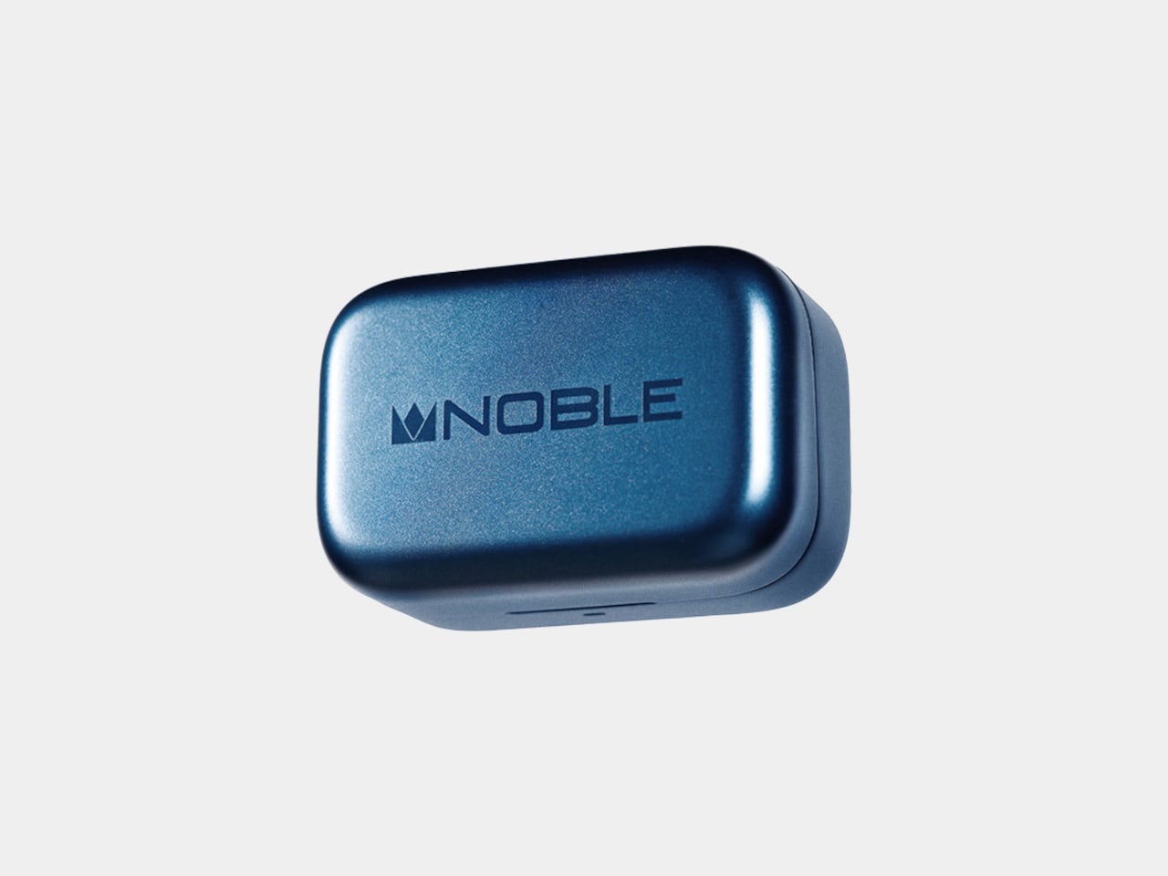
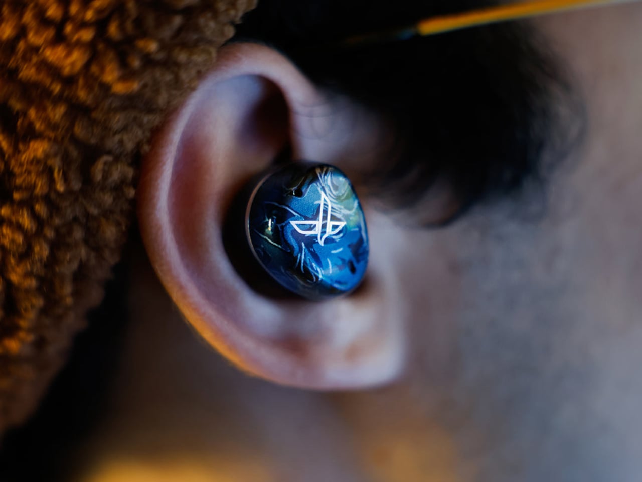
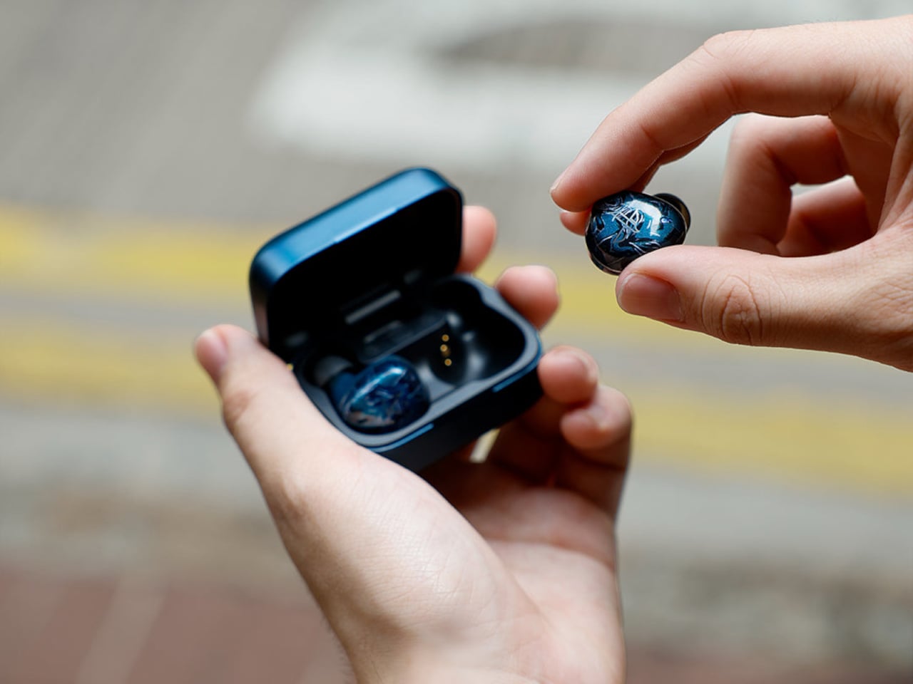
Noble kept most of its visual identity intact. The Osprey carries the marbled acrylic faceplate aesthetic from the FoKus line, with layered blues that read as deliberate rather than generic. The aluminum charging case matches the color and keeps the premium feel without adding bulk.

On the practical side, the Osprey includes hybrid ANC, a Hearing Through mode for ambient awareness, and multipoint connectivity for switching between two devices without re-pairing. ANC handles lower frequencies well, though some higher-pitched background noise still gets through. Dual microphones with cVc noise reduction handle calls, and Bluetooth 6.0 via the Airoha 1571 chipset holds a fast, stable connection even in busier wireless environments.

Battery life sits at seven hours with ANC off and five hours with it on, in line with most competitors. Quick charging is where the Osprey pulls ahead: 10 minutes in the case delivers roughly two hours of listening, a figure that outpaces several earbuds well above this price. The 500mAh aluminum case uses USB-C, and the Noble FoKus app adds a 10-band EQ, touch remapping, and over-the-air updates.

For context, Sony’s WF-1000XM6 retails at $329.95 and the Sennheiser Momentum True Wireless 4 at $299.95, putting the Osprey around $100 to $130 below either. LDAC support separates it further from mainstream earbuds at the same price, most of which cap out at AAC. Noble Audio opened pre-orders on June 4, with units shipping by the end of June, available directly at nobleaudio.com and through select retailers.

The post Noble’s $199 Osprey Earbuds Aim Straight at Sony’s XM6 first appeared on Yanko Design.

The Urn With 4 Screens Showing Moving Images of the Person You Lost

Cremation urns have existed for thousands of years, but their design language has barely moved. They tend toward the ceremonial and the generic, pottery shapes lifted from antiquity or polished boxes that draw from the visual vocabulary of caskets. The underlying assumption across nearly all of them is the same: that the vessel marks an ending. That what’s inside has arrived, not departed.

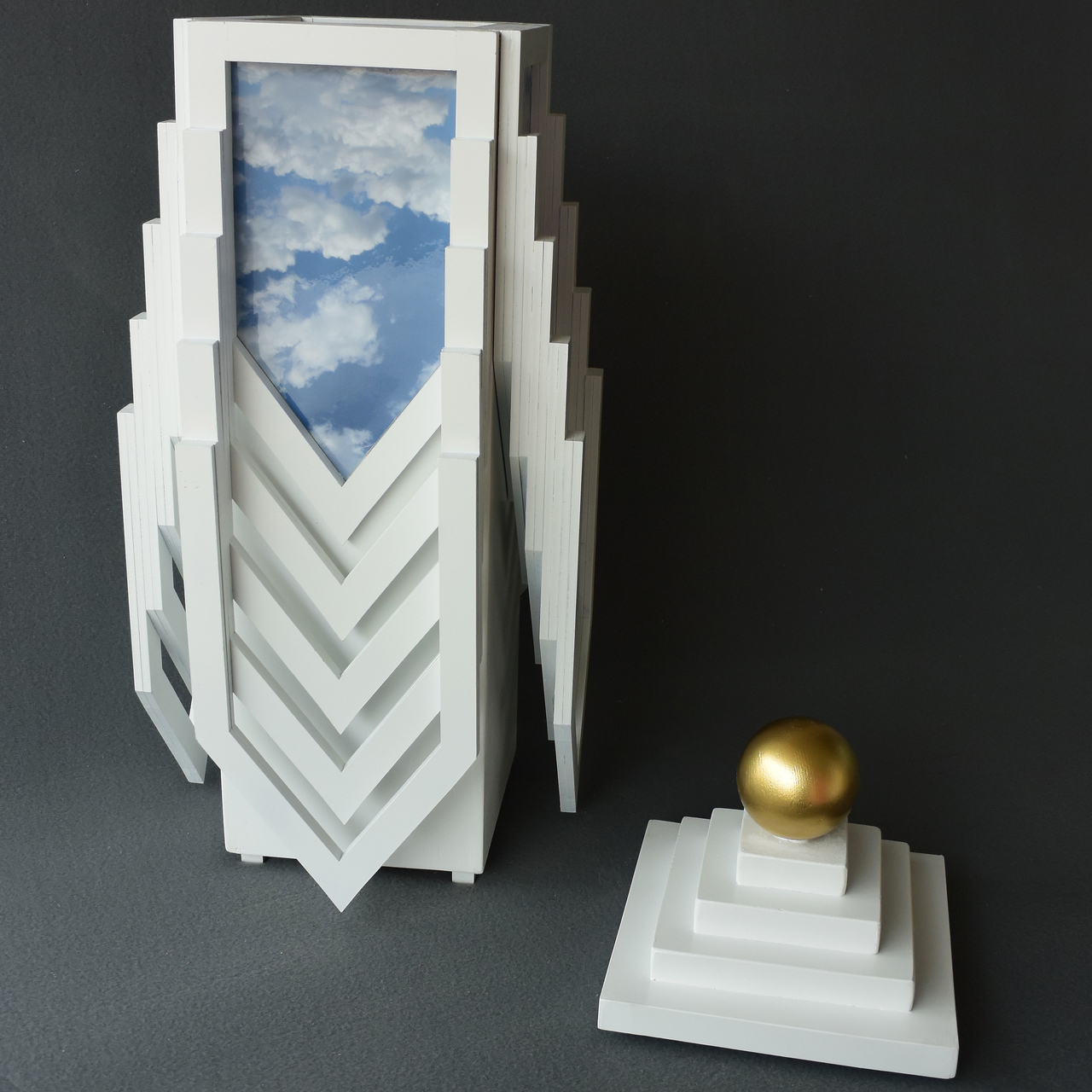
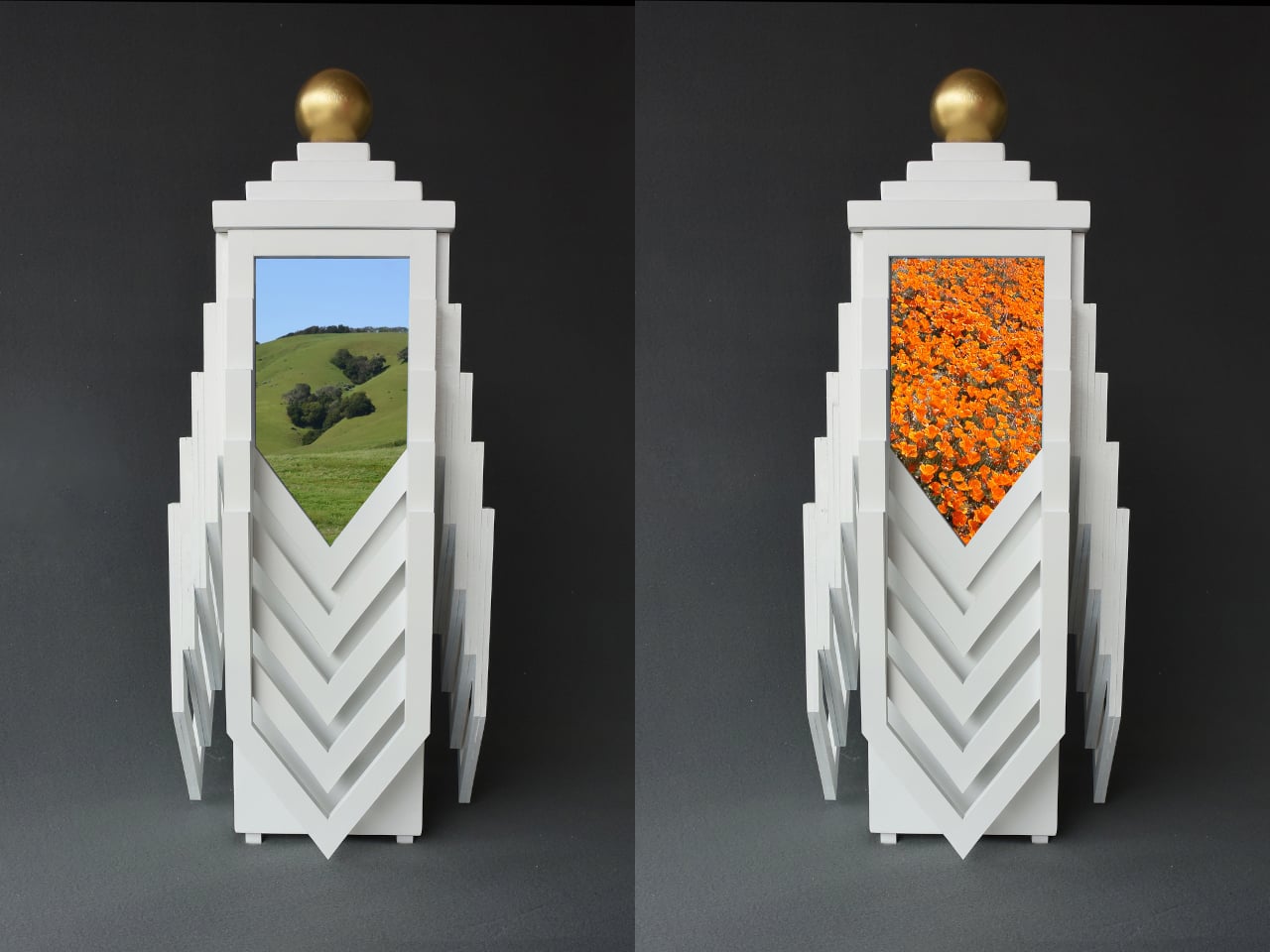
The Transcendence Urn takes a different philosophical position entirely. It belongs to a series of objects conceived as temporary dwellings for the remains of loved ones, held in anticipation of what comes next. The form it takes to express this idea is strikingly futuristic, almost sci-fi in its ambition, built on the premise that the urn theoretically facilitates the occupant’s journey toward a higher state of existence rather than simply containing what was left behind.

Designer: Michael Jantzen

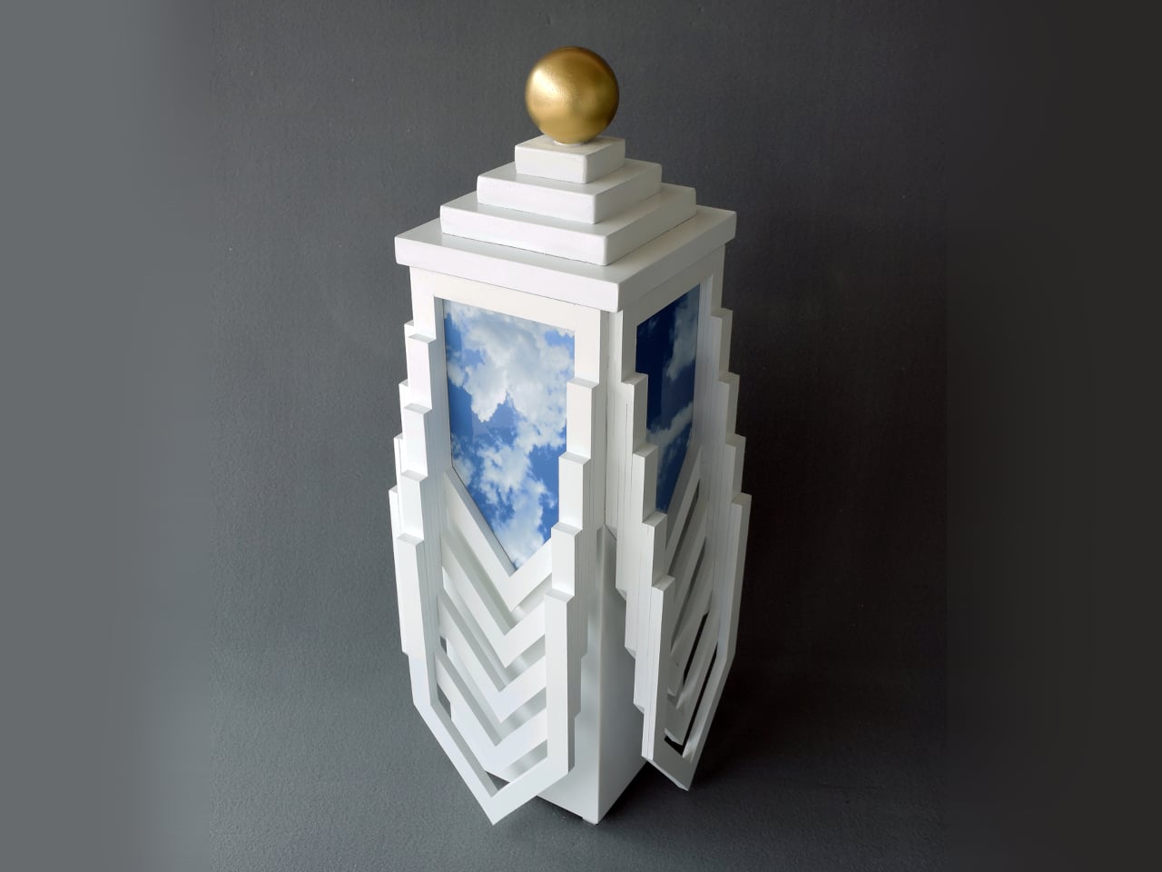
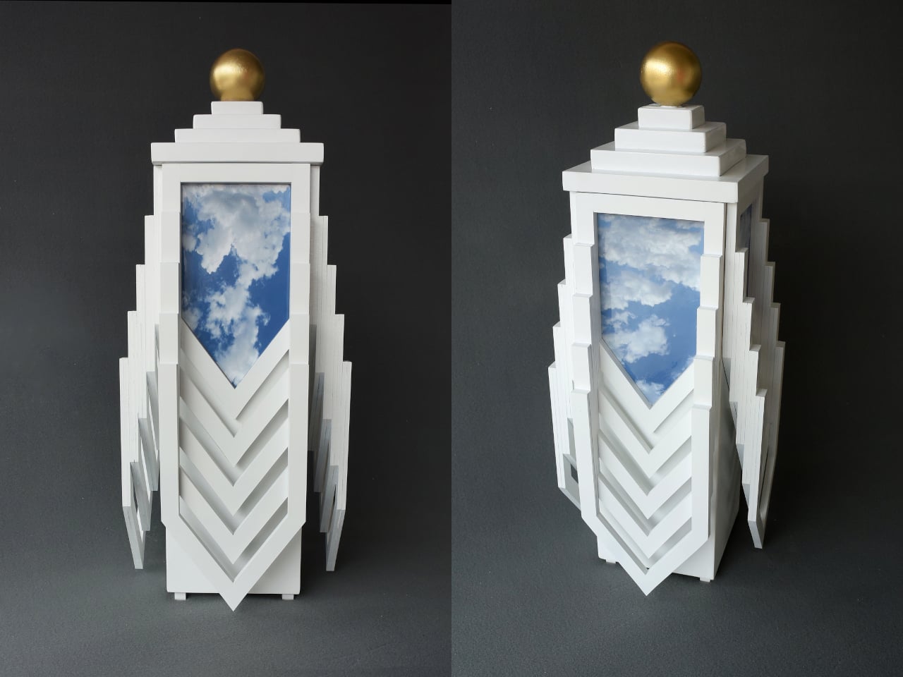
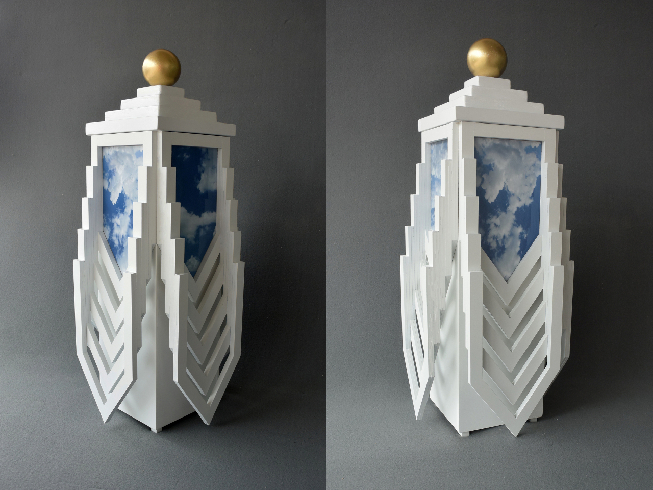
The structure stands 25 inches tall and 12 inches wide, built from painted wood in a form that seems to reach upward. Stepped tiers stack toward the top, followed by a gold sphere that crowns the whole structure and is removable from its own tiered plinth. The lower body radiates outward in layered chevron forms, pointing downward like fins, giving the whole piece a sense of directed energy, as if something inside it is moving rather than resting.

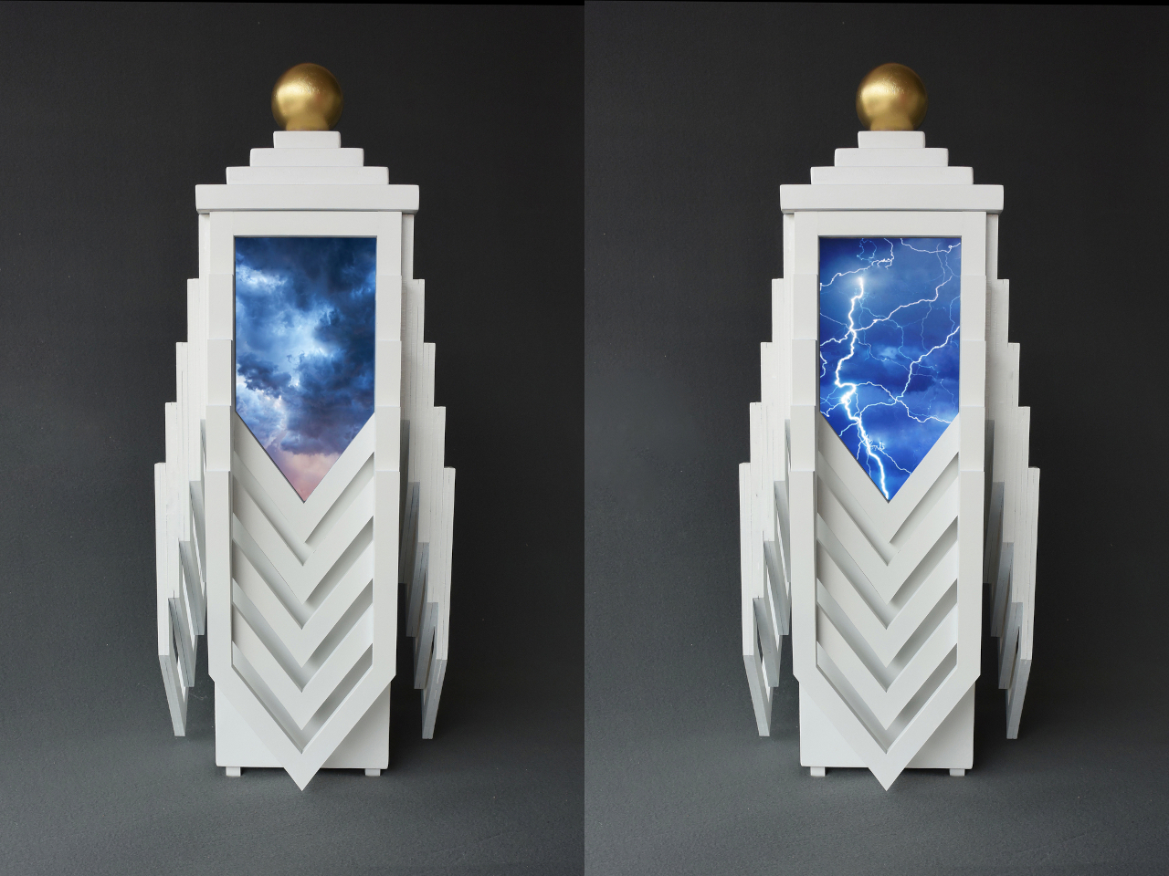
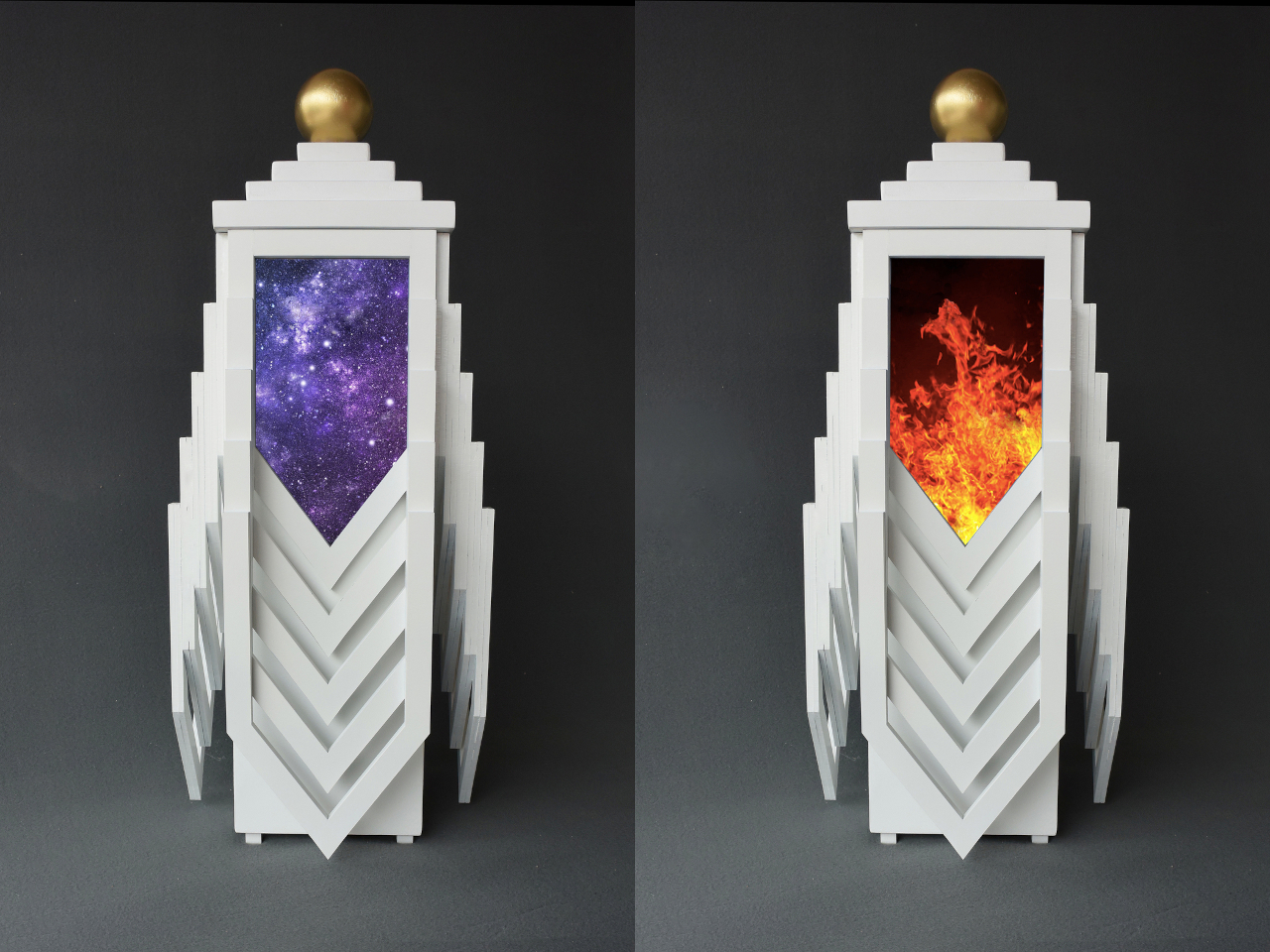
The four panel spaces near the top of the urn are where the personal dimension takes shape. Owners can fill them with photographs selected from a curated series of symbolically resonant images, or with their own. The possibilities run a wide emotional and metaphysical range: images of open sky and drifting clouds, a sunlit hillside, a field of orange flowers, a galaxy, fire, storm, and lightning are all part of the symbolic vocabulary this design draws from. Of course, photos of the actual person can go there, too.

That choice matters more than it might first appear. Most memorial objects leave the bereaved as passive recipients of a fixed form. This one asks them to make decisions about meaning, to assign symbols, and to decide what the person they lost should be surrounded by. It’s a quiet but real kind of agency during a period when very little feels controllable.

A digital variant of the Transcendence Urn replaces the four static panels with four screens displaying moving images and sounds, turning the object from a still memorial into something more like a living one. That version shifts the experience even further, letting the presence of the deceased linger in a more active, dynamic way rather than being fixed to a single still photograph chosen on a single day of grief.

It’s also worth noting what the object looks like on a shelf or a table. It doesn’t look like an urn. It looks like a piece of speculative design, the kind of object that invites questions before anyone knows what it holds. That unfamiliarity carries its own kind of comfort: it doesn’t announce loss the same way a traditional vessel does, and it doesn’t ask the viewer to feel a particular thing on sight.

The post The Urn With 4 Screens Showing Moving Images of the Person You Lost first appeared on Yanko Design.

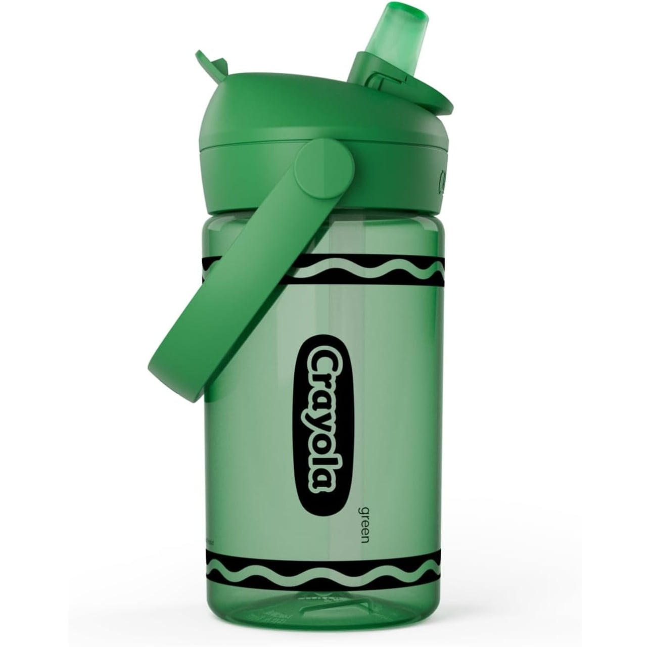
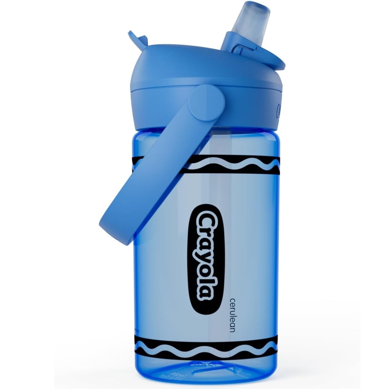
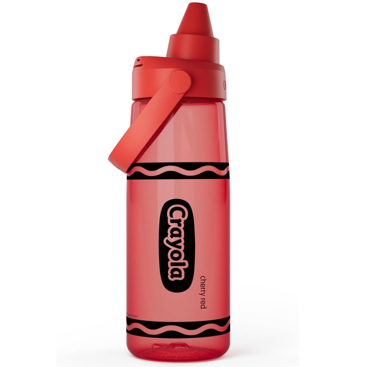
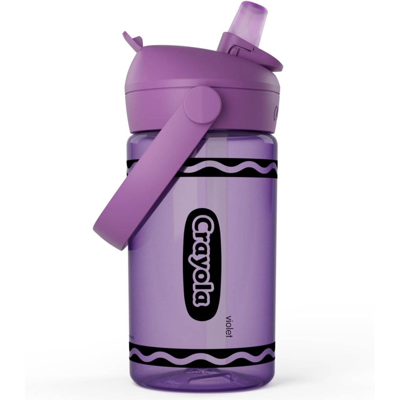
CamelBak and Crayola Just Made the Most Nostalgic Water Bottle

Remember holding a fat crayon between your fingers as a kid? The waxy smell, the satisfying peel of the paper label, that specific weight in your hand that felt like pure creative possibility? CamelBak and Crayola are betting you do, because their new limited-edition Chug Water Bottle Collection is practically a love letter to that memory.

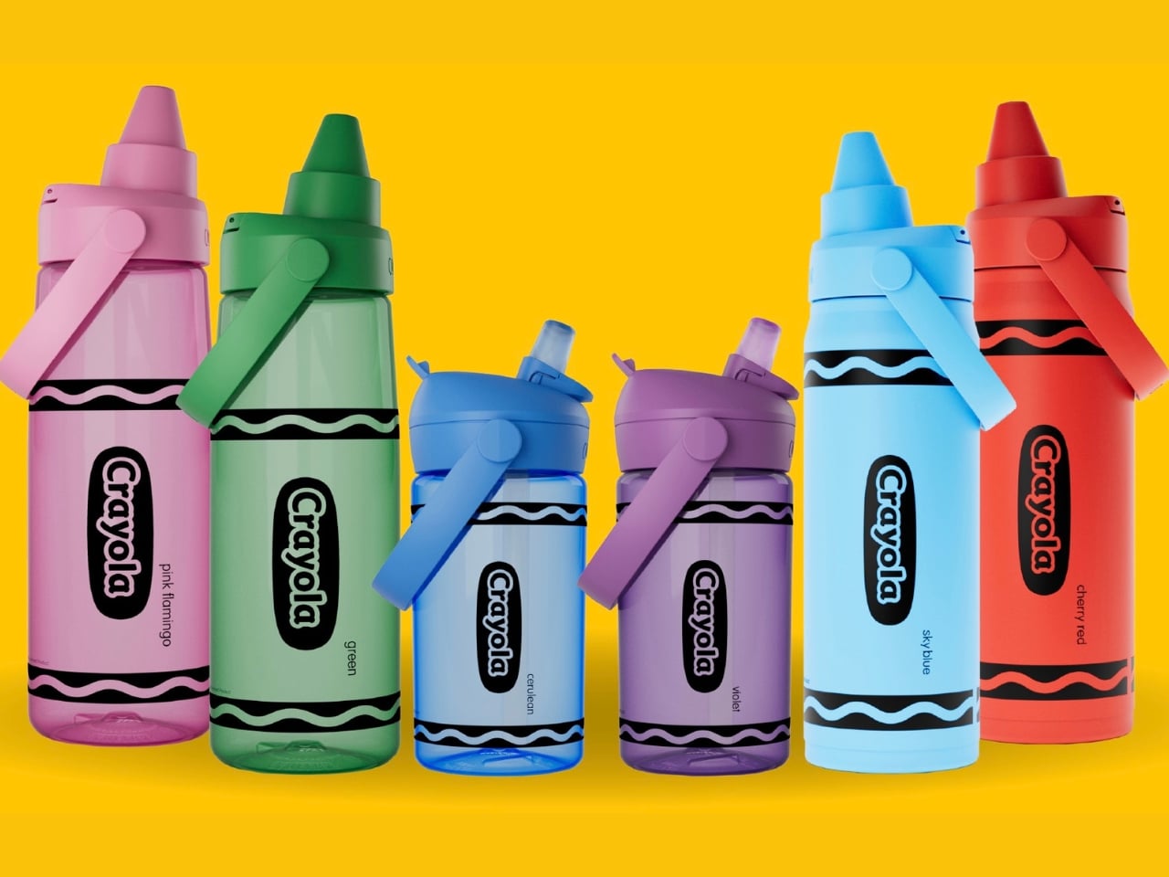
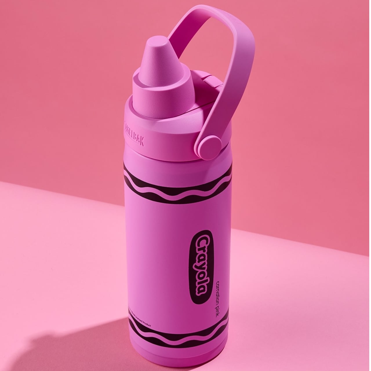
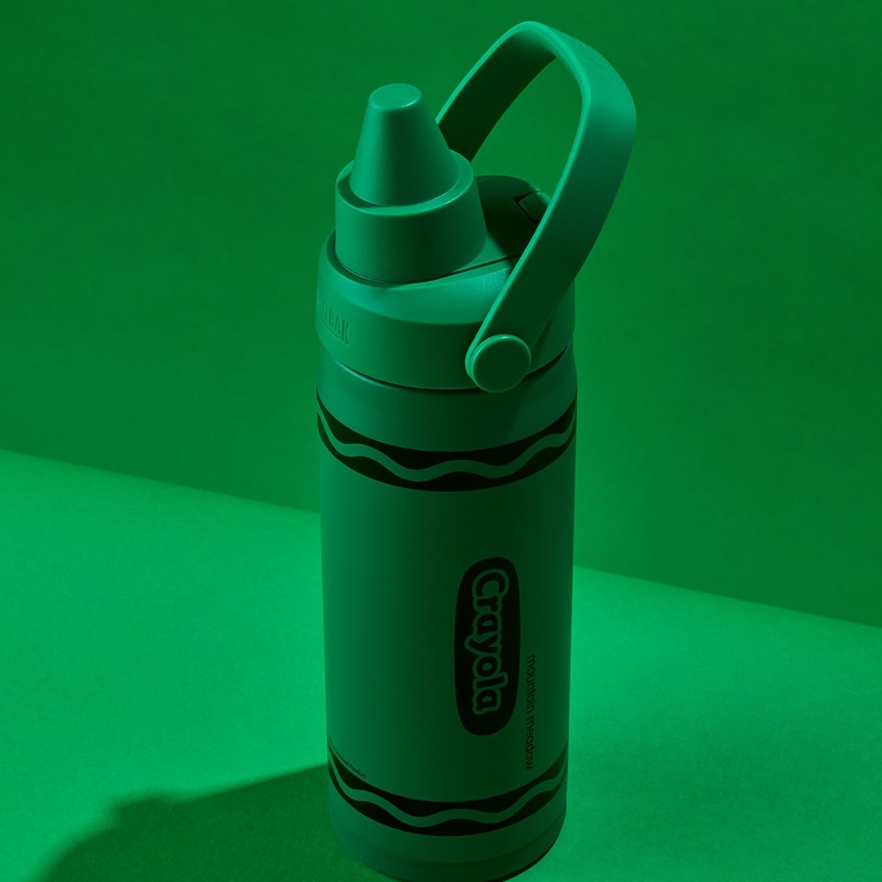
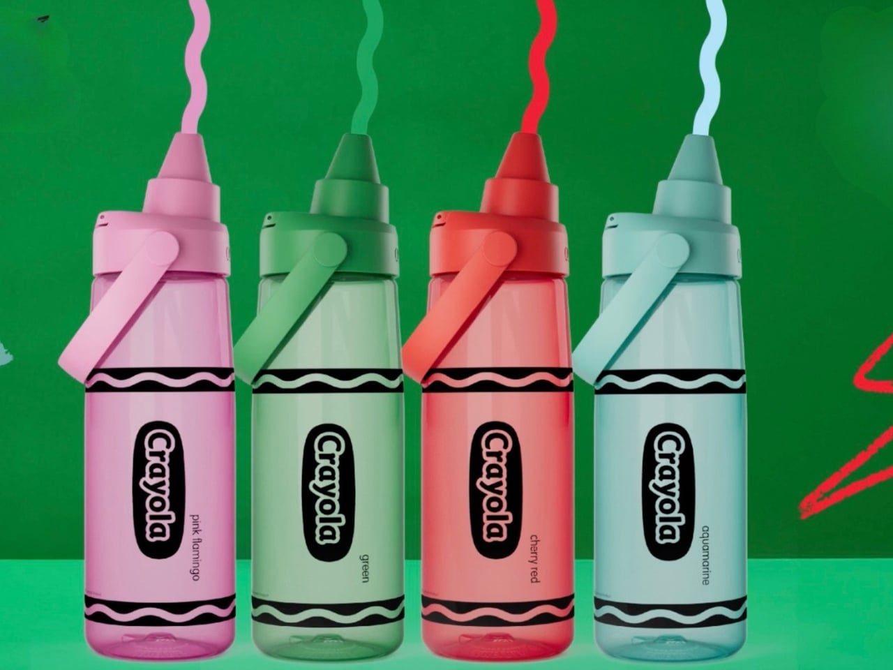
The collaboration transforms the classic crayon into functional hydration gear, and the execution is genuinely clever. The standout feature is the lid shaped to mimic the iconic Crayola crayon tip, a small but deliberate design choice that does a lot of heavy lifting. It’s not just a slap-on logo deal or a crayon-print graphic splashed across a generic bottle. The actual form of the crayon is carried through to the cap, which makes it feel like a real design statement rather than a quick licensing cash grab.

Designer: Camelbak x Crayola

The collection comes in three sizes: a 14oz, a 16oz insulated stainless steel version, and a 25oz option made with Tritan Renew plastic. The 16oz model is vacuum-insulated, keeping drinks ice cold for hours, while the larger 25oz is lightweight and non-insulated, ideal for someone who just wants a grab-and-go bottle without the extra weight. Both are BPA-free, and the 25oz is built with Tritan Renew, which incorporates reclaimed plastic material into its construction. That feels like a thoughtful nod to sustainability, and it’s the kind of detail that tends to get overlooked in the excitement over aesthetics.

Where the collection really delivers is in the color palette. Crayola didn’t just hand over its logo and call it a day. The bottles arrive in shades pulled straight from the classic 64-count box: Cherry Red, Carnation Pink, Sky Blue, Aquamarine, Green, and more. These aren’t muted, “adultified” interpretations of those colors. They’re unapologetically vivid, exactly the kind of saturated tones that made opening a new box of crayons feel like an event. For anyone who has strong feelings about how many “adult” product lines water down color until it becomes something beige and forgettable, this collection is a welcome counter-argument. It’s rare to see a brand commit fully to the bit, and Crayola’s signature palette, deployed here at full intensity, is genuinely satisfying.

Nostalgia-driven collaborations are everywhere right now, and they can be exhausting when they feel cynical. A well-known consumer brand slaps its logo on something unrelated, leans hard on your childhood memories, and hopes the emotion carries the sale. The CamelBak x Crayola partnership sidesteps that trap because the two brands actually share the same lane. Both are built around accessibility, creativity, and the idea that the best products go everywhere with you. Crayola has been a household name since 1903, and CamelBak has spent decades designing hydration products that live in backpacks, gym bags, and school hallways alike. Putting them together isn’t a stretch. If anything, it’s the kind of collab that makes you wonder why it didn’t happen sooner.

The pricing sits at around $28 for the insulated 16oz bottle and closer to $19 to $23 for the 25oz Tritan version. Neither is bargain-bin territory, but they’re reasonable for what you’re getting: a genuinely well-made hydration product with design details that go beyond surface level.

Is this a bottle that will change the way you think about hydration? No. But that’s also not the point. The CamelBak x Crayola Chug Collection is a product that understands the quiet power of play, that the objects we carry around every day say something about who we are and what we choose to care about. Choosing a water bottle shaped like a crayon is a small, deliberate act of joy, and in a product category that has been dominated by matte black cylinders and relentless “wellness” branding, a little color goes a long way. Literally. The collection is limited edition and available now on Amazon and through CamelBak’s website.

The post CamelBak and Crayola Just Made the Most Nostalgic Water Bottle first appeared on Yanko Design.

From Foldable Pilates to Shoe Robots: InnoX GCS 2026’s Best Startups

The consumer tech market has a crowding problem, mostly driven by products that try to do too much for too many people. The most interesting hardware lately has been doing the opposite, building around one specific inconvenience that hasn’t been properly addressed yet. Shenzhen has always had a knack for this, and InnoX Academy has been quietly developing the next generation of builders who make those products happen.

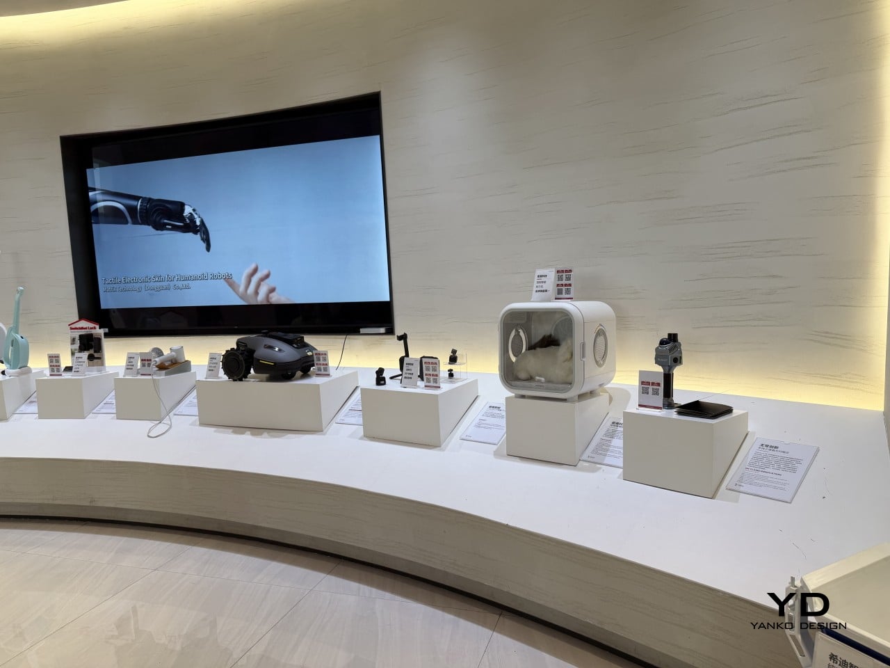
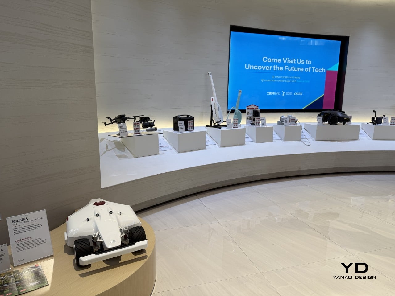
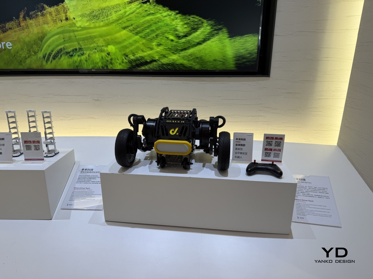
Founded in 2021 by Professor Li Zexiang of Hong Kong University of Science and Technology, Shenzhen InnoX Academy is a structured ecosystem that develops engineers and entrepreneurs into product builders. At the Global Connect Show 2026, it gave the world a look at its latest batch of startups, from home fitness and pet care to ambient design objects, each taking a more considered approach to a specific problem.

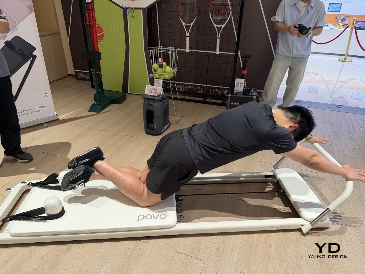
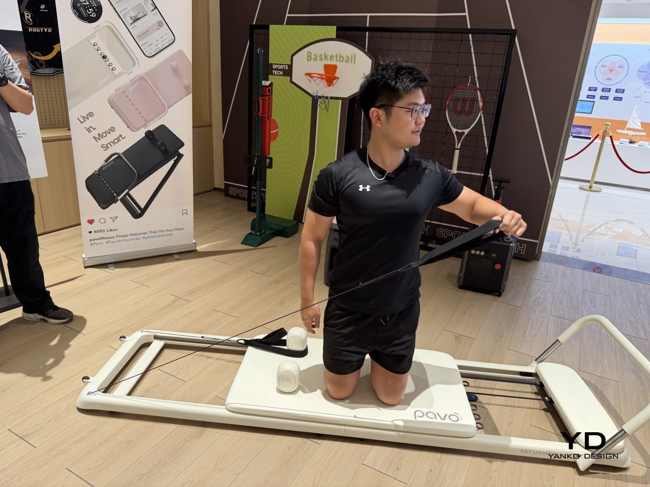
Pilates reformers have always been the kind of equipment you’d only find in a dedicated studio, too large and bulky for most apartments to accommodate. Pavo Fitness, started by a team of architects, industrial designers, and professional Pilates instructors, saw that as a solvable problem. The Pavo Reformer is their answer: a compact, foldable machine designed to bring studio-quality resistance training into a regular home.

Designer: PAVO

Once a session is done, it packs away without being disassembled or moved to a corner, so it doesn’t have to become a permanent fixture in your living space. The onboard smart system keeps tabs on workouts, which matters more in a home setting where there’s no instructor watching your form. It adds a layer of accountability that a conventional reformer simply can’t offer.

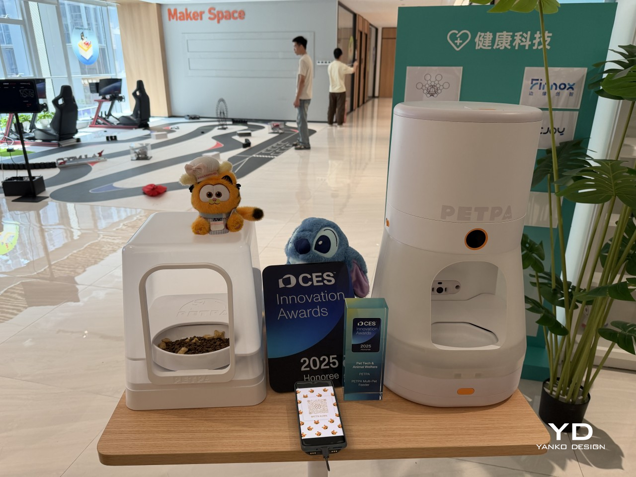
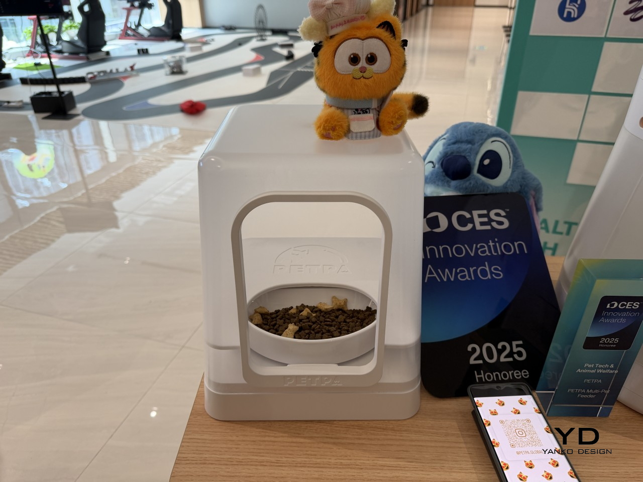
Multi-pet households have a feeding dynamic that most smart feeders don’t actually address. A timed dispenser works for one pet, but when multiple cats have different dietary needs, scheduling meals is only part of the problem; the harder challenge is making sure each cat only gets its own food. That’s what PETPA was built to solve, by a team that previously worked on hardware at DJI, Narwal, and RoboMaster.

Designer: PETPA

The PETPA Multi-pet Feeder uses individual pet recognition to identify each cat and control access to their food, particularly useful in homes where one cat needs to lose weight or follow a prescription diet while the others don’t. It launched at CES 2025 and earned a CES Innovation Award in the Pet Tech and Animal Welfare category, recognizing a product solving a problem most smart feeders still overlook.

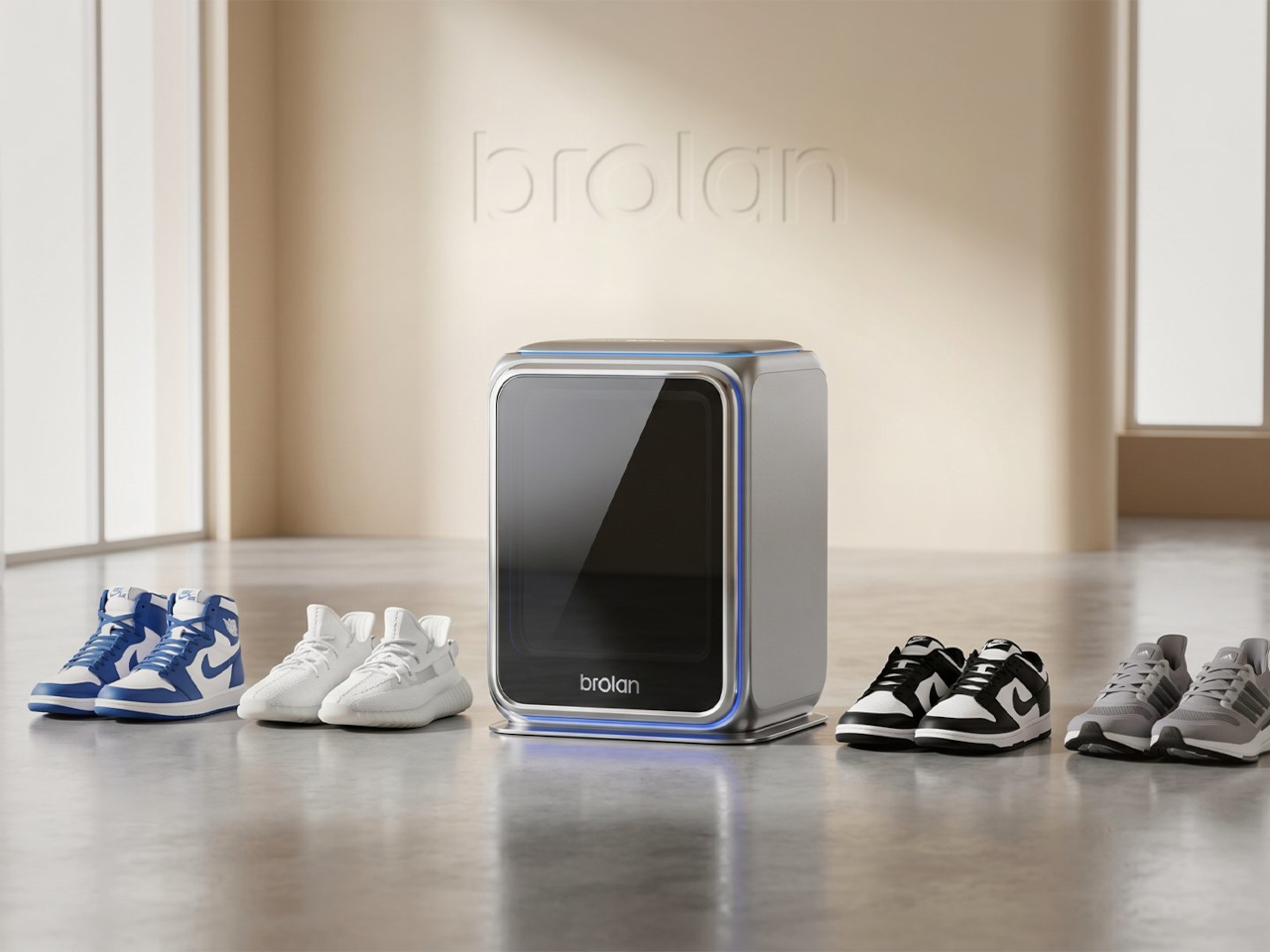
Sneaker care has evolved into its own dedicated ritual for collectors and sports enthusiasts who’d rather not take chances with a stiff brush and soapy water. The typical cleaning routine still carries the risk of fading colors, weakening materials, or warping the structure of more delicate footwear. Brolan’s ClearX is a compact home machine that moves through cleaning, low-temperature drying, and sterilization all in one automated cycle.

Designer: Brolan

Founded in 2025 by a team drawing from Nanyang Technological University, Harbin Institute of Technology, and Tsinghua University, Brolan designed ClearX specifically to clean without the harshness of manual scrubbing. The idea is to get footwear thoroughly clean without putting materials at risk, which matters most for anyone who owns suede, knit, or premium leather shoes that even a careful hand-wash can easily ruin.

Not everything in the InnoX lineup is about automation or performance tracking. REAZENABLE takes a different direction with the REAZE Sandstone Series, a collection that sits somewhere between smart lighting and decorative object, aimed at people who’d rather their home feel calmer than more connected. The brand’s philosophy, technology empowering nature and light reshaping emotion, gives a clear sense of where its priorities are.

Designer: REANZENABLE

The collection includes the Halo light and three aroma vessels, all made from sand-based materials and shaped with ribbed surfaces that recall an uneven lunar landscape. The technical structure is deliberately concealed within those soft architectural forms, so nothing on the shelf reads as a gadget. Atmospheric light, mineral textures, and scent work together into something that feels more like a ritual object than a piece of hardware.

Several other InnoX startups addressed more personal routines. Rootique brought the DUO, a scalp atomizing applicator using patented DuoTrace and IntelliMist technology for precise serum delivery in about 15 seconds, already validated through an Indiegogo campaign that found backers across 52 countries. OCJOY presented the OCJOY Air, a home micro-air oral cleaning system that brings a water-air-powder cleaning method from dental offices to your own countertop.

Direct Drive Tech D1

The lineup stretched into less expected territory, too. Blucalm’s StrikeDeck delivers AI-assisted game audio through a desktop controller, while ORULINK’s Watcher-Robot is an open-source desktop AI companion built for everyday interaction. CHEERLUCK brought a sausage vending robot for campuses and public spaces, and both Y-H2O and ANAVI presented electric watercraft, a hydrofoiling vessel, and a smart personal watercraft, each designed to cut the noise and emissions of traditional marine engines.

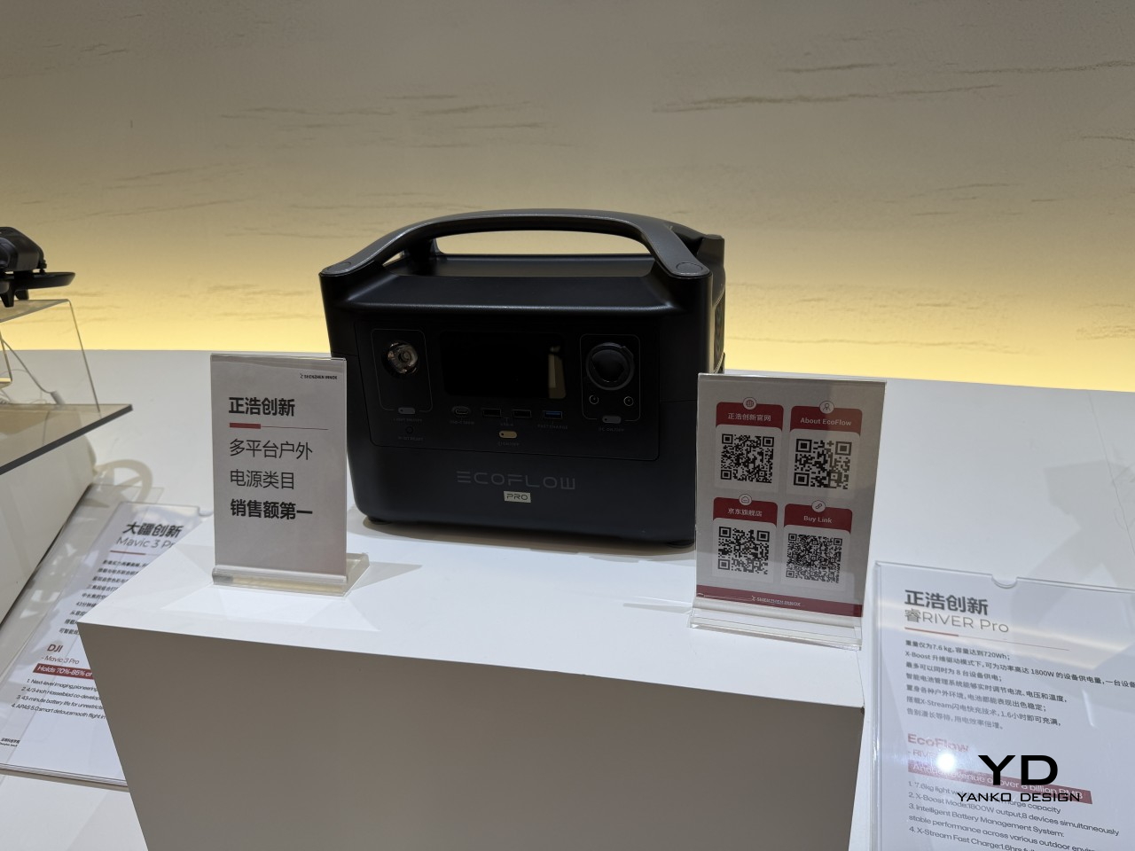
EcoFlow

Narwal

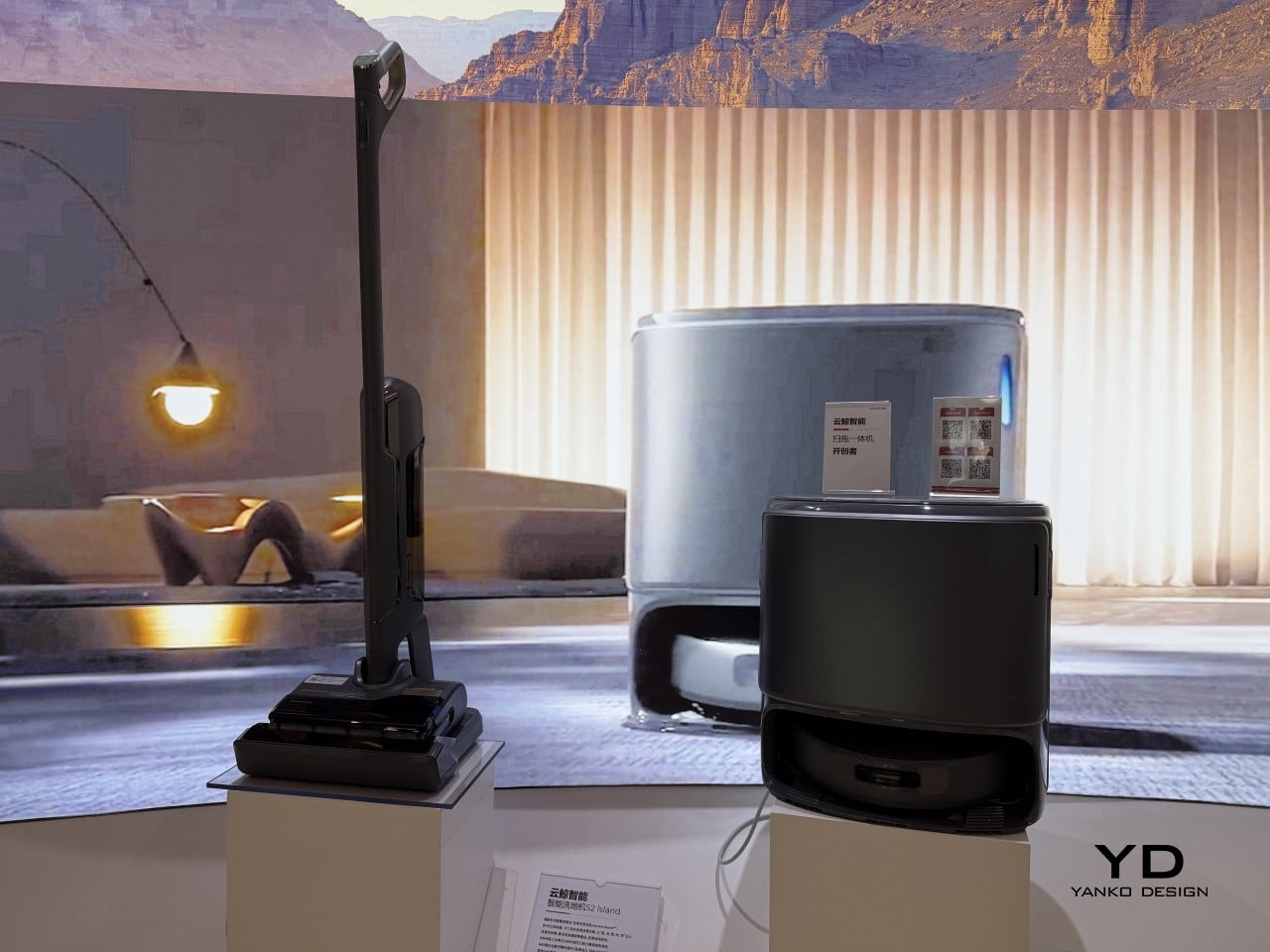
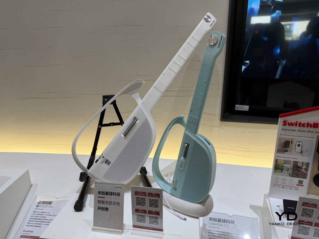
What gives the InnoX lineup credibility beyond the show floor is the academy’s broader history. Brands like Narwal, SwitchBot, DJI, EcoFlow, AgileX, and LiberLive are all part of InnoX’s wider ecosystem, a track record that makes it worth paying attention when the academy’s latest batch of incubated products steps out in front of an international audience for the first time.

LiberLive

DJI

The post From Foldable Pilates to Shoe Robots: InnoX GCS 2026’s Best Startups first appeared on Yanko Design.

The Personal Cooling Device That Blows Cold Air Rather Than Just Moving It

Handheld fans have been a summer staple for years, but the basic formula hasn’t changed much. You press a button, blades spin, and air moves. That works fine when it’s mildly warm, but as summers grow hotter and more people spend time outdoors, a fan that simply redistributes hot air starts to feel less like relief and more like a polite gesture against a much bigger problem. And yet for years, that has remained the only option most people know and reach for.

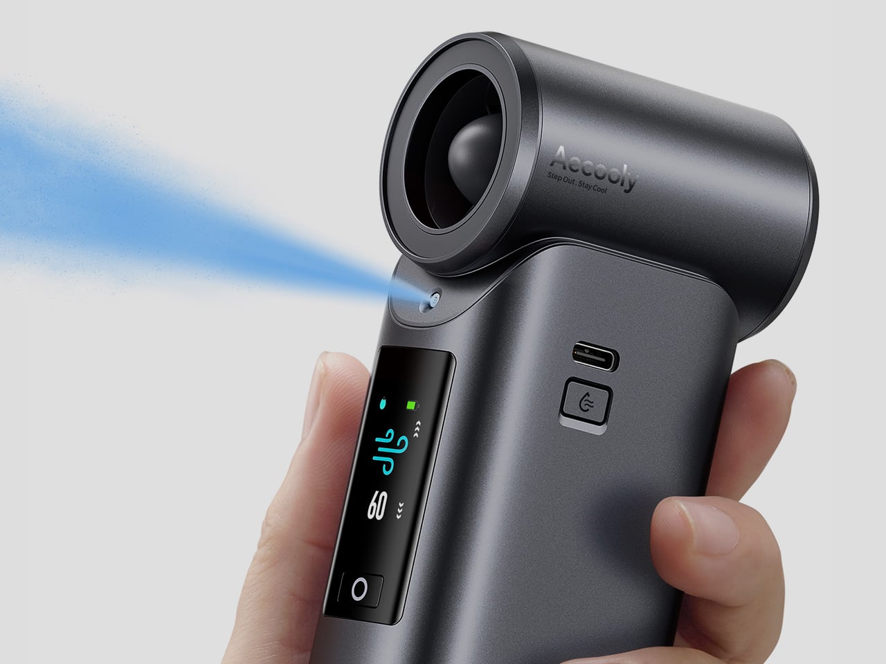
That’s the gap Aecooly is trying to close with the Cold Air Ultra, the brand’s flagship personal cooling device. Rather than simply moving warm air from one side of your face to the other, Aecooly built it around an active cooling system that delivers genuinely cooled airflow, thanks to ultra-fine mist particles that accelerate evaporation to actively draw heat away from the skin. If you’ve ever thought there has to be a fan that actually cools the air, this is that device.

Designer: Aecooly

Click Here to Buy Now: $63.99 $79.99 (20% off, use coupon code “YANKO2026”). Hurry, deal ends in 48 hours!

1

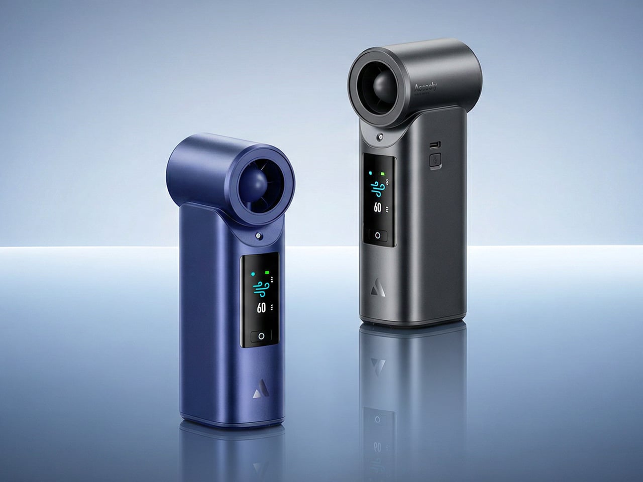
It’s worth noting how the Cold Air Ultra looks, because the design says a lot about what it’s trying to be. The body is compact and upright, with a cylindrical air outlet with a straight, high-pressure duct design, giving it a shape closer to a precision tool than a seasonal gadget and ensuring that the powerful airflow reaches you with zero efficiency loss. Unlike the plastic housing common to most portable fans, the Cold Air Ultra comes in a lightweight body with a premium metallic-inspired finish that’s more resistant to scratches and daily wear, better in hand, and can passively conduct heat away from the motor during extended use.

1

The cooling technology is where the Cold Air Ultra stands apart. An 70,000 RPM brushless motor drives high-speed air that “breaks through” the sticky sweat layer so the mist can evaporate and pull heat away instantly. It’s this dual action of the wind clearing the path for the mist that makes it possible to reduce skin temperature by up to 18°F (10°C) in just 10 seconds, a noticeably different experience from what you’d get with a standard fan.

Two side-by-side thermal camera frames from a HikMicro device showing a person in warm colors; left frame lists center 82.4°F, hottest 100.5°F, coldest 77.8°F, right frame lists center 74.6°F, hottest 103.0°F, coldest 71.9°F, with crosshair markers along a line

What makes the airflow cold rather than simply wet comes down to how the system atomizes water. Rather than using a vibrating membrane to break liquid into droplets, the approach used in most portable evaporative devices, the Cold Air Ultra uses pneumatic atomization: a high-pressure pump forces compressed air through a precision copper nozzle, shearing water into ~20 μm micro-particles at speed. The compression process itself lowers the air temperature before it exits the device, so that what reaches your skin is genuinely cooled airflow, not ambient air with moisture added. The water and air channels are sealed in a patented airtight structure that optimizes flow efficiency and prevents leakage, a design detail that also keeps the electronics fully separated from the water circuit.

Control is handled through what Aecooly calls the “Little Droplet,” a full-color touchscreen built into the front of the body. This enables fast, intuitive, and precise control, allowing users to swipe through the 100-level settings instantly, which is a much more modern and responsive way to manage airflow compared to traditional fans. And with dynamic icons that display battery level, water level, and mist status in real time, you’re never left guessing what’s left.

1

Picture stopping mid-hike to cool down, or waiting on a sweltering subway platform with no breeze in sight. A standard fan doesn’t do much in either of those moments beyond moving hot air around. The Cold Air Ultra is built for situations like these, where getting your skin temperature down quickly during a break or a commute actually makes a noticeable difference to how you feel.

Smart kettle display showing 100% readiness with air/wind icon and finger tapping the lid; side column shows additional status cards with percent values and icons.

Battery life isn’t a compromise here either. The Cold Air Ultra packs a 7,000 mAh cell for up to 10 hours, charges via USB-C in about 2.5 hours, and doubles as a 20W power bank with Quick Charge and Power Delivery support. The magnetic accessory system includes a pointed nozzle and a round nozzle for directing airflow, plus a brush head, each of which can snap on and off without tools. The included lanyard enables hands-free carry, so the device stays accessible during commutes or outdoor use without needing to be held.

Aecooly says the Cold Air system has received the Red Dot Design Award 2026, a recognition that speaks to its functional engineering as much as its considered form. It’s available in a black and a blue finish, and retails for $79.99. For a device that covers personal cooling, emergency power, and outdoor utility in a single package, the price puts it squarely in premium handheld territory.

The standard Aecooly Cold Air at $31.99 $39.99 (20% off, use coupon code “YANKO2026”) brings the same active cooling concept in a simpler package, with a 4,500 mAh battery and five speed settings. It’s a solid introduction to the concept, but the Cold Air Ultra’s touchscreen, 7,000 mAh battery, 20W power bank output, and magnetic tool system make $79.99 feel less like a premium and more like the smarter spend.

Click Here to Buy Now: $63.99 $79.99 (20% off, use coupon code “YANKO2026”). Hurry, deal ends in 48 hours!

The post The Personal Cooling Device That Blows Cold Air Rather Than Just Moving It first appeared on Yanko Design.