C Seed’s Sculptural Bugatti N1 folding TV carries dynamic flair of the Tourbillon supercar

Modern display technologies have come a long way in the last couple of decades, and so have the viewing experiences. Talking of the latter, no one does it better than C Seed, even though at a steep price. The Austrian high-end design brand has awed us with the 165-inch 4K MicroLED TV that disappears into the floor when not in use, and later with a TV that folds into itself within a metallic structure.

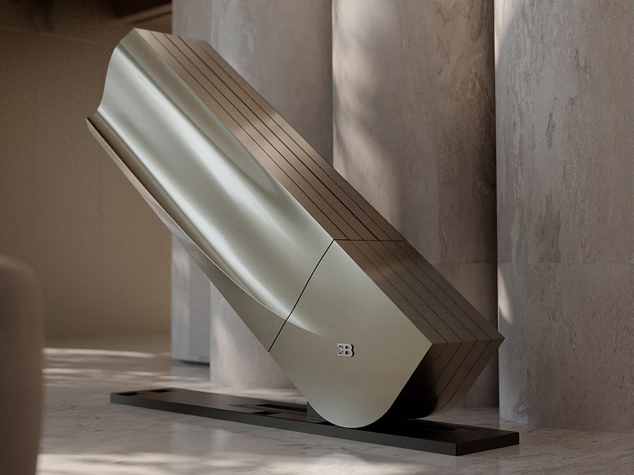
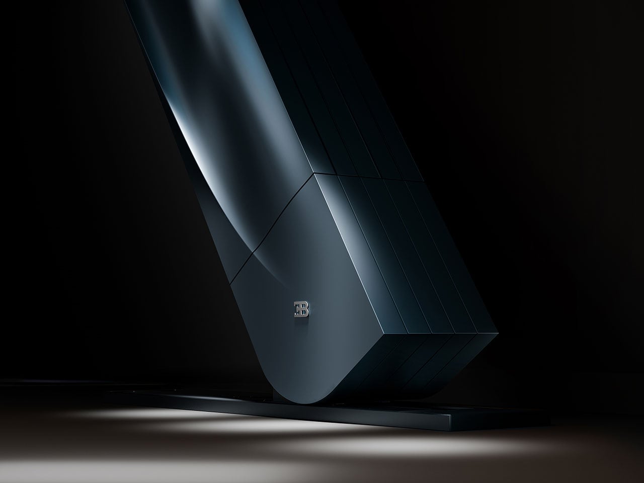
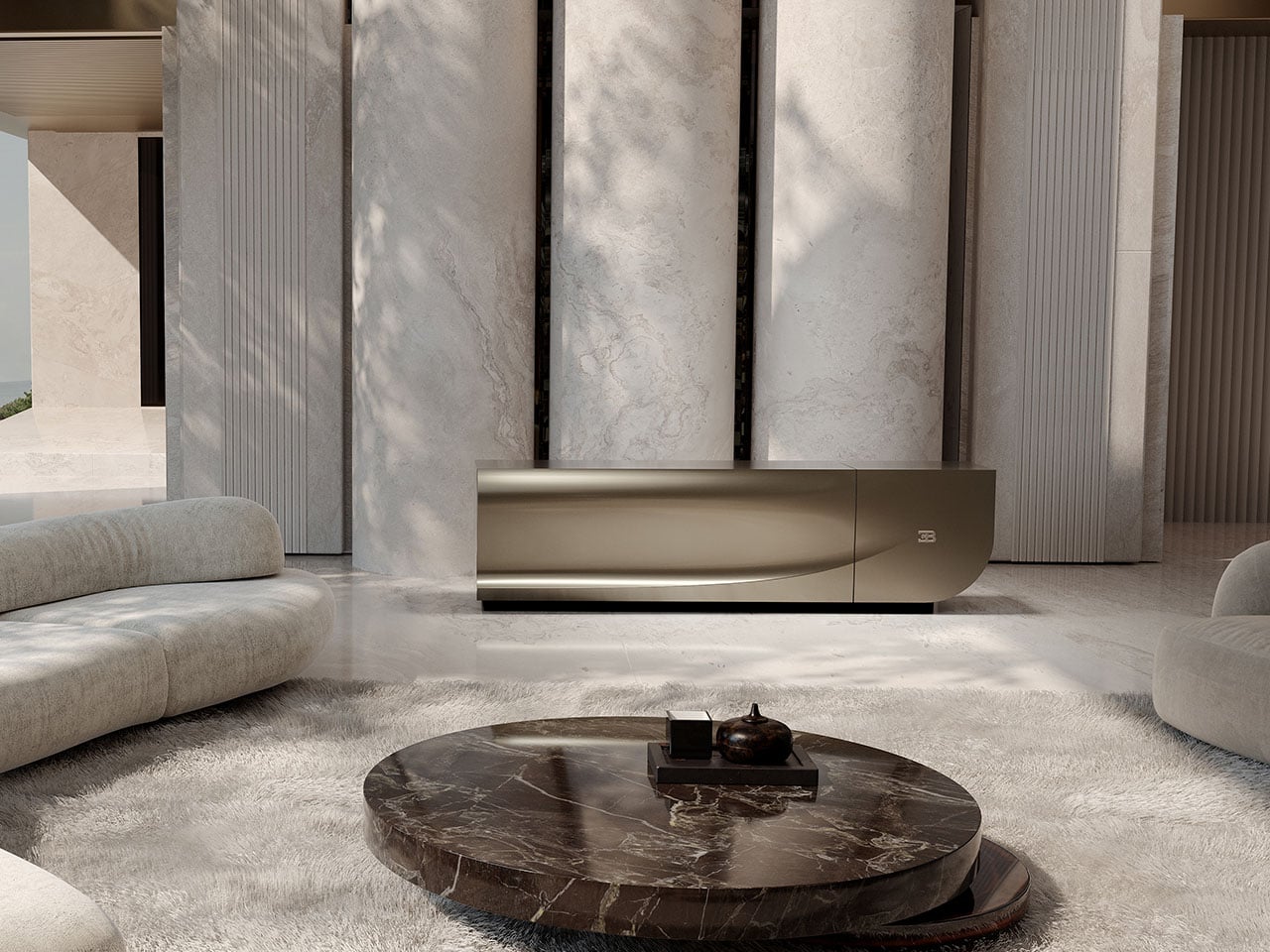
Anything new coming from them is deemed to be at the epitome of modern tech design, and that’s what the C Seed x Bugatti collaboration has materialized into. This is the Bugatti x C Seed N1 TV designed for purists who swear by the Tourbillon hypercar’s magnetism. The very same dynamic flair and emotional connection are now reflected in this sculptural C Seed folding TV.
Designer: C SEED x Bugatti

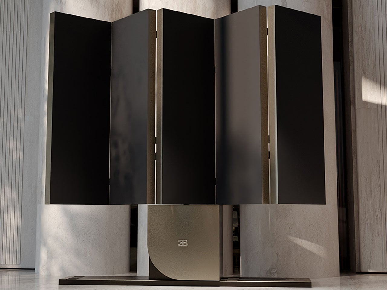
The car’s flowing contours and the precise measurements bring this colossal display into a league of its own. But it’s the calming Sierra of the display folding down into the Tourbillon’s distinct shape and then sliding off horizontally into the stand’s nest that sets this thing apart. It virtually turns into an architectural marvel in this configuration, and then when it’s time for a movie night, the N1 can open up over the course of 45 seconds with the push of a button. Depending on the sitting arrangement in the room, the TV can rotate 180 degrees like a smooth operator. Everything is effortless and creates an emotional connection, both when it is not in use and when it’s time for some cinematic entertainment with friends and family.
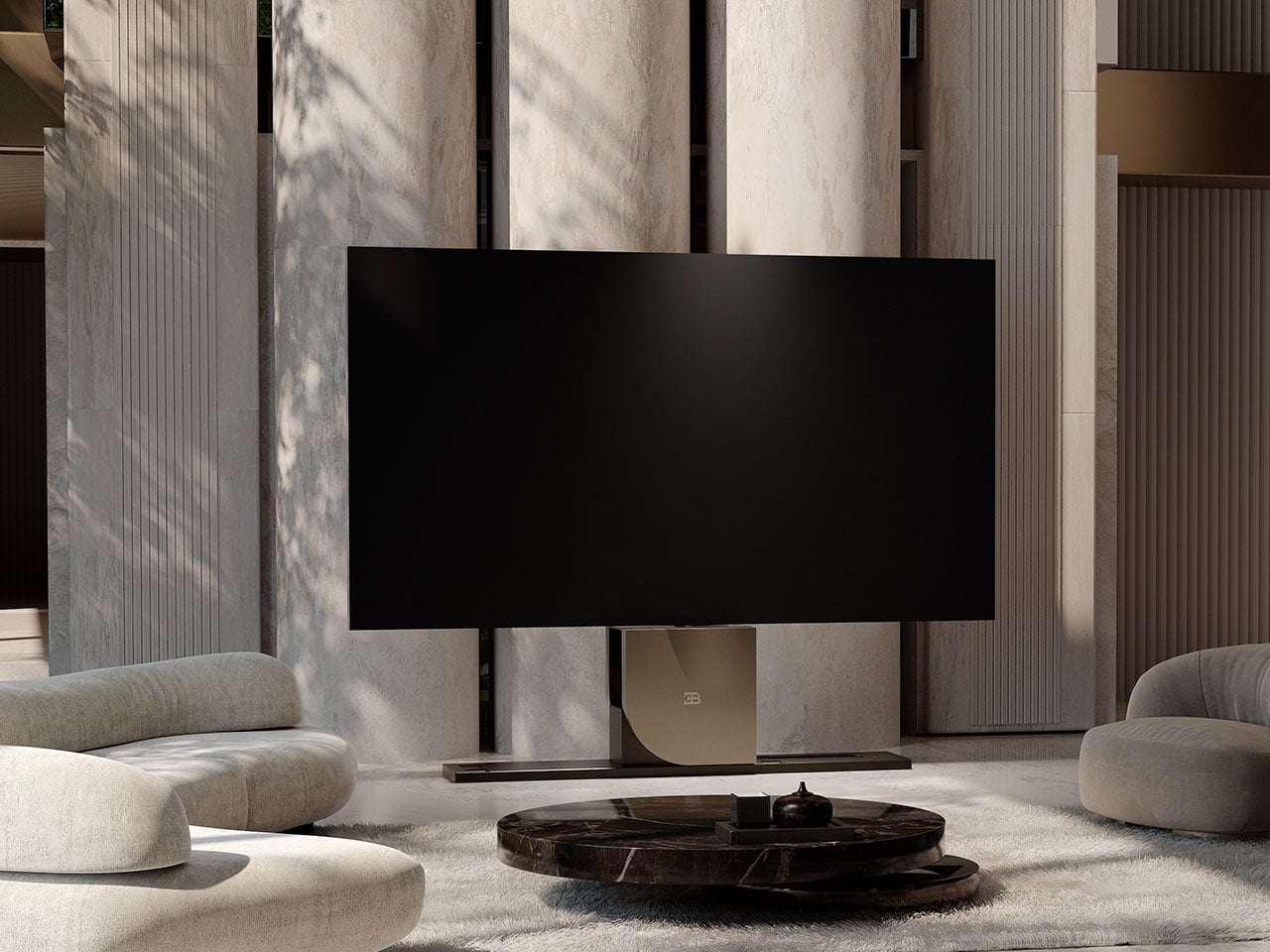
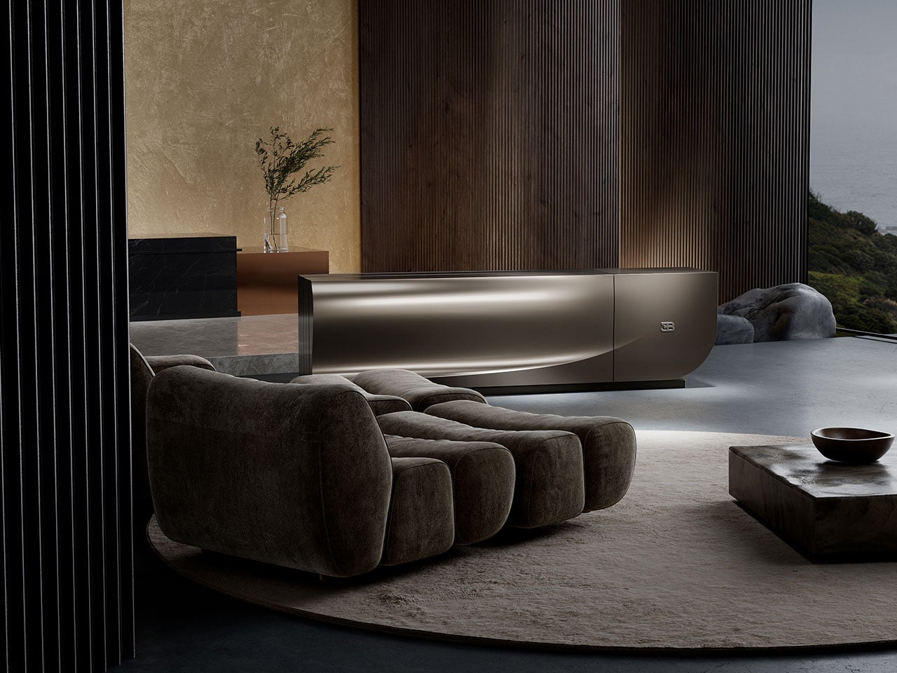
C Seed Bugatti N1 requires no structural integration and sits in your living room just like a luxury furniture piece. According to C Seed, the TV is “shaped by a commitment to precision engineering and uncompromising craftsmanship.” Every single detail, right from the silently unfolding MicroLED technology to the aluminum body in its finest form, is designed keeping in mind elegance, performance, and precision reminiscent of the world of automotive engineering. To keep the overall weight down, C Seed turned to carbon fiber, which speaks volumes about the ultimate refinement of the design.
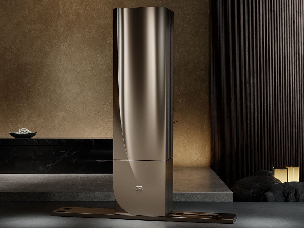
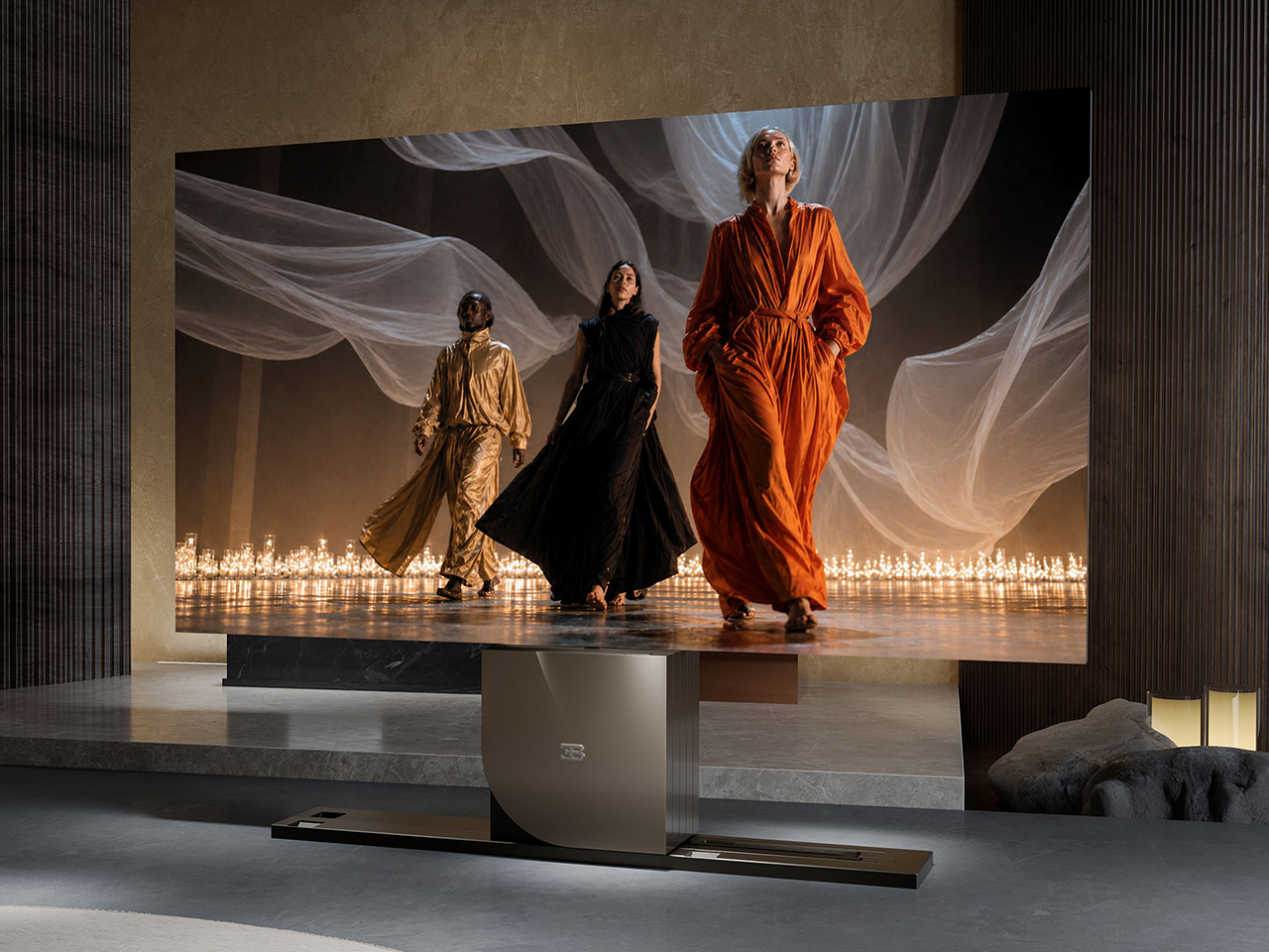
The classy form of the TV is complemented by the sound system designed by Wisdom Audio. The housing has planar magnetic speakers that target a specific frequency range for perceived depth and clarity, no matter where the listener is positioned. Since we are talking about C Seed wizardry here, the speakers also retract into the sculptural housing when not in use. The display is also top of the line, incorporating the latest and greatest 4K MicroLED tech. Along with the Adaptive Gap Calibration for seamless panel transition for the perfect final unified picture, the stunning visuals match the audio for an immersive experience as a whole.
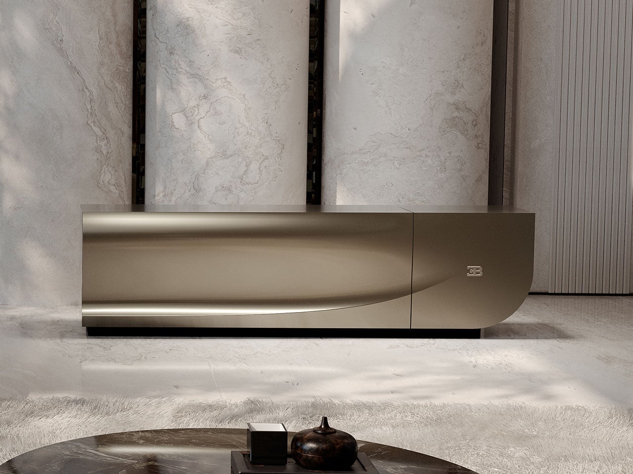
N1 TV is offered in either 110-inch or 137-inch size, and the patented folding display panel tech creates a single continuous screen even with multiple folding cycles. C Seed very rhetorically describes it as an engineered multi-stage movement that turns technical performance into a choreographed visual experience.”
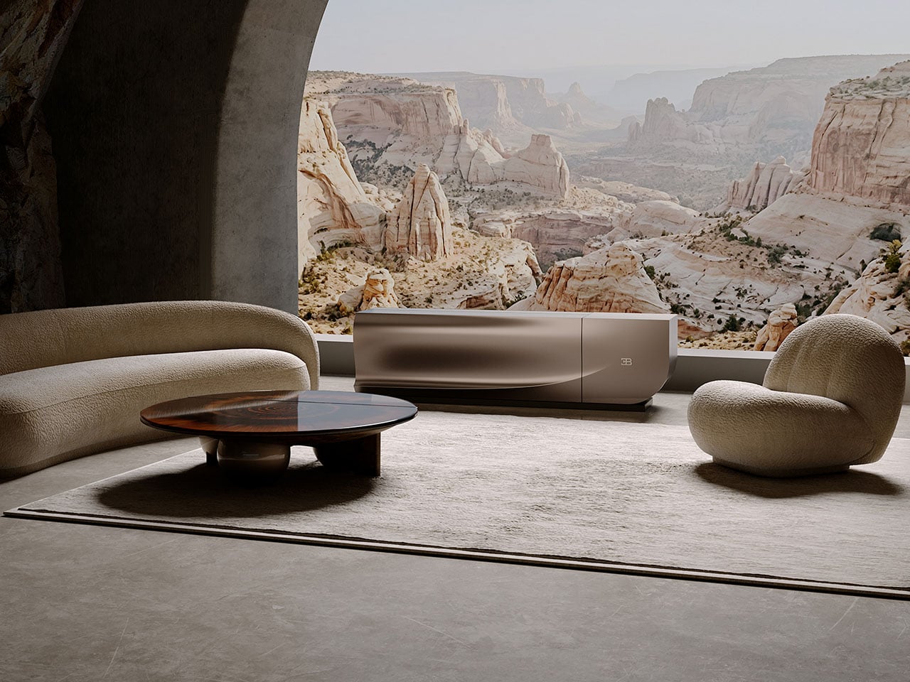
There is no word about the pricing of this tech-infused kinetic sculpture for your living room, but coming from C Seed, it should carry an eye-watering price tag. One thing is clear: the folding display will come in bespoke colors and sizes for demanding users.
The post C Seed’s Sculptural Bugatti N1 folding TV carries dynamic flair of the Tourbillon supercar first appeared on Yanko Design.
Thousands of Paper Sheets, One Kiln, One $58K Prize

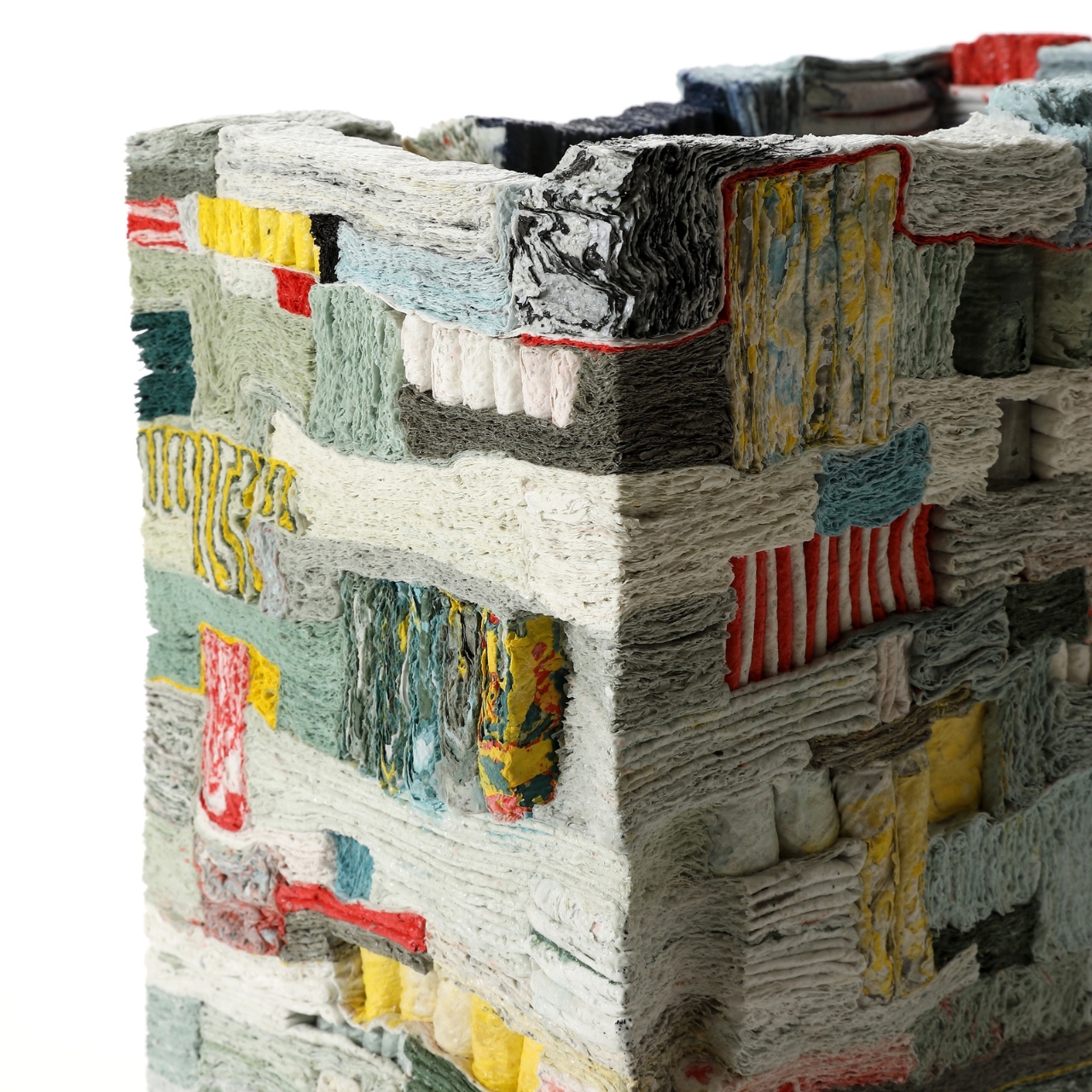
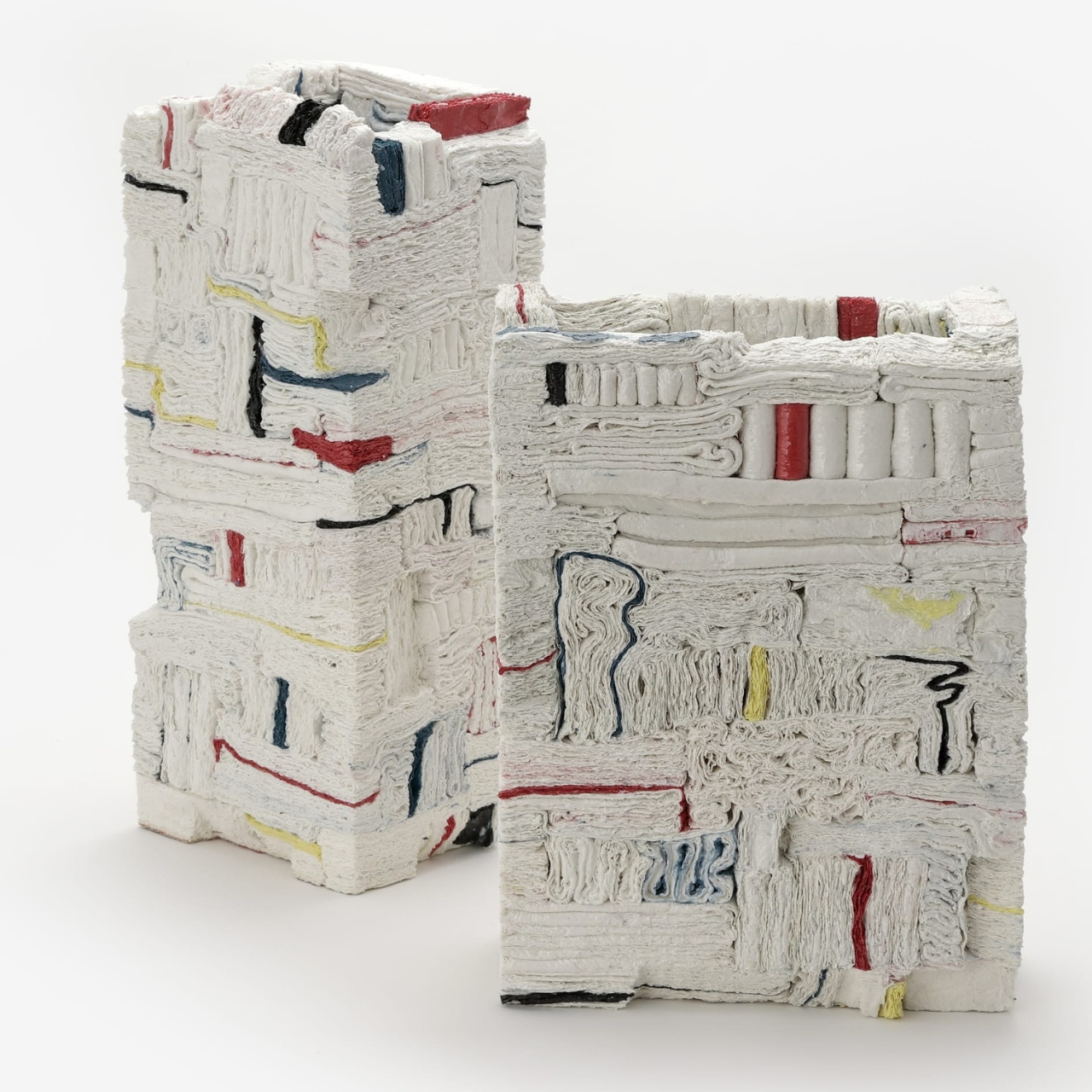
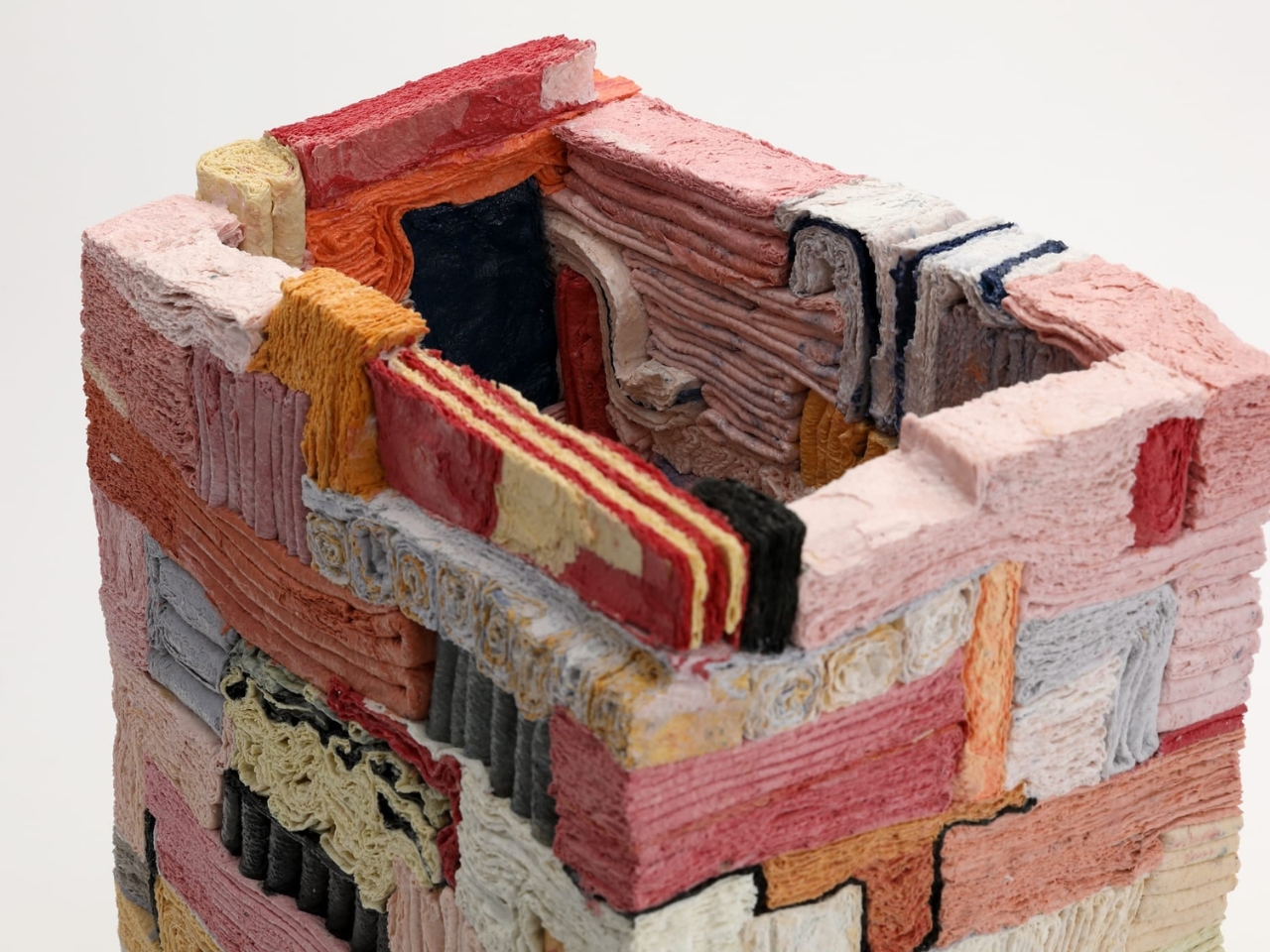
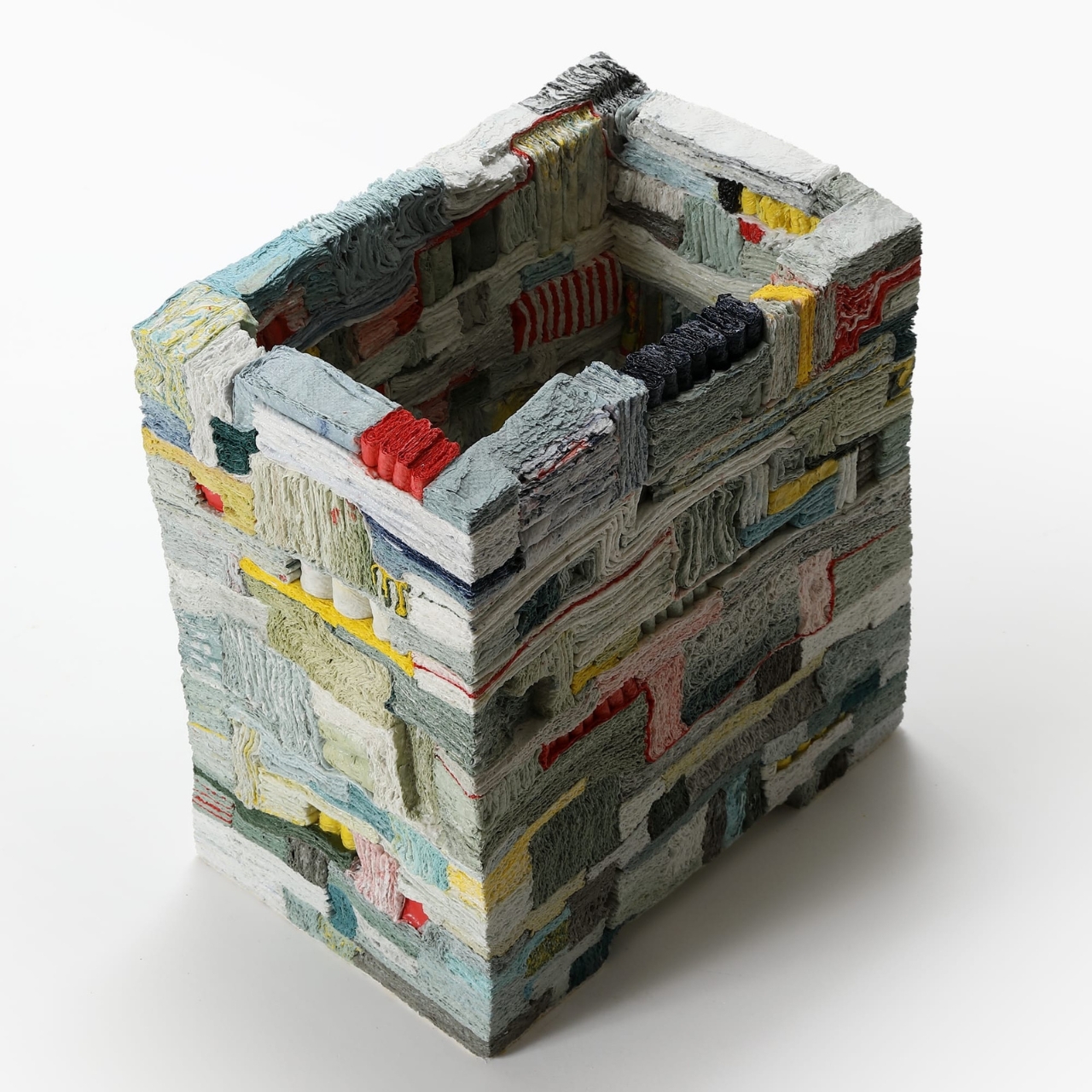
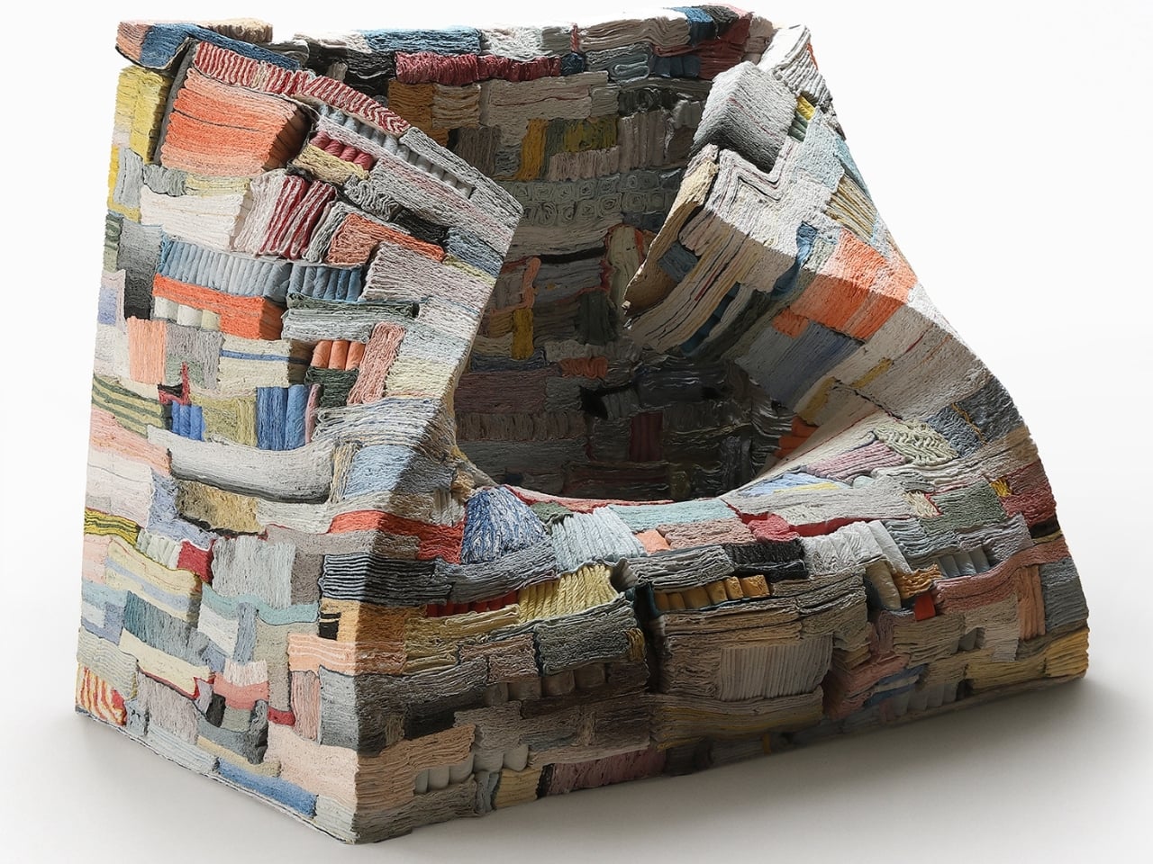
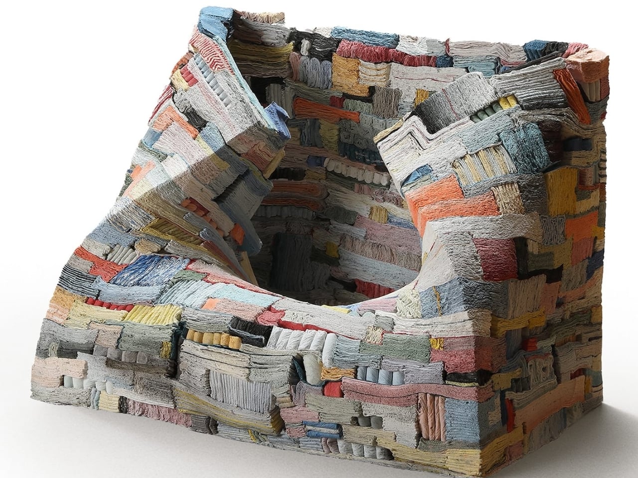
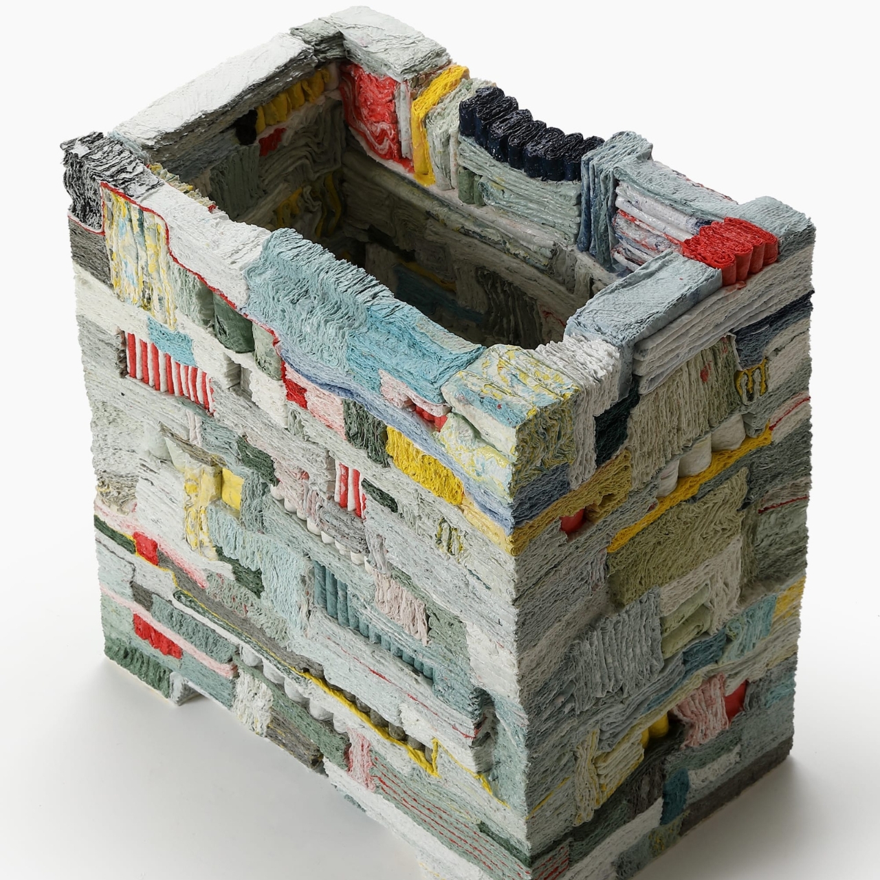
The first time I saw images of Jongjin Park’s Strata of Illusion, I genuinely could not figure out what I was looking at. It reads like a compressed canyon wall, like strata lifted from geological time, like something that took millennia to form. It does not look like something a person assembled in a studio over a matter of months. That disconnect between the familiar and the seemingly impossible is, I think, exactly the point.

Park is a Korean ceramic artist and assistant professor at Seoul Women’s University, and earlier this year he took home the 2026 LOEWE Foundation Craft Prize for Strata of Illusion, one of the most prestigious honors in contemporary craft. The prize comes with €50,000, but the work itself is worth far more attention than a check.

Designer: Jongin Park

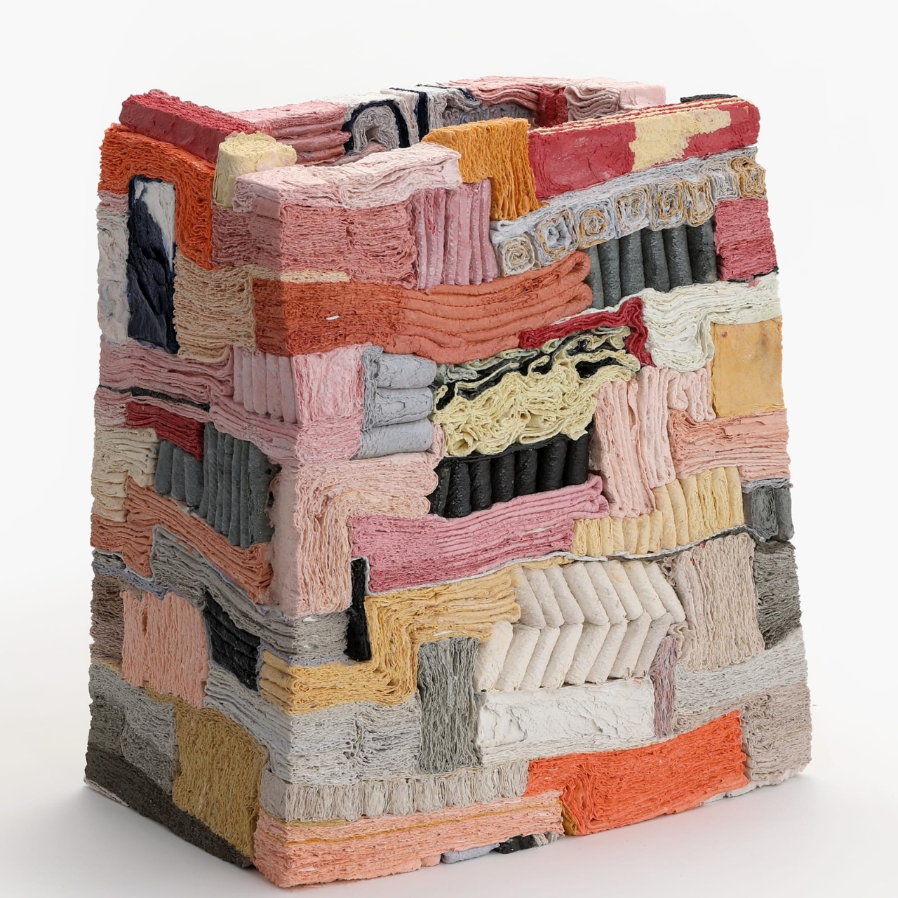
Here is what makes it so remarkable. The sculpture is built from thousands of sheets of ordinary tissue paper. Park coats each sheet in porcelain slip mixed with hand-mixed pigments, then folds, stacks, and presses them together into a dense, rectilinear mass that resembles a partially collapsed seat. Then he fires the whole thing in a kiln. At high temperatures, the paper burns completely away. What remains is a ceramic body that has shifted, bent, and settled under its own weight and the heat, shaped not entirely by the artist’s hands but by forces the material encounters on its own.

The part of his process that genuinely floors me is the surrender in it. Park is not a sculptor in the traditional sense of someone who carves away or imposes a rigid vision onto a material. He sets up conditions. He coats the paper, arranges the layers, builds the compression, and then he cedes control to the kiln. The collapse is not an accident, but it is also not entirely planned. That charged zone between intention and surrender is exactly where Strata of Illusion lives, and it is a hard place to hold without losing your nerve.

The work also occupies a fascinating gray area between ceramics, sculpture, and design, which is part of why it travels so naturally across contexts. Park has shown at Design Miami and PAD London, and the piece feels equally at home in those collectible design spaces as it does in a fine art exhibition. A seat that cannot really be sat upon. A ceramic form that started as something you blow your nose with. A work that looks ancient but was completed last year. The contradictions stack up as deliberately as the paper layers themselves.

Park’s approach demands a kind of trust that is actually quite radical. Not just from the artist, but from the viewer too. You have to accept that the unpredictability is the craft, not the failure of it. We are so conditioned to equate mastery with perfect control that a work like this can feel destabilizing at first. That slight unease is doing something useful, though. It is making you examine what you actually value when you look at something made by hand.

The LOEWE Foundation Craft Prize has long recognized artists who use traditional craft languages to say something larger and more conceptually ambitious. Park’s win feels like a precise fit for that legacy. Strata of Illusion is not just technically extraordinary. It is philosophically loaded in a way that rewards slow, patient looking, which is increasingly rare and increasingly worth seeking out.

The exhibition featuring Park’s work alongside other shortlisted artists is on view at the National Gallery Singapore through June 14. If you happen to be anywhere near it, photographs alone will not prepare you for what the actual scale and texture of the object must feel like in person. There is a density to those compressed layers that images have no way of translating.

For the rest of us, Strata of Illusion offers a genuinely compelling answer to the question of where craft is headed. Not backward into nostalgia, not forward into pure concept. Somewhere in between, fired at high temperatures, shaped by forces no artist fully controls.

The post Thousands of Paper Sheets, One Kiln, One $58K Prize first appeared on Yanko Design.

This Umbrella Has Solar Panels… And It Doubles As An Emergency Power Bank

Every time you open an umbrella, you’re deploying a canopy of wasted real estate. That dark stretched fabric sits between you and the sun, absorbing heat, blocking light, doing absolutely nothing with the energy raining down on it. For a surface that spends its entire working life pointed directly at the sky, that feels like a missed opportunity of the highest order.

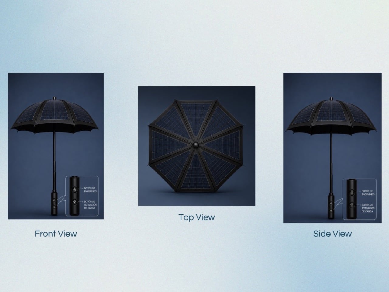
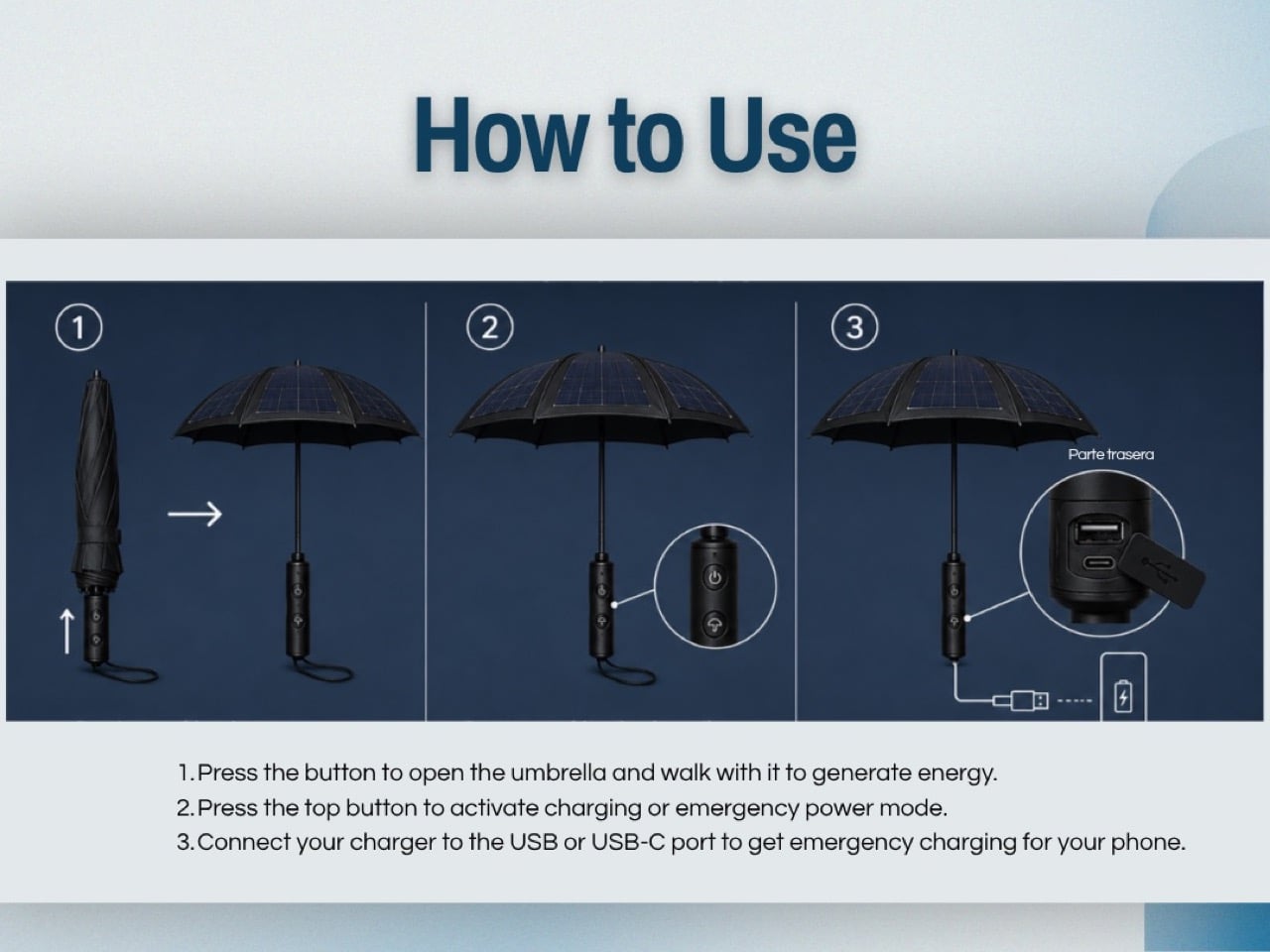
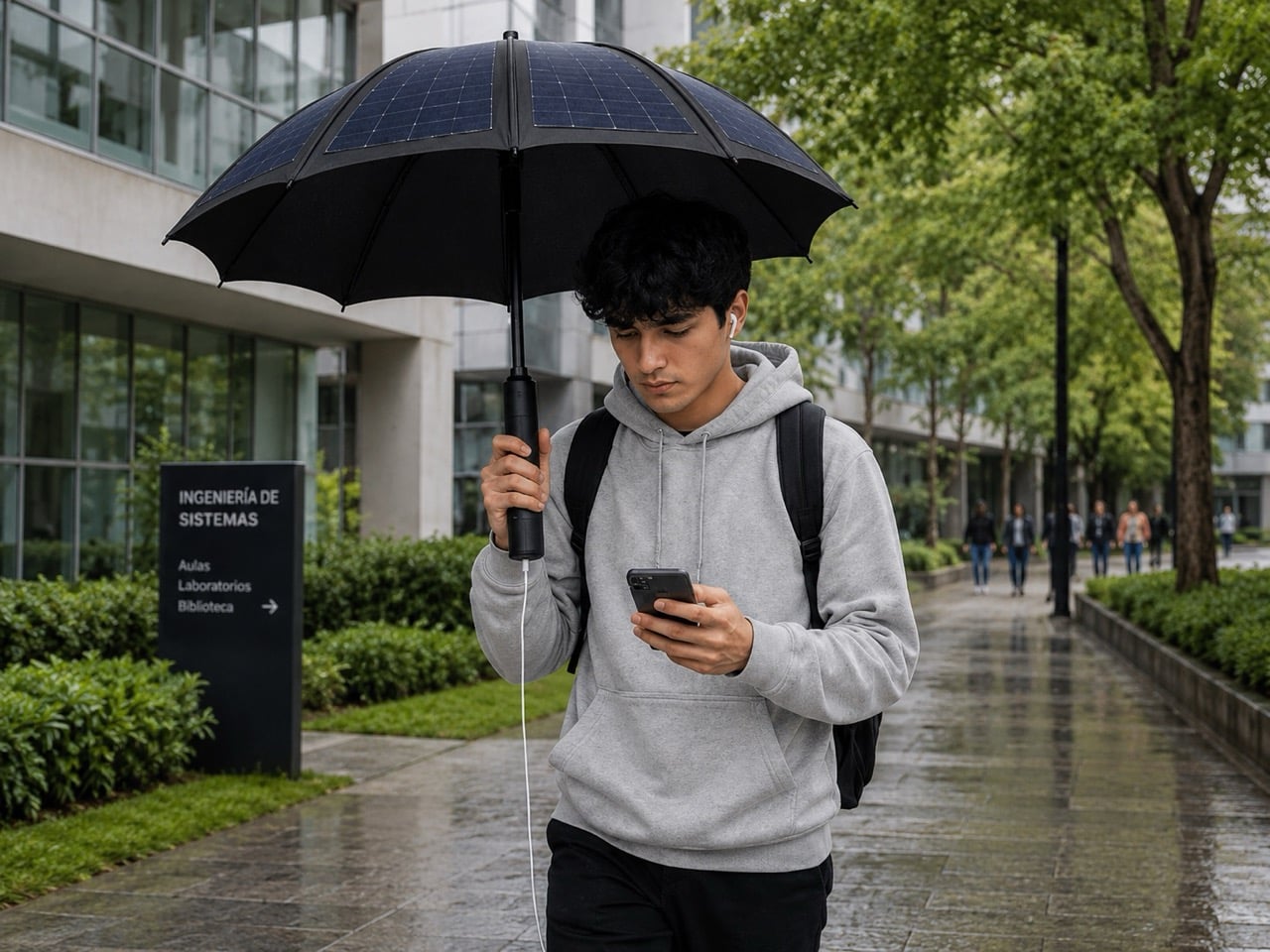
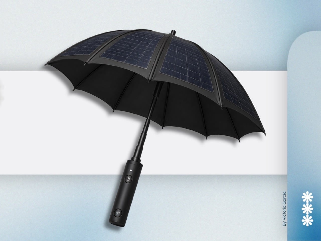
Victoria García Moreno, a student at Universidad Casa Blanca in Mexico, decided to do something about it. Her James Dyson Award entry takes the umbrella’s canopy and lines it with waterproof solar panels, routing that captured energy down through the shaft and into an internal power bank housed in the handle. USB and USB-C ports let you plug your phone in while you walk. Sun protection and emergency charging, packaged into one familiar object.

Designer: Victoria García Moreno

The material logic here is sound, even if the execution remains at concept stage. Solar panels have been conformal and flexible enough for curved surfaces since the early 2000s, and the umbrella canopy offers a genuinely generous collection area compared to most portable solar products on the market. Foldable solar chargers sold today typically max out at panels smaller than a laptop screen. A full umbrella canopy, by comparison, gives you something closer to the kind of surface area that actually moves the needle on solar harvest. The panels García Moreno specifies are waterproof, which solves the obvious problem of a device that lives outdoors and frequently encounters rain.

All the electronics, the power bank, the activation circuitry, the output ports, sit inside the grip in a cylindrical housing that keeps the umbrella’s overall silhouette completely conventional. Two buttons sit on the front face: one to power the system, one to activate charging output. The USB and USB-C ports are recessed into the rear of the handle, keeping them protected when not in use. From the front, this reads as a slightly premium umbrella. The technology announces itself only when you need it to.

The honest limitation García Moreno’s concept faces is the gap between solar panel flexibility and the mechanical demands of a folding umbrella. Current flexible panel technology can handle curves, but repeated folding and unfolding introduces stress concentrations that standard rigid cells handle poorly. That’s a solvable engineering problem, and the James Dyson Award has a history of surfacing student concepts that identify the right problem before the manufacturing world catches up with a solution. For now, the Portable Outdoor Emergency Charger makes its case as a provocation worth taking seriously. The umbrella canopy has been wasted real estate for far too long, and someone had to say it.

The post This Umbrella Has Solar Panels… And It Doubles As An Emergency Power Bank first appeared on Yanko Design.

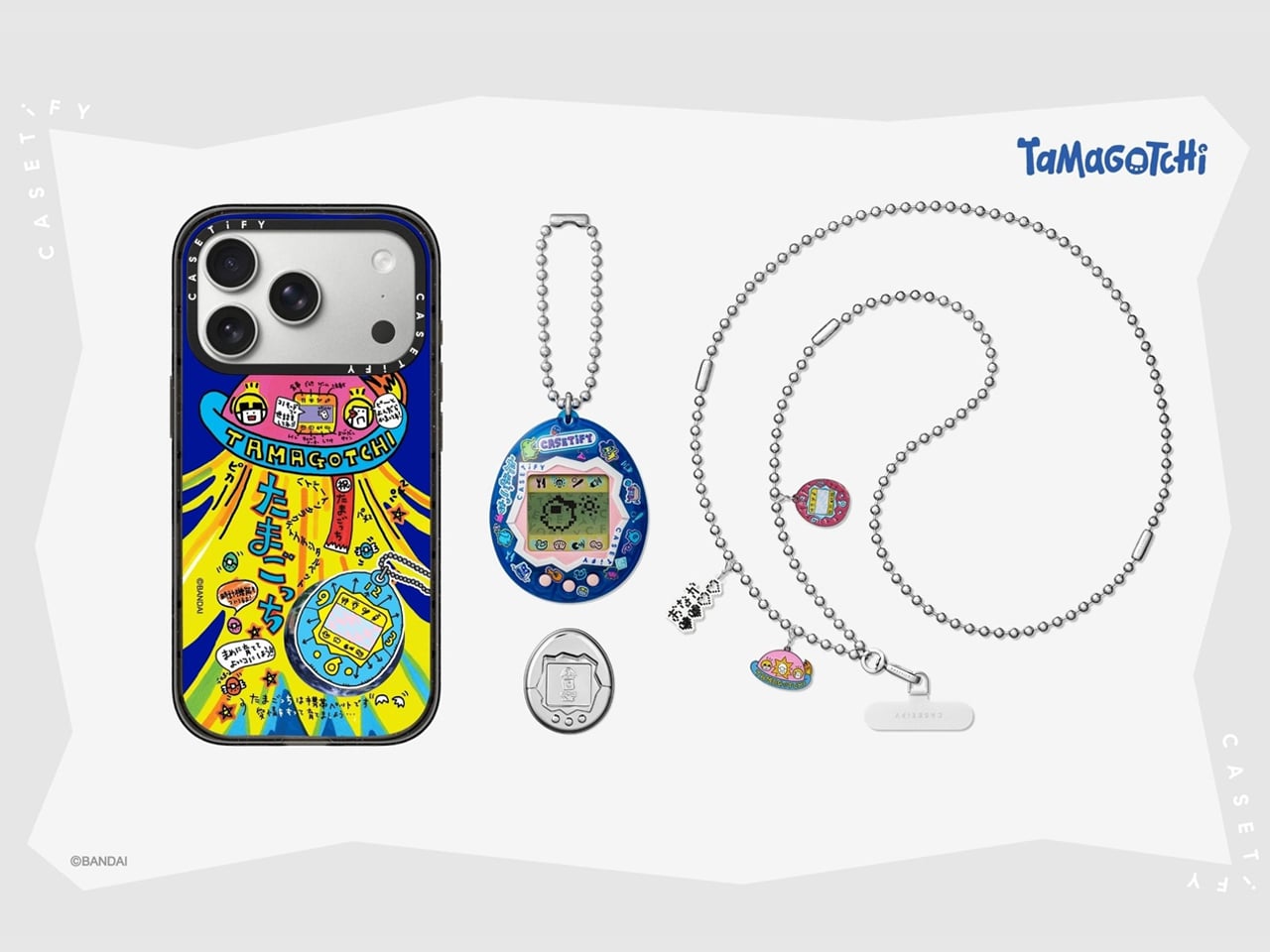
CASETiFY releases an original Tamagotchi, phone cases, charms, and exclusive accessories to pique nostalgia

Tamagotchi, the virtual pet created by Bandai, a Japanese toy manufacturer, was seen constantly hanging from schoolbags in the late 1990s and early 2000s, when I was growing up. As brands now consistently mine millennial nostalgia for Gen-Z delight, many collaborations in the recent past have given birth to or revived the Y2K-era devices, of which the new Tamagotchi x CASETiFY collaboration is a true testament.

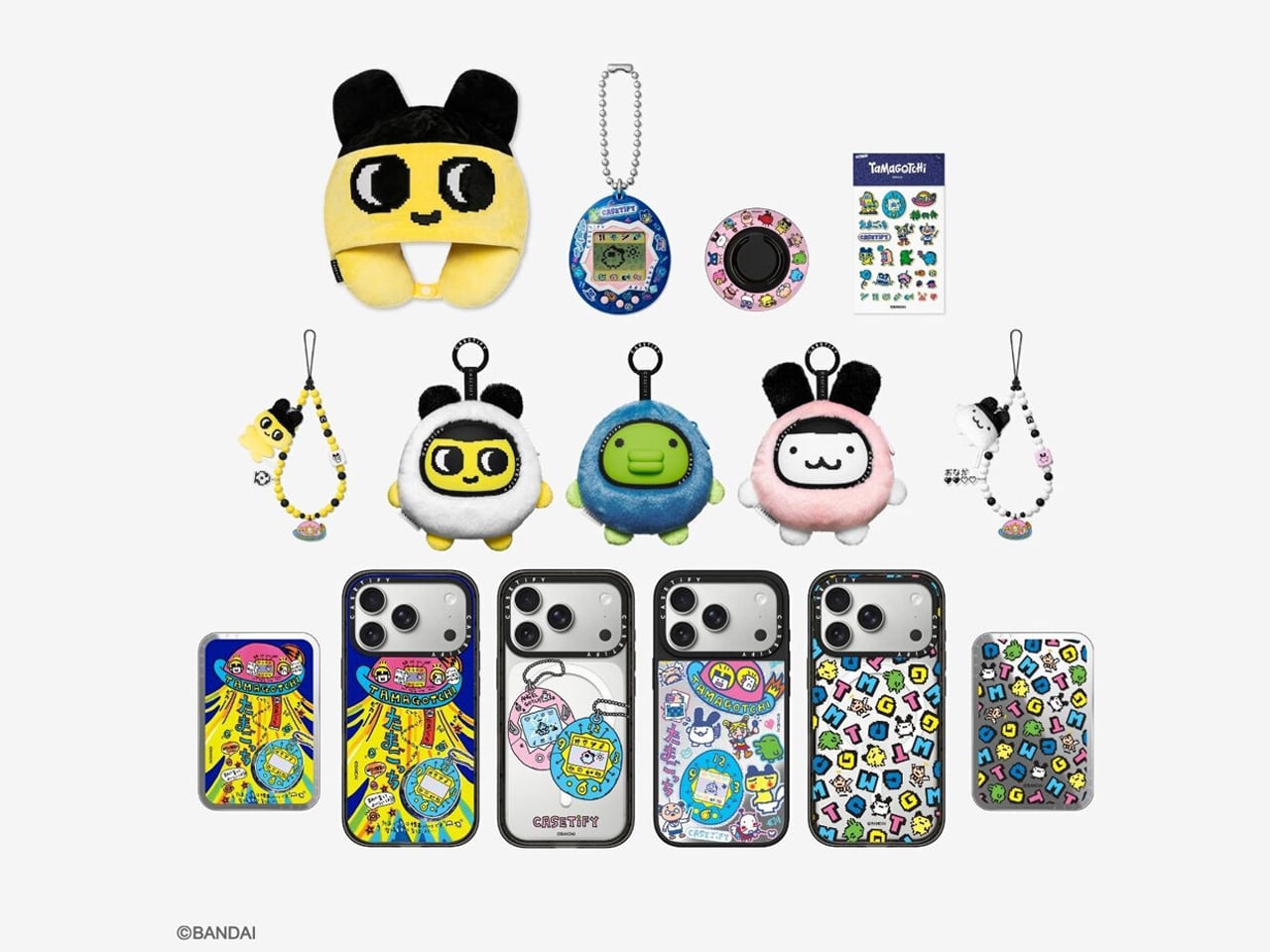
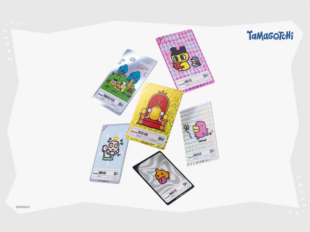
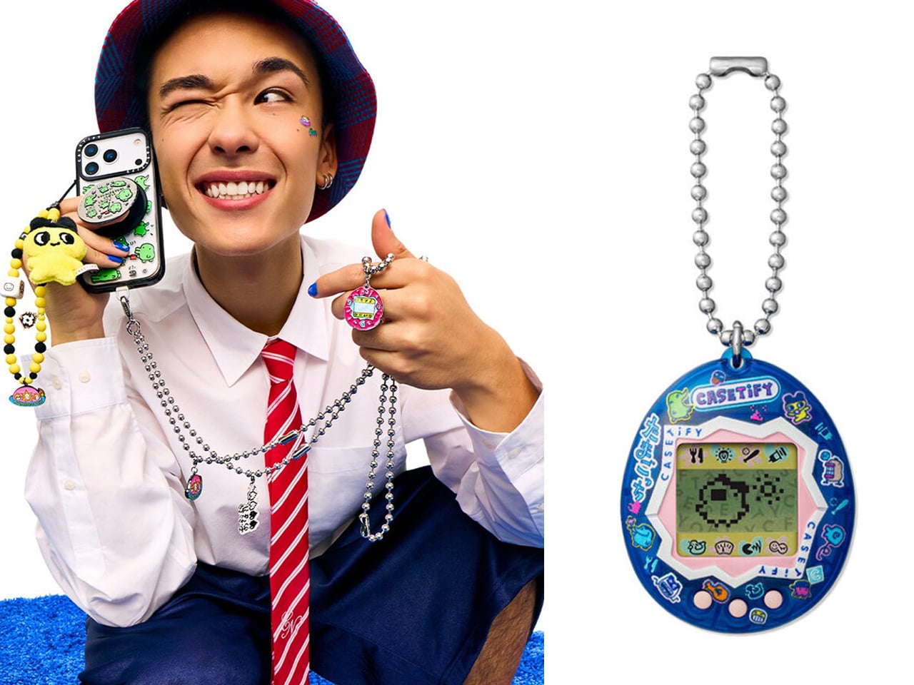
The device, which was a consistent charm for people, especially the kids, appeared clipped onto keychains or held as fidgets in the hand, is now getting a new life through the charismatic collaboration. The collection transforms the favorite nostalgic character into smartphone and tablet cases, charms, collectible accessories, and Tamagotchi chase cards.

Designer: CASETiFY

Officially launched on May 29, 2026, the CASETiFY’s Tamagotchi lineup includes customizable phone cases, earbud pouches, charms, a carry-on suitcase, and also features an original, limited-edition Tamagotchi device, each designed to be styled with interchangeable modular accessories. The exclusive range of products starts at roughly around $15 and goes up to $799.

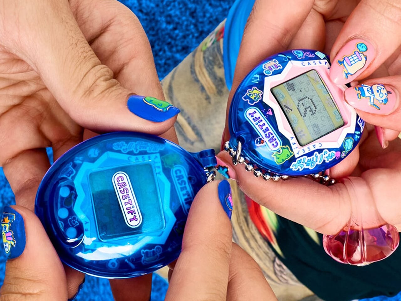
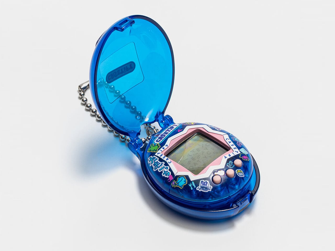
The highlight here, of course, is the release of the Original Tamagotchi Casetify Limited Edition. This collectible object, reimagined as a usable tech accessory, is priced at $45, and comes in a small, egg-shaped form factor with three buttons, just like the real thing launched in 1996. This playable device will be available in a strictly numbered quantity through CASETiFY.

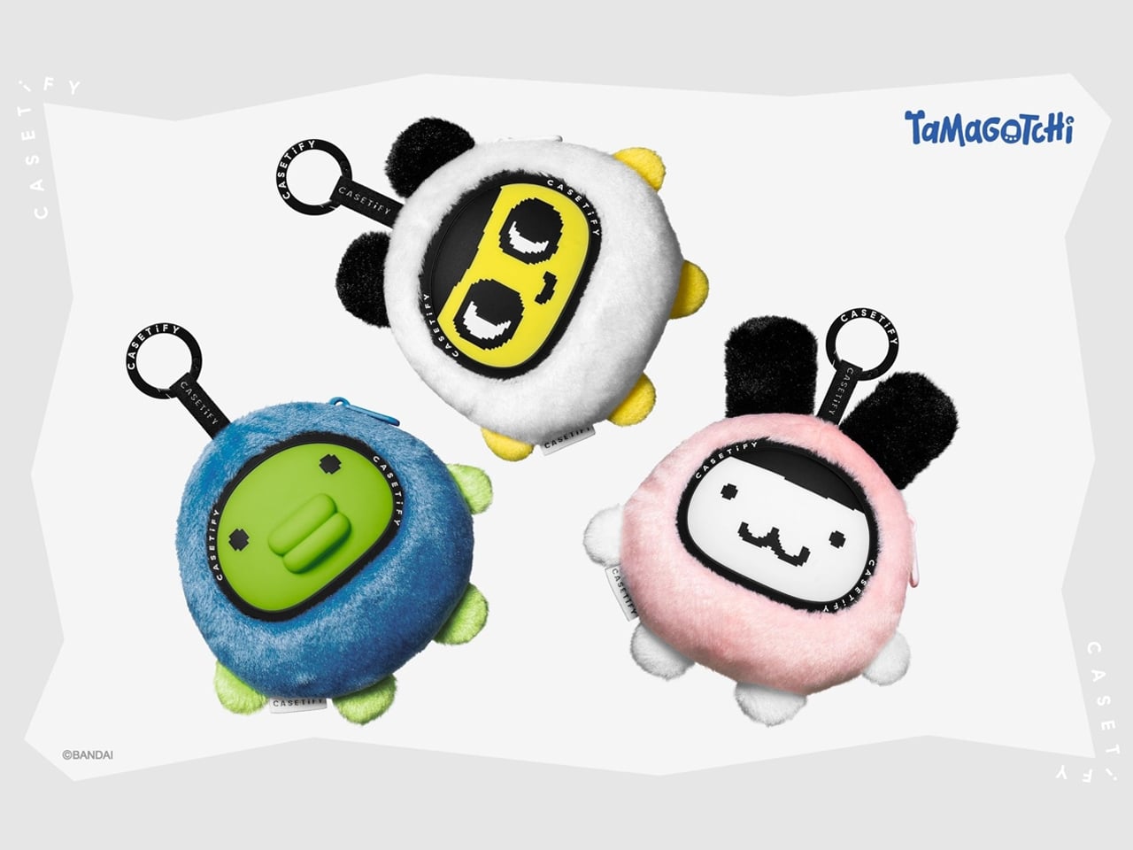
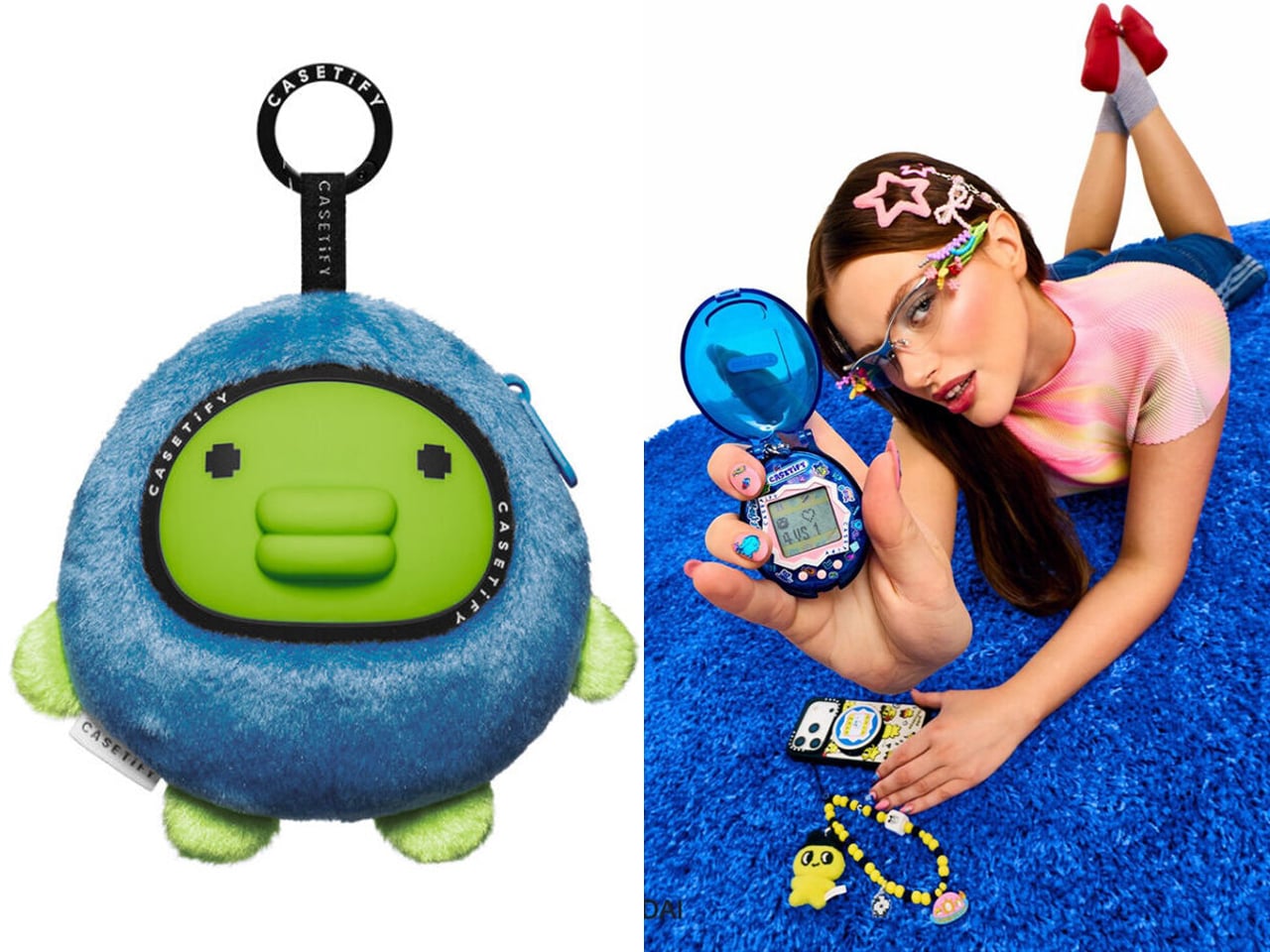
The full collection, including the original Tamagotchi, is now available at casetify.com and CASETiFY stores worldwide. Besides the rare piece, the collaboration, reviving the retro gaming imagery includes, Tamagotchi Collectible Plush Charm for $70, Tamagotchi Jumbo Pattern Snappy Cardholder Stand (MagSafe compatible) for $40, and Egg Tablet Case for the iPad at $79.

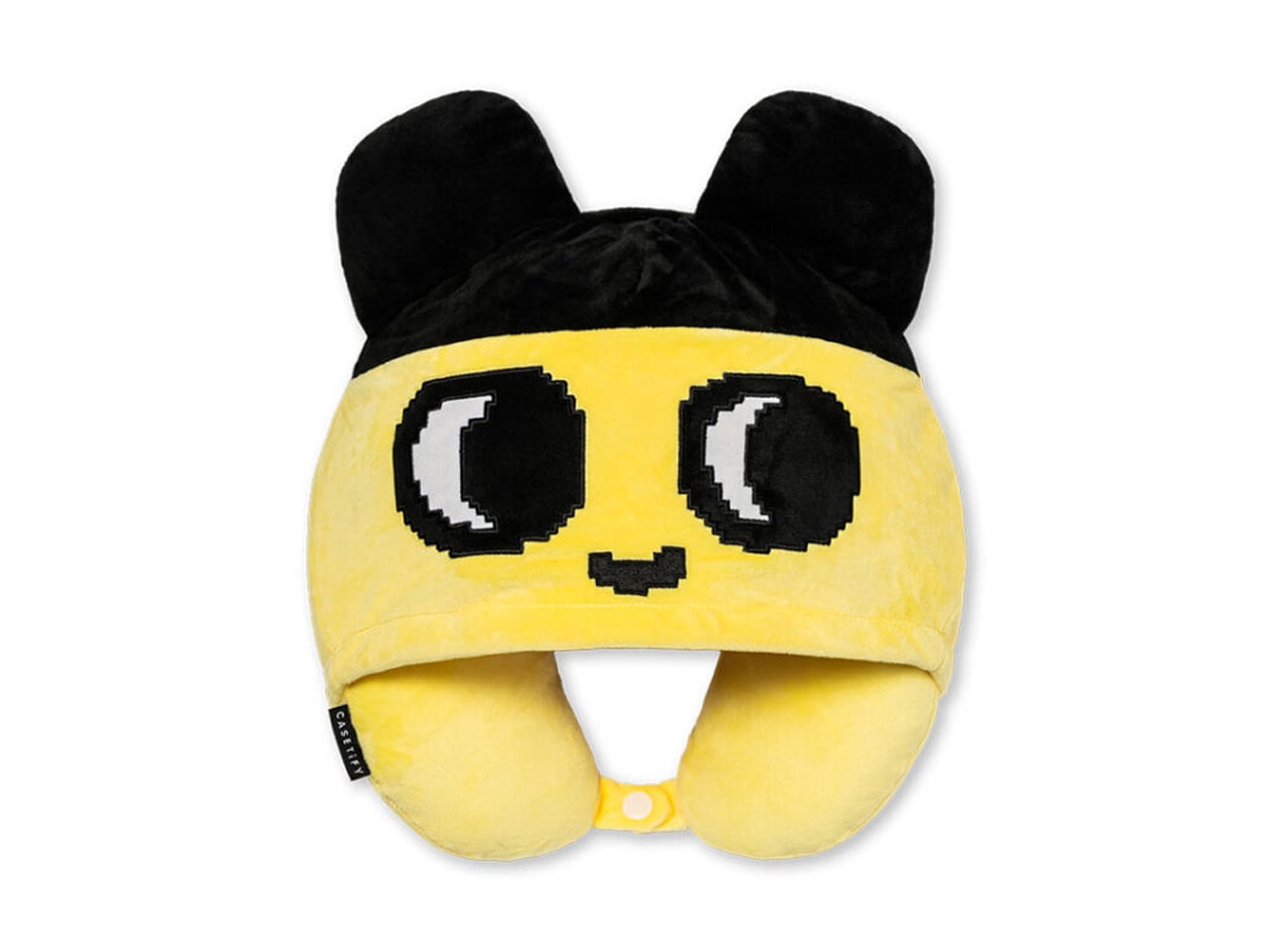
A restoration of the bright colors, character graphics, and the pixilated interfaces that made the Tamagotchi a force to reckon with is seen in the accessories covered in the character’s motifs, beyond the phone, tablet cases, detachable phone charms, and patterned straps. Amid these, the plush pouches designed to hold earbuds really stand out.

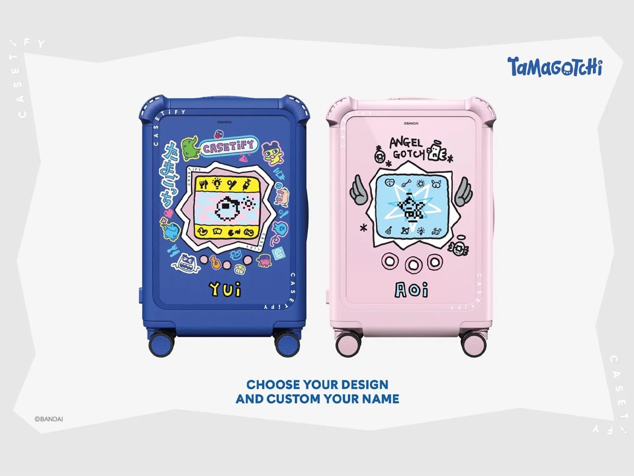
The collection, however, is not just about these smaller accessories. In fact, it comprises a customizable carry-on luggage from the CASETiFY Travel Tamagotchi luggage series. Using different Tamagotchi characters and retro typography, the appeal of the suitcase, available in pink and blue colors, can be enhanced to a decorative height that fans cannot deny.

It is difficult to point directly at what instigated Bandai for this collaboration with CASETiFY. But how it stands out, Tamagotchi nostalgia is seeing a rise in Japan. Themed displays inspired by Tamagotchi’s cute universe are everywhere, from cafes to parties. Reminding us that even after 30 years of its launch, Tamagotchi continues to have a fan following, which the two companies are leveraging through this collaboration.

The post CASETiFY releases an original Tamagotchi, phone cases, charms, and exclusive accessories to pique nostalgia first appeared on Yanko Design.

The Skincare Device Concept That Makes Every Other One Look Lazy

The beauty industry has been promising us “personalized skincare” for years. What usually comes out the other end is a quiz, a starter kit, and a monthly subscription box full of products you may or may not actually need. So when I came across Elio, a concept skincare device by Korean industrial designer Taehyeong Kim, I sat up a little straighter. Not because it makes bold promises, but because it looks exactly like something that already belongs on your counter, and that’s entirely the point.

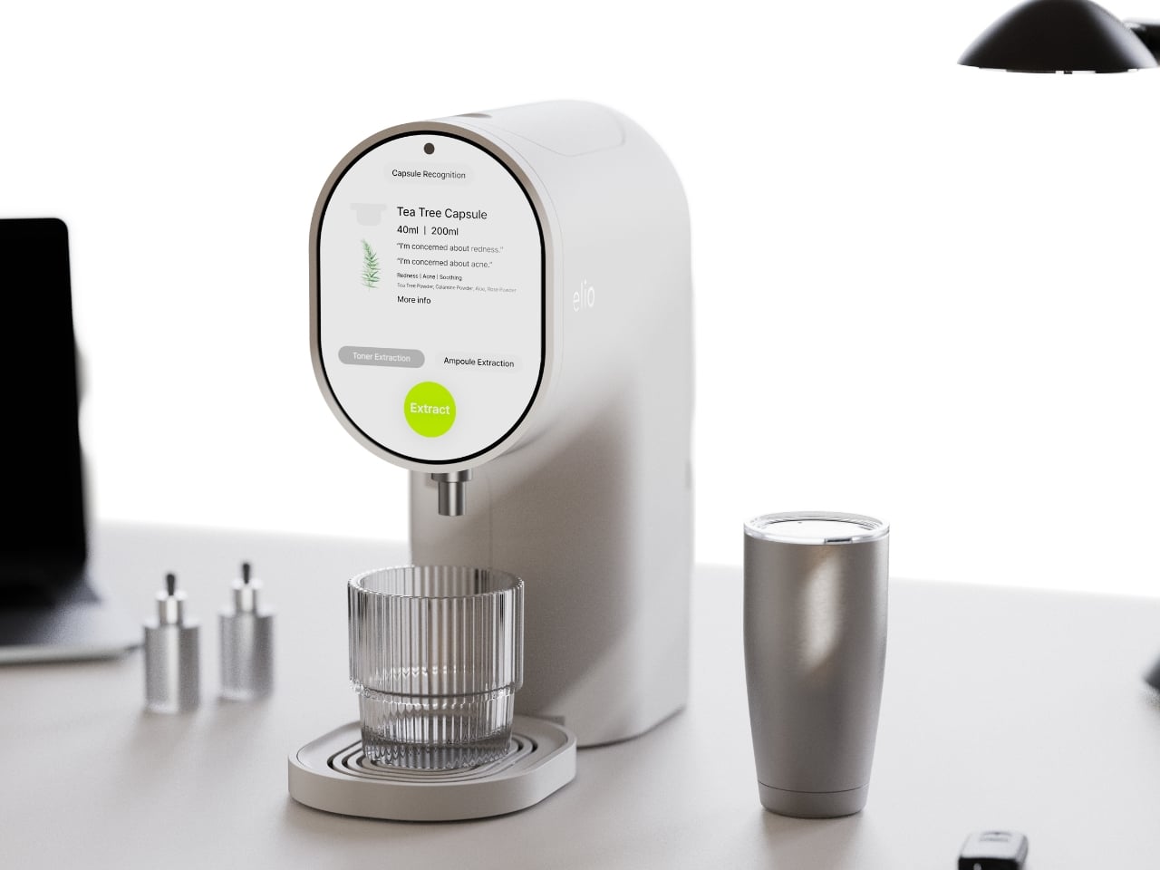
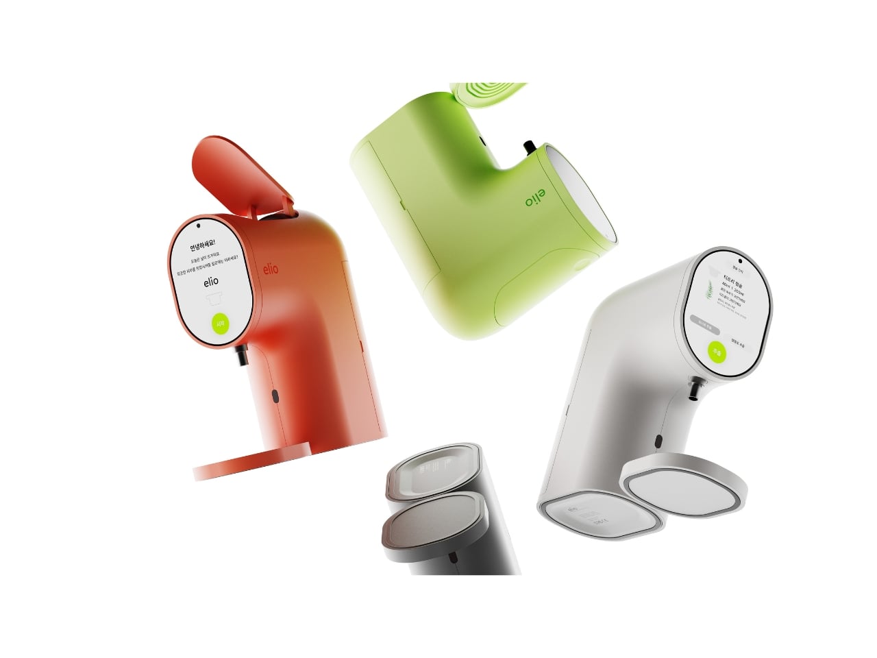
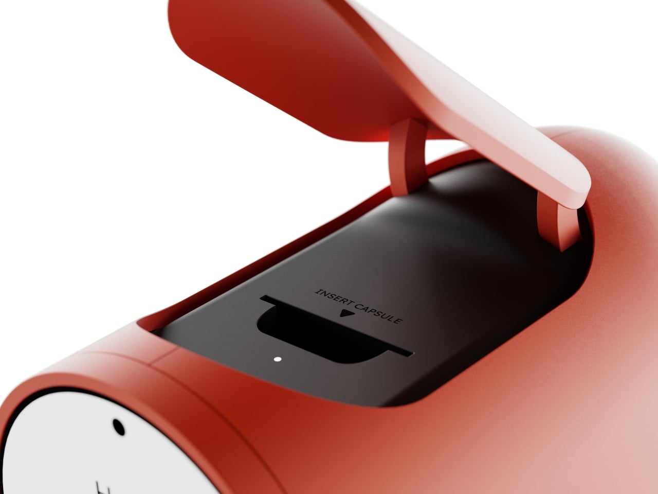
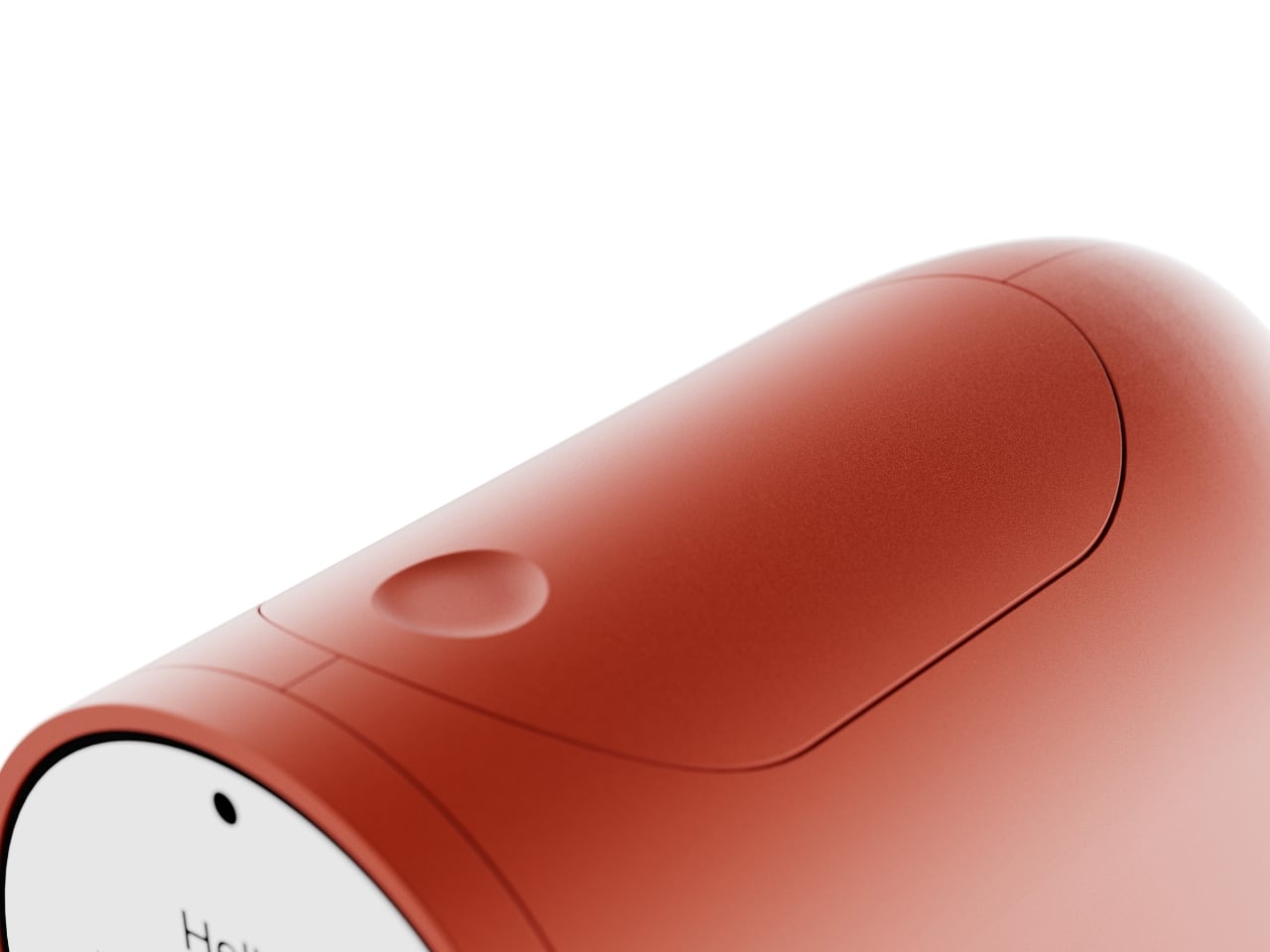
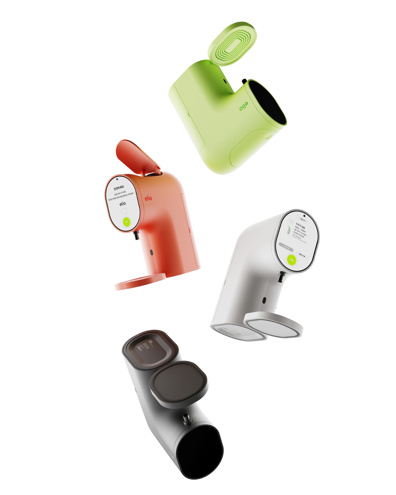
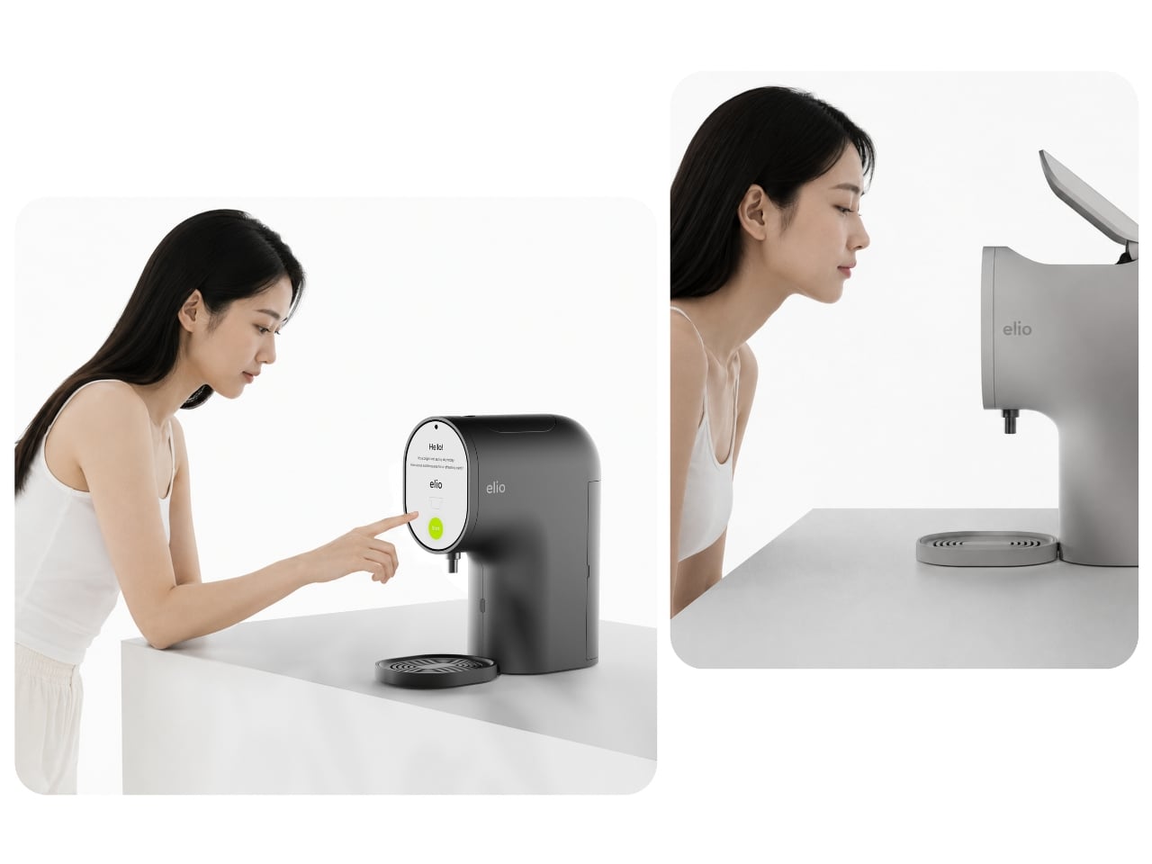
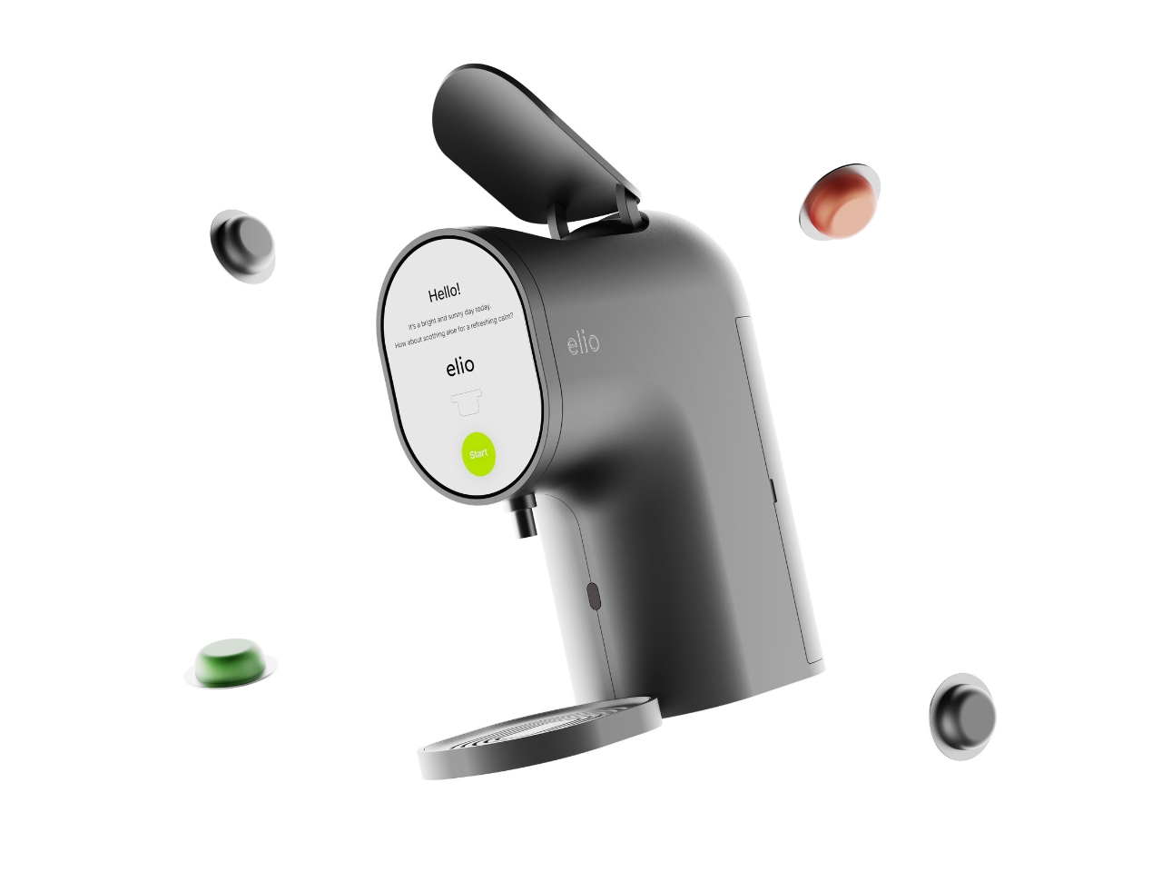
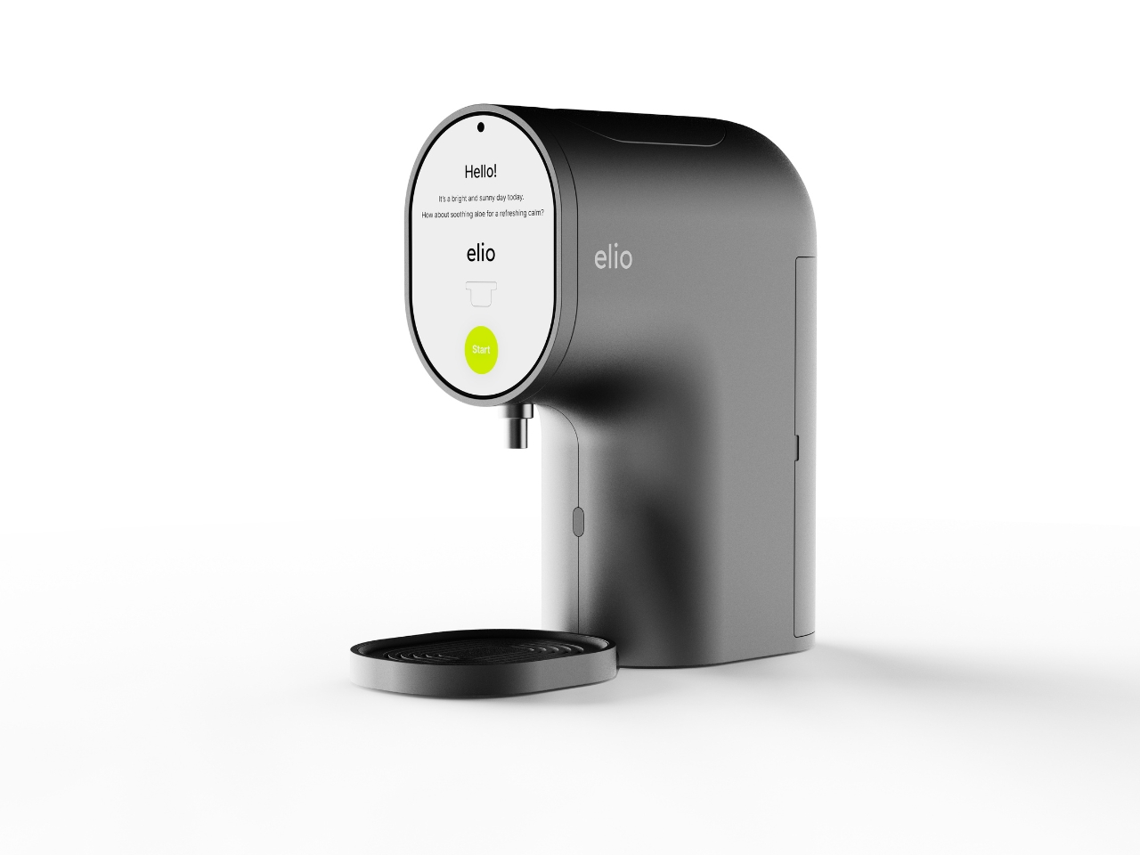
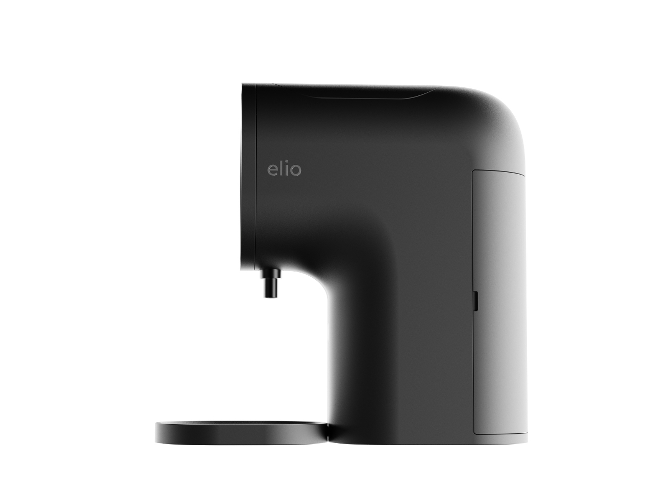
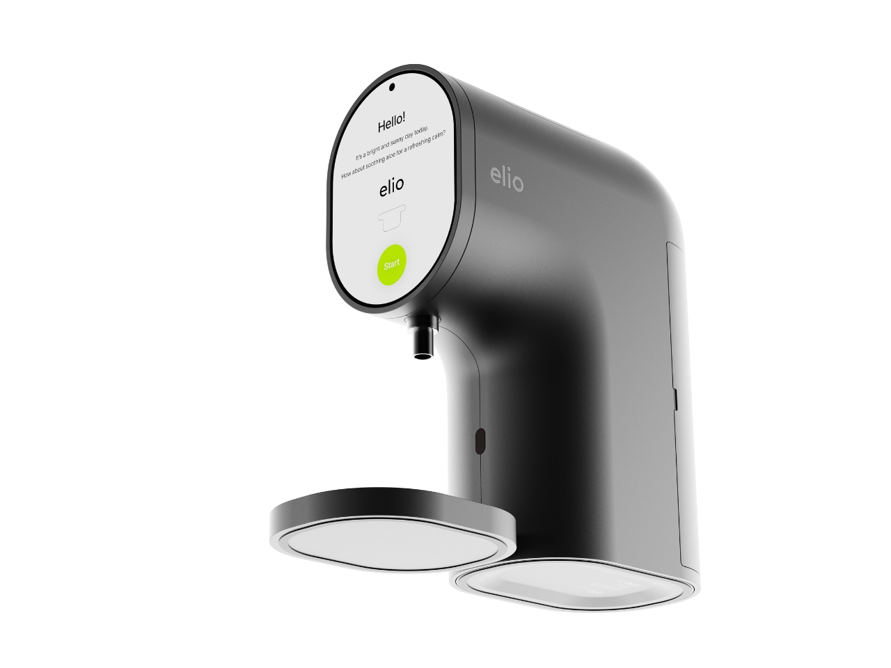
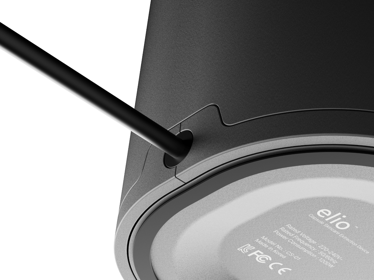
Elio looks like a coffee machine. Specifically, it looks like the kind of sleek pod coffee machine you’d find in a well-designed apartment kitchen. The body is compact and rounded, with a smooth curved neck that sweeps forward and a circular display face mounted front and center. A small nozzle sits just below the screen, and a flat tray rests at the base. Flip open the top lid and you’ll find a slot that literally reads “INSERT CAPSULE.” If you told someone this was a new Nespresso colorway, they’d believe you without question. That’s not a criticism at all. It’s one of the smartest design decisions in the whole concept.

Designer: Taehyeong Kim

The familiarity is doing real work here. One of the biggest friction points in getting people to actually use a skincare device consistently is that most of them look clinical, complicated, or just strange sitting on a bathroom shelf. Elio sidesteps all of that by borrowing the visual language of something people already love and trust. The rounded silhouette, the satisfying top-load mechanism, the single glowing green button on the display. It reads as approachable before you even know what it does.

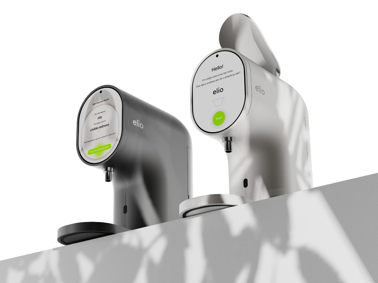
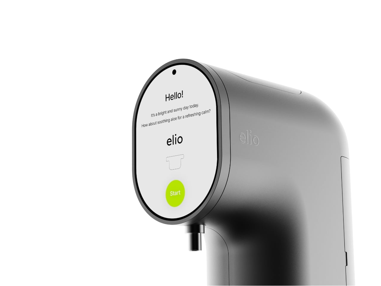
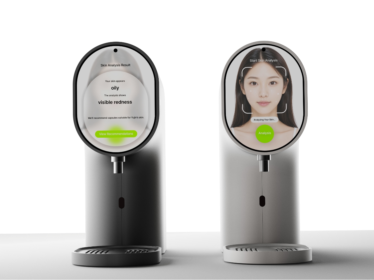
What it does is genuinely clever. Elio is an AI-powered skincare system that scans your skin in real time, reads your condition, and then dispenses a custom-formulated serum through a capsule-based delivery system. The circular display shows your skin analysis results directly, flagging things like oiliness or redness, then recommends the right capsule formula for that specific day. You load the capsule into the top slot, press the green button, and the device does the rest. The capsules themselves are small, pill-shaped, and almost jewel-like in the renders, orbiting the machine like they have somewhere important to be.

The color range is also worth talking about. Most skincare devices default to clinical white or muted grey and call it a day. Elio comes in a deep charcoal, a warm terracotta, a bold lime green, and a soft white. They all work, but the terracotta and lime green versions in particular feel like a deliberate statement. They want to be seen. They want to sit on your counter the way a designer object sits in a living room, as something you chose because you liked how it looked, not just what it did.

The detail I keep returning to is the skin scanning interaction. In the lifestyle renders, the user leans in close to the circular display, which doubles as the analysis interface. It’s an intimate, quiet moment, more ritual than routine, and it reframes what getting ready in the morning can feel like. Not a chore, not a checklist, but a small daily check-in with yourself. Whether or not that reads as overly poetic, the design actively encourages that interaction, and that’s intentional.

Kim is still a student designer based in Daegu, South Korea, and Elio has already picked up a Red Dot Design Award in 2025 alongside Gold and Silver wins at the Spark Design Awards. That’s a significant return for any portfolio piece. It also says something about where Korean industrial design is right now, producing work that doesn’t just look good in renders but thinks clearly about behavior, habit, and the emotional relationship between a person and the objects they live with.

Elio is a concept, not a product you can buy today. But it’s the kind of concept that makes you look at your current skincare shelf and feel a little impatient for the future.

The post The Skincare Device Concept That Makes Every Other One Look Lazy first appeared on Yanko Design.

McDonald’s-inspired Nike Book 2 bring Arizona Desert colors to your next everyday basketball sneaker

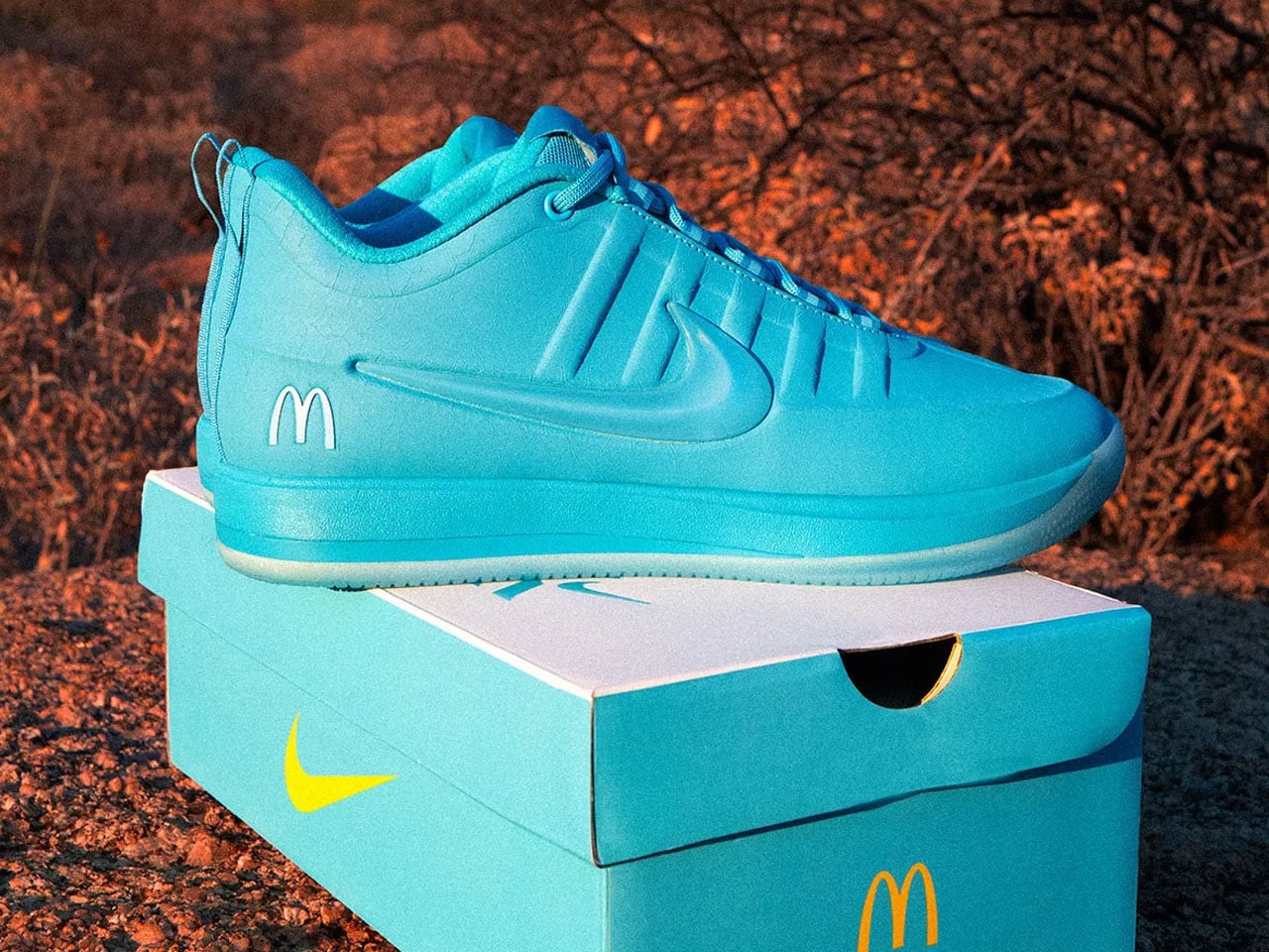
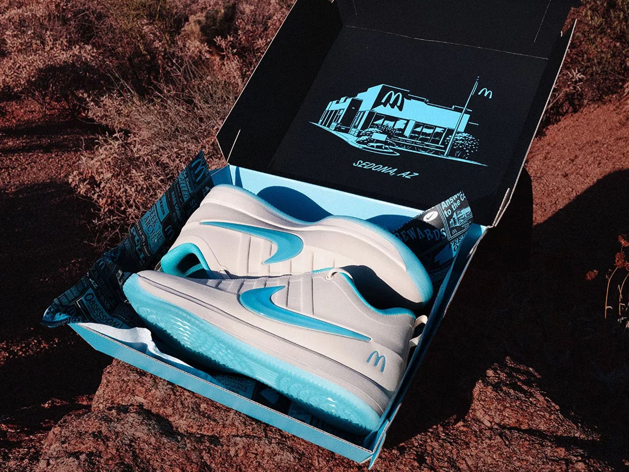
Signature sneakers rarely manage to feel personal anymore. Most arrive overloaded with athlete branding and colorways engineered more for resale culture than everyday wear. Devin Booker’s Nike Book 2 collaboration with McDonald’s takes a surprisingly different route. Instead of leaning into fries-and-burgers nostalgia, the sneaker pulls inspiration from one of Arizona’s oddest landmarks — the turquoise-arched McDonald’s in Sedona — and turns it into a basketball shoe that feels more rooted in place than corporate crossover hype.

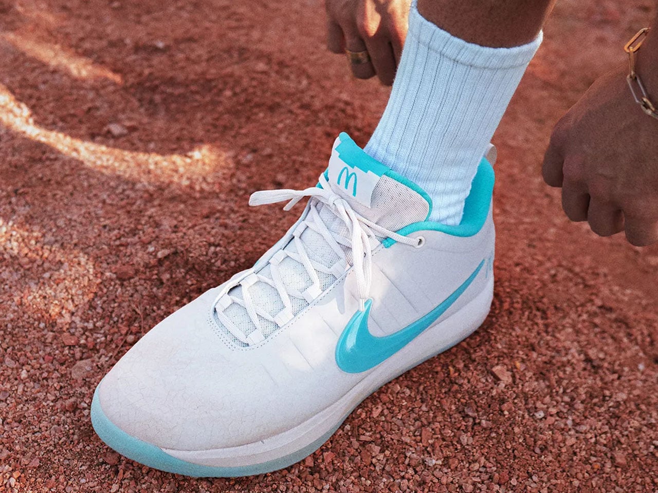
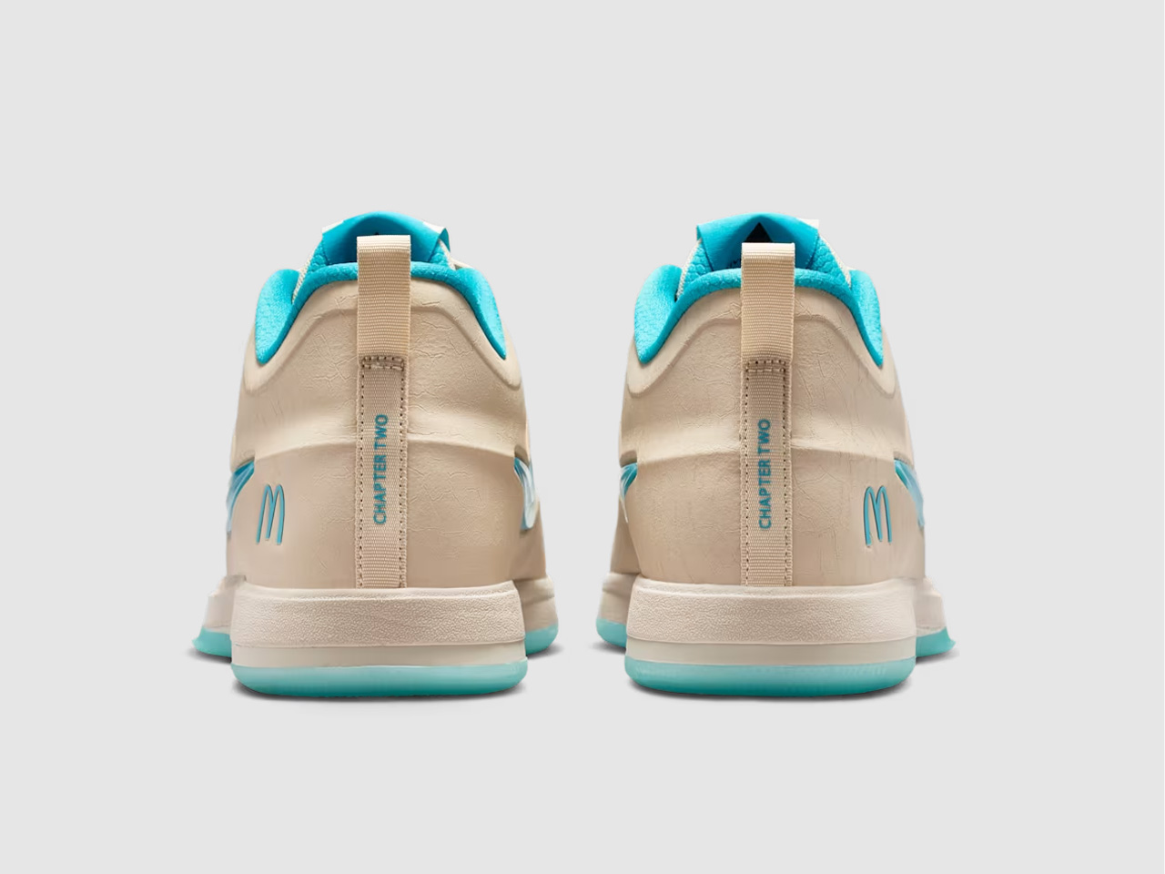
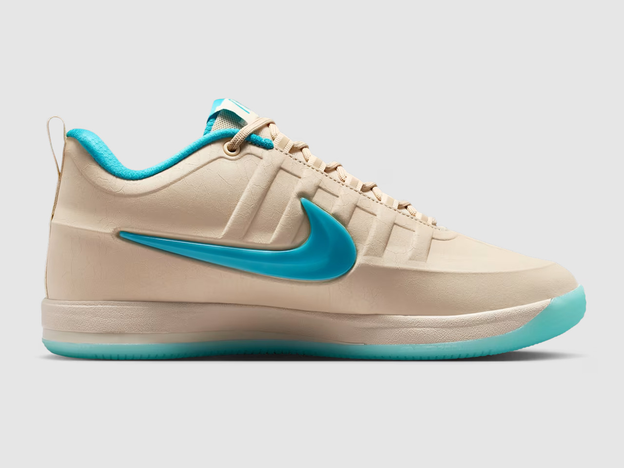
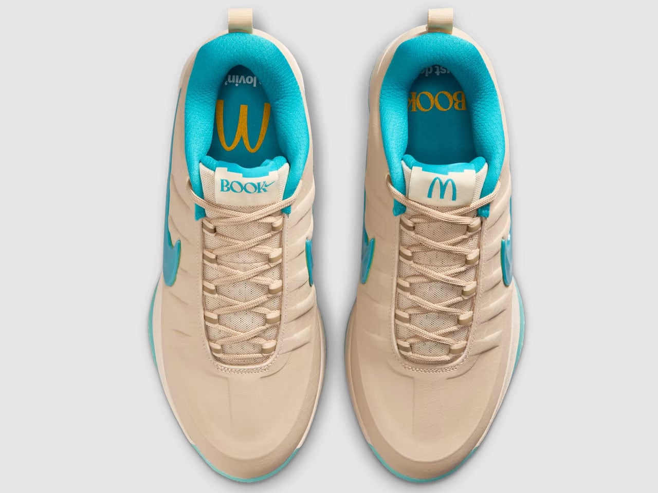
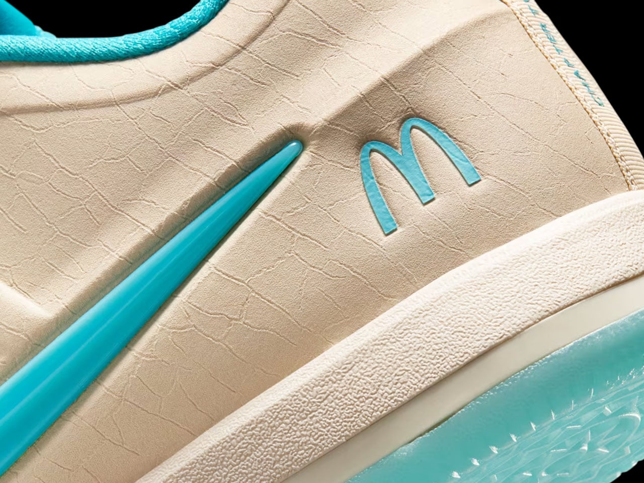
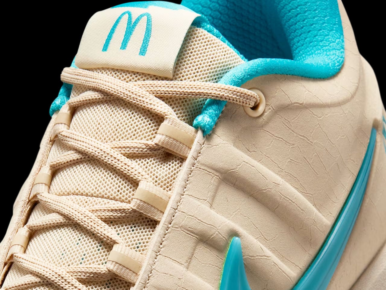
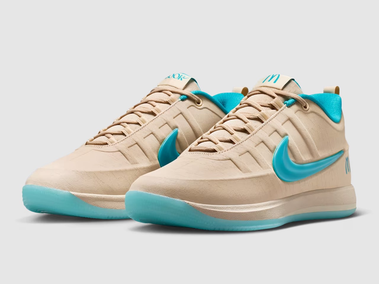
At first glance, the Nike Book 2 “Sedona” barely resembles a McDonald’s collaboration at all. The sneaker trades loud fast-food colors for sandy beige uppers, dusty earth tones, and soft turquoise accents inspired by the famous Sedona McDonald’s location, which swapped its golden arches for turquoise ones to better blend with the city’s iconic red rock surroundings. It’s the kind of hyper-specific regional detail that could have easily become gimmicky, but Booker’s growing signature line has consistently worked best when it stays connected to Arizona culture rather than chasing trends.

Designer: Nike x McDonald’s

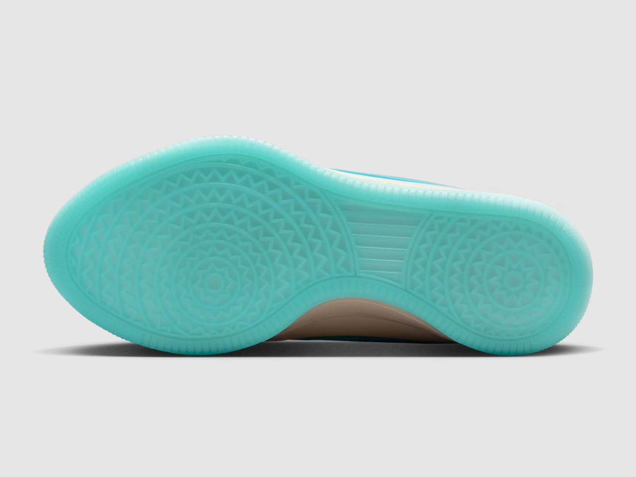
The design itself continues the Book series’ understated approach to basketball footwear. Where many modern performance sneakers rely on exaggerated shapes and futuristic layering, the Book 2 keeps things clean and wearable. The low-cut silhouette looks closer to a lifestyle sneaker than a traditional on-court model, borrowing cues from retro Nike runners and skate shoes while still packing modern basketball tech underneath. Nike equips the sneaker with a forefoot Air Zoom unit, Cushlon 3.0 cushioning, and a lightweight molded upper designed around Booker’s preference for responsive movement and minimal bulk.

That balance between performance and casual wearability is what gives the Book line its identity. Booker has never approached his signature shoes like loud statement pieces; they feel more like sneakers designed by someone who genuinely cares how they look off the court. The “Sedona” colorway pushes that idea even further. The cracked leather details, aged textures, and muted desert palette make the sneaker feel intentionally lived-in, almost like something discovered on a road trip through Arizona rather than a highly manufactured sports collaboration.

McDonald’s also seems aware that the appeal here extends beyond basketball fans. Instead of limiting the partnership to standard product placement, the company built a broader campaign around Booker’s connection to the Southwest. Promotional visuals lean heavily into desert imagery, road-trip aesthetics, and surreal humor, including a campaign video featuring Booker wandering through Sedona alongside a silent Ronald McDonald appearance that somehow feels strange and perfectly on-brand at the same time.

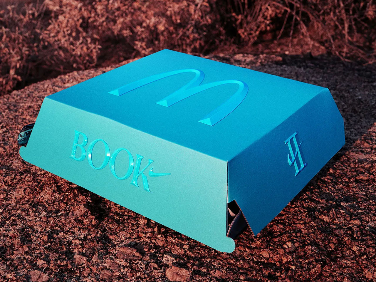
The collaboration also arrives with a Friends & Family sweepstakes through the McDonald’s app, giving select customers access to an exclusive variation of the sneaker with the purchase of specialty beverages. A dedicated pop-up event tied to the release is also expected ahead of launch, reinforcing how brands increasingly treat sneaker drops more like cultural events than product launches. The McDonald’s x Nike Book 2 “Sedona” sneaker is scheduled to release on June 2 through Nike SNKRS and select retailers for $155.

The post McDonald’s-inspired Nike Book 2 bring Arizona Desert colors to your next everyday basketball sneaker first appeared on Yanko Design.
McDonald’s-inspired Nike Book 2 bring Arizona Desert colors to your next everyday basketball sneaker

Signature sneakers rarely manage to feel personal anymore. Most arrive overloaded with athlete branding and colorways engineered more for resale culture than everyday wear. Devin Booker’s Nike Book 2 collaboration with McDonald’s takes a surprisingly different route. Instead of leaning into fries-and-burgers nostalgia, the sneaker pulls inspiration from one of Arizona’s oddest landmarks — the turquoise-arched McDonald’s in Sedona — and turns it into a basketball shoe that feels more rooted in place than corporate crossover hype.

At first glance, the Nike Book 2 “Sedona” barely resembles a McDonald’s collaboration at all. The sneaker trades loud fast-food colors for sandy beige uppers, dusty earth tones, and soft turquoise accents inspired by the famous Sedona McDonald’s location, which swapped its golden arches for turquoise ones to better blend with the city’s iconic red rock surroundings. It’s the kind of hyper-specific regional detail that could have easily become gimmicky, but Booker’s growing signature line has consistently worked best when it stays connected to Arizona culture rather than chasing trends.

Designer: Nike x McDonald’s

The design itself continues the Book series’ understated approach to basketball footwear. Where many modern performance sneakers rely on exaggerated shapes and futuristic layering, the Book 2 keeps things clean and wearable. The low-cut silhouette looks closer to a lifestyle sneaker than a traditional on-court model, borrowing cues from retro Nike runners and skate shoes while still packing modern basketball tech underneath. Nike equips the sneaker with a forefoot Air Zoom unit, Cushlon 3.0 cushioning, and a lightweight molded upper designed around Booker’s preference for responsive movement and minimal bulk.

That balance between performance and casual wearability is what gives the Book line its identity. Booker has never approached his signature shoes like loud statement pieces; they feel more like sneakers designed by someone who genuinely cares how they look off the court. The “Sedona” colorway pushes that idea even further. The cracked leather details, aged textures, and muted desert palette make the sneaker feel intentionally lived-in, almost like something discovered on a road trip through Arizona rather than a highly manufactured sports collaboration.

McDonald’s also seems aware that the appeal here extends beyond basketball fans. Instead of limiting the partnership to standard product placement, the company built a broader campaign around Booker’s connection to the Southwest. Promotional visuals lean heavily into desert imagery, road-trip aesthetics, and surreal humor, including a campaign video featuring Booker wandering through Sedona alongside a silent Ronald McDonald appearance that somehow feels strange and perfectly on-brand at the same time.

The collaboration also arrives with a Friends & Family sweepstakes through the McDonald’s app, giving select customers access to an exclusive variation of the sneaker with the purchase of specialty beverages. A dedicated pop-up event tied to the release is also expected ahead of launch, reinforcing how brands increasingly treat sneaker drops more like cultural events than product launches. The McDonald’s x Nike Book 2 “Sedona” sneaker is scheduled to release on June 2 through Nike SNKRS and select retailers for $155.

The post McDonald’s-inspired Nike Book 2 bring Arizona Desert colors to your next everyday basketball sneaker first appeared on Yanko Design.
This €235 Rippling Stone Valet Tray Has a Candle Holder Built In

Most entryway surfaces tell a familiar story, and it’s rarely a flattering one. Keys get tossed wherever there’s space, coins scatter to the edges, and a watch ends up next to a forgotten receipt by morning. The valet tray was supposed to solve this, but most of them look clinical, forgettable, or like they belong in a hotel room rather than a thoughtfully arranged home.

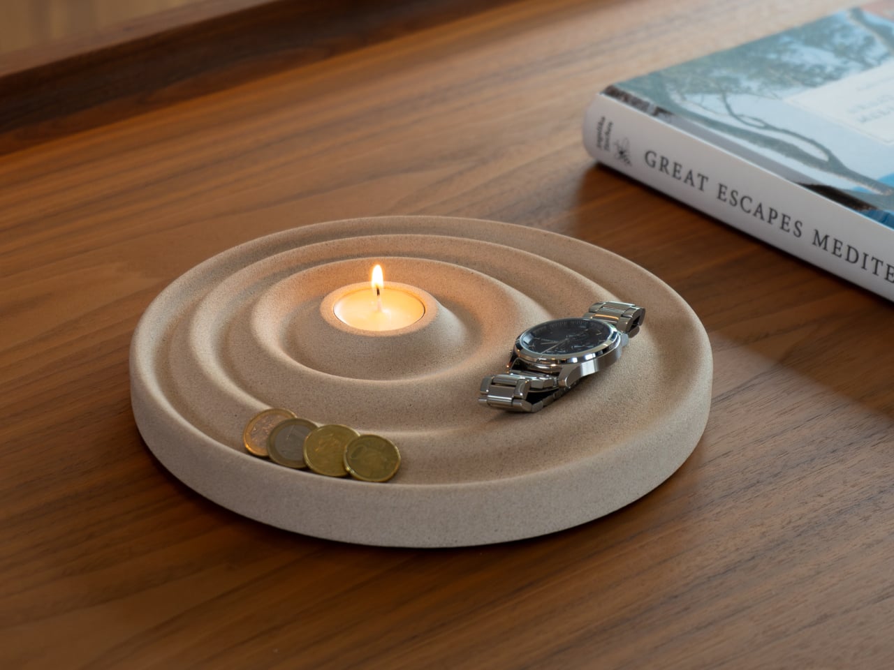
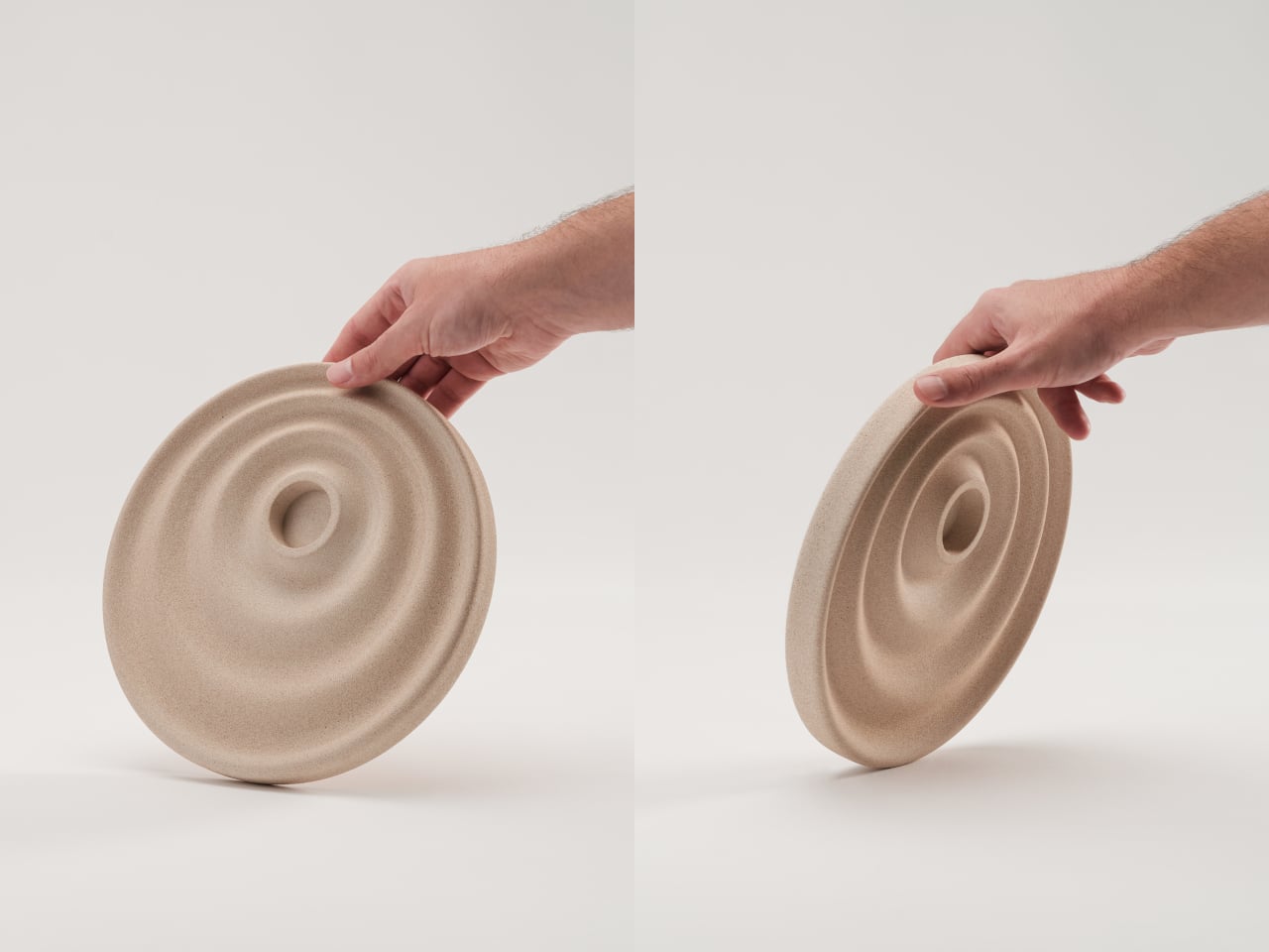
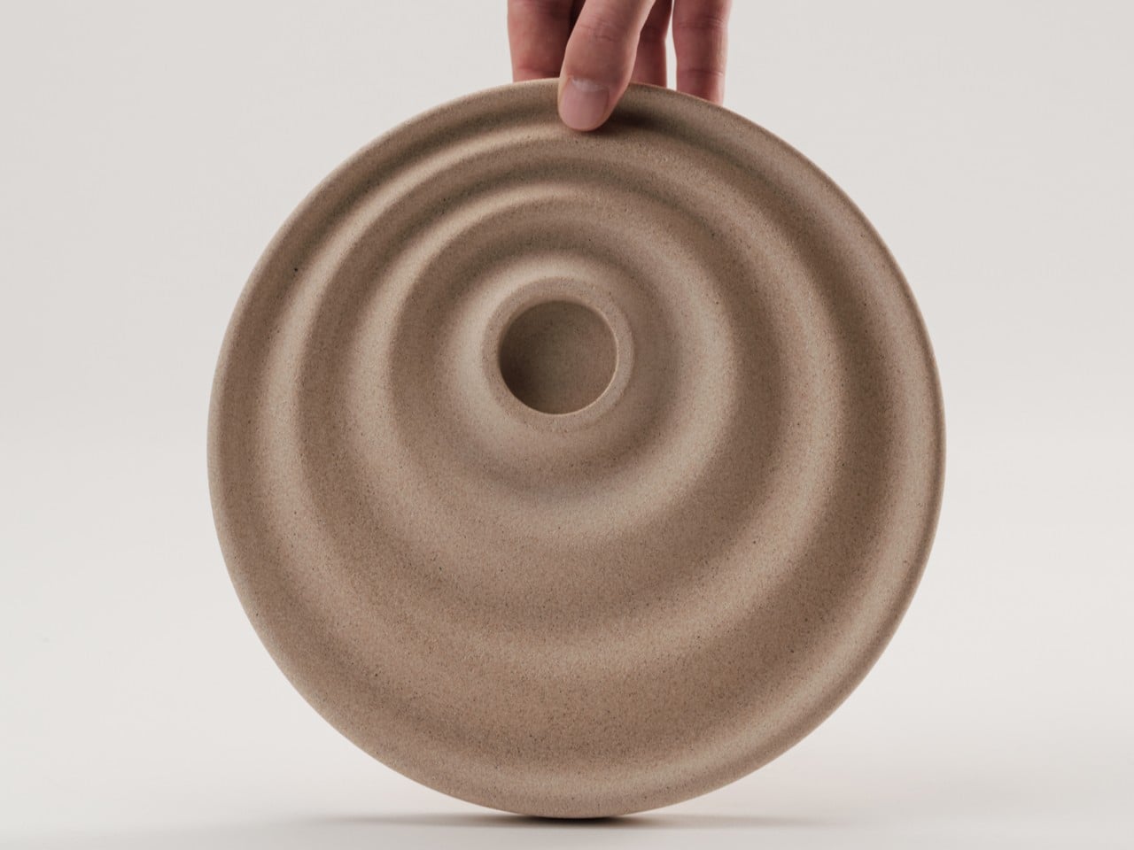
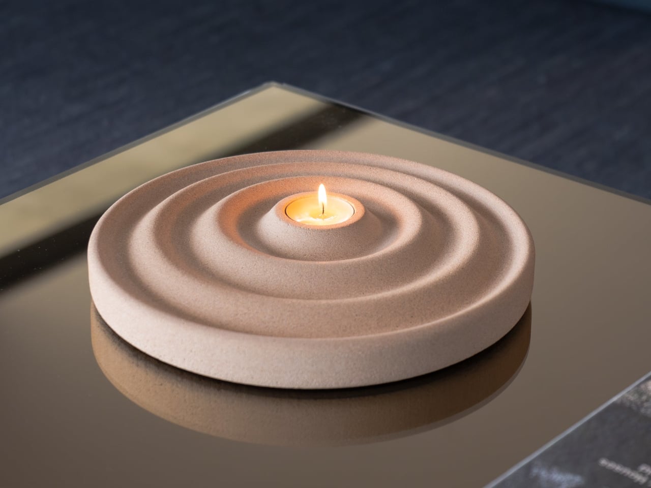
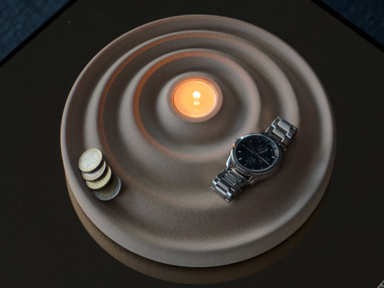
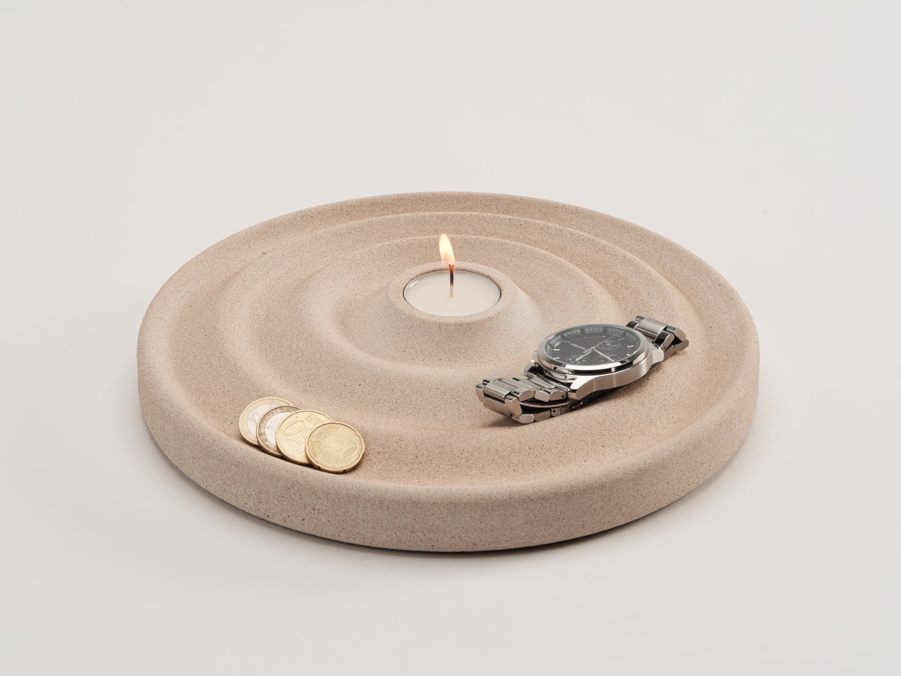
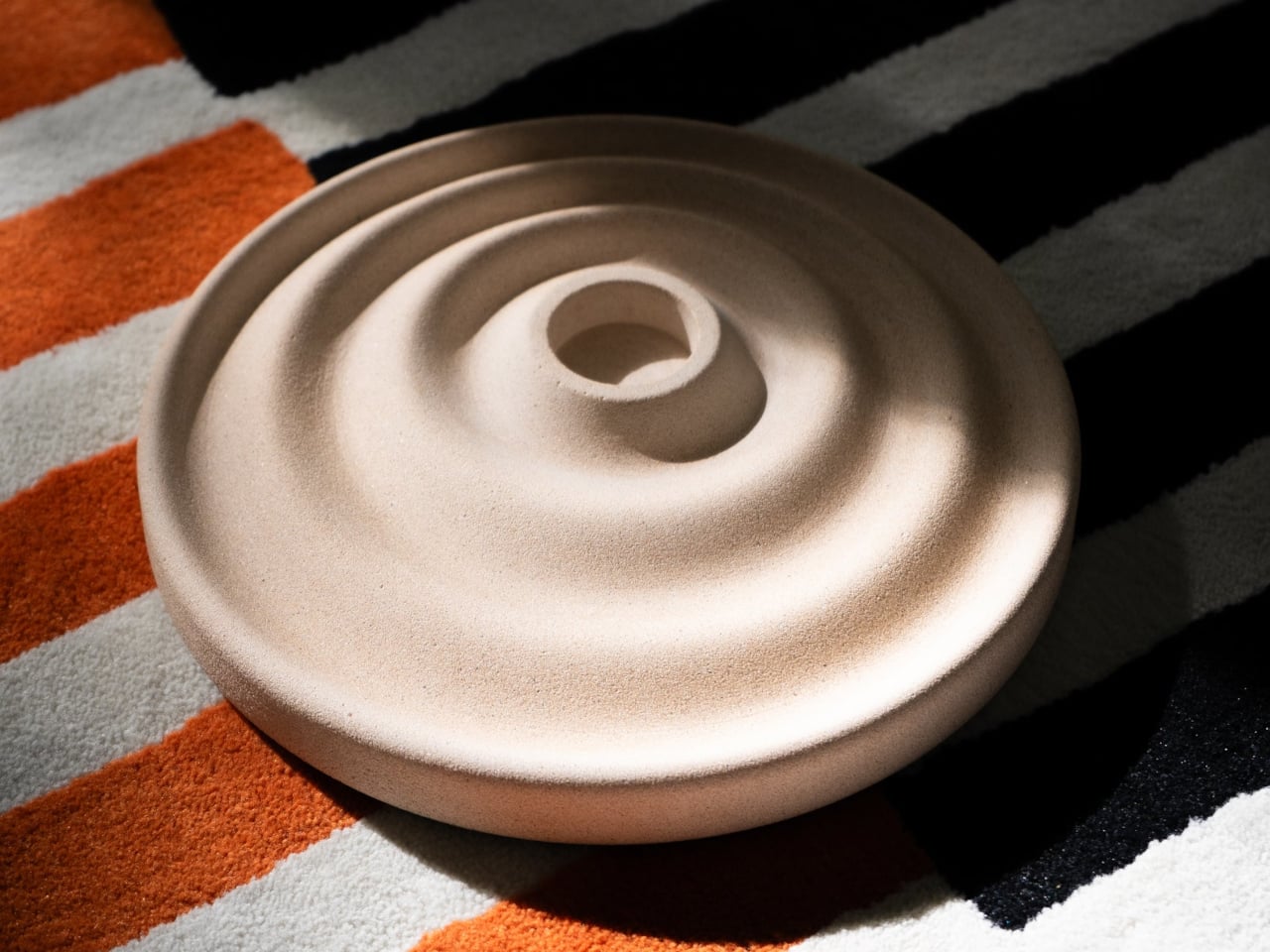
The Delicato Tray takes a different approach, and the solution comes from a direction you might not expect: ripples. Sold through Oftwise, it merges a valet tray and a candle holder into a single disc-shaped object cast from Jesmonite AC730, a sustainable stone composite. The result reads less like a utilitarian catchall and more like something a sculptor quietly left on your nightstand.

Designer: Joao Teixeira for Oftwise

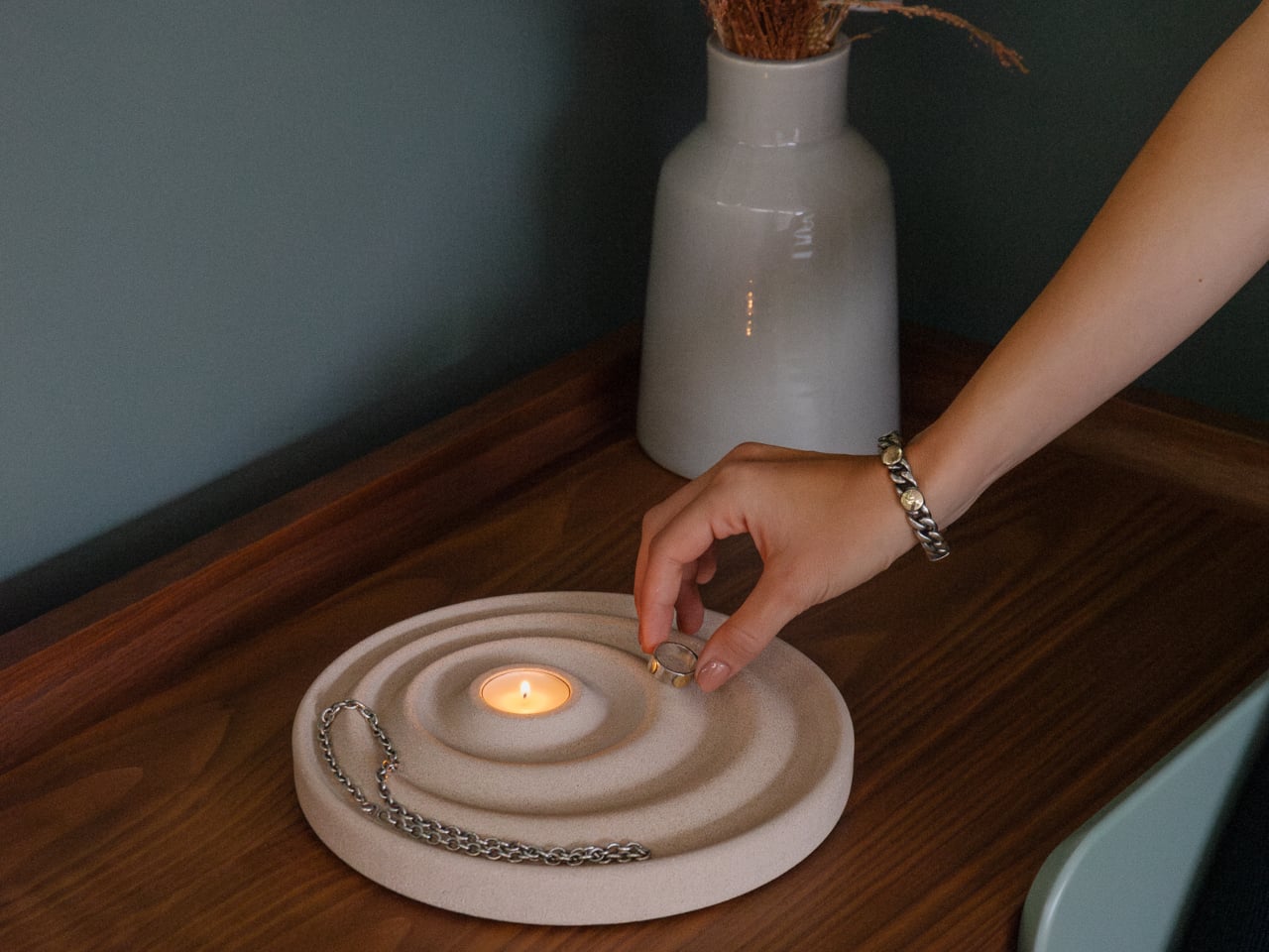
The ripple pattern isn’t purely decorative. The concentric waves are asymmetrical, with the outer rings wider at the front for bulkier items like keys or glasses, and the inner curves sitting closer toward the back for smaller things like rings or coins. It’s a hierarchy built into the shape itself, making organization almost unconscious rather than something you have to think about.

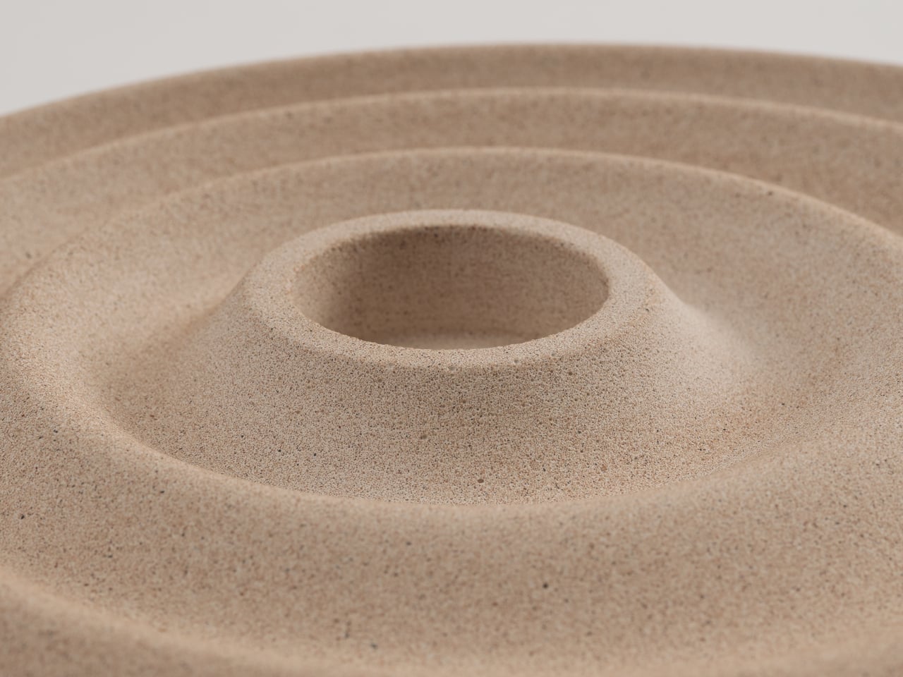
At the center of those ripples sits a recessed pocket sized for a tealight candle, turning the tray into a mood-setter as much as a catchall. Lighting a candle while dropping your watch and keys into the right grooves transforms a mundane habit into something closer to a ritual. It’s a lot to ask of a disc of stone, but Delicato manages it without breaking a sweat.

The material is what makes that balance possible. Jesmonite AC730 is a water-based, VOC-free stone composite that reproduces the look and texture of natural stone without concrete’s weight. It’s independently fire-rated and impact-resistant, which matters for something that routinely sits next to an open flame. A matte acrylic sealer and a cork anti-slip pad on the base round out the practical details.

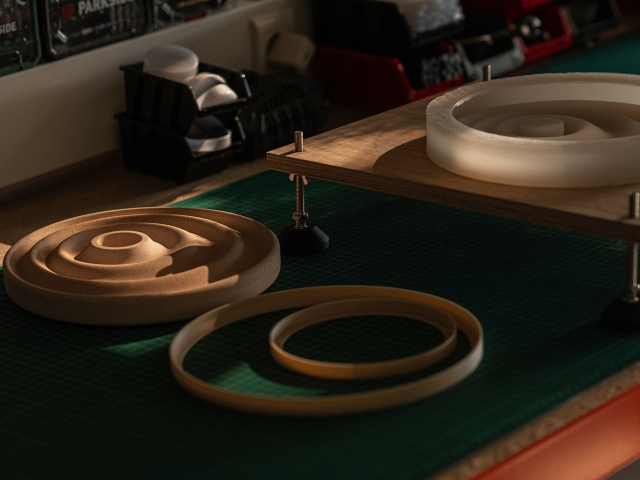
Because the tray is hand-cast, no two are identical. Small air bubbles, subtle texture variations, and minor color shifts are natural byproducts of the process, and Oftwise is upfront about that. The available color, Bath Stone, is a warm sandy beige neutral enough for almost any interior. At 2kg, it has a quiet weight that makes a surface look deliberately arranged.

The Delicato Tray measures 24.5cm x 24.5cm with a height of just 2.8cm, low enough to sit under a bedside lamp without stealing vertical space. The candle pocket measures 3.9cm across and 1.5cm deep, a snug fit for a standard tealight. It retails for €235 on Oftwise, which places it firmly in the premium tier for an object of this category.

What Delicato gets right is something many design objects miss: it doesn’t try too hard to be either thing. It’s not decorative at the expense of being useful, and it’s not useful at the expense of looking good. A tray that doubles as a candle holder and a sculptural object sounds like a confused brief, but the ripple form settles all of that quietly.

The post This €235 Rippling Stone Valet Tray Has a Candle Holder Built In first appeared on Yanko Design.
Ducati Barista M3 1926 gives new meaning to caffeinated motorhead passion

What’s common between thunderous sports bikes and espresso machines? Both deliver a high-adrenaline rush, right? Yes, but there’s more to it: both are precision-engineered, and both rely on immense (bar) pressure and thermal control for peak performance. This shared DNA traces back to the 1960s when British riders modified their stripped-down motorcycles to race from one roadside café to another, giving birth to the term “Café Racer.”

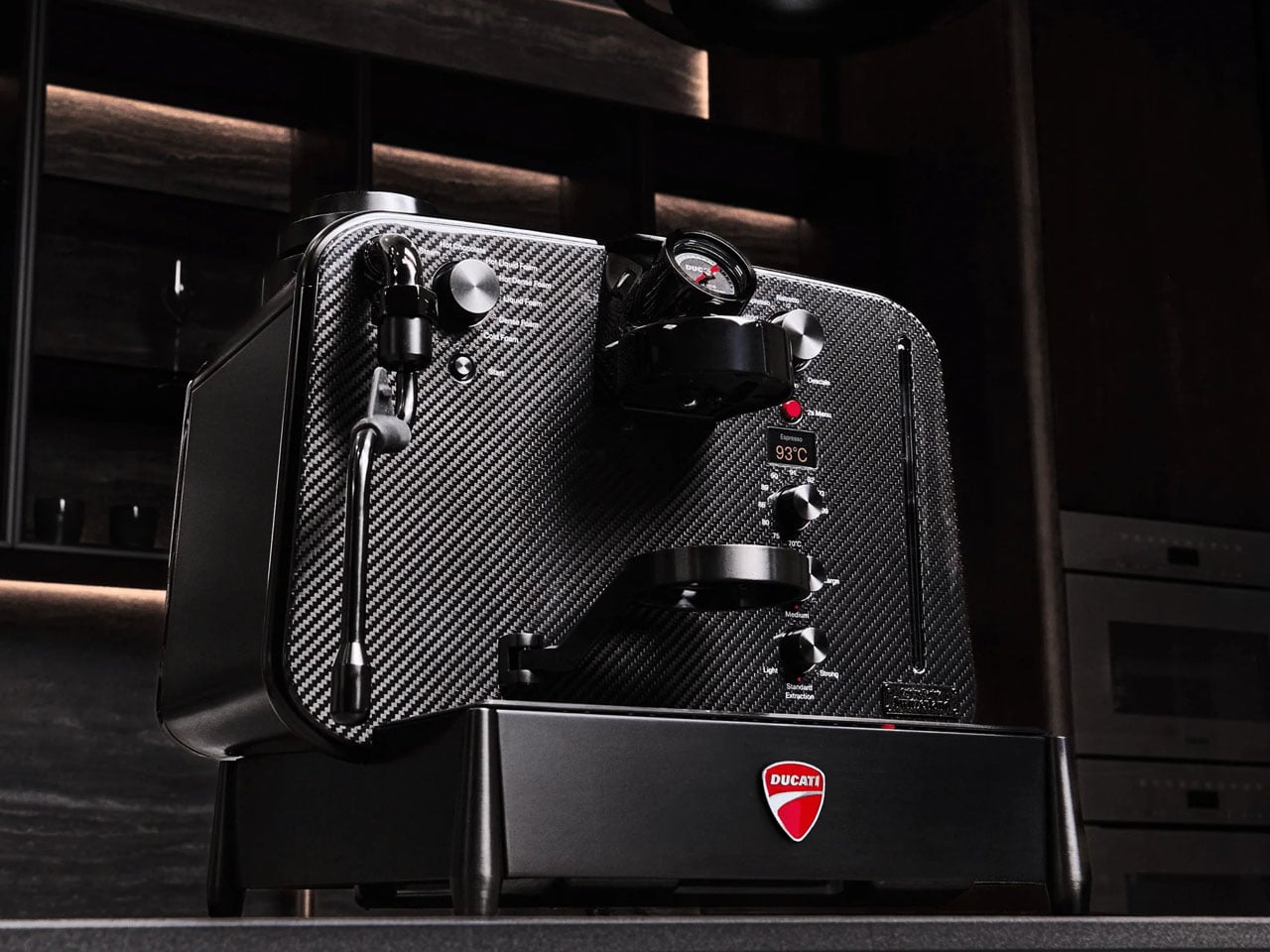
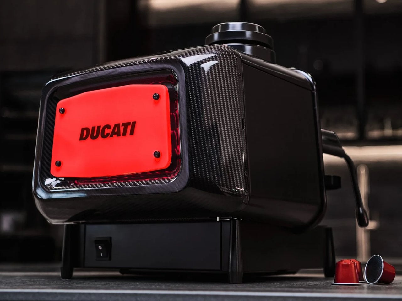
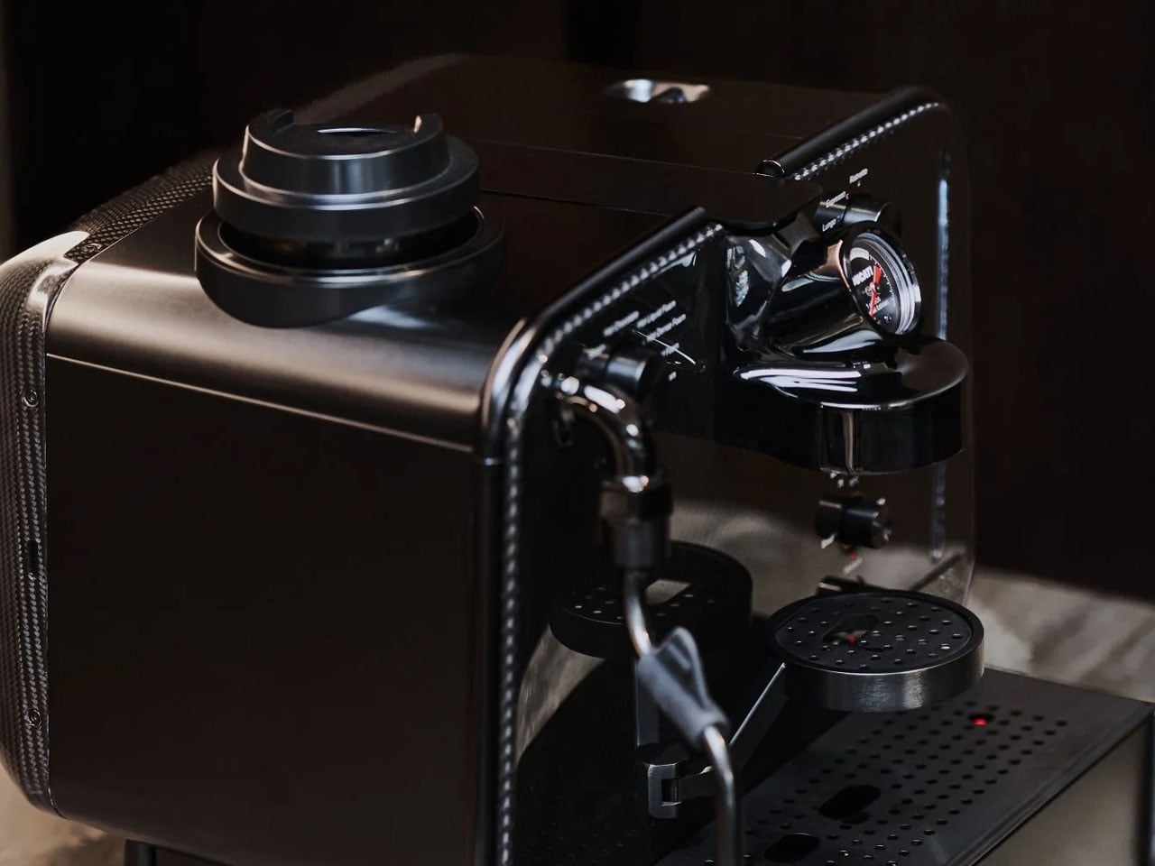
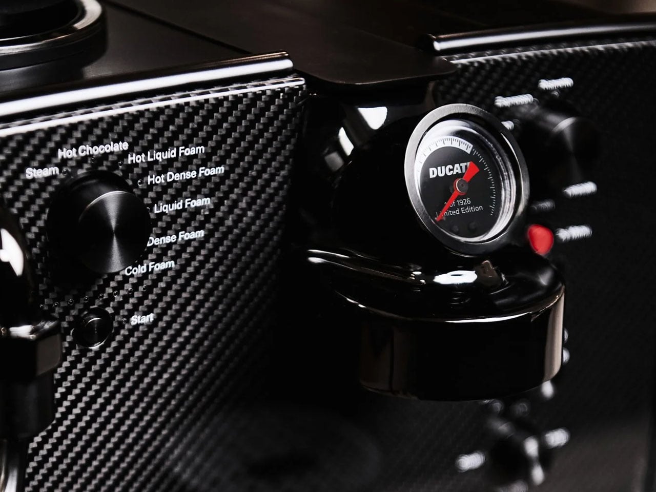
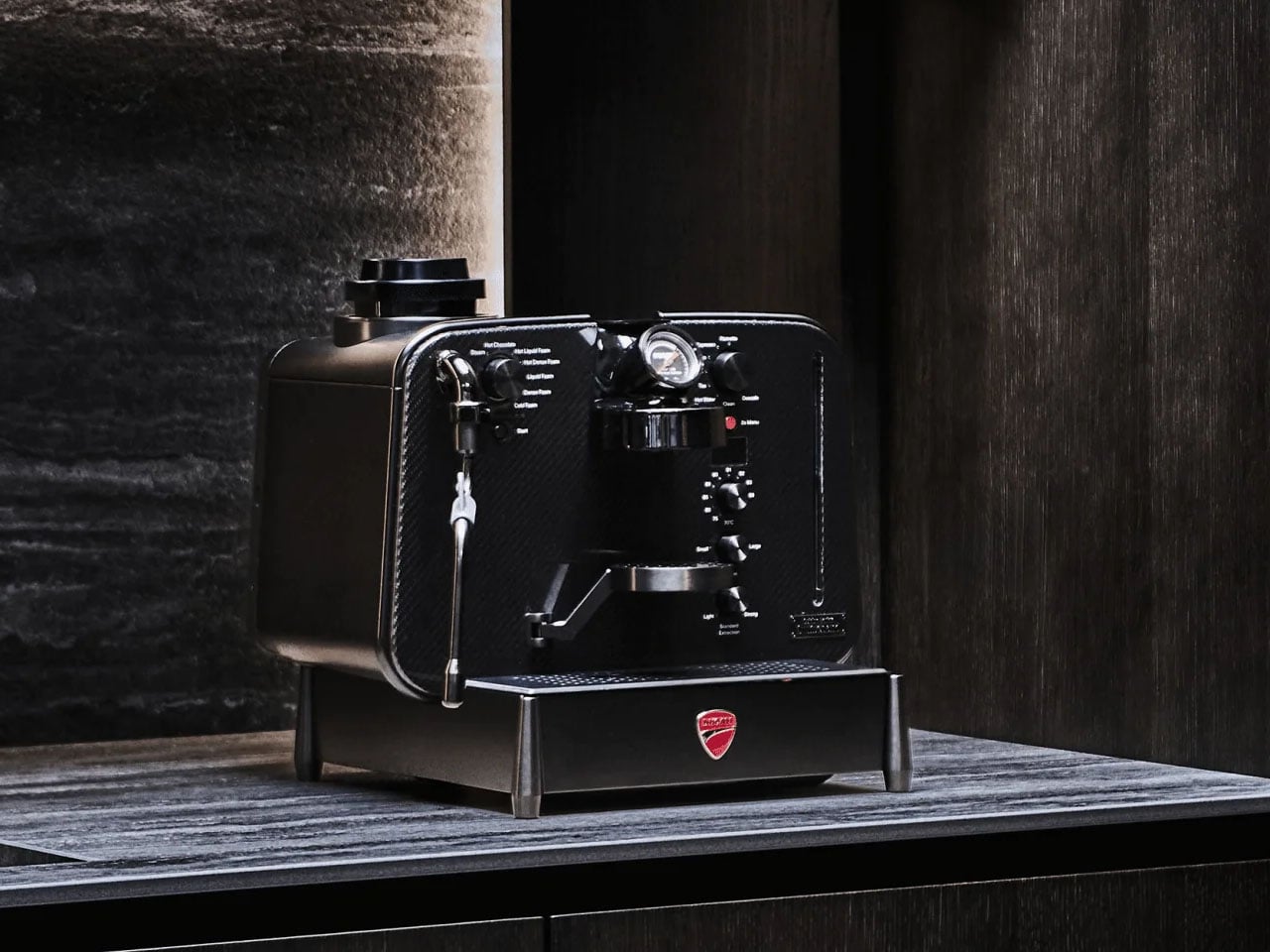
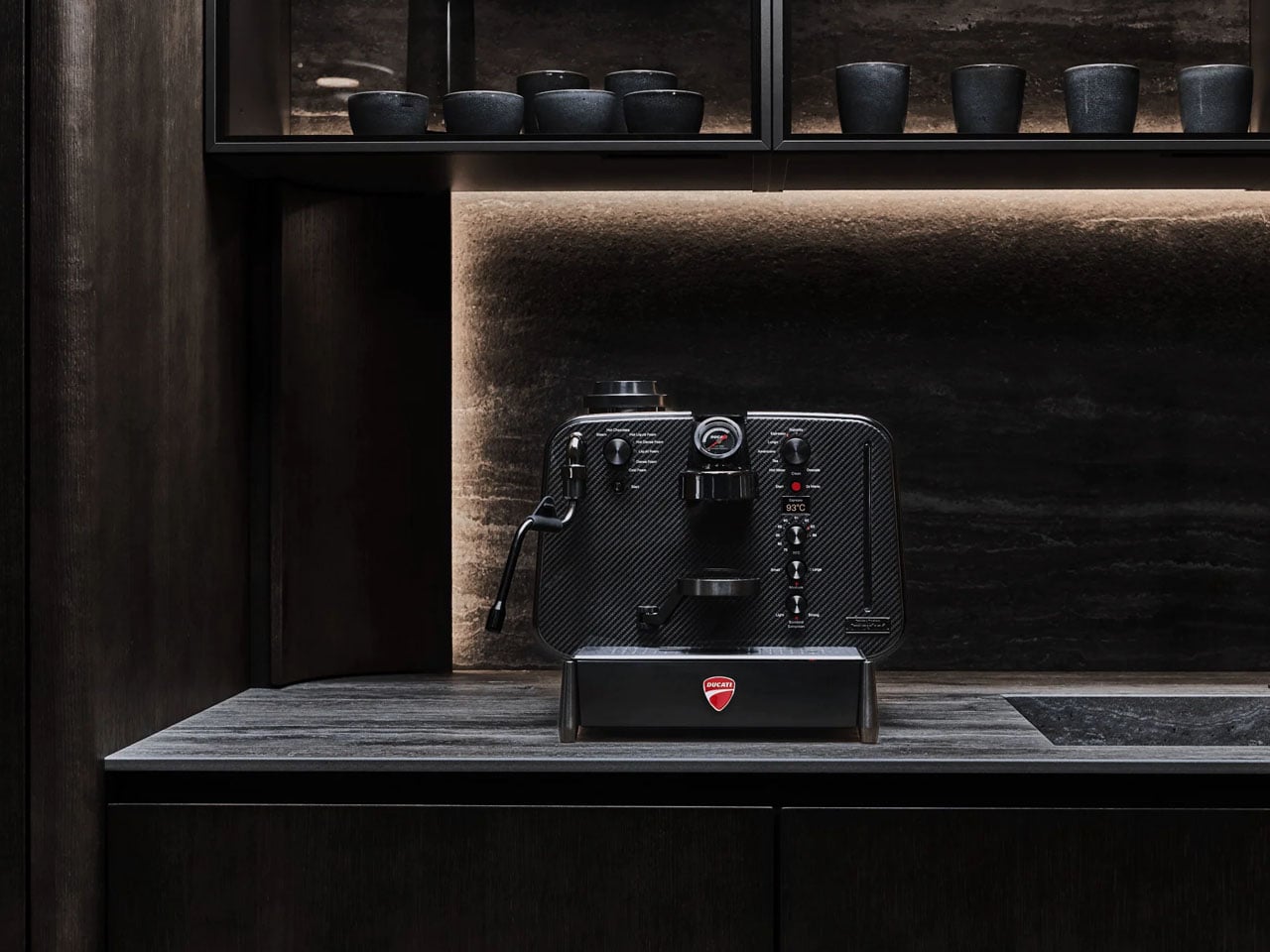
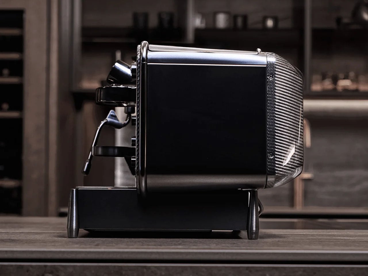
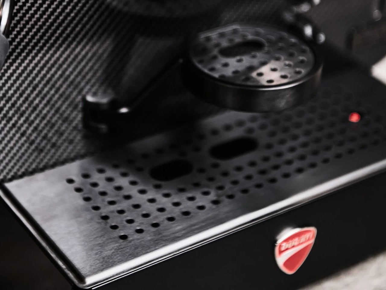
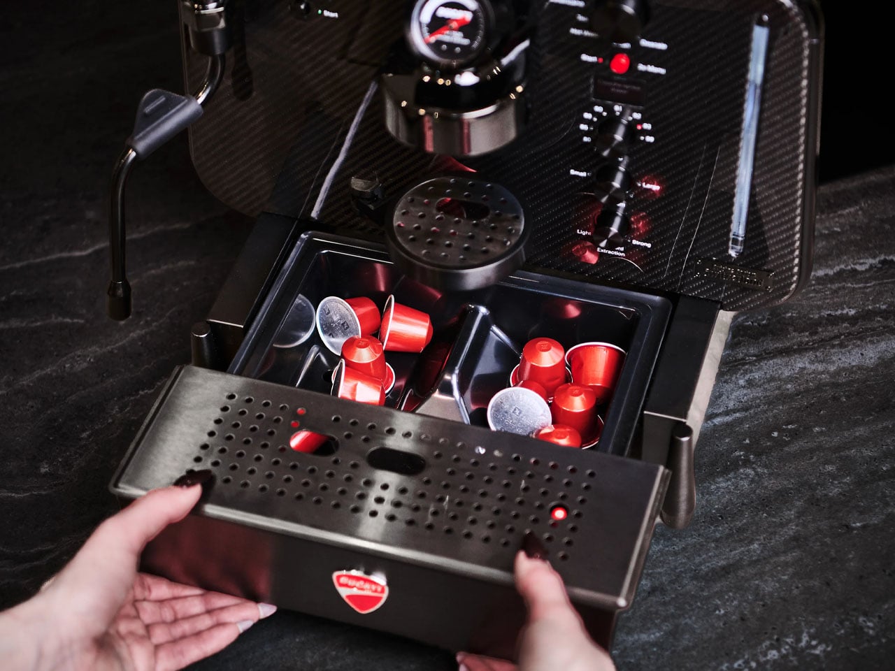
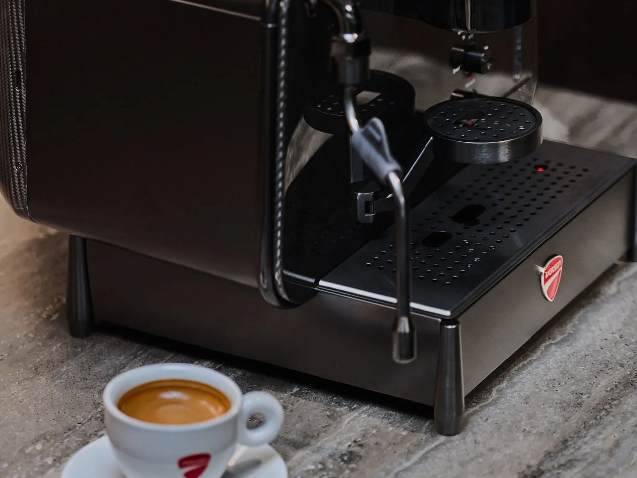
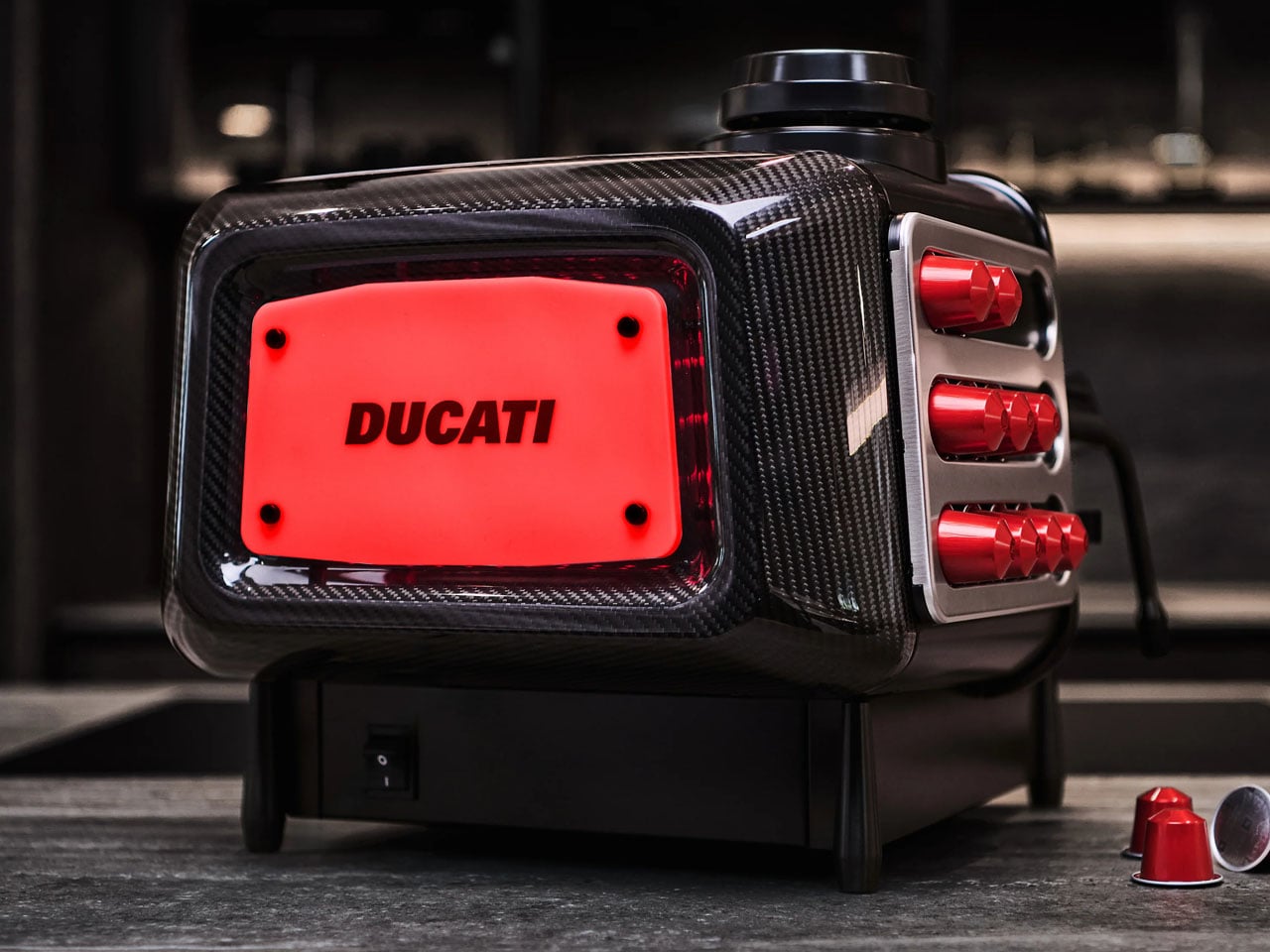
This historical buildup is important for the latest creation by Ducati, which stamps its track image, craftsmanship, and aesthetics onto a flagship espresso machine, which will be released in 1,926 units only. It is touted as the world’s first and only carbon fiber capsule machine with a composite carbon fiber build, and is called the Ducati Barista M3 1926 Limited Edition Carbon Fiber.

Designer: Ducati and Cuisine Barista

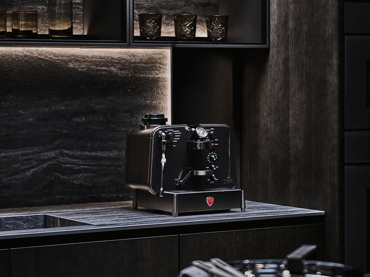
The motorbike-inspired coffee machine hits different in its aesthetic appeal and hopefully the espresso it brews. Even if it doesn’t, it is a collector’s item – ground up – for everyone with a passion for superbikes and love for coffee brewing.

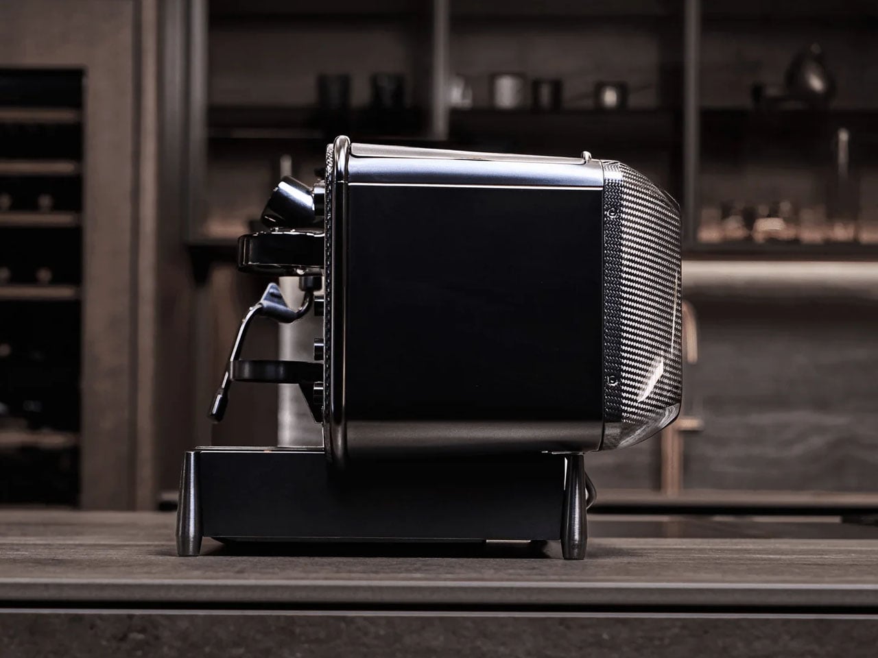
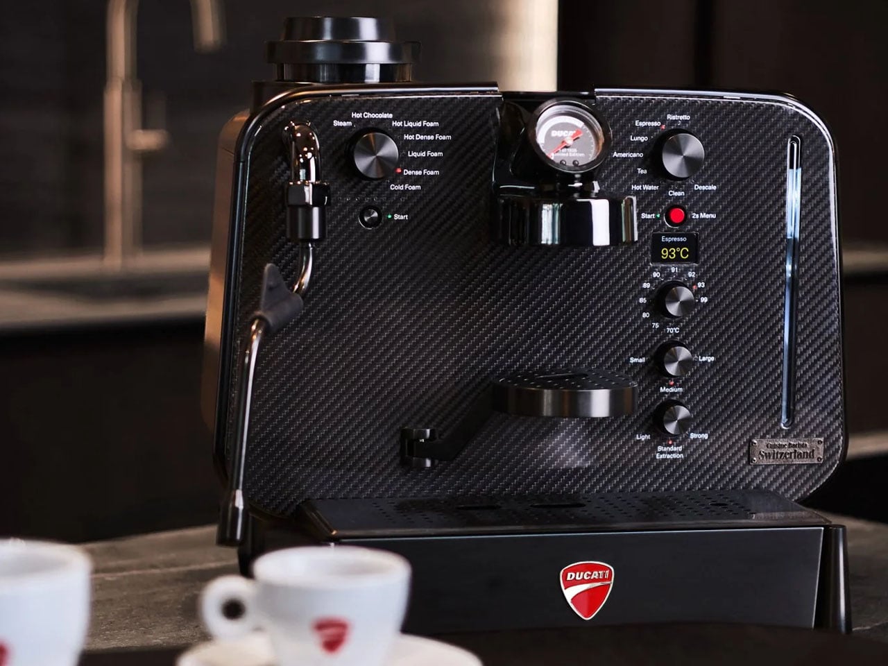
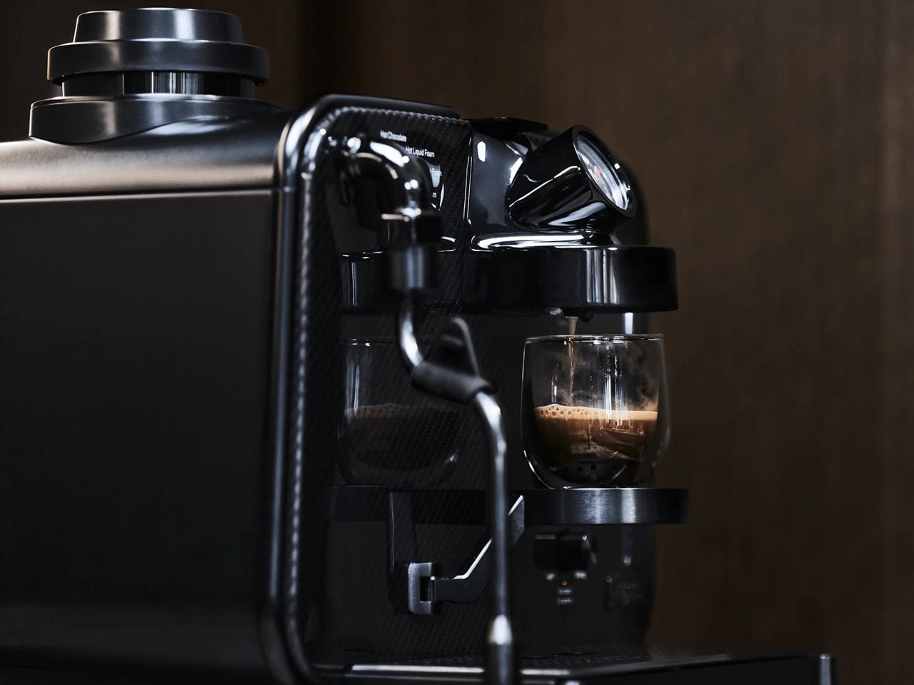
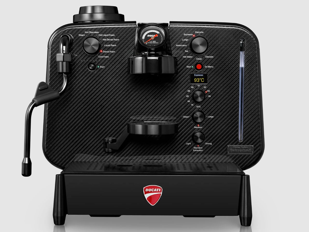
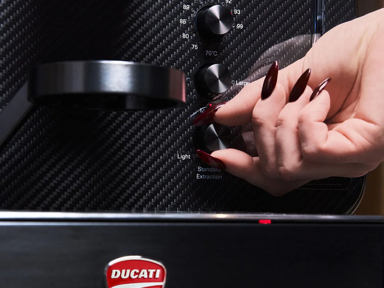
The front and rear panels of the Ducati Barista are crafted from twill-weave carbon fiber material, the same as that seen on the performance track bikes from the brand. The rest of the body is made from stainless steel, overlayed with a PVC coating to bring forth the perfect chrome look that would entice anyone who appreciates craftsmanship at the highest level, irrespective of their allegiance to Ducati.

Barista M3 1926 by Ducati is “only capsule machine in the world” to feature three precision-laid layers of carbon fiber, just 1.5 mm thick, on its front and back. Advanced brewing technology is, of course, a given but for me, having such a beautiful machine take pods, is such a waste of time and effort. The fans wouldn’t align with my thoughts, so here is some information you’d like anyway.

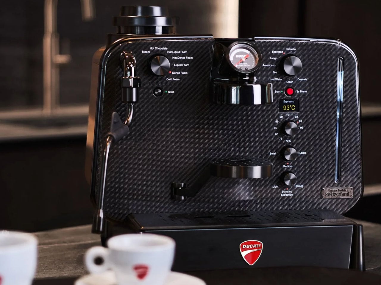
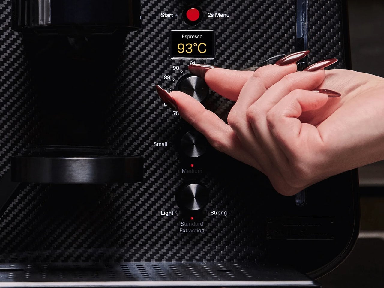
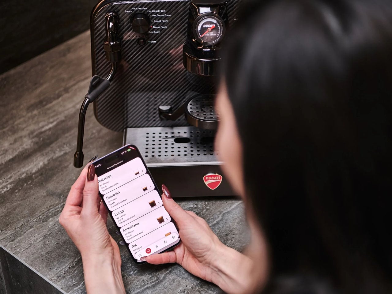
The machine employs a proprietary heating element to deliver an adjustable temperature that’s ready for a good brew in seven seconds flat. If this achieved temperature is not to your preference, you can use onboard controls to set it to your brewing temperature between 70°C to 99°C. Besides the temperature, you can toggle between light, standard, and strong extraction modes, so that what you get from the capsule is brewed perfectly as you prefer.

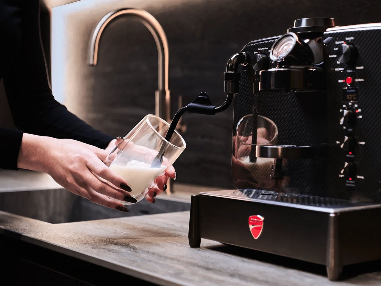
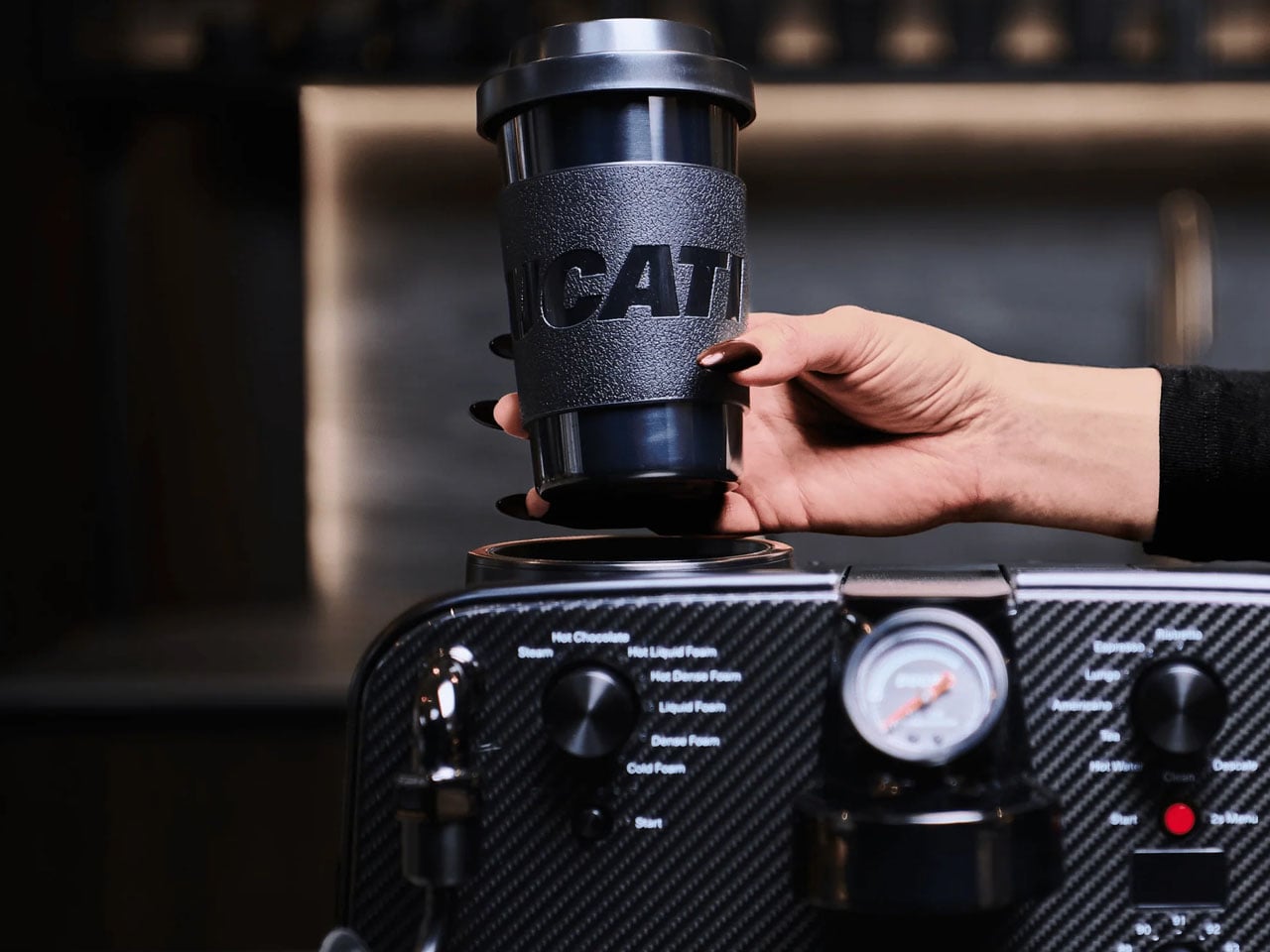
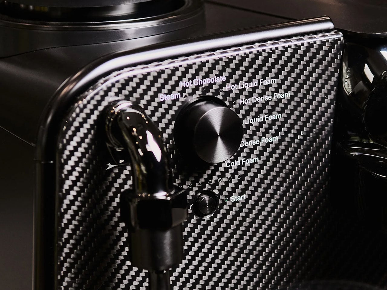
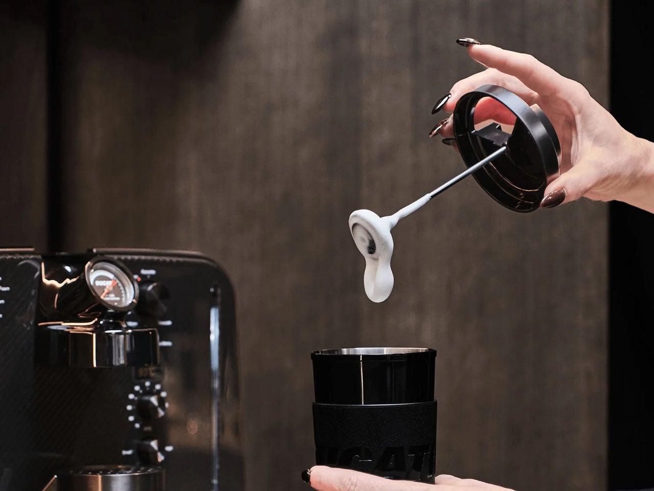
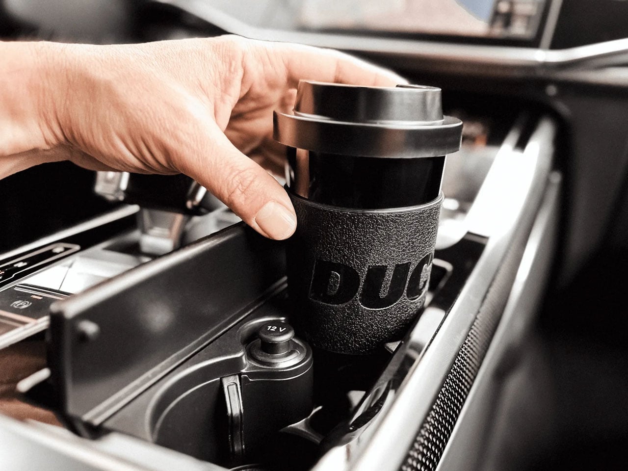
The Barista M3 1926 machine can pump high-pressure up to 19 bar. It comes with the world’s first in-cup frother to elevate your in-home lattes and cappuccinos in café-esque perfection. It’s possible with frothed milk right in the cup provided with your Barista M3 1926. The machine can deliver up to 12 preset drinks at the touch of its integrated control panel.

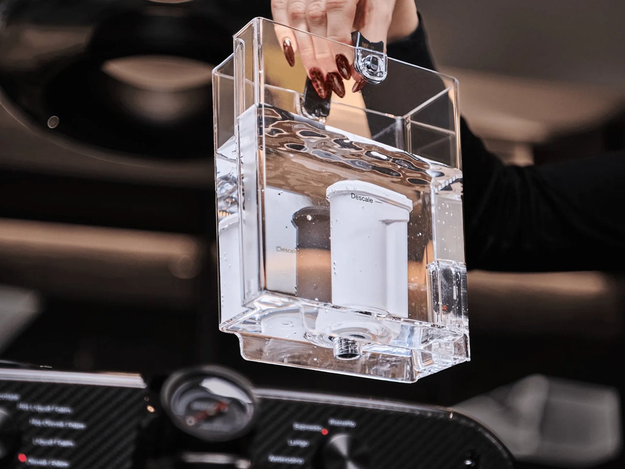
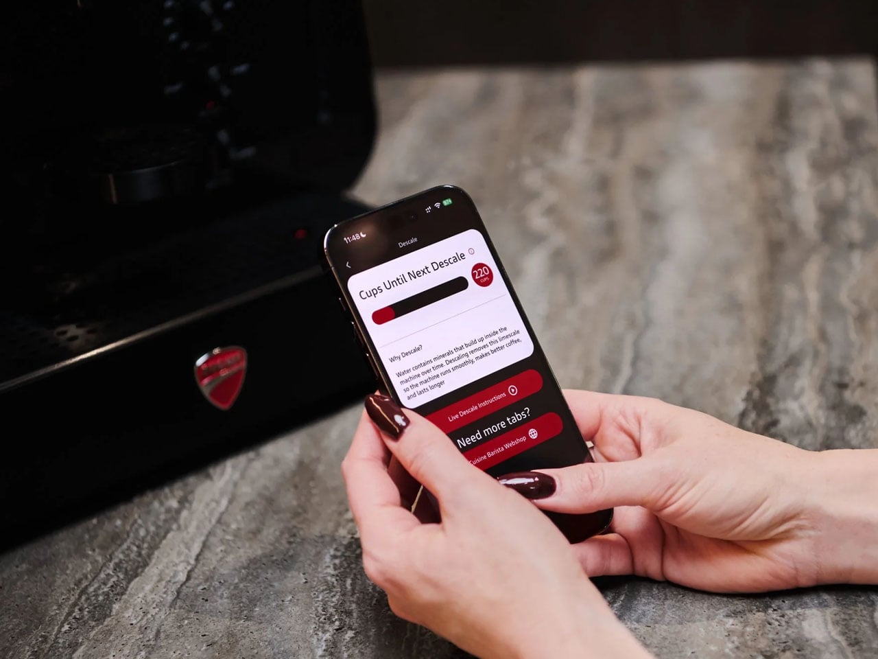
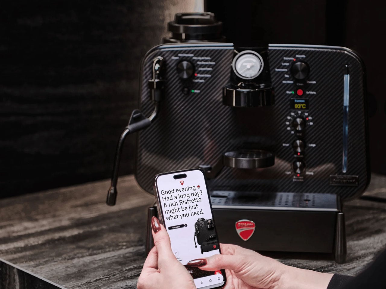
Maintaining this sculptural coffee machine on your countertop is simplified by an accompanying mobile app. The app receives various stats and alerts for descaling and your caffeine consumption, so that you know when to slow down because you’ve already had a few espresso shots in the build-up to the MotoGP!

The post Ducati Barista M3 1926 gives new meaning to caffeinated motorhead passion first appeared on Yanko Design.
This Tissue Box Sinks With Every Pull Like a Quiet Hourglass

Most tissue boxes are designed to be used, emptied, and thrown away. They sit quietly on tables, counters, bedside units, office desks, and bathroom shelves, becoming part of daily life for a short period before adding to another cycle of packaging waste. The cardboard box, printed surface, plastic slit, and disposable structure may seem insignificant on their own, but repeated across homes, hotels, offices, cafés, and public spaces, they create a steady stream of unnecessary material waste.

Reusable tissue boxes offer a more thoughtful alternative. They allow people to refill tissues without discarding the entire outer container each time. They also give the object a more permanent place within the interior environment. Instead of relying on whatever printed packaging comes with a tissue brand, a reusable holder can be chosen to match the mood, material palette, and aesthetic of a space. It can blend into a calm bedroom, add warmth to a living room, or sit neatly within a carefully designed hospitality setting.

Designer: NAATO studio and The oom

Yet many reusable tissue holders still carry the same structural limitation as disposable boxes. They are made for a fixed size and fixed volume. When the tissue stack is full, the object works well. As the stack reduces, the tissues begin to sink lower inside the container. The user has to reach further in; the sheets may fold or get caught, and the holder often needs to be refilled before the tissues are truly finished. The object remains static even though the contents inside are constantly changing.

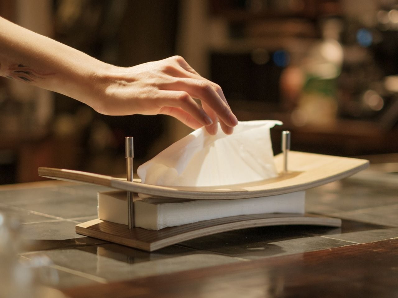
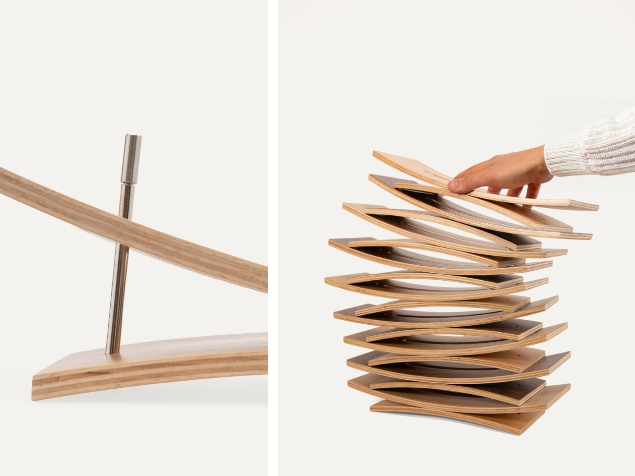
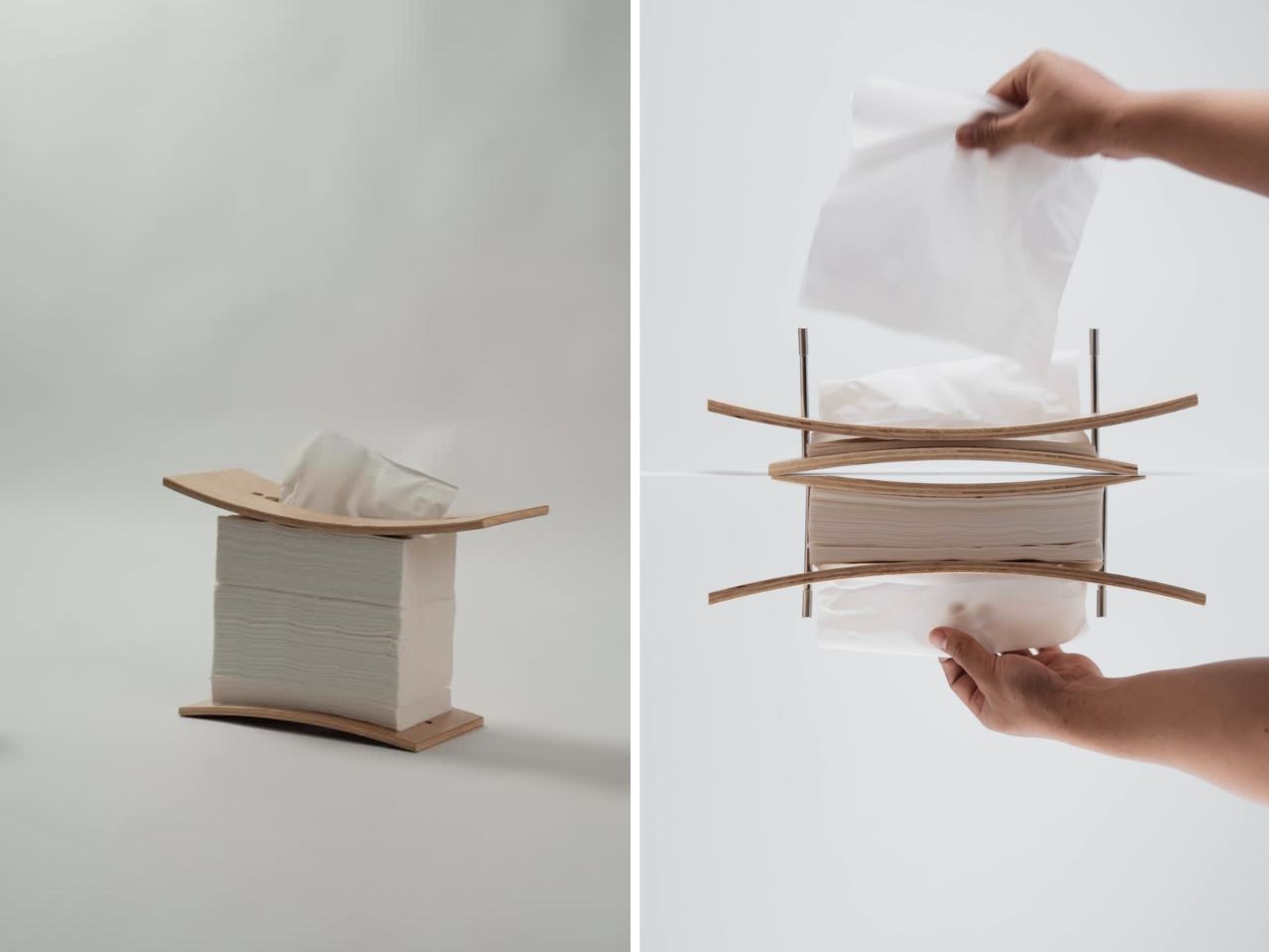
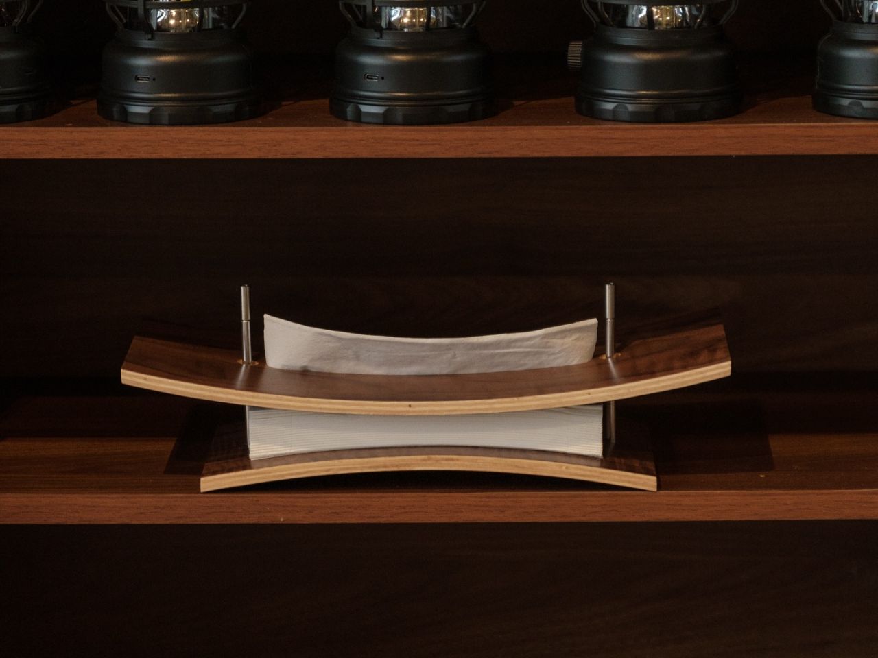
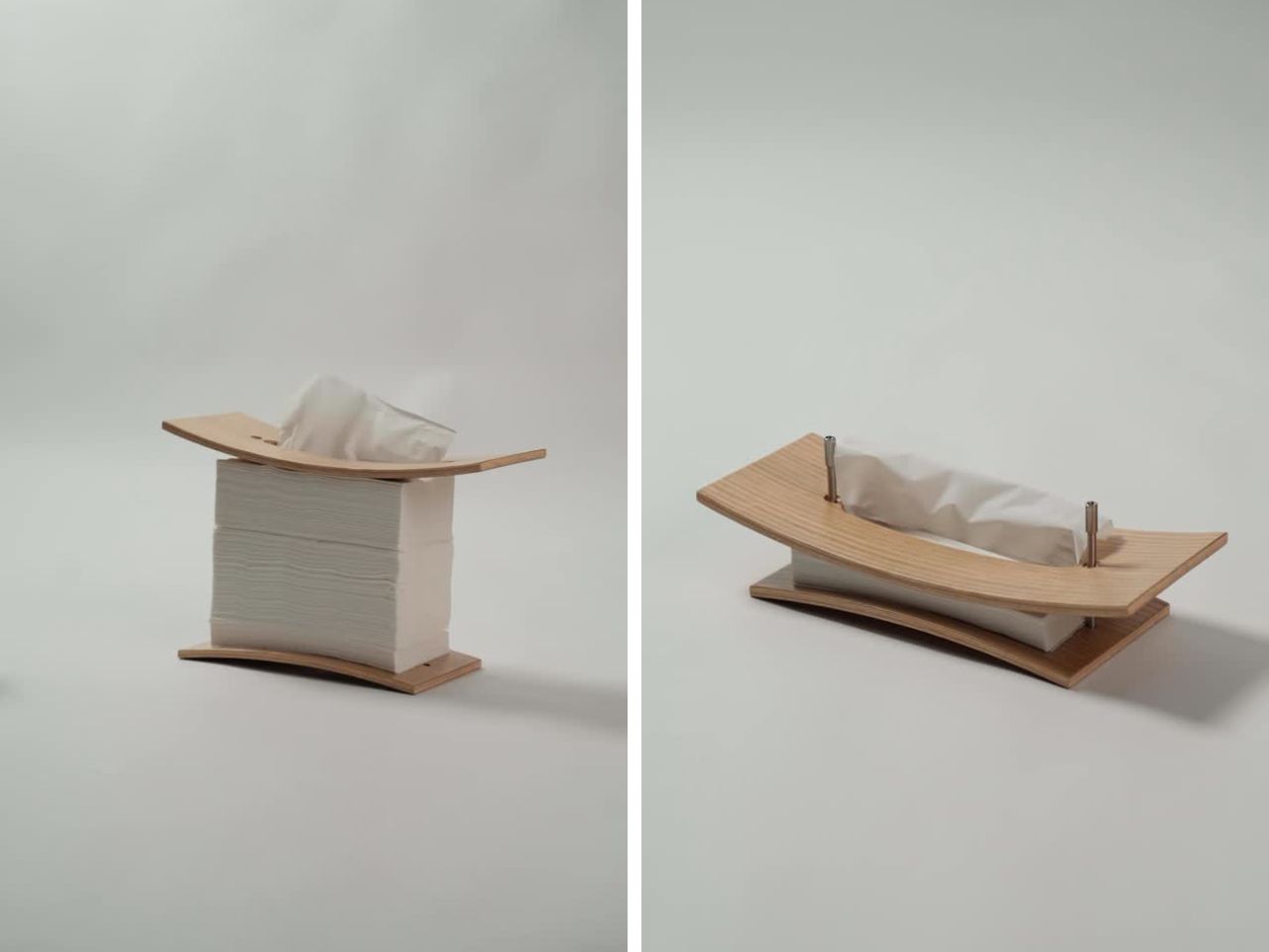
OOM-04 responds to this small but familiar frustration with a quieter, more sensitive design language. Created as the (OOM).04_TISSUE CLAMP by Naato Studio, the product changes with the tissue stack rather than forcing the tissues to fit inside a rigid box. As the tissues are used, the lid gradually sinks with them. The two parenthesis-like shells shift around the remaining stack, allowing the form to visually and physically register the passage of use.

This simple movement turns an ordinary household action into something more poetic. Reaching for a tissue becomes a small moment of awareness. The object behaves almost like an hourglass, softly marking time through depletion rather than through numbers or mechanisms. Each tissue taken changes the object slightly. The holder becomes a visible record of use, care, and routine.

There is a quiet emotional quality in that gesture. Tissues are often used in moments that are intimate or human: wiping a tear, cleaning a spill, caring for someone who is unwell, preparing for the day, removing makeup, or managing a small mess. OOM-04 gives dignity to this everyday object by making it responsive instead of invisible. It does not hide use. It lets us become part of the design.
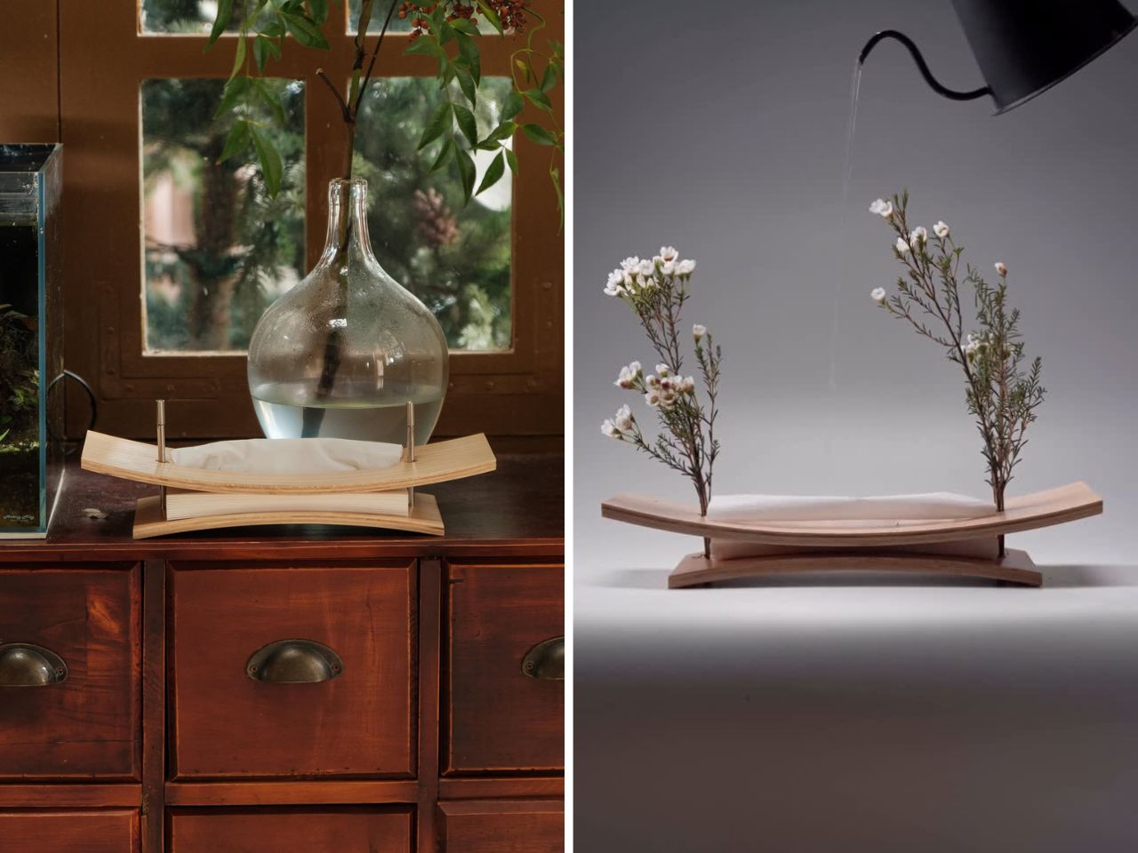
The product belongs to Naato Studio’s “Changing Entity” collection, which explores objects that can evolve over time. The Tissue Clamp is made from two modular shells that can be repaired, reused, and reconfigured. This extends its life beyond a single function. The same parts can eventually be transformed into other objects, such as stools, shelving, or even a lamp. The design is built around the idea that an object should not become waste once its first purpose is complete.
This approach makes sustainability feel less like a sacrifice and more like continuity. OOM-04 does not ask the user to give up beauty, tactility, or interior harmony in order to make a better environmental choice. It offers a sculptural, material-led object that can sit comfortably in a designed space while also reducing reliance on disposable packaging. Its form feels calm, intentional, and adaptable.

OOM-04 feels like the kind of object that earns its place in a room. It is useful, beautiful, and just unusual enough to make someone pause. The design fixes the practical frustration of tissues getting stuck while also giving the object a quiet sense of movement. It turns a disposable household habit into something slower, smarter, and worth keeping.

The post This Tissue Box Sinks With Every Pull Like a Quiet Hourglass first appeared on Yanko Design.