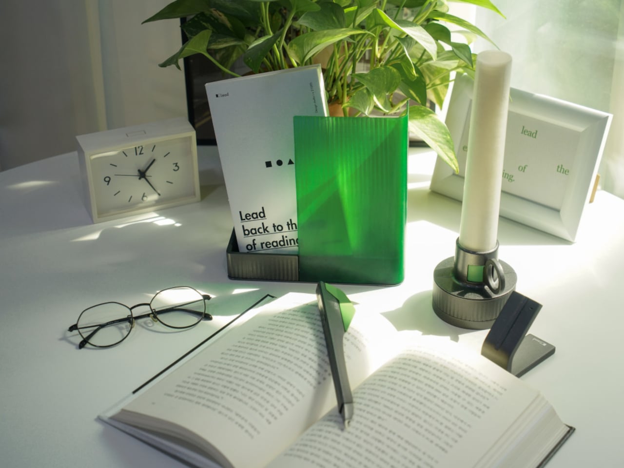
The intention to read a physical book more often usually gets buried under phones, streaming, and vague guilt about never finishing that stack on the nightstand. Reading is not just opening a book; it is a whole arc from deciding to start to actually making it through chapters without drifting away. Lead is a small family of objects designed to sit around a book and quietly support that arc.
Lead is a design concept that treats reading as a story with a beginning, rising action, climax, and resolution. The name is a contraction of “Let’s read” and the first word of the slogan “lead back to the era of reading,” and the system uses three products, Bookeeper, Candle, and Quill, to give each phase of a reading session its own physical cue instead of relying on app notifications you will probably dismiss.
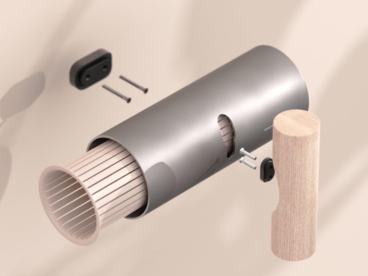
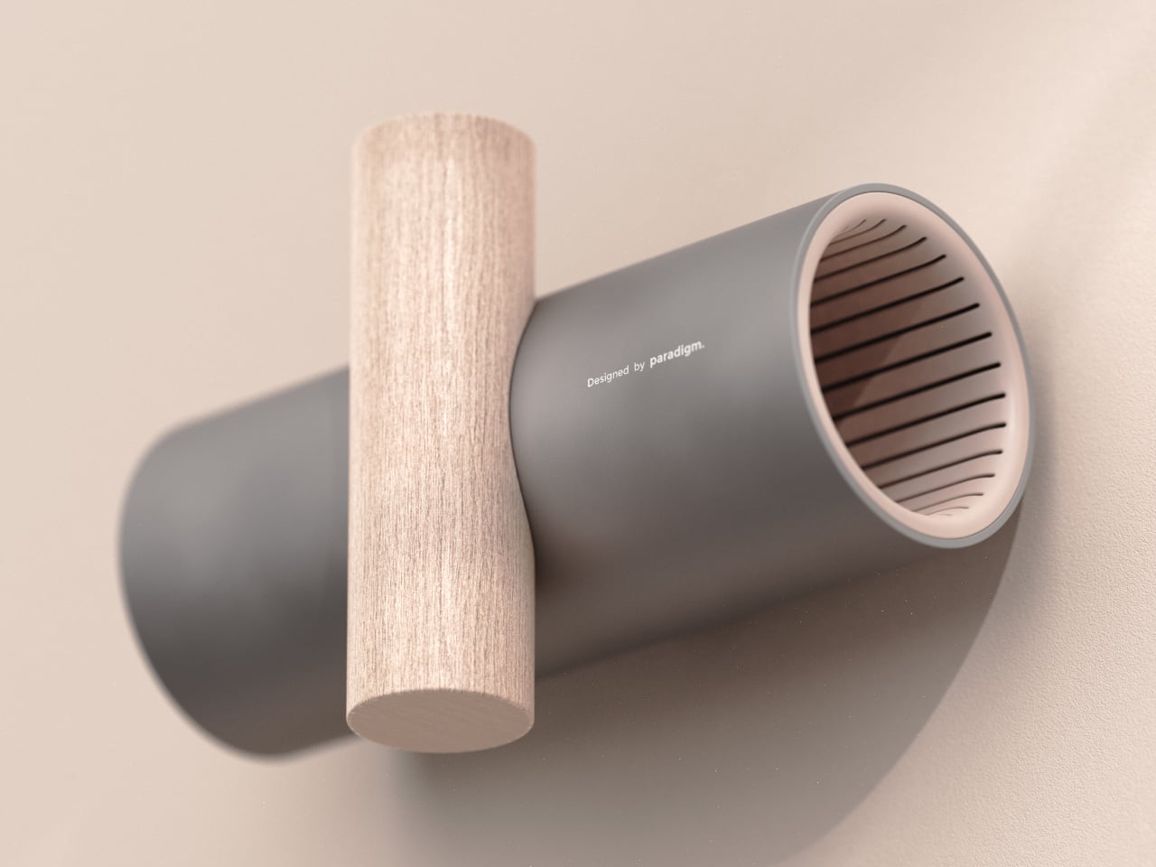
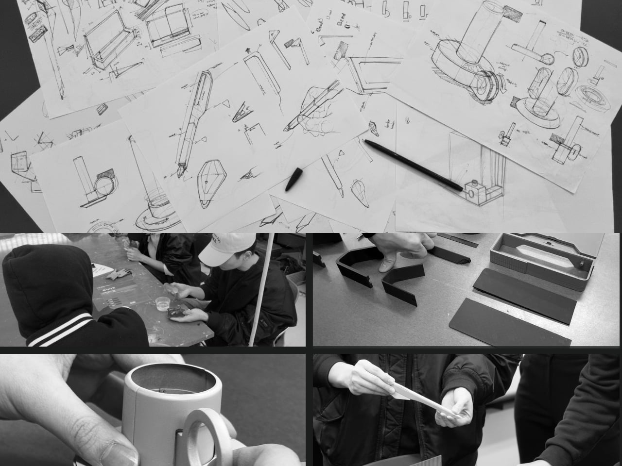
Designers: Yoo Chaeyeon, Kwon Eui Hwan, Yang Jinoo, Lee Sooyeon, Ha Seongmin
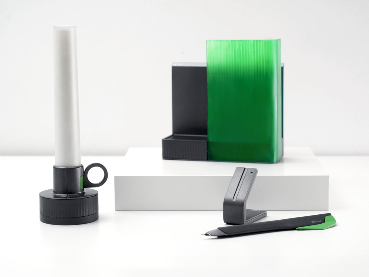
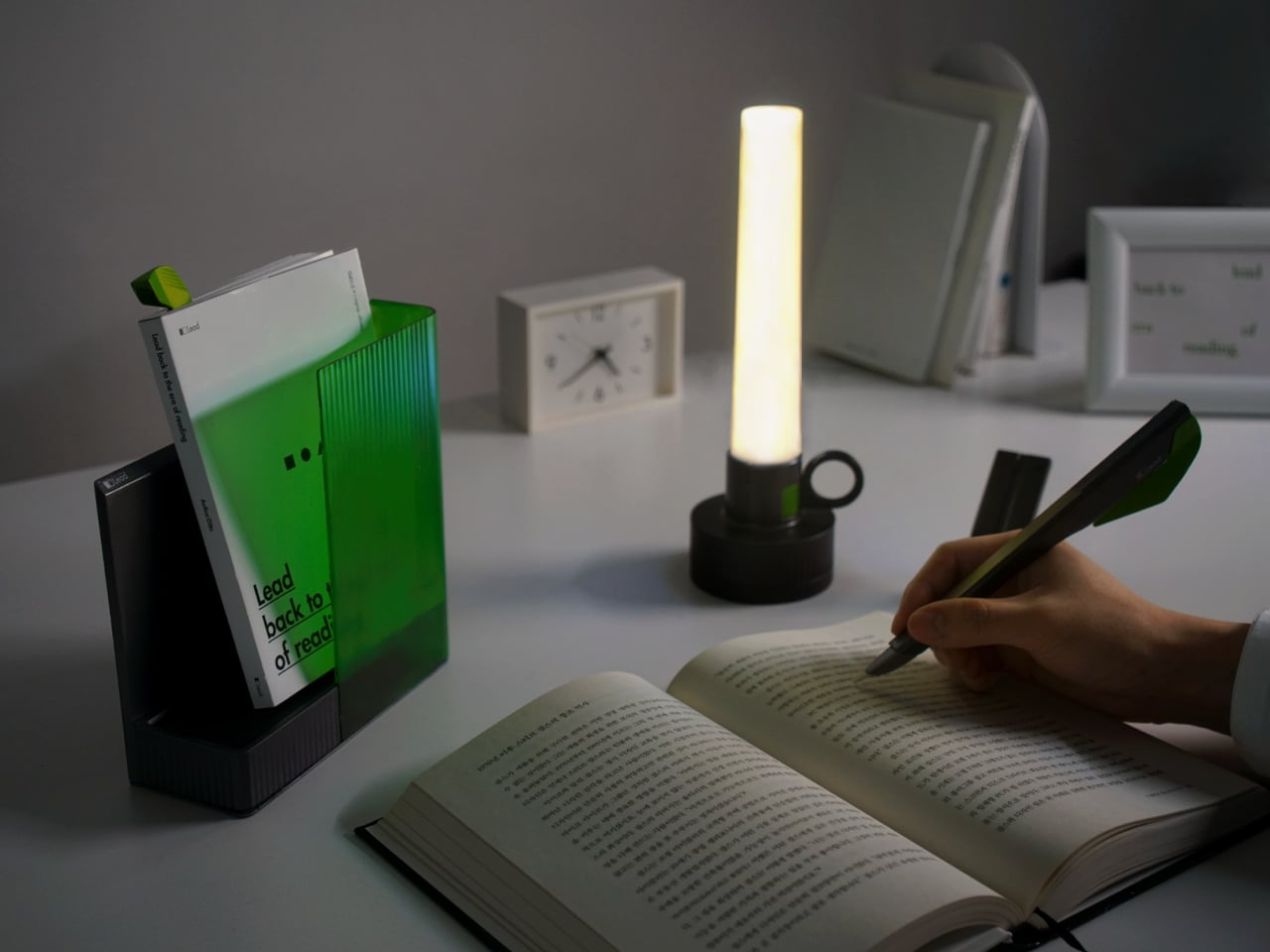
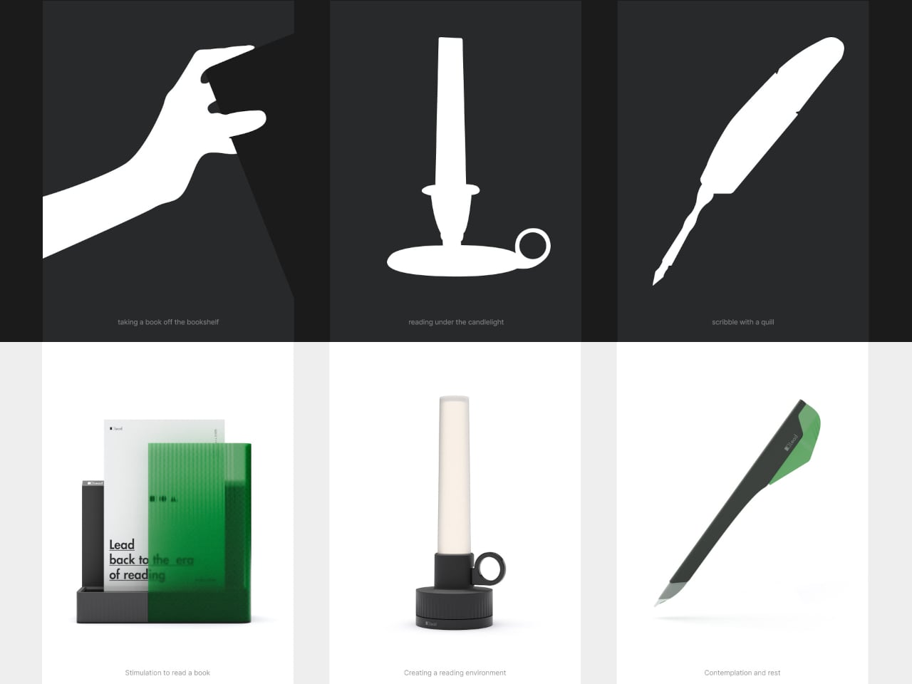
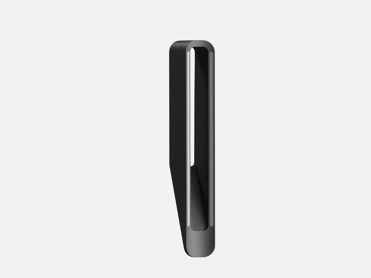
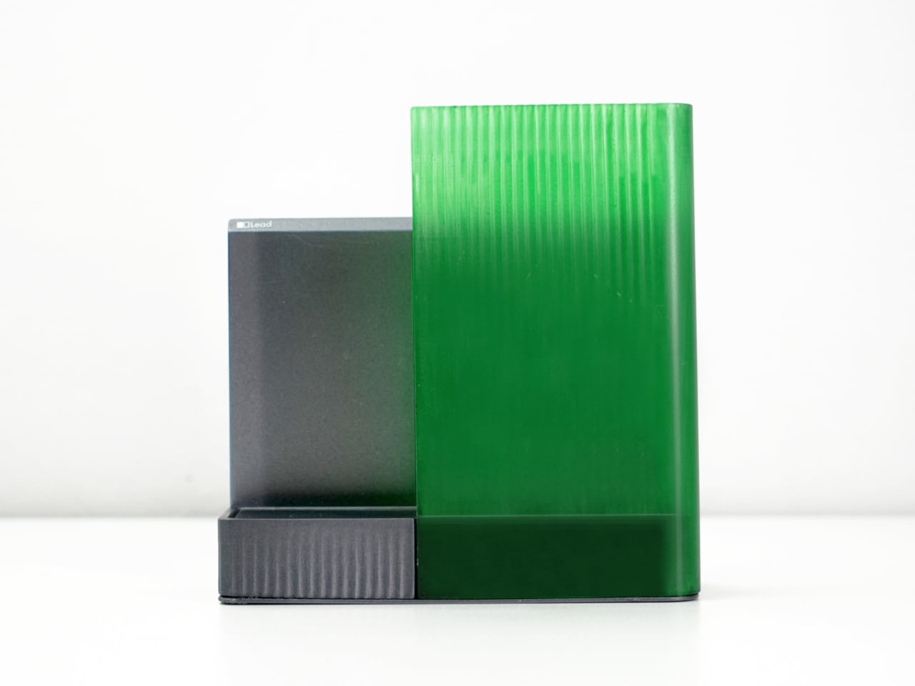
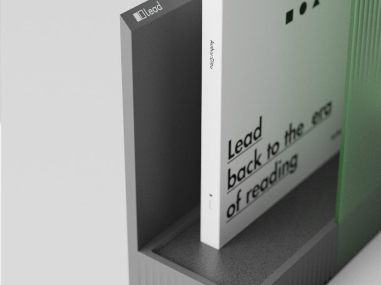
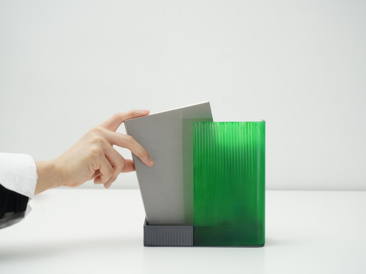
Coming home, you drop your book into Bookeeper, where it sits hidden behind a calm green panel. Earlier, you set a time to read, and as that moment approaches, the base lifts and the book slowly emerges from behind the screen. Instead of a phone notification buzzing and vanishing, the book itself appears, a quiet reminder that this is the slot you promised yourself you would actually use.

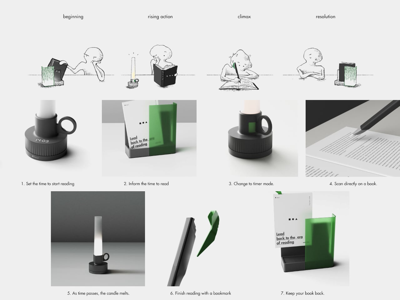
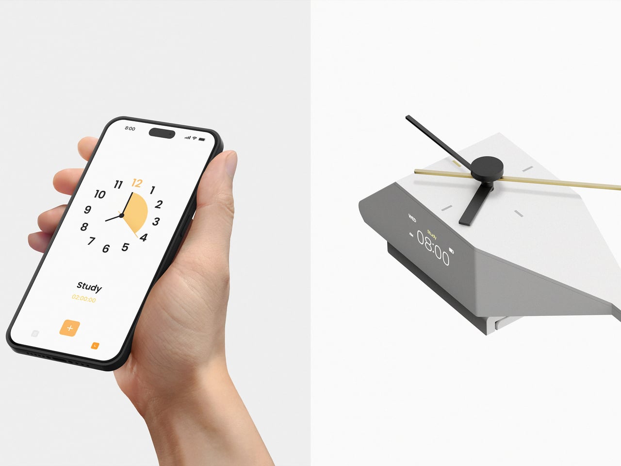
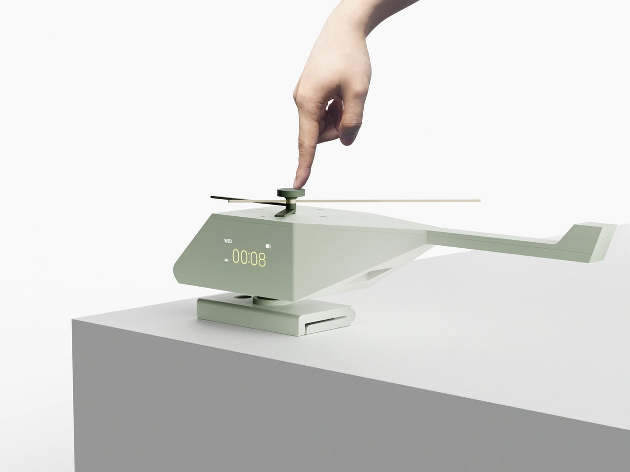
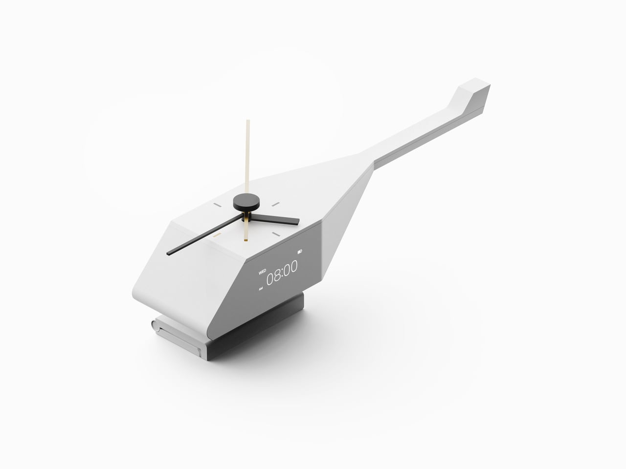
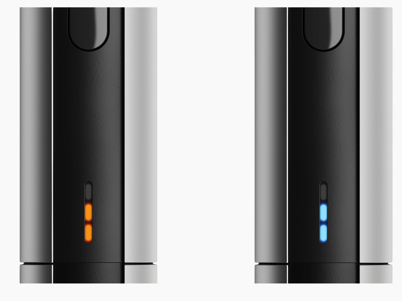
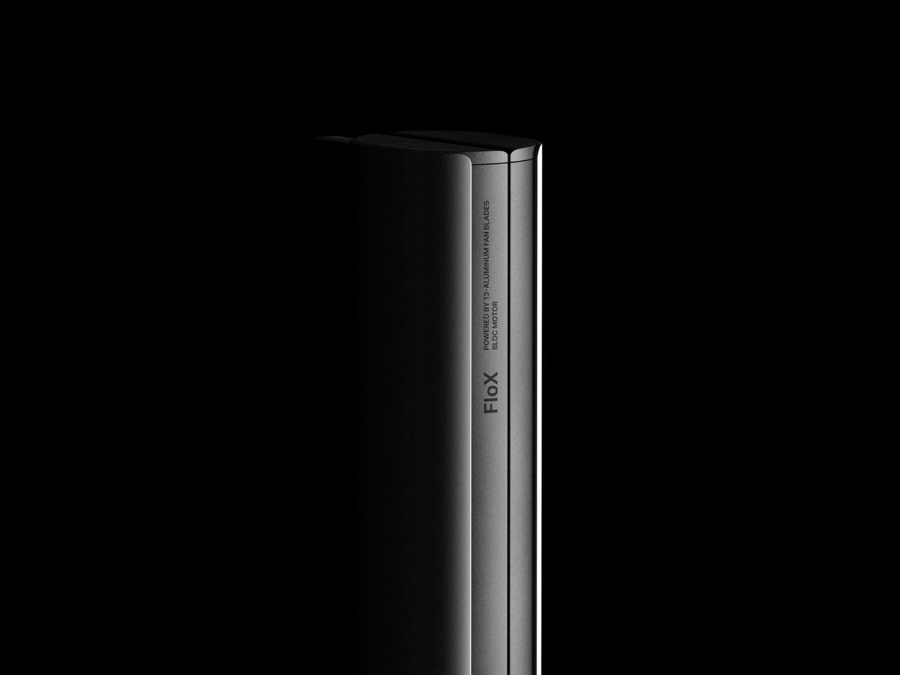
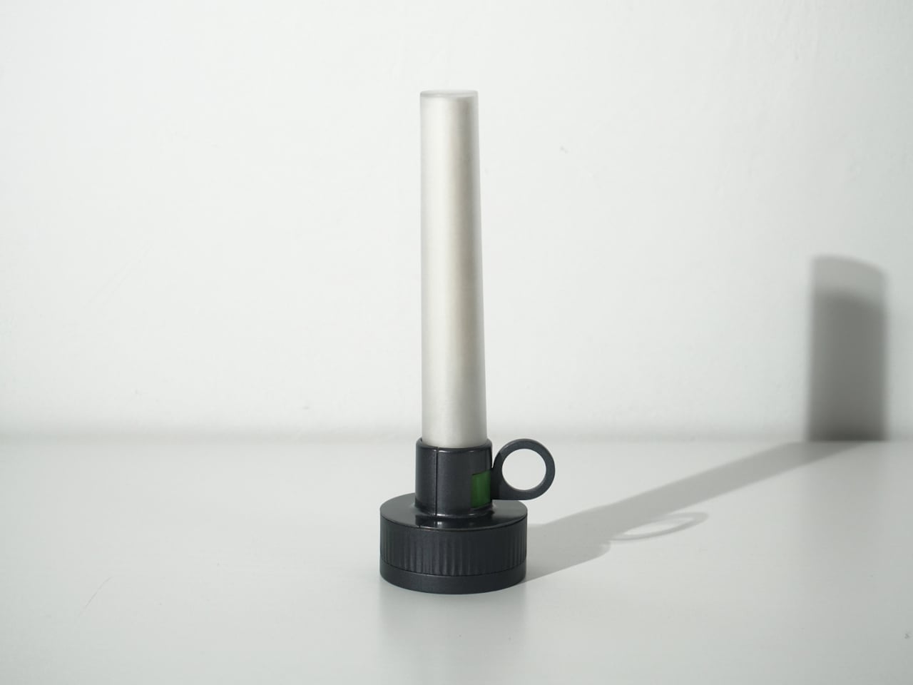
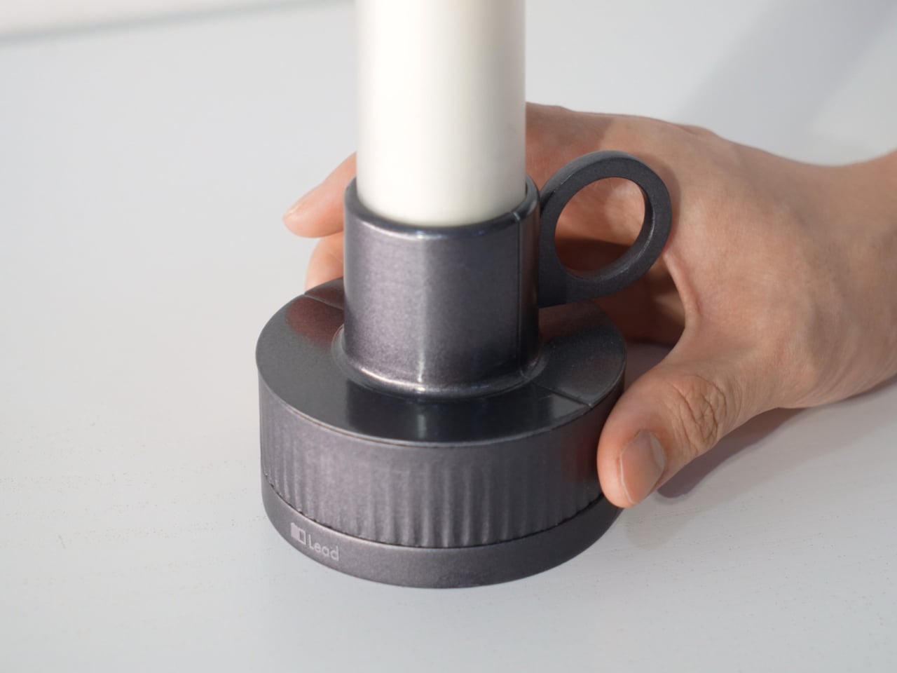
Candle is a slim vertical light that links to Bookeeper by default, then switches into timer mode with a twist of its ring. Before you dive into the pages, you set how long you want to read, and Candle becomes both atmosphere and clock. As you move through chapters, you can sense how your pace matches the time you set, adjusting speed without feeling chased by a digital countdown ticking in the corner.
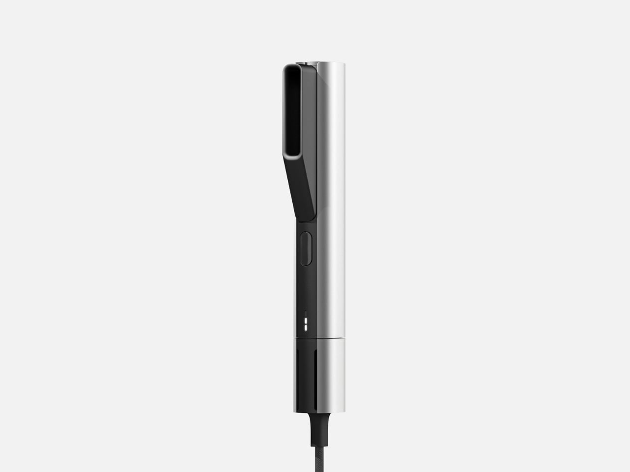
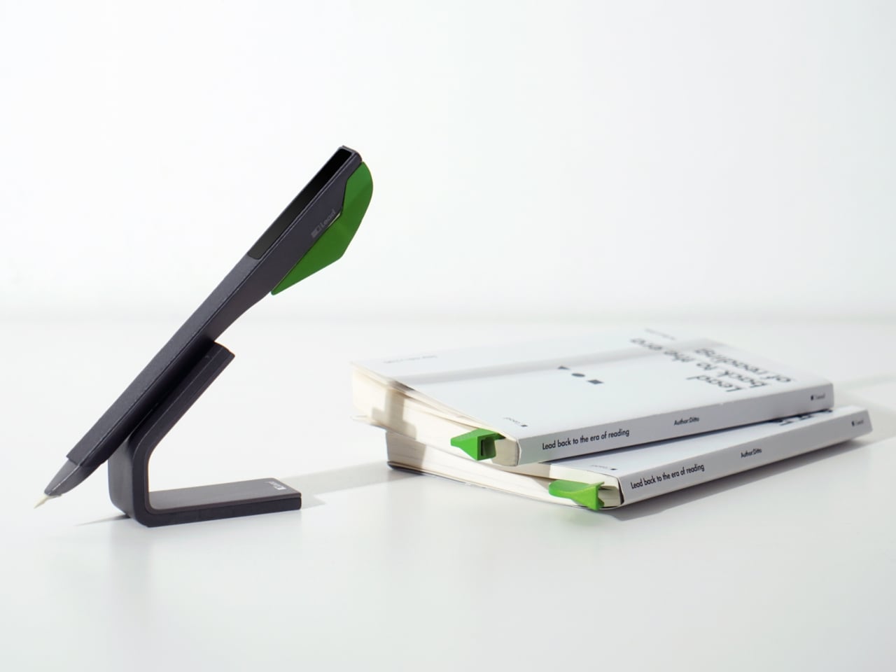
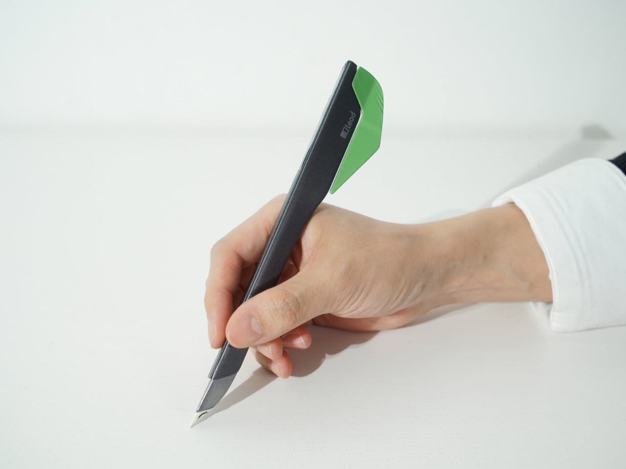
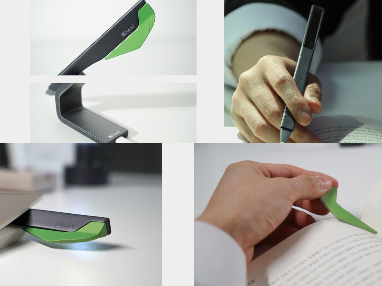
When a line or idea sticks, Quill is a smart pen that lets you write by hand in a notebook or margin, then flip into scan mode to store that text on a device later. It has two main modes, transcription and scan, so you can copy favourite phrases, jot down reflections, and then capture them without breaking the flow. A bookmark element on the back lets Quill rest in the book when you pause.
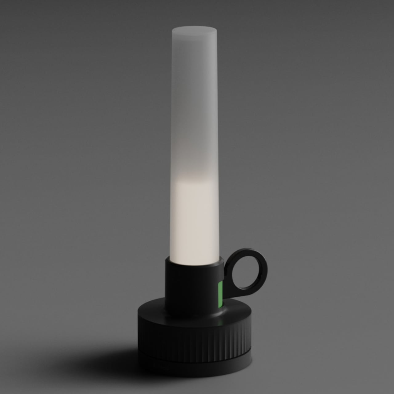
All three objects share dark bases and a calm, translucent green for the parts that move or light up, so they feel like a family without shouting for attention. The interactions are borrowed from analog reading rituals, taking a book off a shelf, lighting a candle, picking up a pen, but layered with just enough technology to guide habit without dragging you back to a screen.
Lead is less about adding gadgets to the reading table and more about designing a gentle structure around a physical book. Bookeeper brings you back at the right time, Candle holds the space and the clock, and Quill helps you remember why the session mattered. When reading often gets squeezed between notifications and feeds, a trio of objects that simply lead you back to the page feels like a quietly radical idea.
The post This Concept Makes Reading a Physical Ritual, Not an App Reminder first appeared on Yanko Design.