7 Best Japanese Tableware Finds That Will Make You Throw Out Every Generic Plate You Own

Most dinnerware is designed to disappear. Plates, bowls, chopsticks — they accumulate in cabinets and get used without being noticed, which is fine until you eat a meal set on something that was actually made with care. Then the gap becomes impossible to close. Japan produces more objects in that second category than anywhere else on earth, not because of tradition for its own sake, but because the Japanese design standard demands that everyday tools perform well and look considered doing it.

These seven pieces represent that standard in different forms — a lacquered cedar bowl from Hida Takayama, a folding knife that rests on the rim of a plate, a porcelain cup that invites you to finish designing it yourself. None of them is a status object or a conversation piece. They are tools for eating, built by people who decided that the distance between acceptable and excellent was worth the extra work.

1. Higashi Shunkei Hida-Cedar Lacquer Bowl

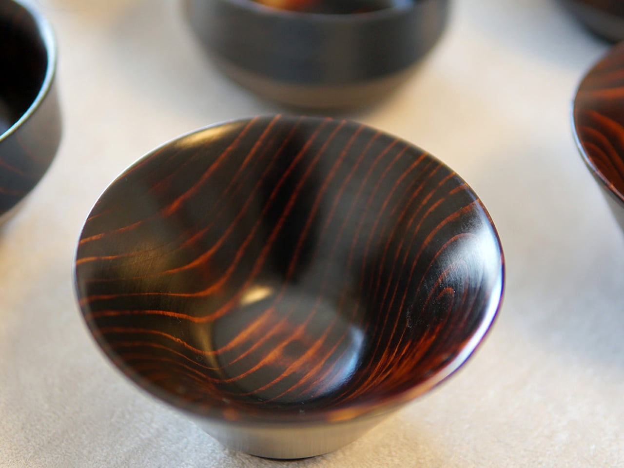
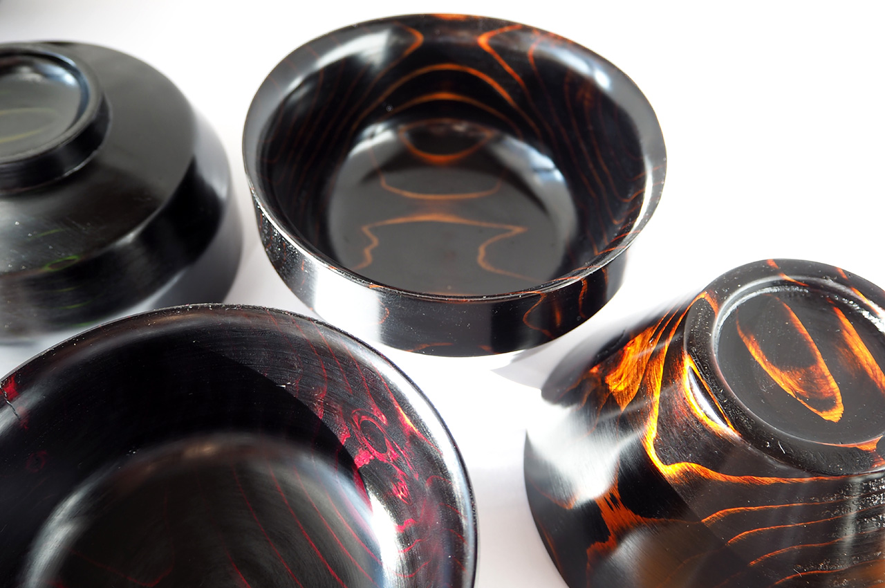
The forests around Hida Takayama cover ninety-two percent of the city’s land, and Higashi Shunkei has been sourcing cedarwood from them for sixty-eight years. The bowls they make are not the obvious Japanese craft choice — that would be ceramic — but cedar carries properties that ceramic cannot replicate. The wood grain in Hida cedar is unusually hard, with softer spaces between grains, making it difficult to process and rare even within Japan. Each bowl is spun on a lathe and finished by hand before a single coat of lacquer is applied.

The lacquer goes on in layers through a process called Suri Urushi, each coat saturating the wood’s pores rather than sitting on top of them. The result feels dense, like ceramic, but insulates like wood, so hot soup stays warm while the bowl remains comfortable to hold. The color deepens with every year of use, meaning a bowl used daily for a decade looks more alive than the one you first bought. They come in rice and soup configurations, in red, black, or blue lacquer, and are dishwasher safe, which, for traditionally lacquered woodwork, is genuinely unusual.

What we like

  • Suri Urushi lacquering fuses into the wood rather than coating it, creating a surface that strengthens and deepens over time rather than peeling or chipping
  • Each bowl’s cedar grain pattern is unrepeatable, making every piece distinct without any designer having to engineer that distinction

What we dislike

  • Hida cedar’s rarity makes these bowls difficult to source outside Japan, and the original crowdfunding campaign that brought them to international attention has since closed
  • The color range of red, black, and blue is considered, but limited for those wanting a neutral or natural wood tone at the table

2. FineLine Aluminum Chopsticks

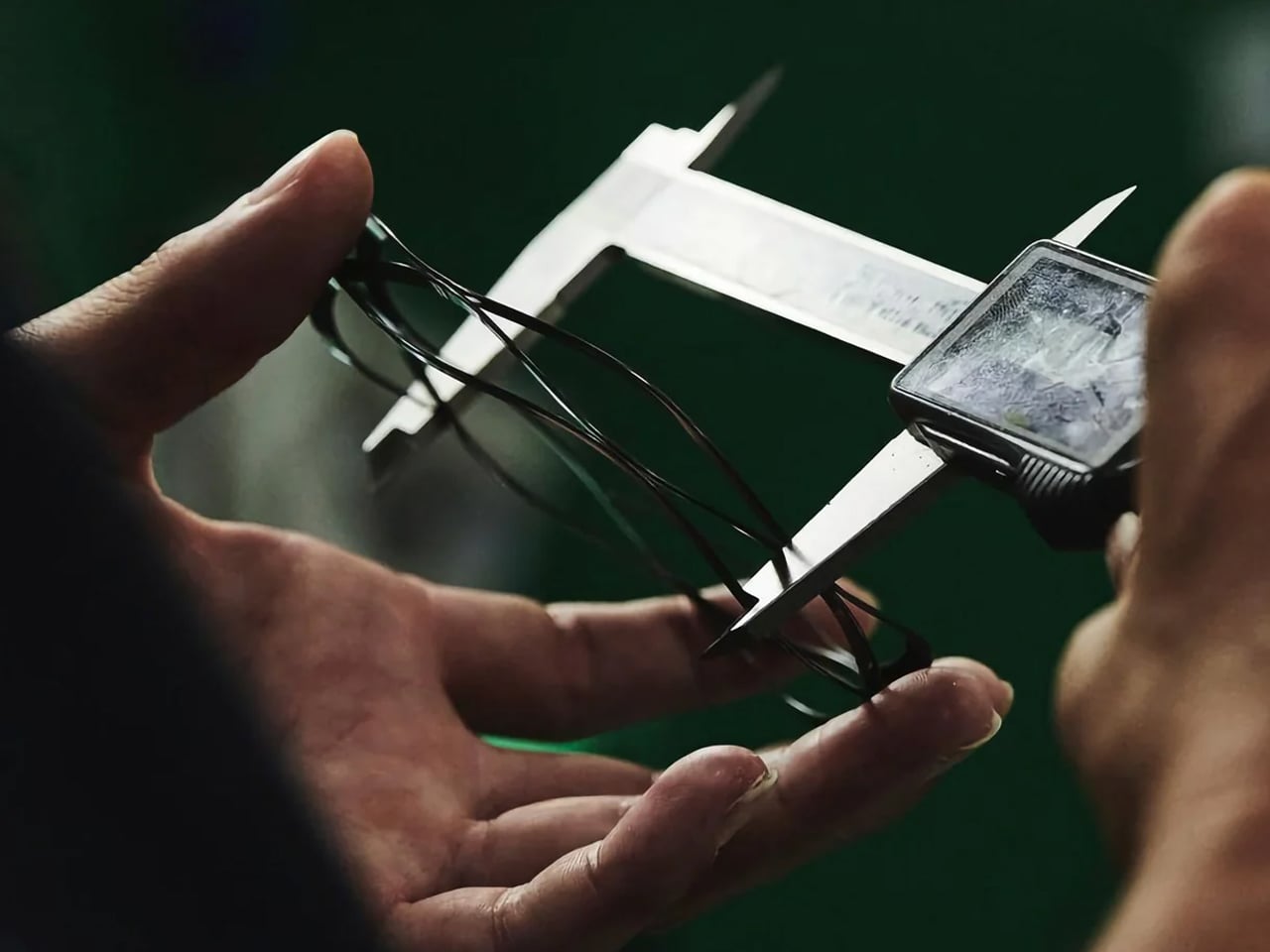
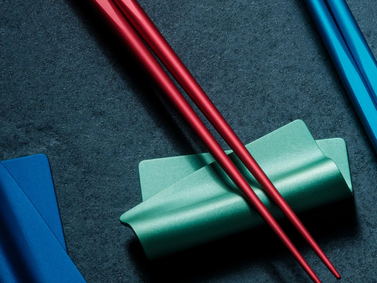
Forty rounds of refinement in Tsubame-Sanjo, Japan — adjustments to tip diameter, taper angle, grip texture, and balance in increments as small as 0.1mm. The Tsubame-Sanjo region produces surgical instruments and precision cutting tools, and that context matters here because the FineLine’s most important specification — a 1.5mm tip, roughly half the diameter of a standard pair — hides nothing. Metal chopsticks done poorly feel clinical and slippery. At this tolerance, applied through a century of metalworking discipline, they feel like the tool was always supposed to be this way.

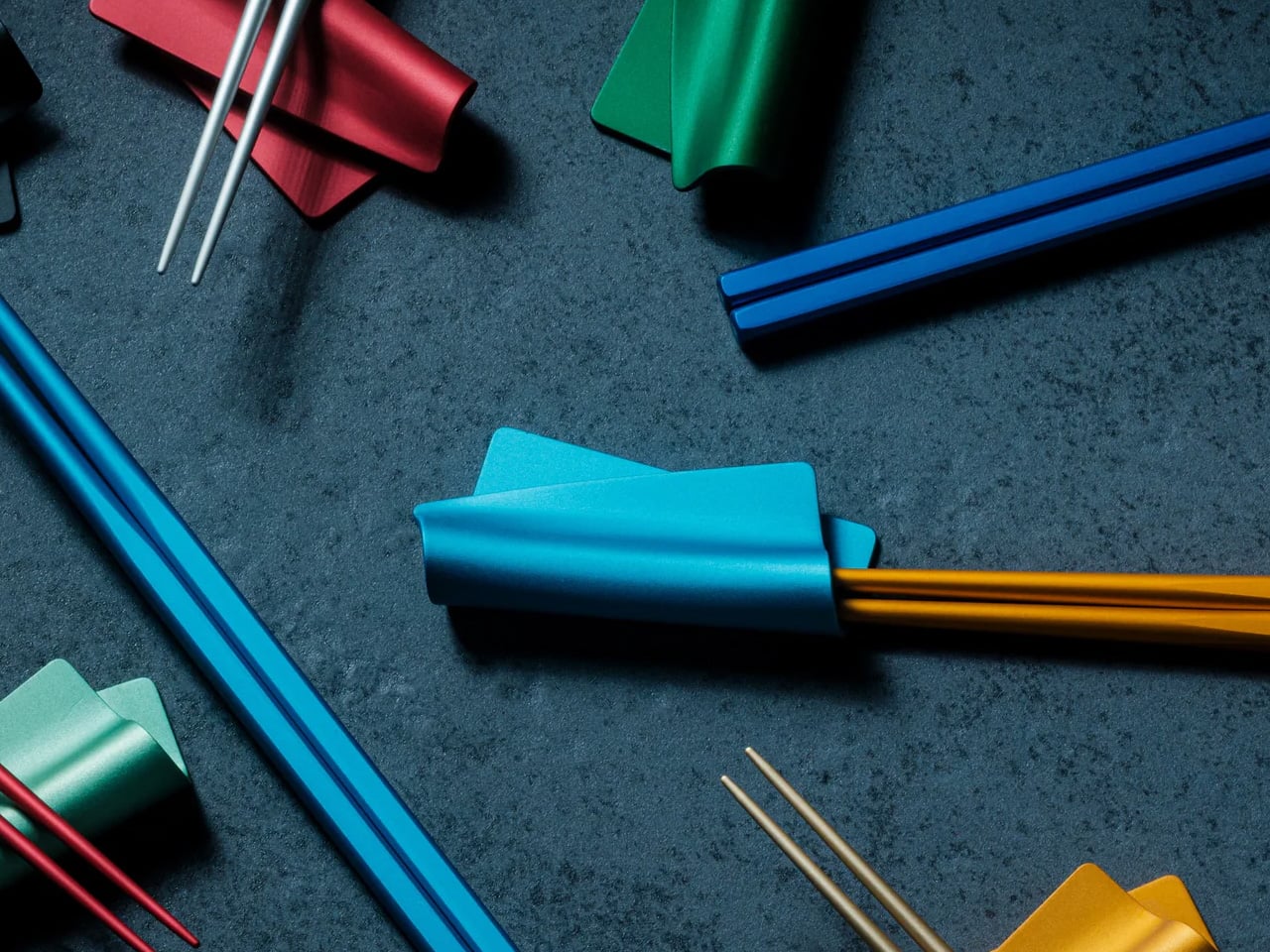
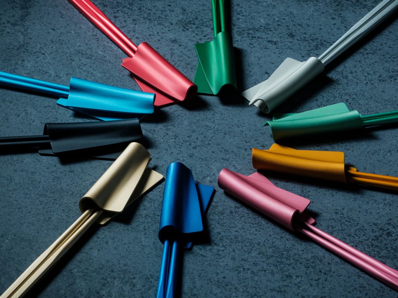
The faceted body prevents rotation, which is the quiet frustration that round chopsticks impose across every meal. Standard chopsticks ask the hand to constantly realign the tips without the user ever quite noticing it. The FineLine removes that entirely. Anodized aluminum construction resists moisture, staining, and dimensional drift indefinitely, and the finish maintains the same grip feel years after first use as it did on day one. Available in ten satin anodized tones, the range is broad enough to suit any table setting built with intention.

Click Here to Buy Now: $30.00

What we like

  • The 1.5mm precision tip creates cleaner contact and greater control than any standard chopstick, turning precision eating into something that requires less effort, not more
  • The faceted anti-rotation body eliminates the constant silent grip corrections that round chopsticks demand, making long meals noticeably calmer

What we dislike

  • Metal chopsticks require a brief adjustment period for users conditioned to the natural flex and warmth of wood or bamboo pairs
  • A single colorway per pair means building a matched set across multiple tones requires purchasing separately

3. FineLine Chopstick Rest

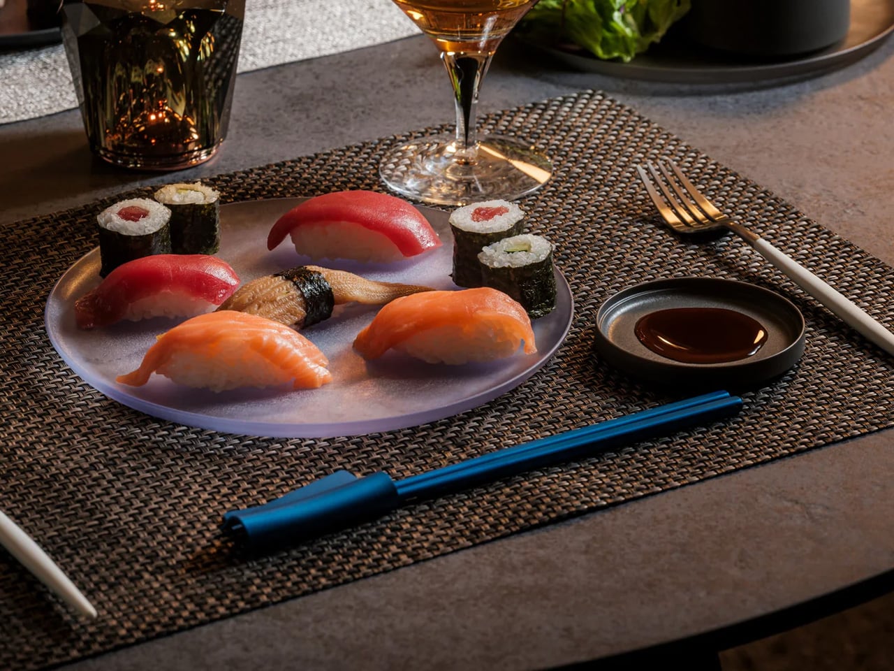
The FineLine Chopstick Rest carries the same design logic as the chopsticks themselves: anodized aluminum, matching satin finish, the same restraint applied to a form most table settings never think about. Set the chopsticks down between courses, and the rest hold them at a clean angle above the cloth, keeping the tips off the surface without drawing any attention to themselves. This is the table setting equivalent of good posture — it contributes to the overall impression without announcing that it’s working at all.

On a table assembled with care, the rest completes the system. The FineLine chopsticks and their rest read as a single considered object rather than two separate purchases, which is not something many tableware accessories manage. The matching color options mean every tonal decision across the pair, and the rest can be made deliberately, whether the goal is a perfectly uniform setting or a considered contrast that only becomes legible when the whole table comes together.

Click Here to Buy Now: $20.00

What we like

  • Shares the exact anodized finish and color range as the chopsticks, reading as a unified system rather than a matching accessory treated as an afterthought
  • Holds chopstick tips cleanly above the table between courses without any visual interruption to the setting around it

What we dislike

  • Designed around the FineLine form factor, making it a less natural pairing with wider traditional wooden or bamboo chopstick styles
  • Holds chopsticks only — no accommodation for spoons or additional cutlery alongside a mixed table setting

4. Oku Folding Knife

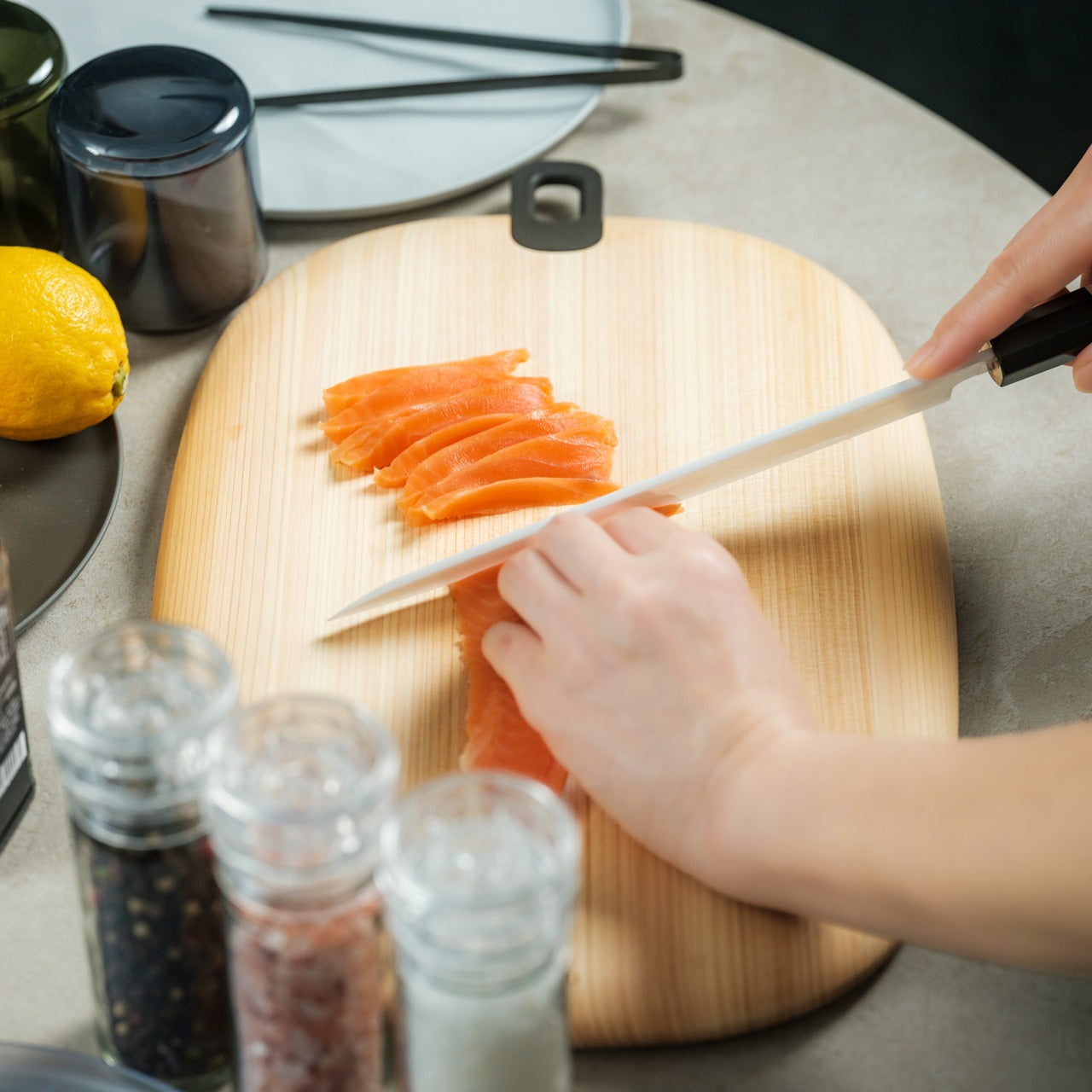
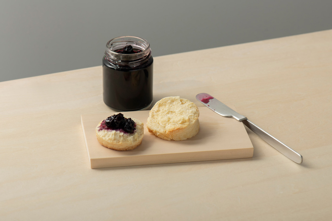
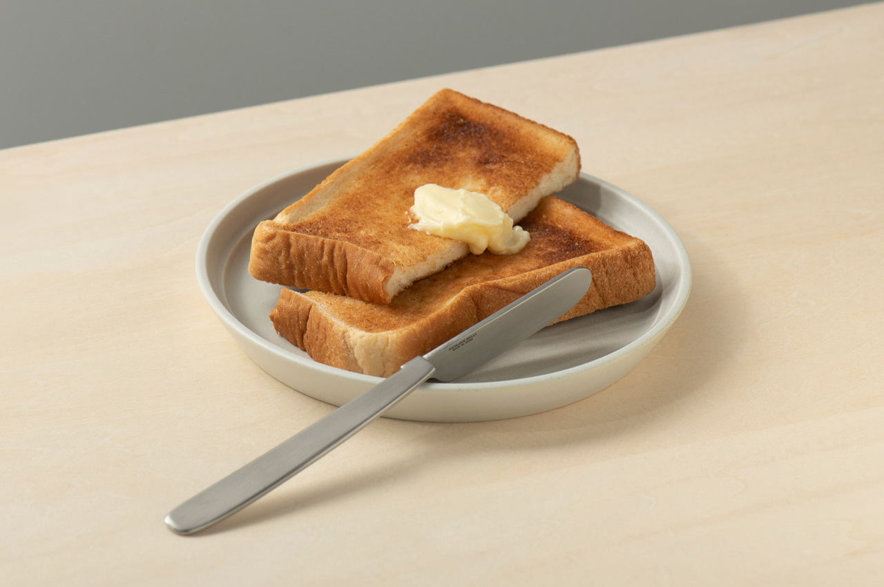
Scottish artist and metalworker Kathleen Reilly spent time living in Japan before designing the Oku Knife, and that experience shows in the problem she chose to address. In Japanese table settings, chopstick rests elevate the tips off the surface between bites, keeping them clean and the cloth unstained. Reilly asked whether a Western table knife could carry that same principle. The result is a handle folded ninety degrees from the blade, letting the handle rest flat on any surface while the blade sits perpendicular to it, never touching the table.

The blade can also hook onto the rim of a plate, held cleanly in position between uses. Reilly worked with craftsmen in Tsubame — the same metalworking city behind the FineLine chopsticks — using generations-old handcrafting techniques in stainless steel. The inner curve of the handle makes it comfortable to hold despite the unconventional angle. The name Oku comes from the Japanese word for “to place,” and the entire object functions as a design argument: that where a tool rests between uses is part of how it should be designed, not an afterthought left to the user to solve.

What we like

  • The handle’s ninety-degree fold solves a genuine table hygiene problem with a form that addresses it structurally rather than requiring a separate accessory
  • Handcrafted in Tsubame using traditional metalworking techniques, carrying genuine craft lineage from one of Japan’s most respected precision metalworking cities

What we dislike

  • The unconventional form reads as puzzling until its purpose is understood — guests unfamiliar with the concept tend to reach for it with visible hesitation
  • No direct retail pricing or purchase link was included alongside the original design feature, making sourcing require independent research

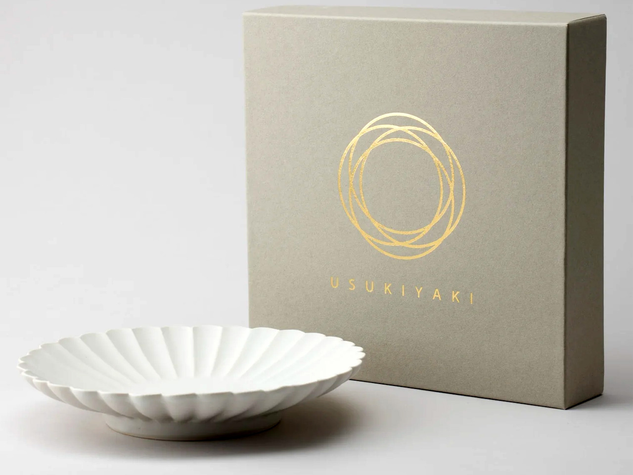
5. USUKIYAKI KIKKA Chrysanthemum Side Plate

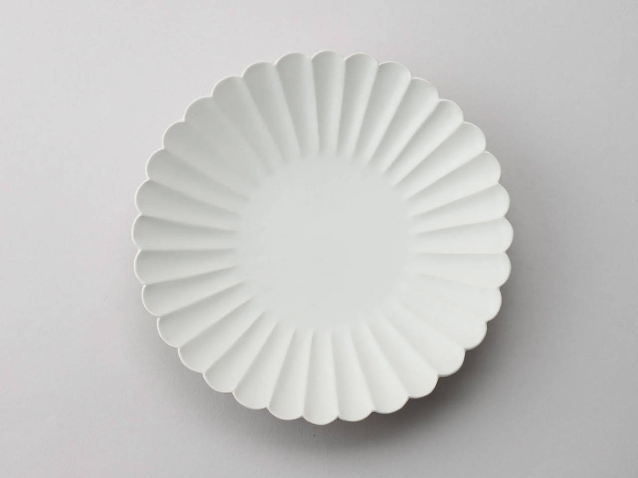
Usuki ware disappeared for two hundred years. The kiln tradition of Usuki City, in Oita Prefecture, went dormant until ceramicist Usami Hiroyuki spent years reconstructing the technique from historical fragments and reviving it as a living practice. The KIKKA series is the clearest expression of what came back. Each plate is shaped using the Katauchi molding technique, producing soft petal-curved forms along the rim that suggest the chrysanthemum, the series is named after. The matte white finish sits in the register between porcelain refinement and handmade warmth, where the best Japanese ceramics have always lived.

At 9.5 centimeters across, the plate is scaled for the foods that benefit from their own surface: tsukemono, a few slices of sashimi, a piece of fruit, and a small side of tofu. The wavy petal rim casts small shadows across the table as the light shifts, so the space around the food changes throughout a meal without the food itself changing at all. Microwave and dishwasher safe, the KIKKA is not a display object saved for guests. It is a daily plate built from a tradition that came within a generation of being lost permanently.

What we like

  • The Katauchi petal rim casts a genuine shadow across the table surface, creating a dynamic visual quality that flat-rimmed plates cannot produce, regardless of glaze or material quality
  • Made by USUKIYAKI artisans reviving a tradition dormant for two centuries, giving each piece craft lineage that mass production cannot manufacture or approximate

What we dislike

  • Hand production means slight variation in petal form and glaze between individual pieces, which requires accepting rather than expecting uniformity across a matched set
  • At 3.7 inches in diameter, the scale suits side dishes only — it is not a main plate and should not be asked to function as one

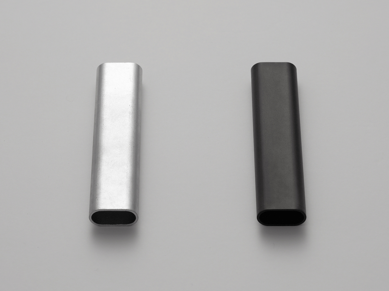
6. Rodent Bottle Opener

Most bottle openers live in drawers and stay there until they’re needed. Kairi Eguchi’s Rodent opener for WELD DESIGN STORE takes the opposite position. It starts as an oval steel pipe, and only the section required to remove a bottle cap receives any intervention. The rest of the pipe is left as it came, preserving what the designer calls the raw, honest character of freshly cut metal. Advanced 3D pipe laser processing makes that minimal intervention possible with the precision the form requires.

The oval profile fits naturally in the hand and carries a weight that makes the act of opening a bottle feel deliberate rather than reflexive. The cutout is shaped after a rodent’s tooth structure — which gives the product its name — and works whether the user pulls down or up, adapting to hand position without adjustment. Available in silver or black, both finished with RoHS-compliant plating that meets environmental manufacturing standards. Slip it into a drawer, rest it on a bar cart, hang it from a cord. A form this reduced works in any context because it isn’t asking the space to accommodate it.

What we like

  • Minimal processing preserves the raw character of the steel, making material honesty the entire design statement rather than a supporting claim
  • The universal up-or-down opening mechanism adapts to different hand positions and bottle angles without any deliberate adjustment required

What we dislike

  • The pipe form is so reduced that it offers no immediate visual indication of function to someone encountering it for the first time
  • A single-function object at a premium price point requires genuine appreciation of design reduction to justify over a utilitarian alternative that does the same job for a fraction of the cost

7. Corcelain Modular Porcelain Cups

Designer Kosuke Takahashi collaborated with 224 Porcelain — founded in 2012 in Ureshino City, Saga Prefecture, drawing from the Hizen-Yoshidayaki ceramic tradition — to produce the Corcelain collection. Each cup arrives from the kiln as a finished, functional vessel. It is also a starting point. Precision-engineered mounting points built into the porcelain accept 3D-printed attachments: feet, handles, lids, decorative elements, configurations that shift the same cup from a morning tea vessel to an evening sake cup without replacing the ceramic itself. The object you buy is the beginning of the design, not the end.

Takahashi’s work centers on systems rather than individual objects, and the Corcelain reflects that orientation. The 3D-printed components are engineered to match the quality and finish standard of the ceramic base, and downloadable models on MakerWorld allow users to create their own attachments — a community of makers extending a traditional craft studio’s output through digital fabrication. The collection makes an argument ceramics rarely voice aloud: that a vessel does not need to be fixed to be complete, and that the user’s participation in determining its final form is a legitimate part of what it means to be designed.

What we like

  • The modular system lets users configure handles, feet, and lids to preference, turning a traditional ceramic vessel into something co-designed rather than simply purchased and placed
  • Downloadable 3D models on MakerWorld mean the attachment ecosystem is open rather than proprietary, extending the object’s possibilities beyond what either collaborator initially designed

What we dislike

  • The modular concept requires access to a 3D printer to unlock the system’s full range, adding a technical barrier for users without that setup at home
  • 3D-printed components alongside hand-thrown porcelain require some design literacy to read as intentional rather than mismatched across the same object

The Table You Set Says Something — Make Sure It’s Worth Hearing

The thread connecting these seven objects is not minimalism as decoration. It is rigor — the decision to apply serious thought to a bowl, a knife, a rest for chopsticks, a cup that accepts attachments — and the willingness to spend more time on the object than the market strictly requires. Each piece here exists because someone refused to stop at good enough. That refusal is exactly the quality that makes a table worth sitting down to in the first place.

None of these objects will make food taste better in any measurable sense. What they change is harder to name: the quality of attention a meal receives. A cedar bowl that improves with age, a chopstick rest that holds its position without interrupting anything around it, a side plate whose petal shadow shifts through dinner — these are quiet contributions. Together, they built a table that makes eating feel like it was worth setting up with care.

The post 7 Best Japanese Tableware Finds That Will Make You Throw Out Every Generic Plate You Own first appeared on Yanko Design.

5 Best Japanese Kitchen Gadgets That Make Cooking Feel Like a Meditation Ritual

Japanese kitchen tools operate differently from their Western counterparts. They don’t promise to speed things up or reduce effort. They promise to make that effort worth something. The objects below share a commitment to material honesty and precision that changes the pace of cooking without changing the recipe. Each one invites you to slow down, pay attention, and find something close to calm in the ordinary rhythm of preparing food.

None of these tools asks for much counter space. None comes with instruction manuals. What they share is a design philosophy rooted in centuries of Japanese craft tradition, where restraint and intention produce objects that reward your attention rather than compete for it. Cooking with them slows you down in a way that feels like a gift. The meditation isn’t something you bring to the kitchen. These tools create the conditions for it.

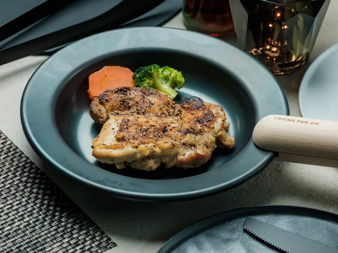
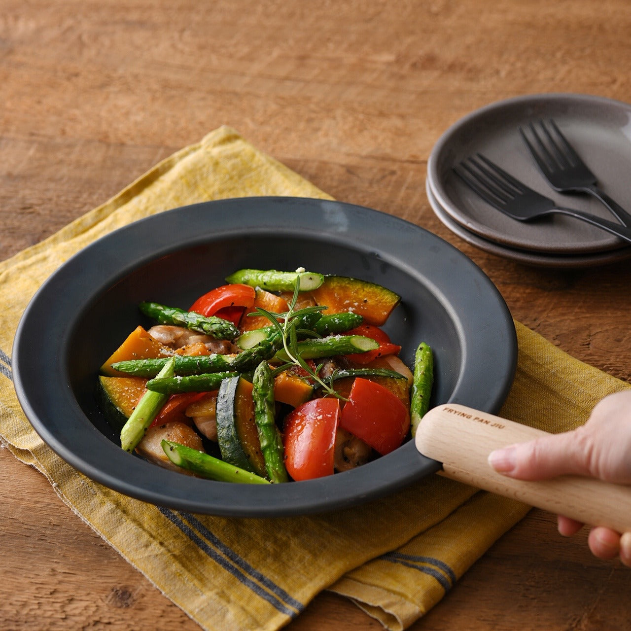
1. Iron Frying Plate

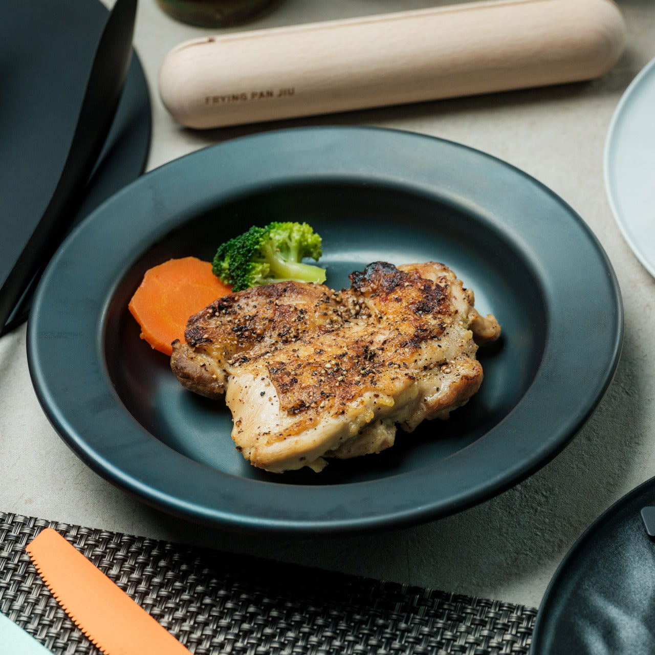
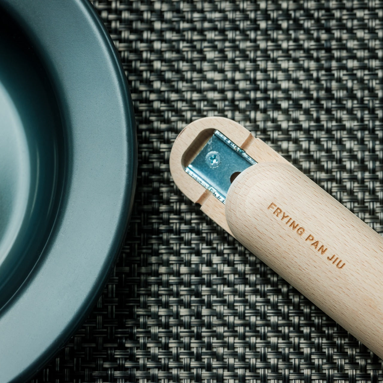
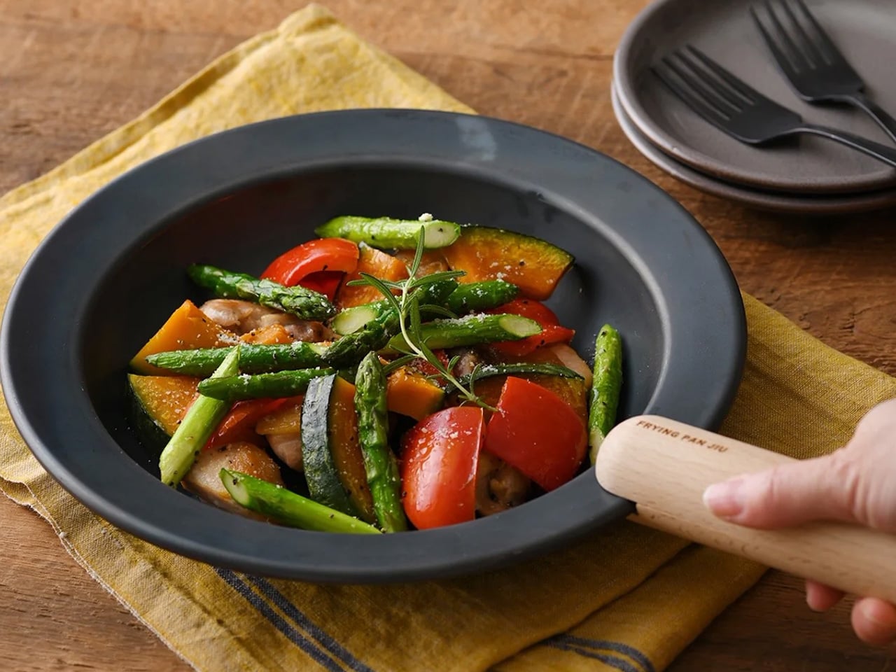
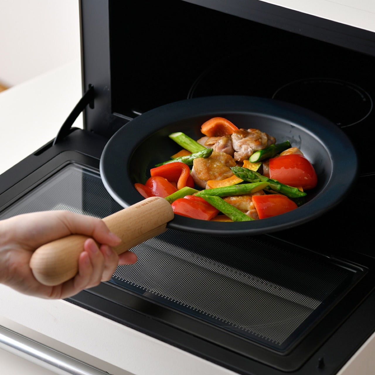
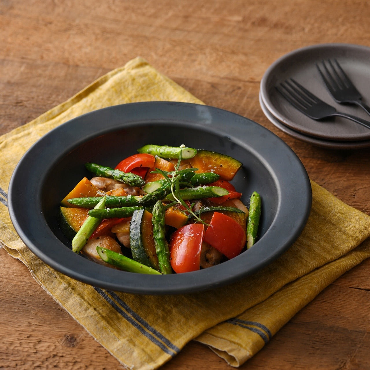
The Iron Frying Plate removes the boundary between the cooking vessel and the serving dish. Crafted from rust-resistant mill scale steel with a detachable wooden handle, it moves from stove to table without a transfer, without a plate in between. Eggs arrive still sizzling. Fish comes off the heat and onto the table in the same object, retaining the kind of temperature and texture that plating destroys. The cook-and-serve design isn’t a shortcut. It’s a different way of thinking about food.

The uncoated surface requires no seasoning before first use and develops natural non-stick properties through regular cooking. The detachable wooden handle attaches and releases with one hand, making the transition from burner to table completely fluid. Retained heat keeps food at a temperature throughout the meal, which changes its pace in subtle but noticeable ways. You stop rushing through dinner because the plate is still doing its job while you’re still deciding what to eat first.

Click Here to Buy Now: $69.00

What We Like

  • The cook-and-serve design preserves the temperature and texture that get lost in any transfer to a separate plate
  • The uncoated mill scale steel develops natural non-stick properties through use, with no chemical coatings involved

What We Dislike

  • The iron construction retains heat long after serving, which requires careful handling at the table
  • Heavier than standard serving dishes, which takes some adjustment if you’re used to lighter ceramics

2. Katakuchi Suribachi & Surikogi Set

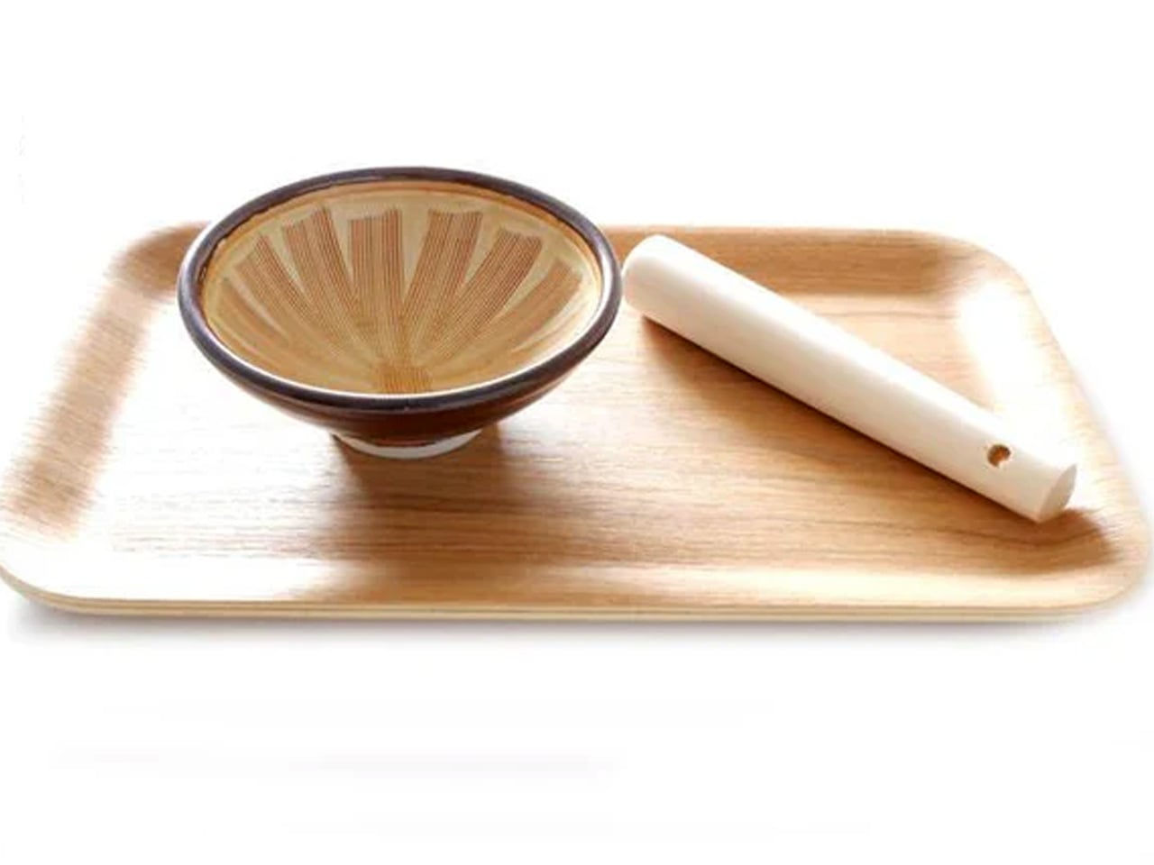
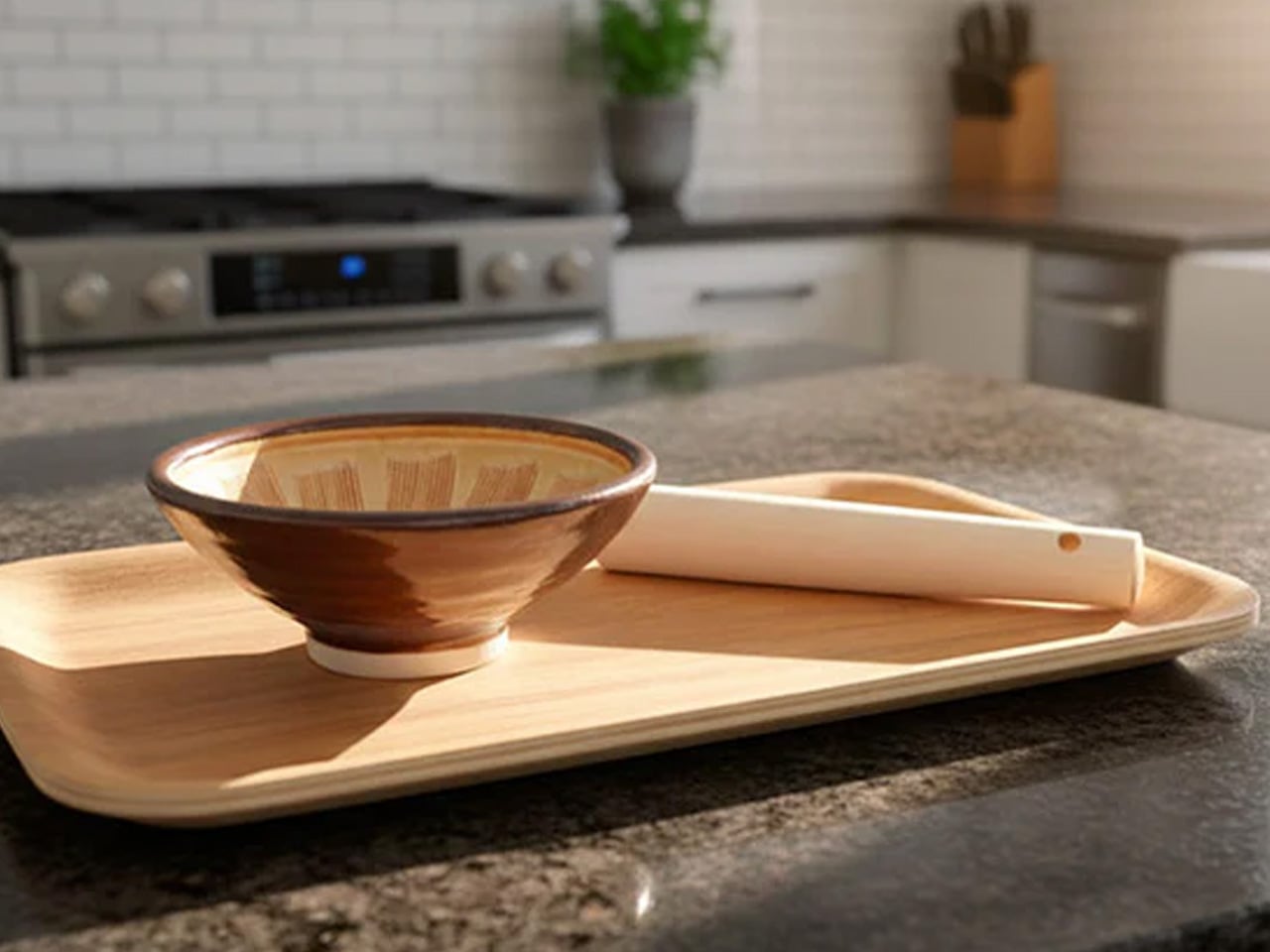
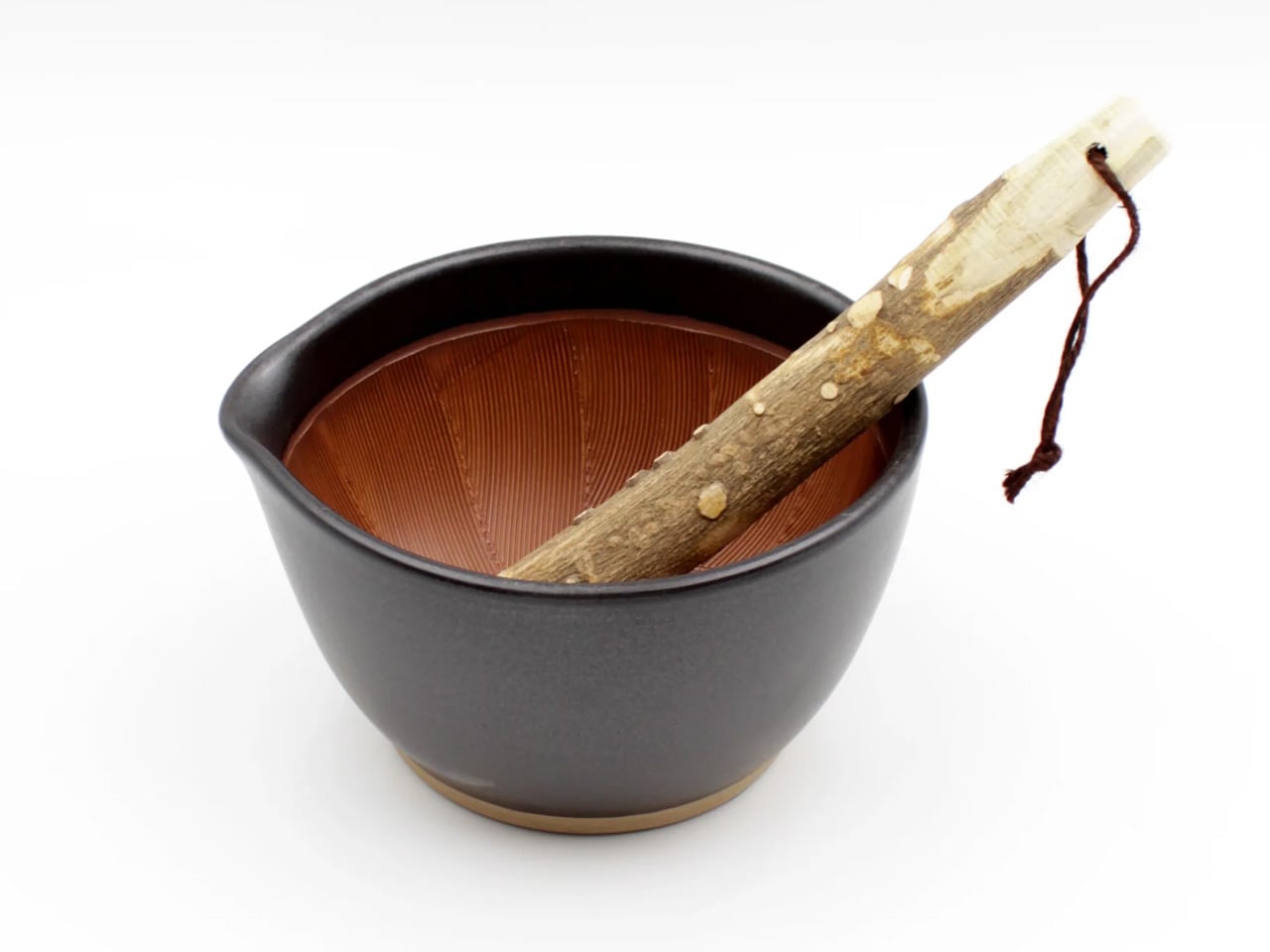
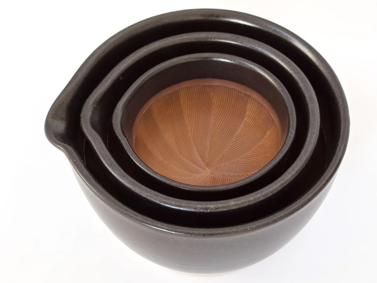
The suribachi is a Japanese mortar defined by its interior: a web of fine ridges that grip seeds and fibres and pull them apart through friction. Unlike smooth-walled mortars that crush, this one grinds, and the difference in what that produces is immediate. The katakuchi design adds a spout, so freshly ground sesame pours cleanly from the vessel without a transfer step. The wood surikogi follows the curve of the bowl exactly, which is the whole point of the pairing.

Using a suribachi imposes a different pace on cooking. You bring the seeds in, you begin to work the pestle in slow circles, and the sound changes as the seeds release their oil. The kitchen starts to smell like food before the pan is even on. That sensory sequence of physical work and gradual transformation is what separates this from a standard grinding tool. Available from TOIRO Kitchen in two colorways, it’s priced between $36 and $63 depending on size.

What We Like

  • The katakuchi spout makes it a single-vessel process from grinding to pouring; nothing gets lost in the transfer
  • The ridged earthenware interior produces a texture and aroma from sesame and spices that a food processor simply cannot replicate

What We Dislike

  • The earthenware body is heavy and requires careful handling; it’s not something you grab quickly
  • Cleaning the grooved interior takes more attention than a smooth-walled mortar

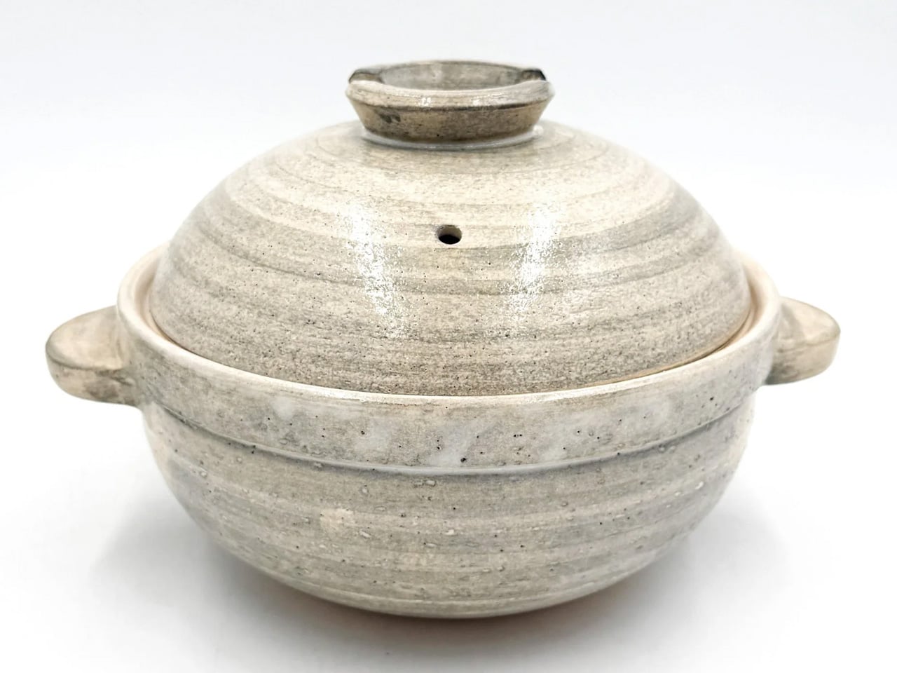
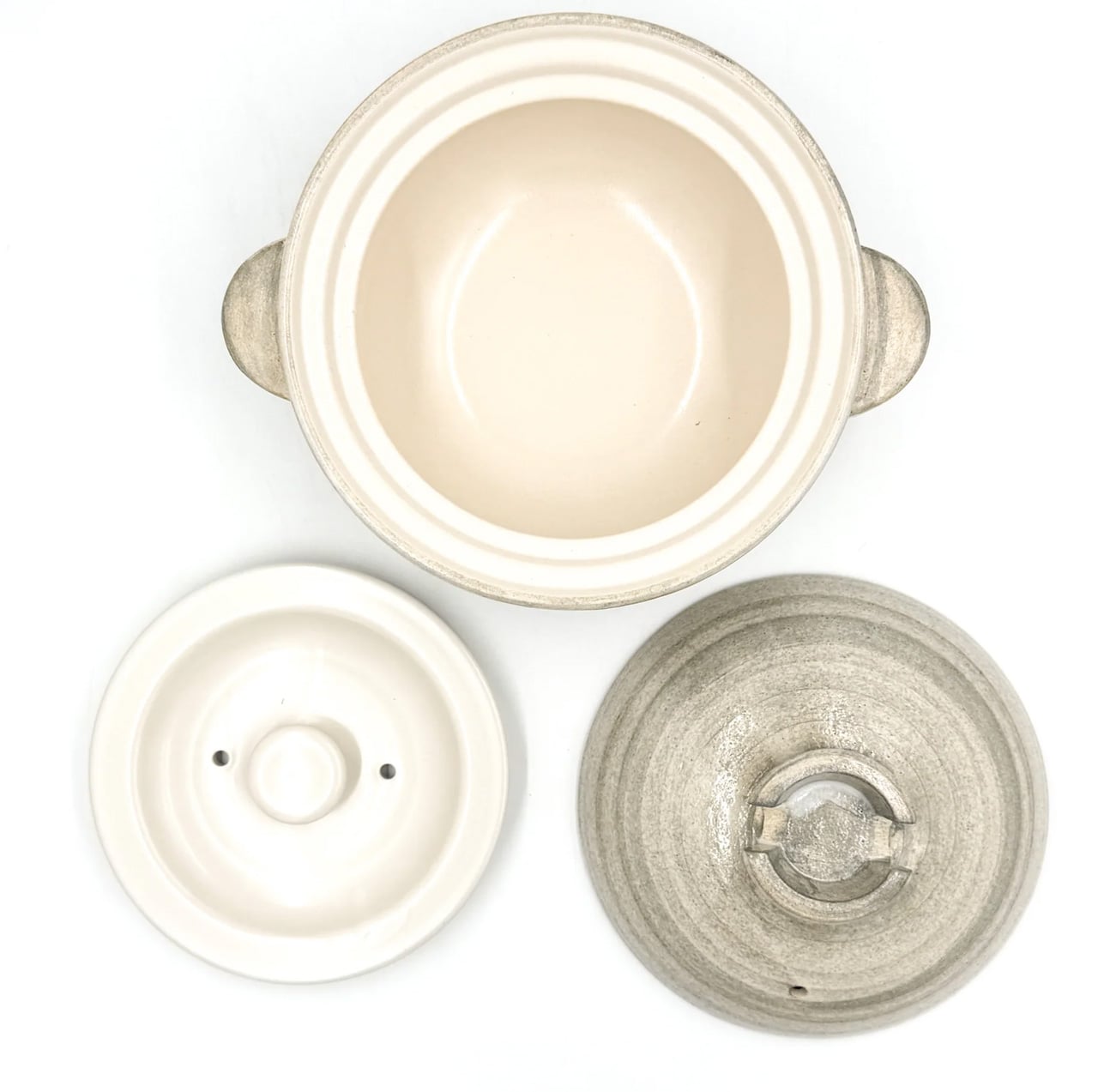
3. Iga-yaki Donabe Clay Pot

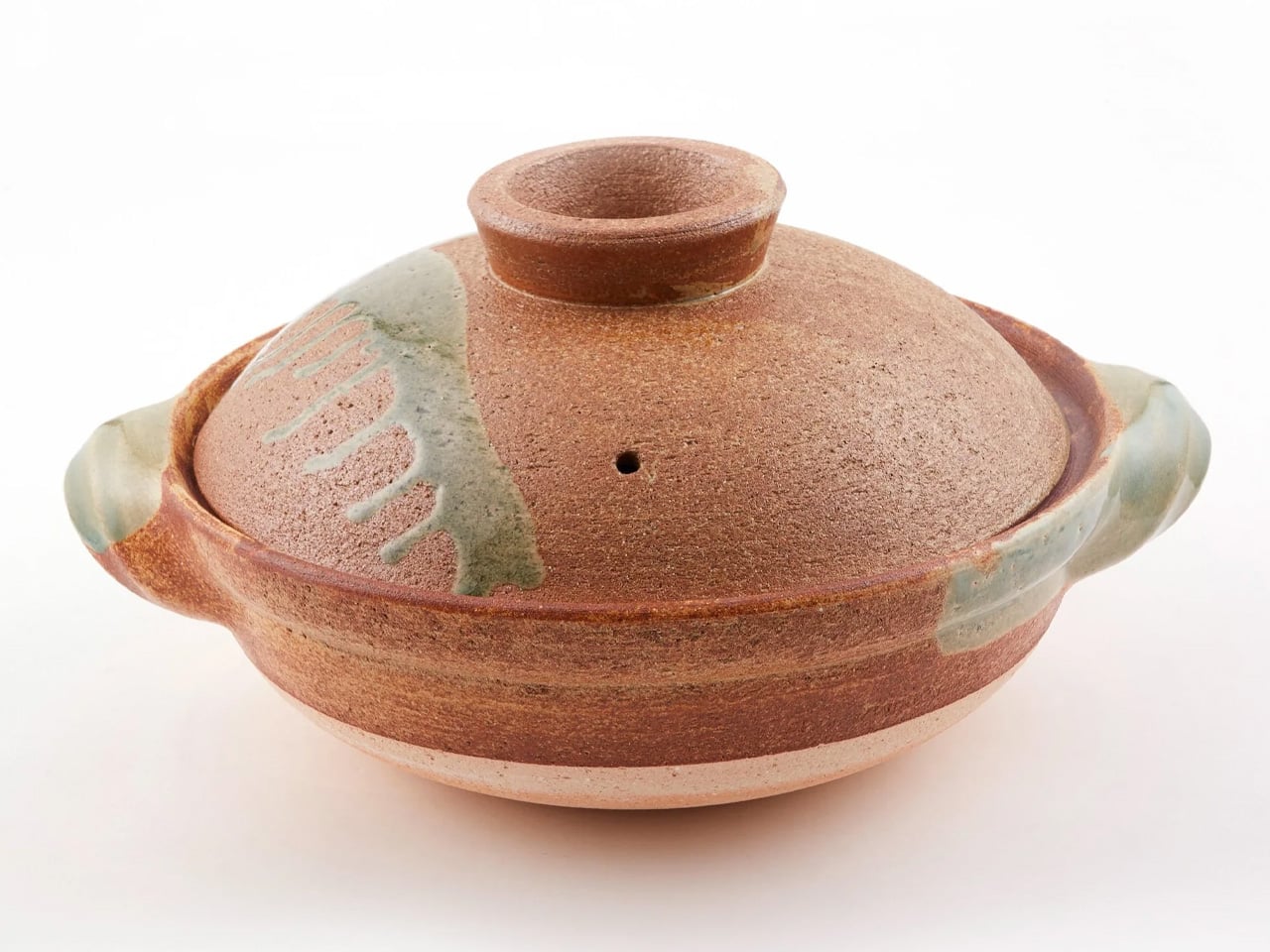
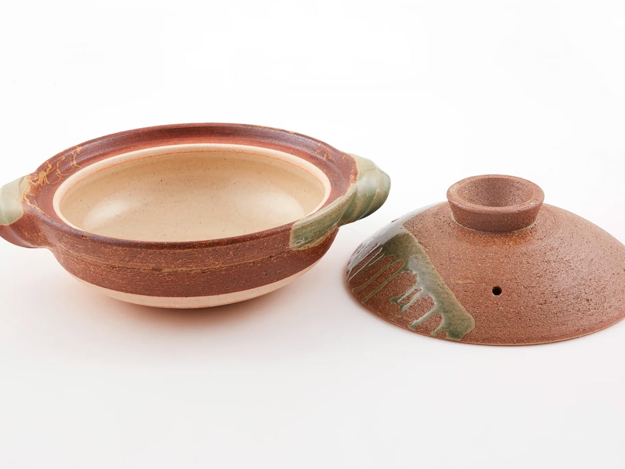
Iga-yaki clay comes from Mie Prefecture in Japan, where the local earth has been used for ceramics since at least the Kamakura period. The porous structure absorbs heat slowly and releases it evenly, creating a cooking environment that metal pots simply cannot replicate. Rice cooked in it sweetens. Broth deepens over a lower flame. The exterior stays rough and unfinished while the interior is glazed smooth: two textures on the same vessel, each doing exactly what it needs to.

Using a donabe imposes a different pace on dinner. You bring it to a heat gradually, you watch the steam rising from the lid, you lower the flame, and wait. That sequence of patient setup, attention to what the pot is communicating, and the discipline not to rush transforms cooking into something closer to practice than production. TOIRO Kitchen stocks Iga-yaki donabe in several sizes, all made in Japan, all functioning as vessels for the kind of cooking that rewards presence.

What We Like

  • Iga-yaki clay retains heat well past the point of turning off the flame, keeping food at a temperature while you’re still at the table
  • Genuinely versatile across hot pot, rice, steaming, and slow braise. One vessel covers all of it

What We Dislike

  • Clay donabe requires seasoning before first use, typically by simmering rice water in it, a step not everyone anticipates from the packaging
  • The porous clay body can absorb strong cooking odors over time and needs to be stored with the lid off after washing

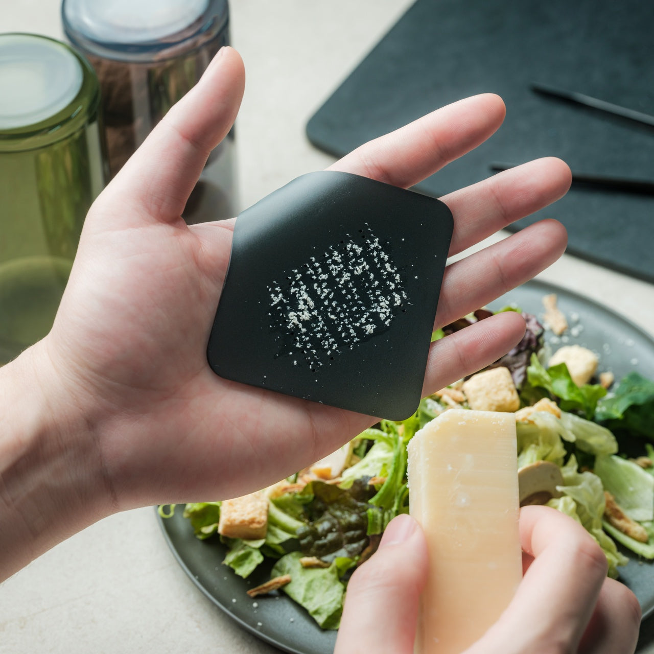
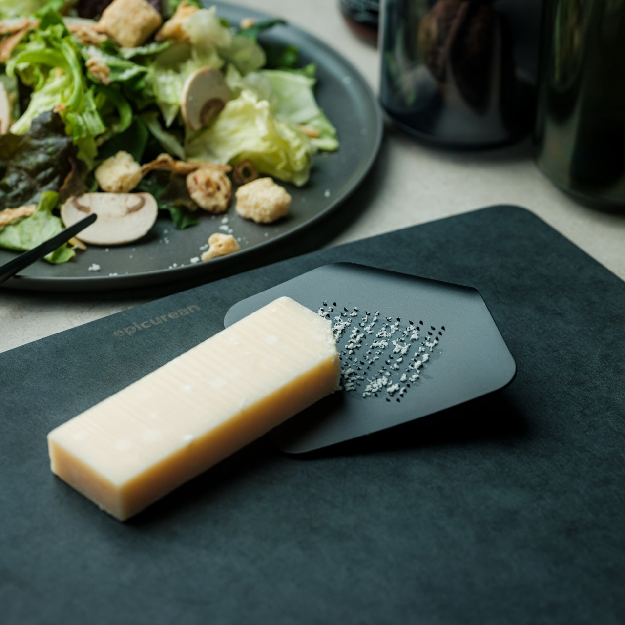
4. Sakura Petal Grater

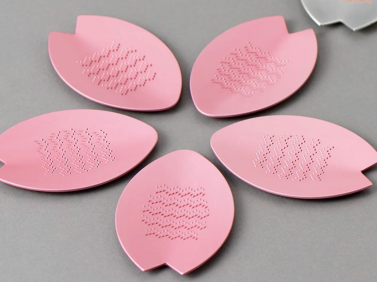
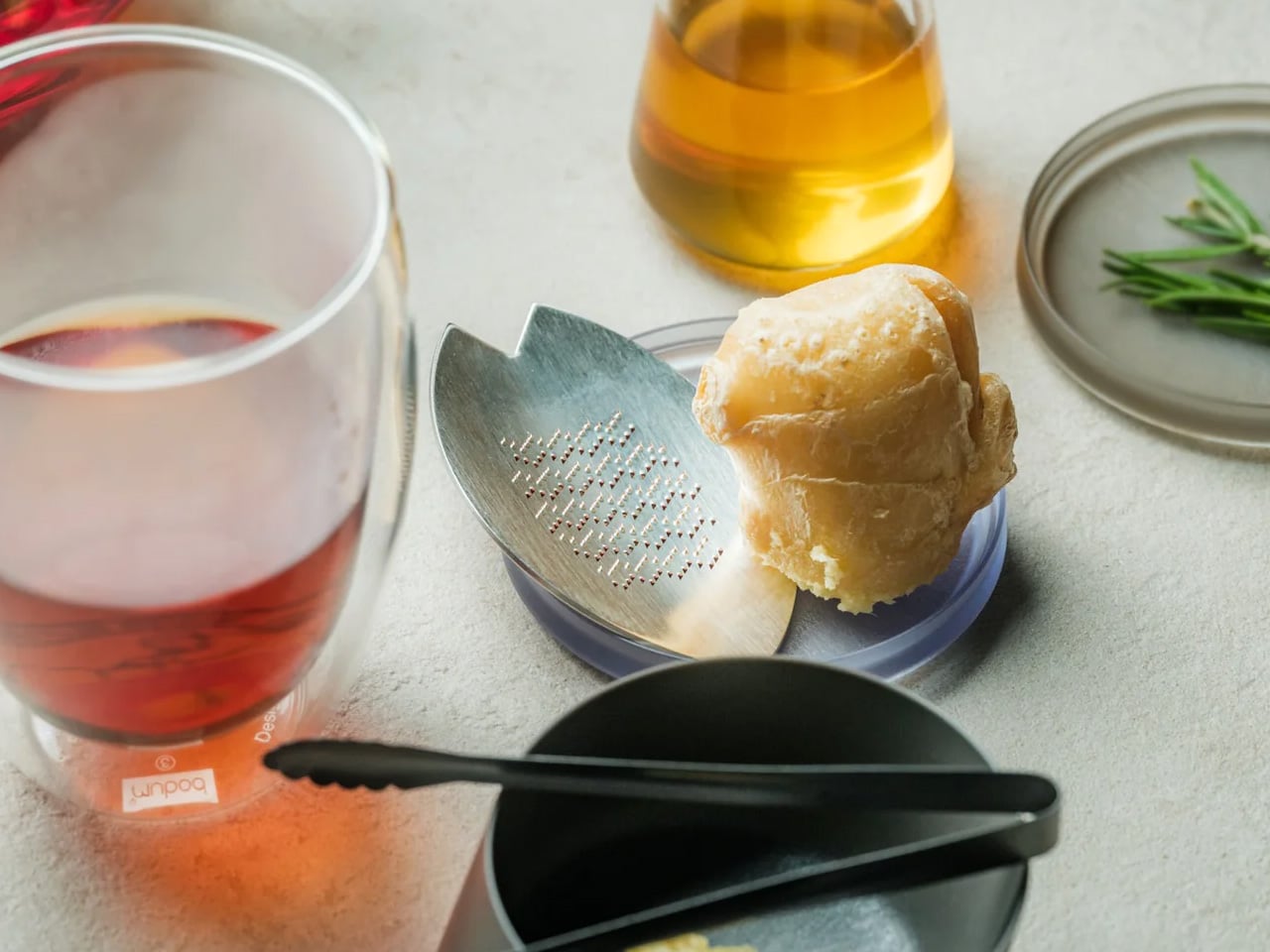
Fresh wasabi grated at the table is a different ingredient from the paste that comes in a tube. The same is true of ginger, of daikon, of any root that peaks the moment it’s reduced. The Sakura Petal Grater is built around that principle. Its sakura petal form brings tableside preparation into the meal itself, turning garnish work from a kitchen task into part of the ritual of eating. The circular motion has a quality that makes stopping feel abrupt.

Made from stainless steel, the grater sits flat and stable at the table, and the anti-slip silicone base doubles as a protective cover when stored. Its compact size means it takes no space to speak of, but what it brings to the table is disproportionate to its footprint. Grating fresh ginger over soup, wasabi alongside sashimi, and daikon over a bowl of soba becomes something you look forward to rather than manage. The shape itself is worth lingering on.

Click Here to Buy Now: $45

What We Like

  • Tableside grating turns fresh garnish preparation into part of the dining ritual rather than prep work done in advance
  • The compact form requires almost no storage space, and the silicone base doubles as a protective cover

What We Dislike

  • The small size means slower processing for larger quantities, so it works best for garnish amounts rather than bulk grating
  • Specialist in scope: for kitchen prep in volume, a larger grater is the more practical tool

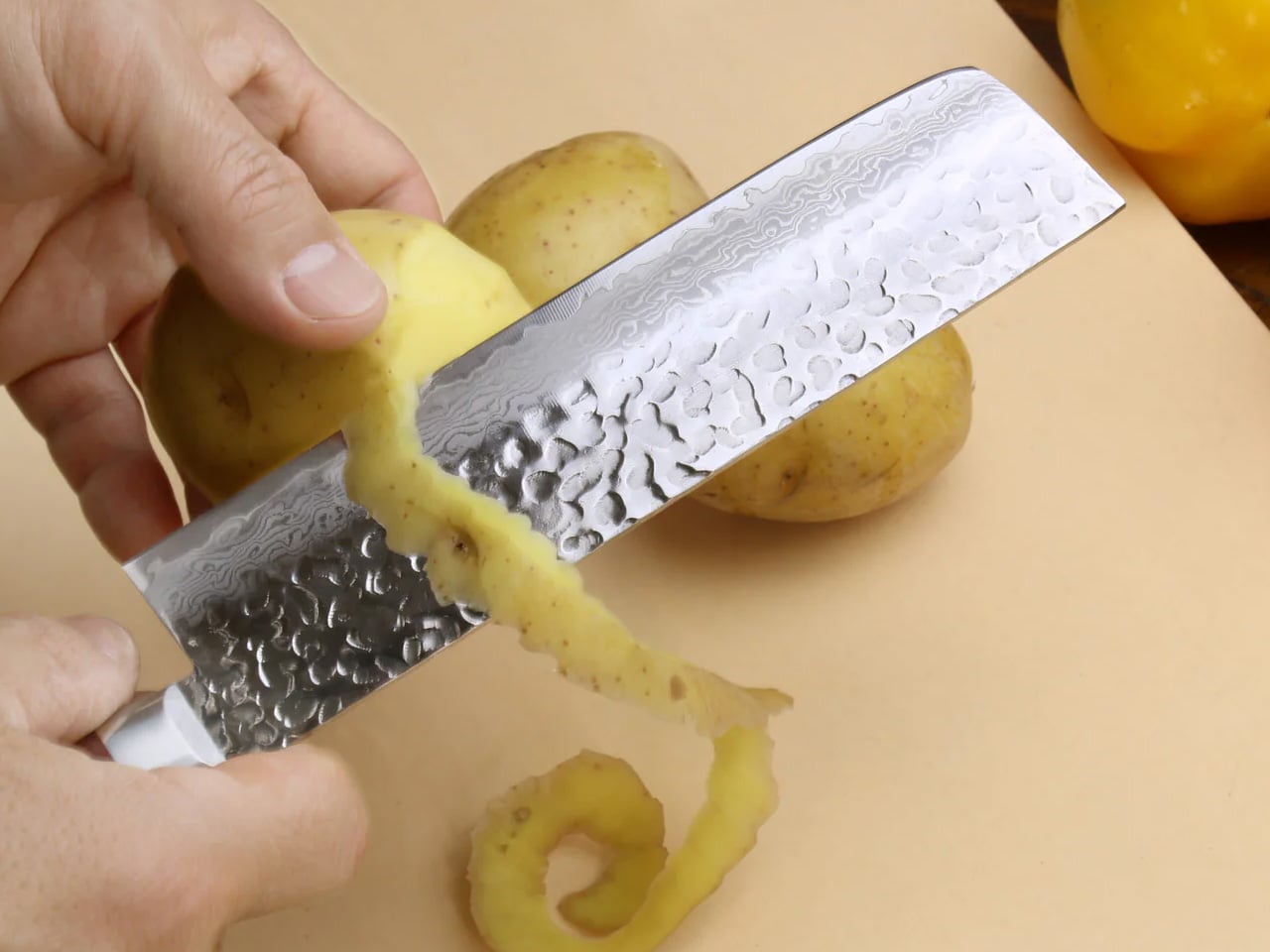
5. Yoshihiro VG-10 16-Layer Hammered Damascus Nakiri 165mm

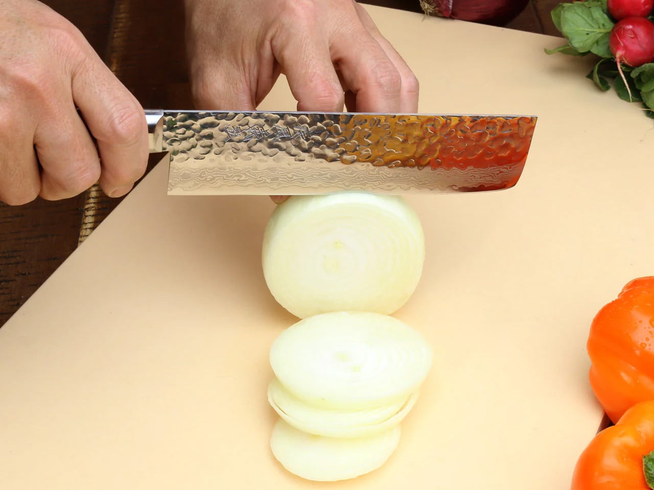
The Nakiri is designed exclusively for vegetables, and that singular focus is the entire point. The flat rectangular edge makes full contact with the cutting board on every stroke, without tip lift, without the curved rock of a chef’s knife. Just clean forward pressure through root vegetables, leafy greens, and ripe tomatoes with equal consistency. Yoshihiro builds this version around a VG-10 core wrapped in 16 layers of hammered Damascus steel, and the surface reduces friction through each cut, so nothing drags.

The Damascus layering produces a pattern unique to each blade, a specific arrangement of steel that no other knife in the world shares with yours. That individuality matters more than it sounds. The full-tang mahogany handle distributes weight in a way that makes extended prep feel balanced rather than tiring. Each blade is handcrafted by master artisans and certified for commercial kitchen use.

What We Like

  • The 16-layer Damascus pattern is unique to every individual blade, making this a personal object in a way factory knives never manage
  • Full-tang construction distributes weight evenly through the handle, reducing fatigue during longer vegetable prep sessions

What We Dislike

  • The Nakiri is a specialist vegetable blade and is not designed for meat, fish, or general-purpose cutting
  • Damascus finishes need careful maintenance and proper storage to preserve both the edge geometry and the layered surface over time

The Kitchen Is Already the Meditation

These five objects share something beyond country of origin. They each ask something of the person using them: attention, patience, a willingness to slow down and notice. The iron plate asks you to eat at the pace of the heat. The donabe asks you to wait for the steam before you touch the lid. The suribachi asks you to stay with the grinding until the smell tells you it’s ready. That presence is the common thread.

None of these tools will make you a better cook overnight. What they will do is change how cooking feels from one session to the next, until the kitchen becomes a place you want to spend time in rather than a place you want to get through. That shift is harder to achieve than any technical skill, and these five objects are exceptionally good at producing it.

The post 5 Best Japanese Kitchen Gadgets That Make Cooking Feel Like a Meditation Ritual first appeared on Yanko Design.

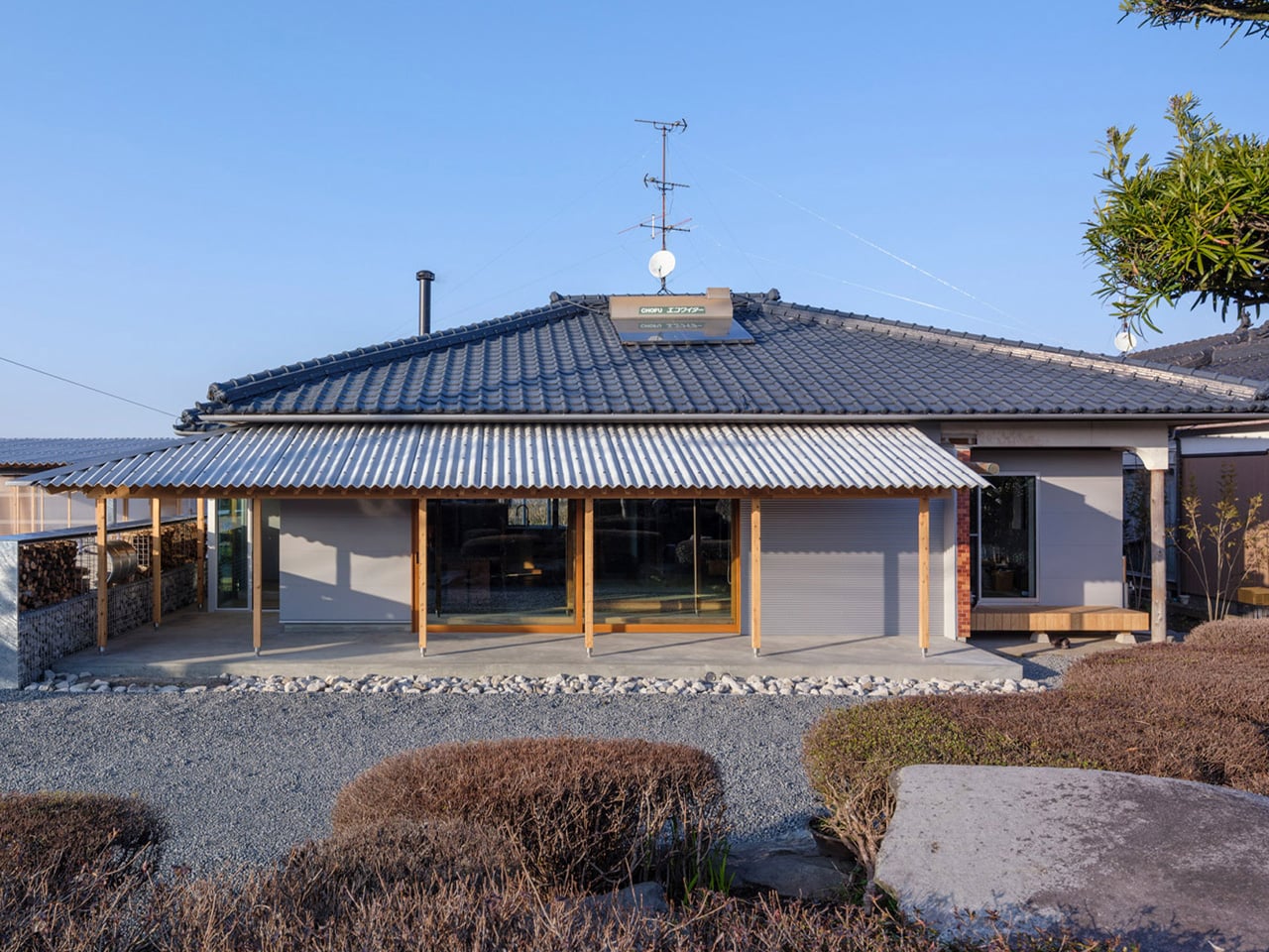
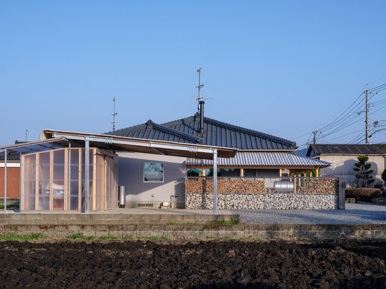
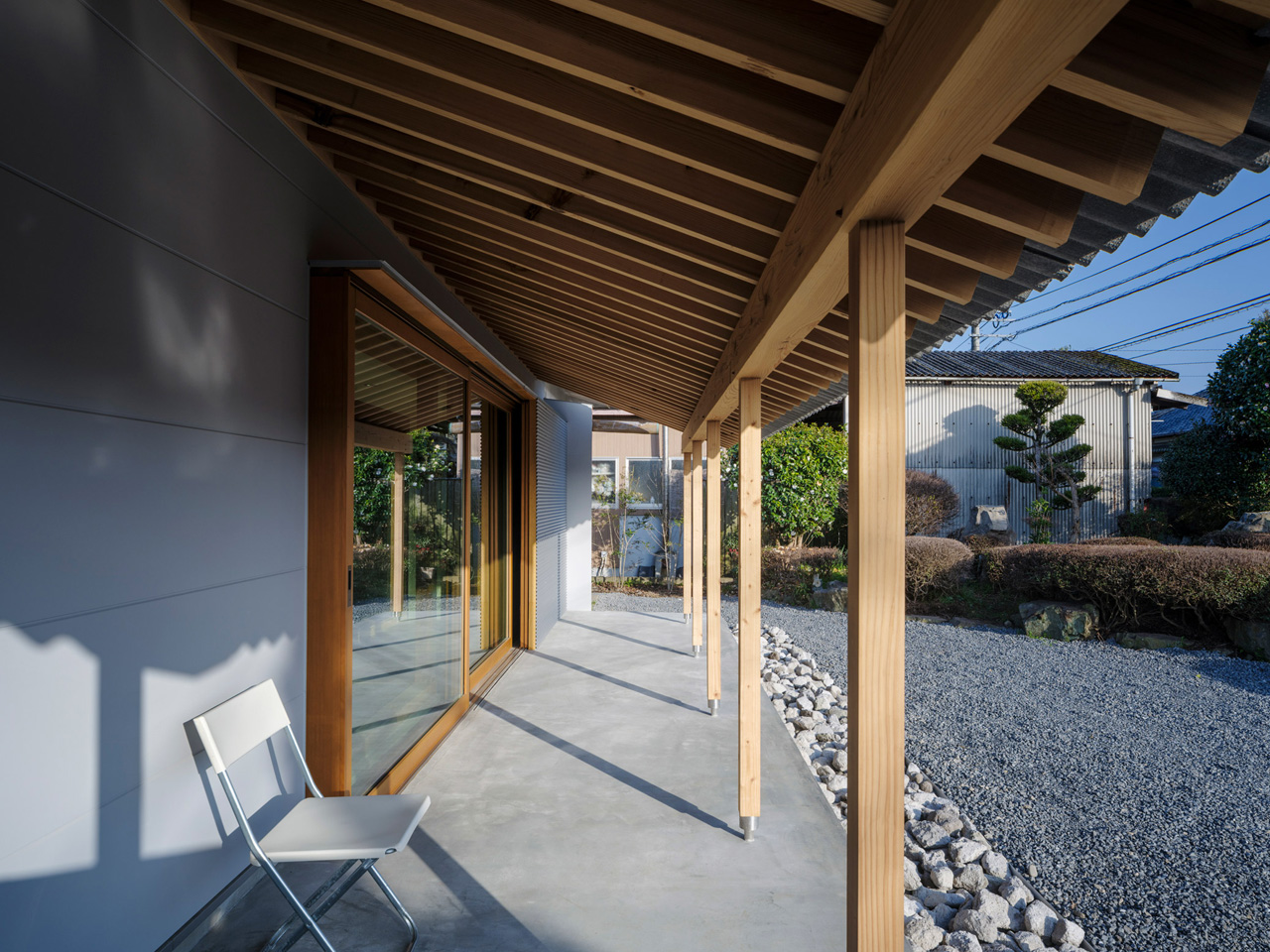
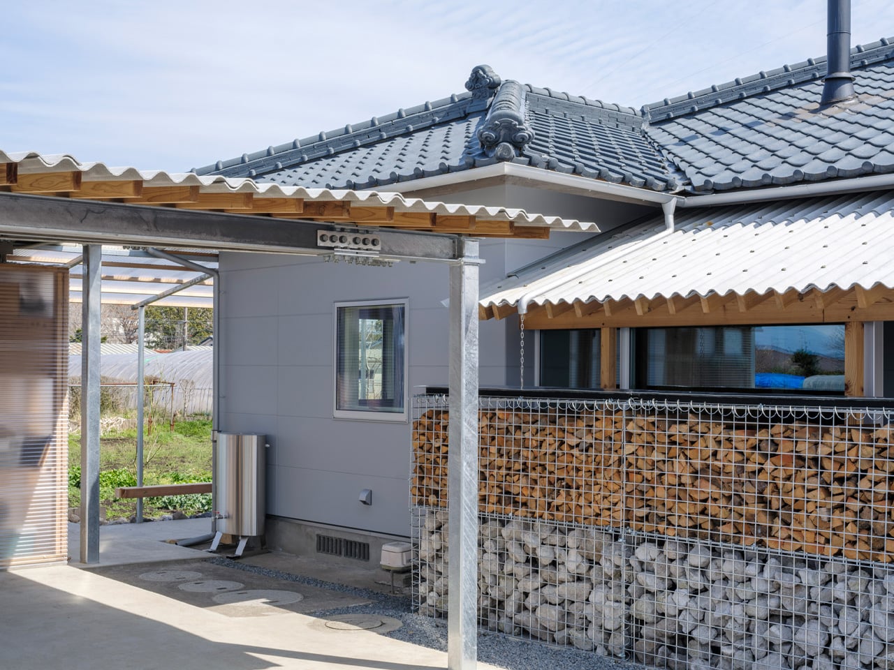
This Traditional Japanese Home Was Brought Back to Life by Opening It Up to Everything Around It

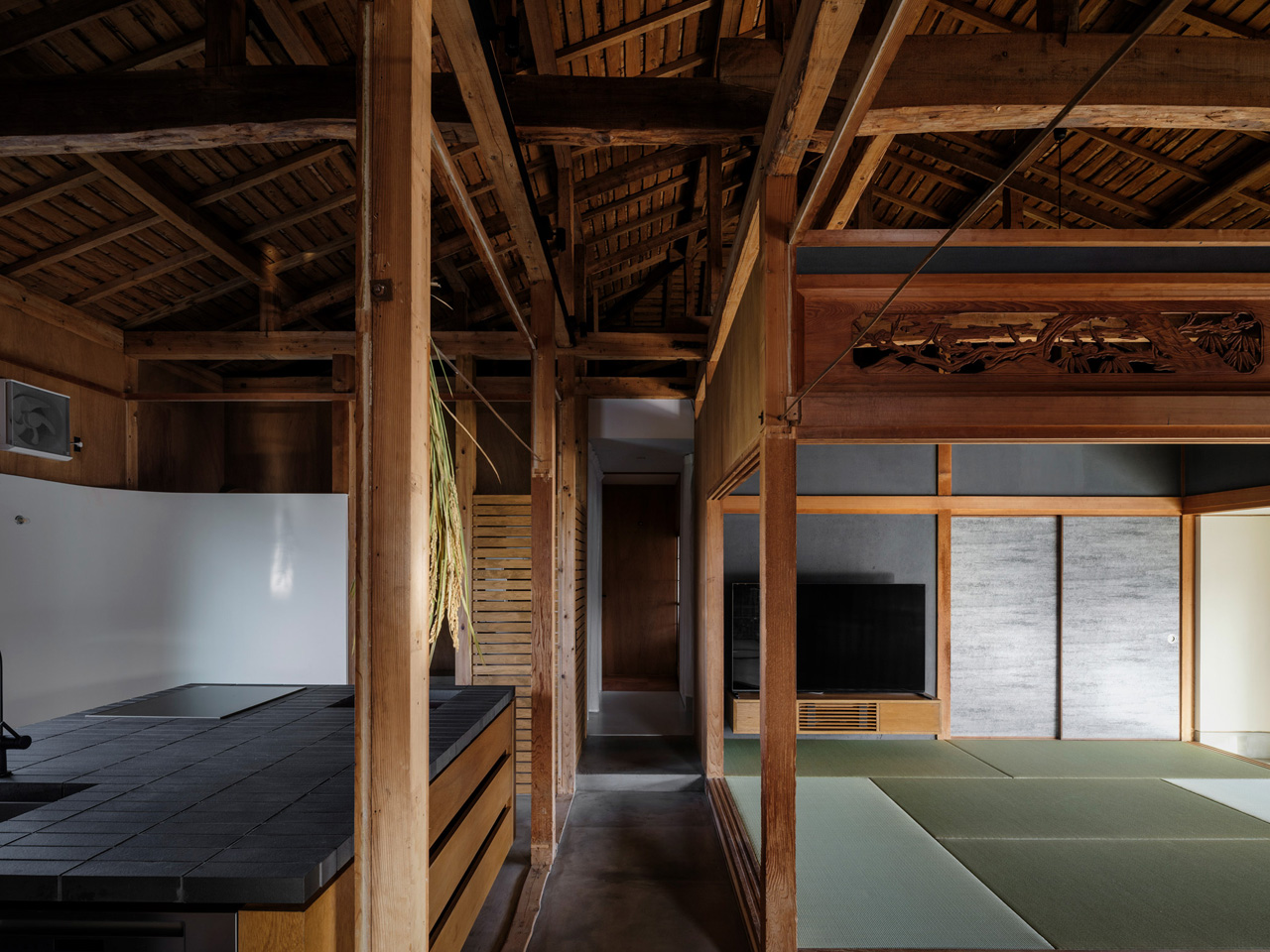
Returning home is a deeply intentional process. Not just to a place, but to a life — one shaped by memory, family, and the particular quality of light that falls through a familiar window. That is precisely the spirit YNAS brought to House in Miyakonojo, a renovation and extension of a traditional timber home in southern Japan that quietly redefines what it means to belong somewhere.

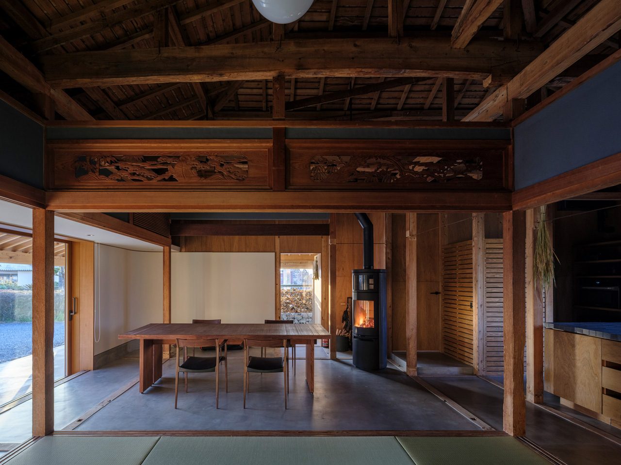
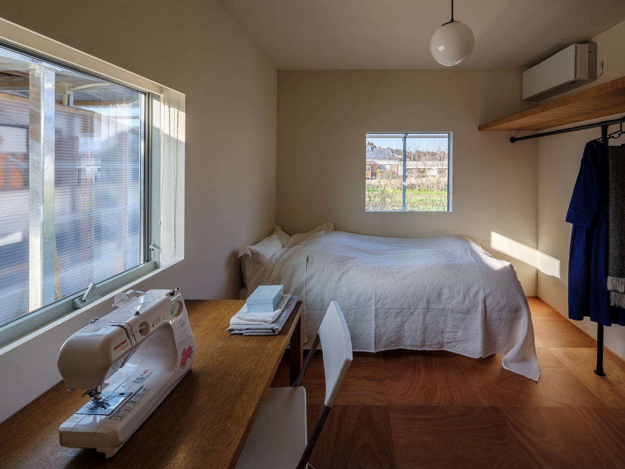
The project began with a couple who, after raising their children and shifting careers, chose to return to the wife’s ancestral home in Miyakonojo to live alongside her father. The house carried history in its bones — a traditional layout of rooms partitioned by sliding screens, arranged off a dark, L-shaped corridor that kept the living area, kitchen, dining room, and bedroom firmly separated from one another. It was a home that had turned inward, closing itself off from both the people inside and the landscape beyond its walls.

Designer: YNAS

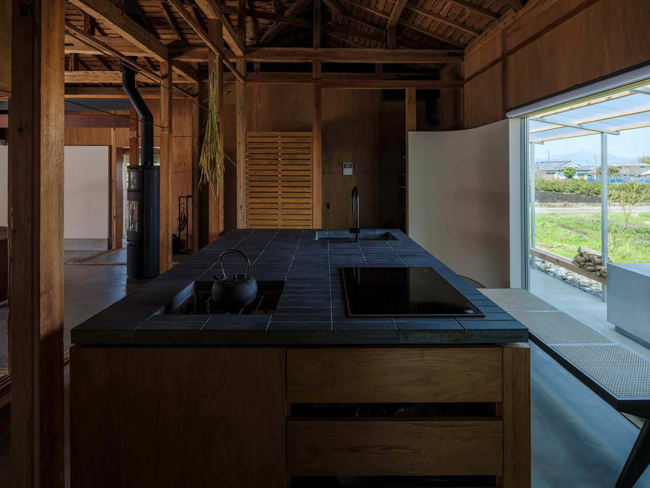
YNAS dismantled that introversion entirely. The studio opened up the cramped internal layout, dissolving the rigid partitions to let space breathe and flow the way a home shared between generations should. The transformation is not just structural — it’s philosophical. The design rejects the idea that privacy requires enclosure, leaning instead into a more generous, paradoxical logic: that openness itself can become a form of protection.

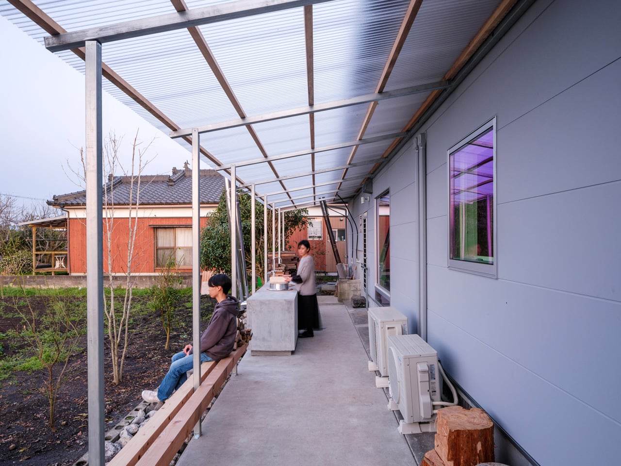
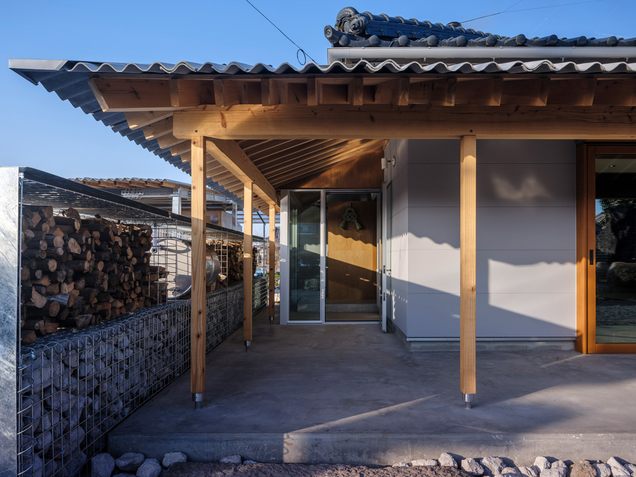
That thinking is most visible in the corrugated metal canopies YNAS added to the exterior. Timber-framed and industrial in material, they extend the home outward, creating covered outdoor spaces that blur the threshold between inside and out. An outdoor kitchen and a wood-fired bath become part of daily life, not luxuries tucked away from it. Neighbors might catch a distant glimpse of the family gathered outside, or notice smoke rising from the stove — and that, the studio argues, is the point.

“The house once again becomes a part of the landscape through the ‘signs of life’ it emits,” YNAS noted of the project. It’s a rare architectural position — one that treats visibility not as exposure but as community, as a soft signal that a home is lived in and loved.

The result is a house that honors its past without being imprisoned by it. The ancestral bones remain, but the rooms now open to each other, to the garden, to the sky. Corrugated metal and old timber sit side by side without apology. Three generations share space under a roof that has finally learned how to exhale. In Miyakonojo, YNAS has done something quietly radical: they’ve made a home feel, again, as it belongs to the world around it.

The post This Traditional Japanese Home Was Brought Back to Life by Opening It Up to Everything Around It first appeared on Yanko Design.
5 Japanese-Designed Mother’s Day Gifts That Become Part of Her Home — Not the Donation Pile

Most Mother’s Day gifts end up in a drawer for three weeks and in a donation box by June. The ones that stay are objects she reaches for without thinking, things that have quietly made themselves at home in her routines. Japanese design has a particular talent for producing exactly those objects. Not because they announce themselves loudly, but because they solve something real with a precision and restraint that earns permanent shelf space.

The five objects here span the kitchen, the bathroom, the bedroom, the living room, and the study. Each was chosen because it carries real design lineage, performs a genuine daily function, and looks far better than anything it currently replaces. None of them requires an explanation or an instruction video. They settle into a home quietly and, over time, make it feel like they were always supposed to be there.

1. Pop-up Book Vase

A vase that folds flat when it’s done. That’s the entire argument for the Pop-up Book Vase, and it holds up completely. Open the cover and a three-dimensional paper vessel rises from the page, engineered from 100% natural pulp with a water-resistant coating sturdy enough to hold fresh stems without collapsing. Three different pop-up designs sit on successive pages, so she can change the vase’s silhouette simply by turning to the next one. When the flowers are done, it closes into a book and takes up no room at all.

What makes it earn a permanent place rather than rotate out is the spatial intelligence built into its form. Most vases compete for the shelf space they occupy. This one eliminates that problem by storing flat between uses. Flip the book upside down, and the arrangement transforms, offering a fresh perspective on the same stems. For a home where every surface is already carefully considered, that kind of versatility, without requiring any additional objects, is the kind of thoughtful gift that stays.

Click Here to Buy Now: $45.00

What We Like

  • Three built-in pop-up designs offer genuine variety without ever needing a second or third vessel taking up additional shelf space
  • It stores completely flat when not in use, a spatial advantage that no ceramic or glass vase can come close to matching

What We Dislike

  • The water-resistant coating has limits, and prolonged exposure to water will eventually degrade the paper structure through repeated use
  • The whimsical book form may not suit interiors that lean toward strictly raw textures, earth tones, and serious material palettes

2. Hasami Porcelain Mug in Natural

Hasami has produced porcelain continuously since the 16th century, and the Natural mug is the version of that tradition that shows its workings most honestly. Made in Nagasaki Prefecture from a proprietary blend of crushed Amakusa stone and porcelain clay, the exterior is left completely unglazed, giving it a dry, matte surface that warms to the hand quickly and develops a natural patina with regular use. A subtle outward curve at the rim directs liquid cleanly and eliminates the flat-edged drip that straight cylindrical mugs produce without thinking about it. At $32, it is the rare object that costs less than it looks.

What makes it a permanent fixture rather than a seasonal one is how it ages. Most mugs look their best the day they arrive and quietly decline from there. This one moves in the other direction, its unglazed surface accumulating character through daily use, the way good leather or raw wood does. Despite the bare finish, the Amakusa clay body is fired to withstand repeated machine washing and microwave use without surface degradation — a real engineering decision that removes the usual compromise of unglazed ceramics entirely. It stacks flush with the broader Hasami range, so it can anchor a set that grows over years without ever looking mismatched.

What We Like

  • The unglazed matte surface develops a genuine patina with daily use, meaning this mug becomes more personal over time rather than simply wearing out
  • Microwave and dishwasher safe despite the bare clay finish, which removes the hand-washing compromise that usually comes with unglazed ceramics

What We Dislike

  • The unglazed interior is food-safe but absorbs flavor over time, which may not suit anyone who switches frequently between coffee and strongly scented teas
  • The natural matte surface marks more readily than a glazed alternative, requiring more mindful handling around oils and pigmented liquids

3. Portable CD Cover Player

There is a version of listening to music that streaming has never quite managed to replicate: the one where the album cover is part of the experience. The Portable CD Cover Player brings that version back with a design that treats the jacket art as equal to the audio itself. A dedicated front pocket displays the cover while the disc plays, so the music and its visual identity occupy the same moment at the same time. A built-in speaker and rechargeable battery mean it goes wherever she does — a kitchen counter, a bedside shelf, a weekend away.

What earns it a permanent spot in the home is that it reads as a design object even when it isn’t playing. Wall-mountable with a separately sold bracket, it functions as a framed display between listening sessions, rotating through whatever record she’s currently living with. The minimalist form keeps the album art and the music at the center, with nothing competing for attention around them. For a home that already takes its objects seriously, this player fits without any negotiation.

Click Here to Buy Now: $199.00

What We Like

  • The jacket art pocket puts the visual and audio experience on equal footing, restoring something streaming quietly removed from the act of listening
  • Built-in speaker and rechargeable battery make it genuinely portable, while wall-mount compatibility means it earns a permanent home when she wants it to stay put

What We Dislike

  • The wall mount bracket is sold separately, which adds an extra purchase and a step between unboxing and the full display experience that the design promises
  • As a speaker-based player, it suits intimate listening environments best and will not fill larger open-plan spaces the way a dedicated audio system would

4. Tosaryu Hinoki Bath Stool

Tosaryu’s woodworkers have been based in the mountains of Kochi Prefecture since the 1970s, working with hinoki cypress from the Shimanto river region. What separates their process from most is time: the wood is dried naturally for three to six months without chemical drying agents, which preserves the aromatic oils that give hinoki its scent and the antibacterial resin that makes it resistant to mold without any applied coatings. Three sizes are available, from the compact Umezawa stool at $90 to the full-height stool, all with ridged surfaces for drainage and slip resistance.

Place one in a shower and warm water activates the wood’s oils, releasing the scent of a Japanese cypress forest into the steam. That is not a marketing description. It is the actual mechanism, and it transforms a daily shower into something closer to a ritual, which is precisely what a gift worth keeping actually does. Tosaryu operates as stewards of local Kochi forests using sustainable harvesting methods. In a bathroom, this stool replaces a generic plastic seat with something that smells like a forest and ages like furniture.

What We Like

  • Natural hinoki oils provide genuine antibacterial protection and a real, steam-activated forest scent with no synthetic fragrance or chemical treatment involved at any stage of production
  • Tosaryu’s sustainable Kochi forest stewardship means both the craft lineage and the environmental story behind this piece are entirely authentic, not marketing language applied after the fact

What We Dislike

  • Hinoki requires thorough drying between uses to prevent cracking, meaning bathrooms without adequate ventilation will shorten the stool’s lifespan considerably over time
  • The high stool carries a $25 shipping surcharge at checkout due to its size and weight, which is worth factoring into the decision before settling on a size

5. Riki Alarm Clock

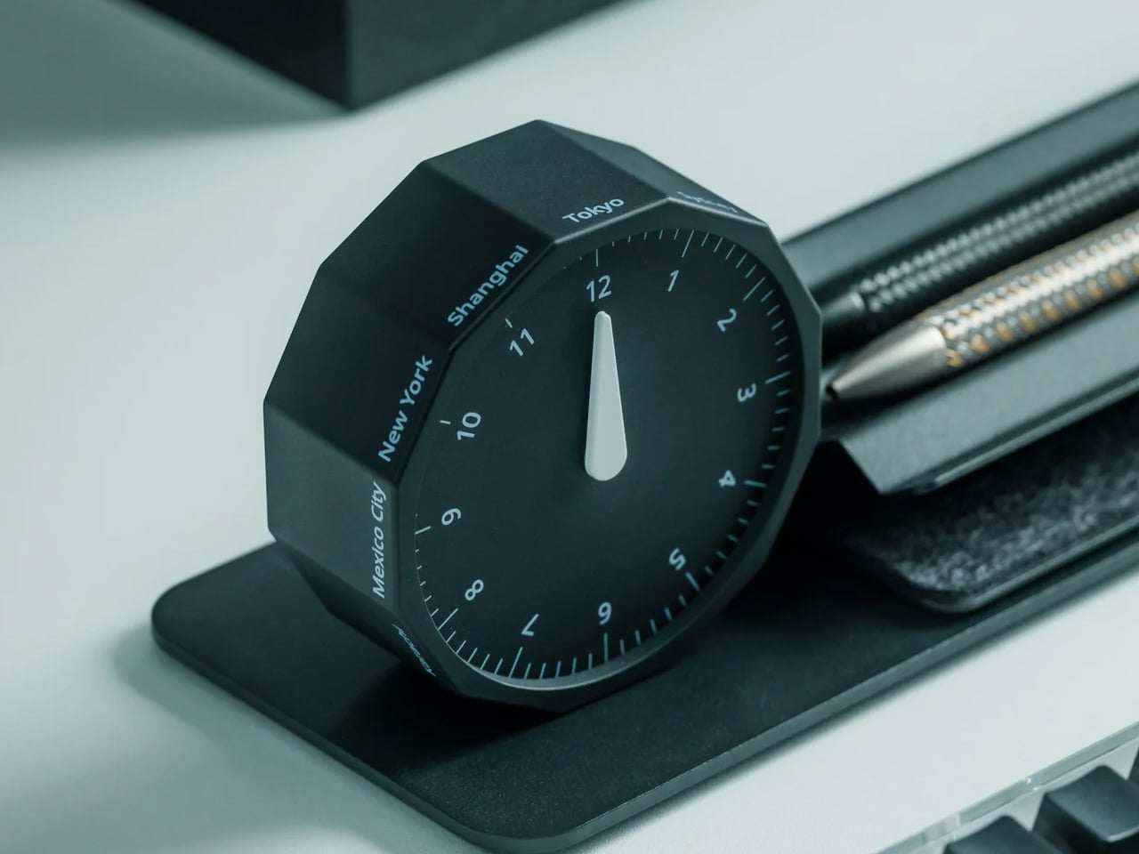
Riki Watanabe established Japan’s first independent design office in 1949, and his work on clocks became the body of work that defined his legacy. The Riki Alarm Clock, produced by Lemnos in Toyama, earned the Good Design Award through choices that look deceptively simple: oversized numerals designed to read clearly from across a room, a completely silent movement with no audible tick, and a single button that consolidates the alarm, snooze, and built-in internal light into one seamless control. The body is beech wood and glass, 4.2 inches across.

Spring is the season when the phone quietly migrates back to the nightstand. The Riki Clock offers a direct, aesthetically grounded alternative. Its silent analog face replaces the notification-laden device on her nightstand with an object that is simply, reliably there. Morning waking becomes a softer experience, shaped by the warm quality of the clock’s internal light rather than the cold glow of a screen. For the bedroom, this is not just a better clock. It is a restructured relationship with the start of every day.

What We Like

  • The completely silent movement removes the most persistent complaint about analog clocks entirely, making it genuinely suited to light sleepers and quieter bedroom environments
  • Good Design Award credentials and Riki Watanabe’s enduring modernist legacy give this clock a real provenance that makes it worth owning, not just worth receiving as a gift

What We Dislike

  • The single-button interface that consolidates alarm, snooze, and internal light may require a brief learning period before it becomes second nature for new users
  • Checking the time in low light requires activating the internal light first, adding one small step compared to the passive glow of a standard digital display

The Best Gifts Don’t Try to Impress — They Earn Their Place

The logic connecting these five objects is not a shared aesthetic. It is a shared commitment to earning their permanent place. The Pop-up Book Vase earns its shelf through spatial intelligence. The ClearFrame earns its wall through beauty and ritual. The Hasami mug earns its cabinet through craft and longevity. The hinoki stool earns the bathroom through scent and material. The Riki clock earns the nightstand by replacing something worse.

Japanese design has always understood that small, considered objects carry the longest meaning. This list is not about finding something impressive enough to survive. It is about finding something honest enough to deserve it. Each of these five objects is genuinely useful, made of real materials, and shaped by a design discipline that leaves nothing to add and nothing to improve. That is what belonging in a home looks like.

The post 5 Japanese-Designed Mother’s Day Gifts That Become Part of Her Home — Not the Donation Pile first appeared on Yanko Design.

5 Japanese Zen Desk Accessories That Turn a Tuesday Morning Into a Meditation

There is a particular kind of Tuesday that gets you. Not Monday, which at least carries the clean energy of a fresh start. Tuesday is when the week begins to feel long before it has any right to, when the desk stops feeling like a chosen space and starts feeling like a place you were assigned. The objects surrounding you have more influence over that feeling than most people acknowledge.

Wabi-sabi, the appreciation of imperfection and transience. Ma, the intentional use of space. Ikigai, the reason to get up. These are not aesthetic trends or interior design keywords. They are deeply considered frameworks for how the material world supports a good life. The five accessories here carry those values in practical, beautiful, desk-ready form — not to impress anyone walking by, but to make every Tuesday worth being present for.

1. ZenFlow Personal Aroma Diffuser

The ZenFlow Personal Aroma Diffuser earns its place on your desk through all your senses at once. It looks sculptural — a handcrafted porcelain filter sitting atop an anodized metal base in Silver, Gold, or Black — but the experience it creates is what makes it genuinely useful. The diffuser combines heat and airflow technology to evenly disperse essential oils through the air without water or mist, keeping your workspace clean and calm. It is aromatherapy without the clutter, without the fuss, and without the puddle on your desk.

For you, this means a desk environment that actively supports focus rather than merely existing around it. Switch between Normal Mode for stronger scent presence during deep work, Airflow Mode when you want subtlety, or ECO Mode for energy-efficient background relaxation throughout the day. The handcrafted porcelain filters are a product of Shibukusa Ryuzo Porcelain’s 180-year legacy, adding a layer of cultural weight to a device that already justifies itself on practicality alone. When the air around you smells intentional, the entire morning shifts slightly in your favor.

Click Here to Buy Now: $170.00

What We Like

  • Water-free technology keeps your desk surface completely clean and mess-free
  • Three adjustable modes let you match the diffuser to your energy level throughout the day

What We Dislike

  • Essential oil refills add an ongoing cost over time
  • The handcrafted porcelain filter requires careful handling to avoid breakage

2. Magboard Clipboard

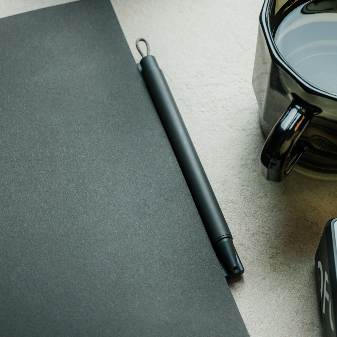
Paper notebooks are personal things. They carry the texture of actual thinking — the crossed-out lines, the sketches in the margins, the half-finished sentences that eventually turn into something better. The Magboard Clipboard understands this in a way that most stationery products do not. Its magnet and lever mechanism lets you bind up to 30 loose sheets without any predefined layout, order, or margin, giving your note-taking the same flexibility as your actual thought process. The hardcover construction is rigid enough to write on while standing.

What it gives you is freedom from the structure that most notebooks quietly impose. Pull out a page, reorder your notes, add a fresh sheet mid-thought, and put everything back in whatever sequence makes sense for how your brain works that day. The water-resistant surface means the board travels without hesitation — into a client meeting, a coffee shop, or a commute in unpredictable weather. For anyone who thinks with a pen in hand, Magboard removes every practical reason not to write, and in doing so, makes the act of capturing ideas feel genuinely frictionless.

Click Here to Buy Now: $45.00

What We Like

  • Loose-sheet format lets you reorganize, remove, and add pages freely without tearing
  • Hardcover design supports writing without needing a flat surface underneath

What We Dislike

  • Loose pages can be easy to misplace if not managed with some care
  • The magnet and lever mechanism may feel unfamiliar to those used to traditional bound notebooks

3. Madco Table Lamp

Designed by Italian designer Elisa Ossino for Japanese brand Ambientec, the Madco Table Lamp takes the warmth of a festive Japanese lantern and distills it into something small, quiet, and considered. A sphere-shaped diffuser sits suspended within a sleek metal frame, available in five colors chosen to add playful elegance without overwhelming a space. It marks the first time Ambientec introduced color into its design language, and the restraint with which they did it says everything — there is nothing loud here, only warmth and a kind of confident understatement.

For you, the Madco is the kind of light source that changes the felt quality of your desk at the start or close of a working day. It is rechargeable via USB-C, fully portable, and waterproof, meaning it moves with you from desk to balcony to garden without complaint, creating soft visual conversations with plants and outdoor textures along the way. The 360-degree rotating light source lets you direct warmth exactly where you need it. It is less a lamp and more a mood rendered in physical form — the sort of object that makes the transition into work feel like a deliberate choice.

What We Like

  • USB-C rechargeable and waterproof, making it genuinely portable for indoor and outdoor use
  • The 360-degree rotating diffuser lets you customize and redirect light output precisely

What We Dislike

  • Battery life will limit continuous use, particularly at higher brightness settings
  • Available in five fixed colors only, which may not suit every interior palette

4. Aya & Sfera Desk Organizers

Ikigaiform describes their practice as Japanese minimalism meeting parametric design, a combination that produces objects feeling simultaneously ancient and quietly futuristic. Aya and Sfera began as full-size self-watering planters before being scaled down into desk-sized cups, carrying the same organic forms and intricate surface patterns into a far smaller footprint. The result is a pen holder — or catch-all, or shelf object — that shares design DNA with a living planter, blurring the line between the functional and the living in a way that feels entirely natural on a working desk.

What makes these organizers genuinely useful for you is the way they bring considered calm to whatever surface they occupy. Wabi-sabi aesthetics and Japandi sensibility run through every curve and surface pattern, making each piece feel deliberate rather than merely decorative. Whether you use them to hold pens, cables, a small succulent, or simply as a visual anchor on an otherwise noisy desk surface, they carry an almost-living quality that rewards closer attention. On a Tuesday morning when everything feels like an obligation, these small objects quietly remind you that your environment is something you actually designed.

What We Like

  • Organic forms and intricate surface textures make these genuinely rewarding to study up close
  • Compact size fits naturally on desks and shelves without claiming excessive space

What We Dislike

  • As a niche studio product, availability and restocking may be limited
  • The soft, organic form may not align with stark industrial or heavily geometric desk setups

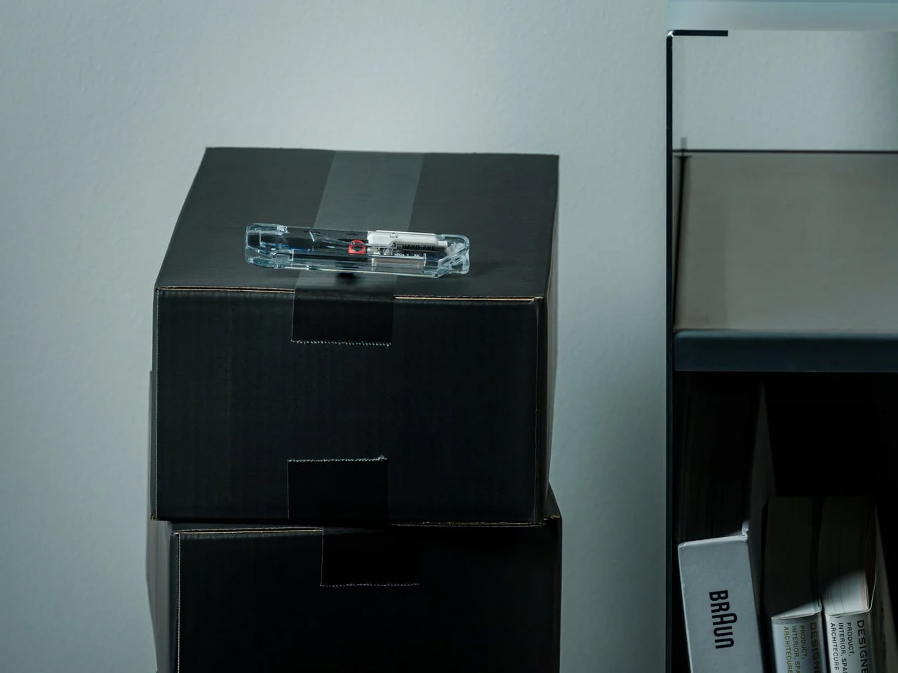
5. Heritage Craft Unboxing Knife

Most box cutters are purely transactional. You use them, drop them into a drawer, forget them completely. The Heritage Craft Unboxing Knife refuses that fate entirely. Carved from a block of aluminum, its circular form directly references Paleolithic hand axes, a shape carrying the entire arc of human tool-making history within it. The wave-like patterns left by precision machining are not purely decorative — they give the object grip, texture, and a visual richness that makes you want to pick it up. It is the rare tool that actively asks to be handled.

For you, this is the object that stays on top of the desk rather than inside it. It is effective — genuinely sharp for slicing tape and opening packages — but it holds its position through presence as much as through function. The tapered form sits confidently on any surface, operating simultaneously as a tool and a quiet sculpture. Japanese design philosophy holds that objects should be worthy of the attention we give them, that usefulness and beauty are not separate qualities. The Heritage Craft Unboxing Knife takes that idea seriously, and in doing so, makes even the small ritual of opening a package feel like something worth noticing.

Click Here to Buy Now: $99.00

What We Like

  • Sculptural aluminum form means it stays visible on the desk rather than disappearing into a drawer
  • Wave-patterned machining provides both a secure grip and a distinctly artisanal visual quality

What We Dislike

  • The circular form may require a short adjustment period for those used to standard box cutters
  • Aluminum construction may accumulate visible surface scratches with regular daily use

The Desk Is the One Space You Actually Get to Choose

The desk is one of the few environments you actually control. Most of what shapes a Tuesday is decided before you sit down — the calendar, the emails, the inbox count. The objects you choose to keep in your immediate space are one of the last genuinely personal decisions left. These five accessories share a quality that goes beyond mere aesthetics: they each slow the eye down, just for a moment.

And in that pause, the morning becomes slightly less automatic. That is exactly what Japanese design has always understood — that objects worthy of attention gradually change the quality of attention you bring to everything else. You cannot redesign your calendar, your inbox, or your Tuesday. But you can redesign the surface in front of you. Fill it with objects that ask something of you. That, quietly, is more than enough.

The post 5 Japanese Zen Desk Accessories That Turn a Tuesday Morning Into a Meditation first appeared on Yanko Design.

This Japanese-Inspired Garden Studio in California Is Doing Three Jobs at Once

The name says two. The building delivers three. Tucked behind a 1912 home in Fairfax, California, Two-Fold Studio is the latest project from San Francisco-based practice ONO, founded in 2020 by Max Obata and Tyler Noblin, and it might be one of the most quietly considered small structures the firm has produced yet.

The client, a general contractor and a ceramic artist who also teaches Pilates, came to ONO with a precise brief: build a pavilion that could hold a Pilates studio, a ceramics workshop complete with kiln, storage, and kitchenette, and, when the occasion calls for it, a guesthouse. Three programmes, one 800-square-foot structure, and a yard full of trees that weren’t going anywhere. The architects delivered on all counts.

Designer: ONO

Rather than bulldoze the site into submission, ONO bent the building around it. The structure contorts into an L-shape, folding around the pre-existing trees to maintain the yard’s existing character. The form then becomes a kind of frame, a viewing pavilion, in ONO’s words, taking direct reference from the Ryoan-ji Rock Garden in Kyoto. The relationship between building and landscape isn’t incidental here; it’s the whole point.

On the outside, the building reads modestly. Cedar shingles tie it back to the original home, keeping the new structure from announcing itself too loudly against the surrounding hills. Sliding glass doors, cheerfully framed in yellow powder-coated aluminum, open one side of the building entirely to the outdoors, creating a small patio underlined by the roof’s generous overhang. The yellow wasn’t arbitrary. Obata has noted that the client works in bold colour in her ceramics, so the palette needed to hold its own.

Step inside, and the two halves of the studio read distinctly but feel continuous. The Pilates side is warm and spare, finished in wood that flows through to a bathroom lined in plaster, a softer material that adds texture without breaking the natural language of the space. The ceramics side opens wider, with blue cabinets, exposed ceiling beams, and zinc countertops chosen specifically for the way they’ll patina into a silvery blue over time. A long work desk doubles as a kitchen counter, adjacent to a kiln neatly tucked into a wall niche.

Clerestory windows flood the ceramics studio with light while maintaining privacy from the street. In summer, with the sliding doors thrown open, afternoon light comes in late and high, ideal, as Obata puts it, for working well into the evening. Two-Fold is small, specific, and built entirely around the person who uses it. That’s what makes it memorable.

The post This Japanese-Inspired Garden Studio in California Is Doing Three Jobs at Once first appeared on Yanko Design.
5 Best Japanese Designs of April 2026 That Make Everything Else Look Like It’s Trying Too Hard

The Japanese Grand Prix is underway this weekend at Suzuka, and it has done what it always does: pulled attention back toward Japan with a kind of quiet, inevitable force. There’s something about watching a sport built on engineering precision staged in a country that has made precision its cultural identity that makes you want to look beyond the circuit. Japan’s design culture runs on the same engine as its racing teams. Nothing is wasted. Nothing is performed. Every decision earns its place, and every object that comes out of that sensibility carries a particular weight.

Japanese design has always understood something the rest of the world is still working out. Restraint is not a lack of ambition. It is the hardest expression of it. The five objects below range from a razor to a kitchen knife to a bath towel, but they all speak the same language. They each solve one problem completely, and they look like nothing else needs to be added. That is the thing about great Japanese design. It doesn’t just make a good product. It makes everything else in the room look like it’s trying too hard.

1. The Paper Razor

There’s something almost provocative about the Paper Razor. Designed by Japan’s Kai Group, it is a single-use disposable razor built almost entirely from paper, reducing plastic use by 98% without compromising function. The origami-inspired body folds completely flat for shipping, then snaps into a rigid, ergonomic handle in seconds. At just 4 grams and 5mm thick when flat-packed, it ships across five colorways: ocean blue, botanical red, jade green, sunny yellow, and sand beige.

The obvious question is water, and the Kai Group answered it practically. The paper body is made from a water-resistant grade similar to milk carton stock, holding up to temperatures of 104°F. The metal blade head features a notched channel on top for easy rinsing between strokes. Designed primarily for travelers, the Paper Razor is the kind of product that feels less like a shaving tool and more like a position statement on what disposable objects are capable of being when someone takes the design seriously.

What We Like:

  • The origami-fold construction assembles in seconds and ships as a 5mm flat-pack, making it one of the most logistically elegant disposables ever designed
  • Reduces plastic use by 98% while maintaining the ergonomics and shave quality of a standard disposable

What We Dislike:

  • Single-use by design, which limits its appeal for anyone building a more sustainable long-term shaving routine
  • Water resistance caps at 104°F, meaning it isn’t suited for anyone who prefers very hot water while shaving

2. Levitating Pen 2.0: Cosmic Meteorite Edition

The Levitating Pen 2.0 Cosmic Meteorite Edition is the kind of desk object that stops a conversation the moment someone notices it. It suspends at a precise 23.5-degree angle, creating a floating illusion that is genuinely difficult to look away from. The design draws its visual language from spacecraft aesthetics, referencing silhouettes like the USS Enterprise, bringing a sci-fi sensibility to something as familiar and grounded as a ballpoint pen sitting on a work surface.

The detail that separates this edition from the standard series is the meteorite tip. The pen incorporates a genuine Muonionalusta meteorite, a fragment older than Earth by 20 million years, shifting this object from clever desk accessory to something rare and worth owning on its own terms. A simple twist sets it spinning for up to 20 seconds. It is a fidget-worthy, collector-grade piece that makes a compelling case that good design doesn’t always need to justify its existence through usefulness alone.

Click Here to Buy Now: $399.00

What We Like:

  • The genuine Muonionalusta meteorite tip gives this pen a provenance no other writing instrument on any desk can match
  • The floating 23.5-degree angle creates an immediate visual anchor on a desk surface without taking up meaningful real estate

What We Dislike:

  • The limited edition nature makes availability unpredictable, and the pricing reflects exclusivity as much as it does materials
  • The spacecraft-inspired aesthetic is deliberate and specific, meaning it will feel out of place on a desk that skews quieter or more minimal

3. Kuroi Hana Knife Collection

The Kuroi Hana knives begin with Japanese AUS-10 steel sourced from Aichi Steel Corporation, rated between 58 and 60 HRC for hardness and chosen specifically for its combination of toughness, sharpness, and corrosion resistance. Each blade is built from 67 layers of high-carbon steel, producing the Damascus layered structure that defines the collection’s character. Kuroi Hana translates to “black flower,” and the dark floral pattern that emerges across each blade makes that name feel entirely earned rather than marketed.

The pattern isn’t applied to the surface. It is drawn out from within. Skilled artisans manually submerge each blade into an etching solution that penetrates the steel layers and reveals the Damascus patterning in a deep, dark floral form. Because the process is done by hand and each blade’s steel structure is unique, no two knives carry the same pattern. This is a kitchen tool that respects the cook enough to make the knife itself a considered, genuinely beautiful object worth picking up before you even start cooking.

What We Like:

  • Every blade carries a unique dark floral pattern drawn from the steel itself, making each knife a one-of-a-kind object rather than a manufactured product
  • AUS-10 steel at 58–60 HRC delivers professional-grade sharpness and toughness that performs as well as it looks, sitting on a magnetic strip

What We Dislike:

  • The artisanal Damascus etching process makes these a premium investment that sits well outside casual kitchen knife territory in terms of price
  • The distinctive dark floral aesthetic is polarizing for cooks who prefer clean, unmarked blades in a working kitchen environment

4. The Invisible Shoehorn

The Invisible Shoehorn is the kind of product that earns its place by solving something so specific and so quietly that you find yourself wondering why every shoehorn hasn’t been designed this way. The long stainless steel body eliminates the need to hunch over, protecting your lower back from the kind of daily accumulated strain that nobody tracks until it’s a problem. The smooth, polished surface slides cleanly against socks and stockings without snagging. It performs one job with a material confidence that feels entirely Japanese.

The transparent stand is the decision that lifts this from a functional object to something worth displaying. Mounted in its clear acrylic holder, the shoehorn practically disappears into its surroundings, reading less like a bathroom utility and more like a considered piece of interior design. In a category full of objects people hide at the back of a closet, this one earns a place on the shelf. That shift from something concealed to something displayed is precisely what separates a good tool from a genuinely designed one.

Click Here to Buy Now: $299.00

What We Like:

  • The transparent acrylic stand transforms a purely utilitarian object into something display-worthy that holds its own in a well-designed home
  • The long stainless steel handle removes real daily lower back strain without requiring any change in how you put your shoes on

What We Dislike:

  • Polished stainless steel and a transparent stand both attract fingerprints readily, requiring consistent upkeep to maintain the invisible aesthetic the design promises
  • The extreme restraint of the form may feel underwhelming to people who expect more visual personality from their home accessories

5. Sento 2 Towel

Most towels are made by twisting cotton fibers into dense, rope-like loops, a production method that prioritizes speed and cost over softness or absorbency. The Sento 2 goes the other way entirely. Using a zero-twist design developed through specialized manufacturing techniques refined in Japan, the natural cotton fibers are left loose and uncompressed, producing a towel that is softer, more absorbent, and faster-drying than standard terry cloth. The process is slower, more demanding, and the finished result communicates every bit of that effort on first contact.

The zero-twist construction leaves natural cotton in a state that feels fundamentally different from anything mass-produced. The towel is light enough to feel like almost nothing in your hands, and absorbent enough that the job is done before you’ve consciously started it. There is an effortless quality to the whole experience that is harder to explain than it is to feel. It is a towel. It is also a quiet argument for buying fewer things, buying them properly, and understanding that the best version of an everyday object is worth far more than the cheapest one.

What We Like:

  • Zero-twist construction produces a softness and absorbency level that standard terry cloth towels genuinely cannot replicate, and the difference is apparent immediately
  • The quick-drying design makes it practical enough for daily rotation, not just a display-shelf luxury that performs better as a photograph

What We Dislike:

  • Zero-twist fibers are more delicate than standard loops and require careful laundering to preserve their structure and softness over repeated washing
  • The premium construction comes at a price that becomes harder to justify when buying multiples to fully outfit a bathroom

Japan Has Been Designing This Way Forever. The Rest of the World Is Still Catching Up.

What these five objects share is not a visual style. It is a philosophy. Japanese design has always understood that the most powerful thing a product can do is remove everything that shouldn’t be there. The Paper Razor removes plastic. The Invisible Shoehorn removes visual noise. The Sento 2 removes the compromise built into every standard terry loop. What remains in each case is an object that works so cleanly it feels inevitable, as though no other version was ever possible.

The Japanese Grand Prix reminds us every year that Japan operates at a level of precision most cultures aim for and fall short of. Its design culture runs on the same engine. These five products are proof that restraint is not a limitation. It is the hardest discipline to master and the most rewarding thing to live with. Every one of them earns its place, whether on a shelf, in a kitchen drawer, mounted by the door, on a desk at a 23.5-degree angle, or wrapped around you right after a shower.

The post 5 Best Japanese Designs of April 2026 That Make Everything Else Look Like It’s Trying Too Hard first appeared on Yanko Design.
8 Best Japanese Spring Home Upgrades That Make Tiny Rooms Feel Like a Wabi-Sabi Sanctuary

Spring in Japan is not a season of accumulation. It is a season of editing, of noticing what was already there, of letting a single branch in a ceramic vessel do the work of an entire floral arrangement. The Japanese approach to domestic space has always understood something Western interiors still struggle with: that less does not mean empty, it means deliberate. And in a tiny room, deliberation is everything.

We have rounded up eight products that carry this philosophy without turning it into a marketing exercise. These are not trendy minimalism props or aspirational mood-board fillers. They are functional objects rooted in Japanese craft traditions, seasonal awareness, and the kind of spatial intelligence that makes a 300-square-foot apartment breathe like a room twice its size. Spring is the perfect excuse to start.

1. Fire Capsule Oil Lamp

Most ambient lighting products try too hard. They pile on features, app connectivity, color-changing LEDs, and lose the one thing that makes warm light feel warm: simplicity. The Fire Capsule oil lamp goes the other direction entirely. It is a cylindrical glass-and-metal lamp with an 80ml fuel capacity, good for up to 16 hours of continuous flame.

The precision-engineered lid keeps the glass chimney clean between uses, which is a small detail that solves a persistent annoyance with oil lamps (dust settling on the glass and clouding the glow over time). An included aroma plate lets the flame double as a scent diffuser, and the flat-topped design means multiple units stack for storage. The cylindrical form ships with a drawstring pouch for portability, so it works just as well on a campsite as it does on a bedside shelf. In a small room, a single real flame on a low table changes the entire atmosphere without any electrical infrastructure.

Click Here to Buy Now: $89.00

What we like

  • 16-hour burn time from a single 80ml fill is generous enough for an entire evening gathering or a long weekend of ambient use.
  • Stackable design and included carrying pouch make storage painless in apartments where every drawer counts.

What we dislike

  • Open flame in a tiny apartment with limited ventilation requires careful placement and awareness, especially around curtains and textiles.
  • Paraffin oil refills are not always easy to source locally, and the lamp does not work with standard candle wax or tea lights.

2. Kyoto Yusai Linen Noren

A doorway without a door is just a gap. A doorway with a noren is a conversation between two rooms that never quite ends, a soft boundary that lets light, air, and movement pass through while still giving each space its own identity. This linen noren from Kyoto Yusai, printed with a dogwood motif, does precisely that.

What makes the noren so effective in small apartments is its relationship with ma, the Japanese concept of meaningful negative space. The fabric hangs in split panels with intentional gaps, and those gaps become part of the composition. Light filters through. Silhouettes soften at the edges. In a narrow studio where the sleeping area bleeds into the kitchen, a well-placed noren restructures how the whole room reads without touching the floor plan. Swap it seasonally, and it becomes a rotating design object with zero storage cost.

What we like

  • Splits the room without blocking airflow or natural light, which is rare for any room divider at this price point.
  • Seasonal swapping means the interior changes character four times a year with no permanent commitment.

What we dislike

  • Linen wrinkles easily after washing, so it needs careful steaming to maintain that clean drape.
  • The standard sizing may not fit non-Japanese doorframes without minor alterations or a tension rod swap.

3. Brass Ikebana Kenzan


Ikebana looks effortless. A single stem angled just so, a branch suspended at an improbable tilt, a few leaves arranged with the kind of negative space that makes the whole composition feel like a held breath. The kenzan is the hidden mechanism that makes all of it possible, a heavy brass pin frog that sits at the bottom of a shallow vessel and grips stems in place with rows of sharp, fixed needles.

This particular kenzan comes from Sanjo, Niigata Prefecture, a city with metalworking lineage stretching back to the 17th century. The artisans behind it have over 50 years of experience, and the difference shows in the needle sharpness and base weight. Cheap kenzans tip under a heavy branch. This one stays put. The removable rubber gasket protects the vase from scratches and keeps the unit from sliding, and the brass construction means it will outlast the disposable floral foam it replaces entirely. No chemical waste, no single-use plastic, just a solid chunk of metal that holds flowers upright and keeps the water clean longer.

What we like

  • Brass construction from veteran Sanjo artisans means this will last decades without bending, rusting, or losing needle sharpness.
  • Eliminates floral foam, which is a meaningful environmental upgrade for anyone who arranges flowers regularly.

What we dislike

  • A 3.5-inch round kenzan is suited to small-to-medium arrangements only; larger branches or tall statement pieces need a bigger base.
  • Sharp needles require careful handling and storage, especially in households with children or pets.

4. ClearFrame CD Player

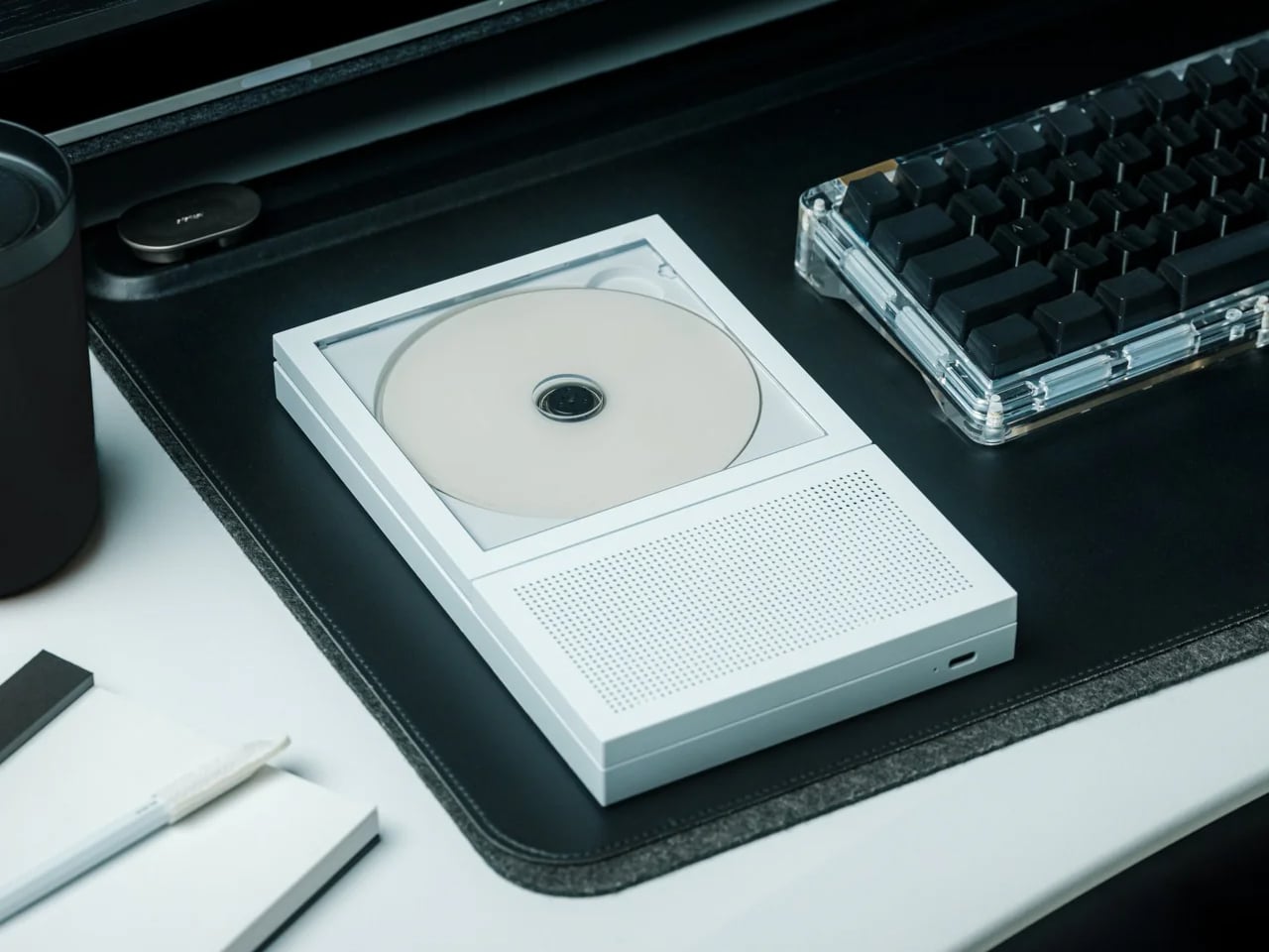
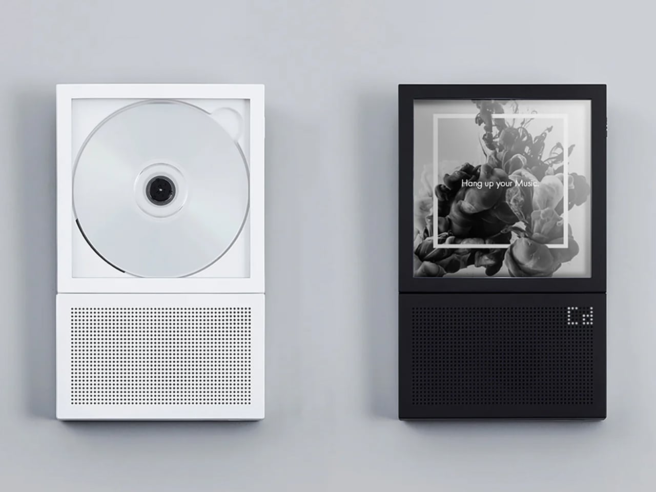
Physical media has a specific gravity that streaming cannot replicate. The act of choosing a disc, sliding it into a tray, and watching it spin is a ritual, not a convenience. The ClearFrame CD player leans into that completely, housing the mechanism inside a crystal-clear polycarbonate shell that frames each album cover like a miniature art exhibit, while the black circuit board sits fully exposed behind it.

Bluetooth 5.1 support and a 7-hour rechargeable battery mean it works wirelessly on a shelf, a desk, or mounted on a wall. Multiple playback modes handle full albums and single-track loops. The square silhouette reads more like a design object than consumer electronics, which is the entire point: in a small room, every object occupies visual real estate, and the ClearFrame earns its shelf space by being something worth looking at even when it is not playing. The exposed circuitry is a deliberate aesthetic choice that shares DNA with the wabi-sabi appreciation of process, of letting the inner workings be part of the beauty rather than hiding them behind a seamless shell.

Click Here to Buy Now: $199.00

What we like

  • Wall-mountable and wireless, so it does not consume any surface area in a room where counter space is precious.
  • Transparent body turns the CD cover into wall art and the circuitry into a visual feature, doubling the object’s function.

What we dislike

  • CD collections are increasingly niche, and anyone without a back catalog will need to start buying physical media to get real value from this.
  • Polycarbonate scratches over time, and a transparent shell means every scuff and fingerprint is visible.

5. Oboro Silver Moon Calendar

Wall calendars are usually the first thing to look dated in a room. They pile up with scribbled appointments, faded ink, and a design sensibility that peaked in the office supply aisle. The Oboro moon calendar, a limited-edition 10th-anniversary piece by Japanese brand Replug, operates on an entirely different register. It tracks the lunar cycle on greige paper with reflective silver foil phases and embossed moon textures that shift with the light.

The name comes from “oboro” (朧), a Japanese word evoking the soft, hazy glow of a partially obscured moon. It is a wall piece that functions more like a meditative object than an organizational tool. The silver foil catches and transforms ambient light throughout the day, so the calendar looks different at dawn than it does at midnight. The embossed texture invites touch, which turns checking the date into something tactile and grounding. In a small room, a single well-chosen wall object can set the tone for the entire space, and the Oboro does that with restraint rather than volume.

Click Here to Buy Now: $69.00

What we like

  • Reflective silver foil creates dynamic light play that changes throughout the day, making it feel alive rather than static.
  • Embossed lunar texture adds a tactile dimension that most wall decor completely ignores.

What we dislike

  • A lunar calendar is not a practical replacement for a standard date calendar, so this supplements rather than replaces existing scheduling tools.
  • Limited-edition status means availability is unpredictable, and replacement for the following year is not guaranteed.

6. Pop-up Book Vase

A vase that is also a book. Open the cover and a three-dimensional paper cutout rises from the page, forming a vessel shaped to hold fresh stems. Three different designs sit on successive pages, so flipping through the book changes the vase silhouette and the entire presentation of the arrangement. Turn the whole thing upside down, and the perspective shifts again.

Made from 100% natural pulp with a water-resistant coating, the construction is more durable than it first appears. The paper engineering behind each pop-up is precise enough to support a real bouquet without collapsing, and the book form factor means it folds flat for storage or travel. In a tiny room, where a traditional ceramic vase competes for shelf space with everything else, a vase that disappears into a closed book when not in use is a spatial gift. The playfulness of the form also cuts against the sometimes austere reputation of Japanese-inspired interiors, a reminder that wabi-sabi is not allergic to delight.

Click Here to Buy Now: $39.00

What we like

  • Three vase designs in a single book mean variety without needing three separate vessels taking up shelf space.
  • Folds completely flat when not in use, which is a storage advantage no ceramic or glass vase can match.

What we dislike

  • Water-resistant coating has limits, and prolonged contact with water will eventually degrade the paper over repeated uses.
  • The whimsical form factor may clash with more austere or serious interior styles that lean heavily into earth tones and raw materials.

7. Tosaryu Hinoki Bath Stool

Japanese bathing is not a quick rinse. It is a seated, deliberate process where the stool is as important as the water. Tosaryu’s hinoki cypress bath stools are made by woodworkers in the mountains of Kochi who have been refining their craft since the 1970s. The wood is dried naturally for three to six months without chemical agents, which preserves the aromatic oils that give hinoki its distinctive calming scent.

Place one of these stools in a bathroom, shower room, or home sauna, and the scent fills the space every time steam or warm water contacts the wood. The antibacterial properties of hinoki resin mean the stool resists mold and bacteria without coatings or treatments. Three sizes are available: the Umezawa (10.5 x 7 x 9 inches), the short sauna stool (10.5 x 9 x 11.75 inches), and the tall stool (13.75 x 9.75 x 15.75 inches). Tosaryu operates as stewards of local forests and lakes, using sustainable harvesting methods. In a small bathroom, the stool replaces the generic plastic shower seat with something that smells like a forest and ages like furniture.

What we like

  • Natural hinoki oils provide antibacterial protection and aromatherapy without any chemical treatments or synthetic fragrances.
  • Sustainable production by Tosaryu’s Kochi-based woodworkers means the stool comes with genuine craft lineage, not just marketing copy about nature.

What we dislike

  • Hinoki requires proper drying between uses to prevent cracking; bathrooms without good ventilation will shorten its lifespan.
  • The high stool incurs a $25 shipping surcharge due to its size and weight, which adds to an already premium price.

8. Kintsugi Repair Kit

Kintsugi is the Japanese practice of mending broken ceramics with lacquer and powdered gold, turning the fracture into a visible seam that becomes part of the object’s history rather than a flaw to hide. Poj Studio’s kit packages this tradition into a hands-on experience, providing the materials and master-class guidance needed to repair a chipped or broken plate at home.

The philosophy behind kintsugi aligns with wabi-sabi at its most literal: the acceptance of imperfection, the beauty of age, and the idea that damage does not diminish value. In practice, the kit turns a broken mug or cracked bowl into something more interesting than it was before the accident. For anyone living in a small space where every dish and vessel matters (both functionally and visually), the ability to restore rather than replace is both economical and aesthetically resonant. The gold seams catch light in a way that flat, unblemished surfaces cannot, adding character to a kitchen shelf that could otherwise feel monotonous.

What we like

  • Transforms breakage into a design feature, which fundamentally changes the relationship with fragile objects in a small household.
  • Master-class guidance makes the repair process accessible to beginners, not just experienced ceramicists.

What we dislike

  • Urushi lacquer requires careful handling and curing time, so this is not a quick afternoon fix; patience is part of the process.
  • The standard kit is designed for chips and clean breaks; items with missing fragments need the separate advanced kit.

Where spring takes us from here

The thread running through all eight of these products is not minimalism as deprivation, but minimalism as attention. A noren does not block a doorway. It choreographs how light and bodies move through it. A kenzan does not just hold flowers. It holds the space around them. A kintsugi kit does not fix a broken cup. It reframes what broken even means.

Spring in a tiny room does not need a renovation, a new furniture set, or a Pinterest board full of aspirational layouts. It needs a few well-chosen objects that understand the difference between filling a space and inhabiting it. These eight do that, each in a way that respects the room, the season, and the craft tradition it comes from. The smallest upgrades, when they come from the right place, tend to change the most.

The post 8 Best Japanese Spring Home Upgrades That Make Tiny Rooms Feel Like a Wabi-Sabi Sanctuary first appeared on Yanko Design.
This Crumbling Kyoto Home Was Rebuilt as a Wabi-Sabi Sanctuary – and Every Detail Is Intentional

Kyoto’s preservation codes make renovation a negotiation between what a building was and what its residents need it to become. In the Narutaki district, kooo architects recently completed that negotiation on a traditional Sukiya-style residence, stripping back decades of piecemeal alterations to recover the spatial clarity the original structure once had. The result is not a museum piece or a minimalist showroom. It is a home that treats historical material as a living framework rather than a frozen artifact, and the distinction matters more than it might seem.

Sukiya architecture grew out of the Japanese tea ceremony tradition, where timber construction, open spatial flow, and natural materials created rooms designed for contemplation rather than display. The original home had lost much of that character over the years as its tatami rooms were modified beyond recognition through successive, uncoordinated changes.

Designer: kooo architects

kooo architects responded by reorganizing the interior into three distinct yet connected spaces: an earthen-floored passage linking the main structure’s two wings to a smaller detached annex, a generous reception room, and a dedicated garden room built for nothing more than sitting with the landscape outside. Western Kyoto’s Rakusei area provides long views and mature plantings that shift dramatically with the seasons, and the architects oriented an entire room around the act of watching that change happen. No program, no storage, no secondary function. A room that exists to frame a view is a commitment most residential renovations cannot afford, and its presence here signals that the project’s priorities sit closer to atmosphere than to square-footage optimization.

Material choices reinforce the connection to Sukiya tradition without replicating it literally. Exposed cherry wood beams run through the interiors. Juraku plaster, a finish historically associated with Kyoto’s architectural identity, covers walls and ceilings. Fusuma sliding doors crafted by Noda Hanga Studio separate the spaces, and all of this work was executed by local craftspeople rather than standardized contractors.

The annex, which is entirely new construction, contains the primary living quarters, including three guest rooms, hinoki wood baths, and translucent window screens that soften incoming light into something closer to atmosphere than illumination. Pairing new construction with a restored historical shell is a familiar strategy, but the success here lies in how seamlessly the two registers communicate across the earthen passage connecting them.

The tension in any heritage renovation sits between preservation and livability, and most projects tip too far in one direction. kooo architects avoided both the replica trap and the gut-renovation impulse. Narutaki’s strict historical context demanded sensitivity, but the home’s new layout reads as contemporary in its spatial logic even while its surfaces and materials carry the weight of a much older architectural vocabulary. Whether the balance holds over years of daily use is a question only the residents can answer, but the framework is sound.

The post This Crumbling Kyoto Home Was Rebuilt as a Wabi-Sabi Sanctuary – and Every Detail Is Intentional first appeared on Yanko Design.
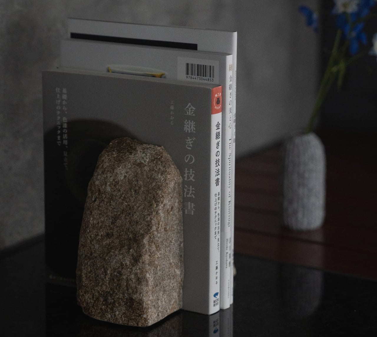
8 Best Japanese Stationery Finds So Clever You’ll Question Why the Rest of the World Even Bothers

Japanese stationery operates on a different set of assumptions. Where most of the world treats pens, notebooks, and desk accessories as afterthoughts, Japan treats them as design problems worth solving with the same precision applied to architecture or automotive engineering. The difference shows up in the details: magnetic closures calibrated to be silent, paper engineered for a specific ink behavior, and leather cut from a single hide. Hence, the grain tells a continuous story.

We have been collecting our favorites for a while now, and this batch feels particularly well-considered. These are not gimmicks dressed in minimalist packaging. Each product here earns its place through a specific, clever solution to a friction most people have accepted as normal. From a pencil that never needs sharpening to a wooden postcard case that borrows its form from ceramic storage traditions, this is stationery that makes the rest of the world’s offerings feel like rough drafts.

1. Inseparable Notebook Pen

Most pens exist independently of the surface they write on. The Inseparable Notebook Pen rejects that premise entirely, using a magnetic clip to lock itself to your notebook cover. A built-in silencer dampens the attachment, so there is no click or rattle, just a quiet lock into place. The barrel is minimalist, comfortable during long sessions, and the ink flow is smooth and immediate.

Japanese stationery brands have long understood that the gap between reaching for a pen and writing is a moment of lost momentum. This pen eliminates that friction. The form is understated, almost invisible against a notebook cover, which is the point. Tools that disappear into your workflow tend to be the ones that last the longest.

Click Here to Buy Now: $19.95

What we like

  • The magnetic clip holds firm during transit but releases with zero effort when needed.
  • The silencer turns a mundane attachment into something tactile and deliberate.

What we dislike

  • The minimalist barrel may feel too slim for those who prefer wider-grip pens.
  • Ink cartridge options are limited, restricting personalization for specific ink preferences.

2. Stalogy Editor’s Series 365-day Notebook (A6)

Stalogy’s 365 Days Notebook packs 368 pages of ultra-thin paper into an A6 form factor that still fits a coat pocket. Each page carries minimal printed detail: dates, days, a faint grid, and time indicators. Ignore them or use them. The paper writes with a smoothness that recalls Hobonichi Techo’s Tomoe River stock, letting ink glide without feathering or bleed-through.

The real strength is flexibility. This notebook works equally well with bullet journaling, daily planning, freeform sketching, or straightforward notes, all without forcing a single organizational method. Most planners assume they know how a day should be structured. This one steps back and lets the user decide, which is a rarer quality than it should be.

What we like

  • Thin paper keeps 368 pages from becoming a brick, maintaining genuine pocketability.
  • Minimal page markings make it equally useful for structured planning and unstructured creative work.

What we dislike

  • Date and time markings are printed extremely small, making them difficult to read in low light.
  • Heavy fountain pen inks will ghost through the thin paper, limiting compatibility with certain instruments.

3. FoldLine Pen Roll

Cut from a single piece of Italian leather, the FoldLine Pen Roll converts from a carrying case to a functional desk tray in under two seconds using origami-inspired folding geometry: no stitched partitions, no zippers. The natural wrap of the fold separates and protects each pen, and metal-bodied instruments stay scratch-free without dedicated slots.

Unfolded, it creates a defined rectangular workspace on any surface: a cafe table, an airplane tray, a hotel desk. That containment matters. Scattered pens create micro-distractions, and a tray eliminates the chaos without occupying permanent desk space. The leather develops a patina over time, improving with age rather than deteriorating.

Click Here to Buy Now: $135.00

What we like

  • The two-step unfolding mechanism feels intuitive enough to be fast and intentional enough to feel like a ritual.
  • Single-piece leather construction means no stitching to fail and no partitions to limit capacity.

What we dislike

  • Without individual pen slots, instruments can shift during aggressive bag movement.
  • Italian leather at this quality carries a price premium well outside impulse-purchase territory.

4. Memento Business Card Log

Business cards are collected, shoved into wallets, and forgotten. The Memento Business Card Log, designed by Japanese brand Re+g, rejects that cycle. It stores up to 120 cards using a two-point slit system that keeps each card secure, and the facing page offers dedicated space for handwritten notes about the person: a conversation detail, a follow-up date, a distinguishing trait.

Re+g’s proprietary binding allows pages to be reordered by category, importance, or any logic that makes sense. The paper stock has a warm, tactile quality. Writing a note by hand about someone forces a level of attention that tapping a phone screen cannot replicate. The log becomes a record not just of who was met, but of how those meetings felt.

Click Here to Buy Now: $35.00

What we like

  • The proprietary binding allows page reordering, so the system evolves with the user.
  • Dedicated note space alongside each card slot turns passive storage into active relationship memory.

What we dislike

  • At 120 cards, heavy networkers will fill the log fast, requiring a second volume.
  • The analog format means no search function, so finding a specific card requires manual browsing.

5. Classiky Chestnut Postcard Case

Classiky’s Chestnut Postcard Case borrows its design language from the wooden boxes used in Japan to store precious ceramics. Varnished Japanese chestnut wood gives it a warmth and grain that plastic or metal storage cannot approach. The proportions (17.6 x 11.6 x 12.4 cm) are calibrated for standard postcards, with two removable separators and a magnetic closure that shuts with clean, weighted precision.

This is a storage object built to outlast its contents. The chestnut deepens in color over years of handling rather than fading, and the removable separators allow flexible configuration depending on collection size. For collectors, letter writers, or anyone who values the physical artifact of a postcard, this case turns storage into curation.

What we like

  • Varnished Japanese chestnut ages beautifully, growing richer in tone over the years of handling.
  • Removable separators allow for a flexible internal configuration across different collection sizes.

What we dislike

  • Dimensions are postcard-specific, so the case cannot accommodate larger formats, such as A5 prints.
  • The craftsmanship and material quality place it at a premium that limits its appeal for casual purchases.

6. Sonic Kakusta

The Sonic Kakusta starts as a soft pen case and transforms into a triangular desk stand that props pens at a 60-degree angle for easy visibility and access. A built-in divider splits the interior into two sections, while a second divider in the lid creates a small shelf for erasers and sticky notes. Strong magnets hold the folded lid in place, preventing the stand from collapsing mid-use.

That 60-degree angle is the smartest detail. Steep enough to display pen tops for identification, shallow enough that pens slide in and out without tipping the case. For anyone working between home, office, and library, the Kakusta eliminates the need to carry both a case and a desk cup. One object handles both roles without appearing to be a compromise.

What we like

  • The magnetic lid holds the stand shape on uneven surfaces without collapsing.
  • The lid divider doubles as a shelf for small items, adding utility most pen cases ignore.

What we dislike

  • Soft material offers limited protection against crushing in an overpacked bag.
  • The triangular footprint is wider than a flat case, occupying more bag space than a traditional pouch.


7. Pocket Everlasting All-Metal Pencil

The Pocket Everlasting All-Metal Pencil uses a graphite and metal alloy tip that deposits marks through friction rather than material loss. The core does not shorten. The point does not dull. The manufacturer claims roughly 10 miles of writing, and the marks are erasable with a standard eraser. At 4.7 inches with a cap, it slips into a shirt pocket without protest.

Traditional pencils generate shavings, require sharpeners, and degrade in humid conditions. This pencil sidesteps all three. The all-metal body has a substantial heft without being heavy, and the graphite-alloy line plays well with watercolor and wet media because it does not bleed when painted over. For field note-takers who need a tool that never fails at the wrong moment, this is a quietly radical solution.

Click Here to Buy Now: $19.95

What we like

  • The graphite-alloy tip eliminates sharpening, shavings, and the risk of a dull point at the worst time.
  • Compatibility with watercolor and wet media makes it versatile for mixed-media sketching.

What we dislike

  • Line weight is fixed, so artists needing variable stroke thickness will find it limiting.
  • The metallic graphite tone differs subtly from traditional pencil graphite, which may bother purists.

8. Stellar Edge Scissors

Scissors are the most overlooked object on a desk. The Stellar Edge Scissors argue that this neglect is a design failure. Crafted from Japanese stainless steel, the blades hold their edge far longer than standard office scissors, and the polished, seamless handles distribute weight so evenly that extended cutting sessions produce no hand fatigue. Every curve has been considered, from the finger loop radius to the pivot tension.

Each snip has a clean, controlled resistance that comes from precise blade geometry and tight manufacturing tolerances. The polished finish reduces friction against tape and adhesive paper, which tend to gum up matte or coated blades. The ergonomic shaping fits both left and right hands without the usual ambidextrous compromise. For anyone who uses scissors more than once a week, these make the ordinary feel considered.

What we like

  • Japanese stainless steel holds a sharp edge far longer than standard office scissor alloys.
  • Weight distribution across the handles eliminates fatigue during extended cutting sessions.

What we dislike

  • The premium material and finish come at a price point difficult to justify for occasional use.
  • The polished surface shows fingerprints easily, so it requires regular wiping to maintain a clean aesthetic.

Where this leaves us

Eight products, and the common thread is not aesthetics or branding. It is the refusal to accept that everyday tools should be disposable, forgettable, or merely functional. Japanese stationery design starts from the assumption that the interaction between a person and a tool is worth engineering down to the last magnetic click, the last gram of weight distribution, the last millimeter of paper thickness.

The rest of the world makes stationery. Japan makes instruments. The difference is not in the materials alone, though those matter. It is in the insistence that a pen’s relationship to a notebook, a scissors’ resistance against paper, or a wooden box’s aging behavior are all design problems that deserve solutions. These eight products are proof that once experienced, going back feels like a downgrade.

The post 8 Best Japanese Stationery Finds So Clever You’ll Question Why the Rest of the World Even Bothers first appeared on Yanko Design.