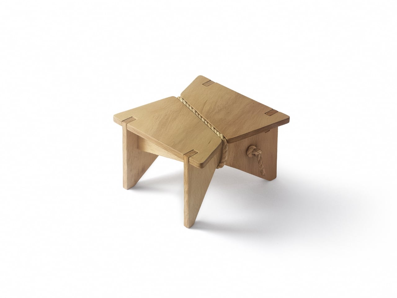
The line between outdoor gear and everyday carry has never been blurrier. More people are treating their camping setups with the same discernment they’d bring to a wardrobe or a home office, hunting for things that work hard but also look intentional. The market has responded, and the range of portable gear sitting somewhere between rugged utility and refined object design has never been broader.
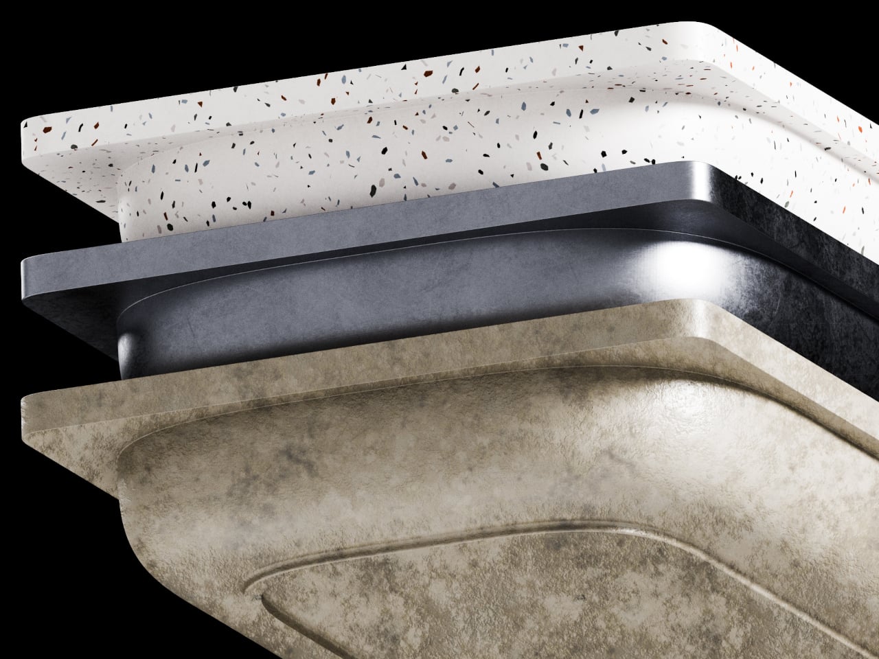
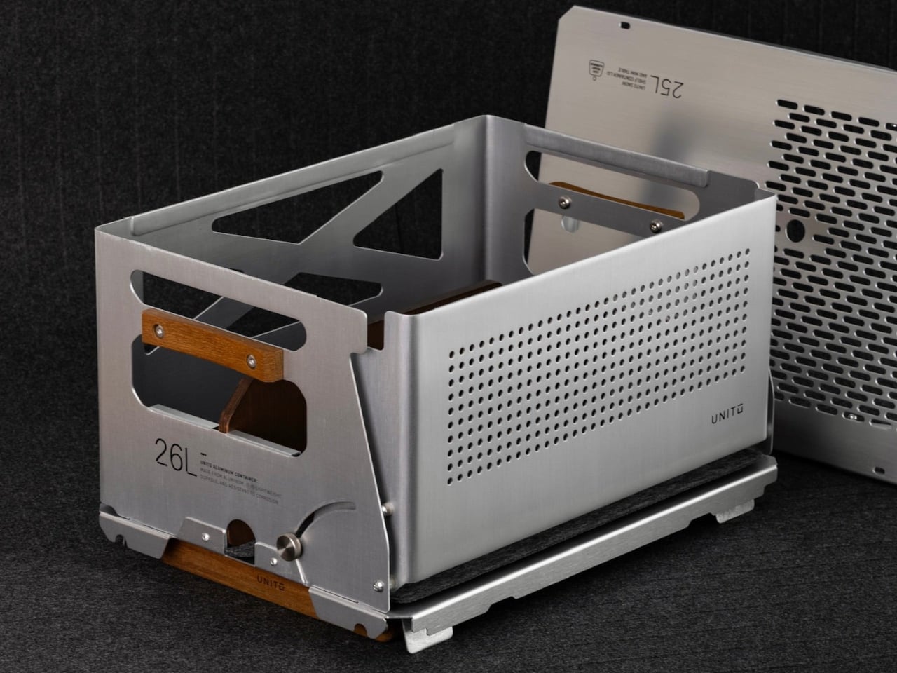
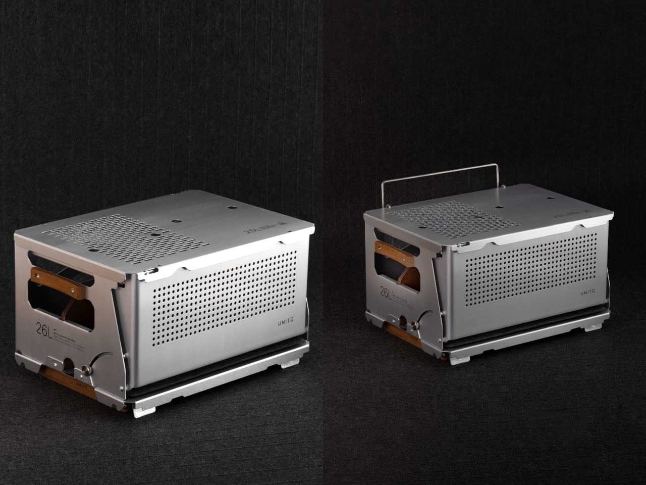
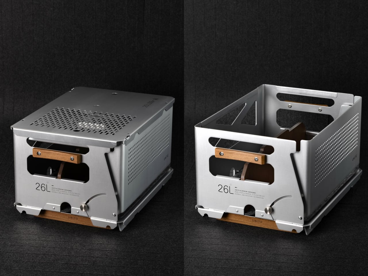
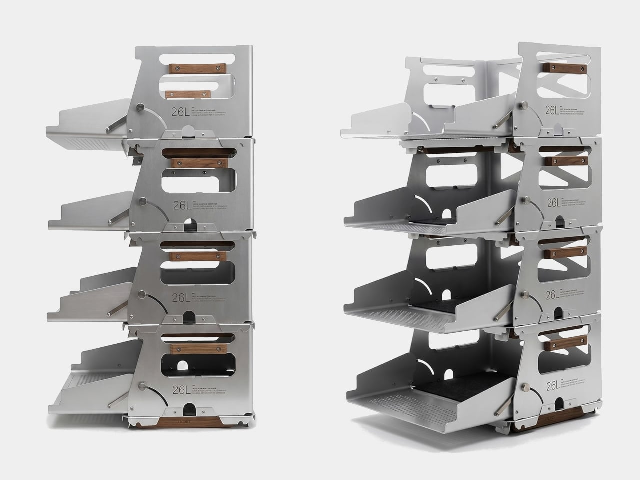
Unito, a Thailand-based brand, has positioned its Container 26L squarely in that territory. The box holds 26 liters of storage and comes loaded with teak wood accents, a foldable table lid, flip-out extension legs, a divider, and a soft pad, all in a full set that retails for $290. It’s built to adapt across environments rather than anchor itself to just one.
Designer: Unito
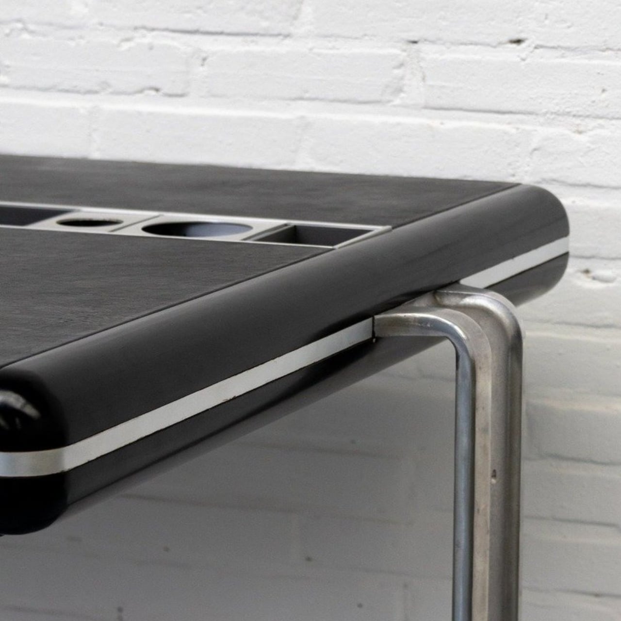
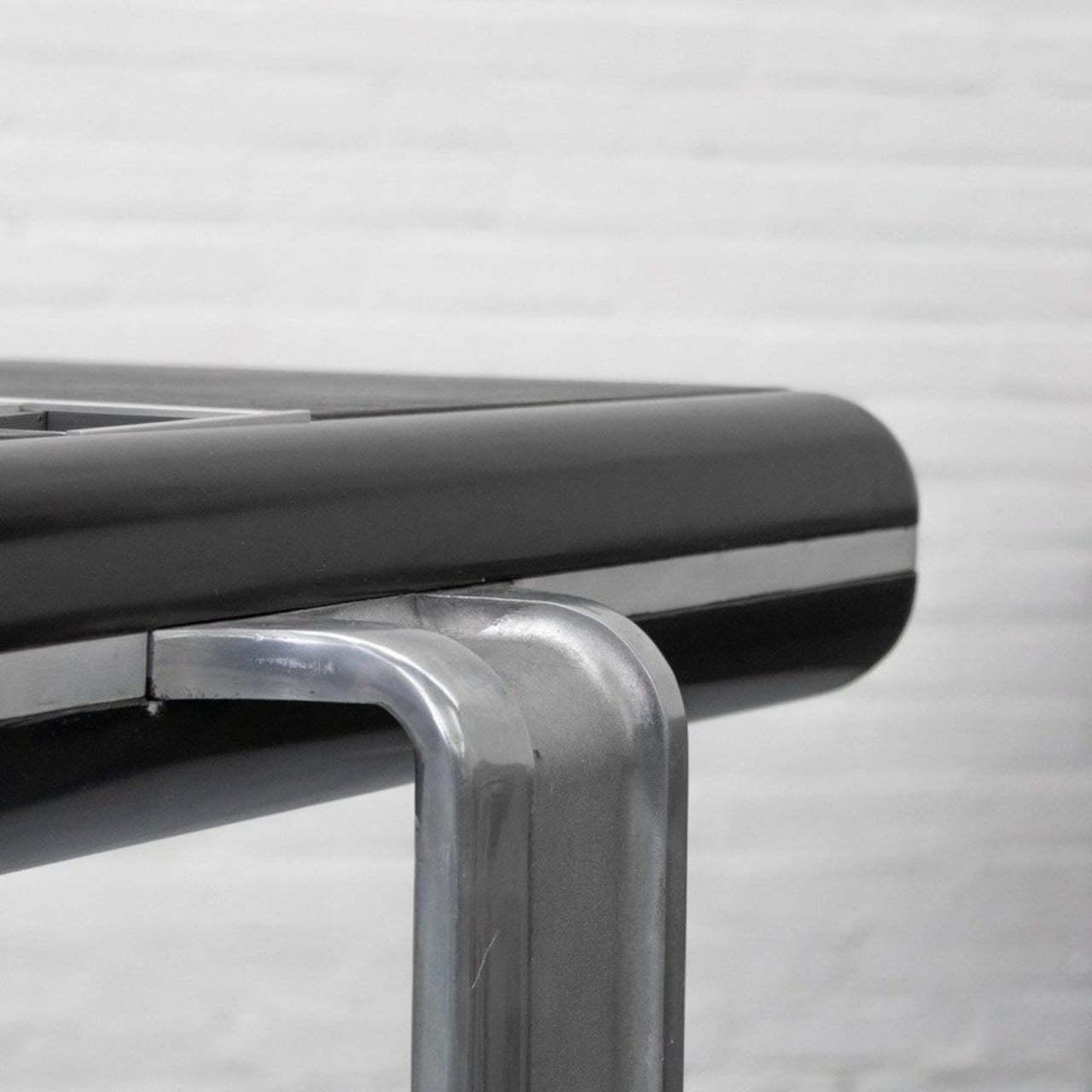
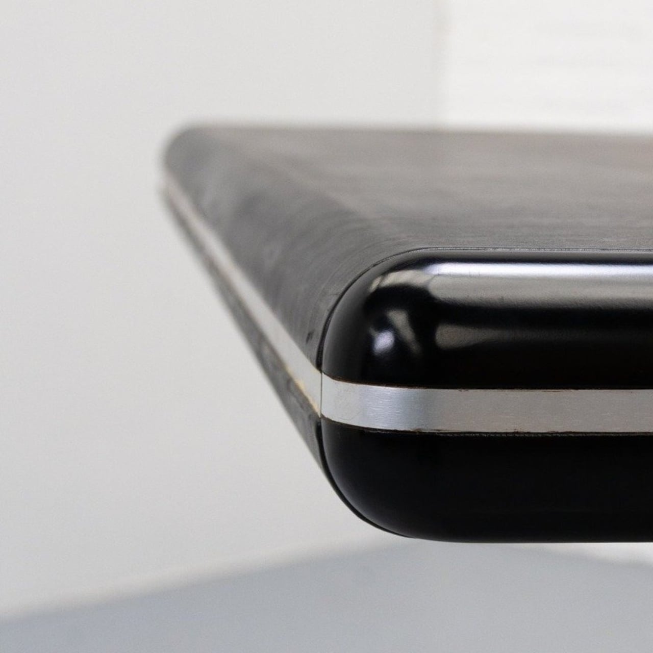
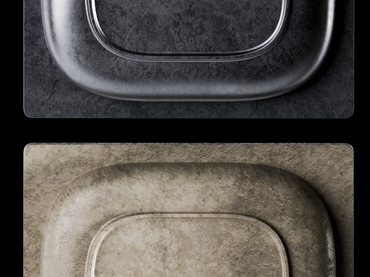
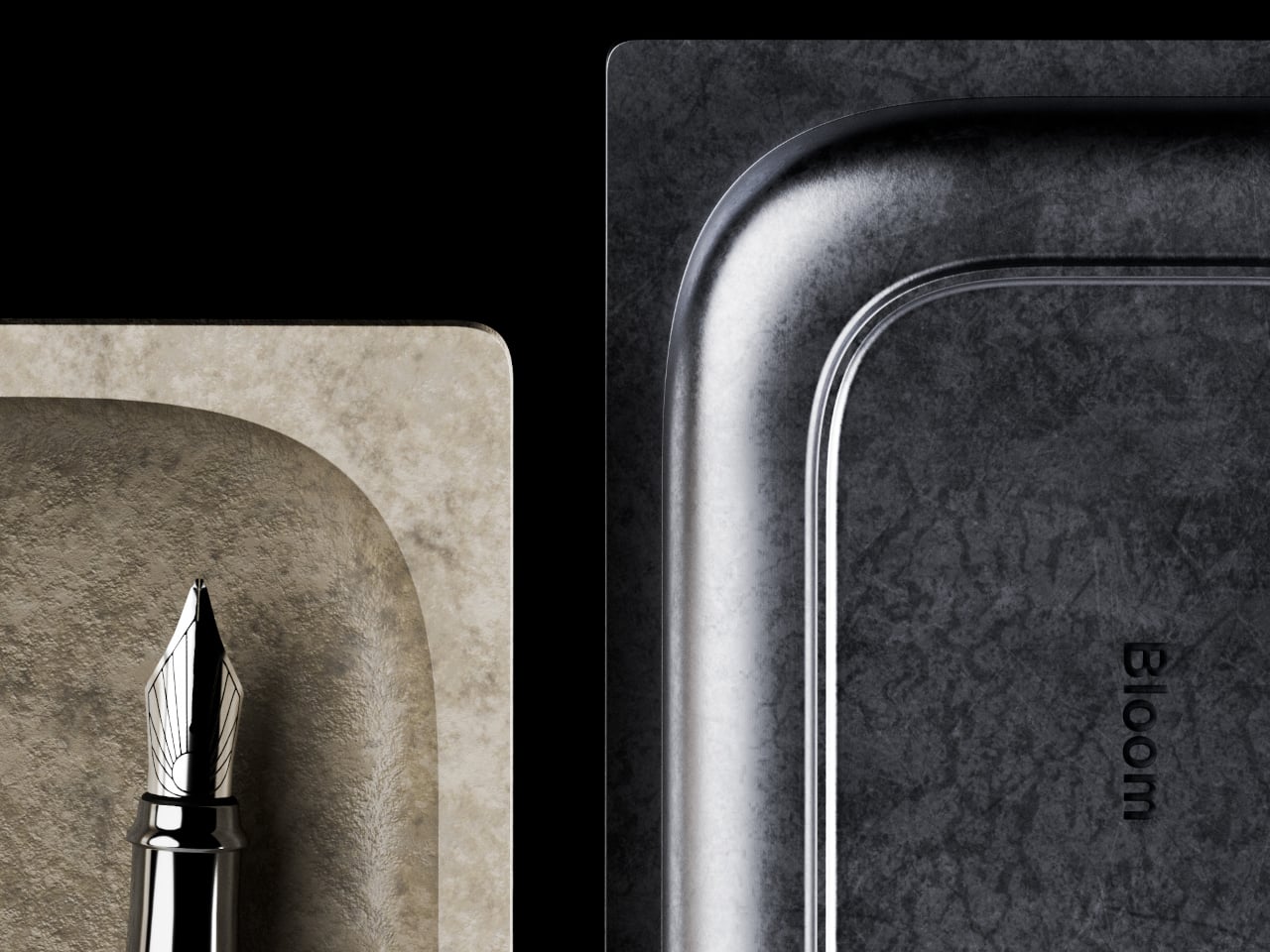
The choice of anodized aluminum for the body does a lot of the heavy lifting. The finish is more corrosion-resistant than bare metal and tougher than paint, which makes it well-suited for the kind of regular outdoor exposure that would start to wear down lesser materials. The silver anodized variant, in particular, has a clean industrial look that doesn’t try too hard and ages without embarrassing itself.
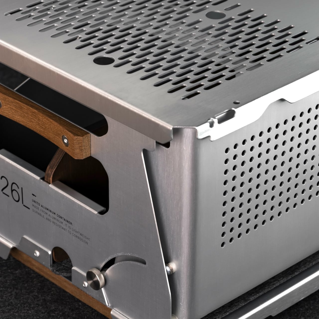
Teak handles sit on either side of the box, giving you a comfortable grip that reads differently against the metallic finish. The flip-out teak extension legs raise the container off the ground into a standing station. Unito supposedly sources the wood from managed plantation forests in Thailand, where the brand is made, addressing concerns about the choice of material.
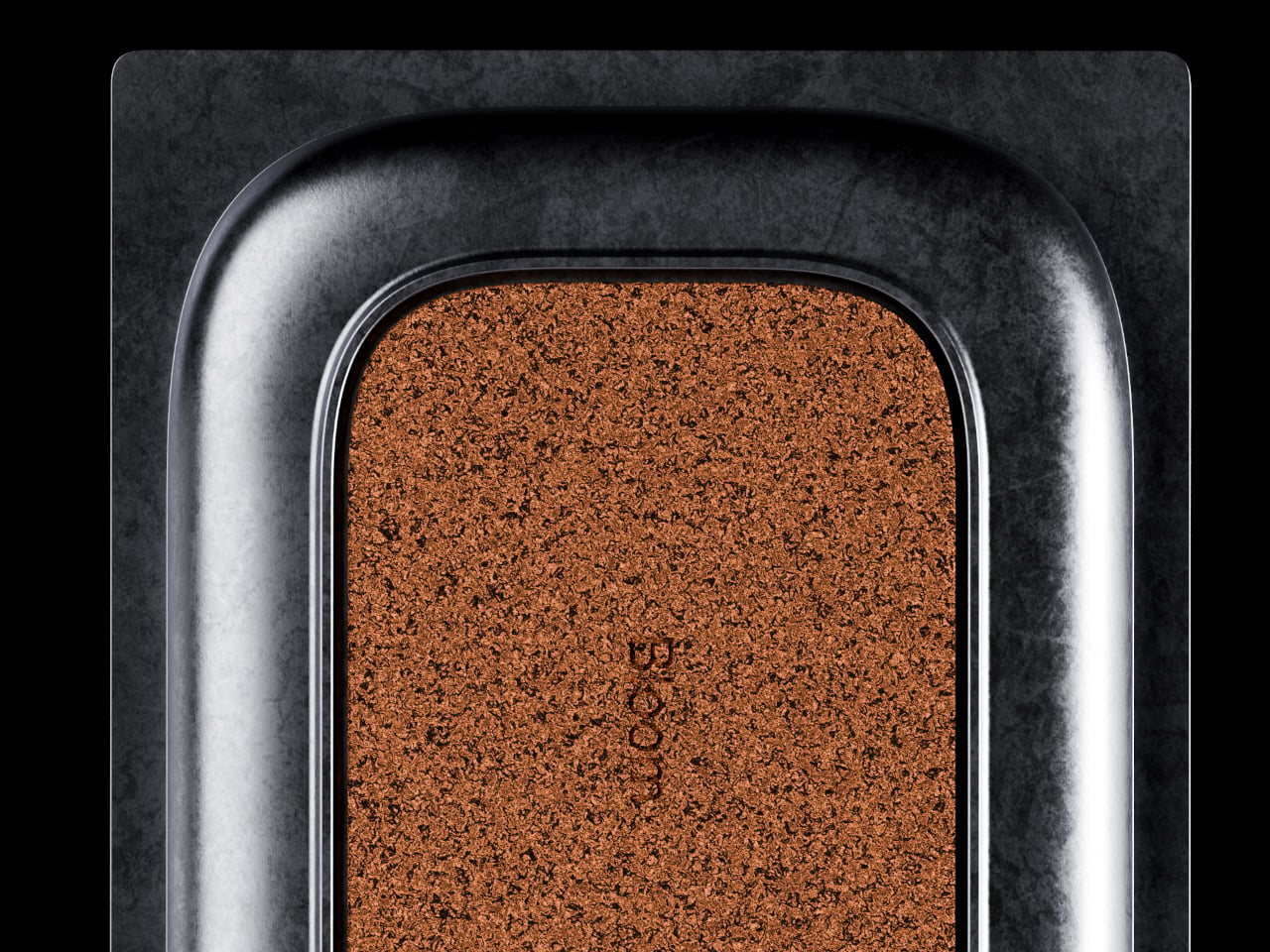
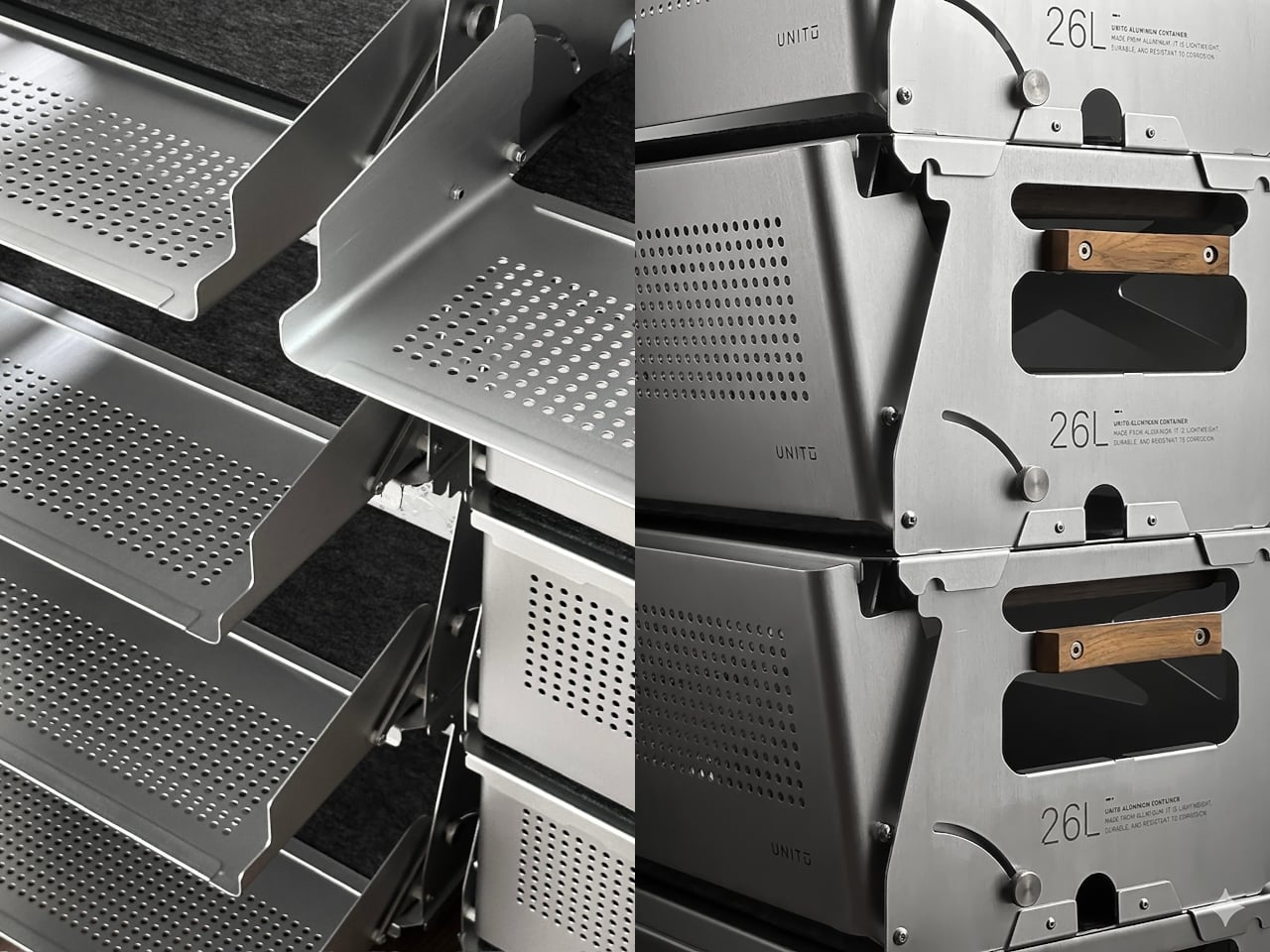
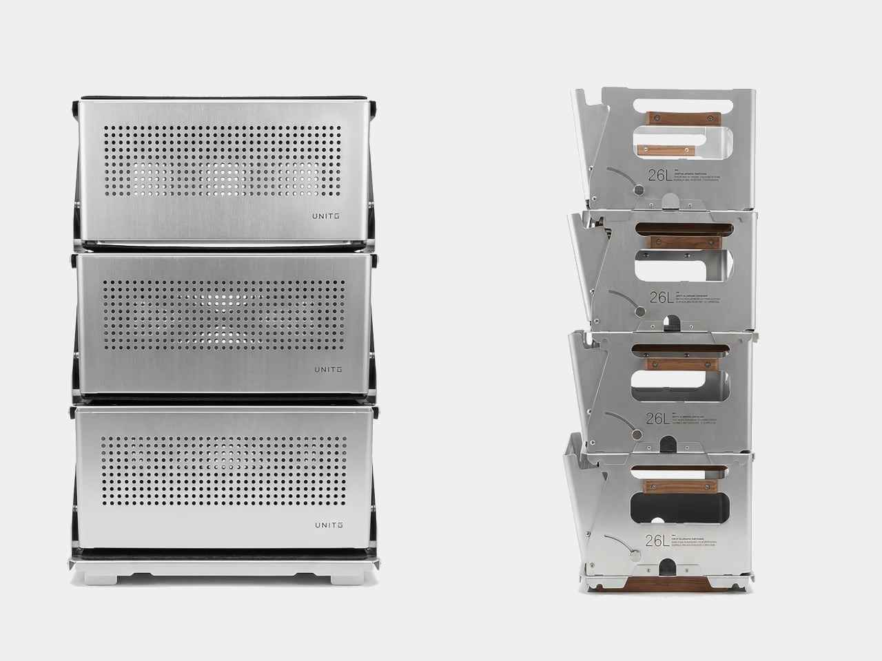
The Snow 25L is the lid that ships with the box, but calling it just a lid undersells what it does. It’s a foldable aluminum table weighing 950 grams, and it’s also compatible with Snow Peak’s 25L crate, which broadens the system’s appeal considerably. Stack two containers, and each lid still opens independently, so access isn’t sacrificed in the name of keeping the stack looking neat.
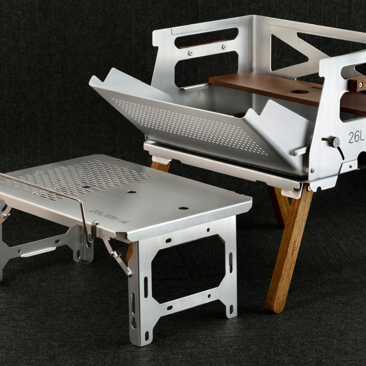
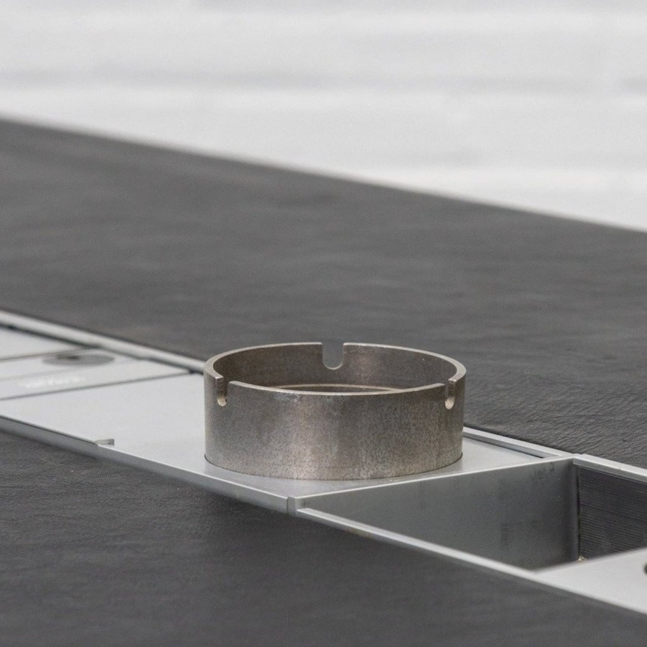
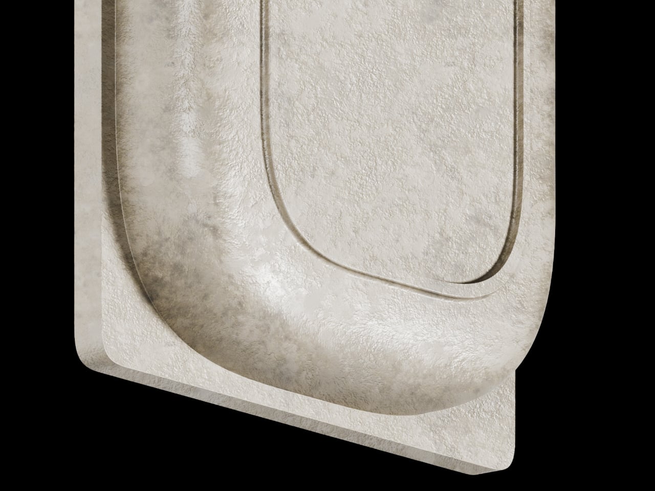
On a campsite, the legs deploy, and the box becomes a prep station for gear, food, or brew equipment. The perforated aluminum body lets air circulate, which matters when you’re storing anything prone to trapping heat or moisture. The included divider helps section off the interior, and a built-in carry handle means you’re not scrambling for a grip when it’s time to pack up.
Back in the studio or at home, the same container holds art supplies, camera gear, or electronics with enough structure to keep things sorted rather than thrown together. The modular system lets you pair containers, add accessories, or use just the box and lid without the legs. It’s the kind of setup that rewards people who’ve thought carefully about their gear.
The post This Modular Teak and Aluminum Box Has a Lid That Folds Into a Table first appeared on Yanko Design.