There’s a certain kind of object that can’t quite decide what it is, and not in a bad way. Furniture has increasingly strayed into collectible territory, and collectibles have crept into living rooms posing as furniture. The result is a growing category of designed objects that live somewhere between a chair and a limited-edition release, serious about craft but refreshingly light about everything else.
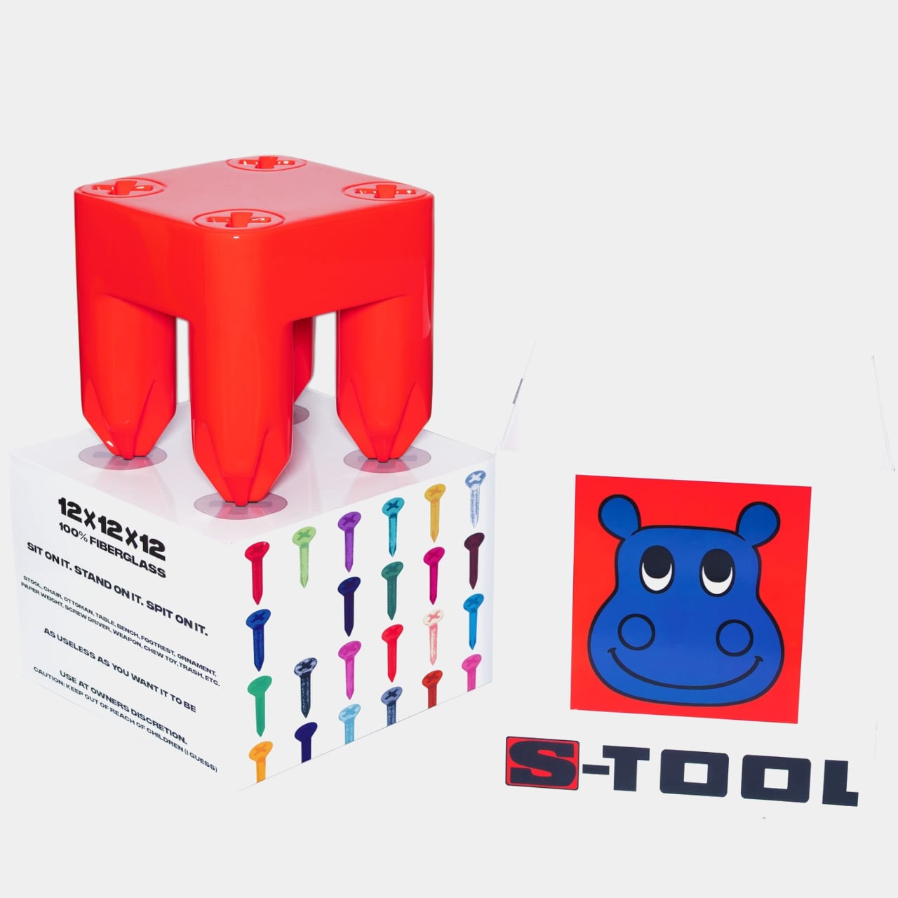
Carpet Company, the Baltimore brand known for carving out its own irreverent corner of the design world, leans into that tension with the S-TOOL, its first piece of furniture. The name makes no effort to hide the attitude, and the official list of potential uses runs from stool and ottoman all the way to footrest, ornament, chew toy, and, with admirable candor, trash.
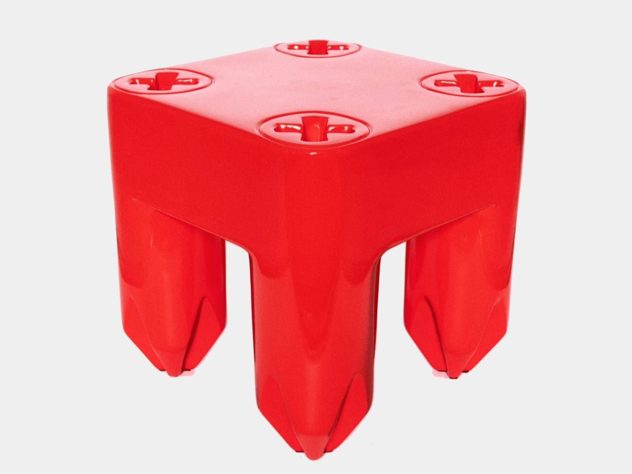
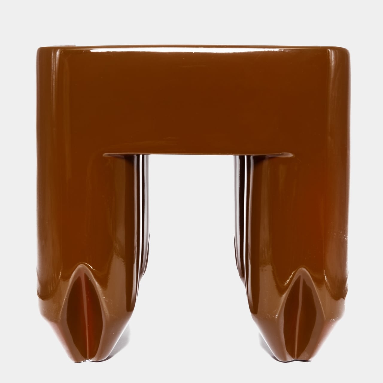
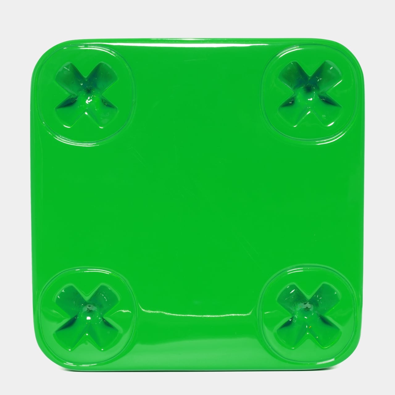
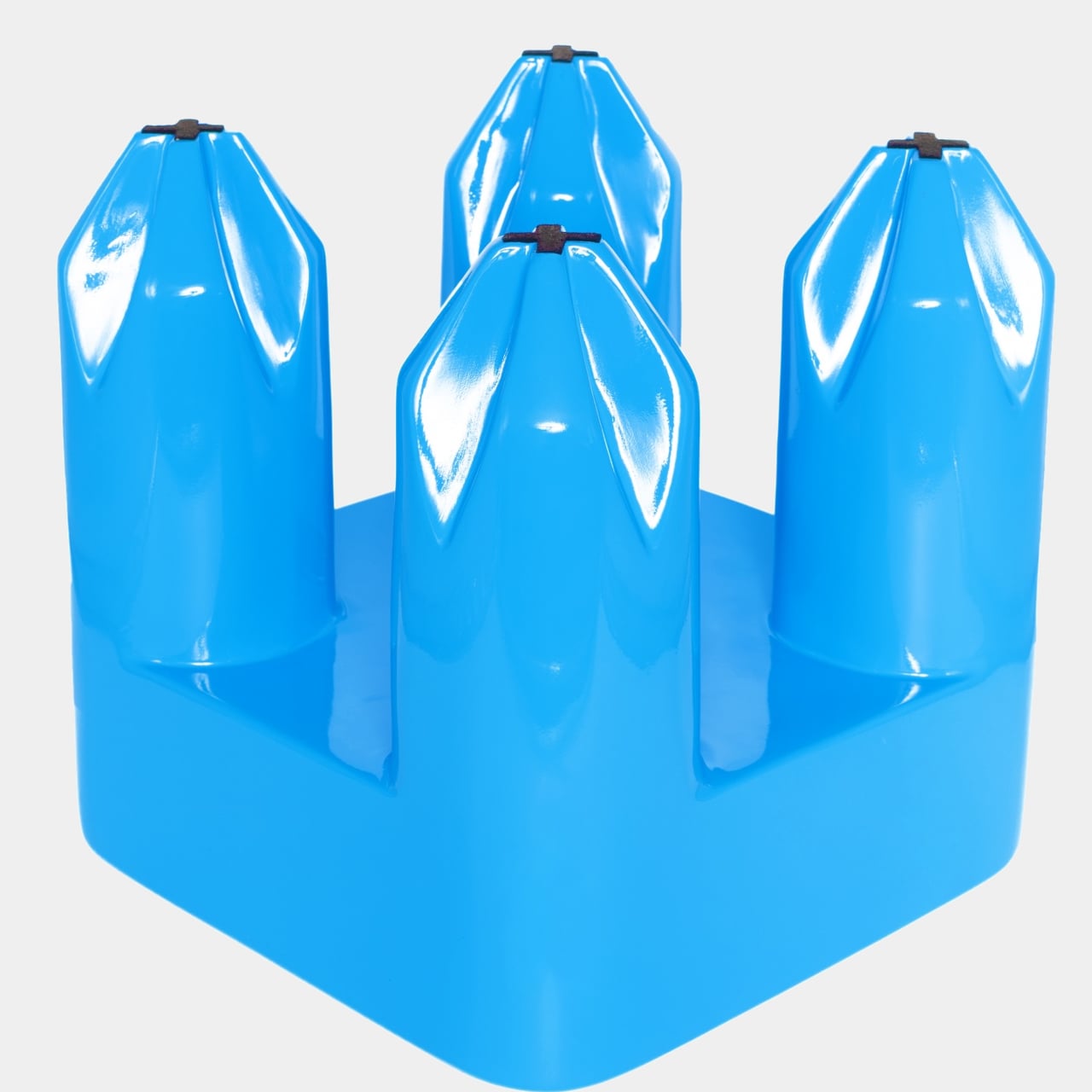
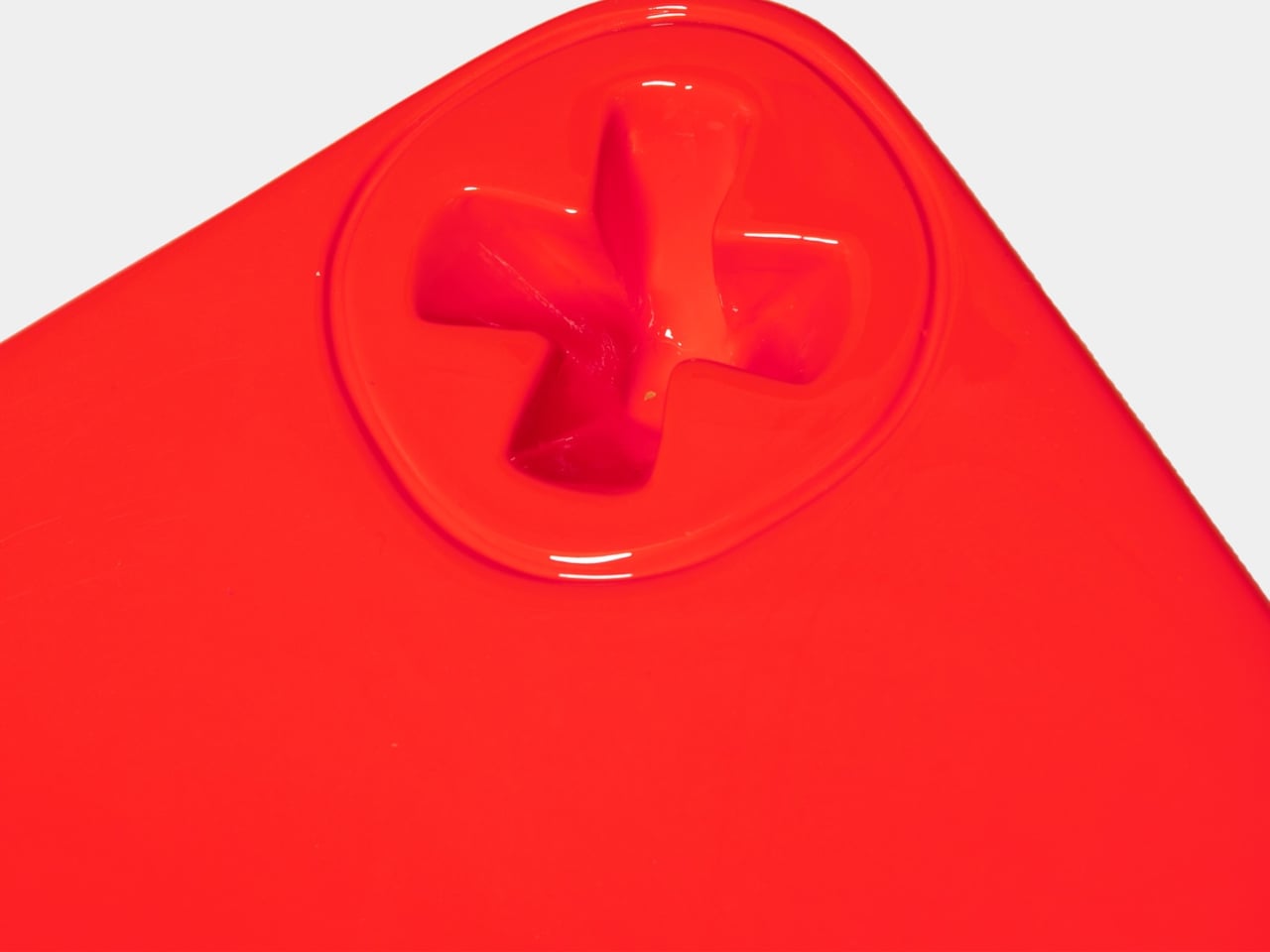
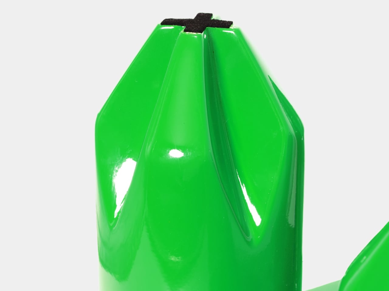
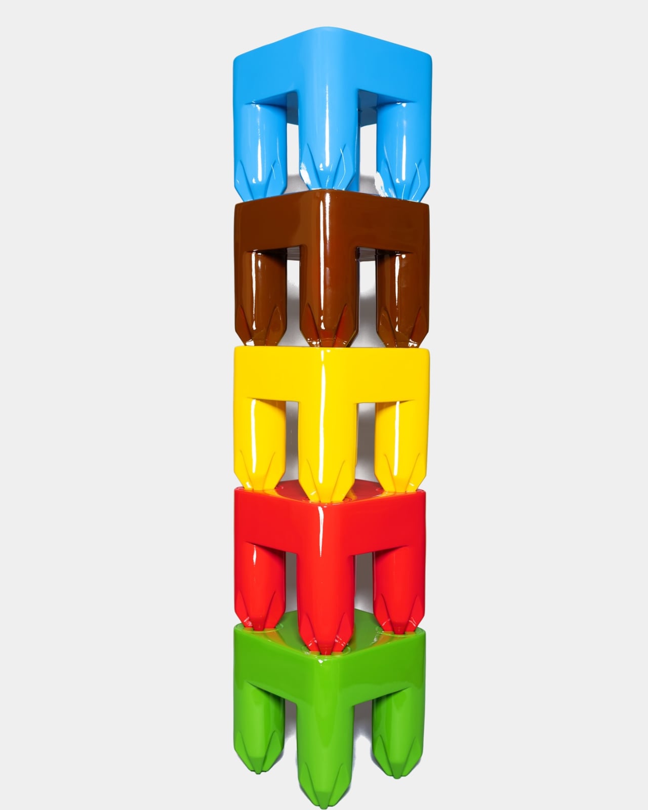
The form is remarkably direct. A 12-by-12-by-12-inch cube of 100% fiberglass, cast in a single unbroken gloss color, sits on four chunky legs that taper down to blunt, faceted points. The top surface carries a screw-head relief in each corner, molded flush into the fiberglass in the same color as the piece, which reads immediately as hardware but behaves purely as ornament.
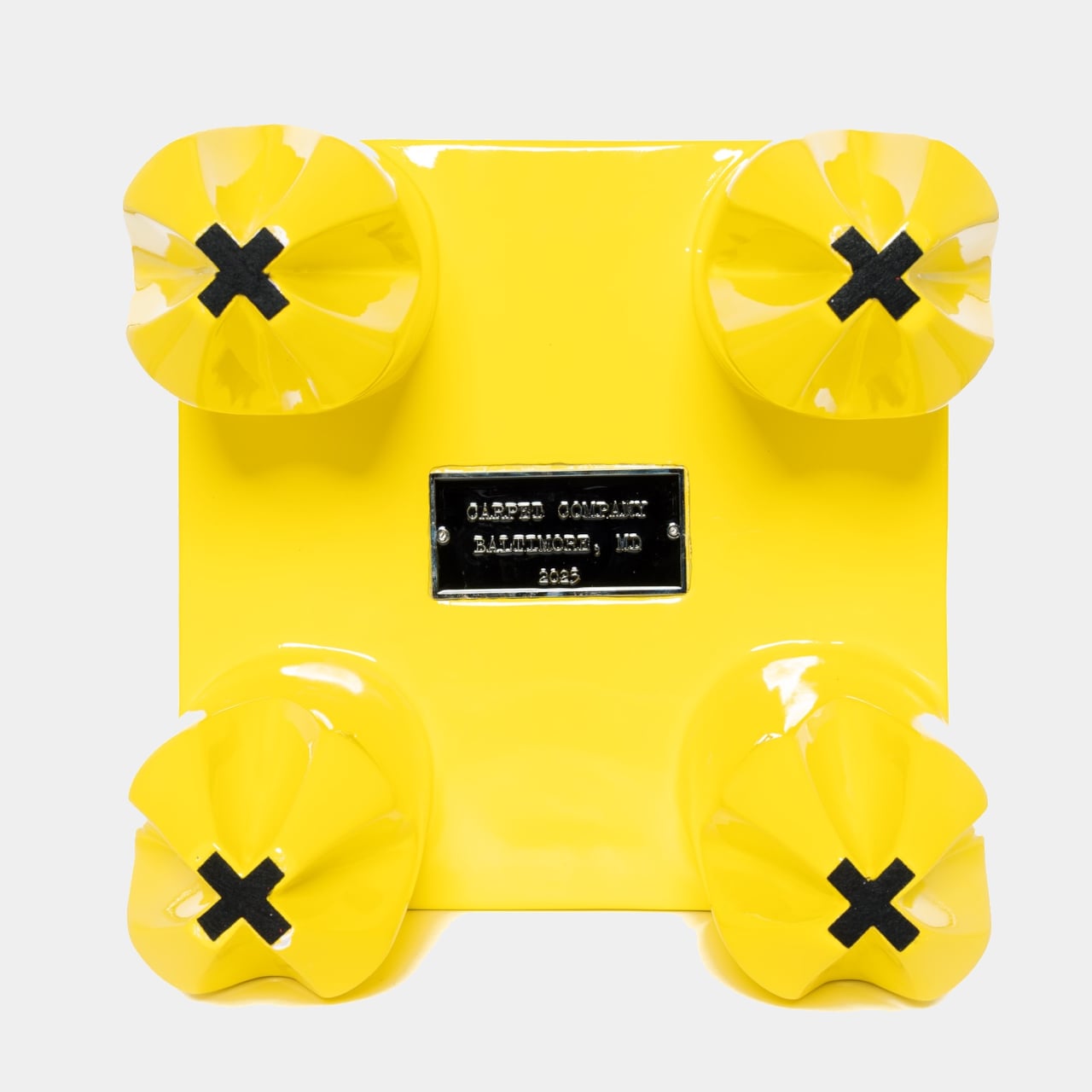
The screw motif carries through to the legs, shaped like Philips screwdrivers that slot into the screw-head relief of another S-TOOL. It’s a small but loaded gesture, nodding to the DIY impulse of the design process without pretending to be handmade. Carpet describes it as hardware that speaks to how things get built, balanced against the glossy, almost candy-like finish to keep the whole concept from becoming too earnest.
The S-TOOL is a limited release, with only 150 units spread across 30 colors, five of each. Every piece carries a metal plaque screwed into the underside, detailing the release and edition, which gives the stool some of the same collectible gravity you’d expect from a numbered print or a signed sneaker. At 15 pounds, it’s substantial enough to feel like something, and that’s rather the point.
The packaging reinforces the whole thing. The box carries the same list of purposes, a column of color-coded screw illustrations previewing the full range, and a cartoon hippo mascot that’s equal parts absurd and charming. Carpet has always been deliberately playful, and the S-TOOL packaging reads like the product brief itself, a small manifesto folded around a cube of brightly colored fiberglass.
What makes the S-TOOL interesting is how much effort went into something that officially disclaims all responsibility. Carpet spent considerable time on proportional analysis to give the elementary form a sense of sophistication it doesn’t advertise, and it shows in how quietly resolved the piece sits. It’s furniture that doesn’t mind being treated as trash, but it’s built carefully enough that you probably won’t.
Most furniture tells you exactly what to do with it. A chair says sit. A table says set things down. A bench says sit, maybe share the space. The X Bench Swing, the latest from Rotterdam-based studio The New Raw, has a slightly more interesting ask: sit, rock, and do it facing the opposite direction from whoever’s sitting next to you.
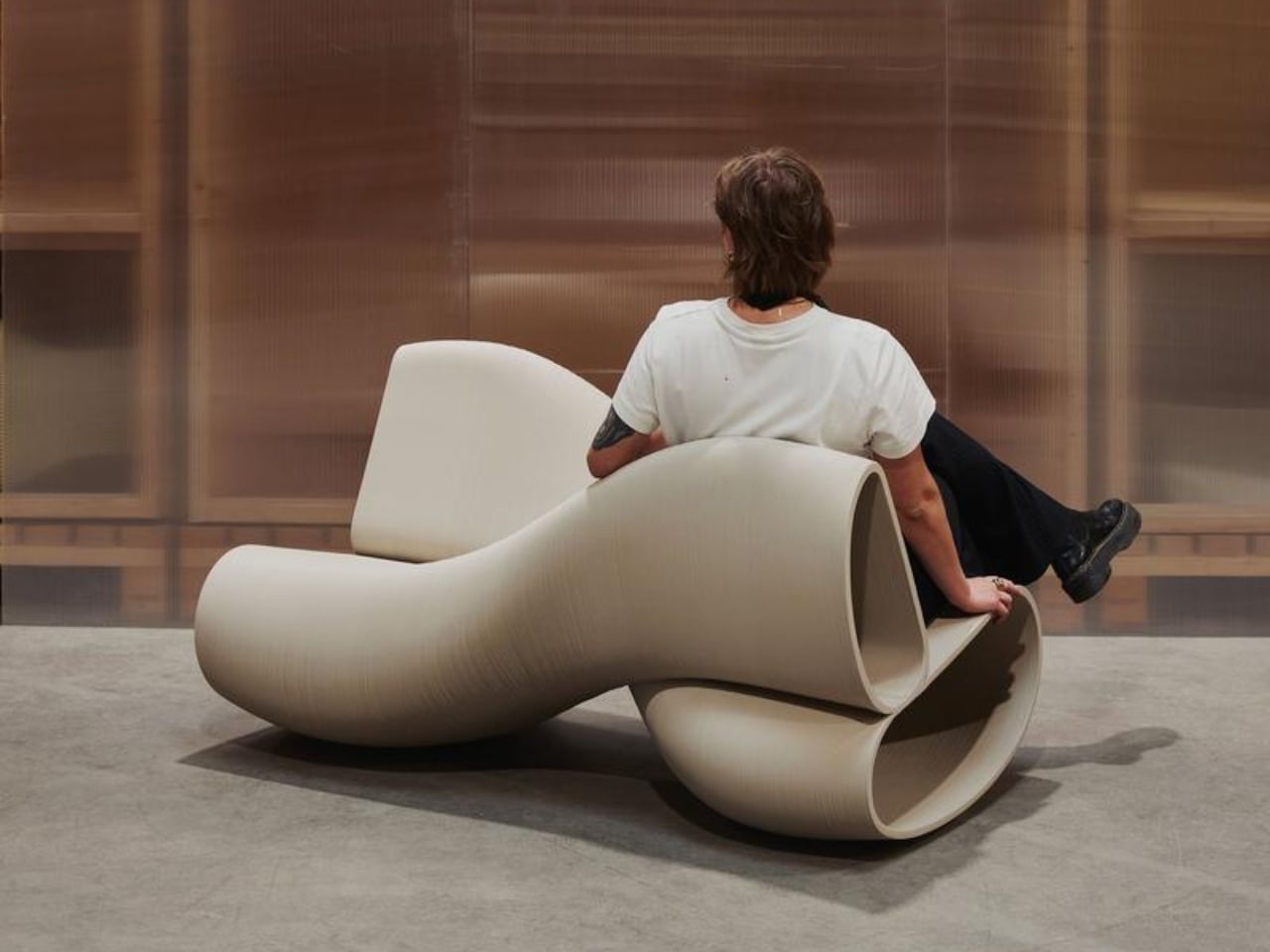
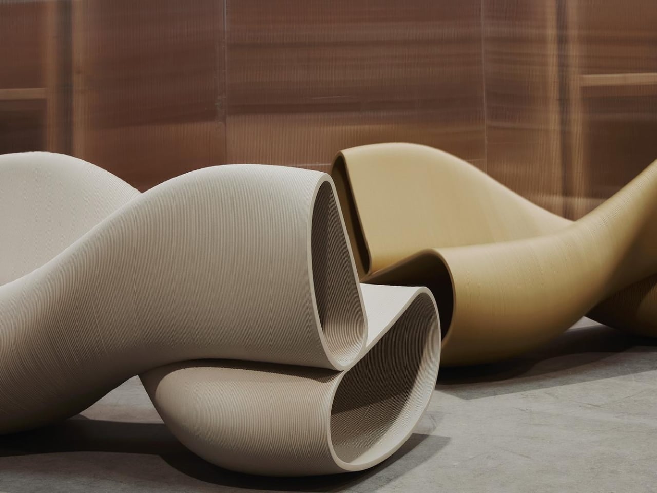
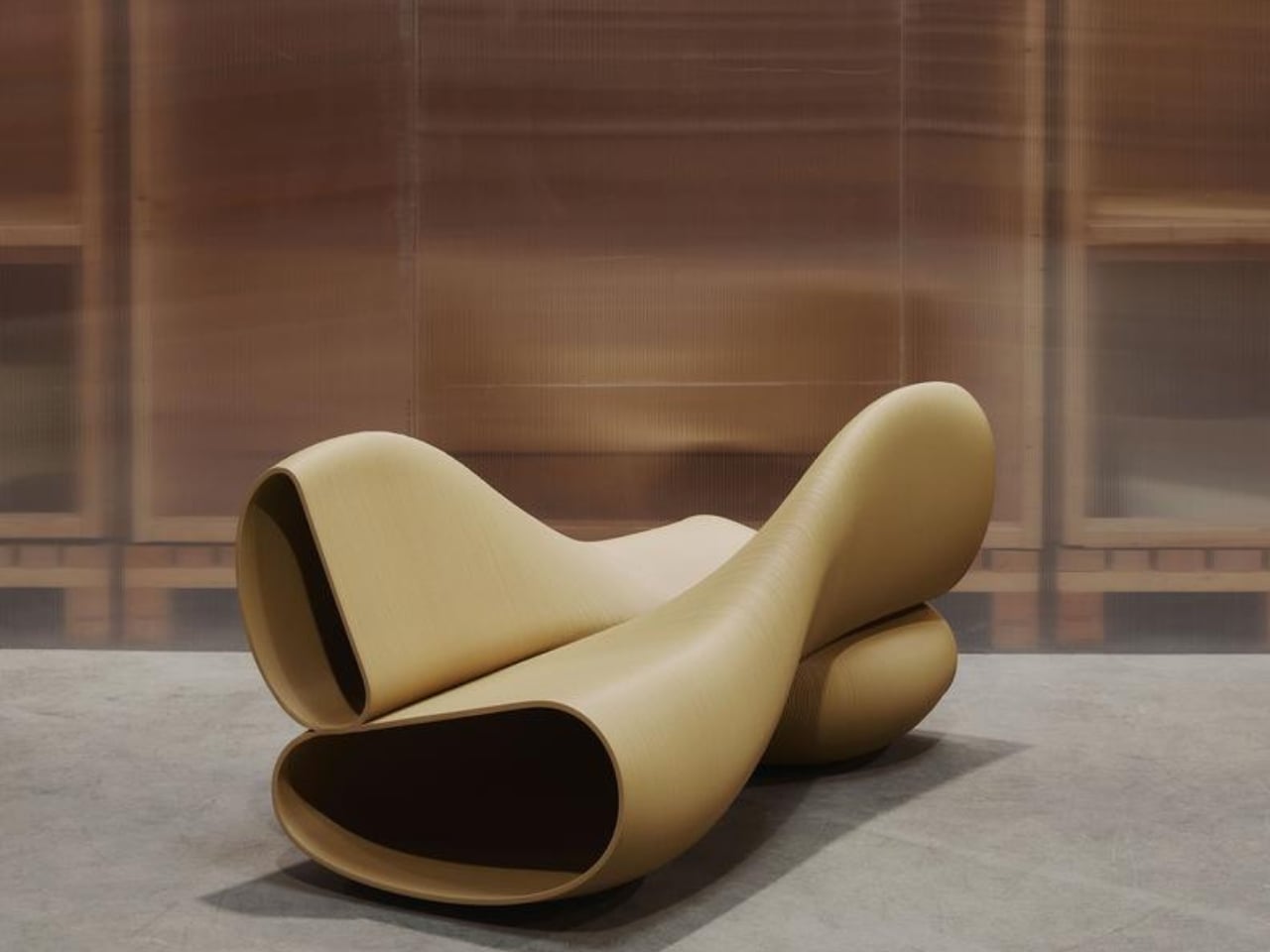
That setup sounds strange until you see it. The bench seats two people, but the clever part is that both sitters face opposite ways while sharing a single rocking motion. Think of it less like a traditional bench and more like a kinetic sculpture that happens to be incredibly functional. The form is defined by two intersecting volumes that create a sculptural, sturdy X-shaped structure. It’s the kind of piece that makes you want to walk around it before you sit down.
The New Raw describes the design’s intent with quiet confidence: “X Bench explores movement as a design principle.” That could easily read as throwaway design-speak, but when you look at the object itself, it actually lands. The rocking motion isn’t just a feature. It’s the whole point of the bench. The movement is built into the geometry, encoded in the alternating orientation of the seats, and made possible by a curved base that lets both sitters sway in rhythm even while facing away from each other.
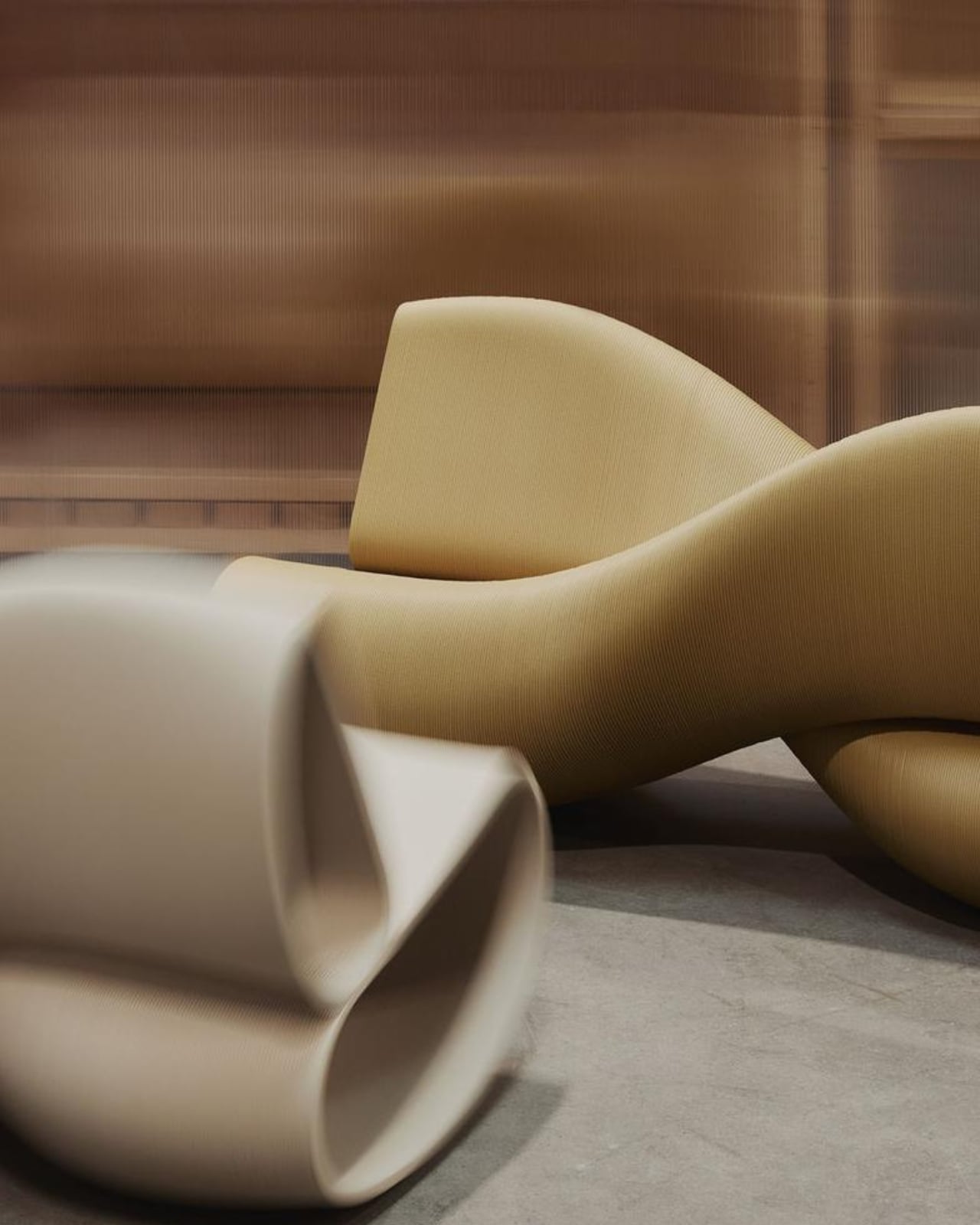
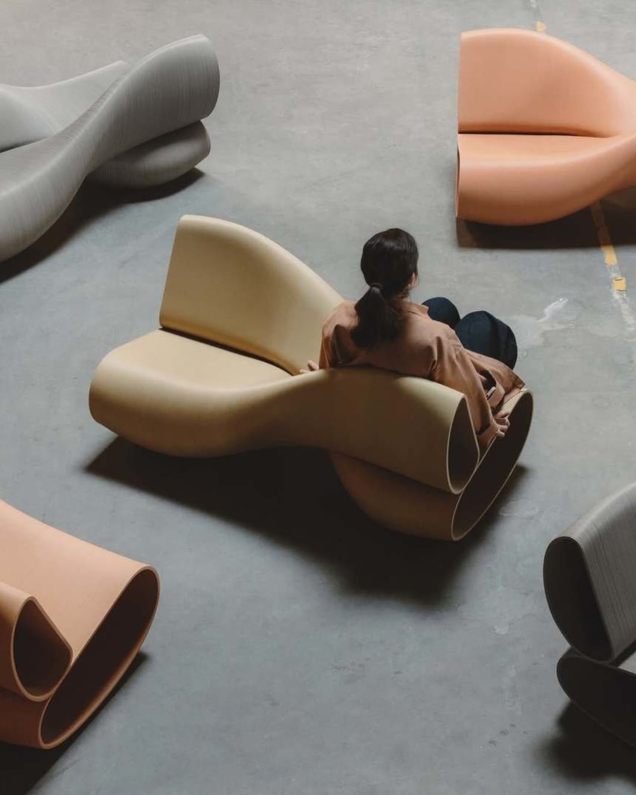
And yes, it’s 3D printed, but not the kind of 3D printing you might be picturing. The New Raw works with industrial robotic arms to fabricate their pieces layer by layer from recycled polypropylene (rPP), plastic waste that would otherwise not have much of a future. Each X Bench uses 55 kilograms of recycled plastic and saves an estimated 143 kilograms of CO2 compared to conventional manufacturing. The studio sources materials from local recyclers in Rotterdam, prints on demand, and uses no adhesives or mixed materials, which means every piece can be fully recycled at the end of its life. The sustainability story here isn’t bolted on as an afterthought. It is the manufacturing philosophy.
The result is a bench that looks nothing like recycled plastic is supposed to look. The surface texture has a tactile, almost geological quality. The layered printing process turns what could be a visual liability into a genuine aesthetic. It reads as warm and handcrafted even though a robot arm built it. That tension between industrial process and sensory finish is, arguably, The New Raw’s most consistent signature across their body of work.
At 70 x 140 x 76 cm, the X Bench isn’t small, but it’s sized for real use. It works indoors or out, which makes it an easy fit for public spaces, gardens, lobbies, or any room that can absorb a statement piece without turning into a gallery. The studio describes it as suited for spaces “with an open-hearted character,” which I’d translate as: don’t put this in a minimalist white box and expect it to whisper quietly in the corner.
The social dimension baked into the design is where the piece gets genuinely interesting. Sitting across from someone on a bench is one kind of dynamic. Sitting back to back while you both rock is another kind of conversation entirely. It invites a sideways glance, a shared rhythm, an awareness of another person without the weight of direct eye contact. For a piece of furniture, that’s a lot to offer.
A lot of sustainable design right now carries a slightly apologetic quality, as if the environmental credentials are meant to compensate for aesthetic compromise. The X Bench doesn’t do that. It’s confident, a little playful, and the fact that it’s made from waste plastic feels like a bonus rather than a burden. The New Raw has been quietly making that argument with their work for years. With the X Bench Swing, they’re making it more clearly than ever.
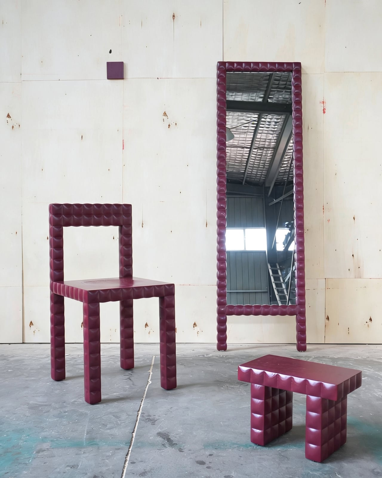
I’ve been thinking a lot lately about what separates furniture that you simply own from furniture that you actually feel something about. Most pieces fall squarely in the first category. They hold your things, fill your space, and eventually end up in someone else’s apartment. But every once in a while, a collection comes along that makes you want to know the story behind it. The Squares, designed by Xiaoya Wang and Jian Ni of One Week Design, is that kind of collection.
The origin story alone is worth sitting with. The design is rooted in a personal memory: Wang’s father worked for a construction company that built small houses, and she occasionally joined him on the job, learning to lay bricks. Ensuring each wall was perfectly plumb, each brick snug against its neighbor, each layer bound by mortar. That ritual, repeated countless times, forged a core belief: objects are vessels of memory. That’s not a new idea, but Wang and Ni have translated it into something tangible and deeply specific.
Designers: Xiaoya Wang & Jian Ni (One Week Design)
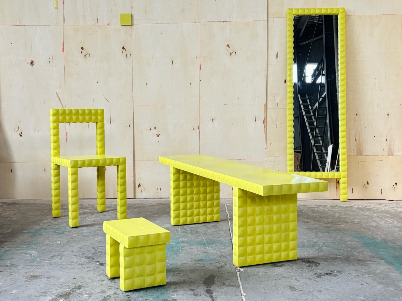
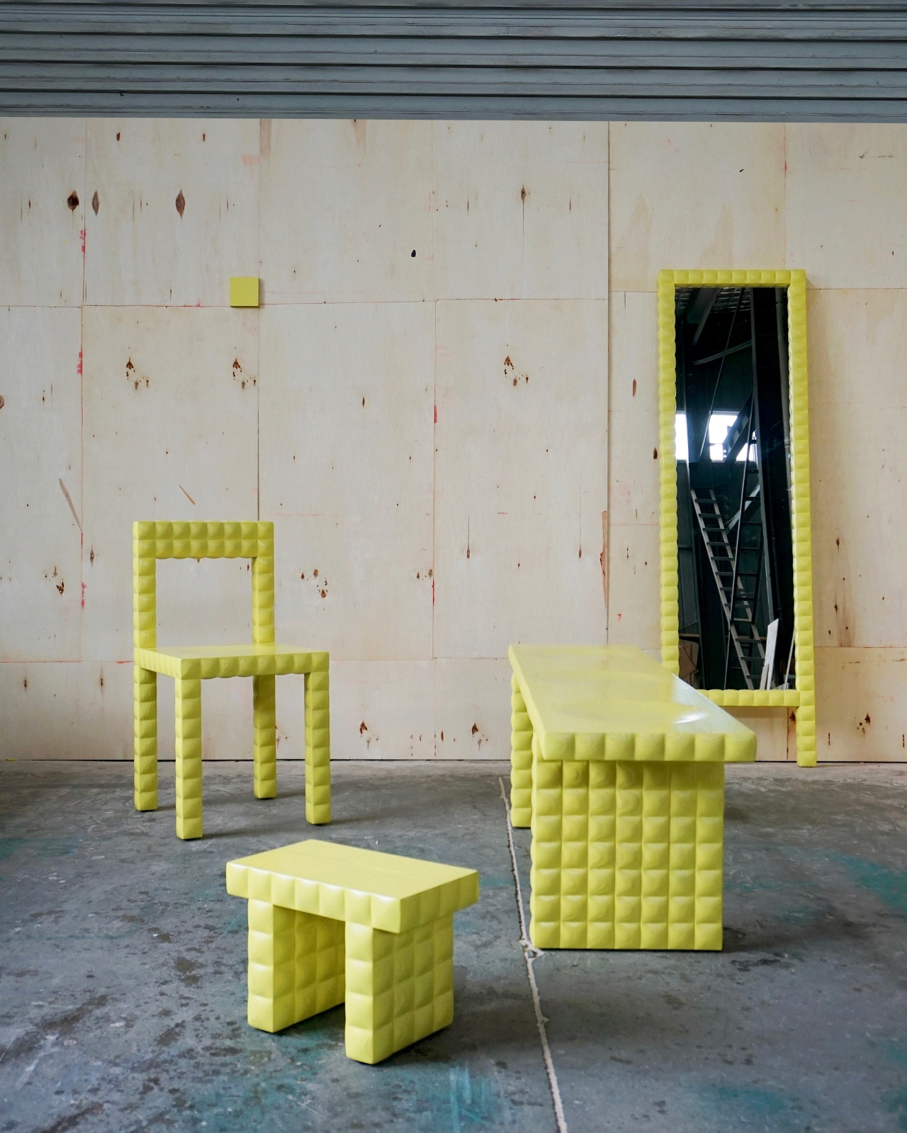
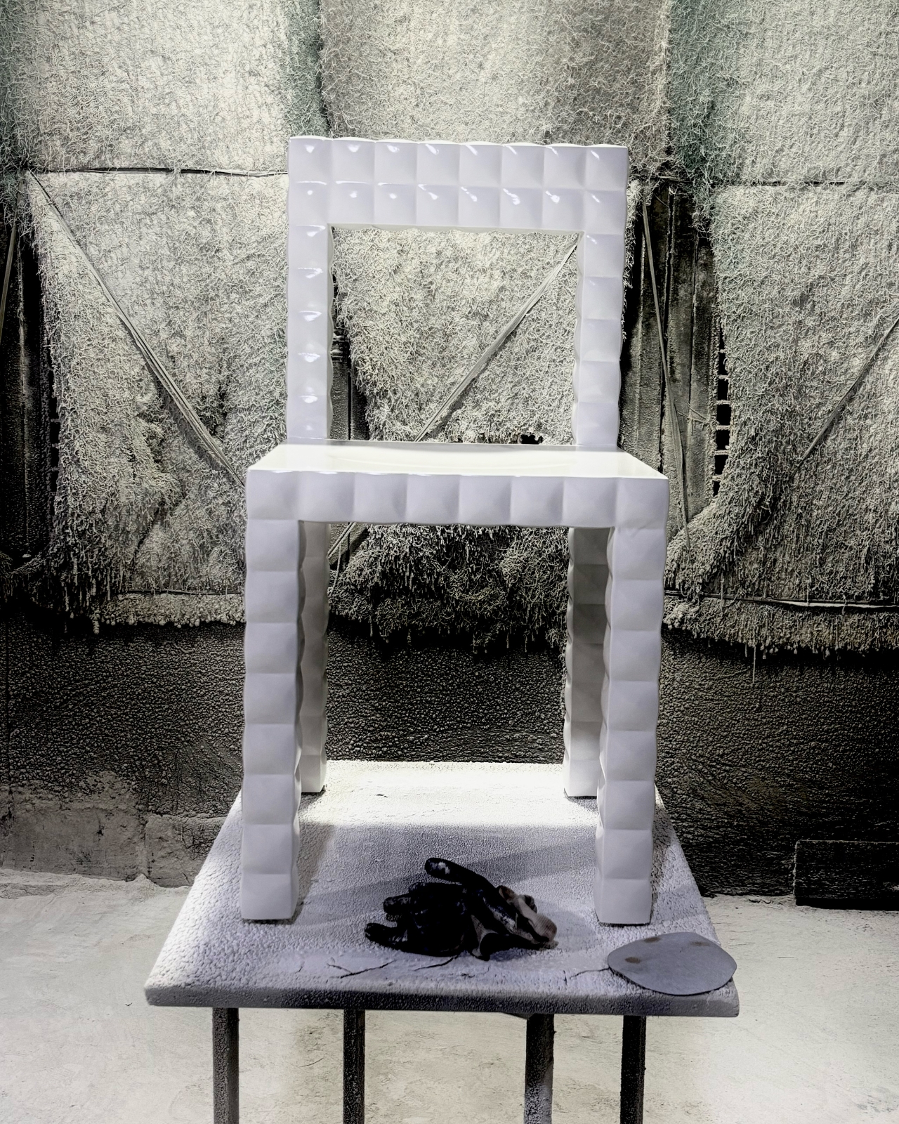
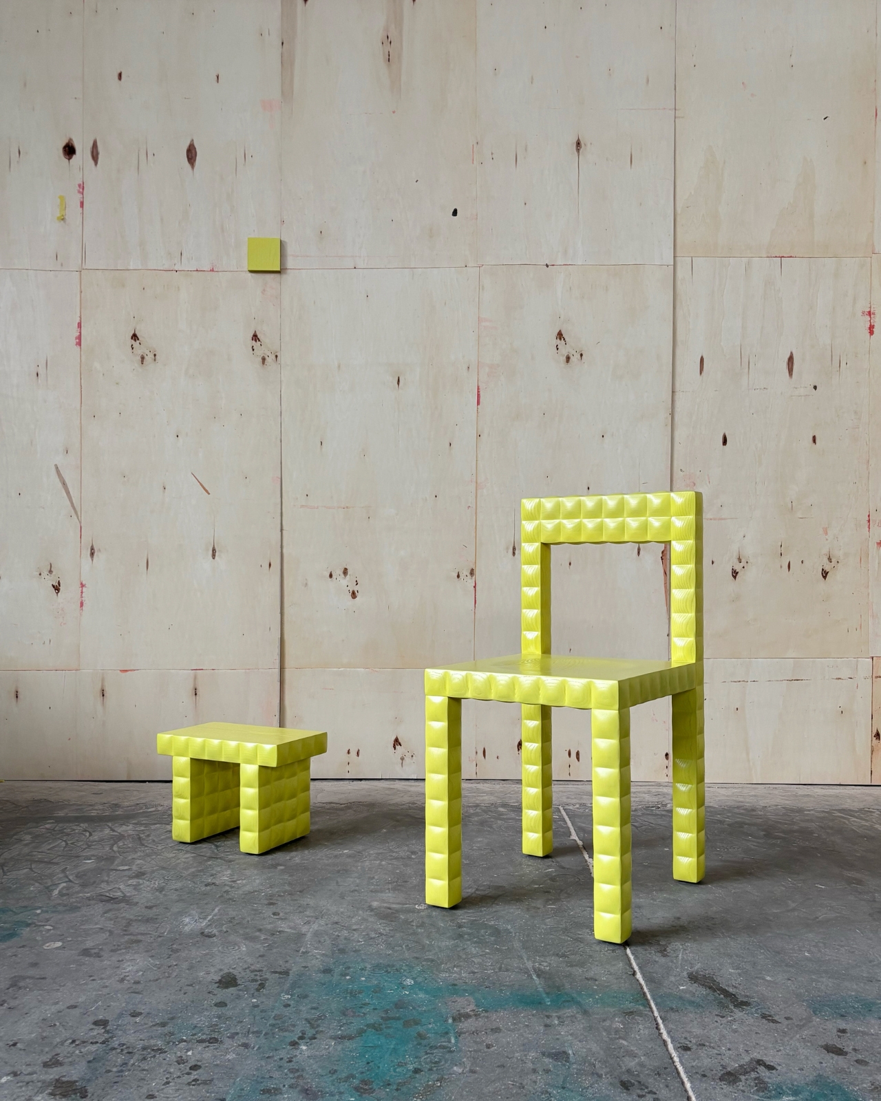
That specificity is where the collection gets interesting. The design exercised extreme restraint, strictly planning every dimension as a multiple of a 5x5cm square. It sounds almost obsessive, and maybe it is, but the result is furniture that feels completely resolved. The chair is reduced to its essence: four legs, a seat, and a back. Nothing more. That kind of restraint is genuinely hard to pull off. Minimalism often reads as cold or indifferent, but The Squares has warmth baked into it precisely because the discipline behind it comes from somewhere real.
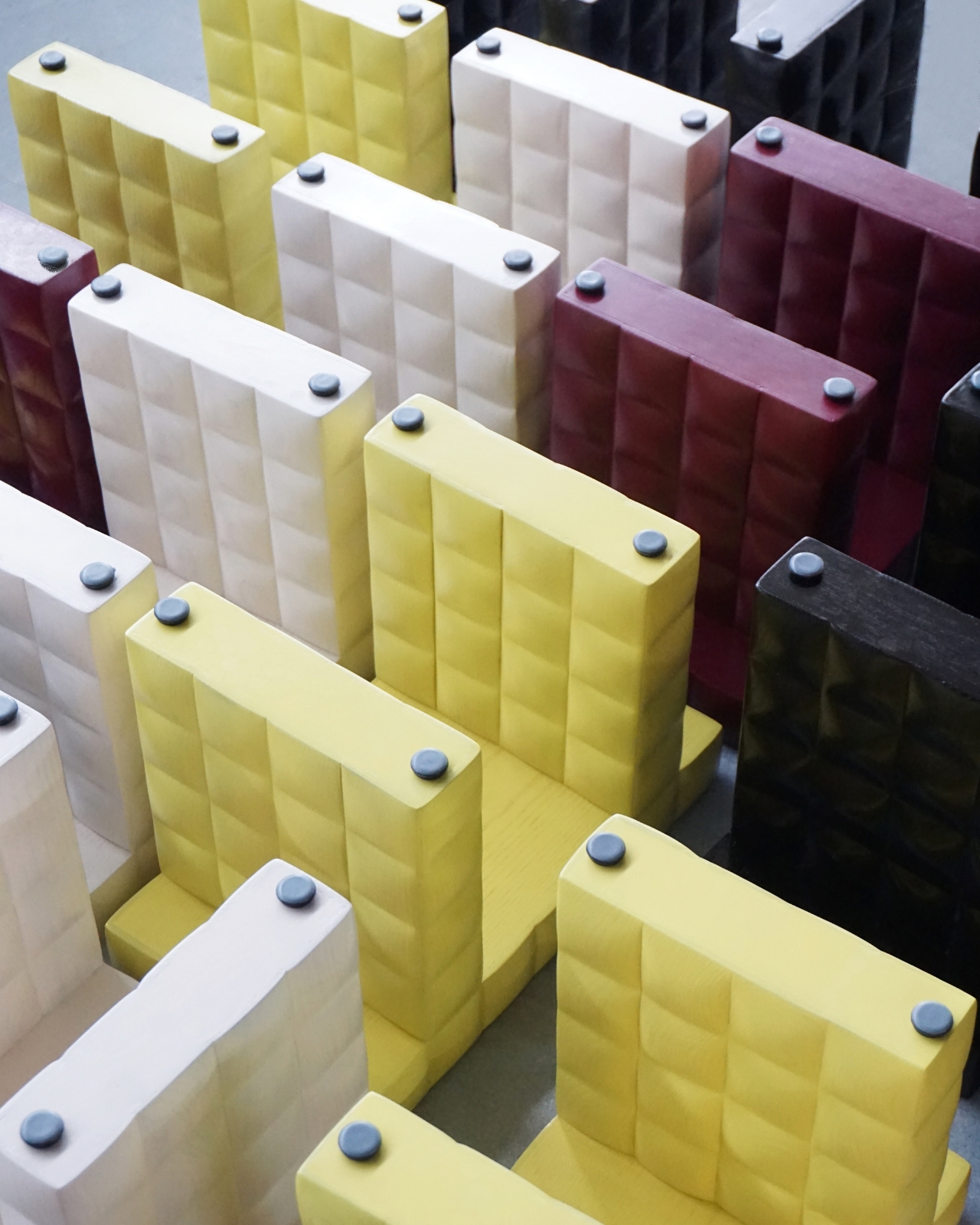
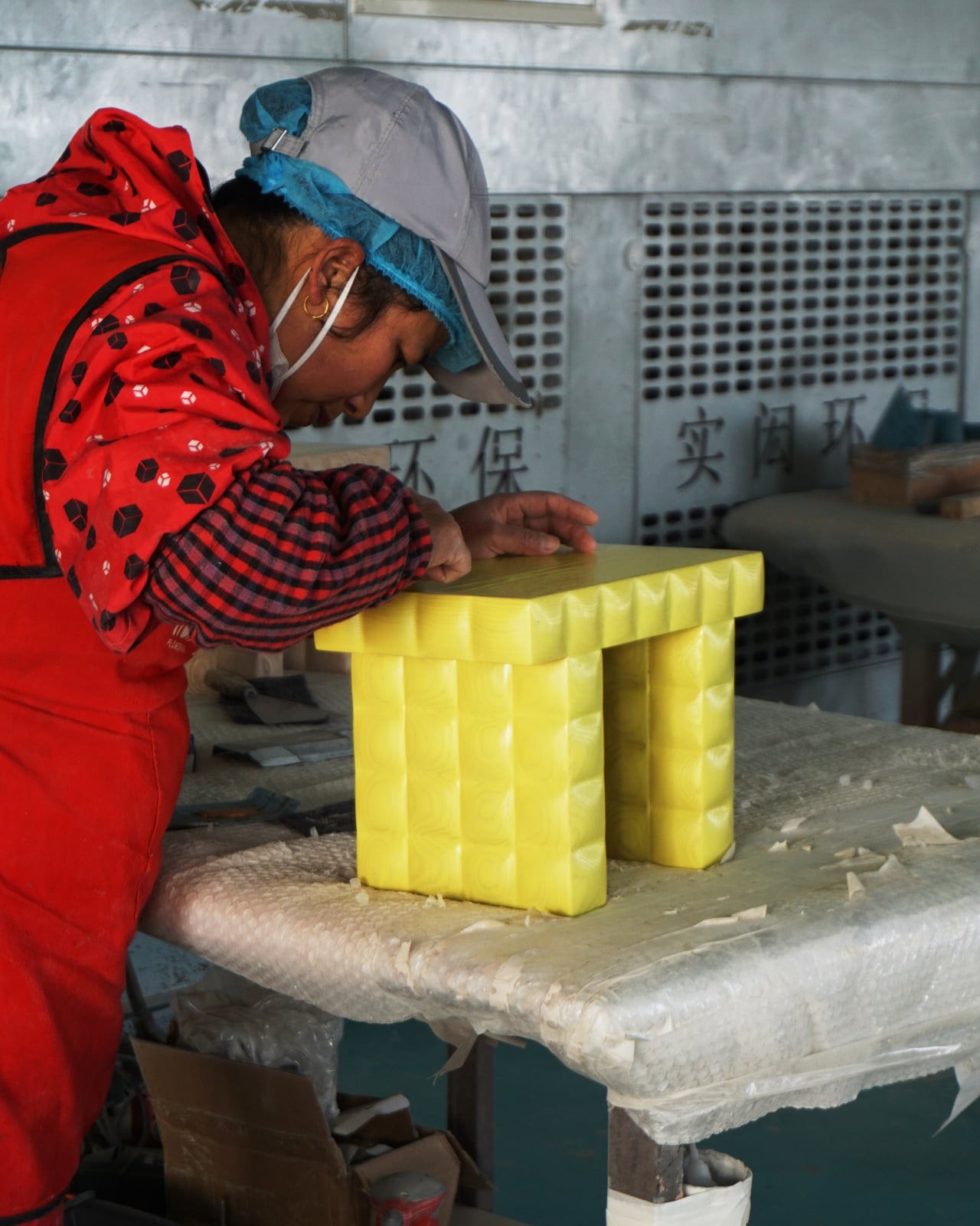
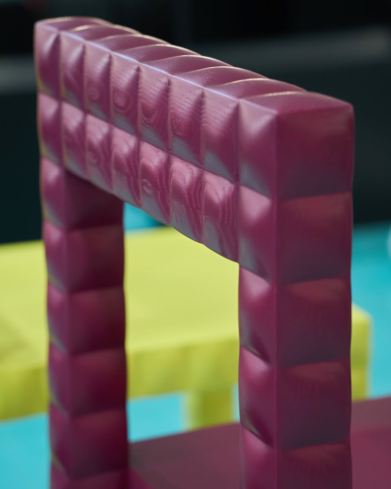
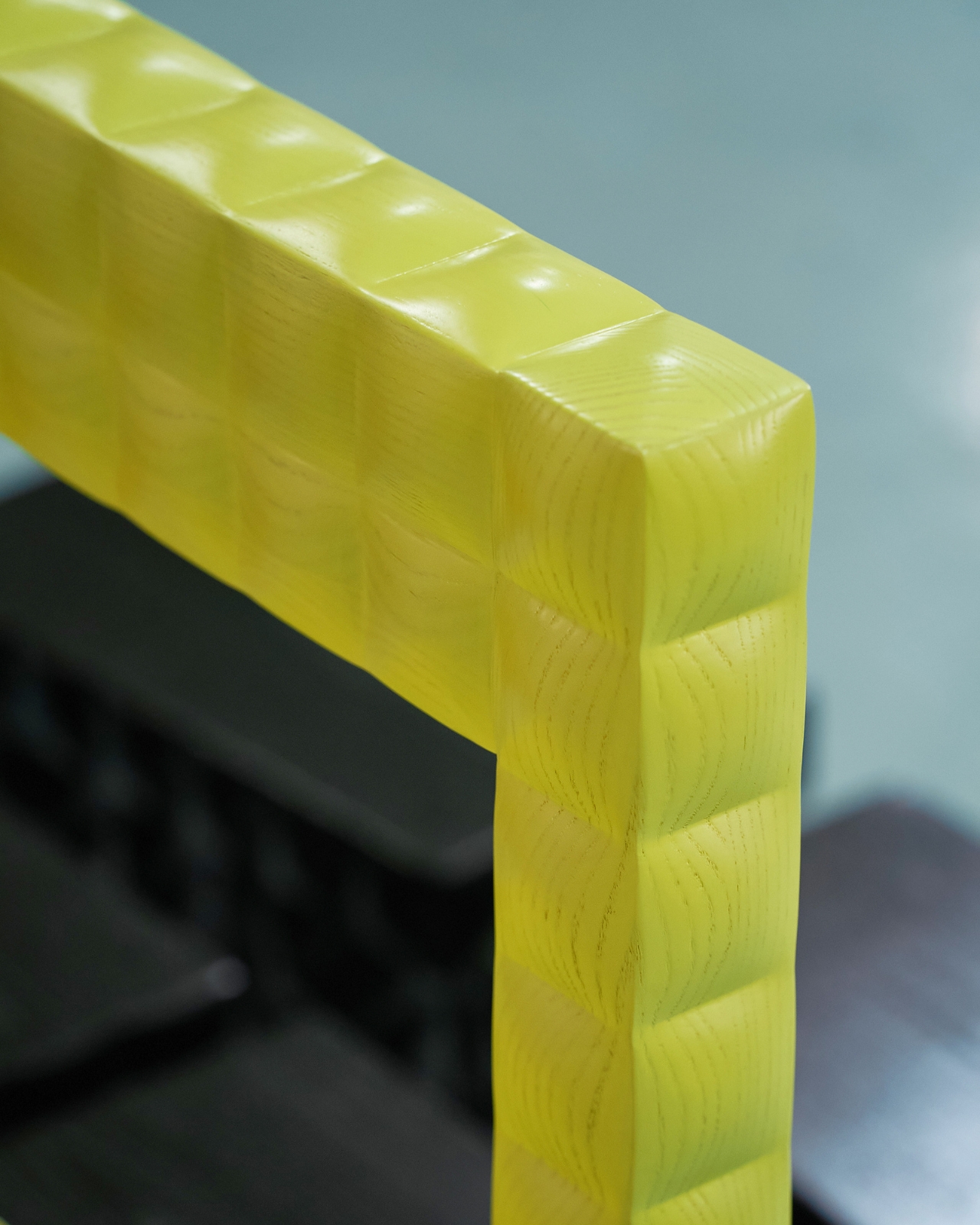
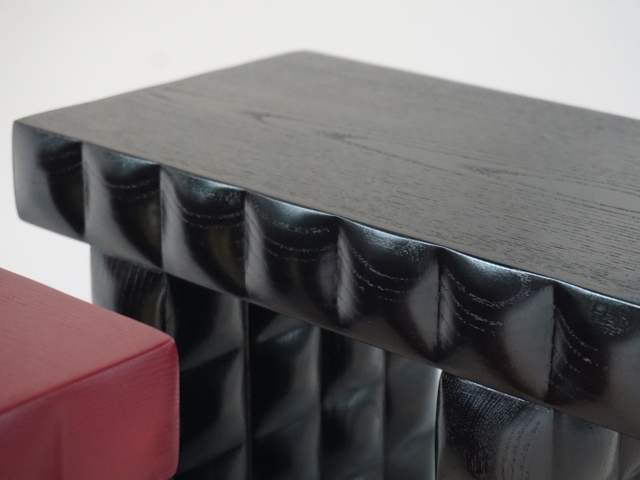
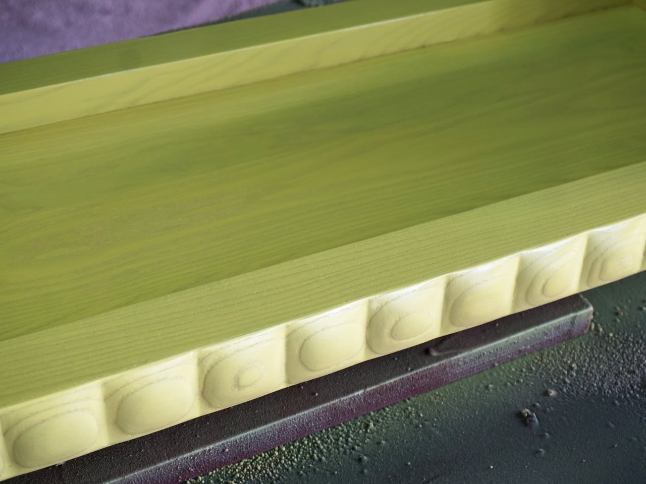
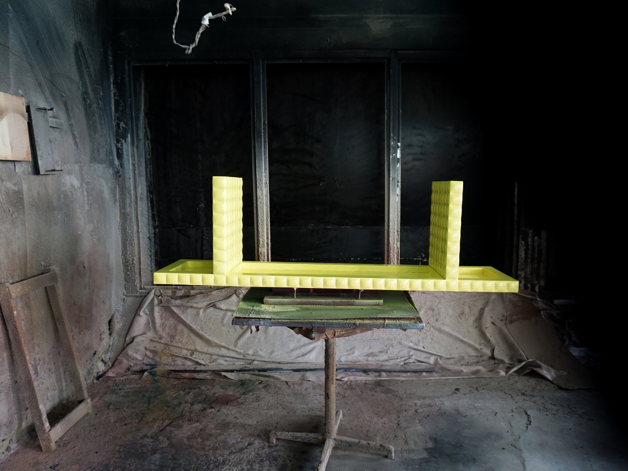
The design process mirrored childhood block-building: starting from chaos and moving toward order through a relentless search for harmony. You can see that in the finished pieces. The forms are architectural without being austere, geometric without feeling mechanical. The surface detail is what pushes it over the edge. The wooden construction features subtly convex surfaces on every block, which catch the light to create shimmering highlights, enhancing the vibrant colors or finishes. It’s a quiet trick that rewards a second look, and a third.
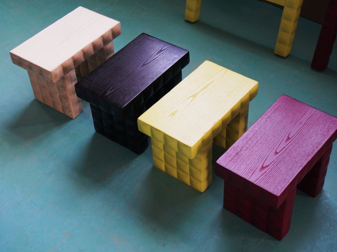
What keeps The Squares from tipping into a pure exercise in restraint is the color. The collection is available in a range of bold, saturated finishes: yellows that practically vibrate, deep crimsons, inky blacks, soft naturals. Beneath its austere exterior, the collection surprises with luminous finishes and bold colors, introducing a note of playful whimsy. I think that’s an accurate read, and I’d add that it gives the collection an unusual flexibility for something so formally rigid. A white Squares chair in a quiet corner reads as sculptural and calm. The same chair in acid yellow is a full statement.
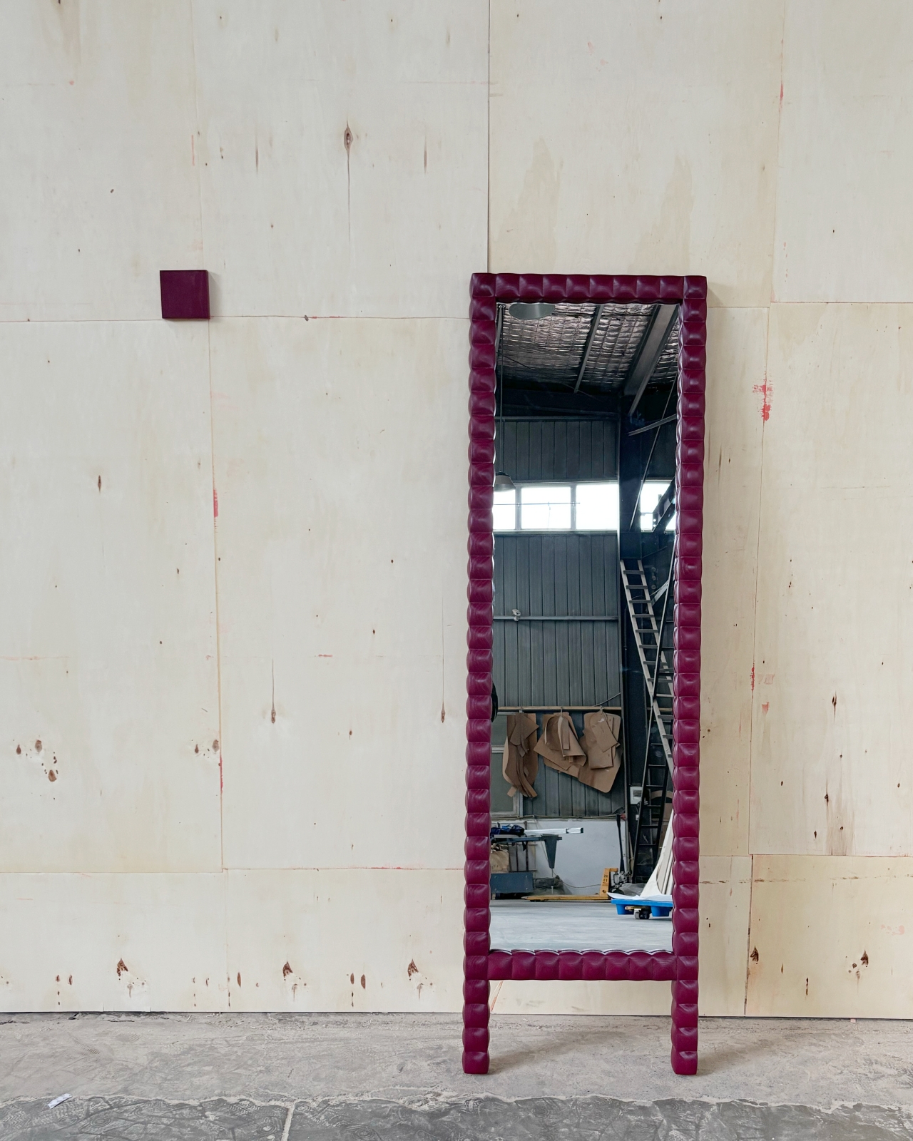
Constructed from solid ash wood with a water-based paint finish, the pieces have a physical presence that photos almost undersell. The wood grain shows through certain finishes in a way that reminds you these are handcrafted objects, not manufactured units. The series currently comprises chairs, benches, stools, and mirrors, available in a variety of colors. The stool, the bench, the mirror — they all carry that same weight and intention. You get the sense that every piece in this family was considered with the same level of care as the chair.
One Week Design plans to expand this family in the future, exploring the endless possibilities of the square. I’m curious to see where that goes, because the vocabulary Wang and Ni have built feels like it has real range. The square is, after all, one of the most elemental forms there is, and they’ve already shown how much meaning you can pack into it when you take it seriously.
Good design often tells you what something is. Great design tells you where it came from. The Squares does both, which is why it’s one of the more memorable collections I’ve come across recently. It looks like order. It feels like memory. And it sits like a chair that knows exactly what it is.
Most furniture does exactly what it promises. A shelf holds things. A table provides surface. A sideboard stores what you don’t want to look at. Deniz Aktay, a Stuttgart-based designer, seems to find that level of literalism a little boring.
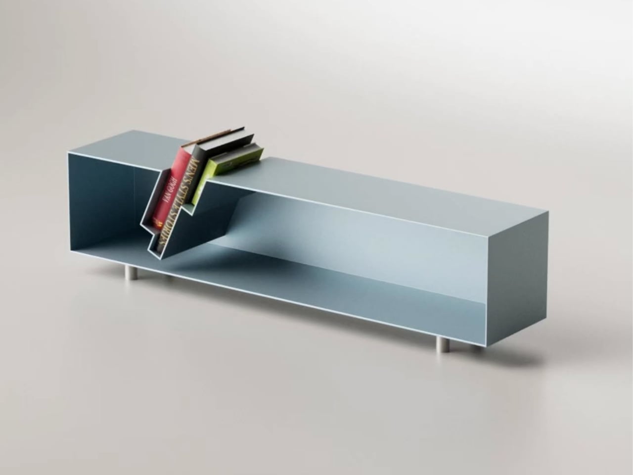
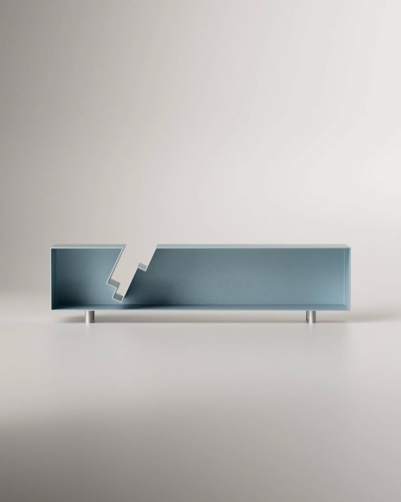
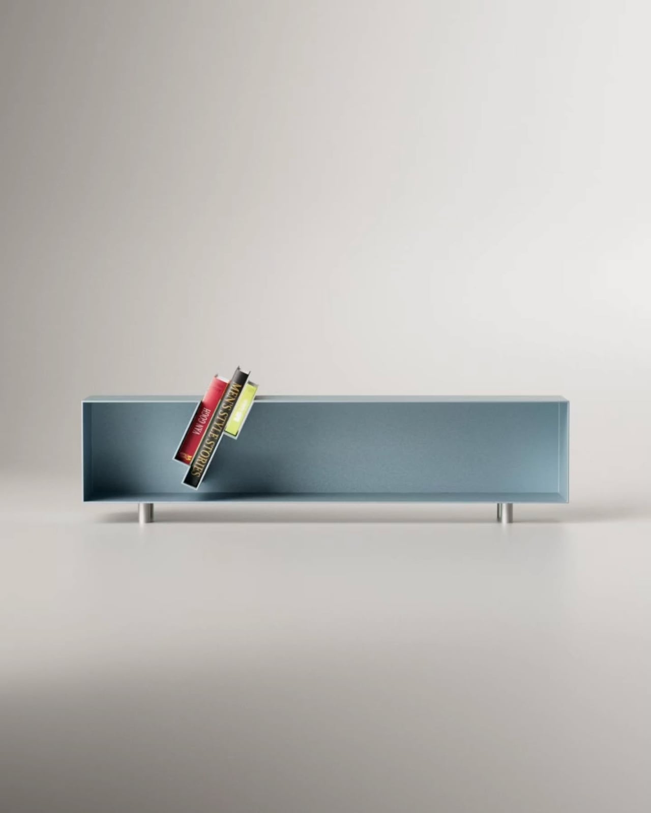
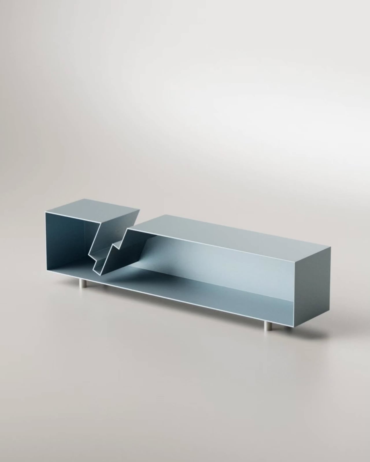
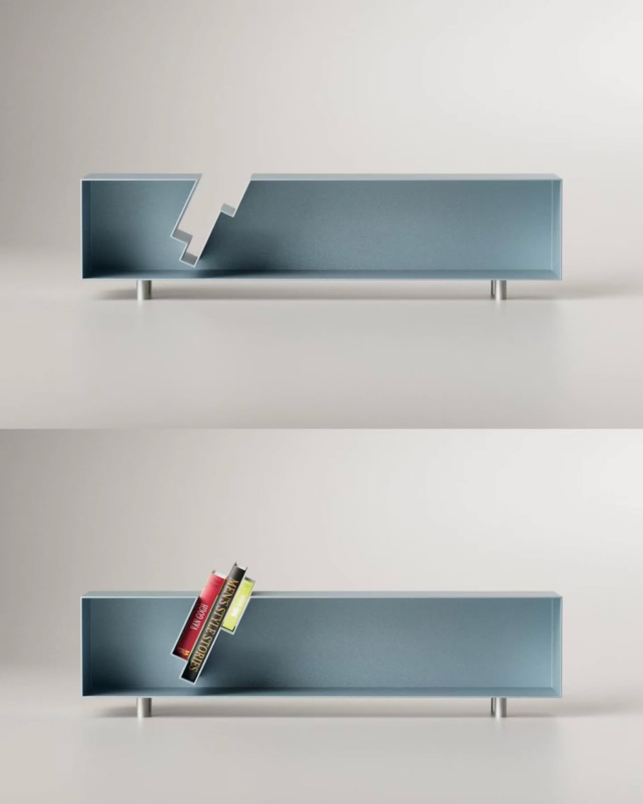
His latest piece, the “Slot” Sideboard, is a sleek metal sideboard that does something I haven’t seen before: it swallows your books whole. Or nearly whole. The top surface features book-shaped cutouts, slots sized just right to accept a few volumes that then slide partway through, hovering suspended between the top of the sideboard and the interior shelf below. Spines tilted at an angle, partially disappearing into the furniture itself, the books aren’t hidden. They’re put on stage.
The visual effect is genuinely arresting. From straight on, it looks like the books are simply leaning through the sideboard, defying the expected logic of furniture. The steel body, finished in a dusty blue-grey, stays completely clean and minimal, which only makes the books pop harder. They become the focal point. The design knows this and leans into it.
Aktay trained as an architect at the University of Stuttgart before founding his own design studio, DEZIN, in 2020. You can feel the architectural thinking in the Slot Sideboard. The slots aren’t decoration. They are a structural decision that reorganizes how the object functions. By cutting through the plane of the top surface, Aktay collapses the boundary between storage and display. The books don’t live behind a door or on top of the piece as an afterthought. They are literally built into its architecture.
This matters more than it might seem. One of the persistent design problems with books is exactly this tension: do you store them, or do you show them? Traditional bookshelves say store, with display as a side effect. Coffee table styling says display, with access sacrificed. The Slot Sideboard says both, simultaneously, and solves the problem by making books a structural element rather than an accessory.
I appreciate that the piece doesn’t shout about this. It’s not a novelty object with an obvious gimmick printed on the side. At rest, without books, the sideboard is clean and almost brutally minimal, the stepped slot openings looking like an architectural section drawing. Add a few books, and the whole thing shifts register. It becomes warmer, more personal, more lived-in. That kind of dual identity in a single object is hard to pull off.
Aktay’s philosophy centers on finding the right balance between proportion, material, and functionality. The Slot Sideboard is a good example of that balance working. The proportions are long and low, giving the piece the kind of horizontal calm that makes a room feel settled. The metal construction is precise without feeling cold. And the function is genuinely expanded by the design, not just dressed up.
The one thing I keep thinking about is the practical question of how many books actually fit, and at what angle. The promotional images show a small cluster, maybe three or four volumes, tilted together in the slot. It reads beautifully. Whether it reads the same with a thicker, heavier hardback, or with books of wildly different heights, is a detail that a real-world test would answer. That’s not a criticism so much as natural curiosity. Good design always makes you want to live with it.
The broader trend here is worth noting. Furniture design has been slowly, quietly moving away from pure storage and toward what you might call narrative objects, pieces that make a room tell a story. The Slot Sideboard fits into that movement while having its own specific logic. It isn’t just pretty. It has a point of view about what books are for and where they belong. They belong where people can see them. Where they’re part of the room. Not filed away. Whether or not Aktay set out to make a statement about books and visibility, the piece makes one. And it makes it beautifully.
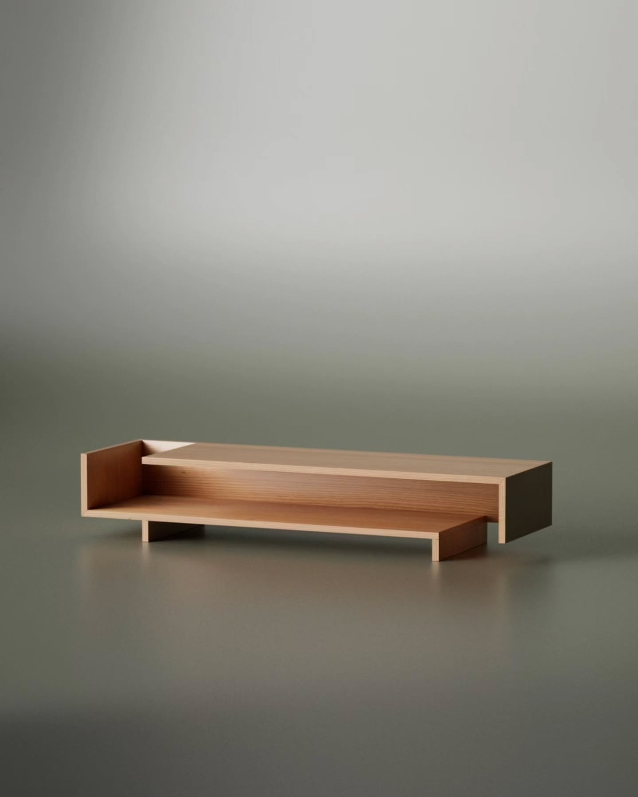
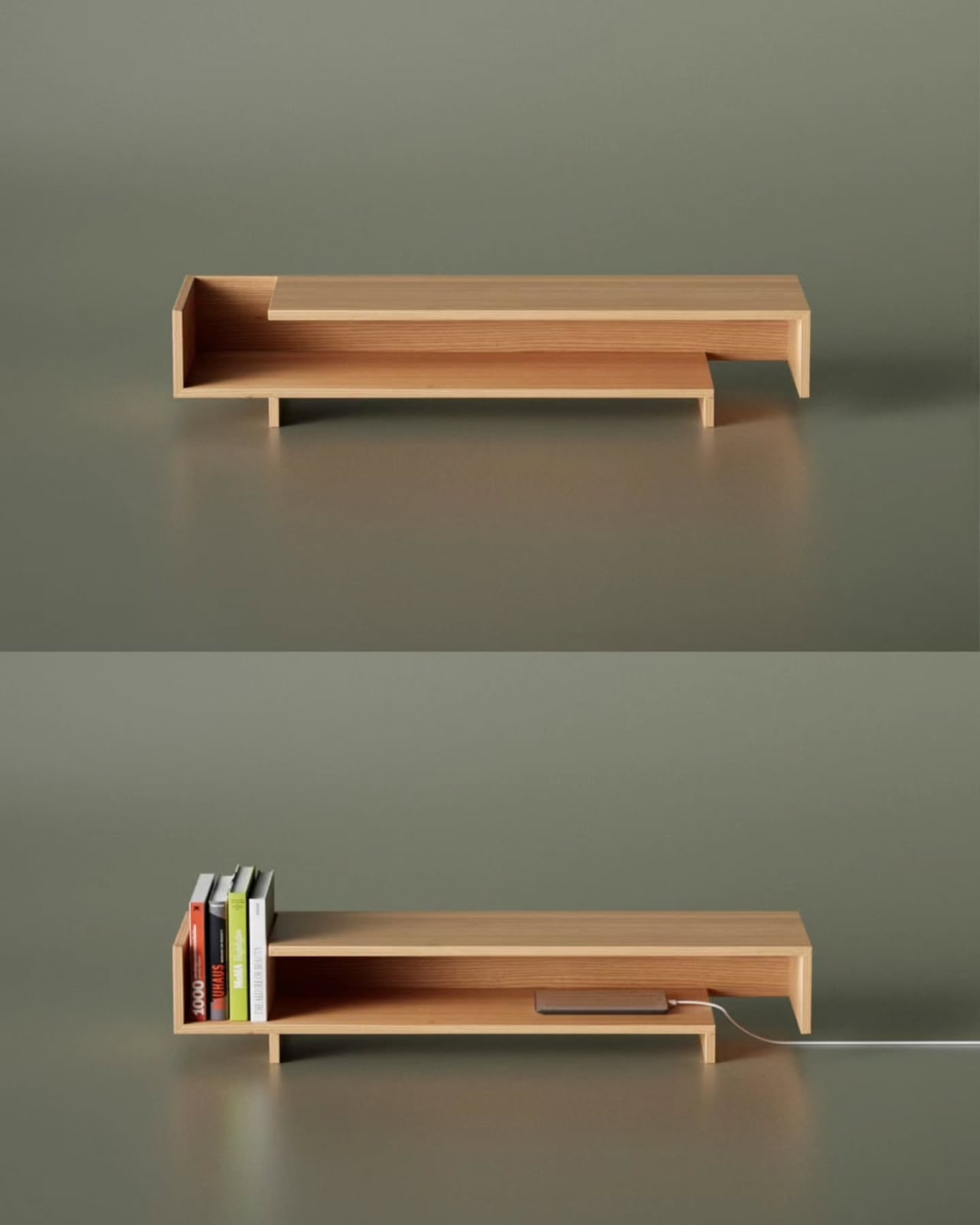
Most great furniture doesn’t start with a grand vision. It starts with a sketch, usually a messy one, the kind you draw absentmindedly while thinking about something else entirely. Designer Deniz Aktay knows this. His latest piece, the Shift Sideboard, is proof that an unfinished line can sometimes carry more intention than a polished one.
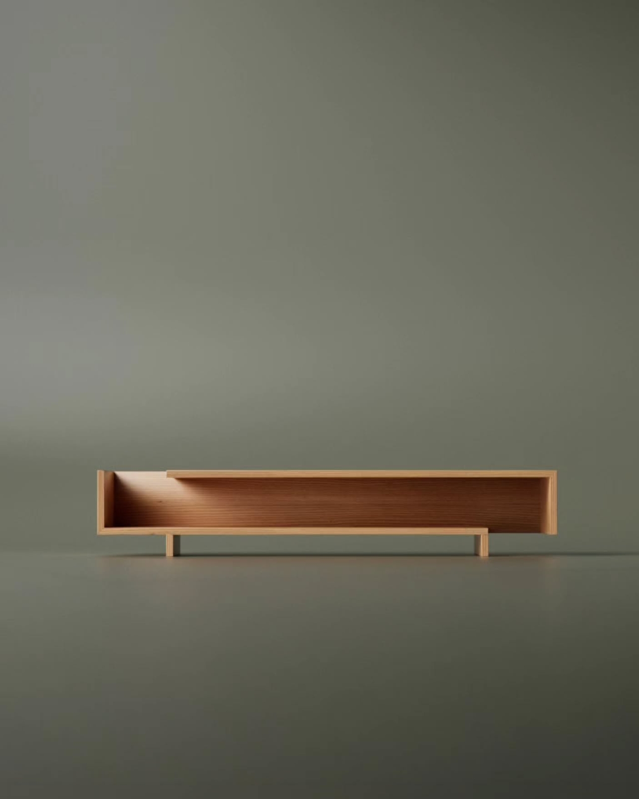
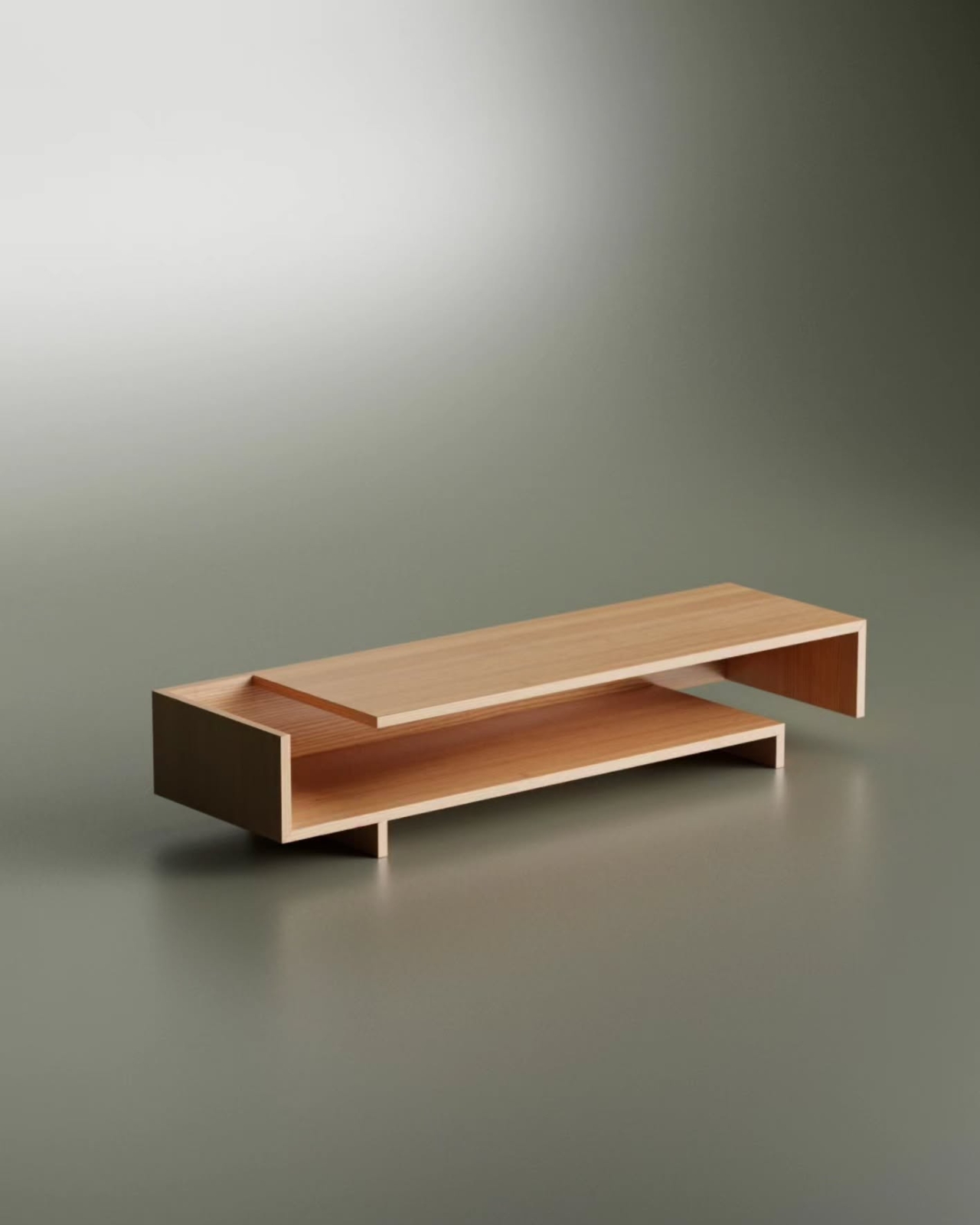
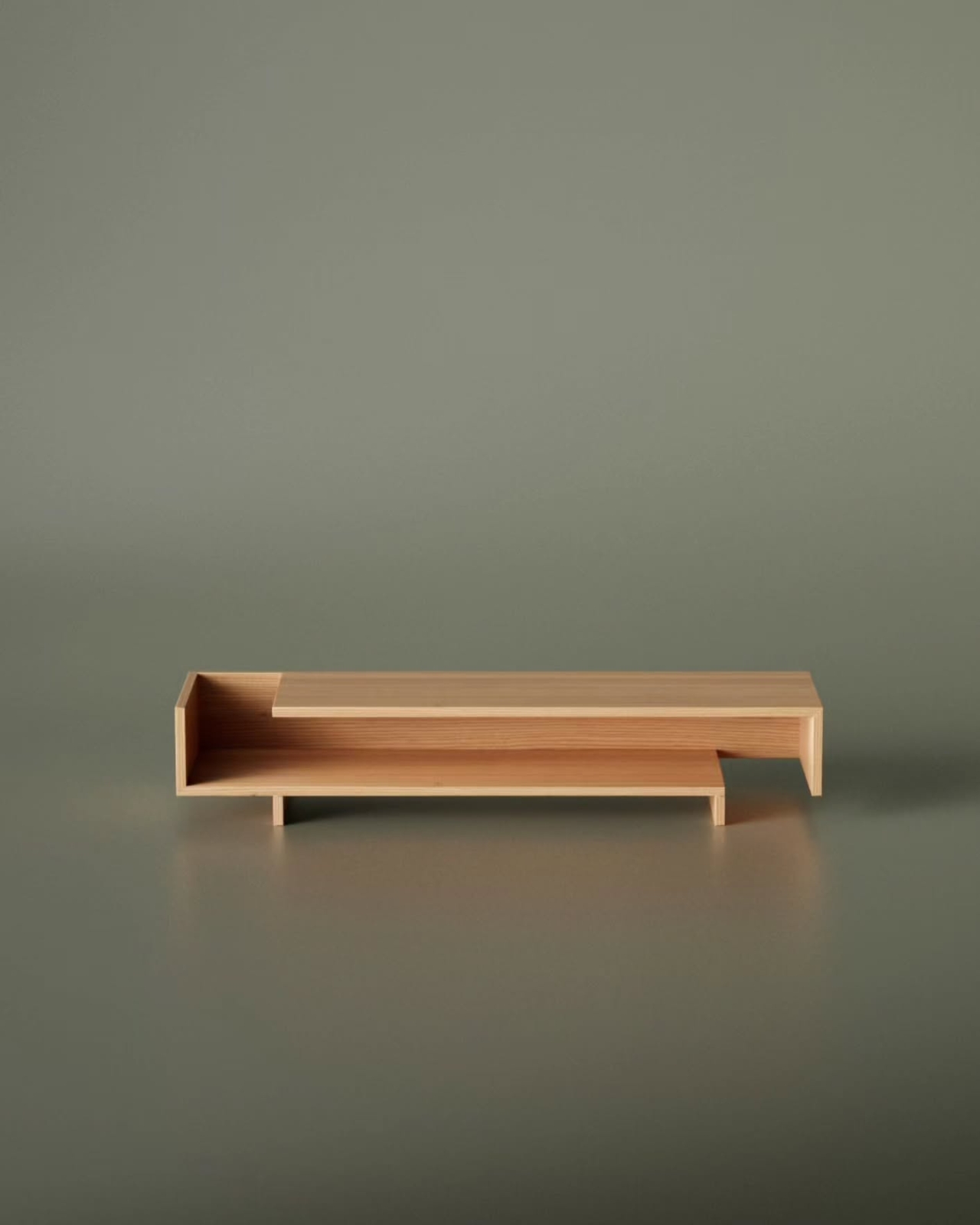
The concept is deceptively simple. Aktay began with a sketch of shifted, incomplete lines, the kind of drawing that would normally get torn out and tossed. But he saw something worth keeping in that incompleteness: a structural idea where two horizontal planes don’t fully align, each one sliding past the other, leaving gaps and openings that feel both accidental and entirely deliberate. That tension between intentional and incidental is what makes the Shift so visually compelling.
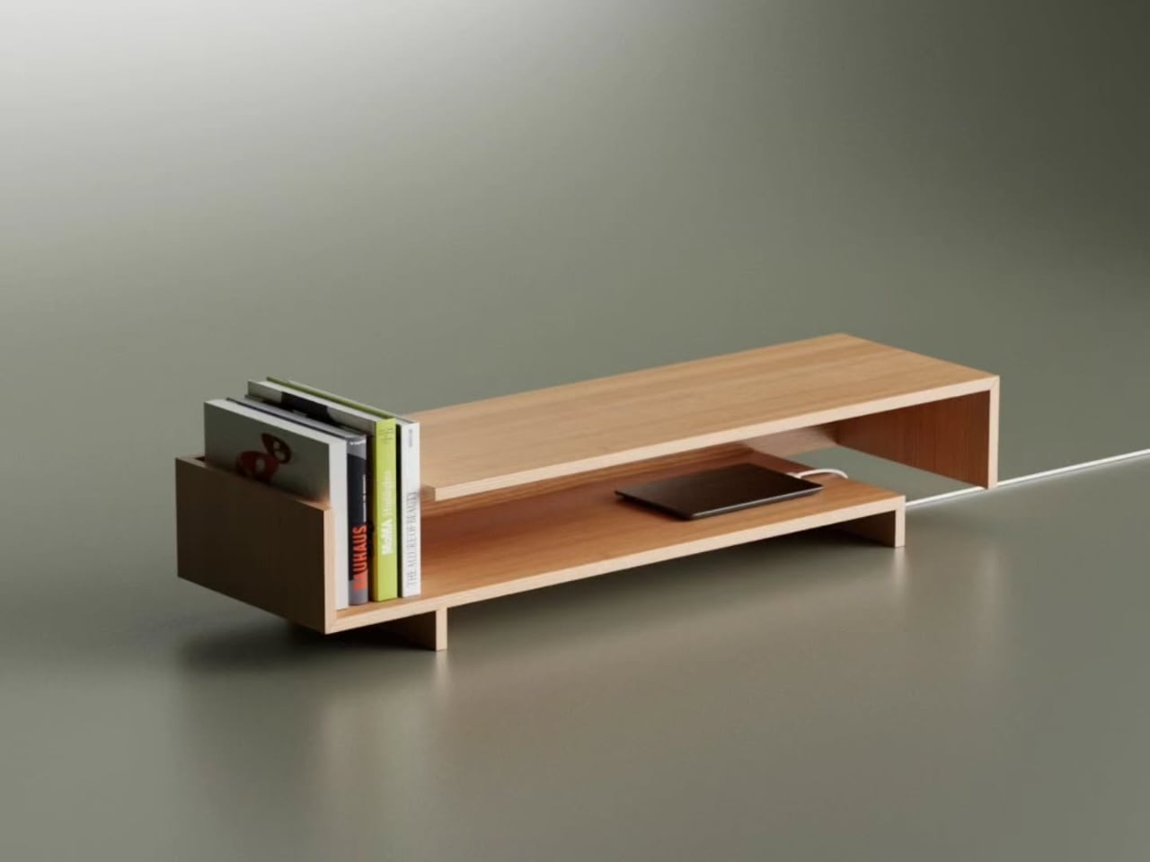
Looking at it from the front, the sideboard reads almost like a typographic letterform. The upper shelf sits shorter, pulled to one side, while the lower platform stretches past it in the opposite direction. The result is a silhouette that feels like it’s mid-motion, caught between two states. It doesn’t try to be symmetrical, and that’s exactly why it works. Symmetry in furniture is safe. This is not that.
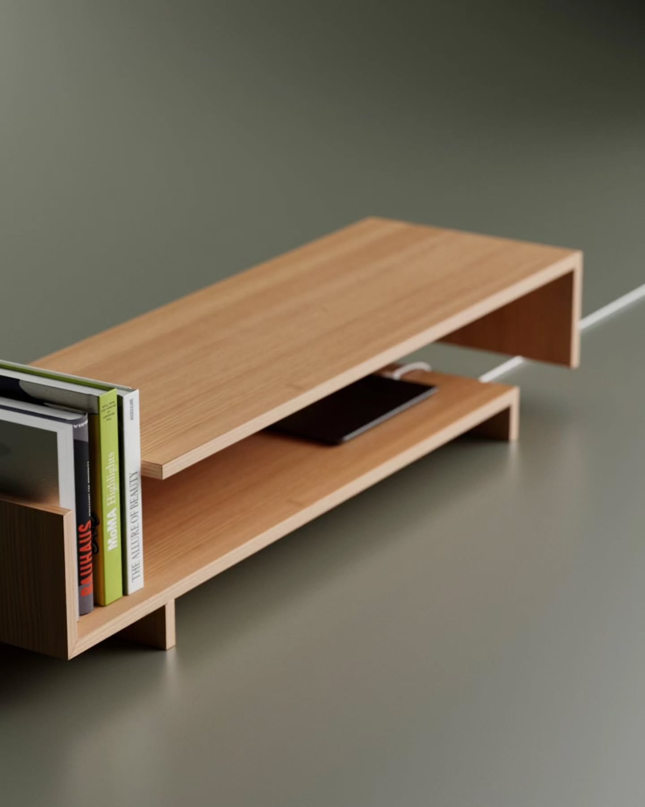
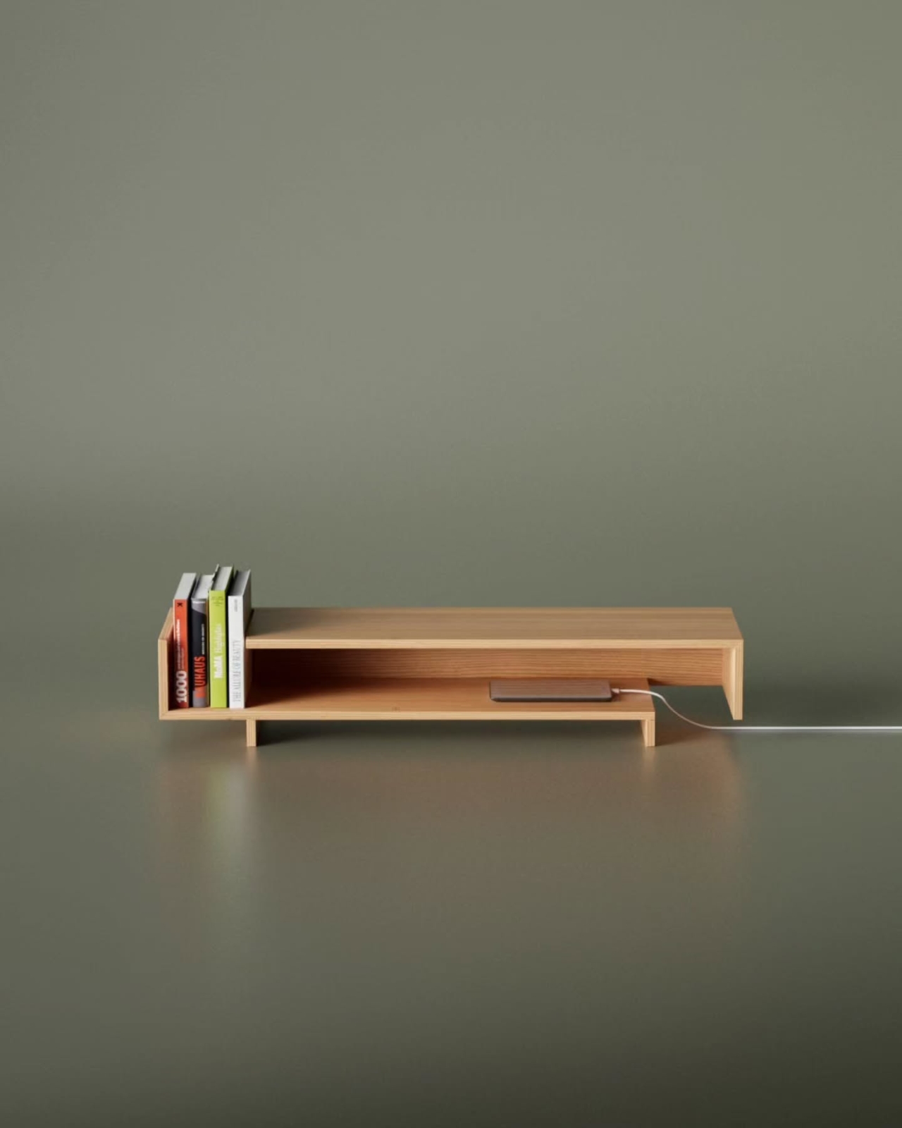
From a practical standpoint, those offset gaps aren’t just aesthetic choices. They translate into genuinely useful storage zones. Books stand upright in the open left compartment without needing bookends. A phone charges through a slot in the side wall, with the cable routed out cleanly through the offset gap at the edge, no cable box, no ugly workaround, no strip of tape pretending the cord isn’t there. For anyone who has ever stared at a tangled mess of cables on a media console and felt low-level irritation about it, this is the kind of thoughtful detail that earns real appreciation.
The material choice reinforces the whole mood of the piece. The warm, pale oak tones photograph beautifully against neutral backgrounds, and I imagine they read even better in a real room. There’s a quietness to it. The grain runs consistently across every surface, and the joinery is clean without being precious. It doesn’t have the cold austerity that some minimalist furniture falls into, the kind where you’re afraid to actually put anything on it. The Shift looks like it wants to be used, which is actually a harder thing to achieve than it sounds.
Aktay has been building a following for this kind of work for a while now, and he’s clearly found an audience that’s hungry for furniture that sits somewhere between concept and craft, pieces that look like they belong in a gallery but function like they belong in a home. His earlier work already hinted at this ability to make structure feel expressive without becoming theatrical. The Shift continues in that direction, but with more restraint. It feels more resolved.
My personal read on it: furniture that earns attention through subtlety is almost always more interesting than furniture that shouts. The Shift doesn’t need to be dramatic. The offset lines do the work quietly, and you keep noticing new things about it the longer you look. The way the shadow falls differently on each side. The way the open compartment frames whatever you put inside it. The way the cable route makes a modern inconvenience feel like it was part of the design from the beginning, because it was.
That last part matters more than it gets credit for. Cable management is often an afterthought, tacked on at the end of a design process with a grommeted hole and a prayer. Building it into the structure itself, as a consequence of the form rather than a patch over it, is the kind of decision that separates a design exercise from something you’d actually want to live with. The Shift Sideboard started as an unfinished sketch. Right now, at least conceptually, it feels very finished indeed.
Most side tables ask very little of you. You set things on them, they hold those things, and that’s the end of the conversation. The Boca table by designer Deniz Aktay is not interested in that conversation at all.
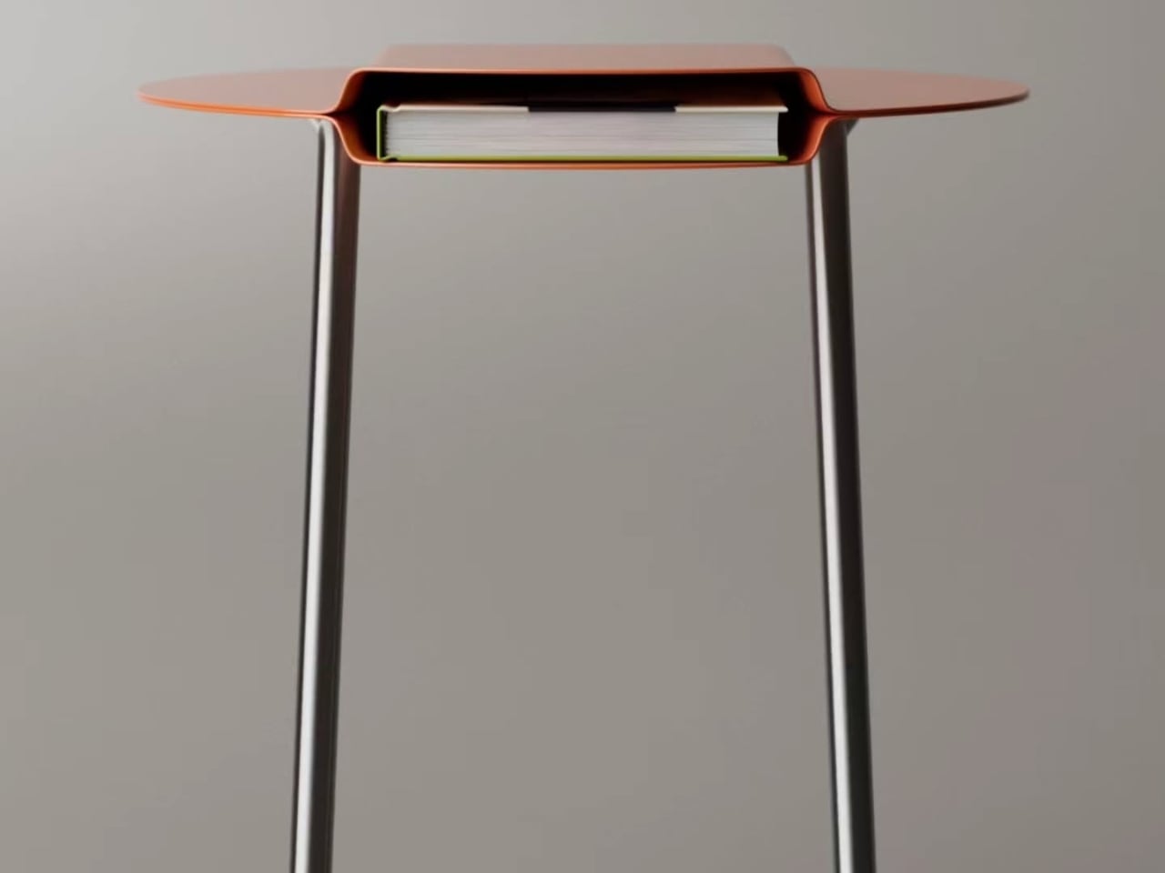
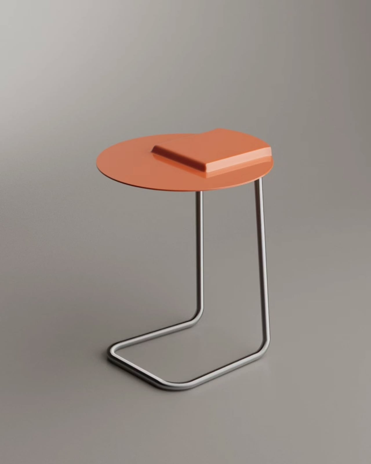
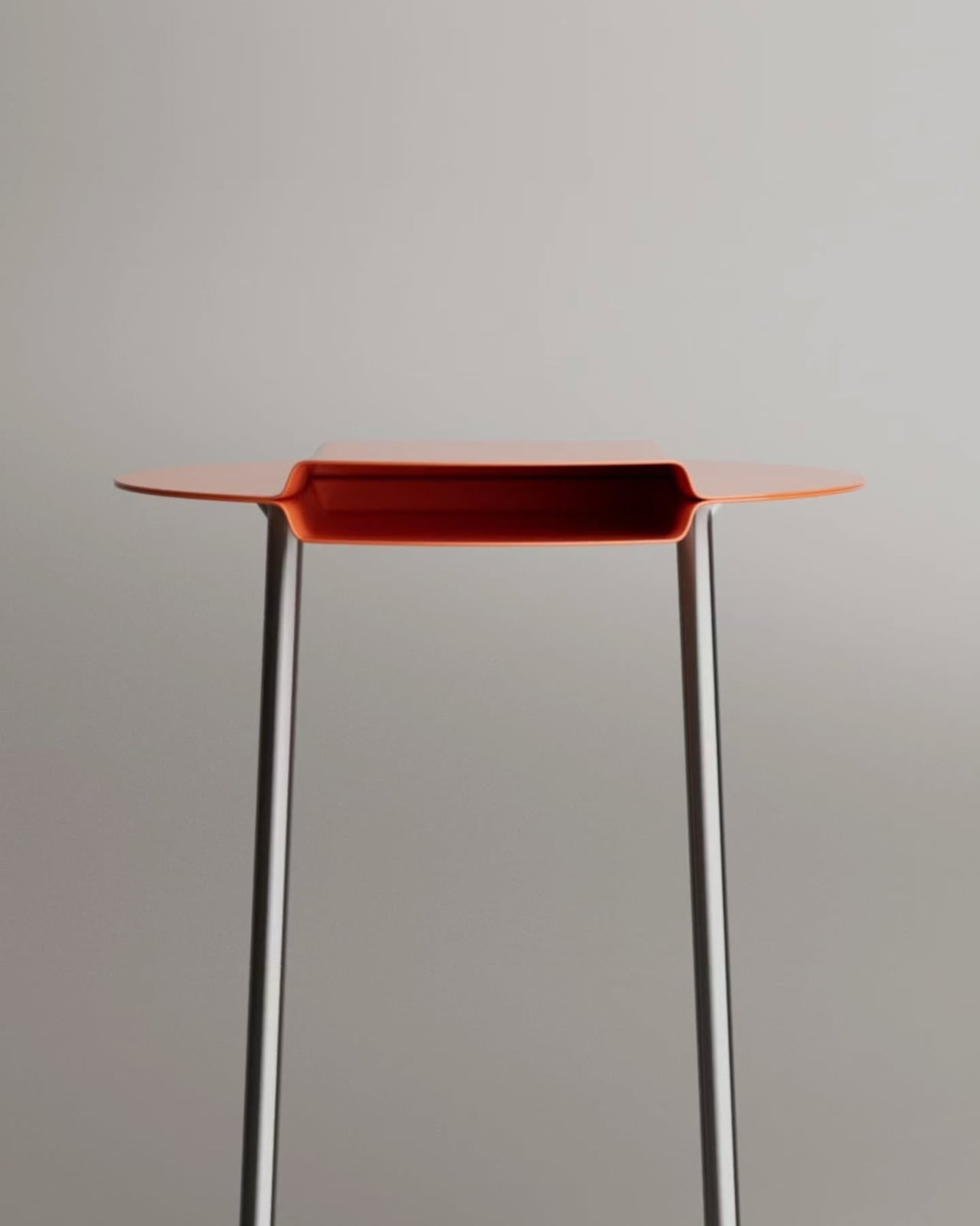
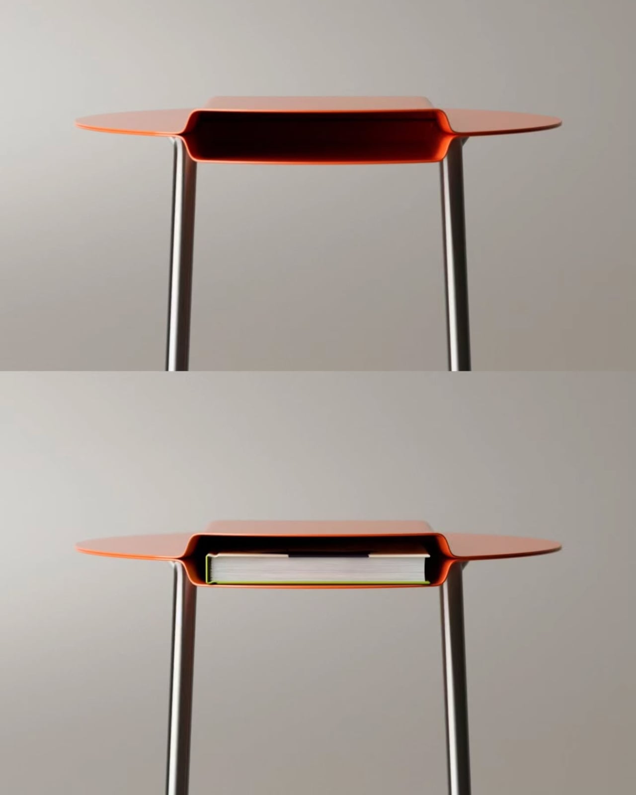
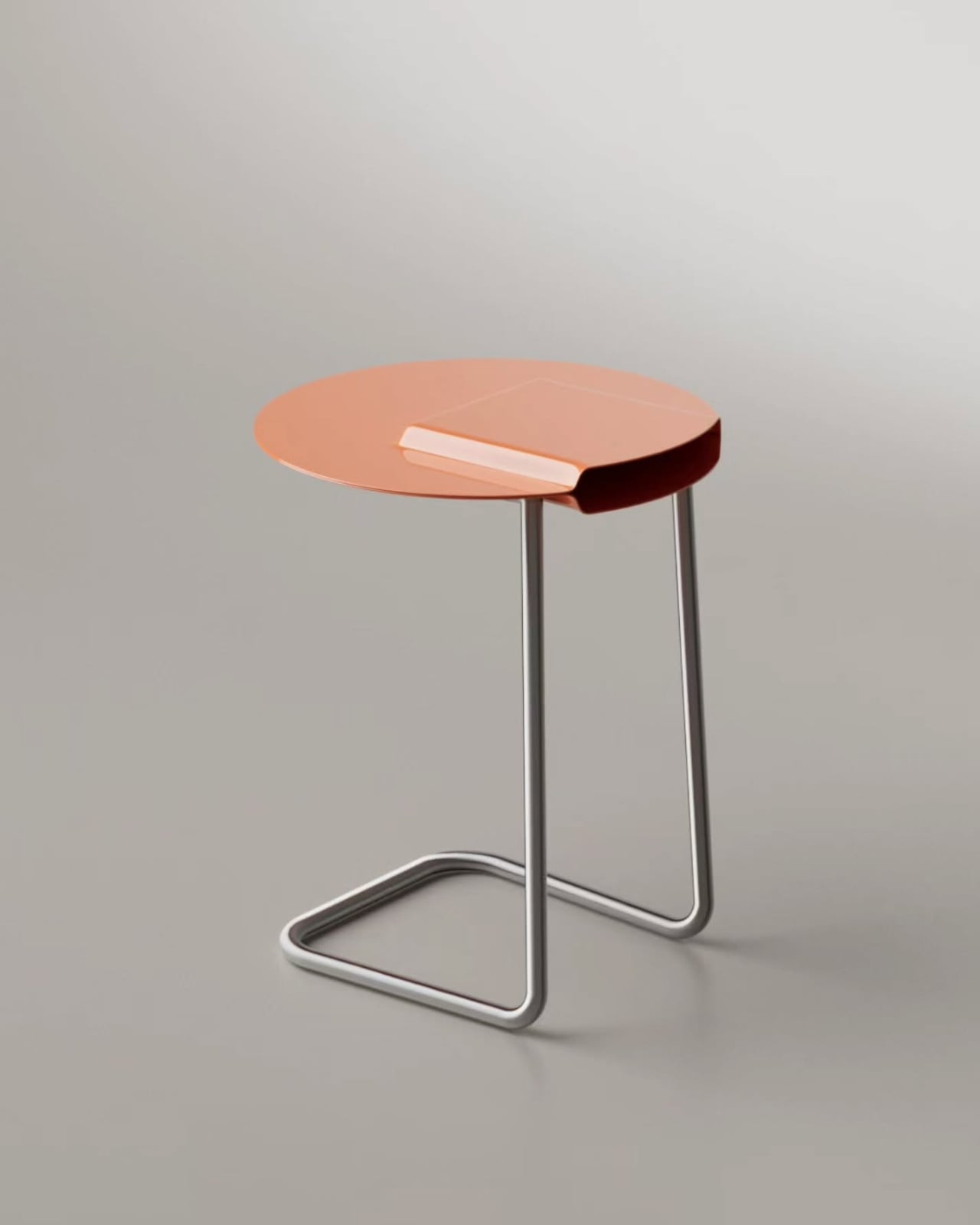
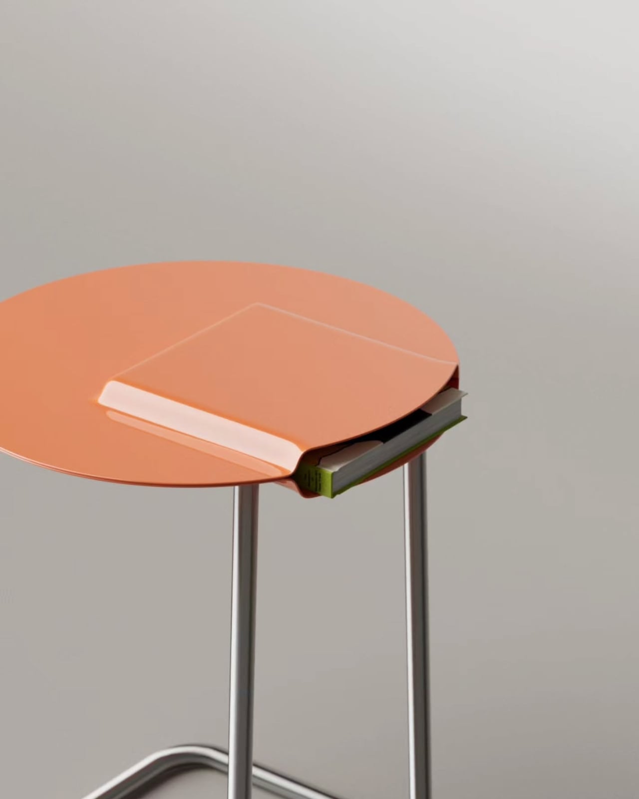
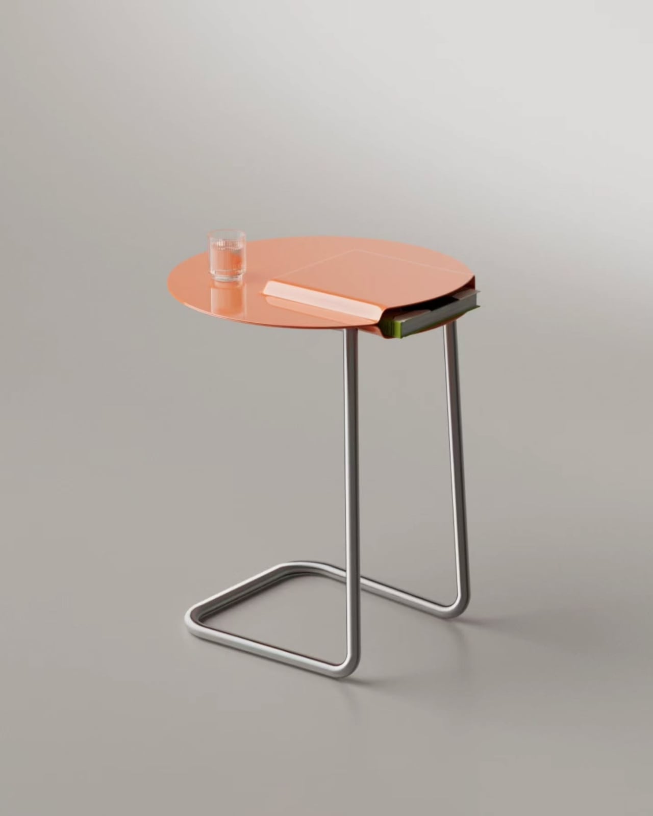
At first glance, it reads as a straightforward piece: a circular metal top, slim tubular legs bent into a smooth C-shaped base, a warm terracotta finish. Tidy, minimal, easy to place. But look at it straight on and something shifts. The tabletop isn’t flat. Its center section dips downward into a rectangular cavity, creating a hidden pocket between two metal layers. That pocket is sized to hold a book flat inside the body of the table itself. Slide one in from the side and just the spine shows, sitting flush at the edge of the circle like a small geometric tab. No separate shelf. No added structure. The storage is built into the form of the top.
The engineering behind this is worth slowing down for. Aktay took a single metal surface and pressed a rectangular section downward, folding it into a tray-like recess while keeping the surrounding disc level and usable. The result is a top that functions on two planes simultaneously: the recessed channel holds the book, and the flat surface above holds everything else. A glass of water, a phone, a small candle, all of it sits on the upper layer without interference. The table doesn’t ask you to choose between storage and surface. It quietly offers both at the same time.
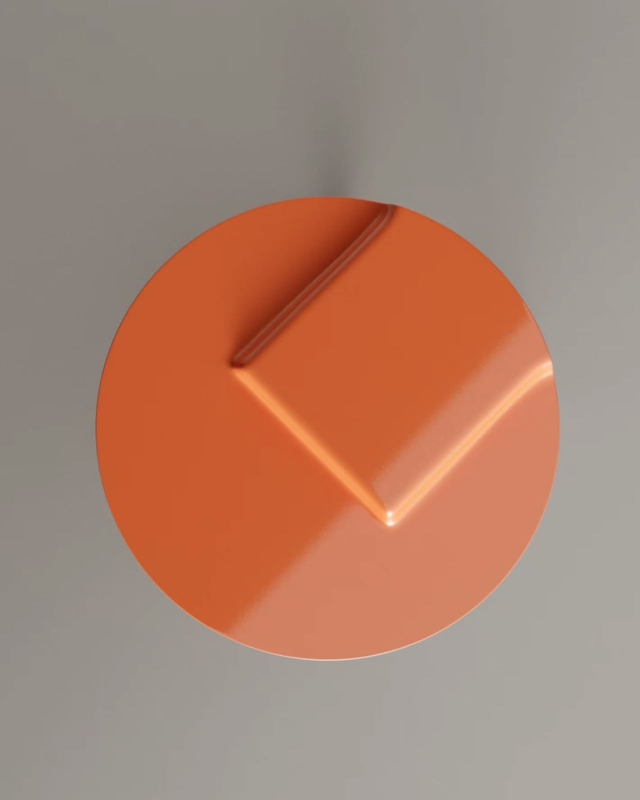
From above, the geometry becomes almost graphic. A flat orange circle with a pressed rectangle at its center, two sharp diagonal ridges fanning outward toward the rim of the disc. It has the kind of topography you’d expect from a relief map or an architectural model, a surface that communicates depth and intention before you even understand the function. Even without a book inside, the form holds your attention. The cavity doesn’t disappear when it’s empty; it becomes a compositional detail, a shadow box pressed into the metal.
The color is doing real work here too. That terracotta-to-coral finish isn’t neutral, but it isn’t loud either. It reads as considered, the kind of color that commands a corner of a room without competing with everything around it. Set against the cool silver of the tubular legs, the contrast is clean and deliberate. The legs themselves are worth noting: bent from a single continuous tube into a profile that tapers from wide at the base to narrower at the top, they give the table a visual lightness that balances the solid weight of the metal disc above. The whole piece feels grounded but not heavy.
What makes the Boca table particularly interesting from a design standpoint is how the form and function are genuinely the same thing. The slot isn’t an addition or an afterthought. It’s the result of shaping the top itself differently. The cavity exists because the metal was bent that way, not because a compartment was attached afterward. That distinction matters more than it might seem. Furniture that achieves storage through added components tends to look like it’s carrying its own extra features. Furniture that achieves storage through form tends to look inevitable, like there was never any other option. Boca belongs to the second category.
There are practical limits worth acknowledging. The fixed-width opening suits standard paperbacks and average hardcovers comfortably, but larger format books won’t fit, and anyone with a habit of keeping thick volumes on their nightstand might find it constraining. That’s a real trade-off. But the specificity of the design is also part of its character. It was made for a particular kind of use, and it doesn’t pretend otherwise.
Stuttgart-based furniture designer Deniz Aktay has been exploring this kind of structural problem-solving across his body of work for years, but the Boca table feels like one of his most resolved ideas yet. The fold does everything. The rest just gets out of the way.
Most furniture design conversations orbit the same fixed points: material choices, color palettes, the eternal debate between form and function. SeongJin Hwang isn’t really interested in that conversation. With the YY Series, his studio TPGF takes a hard left turn and asks a more structural question: what if furniture borrowed its logic directly from architecture?
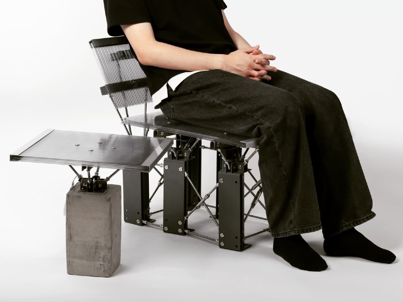
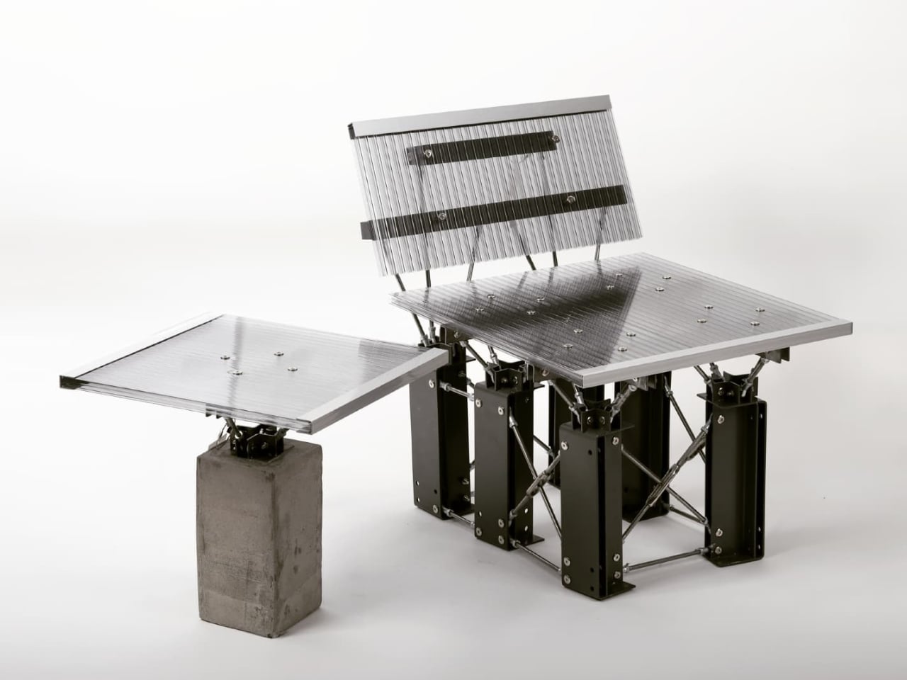
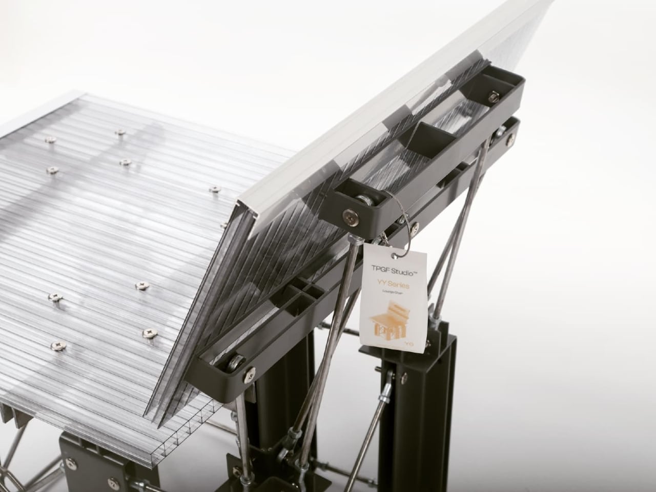
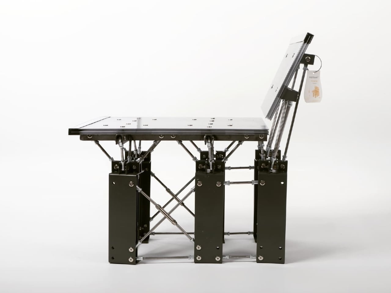
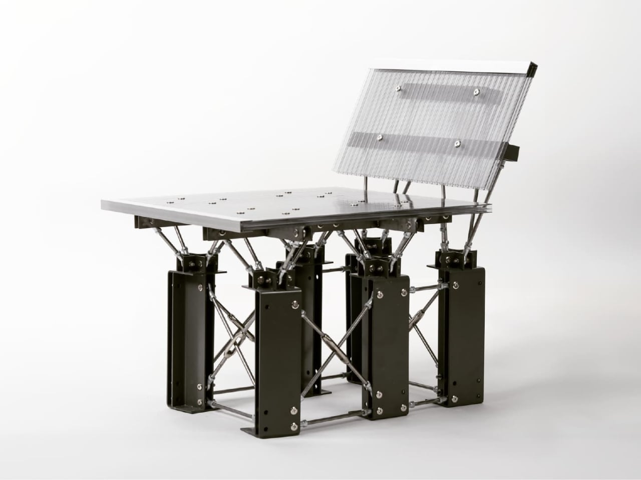
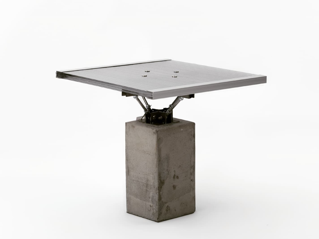
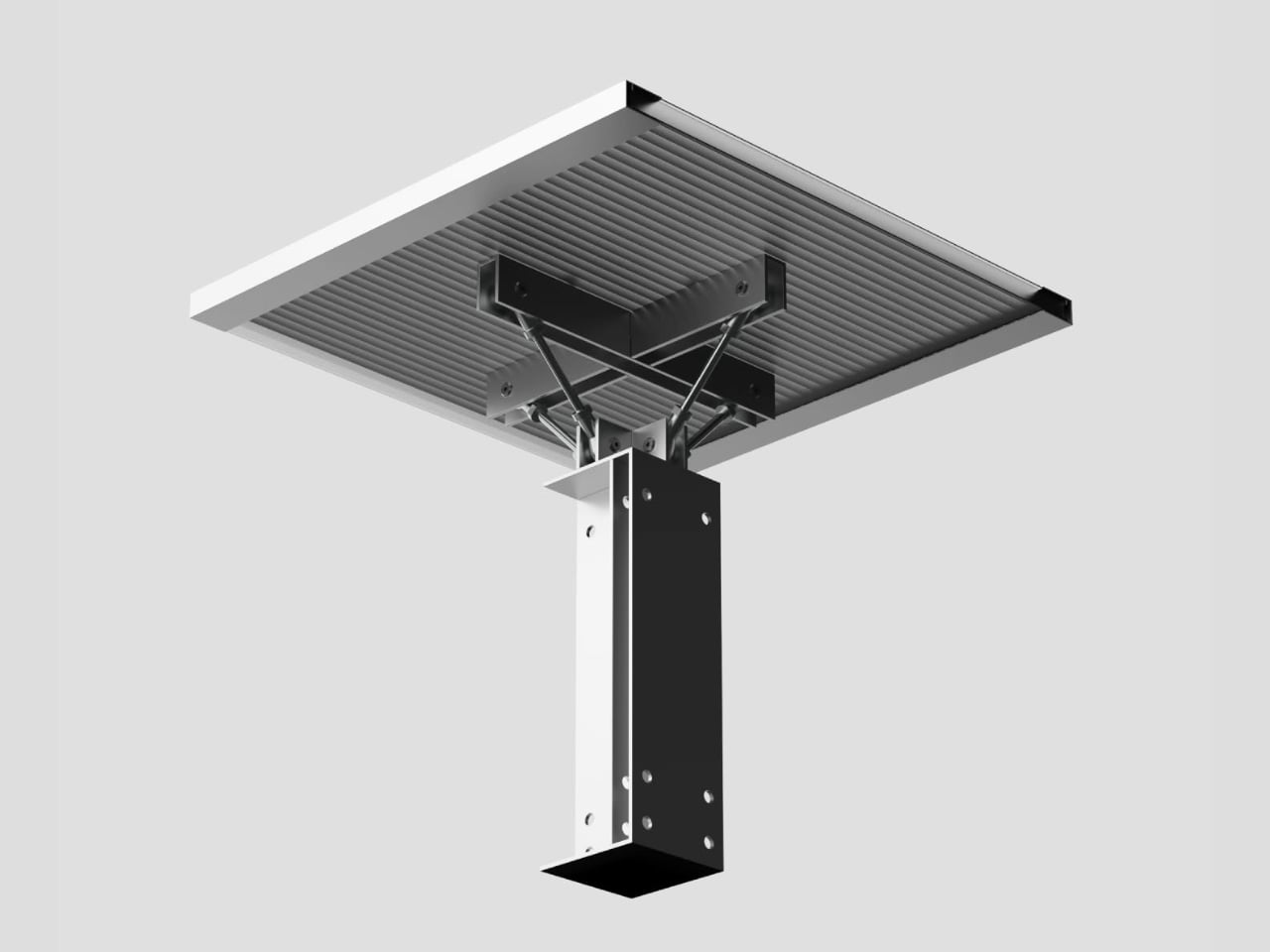
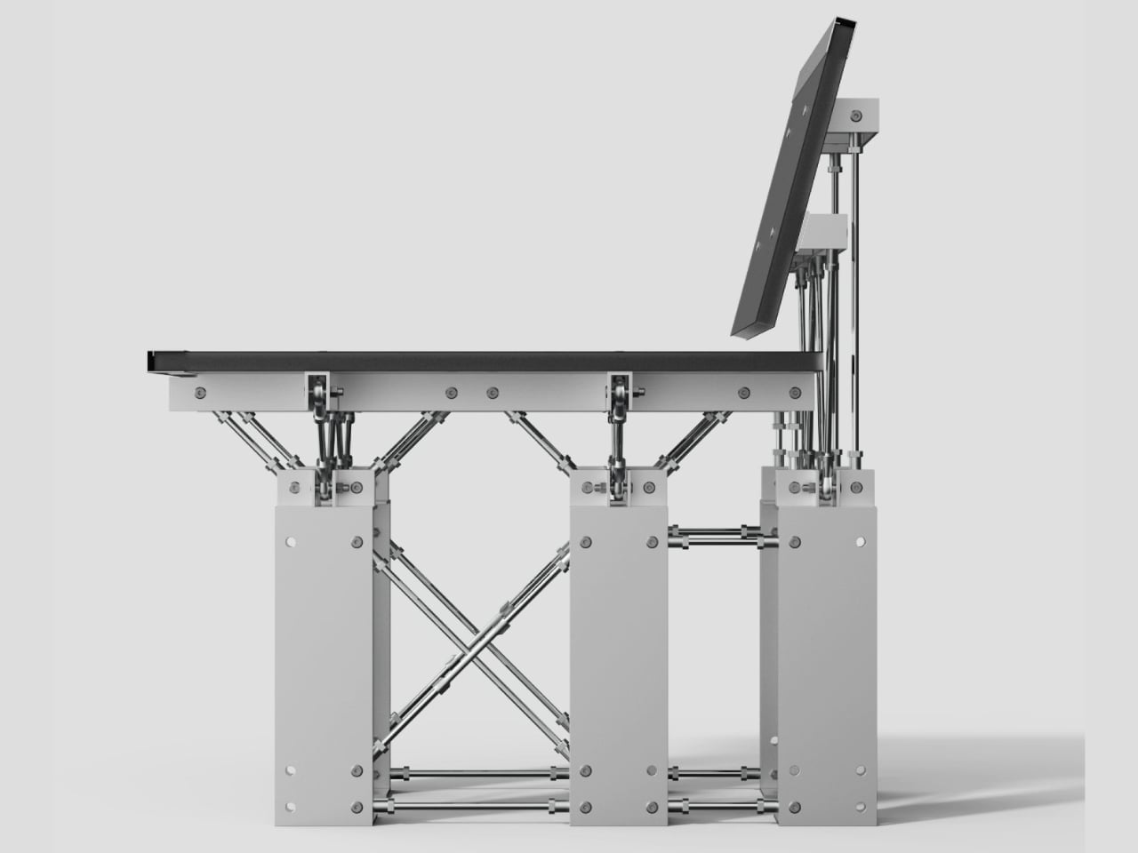
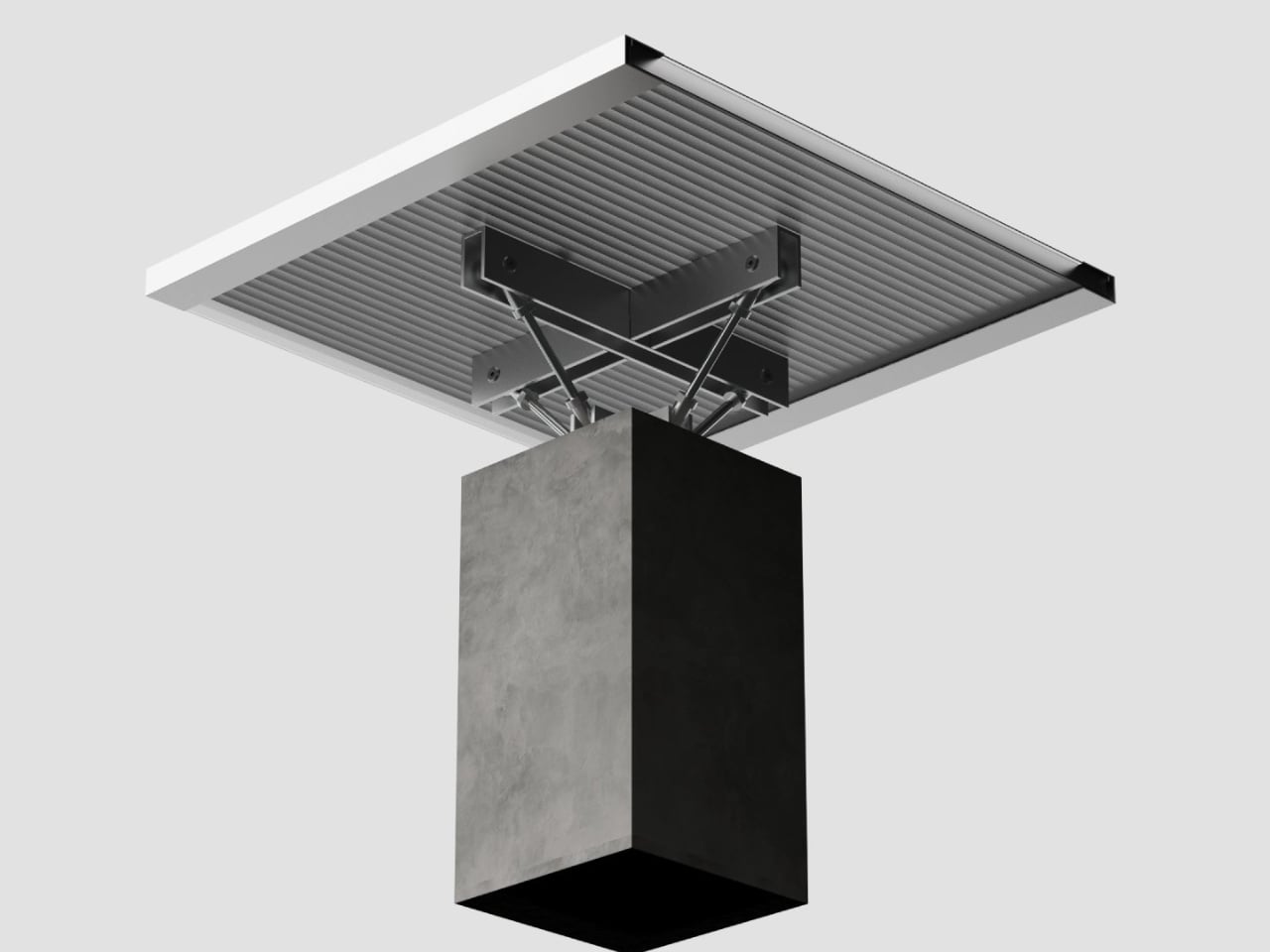
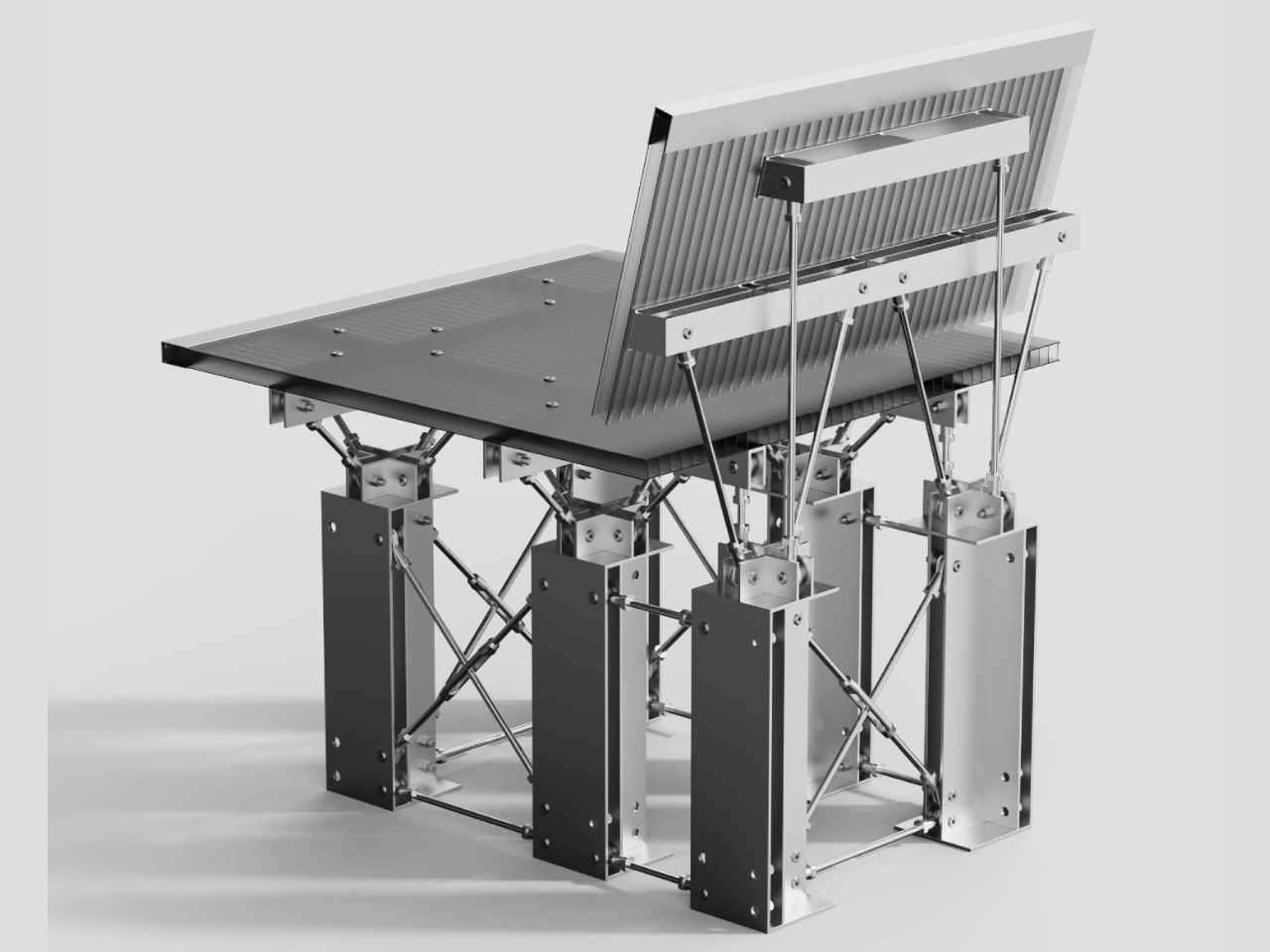
It sounds like a thought experiment, but the result is a collection of pieces that feel genuinely original. The series consists of two objects, the Y1 side table and the Y6 lounge chair, both built around what Hwang calls a “Y structure,” a truss-inspired configuration that mirrors the load-bearing frameworks found in bridges and buildings. The name isn’t arbitrary. Y1 uses the structure once; Y6 repeats it six times. Simple math, surprisingly compelling design.
Designer: SeongJin Hwang
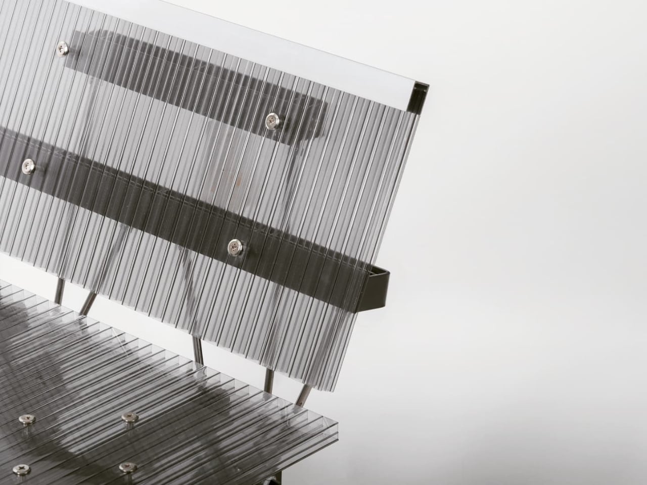
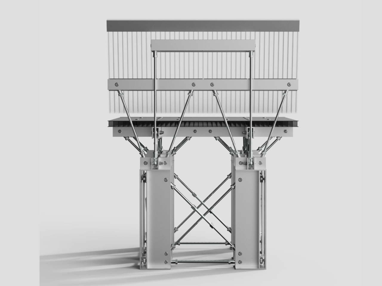
What makes this interesting isn’t just the aesthetic, though the aesthetic is striking enough on its own. Look at the Y6 chair and you’ll see something that reads almost like a miniature industrial site: bolted steel joints, criss-crossing metal rods, ribbed panel surfaces. It doesn’t look like furniture trying to reference architecture. It looks like architecture that happens to be the right size to sit in. That’s a harder trick to pull off than it sounds.
The truss is one of the oldest structural tools in engineering. Builders have used triangulated frameworks to distribute weight and resist bending since well before modern steel construction, and architects have long made a visual language out of it. Steel bridges, industrial warehouses, airport terminals, concert stages; the truss pattern is everywhere once you start noticing it. Hwang’s premise is that this visual and structural logic belongs in the domestic sphere too, not as decoration, but as genuine engineering applied at a smaller, more intimate scale.
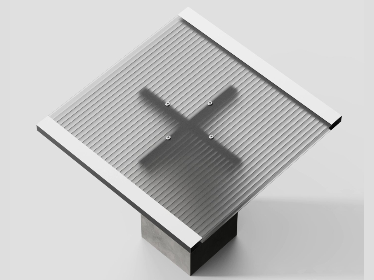
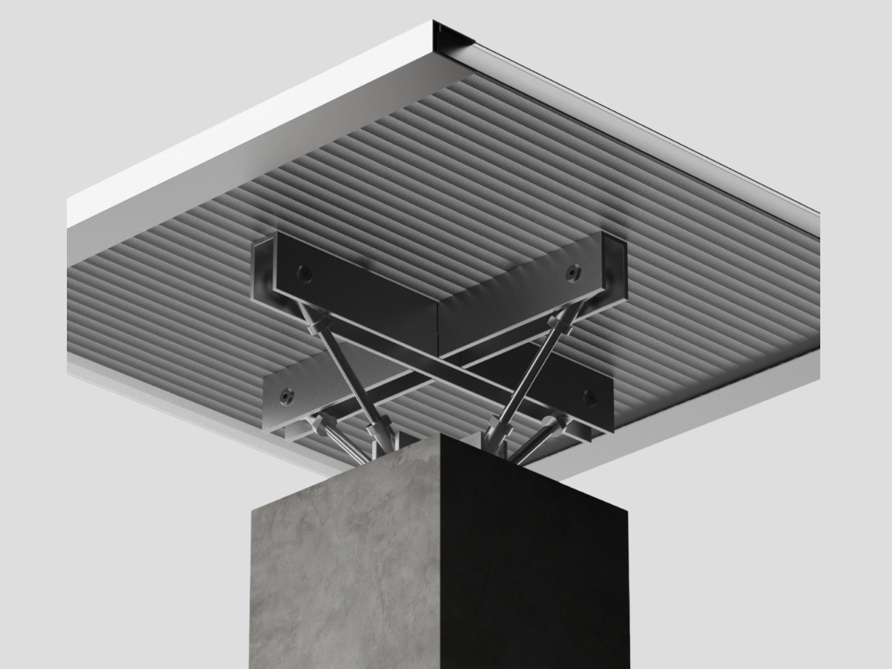
The Y1 side table is the more understated piece. On its own, a single Y structure can’t carry the load a table demands, so Hwang grounds it in a concrete block. The contrast is the point. Concrete is gravity and mass; the steel Y above it is precision and tension. Together they read like a tiny architectural section model that also holds your coffee. The rigor is real, but so is the playfulness.
The Y6 chair scales the idea up and out. Six repeating Y modules form the base and back support, creating a dense pattern of interconnected joints that distributes weight the same way a truss distributes structural stress. From the side profile, the chair looks almost impossibly mechanical, like a piece of stage rigging folded into a sitting position. From above, the bolted tabletop surface turns the ribbed panel into something straight out of an architectural rendering.
The most honest way to describe the YY Series is as furniture made by someone who wasn’t willing to forget what they learned in an architecture program the moment they sat down at a design desk. That’s not a criticism. The tendency to treat furniture and architecture as completely separate disciplines with only occasional, surface-level overlap has always felt a little artificial to me. Buildings and the objects inside them share an ongoing conversation about structure, material, and human use. The YY Series makes that conversation explicit rather than decorative.
Whether these pieces belong in a gallery or a living room is a fair question. The steel and concrete combination isn’t exactly warm, and the mechanical density of the Y6 chair isn’t for everyone’s taste. But that’s part of what makes it worth paying attention to. The YY Series isn’t trying to soften architecture into something livable. It’s inviting you to live inside the logic of architecture directly, bolts, trusses, load paths, and all.
The studio received recognition for the YY Series at the Architecture Madrid Award in October 2024. For a design rooted so firmly in structural thinking, that feels like exactly the right room to be noticed in. The work is worth tracking, and SeongJin Hwang is a designer worth knowing.
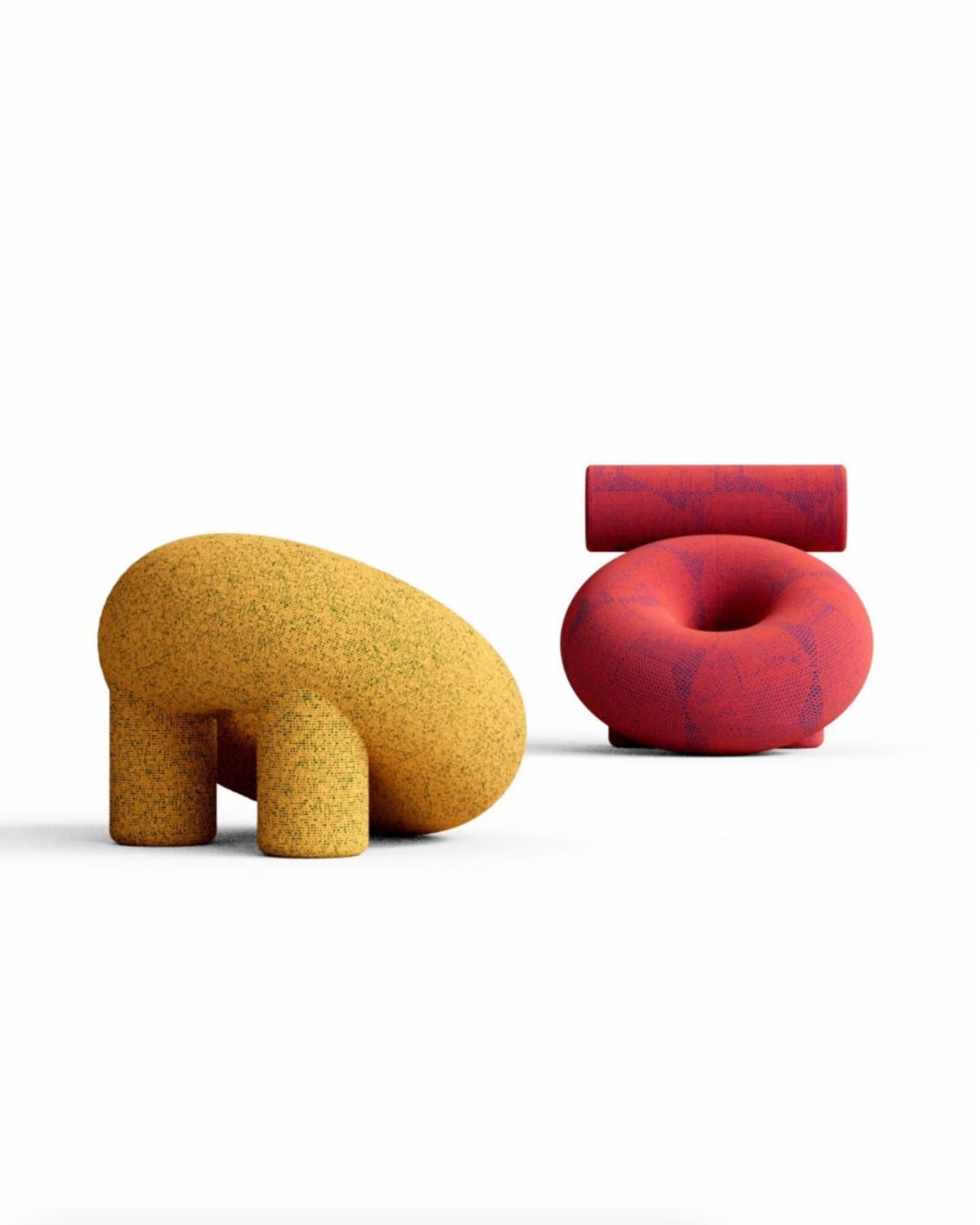
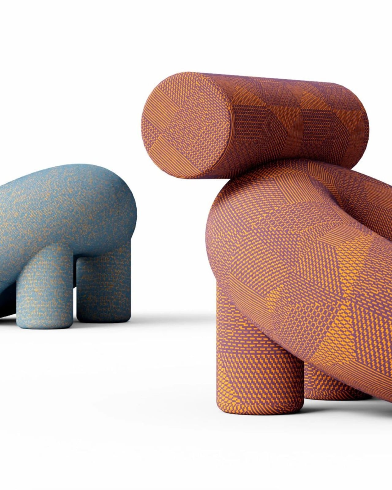
Most furniture gets described in one of two ways: you either call it comfortable or you call it beautiful. Rarely do you call it both, and almost never do you say a chair made you stop mid-scroll to figure out if it was real. The Bublyk lounge chair by Ukrainian designer Andrii Kovalskyi managed all three in a single glance.
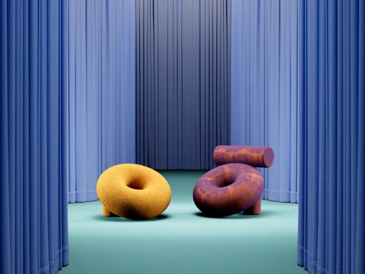
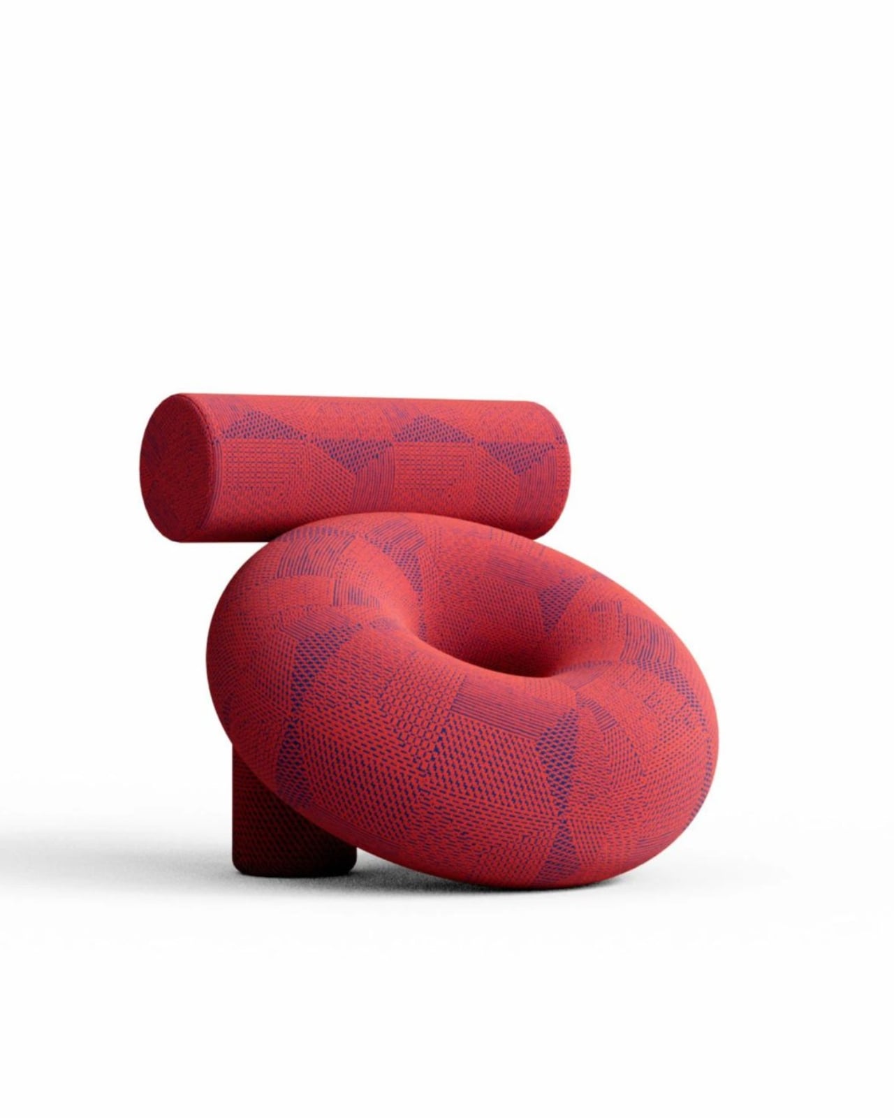
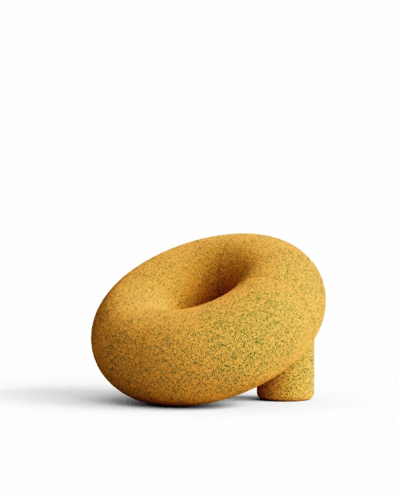
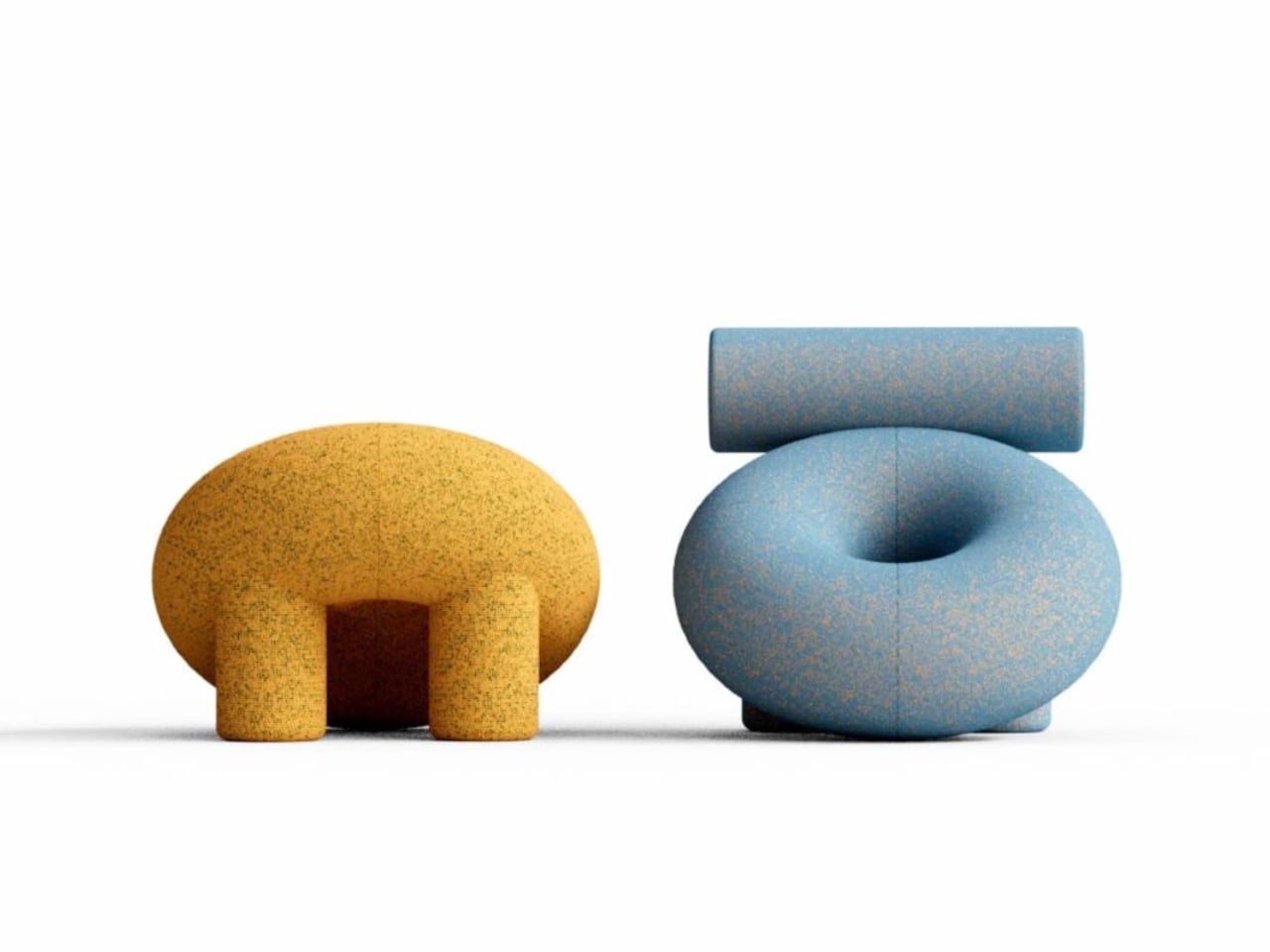
The name is a clue. Bublyk is the Ukrainian word for a ring-shaped bread, essentially a bagel’s Eastern European cousin, and once you know that, you can’t unsee it. The torus geometry at the heart of the design, that classic ring form, is suddenly the most obvious and delightful thing in the room. But Kovalskyi doesn’t stop at one shape. He stacks cylindrical volumes alongside the torus, letting them collide and nestle against each other until the whole thing reads less like furniture and more like a soft, living sculpture that decided to sit down.
What makes this concept genuinely interesting is how Kovalskyi managed to make hard geometric forms feel warm. Torus and cylinder are architectural, mathematical shapes. They belong in textbooks and CAD files. But wrapped in a granular, speckled upholstery that carries the warmth of hand-woven textile, these volumes lose their rigidity entirely. The result is a monolithic form that still feels inviting, like a piece of abstract art you are actually allowed to sit in.
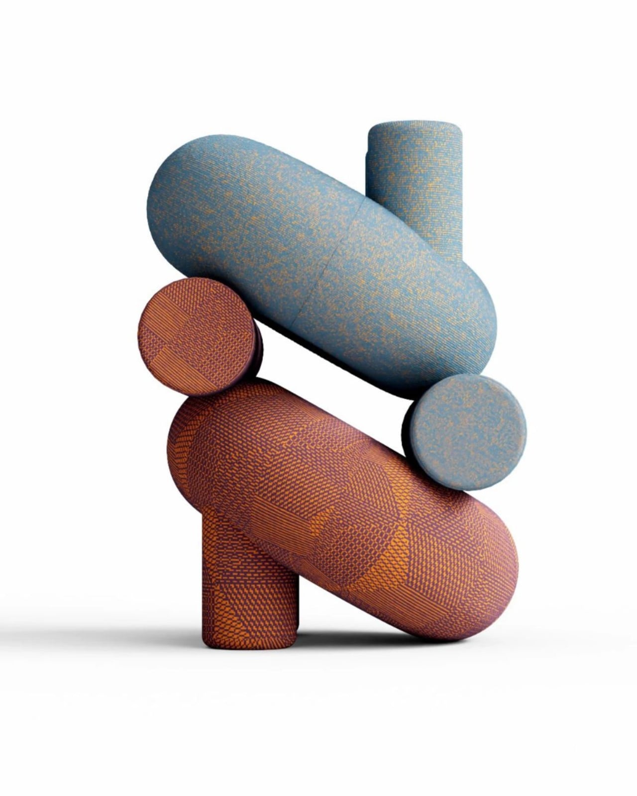
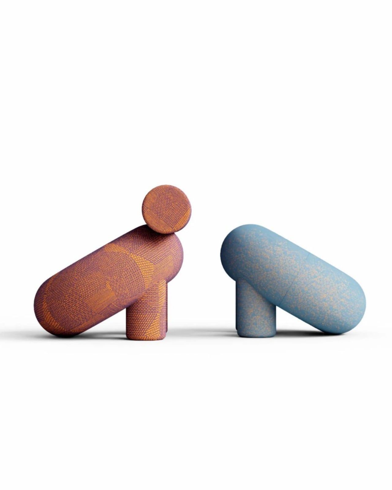
The upholstery deserves its own moment. Versions of the chair use fabrics from Kvadrat Febrik’s Sprinkles collection, and the effect is layered and compelling. Up close, each chair reads like a field of tiny woven dots and shifting patterns, the kind of surface your hands would instinctively want to reach out and touch. From a distance, the texture gives each piece an almost painterly depth, one that shifts in tone with the light. It’s the kind of material decision that elevates a strong silhouette into something that genuinely rewards sustained attention.
The collection spans a range of configurations and colorways. One version wraps the torus body in a cylindrical bolster backrest, giving it a composed, upright posture. Another presents just the torus form, low and reclining, balanced on two short cylinder legs. Viewed side by side, the variations feel like family, different personalities sharing the same underlying design logic. The colorways lean into the boldness: deep crimson reds, powdery blues, warm ochre yellows, earthy burnt oranges. None of these chairs are trying to disappear into a wall.
That feels intentional. Much of contemporary furniture design has been running hard toward quiet luxury: restrained silhouettes, neutral tones, pieces that function as background. Bublyk pushes in the opposite direction. It wants to be the first thing you notice when you walk into a room, and the piece people ask about when they visit. Whether that boldness translates into commercial production remains to be seen, since this is still a concept, but the appetite for character-driven furniture has been building for a while.
One of Kovalskyi’s renders shows the modular components stacked into abstract, totem-like arrangements, hinting at a broader system potential. If these volumes can be reconfigured or mixed across pieces, Bublyk stops being a single statement chair and becomes something closer to a design language. That is a genuinely compelling idea, the kind of thinking that separates a good concept from a lasting one.
Kovalskyi has been designing original furniture and interior objects since 2016, working out of Lviv, Ukraine. His practice spans furniture, lighting, and 3D visualization, and his work consistently shows a willingness to treat form as something to play with, rigorously but also with a sense of humor. The Bublyk chair captures that balance well. The name alone, borrowed from a humble ring-shaped bread, keeps the whole project grounded even as the visual ambition reaches upward.
Comfort is built into the promise. The ergonomics, shaped by the geometry and supported by the granular upholstery, suggest this isn’t purely a sculptural exercise. A person is supposed to sit in it and feel held. If Kovalskyi delivers that in production, Bublyk won’t just be a chair people admire from across the room. It’ll be the one nobody wants to get up from.
In a world of mass production, Scandinavian design stands out for its clean lines, practical elegance, and thoughtful functionality. Rooted in simplicity and clarity, it emphasizes natural materials, durable construction, and timeless aesthetics. Every product strikes a balance between form and purpose, delivering visual appeal and lasting performance.
Integrating Scandinavian design into your space encourages mindful living and attention to detail. From the sleek contours of a chair to the understated functionality of storage solutions, each piece enhances everyday life while maintaining a sense of harmony and refinement. By choosing products that combine practicality, sustainability, and thoughtful design, you create an environment where style meets purpose.
1. Use of Wood & Nature in Scandinavian Design
Scandinavian craftsmanship is rooted in a deep respect for nature, with wood at its core. Imagine the warm grain of a hand-carved birch bowl or the smooth finish of a pine stool. Artisans don’t just shape wood; they honor its textures and natural quirks, creating pieces that feel alive and bring the outdoors into your home.
This approach isn’t about rare or expensive timber. Local woods, such as beech, ash, and oak, take center stage, with simple lines and treatments that highlight their unique character.
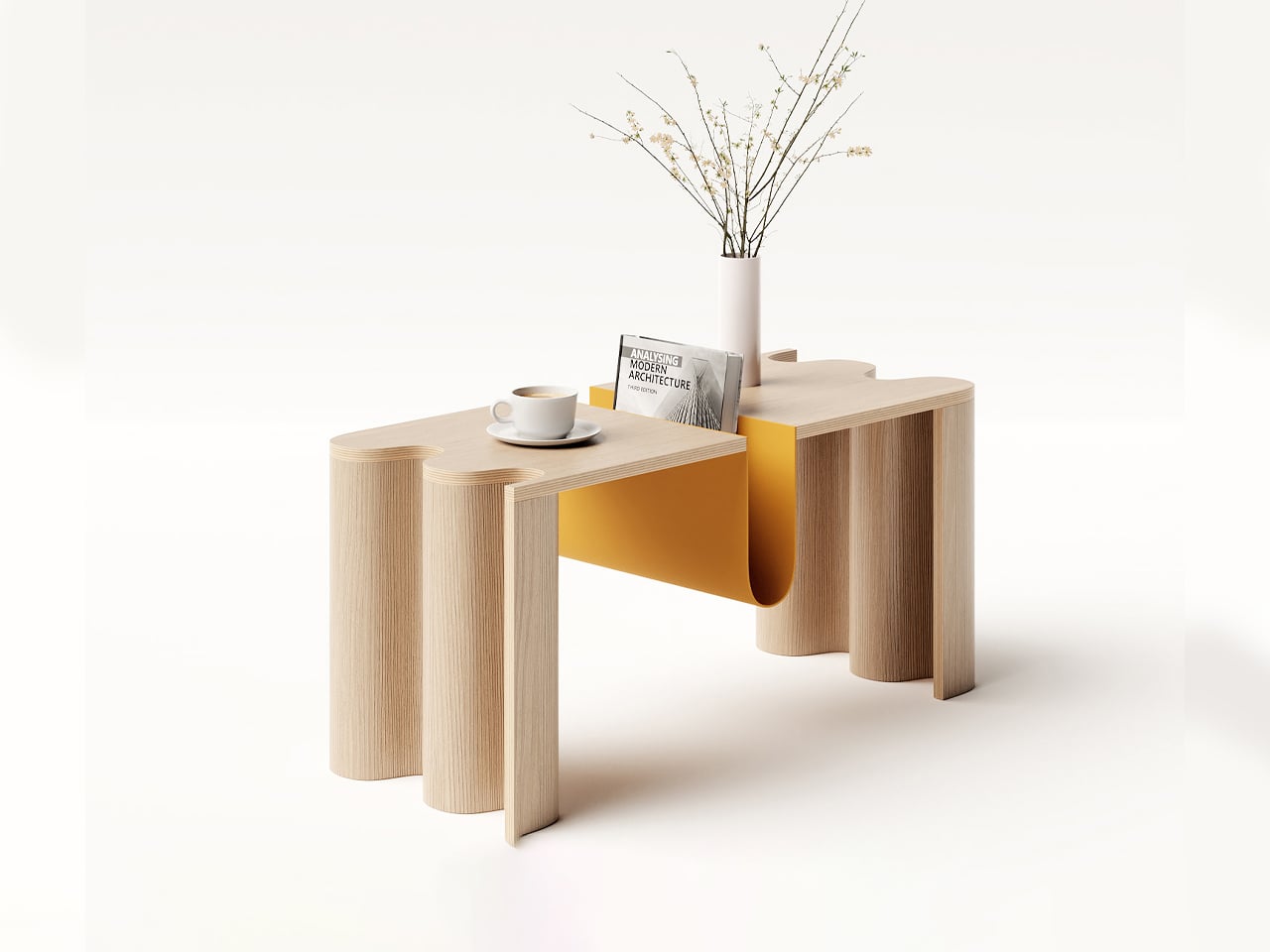
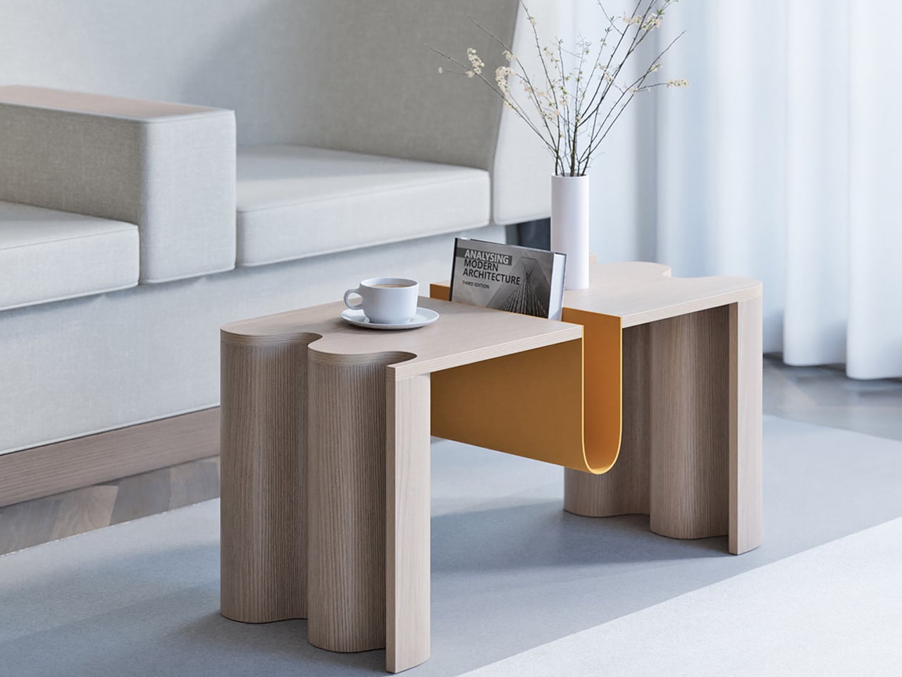
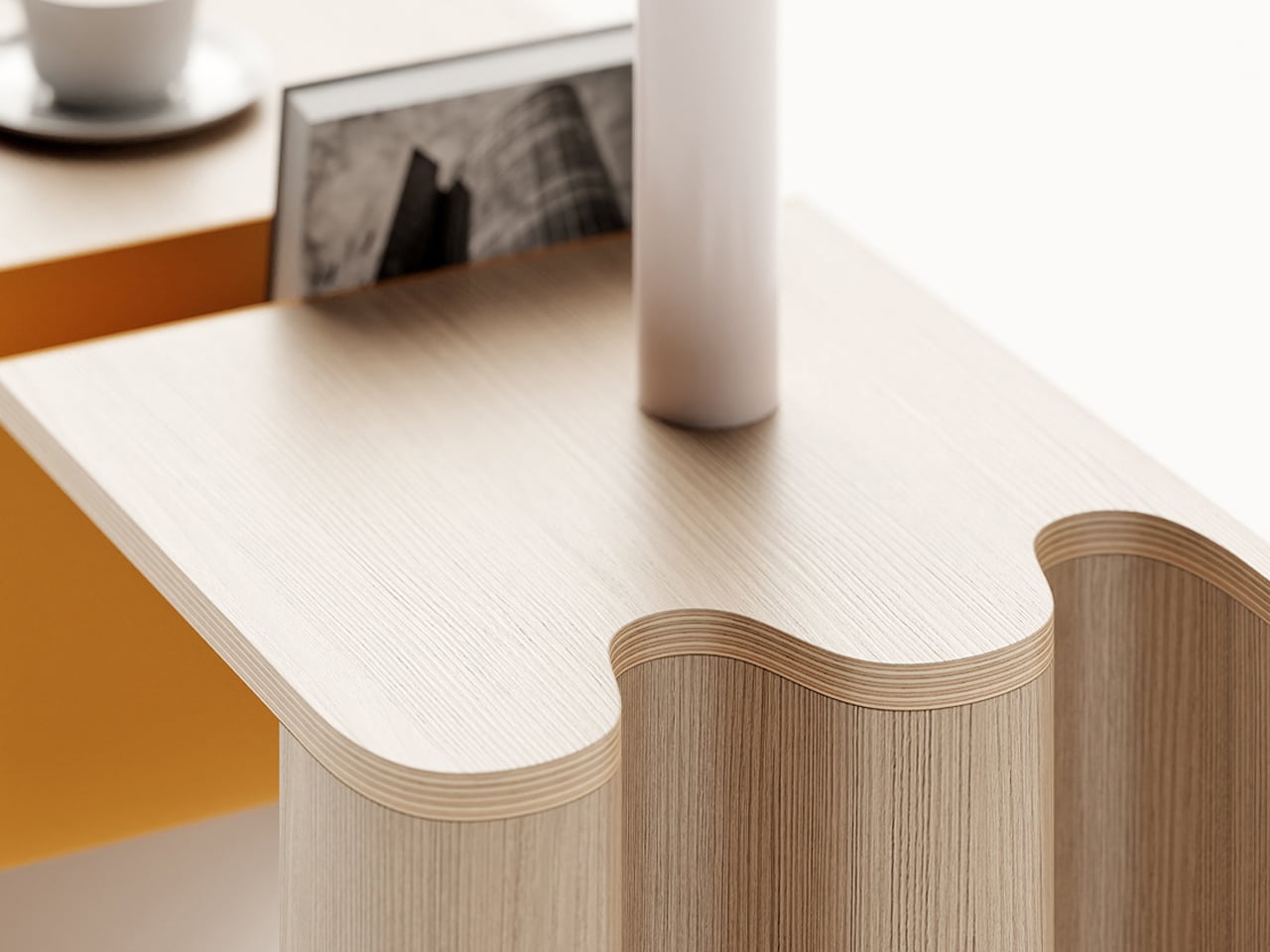
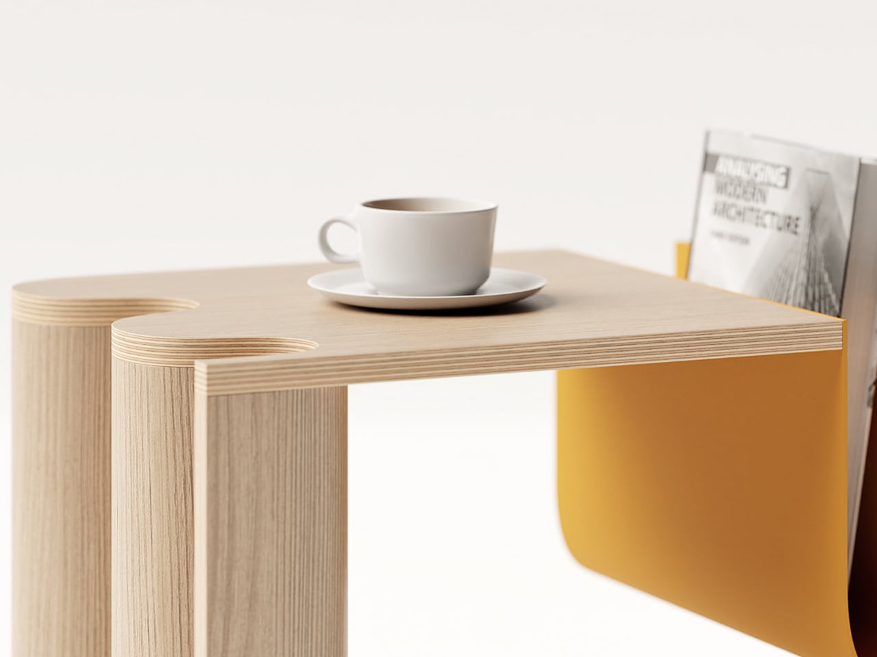
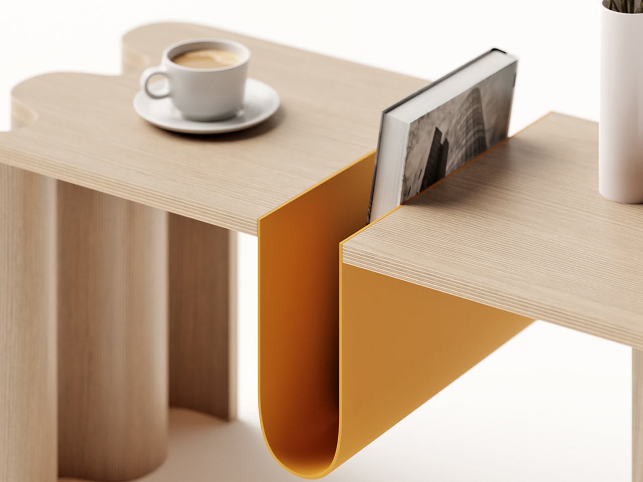
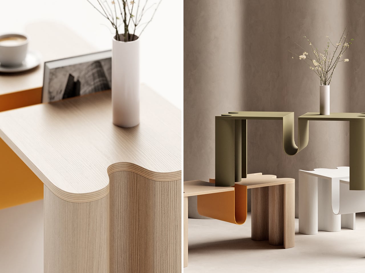
Cloth is a coffee table by João Teixeira that blends Scandinavian functionality with Japanese minimalism, capturing the Japandi spirit of calm, balance, and warmth. Designed to ground a living space without overwhelming it, the table embraces a balance of boldness and elegance from every angle. Its defining feature is a curved bookstand at the center, a sculptural element that anchors the design while leaving ample tabletop space. Subtle details, such as the softly undulating edge reminiscent of a live edge, add a sense of movement to its otherwise minimal profile.
Teixeira’s approach emphasizes simplicity paired with durability. By concealing hardware through techniques like press-bending plywood and CNC-milling the tabletop, the design maintains an uninterrupted look. The result is a dynamic yet understated piece that complements modern interiors with ease. Cloth is more than just a coffee table—it’s a functional statement that elevates a room through its quiet sophistication.
2. Scandinavian Textiles Infuse Warmth
Textiles are the heart of Scandinavian design, adding texture, warmth, and comfort to minimalist interiors. Generations of weaving, knitting, and embroidery have created pieces that are functional and beautiful. From chunky wool throws that invite you to curl up to linen curtains that gently soften light, these items bring a sense of coziness, known as hygge.
The focus is on natural fibers like wool, linen, and cotton, inspired by the Scandinavian landscape in muted earth tones, soft grays, and hints of wildflower or northern-light colors. Draping a hand-woven or machine-made blanket or adding embroidered cushions instantly gives your space a personal, handmade feel.
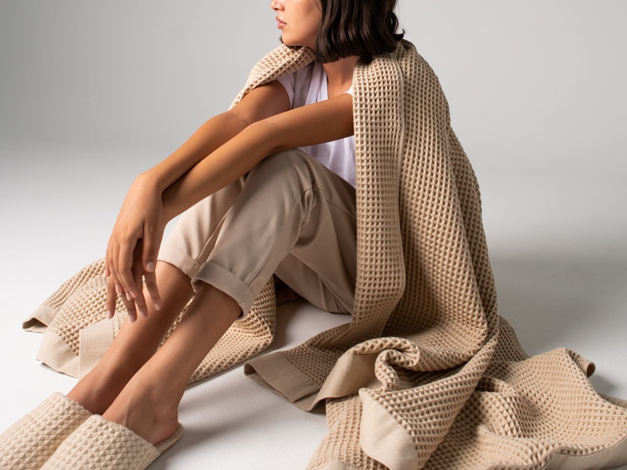
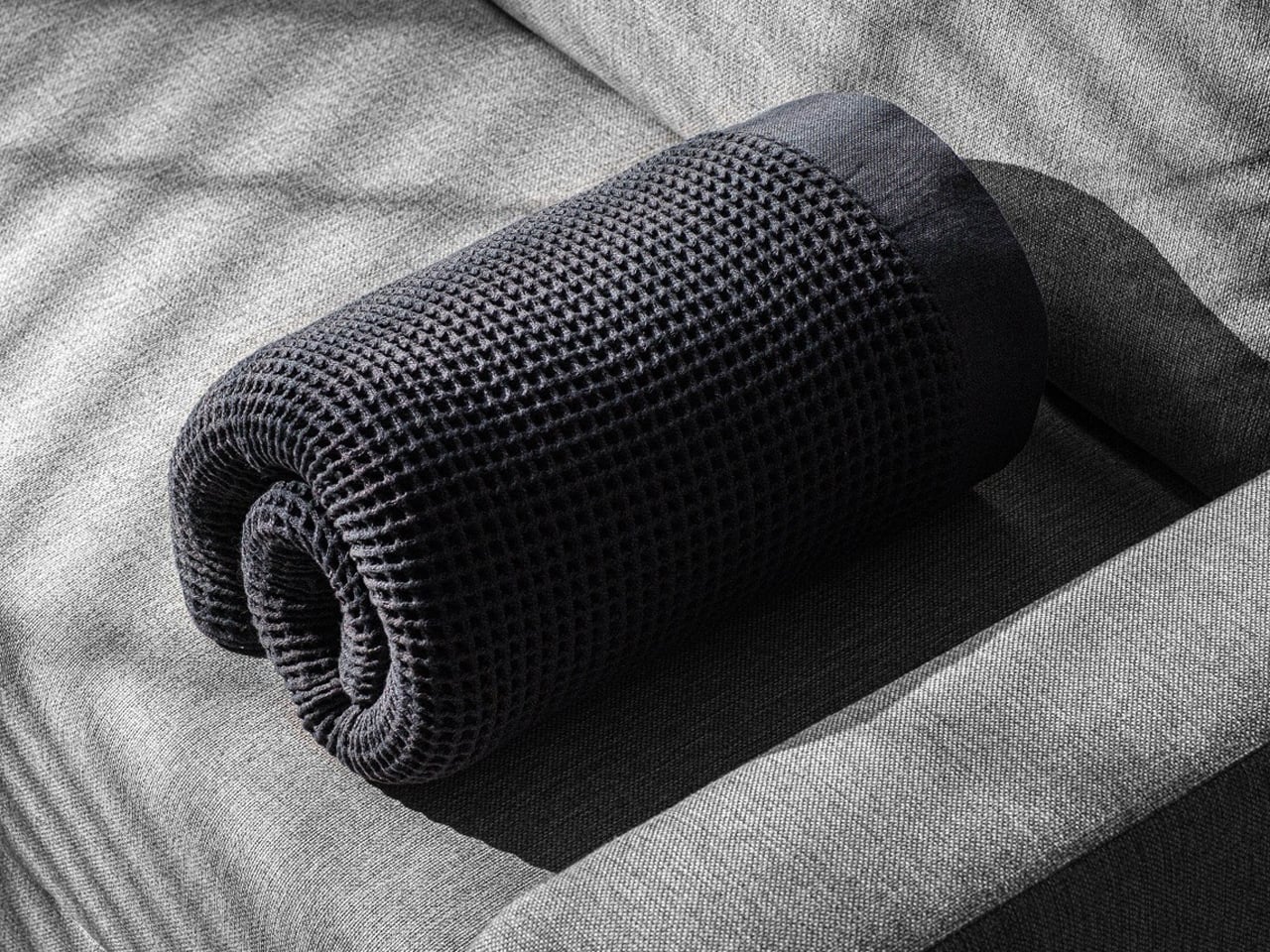
Casamera’s One Blanket, inspired by Scandinavian design, redefines coziness with an innovative open waffle-weave fabric that is breathable, thermoregulating, and soft, providing year-round comfort. Lightweight yet perfectly weighted, it delivers the familiar feeling of security without overheating and can be easily rolled or folded for travel. Whether sleeping in bed or relaxing on the couch, it adapts seamlessly to your needs.
Completing the comfort experience are Casamera’s Slippers, crafted from the same breathable, plush fabric with suede soles for gentle bounce. Both products combine functionality, durability, and eco-friendly materials, reflecting Scandinavian values of simplicity, sustainability, and thoughtful living.
3. Ceramics with Character
Scandinavian ceramics strike a perfect balance of form and function. Moving away from ornate designs, they focus on clean lines, simple shapes, and a tactile feel. A handcrafted ceramic mug carries weight, slight unevenness, and unique character, reflecting the maker’s hand. Designed for daily use, these pieces bring moments of beauty to your morning coffee or family dinner.
Colors and glazes mirror the natural environment like earthy tones, deep blues of the sea, and snowy whites. For example, choosing handmade bowls, plates, or vases is more than stocking your kitchen. It is curating functional art that elevates everyday rituals and makes life more mindful.
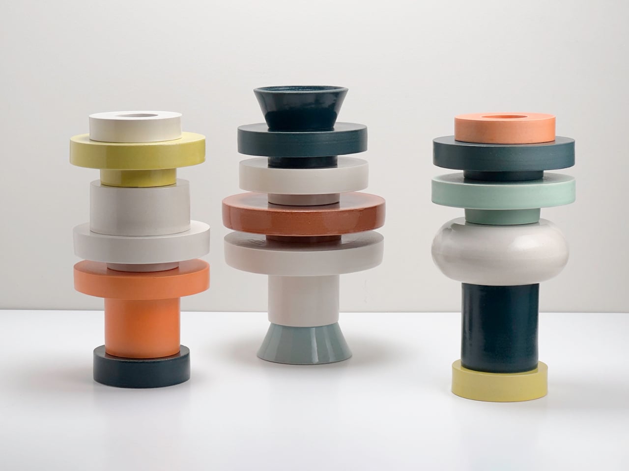
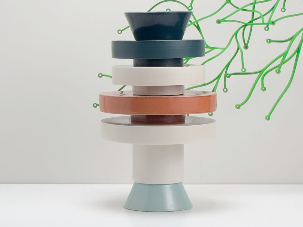
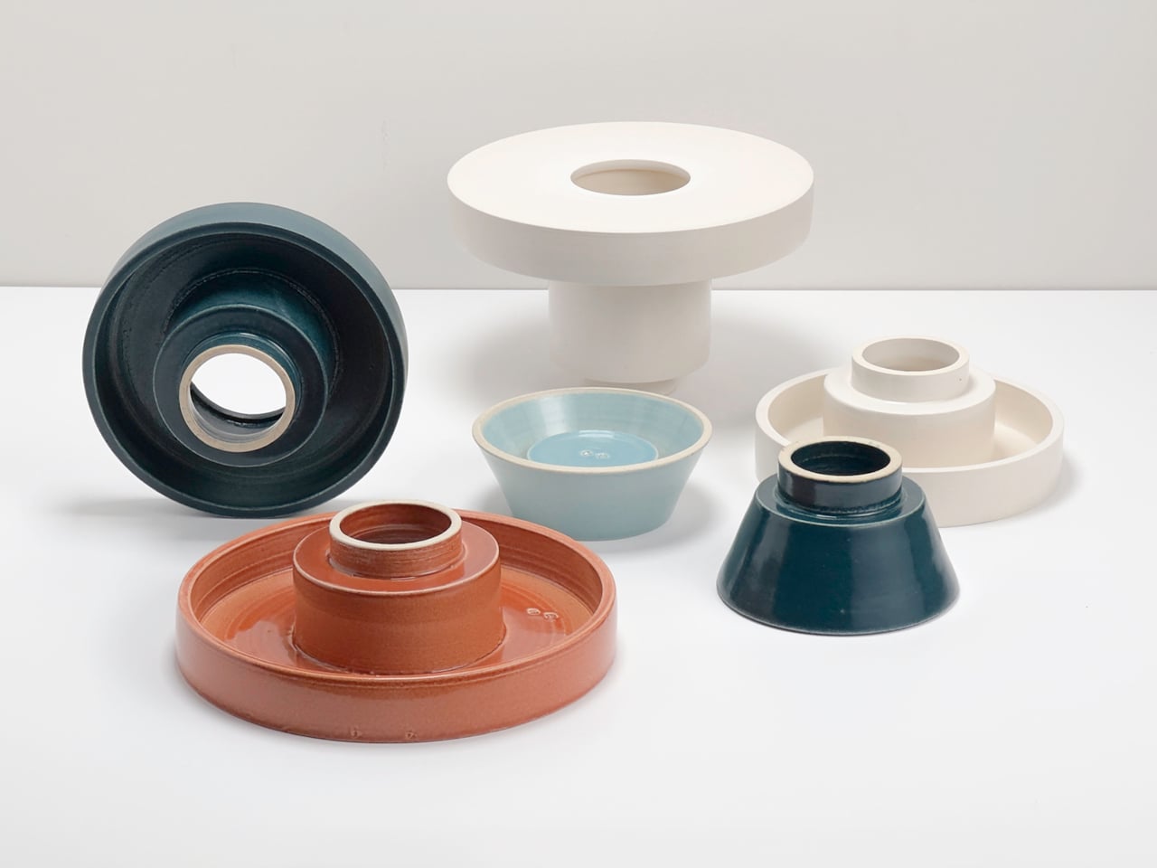
The Torre modular vase series by Scott Newlin for Dudd Haus, Scandinavian-inspired in its clean lines and functional elegance, transforms the traditional vase into a playful, customizable experience. Each vase arrives as a stackable ceramic module that users can arrange and combine to create sculptural, architectural forms. Named “torre” (tower in Italian and Spanish), the series encourages vertical stacking and creative exploration, turning everyday arrangement into a mindful, hands-on ritual.
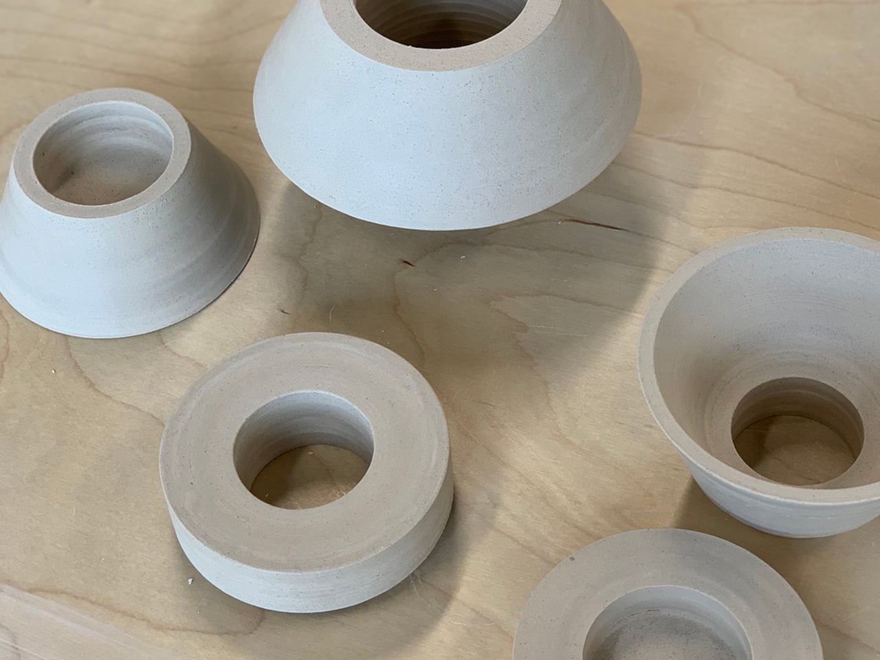
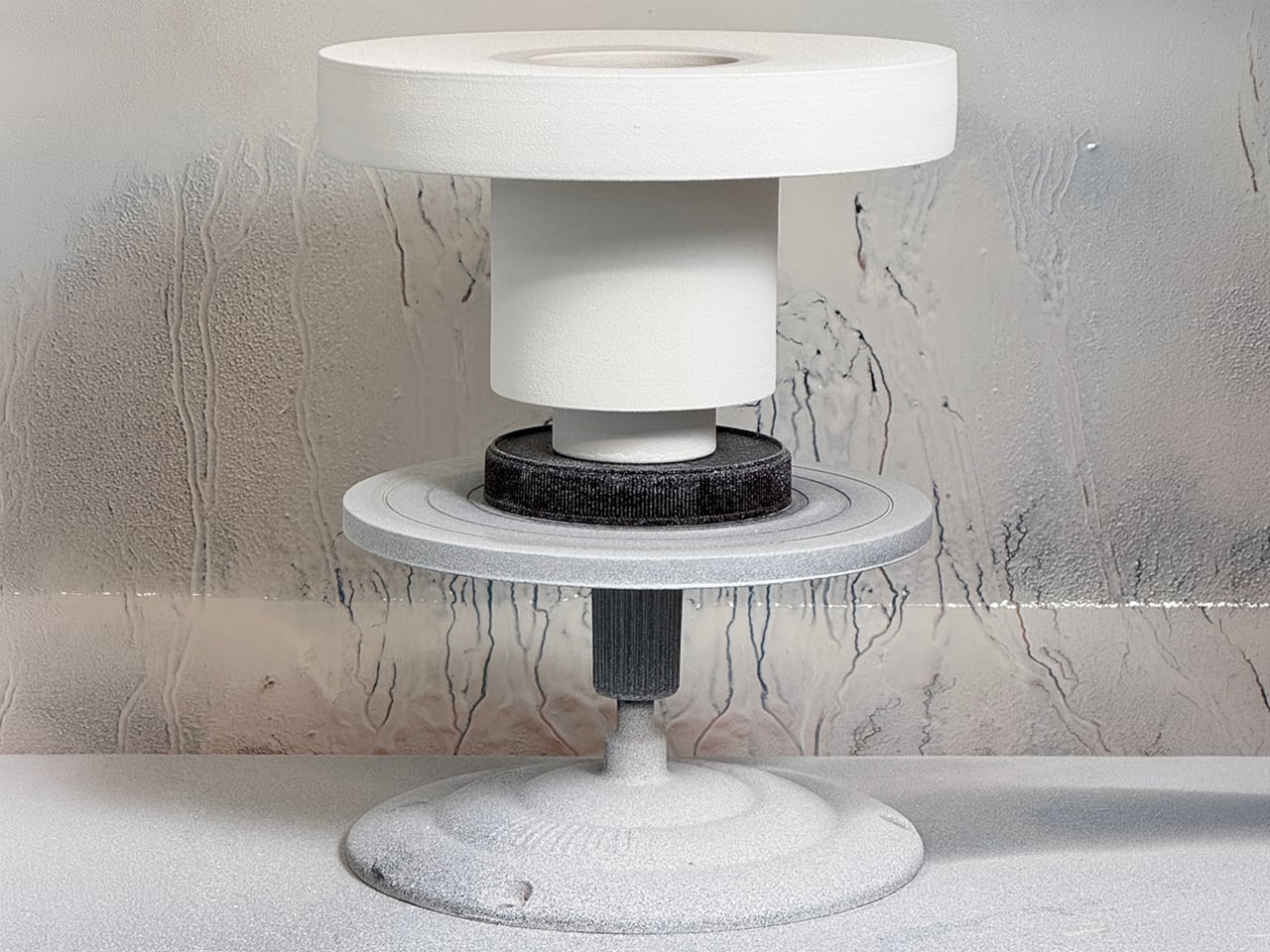
The Torre collection comes in three configurations, each featuring consistent diameters and interlocking lips for stable stacking. Wheel-thrown and spray-glazed, the modules show subtle variations that celebrate craftsmanship while maintaining a sleek, modern finish. Muted tones like off-white, sand, and stone complement diverse interiors, while the versatile design works equally well as a vessel for flowers or as a standalone sculpture.
4. Warmth Through Sculptural Lights
Light plays a vital role in Scandinavian design, especially during long, dark winters. Handcrafted or machine-made lamps and candle holders are more than illumination as they are sculptural pieces that create a warm, inviting atmosphere. Materials like wood, glass, and metal are shaped to diffuse light softly, while a simple paper pendant or carved wooden lamp can transform a room’s mood.
This approach emphasizes well-being through light, known as “mys” in Swedish. Choosing a handmade lamp brings this philosophy into your home, creating warmth, intimacy, and calm. Small, thoughtful details like these profoundly enhance emotional comfort and the feel of a space.
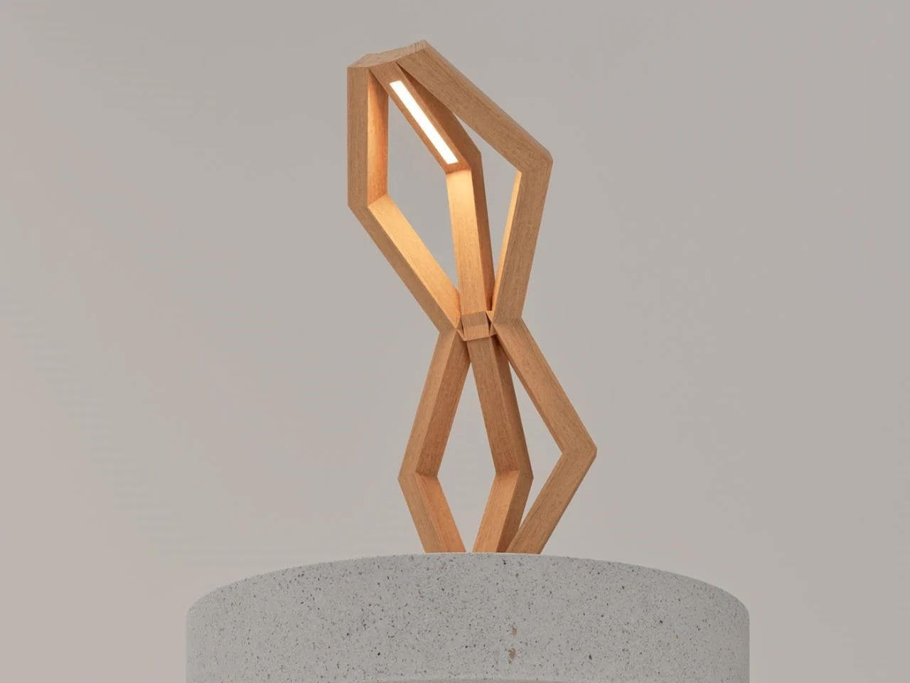
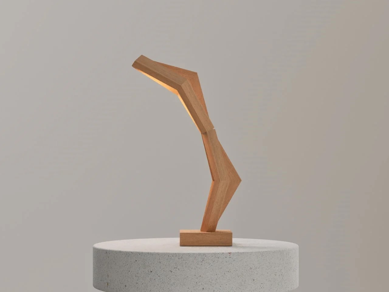
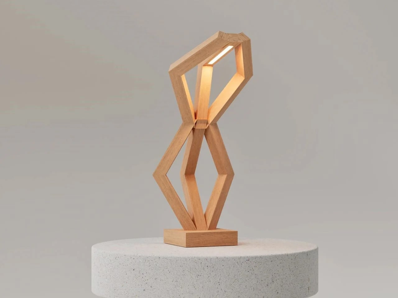
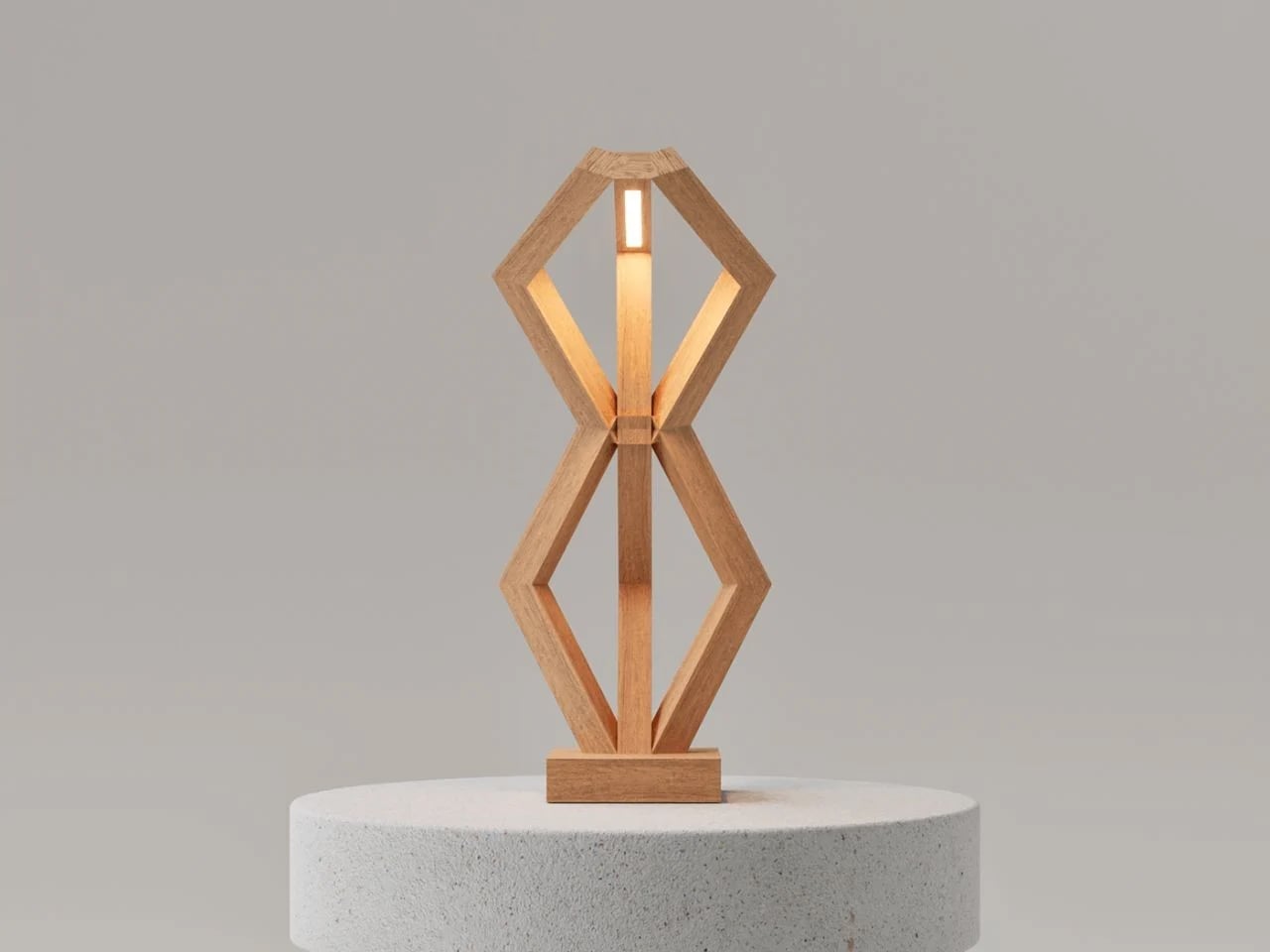
The BERSERK lamp merges Nordic mythology with modern design, creating a sculptural light object that embodies both strength and serenity. Inspired by the Valknut, a symbol associated with Odin and themes of protection and transcendence, the design avoids literal representation in favor of abstraction. Intersecting hexagonal frames meet at a central wooden joint, forming a balanced geometry that feels both grounded and ethereal. The verticality of its structure recalls ancient monoliths, which are stoic and immovable, yet its refined minimalism softens the form, achieving a presence that is bold but understated.
Crafted from warm-toned natural wood, BERSERK emphasizes material honesty through invisible joinery that highlights the grain and preserves the purity of form. A seamless LED light source rests atop the structure, casting a soft, ambient glow that enhances interiors without overpowering them.
5. Functional Craft as Art
In Scandinavian craft, tools are more than instruments as they are objects of beauty. From hand-forged knives to woven baskets and detailed leatherwork, functional items are treated with the same care as decorative pieces. This philosophy reflects a belief that daily objects should be durable, well-made, and visually pleasing.
Using a handcrafted spoon or basket transforms ordinary tasks into interactions with art. This approach encourages finding beauty in the everyday and investing in items built to last. Choosing pieces that are both functional and beautiful helps create a home that honors craftsmanship and intentional, purposeful living.
Sustainable entertaining meets Scandinavian-inspired design with the KNORK Eco Party Plate, where simplicity, functionality, and elegance converge. Building on the KNORK Eco cutlery line, this plate makes eco-conscious living effortless. Its clean, minimalist form ensures every detail serves a purpose, reflecting the Scandinavian ethos of thoughtful, practical design. Reusable and compostable, it demonstrates that sustainable choices, no matter how small, can enhance everyday life while reducing environmental impact.
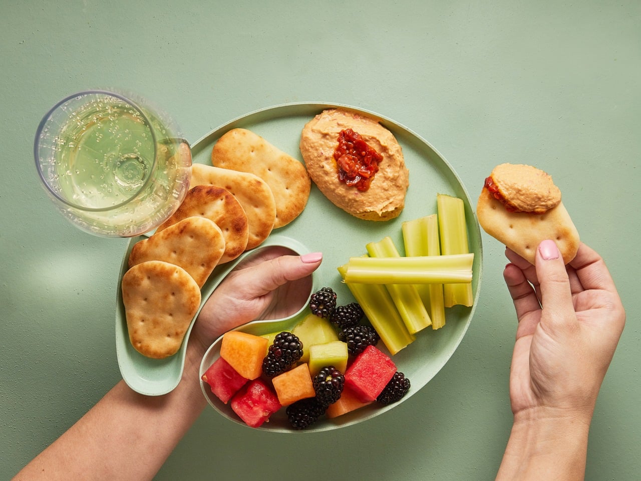
Crafted from bamboo and sugarcane offcuts sourced from furniture factories, the plate supports a zero-waste approach. Its artist’s palette shape allows you to hold a wine glass and utensil simultaneously, ideal for standing parties or casual gatherings. Made with Astrik resin, a biodegradable, glossy polymer, it is dishwasher- and food-safe, heat- and moisture-resistant, and durable for repeated use. Combining minimalist elegance, smart functionality, and eco-friendly materials, the KNORK Eco Party Plate embodies Scandinavian-inspired design while making sustainable entertaining stylish and practical.
Embracing Scandinavian design and craftsmanship goes beyond style as it celebrates authenticity, durability, and a close bond with nature. Each item tells a story, inviting you to slow down, notice the details, and make thoughtful choices that transform your space into a personal, soulful sanctuary.
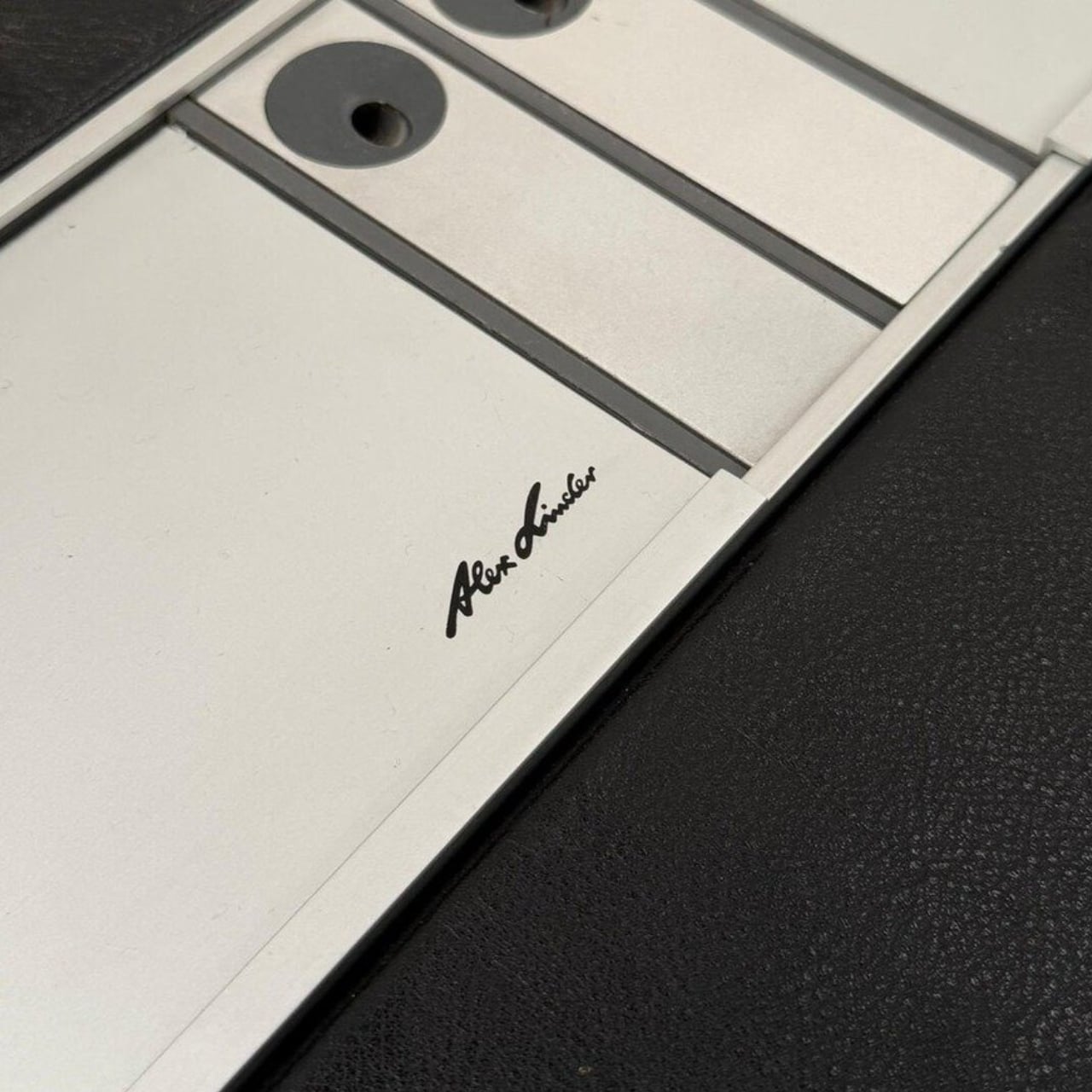
We spend so much time talking about modular design like it’s a modern revelation. Adjustable phone stands, swappable watch bands, magnetic laptop accessories, customizable everything. We talk about it like it’s a product of our era, born from Silicon Valley thinking and the rise of personal personalization. And then you come across Alex Linder’s Executive Desk from the 1970s and suddenly realize none of it is new at all.
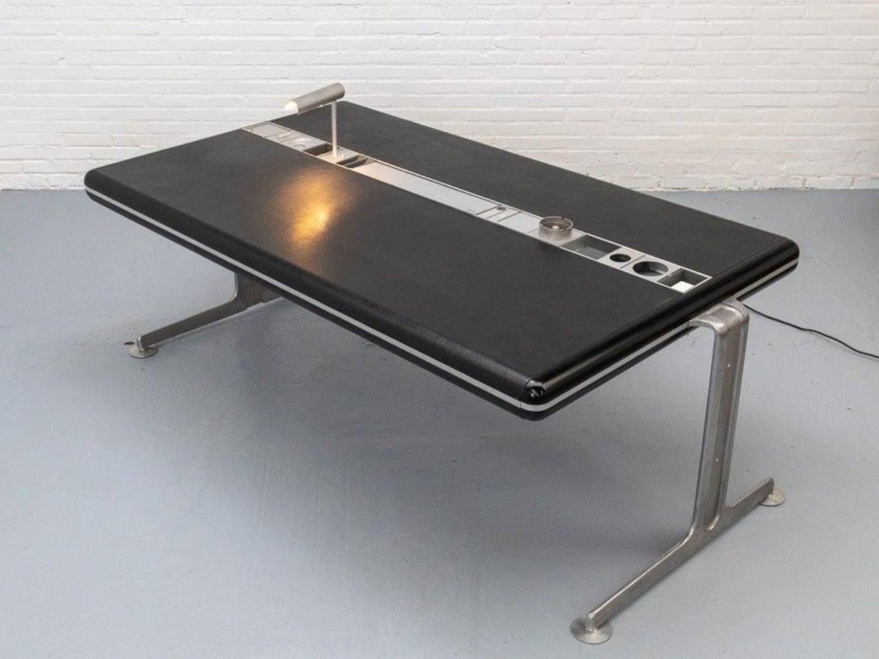
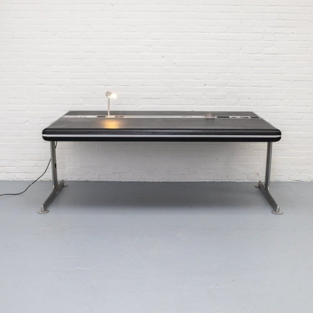
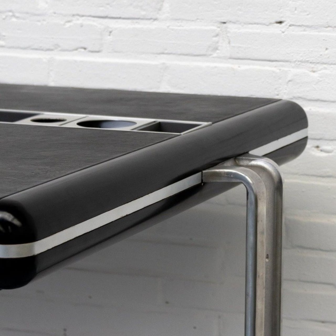
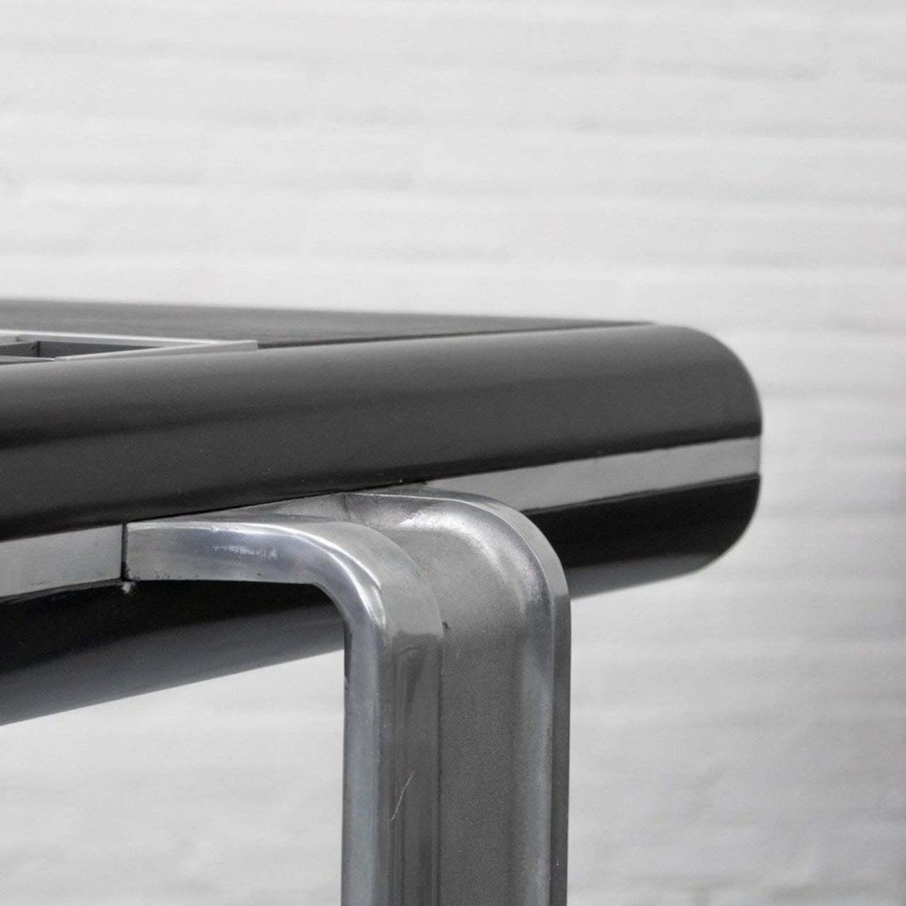
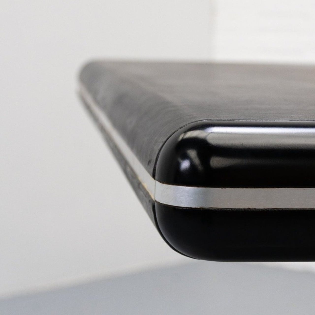
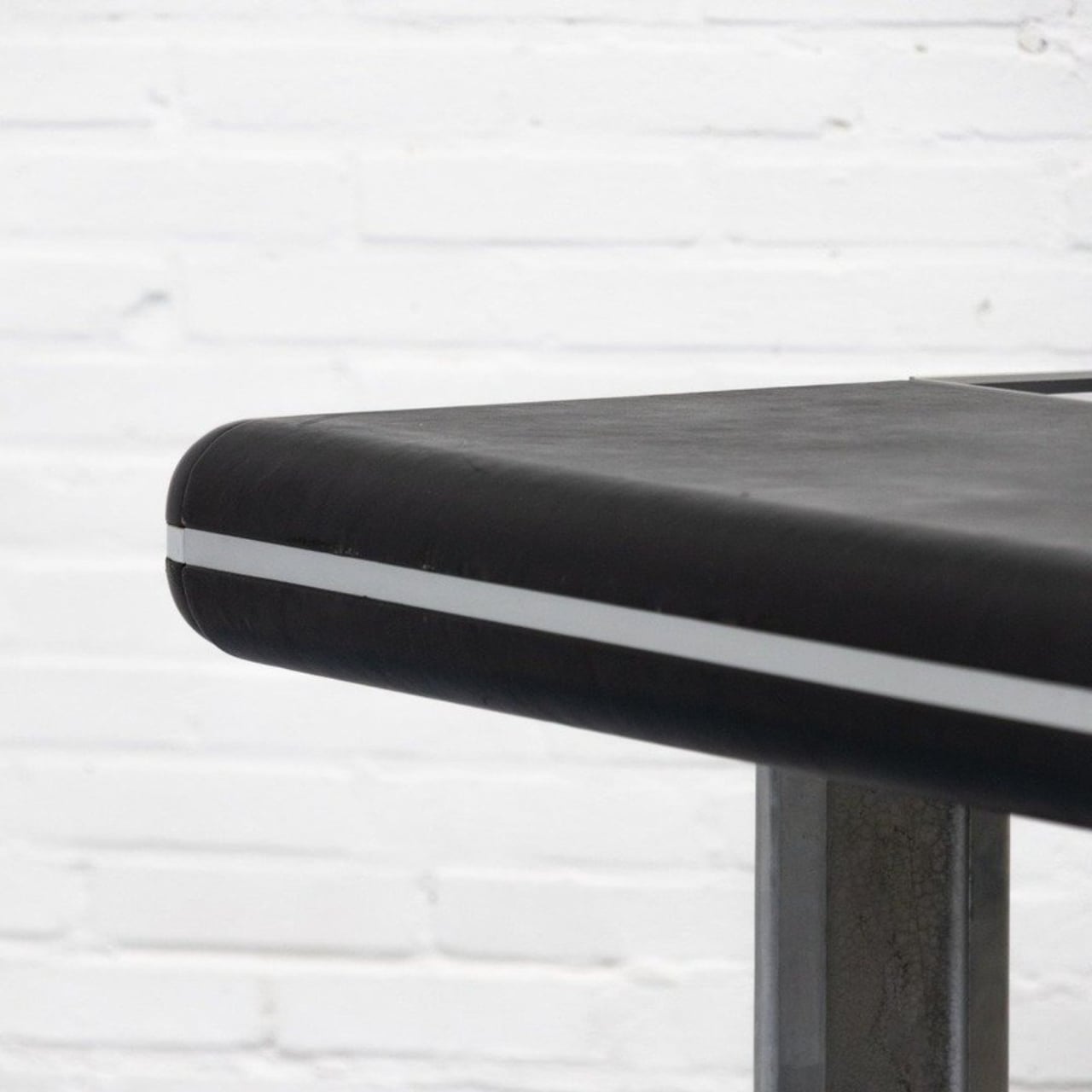
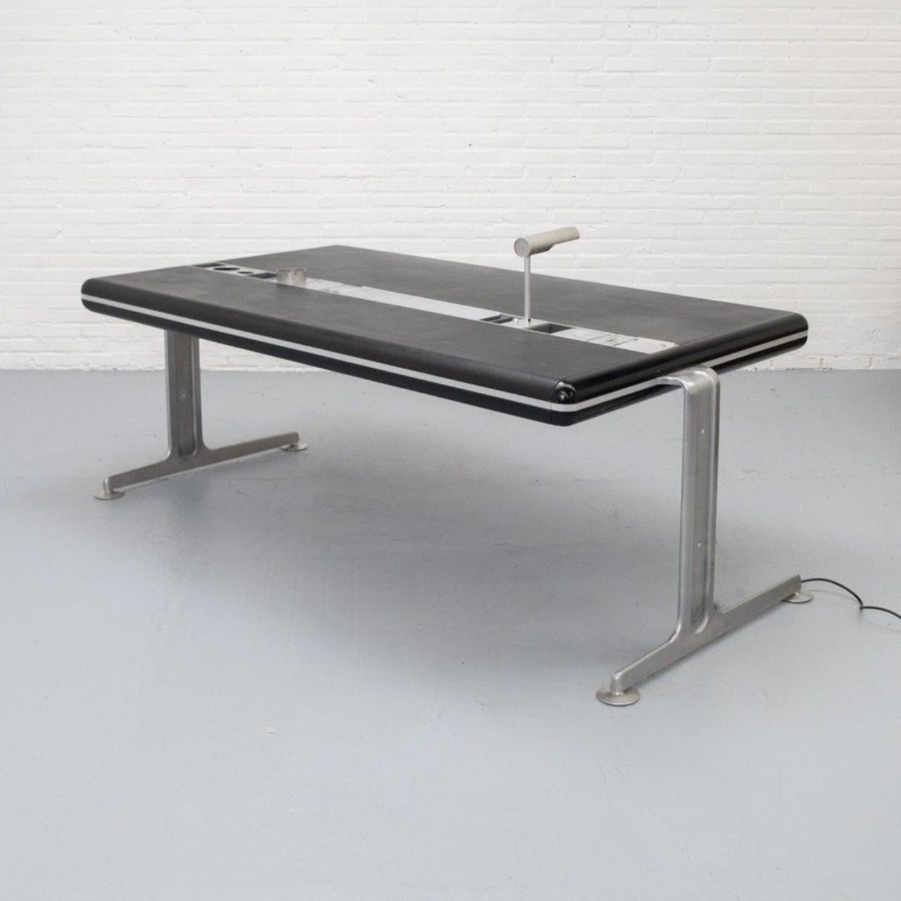
Linder, a Danish designer, built this desk sometime in the 1970s, and it is, by most accounts, extremely rare. Looking at it today, you’d be forgiven for thinking it was designed last year. The top is finished in black leather and framed with aluminum, resting on a solid metal base. The proportions are clean, the materials are considered, and the overall effect is exactly what good Scandinavian design tends to produce: something that looks inevitable, like there was never any other way to do it. But the real story isn’t the leather top or the beautiful lines. It’s what sits right in the center of the desk.
Designer: Alex Linder
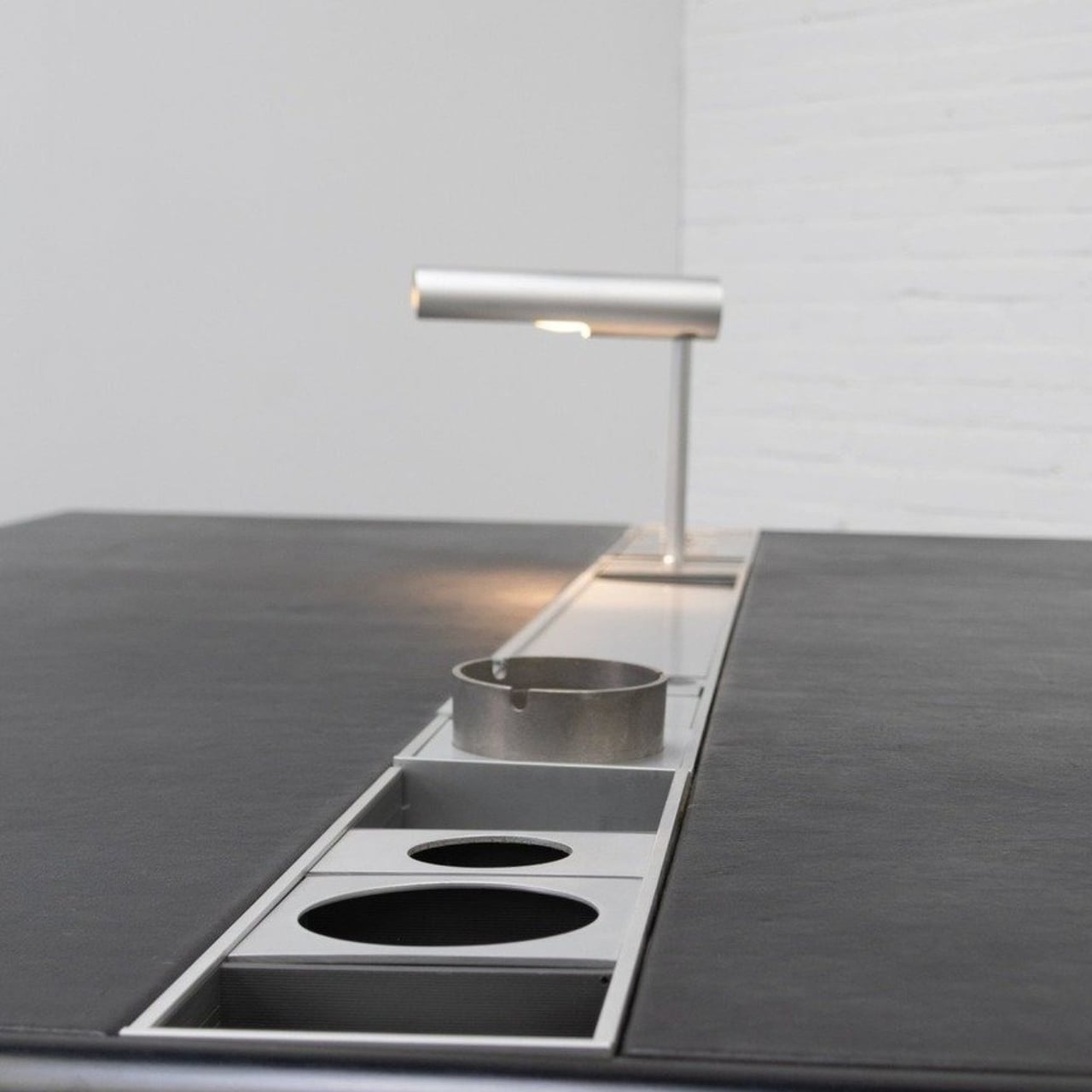
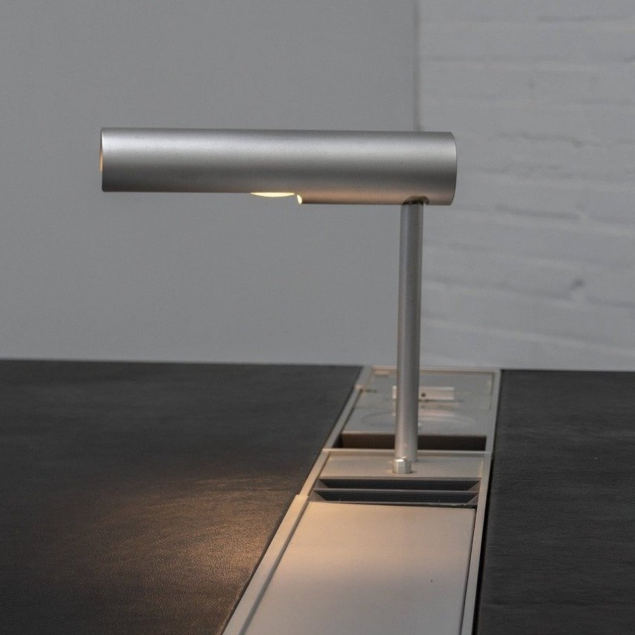
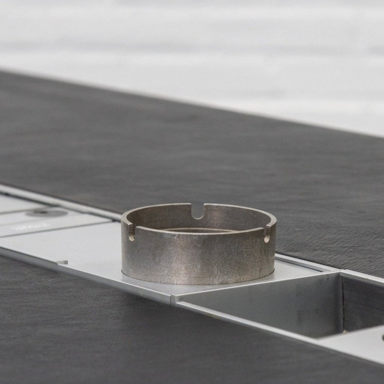
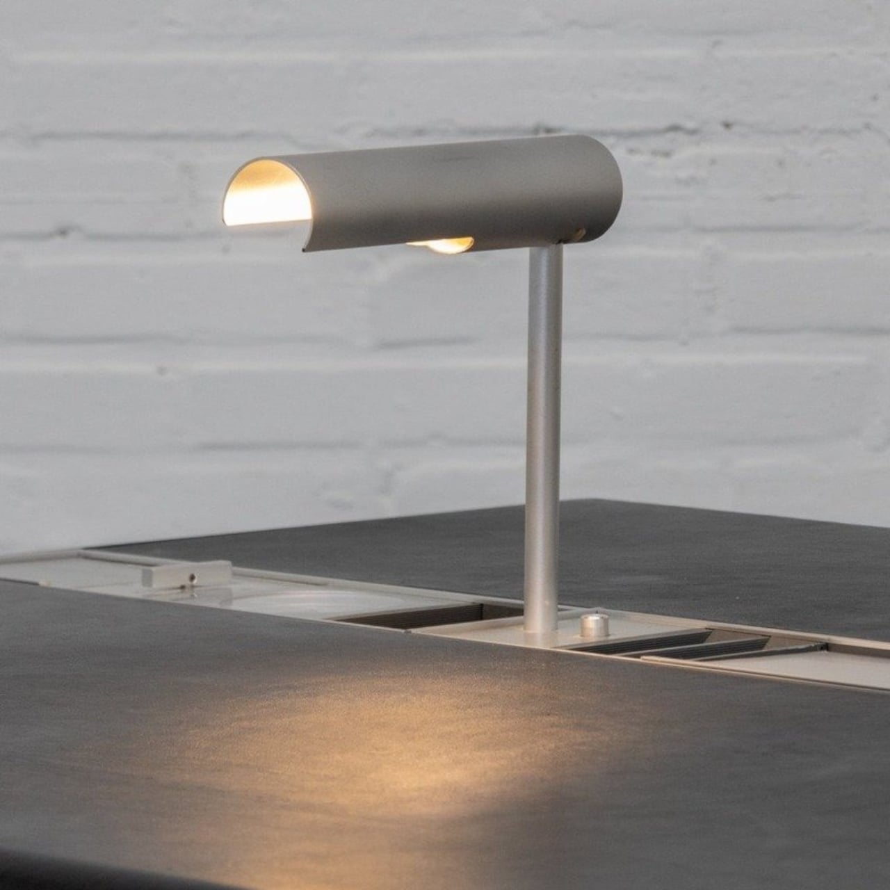
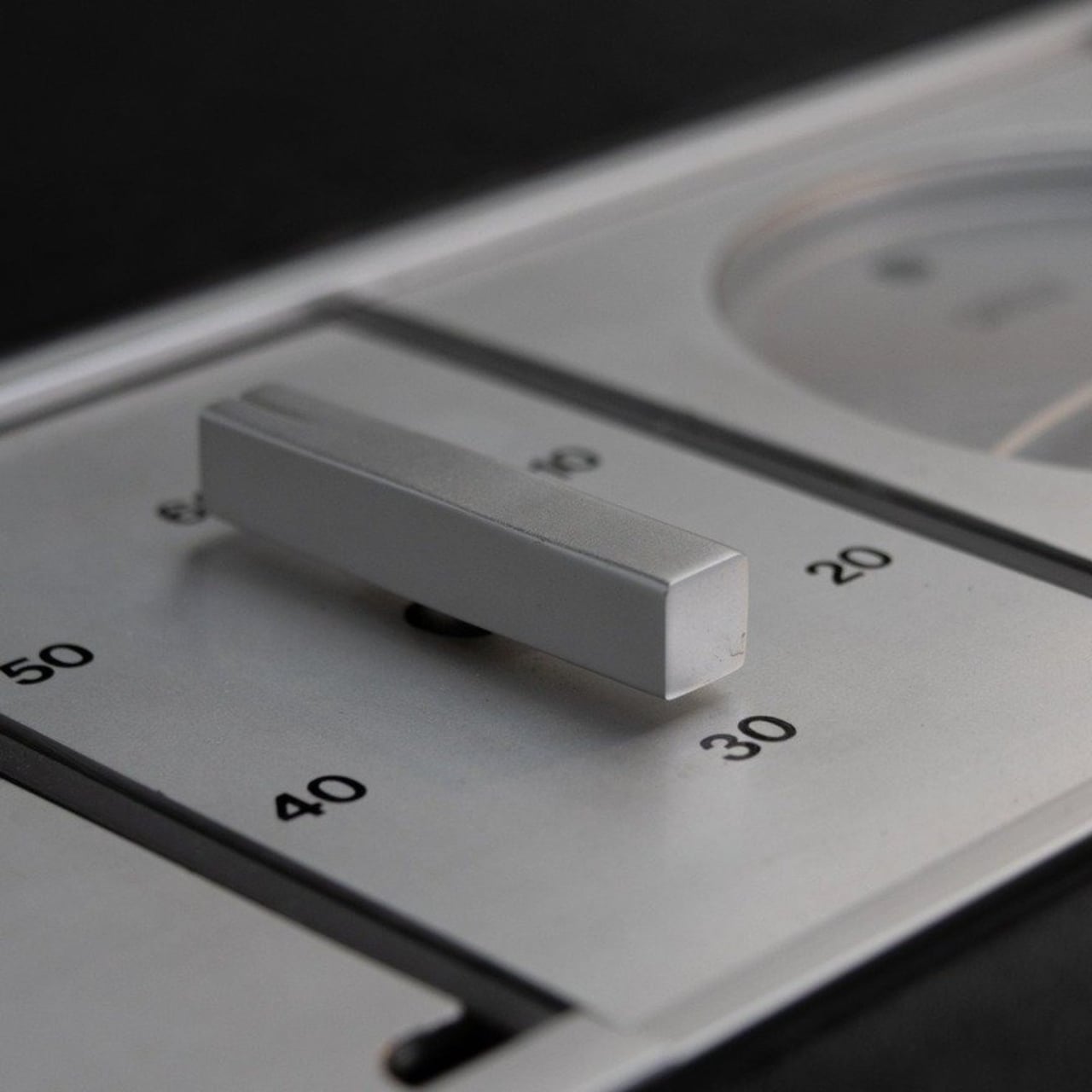
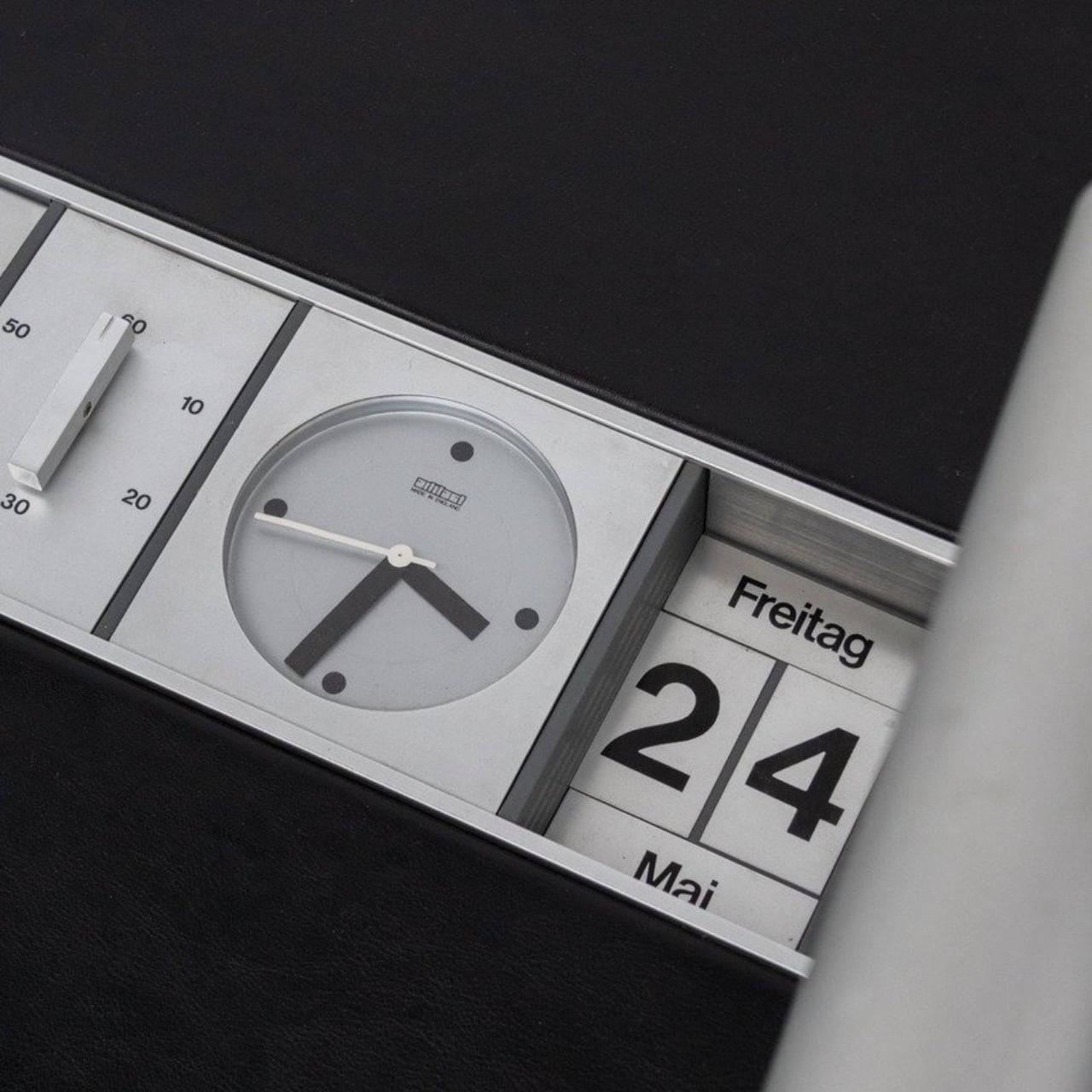
Linder built a recessed aluminum rail directly into the desk surface. Into that rail, you slot accessories: a rotating desk lamp, a clock, a calendar, a mechanical countdown timer presumably for meetings, small storage compartments for pens and miscellaneous objects, and, because it was the ’70s, an ashtray. Each piece sits flush and intentional, like it belongs. The desk also has no drawers, which feels like a deliberate statement rather than an oversight.
Think about what that actually means as a design decision. Linder looked at the way people used a desk and decided that the answer wasn’t more storage hidden underneath, but a curated surface system you could reconfigure based on what you actually needed. That’s not a small idea. That’s the kind of thinking that entire product categories are built on today. It’s about designing for adaptability rather than completeness, which is a genuinely harder problem to solve.
The modular design conversation is everywhere right now. We have monitor arms with built-in cable management, desk mats with snap-in wireless chargers, pegboard setups that practically have their own aesthetics communities on social media. Framework made a modular laptop and built a devoted following around it. The concept of making something that can evolve with the user’s needs has become a selling point, sometimes the selling point. And here’s Linder, decades earlier, doing it quietly on a leather-topped desk in Denmark.
That’s the thing about design that predates the internet: it didn’t have the benefit of going viral. Pieces like this stayed in offices, got passed through estates, ended up in European vintage markets for people who happened to stumble across them. Today, you can find Linder’s Executive Desk listed on resale platforms, tagged as “extremely rare,” priced around $5,000, and shipped from the Netherlands. It’s the kind of object that makes you wonder how many other brilliant, ahead-of-their-time designs are still sitting in storage somewhere, quietly waiting to be rediscovered.
It’s also worth noticing what the desk says about how people worked in the 1970s. A countdown timer for meetings built directly into the furniture is either a sign of remarkable efficiency or remarkable anxiety, possibly both. The rotating lamp suggests someone thought carefully about task lighting at a time when most offices were settling for overhead fluorescents. Even the ashtray has a designated place, literally, which says something about how deliberately every inch of that rail was considered.
Good design doesn’t expire. That’s the lesson Linder’s desk keeps teaching every time someone spots it online and does a double take. It doesn’t look like a relic. It looks like something a design-forward brand would release today with a waitlist and a product launch newsletter. The fact that it came out of a Danish workshop fifty years ago is almost beside the point. The thinking was right then, and it’s still right now.